This is a modern-English version of Wood-Block Printing: A Description of the Craft of Woodcutting and Colour Printing Based on the Japanese Practice, originally written by Fletcher, F. Morley (Frank Morley).
It has been thoroughly updated, including changes to sentence structure, words, spelling,
and grammar—to ensure clarity for contemporary readers, while preserving the original spirit and nuance. If
you click on a paragraph, you will see the original text that we modified, and you can toggle between the two versions.
Scroll to the bottom of this page and you will find a free ePUB download link for this book.

Meadowsweet.
Collotype reproduction of a woodblock print by the Author.
(Frontispiece.)
THE ARTISTIC CRAFTS SERIES
OF TECHNICAL HANDBOOKS
EDITED BY W. R. LETHABY
WOOD-BLOCK
PRINTING
A DESCRIPTION OF THE CRAFT OF
WOODCUTTING & COLOUR PRINTING
BASED ON THE JAPANESE
PRACTICE BY F. MORLEY FLETCHER
WITH
DRAWINGS AND ILLUSTRATIONS BY
THE AUTHOR AND A. W. SEABY.
ALSO COLLOTYPE REPRODUCTIONS
OF VARIOUS EXAMPLES OF
PRINTING, AND AN ORIGINAL
PRINT DESIGNED AND CUT BY
THE AUTHOR PRINTED BY HAND
ON JAPANESE TAPER
LONDON
SIR ISAAC PITMAN & SONS, LTD.
PARKER STREET, KINGSWAY, W.C.2
BATH, MELBOURNE, TORONTO, NEW YORK
Printed by
Sir Isaac Pitman & Sons, Ltd.
Bath, England
LONDON
SIR ISAAC PITMAN & SONS, LTD.
PARKER STREET, KINGSWAY, W.C.2
BATH, MELBOURNE, TORONTO, NEW YORK
Printed by
Sir Isaac Pitman & Sons, Ltd.
Bath, England
EDITOR'S PREFACE
In issuing these volumes of a series of Handbooks on the Artistic Crafts, it will be well to state what are our general aims.
In releasing these volumes of a series of Handbooks on the Artistic Crafts, it's important to outline our general goals.
In the first place, we wish to provide trustworthy text-books of workshop practice, from the points of view of experts who have critically examined the methods current in the shops, and putting aside vain survivals, are prepared to say what is good workmanship, and to set up a standard of quality in the crafts which are more especially associated with design. Secondly, in doing this, we hope to treat design itself as an essential part of good workmanship. During the last century [Pg vi]most of the arts, save painting and sculpture of an academic kind, were little considered, and there was a tendency to look on "design" as a mere matter of appearance. Such "ornamentation" as there was was usually obtained by following in a mechanical way a drawing provided by an artist who often knew little of the technical processes involved in production. With the critical attention given to the crafts by Ruskin and Morris, it came to be seen that it was impossible to detach design from craft in this way, and that, in the widest sense, true design is an inseparable element of good quality, involving as it does the selection of good and suitable material, contrivance for special purpose, expert workmanship, proper finish, and so on, far more than mere ornament, and indeed, that ornamentation itself was rather an exuberance of fine workmanship than a matter of merely abstract lines. Workmanship when separated by too wide a gulf from fresh thought—that is, from design—inevitably decays, and, on the other hand, ornamentation, [Pg vii]divorced from workmanship, is necessarily unreal, and quickly falls into affectation. Proper ornamentation may be defined as a language addressed to the eye; it is pleasant thought expressed in the speech of the tool.
First of all, we aim to provide reliable textbooks on workshop practices, from the perspective of experts who have carefully evaluated the methods used in workshops. They have discarded outdated practices and are ready to identify what constitutes good workmanship and establish a quality standard in the crafts particularly related to design. Secondly, in this process, we hope to regard design itself as a crucial aspect of good workmanship. Over the last century, most arts, except for academic painting and sculpture, were often overlooked, and there was a tendency to treat "design" as just a matter of appearance. The limited "ornamentation" that existed was generally achieved by mechanically following a drawing produced by an artist who often knew little about the technical processes involved in its creation. Thanks to the critical attention that Ruskin and Morris brought to the crafts, it became evident that design cannot be separated from craft like that. In the broadest sense, true design is an integral part of good quality, as it involves choosing good and appropriate materials, functionality for specific purposes, expert workmanship, proper finishing, and more, rather than just superficial decoration. In fact, ornamentation is more an overflow of excellent workmanship than merely abstract lines. When workmanship is too far removed from innovative thinking—that is, from design—it inevitably deteriorates. On the other hand, ornamentation that is disconnected from workmanship is inherently false and quickly becomes pretentious. Proper ornamentation can be defined as a visual language; it’s pleasing thought expressed in the dialect of tools.
In the third place, we would have this series put artistic craftsmanship before people as furnishing reasonable occupations for those who would gain a livelihood. Although within the bounds of academic art, the competition, of its kind, is so acute that only a very few per cent. can fairly hope to succeed as painters and sculptors; yet, as artistic craftsmen, there is every probability that nearly every one who would pass through a sufficient period of apprenticeship to workmanship and design would reach a measure of success.
In the third place, we want this series to prioritize artistic craftsmanship as a way to provide reasonable jobs for those looking to make a living. While competition in academic art is so intense that only a small percentage can realistically expect to succeed as painters and sculptors, there’s a good chance that almost anyone who undergoes enough training in workmanship and design will achieve a level of success as artistic craftsmen.
In the blending of hand-work and thought in such arts as we propose to deal with, happy careers may be found as far removed from the dreary routine of hack labour as from the terrible uncertainty of academic art. It is desirable[Pg viii] in every way that men of good education should be brought back into the productive crafts: there are more than enough of us "in the city," and it is probable that more consideration will be given in this century than in the last to Design and Workmanship.
In the mix of hands-on work and creative thought in the arts we plan to discuss, fulfilling careers can be found that are far from the dull grind of boring labor and also away from the unpredictable nature of academic art. It’s important[Pg viii] that well-educated individuals return to skilled trades: there are plenty of us "in the city," and it’s likely that this century will pay more attention to Design and Workmanship than the last one did.
There are two common ways of studying old and foreign arts—the way of the connoisseur and the way of the craftsman. The collector may value such arts for their strangeness and scarcity, while the artist finds in them stimulus in his own work and hints for new developments.
There are two common ways to study old and foreign arts—the connoisseur’s approach and the craftsman’s approach. The collector might appreciate these arts for their uniqueness and rarity, while the artist sees them as inspiration for their own work and ideas for new developments.
The following account of colour-printing from wood-blocks is based on a study of the methods which were lately only practised in Japan, but which at an earlier time were to some degree in use in Europe also. The main principles of the art, indeed, were well known in the West long before colour prints were produced in Japan, and there is some reason to suppose that the[Pg ix] Japanese may have founded their methods in imitating the prints taken from Europe by missionaries. Major Strange says: "The European art of chiaroscuro engraving is in all essentials identical with that of Japanese colour-printing.... It seems, therefore, not vain to point out that the accidental sight of one of the Italian colour-prints may have suggested the process to the Japanese." The Italians aimed more at expressing "relief" and the Japanese at flat colour arrangements; the former used oily colours, and the latter fair distemper tints; these are the chief differences. Both in the West and the East the design was cut on the plank surface of the wood with a knife; not across the grain with a graver, as is done in most modern wood engraving, although large plank woodcuts were produced by Walter Crane and Herkomer, about thirty years ago, as posters.
The following account of color printing from woodblocks is based on a study of methods that were recently practiced in Japan but were also somewhat used in Europe at an earlier time. The main principles of the art were actually well known in the West long before color prints were created in Japan, and there’s some reason to believe that the[Pg ix] Japanese may have developed their methods by imitating prints brought from Europe by missionaries. Major Strange states: "The European art of chiaroscuro engraving is in all essentials identical with that of Japanese color printing.... It seems, therefore, not unreasonable to suggest that the chance sight of one of the Italian color prints may have inspired the Japanese." The Italians focused more on expressing "relief," while the Japanese concentrated on flat color arrangements; the former used oily colors, and the latter preferred lighter tempera tints; these are the main differences. In both the West and the East, the design was carved on the flat surface of the wood with a knife, not against the grain with a graver, as is common in most modern wood engraving, although large woodcuts were produced by Walter Crane and Herkomer about thirty years ago, as posters.
The old woodcuts of the fifteenth century were produced as pictures as well as for the illustration of books;[Pg x] frequently they were of considerable size. Often, too, they were coloured by stencil plates or freely by hand.
The old woodcuts from the fifteenth century were created as images and also to illustrate books;[Pg x] they were often quite large. They were often colored using stencil plates or painted by hand.
At the same time the printing in colour of letters and other simple devices in books from wood-blocks was done, and a book printed at St. Albans in 1486 has many coats of arms printed in this way; some of the shields having two or three different colours.[1]
At the same time, books were being printed in color using wooden blocks for letters and other simple designs. A book printed in St. Albans in 1486 features numerous coats of arms made this way, with some shields displaying two or three different colors.[1]
About the year 1500 a method of printing woodcuts in several flat tones was invented in Germany and practised by Lucas Cranach and others. A fine print of Adam and Eve by Hans Baldung in the Victoria and Albert Museum has, besides the bold black "drawing," an over-tint printed in warm brown out of which sharp high lights are cut; the print is thus in three tones.
Around the year 1500, a technique for printing woodcuts in various flat tones was developed in Germany and used by Lucas Cranach and others. A beautiful print of Adam and Eve by Hans Baldung in the Victoria and Albert Museum features, in addition to the strong black "drawing," a warm brown over-tint, from which sharp highlights are created; this print has three tones.
Ugo da Carpo (c. 1480-1530) working in Venice, introduced this new type of tone woodcut into Italy; indeed, he claimed to be the inventor of the method. "This was called chiaroscuro, a name[Pg xi] still given to it, and was, in fact, a simple form of our modern chromo printing." His woodcuts are in a simple, vigorous style; one of them after Raphael's "Death of Ananias," printed in brown, has a depth and brilliancy which may remind us of the mezzo-tints of Turner's Liber Studiorum. This is proudly signed, "Per Ugo da Carpo," and some copies are said to be dated 1518.
Ugo da Carpo (c. 1480-1530), who worked in Venice, brought this new type of tone woodcut to Italy; he even claimed to have invented the method. "This was called chiaroscuro, a name[Pg xi] that is still used today, and it was actually a simple version of our modern chromo printing." His woodcuts feature a straightforward, energetic style; one of them, based on Raphael's "Death of Ananias," printed in brown, has a depth and brightness that can remind us of the mezzo-tints in Turner's Liber Studiorum. This piece is proudly signed, "Per Ugo da Carpo," and some versions are said to be dated 1518.
Andrea Andreani (c. 1560-1623), a better known but not a better artist, produced a great number of these tone woodcuts. Several prints after Mantegna's "Triumphs of Caesar" have a special charm from the beauty of the originals; they are printed in three tints of grey besides the "drawing"; the palest of these tints covers the surface, except for high lights cut out of it. A fine print of a Holy Family, about 15×18 inches, has a middle tone of fair blue and a shadow tint of full rich green. Copies of two immense woodcuts at the Victoria and Albert Museum, of Biblical subjects, seem to have been[Pg xii] seems to cramp the hand and injure the eyes of all but the most gifted draughtsmen. It is desirable to cultivate the ability to seize and record the "map-form" of any object rapidly and correctly. Some practice in elementary colour-printing would certainly be of general usefulness, and simpler exercises may be contrived by cutting out with scissors and laying down shapes in black or coloured papers unaided by any pattern.
Andrea Andreani (c. 1560-1623), who is better known but not necessarily a better artist, created a large number of these tone woodcuts. Several prints inspired by Mantegna's "Triumphs of Caesar" possess a unique charm due to the beauty of the originals; they are printed in three shades of grey in addition to the "drawing"; the lightest of these shades covers the surface, except for highlights that are carved out of it. A beautiful print of a Holy Family, approximately 15×18 inches, features a middle tone of light blue and a shadow tint of deep, rich green. Copies of two large woodcuts at the Victoria and Albert Museum, depicting Biblical subjects, seem to have[Pg xii], appear to restrict the hand and strain the eyes of all but the most talented artists. It's important to develop the skill to quickly and accurately capture the "map-form" of any object. Some practice in basic color printing would definitely be beneficial overall, and simpler exercises can be created by cutting shapes from black or colored paper without any pattern.
Finally, the hope may be expressed that the beautiful art of wood-cutting as developed in Western Europe and brought to such perfection only a generation ago is only temporarily in abeyance, and that it too may have another day.
Finally, we hope that the beautiful art of wood-cutting, which was perfected in Western Europe just a generation ago, is only paused for now, and that it will have another chance to thrive.
September 1916.
September 1916.
AUTHOR'S NOTE
This little book gives an account of one of the primitive crafts, in the practice of which only the simplest tools and materials are used. Their method of use may serve as a means of expression for artist-craftsmen, or may be studied in preparation for, or as a guide towards, more elaborate work in printing, of which the main principles may be seen most clearly in their application in the primitive craft.
This short book provides an overview of one of the basic crafts, where only simple tools and materials are used. The techniques involved can express creativity for artist-craftspeople, or can be studied as a preparation for or a guide to more advanced printing work, where the foundational principles are most clearly demonstrated through this basic craft.
In these days the need for reference to primitive handicrafts has not ceased with the advent of the machine. The best achievements of hand-work will always be the standards for reference; and on their study must machine craft[Pg xiv] be based. The machine can only increase the power and scale of the crafts that have already been perfected by hand-work. Their principles, and the art of their design, do not alter under the machine. If the machine disregards these its work becomes base. And it is under the simple conditions of a handicraft that the principles of an art can be most clearly experienced.
In today's world, the importance of traditional crafts hasn't disappeared with the rise of machines. The finest results from handcrafting will always serve as benchmarks, and machine craftsmanship[Pg xiv] should be rooted in their study. Machines can only enhance the capabilities and scale of crafts that have already been refined by hand. The foundational principles and design art of these crafts don’t change with machines. If machines ignore these principles, their output becomes inferior. It’s under the straightforward conditions of handcrafting that the principles of art can be most clearly understood.
The best of all the wonderful and excellent work that is produced to-day by machinery is that which bears evidence in itself of its derivation from arts under the pure conditions of classic craftsmanship, and shows the influence of their study.
The best of all the amazing and outstanding work produced today by machinery is that which reflects its origins in the arts created under the pure standards of classic craftsmanship, and demonstrates the influence of studying those traditions.
The series of which this book is a part stands for the principles and the spirit of the classic examples. To be associated with those fellow-craftsmen who have been privileged to work for the Series is itself an honour of high estimation in the mind of the present writer. If the book contributes even a little toward the usefulness of the series the[Pg xv] experiments which are recorded here will have been well worth while.
The series this book belongs to represents the principles and essence of classic examples. Being associated with fellow creators who have had the privilege of contributing to the Series is a significant honor in the eyes of the author. If this book adds even a bit to the value of the series, then the[Pg xv] experiments shared here will have been worthwhile.
To my friend Mr. J. D. Batten is due all the credit of the initial work. He began the search for a pure style of colour-printing, and most generously supported and encouraged my own experiments in the Japanese method.
To my friend Mr. J. D. Batten goes all the credit for the initial work. He started the search for a pure style of color printing and generously supported and encouraged my own experiments with the Japanese method.
To my old colleague Mr. A. W. Seaby I would also express my indebtedness for his kind help and advice.
To my former colleague Mr. A. W. Seaby, I want to express my gratitude for his helpfulness and advice.
Edinburgh College of Art,
September 1916.
Edinburgh College of Art,
September 1916.
CONTENTS
| CHAPTER I | PAGE | |
|---|---|---|
| Introduction and Description of the Origins of | ||
| Wood-block Printing—Its Uses for Personal | ||
| Artistic Expression, for Reproduction of | ||
| Decorative Designs, and as a Fundamental | ||
| Training for Student of Printed Decoration | 1 | |
| CHAPTER II | ||
| General Description of the Operation of Printing | ||
| from a Set of Blocks | 9 | |
| CHAPTER III | ||
| Description of the Materials and Tools required | ||
| for Block Cutting | 17 | |
| CHAPTER IV | ||
| Block Cutting and the Planning of Blocks | 23 | |
| CHAPTER V | ||
| Preparation of Paper, Ink, Colour, and Paste for | ||
| Printing | 47 | |
| CHAPTER VI | ||
| Detailed Method of Printing—The Printing | ||
| Tools, Baren and Brushes | 61 | |
| CHAPTER VII | ||
| Principles and Main Considerations in Designing | ||
| Wood-block Prints—Their Application to | ||
| Modern Colour Printing | 81 | |
| CHAPTER VIII | ||
| Co-operative Printing | 89 | |
| APPENDIX | ||
| Prints and Collotype Plates | 94 | |
| Books of Reference | 129 | |
| INDEX | 130 | |
ILLUSTRATIONS
| PAGE | ||
|---|---|---|
| 1. | Work Plan Table | 11 |
| 2. | Block Mounted with Cross Ends to Stop Warping | 18 |
| 3. | Knife Drawing | 19 |
| 4. | Chisel Sizes | 20 |
| 5. | Split-Handle Short Chisel | 21 |
| 6. | Hammer | 21 |
| 7. | Hand Positioning When Using a Knife | 30 |
| 8. | Another Hand Position for Using the Knife | 31 |
| 9. | Knife Cuts by Section | 33 |
| 10. | Knife Cuts Diagram | 33 |
| 11. | How to Hold a Gouge | 35 |
| 12. | Removing Wood between Knife Cuts | 35 |
| 13. | Position of Registration Marks | 37 |
| 14. | Register Marks | 37 |
| 15. | Register Marks (Section) | 38 |
| 16. | Colour-block Section | 42 |
| 17. | Paper Sizing Drawing | 49 |
| 18. | Cork for ink bottle with a wad for preservation | 56 |
| 19. | How to Re-cover a Baren | 64 |
| 20. | Brush Drawing | 66 |
| 21. | How to Hold the Paper | 70 |
| 22. | How to use the Baren | 72 |
COLLOTYPE PLATES
| PAGE | ||
|---|---|---|
| 1. | Meadowsweet. Woodblock print reproduction Print by the Author | Frontispiece |
| 2. | Key block of a print drawn and cut by the Author | 5 |
| 3. | The Baren, or Printing Plate | 12 |
| 4. | Color block of a print, with the key block shown at __A_TAG_PLACEHOLDER_0__. p. 5 | 23 |
| 5. | Impression (nearly actual size) or a part of a Japanese woodblock print showing | |
| wide variety in the character of the lines and spots that suggest form | 26 | |
| 6. | Reproduction of a Reduced Impression of the Key Block of a Japanese Print | |
| showing impressive variety in the methods used to suggest form | 33 | |
| 7. | Detail from a Japanese Wood Block | 48 |
APPENDIX
| PAGE | |||
|---|---|---|---|
| 8. | Woodblock Print | by the Author | 95 |
| 9. | First Edition | (Collotype reproduction) | 98 |
| 10. | Second Edition | " | 100 |
| 11. | Third Edition | " | 102 |
| 12. | 4th Printing | " | 104 |
| 13. | 5th Printing | " | 105 |
| 14. | 6th Edition | " | 107 |
| [Pg xxi]15. | 8th Printing | " | 109 |
| 16. | Collotype Reproduction of a Color Print by Hiroshige | 111 |
| 17. | Collotype reproduction of a section of the print displayed on the previous page. | |
| Page, actual size, displaying the treatment of the foliage and the expressive elements. | ||
| Drawing of the Tree Trunk and Stems | 114 | |
| 18. | Collotype reproduction of another part of the print shown on __A_TAG_PLACEHOLDER_0__. p. 111 | |
| Actual Size, showcasing the expressive use of line in drawing distant shapes. | 116 | |
| 19. | Collotype Reproduction of a Color Print by Hiroshige | 118 |
| 20. | Collotype Reproduction of a Section (actual Size) of the Print on the | |
| Previous Page, displaying the Care of Tree Shapes and Spacing | 120 | |
| 21. | Collotype Reproduction of a Color Print by Hiroshige | 121 |
| 22. | Collotype reproduction of a portion, actual size, of the print on the __A_TAG_PLACEHOLDER_0__. | |
| previous page, displaying care for the tree and blossom | 123 | |
| 23. | The Tiger. Collotype Reproduction of a Color Print by J. D. Batten | 125 |
| 24. | Lapwings. Collotype reproduction of a color print by A. W. Seaby. | 127 |
ERRATA
| Page 62.—For "bamboo-sheath" read "bamboo leaf". |
| Page 63.—In last paragraph, delete "the inside of". |
| Page 64.—Third line from bottom, after "occasionally" insert "when printing". |
WOOD-BLOCK PRINTING
BY THE
JAPANESE METHOD
CHAPTER I
INTRODUCTORY
Introduction and Description of the[Pg 1] Origins of Wood-block Printing;
its uses for personal artistic expression,
for reproduction of
decorative designs, and as a fundamental training for students of
printed decoration.
The few wood-block prints shown from time to time by the Society of Graver Printers in Colour, and the occasional appearance of a wood-block print in the Graver Section of the International Society's Exhibitions, or in those of the Society of Arts and Crafts, are the outcome of the experiments of a small[Pg 2] group of English artists in making prints by the Japanese method, or by methods based on the Japanese practice.
The few woodblock prints occasionally displayed by the Society of Graver Printers in Colour, and the rare appearance of a woodblock print in the Graver Section of the International Society's Exhibitions, or in those of the Society of Arts and Crafts, result from the experiments of a small[Pg 2] group of English artists creating prints using the Japanese technique, or methods inspired by Japanese practices.
My interest was first drawn in 1897 to experiments that were being made by Mr. J. D. Batten, who for two years previously had attempted, and partially succeeded in making, a print from wood and metal blocks with colour mixed with glycerine and dextrine, the glycerine being afterwards removed by washing the prints in alcohol. As the Japanese method seemed to promise greater advantages and simplicity, we began experiments together, using as our text-book the pamphlet by T. Tokuno, published by the Smithsonian Institution, Washington, and the dextrine and glycerine method was soon abandoned. The edition of prints, however, of Eve and the Serpent designed by J. D. Batten, printed by myself and published at that time, was produced partly by the earlier method and partly in the simpler Japanese way.
My interest was first piqued in 1897 by experiments being conducted by Mr. J. D. Batten, who had attempted for two years prior to that to create a print from wood and metal blocks using color mixed with glycerin and dextrin, with the glycerin later removed by washing the prints in alcohol. Since the Japanese method seemed to offer greater advantages and simplicity, we started working on experiments together, using the pamphlet by T. Tokuno, published by the Smithsonian Institution in Washington, as our guide, and soon abandoned the dextrin and glycerin method. The edition of prints of Eve and the Serpent, designed by J. D. Batten, printed by me, and published at that time, was created using a combination of the earlier method and the simpler Japanese technique.
Familiar as everyone is with Japanese prints, it is not generally known that[Pg 3] they are produced by means of an extremely simple craft. No machinery is required, but only a few tools for cutting the designs on the surface of the planks of cherry wood from which the impressions are taken. No press is used, but a round flat pad, which is rubbed on the back of the print as it lies on the blocks. The colours are mixed with water and paste made from rice flour. The details of the craft and photographs of the tools were given in full in the Smithsonian Institution pamphlet already mentioned.
Familiar as everyone is with Japanese prints, it's not widely known that[Pg 3] they are made using a very simple technique. No machinery is needed, just a few tools for carving the designs into cherry wood planks from which the prints are taken. Instead of a press, a round flat pad is used, which is rubbed on the back of the print while it’s resting on the blocks. The colors are mixed with water and a paste made from rice flour. The details of the technique and photos of the tools were thoroughly covered in the Smithsonian Institution pamphlet previously mentioned.
It is slow and unsatisfactory work, however, learning manipulation from a book, and several technical difficulties that seemed insurmountable were made clear by the chance discovery in London of a Japanese printseller who, although not a printer, was sufficiently familiar with the work to give some invaluable hints and demonstrations.
It's a slow and frustrating process to learn manipulation from a book, and a few technical challenges that seemed impossible to overcome became clear through a lucky encounter in London with a Japanese printseller. While he wasn’t a printer, he knew enough about the work to offer some priceless tips and demonstrations.
Further encouragement was given to the work by the institution, a little later, of a class in wood-cuts in colour under[Pg 4] my charge, at the L.C.C. Central School of Arts and Crafts, which for several years became the chief centre of the movement.
Further encouragement was given to the work by the institution, a little later, of a class in color woodcuts under[Pg 4] my supervision, at the L.C.C. Central School of Arts and Crafts, which for several years became the main hub of the movement.
Such are the bare historical facts of the development in our country of this craft imported from the Far East.
These are the basic historical facts about how this craft, imported from the Far East, developed in our country.
On a merely superficial acquaintance the Japanese craft of
block-printing may appear to be no more than a primitive though delicate
form of colour reproduction, which modern mechanical methods have long
superseded, even in the land of its invention; and that to study so
limited a mode of expression would be hardly of any practical value to
an artist. Moreover, the craft is under the disadvantage that all the
stages of the work, from making the first design to taking the final
impressions, must be done by the artist himself—work which includes the
delicate cutting of line and planning of colour blocks, and the
preparation of colour and paper. In Japan there were trained craftsmen
expert in each of these branches of the craft, and each carried[Pg 5] out
his part under the supervision of the artist. No part but the design was
done by him. So that the very character of the work has an essential
difference. Under our present conditions the artist must undertake the
whole craft, with all its detail.
At first glance, Japanese block-printing might seem like just a simple but delicate way to reproduce colors, something that modern techniques have overtaken, even in its home country. It may seem that studying such a narrow form of expression wouldn’t hold much practical value for an artist. Additionally, the craft has the drawback that the artist must handle every step of the process, from creating the initial design to making the final prints. This includes intricately carving the lines, planning the color blocks, and preparing the inks and paper. In Japan, skilled artisans specialized in each aspect of the craft, working under the artist’s guidance, so only the design was created by the artist. This creates a fundamental difference in the nature of the work. Today, however, the artist has to manage the entire craft, along with all its intricate details.

Plate II.—Key-block of the print shown on the
frontispiece.
(The portion of wood lying outside the points of the mass of foliage is
left standing to support the paper, but is not inked in printing.)
Simple as the process is, there is, from first to last, a long labour involved in planning, cutting and printing, before a satisfactory batch of prints is produced. After several attempts in delegating printing to well-trained pupils I have found it impossible to obtain the best results by that means, but the cutting of the colour-blocks and the clearing of the key-block after the first cutting of the line may well be done by assistant craftsmen.
As simple as the process seems, there’s a lot of hard work involved in planning, cutting, and printing before a satisfactory set of prints is produced. After several tries at having well-trained students do the printing, I’ve realized it’s impossible to get the best results that way. However, the cutting of the color blocks and the clearing of the key block after the initial line cutting can definitely be done by assistant craftsmen.
A larger demand for the prints might bring about a commercial development of the work, and the consequent employment of trained craftsmen or craftswomen, but the result would be a different one from that which has been obtained by the artists who are[Pg 6] willing to undertake the whole production of their work.
A higher demand for the prints could lead to commercial growth, resulting in the hiring of skilled craftsmen or craftswomen. However, the outcome would be different from what the artists who are[Pg 6] willing to handle all aspects of their work have achieved.
The actual value of wood-block prints for use as decoration is a matter of personal taste and experience.
The true value of wood-block prints for decoration depends on personal taste and experience.
In my own opinion there is an element that always remains foreign in the prints of the Japanese masters, yet I know of no other kind of art that has the same telling value on a wall, or the same decorative charm in modern domestic rooms as the wood-block print. A single print well placed in a room of quiet colour will enrich and dominate a whole wall.
In my opinion, there’s always something foreign about the prints of Japanese masters, but I know of no other type of art that has the same impact on a wall or the same decorative appeal in modern living spaces as the woodblock print. A single print, positioned well in a room with calm colors, can enhance and take over an entire wall.
The modern vogue still favours more expensive although less decorative forms of art, or works of reproduction without colour, yet here is an art available to all who care for expressive design and colour, and within the means of the large public to whom the cost of pictures is prohibitive. In its possibility as a decorative means of expression well suited to our modern needs and uses, and in the particular[Pg 7] charm that colour has when printed from wood on a paper that is beautiful already by its own quality, there is no doubt of the scope and opportunity offered by this art.
The current trend still prefers more expensive, albeit less flashy, forms of art or colorless reproductions, yet there's an art form accessible to anyone who values expressive design and color, and it's affordable for the many people for whom buying artwork can be too costly. This art serves as a decorative means of expression that meets our modern needs, and there's a unique[Pg 7] charm in the way color prints from wood on already high-quality paper. There's no doubt about the possibilities and opportunities this art offers.
But as with new wine and old bottles, a new condition of simplicity in furniture and of pure colour in decoration must first be established. A wood-block print will not tell well amid a wilderness of bric-à-brac or on a gaudy wall-paper.
But just like how new wine needs new bottles, we first need to create a simple style for furniture and use pure colors in decoration. A wood-block print won't stand out well in a cluttered space filled with knick-knacks or against a flashy wallpaper.
From another and quite different point of view, the art of block-cutting and colour-printing has, however, a special and important value. To any student of pictorial art, especially to any who may wish to design for modern printed decoration, no work gives such instruction in economy of design, in the resources of line and its expressive development, and in the use and behaviour of colour. This has been the expressed opinion of many who have undertaken a course of wood-block printing for this object alone.
From a different perspective, the art of block-cutting and color-printing holds unique and significant value. For any student of visual art, particularly for those interested in designing for contemporary printed decor, no other work offers such valuable lessons in design efficiency, the potential of line and its expressive growth, and the use and characteristics of color. Many who have pursued a course in wood-block printing have highlighted this specific benefit.
The same opinion is emphatically[Pg 8] stated by Professor Emil Orlik, whose prints are well known in modern exhibitions. On the occasion of a visit to the Kunstgewerbeschule of Berlin, I found him conducting a class for designers for printed decoration, in which the Japanese craft of block-printing was made the basis of their training. He held to the view that the primitive craft teaches the students the very economy and simplicity upon which the successful use of the great modern resources of colour-printing depend, yet which cannot be learnt except by recourse to simpler conditions and more narrow limitations before dealing with the greater scope of the machine.
The same opinion is strongly[Pg 8] expressed by Professor Emil Orlik, whose prints are well-known in contemporary exhibitions. During a visit to the Kunstgewerbeschule in Berlin, I saw him teaching a class for designers focusing on printed decoration, where the Japanese craft of block-printing was the foundation of their training. He believed that this traditional craft teaches students the essential economy and simplicity that are crucial for effectively using the modern resources of color printing. However, these lessons can only be learned by first working under simpler conditions and more limited constraints before tackling the broader possibilities offered by machines.
My own experience also convinces me that whatever may be the ultimate value of the Eastern craft to our artists as a mode of personal expression, there is no doubt of its effect and usefulness in training students to design with economy and simplicity for modern printing processes.[Pg 9]
My own experience also convinces me that no matter what the ultimate value of Eastern craftsmanship is for our artists as a way of personal expression, there’s no doubt about its impact and usefulness in teaching students to design with efficiency and simplicity for modern printing methods.[Pg 9]
CHAPTER II
General Description of the Operation of Printing from a Set of Blocks
The early stages of any craft are more interesting when we are familiar with the final result. For this reason it is often an advantage to begin at the end.
The early stages of any skill are more engaging when we know what the final outcome looks like. For this reason, it's often helpful to start with the end.
To see a few impressions taken from a set of blocks in colour printing, or to print them oneself, gives the best possible idea of the quality and essential character of print-making. So also in describing the work it will perhaps tend to make the various stages clearer if the final act of printing is first explained.
To look at a few impressions made from a set of blocks in color printing, or to print them yourself, gives the best understanding of the quality and true nature of print-making. Similarly, when describing the work, it might help to clarify the different stages if the final act of printing is explained first.
The most striking characteristic of this craft is the primitive simplicity of[Pg 10] the act of printing. No press is required, and no machinery.
The most striking characteristic of this craft is the basic simplicity of[Pg 10] printing. No press or machinery is needed.
A block is laid flat on the table with its cut surface uppermost, and is kept steady by a small wad of damp paper placed under each corner. A pile of paper slightly damped ready for printing lies within reach just beyond the wood-block, so that the printer may easily lift the paper sheet by sheet on to the block as it is required.
A block is placed flat on the table with its cut surface facing up, and is held steady by a small wad of damp paper under each corner. A stack of slightly damp paper, prepared for printing, is within reach just beyond the wood block, so the printer can easily lift a sheet of paper onto the block as needed.
It is the practice in Japan to work squatting on the floor, with the blocks and tools also on the floor in front of the craftsman. Our own habit of working at a table is less simple, but has some advantages. One practice or habit of the Japanese is, however, to be followed with particular care. No description can give quite fully the sense of extreme orderliness and careful deliberation of their work. Everything is placed where it will be most convenient for use, and this orderliness is preserved throughout the day's work. Their shapely tools and vessels are[Pg 11] handled with a deftness that shames our clumsy ways, and everything that they use is kept quite clean. This skilful orderliness is essential to fine craftmanship, and is a sign of mastery.
In Japan, it's common to work while squatting on the floor, with the blocks and tools laid out in front of the craftsman. Our habit of working at a table is a bit more complicated, but it has its advantages. However, there's one Japanese practice that should be followed with special care. No description can fully capture the sense of extreme orderliness and careful thoughtfulness in their work. Everything is placed for maximum convenience, and this order is maintained throughout the day. Their elegant tools and vessels are handled with a skill that puts our clumsiness to shame, and everything they use is kept very clean. This skilled orderliness is essential for fine craftsmanship and demonstrates mastery.
The arrangement of tools and vessels on a work-table may be as the accompanying plan shows:
The setup of tools and containers on a worktable can be seen in the following plan:

Fig. 1.—Work table layout.
| A. Block. |
| B. Sheets of damped paper lying on a board. |
| C. Second board lifted from B. |
| D. Brushes lying on a strip of wood. |
| E. White plate or dish containing colour. |
| F. Saucer containing paste of rice-flour. |
| G. Baren, or printing pad, lying on a sheet of paper |
| slightly coated with sweet oil and tacked to the table. |
| H. Deep bowl of water and brush for moistening the damping sheets. |
| I. Saucer of water for use in printing. |
| J. Sponge. |
When printing on a table arranged in this way the board lying on the
sheets of damped paper at B is first lifted off and placed at C to
receive the sheets as they are done. If the block A is quite dry, it is
thoroughly moistened with a damp sponge and wiped. The colour from a
saucer, E, is then brushed over the printing surface thinly, and a trace
of paste taken from F is also brushed into the colour. (This is best
done after the colour is roughly spread on the block.) The brush is laid
down in its place, D, and the top sheet of paper from the pile is
immediately lifted to its register marks (notches to keep the paper in
its place) on the block. The manner of holding the paper is shown on
page 70. This must be done deftly, and it is important to waste no time,
as the colour would soon dry on the exposed block and print badly.
When printing on a table set up like this, the board resting on the damp sheets of paper at B is first picked up and moved to C to catch the sheets as they’re done. If the block A is completely dry, it’s thoroughly moistened with a damp sponge and wiped down. Color from a saucer, E, is then brushed over the printing surface in a thin layer, and a little bit of paste from F is also brushed into the color. (It’s best to do this after the color is roughly spread on the block.) The brush is placed back in its spot, D, and the top sheet of paper from the stack is quickly lifted to align with its registration marks (notches to keep the paper in place) on the block. The way to hold the paper is explained on page 70. This needs to be done quickly, as it’s crucial not to waste any time; otherwise, the color will dry on the exposed block and print poorly.
Pressure is then applied to the back of the paper as it lies on the wet
block. This is done by a round pad called the baren by the Japanese.
It is made of[Pg 13] a coil of cord covered by bamboo sheath as shown later
on page 62. The pad is rubbed by hand with considerable pressure, moving
transversely forwards and backwards across the block, working from the
left to the right. Once all over the block should be enough. The paper
is then lifted off and laid face upwards on the board at C. The block is
then re-charged with colour for another impression, and the whole
operation repeated as many times as there are sheets to be printed.
Pressure is applied to the back of the paper while it rests on the wet block. This is done using a round pad called a baren in Japanese. It consists of a coil of cord covered in a bamboo sheath, as shown later on page 62. The pad is rubbed by hand with significant pressure, moving back and forth across the block, working from left to right. Once is enough for the entire block. The paper is then lifted off and placed face up on the board at C. The block is then reloaded with color for another print, and the entire process is repeated as many times as there are sheets to be printed.

Plate III. The Baren, or printing pad.
(The pad is actually 5 inches in diameter.)
When this is done all the sheets will have received a single impression,
which may be either a patch of colour or an impression in line of part
of the design of the print. The block A is then removed, cleaned, and
put away; and the block for the second impression put in its place.
Once this is done, all the sheets will have received a single impression, which can be either a spot of color or a line from part of the print's design. The block A is then taken out, cleaned, and put away; and the block for the second impression is placed in its spot.
It is usual to print the line or key-block of a design first, as one is then able to detect faulty registering or imperfect fitting of the blocks and to correct them at once. But there are cases in which[Pg 14] a gradated tone, such as a sky, may need to be printed before the line block.
It's common to print the outline or key-block of a design first, as this allows you to spot any misalignment or issues with the blocks and fix them immediately. However, there are situations in which[Pg 14] a graduated tone, like a sky, might need to be printed before the outline block.
The complete design of a print may require several blocks for colour as well as the key block which prints the line. The impressions from all these blocks may be printed one after another without waiting for the colour on the paper to dry.
The full design of a print might need multiple blocks for color in addition to the key block that prints the outline. The prints from all these blocks can be applied one after the other without waiting for the color on the paper to dry.
As soon as the batch of damped sheets has been passed over the first block, the sheets are replaced at B between boards, and, if necessary, damped again by means of damping sheets (as described later in Chapter V) ready for the next impression, which may be proceeded with at once without fear of the colour running. It is a remarkable fact that patches of wet colour which touch one another do not run if properly printed.
As soon as the batch of damp sheets has gone through the first block, the sheets are placed at B between boards, and if needed, damped again with damping sheets (as explained later in Chapter V) to prepare for the next impression, which can be done immediately without worrying about the color running. It's interesting to note that patches of wet color that touch each other don't run if they are printed correctly.
For the second printing fresh colour is prepared and clean paste, and the printing proceeds as already described, care being taken to watch the proper registering or fitting of each impression to its place in the design.[Pg 15]
For the second printing, fresh ink is mixed and clean paste is used, and the printing goes ahead as described earlier, with careful attention to ensure that each impression is properly aligned with its position in the design.[Pg 15]
There are many niceties and details to be observed in the printing of both line and colour blocks.[Pg 16] These are given in special chapters following. This description of the main action of printing will be of use in giving a general idea of the final operation before the details of the preliminary stages are described.[Pg 17]
There are many details and subtleties to consider in the printing of both line and color blocks.[Pg 16] These will be covered in the special chapters that follow. This overview of the main printing process will help provide a general understanding of the final step before we go into the details of the earlier stages.[Pg 17]
CHAPTER III
Description of the Materials and Tools required for Block-cutting
The wood most commonly used by the Japanese for their printing-blocks is a cherry wood very similar to that grown in England. The Canadian cherry wood, which is more easily obtained than English cherry, is of too open a grain to be of use. The more slowly grown English wood has a closer grain and is the best for all the purposes of block cutting and printing. Well-seasoned planks should be obtained and kept ready for cutting up as may be required.
The wood that the Japanese primarily use for their printing blocks is a type of cherry wood that's very similar to what’s grown in England. The Canadian cherry wood, which is easier to find than English cherry, has too open a grain to be suitable. The more slowly grown English wood has a tighter grain and is the best choice for block cutting and printing. Well-seasoned planks should be sourced and kept ready for cutting as needed.
When a set of blocks is to be cut for a given design, the size of the
printing surface of each block should be made equal to the size of the
design plus[Pg 18] 1 inch or, for large prints, 1½ inch in addition long
ways, and ¼ or ½ inch crossways. The thickness of the plank need not
be more than ⅝ or ¾ inch. It is best for the protection of the
surfaces of the printing blocks and to prevent warping, also for
convenience in storing and handling them, to fix across each end a piece
of wood slightly thicker than the plank itself. These cross-ends should
be mounted as shown in fig. 2.
When cutting a set of blocks for a specific design, the printing surface of each block should match the size of the design plus[Pg 18] 1 inch or, for larger prints, an additional 1½ inches lengthwise, and ¼ or ½ inch widthwise. The thickness of the plank should be no more than ⅝ or ¾ inch. To protect the surfaces of the printing blocks and prevent warping, as well as for ease of storage and handling, it's recommended to attach a piece of wood slightly thicker than the plank itself across each end. These cross-ends should be mounted as shown in fig. 2.

Fig. 2.—Block mounted with cross ends to prevent warping.
Both surfaces of the plank should be planed smooth and then finished
with a steel scraper, but not touched with sand-paper.
Both sides of the plank should be planed smooth and then finished with a steel scraper, but should not be touched with sandpaper.
It is understood that the face of the[Pg 19] plank is used for the printing surface, and not the end of the grain as in blocks for modern wood engraving.
It is understood that the face of the[Pg 19] plank is used for the printing surface, and not the end of the grain like in blocks for modern wood engraving.
The tools needed for cutting the blocks are the following:
The tools you need to cut the blocks are as follows:
1. THE KNIFE

Fig. 3.—Drawing of the knife.
With this knife the most important and delicate work is done. All the lines of the key-block as well as the boundaries of the colour masses are cut with it, before the removal of intervening spaces.
With this knife, the most important and delicate work is done. All the lines of the key block, as well as the edges of the color areas, are cut with it before removing the spaces in between.
The blade lies in a slot and is held tight by the tapered ferrule. This can be pulled[Pg 20] off by hand and the blade lengthened by pulling it forward in the slot.
The blade is positioned in a slot and secured tightly by the tapered ferrule. You can pull[Pg 20] it off by hand, and you can extend the blade by pulling it forward in the slot.
2. CHISELS
These are used for removing the wood between the cut lines or colour
masses, and should be ordinary carvers' chisels of the following sizes:
These are used to remove the wood between the cut lines or color sections and should be standard carvers' chisels in the following sizes:

Fig. 4.—Sizes of chisels.
except those under No. 9, which are short-handled chisels for small work.
except those under No. 9, which are short-handled chisels for small work.
The Japanese toolmakers fit these small chisels into a split handle as shown in fig. 5. The blade is held tightly in its place by the tapered ferrule when the handle is closed, or can be lengthened by opening the handle and pulling forward the blade in its slot. In this way the blade can be used down to its last inch.[Pg 21]
The Japanese toolmakers fit these small chisels into a split handle, as shown in fig. 5. The blade is held securely in place by the tapered ferrule when the handle is closed, or it can be extended by opening the handle and pulling the blade forward in its slot. This way, the blade can be used down to its last inch.[Pg 21]
3. Mallet
This is needed for driving the larger chisels.
This is necessary for using the bigger chisels.
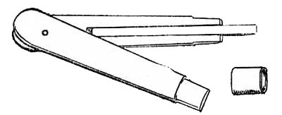
Fig. 5.—Short chisel in split handle.
These are all the tools that are needed for block cutting. For keeping
them in order it is well to have oilstones of three grades:
These are all the tools required for block cutting. To keep them organized, it's helpful to have oilstones in three different grades:

Fig. 6.—Mallet.
1. A carborundum stone for rapidly[Pg 22] re-covering the shape of a chipped or blunt tool.
1. A carborundum stone for quickly[Pg 22] reshaping a chipped or dull tool.
2. A good ordinary oil stone.
2. A decent, standard oil stone.
3. A hard stone for keeping a fine edge on the knife in cutting line
blocks. The American "Washita" stone is good for this purpose.
3. A tough stone for maintaining a sharp edge on the knife when cutting line blocks. The American "Washita" stone works well for this.

Plate IV. Colour block of a print of which the key-block is shown on page 5.
CHAPTER IV
Block Cutting and the Planning of Blocks
The cutting of a line block needs patience and care and skill, but it is not the most difficult part of print making, nor is it so hopeless an enterprise as it seems at first to one who has not tried to use the block-cutter's knife.
Cutting a line block takes patience, care, and skill, but it's not the toughest part of printmaking, nor is it as hopeless as it seems at first to someone who hasn't tried using the block-cutter's knife.
In Japan this work is a highly specialised craft, never undertaken by the artist himself, but carried out by skilled craftsmen who only do this part of the work of making colour prints. Even the clearing of the spaces between the cut lines is done by assistant craftsmen or craftswomen.
In Japan, this work is a highly specialized craft, never done by the artist himself, but carried out by skilled craftsmen who exclusively focus on this aspect of creating color prints. Even clearing the spaces between the cut lines is done by assistant craftsmen or craftswomen.
The exquisite perfection of the cutting of the lines in the finest of the Japanese prints, as, for instance, the profile of a[Pg 24] face in a design by Outamaro, has required the special training and tradition of generations of craftsmen.
The incredible precision of the linework in the best Japanese prints, like the profile of a[Pg 24] face in a design by Outamaro, has taken the dedicated training and tradition of generations of artisans.
The knife, however, is not a difficult weapon to an artist who has hands and a trained sense of form. In carrying out his own work, moreover, he may express a quality that is of greater value even than technical perfection.
The knife, however, isn't a hard weapon for an artist with skilled hands and an trained sense of form. While doing his own work, he may express a quality that's even more valuable than just technical perfection.
At present we have no craftsmen ready for this work—nor could our designs be safely trusted to the interpretation of Japanese block-cutters. Until we train craftsmen among ourselves we must therefore continue to cut our own blocks.
Right now, we don't have any craftsmen available for this work—nor can we safely rely on Japanese block-cutters to interpret our designs. Until we train our own craftsmen, we will have to keep cutting our own blocks.
CUTTING
A set of blocks consists of a key-block and several colour blocks. The block that must be cut first is that which prints the line or "key" of the design. By means of impressions from this key-block the various other blocks for printing the coloured portions of[Pg 25] the design are cut. The key-block is the most important of the set of blocks and contains the essential part of the design.
A set of blocks includes a key block and several color blocks. The block that needs to be cut first is the one that prints the line or "key" of the design. Using impressions from this key block, the other blocks for printing the colored parts of[Pg 25] the design are created. The key block is the most important in the set and contains the essential part of the design.
A drawing of that part of the design which is to be cut on the key-block should first be made. This is done on the thinnest of Japanese tissue paper in black indelible ink. The drawing is then pasted face downward on the prepared first block with good starch paste. It is best to lay the drawing flat on its back upon a pad of a few sheets of paper of about the same size, and to rub the paste on the surface of the block, not on the paper. The block is now laid down firmly with its pasted side on the drawing, which at once adheres to the block. Next turn the block over and lay a dry sheet of paper over the damp drawing so as to protect it, and with the baren, or printing rubber, rub the drawing flat, and well on to the block all over.
A drawing of the part of the design that will be cut on the key block should be created first. This is done on the thinnest Japanese tissue paper using black indelible ink. The drawing is then pasted face down on the prepared first block with good starch paste. It's best to lay the drawing flat on its back on a pad of a few sheets of paper of about the same size and to apply the paste to the surface of the block, not on the paper. The block is then pressed down firmly with its pasted side on the drawing, which immediately sticks to the block. Next, flip the block over and place a dry sheet of paper over the damp drawing to protect it. Using the baren or printing rubber, rub the drawing flat and well onto the block all over.
The drawing should then be allowed to dry thoroughly on the block.[Pg 26]
The drawing should then be left to dry completely on the block.[Pg 26]
With regard to the design of the key block, it is a common mistake to treat this as a drawing only of outlines of the forms of the print. Much modern so-called decorative printing has been weak in this respect. A flat, characterless line, with no more expression than a bent gaspipe, is often printed round the forms of a design, followed by printings of flat colour, the whole resulting in a travesty of "flat" decorative treatment.
When it comes to designing the key block, it's a common mistake to think of it as just an outline drawing of the print shapes. A lot of what’s considered modern decorative printing has been lacking in this area. Often, a flat, lifeless line—having no more character than a bent gas pipe—is printed around the shapes of a design, followed by patches of flat color, resulting in a distorted version of "flat" decorative treatment.
The key design should be a skeleton of all the forms of a print,
expressing much more than mere exterior boundaries. It may so suggest
form that although the colour be printed by a flat tint the result is
not flat. When one is unconscious of any flatness in the final effect,
though the result is obtained by flat printing, then the proper use of
flat treatment has been made. The affectation of flatness in inferior
colour printing and poster work is due to a misapprehension of the true
principle of flat treatment.[Pg 27]
The main design should act as a framework for all types of print, conveying much more than just physical boundaries. It can suggest form so effectively that even if the color is printed with a flat tint, the result still appears dimensional. When someone doesn’t notice any flatness in the final outcome, even though it’s achieved through flat printing, it means the flat treatment has been used correctly. The superficial flatness seen in poor color printing and posters comes from a misunderstanding of the fundamental principle behind flat treatment.[Pg 27]

Plate V. Impression (nearly actual size) of a portion of a Japanese wood block showing great variety in the character of the lines and spots suggesting form.
As an illustration of the great variety of form that may be expressed by the key-block, a reproduction is given (page 33) of an impression from a Japanese key-block. It will be seen that the lines and spots express much more than boundaries of form. In the case of the lighter tree foliage the boundaries are left to be determined entirely by the subsequent colour blocks, and only the interior form or character of the foliage is suggested. The quality or kind of line, too, varies with the thing expressed, whether tree, rock, sea, or the little ship. The design, too, is in itself beautiful and gives the essential form of the entire print.
To illustrate the wide variety of shapes that can be created by the key-block, a reproduction is provided (page 33) of an impression from a Japanese key-block. You’ll notice that the lines and spots convey much more than just the outlines of shapes. For the lighter tree foliage, the outlines are left to be defined entirely by the later color blocks, suggesting only the inner shape or character of the foliage. The type of line also changes depending on what is being depicted, whether it’s a tree, rock, sea, or the small boat. The design itself is beautiful and captures the essential form of the whole print.
The study of the drawing of any of the key-blocks of the Japanese masters will reveal their wonderful power and resource in the suggestion of essential form by black lines, spots, and masses of one uniform tint of black or grey. The development of this kind of expressive drawing is most important to the designer of printed[Pg 29] decoration, whether by wood blocks, or lithography, or any other printing process.
The study of the drawings from any of the key-blocks created by Japanese masters will show their incredible skill in suggesting essential forms using black lines, dots, and solid areas of black or gray. Developing this type of expressive drawing is crucial for anyone designing printed[Pg 29] decorations, whether using wood blocks, lithography, or any other printing method.
When the key-block with its design pasted upon it is thoroughly dry, a little sweet oil should be rubbed with the finger at that part where the cutting is to begin, so as to make the paper transparent and the black line quite clear.
When the key block with its design is completely dry, a little sweet oil should be rubbed with your finger on the area where you'll start cutting, to make the paper transparent and the black line clear.
In order to keep the block from moving on the work-table, there should be fixed one or two strips of wood screwed down, to act as stops in case the block tends to slip, but the block should lie freely on the table, so that it may be easily turned round during the cutting when necessary. One should, however, learn to use the cutting knife in all directions, and to move the block as little as possible.
To keep the block from sliding around on the worktable, you should attach one or two strips of wood securely as stops to prevent the block from slipping. However, the block should rest freely on the table, so it can be easily turned while cutting when needed. It's important to learn how to use the cutting knife in all directions and to move the block as little as possible.
The knife is held and guided by the right hand, but is pushed along by the[Pg 30] middle finger of the left hand placed at the back of the blade, close down near the point. The left hand should be generally flat on the work-table, palm down, and the nail of the middle finger must be kept short. This position is shown (fig. 7) on p. 30.
The knife is held and guided by the right hand but is pushed along by the[Pg 30] middle finger of the left hand placed at the back of the blade, close to the tip. The left hand should be generally flat on the work table, palm down, and the nail of the middle finger must be kept short. This position is shown (fig. 7) on p. 30.
The flat side of the knife should always be against the line to be cut.
The flat side of the knife should always be facing the line that needs to be cut.
Sometimes it is convenient to drive the knife from right to left, but in this case the pressure is given by the right hand, and the left middle finger is used to check and steady the knife, the finger being pressed against the knife just above the cutting edge.
Sometimes it's easier to move the knife from right to left, but in this situation, the right hand applies the pressure, and the left middle finger is used to guide and stabilize the knife, pressing against it just above the cutting edge.
A good position for cutting a long straight line towards oneself on the block is shown below (fig. 8). The left hand is on its side, and the middle finger is hooked round and pulls the knife while the right hand guides it.
A good way to cut a long straight line towards yourself on the block is shown below (fig. 8). The left hand is on its side, and the middle finger is hooked around and pulls the knife while the right hand guides it.
In all cases the middle finger of the left hand pushes or steadies the
knife, or acts as a fulcrum.
In every case, the middle finger of the left hand either pushes or steadies the knife, or serves as a pivot.

Fig. 7.—Position of the hands in using the
knife.
A beginner with the knife usually[Pg 32] applies too much pressure or is apt
to put the left finger at a point too high up on the blade, where it
loses its control. The finger should be as close down to the wood as
possible, where its control is most effective. A small piece of
india-rubber tubing round the knife blade helps to protect the finger.
A beginner with the knife usually[Pg 32] applies too much pressure or tends to place their left finger too high on the blade, which makes it hard to control. The finger should be as close to the wood as possible, where control is most effective. A small piece of rubber tubing around the knife blade helps protect the finger.

Fig. 8.—Another position of the hands in using
the knife.
With practice the knife soon becomes[Pg 33] an easy and a very precise tool,
capable of great expressiveness in drawing. Bear in mind that both sides
of a line are drawn by the knife. The special power of developing the
expressive form of line on both sides is a resource tending to great
development of drawing in designs for wood-block prints. The line may be
of varying form, changing from silhouette to pure line as may best serve
to express the design. It should never be a mere diagram.
With practice, the knife quickly becomes[Pg 33] an easy and very precise tool, capable of great expressiveness in drawing. Remember that both sides of a line are created by the knife. The unique ability to develop the expressive form of a line on both sides is a valuable resource that can significantly enhance drawing in designs for wood-block prints. The line can take on various forms, shifting from silhouette to pure line as needed to best express the design. It should never just be a simple diagram.

Plate VI. Reproduction of an impression (reduced) of the
key-block of a Japanese print showing admirable variety in the means
used to suggest form.

Fig. 9.—Knife cuts in section.

Fig. 10.—Diagram of knife cuts.
The actual cutting proceeds as follows: Starting at some point where the surface of the key-block design has been oiled and made distinct, a shallow cut is made along one side of any form in the design, with the knife held slanting so that the cut slants away from the edge of the form. A second outer parallel cut is then made with the knife held slanting in the opposite direction from the first, so that the two cuts together make a V-shaped trench all along the line of the form. The little strip of wood cut out should detach itself as the second cut[Pg 34] is made, and should not need any picking out or further cutting if the first two cuts are cleanly made. This shallow V-shaped trench is continued all round the masses and along both sides of all the lines of the design. No clearing of the intervening spaces should be attempted until this is done. It will be seen at once that the V-shaped cuts give great strength to the printing lines, so that a quite fine line between two cuts may have a strong, broad base (fig. 9). The depth of the cut would be slightly shallower than that shown in this diagram. In cutting fine line work a cut is first made a little beyond the line, then the cut is made on the line itself (fig. 10).
The actual cutting goes like this: Starting at a point where the surface of the key-block design has been oiled and defined, a shallow cut is made along one side of any shape in the design, with the knife held at an angle so that the cut angles away from the edge of the shape. A second outer parallel cut is then made with the knife held at an angle in the opposite direction from the first, so that the two cuts create a V-shaped trench along the line of the shape. The small strip of wood that gets cut out should detach itself as the second cut[Pg 34] is made and shouldn't require any picking out or additional cutting if the first two cuts are clean. This shallow V-shaped trench is continued all around the masses and along both sides of all the lines of the design. No clearing of the spaces in between should be attempted until this is completed. It's immediately clear that the V-shaped cuts provide great strength to the printing lines, allowing a fine line between two cuts to have a strong, wide base (fig. 9). The depth of the cut would be slightly shallower than what's shown in this diagram. When cutting fine line work, a cut is first made slightly beyond the line, then the cut is made directly on the line itself (fig. 10).
Where a very fine line is to be cut, especially if it is on a curve, the outer[Pg 35] cut of the V trench should be made first, and then that which touches the line: there is thus less disturbance of the wood, and less danger of injuring the edge of the line.
Where a very fine line needs to be cut, especially if it's on a curve, the outer[Pg 35] cut of the V trench should be made first, followed by the cut that touches the line. This way, there’s less disruption to the wood and a lower risk of damaging the edge of the line.
When the V cut has been made outside all the lines, one proceeds to clear the intervening spaces between the lines of the design by taking tool No. 1 (fig. 5). The large spaces should be cleared first. The safest and quickest way is to make a small gouge cut with No. 1 round all the large spaces close up to the first cut, then, with one of the shallower chisels, Nos. 5, 6, or 7 (fig. 5), and the mallet, clear out the wood between the gouge cuts.
When the V cut has been made outside all the lines, you move on to clear the spaces between the lines of the design using tool No. 1 (fig. 5). Start by clearing the larger spaces first. The quickest and safest way to do this is to make a small gouge cut with the No. 1 round tool around all the large spaces, close to the first cut. Then, use one of the shallower chisels, Nos. 5, 6, or 7 (fig. 5), along with the mallet, to remove the wood between the gouge cuts.
For all shallow cuts where the mallet is not needed, the Japanese hold the chisels as shown in fig. 11. With practice this will be found a very convenient and steady grip for the right hand. It has also the advantage that the chisel can be held against the centre of the body and exactly under one's eyes.
For all light cuts where a mallet isn’t necessary, the Japanese hold the chisels as shown in fig. 11. With some practice, this grip will prove to be very comfortable and stable for the right hand. It also has the benefit of allowing the chisel to be positioned at the center of the body and directly in line with one’s eyesight.

Fig. 11.—Method of holding gouge.
In the diagram (fig. 12), if the wood[Pg 36] from A to A1 is to be cleared away, gouge cuts are made at b and b1, then the space between b and b1 may be quickly cleared without risk to the edge of the form at A. When this rough work is done the little ridge between A and b may be cleared with small round or flat tools, as is most convenient. But this final clearing[Pg 37] should not be done until all the large spaces are roughed out.
In the diagram (fig. 12), if the wood[Pg 36] from A to A1 needs to be removed, gouge cuts are made at b and b1. Then, the area between b and b1 can be quickly cleared without damaging the edge of the form at A. Once the rough work is finished, the small ridge between A and b can be cleaned up with small round or flat tools, depending on what’s easiest. However, this final cleanup[Pg 37] shouldn’t be done until all the large areas are roughly finished.

Fig. 12.—Clearing of wood between knife cuts.
The depth to which the spaces must be cleared will depend on their width, as, in printing, the paper will sag more deeply in a wide space than in a narrow one. In spaces of half an inch the depth of the first V-cuts is sufficient, but the proportionate depth is about that of the diagram above. The small spaces are cleared by means of small flat or round chisels without the mallet or the preliminary gouge cut: this is only needed where a large space has to be cleared.
The depth that needs to be cleared in the spaces will depend on their width, since in printing, the paper will sag more in a wider space than in a narrower one. For spaces of half an inch, the depth of the first V-cuts is enough, but the proportional depth is similar to the diagram above. The small spaces are cleared using small flat or round chisels without a mallet or the initial gouge cut; this is only necessary when a larger space needs to be cleared.
There remain now only the placing and cutting of the two register marks or notches for controlling the position of the paper in printing.
There are now just the placement and cutting of the two registration marks or notches to control the paper's position in printing.
These are placed relatively to the design as shown in fig. 13.
These are positioned in relation to the design as shown in fig. 13.
The corner of the print fits into the notch at A, and one edge of the print lies against the straight notch at B.
The corner of the print goes into the notch at A, and one edge of the print rests against the straight notch at B.
The register marks may be even closer to the space covered by the design, but must not actually touch it, as some[Pg 38] margin of paper is necessary in printing: they should also be cut always on the long side of the printing block. It will be seen from the drawing on page 70 that these register marks correspond to the position of the thumb of each hand in laying the paper on the block for printing.
The register marks can be closer to the area covered by the design, but they must not actually touch it, since some[Pg 38] margin is needed on the paper for printing. They should also always be cut on the longer side of the printing block. From the drawing on page 70, you can see that these register marks align with where the thumb of each hand will be when placing the paper on the block for printing.

Fig. 13.—Position of register marks.

Fig. 14.
Register marks.

Fig. 14.
Register marks.
The corner mark, ABC, is made by[Pg 39] cutting from A to B and B to C, with the knife held perpendicularly, and its flat side against the line, then the shaded portion is cut with a flat chisel, sloping from the surface of the block at AC to a depth of about 1/16 inch along AB and BC. The straight notch, EF, is similarly cut, first with a perpendicular knife along EF, and then the shaded portion is chiselled sloping down to the line EF.
The corner mark, ABC, is created by[Pg 39] cutting from A to B and B to C, with the knife held straight up, its flat side against the line. Then, the shaded area is cut with a flat chisel, sloping down from the surface of the block at AC to about a 1/16 inch depth along AB and BC. The straight notch, EF, is cut in the same way, first using a vertical knife along EF, and then the shaded area is chiseled, sloping down to the EF line.
Fig. 15.—Register marks (section of).
In section the two register marks would be as above.
In section, the two registration marks would be as shown above.
The register marks must be smoothly and evenly cut so that the paper, in printing, may slide easily home to its exact place.
The register marks need to be cut smoothly and evenly so that the paper can slide easily into its exact position during printing.
When the design of the key-block and the two register marks have been cut and cleared, the trace of paper and paste on the uncut parts of the wood should be carefully washed off with a[Pg 40] piece of sponge and warm water. The block is then finished and ready for use. The key-block, however, is only one of the set of blocks required for a print in colour, but the colour blocks are simpler and require, as a rule, far less labour.
When the design of the key block and the two registration marks have been cut and cleaned, the residue of paper and paste on the uncut areas of the wood should be carefully washed off with a[Pg 40] sponge and warm water. The block is then complete and ready to use. However, the key block is just one of the set of blocks needed for a color print, but the color blocks are easier and generally require much less effort.
The colour blocks are planned and established by means of impressions taken from the key-block. For this purpose the register marks are inked[2] for printing as well as the design on the block, and the impressions must include both. These impressions are taken on thin Japanese paper, but not necessarily the thinnest tissue. If the thinnest is used, it should be pasted at the corners to a sheet of stiffer paper for convenience in handling.
The color blocks are created using prints from the key-block. For this, the registration marks are inked[2] for printing along with the design on the block, and the prints must include both. These prints are made on thin Japanese paper, but it doesn't have to be the thinnest. If the thinnest is used, it should be glued at the corners to a sturdier sheet of paper for easier handling.
It is then a fairly simple matter to take one of these key-block impressions and to make a plan of the various colour-blocks that will be required. These should obviously be as few as possible.
It’s pretty straightforward to take one of these key-block impressions and create a plan for the different color blocks needed. Obviously, there should be as few as possible.
It is not necessary to provide an[Pg 41] entire block for each patch of colour, but only the extent of surface required for each coloured portion of the print, as well as for its pair of register marks. Patches of different colour that are not adjacent to one another on the design of the print may be cut on the same block, provided they are not too close for free colouring of the block in printing. Each block also may be cut on both sides, so that there is considerable scope for economy in the arranging and planning of the colour blocks.
It’s not necessary to provide a[Pg 41] full block for every color area, just the size of the surface needed for each colored part of the print, along with its pair of registration marks. Different color patches that aren’t next to each other in the print design can be cut on the same block, as long as they’re not too close together for easy coloring in printing. Each block can also be cut on both sides, allowing for a lot of flexibility in arranging and planning the color blocks.
When the arrangement of the plan of colour has been simplified as far as possible, a new block is prepared as described above, and a sheet of thin Japanese paper (unsized) is cut large enough to cover the print design and its register marks. The clean surface of the new block is covered thinly with starch paste well rubbed into the grain, and while this is still wet an impression on the sheet of thin Japanese paper is taken of the entire key-block, including its register marks in black, and laid[Pg 42] before it is dry face downward on the pasted surface of the new block. This should be done as already described on page 25. It should be rubbed flat with the printing pad and left to dry.
Once the color plan has been simplified as much as possible, a new block is prepared as previously mentioned, and a sheet of thin, unsized Japanese paper is cut large enough to cover the print design and its registration marks. The clean surface of the new block is thinly coated with starch paste, well rubbed into the grain. While this is still wet, an impression of the entire key block, including its registration marks in black, is taken on the thin Japanese paper and laid[Pg 42] before it dries, face down on the pasted surface of the new block. This should be done as described on page 25. It should be rubbed flat with the printing pad and left to dry.
This operation requires careful handling, but it should be done easily and methodically, without any hurry.
This task needs careful attention, but it should be done smoothly and methodically, without rushing.
Each side of the set of colour planks should be treated in the same way—a thin impression of the key-block and its register marks being laid upon each. It is advisable to paste down a freshly taken impression, each time, while the ink is still moist, for if these are allowed to dry, the shrinking of the paper causes errors of register.
Each side of the set of color planks should be treated the same way—a light impression of the key block and its registration marks laid on each one. It’s best to paste down a freshly taken impression each time while the ink is still wet because if these are allowed to dry, the paper shrinks and can lead to registration errors.
When these new blocks are dry, the patch of colour to be cut on each surface should be clearly indicated by a thin wash of diluted ink or colour, but not so as to hide the printed key line.
When these new blocks are dry, the area to be cut on each surface should be clearly marked with a light wash of diluted ink or color, but not so much that it obscures the printed key line.
The blocks may then be cut. A V-shaped cut is made round each form, as in the case of the key-block, and the clearing proceeds in the same way, but[Pg 43] it is only necessary to clear a space of about an inch round each form: the rest of the wood should be left standing. A section of the printing surface of a colour block would be as follows:
The blocks can then be cut. A V-shaped cut is made around each shape, just like with the key-block, and the clearing continues in the same manner, but[Pg 43] it's only necessary to clear about an inch around each shape: the rest of the wood should stay intact. A section of the printing surface of a color block would look like this:

Fig. 16.—Section of colour-block. A. Colour mass. B. Depression. C. Surface of Plank.
When the register marks corresponding to these colour forms have also been cut, and the paper washed off the blocks, the clear spaces may be used for pasting down new key impressions for the smaller colour patches and their corresponding register marks. In this way one side of a colour plank may contain several different colour forms and sets of register marks. As a rule the different colour patches would be printed separately, though in some cases two colours may be printed at one impression if they are small and have the same register marks.
When the register marks for these color forms have also been cut, and the paper has been washed off the blocks, the clear areas can be used to paste down new key impressions for the smaller color patches and their corresponding register marks. This way, one side of a color plank can hold several different color forms and sets of register marks. Typically, the different color patches are printed separately, although in some cases, two colors can be printed in one impression if they are small and share the same register marks.
When the blocks have been cut and cleared it is advisable to smooth with[Pg 44] sand-paper the edge of the depression where it meets the uncut surface of the wood, otherwise this edge, if at all sharp, will mark the print.
When the blocks have been cut and cleared, it's a good idea to smooth the edge of the depression where it meets the uncut surface of the wood with[Pg 44] sandpaper; otherwise, a sharp edge could leave a mark on the print.
For any particulars about which one may be in doubt, the sets of blocks at South Kensington Museum or in the Print Room at the British Museum are available for examination. In one of the sets at the British Museum it is interesting to see the temporary corrections that have been made in the register marks during printing by means of little wooden plugs stuck into the register notches.
For any details you might be unsure about, the block sets at the South Kensington Museum or in the Print Room at the British Museum are open for inspection. In one of the sets at the British Museum, it's fascinating to observe the temporary corrections made in the registration marks during printing using small wooden plugs inserted into the registration notches.
In nearly all cases the Japanese blocks were made of cherry wood, but planks of box are said to have been occasionally used for very fine work.
In almost all cases, the Japanese blocks were made of cherry wood, but it’s said that planks of box wood were sometimes used for very fine work.
ERRORS OF REGISTER
However exactly the register marks may be cut in a new set of blocks, very puzzling errors occasionally arise while printing, especially if the planks are of thin wood.[Pg 45]
However accurately the registration marks may be carved into a new set of blocks, confusing errors can sometimes occur during printing, especially if the boards are made from thin wood.[Pg 45]
Some of the blocks are necessarily printed drier than others. For instance, the key-block is printed with a very small amount of ink and paste. Other blocks may be even drier, such as the blocks which print small forms or details in a design. The blocks, however, which are used for large masses of colour, or for gradated tones, are moistened over the whole or a large part of the surface of the block, and if the wood is thin, and not well mounted across the ends, the block soon expands sufficiently to throw the register out. If the block is not mounted across the ends there will also be a tendency to warp, and this will add to the errors of register. But if the blocks are of fairly thick wood, and well mounted, the register will remain very exact indeed.
Some blocks need to be printed drier than others. For example, the key block is printed with very little ink and paste. Other blocks might be even drier, like those that print small shapes or details in a design. However, the blocks used for large areas of color or for gradients are moistened over the entire surface or a significant part of it, and if the wood is thin and not properly secured at the ends, the block will quickly expand enough to disrupt the alignment. If the block isn't secured at the ends, it can also warp, which will increase the registration errors. But if the blocks are made of fairly thick wood and are properly mounted, the registration will remain very accurate.
Usually the key-block is printed first. If the subsequent blocks are not in exact register the error is noticeable at once, and slight adjustments may be made for its correction. But in cases where the key-block is printed last[Pg 46] (as sometimes is necessary) each colour block must be tested before a batch of prints is passed over it. For this purpose the first few prints of every batch should receive a faint impression of the key-block, so that the register of the colour impression may be verified before proceeding with the whole batch.
Usually, the key block is printed first. If the following blocks aren't perfectly aligned, the mistake is obvious right away, and small adjustments can be made to fix it. However, in situations where the key block is printed last[Pg 46] (which is sometimes necessary), each color block needs to be tested before a batch of prints is done. For this purpose, the first few prints of every batch should have a light impression of the key block, so the alignment of the color impression can be checked before continuing with the entire batch.
If these precautions are taken, and the entire set of blocks kept as nearly as possible in the same conditions of dryness or moisture, all difficulties of register in printing will be easily overcome.
If these precautions are followed, and the whole set of blocks is kept as close as possible to the same level of dryness or moisture, all printing registration issues will be easily resolved.
When cutting a new set of blocks there is another possible source of error which needs to be carefully guarded against. Most of the work in designing a new print is necessarily spent in planning and cutting the key-block, which may occupy a considerable time, especially if other work has to be carried on as well. If new wood is used, or wood that has not been seasoned long indoors, it will dry and contract considerably across the grain before the work[Pg 47] is finished. Then, if newer planks are prepared and cut up for the colour blocks, and impressions from the key-block are pasted down on them for cutting, it will be found that, as the newer wood of the colour-blocks goes on drying, it will shrink out of register, and the colour impressions will not fit the line perfectly. It is easy to fall into this difficulty, but there is no danger of it if the planks from which the key-block and the colour-blocks are cut are all equally seasoned and are in the same condition.[Pg 48]
When cutting a new set of blocks, there’s another potential source of error that needs to be closely monitored. Most of the time spent designing a new print goes into planning and cutting the key-block, which can take a significant amount of time, especially if there’s other work to do as well. If new wood is used, or wood that hasn’t been seasoned indoors for long, it will dry and shrink quite a bit across the grain before the work[Pg 47] is finished. Then, if newer planks are prepared and cut for the color blocks, and impressions from the key-block are pasted onto them for cutting, it will be found that as the newer wood of the color blocks dries, it will shrink out of alignment, causing the color impressions not to fit the lines perfectly. It’s easy to run into this problem, but there’s no risk if the planks used for both the key-block and the color blocks are all equally seasoned and in the same condition.[Pg 48]
CHAPTER V
Preparation of Paper, Ink, Colour, and Paste for Printing
PAPER
The paper made by the Japanese from the inner bark of young shoots of the mulberry and certain other plants of similar fibre is beyond all others the best for wood-block printing. It is in itself a very remarkable material, and is used in Japan for a great variety of purposes, on account of the strength and toughness due to its long silky fibre.
The paper created by the Japanese from the inner bark of young mulberry shoots and other similar plants is by far the best for wood-block printing. It’s a truly remarkable material and is used in Japan for many different purposes because of its strength and durability thanks to its long, silky fibers.
Paper of good quality for printing may be obtained directly from Japan, or through trading agents dealing with Japan. A case of five reams would be the smallest quantity obtainable directly, but it is by far the cheapest and most satisfactory way of buying it. In[Pg 49] smaller quantities the paper is obtainable through many of the dealers in artists' materials. Several kinds of this paper are made, but unsized sheets of a quality similar to the print on page 95, and a thin Japanese tissue paper are the two kinds required for printing in colour.
You can get good quality printing paper directly from Japan or through trading agents who work with Japan. The smallest amount you can buy directly is a case of five reams, but this is definitely the cheapest and most reliable way to purchase it. In[Pg 49] smaller amounts, you can find the paper at many art supply dealers. There are several types of this paper available, but you'll need unsized sheets that are similar in quality to the print on page 95 and a thin Japanese tissue paper for color printing.
In its unsized state the paper is too absorbent for use, and it should be sized freshly as needed for work. This is done by brushing a thin solution of gelatine over the smooth surface of the sheets of paper.
In its unprepared state, the paper absorbs too much for use, so it should be sized fresh as necessary for work. This is done by brushing a thin solution of gelatin over the smooth surface of the sheets of paper.
A drawing-board rather larger than the sheets of paper, placed as shown
in fig. 17, with its lower edge resting on a basin of warm size, will be
found a convenient arrangement.
A drawing board that's slightly bigger than the sheets of paper, positioned as shown in fig. 17, with its lower edge resting on a basin of warm size, will be a handy setup.

Plate VII. Impression of a portion of detail from a
Japanese woodblock (very nearly actual size).
The sheet gelatine sold by grocers for cooking makes an excellent size. Six of the thin sheets to a pint of water is a good strength.[3] The gelatine is dissolved in hot water, but should not be boiled, as that partially destroys the size. When dissolved, a little powdered[Pg 51] alum is also stirred in, about as much as will lie on a shilling to a pint of water. The addition of the alum is important, as it acts as a mordant and helps to make a better colour impression.
The sheet gelatin sold by grocery stores for cooking makes a great sizing agent. Six thin sheets per pint of water provide a good strength. The gelatin dissolves in hot water but shouldn't be boiled, as that partially destroys the size. Once dissolved, stir in a bit of powdered alum, about the amount that would balance on a shilling for a pint of water. Adding the alum is important because it acts as a mordant and enhances color quality.

Fig. 17.—Drawing of sizing of paper.
In applying the size to the paper a four-inch broad flat paste brush is used. The paper is laid on the slanting board and the size brushed backward and forward across the paper from the upper end downward. Care must be taken not to make creases in the paper, as these become permanent. To avoid this the lower end of the sheet may be held with the left hand and raised when necessary as the brush passes downwards. The waste size will run down to the basin, but the paper need not be flooded, nor should its surface be brushed unnecessarily, but it must be fully and evenly charged with size. The sheet is then picked up by the two upper corners (which may conveniently be kept unsized) and pinned at each corner over a cord stretched across the workroom. The sheets are left hanging until they are dry. The Japanese lay the paper on the cord,[Pg 52] letting the two halves of the sheet hang down equally on either side.
To apply the size to the paper, use a four-inch wide flat paste brush. Place the paper on the slanted board and brush the size back and forth across the paper from the top down. Be careful not to create creases in the paper, as these will become permanent. To prevent this, you can hold the bottom end of the sheet with your left hand and lift it when needed as the brush moves down. Any excess size will flow into the basin, but the paper shouldn't be soaked, and its surface shouldn't be brushed too much; it just needs to be fully and evenly coated with size. Then, pick up the sheet by the two upper corners (which can conveniently be left unsized) and pin each corner over a cord stretched across the workroom. The sheets are left hanging until they dry. The Japanese lay the paper on the cord,[Pg 52] allowing the two halves of the sheet to hang down evenly on both sides.
The process of sizing and drying the sheets of paper is illustrated in a print shown in the collection at the South Kensington Museum.
The process of sizing and drying the sheets of paper is shown in a print displayed in the collection at the South Kensington Museum.
When the paper is quite dry it is taken down, and if required at once for printing should be cut up into sheets of the size required, with sufficient margin allowed to reach the register marks. It is best to cut a gauge or pattern in cardboard for use in cutting the sheets to a uniform size.
When the paper is completely dry, it is taken down, and if it’s needed right away for printing, it should be cut into sheets of the necessary size, allowing enough margin to reach the registration marks. It's advisable to create a gauge or template out of cardboard to ensure that the sheets are cut to a consistent size.
A few sheets of unsized paper are needed as damping sheets, one being used to every three printing sheets. The damping sheets should be cut at least an inch wider and longer than the printing sheets. Two wooden boards are also required. The sheets of printing paper are kept between these while damping before work.
A few sheets of unsized paper are needed as dampening sheets, using one for every three printing sheets. The dampening sheets should be cut at least an inch wider and longer than the printing sheets. Two wooden boards are also required. The sheets of printing paper are kept between these while dampening before work.
To prepare for work, a damping sheet is taken and brushed over evenly with water with a broad brush (like that used for sizing). The sheet must not be soaked, but made thoroughly moist, evenly all over. It is then laid on one[Pg 53] of the two boards, and on it, with the printing side (the smoother side) downward, are laid three of the sized sheets of printing paper. On these another moist damping sheet is laid, and again three dry sheets of printing paper, face downwards, and so on alternately to the number of sheets of the batch to be printed. A board is placed on the top of the pile.
To get ready for work, take a dampening sheet and evenly brush it with water using a broad brush (like the one used for sizing). The sheet shouldn't be soaked but should be thoroughly moistened all over. Then, it’s placed on one[Pg 53] of the two boards, and on top of it, with the printing side (the smoother side) facing down, three sized sheets of printing paper are laid. Next, another moist dampening sheet is placed on these, followed by three dry sheets of printing paper, face down, and this pattern continues alternately for the number of sheets to be printed. Finally, a board is placed on top of the pile.
The number of prints to be attempted at one printing will vary with the kind of work and with the printer's experience. The printing may be continued during three days, but if the paper is kept damp longer, there is danger of mould and spotting. With work requiring delicate gradation of colour and many separate block impressions twenty or thirty sheets will be found sufficient for three days' hard work. The professional printers of Japan, however, print batches of two hundred and three hundred prints at a time, but in that case the work must become largely mechanical.[4]
The number of prints attempted in one session will depend on the type of work and the printer's expertise. Printing can span over three days, but if the paper stays damp for too long, there's a risk of mold and spotting. For projects needing subtle color gradation and multiple block impressions, twenty or thirty sheets will typically be enough for three days of intensive work. However, professional printers in Japan often produce batches of two hundred to three hundred prints at once, but in those cases, the work tends to become mostly mechanical.[4]
The batch of paper and damping sheets should remain between the boards for at least half an hour when new sheets are being damped for the first time. The damping sheets, all but the top and bottom ones, should then be removed and the printing sheets left together between the boards for some time before printing. An hour improves their condition very much, the moisture spreading equally throughout the batch of sheets. Before printing they should be quite flat and soft, but scarcely moist to the touch. If the sheets are new, they may even be left standing all night after the first damping, and will be in perfect condition for printing in the morning without further damping. No weight should be placed on the boards.
The stack of paper and damping sheets should stay between the boards for at least 30 minutes when the new sheets are being dampened for the first time. The damping sheets, except for the top and bottom ones, should then be taken out, and the printing sheets should remain together between the boards for a while before printing. Letting them sit for an hour really helps, as the moisture spreads evenly throughout the stack of sheets. Before printing, they should be flat and soft, but not damp to the touch. If the sheets are new, they can even be left overnight after the first dampening, and they’ll be in perfect shape for printing in the morning without needing more dampening. No weight should be placed on the boards.
Although no paper has hitherto been found that will take so perfect an impression from colour-blocks as the long-fibred Japanese paper, yet it should be the aim of all craftsmen to become independent of foreign materials as far as possible. There is no doubt that[Pg 55] our paper-makers should be able to produce a paper of good quality sufficiently absorbent to take colour from the wet block and yet tough enough to bear handling when slightly damp.
Although no paper has been found so far that can take such perfect impressions from color blocks as the long-fibered Japanese paper, all craftsmen should aim to become as independent of foreign materials as possible. There’s no doubt that[Pg 55] our paper makers should be able to create a good quality paper that is absorbent enough to take color from the wet block and yet durable enough to handle when slightly damp.
If a short-fibred paper is made without size, it comes to pieces when it is damped for printing. But the amount of absorbency required is not so great as to preclude the use of size altogether. It is a problem which our paper-makers could surely solve. A soft, slightly absorbent, white paper is required. At present nothing has been produced to take the place of the long mulberry fibre of the Japanese, which prints perfectly, but it is far from being pure white in colour. A white paper would have a great advantage in printing high and delicate colour schemes.
If paper with short fibers is made without sizing, it falls apart when it gets damp for printing. However, the level of absorbency needed isn’t enough to completely eliminate the use of sizing. This is a challenge our paper makers can definitely tackle. We need a soft, slightly absorbent, white paper. Right now, nothing has matched the long mulberry fiber from Japan, which prints perfectly, but it isn’t completely white. A white paper would be a big advantage for printing intricate and vibrant color designs.
INK
Next in importance is the preparation of the ink for printing the key-block or any black or grey parts of a design. As a rule the key-block is printed black,[Pg 56] more or less diluted with paste; indeed the key-block is often printed very faintly by means of paste only just tinged with a trace of black.
Next in importance is the preparation of the ink for printing the key block or any black or gray parts of a design. Usually, the key block is printed in black,[Pg 56] slightly diluted with paste; in fact, the key block is often printed very lightly using paste that's just barely tinted with a hint of black.

Fig.. 18.
Cork of ink-bottle with wad for preservative.
The use of colour for the key-block is treated in Chapter VII. The ink is prepared as follows. Take a stick of solid Chinese ink of good quality, and break it with a hammer into fragments; put these to soak in a pot with water for three or four days. (The quality of the sticks of Chinese ink varies greatly. The cheap sticks make a coarse and gritty ink which does not print well.) Day by day pour off the water, adding fresh, so that the glue that soaks out of the softened black fragments is removed. Three days is usually long enough for this. If left too long the whole mass goes bad and is spoiled. When the black mass is soft and clean drain off the water and rub the ink smooth in a dish with a bone palette knife. It is then ready for use, but would rapidly go bad if not used up at once, so that a preservative is necessary to keep a stock[Pg 57] of ink in good condition. An effective method is to put the ink at once into a well-corked, wide-mouthed bottle. To the under side of the cork is nailed a little wad of unsized paper soaked with creosote. By this means ink can be kept in perfect condition for weeks or months. A drop of fresh creosote should occasionally be put on the wad fixed to the cork.
The use of color for the key block is discussed in Chapter VII. The ink is prepared as follows. Take a stick of solid, high-quality Chinese ink and break it into pieces with a hammer; soak these pieces in a pot of water for three or four days. (The quality of Chinese ink sticks varies significantly. Cheaper sticks produce a coarse and gritty ink that doesn't print well.) Each day, pour off the water and add fresh water to remove the glue that seeps out of the softened black pieces. Three days is usually enough for this. If left too long, the entire mixture can spoil. When the black mass is soft and clean, drain off the water and smooth the ink in a dish with a bone palette knife. It's then ready to use, but it would quickly spoil if not used immediately, so a preservative is needed to keep a supply[Pg 57] of ink in good condition. An effective method is to place the ink into a well-corked, wide-mouthed bottle. A small wad of unsized paper soaked in creosote is nailed to the underside of the cork. This way, the ink can be kept in perfect condition for weeks or months. Occasionally, add a drop of fresh creosote to the wad attached to the cork.
Fresh ink may at any time be obtained rapidly in small quantities by rubbing down a stick of Chinese ink on a slab in the ordinary way, but this is very laborious, and is only worth while if one needs a small quantity of a glossy black, for which the rubbed-down ink containing all its glue is the best.
Fresh ink can be quickly made in small amounts by grinding a stick of Chinese ink on a slab in the usual way, but this is quite labor-intensive. It’s only worthwhile if you need a small amount of shiny black ink, as the ground ink with all its glue is the best for that.
COLOUR
Any colour that can be obtained in a fine dry powder may be used in wood-[Pg 58]block printing. Some artists have succeeded in using ordinary water colours sold in tubes, by mixing the colour with the rice paste before printing; but the best results are obtained by the use of pure, finely ground dry colour mixed only with water, the rice paste being added actually on the block.
Any color that can be made into a fine dry powder can be used in wood-[Pg 58]block printing. Some artists have managed to use regular watercolors sold in tubes by mixing the color with the rice paste before printing; however, the best results come from using pure, finely ground dry color mixed only with water, with the rice paste applied directly onto the block.
Most of the artists' colour merchants supply colour by weight in the form of dry powder: any colour that is commonly used in oil or water-colour painting may be obtained in this state. A stock of useful colours should be kept in wide-necked bottles.
Most artists' paint suppliers offer colors by weight as dry powder: any color that's commonly used in oil or watercolor painting can be found this way. It's a good idea to keep a stock of essential colors in wide-necked bottles.
A few shallow plates or small dishes are needed to hold colour and a bone or horn palette knife for mixing and rubbing the colour into a smooth paste in the dishes. Small bone paper knives are useful for taking colour from the bottles.
A few shallow plates or small dishes are needed to hold paint, along with a bone or horn palette knife for mixing and blending the paint into a smooth paste in the dishes. Small bone paper knives are handy for scooping paint from the bottles.
When the colour scheme of a print is made certain—and this is best done by printing small experimental batches—it is a good plan to have a number of[Pg 59] covered pots equal to the number of the different colour impressions, and to fill these with a quantity of each tint, the colour or colours being mixed smoothly with water to the consistency of stiff cream.
When the color scheme of a print is finalized—and the best way to do this is by printing small test batches—it’s a smart idea to have a number of[Pg 59] covered containers equal to the number of different color prints, and to fill these with a portion of each shade, mixing the color or colors smoothly with water to a thick cream-like consistency.
Some colours will be found to print more smoothly and easily than others. Yellow ochre, for instance, prints with perfect smoothness and ease, while heavier or more gritty colours tend to separate and are more difficult. In the case of a very heavy colour such as vermilion, a drop of glue solution will keep the colour smooth for printing, and less paste is necessary. But most colours will give good impressions by means of rice paste alone. It is essential, however, that only very finely ground colours of good quality should be used.
Some colors tend to print more smoothly and easily than others. Yellow ochre, for example, prints perfectly smooth and easy, while heavier or grittier colors tend to separate and are harder to work with. For very heavy colors like vermilion, adding a drop of glue solution can help keep the color smooth for printing, and you’ll need less paste. But most colors will print well using only rice paste. However, it’s crucial to use only finely ground, high-quality colors.
PASTE
A paste must be used with the colour in order to hold it on to the surface of the paper and to give brilliancy. The colour, if printed without paste,[Pg 60] would dry to powder again. The paste also preserves the matt quality which is characteristic of the Japanese prints.
A paste should be used with the color to keep it on the surface of the paper and to enhance its brightness. If the color is printed without paste,[Pg 60] it would dry to a powder again. The paste also maintains the matte quality that is typical of Japanese prints.
Finely ground rice flour may be obtained from grocery dealers. An excellent French preparation of rice sold in packets as Crême de Riz is perfect for the purpose of making paste for printing. It should be carefully made as follows: While half a pint of water is put to boil in a saucepan over a small spirit lamp or gas burner, mix in a cup about two teaspoonfuls of rice flour with water, added little by little until a smooth cream is made with no lumps in it. A bone spoon is good for this purpose. Pour this mixture into the boiling water in the saucepan all at once, and stir well till it boils again, after which it should be left simmering over a small flame for five minutes.
You can get finely ground rice flour from grocery stores. A great French product called Crême de Riz, sold in packets, is perfect for making paste for printing. Follow these steps to prepare it carefully: Boil half a pint of water in a saucepan over a small spirit lamp or gas burner. In a cup, mix about two teaspoons of rice flour with water, adding it little by little until you have a smooth cream with no lumps. A bone spoon works well for this. Pour the mixture into the boiling water in the saucepan all at once, and stir well until it comes to a boil again. Then, let it simmer over a low flame for five minutes.
When the paste has cooled it should be smooth and almost fluid enough to pour: not stiff like a pudding.[Pg 61]
When the paste has cooled, it should be smooth and almost liquid enough to pour; not thick like a pudding.[Pg 61]
While printing, a little paste is put out in a saucer and replenished from time to time.
While printing, a small amount of paste is placed in a saucer and topped up as needed.
Fresh paste should be made every day.
Fresh paste should be made every day.
CHAPTER VI
Detailed Method of Printing
Success in printing depends very much on care and orderliness. It is necessary to keep to a fixed arrangement of the position of everything on the work-table and to have all kept as clean as possible. To see the deft and unhurried work of a Japanese craftsman at printing is a great lesson, and a reproach to Western clumsiness.
Success in printing relies heavily on attention to detail and organization. It's essential to maintain a consistent layout for everything on the work table and to keep everything as clean as possible. Watching a skilled and calm Japanese craftsman at work in printing offers a significant lesson and highlights the clumsiness often found in Western methods.
The positions indicated by the diagram on page 11 will be found to be practical and convenient.
The positions shown in the diagram on page 11 are practical and convenient.
The special tools used in printing are the "baren" or printing pad, which is the only instrument of pressure used, and the printing brushes.
The special tools used in printing are the "baren" or printing pad, which is the only tool for applying pressure, and the printing brushes.
THE BAREN OR PRINTING PAD
[Pg 62]As made by the Japanese, the baren is about five inches in diameter, and consists of a circular board upon which a flat coil of cord or twisted fibre is laid. This is held in place by a covering made of a strip of bamboo-sheath, the two ends of which are twisted and brought together at the back of the board so as to form a handle. The flat surface of the bamboo-sheath is on the under side of the pad when the handle is uppermost. The ribbed bamboo-sheath is impervious to the dampness of the paper in printing, and the pad may be used to rub and press directly on the back of the damp paper as it lies on the block without any protective backing sheet. The collotype reproduction facing page 12 shows the shape and character of the baren.
[Pg 62]Made by the Japanese, the baren has a diameter of about five inches and consists of a circular board with a flat coil of cord or twisted fiber on top. This is secured by a covering made from a strip of bamboo sheath, with the two ends twisted together at the back of the board to form a handle. When the handle is on top, the flat side of the bamboo sheath is underneath the pad. The ribbed bamboo sheath keeps out moisture from the paper during printing, allowing the pad to be used to rub and press directly against the damp paper on the block without needing a protective backing sheet. The collotype reproduction facing page 12 shows the shape and features of the baren.
Japanese printing pads may be obtained from some of the artists' colour-men, or from Japan through various agencies. They are by far the best instrument for the purpose. A pad lasts[Pg 63] a considerable time, and when the bamboo sheath wears through may be re-covered as described below. If the new bamboo sheath is unobtainable, the baren may be re-covered by a sheet of vegetable parchment (of the kind used for covering pots of jam), laid on when wet, and twisted and bound at the end like the original bamboo covering. A baren used and re-covered when worn will last for an indefinite time in this way.
Japanese printing pads can be purchased from some paint suppliers or sourced from Japan through various agencies. They are by far the best tool for the job. A pad lasts[Pg 63] a long time, and when the bamboo cover wears out, it can be replaced as described below. If a new bamboo cover isn’t available, the baren can be re-covered with a sheet of vegetable parchment (the kind used for covering jars of jam), placed on when wet, and twisted and tied at the end like the original bamboo cover. A baren that has been used and re-covered when worn can last indefinitely this way.
TO RE-COVER A WORN BAREN WITH BAMBOO SHEATH
Damp the new leaf in water with a brush on both sides thoroughly.
Dampen the new leaf with a brush on both sides using water completely.
Wipe dry both sides. Lay it on a flat surface and stretch wider with the fingers on the inside, keeping the leaf flat with the palm of the hand[Pg 64].
Wipe both sides dry. Place it on a flat surface and stretch it wider with your fingers on the inside, keeping the leaf flat with the palm of your hand[Pg 64].
Rub the inside of the leaf with something hard and smooth across the width on both sides.
Rub the inside of the leaf with a hard, smooth object along both sides.
1. Cut AG, BG with leaf folded.
1. Cut AG, BG with the leaf folded.
2. Place the round pad in position on the flat leaf.[Pg 65]
2. Position the round pad on the flat leaf.[Pg 65]
3. Stretch the leaf to lap at sides EF.
3. Stretch the leaf to touch the sides EF.
4. Turn in EA and BF fold by fold, first one side and then the other.
4. Fold in EA and BF one side at a time, starting with one side and then the other.
5. Pull hard before beginning the other end.
5. Pull firmly before starting on the other end.

Fig. 19.—Method of re-covering baren.
6. Cut away CH, DH, holding down firmly the end done.
6. Cut away CH, DH, while firmly holding down the finished end.
7. Twist up the ends tightly, pull over to the centre, and tie tightly together; cut off ends.
7. Twist the ends tightly, pull them toward the center, and tie them together securely; trim the excess ends.
8. Polish on board and oil slightly.
8. Polish the surface and apply a little oil.
Twist the inside part of the baren occasionally to save wear by changing its position within the sheath.
Twist the inner part of the baren from time to time to reduce wear by shifting its position inside the sheath.
Several substitutes have been tried[Pg 66] in place of the Japanese baren, with coverings of leather, shark's skin, celluloid, and various other materials, but these necessitate the use of a backing sheet to protect the paper from their harsh surfaces.
Several substitutes have been used[Pg 66] instead of the Japanese baren, including covers made of leather, shark skin, celluloid, and various other materials. However, these require a backing sheet to protect the paper from their rough surfaces.
An ingenious rubber of ribbed glass which works directly on the paper has been devised by Mr. William Giles, who has produced beautiful results by its means.
An innovative eraser made of ribbed glass that works directly on paper has been created by Mr. William Giles, who has achieved stunning results using it.
If one is using the Japanese baren, its surface needs to be kept very slightly oiled to enable it to run freely over the damp paper. A pad of paper with a drop of sweet oil suffices for this, and may lie on the right of the printing block where the baren is put after each impression is taken.
If you're using the Japanese baren, its surface should be kept just a bit oiled so it can move smoothly over the damp paper. A small pad of paper with a drop of light oil is enough for this and can be placed to the right of the printing block where the baren is set after each print is made.
An even simpler method is that of the Japanese craftsman who rubs the baren from time to time on the back of his head.
An even simpler method is that of the Japanese craftsman who occasionally rubs the baren on the back of his head.
BRUSHES
Japanese printing brushes are sold by some artists' colour dealers, but these[Pg 67] are not essential, nor have they any practical superiority over well-made Western brushes.
Japanese printing brushes are available from some artists' color dealers, but these[Pg 67] are not necessary, nor do they have any practical advantage over high-quality Western brushes.

Figure. 20.—Drawing of brushes.
An excellent type of brush is that made of black Siberian bear hair for fine varnishing. These can be had from good brush-makers with the hair fixed so that it will stand soaking in water. Drawings of the type of brush are given above.[Pg 68]
A great type of brush is made from black Siberian bear hair for fine varnishing. You can get these from reputable brush makers, and the hair is secured to endure soaking in water. Drawings of this type of brush are shown above.[Pg 68]
Three or four are sufficient; one broad brush, about three inches, for large spaces, one two-inch, and two one-inch, will do nearly all that is needed. Occasionally a smaller brush may be of use.
Three or four brushes are enough; one wide brush, about three inches for larger areas, one two-inch brush, and two one-inch brushes will cover almost everything you need. Sometimes, a smaller brush might come in handy.
PRINTING
To begin printing, one takes first the key-block, laying it upon a wet sheet of unsized paper, or upon wads of wet paper under each corner of the block, which will keep it quite steady on the work-table. A batch of sheets of printing paper, prepared and damped as described in Chapter V, lies between boards just beyond the block. The pad lies close to the block at the right on oily paper pinned to the table. To the right also are a dish or plate on which a little ink is spread, the printing brush (broad for the key-block), a saucer containing fresh paste, a bowl of water, a small sponge, and a cloth. Nothing else is needed, and it is best to keep the table clear of unnecessary pots or colour bottles.
To start printing, first take the key-block and place it on a wet sheet of unsized paper, or on damp wads of paper under each corner of the block, which will keep it steady on the work table. A stack of printing paper, prepared and moistened as described in Chapter V, lies between boards just beyond the block. The inking pad is positioned near the block on the right, on oily paper pinned to the table. Also on the right are a dish or plate with a little ink, the printing brush (wide for the key-block), a saucer with fresh paste, a bowl of water, a small sponge, and a cloth. Nothing else is needed, and it's best to keep the table free of unnecessary pots or paint bottles.
When these things are ready one[Pg 69] should see that the paper is in a good state. It should be rather drier for a key-block than for other blocks, as a fine line will print thickly if the paper is too damp and soft. In fact, it can scarcely be too dry for the key-block, provided that it has become perfectly smooth, and is still flexible enough for complete contact with the block. But it must not be either dry or damp in patches.
When everything is ready, one[Pg 69] should ensure that the paper is in good condition. It should be drier for a key block than for other blocks, as a fine line will print thickly if the paper is too wet and soft. In fact, it can hardly be too dry for the key block, as long as it is perfectly smooth and still flexible enough to make complete contact with the block. However, it must not be dry or damp in patches.
If the paper is all right, one lifts off the upper board and top damping sheet, placing them on the left, ready to receive the sheets when printed.
If the paper is good to go, you lift off the top board and the top damping sheet, setting them aside on the left to get ready for the printed sheets.
The key-block, if quite dry, must be moistened with a damp sponge and then brushed over with the broad printing brush and ink. If a grey line is wanted the brush should be dipped in a little of the paste and scarcely touched with ink. For a pale grey line the key-block also must be well washed before printing. Even if the line is to be black a little paste should be used. This is best added after one has brushed the black ink on[Pg 70] to the block, not mixed with it beforehand. The ink and paste are then broken together smoothly and completely over the whole surface of the block. The last few brush strokes should be of the full length or breadth of the block and be given lightly with the brush held upright. The inking of the block must be thoroughly done, but with no more brushing than is necessary to spread the colour equally. When properly charged with ink the block should not be at all wet, but just covered with a very thin and nearly dry film of ink and paste.
The key-block, if completely dry, should be moistened with a damp sponge and then brushed over with the broad printing brush and ink. If a gray line is desired, the brush should be dipped in a bit of paste and barely touched with ink. For a light gray line, the key-block should also be thoroughly washed before printing. Even if the line is meant to be black, a little paste should be used. This is best added after brushing the black ink onto[Pg 70] the block, not mixed in beforehand. The ink and paste are then blended smoothly and completely over the entire surface of the block. The final few brush strokes should be done the full length or width of the block and applied lightly with the brush held upright. The inking of the block must be done thoroughly, but only as much brushing as is necessary to spread the color evenly. When properly inked, the block should not be wet at all, but just covered with a very thin and nearly dry layer of ink and paste.
No time should be wasted in lifting the top sheet of printing paper on to the block, placing first its right corner in the register notch, and holding it there with the thumb, then the edge of the paper to the other notch, to be held with the left thumb while the right hand is released to take up the baren (fig. 21). Beginning at the left, the baren is rubbed backwards and forwards, a full stroke each time, to the outside limits of the block, with a moderate,[Pg 72] even pressure, moving the stroke in a zigzag towards the right end of the block (fig. 22). Once over should be enough. A second rub makes heavy printing of the finer lines. Then the paper is lifted from the block and placed on the board to the left.
No time should be wasted lifting the top sheet of printing paper onto the block, starting by placing its right corner in the register notch and holding it there with your thumb. Then, align the edge of the paper with the other notch, holding it with your left thumb while your right hand goes free to pick up the baren (fig. 21). Starting from the left, rub the baren back and forth in a full stroke each time, reaching the outer limits of the block with moderate, [Pg 72] even pressure, moving the stroke in a zigzag toward the right end of the block (fig. 22). Once is usually enough. A second rub can create darker impressions of the finer lines. Then, lift the paper from the block and place it on the board to the left.

Fig. 21.—Manner of holding the paper.
Particular attention must be given to the careful placing of the paper home in the register notches, and to holding it there until the rubber has gripped the paper on the block.
Particular attention must be given to carefully placing the paper home in the register notches and holding it there until the rubber has gripped the paper on the block.
Sheet by sheet all the printing paper is passed in this way over the key-block, and piled together. There is no fear of the ink offsetting or marking the print placed above it. As the work proceeds the block will give better and better impressions. Spoiled or defective impressions should be put together at the top of the pile when it lies ready for the next printing, for the first few impressions are always uncertain, and it is well to use the defective prints as pioneers, so as not to spoil good ones.
Sheet by sheet, all the printing paper is passed over the key-block and stacked together. There's no worry about the ink smudging or marking the print placed on top. As the process continues, the block will produce better and better impressions. Any spoiled or defective impressions should be placed at the top of the pile when it's ready for the next round of printing, because the first few impressions are always a bit unpredictable, and it's best to use the faulty prints as a test run so that the good ones aren’t ruined.
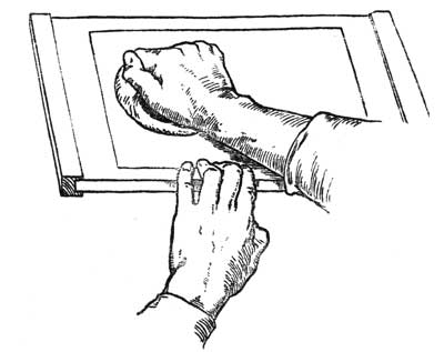
Fig. 22.—Manner of using the baren.
When the block has been printed on[Pg 74] the whole batch, the sheets should be replaced at once between the boards before one prepares for the colour impressions. Usually the paper will be too dry for colour by this time: if this is so, the damping sheets should be moistened and put in again as before; one to each three printing sheets. In a minute or two they will have damped the paper sufficiently and must be taken out, leaving the printing sheets to stand, between the boards, ready for the first colour-block.
When the block has been printed on[Pg 74] the entire batch, the sheets should be replaced immediately between the boards before preparing for the color impressions. By this time, the paper is usually too dry for color. If that’s the case, the damping sheets should be moistened and placed back in as before, one for every three printing sheets. After a minute or two, they will have dampened the paper enough and need to be taken out, leaving the printing sheets resting between the boards, ready for the first color block.
PRINTING FROM COLOUR-BLOCKS
In printing colour the paper may be slightly damper than it should be for key-block impressions, and a heavier pressure is necessary on the baren if the colour masses are large. If the baren is pressed lightly the colour will not completely cover the paper, but will leave a dry, granular texture. Occasionally this quality may be useful, but as a rule a smooth, evenly printed surface is best. It will be found that smooth,[Pg 75] even printing is not obtained by loading the block with colour or paste, but by using the least possible quantity of both, and nearly dry paper.
In color printing, the paper might be slightly wetter than ideal for key-block prints, requiring more pressure on the baren if the color areas are large. If the baren is pressed lightly, the color won't fully cover the paper, resulting in a dry, grainy texture. Sometimes this effect can be beneficial, but generally, a smooth, evenly printed surface is preferable. You'll find that smooth, even printing isn’t achieved by loading the block with a lot of color or paste, but rather by using a minimal amount of both and nearly dry paper.[Pg 75]
In beginning to print from a colour-block, care should be taken to moisten the block fully before printing, or it will not yield the colour from its surface; but the block must be wiped, and not used while actually wet.
In starting to print from a color block, you should make sure to moisten the block completely before printing, or it won't release the color from its surface; however, the block must be wiped and not used while it’s still wet.
The printing proceeds exactly as in the case of the key-block, except for the heavier use of the baren. The paste should be added after the colour has been roughly brushed on to the block, and then the two are smoothly brushed together. The Japanese printers put the paste on to the block by means of a little stick kept in the dish of paste. Experience will soon show the amount of paste needed. It is important neither to add too much nor to stint the paste, as the colour when dry depends on the paste for its quality. Too little paste gives a dead effect.
The printing process is just like with the key-block, except you use the baren more heavily. You should add the paste after roughly brushing the color onto the block, then smoothly mix the two together. Japanese printers apply the paste to the block using a small stick kept in the paste dish. With experience, you'll quickly learn how much paste is needed. It's crucial not to use too much or too little paste, since the quality of the dry color relies on the paste. Using too little paste can result in a flat appearance.
Some of the colours print more easily[Pg 76] than others. With a sticky colour it is well to wipe the block with a nearly dry sponge between each impression, so that the wood gives up its colour more readily. In the case of a very heavy colour such as vermilion a drop of glue and water may help; but with practically all the colours that are generally used the rice paste and careful printing are enough.
Some colors print more easily[Pg 76] than others. For a sticky color, it's best to wipe the block with a nearly dry sponge between each impression, so the wood releases its color more easily. For very thick colors like vermilion, adding a drop of glue and water might help; however, for almost all the colors that are usually used, rice paste and careful printing are sufficient.
The amount of size in the paper is another important factor in the printing of colour. If the paper is too lightly sized the fibres will detach themselves and stick to the damp block. Or if too heavily sized the paper will not take up the colour cleanly from the block, and will look hard when dry. One very soon feels instinctively the right quality and condition of the block, colour, and paper which are essential to good printing; and to print well one must become sensitive to them.
The amount of sizing in the paper is another important factor in color printing. If the paper is lightly sized, the fibers will pull away and stick to the damp block. If it's too heavily sized, the paper won’t absorb the color smoothly from the block, and it will look harsh when dry. You quickly develop an instinct for the right quality and condition of the block, color, and paper that are essential for good printing; to print well, you need to be attuned to these elements.
PRINTING OF GRADATIONS
Beside the printing of flat masses of colour, one of the great resources of[Pg 77] block printing is in the power of delicate gradation in printing. The simplest way of making a gradation from strong to pale colour is to dip one corner of a broad brush into the colour and the other corner into water so that the water just runs into the colour: then, by squeezing the whole width of the brush broadly between the thumb and forefinger so that most of the water is squeezed out, the brush is left charged with a tint gradated from side to side. The brush is then dipped lightly into paste along its whole edge, and brushed a few times to and fro across the block where the gradation is needed. It is easy in this way to print a very delicately gradated tint from full colour to white. If the pale edge of the tint is to disappear, the block should be moistened along the surface with a sponge where the colour is to cease.
Along with printing solid blocks of color, one of the key advantages of block printing is its ability to create delicate gradations in color. The easiest way to achieve a shift from strong to light color is to dip one corner of a wide brush into the color and the opposite corner into water, allowing the water to blend into the color. By squeezing the entire width of the brush evenly between your thumb and forefinger, most of the water is removed, leaving the brush with a gradient from one side to the other. Next, dip the brush lightly into paste along its edge, then brush it a few times back and forth across the block where you want the gradation. This method allows you to print a beautifully subtle tint that transitions from full color to white. If you want the lighter edge of the tint to fade out, you should moisten the block's surface with a sponge where the color should end.
A soft edge may be given to a tint with a brush ordinarily charged if the block is moistened with a clean sponge at the part where the tint is to cease.[Pg 78] This effect is often seen at the top of the sky in a Japanese landscape print where a dark blue band of colour is printed with a soft edge suddenly gradated to white, or sometimes the plumage of birds is printed with sudden gradations. In fact, the method may be developed in all kinds of ways. Often it is an advantage to print a gradation and then a flat tone over the gradation in a second printing.
A soft edge can be achieved with a brush that's usually loaded with paint if the area where the color should fade is dampened with a clean sponge. [Pg 78] This effect is commonly seen at the top of the sky in a Japanese landscape print, where a dark blue band of color transitions smoothly to white, or sometimes in the feathers of birds that feature sudden gradations. In fact, the technique can be adapted in many different ways. It’s often beneficial to print a gradient first and then apply a flat color over the gradient in a second pass.
OFFSETTING
No care need be taken to prevent "offsetting" of the colour while printing. The prints may be piled on the top of each other immediately as they are lifted from the block, without fear of offsetting or marking each other. Only an excessive use of colour, or the leaving of heavy ridges of colour at the edges of the block by careless brushing, will sometimes mark the next print on the pile. As in printing the key-block, it is well to hold the brush quite upright for the last strokes across the block, and always to give a full stroke across the whole length or width of the form to be coloured.[Pg 79]
No special care is needed to avoid "offsetting" the color while printing. The prints can be stacked on top of each other right after being lifted from the block without worrying about them marking each other. Only when there’s too much color used, or if heavy streaks of color are left at the edges of the block due to careless brushing, might the next print in the pile get marked. Just like with printing the key block, it's important to hold the brush straight up for the final strokes across the block and always to make a full stroke across the entire length or width of the area being colored.[Pg 79]
As soon as one colour-block has been printed, the next may be taken and printed at once, without fear of the colour running, even though the fresh colour touches the parts already printed.
As soon as one color block has been printed, the next can be taken and printed right away, without worrying about the color bleeding, even if the new color touches the areas that have already been printed.
One by one each colour-block is printed in this way until the batch of paper has been passed over the whole set of blocks composing the design of the print. There may sometimes be an advantage in not printing the key-block first, though as a rule it should come first for the sake of keeping the later blocks in proper register. If the key-block is not printed one cannot see how the colour-blocks are fitting. But in the case of a sky with perhaps two or even three printings—a gradation and a flat tone or two gradations—there is danger of blurring the lines of the key-block, so that in such a case the sky should be printed first, and then the key-block followed by the remaining colour-blocks.
One by one, each color block is printed like this until the entire batch of paper has gone over all the blocks that make up the design of the print. Sometimes, it might actually be better not to print the key block first, but generally, it should be printed first to keep the later blocks aligned properly. If the key block isn’t printed, you can’t see how the color blocks are fitting together. However, in cases where the sky has maybe two or even three printings—a gradient and a flat tone or two gradients—there’s a risk of smudging the lines of the key block. So in those cases, the sky should be printed first, then the key block, followed by the remaining color blocks.
At the end of a day's printing the prints may quite safely be left standing[Pg 80] together between the boards until the next day. For three days the damp paper comes to no harm, except in hot weather, but on the fourth day little red spots of mould begin to show and spread. It should be remembered that freshly boiled paste is to be used each day.
At the end of a day's printing, the prints can be safely left stacked together between the boards until the next day[Pg 80]. For three days, the damp paper is fine, except in hot weather, but by the fourth day, small red spots of mold start to appear and spread. It's important to remember to use freshly boiled paste each day.
DRYING OF PRINTS
When the prints are finished they should be put to dry as soon as possible. If they are spread out and left exposed to the air they will soon dry, but in drying will cockle, and cannot then be easily pressed flat. It is better to have a number of mill-boards or absorbent "pulp" boards rather larger than the prints, and to pile the prints and boards alternately one by one, placing a weight on the top of the pile. The absorbent boards will rapidly dry the prints and keep them quite flat.
When the prints are done, they should be dried as quickly as possible. If they are laid out and left open to the air, they'll dry soon but can warp, making it difficult to press them flat later. It's better to have several millboards or absorbent "pulp" boards that are slightly larger than the prints, and to stack the prints and boards alternately, one by one, putting a weight on top of the stack. The absorbent boards will dry the prints quickly and keep them nice and flat.
Finished prints should be numbered for reference, and should, if printed by the artist himself, also bear his signature[Pg 81] —or some printed sign to that effect. The number of prints obtainable from a set of blocks is difficult to estimate. The Japanese printers are said to have made editions of several thousands from single sets of blocks. The actual wear in printing even of a fine line block is imperceptible, for the pressure is very slight. Certainly hundreds of prints can be made without any deterioration. But an artist who is both designing and producing his own work will not be inclined to print large editions.[5]
Finished prints should be numbered for reference, and if printed by the artist themselves, they should also have their signature[Pg 81] —or some printed indication of that. It's hard to estimate how many prints can be made from a set of blocks. Japanese printers are known to have produced editions of several thousands from a single set of blocks. The actual wear from printing even a fine line block is barely noticeable, since the pressure used is very light. Certainly, hundreds of prints can be produced without any significant decline in quality. However, an artist who is both designing and producing their own work is unlikely to want to print large editions.[5]
CHAPTER VII
Principles and Main Considerations in designing Wood-block Prints—Their Application to Modern Colour Printing
Until one has become quite familiar with the craft of wood-block printing it is not possible to make a satisfactory design for a print, or to understand either the full resources that are available or the limits that are fixed.
Until you’re really familiar with the craft of wood-block printing, you can’t create a good design for a print, nor can you grasp all the resources available or the limits that are set.
In beginning it is well to undertake only a small design, so that no great amount of material or time need be consumed in gaining the first experience, but this small piece of work should be carried through to the end, however defective it may become at any stage. A small key-block and two or three colour patches may all be cut on[Pg 83] the two sides of one plank for this purpose.
At the start, it's best to take on a small project, so you don’t use up too much material or time while getting your first experience. However, it's important to see this small task through to completion, no matter how imperfect it turns out at any point. You can cut a small key-block and a couple of color patches on[Pg 83] both sides of a single plank for this.
There is great diversity of opinion as to the conventions that are appropriate to the designing of colour prints. In the work of the Japanese masters the convention does not vary. A descriptive black or grey line is used throughout the design, outlining all forms or used as flat spots or patches. The line is not always uniform, but is developed with great subtlety to suggest the character of the form expressed, so that the subsequent flat mass of colour printed within the line appears to be modelled. This treatment of the line is one of the great resources of the work, and is special to this kind of design, in which the line has to be cut with the knife on both sides, and is for this reason capable of unusual development in its power of expressing form. Indeed the knife is the final instrument in the drawing of the design.
There is a wide range of opinions about the conventions suitable for designing color prints. In the works of Japanese masters, the convention remains consistent. A descriptive black or gray line is used throughout the design, outlining all forms or applied as flat spots or patches. The line isn’t always uniform, but it is developed with great finesse to suggest the character of the form expressed, making the subsequent flat mass of color printed within the line appear to have depth. This approach to the line is one of the key strengths of the work and is unique to this style of design, where the line must be cut with the knife on both sides, allowing for exceptional development in its ability to convey form. Indeed, the knife is the ultimate tool in creating the design.
The designing of a print depends most of all upon this development of line and black mass in the key-block. The colour pattern of the print is held together by it, and the form suggested. In the Japanese prints the key-block is invariably printed black or grey. Masses intended to be dense black in the finished print are printed first a flat grey by the key-block, and are then printed a full black from a colour-block like any other patch of colour, the double printing being necessary to give the intensity of the black.
The design of a print relies heavily on the development of line and black mass in the key-block. It holds the color pattern of the print together and suggests the form. In Japanese prints, the key-block is always printed in black or grey. Areas meant to be a solid black in the final print are first printed in a flat grey by the key-block and then printed in full black from a color-block, just like any other color patch. This double printing is necessary to achieve the richness of the black.
Although several modern prints have been designed on other principles, and sometimes a coloured key-block is successfully used, yet the convention adopted by the Japanese is the simplest and most fundamental of all. Outside its safe limitations the technical difficulties are increased, and one is led to make compromises that strain the[Pg 85] proper resources of block printing and are of doubtful advantage.
Although several modern prints have been created based on different principles, and sometimes a colored key block is successfully used, the convention adopted by the Japanese remains the simplest and most fundamental of all. Outside of its safe boundaries, the technical challenges increase, leading to compromises that stretch the proper resources of block printing and provide questionable benefits.
The temptation to use colour with the key-block comes when one attempts to use the key-block for rendering light and shadow. Its use by the Japanese masters was generally for the descriptive expression of the contours of objects, ignoring entirely their shadows, or any effects of light and shade, unless a shadow happened occasionally to be an important part of the pattern of the design. Generally, as in nearly all the landscape prints by Hiroshigé, the line is descriptive or suggestive of essential form, not of effects in light and shade.
The temptation to use color with the key-block arises when you try to use the key-block to show light and shadow. Japanese masters typically used it to express the contours of objects, completely ignoring their shadows or any effects of light and shade, unless a shadow was an essential part of the design pattern. Generally, as seen in almost all of Hiroshige's landscape prints, the lines are descriptive or suggestive of the essential form, not focused on light and shade effects.
If the key-block is used for light and shade, the question of relative tones and values of shadows arises, and these will be falsified unless a key-block is made for each separate plane or part of the design, and then there is danger of confusion or of compromises that are beyond the true scope of the work.
If the key-block is used for light and shadow, the issue of relative tones and values of shadows comes up, and these will be distorted unless a key-block is created for each individual plane or section of the design. This also risks creating confusion or compromises that go beyond the genuine intent of the work.
It is generally safest to print the key-block in a tone that blends with the[Pg 86] general tone of the print, and not to use it as a part of the colour pattern. It serves mainly to control the form, leaving the colour-blocks to give the colour pattern. There are cases, of course, where no rule holds good, and sometimes a design may successfully omit the key-block altogether, using only a few silhouettes of colour, one of which controls the main form of the print, and serves as key-block. Frequently, also, the key-block may be used to give the interior form or character of part of a design, leaving the shape of a colour-block to express the outside shape or contour; as in the spots suggesting foliage in the print on page 114. The shapes of the tree forms are partly left to the colour-block to complete, the key only giving the suggestion of the general broken character of the foliage, not the outside limits of the branches. The outer shape of a tree or branch is rarely expressed by an enclosing line in any of the Japanese prints. The key-block is often used to describe interior form when a silhouette[Pg 87] of colour is all that is needed for the contour. The expressive rendering of the rough surface of tree trunks and of forms of rock, or the articulation of plants and the suggestion of objects in atmospheric distance or mist, should be studied in good prints by the Japanese masters. In printed work by modern masters—as, for example, the work of the great French designers of poster advertisements—much may be learnt in the use and development of expressive line.
It’s generally safest to print the key-block in a tone that blends with the[Pg 86] overall tone of the print, rather than using it as part of the color pattern. Its main purpose is to define the form, while the color-blocks are responsible for the color pattern. Of course, there are exceptions, and sometimes a design can successfully do without the key-block entirely, using just a few color silhouettes, one of which defines the main form of the print and acts as the key-block. Additionally, the key-block may be used to convey the internal form or character of a part of the design, leaving the color-block to express the outer shape or contour; for instance, in the spots that suggest foliage on the print on page 114. The shapes of the tree forms are partially completed by the color-block, with the key providing only an indication of the general fragmented look of the foliage, not the outer edges of the branches. The outer shape of a tree or branch is rarely defined by an enclosing line in any Japanese prints. The key-block is often used to detail the internal form when a silhouette[Pg 87] of color suffices for the contour. The expressive depiction of the rough texture of tree trunks and rock formations, as well as the detailing of plants and the suggestion of objects in atmospheric distance or fog, should be studied in quality prints by Japanese masters. In modern prints by contemporary masters—like the work of notable French poster designers—much can be learned about the use and development of expressive line.
The Japanese system of training is well described in a book by Henry P. Bowie on "The Laws of Japanese Painting," in which many useful suggestions are given with reference to graphic brush drawing and the suggestive use of line and brush marks.
The Japanese training method is thoroughly explained in a book by Henry P. Bowie titled "The Laws of Japanese Painting," which offers many helpful tips regarding graphic brush drawing and the effective use of lines and brush strokes.
As part of the training of a designer for modern decorative printing, the experience and sense of economy that are to be gained from the study of wood-block printing are very great. Perhaps no work goes so directly to the essentials[Pg 88] of the art of decorative designing for printed work of all kinds. The wood blocks not only compel economy of design, but also lead one to it.
As part of a designer's training in modern decorative printing, the insights and sense of economy gained from studying wood-block printing are invaluable. No other work addresses the fundamentals of decorative design for printed materials as directly. Wood blocks not only require efficient design but also encourage it.
Even as a means of general training in the elements of decorative pictorial composition the wood blocks have great possibilities as an adjunct to the courses of work followed by art students. The same problems that arise in all decoration may be dealt with by their means on a small scale, but under conditions that are essentially instructive. Colour schemes may be studied and worked out with entire freedom by printing and reprinting until a problem is thoroughly solved. A colour design may be studied and worked out as fully by means of a small set of blocks, and with more freedom for experiment and alteration than is possible by the usual methods of study, such as painting and repainting on paper or canvas or wall; for the form being once established by the blocks, the colour may be reconstructed again and again without limit.[Pg 89]
Even as a way to get general training in the basics of decorative pictorial composition, wood blocks have great potential as a supplement to the courses that art students take. The same challenges that come up in all decoration can be addressed using them on a smaller scale, but in ways that are very educational. Color schemes can be explored and developed freely by printing and reprinting until the issue is completely resolved. A color design can be studied and developed just as fully with a small set of blocks, allowing for more freedom to experiment and make changes than with traditional methods of study, like painting and repainting on paper, canvas, or wall; once the form is established by the blocks, the color can be reconstructed over and over without limits.[Pg 89]
The craft has thus not only its special interest as a means of personal expression, but also a more general use as a means of training and preparation for the wider scope and almost unlimited resources of modern printing. The best use of those resources will be made by artists who have been trained under simpler conditions, and have found their way gradually to an understanding of the secrets of æsthetic economy in printing. One of the many paths to that experience is by way of the craft of the wood-block printer.[Pg 90]
The craft not only serves as a unique form of personal expression but also has a broader purpose as a way to train and prepare for the vast possibilities and almost limitless resources of modern printing. The most effective use of those resources will come from artists who have learned under simpler conditions and have gradually gained an understanding of the principles of aesthetic efficiency in printing. One of the various ways to gain that experience is through the craft of wood-block printing.[Pg 90]
CHAPTER VIII
Co-operative Printing
A print is shown at the end of this book (page 95) as an example of a first experiment in co-operative printing. An actual print was needed to illustrate the method of block printing, and the number required was too great for a single printer to undertake. So the work was divided between four printers (of whom the writer was one), working together. Each of us had been accustomed to print our own prints in small batches of a dozen or two at a time, giving individual care to each print. The printing of 2000 prints to a fixed type was a very different matter, and proved an instructive and valuable experience. It was found that the printing of a large number of successive impres[Pg 91]sions gave one an increasingly delicate control of a block, and a high percentage of perfect impressions. After the initial experiments and practice, the failures in the later batches of the print were reduced to only 4 or 5 per cent. of the completed prints. The work was done in batches of 250 prints, each print receiving eight impressions, as shown on pages 98-109. Each of the four printers took charge of a particular series of the blocks, which were printed in a regular order. It was found most convenient to print the key-block last of all, as the heavy blacks in it were inclined to offset under the pressure of the baren and slightly soil the colour-blocks, if the key-block was printed first, as is usually the practice.
A print is shown at the end of this book (page 95) as an example of an initial experiment in cooperative printing. An actual print was needed to demonstrate the method of block printing, and the required number was too high for a single printer to manage. So, the work was split among four printers (including the author), collaborating together. Each of us was used to printing our own pieces in small batches of a dozen or so at a time, giving individual attention to each print. Printing 2000 prints in a fixed type was a completely different challenge and turned out to be an informative and valuable experience. It was discovered that creating a large number of successive impressions gave us increasingly precise control over a block, resulting in a high percentage of flawless prints. After the initial trials and practice, the mistakes in the later batches were reduced to only 4 or 5 percent of the completed prints. The work was done in batches of 250 prints, with each print receiving eight impressions, as shown on pages 98-109. Each of the four printers was responsible for a specific series of blocks, which were printed in a consistent order. It was found to be most convenient to print the key block last, as the heavy blacks in it tended to smudge under the pressure of the baren and slightly dirty the color blocks if the key block was printed first, as is typically done.
The colour-blocks were printed in the order in which they are placed in the Appendix.
The color blocks were printed in the order they appear in the Appendix.
The best quality of work was done on nearly dry paper. The damping sheets were placed among the new paper at the end of the day's work and removed after ten or fifteen minutes, the printing[Pg 92] paper then was left standing over night between boards, ready for work in the morning, and was not damped again until after receiving several impressions. Then it was very slightly damped again by means of a damping sheet to every ten or twelve prints placed there for a very few minutes.
The highest quality work was done on almost dry paper. The damping sheets were inserted among the new paper at the end of the day and taken out after ten to fifteen minutes. The printing[Pg 92] paper was then left to sit overnight between boards, ready for use in the morning, and wasn’t dampened again until after getting several impressions. After that, it was only slightly dampened again with a damping sheet for every ten to twelve prints, and this was done for just a few minutes.
As one printer finished the impressions from one of his blocks, the batch of papers was passed on to the others, each in turn. In this way three batches of 250 were printed without haste in one week, working eight hours a day for five and a half days.
As one printer completed the prints from his block, the stack of papers was handed off to the others, one after another. This way, three batches of 250 were printed without rushing over the course of a week, working eight hours a day for five and a half days.
The chief difficulty experienced was in keeping to the exact colour and quality of the type print, each printer being inclined to vary according to individual preferences. To counteract this tendency, it is necessary for one individual to watch and control the others in these respects.
The main challenge faced was maintaining the exact color and quality of the type print, as each printer tended to make adjustments based on personal preferences. To address this issue, it's essential for one person to supervise and manage the others in these areas.
Otherwise the work proceeded easily and made very clear the possibilities of the craft for the printing of large numbers[Pg 93] of prints for special purposes where the qualities required are not obtainable by machine printing. Obviously the best results will always be obtained by the individual printing of his own work by an artist. This can only be done, however, in comparatively small numbers, yet the blocks are capable of printing very large quantities without deterioration. The set of blocks used for the example given here showed very little deterioration after 4000 impressions had been taken. The key-block was less worn than any, the pressure being very slight for this block, and the ink perfectly smooth. The impression of which a reproduction is given on page 109 was taken after 4000 had been printed from the key-block. Block No. 2 was much more worn by the gritty nature of the burnt sienna used in its printing. It would be an easy matter, however, to replace any particular colour-block that might show signs of wear in a long course of printing.
Otherwise, the work moved along smoothly and clearly demonstrated the potential of the craft for producing large quantities of prints for specific purposes where the needed qualities can’t be achieved through machine printing. Clearly, the best results will always come from an artist printing their own work. However, this can only be done in relatively small numbers, yet the blocks can print very large quantities without losing quality. The set of blocks used for the example here showed very little wear after 4000 impressions were made. The key block was less worn than the others, as the pressure on this block was minimal and the ink was perfectly smooth. The impression shown on page 109 was made after 4000 had been printed from the key block. Block No. 2 was more worn due to the gritty nature of the burnt sienna used in its printing. However, it would be easy to replace any specific color block that might show signs of wear after extensive printing.
Other examples given in the Appendix[Pg 94] show qualities and methods of treatment that are instructive or suggestive.
Other examples provided in the Appendix[Pg 94] illustrate qualities and treatment methods that are educational or inspiring.
No. 6 is the key impression of a Japanese print in which an admirable variety of resource is shown by its design; the character of each kind of form being rendered by such simple yet so expressive indications. It is instructive to study the means by which this is done, and to notice how interior form is sometimes suggested by groups of spots or black marks of varied shape while the indication of the external form is left entirely to the shape of the colour-block subsequently to be printed.
No. 6 is the key impression of a Japanese print that showcases an impressive variety of resources through its design; the nature of each type of form is expressed with such simple yet highly effective hints. It's insightful to examine how this is achieved and to observe how the inner form is sometimes suggested by clusters of spots or irregular black marks, while the outer form is completely determined by the shape of the color block that will be printed later.
Plate XVI is a reproduction of a print by Hiroshigé and shows the suggestive use of the key-block in rendering tree forms. Plates XVII and XVIII show in greater detail this kind of treatment.
Plate XVI is a reproduction of a print by Hiroshigé and illustrates the effective use of the key-block in depicting tree shapes. Plates XVII and XVIII provide a more detailed view of this technique.
Plates XXIII-XXIV are key-blocks of modern print designs.[Pg 95]
Plates XXIII-XXIV are essential blocks for modern print designs.[Pg 95]
APPENDIX
An original print in colour, designed and cut by the author and printed by hand on Japanese paper, followed by collotype reproductions showing the separate impressions of the colour blocks used for this print, and other collotype reproductions of various examples of printing and design.
An original color print, created and carved by the author and printed by hand on Japanese paper, followed by collotype reproductions showcasing the individual impressions of the color blocks used for this print, along with other collotype reproductions of various examples of printing and design.
| The particulars given in Chapter VIII on co-operative printing refer specially to the original print included in the first edition. In this edition an entirely new print is shown, and only 1,000 copies of it are being published. |

Plate VIII.—An original Print designed and cut by the Author, printed by hand on Japanese paper.
| Plates originally printed in collotype are now produced in half-tone |

Plate IX.—First printing. Key block. Black.

Plate X.—Second printing. Dull Red. Printed lightly at the top.

Plate XI.—Third printing. Deep Blue. Strong at the bottom, paler at the top.

Plate XII.—Fifth printing. Bright Orange.
(The fourth printing, not shown, is a similar small block, printing a faint tone over the road in the foreground.)

Plate XIII.—Sixth printing. Indian Red. Gradation.

Plate XIV.—Seventh printing. Green. Printed flat.

Plate XV.—Eighth printing. Bluish green. Gradation.

Plate XVI.—Reproduction of a colour print by Hiroshigé.

Plate XVII.—Reproduction of a portion of the print shown on the preceding page, actual size, showing the treatment of the foliage and the expressive drawing of the tree trunk and stems.

Plate XVIII.—Reproduction of another portion of the print shown on page 111 (actual size), showing the expressive use of line in the drawing of the distant forms.

Plate XIX.—Reproduction of a colour print by Hiroshigé.

Plate XX.—Reproduction of a portion (actual size) of the print on the preceding page, showing treatment of tree forms and distance.

Plate XXI.—Reproduction of a colour print by Hiroshigé.

Plate XXII.—Reproduction of a portion (actual size) of the print on the preceding page, showing treatment of tree and blossom.

Plate XXIII.—The Tiger. Reproduction of a colour print by J. D. Batten.

Plate XXIV.—Lapwings. Reproduction of a colour print by A. W. Seaby.
BOOKS OF REFERENCE
"Tools and Materials illustrating the Japanese Method of Colour Printing." A descriptive catalogue of a collection exhibited in the Victoria and Albert Museum, London. Price Twopence. Victoria and Albert Museum Catalogues. 1913.
"Tools and Materials showcasing the Japanese Method of Color Printing." A descriptive catalog of a collection displayed at the Victoria and Albert Museum, London. Price Two Pence. Victoria and Albert Museum Catalogs. 1913.
"The Colour Prints of Japan." By Edward F. Strange. The Langham Series of Art Monographs. London.
"The Colour Prints of Japan." By Edward F. Strange. The Langham Series of Art Monographs. London.
"Japanese Colour Prints." By Edward F. Strange. (3rd Edition.) Victoria and Albert Museum Handbooks. London.
"Japanese Colour Prints." By Edward F. Strange. (3rd
"Japanese Wood Engravings." By William Anderson, F. R. C. S. London, Seeley & Co., Ltd. New York, Macmillan & Co. 1895.
"Japanese Wood Engravings." By William Anderson, F. R. C. S. London, Seeley & Co., Ltd. New York, Macmillan & Co. 1895.
"Japanese Wood-cutting and Wood-cut Printing." By T. Tokuno. Edited and annotated by S. R. Kochler. Report of the Smithsonian Institution, Washington, for the year ending June 30, 1892. Issued in pamphlet form by the U.S.A. National Museum, Washington. 1893.
"Japanese Wood-cutting and Wood-cut Printing." By T. Tokuno. Edited and annotated by S. R. Kochler. Report of the Smithsonian Institution, Washington, for the year ending June 30, 1892. Issued in pamphlet form by the U.S.A. National Museum, Washington. 1893.
Other works containing descriptions and references to the craft of wood-block printing in the Art Library at the Victoria and Albert Museum, London, are the following:—
Other works that describe and reference the craft of wood-block printing in the Art Library at the Victoria and Albert Museum, London, include the following:—
"The Industries of Japan." By J. J. Rein. (Paper, pp. 389.) London. 1889.
"The Industries of Japan." By J. J. Rein. (Paper, pp. 389.) London. 1889.
"Bungei Ruisan," By Yoshino Sakakibara. Essays on Japanese literature, with additional chapters describing the manufacture of paper and the processes of printing and engraving. (The Museum copy has MS. translations of the portion relating to engraving.) Tokyo. 1878.[Pg 130]
"Bungei Ruisan," by Yoshino Sakakibara. Essays on Japanese literature, with extra chapters detailing how paper is made and the methods of printing and engraving. (The museum copy includes handwritten translations of the parts about engraving.) Tokyo. 1878.[Pg 130]
[4] See CHAPTER VIII for further experience on this point.
[4] Check out CHAPTER VIII for more insights on this topic.
[5] Further experience on this point is given in CHAPTER VIII on Co-operative Printing.
[5] More insight on this topic can be found in CHAPTER VIII on Co-operative Printing.
INDEX
Alum, 50
Andreani, Andrea, xi
Baldung, Hans, x
Bamboo-sheath, 62
Baren, 11, 61, 62
Baren, manner of using, 72
Baren, to re-cover, 63, 64
Baren, to re-cover (diagram), 64
Batches, size of, 89
Batten, J. D., 2
Block cutting, materials, 17
Blocks, cutting of, 17, 23
Blocks, mounting of, 18
Blocks, planning of, 23
Books of reference, 129
Bowie, Henry P., 86
British Museum Print Room, 43
Brushes, 65
Brushes, drawing of, 66
Carborundum stone, 21
Cherry wood, 17
Chiaroscuro, x
Chinese ink, 55
Chisel, grip of, 34, 35
Chisels, 20
Clearing of spaces, 33
Clearing of wood between knife cuts, 35
Colour, 56
Colour block, diagram of section, 42
Colour blocks, plan of, 39
Colour blocks, planning, 40, 41
Colour blocks, printing from, 73
Colour design, 87
Commercial development, 5
Conventions of design, 82
Co-operative printing, 89
Craft in Japan, 61
Craftsmen, training of, 24
Cranach, Lucas, x
Crane, Walter, ix
Creasote, 56
Cutting, 25
Da Carpo, Ugo, x
Damping, 14
Damping sheets, 51
Design, 27
Design, conventions in, 82
Designing, 81
Designing wood-block prints, principles of, 81
Design of key-block, 26
Diagram of knife cuts, 33
Drying of colour, 77
Drying of prints, 79
Errors of register, 43
[Pg 131]Eve and the Serpent, print of, 2
Flat treatment, 26, 27
Foliage, 85
Gelatine, 48
Giles, William, 65
Glue solution with colour, 58, 75
Gouge, method of holding, 35
Gradations, printing of, 75
Grip of chisel, 34, 35
Hands, position of, in cutting, 30, 31
Herkomer, ix
Hiroshigé, 84
Impressions, possible number of, 92
Ink, 54
Inking of block, 69
Ink, preservative for, 56
Italian woodcuts, ix
Jackson, T. B., xii
Japan, craft in, 4, 23
Japanese blocks, 43
Japanese craftsmen, 61
Japanese drawing, 27
Japanese key-block, 33
"Japanese Painting, The Laws of," 86
Japanese paper, 54
Japanese printers, 52, 80
Japanese prints, 83
Key-block, 25, 27, 84, 85
Key-block impressions, 5, 26, 33
Knife, 19
Knife, drawing of, 19
Knife, use of, 24
Knife cuts, diagram of, 33
"Laws of Japanese Painting," 86
Light and shade, 85
Line block, cutting of, 32
Line, development of, 32
Line of key-block, 26
Mallet, 21
Mallet, drawing of, 21
Mantegna, xi
Millboards for drying, 79
Modern prints, 83
Mordant, alum as, 50
Mould, 79
Mulberry fibre, 47
Museums, sets of blocks at, 43
Number of impressions, 92
Offsetting, 71, 77
Oilstones, 21
Orlik, Prof. Emil, 7
Outamaro, 24
Pad, 61
Paper, 47
Paper, damping of, 51
Paper, manner of holding, 70
Paper, mould in, 79
Paper, need of white, 54
Paper, sizing of, 48
Paper, sizing of (drawing), 49
Paste, 58
Paste, amount used in printing, 74
Paste, preparation of, 59
Plank, preparation of, 18
Planning of blocks, 24
Position of hands, 30, 31
Posters, 86, 87
Printing, 67
Printing, co-operative, 89
Printing, detailed method of, 61
Printing from colour blocks, 73
Printing, general description of, 9
[Pg 132]Printing of gradations, 75, 76, 77
Printing pad, 62
Prints, designing, 81
Prints, drying of, 79
Register, 71, 78
Register, errors of, 41, 43
Register marks, 36, 37, 42
Register marks, position of, 37
Register marks, section of, 38
Rice flour, 59
Rice paste, 58
Rubber, glass, 65
Rubber, printing, 61
Shadows, treatment of, 85
Shallow cuts, 34
Shrinking of paper, 41
Siberian bear hair brushes, 66
Size, amount of, in paper, 75
Size, excess of, 75
Sizing of paper, 48, 49
Smithsonian Institution pamphlet, 2
South Kensington Museum, 43
Spots in paper, 79
Table, plan of, 11
Tokuno, T., 2
Tools for block-cutting, 19
Training of designers, 86
Treatment of form, 93
Tree-forms, 85, 93
Variety of line, 82, 83
Washita oilstone, 22
Wood, 17
Woodcuts, Italian, ix.
Work-table, plan of, 11
Alumni, __A_TAG_PLACEHOLDER_0__
Andreani, Andrea, __A_TAG_PLACEHOLDER_0__
Baldung, Hans, __A_TAG_PLACEHOLDER_0__
Bamboo sheath, __A_TAG_PLACEHOLDER_0__
Barless, __A_TAG_PLACEHOLDER_0__, __A_TAG_PLACEHOLDER_1__, __A_TAG_PLACEHOLDER_2__
Baren, method of use, __A_TAG_PLACEHOLDER_0__
Baren, to recover, __A_TAG_PLACEHOLDER_0__, __A_TAG_PLACEHOLDER_1__
Baren, to re-cover (diagram), __A_TAG_PLACEHOLDER_0__
Batch size, __A_TAG_PLACEHOLDER_0__
Batten, J. D., __A_TAG_PLACEHOLDER_0__
Block cutting, materials, __A_TAG_PLACEHOLDER_0__
Cutting blocks, __A_TAG_PLACEHOLDER_0__, __A_TAG_PLACEHOLDER_1__
Mounting blocks, __A_TAG_PLACEHOLDER_0__
Planning blocks, __A_TAG_PLACEHOLDER_0__
Reference books, __A_TAG_PLACEHOLDER_0__
Bowie, Henry P., __A_TAG_PLACEHOLDER_0__
British Museum Print Room, __A_TAG_PLACEHOLDER_0__
Brushes, __A_TAG_PLACEHOLDER_0__
Drawing brushes, __A_TAG_PLACEHOLDER_0__
Carborundum stone, __A_TAG_PLACEHOLDER_0__
Cherry wood, __A_TAG_PLACEHOLDER_0__
Chiaroscuro, __A_TAG_PLACEHOLDER_0__
Chinese ink, __A_TAG_PLACEHOLDER_0__
Chisel, grip of, __A_TAG_PLACEHOLDER_0__, __A_TAG_PLACEHOLDER_1__
Chisels, __A_TAG_PLACEHOLDER_0__
Clearing spaces, __A_TAG_PLACEHOLDER_0__
Removing wood between knife cuts, __A_TAG_PLACEHOLDER_0__
Color, __A_TAG_PLACEHOLDER_0__
Color block, section diagram, __A_TAG_PLACEHOLDER_0__
Color blocks, design of, __A_TAG_PLACEHOLDER_0__
Color blocks, planning, __A_TAG_PLACEHOLDER_0__, __A_TAG_PLACEHOLDER_1__
Color blocks, printing from, __A_TAG_PLACEHOLDER_0__
Color design, __A_TAG_PLACEHOLDER_0__
Commercial development, __A_TAG_PLACEHOLDER_0__
Design conventions, __A_TAG_PLACEHOLDER_0__
Co-op printing, __A_TAG_PLACEHOLDER_0__
Craft in Japan, __A_TAG_PLACEHOLDER_0__
Training of craftsmen, __A_TAG_PLACEHOLDER_0__
Cranach, Lucas, __A_TAG_PLACEHOLDER_0__
Crane, Walter, __A_TAG_PLACEHOLDER_0__
Creosote, __A_TAG_PLACEHOLDER_0__
Cutting-edge, __A_TAG_PLACEHOLDER_0__
Da Carpo, Ugo, __A_TAG_PLACEHOLDER_0__
Damping, __A_TAG_PLACEHOLDER_0__
Damping sheets, __A_TAG_PLACEHOLDER_0__
Design, __A_TAG_PLACEHOLDER_0__
Design conventions in __A_TAG_PLACEHOLDER_0__
Designing, __A_TAG_PLACEHOLDER_0__
Principles of wood-block print design, __A_TAG_PLACEHOLDER_0__
Key-block design, __A_TAG_PLACEHOLDER_0__
Knife cuts diagram, __A_TAG_PLACEHOLDER_0__
Color drying, __A_TAG_PLACEHOLDER_0__
Drying prints, __A_TAG_PLACEHOLDER_0__
Errors in register, __A_TAG_PLACEHOLDER_0__
[Pg 131]Eve and the Serpent, print of, __A_TAG_PLACEHOLDER_0__
Flat treatment, __A_TAG_PLACEHOLDER_0__, __A_TAG_PLACEHOLDER_1__
Foliage, __A_TAG_PLACEHOLDER_0__
Gelatin, __A_TAG_PLACEHOLDER_0__
Giles, William, __A_TAG_PLACEHOLDER_0__
Colored glue solution, __A_TAG_PLACEHOLDER_0__, __A_TAG_PLACEHOLDER_1__
Gouge, gripping technique, __A_TAG_PLACEHOLDER_0__
Gradations, printing of, __A_TAG_PLACEHOLDER_0__
Grip of chisel, __A_TAG_PLACEHOLDER_0__, __A_TAG_PLACEHOLDER_1__
Hand placement for cutting, __A_TAG_PLACEHOLDER_0__, __A_TAG_PLACEHOLDER_1__
Herkomer, __A_TAG_PLACEHOLDER_0__
Hiroshige, __A_TAG_PLACEHOLDER_0__
Possible number of impressions, __A_TAG_PLACEHOLDER_0__
Ink, __A_TAG_PLACEHOLDER_0__
Inking the block, __A_TAG_PLACEHOLDER_0__
Ink, a preservative for, __A_TAG_PLACEHOLDER_0__
Italian woodcuts, __A_TAG_PLACEHOLDER_0__
Jackson, T. B., __A_TAG_PLACEHOLDER_0__
Japan, craft in, __A_TAG_PLACEHOLDER_0__, __A_TAG_PLACEHOLDER_1__
Japanese blocks, __A_TAG_PLACEHOLDER_0__
Japanese artisans, __A_TAG_PLACEHOLDER_0__
Japanese art, __A_TAG_PLACEHOLDER_0__
Japanese key-block, __A_TAG_PLACEHOLDER_0__
"Japanese Painting, The Laws of," __A_TAG_PLACEHOLDER_0__
Japanese paper, __A_TAG_PLACEHOLDER_0__
Japanese printers, __A_TAG_PLACEHOLDER_0__, __A_TAG_PLACEHOLDER_1__
Japanese prints, __A_TAG_PLACEHOLDER_0__
Key-block, __A_TAG_PLACEHOLDER_0__, __A_TAG_PLACEHOLDER_1__, __A_TAG_PLACEHOLDER_2__, __A_TAG_PLACEHOLDER_3__
Key-block prints, __A_TAG_PLACEHOLDER_0__, __A_TAG_PLACEHOLDER_1__, __A_TAG_PLACEHOLDER_2__
Knife, __A_TAG_PLACEHOLDER_0__
Knife drawing, __A_TAG_PLACEHOLDER_0__
Knife use, __A_TAG_PLACEHOLDER_0__
Knife cuts diagram, __A_TAG_PLACEHOLDER_0__
"Laws of Japanese Painting," __A_TAG_PLACEHOLDER_0__
Light and shadow, __A_TAG_PLACEHOLDER_0__
Line block, cutting off, __A_TAG_PLACEHOLDER_0__
Line, development of, __A_TAG_PLACEHOLDER_0__
Line of key block, __A_TAG_PLACEHOLDER_0__
Mallet, __A_TAG_PLACEHOLDER_0__
Mallet drawing, __A_TAG_PLACEHOLDER_0__
Mantegna, __A_TAG_PLACEHOLDER_0__
Drying millboards, __A_TAG_PLACEHOLDER_0__
Modern prints, __A_TAG_PLACEHOLDER_0__
Mordant, alum, __A_TAG_PLACEHOLDER_0__
Mold, __A_TAG_PLACEHOLDER_0__
Mulberry fiber, __A_TAG_PLACEHOLDER_0__
Museums, block sets at, __A_TAG_PLACEHOLDER_0__
Impressions count, __A_TAG_PLACEHOLDER_0__
Offsetting, __A_TAG_PLACEHOLDER_0__, __A_TAG_PLACEHOLDER_1__
Oils stones, __A_TAG_PLACEHOLDER_0__
Orlik, Prof. Emil, __A_TAG_PLACEHOLDER_0__
Outamaro, __A_TAG_PLACEHOLDER_0__
Pad, __A_TAG_PLACEHOLDER_0__
Paper, __A_TAG_PLACEHOLDER_0__
Paper damping, __A_TAG_PLACEHOLDER_0__
Paper, how to hold it, __A_TAG_PLACEHOLDER_0__
Paper, mold in, __A_TAG_PLACEHOLDER_0__
White paper needed, __A_TAG_PLACEHOLDER_0__
Sizing paper, __A_TAG_PLACEHOLDER_0__
Paper sizing (drawing), __A_TAG_PLACEHOLDER_0__
Paste, __A_TAG_PLACEHOLDER_0__
Paste, amount used in printing, __A_TAG_PLACEHOLDER_0__
Paste preparation, __A_TAG_PLACEHOLDER_0__
Plank preparation, __A_TAG_PLACEHOLDER_0__
Block planning, __A_TAG_PLACEHOLDER_0__
Position of hands, __A_TAG_PLACEHOLDER_0__, __A_TAG_PLACEHOLDER_1__
Posters, __A_TAG_PLACEHOLDER_0__, __A_TAG_PLACEHOLDER_1__
Printing, __A_TAG_PLACEHOLDER_0__
Printing, collaborative, __A_TAG_PLACEHOLDER_0__
Printing, a detailed method of, __A_TAG_PLACEHOLDER_0__
Printing from color blocks, __A_TAG_PLACEHOLDER_0__
Printing, overview of, __A_TAG_PLACEHOLDER_0__
[Pg 132]Printing of gradations, __A_TAG_PLACEHOLDER_0__, __A_TAG_PLACEHOLDER_1__, __A_TAG_PLACEHOLDER_2__
Printing pad, __A_TAG_PLACEHOLDER_0__
Prints, design, __A_TAG_PLACEHOLDER_0__
Drying prints, __A_TAG_PLACEHOLDER_0__
Register, __A_TAG_PLACEHOLDER_0__, __A_TAG_PLACEHOLDER_1__
Register, errors of, __A_TAG_PLACEHOLDER_0__, __A_TAG_PLACEHOLDER_1__
Register marks, __A_TAG_PLACEHOLDER_0__, __A_TAG_PLACEHOLDER_1__, __A_TAG_PLACEHOLDER_2__
Position of register marks, __A_TAG_PLACEHOLDER_0__
Registration marks, part of, __A_TAG_PLACEHOLDER_0__
Rice flour, __A_TAG_PLACEHOLDER_0__
Rice flour, __A_TAG_PLACEHOLDER_0__
Rubber, glass, __A_TAG_PLACEHOLDER_0__
Rubber, printing, __A_TAG_PLACEHOLDER_0__
Shadows, management of, __A_TAG_PLACEHOLDER_0__
Shallow cuts, __A_TAG_PLACEHOLDER_0__
Shrinking paper, __A_TAG_PLACEHOLDER_0__
Siberian bear hair brushes, __A_TAG_PLACEHOLDER_0__
Paper size and amount, __A_TAG_PLACEHOLDER_0__
Excess size, __A_TAG_PLACEHOLDER_0__
Paper sizing, __A_TAG_PLACEHOLDER_0__, __A_TAG_PLACEHOLDER_1__
Smithsonian pamphlet, __A_TAG_PLACEHOLDER_0__
South Kensington Museum, __A_TAG_PLACEHOLDER_0__
Spots on paper, __A_TAG_PLACEHOLDER_0__
Table, ___A_TAG_PLACEHOLDER_0__ plan
Tokuno, T., __A_TAG_PLACEHOLDER_0__
Block-cutting tools, __A_TAG_PLACEHOLDER_0__
Designer training, __A_TAG_PLACEHOLDER_0__
Treatment of form, __A_TAG_PLACEHOLDER_0__
Tree shapes, __A_TAG_PLACEHOLDER_0__, __A_TAG_PLACEHOLDER_1__
Variety of styles, __A_TAG_PLACEHOLDER_0__, __A_TAG_PLACEHOLDER_1__
Washita oil stone, __A_TAG_PLACEHOLDER_0__
Wood, __A_TAG_PLACEHOLDER_0__
Italian woodcuts, __A_TAG_PLACEHOLDER_0__.
Work table plan, __A_TAG_PLACEHOLDER_0__
ARTISTS INTERESTED IN THE
:: :: PERMANENCE OF :: ::
THEIR WOOD BLOCK PRINTS
now use the CAMBRIDGE COLOURS only, because
(1) Only Pigments of the HIGHEST ORDER OF PERMANENCE are included in the Cambridge Palette
(1) Only pigments of the HIGHEST ORDER OF PERMANENCE are included in the Cambridge Palette
(2) All the Pigments may be SAFELY MIXED TOGETHER without danger of their acting injuriously on each other
(2) All the Pigments can be SAFELY MIXED TOGETHER without any risk of them harming one another.
(3) All the Pigments are PURE and free from injurious impurities
(3) All the pigments are PURE and free from harmful impurities
SOLE MAKERS
MADDERTON & CO., LTD., Loughton, Essex ENGLAND
(ESTABLISHED 1891)
TELEGRAMS Phone
"MADDERTON, LOUGHTON," ESSEX 63 Loughton
All Tools and Materials for
JAPANESE WOODBLOCK
CUTTING AND PRINTING
as described in this book are stocked by
PENROSE'S
including several new forms of Tools and Brushes
approved by F. Morley Fletcher, Esq.
LIST FREE ON APPLICATION
A. W. PENROSE & CO., LTD.
109 Farringdon Road, London, E.C.1.
Printed by Sir Isaac Pitman & Sons, Ltd., Bath, England[Pg 133]
Printed by Sir Isaac Pitman & Sons, Ltd., Bath, England[Pg 133]
Download ePUB
If you like this ebook, consider a donation!