This is a modern-English version of A Color Notation: A measured color system, based on the three qualities Hue, Value and Chroma, originally written by Munsell, A. H. (Albert Henry).
It has been thoroughly updated, including changes to sentence structure, words, spelling,
and grammar—to ensure clarity for contemporary readers, while preserving the original spirit and nuance. If
you click on a paragraph, you will see the original text that we modified, and you can toggle between the two versions.
Scroll to the bottom of this page and you will find a free ePUB download link for this book.
This text uses utf-8 (unicode) file encoding. If the apostrophes and quotation marks in this paragraph appear as garbage, you may have an incompatible browser or unavailable fonts. First, make sure that the browser’s “character set” or “file encoding” is set to Unicode (UTF-8). You may also need to change your browser’s default font.
This text uses UTF-8 (Unicode) file encoding. If the apostrophes and quotation marks in this paragraph look weird, you might have an incompatible browser or missing fonts. First, check that the browser’s “character set” or “file encoding” is set to Unicode (UTF-8). You might also need to change your browser’s default font.
A BALANCED COLOR SPHERE
PASTEL SKETCH
A Balanced Color Sphere
Pastel Sketch
A COLOR NOTATION
By
By
A. H. MUNSELL
A. H. Munsell
A MEASURED COLOR
SYSTEM, BASED ON THE
THREE QUALITIES
Hue, Value, and Chroma
A MEASURED COLOR
SYSTEM, BASED ON THE
THREE QUALITIES
Hue, Value, and Chroma
WITH
WITH
Illustrative Models, Charts,
and a Course of Study
Arranged for Teachers
Illustrative Models, Charts,
and a Course of Study
Organized for Teachers
2nd Edition
Revised &
Enlarged
2nd Edition Revised & Expanded
Geo. H. Ellis Co.
BOSTON
1907
Geo. H. Ellis Co.
Boston
1907
Copyright, 1905
by
A. H. Munsell
Copyright, 1905 by A. H. Munsell
All rights reserved
All rights reserved
Entered at Stationers’ Hall
Entered at Stationers' Hall
AUTHOR’S PREFACE.
At various times during the past ten years, the gist of these pages has been given in the form of lectures to students of the Normal Art School, the Art Teachers’ Association, and the Twentieth Century Club. In October of last year it was presented before the Society of Arts of the Massachusetts Institute of Technology, at the suggestion of Professor Charles R. Cross.
At different points over the last ten years, the main ideas in these pages have been shared through lectures to students at the Normal Art School, the Art Teachers’ Association, and the Twentieth Century Club. In October of last year, it was presented to the Society of Arts at the Massachusetts Institute of Technology, based on the suggestion of Professor Charles R. Cross.
Grateful acknowledgment is due to many whose helpful criticism has aided in its development, notably Mr. Benjamin Ives Gilman, Secretary of the Museum of Fine Arts, Professor Harry E. Clifford, of the Institute, and Mr. Myron T. Pritchard, master of the Everett School, Boston.
Grateful acknowledgment goes to many who have provided helpful criticism that contributed to its development, especially Mr. Benjamin Ives Gilman, Secretary of the Museum of Fine Arts, Professor Harry E. Clifford of the Institute, and Mr. Myron T. Pritchard, principal of the Everett School in Boston.
A. H. M.
A. H. M.
Chestnut Hill, Mass., 1905.
Chestnut Hill, MA, 1905.
PREFACE TO SECOND EDITION.
The new illustrations in this edition are facsimiles of children’s studies with measured color, made under ordinary school-room conditions. Notes and appendices are introduced to meet the questions most frequently asked, stress being laid on the unbalanced nature of colors usually given to beginners, and the mischief done by teaching that red, yellow, and blue are primary hues.
The new illustrations in this edition are replicas of children's studies with measured color, created under regular classroom conditions. Notes and appendices have been added to address the most commonly asked questions, emphasizing the imbalanced nature of colors typically presented to beginners, and the problems caused by teaching that red, yellow, and blue are primary colors.
The need of a scientific basis for color values is also emphasized, believing this to be essential in the discipline of the color sense.
The importance of having a scientific foundation for color values is also highlighted, as this is considered crucial in the field of color perception.
A. H. M.
A.H.M.
Chestnut Hill, Mass., 1907.
Chestnut Hill, MA, 1907.
INTRODUCTION.
The lack of definiteness which is at present so general in color nomenclature, is due in large measure to the failure to appreciate the fundamental characteristics on which color differences depend. For the physicist, the expression of the wave length of any particular light is in most cases sufficient, but in the great majority of instances where colors are referred to, something more than this and something easier of realization is essential.
The current vagueness in color naming is largely due to a failure to understand the basic traits that cause color differences. For physicists, the wavelength of a specific light is often sufficient, but in most cases where colors are mentioned, something more intuitive and accessible is needed.
The attempt to express color relations by using merely two dimensions, or two definite characteristics, can never lead to a successful system. For this reason alone the system proposed by Mr. Munsell, with its three dimensions of hue, value, and chroma, is a decided step in advance over any previous proposition. By means of these three dimensions it is possible to completely express any particular color, and to differentiate it from colors ordinarily classed as of the same general character.
The effort to describe color relationships using only two dimensions or two specific traits can never result in a successful system. For this reason alone, the system suggested by Mr. Munsell, which incorporates three dimensions—hue, value, and chroma—is a significant improvement over any earlier proposals. With these three dimensions, it's possible to fully represent any specific color and to distinguish it from colors that are typically grouped as being of the same general type.
The expression of the essential characteristics of a color is, however, not all that is necessary. There must be some accurate and not too complicated system for duplicating these characteristics, one which shall not alter with time or place, and which shall be susceptible of easy and accurate redetermination. From the teaching standpoint also a logical and sequential development is absolutely essential. This Mr. Munsell seems to have most successfully accomplished.
The expression of the key traits of a color isn't everything that's needed. There should be a straightforward system for replicating these traits, one that remains consistent over time and in different places, and that can be easily and accurately reassessed. From an educational perspective, a logical and step-by-step approach is also crucial. Mr. Munsell appears to have achieved this very effectively.
In the determination of his relationships he has made use of distinctly scientific methods, and there seems no reason why his suggestions should not lead to an exact and definite system of color essentials. The Munsell photometer, which is briefly referred to, is an instrument of wide range, high precision, and great sensitiveness, and permits the valuations which are necessary in his system to be accurately made. We all appreciate the necessity for some improvement in our ideas of color, and the natural inference is that the training should be begun in early youth. The present system in its modified form possesses elements of simplicity and attractiveness which should appeal to children, and give them almost unconsciously a power of discrimination which would prove of immense value in later life. The possibilities in this system are very great, and it has been a privilege to be allowed during the past few years to keep in touch with its development. I cannot but feel that we have here not only a rational color nomenclature, but also a system of scientific importance and of practical value.
In figuring out his relationships, he has used clearly scientific methods, and there’s no reason his suggestions shouldn’t lead to a precise and clear system of color essentials. The Munsell photometer, which is mentioned briefly, is a highly versatile, precise, and sensitive instrument that allows for the necessary evaluations in his system to be made accurately. We all recognize the need for some improvements in our understanding of color, and it’s logical to think that training should start in early childhood. The current system, in its updated form, has simple and appealing elements that should attract children, giving them an almost instinctive ability to discern colors that will be incredibly useful later in life. The potential of this system is vast, and I’ve been fortunate to stay connected with its development over the past few years. I truly believe we have here not only a rational color naming system but also one of scientific significance and practical usefulness.
H. E. Clifford.
H.E. Clifford.
Massachusetts Institute of
Technology,
February, 1905.
Massachusetts Institute of Technology, February 1905.
7
CONTENTS.
| Introduction by Professor Clifford. | |||
| Part I. | |||
| Chapter | Below is a short piece of text (5 words or fewer). Modernize it into contemporary English if there's enough context, but do not add or omit any information. If context is insufficient, return it unchanged. Do not add commentary, and do not modify any placeholders. If you see placeholders of the form __A_TAG_PLACEHOLDER_x__, you must keep them exactly as-is so they can be replaced with links. | ||
| I. | COLOR NAMES: red, yellow, green, blue, purple | 1 | |
| Appendix I.—Misnomers for Color. | |||
| II. | COLOR QUALITIES: hue, value, chroma | 20 | |
| Appendix II.—Scales of Hue, Value, and Chroma. | |||
| III. | COLOR MIXTURE: a tri-dimensional balance | 54 | |
| Appendix III.—False Color Balance. | |||
| IV. | PRISMATIC COLORS | 87 | |
| Appendix IV.—Children’s Color Studies. | |||
| V. | THE PIGMENT COLOR SPHERE: true color balance | 102 | |
| Appendix V.—Schemes based on Brewster’s Theory. | |||
| VI. | COLOR NOTATION: a written color system | 132 | |
| VII. | COLOR HARMONY: a measured relation | 146 | |
|
Part II. |
|||
|
A COLOR SYSTEM AND COURSE OF STUDY BASED ON THE COLOR SOLID AND ITS CHARTS. |
|||
| Arranged for nine years of school life. | |||
| GLOSSARY OF COLOR TERMS. | |||
| Taken from the Century Dictionary. | |||
| INDEX | |||
| (by paragraphs). | |||
Chapter I.
COLOR NAMES.
Writing from Samoa to Sidney Colvin in London, Stevenson1 says: “Perhaps in the same way it might amuse you to send us any pattern of wall paper that might strike you as cheap, pretty, and suitable for a room in a hot and extremely bright climate. It should be borne in mind that our climate can be extremely dark, too. Our sitting-room is to be in varnished wood. The room I have particularly in mind is a sort of bed and sitting room, pretty large, lit on three sides, and the colour in favour of its proprietor at present is a topazy yellow. But then with what colour to relieve it? For a little work-room of my own at the back I should rather like to see some patterns of unglossy—well, I’ll be hanged if I can describe this red. It’s not Turkish, and it’s not Roman, and it’s not Indian; but it seems to partake of the last two, and yet it can’t be either of them, because it ought to be able to go with vermilion. Ah, what a tangled web we weave! Anyway, with what brains you have left choose me and send me some—many—patterns of the exact shade.”
Writing from Samoa to Sidney Colvin in London, Stevenson says: “It might be fun for you to send us any wallpaper designs that you think are cheap, pretty, and suitable for a room in a hot and very bright climate. Keep in mind that our climate can also be quite dark. Our sitting room will be in varnished wood. The room I'm thinking of is kind of a combined bedroom and sitting room, pretty spacious, with light coming in from three sides, and the color my owner prefers right now is a topaz yellow. But what color should go with it? For a little workroom of my own in the back, I’d really like to see some patterns of a matte red—well, I’m stumped on how to describe this red. It’s not Turkish, nor Roman, nor Indian; it seems to have elements of the latter two, yet it can't be either, because it should work with vermilion. Ah, what a tangled web we weave! Anyway, with whatever brainpower you have left, pick out and send me some—lots—patterns of the exact shade.”
(1) Where could be found a more delightful cry for some rational way to describe color? He wants “a topazy yellow” and a red that is not Turkish nor Roman nor Indian, but that “seems to partake of the last two, and yet it can’t be either of them.” As a cap to the climax comes his demand for “patterns of the exact shade.” Thus one of the clearest and most forceful writers of 10 English finds himself unable to describe the color he wants. And why? Simply because popular language does not clearly state a single one of the three qualities united in every color, and which must be known before one may even hope to convey his color conceptions to another.
(1) Where can you find a more perfect plea for a reasonable way to describe color? He wants “a topaz yellow” and a red that isn’t Turkish, Roman, or Indian, but that “seems to have qualities of the last two, and yet it can’t be either.” To top it off, he asks for “patterns of the exact shade.” So, one of the clearest and most powerful writers of 10 English finds himself unable to describe the color he wants. And why? Simply because common language doesn’t clearly express any of the three qualities combined in every color, which must be understood before one can even hope to share their color ideas with someone else.
(2) The incongruous and bizarre nature of our present color names must appear to any thoughtful person. Baby blue, peacock blue, Nile green, apple green, lemon yellow, straw yellow, rose pink, heliotrope, royal purple, Magenta, Solferino, plum, and automobile are popular terms, conveying different ideas to different persons and utterly failing to define colors. The terms used for a single hue, such as pea green, sea green, olive green, grass green, sage green, evergreen, invisible green, are not to be trusted in ordering a piece of cloth. They invite mistakes and disappointment. Not only are they inaccurate: they are inappropriate. Can we imagine musical tones called lark, canary, cockatoo, crow, cat, dog, or mouse, because they bear some distant resemblance to the cries of those animals? See paragraph 131.
(2) The odd and strange nature of our current color names must be obvious to anyone who reflects on it. Baby blue, peacock blue, Nile green, apple green, lemon yellow, straw yellow, rose pink, heliotrope, royal purple, Magenta, Solferino, plum, and automobile are popular terms that convey different ideas to different people and completely fail to define colors. The names for a single shade, like pea green, sea green, olive green, grass green, sage green, evergreen, and invisible green, can't be relied upon when ordering fabric. They lead to errors and disappointment. Not only are they imprecise: they are also inappropriate. Can we imagine musical notes named after lark, canary, cockatoo, crow, cat, dog, or mouse, just because they sound somewhat like those animals? See paragraph 131.
Color needs a system.
(3) Music is equipped with a system by which it defines each sound in terms of its pitch, intensify, and duration, without dragging in loose allusions to the endlessly varying sounds of nature. So should color be supplied with an appropriate system, based on the hue, value, and chroma2 of our sensations, and not attempting to describe them by the indefinite and varying colors of natural objects. The system now to be considered portrays the three dimensions of color, and measures each by an appropriate scale. It does not rest upon the whim of an individual, but upon physical measurements made possible by special color 11 apparatus. The results may be tested by any one who comes to the problem with “a clear mind, a good eye, and a fair supply of patience.”
(3) Music uses a system to define each sound based on its pitch, intensity, and duration, without getting sidetracked by the infinite variety of natural sounds. Similarly, color should have a relevant system grounded in the hue, value, and chroma of our perceptions, rather than trying to describe them using the vague and changing colors of natural objects. The system being discussed here illustrates the three dimensions of color and quantifies each using an appropriate scale. It doesn't rely on personal opinions but on physical measurements achievable through specialized color 11 equipment. Anyone approaching this topic with “a clear mind, a good eye, and a fair amount of patience” can verify the results.
Clear mental images make clear speech. Vague thoughts find vague utterance.
(4) The child gathers flowers, hoards colored beads, chases butterflies, and begs for the gaudiest painted toys. At first his strong color sensations are sufficiently described by the simple terms of red, yellow, green, blue, and purple. But he soon sees that some are light, while others are dark, and later comes to perceive that each hue has many grayer degrees. Now, if he wants to describe a particular red,—such as that of his faded cap,—he is not content to merely call it red, since he is aware of other red objects which are very unlike it. So he gropes for means to define this particular red; and, having no standard of comparison,—no scale by which to estimate,—he hesitatingly says it is a “sort of dull red.”
(4) The child picks flowers, collects colorful beads, chases butterflies, and asks for the flashiest toys. At first, he uses basic terms like red, yellow, green, blue, and purple to describe his strong feelings about colors. But soon, he notices that some colors are light while others are dark, and later he realizes that each color has many shades of gray. Now, if he wants to describe a specific red—for example, the one on his faded cap—he isn’t satisfied just calling it red, because he recognizes other red objects that look very different. So he searches for ways to describe this particular red, and without a standard for comparison—no way to measure it—he tentatively calls it a “kind of dull red.”
(5) Thus early is he cramped by the poverty of color language. He has never been given an appropriate word for this color quality, and has to borrow one signifying the opposite of sharp, which belongs to edge tools rather than to colors.
(5) He's limited by the lack of words to describe color. He’s never been given a suitable term for this color quality and has to use a word that means the opposite of sharp, which relates more to tools than to colors.
Most color terms are borrowed from other senses.
(6) When his older sister refers to the “tone” of her green dress, or speaks of the “key of color” in a picture, he is naturally confused, because tone and key are terms associated in his mind with music. It may not be long before he will hear that “a color note has been pitched too high,” or that a certain artist “paints in a minor key.” All these terms lead to mixed and indefinite ideas, and leave him unequipped for the clear expression of color qualities.
(6) When his older sister talks about the “tone” of her green dress or mentions the “key of color” in a painting, he’s understandably confused since tone and key are words he associates with music. It won’t be long before he hears that “a color note is too bright” or that a certain artist “paints in a minor key.” All these terms create mixed and unclear ideas, leaving him unprepared to clearly express color qualities.
(7) Musical art is not so handicapped. It has an established 12 scale with measured intervals and definite terms. Likewise, coloristic art must establish a scale, measure its intervals, and name its qualities in unmistakable fashion.
(7) Musical art isn't as limited. It has a set scale with defined intervals and specific terms. Similarly, the art of color needs to create a scale, measure its intervals, and clearly identify its qualities. 12
Color has three dimensions.
(8) It may sound strange to say that color has three dimensions, but it is easily proved by the fact that each of them can be measured. Thus in the case of the boy’s faded cap its redness or HUE3 is determined by one instrument; the amount of light in the red, which is its VALUE,3 is found by another instrument; while still a third instrument determines the purity or CHROMA3 of the red.
(8) It might seem odd to say that color has three dimensions, but this is easy to prove since each can be measured. For example, with the boy's faded cap, its redness or Color3 is measured by one tool; the amount of light in the red, which is its VALUE3, is determined by another tool; while a third tool measures the purity or CHROMA3 of the red.
The omission of any one of these three qualities leaves us in doubt as to the character of a color, just as truly as the character of this studio would remain undefined if the length were omitted and we described it as 22 feet wide by 14 feet high. The imagination would be free to ascribe any length it chose, from 25 to 100 feet. This length might be differently conceived by every individual who tried to supply the missing factor.
The absence of any one of these three qualities leaves us uncertain about the nature of a color, just like the character of this studio would remain unclear if we only said it was 22 feet wide and 14 feet high without mentioning the length. People could imagine any length they wanted, ranging from 25 to 100 feet. Each person trying to fill in the missing detail might picture a different length.
(9)
 To illustrate the tri-dimensional nature of colors. Suppose we peel an
orange and divide it in five parts, leaving the sections slightly
connected below (Fig. 4). Then let us say that all the reds we have
ever seen are gathered in one of the sections, all yellows in another,
all greens in the third, blues in the fourth, and purples in the fifth.
Next we will assort these HUES in each
section so that the lightest are near the top, and grade regularly to
the darkest near the bottom. A white wafer connects all the
sections at the top, and a black wafer may be added beneath. See Plate I.
To illustrate the tri-dimensional nature of colors. Suppose we peel an
orange and divide it in five parts, leaving the sections slightly
connected below (Fig. 4). Then let us say that all the reds we have
ever seen are gathered in one of the sections, all yellows in another,
all greens in the third, blues in the fourth, and purples in the fifth.
Next we will assort these HUES in each
section so that the lightest are near the top, and grade regularly to
the darkest near the bottom. A white wafer connects all the
sections at the top, and a black wafer may be added beneath. See Plate I.
(9)
To show the three-dimensional nature of colors. Imagine peeling an orange and splitting it into five parts, keeping the sections slightly attached at the bottom (Fig. 4). Now let's say that all the reds we've ever seen are in one section, all the yellows in another, all the greens in the third, blues in the fourth, and purples in the fifth. Next, we'll organize these COLORS in each section so that the lightest shades are near the top, gradually transitioning to the darkest shades at the bottom. A white wafer connects all the sections at the top, and a black wafer can be added at the bottom. See Plate I.
(10) The fruit is then filled with assorted colors, graded from white to black, according to their VALUES, and disposed by their HUES in the five sections. A slice near the top will uncover light values in all hues, and a slice near the bottom will find dark values in the same hues. A slice across the middle discloses a circuit of hues all of MIDDLE VALUE; that is, midway between the extremes of white and black.
(10) The fruit is then filled with a variety of colors, ranging from white to black, based on their VALUES, and arranged by their COLORS in five sections. A slice near the top reveals light values in all hues, while a slice near the bottom shows dark values in the same hues. A slice through the middle reveals a circle of hues all at MIDDLE VALUE; that is, halfway between the extremes of white and black.
(11) Two color dimensions are thus shown in the orange, and it remains to exhibit the third, which is called CHROMA, or strength of color. To do this, we have only to take each section in turn, and, without disturbing the values already assorted, shove the grayest in toward the narrow edge, and grade outward to the purest on the surface. Each slice across the fruit still shows the circuit of hues in one uniform value; but the strong chromas are at the outside, while grayer and grayer chromas make a gradation inward to neutral gray at the centre, where all trace of color disappears. The thin edges of all sections unite in a scale of gray from black to white, no matter what hue each contains.
(11) Two color dimensions are shown in the orange, and now we need to show the third one, called CHROMA, or color intensity. To do this, we just take each section one at a time and, without changing the values we've arranged, push the grayer ones toward the narrow edge and work our way outward to the purest color on the surface. Each slice of the fruit still displays the range of colors in one consistent value; however, the vibrant colors are on the outside, while the grayer colors fade inward to a neutral gray at the center, where all color disappears. The thin edges of all sections come together to form a scale of gray from black to white, regardless of the hue each one has.
The curved outside of each section shows its particular hue graded from black to white; and, should the section be cut at right angles to the thin edge, it would show the third dimension,—chroma,—for the color is graded evenly from the surface to neutral gray. A pin stuck in at any point traces the third dimension.
The curved outer edge of each section displays its unique color gradient from black to white. If you were to slice the section at a right angle to the thin edge, you'd reveal the third dimension—chroma—since the color transitions smoothly from the surface to neutral gray. Placing a pin in at any point illustrates the third dimension.
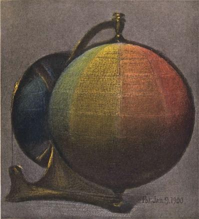
A color sphere can be used to unite the three dimensions of hue, value, and chroma.
(12)
 Having used the familiar structure of the orange as a help in
classifying colors, let us substitute a geometric solid, like a
sphere,4
and make use of geographical terms. The north pole is white. The south
pole is black.
14
The equator is a circuit of middle reds, yellows, greens, blues, and
purples. Parallels above the equator describe this circuit in lighter
values, and parallels below trace it in darker values. The vertical axis
joining black and white is a neutral scale of gray values, while
perpendiculars to it (like a pin thrust into the orange) are scales of
chroma. Thus our color notions may be brought into an orderly relation
by the color sphere. Any color describes its light and strength by its
location in the solid or on the surface, and is named by its place in
the combined scales of hue, value, and chroma.
Having used the familiar structure of the orange as a help in
classifying colors, let us substitute a geometric solid, like a
sphere,4
and make use of geographical terms. The north pole is white. The south
pole is black.
14
The equator is a circuit of middle reds, yellows, greens, blues, and
purples. Parallels above the equator describe this circuit in lighter
values, and parallels below trace it in darker values. The vertical axis
joining black and white is a neutral scale of gray values, while
perpendiculars to it (like a pin thrust into the orange) are scales of
chroma. Thus our color notions may be brought into an orderly relation
by the color sphere. Any color describes its light and strength by its
location in the solid or on the surface, and is named by its place in
the combined scales of hue, value, and chroma.
(12)
Having used the familiar structure of the orange to help classify colors, let’s switch to a geometric shape, like a sphere,4
and use geographical terms. The north pole is white. The south pole is black.
14
The equator is a band of middle reds, yellows, greens, blues, and purples. The parallels above the equator represent this band in lighter shades, while the parallels below show it in darker shades. The vertical axis connecting black and white is a neutral gray scale, while the lines perpendicular to it (like a pin pushed into the orange) represent scales of chroma. This way, our color ideas can be organized through the color sphere. Each color conveys its lightness and intensity based on its position in the solid or on the surface and is identified by its place in the combined scales of hue, value, and chroma.
Two dimensions fail to describe a color.
(13) Much of the popular misunderstanding of color is caused by ignorance of these three dimensions or by an attempt to make two dimensions do the work of three.
(13) Much of the common confusion about color comes from not understanding these three dimensions or from trying to force two dimensions to represent three.
(14) Flat diagrams showing hues and values, but omitting to define chromas, are as incomplete as would be a map of Switzerland with the mountains left out, or a harbor chart without indications of the depth of water. We find by aid of the measuring instruments that pigments are very unequal in this third dimension,—chroma,—producing mountains and valleys on the color sphere, so that, when the color system is worked out in pigments and charted, some colors must be traced well out beyond the spherical surface (paragraphs 125–127). Indeed, a COLOR TREE5 is needed to display by the unequal levels and lengths of its branches the individuality of pigment colors. But, whatever solid or figure is used to illustrate color relations, it must combine the three scales of hue, value, and chroma, and these definite scales furnish a name for every color based upon its intrinsic qualities, and free from terms purloined in other sensations, or caught from the fluctuating colors of natural objects.
(14) Flat diagrams showing colors and shades, but failing to define chroma, are as incomplete as a map of Switzerland without its mountains or a harbor chart missing depth indicators. With measuring tools, we find that pigments vary greatly in this third dimension—chroma—creating peaks and valleys on the color sphere. So, when the color system is developed in pigments and mapped out, some colors need to extend well beyond the spherical surface (paragraphs 125–127). In fact, a Color Tree5 is necessary to illustrate the individuality of pigment colors through the uneven heights and lengths of its branches. However, no matter what solid or shape is used to represent color relationships, it must incorporate the three scales of hue, value, and chroma. These specific scales provide a name for every color based on its inherent qualities, free from terms borrowed from other experiences or influenced by the ever-changing colors of natural objects.
How this system describes the spectrum.
(15) The solar spectrum and rainbow are the most stimulating color experiences with which we are acquainted. Can they be described by this solid system?
(15) The solar spectrum and rainbow are the most exciting color experiences we know. Can they be explained by this solid system?
(16) The lightest part of the spectrum is a narrow field of greenish yellow, grading into darker red on one side and into darker green upon the other, followed by still darker blue and purple. Upon the sphere the values of these spectral colors trace a path high up on the yellow section, near white, and slanting downward across the red and green sections, which are traversed near the level of the equator, it goes on to cross the blue and purple well down toward black.
(16) The lightest part of the spectrum is a slim band of greenish-yellow, shifting to darker red on one side and darker green on the other, followed by even darker blue and purple. On the sphere, the values of these spectral colors create a path that rises high in the yellow section, close to white, then slants downward across the red and green sections, crossing near the equator, before continuing to pass through the blue and purple, well into the black.
(17) This forms an inclined circuit, crossing the equator at opposite points, and suggests the ecliptic or the rings of Saturn (see outside cover). A pale rainbow would describe a slanting circuit nearer white, and a dimmer one would fall within the sphere, while an intensely brilliant spectrum projects far beyond the surface of the sphere, so greatly is the chroma of its hues in excess of the common pigments with which we work out our problems.
(17) This creates a slanted path, crossing the equator at two opposite points, and suggests the ecliptic or the rings of Saturn (see outside cover). A light rainbow would form a slanted path closer to white, while a fainter one would fall inside the sphere, and an extremely bright spectrum extends well beyond the sphere's surface, as its colors are so much more intense than the usual pigments we use to solve our problems.
(18) At the outset it is well to recognize the place of the spectrum in this system, not only because it is the established basis of scientific study, but especially because the invariable order assumed by its hues is the only stable hint which Nature affords us in her infinite color play.
(18) At the beginning, it's important to understand the role of the spectrum in this system, not just because it's the foundation of scientific study, but especially because the consistent order of its colors is the only reliable clue that Nature gives us in her endless display of colors.
(19) All our color sensations are included in the color solid. None are left out by its scales of hue, value, and chroma. Indeed, the imagination is led to conceive and locate still purer colors than any we now possess. Such increased degrees of color sensation can be named, and clearly conveyed by symbols to another person as soon as the system is comprehended.
(19) All of our color experiences are captured in the color solid. None are excluded by its scales of hue, value, and chroma. In fact, the imagination is inspired to envision and identify even purer colors than those we currently have. These enhanced levels of color experience can be named and clearly communicated to someone else as soon as the system is understood.
1. Vailima Letters, Oct. 8, 1902.
__A_TAG_PLACEHOLDER_0__ Vailima Letters, Oct. 8, 1902.
4. See frontispiece.
__A_TAG_PLACEHOLDER_0__ See __A_TAG_PLACEHOLDER_1__.
Appendix to Chapter I.
Misnomers for Color.
The Century Dictionary helps an intelligent study of color by its clear definitions and cross-references to HUE, VALUE, and CHROMA,—leaving no excuse for those who would confuse these three qualities or treat a degree of any quality as the quality itself.
The Century Dictionary supports a smart understanding of color with its clear definitions and cross-references to Color, VALUE, and CHROMA,—giving no room for anyone who might mix up these three qualities or mistake a level of any quality for the quality itself.
Obscure statements were frequent in text-books before these new definitions appeared. Thus the term “shade” should be applied only to darkened values, and not to hues or chromas. Yet one writer says, “This yellow shades into green,” which is certainly a change of hue, and then speaks of “a brighter shade” in spite of his evident intention to suggest a stronger chroma, which is neither a shade nor brighter luminosity.
Obscure statements were common in textbooks before these new definitions came out. So, the term “shade” should only refer to darker values, not to hues or chromas. Yet one author says, “This yellow shades into green,” which clearly indicates a change in hue, and then refers to “a brighter shade” despite his clear intent to imply a stronger chroma, which is neither a shade nor increased brightness.
Children gain wrong notions of “tint and shade” from the so-called standard colors shown to them, which present “tints” of red and blue much darker than the “shades” of yellow. This is bewildering, and, like their elders, they soon drop into the loose habit of calling any degree of color-strength or color-light a “shade.” Value is a better term to describe the light which color reflects to the eye, and all color values, light or dark, are measured by the value-scale.
Children develop incorrect ideas about “tint and shade” from the standard colors they are shown, which display “tints” of red and blue that are much darker than the “shades” of yellow. This can be confusing, and just like adults, they quickly fall into the habit of referring to any level of color intensity or brightness as a “shade.” Value is a more accurate term to describe the light that color reflects to the eye, and all color values, whether light or dark, are measured by the value-scale.
“Tone” is used in a confusing way to mean different things. Thus in the same sentence we see it refers to a single touch of the brush,—which is not a tone, but a paint spot,—and then we 17 read that the “tone of the canvas is golden.” This cannot mean that each paint spot is the color of gold, but is intended to suggest that the various objects depicted seem enveloped in a yellow atmosphere. Tone is, in fact, a musical term appropriate to sound, but out of place in color. It seems better to call the brush touch a color-spot: then the result of an harmonious relation between all the spots is color-envelope, or, as in Rood, “the chromatic composition.”
“Tone” is often used in a confusing way to mean different things. So, in the same sentence, it can refer to a single brush stroke—which is not a tone, but a paint spot—and then we see that the “tone of the canvas is golden.” This doesn’t mean that each paint spot is the color gold, but rather suggests that the various objects depicted seem to be surrounded by a yellow atmosphere. Tone is actually a musical term suited to sound, but it feels out of place in color. It makes more sense to call the brush stroke a color-spot: then the result of a harmonious relationship between all the spots is a color-envelope, or, as Rood put it, “the chromatic composition.”
“Intensity” is a misleading term, if chroma be intended, for it depends on the relative light of spectral hues. It is a degree rather than a quality, as appears in the expressions, intense heat, light, sound,—intensity of stimulus and reaction. Being a degree of many qualities, it should not be used to describe the quality itself. The word becomes especially unfit when used to describe two very different phases of a color,—as its intense illumination, where the chroma is greatly weakened, and the strongest chroma which is found in a much lower value. “Purity” is also to be avoided in speaking of pigments, for not one of our pigments represents a single pure ray of the spectrum.
“Intensity” is a confusing term if we’re talking about chroma, because it depends on the relative light of spectral hues. It’s more of a degree than a quality, as seen in terms like intense heat, light, and sound—intensity of stimulus and reaction. Since it’s a degree of many qualities, it shouldn’t be used to describe the quality itself. The term becomes particularly unsuitable when describing two very different aspects of a color—like its intense illumination, where the chroma is significantly weakened, and the strongest chroma, which appears at a much lower value. “Purity” should also be avoided when talking about pigments, since none of our pigments represents a single pure ray of the spectrum.
Examples are constantly found of the mental blur caused by such unfortunate terms, and, since misunderstanding becomes impossible with measured degrees of hue, value, and chroma, it seems only a question of time when they will take the place of tint, tone, shade, purity and intensity.
Examples are everywhere of the confusion caused by these unfortunate terms, and since misunderstandings become impossible with clearly defined degrees of hue, value, and chroma, it seems just a matter of time before they replace tint, tone, shade, purity, and intensity.
Chapter II.
COLOR QUALITIES.
(20) The three color qualities are hue, value, and chroma.
(20) The three color properties are hue, value, and chroma.
HUE is the name of a color.
(21) Hue is the quality by which we distinguish one color from another, as a red from a yellow, a green, a blue, or a purple. This names the hue, but does not tell whether it is light or dark, weak or strong,—leaving us in doubt as to its value and its chroma.
(21) Hue is the characteristic that helps us tell one color from another, like red from yellow, green, blue, or purple. This identifies the hue but doesn't indicate whether it's light or dark, weak or strong—leaving us uncertain about its value and saturation.
Science attributes this quality to difference in the LENGTH of ether waves impinging on the retina, which causes the sensation of color. The wave length M. 5269 gives a sensation of green, while M. 6867 gives a sensation of red.6
Science attributes this quality to differences in the LENGTH of ether waves hitting the retina, which creates the sensation of color. A wavelength of M. 5269 produces a sensation of green, while M. 6867 results in a sensation of red.6
VALUE is the light of a color.
(22) Value is the quality by which we distinguish a light color from a dark one. Color values are loosely called tints and shades, but the terms are frequently misapplied. A tint should be a light value, and a shade should be darker; but the word “shade” has become a general term for any sort of color, so that a shade of yellow may prove to be lighter than a tint of blue. A photometric7 scale of value places all colors in relation to the extremes of white and black, but cannot describe their hue or their chroma.
(22) Value is the quality we use to tell a light color apart from a dark one. Color values are often referred to as tints and shades, but these terms are commonly used incorrectly. A tint should refer to a light value, while a shade should be darker; however, the word “shade” has become a catch-all for any type of color, meaning that a shade of yellow can be lighter than a tint of blue. A photometric7 scale of value positions all colors in relation to the extremes of white and black, but it can't describe their hue or chroma.
Science describes this quality as due to difference in the HEIGHT or amplitude of ether waves impinging on the retina. Small amplitudes of the wave lengths given in paragraph 21 produce the sensation of dark green and dark red: larger amplitudes give the sensation of lighter green and lighter red.
Science explains this quality as a result of differences in the HEIGHT or amplitude of ether waves striking the retina. Small amplitudes of the wavelengths mentioned in paragraph 21 create the feeling of dark green and dark red; larger amplitudes produce the feeling of lighter green and lighter red.
CHROMA is the strength of a color.
(23) Chroma is the quality by which we distinguish a strong color from a weak one. To say that a rug is strong in color gives no hint of its hues or values, only its chromas. Loss of chroma is loosely called fading, but this word is frequently used to include changes of value and hue. Take two autumn leaves, identical in color, and expose one to the weather, while the other is waxed and pressed in a book. Soon the exposed leaf fades into a neutral gray, while the protected one preserves its strong chroma almost intact. If, in fading, the leaf does not change its hue or its value, there is only a loss of chroma, but the fading process is more likely to induce some change of the other two qualities. Fading, however, cannot define these changes.
(23) Chroma is the quality that helps us tell a vivid color from a dull one. Saying a rug has strong color doesn’t reveal its shades or tones, just its chromas. When we talk about loss of chroma, we often use the term fading, but that usually also includes shifts in tone and shade. If you take two autumn leaves that are the same color and leave one outside while pressing the other in a book, the exposed leaf will soon fade to a neutral gray, while the protected one keeps its bright chroma almost perfectly. If the fading doesn't change the hue or value of the leaf, it’s just a loss of chroma, but typically, fading will also cause some alterations to the other two aspects. Still, fading alone can't explain these changes.
Science describes chroma as the purity of one wave length separated from all others. Other wave lengths, INTERMINGLING, make its chroma less pure. A beam of daylight can combine all wave lengths in such balance as to give the sensation of whiteness, because no single wave is in excess.8
Science describes chroma as the purity of a single wavelength separated from all the others. Other wavelengths, Intermingling, make its chroma less pure. A beam of daylight can combine all wavelengths in such a balanced way that it creates the sensation of whiteness, because no single wavelength is in excess.8
(24) The color sphere (see Fig. 1) is a convenient model to illustrate these three qualities,—hue, value, and chroma,—and unite them by measured scales.
(24) The color sphere (see Fig. 1) is a useful model to show these three qualities—hue, value, and chroma—and connect them through measured scales.
(25)
 The north pole of the color sphere is white, and the south pole black.
Value or luminosity of colors ranges between these two extremes. This is
the vertical scale, to be memorized as V,
20
the initial for both value and vertical. Vertical movement through color
may thus be thought of as a change of value, but not as a change of hue
or of chroma. Hues of color are spread around the equator of the sphere.
This is a horizontal scale, memorized as H, the initial for both
hue and horizontal. Horizontal movement around the color solid is thus
thought of as a change of hue, but not of value or of chroma.
A line inward from the strong surface hues to the neutral gray
axis, traces the graying of each color, which is loss of chroma, and
conversely a line beginning with neutral gray at the vertical axis, and
becoming more and more colored until it passes outside the sphere, is a
scale of chroma, which is memorized as C, the initial both for
chroma and centre. Thus the sphere lends its three dimensions to color
description, and a color applied anywhere within, without, or on its
surface is located and named by its degree of hue, of value, and of
chroma.
The north pole of the color sphere is white, and the south pole black.
Value or luminosity of colors ranges between these two extremes. This is
the vertical scale, to be memorized as V,
20
the initial for both value and vertical. Vertical movement through color
may thus be thought of as a change of value, but not as a change of hue
or of chroma. Hues of color are spread around the equator of the sphere.
This is a horizontal scale, memorized as H, the initial for both
hue and horizontal. Horizontal movement around the color solid is thus
thought of as a change of hue, but not of value or of chroma.
A line inward from the strong surface hues to the neutral gray
axis, traces the graying of each color, which is loss of chroma, and
conversely a line beginning with neutral gray at the vertical axis, and
becoming more and more colored until it passes outside the sphere, is a
scale of chroma, which is memorized as C, the initial both for
chroma and centre. Thus the sphere lends its three dimensions to color
description, and a color applied anywhere within, without, or on its
surface is located and named by its degree of hue, of value, and of
chroma.
(25)
The north pole of the color sphere is white, and the south pole is black. The value or brightness of colors ranges between these two extremes. This is the vertical scale, remembered as V, which stands for both value and vertical. Moving vertically through color can be seen as a change in value, but not as a change in hue or chroma. The hues of color are spread around the equator of the sphere. This is a horizontal scale, remembered as H, which stands for both hue and horizontal. Moving horizontally around the color solid represents a change in hue, but not in value or chroma. A line moving inward from the vivid surface hues to the neutral gray axis illustrates the graying of each color, which means a loss of chroma. Conversely, a line starting with neutral gray at the vertical axis and becoming increasingly colorful until it goes outside the sphere represents a scale of chroma, which is remembered as C, standing for both chroma and center. Thus, the sphere gives its three dimensions to color description, and a color applied anywhere within, outside, or on its surface is identified and described by its level of hue, value, and chroma.
HUES first appeal to the child, VALUES next, and CHROMAS last.
(26) Color education begins with ability to recognize and name certain hues, such as red, yellow, green, blue, and purple (see paragraphs 182 and 183). Nature presents these hues in union with such varieties of value and chroma that, unless there be some standard of comparison, it is impossible for one person to describe them intelligently to another.
(26) Color education starts with the ability to recognize and name specific colors, like red, yellow, green, blue, and purple (see paragraphs 182 and 183). Nature shows these colors combined with different shades and intensities that make it hard for one person to clearly explain them to another without some standard for comparison.
(27) The solar spectrum forms a basis for scientific color analysis, taught in technical schools; but it is quite beyond the comprehension of a child. He needs something more tangible and constantly in view to train his color notions. He needs to handle colors, place them side by side for comparison, imitate them with 21 crayons, paints, and colored stuffs, so as to test the growth of perception, and learn by simple yet accurate terms to describe each by its hue, its value, and its chroma.
(27) The solar spectrum is the foundation for scientific color analysis taught in technical schools, but it's too complex for a child to understand. Children need something more concrete and visible to develop their understanding of color. They should work with colors, arrange them side by side for comparison, and replicate them using crayons, paints, and colored materials. This hands-on approach helps them enhance their perception and learn to describe each color simply and accurately in terms of its hue, value, and chroma.
(28) Pigments, rather than the solar spectrum, are the practical agents of color work. Certain of them, selected and measured by this system (see Chapter V.), will be known as MIDDLE COLORS, because they stand midway in the scales of value and chroma. These middle colors are preserved in imperishable enamels,9 so that the child may handle and fix them in his memory, and thus gain a permanent basis for comparing all degrees of color. He learns to grade each middle color to its extremes of value and chroma.
(28) Pigments, not the solar spectrum, are the practical tools for color work. Some of these, chosen and measured by this system (see Chapter V.), will be referred to as MIDDLE HUES because they are positioned in the middle of the scales of value and chroma. These middle colors are preserved in durable enamels, 9 so that the child can handle and remember them, providing a solid foundation for comparing all variations of color. They learn to assess each middle color against its extremes of value and chroma.
(29) Experiments with crayons and paints, and efforts to match middle colors, train his color sense to finer perceptions. Having learned to name colors, he compares them with the enamels of middle value, and can describe how light or dark they are. Later he perceives their differences of strength, and, comparing them with the enamels of middle chroma, can describe how weak or strong they are. Thus the full significance of these middle colors as a practical basis for all color estimates becomes apparent; and, when at a more advanced stage he studies the best examples of decorative color, he will again encounter them in the most beautiful products of Oriental art.
(29) Experimenting with crayons and paints, along with his attempts to match medium colors, helps him refine his color perception. After learning to identify colors, he compares them to mid-value colors and can describe their lightness or darkness. Later on, he starts to notice differences in intensity, and by comparing them with mid-chroma colors, he can express how intense or subtle they are. This reveals the importance of these mid-range colors as a practical foundation for all color assessments; and when he advances further and studies the best examples of decorative color, he'll see them again in the most stunning artworks of Oriental art.
Is it possible to define the endless varieties of color?
(30) At first glance it would seem almost hopeless to attempt the naming of every kind and degree of color. But, if all these varieties possess the same three qualities, only in different degrees, and if each quality can be measured by a scale, then there is a clue to this labyrinth.
(30) At first glance, it might seem nearly impossible to name every type and shade of color. However, if all these variations share the same three qualities, just to different extents, and if each quality can be measured on a scale, then there's a hint to solving this puzzle.
A COLOR SPHERE and COLOR TREE to unite hue, value, and chroma.
(31)
 This clue is found in the union of these three qualities by measured
scales in a color sphere and color tree.10 The equator of the sphere11 may be
divided into ten parts, and serve as the scale of hue, marked R,
YR, Y, GY, G, BG, B, PB, P, and RP. Its vertical axis may
be divided into ten parts to serve as the scale of value, numbered from
black (0) to white (10). Any perpendicular to the neutral axis is a
scale of chroma. On the plane of the equator this scale is numbered 1,
2, 3, 4, 5, from the centre to the surface.
This clue is found in the union of these three qualities by measured
scales in a color sphere and color tree.10 The equator of the sphere11 may be
divided into ten parts, and serve as the scale of hue, marked R,
YR, Y, GY, G, BG, B, PB, P, and RP. Its vertical axis may
be divided into ten parts to serve as the scale of value, numbered from
black (0) to white (10). Any perpendicular to the neutral axis is a
scale of chroma. On the plane of the equator this scale is numbered 1,
2, 3, 4, 5, from the centre to the surface.
(31)
This clue is found in the combination of these three qualities measured on a color sphere and color tree.10 The equator of the sphere11 can be divided into ten segments, serving as the hue scale, labeled R, YR, Y, GY, G, BG, B, PB, P, and RP. Its vertical axis can be divided into ten segments to represent the value scale, ranging from black (0) to white (10). Any perpendicular line to the neutral axis represents a chroma scale. On the plane of the equator, this scale is numbered 1, 2, 3, 4, 5, from the center to the surface.
(32) This chroma scale may be raised or lowered to any level of value, always remaining perpendicular to the axis, and serving to measure the chroma of every hue at every level of value. The fact that some colors exceed others to such an extent as to carry them out beyond the sphere is proved by measuring instruments, 23 but the fact is a new one to many persons. (Figs. 2 and 3.)
(32) This chroma scale can be adjusted to any value, always staying perpendicular to the axis, and is used to measure the chroma of each hue at every value level. The reality that some colors are significantly more intense than others, pushing them out beyond the sphere, is demonstrated by measuring instruments, 23 but this fact is unfamiliar to many people. (Figs. 2 and 3.)
 The Color Tree")
(33) For this reason the COLOR TREE is a completer model than the sphere, although the simplicity of the latter makes it best for a child’s comprehension.
(33) For this reason, the Color Tree is a more complete model than the sphere, although the simplicity of the latter makes it better for a child’s understanding.
(34) The color tree is made by taking the vertical axis of the sphere, which carries a scale of value, for the trunk. The branches are at right angles to the trunk; and, as in the sphere, they carry the scale of chroma. Colored balls on the branches tell their Hue. In order to show the MAXIMA of color, each branch is attached to the trunk (or neutral axis) at a level demanded by its value,—the yellow nearest white at the top, then the green, red, blue, and purple branches, approaching black in the order of their lower values. It will be remembered that the chroma of the sphere ceased with 5 at the equator. The color tree prolongs 24 this through 6, 7, 8, and 9. The branch ends carry colored balls, representing the most powerful red, yellow, green, blue, and purple pigments which we now possess, and could be lengthened, should stronger chromas be discovered.12
(34) The color tree is created by using the vertical axis of the sphere as the trunk, which has a value scale. The branches extend out from the trunk at right angles and, like in the sphere, they show the chroma scale. Colored balls on the branches indicate their Hue. To demonstrate the MAXIMA of color, each branch connects to the trunk (or neutral axis) at a height corresponding to its value—yellow is closest to white at the top, followed by green, red, blue, and purple branches, which move closer to black as their values decrease. It's important to remember that the chroma of the sphere ended with 5 at the equator. The color tree extends this through 6, 7, 8, and 9. The ends of the branches have colored balls, representing the most vibrant red, yellow, green, blue, and purple pigments we currently have, and could be extended if stronger chromas are found.12
(35) Such models set up a permanent image of color relations. Every point is self-described by its place in the united scales of hue, value, and chroma. These scales fix each new perception of color in the child’s mind by its situation in the color solid. The importance of such a definite image can hardly be overestimated, for without it one color sensation tends to efface another. When the child looks at a color, and has no basis of comparison, it soon leaves a vague memory that cannot be described. These models, on the contrary, lead to an intelligent estimate of each color in terms of its hue, its value, and its chroma; while the permanent enamels correct any personal bias by a definite standard.
(35) These models create a lasting image of color relationships. Every point defines itself by its position within the combined scales of hue, value, and chroma. These scales embed each new color perception in the child's mind based on its location in the color solid. The significance of such a clear image cannot be overstated, as, without it, one color sensation can overshadow another. When the child views a color without a reference point, it quickly becomes a vague memory that can't be easily described. In contrast, these models encourage an informed assessment of each color regarding its hue, value, and chroma, while the permanent enamels mitigate any personal bias by providing a clear standard.
(36) Thus defined, a color falls into logical relation with all other colors in the system, and is easily memorized, so that its image may be recalled at any distance of time or place by the notation.
(36) In this way, a color is logically connected to all other colors in the system, making it easy to remember, so its image can be recalled at any time or place using the notation.
(37) These solid models help to memorize and assemble colors and the memory is further strengthened by a simple NOTATION, which records each color so that it cannot be mistaken for any other. By these written scales a child gains an instinctive estimate of relations, so that, when he is delighted with a new color combination, its proportions are noted and understood.
(37) These solid models help to remember and combine colors, and the memory is further reinforced by a simple NOTATION, which records each color so that it can't be confused with any other. Through these written scales, a child develops an intuitive sense of relationships, so that when they are excited about a new color combination, its proportions are recognized and understood.
(38) Musical art has long enjoyed the advantages of a definite scale and notation. Should not the art of coloring gain by similar definition? The musical scale is not left to personal 25 whim, nor does it change from day to day; and something as clear and stable would be an advantage in training the color sense.
(38) Musical art has always benefited from having a specific scale and system of notation. Shouldn't the art of coloring benefit from a similar structure? The musical scale isn't subject to personal preference, nor does it change every day; having something just as clear and stable would be beneficial for developing the color sense. 25
(39) Perception of color is crude at first. The child sees only the most obvious distinctions, and prefers the strongest stimulation. But perception soon becomes refined by exercise, and, when a child tries to imitate the subtle colors of nature with paints, he begins to realize that the strongest colors are not the most beautiful,—rather the tempered ones, which may be compared to the moderate sounds in music. To describe these tempered colors, he must estimate their hue, value, and chroma, and be able to describe in what degree his copy departs from the natural color. And, with this gain in perception and imitation of natural color, he finds a strong desire to invent combinations to please his fancy. Thus the study divides into three related attitudes, which may be called recognition, imitation, and invention. Recognition of color is fundamental, but it would be tedious to spend a year or two in formal and dry exercises to train recognition of color alone; for each step in recognition of color is best tested by exercise in its imitation and arrangement. When perception becomes keener, emphasis can be placed on imitation of the colors found in art and in nature, resting finally on the selection and grouping of colors for design.13
(39) At first, a child's perception of color is pretty basic. They only notice the most obvious differences and gravitate towards the brightest colors. However, as they practice, their understanding becomes more sophisticated. When a child attempts to replicate the subtle colors of nature with paints, they start to realize that the boldest colors aren’t necessarily the most beautiful—it's actually the more muted ones that resemble harmonious sounds in music. To represent these muted colors, they need to assess their hue, value, and chroma, and be able to articulate how their version differs from the original color. With this improvement in understanding and recreating natural colors, a strong desire to create pleasing combinations arises. Thus, the study breaks down into three connected approaches: recognition, imitation, and invention. While recognizing color is essential, it would be dull to spend a year or two only on formal exercises for color recognition; each step in recognizing color is best reinforced through practice in imitation and arrangement. As perception sharpens, the focus can shift to imitating colors found in art and nature, ultimately leading to the selection and grouping of colors for design.13
Every color can be recognized, named, matched, imitated, and written by its HUE, VALUE, and CHROMA.
(40) The notation used in this system places Hue (expressed by an initial) at the left; Value (expressed by a number) at the right and above a line; and Chroma (also expressed by 26 a number) at the right, below the line. Thus R5/9 means
(40) The notation used in this system positions Hue (represented by an initial) on the left; Value (represented by a number) on the right and above a line; and Chroma (also represented by a number) on the right, below the line. So, R5/9 means
| Color (red), | VALUE (5) | , | and will be found to represent the qualities of the pigment vermilion.14 |
| CHROMA (9) |
Hue, value, and chroma unite in every color sensation, but the child cannot grasp them all at once. Hue-difference appeals to him first, and he gains a permanent idea of five principal hues from the enamels of MIDDLE COLORS, learning to name, match, imitate, and finally write them by their initials: R (red), Y (yellow), G (green), B (blue), and P (purple). Intermediates formed by uniting successive pairs are also written by the joined initials, YR (yellow-red), GY (green-yellow), BG (blue-green), PB (purple-blue), and RP (red-purple).
Hue, value, and chroma come together in every color experience, but a child can't understand them all at once. Hue-difference appeals to him first, and he develops a lasting concept of five main hues from the enamels of Mid-tone colors, learning to name, match, imitate, and eventually write them by their initials: R (red), Y (yellow), G (green), B (blue), and P (purple). The intermediate colors created by combining successive pairs are also represented by their combined initials: YR (yellow-red), GY (green-yellow), BG (blue-green), PB (purple-blue), and RP (red-purple).
(41) Ten differences of hue are as many as a child can render at the outset, yet in matching and imitating them he becomes aware of their light and dark quality, and learns to separate it from hue as value-difference. Middle colors, as implied by that name, stand midway between white and black,—that is, on the equator of the sphere,—so that a middle red will be written R5/, suggesting the steps 6, 7, 8, and 9 which are above the equator, while steps 4, 3, 2, and 1 are below. It is well to show only three values of a color at first; for instance, the middle value contrasted with a light and a dark one. These are written R3/, R5/, R7/. Soon he perceives and can imitate finer differences, and the red scale may be written entire, as R1/, R2/, R3/, R4/, R5/, R6/, R7/, R8/, R9/, with black as 0 and white as 10.
(41) Ten different shades are as many as a child can recognize at first, but as they practice matching and imitating them, they become aware of their light and dark qualities, learning to distinguish this aspect as value-difference. Middle colors, as the name suggests, sit between white and black—meaning they are located at the midpoint of the spectrum—so a middle red will be written as R5/, indicating the steps 6, 7, 8, and 9 that are above the midpoint, while steps 4, 3, 2, and 1 are below. It’s best to start with just three values of a color; for instance, the middle value compared to a light and a dark one. These are noted as R3/, R5/, R7/. Soon, they recognize and can imitate more subtle differences, and the full red scale can be recorded as R1/, R2/, R3/, R4/, R5/, R6/, R7/, R8/, R9/, with black represented as 0 and white as 10.
(42) Chroma-difference is the third and most subtle color quality. The child is already unconsciously familiar with the middle chroma of red, having had the enamels of MIDDLE COLOR always 27 in view, and the red enamel is to be contrasted with the strongest and weakest red chromas obtainable. These he writes R /1, R /5, R /9, seeing that this describes the chromas of red, but leaves out its values. R5/1, R5/5, R5/9, is the complete statement, showing that, while both hue and value are unchanged, the chroma passes from grayish red to middle red (enamel first learned) and out to the strongest red in the chroma scale obtained by vermilion.
(42) Chroma-difference is the third and most subtle color quality. The child is already unconsciously familiar with the middle chroma of red, having always seen the shades of MIDDLE COLOR in view, and the red enamel is contrasted with the strongest and weakest red chromas available. He writes them as R /1, R /5, R /9, noting that this describes the chromas of red but omits its values. R5/1, R5/5, R5/9 provides the complete statement, showing that while both hue and value remain unchanged, the chroma shifts from grayish red to middle red (the enamel first learned) and extends to the strongest red in the chroma scale achieved by vermilion.
(43) It may be long before he can imitate the intervening steps of chroma, many children finding it difficult to express more than five steps of the chroma scale, although easily making ten steps of value and from twenty to thirty-five steps of hue. This interesting feature is of psychologic value, and has been followed in the color tree and color sphere.
(43) It might take a while before he can replicate the steps of chroma, as many children struggle to express more than five steps of the chroma scale, even though they can easily create ten steps of value and between twenty to thirty-five steps of hue. This fascinating aspect has psychological significance and has been explored in the color tree and color sphere.
Does such a scientific scheme leave any outlet for feeling and personal expression of beauty?
(44) Lest this exact attitude in color study should seem inartistic, compared with the free and almost chaotic methods in use, let it be said that the stage thus far outlined is frankly disciplinary. It is somewhat dry and unattractive, just as the early musical training is fatiguing without inventive exercises. The child should be encouraged at each step to exercise his fancy.
(44) To avoid the impression that this approach to color study is unartistic when compared to the more free-spirited and chaotic methods out there, it's important to note that the stage we've discussed is meant to be a foundational discipline. It can feel a bit dull and unappealing, similar to how early music training can be exhausting without creative exercises. Children should be encouraged to use their imagination at every opportunity.
(45) Instead of cramping his outlook upon nature, it widens his grasp of color, and stores the memory with finer differences, supplying more material by which to express his sense of coloristic beauty.
(45) Instead of limiting his perspective on nature, it expands his understanding of color, and enriches his memory with more subtle distinctions, providing him with more material to express his appreciation for coloristic beauty.
(46) Color harmony, as now treated, is a purely personal affair, difficult to refer to any clear principles or definite laws. The very terms by which it seeks expression are borrowed from music, and suggest vague analogies that fail when put to the test. Color 28 needs a new set of expressive terms, appropriate to its qualities, before we can make an analysis as to the harmony or discord of our color sensations.
(46) Color harmony, as it's currently discussed, is a totally personal matter that’s hard to connect to any clear principles or established rules. The terms used to describe it are taken from music, and they hint at vague comparisons that don't hold up under scrutiny. Color 28 needs a fresh set of expressive terms that are suited to its qualities before we can analyze the harmony or discord in our color experiences.
(47) This need is supplied in the present system by measured CHARTS, and a NOTATION. Their very construction preserves the balance of colors, as will be shown in the next chapter, while the chapter on harmony (Chapter VII.) shows how harmonious pairs and triads of color may be found by MASKS with measured intervals. In fact, practice in the use of the charts supplies the imagination with scales and sequences of color quite as definite and quite as easily written as those sound intervals by which the musician conveys to others his sense of harmony. And, although in neither art can training alone make the artist, yet a technical grasp of these formal scales gives acquaintance with the full range of the instrument, and is indispensable to artistic expression. From these color scales each individual is free to choose combinations in accord with his feeling for color harmony.
(47) This need is met in the current system by measured GRAPHS and a NOTATION. Their design maintains the balance of colors, as will be demonstrated in the next chapter, while the chapter on harmony (Chapter VII.) illustrates how harmonious pairs and triads of color can be identified using Masks with measured intervals. In fact, practicing with the charts provides the imagination with scales and sequences of color that are just as definite and easily expressed as the sound intervals musicians use to communicate their sense of harmony. And, although training alone cannot make someone an artist in either field, having a technical understanding of these formal scales gives one familiarity with the full range of the instrument and is essential for artistic expression. From these color scales, each individual is free to select combinations that resonate with their sense of color harmony.
Let us make an outline of the course of color study traced in the preceding pages.15
Let’s create an outline of the color study discussed in the previous pages.15
PERCEPTION of color.
(48) Hue-difference.
Hue difference.
Middle hues (5 principals).
Midtones (5 main colors).
Middle hues (5 intermediates).
Middle shades (5 intermediates).
Middle hues (10 placed in sequence as SCALE of HUE).
Middle hues (10 arranged in order as SCALEof COLOR).
Value-difference.
Value difference.
Light, middle, and dark values (without change of hue).
Light, medium, and dark shades (without changing the color).
Light, middle, and dark values (traced with 5 principal hues).
Light, medium, and dark shades (marked with 5 main colors).
10 values traced with each hue. SCALE of VALUE. The Color Sphere.
10 values identified with each color. SCALE of VALUE. The Color Sphere.
Chroma-difference.
Color difference.
Strong, middle, and weak chroma (without change of hue).
Strong, medium, and weak color saturation (without change of hue).
Strong, middle and weak chroma (traced with three values without change of hue).
Strong, medium, and weak color intensity (marked with three values without changing the hue).
Strong, middle, and weak chroma (traced with three values and ten hues).
Strong, medium, and weak chroma (represented by three values and ten hues).
Maxima of color and their gradation to white, black, and gray. The Color Tree.
Maxima of color and their shades transitioning to white, black, and gray. The Color Tree.
EXPRESSION of color.
(49) Matching and imitation of hues (using stuffs, crayons, and paints).
(49) Matching and imitating colors (using materials, crayons, and paints).
Matching and imitation of values and hues (using stuffs, crayons, and paints).
Matching and imitating values and colors (using materials, crayons, and paints).
Matching and imitation of chromas, values, and hues (using stuffs, crayons, and paints).
Matching and imitating colors, shades, and tones (using materials, crayons, and paints).
Notation of color.
Color notation.
| Hue | Value | , H | V | , |
| Chroma | C |
Initial for hue, numeral above for value, numeral below for chroma.
Initial for color, number above for value, number below for chroma.
Sequences of color.
Color patterns.
Two scales united, as hue and value, or chroma and value.
Two scales combined, like color and brightness, or saturation and brightness.
Three scales united,—each step a change of hue, value, and chroma.
Three scales came together—each step a shift in color, value, and brightness.
Balance of color.
Color balance.
Opposites of equal value and chroma (R5/5 and BG5/5).
Opposites of the same value and intensity (R5/5 and BG5/5).
Opposites of equal value and unequal chroma (R5/9 and BG5/3).
Opposites that are equally valued but have different levels of color intensity (R5/9 and BG5/3).
Opposites unequal both in value and chroma (R7/3 and BG3/7).
Opposites that differ in both value and color (R7/3 and BG3/7).
Area as an element of balance.
Area as a balancing element.
HARMONY of color.
(50) Selection of colors that give pleasure.
Color choices that bring joy.
Study of butterfly wings and flowers, recorded by the NOTATION.
Study of butterfly wings and flowers, recorded by the Notation.
Study of painted ornament, rugs, and mosaics, recorded by the NOTATION.
Study of painted decor, rugs, and mosaics, noted by the NOTATION.
Personal choice of color PAIRS, balanced by H, V, C, and area.
Personal choice of color Couples, balanced by hue, value, chroma, and area.
Personal choice of color TRIADS, balanced by H, V, C, and area.
Personal choice of color Triads, balanced by hue, value, chroma, and area.
Grouping of colors to suit some practical use: wall papers, rugs, book covers, etc.
Grouping of colors for practical purposes: wallpaper, rugs, book covers, etc.
Their analysis by the written notation.
Their analysis through the written notation.
Search for principles of harmony, expressed in measured terms.
Search for principles of harmony, articulated in precise terms.
A definite plan of color study, with freedom as to details of presentation.16
(51) Having memorized these broad divisions of the study, a clever teacher will introduce many a detail, to meet the mood of the class, or correlate this subject with other studies, without for a moment losing the thread of thought or befogging the presentation. But to range at random in the immense field of color sensations, without plan or definite aim in view, only courts fatigue of the retina and a chaotic state of mind.
(51) Once a skilled teacher has memorized these main categories of the subject, they will seamlessly introduce various details to match the class's mood or connect this topic with other subjects, all while maintaining clarity and focus. However, wandering aimlessly through the vast world of color sensations, without a plan or clear objective, only leads to eye strain and a confused mindset.
(52) The same broad principles which govern the presentation of other ideas apply with equal force in this study. A little, well apprehended, is better than a mass of undigested facts. If the child is led to discover, or at least to think he is discovering, new things about color, the mind will be kept alert and seek out novel illustrations at every step. Now and then a pupil will be found 31 who leads both teacher and class by intuitive appreciation of color, and it is a subtle question how far such a nature can be helped or hurt by formal exercises. But such an exception is rare, and goes to prove that systematic discipline of the color sense is necessary for most children.
(52) The same general principles that guide the presentation of other concepts apply equally in this study. A small amount, well understood, is better than a large quantity of unprocessed information. If a child is encouraged to discover, or at least to feel like they are discovering, new things about color, their mind will stay engaged and will look for new examples at every turn. Occasionally, there will be a student who intuitively understands color and can guide both the teacher and the class, and it's a nuanced question how much such a student can benefit from or be hindered by formal exercises. However, such exceptions are rare and demonstrate that systematic training of the color sense is essential for most children. 31
(53) Outdoor nature and indoor surroundings offer endless color illustrations. Birds, flowers, minerals, and the objects in daily use take on a new interest when their varied colors are brought into a conscious relation, and clearly named. A tri-dimensional perception, like this sense of color, requires skilful training, and each lesson must be simplified to the last point practicable. It must not be too long, and should lead to some definite result which a child can grasp and express with tolerable accuracy, while its difficulties should be approached by easy stages, so as to avoid failure or discouragement. The success of the present effort is the best incentive to further achievement.
(53) Exploring the outdoors and our indoor environments provides endless opportunities for colorful illustrations. Birds, flowers, minerals, and everyday objects gain new significance when we recognize and name their different colors. Understanding color in three dimensions, like this, requires skillful training, and each lesson needs to be simplified as much as possible. It shouldn’t be too long and should lead to a clear result that a child can understand and describe quite accurately, while any challenges should be introduced gradually to prevent failure or discouragement. The success of this effort serves as the best motivation for further progress.
6. See Glossary for definitions of Micron, Photometer, Retina, and Red, also for Hue, Tint, Shade, Value, Color Variables, Luminosity, and Chroma.
6. See Glossary for definitions of Micron, Photometer, Retina, and Red, also for Hue, Tint, Shade, Value, Color Variables, Luminosity, and Chroma.
__A_TAG_PLACEHOLDER_0__ See photometer in paragraph __A_TAG_PLACEHOLDER_1__.
9. When recognized for the first time, a middle green, blue, or purple, is accepted by most persons as well within their color habit, but middle red and middle yellow cause somewhat of a shock. “That isn’t red,” they say, “it’s terra cotta.” “Yellow?” “Oh, no, that’s—well, it’s a very peculiar shade.”
9. When people see it for the first time, a middle green, blue, or purple is commonly accepted as fitting within their understanding of color, but middle red and middle yellow tend to surprise them. “That isn’t red,” they say, “it’s terra cotta.” “Yellow?” “Oh, no, that’s—well, it’s a really unusual shade.”
Yet these are as surely the middle degrees of red and yellow as are the more familiar degrees of green, blue, and purple. This becomes evident as soon as one accepts physical tests of color in place of personal whim. It also opens the mind to a generally ignored fact, that middle reds and yellows, instead of the screaming red and yellow first given a child, are constantly found in examples of rich and beautiful color, such as Persian rugs, Japanese prints, and the masterpieces of painting.
Yet these are just as clearly the intermediate shades of red and yellow as the more familiar shades of green, blue, and purple. This becomes clear once we rely on physical tests of color instead of personal preference. It also makes us aware of a mostly overlooked fact: that the middle reds and yellows, rather than the bright red and yellow typically given to a child, are often found in rich and beautiful examples of color, like Persian rugs, Japanese prints, and the masterpieces of painting.
__A_TAG_PLACEHOLDER_0__ Check out Color Tree in paragraph __A_TAG_PLACEHOLDER_1__.
11. Unaware that the spherical arrangement had been used years before, I devised a double tetrahedron to classify colors, while a student of painting in 1879. It now appears that the sphere was common property with psychologists, having been described by Runge in 1810. Earlier still, Lambert had suggested a pyramidal form. Both are based on the erroneous assumption that red, yellow, and blue are primary sensations, and also fail to place these hues in a just scale of luminosity. My twirling color solid and its completer development in the present model have always made prominent the artistic feeling for color value. It differs in this and in other ways from previous systems, and is fortunate in possessing new apparatus to measure the degree of hue, value, and chroma.
11. Not realizing that the spherical layout had already been used years earlier, I created a double tetrahedron to categorize colors while studying painting in 1879. It turns out that the sphere was a common concept among psychologists, having been described by Runge in 1810. Even earlier, Lambert had suggested a pyramidal shape. Both ideas are based on the incorrect belief that red, yellow, and blue are the primary sensations, and they also fail to accurately rank these colors in terms of brightness. My spinning color solid and its further development in the current model have always highlighted the artistic sense of color value. This approach differs from previous systems in several ways and is fortunate to have new tools for measuring hue, value, and chroma.
14. See Chapter VI.
__A_TAG_PLACEHOLDER_0__ See __A_TAG_PLACEHOLDER_1__.
Appendix to Chapter II.
PLATE I.
THE COLOR SPHERE, with Measured Scales of
HUE, VALUE, and CHROMA.
The teacher of elementary grades introduces these scales of tempered color as fast as the child’s interest is awakened to their need by the exercises shown in Plates II. and III. Thus the Hue scale is learned before the end of the second year, the Value scale during the next two years, and the Chroma scale in the fifth year. By the time a child is ten years old these definite color scales have become part of his mental furnishing, so that he can name, write, and memorize any color group.
The elementary teacher introduces these color scales as soon as the child's interest is sparked by the activities shown in Plates II and III. In this way, the Hue scale is learned by the end of the second year, the Value scale in the following two years, and the Chroma scale in the fifth year. By the time a child is ten, these specific color scales have become a part of their knowledge, allowing them to name, write about, and memorize any color group.
1. The Color Sphere in Skeleton. This diagram shows the middle colors on the equator, with strong red, yellow, green, blue, and purple, each at its proper level in the value scale, and projecting in accordance with its scale of chroma. See the complete description of these scales in Chapter II.
1. The Color Sphere in Skeleton. This diagram illustrates the primary colors on the equator, featuring vibrant red, yellow, green, blue, and purple, each positioned correctly on the value scale and displayed according to its chroma level. For a detailed explanation of these scales, see Chapter II.
2. The Color Score. Fifteen typical steps taken from the color sphere are here spread out in a flat field. The Five Middle Colors form the centre level, with the same hues in a lighter value above and in a darker value below. Chapter VI. describes the making of this Score, and its use in analyzing colors and preserving a written record of their groups.
2. The Color Score. Fifteen typical steps taken from the color spectrum are displayed in a flat layout. The Five Mid-Tones form the central level, with the same shades in a lighter tone above and in a darker tone below. Chapter VI. explains how this Score is created and used for analyzing colors and keeping a written record of their groups.
3. The Value Scale and Chroma Scale. Each of the five color maxima is thus shown at its proper level in the scale of light, and graded by uniform steps from its strongest chroma inward to neutrality at the axis of the sphere. Pigment inequalities here become very apparent.
3. The Value Scale and Chroma Scale. Each of the five color maxima is displayed at its correct position in the light scale and graded in consistent steps from its brightest chroma inward to neutrality at the center of the sphere. The differences in pigments are clearly visible here.

33
FOR PLATES II. & III.,
SEE APPENDIX TO CHAPTER IV.,
CHILDREN’S COLOR STUDIES.
34
Chapter III.
COLOR MIXTURE AND BALANCE.
All colors grasped in the hand.
(54)
 Let us recall the names and order of colors given in the last chapter,
with their assemblage in a sphere by the three qualities of HUE, VALUE, and
CHROMA. It will aid the memory to call
the thumb of the left hand RED, the
forefinger YELLOW, the middle finger
GREEN, the ring finger BLUE, and the little finger PURPLE (Fig. 6). When the finger tips are in a
circle, they represent a circuit of hues, which has neither beginning
nor end, for we can start with any finger and trace a sequence forward
or backward. Now close the tips together for white, and imagine that the
five strong hues have slipped down to the knuckles, where they stand for
the equator of the color Sphere. Still lower down at the wrist is
black.
Let us recall the names and order of colors given in the last chapter,
with their assemblage in a sphere by the three qualities of HUE, VALUE, and
CHROMA. It will aid the memory to call
the thumb of the left hand RED, the
forefinger YELLOW, the middle finger
GREEN, the ring finger BLUE, and the little finger PURPLE (Fig. 6). When the finger tips are in a
circle, they represent a circuit of hues, which has neither beginning
nor end, for we can start with any finger and trace a sequence forward
or backward. Now close the tips together for white, and imagine that the
five strong hues have slipped down to the knuckles, where they stand for
the equator of the color Sphere. Still lower down at the wrist is
black.
(54)
Let's remember the names and order of colors mentioned in the last chapter, arranged in a sphere according to the three qualities of Color, VALUE, and CHROMA. It helps to remember by associating the thumb of your left hand with RED, the forefinger with YELLOW, the middle finger with GREEN, the ring finger with BLUE, and the little finger with Purple (Fig. 6). When the fingertips are in a circle, they form a loop of colors that has no beginning or end since you can start with any finger and trace a sequence either forward or backward. Now bring the tips together for white, and visualize the five strong colors sliding down to the knuckles, where they represent the equator of the color sphere. Even lower down at the wrist is black.
(55) The hand thus becomes a color holder, with white at the finger tips, black at the wrist, strong colors around the outside, and weaker colors within the hollow. Each finger is a scale of its own color, with white above and black below, while the graying of all the hues is traced by imaginary lines which meet in the middle of the hand. Thus a child’s hand may be his substitute for the color sphere, and also make him realize that it is filled with grayer degrees of the outside colors, all of which melt into gray in the centre.
(55) The hand becomes a holder of colors, white at the fingertips, black at the wrist, bright colors on the outside, and softer colors inside the hollow. Each finger showcases its own color, with white above and black below, while the fading of all the colors is marked by imaginary lines that meet in the center of the hand. In this way, a child's hand can serve as a substitute for a color wheel, helping him understand that it contains various shades of the outer colors, all of which blend into gray in the middle.
Neighborly and opposite hues; and their mixture.
(56)
 Let this circle (Fig. 7) stand for the equator of the color sphere with
the five principal hues (written by their initials R, Y, G, B,
and P) spaced evenly about it. Some colors are neighbors, as red
and yellow, while others are opposites. As soon as a child experiments
with paints, he will notice the different results obtained by mixing
them.
Let this circle (Fig. 7) stand for the equator of the color sphere with
the five principal hues (written by their initials R, Y, G, B,
and P) spaced evenly about it. Some colors are neighbors, as red
and yellow, while others are opposites. As soon as a child experiments
with paints, he will notice the different results obtained by mixing
them.
(56)
Imagine this circle (Fig. 7) represents the equator of the color sphere with the five main colors (marked by their initials R, Y, G, B, and P) evenly distributed around it. Some colors are next to each other, like red and yellow, while others are opposite each other. As soon as a child plays with paints, they will notice the different effects created by mixing them.
First, the neighbors, that is, any pair which lie next one another, as red and yellow, will unite to make a hue which retains a suggestion of both. It is intermediate between red and yellow, and we call it YELLOW-RED.17
First, the neighbors, meaning any two colors that sit next to each other, like red and yellow, will come together to create a shade that still hints at both. It is in between red and yellow, and we refer to it as YELLOW-RED.17
(57) Green and yellow unite to form GREEN-YELLOW, blue and green make BLUE-GREEN, and so on with each succeeding pair. These intermediates are to be written by their initials, and inserted in their proper place between the principal hues. It is as if an orange (paragraph 9) were split into ten sectors instead of five, with red, yellow, green, blue, and purple as alternate sectors, while half of each adjoining color pair were united to form the sector between them. The original order of five hues is in no wise disturbed, but linked together by five intermediate steps.
(57) Green and yellow combine to create Green-yellow, blue and green produce Teal, and so forth with each following pair. These intermediate colors should be indicated by their initials and placed correctly between the main colors. It’s like an orange (paragraph 9) being divided into ten sections instead of five, with red, yellow, green, blue, and purple as alternating sections, while half of each adjacent color pair merges to form the section in between. The original sequence of five colors remains unchanged, but they are connected by five intermediate shades.
(58) Here is a table of the intermediates made by mixing each pair:—
(58) Here is a table of the mixtures created by combining each pair:—
Red and yellow unite to form yellow-red (YR), popularly called orange.17
Red and yellow come together to create yellow-red (YR), commonly known as orange.17
Yellow and green unite to form green-yellow (GY), popularly called grass green.
Yellow and green come together to create green-yellow (GY), commonly known as grass green.
Green and blue unite to form blue-green (BG), popularly called peacock blue.
Green and blue come together to create blue-green (BG), commonly known as peacock blue.
Blue and purple unite to form purple-blue (PB), popularly called violet.
Blue and purple come together to create purple-blue (PB), commonly known as violet.
Purple and red unite to form red-purple (RP), popularly called plum.
Purple and red come together to create red-purple (RP), commonly known as plum.
Using the left hand again to hold colors, the principal hues remain unchanged on the knuckles, but in the hollows between them are placed intermediate hues, so that the circle now reads: red, yellow-red, yellow, green-yellow, green, blue-green, blue, purple-blue, purple, and red-purple, back to the red with which we started. This circuit is easily memorized, so that the child may begin with any color point, and repeat the series clock wise (that is, from left to right) or in reverse order.
Using the left hand again to hold colors, the main colors stay the same on the knuckles, but in the spaces between them are intermediate colors, so that the circle now goes: red, yellow-red, yellow, green-yellow, green, blue-green, blue, purple-blue, purple, and red-purple, back to the red where we started. This sequence is easy to memorize, allowing the child to begin with any color point and repeat the series clockwise (that is, from left to right) or in reverse order.
(59) Each principal hue has thus made two close neighbors by mixing with the nearest principal hue on either hand. The neighbors of red are a yellow-red on one side and a purple-red on the other. The neighbors of green are a green-yellow on one hand and a blue-green on the other. It is evident that a still closer neighbor could be made by again mixing each consecutive pair in this circle of ten hues; and, if the process were continued long enough, the color steps would become so fine that the eye could see only a circuit of hues melting imperceptibly one into another.
(59) Each main color has created two close neighbors by blending with the nearest main color on either side. The neighbors of red are yellow-red on one side and purple-red on the other. The neighbors of green are green-yellow on one side and blue-green on the other. It's clear that an even closer neighbor could be created by mixing each consecutive pair in this circle of ten colors; and if this process continued long enough, the color transitions would become so subtle that the eye would only see a range of colors gradually blending into each other.
(60) But it is better for the child to gain a fixed idea of red, yellow, green, blue, and purple, with their intermediates, before attempting to mix pigments, and these ten steps are sufficient for primary education.
(60) But it's better for the child to have a clear understanding of red, yellow, green, blue, and purple, along with the colors in between, before trying to mix paints, and these ten steps are enough for primary education.
(61) Next comes the question of opposites in this circle. A line drawn from red, through the centre, finds its opposite, blue-green.18 If these colors are mixed, they unite to form gray. Indeed, the centre of the circle stands for a middle gray, not only because it is the centre of the neutral axis between black and white, but also because any pair of opposites will unite to form gray.
(61) Next, let’s talk about opposites in this circle. A line drawn from red, through the center, reaches its opposite, blue-green. If these colors are mixed, they combine to create gray. In fact, the center of the circle represents a middle gray, not just because it’s the midpoint of the neutral axis between black and white, but also because any pair of opposites will blend to form gray.
(62) This is a table of five mixtures which make neutral gray:
(62) Here’s a table of five mixtures that create neutral gray:
| Opposites | Red & Yellow Green Blue Purple |
Blue-green Purple-blue Red-purple Yellow-red Green-yellow |
Each pair of which unites in neutral gray. Each pair of which comes together in neutral gray. |
(63) But if, instead of mixing these opposite hues, we place them side by side, the eye is so stimulated by their difference that each seems to gain in strength; i.e., each enhances the other when separate, but destroys the other when mixed. This is a very interesting point to be more fully illustrated by the help of a color wheel in Chapter V., paragraph 106. What we need to remember is that the mixture of neighborly hues makes them less stimulating to the eye, because they resemble each other, while a mixture of opposite hues extinguishes both in a neutral gray.
(63) But if we place these contrasting colors side by side instead of mixing them, the difference between them stimulates the eye so much that each appears stronger; i.e., each enhances the other when they are separate, but destroys the other when mixed. This is a really interesting point that will be better explained with the help of a color wheel in Chapter V., paragraph 106. It's important to remember that when neighboring colors are mixed, they become less eye-catching because they look similar, while mixing opposite colors leads to a dull gray that washes out both.
Hues once removed, and their mixture.
(64)
 There remains the question, What will happen if we mix, not two
neighbors, nor two opposites, but a pair of hues once removed in the
circle, such as red and green? A line joining this pair does
not pass through the neutral centre, but to one side nearer yellow,
which shows that this mixture falls between neutral gray and yellow,
partaking somewhat of each. In the same way a line joining yellow and
blue shows that their mixture contains both green and gray. Indeed,
a line joining any two colors in the circuit may be said to
describe their union. A radius crossing this line passes to some
hue on the circumference, and describes by its intersection with the
first line
38
the chroma of the color made by a mixture of the two original
colors.
There remains the question, What will happen if we mix, not two
neighbors, nor two opposites, but a pair of hues once removed in the
circle, such as red and green? A line joining this pair does
not pass through the neutral centre, but to one side nearer yellow,
which shows that this mixture falls between neutral gray and yellow,
partaking somewhat of each. In the same way a line joining yellow and
blue shows that their mixture contains both green and gray. Indeed,
a line joining any two colors in the circuit may be said to
describe their union. A radius crossing this line passes to some
hue on the circumference, and describes by its intersection with the
first line
38
the chroma of the color made by a mixture of the two original
colors.
(64)
The question remains: What happens if we mix, not two neighboring colors or two opposites, but a pair of hues that are one step apart on the color wheel, like red and green? The line connecting these colors doesn't go through the neutral center but leans towards yellow, showing that this mixture lies somewhere between neutral gray and yellow, sharing qualities of both. Similarly, a line connecting yellow and blue indicates that their mixture contains elements of both green and gray. In fact, any line connecting two colors on the wheel can describe their combination. A radius crossing this line reaches a hue on the edge and defines, through its intersection with the first line
38
the chroma of the resulting color created by mixing the two original colors.
|
Red & Yellow Green Blue Purple |
Green make Blue Purple Red Yellow |
Yellow‑gray Green-gray Blue-gray Purple‑gray Red-gray |
Each pair unites in a colored gray, which is an intermediate hue of weak chroma. Each pair comes together in a colored gray, which is a middle shade of low saturation. |
Mixture of white and black: a scale of grays.
(65) So far we have thought only of the plane of the equator, with its circle of middle hues in ten steps, and studied their mixture by drawing lines to join them. Now let us start at the neutral centre, and think upward to white and downward to black (Fig. 9.)
(65) Up until now, we've only considered the equator plane, with its circle of average tones in ten steps, and analyzed their blending by connecting them with lines. Now, let's begin at the neutral center, and think about moving upward to white and downward to black (Fig. 9.)

This vertical line is the neutral axis joining the poles of white and black, which represent the opposites of light and darkness. Middle gray is half-way between. If black is called 0, and white is 10, then the middle point is 5, with 6, 7, 8, and 9 above, while 4, 3, 2, and 1 are below, thus making a vertical scale of grays from black to white (Chapter II., paragraph 25).
This vertical line is the neutral axis connecting the extremes of white and black, representing the opposites of light and darkness. Middle gray is right in the middle. If we consider black as 0 and white as 10, then the midpoint is 5, with 6, 7, 8, and 9 above it, while 4, 3, 2, and 1 are below. This creates a vertical scale of grays from black to white (Chapter II., paragraph 25).
If left to personal preference, an estimate of middle value will vary with each individual who attempts to make it. This appears in the neutral scales already published for schools, and students who depend upon them, discover a variation of over 10 per cent. in the selection of middle gray. Since this VALUE SCALE underlies all color work, it needs accurate adjustment by scientific means, as in scales of sound, of length, of weight, or of temperature.
If people are allowed to choose for themselves, their estimate of the middle value will differ from person to person. This is evident in the neutral scales already published for schools, and students who rely on them find a variation of over 10 percent in their choice of middle gray. Since this VALUE SCALE forms the basis for all color work, it needs to be accurately adjusted using scientific methods, just like scales for sound, length, weight, or temperature.
A PHOTOMETER (photo, light, and meter, a measure)19 is shown 39 on the next page. It measures the relative amount of light which the eye receives from any source, and so enables us to make a scale with any number of regular steps. The principle on which it acts is very simple.
A Light meter (photo, light, and meter, a measure)19 is shown 39 on the next page. It measures the amount of light that the eye receives from any source, allowing us to create a scale with any number of regular intervals. The principle behind it is quite straightforward.
A rectangular box, divided by a central partition into halves, has symmetrical openings in the front walls, which permit the light to reach two white fields placed upon the back walls. If one looks in through the observation tube, both halves are seen to be exactly alike, and the white fields equally illuminated. A valve is then fitted to one of the front openings, so that the light in that half of the photometer may be gradually diminished. Its white field is thus darkened by measured degrees, and becomes black when all light is excluded by the closed valve. While this darkening process goes on in one-half of the instrument, the white field in the other half does not change, and, looking into the eyepiece, the observer sees each step contrasted with the original white. One-half is thus said to be variable because of its valve, and the other side is said to be fixed. A dial connected with the valve has a hand moving over it to show how much light is admitted to the field in the variable half.
A rectangular box, split down the middle by a central divider, has symmetrical openings in the front walls that let light reach two white areas on the back walls. When you look through the observation tube, both halves look exactly the same, and the white areas are equally lit. A valve is then attached to one of the front openings, allowing the light in that half of the photometer to be gradually reduced. The white area in that half gets darker in measured increments and turns black when all light is blocked by the closed valve. While this darkening happens in one half of the instrument, the white area in the other half stays the same, and when you look into the eyepiece, you see each stage contrasted with the original white. One half is called variable because of its valve, while the other side is called fixed. A dial connected to the valve has a hand that moves to indicate how much light is let into the variable half.
Let us now test one of these personal decisions about middle value. A sample replaces the white field in the fixed half, and by means of the valve, the white field in the variable half is alternately darkened and lightened, until it matches the sample and the eye sees no difference in the two. The dial then discloses the fact that this supposedly MIDDLE VALUE reflects only 42 per cent. of the light; that is to say, it is nearly a whole step too low in a decimal scale. Other samples err nearly as far on the light side of middle value, and further tests prove not only the varying color sensitiveness of individuals, but detect a difference between the left and right eye of the same person.
Let’s now test one of these personal choices regarding the middle value. A sample replaces the white area in the fixed half, and using the valve, the white area in the variable half is alternately darkened and lightened until it matches the sample and the eye sees no difference between the two. The dial then reveals that this supposedly MIDDLE VALUE reflects only 42 percent of the light; that is, it’s nearly a full step too low on a decimal scale. Other samples are similarly off on the light side of the middle value, and additional tests not only show the varying color sensitivity of individuals but also reveal a difference between the left and right eye of the same person.
PHOTOMETER.
Light meter.
 |
 |
| Back View. | Front View. |
The vagaries of color estimate thus disclosed, lead some to seek shelter in “feeling and inspiration”; but feeling and inspiration are temperamental, and have nothing to do with the simple facts of vision. A measured and unchanging scale is as necessary and valuable in the training of the eye as the musical scale in the discipline of the ear.
The inconsistencies in color perception revealed here make some people turn to “intuition and inspiration,” but intuition and inspiration are unreliable and unrelated to the basic facts of seeing. A consistent and fixed scale is just as important and valuable for training the eye as the musical scale is for training the ear.
It will soon be necessary to talk of the values in each color. We may distinguish the values on the neutral axis from color values by writing them N1, N2, N3, N4, N5, N6, N7, N8, N9, N10. Such a scale makes it easy to foresee the result of mixing light values with dark ones. Any two gray values unite to form a gray midway between them. Thus N4 and N6 being equally above and below the centre, unite to form N5, as will also N7 41 and N3, N8 and N2, or N9 and N1. But N9 and N3 will unite to form N6, which is midway between 6 and 9.
It will soon be necessary to discuss the values of each color. We can distinguish the values on the neutral axis from the color values by labeling them N1, N2, N3, N4, N5, N6, N7, N8, N9, N10. This scale makes it easy to predict the outcome of mixing light values with dark ones. Any two gray values combine to create a gray that falls directly between them. For example, N4 and N6, being equally above and below the center, combine to form N5, just like N7 and N3, N8 and N2, or N9 and N1. However, N9 and N3 will combine to create N6, which is midway between 6 and 9.

Vertical Section through light openings.
Vertical section through light openings.
PARTS.
Components.
C, Cabinet, with sample-holder (H) and mirror (M), which may be removed and stored to left of dial (D) when instrument is closed for transportation.
C, Cabinet, with sample holder (H) and mirror (M), which can be taken out and stored to the left of the dial (D) when the instrument is closed for transport.
D, Dial: records color values in terms of standard white (100), the opposite end of the scale being absolute blackness (0).
D, Call: tracks color values based on standard white (100), with the other end of the scale being total black (0).
E, Eye-piece: to shield eye and sample from extraneous light while color determinations are being made. Fatigue of retina should be avoided.
E, Eyepiece: to protect the eye and sample from outside light during color measurements. Avoid retinal fatigue.
G, Gear: actuates cat’s-eye shutter, which controls amount of light admitted to right half of instrument. Its shaft carries index-hand over dial.
G, Equipment: activates the cat’s-eye shutter, regulating the amount of light that enters the right side of the instrument. Its shaft moves the index hand across the dial.
H, Field-Holder: retains sample and standard white in same plane, and isolates them. Is hinged upon lower edge, and secured by pivot clamp.
H, Field Holder: keeps the sample and standard white in the same plane and separates them. It is hinged at the lower edge and secured with a pivot clamp.
M, Mirror: permits observation of the isolated halves of the holder, bearing standard white and the color to be measured. Should be clean and free from dust on both sides of central partition.
M, Mirror: allows viewing of the separate halves of the holder, showing standard white and the color being measured. It should be clean and free from dust on both sides of the center divider.
S, Diffusing Screen, placed over front apertures, to evenly distribute the light.
S, Diffuser Screen, set over front openings, to evenly spread the light.
(66) When this numbered scale of values is familiar, it serves not only to describe light and dark grays, but the value of colors which are at the same level in the scale. Thus R7 (popularly called a tint of red) is neither lighter nor darker than the gray of N7. A numeral written above to the right always indicates value, whether of a gray or a color, so that R1, R2, R3, R4, R5, R6, R7, R8, R9, describes a regular scale of red values from black to white, while G1, G2, G3, etc., is a scale of green values.
(66) When you're familiar with this numbered scale of values, it helps not just to describe light and dark grays, but also the value of colors that match the same level on the scale. So, R7 (commonly referred to as a tint of red) isn’t any lighter or darker than the gray of N7. A number written above to the right always shows the value, whether it’s for a gray or a color, so R1, R2, R3, R4, R5, R6, R7, R8, R9 represents a standard scale of red values from black to white, while G1, G2, G3, etc., is a scale of green values.
(67) This matter of a notation for colors will be more fully worked out in Chapter VI., but the letters and numerals already described greatly simplify what we are about to consider in the mixture and balance of colors.
(67) This issue of a color notation will be explored in more detail in Chapter VI., but the letters and numbers we've already discussed make it much easier to understand the mixing and balancing of colors.
Mixture of light hues with dark hues.
(68)
 Now that we are supplied with a decimal scale of grays, represented by
divisions of the neutral axis (N1, N2, etc.), and
a corresponding decimal scale of value for each of the ten hues ranged
about the equator (R1, R2,—YR1,
YR2,—Y1,
Y2,—GY1, GY2,—and so on),
traced by ten equidistant meridians from black to white, it is not
difficult to foresee what the mixture of any two colors will produce,
whether they are of the same level of value, as in the colors of the
equator already considered, or whether they are of different levels.
Now that we are supplied with a decimal scale of grays, represented by
divisions of the neutral axis (N1, N2, etc.), and
a corresponding decimal scale of value for each of the ten hues ranged
about the equator (R1, R2,—YR1,
YR2,—Y1,
Y2,—GY1, GY2,—and so on),
traced by ten equidistant meridians from black to white, it is not
difficult to foresee what the mixture of any two colors will produce,
whether they are of the same level of value, as in the colors of the
equator already considered, or whether they are of different levels.
(68)
Now that we have a decimal scale of grays, shown through divisions of the neutral axis (N1, N2, etc.), along with a corresponding decimal scale of value for each of the ten hues arranged around the equator (R1, R2,—YR1, YR2,—Y1, Y2,—GY1, GY2,—and so on), mapped by ten evenly spaced meridians from black to white, it’s easy to predict what mixing any two colors will yield, whether they are at the same value level, like the colors at the equator we just looked at, or if they are at different levels.
(69) For instance, let us mix a light yellow (Y7) with a dark red (R3). They are neighbors in hue, but well removed in value. A line joining them centres at YR5. This describes the result of their mixture,—a value intermediate between 7 and 3, with a hue intermediate between R and Y. It is a yellow-red of middle value, popularly called “dark orange.” But, while this term “dark orange” rarely means the same color to three different people, these measured scales give to YR5 an unmistakable meaning, just as the musical scale gives an unmistakable significance to the notes of its score.
(69) For example, let's mix a light yellow (Y7) with a dark red (R3). They are similar in color, but quite different in value. A line connecting them centers at YR5. This shows the outcome of their mixture—a value that falls between 7 and 3, with a color that lies between R and Y. It results in a yellow-red of medium value, commonly referred to as “dark orange.” However, while the term “dark orange” often means different things to different people, these defined scales give YR5 a clear meaning, just like a musical scale gives precise significance to the notes in its composition.
(70) Evidently, this way of writing colors by their degrees of value and hue gives clearness to what would otherwise be hard to express by the color terms in common use.
(70) Evidently, this method of writing about colors in terms of their value and hue makes it clearer than using the typical color terms that are often confusing.
(71) If Y9 and R5 be chosen for mixture, we know at once that 43 they unite in YR7, which is two steps of the value scale above the middle; while Y6 and R2 make YR4, which is one step below the middle. Charts prepared with this system show each of these colors and their mixture with exactness.
(71) If Y9 and R5 are selected for the mixture, we immediately know that 43 they combine to form YR7, which is two levels above the midpoint; while Y6 and R2 create YR4, which is one level below the midpoint. Charts made with this system display each of these colors and their mixtures accurately.
(72) The foregoing mixtures of dark reds and light yellows are typical of the union of light and dark values of any neighboring hues, such as yellow and green, green and blue, blue and purple, or purple and red. Next let us think of the result of mixing different values in opposite hues; as, for instance, YR7 and B3 (Fig. 11). To this combination the color sphere gives a ready answer; for the middle of a straight line through the sphere, and joining them, coincides with the neutral centre, showing that they balance in neutral gray. This is also true of any opposite pair of surface hues where the values are equally removed from the equator.
(72) The mixtures of dark reds and light yellows mentioned above are typical of combining light and dark values of any neighboring colors, like yellow and green, green and blue, blue and purple, or purple and red. Now, let’s consider the effect of mixing different values of opposite colors; for example, YR7 and B3 (Fig. 11). The color sphere provides a clear answer to this combination; the midpoint of a straight line connecting them falls at the neutral center, indicating that they balance in neutral gray. This also applies to any pair of opposite surface colors where the values are equally distant from the equator.
(73)
 Suppose we substitute familiar flowers for the notation, then
YR7 becomes the buttercup, and B3 is the wild
violet. But, in comparing the two, the eye is more stimulated by the
buttercup than by the violet, not alone because it is lighter, but
because it is stronger in chroma; that is, farther away from the neutral
axis of the sphere, and in fact out beyond its surface, as shown in
Fig. 11.
Suppose we substitute familiar flowers for the notation, then
YR7 becomes the buttercup, and B3 is the wild
violet. But, in comparing the two, the eye is more stimulated by the
buttercup than by the violet, not alone because it is lighter, but
because it is stronger in chroma; that is, farther away from the neutral
axis of the sphere, and in fact out beyond its surface, as shown in
Fig. 11.
(73)
If we replace the notation with familiar flowers, then YR7 becomes the buttercup, and B3 is the wild violet. However, when comparing the two, the buttercup catches the eye more than the violet, not just because it's lighter, but also because it has a stronger color intensity; that is, it’s positioned farther from the neutral axis of the sphere, and actually extends beyond its surface, as shown in Fig. 11.
The head of a pin stuck in toward the axis on the 7th level of YR may represent the 9th step in the scale of chroma, such as the buttercup, while the “modest” violet with a chroma of only 4, is shown by its position to be nearer the neutral axis than the brilliant buttercup by five steps of chroma. This is the third dimension of color, and must be included in our notation. 44 So we write the buttercup YR7/9 and the violet B3/4,—chroma always being written below to the right of hue, and value always above.
The head of a pin pointing toward the axis on the 7th level of YR may represent the 9th step in the chroma scale, like the buttercup, while the “modest” violet, with a chroma of only 4, is indicated by its position to be five steps closer to the neutral axis than the bright buttercup. This is the third dimension of color and must be included in our notation. 44 So we write the buttercup YR7/9 and the violet B3/4,—with chroma always written below to the right of hue, and value always above.
| (This is the invariable order: Color | VALUE | .) |
| CHROMA |
(74) A line joining the head of the pin mentioned above with B3/4 does not pass through the centre of the sphere, and its middle point is nearer the buttercup than the neutral axis, showing that the hues of the buttercup and violet do not balance in gray.
(74) A line connecting the tip of the pin mentioned earlier with B3/4 does not go through the center of the sphere, and its midpoint is closer to the buttercup than the neutral axis, indicating that the colors of the buttercup and violet do not balance in gray.
The neutral centre is a balancing point for colors.
(75) This raises the question, What is balance of color? Artists criticise the color schemes of paintings as being “too light or too dark” (unbalanced in value), “too weak or too strong” (unbalanced in chroma), and “too hot or too cold” (unbalanced in hue), showing that this is a fundamental idea underlying all color arrangements.
(75) This brings up the question, what is color balance? Artists critique color schemes in paintings for being “too light or too dark” (unbalanced in value), “too weak or too strong” (unbalanced in chroma), and “too hot or too cold” (unbalanced in hue), highlighting that this is a key concept behind all color arrangements.
(76) Let us assume that the centre of the sphere is the natural balancing point for all colors (which will be best shown by Maxwell discs in Chapter V., paragraphs 106–112), then color points equally removed from the centre must balance one another. Thus white balances black. Lighter red balances darker blue-green. Middle red balances middle blue-green. In short, every straight line through this centre indicates opposite qualities that balance one another. The color points so found are said to be “complementary,” for each supplies what is needed to complement or balance the other in hue, value, and chroma.
(76) Let’s say that the center of the sphere is the natural balance point for all colors (which will be best demonstrated by Maxwell discs in Chapter V., paragraphs 106–112). This means that color points equally distant from the center must balance each other. So, white balances black. A lighter red balances a darker blue-green. A medium red balances a medium blue-green. In short, every straight line through this center shows opposite qualities that balance each other out. The color points identified this way are referred to as “complementary,” since each provides what is needed to complement or balance the other in hue, value, and chroma.
(77) The true complement of the buttercup, then, is not the violet, which is too weak in chroma to balance its strong opposite. We have no blue flower that can equal the chroma of the buttercup. Some other means must be found to produce a balance. One way is to use more of the weaker color. Thus we can make 45 a bunch of buttercups and violets, using twice as many of the latter, so that the eye sees an area of blue twice as great as the area of yellow-red. Area as a compensation for inequalities of hue, value, and chroma will be further described under the harmony of color in Chapter VII.
(77) The true counterpart of the buttercup isn't the violet, which is too muted in color to balance its vibrant opposite. We don't have any blue flower that can match the brightness of the buttercup. We need to find another way to create balance. One method is to use more of the lighter color. So we can arrange a bunch of buttercups and violets, using twice as many violets, so that the eye perceives an area of blue that is double the area of yellow-red. Area as a way to compensate for differences in hue, value, and chroma will be further explained under the harmony of color in Chapter VII.
(78) But, before leaving this illustration of the buttercup and violet, it is well to consider another color path connecting them which does not pass through the sphere, but around it (Fig. 12). Such a path swinging around from yellow-red to blue slants downward in value, and passes through yellow, green-yellow, green, and blue-green, tracing a sequence of hue, of which each step is less chromatic than its predecessor.
(78) But before we move on from this illustration of the buttercup and violet, it’s important to think about another color path linking them that goes around the sphere instead of through it (Fig. 12). This path swings from yellow-red to blue, moving downward in value, and includes yellow, green-yellow, green, and blue-green, creating a sequence of hue, where each step is less vibrant than the one before.

This diminishing sequence is easily written thus,—YR8/9, Y7/8, GY6/7, G5/6, BG4/5, B3/4,—and is shown graphically in Fig. 12. Its hue sequence is described by the initials YR, Y, GY, G, BG, and B. Its value-sequence appears in the upper numerals, 8, 7, 6, 5, 4, and 3, while the chroma-sequence is included in the lower numerals, 9, 8, 7, 6, 5, and 4. This gives a complete statement of the sequence, defining its peculiarity, that at each change of hue there is a regular decrease of value and chroma. Nature seems to be partial to this sequence, constantly reiterating it in yellow flowers with their darker green leaves and underlying shadows. In spring time she may contract its range, making the blue more green and the yellow less red, but in autumn she seems to widen the range, presenting strong contrasts of yellow-red and purple-blue.
This decreasing sequence can be easily written as YR8/9, Y7/8, GY6/7, G5/6, BG4/5, B3/4, and is shown visually in Fig. 12. The hue sequence is represented by the initials YR, Y, GY, G, BG, and B. The value sequence is indicated by the upper numbers 8, 7, 6, 5, 4, and 3, while the chroma sequence is shown in the lower numbers 9, 8, 7, 6, 5, and 4. This provides a complete overview of the sequence, highlighting its unique characteristic that, with each hue change, there is a consistent decrease in value and chroma. Nature seems to favor this sequence, frequently repeating it in yellow flowers with darker green leaves and shadows beneath. In spring, she might narrow the range, making the blue more green and the yellow less red, but in autumn, she appears to expand the range, showcasing strong contrasts of yellow-red and purple-blue.
(79) Every day she plays upon the values of this sequence, 46 from the strong contrasts of light and shadow at noon to the hardly perceptible differences at twilight. The chroma of this sequence expands during the summer to strong colors, and contracts in winter to grays. Indeed, Nature, who would seem to be the source of our notions of color harmony, rarely repeats herself, yet is endlessly balancing inequalities of hue, value, and chroma by compensations of quantity.
(79) Every day she plays with the values of this sequence, 46 from the stark contrasts of light and shadow at noon to the barely noticeable differences at twilight. The color intensity of this sequence grows during the summer to vivid colors and shrinks in winter to grays. In fact, Nature, which seems to be the source of our ideas about color harmony, rarely repeats herself, yet constantly balances the differences in hue, value, and color intensity through adjustments in quantity.
(80) So subtle is this equilibrium that it is taken for granted and forgotten, except when some violent disturbance disarranges it, such as an earthquake or a thunder-storm.
(80) This balance is so delicate that people often overlook it and forget about it, unless something drastic like an earthquake or a thunderstorm disrupts it.
The triple nature of color balance illustrated.
(81) The simplest idea of balance is the equilibrium of two halves of a stick supported at its middle point. If one end is heavier than the other, the support must be moved nearer to that end.
(81) The most basic concept of balance is the equal weight of two halves of a stick held up at its center. If one end is heavier than the other, the support needs to be shifted closer to that end.
But, since color unites three qualities, we must seek some type of triple balance. The game of jackstraws illustrates this, when the disturbance of one piece involves the displacement of two others. The action of three children on a floating plank or the equilibrium of two acrobats carried on the shoulders of a third may also serve as examples.
But, since color combines three qualities, we need to find some kind of triple balance. The game of jackstraws shows this, where the movement of one piece causes two others to shift. The interaction of three kids on a floating plank or the balance of two acrobats being supported on the shoulders of a third can also serve as examples.
(82)
 Triple balance may be graphically shown by three discs in contact. Two
of them are suspended by their centres, while they remain in touch with
a third supported on a pivot, as in Fig. 14. Let us call the lowest disc
Hue (H), and the lateral discs Value (V) and Chroma (C). Any dip or
rotation of the lower disc H will induce sympathetic action in the two
lateral discs V and C. When H is inclined, both V
47
and C change their relations to it. If H is raised vertically, both V
and C dip outward. If H is rotated, both V and C rotate, but in opposite
directions. Indeed, any disturbance of V affects H and C, while H and V
respond to any movement of C. So we must be prepared to realize
that any change of one color quality involves readjustment of the other
two.
Triple balance may be graphically shown by three discs in contact. Two
of them are suspended by their centres, while they remain in touch with
a third supported on a pivot, as in Fig. 14. Let us call the lowest disc
Hue (H), and the lateral discs Value (V) and Chroma (C). Any dip or
rotation of the lower disc H will induce sympathetic action in the two
lateral discs V and C. When H is inclined, both V
47
and C change their relations to it. If H is raised vertically, both V
and C dip outward. If H is rotated, both V and C rotate, but in opposite
directions. Indeed, any disturbance of V affects H and C, while H and V
respond to any movement of C. So we must be prepared to realize
that any change of one color quality involves readjustment of the other
two.
(82)
Triple balance can be illustrated with three discs touching each other. Two of them are suspended by their centers while they maintain contact with a third one that is resting on a pivot, as shown in Fig. 14. Let's call the lowest disc Hue (H) and the side discs Value (V) and Chroma (C). Any tilt or rotation of the lower disc H will cause a reaction in the two side discs V and C. When H tilts, both V and C change their positions in relation to it. If H is lifted vertically, both V and C move outward. If H is rotated, both V and C rotate, but in opposite directions. In fact, any change in V impacts H and C, while H and V react to any movement of C. Therefore, we need to understand that any change in one color quality requires adjustments in the other two.
(83) Color balance soon leads to a study of optics in one direction, to æsthetics in another, and to mathematical proportions in a third, and any attempt at an easy solution of its problems is not likely to succeed. It is a very complicated question, whose closest counterpart is to be sought in musical rhythms. The fall of musical impulses upon the ear can make us gay or sad, and there are color groups which, acting through the eye, can convey pleasure or pain to the mind.
(83) Color balance quickly leads to exploring optics in one direction, aesthetics in another, and mathematical proportions in a third. Any attempt to find a simple solution to its problems is probably doomed to fail. It’s a very complex issue, with its closest equivalent found in musical rhythms. The impact of musical beats on our ears can make us feel happy or sad, and there are color groups that, through our eyes, can bring pleasure or pain to our minds.
(84) A colorist is keenly alive to these feelings of satisfaction or annoyance, and consciously or unconsciously he rejects certain combinations of color and accepts others. Successful pictures and decorative schemes are due to some sort of balance uniting “light and shade” (value), “warmth and coolness” (hue), with “brilliancy and grayness” (chroma); for, when they fail to please, the mind at once begins to search for the unbalanced quality, and complains that the color is “too hot,” “too dark,” or “too crude.” This effort to establish pleasing proportions may be unconscious in one temperament, while it becomes a matter of definite analysis in another. Emerson claimed that the unconscious only is complete. We gladly permit those whose color instinct is unerring—(and how few they are!)—to neglect all rules and set formulas. But education is concerned with the many who have not this gift.
(84) A colorist is very aware of these feelings of satisfaction or annoyance, and whether they realize it or not, they reject certain color combinations while accepting others. Successful images and design schemes result from a balance of “light and shade” (value), “warmth and coolness” (hue), and “brilliancy and grayness” (chroma); when they don't look good, people immediately start looking for what's off-balance and complain that the color is “too hot,” “too dark,” or “too bright.” This quest for pleasing proportions might be instinctive for some, while others analyze it more deliberately. Emerson said that the unconscious is the only true completeness. We happily allow those with an instinctive grasp of color—(and there are so few of them!)—to ignore all rules and formulas. But education must focus on the many who lack this talent.
(85) Any real progress in color education must come not from a blind imitation of past successes, but by a study into the laws 48 which they exemplify. To exactly copy fine Japanese prints or Persian rugs or Renaissance tapestries, while it cultivates an appreciation of their refinements, does not give one the power to create things equally beautiful. The masterpieces of music correctly rendered do not of necessity make a composer. The musician, besides the study of masterpieces, absorbs the science of counterpoint, and records by an unmistakable notation the exact character of any new combination of musical intervals which he conceives.
(85) Real progress in color education needs to come not from blindly copying past achievements, but from understanding the principles they represent. 48 Simply replicating beautiful Japanese prints, Persian rugs, or Renaissance tapestries may enhance our appreciation of their details, but it doesn’t give us the ability to create equally stunning works. Accurately performing music masterpieces doesn’t automatically make someone a composer. A musician, in addition to studying great works, learns the science of counterpoint and uses clear notation to capture the precise nature of any new musical combinations they imagine.
(86) So must the art of the colorist be furnished with a scientific basis and a clear form of color notation. This will record the successes and failures of the past, and aid in a search, by contrast and analysis, for the fundamentals of color balance. Without a measured and systematic notation, attempts to describe color harmony only produce hazy generalities of little value in describing our sensations, and fail to express the essential differences between “good” and “bad” color.
(86) The art of colorists needs to be supported by a scientific foundation and a clear system of color notation. This will document past successes and failures, and help in the pursuit, through comparisons and analysis, of the basics of color balance. Without a precise and systematic notation, efforts to explain color harmony only result in vague generalizations that are of little use in conveying our feelings, and do not capture the crucial differences between "good" and "bad" color.
17. Orange is a variable union of yellow and red. See Appendix.
17. Orange is a mix of yellow and red. See Appendix.
18. Green is often wrongly assigned as the opposite of red. See Appendix, on False Color Balance.
18. Green is often incorrectly thought of as the opposite of red. See Appendix, on False Color Balance.
19. Adopted in Course on Optical Measurements at the Massachusetts Institute of Technology. Instruments have also been made for the Harvard Medical School, the Treasury Department in Washington, and various private laboratories.
19. Adopted in the Course on Optical Measurements at the Massachusetts Institute of Technology. Instruments have also been created for Harvard Medical School, the Treasury Department in Washington, and several private labs.
Appendix to Chapter III.

False Color Balance. There is a widely accepted error that red, yellow, and blue are “primary,” although Brewster’s theory was long ago dropped when the elements of color vision proved to be RED, GREEN, and VIOLET-BLUE. The late Professor Rood called attention to this in Chapters VIII.–XI. of his book, “Modern Chromatics,” which appeared in 1879. Yet we find it very generally taught in school. Nor does the harm end there, for placing red, yellow, and blue equidistant in a circle, with orange, green, and purple as intermediates, the teacher goes on to state that opposite hues are complementary.
False Color Balance. There is a common misconception that red, yellow, and blue are “primary” colors, even though Brewster’s theory was discarded long ago when it was shown that the true elements of color vision are RED, GREEN, and Violet-blue. The late Professor Rood pointed this out in Chapters VIII.–XI. of his book, “Modern Chromatics,” which was published in 1879. Still, this outdated idea is widely taught in schools. The issue doesn’t stop there; by positioning red, yellow, and blue evenly in a circle, with orange, green, and purple in between, teachers claim that opposite colors are complementary.
| Red is | thus made the complement of | Green, |
| Yellow | „ „ | Purple, and |
| Blue | „ „ | Orange. |
Unfortunately, each of these statements is wrong, and, if tested by the mixture of colored lights or with Maxwell’s rotating discs, their falsity is evident.
Unfortunately, each of these statements is incorrect, and if tested with a mix of colored lights or using Maxwell’s rotating discs, their falsehood becomes obvious.
There can be no doubt that green is not the complement of red, nor purple of yellow, nor orange of blue, for neither one of these pairs unites as it should in a balanced neutrality, and a total test of the circle gives great excess of orange, showing that red 50 and yellow usurp too great a portion of the circumference. Starting from a false basis, the Brewster theory can only lead to unbalanced and inharmonious effects of color.
There’s no doubt that green isn’t the complement of red, purple isn’t the complement of yellow, and orange isn’t the complement of blue, because none of these pairs achieve a balanced neutrality. A complete test of the color wheel shows there’s too much orange, indicating that red and yellow dominate too much of the circumference. Based on incorrect assumptions, the Brewster theory can only result in unbalanced and disharmonious color effects. 50
The fundamental color sensations are RED, GREEN, and VIOLET-BLUE.
The basic color sensations are RED, GREEN, and Violet-blue.
| Red has for its | true complement | BLUE-GREEN, |
| Green | „„ | Red-purple, and |
| Violet-blue | „„ | YELLOW, |
all of the hues in the right-hand column being compound sensations. The sensation of green is not due to a mixture of yellow and blue, as the absorptive action of pigments might lead one to think: GREEN IS FUNDAMENTAL, and not made by mixing any hues of the spectrum, while YELLOW IS NOT FUNDAMENTAL, but caused by the mingled sensations of red and green. This is easily proved by a controlled spectrum, for all yellow-reds, yellows, and green-yellows can be matched by certain proportions of red and green light, all blue-greens, blues, and purple-blues can be obtained by the union of green and violet light, while purple-blue, purple, and red-purple result from the union of violet and red light. But there is no point where a mixture gives red, green, or violet-blue. They are the true primaries, whose mixtures produce all other hues.
All the colors in the right-hand column are complex sensations. The experience of green doesn’t come from mixing yellow and blue, as one might assume from how pigments absorb light: GREEN IS ESSENTIAL, and isn’t created by combining any colors from the spectrum, while YELLOW IS NOT ESSENTIAL, but is produced by the combined sensations of red and green. This can easily be demonstrated with a controlled spectrum, as all yellow-reds, yellows, and green-yellows can be matched with specific ratios of red and green light. Similarly, all blue-greens, blues, and purple-blues arise from the combination of green and violet light, while purple-blue, purple, and red-purple come from mixing violet and red light. However, there’s no combination that results in red, green, or violet-blue. These are the true primary colors, and their mixtures create all other hues.
Studio and school-room practice still cling to the discredited theory, claiming that, if it fails to describe our color sensations, yet it may be called practically true of pigments, because a red, yellow, and blue pigment suffice to imitate most natural colors. This discrepancy between pigment mixture and retinal mixture becomes clear as soon as one learns the physical make-up and behavior of paints.
Studio and classroom practices still hold on to the outdated theory, arguing that, even if it doesn't accurately describe our color sensations, it's practically true for pigments because red, yellow, and blue pigments can reproduce most natural colors. The difference between mixing pigments and mixing colors in our vision is evident once you understand the physical properties and behavior of paints.
 Spectral analysis shows that no pigment is a pure example of the
dominant hue which it sends to the eye. Take, for example, the very
chromatic pigments representing red and green, such as vermilion and
emerald green. If each emitted a single pure hue free from trace of any
other hue, then their mixture would appear yellow, as when spectral red
and green unite. But, instead of yellow, their mixture produces a warm
gray, called brown or “dull salmon,” and this is to be inferred from
their spectra, where it is seen that vermilion emits some green and
purple as well as its dominant color, while the green also sends some
blue and red light to the eye.20
Spectral analysis shows that no pigment is a pure example of the
dominant hue which it sends to the eye. Take, for example, the very
chromatic pigments representing red and green, such as vermilion and
emerald green. If each emitted a single pure hue free from trace of any
other hue, then their mixture would appear yellow, as when spectral red
and green unite. But, instead of yellow, their mixture produces a warm
gray, called brown or “dull salmon,” and this is to be inferred from
their spectra, where it is seen that vermilion emits some green and
purple as well as its dominant color, while the green also sends some
blue and red light to the eye.20
Spectral analysis shows that no pigment is a pure version of the dominant color it presents to the eye. For instance, consider the bright pigments that represent red and green, like vermilion and emerald green. If each released a single, pure color without any trace of another color, their mixture would look yellow, just like when spectral red and green combine. Instead of yellow, however, their mixture creates a warm gray called brown or “dull salmon,” which can be understood from their spectra, where it shows that vermilion emits some green and purple in addition to its main color, while the green also sends some blue and red light to the eye.20
Thus stray hues from other parts of the spectrum tend to neutralize the yellow sensation, which would be strong if each of the pigments were pure in the spectral sense. Pigment absorption affects all palette mixtures, and, failing to obtain a satisfactory yellow by mixture of red and green, painters use original yellow pigments,—such as aureolin, cadmium, and lead chromate,—each of them also impure but giving a dominant sensation of yellow. Did the eye discriminate, as does the ear when it analyzes the separate tones of a chord, then we should recognize that yellow pigments emit both red and green rays.
Thus, stray colors from other parts of the spectrum tend to cancel out the yellow feeling, which would be strong if each pigment were pure in the spectral sense. Pigment absorption impacts all palette mixtures, and since it's hard to get a satisfactory yellow by mixing red and green, painters use original yellow pigments—like aureolin, cadmium, and lead chromate—each of which is also impure but gives a strong yellow sensation. If the eye could distinguish colors like the ear analyzes the separate tones of a chord, we would realize that yellow pigments emit both red and green rays.
White light dispersed into a colored band by one prism, may have the process reversed by a second prism, so that the eye sees again only white light. But this would not be so, did not the balance of red, green, and violet-blue sensations remain undisturbed. All our ideas of color harmony are based upon this fundamental relation, and, if pigments are to render harmonious effects, 52 we must learn to control their impurities so as to preserve a balance of red, green, and violet-blue.
White light that spreads into a spectrum of colors when passing through one prism can be returned to white light by using a second prism, as long as the balance of red, green, and violet-blue sensations stays intact. Our understanding of color harmony relies on this essential relationship, and if pigments are meant to produce harmonious effects, 52 we need to learn how to manage their impurities to maintain a balance of red, green, and violet-blue.
Otherwise, the excessive chroma and value of red and yellow pigments so overwhelm the lesser degrees of green and blue pigments that no balance is possible, and the colorist of fine perception must reject not alone the theoretical, but also the practical outcome of a “red-yellow-blue” theory.
Otherwise, the intense brightness and vibrancy of red and yellow pigments completely overshadow the more subdued green and blue pigments, making it impossible to find any balance. A colorist with a keen eye must dismiss not just the theory, but also the practical results of a "red-yellow-blue" theory.
Some of the points raised in this discussion are rather subtle for students, and may well be left until they arise in a study of optics, but the teacher should grasp them clearly, so as not to be led into false statements about primary and complementary hues.
Some of the points brought up in this discussion are pretty subtle for students and can be saved until they come up in a study of optics, but the teacher should understand them clearly to avoid making incorrect statements about primary and complementary colors.
Chapter IV.
PRISMATIC COLOR.
Pure color is seen in the spectrum of sunlight.
(87) The strongest sensation of color is gained in a darkened room, with a prism used to split a beam of sunlight into its various wave lengths. Through a narrow slit there enters a straight pencil of light which we are accustomed to think of as white, although it is a bundle of variously colored rays (or waves of ether) whose union and balance is so perfect that no single ray predominates.
(87) The most intense experience of color happens in a dark room, using a prism to break a beam of sunlight into its different wavelengths. Light enters through a narrow slit, and we usually think of it as white, but it’s actually a bunch of differently colored rays (or waves of ether) that combine so perfectly that no single ray stands out.
(88)
 Cover the narrow slit, and we are plunged in darkness. Admit the beam,
and the eye feels a powerful contrast between the spot of light on the
floor and its surrounding darkness. Place a triangular glass prism near
the slit to intercept the beam of white light, and suddenly there
appears on the opposite wall a band of brilliant colors. This delightful
experiment rivets the eye by the beauty and purity of its hues. All
other colors seem weak by comparison.
Cover the narrow slit, and we are plunged in darkness. Admit the beam,
and the eye feels a powerful contrast between the spot of light on the
floor and its surrounding darkness. Place a triangular glass prism near
the slit to intercept the beam of white light, and suddenly there
appears on the opposite wall a band of brilliant colors. This delightful
experiment rivets the eye by the beauty and purity of its hues. All
other colors seem weak by comparison.
(88)
Cover the narrow slit, and we are surrounded by darkness. Let in the light beam, and the eye notices a striking contrast between the spot of light on the floor and the surrounding dark space. Place a triangular glass prism by the slit to catch the beam of white light, and suddenly a band of vivid colors appears on the opposite wall. This fascinating experiment captivates the eye with the beauty and clarity of its colors. All other colors seem pale in comparison.
Their weakness is due to impurity, for all pigments and dyes reflect portions of hues other than their dominant one, which tend to “gray” and diminish their chroma.
Their weakness comes from being impure, as all pigments and dyes reflect parts of colors other than their main one, which tends to "gray" and reduce their vibrancy.
(89) But prismatic color is pure, or very nearly so, because the shape of the glass refracts each hue, and separates it by the length 54 of its ether wave. These waves have been measured, and science can name each hue by its wave length. Thus a certain red is known as M. 6867, and a certain green sensation is M. 5269.21 Without attempting any scientific analysis of color, let it be said that Sir Isaac Newton made his series of experiments in 1687, and was privileged to name this color sequence by seven steps which he called red, orange, yellow, green, blue, violet, and indigo. Later a scientist named Fraunhofer discovered fine black lines crossing the solar spectrum, and marked them with letters of the alphabet from a to h. These with the wave length serve to locate every hue and define every step in the sequence. Since Newton’s time it has been proved that only three of the spectral hues are primary; viz., a red, a green, and a violet-blue, while their mixture produces all other gradations. By receiving the spectrum on an opaque screen with fine slits that fit the red and green waves, so that they alone pass through, these two primary hues can be received on mirrors inclined at such an angle as to unite on another screen, where, instead of red or green, the eye sees only yellow.22
(89) But prismatic color is pure, or very close to it, because the shape of the glass bends each hue and separates it by the length of its ether wave. These waves have been measured, and science can identify each hue by its wavelength. For example, a certain red is known as M. 6867, and a specific green sensation is M. 5269.21 Without trying to analyze color scientifically, it’s worth noting that Sir Isaac Newton conducted his series of experiments in 1687 and had the honor of naming this color sequence in seven steps: red, orange, yellow, green, blue, violet, and indigo. Later, a scientist named Fraunhofer discovered fine black lines crossing the solar spectrum and labeled them with letters from a to h. These, along with the wavelength, help pinpoint every hue and define each step in the sequence. Since Newton’s time, it has been shown that only three of the spectral hues are primary: a red, a green, and a violet-blue, and their combinations produce all other shades. By projecting the spectrum onto an opaque screen with fine slits that match the red and green waves, so that only they pass through, these two primary hues can be reflected off mirrors angled to combine on another screen, where, instead of seeing red or green, the eye perceives only yellow.22
(90) A similar arrangement of slits and mirrors for the green and violet-blue proves that they unite to make blue, while a third experiment shows that the red and violet-blue can unite to make purple. So yellow, blue-green, and purple are called secondary 55 hues because they result from the mixture of the three primaries, red, green, and violet-blue.
(90) A similar setup of slits and mirrors for green and violet-blue shows that they combine to create blue, while a third experiment indicates that red and violet-blue can come together to form purple. Therefore, yellow, blue-green, and purple are classified as secondary 55 colors because they result from mixing the three primary colors: red, green, and violet-blue.
In comparing these two color lists, we see that the “indigo” and “orange” of Sir Isaac Newton have been discarded. Both are indefinite, and refer to variable products of the vegetable kingdom. Violet is also borrowed from the same kingdom; and, in order to describe a violet, we say it is a purple violet or blue violet, as the case may be, just as we describe an orange as a red orange or a yellow orange. Their color difference is not expressed by the terms “orange” or “violet,” but by the words “red,” “yellow,” “blue,” or “purple,” all of which are true color names and arouse an unmixed color image.
In comparing these two color lists, we see that “indigo” and “orange” from Sir Isaac Newton have been left out. Both are vague and refer to different variations in the plant kingdom. Violet also comes from the same source; to describe a violet, we say it is a purple violet or blue violet, depending on the specific shade, just like we describe an orange as a red orange or a yellow orange. The difference in their colors isn't captured by the terms “orange” or “violet,” but rather by the words “red,” “yellow,” “blue,” or “purple,” which are all accurate color names and evoke a clear color image.
(91) In the nursery a child learns to use the simple color names red, yellow, green, blue, and purple. When familiarity with the color sphere makes him relate them to each other and place them between black and white by their degree of light and strength, there will be no occasion to revert to vegetables, animals, minerals, or the ever-varying hues of sea and sky to express his color sensations.
(91) In the nursery, a child learns to use basic color names like red, yellow, green, blue, and purple. As the child becomes more familiar with colors, they start to understand how the colors relate to one another and can position them between black and white based on their brightness and intensity. At this point, there's no need to refer back to vegetables, animals, minerals, or the ever-changing shades of the sea and sky to describe their color experiences.
(92) Another experiment accentuates the difference between spectral and pigment color. When the spectrum is spread on the screen by the use of a prism, and a second prism is placed inverted beyond the first, it regathers the dispersed rays back into their original beam, making a white spot on the floor. This proves that all the colored rays of light combine to balance each other in whiteness. But if pigments which are the closest possible imitation of these hues are united on a painter’s palette, either by the brush or the knife, they make gray, and not white.
(92) Another experiment highlights the difference between spectral and pigment color. When the spectrum is displayed on the screen using a prism, and a second prism is placed upside down beyond the first, it gathers the spread-out rays back into their original beam, creating a white spot on the floor. This shows that all the colored rays of light combine to create whiteness. However, if pigments that closely imitate these colors are mixed on a painter’s palette, either with a brush or a knife, they create gray, not white.
(93) This is another illustration of the behavior of pigments, for, instead of uniting to form white, they form gray, which is a 56 darkened or impure form of white; and, lest this should be attributed to a chemical reaction between the various matters that serve as pigments, the experiment can be carried out without allowing one pigment to touch another by using Maxwell discs, as will be shown in the next chapter.
(93) This is another example of how pigments behave. Instead of coming together to make white, they combine to create gray, which is a darker or impure version of white. To ensure this isn't just due to a chemical reaction between the different pigments, the experiment can be conducted without one pigment touching another by using Maxwell discs, which will be demonstrated in the next chapter.
(94) Before leaving these prismatic colors, let us study them in the light of what has already been learned of color dimensions. Not only do they present different values, but also different chromas. Their values range from darkness at each end, where red and purple become visible, to a brightness in the greenish yellow, which is almost white. So on the color tree described in Chapter II., paragraph 34, yellow has the highest branch, green is lower, red is below the middle, with blue and purple lower down, near black.
(94) Before we move on from these vibrant colors, let's take a moment to look at them through the lens of what we've already learned about color dimensions. They not only have different values but also different levels of chroma. Their values range from darkness at both ends, where red and purple can be seen, to a brightness in greenish-yellow that is almost white. As shown on the color tree described in Chapter II., paragraph 34, yellow sits at the highest point, green is a bit lower, red is below the middle, while blue and purple are further down, close to black.
(95) Then in chroma they range from the powerful stimulation of the red to the soothing purple, with green occupying an intermediate step. This is also given on the color tree by the length of its branches.
(95) Then in color, they go from the intense energy of red to the calming purple, with green in between. This is also shown on the color tree by the length of its branches.
(96)
 In Fig. 15 the vertical curve describes the values of the spectrum as
they grade from red through yellow, green, blue, and purple. The
horizontal curve describes the chromas of the spectrum in the same
sequence; while the third curve leaning outward is obtained by uniting
the first two by two planes at right angles to one another, and sums up
the three qualities by a single descriptive line. Now the red and purple
ends are far apart, and science forbids their junction because of their
great difference in wave length. But the mind is prone to unite them in
order to produce the red-purples which we see in clouds at sunset, in
flowers and
57
grapes and the amethyst. Indeed, it has been done unhesitatingly in most
color schemes in order to supply the opposite of green.
In Fig. 15 the vertical curve describes the values of the spectrum as
they grade from red through yellow, green, blue, and purple. The
horizontal curve describes the chromas of the spectrum in the same
sequence; while the third curve leaning outward is obtained by uniting
the first two by two planes at right angles to one another, and sums up
the three qualities by a single descriptive line. Now the red and purple
ends are far apart, and science forbids their junction because of their
great difference in wave length. But the mind is prone to unite them in
order to produce the red-purples which we see in clouds at sunset, in
flowers and
57
grapes and the amethyst. Indeed, it has been done unhesitatingly in most
color schemes in order to supply the opposite of green.
(96)
In Fig. 15, the vertical curve shows the values of the spectrum as they transition from red to yellow, green, blue, and purple. The horizontal curve displays the chromas of the spectrum in the same order, while the third curve, which leans outward, is created by connecting the first two curves with two perpendicular planes, summarizing the three qualities with a single descriptive line. Now, the red and purple ends are quite distant from each other, and science indicates that they can't be combined due to their significant difference in wavelength. However, our minds tend to merge them to create the red-purples that we observe in clouds at sunset, in flowers, grapes, and amethyst. In fact, this has been done consistently in many color schemes to provide a complement to green.
A prismatic color sphere.
(98) With a little effort of the imagination we can picture a prismatic color sphere, using only the colors of light. In a cylindrical chamber is hung a diaphanous ball similar to a huge soap bubble, which can display color on its surface without obscuring its interior. Then, at the proper points of the surrounding wall, three pure beams of colored light are admitted,—one red, another green, and the third violet-blue.
(98) With a bit of imagination, we can visualize a sphere of prismatic colors, using just the colors of light. In a cylindrical chamber, a transparent ball, resembling a gigantic soap bubble, is suspended, displaying colors on its surface without blocking the view of its interior. Then, at the right spots on the surrounding wall, three pure beams of colored light are let in—one red, another green, and the third violet-blue.
(99) They fall at proper levels on three sides of the sphere, while their intermediate gradations encircle the sphere with a complete spectrum plus the needed purple. As they penetrate the sphere, they unite to balance each other in neutrality. Pure whiteness is at the top, and, by some imaginary means their light gradually diminishes until they disappear in darkness below.
(99) They fall at appropriate levels on three sides of the sphere, while their intermediate shades wrap around the sphere with a full spectrum, including the necessary purple. As they enter the sphere, they come together to find balance in neutrality. Pure white is at the top, and, through some imagined process, their light gradually fades until it vanishes into darkness below.
(100) This ideal color system is impossible in the present state of our knowledge and implements. Even were it possible, its immaterial hues could not serve to dye materials or paint pictures. Pigments are, and will in all probability continue to be, the practical agents of coloristic productions, however reluctant the scientist may be to accept them as the basis of a color system. It is true that they are chemically impure and imperfectly represent the colors of light. Some of them fade rapidly and undergo chemical change, as in the notable case of a green pigment tested 58 by this measured system, which in a few weeks lost four steps of chroma, gained two steps of value, and swung into a bluer hue.
(100) This ideal color system isn't possible with our current knowledge and tools. Even if it were, the intangible colors couldn't be used to dye materials or paint pictures. Pigments are, and likely will continue to be, the practical means of creating colors, no matter how much scientists might hesitate to view them as the foundation of a color system. It's true that they are chemically impure and don't perfectly represent the colors of light. Some fade quickly and undergo chemical changes, like a green pigment tested 58 by this measured system, which lost four steps of chroma, gained two steps of value, and shifted to a bluer hue within just a few weeks.
(101) But the color sphere to be next described is worked out with a few reliable pigments, mostly natural earths, whose fading is a matter of years and so slight as to be almost imperceptible. Besides, its principal hues are preserved in safe keeping by imperishable enamels, which can be used to correct any tendency of the pigments to distort the measured intervals of the color sphere.
(101) The color sphere described next is made with a few reliable pigments, mostly natural earths, which fade over years and are barely noticeable. Also, its main colors are protected by durable enamels that can be used to fix any tendency of the pigments to disrupt the measured intervals of the color sphere.
This meets the most serious objection to a pigment system. Without it a child has nothing tangible which he can keep in constant view to imitate and memorize. With it he builds up a mental image of measured relations that describe every color in nature, including the fleeting hues of the rainbow, although they appear but for a moment at rare intervals. Finally, it furnishes a simple notation which records every color sensation by a letter and two numerals. With the enlargement of his mental power he will unite these in a comprehensive grasp of the larger relations of color.
This addresses the biggest issue with a color system. Without it, a child has nothing concrete to continuously observe for imitation and memorization. With it, they create a mental picture of the measured relationships that define every color in nature, including the brief hues of the rainbow, even though those appear only momentarily and infrequently. Ultimately, it provides a straightforward way to record every color experience using a letter and two numbers. As their mental abilities grow, they will connect these into a broader understanding of color relationships.
20. See Rood, Chapter VII., on Color by Absorption.
20. See Rood, Chapter VII, on Color by Absorption.
21. See Micron in Glossary.
__A_TAG_PLACEHOLDER_0__ Check the Glossary for Micron.
22. The fact that the spectral union of red and green makes yellow is a matter of surprise to practical workers in color who are familiar with the action of pigments, but unfamiliar with spectrum analysis. Yellow seems to them a primary and indispensable color, because it cannot be made by the union of red and green pigments. Another surprise is awaiting them when they hear that the yellow and blue of the spectrum make white, for all their experience with paints goes to prove that yellow and blue unite to form green. Attention is called to this difference between the mixture of colored light and of colored pigments, not with the idea of explaining it here, but to emphasize their difference; for in the next chapter we shall describe the practical making of a color sphere with pigments, which would be quite impractical, could we have only the colors of the spectrum to work with. See Appendix to preceding chapter.
22. It's surprising to practical color workers that when red and green light mix, they create yellow, especially since they're used to the way pigments behave but not spectrum analysis. To them, yellow feels like a primary and essential color because you can't create it by mixing red and green pigments. They’ll be even more surprised to learn that yellow and blue light actually combine to make white, despite their experiences with paint showing that yellow and blue mix to make green. This distinction between mixing colored light and colored pigments is pointed out not to explain it right now, but to highlight the difference; in the next chapter, we will discuss how to practically create a color sphere using pigments, which would be impossible if we only had the colors of the spectrum to use. See Appendix to preceding chapter.
Appendix to Chapter IV.
Children’s Color Studies.
These reproductions of children’s work are given as proof that color charm and good taste may be cultivated from the start.
These reproductions of children's work serve as evidence that a love for color and good taste can be developed from an early age.
Five Middle Hues are first taught by the use of special crayons, and later with water colors. They represent the equator of the color sphere (see Plate I.),—a circle midway between the extremes of color-light and color-strength,—and are known as Middle Red, Middle Yellow, Middle Green, Middle Blue, and Middle Purple.
Five Middle Tones are first taught using special crayons and later with watercolors. They represent the midpoint of the color sphere (see Plate I.),—a circle that sits between the extremes of color light and color strength,—and are known as Middle Red, Middle Yellow, Middle Green, Mid Blue, and Middle Purple.
Beginners should avoid Strong Color. Extreme red, yellow, and blue are discordant. (They “shriek” and “swear.” Mark Twain calls Roxana’s gown “a volcanic eruption of infernal splendors.”) Yet there are some who claim that the child craves them, and must have them to produce a thrill. So also does he crave candies, matches, and the carving-knife. He covets the trumpet, fire-gong, and bass-drum for their “thrill”; but who would think them necessary 60 to the musical training of the ear? Like the blazing bill-board and the circus wagon, they may be suffered out-of-doors; but such boisterous sounds and color sprees are unfit for the school-room.
Beginners should avoid strong colors. Bright red, yellow, and blue clash with each other. (They “scream” and “argue.” Mark Twain describes Roxana’s dress as “a volcanic eruption of hellish splendor.”) Yet some insist that children desire these colors and need them to feel excitement. Just like they crave candies, matches, and carving knives. They are drawn to the trumpet, fire gong, and bass drum for their “thrill”; but who would consider them essential for developing a good ear for music? Like the flashy billboards and circus wagons, they can be tolerated outside; but such loud noises and riotous colors are not suitable for the classroom. 60
Quiet Color is the Mark of Good Taste. Refinement in dress and the furnishings of the home is attractive, but we shrink from those who are “loud” in their speech or their clothing. If we wish our children to become well-bred, is it logical to begin by encouraging barbarous tastes? Their young minds are very open to suggestion. They quickly adopt our standards, and the blame must fall upon us if they acquire crude color habits. Yellow journalism and rag-time tunes will not help their taste in speech or song, nor will violent hues improve their taste in matters of color.
Subtle Color is a Sign of Good Taste. Having a refined style in clothing and home decor is appealing, but we tend to avoid those who are “loud” in how they speak or dress. If we want our children to grow up well-mannered, does it make sense to start by promoting poor tastes? Their young minds are very receptive to influence. They quickly take on our standards, and it's our responsibility if they develop a preference for garish colors. Sensational journalism and catchy tunes won't enhance their taste in conversation or music, and neither will bright colors improve their sense of aesthetics.
Balance of Color is to be sought. Artists and decorators are well aware of a fact that slowly dawns upon the student; namely, that color harmony is due to the preservation of a subtle balance and impossible by the use of extremes. This balance of color resides more within the spherical surface of this system than in the excessive chromas which project beyond. It is futile to encourage children in efforts to rival the poppy or buttercup, even with the strongest pigments obtainable. Their sunlit points give pleasure because they are surrounded and balanced by blue ether and wide green fields. Were these conditions reversed, so that the flowers appeared as little spots of blue or green in great fields of blazing red, orange, and yellow, our pained eyes would be shut in disgust.
Balance of Color is what we should aim for. Artists and decorators know something that takes time for students to realize: color harmony comes from maintaining a subtle balance and is impossible when using extreme colors. This balance of color exists more within the spherical surface of this system than in the overly bright colors that stand out. It's pointless to push children to compete with the colors of poppies or buttercups, even using the brightest pigments available. Their bright spots are enjoyable because they are framed and balanced by blue skies and expansive green fields. If the scenario were flipped, with the flowers appearing as small blue or green dots in vast fields of bright red, orange, and yellow, our eyes would wince in disgust.
The painter knows that pigments cannot rival the brilliancy of the buttercup and poppy, enhanced by their surroundings. What is more, he does not care to attempt it. Nor does the musician wish to imitate the screech of a siren or the explosion of a gun. These are not subjects for art. Harmonious sounds are the study of the musician, and tuned colors are the materials of the colorist. Corot 61 in landscape, and Titian, Velasquez, and Whistler in figure painting, show us that Nature’s richest effects and most beautiful color are enveloped in an atmosphere of gray.
The painter knows that pigments can't match the brightness of buttercups and poppies, especially when surrounded by their environment. What's more, he has no desire to try. The musician also doesn't want to replicate the screech of a siren or the blast of a gun. These aren’t subjects for art. The musician focuses on harmonious sounds, while the colorist works with tuned colors. Corot 61 in landscapes, and Titian, Velasquez, and Whistler in figure painting, demonstrate that nature's richest effects and most beautiful colors are wrapped in a gray atmosphere.
Beauty of Color lies in Tempered Relations. Music rarely touches the extreme range of sound, and harmonious color rarely uses the extremes of color-light or color-strength. Regular scales in the middle register are first given to train the ear, and so should the eye be first familiarized with medium degrees of color.
The beauty of color comes from balanced relationships. Music rarely reaches the extreme ends of sound, and harmonious color seldom uses the extremes of brightness or saturation. Standard scales in the mid-range are first used to train the ear, and similarly, the eye should be initially acquainted with moderate levels of color.
This system provides measured scales, established by special instruments, and is able to select the middle points of red, yellow, green, blue, and purple as a basis for comparing and relating all colors. These five middle colors form a Chromatic Tuning Fork. (See page 70.) It is far better that children should first become familiar with these tuned color intervals which are harmonious in themselves rather than begin by blundering among unrelated degrees of harsh and violent color. Who would think of teaching the musical scale with a piano out of tune?
This system provides precise scales created by specialized instruments and can identify the midpoint between red, yellow, green, blue, and purple as a foundation for comparing and relating all colors. These five central colors create a Chromatic Tuning Fork. (See page 70.) It’s much better for children to first get familiar with these harmonious color intervals instead of starting with random, harsh, and clashing colors. Who would think of teaching the musical scale with an out-of-tune piano?
The Tuning of Color cannot be left to Personal Whim. The wide discrepancies of red, yellow, and blue, which have been falsely taught as primary colors, can no more be tuned by a child than the musical novice can tune his instrument. Each of these hues has three variable factors (see page 14, paragraph 14), and scientific tests are necessary to measure and relate their uneven degrees of Hue, Value, and Chroma.
The Tuning of Color can't be left up to personal preference. The big differences in red, yellow, and blue, which have wrongly been identified as primary colors, can't be adjusted by a child any more than a beginner can tune their musical instrument. Each of these colors has three variable factors (see page 14, paragraph 14), and scientific tests are needed to measure and connect their varying levels of Hue, Value, and Chroma.
Visual estimates of color, without the help of any standard for comparison, are continually distorted by doubt, guess-work, and the fatigue of the eye. Hardly two persons can agree in the intelligible description of color. Not only do individuals differ, but the same eye will vary in its estimates from day to day. A frequent assumption that all strong pigments are equal in chroma, is 62 far from the truth, and involves beginners in many mishaps. Thus the strongest blue-green, chromium sesquioxide, is but half the chroma of its red complement, the sulphuret of mercury. Yet ignorance is constantly leading to their unbalanced use. Indeed, some are still unaware that they are the complements of each other.25
Visual estimates of color, without any standard for comparison, are constantly influenced by doubt, guesswork, and eye fatigue. It's rare for two people to agree on a clear description of color. Not only do individuals perceive color differently, but the same eye can give different estimates from day to day. A common misconception that all strong pigments have the same chroma is far from accurate and leads beginners into many mistakes. For example, the strongest blue-green, chromium sesquioxide, has only half the chroma of its red counterpart, the sulphuret of mercury. Yet, ignorance often results in their imbalanced use. In fact, some people still don't realize that they are complements of each other.
It is evident that the fundamental scales of Hue, Value, and Chroma must be established by scientific measures, not by personal bias. This system is unique in the possession of such scales, made possible by the devising of special instruments for the measurement of color, and can therefore be trusted as a permanent basis for training the color sense.
It’s clear that the basic scales of Hue, Value, and Chroma need to be set by scientific measurements rather than personal opinions. This system is unique for having these scales, thanks to the creation of special tools for measuring color, and can thus be relied upon as a solid foundation for developing color perception.
The examples in Plates II. and III. show how successfully the tuned crayons, cards, and water colors of this system lead a child to fine appreciations of color harmony.
The examples in Plates II. and III. demonstrate how effectively the tuned crayons, cards, and watercolors of this system help a child develop a keen appreciation for color harmony.

PLATE II.
Color Studies with TUNED CRAYONS
in the Lower Grades.
Children have made every example on this plate, with no other material than the five crayons of middle hue, tempered with gray and black. A Color Sphere is always kept in the room for reference, and five color balls to match the five middle hues are placed in the hands of the youngest pupils. Starting with these middle points in the scales of Value and Chroma, they learn to estimate rightly all lighter and darker values, all weaker and stronger chromas, and gradually build up a disciplined judgment of color.
Children have created every example on this plate, using only five crayons in mid-tone shades, mixed with gray and black. A Color Sphere is always available in the room for reference, and five color balls that match the five mid-tone shades are given to the youngest students. By starting with these middle points in the scales of Value and Chroma, they learn to accurately assess all lighter and darker values, as well as all weaker and stronger chromas, and gradually develop a refined judgment of color.
Each study can be made the basis of many variations by a simple change of one color element, as suggested in the text.
Each study can serve as the foundation for numerous variations just by changing one color element, as mentioned in the text.
1. Butterfly. Yellow and black crayon. Vary by using any single crayon with black.
1. Butterfly. Yellow and black crayon. Change it up by using any single crayon with black.
2. Dish. Red crayon, blue and green crayons for back and foreground. Vary by using the two opposites of any color chosen for the dish and omitting the two neighboring colors. See No. 4.
2. Dish. Red crayon, blue and green crayons for the background and foreground. Mix it up by using the two opposite colors of any chosen color for the dish and leaving out the two adjacent colors. See No. 4.
3. Hiawatha’s canoe. Yellow crayon, with rim and name in green. Vary color of canoe, keeping the rim a neighboring color. See No. 4.
3. Hiawatha’s canoe. Yellow crayon, with a green rim and name. Vary the color of the canoe, keeping the rim a similar color. See No. 4.
4. Color-circle. Gray crayon for centre, and five crayons spaced equidistant. This gives the invariable order, red, yellow, green, blue, purple. Never use all five in a single design. Either use a color and its two neighbors or a color and its two opposites. By mingling touches of any two neighbors, the intermediates are made and named yellow-red (orange), green-yellow, blue-green, purple-blue (violet), and red-purple. Abbreviated, the circle reads R, YR, Y, GY, G, BG, B, PB, P, RP.
4. Color circle. Gray crayon in the center, and five crayons spaced evenly around it. This gives the consistent order: red, yellow, green, blue, purple. Never use all five in one design. Use either a color and its two neighboring colors or a color and its two opposite colors. By mixing touches of any two neighbors, you create and name the intermediates: yellow-red (orange), green-yellow, blue-green, purple-blue (violet), and red-purple. Abbreviated, the circle reads R, YR, Y, GY, G, BG, B, PB, P, RP.
5. Rosette. Red cross in centre, green leaves: blue field, black outline. Vary as in No. 2.
5. Rosette. Red cross in the center, green leaves: blue background, black outline. Vary as in No. 2.
6. Rosette. Green centre and edge of leaves, purple field and black accents. Vary color of centre, keeping field two colors distant.
6. Rosette. Green center and edge of leaves, purple background and black accents. Change the color of the center, keeping the background two colors apart.
7. Plaid. Use any three crayons with black. Vary the trio.
7. Plaid. Use any three crayons along with black. Mix up the trio.
8. Folding screen. Yellow field (lightly applied), green and black edge. Make lighter and darker values of each color, and arrange in scales graded from black to white.
8. Folding screen. Yellow field (lightly applied), green and black edge. Create lighter and darker shades of each color and arrange them in scales from black to white.
9. Rug. Light red field with solid red centre, border pattern and edges of gray. This is called self-color. Change to each of the crayons.
9. Rug. Light red background with a solid red center, border pattern, and gray edges. This is called self-color. Switch to each of the crayons.
10. Rug. Light yellow field and solid centre, with purple and black in border design. Vary by change of ground, keeping design two colors distant and darkened with black.
10. Rug. Light yellow background with a solid center, featuring a border design in purple and black. Change the ground to vary, while keeping the design two colors apart and darkened with black.
11. Lattice. Yellow with black: alternate green and blue lozenges. Vary by keeping the lozenges of two neighboring colors, but one color removed from that of the lattice.
11. Lattice. Yellow with black: alternating green and blue diamonds. Change it up by keeping the diamonds of two adjacent colors, but one color away from that of the lattice.
For principles involved in these color groups, see Chapter III.
For the principles related to these color groups, check Chapter III.

PLATE III.
Color Studies with TUNED WATER COLORS
in the Upper Grades.
Previous work with measured scales, made by the tuned crayons and tested by reference to the color sphere, have so trained the color judgment that children may now be trusted with more flexible material. They have memorized the equable degrees of color on the equator of the sphere, and found how lighter colors may balance darker colors, how small areas of stronger chroma may be balanced by larger masses of weaker chroma, and in general gained a disciplined color sense. Definite impressions and clear thinking have taken the place of guess-work and blundering.
Previous work with measured scales, created by the tuned crayons and tested against the color sphere, has trained children's color judgment, allowing them to handle more flexible material now. They have memorized the consistent degrees of color on the sphere's equator and learned how lighter colors can balance darker ones, how small areas of stronger color can be countered by larger areas of weaker color, and have generally developed a disciplined sense of color. Clear impressions and logical thinking have replaced guesswork and mistakes.
Thus, before reaching the secondary school, they are put in possession of the color faculty by a system and notation similar to that which was devised centuries ago for the musical sense. No system, however logical, will produce the artist, but every artist needs some systematic training at the outset, and this simple method by measured scales is believed to be the best yet devised.
Thus, before they get to high school, they're taught about color using a system and notation similar to what was created centuries ago for music. No matter how logical the system is, it won't create an artist, but every artist needs some structured training at the beginning, and this simple method using measured scales is thought to be the best one that's been developed so far.
Each example on this plate may be made the basis of many variants, by small changes in the color steps, as suggested in the 65 text, and further elaborated in Chapter VI. Indeed, the studies reproduced on Plates II. and III. are but a handful among hundreds of pleasing results produced in a single school.26
Each example on this plate can be the starting point for many variations by making small changes to the color steps, as mentioned in the 65 text, and further explained in Chapter VI. In fact, the studies shown on Plates II and III are just a few of the many satisfying outcomes created in a single school.26
1. Pattern. Purple and green: the two united and thinned with water will give the ground. Vary with any other color pair.
1. Pattern. Purple and green: when combined and diluted with water, they will create the background. Experiment with any other color pairs.
2. Pattern. Figure in middle red, with darker blue-green accent. Ground of middle yellow, grayed with slight addition of the red and green. Vary with purple in place of blue-green.
2. Pattern. Figure in a bright red, with a darker teal accent. Background of a medium yellow, muted slightly with a hint of red and green. Substitute purple for the teal.
3. Japanese teapot. Middle red, with background of lighter yellow and foreground of grayed middle yellow.
3. Japanese teapot. Medium red, with a light yellow background and a muted yellow foreground.
4. Variant on No. 3. Middle yellow, with slight addition of green. Foreground the same, with more red, and background of middle gray.
4. Variation on No. 3. Yellow in the middle, with a slight touch of green. The foreground is the same, but with more red, and the background is a medium gray.
5. Group. Background of yellow-red, lighter vase in yellow-green, and darker vase of green, with slight addition of black. Vary by inversion of the colors in ground and darker vase.
5. Group. Background in yellow-red, lighter vase in yellow-green, and darker vase in green, with a touch of black. Vary by switching the colors in the background and darker vase.
6. Wall decoration. Frieze pattern made of cat-tails and leaves,—the leaves of blue-green with black, tails of yellow-red with black, and ground of the two colors united and thinned with water. Wall of blue-green, slightly grayed by additions of the two colors in the frieze. Dado could be a match of the cat-tails slightly grayer. See Fig. 23, page 82.
6. Wall decoration. A frieze pattern featuring cat-tails and leaves—the leaves in blue-green and black, cat-tails in yellow-red and black, and the background blending the two colors thinned with water. The wall is blue-green, slightly muted by the addition of the two colors in the frieze. The dado could match the cat-tails, with a slightly grayer shade. See Fig. 23, page 82.
7. Group. Foreground in purple-blue, grayed with black. Vase of purple-red, and background in lighter yellow-red, grayed.
7. Group. Foreground in purple-blue, muted with black. Vase of purple-red, and background in lighter yellow-red, muted.
For analysis of the groups and means of recording them, see Chapter III.
For information on the groups and how to record them, see Chapter III.
23. See Century Dictionary for definition of chroma. Under the word “color” will be found definitions of Primary, Complementary, Constants (chroma, luminosity, and hue), and the Young-Helmholtz theory of color-sensation.
23. Check the Century Dictionary for the definition of chroma. Under the term "color," you'll find definitions for Primary, Complementary, and Constants (chroma, luminosity, and hue), as well as the Young-Helmholtz theory of color sensation.
24. It must not be assumed because so much stress is laid upon quiet and harmonious color that this system excludes the more powerful degrees. To do so would forfeit its claim to completeness. A Color Atlas in preparation displays all known degrees of pigment color arranged in measured scales of Hue, Value, and Chroma.
24. It's important to remember that just because there's a strong emphasis on calm and harmonious colors, this system doesn't ignore the more intense hues. To think otherwise would undermine its completeness. A Color Atlas currently in development showcases all known shades of pigment color organized in measured scales of Hue, Value, and Chroma.
__A_TAG_PLACEHOLDER_0__ See __A_TAG_PLACEHOLDER_1__
26. The Pope School, Somerville, Mass.
__A_TAG_PLACEHOLDER_0__ The Pope School, Somerville, MA.
Chapter V.
A PIGMENT COLOR SPHERE.27
How to make a color sphere with pigments.
(102) The preceding chapters have built up an ideal color solid, in which every sensation of color finds its place and is clearly named by its degree of hue, value, and chroma.
(102) The earlier chapters have created an ideal color solid, where every color sensation is positioned and clearly identified by its hue, value, and chroma level.

It has been shown that the neutral centre of the system is a balancing point for all colors, that a line through this centre finds opposite colors which balance and complement each other; and we are now ready to make a practical application, carrying out these ideal relations of color as far as pigments will permit in a color sphere27 (Fig. 16).
It has been shown that the neutral center of the system is a balancing point for all colors, that a line through this center connects opposite colors that balance and complement each other; and we are now ready to make a practical application, implementing these ideal relationships of color as far as pigments will allow in a color sphere27 (Fig. 16).
(103) The materials are quite simple. First a colorless globe, mounted so as to spin freely on its axis. Then a measured scale of value, specially devised for this purpose, obtained by the daylight photometer.28 Next a set of carefully chosen pigments, whose reasonable permanence has been tested by long use, and which are prepared so that they will not glisten when spread on the surface of the globe, but give a uniformly mat surface. A glass palette, palette knife, and some fine brushes complete the list.
(103) The materials are pretty straightforward. First, there's a colorless globe that’s mounted to spin freely on its axis. Next, a specially designed scale of value, created for this purpose, is obtained using a daylight photometer. Then, there's a selection of carefully chosen pigments that have been proven to last over time and are prepared to ensure they don’t shine when applied to the globe's surface, resulting in a consistently matte finish. A glass palette, palette knife, and some fine brushes round out the list.
| Color Pairs. | Pigments Used. | Chemical Nature. |
|---|---|---|
| Red and |
Venetian red. | Calcined native earth. |
| Blue-green. | Viridian and Cobalt. | Chromium sesquioxide. |
| Yellow and |
Raw Sienna. | Native earth. |
| Purple-blue. | Ultramarine. | Artificial product. |
| Green and |
Emerald green. | Arsenate of copper. |
| Red-purple. | Purple madder. | Extract of the madder plant. |
| Blue and |
Cobalt. | Oxide of cobalt with alumina. |
| Yellow-red. | Orange cadmium. | Sulphide of cadmium. |
| Purple and |
Madder and cobalt. | See each pigment above. |
| Green-yellow. | Emerald green and Sienna. | See each pigment above. |
(105) These paints have various degrees of hue, value, and chroma, but can be tempered by additions of the neutrals, zinc white and ivory black, until each is brought to a middle value and tested on the value scale. After each pair has been thus balanced, they are painted in their appropriate spaces on the globe, forming an equator of balanced hues.
(105) These paints come in different shades, brightness levels, and saturation, but can be adjusted by adding neutral colors like zinc white and ivory black, until each one reaches a mid-tone and is checked against the value scale. After each pair has been balanced this way, they’re applied to their designated areas on the globe, creating an equator of evenly balanced colors.
(106)
 The method of proving this balance has already been suggested in Chapter
IV., paragraph 93. It consists of an ingenious
implement devised by Clerk-Maxwell, which gives us a result of mixing
colors without the chemical risks of letting them come in contact, and
also measures accurately the quantity of each which is used
(Fig. 17).
The method of proving this balance has already been suggested in Chapter
IV., paragraph 93. It consists of an ingenious
implement devised by Clerk-Maxwell, which gives us a result of mixing
colors without the chemical risks of letting them come in contact, and
also measures accurately the quantity of each which is used
(Fig. 17).
(107) This is called a Maxwell disc, and is nothing more than 68 a circle of firm cardboard, pierced with a central hole to fit the spindle of a rotary motor, and with a radial slit from rim to centre, so that another disc may be slid over the first to cover any desired fraction of its surface. Let us paint one of these discs with Venetian red and the other with viridian and cobalt, the first pair in the list of pigments to be used on the globe.
(107) This is called a Maxwell disc, and it’s just 68 a circle of stiff cardboard, with a central hole to fit the spindle of a rotary motor, and a radial slit from the edge to the center, so that another disc can be slid over the first to cover any portion of its surface. Let’s paint one of these discs with Venetian red and the other with viridian and cobalt, which are the first pigments on the list to be used on the globe.
(108) Having dried these two discs, one is combined with the other on the motor shaft so that each color occupies half the circle. As soon as the motor starts, the two colors are no longer distinguished, and rapid rotation melts them so perfectly that the eye sees a new color, due to their mixture on the retina. This new color is a reddish gray, showing that the red is more chromatic than the blue-green. But by stopping the motor and sliding the green disc to cover more of the red one, there comes a point where rotation melts them into a perfectly neutral gray. No hint of either hue remains, and the pair is said to balance.
(108) After drying these two discs, one is placed on the motor shaft alongside the other, ensuring that each color takes up half of the circle. As soon as the motor starts, the two colors blend together, and their rapid rotation mixes them so seamlessly that the eye perceives a new color due to their combination on the retina. This new color appears as a reddish gray, indicating that red is more vibrant than blue-green. However, when the motor is stopped and the green disc is adjusted to cover more of the red one, there comes a moment when their combination results in a perfectly neutral gray. At this point, no trace of either color remains, and the pair is said to be balanced.
(109) Since this balance has been obtained by unequal areas of the two pigments, it must compensate for a lack of equal chroma in the hues (see paragraphs 76, 77); and, to measure this inequality, a slightly larger disc, with decimal divisions on its rim, is placed back of the two painted ones. If this scale shows the red as occupying 3⅓ parts of the area, while blue-green occupies 6⅔ parts, then the blue-green must be only half as chromatic as the red, since it takes twice as much to produce the balance.
(109) Since this balance has been achieved through unequal areas of the two pigments, it has to make up for a lack of equal chroma in the colors (see paragraphs 76, 77); to measure this difference, a slightly larger disc with decimal divisions on its edge is placed behind the two painted discs. If this scale shows that the red occupies 3⅓ parts of the area while blue-green occupies 6⅔ parts, then the blue-green must be only half as chromatic as the red since it takes twice as much to create the balance.
(110) The red is then grayed (diminished in chroma by additions of a middle gray) until it can occupy half the circle, with blue-green on the remaining half, and still produce neutrality when mixed by rotation. Each disc now reads 5 on the decimal scale. Lest the graying of red should have disturbed its value, it is again tested on the photometric scale, and reads 4.7, showing it has been 69 slightly darkened by the graying process. A little white is therefore added until its value is restored to 5.
(110) The red is muted (less intense due to the addition of a middle gray) until it fills half the circle, with blue-green covering the other half, and still achieves neutrality when mixed by rotation. Each disc now registers 5 on the decimal scale. To make sure that the graying of red hasn't affected its value, it is tested again on the photometric scale, showing a reading of 4.7, indicating it has been 69 slightly darkened by the graying process. A bit of white is then added until its value is brought back to 5.
(111) The two opposites are now completely balanced, for they are equal in value (5), equal in chroma (5), and have proved their equality as complements by uniting in equal areas to form a neutral mixture. It only remains to apply them in their proper position on the sphere.
(111) The two opposites are now perfectly balanced, as they are equal in value (5), equal in chroma (5), and have demonstrated their equality as complements by coming together in equal areas to create a neutral mixture. It only remains to place them in their correct position on the sphere.
(112) A band is traced around the equator, divided in ten equal spaces, and lettered R, YR, Y, GY, G, BG, B, PB, P, and RP (see Fig. 18). This balanced red and blue-green are applied with the brush to spaces marked R and BG, care being taken to fill, but not to overstep the bounds, and the color laid absolutely flat, that no unevenness of value or chroma may disturb the balance.
(112) A band is drawn around the equator, split into ten equal parts, and labeled R, YR, Y, GY, G, BG, B, PB, P, and RP (see Fig. 18). This balanced red and blue-green are applied with a brush to the areas marked R and BG, making sure to fill them in without going over the edges, and the color is laid down completely flat so that no variations in value or color intensity disrupt the balance.
(113)
 The next pair, represented by Raw Sienna and Ultramarine, is similarly
brought to middle value, balanced by equal areas on the Maxwell discs,
and, when correct in each quality, is painted in the spaces Y and PB.
Emerald Green and Purple Madder, which form the next pigment pair, are
similarly tempered, proved, and applied, followed by the two remaining
pairs, until the equator of the globe presents its ten equal steps of
middle hues.
The next pair, represented by Raw Sienna and Ultramarine, is similarly
brought to middle value, balanced by equal areas on the Maxwell discs,
and, when correct in each quality, is painted in the spaces Y and PB.
Emerald Green and Purple Madder, which form the next pigment pair, are
similarly tempered, proved, and applied, followed by the two remaining
pairs, until the equator of the globe presents its ten equal steps of
middle hues.
(113)
The next pair, represented by Raw Sienna and Ultramarine, is also brought to a mid-tone, balanced by equal areas on the Maxwell discs, and when each quality is correct, it's applied in the spaces Y and PB. Emerald Green and Purple Madder, which make up the next pigment pair, are treated in the same way, tested, and used, followed by the last two pairs, until the equator of the globe displays its ten equal steps of mid-tones.
An equator of ten balanced hues.
(114) Now comes the total test of this circuit of balanced hues by rotation of the sphere. As it gains speed, the colors flash less and less, and finally melt into a middle gray of perfect neutrality. Had it failed to produce this gray and shown a tinge of any hue still persisting, we should say that the persistent hue was in excess, or, conversely, that its opposite hue was deficient in chroma, and failed to preserve its share in the balance.
(114) Now we come to the ultimate test of this circuit of balanced colors by rotating the sphere. As it speeds up, the colors flash less and less, and eventually blend into a neutral gray. If it hadn't produced this gray and instead shown any hint of a color still remaining, we would conclude that the lingering color was overpowering, or, on the other hand, that its opposite color was lacking in saturation and couldn't maintain its part in the balance.
(115) For instance, had rotation discovered the persistence of reddish gray, it would have proved the red too strong, or its opposite, blue-green, too weak, and we should have been forced to retrace our steps, applying a correction until neutrality was established by the rotation test.
(115) For example, if rotation had found that reddish gray remained constant, it would have shown that red was too intense, or its counterpart, blue-green, too weak, and we would have had to go back and make adjustments until we achieved neutrality through the rotation test.
(116) This is the practical demonstration of the assertion (Chapter I., paragraph 8) that a color has three dimensions which can be measured. Each of these ten middle hues has proved its right to a definite place on the color globe by its measurements of value and chroma. Being of equal chroma, all are equidistant from the neutral centre, and, being equal in value, all are equally removed from the poles. If the warm hues (red and yellow) or the cool hues (blue and green) were in excess, the rotation test of the sphere would fail to produce grayness, and so detect its lack of balance.29
(116) This is the practical demonstration of the claim (Chapter I., paragraph 8) that a color has three dimensions that can be measured. Each of these ten middle hues has proven its rightful place on the color wheel based on its measurements of value and chroma. Since they all have the same chroma, they are equidistant from the neutral center, and being equal in value means they are all equally distant from the extremes. If there were too many warm hues (red and yellow) or cool hues (blue and green), the rotation test of the sphere wouldn't produce grayness, revealing a lack of balance.29
A chromatic tuning fork.
(117) The five principal steps in this color equator are made in permanent enamel and carefully safeguarded, so that, if the pigments painted on the globe should change or become soiled, it could be at once detected and set right. These five are middle red (so called because midway between white and black, as well as midway between our strongest red and the neutral centre), middle yellow, middle green, middle blue, and middle purple. They may be called the CHROMATIC TUNING FORK, for they serve to establish the pitch of colors, as the musical tuning fork preserves the pitch of sounds.
(117) The five main steps in this color spectrum are made with permanent enamel and are carefully protected, so that if the pigments painted on the globe change or get dirty, it can be quickly noticed and corrected. These five are middle red (named this because it's halfway between white and black, as well as halfway between our brightest red and the neutral center), middle yellow, middle green, middle blue, and middle purple. They can be referred to as the Tuning fork with color coding, because they help set the tone of colors, just like a musical tuning fork maintains the tone of sounds.
Completion of a pigment color sphere.
(118) When the chromatic tuning fork has thus been obtained, 71 the completion of the globe is only a matter of patience, for the same method can be applied at any level in the scale of value, and a new circuit of balanced hues made to conform with its position between the poles of white and black.
(118) When the chromatic tuning fork has been acquired, 71 finishing the globe is just a matter of patience, since the same method can be used at any level of value, and a new circuit of balanced colors can be created to match its position between the extremes of white and black.
(119)
 The surface above and below the equatorial band is set off by parallels
to match the photometric scale, making nine bands or value zones in all,
of which the equator is fifth, the black pole being 0 and the white
pole 10.
The surface above and below the equatorial band is set off by parallels
to match the photometric scale, making nine bands or value zones in all,
of which the equator is fifth, the black pole being 0 and the white
pole 10.
(119)
The areas above and below the equatorial band are marked by parallels to align with the photometric scale, creating a total of nine bands or value zones. The equator is the fifth zone, with the black pole being 0 and the white pole being 10.
(120) Ten meridians carry the equatorial hues across all these value zones and trace the gradation of each hue through a complete scale from black to white, marked by their values, as shown in paragraph 68. Thus the red scale is R1, R2, R3, R4, R5 (middle red), R6, R7, R8, and R9, and similarly with each of the other hues. When the circle of hues corresponding to each level has been applied and tested, the entire surface of the globe is spread with a logical system of color scales, and the eye gratified with regular sequences which move by measured steps in each direction.
(120) Ten meridians distribute the equatorial colors across all these value zones and outline the transition of each color through a complete scale from black to white, defined by their values, as shown in paragraph 68. Thus the red scale is R1, R2, R3, R4, R5 (middle red), R6, R7, R8, and R9, and the same applies to each of the other colors. When the circle of colors corresponding to each level has been applied and tested, the entire surface of the globe is covered with a logical system of color scales, providing the eye with satisfying sequences that progress in measured steps in every direction.
(121) Each meridian traces a scale of value for the hue in which it lies. Each parallel traces a scale of hue for the value at whose level it is drawn. Any oblique path across these scales traces a regular sequence, each step combining change of hue with a change of value and chroma. The more this path approaches the vertical, the less are its changes of hue and the more its changes of value and chroma; while, the nearer it comes to the horizontal, the less are its changes of value and chroma, while the greater become its changes of hue. Of these two oblique paths the first may be called that of a Luminist, or painter like Rembrandt, whose canvases present great contrasts of light and shade, while the second 72 is that of the Colorist, such as Titian, whose work shows great fulness of hues without the violent extremes of white and black.
(121) Each meridian marks a scale of value for the color it represents. Each parallel marks a scale of color for the value at which it is set. Any diagonal line across these scales follows a regular pattern, with each step blending a change in color with a change in value and intensity. The closer this line is to vertical, the smaller the changes in color and the larger the changes in value and intensity; conversely, as it approaches horizontal, the smaller the changes in value and intensity, and the larger the changes in color. Of these two diagonal paths, the first can be called that of a Luminist, or a painter like Rembrandt, whose canvases feature strong contrasts of light and dark, while the second 72 reflects the Colorist, such as Titian, whose work displays a richness of colors without extreme contrasts of white and black.
Total balance of the sphere tested by rotation on any desired axis.
(122) Not only does the mount of the color sphere permit its rotation on the vertical axis (white-black), but it is so hung that it may be spun on the ends of any desired axis, as, for instance, that joining our first color pair, red and blue-green. With this pair as poles of rotation, a new equator is traced through all the values of purple on one side and of green-yellow on the other, which the rotation test melts in a perfect balance of middle gray, proving the correctness of these values. In the same way it may be hung and tested on successive axes, until the total balance of the entire spherical series is proved.
(122) Not only does the mount of the color sphere allow it to rotate on the vertical axis (white-black), but it is also set up so it can be spun around any desired axis, like the one connecting our first color pair, red and blue-green. With this pair as rotation points, a new equator is drawn through all the shades of purple on one side and green-yellow on the other, which the rotation test blends into a perfect balance of middle gray, confirming the accuracy of these values. Similarly, it can be hung and tested on successive axes, until the overall balance of the entire spherical series is confirmed.
(123) But this color system does not cease with the colors spread on the surface of a globe.30 The first illustration of an orange filled with color was chosen for the purpose of stimulating the imagination to follow a surface color inward to the neutral axis by regular decrease of chroma. A slice at any level of the solid, as at value 8 (Fig. 10), shows each hue of that level passing by even steps of increasing grayness to the neutral gray N8 of the axis. In the case of red at this level, it is easily described by the notation R8/3, R8/2, R8/1, of which the initial and upper numerals do not change, but the lower numeral traces loss of chroma by 3, 2, and 1 to the neutral axis.
(123) But this color system doesn’t stop with the colors on the surface of a globe. 30 The first illustration of an orange filled with color was selected to spark the imagination, encouraging a journey inward along the surface color to the neutral axis through a gradual reduction in chroma. A slice at any level of the solid, like at value 8 (Fig. 10), shows each hue at that level transitioning through even steps of increasing grayness to the neutral gray N8 of the axis. For red at this level, it's easily expressed by the notation R8/3, R8/2, R8/1, where the first and upper numbers remain the same, but the lower number indicates the loss of chroma by 3, 2, and 1 as it moves toward the neutral axis.
(124) And there are stronger chromas of red outside the surface, which can be written R8/4, R8/5, R8/6, etc. Indeed, our color measurements discover such differences of chroma in the various pigments used, that the color tree referred to in paragraphs 34, 35, is necessary 73 to bring before the eye their maximum chromas, most of which are well outside the spherical shell and at various levels of value. One way to describe the color sphere is to suggest that a color tree, the intervals between whose irregular branches are filled with appropriate color, can be placed in a turning lathe and turned down until the color maxima are removed, thus producing a color solid no larger than the chroma of its weakest pigment (Fig. 2).
(124) There are more intense shades of red beyond the surface, which can be labeled R8/4, R8/5, R8/6, and so on. Our color measurements reveal differences in chroma across the various pigments used, making the color tree mentioned in paragraphs 34, 35 essential to visually represent their maximum chromas, most of which lie well outside the spherical shell and at different value levels. One way to visualize the color sphere is to imagine a color tree, with gaps between its irregular branches filled with the appropriate color, placed on a lathe and shaped down until the color maxima are removed, resulting in a color solid no larger than the chroma of its weakest pigment (Fig. 2).
Charts of the color solid.
(125) Thus it becomes evident that, while the color sphere is a valuable help to the child in conceiving color relations, in uniting the three scales of color measure, and in furnishing with its mount an excellent test of the theory of color balance, yet it is always restricted to the chroma of its weakest color, the surplus chromas of all other colors being thought of as enormous mountains built out at various levels to reach the maxima of our pigments.
(125) So, it becomes clear that, while the color sphere is a great tool for children to understand color relationships, connect the three scales of color measurement, and provide an excellent test of color balance theory with its framework, it is always limited by the saturation of its weakest color, with the extra saturations of all other colors seen as huge mountains built up at different heights to reach the maximum of our pigments.
(126) The complete color solid is, therefore, of irregular shape, with mountains and valleys, corresponding to the inequalities of pigments. To display these inequalities to the eye, we must prepare cross sections or charts of the solid, some horizontal, some vertical, and others oblique.
(126) The complete solid of colors is, therefore, irregular in shape, featuring peaks and troughs that reflect the variations in pigments. To visually represent these variations, we need to create cross sections or charts of the solid—some horizontal, some vertical, and others at an angle.
(127) Such a set of charts forms an atlas of the color solid, enabling one to see any color in its relation to all other colors, and name it by its degree of hue, value, and chroma. Fig. 20 is a horizontal chart of all colors which present middle value (5), and describes by an uneven contour the chroma of every hue at this level. The dotted fifth circle is the equator of the color sphere, whose principal hues, R5/5. Y5/5, G5/5, B5/5, and P5/5, form the chromatic tuning fork, paragraph 117.
(127) This set of charts creates a color atlas, allowing you to see any color in relation to all other colors and to identify it by its hue, value, and chroma. Fig. 20 is a horizontal chart showing all colors that have a middle value (5), illustrating the chroma of each hue at this level with an uneven outline. The dotted fifth circle represents the equator of the color sphere, where the primary hues, R5/5, Y5/5, G5/5, B5/5, and P5/5, create the chromatic tuning fork, paragraph 117.

(128) In this single chart the eye readily distinguishes some three hundred different colors, each of which may be written by its hue, value, and chroma. And even the slightest variation of one of them can be defined. Thus, if the principal red were to fade slightly, so that it was a trifle lighter and a trifle weaker than the enamel, it would be written R5.1/4.9, showing it had lightened by 1 per cent. and weakened by 1 per cent. The discrimination made possible by this decimal notation is much finer than our present visual limit. Its use will stimulate finer perception of color.
(128) In this single chart, the eye can easily distinguish about three hundred different colors, each of which can be identified by its hue, value, and chroma. Even the slightest variation in any of them can be defined. For example, if the main red were to fade a bit, becoming slightly lighter and weaker than the enamel, it would be noted as R5.1/4.9, indicating a lightening of 1 percent and a weakening of 1 percent. The discrimination made possible by this decimal notation is much finer than our current visual limits. Its use will encourage a sharper perception of color.
(129) Such a very elementary sketch of the Color Solid and Color Atlas, which is all that can be given in the confines of this small book, will be elsewhere presented on a larger and more complete scale. It should be contrasted with the ideal form composed of prismatic colors, suggested in the last chapter, paragraphs 75 98, 99, which was shown to be impracticable, but whose ideal conditions it follows as far as the limitations of pigments permit.
(129) This basic overview of the Color Solid and Color Atlas, which is all we can provide in this small book, will be presented in more detail elsewhere. It should be compared with the ideal form made up of prismatic colors mentioned in the last chapter, paragraphs 75 98, 99, which we showed to be impractical, but it follows those ideal conditions as closely as the limitations of pigments allow.
(130) Besides its value in education as setting all our color notions in order, and supplying a simple method for their clear expression, it promises to do away with much of the misunderstanding that accompanies the every-day use of color.
(130) In addition to its educational value by organizing all our ideas about color and providing a straightforward way to express them clearly, it also promises to eliminate a lot of the confusion that comes with the everyday use of color.
(131) Popular color names are incongruous, irrational, and often ludicrous. One must smile in reading the list of 25 steps in a scale of blue, made by Schiffer-Muller in 1772:—
(131) Popular color names are often mismatched, illogical, and sometimes ridiculous. It's hard not to chuckle when reading the list of 25 shades of blue created by Schiffer-Muller in 1772:—
| A. | a. | White pure. |
| b. | White silvery or pearly. | |
| c. | White milky. | |
| B. | a. | Bluish white. |
| b. | Pearly white. | |
| c. | Watery white. | |
| C. | Blue being born. | |
| D. | Blue dying or pale. | |
| E. | Mignon blue. | |
| F. | Celestial blue, or sky-color. | |
| G. | a. | Azure, or ultramarine. |
| b. | Complete or perfect blue. | |
| c. | Fine or queen blue. | |
| H. | Covert blue or turquoise. | |
| I. | King blue (deep). | |
| J. | Light brown blue or indigo. | |
| K. | a. | Persian blue or woad flower. |
| b. | Forge or steel blue. | |
| c. | Livid blue. | |
| L. | a. | Blackish blue. |
| b. | Hellish blue. | |
| c. | Black-blue. | |
| M. | a. | Blue-black or charcoal. |
| b. | Velvet black. | |
| c. | Jet black. |
The advantage of spacing these 25 colors in 13 groups, some with three and others with but one example, is not apparent; nor why ultramarine should be several steps above turquoise, for the reverse is generally true. Besides which the hue of turquoise is greenish, while that of ultramarine is purplish, but the list cannot show this; and the remarkable statement that one kind of blue is “hellish,” while another is “celestial,” should rest upon an experience that few can claim. Failing to define color-value and color-hue, the list gives no hint of color-strength, except at 76 C and D, where one kind of blue is “dying” when the next is “being born,” which not inaptly describes the color memory of many a person. Finally, it assures us that Queen blue is “fine” and King blue is “deep.”
The benefit of arranging these 25 colors into 13 groups, some with three examples and others with just one, isn’t clear; nor is it obvious why ultramarine should be rated higher than turquoise, when usually it’s the other way around. Plus, turquoise has a greenish tone, while ultramarine leans toward purple, but the list doesn’t reflect this; and the surprising claim that one type of blue is “hellish,” while another is “celestial,” is based on experiences that few people can genuinely claim to have had. Without defining color value and hue, the list provides no indication of color strength, except at 76 C and D, where one shade of blue is described as “dying” while the next is “being born,” which aptly captures the color memory of many individuals. Lastly, it tells us that Queen blue is “fine” and King blue is “deep.”
This year the fashionable shades are “burnt onion” and “fresh spinach.” The florists talk of a “pink violet” and a “green pink.” A maker of inks describes the red as a “true crimson scarlet,” which is a contradiction in terms. These and a host of other names borrowed from the most heterogeneous sources, become outlawed as soon as the simple color terms and measures of this system are adopted.
This year, the trendy colors are “burnt onion” and “fresh spinach.” Florists are referring to a “pink violet” and a “green pink.” An ink manufacturer describes the red as a “true crimson scarlet,” which doesn’t really make sense. These names, along with many others taken from various sources, become irrelevant once the straightforward color terms and standards of this system are used.
Color anarchy is replaced by systematic color description.
Color chaos is replaced by organized color description.
27. Patented Jan. 9, 1900.
__A_TAG_PLACEHOLDER_0__ Patented January 9, 1900.
Appendix to Chapter V.
Color schemes based on Brewster’s mistaken theory.

Runge, of Hamburg (1810), suggested that red, yellow, and blue be placed equidistant around the equator of a sphere, with white and black at opposite poles. As the yellow was very light and the blue very dark, any coherency in the value scales of red, yellow, and blue was impossible.
Runge, from Hamburg (1810), proposed that red, yellow, and blue should be positioned evenly around the equator of a sphere, with white and black at opposite poles. Since yellow was quite light and blue was very dark, it was impossible to maintain any consistency in the value scales of red, yellow, and blue.
Chevreul, of Paris (1861), seeking uniform color scales for his workmen at the Gobelins, devised a hollow cylinder built up of ten color circles. The upper circle had red, yellow, and blue spaced equidistant, and, as in Runge’s solid, yellow was very light and blue very dark. Each circle was then made “one-tenth” darker than the next above, until black was reached at the base. Although each circle was supposed to lie horizontally, only the black lowest circle presents a level of uniform values.
Chevreul, from Paris (1861), aimed to create consistent color scales for his workers at the Gobelins, coming up with a hollow cylinder made of ten color circles. The top circle featured red, yellow, and blue evenly spaced, and, like in Runge’s solid, yellow was very light while blue was very dark. Each circle was then made “one-tenth” darker than the one above it, until black was reached at the bottom. Although each circle was intended to be horizontal, only the lowest black circle shows a level of uniform values.
Yellow values increase their luminosity thrice as fast as purple values, so that each circle should tilt at an increasing angle, and the upper circle of strongest colors be inclined at 60° to the black base. Besides this fault shared with Runge’s sphere, it falls into another by not diminishing the size of the lower circles where added black diminishes the chroma.
Yellow values increase their brightness three times faster than purple values, so each circle should tilt at a greater angle, with the top circle of the most vibrant colors slanted at 60° to the black base. In addition to this issue shared with Runge’s sphere, it encounters another problem by not reducing the size of the lower circles where added black reduces the chroma.
Desire to make colors fit a chosen contour, and the absence of 78 measuring instruments, cause these schemes to ignore the facts of color relation. Like ancient maps made to satisfy a conqueror, they amuse by their distortion.
The desire to make colors match a selected shape, along with the lack of measuring tools, leads these plans to overlook the realities of color relationships. Much like old maps created to please a conqueror, they entertain through their inaccuracies.
Brewster’s mistaken theory underlies these schemes, as is also the case with Froebel’s gifts, whose color balls continue to give wrong notions at the very threshold of color education. As pointed out in the Appendix to Chapter III., the “red-yellow-blue” theory inevitably spreads the warm field of yellow-red too far, and contracts the blue field, so that balance of color is rendered impossible, as illustrated in the gaudy chromo and flaming bill-board.
Brewster’s flawed theory is the foundation of these methods, similar to Froebel’s gifts, whose colored balls still create misconceptions right at the start of color education. As mentioned in the Appendix to Chapter III., the “red-yellow-blue” theory extends the warm spectrum of yellow-red too much and compresses the blue area, making it impossible to achieve a balance of color, as shown in the flashy prints and bright billboards.
These schemes are criticised by Rood as “not only in the main arbitrary, but also vague”; and, although Chevreul’s charts were published by the government in most elaborate form, their usefulness is small. Interest in the growth of the present system, because of its measured character, led Professor Rood to give assistance in the tests, and at his request a color sphere was made for the Physical Cabinet at Columbia.
These schemes are criticized by Rood as “not only mostly arbitrary but also vague”; and, although Chevreul’s charts were published by the government in great detail, their usefulness is minimal. Interest in the development of the current system, due to its precise nature, prompted Professor Rood to assist in the tests, and at his request, a color sphere was created for the Physical Cabinet at Columbia.
Chapter VI.
COLOR NOTATION.
Suggestion of a chromatic score.
(132) The last chapter traced a series of steps leading to the construction of a practical color sphere. Each color was tested by appropriate instruments to assure its degree of hue, value, and chroma, before being placed in position. Then the total sphere was tested to detect any lack of balance.
(132) The last chapter outlined the steps involved in creating a functional color sphere. Each color was evaluated with the right instruments to ensure its hue, value, and chroma were accurate before being positioned. After that, the entire sphere was checked to find any imbalances.
(133) Each color was also written by a letter and two numerals, showing its place in the three scales of hue, value, and chroma. This naturally suggests, not only a record of each separate color sensation, but also a union of these records in series and groups to form a color score, similar to the musical score by which the measured relations of sound are recorded.
(133) Each color was also represented by a letter and two numbers, indicating its position in the three scales of hue, value, and chroma. This clearly suggests not just a record of each individual color sensation, but also a combination of these records into sequences and groups to create a color score, much like the musical score that documents the measured relationships of sound.
(134)
 A very simple form of color score may be easily imagined as a
transparent envelope wrapped around the equator of the sphere, and
forming a vertical cylinder (Fig. 21). On the envelope the equator
traces a horizontal centre line, which is at 5 of the value
scale, with zones 6, 7, 8, and 9 as parallels above, and the zones
4, 3, 2, and 1 below. Vertical lines are drawn through ten equidistant
points on this centre line, corresponding with the divisions of the
hue scale, and marked R, YR, Y, GY, G, BG, B, PB, P,
and RP.
A very simple form of color score may be easily imagined as a
transparent envelope wrapped around the equator of the sphere, and
forming a vertical cylinder (Fig. 21). On the envelope the equator
traces a horizontal centre line, which is at 5 of the value
scale, with zones 6, 7, 8, and 9 as parallels above, and the zones
4, 3, 2, and 1 below. Vertical lines are drawn through ten equidistant
points on this centre line, corresponding with the divisions of the
hue scale, and marked R, YR, Y, GY, G, BG, B, PB, P,
and RP.
(134)
A very simple version of a color score can be easily visualized as a transparent envelope wrapped around the equator of a sphere, forming a vertical cylinder (Fig. 21). On this envelope, the equator marks a horizontal center line that sits at 5 on the value scale, with zones 6, 7, 8, and 9 as parallels above it, and zones 4, 3, 2, and 1 below. Vertical lines are drawn through ten equally spaced points on this center line, corresponding to the divisions of the hue scale, and labeled R, YR, Y, GY, G, BG, B, PB, P, and RP.
(135) The transparent envelope is thus divided into one hundred compartments, which provide for ten steps of value in each of the ten middle colors. Now, if we cut open this envelope along one of the verticals,—as, for instance, red-purple (RP), it may be spread out, making a flat chart of the color sphere (Fig. 22).
(135) The clear envelope is divided into one hundred sections, each representing ten value steps in the ten middle colors. Now, if we cut this envelope open along one of the verticals, for example, red-purple (RP), we can spread it out to create a flat chart of the color sphere (Fig. 22).
Why green is given the centre of the score.
(136)
 A cylindrical envelope might be opened on any desired meridian, but it
is an advantage to have green (G) at the centre of the chart, and it is
therefore opened at the opposite point, red-purple (RP). To the right of
the green centre are the meridians of green-yellow (GY), yellow (Y),
yellow-red (YR), and red (R), all of which are known as warm
colors, because they contain yellow and red. To the left are the
meridians of blue-green (BG), blue (B), purple-blue (PB), and purple
(P), all of which are called cool colors, because they contain
blue. Green, being neither warm nor cold of itself, and becoming so only
by additions of yellow or of blue, thus serves as a balancing point or
centre in the hue-scale.31
A cylindrical envelope might be opened on any desired meridian, but it
is an advantage to have green (G) at the centre of the chart, and it is
therefore opened at the opposite point, red-purple (RP). To the right of
the green centre are the meridians of green-yellow (GY), yellow (Y),
yellow-red (YR), and red (R), all of which are known as warm
colors, because they contain yellow and red. To the left are the
meridians of blue-green (BG), blue (B), purple-blue (PB), and purple
(P), all of which are called cool colors, because they contain
blue. Green, being neither warm nor cold of itself, and becoming so only
by additions of yellow or of blue, thus serves as a balancing point or
centre in the hue-scale.31
(136)
A cylindrical envelope can be opened on any desired meridian, but it’s better to have green (G) at the center of the chart, so it’s opened at the opposite point, red-purple (RP). To the right of the green center are the meridians of green-yellow (GY), yellow (Y), yellow-red (YR), and red (R), which are all called warm colors because they contain yellow and red. To the left are the meridians of blue-green (BG), blue (B), purple-blue (PB), and purple (P), which are referred to as cool colors because they contain blue. Green, since it’s neither warm nor cool by itself and only becomes one or the other with the addition of yellow or blue, acts as a balancing point or center in the hue scale. 31
(137) The color score presents four large divisions or color fields made by the intersection of the equator with the meridian of green. Above the centre are all light colors, and below it are all dark colors. To the right of the centre are all warm colors, and to the left are all cool colors. Middle green (5G5/5) is the centre of balance for these contrasted qualities, recognized by all 81 practical color workers. The chart forms a rectangle whose length equals the equator of the color sphere and its height equals the axis (a proportion of 3.14:1), representing a union and balance of the scales of hue and of value. This provides for two color dimensions; but, to be complete, the chart must provide for the third dimension, chroma.
(137) The color score shows four large sections or color fields created by the intersection of the equator and the green meridian. Above the center are all the light colors, and below it are all the dark colors. To the right of the center are the warm colors, while to the left are the cool colors. Middle green (5G5/5) is the balance point for these contrasting qualities, recognized by all 81 professional colorists. The chart forms a rectangle where the length equals the color sphere’s equator and the height equals the axis (a proportion of 3.14:1), symbolizing a balance between the scales of hue and value. This allows for two color dimensions; however, for completeness, the chart also needs to include the third dimension, chroma.
(138) Replacing the chart around the sphere and joining its ends, so that it re-forms the transparent envelope, we may thrust a pin through at any point until it pierces the surface of the sphere. Indeed, the pin can be thrust deeper until it reaches the neutral axis, thus forming a scale of chroma for the color point where it enters (see paragraph 12). In the same way any colors on the sphere, within the sphere, or without it, can have pins thrust into the chart to mark their place, and the length by which each pin projects can be taken as a measure of chroma. If the chart is now unrolled, it retains the pins, which by their place describe the hue and value of a color, while their length describes its chroma.
(138) Replacing the chart around the sphere and connecting its ends to recreate the transparent cover, we can push a pin through at any point until it pierces the surface of the sphere. In fact, the pin can be pushed deeper until it reaches the neutral axis, thus creating a scale of chroma for the color point where it enters (see paragraph 12). Similarly, any colors on the sphere, inside the sphere, or outside it can have pins inserted into the chart to mark their position, and the length of each pin can be used as a measure of chroma. If the chart is now unrolled, it keeps the pins, which by their placement indicate the hue and value of a color, while their length indicates its chroma.
Pins stuck into the score represent chroma.
(139) With this idea of the third color dimension incorporated in the score we can discard the pin, and record its length by a numeral. Any dot placed on the score marks a certain degree of hue and value, while a numeral beside it marks the degree of chroma which it carries, uniting with the hue and value of that point to give us a certain color. Glancing over a series of such color points, the eye easily grasps their individual character, and connects them into an intelligible series.
(139) With this concept of the third color dimension included in the score, we can leave out the pin and record its length with a number. Any dot on the score indicates a specific degree of hue and value, while a number next to it shows the level of chroma it has, combining with the hue and value of that point to give us a specific color. By looking at a series of these color points, the eye quickly understands their individual characteristics and links them into a coherent series.
(140) Thus a flat chart becomes the projection of the color solid, and any color in that solid is transferred to the surface of the chart, retaining its degrees of hue, value, and chroma. So far the scales have been spoken of as divided into ten steps, but 82 they may be subdivided much finer, if desired, by use of the decimal point. It is a question of convenience whether to make a small score with only the large divisions, or a much larger score with a hundred times as many steps. In the latter case each hue has ten steps, the middle step of green being distinguished as 5G5/5 to suggest the four steps 1G, 2G, 3G, 4G, which precede it, and 6G, 7G, 8G, and 9G, which follow it toward blue-green.
(140) So, a flat chart represents the color solid, and any color from that solid is transferred to the chart's surface, keeping its levels of hue, value, and chroma. Until now, the scales have been described as divided into ten steps, but 82 they can be subdivided even more finely if needed, using decimal points. It’s a matter of convenience whether to create a simple score with just the major divisions or a much more detailed score with a hundred times as many steps. In the latter case, each hue has ten steps, with the middle green step labeled as 5G5/5 to signify the four steps 1G, 2G, 3G, 4G that come before it, and 6G, 7G, 8G, and 9G that follow it towards blue-green.
--Giving Areas by H, V and C.")
The score preserves color records in a convenient shape.
Such a color score, or notation diagram, to be made small or large as the case demands, offers a very convenient means for recording color combinations, when pigments are not at hand.
Such a color score, or notation diagram, which can be adjusted to be smaller or larger as needed, provides a really handy way to record color combinations when pigments aren't available.
(141)
 To display its three dimensions, a little model can be made with three
visiting cards, so placed as to present their mutual intersection at
right angles (Fig. 24).
To display its three dimensions, a little model can be made with three
visiting cards, so placed as to present their mutual intersection at
right angles (Fig. 24).
(141)
To show its three dimensions, you can create a small model using three business cards, arranged to intersect each other at right angles (Fig. 24).
5G 5/5 is their centre of mutual balance. A central plane separates all colors into two contrasted fields. To the right are all warm colors, to the left are all cool colors. Each of these 83 fields is again divided by the plane of the equator into lighter colors above and darker colors below. These four color fields are again subdivided by a transverse plane through 5G5/5 into strong colors in front and weak colors beyond or behind it.
5G 5/5 is their center of balance. A central plane splits all colors into two contrasting areas. On the right are all the warm colors, and on the left are all the cool colors. Each of these 83 areas is further divided by the equatorial plane into lighter colors above and darker colors below. These four color areas are then subdivided by a transverse plane through 5G5/5 into strong colors in front and weak colors behind or beyond it.
(142) Any color group, whose record must all be written to the right of the centre, is warm, because red and yellow are dominant. One to the left of the centre must be cool, because it is dominated by blue. A group written all above the centre must have light in excess, while one written entirely below is dark to excess. Finally, a score written all in front of the centre represents only strong chromas, while one written behind it contains only weak chromas. From this we gather that a balanced composition of color preserves some sort of equilibrium, uniting degrees of warm and cool, of light and dark, and of weak and strong, which is made at once apparent by the dots on the score.
(142) Any color group whose values are recorded to the right of the center is considered warm because it is dominated by red and yellow. A group to the left of the center is cool, as it is dominated by blue. A group placed entirely above the center indicates excess light, while one placed entirely below indicates excess dark. Finally, a score recorded completely in front of the center represents only strong colors, while one recorded behind contains only weak colors. From this, we understand that a balanced composition of color maintains some kind of equilibrium, connecting warm and cool, light and dark, as well as weak and strong, which is clearly shown by the dots on the score.
(143) A single color, like that of a violet, a rose, or a buttercup, appears as a dot on the score, with a numeral added for its chroma. A parti-colored flower, such as a nasturtium, is shown by two dots with their chromas, and a bunch of red and yellow flowers will give by their dots a color passage, or “silhouette,” whose warmth and lightness is unmistakable.
(143) A single color, like that of a violet, a rose, or a buttercup, shows up as a dot on the score, with a number indicating its chroma. A multi-colored flower, like a nasturtium, is represented by two dots with their respective chromas, and a bunch of red and yellow flowers will create a color transition, or “silhouette,” that is clearly warm and bright.
The chroma of each flower written with the silhouette completes the record. The hues of a beautiful Persian rug, with dark red predominating, or a verdure tapestry, in which green is dominant, or a Japanese print, with blue dominant, will trace upon the score a pattern descriptive of its color qualities. These records, with practice, become as significant to the eye as the musical score. The general character of a color combination is apparent at a glance, while its degrees of chroma are readily joined to fill out the mental image.
The color of each flower outlined in silhouette completes the record. The shades of a beautiful Persian rug, with dark red being the most prominent, or a green-dominant tapestry, or a Japanese print where blue shines through, will create a pattern on the score that reflects its color qualities. With practice, these records become just as meaningful to the eye as a musical score. You can see the overall character of a color combination at a glance, while its levels of saturation easily come together to complete the mental image.
(144) Such a plan of color notation grows naturally from the spherical system of measured colors. It is hardly to be hoped, in devising a color score, that it should not seem crude at first. But the measures forming the basis of this record can be verified by impartial instruments, and have a permanent value in the general study of color. They also afford some definite data as to personal bias in color estimates.
(144) This system of color notation develops naturally from the spherical model of measured colors. It's unlikely that when creating a color score it won’t seem basic at first. However, the measurements that make up this record can be tested with unbiased instruments and hold lasting value in the broader study of color. They also provide some concrete information regarding personal preferences in color assessments.
(145) This makes it possible to collect in a convenient form two contrasting and valuable records, one preserving such effects of color as are generally called pleasing, and another of such groups as are found unpleasant to the eye. Out of such material something may be gained, more reliable than the shifting, personal, and contradictory statements about color harmony now prevalent.
(145) This allows us to gather two valuable records in an easy-to-use format: one that captures the visually pleasing effects of color and another that documents groups that are generally seen as unpleasant to the eye. From this material, we can obtain insights that are more consistent and reliable than the personal and often conflicting opinions about color harmony that are common today.
31. To put this in terms of the spectrum wave lengths, long waves at the red end of the spectrum give the sensation of warmth, while short waves at the violet end cause the sensation of coolness. Midway between these extremes is the wave length of green.
31. To explain this in terms of the spectrum wavelengths, long waves at the red end of the spectrum create a feeling of warmth, while short waves at the violet end create a feeling of coolness. In between these extremes is the wavelength of green.
Chapter VII.
COLOR HARMONY.
Colors may be grouped to please or to give annoyance.
(146) Attempts to define the laws of harmonious color have not attained marked success, and the cause is not far to seek. The very sensations underlying these effects of concord or of discord are themselves undefined. The misleading formula of my student days—that three parts of yellow, five parts of red, and eight parts of blue would combine harmoniously—was unable to define the kind of red, yellow, and blue intended; that is, the hue, value, and chroma of each of these colors was unknown, and the formula meant a different thing to each person who tried to use it.
(146) Efforts to define the principles of harmonious color haven't been very successful, and the reason is easy to find. The very sensations that lead to these effects of harmony or discord are themselves unclear. The misleading formula from my student days—that mixing three parts of yellow, five parts of red, and eight parts of blue would create a harmonious result—didn't specify the type of red, yellow, and blue meant; that is, the hue, value, and chroma of each color were not defined, making the formula mean something different for everyone who tried to use it.
(147) It is true that a certain red, green, and blue can be united in such proportions on Maxwell discs as to balance in a neutral gray; but the slightest change in either the hue, value, or chroma, of any one of them, upsets the balance. A new proportion is then needed to regain the neutral mixture. This has already been shown in the discussion of triple balance (paragraph 82).
(147) It's true that specific amounts of red, green, and blue can be combined on Maxwell discs to create a neutral gray; however, even a tiny change in the hue, value, or saturation of any one of them disrupts that balance. A new combination is required to achieve the neutral mix again. This has already been demonstrated in the discussion of triple balance (paragraph 82).
(148) Harmony of color has been still further complicated by the use of terms that belong to musical harmony. Now music is a measured art, and has found a set of intervals which are defined scientifically. The two arts have many points of similarity; and the impulses of sound waves on the ear, like those of light waves on the eye, are measured vibrations. But they are far apart in their scales, and differ so much in important 86 particulars that no practical relationship can be set up. The intervals of color sensation require fit names and measures, ere their infinite variety can be organized into a fixed system.
(148) The harmony of color has become even more complicated by using terms that come from musical harmony. Music is a measured art and has established a set of intervals defined scientifically. The two arts share many similarities, and the way sound waves interact with the ear, like light waves with the eye, involves measured vibrations. However, they are quite different in their scales and differ significantly in important aspects, making it impossible to establish a practical relationship between them. The intervals of color sensation need appropriate names and measurements before their infinite variety can be organized into a fixed system. 86
(149) Any effort to compare certain sounds to certain colors soon leads to the wildest vagaries.
(149) Any attempt to compare specific sounds to specific colors quickly results in the craziest variations.
Harmony of sound is unlike harmony of color.
(150) The poverty of color language tempts to a borrowing from the richer terminology of music. Musical terms, such as “pitch, key, note, tone, chord, modulation, nocturne, and symphony,” are frequently used in the description of color, serving by association to convey certain vague ideas.
(150) The limited language for describing colors often leads to borrowing from the more detailed vocabulary of music. Terms like “pitch, key, note, tone, chord, modulation, nocturne, and symphony” are commonly used to describe color, helping to evoke certain abstract ideas through association.
(151) In the same way the term color harmony, from association with musical harmony, presents to the mind an image of color arrangement,—varied, yet well proportioned, grouped in orderly fashion, and agreeable to the eye. But any attempt to define this image in terms of color is disappointing. Here is a beautiful Persian rug: why do we call it beautiful? One says “because its colors are rich.” Why are they rich? “Because they are deep in tone.” What does that mean? The double-bass and the fog-horn are deep in tone, but not necessarily beautiful on that account. “Oh, no,” says another, “it is all in one harmonious key.” But what is a key of color? Is it made by all the values of one color, such as red, or by all the hues of equal value, such as the middle hues in our color solid?
(151) Just like the term color harmony, which is linked to musical harmony, creates an image of a color arrangement that is varied yet well-balanced, organized neatly, and pleasing to the eye. However, trying to define this image in terms of color can be frustrating. Take a beautiful Persian rug, for example: what makes it beautiful? One might say, “because its colors are rich.” But what does that mean? “Because they are deep in tone.” What does that even mean? The double-bass and the foghorn are deep in tone, but that doesn’t mean they’re beautiful. “Oh, no,” someone else might say, “it’s all in one harmonious key.” But what does a key of color mean? Is it created by all the shades of one color, like red, or by all the hues with equal intensity, like the middle shades in our color solid?
(152) Certainly it is neither, for the rug has both light and dark colors; and, of the reds, yellows, greens, and blues, some are stronger and others weaker. Then what do we mean by a key of color? One must either continue to flounder about or frankly confess ignorance.
(152) Definitely not, because the rug has both light and dark colors; among the reds, yellows, greens, and blues, some are more vivid while others are more muted. So what do we mean by a color key? One has to either keep struggling to understand or honestly admit they don’t know.
(153) Musical harmony explains itself in clear language. It 87 is illustrated by fixed and definite sound intervals, whose measured relations form the basis of musical composition. Each key has an unmistakable character, and the written score presents a statement that means practically the same thing to every person of musical intelligence. But the adequate terms of color harmony are yet to be worked out.
(153) Musical harmony speaks for itself in straightforward terms. It 87 is shown through specific and exact sound intervals, whose measured relationships are the foundation of musical composition. Each key has a distinct character, and the written score conveys a message that essentially means the same thing to anyone with musical understanding. However, the precise terms of color harmony still need to be developed.
Let us leave these musical analogies, retaining only the clue that a measured and orderly relation underlies the idea of harmony. The color solid which has been the subject of these pages is built upon measured color relations. It unites measured scales of hue, value, and chroma, and gives a definite color name to every sensation from the maxima of color-light and color-strength to their disappearance in darkness.
Let’s move away from these musical comparisons, keeping only the point that a consistent and organized relationship forms the basis of harmony. The color solid discussed in these pages is based on structured color relationships. It combines defined scales of hue, value, and chroma, assigning a specific color name to each sensation, from the brightness of color-light and color-strength to their fade into darkness.
(155) Instead of theorizing, let us experiment. As a child at the piano, who first strikes random and widely separated notes, but soon seeks for the intervals of a familiar air, so let us, after roaming over the color globe and its charts, select one familiar color, and study what others will combine with it to please the eye.
(155) Rather than just thinking about it, let's try it out. Like a child at the piano who starts by hitting random keys but eventually looks for the notes of a familiar tune, let's explore the color spectrum and its charts, pick one color we know well, and see which other colors blend with it to catch the eye.
(156) Here is a grayish green stuff for a dress, and the little girl who is to wear it asks what other colors she may use with it. First let us find it on our instrument, so as to realize its relation to other degrees of color. Its value is 6,—one step above the equator of middle value. Its hue is green, G, and its chroma 5. It is written G6/5.
(156) Here's a grayish-green fabric for a dress, and the little girl who will wear it wants to know what other colors she can pair with it. First, let's find it on our color wheel to understand its relationship to other color degrees. Its value is 6—one step above the midpoint. Its hue is green, G, and its chroma is 5. It's noted as G6/5.
(157) Color paths lead out from this point in every direction. 88 Where shall we find harmonious colors, where discordant, where those paths most frequently travelled? Are there new ones still to be explored?
(157) Color paths stretch out from this point in every direction. 88 Where can we find colors that are harmonious, where are the clashing ones, and where are the paths most often taken? Are there new ones yet to be discovered?
(158) There are three typical paths: one vertical, with rapid change of value; another lateral, with rapid change of hue; and a third inward, through the neutral centre to seek the opposite color field. All other paths are combinations of two or three of these typical directions in the color solid.
(158) There are three common paths: one vertical, quickly changing in value; another lateral, quickly changing in hue; and a third inward, moving through the neutral center to find the opposite color field. All other paths are mixes of two or three of these typical directions in the color solid.
Three typical color paths.
(159)
 1. The vertical path finds only lighter and darker values of
gray-green,—“self-colors or shades,” they are generally
called,—and offers a safe path, even for those deficient in color
sensation, avoiding all complications of hue, and leaving the eye free
to estimate different degrees of a single
quality,—color-light.
1. The vertical path finds only lighter and darker values of
gray-green,—“self-colors or shades,” they are generally
called,—and offers a safe path, even for those deficient in color
sensation, avoiding all complications of hue, and leaving the eye free
to estimate different degrees of a single
quality,—color-light.
(159)
1. The vertical path shows only light and dark shades of gray-green—often referred to as “self-colors or shades”—and provides a straightforward route, even for those with limited color perception. It avoids any complexities of color, allowing the eye to focus on evaluating different intensities of a single quality—color-light.
(160) 2. The lateral path passes through neighboring hues on either side. In this case it is a sequence from blue, through green into yellow. This is simply change of hue, without change of value or chroma if the path be level, but, by inclining it, one end of the sequence becomes lighter, while the other end darkens. It thus becomes an intermediate between the first and second typical paths, combining, at each step, a change of hue with a change of value. This is more complicated, but also more interesting, showing how the character of the gray-green dress will be set off by a lighter hat of Leghorn straw, and further improved by a trimming of darker blue-green. The sequence can be made still more subtle and attractive by choosing a straw whose yellow is stronger than the green of the dress, while a weaker 89 chroma of blue-green is used in the trimming. This is clearly expressed by the notation thus: Y8/7, G6/5, BG4/3, and written on the score by three dots and their chromas,—7, 5, and 3 (see Fig. 23).
(160) 2. The lateral path moves through similar colors on both sides. In this case, it’s a transition from blue, through green to yellow. This is just a change in color without altering the value or intensity if the path remains level. However, by tilting it, one end of the sequence gets lighter while the other end gets darker. This creates a blend between the first and second typical paths, combining, at each step, a change in color with a change in value. This is more complex but also more engaging, demonstrating how the gray-green dress will be complemented by a lighter Leghorn straw hat, and further enhanced by a trimming of darker blue-green. The sequence can be made even more subtle and appealing by selecting a straw with a yellow that is stronger than the green of the dress, while a weaker shade of blue-green is used for the trim. This is clearly represented by the notation: Y8/7, G6/5, BG4/3, and written on the score as three dots with their intensities—7, 5, and 3 (see Fig. 23).
(161) 3. The inward path which leads by increase of gray to the neutral centre, and on to the opposite hue red-purple, RP4/5, is full of pitfalls for the inexpert. It combines great change of hue and chroma, with small change of value.
(161) 3. The internal path that goes from gray to the neutral center, and then to the opposite color red-purple, RP4/5, is filled with traps for those who are inexperienced. It involves significant changes in color and intensity, but only minor changes in lightness.
(162) If any other color point be chosen in place of gray-green, the same typical paths are just as easily traced, written by the notation, and recorded on the color score.
(162) If any other color point is picked instead of gray-green, the same typical paths can be easily seen, noted with the notation, and recorded on the color score.
These paths trace sequences from any point in the color solid.
(163) In the construction of the color solid we saw that its scales were made of equal steps in hue, value, and chroma, and tested by balance on the centre of neutral gray. Any step will serve as a point of departure to trace regular sequences of the three types. The vertical type is a sequence of value only. It is somewhat tame, lacking the change of hue and chroma, but giving a monotonous harmony of regular values. The horizontal type traces a sequence of neighboring hues, less tame than the vertical type, but monotonous in value and chroma. The inward type connects opposite hues by a sequence of chroma balanced on middle gray, and is more stimulating to the eyes.
(163) In building the color solid, we noticed that its scales were constructed with equal increments in hue, value, and chroma, and were balanced on a neutral gray center. Any step can serve as a starting point to follow consistent sequences of the three types. The vertical type is a sequence based solely on value. It’s somewhat dull, missing variations in hue and chroma, resulting in a monotonous harmony of consistent values. The horizontal type outlines a sequence of adjacent hues, which is less dull than the vertical type but still monotonous in value and chroma. The inward type links opposite hues through a sequence of chroma balanced on middle gray, and it is more engaging to the eyes.
(164) These paths have so far been treated as made up of equal steps in each direction, with the accompanying idea of equal quantities of color at each step. But by using unequal quantities of color, the balance may be preserved by compensations to the intervals that separate the colors (see paragraphs 109, 110).
Unequal color quantities compensated by relations of hue, value, and chroma.
(165) Small bits of powerful color can be used to balance large 90 fields of weak chroma. For instance, a spot of strong reddish purple is balanced and enhanced by a field of gray-green. So an amethyst pin at the neck of the girl’s dress will appear to advantage with the gown, and also with the Leghorn straw. But a large field of strong color, such as a cloth jacket of reddish purple, would be fatal to the measured harmony we seek.
(165) Small pops of vibrant color can be used to balance out large 90 areas of dull color. For example, a splash of bold reddish-purple is balanced and enhanced by a background of gray-green. So, an amethyst pin at the neckline of the girl’s dress will look great with both the gown and the Leghorn straw hat. However, a large area of strong color, like a bright reddish-purple jacket, would ruin the balanced harmony we’re aiming for.
(166) This use of a small point of strong chroma, if repeated at intervals, sets up a notion of rhythm; but, in order to be rhythmic, there must be recurrent emphasis, “a succession of similar units, combining unlike elements.” This quality must not be confused with the unaccented succession, seen in a measured scale of hue, value, or chroma.
(166) Using a small spot of strong color, when repeated at intervals, creates a sense of rhythm; however, to be truly rhythmic, there must be recurring emphasis, “a series of similar units that combine different elements.” This quality should not be mistaken for the unaccented succession found in a measured scale of color, brightness, or intensity.
Paper masks to isolate color intervals.
(167) A sheet of paper large enough to hide the color sphere may be perforated with three or more openings in a straight line, and applied against the surface, so as to isolate the steps of any sequence which we wish to study. Thus the sequence given in paragraph 160—Y8/7, G6/5, BG4/3—may be changed to bring it on the surface of the sphere, when it reads Y8/3, G6/5, BG5/5. A mask with round holes, spaced so as to uncover these three spots, relieves the eye from the distraction of other colors. Keeping the centre spot on green, the mask may be moved so as to study the effect of changing hue or value of the other two steps in the sequence.
(167) A large sheet of paper that can cover the color sphere can be punctured with three or more holes in a straight line and placed against the surface to isolate the steps of any sequence we want to examine. For example, the sequence mentioned in paragraph 160—Y8/7, G6/5, BG4/3—can be adjusted to appear on the surface of the sphere, changing it to Y8/3, G6/5, BG5/5. A mask with round holes, positioned to reveal these three areas, helps the eye focus by eliminating distractions from other colors. By keeping the center spot on green, the mask can be shifted to study the impact of changing the hue or value of the other two steps in the sequence.
(168) The sequence is lightened by sliding the whole mask upward, and darkened by dropping it lower. Then the result of using the same intervals in another field is easily studied by moving the mask to another part of the solid.
(168) The sequence is brightened by sliding the entire mask up, and darkened by moving it down. Then, the outcome of using the same intervals in a different area can be easily analyzed by repositioning the mask to another section of the solid.
(169) Change of interval immediately modifies the character of a color sequence. This is readily shown by having an under-mask, with a long, continuous slit, and an over-mask whose perforations 91 are arranged in several rows, each row giving different spaces between the perforations. In the case of the girl’s clothing, the same sequence produces quite a different effect, if two perforations of the over-mask are brought nearer to select a lighter yellow-green dress, while the ends of the sequence remain unchanged. To move the middle perforation near the other end, selects a darker bluish green dress, on which the trimming will be less contrasted, while the hat appears brighter than before, because of greater contrast.
(169) Changing the interval immediately alters the character of a color sequence. This can be easily demonstrated using an under-mask with a long, continuous slit and an over-mask with perforations arranged in several rows, each row spaced differently between the holes. In the case of the girl's clothing, the same sequence creates a completely different effect if two holes in the over-mask are moved closer together to choose a lighter yellow-green dress, while the ends of the sequence stay the same. If the middle hole is moved closer to one end, it selects a darker bluish-green dress, which will have less contrast with the trim, while the hat will appear brighter than before due to the increased contrast. 91
(170) The variations of color sequence which can thus be studied out by simple masks are almost endless; yet upon a measured system the character of each effect is easily described, and, if need be, preserved by a written record.
(170) The different color sequences that can be explored using simple masks are nearly limitless; however, with a structured system, the nature of each effect can be easily described and, if necessary, documented in writing.
Invention of color groups.
(171) Experiments with variable masks for the selection of color intervals, such as have been described, soon stimulate the imagination, so that it conceives sequences through any part of the color solid. The color image becomes a permanent mental adjunct. Five middle colors, tempered with white and black, permit us to devise the greatest variety of sequences, some light, others dark, some combining small difference of chroma with large difference of hue, others uniting large intervals of chroma with small intervals of hue, and so on through a well-nigh inexhaustible series.
(171) Experiments with variable masks for selecting color ranges, like those described, quickly ignite the imagination, allowing it to envision sequences throughout the entire color spectrum. The color image becomes a lasting mental companion. Five base colors, mixed with white and black, enable us to create a wide variety of sequences—some light, others dark, some with slight differences in saturation and large differences in hue, while others combine significant variations in saturation with minor variations in hue, and so forth through an almost endless series.
(172) As this constructive imagination gains power, the solid and its charts may be laid aside. We can now think color consecutively. Each color suggests its place in the system, and may be taken as a point of departure for the invention of groups to carry out a desired relation.
(172) As this creative imagination becomes stronger, the tangible and its diagrams can be put aside. We can now think about color continuously. Each color indicates its position in the system and can be used as a starting point for inventing groups that create the desired relationship.
(173) This selective mental process is helped by the score described 92 in the last chapter; and the quantity of each color chosen for the group is easily indicated by a variable circle, drawn round the various points on the diagram. Thus, in the case of the child’s clothes, a large circle around G6/5 gives the area of that color as compared with smaller circles around Y8/7 and BG4/3, representing the area of the straw and the trimming.
(173) This selective mental process is aided by the score mentioned 92 in the last chapter; the quantity of each color chosen for the group is easily shown by a variable circle drawn around the various points on the diagram. For example, in the case of the child’s clothes, a large circle around G6/5 indicates the area of that color compared to smaller circles around Y8/7 and BG4/3, which represent the area of the straw and the trimming.
(174) When the plotting of color groups has become instinctive from long practice, it opens a wide field of color study. Take as illustration the wings of butterflies or the many varieties of pansies. These fascinating color schemes can be written with indications of area that record their differences by a simple diagram. In the same way, rugs, tapestries, mosaics,—whatever attracts by its beauty and harmony of color,—can be recorded and studied in measured terms; and the mental process of estimating hues, values, chromas, and areas by established scales must lead the color sense to finer and finer perceptions.
(174) Once plotting color groups becomes second nature through practice, it opens up a broad area for color study. For example, consider the wings of butterflies or the many types of pansies. These captivating color patterns can be documented with simple diagrams that capture their differences. Similarly, rugs, tapestries, mosaics—anything that appeals due to its beauty and color harmony—can be recorded and analyzed in measured terms. The cognitive process of assessing hues, values, chromas, and areas according to set scales should lead to an increasingly refined color sense.
The same process serves as well to record the most annoying and inharmonious color groups. When sufficient of these records have been obtained, they furnish definite material for a contrast of the color combinations which please, with those that cause disgust. Such a contrast should discover some broad law of color harmony. It will then be in measured terms which can be clearly given; not a vague personal statement, conveying different meanings to each one who hears it.
The same process can also be used to document the most irritating and clashing color combinations. Once enough of these records have been collected, they provide concrete material for comparing the color combinations that are enjoyable with those that are unpleasant. This comparison should reveal some overarching principle of color harmony. It will then be expressed in specific terms that are easily understood, rather than as a vague personal opinion that could be interpreted differently by everyone who hears it.
Constant exercise needed to train the color sense.
(175) Appreciation of beautiful color grows by exercise and discrimination, just as naturally as fine perception of music or literature. Each is an outlet for the expression of taste,—a language which may be used clumsily or with skill.
(175) An appreciation for beautiful colors develops with practice and discernment, just like a refined sense of music or literature. Each serves as an outlet for expressing taste—a language that can be used awkwardly or with finesse.
(176) As color perception becomes finer, it discards the more 93 crude and violent contrasts. A child revels in strong chromas, but the mark of a colorist is ability to employ low chroma without impoverishing the color effect. As a boy’s shrieks and groans can be tempered to musical utterance, so his debauches in violent red, green, and purple must be replaced by tempered hues.
(176) As our ability to see colors improves, we move away from harsh and extreme contrasts. A child delights in bright colors, but a true colorist knows how to use muted colors without losing richness. Just as a boy's cries and moans can be shaped into a musical sound, his excessive use of bright red, green, and purple should be replaced with softer tones. 93
(177) Raphael, Titian, Velasquez, Corot, Chavannes, and Whistler are masters in the use of gray. Personal bias may lead one colorist a little more toward warm colors, and another slightly toward the cool field, in each case attaining a sense of harmonious balance by tempered degrees of value and chroma.33
(177) Raphael, Titian, Velasquez, Corot, Chavannes, and Whistler are experts at using gray. Personal preference might sway one artist more towards warm colors, while another leans a bit more towards cool tones, yet in each case they achieve a sense of harmonious balance through carefully measured values and color intensity.33
(178) It is not claimed that discipline in the use of subtle colors will make another Corot or Velasquez, but it will make for comprehension of their skill. It is grotesque to watch gaudily dressed persons going into ecstasies over the delicate coloring of a Botticelli, when the internal as well as the external evidence is against them.
(178) It's not suggested that mastering subtle colors will create another Corot or Velasquez, but it will help in understanding their skill. It's ridiculous to see overly flashy people fawning over the delicate colors of a Botticelli when both the internal and external evidence disagree with them.
(179) The colors which we choose, not only in personal apparel, but in our rooms and decorations, are mute witnesses to a stage of color perception.
(179) The colors we choose, not just in our clothing but also in our homes and decor, quietly reflect a certain level of color awareness.
If that perception is trained to finer distinctions, the mind can no longer be content with coarse expression. It begins to feel an incongruity between the “loud” color of the wall paper, bought because it was fashionable, and the quiet hues of the rug, which was a gift from some artistic friend. It sees that, although the furniture is covered with durable and costly materials, their color “swears” at that of the curtains and wood-work. In short, the 94 room has been jumbled together at various periods, without any plan or sense of color design.
If that perception is trained to recognize finer distinctions, the mind can no longer be satisfied with broad expressions. It starts to notice a mismatch between the “loud” color of the wallpaper, which was chosen because it was trendy, and the subtle tones of the rug, a gift from a creative friend. It realizes that, even though the furniture is covered in durable and expensive materials, their color clashes with the curtains and woodwork. In short, the 94 room has been thrown together over time, without any planning or sense of color design.
(180) Good taste demands that a room be furnished, not alone for convenience and comfort, but also with an eye to the beauty of the various objects, so that, instead of confusing and destroying the colors, each may enhance the other. And, when this sense of color harmony is aroused, it selects and arranges the books, the rugs, the lamp shade, the souvenirs of travel and friendship, the wall paper, pictures, and hangings, so that they fit into a color scheme, not only charming to the eye at first glance, but which continues to please the mind as it traces out an intelligent plan, bringing all into general harmony.
(180) Good taste requires that a room be furnished not just for practicality and comfort, but also with an eye for the beauty of the various items, ensuring that instead of clashing and overwhelming the colors, each one enhances the others. When this sense of color harmony is awakened, it picks and arranges the books, rugs, lampshades, travel souvenirs, friendship keepsakes, wallpaper, pictures, and drapes, creating a color scheme that is not only visually appealing at first glance but also continues to satisfy the mind as it follows a thoughtful design, bringing everything into a cohesive harmony.
(181) Nor will this cease when one room has been put to rights. Such a coloristic attitude is not satisfied until the vista into the next apartment is made attractive. Or should there be a suite of rooms, it demands that, with variety in each one, they all be brought into harmonious sequence. Thus the study of color finds immediate and practical use in daily life. It is a needed discipline of color vision, in the sense that geometry is a discipline of the mind, and it also enters into the pleasure and refinement of life at every step. Skill or awkwardness in its use exerts as positive an influence upon us as do the harmonies and discords of sound, and a far more continuous one. It is thought a defect to be unmusical. Should it not be considered a mark of defective cultivation to be insensitive to color?
(181) Nor will this stop when one room is fixed up. This color-focused mindset isn't satisfied until the view into the next room looks good. If there’s a set of rooms, it insists that each one, with its own variety, is brought together in a pleasing arrangement. Therefore, studying color has a direct and practical application in daily life. It's a necessary training for color perception, just like geometry is for the mind, and it contributes to the enjoyment and sophistication of life at every turn. Being skilled or clumsy in using color impacts us just as much as the harmonies and dissonances of music, and in a much more continuous way. It’s considered a downside to lack musicality. Shouldn’t it also be seen as a sign of poor refinement to be indifferent to color?
(182) In this slight sketch of color education it has been assumed that we are to deal with those who have normal perceptions. But there are some who inherit or develop various degrees of color-blindness; and a word in their behalf may be opportune.
(182) In this brief overview of color education, we've assumed we're addressing individuals with normal color perception. However, there are those who are born with or develop various levels of color-blindness; so it might be useful to say a few words on their behalf.
(183) A case of total color-blindness is very rare, but a few 95 are on record. When a child shows deficient color perception,34 a little care may save him much discomfort, and patient training may correct it. If he mismatches some hues, confuses their names, seems incapable of the finer distinctions of color, study to find the hues which he estimates well, and then help him to venture a little into that field where his perception is at fault. Improvement is pretty sure to follow when this is sympathetically done. One student, who never outgrew the habit of giving a purplish hue to all his work, despite many expedients and the use of various lights and colored objects to correct it, is the single exception among hundreds whom it has been my privilege to watch as they improved their first crude estimates, and gained skill in expressing their sense of Nature’s subtle color.
(183) A case of complete color blindness is very rare, but a few are on record. When a child exhibits poor color perception, a little care may save him a lot of discomfort, and patient training might fix it. If he mismatches some colors, confuses their names, or seems unable to make finer distinctions in color, try to identify the colors he perceives well, and then help him explore a bit in the areas where his perception is lacking. Improvement is likely to follow when this is done with understanding. One student, who never managed to shake the habit of making all his work have a purplish tint despite many attempts and using different lights and colored objects to correct it, is the only exception among hundreds I have had the privilege to observe as they improved their initial rough estimates and developed greater skill in expressing their sense of nature’s subtle colors.
(184) To sum up, the first chapter suggests a measured color system in place of guess-work. The next describes the three color qualities, and sketches a child’s growth in color perception. The third tells how colors may be mingled in such proportions as to balance. After the impracticability of using spectral color has been shown in the fourth chapter, the fifth proceeds to build a practical color solid. The sixth provides for a written record of color, and the last applies all that has preceded to suggestions for the study of color harmony.
(184) To sum up, the first chapter suggests a systematic approach to color instead of guessing. The next one describes the three qualities of color and outlines a child's development in color perception. The third explains how colors can be mixed in proportions to achieve balance. After demonstrating the impracticality of using spectral color in the fourth chapter, the fifth moves on to create a practical color solid. The sixth offers a way to keep a written record of color, and the last applies everything discussed to recommendations for studying color harmony.
(185) Wide gaps appear in this outline. There is much that deserves fuller treatment. But, if the search for refined color and a clearer outlook upon its relations are stimulated by this fragmentary sketch, some of its faults may be overlooked.
(185) There are noticeable gaps in this outline. A lot more needs to be discussed. However, if this incomplete sketch encourages a deeper exploration of refined color and a better understanding of its relationships, some of its shortcomings can be overlooked.
32. Professor James says there are three classic stages in the career of a theory: “First, it is attacked as absurd; then admitted to be true, but obvious and insignificant; finally it is seen to be so important that its adversaries claim to be its discoverers.”
32. Professor James says there are three classic stages in the career of a theory: “First, it's criticized as ridiculous; then recognized as true, but seen as obvious and unimportant; finally, it’s viewed as so crucial that its opponents claim to have discovered it.”
33. “Nature’s most lively hues are bathed in lilac grays. Spread all about us, yet visible only to the fine perception of the colorist, is this gray quality by which he appeals. Not he whose pictures abound in ‘couleurs voyantes,’ but he who preserves in his work all the ‘gris colorés’ is the good colorist.”
33. “Nature’s most vibrant colors are wrapped in soft lilac grays. They surround us, but only the keen eye of a colorist can see them. It's not the artist whose works are filled with ‘bright colors,’ but rather the one who maintains all the ‘colored grays’ in their art who is the true colorist.”
Translation from J. F. Rafaelli, in Annales Politiques & Litteraires.
Translation from J. F. Rafaelli, in Annales Politiques & Litteraires.

REPRODUCTION OF FLOWER STUDIES,
PAINTED WITH MUNSELL WATER COLOR
Published by
Wadsworth, Howland & Co., Incorporated, Boston, Mass.
REPRODUCTION OF FLOWER STUDIES,
PAINTED WITH MUNSELL WATER COLOR
Published by
Wadsworth, Howland & Co., Inc., Boston, MA.
PART II.
A COLOR SYSTEM AND COURSE OF STUDY
BASED ON THE COLOR SOLID AND ITS CHARTS.
Arranged for nine years of school life.
Arranged for nine years of schooling.
GLOSSARY OF COLOR TERMS.
Taken from the Century Dictionary.
Taken from the Century Dictionary.
INDEX
(by paragraphs).
Below is a short piece of text (5 words or fewer). Modernize it into contemporary English if there's enough context, but do not add or omit any information. If context is insufficient, return it unchanged. Do not add commentary, and do not modify any placeholders. If you see placeholders of the form __A_TAG_PLACEHOLDER_x__, you must keep them exactly as-is so they can be replaced with links. (by paragraphs).
A COLOR SYSTEM WITH COURSE OF STUDY BASED
ON THE COLOR SOLID AND ITS CHARTS
See Chapter II.
Check __A_TAG_PLACEHOLDER_0__.
Copyright, 1904, by A. H. Munsell.
Copyright, 1904, by A. H. Munsell.
|
A COLOR SYSTEM AND COURSE OF STUDY A COLOR SYSTEM AND COURSE OF STUDY
BASED ON THE COLOR SOLID AND ITS CHARTS, BASED ON THE COLOR SOLID AND ITS CHARTS, |
|||||||||
| Grade. | Subject. | Colors Studied. | Illustration. | Application. | Materials. | ||||
|---|---|---|---|---|---|---|---|---|---|
| 1. | Colors of color. | Red. R. Yellow. Y. Green. G. Blue. B. Purple. P. |
Sought in Nature and Art. |
Borders and Rosettes. | Colored crayons and papers. |
||||
| 2. | Colors of color. | Yellow-red. YR. Green-yellow. GY. Blue-green. BG. Purple-blue. PB. Red-purple. RP. |
Sought in Nature and Art. |
Borders and Rosettes. | Colored crayons and papers. |
||||
| 3. | Values of color. | Light, middle, and dark R. „ „ „ Y. „ „ „ G. „ „ „ B. „ „ „ P. |
Sought in Nature and Art. |
Design. | Color sphere. |
||||
| 4. | Values of color. |
|
Sought in Nature and Art. |
Design. | Charts. | ||||
| 5. | Chromas of color. |
3 chromas of R5/. „„ „Y5/. „„ „G5/. „„ „B5/. „„ „P5/. |
Sought in Nature and Art. |
Design. | Charts. | ||||
| 6. | Chromas of color. |
|
Sought in Nature and Art. |
Design. | Color Tree. |
||||
| 7. |
|
„ | Paints. | ||||||
| 8. |
Quantity of color. Amount of color. Pairs of equal area and unequal area Balanced by HUE, VALUE, and CHROMA. Pairs of equal area and unequal area Balanced by Color, VALUE, and CHROMA. | „ | Paints. | ||||||
| 9. |
Quantity of color. Color quantity. Triads of equal area and unequal area Balanced by HUE, VALUE, and CHROMA. Triads of equal area and different area Balanced by Color, VALUE, and CHROMA. |
„ | Paints. | ||||||
Copyright, 1904, by A. H. Munsell.
Copyright, 1904, by A. H. Munsell.
STUDY OF SINGLE HUES AND THEIR SEQUENCE. Two Years.
FIRST GRADE LESSONS.
| 1. | Talk about familiar objects, to bring out color names, as toys, flowers, | |
| 2. | clothing, birds, insects, etc. | |
| 3. | Show soap bubbles and prismatic spectrum. | |
| 4. | Teach term COLOR. Hues of flowers, spectrum, plumage of birds, etc. | |
| 5. | Show MIDDLE __A_TAG_PLACEHOLDER_0__ RED. | Find other reds. |
| 6. | „YELLOW. | „yellows, and compare with reds. |
| 7. | „ GREEN. „ GREEN. |
„greens,„ „and yellows. |
| 8. | “BLUE. | „blues,„preceding hues. |
| 9. | „PURPLE. | „purples,„ |
| 10–15. | Review FIVE MIDDLE TONES,35 match with colored papers, and place in circle. | |
| 16–20. | Show Color Sphere. Find sequence of five middle hues. Memorize order. | |
| 21. | Middle red imitated with crayon, named and written by initial R. | |
| 22. | „ yellow„ „ „ „ „Y. | |
| 23. | „ green „ „ „ „ „G. | |
| 24. | „ blue „ „ „ „ „B. | |
| 25. | „ purple „ „ „ „ „P. | |
| 26–30. | Review, using middle hues35 in borders and rosettes for design. | |
Aim.—To recognize sequence of five middle hues.
To name, match, imitate, write, and arrange them.
Aim.—To identify a sequence of five middle colors.
To name, match, imitate, write, and organize them.
SECOND GRADE LESSONS.
| 1–3. | Review sequence of five middle hues.35 | |
| 4. | Show a hue INTERMEDIATE between red and yellow. Find it in objects. | |
| 5. | Compare with red and yellow. | |
| 6. | Recognize and name YELLOW-RED. Match, imitate, and write YR. | |
| 7–8. | Show Green-yellow between green and yellow. | Treat as above, and write GY. |
| 9–10. | „Teal "‘"blue and green. | „ „ „BG. |
| 11–12. | “PURPLE-BLUE „purple and blue. | „ „ „PB. |
| 13–14. | „Deep red „red and purple. | „ „ „RP. |
| 15–20. | Make circle of ten hues. Place Intermediates, and memorize order so as to repeat forward or backward. Match, imitate, and write by initials. Make a circle of ten colors. Arrange the intermediates and memorize the order so you can repeat it forwards or backwards. Match, imitate, and write using initials. |
|
| 21–25. | Find sequence of ten hues on COLOR SPHERE. Compare with hues of natural objects. Find a sequence of ten colors on Color Wheel. Compare them with the colors of natural objects. |
|
| 26‑30. | Review, using any two hues in sequence for borders and rosettes. | |
Aim.—To recognize sequence of ten hues, made up of five middle35 hues and the five intermediates. To name, match, write, imitate, and arrange them.
Aim.—To identify a series of ten colors, consisting of five primary hues and five intermediary colors. To name, match, write, replicate, and organize them.
STUDY OF SINGLE VALUES AND THEIR SEQUENCE. Two Years.
THIRD GRADE LESSONS.
| 1. | Review sequence of ten hues. | |
| 2. |
Recognize, name, match, imitate, write, and find them on the COLOR SPHERE. Also in objects. Recognize, name, match, imitate, write, and find them on the Color Sphere. Also in objects. |
|
| 3. | ||
| 4. | Teach use of term VALUE. Color value recognized apart from color hue. Teach the use of the term VALUE. Color value is recognized separately from color hue. |
|
| 5. |
Find values of red, lighter and darker than the middle value already familiar. Find values of red that are lighter and darker than the middle value you already know. |
|
| 7. | Three values of RED. Three values of RED. |
Find on sphere. Name as LIGHT, MIDDLE, and DARK values of red. Find on sphere. Name as Light, MIDDLE, and DARK values of red. |
| 8. | „ | Imitate with crayons, and write them as 3, 5, and 7. |
| 9. | “YELLOW. | Compare with above. |
| 10. | Recognize, name, match, and imitate with crayons. Recognize, label, match, and copy with crayons. |
|
| 11. | „GREEN. | Compare, and treat as above. |
| 12. | Find on sphere and in objects. | |
| 13. | „BLUE. | „ “ |
| 14. | ||
| 15. | „PURPLE. | „ „ |
| 16. | ||
| 17‑20. | Review, combining two values and a single hue for design.36 | |
Aim.—To recognize a sequence combining three values and
five middle hues.
To name, match, imitate, and arrange them.
Aim.—To identify a pattern that includes three values and five intermediate shades.
To label, pair, replicate, and organize them.
FOURTH GRADE LESSONS.
| 1. | Review sequence of three values in each of the five middle hues. | ||
| 2. | To recognize, name, match, imitate, and find them on sphere and in objects. To identify, label, match, replicate, and locate them on spheres and in objects. |
||
| 3. | |||
| 4. | Show FIVE VALUES of |
RED. Find them on large color sphere. Number them 1, 3, 5, 7, 9. Match, imitate, and write. RED. Locate them on the large color wheel. Number them 1, 3, 5, 7, 9. Match, replicate, and write. |
|
| 5. | |||
| 6. | „ | Teal.„ „ „ | |
| 7. | “ | PURPLE-BLUE compared with Yellow. | Treat as above and review. |
| 8. | „ | Red-purple„Green. | |
| 9. | „ | Yellow-Red „Blue. | |
| 10. | „ | Lime green„Purple. | |
Aim.—To recognize sequences combining five values in each
of ten hues.
To name, match, imitate, WRITE, and
arrange them.
Aim.—To identify sequences combining five values across ten colors.
To name, match, imitate, WRITE, and organize them.
STUDY OF SINGLE CHROMAS AND THEIR SEQUENCES. Two Years.
FIFTH GRADE LESSONS.
| 1. |
Review sequences of hue and value. Find them on the color sphere. Name, match, imitate, write, and arrange them by hue and value. Review color sequences and their intensity. Locate them on the color sphere. Name, match, imitate, write, and organize them by hue and intensity. |
|
| 2. | Teach use of term CHROMA. Teach meaning of term CHROMA. |
Compare three chromas with three values of red. Compare three shades with three levels of red. Name them WEAK, MIDDLE, and STRONG chromas. Name them WEAK, MIDDLE, and STRONG chromas. Find in nature and art. Discover in nature and art. |
| 3. | Three colors of RED. | Compare with three of blue-green. |
| 4. | Show COLOR TREE. Suggest unequal chroma of hues. Show Color Tree. Suggest different brightness levels of colors. |
|
| 5. | Sorry, it seems like your text is incomplete. Please provide a complete phrase for me to modernize.YELLOW. | Compare with three chromas of purple-blue. |
| 6. | „GREEN | „ „ red-purple. |
| 7. | "“BLUE. | „ „ yellow-red. |
| 8. | „Purple. | „ „ green-yellow. |
| 9. |
Arrange five middle hues in circle, described as on the surface of the Color Sphere (middle chroma), with weaker chromas inside, and stronger chromas outside, the sphere. Arrange five mid-tones in a circle, as depicted on the surface of the Color Sphere (middle chroma), with lower chromas on the inside and higher chromas on the outside of the sphere. |
|
| 10. | Review,—to find these sequences of chroma in nature and art. | |
Aim.—To recognize sequences combining three chromas, middle
value, and ten hues.
To name, match, imitate, and arrange them.
Aim.—To identify patterns that include three colors, the average value, and ten shades.
To name, match, replicate, and organize them.
SIXTH GRADE LESSONS.
| 1. |
Review sequences combining three chromas, five hues, and middle value. Review sequences combining three colors, five shades, and medium value. Find on Color Tree, name, match, imitate, and arrange them. Find on Color Tree: name, match, imitate, and arrange them. |
|
| 2. | Three colors of LIGHTER and DARKER RED. | Compare with middle red. |
| 3. | Write„ „ „„ | as a fraction, chroma under value, using 3, 5, and 7. Thus R5/7. |
| 4. | Find „ „RED, and compare with darker blue-green. | |
| 5. | Three colors of LIGHTER and DARKER YELLOW, with purple-blue. | |
| 6. | „ „ „ „ GREEN, „red-purple. | |
| 7. | „ „ „ „ BLUE,„yellow-red. | |
| 8. | „ „ „ „ PURPLE, „green-yellow. | |
| 9. |
Colors in nature and art, defined by hue, value, and chroma. Named, matched, imitated, written, and arranged by Color Sphere and Tree. Colors in nature and art are defined by hue, value, and chroma. They are named, matched, imitated, written, and arranged by Color Sphere and Tree. |
|
| 10. |
Review,—to find sequences combining three chromas, five values, and ten hues. Review—to find sequences combining three colors, five shades, and ten hues. |
|
Aim.—To recognize sequences of chroma, as separate from
sequences of hue or sequences of value.
To name, match, write, imitate, and arrange colors in terms of their
hue, value, and chroma.
Aim.—To identify sequences of color intensity, distinct from sequences of color tone or sequences of brightness.
To name, match, write, imitate, and organize colors based on their hue, brightness, and intensity.
COLOR EXPRESSION IN TERMS OF THE HUES, VALUES,
AND CHROMAS.
SEVENTH GRADE LESSONS.
| 1. | Review sequences of hue (initial), value (upper numeral), & chroma (lower numeral). Review sequences of color (initial), brightness (upper number), & saturation (lower number). |
| 2. | „„ „ „ |
| 3. |
Exercises in expressing colors of natural objects by the NOTATION, and Exercises in expressing the colors of natural objects using the NOTATION, and |
| 4. | |
| 5. | Reds in Nature and Art, imitated, written, and traced „ |
| 6. | Yellows„ „ „ „ |
| 7. | Salads „ „ „ „ |
| 8. | Blues music „ „ „ „ |
| 9. | Purples „ „ „ „ |
| 10. | One color combination selected, defined, and arranged for design. (See note 4th Grade.) |
Aim.—To define any color by its hue, value, and chroma.
To imitate with pigments and write it.
Aim.—To define any color by its hue, value, and chroma.
To replicate it with paints and document it.
EIGHTH GRADE LESSONS.
| 1. | Review sequences, and select colors which balance. Illustrate the term. | |
| 2. | Balance of light and dark,—weak and strong,—hot and cold colors. | |
| 3. | Red | and blue-green balanced in hue, value, and chroma, with EQUAL AREAS. |
| 4. | Yellow | „ purple-blue „ |
| 5. | Green | „ red-purple „ „ |
| 6. | Blue | „ yellow-red „ „ |
| 7. | Purple | „ green-yellow„ „ |
| 8. |
Unequal areas of the above pairs, balanced by compensating qualities of hue, value, and chroma. Examples from nature and art. Uneven areas of the above pairs, balanced by compensating qualities of color, lightness, and saturation. Examples from nature and art. |
|
| 9. | ||
| 10. | One color combination of unequal areas selected, defined, and used in design. | |
Aim.—To BALANCE colors by
area, hue, value, and chroma.
To imitate with pigments and write the balance by the notation.
Aim.—To Balance colors by area, hue, value, and chroma.
To replicate with pigments and document the balance through notation.
NINTH GRADE LESSONS.
| 1. | Review balance of color pairs, by area, hue, value, and chroma. |
| 2. | To recognize, name, imitate, write, and record them. |
| 3. | Selection of two colors to balance a given RED. |
| 4. | „ „ „„ YELLOW. |
| 5. | „ „ „„ GREEN. |
| 6. | „ „ „„ BLUE. |
| 7. | „ „ „„ PURPLE. |
| 8–10. | Triad of color, selected, balanced, written, and used in design. |
Aim.—To recognize triple balance of color, and express it in terms of area, hue, value, and chroma. Also to use it in design.
Aim.—To identify the three-way balance of color and express it in terms of area, hue, value, and chroma. Additionally, to apply it in design.
35. The term MIDDLE, as used in this course of color study, is understood to mean only the five principal hues which stand midway in the scales of VALUE and CHROMA. Strictly speaking, their five intermediates are also midway of the scales; but they are obtained by mixture of the five principal hues, as shown in their names, and are of secondary importance.
35. The term MIDDLE, as used in this color study course, refers specifically to the five main hues that sit in the middle of the scales of VALUE and CHROMA. Technically, the five intermediate colors are also in the middle of the scales; however, they are created by mixing the five main hues, as indicated by their names, and are considered secondary.
Footnote 35 is referenced five times in the first two years’ lessons.
Footnote 35 is mentioned five times in the lessons from the first two years.
36. These ten lessons in this and succeeding grades are devoted to color perception only. Their application to design is a part of the general course in drawing, and will be so considered in the succeeding grades. Note that, although thus far nothing has been said about complementary hues, the child has been led to associate them in opposite pairs by the color sphere. (See Chapter III., p. 76.)
36. These ten lessons in this and the following grades focus solely on color perception. Their use in design is part of the overall drawing course and will be treated that way in the next grades. Keep in mind that, even though complementary colors haven't been mentioned yet, the child has been encouraged to think of them in pairs through the color sphere. (See Chapter III., p. 76.)
GLOSSARY OF COLOR TERMS
TAKEN FROM
THE
TAKEN FROM
THE
CENTURY DICTIONARY.
Century Dictionary.
GLOSSARY
The color definitions here employed are taken from the Century Dictionary. Special attention is called to the cross references which serve to differentiate HUE, VALUE, and CHROMA.
The color definitions used here are from the Century Dictionary. Pay special attention to the cross-references that help differentiate HUE, VALUE, and CHROMA.
After Image.—An image perceived after withdrawing the eye from a brilliantly illuminated object. Such images are called positive when their colors are the same as that of the object, and negative when they are its complementary colors.
After Image.—An image seen after you look away from a brightly lit object. These images are called positive when their colors match those of the object, and negative when they display complementary colors.
Blue.—Of the color of the clear sky; of the color of the spectrum between wave lengths .505 and .415 micron, and more especially .487 and .460; or of such light mixed with white; azure, cerulean.
Blue.—The color of a clear sky; the color in the spectrum between wavelengths .505 and .415 micron, and especially around .487 and .460; or light of this color mixed with white; azure, cerulean.
Black.—Possessing in the highest degree the property of absorbing light; reflecting and transmitting little or no light; of the color of soot or coal; of the darkest possible hue; sable. Optically, wholly destitute of color, or absolutely dark, whether from the absence or the total absorption of light. Opposed to white.
Black.—Having the strongest ability to absorb light; reflecting and transmitting very little or no light; the color of soot or coal; the darkest possible shade; ebony. Optically, completely lacking color, or entirely dark, due to either the absence or total absorption of light. Opposite of white.
Brown.—A dark color, inclined to red or yellow, obtained by mixing red, black, and yellow.
Brown.—A dark color that leans towards red or yellow, created by combining red, black, and yellow.
CHROMA.—The degree of departure of a color sensation from that of white or gray; the intensity of distinctive hue; color intensity.
CHROMA.—The extent to which a color feels different from white or gray; the strength of a unique hue; color saturation.
Chromatic.—Relating to or of the nature of color.
Colorful.—Connected to or having to do with color.
Cobalt Blue.—A pure blue tending toward cyan blue and of high luminosity; also called Hungary blue, Lethner’s blue, and Paris blue.
Cobalt Blue.—A vibrant blue that leans towards cyan and has high brightness; also known as Hungary blue, Lethner’s blue, and Paris blue.
Color.—Objectively, that quality of a thing or appearance which is perceived by the eye alone, independently of the form of the thing; subjectively, a sensation peculiar to the organ of vision, and arising from the optic nerve.
Color.—Objectively, it's the quality of an object or appearance that we see with our eyes, separate from its shape; subjectively, it's a sensation unique to our vision, coming from the optic nerve.
Color Blindness.—Incapacity for perceiving colors, independent of the capacity for distinguishing light and shade. The most common form is inability to perceive red as a distinct color, red objects being confounded with gray or green; and next in frequency is the inability to perceive green.
Color Vision Deficiency.—Inability to see colors, separate from the ability to differentiate light and dark. The most common type is trouble seeing red as a distinct color, where red objects are mistaken for gray or green; the next most common is the inability to see green.
Color Constants.—The numbers which measure the quantities, as well as any other system of three numbers for defining colors, are called constants of color.
Color Constants.—The numbers that measure the amounts, along with any other system of three numbers used to define colors, are referred to as color constants.
Color Variables.—Colors vary in CHROMA, or freedom from admixture of white light; in BRIGHTNESS, or luminosity; and in HUE, which roughly corresponds to the mean wave length of the light emitted.
Color Variables.—Colors differ in CHROME, which refers to the purity of the color without the mix of white light; in BRIGHTNESS, or how much light they emit; and in COLOR, which roughly corresponds to the average wavelength of the emitted light.
Colors, Complementary.—Those pairs of color which when mixed produce white or gray light, such as red and green-blue, yellow and indigo-blue, green-yellow and violet.
Complementary Colors.—Those pairs of colors that, when mixed together, create white or gray light, such as red and teal, yellow and indigo, or lime and purple.
Colors, Primary.—The red, green, and violet light of the spectrum, from the mixture of which all other colors can be produced. Also called fundamental colors.
Primary Colors.—The red, green, and violet light of the spectrum, from which all other colors can be made. Also known as fundamental colors.
Dyestuffs.—In commerce, any dyewood, lichen, or dyecake used in dyeing and staining.
Dyes.—In commerce, any dyewood, lichen, or dye cake used for dyeing and staining.
Electric Light.—Light produced by electricity and of two general kinds, the arc light and the incandescent light. In the first the voltaic arc is employed. In the second a resisting conductor is rendered incandescent by the current.
Electric Light.—Light created by electricity, which comes in two main types: the arc light and the incandescent light. The first uses the voltaic arc, while the second heats a resisting conductor until it glows due to the current.
Enamel.—In the fine arts a vitreous substance or glass, opaque or transparent, and variously colored, applied as a coating on a surface of metal or of porcelain.
Enamel.—In the fine arts, it's a glassy substance that can be either opaque or transparent and comes in various colors, used as a coating on metal or porcelain surfaces.
Grating, Diffraction.—A series of fine parallel lines on a surface of glass, or polished metal, ruled very close together, at the rate of 10,000 to 20,000 or even 40,000 to the inch; distinctively called a diffraction or a diffraction grating, much used in spectroscopic work.
Grating, Diffraction.—A series of fine parallel lines on a glass or polished metal surface, spaced very closely together, at a rate of 10,000 to 20,000 or even 40,000 lines per inch; specifically known as a diffraction or diffraction grating, commonly used in spectroscopic work.
Gray.—A color having little or no distinctive hue (CHROMA) and only moderate luminosity.
Gray.—A color that has little or no distinct hue (CHROMA) and only moderate brightness.
Green.—The color of ordinary foliage; the color seen in the solar spectrum between wave lengths 0.511 and 0.543 micron.
Green.—The color of common leaves; the color found in the solar spectrum between wavelengths 0.511 and 0.543 microns.
Emerald Green.—A highly chromatic and extraordinarily luminous green of the color of the spectrum at wave length 0.524 micron. It recalls the emerald by its brilliancy, but not by its tint; applied generally to the aceto-arsenate of copper. Usually known as Paris green.
Emerald Green.—A vibrant and exceptionally bright green that matches the spectrum at a wavelength of 0.524 microns. It reminds you of the brilliance of an emerald, though it doesn't share the same shade; it's typically associated with the aceto-arsenate of copper. Commonly referred to as Paris green.
High Color.—A hue which excites intensely chromatic color sensations.
Vibrant Color.—A color that creates strong and intense color sensations.
HUE.—Specifically and technically, distinctive quality of coloring in an object or on a surface; the respect in which red, yellow, green, blue, etc., differ one from another; that in which colors of equal luminosity and CHROMA may differ.
HUE.—Specifically and technically, the unique quality of color in an object or on a surface; the ways in which red, yellow, green, blue, etc., differ from one another; the aspects in which colors of the same brightness and CHROMA may vary.
Indigo.—The violet-blue color of the spectrum, extending, according to Helmholtz, from G two-thirds of the way to F in the prismatic spectrum. The name was introduced by Newton, but has lately been discarded by the best writers.
Indigo color.—The violet-blue color in the spectrum, stretching, according to Helmholtz, from G two-thirds of the way to F in the prismatic spectrum. The name was introduced by Newton, but it has recently been dismissed by top writers.
Light.—Adjective applied to colors highly luminous and more or less deficient in CHROMA.
Illuminate.—An adjective used to describe colors that are very bright and somewhat lacking in CHROMA.
Luminosity.—Specifically, the intensity of light in a color, measured photometrically; that is to say, a standard light has its intensity, or vis viva, altered, until it produces the impression of being equally bright with the color whose light is to be 110 determined; and the measure of the vis viva of the altered light, relatively to its standard intensity, is then taken as the luminosity of the color in question.
Brightness.—Specifically, the brightness of a color, measured in terms of light intensity; in other words, a standard light is adjusted in intensity, or vis viva, until it appears equally bright as the color whose brightness is to be measured; then the measure of the vis viva of the adjusted light, compared to its standard intensity, is used as the luminosity of the specified color. 110
Maxwell Color Discs.—Discs having each a single color, and slit radially so that one may be made to lap over another to any desired extent. By rotating these on a spindle, the effect of combining certain colors in varying proportions can be studied.
Maxwell Color Discs.—Discs that each have one color and are cut radially so that they can overlap each other to any extent desired. By spinning these on a spindle, you can explore the effect of mixing certain colors in different proportions.
Micron.—The millionth part of a metre, or 1/23400 of an English inch. The term has been formally adopted by the International Commission of Weights and Measures, representing the civilized nations of the world, and is adopted by all metrologists.
Micron.—One millionth of a meter, or 1/23400 of an English inch. The term has been officially accepted by the International Commission of Weights and Measures, representing the civilized nations of the world, and is used by all metrologists.
Orange.—A reddish yellow color, of which the orange is the type.
Orange.—A reddish-yellow color, with orange being the main example.
Vision, Persistence of.—The continuance of a visual impression upon the retina of the eye after the exciting cause is removed. The length of time varies with the intensity of the light and the excitability of the retina, and ordinarily is brief, though the duration may be for hours, or even days. The after image may be either positive or negative, the latter when the bright part appears dark and the colored parts in their corresponding contrast colors. It is because of this persistence that, for example, a firebrand moved very rapidly appears as a band or circle of light.
Enduring Vision.—The continuation of a visual impression on the retina after the cause has been removed. The duration varies depending on the intensity of the light and the sensitivity of the retina, and is usually short, though it can last for hours or even days. The afterimage can be either positive or negative, with the negative appearing as dark in the bright areas and the colors showing their opposite hues. This persistence is why, for instance, a rapidly moved firebrand looks like a glowing band or circle of light.
Photometer.—An instrument used to measure the intensity of light. Specifically, to compare the relative intensities of the light emitted from various sources.
Light meter.—A device that measures how bright light is. It specifically compares the brightness of light coming from different sources.
Pigment.—Any substance that is or can be used by painters to impart color to bodies.
Color.—Any substance that artists use or can use to add color to materials.
Pink.—A red color of low chroma, but high luminosity, inclining toward purple.
Pink.—A low-saturation red color with high brightness, leaning towards purple.
Primary Colors.—See Colors, primary.
Primary Colors.—See primary colors.
Pure Color.—A color produced by homogeneous light. Any very brilliant or decided color.
Vibrant Color.—A color created by uniform light. Any very bright or strong color.
Purple.—A color formed by the mixture of blue and red, including the violet of the spectrum above wave length 0.417, which is nearly a violet blue, and extending to, but not including, crimson.
Purple.—A color made by mixing blue and red, including the violet found in the spectrum above a wavelength of 0.417, which is almost a violet blue, and going up to, but not including, crimson.
Rainbow.—A bow or an arc of a circle, consisting of the prismatic colors, formed by the refraction and the reflection of rays of light from drops of rain or vapor, appearing in the part of the heavens opposite to the sun.
Rainbow.—A bow or arc in the sky made up of a spectrum of colors, created by the bending and reflecting of light rays from water droplets or vapor, visible in the section of the sky opposite the sun.
Red.—A color more or less resembling that of blood, or the lower end of the spectrum. Red is one of the most general color names, and embraces colors ranging in hue from aniline to scarlet iodide of mercury and red lead. A red yellower than vermilion is called scarlet. One much more crimson is called crimson red. A very dark red, if pure or crimson, is called maroon; if brownish, chestnut or chocolate. A pale red—that is, one of low CHROMA and high LUMINOSITY—is called a pink, ranging from rose pink or pale crimson to salmon pink or pale scarlet.
Red.—A color that looks a lot like blood or is found at the lower end of the color spectrum. Red is one of the most widely used color names and includes shades that range from aniline to scarlet iodide of mercury and red lead. A red that is yellower than vermilion is called scarlet. A much deeper red is referred to as crimson red. A very dark red, if it's pure or crimson, is called maroon; if it's brownish, it's referred to as chestnut or chocolate. A light red—meaning one with low CHROMA and high Brightness—is called pink, covering shades from rose pink or pale crimson to salmon pink or pale scarlet.
Venetian Red.—An important pigment used by artists, somewhat darker than brick red in color, and very permanent.
Venetian Red.—A significant pigment used by artists, it's a bit darker than brick red and very long-lasting.
Retina.—The innermost and chiefly nervous coat of the posterior part of the eyeball.
Retina.—The innermost and primarily nerve layer of the back part of the eyeball.
Saturation, of Colors.—In optics the degree of admixture with white, the saturation diminishing as the amount of white is increased. In other words, the highest degree of saturation belongs to a given color when in the state of greatest purity.
Color Saturation.—In optics, saturation refers to how much a color is mixed with white, with saturation decreasing as the amount of white increases. In other words, a color has the highest saturation when it is in its purest form.
Scale.—A graded system, by reference to which the degree, intensity, or quality of a sense perception may be estimated.
Scale.—A ranked system used to evaluate the degree, intensity, or quality of a sensory perception.
Shade.—Degree or gradation of defective luminosity in a color, often used vaguely from the fact that paleness, or high luminosity, combined with defective CHROMA, is confounded with high luminosity by itself. See Color, Hue, and Tint.
Shade.—A level or variation of imperfect brightness in a color, often used loosely because paleness, or high brightness, along with reduced CHROME, is confused with high brightness on its own. See Color, Hue, and Tint.
Spectrum.—In physics the continuous band of light showing the successive prismatic colors, or the isolated lines or bands of color, observed when the radiation from such a source as the sun or an ignited vapor in a gas flame is viewed after having been passed through a prism (prismatic spectrum) or reflected from a diffraction grating (diffraction or interference spectrum). See Rainbow.
Spectrum.—In physics, the continuous range of light that displays the different prismatic colors, or the separate lines or bands of color noticed when the light from a source like the sun or burning vapor in a gas flame is viewed after passing through a prism (prismatic spectrum) or reflected off a diffraction grating (diffraction or interference spectrum). See Rainbow.
Tint.—A variety of color; especially and properly, a luminous variety of low CHROMA; also, abstractly, the respect in which a color may be raised by more or less admixture of white, which at once increases the luminosity and diminishes the CHROMA.
Shade.—A type of color; specifically, a bright version of low CHROMA; also, in abstract terms, the way a color can be lightened by mixing in more or less white, which increases its brightness and reduces the CHROMA.
Tone.—A sound having definiteness and continuity enough so that its pitch, force, and quality may be readily estimated by the ear. Musical sound opposed to noise. The prevailing effect of a color.
Vibe.—A sound that is clear and consistent enough for its pitch, volume, and quality to be easily recognized by the ear. Musical sound as opposed to noise. The dominant effect of a color.
Ultramarine.—A beautiful natural blue pigment, obtained from the mineral lapis-lazuli.
Ultramarine Blue.—A beautiful natural blue pigment, made from the mineral lapis lazuli.
VALUE.—In painting and the allied arts, relation of one object, part, or atmospheric plane of a picture to the others, with reference to light and shade, the idea of HUE being abstracted.
VALUE.—In painting and related arts, the relationship between one object, part, or atmospheric layer of a picture to the others, considering light and shadow, while abstracting the concept of HUE.
Vermilion.—The red sulphate of mercury.
Vermilion. — The red mercury sulfate.
Violet.—A general class of colors, of which the violet flower is a 113 highly chromatic example. The sensation is produced by a pure blue whose CHROMA has been diminished while its LUMINOSITY has been increased. Thus blue and violet are the same color, though the sensations are different. A mere increase of illumination may cause a violet blue to appear violet, with a diminution of apparent CHROMA. This color, called violet or blue according to the quality of the sensation it excites, is one of the three fundamental colors of Young’s theory. A deep blue tinged with red.
Violet.—A general category of colors, of which the violet flower is a highly vibrant example. The sensation arises from a pure blue that has had its CHROMA reduced while its BRIGHTNESS has been enhanced. Therefore, blue and violet are the same color, even though the sensations they produce are different. Simply increasing the lighting can make a violet blue look violet, resulting in a decrease in apparent CHROMA. This color, referred to as violet or blue depending on the sensation it evokes, is one of the three primary colors of Young’s theory. A deep blue mixed with red.
Viridian.—Same as Veronese green.
Viridian.—Same as Veronese green.
White.—A color transmitting, and so reflecting to the eye, all the rays of the spectrum, combined in the same proportion as in the impinging light.
White.—A color that transmits and reflects all the rays of the spectrum to the eye, combined in the same proportions as in the incoming light.
Yellow.—The color of gold and of light, of wave length 0.581 micron. The name is restricted to highly chromatic and luminous colors. When reduced in CHROMA, it becomes buff; when reduced in LUMINOSITY, a cool brown. See Brown.
Yellow.—The color of gold and light, with a wavelength of 0.581 micron. The name refers to vibrant and bright colors. When the CHROMA is lowered, it turns into buff; when the BRIGHTNESS is decreased, it becomes a cool brown. See Brown.
Veronese Green.—A pigment consisting of hydrated chromium sesquioxide. It is a clear bluish green of great permanency. Also called Viridian.
Veronese Green.—A pigment made from hydrated chromium sesquioxide. It is a bright bluish-green that lasts a long time. It's also known as Viridian.
INDEX BY PARAGRAPHS.
Balance of color, __A_TAG_PLACEHOLDER_0__, __A_TAG_PLACEHOLDER_1__, __A_TAG_PLACEHOLDER_2__, __A_TAG_PLACEHOLDER_3__–__A_TAG_PLACEHOLDER_4__, __A_TAG_PLACEHOLDER_5__–__A_TAG_PLACEHOLDER_6__, __A_TAG_PLACEHOLDER_7__, __A_TAG_PLACEHOLDER_8__, __A_TAG_PLACEHOLDER_9__, __A_TAG_PLACEHOLDER_10__, __A_TAG_PLACEHOLDER_11__, __A_TAG_PLACEHOLDER_12__, __A_TAG_PLACEHOLDER_13__, __A_TAG_PLACEHOLDER_14__, __A_TAG_PLACEHOLDER_15__.
Black, __A_TAG_PLACEHOLDER_0__, __A_TAG_PLACEHOLDER_1__, __A_TAG_PLACEHOLDER_2__, __A_TAG_PLACEHOLDER_3__, __A_TAG_PLACEHOLDER_4__, __A_TAG_PLACEHOLDER_5__, __A_TAG_PLACEHOLDER_6__, __A_TAG_PLACEHOLDER_7__, __A_TAG_PLACEHOLDER_8__, __A_TAG_PLACEHOLDER_9__.
Blue, __A_TAG_PLACEHOLDER_0__, __A_TAG_PLACEHOLDER_1__, __A_TAG_PLACEHOLDER_2__, __A_TAG_PLACEHOLDER_3__, __A_TAG_PLACEHOLDER_4__, __A_TAG_PLACEHOLDER_5__, __A_TAG_PLACEHOLDER_6__.
Brewster’s theory, Appendix III.
Brewster’s theory, __A_TAG_PLACEHOLDER_0__.
Charts of the color wheel, __A_TAG_PLACEHOLDER_0__, __A_TAG_PLACEHOLDER_1__, __A_TAG_PLACEHOLDER_2__, __A_TAG_PLACEHOLDER_3__, __A_TAG_PLACEHOLDER_4__, __A_TAG_PLACEHOLDER_5__, __A_TAG_PLACEHOLDER_6__.
Chevreul, Appendix III., V.
Chevreul, __A_TAG_PLACEHOLDER_0__, __A_TAG_PLACEHOLDER_1__.
Chroma, __A_TAG_PLACEHOLDER_0__, __A_TAG_PLACEHOLDER_1__, __A_TAG_PLACEHOLDER_2__, __A_TAG_PLACEHOLDER_3__, __A_TAG_PLACEHOLDER_4__, __A_TAG_PLACEHOLDER_5__–__A_TAG_PLACEHOLDER_6__, __A_TAG_PLACEHOLDER_7__, __A_TAG_PLACEHOLDER_8__, __A_TAG_PLACEHOLDER_9__, __A_TAG_PLACEHOLDER_10__, __A_TAG_PLACEHOLDER_11__, __A_TAG_PLACEHOLDER_12__, __A_TAG_PLACEHOLDER_13__, __A_TAG_PLACEHOLDER_14__, __A_TAG_PLACEHOLDER_15__, __A_TAG_PLACEHOLDER_16__, __A_TAG_PLACEHOLDER_17__, __A_TAG_PLACEHOLDER_18__, __A_TAG_PLACEHOLDER_19__, __A_TAG_PLACEHOLDER_20__, __A_TAG_PLACEHOLDER_21__.
Scale of, __A_TAG_PLACEHOLDER_0__, __A_TAG_PLACEHOLDER_1__, __A_TAG_PLACEHOLDER_2__, __A_TAG_PLACEHOLDER_3__–__A_TAG_PLACEHOLDER_4__, __A_TAG_PLACEHOLDER_5__, __A_TAG_PLACEHOLDER_6__.
Strongest, __A_TAG_PLACEHOLDER_0__, __A_TAG_PLACEHOLDER_1__, __A_TAG_PLACEHOLDER_2__.
Chromatic tuning fork, __A_TAG_PLACEHOLDER_0__, __A_TAG_PLACEHOLDER_1__, __A_TAG_PLACEHOLDER_2__–__A_TAG_PLACEHOLDER_3__.
Circuit, inclined, __A_TAG_PLACEHOLDER_0__, __A_TAG_PLACEHOLDER_1__, __A_TAG_PLACEHOLDER_2__.
Color, gear, __A_TAG_PLACEHOLDER_0__, __A_TAG_PLACEHOLDER_1__, __A_TAG_PLACEHOLDER_2__, __A_TAG_PLACEHOLDER_3__.
Atlas, 129.
Atlas, __A_TAG_PLACEHOLDER_0__.
Balance, __A_TAG_PLACEHOLDER_0__, __A_TAG_PLACEHOLDER_1__, __A_TAG_PLACEHOLDER_2__, __A_TAG_PLACEHOLDER_3__–__A_TAG_PLACEHOLDER_4__, __A_TAG_PLACEHOLDER_5__–__A_TAG_PLACEHOLDER_6__ (triple), __A_TAG_PLACEHOLDER_7__, __A_TAG_PLACEHOLDER_8__, __A_TAG_PLACEHOLDER_9__, __A_TAG_PLACEHOLDER_10__, __A_TAG_PLACEHOLDER_11__, __A_TAG_PLACEHOLDER_12__, __A_TAG_PLACEHOLDER_13__, __A_TAG_PLACEHOLDER_14__.
Charts, __A_TAG_PLACEHOLDER_0__, __A_TAG_PLACEHOLDER_1__, __A_TAG_PLACEHOLDER_2__, __A_TAG_PLACEHOLDER_3__, __A_TAG_PLACEHOLDER_4__, __A_TAG_PLACEHOLDER_5__, __A_TAG_PLACEHOLDER_6__.
Circuit, __A_TAG_PLACEHOLDER_0__, __A_TAG_PLACEHOLDER_1__, __A_TAG_PLACEHOLDER_2__.
Color and size of, __A_TAG_PLACEHOLDER_0__, __A_TAG_PLACEHOLDER_1__, __A_TAG_PLACEHOLDER_2__, __A_TAG_PLACEHOLDER_3__, __A_TAG_PLACEHOLDER_4__, __A_TAG_PLACEHOLDER_5__, __A_TAG_PLACEHOLDER_6__, __A_TAG_PLACEHOLDER_7__.
Curves, 94.
Curves, __A_TAG_PLACEHOLDER_0__.
Discs, Maxwell’s, __A_TAG_PLACEHOLDER_0__, __A_TAG_PLACEHOLDER_1__, __A_TAG_PLACEHOLDER_2__–__A_TAG_PLACEHOLDER_3__, __A_TAG_PLACEHOLDER_4__, __A_TAG_PLACEHOLDER_5__.
Harmony, __A_TAG_PLACEHOLDER_0__, __A_TAG_PLACEHOLDER_1__, __A_TAG_PLACEHOLDER_2__, __A_TAG_PLACEHOLDER_3__–__A_TAG_PLACEHOLDER_4__, __A_TAG_PLACEHOLDER_5__–__A_TAG_PLACEHOLDER_6__, __A_TAG_PLACEHOLDER_7__.
Key of, __A_TAG_PLACEHOLDER_0__, __A_TAG_PLACEHOLDER_1__, __A_TAG_PLACEHOLDER_2__.
Lists, 131.
Lists, __A_TAG_PLACEHOLDER_0__.
Measured, __A_TAG_PLACEHOLDER_0__, __A_TAG_PLACEHOLDER_1__, __A_TAG_PLACEHOLDER_2__.
Middle, __A_TAG_PLACEHOLDER_0__, __A_TAG_PLACEHOLDER_1__, __A_TAG_PLACEHOLDER_2__–__A_TAG_PLACEHOLDER_3__, __A_TAG_PLACEHOLDER_4__.
Misnomers, Appendix I.
Misnomers, __A_TAG_PLACEHOLDER_0__.
Names, __A_TAG_PLACEHOLDER_0__, __A_TAG_PLACEHOLDER_1__, __A_TAG_PLACEHOLDER_2__, __A_TAG_PLACEHOLDER_3__, __A_TAG_PLACEHOLDER_4__, __A_TAG_PLACEHOLDER_5__, __A_TAG_PLACEHOLDER_6__, __A_TAG_PLACEHOLDER_7__.
Notation, __A_TAG_PLACEHOLDER_0__, __A_TAG_PLACEHOLDER_1__, __A_TAG_PLACEHOLDER_2__–__A_TAG_PLACEHOLDER_3__, __A_TAG_PLACEHOLDER_4__, __A_TAG_PLACEHOLDER_5__, __A_TAG_PLACEHOLDER_6__, __A_TAG_PLACEHOLDER_7__, __A_TAG_PLACEHOLDER_8__, __A_TAG_PLACEHOLDER_9__.
Orange, __A_TAG_PLACEHOLDER_0__–__A_TAG_PLACEHOLDER_1__, __A_TAG_PLACEHOLDER_2__, __A_TAG_PLACEHOLDER_3__.
Paths, __A_TAG_PLACEHOLDER_0__, __A_TAG_PLACEHOLDER_1__, __A_TAG_PLACEHOLDER_2__–__A_TAG_PLACEHOLDER_3__.
Perception, __A_TAG_PLACEHOLDER_0__, __A_TAG_PLACEHOLDER_1__, __A_TAG_PLACEHOLDER_2__, __A_TAG_PLACEHOLDER_3__.
Principal (5), __A_TAG_PLACEHOLDER_0__, __A_TAG_PLACEHOLDER_1__, __A_TAG_PLACEHOLDER_2__, __A_TAG_PLACEHOLDER_3__, __A_TAG_PLACEHOLDER_4__, __A_TAG_PLACEHOLDER_5__, __A_TAG_PLACEHOLDER_6__, __A_TAG_PLACEHOLDER_7__, __A_TAG_PLACEHOLDER_8__, __A_TAG_PLACEHOLDER_9__.
Principal (5) and intermediates (5), __A_TAG_PLACEHOLDER_0__, __A_TAG_PLACEHOLDER_1__, __A_TAG_PLACEHOLDER_2__, __A_TAG_PLACEHOLDER_3__, __A_TAG_PLACEHOLDER_4__.
Purity, __A_TAG_PLACEHOLDER_0__, __A_TAG_PLACEHOLDER_1__, __A_TAG_PLACEHOLDER_2__, __A_TAG_PLACEHOLDER_3__, __A_TAG_PLACEHOLDER_4__, __A_TAG_PLACEHOLDER_5__.
Records 145.
Records __A_TAG_PLACEHOLDER_0__.
Relations, __A_TAG_PLACEHOLDER_0__, __A_TAG_PLACEHOLDER_1__, __A_TAG_PLACEHOLDER_2__, __A_TAG_PLACEHOLDER_3__, __A_TAG_PLACEHOLDER_4__.
Rhythm, 166.
Rhythm, __A_TAG_PLACEHOLDER_0__.
Scale, __A_TAG_PLACEHOLDER_0__, __A_TAG_PLACEHOLDER_1__, __A_TAG_PLACEHOLDER_2__, __A_TAG_PLACEHOLDER_3__, __A_TAG_PLACEHOLDER_4__, __A_TAG_PLACEHOLDER_5__, __A_TAG_PLACEHOLDER_6__, __A_TAG_PLACEHOLDER_7__.
Score, __A_TAG_PLACEHOLDER_0__–__A_TAG_PLACEHOLDER_1__, __A_TAG_PLACEHOLDER_2__, __A_TAG_PLACEHOLDER_3__.
Sensations, __A_TAG_PLACEHOLDER_0__, __A_TAG_PLACEHOLDER_1__, __A_TAG_PLACEHOLDER_2__, __A_TAG_PLACEHOLDER_3__, __A_TAG_PLACEHOLDER_4__, __A_TAG_PLACEHOLDER_5__.
Sequences, __A_TAG_PLACEHOLDER_0__, __A_TAG_PLACEHOLDER_1__, __A_TAG_PLACEHOLDER_2__, __A_TAG_PLACEHOLDER_3__, __A_TAG_PLACEHOLDER_4__, __A_TAG_PLACEHOLDER_5__–__A_TAG_PLACEHOLDER_6__, __A_TAG_PLACEHOLDER_7__.
Sir Isaac Newton’s, 89.
Sir Isaac Newton’s discovery, __A_TAG_PLACEHOLDER_0__.
Schemes, Appendix V.
Plans, __A_TAG_PLACEHOLDER_0__.
Solid, __A_TAG_PLACEHOLDER_0__, __A_TAG_PLACEHOLDER_1__, __A_TAG_PLACEHOLDER_2__, __A_TAG_PLACEHOLDER_3__, __A_TAG_PLACEHOLDER_4__, __A_TAG_PLACEHOLDER_5__, __A_TAG_PLACEHOLDER_6__.
Spectral, __A_TAG_PLACEHOLDER_0__, __A_TAG_PLACEHOLDER_1__, __A_TAG_PLACEHOLDER_2__, __A_TAG_PLACEHOLDER_3__.
Sphere, __A_TAG_PLACEHOLDER_0__–__A_TAG_PLACEHOLDER_1__, __A_TAG_PLACEHOLDER_2__, __A_TAG_PLACEHOLDER_3__, __A_TAG_PLACEHOLDER_4__, __A_TAG_PLACEHOLDER_5__, __A_TAG_PLACEHOLDER_6__, __A_TAG_PLACEHOLDER_7__, __A_TAG_PLACEHOLDER_8__, __A_TAG_PLACEHOLDER_9__, __A_TAG_PLACEHOLDER_10__, __A_TAG_PLACEHOLDER_11__, __A_TAG_PLACEHOLDER_12__, __A_TAG_PLACEHOLDER_13__.
Standard, __A_TAG_PLACEHOLDER_0__, __A_TAG_PLACEHOLDER_1__, __A_TAG_PLACEHOLDER_2__.
System, __A_TAG_PLACEHOLDER_0__, __A_TAG_PLACEHOLDER_1__, __A_TAG_PLACEHOLDER_2__, __A_TAG_PLACEHOLDER_3__, __A_TAG_PLACEHOLDER_4__.
Tree, __A_TAG_PLACEHOLDER_0__, __A_TAG_PLACEHOLDER_1__–__A_TAG_PLACEHOLDER_2__, __A_TAG_PLACEHOLDER_3__, __A_TAG_PLACEHOLDER_4__, __A_TAG_PLACEHOLDER_5__, __A_TAG_PLACEHOLDER_6__.
Waves, __A_TAG_PLACEHOLDER_0__, __A_TAG_PLACEHOLDER_1__, __A_TAG_PLACEHOLDER_2__.
Tones, 134.
Tones, __A_TAG_PLACEHOLDER_0__.
Children’s color studies, Appendix IV.
Kids' color studies, __A_TAG_PLACEHOLDER_0__.
Colorist, __A_TAG_PLACEHOLDER_0__, __A_TAG_PLACEHOLDER_1__, __A_TAG_PLACEHOLDER_2__.
Colorful art, __A_TAG_PLACEHOLDER_0__, __A_TAG_PLACEHOLDER_1__, __A_TAG_PLACEHOLDER_2__, __A_TAG_PLACEHOLDER_3__.
Combined scales, __A_TAG_PLACEHOLDER_0__, __A_TAG_PLACEHOLDER_1__, __A_TAG_PLACEHOLDER_2__, __A_TAG_PLACEHOLDER_3__, __A_TAG_PLACEHOLDER_4__.
Daylight photometer, __A_TAG_PLACEHOLDER_0__, __A_TAG_PLACEHOLDER_1__, __A_TAG_PLACEHOLDER_2__.
Enamels, __A_TAG_PLACEHOLDER_0__, __A_TAG_PLACEHOLDER_1__, __A_TAG_PLACEHOLDER_2__, __A_TAG_PLACEHOLDER_3__.
False color balance, Appendix III.
False color balance, __A_TAG_PLACEHOLDER_0__.
Flat diagrams, 14.
Flat diagrams, __A_TAG_PLACEHOLDER_0__.
Fundamental sensations, 28, Appendix III.
Core feelings, __A_TAG_PLACEHOLDER_0__, __A_TAG_PLACEHOLDER_1__.
Green, __A_TAG_PLACEHOLDER_0__, __A_TAG_PLACEHOLDER_1__, __A_TAG_PLACEHOLDER_2__, __A_TAG_PLACEHOLDER_3__, __A_TAG_PLACEHOLDER_4__, __A_TAG_PLACEHOLDER_5__, __A_TAG_PLACEHOLDER_6__, __A_TAG_PLACEHOLDER_7__.
Hue, __A_TAG_PLACEHOLDER_0__, __A_TAG_PLACEHOLDER_1__, __A_TAG_PLACEHOLDER_2__, __A_TAG_PLACEHOLDER_3__–__A_TAG_PLACEHOLDER_4__, __A_TAG_PLACEHOLDER_5__, __A_TAG_PLACEHOLDER_6__, __A_TAG_PLACEHOLDER_7__–__A_TAG_PLACEHOLDER_8__, __A_TAG_PLACEHOLDER_9__, __A_TAG_PLACEHOLDER_10__, __A_TAG_PLACEHOLDER_11__, __A_TAG_PLACEHOLDER_12__, __A_TAG_PLACEHOLDER_13__, __A_TAG_PLACEHOLDER_14__, __A_TAG_PLACEHOLDER_15__, __A_TAG_PLACEHOLDER_16__, __A_TAG_PLACEHOLDER_17__, __A_TAG_PLACEHOLDER_18__.
Scale of, __A_TAG_PLACEHOLDER_0__, __A_TAG_PLACEHOLDER_1__, __A_TAG_PLACEHOLDER_2__, __A_TAG_PLACEHOLDER_3__, __A_TAG_PLACEHOLDER_4__, __A_TAG_PLACEHOLDER_5__, __A_TAG_PLACEHOLDER_6__.
Ideal color system, 100.
Perfect color scheme, __A_TAG_PLACEHOLDER_0__.
Lambert’s pyramid, note to 31.
Lambert's pyramid, note to __A_TAG_PLACEHOLDER_0__.
Luminist, 121.
Luminist, __A_TAG_PLACEHOLDER_0__.
Maxwell discs, __A_TAG_PLACEHOLDER_0__, __A_TAG_PLACEHOLDER_1__, __A_TAG_PLACEHOLDER_2__, __A_TAG_PLACEHOLDER_3__.
Measurement of colors, 3, 8, 14, 116, Appendix IV.
Color measurement, __A_TAG_PLACEHOLDER_0__, __A_TAG_PLACEHOLDER_1__, __A_TAG_PLACEHOLDER_2__, __A_TAG_PLACEHOLDER_3__, __A_TAG_PLACEHOLDER_4__.
Middle gray, __A_TAG_PLACEHOLDER_0__, __A_TAG_PLACEHOLDER_1__, __A_TAG_PLACEHOLDER_2__.
Middle tones, __A_TAG_PLACEHOLDER_0__, __A_TAG_PLACEHOLDER_1__, __A_TAG_PLACEHOLDER_2__.
Musical terms for colors, __A_TAG_PLACEHOLDER_0__, __A_TAG_PLACEHOLDER_1__, __A_TAG_PLACEHOLDER_2__–__A_TAG_PLACEHOLDER_3__.
Neutral axis, __A_TAG_PLACEHOLDER_0__, __A_TAG_PLACEHOLDER_1__, __A_TAG_PLACEHOLDER_2__, __A_TAG_PLACEHOLDER_3__, __A_TAG_PLACEHOLDER_4__.
Neutral gray, __A_TAG_PLACEHOLDER_0__, __A_TAG_PLACEHOLDER_1__, __A_TAG_PLACEHOLDER_2__, __A_TAG_PLACEHOLDER_3__, __A_TAG_PLACEHOLDER_4__, __A_TAG_PLACEHOLDER_5__, __A_TAG_PLACEHOLDER_6__, __A_TAG_PLACEHOLDER_7__, __A_TAG_PLACEHOLDER_8__.
Notation diagram, 140.
Notation diagram, __A_TAG_PLACEHOLDER_0__.
Orange, __A_TAG_PLACEHOLDER_0__–__A_TAG_PLACEHOLDER_1__, __A_TAG_PLACEHOLDER_2__, __A_TAG_PLACEHOLDER_3__.
Pigments, __A_TAG_PLACEHOLDER_0__, __A_TAG_PLACEHOLDER_1__–__A_TAG_PLACEHOLDER_2__, __A_TAG_PLACEHOLDER_3__–__A_TAG_PLACEHOLDER_4__, __A_TAG_PLACEHOLDER_5__, __A_TAG_PLACEHOLDER_6__.
Photometer, 65.
Photometer, __A_TAG_PLACEHOLDER_0__.
Primary sensations, 89.
Main feelings, __A_TAG_PLACEHOLDER_0__.
Prismatic color sphere, 98.
Prism color sphere, __A_TAG_PLACEHOLDER_0__.
Purple, 5.
Purple, __A_TAG_PLACEHOLDER_0__.
Red, middle, __A_TAG_PLACEHOLDER_0__, __A_TAG_PLACEHOLDER_1__, __A_TAG_PLACEHOLDER_2__, __A_TAG_PLACEHOLDER_3__, __A_TAG_PLACEHOLDER_4__, __A_TAG_PLACEHOLDER_5__, __A_TAG_PLACEHOLDER_6__, __A_TAG_PLACEHOLDER_7__, __A_TAG_PLACEHOLDER_8__, __A_TAG_PLACEHOLDER_9__, __A_TAG_PLACEHOLDER_10__.
Retina, 21.
Retina, __A_TAG_PLACEHOLDER_0__.
Rood, modern chromatics, Appendix I.
Rood, modern color theory, __A_TAG_PLACEHOLDER_0__.
Runge, note to 31, Appendix V.
Runge, note to __A_TAG_PLACEHOLDER_0__, __A_TAG_PLACEHOLDER_1__.
Shades and tints, 22.
Colors and shades, __A_TAG_PLACEHOLDER_0__.
Spectrum, solar, __A_TAG_PLACEHOLDER_0__–__A_TAG_PLACEHOLDER_1__, __A_TAG_PLACEHOLDER_2__, __A_TAG_PLACEHOLDER_3__, __A_TAG_PLACEHOLDER_4__, __A_TAG_PLACEHOLDER_5__, __A_TAG_PLACEHOLDER_6__, __A_TAG_PLACEHOLDER_7__, __A_TAG_PLACEHOLDER_8__.
Tone, 6.
Tone, __A_TAG_PLACEHOLDER_0__.
Value, __A_TAG_PLACEHOLDER_0__, __A_TAG_PLACEHOLDER_1__–__A_TAG_PLACEHOLDER_2__, __A_TAG_PLACEHOLDER_3__, __A_TAG_PLACEHOLDER_4__–__A_TAG_PLACEHOLDER_5__, __A_TAG_PLACEHOLDER_6__, __A_TAG_PLACEHOLDER_7__, __A_TAG_PLACEHOLDER_8__, __A_TAG_PLACEHOLDER_9__–__A_TAG_PLACEHOLDER_10__, __A_TAG_PLACEHOLDER_11__, __A_TAG_PLACEHOLDER_12__, __A_TAG_PLACEHOLDER_13__, __A_TAG_PLACEHOLDER_14__, __A_TAG_PLACEHOLDER_15__, __A_TAG_PLACEHOLDER_16__, __A_TAG_PLACEHOLDER_17__, __A_TAG_PLACEHOLDER_18__.
Scale of, __A_TAG_PLACEHOLDER_0__, __A_TAG_PLACEHOLDER_1__, __A_TAG_PLACEHOLDER_2__, __A_TAG_PLACEHOLDER_3__, __A_TAG_PLACEHOLDER_4__, __A_TAG_PLACEHOLDER_5__, __A_TAG_PLACEHOLDER_6__, __A_TAG_PLACEHOLDER_7__, __A_TAG_PLACEHOLDER_8__, __A_TAG_PLACEHOLDER_9__.
Vermilion, 42, Appendix III.
Vermilion, __A_TAG_PLACEHOLDER_0__, __A_TAG_PLACEHOLDER_1__.
Vertical (neutral) axis, __A_TAG_PLACEHOLDER_0__, __A_TAG_PLACEHOLDER_1__, __A_TAG_PLACEHOLDER_2__, __A_TAG_PLACEHOLDER_3__, __A_TAG_PLACEHOLDER_4__, __A_TAG_PLACEHOLDER_5__.
Violet, 90.
Violet, __A_TAG_PLACEHOLDER_0__.
Wave lengths, __A_TAG_PLACEHOLDER_0__, __A_TAG_PLACEHOLDER_1__, __A_TAG_PLACEHOLDER_2__, __A_TAG_PLACEHOLDER_3__.
White, __A_TAG_PLACEHOLDER_0__, __A_TAG_PLACEHOLDER_1__, __A_TAG_PLACEHOLDER_2__, __A_TAG_PLACEHOLDER_3__, __A_TAG_PLACEHOLDER_4__, __A_TAG_PLACEHOLDER_5__, __A_TAG_PLACEHOLDER_6__, __A_TAG_PLACEHOLDER_7__, __A_TAG_PLACEHOLDER_8__, __A_TAG_PLACEHOLDER_9__, __A_TAG_PLACEHOLDER_10__, __A_TAG_PLACEHOLDER_11__, __A_TAG_PLACEHOLDER_12__, __A_TAG_PLACEHOLDER_13__.
 MUNSELL PHOTOMETER
Patented November 19, 1901
Patented Nov 19, 1901
A portable, daylight instrument, adapted to laboratory work
in general, and of especial service in the comparison
of color values. Placed in the course
of Optical Measurements at the
Massachusetts Institute of
Technology
A portable, daylight instrument designed for laboratory work
in general, and especially useful for comparing
color values. Positioned in the context
of Optical Measurements at the
Massachusetts Institute of
Technology
Price, $50
Cost: $50
![]()
![]()
IN PREPARATION
GETTING READY
A COLOR ATLAS
Also text-books and models
specially designed
to serve in the education of
the color sense
Also, textbooks and models
specifically created
to aid in the education of
the color sense
For comparison purposes, here is the Color Balance illustration (Appendix III) using the colors of your computer monitor (red, green, blue):
For comparison, here’s the Color Balance illustration (Appendix III) using the colors from your computer monitor (red, green, blue):

The three “secondary” colors each combine two of the three colors in equal amounts. These are the colors used by your printer: yellow, cyan (blue + green) and magenta (red + blue).
The three “secondary” colors mix two of the primary colors in equal parts. These are the colors your printer uses: yellow, cyan (blue + green), and magenta (red + blue).
Download ePUB
If you like this ebook, consider a donation!