This is a modern-English version of Pictorial Composition and the Critical Judgment of Pictures, originally written by Poore, Henry Rankin.
It has been thoroughly updated, including changes to sentence structure, words, spelling,
and grammar—to ensure clarity for contemporary readers, while preserving the original spirit and nuance. If
you click on a paragraph, you will see the original text that we modified, and you can toggle between the two versions.
Scroll to the bottom of this page and you will find a free ePUB download link for this book.

A Guide for Students and Art Enthusiasts New York and London
G. P. Putnam's Sons
1903
It is with sincere pleasure that I dedicate this book to my first teacher, Peter Moran, as an acknowledgment to the interest he inspired in this important subject
I am truly happy to dedicate this book to my first teacher, Peter Moran, for igniting my interest in this important topic.
Intro
This book has been prepared because, although the student has been abundantly supplied with aids to decorative art, there is little within his reach concerning pictorial composition.
This book has been created because, although students have plenty of resources for decorative art, there's not much available to them about pictorial composition.
I have added thereto hints on the critical judgment of pictures with the hope of simplifying to the many the means of knowing pictures, prompted by the recollection of the topsyturviness of this question as it confronted my own mind a score of years ago. I was then apt to strain at a Corot hoping to discover in the employment of some unusual color or method the secret of its worth, and to think of the old masters as a different order of beings from the rest of mankind.
I have added hints for critically judging pictures with the hope of making it easier for many to understand them, remembering how confusing this question was for me two decades ago. Back then, I would look at a Corot, hoping that some unusual color or technique would reveal its value, and I considered the old masters to be completely different from everyone else.
Let me trust that, to a degree at least, these pages may prove iconoclastic, shattering the images created of superstitious reverence and allowing, in their stead, the result in art from whatever source to be substituted as something quite as worthy of this same homage.
Let me hope that, to some extent at least, these pages will be groundbreaking, breaking down the images built out of superstitious reverence and allowing, instead, the result of art from any source to be recognized as equally deserving of this same respect.
The author acknowledges the courtesies of the publishers of Scribners, The Century and Munsey's magazines, D. Appleton, Manzi, Joyant & Co., and of the artists giving consent to the use of [pg 3] their pictures for this book. Acknowledgment is also made to F. A. Beardsley, H. K. Freeman and L. Lord, for sketches contributed thereto.
The author thanks the publishers of Scribners, The 100sand Munsey's magazines, D. Appleton, Manzi, Joyant & Co., and the artists who allowed the use of [pg 3] their images for this book. The author also acknowledges F. A. Beardsley, H. K. Freeman, and L. Lord for their contributing sketches.
Preface to the Second Edition
The revision which the text of this book has undergone has clarified certain parts of it and simplified the original argument by a complete sequence of page references and an index. The appendix reduces the contents to a working formula with the purpose of rendering practical the suggestions of the text.
The revisions made to this book's text have clarified some sections and simplified the original argument by providing a complete sequence of page references and an index. The appendix condenses the content into a practical formula aimed at making the text's suggestions easier to apply.
In its present form it seeks to meet the requirements of the student who desires to proceed from the principles of formal and decorative composition into the range of pictorial construction.
In its current version, it aims to fulfill the needs of students who want to move from the basics of formal and decorative composition into the area of pictorial construction.
Preface to the 10th Edition
After twelve years Pictorial Composition continues with a steady demand. Through the English house it has become “a standard” in the British Isles and finds a market in India and Australia.
After twelve years Photo Composition still enjoys strong demand. Through the English publisher, it has become “a standard” in the British Isles and is also popular in India and Australia.
At the request of a few artists of Holland it has been translated and will shortly be issued in Dutch.
At the request of several artists from Holland, it has been translated and will soon be available in Dutch.
Contents
- Preface
- PART I
- CHAPTER I - INTRODUCTORY
- CHAPTER II - THE SCIENTIFIC SENSE IN PICTURES
- CHAPTER III - BALANCE
- BALANCE OF THE STEELYARD.
- POSTULATES
- VERTICAL AND HORIZONTAL BALANCE.
- THE NATURAL AXIS
- APPARENT OR FORMAL BALANCE.
- BALANCE BY OPPOSITION OF LINE.
- BALANCE BY OPPOSITION OF SPOTS.
- TRANSITION OF LINE.
- BALANCE BY GRADATION
- BALANCE OF PRINCIPALITY OR ISOLATION
- BALANCE OF CUBICAL SPACE.
- CHAPTER IV - EVOLVING THE PICTURE
- CHAPTER V - ENTRANCE AND EXIT
- GETTING INTO THE PICTURE
- GETTING OUT OF THE PICTURE
- CHAPTER VI - THE CIRCULAR OBSERVATION OF PICTURES
- CIRCULAR COMPOSITION
- RECONSTRUCTION FOR CIRCULAR OBSERVATION.
- CHAPTER VII - ANGULAR COMPOSITION, THE LINE OF BEAUTY AND THE RECTANGLE
- THE VERTICAL LINE IN ANGULAR COMPOSITION
- ANGULAR COMPOSITION BASED ON THE HORIZONTAL
- THE LINE OF BEAUTY.
- THE RECTANGLE
- CHAPTER VIII - THE COMPOSITION OF ONE, TWO, THREE AND MORE UNITS
- THE FIGURE IN LANDSCAPE
- CHAPTER IX - GROUPS
- CHAPTER X - LIGHT AND SHADE
- PRINCIPALITY BY EMPHASIS, SACRIFICE, AND CONTRAST.
- GRADATION
- CHAPTER XI - THE PLACE OF PHOTOGRAPHY IN FINE ART
- PART II - THE ÆSTHETICS OF COMPOSITION
- CHAPTER XII - BREADTH VERSUS DETAIL
- SUGGESTIVENESS.
- MYSTERY.
- SIMPLICITY.
- RESERVE.
- RELIEF.
- FINISH.
- PART III - THE CRITICAL JUDGEMENT OF PICTURES
- CHAPTER XIV - SPECIFIC QUALITIES AND FAULTS
- CHAPTER XV - THE PICTURE SENSE
- CHAPTER XVI - COLOR, HARMONY, TONE
- VALUES.
- CHAPTER XVII - ENVELOPMENT AND COLOR PERSPECTIVE
- CHAPTER XVIII - THE BIAS OF JUDGMENT
- CHAPTER XIX - THE LIVING PRINCIPLE
- APPENDIX
Images
- Light and Shade--Geo. Inness
- Fundamental Forms of Construction
- Why Art Without Composition is Crippled: The Madonna of the Veil--Raphael; The Last Judgement--Michael Angelo; Birth of the Virgin Mary--Durer; The Annunciation--Botticelli; In Central Park; The Inn--Teniers
- Three Ideas in Pictorial Balance
- Pines in Winter (Unbalance); The Connoisseurs--Fortuny (Balance of the Steelyards)
- Portrait of Sara Bernhardt--Clairin (Balance Across the Natrual Axis)
- Lady with Muff--Photo A. Hewitt (Steelyard in Perspective)
- Lion in the Desert--Gerome (Balance of Isolated Measures); Salute to the Wounded--Detaille (Balance of Equal Measures)
- Indian and Horse--Photo A.C. Bode (Oppposition of Light and Dark Measures); The Cabaret--L. L'hermitte (Opposition Plus Transition)
- Along the Shore--Photo by George Butler (Transitional line); Pathless--Photo by A. Horsely Hinton (Transitional Line)
- Hillside (Graded Light Upon Surfaces; Cloud Shadows); River Fog (Light Graded by Atmospheric Density); The Chant (Gradation through Values of Separated Objects)
- The View-Metre
- Three Pictures Found with the View-Metre
- View Taken with a Wide Angle Lens
- Photography Nearing the Pictorial
- The Path of the Surf--Photo (Triangles Occuring in the leading line); The Shepherdess--Millet (Composition Exhibiting a Double Exit)
- Circular Observation--The Principle; The Slaying of the Unpropitious Messengers (Triangular Composition--Circular Observation)
- Huntsman and Hounds (Triangle with Circular Attraction); Portrait of Van der Geest--Van Dyck (A sphere within a Circle)
- Marriage of Bacchus and Ariadne--Tintoretto (Circle and Radius); Endymion--Watts (The Circle--Vertical Plane)
- The Fight Over the Body of Patroclus--Weirls; 1807--Meissonier; Ville d'Avray--Corot; The Circle in Perspective
- The Hermit--Gerard Dow (Rectangle in Circle); The Forge of Vulcan--Boucher (Circular Observation by Suppression of Sides and Corners)
- Orpheus and Eurydice--Corot (Figures outside the natural line of the picture's composition); The Holy Family--Andrea del Sarto (The circle overbalanced)
- The Herder--Jaque
- Alone--Jacques Israels (Constructive Synthesis upon the Vertical); The Dance--Carpeaux (The Cross Within the Circle)
- Sketches from Landscapes by Henry Ranger; Parity of Horizonatals and Verticals; Crossings of Horizontals by Spot Diversion
- Sketch from the Book of Truth--Claude Lorrain (Rectangle Unbalanced); The Beautiful Gate--Raphael (Verticals Destroying Pictorial Unity)
- Mother and Child--Orchardson (Horizontals opposed or Covered); Stream in Winter--W. E. Schofield (Verticals and Horizontals vs. Diagonal)
- Hogarth's Line of Beauty
- Aesthetics of Line; The Altar; Roman Invasion--F. Lamayer (Vertical line in action; dignified, measured, ponderous); The Flock--P. Moran (The horizontal, typifying quietude, repose, calm, solemnity); The curved line: variety, movement; Man with Stone--V. Spitzer (Transitional Line, Cohesion); The Dance--Rubens (The ellipse: line of continuity and unity); Swallows--From the Strand (The diagonal: line of action; speed)
- Aesthetics of Line, Continued, Where Line is the motive and Decoration is the Impulse; Winter Landscape--After Photograph (Line of grace, variety, facile sequence); Line Versus Space (The same impulse with angular energy, The line more attractive than the plane); Reconciliation--Glackens (Composition governed by the decorative exterior line); December--After Photograph (Radial lines with strong focalization)
- Unity and its Lack; The Lovers--Gussow; The Poulterers--Wallander
- Return of Royal Hunting Party--Isabey; The Night Watch--Rembrandt
- Departure for the Chase--Cuyp (Background Compromising Original Structure); Repose of the Reapers--L. L'hermite (The Curvilinear Line)
- The Decorative and Pictorial Group; Allegory of Spring--Botticelli (Separated concepts expressing separate ideas); Dutch Fisher Folk--F. V. S. (Separated concepts of one idea); The Cossack's Reply--Repin (Unity through a cumulative idea)
- Fundamental Forms of Chiaroscuro; Whistler's Portrait of his Mother; Moorland--E. Yon; Charcoal Study--Millet; The Arbor--Ferrier
- Fundamental Forms of Chiaroscuro, Continued; Landscape--Geo. Inness; The Kitchen--Whistler; St. Angela--Robt. Reid; An Annam Tiger--Surrand; The Shrine--Orchardson; Monastic Life--F. V. DuMond
- A Reversible Effect of Light and Shade (The Same Subject Vertically and Horizontally Presented)
- Spots and Masses; Note-book sketches from Rubens, Velasquez, Claude Lorrain and Murillo
- Death of Caesar--Gerome; The Travel of the Soul--After Howard Pyle
- Bishop Potter
- Decorative Evolving the Pictorial; The North River--Prendergast; An Intrusion--Bull; Landscape Arrangement--Guerin
- Stable Interior--A. Mauve (A simple picture containing all the principles of composition); Her Last Moorings--From a Photograph
- Alice--W.M. Chase (Verticals Diverted); Lady Archibald Campbell--Whistler (Verticals Obliterated); The Crucifixion--Amie Morot (Verticals Opposed)
PART I
“The painter is a compound of a poet and a man of science.”
"The painter is a mix of a poet and a scientist."
“It is working within limits that the artist reveals himself.”
"The artist reveals their identity by operating within limits."
CHAPTER I - INTRODUCTION
This volume is addressed to three classes of readers; to the layman, to the amateur photographer, and to the professional artist. To the latter it speaks more in the temper of the studio discussion than in the spirit didactic. But, emboldened by the friendliness the profession always exhibits toward any serious word in art, the writer is moved to believe that the matters herein discussed may be found worthy of the artist's attention—perhaps of his question. For that reason the tone here and there is argumentative.
This book is aimed at three types of readers: the general reader, the amateur photographer, and the professional artist. For the latter, it engages more in the style of a studio discussion than a teaching approach. However, encouraged by the warmth the profession always shows toward serious discussions in art, the author believes that the topics covered may be worth the artist's consideration—perhaps even worthy of their questioning. For that reason, the tone is sometimes argumentative.
The question of balance has never been reduced to a theory or stated as a set of principles which could be sustained by anything more than example, which, as a working basis must require reconstruction with every change of subject. Other forms of construction have been sifted [pg 12] down in a search for the governing principle,—a substitution for the “rule and example.”
The issue of balance has never been simplified into a theory or defined by a fixed set of principles that could stand up to anything more than examples, which, as a practical foundation, need to be reworked with every change of topic. Other types of construction have been examined in the quest for a guiding principle—a replacement for the "rule and example." [pg 12]
To the student and the amateur, therefore, it must be said this is not a “how-to-do” book. The number of these is legion, especially in painting, known to all students, wherein the matter is didactic and usually set forth with little or no argument. Such volumes are published because of the great demand and are demanded because the student, in his haste, will not stop for principles, and think it out. He will have a rule for each case; and when his direct question has been answered with a principle, he still inquires, “Well, what shall I do here?”
To the student and the beginner, it should be made clear that this is not a "how-to" book. There are countless books like that, especially in painting, known to all students, where the material is instructive yet presented with little or no explanation. These books are published due to high demand, and they're sought after because students, in their eagerness, don't take the time to understand the underlying principles. They want a formula for every situation; even when their straightforward question is answered with a principle, they still ask, "Well, what should I do now?"
Why preach the golden rule of harmony as an abstraction, when inharmony is the concrete sin to be destroyed. We reach the former by elimination. Whatever commandments this book contains, therefore, are the shalt nots.
Why promote the golden rule of harmony as just an idea when disharmony is the real issue that needs to be addressed? We achieve the former through removal. So, whatever commandments this book includes are the "shalt nots."
As the problems to the maker of pictures by photography are the same as those of the painter and the especial ambition of the former's art is to be painter-like, separations have been thought unnecessary in the address of the text. It is the best wish of the author that photography, following painting in her essential principles as she does, may prove herself a well met companion along art's highway,—seekers together, at arm's length, and in defined limits, of the same goal.
As the challenges faced by photographers are the same as those faced by painters, and since photographers aspire to mimic the painter's art, there’s no need to differentiate in the text. The author hopes that photography, which follows the fundamental principles of painting, can be a good companion on the journey of art—both seeking the same goal side by side, within clear boundaries.
The mention of artists' names has been limited, and a liberal allusion to many works avoided because to multiply them is both confusing and unnecessary.
The mention of artists' names has been kept to a minimum, and references to many works have been avoided because listing them all is both confusing and unnecessary.
To the art lover this book may be found of interest as containing the reasons in picture composition, and through them an aid to critical judgment. We adapt our education from quaint and curious sources. It is the apt correlation of the arts which accounts for the acknowledgment by an English story writer that she got her style from Ruskin's “Principles of Drawing”; and of a landscape painter that to sculpture he owed his discernment of the forest secrets, by daily observing the long lines of statues in the corridor of the Royal Academy; or by the composer of pictures to the composer of music; or by the preacher that suggestions to discourse had come to him through the pictorial processes of the painter.
To art lovers, this book might be interesting as it explores the reasons behind picture composition, serving as a guide for critical judgment. We shape our education from unique and intriguing sources. It's the close relationship between the arts that explains why an English storyteller acknowledged that she got her style from Ruskin's "Drawing Basics"; and why a landscape painter credited sculpture for his understanding of forest secrets, gained by regularly observing the long lines of statues in the corridor of the Royal Academy; or why the creator of images draws inspiration from music; or how the preacher found discourse suggestions through the visual processes of the painter.
CHAPTER II - THE SCIENTIFIC MEANING IN PICTURES
The poet-philosopher Emerson declared that he studied geology that he might better write poetry.
The poet-philosopher Emerson stated that he studied geology to improve his poetry writing.
For a moment the two elements of the proposition stand aghast and defiant; but only for a moment. The poet, who from the top looks down upon the whole horizon of things can never use the tone of authority if his gaze be a surface one. He must know things in their depth in order that the glance may be sufficient.
For a moment, the two parts of the proposition are shocked and resistant; but just for a moment. The poet, who from above surveys the entire landscape of reality, can never speak with authority if his view is superficial. He must understand things deeply for his insight to be meaningful.
The poet leaves his geology and botany, his grammar and rhetoric on the shelf when he makes his word picture. After he has expressed his thought however he may have occasion to call on the books of science, the grammar and rhetoric and these may very seriously interfere with the spontaneous product. So do the sentries posted on the boundary of the painter's art protect it from the liberties taken in the name of originality.
The poet sets aside his knowledge of geology, botany, grammar, and rhetoric when he creates his imagery. After he conveys his thoughts, he might need to refer to scientific texts, along with grammar and rhetoric, and these can really interrupt the spontaneous process of creating. Likewise, the guards at the edge of the painter's craft protect it from the freedoms claimed in the name of originality.
“The progressive element in our art,” says the author of “The Law of Progress in Art,” “is the scientific element. . . . Artists will not be any more famous for being scientific, but they are [pg 15] compelled to become scientific because they have embraced a profession which includes science. What I desire to enforce is the great truth that within the art of painting there exists, flourishes and advances a noble and glorious science which is essential and progressive.”
"The innovative side of our art," says the author of “The Law of Progress in Art,” “is the scientific aspect. . . . Artists won’t gain more fame for being scientific, but they have to become scientific because they’ve chosen a career that involves science. What I want to highlight is the important truth that within the art of painting, there exists, thrives, and evolves a noble and remarkable science that is both essential and progressive.”
“Any one who can learn to write can learn to draw;” and every one who can learn to draw should learn to compose pictures. That all do not is in evidence in the work of the many accomplished draughtsmen who have delineated their ideas on canvas and paper from the time of the earliest masters to the present day, wherein the ability to produce the details of form is manifest in all parts of the work, but in the combination of those parts the first intention of their presence has lost force.
"Anyone who can learn to write can learn to draw;" and everyone who can learn to draw should learn to create pictures. That not everyone does is clear in the work of many skilled artists who have expressed their ideas on canvas and paper from the time of the earliest masters to today. While the ability to create detailed forms is evident in every part of their work, the original intention behind combining those parts has diminished in strength.
Composition is the science of combination, and the art of the world has progressed as do the processes of the kindergarten. Artists first received form; then color; the materials, then the synthesis of the two. Notable examples of the world's great compositions may be pointed to in the work of the Renaissance painters, and such examples will be cited; but the major portion of the art by which these exceptions were surrounded offers the same proportion of good to bad as the inverse ratio would to-day.
Composition is the science of combining elements, and the art world has evolved similarly to how kids learn in kindergarten. Artists started with form, then added color, followed by materials, and finally combined the two. We can look at the remarkable works of Renaissance painters as prime examples of great compositions, and we will reference those, but most of the art that exists alongside these exceptions has a similar mix of good and bad as you'd find today.
Without turning to serious argument at this point, a superficial one, which will appeal to most art tourists, whether professional or lay, is found in the relief experienced in passing from the galleries of the old to those of the new art [pg 16] in Europe, in that one finds repose and experiences a relief of mental tension, discovering with the latter the balance of line, of mass and of color, and that general simplicity so necessary to harmony, which suggests that the weakness of the older art lay in the last of the three essentials of painting; form, color and composition. The low-toned harmonies of time-mellowed color we would be loath to exchange for aught else, except for that element of disturbance so vague and so difficult of definition, namely, lack of composition.
Without going into serious debate right now, a simpler point that will resonate with most art enthusiasts, whether professionals or casual visitors, is the relief felt when moving from the galleries of old art to those of new art [pg 16] in Europe. In this transition, one finds a sense of calm and relief from mental strain, discovering in new art the balance of line, mass, and color, along with the overall simplicity that's essential for harmony. This suggests that the older art's weakness was in one of these three fundamental aspects of painting: form, color, and composition. The soft harmonies of aged colors are something we wouldn’t want to trade for anything else, except for that element of disruption that’s so vague and hard to define, which is a lack of composition.

In the single case of portrait composition of two figures (more difficult than of one, three or more) it is worthy of note how far beyond the older are the later masters; or in the case of the grouping of landscape elements, or in the arrangement of figures or animals in landscape, how a finer sense in such arrangement has come to art. Masterful composition of many figures however has never been surpassed in certain examples of Michael Angelo, Rubens, Corregio and the great Venetians, yet while we laud the successes of these men we should not forget their lapses nor the errors in composition of their contemporaries.
In the rare instance of a portrait featuring two figures (which is trickier than one, three, or more), it’s impressive to see how much the later masters have surpassed the older ones; or when it comes to grouping landscape elements or arranging figures or animals in a landscape, there’s clearly a more refined sense of arrangement in contemporary art. However, the outstanding composition of many figures has never been outdone in certain works by Michelangelo, Rubens, Correggio, and the great Venetian artists. Still, while we celebrate the achievements of these masters, we shouldn't overlook their mistakes or the compositional errors made by their peers.
Those readers who have been brought up in the creed and catechism of the old masters, and swallowed them whole, with no questions, I beg will lay aside traditional prejudice, and regarding every work with reference to neither name nor date, challenge it only with the countersign “good composition.” This will require an [pg 17] unsentimental view, which need not and should not be an unsympathetic one, but which would bare the subject of that which overzealous devotion has bestowed upon it, a compound accumulation of centuries.
Those readers who have been raised on the teachings of the old masters and accepted them without question, I ask you to put aside any traditional biases and look at each work without considering the name or date, judging it only by the standard “great composition.” This will require a straightforward perspective that doesn’t have to be unsympathetic but will strip away the layers of sentiment that passionate devotion has piled on over the centuries. [pg 17]
The most serious work yet written on composition, Burnet's “Light and Shade,” was penned at a time when the influence of old masters held undisputed sway. The thought of that day in syllogism would run as follows: The work of the Old Masters in its composition is beyond reproach. Botticelli, Raphael, Paul Potter, Wouvermans, Cuyp, Domenichino, Dürer, Teniers et al., are Old Masters. Therefore, we accept their works as models of good composition, to be followed for all ages. And under such a creed a work valuable from many points of view has been crippled by its free use of models, which in some cases compromise the arguments of the author, and in others, if used by artists of the present day, would only serve to administer a rebuke to their simple trust, in that practical manner known to juries, hanging committees and publishers.
The most significant work on composition written so far, Burnet's "Light and Shadow," was created when the influence of the old masters was unquestionable. The reasoning of that time would go like this: The composition of the Old Masters is beyond criticism. Botticelli, Raphael, Paul Potter, Wouvermans, Cuyp, Domenichino, Dürer, Teniers, and others are Old Masters. Therefore, we regard their works as models of good composition, to be emulated for all time. However, under this belief, a work valuable from many perspectives has been hindered by its heavy reliance on models, which in some cases undermine the author's arguments, and in others, if used by today's artists, would only serve to criticize their naive trust, in that practical way known to juries, hanging committees, and publishers.

The slight advance made in the field of painting during the past three centuries has come through this channel, and strange would it seem if the striving of this long period should show no improvement in any direction.
The small progress made in painting over the last three centuries has come through this path, and it would be strange if the efforts during this long time had produced no improvement in any way.
Composition is the mortar of the wall, as drawing and color are its rocks of defence. Without it the stones are of little value, and are but separate integrals having no unity. If the [pg 19] reader agrees with this, then he agrees to throw out of the category of the picture all pictorial representations which show no composition. This classification eliminates most of the illustrations of scientific work; such illustrations as aim only at facts of incident, space or topography, photographic reproductions of groups wherein each individual is shown to be quite as important as every other, and which, therefore, become a collection of separate pictures, and such illustrations as are frequently met with in the daily papers, where opportunities for picture-making have been diverted to show where the victim fell, and where the murderer escaped, or where the man drowned—usually designated by a star. These are not pictures, but perspective maps to locate events. Besides these, in the field of painting, are to be found now and then products of an artist's skill which, though interesting in technique and color, give little pleasure to a well-balanced mind, destitute as they are of the simple principles which govern the universe of matter. Take from nature the principles of balance, and you deprive it of harmony; take from it harmony and you have chaos.
Composition is like the mortar of a wall, while drawing and color serve as its protective stones. Without composition, the stones lack value and become just disconnected parts without unity. If the reader agrees with this, then they must also agree to exclude from the category of the image all visual representations that lack composition. This would remove most illustrations from scientific work; those that only focus on facts regarding incidents, space, or landscapes, photographic reproductions of groups where each individual is depicted as equally important, creating merely a collection of separate images, and the illustrations often seen in newspapers, where the opportunity for visual storytelling is reduced to showing where a victim fell, where a murderer escaped, or where someone drowned—often indicated by a star. These are not pictures but rather perspective maps that pinpoint events. Additionally, in the realm of painting, there occasionally exist works of an artist's skill that, while interesting in technique and color, fail to provide satisfaction to a discerning viewer, as they lack the fundamental principles that govern the universe of matter. Remove the principles of balance from nature, and you rob it of harmony; take away harmony, and what remains is chaos.
A picture may have as its component parts a man, a horse, a tree, a fence, a road and a mountain; but these thrown together upon canvas do not make a picture; and not, indeed, until they have been arranged or composed.
A picture can include a man, a horse, a tree, a fence, a road, and a mountain, but just putting these things together on a canvas doesn't create a picture. It's only when they have been arranged or composed that they truly become one.
The argument, therefore, is that without composition, there can be no picture; that the [pg 20] composition of pictorial units into a whole is the picture.
The point is that without composition, there can't be a picture; that the [pg 20] composition of visual elements into a complete image is the picture.
Simple as its principles are, it is amazing, one might almost say amusing, to note how easily they eluded many artists of the earlier periods, whose work technically is valuable, and how the new school of Impressionism or Naturalism has assumed their non-importance. That all Impressionists do not agree with the following is evidenced by the good that comes to us with their mark,—“Opposed to the miserable law of composition, symmetry, balance, arrangement of parts, filling of space, as though Nature herself does not do that ten thousand times better in her own pretty way.” The assertion that composition is a part of Nature's law, that it is done by her and well done we are glad to hear in the same breath of invective that seeks to annihilate it. When, under this curse we take from our picture one by one the elements on which it is builded, the result we would be able to present without offence to the author of “Naturalistic Painting,” Mr. Francis Bate.
As simple as its principles are, it's surprising, even kind of funny, to see how many artists from earlier periods overlooked them, even though their work is technically impressive. The new school of Impressionism or Naturalism seems to have downplayed their importance. The fact that not all Impressionists agree with this is clear from the value we gain from their mark,—“Against the miserable rules of composition, symmetry, balance, and arrangement of parts, as if Nature herself doesn’t do that better in her own beautiful way countless times.” We’re pleased to hear the idea that composition is part of Nature's law and that she executes it well, even in the same breath that criticizes it. When we take elements away from our painting one by one, under this curse, what remains could still be appreciated by the author of "Naturalistic Art" Mr. Francis Bate, without offending him.
“The artist,” says Mr. Whistler, “is born to pick, and choose, and group with science these elements, that the result may be beautiful—as the musician gathers his notes and forms his chords until he brings forth from chaos glorious harmony. To say to the painter that Nature is to be taken, as she is, is to say to the player that he may sit on the piano. That Nature is always right is an assertion artistically, as untrue as it is one whose truth is universally taken for [pg 21] granted. Nature is very rarely right to such an extent, even, that it might almost be said that Nature is usually wrong; that is to say, the condition of things that shall bring about the perfection of harmony worthy a picture is rare, and not common at all.”
“The creator,” says Mr. Whistler, "is intended to skillfully select, arrange, and combine these elements so that the result is beautiful—similar to how a musician gathers notes and builds chords to create wonderful harmony from chaos. Telling a painter to capture Nature exactly as it is would be like telling a pianist to simply sit down at the piano. Saying that Nature is always right is an artistic claim that is as false as it is widely believed to be true. Nature is very rarely right to the extent that one could argue that Nature is usually wrong; in other words, the conditions needed to achieve the perfect harmony that a picture deserves are rare and hardly typical."
Between the life class, with its model standing in academic pose and the pictured scene in which the model becomes a factor in the expression of an idea, there is a great gulf fixed. The precept of the ateliers is paint the figure; if you can do that, you can paint anything.
Between the life drawing class, with its model posing in a traditional way, and the painted scene where the model plays a role in expressing an idea, there’s a huge gap. The rule in the studios is to paint the figure; if you can do that, you can paint anything.
Influenced by this half truth many a student, with years of patient life school training behind him, has sought to enter the picture-making stage with a single step. He then discovers that what he had learned to do cleverly by means of routine practice, was in reality the easiest thing to do in the manufacture of a picture, and that sterner difficulties awaited him in his settlement of the figure into its surroundings—background and foreground.1
Influenced by this partial truth, many students, after years of dedicated training in school, have tried to step into the world of picture-making in one go. They soon realize that what they had learned to do skillfully through routine practice was actually the easiest part of creating an image, and that tougher challenges awaited them in integrating the figure with its background and foreground.1
Many portrait painters assert that it is the setting of the subject which gives them the most trouble. The portraitist deals with but a single figure, yet this, in combination with its scanty support, provokes this well-known comment.
Many portrait painters claim that it's the backdrop of the subject that gives them the most trouble. The portrait artist works with just one figure, but this, along with its minimal context, elicits this well-known observation.
The lay community cannot understand this. [pg 22] It seems illogical. It can only be comprehended by him who paints.
The general public can't grasp this. [pg 22] It seems unreasonable. Only the person who creates can truly understand it.
The figure is tangible and represents the known. The background is a space opened into the unknown, a place for the expressions of fancy. It is the tone quality accompanying the song, the subject's reliance for balance and contrast. An inquiry into the statement that the accessories of the subject demand a higher degree of artistic skill than the painting of the subject itself, and that on these accessories depend the carrying power of the subject, leads directly to the principles of composition.
The figure is real and symbolizes what's familiar. The background is an area that leads into the unknown, a space for creative expression. It’s the tonal quality that adds depth to the song, providing the subject with balance and contrast. Examining the idea that the elements surrounding the subject require more artistic skill than painting the subject itself—and that the impact of the subject relies on these elements—brings us right to the principles of composition.
“It must of necessity be,” says Sir Joshua Reynolds, “that even works of genius, like every other effect, as they must have their cause, must also have their rules; it cannot be by chance that excellencies are produced with any constancy or any certainty, for this is not the nature of chance; but the rules by which men of extraordinary parts, and such as are called men of genius, work, are either such as they discover by their own peculiar observations, or of such a nice texture as not easily to admit being expressed in words, especially as artists are not very frequently skillful in that mode of communicating ideas. Unsubstantial, however, as these rules may seem, and difficult as it may be to convey them in writing, they are still seen and felt in the mind of the artist; and he works from them with as much certainty as if they were embodied upon paper. It is true these refined principles cannot always be made palpable, as the more [pg 23] gross rules of art; yet it does not follow but that the mind may be put in such a train that it still perceives by a kind of scientific sense that propriety which words, particularly words of impractical writers, such as we are, can but very feebly suggest.”
"It must be," says Sir Joshua Reynolds, "Even brilliant works, like any other results, must have their causes and rules; excellence doesn't just happen by chance, as that's not how chance operates. The rules that extraordinary individuals and those called geniuses adhere to are either discovered through their unique observations or are so subtle that it's difficult to articulate them in words, especially since artists often struggle to express their ideas this way. Although these rules may seem insubstantial and hard to write down, they are still felt and understood by the artist’s mind, allowing them to work from these principles with the same confidence as if they were written down. It's true that these refined principles can’t always be clearly defined like the more basic rules of art, but that doesn’t mean the mind can’t be trained to recognize the kind of propriety that words, especially those from impractical writers like us, can only suggest weakly."
Science has to do wholly with truth, Art with both truth and beauty; but in arranging a precedence she puts beauty first.
Science is all about truth, while Art is about both truth and beauty; however, when it comes to prioritizing, it places beauty first.
Our regard for the science of composition is acknowledged when, after having enjoyed the painter's work from the art side alone, the science of its structure begins to appear. Instead of the concealment of art by art it is the suppression of the science end of art that takes our cunning.
Our appreciation for the art of composition becomes clear when, after enjoying the painter's work purely for its beauty, we start to notice the structure behind it. Instead of art hiding itself within art, it’s actually the lack of focus on the scientific side of art that catches our attention.
“The picture which looks most like nature to the uninitiated,” says a clever writer, “will probably show the most attention to the rules of the artist.”
"The image that feels most familiar to those who aren't well-informed about it," says a clever writer, "is likely to show the most commitment to the artist's rules."
Ten years ago the writer took part in an after-dinner discussion at the American Art Association of Paris over the expression “the rules of composition.” A number of artists joined in the debate, all giving their opinion without premeditation. Some maintained that the principles of composition were nothing more than aesthetic taste and judgment, applied by a painter of experience.
Ten years ago, the author participated in an after-dinner discussion at the American Art Association of Paris about the phrase “the rules of composition.” Several artists joined the debate, all sharing their thoughts on the spot. Some argued that the principles of composition were simply a matter of aesthetic taste and judgment, as applied by an experienced painter.
Others, with less beggary of the question, affirmed that the principles were negative rather than positive. They warned the artist rather than instructed him; and, if rules were to [pg 24] follow principles, they were rules concerning what should not be done. The epitome of the debate was that composition was like salt, in the definition of the small boy, who declared that salt is what makes things taste bad when you don't put any on.
Others, with less fuss over the question, argued that the principles were more about what you shouldn’t do than what you should. They cautioned the artist instead of giving clear guidance; and if there were rules to follow, they were about what to avoid doing. The essence of the debate was that composition was like salt, in the words of a little boy who said that salt is what makes things taste bad when you don’t add it. [pg 24]

The Classic Scales—equal weights on even arms, the controlling idea of decorative composition.
The Classic Scales—equal weights on both sides, the central concept of decorative design.
A later notion of balance—the Steelyard, a small weight on the long arm of the fulcrum, admitting great range in the placement of balancing measures.
A later concept of balance—the Steelyard, a small weight on the long arm of the fulcrum, allowing for a wide range in the positioning of balancing measures.
The Scales or Steelyard in perspective, developing the notion of balance through the depth of a picture discoverable over a fulcrum or neutral space.
The Scales or Steelyard in perspective, exploring the idea of balance through the depth of an image that can be revealed over a fulcrum or neutral space.
CHAPTER 3 - BALANCE
Of all pictorial principles none compares in importance with Unity or Balance.
Of all the principles of visual art, none is as important as Unity or Balance.
“Why all this intense striving, this struggle to a finish,” said George Inness, as, at the end of a long day, he flung himself exhausted upon his lounge, “but an effort to obtain unity, unity.”
"Why all this intense effort, this push to the end?" said George Inness, as, at the end of a long day, he collapsed fatigued onto his couch, "but an effort to achieve unity, unity."
The observer of an artist at work will notice that he usually stands at his easel and views his picture at varied distances, that he looks at it over his shoulder, that he reverses it in a mirror, that he turns it upside down at times, that he develops it with dots or spots of color here and there, points of accent carefully placed and oft-times changed.
The observer of an artist at work will notice that they usually stand at their easel and look at their painting from different distances, that they examine it over their shoulder, that they reflect it in a mirror, that they sometimes turn it upside down, and that they develop it with dots or spots of color here and there, carefully placing and often changing points of emphasis.
What is the meaning of this thoughtful weighing of parts in the slowly-growing mosaic, but that he labors under the restraint of a law which he feels compelled to obey and the breaking of which would cause anguish to his esthetic sense. The law under which his striving proceeds is the fundamental one of balance, and the critical artist obeys it whether he be the maker of vignettes for a newspaper, or the painter who declares for color only, or the man who tries hard to produce naivete by discarding composition. The test to which the sensitive eye [pg 26] subjects every picture from whatsoever creed or camp it comes is balance or equipoise, judgment being rendered without thought of the law. After the picture has been left as finished, why does an artist often feel impelled to create an accent on this side or weaken an obtrusive one on the other side of his canvas if not working under a law of balance?
What does this careful consideration of elements in the slowly-growing mosaic mean, if not that he feels restricted by a law he must follow, and breaking it would distress his aesthetic sensibility? The principle guiding his efforts is the fundamental one of balance, and the discerning artist adheres to it, whether he’s creating illustrations for a newspaper, a painter focused solely on color, or someone trying to achieve simplicity by ignoring composition. The sensitive eye evaluates every picture, regardless of its origin, based on balance or equilibrium, with judgment made independently of the law. Once a piece is completed, why does an artist often feel the need to emphasize one side or lessen a dominant element on the other side of his canvas, if not because he’s adhering to a law of balance?
Let any picture be taken which has lived long enough before the public to be considered good by every one; or take a dozen or more such and add others by artists who declare against composition and yet have produced good pictures; subject all these to the following simple test: Find the actual centre of the picture and pass a vertical and horizontal line through it. The vertical division is the more important, as the natural balance is on the lateral sides of a central support. It will be found that the actual centre of the canvas is also the actual pivot or centre of the picture, and around such a point the various components group themselves, pulling and hauling and warring in their claim for attention, the satisfactory picture showing as much design of balance on one side of the centre as the other, and the picture complete in balance displaying this equipoise above and below the horizontal line.
Let’s take any artwork that has been popular long enough to be widely regarded as good; or choose a dozen or more such pieces and include others by artists who argue against composition yet have created strong works; then apply this straightforward test: Locate the true center of the artwork and draw a vertical and horizontal line through it. The vertical line is more important because natural balance is found on either side of a central point. You’ll find that the actual center of the canvas is also the true pivot or heart of the piece, and around this point, the different elements will gather, competing for attention. A balanced artwork will show as much design and balance on one side of the center as on the other, with its overall balance evident above and below the horizontal line.
Now, in order that what seems at first glance an exclusive statement may be understood, the reader should realize that every item of a picture has a certain positive power, as though each object were a magnet of given potency. Each has attraction for the eye, therefore each, [pg 27] while obtaining attention for itself, establishes proportional detraction for every other part. On the principle of the steelyard, the farther from the centre and more isolated an object is, the greater its weight or attraction. Therefore, in the balance of a picture it will be found that a very important object placed but a short distance from the centre may be balanced by a very small object on the other side of the centre and further removed from it. The whole of the pictorial interest may be on one side of a picture and the other side be practically useless as far as picturesqueness or story-telling opportunity is concerned, but which finds its reason for existing in the balance, and that alone.
Now, to help understand what seems like an exclusive statement at first glance, the reader should recognize that every element in a picture has a certain positive energy, almost as if each object is a magnet with a specific strength. Each one attracts the eye, so while one part grabs attention, it also diminishes the focus on every other part. Based on the principle of the steel yard, the further away and more isolated an object is from the center, the greater its visual weight or attraction. Thus, in a picture's balance, you might find that a very significant object placed just a short distance from the center can be balanced by a much smaller object on the other side that is further away from it. Most of the visual interest might be on one side of a picture, with the other side seeming almost irrelevant in terms of aesthetics or narrative, but it exists solely for the sake of balance.
In the emptiness of the opposing half such a picture, when completely in balance, will have some bit of detail or accent which the eye in its circular, symmetrical inspection will catch, unconsciously, and weave into its calculation of balance; or if not an object or accent or line of attraction, then some technical quality, or spiritual quality, such, for example, as a strong feeling of gloom, or depth for penetration, light or dark, a place in fact, for the eye to dwell upon as an important part in connection with the subject proper, and recognized as such.
In the empty space of the opposite side, a perfectly balanced scene will have some detail or highlight that the eye will notice, almost without realizing it, and integrate into its sense of balance. If there isn't a specific object or highlight, it could be some technical aspect or emotional quality, like a feeling of sadness, depth for exploration, or light versus dark. Essentially, it will be a focal point for the eye to linger on, recognized as an important part related to the main subject.
But, the querist demands, if all the subject is on one side of the centre and the other side depends for its existence on a balancing space or accent only, why not cut it off? Do so. Then you will have the entire subject in one-half the space to be sure, but its harmony or balance will [pg 28] depend on the equipoise when pivoted in the new centre.
But, the questioner insists, if everything is on one side of the center and the other side only exists because of a balancing space or emphasis, why not just eliminate it? Go ahead. You’ll have the whole subject in half the space, but its harmony or balance will [pg 28] depend on the stability when tilted in the new center.
BALANCE OF THE SCALE.
Let the reader make the test upon the “Connoisseurs” and cut away everything on the right beyond a line through the farther support of the mantel. This will place the statue in the exact centre. In this shape the picture composes well. In re-adding this space however the centre is shifted leaving the statue and two figures hanging to one side but close to the pivot and demanding more balance in this added side. Now the space alone, with very little in it, has weight enough, and just here the over-scientific enthusiast might err; but the artist in this case from two other considerations has here placed a figure. It opposes its vertical to the horizontal of the table, and catches and turns the line of the shadow on the wall into the line of the rug. An extended search in pictorial art gives warrant for a rule, upon this principle, namely: where the subject is on one side of the centre it must exist close to the centre, or, in that degree in which it departs from the centre, show positive anchorage to the other side.
Let the reader test the “Experts” and cut away everything on the right beyond a line through the far support of the mantel. This will place the statue directly in the center. In this arrangement, the picture looks good. However, when this space is added back, the center shifts, leaving the statue and two figures leaning to one side but still close to the pivot, which requires more balance on this added side. Now the space alone, with very little in it, is heavy enough, and this is where an overly scientific enthusiast might make a mistake; but the artist, considering two other factors, has placed a figure here. It stands vertical against the horizontal table and catches and turns the line of the shadow on the wall into the line of the rug. An extensive look into visual art supports a principle: when the subject is on one side of the center, it must be near the center, or if it strays from the center, it must show strong support on the opposite side.

It is not maintained that every good picture can show this complete balance; but the claim is made that the striving on the part of its designer has been in the direction of this balance, and that, had it been secured, the picture would have been that much better. Let this simple test be applied by elimination of overweighted parts or [pg 29] addition of items where needed, on this principle, and it will be found that the composition will always improve. As a necessary caution it should be observed that the small balancing weight of the steelyard should not become a point causing divided interest.
It isn't claimed that every great picture can achieve this is complete balance; however, it's suggested that the designer's goal has been to reach this balance, and if it had been achieved, the picture would have been even better. Let's use a simple test: remove any overly heavy parts or [pg 29] add elements where necessary, based on this principle, and you'll see that the composition always gets better. A necessary caution to keep in mind is that the small balancing weight of the steelyard shouldn't draw too much attention.
It is easy to recognize a good composition; to tell why it is good may be difficult; to tell how it could be made better is what the art worker desires to know. Let the student when in doubt weight out his picture in the balances mindful that the principle of the steelyards covers the items in the depth as well as across the breadth of the picture.
It’s easy to spot a good composition; explaining why it’s good might be tough; and knowing how it could be improved is what the artist wants to learn. When in doubt, the student should evaluate their picture carefully, keeping in mind that the principle of balance applies to both the depth and width of the artwork.
Assumptions
Every picture is a collection of units or items.
Every picture is made up of individual elements or components.
Every unit has a given value.
Every unit has a specific value.
The value of a unit depends on its attraction; its attraction varies as to its placement.
The value of a unit depends on how appealing it is; its appeal changes based on where it's placed.
An isolated unit near the edge has frequently more attraction than at the centre.
An isolated unit near the edge often has more appeal than one in the center.
Every part of the picture space has some attraction.
Every part of the picture space is appealing.
Space having no detail may possess attraction by gradation and by association.
Space with no details can still be appealing through gradual changes and connections.
A unit of attraction in an otherwise empty space has more weight through isolation than the same when placed with other units.
A unit of attraction in an otherwise empty space carries more significance when it's isolated than when it's surrounded by other units.
A black unit on white or a white on black has more attraction than the same on gray.
A black design on white or a white design on black is more appealing than the same design on gray.
The value of a black or white unit is proportioned to the size of space contrasting with it.
The value of a black or white unit depends on the size of the space it contrasts with.
A unit in the foreground may have less weight than a like one in the distance.
A unit in the foreground might carry less significance than a similar one in the background.
Two or more associated units may be reckoned as one and their united centre is the point on which they balance with others.
Two or more connected units can be considered as one, and their collaboration hub is the point where they balance with others.
The “Lion of the Desert,” by Gerome shows three isolated spots and one line of attraction. The trend of vision on leaving the lion is to the extreme right and thence back along the pathway of the dark distance into the picture to the group of trees. Across this is an oppositional balance from the bushes of the foreground to the mountains of the extreme distance. The only line in the composition, better seen in the painting than in the reproduction, counts much in the balance over the centre. The placement of the important item or subject, has little to do with the balance scheme of a picture. This is the starting point, and balance is a consideration beyond this.
The “Lion of the Desert,” by Gerome features three isolated areas and one focal point. When you leave the lion, your gaze naturally shifts to the far right and then back along the dark path into the picture towards the group of trees. There’s a contrasting balance from the bushes in the foreground to the mountains in the background. The sole line in the composition, which is clearer in the painting than in the reproduction, plays a significant role in the balance across the center. The position of the main subject doesn’t greatly impact the overall balance of the picture. This is the starting point, and balance is something to think about beyond this.
In every composition the eye should cross the central division at least once. This initiates equipoise, for in the survey of a picture the eye naturally shifts from the centre of interest, which may be on one side, to the other side of the canvas. If there be something there to receive it, the balance it seeks is gratified. If it finds [pg 31] nothing, the artist must create something, with the conclusion that some element of the picture was lacking.
In every artwork, the viewer's eye should cross the central line at least once. This creates balance, because when looking at a picture, the eye naturally moves from the main point of interest, which might be on one side, to the other side of the canvas. If there's something there to engage with, the balance the eye seeks is fulfilled. If it finds nothing, the artist needs to add something, indicating that some part of the artwork is missing. [pg 31]
In the snow-scene the eye is attracted from the pine-trees to the houses on the left and rests there, no attraction having been created to move it to the other half of the picture.
In the snowy scene, your eyes are drawn from the pine trees to the houses on the left and stay there, with no reason to shift them to the other side of the picture.
What is known as divided interest in a picture is nothing more than the doubt established by a false arrangement of balance, too great an attraction being used where less weight was needed. The artist must be the judge of the degree of satisfaction he allows this feeling, but no one can ignore it and obtain unity.
What’s referred to as divided interest in an image is just the confusion caused by a poor balance, where too much attraction is used when less was needed. The artist has to decide how much satisfaction this feeling allows, but no one can overlook it and achieve unity.
The question of degree must have a caution placed before it; for in an attempt to create a balance on the opposite side of the vertical the tendency is to use too heavy a weight. The whole of the subject is sometimes made to take its place well on one side and another item would seem redundant. Two points will be noticed in all of such cases: that the opposing half may either be cut off without damage, or greatly elongated, and in both forms the picture seems to survive.6 The fact becomes an argument for the theory of balance across a medial upright line; in the first instance by shifting the line itself into the centre of the subject, and in the second by securing more weight of space with which to balance the subject.
The question of degree needs a bit of caution; when trying to create balance on the other side of the vertical, there’s a tendency to use a weight that’s too heavy. Sometimes, the entire subject fits well on one side, making another element seem unnecessary. Two things stand out in these cases: the opposing half can either be removed without causing harm or greatly stretched, and in both scenarios, the overall image still holds up. The situation supports the theory of balance across a central upright line; in the first case by moving the line itself to the center of the subject, and in the second by providing more weight of space to balance the subject.

The portrait of Sarah Bernhardt, an excellent composition from many points of view, finds its most apparent balance on either side of the [pg 34] sinuous line of light through the centre exhibiting the axis, which many pictures show in varying degrees. The opposing corners are well balanced, the plant over against the dog, with a trifle too much importance left to the dog. Place the finger in observation over the head and forelegs of the dog, taking this much off and the whole composition gains, not only because the diagonal corners then balance, but because the heads of both woman and dog are too important for the same side of the picture.
The portrait of Sarah Bernhardt, is an excellent composition from many angles and finds its clearest balance on either side of the [pg 34] curvy line of light down the middle, showcasing the axis which many artworks display in different ways. The opposing corners are well balanced, with the plant countering the dog, though the dog is given a bit too much focus. If you cover the head and front legs of the dog with your finger, removing this much attention improves the entire composition, not just because the diagonal corners then balance, but also because the heads of both the woman and the dog are too significant for the same side of the artwork.
It would be perfectly possible in the more complete composition to have both heads as they are, but this would demand more weight on the other side; or a shifting of the whole picture very slightly toward the left side.
It would be totally doable in the more complete version to have both heads as they are, but this would require more weight on the other side; or a slight adjustment of the entire picture to the left.
In the painting this is not felt, as the head of the dog is so treated that it attracts but little, though the object be in the close foreground.
In the painting, this isn’t noticeable since the dog's head is designed in a way that it draws very little attention, even though it's right in the foreground.
This picture also balances on the horizontal and vertical lines.
This image also balances on the horizontal and vertical lines.
Here we have the dog and fan balancing the body and plant. The balance across the diagonal of the figure, by the opposition of the dog with the plant is very complete. Joined with the hanging lamp above, this sinuous line effects a letter S or without the dog and leaf Hogarth's line of beauty.
Here we have the dog and fan balancing the body and plant. The balance diagonally of the figure, through the contrast between the dog and the plant, is very effective. Combined with the hanging lamp above, this curved line creates an S shape or, without the dog and leaf, represents Hogarth's line of beauty.
In the matter also of the weakening of the necessary foundation lines which support the figure (the sofa), and cut the picture in two, this curving figure, the pillow and the large leaf do excellent service.
In terms of the weakening of the essential foundation lines that support the figure (the sofa) and divide the picture in half, this curving shape, the pillow, and the large leaf do a great job.
When one fills a vase with flowers he aims at both unity and balance, and if, in either color combination, or in massing and accent, it lacks this, the result is disturbing. Let the vase become a bowl and let the bowl be placed on its edge and made to resemble a frame, entirely surrounding the bouquet; his effort remains the same. To be effective in a frame, balance and unity are just as necessary. The eye finds repose and delight in the perfect equipoise of elements, brought into combination and bound together by the girdle of the frame.
When someone fills a vase with flowers, they aim for both unity and balance. If it misses this in terms of color combinations, massing, or accents, the result can be unsettling. If you turn the vase into a bowl and tip it on its edge to make it look like a frame that completely surrounds the bouquet, the goal remains the same. To be effective within a frame, balance and unity are equally important. The eye finds rest and pleasure in the ideal balance of elements, brought together and held in place by the edges of the frame.
A picture should be able to hang from its exact centre. Imperfect composition inflicts upon the beholder the duty of accommodating his head to the false angle of the picture. Pictures that stand the test of time do not demand astigmatic glasses. We view them balanced, and they repeat the countersign—“balanced.”
A picture should hang perfectly from its center. Poor composition forces the viewer to tilt their head to fit the awkward angle of the piece. Timeless artworks don’t require you to see them through distorted lenses. We see them balanced and they echo the affirmation—“balanced.”
After settling upon this as the great consideration in the subject of composition and reducing the principle to the above law, I confess I had not the full courage of my conviction for a six month, for now and then a picture would appear that at first glance seemed like an unruly colt, to refuse to be harnessed to the theory and was in danger of kicking it to pieces. After a number of such apparent exceptions and the ease with which they submitted to the test of absolute balance from the centre, on the scheme of the steelyards, I am now entirely convinced that what writers have termed the “very vague subject of composition,” “the perplexing question of [pg 36] arrangement of parts,” etc., yields to this simplest law, and which, in its directness and clearness, affords the simplest of working rules. Those whose artistic freedom bids defiance to the slavery of rule, as applied to an artistic product, and who try to produce something that shall break all rules, in the hope of being original, spend the greater part of the time in but covering the surface so that the principle may not be too easily seen, and the rest of the time in balancing the unbalanced.
After coming to terms with this as the key issue in the topic of composition and applying the principle above, I admit that I didn’t fully trust my conviction for six months. Occasionally, an image would show up that initially felt like a wild colt, resisting being tied to the theory and threatening to kick it apart. After several of these seeming exceptions and observing how easily they conformed to the standard of absolute balance from the center, based on the steelyard model, I am now completely convinced that what writers have referred to as the “very unclear topic of composition,” "the confusing issue of [pg 36] how parts are arranged," etc., can be explained by this straightforward law, which, due to its clarity and simplicity, provides an easy working rule. Those who believe their artistic freedom means ignoring the constraints of rules when it comes to a creative work, and who strive to create something that breaks all rules in the hope of being original, spend most of their time merely masking the principle so it's not too easily recognized, and the rest of the time trying to balance what’s out of balance.
As the balance of the figure dominates all other considerations in the statue or painting of the human form, so does the equipoise of the picture, or its balance of parts, become the chief consideration in its composition. The figure balances its weight over the point of support, as the flying Mercury on his toes, the picture upon a fulcrum on which large and small masses hang with the same delicate adjustment. In Fortuny's “Connoisseurs,” the two men looking at a picture close to the left of the centre form the subject. The dark mass behind them stops off further penetration in this direction, but the eye is drawn away into the light on the right and seeks the man carrying a portfolio. At his distance, together with the lighted objects he easily balances the important group on the other side of the centre. Indeed, with the attractiveness of the clock, vase, plaque, mantel and chest, his face would have added a grain too much, and this the artist happily avoided by covering it with the portfolio.
As the balance of the figure takes precedence over all other aspects in the statue or painting of the human form, so does the equilibrium of the picture, or its balance of elements, become the main focus in its composition. The figure distributes its weight over the point of support, just like the flying Mercury balancing on his toes, while the picture rests on a point where large and small elements hang with the same careful arrangement. In Fortuny's “Foodies,”, the two men observing a picture near the left center are the main subject. The dark shape behind them prevents any further exploration in that direction, but the viewer's gaze is drawn to the light on the right, where the man carrying a portfolio stands. At that distance, along with the illuminated objects, he effectively balances the significant group on the other side of the center. In fact, with the appealing clock, vase, plaque, mantel, and chest, his face would have added just a little too much, and the artist wisely avoided this by covering it with the portfolio.

In the portrait study of “Lady with Muff,” one first receives the impression that the figure has been carelessly placed and, indeed, it would go for a one-sided and thoughtless arrangement but for the little item, almost lost in shadow, on the left side. This bit of detail enables the eye to penetrate the heavy shadow, and is a good example of the value of the small weight on the long arm of the steelyard, which balances its opposing heavy weight.
In the portrait study of "Lady with Muff" the initial impression is that the figure seems to be carelessly positioned, and it might appear to be a thoughtless arrangement if not for a small detail, almost hidden in shadow, on the left side. This detail allows the viewer to see beyond the heavy shadow and serves as a great example of how a small weight can balance a larger opposing weight on a scale.
This picture is trimmed a little too much on the top to balance across the horizontal line, and, indeed, this balance is the least important, and, in some cases, not desirable; but the line of light following down from the face and across the muff and into the lap not only assists this balance, but carries the eye into the left half, and for that reason is very valuable in the lateral balance, which is all important to the upright subject.
This picture is trimmed a bit too much at the top to create a good balance along the horizontal line, and honestly, this balance is the least important aspect and, in some cases, not even desirable. However, the line of light that flows down from the face, across the muff, and into the lap not only helps with this balance but also guides the viewer's eye into the left half. For that reason, it's very valuable for the side balance, which is crucial for the upright person.
One other consideration regarding this picture, in the matter of balance, contains a principle: The line of the figure curves in toward the flower and pot which become the radius of the whole inner contour. This creates an elliptical line of observation, which being the arc on this radius receives a pull toward its centre. There is a modicum of balance in the mere weight of this empty space, but when given force by its isolation, plus the concession to its centripetal significance, the small item does great service in settling the equilibrium of the picture. The lines are precisely those of the Rubens recently added to the Metropolitan Museum, wherein the [pg 40] figures of Mary, her mother, Christ and John form the arc and the bending form of the monk its oppositional balance.
One more thing to think about with this picture, regarding balance, involves a key principle: The figure’s line curves towards the flower and pot, which become the radius of the entire inner contour. This creates an elliptical line of observation, and since it's the arc on this radius, it's naturally pulled towards its center. There’s a bit of balance in the sheer weight of this empty space, but when it gains strength from being isolated, along with its centripetal significance, this small element plays a big role in achieving the picture's equilibrium. The lines are exactly those in the Rubens that was recently added to the Metropolitan Museum, where the figures of Mary, her mother, Christ, and John create the arc, and the monk's bending form provides the opposing balance. [pg 40]
In proof of the fact that the half balance, or that on either side of the vertical is sufficient in many subjects, see such portraits in which the head alone is attractive, the rest being suppressed in detail and light, for the sake of this attraction.
In proof that the half balance, or that on either side of the vertical is enough in many subjects, look at portraits where only the head is appealing, while the rest is downplayed in detail and light to enhance this appeal.
It is rarely that figure art deals with balance over the horizontal central line in conjunction with balance over the vertical.
Figure art seldom addresses balance along the horizontal center line together with balance along the vertical.
One may recall photographs of figures in which the positions on the field of the plate are very much to one side of the centre, but which have the qualifying element in leading line or balance by an isolated measure that brings them within the requirements of unity. The “Brother and Sister” 7 by Miss Kasebier—the boy in sailor cap crowding up to the face and form of his younger sister,—owes much to the long, strongly-relieved line of the boy's side and leg which draws the weight to the opposite side of the picture. In imagination we may see the leg below the knee and know how far on the opposite side of the central vertical his point of support really is. The movement in both figures originates from this side of the picture as the lines of the drapery show. Deprive such a composition of its balancing line and instead of a picture we would have but two figures on one side of a plate.
One might remember photos of people where their positions are really off-center, but they include elements like lead line or balance by a single measure that bring them together in a unified way. The "Siblings" 7 by Miss Kasebier—the boy in a sailor cap leaning towards his younger sister—benefits greatly from the strong, clearly defined line of the boy's side and leg that shifts the visual weight to the other side of the image. In our minds, we can picture the part of his leg below the knee and realize how far off the central vertical line his point of support actually is. The movement in both figures starts from this side of the image, as shown by the lines of the drapery. If you took away that balancing line, instead of a cohesive photo, we’d end up with just two figures on one side of the plate.
The significance of the horizontal balance is best understood in landscape, with its extended perspective. Here the idea becomes reminiscent of our childhood's “teeter.” Conceiving a long space from foreground to distance, occupied with varied degrees of interest, it is apparent how easily one end may become too heavy for the other. The tempering of such a chain of items until the equipoise is attained must be coordinate with the effort toward the lateral balance.
The importance of horizontal balance is best understood in landscapes, which offer a broad perspective. It reminds us of our childhood’s "wobble." When we think about a long space that stretches from the foreground to the background, filled with varying levels of interest, it’s clear how one end can easily become heavier than the other. Adjusting this series of elements until balance is reached must align with the effort to achieve lateral balance.
Vertical and horizontal balance.
In the “Salute to the Wounded,”by Detaille, complete and formal balance on both the vertical and horizontal line is shown. The chief of staff is on one side of centre, balanced by the officer on the other, and the remaining members of staff balance the German infantry. Although the heads of prisoners are all above the horizontal line, three-fourths of the body comes below—a just equivalent—and, in the case of the horsemen, the legs and bodies of the horses draw down the balance toward the bottom of the canvas, specially aided by the two cuirassiers in the left corner. In addition to this, note the value of the placement of the gray horse and rider at left, as a means of interrupting the necessary and objectionable line of feet across the canvas and leading the eye into the picture and toward the focus, both by the curve to the left, including the black horse, and also by the direct jump across [pg 42] the picture, through the white horse and toward the real subject—i.e., the prisoners.
In the “Salute to the Wounded,” by Detaille, there's a complete and formal balance along both the vertical and horizontal lines. The chief of staff is positioned on one side of the center, balanced by the officer on the opposite side, while the remaining staff members balance the German infantry. Even though the prisoners' heads are all above the horizontal line, three-quarters of their bodies extend below it—creating a fair equivalent—and for the horsemen, the legs and bodies of the horses pull the balance down toward the bottom of the canvas, especially supported by the two cuirassiers in the left corner. Additionally, pay attention to the placement of the gray horse and rider on the left; they effectively break the unavoidable and distracting line of feet across the canvas, guiding the viewer's eye into the picture and toward the focal point, both through the curve to the left, which includes the black horse, and by the direct movement across the [pg 42] canvas, via the white horse, leading directly to the main subject—i.e., the prisoners.

Much has been written by way of suggestion in composition dealing with this picture or that to illustrate a thought which might have been simplified over the single idea of balance which contains the whole secret and which if once understood in all of its phases of possible change will establish procedure with a surety indeed gratifying to him who halts questioning the next step, or not knowing positively that the one he has taken is correct.
Much has been suggested in writing about this picture or that to explain a thought that could have been simplified into the single idea of balance, which holds the entire secret. Once understood in all its possible variations, it will create a process that reassures anyone who pauses to question their next step or is uncertain whether the one they have taken is the right one.
These criticisms vaguely named “confusion,” “stiffness,” “scattered quantity,” etc., all lead in to the root, unbalance, and are to be corrected there.
These criticisms loosely referred to as "confusion" “rigidity,” “scattered amount,” etc., all stem from the core issue of unbalance and should be addressed at that level.
Balance is of importance according to the number of units to be composed. Much greater license may be taken in settling a single figure into its picture-space than when the composition involves many. In fact the mind pays little heed to the consideration of balance until a complication of many units forces the necessity upon it. The painter who esteems lightly the subject of composition is usually found to be the painter of simple subjects—portraits and non-discursive themes, but though these may survive in antagonism to such principles their authors are demanding more from the technical quality of their work than is its mission to supply.
Balance is important depending on how many elements are in a composition. You can be more flexible when positioning a single figure in its space compared to when you're working with many elements. In fact, the mind barely considers balance until a complex arrangement of multiple units makes it necessary. A painter who doesn't take composition seriously is typically someone who focuses on simple subjects—like portraits and straightforward themes. However, while these works may thrive despite ignoring such principles, their creators often expect more from the technical quality of their work than what that work is actually meant to provide.
The first two main lines, if they touch or cross, start a composition. After that it is necessary to work upon the picture as it hangs in the balances.
The first two main lines, if they touch or cross, create a composition. After that, it's important to work on the picture as it hangs in the balance.
The inutility of considering composition in outline or in solid mass of tone as a safe first analysis of finished work is evident when we discover that not until we have brought the picture to the last stage of detail finish do we fully encompass balance. The conception which looks acceptable to one's general idea in outline may finish all askew; or the scheme of Light and Dark in one or two flat tones minus the balance of gradation will prove false as many times as faithful, as it draws toward completion. It is because of this that artists when composing roughly in the presence of nature seldom if ever produce note-book sketches which lack the unity of gradation. It is the custom of some artists to paint important pictures from such data which, put down hot when the impression is compulsory, contain [pg 44] more of the essence of the subject than the faithful “study” done at leisure.
The uselessness of looking at the composition in either an outline or a solid mass of tone as a reliable first step in analyzing finished work becomes clear when we realize that we don’t fully achieve balance until we bring the picture to its final stage of detail. What might seem acceptable in outline can end up looking completely off; similarly, a scheme of light and dark in one or two flat tones without the balance of gradation can be as often incorrect as it is correct as it nears completion. This is why artists, when roughly composing in front of nature, rarely create note-book sketches that lack a unified gradation. Some artists have a habit of creating important pieces from quick notes taken in the moment, which capture more of the subject's essence than the detailed study done at a relaxed pace. [pg 44]

The possibilities of balanced arrangement being so extensive, susceptible in fact of the most eccentric and fantastic composition, it follows: that its adaptability to all forms of presentation disarms argument against it. In almost every case, when the work of an accomplished painter fails to convince, through that completeness which of all qualities stands first, when, after the last word has been said by him, when, nature, in short, has been satisfied and the work still continues in its feeble state of insurrection, which many artists will confess it frequently requires years to quell, it is sure proof that way back in the early construction of such a picture some element of unbalance had been allowed.
The possibilities for a balanced arrangement are so vast, and can be incredibly unique and imaginative, that it’s clear its adaptability to all forms of presentation silences any arguments against it. Almost every time an accomplished painter's work fails to convince due to that completeness, which is the most important quality, when everything has been said by them, and when nature, essentially, has been satisfied yet the work remains in a weak state of rebellion—a state that many artists will admit can take years to resolve—it is a clear sign that somewhere in the initial creation of the picture, some element of imbalance was allowed.
THE NATURAL AXIS
In varying degrees pictures express what may be termed a natural axis, on which their components arrange themselves in balanced composition. This axis is the visible or imaginary line which the eye accepts connecting the two most prominent measures or such a line which first arrests the attention. If there be but one figure, group or measure, and there be an opening or point of attraction through the background diverting the vision from such to it, then this line of direction becomes the axis. The axis does not merely connect two points within the picture, but pierces it, and the near end of the shaft has much to do with this balance.
In different ways, images convey what can be called a natural axis, where their elements are arranged in a balanced way. This axis is the visible or imaginary line that the eye recognizes as connecting the two most noticeable features or the line that first grabs attention. If there's only one figure, group, or element, and an opening or point of interest in the background draws the attention away from it, then this direction line becomes the axis. The axis doesn't just link two points within the image; it also goes through it, and the end of the line closer to the viewer significantly influences this balance.
Balance across the centre effects the unity of the picture in its limitations with its frame. Balance on the axis expresses the natural balance of the subject as we feel it in nature when it touches us personally and would connect our spirit with its own.
Balance in the center influences the unity of the image within the constraints of its frame. Balance along the axis showcases the natural harmony of the subject as we experience it in nature when it resonates with us personally and links our spirit with its own.
We discern the former more readily where the subject confronts us with little depth of background. We get into the movement of the latter when the reach is far in, and we feel the subject revolving on its pivot and stretching one arm toward us while the other penetrates the visible or the unknown distance.
We notice the first situation more easily when the topic presents itself with minimal depth. We engage with the second when its scope is extensive, and we sense the subject turning on its axis, extending one arm toward us while the other reaches out into the visible or unknown distance.
Balance constructed over this line will bring the worker to as unified a result as the use of the steelyard on the central vertical line.
Balance created along this line will lead the worker to a result as unified as using the steelyard on the central vertical line.
In this method there is less restraint and when the axis is well marked it is best to take it. Not every subject develops it however. It is easily felt in Clairin's portrait of Sarah Bernhardt, the “Lady with Muff,” “The Path of the Surf,” and in the line of the horse, Indian, and sunset. When the axis is found, its force should be modified by opposed lines or measures, on one or both sides. In these four examples good composition has been effected in proportion as such balance is indicated; in the first by dog and palm, in the second by flower-pot, in the third by the light on the stubble and cloud in left hand corner, and in the last by the rocks and open sea.
In this approach, there's more flexibility, and when the axis is clearly defined, it's best to follow it. Not every subject expresses this, though. It's easily felt in Clairin's portrait of Sarah Bernhardt the “Lady with Muff,” “The Surf Path,” and in the line of the horse, Native American, and sunset. Once the axis is established, its impact should be balanced by contrasting lines or measures on one or both sides. In these four examples, effective composition has been achieved to the extent that such balance is shown; in the first by the dog and palm, in the second by the flower pot, in the third by the light on the stubble and the cloud in the left corner, and in the last by the rocks and open sea.
A further search among the accompanying illustrations would reveal it in the sweeping line [pg 46] of cuirassiers, 1807 balanced by the group about Napoleon, the line of the hulk and the light of the sky in “Her Last Moorings,” the central curved line in “The Body of Patroclus” the diagonal line through the arm of Ariadne into the forearm of Bacchus.
A deeper look at the included illustrations would show it in the sweeping line of cuirassiers, 1807 balanced by the group around Napoleon, the outline of the body, and the light of the sky in “Her Last Moorings,” the central curved line in “The Body of Patroclus” the diagonal line through the arm of Ariadne into the forearm of Bacchus.
Apparent or formal balance.
Raphael is a covenient point at which to commence a study of composition. His style was influenced by three considerations: warning by the pitfalls of composition into which his predecessors had fallen; confidence that the absolutely formal balance was safe; and lack of experience to know that anything else was as good. To these may be added the environment for which most of his works were produced. His was an architectural plan of arrangement, and this well suited both the dignity of his subject and the chaste conceptions of a well poised mind.
Raphael is a good starting point for studying composition. His style was shaped by three factors: a warning about the mistakes in composition that his predecessors made; a belief that complete formal balance was reliable; and a lack of experience that made him unaware that other approaches could also be effective. Additionally, we should consider the context in which most of his works were created. He had an architectural approach to arrangement, which suited both the seriousness of his subjects and the pure ideas of a well-balanced mind.
Raphael, therefore, stands as the chief exponent of informal composition. His plan was to place the figure of greatest importance in the centre. This should have its support in balancing figures on either side; an attempt then often observable was to weaken this set formality by other objects wherein, though measure responded to measure, there was a slight change in kind or degree, the whole arrangement resembling that of an army in battle array; with its centre, flanks and skirmishers. The balance of equal measures—seen in his “Sistine Madonna,” is conspicuous in most ecclesiastical pictures of that [pg 47] period, notably the “Last Supper of Leonardo” in which two groups of three persons each are posed on either side of the pivotal figure.
Raphael, therefore, stands out as the main advocate of informal writing. His plan was to position the most important figure in the center. This figure should be balanced by supporting figures on either side; a common approach was to soften this rigid formality with other elements that, while maintaining balance, introduced subtle variations in type or degree, making the whole setup resemble an army in battle formation, with its center, flanks, and skirmishers. The balance of equal measures—seen in his “Sistine Madonna," is evident in most church paintings of that [pg 47] period, especially the “Da Vinci's Last Supper” where two groups of three people each are positioned on either side of the central figure.
This has become the standard arrangement for all classical balanced composition in pictorial decoration. The doubling of objects on either side of a central figure not only gives to it importance, but contributes to the composition that quietude, symmetry and solemnity so compatible with religious feeling or decorative requirement. The objection to this plan of balance is that it divides the picture into equal parts, neither one having precedence, and the subdivisions may be continued indefinitely. For this reason it has no place in genre art. Its antiphonal responses belong to the temple. A more objectionable form of balance on the centre is that in which the centre is of small importance. This cuts the picture into halves without reason. The “Dutch Peasants on the Shore,” “Low Tide,” and “The Poulterers,” and David's “Rape of the Sabine Women,” are examples.
This has become the standard setup for all classical balanced compositions in visual art. Doubling objects on either side of a central figure not only highlights its importance but also creates a sense of calm, symmetry, and seriousness that aligns well with religious themes or decorative needs. The downside of this balancing method is that it splits the artwork into equal parts, with neither side being more important, and you could keep subdividing ad infinitum. Because of this, it doesn’t fit in genre art. Its responsive nature is meant for temples. An even more problematic type of balance at the center is when the center isn’t significant. This unjustifiably divides the artwork into halves. The “Dutch Peasants at the Shore,” “Low Tide,” and “The Poulterers,” and David's “Abduction of the Sabine Women,” serve as examples.
These pictures present three degrees of formal balance. In the first a lack of sequence impairs the picture's unity. In the second, though the objects are contiguous there is no subjective union, and in David's composition the formality of the decorative structure is inapplicable to the theme.
These images show three levels of formal balance. In the first one, a lack of order disrupts the picture's unity. In the second, even though the objects are close together, there is no personal connection, and in David's composition, the structured decorum doesn’t really fit the theme.
The circular group of Dagnan-Bouveret's “Pardon in Brittany,” where the peasants are squatted on the left in the foreground is a daring bit of balance, finding its justification in the [pg 48] movement of interest toward the right in the background.
The circular arrangement in Dagnan-Bouveret's "Forgiveness in Brittany," where the peasants are huddled on the left in the foreground, is a bold display of balance, justified by the movement of interest toward the right in the background. [pg 48]
In all forms, save the classic decoration it should be the artist's effort to conceal the balance over the centre.
In all forms, aside from classic decoration, the artist should strive to hide the balance at the center.

In avoiding the equal divisions of the picture plane a practical plan of construction is based upon the strong points as opposed to the weak ones. It assumes that the weak point is the centre, and that in all types of composition where formality is not desired the centre is to be avoided. Any points equidistant from any two sides are also weak points. The inequalities in distance should bear a mathematical ratio to each other as one and two-thirds, two and three-fifths. These points will be strongest and best adapted for the placement of objects which are distant from the boundary lines and the corners, in degrees most varied.
In avoiding equal divisions of the picture plane, a practical construction plan focuses on the strong points instead of the weak ones. It suggests that the weak point is the center, and that in all types of composition where formality isn't wanted, the center should be avoided. Any points that are equidistant from any two sides are also considered weak points. The distance inequalities should relate mathematically to each other in ratios like one to two-thirds or two to three-fifths. These points will be the strongest and most suitable for placing objects that are away from the boundary lines and corners, in a wide range.
If we take a canvas of ordinary proportion, namely, one whose length is equal to the hypothenuse on the square of its breadth, as 28×36 or 18×24 and divide it into unequal divisions as three, five or seven, we will produce points on which good composition will result.
If we take a canvas of standard size, for example, one where the length is equal to the hypotenuse of the square of its width, like 28×36 or 18×24, and divide it into uneven sections such as three, five, or seven, we can create points that will lead to a good composition.
The reason for this is that the remaining two-thirds becomes a unit as has the one-third. If the larger is given the precedence it carries the interest; if not it must be sacrificed to the smaller division. On this principle it may be seen that a figure could occupy a position in the centre if it tied itself in a positive way to that division which carried the remainder of the interest thus becoming unobjectionable as an element dividing the picture into equal parts.
The reason for this is that the remaining two-thirds act as a unit just like the one-third. If the larger portion takes precedence, it holds the interest; if it doesn’t, it has to be sacrificed for the smaller part. Based on this principle, it’s clear that a figure could be positioned in the center if it connects in a good way way to the part that holds the rest of the interest, thus becoming acceptable as an element dividing the picture into equal sections.
The formula is always productive of excellent results. (See Howard's “Sketcher's Manual.”)
The formula consistently produces great results. (See Howard's "Sketcher's Handbook.")
This proportional division of the picture one may find in the best of Claude Lorraine's landscapes, with him a favorite method of construction. It suggests the pillars and span for a suspension trestle. When, as is invariably seen in Claude's works the nearest one is in shadow, the vision is projected from this through the space intervening to the distant and more attractive one. A feeling of great depth is inseparable from this arrangement.
This proportional division of the picture can be seen in the best of Claude Lorraine's landscapes, which is a favorite method of construction for him. It suggests the supports and span of a suspension bridge. When, as is always observed in Claude's works, the foreground is in shadow, the view is directed through the intervening space to the distant and more appealing part. This arrangement is inherently linked to a sense of great depth.
BALANCE BY OPPOSITION OF LINES.
A series of oppositional lines has more variety and is therefore more picturesque than the tangent its equivalent. The simplest definition of [pg 49] picturesqueness is variety in unity. The lines of the long road in perspective offer easy conduct for the eye, but it finds a greater interest in threading its way over a track lost, then found, lost and found again. In time we as surely arrive from a to z by one route as by the other, but in one the journey has had the greater interest.
A series of opposing lines has more variety and is therefore more visually appealing than the straight line that mirrors it. The basic definition of [pg 49] picturesqueness is unity in variety. The lines of a long road in perspective provide an easy flow for the eye, but it finds more excitement navigating a path that is lost, then rediscovered, lost again, and found once more. In time, we will surely travel from a to z by either route, but the journey on one will have been much more interesting.
Imagine a hillside and sky offered as a picture. The hillside is without detail, the sky a blank. The first item introduced attracts the eye, the second and third are joined with the first. If they parallel the line of the hillside they do nothing toward the development of the picture but rather harm by introducing an element of monotony. If, however, they are so placed in sky and land as to accomplish opposition to this line they help to send the eye on its travels.
Imagine a hillside and sky presented as an image. The hillside lacks detail, and the sky is empty. The first element introduced captures attention, while the second and third elements connect with the first. If they follow the curve of the hillside, they don't contribute to the picture's development and instead create a sense of monotony. However, if they are positioned in the sky and land to contrast with this line, they encourage the eye to explore further.
No better example of this principle can be cited than Mr. Alfred Steiglitz's pictorial photograph of two Dutch women on the shore. The lines of ropes through the foreground connect with others in the middle distance leading tangentially to the house beyond.
No better example of this principle can be found than Mr. Alfred Steiglitz's pictorial photograph of two Dutch women by the shore. The lines of ropes in the foreground connect with others in the middle distance, leading tangentially to the house in the background.
To one who fences or has used the broad sword a feeling for oppositional line should come as second nature. A long sweeping stroke must be parried or opposed frankly; the riposte must also be parried. A bout is a picturesque composition of two men and two minds in which unity of the whole and of the parts is preserved by the balance of opposed measures. The analogy is appropriate. The artist stands off brush in hand [pg 51] and fights his subject to a finish, the force of one stroke neutralizing and parrying another. This is as true of linear as color composition, where the scheme is one producing harmony by opposition of colors.
For someone who fences or has used a broadsword, having an instinct for opposing lines should feel completely natural. A long, sweeping stroke needs to be blocked or countered directly; the comeback also needs to be blocked. A bout is like a beautiful composition of two people and two minds where the overall unity and the balance of opposing actions are maintained. This analogy fits well. The artist steps back with a brush in hand and engages their subject until the end, with the impact of one stroke cancelling out and counteracting another. This applies to both linear and color composition, where the design creates harmony through the contrast of colors.


In the photograph of the Indian and horse we have a subject full of fine quality. The demonstration occurs in the sky at just the right place to serve as a balance for the heavy measures of the foreground and the interest is drawn back into the picture and to the upper left hand corner by the two cloud forms, over which is sharply thrown a barricade of cloud which turns the vision back into the picture. The simplicity of the three broad tones is appropriate to the sentiment of vastness which the picture contains. The figure seated in revery before this expanse supplies the mental element to the subject, the antithesis of which is the interest of the horse, earthward. Each one has his way, and in the choice by each is the definition of man and brute, a separation which the pose of each figure indicates through physical disunion. The space between them widens upon the horizon line. To establish the necessary pictorial connection or at least a hint of it suggests three devices. A lariat in a curving line might be slightly indicated [pg 52] through the grass: the foreground might be cut so as to limit the range toward us; or a broken line may be constructed diagonally from the horse's left foot by a few accents in the light of the stubble. In the first, the union is effected by transition of line; in the last by opposition of the spot of the figure to the line of the horse's shoulder and leg extended by a line through the grass.
In the photograph of the Indian and horse, we see a subject of high quality. The scene plays out in the sky at just the right spot to balance the heavy elements in the foreground, and our attention is drawn back into the picture towards the upper left corner by the two cloud formations, which are sharply outlined by a barrier of clouds that directs our gaze back into the image. The simplicity of the three broad tones fits the sense of vastness that the picture conveys. The figure sitting in contemplation in front of this expanse adds a mental element to the scene, contrasting with the horse's grounded interest. Each occupies their own space, and their choices define the distinction between man and beast, a separation evident in the physical distance between them. The gap between them widens along the horizon line. To create the necessary pictorial connection—or at least suggest one—three techniques could be used. A lariat could be subtly suggested in a curving line across the grass; the foreground could be shaped to limit our view toward us; or a broken line could be made diagonally from the horse's left foot using a few highlights in the stubble. In the first case, the connection is made through the flow of the line; in the last, it’s achieved by contrasting the position of the figure against the line of the horse's shoulder and leg, extended through the grass. [pg 52]
With the coalition of these two figures there would no longer be felt a procession of three items in a straight perspective line: the horse, the man, and the distant river. Instead it would be the horse and owner over against the notion of prairie, river, and sky.
With the combination of these two figures, there wouldn't be just a lineup of three things in a straight line anymore: the horse, the man, and the faraway river. Instead, it would be the horse and its owner set against the idea of the prairie, river, and sky.
Balance by opposing areas.
Spots or accents are in the majority of cases equivalent to a line. The eye follows the line more easily, but the spot is a potent force of attraction and we take the artist's hint in his use of it, often finding that its subtlety is worth more than the line's strength. In the case of a simple hillside back-stopped by a dense mass of trees, a flat and an upright plane are presented, but until the vision is carried into and beyond the line of juncture the opposition of mere planes accomplishes little, the only thing thus established being a strong effect of light and shade and not until the eye is coaxed into the sky so that there be established a union between the pathway or other object on the hill and the distance, will balance by transition be effected.
Spots or accents usually act like a line. The eye finds it easier to follow a line, but spots are a powerful draw, and we notice the artist's intent in their use, often realizing that their subtlety is more valuable than the strength of a line. For example, with a simple hillside backed by a thick mass of trees, a flat and an upright plane are shown. However, until your gaze is drawn into and beyond the line where they meet, just having these planes doesn’t achieve much; it only creates a strong effect of light and shadow. It's not until the eye is guided up into the sky, establishing a connection between the pathway or another object on the hill and the background, that a sense of balance through transition is achieved.
This is one of the subtlest and most necessary principles in landscape composition. The illustration herewith is of the simplest nature but the principle may be expanded indefinitely as it has to do both with lateral and perspective balance.
This is one of the most subtle and essential principles in landscape composition. The illustration included is very simplistic, but the principle can be expanded endlessly as it relates to both lateral and perspective balance.
In the “Death of Cæsar,” the perspective line of the statues and the opposite curve in the floor are continued through the opposing mass of columns and wall to the court beyond, a positive control of the distance by the foreground, being thus secured.
In the “Death of Caesar,” the perspective line of the statues and the curved floor continue through the contrasting columns and wall to the courtyard beyond, effectively controlling the distance from the foreground.
LINE TRANSITION.
More effective than opposition, as the cross bar is more effective for strength than the bar supported on only one side, is Transition, or the same item carried across, or delivered to another item which shall cross a line or space.
More effective than resistance, just like a crossbar is stronger than a bar supported on only one side, is Transition, or the same item carried over, or delivered to another item that will cross a line or space.
In the group of peasants in the Cabaret note the use of lines of opposition and transition, in the single figures and when taken in twos. The laborer (with shovel) in his upper and lower extremities exhibits a large cross which becomes larger when we add the table on which his extended arm rests and the figure standing behind him. The ascent of this vertical is stopped by the line of the mantel and then continued by the plate and picture. So in minor parts of this group one may think out the rugged energy of its composition, nor anywhere discover a single curved or flowing line. Nor does it require an experienced eye to note the pyramidal structure of the various parts. In the action of the heads [pg 56] and bodies of the two central figures is another strong example of oppositional arrangement. The heavily braced table is typical of the whole.
In the group of peasants in the Cabaret Show notice the use of opposing and transitional lines, both in individual figures and in pairs. The laborer (with shovel) shows a large cross formed by his upper and lower limbs, which appears even larger when we include the table his extended arm rests on and the figure behind him. The upward movement of this vertical line is interrupted by the mantel and then continues with the plate and picture. Even in the smaller parts of this group, you can sense the rugged energy of its composition, and there’s not a single curved or flowing line to be found. You don’t need a trained eye to recognize the pyramidal structure of the various elements. The positioning of the heads and bodies of the two central figures serves as another strong example of this oppositional layout. The heavily braced table is indicative of the entire scene. [pg 56]

In landscape the transitional line from land into sky is often impossible and objectionable. The sentiment of the subject may deny any attempt at this union. Here the principle only, should be hinted at. In the case of a sunset sky where the clouds float as parallel bars above the horizon and thus show the character of a quiet and windless closing of day, a transitional line such as a tree, mast or spire may be unavailable. Oppositional spots or lines attracting the vision into the land and thus diverting it from the horizontals are the only recourse. In the shore view the sun's rays create a series of lines which admirably unite with the curve of the wagon tracks. The union of sky and land is thus effected and meanwhile the subject proper has its ruggedness associated with the graceful compass of these elements.
In landscapes, the line where land meets sky can often be unclear and unappealing. The feelings evoked by the scene may resist any attempt to blend the two. Here, only the concept should be suggested. For example, during a sunset, when clouds stretch like parallel lines above the horizon, it can feel like a calm, windless end to the day, making it difficult to find a transitional line such as a tree, mast, or spire. The only elements that draw the eye back to the land, diverting it from the horizontal lines, are the options. On the shore, the sun's rays create a series of lines that beautifully complement the curve of the wagon tracks. This connection between sky and land is achieved, while the main subject retains its ruggedness alongside the graceful flow of these elements.
In fact transitional line is so powerful that unless it contains a part of the subject it should seldom be used.
In fact, the transitional line is so powerful that unless it includes a part of the subject, it should rarely be used.
In the “Annunciation” by Botticelli the introduction of a long perspective line beyond the figures, continuing the lines of the foreground, railroads the vision right through the subject, carrying it out of the picture. If the attention is pinned perforce on the subject, one feels the interruption and annoyance of this unnecessary landscape. The whole Italian school of the Renaissance weakened the force of its portraits [pg 57] and figure pictures by these elaborate settings which they seemed helpless to govern. In Velasquez we frequently find the simplification of background which saves the entire interest for the subject; but even he in his “Spinners” and to a lesser degree in some other compositions, makes the same error. In the greatest of Rembrandt's portrait groups, “The Syndics,” his problem involved the placement of six figures. Four are seated at the far side of a table looking toward us, the fifth, on the near side, rises and looks toward us. His head, higher than those of the row of four, breaks this line of formality; but the depth and perspective of the picture is not secured until the figure standing in the background is added. This produces from the foreground figure, through one of the seated figures, the transitional line which pulls the composition forward and backward and makes a circular composition of what was commenced upon a line sweeping across the entire canvas.
In the “Annunciation” by Botticelli, the introduction of a long perspective line extending beyond the figures, continuing the lines of the foreground, pushes the viewer’s gaze right through the subject and out of the picture. Even if our focus is forced onto the subject, the unnecessary landscape interrupts and annoys. The entire Italian school of the Renaissance weakened the impact of its portraits and figure paintings with these elaborate settings that they seemed unable to control. In Velasquez, we often find a simpler background that directs all the attention to the subject; however, even he makes the same mistake in his "Fidget spinners" and, to a lesser extent, in some other works. In Rembrandt's greatest portrait group, “The Syndics” he faced the challenge of positioning six figures. Four are seated on one side of a table looking at us, while the fifth figure, on the near side, stands and looks our way. His head, elevated above the seated figures, disrupts this formal line; but the depth and perspective of the image isn’t achieved until the figure in the background is included. This creates a transitional line from the foreground figure, through one of the seated figures, which draws the composition both forward and backward, forming a circular arrangement from what began as a straight line across the entire canvas.
The hillside entitled “Pathless,” by Horsley Hinton is a subject easily passed in nature as ordinary, which has been however unified and made available through the understanding of this principle. So much of an artist is its author that I can see him down on his knees cutting out the mass of blackberry stems so that the two or three required in the foreground should strike as lines across the demi-dark of the lower middle space. The line of the hill had cut this off from the foreground and these attractive lines are as [pg 58] cords tying it on. From the light rock in the lower centre the eye zigzags up to the line of hillside, cutting the picture from one side to the other. Fortunately nature had supplied a remedy here in the trees which divert this line. But this is insisted on in the parallelism of the distant mountains. The artist, however, has the last word. He has created a powerful diversion in the sky, bringing down strong lines of light and a sense of illumination over the hill and into the foreground. The subject, unpromising in its original lines, has thus been redeemed. This sort of work is in advance of the public, but should find its reward with the elect.
The hillside called “Pathless” by Horsley Hinton, is a scene in nature that might seem ordinary at first glance, but it has been transformed and made meaningful through an understanding of this principle. The artist is so much a part of this work that I can picture him kneeling, pruning the blackberry stems so that the few needed in the foreground would create lines across the dimness of the lower middle section. The hill's line cuts this off from the foreground, and these appealing lines act like cords tying it all together. From the light rock in the lower center, the eye zigzags up toward the hillside, slicing the picture from one side to the other. Luckily, nature provided a solution in the trees that redirect this line. However, this is reinforced by the parallel lines of the distant mountains. Ultimately, the artist has the final say. He’s created a striking distraction in the sky, bringing down bold lines of light and a sense of illumination over the hill and into the foreground. The subject, which seemed unpromising at first, has thus been saved. This type of work is ahead of the general audience but should be appreciated by those with discernment.
Gradual Balance
Gradation will be mentioned in another connection but as a force in balance it must be noticed here. It matters not whither the tone grades, from light to dark or the reverse, the eye will be drawn to it very powerfully because it suggests motion. Gradation is the perspective of shade; and perspective we recognize as one of the dynamic forces in art. When the vision is delivered over to a space which contains no detail and nought but gradation, the original impulse of the line is continued.
Gradation will be discussed in another context, but as a balancing force, it’s important to mention it here. It doesn’t matter whether the tone shifts from light to dark or the other way around; the eye is strongly attracted to it because it implies movement. Gradation is the perspective of shade, and we recognize perspective as one of the dynamic forces in art. When our vision is focused on a space that has no detail and only gradation, the initial impulse of the line continues.

Gradation, as an agent of light, exhibits its loveliest effect and becomes one of the most interesting and useful elements of picture construction.
Gradation, as a light element, shows its best effect and becomes one of the most fascinating and valuable parts of creating an image.
As a force in balance it may frequently replace detail when added items are unnecessary. [pg 59] In “Her Last Moorings” the heavy timbers, black and positive in the right foreground, attract the eye and divide the interest. The diversion from the hulk to the sky is easy and direct and forms the natural axis. A substitution for the foreground item is a simple gradation, balancing a like gradation in the sky.
As a balancing element, it can often take the place of detail when additional items aren’t needed. [pg 59] In “Her Final Anchors”, the strong, dark timbers in the foreground capture attention and create a division of interest. The transition from the shipwreck to the sky is smooth and straightforward, creating a natural axis. A replacement for the foreground element is a simple gradient, matching a similar gradient in the sky.
The measure of light and dark when mixed is tonically the same as the gray of the gradation—but its attraction is weakened.
The balance of light and dark when combined is essentially the same as the gray in the gradient—but its appeal is diminished.
BALANCE OF POWER OR ISOLATION
These qualities are not synonymous but so nearly so that they are mentioned together. In discussing the principle of the steelyard it was stated that a small item could balance a very large one whose position in point of balance was closer to the fulcrum, but to this point must be added the increase of weight and importance which isolation gives. These considerations need not be mystifying.
These qualities aren't exactly the same, but they're so similar that they're often mentioned together. When talking about the principle of the steelyard, it was noted that a small item could balance a much larger one if its position was closer to the fulcrum. However, we also need to consider the additional weight and significance that isolation brings. These points shouldn't be confusing.
In the charge to Peter, “Feed my sheep,” Raphael has produced something quite at variance with his ordinary plan of construction. Christ occupies one side of the canvas, the disciples following along the foreplane toward him.
In the command to Peter, "Take care of my sheep," Raphael created something that differs significantly from his usual style. Christ is positioned on one side of the canvas, with the disciples approaching him from the foreground.
Here is an isolated figure the equivalent of a group.
Here is a standalone figure that represents a group.
The sleeping senator of Gerome's picture effects a like purpose among the empty benches and pillars. The main group is placed near the centre, the small item at the extreme edge. Even Cæsar in the foreground—covered by [pg 62] drapery and in half shadow—is less potent as an item of balance, than this separate figure.
The sleeping senator in Gerome's image serves a similar purpose amidst the vacant benches and columns. The main group is positioned near the center, while the small figure is at the far edge. Even Cæsar in the foreground—draped and partly in shadow—holds less weight as a balancing element than this solitary figure.
Cubic space balance.
Finally the notion that the picture is a representation of depth as well as length and height develops the idea of balance in the chain of items from foreground to distance. A pivotal space then will be found, a neutral ground in the farther stretch from which may be created so much attraction as to upend the foreground, or in the nether reach toward us there may be such attraction as to leave the distance without its weight in the convention of parts. The group with insufficient attraction back of it topples toward us, to be sustained within the harmonious circuit of the picture only by such items of attraction behind it as will recover a balance which their absence gave proof of. This is a more subtle but none the less potent influence than the vertical and lateral balance and may best be apprehended negatively. The “aggressiveness” of many foreground items which are in themselves essential as form and correct in value is caused by the lack of their balancing complements in the back planes of the picture.
Finally, the idea that the image represents depth along with length and height emphasizes the concept of balance between the foreground and the background. A crucial space will appear, a neutral area in the distance, from which an attraction can be created strong enough to destabilize the foreground. Conversely, in the area closer to us, there might be such an attraction that it leaves the background feeling unbalanced. A group lacking sufficient attraction behind it drifts toward us, only being kept within the harmonious flow of the image by the appealing elements behind it, which restore the balance that their absence indicated. This is a more subtle but still powerful influence than the vertical and horizontal balance and can best be understood in a negative way. The "assertiveness" of many foreground elements, which are essential in form and accurate in value, arises from the absence of their balancing counterparts in the background of the picture.
Balance is not of necessity dependent upon objects of attraction. Its essence lies in the movement from one part of the picture to another, which the arrangement compels, and this may often be stimulated by the intention or suggestion of motion in a given direction.
Balance doesn’t have to depend on attractive objects. Its essence is in the shift from one part of the picture to another, which the arrangement encourages, and this can often be influenced by the intention or suggestion of movement in a certain direction.
CHAPTER IV - DEVELOPING THE IMAGE
The artist gets his picture from two sources. He either goes forth and finds it, or creates it. If he creates it the work is deliberate, and the artist assumes responsibility. If he goes to nature, he and nature form a partnership, she supplying the material and he the experience. In editing the material thus supplied, the artist discovers how great is the disparity between art and nature, and what a disproof nature herself is to the common notion that art is mirrored nature, and that any part of her drawn or painted will make a picture.
The artist gets his image from two sources. He either goes out to find it or creates it. If he creates it, the work is intentional, and the artist takes responsibility. If he turns to nature, he and nature work together, with nature providing the material and him bringing in the experience. While refining the material provided, the artist realizes just how much difference there is between art and nature, and how nature itself contradicts the common belief that art is simply a reflection of nature, and that any part of it, whether drawn or painted, will count as a picture.
The first stage of the art collector is that in which his admiration dwells on imitation such as the still-life painter gives him, but soon his art sense craves an expression with thought in it, the imitation, brow-beaten into its proper place and the creative instinct of the artist visible. In other words, he seeks the constructive sense of the man who paints the picture. “The work of art is an appeal to another mind, and it cannot draw out more than that mind contains. But to enjoy is, as it were, to create; to understand is a form of equality.”8 With the horse before the cart and the artist holding the reins, he gets a [pg 64] fresh start, and is in a fair way to comprehend Richard Wagner's assertion that you cannot have art without the man. In the same manner does the student usually develop. With the book of nature before him he is eager to sit down anywhere and read, attracted by each separate item of the vast pattern, but he finds he has opened nature's dictionary and that to make poetry or even good prose he must put the separate words and phrases together.
The first stage of an art collector's journey is when they admire works that imitate reality, like the still-life paintings. But soon, their appreciation evolves as they start to crave deeper meaning—an expression filled with thought, where imitation is refined and the artist’s creative instincts shine through. In other words, they seek the insight of the person who painted the picture. "An artwork speaks to another person's mind and can only bring forth what that mind already knows. However, enjoying art is, in a way, a form of creation; understanding is a type of equality."8 With the horse before the cart and the artist at the helm, they get a fresh perspective and are on their way to grasping Richard Wagner's belief that you can't have art without the artist. Similarly, a student usually grows in this way. With nature’s book laid open before them, they eagerly settle down to read, drawn to each piece of the vast tapestry, only to discover they’ve opened nature’s dictionary; to create poetry or even good prose, they must piece together the individual words and phrases.
After the first roll of films has been printed and brooded over, the kodac person is apt to ask in a tone of injured and deceived innocence, “Well, what does make a picture?”
After the first set of photos has been developed and scrutinized, the Kodak person is likely to ask in a tone of hurt and misled innocence, “So, what really makes a good picture?”
He with others has supposed it possible to go to nature and, taking nothing with him, bring something back. Though one does not set out with the rules of composition, he must at least present himself before nature with fixed notions of the few requirements which all pictures demand. Having looked at a counterfeit of her within four sides of a frame and learned to know why a limited section of her satisfied him by its completeness he approaches her out of doors with greater prospects of success than though he had not settled this point. Good art, of the gallery, is the best guide to a trip afield. Having seen what elements and what arrangements have proved available in the hands of other men, the student will not go astray if he seek like forms in nature. Armed with defininite convictions he will see, through her bewildering meshes the faithful lines he needs. The star gazer with a [pg 65] quest for the constellations of the Pleiades or the Great Bear, must close his eyes to many irrelevant stars which do not fit the figure. Originality does not require the avoidance of principles used by others. Pictorial forms are world's property. Originality only demands “the causing to pass into our own work a personal view of the world and of life.”9 Personality in ninety-nine cases out of a hundred is a graft. The forms of artistic expression have been preempted long ago. The men who had the first chances secured the truest forms of it and in a running glance through a miscellaneous collection of prints one's attention is invariably arrested by the force of the pictures by the older masters; so dominating is the first impression that we concede the case upon the basis of effect before discovering the many obstacles and omissions counting against their greater efficiency. But the essence is of the living sort. With this conceded and the fact that nature's appeal is always strongest when made through association with man it is for us to cultivate these associations.
He and others have thought it possible to go to nature and, without bringing anything along, come back with something valuable. Even if one doesn’t start with strict rules of composition, they must at least approach nature with clear ideas about the few essentials that every picture needs. Having looked at a representation of her within the confines of a frame and understanding why a specific section of it satisfied him with its completeness, he heads outdoors with a better chance of success than if he hadn’t thought this through. Good art from galleries is the best guide for an outdoor trip. After seeing which elements and arrangements have worked for others, the student won't go wrong if they look for similar forms in nature. Equipped with clear beliefs, they will see the essential lines they need through nature’s confusing details. The stargazer looking for the Pleiades or the Great Bear must ignore many irrelevant stars that don’t fit the pattern. Originality doesn’t mean avoiding principles used by others. Pictorial forms belong to everyone. Originality simply requires “the ability to bring into our own work a personal view of the world and of life.” Personality in most cases is borrowed. The means of artistic expression were claimed long ago. Those who had the first opportunities captured the truest forms, and when quickly viewing a mixed collection of prints, you’re often struck by the impact of the works by the older masters; their initial impression is so powerful that we accept it based on effect before recognizing the many challenges and shortcomings that undermine their greater impact. But the essence is alive. With this understood, and noting that nature’s appeal is always strongest when linked to human experience, it's up to us to nurture these connections.
“Study nature attentively,” says Reynolds, “but always with the masters in your company; consider them as models which you are to imitate, and at the same time as rivals, with whom you are to contend.”
“Pay attention to nature,” says Reynolds, "Always keep the masters nearby; view them as role models to emulate, as well as competitors you should aim to match."
A wise teacher has said the quickest road to originality is through the absorption of other men's ideas.
A wise teacher once said that the fastest way to be original is by taking in other people's ideas.
Before going forth therefore with a canvas or [pg 66] plate holder, it behooves us first to know what art is. Certainly the most logical step from the study of constructive form is through the practical technique of work which we would emulate. To copy interpretations of outdoor nature by others is commendable either at the experimental period, when looking for a technique, or as an appreciation.
Before we proceed with a canvas or plate holder, we first need to understand what art is. The most logical next step from studying basic forms is to explore the practical techniques that we want to imitate. Copying how others interpret the outdoors is commendable, whether during the experimental phase when developing a technique or as a form of appreciation.
Besides this mental preparation, the next best equipment for finding pictures is a Claude Lorraine glass, because, being a convex mirror, it shows a reduced image of nature in a frame. The frame is important not only because it designates the limitations of a picture, but because it cuts it free from the abstracting details which surround it. If one has not such a glass, a series of small pasteboard frames will answer. The margin should be wide enough to allow the eye to rest without disturbance upon the open space. Two rectangular pieces that may be pushed together from top or side is probably the most complete device. The proportion of the frame is therefore adaptable to the subject and the picture may be cut off top, bottom or sides as, demanded.
Besides this mental preparation, the next best tool for finding images is a Claude Lorraine glass, since it acts as a convex mirror that displays a smaller version of nature in a frame. The frame is important not only because it defines the limits of an image, but also because it removes the distracting details that surround it. If you don't have this glass, a series of small cardboard frames will work just as well. The edges should be wide enough to let your eyes rest comfortably on the open space. Two rectangular pieces that can be adjusted from the top or side are probably the best choice. This way, the frame's proportions can be adjusted to fit the subject, allowing the image to be cropped from the top, bottom, or sides as needed.


Many artists reduce all subjects to two or three sizes, which they habitually paint. The view-meter may in such cases be further simplified by using a stiff cardboard with such proportions cut out. By having them all on a single board a subject may be more rapidly tested than by the device of the collapsible sides. A light board, the thickness of a cigar-box cover, 4×5 inches, [pg 67] and easily carried in the pocket, will enable one to land his subject in his canvas exactly as he wants it, and avoid the grievance of reconstruction later. By leaving a broad margin about the openings, one obtains the impression of a picture in its mat or frame, and may judge of it in nature as he will after regard it when completed and on exhibition.
Many artists simplify all subjects to just two or three sizes that they usually paint. The view-meter can be made even simpler by using a stiff piece of cardboard with those proportions cut out. Having everything on one board allows for quicker testing of a subject compared to using collapsible sides. A lightweight board, about the thickness of a cigar box, measuring 4×5 inches, [pg 67] and easily portable in your pocket, will help you get your subject onto the canvas exactly as you want it, preventing the hassle of having to redo it later. By leaving a wide margin around the openings, you create the feel of a picture in its mat or frame, allowing you to assess how it will look in nature, just as it will when it's completed and displayed.

The accompanying photograph was produced by a revolving camera encompassing an area of 120 degrees. As a composition it is not bad, but unfortunate here and there. It has a well-defined centre, and the two sides balance well, the left clogging the vision and thus giving way to the right, which allows the eye to pass out of the picture on this side beyond the fountain and across the stretch of sunlight. At a glance, however, one may see three complete pictures, and with the aid of the view-meter a number of other combinations may be developed. Its construction is that of Hobbema's “Alley near Middelharnes,” in the National Gallery, London, of so pronounced formality that a number of such construction in a gallery, would prove monotonous.
The accompanying picture was created using a rotating camera that covers an area of 120 degrees. As a composition, it isn't bad, but it does have its flaws here and there. It has a clear center, and the two sides balance well—the left side slightly obstructs the view, allowing the right side to lead the eye out of the picture beyond the fountain and across the sunlit area. At first glance, one can see three complete images, and with the view-meter, several other combinations can be explored. Its structure is similar to Hobbema's “Alley by Middelharnes,” in the National Gallery, London, which is so distinctly formal that having several of such compositions in a gallery would become monotonous.
Beginning on the left, we may apply the view-meter first to exclude the unnecessary branch forms and sky space on the top; second, to cut away the tree on the right, which, in that it parallels the line of the margin, is objectionable, and is rendered unnecessary as a side for the picture by the two trees beyond in the middle plane; and, third, to limit the extent of the picture on [pg 69] the bottom, tending as it does to force the spectator back and away from the subject proper. The interest is divided between the white building and rustic bridge and the pivot of this composition adjusts itself in line with the centre tree. In the next picture the first tree on left of avenue is cut away for the same reason as in the previous arrangement, and although one of a line of trees in perspective, the trunk as an item is unserviceable, as its branches start above the point where the top line occurs, and can therefore render no assistance in destroying an absolute vertical as has been done in the left tree by the bifurcation, and the first on the right by the encroaching masses of leaves. The eye follows the receding lines of roadway beneath the canopy and is led out of the picture by the light above the hill. The last arrangement is more formal than either of the others but gives us the good old form of composition frequently adopted by Turner, Rousseau, Dupré, and others, namely of designing an encasement for the subject proper, through which to view it. For that reason after the arch overhead has been secured all else above is cut away as useless. The print has been cut a little on the right, as by this means the foreground tree is placed nearer that side and also because the extra space allowed too free an escapement of the eye through this portal, the natural focus of course being the fountain where the eye should rest at once. It has been cut on the bottom so as to exclude the line where the road and the grass meet—an [pg 69] especially bad line, paralleling the bottom of the picture and line of shadow upon the grass. This shadow is valuable as completing the encasement of the subject on the bottom and in starting the eye well into the picture toward its subject.
Starting from the left, we can use the view-meter to first eliminate the unnecessary branch shapes and the sky at the top; second, to remove the tree on the right, which is a problem because it aligns with the edge of the picture and is made irrelevant as a side element by the two trees further back in the middle ground; and third, to limit the depth of the image at the bottom, which pushes the viewer back and away from the main subject. The focus is split between the white building and the rustic bridge, and the center of this composition aligns with the middle tree. In the next image, the first tree on the left side of the avenue is removed for the same reason as in the earlier layout. Even though it is part of a series of trees in perspective, its trunk isn’t helpful because its branches begin above the top line, meaning it can’t help break up the strict vertical line like the left tree has done by branching out, and the first tree on the right has done with its overlapping leaves. The eye follows the receding lines of the road beneath the canopy and is directed out of the picture by the light above the hill. The final setup is more formal than the others but gives us the classic composition often used by Turner, Rousseau, Dupré, and others, which creates an encasement for the main subject to be viewed through. For that reason, once the arch overhead is established, everything above it is removed as unnecessary. The print is slightly trimmed on the right so that the foreground tree is closer to that side and also because the extra space allowed too much freedom for the eye to exit through this passage, with the fountain being the natural focal point where the eye should settle immediately. It has been cut at the bottom to remove the line where the road meets the grass—an especially awkward line that runs parallel to the bottom of the image and creates a shadow on the grass. This shadow is valuable as it helps to complete the encasement of the subject at the bottom and directs the eye nicely into the picture toward the main focus.
Our natural vision always seeks the light. Shadows are the carum cushions from which the sight recoils in its quest for this. Letting the eye into the picture over a foreground of subdued interest, or better still, of no interest is one of the most time-honored articles of the picture-maker's creed. If the reader will compare the first and last of these three compositions he will see how in this respect the first loses and the last gains. The element of the shaded foreground in the first was cut out in preserving a better placement for the subject proper, which lay beyond.
Our natural vision always looks for the light. Shadows are the soft spots from which our sight pulls back in its search for it. Allowing the eye to enter the scene over a background of low interest, or even better, no interest at all, is one of the classic principles of creating an image. If the reader compares the first and last of these three compositions, they will notice how the first loses and the last gains in this regard. The shaded foreground in the first was removed to provide a better placement for the main subject, which was located further back.

The photographer comes upon a group of cows. “Trees, cattle, light and shade—a picture surely!” Fearful of disturbing the cows he exposes at a distance, then stalks them, trying again with a different point of sight and, having joined them and waited for their confidence, makes the third attempt. On developing, the first one reveals the string-like line of road cutting the picture from end to end, the cattle as isolated spots, the tree dividing the sky space into almost equal parts. In the second, the lower branch of tree blocks the sky and on the other side there is a natural window, opening an exit into the distance. This is desirable but unfortunately the bending roadway on the right [pg 72] accomplishes the same purpose and so two exits are offered, always objectionable. With this out, the value of the rock and foreground cow is also better appreciated as leading spots taking us to the natural focus, the white cow lying close to the tree. The rock in left corner having no influence in a leading line should be suppressed. The cattle now swing into the picture from both sides and one of them opposes the horizontal of her back to the vertical of the tree, thus easing the force of its descent.
The photographer encounters a group of cows. “Trees, cattle, light, and shadow—a perfect shot!” Worried about scaring the cows away, he takes a shot from a distance, then quietly approaches them, trying a different angle. After integrating himself with them and gaining their trust, he captures the third try.. When he develops the first shot, it shows a string-like road cutting across the image, with the cattle appearing as isolated spots and the tree splitting the sky into almost equal halves. In the second shot, a lower branch of the tree blocks part of the sky, while on the other side there’s a natural window that opens into the distance. This is appealing, but unfortunately, the winding road on the right does the same thing, creating two exits, which is always undesirable. With this in mind, the significance of the rock and the cow in the foreground is better recognized as leading elements that guide the viewer to the natural focus, the white cow resting near the tree. The rock in the left corner does not contribute to a leading line and should be removed. The cows now enter the scene from both sides, and one of them positions her back horizontally against the tree's vertical shape, softening its sharp descent.
In the last there is much more concentration. The road does not parallel the bottom and though passing out of the picture the vision is brought back again along the distant line of trees. The objection to this arrangement lies in the equal division of the subject by the tree-trunk. The white cow focalizes the vision but the sky and the more graceful branches soon capture it. The cow in the right foreground is only valuable as an oppositional measure to the line of cows stretching across the picture which it helps to divert, otherwise she carries too much attraction to the side.
In the end, there’s a lot more focus. The road doesn’t follow the bottom edge, and even though it exits the scene, the view comes back along the distant line of trees. The problem with this setup is that the tree trunk divides the subject evenly. The white cow draws the eye, but the sky and the more elegant branches quickly take attention away. The cow in the right foreground only adds value as a contrast to the line of cows stretching across the image, which it helps to divert; otherwise, it pulls too much focus to that side.
The best arrangement for the subject would have been the tree one-third from the left side, the white cow touching its line, one or two of those lying on the ground working toward the foreground in a zigzag, little or no diversion from the distance on the left of tree. The swing of the picture would then have been from the foreground to the focus, the white cow and tree, thence to the group under the tree and out [pg 73] through the sky. This would have divided the picture-plane into thirds instead of halves, bringing it into the form elsewhere recommended as being the arrangement of Claude's best pictures.
The best layout for the scene would have had the tree one-third from the left, with the white cow touching its line. One or two of the cows lying on the ground should have been angled toward the foreground in a zigzag pattern, with little to no distraction from the distance on the left of the tree. This way, the flow of the image would move from the foreground to the focus—the white cow and tree—then to the group under the tree and out through the sky. This arrangement would have divided the picture into thirds instead of halves, aligning it with the style suggested for Claude's best paintings. [pg 73]

CHAPTER V - ENTRY AND EXIT
GETTING IN THE PICTURE
One reason that many pictures are passed in exhibitions is that the visitor lacks an invitation to enter. Others frankly greet one a long way off, obliging the wanderer searching for compelling interest to acknowledge their cordiality, aware of a gesture of welcome in something which he may later pause to analyse and at length apprehend.
One reason many artworks are overlooked in exhibitions is that visitors don't feel invited to engage. Others openly welcome you from a distance, encouraging the observer in search of something intriguing to acknowledge their friendliness, knowing that there’s an invitation to explore something that they might later stop to analyze and eventually understand.
It may appear in the freedom of an empty foreground, which, like a stage unadorned, merely supports the action upon it; or, if this foreground be adorned then happily by items of slight interest leading to the subject; or it may insist with such an emphatic demand for attention that the common places of receding perspective have been employed.
It might show up in the openness of a bare foreground, which, like a plain stage, simply holds the action taking place; or, if this foreground is decorated, it might do so pleasantly with details of minimal interest that lead to the main subject; or it could demand attention so strongly that typical elements of vanishing perspective are used.
One spot or circumference there should be toward which through the suppression of other parts the eye is led at once. When there, even though the vision has passed far into the canvas, one is at the focal point only, the true goal of the pictorial intention. Any element which proves too attractive along this avenue of entrance is confusing to the sight and weakening to the impression.
One area or circle should be where the eye is immediately drawn, thanks to the minimization of other parts. When you focus there, even if your gaze travels deep into the canvas, you’re only at the focal point, the actual aim of the artwork. Any element that is too appealing along this path can distract the viewer and lessen the overall impact.
One item after another, in sequence, the visitor should then be led to, and, having made the circuit and paid his respects to the company in the order of importance with that special care which prevails at a Chinese court function, the visitor should be shown the exit. Getting out of a picture is almost as important as getting into it, but of this later.
One item after another, in order, the visitor should then be guided to, and after completing the circuit and greeting the guests in order of importance with the special attention typical of a Chinese court event, the visitor should be shown the exit. Exiting a scene is almost as crucial as entering it, but more on that later.
If the artist, in the composition of his picture, cannot so arrange a reception for his guests, he is not a successful host.
If the artist can't create a welcoming experience for his guests in the composition of his picture, he's not a successful host.
This disposal of the subject matter into which principality enters so acutely is more patent in the elaborate figure subject than in any other, with the distinction between an assemblage of, and a crowd of figures, made plain.
This breakdown of the topic involving principality is clearer in the detailed figure subject than in any other, with the difference between a group of figures and a crowd of figures clearly shown.
The writer once called, in company with a friend of the painter, upon the late Edmond Yon, the French landscapist. We found him in his atelier, and saw his completed picture, about to be sent to the Salon. He shortly took us into an adjacent room, where hung his studies, and thence through his house into the garden, showed us his view of the city, commented on the few fruit trees, the flowers, as we made the circuit of the little plot, and, at the porte, we found the servant with our hats. It was a perfectly logically sequence. We had come to the end; and how complete!
The writer once visited the late Edmond Yon, a French landscape painter, along with a friend of his. We found him in his studio, looking at his finished painting that was about to be sent to the Salon. He briefly took us into a nearby room where his studies were displayed, and from there, we walked through his house to the garden. He showed us his view of the city and talked about the few fruit trees and flowers as we walked around the small garden. At the gate, we found the servant waiting with our hats. It was a perfectly logical sequence. We had reached the end, and it felt so complete!
“He always does it so,” said the friend. We had seen the man, his picture, his studies, his house, caught the inspiration of his view, had made the circuit of the things which daily [pg 76] surrounded him, and what more—nothing; except the hats. Bon jour!
"He always does it like this," said the friend. We had seen the man, his picture, his studies, his house, captured the essence of his perspective, explored everything that surrounded him daily, and what else—nothing; except for the hats. Good day!
The new picture, like any new acquaintance, we are tempted to sound at once, in a single glance, judging of the great and apparent planes of character, seeking the essential affinity. If we pass favorably, our enjoyment begins leisurely. The picture we are to live with must possess qualities that will bear close scrutiny, even to analysis. If we are won, there is a satisfaction in knowing why.
The new painting, like any new person we meet, makes us want to assess it immediately, judging its major and obvious traits, looking for a deeper connection. If we have a positive reaction, our enjoyment starts to grow slowly. The artwork we choose to keep must have qualities that can stand up to careful examination, even detailed analysis. If we are captivated, there’s a sense of fulfillment in understanding why.
It must be remembered that the actual picture space in nature is that of a funnel, its size varying according to the extent of distance represented. The angle of sixty degrees which the eye commands may widen into miles. The matter of equipoise or unity therefore applies to most extended areas and no part of this extent may escape from the calculation.
It should be noted that the real picture space in nature is that of a funnel, with its size changing based on the distance depicted. The angle of sixty degrees that the eye can see can stretch out into miles. Therefore, the idea of balance or unity applies to large areas, and no part of this area can be overlooked in the analysis.
The objection of formal balance over the centre is that it produces a straddle, as, in hopscotch one lands with both feet on either side of a dividing line. In all pictures of deep perspective the best mode of entrance is to triangulate in, with a series of zigzags, made easy through the habit of the eye to follow lines, especially long and receding ones. It is the long lines we seize upon in pinning the action of a figure, and the long lines which stretch toward us are those which help most to get us into a picture.
The issue with having formal balance at the center is that it creates a split, similar to how in hopscotch you land with both feet on either side of a dividing line. In all images with deep perspective, the best way to enter is to approach with a series of zigzags, which is made easier by the eye's tendency to follow lines, especially long and receding ones. It's the long lines that we focus on when capturing the action of a figure, and the long lines stretching toward us are the ones that help us engage with a picture the most.
The law here is that of perspective recession, and, it being the easiest of comprehension and the most effective in result, is used extensively [pg 77] by the scene-painter for his drop-curtain and by the landscapist, whose subject proper lies often in the middle distance—toward which he would make the eye travel.
The principle at work here is perspective recession, which is easy to understand and highly effective, making it widely used [pg 77] by scene painters for their drop curtains and by landscape artists, whose main focus often lies in the middle distance—drawing the viewer's eye towards it.
When the opportunity of line is wanting an arrangement of receding spots, or accents is an equivalent.
When the opportunity for a line is lacking, a setup of fading spots or highlights serves as an equivalent.
The same applies, though in less apparent force, to the portrait or foreground figure subject.
The same goes for the portrait or main figure, although it's not as obvious.
Where the subject lies directly in the foreground, the eye will find it at once, but the care of the artist should even then be exercised to avoid lines which, though they could not block, might at least irritate one's direct vision of the subject.
Where the subject is clearly in the foreground, the eye will notice it immediately, but the artist should still be mindful to avoid lines that, while they may not completely obstruct, could at least distract from a clear view of the subject.
Conceive if you can, for one could rarely find such an example in pictorial art, of the forespace corrugated with lines paralleling the bottom line of a frame. It would be as difficult for a bicyclist to propel his machine across a plowed field as for one to drive his eye over a foreground thus filled with distracting lines when the goal lay far beyond.
Imagine, if you can, because it's hard to find something like this in visual art, a foreground filled with lines that run parallel to the bottom edge of a frame. It would be just as tough for a cyclist to ride his bike across a plowed field as it would be for someone to focus on a foreground that’s cluttered with distracting lines when the real point of interest is far in the distance.
Mr. Schilling, in his well-known “Spring Ploughing,” has treated this problem with great discernment. Instead of a multiplicity of lines crossing the foreplane, the barest suggestion suffices to designate plowed ground, the absence of detail allowing greater force to the distant groups.
Mr. Schilling, in his well-known "Spring Plowing," has addressed this issue with great insight. Instead of having many lines crisscrossing the foreground, just a simple suggestion is enough to represent plowed land, with the lack of detail giving more impact to the distant groups.
In the Marine subject, especially with the sea running toward us, long lines are created across the foreground, but with respect to these, as [pg 78] may be noted in nature, there is a breaking and interlacing of lines in the wave form so that the succession of such accents may lead tangentially from the direction of the wave. A succession of horizontal lines is however the character of the marine subject. When the eye is stopped by these it has found the subject. Only through the sky or by confronting these forms at an angle can the force of the horizontals be broken. Successful marines with the camera's lens pointed squarely at the sea have been produced, but the best of them make use of the modifying lines of the surf, or oppositional lines or gradations in the sky.
In marine subjects, especially with the sea coming toward us, long lines form across the foreground. However, as seen in nature, there's a breaking and intertwining of lines in the wave shape, so that the sequence of these accents can lead away from the wave's direction. Still, a series of horizontal lines define marine subjects. When the eye is drawn to these, it has found the subject. The impact of the horizontals can only be disrupted through the sky or by viewing these forms at an angle. Successful marine photos taken with the camera aimed straight at the sea have been made, but the best ones incorporate the changing lines of the surf or contrasting lines or shades in the sky.
In a large canvas by Alexander Harrison, its subject a group of bathers on the shore, one single line, the farthest reach of the sea, proves an artist's estimate of the leading line. On it the complete union of figures and ocean depended. Its presence there was simple nature, its strong enforcement the touch of art.
In a large painting by Alexander Harrison featuring a group of bathers on the shore, one single line—the furthest edge of the sea—shows the artist's understanding of the main line. The connection between the figures and the ocean relied on it. Its presence represented pure nature, while its strong emphasis came from the artist's skill.
The eye's willingness to follow long lines may however become dangerous in leading away from the subject and out of the picture. What student cannot show studies (done in his earliest period) of an interesting fence or stone wall, blocking up his foreground and leading the eye out of the picture? It is possible to so cleverly treat a stone wall that it would serve us as an elevation from which to get a good jump into the picture. Here careful painting with the intent of putting the foreground out of focus, could perhaps land the eye well over the obstruction, [pg 78] and if so, our consideration of the picture begins beyond this point. If the observer could take such a barrier as easily as a cross country steeple-chaser his fences and stone walls, there would be no objection, but when the artist forces his guest to climb!—he is unreasonable. For two years a prominent American landscape painter had constantly on his easel a very powerful composition. The foreplane of trees, with branches which interlaced at the top, made, with the addition of a stone wall below, an encasement for the picture proper, which lay beyond. The lower line, i.e., the stone wall, was in constant process of change, obliterated by shadow or despoiled by natural dilapidation, sometimes vine-grown. In its several stages it showed always the most critical weighing of the part, and a consummate dodging of the difficulties.
The eye's tendency to follow long lines can be risky as it may lead away from the subject and out of the frame. What student hasn’t created studies (from their early days) of an intriguing fence or stone wall that blocks the foreground and directs the gaze out of the picture? It's possible to design a stone wall so skillfully that it acts as a platform from which to leap into the scene. Careful painting with the goal of softening the foreground could allow the eye to move past the obstruction, [pg 78] and if that happens, our focus on the picture begins beyond this point. If the viewer could navigate such a barrier as easily as a cross-country steeplechaser navigating fences and stone walls, there would be no problem, but when the artist forces the viewer to climb over it!—that’s unreasonable. For two years, a well-known American landscape painter had a powerful composition on his easel. The foreground trees, with interlacing branches at the top, created, along with a stone wall below, a frame for the actual picture that lay beyond. The lower line, i.e. the stone wall, was constantly changing, sometimes obscured by shadow or worn down by nature, occasionally overgrown with vines. In all its variations, it demonstrated a careful balance of elements and a masterful handling of challenges.
When finally exhibited, however, the wall had given way to a simple shadow and a pool of water. The attempt to carry the eye over a cross-line in the foreground had been a long and conclusive one, and its final abandonment an admonition on this point. A barrier across the middle distance is almost as objectionable. In the subject of a river embankment the eye comes abruptly against its upper line, which is an accented one, and from this dives off into the fathomless space of the sky, no intermediate object giving a hint of anything existing between that and the horizon.
When it was finally displayed, the wall had turned into just a simple shadow and a pool of water. The effort to guide the viewer's gaze over a horizontal line in the foreground had been extensive and definitive, and its eventual abandonment served as a warning on this matter. A barrier in the middle distance is nearly as problematic. In a scene with a riverbank, the viewer suddenly encounters its upper edge, which is quite pronounced, and from there, the gaze plunges into the endless expanse of the sky, with no elements in between to suggest anything exists between that and the horizon.
In order to use such a subject it would be necessary to oppose the horizontal of the bank [pg 80] by an item that would overlap and extend above it, as a hay wagon with a figure on top of it or the sail of a boat, and if possible to continue this transitional feeling in the sky by such cloud forms as would carry the eye up. Attraction in the sky would create a depth for penetration which the embankment blocked.
To use a subject like this, you would need to contrast the bank's horizontal line with something that overlaps and rises above it, like a hay wagon with a figure on top or the sail of a boat. It would also help to carry this transitional feeling into the sky with cloud shapes that draw the eye upward. Elements in the sky would add depth that the embankment obstructs. [pg 80]

The “Path of the Surf” is a splendid leading line ending most beautifully in a curve.
The “Path of the Surf” is a fantastic main line that gracefully ends in a curve.
Many readers will recall the notable picture by Mr. Picknell, now deceased, of a white road in Picardie. Here all the lines converged at the horizon. The perspective was so true as to become fascinating, a problem of very ordinary deception. More subtle is Turner's “Approach to Venice,” see Fundamental Forms, in which the lines are substituted by spots—the gondolas—which, in like manner, bear us to the subject. The graceful arch of the sky also presses us toward the subject.
Many readers will remember the famous painting by Mr. Picknell, now passed away, of a white road in Picardy. Here, all the lines meet at the horizon. The perspective is so realistic that it becomes captivating, a trick of very ordinary deception. More refined is Turner's “Getting to Venice” see Essential Forms,, where the lines are replaced by dots—the gondolas—which similarly lead us to the subject. The graceful curve of the sky also draws us toward the subject.
One may readily use the placement of the spots and substitute cattle instead of gondolas and woods for the spired city; or groups of figures, sheep, rocks, etc. The composition is fundamental, and will accommodate many subjects.
One can easily use the arrangement of the spots and replace cattle with gondolas and woods with the tall city; or groups of figures, sheep, rocks, etc. The composition is basic and can adapt to many subjects.
Exiting the picture
This is important because necessary. It is much better to pass out than to back out. Pictures show many awkward methods of exit. In some there are too many chances to leave; in others there are none. Pictures in which there [pg 81] is no opportunity for visual peripatetics require no such provision. In the portrait we confront a personality, and some painters plainly tell us by the blank space of the background that there shall be but one idea to the observer's mind. In this event he has but to bow and withdraw. But suppose the curtain of the background be drawn and a glimpse is disclosed of a landscape beyond. This bit of attraction leads us toward it. Instead therefore of breaking off from the subject we are led away from it. The associations with the subject are ofttimes interesting and appropriate and the great majority of portraits include them. As soon therefore as we begin on any detail in the background we connect the portrait with the pictorial and the sitter becomes one of a number of elements in the scheme, the fulcrum on which they balance. A patch of sky, besides creating an expansion in the diameter of the picture introduces color, often valuable, as noted later.
This is important because it's necessary. It's much better to pass out than to back out. Images show various awkward ways to exit. In some, there are too many chances to leave; in others, there are none. Images without any opportunity for visual wandering don’t require such arrangements. In a portrait, we face a personality, and some artists clearly indicate by the blank space in the background that there should be only one idea in the observer's mind. In this case, one simply has to bow and leave. But what if the background curtain is drawn and a glimpse of a landscape is revealed? This bit of intrigue pulls us in. So instead of disengaging from the subject, we are drawn away from it. The associations with the subject are often interesting and relevant, and most portraits include them. As soon as we focus on any detail in the background, we link the portrait with the visual narrative, and the sitter becomes just one of several elements in the scene, the pivot on which they balance. A patch of sky, besides expanding the visual field of the picture, introduces color, which is often valuable, as noted later. [pg 81]
But more than this, these sky spots in a dark background are air holes. They enable us to breathe in the picture, giving a decided sense of atmosphere. When well subordinated they offer no distraction to the subject, but give to the picture a depth. When no other object is introduced, a gradation is serviceable. Much may be thus suggested and besides the depth and air properties thus introduced, such variety of surface excites visual motion. The eye always follows the course of light from the shadow. The artist may make use of this fact in balancing the picture and of leading the eye out where he [pg 81] will. As the elaborate subject is often approached through a curve or zigzag, in like manner it should be left, though the natural finish of such a series should connect easily with its start.
But more than that, these spots in the dark sky are like air holes. They let us breathe in the image, creating a strong sense of atmosphere. When they’re properly integrated, they don’t distract from the main subject but instead add depth to the picture. When there are no other objects present, a smooth gradation works well. This can suggest a lot, and in addition to creating depth and an airy feel, the variety of surfaces sparks visual movement. The eye naturally follows the light coming from the shadows. The artist can use this tendency to balance the picture and guide the viewer’s gaze wherever they want. Just as a complex subject is often approached through curves or zigzags, it should also be exited in that way, though the natural conclusion of such a series should connect smoothly back to its beginning. [pg 81]
The eye should never be permitted to leave the principal figure or object and go straight back and out through the centre. If this is allowed the width of the picture is slighted. Therefore if the attraction of the natural exit is greater than other objects they exist in vain.
The eye should never be allowed to leave the main figure or object and go straight back and out through the center. If this happens, it undermines the width of the picture. So, if the pull of the natural exit is stronger than other objects, those objects are pointless.
The exit should be so guarded that after the visitor has moved about and seen everything, he comes upon it naturally. For example conceive a subject—figures or cattle—with the principal object in the foreground. From this the other objects, all placed on the left side, move in a half circle back and into the picture, this circuit naturally leading to an opening in the trees or to a point of attraction in the sky or to a glimpse of distance. If this be not of less interest than any object of the progression, the unity of the picture disappears, for from the principal object in the foreground the vision goes direct to the distance.
The exit should be designed in a way that, after the visitor has explored and seen everything, they come across it naturally. For instance, imagine a subject—like figures or cattle—with the main object in the foreground. From this point, the other objects, all placed to the left, create a half-circle that leads back into the picture, guiding the viewer to an opening in the trees, a focal point in the sky, or a view into the distance. If this isn't as interesting as any object in the scene, the unity of the picture is lost because the focus will shift directly from the main object in the foreground to the distance.
Providing two or more exits is a common error of bad composition. This is the main objection to the form of balance on the centre, which produces two spaces of equal importance on either side.
Providing two or more exits is a common mistake in poor writing. This is the main criticism of the form of balance in the center, which creates two equally important spaces on either side.
In the drawing of the “Shepherdess” by Millet the attraction of two alleys which the eye might take is largely regulated by the subordination of one of them by proportional size and a lowering of the tone of the sky. At best, however, it is a case of divided interest, though the deepest dark [pg 83] against the highest light helps to control the situation. If for the balance of the pines in the snow scene a small tree on the right were added, the objection would then be that from the central point of attraction, the pines, the vision would go in two directions, toward the houses and the tree. The visual lines connecting these two points would cross the first or principal object instead of leading from this to one and thence to the other as would not be the case if the added tree appeared in the extreme distance on the right. Under this arrangement there would be progression into the picture. A still better arrangement would have been direct movement from the mass of trees to the houses placed on the right, with the space now occupied by them left vacant.
In Millet's drawing of the “Shepherdess”, the attraction of the two alleys that the eye could follow is largely influenced by one being smaller and the sky's tone being darker. However, it's still a situation of divided focus, though the deep shadows against the brightest light help manage it. If a small tree were added on the right to balance the pines in the snowy landscape, the problem would be that from the central focus, the pines, the view would split in two directions toward the houses and the tree. The lines connecting these two points would intersect the main subject instead of leading the eye from it to one and then to the other, which would happen if the extra tree was placed far back on the right. This setup would create a sense of progression into the artwork. An even better arrangement would have been to have a direct flow from the mass of trees to the houses on the right, leaving the space they currently occupy empty. [pg 83]
CHAPTER VI - THE CIRCULAR OBSERVATION OF PICTURES
The entrance into a picture and obstacles thereto, as applied to landscape, has already been considered, from which it is evident that wisdom renders this as easy as possible for the vision, not only negatively, but through positive means as well. An obstruction through which penetration must be forced, diverting the attention, is like the person who claims us when we are trying to listen to someone else.
The entry into a picture and the obstacles involved, especially regarding landscapes, has already been looked into, making it clear that intelligence makes this as easy as possible for the eyes, not just by removing negatives but also through positive strategies. An obstruction that requires effort to get through and draws our focus away is similar to someone who interrupts us while we’re trying to pay attention to someone else.
When in nature we observe a scene that naturally fits a frame and we find ourselves gazing first at one object and then at another and returning again to the first, we may be sure it will make a picture.
When we’re in nature and see a scene that perfectly fits a frame, we often find ourselves looking at one object, then another, and back to the original one, and we can be sure it will create a great picture.
But when we are tempted to turn, in the inspection of the whole horizon (though this be circular observation), it proves we have not found a picture. Our picture, on canvas, must fit an arc of sixty degrees. The other thing is a panorama. The principle is contained in the illustration of the athletes. This picture has the fascination of a continuous performance and so in degree should every picture have.
But when we feel the urge to look around at the entire horizon (even if it's just a circular view), it shows that we haven't created a complete picture. Our artwork on canvas needs to capture a 60-degree angle. The other option is a panorama. This concept is demonstrated in the illustration of the athletes.. This picture has the allure of an ongoing performance, and in a way, every picture should aim to have that quality.
In the foreground, or figure subject the same principles apply. The main point is to capture [pg 85] the observer's interest with the theme, which to his mental processes shall unfold according to the artist's plan. With twenty objects to present, which one on the chessboard of your picture shall take precedence and which shall stand next in importance, and which shall have a limited influence, and which, like the pawns, shall serve as little more than the added thoughts in the game?
In the foreground, or the main subject, the same principles apply. The key is to grab the observer's attention with the theme, which will develop in their mind based on the artist's vision. When presenting twenty objects, which one on the chessboard of your picture should take the spotlight, which should be next in importance, which should have a minor influence, and which, like the pawns, should serve as little more than added thoughts in the game?

In “The Slaying of the Unpropitious Messengers,” a picture of great power and truly sublime in the simplicity of its dramatic expression, the vision falls without hesitation on the figure of Pharaoh, easily passing over the three prostrate forms in the immediate foreground. These might have diverted the attention and weakened the subject had not they been skillfully played for second place. Their backs have been turned, their faces covered, and, though three to one, the single figure reigns supreme. Note how they are made to guide the eye toward him and into the picture and discover in the other lines of the picture an intention toward the same end, the staircase, the river, the mountain, the angular contour of the portico behind tying with the nearer roof projection and making a broken stairway from the left-hand upper corner. See, again, the lines of the canopy composing a special frame for the master figure.
In “The Killing of the Unlucky Messengers,” there's a powerful image that's truly impressive in its straightforward dramatic expression. The focus immediately settles on Pharaoh, effortlessly bypassing the three prostrate figures in the foreground. These figures could have distracted from the main subject, but they've been cleverly arranged to take a back seat. Their backs are turned, their faces are concealed, and despite being three against one, the single figure remains dominant. Notice how they direct the viewer's gaze toward him and into the scene, revealing other elements that also lead to the same focus: the staircase, the river, the mountain, and the angular shape of the portico in the background connecting with the nearby roof projection, creating a broken staircase from the upper left corner. Again, observe how the lines of the canopy create a distinct frame for the main figure.
Suppose a reconstruction of this composition. Behold the slain messengers shaken into less recumbent and more tragic attitudes, arranged along the foreplane of the picture; let all the [pg 88] leading lines be reversed; make them antagonistic to the principles upon which the picture was constructed. The subject indeed will have been preserved and the story illustrated, but the following points will be lost and nothing gained: A central dominating point of interest; the disparity between monarch and slave; the sentiment of repose and quietude suggested by a starlit night and the coordination of recumbent lines; the pathos of the lonely vigil, with the gaze of the single figure strained and fixed upon, the distant horizon whence he may expect the remnants of his shattered army.
Imagine a remake of this artwork. Picture the fallen messengers positioned in more dramatic poses instead of lying down, arranged across the foreground of the image; let all the leading lines be reversed, going against the original design of the piece. The subject will still be there, and the story will be told, but the following elements will be lost with nothing gained: a strong central point of interest; the contrast between the ruler and the subordinate; the feeling of peace and calm evoked by a starlit night and the harmony of lying figures; the emotion of the solitary watch, with the gaze of the single figure fixed on the distant horizon, waiting for news of his defeated army.
The artist's first conception of this subject was doubtless that of a pyramid; the head of Pharaoh is the apex and the slaves the base and side lines. The other lines were arranged in part to draw away from this apparent and very common form of composition. One has but to look through a list of notable pictures to find evidence of the very frequent use of these concentric lines drawing the vision from the lower corners of the picture to an apex of the pyramid.
The artist's initial idea for this subject was probably that of a pyramid; the Pharaoh's head serves as the peak while the slaves form the base and the sides. The other lines were partly organized to steer away from this obvious and familiar composition style. If you browse through a list of famous paintings, you'll see clear examples of these concentric lines guiding the viewer's gaze from the lower corners of the image to the top of the pyramid.
Now, herein lies the analogy between the simplest form of landscape construction and the foreground or figure subject. The framework of both is the pyramid, or what is termed the structure of physical stability. In the landscape the pyramid lies on its side, the apex receding. It is the custom of some figure painters to construct entirely in pyramids, the smaller items of the picture resolving themselves into minor pyramids. In the single figure picture—the portrait, [pg 89] standing or sitting—the pyramidal form annihilates the spaces on either side of the figure, which, paralleling both the sides and the frame, would leave long quadrilaterals in place of diminishing segments.
Now, here's the analogy between the simplest form of landscape design and the foreground or main subject. The foundation of both is the pyramid, or what is called the structure of physical stability. In the landscape, the pyramid is laid on its side, with the top point retreating. Some figure painters prefer to construct everything in pyramids, with the smaller elements of the painting forming minor pyramids. In a single figure painting—the portrait, whether standing or sitting—the pyramidal shape eliminates the spaces on either side of the figure, which would otherwise create long rectangles instead of diminishing segments. [pg 89]
Whether the pyramid is in perspective or one described on the foreplane of a picture, the principle is, leading lines should carry the eye into the picture or toward the subject, a point touched upon in the preceding chapter.
Whether the pyramid is shown in perspective or outlined on the front surface of a picture, the key idea is, Leading lines should direct the viewer's eye into the image or towards the subject. a point discussed in the previous chapter.
When reverie begins in a picture, one's vision involuntarily makes a circuit of the items presented, starting at the most interesting and widening in its review toward the circumference, as ring follows ring when a stone is thrown into water. The items of a picture may arrange themselves in elliptical form, and the circuit may bend back into the picture; or the form may be described on a vertical plane, but the circuit should be there, and if two circuits may be formed the reverie will continue that much longer. The outer circuit finished, the vision may return to the centre again. If in a landscape, for instance, the interest of the sky dominates that of the land, the vision will centre there and come out through the foreground, and it is important that the eye have such a course marked out for it, lest, left to itself, it slip away through the sides, and the continuous chain of reverie be broken.
When daydreaming starts with an image, your eyes naturally scan the items presented, beginning with the most interesting and then expanding outward, just like ripples spreading when a stone is dropped in water. The elements in a picture can be arranged in an oval shape, and the gaze might loop back into the picture; or it could follow a vertical path, but there should always be a pathway, and if two paths are created, the daydream will last even longer. Once the outer pathway is completed, your eyes can return to the center again. For example, if a landscape shows that the sky catches more interest than the land, your gaze will focus there and then move through the foreground. It's crucial for the viewer to have a clear path, or else, if left to wander, the eyes might drift off the sides, breaking the continuous flow of daydreaming.
It is interesting to note in what cycles this great wheel of circular observation revolves, directing the slow revolution of our gaze.
It’s interesting to see how this huge wheel of circular observation turns, guiding the gradual shift of our focus.
In one picture it takes us from the corner of [pg 90] the canvas to the extreme distance and thence in a circuit back; in another it moves on a flat plane like an ellipse in perspective. Again, first catching the eye in the centre, it unfolds like a spiral.
In one image, it takes us from the corner of [pg 90] the canvas to the farthest point and then circles back; in another, it moves across a flat plane like an ellipse in perspective. Again, first grabbing the attention in the center, it unfurls like a spiral.
Much of a painter's attention is given to keeping his edges so well guarded that the vision in its circuit may be kept within the canvas. A large proportion of the changes which all pictures pass through in process of construction is stimulated by this consideration—how to stop a wayward eye from getting too near the edge and escaping from the picture. When every practical device has been tried, as a last resource the centre may be strengthened.
Much of a painter's focus is on protecting the edges so that the vision within its boundaries stays on the canvas. A significant amount of the changes that all artworks undergo during their creation is driven by this idea—how to prevent a wandering eye from getting too close to the edge and breaking free from the picture. When every practical method has been attempted, the last resort may be to reinforce the center.
In order to settle this point to the student's satisfaction no better proof could be suggested than that he paint in black and white a simple landscape motif, with no attempt to create a focus, with no suppression of the corners and no circuit of objects—a landscape in which ground and sky shall equally divide the interest. He may produce a counterfeit of nature, but the result will rise no higher in the scale of art than a raw print from the unqualified negative in photography. The art begins at that point, and consists in the production of unity, in the establishment of a focus, in the subordination of parts by the establishment of a scale of relative values, and in a continuity of progression from one part to another. The procedure will be somewhat as follows: Decision as to whether the sky or ground shall have right of way; the production [pg 93] of a centre and a suppression of contiguous parts; the feeling after lines which shall convey the eye away from the focal centre and lead it through the picture, a groping for an item, an accent, or something that shall attract the eye away from the corner or side of the picture, where, in following the leading lines, it may have been brought, and back toward the focus again. Here then, will have been described the circuit of which we speak. In the suppression of the corners the same instinct for the elliptical line has been followed, for the composition, by avoiding them, describes itself within the inner space.
To resolve this issue to the student’s satisfaction, there’s no better proof than having him paint a simple landscape in black and white, without trying to create a focal point, without cutting off the corners, and with no distractions from objects. The landscape should equally balance the ground and the sky. He might create a representation of nature, but the result will only match a raw print from an unedited photography negative. Art starts at that point; it involves creating unity, establishing a focal point, subordinating elements by setting a scale of relative values, and maintaining a flow from one part to another. The process will generally follow these steps: deciding whether the sky or ground should take priority; creating a center while minimizing nearby elements; looking for lines that guide the viewer's eye away from the focal point and through the artwork, searching for an element, an accent, or something that draws attention back from the picture's corners or sides toward the focus again. This describes the circuit we’re discussing. By avoiding the corners, the instinct for an elliptical line is maintained, as the composition defines itself within the inner area.

A composition in an oval or circle is much more easily realized than one occupying a rectangular space, as the vexing item of the corners has been disposed of, and the reason why these shapes are not popularly used is that hanging committees cannot dispose of them with other pictures. The attempt in the majority of compositions, however, is to fit the picture proper to the fluent lines of the circle or oval. In “Huntsman and Hounds,” a picture which is introduced because the writer is able to speak of points in its construction which these principles necessitated, the pyramidal form of composition is apparent, and around this a circuit is described by the hand, arm, crop, spot on dog's side, elbow of dog's foreleg, line of light on the other dog's breast, the light on table and chair in background—all being points which catch the eye and keep it moving in a circuit. In the first arrangement of this [pg 94] composition a buffet occupied the space given to the indication of chair and table. This did not assist sufficiently in diverting the awkward line from the left shoulder, down the arm, into the dog's head and out of the picture. Judgment here lay between filling the space with the dog's head, which would have separated it too far from the man, or striving to divert it as noted. The space between this line and the side of the canvas was the difficult space of the picture. There is always a rebellious member in every picture, which continues unruly throughout its whole construction, and this one did not settle itself until several arrangements of the part were tried. In order to divert the precipitate line a persistence of horizontals was necessary—the table, the chair and the shadow on the floor. The shadows and the picture on the wall block the top and sides, and the shadow from the fender indicated along the lower edge complete the circuit and weaken the succession of verticals in the legs of dog and man.
A composition in an oval or circle is much easier to create than one in a rectangular space, since you don't have to worry about the corners; the reason these shapes aren’t commonly used is that hanging committees struggle to display them alongside other pictures. However, most compositions try to fit the image to the flowing lines of the circle or oval. In “Huntsman and Hounds” a piece included because the author can discuss elements in its design that these principles require, the pyramidal composition is clear, and a circular movement is created by the hand, the arm, the crop, a spot on the dog's side, the elbow of the dog's foreleg, the light on the other dog's chest, and the light on the table and chair in the background—all of which are elements that draw the eye and keep it moving in a circle. In the initial layout of this [pg 94] composition, a buffet filled the space meant for the chair and table. This didn't do enough to redirect the awkward line running from the left shoulder, down the arm, into the dog's head, and out of the picture. The choice here was between filling the space with the dog's head, which would have made it too distant from the man, or trying to redirect it as noted. The area between this line and the edge of the canvas was the challenging area of the picture. There’s always a stubborn element in every artwork that stays difficult throughout its entire creation, and this one didn’t resolve itself until several variations were attempted. To redirect the abrupt line, strong horizontal elements were needed—the table, the chair, and the shadow on the floor. The shadows and the artwork on the wall block the top and sides, and the shadow from the fender along the bottom edges complete the circuit and lessen the dominance of the vertical lines in the legs of the dog and man.
Circular Composition
Circular observation in pictures whose structure was apparently not circular leads to the consideration of circular composition, or that class of pictures where the evident intention is to compose under the influence of circular observation—where the circle expresses the first thought in the composition.
Circular observation in images that don’t seem to be circular prompts a look at circular design, or that type of images where the clear goal is to create under the impact of circular observation—where the circle embodies the initial idea in the composition.
This introduces us to the widest reaches of pictorial art, for in this category lie the greatest [pg 95] of the world's pictures. Slight analysis is necessary to discover this arrangement in the majority of the strongest compositions which we encounter. In the Metropolitan and Lenox Galleries of New York, the following pictures may be looked at for this form of structure, showing the circle either in the vertical plane or in perspective. Auguste Bonheur's large cattle-piece, Inness' “Autumn Oaks,” Corot's “Ville d'Avray,” Knaus' “Madonna,” Cabanel's kneeling female figure, Koybet's “Card Players,” “Jean d'Arc,” by Bastian Lepage; “The Baloon,” by Julian Dupré; Wylie's “Death of the Vendean Chief,” Leutze's “Crossing of the Delaware,” Meissonier's “1807,” the three pictures of Turner, “Milton Dictating to His Daughters,” by Munkacsy, and Knaus' “Bow at a Peasants' Ball.” This list contains the most important works of these collections, and others might easily be added.
This shows us the broadest scope of visual art because this category encompasses the greatest [pg 95] of the world's artwork. A little analysis is needed to identify this arrangement in most of the strongest compositions we come across. In the Metropolitan and Lenox Galleries of New York, you can look at the following artworks to see this structure, which illustrates the circle either in the vertical plane or in perspective. Auguste Bonheur's large cattle painting, Inness' “Fall Oaks,” Corot's “Ville d'Avray,” Knaus' "Madonna," Cabanel's kneeling female figure, Koybet's “Card Players” “Joan of Arc,” by Bastian Lepage; “The Balloon,” by Julian Dupré; Wylie's “Death of the Vendee Chief,” Leutze's "Crossing the Delaware," Meissonier's "1807," the three pieces by Turner, "Milton Dictating to His Daughters" by Munkacsy, and Knaus' “Bow at a Peasant Ball.” This list includes the most significant works in these collections, and others could easily be added.
The head by Van Dyck carries with it the repose which belongs to the completeness of the circle.
The head by Van Dyck embodies the calm that comes with the completeness of the circle.
Like Saturn and his ring, this sphere within the circle is typical of harmony in unity, and for this reason, though detached as we know it to be, it has a greater completeness than though joined to a body. It is on this general principle that all circular compositions are based—absorption of the attention within the circuit.
Like Saturn and his rings, this sphere within the circle represents harmony in unity and for this reason, even though it appears separate, it feels more complete than if it were attached to a body. This general principle is the foundation for all circular designs—capturing the attention in the circuit.

In Tintoretto's “Marriage of Bacchus and Ariadne,” the floating figure offers us a shock not quite relieved when we recall the epoch of its production or concede the customary license [pg 96] to mythology. At a period in art when angels were employed through a composition as a stage manager would scatter supernumeraries—to fill gaps or create masses—in any posture which the conditions of the picture demanded, it is not strange that the artist conceived this figure suspended from above in an arc of a circle, if in these lines it served his purpose. In this shape it completes a circuit in the figures, fills the space which would otherwise open a wide escape for the vision, and, by the union of the three heads, joins the figures in the centre of the canvas, completing, with the legs of Ariadne, five radial lines from this focus.
In Tintoretto's "Bacchus and Ariadne's Marriage," the floating figure gives us a jolt that's not fully eased even when we think about the time it was created or accept the typical freedom with mythology. [pg 96] During an era in art when angels were used like a stage manager would arrange extras—to fill in gaps or create groupings—in any position the artwork required, it’s not surprising that the artist envisioned this figure hanging from above in a circular arc, if that served his purpose. In this configuration, it completes a loop in the figures, fills the space that would otherwise allow a broad escape for the eye, and, by linking the three heads, ties the figures together in the center of the canvas, forming five radial lines from this focal point along with Ariadne's legs.
To the mind of a sixteenth century artist, these reasons were more convincing than the objection to painting a hundred and forty pounds of recumbent flesh and blood, with the support unseen. To the modern artist such a conception would be well-nigh impossible, though Mr. Watts gives us much the same action. Here, however, the movement of the draperies supplies motion to the figure of Selene, and as a momentary action we know it to be possible. Were the interpretation of motion by hair and drapery impossible, and the impression, as in the Tintoretto, that of the suspended nude model, it would be safe to say that no modern painter would have employed such a figure. This touch of realism, even among the transcendental painters, denotes the clean-cut separations between the modern and mediaeval art sense.
To the mind of a sixteenth-century artist, these reasons were more convincing than the criticism of painting a hundred and forty pounds of lying flesh and blood without a visible support. To the modern artist, such a concept would be nearly impossible, although Mr. Watts gives us a similar action. Here, though, the movement of the draperies adds motion to Selene's figure, and as a momentary action, we recognize it as possible. If interpreting motion through hair and drapery were impossible, and the impression, like in Tintoretto, was of a suspended nude model, it would be safe to say that no modern painter would have used such a figure. This touch of realism, even among the transcendental painters, highlights the clear differences between modern and medieval artistic sensibilities.
While these two examples show the “vortex” [pg 97] arrangement with fluent outlines, the portrait10 by Mr. Whistler expresses the same principles in an outline almost rectangular, but is to be placed in the same category as the other two. The chair-back, the curtain, the framed etching, are all formally placed with respect to the edges of the canvas, and as we observe them in their order, we return in a circuit to the head.
While these two examples show the “spiral” [pg 97] arrangement with flowing outlines, the portrait10 by Mr. Whistler conveys the same principles in an almost rectangular outline, but it belongs in the same category as the other two. The chair-back, the curtain, and the framed etching are all purposefully arranged in relation to the edges of the canvas, and as we look at them in sequence, we make our way back to the focal point.
The circle in composition is discoverable in many pictures where there is no direct evidence that the intention was to compose thus, but wherein analysis on these lines proves that, led by unity, balance and repose (cardinal beacon-lights to the mind artistic), the painter naturally did it.
The circle in composition can be found in many paintings where there’s no clear evidence that it was intended that way. However, if we analyze these works, it becomes evident that, guided by unity, balance, and tranquility (key guiding principles for artistic thinking), the artist naturally achieved this.
It is of interest to review this picture through its simple evolution. The head conceived in its pose, the next line of interest is one from neck to feet. This, besides being the edge of the black mass of the body, is the more apparent against the light gray wall and as a line is attractive in forming Hogarth's “Line of Beauty.” But beautiful as it may be, it commits an unlovely act in cutting a picture diagonally, almost from corner to corner. Interruption of this is effected by the hands and increased by the handkerchief. Shortly below the knee this is diverted by the base-board and at the bottom squarely stopped by the solid rectangle of the stool.
It’s interesting to look at this picture through its simple evolution. The head, with its distinct pose, leads to the next point of interest, which runs from the neck to the feet. This line, besides outlining the dark shape of the body, stands out more against the light gray wall, and as a line, it contributes to Hogarth's "Line of Beauty." But as beautiful as it is, it also creates an unattractive division in the picture, cutting it diagonally almost from corner to corner. This interruption is highlighted by the hands and enhanced by the handkerchief. Just below the knee, this line is redirected by the baseboard and ultimately halted by the solid rectangle of the stool at the bottom.
Suppose that the picture on the wall were missing; not only would the long parallelogram [pg 98] of the curtain be unrelieved, but the return of the line to the subject in the ensemble of the picture would be broken. This, therefore, becomes the keystone of the composition. Other considerations besides its diversion from the curtain are, its curtailing of wall space, and, by its close placement to the curtain, its union therewith as a balance for head and body—in bulk of light and dark almost identical with them, though less forcible in tonal value.
Imagine if the picture on the wall was gone; not only would the long parallelogram of the curtain seem incomplete, but the entire look of the space would feel off without the picture tying everything together. This makes it a key element of the design. Besides drawing attention away from the curtain, it also reduces the wall space, and because it’s placed close to the curtain, it creates a balance for the top and bottom parts of the space—in terms of light and dark, it’s almost a match, although it’s a little less intense in tone. [pg 98]
In Wiertz's group about the body of Patroclus, though its contour is more decidedly circular (and in the use of this term is always meant a line returning on itself), it fails to prompt circular observation to the same extent as the foregoing. The eye seesaws back and forth along the lines of the hammock arrangement of light, and we are conscious of the extreme balance and the careful parcelling out of the units of force.
In Wiertz's group featuring the body of Patroclus, although its shape is more distinctly circular (and this term always refers to a line that loops back on itself), it doesn’t encourage circular observation as much as the previous one. The eye oscillates along the lines created by the hammock-like arrangement of light, and we become aware of the perfect balance and the intentional distribution of the units of force.
With all its evident abandon the method is painfully present, as though the artist, given so much Greek, was careful to add the same amount of Trojan. The level and plummet setting of the group exactly within the sides of the frame, with no suggestion of anything else existing in the world, puts it into the class of formal decoration, with which old masterdom abounds, and whence Wiertz received the inspiration for most of his great compositions.
With all its obvious freedom, the technique is strikingly clear, as if the artist, infused with so much Greek influence, deliberately included an equal amount of Trojan elements. The precise alignment of the group within the edges of the frame, with no hint of anything else in the world, categorizes it as formal decoration, which is abundant in the works of the old masters and from which Wiertz drew inspiration for many of his significant compositions.

More studiable is the vortex arrangement of the “1807,” with its magnificent sweep of cavalry, where the tumultuous energy of one part is augmented by fine antithesis of repose in [pg 101] another. Meissonier's composition was expanded after the first conception was nearly completed. The visitor at the Metropolitan Museum may discover a horizontal line in the sky and a vertical one through the right end. This slight ridge in the canvas shows the dimensions of the original thought. The added space gave larger opportunity for the maneuvres of the cuirassiers, and set Napoleon to the left of the exact centre, where, by the importance of his figure, he more justly serves as a balance for the heavier side of the picture.
The vortex arrangement of the “1807” is more compelling, showcasing its impressive cavalry sweep, where the chaotic energy of one part is balanced by the calmness in another. Meissonier expanded his composition after the initial concept was almost finished. Visitors at the Metropolitan Museum can notice a horizontal line in the sky and a vertical line at the right end. This slight ridge in the canvas indicates the dimensions of the original idea. The added space allowed for more room for the maneuvers of the cuirassiers and positioned Napoleon to the left of the exact center, where his prominent figure better balances the heavier side of the painting.
As in the Whistler portrait, the keystone was the picture on the wall, in this composition the group of mounted guardsmen on the left gives a circle's unity to it, helps to join the middle distance with the foreground, becomes the third point in the triangle, which gives pyramidal solidity to the composition and is altogether quite as important to the picture as the right wing to an army.
As in the Whistler portrait, the main focus was the picture on the wall; in this composition, the group of mounted guardsmen on the left provides a sense of unity, connecting the middle distance with the foreground. They form the third point in the triangle, which lends a solid, pyramidal structure to the composition and is just as crucial to the picture as the right flank is to an army.
Corot was wont to rely on Nature's gift as she bestowed it, merely allowing his sensitive picture-sense to lead him where pictures were, rather than upon any artful reconstruction of the facts of nature. His “Little Music,” as he called it, came for the most part ready-made for him, and he simply caught it and wrote the score. His art is less impressive for composite quality, than, for example, that of Mauve, who, in the same simple range of subject, sought to produce a perfect composition every time. In the “Lake at Ville d'Avray,” we have one of Corot's [pg 102] happiest subjects, though not especially characteristic. A considerable part of its charm lies in our opportunity to girdle it with our eye, and in imagination from any point along its rim to view its circumference as a page from Nature, complete.
Corot often relied on the natural beauty around him, using his keen artistic intuition to find compositions instead of reconstructing nature in a meticulous way. His “Little Music” as he referred to it, mostly came to him fully formed, and he simply captured it and wrote the score. His art is less about complex compositions compared to someone like Mauve, who aimed for perfect compositions in similar simple subjects every time. In the "Lake in Ville d'Avray," we find one of Corot's most delightful subjects, even if it isn't particularly typical of his work. A significant part of its appeal comes from our ability to visually encircle it and imagine seeing its full shape from any point along its edge, viewing it as a complete page from Nature.
Reconstruction for circular viewing.
Circular composition traceable in what has been first conceived as pyramidal or rectangular, circular composition as the first intention, expressed either on a vertical plane or in perspective, i.e., circular or elliptical—and composition made circular not by any arrangement of parts, but by sacrifice and elimination of edges and corners are the three forms of composition which produce circular observation. The value of the circle as a unifying and therefore as a simplifying agent cannot be overestimated, especially in solving the problems which occur in composition where the circle has not been a part of the original scheme, but where, when applied, it seems to bring a relief to confusion and disorder. In many cases where all essential items are happily arranged, but, as a whole, refuse to compose, the addition of some element or the readjustment of a part which will produce circular observation, will ofttimes prove the solution of the difficulty.
Circular composition can be traced back to what was initially thought of as pyramidal or rectangular. Circular composition was the original intention, expressed either on a vertical plane or in perspective, meaning circular or elliptical—and composition made circular not by rearranging parts, but by sacrificing and eliminating edges and corners are the three forms of composition that create circular observation. The value of the circle as a unifying and therefore simplifying element can't be overstated, especially in addressing issues that arise in composition where the circle wasn't part of the original design, but when introduced, it seems to relieve confusion and disorder. In many situations where all essential elements are well arranged but don't seem to come together as a whole, adding some element or adjusting a part to create circular observation often proves to be the solution to the problem.

Just as progression in a straight line will soon carry us out of the picture, will circular progression keep us within its bounds. If then, circular observation affords the best means of appreciation, [pg 103] it follows that circular composition is the most telling form of presentation. There are many subjects which naturally do not fall in these lines, but which may ofttimes be reedited into this class. This reediting means composition, and two examples from a vast number are here given to show the working out of the problem. In the “Hermit,” by Dow, the figure, book and hour glass compose in a simple left angle, but the head becomes the centre to a circular composition by the presence of the arch above and the encircling shadow behind and beneath the arm. The corners sacrifice their space to strengthen the centre and the vision is thus completely funneled upon the head. In striking contrast to this is the composition by Boucher. Here are the elements for two or three pictures thrown into one, and in some respects well governed as a single composition. Conceive, however, this subject bereft of the darkened corners, and the gradations which create a focus. The figures would lie upon the canvas somewhat in the shape of a letter Z, devoid of essential coherence, with the details in the foreground hopelessly exposed as padding.
Just as moving in a straight line will quickly take us out of the frame, moving in a circle will keep us within its limits. If circular observation provides the best way to appreciate something, it follows that circular composition is the most effective way to present it. There are many topics that don’t naturally fit into this format but can often be reorganized into this category. This reorganization means composition, and here are two examples from many to illustrate how this is done. In the "Hermit," by Dow, the figure, book, and hourglass create a simple left angle, but the head becomes the focus of a circular composition thanks to the arch above it and the shadow wrapping around behind and beneath the arm. The corners give up their space to emphasize the center, directing the viewer's attention entirely to the head. In sharp contrast, Boucher’s composition combines elements for two or three pictures into one, and in some ways, it is well structured as a single piece. However, imagine this subject without the dark corners and the gradients that create a focal point. The figures would be arranged on the canvas somewhat like a letter Z, lacking essential coherence, with the details in the foreground appearing awkwardly as filler.
Another resort in order to secure a vortex, or a centre bounded by a circle, is to surround the head or figure with flying drapery, branch forms, a halo or any linear item which may serve both to cut out and to hem in. It accomplishes something of what the hand does when held as a tunnel before the eye. Such a device offers ready aid to the decorator whose figures must often [pg 104] receive a close encasement, fitted as they are into limited spaces, when many an ungracious line in the subject is made to disappear through the accommodation of pliant drapery or of varied tree forms.
Another way to create a vortex, or a center defined by a circle, is to surround the head or figure with flowing fabric, branch shapes, a halo, or any linear element that can both isolate and contain. It does something similar to what a hand does when held up like a tunnel in front of the eye. This method is very helpful for decorators whose figures often need to be enclosed, especially when they're placed in tight spots, allowing many awkward lines in the subject to fade away through the use of flexible drapery or diverse tree shapes. [pg 104]
In this class of compositions especially must the background be made the complement of the subject. What the subject fails to contain may there be supplied, a sort of auxiliary opportunity.
In this type of composition, the background must really serve as the complementary to the subject. Whatever the subject lacks can be added in, providing an additional opportunity.
The subject, or most interesting part, should lie either within the circuit or be the most important item of the circle. It should never be outside the circle. If it appears there, the eye is thrown off of the elliptical track. If the reader will compare the “Lake at Ville d'Avray” by Corot with his “Orpheus and Eurydice,” the charm in the former may reveal itself more completely through the jar to which the latter subjects us. The figures of the divine lyrist and his bride escaping out of one corner of the canvas do not enter at all into the linear scheme and in their anxiety to flee Hades they are about to leave art and the spectator. The picture is a strange counterpart of the Apollo and Daphne of Giorgione at Venice, and since it is known of Corot that he cared infinitely more for nature than art, it is fair to suppose that he had never seen this picture either in the original or reproduction. Had he been governed by the feeling for unity which his works usually display this pitfall in the borders of plagiarism would not have snared him.
The main focus should either be within the circuit or be the most significant element of the circle. It should never be outside the circle. If it is, the eye gets distracted from the elliptical path. If the reader compares the “Lake at Ville d'Avray” by Corot with his “Orpheus and Eurydice” the charm of the former may become more evident through the disruption that the latter creates. The figures of the divine musician and his bride escaping from one corner of the canvas do not fit into the linear design, and in their rush to flee Hades, they seem to be about to exit both art and the viewer's attention. The painting serves as a strange counterpart to Giorgione's Apollo and Daphne in Venice, and since it's known that Corot valued nature far more than art, it’s reasonable to assume he had never seen this painting either in person or in reproduction. If he had been guided by the sense of unity that his works usually show, he wouldn't have fallen into this trap of unintentional plagiarism.

The “Holy Family,” by Andrea del Sarto, is a composition in which the good intention of the artist to make a complete line within the sides of the canvas seems a matter of greater concern than other principles of composition, quite as important. The ellipse of the three figures is beautifully carried out, but it leaves one of them, the most important, in the least important place. The whole composition sags in this direction, the weight of Joseph, in half shadow, being insufficient to recover the balance. With these figures all well drawn and especially adapted in their contours to the organic lines of composition, several rearrangements might be made, as well as other arrangements, with any one of the four figures omitted, its place used for reserved space. No better practice in linear and mass composition could be suggested than slight modification of parts by raising or lowering or spacing or by the reconstruction of the background, of well known pictures in which the composition is confused.
The “Holy Family” by Andrea del Sarto, is a piece where the artist's goal to create a continuous line along the edges of the canvas seems to take priority over other important compositional principles. The arrangement of the three figures is nicely designed, but it places the most significant figure in the least noticeable spot. The overall composition tends to lean in this direction, as the weight of Joseph, who is in half shadow, isn't enough to restore balance. While all the figures are well-drawn and their shapes fit nicely into the overall composition, some rearrangements could be made, including leaving out one of the four figures to create some reserved space. There’s no better way to practice linear and mass composition than by making slight adjustments to the parts—like raising, lowering, or spacing the figures, or reconstructing the background of well-known artworks where the composition feels chaotic.
A common mistake in the use of the circular form is that of making it too apparent. A list of pictures might be made wherein the formal lines of construction are very much in evidence. Such could be well headed by Raphael's “Death of Ananias,” where the formality of the arrangement is on a par with the strain and effort expressed in every one of its figures. The curved peristyle of kneeling disciples offers a temptation to push the end man and await the result on the others, more to witness a rearrangement than [pg 106] create any further commotion in the infant church. The fact that this work is decorative rather than pictorial in intention cannot relieve the representation of an actual occurrence of the charge of being struck off in an oft-used and well worn mold. Compare with this Rembrandt's famous circular composition, “Christ Healing the Sick,” wherein though the weight on either side of Christ is about evenly divided, the formality of placement has been most carefully avoided, and where the impression is merely that the Healer is the centre of a body of people who surround him.
A common mistake when using the circular format is making it too obvious. You might create a list of images where the structured lines of composition are really noticeable. This could be exemplified by Raphael's “Death of Ananias” where the setup of the figures matches the tension and effort shown in each one of them. The curved line of kneeling disciples tempts you to push the end person and see how the others react, more to see a rearrangement than to create any more chaos in the early church. The fact that this artwork is meant to be decorative rather than pictorial doesn’t excuse the depiction of a real event from being criticized for fitting into a common and overused mold. In contrast, look at Rembrandt's famous circular piece, “Jesus Healing the Sick,” where, although the weight on both sides of Christ is fairly balanced, the formality of arrangement has been skillfully avoided, giving the impression that the Healer is simply at the center of a group of people surrounding him.
With the great principle of linear composition in mind, namely, that the vision travels in the path of least resistance, no rule need be formulated and no further examples produced to prove that the various items of a composition are taken at their required value to the extent to which they adhere to and partake of the established plan of observation.
With the main idea of linear composition in mind, which is that the vision moves along the path of least resistance, there's no need for specific rules or additional examples to show that the different elements of a composition are valued based on how well they adhere to and contribute to the established observation plan.
CHAPTER VII - ANGULAR COMPOSITION, THE LINE OF BEAUTY, AND THE RECTANGLE
The Triangle.
In angular composition the return of the eye over its course, as in circular observation, is practically eliminated. While the circle and ellipse offer a succession of items and events, one the sequence of the other, so that the vision concludes like a boomerang, angular composition sends a shaft direct, with no return.
In angular composition, the eye's return along its path, as seen in circular observation, is basically removed. While the circle and ellipse provide a sequence of items and events, one after the other, causing the vision to end up like a boomerang, angular composition sends a line straight through, with no return.
Here the pleasure of reverie through an endless chain must be exchanged for the stimulation of a shock, for force by concentration, for ruggedness at the expense of elegance.
Here, the enjoyment of daydreaming through an endless loop must be traded for the excitement of a jolt, for intensity through focus, for toughness rather than grace.
Pure triangular composition is a form rarely seen, as, in most cases where the lines of the triangle are detected as the first conception, other lines or points have been added to destroy or modify them.
Pure triangular composition is a style that's rarely seen because in most cases where the triangle's lines are noticed as the initial idea, other lines or points have been added to change or disrupt them.
Jacque has been successful in the management of what is considered a difficult form. In the herder with cattle although we feel in the next moment the subject will have passed, while it lasts the artist has kept the eye upon it by the use of dark figures at either end and a concentration of light in the centre; also by the presence of the tree in the distance which turns the eye into the picture as it leaves the cow on the right.
Jacque has successfully managed what is seen as a challenging form. In the herder with cattle, even though we sense that the moment will soon end, the artist maintains focus on it through the use of dark figures at both ends and a concentration of light in the center; additionally, the distant tree directs the viewer's gaze into the scene as it leaves the cow on the right.

Another example more complete as a composition is his famous “Shepherd and Sheep,”11 in which the angle is formed by the dark dog at the extreme right, the lines expanding through the figure of the shepherd and thence above into a group of trees and below along the edge of the flock. In this example the base line runs into the picture by perspective and thence back into the picture to the trees.
Another example that completes the composition is his famous “Shepherd and Sheep,”11, where the dark dog at the far right creates an angle. The lines extend through the figure of the shepherd, then upward into a group of trees and downward along the edge of the flock. In this example, the baseline enters the picture through perspective and then leads back into the picture toward the trees.
The “Departure for the Chase,” by Cuyp, shows an unsuccessful use of this shape.
The “Departure for the Chase,” by Cuyp demonstrates an ineffective use of this shape.
In “The Path of the Surf,” the main form—the surf—is a triangle and the two supporting spaces triangles. Such a construction is particularly stable, as these focalize on the line of interest. Some artists construct most of their pictures in a series of related triangles. The [pg 109] writer calling upon Henry Bacon found him painting a group of transatlantic travellers on a steamer's deck. He pointed out a scheme of triangles which together formed one great triangle, but said he was looking for the last point for the base of this. A monthly magazine was suggested, which, laid open on its face, proved le dernier clou.
In “The Surf Path,” the main shape—the surf—is a triangle, with two supporting triangle shapes. This design is especially stable because these triangles focus on the line of interest. Some artists create most of their pieces using a series of connected triangles. The [pg 109] writer found Henry Bacon while he was painting a group of transatlantic travelers on a steamer's deck. He noted a pattern of triangles that together made one large triangle but mentioned that he was searching for the final point for its base. A monthly magazine was suggested, which, when laid open, served as the last nail.
THE VERTICAL LINE IN ANGULAR COMPOSITION
When Giotto was asked for his conception of a perfect building, he produced a circle. When Michael Angelo was appealed to, he designated the cross. On both bases may good architecture and good pictures be founded. If the extremities of the Greek cross be connected by arcs, a circle will result, and if the Latin cross be so bounded we will have a kite-shape, or ellipse. The two designs are, therefore, not as dissimilar as may at first be supposed. In both, from the pictorial standpoint, they are the framework by means of which the same given space may be filled.
When Giotto was asked for his idea of a perfect building, he drew a circle. When Michelangelo was consulted, he chose the cross. Good architecture and great art can be based on both. If you connect the ends of the Greek cross with arcs, you’ll get a circle. If you do the same with the Latin cross, you’ll create a kite shape or an ellipse. So, the two designs aren’t as different as they might seem at first. From an artistic perspective, both serve as a framework for filling the same space.
The simple vertical line is monotonous. Its bisection produces balance; a cross is the result. Again, two crosses placed together, the arms touching, and three crosses in like position, will represent the picture plan of the grouping so frequently used by Raphael—a central figure balanced by one on either side, the horizon joining them, and behind this the balance repeated in trees and other figures.
The simple vertical line is dull. Cutting it in half creates balance; a cross is the outcome. Again, two crosses placed together with their arms touching, and three crosses in the same position, represent the layout that Raphael often used—a central figure balanced by one on each side, the horizon connecting them, and behind this, the balance repeated in trees and other figures.
Pictorially, the vertical line is much more important than any other. It is the direction of gravity; it represents man upright, in distinction from the brutes; it also can stand alone, all other lines demanding supports. Of two equally forcible lines, this would first be seen. In composition, therefore, it has the right of way.
Visually, the vertical line is far more significant than any other. It represents the direction of gravity; it symbolizes a person standing upright, different from animals; it can also stand alone, while all other lines need support. Among two equally strong lines, this one would catch the eye first. In composition, therefore, it takes priority.
Let us start with a subject represented by a vertical line—a tree or figure. The directness, rigidity, isolation and unqualified force of such a line demands balance; otherwise, extension is the sole idea. With the thought of a frame or sides of the picture comes the necessary horizontal line, bisecting the vertical. Length and breadth have then been represented, something in two dimensions started, and the four sides of a frame necessitated.
Let’s begin with a subject represented by a vertical line—a tree or figure. The straightness, stiffness, isolation, and absolute strength of such a line require balance; otherwise, it’s just about extension. When we think of a frame or the sides of a picture, we introduce the necessary horizontal line that cuts through the vertical. Length and width are now represented, initiating something in two dimensions and creating the need for the four sides of a frame.
In sculpture this consideration weighs nothing. A statue is framed by all outdoors. The vertical of a single figure pierces the unlimited sky, and the only consideration to the artist is that the mass looks well from any point of view. The group by Carpeaux is a sample of plastic art unusually picturesque, and would easily fit a frame, because in it the vertical figure is supported by horizontals, both of lines and in the idea of lateral movement. It is, therefore, solid and complete and sets forth in its structure the thought of Alexander the Great when he had his artists represent, in a design painted upon his equipments, lasting power as a sword within a circuit.
In sculpture, this aspect doesn’t matter at all. A statue is set against the backdrop of the outdoors. The height of a single figure stretches up into the limitless sky, and the only concern for the artist is that the mass looks good from any angle. The group by Carpeaux is an example of plastic art that is particularly striking and would easily fit within a frame, as the vertical figure is supported by horizontal lines and the idea of lateral movement. Thus, it is solid and complete, conveying the thought of Alexander the Great when he had his artists depict, in a design painted on his armor, enduring power as a sword within a circle.
This piece of sculpture is a cross within a [pg 113] cylinder, but on a flat plane the principle is just as forcible, as will further be shown in the picture by Israels.
This sculpture is a cross inside a cylinder, but on a flat surface, the principle is just as powerful, as will be further illustrated in the picture by Israels.

“The Crucifixion,” by Morot, is more statuesque than picturesque, and would gain in effect if seen unembarrassed by the limitations of a frame. Its strength in one situation is its weakness in another. The presence of the frame creates three spaces, one above the horizontal and one on either side of the vertical, and these are empty. Therefore, although the single thought of the dying Saviour is sufficiently great to bear—nay, even, perhaps, demand—isolation, it unites itself with nothing else within our compass of vision, and, therefore, cannot be said to compose with its frame. The reader is now in a position to appreciate the simple mechanics which underlie the composition by Israels. In “Alone” the artist starts with the figure of the man—a vertical. The next thought closely allied is the woman. The two complete a cross. From either end two more verticals are erected. On the left another horizontal joins the vertical in the top of the table and unites it with another vertical, the shutter, and so on to the edge of the picture. On the other side the basket top leads off from the vertical and thence down the side to the floor and to the edge of the picture by the lines of fagots. The circuit, which helps to keep the vision in the picture and serves to render more compact the subject proper, is developed by the shelf, weights of the clock, basket, cap, items upon table, shutter and bedpost. For [pg 114] proof that the horizontal lines in this composition were all placed there for the relief of the verticals, with the first of which the picture starts, let us remove the table, basket and bench and see how the arrangement becomes one of quadrangles, paralleling instead of uniting with the sides. In every case, in the accompanying illustrations, there has been an effort to reach out toward the sides and take hold there. Those that have established these points of contact most fully are the most stable and the most satisfying.
"The Crucifixion," by Morot, is more about the sculpture-like quality than the picturesque, and it would be more impactful if viewed without being constrained by a frame. Its strength in one context is a weakness in another. The frame creates three separate areas: one above the horizontal and one on each side of the vertical, all of which are empty. So, while the powerful image of the dying Savior is significant enough to demand isolation, it doesn’t connect with anything else within our visual reach, thus it fails to harmonize with its frame. Readers can now grasp the straightforward mechanics that underpin Israels' composition. In "Solo", the artist begins with the figure of a man—a vertical line. The next closely related figure is the woman. Together, they form a cross. From each end, two additional verticals rise. On the left, another horizontal line connects with the vertical at the top of the table, tying it to another vertical, the shutter, and continuing to the edge of the painting. On the opposite side, the top of the basket extends from the vertical down to the floor and to the edge of the painting through the lines of the bundles of sticks. The circuit, which helps keep the viewer's gaze within the artwork and makes the subject matter more compact, is enhanced by the shelf, the weights of the clock, the basket, the cap, the items on the table, the shutter, and the bedpost. For [pg 114] evidence that all the horizontal lines in this composition were deliberately placed to provide relief for the verticals—starting with the first vertical—let's imagine the table, basket, and bench removed to see how the arrangement shifts to quadrangles, paralleling rather than uniting with the sides. In every instance, as shown in the accompanying illustrations, there has been an effort to reach out toward the sides and establish connections. Those that have achieved these points of contact most effectively are the most stable and satisfying.
In the composition of the “Beautiful Gate,” by Raphael, the two pillars, in that they span the whole distance from bottom to top, destroy all chance for unity. Three pictures result instead of one—a triptych elaborately framed. Even with these verticals cutting the picture into sections, had horizontals been introduced between them and in front, or even behind, some of the necessary unity of pictorial structure could have been secured. What connection exists between these several parts is all subjective, but not structural, the impulse to exhibit the wonderful columns in their remarkable perfection of detail being a temptation to which the picture was sacrificed.
In Raphael's “Beautiful Gate,”, the two pillars that stretch from the bottom to the top undermine any chance of achieving unity. Instead of one cohesive image, we end up with three pictures, framed like a triptych. Even with these verticals dividing the image, if there had been horizontal elements added between them or in front or behind, it could have provided some necessary unity to the visual structure. The connections between these different parts are all subjective rather than structural, as the desire to showcase the impressive columns in their intricate detail ended up compromising the overall picture.
Such an exhibition of the uncontrolled vertical produces an effect on a par with a football carried straight across the field and placed on the goal line without opposition. All the strategy of the game is left out, and although the play produces the required effect in the score, a few [pg 115] repetitions of the procedure would soon clear the benches. The interest to the spectators and players alike enters in when the touch-down is accomplished after a series of zigzags toward the outer line, where force meeting force in a counter direction results in a tangent, when the goal is reached by the subtlety of a diagonal. A cushion carom is an artistic thing; a set-up shot is the beginner's delight. In the “Allegory of Spring,” by Botticelli, we have a sample of structure lacking both circular cohesion and the stability of the cross adhesion. Like separate figures and groups of a photographic collection, it might be extended indefinitely on either side or cut into four separate panels. The accessories of the figures offer no help of union. Besides the lack of structural unity, no effort toward it appears in the conception of the subject. Each figure or group is sufficient unto itself, and the whole represents a group of separate ideas. This is not composition, but addition.
Such an exhibition of uncontrolled height creates an effect similar to a football being carried straight across the field and placed on the goal line without any defense. All the strategy of the game is missing, and even though the play achieves the desired score, a few repetitions of this method would soon bore the audience. The interest for both spectators and players comes into play when a touchdown is scored after a series of zigzag movements toward the sideline, where forces collide in opposite directions, resulting in a tangent, with the goal being reached through the finesse of a diagonal. A cushion shot is an artistic maneuver; a set-up shot is a beginner's joy. In the “Allegory of Spring,” by Botticelli, we see an example of a structure lacking both circular cohesion and the stability of cross adhesion. Like separate figures and groups in a photo collection, it could be indefinitely extended on either side or divided into four separate panels. The details in the figures do not contribute to a sense of unity. Besides the lack of structural unity, there's no effort towards it in the idea behind the subject. Each figure or group stands alone, and the whole represents a collection of separate ideas. This is not composition; it's merely addition.
But what of the single figure in standing portraiture, when only the person is presented, and no thought desired but that of personality, when the outline stands relieved by spaces of nothingness? Though less apparent, the principle of union with the sides still abides. What is known as the lost and found outline is a recognition of this, an effort of the background to become homogeneous with the vertical mass, the line giving way that the surrounding tone may be let in. Such is the feeling with which many of the most subtle of Whistler's full-lengths have been [pg 116] produced. The portraits of Carriere are still more striking examples of absolute dismissal of outline.
But what about the single figure in a portrait, when only the person is shown and the focus is solely on their personality, with the outline set against empty spaces? Even though it's less obvious, the idea of connection to the sides is still present. What’s called the lost and found outline reflects this—it's the background's attempt to blend in with the vertical figure, allowing the lines to fade so the surrounding tones can come through. This is the feeling conveyed in many of Whistler's most nuanced full-length portraits. The portraits by Carriere are even more striking examples of completely eliminating the outline. [pg 116]
In the well-known portrait of “Alice,” by Mr. Chase, where the crisp edges of a white dress are relieved against a dark ground, such treatment is impossible. Here, however, the device of flying ribbons is a most clever one, which, besides giving the effect of motion, causes an interruption in these clean-cut outlines, as also in the formal spaces on either side. The horizontal accent of dark through the centre of the canvas, suggesting a grand piano in the dim recesses behind, fulfills a like obligation from the linear as well as tonal standpoint.
In the famous portrait of “Alice,” by Mr. Chase, the sharp edges of a white dress stand out against a dark background, which makes this approach impossible. However, the use of flying ribbons is a really clever touch; it not only creates a sense of movement but also breaks up the clean lines and the formal spaces on either side. The dark horizontal line across the middle of the canvas, suggesting a grand piano in the shadowy background, serves a similar purpose both in terms of line and tone.
ANGULAR COMPOSITION BASED ON THE HORIZONTAL
As the vertical may be termed the figure painters' line so the horizontal becomes the line of the landscape painter. Given these as the necessary first things, the picture is made by building upon and around them. The devices which aid the figure painter in disposing of one or many verticals have been briefly viewed. A consideration of the horizontal will necessarily take us out of doors to earth and sky, where nature constructs on surfaces which follow the horizon.
As the vertical can be called the line for figure painters, the horizontal serves as the line for landscape painters. With these as the essential starting points, the artwork is created by building upon and around them. The techniques that help figure painters arrange one or more verticals have been briefly discussed. Looking at the horizontal will naturally lead us outdoors to the earth and sky, where nature shapes surfaces that follow the horizon.
The problem in composition which each of these lines presents is the same and the principle governing the solution of each identical; balance by equalization of forces. [pg 117] Given a line which coincides with but one side of the picture it becomes necessary for the poise of the quadrilateral to cross it with an opposing line. The rectangular cross, though more positive and effective, is no more potential in securing this unity than the crossing of lines at a long angle. A series of right angles will in time arrive at the same point as the tangent, but less quickly. Each angle in such an ascent produces the parity of both horizontal and vertical. The tangent expresses their synthesis. In Fortuny's “Connoisseurs,” the right angle formed by the line of the mantel and the statue takes the eye to the same point as the tangent of the shadow. Again, the principle allows the modification of any arm of the cross, maintaining only the fact of the cross itself. When a line passes through the first or necessary line of construction it has, so to speak, incorporated itself as a part of the picture, and what it becomes thereafter is of no great importance. If the reader will make simple line diagrams of but a few pictures, this point will be made clear, and it will be found that such diagrams which represent either the actual lines of direction or lines of suggestion from point to point or mass to mass will comfortably fill the quadrilateral of the frame as a linear design.
The issue with composition that each of these lines presents is the same, and the principle guiding the solution is identical: balance through equalizing forces. [pg 117] When a line only lines up with one side of the picture, it's essential for the balance of the quadrilateral to cross it with a contrasting line. The rectangular cross, although more definitive and effective, isn't any more capable of achieving this unity than crossing lines at a wide angle. A series of right angles will eventually reach the same point as the tangent, but will take longer. Each angle in this progression creates balance in both horizontal and vertical directions. The tangent demonstrates their combined effect. In Fortuny's “Experts,”, the right angle formed by the mantel line and the statue draws the eye to the same point as the tangent of the shadow. Again, the principle allows for adjustments to any arm of the cross while maintaining the cross itself as a fundamental element. When a line intersects the initial or necessary line of construction, it essentially becomes part of the picture, and its subsequent form is not overly significant. If the reader creates simple line diagrams of just a few artworks, this concept will become evident, and it will be found that such diagrams representing either actual directional lines or lines suggesting movement from point to point or mass to mass will easily fill the quadrilateral of the frame as a straightforward design.
In all analyses of pictures the student should select the first or most commanding and necessary line of the conception. Having found this thread the whole composition will unravel and disclose a reason for each stitch.
In all analyses of images, the student should identify the primary or most essential line of the concept. Once this thread is found, the entire composition will unfold and reveal the purpose behind each detail.
Let a horizontal base line be assumed and verticals erected therefrom, without crossing it. The reason why no picture results is because there is no cross. Such a design would suggest many of Fra Angelico's decorations of saints and angels; or the plan of the better known decoration of “The Prophets” at the Boston Library by Sargent. These groups, it must be remembered, are not pictorial and are not compositions from the picture point of view. Their homogeneity depends not on interchange of line or upon other mechanics of composition, but only upon the unity of associated ideas. In instances, however, where some of the figures of these groups are joined by horizontal lines or masses which bisect these verticals the pictorial intention begins to be felt.
Let’s assume there’s a horizontal baseline with vertical lines drawn from it, without crossing it. The reason no picture comes out of this is that there’s no intersection. This kind of design would remind you of many of Fra Angelico's decorations of saints and angels, or the layout of the more well-known decoration of “The Prophets” at the Boston Library by Sargent. It’s important to note that these groups aren’t pictorial and don’t come together from a visual composition standpoint. Their unity doesn’t rely on the exchange of lines or other compositional techniques, but solely on the coherence of related ideas. However, in cases where some figures in these groups are linked by horizontal lines or shapes that cut through these verticals, the pictorial intent starts to emerge.

Of the accompanying illustrations that of the view on the shore with overhanging clouds shows a most persistent lot of horizontals with nothing but the lighthouse and the masts of the vessels to serve for reactive lines. At their great distance they would accomplish little to relieve this disparity of line were it not for the aid of the vertical pillar of cloud and the pull downward which the eye received in the pool below the shore. The most troublesome line in this picture is the shore line, but an effort is made here to break its monotony by two accents of bushes on either side. What, therefore, would seem to be a composition “going all one way,” displays, after all, a strong attempt toward the recognition of the principle of crossed lines.
Of the accompanying images, the view of the shore with overhanging clouds reveals a persistent mix of horizontal lines, with only the lighthouse and the masts of the boats offering some vertical contrast. At such a distance, they don’t do much to relieve this line imbalance, if not for the tall cloud above and the downward pull your eyes feel in the water below the shore. The most challenging line in this scene is the shoreline, but there’s an effort to break its monotony with two clusters of bushes on either side. What might seem like a composition “going one way,” actually makes a strong attempt to recognize the principle of crossed lines.
The sketch shows the constructive lines of a picture by Henry Hanger, and lacks the force of color by which these points are emphasized.
The sketch outlines the structure of a picture by Henry Hanger, but it lacks the vibrant colors that highlight these aspects.

In the wood interior the stone wall is the damaging line. Not only does it parallel the bottom line, always unfortunate, but it cuts the picture in two from side to side. Above this the bottom line of the distant woods gives another paralleling line, running the full length of the picture. Given the verticals together with these, however, their force becomes weakened until there ensues an almost perfect balance, the crossing lines weighing out even. The sketch from Claude Lorraine, out of the “Book of Truth,” shows a great left angle composition of line not very satisfactory, owing to its lack of weight for the long arm of the steelyard. The principle, however, which this sketch exhibits is correct, and its balance of composition would be easily effected by the addition of some small item of interest to the extreme left. It is not, however, a commendable type of composition, owing to the difficulty of obtaining a rational balance, but when this is to be had in just its right force the plan of lines is excellent. In the matter of measures, were the whole composition pushed to the left we would at once feel a relief in the spaces. But the impressionist queries why not take it as it stands! So it might be taken, and a most balanced picture painted from it; but these considerations apply to the black and white, without the alteration which color might effect.
In the wood interior, the stone wall creates a problematic line. Not only does it line up with the bottom of the image—which is always unfortunate—but it also splits the picture in half from side to side. Above this, the bottom line of the distant woods creates another parallel line that runs the entire length of the image. However, when combined with the verticals, the impact of these lines weakens until there's an almost perfect balance, with the crossing lines balancing each other out. The sketch by Claude Lorraine, from the “Book of Truth” features a large left-angle composition that isn't very satisfying due to its lack of weight for the long arm of the steelyard. The principle shown in this sketch is correct, and its compositional balance could be easily improved by adding a small item of interest to the far left. However, it isn't a great type of composition due to the challenge of achieving a rational balance. When this can be achieved with the right emphasis, the arrangement of lines is excellent. Regarding measurements, if the entire composition were shifted to the left, we would immediately feel a sense of relief in the spaces. But the impressionist questions why not just take it as it is! It could indeed be taken that way, and a very balanced picture could be painted from it; but these considerations apply to the black and white, without accounting for the changes color might bring.

No less aggravated a case of horizontals is the [pg 122] charming picture of mother and child by Mr. Orchardson. The long cane sofa and the recumbent baby are the two unaccommodating lines for which the mother's figure was especially posed. Howsoever unconscious may appear the renderings of this figure, plus the fan, the underlying structure of it conforms absolutely to the requirements of the unthinking half of the subject. It is an instance of an unpromising start resulting with especial success through skillful playing to its awkward leads.
No less concerning in terms of horizontal alignment is the charming depiction of mom and baby by Mr. Orchardson. The long cane sofa and the reclining baby are the two problematic lines for which the mother’s figure was specifically arranged. Regardless of how casual the renderings of this figure and the fan might seem, its underlying structure completely meets the needs of the less thoughtful half of the subject. It’s a case of a challenging beginning turning into notable success through skillful handling of its awkward elements.
The principle of the diagonal being equivalent as a space filler to the crossed horizontal and vertical is shown by comparison of the wood interior with the winter landscape, in which the foreground has been thus disposed of. The force of a horizontal is more cleverly weakened by such a line because besides adding variety it accomplishes its intention with less effort. As a warning of what may happen when these principles are neglected or overdone one glance at the equestrian picture by Cuyp is sufficient. His subject, a man on horseback, is an excellent cross of a horizontal and vertical in itself and simply required to be let alone and led away from. The background destroys this and, instead of being an aid to circular observation, persists in adding a line to one in the subject which should have been parried, and thus cuts the picture in two.
The idea that the diagonal serves as a space filler, much like the crossed horizontal and vertical lines, is illustrated by comparing the wooden interior with the winter scenery, where the foreground is arranged in this way. The impact of a horizontal line is cleverly diminished by such a diagonal because, in addition to providing variety, it achieves its purpose with less effort. As a cautionary example of the potential consequences when these principles are ignored or exaggerated, a quick look at the horseback riding artwork by Cuyp is enough. The subject, a man on horseback, is already a great blend of horizontal and vertical elements and simply needed to be left alone and guided away from. Unfortunately, the background undermines this and, instead of supporting a circular view, continues to add a line to one in the subject that should have been avoided, effectively splitting the picture in two.
Cuyp in this as in another similar picture had in mind light and shade rather than linear composition, but even so, the composition shows little [pg 123] intelligence. No amount of after manipulation could condone so vicious a slaughter of space and line opportunities which the background, with its reduplicating edge, accomplishes.
Cuyp in this painting, like in another similar one, focused more on light and shadow than on linear composition. Still, the composition lacks much intelligence. No amount of editing could make up for the terrible waste of space and line opportunities that the background, with its repetitive edges, creates. [pg 123]
Study in that vast and changeful realm the sky offers a greater opportunity for selection than any other part of nature.
Studying the vast and ever-changing sky provides a greater opportunity for selection than any other part of nature.
The sky is but one of two elements in every landscape and in the majority of cases it is the secondary element. If the sky is to agree with an interesting landscape it must retire behind it. If it causes divided interest, its interest must be sacrificed. Drawings, photographs and color studies of skies with the intention of combining them with landscape should be made in the range of secondary interest and with the calculation of their fitting to the linear scheme of landscape. Skies which move away from the horizon diagonally, suggesting the oppositional feeling, are more useful in an artist's portfolio than a series of clouds, the bottoms of which parallel the horizon, especially when these float isolated in the sky. When the formal terrace of clouds entirely fills the sky space, its massive structure is felt rather than the horizontal lines, just as a series of closely paralleled lines becomes a flat tint.
The sky is just one of two elements in every landscape, and usually, it plays a secondary role. For the sky to complement an interesting landscape, it should take a backseat. If it creates a conflict of interest, then its visual appeal must take a backseat. Drawings, photos, and color studies of skies intended to be paired with landscapes should be created with the understanding that they are a secondary interest and should align with the overall linear design of the landscape. Skies that angle away from the horizon diagonally, creating a sense of tension, are more valuable in an artist's collection than a series of clouds that sit parallel to the horizon, especially when they appear isolated in the sky. When a thick layer of clouds completely fills the sky, it’s the massive structure that stands out rather than the horizontal lines, much like how a series of closely grouped lines creates a flat color.
THE LINE OF BEAUTY.
The most elastic and variable of the fundamental forms of composition is the line of beauty, the letter S, or, conceived more angularly, the letter Z. This is one particularly [pg 124] adapted to upright arrangements and one largely used by the old masters. We are able to trace this curvilinear feeling through at least one-third of the great figure compositions of the Renaissance. Note the page of sketches in the chapter on Light and Shade. Though selected for this quality they show a strong feeling for the sweeping line of the letter S. “The Descent from the Cross,” a most marked example, can well be considered one of the world's greatest compositions. Over and over again Rubens has repeated this general form and always with great effect. Whether the line is traceable upon the vertical plane or carries the eye into the picture and forms itself into the graceful union of one object with another, its great pictorial power is revealed to any who will look for it.
The most flexible and varied of the basic forms of design is the line of beauty, resembling the letter S or, when thought of in a more angular way, the letter Z. This form is especially suited for upright arrangements and was heavily used by the old masters. We can see this curvy feeling in at least one-third of the major figure compositions from the Renaissance. Check out the page of sketches in the chapter on Light and Shadow.. Although chosen for this quality, they demonstrate a strong appreciation for the flowing line of the letter S. “The Descent from the Cross” a prominent example, is considered one of the world's great masterpieces. Rubens repeatedly utilized this general shape, always with impressive results. Whether the line appears on the vertical plane or leads the viewer into the artwork, merging one object with another, its remarkable pictorial strength is evident to anyone willing to look for it. [pg 124]
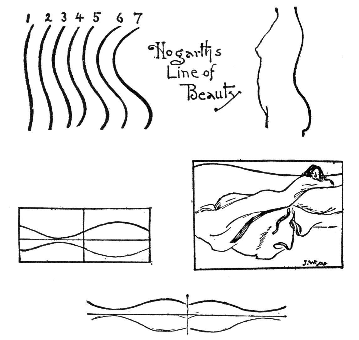
In Hogarth's essay on “The Line of Beauty,” he sets forth a series of seven curves selecting No. 4 as the most perfect. This is duplicated in nature by the line of a woman's back. If two be joined side by side they produce the beautiful curve of a mouth and the cupid's bow. Horizontally, the line becomes a very serviceable one in landscape. As a vertical it recalls the upward sweep of a flame which, ever moving, is symbolic of activity and life. To express this line both in the composition of the single figure and of many figures was the constant effort of Michael Angelo and, through Marcus de Sciena, his pupil, it has been passed down to us. By the master it was considered most important advice. “The greatest grace,” he asserts, “that a picture can have is that it express life and motion, as that of a flame of fire.” Yet in the face of such a statement from the painter of the “Last Judgment” it is difficult to reconcile the lack of it in this great picture.
In Hogarth's essay on “The Line of Beauty,” he presents a series of seven curves, identifying No. 4 as the most perfect. This is reflected in nature by the curve of a woman's back. When two curves are placed side by side, they create the beautiful shape of a mouth and the cupid's bow. Horizontally, the line serves a practical purpose in landscapes. Vertically, it evokes the upward movement of a flame, which symbolizes activity and life. Both in the composition of single figures and multiple figures, expressing this line was a constant goal for Michelangelo, and it has been passed down to us through his pupil, Marcus de Sciena. The master deemed this to be vital advice. "The ultimate grace," he claims, "One thing a picture can do is express life and movement, like the flicker of a flame." Yet, given such a statement from the painter of the "Final Judgment," it’s hard to reconcile the absence of it in this monumental work.
The compound curve which this line contains is one of perfect balance, traceable in the standing figure. As an element of grace, alone, it affords the same delight as the interweaving curves of a dance or the fascination of coiling and waving smoke. Classic landscape, in which many elements are introduced, or any subject where scattered elements are to be swept [pg 126] together and controlled is dependent upon this principle. An absolute line is not of course necessary, but points of attraction, which the eye easily follows, is an equivalent. Many simple subjects owe their force and distinction entirely to a good introduction through a bold sweeping curved line. Thanks to the wagon track of the seashore, which may be given any required curve, the formality and frequent emptiness of this subject is made to yield itself into good composition. When the subject rejects grace and demands a rugged form, the sinuous flow of line may be exchanged for an abrupt and forcible zigzag. In such an arrangement the eye is pulled sharply across spaces from one object to another, the space itself containing little of interest. In the short chapter on Getting out of the Picture, the use of this zigzag line was emphasized.
The compound curve in this line is perfectly balanced, evident in the standing figure. As a standalone element of grace, it offers the same pleasure as the intertwined curves of a dance or the mesmerizing movement of curling and swaying smoke. Classic landscapes, where many elements are brought together, or any subject with scattered components that need to be unified, relies on this principle. While a definitive line isn't strictly necessary, points of interest that the eye can easily follow serve a similar purpose. Many simple subjects achieve their impact and uniqueness through a strong introduction with a bold, sweeping curved line. The wagon track along the shore, which can take any desired curve, transforms the formality and frequent emptiness of this subject into good composition. When a subject disregards grace and calls for a rugged form, the smooth flow of lines can be swapped for a sharp and forceful zigzag. In this setup, the eye is drawn quickly across the space from one object to another, with the space itself offering little of interest. In the short chapter on Getting Out of the Picture, the use of this zigzag line was highlighted.
The opportunity offered in the film-like cirrus clouds, which so frequently lie as the background to the more positive forms of the cumulous, for securing the oppositional feeling, is one frequently adopted by sky painters. Besides strengthening the structure pictorially such arrangement frequently imparts great swing and movement in the lines of a sky, carrying the eye away from the horizon. When positive cloud motion is desired these oppositional masses may become very suggestive of wind, different strata showing a contrasted action of air currents.
The chance presented by the film-like cirrus clouds, which often serve as a backdrop to the more positive cumulus clouds, to create an opposing feeling is something that sky painters often use. This arrangement not only enhances the visual composition but also adds a sense of movement and dynamism in the lines of the sky, drawing the viewer's gaze away from the horizon. When there's a need for noticeable cloud movement, these opposing masses can evoke a sense of wind, with different layers showcasing contrasting air currents.
As an adjunct to any other form of composition this line may be profitably employed. It plays second with graceful effect in the [pg 127] “Path of the Surf,” “The Lovers,” “The Stream in Winter,” “The Chant,” “1807,” and is traceable in many of the best compositions.
This line can be effectively used as a complement to any other type of writing. It adds a nice touch in the [pg 127] “Surf Path,” "The Lovers," "Winter Stream," “The Chant,” “1807” and can be seen in many of the best works.
THE RECTANGLE
The last of the great forms of composition is the rectangle, but this always in connection with oppositional balance. Such a form attaches itself to two sides of the picture and the importance of a reacting measure is obvious. In this lies the warrant for its use, for without it unity is impossible. Of the six fundamental forms of composition this is the only one which is dependent, all the others containing within themselves the element of balance.
The last major type of composition is the rectangle, but it always relates to opposing balance. This form connects to two sides of the picture, making the need for a counterbalance clear. This is why its use is justified; without it, unity cannot be achieved. Out of the six basic forms of composition, this one is unique because it relies on something else, while the others inherently contain the element of balance.
The rectangle plus the isolated measure approaches the completeness of the cross and in the degree it lacks this completeness it develops opportunities for originality.
The rectangle along with the isolated measurement contributes to the full realization of the cross, and to the extent that it lacks this completeness, it creates opportunities for originality.
In the landscape by Corot the letter L is plainly shown. In the diagram of Fundamental Forms also, the tree-mass, cow and river bank in shadow serve as a sombre foil for the clump of trees upon the opposite shore which are bathed in the soft luminous haze of early morning. This is the real attraction which, grafted upon the heavy structure of the foreground affects us the more through the contrast. In Mr. Pettie's picture of “James II and the Duke of Monmouth,” we have the opposition of the two lines, the attraction in the open space being the line of seats along the wall. These, in the dimly lighted [pg 130] interior, are scarcely assertive enough to effect the diversion which the open structure demands.
In the landscape by Corot the letter L is clearly visible. In the diagram of Fundamental Forms, the dark shapes of the tree mass, cow, and riverbank create a stark contrast against the cluster of trees on the opposite shore, which are illuminated by the gentle morning haze. This contrast is what's truly captivating, adding depth to the heavy structure in the foreground. In Mr. Pettie's painting of “James II and the Duke of Monmouth,”, we see the clash of two lines, with the attraction in the open space coming from the row of seats along the wall. In the dimly lit interior, these seats are barely noticeable enough to create the movement that the open design calls for.
In perspective this arrangement merges into the triangle which has already been discussed. The “Sheep and Shepherd,” by Jacque is constructed upon the L reversed and is an unusually strong example of a rare arrangement.
In this context, this arrangement blends into the triangle that has already been talked about. The “Sheep and Shepherd,” by Jacque is built upon the reversed L and is a particularly strong example of a rare layout.
LINE
Structural line, or that which stands for the initial form of the picture and conjunctive line, or that which joins itself naturally to such form are the two phases of line which engage the scientific study of the artist. Line for line's sake is an opportunity offered him quite apart from structural considerations. Line has a distinct aesthetic value no less than one contributive to picture mechanics. Thus pictures conceived in vertical lines bespeak dignity, solemnity, quietude; pillars, trees of straight shaft, ascending smoke and other vertical forms all voice these and allied emotions. With slightly less force does a series of horizontals affect us and with a kindred emotion. But when the line slants and ceases to support itself, or becomes curved, movement is suggested and another set of emotions is evoked. The diagonal typifies the quick darting lightning. The vertical curved line is emblematic of the tongue of flame; the horizontal curve, of a gliding serpent. In the circle and ellipse we feel the whirl and fascination of continuity. The linear impulse in composition therefore plays [pg 131] a part in emotional art independent of the subject itself.
The structural line, which represents the initial shape of the image, and the conjunctive line, which naturally connects to that shape, are the two aspects of line that draw the artist's scientific study. Line for its own sake presents an opportunity outside of structural concerns. Line has its own aesthetic value, contributing significantly to how the picture works. Pictures designed with vertical lines convey dignity, seriousness, and tranquility; pillars, straight trees, rising smoke, and other vertical shapes express these and related feelings. A series of horizontal lines affects us similarly but with a bit less intensity. However, when the line tilts and loses its support or becomes curved, it suggests movement and stirs a different set of emotions. Diagonal lines symbolize the quick flash of lightning. A vertical curved line represents the flicker of flames; a horizontal curve signifies a smoothly gliding serpent. In circles and ellipses, we sense the spin and allure of continuity. Therefore, the use of lines in composition plays a role in emotional art that is independent of the subject itself. [pg 131]
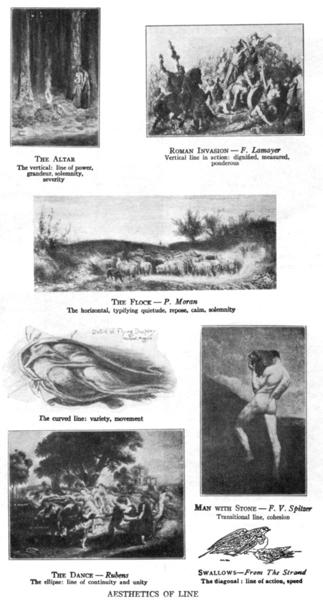

Pictorial art owes a large and increasing debt to decorative art and no small part of this is its simple beauty of line. It is rare however to find the painter governed in his first conception by any positive linear form. The outlines of great compositions only hint of decorative structure and give no evidence that they were planned as linear designs. The requirement of linear design that she beautifully fill a space is met by pictorial composition through the many correlative opportunities which in her broader range are open to her, by which she adds to the fundamental forms of construction (which often prove bad space fillers) such items as connect their outlines with the encasement or frame. With some ingenuity advocates of pure design as the basis of pictorial structure, point out the similarity of certain compositions to formal, ornamental design or type forms of plants, flowers, etc., yet omit to state how many of the best compositions they reject in their search for the happy hit or to allow for the fact that in those which they cite, cruel disturbance of the beautiful scheme could easily be wrought by slight reconstruction, leaving the work quite as good. The author's contention is directly opposed to the notion that pictorial art is dependent on the flat plan of the design, which is only contributory, but that its essence is known by an apprehension of balance through the depth of the picture. Pictorial art is not an art of two dimensions but of three.
Pictorial art owes a significant and growing debt to decorative art, largely because of its simple beauty in shapes. However, it’s rare to find that a painter is guided in their initial idea by any good linear form. The outlines of great compositions only hint at decorative structure and show no signs that they were originally planned as linear designs. The requirement of linear design to beautifully fill a space is fulfilled by pictorial composition through the various opportunities available in its broader range, allowing it to include to the basic construction forms (which often don’t fill space well) elements that connect their outlines with the frame. Some proponents of pure design as the foundation of pictorial structure highlight the similarities between certain compositions and formal, ornamental designs or types of plants, flowers, etc., yet fail to acknowledge how many of the best compositions they dismiss in their quest for the perfect fit or to consider that in those they cite, minor adjustments could easily disrupt the beautiful scheme without diminishing the work's quality. The author's argument is directly against the idea that pictorial art relies solely on the flat design plan, which is only a contributing factor; instead, its essence is understood through a sense of balance within the depth of the picture. Pictorial art is not a two-dimensional art but a three-dimensional one.
CHAPTER VIII - THE COMPOSITION OF ONE, TWO, THREE, AND MORE UNITS
Starting with a single idea represented by a single unit the coexistent thought must be the frame or canvas circumference. Supplying this we may then think of the unit as a matter of proportion. When the amount of space allowed the unit has been decided, the space between its circumference and the dimensions of the canvas, or what may be called the surplus or contributing area is the only thing that remains to engage us. Let the unit be a standing figure, or a portrait, head and shoulders.
Starting with one idea represented by a single unit, the accompanying thought must serve as the frame or edge of the canvas. With this in mind, we can think of the unit in terms of proportion. Once we determine the amount of space allocated to the unit, the space between its edge and the dimensions of the canvas, or what can be considered the extra or contributing area, is all that is left for us to focus on. Let the unit be a standing figure or a portrait of just the head and shoulders.
The unification of a unit, enclosed in four sides, with those sides can only be accomplished by either having the mass of the figure touch the sides of the canvas, or stretch toward them with that intent. According to the strength or number of such points of attachment will the unit be found to maintain a stable existence amid its surroundings. In the case of the single figure standing within the frame where no chance of contact occurs, the background should show an oppositional mass or line attaching at some point the vertical sides of the figure to the sides of the canvas. An equivalent of such a line is a gradation, often the shadow from the figure serving to effect this union. If the shadow unites the outline with the background in such a tone as to subdue or destroy this [pg 133] outline, the attachment becomes stronger and at the same time the positiveness of outline on the light side finds its contrast and balance in this area of mystery and envelopment.
The unification of a shape, enclosed on all four sides, with those options can only be achieved by either having the mass of the figure touch the edges of the canvas or reaching toward them with that purpose. Depending on the strength or quantity of these attachment points, the unit will maintain a stable existence within its surroundings. When a single figure is within the frame and does not touch anything, the background should present an opposing mass or line connecting the vertical sides of the figure to the edges of the canvas. A similar line can be a gradient, often the shadow of the figure that helps create this connection. If the shadow merges the outline with the background in such a way that it softens or blurs this [pg 133] outline, the connection becomes stronger while the clarity of the outline on the light side finds its contrast and balance in this area of mystery and enveloping.
A development by chiaroscuro is a necessity to the pictorial unity of the single figure.
A development by light and shadow is essential for the visual unity of the individual figure.
In the portrait of Olga Nethersole (see “The Pose in Portraiture”), the photographer presents the section of a figure; not a picture. The spaces in the background form no scheme with the figure and have not been used to relieve the lines of the skirt. The sacrifice in half-tone of the lower part would have given prominence to the upper and more important part. Owing to the interest and attraction of the triplicated folds of the dress the vision is carried all the way to the lower edge, where it is irritated by the sudden disappearance. The picture has no conclusion. It is simply cut off, and so ended.
In the portrait of Olga Nethersole (see “The Pose in Portraits”), the photographer captures part of a figure, not a complete image. The background doesn’t create any relationship with the figure and hasn’t been used to soften the lines of the skirt. If the lower part had been made less prominent, it would have highlighted the upper and more significant part. Because of the fascinating and appealing folds of the dress, the viewer’s gaze is drawn all the way down to the bottom edge, where it is abruptly cut off. The image lacks a conclusion. It’s just suddenly stopped, and that's it.
It is the opinion of some artists that the portrait having for its purpose the presentation of a personality should contain nothing else. With the feeling that the background is something that should not be seen, more art is often expended in painting a space with nothing in it than in putting something there that may not be seen. In doing nothing with a background a space may be created that says a great deal that it should not.
It’s the opinion of some artists that a portrait meant to showcase a personality shouldn't include anything else. Believing that the background shouldn't be noticeable, more effort is often put into painting an empty space than into adding something here that might not be seen. By leaving the background untouched, a space can be created that communicates a lot of unintended messages.
There is nothing more difficult than the composition of two units especially when both are of equal prominence. The principle of Principality sets its face sternly against the attempt.
There is nothing more challenging than combining two units, especially when both are equally important. The principle of Principality firmly opposes this effort.
One must dominate, either in size, or attraction, either by sentiment or action.
One must stand out, either by size or charm, either through feelings or actions.
Art can show distinguished examples of two figures of equal importance placed on the same canvas, but pictorially they lack the essential of complete art,—unity. The critical study of this problem by modern painters has secured in portraiture and genre much better solutions than can be found in the field of good painting up to the present. We may look almost in vain through old masterdom and through the examples of the golden age of portraiture in England, discovering but few successes of such combination in the works of Gainsborough, Reynolds and others.
Art can display notable instances of two equally important figures on the same canvas, but visually they lack the crucial element of complete art—unity. Modern painters' critical examination of this issue has led to much better solutions in portraiture and genre than what we've seen in quality painting up to now. We might search through the works of the old masters and the golden age of portraiture in England almost in vain, finding only a few successful combinations in the works of Gainsborough, Reynolds, and others.
The foreplacement of one figure over another does not always mean prominence for it. Light, as an element, is stronger than place. On this basis where honors are easy with the two subjects one may have precedence of place and one of lighting.
The placement of one figure over another doesn't always indicate that it stands out more. Light, as an element, is more powerful than position. In situations where both subjects are held in high regard, one might take precedence due to its location and the other because of the lighting.
The difficulty in the arrangement of two is in their union. If, for instance, they are opposed in sentiment as markedly as two fencers there yet must be a union secured in the background. If placed in perspective, perspective settles most of the difficulty.
The challenge in arranging two people is in their coming together. If, for example, they have opinions that are as different as two fencers, there still needs to be a connection established behind the scenes. When viewed from the right perspective, perspective resolves most of the challenges.

The accompanying pictures are examples at both ends of the scale. “The Lovers,” in construction, shows what all pictures demand, the centripetal tendency. All the elements consist. As a picture it is complete; another figure would spoil it for us and them. Not so the [pg 135] “Poulterers”; persons could come and go in this picture without effecting it. It is but a section at best. One can imagine a long row of pickers, or we could cut it through the centre and have two good studies. There is no union. The other contains principality, transition of line, balance of light and shade, circular observation, opposition of color values and the principle of sacrifice.
The pictures shown represent extremes on a spectrum. “The Lovers” in construction exemplifies what all pictures aim for: a unifying focus. All the elements come together perfectly. As a visual piece, it's complete; adding anything else would ruin it for us and for others. On the other hand, the [pg 135] “Poultry Sellers” allows people to come and go without affecting it. It’s just a snapshot, at best. You can picture a long line of workers, or we could split it in the middle and create two strong research. There’s no cohesion there. The other image embodies concepts of central power, the flow of lines, a balance between light and shadow, circular perspective, contrasting color values, and the idea of sacrifice.
In Mr. Orchardson's “Mother and Child” the first place is given to the child in white; the background carries the middle tint and the mother has been reserved in black. Greater sacrifice of one figure to another, the mother to the child, is seen in Miss Kasebier's picture of a nude infant held between the knees of the mother whose face is so abased as to be unseen; or in John Sargent's portrait of a boy seated and gazing toward us into space while his mother in the half-shadow of the background reads aloud. The greatest contributing force to contrast is sacrifice. The subject is known to be important by what is conceded to it.
In Mr. Orchardson's “Mother and Child”, the child in white takes center stage; the background features a medium shade, and the mother is dressed in black. A more significant sacrifice of one figure for another, with the mother yielding to the child, is depicted in Miss Kasebier's image of a nude baby held between the mother's knees, whose face is so downcast that it remains unseen; or in John Sargent's portrait of a boy sitting and staring into space while his mother reads aloud from the shadows of the background. The strongest element contributing to contrast is sacrifice. The significance of the subject is highlighted by what is given up for it.
The portrait of two gentlemen by Eastman Johnson is one of the most successful attempts at bringing two figures of equal importance on to one canvas. They are in conversation, the one talking and active, the other listening and passive, and the necessary contrast is thus created.
The portrait of two gentlemen by Eastman Johnson is one of the most successful efforts to bring two equally important figures onto one canvas. They are in conversation, with one speaking and engaged while the other listens and is more reserved, creating a clear contrast.
In the combination of three units the objection of formal balance disappears. If one be opposed by two, the force gained by the one through [pg 136] isolation commensurates the two. In such arrangement the two may be united by overlapping so that though the sense and idea of two be present it is shown in one mass as a pictorial unit. This general disposition, experience shows to be the best. Two other good forms are two separated units joined by other items and opposed to one, or the three joined either directly or by suggestion, the units balanced like a triangle by opposition. The Madonna and St. John with the Infant Christ is a sample of the first. In the “Connoisseurs” by Fortuny we have the second form, and in the “Huntsman and Hounds” the third. A most original and commendable arrangement of three figures by W. L. Hollinger appears in “The Pose in Portraiture,” the members of a trio, violin, cello and piano. The pianist is designated by the suggestion of her action which is completed out of the picture. In her position however she accomplishes the balancing of two figures against one.
In the combination of three elements, the issue of formal balance vanishes. If one is opposed by two, the strength gained by the solo element through its isolation balances out with the two. In this setup, the two can be connected by overlapping, so that even though the concept and image of two are present, they appear as a single cohesive unit. This overall arrangement is proven to be the most effective. Two other effective forms include two separate units linked by additional elements and opposing one, or all three connected either directly or through suggestion, with the units balanced like a triangle by opposition. The Madonna and St. John with the Baby Jesus is an example of the first type. In the "Experts" by Fortuny, we see the second form, and in the “Huntsman and Hounds” the third. A highly original and praiseworthy arrangement of three figures by W. L. Hollinger can be found in “Poses in Portraits,” featuring a trio of violin, cello, and piano. The pianist is indicated by the suggestion of her action, which extends beyond the frame. In her position, however, she effectively balances two figures against one.
The Figure in Landscape
A writer on the use of the figure in out-of-door photography after leading the reader through many pages concludes by saying: after all you had better leave them out.
A writer discussing the use of figures in outdoor photography, after guiding the reader through many pages, concludes by saying: after all, it's probably better to leave them out.
In two works on photography from an English and American press the writer has seen this article quoted in full and therefore infers that the author has been taken seriously.
In two books on photography from English and American publishers, the writer has found this article quoted in full and thus concludes that the author has been taken seriously.
The relation of Man to Nature, and the [pg 137] sentiment, interchangeable, proceeding from one to the other, is a link binding the one to the dust from which he sprang and the other to the moods of man to which she makes so great an appeal. It is a union of a tender nature to the real lover of the voiceless influences which surround him:
The connection between humans and nature, with feelings constantly shifting between the two, ties us to the earth we came from and resonates with the emotions that nature evokes in us. It’s a bond that reflects a deep sensitivity to the unspoken forces around us:
Can a sentiment so strong in fact, be divorced in art? It is the fulcrum on which the art of Mauve and Millet and Walker lifts and turns us. It is not necessary to mention other painters; but to the case in point observe that at Barbizon a photographer of artistic perceptions has for years followed in the footprints of Millet. If nature moves us directly she will move us through our own kind. We feel the vastness of a scene by the presence of a lone figure. The panoramic grandeur of the sky attracts us the more if it has also appealed to a figure in the picture. But beyond this affinity in the subject there are sufficient reasons why the figure should be included. The figure can be moved about as a knight in the game, hither and yon as the fixed conditions of topography demand. Many a landscape which would be entirely useless without such an element is not only redeemed, but is found to be particularly prepared and waiting for this keystone. Take for example [pg 138] a picture in which lines are paralleling one another in their recession from the foreground or where there is a monotony in any horizontal sequence. The vertical of the figure means the balance of these. The principle is one already noted, action balancing action in contrary direction.
Can a feeling so powerful really be separated from art? It's the pivot on which the works of Mauve, Millet, and Walker lift and move us. There’s no need to mention other artists; just look at how a photographer in Barbizon, who understands art, has followed in Millet's footsteps for years. When nature inspires us directly, it also connects us through our fellow humans. We sense the vastness of a scene with the presence of a solitary figure. The majestic beauty of the sky captivates us even more if it catches the attention of someone in the image. But beyond this connection in the subject matter, there are plenty of reasons to include the figure. The figure can be positioned like a chess piece, moved around as the landscape requires. Many landscapes would be completely ineffective without such an element; instead, they are not only enhanced but seem to be waiting for this essential piece. For instance, consider an image where lines are receding parallel from the foreground or where there's a dullness in any horizontal pattern. The vertical presence of the figure provides balance. This principle has already been noted: action countering action in opposite directions.
What of the nymphs of Corot, or the laveuses bending at the margin of the lake, the plowman homeward plodding o'er the lea, the shepherd on the distant moor, the woodsman in the forest, the farmer among his fields. We associate our vision of the scene with theirs. When as mere dots they are discerned, the vastness of their surroundings is realized at their expense and the exclamation of the psalmist is ours: “What is man that thou art mindful of him.”
What about the nymphs of Corot, or the women washing clothes by the lake, the farmer trudging home across the meadow, the shepherd out on the distant moor, the woodsman in the forest, the farmer in his fields? We connect our view of the scene with theirs. When we see them as tiny figures, we really grasp how vast their surroundings are, and we echo the psalmist's exclamation: "What is humanity that you are mindful of them?"
The danger in the use of the figure is that it is so frequently lugged in. The friends that happen to be along are often made to do. There is no case where the fitness of things is more compulsory than in the association of figures with landscape. The haymaker creates a sensation on Broadway but no more so than Dundreary crossing a plowed field in Oxford ties. As the poetry of a Corot landscape invites the nymphs to come and the ruggedness of the Barbizon plain befits the toiling peasants of Millet, so should our landscape determine the chord in humanity to be harmoniously played with it.
The risk of using figures in art is that they’re often just thrown in. Friends who happen to be there are frequently used as stand-ins. There’s no situation where the appropriateness of elements is more important than pairing figures with the landscape. A haymaker makes a splash on Broadway, but not more than Dundreary stomping through a plowed field in Oxford ties. Just as the beauty of a Corot landscape invites nymphs to join and the roughness of the Barbizon plain suits the hardworking peasants of Millet, our landscape should inspire the human elements that blend harmoniously with it.
A fault in construction is frequently seen in the lack of simplicity of foreplane and [pg 139] background. It must first be determined whether it is to be a landscape with figures or figures in landscape. The half one and half another picture is a sure failure.
A mistake in construction is often observed in the unnecessary complexity of the foreground and background. It should first be established whether the focus will be a landscape with figures or figures within a landscape. A composition that is half one and half the other is bound to fail.
The most serviceable material one may collect in sketching are such positions which play second or third parts in composition; cattle or other animals in back or three-quarter view which readily unite with and lead to their principals.
The most useful material to gather when sketching includes elements that play secondary or tertiary roles in the composition; animals like cattle shown from the back or at a three-quarter angle that easily connect with and lead to the primary subjects.
In the selection of the subject the main object has most of one's thought. This however usually “goes” without thought, asserting itself by its own interest. Figures which are less interesting than this and still less, such as will combine with the subject proper, are what the painter and illustrator long for. As with the background, those things which are not of sufficient interest to be worth while in themselves are, owing to their lesser significance, of the utmost importance to the composer. Note in the usual Van Marke cattle picture of five cows, the diminishing interest in the other four, or the degree of restraint expressed in most of the figures successfully introduced into landscape.
In choosing a subject, the main focus is on what captures one’s attention. However, this usually happens instinctively, driven by its own appeal. Artists and illustrators crave elements that are less captivating but still complement the main subject. Similar to the background, things that aren’t interesting enough to stand alone are crucial to the overall composition due to their lesser importance. Take a typical Van Marke painting featuring five cows; you’ll notice that the other four have diminishing appeal, or observe the subtlety often represented in most figures successfully integrated into landscapes.
CHAPTER 9 - GROUPS
In the statuesque group the outline is important because this is seen against the background of wall, or sky, and frequently in silhouette. Any fault in its contour as a mass is therefore emphasized. This consideration applies pictorially to groups which are complete in themselves and have no incorporation with backgrounds, such for instance as the photographic group of a number of people. Here personality is the first requirement, but harmony of arrangement and picturesqueness may be united thereto. The two best shapes are the oval and the pyramid. In either of these outlines there is opportunity for a focal centre, always important. In forming such an arrangement the focus should be the first consideration, item by item being added. As the group approaches the outline it must be governed according to the form desired. A more artistic combination of figures will be found to be a separation into a large and a small group, the principal figure placed in either. If in the former, the figures of the smaller group must be sacrificed to this figure, either in pose or lighting. If the principal figure is in the smaller group or entirely separate, this isolation will prove sufficient for the distinction.
In a group of statues, the outline is crucial because it’s viewed against the background of a wall or sky, often in silhouette. Any imperfection in its shape as a whole gets highlighted. This idea also applies to groups that are self-contained and not connected to backgrounds, like a photo of several people. Here, personality is essential, but it can also be combined with an appealing arrangement and aesthetic quality. The two best shapes are the oval and the pyramid. Both of these outlines allow for a focal point, which is always important. When creating such an arrangement, the focus should be the main priority, with each element added one by one. As the group takes shape, it should be adjusted according to the desired form. A more artistic combination of figures can be achieved by splitting them into a larger group and a smaller one, placing the main figure in either group. If it’s in the larger group, the figures in the smaller group must take a backseat to the main figure, whether in their pose or lighting. If the main figure is in the smaller group or completely separate, this isolation will be enough to create distinction.
Where greater liberties may be taken and the intention is for a purely artistic composition, the curvilinear S shape will be found a good line to build upon. When this is too apparent a single oppositional figure will destroy its formality.
Where more freedom can be exercised and the goal is a purely artistic composition, the curvilinear S shape will serve as a solid foundation. However, if this becomes too obvious, a single opposing figure can undermine its formality.
The possibilities of the single figure as a reserve, kept to be placed at the last moment where something is necessary, are worth noting. If the group be too formal in outline, lateral arrangement, or expression, the reserve may be played as a foil to create a diversion.
The potential of using a single figure as a backup, held in reserve for when something is needed at the last minute, is worth mentioning. If the group appears too formal in shape, layout, or expression, the reserve can be used as a contrast to create a diversion.
In all successful groups the principle of sacrifice must play havoc. Here the artist should expect to pay for his art scruples. Rembrandt was the first painter sacrificed to these instincts. When the order to paint the “Municipal Guard” came to him he saw in it an opportunity toward the pictorial. Knowing what this entailed he persevered, despite the mutterings of his sitters, the majority of whom were ill pleased with their respective positions. When finally the canvas was finished, full of mystery and suggestiveness and those subtle qualities, such as before had never been seen in Dutch art, those for whom it had been executed expressed their opinion by giving an order for the same to a rival. His picture is a collection of separate individuals, each having an equal importance. Here was the sudden ending of Rembrandt's career as a painter of portraits, only one canvas of an important group being painted thereafter—the “Syndics.” A certain reason in this popular criticism cannot be denied. The composition is unnecessarily [pg 142] scattered and the placements arbitrary, though through the radial lines of pikes and flag pole the scattered parts are drawn together. The composition partakes of the confusion of the scene depicted, yet in its measure of parts one can doubt not that the comparative values of his sitters have been considered.
In all successful groups, the principle of sacrifice has to cause chaos. Here, the artist should expect to pay for their artistic principles. Rembrandt was the first painter sacrificed to these instincts. When the order to paint the “Municipal Security” came to him, he saw it as an opportunity for visual storytelling. Knowing what this would involve, he stuck with it, despite the complaints from his sitters, most of whom were not happy with their poses. When the canvas was finally finished, overflowing with mystery, suggestiveness, and subtle qualities never before seen in Dutch art, those for whom it was made responded by commissioning a rival instead. His painting is a collection of individual figures, each equally important. This marked the abrupt end of Rembrandt's career as a portrait painter, with only one important group portrait created afterward—the “Managers.” There's some truth to this public criticism. The composition feels unnecessarily scattered and the placements seem random, although the radial lines of pikes and flagpoles do bring the scattered parts together. The composition reflects the confusion of the scene depicted, yet one cannot doubt that the relative value of his sitters has been taken into account. [pg 142]
The democracy of man in his freedom and equality is the despair of the artist who knows that the harmony of the universe is conditional on kingship and principalities and powers, and the scale of things from the lowest to the highest.
The democracy of people in their freedom and equality frustrates the artist who understands that the harmony of the universe depends on hierarchy and authority, and the balance of things from the lowest to the highest.
Says Mr. Ruskin: “The great object of composition being always to secure unity—that is, to make many things one whole—the first mode in which this can be effected is by determining that one feature shall be more important than all the rest and that others shall group with it in subordinate position.”
Says Mr. Ruskin: "The main goal of writing is always to create unity—that is, to merge various elements into one complete piece. The first step to achieve this is to determine which aspect will be the most important, while the other elements will play a supporting role."
Principality may be secured either by attraction of light as in a white dress or by placing the figure as the focus of leading lines as are supplied by the architecture of a building, or such lines as are happily created by surrounding figures which proceed toward the principal one, or by including such a figure in the most important line. Again the figure for such a position may be the only one in a group which exhibits unconcern or absolute repose, the others by expression or action acknowledging such sovereignty.
Principality can be established either by drawing attention with light, like in a white dress, or by positioning the figure at the center of leading lines provided by the architecture of a building, or by creating lines naturally through surrounding figures that direct focus towards the main one, or by placing that figure on the most significant line. Additionally, the figure in this position might be the only one in a group that shows calm or complete stillness, while the others express or act in recognition of its dominance.
The summer time out-of-door group which is [pg 143] so frequently interesting only to “friends,” in many cases affords opportunities for pictures attractive to all. The average photographer is concerned only with his people; the background is brought to mind when he sees the print. Although little or no interest may be found in the background it should be appropriate, and should play a reserve part, serving the chiaroscuro and therefore the illumination of the subject and creating an opportunity for the exit which always gives depth and an extended interest. A mass of foliage with little penetration by the sky except in one or two places and at the side, not the centre, may always be found safe. If the attraction is too great the group suffers. Appreciating the importance of his setting for groups the photographer must select these with three points in view; simplicity, uninterest and exit in background; simplicity, uninterest and leading line or balancing mass or spot (if required) in foreground. When looking for backgrounds he may feel quite sure he has one if it is the sort of thing he would never dream of photographing on its own account. Besides being too interesting, most backgrounds are inappropriate and distracting. The frequent commendations and prizes accorded to good subjects having these faults and therefore devoid of unity tell how little even photographic judges and editors think on the appropriate and essential ensemble in composition.
The summer outdoor group often captures the interest of only a few "friends," but it can present chances for pictures that appeal to everyone. The typical photographer focuses on the people, only remembering the background when they see the print. Even if the background doesn't seem interesting, it should fit well and play a supportive role, enhancing the light and shadow of the main subject while creating a potential exit that adds depth and interest. A dense mass of leaves, with just a little bit of sky peeking through in a few spots, especially on the sides rather than in the center, is usually a safe choice. If the background is too eye-catching, it distracts from the group. Understanding how crucial the setting is for group shots, the photographer should choose backgrounds with three main ideas in mind: simplicity, lack of distraction, and a potential exit; simplicity, lack of distraction, and leading lines or balanced elements in the foreground. When searching for backgrounds, a photographer can be confident they’ve found one if it’s something they wouldn’t dream of shooting on its own. Most backgrounds are either too interesting or inappropriate and distracting. The frequent awards given to good subjects that possess these flaws, and thus lack unity, reveal how little even photographic judges and editors consider the importance of a cohesive composition.
With the background in unobjectionable evidence the photographer should rapidly address [pg 144] his posers a little lecture on compositional requirements and at the end ask for volunteers for the sacrificial parts, at the same time reminding them that the back or side view is not only characteristic of the person but often very interesting. He should maintain that a unity be evident in the group; of intent, of line, and of gradation. The first is subjective and must be felt by the posers. The other two qualifications are for the artist's consideration. At such a time his acquaintance with examples of pictorial art will come to his aid. He must be quick to recognize the possibilities of his material which may be hurriedly swept into one of the forms which have justified confidence.
With the background clearly in place, the photographer should quickly give his subjects a brief talk on composition and then ask for volunteers for the sacrificial roles, while also reminding them that the back or side view not only reflects the individual but can also be very intriguing. He should ensure that there’s a sense of unity in the group; in their intent, lines, and gradation. The first aspect is subjective and needs to be felt by the subjects. The other two points are for the artist to consider. In this moment, his knowledge of visual art will be beneficial. He must quickly recognize the potential of his setup, which might be hastily organized into one of the forms that inspire confidence. [pg 144]
When a continuity of movement has been secured, a revisionary glance must be given to determine if the whole is balanced; background, foreground and focus, one playing into the other as the lines of a dance, leading, merging, dissolving, recurring.
When movement flows continuously, it's important to take a moment to check if everything is balanced; background, foreground, and focus should interact like the elements of a dance—leading, merging, dissolving, and recurring.
Mindful of the distractions of such occasions, the wise man has done his thinking beforehand, has counted his figures, has noted the tones of clothing and has resolved on his focal light. With this much he has a start and can begin to build at once. His problem is that of the maker of a bouquet adding flower to flower around the centre.
Mindful of the distractions that come with these occasions, the wise person has thought things through in advance, calculated the details, observed the colors of clothing, and determined his main focus. With this groundwork laid, he can start right away. His challenge is similar to that of a bouquet maker, adding flowers one by one around the center.
To make a rough sketch from the models themselves posed and thought over, with the opportunity for erasures of revisions before leading them out of doors, often proves economy of time.
To quickly sketch from the models themselves, considering their poses and making adjustments before taking them outside, often saves time.
It is a custom of continental painters to compose extensive groups and photograph them for study in arrangement. The author has seen numerous compositions in photography in which artists have posed as characters of well-known paintings.
It’s common for continental painters to create large groups and take photos of them for arrangement study. The author has seen many photographic compositions where artists have posed as characters from famous paintings.
Much can be learned of good grouping from the stage, especially the French stage. The best managers start with the picturesque in mind and are on the alert to produce well arranged pictures. The plays of Victorien Sardou and the classic dramas of the state theatre are studies in the art of group arrangements.
Much can be learned about effective grouping from the stage, especially the French theater. The best directors begin with aesthetics in mind and are always ready to create well-composed scenes. The plays of Victorien Sardou and the classic dramas of the state theater are excellent examples of the art of group arrangements.
It will be noticed in most groups that there is an active and a passive element, that many figures in their reserve are required to play second to a few. The active principle is represented by these to whom a single idea is delivered for expression.
It will be noticed in most groups that there's an active and a passive element, and that many people in the background are required to play second to a few. The active principle is represented by those who receive a single idea to express.

In “The Return of the Hunting Party” the group of hounds, huntsman and deer is such an element of reserve, contrasting its repose with the bustle and activity of the visitors. It is a diversion also for the long line stretching across the picture. This is the more evident through the repetition of it in the line of the second-story and roof and below in the line of game which unnecessarily extends the group of hounds. A relief for the insistent line of the figures could have been supplied by lighter drapery back of the table. This then would have created a cross tone connecting the hounds in a curve with the upper centre panel. It is a picture in five [pg 146] horizontal strips, and is introduced for the warning it contains in its treatment of a group which is in itself a line. The well-known “Spanish Marriage” by Fortuny also shows the reserve group, but the contrast is more positive both in repose and color. The main and more distant group is well centralized and there is a clever diminuendo expressed in its characters.
In "The Return of the Hunting Party", the pack of dogs, the huntsman, and the deer create a sense of stillness that contrasts with the hustle and bustle of the visitors. It also serves as a distraction for the long line running across the image. This effect is more noticeable due to the repetition of the line in the second-story and roof, as well as the extended line of game that unnecessarily stretches the group of hounds. A lighter drapery behind the table could have provided a visual break for the continuous line of figures. This would create a curve linking the hounds to the upper central panel. The painting is composed of five [pg 146] horizontal sections, and it serves as a cautionary example in its portrayal of a group that is essentially a line. The famous “Spanish Wedding” by Fortuny also depicts a reserved group, but the contrast is more pronounced in both its stillness and colors. The main group and the one in the background are well-centered, and there’s a clever gradual decrease in intensity expressed in the characters.

In “The Reapers” this idea has apt illustration. The figure in the foreground is in contrast with the remaining three, both as an oppositional line and in his action, the three being in repose. The single figure, though active, does not attract as much as the child who receives importance from the attention of the two figures. Her position, opposed to the two, turns the interest back into the group. In all the compositions by this master one is impressed by the grace and force of the arrangement. A small portfolio of his charcoal reproductions or a few photographs of his pictures should be a part of the print collection of every artist. No better designer of small groups ever lived.
In “The Reapers”, this idea is illustrated well. The figure in the foreground contrasts with the other three, both in his stance and actions, as the three are at rest. Although the single figure is active, he doesn't draw attention like the child does, who stands out due to the focus of the two other figures. Her position, opposite the two, pulls the interest back to the group. In all of the works by this master, one is struck by the elegance and strength of the composition. A small collection of his charcoal reproductions or some photographs of his artworks should be part of every artist's print collection. No one has ever designed small groups better.
With the amount of good art now coming from the camera it is strange that no groups of note have been produced.12 In the field of pure portraiture the attempt may as well be abandoned. The photographer can at best but mitigate conditions. The picture group can only apply when sacrifice and subordination are possible.
With the quality of art coming from photography today, it's surprising that no notable groups have emerged.12 In the area of pure portraiture, we might as well give up. A photographer can only do so much to improve the situation. A group photo can only work when there's a willingness to make sacrifices and put others first.
A study of famous groups will settle this and other points mentioned, beyond question. In the [pg 149] religious group, where the idea of adoration was paramount, the principal figure was usually, though not always, given place in the upper part of the picture toward which by gestures, leading lines or directed vision our attention is drawn at once. Note the figures which sacrifice to this effect in the “Transfiguration,” “The Immaculate Conception,” “The Sistine Madonna,” “The Virgin Enthroned,” “The Adoration of the Magi,” and in fact all of the world famous compositions of the old religious art.
A study of famous groups will clarify this and other points mentioned, without a doubt. In the [pg 149] religious group, where the idea of worship was most important, the main figure was usually, although not always, placed in the upper part of the picture, drawing our attention through gestures, leading lines, or focused vision. Check out the figures that contribute to this effect in the "Transfiguration," “The Immaculate Conception,” “The Sistine Madonna” "The Virgin on the Throne," “The Adoration of the Magi” and indeed all of the world-famous works of old religious art.

In one of the most famous of modern groups “The Cossacks Reply to the Sultan of Turkey,” by the greatest of Russian painters Elias Repine, the force given to the hilarious frenzy of the group by the occasional figure in repose is easily apparent.
In one of the most famous modern groups “The Cossacks Respond to the Sultan of Turkey,” by the greatest Russian painter Ilya Repin, the impact of the lively chaos of the group is clearly highlighted by the occasional figure at rest.
The answer to a summons for surrender is being penned upon a rude table around which press close the barbaric leaders of the forces gathered in the distance. Some are lolling on wine casks, others indifferently gaze at the fingers of the clerk as he carefully pens the document, others smoke silently, one is looking out of the picture as though unconcerned. Yet life and movement are instinct in every part, for though the action is consigned to but a few,—these form a series of small climaxes through the entire circumference of the group and we feel in another moment that the passive expressions will in their turn be exchanged for the mad ribaldry of laughter which has seized their brethren. The group is a triumph for several æsthetic realities [pg 150] produced and heightened by contrast and subordination.
The response to a call for surrender is being written on a rough table surrounded by the brutal leaders of the forces gathered nearby. Some are lounging on wine barrels, others are apathetically watching the clerk’s fingers as he carefully writes the document, some are quietly smoking, and one is staring off into space as if uninterested. Yet there's life and movement all around, for even though only a few are actively engaged, they create a series of small climaxes that ripple through the entire group, and we can sense that soon the still expressions will burst into the wild laughter that has captured their companions. The group is a celebration of several aesthetic realities [pg 150] revealed and intensified through contrast and hierarchy.
The principality of repose is well illustrated in the group of “The Chant” where the inaction of the woman dominates through its contrast with the effort expressed by the other members of the group.
The idea of rest is clearly shown in the group of “The Chant” where the stillness of the woman stands out against the activity of the other group members.
There are three types of group composition; first, where the subject's interest is centred upon an object or idea within the picture as in “The Cabaret” or Rembrandt's “Doctors” surrounding a dissecting table; second, where the attraction lies outside the picture as in the “Syndics” or the “Night Watch,” and third, where absolute repose is expressed and the sentiment of reverie has dominated the group, as in “The Madonna of the Chair,” and the ordinary family photograph.
There are three types of group composition: first, where the subject's interest is focused on an object or idea within the picture, like in “The Cabaret” or Rembrandt's "Doctors" around a dissecting table; second, where the attraction is outside the picture, as seen in "Managers" or "Night Watch," and third, where total calm is portrayed and a sense of daydreaming dominates the group, like in “The Madonna of the Chair” and the typical family photo.
The spiritual or sentimental quality of the theme should have first consideration and dictate the form of arrangement. A unity between the idea and its form of expression constitutes the desideratum of refinement in composition.
The spiritual or emotional aspect of the theme should be the top priority and guide how it's structured. A harmony between the concept and how it's expressed is the goal of sophistication in composition.
CHAPTER X - LIGHT AND SHADE
In this familiar term in art the importance of the two elements is suggested in their order.
In this well-known term in art, the significance of the two elements is implied by their sequence.
The effort of the painter is ever in the direction of light. This is his thought. Shade is a necessity to the expression of it.
The painter's effort is always aimed at light. This is his focus. Shadow is essential for expressing it.
Chiaroscuro,—from the Italian, light obscure, in its derivation, gives a hint of the manufacture of a work of light and shade.
Chiaroscuro—from the Italian, dim light, in its origin, suggests the creation of a piece that plays with light and shadow.
Light is gained by sacrifice. This is one of the first things a student grasps in the antique class. Given an empty outline he produces an effect of light by adding darks. So do we get light in the composition of simple elements, by sacrifice of some one or more, or a mass of them, to the demands of the lighter parts. “Learn to think in shadows,” says Ruskin. Rembrandt's art entire, is the best case in point. A low toned and much colored white may be made brilliant by dark opposition. The gain to the color scheme lies in its power to exhibit great light and at the same time suggest fullness of color.
Light comes from sacrifice. This is one of the first things a student understands in the classic art class. Given an empty canvas, he creates an effect of light by adding darks. We achieve light in the composition of simple elements by sacrificing one or more of them to accommodate the lighter parts. "Learn to think in shades," says Ruskin. Rembrandt's entire body of work exemplifies this perfectly. A low-toned and richly colored white can be made vibrant by dark contrast. The advantage to the color scheme lies in its ability to display great light while also suggesting depth of color.
As we have discussed line and mass composition as balanced over the central vertical line, so is the question of light and shade best comprehended, as forces balancing, over a broad [pg 152] middle tint. The medium tint is the most important, both for tone and color. This commands the distribution of measures in both directions; toward light and toward dark. Drawings in outline upon tinted paper take on a surprising finish with a few darks added for shadow and the high lights touched in with chalk or Chinese white. The method in opaque water color, employed by F. Hopkinson Smith and others, of working over a tinted paper such as the general tone of the subject suggests, has its warrant in the early art of the Venetian painters. If a blue day, a blue gray paper is used; if a mellow day, a yellow paper.
As we’ve talked about line and mass composition being balanced over the central vertical line, we can understand the concept of light and shade as forces balancing over a broad [pg 152] mid-tone. The medium tint is key for both tone and color. This guides how light and dark are distributed. Drawings outlined on tinted paper can look surprisingly finished with a few darks added for shadow and highlights touched in with chalk or Chinese white. The technique using opaque watercolor, practiced by F. Hopkinson Smith and others, of working over tinted paper based on the general tone of the subject, has roots in the early art of the Venetian painters. If it’s a blue day, a blue-gray paper is used; if it’s a warm day, a yellow paper.
In pictorial art the science of light and dark is not reducible to working formulae as in decoration, where the measures of Notan are governed on the principle of interchange. Through decoration we may touch more closely the hidden principles of light and shade in pictures than without the aid of this science, and the artist of decorative knowledge will always prove able in “effect” in his pictorial work.
In visual art, the science of light and dark can't be simplified into formulas like it can in decoration, where the measures of Notan follow the principle of interchange. Through decoration, we can better understand the hidden principles of light and shadow in images than we could without this knowledge, and an artist with a background in decoration will always excel in "impact" in their visual work.
With that clear conception of the power of the light and the dark measure which is acquired in the practice of “spotting” and filling of spaces, especially upon a middle tint, the problem of bringing into prominence any item of the picture is simplified upon the decorative basis.
With that clear understanding of the power of light and dark, gained through the practice of sighting and filling spaces, especially on a mid-tone, the challenge of highlighting any part of the picture becomes easier on a decorative foundation.
Pictorially the light measure is more attractive than the dark, but the dark in isolation is nearly as powerful.
Visually, the light measure looks more appealing than the dark, but the dark on its own is almost as powerful.
With this simple notion in mind the artist proceeds upon his checker-board opposing force to force.
With this basic idea in mind, the artist moves forward with his chessboard, facing one force against another.
With him the work can never be as absorbing as to the decorator whose items are all of about the same value and of recurring kinds. The subject dictates to the painter who must play more adroitly to secure an effect of light and shade by the use of devices such as nature offers.
With him, the work can never be as engaging as it is for the decorator whose items are all of similar value and of repetitive types. The subject guides the painter, who has to work more skillfully to achieve an effect of light and shadow using the techniques that nature provides.
As a matter of brilliancy of light, with which painting is concerned, the effect is greater when a small measure of light is opposed to a large measure of dark than when much light is opposed to little dark. Comparison between Whistler's “Woman in White,” a white gown relieved against a white ground, the black of the picture being the woman's hair, and any one of the manger scenes of the fifteenth century painters with their concentration of light will prove how much greater the sense of light is in the latter.
As far as light brightness in painting goes, the impact is stronger when a small amount of light is set against a large amount of dark than when a lot of light is opposed to a little dark. Comparing Whistler's “Woman in White” which features a white gown against a white background with the black of the woman's hair, to any of the manger scenes by 15th-century painters, which have a strong focus on light, will show just how much more pronounced the sense of light is in the latter.
When much light and little dark produces great brilliancy it is usually by reason of a gradation in the light, giving it a cumulative power, as is seen in the sky or upon receding objects on a foggy day. A small dark added, intensifies the light, not only by contrast of measure, but in showing the high key of the light measures.
When a lot of light and a little bit of darkness create great brightness, it’s usually because of a gradual change in the light that builds up its intensity, like what you see in the sky or on distant objects on a foggy day. Adding a small amount of darkness makes the light seem even brighter, not just by contrast but also by highlighting the brightness of the light itself.
Accents of dark produce such snappiness as is commended by the publisher who esteems the brilliancy which a rapid interchange of lights and [pg 154] darks always yields, a sparkle, running through the whole and easily printed. The works of Mr. Wenzell as a single example of this quality, or of Mr. Henry Hutt, in lighter key, will be found to gain much of their force from a very few accents of dark. On the other hand when the work deals with a medium tone and darks, with few high lights, these gain such importance as to control the important items.
Accents of dark create a snap that the publisher appreciates because of the brilliance that comes from a quick mix of lights and darks. It gives a sparkle that runs throughout and is easy to print. The works of Mr. Wenzell serve as a prime example of this quality, or Mr. Henry Hutt in a lighter style, both gain much of their impact from just a few dark accents. Conversely, when a piece uses medium tones and darks with few highlights, those highlights become so significant that they dominate the key elements.
The value of the middle tint, when not used as the under tone of a picture is apparent as balancing and distributing the light and dark measures of objects. When, for instance, these three degrees of tone are used, if the black and white are brought together and the middle tone opposed a sense of harmony results. The black and white if mixed would become a middle tone. We feel the balance of measures without synthesis or inquiry. Many of the compositions of Tolmouche of two and three female figures are thus disposed, one figure having a gray dress and one a black dress and white waist, or a black figure and white are placed together and opposed to a figure in gray. In Munkacsy's “Milton Dictating to His Daughters,” the broad white collar of the poet contrasted with his black velvet suit, is well balanced and distributed by the medium tones of the three dresses.
The value of the middle tone, when not used as the base tone of a picture, is clear in how it balances and distributes the light and dark areas of objects. For example, when these three degrees of tone are applied, bringing black and white together and placing the middle tone in opposition creates a sense of harmony. If black and white are mixed, they become a middle tone. We perceive the balance of tones instinctively, without needing to analyze it. Many of Tolmouche's compositions featuring two or three female figures are set up this way—one figure might wear a gray dress, while another has a black dress with a white waist, or a black figure might be paired with a white one, contrasted against a gray figure. In Munkacsy's "Milton Dictating to His Daughters" the broad white collar of the poet is well balanced against his black velvet suit, thanks to the medium tones of the three dresses.


An accent is forcible in proportion as its own unit of intensity is distributed over the space on which it is placed. Take for instance a picture in India ink of a misty morning wherein the [pg 155] whole landscape may be produced with a small drop of ink spread in light gradations upon ten by fourteen inches square. An object in the foreground one by two inches in which the same measure of black is used will of course possess powerful attraction. If, however, this measure be expanded the gain in bulk will be balanced by the loss in intensity. Less attraction for the object is given either by increasing the intensity of the surrounding tint or decreasing its extent. In the two pictures by Gerome of lions, the one in the midst of the vast space of desert obtains its force from its dark isolated in a large area. In the other picture the emerald green eyes of the lion are the attraction of the picture, as points of light relieved by the great measures of dark of the lion, together with the gloom of the cave.
An accent is powerful based on how its intensity is spread over the area it's placed on. For example, consider a drawing in India ink of a misty morning where the entire landscape can be created with a small drop of ink spread in soft gradations over a ten by fourteen-inch square. An object in the foreground, measuring one by two inches, that uses the same amount of black will naturally draw more attention. However, if this amount is spread out, the increase in size will be offset by a decrease in intensity. The object will attract less attention if either the surrounding color is made more intense or its size is reduced. In the two paintings by Gerome featuring lions, the one set against the vast expanse of desert gains its impact from its dark color isolated in a large space. In the other painting, the emerald green eyes of the lion become the focal point, standing out as bright spots against the lion's dark fur and the shadows of the cave.
The message of impressionism is light, as the effort of the early painters was to secure light, the quest of all the philosophies. The impressionist calls upon every part of his work to speak of light, the middle tint, the high lights and the shadow all vibrating with it. From the decorative point of view alone, the picture, as a surface containing the greatest amount of beauty of which the subject is capable is more beautiful when varied by many tones, or by few, in strong contrast, than when this variety or contrast is wanting. Those decorative designs have the strongest appeal in which the balancing measures are all well defined. There are schemes of much dark and little light, or the reverse, or an even [pg 156] division, and in each case the balance of light and dark is sustained; for when there is little dark its accenting power is enhanced and when little light is allowed, it, in the same manner, gains in attraction. But light and dark every work of art must have; for to think of light without dark is impossible. When, therefore, the artist begins a picture his first thought is what is to be the scheme of light and shade? The direction or source of the light helps a decision. The illumination of the subject is a study most easily proceeded with by induction, from particular cases to general conclusions.
The message of impressionism is light, as the goal of the early painters was to gather light, which is the aim of all philosophies. The impressionist calls on every aspect of his work to express light—mid-tones, highlights, and shadows all resonating with it. Just from a decorative perspective, the artwork, as a surface that showcases the maximum beauty of the subject, is more appealing when it features a range of tones or a few, in stark contrast, than when this variety or contrast is absent. The most compelling decorative designs are those in which balancing elements are clearly defined. There are compositions with lots of dark and little light, or the opposite, or an even distribution, and in each instance, the balance of light and dark is maintained; when there's little dark, its impact is heightened, and when there's little light, it similarly gains attraction. However, every artwork must have both light and dark; it's impossible to consider light without dark. Therefore, when the artist starts a painting, their first consideration is what the light and shade scheme will be. The direction or source of the light helps guide this decision. Studying the illumination of the subject is best approached inductively, moving from specific cases to broader conclusions.

The effectiveness of the first of the two reversible photographs is as great as the last and the subject as picturesque though it be [pg 157] discovered that the first is the second placed on end. It is able to satisfy us not only because of the happy coincidence that the leaves upon the bridge represent bark texture and the subdued light upon its near end creates the rotundity of the trunk or that a distant tree serves as the horizontal margin of a pool, but because its light and shade is conceived upon the terms of balance expressing in either position one of the fundamental forms of light and shade and lineal construction, that of the rectangle in either light or dark together with an oppositional measure—the light through the distant trees.
The effectiveness of the first of the two reversible photos is as strong as the last, and the subject is picturesque, even though it’s been discovered that the first is the second turned on its end. It satisfies us not just because of the happy coincidence that the leaves on the bridge look like bark texture and the soft light on its near end creates the roundness of the trunk, or that a distant tree acts as the horizontal border of a pool, but also because its light and shade are balanced, representing one of the fundamental forms of light and shade and linear construction—either a rectangle in light or dark, along with a contrasting element—the light filtering through the distant trees. [pg 157]
With the history of art and the world's gallery of painting spread out before us, we may take a continuous view of the whole field. Leaving out the painters of the experimental era let us begin with the great masters of effect.
With the history of art and the world's collection of paintings in front of us, we can take an ongoing look at the entire landscape. Excluding the painters from the experimental period, let's start with the great masters of technique.
Sir Joshua Reynolds tells us it was his habit in looking for the secrets of the masters of painting to make rough pencil notes of those pictures that attracted him by their power of effect as he passed from one gallery to another. He found almost all of them revealed a broad middle tone which was divided again into half dark and half light tones, and these, added to the accents of light and dark made five distinct tones. The Venetian painters attracted him most and, he says, speaking of Titian, Paul Veronese and Tintoret, “they appeared to be the first painters who reduced to a system what was before practised without any fixed principle.” From these [pg 158] painters he declares Rubens extracted his scheme of composition which was soon understood and adopted by his countrymen, even to the minor painters of low life in the Dutch school.
Sir Joshua Reynolds shared that it was his habit to jot down rough pencil notes of the paintings that impressed him as he moved between galleries. He noticed that almost all of them showed a broad mid-tone which was again split into darker and lighter tones, and together with the highlights and shadows created five unique tones. He was particularly drawn to the Venetian painters, and regarding Titian, Paul Veronese, and Tintoret, he remarked, “They appeared to be the first artists to organize what had been done before without any established principles.” From these [pg 158] painters, he claimed that Rubens developed his composition technique, which was quickly grasped and embraced by his fellow countrymen, extending even to the lesser-known artists in the Dutch school.
“When I was in Venice,” he says, “the method I took to avail myself of their principle was this: When I observed an extraordinary effect of light and shade in any picture I darkened every part of a page in my note-book in the same gradation of light and shade as the picture, leaving the white paper untouched to represent light and this without any attention to the subject or the drawing of the figures. A few trials of this kind will be sufficient to give the method of their conduct in the management of their lights. After a few experiments I found the paper blotted nearly alike: their general practice appeared to be to allow not above a quarter of the picture for light, including in this portion both the principal and secondary lights; another quarter to be as dark as possible and the remaining half kept in mezzo-tint or half shadow.”
“When I was in Venice,” he says, "My way of understanding their technique was this: Whenever I saw a beautiful play of light and shadow in any artwork, I would darken every part of a page in my notebook to match the gradations of light and shade in the artwork, leaving the white paper untouched to represent light, without concentrating on the subject or figures. A few trials like this will be enough to understand how they manage their light. After some experimentation, I found that the paper ended up similar in tone: their common practice seemed to be to allocate no more than a quarter of the artwork to light, including both the main and secondary light areas; another quarter as dark as possible, while keeping the remaining half in mezzo-tint or half shadow."
“Rubens appears to have admitted rather more light than a quarter and Rembrandt much less, scarce an eighth; by this conduct Rembrandt's light is extremely brilliant, but it costs too much; the rest of the picture is sacrificed to this one object. That light will certainly appear the brightest which is surrounded with the greatest quantity of shade, supposing equal skill in the artist.”
"Rubens seems to let in much more light than a quarter, while Rembrandt lets in much less, hardly an eighth; because of this, Rembrandt's light is extremely striking, but it comes at a high price; the rest of the painting suffers because of this one aspect. The light will definitely stand out the most when it's surrounded by a lot of shadow, assuming the artist has equal talent."
“By this means you may likewise remark the various forms and shapes of those lights as well [pg 159] as the objects on which they are flung; whether a figure, or the sky, a white napkin, animals, or utensils, often introduced for this purpose only. It may be observed likewise, what a portion is strongly relieved and how much is united with its ground; for it is necessary that some part (though a small one is sufficient) should be sharp and cutting against its ground whether it be light on dark, or dark on a light ground, in order to give firmness and distinctness to the work. If, on the other hand, it is relieved on every side, it will appear as if inlaid on its ground.”
"This way, you can notice the different forms and shapes of the lights as well as the objects they illuminate, whether it’s a figure, the sky, a white napkin, animals, or utensils often used for this purpose. You can also see which parts stand out strongly and how much they blend with their background; it’s important that some area (even a small one is enough) is sharp and defined against its background, whether it’s light on dark or dark on light, to give strength and clarity to the work. If, however, it’s defined on all sides, it will appear to be embedded in its background."
“Such a blotted paper held at a distance from the eye would strike the spectator as something excellent for the disposition of the light and shadow though he does not distinguish whether it is history, a portrait, a landscape, dead game, or anything else; for the same principles extend to every branch of art. Whether I have given an exact account or made a just division of the quantity of light admitted into the works of those painters is of no very great consequence; let every person examine and judge for himself: it will be sufficient if I have suggested a mode of examining pictures this way and one means at least of acquiring the principles on which they wrought.”
A heavily marked piece of paper viewed from a distance can look impressive due to how it plays with light and shadow, even if the observer can't determine whether it's a historical scene, a portrait, a landscape, dead game, or something else; these principles hold true for all art forms. It's not crucial whether I've accurately described or classified the light in those artists' works; everyone should take a look and form their own opinions: it will suffice if I’ve suggested a way to examine images this way and at least one approach to grasping the principles behind their work.
The accompanying page of sketches has been produced in the spirit of this recommendation.
The page of sketches has been created in line with this suggestion.
Turning from examples of figure art, to outdoor nature, it will be found that these principles apply with equal force to landscape composition. No better advice could be offered the beginner [pg 160] in landscape than to resolutely select and produce three, four or five distinct and separate tones in every study. The incoherency of beginner's work out of doors is largely due to its crumbling into a great number of petty planes, a fault resulting from observation of detail instead of the larger shapes. For this reason the choice of subjects having little or no detail should be insisted on: sky and land, a chance for organic line and a division of light and shade, such as may be found in an open, rolling country where the woodland is grouped for distant masses.
Turning from figure art examples to outdoor nature, you'll find that these principles apply just as strongly to landscape composition. No better advice could be given to beginners in landscape painting than to consciously choose and create three, four, or five distinct tones in each study. The inconsistency in beginners' outdoor work often stems from breaking down into too many small planes, a mistake that comes from focusing on details rather than the larger shapes. For this reason, it's essential to choose subjects that have little or no detail: sky and land, providing opportunities for organic lines and a balance of light and shadow, like in open, rolling countryside where the woods are grouped into distant masses. [pg 160]
PRINCIPALITY THROUGH EMPHASIS, SACRIFICE, AND CONTRAST.
Under the discussion of Balance it was shown that a small measure often became the equivalent of a larger measure by reason of its particular placement. The sacrifice of many measures to one, also is often the wisest disposition of forces. Upon the stage, spectacular arrangement is constructed almost entirely on this principle. The greater the number of figures supporting, or sacrificing to the central figure, the greater its importance. The sun setting over fields or through the woods though covering but a very limited measure of the picture is what we see and remember, the remaining space serving this by subordination. Note how masters of landscape reach after such a point either by banking up abruptly about it as in the wood interior, or by vast gradations toward it. The muzzle of the [pg 161] cannon is the only place where the fire and smoke are seen, but how much weight is necessitated back of this for the recoil, and how much space must be reckoned on for the projectile of the gun. A terrific explosion takes place; but we do not realize its power until it is noted that sound reverberated and the earth trembled for miles around. For its full realization the report of the quiet miles is important. The lack of this support in the light and shade scheme, whereby the principal object is made to occupy too much space is one of the commonest of faults in photography and illustration.
In the discussion about Balance, it was shown that a small amount can often represent a larger one because of how it’s placed. Sacrificing several elements for one can often be the smartest way to use resources. On stage, a dramatic setup is created almost entirely based on this principle. The more figures that support or give up their importance for the central figure, the more significant that figure becomes. The sun setting over fields or through the woods, despite covering only a small part of the scene, is what we see and remember, with the rest of the space serving to highlight it. Notice how landscape artists achieve this effect, either by abruptly framing the focal point like in a dense forest or by gradually leading the eye toward it. The muzzle of the cannon is the only place where the fire and smoke are visible, but a lot of force is required behind it for recoil, and much space must be accounted for the projectile. A massive explosion occurs, but we don’t grasp its power until we notice the sound echoing and the ground shaking for miles around. To fully appreciate it, the silence of the surrounding miles is crucial. A common mistake in photography and illustration is lacking this support in the light and shade scheme, where the main subject ends up taking up too much space.
One familiar with woodland scenery knows well how often a subject is lost and found as the sun changes in its course. At one moment a striking composition is present, the highest light giving kingly distinction to one of the monarchs of the forest. Passing on to return in a few minutes one looks in vain for the subject. He is sure of the particular spot, but the king stands sullen in the shadow, robbed of his golden mantle which is now divided to bedeck two or three striplings in the background. For the painter the only recourse is to make a pencil note of the original scheme of light and shade and hold resolutely to it. The photographer must patiently wait for it.
One who knows woodland scenery understands how often a subject gets lost and then found again as the sun moves across the sky. One moment, there’s a captivating scene, and the brightest light gives royal prominence to one of the forest's giants. After a few minutes, when you return, you search in vain for the same subject. You remember exactly where it was, but now the king stands gloomily in the shadows, stripped of his golden glow, which has now shifted to highlight two or three younger trees in the background. For the painter, the only option is to jot down a quick note of the original interplay of light and shadow and stick to it. The photographer must wait patiently for the right moment.
Says Reynolds:
Reynolds says:
“Every man that can paint at all can execute individual parts; but to keep these parts in due subordination as relative to a whole, requires a comprehensive view of art that more strongly [pg 164] implies genius than perhaps any quality whatever.”13
"Every man who can paint can create individual pieces; however, organizing these pieces correctly as part of a whole requires a deeper understanding of art that indicates genius more than possibly any other quality."13
No more forcible examples of this truth may be had than the art of Claude Lorraine. Claude whose nature painting Ruskin berates but whose composition is strong, had two distinct arrangements, both based on the principle of Principality. In the first he created sides for the centre which were darkened so that the light of the centre might gain by contrast. It is the formal Raphaelesque idea; the other and much better one shows a division of the picture into thirds. The first division is given to the largest mass but usually not the most important. This, if trees or a building, is shadow covered, reserving the more distant mass, which is the most attractive, to gain by the sacrifice of the foreground mass.
No stronger examples of this truth exist than in the art of Claude Lorraine. Claude, whose nature painting Ruskin criticizes but whose composition is powerful, had two distinct arrangements, both based on the principle of Principality. In the first, he created sides for the center that were darkened so that the light in the center would stand out even more. This follows the classic Raphaelesque idea; the other, much better approach divides the picture into thirds. The first third is given to the largest mass, which is usually not the most significant. This mass, whether it's made up of trees or a building, is covered in shadow, allowing the more distant mass, which is the most appealing, to shine through at the expense of the foreground mass.

The first of these forms was evidently most esteemed by Claude, for his greatest works are thus conceived: “Cleopatra Landing at Tarsus,” “The Embarkation of the Queen of Sheba,”. “The Flight into Egypt,” “St. Paul leaving Ostia,” “The Seaport with the Large Tower” and others. In all of these the light proceeds toward us through an avenue which the sides create. Under this effect we receive the light as it comes to us. In the other form the vision is carried into the picture by a series of mass attractions the balance being less apparent. “The Landscape of the Dresden Gallery,” “The Marriage of Isaac and Rebecca,” “The Finding of Moses,” “Egeria and Her Nymphs,” and “Driving Cattle to the Meadows,” [pg 165] together with many etchings, are based on the second form. In all these about one third of the picture is put into shadow, a great right angle being constructed of the vertical mass and the shadow which it casts, generally across the entire foreground.
The first of these forms was clearly the favorite of Claude, as his greatest works are designed this way: "Cleopatra Arriving at Tarsus," “The Departure of the Queen of Sheba,”. “The Flight to Egypt,” “St. Paul departing Ostia,” “The Seaport with the Tall Tower” and others. In all of these, the light comes toward us through an avenue created by the sides. We receive the light as it approaches us under this effect. In the other form, the vision is drawn into the picture by a series of mass attractions, making the balance less clear. "The Landscape of the Dresden Gallery," "The Wedding of Isaac and Rebecca," “Moses Found,” "Egeria and Her Nymphs," and “Driving Cattle to the Fields,” [pg 165] along with many etchings, are based on the second form. In all these, about one third of the picture is in shadow, with a significant right angle formed by the vertical mass and the shadow it casts, typically stretching across the entire foreground.

In “The Travel of the Soul” by Howard Pyle, reproduced from the Century Magazine, is remarkably expressed the fullness of quality resulting from these few principles. The force of the light is increased first by juxtaposition with the deepest dark merging so gradually into the darkness behind as to become the end or culmination of the great gradation of the background. As in many works by the older masters the source of light is conceived within the picture, so by its issuance from the inward of the wing, the valuable principle of radiation has resulted, the light passing upward through the wan face behind to the crescent moon and below through the sleeve and long fold of the dress to the ground. On the side it follows the arm disappearing through the fingers into the shadow.
In “The Journey of the Soul” by Howard Pyle, reproduced from the Century Magazine, the richness of quality resulting from these few principles is beautifully captured. The intensity of the light is heightened by contrasting it with the deepest dark, which gradually merges into the shadows behind, becoming the climax of the background's great gradation. Just like in many works by the older masters, the light source is imagined within the picture. As it emanates from the inner part of the wing, the principle of radiation takes shape, with light flowing upwards through the pale face behind to the crescent moon, and downwards through the sleeve and long fold of the dress to the ground. On the side, it travels along the arm, disappearing through the fingers into the shadows.
Beyond this circuit lies the great encasement of another gradation darkening toward the sides and corners. This has been interrupted by the tree masses and sky of the upper side, as the idea of radiation was changed on the left by the oppositional line of branch forms. In the other pictures of this remarkable series may be found three distinct type forms of composition.
Beyond this circuit is the great encasement of another layer that darkens toward the edges and corners. This is broken up by the clumps of trees and the sky above, as the concept of radiation shifts on the left due to the opposing line of branch shapes. In the other images of this remarkable series, there are three distinct types of compositional forms.
Together they set forth the structure of the circle or ellipse, the letter S or line of beauty, [pg 166] the triangle, and the cross. The one before us discloses a triangle or letter V, on which the figures compose, within a triangle formed of the rock fracture and path.
Together they outline the shape of the circle or ellipse, the letter S or curve of beauty, [pg 166] the triangle, and the cross. The one in front of us reveals a triangle or letter V, where the shapes are arranged within a triangle created by the rock fracture and pathway.
It must be remembered that the effort of the artist is to secure light in the degree which his subject demands. There are many degrees of light and they must not be confounded. The light of a lantern is not sufficient illumination for an effect under gas and a window on the north side won't do to call sunlight into a room upon a posed figure. The fault of many pictures is that the proprieties just here are violated. Some of the lowest toned interiors of Israels are satisfactory when judged from the standpoint of light, while out of door attempts in high key fail to suggest the fact of a sun in nature. The fault is that the exact degree of illumination which the subject demands is not present.
It should be noted that an artist's goal is to capture the right amount of light as required by their subject. There are various levels of light, and they shouldn't be mixed up. The light from a lantern isn't bright enough for an effect that requires gas light, and a north-facing window won’t bring sunlight into a room for a posed figure. Many paintings fail because they overlook these details. Some of Israels' darker interior works work well considering the lighting, while outdoor scenes in bright tones don’t accurately convey the presence of sunlight in nature. The issue is that the exact level of light required by the subject is missing.
There may be a greater feeling of light in a figure sitting in the shadow than in the same figure next to a window.
There might be a stronger sense of light in a person sitting in the shadows than in the same person sitting next to a window.
To the painter, light and air are but degrees of the same idea. If the figure seated in the shadow is well enveloped and relieved by the exact temper of reflected lights, it takes its place in his scheme of brilliant lighting as much as any other part.
To the painter, light and air are just different levels of the same concept. If the figure sitting in the shadow is well surrounded and highlighted by the right balance of reflected lights, it fits into his plan for bright lighting just like any other part.
The purpose of shadow is first to produce light, second to secure concentration, third to dismiss space not required and incidentally to suggest air and relief by the gradation which every shadow must have.
The purpose of shadow is primarily to create light, secondly to ensure focus, thirdly to eliminate unnecessary space, and also to imply atmosphere and depth through the gradation that every shadow should have.
The idea of Notan, or the Light and Dark [pg 167] combination of Japanese art, differs from this in its intent, which is merely to set forth an agreeable interchange of light, dark and medium toned spaces. To the decorative intentions of the oriental artist natural fact is of small concern and the fact of shade produced by light is dismissed as are many other notions which are non-conformable to his purpose. The great value of this concept, however, should be recognized, and in formulating a scheme of light and shade for any picture its light and dark masses may be so arranged as to suggest much of the beauty which its flat translation by Notan would yield. The practice of laying out the flat light and dark scheme of every picture which is to be finished in full relief is therefore most helpful, and directly in line with Sir Joshua's habit with the old masters.
The concept of Notan, or the light and dark [pg 167] combination in Japanese art, differs in its purpose, which is simply to create a pleasing mix of light, dark, and medium-toned spaces. For the decorative goals of the Oriental artist, natural reality matters little, and the shadows created by light are overlooked, along with many other ideas that don’t align with his intent. However, the significant value of this idea should be acknowledged, and when creating a light and shadow plan for any artwork, its light and dark areas can be arranged to evoke much of the beauty that its flat representation through Notan would achieve. Thus, the practice of planning the flat light and dark layout for every piece meant to be presented in full relief is highly beneficial and aligns with Sir Joshua's approach to the old masters.
It is not sufficient that pictures have lights and darks. The balance here is quite as important as line and measure. The proportion of light to dark depends on the importance required by certain parts of the picture. Effectiveness is given to that end of the scale which is reserved in small quantity. The white spot attracts in the “Dead Warrior,” the dark spot in the “Lion of the Desert.” A comparison of the “Night Watch” and the “Landscape” by Inness will show that both are constructed on a medium tone on which strong relief is secured by contrasts of light and dark. Isolated spots occur through each contributing an energy opposed to the subtle gradations of the large spaces. The [pg 168] rich depths of the background and the frequent opposition of shadow with light in the landscape are very typical of Inness' art and we know that the “Night Watch” contains the best thought and richest conclusions of the greatest master of light and shade.
It's not enough for images to just have light and dark. The balance is just as crucial as line and proportion. The ratio of light to dark depends on how important certain areas of the image are. Impact is created on that end of the scale which is used sparingly. The white spot draws attention in the “Dead Warrior,” while the dark spot does so in the “Lion of the Desert.”. A side-by-side comparison of the “Night Watch” and the “Landscape” by Inness will demonstrate that both are built on a medium tone, where strong contrast is achieved through variations of light and dark. Isolated areas appear throughout, each adding energy that contrasts with the subtle transitions in the larger spaces. The [pg 168] rich layers of the background and the frequent interplay of shadow and light in the landscape are very characteristic of Inness' style, and we can see that the "Night Watch" showcases the finest ideas and the most profound insights from the greatest master of light and shade.
The type forms in light and shade are less pronounced than those of linear construction, though through all compositions of effect, certain well defined schemes of chiaroscuro are traceable. As soon as any one is selected it rests with the artist to vary its conventional structure and make it original.
The shapes created by light and shadow are less distinct than those made by lines, yet in all visual effects, specific patterns of light and dark can be observed. Once a pattern is chosen, it’s up to the artist to alter its traditional structure and make it their own.
Lack of a well-defined scheme of light and dark however, is ruinous to any pictorial or decorative undertaking.
Not having a clear scheme of light and dark is disastrous for any artistic or decorative project.
The accompanying wood interiors are introduced in proof that light and shade rather than form is the pictorial element of greatest value. In both pictures the principles of chiaroscuro are strongly expressed, and we look closely before discovering that the first one is the second placed on end.
The accompanying wood interiors show that light and shadow, rather than shape, are the most valuable visual elements. In both images, the principles of chiaroscuro are prominently featured, and we have to look closely before realizing that the first one is just the second one turned on its side.
Analysis of pictures into light, dark, and halftone develops the following forms.
Analysis of images into light, dark, and halftone results in the following forms.
Graduation
Light being the happy and positive side of art presentation, any form or modification of it partakes of its quality. The gradation bespeaks its tenderness, and, much as we may admire light's power, this, by its mere variety, is more attractive.
Light is the joyful and uplifting aspect of art presentation, and any form or change of it reflects that quality. The gradation shows its gentleness, and while we may appreciate light's strength, its variety makes it even more appealing.
We well endure the shadow if in it can be noticed a movement toward the light. Technically, an ungraded shadow means mud. One in which reflection plays a part speaks of the life of light and in it we feel that promise. We know it to be on its travels, glancing and refracting from every object which it touches. The shadows which it cannot penetrate directly, receive its gracious influence in this way and always under a subtler law which governs its direct shining—by gradation.
We can handle the darkness as long as there's a hint of movement towards the light. In practical terms, a flat shadow just means dullness. A shadow that reflects light suggests the presence of life and gives us a sense of hope. We recognize that light is on its journey, bouncing and refracting from everything it touches. The shadows that light can't reach directly still benefit from its gentle presence, and this always follows a more delicate principle than its direct shine—through gradation.
Most good pictures are produced in the medium range and the ends of the scale are reserved for incisive duty. A series of gradations in which the grace and flow of line and tone are made to serve the forcible stroke which we see, presents a combination of subtlety and strength. Again the art of Inness affords illustration.
Most great pictures are created in the middle range, while the extremes are used for sharp effects. A series of gradations where the elegance and movement of line and tone support the strong stroke we observe shows a mix of subtlety and strength. Once again, the art of Inness provides a clear example.
There are three forms of this quality: that in which light shows a gradual diminution of power, as seen upon a wall near a window, or in white smoke issuing from a funnel; that in which the color or force of a group of objects weaken as they recede, as may be observed in fog; and that in which the arrangement secures, in disconnected objects a regular succession of graded measures. In each case the pictorial value of this element is apparent. The landscape painter may avail himself of it as the figure painter does of his screen, counting on the cloud shadow to temper and unite disjointed items of his picture. He makes use of it where leading lines are wanting or are undesirable, or to give [pg 172] an additional accent to light by such contrast or to introduce a note of dark by suppressing the tone of an isolated object. Gradation is the sweetening touch in art, ofttimes making unity of discordant and unartful elements. The vision will pierce the shadow to find the light beyond. It will dwell longest on the lightest point and believe this more brilliant than it is if opposed by an accent of dark which is the lowest note in a dark gradation.
There are three types of this quality: the first is when light gradually loses intensity, as seen on a wall near a window or in white smoke coming from a funnel; the second is when the color or intensity of a group of objects fades as they move away, which can be noticed in fog; and the third is when the arrangement creates a consistent series of graded measures in separate objects. In each case, the artistic value of this element is clear. A landscape painter can use it like a figure painter uses a screen, relying on cloud shadows to blend and connect disjointed parts of his artwork. He applies it where leading lines are absent or unwanted, or to enhance the light with contrast, or to introduce a shadow by muting the tone of a single object. Gradation is the subtle touch in art that often creates unity from conflicting and awkward elements. The eye will penetrate the shadow to find the light beyond. It will linger on the brightest point and perceive it as more brilliant than it actually is, especially when contrasted with a dark accent that is the lowest point in a dark gradation. [pg 172]
Turner and Claude often brought the highest light and deepest dark together in close opposition through a series of big gradations of objects, the most light-giving device known in painting. The introduction of a shadow through the foreground or middle distance, over which the vision travels to the light beyond, always gives great depth; another of the devices in landscape painting frequently met with in the work of Claude, Ruysdael, Corot, Vandevelde, Cuyp, Inness, Wyant, Ranger, and all painters of landscape who attain light by the use of a graded scale of contrasts. A cumulative gradation which suddenly stops has the same force in light and shade as a long line which suddenly changes into a short line of opposed direction. They are both equivalent to a pause in music, awakening an attention at such a point, and only to be employed where there is something important to follow.
Turner and Claude often brought the brightest light and the darkest dark together in sharp contrast using a range of large gradients of objects, the most illuminating technique in painting. Introducing a shadow in the foreground or middle distance, which the viewer’s gaze travels through to reach the light beyond, always creates great depth. This is another technique seen in landscape painting, commonly found in the works of Claude, Ruysdael, Corot, Vandevelde, Cuyp, Inness, Wyant, Ranger, and all landscape artists who achieve light through a graduated scale of contrasts. A gradual change that abruptly stops has the same impact in light and shadow as a long line that suddenly shifts to a short line in the opposite direction. Both are equivalent to a pause in music, capturing attention at that moment, and should only be used when something important is about to follow.
EQUIVALENTS
It is the experience of all picture makers that under the limitations which special subjects [pg 173] impose they are often obliged to search for an equivalent with which to comply with the requirements of composition.
It’s a common experience among all artists that within the constraints set by specific subjects, they often have to look for an equivalent that meets the demands of composition. [pg 173]
If, for instance, in the arrangement of a picture it is found necessary to move an object—a tree, figure or other item of importance, instead of obliteration and repainting, the result is attained by creating an attraction on the side from which it is to be moved.
If, for example, in setting up a picture it's necessary to move an object—a tree, figure, or other important item—rather than erasing and repainting, the goal is achieved by creating an attraction on the side from which it will be moved.
By so doing the range of the picture is increased and its space seems to take in more than its limits presupposed: If an isolated tree standing against a mass of trees, by opening the sky through that mass or by creating attraction of color or form therein, the vision is led to the far side of the object to be moved, which is thereby crowded out of its position in the balancing scheme.
By doing this, the scope of the picture expands, and it appears to encompass more than initially expected. For instance, if a lone tree stands out against a dense group of trees, it can open up the sky through that mass or create an appealing contrast of color or shape. This draws the viewer's gaze to the other side of the object that is meant to be prominent, which then gets pushed out of its intended place in the overall balance.
An object upon a surface may frequently give place to a dark or light variation of the surface itself which becomes an equivalent of attraction.
An object on a surface often creates a dark or light change in the surface itself, which acts like a form of attraction.
Several objects may be made to balance without rearrangement though the marginal proportions of the picture are altered. The ship and moon compose as an upright, but not in long shape without either the following line which indicates the ship's course; or an object of attraction in the opposing half either in the distance or foreground, much less being required in the latter than the former. The equivalent therefore of the leading line is the object on the farther shore.
Several objects can balance each other without rearranging them, even when the outer proportions of the picture change. The ship and moon forms an upright shape, but not a long shape, without either the line that shows the ship’s path or an attractive object in the opposite half, whether far away or up close, especially needed in the former than in the latter. Therefore, the counterpart of the leading line is the object on the far shore.
The necessity of either the one or the other is more clearly shown when the line from the boat swings in the opposite direction.
The need for either one or the other becomes clearer when the line from the boat swings the other way.
An object may be rendered less important by surrounding it with objects of its own kind and color.
An object can seem less significant when it's placed among similar objects of the same type and color.
An abrupt change in the direction of a line may have attraction equal to an object on that line.
An sudden change in the direction of a line can attract as much as an object on that line.
With two spaces of equal size, importance may be given to one of them by increasing its light; by using leading lines toward it, by placing an accent upon it, by creating a gradation in it.
With two equal-sized areas, you can emphasize one by increasing its brightness; using leading lines to draw attention to it, adding an accent to it, or creating a gradient within it.
Spots often become the equivalent of lines in their attractive value.
Spots often become as appealing as lines in terms of their attractiveness.
A series of oppositional lines has more picturesqueness than the tangent, its equivalent.
A series of opposing lines is more visually interesting than the tangent, which is its equivalent.
A gradation may have the equivalent attraction of an object.
A gradient can have the same appeal as an object.
A line in its continuity is more attractive than a succession of isolated objects.
A continuous line is more appealing than a series of disconnected objects.
The attractive value of an object in the scale of balance may be weakened by moving it toward the centre or extending the picture on that side.
The appealing value of an object on the scale of balance can decrease if it is shifted toward the center or if the picture is stretched on that side.
Motion toward, either in intention or by action, is equivalent to balancing weight in that space of the picture to which the action is directed.
Motion towards something, whether intended or acted upon, is like balancing weight in the area of the image that the action is aimed at.
Light is increased by deepening contiguous tones; dark, by heightening contiguous tones.
Light is enhanced by deepening surrounding tones; dark, by intensifying surrounding tones.
A still-life may be constructed on the same lines as any form on the vertical plane and many of the perspective plane of composition. See Fundamental Forms.
A still life can be created in the same way as any shape on a vertical plane, along with many aspects of the composition's perspective plane. See Basic Shapes.
CHAPTER XI - THE ROLE OF PHOTOGRAPHY IN FINE ART
Since the time that photography laid its claim to be reckoned among the fine arts the attention of artists has been attracted first by the claim and thereafter, with acknowledgments, to the performance.
Since photography established itself as a fine art, artists have initially been drawn to the assertion and later, with recognition, to the performance.
The art cry of the newly baptized had the vehement ring of faith and determination. Like the prophecy of the embryo premier it sounded: “My lords, you will hear me yet.”
The passionate shout of the newly baptized echoed with faith and determination. Like the prediction of a soon-to-be leader, it resonated: "My lords, you will listen to me again."
The sustained interest of the “Photographic Salon” and the utterance of its exhibitors in the language of art, has long since obtained concession to the claim for associate membership. To make this relationship complete became the effort of many writers of the photographic circle. “The whole point then,” writes Prof. P. H. Emerson, B. A., M. D., of England, “is that what the painter strives to do is to render, by any means in his power, as true an impression of any picture which he wishes to express as possible. A photographic artist strives for the same end and in two points only does he fall short of the painter—in color and in the ability to render so accurately the relative values, although this is to a great extent compensated by the tone of the picture. How then is photography superior to etching, wood-cutting, charcoal drawing? The [pg 178] drawing of the lens is not to be equalled by any man. There is ample room for selection, judgment and posing, and, in a word, in capable hands a finished photograph is a work of art. Thus we see that the art has at last found a scientific basis and can be rationally discussed, and I think I am right in saying that I was the first to base the claims of photography as a fine art on these grounds and I venture to predict that the day will come when photographs will be admitted to hang on the walls of the Royal Academy.”
The ongoing interest in the “Photo Exhibition” and the expressions of its exhibitors in the language of art have long established the case for associate membership. Many writers in the photography community have worked to complete this relationship. "The main point then," writes Prof. P. H. Emerson, B. A., M. D., from England, What the painter aims to do is create, using any available means, the most accurate impression of the image they want to convey. A photographic artist seeks the same result and only falls short of the painter in two areas—color and the precise rendering of relative values, though this is mostly compensated for by the image's tone. So why is photography better than etching, wood-cutting, or charcoal drawing? The skill of the lens cannot be replicated by any person. There's plenty of room for selection, judgment, and posing, and in skilled hands, a finished photograph is a work of art. Thus, we can see that photography has finally established a scientific foundation that can be discussed rationally. I believe I was the first to base the claims of photography as a fine art on these principles, and I dare to predict that there will come a day when photographs will be allowed to hang on the walls of the Royal Academy.
Since the appearance of the above which comes as close to the real reason in question as its logic might intimate, but which is worth quoting from the prophecy which it contained, there have been many expressions of opinions by photographers. None, however, are more to the point than the following from the pen of Mr. F. H. Wilson: “When, fifty years ago, the new baby, photography, was born, Science and Art stood together over her cradle questioning what they might expect of her, wondering what place she would take among their other children. Science soon found that she had come with her hands full of gifts and her bounty to astronomy, microscopy and chemistry made her name blessed among these, her elder sisters. Art, always more conservative, hung back. But slowly jealous Art who first frowned and called the rest of her brood around her, away from the parvenue, has let her come near, has taken her hand, and is looking her over with questioning eyes. Soon, [pg 179] without doubt, she will have her on her lap with the rest.”
Since the appearance of the above, which gets as close to the real reason in question as its logic might suggest, but which is worth quoting from the prophecy it contained, there have been many opinions expressed by photographers. None, however, are more relevant than the following from Mr. F. H. Wilson: “Fifty years ago, when photography was born, Science and Art stood by her cradle, wondering what to expect from her and what place she would find among their other creations. Science quickly recognized that she came bearing many gifts, and her contributions to fields like astronomy, microscopy, and chemistry made her well-known among her older siblings. Art, always more cautious, hesitated at first. But over time, jealous Art, who initially frowned and called her other children away from the newcomer, has begun to let her come closer, taken her hand, and is now looking at her with curiosity. Soon enough, without a doubt, she will have photography on her lap with the rest.”
“Why has she been kept out so long? Almost from the beginning she claimed a place in the house beautiful of art. In spite of rebuffs she knocked at its doors, though the portrait painter and the critic flung stones at her from the house-top, and the law itself stood at the threshold denying her entrance. Those early efforts were not untinctured with a fear that if she should get in she would run the establishment, but the law long since owned her right, and instead of the crashing boulders of artistic dislike and critical indignation the volleys they drop at her feet now are mere mossy pebbles flung by similarly mossy critics or artist-bigots. Still, the world at large hears them rattle and does not give her the place and estimation she has won.”
“Why has she been kept out for so long? Almost from the beginning, she has claimed her place in the beautiful world of art. Despite the challenges, she has knocked on its doors, even though portrait painters and critics have thrown stones at her from above, and the law itself has blocked her entry. Those early attempts were filled with the fear that if she got in, she would take over the entire system, but the law has long since recognized her right, and instead of the heavy boulders of artistic disdain and critical outrage, the insults they throw at her now are just worn-out pebbles thrown by similarly outdated critics or artist bigots. Still, the world at large hears these noises and doesn’t acknowledge the place and respect she has rightfully earned.”
“Art began with the first touch of man to shape things toward his ideal, be that ideal an agreeable composition, or the loftiest conception of genius. The higher it is the more it is art. Art is head-and-hand work and a creation deserves the name of art according to the quality and quantity of this expended on it. Simply sit down squarely before a thing and imitate it as an ox would if an ox could draw, with no thought or intention save imitation and the result will cry from every line, ‘I am not art but machine work,’ though its technique be perfection. Toil over arrangement and meditate over view-point and light, and though the result be the rudest, it will bear [pg 180] the impress of thought and of art. I tell you art begins when man with thought, forming a standard of beauty, commences to shape the raw material toward it. In pure landscape, where modification is limited, it begins when the artist takes one standpoint in preference to another. In figure composition, where modification is infinite, it begins with the first touch to bring the model into pose. When he bends a twig or turns a fold of drapery the spirit of art has come and is stirring within him. What matters the process! Surely it is time that this artistic bigotry was ended.”
Art began the moment someone first touched something to shape it according to their vision, whether that vision is about creating a pleasing arrangement or expressing creativity at its highest level. The greater the vision, the more it qualifies as art. Art involves both thinking and doing; a creation is considered art based on the care and effort put into it. If you just sit down and try to replicate something like a cow would if it could draw, without any real thought or intention beyond simple imitation, the result will scream from every line, ‘I am not art but machine work,’ no matter how technically skilled it is. If you put in effort on the arrangement and think deeply about the perspective and lighting, even the roughest result will show thought and creativity. I’m telling you, art starts when a person, guided by thought and a sense of beauty, begins to shape raw materials accordingly. In pure landscapes, where changes are limited, it starts when the artist chooses one viewpoint over another. In figure compositions, where possibilities are endless, it begins with the first touch that poses the model. When the artist bends a twig or adjusts a fold of fabric, that’s when the spirit of art enters and starts to move within them. What matters is the process! It’s definitely time to put an end to this artistic narrow-mindedness.
The kernel lies in the sentence “when he bends a twig,” etc., “the spirit of art has come.” In other words when he exhibits choice and preference, when, in short, he composes.
The core idea is in the sentence “when he snaps a twig,” etc., "The spirit of art has arrived." In other words, when he shows selection and preference, when, in short, he creates.
Recognizing that composition was the only portal through which the new candidate for art recognition could gain an entrance into the circle of Art, the single effort of the past photographer, viz.; the striving for detail and sharpness of line, has been relegated to its reasonable place. A comprehension of composition was found to demand the knowledge of a score of things which then by necessity were rapidly discovered, applied and installed. Composition means sacrifice, gradation, concentration, accent, obliteration, replacement, construction of things the plate does not have, destruction of what it should not have.
Recognizing that composition was the only way for the new candidate seeking recognition in art to enter the art world, the previous photographer's focus on detail and sharpness of line has been put in its proper place. Understanding composition was found to require knowledge of many elements that were quickly discovered, applied, and established. Composition involves sacrifice, gradation, concentration, emphasis, removal, substitution, creating elements that aren’t on the plate, and eliminating what shouldn’t be there.
Supplied with such a magician's wand no effect was denied: all things seemed possible.
With a wand like that, nothing was off limits: everything felt possible.
Gratified by recognition in a new realm the new associations should be strengthened. Whereas photography had been spanned by the simple compass of Mr. and Mrs. A. and their daughter, in figures; or topographical accuracies in landscape, revellers in the new art talked of Rembrandt and Titian, Corot and Diaz. To do something which should put their art in touch with these, their new-found brethren, was the thing! A noble ambition, but only a mistaking of the effect for the cause. These men composed. The blurred outline, the vacant shadow, the suppressed corners, the clipped edges. This all means composition in the subduing of insistent outline, in the exchange of breadth for detail, in the centralization of light, in the suppression of the unnecessary.
Satisfied with being recognized in a new domain, the new connections should be solidified. While photography had been limited to the straightforward depictions of Mr. and Mrs. A. and their daughter, or accurate landscapes, those immersing themselves in the new art spoke of Rembrandt and Titian, Corot and Diaz. The goal was to create something that connected their art with these newfound peers! A noble ambition, but it was a misunderstanding of the effect for the cause. These artists written. The blurred outlines, the empty shadows, the subdued corners, the cropped edges. All of this equates to composition through the softening of bold outlines, trading breadth for detail, focusing light, and eliminating the unnecessary.
But no, the employment of these devices of the painter from the photographer's point of view of composition is not sufficient. Photography is now busy complimenting every school of painting under the sun. Yesterday it was Rembrandt's school. Now that is passed, and Carrière is better and to-morrow, perchance, it will be Raphael or Whistler or some Japanese, why not?
But no, using these tools of the painter from the photographer's perspective on composition isn't enough. Photography is currently busy paying tribute to every style of painting out there. Yesterday it was Rembrandt's style. That's now in the past, and Carrière is better, and tomorrow, perhaps, it will be Raphael or Whistler or some Japanese artist, why not?
The one and only good sign which marks imitation is that it shows appreciation, and this of the standards is a good thing. Let each have its turn. Their synthesis may be you.
The only good indication of imitation is that it shows appreciation, and having standards is a positive thing. Let each take its turn. Their combination may be you.
But to a man of the professions or business whose time for study in these vast fields of the classics is so disproportionate to their extent [pg 182] and who, though supplied with search warrants and summons, still fails to make a capture, how ineffectual and wearying this chase after ideals—subjective. Why not shorten your course? Why not produce Rembrandts and Corots because you apprehend the principles on which they work and anticipate a surprise in discovering, as by chance, that you have produced something which recalls them. In this way and by these means there will be meaning in your claim of brotherhood.
But for a professional or business person whose time for studying the vast fields of classic literature is so limited compared to how extensive they are [pg 182] and who, even with all the tools and resources available, still struggles to make any real progress, how pointless and exhausting this pursuit of ideals—subjective. Why not make your path easier? Why not create works like Rembrandts and Corots because you understand the principles behind them and expect a surprise in finding, almost by accident, that you've created something that looks like them. In this way and through these means, your claim to be part of a community will hold real significance.
One may scarcely call an estimate in art matters complete without an opinion from Mr. Ruskin. “In art we look for a record of man's thought and power, but photography gives that only in quite a secondary degree. Every touch of a great painting is instinct with feeling, but howsoever carefully the objects of a picture be chosen and grouped by the photographer, there his interference ends. It is not a mere matter of color or no color, but of Invention and Design, of Feeling and Imagination. Photography is a matter of ingenuity: Art of genius.”
One can hardly consider an assessment of art complete without including Mr. Ruskin's views. “In art, we look for a reflection of human thoughts and creativity, but photography captures that only to a certain degree. Every brushstroke in a great painting is full of emotion, but no matter how thoughtfully the photographer chooses and arranges the subjects in a picture, that’s where their involvement ends. It’s not just about color or the absence of it; it’s about Creativity and Design, Emotion and Imagination. Photography involves skill; Art involves genius.”
On these lines however the philosopher of Coniston hardly proves his case.
On these points, however, the philosopher from Coniston barely makes his case.
Invention and design, feeling and imagination, are all a part of the photographer's suite. He employs them all. And these too are qualities the most artistic. Technique, which is manual and not spiritual, is the one point at which art and photography cannot coalesce. To Art's sentient finger-tips, Photography holds up only steel, [pg 183] wood and glass. Art therefore holds the winning cards.
Invention and design, emotion and creativity, are all part of a photographer's toolkit. He uses them all. And these are also the qualities that define the most artistic work. Technique, which is practical and not expressive, is the one area where art and photography can’t fully merge. To Art’s sensitive fingertips, Photography offers only metal, wood, and glass. Therefore, Art has the advantage. [pg 183]
P. G. Hamerton, England's safest and surest critic of art, writing a generation ago on the “Relation between Photography and Painting,” says: “But all good painting, however literal, however pre-Raphaelite or topographic, is full of human feeling and emotion. If it has no other feeling in it than love or admiration for the place depicted, that is much already, quite enough to carry the picture out of the range of photography into the regions of real art.”
P. G. Hamerton, England's most reliable and insightful art critic, wrote about the "Relationship between Photography and Painting," a generation ago, stating: “However, all great painting, regardless of how literal, pre-Raphaelite, or topographic it is, is infused with human feeling and emotion. If it merely expresses love or admiration for the depicted location, that's already meaningful—more than enough to elevate the artwork from photography into the realm of true art.”
“And this is the reason why good painting cannot be based on photography. I find photographic data of less value than hasty sketches. The photograph renders the form truly, no doubt, as far as it goes, but it by no means renders feelings and is therefore of no practical use (save for reference) to a painter who feels habitually and never works, without emotion.”
“And this is why good painting can't rely on photography. I consider photographic images less valuable than quick sketches. While photographs accurately show shapes, they don’t convey emotions, which makes them almost useless (except as references) for a painter who always feels and never works without emotion.”
It is very much to be questioned if Mr. Hamerton in the face of what has since been done with the camera by men who feel and are led by the emotional in art, would claim a distinction to the painter and deny that the photographic product was unaffected by the emotional temperament.
It’s highly questionable whether Mr. Hamerton, given what has been done with the camera by people who vibe and are driven by emotion in art, would still argue that painting is superior and deny that photography is influenced by emotional temperament.
A friend shows us a group of his pets, either dogs, horses or children, done by an “artist photographer.” We find it strongly composed, evincing a clear knowledge of every point to be observed in extracting from the subject all the picturesqueness there was in it. We notice a soft painter-like touch, shadows not detailed—simply [pg 184] graded—aerial envelopment everywhere suggested.
A friend shows us a group of his pets, which could be dogs, horses, or kids, taken by an “artist and photographer.” We find it well-composed, clearly showing a deep understanding of how to capture all the charm from the subject. We notice a gentle, painterly quality, with shadows that are not overly detailed—just [pg 184] smoothly blended—a sense of airy depth is suggested throughout.
It would be pedantry for the painter to correct the expression of his friend and suggest that the man who produced the picture was not an artist. It is the product of a man who felt exactly as an artist would have felt; an expression of views upon a subject entirely governed by the principles of art, and the man who made it, by that sympathy which he exhibits with those principles, is my brother in art to a greater degree than the painter who, with youthful arrogance, throws these to the winds “mistaking,” as has been cleverly said, “the will-o'-the-wisp of eccentricity for the miracle working impulse of genius.” In whatsoever degree more of the man and less of the mechanics appear, in that degree is the result a work of art.
It would be pretentious for the painter to correct his friend's expression and claim that the person who created the picture was not an artist. It comes from someone who felt just as an artist would feel; it's an expression of ideas on a subject completely influenced by the principles of art. The person who created it, through the empathy he shows towards those principles, is more of a brother in art to me than the painter who, with youthful arrogance, disregards these principles, “mistaking,” as has been cleverly said, “the will-o'-the-wisp of eccentricity for the miracle working impulse of genius.” To whatever extent there is more of the guy and less of the mechanics, to that extent is the outcome a true work of art.
The reliance of photography on composition has provoked an earnest search for its principles. The photographer felt safe in going to the school of painting for these principles and accepted without question the best book written for painters, that by John Burnet, penned more than a century ago at a time when the art of England was at a low imitative ebb, and unduly influenced by imitation. This has been abundantly quoted by photographic teachers and evidently accepted, with little challenge, as final.
The dependence of photography on composition has led to a serious search for its principles. Photographers confidently turned to the field of painting for these principles and embraced without hesitation the best book for painters, written by John Burnet over a century ago when England's art was struggling and heavily affected by imitation. This work has been frequently cited by photography instructors and is clearly regarded, with little dispute, as definitive.
The best things, discoverable to the writer, in the field of composition, have been by the photographers themselves—the best things as well as the most inane; but in the face of so many [pg 185] results that earnest workers with the camera produce and continue to put forth, which cannot find a place in the categories of Art, it would seem that these preachments have been unheeded, or were not sufficiently clear to afford practical guidance for whom they were intended. Mr. P. H. Robinson14declares most strenuously for composition. “It is my contention,” he says, “that one of the first things an artist should learn is the construction of a picture.” On a par with this is the opinion of Mr. Arthur Dow, the artist, who declares that “art education should begin at composition.”
The greatest insights for writers in the realm of composition have come from photographers themselves—both the most brilliant and the most trivial. Yet, given the many results that dedicated camera operators create and share that don't fit into the categories of Art, it seems these teachings have been ignored or were not clear enough to provide practical guidance to those they were meant for. Mr. P. H. Robinson strongly advocates for composition. "I believe," he says, "One of the first things an artist should learn is the construction of a picture." Along similar lines, Mr. Arthur Dow, the artist, states that “art education should begin with composition.” [pg 185]
It is for lack of this that the searcher for the picturesque so frequently returns empty handed.
It’s because of this lack that those searching for the picturesque often come back empty-handed.
PART II - THE AESTHETICS OF COMPOSITION
CHAPTER XII - BREADTH VS. DETAIL
Subjectively the painter and the photographer stretch after the same goal.
Subjectively, both the painter and the photographer aim for the same goal.
Technically they approach it from opposite directions.
Technically, they're coming at it from opposite sides.
The painter starts with a bare surface and creates detail, the photographer is supplied therewith.
The painter begins with a blank canvas and adds details, while the photographer has those details given to them.
Art lies somewhere between these starting points; for art is a reflection of an idea and ideas may or may not have to do with detail.
Art exists somewhere between these starting points; because art reflects an idea, and ideas might or might not involve detail.
According to the subject then is the matter of detail to serve us. In the expression of character a certain amount of detail is indispensable; by the painter to be produced, by the photographer saved. But detail is often so beautiful in itself! and is not art a presentation of the beautiful, pleads the photographer. And the reply in the Socratic method is: “Look at the whole subject: does the idea of it demand this detail?”
According to the topic at hand, we need to consider the details. When expressing character, a certain level of detail is essential; it needs to be created by the painter, while the photographer captures it. But details can be so stunning on their own! Isn’t art all about showcasing beauty, argues the photographer? The Socratic response is: “Consider the whole topic: is this level of detail necessary for the concept?”
The untutored mind always sees detail. For this reason most education is inductive, but [pg 188] though the process is inductive, the goal is the eternal synthesis. It is the reporter who gathers the facts: the editor winnows therefrom the moral.
The untrained mind always notices details. That's why most education is based on inductive reasoning, but even though the approach is inductive, the goal is to achieve a timeless synthesis. It's the reporter who collects the facts; the editor extracts the lesson from those facts.
The artist must—in time—get on top and take this survey. Looking at any subject with eyes half closed enables him to see it without detail, and later, with eyes slowly opening, admitting that much only which is necessary to character.
The artist must eventually take control and assess this situation. By looking at any subject with eyes partially closed, he can see it without the details, and later, as his eyes slowly open, he allows in only what's essential to its character.
The expression of character by masses of black and white proves this. Bishop Potter is unmistakable, his features bounded by their shadows. From such a start then it is a question of procedure cautiously to that point where the greatest character lies, but beyond which point detail becomes unnecessary to character.
The expression of character through masses of black and white demonstrates this. Bishop Potter is unmistakable, his features outlined by their shadows. From this foundation, it's a matter of carefully navigating to the point where the greatest character exists, but beyond that point, detail becomes unnecessary for character.

The pen portrait of Thackeray by Robt. Blum is a careful delineation of the characteristic head of the novelist set on shoulders characteristically bent forward and the body characteristically tall. What more can be told of Thackeray's [pg 189] personality? Would the buttons and the wrinkles of the clothing help matters! No, as facts they would not, and when art has to do only with character, the simplest statement is the most forcible.
The portrait of Thackeray by Robt. Blum carefully captures the distinct features of the novelist, including his forward-bent shoulders and tall stature. What else can we say about Thackeray's personality? [pg 189] Would the buttons and wrinkles on his clothes add anything? No, as facts, they wouldn't. When it comes to character, the simplest description is often the most powerful.
Millet, at one time, was known as “the man who painted peasants without wrinkles in their breeches.” Not because wrinkles were too much for him, nor because they were not thought worth while, but because, in his effort to prune his picture of the unessentials, the wrinkles were brushed aside.
Millet was once called “the man who painted peasants with smooth breeches.” Not because he couldn't paint wrinkles or that they weren't considered important, but because, in his attempt to simplify his artwork by removing unnecessary details, he left out the wrinkles.
When, however, art has to do with filling an entire space with something, and the clothing occupies a considerable part of it, what shall be done? This changes the details of the question. Yet all portraits that hit hard in exhibitions are those conceived in simplicity, those in which the personality is what stops and holds us.
When art needs to fill an entire space with something, and the clothing takes up a large portion of it, what should be done? This changes the specifics of the question. However, all the portraits that make a strong impact in exhibitions are those that are designed with simplicity, where the personality is what captures and keeps our attention.
There are certain large organic lines of drapery which the character demands, but beyond this point opinion divides authoritatively from the complete silence of obliteration to the tumultuous noisiness of “the whole truth”
There are certain significant organic lines of drapery that the character requires, but beyond this, opinions range widely from the total silence of erasure to the loud chaos of “the complete truth”.
In the portraits by Carrière all detail is swept away, and the millinery artists are shocked. Simplicity should never compromise texture and quality. This side of the truth cannot prove objectionable.
In Carrière's portraits, all the details are removed, leaving the millinery artists in shock. Simplicity should never come at the cost of texture and quality. This aspect of the truth can't be seen as a problem.
“You have made my broadcloth look like two-fifty a yard and it really cost four,” was a criticism offered by a young lady who posed in a riding habit. Such practical criticism is [pg 190] frequently necessary to bring the artist down from the top height observatory where he is absorbed with “the big things.”
"You've made my fabric look like it was only $2.50 a yard when it actually cost $4." said a young lady in a riding outfit. Such straightforward feedback is often needed to bring the artist back down from their lofty perspective, where they get caught up in “the important things.” [pg 190]
Breath does not signify neglect of detail or neglect of finish; it means simplification where unity had been threatened. It is seeing the big side of small things, if the small things cannot be ignored.
Breath doesn’t mean ignoring details or skipping the finishing touches; it means simplifying when unity is at risk. It’s about recognizing the bigger picture in small things, even if those small things can’t be overlooked.
The lighting of a subject has much to do with its breadth. A light may be selected that will chop such a well organized unit as the body into three or four separate sections, or one that produces an equal division of light and shade—seldom good. Shadows are generally the hiding-places for mystery; and mystery is ever charming. None better than Rembrandt knew the value of those vague spaces of nothingness, in backgrounds, and in the figure itself, a sudden pitch from light and positiveness into conjecture. We hear in photography much of the “Rembrandt-esque effect,” which when produced, proves to be just blackness. There can be no shadow without light, and Rembrandt's effort was to obtain this, rather than produce darkness.
The way you light a subject greatly affects its perception. You can choose a light that divides a well-structured form like the body into three or four distinct sections, or one that creates an equal balance of light and shadow—this is usually not ideal. Shadows often conceal mystery, and mystery is always intriguing. No one understood the importance of those ambiguous areas of emptiness in backgrounds and within the figure better than Rembrandt. He knew how to shift from clarity into ambiguity. In photography, we often hear about the “Rembrandt-style effect,” which, when achieved, often just looks like blackness. There can't be shadow without light, and Rembrandt aimed to capture this contrast, rather than simply create darkness.
The feeling of light may also be broadly expressed by a direct illumination. Here the shadow plays a very small part, and the subject is presented in its outline. Under such an effect we lose variety but gain simplicity. This brings us close to the region of two dimensions, the realm of Japanese art and mural decoration. The portraits of Manet, the decorations of Puvis de Chavannes, and the early Italians, display the [pg 191] quality of breadth because of the simplicity of lighting which these subjects received.
The feeling of light can also be expressed through direct illumination. Here, shadows play a minimal role, and the subject is shown in its outline. With this effect, we lose variety but gain simplicity. This brings us closer to a two-dimensional space, like in Japanese art and mural decoration. The portraits of Manet, the decorations of Puvis de Chavannes, and the early Italians all showcase a sense of breadth due to the simplicity of the lighting they received. [pg 191]
Breadth in the treatment of the figure may be obtained by graded light. If a shadow be produced at the bottom of the picture sufficiently strong to obliterate both the light and shade of detail, and thence be made to weaken as it proceeds upward and finally give place to light, where light is most needed, great simplicity as well as the element of variety will be the result.
Breadth in how the figure is portrayed can be achieved through assessed lighting. If a strong shadow is created at the bottom of the image that completely covers both the light and dark details, and then gradually fades as it moves upward to give way to light where it's most needed, the outcome will be not only great simplicity but also a sense of variety.
Thus, in the most effective treatment in mural decoration, one sees only the grand forms, the movement, the intention, those things which most befit the inner surface of the building being also those which bear the greater importance. The fact is used as an argument for the assumption that painting should, after all, be an art of two dimensions, length and breadth, reserving thickness and its representation, for sculpture. This robs painting of the quality of natural aspect, except under the single effect of absolutely direct lighting and ignores its development beyond the flatly colored representations of the ancient Egyptians, our American Indians and the Japanese, a development inaugurated by the Greeks and since adhered to by all occidental nations.
Therefore, in the most effective approach to mural decoration, you only see the grand shapes, the movement, the intention—those elements that best suit the interior of the building and hold the most significance. This fact is used to argue that painting should ultimately be a two-dimensional art, focusing on length and width, while leaving thickness and its representation for sculpture. This takes away from painting's natural quality, except under direct lighting, and overlooks its evolution beyond the flat-colored images from ancient Egyptians, Native Americans, and the Japanese—a progression that began with the Greeks and has been followed by all Western nations since then.
The student who goes to nature and sees mass only, discarding all detail, will run the chance of being a colorist as well as a painter of breadth, two of the most important qualifications; for if he refuses to be stopped by detail his intelligence will crystallize upon that other thing which attracts him. He will think the harder upon the [pg 192] simple relations of tones and the exact color. Slowly dexterity will add a facility to his brush and he will, while aiming at character, through breadth, unconsciously introduce characteristic detail. This is the hope of the new method which is now being introduced into the system of public school instruction.
The student who goes out into nature and sees only the big picture, ignoring all the details, has the chance to be both a colorist and a painter of grand scenes, which are two of the most essential skills. If he doesn’t let details distract him, his understanding will sharpen on that other aspect that captivates him. He will focus more on the simple relationships of tones and the precise colors. Gradually, skill will give him more ease with his brush, and while he strives for character through broad strokes, he will naturally incorporate distinctive details. This is the promise of the new approach that is currently being integrated into public school teaching.
The scheme as developed by Mr. Dow is decorative rather than naturalistic, the aesthetic side with “Beauty,” as the watchword being in greatest point. The filling of spaces in agreeable and harmonious arrangement does not demand strict acknowledgment to natural aspect. Indeed this is denied in most cases where the limitations of decoration are enjoined. With the first principle, truth, upon which all education rests, as the basis of such study, the nature part of this system will fall into its logical channels. If nature's largeness and simplicity contributes to its value, then nature should be consulted when she is large and simple. Studies of trees in gray silhouette, should be made at twilight, either of evening or early morning, when the detail, which is useless to the decorative scheme, is not seen. Under such conditions no slight or sacrifice is necessitated. Nature then contributes her quantity directly and the student has no warrant in assuming to change her. There are times also when the face of nature is so varied that the most fantastic schemes of Notan15 are observed; a harbor filled with sails and sea-gulls, a crowd of people speckling the shore, the houses of a village dotted over a hillside. Under a direct [pg 193] light these become legitimate subjects offered by nature herself to the scheme which, however, she only now and then honors.
The approach developed by Mr. Dow is more decorative than realistic, with the aesthetic aspect focused on “Beauty” as the main goal. Filling spaces in a pleasant and harmonious way doesn’t require strict adherence to natural appearances. In fact, this is often disregarded in most cases where decorative limitations are emphasized. With the foundational principle of truth, which education relies on, the natural aspect of this system will follow its logical path. If nature's vastness and simplicity enhance its value, then we should observe nature when it’s large and simple. Studies of trees in gray silhouettes should be conducted at twilight, either in the evening or early morning, when the details that don't contribute to the decorative scheme are not visible. Under these conditions, no slight or sacrifice is needed. Nature then provides her elements directly, and the student has no right to alter her. There are also moments when the landscape is so diverse that the most imaginative designs of Notan15 can be seen; a harbor filled with sails and seagulls, a crowd of people speckling the shore, and village houses scattered across a hillside. In direct light, these scenes are valid subjects offered by nature herself to the design, which she only occasionally recognizes. [pg 193]
The system therefore accompanies the student but part way and leaves him still knocking at the door of the complete naturalistic presentation of pictorial art, a development which stretches into limitless possibilities by the use of the third dimension.
The system supports the student, but only to a certain extent, leaving him still trying to access the full naturalistic presentation of visual art, a process that opens up endless possibilities through the use of three-dimensional elements.
Work in two dimensions by reason of its greater simplicity should naturally precede the complications involved in producing the completely modelled forms of nature, and therein the argument for its use in the early stages of the student's development is a strong one.
Working in two dimensions, due to its simplicity, should naturally come before the complexities of creating fully modeled forms found in nature. This supports the case for using it in the early stages of a student's development.
SUGGESTIVENESS.
Breadth, so often accountable for mystery, leads to suggestiveness. It is at this point that graphic art touches hands with the invisible,—where the thing merges into the idea. Here we deliver over our little two by four affair with its specifications all marked, into the keeping of larger hands which expand its possibilities. If then Imagination carries us beyond the limits of graphic art let us by all means employ it. Upon this phase of art the realist can but look with folded arms. The dwellers in the charmed world of Greek mythological fancy came on tiptoe to the borders only of the daily life of that age.
Breadth, often responsible for mystery, leads to suggestiveness. It is at this point that graphic art connects with the invisible—where the object merges into the idea. Here, we hand over our small, specified piece of work to larger forces that expand its possibilities. If Imagination takes us beyond the confines of graphic art, let's definitely use it. On this aspect of art, the realist can only watch with crossed arms. The inhabitants of the enchanting world of Greek mythology approached the edges of everyday life with anticipation.
The still-life painter has to do with fact, and for many other subjects also the fact alone is [pg 193] sufficient. It is generally so in portraiture where rendition of externals is attempted, but the portrait may suggest revery and reflection, or, by intimate accessory, provoke a discursive movement in thought.
The still-life painter focuses on reality, and for many other subjects, reality alone is enough. This is usually true in portrait painting, where the goal is to capture appearances, but a portrait can also evoke daydreaming and contemplation, or, through personal information, inspire a flow of ideas.
The realist is a man of drawing and how to do it, of paint and putting it on, of textures and technique; he is a painter; and stops with that. But the maker of pictures would step to another point of sight. He would so aim as to shoot over the hilltop. He would hit something which he cannot see.
The realist is someone who understands drawing and how to do it, paint and how to apply it, textures and techniques; he is a painter, and that's where he stops. But the picture maker would take a different perspective. He would aim to see beyond the hilltop. He would hit something he can’t see.
Suggestion is both technical and subjective. There is suggestion of detail, of act and of fact. In producing the effect, instead of the detail, of a bunch of grass or a mass of drapery, we substitute suggestion for literalism.
Suggestion is both technical and subjective. There is a suggestion of detail, of action, and of fact. In creating the effect, rather than focusing on the details, like a bunch of grass or a mass of fabric, we replace literalism with suggestion.
Fortuny, as a figure painter, was master of this art, his wonderful arrangements of figures amongst drapery and in grasses bearing evidence. Here, out of a fantastic crush of color, will be brought to view a beautifully modelled hand and wrist which connect by the imagination only, with the shoulder and body. These however, are ready to receive it and like other parts of the picture are but points of fact to give encouragement to the quest for the remainder. The hide and seek of the subject, the “lost and found” in the line, the subsidizing of the imagination for tribute, by his magic wand stroke were the artifices by which Fortuny coquetted with nature and the public, fascinating the art world of his day.
Fortuny, as a figure painter, was a master of this art, with his stunning arrangements of figures among drapery and grasses proving it. Here, from a vibrant mix of colors, a beautifully shaped hand and wrist come into view that only connect to the shoulder and body through the imagination. These elements are ready to receive that connection and, like other parts of the painting, serve as mere details to encourage the search for the rest. The playful hiding and revealing of the subject, the "lost & found" in the line, and the way he invoked imagination through his magical brushwork were the tricks Fortuny used to flirt with nature and the public, captivating the art world of his time.
Fortuny, however, never took us beyond the bounds of his picture. It was his doctrine that avoidance of detail was artful; that to carry the whole burden when imagination could be tricked into shouldering some of it was fool's drudgery. Millet, who was his antipode as a clumsy handler of his tools, declared himself fortunate in being able to suggest much more than he could paint.
Fortuny, however, never took us beyond the limits of his painting. He believed that skipping detail was a skill; that it was foolish labor to take on everything when imagination could be convinced to share some of the load. Millet, who was his opposite in dealing with his tools, considered himself lucky to be able to suggest much more than he could actually paint.
In one of the competitions at the Royal Academy in England, the prize was awarded to that rendering of the expression of Grief which showed the face entirely covered, the suggestion being declared stronger than the fact.
In one of the competitions at the Royal Academy in England, the prize was awarded to the depiction of Grief that showed the face completely covered, with the implication being considered more powerful than the reality.
In the realm of suggestion however the landscape artist has much the wider range. Who has not experienced the fascination of a hilltop? The hill may be uninteresting—on your side,—but there is another. There is a path winding over it, telling of the passing of few or many; your feet have touched it and imagination has you in her train, and you follow eagerly to the beck of her enchantment.
In the world of suggestion, though, the landscape artist has a much broader range. Who hasn't felt the allure of a hilltop? The hill might seem dull from your side, but there's another view. There's a path winding over it, hinting at the footsteps of a few or many; you’ve walked on it, and your imagination draws you in, making you eagerly follow where her charm leads.
Suppose the scene at twilight on one of the great plains of northern France where beets are the sole crop. A group of carts and oxen shut out the background and no figures are seen. If however against the sky are the silhouetted forms of two handfuls of beets, the sight of a figure or even a part of him would seem unnecessary to a casual observer who wished to know if there was any one about. These inanimate things moving through the air mean life. The painter has [pg 196] created one figure and suggested the likelihood of others by these few touches. Herein we have the suggestion of a fact. The suggestion of an act, may further be developed by showing the figure, having already finished with the handful, bending to pick up others. Such a position would be an actual statement regarding the present act but a suggested one concerning the former, the effect of which is still seen. If then the figure were represented as performing something in any moment of time farther removed from that governing the position of the beets than natural action could control, he has forced into his figure an accelerated action which ranges anywhere between the startling, the amusing, and the impossible.
Imagine the scene at dusk on one of the vast plains of northern France where beets are the only crop. A group of carts and oxen blocks the background, and no people are visible. However, if you see the silhouetted shapes of a couple of handfuls of beets against the sky, a casual observer looking to see if anyone is around would find a figure or even part of one unnecessary. These lifeless things moving in the air signify life. The artist has created one figure and hinted at the presence of others with these few details. This gives us the suggestion of a fact. The suggestion of an action can be enhanced by showing the figure, having already finished with one handful, bending down to pick up more. This pose would clearly indicate the current action but imply the previous one, the effects of which are still visible. If the figure were portrayed as doing something at a time further away from the position of the beets than natural movement would allow, it would introduce an accelerated action that could range from startling to amusing to impossible. [pg 196]
The power of implied force or action by suggestion is the basis of the Greek sculptured art of the highest period. Much of the argument of Lessing's elaborate essay on the “Laocoon” is aimed at this point, which is brought out in its completeness in his discussion of Timomachus' treatment of the raving Ajax. “Ajax was not represented at the moment when, raging among the herds he captures and slays goats and oxen, mistaking them for men. The master showed him sitting weary after these crazy deeds of heroism, and meditating self-destruction. That was really the raving Ajax, not because he is raving at the moment, but because we see he has been raving and with what violence his present reaction of shame and despair vividly portrays. We see the force of the tempest in the [pg 197] wrecks and the corpses with which it has strewn the beach.”
The power of implied force or action through suggestion is the foundation of the finest period of Greek sculpted art. A lot of the argument in Lessing's detailed essay on the “Laocoön” focuses on this idea, which is fully expressed in his discussion of Timomachus' depiction of the raving Ajax. Ajax isn't depicted in the moment when, in a frenzy among the herds, he captures and kills goats and cattle, mistaking them for men. The artist shows him sitting, worn out after these wild acts of heroism, contemplating suicide. This is the truly raving Ajax—not because he’s raging at that moment, but because we can see that he has been raving and how intensely his current feelings of shame and despair are expressed. We can recognize the strength of the storm in the wreckage and bodies scattered along the shore.
In the photographic realm of the nude, this quality is compulsory. We don't want to have offered us so intimate a likeness of a nude figure that we ask, “Who is she, or he?” The general and not the particular suffices; the type not the person. The painter's art contains few stronger touches through this means than the incident of the sleeping senator in Gérôme's “Death of Cæsar”.
In the world of nude photography, this quality is essential. We don’t want to be given such an intimate representation of a nude figure that we wonder, “Who are they?” The focus should be on the general rather than the specific; it’s about the type, not the individual. The painter's art includes few stronger moments achieved in this way than the scene of the sleeping senator in Gérôme's “Death of Caesar”.
In the suggestion of an idea, graphic and plastic art rise to the highest levels of poetry. The picture or the poem then becomes the surface, refracting the idea which stretches on into infinity.
In proposing an idea, graphic and visual art reach the highest levels of poetry. The image or the poem becomes the canvas, reflecting the idea that extends into infinity.
The dying lion of Lucerne, mortally pierced by the shaft, the wounded lion of Paris, striking under his forepaw the arrow meant for his destruction are symbols memorializing the Swiss guard of Louis XVI, and the unequal struggle of France against Germany in '72.
The dying lion of Lucerne, fatally pierced by the arrow, the wounded lion of Paris, striking the arrow meant for his demise under his forepaw, are symbols honoring the Swiss guard of Louis XVI and the unfair battle of France against Germany in '72.
At the death of Lorenzo the arts languished and Michel Angelo's supine and hanging figures in his tomb are there to indicate it.
At the death of Lorenzo, the arts struggled, and Michelangelo's reclining and hanging figures on his tomb reflect that.
MYSTERY.
Suggestion with its phantom guide-posts leads us through its varied mazes to the dwelling-place of mystery. Here the artist will do well to tarry and learn all the oracle may teach him.
Suggestion, with its invisible signposts, guides us through its complex paths to the realm of the unknown. Here, the artist should pause and absorb all that the oracle has to offer.
The positive light of day passes to the twilight of the moon and stars.
The bright light of day fades into the twilight of the moon and stars.
What things may be seen and forms created out of the simple mystery of twilight!
What things can be seen and shapes made from the simple mystery of twilight!
Its value by suggestion may be known technically to the artist, for through the elimination of detail, the work is sifted to its essence and we then see it in its bigness, if it has any, and if not we discover this lack. When the studio light fails our best critic enters and discloses in a few moments what we have been looking for all day long.
Its value through suggestion may be understood technically by the artist, as removing detail distills the work to its essence, allowing us to see its significance, if it has any; if it doesn’t, we realize this deficiency. When the studio light dims, our most insightful critic steps in and reveals in just moments what we've been searching for all day.
There should be in most pictures an opportunity of saying that which shall be interpreted by each one according to his temperament, a little place where each may delight in setting free his own imagination.
There should be in most pictures a chance to express something that each person can interpret based on their own personality, a small space where everyone can enjoy unleashing their imagination.
To account for the popularity of many pictures in both color and black and white on any other ground than that of mystery seems ofttimes impossible. The strong appeal made to all classes by subjects containing mysterious suggestion is evidenced by the frequency of awards to such in photographic and other competitions.
To explain the popularity of many photographs in both color and black and white for reasons other than mystery often seems impossible. The strong attraction to all groups of people by subjects with a mysterious element is shown by how often such works are recognized in photography and other competitions.
The student of photography asks if blurred edges, empty shadows and vaporous detail mean quality. They certainly mean mystery, which when applied to an appropriate subject signifies that the artist has joined his art with the imagination of the beholder. He has therefore let it out at large usury.
The photography student asks if blurred edges, empty shadows, and hazy details represent quality. They definitely evoke mystery, which, when applied to a suitable subject, indicates that the artist has connected their art with the viewer's imagination. Thus, they have allowed it to be openly engaging.
A cottage near a wood may be a very ordinary subject at three in the afternoon, but at eight in the evening, seen in palpitating outline against the forest blackness or the low toned sky, it becomes an element in a scheme of far larger [pg 199] dimensions. The difference between the definite and indefinite article, when coupled with that house, is the difference in the quality of the art of which we speak.
A cottage near a woods might seem quite ordinary at three in the afternoon, but at eight in the evening, framed by the dark forest or the soft-toned sky, it turns into a part of something much bigger. The difference between “a” and “the” when talking about that house reflects the difference in the quality of the art we’re discussing. [pg 199]
Mystery by deception is a misguided use of an art quality.
Mystery through deception is a wrong way to use an artistic quality.
In photography one man delights in the etching point and cannot stop until he has made a net work all over his plate and led us to look at this instead of his picture, which, if good, would have been let alone—a clever device of throwing dust into our eyes. Another produces what appears to be a pencil drawing, and a very good imitation some of them are, but at best a deception. To make something look like something else is a perversion of a brilliant discovery in photographic processes, which offers the means for securing unity (and in this word lies every principle of composition) by adding to or subtracting from the first product.
In photography, one person gets caught up in the details and can't stop until they've created a web all over their image, distracting us from the actual picture, which, if it were good, would have stood on its own—it's a clever trick to mislead us. Another person creates something that looks like a pencil drawing, and some of them are really good imitations, but at the end of the day, it's still a deception. Making something look like something else twists a brilliant breakthrough in photographic techniques, which allows for achieving unity (and this word holds every principle of composition) by adding to or taking away from the original image.
This may involve the destruction of two-thirds or three-fourths of the plate or it may demand many an accent subtly supplied before unity is satisfied, before the subject is stripped of its non-essentials or before it may be regarded complete. Let such good work go on—and the other sort too, if you will, the stunts, the summersaults and the hoop performances, but in the dignity of photographic competitions give the deceptions, the imitations of other things, no standing or quarter.
This might mean destroying two-thirds or three-fourths of the image, or it could require many subtle touches before everything feels complete, before the subject is rid of unnecessary elements or before it can be considered finished. Let that good work continue—and the other types too, if you like, the tricks, the flips, and the hoop acts, but in the serious realm of photography competitions, don't give any value or recognition to deceptions or imitations of other things.
No one will deny the interest there is in a sensitive, flexible line and in the rendition of [pg 200] mass by line. But photography is an art dealing with finished surfaces of perfect modelling, and workers in this art should preserve the “nature” of their subject. The man who feels line had better etch or use a pencil.
No one can deny the appeal of a delicate, adaptable line and how it conveys form through line. But photography is an art focused on capturing smooth surfaces with perfect shapes, and those who practice this art should maintain the “nature” of what they're depicting. If someone connects with line, it's better for them to etch or use a pencil.
Simplicity.
Breadth while fostering suggestiveness gives birth to simplicity; a subjective quality.
Breadth, while promoting suggestiveness, leads to simplicity; a personal quality.
When applied to pictorial art, simplicity's first appeal is a mental one. We are attracted by neither technique nor color, nor things problematic to the painter; but by his mental attitude toward his subject. If we determine that the result has come of elimination, that to produce it, much has been thrown away and that the artist prefers what he has left at a sacrifice, to what might have been, acknowledgment for this condensation is coupled with respect. There is however a type of simplicity, the Simple Simon sort, or an indisposition to undertake difficult things, which leads to a selection of the easy subject in nature. Having found some modest bit of charm, the Simple Simon turns and twists it to attenuation, with the earnest declaration that there is no greater quality than simplicity; but purposeful emptiness lifts its hands in vain for the baptismal sanctification of the poetic spirit.
When it comes to visual art, simplicity's main appeal is mental. We're not drawn to technique or color, or the challenges the artist faces; instead, we're interested in his mindset about the subject. If we see that the outcome results from elimination—that the artist has discarded much to create it and values what remains more than what could have been—we acknowledge this reduction with respect. However, there's also a type of simplicity, like the Simple Simon kind, which reflects a reluctance to take on challenging subjects, leading to the choice of easier natural themes. After finding a small charm, the Simple Simon twists it into something thin, insisting that there’s no greater quality than simplicity; yet, empty simplicity can't truly claim the deeper essence of artistic spirit.
Where simplicity really serves the artist in his task is in those cases demanding the unification of many elements.
Where simplicity truly helps the artist in their work is in situations that require bringing together multiple elements.
In painting, Rubens and Turner thus wrought, [pg 201] bringing harmony from an organ of three banks and a score of stops, setting themselves the task of strong men.
In painting, Rubens and Turner created, [pg 201] bringing harmony from an organ with three manuals and a variety of stops, challenging themselves like true champions.
Whatsoever subject be projected, the quality of principality takes precedence over all others. This is the first step toward simplicity; some one thought made chief; therefore some one object in the composition of quantities and some one light in the scheme of chiaroscuro dominant. With this determined, the problem which follows is, how shall principality be maintained and to what degree of sacrifice must all other objects be submitted. In the rapid examination of many works of art, those that appeal strongest will be found to be those in which the elements are simple, or, if complex, are governed by this quality through principality.
Whatever subject is presented, the quality of the main theme takes priority over everything else. This is the first step toward simplicity; one idea is made the focal point, leading to one main object in the arrangement of elements and one primary light in the design of shadows. Once this is established, the next question is how to maintain this main theme and what sacrifices other elements must make. In quickly reviewing various artworks, the most striking ones will generally be those that are simple, or if they are complex, are still guided by this main theme.
Reserve.
Another bifurcation of simplicity is Reserve. In the simple statement of the returning Roman general: “I came, I saw, I conquered,” all that the senate desired to know was stated and it gained force by virtue of what was left unsaid. Anything else might have gratified the curiosity of his auditors, but the man, in holding this secret, made himself an object of interest. Rembrandt has told us that the legitimate gamut of expression lies some distance between the deepest dark of our palette and its highest light. Expression through limitations is dignified, a quality which the strain to fill all limits sacrifices. It is the force quickly squandered by [pg 202] the young actor, who “overacts,” disturbing the balance of forces in the other parts.
Another branch of simplicity is Reserve. In the simple statement of the returning Roman general: "I came, I saw, I won." everything the senate wanted to know was conveyed, and it gained power because of what was not said. Anything more might have satisfied the curiosity of his listeners, but by keeping this secret, he made himself an interesting figure. Rembrandt has told us that the true range of expression exists somewhere between the darkest shades of our palette and its brightest highlights. Expression through restrictions is dignified, a quality that the effort to fill every limit compromises. It’s the energy quickly wasted by the young actor, who “overreacts,” upsetting the balance of forces in the other parts. [pg 202]
Upon the pivot of Reserve the opposing creeds of the Impressionists and Tonists bear with most contention. The former would lash their coursers of Phoebus with unsparing hand from start to finish; the latter prefer the “Waiting Race,” every atom of force governed and in control, held for the opportunity, when increasing strength is necessary. It is the difference between aiming at the bull's-eye or the whole target.
Upon the pivot of Reserve, the opposing beliefs of the Impressionists and Tonists clash the most. The former would drive their horses of sunlight with relentless vigor from start to finish; the latter prefer the “Waiting Race,” where every bit of energy is regulated and held in check until it’s needed more. It’s the difference between aiming for the bull's-eye or the entire target.
The recent tendency of illustration to produce a result in three or four flat tones is another voice proclaiming for reserve. The new movement in decorative art may rightly claim this acknowledgment to it. In the work of Jules Guérin it is interesting to note how the bit and bridle of these two factors of breadth have been applied to every stroke, now and then only, detail being allowed its say, and in but a still small voice.
The recent trend in illustration to create images using three or four flat tones is another indication of restraint. The new movement in decorative art can justifiably be recognized for this. In Jules Guérin's work, it's fascinating to observe how these two aspects of simplicity have influenced every stroke, occasionally allowing detail to make its presence known, but in a subtle way.
With the large number of pictorial ideas now being recast in the decorative formula it is necessary to have a clear notion of the purpose and the limitations of decorative art, that this new art may not be misunderstood nor confounded with the purely pictorial.
With the many pictorial ideas currently being reinterpreted in decorative styles, it's essential to have a clear understanding of the purpose and limitations of decorative art, so this new art isn't misunderstood or mixed up with purely pictorial art.

Decoration is essentially flat. It represents length and breadth. It applies primarily to the flat vertical plane. It deals with the symbols of form, with fact by suggestion, with color in mass. It substitutes light and dark for nature's [pg 205] light and shade. Conceptions evolved upon the flat vertical plane deal with pictorial data as material for heraldic quartering, with natural fact as secondary to the happy adjustment of spaces. Nature to the decorative mind presents a variegated pattern from which to clip any shape which the color design demands.
Decoration is essentially flat. It represents length and width. It mainly applies to the flat vertical surface. It focuses on the symbols of form, suggesting reality, and deals with color as a whole. It replaces nature's light and shadow with its own light and dark. Ideas developed on the flat vertical surface use pictorial elements as material for heraldic designs, while natural facts take a backseat to the pleasing arrangement of spaces. For the decorative mind, nature offers a diverse pattern from which to create any shape that the color design requires. [pg 205]
The influence on pictorial art of the decorative tendency, has brought much into the pictorial category which has never been classified.
The impact of decorative trends on visual art has introduced many elements into the visual category that have never been classified.
The Rose Croix influence has witnessed its seed maturing into the art nouveau, and what was nurtured under the forcing glass of decoration has suddenly been transplanted into the garden of pictorial art. In consequence it would appear that the constitution of the latter required amendments as being scarce broad enough to accommodate the newer thing. It is difficult, for instance, to reconcile the crowded and spotted surfaces in Mr. Maurice Prendergast's pictures, to the requirements of the balanced conception. It must be recognized however that their first claim for attraction is their color which is usually a harmony in red, yellow and blue, and when the crowds of people or buildings do not form balancing combinations they oft-times so fill the canvas as to leave excellent spaces, more commanding through their isolation than the groups choking the limits of the canvas. More often however these crowds may be found to hang most beautifully to a natural axis and to comply with all the principles of pictorial structure.
The Rose Croix influence has seen its beginnings grow into Art Nouveau and what was cultivated under the glass of decoration has now been moved into the realm of visual art. As a result, it seems that the structure of the latter needs changes because it’s not wide enough to fit the new style. It's challenging, for example, to align the busy and dotted surfaces in Mr. Maurice Prendergast's paintings with the requirements of balanced design. However, it must be acknowledged that their main appeal is their color, which is typically a mix of red, yellow, and blue. When the crowds of people or buildings don’t create balanced arrangements, they often fill the canvas in such a way that the open spaces, by themselves, are more striking than the groups that crowd the edges of the canvas. More often though, these crowds can be found hanging beautifully around a natural axis and adhering to all the principles of visual composition.
In his park scene, showing several tiers of equestrians one above the other, the chief charm is the idea of continuous movement which the scene conveys. The detail, wisely omitted, if supplied would arrest the attention and a challenge on this basis would follow. It would then be found that what we accepted as an impression of natural aspect we would demand more of as a finished picture. It is because it is more decorative than pictorial and because its pictorial parts are rendered by suggestion, that it makes so winning an appeal.
In his park scene, featuring multiple layers of horseback riders stacked on top of each other, the main appeal is the sense of ongoing movement that the scene communicates. Any details that were intentionally left out, if included, would draw attention and invite scrutiny. It would then become clear that what we perceive as a natural impression would lead us to expect more from it as a complete picture. Its charm lies in being more decorative than purely artistic, and because its artistic elements are suggested rather than fully depicted, it creates such an attractive allure.
The quaint and fascinating concepts of Mr. Bull in the range of animal delineation are all struck in the stamp of this newer mould, and the list is a constantly increasing one of the illustrators whose work bears this sign.
The charming and intriguing ideas of Mr. Bull in the realm of animal illustration are all marked by this new style, and the list of artists whose work reflects this signature keeps growing.
Relief.
The popular notion concerning pictures is that they should stand out; but as has been aptly said, “they should stand in”; so stand as to keep their places within the frame and to keep the component parts in control. A single object straining itself into prominence through the great relief it exhibits, is just as objectionable as the one voice in a chorus heard above the rest.
The common belief about pictures is that they should stand out; but as has been wisely said, “they should fill in”; so they should fit well within the frame and keep the different elements balanced. A single object trying too hard to stand out with its strong contrast is just as problematic as one voice in a choir being louder than the others.
It is a law of light that all objects of the same plane receive identically the same illuminations. If then, one seems favored, it must be by suppression of the rest. Now and then this is necessary, but that it occurs by this means and not by unnatural forcing must be evident.
It’s a principle of light that all objects on the same plane receive exactly the same amount of illumination. If one appears to be favored, it must be due to the reduction of light to the others. Sometimes this is necessary, but it should be clear that it happens naturally rather than through artificial manipulation.
It is not necessary for the artist to lift his sitter off the canvas by a forced light on the figure and an intense shadow separating him from the wall behind.
It isn't required for the artist to make his subject stand out from the canvas by using harsh lighting on the figure and deep shadows that separate him from the wall behind.
Correggio knew so well to conserve breadth just here. Instead of this cheap and easy relief, he almost invariably chose to offset the dark side with a darker tone in the background, allowing the figure's shadow to melt inperceptibly into the back space. Breadth and softness was of course the result.
Correggio understood perfectly how to maintain a sense of depth in this area. Rather than opting for a simple and convenient relief, he consistently preferred to balance the darker aspects with an even deeper tone in the background, allowing the shadow of the figure to seamlessly blend into the space behind it. The result was a sense of depth and softness.
Occasionally however a distinct attempt at relief may be witnessed in the work of good painters. Some of Valesquez' standing portraits are expressive of the painter's joy in making them “stand out.” In all these pictures however there are no other objects, no items added to the background from which the figure is separated. The subject simply stands in air. In other words it is an entity and not a composition.
Occasionally, though, a clear effort to create relief can be seen in the work of skilled painters. Some of Velázquez's standing portraits show the painter's joy in making them "be unique." However, in all these pictures, there are no other objects or items in the background from which the figure is separated. The subject simply stands in space. In other words, it is an entity and not a composition.
The process technically for the subduing of relief is flattening the shadows, thus rendering the marked roundness of objects less pronounced. The envelopment of air which all painting should express,—the detachment of one object from another,—goes as far toward the production of relief as is necessary.
The process of creating relief in painting involves flattening the shadows, which makes the roundness of objects less noticeable. Capturing the surrounding atmosphere that every painting should convey—how one object stands apart from another—plays a significant role in producing the sense of relief that is needed.
FINISH.
But the enquiry is naturally made, “if deception is undesirable, should the artist pause before he has brought his work to a complete finish?” Finish is not dependent upon putting in [pg 208] everything which nature contains, else would art not be a matter of selection. Finish, though interpreted singularly by different artists as to degree, is universally understood to mean the same thing. Finish is the expression of the true relations of objects or of the parts of one object. When the true relations or values of shade and color are rendered the work is complete. That ends it. The student for the first year or so imagines his salvation depends on detail and prides himself on how much of it he can see. The instructor insists on his looking at nature with his eyes half closed in the hope that he will take the big end of things. There is war between them until the student capitulates, after which the instructor tells him to go as he pleases knowing with this lesson learned he will not go wrong.
But the question naturally arises, "If deception is not wanted, should the artist think twice before completing their work?" Completion isn’t just about including everything nature offers; otherwise, art wouldn’t be about making choices. Although different artists interpret what completion means in varying degrees, there is a universal understanding of its essence. Completion is about expressing the true relationships of objects or the parts of one object. When the genuine relationships or values of light and color are captured, the work is finished. That’s it. The student in their first year often thinks their success relies on detail and takes pride in how much of it they can perceive. The instructor urges them to observe nature with their eyes half closed, hoping they will grasp the broader perspective. There’s a struggle between them until the student concedes, after which the instructor tells them to proceed as they wish, confident that with this lesson learned, they will not go astray.
As a comprehensive example of finish without detail, one may take the works of Mauve which aim to represent nature as truly as possible in her exact tints. No one can observe any picture ever painted by this master and not be drawn down close to the ground that he may walk on it or elevate his head into the air and breathe it or feel it possible to send a stone sailing into its liquid depths; but finish! when we look for it where or what is it? At the Stewart Gallery the attendant was accustomed to offer the visitor a magnifying glass with which to examine the lustre of a horse's eye or the buckles upon Napoleon's saddle, in the “Review of Cuirassiers at the Battle of Friedland” by Meissonier. These [pg 209] items are what interested the great detailist and they are perfect; but with all the intense effort of six close years of labor the picture has less real finish than any work ever signed by Mauve. The big thing in finish has been missed and I doubt if any artist or connoisseur has ever come upon this picture, now in the Metropolitan Museum, without a slight gasp at the false relation of color existing between the green wheat, the horses trampling through it and the sky above it. The unity of these elements was the first step in finish and the artist with all his vast knowledge of little things never knew it.
As a complete example of polish without detail, you can look at Mauve's works, which aim to depict nature as accurately as possible in her true colors. No one can look at any painting by this master and not feel compelled to get close to the ground to walk on it, or lift their head to the sky to breathe it in, or even feel like they could throw a stone into its liquid depths; but polish! When we search for it, where is it? At the Stewart Gallery, the staff used to offer visitors a magnifying glass to examine the shine of a horse's eye or the buckles on Napoleon's saddle in the “Evaluation of Cuirassiers in the Battle of Friedland” by Meissonier. These details are what fascinated the great detail artist, and they are flawless; yet, with all the hard work of six focused years, this painting has less true polish than any work ever signed by Mauve. The crucial aspect of polish has been overlooked, and I doubt any artist or expert has ever encountered this painting, now in the Metropolitan Museum, without a slight gasp at the inaccurate color relationship between the green wheat, the horses trampling through it, and the sky above. The harmony of these elements was the first step in achieving polish, and despite his extensive knowledge of small details, the artist never understood it.
If then, perfect finish is a matter beyond detail, it follows it must be looked for elsewhere than at this end of nature.
If a perfect finish is something beyond just details, then it must be sought elsewhere than at this point in nature.
The average man soon takes the artist's intention and accepts the work on this basis, thinking not of finish nor of its lack, but of nature; acknowledging through the suggestions of the picture that he has been touched by her.
The average person quickly understands the artist's intent and views the work this way, not focusing on its completion or imperfections, but on nature; recognizing through the hints in the artwork that they've been moved by it.
“During these moments,” says John La Farge in his “Considerations on Painting,” “are not the spectators excusable who live for the moment a serene existence, feeling as if they had made the work they admire?”
"During these times," says John La Farge in his "Thoughts on Painting," "Don't the spectators have a right to feel justified in living a calm life, as if they were the ones who created the art they admire?"
The argument then is that the master painter is one who selects the subject, takes precious care that its foundation quantities and qualities are furnished and then hands it over to any one to finish. That it falls into sympathetic hands is his single solicitude.
The argument is that the master painter chooses the subject, carefully ensures that its essential qualities and quantities are provided, and then lets anyone complete it. His only concern is that it ends up in capable hands.
“It requires two men to paint a picture,” says Mr. Hopkinson Smith, “one to work the brush and the other to kill the artist when he has finished his picture and doesn't know it.”
"It takes two people to make a painting," says Mr. Hopkinson Smith, "One to hold the brush and the other to help the artist when they finish and can't see it anymore."
PART III - THE CRITICAL JUDGMENT OF PICTURES
CHAPTER XIII - THE GUY IN ART
“Art is a middle quality between a thought and a thing—the union of that which is nature with that which is exclusively human.”16
“Art is a link between an idea and a physical object—the combination of what is natural with what is purely human.”16
For the every-day critic much of the secret lies in the proposition art is nature, with the man added; nature seen through a temperament. Nature is apparent on the surface of pictures. We see this side at a glance. To find the man in it requires deeper sight.
For the everyday critic, a lot of the secret is in the idea that art is nature, plus the human touch; nature viewed through someone's perspective. Nature is obvious on the surface of paintings. We notice this immediately. To discover the human element within it takes a more insightful look.
If a painter of portraits, has he painted the surface, or the character? Has he gone halting after it, or has he nailed it: has he won with it finally? Is he a man whose natural refinement [pg 212] proved a true mirror in which his sitter was reflected or has the coarse and uneven grain of the artist become manifest in the false planes of the character presentation? With respect to portraits less than other subjects, can we expect to find them reflections of the artist's personality. But some of the ablest, while interpreting another's character, frequently add somewhere in it their own. The old masters rarely signed, feeling that they wrote themselves all through their works.
If a portrait painter has created a piece, did he capture just the surface or the true essence? Did he struggle to get it right, or has he truly succeeded? Is he someone whose natural elegance served as a clear reflection of his subject, or has the rough and uneven texture of the artist shown through in the flawed representation of the character? Compared to other subjects, can we really expect portraits to reflect the artist's personality? However, some of the most skilled artists, while portraying someone else's character, often integrate elements of their own style. The old masters rarely signed their work, believing that their identity was present throughout the entire piece. [pg 212]
The sure thing regarding the great portraitist is that he is a man of refinement. This all history shows.
The one thing we know for sure about the great portrait artist is that he is a refined individual. History proves this.
Is our artist a genre painter: then does his mind see small things to delight in them, or to delight us—if this, he is our servitor or little better,—does he go at the whole thing with the sincerity of an artistic purpose and somewhere place a veritable touch of genius, or only represent one item after another until the whole catalogue of items is complete, careful that he leave behind no just cause for reproach? Has the man dignified his subject and raised it to something above imitative art, or does he clearly state in his treatment of it that imitation is the end of art?
Is our artist a genre painter? If so, does he find joy in small things for his own sake or to bring us joy? If that's the case, then he's just our servant, or maybe a little more. Does he approach his work with genuine artistic intent and infuse it with a real spark of genius? Or does he just depict one item after another until he completes a whole list, making sure he leaves no valid reason for criticism? Has he elevated his subject and transformed it into something more than just imitation, or does he clearly indicate through his approach that imitation is the ultimate goal of art?
Is he a painter of historic incident; then does he convince you that his data are accurate, or allow you to conjecture that his details are makeshifts? Is the scene an inspiration or commonplace? Has he been able to put you into the atmosphere of a bygone day, or do his figures look like models in hired costume and quite [pg 213] ready to resume their own clothes and modern life?
Is he a painter of historical events? Does he convince you that his facts are accurate, or does he let you wonder if his details are just makeshift? Is the scene inspiring or ordinary? Has he managed to immerse you in the atmosphere of a past era, or do his figures seem like models in rented costumes, just ready to slip back into their own clothes and modern life? [pg 213]
Is he a painter of flowers; then is he an artist or a botanist? Is he a marinist; then, as a landsman has he made you feel like one, or has he painted for you water that can be walked on without faith? Has he shown you the dignity, the vastness, the tone, and above all the movement of the sea?
Is he a painter of flowers? Then is he an creator or a botanist? Is he a painter of marine scenes? Then, as someone who doesn’t live by the sea, has he made you feel like you belong there, or has he painted water you can walk on without believing it? Has he shown you the dignity, the vastness, the tone, and above all, the movement of the sea?
Is he a landscape painter? Then is he in a position to assert himself to a greater degree than they all? The farther one may remove himself from his theme, the less of its minutiae will he see. The process of simplification is individual. What he takes from nature he puts back out of himself. The landscape painter becomes an interpreter of moods, his own as well as nature's, and in his selection of these he reveals himself. Does he show you the kingdoms of the world from some high mount, or make you believe they may be found if you keep on moving through the air and over the ground such as he creates? Does he make you listen with him to the soft low music when nature is kindly and tender and lovable, or is his stuff of that robust fibre which makes her companionable to him in her ruggedness and strength?
Is he a landscape painter? Then does that mean he can express himself more than anyone else? The further someone distances themselves from their subject, the less detail they'll notice. The process of simplification is personal. What he takes from nature, he expresses through himself. The landscape painter becomes an interpreter of feelings, both his own and those of nature, and in the choices he makes, he reveals himself. Does he show you the world's beauty from a high vantage point, or make you believe it can be discovered if you keep moving through the environment he creates? Does he make you listen to the soft, gentle music when nature is kind, tender, and lovable, or does his work have that strong quality that makes her feel friendly to him in her ruggedness and strength?
As the hidden forces of nature control man yet bend to his bidding—electricity, air, steam, etc.—so do the open and obvious ones which the painter deals with. They dictate all the conditions and yet somehow—he governs. The different ways in which he does this gives to art its [pg 214] variety and enables us to form a scale of relative values.
As the unseen forces of nature influence humans while also responding to their commands—like electricity, air, steam, etc.—so do the clear and evident forces that the painter works with. They determine all the conditions, but in some way, he is in control. The various methods he uses to achieve this provide art with its [pg 214] diversity and allow us to create a scale of relative values.
The work of art which attracts us excites two emotions; pleasure in the subject; admiration for the artist. Exhibitions of strength and skill claim our interest not so much for the thing done, which often perishes with the doing, as for the doer. The poet with a hidden longing to express or a story to tell, who binds himself to the curious limitations of the Italian sonnet, in giving evidence of his powers, excites greater admiration than though he had not assumed such conditions.
The artwork that draws us in stirs up two feelings: enjoyment of the subject and admiration for the artist. Displays of strength and skill capture our attention not just for the act itself, which often fades with the moment, but for the person performing it. The poet with a hidden desire to express something or a story to share, who restricts himself to the specific rules of the Italian sonnet, earns even more admiration in showcasing his talents than if he hadn’t taken on such constraints.
It is the personal element which has established photography and given it art character. Says J. C. Van Dyke, “a picture is but an autobiographical statement; it is the man and not the facts that may awaken our admiration; for, unless we feel his presence and know his genius the picture is nothing but a collection of incidents. It is not the work but the worker, not the mould but the moulder, not the paint but the painter.”
It’s the personal touch that has made photography what it is today and has given it an artistic quality. J. C. Van Dyke says, “A picture is simply an autobiographical statement; it’s the individual and not just the facts that can evoke our admiration. Unless we feel their presence and recognize their talent, the picture is merely a collection of events. It’s not the artwork but the person creating it, not the mold but the person shaping it, not the paint but the painter.”
Witness it in the work of Michel Angelo, in both paint and marble. How we feel the man of it in Franz Hals, in Rembrandt, in Rubens, Van Dyck, Valasquez, Ribera and Goya, in Watteau and Teniers, in Millet and Troyon, in Rousseau and Rico, in Turner, Constable and Gainsborough, in Fildes and Holl, in Whistler, in Monet, in Rodin and Barnard, in Inness, in Wyant and Geo. Fuller.
Witness it in the works of Michelangelo, in both paint and marble. How we feel the guy behind it in Frans Hals, in Rembrandt, in Rubens, Van Dyck, Velázquez, Ribera, and Goya, in Watteau and Teniers, in Millet and Troyon, in Rousseau and Rico, in Turner, Constable, and Gainsborough, in Fildes and Holl, in Whistler, in Monet, in Rodin and Barnard, in Inness, in Wyant, and Geo. Fuller.
Like religion, art is not a matter of surfaces.
Like religion, art isn’t just about appearances.
Its essence is to be spiritually discerned. It is the spirit of the artist you must seek;—find the man.
Its essence is to be spiritually understood. You need to look for the spirit of the artist;—find the person.
CHAPTER XIV - SPECIFIC TRAITS AND FLAWS
If we recognize the manly qualities in a picture, the work has at least a favorable introduction. Farther than this point it may not please us, but if not, it should remain a question of taste between the artist and yourself; and, concerning taste there is no disputing. It is just at this point that the superficial critic errs. Dislike for the subject, however ably expressed, is never cause for condemnation. The fair question to ask is, what was the artist's intention? Its answer provokes your challenge; “Is it worth the expression!” If conceded, the real judgment begins. Has he done it; if not wholly—in what degree?
If we can see the strong qualities in a picture, at least it starts off well. Beyond that, it may not appeal to us, but if it doesn't, it should be a matter of personal taste between the artist and you; and there’s no arguing about taste. This is exactly where the casual critic goes wrong. Disliking the subject, no matter how well it’s portrayed, is never a reason to dismiss it. The right question to ask is, what was the artist's intention? The answer to that prompts your challenge: "Is it worth sharing?" If you agree, then the real judgment starts. Did he accomplish it; if not completely—in what way?
The question of degree will demand the patience of good judgment. There may be much or little sanity in condemning a picture owing to a single fault. It depends on the kind. There are errors of selection, of presentation (technique) of natural fact, and of art principle. We can excuse the first, condone the second, find small palliation for the third, but he for whom art principles mean nothing, is an art anarchist.
The question of degree will require the patience of good judgment. Judging a piece based on a single flaw may seem excessive or reasonable. It all depends on the type of issue. There are mistakes in selection, presentation (technique) of natural truth, and artistic principles. We can overlook the first, tolerate the second, and have little sympathy for the third, but someone who disregards artistic principles is an art anarchist.
Errors of selection are errors of judgment. A man may choose a subject which is unprofitable and which refuses to yield fruit; and yet in his [pg 217] effort at reediting its elements he may have shown great skill and knowledge and may have expended upon it his rarest gifts—fine technique and good color. The critic must read between the lines and blame the judgment, not the art. Feeble selection and weak composition will be more easily specified as faults than bad drawing and unworthy color.
Errors in selection are mistakes in judgment. A person might choose a topic that is unproductive and doesn’t bear fruit; yet, in their attempt to rework its elements, they may demonstrate impressive skill and knowledge and may have dedicated their finest gifts—great technique and good color—toward it. The critic needs to read between the lines and hold the judgment accountable, not the artistry. Poor selection and weak composition are easier to pinpoint as flaws than bad drawing and inferior color. [pg 217]
To the profession, the epithet “commonplace” weighs heavily against a work of art. Selection of what is fitting as an art subject means experience. The “ungrateful” subject and bad composition are therefore likely to mark the nouveau in picture making—the student fresh from the atelier with accurate drawing and true color and who may be full of promise, but who has become tangled with what the French term the soujet ingrat. Every artist has studies of this sort which contain sufficient truth to save them from being painted over as canvas, and most painters know the place for such—the storeroom. Exhibition of studies is interesting as disclosing the means to an end, and the public should discern between the intention of the “study” and of the picture.
To the profession, the label "usual" is a serious drawback for a work of art. Choosing what's suitable as an art subject requires experience. The "ungrateful" subject and poor composition are likely to define the new in art creation—new students fresh from the studio with accurate drawing and true colors who might show a lot of potential but get caught up in what the French call the ungrateful subject. Every artist has studies like this that have enough truth in them to avoid being simply painted over as canvas, and most painters know where these belong—the storeroom. Showing studies is interesting because it reveals the process to achieve an end, and the public should understand the difference between the purpose of a "study" and that of the final picture.
Herein lies the injustice of acquiring the posthumous effects of an artist and exposing for sale every scrap to be found. The ravenous group of dealers which made descent upon the Millet cottage at the death of that artist effected as clean a sweep as an army of ants in an Indian bungalow. In consequence we see in galleries throughout Europe and this country many trifles [pg 218] in pastel which are not only incomplete but positively bad as color. Millet used but a few hard crayons for trials in color suggestion, to be translated in oil. Some were failures in composition and in most the color is nothing more than any immature hand could produce with such restricted means. To allow these to enter into any estimate of Millet or to take them seriously as containing his own estimate of art, or as intrinsically valuable, is folly.
Here’s the problem with taking the posthumous works of an artist and putting every piece up for sale. The greedy group of dealers that descended on Millet’s cottage after his death cleared it out like an army of ants in an Indian bungalow. As a result, we find many trivial pieces in pastel in galleries across Europe and this country that are not only incomplete but actually poor in color. Millet used just a few hard crayons for color trials, intended to be translated into oil. Some of these were compositional failures, and in most cases, the color is something any beginner could produce with such limited tools. Allowing these works to be included in any evaluation of Millet or to be taken seriously as representing his view of art, or as having real value, is simply foolish.
The faults of selection may also be open to difference of opinion. “Who would want to paint you when no one wants to look at you?” said an old epigrammatist to a misshapen man. “Not so,” says the artist; “I will paint you though people may not like to look at you and they will look at my portrait not for your sake but for my art, and find it interesting.”
The flaws in selection can also attract different opinions. "Who would want to paint you when no one wants to look at you?" an old poet said to a deformed man. “Not at all,” the artist replies. "I'll paint you even if others don't find you attractive. They'll look at my portrait not because of you, but for my art, and they'll find it interesting."
The cult that declares for anything as a subject, its value dependent upon that which the artist adds, stands as a healthy balance to that band of literary painters which affected English art a generation ago, the school of Rossetti, Burne-Jones, and Maddox-Brown, who strove to present ideas through art. With them the idea was paramount, and the technical in time dwindled, the subject with its frequently ramified meaning, proving to be beyond their art expression.
The movement that champions any subject, with its value hinging on what the artist contributes, serves as a healthy counterbalance to the group of literary painters who influenced English art a generation ago, including Rossetti, Burne-Jones, and Maddox-Brown, who aimed to convey ideas through their artwork. For them, the idea was the most important aspect, and over time, the technical skills diminished, as the subject with its often complex meanings turned out to be beyond their artistic expression.
Again, the popular attempt to conceive in pictures that which the artist never expected us to find is as reprehensible in graphic as in musical art. There is often no literary meaning whatever in some of the best examples of [pg 218] both. Harmony, tone, color and technique pure and simple are the full compass of the intention. What this may suggest to the individual he is welcome to, but the glib dictum of certain preachers on art as to hidden intentions would indicate that they had effected an agreement, with the full confidence of the silent partner to exploit him. Beware of the gilt edged footnote, or the art that depends upon it. A writer of ordinary imagination and fluent English can put an aureole about any work of art he desires and much reputation is secured on this wise.
Once again, the common tendency to visualize what the artist never intended us to see is just as misguided in visual art as it is in music. Many of the best examples in both forms often lack any clear literary meaning. Harmony, tone, color, and technique alone encompass the full intent. What this may suggest to an individual is theirs to interpret, but the simplistic claims made by some art critics about hidden meanings seem to indicate they've made a pact, fully confident in exploiting the silent partner. Be cautious of the flashy footnote or the art that relies on it. A writer with average creativity and good command of English can easily create an aura around any artwork they choose, and significant reputation can be built in this way.
In the presentation of a subject through given pictorial elements, the critic will know whether the most has been made of the opportunity. If the composition prove satisfactory and the theme as presented still fails to move the critic, he must shift from the scientific analysis to those qualities governing the artist subjectively. He is lacking in “temperament,” and without temperament who in art has a chance? With years in the schools and a technique of mechanical perfection he lacks the divine fire and leaves us cold. It is for the critic to say this, and herein he becomes a teacher to public and artist.
In evaluating a subject through visual elements, the critic can tell if the opportunity has been fully utilized. If the composition is satisfactory but the theme still doesn’t resonate with the critic, they need to move beyond scientific analysis to consider the subjective qualities that influence the artist. Lacking in "personality," who in the art world stands a chance without it? With years spent in schools and perfect technical skills, the artist is missing that spark of inspiration, leaving us feeling indifferent. It’s the critic’s role to convey this, and in doing so, they become a teacher to both the public and the artist.
The patron who agreed that a picture under discussion had every quality which the salesman mentioned and patiently heard him through but quietly remarked, “It hasn't that,” as he snapped his finger, is the sort of a critic who does not need to know the names of things in art. He felt a picture should have snap, and if it did not, it was lacking.
The patron who agreed that the painting being discussed had all the qualities the salesperson mentioned and patiently listened to him but quietly said, “It doesn’t have that,” while snapping his fingers, is the kind of critic who doesn’t need to know the names of things in art. He believed that a painting should have a spark, and if it didn't, it was missing something.
But beyond the presentation of a theme having in it the mark of genius, is that of workmanlike technique. The demand of the present age is for this. If a subject is not painted it will scarce hold as art. Ideas, composition, even color and harmony plead in vain; the spirit of the times sits thus in judgment.
But beyond showcasing a theme that reflects genius, there's also the aspect of skilled technique. This is what the current era demands. If a subject is unpainted, it will hardly be considered art. Ideas, composition, and even color and harmony will go unheard; the spirit of the times acts as a judge.
The presentation also should be individual, the unmistakable sign of distinction. To be able to tell at a glance by this mark puts us on the footing of intimate acquaintance. A difference exists between this and the well-known mannerisms of individuals. The latter applies to special items in pictures, the former to the individual style of expression. An artist may have one way of seeing all trees, or the similarity of one picture with another may be because there is only one sort of tree that interests him, or one time of day when all trees attract his brush. In the first case he is a mannerist, in the other a worker in a chosen groove. It cannot be denied that many artists making a success in a limited range of subject consent to stop, and go no further, under pressure of dealers or the public. The demand for specialists has much more reason in science and mechanics than in art, which is or should be a result of impulse.17
The presentation should also be unique, a clear sign of distinction. Being able to recognize this mark at a glance puts us on friendly terms. There’s a difference between this and the common quirks of individuals. The latter refers to specific traits in their artwork, while the former pertains to their personal style of expression. An artist might have one way of seeing all trees, or the similarity between two pictures might occur because there's only one type of tree that captures his interest, or just one time of day when all trees inspire him. In the first case, he’s a mannerist; in the second, he’s working within a chosen niche. It’s true that many successful artists focusing on a limited range of subjects choose to stop and not explore further, often due to pressure from dealers or the public. The demand for specialists is much stronger in science and mechanics than in art, which should be driven by instinct. 17
Corot declared he preferred the low sweet music of early dawn and to him there was enough variety in it to keep him employed as long as he could paint; but the thralldom of an artist who follows in the groove of a bygone success because if he steps out of it the dealer [pg 220] frowns and will not handle his work, is pitiable, exposing to view year by year the remonitory canvas with such slight changes as newness demands. It would be a healthier sign in art if the press and public would applaud new ventures when it was clear that an artist, thereby, was seeking to do better things and perhaps find himself in a newer vein. But variety in art it is maintained need not come of variety in the individual but of a variety of individuals. So Van Marke must paint cows, and Jacque sheep and Wouvermanns must be told by the inevitable white horse, and have the mere mention of the artist's name mean the same sort of picture every time. This aids the simplification of a many-sided question. The public, as Mr. Hamerton declares, hates to burden itself with names; to which might be added that it also hates to differentiate with any single name. A good portraitist in England one year exhibited at the Royal Academy a wonderfully painted peacock. The people raved and thereafter he was allowed to paint nothing else. Occasionally it is shown that this discrimination is without reason, as many men rise above the restriction. The Gainsborough portrait and landscape are equally strong, the works of painters in marble, and sculptors who use color, have proved a surprise to the critics and an argument against the “specialty.”
Corot said he preferred the soft, gentle music of early dawn, and to him, it had enough variety to keep him busy painting for as long as he could. Yet, the plight of an artist who sticks to the safe path of past successes because stepping away leads to disapproval from dealers is unfortunate. They showcase the same old works year after year, making only minor updates to meet the demand for freshness. It would be a healthier trend in art if the media and public celebrated new explorations when it was clear that an artist was striving to create better art and potentially discover a new style. However, it’s argued that diversity in art doesn’t necessarily come from varied individual talents but rather from a variety of artists. So, Van Marke must paint cows, Jacque sheep, and Wouvermanns can only be recognized for their inevitable white horses, meaning the mention of an artist's name only brings to mind the same type of painting every time. This simplifies a complex issue. The public, as Mr. Hamerton points out, dislikes the burden of remembering names; it could also be said that they dislike having to distinguish between artists. A talented portrait painter in England showcased a beautifully painted peacock at the Royal Academy one year, and the audience raved about it. After that, he was only allowed to paint peacocks. Occasionally, it's evident that such narrow focus is unreasonable since some artists excel beyond these confines. The strengths of Gainsborough’s portraits and landscapes are equal. The works of sculptors who use color to create marble pieces have surprised critics and challenged the notion of “specialty.”
There are two degrees in the subversion of the natural fact.
There are two levels in the distortion of the natural fact.
If, for example, under the rule in physics, the [pg 221] angle of incidence being equal to the angle of reflection, it be found that a cloud in the sky will reflect into water too near the bottom of the picture, a painter's license may move it higher in its vertical line; but if the same cloud is made to reflect at an angle several degrees to right or left, the artist breaks the simplest law of optics. The painter's art at best is one of deception. In the first case the lie was plausible. In the second case any schoolboy could have “told on” the artist.
If, for example, according to the rule in physics, the angle of incidence is equal to the angle of reflection, and it turns out that a cloud in the sky reflects into water that is too low in the picture, a painter might choose to move it higher on its vertical axis; but if the same cloud is made to reflect at an angle several degrees to the right or left, the artist is breaking the simplest law of optics. The painter's art is ultimately about deception. In the first case, the deception was believable. In the second case, any schoolboy could have "shouted" the artist.
There are good painters who appear to know little and care less for physical fact. Their business is with the surface of the earth; the whys and wherefores of the universe they ignore, complacent in their ignorance until it leads them to place the evening star within the arc of the crescent moon, when they are annoyed to be told that the moon does not grow from this shape to the full orb once a month. But ofttimes, though the artist may not flout the universe, he shows his carelessness of natural fact and needs the snubbing. It is in this range that the little critic walks triumphantly posing as a shrewd and a discerning one. He holds up inconsistencies with his deft thumb and finger and cries, “what a smart boy am I.” And yet in spite of him Rubens, for the sake of a better line in the foreground of one of his greatest compositions dares to reconstruct a horse with his head issuing from his hind quarters, allowing the tail to serve as the mane, and Turner kept on drawing castles all wrong.
There are talented painters who seem to know little and care even less about physical reality. Their focus is on the surface of the earth; they disregard the reasons and explanations of the universe, content in their ignorance until it frustrates them when they mistakenly position the evening star within the curve of the crescent moon, only to be corrected that the moon doesn’t grow from that shape to a full orb each month. However, often, even if the artist doesn’t dismiss the universe, he displays carelessness regarding natural facts and needs to be corrected. This is the territory where the little critic struts around confidently, pretending to be sharp and insightful. He points out inconsistencies with his clever thumb and finger and boasts, "What a smart boy I am." Yet, despite him, Rubens, in pursuit of a better line in the foreground of one of his greatest works, boldly reconstructs a horse with its head coming from its hindquarters, using the tail as the mane, and Turner continues to draw castles incorrectly.
But these critics have their place. Even Ruskin accepted this as a part of his work.
But these critics have their role. Even Ruskin acknowledged this as part of his work.
There are occasions, as every artist will admit, when the artless critic with his crude commonplaces is most welcome.
There are times, as every artist will agree, when the unrefined critic with his simple observations is actually pretty welcome.
As to the violator of art principles, his range in art must perforce be short, his reward a smile of pity, his finish suicide. Originality may find all the latitude it requires within the limits of Art Principles.
As for the person who breaks design principles, their range in art will inevitably be limited, their reward a sympathetic smile, and their end may well be despair. Originality can find all the freedom it needs within the boundaries of Art Principles.
Ruskin in his principles of drawing enumerates these as “Principality, i.e., a chief object in a picture to which others point: Repetition, the doubling of objects gives quietude: Symmetry develops solemnity, but in landscape it must be balanced, not formal. Continuity: as in a succession of pillars or promontories or clouds involving change and relief, or else it would be mere monotonous repetition. Curvature: all beautiful objects are bounded by infinite curves, that is to say, of infinitely changing direction, or else made up of an infinite number of subordinate curves. Radiation: illustrated in leaves and boughs and in the structure of organic bodies. Contrast: of shapes and substances and of general lines; being the complement of the law of continuity, contrast of light and shade not being enough. Interchange: as in heraldic quartering. Consistency: or breadth overriding petty contrast and giving the effect of aggregate color or form. Harmony: art is an abstract and must be harmoniously abstracted, keeping the relations of values.”
Ruskin, in his drawing principles, lists these as "Principality refers to a main subject in an image that draws attention away from other elements. Repetition occurs when objects are doubled, creating a sense of calm. Symmetry suggests solemnity, but in landscapes, it should be balanced rather than strict. Continuity resembles a series of pillars, cliffs, or clouds that create change and interest; without this, it turns into boring repetition. Curvature: all beautiful objects feature smooth curves, which means they change direction endlessly or consist of many smaller curves. Radiation is seen in leaves, branches, and the structures of living things. Contrast exists between shapes, materials, and overall lines; it complements the principle of continuity, as light and shade alone are not enough. Interchange occurs as in heraldic divisions. Consistency, or breadth, overshadows minor contrasts, creating the impression of a unified color or form. Harmony: art is abstract and must be harmoniously abstracted, preserving the relationships of values."
With the above principles of composition Mr. Ruskin aims to cover the field of architecture, sculpture and painting, and he declares there are doubtless others which he cannot define “and these the most important and connected with the deepest powers of art. The best part of every work of art is inexplicable. It is good because it is good.”
With the principles of composition mentioned above, Mr. Ruskin seeks to encompass architecture, sculpture, and painting, and he states that there are certainly others he can't define “and these are the most important aspects connected to the deepest powers of art. The most valuable part of any artwork defies explanation. It’s good simply because it is good.”
Mr. Hamerton enumerates the duties of the critic as follows; “to utter unpopular truths; to instruct the public in the theoretical knowledge of art; to defend true living artists against the malice of the ignorant; to prevent false living artists from acquiring an influence injurious to the general interests of art; to exalt the fame of dead artists whose example may be beneficial; to weaken the fame of dead artists whose names have an injurious degree of authority; to speak always with absolute sincerity; to give expression to vicissitudes of opinion, not fearing the imputation of inconsistency; to make himself as thoroughly informed as his time and opportunities will allow, about everything concerning the Fine Arts, whether directly or indirectly; to enlarge his own powers of sympathy; to resist the formation of prejudices.” The above requirements are well stated for critics who, by reason of the authority of their position as press writers, are teachers of art. As to the personnel and qualifications of this Faculty of Instruction, investigation would prove embarrassing. The shallowness of the average review of current exhibitions is no more surprising, than that responsible [pg 225] editors of newspapers place such consignments in the hands of the all-around-reporter, to whom a picture show is no more important than a fire or a function. Mr. Hamerton in his essay urges artists to write on art topics, as their opinions are expert testimony, a suggestion practically applied by a small group of daily papers in America. Says Mr. Stillman, “No labor of any human worker is ever subjected to such degradation as is art to-day under the criticism of the daily paper.” Probably no influence is more responsible for the apathy and distrust of the public regarding art than these reviews of exhibitions for the daily press. The reader quotes as authoritative the dictum of a great journal, seldom reflecting that this is the opinion of one man, who, with rarest exception, is the least qualified of any writer on the staff to speak on his theme. Such is the value which the average manager puts upon the subject. To review the picked efforts of a year, of several hundred men, a scant column is deemed sufficient. Howsoever honest may be the intention toward these, the limitations render the task hopeless, for all efforts to level the scales to a nicety may be foiled by the shears of the managing editor if perchance another petit larceny should require any part of the space.
Mr. Hamerton lists the responsibilities of a critic as follows: “to speak out about unpopular truths; to educate the public on the theoretical aspects of art; to stand up for genuine living artists against the ignorance of critics; to prevent false living artists from gaining influence that harms the overall interests of art; to enhance the reputation of deceased artists whose examples can be helpful; to reduce the status of deceased artists whose names carry harmful authority; to always speak with complete honesty; to share changes in opinion without fearing the label of inconsistency; to learn as much as possible about everything related to the Fine Arts, directly or indirectly; to increase his own capacity for empathy; to resist forming biases.” These expectations are clearly defined for critics, who, due to their authority as writers for the press, serve as art educators. Investigating the qualifications and backgrounds of this Teaching Faculty would likely be uncomfortable. The superficiality of the average reviews of current exhibitions is no more surprising than the fact that responsible newspaper editors assign these tasks to general reporters, for whom an art exhibition is no more significant than a fire or a social event. In his essay, Mr. Hamerton encourages artists to write about art, as their viewpoints are expert opinions, a suggestion that has been partially implemented by a small number of daily newspapers in America. Mr. Stillman states, "No worker's effort is ever belittled as much as art is today by the reviews in daily newspapers." Likely no factor contributes more to the public's apathy and skepticism toward art than these daily press reviews of exhibitions. Readers regard the statements of a prominent journal as authoritative, rarely considering that this is merely the opinion of one individual, who is usually the least qualified on the staff to comment on the topic. This reflects the value that the average manager places on the subject. To summarize the top efforts of several hundred artists over a year, a single column is often deemed adequate. Regardless of how sincere the intention may be toward these artists, the constraints make the task impractical, as all attempts to balance the scales meticulously could be undermined by the managing editor if another petty issue demands some of the space.
So the critic gives it up, mounts a pedestal, waves whole walls, aye galleries, to oblivion, and with the sumptuousness of a Nero, adopts the magnificent background, in the light of which for a moment he shines resplendent, as a gilded setting for his oracles.
So the critic surrenders, steps up onto a pedestal, and sends entire walls, even galleries, into oblivion. With the extravagance of a Nero, he embraces the grand backdrop that makes him shine brilliantly for a moment, using it as a lavish setting for his pronouncements.
CHAPTER XV - THE PICTURE SENSE
“Fortunate is he, who at an early age knows what art is.”18
"Those who understand what art is at a young age are truly fortunate."18
Howsoever eloquent may be the artist in his work, it is convincing only in that degree to which his audience is prepared to understand his language and comprehend his subject.
No matter how eloquent the artist is in their work, it is only persuasive to the extent that the audience is ready to understand their language and grasp the subject.
“The artist hangs his brains upon the wall,” said the veteran salesman of the National Academy, and there they remain without explanation or defense. The crowd as it passes, enjoys or jeers, as the ideas of this mute language are comprehended or confounded. Art requires no apology and asks none; all she requests is that those who would affect her must know the principles upon which she works. An age of altruism should be able to insure to the artist sufficient culture in his audience so that his language be understood and that his speech be not reckoned as an uncertain sound. The public should form with him an industrial partnership, not in the limited sense of giving and taking, but of something founded on comprehensibility.
“The artist displays his ideas on the wall,” said the experienced salesman from the National Academy, and they stay there without explanation or justification. The crowd passing by either enjoys or mocks them, as they grasp or struggle with this silent language. Art doesn’t need an apology and doesn't ask for one; all it requests is that those who engage with it understand the principles behind it. An era of kindness should ensure that the artist's audience has enough cultural knowledge to comprehend his language so that his message isn’t seen as meaningless. The public should form a creative partnership with him, not just in terms of exchange, but based on mutual understanding.
What proportion of the visitors to an annual exhibition can intelligently state the purpose of impressionism, or distinguish between this and [pg 227] tonal art; what proportion think of art only as it exploits a “subject” or “tells a story”; how many look at but one class of pictures and have no interest in the rest; how many go through the catalogue with a prayer-book fidelity, and know nothing of it all when they come out! How many know enough to hang the pictures in their own houses so that each picture is helped and none damaged?
What percentage of the visitors to an annual exhibition can clearly explain the purpose of impressionism or tell the difference between it and tonal art? How many only see art as something that presents a “subject” or “tells a story”? How many focus on just one type of artwork and have no interest in anything else? How many go through the catalogue as if it's a prayer book, yet understand nothing of it when they leave? How many know enough to hang the pictures in their own homes so that each piece enhances the others without hurting any?
Could it be safely inferred that every collector of pictures knows and feels to the point of giving a reason for his choice of pictures, or even reasonable advice to a friend who would also own pictures? Is not much of what is bought taken on the word of a reliable dealer and owned in the satisfaction of its being “all right,” and perhaps “safe,” as an investment? Is it unreasonable to ask the many sharers in the passing picture pleasures of a great city to make themselves intelligent in some other and more practical way than by contact, gleaning only through a lifetime what should have been theirs without delay as a foundation and to exchange for the vague impression of pleasure, defended in the simple comfort of knowing what one likes, the enjoyment of sure authority and a reason for it.
Can we safely assume that every art collector understands and can articulate their reasons for choosing certain artworks, or even offer reasonable advice to a friend who wants to own art? Isn't much of what people buy based on the word of a trusted dealer and owned with the confidence that it's “all right,” and maybe even “safe” as an investment? Is it unreasonable to ask the many who enjoy the fleeting beauty of art in a big city to become knowledgeable in a more practical way than just through personal experience, only learning throughout their lives what should have been their right from the start as a foundation? Instead of settling for a vague sense of enjoyment defended by the simple comfort of “knowing what one likes,” shouldn’t they seek the enjoyment of real authority and understanding behind it?
The best of all means for acquiring art sense is association; first, with a personality; second, with the product. The artist's safest method with the uninitiated is to use the speech which they understand. In conversation, artists, as a rule, talk freely, and one may get deeper into art from a fortnight's sojourn with a group [pg 228] of artists than from all the treatises ever written on the philosophy of art. The most successful collectors of pictures know this. They study artists as well as pictures. But on the other hand must it not also be conceded that acquaintance with fine examples of art is in a fair way of cultivating the keen and intelligent collector in the pictorial sense to a degree beyond that of those artists whose associations are altogether with their own works or with those who think with them, who must of necessity believe most sincerely in themselves and who are thus obliged to operate in a groove, and with consequent bias. For this reason association should be varied. No one has the whole truth.
The best way to develop your artistic sense is through association; first, with a person, and second, with the artwork. The safest approach for an artist when dealing with novices is to use language they can understand. In discussions, artists typically speak openly, and spending just two weeks with a group of artists can teach you more about art than all the books ever written on art philosophy. The most successful art collectors understand this. They learn about artists as well as the artwork. However, it must also be acknowledged that being familiar with great examples of art can significantly enhance the perspective of a discerning collector beyond what those artists, who are only surrounded by their own work or those who share their views, can offer. These artists often have to believe wholeheartedly in their own creations, which can limit their perspective. For this reason, it's important to have diverse associations. No one holds the complete truth.
Music scores a point beyond painting, in necessitating a personality. We see the interpreter and this intimacy assists comprehension. But howsoever potent is association with art and artist, one may thus never get as closely in touch with art as by working with her. The best and safest critic is of course one who has performed. Experts are those persons who have passed through every branch and know the entire “business.”
Music goes beyond painting because it requires a personality. We can see the performer, and that connection helps us understand better. But no matter how powerful the relationship is between art and artist, we can never connect with art as closely as we do when we create it ourselves. The best and most reliable critic is, of course, someone who has performed. Experts are those individuals who have experienced every aspect and understand the whole “business.”
The years of toil to students who eventually never arrive are incidentally spent in gaining the knowledge to thus know pictures, and though the success of accomplishment be denied, their compensation lies in the lengthened reach of a new horizon which meantime has been opened to them. Whether the picture be found in nature [pg 229] and is to be rescued, as is the bas-relief from its enveloping mould, cut out of its surroundings by the four sides of the canvas and brought indoors with the same glow of triumph as the geologist feels in picking a turquoise out of a rock at which others had stared and found nothing; or whether it be found, as one of many in a collection of prints or paintings; or whether the recognition be personal and asks the acceptance of something wrought by one's own hand—to know a picture when one sees it—this is art sense. Backed by a judgment presenting a defense to the protests of criticism, it becomes art knowledge.
The years of hard work that students put in, even if they never achieve their goals, are spent gaining the knowledge to recognize art. Even if they don't achieve success, their reward is the broader perspective that has opened up in front of them. Whether the artwork is found in nature and is extracted like a bas-relief from its surrounding mold, cut out by the four sides of the canvas and brought indoors with the same feeling of success that a geologist has when finding a turquoise in a rock that others overlooked; or if it’s one of many in a collection of prints or paintings; or if the recognition is personal and involves accepting something created by one’s own hand—being able to recognize a piece of art when you see it—this is art sense. Supported by a judgment that stands up against criticism, it becomes art knowledge.
To find and preserve pictures out of the maze of nature is the labor of the artist: to recognize them when found, the privilege of the connoisseur.
To discover and keep images from the chaos of nature is the job of the artist; to appreciate them when discovered is the privilege of the expert.
The guileless prostrations which the many affect regarding art judgments evoke the same degree of pity as the assertion of the beggar that he needs money for a night's lodging when you and he know that one is awaiting him for the asking at the Bureau of Charities. The many declare they know nothing about art, the while having an all around culture in the humanities, in literature, poetry, prose composition, music, æsthetics, etc. The principles of all the arts being identical, how simple would it be to apply those governing the arts which one knows to what is unknown. The musician and poet make use of contrast, light and shade, gradation, antithesis, balance, accent, force by opposition, [pg 230] isolation and omission, rhythm, tone-color, climax, and above all unity and harmony.
The naive displays that many people put on regarding their opinions about art stir up the same kind of pity as when a beggar says he needs money for a place to stay when both you and he know that help is available at the Bureau of Charities. Many claim they know nothing about art, even though they have a broad understanding of the humanities, including literature, poetry, prose, music, aesthetics, and so on. Since the principles of all arts are the same, it would be so easy to use the knowledge from the arts they do understand and apply it to the ones they don't. Musicians and poets utilize contrast, light and shadow, gradation, antithesis, balance, emphasis, opposing forces, isolation and omission, rhythm, tone color, climax, and above all, unity and harmony. [pg 230]
Let the musician and him who knows literature challenge the work of art for a violation of any of these and the judgment which results may be accepted seriously; and yet the essence lies beyond—with nature herself. It is just here that the stock writer of the daily paper misses it. He may have science enough, but lacks the love, the revelation through communion.
Let the musician and the literature expert critique the artwork for any violations, and their judgment can be taken seriously; however, the true essence lies beyond—with nature itself. This is where the typical newspaper writer gets it wrong. They might have the knowledge, but they lack the love, the revelation through community.
But, with this omitted, critical judgment is safer in the hands of a person of broad culture, who knows nothing of the tools of painting and sculpture, than when wielded by a half-educated student of art with his development all on one side. Ruskin warns us of young critics.
But with this left out, critical judgment is safer in the hands of a well-rounded person who knows nothing about the tools of painting and sculpture than in the hands of a half-educated art student whose development is all lopsided. Ruskin warns us about young critics.
As a short cut, the camera fills a place for the many who feel pictures and wish to create them, but at small cost of time and effort. A little art school for the public has the small black box become, into which persons have been looking searchingly and thoughtfully for the past dozen years. To those who have thus regarded it and exhibit work in competition, revelations have come. Non-composition ruins their chances. Good composition is nine-tenths of the plot. When this is conceded the whole significance of their art is deepened. Then and not until then does photography become allied with art, for this is the only point at which brains may be mixed with the photographic product.
As a shortcut, the camera serves a purpose for many who feel pictures and want to create them without spending too much time and effort. It has become a small art school for the public, with the little black box that people have been looking into intently and thoughtfully for the last twelve years. For those who have looked at it this way and showcase their work in competitions, insights have emerged. Poor composition undermines their chances. Good composition is nine-tenths of the story. Once this is acknowledged, the significance of their art is enriched. It is only at this point that photography becomes connected with art, as this is the only time when brains might be blended with the photographic outcome.
Any one who has experienced a lantern slide exhibition of art, where picture after picture [pg 231] follows rapidly and the crowd expresses judgment by applause, will not long be in doubt what pictures make the strongest appeal. The “crowd” applauds three types; something recognized as familiar, the “happy hit,” especially of title, and, (not knowing why) all pictures, without regard to subject, which express unity. The first two classes are not a part of this argument, but of the last, the natural, spontaneous attraction of the healthy mind by what is complete through unity contains such reason as cannot be ignored. Subjects of equal or greater interest which antagonize unity fall flat before this jury.
Anyone who has attended a lantern slide art exhibition, where images rapidly transition one after another and the audience shows their approval with applause, will soon realize which pictures are the most impactful. The audience tends to applaud three types: something recognizable and familiar, the “happy hit,” often associated with the title, and, (though they might not understand why) all pictures, regardless of the subject, that show unity. The first two categories aren’t part of this discussion, but the last one—the natural, instinctive attraction of a healthy mind to complete images that convey unity—is something that can't be overlooked. Subjects that are equally or more interesting but detract from unity typically fail to impress this audience.
There is no opportunity more valuable to the amateur photographer than the lantern slide exhibition, and the fact that even now no more than ten or twelve per cent. of what is shown is pictorially good should provoke a search for the remedy.
There’s no opportunity more valuable to the amateur photographer than a lantern slide exhibition, and the fact that even now only about ten or twelve percent of what’s shown is visually appealing should encourage a search for a solution.
For the student, to fill the eye full of good compositions and to know why good, is of equal value with the study of faulty composition to discover why bad.
For a student, understanding great compositions and knowing why they’re great is just as important as studying poor compositions to figure out why they’re bad.
The challenge of compositions neither good nor bad to discover wherein they could be improved is better practice than either.
The challenge of compositions that are neither good nor bad, to figure out how they can be improved, is more valuable practice than either one.
This is the constant exercise of every artist, the ejection of the sand grains from his easy running machinery.
This is the ongoing task of every artist, getting rid of the sand grains from their smoothly operating machine.
Before photography became a fashion it was the writer's privilege to meet a county physician who had cultivated for himself a critical picture sense. The lines of his circuit lay among the [pg 232 ] pleasantest of pastoral scenes. Stimulated by their beauty it became his habit, as he travelled, to mark off the pictures of his route, to note where two ran together, to decide what details were unnecessary, or where, by leaving the highway and approaching or retiring he discovered new ones. After a time he bought a Claude Lorraine glass. It was shortly after this purchase that I met him. His enthusiasm was delightful. With this framing of his views his judgment grew sensitive and as he showed these mirrored pictures to friends who rode with him he was most particular at just what point he stopped his horse. The man for whom picture galleries were a rarity, talked as intelligently upon the fundamental structure of pictures as most artists.
Before photography became all the rage, it was common for a writer to meet a county doctor who had developed a keen sense of visual imagery. His routes took him through some of the most beautiful pastoral landscapes. Inspired by their charm, he made it a habit to mentally outline the scenes he encountered while traveling, noting where two views merged, deciding which details were unnecessary, and discovering new perspectives by deviating from the main road. Eventually, he bought a Claude Lorraine glass. It was shortly after this purchase that I met him. His enthusiasm was infectious. With this presentation of his views, his judgment became more discerning, and as he shared these reflected images with friends riding alongside him, he was very particular about where he stopped his horse. The man, for whom art galleries were rare, spoke as intelligently about the fundamental structure of images as most artists.
“I buy the pictures of Mauve,” remarked a clergyman in Paris, “because he puts into them what I try to get into my sermons; simplicity, suggestiveness and logical sequence.”
“I buy Mauve’s art,” said a priest in Paris, "because he conveys what I strive for in my sermons: simplicity, significance, and a clear flow of ideas."
CHAPTER XVI - COLOR, HARMONY, TONE
In viewing a picture exhibition the average man, woman and child would be attracted by different aspects of it; the man by the tone of the pictures, the woman by their color, the child almost wholly by the form or subject. The distinction is of course epigrammatic, but there is a basis for it in the daily associations of each of the three, the man with the conventional appointments of his dress and his business equipment, the woman with her gowns, her house decorations and flowers, the child with the world of imagination and fancy in which he dwells.
In looking at a picture exhibition, the average man, woman, and child would be drawn to different aspects of it; the man would focus on the mood of the pictures, the woman on their colors, and the child primarily on the shapes or subjects. This distinction is somewhat simplified, but there’s a foundation for it in the everyday experiences of each group: the man with the formalities of his clothing and work tools, the woman with her dresses, home decor, and flowers, and the child with the imaginative world he inhabits.
The distinction has much to do with the method and the degree of one's æsthetic development. That a picture must have a subject is the first pons asinorum to be crossed, the child usually preferring to remain on the farther side. The delight in color belongs to the lighter, freer or more barbaric part of the race. Tone best fits the sobriety of man.
The difference is largely about how developed someone's aesthetic sense is. The first hurdle to overcome is understanding that a picture needs a subject, which most kids prefer to avoid. Enjoyment of color is more associated with the lighter, freer, or more primitive aspects of humanity. Tone is more suited to the seriousness of humans.
The distinction is the difference in preference for an oak leaf as it turns to bronze, and a maple as it exchanges its greens for yellow and scarlet.
The distinction is the difference in preference for an oak leaf as it turns bronze, and a maple as it changes its greens for yellow and red.
In the latter case two primaries are evolved from a secondary color and in the other a [pg 234] tertiary from a secondary. In the case of the oak bronze there is more harmony, for the three primaries are present.
In the second case, two primary colors are created from a secondary color, while in the other, a tertiary color comes from a secondary one. In the case of oak bronze, there's more harmony because all three primary colors are present. [pg 234]
In the case of the yellow and red, there is contrast and effect, but less harmony, since but two primaries appear.
In the case of yellow and red, there's contrast and impact, but less harmony because only two primary colors are present.
As the walls are studied that sort of color art is found to be most conspicuously prominent which is in the minority and probably one's unsophisticated choice, from the point of view of color, would be that which has the distinction of rarity, as the red haired woman is at a premium in the South Sea isles. If, however, the tonal and the coloresque art were in even interchange, the former would have much of its strength robbed, to the degree of the excessive color of its neighbors. If, however, the pictures of tone and of color, instead of being hung together were placed apart, it would be found that the former expressed the greater unity and presented a front of composure and dignity and that the varied color combinations would as likely quarrel among themselves as with their former neighbors.
As the walls are examined, it's clear that colors that are less common stand out the most. Usually, a person without much experience in color would gravitate towards what is rare, similar to how a red-haired woman is valued in the South Sea islands. However, if tonal and colorful art were displayed side by side, the tonal art would lose much of its impact due to the overwhelming colors nearby. If, instead, the tonal and colorful artworks were displayed separately, it would become evident that the tonal pieces showed more unity and conveyed a sense of composure and dignity, while the colorful combinations might end up conflicting with each other just as much as with the tonal pieces.
That a just distinction may be had between tonal and coloresque and impressionist art, the purpose of each must be stated. The “tonist” aims primarily at unified color, to secure which he elects a tone to be followed, which shall dominate and modify every color of his subject. This is accomplished by either painting into a thin glaze of color, administered to the whole canvas so that every brushful partakes of some of it; or by modifying the painting subsequently by transparent glazes of the same tone.
To have a clear distinction between tonal, coloristic, and impressionist art, we must define the purpose of each. The “tonist” primarily focuses on a unified color, choosing a tone to dominate and influence every color in the subject. This is achieved by either applying a thin glaze of color over the entire canvas so that each brushstroke carries some of that tone; or by adjusting the painting later with transparent glazes of the same tone.
The conscientious impressionist, on the contrary, produces harmony by juxtapositions of pure color. Harmony results when the three primary colors are present either as red, yellow and blue or as a combination of a secondary and primary: green with red, orange with blue or purple with yellow.
The diligent impressionist, on the other hand, creates harmony through the use of pure colors placed side by side. Harmony occurs when the three primary colors are included as red, yellow, and blue or as a mix of a secondary color and a primary: green with red, orange with blue, or purple with yellow.
The impressionist goes farther, knowing that the complementary of a color will tend to neutralize it, supplying as it does the lacking element to unity, he creates a vivid scheme of color on this basis. In representing therefore a gray rock he knows that if red be introduced, a little blue and yellow will kill it, and the three colors together at a distance will produce gray. Instead, therefore, of mixing upon his palette three primaries to produce the tertiary gray, he so places them on the canvas that at the proper distance (though this consideration is of small concern to him) the spectator will mix them—which he often does. The advantage of this method of color presentation lies in the degree of purity which the pigment retains. Its disadvantage appears in its frequent distortion of fact and aspect of nature, sacrificed to a scientific method of representation. An estimate of impressionism is wholly contained in the reply to the question, “Do you like impressions? Yes, when they are good;” and in the right hands they are.
The impressionist goes further, understanding that the complement of a color will tend to neutralize it, providing the missing element for unity. He creates a vibrant color scheme based on this. So when he represents a gray rock, he knows that if he adds red, some blue and yellow will dull it down, and the three colors together will produce gray from a distance. Instead of mixing all three primary colors on his palette to create the tertiary gray, he arranges them on the canvas so that at the right distance (though he doesn’t focus much on this) the viewer will blend them—which often happens. The benefit of this method of presenting color is that the pigment retains a high degree of purity. Its downside is that it can often distort the facts and aspects of nature, sacrificed for a scientific way of representation. An assessment of impressionism is fully captured in the answer to the question, "Do you enjoy impressions? Yes, when they're done well;" and in the right hands, they definitely are.
They are good only when the real intention of [pg 236] impressionism has been expressed, when the synthesis of color has actually produced light and air, and an impression of nature is quickened. But the voice from the canvas more frequently cries “nature be hanged—but this is impressionism.”
They are only effective when the true intention of impressionism has been conveyed, when the mix of colors has genuinely created a sense of light and air, and a feeling of nature is brought to life. But more often, the canvas seems to shout, "Who cares about nature—this is impressionism."
The little people of impressionism finding it possible to represent more light than even nature shows in very many of her aspects, delight in exhibiting the disparity existing between nature and, forsooth, impressionism. Thus we see attempts to “knock out” with these scientific brass knuckles all those who refuse to fight with them. The rumpus grows out of the different attitudes in which nature is approached.
The small artists of impressionism have found a way to show more light than nature often does in many of its forms, and they enjoy highlighting the differences between nature and, indeed, impressionism. So, we see efforts to “knock out” everyone who refuses to engage with their style. The conflict arises from the various ways people approach nature.
The one, drawn by her beauty, kneels to her, touching her resplendent garments; the other grasps her with the mailed hand, bedecking her with a mantle of his own. The knights wooing the same mistress are therefore lorn rivals.
The one, captivated by her beauty, kneels before her, gently touching her radiant clothing; the other holds her with his armored hand, draping her with a cloak of his own. The knights vying for the same lady are thus unfortunate rivals.
For effect, no one can deny that produced by the savage in war paint and feathers is more startling than the man wearing the conventional garb of civilization, or that the stars and stripes have greater attraction than the modified tones of a gobelin tapestry or a Persian rug. We put the flag outside the building but the daily course of our lives is more easily spent with the tapestry and rug.
For impact, nobody can deny that the image created by a warrior in war paint and feathers is more striking than the person in ordinary civilized clothing, or that the stars and stripes are more appealing than the subtle colors of a gobelin tapestry or a Persian rug. We display the flag outside the building, but we find it easier to go about our daily lives surrounded by the tapestry and rug.
An “impression”19 among tonal pictures [pg 237] appears as foolish as a tonal picture among impressions and the sane conclusion is that the attempt to combine them should not be made.
An "impression"19 among tonal images [pg 237] seems just as silly as a tonal image among impressions, and it's reasonable to conclude that we shouldn't try to blend them together.
The clear singing tones of the upper register are better rendered under this formula than by any other, but the feeling of solidity and the tonal depth of nature are qualities which it compromises. Impressionism expresses frankly by the use of smaller methods what the tonists attain by larger and freer ones. The individual must decide whether he prefers to tell the time as he watches the movement of the works or will take this for granted if he gets the result.
The clear singing tones of the upper register are better produced using this method than with any other, but it sacrifices the feeling of solidity and the tonal richness of nature. Impressionism openly conveys what tonists achieve through broader and more flexible techniques by employing smaller methods. The individual must choose whether they prefer to track the time as they observe the movement of the pieces or assume it if they get the desired outcome.
For charm in color no one will deny that in the works of old masters this is found in greater degree than in painting of more recent production, and the reason is, not because the pigments of the fourteenth century are better than ours, but it is to be found in the alterative and refining influences of time and varnish, which have crowned them with the glorious aureole of the centuries.
For color appeal, no one can argue that the works of old masters showcase it more than the paintings created more recently. The reason isn’t that the pigments from the fourteenth century are superior to ours, but rather in the transformative and refining effects of time and varnish, which have given them the beautiful glow of the centuries.
Guided by this fact the modern school of tonists seeks to shorten the period between the date of production and this final desirable quality, by setting in motion these factors at once. They therefore paint with varnish as a medium, multiplying the processes of glazing with pure color so that under a number of surfaces of varnish the same chemical action may be precipitated which in the earlier art came about with but few exceptions as a happening through the simple necessary acts of preservation. The consequence [pg 238] of this adoption of kindred processes is that the tonal pictures and the old masters join hands naturally and can stand side by side in the gallery of the collector.
Guided by this fact, the modern school of tonists aims to reduce the time between the production date and the desired final quality by activating these factors simultaneously. They therefore use varnish as a medium, increasing the glazing processes with pure color so that, under multiple layers of varnish, the same chemical reactions occur that, in earlier art, happened only through a few necessary acts of preservation. The result of adopting these related processes is that tonal paintings and those of the old masters complement each other naturally and can coexist in a collector's gallery. [pg 238]
This, though a wholly practical reason for the growing popularity of tonal art is one of the powerful considerations for the trend from that sort which is liable to create discord. The simplest illustration of harmony, and unity and tone may be had in nature herself, for though these qualities have their scientific exposition, the divisions of the color scale are not so easily comprehended by many people as the chart which may be conceived in extended landscape. The sky, inasmuch as it spreads itself over the earth and reflects its light upon it, dictates the tone of the scene. The surface of the lake reveals this fact beyond dispute, for the water takes on any tone which the sky may have. The sky's power of reflection is no less potent in the landscape.
This, while a completely practical reason for the growing popularity of tonal art, is one of the strong factors driving the trend away from styles that tend to create discord. The simplest example of harmony, unity, and tone can be found in nature itself, because although these qualities can be scientifically explained, the divisions of the color spectrum are not easily grasped by many people compared to the chart that can be imagined in an expansive landscape. The sky, since it stretches above the earth and reflects its light onto it, sets the tone of the scene. The surface of the lake clearly demonstrates this fact, as the water takes on whatever tone the sky possesses. The sky's ability to reflect is just as powerful in the landscape.
Reflection is observable in that degree in which the surface, reflected upon, is rough or smooth. The absorbent surface allows the light to fall in and disappear and under this condition we see the true or local color. Note, for example, the effect of light on velvet or the hide of a cow in winter. When the hair points toward the light the mass is rich and dark, but when it turns away in any direction its polished surface reflects light, which like the lake becomes a mirror to it.
Reflection is noticeable based on how rough or smooth the surface is. A surface that absorbs light allows it to enter and disappear, revealing the true or local color. For instance, consider how light interacts with velvet or a cow's hide in winter. When the hair is facing the light, the appearance is deep and dark, but when it turns away in any direction, its polished surface reflects light, creating a mirror-like effect similar to a lake.
Light falling upon a meadow will influence it [pg 239] by its own color only in those places where the grass is turned at an angle from its rays.
Light shining on a meadow will affect it [pg 239] only in those areas where the grass is angled away from its rays.
From these few observations it becomes obvious that unity of tone is a simple matter when understood by the painter and that unity, being a most important part of his color scheme, may be increased by additions of objects bearing the desirable color which nature fails to supply in any particular subject. Thus if the day be one in which a warm mellow haze pervades the air, those tones of the sky repeated upon the backs of cattle, a roadway, clothing, or what not, may effect a more positive tonality than the lesser items would give which also reflect it. Herein then is the principle of Tonality: That all parts of the picture should be bound together by the dominating color or colors of the picture.
From these few observations, it’s clear that achieving a unified tone is straightforward when the painter understands it. This unity, being a crucial aspect of the color scheme, can be enhanced by adding objects that feature the desirable color which nature doesn't provide in a particular scene. For instance, if it's a day filled with a warm, mellow haze, the tones of the sky reflected on the backs of cattle, a road, clothing, or other elements can create a stronger overall tonality than the smaller details would alone. This illustrates the principle of Tonality: All parts of the picture should be connected by the dominant color or colors in the artwork.
With the indoor subject the consideration is equally strong. Let the scheme be one as coloresque as the Venetian school took delight in, vivid primaries in close juxtaposition (see small reproduction in Fundamental forms—The Cross). The central figure, that of St. Peter is clothed in dark blue with a yellow mantle. The Virgin's dress is deep red, her mantle a blue, lighter than that of Peter's robe. Through the pillars is seen the blue sky of still lighter degree. Thus the sky enters the picture by graded approaches and focalizes upon the central figure. In like manner do the light yellow clouds repeat their color in the side of the building, in the yellow spot in the flag and the mantle of the central figure. The red of [pg 239] the Virgin's robe and the yellow mantle together form a combination of a yellow red in the flag, the blue and red of the central figures become purple and garnet in the surplices of the kneeling churchmen and doges. The repetition of a given color in different parts of the figure is pushed still further in the blue gray hair of the kneeling figures, the red brown tunics of the monks and the yellow bands upon the draperies.
With the indoor subject, the consideration is just as strong. Let the scheme be as colorful as the Venetian school enjoyed, with vivid primary colors placed closely together (see small reproduction in Basic forms—The Cross). The central figure, St. Peter, is dressed in dark blue with a yellow cloak. The Virgin's dress is deep red, and her mantle is a lighter blue than Peter's robe. Through the pillars, the blue sky is visible, slightly lighter. This allows the sky to enter the picture through graded layers and focuses on the central figure. Similarly, the light yellow clouds echo their color in the side of the building, the yellow spot on the flag, and the mantle of the central figure. The red of the Virgin's robe and the yellow mantle combine to create a yellow-red in the flag, while the blue and red of the central figures transform into purple and garnet in the robes of the kneeling churchmen and doges. The repetition of a given color across different parts of the scene is emphasized further in the blue-gray hair of the kneeling figures, the reddish-brown tunics of the monks, and the yellow bands on the draperies.
In the picture by Henry Ranger (the crossing of horizontals effected without a line), a canvas in which the color is particularly reserved and gray, the tone is created by precisely the same means. The cool gray and warm white clouds are reflected into the water and concentrated with greater force in the pool in the foreground, the greens and drabs of the bushes being strikingly modified by both of the tones noted in the sky. In landscape a cumulative force may be given the progress of the sky tones by the use of figures, the blue or gray of the sky being brought down in stronger degree upon the clothing of the peasant, his cart or farm utensils. Just here inharmony easily insinuates itself through the introduction of elements having no antiphonal connection.
In the photo by Henry Ranger (the crossing of horizontals done without a line), a canvas where the colors are mostly muted and gray, the tone is achieved in the same way. The cool gray and warm white clouds are reflected in the water and intensified in the pool in the foreground, with the greens and muted shades of the bushes being notably altered by the tones in the sky. In landscapes, the impact of the sky's colors can be enhanced by including figures, with the blue or gray of the sky being mirrored more strongly in the clothing of the peasant, his cart, or farming tools. Here, disharmony can easily creep in when elements are introduced that have no complementary connection.
Fancy a single spot of red without its echo. Our sense of tonal harmony is unconsciously active when between two figures observed too far away for sight of their faces we quickly make our conclusions concerning their social station, if one be arrayed in a hat trimmed with purple [pg 241] and green, a garnet waist and a buff skirt, while the other, though dressed in strong colors expresses the principles of coloration herewith defined. The purple and green hat may belong to her suit if their colors be repeated by modification, in it; or the garnet and buff become the foundation for unity if developed throughout the rest of the costume.
Imagine a splash of red without anything to match it. Our sense of color balance works subconsciously when we see two people from a distance, enough that we can't see their faces, and we quickly form opinions about their social status. If one is wearing a hat decorated with purple and green, a garnet top, and a buff skirt, while the other, despite wearing bright colors, reflects the color principles we just mentioned. The purple and green hat could coordinate with her outfit if those colors appear in a modified form in it; or the garnet and buff can create a sense of unity if they’re used throughout the rest of the outfit. [pg 241]
The purchaser of a picture may be sure of the tone of his new acquisition if he will hang it for a day or two upside down. This is one of the simplest tests applied by artists, and many things are revealed thereby. Form is lost and the only other thing remains—color.
The buyer of a painting can be confident about the vibe of their new artwork if they hang it upside down for a day or two. This is one of the easiest tests used by artists, and it reveals a lot. The shape disappears, leaving only one thing—color.
Harmony being dependent only on the interrelations of colors, their degree or intensity are immaterial.
Harmony relies solely on how colors relate to each other; their degree or intensity doesn’t matter.
On this basis it is a matter of choice whether our preference be for the coloresque or the more sober art.
On this basis, it’s a matter of choice whether we prefer the colorful style or the more subdued art.
It must however be borne in mind that the danger lies in the direction of color. Inharmony is more frequently found here than in the picture of sober tone.
It should be kept in mind that the danger is in the use of color. Disharmony is more often found here than in a piece with a subdued tone.
Precisely the same palette is used to produce an autumnal scene on a blue day, when the colors are vivid and the outline on objects is hard and the form pronounced, as on an overcast day with leaden clouds and much of the life and color gone from the yellow and scarlet foliage.
The same color scheme is used to create an autumn scene on a blue day, when the colors are bright, the outlines of objects are sharp, and the shapes are clear, just like on a gray day with heavy clouds when much of the life and color has faded from the yellow and red leaves.
The reason why chances for harmony in the first are less than in the second is that the synthetic union of the colors is not as obvious or [pg 241] as simple as in the latter, in which to produce the gray sky, red and yellow have been added to the blue, and the sky tones are more apparently added to the bright hues by being mixed into dull colors upon the palette. The circle of harmony is therefore more easily apparent to our observation.
The reason why the chances for harmony in the first example are lower than in the second is that the blending of the colors isn't as clear or straightforward as it is in the latter. In the second, to create the gray sky, red and yellow are mixed with blue, and the sky tones are more clearly incorporated into the bright colors by being blended with dull colors on the palette. Therefore, the circle of harmony is more easily noticeable to us. [pg 241]
It is for this reason that tonality is more easily understood when applied to the green and copper bronze of the oak tree against a cool gray sky than the red and yellow hillside and the blue sky.
It’s for this reason that tone is more easily understood when applied to the green and copper bronze of the oak tree against a cool gray sky than the red and yellow hillside and the blue sky.
VALUES.
Another important consideration in an estimate of a picture is its truth of values. The color may be correct and harmonious but the degree of its light and shade be faulty. This is a consideration more important to the student than the connoisseur as but few pictures see the light of an exhibition which carry this fault. It is the one most dwelt upon in the academies after the form in outline has been mastered. On it depends the correctness of surface presentation. If, for instance, the values of a face are false, the character will be disturbed. This point has been made evident to all in the retouching, which many photographs receive. Likeness is so dependent on those surfaces connecting the features or upon the light and shade of the features, that any tampering with them in a sensitive part is ruinous.
Another important factor to consider when evaluating a painting is its accuracy in capturing values. The colors might be right and harmonious, but the way light and shadow are represented could be off. This is something that's more relevant for students than for experts since very few artworks that have this flaw are displayed in exhibitions. It's a key focus in art schools once students have mastered outlining. The accuracy of how surfaces are presented relies on this. For example, if the values of a face are incorrect, it can distort the character. This has become clear to everyone through the retouching that many photographs undergo. The likeness heavily relies on the interplay of surfaces around the features or the light and shadow on the features, so any alterations in sensitive areas can be detrimental.
Values represent the degree of light and shade [pg 243] which the picture demands, the relations of one part to another on the scale assumed. Thus with the same light affecting various objects in a room, if one be represented as though illumined by a different degree of light it is out of value; or, in a landscape, if an object in the distance is too strong in either color or degree of light and shade for its particular place in perspective, it is out of value. There are therefore values of color and of chiaroscuro, which may be illustrated in a piece of drapery. A light pink silk will be out of value in its shadow if these are too dark for the degree of light represented, and out of color value, if, instead of a salmon tone in the crease which a reflection from the opposing surface of the fold creates, there be a purplish hue which properly belongs to the outer edge of the fold in shadow, where, from the sky or a cool reflecting surface near by, it obtains this change of color by reflection.
Values indicate the levels of light and shadow [pg 243] that the image requires, reflecting the relationships between different parts according to the chosen scale. So, when the same light impacts various objects in a room, if one is depicted as being illuminated by a different light intensity, it doesn't hold up in terms of value; similarly, in a landscape, if an object in the background appears too vibrant in color or light and shadow for its position in perspective, it also lacks value. Thus, there are values of color and chiaroscuro, which can be seen in a piece of fabric. A light pink silk will not have proper value in shadow if the shadows are too dark for the level of light shown, and it will be out of color value if, instead of a salmon tone in the crease created by reflection from the opposite surface of the fold, there is a purplish tint that actually belongs to the outer edge of the fold in shadow, where it picks up this color change from nearby cool reflective surfaces or the sky.
The most objectionable form of false values is the isolated sort, whereby the over accentuation of a part is made to impress itself unduly; “to jump” in the technical phraseology of the school.
The most objectionable form of false values is the isolated kind, where the excessive focus on one part makes it unduly prominent; "to leap" in the technical terminology of the school.
The least objectionable and often permitted form is that where a large section is put out of its value with the intent of accenting the light of a contiguous part.
The least objectionable and often allowed form is when a large section is diminished in value to highlight the brightness of a nearby part.
In landscape the whole foreground is frequently lowered in tone beyond the possibility of any cloud shadow, for the sake of the light beyond, which may be the color motif of the picture and which thereby is glorified.
In landscape painting, the entire foreground is often toned down to the point where no cloud shadows are possible, all for the sake of the light in the background, which can serve as the color theme of the artwork and is thus celebrated.
CHAPTER XVII - ENVELOPMENT AND COLOR PERSPECTIVE
Allied to values is the idea of envelopment: of a kindred notion to this is aerial perspective. On these two depends the proper presentation of a figure in air.
Allied to values is the idea of envelopment; a related concept is aerial perspective. These two are essential for the correct presentation of a figure in the air.
If at any place on the contour of a figure the background seems to stick, the detachment from its surroundings, which every figure should have, is wanting.
If at any point on the outline of a shape the background appears to cling, the separation from its surroundings, which every shape should have, is missing.
The reason for it is to be found in a false value which has deprived it of rotundity of envelopment.
The reason for this is a false value that has taken away its full, rounded nature.
The solid object which resists the attempt to put one's hand around it or to stretch beyond into the background, lacks this quality. A fine distinction must be here drawn between simple envelopment and relief, which is a more positive and less important quality.
The solid object that resists the effort to wrap your hand around it or reach further into the background lacks this quality. A clear distinction should be made here between simple enclosure and relief, which is a more definitive but less significant quality.
However flatly and in mass figures may be conceived, the impression of aerial envelopment must be unmistakable. Here a nice adjustment of values or relative tones will accomplish it.
However simply and in large numbers it may be envisioned, the feeling of being surrounded by air must be clear. Here, a careful adjustment of values or relative tones will achieve this.
Naturally, the greater space between the spectator and an object, the more air will be present. To the painter the color of air is the color of the sky. This then will be mixed with the local color of the object, giving it atmosphere.
Naturally, the more distance there is between the viewer and an object, the more air will be in between. For painters, the color of air reflects the color of the sky. This will then be mixed with the object's local color, creating an atmosphere.
Envelopment is unmistakably represented by the out of door Dutch painters, for in the low countries atmosphere is seen in its density, and at very short range. Holland is therefore an ideal sketching ground for the painter and the best in the world for the student, since the ideas of values and envelopment are ever present. In this saturated air the minute particles of moisture which, in the case of rain or fog can affect the obliteration of objects, partially accomplishes it at all times, with the result that objects seem to swim in atmosphere.
Envelopment is clearly shown by the outdoor Dutch painters, as in the low countries, the atmosphere is visible in its density and at very close range. Holland is, therefore, an ideal location for painters to sketch and the best in the world for students, as the concepts of values and envelopment are always present. In this humid air, the tiny moisture particles, which can blur objects in the presence of rain or fog, consistently create a sense of obscurity, making objects appear to swim in the vibe.
In such a landscape perspective of value and color is easily observed, making positive the separation of objects. The painter, under these conditions, is independent of linear perspective to give depth to his work, which being one of the cheap devices of painting he avoids as much as possible.
In this kind of landscape, the value and color stand out clearly, making it easy to distinguish objects. The painter, in this situation, doesn't rely on linear perspective to add depth to their work, a technique they try to avoid since it's seen as a simplistic trick in painting.
It is because aerial perspective is paintable and the other sort is not that artists shun the clear altitudes of Colorado where all the year one can see for eighty miles and, on the Atlantic border, wait the summer through for the fuller atmosphere which the fall will bring, that by its tender envelopment the vividness and detail which is characteristic of the American landscape may give place to what is serviceable to the purposes of painting.
It’s because aerial perspective can be painted while the other type cannot that artists avoid the clear heights of Colorado, where you can see for eighty miles all year round. On the Atlantic coast, they spend summer waiting for the clearer atmosphere that fall will bring. This gentle atmosphere allows the vividness and detail typical of the American landscape to be replaced by what is useful for painting.
It is because of misunderstanding on this point that we of the Western Hemisphere may wrongly challenge foreign landscape, judging it upon the natural aspect of our own country. The [pg 246] untravelled American or he who has “been there” without seeing things, is not aware that distinctly different conditions prevail in Europe than with us, especially above latitude 40°.
It’s due to a misunderstanding of this issue that we in the Western Hemisphere might mistakenly evaluate foreign landscapes based on the natural characteristics of our own country. The untraveled American or someone who has “been there” without truly observing things doesn’t realize that significantly different conditions exist in Europe compared to us, especially north of latitude 40°. [pg 246]
Advantage in the paintability of subject therefore lies distinctly with the European artist, and it may be because he has to labor against these odds that the American landscapist has forged to the front and is now leading his European brethren. It must, however, be acknowledged that he acquired what he knows concerning landscape from the art and nature of Europe—from Impressionism with its important legacy of color, which has been acknowledged in varying degree by all our painters, and from the “school of 1830,” on which is based the tonal movement of the present.
Advantage in the paintability of the subject clearly lies with the European artist, and it might be because he has to work against these challenges that the American landscape painter has risen to the top and is now outpacing his European counterparts. However, it should be recognized that he learned what he knows about landscapes from European art and nature—from Impressionism with its significant legacy of color, which has been embraced to varying extents by all our artists, and from the “School of 1830,” which forms the basis of today's tonal movement.
Other than perspective of values, no importance should be attached to that which, with the inartistic mind, is regarded so important a quality. The art instruction which the common school of the past generation offered was based on perspective, its problems, susceptible of never ending circumventions, being spread in an interminable maze before the student. Great respect for this “lion in the path” was a natural result and “at least a two years' study” of these problems was thought necessary before practical work in art could commence. (See Appendix.)
Other than the perspective of values, no importance should be given to what, in a non-artistic mind, is seen as such an important quality. The art instruction that the typical school of the past generation provided was focused on perspective, its challenges, which could be endlessly navigated, creating an unending maze for the student. A great respect for this “lion in the way” was a natural outcome, and "at least a two-year study" of these challenges was considered necessary before starting practical work in art. (See Appendix.)
Mr. Ruskin's fling at the perspective labyrinth would have been more authoritative than it proved, had he not too often lessened our faith by the cry of wolf when it proved a false alarm.
Mr. Ruskin's jab at the perspective maze would have been more convincing than it turned out to be, if he hadn't too often undermined our trust by crying wolf when it was actually a false alarm.
There is a single truth which, though simple, was never known to Oriental art, namely; that in every picture there must be a real or understood horizon—the level of the painter's eye,—that all lines above this will descend and all lines below will rise to it as they recede.
There’s one simple truth that, although straightforward, has never been recognized in Oriental art: every picture must have a real or implied horizon—the level of the painter's eye. All lines above this horizon will slope down, and all lines below will slope up as they move away.
But upon aerial perspective depends the question of detail in the receding object and this to the painter is of first importance. To temper a local color so that it shall settle itself to a nicety at any distance, in the perspective scheme, and to express the exact degree of shadow which a given color shall have under a given light and at a given distance are problems which absorb four-fifths of the painter's attention.
But the question of detail in objects that recede depends on aerial perspective, and this is of utmost importance to the painter. To adjust a local color so that it appears just right from any distance in the perspective layout, and to convey the exact degree of shadow a specific color should have under particular light and at a certain distance are challenges that take up most of the painter's focus.
If the features of a man a hundred yards away be painted with the same fidelity as though he stood but ten yards distant the aerial balance is disturbed, the man being brought nearer than his place on the perspective plan allows.
If a man's features from a hundred yards away are painted with the same detail as if he were just ten yards away, it messes up the perspective, making the man appear closer than he actually is according to the perspective guidelines.
At a mile's range a tree to the painter is not an object expressing a combination of leaves and branches, but a solid colored mass having its light and shade and perhaps perforated by the sky. It is with natural aspect and not natural fact that the painter deals.
At a mile away, to the painter, a tree isn’t just a mix of leaves and branches; it’s a solid mass of color with its own light and shadow, maybe even shaped by the sky. The painter focuses on the natural aspect rather than the natural fact.
Pre-Raphaelite art practised this phase of honesty, which, in our own day was revived in England. In this later coterie of pre-Raphaelite brethren was but one painter, the others, men of varying artistic perceptions and impulses. To the painter it in time became evident that he was out of place in this company and the [pg 248] commentary of his withdrawal proved more forcible than any to be made by an outsider.
Pre-Raphaelite art practiced this level of honesty, which was revived in England in our time. Within this later group of pre-Raphaelite friends, there was only one painter; the rest were men with different artistic views and drives. Over time, the painter realized he didn't quite fit in with this group, and the reasons for his withdrawal became clearer and more impactful than any outsider's comments. [pg 248]
When, therefore, judgment be applied to a work of painting it must be with a knowledge of natural aspect in mind, not necessarily related, even vaguely, to the scene under consideration, but such as has come by the absorption of nature's moods, whereby, with the cause given, the effect may be known as a familiar sequence. The public too should be sufficiently knowing to catch the code signals of each artist whereby these natural facts are symbolled.
When evaluating a painting, it’s important to keep in mind a clear understanding of natural appearances, not necessarily connected, even loosely, to the specific scene being analyzed, but rather gained through an immersion in nature's emotions. This way, with the cause established, the effect can become clear as a familiar outcome. The audience should also be knowledgeable enough to recognize the signals each artist uses to symbolize these natural truths.
Herein has now been set forth, as concisely as possible, the few considerations which are ever present to the painter. The connoisseur who would judge of his work, either subjectively or technically, must follow in his footprints and be careful to follow closely. He must appreciate the differences in the creeds of workers in color and not apply the formulas of impressionism to works in tone. He must not emphasize the importance of drawing in the work which clearly speaks of color and by its technique ignores all else; nor expect the miracle of luscious, translucent color in a work demanding the minute drawing of detail. He can, however, be sure that the criteria of judgment which under all circumstances will apply are:
Here are a few key things that every painter keeps in mind. The art critic who wants to assess their work, whether subjectively or technically, needs to closely follow their lead. They should recognize the different styles of color workers and not apply impressionist formulas to tonal works. They shouldn't stress the importance of drawing in pieces that clearly focus on color and disregard other aspects due to their technique; nor should they expect vibrant, translucent colors in a work that requires detailed, meticulous drawing. However, they can be confident that the criteria for judgment that will apply in every situation are:
Balanced and unified composition, both of line and mass.
Balanced and unified composition of both line and form.
Harmony of color, expressed by the correlation of all colors throughout the picture.
Harmony of color comes from the relationship between all the colors in the image.
Tone, or the unification of all colors upon the basis of a given hue.
Tone, or the blending of all colors based on a specific hue.
Values, or the relation of the shades of an object to each other and the degree of relation between one object and another.
Values are the relationship between the shades of an object and how they relate to each other, as well as the degree of relationship between one object and another.
Envelopment, or the sense of air with which objects are surrounded.
Envelopment, or the feeling of air surrounding objects.
With these five ideas in mind the critic of Philistia may enter the gallery, constituting himself a jury of one, assured he is armed with every consideration which influenced the artist in his work and the art committee in its acceptance thereof.
With these five ideas in mind, the critic of Philistia can enter the gallery, making himself a jury of one, confident that he has all the insights that influenced the artist in their work and the art committee in its acceptance of it.
Judgment however does not end here. These constitute the tables of the law, and law finds its true interpretation only in the spirit of the living principle.
Judgment doesn’t stop here. These are the tables of the law, and the true meaning of the law can only be understood in the spirit of the living principle.
CHAPTER 18 - THE BIAS OF JUDGMENT
If discernment was ours to trace through the maze of fashion and experimental originality the living principle of true art, the caprice of taste would have little to do with the comfort of our convictions or the worth of our investments.
If we could navigate the maze of fashion and creative originality with discernment, the whims of taste would hardly affect the confidence in our beliefs or the value of our investments.
Fallacy has its short triumphs and the persuasive critic or the creator of art values may effect real value but for a day. The limit of the credulity of the public, which Lincoln has immortalized, is the basis of hope.
Fallacy has its brief victories, and the persuasive critic or creator of art may create real value, but only temporarily. The limits of the public's gullibility, which Lincoln famously noted, form the foundation of hope.
The public in time rights itself.
The public eventually corrects itself.
Error in discerning this living principle in art is cause for the deepest contrition at the confessional of modern life. Unsigned and unrecognized works by modern masters have been rejected by juries to whom in haste the doors of the Salon or Society have been reopened with apologies. The nation which assumes the highest degree of aesthetic perception turned its back on Millet and Corot and Courbet and Manet and Puvis de Chavannes, rejecting their best, and has honored yesterday what it spurns to-day. The feverish delirium of the upper culture demands “some new thing,” and Athens, Paris, London and New York concede it.
Mistakes in recognizing this essential principle in art lead to deep regret in the context of modern life. Unsigned and unrecognized pieces by modern masters have been dismissed by juries who hastily opened the doors of the Hair salon or Community with apologies. The country that prides itself on its aesthetic sensitivity turned away from Millet, Corot, Courbet, Manet, and Puvis de Chavannes, rejecting their best work, while honoring what it scorns today. The restless demand of high culture for "something new," is fulfilled by Athens, Paris, London, and New York.
But what has lived? What successive generations have believed in may be believed by us; a [pg 251] thought expressed by the author of “Modern Painters” in one magnificent sentence, containing 153 words and too long for quotation. The argument is based on the common sense of mankind. It has however this objection. Judgment by such agreement is bound to be cumulative. What is good in the beginning is better to-day, still better to morrow, then great, then wonderful, then divine.
But what has truly lived? What generations before us have believed can also be believed by us; a thought expressed by the author of “Modern Artists” in one impressive sentence that contains 153 words and is too long to quote. The argument relies on the common sense of humanity. However, there is one drawback. Judgment based on such consensus is bound to be cumulative. What is good at first is better today, even better tomorrow, then great, then wonderful, then divine. [pg 251]
This is the Raphaelesque progression, and if fifty persons were asked who was the greatest painter, forty-nine would say Raphael, without discrimination. The fiftieth might have observed what all painters know, that Raphael was not a great painter, either as colorist or technician. The opinion in this contention of Velasquez that of all painters he studied at Rome, Raphael pleased him least, is a judgment of a colorist and a technician, the more valuable because rendered before the ministrations of oil and granular secretion had enveloped his work in the mystery from which it speaks to us. As a painter and draughtsman Raphael is perhaps outclassed by Bouguereau, Cabanel or Lefevre of our own time, and as a composer of either decorative or pictorial design he has had superiors. But the work of Raphael possesses the loving unction of real conviction and nothing to which he put his well trained hand failed of the baptism of genius. Through this mark, therefore, it will live forever. Nor should any work require more than this for continuous life. Each age should be distinctive.
This is the Raphaelesque progression, and if you asked fifty people who the greatest painter was, forty-nine would say Raphael, without hesitation. The fiftieth might point out what all artists know, that Raphael wasn’t a great painter, either in terms of color or technique. Velasquez’s opinion—that of all the painters he studied in Rome, Raphael impressed him the least—is a judgment from a colorist and technician, which is particularly valuable since it was given before oil and other techniques cloaked his work in mystery. As a painter and draftsman, Raphael may be outshined by Bouguereau, Cabanel, or Lefevre from our time, and in terms of either decorative or pictorial design, he has had rivals. However, Raphael's work carries the heartfelt touch of real conviction, and everything he crafted with his well-trained hand bore the mark of genius. Because of this, his work will endure forever. No work should need more than this to achieve lasting life. Each era should be unique.
The bias of judgment through the cumulative [pg 252] regard of successive centuries is what has created the popular disparity between the old and modern masters, and it must not be forgotten that the harmony of color and its glowing quality is largely the gift of these centuries, a fact made cruelly plain to those who have restored pictures and tampered with their secrets.
The way people's judgments have changed over countless years is what has led to the common difference between old and modern masters. We should remember that the harmony of color and its vibrant quality is mostly due to these centuries. This fact becomes painfully clear to those who have restored paintings and interfered with their hidden techniques.
It will be a surprise to the average man in that realm of perfect truth which lies beyond, to mark, in the association of artists of all ages, when the divisions of schools, periods and petty formulas are forgotten, that Raphael will grasp the hand of Abbott Thayer, saying to him in the never dying fervor of art enthusiasm and with the acknowledgment of limitations, which is one of the signs of greatness;
It will surprise the average person in that realm of perfect truth beyond this one to see, in the company of artists from all ages, how the divisions of schools, periods, and small formulas fade away, that Raphael will take Abbott Thayer's hand, saying to him with the everlasting passion of artistic enthusiasm and with the awareness of limitations, which is one of the hallmarks of greatness;
“O, that I had had thy glorious quality of technical subtlety in place of the mechanical directness in which I labored!” and he in turn to be reminded that had he paused for this, the span of his short life were measured long before he had accomplished half his work.
"Oh, I wish I had your amazing skill for technical detail instead of the simple approach I've been using!" And he, in turn, was reminded that if he had taken a moment for this, the duration of his brief life would have been counted long before he had completed half of his work.
A kindred bias is the eventual acceptance of whatever is persisted in. Almost any form in which a technically good artist may express his idea will in time find acceptance. It has the persuasion of the advertisement, offering what we do not want. In time we imagine we do. Duplications of Cuyp's very puerile arrangement of parts, as in the “Departure for the Chase” to be found in others of his pictures, work in our minds mitigation for those faults. The belief in self has the singular magnetic potency of [pg 253] drawing and turning us. A stronger magnet must then be the living principle. We find it in unity. Originality compromises this at its peril.
A similar bias is the eventual acceptance of whatever is promoted consistently. Almost any way a skilled artist expresses their idea will eventually be accepted. It has the influence of advertising, presenting what we don’t want, which over time, we come to think we do want. Imitations of Cuyp's rather childish arrangement of elements, like in the "Heading out for the Chase" seen in some of his other works, help lessen those flaws in our minds. The belief in oneself has a unique magnetic power of [pg 253] attracting and guiding us. A stronger magnet must then be the living principle. We find it in unity. Originality compromises this at its own risk.
And that discrimination against the prophet in his own country! Under its ban the native artist left his home and dwelt abroad; but the expatriation which produced pictures of Dutch and French peasants by native painters was in time condemned. The good of the foreign experience lay in the medals which were brought back out of banishment. These turned the tide of thoughtless prejudice, and international competitions have kept it rising.
And that discrimination against the prophet in his own country! Under its ban, the local artist left home and lived abroad; however, the exile that resulted in paintings of Dutch and French peasants by local painters was eventually criticized. The benefit of the foreign experience was the medals that were brought back from exile. These changed the course of mindless prejudice, and international competitions have kept it growing.
But the worth of the foreign signature is now of the lesser reckonings; for with the same spirit in which the native artist would annihilate the tariff on foreign art, have the best painters of Europe declared “there shall be no nationality in art”; for art is individual and submits to the government stamp only by courtesy.
But the value of a foreign signature is now less significant; for with the same attitude that a local artist would eliminate the tariff on foreign art, the best painters in Europe have stated "There should be no nationality in art."; because art is personal and only accepts a government stamp out of politeness.
Happy that nation which, when necessary, can believe in its own, not to exclusion, from clannish pride, but on the basis of that simple canon adopted by the world of sport; “Let the best win.”
Happy is the nation that can, when needed, believe in itself, not out of clannish pride, but based on that straightforward principle embraced by the world of sports; “May the best win.”
The commonest bias to judgment is also the most vulgar—price. The reply of the man of wealth to the statement that a recent purchase was an inferior example of an artist's work; “I paid ten thousand for it. Of course it's all right,” was considered final to the critic. The man whose first judgment concerning an elaborate picture of roses was turned to surprise and [pg 254] wonder when told the price, which in time led to respect and then purchase, may find parallels in most of the collections of Philistia. “The value of a picture is what some one will pay for it” is a maxim of the creators of picture values and upon it the “picture business” has its working basis. And so together with the good of foreign art have the Meyer Von Bremens and the Verbeckhovens, the creations of the school of smiles and millinery, and the failures and half successes of impressionism, together with its good, been cornered, and unloaded upon the ingenuous collector.
The most common bias in judgment is also the most basic—price. The wealthy person's response to someone saying a recent purchase was a poor example of an artist's work: "I paid ten thousand for it. Of course, it's good." was seen as definitive by the critic. The person whose initial opinion about an elaborate picture of roses shifted to surprise and amazement upon learning the price, eventually leading to appreciation and then a purchase, may find similar stories in many collections of the average art buyer. "The value of a picture is determined by what someone is willing to pay for it." is a saying among those who determine art values, and it serves as the foundation for the "art market". Thus, along with the merits of foreign art, the creations of the Meyer Von Bremens and the Verbeckhovens, the works from the school of smiles and fashion, as well as the unsuccessful and mediocre pieces of impressionism, have all been packaged and presented to the unsuspecting collector.
The most insidious bias of judgment is that developed by the art historian, the man who really knows.
The most deceptive bias in judgment is created by the art historian, the person who truly understands.
Serene and above the petty matters which concern the buyer of art and perplex the producer, he pours forth his jeremiads upon the age and its art, subjecting them to indefensible comparisons with the fifteenth century and deploring the materialism of modern times.
Serene and above the trivial issues that bother the art buyer and confuse the producer, he expresses his complaints about the current age and its art, making unfair comparisons to the fifteenth century and lamenting the materialism of today.
The argument is that out of the heart the mouth must speak; can men gather figs from thistles: is it reasonable to expect great art when men and messages are transported by steam and electricity, in the face of Emerson's contention that art is antagonistic to hurry? The argument neglects the fact that this present complex life is such because it has added one by one these separate interests to those which it has received as an inheritance, each of which in its own narrowing niche having [pg 255] been preserved under the guardianship of the specialist.
The idea is that what’s in your heart will come out in your words; can you really expect to pick figs from thorns? Is it realistic to think we can produce great art when everything is sped up by steam and electricity, especially when Emerson said that art clashes with speed? This argument overlooks the fact that our complicated lives are like this because we’ve gradually added these separate interests to what we’ve inherited, each of which has been carefully maintained by specialists in their own limited areas. [pg 255]
The art instinct has never died out; but art, which aforetime was the only thought of the humanists, has been obliged to move up and become condensed. But mark, the priests who keep alive her fires can still show their ordination from the hands of the divine Raphael. The age may be unsympathetic, but for those who will worship, the fire burns. Whereas art was once uplifted by the joyous acclaim of the whole people, she must now fight for space in a jostling competition. But is it not more reasonable that the prophet lay aside his sackcloth and accept the conditions of the new era, acknowledging that art has had its day in the sanctuary and has now come to adorn the home and that of necessity therefore the conditions of subject and of size must be altered? The impulse which aforetime expressed itself in ideals is now satisfied to become reflective of the emotions. The change which has restricted the range in the grander reaches of the ideal has resulted in the closer and more intimate friendship with nature. The effort which was primarily ideal now turns its fervor into the quality of its means.
The instinct for art has never faded; however, art, which used to be the main focus of humanists, has had to adapt and become more refined. But look, the creators who keep its spirit alive can still trace their roots back to the divine Raphael. This era might be indifferent, but for those who choose to appreciate it, the passion persists. While art was once celebrated by the entire community, it now has to vie for attention in a crowded landscape. Yet isn’t it more sensible for the artist to set aside old ways and embrace the realities of this new age, recognizing that art has had its time in grand places and is now meant to beautify homes, necessitating a shift in subject matter and scale? The drive that once expressed itself through lofty ideals is now content to reflect emotions. The transformation that has narrowed the scope of high ideals has led to a deeper and more personal connection with nature. The focus that was once primarily idealistic has now shifted its energy towards the quality of its expression.
CHAPTER 19 - THE LIVING PRINCIPLE
If there be a basis of reliance for continuous life and consequent value, a search for the living principle must be made in those works which the world will not let die. And this labor will be aided by the exclusion of such as have had their day and passed. Although the verdict suggested in the fostering care of the people or in its lack, may be wrong, as future ages may show, yet for us in our inquiry in the twentieth century this jury is our only court of appeal and its dictum must be final.
If there's a foundation for relying on continuous life and resulting value, we need to look for the living principle in those works that the world refuses to let fade away. And this effort will be supported by leaving out those that have had their time and are now gone. Even though the judgment implied by the people's support or absence might be incorrect, as future generations may reveal, for us in our inquiry in the twentieth century, this jury is our only point of reference, and its decision must be final.
We command a view of the long line of art unfolding as a river flows, in winding course from meagre sources, and through untoward obstructions into a natural bed which awaits it, now deep and swollen, now slender, now graceful, now turbid, here breaking into smaller threads stretching into opposed directions, here again uniting and deepening, and we mark in all of its variety of course and depth, the narrow line of the channel. A slender line there is touching hands through all generations from the painters of the twilight of Art to the painters of the present who have seen all of its light and for whom too much of its brilliancy has proved bewildering. The history of art is perforce full [pg 257] of the chronicles of unfruitful effort and the galleries as replete with unprofitable pictures. Our ardent though rapid quest will, unaided by the catalogue, discover for us the real, and sift it free of the spurious if we have settled with ourselves what art is and what its purpose. If we hold to the present popular notion that art is imitation, the results will come out at variance with the popular opinion of five centuries. If, on the other hand, we delegate to its proper place fidelity to the surface of nature, we must of necessity seek still further for its essence. This is subjective and not objective.
We have a view of the long line of art unfolding like a river, winding from modest beginnings and through various obstacles into a natural bed that awaits it—sometimes deep and swollen, sometimes thin, sometimes elegant, and sometimes muddy. At times it breaks into smaller streams going in different directions, and then again it merges and deepens, and we notice, through all its variety in course and depth, the narrow line of the channel. There is a slender connection across generations, from the artists of art’s twilight to the contemporary artists who have experienced its full brightness, which for some has been overwhelming. The history of art is inevitably filled with stories of unproductive efforts, and the galleries are full of unprofitable works. Our passionate but quick search, without the help of a catalogue, will reveal the real art to us and separate it from the fake, as long as we have decided for ourselves what art is and what its purpose should be. If we stick to the current popular belief that art is imitation, our results will clash with the popular opinion of the last five centuries. On the other hand, if we properly prioritize fidelity to the surface of nature, we will inevitably seek even deeper for its essence. This essence is subjective, not objective.
To make apparent a statement the edge of which strikes dull from much use in purely philosophical lingo, let us take the case of a picture representing a laborer with his horse. The idea for the expression of which the few elements of field, man and beast, are employed is Toil. Whether then the man and beast be in actual labor or not, the dominant idea in the artist's mind is that they are or have been laboring; that that is what they stand for, that idea to be presented in the strongest possible way. “The strongest possible way” is the question to be debated. Individual artists interpret this as suits their temperament, the jury therefore sits in judgment upon the temperament as the exponent of “the strongest possible way.” With the idea of toil in mind one artist is moved to present its unadorned force, careful not to weaken the conception by the addition of anything superfluous or extraneous to the idea. Its force is therefore [pg 258] ideal force and the presentation appeals to and moves us on this basis. Another will see in the subject of a landscape, a man and a horse, an opportunity presented of detail and of surfaces and will delight in expressing what he knows to do cleverly. Under this impulse the dexterity of his art is poured forth; the long training of the workshop aids him. He paints the horse and makes it look not only like a real horse, but a particular one. The bourgeois claps his hands exclaiming, “See it is unmistakably old Dobbin, the white spot on his fetlock is there and his tail ragged on the end; and the laborer, I know him at once. How true to life with side whiskers and that ugly cut across the forehead and his hat with the hole in it. The field too is all there, the stones, the weeds, the rows of stubble, nothing slighted. And the action of the light too, what a relief the figures possess, how like colored photographs they stand out, clear, sharp and unmistakable.”
To clarify a statement that has become dull from overuse in philosophical discussions, let's consider a picture of a laborer with his horse. The central theme represented by the elements of field, man, and beast is Work. Whether the man and horse are actually working or not, the dominant idea in the artist's mind is that they are or have been laboring; that's what they symbolize, this idea to be represented as powerfully as possible. The question is how to achieve "the strongest way possible." Different artists interpret this based on their styles, so the jury evaluates this interpretation as the embodiment of "the strongest way possible." With the idea of toil in mind, one artist might aim to showcase its raw power, making sure not to weaken the concept with unnecessary details. This creates an ideal representation that resonates with us accordingly. Another artist might see the landscape with the man and horse as an opportunity for detail and texture, happily expressing his skill. Driven by this urge, his artistic ability shines through. He paints the horse to look not just like a horse but like a specific one. The middle class applauds, saying, “Look, that’s definitely old Dobbin; the white spot on his ankle is right there, and his tail is frayed at the end. And I can instantly recognize that worker. He looks so real with his sideburns, that ugly cut on his forehead, and his hat with a hole in it. The field is all there too, with the stones, the weeds, and the stubble rows—nothing has been missed. Plus, the way the light plays on the figures makes them stand out like colored photographs, clear, sharp, and unmistakable.”
A third artist, without sacrificing the individual character of the horse will yet represent him in such a way that one feels first the idea, of a laboring horse and afterward notes that he is a particular horse, and in like manner with the man of the picture. This artist's conception lies midway between the two extremes and in consequence expresses greater truth than either. He poises himself on the magic line spanning the chasm between these opposing walls, supported by the balancing pole of the real and ideal, lightly gripped in the centre.
A third artist, while still maintaining the unique characteristics of the horse, will depict it in a way that first conveys the idea of a working horse, and then, as you look closer, you notice that it’s a specific horse, similarly with the man in the painting. This artist's vision finds a balance between the two extremes and, as a result, conveys a deeper truth than either. He stands on the fine line that bridges the gap between these opposing sides, balanced by the pole of reality and imagination, lightly held in the middle.
But to return to the first in the spirit of nature-love and truth to prove if it be worthy. Judged on this scale does it stand? Coordinately with the idea of toil, does it violate the laws of the universe; do the surfaces thereof reflect the light of day; is the color probable; is the action possible? If under this scrutiny the work fails, its acceptable idealistic expression cannot save it.
But to return to the beginning in the spirit of nature appreciation and truth to see if it deserves to be considered. Judged by this standard, does it hold up? In line with the concept of hard work, does it break the laws of the universe; do its surfaces reflect daylight; is the color realistic; is the action feasible? If the work doesn’t pass this examination, its idealistic expression won’t redeem it.
It is here that the idealist pleads in vain for the painters of the groping periods of art, or for the pre-Raphaelites of the nineteenth century, who in their spirit beg that we accept their unctuous will for the deed completely wrought. When however they do fill the condition of natural aspect in its fundamental essence, in its condition of non-violation of physical law, when, uncompromised by such discrepancy, the presentment of the idea is complete and this alone engages us, the work by virtue of its higher motive takes higher rank in the scale of art than that in which the idea has been delegated to a place second to the shell which encloses it. It is the art which fulfills both requirements with the idea paramount that has survived in all ages. The reverse order is not sustained by the history of art. Mark the line from the early masters to the present, do you not find the description includes “the idealists” who could paint? The list would be a long and involved one, taking its start in Italy with Botticelli, Giotto, Fra Angelico, Raphael, Leonardo da Vinci, Michael Angelo, Andrea del Sarto, Fra Bartolomeo, [pg 260] Titian, Giorgione, and extending thence to our own time inclusive of Millet, Corot, Watts, Turner, Blake, Rousseau, Mauve, Puvis de Chavannes and Ryder—men of all complexions in art, and typical of many more quite as diverse in their subjects and modes of expression but who place the idea, the motive, the emotion, the type, before the thing depicted. For them the letter of the law killeth, but the spirit giveth life. This of course raises issue with the naturalistic school—a school which believes in rendering Nature as she is, without rearrangement, addition, substraction or idealization; a school presuming the artist to be a copyist, and founded not on the principles of design, but the love of nature.
It is here that the idealist argues unsuccessfully for the artists from the early periods of art, or for the pre-Raphaelites of the nineteenth century, who in their essence hope that we accept their heartfelt intentions as if they were fully realized works. However, when they do meet the natural aspect in its fundamental essence, adhering to the laws of nature, and when, free from such contradictions, the presentation of the idea is complete and solely captivates us, the work rises in the hierarchy of art due to its higher purpose compared to those where the idea is secondary to the surface it inhabits. It is the art that satisfies both requirements with the idea in focus that has endured through the ages. The opposite order is not supported by the history of art. Look at the progression from the early masters to today; do you not see that the description includes "the dreamers" who can paint? The list would be extensive, starting in Italy with Botticelli, Giotto, Fra Angelico, Raphael, Leonardo da Vinci, Michelangelo, Andrea del Sarto, Fra Bartolomeo, [pg 260] Titian, Giorgione, and continuing through to our own time, including Millet, Corot, Watts, Turner, Blake, Rousseau, Mauve, Puvis de Chavannes, and Ryder—artists of all styles, representative of many others just as varied in their subjects and ways of expression but who prioritize the idea, the motive, the emotion, the type, over the thing depicted. For them, the strict application of rules stifles, but the spirit brings life. This definitely challenges the naturalist school—a school that believes in depicting Nature as it is, without rearrangement, addition, subtraction, or idealization; a school that sees the artist as a copyist, grounded not in the design principles but in the nature lover.
Says W. J. Stillman in his impassioned polemic on “The Revival of Art”: “The painter whose devotion to nature is such that he never leaves or varies from her, may be, and likely is, a happier man than if he were a true artist...To men of the other type, the external image disturbs the ideal which is so complete that it admits no interference. To them she may offer suggestions, but lays down no law.”
Says W. J. Stillman in his passionate argument on "Art Revival": "The painter who is so committed to nature that he never deviates from it might be, and likely is, happier than if he were a true artist... For those with a different perspective, the outside image interferes with an ideal that is so perfect it allows for no interruptions. For them, nature may offer direction, but it imposes no rules."
The complaint of Turner that Nature so frequently put him out contains for us what it should have expressed to Ruskin, the real attitude which he held toward nature, but which Ruskin in his enthusiastic love of nature did not, or would not perceive. What the master artist saw and utilized in nature were forms for his designs and sentiment for emotional expression. [pg 261] Yet the recorder of his labors followed after, verifying his findings with near-sighted scrutiny, lauding him with commendations for keen observation in noting rock fractures, the bark of trees, grass, or the precise shape of clouds, undismayed when his hero neglected all these if they interfered with his art.
Turner's complaint that Nature often threw him off balance reveals to us what it should have conveyed to Ruskin: the true perspective Turner had towards nature, which Ruskin, in his passionate love for nature, either didn't see or chose to ignore. What the master artist observed and applied in nature were shapes for his designs and feelings for emotional expression. [pg 261] However, the chronicler of his work followed suit, confirming his findings with myopic scrutiny and praising him for his sharp observations of rock fractures, tree bark, grass, or the exact shape of clouds, unfazed when his idol overlooked all of these if they interfered with his art.
The point of the argument as stated by the idealists can be understood only save through the element in our nature from which art draws its vitality. Its deduction is thus bluntly expressed; “the nearest to nature, the farther from art,” an apparent paradox paralleled by the epigram, “the nearer the church, the farther from God.”
The main idea of the argument presented by the idealists can only be grasped through the part of our nature that gives art its energy. This conclusion is straightforwardly stated: "the closer you are to nature, the farther you are from art," which seems like a contradiction similar to the saying, "The nearer you are to church, the farther you are from God."
Both of them, out of their hollow clamor, echo back a startling truth: Not form, but spirit. Thus did Rembrandt work for the spirit of the man and the art to be got from the waiting subject. Thus did Millet reveal in his representation of a single toiler the type of all labor. Thus did Corot stop, when he had produced the spirit of the morning, knowing well his nymphs would have vanished if the mystery of their hiding-places was entirely laid bare, nor ever come to him again had he exposed the full truth of form and feature.
Both of them, from their empty noise, reflect a surprising truth: Not form but spirit. This is how Rembrandt focused on capturing the spirit of the person and the art to be created from the patient subject. Similarly, Millet showed in his portrayal of a single worker the essence of all labor. Corot too understood when he created the spirit of the morning, realizing that his nymphs would disappear if their secret hiding places were completely revealed, and they would never return to him had he uncovered the full truth of form and detail.
It is the touch of poesy which has glorified these works and those of their kind, the spring of the unwritten law yielding preeminence to the emotional arts. Impulse is the life of it: it dies when short tethered by specific limitations.
It’s the influence of poetry that has elevated these works and similar ones, with the foundation of the unwritten law giving priority to the emotional arts. Emotion is what brings it to life: it fades away when constrained by strict limitations.
On this basis the way seems opened to settle [pg 262] the changeful formulas of taste; why the rejection of what for the moment has held the pinnacle of popular favor; why, for instance, the waning of interest in the detailists of the brilliant French-Spanish School, the school of Fortuny, Madrazzo, Villegas, Rico, or of the work of Meissonier, who as a detailist eclipsed them all. A simple analysis of their work in toto will prove that their best pictures are those in which a sentiment has dominated and in which breadth and largeness of effect is strongest. Thus Meissonier's “Return of Napoleon from Moscow,” is a better picture than his “Napoleon III surrounded by his staff in Sicily,” which latter is only a marvellous achievement at painting detail in the smallest possible size, and lacks entirely the forceful composition of mass and light and shade of the former. Thus does the “Spanish Marriage” of Fortuny outclass his “Academicians Choosing a Model,” which besides lacking the reserve force of the former has its source in flippant imagination; and so may the many other shifts of time and tide in the graphic arts be measured and chronicled upon the basis of the emotions and the formative touch of the poetic, upon the sequence of the artist's regard for the ideal and the real, and the degree of his approach toward either. The concensus of the ages regarding finish, dexterity, cleverness, and chic is that in the scale of art they weigh less than the simple breadth of effect which they so frequently interrupt. The school of Teniers with all of its detail was preservative of this.
On this basis, it seems clear that we can settle the changing standards of taste; we can ask why something that has momentarily taken the top spot in popularity has been rejected; for instance, why interest is fading in the detail-focused artists of the brilliant French-Spanish School, like Fortuny, Madrazzo, Villegas, Rico, or even Meissonier, who, as a detailist, surpassed them all. A simple analysis of their work as a whole will show that their best paintings are those where a strong sentiment is present and where the overall impact is the most striking. For example, Meissonier's “Return of Napoleon from Moscow” is a superior painting compared to his “Napoleon III Surrounded by His Staff in Sicily,” the latter being merely an incredible feat of painting intricate details at a small size, lacking the strong composition of mass, light, and shade found in the former. Similarly, Fortuny's “Spanish Marriage” outshines his “Academicians Choosing a Model,” which, aside from lacking the depth of the former, stems from a lighthearted imagination. We can measure and document many other shifts in the visual arts based on emotions and the artistic touch of the poetic, as well as the artist's focus on the ideal versus the real and how closely he approaches either. The consensus over the years regarding polish, skill, cleverness, and style is that in the hierarchy of art, they are less significant than the simple overall impact they often disrupt. The school of Teniers, with all its detail, upheld this idea.
It is on the question of detail and the careful anxiety concerning the surface that the art instinct avoids science, refusing her microscope in preference for the unaided impression of normal sight. The living art of the ages is that in which the painter is seen to be greater than his theme, in which we acknowledge the power first, and afterward the product. It is the unfettered mode allowing the greatest individualism of expression; it is, in short, the man end of it which lives, for his is the immortal life.
It’s about the issue of detail and the careful concern for surface that artistic instinct shies away from science, choosing not to use a microscope but instead relying on the natural impression of regular sight. The enduring art of the ages is where the artist is recognized as greater than the subject, where we appreciate the creator first, and then the creation. It’s the unrestricted style that allows for the most individuality in expression; in short, it’s the human aspect that thrives, for that is what possesses eternal life.
APPENDIX
The argument of the book is here reduced to a working basis.
The book's argument is now simplified to a practical foundation.
The Idea
The first point settled in the making of a picture after the subject has germinated, is the shape into which the items of the concept are to be edited; the second is the arrangement of those items within the proscribed limits; the third is the defining of the dark and light masses. This consideration forces the question whence the light, together with its answer, hence the shadow.
The first thing to decide when creating a picture, after the subject has developed, is the shape into which the elements of the concept will be arranged; the second is how those elements will be positioned within the set boundaries; the third is defining the areas of light and dark. This leads to the question of where the light comes from, along with its corresponding shadow.
The Process
The detail of the direction of light and the action of the shadows cuts the pictorial intention clear of the decorative design. Design is a good basis, its simplicity yielding favorably to the settlement of spaces and the construction of lines, but its chief purpose ends when it has cleared the field of little things and reduced the first conception, which usually comes as a bundle of items, to a broad and dignified foundation into which these little things are set.
The way the light shines and how the shadows move makes the artistic intention stand out from the decorative design. Design is a solid foundation; its simplicity helps organize spaces and shape lines effectively, but its main goal is achieved once it has eliminated the minor details and transformed the initial idea—which often starts as a collection of elements—into a broad and dignified base where those minor details are incorporated.
Design
A severe, space-filling design in three tones or four will place the student in a position of confidence to proceed with detail which, until the design has settled [pg 266] well into its four sides, should be persistently excluded. It may, however, be found that the essence of certain subjects lies in a small item of detail. This, when known, must be allowed for in the design.
A strong, bold design in three or four colors will give the student the confidence to move forward with details, which should be consistently left out until the design is firmly established within its four boundaries. However, it might turn out that the core of certain subjects is found in a small detail. Once this is identified, it needs to be incorporated into the design. [pg 266]
Line
Of first importance in composition is the notion of Light and Dark, to which Line is second. In the tone design line is but the edge of the masses. Line as the basis of the form of the design is reduced to a few forms which with modifications become the framework for all pictorial structure. (See Fundamental Forms.) Line as an element of beauty sufficient of itself to become subjective is rare, an exception in pictorial art. (See Line)
Of primary importance in composition is the concept of Light and Dark, with Line being secondary. In tone design, line is merely the outline of the masses. As the foundation of the design's form, line is simplified into a few shapes that, with variations, create the framework for all visual structure. (See Core Structures.) Line, as an element of beauty that is self-sufficient enough to be subjective, is uncommon and an exception in visual art. (See Line)
The æsthetics of Line must be comprehended and felt in its symbolism. The form into which lines may lead the subject should have the full knowledge of the composer.
The aesthetics of line must be understood and felt in its symbolism. The way lines can shape the subject should be fully understood by the creator.
The Vertical
The uplift of the simple vertical is spiritual as well as mechanical. It may carry the thought to higher levels or may support therewith an opposed line. In either case its strength is majestic and in so far as this line dominates does the picture receive its quality.
The uplift of the simple vertical is both spiritual and mechanical. It can elevate thought to higher levels or support an opposing line. In either case, its strength is impressive, and the more this line dominates, the more the picture gains its quality.
The Horizontal
A group of pines or the columns of the Greek or Egyptian temple alike induce solemnity, quietude and dignity. The horizontal is a line less commanding than the vertical with its upright strength, the symbol of repose, serenity, and reserved motion.
A group of pines or the columns of a Greek or Egyptian temple create a sense of seriousness, calm, and dignity. The horizontal line is less impressive than the vertical, which represents strength, stability, and a sense of peace and controlled movement.
The Diagonal
The diagonal being an unsupported line naturally suggests instability, change, motion, transit. Its purpose frequently is to connect the stabler forms of the composition or lead therefrom.
The diagonal being an unsupported line naturally implies instability, change, movement, and transition. Its purpose is often to connect the more stable elements of the composition or to lead away from them.
The curvilinear line is the basis of variety and graceful movement. As an adjunct, it assists the sequence of parts. In the latter capacity it is of great importance to the composer. It is of course the basis of the circle as well as the important notion of circular construction and observation.
The curvy line is the foundation of variety and smooth movement. As an addition, it supports the sequence of elements. In this role, it is extremely important to the composer. It is, of course, the foundation of the circle as well as the key concept of circular construction and observation.
Given the subject and means of expression the final labor is the restraint or enforcement of parts in the degree of their importance. This requires ingenuity and knowledge and frequently demands a reconstruction of the original scheme.
Given the subject and means of expression, the final work involves controlling or enforcing elements based on their significance. This takes creativity and understanding and often requires a reworking of the original plan.
Principality and Sacrifice
The most absolute and the most important idea in the production of art is Principality, that one object or idea shall be supreme. Its correlative idea contains in it the hardships of composition, namely, Sacrifice. This forces a graded scale of importance or attraction throughout the entire work.
The most fundamental and crucial concept in creating art is Principality which means that one object or idea should stand out as the most important. Its related concept involves the challenges of composition, specifically, Sacrifice. This demands a hierarchy of importance or appeal throughout the whole piece.
The idea has complete exposition in the vase or baluster in which the commanding lines of the body find both support and extension through the lesser associated parts. These stand as types of complete art revealing the uncompromising principles of domination and subordination.
The concept is fully expressed in the vase or baluster, where the strong lines of the main body get both support and extension from the smaller related parts. These serve as examples of complete art that showcase the clear principles of dominance and subordination.

In the picture, complete in its chiaroscuro, these principles are as easily apprehended as [pg 268] with the more tangible line and space of the solid form. The “Cow in a Stable,” by Mauve, contains by his management of this rude and simple subject all the possibilities opened to and demanded by compositions involving many elements. It might stand as the light and dark scheme for some of the allegories of Rubens, Wiertz or Correggio, or for many genre interiors, or for an “arrangement” of flowers.
In the picture, complete with its play of light and shadow, these principles are just as easy to understand as the more obvious lines and shapes of the solid form. The “Cow in a Barn,” by Mauve showcases, through his handling of this rough and basic subject, all the possibilities that compositions with multiple elements can offer. It could serve as the light and dark scheme for some of the allegories by Rubens, Wiertz, or Correggio, or for many genre interiors, or for a “setup” of flowers.
When once the importance of this principle is realized many of the pitfalls into which beginners are so prone to fall are covered, and that forever. Time and regrets are both saved to the student who will pause for the absorption of the few principles on which all the arts are founded.
When the importance of this principle is recognized, many of the traps that beginners often fall into are avoided for good. Both time and regrets are saved for the student who takes a moment to absorb the few principles that all the arts are based on.
This idea may seem to disturb the notion of balance across the centre, especially when the object which receives our first consideration occupies one side of the picture. A study of the postulates together with the principle of the steelyard and the knowledge of picture balance will clear any apprehension of conflict.
This idea might challenge the concept of balance in the center, particularly when the subject we focus on is positioned to one side of the image. Examining the principles along with the concept of the steelyard and understanding picture balance will alleviate any concern about conflict.
The Main Idea
Above and beyond the object which dominates all others is the idea which dominates the picture. Such may be light, gloom, space, action, passion, repose, communion, humor, or whatever has stimulated and therefore must govern the composition. If with the sentiment of Repose as subjective, the principal object expresses action, there must necessarily be conflict between the idea and the reality.
Above and beyond the main object that stands out is the idea that drives the picture. This could be light, darkness, space, movement, emotion, rest, connection, humor, or anything that has sparked and thus needs to control the composition. If the feeling of rest is subjective and the main object conveys movement, there will naturally be a conflict between the idea and the reality.
Action, however, may very appropriately be [pg 269] introduced into a conception of repose, its contrast heightening this emotion; the creeping baby, the frolicking kitten, the swinging pendulum, the distant toilers observed by a nearer group at rest.
Action can actually fit well into an idea of rest, with its contrast making this feeling stronger; the crawling baby, the playful kitten, the swinging pendulum, and the distant workers seen by a nearby group at rest.
The point where a counter emotion weakens and where it strengthens the idea is determined on a scale of degree, many necessary parts taking precedence thereto before the opposed sentiment shall attract us. These ideas, correlative to their principal, have also their scale of attraction, and only in the formal arrangement of allegory and decoration may two units be allowed the same degree of attraction. This is one of the most frequent forms in which weak composition develops, leaving the mind uncertain as to the sequence, and the eye wavering between the equal claims of separated parts. The neglect of leading lines, or of forcing a logical procedure from part to part, so that no part may escape the continuous inspection of all, produces decomposition. The avoidance of inharmony must of course yield harmony.
The point where a counter emotion weakens and where it strengthens the idea is determined on a scale of degree, with many necessary parts taking precedence before the opposing sentiment attracts us. These ideas, related to their main counterpart, also have their own scale of attraction, and only in the formal arrangement of allegory and decoration can two elements have the same level of attraction. This is one of the most common ways weak composition develops, leaving the mind unsure of the sequence and the eye shifting between the equal claims of separate parts. Ignoring leading lines or forcing a logical flow from one part to another, so that no part can escape the ongoing scrutiny of all, leads to decay. Avoiding dissonance must, of course, produce harmony.
Balance
Harmony, therefore, though a necessary principle in all art, does not push herself to the front as does Principality. She follows naturally, if allowed to.
Harmony, then, while being an essential part of all art, doesn’t take center stage like Principality does. She naturally follows, if given the chance.
The Essentials and Possibilities of Composition
Of the other principles, Consistency or breadth, Continuity and its complement, Contrast, associate themselves in greater or less degree with Principality and Harmony, which are the must [pg 270] be's; while Repetition, Radiation, Curvature and Interchange are reckoned as the may be's of composition.
Of the other principles, Consistency or breadth, Continuity and its counterpart, Contrast, connect more or less with Principality and Harmony, which are the essentials; while Repetition, Radiation, Curvature, and Interchange are considered the options in composition. [pg 270]
Viewpoint
The basis of all plane presentation is founded on perspective, an absolute science giving absolute satisfaction to all who would have it. Knowing that a figure must be of a certain height if it occupy a given space is often a shorter road to the fact even though it demand a perspective working plan than feeling for it with the best of artistic intentions. One may feel all around the spot before finding it, and meanwhile the scientist has been saving his temper.
The foundation of all flat presentations is based on perspective, a complete science that offers total satisfaction to anyone who seeks it. Knowing that a figure must be a specific height to fit in a certain space is often a quicker path to understanding, even if it requires a detailed perspective plan, than simply feeling it out with the best artistic intentions. One might explore the area extensively before pinpointing it, while the scientist has kept his composure all along.
In all compositions demanding architectural environment or many figures, perspective becomes essential, at least as a time saver. Yet if the science never existed such art as embraces many figures and architecture could find adequate expression at the hands of the discerning artist.
In all works that require architectural settings or numerous figures, perspective is essential, if only to save time. However, if this science didn't exist, art that incorporates many figures and architecture could still find proper expression through the skilled artist.
The science of perspective does no more than acquaint the artist with any given angle. His knowledge of cause and effect in the universe, with an added art instinct, are equipment sufficient to obtain this.
The science of perspective simply helps the artist understand any specific angle. Their knowledge of cause and effect in the universe, combined with a natural artistic instinct, is enough to achieve this.
No part of art expression commands more of the mysterious reverence of the atechnic than perspective. It is that universal art term that includes very much to many people. When, after writing a thorough treatise on the subject, Mr. Ruskin remarked the essence of the whole thing can be known in twenty minutes, it was doubtless [pg 271] in rebuke of the unqualified suppositions of the artless public.
No part of artistic expression inspires more mysterious respect than perspective. It's a universal art term that means a lot to different people. When Mr. Ruskin, after writing an in-depth study on the topic, said the essence of it can be understood in twenty minutes, he was likely responding to the unfounded assumptions of the uninformed public. [pg 271]
Balance
The conception of balance clearly understood in the length, the height and the depth of a picture contains the whole truth of pictorial composition. The elements which war against unity and which we seek to extract, reveal themselves as the disturbers of balance and are to be found when the principles of balance are put into motion.
The idea of balance, clearly grasped in the length, height, and depth of a picture, holds the entire truth of visual composition. The elements that clash with unity, which we aim to remove, become apparent as the disruptors of balance and are identified when the principles of balance are activated.
Does divided interest vex us, the foreground absorbing so much interest that the background, where the real subject may lie, struggles in vain for its right; then we may know that the balance through the depth of the picture has been disturbed. Does the middle distance attract us too much in passing to the distance where the real subject may lie; then we may know that its attachment to the foreground or its sacrifice to the background is insufficient and that its shift in the right direction will restore balance. Do we feel that one side of the picture attracts our entire attention and the other side plays no part in the pictorial scheme, then we may know that the items of the lateral balance are wanting.
Does divided interest bother us, with the foreground grabbing so much attention that the background, where the real subject might be, struggles in vain for recognition? Then we can tell that the balance throughout the depth of the picture has been disrupted. Does the middle distance pull us in too much while passing the distance where the real subject might be? Then we can see that its connection to the foreground or its sacrifice to the background isn't enough, and shifting it in the right direction will restore balance. Do we feel that one side of the picture draws all our attention while the other side has no role in the overall design? Then we can recognize that the elements of lateral balance are missing.
It is rare to find apart from formality a composition which develops to a finish in an orderly procedure. Once separated from the even balance the picture becomes a sequence of compromises, the conciliation of each new element by the reconstruction of what is already there or the introduction of the added item which unity necessitates.
It’s uncommon to find a piece that, aside from its formality, progresses to a conclusion in a structured way. Once it departs from a balanced state, the artwork turns into a series of compromises, bringing together each new element by reshaping what already exists or by incorporating the new component that unity requires.
The argument reminds the picture maker that he is in like case with the voyageur who loads his canoe, sensible of the exquisite poise which his craft demands. Along its keelson he lays the items of his draught, careful for instance that his light and bulky blanket on one side is balanced by the smaller items of heavier weight in opposed position. The bow under its load may be almost submerged and the onlooker ventures a warning. But again balance is restored when the seat at the other end is occupied as a final act in the calculation.20
The argument reminds the picture maker that he is in the same situation as the traveler who packs his canoe, aware of the perfect balance his craft requires. He carefully places the items along the bottom of the canoe, making sure that a light and bulky blanket on one side is counterbalanced by smaller, heavier items on the opposite side. The front of the canoe might be almost submerged under the load, and an observer might offer a warning. But balance is achieved again when someone sits at the other end as the final step in the process.20
The degree of attraction of objects in the balanced scheme must be a matter of individual decision as are many other applied principles in temperamental art.
The level of attraction of objects in the balanced setup should be a personal choice, just like many other applied concepts in temperament-driven art.
Color representing the natural aspect of objects, color containing “tone,” and color containing tone quality or “tonal quality,” are three aspects of color to be met with in accepted art.
Color representing the natural aspect of objects, color containing “tone” and color containing tone quality or "sound quality," are three elements of color commonly found in recognized art.
Color
As with the sentiment of the art idea, whether it incline toward the real or the ideal, so the distinction applies between what is reflective only of nature and what is reflective also of the artist's temperament. It is a simple proposition in the scale of value and it works as truly when applied to color as to the art concept: the more of the man the better the [pg 273] art. Were it not so the color-photograph would have preeminence.
As with the feeling of the artistic idea, whether it leans towards the real or the ideal, this distinction applies between what simply reflects nature and what also shows the artist's temperament. It's a straightforward principle in terms of value, and it holds true for color just as it does for artistic concepts: the more of the artist in the work, the better the art. If that weren't the case, color photographs would take the lead. [pg 273]
The first degree in the scale of color is represented by that sort which applied to canvas to imitate a surface seems satisfying to the artist as nature-color. The second degree is that in which the color is made to harmonize with all other colors of the picture on the basis of a given hue. This tonal harmony may fail to reveal itself in many subjects in nature or in such arrangements of objects as the still-life painter might and often does collect, and is therefore clearly a quality with which the artist endows his work. Such painters as Whistler and his following see to it that this tonality inheres in all subjects which may be governed in the composition of color (such as his “arrangements” in the studio), so that the production of this harmony results naturally by following the subject.
The first level in the color scale represents a type that, when applied to canvas to mimic a surface, feels satisfying to the artist as natural color. The second level is where the color is made to match all other colors in the artwork based on a specific hue. This tonal harmony might not be evident in many subjects found in nature or in the arrangements created by still-life painters, which they often bring together, and is clearly a quality the artist gives to their work. Painters like Whistler and his followers ensure that this tonality is present in all subjects that can be influenced by color composition (like his "plans" in the studio), making the production of this harmony occur naturally by following the subject.
Mood
The color key is given in that selected hue which influences to a greater or less degree all the colors, even when these make violent departures in the scheme of harmony. Solicitous only of the quality of unified color, the majority of these painters (though this frequently does not include Mr. Whistler himself) concern themselves wholly with that thought, employing their pigment so directly that the vibration of color is sacrificed.
The color key is presented in a chosen hue that affects all the colors to varying degrees, even when they significantly diverge from the harmony scheme. Focused solely on achieving a cohesive color quality, most of these painters (though often excluding Mr. Whistler himself) are completely dedicated to that idea, using their pigments so straightforwardly that the vibe of color is compromised.
The production of this vibration is by agreement on the part of all great colorists impossible through impasted color or that applied flatly to the surface, which they declare cannot be as [pg 274] powerful, as significant or as beautiful as that which vibrates, either by reason of the juxtaposition of color plainly seen, as with the impressionists, or of its broken tone, or by virtue of the influence of a transparent glaze of color which enables two colors to be seen at once.
The creation of this vibration, as agreed upon by all major colorists, cannot be achieved through thickly applied color or flat surfaces. They argue that it can't be as strong, meaningful, or beautiful as the kind that vibrates, whether due to the clear juxtaposition of colors, like with the Impressionists, the broken tones, or the effect of a transparent glaze that allows two colors to be seen simultaneously. [pg 274]
The last method is that of Titian, the second in combination with the last that of Rembrandt in his latest and best period, the first that of Monet, which contains the principle of coloration in its scientific analysis. The chasm between these men is not known in any such degree as a superficial notion of their respective arts might presuppose. The real disparity in color presentation exists between all such painters and those who paint directly on white canvas, neglecting the influence of the undertone and the enrichment which enters into color by glazes (transparent color).
The last method is that of Titian, the second in combination with the last that of Rembrandt in his latest and best period, the first that of Monet, which contains the principle of coloration in its scientific analysis. The gap between these artists is not as well understood as a superficial view of their respective styles might suggest. The real difference in how color is presented exists between these painters and those who paint directly on white canvas, ignoring the impact of the undertone and the depth added to color through glazes (transparent color).
Such painters may be able to represent most faithfully the true tints of Nature but not the true impression, for Nature is always expressive of that depth and strength which lies far in and which the painter of “quality” insists to render. To him it is that something containing the last word of a thorough statement, and without it the statement is a surface one.
Such painters might accurately capture the true colors of nature, but they can’t convey the real impression, because nature always reflects a depth and strength that lies deeper, which the painter of "quality" strives to express. For him, it represents that essential element that completes a thorough statement; without it, the statement feels superficial.
Technically, it may mean the labor of many repaintings, of color glazes, and of procedure from one process to another, so that the first statement on the canvas becomes the general but not the final dictum. Through these the work takes on that unctuousness of depth and strength [pg 275] by which one experiences the same thrill as through the deep reverberations of a musical tone from many instruments, simple tone being producible by one instrument. Practically, it is the pulsation of color in every part of the picture felt by either the play of one color through another or by such broken color as may be administered by a single brush stroke loaded with several colors or by a single color so dragged across another as to leave some of the under color existent.
Technically, it might involve a lot of repainting, applying color glazes, and shifting from one technique to another, so that the initial statement on the canvas becomes the overall but not the final message. Through these methods, the artwork gains a richness of depth and strength [pg 275] that gives you a thrill similar to the deep tones produced by multiple musical instruments, while a simple tone can come from just one instrument. Practically, it's about the vibrancy of color in every part of the image, felt either through the interplay of colors or through broken colors created by a single brushstroke loaded with various colors or a single color dragged over another, revealing some of the underlying color.
Quality
Such technique produces the highest tonal quality. It cannot be supposed that Rembrandt glazed and repainted on his portraits for a lesser reason than to supply them with a quality which direct painting denied, nor that Frank Holl, of our own times, employed a like method for the sake of being like Rembrandt.
Such technique produces the highest tonal quality. It can't be assumed that Rembrandt glazed and repainted his portraits for any reason less than to give them a quality that direct painting lacked, nor that Frank Holl, in our own time, used a similar method just to mimic Rembrandt.
Natural Color; Tonal Color, representing nature; and Tonality plus “Quality” (the last a vague term denoting depth and fullness of color) are three grades represented, the first by Meissonier in his “1807”, a picture devoid of tone; the second by the portraits of Alice, by Chase, and Lady Archibald Campbell, by Whistler; and the last or tonal quality, by the later works of George Fuller and Albert Ryder. Under these specified classes the lists of names in art are now lengthening and shortening, the indications of our present art pointing to a revival of the color quality of a former age.
Natural Color; Tonal Color, representing nature; and Tonality plus "Quality" (the last being a vague term that refers to the depth and richness of color) are three categories represented, the first by Meissonier in his “1807”, a work without tone; the second by the portraits of Alice, by Chase, and Lady Archibald Campbell, by Whistler; and the last or tonal quality, by the later works of George Fuller and Albert Ryder. Within these specified categories, the lists of names in art are now growing and shrinking, indicating that our current art is showing signs of a revival of the color quality from a previous era.

Don'ts
It was stated in the introduction that the [pg 275] commandments of this book would be the “must nots,” yet for him who apprehends principles, commandments do not exist. A few conclusions from the foregoing arguments may, however, be of service to beginners in the practice of composition.
It was mentioned in the introduction that the [pg 275] rules of this book would be the "must nots" but for someone who understands principles, rules don't really matter. A few takeaways from the earlier points may still be helpful for those just starting out in the art of writing.
Structures to be avoided are:—
Structures to avoid are:—
Those in which the lines all run one way without opposition:
Those where the lines all go in one direction without any conflict:
Those especially in which the bottom of the frame is paralleled:
Those especially where the bottom of the frame is parallel:
Those in which the perspective of a line or the edge of a mass happens to be a vertical:
Those where the perspective of a line or the edge of a shape is vertical:
Those in which an opposing plane or attractive mass barricades the entrance of the picture:
Those where an opposing surface or attractive mass blocks the entrance to the scene:
Those in which two masses in different planes happen to be the same size:
Those where two masses in different planes are the same size:
Those in which objects of equal interest occur in the same picture:
Those where objects of equal interest appear in the same image:
Those in which an object awkwardly prolongs a line:
Those where an object clumsily extends a line:
Those in which the line of the background duplicates the lines of the subject:
Those where the background lines match the subject lines:
Those in which the picture is cut by lines too long continued in any direction:
Those where the picture is interrupted by lines that are too long in any direction:
Those in which radial lines fail to lead to a focal object:
Those where radial lines don’t connect to a central object:
Those in which the items of a picture fail to present a natural sequence:
Those where the elements of a picture don't show a natural order:
Those in which the subject proper is not dignified by a conspicuous placement or is swamped by too attractive surroundings:
Those where the main subject isn't given a prominent position or is overpowered by overly appealing surroundings:
Those in which the most energetic forms of construction are not allied to the principal but to secondary parts of the picture:
Those where the most dynamic forms of construction are connected more to the secondary elements of the image rather than the main ones:
Those formal compositions in which greater interest is shown at the sides than in the centre:
Those formal compositions where more interest is placed on the sides than in the center:
Those in which the aesthetic principle of the constructive form is antagonistic to the sentiment of the subject.
Those where the aesthetic principle of the constructive form clashes with the feelings of the subject.
Download ePUB
If you like this ebook, consider a donation!