This is a modern-English version of Of the Just Shaping of Letters, originally written by Dürer, Albrecht.
It has been thoroughly updated, including changes to sentence structure, words, spelling,
and grammar—to ensure clarity for contemporary readers, while preserving the original spirit and nuance. If
you click on a paragraph, you will see the original text that we modified, and you can toggle between the two versions.
Scroll to the bottom of this page and you will find a free ePUB download link for this book.
Transcriber's Note:
Transcriber's Note:
Every effort has been made to replicate this text as faithfully as possible, including inconsistencies in spelling and hyphenation. No changes have been made to the printed text.
Every effort has been made to replicate this text as accurately as possible, including inconsistencies in spelling and hyphenation. No changes have been made to the printed text.
OF THE JUST SHAPING OF LETTERS
BY ALBRECHT DÜRER
TRANSLATED
BY
R. T. NICHOL
FROM THE LATIN TEXT OF
THE EDITION OF
MDXXXV
*
OF THE PROPER FORMATION OF LETTERS
BY ALBRECHT DÜRER
TRANSLATED
BY
R. T. NICHOL
FROM THE LATIN TEXT OF
THE EDITION OF
1535
*

OF THE JUST
SHAPING OF
LETTERS
FROM THE APPLIED
GEOMETRY OF
ALBRECHT
DÜRER
BOOK
JJJ
FROM THE APPLIED GEOMETRY OF ALBRECHT DÜRER BOOK JJJ
DOVER PUBLICATIONS, INC. · NEW YORK
DOVER PUBLICATIONS, INC. · NEW YORK
ALBRECHT DÜRER TO WILIBALD PIRCKHEIMER
HIS PATRON AND VERY GOOD FRIEND
GREETING:

In our Germany, most excellent Wilibald, are to be found at the present day many young men of a happy talent for the Art Pictorial, who without any artistic training whatever, but taught only by their daily exercise of it, have run riot like an unpruned tree, so that unhesitatingly and without compunction they turn out their works, purely according to their own judgment. But when great and ingenious artists behold their so inept performances, not undeservedly do they ridicule the blindness of such men; since sane judgment abhors nothing so much as a picture perpetrated with no technical knowledge, although with plenty of care and diligence. Now the sole reason why painters of this sort are not aware of their own error is that they have not learnt Geometry, without which no one can either be or become an absolute artist; but the blame for this should be laid upon their masters, who themselves are ignorant of this art. Since this is in very truth the foundation of the whole graphic art, it seems to me a good thing to set down for studious beginners a few rudiments, in which I might, as it were, furnish them with a handle for using the compass and the rule, and thence, by seeing Truth itself before their eyes, they might become not only zealous of the arts, but even arrive at a great and true understanding of them.
In our Germany, most excellent Wilibald, there are many young men today who have a natural talent for painting. Without any formal training and having learned only through practice, they create art freely, like an untrimmed tree. They confidently produce their works based solely on their own judgment. However, when skilled and brilliant artists see their clumsy efforts, it’s understandable that they mock the ignorance of these individuals; since sound judgment cannot tolerate a painting made without technical knowledge, even if it’s done with a lot of care and effort. The main reason why these painters don’t realize their mistakes is that they haven’t learned Geometry, which is essential to becoming a true artist. This blame falls on their teachers, who are also unaware of this vital art. Since Geometry is truly the foundation of all graphic art, I believe it is helpful to provide beginners with some basic principles that can serve as a guide for using the compass and ruler. By doing so, they may witness Truth itself and develop a genuine passion for the arts, as well as attain a profound understanding of them.
Now, although in our own time, and amongst ourselves, the Art Pictorial is in ill repute with some, as being held to minister incitement to idolatry, yet a Christian man is no more enticed to superstition by pictures or images, than is an honest man girt with a sword to highway robbery. Certes he would be a witless creature who would willingly adore either pictures or images of wood or stone. On the contrary, a picture is the rather edifying and agreeable to Christian religion and duty, if only it be fairly, artificially, and correctly painted.
Now, even though in our time and among ourselves, visual art has a bad reputation with some for supposedly encouraging idolatry, a Christian man is no more tempted to superstition by pictures or images than an honest person is tempted to robbery just because they're carrying a sword. Indeed, it would be foolish to willingly worship pictures or images made of wood or stone. On the contrary, a picture can be quite uplifting and beneficial to the Christian faith and practice, as long as it is well, skillfully, and accurately painted.
In what honour and dignity this art was anciently held amongst the Greeks and Romans, the old authors sufficiently testify; though afterwards all but lost, while it lay hid for more than a thousand years. It has now at length, only within the last two hundred years, by some Italians been brought again to light. For it is the easiest thing in the world for the Arts to be lost and perish; but only with difficulty, and after long time & pains are they resuscitated. Wherefore I hope that no wise man will defame this laborious task of mine, since with good intent & in behoof of all who love the Liberal Arts have I undertaken it: nor for painters alone, but for goldsmiths too, & for sculptors, and stonecutters, and woodcarvers, and for all, in short, who use compass, and rule, and measuring line—that it may serve to their utility.
The ancient Greeks and Romans held this art in high regard, as many old authors have shown. However, it was nearly lost for over a thousand years. Recently, in the last two hundred years, some Italians have brought it back to light. It’s all too easy for the arts to be forgotten and vanish, but it takes a lot of time and effort to revive them. Therefore, I hope that no wise person will criticize my hard work, as I have undertaken it with good intentions for everyone who appreciates the Liberal Arts—not just for painters, but also for goldsmiths, sculptors, stonecutters, woodcarvers, and anyone else who uses a compass, ruler, or measuring line, so that it may be useful to them.
Nor is anyone compelled whether or no to spend gainful hours on these exercises of mine; although I am not ignorant that whoever is well exercised in them will thence acquire not only the principles of his own art, but by daily practice, an exactitude of judgment, with which he will proceed to higher investigations & discover many more things than I have here pointed out.
No one is forced to spend productive hours on my exercises; although I know that anyone who practices them will not only learn the fundamentals of their craft but also, through regular practice, develop a sharp judgment that will lead them to deeper inquiries and uncover many more things than I have mentioned here.
But since, illustrious Sir, it is clearer than light that you are yourself, so to speak, an asylum of all the noble Arts, it has been my pleasure, out of a singular love I bear towards you, to dedicate to you this book; not because I desire to appear therein as rendering you any great service, but because thereby you may understand how engaged my mind is to you; and since by my work I can confer on you but little favour, at least by the exhibition of a ready mind I may repay the benefits you shower upon me.
But since, esteemed Sir, it’s as clear as day that you are, in a way, a refuge for all the noble Arts, it has been my pleasure, out of the special love I have for you, to dedicate this book to you; not because I want to seem like I’m doing you a big favor, but so that you can see how much I care about you; and since my work can offer you only a little benefit, at least by showing my willingness, I can repay the kindness you constantly show me.
Farewell.
Goodbye.

OF THE JUST SHAPING OF LETTERS
FROM THE APPLIED GEOMETRY
OF ALBRECHT DÜRER
BOOK III.
FROM THE APPLIED GEOMETRY
OF ALBRECHT DÜRER
BOOK III.

Now, since architects, painters & others at times are wont to set an inscription on lofty walls, it will make for the merit of the work that they form the letters correctly. Accordingly I am minded here to treat briefly of this. And first I will give rules for a Latin Alphabet, and then for one of our common Text: since it is of these two sorts of letters we customarily make use in such work; and first, for the Roman letters: Draw for each a square of uniform size, in which the letter is to be contained. But when you draw in it the heavier limb of the letter, make this of the width of a tenth part of the square, and the lighter a third as wide as the heavier: and follow this rule for all letters of the Alphabet.
Now, since architects, painters, and others sometimes like to put inscriptions on high walls, it’s important that they create the letters correctly to improve the quality of the work. Therefore, I want to discuss this briefly. First, I will outline rules for a Latin Alphabet and then for our common Text, as we typically use these two types of letters for such work. Starting with the Roman letters: Draw a square of uniform size for each letter, where the letter will fit inside. When drawing the thicker part of the letter, make it one-tenth the width of the square, and the thinner part should be one-third as wide as the thicker part. Follow this guideline for all the letters in the Alphabet.
First, make an A after this fashion: Indicate the angles of the square by the letters a. b. c. d. (and so do for all the rest of the letters): then divide the square by two lines bisecting one another at right angles—the vertical e. f. the horizontal g. h.: then, in the lower line, take two points, i. and k., distant respectively one-tenth of the space c. d. from the points c. and d.: then, from the point i. draw upwards to the top of the square the lighter limb; & thence downwards the heavier limb, so that the outer edges of both may touch, respectively, the points i. and k.: then let a triangle be left between the limbs, and a point e. be fixed at top in the middle of the letter, and next join both limbs beneath the horizontal line, and let this limb be a third as broad as the heavier limb.
First, make an A after this fashion: Mark the angles of the square with the letters a, b, c, and d (and do the same for all the other letters): then split the square with two lines that intersect at right angles—the vertical line being e and f, and the horizontal line g and h: now, on the lower line, choose two points, i and k, that are each one-tenth the distance of c and d from those points: then, from point i, draw a light limb upward to the top of the square; and from there, draw a heavier limb downward, so that the outer edges of both limbs touch points i and k, respectively: now, a triangle should be formed between the limbs, with point e fixed at the top in the middle of the letter, and then connect both limbs below the horizontal line, making this limb one-third the width of the heavier limb.
Now let the arc of a circle, applied to the top of the outside edge of the heavier limb, project beyond the square. Then cut off the top of the letter with a serpentine or curving line, so that the concavity decline towards the lighter limb, and prolong acutely either limb of the letter at the bottom to either side, so as to meet the angles of the square at c. and d.: this you shall make with the arc of a circle, whose semi-diameter is one-seventh of the side of the square; but the two lower curves, mutually opposite, permit to extend so that each is a third of the heavier limb, and this you shall obtain by the arc of a circle whose diameter is equal to the breadth of the heavier limb.
Now take the arc of a circle and place it on the top of the outer edge of the thicker limb, extending it beyond the square. Next, trim the top of the letter with a wavy or curved line, allowing the inward curve to slope down towards the thinner limb. Then, extend each limb of the letter at the bottom to the sides so they touch the angles of the square at points c and d. You will do this with a circle arc whose radius is one-seventh of the square's side. For the two lower curves, which are opposite each other, allow them to extend so that each covers a third of the thicker limb. You will achieve this with a circle arc whose diameter matches the width of the thicker limb.
Moreover, this same letter A you may cut off at top with the side of the square, and then produce to a fine point in either direction, as you did the feet below, yet so that the longer production shall be to the fore-side (namely, the left); but in this case it will be necessary to draw in the limb k. a little closer.
Moreover, you can also trim the top of this letter A with the edge of the square and then extend it to a fine point in either direction, just like you did with the feet below, but make sure the longer extension is towards the front side (which is the left). However, in this case, you’ll need to bring the limb k a bit closer.
Likewise the same A you may draw in yet another manner—that is, pointed at top. In that case let the limbs slope towards one another yet more closely; then lower the transverse a little and double its width. You may also cut off the limb at top bluntly, or sharpen it on the fore-side. You ought to make yourself familiar with these three forms, or whichever of them pleases you best.
Likewise, you can create the same A in a different way—that is, with a point at the top. In that case, let the limbs slope towards each other even more closely; then lower the crossbar a little and make it wider. You can also cut off the top of the limb flat or sharpen it on the front side. You should get familiar with these three forms or whichever one you like the most.
And note likewise that in exactly the same fashion in which this letter is acutely prolonged at top & bottom, are the other letters to be so prolonged which are drawn with oblique lines, as V, X, Y, although a few changes may be necessary, as you shall hear below.
And also note that in exactly the same way this letter is extended at the top and bottom, the other letters that are drawn with slanted lines, like V, X, and Y, should be extended in the same manner, although a few adjustments might be needed, as you will see below.
I have here subjoined an engraving of this letter.
I have included an engraving of this letter.


OF THE LETTER B.
And now you shall draw B in its square thus: First divide the square horizontally by the line e. f.; then bisect the lines a. e. and b. f. by the line g. h. Next, you must first set properly the broad vertical limb of the letter, distant its own breadth from the side a. c. of the square a. b. c. d. Then erect the line i. k. on the inner side of the limb already drawn, and distant from it one-tenth of a side of the square, and let it cut the line g. h. in the point l.
And now you should draw B in its square like this: First, divide the square horizontally with the line e. f.; then bisect the lines a. e. and b. f. with the line g. h. Next, you need to set the broad vertical part of the letter at a distance equal to its own width from the side a. c. of the square a. b. c. d. Then, draw the line i. k. on the inner side of the previously drawn limb, keeping it one-tenth of a side of the square away from it, and let it intersect the line g. h. at point l.
Next, draw strips narrower and horizontal (to be produced hereafter into the convex limbs) from the vertical band to meet the vertical line i. k.—namely, at top, below the line a. b.; next, above the line e. f.; and at bottom, above the line c. d.
Next, draw narrower horizontal strips (which will be made into the convex limbs later) from the vertical band to meet the vertical line i.k.—specifically, at the top, below line a.b.; then, above line e.f.; and at the bottom, above line c.d.
Now set a leg of the compass on the point l. and describe a semicircle to the right of the transverse strips, so that the extremities of the circumference, in the vertical line i. k., below the side a. b., and above the line e. f. may coincide with those short transverse lines. Then bisect the narrow transverse strip which is above the line e. f. in the line i. k. by the point m.; and indicate the breadth of the letter, to the right of the semicircle, by the point n. in the line g. h.; and afterwards draw from the point m. above the line e. f. in the direction of f. a short horizontal line as great as need be: then describe a semicircle which shall include this line, and the point n., and, at the top, the side a. b.; and through n. let pass a vertical line. These all combine to form, below, the concave of the curved limb, and above, its convex.
Now set one leg of the compass on point l. and draw a semicircle to the right of the transverse strips, so that the ends of the circle, along the vertical line i.k., just below the side a.b., and above the line e.f., line up with those short transverse lines. Then divide the narrow transverse strip that is above the line e.f. along the line i.k. at point m. Next, mark the width of the letter, to the right of the semicircle, at point n. on line g.h.; and then draw a short horizontal line from point m. above line e.f. towards direction f. as long as necessary: then draw a semicircle that includes this line, point n., and at the top, side a.b.; and draw a vertical line through n. All of these elements come together to create, below, the concave curve and above, the convex curve.
Next, produce the transverse strip above c. d., in the direction of d., as far as required, and mark this q. Then bisect the line m. q. by the line o. p., cutting the line n. in the point r.; and next describe a semicircle touching the horizontal line e. f., the point r., and the position q. Then indicate the breadth of this limb of the letter by the point s. to the right of the point r. in the line o. p. and describe a semicircle, touching the line m., the point s., and the side of the square c. d. There will then remain in the letter three right angles to be eliminated: the interior and lower one may be shaped into a curve by a circle whose semi-diameter is two-thirds of the breadth of the broad limb of the letter, and the exterior ones you shall fine to a point by circular lines whose semi-diameter is equal to the breadth of that limb.
Next, create the transverse strip above c. d., moving towards d., as far as needed, and label this point q. Then, divide the line m. q. in half using the line o. p., intersecting line n. at point r. After that, draw a semicircle that touches the horizontal line e. f., the point r., and the position q. Then, indicate the width of this part of the letter with point s. to the right of point r. on the line o. p. and draw a semicircle that touches line m., point s., and the edge of square c. d. At this point, there will be three right angles in the letter that need to be rounded off: the inner and lower one can be smoothed into a curve using a circle with a radius that is two-thirds the width of the broad part of the letter, while the outer ones should be pointed using circular lines whose radius is equal to the width of that part.
Another method.
Or you may make your B in this fashion: Let the side a. c. of the square be divided into nine equal parts, and cut off the four superior parts by the horizontal line e. f. Then erect your vertical limb as described above; and the superior curved limb you shall make between a. b. and e. f.; the inferior between e. f. and c. d.
Or you can create your B like this: Divide side a.c. of the square into nine equal sections and remove the top four sections with the horizontal line e.f. Then, stand up your vertical part as mentioned earlier; the upper curved part should be made between a.b. and e.f.; the lower part should be between e.f. and c.d.
Now divide a. b. into nine equal parts, and cut off four parts towards b. in the point g.; then divide c. d. into five equal parts, and the last, towards d. mark off in the point h. and join g. and h. by the line g. h. which should touch on their exterior edges the superior and inferior limbs of the letter. Now these limbs must be drawn of a particular form; and the compass, in drawing the circular lines, must be moved up and down their diagonals: and these two diagonals you shall determine in this wise.
Now divide a. b. into nine equal parts, and cut off four parts towards b. at point g.; then divide c. d. into five equal parts, and the last part towards d. will be marked at point h. Connect g. and h. with a line g. h. that should touch the outside edges of the upper and lower parts of the letter. These parts must be shaped in a specific way; when drawing the circular lines with the compass, it should move up and down along their diagonals: and you will determine these two diagonals in this manner.
Divide a. e. into four parts; the lowest, above e., call i. e.; the lowest of the five remaining, above c., call c. k. Then join the points i. and b. and k. and f. respectively, by the lines i. b. and k. f. Upon these lines move and turn your compass, & in this way you shall describe both curved limbs: and they must both be broader towards the top than towards the bottom, as follows naturally with the stroke of a pen, and, moreover, while approximately round, they are not to be circular; therefore you will have to move your compass at need along the diagonals, and withal to assist it also with the hand, as I have done in the picture on the following page.
Divide a. e. into four parts; the lowest section, above e., is called i. e.; the lowest of the five remaining, above c., is called c. k. Next, connect the points i. and b. and k. and f. with the lines i. b. and k. f. Use these lines to move and turn your compass to create both curved shapes: they should be wider at the top than at the bottom, just like how a pen stroke naturally flows, and while they should be roughly rounded, they shouldn't be perfectly circular; therefore, you'll need to adjust your compass along the diagonals and also use your hand to help guide it, as I've shown in the illustration on the next page.

OF THE LETTER C.
Next you shall make the letter C in its own square thus: Bisect the square a. b. c. d. by the horizontal line e. f. and in it let i. be the middle point. From this point as the centre, & i. f. or i. e. as the radius, describe a circle touching interiorly all four sides of the square. Now move the leg of the compass, but without varying its span, to a point k. a little to the right of i. in the line e. f., letting the space i. k. denote the greatest breadth of the letter you desire; & from the centre k. describe another circle which shall cut twice the line b. d., and whose circumference to the left will mark the required breadth of the letter. Next, draw the vertical line g. h., parallel to b. d., distant from b. a tenth part of the line a. b. This will cut off for you at top and bottom the letter C as the ancients were accustomed to use it. But I would have you cut off the lower limb in the middle point between g. h. and b. d.: then make the limbs somewhat finer and rounder on the inside towards top and bottom from the point where the circles intersect; and for its greater perfection round out the letter, above and below, to touch the sides of the square a. b. and c. d. Next, low down, where the letter with one foot crosses the line g. h., there, under the circular line make the form a little more incurved, yet so that with the tip of its end it shall again touch the circular line. Similarly, but higher up, make the foot more hollow on the inside than the circle left it: and thus two circular lines will give you very nearly the whole form of the letter.
Next, you'll create the letter C in its own square like this: Split the square a. b. c. d. with a horizontal line e. f. and mark the midpoint as i. Using this point as the center, and with i. f. or i. e. as the radius, draw a circle that touches all four sides of the square from the inside. Now, without changing the compass width, move it to a point k, slightly to the right of i. along the line e. f., letting the distance i. k. represent the maximum width of the letter you want. From center k, draw another circle that intersects the line b. d. twice, with the left side marking the desired width of the letter. Then, draw the vertical line g. h., parallel to b. d., set apart from b. by one-tenth the length of line a. b. This will give you the top and bottom of the letter C as the ancients used to write it. But I suggest you trim off the lower part right at the midpoint between g. h. and b. d.: then refine the ends a bit to make them rounder on the inside towards the top and bottom, starting from where the circles intersect; and to enhance its shape, round the letter slightly above and below so it touches the sides of the square a. b. and c. d. Next, at the bottom where the letter meets one edge of the line g. h., make the curve a little more inward, ensuring that the tip still touches the curved line. Similarly, higher up, make the other end more hollow on the inside than where the circle left it: this will allow the two curves to give you almost the complete form of the letter.
Another method.
Or, secondly, you may make the letter C thus: Draw in the square a diagonal c. b.; set the leg of your compass on its middle point i. and with the other leg describe the exterior circle as before, terminating it above at the diagonal c. b.; but below, make your circle pass a little beyond the former sweep. Then set the leg of your compass, but without changing its gauge, as far above i. in the diagonal as the letter's greatest width, and describe your inner circle; and, as though made with a pen, let the descending stroke be heavier than the ascending. The rest you may elaborate with your hand; & let the trimming of the ends of the letter, above, slope upwards, & below, downwards, exactly as I have here drawn the shapes.
Or, secondly, you can draw the letter C like this: First, draw a diagonal line in the square from c to b. Place the leg of your compass on the midpoint i and, with the other leg, draw the outer circle as before, stopping above at the diagonal c to b. Below, let your circle extend slightly beyond the previous arc. Then, without changing the compass's width, place the leg above i along the diagonal at the letter's widest point and draw your inner circle. Make the downward stroke heavier than the upward one, as if it were drawn with a pen. You can finish the rest by hand, and make sure the ends of the letter trim so that the top slopes upwards and the bottom slopes downwards, just like I’ve shown in these shapes.

THE LETTER D.
The letter D you shall make thus: Divide its square by the perpendicular or vertical line g. h. and by the horizontal line e. f. into four small squares, and call their point of intersection i.: then draw the broader limb of the letter from the side a. b. downwards, to meet the side c. d. and at the distance of its own width from a. c.; and produce the limb at top and bottom to a sharp point at the angles a. and c. as was shown above in B; using the same method in all straight limbs in the remaining letters. Next you are to produce from this limb two narrower tracts horizontally, and from these are to be described the circular arcs of the letter between the line a. b. at top and the line c. d. at bottom, and extending as far as the perpendicular g. h.; next, with your compass join g. f. h. Then, in the line e. f. lay off a portion equal in breadth to the widest limb of the letter, at the point k.; next, set one foot of your compass on k. and let the other cut the said line e. f. in l.; let this be the immovable leg of your compass, and with the other, beginning from k., describe internally, to the narrower transverse limbs, an arc which shall touch both, completing your acute angle above, but rounding out the lower one by a circular arc of the same diameter as the one by which you sharpened your exterior subtending angle.
The letter D should be made like this: First, divide its square using the vertical line g.h. and the horizontal line e.f. into four smaller squares, and call the point where they meet i. Then, draw the wider part of the letter starting from the side a.b. downwards, so it meets side c.d. at a distance equal to its own width from a.c. Extend both the top and bottom of this limb to a sharp point at the angles a. and c., as demonstrated earlier in B; apply this same method to all straight limbs in the other letters. Next, draw two narrower sections horizontally from this limb, and use these to create the circular arcs of the letter between line a.b. at the top and line c.d. at the bottom, extending all the way to the vertical lines g.h.; then, with your compass, connect g.f.h. After that, on line e.f., mark off a section equal in width to the widest part of the letter at point k.; next, place one foot of your compass on k. and let the other end intersect line e.f. at l.; this will be the fixed leg of your compass. With the other leg, starting from k., draw an internal arc that touches both the narrower parts, completing the acute angle at the top while rounding the lower one with a circular arc of the same diameter as the one you used to sharpen the outer angle.
Another method.
You may make the round limb of the same D in another fashion; namely, as a pen naturally would, broader above than below. For this, draw the diagonal c. b. and describe your exterior arc as before; but to describe the interior, in the line c. b. take a point m. lower down than i. and distant from it the width of the broader limb, and without altering your compass describe an interior line; but where the limb must needs be narrower, there you are to accommodate it with your hand, both below and above, as in the following cut.
You can create the rounded part of the same D in a different way; specifically, like a pen does naturally, wider at the top than at the bottom. To do this, draw the diagonal c.b. and sketch your outer arc as before. To create the inner arc, on the line c.b., choose a point m lower than i, spaced apart by the width of the wider part. Without changing your compass, draw the inner line; however, where the limb needs to be narrower, you should adjust it by hand, both above and below, as shown in the following illustration.


THE LETTER E.
The letter E you shall form in its square thus: Draw a transverse line e. f. bisecting a. b. and c. d. in e. and f.; then draw the great vertical limb of the letter, to the left, as you did for D. Next draw also an upper transverse limb of narrower dimensions, parallel to a. b. and in length six-tenths minus one-third of one-tenth of the length of a. b.; and the end of this bend downwards one-tenth of the length of a. b. and use this as the diameter of the circle with which you round out the inner angle of this extremity: then draw your narrow middle limb parallel to the median line e. f. and above it, so that it may be shorter than the upper limb by one-tenth of the length of a. b., but at its terminus double as wide; & you are to round it out (in either direction) by the arc of a circle whose diameter is one-sixth the length of e. f. Now construct your lowest limb upon the line c. d., so that at its ultimate angle it may exceed in length the upper limb by one-tenth of c. d.; the cusp, however, you are to prolong beyond this part by two-thirds of one-tenth part, and erect above it to one-sixth of the length of c. d., and round out the same by a circle whose semi-diameter is also a sixth of c. d. In like manner the final angle of the letter you shall round out by an arc of the same circle by which you rounded out the middle transverse limb: the other angles you are to leave acute, as in the following cut.
The letter E should be formed in its square like this: Draw a horizontal line e.f. that bisects a.b. and c.d. at points e and f. Then draw the tall vertical line of the letter to the left, just like you did for D. Next, draw the upper horizontal part, which should be narrower and parallel to a.b., measuring six-tenths minus one-third of one-tenth of the length of a.b.; the end of this line should dip down one-tenth of the length of a.b., and this will be the diameter of the circle you use to round the inner angle at this end. Then draw the narrow middle line parallel to the median line e.f. and above it, ensuring it is shorter than the upper line by one-tenth the length of a.b., but at its end, it should be double the width. You should round it out (in either direction) with an arc of a circle whose diameter is one-sixth the length of e.f. Now create your bottom line along c.d., making it longer than the upper line by one-tenth of c.d. However, extend the tip beyond this part by two-thirds of one-tenth and raise it to one-sixth of the length of c.d., rounding it out with a circle whose radius is also one-sixth of c.d. Similarly, round the final angle of the letter with an arc of the same circle used to round the middle horizontal line; leave the other angles sharp, as shown in the following illustration.

THE LETTER F.
The letter F you are to form in the same manner as E; except that you shall omit the lower limb altogether, and, in its place, round out the letter on both sides below, as you did E on one side only, as I have shown you below.
The letter F should be created in the same way as E; however, you should skip the lower part completely, and instead, make the letter round on both sides at the bottom, just like you did with the letter E on one side only, as I’ve demonstrated below.

THE LETTER G.
Likewise the letter G you are to make as you did C, before described; this, however, excepted: that in front (that is, to the left) of the line g. h. is to be erected the broad limb of the letter, upwards from the curve to the line e. f., and above it is to be rounded to a point, on either side, as before was said; but below, both angles are to remain.
Likewise, you're going to create the letter G just like you did C, as described earlier; except for this: in front (that is, to the left) of the line g. h. you need to make the broad limb of the letter, rising from the curve to the line e. f., and above it should come to a point on both sides, as previously mentioned; but below, both angles should stay as they are.
Or, you shall form G in the following fashion in the said square, divided as before: Draw the diagonal c. b. and set your compass with one leg on the point i. and with the other describe an arc from e. to the middle point c. d. and mark this point l.; in like manner also, describe an arc upwards to the line a. b. so as to meet the perpendicular line g. h. & mark that point z. Then, in the line g. h., take a point m. so that the part m. h. shall be one-tenth of the line g. h.; then, with a sweep of your hand join l. & m. with the curved line l. m. Next, you are to draw from z. a line upwards, as broad as the standard of the letter, but oblique and in direction midway between your circular line & the perpendicular g. h. and from the extremity of this line you must draw a curved line to meet a. b. at the point where your circular line touches it. Next, cut off from the bottom of g. h. a part one-third of its length, & indicate this by the point n., & to this height, from the level of m. upwards, produce the broad limb of the letter, and let its extremities above be finished in either direction, of the same size. After this set the leg of your compass on the diagonal c. b. the breadth of the standard of the letter above i. & at the distance e. i. describe an arc, which above shall touch the exterior boundary a. b. but below shall stop short above l.; & from this point you must with your hand draw a line to the vertical limb at the height of m.
Or, you will create G in the following way in the square, divided as before: Draw the diagonal c.b. and place your compass with one leg on point i. and with the other leg draw an arc from e. to the midpoint c.d. and mark this point l. Similarly, draw an arc upwards to line a.b. so that it meets the vertical line g.h. and mark that point z. Then, on line g.h., choose a point m. so that segment m.h. is one-tenth of line g.h.; next, smoothly connect l. and m. with a curved line l.m. After that, draw a line upwards from z., as wide as the standard of the letter but slanted, halfway between your circular line and the vertical g.h., and from the end of this line, draw a curved line to meet a.b. at the point where your circular line touches it. Next, cut off one-third of the length from the bottom of g.h. and indicate this with point n., and up to this height, from m. upwards, extend the broad limb of the letter, ensuring its ends above are finished evenly in either direction. After this, place the leg of your compass on diagonal c.b., the width of the standard of the letter above i., and at the distance e.i. draw an arc that will touch the outer boundary a.b. from above but will stop short above l. below; from this point, draw a line to the vertical limb at the height of m.
And the same you shall do above in drawing the narrower limb of the letter, as seen in the following diagram.
And you should do the same when drawing the narrower part of the letter, as shown in the following diagram.

THE LETTER H.
The letter H is to be formed of two broad, great, & vertical limbs of the height of the square, in such fashion that their extremities, being produced exteriorly, shall touch the four angles of the square, a. c. and b. d. respectively. Now in what fashion the projections of the broader limbs of letters are to be rounded out at top and bottom and on either side, you have been instructed; for in any letter you please, any broad and vertical limb is to be depicted at top and bottom thrice as broad as at its middle: provided always it is not joined to a narrower limb. So when this has been accomplished, then draw your narrower transverse limb upon the line e. f. as is shown below.
The letter H should be made up of two wide, tall vertical lines that reach the height of the square. Their ends should extend outward to touch the four corners of the square, specifically points a.c. and b.d. You’ve already learned how to round the tops, bottoms, and sides of the wider parts of letters. For any letter, any wide vertical line should be three times as wide at the top and bottom compared to the middle, as long as it’s not connected to a narrower line. Once you’ve done that, draw the narrower horizontal line on the line e.f. as shown below.

THE LETTER I.
The letter I you are to make of a single broad vertical tract in the midst of its square, touching the latter top and bottom; and of this, at both ends, and on either side, you are to round out the productions or projections as below is shown.
The letter I should consist of a single wide vertical strip in the center of the square, reaching both the top and bottom; at both ends and on either side, you need to round out the shapes or extensions as shown below.

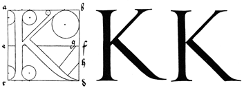
THE LETTER K.
Now for K: You are to make the first tract vertical, in the same manner as you formerly did for H; then draw another narrower limb from the broader and erect one, so that it may, at its lower end, impinge obliquely on the transverse line e. f. and above may ascend to the right till it meet the line a. b., taking care to make it parallel to the diagonal c. b.; and this, at the top, you are to produce in both directions so that each production may represent a tenth part of the line a. b. The hitherward projection you are to round out with a circle of which the diameter must not exceed the breadth of the lesser limb; but of the other arc, by means of which you round out the farther projection, you shall make the diameter double as great as the diameter of the arcs by which you have customarily hollowed out the preceding extensions of the broad and vertical limbs. Next, from the narrow limb so constructed draw in a downward direction another broad limb, so that it too may be parallel to a diagonal of the square; & of this the beginning is to be taken from the acute angle which the narrower limb makes with the broad vertical limb, and let it be drawn with its projection to the angle d., yet in this fashion: take two points this side of d. after this manner, so that the first point may be distant from d. the tenth part of the line c. d. & the second as far again from the first; then let the said tract be drawn within the space which is between the two points, but in blind and invisible lines. Afterwards you shall add the extension, which you shall make this way: take before f. in the line e. f., a point g. no farther distant from f. than the breadth of the narrower limb; on this point set one leg of your compass, & let the other be extended to the angle d., from which let it be guided back along the broad but invisible blind limb: thence will result the lower convexity of the tail you seek; but its upper concavity look for in this way: divide f. d. in its middle point h.; on this set one leg of your compass, and with the other describe an arc passing through d. to meet the broad limb.
Now for K: You need to make the first section vertical, just like you did before for H; then draw another narrower limb from the broader and upright one, so that it touches the transverse line e. f. at an angle at its lower end and then rises to the right until it meets the line a. b., making sure it stays parallel to the diagonal c. b.; at the top, you should extend it in both directions so that each extension represents one-tenth of the line a. b. The projection on this side should be rounded out with a circle where the diameter doesn’t exceed the width of the narrower limb; for the other arc, which rounds out the further projection, the diameter should be double that of the arcs you've typically used to shape the earlier extensions of the broad and vertical limbs. Next, from the narrow limb you just created, draw another broad limb downwards, so that it is also parallel to a diagonal of the square; the starting point for this should be taken from the acute angle formed between the narrower limb and the broad vertical limb, and it should be drawn with its projection to the angle d. in this way: take two points on this side of d., where the first point is one-tenth the distance from d. the length of c. d., and the second point is the same distance from the first; then draw this section between those two points, but with hidden and invisible lines. Afterward, you should add the extension like this: take a point g. on the line e. f. before f., no further away from f. than the width of the narrower limb; place one leg of your compass on this point, and extend the other to the angle d., then guide it back along the broad but hidden limb: this will create the lower curve of the tail you want; for the upper concavity, do it this way: divide f. d. at its midpoint h.; set one leg of your compass on this point, and with the other, draw an arc that goes through d. to meet the broad limb.
Or you may make K in this manner: First, let your broader vertical limb, and your upper narrow one remain as they have been described, except that the interior angle which the narrower limb forms with a. b. shall remain acute, but the exterior one shall be rounded out, as has been said. Then let there be drawn the lower broad limb, obliquely from the angle which is included between e. f. and the vertical limb, and let it descend to meet the side c. d. so that between d. and the limb the width of the limb be left vacant; and the hither angle is to be left, but the farther, towards d., shall be rounded out a little, as shown below.
Or you can create K like this: First, keep your wider vertical limb and your upper narrow one as they have been described, but ensure that the interior angle formed by the narrower limb with a. b. stays acute while the exterior one is rounded out, as mentioned. Then draw the lower wide limb at an angle from the point between e. f. and the vertical limb, letting it slope down to meet the side c. d. so that there’s a gap left between d. and the limb; the angle on the near side should remain sharp, while the farther angle toward d. should be slightly rounded out, as illustrated below.
THE LETTER L.

THE LETTER M.
The letter M you shall form in two ways within its square. In the first, draw the narrower limb of the letter vertical, to the right of a. c., distant from a. one-tenth of the distance a. b.: draw the other, & broader limb, on the near side of b. d., also a tenth part of the whole distant from b. & in such fashion that both limbs touch the square at top and bottom; then, between the two, bisect the line c. d. in the point e. and draw a broad limb from the inner angle of the narrow limb, downwards to the point e., & next a narrow one upwards from e. to the inner angle of the broader vertical limb; and the inner angles at top you must not round out, but leave acute; the exterior angles, however, at the top, and both exterior and interior at bottom of both vertical limbs, you are to adorn with the customary projections, as you have done in the preceding letters. You are to know, too, that when these letters are drawn with a pen, they are to be described with a single stroke. But for your guidance is this letter, in the manner in which I have instructed you, depicted below.
You will create the letter M in two ways within its square. First, draw the narrower vertical limb of the letter to the right of point a.c., a tenth of the distance away from point a. Next, draw the other, wider limb on the side of point b.d., also a tenth of the total distance from point b. Ensure that both limbs touch the top and bottom of the square; then, bisect the line c.d. at point e. Draw a wide limb from the inner angle of the narrow limb down to point e, and then a narrow limb upwards from point e to the inner angle of the wider vertical limb. Do not round out the inner angles at the top; keep them sharp. However, you should add the usual projections to the exterior angles at the top and both the exterior and interior angles at the bottom of both vertical limbs, just as you've done with the previous letters. Keep in mind that when these letters are drawn with a pen, they should be made in a single stroke. Below, you can see this letter depicted as I’ve instructed you.
Another method.
Another way is thus: Divide the side a. b. of the square into six equal parts & mark off the two extreme parts, one at either end, by the points f. and g.; then draw the inner and broader limb, with its point at e. as above; and to this, in an upward direction, a narrower one, so that between f. g. be left a vacant space, and so more readily the letter slope forward. Then you are to draw the two lateral and vertical limbs—the near and slender, and the farther broad one—at the top, indeed, as in the first sketch, but at the bottom produce them to the two angles c. and d. and finally add projecting cusps, as you were instructed in the first M; but the projection below will pass beyond the square at the points c. and d. Or you shall make M at top with acute angles, in which case the lateral limbs will slope the more; or shear them off obtusely, and in this fashion (whichever pleases you best) make them as you see them depicted in the following diagrams.
Another way to do it is this: Divide the side a.b. of the square into six equal parts and mark off the two outer parts, one at each end, with the points f. and g.; then draw the inner and wider limb, with its point at e. like before; and to this, draw a narrower limb heading upwards, so that between f. and g. there's an empty space, allowing the letter to slope forward more easily. Next, draw the two side and vertical limbs—the closer and thinner one, and the farther wider one—at the top, as shown in the first sketch, but extend them down to the two corners c. and d., and finally add protruding cusps, as you were instructed in the first M; however, the projection below will extend beyond the square at points c. and d. Alternatively, you can make M at the top with sharp angles, which will make the side limbs slope more; or cut them off at an angle, and in this way (whichever you prefer) shape them as you see depicted in the following diagrams.


THE LETTER N.
Likewise the letter N you shall make in its square thus: First you are to draw two standards vertical and slender, so that at top & bottom they may touch the square, & that being produced, the nigh one at the bottom, and the farther at the top, they may touch the angles at c. and b. Now join these two by a broad oblique limb, running from the angle a. to the point e., by which is denoted the remote side of the farther limb, where you shall allow the acute angle to remain; but at the top, this limb, produced beyond the angle a., you are to round out to a fifth part of the length of a. b. This prolongation should incurve below, a fifteenth part of the distance a. b. projected on two arcs, the upper one the greater, the lower the less. For the lesser arc, therefore, you shall take as diameter of its circle, a line the fifth part of the distance a. b. and its centre is to be taken outside the square, so that the foot of the compass may touch the tip of the extension and the angle a.; then extend a little the feet of the compass, and shift its centre until the arc touch both the tip of the part produced, & the broad oblique limb, in the middle point between the side a. c. & the nearer of the two slender vertical limbs.
Similarly, you should create the letter N in its square like this: First, draw two tall, slender vertical lines so they touch the top and bottom of the square. Extend them so that the one closer is at the bottom and the further one is at the top, making contact at the corners c. and b. Next, connect these two lines with a wide slanted line that goes from corner a. to point e., which represents the far side of the higher line, where you should leave the sharp angle. At the top, extend this line beyond corner a. and round it out to a fifth of the length of a. b. This extension should curve inward below, a fifteenth of the distance a. b., using two arcs—the upper one being larger and the lower one smaller. For the smaller arc, use a line that is a fifth of the distance a. b. as its diameter, and its center should be positioned outside the square, allowing the compass tip to touch the end of the extension and corner a.; then adjust the compass a little wider and move its center until the arc touches both the tip of the extended part and the wide slanted line, at the midpoint between side a. c. and the closer of the two slender vertical lines.
Or you may make the letter N in such fashion that its upper nigh extension shall remain within the square; or you may make from it an acute angle as shown overleaf.
Or you can create the letter N in a way that its upper right extension stays inside the square; or you can form an acute angle with it as illustrated on the next page.

THE LETTER O.
Now O you shall make this way in its square. Set in the square the diameter c. b. and bisect it in the point e., so that e. may form a middle point between the two points f. and g. which are to be your two centres; and from each let a circle be described touching two sides of the square; & where the circles cut one another, there with your hand you must shape the slender outline of the letter to a juster proportion, as below is shown.
Now, you shall create this path in its square. Place the diameter c. b. in the square and bisect it at point e., making e. the midpoint between the two points f. and g., which will serve as your two centers. From each center, draw a circle that touches two sides of the square; where the circles intersect, you must use your hand to craft the slender outline of the letter into a more accurate proportion, as shown below.

THE LETTER P.
P you shall make in its square in this wise. Divide the square a. b. c. d. by the median horizontal line e. f.; then divide a. e. & b. f. equally by the line g. h. Next draw, first the broad vertical limb for this letter P, as you did a short while ago for K, and afterwards erect the line i. k. the distance of its own breadth to the right of your vertical limb; (here you must ever observe that in a lettered square we speak of the angle a. as the “hither” angle, that is, to the left; & the angle b. as the “farther” angle, that is, to the right). Then where the line i. k. cuts g. h. call the point l., and next draw two slender horizontal limbs, the upper below a. b., the lower above e. f., from the broad vertical limb as far as the line i. k. Set one leg of the compass on the point l., extending the other to the lower side of the lower horizontal limb near k.; then describe an arc through the line g. h. as far as the other slender horizontal limb of this same P, & where it cuts the line g. h. set the point m. Next, on the far side of m. measure the width of the large limb of the letter, along the line g. h. to the point n. and let your compass be stretched so that with one foot it may touch the line a. b. and with the other the point n.; then set one foot of the compass on n. & the other on the line g. h. to the right, in the point o., in which this foot is to be left standing immovable, and with the other is to be described an arc, passing through the point n. and touching the lines a. b. and e. f.
P should be created in its square like this. Divide the square a. b. c. d. with the median horizontal line e. f.; then divide a. e. and b. f. equally using the line g. h. Next, draw the broad vertical limb for this letter P, just like you did before for K, then extend the line i. k. the distance of its own width to the right of your vertical limb; (here you should always remember that in a lettered square, we refer to the angle a. as the “near” angle, that is, to the left; and the angle b. as the “far” angle, that is, to the right). Then where the line i. k. intersects g. h., label that point l., and next draw two thin horizontal limbs, the upper below a. b., and the lower above e. f., extending from the broad vertical limb to the line i. k. Place one leg of the compass on point l., extending the other to the lower side of the lower horizontal limb close to k.; then draw an arc through line g. h. up to the other thin horizontal limb of this same P, and where it intersects line g. h., mark the point m. Next, on the far side of m., measure the width of the broad limb of the letter along line g. h. to point n., and set your compass so that one leg touches line a. b. and the other touches point n.; then set one foot of the compass on n. and the other on line g. h. to the right, at point o., where this foot should remain fixed, and with the other leg, draw an arc that goes through point n. and touches lines a. b. and e. f.
Or you may form the loop of this letter in the following manner. Set a leg of the compass under the transverse g. h. in the line i. k., in a place median between the line e. f. & the lower part of the upper transverse of the slender limb, in the point p. and describe an arc as before, passing through m. so that the loop will be acute at the bottom, and its tip will end in the middle space between the line i. k. and the broad vertical limb of the letter.
Or you can create the loop of this letter like this. Place one leg of the compass at the cross point g. h. on the line i. k., in a spot that’s halfway between the line e. f. and the lower part of the upper cross of the narrow limb, at point p, and draw an arc as before, passing through m, so that the loop will be sharp at the bottom, and its tip will finish in the middle space between the line i. k. and the wide vertical limb of the letter.
Or make this same P with a circular sweep, by shifting the compass upon the diameter, so that that sweep may be broader at the top (as though made with a pen) as will be shown in the diagram on the following page.
Or create this same P with a circular motion, by moving the compass along the diameter, so that the arc may be wider at the top (as if drawn with a pen) as illustrated in the diagram on the next page.

THE LETTER Q.
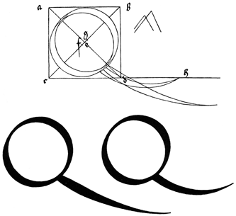
Make your Q in its square in the self-same manner as was prescribed for O; but add to it its tail thus: Draw a diameter of the square, the line a. d., about which, starting from the curved outline, begin to draw a long tail, producing it through the angle d. in such fashion that d. may be in the middle of the thickest part of the tail; but where the tail begins let it be a little narrower than in the angle d., where it should attain its real thickness. Then let it be drawn out, beyond the angle d. to the length of the entire diameter, and in a downward direction, yet so that it curves while it slopes, & that its tip shall not fall lower than a third of the side below the lowest side of the square, and shall tend, as it nears the point, to grow sharper little by little, and at length end in a very fine point indeed.
Make your Q in its square the same way as instructed for O; but add its tail like this: Draw a diameter of the square, the line a.d. Starting from the curved outline, begin to draw a long tail through angle d., so that d. is in the middle of the thickest part of the tail. At the beginning of the tail, it should be a bit narrower than at angle d., where it should reach its actual thickness. Then extend it beyond angle d. to the length of the entire diameter, curving downward without going lower than a third of the side below the bottom side of the square, and as it approaches the point, it should gradually get sharper until it ends in a very fine point.
Or you shall give Q a shorter tail in this fashion, to wit: set your compasses to the length of the side c. d. and draw a tail from the bulge of the same letter, describing through the point d. its inner arc of the same length as c. d., taking care that the tail bend upwards until it again reach c. d. produced, in the point h.; then shift your compasses, & with the other leg again describe from the bulge of the letter an arc below d. & continue it until again it reach h., but in such fashion that the tail shall find its greatest thickness at the start, as in the following figure is doubly depicted.
Or you can give Q a shorter tail like this: set your compass to the length of side c.d. and draw a tail from the curve of the letter, creating an arc through point d. that’s the same length as c.d. Make sure the tail bends upwards until it meets c.d. extended at point h. Then adjust your compass and, with the other leg, draw an arc from the curve of the letter below point d. and continue it until it reaches h. again, ensuring that the tail is thickest at the beginning, as shown in the figure below.
THE LETTER R.
Moreover R you must make in its square just as was directed for P; but then erect a right line q. r. through the middle point of the square, & let it cut the exterior arc of the rounded limb in s., from which point, downwards towards the angle d., let there be drawn a broad tract, almost equal to that which you made above for the letter K., but this is to be somewhat bent in, and so shaped by your hand that its tip, well formed, may arrive directly on the angle d.
Moreover, you must create a square for R just as directed for P; then draw a straight line q. r. through the midpoint of the square, and have it intersect the outer arc of the rounded limb at point s. From that point, draw a wide area downwards towards the angle d., nearly equal to what you created above for the letter K., but this should be slightly inwardly curved and shaped by your hand so that its tip, well-formed, reaches directly to angle d.
Or make R in such fashion that its rounded sweep, as though made with a pen, shall be above broader, & narrower below. To accomplish this, you must shift your compasses on the diameter q. e. & not allow the rounded limb to touch the vertical one, as was described in P. Besides, the oblique limb is to be deduced from the rounded one with a little more of a curve; just as I have drawn overleaf.
Or create the letter R in such a way that its rounded part, as if drawn with a pen, is wider at the top and narrower at the bottom. To do this, you need to adjust your compass on the diameter q.e.d. and make sure the rounded part doesn't touch the vertical one, as explained in P. Additionally, the slanted part should be drawn from the rounded part with a bit more curve, just as I've illustrated on the next page.

THE LETTER S.
Next, the letter S you shall make as follows in its square, a. b. c. d. First draw the horizontal line e. f. and the median & vertical one g. h. and let them bisect one another in the point m. Then choose the main thickness of the letter, and set it in the line g. h. so that the point m. may divide it, having one-third of the thickness below it; next, set the lesser thickness, at the top beneath g., indicating it by the point i., and at bottom, above h. in the point k.; and the thickness of the letter indicate above by n. and below by l.
Next, you'll create the letter S in its square, a. b. c. d. First, draw the horizontal line e. f. and the vertical line g. h. so that they intersect at point m. Then, choose the main thickness of the letter and place it along line g. h. so that point m divides it, with one-third of the thickness below it. After that, set the smaller thickness at the top just below g., marked by point i., and at the bottom, just above h. at point k. Lastly, indicate the thickness of the letter above with n. and below with l.
Next, set a leg of your compasses on the line g. h. in the mid-point between i. and n., and with the other describe a circle passing through i. and n.; in like manner, upon the line g. h. set your compasses upon the mid-point of g. l. and describe a circle passing through g. & l. Then once more set your compass on the same line g. h. in the mid-point of n. h. and describe a circle through n. & h.; and lastly, in the mid-point of l. k. you must set one leg, & with the other is a circle to be described through these same points l. & k.; afterwards cut off by vertical section the upper portion of this letter, so that the part thus cut off may contain in its extremity the maximum thickness of the letter and a third part besides, & also that its tip may project downwards so far as to stand midway between the centre of the circle i. n. and the side b. d.; in other words, let the tip be distant on the right, from the circle i. n. the first third of the interval between the greater and lesser circles.
Next, place one end of your compass on the line g. h. at the midpoint between i. and n., and use the other end to draw a circle that passes through i. and n. Similarly, on the line g. h., set your compass at the midpoint of g. l. and draw a circle passing through g. & l. Then, once again on the line g. h. at the midpoint of n. h., draw a circle through n. & h.; and finally, at the midpoint of l. k. set one leg of the compass, and use the other to draw a circle through points l. & k. After that, remove the upper portion of this letter by cutting it off so that the part you remove contains the maximum thickness of the letter and an additional third, and ensure that the tip projects downwards far enough to sit midway between the center of the circle i. n. and the side b. d.; in other words, let the tip be positioned on the right, one-third of the way between the larger and smaller circles from the circle i. n.
Another method.
Yet another way may you make the letter S. In the square a. b. c. d. bisect the horizontal line e. f. in the point m.; then set one leg of your compass upon the mid-point between g. and m. & with the other describe a segment of a circle in the direction of a. e. passing through the points m. and g.; next, set your compass upon the mid-point between m. and h. and describe a segment of a circle through m. and h. in the direction of f. d. The two arcs will touch above, in front, and below, in the rear, the exterior curvatures of this same letter S.
Another way to create the letter S involves the square a. b. c. d. Start by bisecting the horizontal line e. f. at point m. Then place one leg of your compass at the midpoint between g. and m. and use the other leg to draw a segment of a circle toward a. e., passing through points m. and g. Next, position your compass at the midpoint between m. and h. and draw another segment of a circle through m. and h. toward f. d. The two arcs will meet above, in front, and below, in the back, forming the outer curves of the letter S.
Next, draw through m. the diameter c. b. and at its middle indicate the maximum thickness of the letter by the two points p. and q. from which let there be drawn two right lines, one up, & one down, to those two arcs; & next, from the two points p. & q. draw two curved parallels to the same arcs, regulating the distance between them, their elevation & depression from the centres of the same circles. Next, indicate below g. and above h. the minimum thickness of the letter; and from these points you will with your hand fashion the inner shape of the letter, both above and below, & produce the limb of S, above towards b. Cut it off so that its lower tip may touch the segment, & that the part cut off upwards may contain a tenth part of a. b. and that the segment may still exceed the part cut off. Then construct a vertical line r. s. to the right of e. c. and distant from it a fifth part of c. d.; let it cut the diagonal c. b. in t. and to the angle just formed produce the extremity of the letter, making the part so cut off a third broader than the upper portion. Lastly, you will have to produce the tip ever so little beyond t.; as I have briefly indicated.
Next, draw the diameter from point m to point c. b. and at its midpoint mark the maximum thickness of the letter with points p. and q. From there, draw two straight lines – one going up and one going down – to those two arcs. Then, from points p. and q., draw two curved lines parallel to the arcs, adjusting the distance between them as well as their height and depth from the centers of the circles. Next, indicate the minimum thickness of the letter below g. and above h.; from these points, you’ll sketch the inner shape of the letter, both above and below, and create the upper part of S, extending towards b. Trim it so the lower tip touches the segment, ensuring the section cut off upwards represents a tenth of a.b. while the segment still remains larger than the cut-off part. Then, draw a vertical line r. s. to the right of e. c. at a distance equal to a fifth of c. d.; let it intersect the diagonal c. b. at t., and from the angle formed, extend the tip of the letter, making the cut-off part a third wider than the top portion. Finally, extend the tip just slightly beyond t., as I have briefly described.


THE LETTER T.
Set the broad limb of T in the midst of its square erect, produced & drawn to a point on either side below, just as you did before in the letter I; then take two points e. and f., distant respectively one-tenth of the whole space from a. and b., and let the transverse limb of the letter be drawn below e. f. and of an equal length with it; but the projecting extremities of this line are to be cut obliquely, and the tips of these projections shall so far extend above the line a. b. to the right as below they depend to the left. The oblique lines of these projections are to be each a fifth part of the length of a. b.; & the angles of these projections you shall round out by means of circles of diverse radius—namely, for the lesser angle you are to use a diameter only two-thirds of the width of the broader limb; but for the greater angle you shall take a diameter equal to the side of a square contained between the broad and vertical limb and the intercepted portion of the line a. b.
Set the broad part of T in the middle of its square, extending and drawn to a point on either side below, just like you did before in the letter I; then take two points e. and f., spaced one-tenth of the total distance from a. and b., respectively, and let the horizontal part of the letter be drawn below e. f. and be the same length as it; however, the ends of this line should be cut at an angle, and the ends of these cuts should extend above the line a. b. to the right as far as they drop below on the left. The angled parts of these cuts should each be one-fifth the length of a. b.; and you should round off the angles of these cuts using circles of different radii—specifically, for the smaller angle, use a diameter that is two-thirds the width of the broader part; for the larger angle, use a diameter equal to the side of a square formed between the broad and vertical parts and the section of the line a. b.
Another method.
Or you make T thus in its square: Take your point e. as before, to the right of a., and cut your transverse limb diagonally, as before, yet so that the projection be dimidiated to the right, and at top the angle remain as it falls; and so at the other extremity, only the point f. must be moved as near again to b., the cutting line to be a little more erect, & the projection formed a trifle broader than at the hither end; otherwise shall everything remain as before; as I have delineated for you on the opposite page.
Or you make T like this in its square: Take your point e, just like before, to the right of a, and cut your transverse limb diagonally, as before, but make sure the projection is split to the right, and at the top, the angle stays the same as it falls; do the same at the other end, but point f must be moved a bit closer to b, the cutting line should be a little more upright, and the projection should be slightly broader than at the near end; otherwise, everything will stay the same as before, just as I’ve illustrated for you on the opposite page.

THE LETTER V.
V you shall thus make in its square: Bisect c. d. in the point e.; then set the point f. one-tenth of the whole line a. b. beyond a., and in like fashion g. to the hither side of b. Then draw the broad limb of your letter downwards from f. to e. and sharpen it; & thence draw upwards your slender limb to g.; and at the top produce it in either direction, as you did before at the bottom of A; just as you see it shown below.
V you will make it in its square: Divide c. d. at point e. then place point f. one-tenth of the entire line a. b. beyond a., and similarly g. on the near side of b. Next, draw the broad part of your letter downward from f. to e. and sharpen it; then draw your thin part upward to g.; and at the top extend it in either direction, just like you did at the bottom of A; just as you see illustrated below.

THE LETTER X.
X you shall form thus: Draw two vertical lines e. f. and g. h. distant respectively one-tenth part of the line a. b. from the sides a. c. and b. d. Then draw the two limbs intersecting one another in the form of a cross—the broad one so that at top, & with its hither side it shall touch e., & at the bottom, and with its farther side h.; but the narrow limb so that at top, and with its farther side it may touch g., & at bottom, with its hither side f. Then add its projections, touching, at top and bottom, the four angles a. b. c. d., & choose a semi-diameter of the larger circle of the length of a fifth part of a. b.; & with that you shall round out the four greater angles; but for the lesser circle you shall take a diameter as long as two-thirds the width of the broader limb.
X you shall form like this: Draw two vertical lines e. f. and g. h. that are each one-tenth the length of the line a. b. from the sides a. c. and b. d. Next, draw the two limbs crossing each other in the shape of a cross—the broad one so that at the top, its near side touches e., and at the bottom, its far side touches h.; and the narrow limb so that at the top, its far side touches g., and at the bottom, its near side touches f. Then add its projections, touching the four corners a. b. c. d. at the top and bottom, and choose a semi-diameter of the larger circle that is one-fifth the length of a. b.; with that, you will round out the four larger angles; for the smaller circle, use a diameter that is two-thirds the width of the broader limb.
Or you may vary X thus: Let everything be left as before except the narrower limb, which at top you shall make more erect by one-half the breadth of the wider limb; and so the upper part of the letter shall be less and narrower than the lower, and shall have a different aspect, as is shown below.
Or you can change X like this: Keep everything the same except the narrower limb, which you should make more upright at the top by half the width of the wider limb; this way, the upper part of the letter will be smaller and narrower than the lower part, giving it a different appearance, as shown below.

THE LETTER Y.
Y you shall achieve in the midst of its square, as far as its lower half is concerned, after the instructions before given for I; but its upper part you shall divide so that its hither limb shall contain two-thirds, and its farther one-third of the broad standard; and let them slope to either side so that produced they may touch the two angles a. and b.; and the greater circles, by which you are to round out their obtuse or greater angles, make of a diameter as great as a containing side of the square enclosed between the standard and the sides of the great square, as in T was shown; but the diameters of the circles which you apply to the lesser angles, make double the width of the broad standard, as below.
Y you will achieve in the center of its square, regarding its lower half, after the earlier instructions for I; but its upper part you will divide so that the closer side contains two-thirds, and the farther side one-third of the broad standard; and let them slope outward so that extended they can touch the two corners a. and b.; and the larger circles, which you will use to round out their obtuse or larger angles, should have a diameter as large as a side of the square enclosed between the standard and the sides of the large square, as shown in T; but the diameters of the circles you use for the smaller angles, should be double the width of the broad standard, as described below.

THE LETTER Z.
Z you shall make thus: Set upon either side, both beneath & beyond the angle a., two points e. & f., each at a distance of the tenth part of a. b.; so also, set two other points g. and h. both before and above the angle d. and with right lines join e. f. and g. h.; then draw your narrower transverse limb, beneath a. b. backwards as far as the angle b.; from thence draw your broad limb diagonally to c.; and then again a narrower one from c. to g.; and with your hand round out the two tips e. and h.
Z you will do as follows: Place two points e. and f. on either side of the angle a., each at a distance equal to one-tenth of a.b.; similarly, position two more points g. and h. both in front of and above the angle d. Connect e. to f. and g. to h. with straight lines; then draw your narrower transverse limb below a.b. back to the angle b.; from there, draw your wider limb diagonally to c.; and once again, a narrower one from c. to g.; finally, use your hand to round out the two tips e. and h.
Or make Z thus: Divide the square a. b. c. d. by the vertical line e. f. and in this reduced space construct the letter as before; but so that the two transverse limbs be cut short, above on the nigh side, and below on the far, by the vertical lines a. c. and e. f. respectively as below.
Or create Z like this: Split the square a. b. c. d. with the vertical line e. f. and in this smaller area, form the letter as before; but make sure that the two horizontal parts are cut short, at the top on the near side, and at the bottom on the far side, by the vertical lines a. c. and e. f., respectively, as shown below.

So likewise, in other fashion, can we make all the letters already drawn, on a scale of ninths, just as we have now drawn them on a scale of tenths; in just the same manner, according to the due proportion of each, in its own square, a. b. c. d., dividing them into nine, as just now into ten parts; & that this may be the better understood, I have chosen to append here letters of such fashion. Also these letters are to be made five parts high when written small & rapidly, by hand. In such writing the versals are made of the same proportion and form, but one-third larger than the ordinary letters of the writing.
Similarly, we can create all the letters we've already drawn on a scale of ninths, just like we've done on a scale of tenths. In the same way, according to the proper proportion of each letter, within its own square a. b. c. d., we divide them into nine parts, just as we did with ten parts before. To make this clearer, I have included some sample letters here. These letters should be five parts high when written small and quickly by hand. In this style of writing, the capital letters are made in the same proportion and form, but are one-third larger than the ordinary letters.


DIRECTIONS FOR THE CONSTRUCTION OF THE TEXT OR QUADRATE LETTERS
The letters which are usually called “text,” or quadrate, it was formerly customary so to write, although they are now imitated by the new art, as presently I shall show below. Although the alphabet begins with the writing of A, yet shall I (not needlessly) in the first place undertake to draw an I; because almost all the other letters are formed after this letter, although always something has to be added to it or taken away.
The letters commonly known as "text" or square letters were traditionally written this way, though they are now replicated by the new art, as I will demonstrate below. Even though the alphabet starts with the letter A, I will first focus on drawing an I; this is because almost all the other letters are based on this one, even though something usually needs to be added or removed.
First make your I of equal squares, of which three are properly set one over the other; and the top of the top one, and the bottom of the bottom one, divide in two points, that is to say, into three equal parts: then set a square equal to the others in an oblique manner, so that its diagonal be vertical, and its angle on the first point of the top square. In this way, this oblique square shall extend with its angles more to the left than the right. Then produce upwards on either side, after the width of the superposed squares, right lines to meet the sides of the oblique set square. Next do below precisely as you did above, except that you must set the angle of the oblique square on the second point, that is, the one farthest to the right in the bottom of the lowest square; and let fall your lines on either side upon the transposed square: so will I be perfect; only above it draw with a fine pen a tiny in-crescent.
First, create your I using equal squares, stacking three directly on top of each other. Divide the top of the top square and the bottom of the bottom square into two points, which means into three equal sections. Then, place another square diagonally so that its diagonal is vertical, and its angle touches the first point of the top square. This way, the diagonal square will extend its angles more to the left than to the right. Next, draw straight lines upward on both sides, matching the width of the stacked squares, to meet the sides of the diagonal square. Then repeat this process below, except this time place the angle of the diagonal square at the second point, which is the furthest to the right at the bottom of the lowest square; draw your lines on both sides to meet the repositioned square. Doing this will finalize the shape; finally, above it, draw a small crescent with a fine pen.
So shall you make N from two standards of this same I, set so that their angles at top and bottom touch; and in this manner the space between the two shall be narrower than the breadth of either: also, you shall no longer put little crescents above them; you must make of the same length all the short letters throughout the alphabet.
So you will create N using two versions of this same I, positioned so their angles at the top and bottom connect; and in this way, the space between them will be narrower than the width of either: also, you will no longer add small crescents above them; you must make all the short letters in the alphabet the same length.
In like manner make M of three standards, just as you made N of two.
In the same way, create M using three standards, just like you created N using two.
R make as I, except only that at top you must set an equal square diagonally, to the right, so that angle touch angle. R you may make also in this fashion: below leave its foot as before, but above add two diagonal squares, which shall touch each other with their angles in the middle point of the vertical limb, and then produce upwards both sides of the latter to meet the diagonal square.
R make as I do, but at the top, you need to set a square diagonally to the right, so that angle touches angle. You can also create R this way: leave its base as before, but add two diagonal squares at the top that touch at their angles in the middle point of the vertical limb, then extend both sides upward to meet the diagonal square.
V is made in three ways. First let it be made simply, as N; only that in the farther limb, you shall omit at the top the diagonal square; and instead shall draw an oblique line, so that it may make two angles in this limb (produced) of which the farther shall be of the same height as that of the topmost angle of the diagonal square, & the higher angle of the same height as the angle nearest to it in the said square.
V is created in three different ways. First, make it simply, like N; just that in the farther limb, you should leave out the diagonal square at the top and instead draw an angled line, so that it forms two angles in this limb (extending) where the farther angle matches the height of the topmost angle of the diagonal square, and the higher angle is the same height as the angle closest to it in that square.
The second V, which we use at the beginning of a sentence, make thus: Draw the first limb as before for I; only, at the bottom, push the diagonal square a little further to the right, so that its hither angle does not project beyond the side of the vertical limb, but falls in the line of its descent. Then set the second limb to the right of this, and cut it off below by an oblique line, drawn from the lowest angle upwards to the right, as far as the middle point of the lowest of the three superposed squares.
The second V, which we use at the beginning of a sentence, is made like this: Draw the first part as you did for I; just, at the bottom, move the diagonal square a bit further to the right, so its near angle doesn’t stick out beyond the side of the vertical part, but lines up with its descent. Then place the second part to the right of this, and cut it off below with a slanting line, drawn from the lowest angle up to the right, reaching the middle point of the lowest of the three stacked squares.
Next make W (i. e., double V) just as you made V-simplex; only you shall set before it the standard limb of I.
Next, create W (which is double V) just like you made V-simplex; just make sure to place the standard limb of I in front of it.
B make as the second V-simplex; but in the first upright omit the diagonal square at the top, and set upon the three original squares three others similar, but the seventh one you shall cut off diagonally from its lower hither angle.
B make as the second V-simplex; but in the first upright omit the diagonal square at the top, and set upon the three original squares three others similar, but the seventh one you shall cut off diagonally from its lower hither angle.
Likewise when your B so made is turned upside down, then it will be a Q.
Likewise, when your B is turned upside down, it becomes a Q.
X you shall construct from I. Append from top angle to the right a diagonally set square, as you did before in R; and at the bottom draw an acute tail to the left from the diagonal, and at the middle of the vertical limb describe a transverse, in such way that the former is cut before and aft by the latter's diagonal; let the hither and lower angle be terminated as far in front of the upright as would measure one-half of the cutting diagonal, which at top shall just touch the upright; but to the right let the transverse at top project to a point just below the angle of the oblique square; from thence downwards let it be cut off by an oblique line parallel to the anterior diagonal.
X you will build from I. Attach a diagonally placed square from the top angle to the right, like you did before in R; at the bottom, draw an acute tail to the left from the diagonal, and in the middle of the vertical limb, create a cross-section, so that the first is intersected in front and behind by the diagonal of the latter; allow the upper and lower angles to extend as far in front of the upright as half of the cutting diagonal, which should just touch the upright at the top; but towards the right, let the cross-section at the top project to a point just below the angle of the slanted square; from there downwards, let it be cut off by a slanted line parallel to the front diagonal.
C you shall construct from I after this fashion: Remove the top diagonal square, & let lines be produced on either side to the proper height of the letter, and cut off the hither angle by a diagonal; then draw at top a broad transverse, projecting beyond the vertical to the right the width of the latter, and cut this off by a diagonal in such a way that it project below only half as far as above.
C you shall build from I like this: Take off the top diagonal square, and extend lines on both sides to the correct height of the letter, then trim the front angle with a diagonal; next, draw at a wide horizontal line at the top, extending to the right the same width as the vertical line, and cut this off with a diagonal so that it hangs down only half as much as it does above.
The vertical standard of E you shall make as for C; but from above let there descend to the right a broad limb from the diagonal bisecting the right angles of one square, and one-third again as long as broad; and let there be drawn from its lower angle a small diagonal line to the vertical limb.
The vertical standard of E should be made like C; however, from above, a wide limb should extend down to the right from the diagonal that cuts through the right angles of one square, and it should be one-third longer than it is wide; and from its lower angle, a short diagonal line should be drawn to the vertical limb.
T shall be made like C, except that at top something is added to its diagonal, so that its tip converges to a fine point, and the like to the left on the hither side of the broad standard, just as at the top: and because of this is T at top more elegant than C, and has not the same incurved appearance.
T will be shaped like C, but at the top, something will be added to its diagonal so that its tip tapers to a fine point, with a similar feature on the left side near the broad standard, just like at the top. Because of this, T is more elegant at the top than C and doesn’t have the same curved appearance.
L you are to make below like I; only six squares are to be set on end; then cut off the hither side of the seventh by a diagonal, and so the apex of the letter shall remain to the right.
L you are to make below like I; only six squares are to be set on end; then cut off the closer side of the seventh by a diagonal, and so the peak of the letter shall remain to the right.
The letter S you shall make as L; except that at top to the right must be drawn a broad limb of the length of the diagonal, which afterwards you are to cut off by a line parallel to the diagonal.
The letter S should be made like L; however, at the top right, you need to draw a wide limb that matches the length of the diagonal, which you will then cut off with a line that runs parallel to the diagonal.
F you shall make as S, just adding to it a transverse limb at the height of the shorter letters and double as long as broad, so that the point on the hither side & below shall project as far as half the limb's breadth, so that the two diagonal abscissions may be equidistant from one another.
If you create an S, just add a crossbar at the height of the shorter letters and make it twice as long as it is wide, so that the end on this side and below sticks out as far as half the width of the crossbar, ensuring that the two diagonal cuts are evenly spaced from each other.
The near limb of the letter H make like L, and to it join by its top, in the proper place, the farther made like I; but below, for the diagonal square, substitute a fourth square in line with the others, and the fifth and lowest cut off on the far side by its diagonal.
The near part of the letter H looks like an L, and at the top, connect it to the far part shaped like an I; but below, replace the diagonal square with a fourth square aligned with the others, and the fifth square at the bottom should be cut off on the far side by its diagonal.
Of K make the near limb like L; and to the right of it append a diagonal square, from the lowest angle of which let a line be obliquely produced to meet the said vertical limb; and next from this line let a broad limb be obliquely drawn, and this, at the bottom, you are to cut off by a diagonal, in such fashion that the space below, between the two tips shall not be more than the diagonal of a single square.
Of K, make the nearby limb like L; and to its right, add a diagonal square. From the lowest corner of this square, extend a line diagonally to meet the vertical limb. Next, from this line, draw a broad limb at an angle, and at the bottom, cut it off diagonally so that the space below, between the two tips, is no more than the diagonal of a single square.
D in its lower half make like B; but at top let the anterior limb ascend upwards to the maximum height of the letters, and then cut off the hither angle by its diagonal; next superpose to the same height half a square upon the other three squares of the farther limb, & once more do here as you did below, and let this broken limb rest on the angle of the near limb, and let it extend beyond it as far as the end of the upright near limb; and so will it all but contain three conjunct squares; for when it meets the near vertical limb, that fraction is to be cut off at right angles.
D in its lower half looks like B; but at the top, let the front limb go up to the tallest height of the letters, and then cut off the inside angle with its diagonal; next, place half a square atop the other three squares of the far limb at the same height, and once again do here as you did below, and let this broken limb rest on the angle of the near limb, extending beyond it to the end of the upright near limb; this way, it will almost contain three connected squares; when it meets the near vertical limb, that part should be cut off at right angles.
O you are to make below as D, and also the same at the top as the bottom, only, as it were, turning it upside down.
O you are to make the bottom the same as D, and also the top the same as the bottom, just, in a way, turning it upside down.
The anterior limb of P make like L inverted; but the posterior like the standard of I: at bottom, however, you are not to add an oblique square, but amputate the limb diagonally, & draw at the bottom a broad transverse limb, which likewise is to be cut off diagonally, so that the lower point shall project to the left, a distance of half the breadth of the limb.
The front limb of P resembles an inverted L; however, the back limb looks like the standard of I. At the bottom, you shouldn't add an oblique square; instead, cut the limb diagonally and draw a wide horizontal limb at the bottom, which should also be cut off diagonally so that the lower point sticks out to the left by half the width of the limb.
Likewise A in the lower half you are to make like N; but of its anterior vertical limb, you are to cut off the hither angle of the middle square by its diagonal; of the posterior, however, allow three squares to remain superposed, and incline the top part (the fourth square) rather to the left, so that if at this side is joined to it the half of a square, then it shall attain the height of the letter; and cut off the square obliquely, yet so that the lower point shall project farther than the upper; then describe to the left a circle, sweeping downwards, so that its contents shall embrace the farthest limit of the anterior limb.
Similarly, in the lower half, you need to make it like N; however, for the front vertical part, you should cut off the corner of the middle square using its diagonal. For the back, let three squares stay stacked, and tilt the top part (the fourth square) a bit to the left, so that when a half square is added to this side, it reaches the height of the letter. Cut the square at an angle, ensuring the bottom point sticks out farther than the top. Then, draw a circle to the left, curving downwards, so that it includes the outer edge of the front limb.
Z is made in threefold fashion. First set a diagonal square which shall touch the height of the letter; then add another like it, on the right, joining their sides, & let these form a quadrangle sloping downwards on the right: next set a diagonal square in straight line under the top square, and distant from the lower one the length of its diameter: then draw a diagonal line between the near angles of these two squares, or make a rounded limb to reach the lower square; but from the said lowest square of all you shall draw downwards and to the right, by the aid of divers circles, a round extension, whose bottom shall mark the length of the letter; and let its tip, sharp and tenuous, verge to the left. Or construct Z of three oblique limbs, one above the other, & to connect them draw the diagonal, which shall slope upwards to the right.
Z is made in three parts. First, create a diagonal square that reaches the height of the letter; then add another similar square to the right, connecting their sides, which will form a downward sloping shape on the right. Next, place a diagonal square directly below the top square, allowing some space between the two equal to the diameter of the upper square. Then, draw a diagonal line between the nearest corners of these two squares, or create a rounded line that connects to the lower square. From the lowest square, draw downward and to the right using various circles to create a round extension, with the bottom indicating the length of the letter and a sharp, thin tip pointing to the left. Alternatively, you can create Z using three slanted lines, one above the other, connecting them with a diagonal that slopes upwards to the right.
Another Z you may make in this way: Let three diagonal squares be set atop of one another; and let the lowest have a rounded extension, as in the first Z.
Another Z you can create like this: Stack three diagonal squares on top of each other; and let the bottom one have a curved extension, just like in the first Z.
The first limb of G make below like I, and add at the bottom another diagonal square, joining the two by their angles; but at top produce the farther tip of this limb upwards to the height of the letter, & from this point draw a diagonal downward to the left, as far as the hither angle of the first right square of the three set one on other. Next draw the farther vertical standard entire, of the same length as the hither standard, and at the bottom draw a diagonal from the angle of the lowest oblique square to touch the tip of the angle of the farther limb, & on the inner side produce downwards the side of the limb, to meet the tip of the said diagonal; to this also, by one line, join the lowest of the hither squares. Now draw at top a transverse limb of the customary breadth, from the back of the nearer vertical limb, passing through the farther one, and reaching as far beyond this as its breadth; & this limb, finally, you shall cut off by an oblique line parallel to that of the near limb.
Create the first part of the letter G like the letter I, and at the bottom, add another diagonal square, connecting the two at their corners. On top of this, extend the outer tip of this part upward to match the height of the letter, and from this point, draw a diagonal line down to the left, reaching the near corner of the first right square in the stacked set of three. Next, draw the outer vertical line entirely, matching the length of the near line, and at the bottom, draw a diagonal line from the corner of the lowest angled square to touch the tip of the outer part. On the inner side, extend the side of the part downward to meet the tip of that diagonal; connect this to the lowest of the near squares with a single line. Now draw a horizontal part at the top, of the usual width, from the back of the nearer vertical part, passing through the outer one, and extending as far beyond it as its width; finally, cut this part off with an angled line parallel to that of the near part.
Y you shall make as N, only at bottom must be omitted the farther diagonal square, & in its place is to be set a right square under the other three superposed squares; then split the fifth square by a diagonal, so that the tip shall be in front; from which let there be produced a diagonal line, equal in length to a single side of the square.
Y you shall make as N, but at the bottom, you must leave out the farther diagonal square, and instead, place a right square under the other three stacked squares; then, split the fifth square diagonally, so that the tip is in front; from this, draw a diagonal line that is equal in length to one side of the square.
Curved, or short S, you shall make on this wise. At the middle height of the letter, let there be set, close to one another, their angles touching, two oblique squares; from the near square draw a broad vertical limb to the height of the letter; and in the same fashion, from the farther square let one fall downwards—just as you constructed I top & bottom. Next cut off both these limbs, one at top and one at bottom, by diagonals, in such fashion that the sharp tips of both may be on the side near the middle. Then let there be drawn two broad limbs—namely, from the upper, to the right, and downwards; and in like manner, from the lower, upwards, and to the left; of the breadth of the limb, above and below, but let them be produced no further than the breadth of the distance between the limbs: then draw a diagonal downwards, from right to left, which shall cut off both oblique limbs. To it also you must produce the sides of the squares set in the midst.
Curved, or short S, you should create it like this. At the middle height of the letter, place two slanted squares close together, so their corners touch. From the first square, draw a wide vertical line up to the height of the letter; then, from the second square, let a line drop down—just like you did for the top and bottom of I. Next, cut off both lines, one at the top and one at the bottom, with diagonals so that the pointed ends of both are on the side closer to the middle. Then draw two wide lines—one from the top, going to the right and downwards; and similarly, one from the bottom, going upwards and to the left; they should be the same width as the lines above and below, but extend them only as far as the distance between the lines. Finally, draw a diagonal line downwards from right to left, cutting off both slanted lines. You should also extend the sides of the squares placed in the middle.
So, accordingly, have I set them down—in skeleton in rotation, and in proper order in black. This (as I said above) is the antique form of the letters; but in these days there is used a more elegant text, and a diagonal square is substituted in the middle place for a right square, so that the lines of the letters are not so much curved; and there are made certain limbs adjoined and cleft; and there are set one on another three squares & a half; and spaces are left between two limbs as great as their width. Letters of this sort also have I set forth on the third page following; as also capital letters, which are called “versals,” because they are customarily set at the beginning of a verse; and these ought to be made one-third higher than the remaining shorter letters in writing.
So, I've laid them out like this—in a basic structure and in the correct order in black. This (as I mentioned before) is the old style of the letters; however, nowadays a more stylish font is used, and a diagonal square replaces the right square in the middle, so that the lines of the letters aren't as curved; some limbs are attached and split; and three and a half squares are stacked on top of each other with spaces left between two limbs that are equal to their width. I've also displayed letters of this type on the third page following; as well as capital letters, known as “versals,” because they're usually placed at the start of a verse; and these should be one-third taller than the other shorter letters in writing.


Here ends this little Book.
This little book concludes here.
Download ePUB
If you like this ebook, consider a donation!