This is a modern-English version of Writing & Illuminating, & Lettering, originally written by Johnston, Edward.
It has been thoroughly updated, including changes to sentence structure, words, spelling,
and grammar—to ensure clarity for contemporary readers, while preserving the original spirit and nuance. If
you click on a paragraph, you will see the original text that we modified, and you can toggle between the two versions.
Scroll to the bottom of this page and you will find a free ePUB download link for this book.
See Transcriber's Endnote for details of this transcription. Scans of the original printed book are available from archive.org/details/writingillumina00john.
See Transcriber's Endnote for details of this transcription. Scans of the original printed book are available from archive.org/details/writingillumina00john.

WRITING & ILLUMINATING,
AND LETTERING


EDITOR’S PREFACE
In issuing these volumes of a series of Handbooks on the Artistic Crafts, it will be well to state what are our general aims.
In publishing these volumes of a series of Handbooks on the Artistic Crafts, it’s important to clarify our overall goals.
In the first place, we wish to provide trustworthy text-books of workshop practice, from the points of view of experts who have critically examined the methods current in the shops, and putting aside vain survivals, are prepared to say what is good workmanship, and to set up a standard of quality in the crafts which are more especially associated with design. Secondly, in doing this, we hope to treat design itself as an essential part of good workmanship. During the last century most of the arts, save painting and sculpture of an academic kind, were little considered, and there was a tendency to look on “design” as a mere matter of appearance. Such “ornamentation” as there was was usually obtained by following in a mechanical way a drawing provided by an artist who often knew little of the technical processes involved in production. With the critical attention given to the crafts by [p-viii] Ruskin and Morris, it came to be seen that it was impossible to detach design from craft in this way, and that, in the widest sense, true design is an inseparable element of good quality, involving as it does the selection of good and suitable material, contrivance for special purpose, expert workmanship, proper finish, and so on, far more than mere ornament, and indeed, that ornamentation itself was rather an exuberance of fine workmanship than a matter of merely abstract lines. Workmanship when separated by too wide a gulf from fresh thought—that is, from design—inevitably decays, and, on the other hand, ornamentation, divorced from workmanship, is necessarily unreal, and quickly falls into affectation. Proper ornamentation may be defined as a language addressed to the eye; it is pleasant thought expressed in the speech of the tool.
In the first place, we want to provide reliable textbooks on workshop practices, from the perspectives of experts who have critically analyzed the methods used in shops. They ignore outdated practices and are ready to define what constitutes good craftsmanship and establish a standard of quality in the crafts closely related to design. Secondly, by doing this, we aim to treat design itself as a crucial part of good craftsmanship. Over the last century, most arts, except for academic painting and sculpture, were largely overlooked, and there was a tendency to view "design" merely as a matter of appearance. The limited "ornamentation" that existed was typically achieved by mechanically following a drawing provided by an artist who often lacked knowledge of the technical processes necessary for production. Thanks to the critical scrutiny of crafts by [p-viii] Ruskin and Morris, it became clear that design cannot be separated from craft in this manner. In the broadest sense, true design is an inseparable part of good quality, involving the selection of proper and suitable materials, innovative solutions for specific purposes, expert craftsmanship, quality finish, and so on—far beyond mere decoration. In fact, ornamentation is more about the richness of fine craftsmanship than just abstract lines. Craftsmanship that is too distant from fresh ideas—that is, from design—inevitably deteriorates. On the other hand, decoration that is detached from craftsmanship is bound to be insincere and quickly becomes pretentious. Proper ornamentation can be defined as a visual language; it is thoughtful expression conveyed through the skills of the tool.
In the third place, we would have this series put artistic craftsmanship before people as furnishing reasonable occupations for those who would gain a livelihood. Although within the bounds of academic art, the competition, of its kind, is so acute that only a very few per cent. can fairly hope to succeed as painters and sculptors; yet, as artistic craftsmen, there is every probability that nearly every one who would pass through a sufficient period of apprenticeship to workmanship and design would reach a measure of success.
In the third place, we want this series to prioritize artistic craftsmanship over people as a way to provide reasonable jobs for those seeking to make a living. Although the competition in academic art is incredibly tough, making it unlikely that more than a small percentage will actually succeed as painters and sculptors, it's quite probable that almost everyone who goes through enough time learning the skills of workmanship and design would achieve some level of success as artistic craftsmen.
In the blending of handwork and thought in [p-ix] such arts as we propose to deal with, happy careers may be found as far removed from the dreary routine of hack labour as from the terrible uncertainty of academic art. It is desirable in every way that men of good education should be brought back into the productive crafts: there are more than enough of us “in the city,” and it is probable that more consideration will be given in this century than in the last to Design and Workmanship.
In combining hands-on work and creativity in [p-ix] the types of arts we want to discuss, fulfilling careers can be found that are far removed from the dull routine of mindless labor and the awful uncertainty of academic art. It’s important for well-educated individuals to return to skilled crafts: there are already plenty of us “in the city,” and it’s likely that this century will pay more attention to Design and Craftsmanship than the last one did.
Of all the Arts, writing, perhaps, shows most clearly the formative force of the instruments used. In the analysis which Mr. Johnston gives us in this volume, nearly all seems to be explained by the two factors, utility and masterly use of tools. No one has ever invented a form of script, and herein lies the wonderful interest of the subject; the forms used have always formed themselves by a continuous process of development.
Of all the arts, writing probably illustrates the influence of the tools used the best. In Mr. Johnston's analysis in this book, almost everything can be explained by two factors: usefulness and skilled use of tools. No one has ever created a form of writing; this is where the topic becomes truly fascinating. The forms we use have always evolved through a continuous process of development.
The curious assemblages of wedge-shaped indentations which make up Assyrian writing are a direct outcome of the clay cake, and the stylus used to imprint little marks on it. The forms of Chinese characters, it is evident, were made by quickly representing with a brush earlier pictorial signs. The Roman characters, which are our letters to-day, although their earlier forms have only come down to us cut in stone, must have been formed by incessant practice with a flat, stiff [p-x] brush, or some such tool. The disposition of the thicks and thins, and the exact shape of the curves, must have been settled by an instrument used rapidly; I suppose, indeed, that most of the great monumental inscriptions were designed in situ by a master writer, and only cut in by the mason, the cutting being merely a fixing, as it were, of the writing, and the cut inscriptions must always have been intended to be completed by painting.
The fascinating patterns of wedge-shaped marks that make up Assyrian writing are a direct result of the clay tablet and the stylus used to create small impressions on it. The shapes of Chinese characters clearly evolved from quickly sketching earlier pictorial symbols with a brush. The Roman letters we use today, although we only have their earlier forms recorded in stone, must have been developed through constant practice with a flat, stiff brush or a similar tool. The variations in thickness and the precise shape of the curves likely came from using an instrument swiftly; in fact, I believe that most of the impressive monumental inscriptions were designed on-site by a skilled writer, with the mason simply carving them out later. The carving was basically a way to fix the writing, and these inscriptions were probably always meant to be completed with paint.

All fine monumental inscriptions and types are but forms of writing modified according to the materials to which they are applied. The Italian type-founders of the fifteenth century sought out fine examples of old writing as models, and for their capitals studied the monumental Roman inscriptions. Roman letters were first introduced into English inscriptions by Italian artists. Torrigiano, on the tombs he made for [p-xi] Henry VII. in Westminster Abbey and for Dr. Young at the Rolls Chapel, designed probably the most beautiful inscriptions of this kind to be found in England.
All great monumental inscriptions and styles are just forms of writing adapted to the materials they’re made from. The Italian type foundries of the fifteenth century looked for excellent examples of old writing as inspiration, and for their capital letters, they studied monumental Roman inscriptions. Roman letters were first brought into English inscriptions by Italian artists. Torrigiano, on the tombs he created for [p-xi] Henry VII in Westminster Abbey and for Dr. Young at the Rolls Chapel, probably designed the most beautiful inscriptions of this kind found in England.
This volume is remarkable for the way in which its subject seems to be developed inevitably. There is here no collection of all sorts of lettering, some sensible and many eccentric, for us to choose from, but we are shown the essentials of form and spacing, and the way is opened out to all who will devote practice to it to form an individual style by imperceptible variations from a fine standard.
This book is impressive in how it develops its topic naturally. It doesn't just offer a mix of different styles, some practical and many odd, for us to pick from. Instead, it provides the fundamentals of form and spacing, guiding anyone willing to practice toward creating a unique style through subtle changes from a high standard.
Writing is for us the most universal of the Arts, and most craftsmen have to deal with lettering of a more formal kind. It is a commonplace of historical criticism to point out how much the Italian artists owed to the general practice amongst them of goldsmith’s work, a craft which required accuracy and delicacy of hand. We cannot go back to that, but we do need a basis of training in a demonstrably useful art, and I doubt if any is so generally fitted for the purpose of educating the hand, the eye, and the mind as this one of WRITING.
Writing is the most universal of the arts for us, and most craftsmen have to work with more formal lettering. Historically, it's been noted how much Italian artists benefited from the common practice of goldsmithing, a craft that required precision and finesse. We can't return to that, but we need a solid foundation in a clearly useful art, and I doubt there's anything better suited for training the hand, the eye, and the mind than this art of WRITING.
W. R. LETHABY.
W. R. Lethaby.
October 1906.
October 1906.
“We must set up the strong present tense against all the rumours of wrath, past or to come. So many things are unsettled which it is of the first importance to settle,—and, pending their settlement, we will do as we do. . . . Expediency of literature, reason of literature, lawfulness of writing down a thought, is questioned; much is to say on both sides, and, while the fight waxes hot, thou, dearest scholar, stick to thy foolish task, add a line every hour, and between whiles add a line. Right to hold land, right of property is disputed, and the conventions convene, and before the vote is taken, dig away in your garden, and spend your earnings as a waif or godsend to all serene and beautiful purposes. Life itself is a bubble and a scepticism, and a sleep within a sleep. Grant it, and as much more as they will,—but thou, God’s darling! heed thy private dream: thou wilt not be missed in the scorning and scepticism: there are enough of them: stay there in thy closet, and toil, until the rest are agreed what to do about it. Thy sickness, they say, and thy puny habit, require that thou do this or avoid that, but know that thy life is a flitting state, a tent for a night, and do thou, sick or well, finish that stint. Thou art sick, but shall not be worse, and the universe, which holds thee dear, shall be the better.”
We need to stand strong in the present against all the rumors of anger, whether from the past or looming in the future. There are so many things unsettled that it’s crucial to resolve them—and while we wait for that to happen, let’s continue as we do. The value of literature, the reasons for writing down our thoughts, are being questioned; there’s a lot to say on both sides, and while the debate heats up, you, dear scholar, stick to your work, add a line every hour, and in between, add another line. The right to own land, the right to property is being debated, and while the discussions happen, keep digging in your garden, and spend your earnings on peaceful and beautiful pursuits. Life itself feels like a bubble, full of doubt, and a sleep within a sleep. Acknowledge it, and whatever else they say—but you, beloved of God! focus on your personal dream: you won’t be missed in the mockery and skepticism; there are plenty of those already. Stay in your space, and work, until everyone else decides what to do about it. They say your illness and your fragile habits mean you should do this or avoid that, but remember that your life is a fleeting situation, a tent for the night, and whether you’re sick or well, complete that task. You are unwell, but it won’t get worse, and the universe, which cherishes you, will be better for it.
—Emerson.
—Emerson.
“I began to think that if I should discover how to make enamels, I could make earthen vessels and other things very prettily, because God had gifted me with some knowledge of drawing. And thereafter, regardless of the fact that I had no knowledge of drugs, I began to seek for the enamels as a man gropes in the dark.”
I started to think that if I figured out how to make enamels, I could create beautiful clay pots and other items because God had given me some drawing skills. So, even though I had no knowledge of materials, I began to search for the enamels like someone searching in the dark.
—Palissy.
—Palissy.
“. . . in that communion only, beholding beauty with the eye of the mind, he will be enabled to bring forth, not images of beauty, but realities (for he has hold not of an image but of a reality), and bringing forth and nourishing true virtue to become the friend of God and be immortal, if mortal man may.”
. . . in that connection alone, by seeing beauty with the mind's eye, he will be able to create not just images of beauty, but actual realities (because he doesn't grasp an image but a reality), and by bringing forth and nurturing true virtue, he can become a friend of God and achieve immortality, if a mortal man can.
—Plato.
—Plato.
AUTHOR’S PREFACE
WRITING
The arts of WRITING, ILLUMINATING, & LETTERING offer a wide field for the ingenious and careful craftsman and open the way to a number of delightful occupations. Beyond their many uses—some of which are referred to below—they have a very great educational value. This has long been recognized in the teaching of elementary design, and the practice of designing Alphabets and Inscriptions is now common in most Schools of Art. Much would be gained by substituting, generally, WRITING for designing, because writing being the medium by which nearly all our letters have been evolved from the Roman Capital (see p. 35), the use of the pen—essentially a letter-making tool—gives a practical insight into the construction of letters attainable in no other way. The most important use of letters is in the making of books, and the foundations of typography and book decoration may be mastered—as they were laid—by the planning, writing, and illuminating of MSS. in book form. Of this a modern printer (see also p. 368) says:
The art of WRITING, ILLUMINATING, & LETTERING provides a broad range of opportunities for creative and attentive artisans, leading to several enjoyable careers. Besides their numerous applications—some mentioned below—they also have significant educational benefits. This has been recognized for a long time in teaching elementary design, and designing Alphabets and Inscriptions is now a common practice in most Art Schools. There would be a lot to gain by generally replacing WRITING with designing, since writing is the medium through which almost all our letters have developed from the Roman Capital (see p. 35). Using the pen—essentially a tool for creating letters—provides a practical understanding of letter construction that can't be achieved in any other way. The most crucial use of letters is in bookmaking, and the basics of typography and book decoration can be learned—as they were established—through planning, writing, and illuminating manuscripts in book format. A modern printer says this (see also p. 368):
“In the making of the Written Book, . . . . . . the adjustment of letter to letter, of word to word, of picture to text and of text to picture, and of the whole to the subject matter and to the page, admits of great nicety and perfection. The type is fluid, and the letters and words, picture, text, and page are conceived of as one and are all executed by one hand, or by several hands all working together without intermediation on one identical page and [p-xiv] with a view to one identical effect. In the Printed Book this adjustment is more difficult. . . . . . . Yet in the making of the printed book, as in the making of the written book, this adjustment is essential, and should be specially borne in mind, and Calligraphy and immediate decoration by hand and the unity which should be inseparably associated therewith would serve as an admirable discipline to that end.”
“In creating the Written Book, the alignment of letters to letters, words to words, images to text, and text to images, along with the overall cohesion to the subject matter and the page, requires great precision and perfection. The type is flexible, and the letters, words, images, text, and page are all viewed as a single entity, executed by one person or by several individuals collaborating seamlessly on one unified page and [p-xiv] aiming for one consistent effect. In the Printed Book, this alignment is more challenging. . . . Yet, in the process of creating the printed book, just like with the written book, this alignment is crucial and should always be kept in mind. Calligraphy, along with immediate hand decoration, and the unity that should inherently go along with it, would provide an excellent framework towards this goal.”
And though calligraphy is a means to many ends, a fine MS. has a beauty of its own that—if two arts may be compared—surpasses that of the finest printing. This in itself would justify the transcribing and preservation of much good literature in this beautiful form (besides the preparation of “Illuminated Addresses,” Service Books, Heraldic and other MSS.) and make the practice of formal writing desirable. And furthermore as the old-fashioned notion that a legible hand is a mark of bad breeding dies out, it may be that our current handwriting will take legibility and beauty from such practice. And even the strict utilitarian could not fail to value the benefits that might some day come to men, if children learnt to appreciate beauty of form in their letters and in their writing the beauty of carefulness.
And even though calligraphy serves many purposes, a beautiful manuscript has its own charm that—if we can compare the two arts—surpasses that of the finest printing. This alone would justify transcribing and preserving a lot of great literature in this lovely form (along with creating “Illuminated Addresses,” Service Books, Heraldic and other manuscripts) and make the practice of formal writing appealing. Moreover, as the outdated belief that having neat handwriting indicates poor breeding fades away, our current handwriting might gain legibility and beauty from such practice. Even the strict utilitarian wouldn't overlook the benefits that could one day arise if children learned to appreciate the beauty of form in their letters and the elegance of careful writing.
ILLUMINATING
Of the practice of ILLUMINATING—properly associated with writing—it may be observed that, among various ways of acquiring a knowledge of the elements of design & decoration it is one of the most simple and complete. Moreover, a fine illumination or miniature has a beauty of its own that may surpass the finest printed book-decoration. And pictures in books may be as desirable as pictures on the wall—even though like the beautiful household gods of the Japanese they are kept in safe hiding and displayed only now and then. [p-xv]
Of the practice of LIGHTING UP—closely tied to writing—it can be noted that, among the various methods of gaining knowledge of the elements of design & decoration, it is one of the simplest and most comprehensive. Additionally, a beautiful illumination or miniature has its own unique appeal that can even surpass the finest printed book designs. Moreover, illustrations in books can be just as appealing as artwork on the walls—even if, much like the cherished household gods of the Japanese, they are kept safely tucked away and shown only occasionally. [p-xv]
LETTERING
Magnificent as are the dreams of a fine Decoration based on lettering, the innumerable practical applications of LETTERING itself (see Chap. XVI.) make the study of Letter-Craft not only desirable but imperative. And perhaps I may here be permitted to quote from The Athenæum of Feb. 3, 1906, which says of “the new school of scribes and designers of inscriptions”
Magnificent as the dreams of a beautiful design are, based on lettering, the countless practical uses of Text Design itself (see Chap. XVI.) make studying Letter-Craft not just desirable but essential. And maybe I could quote from The Athenæum dated Feb. 3, 1906, which discusses “the new school of scribes and designers of inscriptions.”
“These have attacked the problem of applied design in one of its simplest and most universal applications, and they have already done a great deal to establish a standard by which we shall be bound to revise all printed and written lettering. If once the principles they have established could gain currency, what a load of ugliness would be lifted from modern civilization! If once the names of streets and houses, and, let us hope, even the announcements of advertisers, were executed in beautifully designed and well-spaced letters, the eye would become so accustomed to good proportion in these simple and obvious things that it would insist on a similar gratification in more complex and difficult matters.”
“These have tackled the issue of applied design in one of its most straightforward and universal forms, and they have already made significant strides in setting a standard that will require us to revise all printed and written lettering. If the principles they’ve established could gain traction, imagine how much ugliness would be removed from modern life! If the names of streets and buildings, and hopefully even the advertisements, were created with beautifully designed and well-spaced letters, people would get so used to good proportions in these simple and obvious things that they would demand the same satisfaction in more complicated and challenging matters.”
Yet Ordinary Writing and even scribbling has had, and still might have, a good influence on the art of the Letter maker, and at least the common use of pen, ink, & paper makes it a simple matter for any one to essay a formal or ‘book’ hand. A broad nib cut to give clean thick and thin strokes (without appreciable variation of pressure) will teach any one who cares to learn, very clearly and certainly. And though much practice goes to the making of a perfect MS., it is easier than people suppose to make really beautiful things by taking a little pains. As “copy book” hands simple, primitive pen-forms—such as the Uncial & Half-Uncial (pp. 38, 70)—afford the best training and permit [p-xvi] the cultivation of the freedom which is essential in writing: they prepare the way for the mastery of the most practical characters—the ROMAN CAPITAL, roman small-letter, & Italic—and the ultimate development of a lively and personal penmanship.
Yet Ordinary Writing and even doodling have had, and may still have, a positive impact on the art of letter-making. The widespread use of pen, ink, and paper makes it easy for anyone to try out a formal or 'book' hand. A broad nib, shaped to produce clean thick and thin strokes (without significant pressure variation), will clearly and certainly teach anyone willing to learn. While a lot of practice is needed to create perfect handwriting, it’s actually easier than most people think to produce really beautiful pieces with a bit of effort. Simple, basic pen forms seen in "copybooks"—like Uncial & Half-Uncial (pp. 38, 70)—provide the best training and allow for [p-xvi] the development of the freedom that's essential in writing. They pave the way for mastering the most practical styles—the ROMAN CAPITAL, lowercase roman letters, and Italic—leading to the ultimate evolution of a lively and personal handwriting style.
MODERN DEVELOPMENT OF WRITING & ILLUMINATING
Developing, or rather re-developing, an art involves the tracing in one’s own experience of a process resembling its past development. And it is by such a course that we, who wish to revive Writing & Illuminating, may renew them, evolving new methods and traditions for ourselves, till at length we attain a modern and beautiful technique. And if we would be more than amateurs, we must study and practise the making of beautiful THINGS and thereby gain experience of Tools, Materials, and Methods. For it is certain that we must teach ourselves how to make beautiful things, and must have some notion of the aim and bent of our work, of what we seek and what we do.
Developing, or rather re-developing, an art involves tracing our own experiences along a path similar to its past evolution. By following this route, we who want to revive Writing & Illuminating can renew them, creating new methods and traditions for ourselves until we finally achieve a modern and beautiful technique. If we want to be more than hobbyists, we need to study and practice making beautiful things, which will help us gain experience with tools, materials, and methods. It's clear that we have to teach ourselves how to create beautiful things and have some understanding of the purpose and direction of our work, of what we seek and what we do.
Early illuminated MSS. and printed books with woodcuts (or good facsimiles) may be studied with advantage by the would-be Illuminator, and he should if possible learn to draw from hedgerows and from country gardens. In his practice he should begin as a scribe making MS. books and then decorating them with simple pen & colour work. We may pass most naturally from writing to the decoration of writing, by the making and placing of initial letters. For in seeking first a fine effectiveness we may put readableness before “looks” and, generally, make a text to read smoothly, broken only by its natural division into paragraphs, chapters, and the like. But these divisions, suggesting that a pause in reading is desirable, suggest also that [p-xvii] a mark is required—as in music—indicating the “rest”: this a large capital does most effectively.
Early illuminated manuscripts and printed books with woodcuts (or good facsimiles) can be beneficial for anyone looking to become an illuminator. If possible, they should learn to draw from hedgerows and country gardens. In practice, they should start as a scribe creating manuscript books and then decorate them with simple pen and color work. We can naturally transition from writing to the decoration of writing by creating and placing initial letters. By first focusing on a fine effectiveness, we can prioritize readability over “looks” and generally make a text flow smoothly, interrupted only by its natural divisions into paragraphs, chapters, and such. These divisions, indicating a pause in reading, also suggest that [p-xvii] a mark is needed—as in music—to indicate the “rest”; a large capital letter serves this purpose most effectively.
A technical division of illumination into Colour-work, Pen-work, and Draughtsmanship is convenient (see Chap. XI.). Though these are properly combined in practice, it is suggested that, at first, it will be helpful to think of their effects as distinct so that we may attain quite definitely some mastery of pure, bright, colours & simple colour effects, of pen flourishing and ornament, and of drawing—whether plain or coloured, that will go decoratively with writing or printing. This distinction makes it easier to devise definite schemes of illumination that will be within our power to carry out at any stage of our development. And while the penman inevitably gains some power of pen decoration it is well for him as an illuminator to practise in bright colours and gold; for illumination may be as brilliant and splendid in its own way as stained glass, enamels, and jewellery are in theirs.1 At first, at any rate, hues that have the least suspicion of being dull or weak are to be avoided as though they were plainly “muddy” or “washed-out.” The more definite we make our work the more definitely will our materials instruct us; and such service must precede mastery.
A practical way to divide illumination is into Colour-work, Pen-work, and Draughtsmanship (see Chap. XI.). While these elements are usually used together in practice, it's recommended that we initially view their effects as separate. This helps us gain a solid understanding of pure, bright colors and simple color effects, as well as pen ornamentation and drawing—whether simple or colored—that complement writing or printing. Making this distinction allows us to create clear plans for illumination that we can implement at any level of our skills. Although a pen artist will naturally develop some ability in pen decoration, it's beneficial for them as an illuminator to practice with bright colors and gold; for illumination can be as vibrant and stunning as stained glass, enamel, and jewelry. At the beginning, we should avoid colors that seem dull or weak, as if they are clearly “muddy” or “washed-out.” The clearer we make our work, the more our materials will guide us, and this guidance is essential before achieving mastery.
MODERN DEVELOPMENT OF LETTERING
Referring again to good LETTERING: the second part of this book deals with some of its Qualities, Forms—the Roman Capitals & their important pen-derivatives—and Uses. It is written [p-xviii] largely from the penman’s point of view,2 but a chapter on inscriptions in stone has been added and various types and modes of letter making are discussed. The essential qualities of Lettering are legibility, beauty, and character, and these are to be found in numberless inscriptions and writings of the last two thousand years. But since the traditions of the early scribes and printers and carvers have decayed, we have become so used to inferior forms and arrangements that we hardly realize how poor the bulk of modern lettering really is. In the recent “revival” of printing and book decoration, many attempts have been made to design fine alphabets and beautiful books—in a number of cases with notable success. But the study of Palæography and Typography has hitherto been confined to a few specialists, and these attempts to make “” books often shew a vagueness of intention, which weakens their interest and an ignorance of Letter-craft which makes the poorest, ordinary printing seem pleasant by comparison. The development of Letters was a purely natural process in the course of which distinct and characteristic types were evolved and some knowledge of how these came into being will help us in understanding their anatomy and distinguishing good and bad forms. A comparatively little study of old manuscripts and inscriptions will make clear much of the beauty and method of the early work. And we may accustom ourselves to good lettering by carefully studying such examples as we can find, and acquire a practical knowledge [p-xix] of it by copying from them with a pen or chisel or other letter-making tool. A conscientious endeavour to make our lettering readable, and models3 and methods chosen to that end, will keep our work straight: and after all the problem before us is fairly simple—To make good letters and to arrange them well. To make good letters is not necessarily to “design” them—they have been designed long ago—but it is to take the best letters we can find, and to acquire them and make them our own. To arrange letters well requires no great art, but it requires a practical knowledge of letter-forms and of the rational methods of grouping these forms to suit every circumstance.
Referring again to good Typography: the second part of this book covers some of its Qualities, Forms—the Roman Capitals and their important pen-derivatives—and Uses. It is written [p-xviii] largely from the perspective of a penman, 2 but a chapter on stone inscriptions has been added, and various types and methods of making letters are discussed. The essential qualities of Lettering are legibility, beauty, and character, all of which can be found in countless inscriptions and writings from the last two thousand years. However, since the traditions of early scribes, printers, and carvers have faded, we've become so accustomed to inferior forms and layouts that we hardly notice how poor most modern lettering actually is. In the recent “revival” of printing and book decoration, many attempts have been made to design beautiful alphabets and refined books—with notable success in some instances. Yet, the study of Palæography and Typography has largely been the domain of a few specialists, and these attempts to create “good” books often show a lack of clear intention, which diminishes their appeal, along with a lack of knowledge about Letter-craft that makes even the most basic modern printing seem pleasant in comparison. The evolution of Letters was a purely natural process where distinct and unique types emerged, and understanding how these were developed will aid us in recognizing their structure and distinguishing good forms from bad. A relatively small amount of study into old manuscripts and inscriptions will reveal much of the beauty and technique of early work. We can familiarize ourselves with good lettering by carefully examining examples we find, and by acquiring practical knowledge [p-xix] through copying them with a pen, chisel, or other letter-making tools. A dedicated effort to ensure our lettering is readable, along with appropriately chosen models 3 and methods, will keep our work on point: after all, the task at hand is pretty straightforward—To create good letters and arrange them effectively. Making good letters doesn’t necessarily mean “designing” them—they were designed long ago—but rather taking the best letters available, acquiring them and making them our own. Arranging letters well doesn’t require significant artistry, but it does necessitate a practical understanding of letter forms and how to group these forms rationally to fit every situation.
THE SCOPE OF THIS HANDBOOK
Generally this book has been planned as a sort of “guide” to models and methods for Letter-craftsmen and Students—more particularly for those who cannot see the actual processes of Writing, Illuminating, &c. carried out, and who may not have access to collections of MSS. Much of, if not all, the explanation is of the most obvious, but that, I hope, gives it more nearly the value of a practical demonstration. In describing methods and processes I have generally used the present tense—saying that they “are—”: this is to be taken as meaning that they are so in early MSS. and inscriptions, and in the practice of the modern school of scribes who found their work on them.
Generally, this book is designed as a sort of “guide” for letter crafters and students—especially for those who can’t see the actual processes of writing, illuminating, etc. being carried out, and who may not have access to collections of manuscripts. Much of the explanation is very straightforward, but I hope that makes it feel more like a practical demonstration. When describing methods and processes, I have mostly used the present tense—saying that they “are”—which means that they are as seen in early manuscripts and inscriptions, and in the work of the modern school of scribes who base their work on them.
Regarding the copying of early work (see pp. 195, 323, &c.) it is contended that to revive an art [p-xx] one must begin at the beginning, and that, in an honest attempt to achieve a simple end, one may lawfully follow a method4 without imitating a style. We have an excellent precedent in the Italian scribes who went back 300 years for a model and gave us the Roman small-letter as a result (see p. 47). The beginners attitude is largely, and necessarily, imitative, and at this time we should have much to hope from a school of Artist-Beginners who would make good construction the only novelty in their work. We have almost as much—or as little—to be afraid of in Originality as in imitation, and our best attitude towards this problem is that of the Irishman with a difficulty—“to look it boldly in the face and pass on”—making an honest attempt to achieve a simple end. Perhaps we trouble too much about what we “ought to do” & “do”: it is of greater moment to know what we are doing & trying to do. In so far as tradition fails to bound or guide us we must think for ourselves and in practice make methods and rules for ourselves: endeavouring that our work should be effective rather than have “a fine effect”—or be, rather than appear, good—and following our craft rather than making it follow us. For all things—materials, tools, methods—are waiting to serve us and [p-xxi] we have only to find the “spell” that will set the whole universe a-making for us.
Regarding the copying of early work (see pp. 195, 323, &c.), it is argued that to bring back an art [p-xx], one must start from the beginning, and that, in a genuine attempt to achieve a simple goal, one can rightly follow a method 4 without mimicking a style. We have a strong precedent in the Italian scribes who looked back 300 years for a model and created the Roman lowercase as a result (see p. 47). The beginner's approach is largely, and understandably, imitative, and at this moment, we should have much to expect from a school of Artist-Beginners who make solid construction the only new thing in their work. We have almost as much—or as little—to fear in Originality as in imitation, and our best approach to this problem is like that of the Irishman facing a challenge—“to look it boldly in the face and move on”—making an honest attempt to achieve a simple goal. Perhaps we worry too much about what we “should do” & “do”: it is more important to know what we are doing & trying to do. To the extent that tradition fails to limit or guide us, we must think for ourselves and in practice create methods and rules for ourselves: striving for our work to be effective rather than just have “a nice effect”—or be, rather than seem, good—and pursuing our craft rather than making it follow us. For all things—materials, tools, methods—are ready to assist us, and [p-xxi], we only need to find the “spell” that will set the entire universe in motion for us.
Endeavouring to attain this freedom we may make Rules and Methods serve us (see p. 221), knowing that Rules are only Guides and that Methods are suggested by the work itself: from first to last our necessary equipment consists in good models, good tools, & a good will. Within the limits of our craft we cannot have too much freedom; for too much fitting & planning makes the work lifeless, and it is conceivable that in the finest work the Rules are concealed, and that, for example, a MS. might be most beautiful without ruled lines and methodical arrangement (see p. 343). But the more clearly we realize our limitations the more practical our work. And it is rather as a stimulus to definite thought—not as an embodiment of hard and fast rules—that various methodical plans & tables of comparison & analysis are given in this book. It is well to recognize at once, the fact that mere taking to pieces, or analysing, followed by “putting together,” is only a means of becoming acquainted with the mechanism of construction, and will not reproduce the original beauty of a thing: it is an education for work, but all work which is honest and straightforward has a beauty and freshness of its own.
In our quest for freedom, we might use rules and methods to guide us (see p. 221), understanding that rules are just guides and that methods arise from the work itself. From start to finish, our essential tools include good models, good tools, and a strong will. Within the scope of our craft, we can’t have too much freedom; excessive fitting and planning can make the work lifeless, and it’s possible that in the best work, the rules are hidden. For instance, a manuscript might be incredibly beautiful without any ruled lines or structured layout (see p. 343). However, the clearer we understand our limitations, the more practical our work can be. The various structured plans, comparison tables, and analyses presented in this book are meant more as a catalyst for focused thought rather than strict rules. It’s important to acknowledge right away that simply breaking down and analyzing something, followed by “putting it back together,” is merely a way to learn about the construction mechanism, and it won't recreate the original beauty of the piece. It serves as a preparation for work, but every honest and straightforward piece of work has its own unique beauty and freshness.
The commercial prospects of the student of Writing & Illuminating—or, indeed, of any Art or Craft—are somewhat problematical, depending largely on his efficiency & opportunities. There is a fairly steady demand for Illuminated Addresses; but the independent craftsman would have to establish himself by useful practice, and by seizing opportunities, and by doing his work well. Only an attempt [p-xxii] to do practical work will raise practical problems, and therefore useful practice is the making of real or definite things. In the special conditions attaching to work which the craftsman is commissioned to do for another person, there is a great advantage. And the beginner by setting himself specific tasks (for example: making a MS. book for a specific purpose—see p. 100) should give reality to his work. As a craftsman in Lettering he might get work in some of the directions mentioned in pp. 337–341.
The job prospects for someone studying Writing & Illuminating—or any Art or Craft, really—can be a bit uncertain, largely depending on their skills and opportunities. There’s a steady need for Illuminated Addresses, but an independent craftsman would need to establish themselves through useful practice, by seizing opportunities, and by doing quality work. Only by attempting practical tasks will practical challenges arise, and so useful practice is the creation of real or specific items. There are significant advantages in the unique situations connected to commissioned work for others. A beginner, by setting specific goals (like creating a manuscript book for a particular purpose—see p. 100), should make their work feel more tangible. As a craftsman in Lettering, they might find work in some of the areas outlined in pp. 337–341.
Although the demand for good work is at present limited, the production of good work will inevitably create a demand; and, finally, the value of Quality is always recognized—sooner or later, but inevitably—and whatever “practical” reasons we may hear urged in favour of Quantity, the value of Quality is gaining recognition every day in commerce and even in art, and there or here, sooner or later we shall know that we can afford the best.
Although the demand for quality work is currently limited, producing high-quality work will inevitably create that demand. Ultimately, the value of quality is always acknowledged—sooner or later, but it will happen. No matter what "practical" reasons we hear in favor of quantity, the significance of quality is being recognized more and more every day in business and even in art. Sooner or later, we will understand that we can afford the best.
EDWARD JOHNSTON.
EDWARD JOHNSTON.
October 1906.
October 1906.
My thanks are due to Mr. T. J. Cobden-Sanderson, to Mr. Emery Walker, and to Mr. George Allen for quotations: to Mr. Graily Hewitt, to Mr. Douglas Cockerell, to Mr. A. E. R. Gill, to Mr. C. M. Firth, and to Mr. G. Loumyer, for special contributions on gilding, binding, and inscription-cutting: to Mr. S. C. Cockerell for several of the plates: to Mr. W. H. Cowlishaw, to the Rev. Dr. T. K. Abbott, to Dr. F. S. Kenyon of the New Palæographical Society, to the Vicar of Holy Trinity Church, Hastings, to the Secretary of the Board of Education, S. Kensington, to Mr. H. Yates-Thompson, to Mr. G. H. Powell, and to others, for permission to reproduce photographs, &c.: and to Mr. Noel Rooke and G. J. H. for assistance with the illustrations and many other matters: I should like, moreover, to acknowledge my indebtedness to Mr. W. R. Lethaby and Mr. S. C. Cockerell for encouragement and advice in years past.
My thanks go to Mr. T. J. Cobden-Sanderson, Mr. Emery Walker, and Mr. George Allen for their quotes; to Mr. Graily Hewitt, Mr. Douglas Cockerell, Mr. A. E. R. Gill, Mr. C. M. Firth, and Mr. G. Loumyer for their special contributions on gilding, binding, and inscription-cutting; to Mr. S. C. Cockerell for several of the plates; to Mr. W. H. Cowlishaw, Rev. Dr. T. K. Abbott, Dr. F. S. Kenyon of the New Palæographical Society, the Vicar of Holy Trinity Church in Hastings, the Secretary of the Board of Education in S. Kensington, Mr. H. Yates-Thompson, Mr. G. H. Powell, and others for permission to reproduce photographs, etc.; and to Mr. Noel Rooke and G. J. H. for help with the illustrations and many other matters. Additionally, I want to acknowledge my gratitude to Mr. W. R. Lethaby and Mr. S. C. Cockerell for their encouragement and advice over the years.
E. J.
E. J.
1 See Chap. XVI. “Of Colour” in “Stained Glass Work” by C. W. Whall, in this Series, and the illuminator might profit by the suggestion (ibid., p. 232) of playing with a home-made kaleidoscope.
1 See Chap. XVI. “Of Colour” in “Stained Glass Work” by C. W. Whall, in this Series, and the illuminator might benefit from the suggestion (ibid., p. 232) of experimenting with a homemade kaleidoscope.
3 In making choice of a model we seek an essentially legible character, remembering that our personal view of legibility is apt to favour custom and use unduly, for a quite bad, familiar writing may seem to us more readable than one that is far clearer in itself but unfamiliar.
3 When choosing a model, we look for a character that is easy to read, keeping in mind that our own view of readability often leans too much towards what we’re used to. A poorly written, familiar text might seem easier to read than a much clearer but unfamiliar one.
4 Much remains to be found out and done in the matter of improving tools & materials & processes, and it would be preferable that the rediscovery of simple, old methods should precede new & complex inventions. We still find the Quill—for its substance & for shaping it and keeping it sharp—is a better tool than a modern gold or metal pen (see p. 60). The old parchment, paper, ink, gilding-size & colours are all much better than those now obtainable (see pp. 51, 167, 173, 178–179). I should greatly appreciate any advice from illuminators and letter-craftsmen as to materials and methods, and should endeavour to make such information available to others.—E. J.
4 There's still so much to discover and accomplish when it comes to enhancing tools, materials, and processes. It would be better if we focused on rediscovering simple, traditional methods before diving into new and complicated inventions. We still find that the quill—thanks to its material and its ability to be shaped and kept sharp—is a better tool than any modern gold or metal pen (see p. 60). The old parchment, paper, ink, gilding size, and colors are all far superior to what's available today (see pp. 51, 167, 173, 178–179). I would greatly appreciate any advice from illuminators and letter craftsmen regarding materials and methods, and I will do my best to share that information with others.—E. J.
ADDENDA & CORRIGENDA
P. 51. Beginners practising large writing may more easily use a thin, or diluted, ink: in small writing this does not show up the faults with sufficient clearness.
P. __A_TAG_PLACEHOLDER_0__. Beginners practicing large writing may find it easier to use a thin or diluted ink: in small writing, this doesn’t highlight the mistakes clearly enough.
P. 59. Quills often have a sort of skin (which tends to make a ragged nib), this should be scraped off the back.
P. __A_TAG_PLACEHOLDER_0__. Quills often have a kind of skin (which can create a rough nib), so this should be scraped off the back.
P. 63. Until the simple pen-stroke forms are mastered, the pen should be used without appreciable pressure. With practice one gains sleight of hand (pp. 85, 311), and slightly changing pressures & quick movements on to the corners, or points, of the nib are used. The forms in the best MSS. shew such variations; e.g. the Uncials in fig. 5 appear to have been made with varying pressure (perhaps with a soft reed) & their fine finishing-strokes with the nib-point (comp. forms in fig. 146). Versals likewise shew varying, and sometimes uncertain, structures that suggest a form consisting of strokes other than definite pen strokes. [p-xxv]
P. __A_TAG_PLACEHOLDER_0__. Until the basic pen strokes are mastered, the pen should be used with little pressure. With practice, you develop sleight of hand (pp. 85, 311), and you can slightly adjust pressure and make quick movements on the corners or points of the nib. The forms in the best manuscripts show such variations; e.g. the Uncials in fig. 5 seem to have been created with different pressures (possibly with a soft reed) and their fine finishing strokes with the nib point (comp. forms in fig. 146). Versals also show variations and sometimes uncertain structures that suggest they consist of strokes other than definite pen strokes. [p-xxv]


P. __A_TAG_PLACEHOLDER_0__. A nib can be sharpened several times before it needs to be re-cut by trimming it from underneath (fig. a).
Pp. 73 & 81. The thin finishing-strokes of j, & F, G, J, N, are made with the point of the nib—see note p. 63 above.
Pp. __A_TAG_PLACEHOLDER_0__ & __A_TAG_PLACEHOLDER_1__. The fine finishing touches of j, & F, G, J, N, are done with the tip of the nib—see note p. 63 above.
P. __A_TAG_PLACEHOLDER_0__. The layout of a paper scale is shown in fig. b.
P. 109. The dots for lines were often pricked through the edges of the book-sheets which were cut off after ruling (fig. c).
P. __A_TAG_PLACEHOLDER_0__. The dots for the lines were often pressed through the edges of the pages which were trimmed after being ruled (fig. c).
P. 118. The spread or wedge-shaped thin stroke, sometimes very strongly marked, is common in early forms (fig. d).
P. __A_TAG_PLACEHOLDER_0__. The spread or wedge-shaped thin stroke, sometimes very pronounced, is common in early styles (fig. d).
P. __A_TAG_PLACEHOLDER_0__.
 &
&
 : better (pen) versions of these are shown in fig. e.
P. 208. Ornamental Letter forms may consist of flourishes, patterns, leaves, flowers, &c. (see fig. f).
P. __A_TAG_PLACEHOLDER_0__. Decorative letters can include flourishes, patterns, leaves, flowers, etc. (see fig. f).
Pp. 215–217. Diapering generally means the variegation, figuring, or flowering, of a plain or patterned surface, with a finer pattern (see fig. 191a). Some diagrams of simple patterns (g–g2 from modern cantagalli ware) are shewn in fig. g. Note: the more solid penwork line-fillings in figs. 87, 126, make effective framing borders (see fig. h).
Pp. __A_TAG_PLACEHOLDER_0__–__A_TAG_PLACEHOLDER_1__. Diapering typically refers to the variation, design, or embellishment of a plain or patterned surface, with a more detailed pattern (see fig. 191a). Some diagrams of simple patterns (g–g2 from modern cantagalli ware) are shown in fig. g. Note: the more solid line-fillings in figs. 87, 126 create effective framing borders (see fig. h).
Pp. 219–220. Note: the principle of breaking straight or long lines, mentioned in regard to background edges (p. 190), and illustrated in the line-finishings (fig. 126) and flourishes (fig. 79), is related to branching out and is re-creative, whereas the prolonged line is tiresome (see figs. k, k1, & comp. k2).
Pp. __A_TAG_PLACEHOLDER_0__–__A_TAG_PLACEHOLDER_1__. Note: the idea of breaking straight or long lines, mentioned in relation to background edges (p. 190), and shown in the line finishes (fig. 126) and flourishes (fig. 79), is connected to branching out and is creative, while the extended line is exhausting (see figs. k, k1, & comp. k2).
P. __A_TAG_PLACEHOLDER_0__. The BDSM should be rounded shoulders—see note p. 280 below. [p-xxvi]
P. __A_TAG_PLACEHOLDER_0__. Sometimes it's better to create narrow shapes instead of combining wider ones—see example fig. l.
Pp. 270–275.
Pp. 280–288.
The large types—“Old Face” (founded on Caslon Type) and “Old French”
(modern) respectively—are used in these pages as reference or index
letters (not as models).
Pp. __A_TAG_PLACEHOLDER_0__–__A_TAG_PLACEHOLDER_1__.
Pp. __A_TAG_PLACEHOLDER_2__–__A_TAG_PLACEHOLDER_3__.
The large typefaces—“Old Face” (based on Caslon Type) and “Old French” (modern)—are used on these pages as reference or index letters (not as examples).
P. 280.
Generally round-shouldered letters have
finer and more stable forms than square-shouldered,
and generally emphasis
should be laid on the strong, thick stroke
running obliquely down from left to right
( ),
while the weak, thin stroke
(
),
while the weak, thin stroke
( )
is rather to be avoided (see
fig. m). The
writing used in the diagrams in this
book, considered as a formal hand,
shews a little too much of the thin
stroke (see p.
485).
)
is rather to be avoided (see
fig. m). The
writing used in the diagrams in this
book, considered as a formal hand,
shews a little too much of the thin
stroke (see p.
485).
P. __A_TAG_PLACEHOLDER_0__.
Generally, rounded-shoulder letters have more refined and stable forms than square-shouldered ones, and it's best to focus on the strong, thick stroke running diagonally down from left to right
(),
while the weak, thin stroke
()
should generally be avoided (see fig. m). The writing style used in the diagrams in this book, when viewed as a formal script, shows a bit too much of the thin stroke (see p. 485).
P. 324. Commonly letters are made more slender in proportion as they are made larger, and it is generally not desirable (or possible) in practical work to have exactly similar proportions in large and small lettering.
P. __A_TAG_PLACEHOLDER_0__. Typically, letters are designed to be thinner as they get larger, and it's usually not practical (or possible) to maintain the same proportions in both large and small text.
P. __A_TAG_PLACEHOLDER_0__. g from fig. __A_TAG_PLACEHOLDER_1__ inaccurate—see fig. __A_TAG_PLACEHOLDER_2__ & refer to fig. n.
P. 331. Ornamental letters—see note p. 208 above.
P. __A_TAG_PLACEHOLDER_0__. Decorative letters—see note p. 208 above.
P. 481. A small writing is often the most practical—in the matter of speed in reading and less bulk in the MS., besides speed in the writing of it—but it is more difficult for the beginner to write it well and it is apt to lose some of the virtues of formal penmanship (see Fine-pen writing pp. 59, 86, 311, 324, 482).
P. __A_TAG_PLACEHOLDER_0__. A small piece of writing is often the most practical—it's quicker to read and takes up less space in the manuscript, plus it's faster to write. However, it's harder for beginners to do it well, and it tends to lose some of the qualities of formal handwriting (see Fine-pen writing pp. 59, 86, 311, 324, 482).
P. 485. Oblique thin stroke—see note p. 280 above.
P. __A_TAG_PLACEHOLDER_0__. Slanted thin line—refer to note p. 280 above.
CONTENTS
- Editor's Preface vii
- Author's Introduction xiii
- Additions & Corrections xxiii
-
-
THE DEVELOPMENT OF WRITING 35
- ACQUIRING A FORMAL HAND: (1) TOOLSAcquiring a Formal Hand: Tools, &c. — The Desk — Paper & Ink — Pens: The Reed: The Quill — Of Quills generally — Pen-knife, Cutting-slab, &c. 48
-
ACQUIRING A FORMAL HAND: (2) METHODSPosition of the Desk — The Writing Level — Use of the Pen — Holding the Pen — Filling the Pen, &c. 61
-
ACQUIRING A FORMAL HAND: (3) MODELSModels — Notes on Construction: Script I. — Coupling the Letters — Spacing: Letters, Words, & Lines — Uncial Capitals: Script II. — Numerals & Punctuation Marks — Of Copying MSS. Generally 70
-
ACQUIRING A FORMAL HAND: (4) PRACTICEPractice — Scripts I. & II. — Arranging & Ruling a Single Sheet — Problem I. (a Sheet of Prose) — Problem II. (a Sheet of Poetry) — Spacing & Planning Manuscript 85
-
MANUSCRIPT BOOKSMS. Books: Tools & Materials — Methods & Proportions — The Size & Shape of the Book — The Widths of the Margins — The Size of the Writing, &c. — Ruling — MS. Books: General Remarks 98
- VERSAL LETTERS & COLOURED CAPITALSDevelopment of Versals — General Analysis of Versals — Notes on Construction of Versals — Spacing & Arrangement of Versals 112
- BLACK & REDRubricating — Initial Pages or Title Pages — Prefaces & Notes in Colour — Pages with Coloured Headings — Page or Column Heading & Initial — Versals in Column or Marginal Bands — Stanzas or Verses marked by Versals — Music with Red Staves — Tail-Pieces, Colophons, &c. — Rubricating: General Remarks 127
- LAYING & BURNISHING GOLDTools & Materials — Laying the Ground — Laying the Gold-Leaf — Burnishing the Gold — Remedying Faults in Gilding — Gold Writing — Other Methods & Recipes for Gilding — Appendix on Gilding (by Graily Hewitt) 145
- THE USE OF GOLD & COLOURS IN INITIAL LETTERS & SIMPLE ILLUMINATIONTools & Materials for Simple Illumination — Parchment, “Vellum,” & Pounce — Colours — Simple Colour Effects — Matt Gold — Burnished Gold — Burnished Gold Forms, & Outlines — Background Capitals — Applying the Background — Ornament of Backgrounds 172
- A THEORY OF ILLUMINATIONIllumination — “Barbaric, or Colour-Work, Illumination” — “Filigree, or Pen-Work, Illumination” — “Natural, or Limner’s, Illumination” 193
- THE DEVELOPMENT OF ILLUMINATIONThe Development of Illumination — Line-Finishings — Initial Letters — Borders & Backgrounds 204
- “DESIGN” IN ILLUMINATION“Design” — Elementary Patterns in Decoration — Scale & Scope of Decoration — Of “Designing” Manuscripts, Generally 214
-
-
- GOOD LETTERING — SOME METHODS OF CONSTRUCTION & ARRANGEMENTGood Models — The Qualities of Good Lettering — Simplicity — Distinctiveness — Proportion — Beauty of Form — Beauty of Uniformity — Right Arrangement — Setting Out & Fitting In — “Massed Writing” & “Fine Writing” — Even Spacing — Theory & Practice 237
- THE ROMAN ALPHABET & ITS DERIVATIVESThe Roman Alphabet — Proportions of Letters: Widths — Upper & Lower Parts — Essential or Structural Forms — Characterisation of Forms — Built-Up Forms — Simple-Written Capitals — Uncials — Capitals & Small-Letters — Early, Round, Upright, Formal Hands — Slanted-Pen Small-Letters — Roman Small-Letters — Italics — Semi-Formal Hands — Of Formal Writing Generally — Decorative Contrasts — Ornamental Letters 268
-
-
- CHAPTER XVISPECIAL SUBJECTSDivers Uses of Lettering — MS. Books, &c. — Binding MSS (with Note by Douglas Cockerell) — Broadsides, Wall Inscriptions, &c. — Illuminated Addresses, &c. — Monograms & Devices — Title Pages — Lettering for Reproduction — Printing — Inscriptions on Metal, Stone, Wood, &c. — Of Inscriptions Generally — Bibliography, &c. 337
-
- CHAPTER XVIIINSCRIPTIONS IN STONE
(By A. E. R. Gill)Treatment & Arrangement — The Three Alphabets — Size & Spacing — The Material — Setting Out — Tools — A Right Use of the Chisel — Incised Letters & Letters in Relief — The Sections of Letters — Working in situ 389
- Collotype Plates Notes 407
- The Collotype Prints 431
- Index 489
PART I
WRITING
 ILLUMINATING

PART I
WRITING
ILLUMINATING
CHAPTER I
Writing Evolution
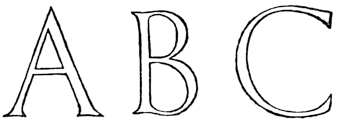
Nearly every type of letter with which we are familiar is derived from the Roman Capitals, and has come to us through the medium, or been modified by the influence, of the pen. And, therefore, in trying to revive good Lettering, we cannot do better than make a practical study of the best pen-forms, and learn at the same time to appreciate the forms of their magnificent archetypes as preserved in the monumental Roman inscriptions.
Nearly every type of letter we know today comes from Roman Capitals and has been shaped by the use of the pen. Therefore, in our effort to bring back quality lettering, we should make a practical study of the best pen forms while also appreciating the impressive styles of their original forms found in the monumental Roman inscriptions.
FORMAL WRITING—the “book-hand” or professional writing of the scribes—comes of the careful writing of the Roman Capitals (see also footnote, p. 38, on the beginnings of fine penmanship). It was the—
FORMAL WRITING—the “book-hand” or professional writing of the scribes—originates from the careful writing of Roman Capitals (see also footnote, p. 38, on the beginnings of fine penmanship). It was the—
In early cursive writing—the running-hand or ordinary writing of the people—
In early cursive writing—the running-hand or regular writing of the people—

Here it is sufficient to trace the history of the formal Latin “hands,” but the continual, modifying influence exerted on them by the ordinary cursive writing should be borne in mind. Notable results of this influence are seen in Half-Uncials and Italics.
Here, it’s enough to outline the history of the formal Latin “hands,” but it's important to remember the ongoing, changing influence that regular cursive writing has had on them. Significant outcomes of this influence are evident in Half-Uncials and Italics.
SQUARE CAPITALS were formal, pen-made Roman Capitals, of the monumental type: they were used (perhaps from the second) till about the [p038] end of the fifth century for important books (see Plate III.).
SQUARE CAPITALS were formal, handcrafted Roman Capitals of the monumental style. They were used (possibly starting in the second century) until around the [p038] end of the fifth century for significant books (see Plate III.).

ROMAN UNCIALS were fully developed by the fourth century, and were used from the fifth till the eighth century for the finest books (fig. 5).
ROMAN UNCIALS were fully developed by the fourth century and were used from the fifth to the eighth century for the best books (fig. 5).

Uncials are true pen-forms8—more quickly written than the “Square,” and clearer than the “Rustic” Capitals—having the characteristic, simple strokes and beautiful, rounded shapes which flow from the rightly handled reed or quill. The [p040] typical Uncial letters are the round D, E, H, M, U (or V), and A and Q (see p. 300).
Uncials are true pen forms8—written faster than the "Square" and clearer than the "Rustic" Capitals. They have simple strokes and beautiful, rounded shapes that come from using a properly handled reed or quill. The [p040] typical Uncial letters include the round D, E, H, M, U (or V), and A and Q (see p. 300).
ROMAN HALF-UNCIALS—or Semi-Uncials—(fig. 6) were mixed Uncial and Cursive forms adopted by the scribes for ease and quickness in writing. Their evolution marks the formal change from Capitals to “Small-Letters.”
ROMAN HALF-UNCIALS—or Semi-Uncials—(fig. 6) were a blend of Uncial and Cursive styles used by scribes for faster and easier writing. Their development signifies the formal shift from Capitals to "Small-Letters."

They were first used as a book-hand for the less important books about the beginning of the sixth century.
They were first used as a reference for the less important books around the early sixth century.
IRISH HALF-UNCIALS were founded on the Roman Half-Uncials (probably brought to Ireland by Roman missionaries in the sixth century). As a beautiful writing, they attained in the seventh century a degree of perfection since unrivalled (see Plate VI.).
IRISH HALF-UNCIALS originated from the Roman Half-Uncials (likely introduced to Ireland by Roman missionaries in the sixth century). As an elegant form of writing, they reached an unmatched level of perfection by the seventh century (see Plate VI.).
They developed in the eighth and ninth centuries into a “pointed” writing, which became the Irish national hand.
They evolved in the eighth and ninth centuries into a “pointed” style of writing, which became the Irish national script.

CAROLINE (or CARLOVINGIAN) WRITING.—While English and Irish writing thus came from Roman Half-Uncial, the Continental hands were much influenced by the rougher Roman Cursive, and were, till near the end of the eighth century, comparatively poor.
CAROLINE (or CARLOVINGIAN) WRITING.—While English and Irish writing evolved from Roman Half-Uncial, the writing styles on the Continent were greatly impacted by the more casual Roman Cursive and remained relatively underdeveloped until just before the end of the eighth century.
“The period of Charlemagne is an epoch in the history of the handwritings of Western Europe. With the revival of learning naturally came a reform of the writing in which the works of literature were to be made known. A decree of the year 789 called for the revision of church books; and this work naturally brought with it a great activity in the writing schools of the chief monastic centres of France. And in none was there greater activity than at Tours, where, under the rule of Alcuin of York, who was abbot of St. Martin’s from 796 to 804, was specially developed the exact hand which has received the name of the Caroline Minuscule.”9 [p042]
“The time of Charlemagne marks an important chapter in the history of handwriting in Western Europe. With the revival of learning came a necessary reform in writing that would present literary works. A decree from 789 called for the revision of church books; this effort led to increased activity in the writing schools at the major monastic centers in France. None saw more activity than Tours, where, under the leadership of Alcuin of York, who was the abbot of St. Martin’s from 796 to 804, the precise style of handwriting known as the Caroline Minuscule was particularly developed.”9 [p042]

The influence of the Caroline hands (see fig. 8) presently spread throughout Europe. The letters in our modern copy-books may be regarded as their direct, though degenerate, descendants.
The influence of the Caroline hands (see fig. 8) is now widespread across Europe. The letters in our modern copybooks can be seen as their direct, albeit less refined, descendants.
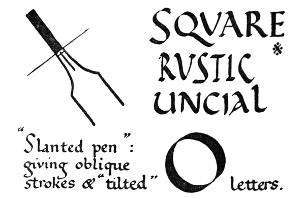
SLANTED-PEN or TILTED WRITING.—The forms of the letters in early writing indicate an easily held pen—slanted away from the right shoulder. The slanted pen naturally produced oblique thick strokes and thin strokes, and the letters were “tilted” (see fig. 9).
SLANTED-PEN or TILTED WRITING.—The shapes of the letters in early writing show that a pen was held comfortably—angled away from the right shoulder. This slanted pen naturally created oblique thick and thin strokes, resulting in “tilted” letters (see fig. 9).
In the highly finished hands—used from the sixth to the eighth centuries—such as the later Uncials and the Roman, Irish, and English Half-Uncials, the pen was manipulated or cut so that the thin strokes were approximately horizontal, and the thick strokes vertical (fig. 10). The earlier and easier practice came into fashion again in the eighth and ninth centuries, and the round Irish and English hands became “pointed” as a result of slanting the pen.
In the refined handwriting used from the sixth to the eighth centuries, like the later Uncials and the Roman, Irish, and English Half-Uncials, the pen was held or shaped so that the thin strokes were mostly horizontal and the thick strokes were vertical (fig. 10). The earlier and simpler style made a comeback in the eighth and ninth centuries, and the rounded Irish and English scripts became “pointed” because of the pen being tilted.
The alteration in widths and directions of pen strokes, due to the use of the “slanted pen,” had these effects on the half-uncial forms (see fig. 11):—
The change in widths and angles of pen strokes, because of using the “slanted pen,” had these effects on the half-uncial forms (see fig. __A_TAG_PLACEHOLDER_0__):—
1. The thin strokes taking an oblique (upward) direction (a) (giving a sharp angle with the verticals (d, a)) led to angularity and narrower forms (a1), and a marked contrast between thick and thin strokes—due to the abrupt change from one to the other (a2).
1. The thin lines moving at an angle (upward) direction (a) (creating a sharp angle with the verticals (d, a)) resulted in angular shapes and slimmer forms (a1), and a strong contrast between thick and thin lines—because of the sudden transition from one to the other (a2).
2. The thick strokes becoming oblique (b) caused a thickening of the curves below on the left (b1), and above on the right (b2), which gave heavy shoulders and feet.
2. The thick strokes turning slanted (b) led to a thickening of the curves below on the left (b1), and above on the right (b2), which created heavy shoulders and feet.
3. The horizontal strokes becoming thicker (c) gave stronger and less elegant forms. [p044]
3. The horizontal strokes getting thicker (c) created bolder and less graceful shapes. [p044]

4. The vertical strokes becoming thinner (d) (with oblique or pointed ends—not square ended) increased the tendency to narrow letters.
4. The vertical strokes getting thinner (d) (with slanted or pointed ends—not flat ended) increased the tendency for letters to become narrower.

It is to be noted that the Caroline letters—though written with a “slanted pen”—kept the open, round appearance of the earlier forms. [p046]
It’s important to note that the Caroline letters—although written with a “slanted pen”—maintained the open, round look of earlier versions. [p046]
TENTH, ELEVENTH, AND TWELFTH CENTURY WRITING.—The easy use of the slanted pen, and the lateral compression of the letters which naturally followed, resulted in a valuable economy of time and space in the making of books. This lateral compression is strongly marked in the tenth century (see fig. 12), and in the eleventh and twelfth centuries it caused curves to give place to angles, and writing to become “Gothic” in character (see Plate XI.).
TENTH, ELEVENTH, AND TWELFTH CENTURY WRITING.—The simple use of the slanted pen, along with the sideways narrowing of the letters that naturally followed, led to a significant saving of time and space in bookmaking. This narrowing was particularly noticeable in the tenth century (see fig. 12), and in the eleventh and twelfth centuries, it caused curves to be replaced by angles, giving writing a “Gothic” style (see Plate XI.).

THIRTEENTH, FOURTEENTH, AND FIFTEENTH CENTURY WRITING.—The tendency to compression continued, and a further economy of space was effected in the thirteenth and fourteenth centuries by the general use of much smaller writing (see fig. 13). In the fifteenth century writing grew larger and taller again, but the letters had steadily become [p047] narrower, more angular, and stiffer, till the written page consisted of rows of perpendicular thick strokes with heads and feet connected by oblique hair-lines—which often look as if they had been dashed in after with a fine pen—all made with an almost mechanical precision (see Plate XVII.).
THIRTEENTH, FOURTEENTH, AND FIFTEENTH CENTURY WRITING.—The trend toward compression continued, and there was an even greater saving of space in the thirteenth and fourteenth centuries due to the widespread use of much smaller writing (see fig. 13). In the fifteenth century, writing became larger and taller once again, but the letters had gradually become [p047] narrower, more angular, and stiffer, until the written page consisted of rows of thick vertical strokes with heads and feet connected by slanted hair-lines—which often appeared to have been added later with a fine pen—all created with an almost mechanical precision (see Plate XVII.).

ITALIAN WRITING.—In Italy alone the roundness of the earlier hands was preserved, and though in course of time the letters were affected by the “Gothic” tendency, they never lost the curved forms or acquired the extreme angularity which is seen in the writings of Northern Europe (compare Plates X. and XI.).
ITALIAN WRITING.—In Italy alone, the rounded style of the earlier scripts was maintained, and although over time the letters were influenced by the "Gothic" trend, they never lost their curved shapes or gained the sharp angles characteristic of the writings in Northern Europe (compare Plates X. and XI.).
At the time of the Renaissance the Italian scribes remodelled their “hands” on the beautiful Italian writing of the eleventh and twelfth centuries (see Plates X. and XVIII., XIX., XX.). The early Italian printers followed after the scribes and modelled their types on these round clear letters. And thus the fifteenth century Italian formal writing became the foundation of the “Roman” small letters, which have superseded all others for the printing of books. [p048]
During the Renaissance, Italian scribes transformed their “hands” based on the elegant Italian writing from the eleventh and twelfth centuries (see Plates X. and XVIII., XIX., XX.). The early Italian printers followed the scribes’ lead and created their typefaces inspired by these round, clear letters. As a result, the formal Italian writing of the fifteenth century became the basis for the “Roman” small letters, which have replaced all others in book printing. [p048]
CHAPTER II ACQUIRING A FORMAL HAND: (1) TOOLS Getting a Formal Hand: Tools, etc. — The Desk — Paper & Ink — Pens: The Reed: The Quill — About Quills in General — Pen Knife, Cutting Board, etc.
ACQUIRING A FORMAL HAND: TOOLS, &C.
The simplest way of learning how to make letters is to acquire a fine formal hand. To this end a legible and beautiful writing (see p. 70) should be chosen, and be carefully copied with a properly cut pen.
The easiest way to learn how to write letters is to develop a neat, formal hand. To do this, you should choose a clear and beautiful style of writing (see p. 70) and carefully practice copying it with a well-made pen.
For learning to write, the following tools and materials are required:—
For learning to write, the following tools and materials are required:—
- Desk.
- Writing-paper.
- Ink and filler.
- Pens (Reed and Quill) with “springs.” [p049]
- Pen-knife, sharpening-stone, and cutting-slab.
- Magnifying glass.
- Two-foot (preferably three-foot) rule, and pencil.
- Linen pen-wiper.
THE DESK


An ordinary desk or drawing-board can be used, but the best desk is made by hinging a drawing-board (“Imperial” size) to the edge of a table. The board may be raised and supported at any desired angle by a hinged support, or by a round tin set under it (fig. 14). For a more portable [p050] desk two drawing-boards may be similarly hinged together and placed on a table (fig. 15).
An ordinary desk or drawing board can work, but the best setup is to attach a drawing board (size: “Imperial”) to the edge of a table with hinges. The board can be tilted and supported at any angle you want using a hinged support or a round tin placed underneath it (fig. 14). For a more portable desk, you can hinge two drawing boards together and set them on a table (fig. 15).

A tape or string is tightly stretched—horizontally—across the desk to hold the writing-paper (which, as a rule, is not pinned on). The lower part of the writing-paper is held and protected by a piece of stout paper or vellum fixed tightly, with drawing-pins, across and over it (fig. 16). Under the writing-paper there should be a “writing-pad,” consisting of one or two [p051] sheets of blotting-paper, or some other suitable substance.10
A tape or string is tightly stretched—horizontally—across the desk to hold the writing paper (which usually isn't pinned down). The lower part of the writing paper is held and protected by a sturdy piece of paper or vellum that is tightly secured across and over it (fig. 16). Under the writing paper, there should be a "writing-pad," made up of one or two [p051] sheets of blotting paper or another suitable material.10
It is a good plan to have the lower, front edge of the desk bevelled or rounded, so that the tail part of a deep sheet, which may hang below the table, does not become accidentally creased by being pressed against it. A curved piece of cardboard fixed on the edge will answer the same purpose.
It’s a smart idea to have the lower front edge of the desk beveled or rounded, so that the back part of a long sheet, which might hang below the table, doesn’t accidentally get creased by being pressed against it. A curved piece of cardboard attached to the edge will serve the same purpose.
PAPER & INK
A good, prepared, liquid (carbon) ink is best. It should be as black as possible, without being too thick. A jet-black ink will test the quality of the writing by “showing up” all the faults; “pale” or “tinted” inks rather conceal the faults, and lend a false appearance of excellence (p. 322). A thin ink greatly adds to the ease of writing (see Addenda, p. 23). Waterproof inks, as a rule, are too thick or gummy, and do not flow freely enough.
A good, prepared, liquid (carbon) ink is the best choice. It should be as black as possible without being too thick. Jet-black ink will highlight the quality of the writing by revealing all the flaws; “pale” or “tinted” inks tend to hide the imperfections and create a misleading impression of quality (p. 322). A thin ink significantly improves the ease of writing (see Addenda, p. 23). Generally, waterproof inks are too thick or sticky and don't flow freely enough.
The ink-bottle is kept corked when not in use, to keep the ink clean and prevent evaporation. Thick or muddy ink should be put away: it is not worth while trying to use it.
The ink bottle is kept corked when not in use to keep the ink clean and stop it from evaporating. Thick or muddy ink should be discarded; it’s not worth trying to use it.
A small brush is used for filling the pen.
A small brush is used to fill the pen.
PENS
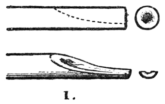
A Reed or Cane pen is best for very large writing—over half an inch in height—and therefore [p052] it is of great use in studying pen strokes and forms.
A Reed or Cane pen is ideal for very large writing—more than half an inch tall—and therefore [p052] it's really useful for studying pen strokes and shapes.


V. A pencil or brush-handle is held under the nib, and is gently twitched upwards to lengthen the slit (fig. 21). An ordinary reed should have a slit about 34 inch long. A very stiff pen may have in addition a slit on either side of the centre.
V. A pencil or brush handle is held under the nib and is gently pulled upwards to widen the slit (fig. 21). A standard reed should have a slit about 34 inch long. A very stiff pen may also have a slit on both sides of the center.


VII. A strip of thin metal (very thin tin, or clock spring with the “temper” taken out by heating and slowly cooling) is cut the width of the nib and about 2 inches long. This is folded into a “spring” (fig. 23).
VII. A thin piece of metal (very thin tin or clock spring with the “temper” removed by heating and slowly cooling) is cut to the width of the nib and about 2 inches long. This is folded into a “spring” (fig. 23).

The loop a b c is “sprung” into place, and holds the spring in the right position. The loop c d, which should be rather flat, holds the ink in the pen. The point d should be about 18 inch from the end of the nib.
The loop a b c is set in place and keeps the spring in the correct position. The loop c d, which should be quite flat, holds the ink in the pen. The tip d should be about 18 inch from the end of the nib.
THE QUILL.—A Turkey’s Quill is strong, and suitable for general writing. As supplied by the stationers it consists of a complete wing-feather, about 12 inches long, having the quill part cut for ordinary use. For careful writing it should be re-made thus:—
THE QUILL.—A Turkey’s Quill is sturdy and ideal for general writing. Supplied by stationers, it features a full wing feather, roughly 12 inches long, with the quill part trimmed for regular use. For precise writing, it should be modified this way:—

I. The quill should be cut down to 7 or 8 inches (fig. 25); the long feather if left is apt to be in the way.
I. The quill should be trimmed to 7 or 8 inches (fig. 25); if the feather is too long, it tends to get in the way.


III. The nib already has a slit usually about 14 inch long. This is sufficient in a fairly pliant pen; in a very stiff pen (see p. 60) the slit may be lengthened to 38 inch. This may be done with care by holding a half-nib between the forefinger [p056] and thumb of each hand, but the safest way is to twitch the slit open (fig. 27), using the end of another pen (or a brush-handle) as explained under Reed, V. (see p. 53).
III. The nib already has a slit that’s usually about 14 inch long. This is enough for a fairly flexible pen; in a very rigid pen (see p. 60) the slit can be extended to 38 inch. You can do this carefully by holding a half-nib between the forefinger [p056] and thumb of each hand, but the safest way is to twitch the slit open (fig. 27), using the end of another pen (or a brush handle) as explained under Reed, V. (see p. 53).


The shaft rests lightly in the left hand (not gripped and not pressed down on slab at all), and the knife blade is entered with a steady pressure.
The shaft sits gently in the left hand (not gripped and not pressing down on the slab at all), and the knife blade is inserted with consistent pressure.
If the nib is then not wide enough it may be cut again; if too wide, the sides may be pared down.
If the nib isn't wide enough, it can be cut again; if it's too wide, the sides can be trimmed down.
Cut very little at a time off the tip of the nib; a heavy cut is apt to force the pen out of shape and spoil the edge of the nib.
Cut just a little bit off the tip of the nib at a time; making a deep cut is likely to bend the pen out of shape and ruin the edge of the nib.
VI. The nib should then be examined with the magnifying glass. Hold the pen, back down, over a sheet of white paper, and see that the ends of the two half-nibs are in the same straight line a–b (fig. 30).
VI. Next, check the nib with a magnifying glass. Hold the pen, nib side down, over a piece of white paper and make sure that the tips of the two halves of the nib are lined up in a straight line a–b (fig. 30).
The nib should have an oblique chisel-shaped tip, very sharply cut (fig. 31).
The nib should have an angled chisel-shaped tip, cut very sharply (fig. 31).


VII. The Spring (see Reed, VII.) (about 332 inch by 112 inch) is placed so that the point is about 116 inch from the end of the nib. The long loop should be made rather flat to hold plenty of ink (A, fig. 35)—neither too much curved (B: this holds only a drop), nor quite flat (C: this draws the ink up and away from the nib).
VII. The Spring (see Reed, VII.) (about 332 inches by 1/2 inches) should be positioned so that the tip is about 116 inch from the end of the nib. The long loop needs to be fairly flat to hold a good amount of ink (A, fig. 35)—not too curved (B: this only holds a drop), and not completely flat (C: this pulls the ink up and away from the nib).
OF QUILLS GENERALLY
For ordinary use the nib may be cut with a fairly steep angle, as shown (magnified) at (a) (fig. 36).
For regular use, the nib can be cut at a pretty steep angle, as shown (enlarged) at (a) (fig. 36).
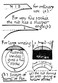
The pen may be made more pliant by scraping it till it is thinner, or by cutting the “shoulder” (a–b, fig. 29) longer, or stiffer by cutting the nib back until the “shoulder” is short.
The pen can be made more flexible by scraping it down until it’s thinner, or by making the “shoulder” (a–b, fig. 29) longer, or firmer by trimming the nib back until the “shoulder” is short.
The main advantages of a quill over a metal pen are, that the former may be shaped exactly as the writer desires, and be re-cut when it becomes blunt.
The main advantages of a quill over a metal pen are that the quill can be shaped exactly as the writer wants and can be re-cut when it gets dull.
A metal pen may be sharpened on an oilstone, but the process takes so much longer that there is no saving in time: it is not easily cut to the exact shape, and it lacks the pleasant elasticity of the quill.
A metal pen can be sharpened on an oilstone, but the process takes so much longer that there’s no time saved: it’s not easy to trim to the exact shape, and it doesn’t have the nice flexibility of a quill.
A gold pen is probably the best substitute for a quill, and if it were possible to have a sharp, “chisel-edged” iridium tip on the gold nib, it would be an extremely convenient form of pen. A “fountain pen” might be used with thin ink.
A gold pen is likely the best replacement for a quill, and if it were possible to have a sharp, “chisel-edged” iridium tip on the gold nib, it would be a very convenient kind of pen. A “fountain pen” could be used with thin ink.
PEN-KNIFE, CUTTING-SLAB, &C.

THE SLAB.—A piece of glass (preferably white) may be used for fine quills; hard wood, bone, or celluloid for reed and cane pens.
THE SLAB.—A piece of glass (ideally white) can be used for fine quills; hardwood, bone, or celluloid for reed and cane pens.
SHARPENING STONE.—A “Turkey” (fine) or “Washita” (fine or coarse grained) stone.
SHARPENING STONE.—A "Turkey" (fine) or "Washita" (fine or coarse grained) stone.
MAGNIFYING GLASS.—A magnifying glass (about 1 inch in diameter) is necessary for examining fine pen nibs to see if they are “true.” A “pocket” glass is the most suitable for general use, and for the analysis of small writing, &c.
MAGNIFYING GLASS.—A magnifying glass (about 1 inch in diameter) is essential for checking fine pen nibs to see if they are “true.” A “pocket” glass is the best option for everyday use and for analyzing small writing, etc.
RULE.—A 2, or 3-foot wood rule having brass strips let in to protect the edges, or a metal rule.
RULE.—A 2 or 3-foot wooden ruler with brass strips inlaid to protect the edges, or a metal ruler.
LINEN PEN-WIPER.—A piece of an old linen handkerchief may be used to keep the pen clean.
LINEN PEN-WIPER.—A piece of an old linen handkerchief can be used to keep the pen clean.
CHAPTER III ACQUIRING A FORMAL HAND: (2) METHODS Desk Position — Writing Height — Using the Pen — How to Hold the Pen — Filling the Pen, etc.
POSITION OF THE DESK

Always write at a slope. This enables you to sit up comfortably at your work, and to see the MS. clearly as though it were on an easel—and, by the resulting horizontal position of the pen, the ink is kept under control. It may be seen from ancient pictures that this was the method of the scribes (see Frontispiece). Never write on a flat table; it causes the writer to stoop, the MS. is seen foreshortened, and the ink flows out of the pen too rapidly. [p062]
Always write at an angle. This helps you sit comfortably while working and allows you to see the manuscript clearly, just like it’s on an easel. Plus, the angled position of the pen helps keep the ink under control. Ancient pictures show that this was the technique used by scribes (see Frontispiece). Never write on a flat table; it makes you hunch over, the manuscript appears distorted, and the ink flows out of the pen too quickly. [p062]
The slope of the desk may be about, or rather less than, 45° to begin with: as the hand becomes accustomed to it, it may be raised to about 60° (fig. 38).
The angle of the desk might be around, or maybe slightly less than, 45° at first; as your hand gets used to it, it can be adjusted to about 60° (fig. 38).
The “heel” of the right hand may be tired at first, but it soon grows used to the position. A rest for the left arm, if necessary, can be attached to the left side of the board.
The “heel” of the right hand might feel tired at first, but it quickly gets used to the position. If needed, a rest for the left arm can be attached to the left side of the board.
Lighting. The desk is placed very near to a window, so that a strong light falls on it from the left. Direct sunlight may be cut off by fixing a sheet of thin white paper in the window. Careful work should be done by daylight. Work done by artificial light always appears faulty and unsatisfactory when viewed by day.
Lighting. The desk is positioned close to a window, allowing strong light to come in from the left. To block direct sunlight, you can attach a sheet of thin white paper to the window. Careful work should be done during the day. Work completed under artificial light always looks flawed and unsatisfactory when seen in daylight.
THE WRITING LEVEL

Each penman will find for himself the writing level along which his pen will move most naturally and conveniently (see figs. 39 and 16). The paper guard should be pinned on about 1 inch below the [p063] writing level: the tape is fixed across about 3 inches above the guard. In the case of very large writing the space between the tape and the guard is greater, and in the case of a very small MS. it is less.
Each writer will discover the writing level where their pen moves most comfortably and easily (see figs. 39 and 16). The paper guard should be pinned about 1 inch below the [p063] writing level: the tape is secured about 3 inches above the guard. If the writing is very large, the space between the tape and the guard is larger, and if the writing is very small, it is smaller.
The writing level is kept constant. When one line has been written, the writing paper—which is placed behind the tape and the guard—is pulled up for another line.
The writing level is kept constant. When one line is finished, the writing paper—which is positioned behind the tape and the guard—is pulled up for the next line.
USE OF THE PEN
For the practical study of pen-forms use a cane or a reed pen—or a quill cut very broad—giving a broad, firm, thick stroke. It is the chisel edge (p. 57) of the nib which gives the “clean cut” thick and thin strokes and the graduated curved strokes characteristic of good writing (fig. 40).
For practical penmanship practice, use a cane, a reed pen, or a quill that’s cut wide to create a broad, firm, and thick stroke. It's the chisel edge (p. 57) of the nib that produces the “clean cut” thick and thin strokes, as well as the graduated curved strokes that are typical of good writing (fig. 40).

It is very important that the nib be cut “sharp,” and as often as its edge wears blunt it must be resharpened. It is impossible to make “clean cut” strokes with a blunt pen (see Addenda, p. 25).
It is really important that the nib is cut “sharp,” and every time its edge gets dull, it needs to be reshaped. You can’t make “clean cut” strokes with a blunt pen (see Addenda, p. 25).
When the nib is cut back, the “shoulder” should be cut back to preserve the elasticity of the pen (p. 60).
When the nib is trimmed, the “shoulder” should also be trimmed to keep the pen's flexibility (p. 60).
HOLDING THE PEN
The pen should be so lightly held that the act of writing should draw the edge of the nib into perfect contact with the paper, both the half-nibs touching the surface. (To make sure that the contact is perfect, make experimental thick strokes on a scrap of paper—pinned at the right-hand side of the desk—and see that they are “true,” i.e. that they are of even width, with “clean cut” edges and ends.) The writer should be able to feel what the nib is doing. If the pen be gripped stiffly the edge of the nib cannot be felt on the paper; and it will inevitably be forced out of shape and prematurely blunted.
The pen should be held so lightly that the act of writing draws the tip of the nib into perfect contact with the paper, with both halves of the nib touching the surface. (To ensure the contact is perfect, try making thick strokes on a piece of scrap paper—pinned to the right side of your desk—and check that they are “true,” i.e. that they are of even width, with “clean cut” edges and ends.) The writer should be able to feel what the nib is doing. If the pen is held too tightly, the edge of the nib can’t be felt on the paper, which will inevitably cause it to become misshapen and wear down too quickly.
THE CUSTOMARY MANNER.—The ancient scribe probably held his pen in the manner most convenient to himself; and we, in order to write with freedom, should hold the pen in the way to which, by long use, we have been accustomed; provided that, for writing an upright round-hand, the pen be so manipulated and cut as to make fine horizontal thin strokes and clean vertical thick strokes (see fig. 40, & footnote, p. 304).
THE CUSTOMARY MANNER.—The ancient scribe likely held his pen in whatever way was most comfortable for him; similarly, to write freely, we should grip the pen in the way we've become accustomed to through practice; as long as, when writing in an upright round-hand, the pen is adjusted and shaped to create fine horizontal thin strokes and clean vertical thick strokes (see fig. 40, & footnote, p. 304).

SLANTED SHAFT, &c.—Most people are accustomed to holding a pen slanted away from the right shoulder. The nib therefore is cut at [p066] an oblique angle13 to the shaft, so that, while the shaft is slanted, the edge of the nib is parallel with the horizontal line of the paper, and will therefore produce a horizontal thin stroke and a vertical thick stroke. For example: if the shaft is held slanted at an angle of 70° with the horizontal, the nib is cut at an angle of 70° with the shaft (fig. 42). The angle of the nib with the shaft may vary from 90° (at right angles) to about 70°, according to the slant at which the shaft is held (fig. 43).
SLANTED SHAFT, &c.—Most people are used to holding a pen tilted away from their right shoulder. As a result, the nib is shaped at [p066] an angle that is tilted 13 to the shaft, so that while the shaft is slanted, the edge of the nib stays parallel to the horizontal line of the paper, producing a thin horizontal stroke and a thick vertical stroke. For instance, if the shaft is held at a 70° angle with the horizontal, the nib is cut at a 70° angle with the shaft (fig. 42). The angle of the nib relative to the shaft can range from 90° (at right angles) to about 70°, depending on the angle at which the shaft is held (fig. 43).


If the writer prefers an extremely slanted shaft, to cut the nib correspondingly obliquely would weaken it, so it is better to counteract the slant by slightly tilting the paper (fig. 44).
If the writer prefers a very slanted nib, cutting the nib at an angle would weaken it, so it's better to balance the slant by slightly tilting the paper (fig. 44).
To produce the horizontal thin stroke, therefore:
To create the horizontal thin stroke, therefore:
- The slant at which the shaft is held,
- The angle at which the nib is cut, and
- The tilt which may be given to the paper:

must be so adjusted, one to another, that the chisel edge of the nib is parallel to the horizontal line of the paper. Before writing, make trial strokes on a scrap of paper to see that this is so: the vertical thick strokes should be square ended and the full width of the nib, the horizontal strokes as fine as possible.
must be adjusted to each other so that the chisel edge of the nib is parallel to the horizontal line of the paper. Before writing, make some test strokes on a scrap of paper to check this: the vertical thick strokes should have square ends and be the full width of the nib, while the horizontal strokes should be as fine as possible.

HORIZONTAL SHAFT, &c.—The pen shaft is held approximately horizontal. This will be found the natural position for it when the slope [p068] of the desk is about 50° or 60°. It gives complete control of the ink in the pen, which can be made to run faster or slower by slightly elevating or depressing the shaft (fig. 45).

The pen makes a considerable angle with the writing surface, so that the ink, which is held in the hollow of the nib, comes in contact with the paper at the very extremity of the nib, making very fine strokes (a, fig. 47).
The pen is positioned at a significant angle to the writing surface, allowing the ink, contained in the reservoir of the nib, to touch the paper only at the tip of the nib, creating very fine lines (a, fig. 47).

It is convenient to stand the ink, &c., beside the desk on the left, and for this purpose a little cup-shaped bracket or clip may be attached to the edge of the writing-board. The filling-brush stands in the ink-bottle (p. 51) or pot of colour (p. 176), and is taken up in the left hand; the pen, retained in the right hand, being brought over to the left to be filled.
It’s handy to keep the ink, etc., next to the desk on the left, and for this, a small cup-shaped bracket or clip can be attached to the edge of the writing board. The filling brush is placed in the ink bottle (p. 51) or pot of color (p. 176), and is picked up with the left hand, while the pen, held in the right hand, is moved over to the left to be filled.

The back of the nib is kept dry (a, fig. 48). A very convenient and perfectly clean method, when care is taken, of removing any ink on the back of the pen is to draw it across the back of the left fore-finger.
The back of the nib is kept dry (a, fig. 48). A very handy and completely clean way, when done carefully, to remove any ink from the back of the pen is to wipe it across the back of your left index finger.
In careful work the pen should be tried, on a [p070] scrap of paper, almost every time it is filled (to see that it is not too full and that the ink is flowing rightly).
In careful work, the pen should be tested on a [p070] scrap of paper almost every time it is filled (to ensure that it isn’t overfilled and that the ink is flowing properly).
The nib is kept clean. A carbon ink (p. 51), through gradual evaporation, is apt to clog the nib (especially in hot weather); therefore every now and then, while the nib is in use, the spring is taken out and the whole thoroughly cleaned. It is impossible to write well with a dirty pen.
The nib is kept clean. A carbon ink (p. 51), due to gradual evaporation, can clog the nib (especially in hot weather); so every once in a while, while using the nib, the spring is removed and everything is cleaned thoroughly. It's impossible to write well with a dirty pen.
CHAPTER IV GETTING A FORMAL HAND: (3) MODELS Models — Construction Notes: Script I. — Letter Pairing — Spacing: Letters, Words, & Lines — Uncial Capitals: Script II. — Numerals & Punctuation Marks — About Copying MSS. in General.
MODELS
The English Half-Uncial writing in Plate VII. is an excellent model. Those who have sufficient time to spare for the careful study of this, or any other legible and beautiful round-hand, should obtain access to the MSS. in a museum, or procure good facsimiles (see Plates at end of Book, & p. 388).
The English Half-Uncial writing in Plate VII. is a great example. If you have enough time to dedicate to studying this or any other clear and lovely round-hand, you should check out the manuscripts in a museum or get good facsimiles (see Plates at end of Book, & p. 388).

Before copying a hand it is well to examine carefully the manuscript from which it is taken: observe its general appearance: note the character and mode of the ruling, and the sizes and relative proportions of page, text, margins, and ornaments. With regard to the actual forms of the letters and the mode of their arrangement, such a method of analysis as the following will be found useful, as an aid to accuracy in copying, and definiteness in self-criticism. [p072]
Before copying a document, it’s important to carefully examine the manuscript you’re working from: check its overall look, observe the style and way the lines are drawn, and take note of the sizes and proportions of the page, text, margins, and decorations. When it comes to the actual shapes of the letters and how they’re arranged, a method of analysis like the one below will be helpful for accuracy in copying and being specific in self-evaluation. [p072]
A METHOD OF ANALYSIS. |
Example: Analysis of Script I. (as in fig. 50). | |
|---|---|---|
| 1. THE WRITING | general character: | Modernized Half-Uncial. |
| (Ruling) | Double or single lines, &c. (see pp. 304, 305): | Double lines (see figs. 59, 65). |
| Letters | round or angular: | round. |
| upright or sloping: | upright. | |
| coupled or separate: | coupled. | |
| 2. THIN STROKES: | horizontal or oblique (see figs. 10, 9): | horizontal. |
| 3. THICK STROKES: | heavy, medium, or light (see fig. 183): | medium. |
| 4. “HEADS” & “FEET”: | character (see fig. 145): | solid, triangular, &c. |
| 5. STEMS (ascending & descending): | short, medium, or long (see fig. 183): | medium. |
| 6. SPACING (Letters, Words, Lines): | close or wide (see fig. 154): | fairly close (see figs. 54, 55). |
| 7. ARRANGEMENT: | in mass (of equal lines), or in column (of unequal lines) (see fig. 154): | in mass of equal lines (see fig. 66). |
| 8. MEASUREMENTS (& proportions see pp. 324, 327): | width of thick stroke (see p. 83): | l = about 332″ wide. |
| height of o and d (see pp. 82, 84): |
| |
| writing lines, distance apart (see p. 82): | Lines 1″ apart. | |
| 9. COMPONENT PARTS: | number and forms (see pp. 75, 81, 84): |
|
Most of the strokes begin as down-strokes, but at the end of a down-stroke, when the ink is flowing freely, the stroke may be continued in an upward direction (as in coupling-strokes, &c., the feet of letters, the thin stroke of x, and, if preferred, in making the last stroke of g, s, and y).
Most strokes start as down-strokes, but at the end of a down-stroke, when the ink is flowing freely, the stroke can continue upward (like in coupling-strokes, etc., the feet of letters, the thin stroke of x, and, if you'd like, when finishing the last stroke of g, s, and y).
While the ink is still wet in a down-stroke, the nib may be replaced on it and be pushed upward and outward to form the round arch in b, h, m, n, p, and r. This stroke, reversed, is also used for the top of t.
While the ink is still wet in a down-stroke, the nib can be replaced on it and pushed upward and outward to create the round arch in b, h, m, n, p, and r. This stroke, when reversed, is also used for the top of t.
The making of these UP-strokes is shown diagrammatically in fig. 51.
The process of making these UP-strokes is illustrated in fig. 51.
Note.—The forms +oin× in fig. 51 contain all the principal strokes in this alphabet, and are therefore useful for early practice.
Note.—The forms +join× in fig. 51 include all the main strokes in this alphabet, making them helpful for beginners.


COUPLING THE LETTERS

The coupling-strokes are finishing strokes—and as such are akin to serifs (p. 244)—growing out of or added to such stems as need “finishing.”
The coupling-strokes are final touches—and in that way, they're similar to serifs (p. 244)—emerging from or being added to stems that require a "finish."
Coupling enables one to write faster and with [p076] more freedom, the concluding or “coupling” stroke not being slowed down, but written with a dash, which is covered by the first stroke of the succeeding [p077] letter. It keeps the individual words more distinct, and therefore permits closer spacing of the text. Coupling is for convenience and legibility, and where it tends to interfere with legibility, we must be careful. The freer and more cursive the hand, the greater is the tendency to join and run letters together, as in ordinary writing.
Coupling lets you write faster and with more freedom, as the final or “coupling” stroke isn’t held back, but is done quickly and is covered by the first stroke of the next [p077] letter. It keeps individual words clearer, allowing for tighter spacing in the text. Coupling is for convenience and legibility, but we have to be cautious where it impacts clarity. The more cursive your handwriting is, the more likely you are to connect and blend letters together, like in regular writing.
It is preferable to couple letters below, if possible. Couplings above are sometimes apt to confuse the reading; for example, the cross-bar of t (though the most natural coupling for the scribe to use—see petatis, Plate VII.) should generally be made to pass over or fall short of the succeeding letter (see fig. 52).
It’s better to connect the letters below when possible. Connections above can sometimes confuse the reading; for instance, the cross-bar of t (even though it’s the most natural connection for the scribe to use—see petatis, Plate VII.) should usually be made to either pass over or fall short of the next letter (see fig. 52).
SPACING: LETTERS, WORDS, & LINES
The letters of a word are fitted together so that there is a general effect of evenness. This evenness is only to be attained by practice: it is characteristic of rapid skilful writing, and cannot be produced satisfactorily by any system of measurement while the writer’s hand is still slow and uncertain. It is worth noting, however, that the white interspaces vary slightly, while the actual distances between the letters vary considerably, according to whether the adjacent strokes curve (or slant) away or are perpendicular (figs. 53, 152).
The letters of a word come together to create a smooth overall look. Achieving this smoothness takes practice; it’s a hallmark of quick, skillful writing and can’t be accurately measured when the writer’s hand is still slow and unsure. It’s interesting to point out, though, that the empty spaces between letters vary slightly, while the actual distances between the letters can change significantly, depending on whether the nearby strokes curve (or slant) away or are straight up and down (figs. 53, 152).
It is sufficient for the beginner to take care that two curved letters are made very near each other, and that two straight strokes are spaced well apart.
It’s enough for a beginner to ensure that two curved letters are placed very close together and that two straight strokes are spaced far apart.
If the curves are too far apart there will be spots of light, and where several heavy stems are made too close together, “blots” of dark, marring the evenness of the page. [p078]
If the curves are too far apart, there will be patches of light, and where several thick stems are too close together, there will be "blobs" of dark, disrupting the uniformity of the page. [p078]


The descending strokes of the upper line must “clear” the ascending strokes of the lower line. Interlocking of these strokes may be avoided by the experimental placing of p over d (fig. 55).
The descending strokes of the upper line must “clear” the ascending strokes of the lower line. Interlocking these strokes can be avoided by trying different placements of p over d (fig. 55).

UNCIAL CAPITALS: SCRIPT II.


Grouping: Uncials have no coupling-strokes; when several are used together, they are not joined, but evenly grouped, allowing as before for curves and straight strokes (see p. 77).
Grouping: Uncials don’t have coupling-strokes; when they are used together, they aren't connected but are organized evenly, still accounting for curves and straight strokes (see p. 77).
- Spacing:
- (a) When used with Script I., Uncials are written on the same lines, and have to follow the same spacing (in spite of their longer stems).
- (b) When Uncials are used by themselves, their spacing may be wider (p. 297).
Note.—The height of Uncial o is about equal to the height of the Half-Uncial d.
Note.—The height of Uncial o is roughly the same as the height of the Half-Uncial d.
NUMERALS & PUNCTUATION MARKS
(See fig. 57.)
When writing “Arabic numerals,” 1 and 0 may be made on the line, 2468 ascending, and 3579 descending.
When writing "Arabic numerals," 1 and 0 can be written on the line, 2468 ascending, and 3579 descending.
OF COPYING MSS. GENERALLY
When copying a MS. it is best to choose a complete page—or part of a page—to be copied in facsimile.
When copying a manuscript, it's best to select a complete page—or part of a page—to be copied exactly.
Make a general examination and analysis as suggested at p. 71. Accurate measurements will be found helpful.
Make a general review and analysis as suggested on page 71. Accurate measurements will be useful.
Take the heights of the o and the d, and the distance apart of the writing-lines with dividers [p083] The width of the thick stroke is best found by making experimental thick strokes—the full width of the pen nib—on a scrap of paper: cut the paper in half across the thick strokes, and place the cut edge on the thickest strokes in the original MS., you will then find whether the pen nib should be cut wider or narrower.
Take the heights of the o and the d, and the distance between the writing lines using dividers [p083] The best way to determine the width of the thick stroke is by making test thick strokes—the full width of the pen nib—on a piece of scrap paper. Cut the paper in half across the thick strokes, and place the cut edge on the thickest strokes in the original manuscript, and you will then see if the pen nib should be cut wider or narrower.
The direction of the thickest strokes is approximately at right angles to the direction of the thin strokes; which commonly approaches the horizontal in early round hands, and is oblique in other hands (see fig. 9 and 10). The positions both of these strokes in the model, and of your pen, determine the angle of the nib. Therefore, cut the nib across at such an angle to the shaft of the pen that, when you hold the pen naturally, the direction of the thin strokes which it makes on the writing paper will coincide with the direction of the thin strokes in the model; but
The direction of the thickest strokes is roughly at right angles to the direction of the thin strokes, which typically run horizontal in early round handwriting and are slanted in other styles (see fig. 9 and 10). The positions of both these strokes in the model and your pen determine the nib's angle. So, trim the nib at an angle to the pen’s shaft so that when you hold the pen naturally, the direction of the thin strokes it produces on the paper matches the direction of the thin strokes in the model; but
- (a) The way in which the shaft is held,
- (b) The angle at which the nib is cut,
- (c) The position of the writing paper,
may all be slightly varied, so that the direction of the thin strokes can be followed exactly (see p. 66).
may all be slightly varied, so that the direction of the thin strokes can be followed exactly (see p. 66).
The writing paper is cut and ruled exactly in accordance with the model; and the heights of the letters and the widths of the thick strokes in the copy agree as nearly as possible with those in the original. It is therefore a good test for accuracy—when a few lines of writing have been copied—to measure and compare their lengths. If they correspond with their originals, it goes far to prove the copy a good one.
The writing paper is cut and lined up exactly like the model, and the heights of the letters and the widths of the thick strokes in the sample match as closely as possible with those in the original. Therefore, it's a good way to check for accuracy—when a few lines of writing have been copied—to measure and compare their lengths. If they match their originals, it strongly indicates that the copy is a good one.
Before copying more of the page, the construction of the letters should be carefully studied. The number and the forms of pen-strokes in each letter [p084] are found by examination—with a magnifying glass if necessary—and by the experimental putting together of strokes, to form a similar letter. For this a large pen, such as a reed, is useful, and it is a good plan to write individual letters and words exactly two, three, or four times their height in the model: both the pen nib and the individual letters are made correspondingly two, three, or four times as wide as in the original.
Before copying more from the page, you should take a close look at how the letters are formed. The number and type of pen strokes in each letter [p084] can be figured out by examining them—using a magnifying glass if needed—and by trying out different strokes to create a similar letter. For this, a larger pen, like a reed, comes in handy. It's also a good idea to write each letter and word at least two, three, or four times their height from the model: both the pen nib and the individual letters should be proportionally two, three, or four times as wide as in the original.
It is particularly important, in copying, to preserve accurately the proportion of the thick stroke to the height and width of a letter (see p. 324). These are conveniently measured by the pen nib itself, or by the estimated width of the thick stroke; thus, in the writing shown in fig. 50, the width of the o is approximately five, and the height approximately four, times the width of the thick stroke.
It’s especially important, when copying, to accurately maintain the ratio of the thick stroke to the height and width of a letter (see p. 324). These can be conveniently measured by the pen nib itself, or by estimating the width of the thick stroke; for example, in the writing shown in fig. 50, the width of the o is roughly five, and the height is about four times the width of the thick stroke.
Not only must the copier ascertain what the forms are like and what are their proportions, but he must try to find out how they were made. This is of the greatest importance, for the manner of making a letter, or even a single stroke, affects its form and character with a definite tendency (see p. 416 & fig. 172). And this becomes more marked the faster the writing. An apparently right form may yet be wrongly—if slowly—made; but in rapid writing, a wrong manner of handling the pen will inevitably produce wrong forms. As the real virtue of penmanship is attained only when we can write quickly, it is well worth training the hand from the beginning in the proper manner.
Not only does the copier need to understand what the forms look like and their proportions, but he also needs to find out how they were created. This is extremely important because the way a letter, or even a single stroke, is made influences its shape and character in a specific way (see p. 416 & fig. 172). This becomes even more pronounced with faster writing. An apparently correct form might be created incorrectly—if slowly—but with quick writing, improper pen handling will inevitably lead to incorrect forms. Since the true skill of penmanship is only achieved when we can write quickly, it's definitely worthwhile to train the hand from the start in the correct way.
Patient and careful examination should be made of the changing pen-strokes, and of the mode in which they join—to form letters—and begin and end—to form “heads” and “feet.” This, accompanied [p085] by practical experiments in cutting and handling the pen, will bring out details of the utmost technical value. A certain amount of legitimate “faking” (p. 246), play of the pen, and sleight of hand (p. 311), may be found, but, in the main, the regular, natural, thick and thin strokes of the pen, and the orderly arrangement of the writing, give to a manuscript its beauty and character.
A careful and detailed examination should be done on the changing pen strokes, and on how they connect to form letters—and how they begin and end to create “heads” and “feet.” This, along with practical experiments in cutting and handling the pen, will reveal important technical details. You might notice some legitimate “faking” (p. 246), variations in pen strokes, and sleight of hand (p. 311), but generally, the consistent, natural, thick and thin strokes of the pen, along with the neat arrangement of the writing, give a manuscript its beauty and character.
Then having cut the nib rightly, you may, in a sense, let the pen do the writing, while you merely follow the strokes of the model, and you will, in course of time, have the pleasure of seeing the same beautiful writing—in the very manner of the ancient scribes—growing under your own hand.
Then, after cutting the nib correctly, you can, in a way, let the pen do the writing, while you just follow the strokes of the model, and over time, you'll get to enjoy seeing the same beautiful writing—in the style of the ancient scribes—developing under your own hand.
CHAPTER V GETTING A FORMAL HAND: (4) PRACTICE Practice — Scripts I & II — Arranging & Ruling a Single Sheet — Problem I (a Sheet of Prose) — Problem II (a Sheet of Poetry) — Spacing & Planning Manuscript.
PRACTICE
In acquiring a formal writing the penman should have two paper books constantly in hand: one for the study of the forms of letters, the other for both the letters and their arrangement. The first should contain large and very carefully made writing—with perhaps only one word to the line; the second [p086] should have smaller and quicker writing, neatly arranged on the pages, with four or five words to the line. (See MS. Books, Chap. VI.)
In learning formal writing, the writer should always keep two notebooks on hand: one for studying the shapes of letters and the other for both the letters and their layout. The first notebook should feature large, meticulously crafted writing—maybe just one word per line; the second [p086] should contain smaller, quicker writing, neatly organized on the pages with four or five words per line. (See MS. Books, Chap. VI.)
A broad nib is used in preference to a narrow one, so that the characteristics of true pen-work are brought out and the faults made clear. A fine, light handwriting is often very pretty, but it is certain to mislead the novice in penmanship (see p. 324).
A broad nib is preferred over a narrow one to highlight the features of genuine penmanship and make any mistakes obvious. While fine, light handwriting can be quite beautiful, it can easily mislead beginners in writing skills (see p. 324).
Having acquired a formal hand the penman may modify and alter it, taking care that the changes are compatible, and that they do not impair its legibility or beauty. Such letters as are obsolete he replaces by legible forms akin to them in feeling, and, the style of the selected type becoming very naturally and almost unconsciously modified by personal use, he at length attains an appropriate and modern Formal-Handwriting. The process of “forming” a hand requires time and practice: it resembles the passage of “Copy-book” into “Running” hand, familiar to us all (see p. 323).
Once someone has developed a formal handwriting style, they can adjust and change it, making sure those changes keep it easy to read and attractive. They can replace outdated letters with clear forms that have a similar feel, and as they use their chosen style more, it naturally and almost unconsciously evolves into a modern formal handwriting. The process of "forming" a hand takes time and practice; it’s similar to transitioning from "Copy-book" to "Running" hand, something we all know (see p. 323).

SCRIPTS I. & II.
Having cut
the nib of a
reed or large
quill to the
exact width required for the thick stroke, copy the
component strokes of the letter
 (Script I.), and
[p087]
immediately make the complete letter: go through
the whole alphabet in this way several times (fig.
58). Next join the letters together (see p.
73)
[p088]
to form words—writing always between ruled lines
(fig.
59 & p.
414).
(Script I.), and
[p087]
immediately make the complete letter: go through
the whole alphabet in this way several times (fig.
58). Next join the letters together (see p.
73)
[p088]
to form words—writing always between ruled lines
(fig.
59 & p.
414).
Having trimmed the tip of a reed or large quill to the exact width needed for a thick stroke, replicate the individual strokes of the letter
(Script I.), and
[p087]
immediately create the complete letter: go through the entire alphabet this way several times (fig.
58). Next, connect the letters together (see p.
73)
[p088]
to form words—always write between ruled lines (fig.
59 & p.
414).
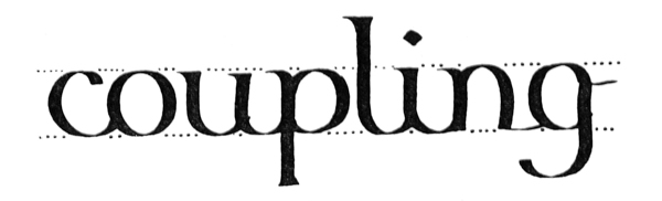

Next make a neat page of large writing, and, if possible, write such a page every day. The more definite and methodical practice is, the better. “Practising” anyhow, on scraps of paper, does more harm than good.
Next, create a tidy page of large writing, and if you can, write a page like this every day. The more organized and systematic your practice is, the better. “Practicing” anyhow, on random pieces of paper, does more harm than good.

ARRANGING & RULING A SINGLE SHEET
The proportions of the writing, spacing, and margins will likewise properly settle themselves (see pp. 265, 103, 107), but where the size of the sheet only is fixed, we have, broadly speaking, to decide between “large” writing with “small” margins (fig. 61), and “small” writing with “large” margins (fig. 62).

Generally a compromise is arrived at and the proportions are more evenly balanced (fig. 63).
Generally, a compromise is reached, and the proportions are more evenly balanced (fig. 63).
Ruling (see also pp. 258, 99).—The mode of ruling marginal lines and writing lines is shown in fig. 65. The ruling should be light, but firm and accurate. A fine pen, or hard pencil, or a blunt point may be used. Where the writing lines are double (as for round hands, p. 304), it is best to have a double ruling point (see fig. 77). Two hard pencils firmly [p090] lashed together make a convenient tool for large work: the distance between the points is easily adjusted by means of a small wedge.
Ruling (see also pp. 258, 99).—The method for creating marginal lines and writing lines is shown in fig. 65. The ruling should be light, but firm and precise. A fine pen, a hard pencil, or a blunt point can be used. When the writing lines are double (like for round hands, p. 304), it’s best to use a double ruling point (see fig. 77). Two hard pencils securely [p090] lashed together make a handy tool for larger work: the distance between the points can be easily adjusted with a small wedge.

PROBLEM I. (A SHEET OF PROSE)
To write out the Pater noster (50 words) in a formal round-hand (arranged in “mass” of equal lines) on a sheet of “foolscap” (i.e. 17 inches high and 1312 inches wide).
To write out the Our Father (50 words) in a formal round-hand (arranged in a “block” of equal lines) on a sheet of “foolscap” (i.e. 17 inches high and 13 1/2 inches wide).
If the size of the writing be considered of the first importance, a few words are written out in a script chosen to suit the subject, the space, &c., and these are measured to find the area which the whole text so written would occupy (fig. 64). The size of the script is then modified, if necessary, to suit the available area. [p091]
If the size of the writing is seen as most important, a few words are written in a font chosen to match the topic, the space, etc., and these are measured to determine the area the entire text would take up (fig. 64). The size of the font is then adjusted, if needed, to fit the available area. [p091]


The top and side margins may be of equal width—or the top may be a little less (see a, fig. 70). Ample space should be allowed for the foot margin, which is generally about twice the width of the top, but may vary in different cases, according as the text falls short of or encroaches upon it (see pp. 352, 342). For a plain foolscap sheet: sides (each) 212 inches, top (approx.) 2 inches, and foot (approx.) 4 inches, may be taken as suitable margins (fig. 65).
The top and side margins can be the same width—or the top might be slightly narrower (see a, fig. 70). There should be plenty of space for the foot margin, which is usually about twice the width of the top, but can vary depending on whether the text is too short or too close to it (see pp. 352, 342). For a standard foolscap sheet: sides (each) 2/12 inches, top (about) 2 inches, and foot (about) 4 inches, are considered suitable margins (fig. 65).
The width of the sheet (1312 inches) less the two side margins (212 inches each) gives the length of the writing lines (1312 – 5 = 812 inches). One or two such lines are written experimentally in a suitable script (say, 516 inch), and the average number of words per line (four) is found.
The width of the sheet 13 1/2 inches) minus the two side margins (2 1/2 inches each) equals the length of the writing lines (13 1/12 – 5 = 8 1/2 inches). One or two of these lines are written as a test in a suitable script (for example, 5 16 inch), and the average number of words per line (four) is calculated.
The number of words in the complete text (fifty) will determine the number of lines: an extra line or so may be allowed for safety (504 = 1212, say, thirteen). The spacing of these is calculated—
The total number of words in the text (fifty) will determine how many lines there will be: we can allow an extra line or so just to be safe (504 = 12 1/2, let’s say, thirteen). The spacing for these is calculated—
—and if the space is not sufficient, the writing is made a little smaller. If, on the other hand, the [p095] marginal depth left over were excessive, the writing might be made a little larger in order to fill up the space.
—and if the space isn't enough, the text is made a bit smaller. On the other hand, if the [p095] marginal space leftover is too much, the text might be made a bit larger to fill the space.
PROBLEM II. (A SHEET OF POETRY)
To write out “He that is down, needs fear no fall,” in a formal round-hand on a sheet of foolscap (i.e. 17 inches high × 1312 inches wide).
To write out “He who is down, doesn't need to fear a fall,” in a formal round-hand on a sheet of foolscap (i.e. 17 inches high × 13 1/2 inches wide).
Here there are three verses of four lines each: these with two space lines, left between the verses, give a total of fourteen lines (fig. 67).
Here are three verses of four lines each: these with two blank lines left between the verses give a total of fourteen lines (fig. 67).

A poem has a given number of lines of various lengths, and only very strong reason or necessity can justify our altering its proper form (e.g. by breaking up the lines) in order to make a mass of equal lines. Such theoretical margins as are possible in the treatment of prose can therefore seldom be observed in writing out a poem, and, unless the height or the width of the sheet can be altered, there is apt to be an excess of margin in one or the other direction. When such excess margin is obviously unavoidable, no objection can be made to its appearance. Poetry may conveniently be treated as “fine writing” (see p. 263).
A poem has a specific number of lines in different lengths, and only very strong reasons or needs can justify changing its original format (e.g., by breaking up the lines) to create uniform lines. The theoretical margins possible in prose writing are rarely applicable when writing a poem, and unless the sheet's height or width can be adjusted, there tends to be too much margin in one direction or another. When this extra margin is clearly unavoidable, there's no reason to object to it. Poetry can be conveniently seen as “fine writing” (see p. 263).
If the size of the writing be considered of the first importance, several of the longer lines (e.g. the first and the eleventh in the poem given) are written on a piece of paper in the size of writing preferred (say, 14 inch). By laying this paper on the given sheet, it is seen whether such lines would allow of sufficient side margins. (If they would not, the writing may be made smaller.)
If the size of the writing is seen as really important, several of the longer lines (e.g. the first and the eleventh in the poem given) are written on a piece of paper in the preferred size (let's say, 14 inch). By placing this paper on the given sheet, you can check if those lines would leave enough side margins. (If they don't, the writing can be made smaller.)
The height of the writing (14 inch) must allow of the full number of lines (fourteen) being properly [p097] spaced on the sheet (17 inches) with sufficient head and foot margins. This is calculated—
The height of the writing 1/4 inch) needs to be enough to fit all the lines (fourteen) properly [p097] spaced on the page (17 inches) with enough top and bottom margins. This is calculated—
14 in. writing requires approximately 34 in. spacing (p. 79): Fourteen lines at 34 in. gives 1012 in. = depth of text: 1012 in. from 17 in. leaves 612 in. for head and foot margins
14 in. writing needs about 34 in. spacing (p. 79): Fourteen lines at 34 in. results in 10 1/2 in. = depth of text: 10 1/2 in. from 17 in. leaves 6 1/2 in. for head and foot margins
—and if the space were not sufficient, the lines might be made a little closer, or the writing a little smaller (or, if necessary, the blank lines might be left out between the verses; p. 123).
—and if the space isn’t enough, the lines could be squeezed a bit closer together, or the writing could be made a bit smaller (or, if needed, the blank lines could be removed between the verses; p. 123).
The Sizes of the Margins.—It will be seen that the above method is primarily for settling a length of line which will allow of sufficient side margins. The process can be reversed; if necessary, the side margins are made of a given width, thus determining the exact length of the line, the size of writing which this line allows being found experimentally.
The Sizes of the Margins.—You can see that the method above is mainly for figuring out a length of line that provides enough side margins. The process can be flipped; if needed, the side margins can be set to a specific width, which then determines the exact length of the line, with the size of writing allowed by this line being determined through experimentation.
Note.—The extra long lines may slightly encroach on the right-hand margin: the effect of this is balanced by the falling short of other lines.
Note.—The extra long lines might slightly extend into the right-hand margin: this is balanced out by other lines that are shorter.
SPACING & PLANNING MANUSCRIPT
In penmanship great nicety of spacing and arrangement is possible. The ascending and descending strokes may be shortened or drawn out, the spaces between letters and words may be slightly increased or decreased, the lines may be written near or far apart, and the letters may be written with a broader or narrower nib.
In handwriting, you can achieve a high level of detail in spacing and layout. The upward and downward strokes can be shortened or elongated, the gaps between letters and words can be a little wider or narrower, the lines can be written close together or spaced out, and the letters can be made with a wider or thinner pen tip.
Elaborate spacing and planning, however, should not be attempted at first, and straightforward, undesigned work is often the best. The student is apt to waste time writing out an elaborate draft [p098] in order to ascertain how to space the matter. This is a mistake, because if written well, it is a waste of good writing on a mere draft; if written ill, it is bad practice. The briefer experiments and calculations are, the better, though the simplest problem always requires for its solution a calculation or process of guess and trial (such as suggested in the preceding pages). Practice will make people very good guessers, and the best work of all is done when the worker guesses rightly, and follows his guesses with the actual work, itself the trial and proof of accuracy.
Elaborate spacing and planning shouldn’t be attempted at first; straightforward, unplanned work is often best. The student tends to waste time drafting an elaborate version just to figure out how to space the content. This is a mistake because, if it’s written well, it wastes good writing on a mere draft; if it’s written poorly, it’s bad practice. The shorter the experiments and calculations, the better. However, even the simplest problem requires some sort of calculation or process of guesswork (as suggested in the previous pages). Practice will make people better guessers, and the best results come when the worker makes accurate guesses and follows them up with actual work, which serves as the trial and proof of accuracy.
CHAPTER VI MANUSCRIPT BOOKS__A_TAG_PLACEHOLDER_0__MS. Books: Tools & Materials — Methods & Proportions — The Size & Shape of the Book — The Widths of the Margins — The Size of the Writing, etc. — Ruling — MS. Books: General Remarks.
MS. BOOKS: TOOLS & MATERIALS
The making of manuscript books, based on a study of the early MSS., offers the best training to the scribe and illuminator in writing, lettering, rubricating, gilding, illuminating initials and borders, and miniature painting, and is the best means of mastering the foundations of Book Typography and Decoration.
Creating manuscript books, based on a study of the early manuscripts, provides the best training for the scribe and illuminator in writing, lettering, adding rubrics, gilding, illuminating initials and borders, and miniature painting, and is the most effective way to master the basics of Book Typography and Decoration.
Materials, &c. for MS. Books; Paper (see pp. 51, 103, 111, 317); Vellum and Parchment and Pounce [p099] (see pp. 110, 167, 173–5).—Cut a small sheet the size of a page of the book, and clip the long edge between two flat pieces of wood (holding it as it would be if bound). If the page will bend over and stay down by its own weight, it is thin enough (R fig. 68); if it stands up (W), it is too stiff.
Materials, etc. for MS. Books; Paper (see pp. 51, 103, 111, 317); Vellum and Parchment and Pounce [p099] (see pp. 110, 167, 173–5).—Cut a small sheet to the size of a page in the book, and hold the long edge between two flat pieces of wood (as it would be if it were bound). If the page can bend over and stay down by its own weight, it's thin enough (R fig. 68); if it stands up (W), it's too stiff.

Cutting Sheets.—A frame or template (the size of the sheet desired) is used by parchment makers. It is useful for cutting out the sheets for a common size of parchment book. They are cut on the end-grain of wood, or on card or glass.
Cutting Sheets.—A frame or template (the size of the sheet needed) is used by parchment makers. It helps in cutting out sheets for a standard size of parchment book. They are cut on the end grain of wood, or on card or glass.
Folding.—A Folder, as used by bookbinders (or a bone paper-knife), is useful, and also a Set or T-Square for testing right angles, &c. The fold and the top edge of each book-sheet are commonly squared by proper folding.
Folding.—A Folder, used by bookbinders (or a bone paper knife), is useful, and so is a Set or T-Square for checking right angles, etc. The fold and the top edge of each book sheet are typically aligned by proper folding.
Ruling, &c. (see p. 343).—For marking distances of lines, a carefully prepared paper17 scale or pattern (p. 25) and an awl (p. 109), or a [p100] “star-wheel”—having regular intervals between the spikes—may be used. Or the ruling—of the writing lines—may be simplified by using a stout card frame (internally the size of the text-column) with strips glued across it: for a common size of book this might be made in stout tin or other metal. The lines are commonly ruled with a ruling stylus (see figs. 72, 77), or a sort of “rake” may be made to rule six lines at once.
Ruling, &c. (see p. 343).—To mark distances of lines, you can use a well-prepared paper17 scale or pattern (p. 25) and an awl (p. 109), or a [p100] “star-wheel” that has regular intervals between the spikes. Alternatively, you can simplify the ruling of the writing lines by using a sturdy card frame (the size of the text column) with strips glued across it; for a standard book size, this could be made from strong tin or another metal. The lines are usually ruled with a ruling stylus (see figs. 72, 77), or a type of “rake” can be used to rule six lines at once.
Writing, Colouring, Gilding, Binding (Chaps. II., X., IX., XVI.).
Writing, Coloring, Gilding, Binding (Chaps. II., X., IX., XVI.).
METHODS & PROPORTIONS
Having to make a manuscript book for a specific purpose, the scribe formulates in his mind a general plan of the work, and decides approximately the respective sizes of page and of writing which seem most suitable.
Having to create a manuscript book for a specific purpose, the scribe plans out the work in his mind and decides on the appropriate sizes for the pages and writing that seem most suitable.
He endeavours to fashion the book in accord with its use, and therefore allows the (most suitable) material, the subject-matter and the office of the book, and the way in which it will be read and handled, to determine as far as is possible the proportions of its parts, and its treatment as a whole.
He strives to shape the book according to its purpose, and so he lets the most appropriate materials, the content, the function of the book, and how it will be read and used influence, as much as possible, the proportions of its sections and its overall approach.
Its material may be vellum, parchment, or paper, on which a variety of pens, brushes, and other tools, with inks, colours, and metal foils, may be employed. Its office may be “useful” or “ornamental”; its contents may be long or short, weighty or light, and of greater or less worth; it may be for public or for private use; and the book may be intended to be placed on a lectern, to be held in the hand, or to be carried in a coat pocket.
Its material can be vellum, parchment, or paper, on which various pens, brushes, and other tools can be used, along with inks, colors, and metal foils. Its purpose can be “useful” or “ornamental”; its contents can be long or short, heavy or light, and of greater or lesser value; it can be for public or private use; and the book can be designed to be placed on a lectern, held in the hand, or carried in a coat pocket.
In following out such natural indications, the [p101] practised craftsman relies greatly on his working methods, preferring a direct mode of treatment to one which is too ingenious or subtle. In deciding a doubtful point, a common-sense of proportion is a sufficient guide, and one may generally assume that great works are best “writ large,” and that large letters look best on an ample page, and vice versâ.
In following natural cues, the [p101] skilled craftsman relies heavily on his working methods, favoring a straightforward approach over one that is overly complicated or clever. When facing a tricky question, a good sense of proportion is a reliable guide, and one can usually assume that significant works are best “written large,” and that large letters look best on a spacious page, and vice versa.
The main proportions which have to be considered are interdependent, and follow one another in their natural order (see p. 256), thus—
The main proportions that need to be considered are interdependent and follow each other in their natural order (see p. 256), therefore—
- 1. The size and shape of the book.
- 2. The widths of the margins.
- 3. The size of the writing, &c.
And the methodical scribe makes his books of certain definite and regular sizes, each size having corresponding and regular proportions of margins and writing. Though these may greatly depend on individual taste and experience, it is suggested that—like all good designs—they should be allowed as far as possible to settle and arrange themselves.
And the organized scribe creates his books in specific, standard sizes, with each size having consistent margins and writing proportions. While these can vary based on personal preference and experience, it’s recommended that—like all good designs—they should be allowed to settle and arrange themselves as much as possible.
THE SIZE & SHAPE OF THE BOOK
A book is thought of by the scribe chiefly as an open book, and the width and height of its pages are chosen with a view to its convenient shape and pleasant appearance when open. The most economical sizes into which a suitable sheet of paper can be folded (or a skin of parchment can be cut) may commonly be allowed to decide these proportions.
A book is mainly seen by the scribe as an open book, and the width and height of its pages are chosen for convenience and a pleasant look when it's open. The most efficient sizes in which a suitable sheet of paper can be folded (or a piece of parchment can be cut) are usually used to determine these dimensions.
When a printer is about to print a book he chooses a sheet of paper which will fold into a suitable shape and size. If the sheet be folded [p102] once to form two leaves, the book is called a folio (fig. 69); folded again to form a “section” of four leaves—a quarto (4to); or folded a third time to form a section of eight leaves—an octavo (8vo).18 [p103] The book is made up of a number of sections sewn on to strings or tapes (see p. 347).
When a printer is ready to print a book, he selects a sheet of paper that can be folded into a suitable shape and size. If the sheet is folded [p102] once to create two leaves, the book is called a folio (fig. 69); if it's folded again to form a section of four leaves, it's a quarto (4to); or if it's folded a third time to create a section of eight leaves, it's an octavo (8vo).18 [p103] The book consists of several sections sewn onto strings or tapes (see p. 347).

The penman will find that, besides saving time and labour, it conduces to good work if he keep to certain regular sizes for “large,” “medium,” and “small” books; and, if the ordinary sheets of paper which he uses will fold in convenient folio, quarto, and octavo sizes, it is well that he make these his standards for paper books.
The writer will realize that, in addition to saving time and effort, it's beneficial to stick to specific standard sizes for "large," "medium," and "small" books. If the regular sheets of paper he uses can be folded into convenient folio, quarto, and octavo sizes, it's a good idea for him to use these as his benchmarks for printed books.
Paper being made in sheets of various dimensions, by folding a large or a small sheet, a “large” or “small” folio—4to, 8vo—can be obtained.
Paper is made in sheets of different sizes; by folding a large or small sheet, you can get a "large" or "small" folio—4to, 8vo.
It may be noted that the length and the width of sheets of paper19 are very commonly about as 9 is to 7. And therefore, when the sheet is folded for folio or octavo, the proportions are roughly about 7: 412, which are very good proportions for a page of a book. It is obvious that a narrow (“upright”) book is easier to handle and more pleasant in appearance (when open) than an album or “oblong” shape of book (b and c, fig. 70).
It’s worth noting that the length and width of sheets of paper19 are usually about 9 to 7. So, when the sheet is folded for folio or octavo, the proportions are roughly 7: 4 1/2, which are great proportions for a page of a book. It’s clear that a narrow (“upright”) book is easier to handle and looks nicer when open than an album or “oblong” shape of book (b and c, fig. 70).
THE WIDTHS OF THE MARGINS
The “page” or column of text should be in such proportion to the page of the book, and be placed on it in such a way as to leave adequate [p104] margins on every side. A narrow column of text is generally best, for short lines are easiest to write and to read, and do not tire the hand, or the eye, in passing from one line to the next. For this reason the text is often divided into two or more columns when the page is wide, or the writing is very small in comparison.
The “page” or column of text should be sized proportionately to the book's page and positioned in a way that allows for sufficient [p104] margins on all sides. A narrower column of text is typically better, as shorter lines are easier to write and read, reducing strain on the hand, or the eye, when moving from one line to the next. Because of this, the text is often split into two or more columns when the page is wide, or when the writing is quite small in comparison.

The exact proportion of margin to text in a given page depends on circumstances, and is largely a matter of taste (ex. fig. 71 & note 2, b, p. 256). But just as it is advantageous generally to keep to certain [p106] sizes of pages, it is well to keep to certain—corresponding—sizes of margins for regular use.
The exact ratio of margin to text on a page depends on the situation and is mostly a matter of personal preference (ex. fig. 71 & note 2, b, p. 256). However, just like it's usually beneficial to stick to specific [p106] sizes for pages, it's also good to adhere to certain—matching—sizes of margins for regular use.

Fig. 71.—Diagram showing the ruling of a (Recto) page 434 inches × 714 inches as for a manuscript book (allowing five or six words to the Writing-line). There are fifteen Writing-lines, the Line-space being 516 inch.
Fig. 71.—Diagram showing the layout of a (Recto) page 4 3/4 inches × 7 1/4 inches for a manuscript book (allowing five or six words per Writing-line). There are fifteen Writing-lines, with the Line-space being 516 inch.
The proportions of large CAPITALS, shown above, are set by the Line-space (footnote, p. 221).
The sizes of the large CAPITALS, shown above, are determined by the Line-space (footnote, p. 221).
The Foot margin is 178 inch.
The foot margin is 1 7/8 inch.
Inner margin 58 inch. Side margin 114 inch. Top margin approximately 78 inch (measured to the top of the writing on the first line—see also fig. 65).
Inner margin 58 inches. Side margin 1/4 inches. Top margin approximately 78 inches (measured to the top of the writing on the first line—see also fig. 65).
The proportions of the margins to each other follow a sort of tradition (see fig. 70), the foot margin (4) usually being twice as wide as that at the top (2), the side margins generally greater than the top and less than the foot. The two pages of an opening may be viewed as one sheet having two columns of text; and the two inner margins, which combine to form an interspace, are therefore made narrow (about 112 each), so that together they are about equal to one side margin (fig. 70). These proportions (112 : 2 : 3 : 4) approximate to the proportions common in early MSS.
The proportions of the margins to one another follow a kind of tradition (see fig. 70), with the bottom margin (4) typically being twice as wide as the top margin (2), and the side margins usually wider than the top but narrower than the bottom. The two pages of an opening can be seen as one sheet with two columns of text; therefore, the two inner margins, which create an interspace, are made narrow (about 1/2 each), so that combined they are roughly equal to one side margin (fig. 70). These proportions (1/2 : 2 : 3 : 4) are similar to the proportions found in early manuscripts.
Sufficient and proportional margins add greatly to the usefulness and beauty of a book. That the writers and illuminators used them when books were read and valued in a way we can scarcely realise now, shows that such things are not, as some might suppose, a matter of affectation. Besides the natural fitness of the common proportions commends them: a deep foot margin is a foundation to the whole, and gives a spare piece for the reader to hold,20 and wide side margins rest the eyes and keep the text from “running off the page” at the end of each line; and (the two) narrow inner margins combine to separate the pages sufficiently, but not too far, so that they form two “columns” together, framed by the outer margins of the open book.
Sufficient and proportional margins greatly enhance both the usefulness and beauty of a book. The fact that writers and illustrators used them when books were valued and read in ways we can hardly imagine today shows that such details are not merely showy, as some might think. Additionally, the natural appeal of common proportions supports their use: a deep bottom margin serves as a foundation for the whole layout and provides space for the reader to hold the book, and wide side margins are easier on the eyes and prevent the text from "running off the page" at the end of each line; meanwhile, the two narrow inner margins adequately separate the pages without being too far apart, allowing them to form two “columns” together, framed by the outer margins of the open book.
When books are meant to be bound, from 116 inch to 18 inch extra margin should be allowed all round the page for the cutting down and binding. The [p107] binding is apt to encroach on the inner margins, especially in vellum books, which do not open fully; in order, therefore, that the inner margins may keep their proper width, an extra width of 18 to 14 inch (according to the stiffness of the material) is allowed.
When books are ready to be bound, you should allow a margin of between 116 inch and 18 inch on all sides of the page for cutting and binding. The [p107] binding can often intrude into the inner margins, especially with vellum books that don't open fully. To ensure the inner margins maintain their correct width, an additional width of 18 to 14 inch (depending on the stiffness of the material) is required.
THE SIZE OF THE WRITING, &C.
Eight or nine words to the line is a common proportion in ordinary printed books, and may be taken by the scribe as his ordinary maximum. Lines having very many words are difficult to read.
Eight or nine words per line is a common standard in regular printed books, and the scribe can consider this his usual maximum. Lines with too many words can be hard to read.
On the other hand, lines of only two or three words each are generally tiresome, though they may be allowed in special cases of fine writing (see p. 262), where it is less necessary to economise space or time, and the effect of an even mass is not desired. But in any case where there is an attempt to make the right-hand edge of the text approximately even, at least four or five words to the line are necessary; the scribe may therefore take four words per line as his ordinary minimum.
On the other hand, lines that have only two or three words each are usually tedious, although they might be acceptable in specific cases of fine writing (see p. 262), where it’s less critical to save space or time, and a uniform look isn’t needed. However, in any situation where there’s an effort to keep the right edge of the text fairly even, at least four or five words per line are required; therefore, the writer should consider four words per line as their usual minimum.
We may say generally, then, that an ordinary manuscript book should contain between four and eight words (or between 25 and 50 letter-spaces) to the line. [p108]
We can say, then, that a typical manuscript book should have between four and eight words (or between 25 and 50 letter-spaces) per line. [p108]
The exact size of the writing allowed in a given case may be found by a process of guess and trial, but this is seldom necessary for the practical scribe who uses regular sizes for regular occasions.
The specific size of the writing allowed in a particular situation can be determined through a process of trial and error, but this is rarely needed for the practical writer who uses standard sizes for regular situations.
The number of writing-lines to the page equals the number of times that the line-space is contained in the text-column (i.e. the height of the page less the top and foot margins)—allowing for the top line not requiring a full space (see fig. 71). Any fractional space left over may be added to the foot margin, or, if nearly equal to one line-space, a little may be taken from the margins to complete it.
The number of writing lines on a page is equal to how many times the line space fits into the text column (i.e. the height of the page minus the top and bottom margins)—considering that the top line doesn’t need a full space (see fig. 71). Any leftover fractional space can be added to the bottom margin, or if it’s almost equal to one line space, a little can be taken from the margins to make it complete.
RULING
Having folded and cut the large sheet of paper into small (book) sheets of the size determined on, take one of these as a pattern and rule it throughout as if it were to be used in the book.
Having folded and cut the large sheet of paper into small book sheets of the specified size, take one of these as a template and draw lines across it as if it were to be used in the book.

Under the writing paper there should be a “pad” of ordinary paper (or blotting paper).
Under the writing paper, there should be a “pad” of regular paper (or blotting paper).

The writing lines are ruled across, between the marginal lines, their places having been indicated by equidistant dots (b, fig. 73).
The writing lines are drawn across, between the margin lines, with their locations indicated by evenly spaced dots (b, fig. 73).
A dozen or more of the small sheets of the book are piled together on a board with their top edges exactly coinciding, and the pattern sheet is accurately placed on the top of the pile. The pile of sheets may be fixed by a narrow piece of wood placed across and screwed down (fig. 74). (See Addenda, p. 25.)
A dozen or more small sheets of the book are stacked together on a board with their top edges perfectly aligned, and the pattern sheet is accurately placed on top of the stack. The stack of sheets can be secured with a narrow piece of wood laid across and screwed down (fig. 74). (See Addenda, p. 25.)


The writing lines are ruled as in fig. 76 (sometimes across the narrow inner margins).
The writing lines are lined up like in fig. 76 (sometimes across the narrow inner margins).

For double writing lines a double-ruling stylus may be made of two pins fixed in a wooden handle at the exact width of the writing gauge (fig. 77).
For double writing lines, a double-ruling stylus can be made from two pins attached to a wooden handle, set at the exact width of the writing gauge (fig. 77).
MS. BOOKS—GENERAL REMARKS
Sections (p. 102).—A section, or “gathering,” commonly consists of four book-sheets, folded in half into eight leaves (i.e. sixteen pages), but three or even two sheets are sufficient when they are extra thick, and five or six may be used when extra thin. Parchment sheets should have their smooth sides so placed together that each “opening” of the book has both its pages rough or both smooth and the pages are pounced after they are ruled (see p. 174).
Sections (p. 102).—A section, or “gathering,” typically consists of four sheets of paper, folded in half to create eight leaves (i.e. sixteen pages), but three or even two sheets can work if they are thick enough, and five or six can be used if they are extra thin. Parchment sheets should have their smooth sides facing each other, making sure that each “opening” of the book has either both pages rough or both smooth, and the pages are pounced after they are ruled (see p. 174).
Before the writing is begun the pages of the section are numbered on the inner marginal line, [p111] about 12 inch or so below the footline. This will prevent mistakes.
Before writing starts, the pages of the section are numbered on the inner margin line, [p111] about 12 inch or so below the footer. This will help avoid mistakes.
Fly-leaves.—One or more leaves of the first and last sections in a book are left blank (besides the extra sheet or section (p. 346) which is used in the binding—attached to the cover). A book of any size or importance ought to have at least three fly-leaves at the beginning, and three or four at the end. These extra leaves protect the manuscript, and, in a sense, constitute margins for the whole body of the text. They may also be used to make thin books thicker, for the sake of the binding. At the end of Service books, or other books likely to be of permanent interest, additional fly-leaves should be provided for notes and annotations (see pp. 344, 346).
Fly-leaves.—One or more blank pages are included at the beginning and end of a book (in addition to the extra sheet or section (p. 346) used in the binding—attached to the cover). A book of any size or significance should have at least three fly-leaves at the start and three or four at the finish. These extra pages protect the manuscript and act as margins for the entire text. They can also be used to make thinner books feel thicker for the sake of the binding. At the end of Service books or other books that are likely to be of lasting interest, additional fly-leaves should be included for notes and annotations (see pp. 344, 346).
Rough or Smooth Edges.—The rough “Deckle” edges of hand-made paper are inconvenient in a book of any thickness, and should be trimmed off after folding, though they may be left in the case of very thin books. The deckle edge should not occur at the top of the page, as it would there be a trap for dust, and because it is important that the tops of pages should all be level. The top edge or head of a book is often cut and gilt in order to keep out the dust—this is called “Library gilt.” It is more suitable, however, that all the edges be gilt.
Rough or Smooth Edges.—The rough “Deckle” edges of handmade paper can be a hassle in any book thickness and should be trimmed after folding, although they can be left for very thin books. The deckle edge shouldn’t be at the top of the page, as it would collect dust and it’s important that the tops of pages are all level. The top edge or head of a book is often cut and gilded to keep out dust—this is called “Library gilt.” However, it’s better for all the edges to be gilded.
The Top Margins throughout the book are kept quite level. Any irregularity at the top of a page catches the eye at once, while slight differences at the side, or considerable differences at the foot, may occur without spoiling the appearance of the margins. All measurements for marginal and writing lines, &c., are therefore made from the [p112] fold of the book-sheet and from the top edge, which is cut at right angles to the fold.
The Top Margins throughout the book are kept fairly even. Any irregularity at the top of a page stands out immediately, while slight differences on the sides or larger differences at the bottom may happen without ruining the look of the margins. All measurements for margins and writing lines, etc., are therefore made from the [p112] fold of the book sheet and from the top edge, which is cut straight across to the fold.
Regular Writing.—In writing one page it is a good plan to have its fellow page, or a similarly written one, fixed on the desk beside it as a pattern. This will save the beginner from a very common error—writing larger or smaller (which of course spoils the look of the pages).
Regular Writing.—When writing a page, it's helpful to have a similar page or a reference page placed right next to it on the desk as a guide. This will help beginners avoid a common mistake—writing too large or too small, which can ruin the overall appearance of the pages.
Initial Page.—The text of a book commonly begins on a recto, or right hand, page (see p. 365).
Initial Page.—The text of a book usually starts on a recto, or right-hand, page (see p. 365).
CHAPTER VII Bold letters & colored capsDevelopment of Versals — General Analysis of Versals — Notes on Constructing Versals — Spacing & Arrangement of Versals.
DEVELOPMENT OF VERSALS

The earliest books consisted of a number of lines of continuous writing in capital letters. There were seldom any divisions of the text—into paragraphs, chapters, or the like—or even of one word from another; nor were important words distinguished by larger initials. The first division of paragraphs was made by a slight break in the text and a mark; later, the first letter of the first complete line of the new paragraph was placed in the margin and written larger. When “small-letters” were evolved, capitals ceased to be used for the body of the text, and became distinguishing letters for headings and important words. [p113]
The earliest books were made up of continuous writing in all capital letters. There were hardly any breaks in the text—like paragraphs, chapters, or anything similar—or even spaces between words; important words weren't highlighted by larger initials either. The first paragraph divisions were indicated by a small break in the text and a mark; later, the first letter of the first complete line of the new paragraph was placed in the margin and written larger. When lowercase letters were introduced, capital letters stopped being used for the main text and became reserved for headings and key words. [p113]
The capitals written at the beginnings of books, chapters, and paragraphs grew larger and more ornamental, and at length were made in colour and decorated with pen flourishes. Such letters, used to mark the beginnings of verses, paragraphs, &c., were called “Versals.”23
The capital letters at the start of books, chapters, and paragraphs became bigger and more decorative, eventually being colored and embellished with pen flourishes. These letters, used to indicate the start of verses, paragraphs, etc., were called “Versals.”23

In modern printing and ordinary writing the first line of a paragraph is generally indented (a, fig. 78), but the earlier method of employing a special mark or letter (b or c) is more effective, and it might very well be used, even in modern printed books, for fine editions. Affording a legitimate opening for illumination and book-ornament, it was (and is) the natural method for the penman, who, starting with these useful capitals, by flourishing them—in their [p114] own colour, or by dotting, outlining, or ornamenting them, with a contrasting colour (see fig. 79, from an old MS.), evolved the Illuminated Initial.
In modern printing and everyday writing, the first line of a paragraph is usually indented (a, fig. 78), but the older method of using a special mark or letter (b or c) is more effective, and it could still be used, even in contemporary printed books, for luxury editions. This approach provides a great opportunity for decoration and embellishment, and it was (and is) the natural technique for the calligrapher, who, starting with these helpful capitals, by flourishing them—in their [p114] own color, or by dotting, outlining, or decorating them with a contrasting color (see fig. 79, from an old MS.), created the Illuminated Initial.
Types of Versal Letters (examples: Plates IX., X., XI., XII., and fig. 1, 78 to 94, 150, 161, 165, 166, 189).—The earlier Versals had very simple and beautiful pen shapes, and are the best models for the modern penman to follow. After the fourteenth century they were often fattened and vulgarised and overdone with ornament. In this way they not only lost their typical forms; but their “essential forms”—as letters derived from the Roman Alphabet—became much disguised and confounded (see fig. 128).
Types of Versal Letters (examples: Plates IX., X., XI., XII., and fig. 1, 78 to 94, 150, 161, 165, 166, 189).—The earlier Versals had very simple and beautiful pen shapes, and serve as the best examples for modern calligraphers to emulate. After the fourteenth century, they became more elaborate and over-the-top with decorations. As a result, they lost their original forms, and their “essential forms”—as letters that originated from the Roman Alphabet—became heavily altered and confused (see fig. 128).
GENERAL ANALYSIS OF VERSALS | |
|---|---|
| 1. THE LETTERS | (Pen-made), Built-up, Ornamental (coloured), “Gothic” Capitals (Round and Square forms). |
| 2. HORIZONTALS— | |
| STRAIGHT: | Medium—commonly the width of the nib. |
| CURVED: | Thin—the thin stroke of the pen. |
| 3. PERPENDICULARS: | Built-up, slightly curved in on either side. |
| 4. SERIFS: | Long, thin, slightly curved. |
| 5. LONG STEMS: | Various (see p. 119, & figs. 84, 90). |
| 6. SPACING— | |
| Letters & Words: | Various (see figs. 89, 92, 166). |
| Lines: | Usually one or more of the line-spaces apart (see pp. 126, 128). |
| 7. ARRANGEMENT: | Singly: set in text or margin, or part in both (fig. 86). |
| Grouped: after large initials (fig. 92). | |
| In Lines: wide or close, often one word to the line (fig. 89). | |
| 8. MEASUREMENTS: | Stem width: commonly two or three widths-of-nib across thinnest part (fig. 165). |
| O height: commonly one, two, or more of the line-spaces. | |
| 9. COMPONENT PARTS: | A has approx. 10 strokes & filling. |
| B has approx. 8 strokes & filling. | |
| C has approx. 7 strokes & filling. | |
| and so on (see fig. 81). | |


NOTES ON CONSTRUCTION OF VERSALS
(See figs.
80, 81, 85,
165)
Versal Letters are properly built-up (p. 291) with true pen-strokes (b, fig. 81). Drawn or painted, they acquire a different character (p. 292). Their office being to mark important parts of the text, they are generally distinguished by colour and freedom of form—tending to curves and flourishes.
Capital Letters are properly constructed (p. 291) with true pen strokes (b, fig. 81). When drawn or painted, they take on a different look (p. 292). Their purpose is to highlight key sections of the text, so they are usually set apart by color and have a more fluid, free form—leaning towards curves and embellishments.
The pen has an extra long slit (12 inch to 34 inch), and the writing-board may be lowered (see fig. 46, b) to permit of the thick, liquid colour running out freely. The nib is of the ordinary shape (but not too oblique), and generally rather less in width than the nib used for the accompanying text (a, fig. 81).
The pen has an extra long slit (12 inch to 34 inch), and the writing-board can be lowered (see fig. 46, b) to allow the thick, liquid color to flow out easily. The nib has a standard shape (but isn’t too angled), and is generally somewhat narrower than the nib used for the accompanying text (a, fig. 81).
The outlining strokes are quickly written and immediately filled in, each letter being loaded well with the colour, which thereafter dries evenly, with a slightly raised “flat” surface. The liquid colour should be fairly thick (see colour, p. 176).
The outline strokes are quickly made and filled in right away, with each letter being thoroughly loaded with color that then dries evenly, resulting in a slightly raised "flat" surface. The liquid color should be pretty thick (see color, p. 176).
“Gothic lettering” is a term used for “Black-letter” and related types, as distinguished from “Roman” types. “Gothic” capitals tend to roundness, the small-letters to angularity, but in each the abrupt change from thick to thin strokes, and the resulting contrast of stroke, are characteristics—the result of pen work.24 In Versals this contrast is marked; the ends of the thinner strokes spread (see Addenda, p. 25, & cross-bar of A, fig. 71), and the heavy parts are crossed by thin serifs. Versals may retain their pen character and yet approach [p119] the “Roman Letter” (p. 294), or be changed into the ornate “Lombardic” (p. 34). They are capable of great variety, and the “round” or “square” D, E, H, M, and W may be used at pleasure.
“Gothic lettering” refers to “Black-letter” and similar styles, distinguishing them from “Roman” types. Gothic capitals usually have a rounded appearance, while the lowercase letters are more angular. However, both styles share a sudden transition from thick to thin strokes, creating a striking contrast—this is due to pen work.24 In Versals, this contrast is evident; the ends of the thinner strokes spread (see Addenda, p. 25, & cross-bar of A, fig. 71), and the heavy parts are crossed by thin serifs. Versals can maintain their pen-like character while also resembling the “Roman Letter” (p. 294), or be transformed into the decorative “Lombardic” style (p. 34). They offer a wide range of variations, and the “round” or “square” D, E, H, M, and W can be used freely.

The Stems curve in slightly on either side. When they are very tall the mid part may be quite straight, imperceptibly curving out towards the ends (b, fig. 82). This gives an effect of curvature throughout the length, while keeping the letter graceful and straight. The head of a stem (especially of an ascender) should be slightly wider than the foot (fig. 83). This applies generally to every sort of built-up capitals.
The Stems curve in a bit on both sides. When they’re very tall, the middle section can be pretty straight, gradually curving out toward the ends (b, fig. 82). This creates a sense of curve along the entire length while maintaining the letter’s elegance and straightness. The top of a stem (especially for an ascender) should be slightly wider than the bottom (fig. 83). This generally applies to all types of built-up capitals.


The Serifs are long and slightly curved in ornamental forms (fig. 79): shorter, and nearly straight in stiffer forms (fig. 166). In many cases the serifs appear to have been written first, the stems being added between them (f, fig. 81)—in old MSS. the stems often show ragged ends crossing the serifs. Sometimes the serif appears to have been added to the stem in two pieces, half on either side springing from the corners of the stem (g). The safest way seems to be the complete finishing stroke added to, and forming sharp angles with, the stem (h).
The Serifs are long and gently curved in decorative styles (fig. 79): shorter and almost straight in more rigid styles (fig. 166). In many instances, the serifs seem to have been drawn first, with the stems added in between them (f, fig. 81)—in older manuscripts, the stems often have uneven ends that extend over the serifs. Sometimes, the serif seems to have been added to the stem in two parts, with each half coming from the corners of the stem (g). The most reliable method appears to be the complete finishing stroke that connects to, and creates sharp angles with, the stem (h).

The Bows or Curves of Versals (and of built-up letters generally) are begun with the inside stroke—a rather flat curve: and finished with the outer stroke—a pronounced curve (a, fig. 85). This preserves [p122] the continuity of the interior curve, together with the clean contrast of the thick and thin strokes (see inside shapes, p. 253). The normal form may be flattened or curved a little (b), but exaggeration in either direction produces a degraded form. Part round letters, as D, P, and q, may be begun with a complete inner oval, or a nearly completed O (to which the stem is added); this preserves their interior symmetry (c).
The Bows or Curves of Versals (and of built-up letters in general) start with the inside stroke—a somewhat flat curve—and finish with the outer stroke—a distinct curve (a, fig. 85). This maintains [p122] the flow of the inner curve, along with the clear contrast of thick and thin strokes (see inside shapes, p. 253). The standard shape can be flattened or slightly curved (b), but exaggeration in either direction creates a poor form. Round letters, such as D, P, and q, can begin with a complete inner oval, or a nearly completed O (to which the stem is added); this keeps their inner symmetry (c).
The beauty and quality of Versal letters depends very much on their freedom; touching-up or trimming after they are made is apt to spoil them; and when good letters are made with a free hand, minute roughnesses, which are due to their quick construction, may be regarded as shewing a good rather than a bad form of care-less workmanship (see (c) fig. 164).
The beauty and quality of Versal letters really rely on how free they are; touching-up or trimming them after they've been created tends to ruin them. When good letters are crafted with a free hand, the small imperfections from their quick creation can be seen as displaying a good rather than a bad form of care-less workmanship (see (c) fig. 164).
SPACING & ARRANGEMENT OF VERSALS
(Allowing for the special treatment of Versals called for by the extreme freedom and elasticity of their pen forms, the following remarks apply generally to the spacing and arrangement of coloured capitals in written pages)
(Allowing for the special treatment of capital letters due to the extreme flexibility and fluidity of their pen forms, the following remarks apply generally to the spacing and arrangement of colored capitals in written pages)
Versals accompanying Small Text are generally dropped below the writing-line, so that their tops are level with the tops of the small letters (fig. 86).
Versals alongside Small Text are usually lowered below the baseline, aligning the tops with the tops of the small letters (fig. 86).
Line beginnings marked by Versals.—Where every line on a page begins with a coloured capital, the majority of the forms are kept rather plain (see (5) p. 136). They may be effectively treated as a band of simple or variegated colour (p. 136). This is a common treatment for a list of names or a poem; sometimes, especially if there are many lines, simple-written capitals (p. 297) may be used instead of Versals.
Line beginnings marked by Versals.—When each line on a page starts with a colored capital, most of the forms are kept fairly simple (see (5) p. 136). They can be effectively seen as a band of plain or varied color (p. 136). This is a common approach for a list of names or a poem; sometimes, especially if there are a lot of lines, simple-written capitals (p. 297) may be used instead of Versals.
Verses or Paragraphs may be marked by Versals set in the text (a), or part in margin, part in text (b), or wholly in the margin (c, fig. 86). The marginal capital is the simplest, and it has the advantage of leaving the page of text entire; it may, however, sometimes be desirable to break the continuity by an inset capital, especially in cases of closely written text, or of stanzas not spaced apart (see p. 138).
Verses or Paragraphs can be marked by initial capitals set in the text (a), or part in the margin, part in the text (b), or completely in the margin (c, fig. 86). The marginal capital is the easiest method, and it has the benefit of keeping the text page intact; however, there are times when it might be useful to disrupt the flow with an embedded capital, especially in cases of densely written text or stanzas that aren't spaced apart (see p. 138).
The first word of a paragraph, which is begun with a Versal, is often completed in simple-written capitals of the same colour as the text (a, fig. 86).
The first word of a paragraph, which starts with a capital letter, is often finished in simple-written uppercase letters of the same color as the text (a, fig. 86).
Various ways of marking Paragraphs.—(a) The
paragraph marks
 ,
¶, preferably coloured, may
be used instead of (or even with) Versals (comp.
fig.
95); (b) by one word or line (or several words
or lines) of simple-written (or built-up) capitals in
black or colour (see fig.
93); (c) by some suitable
ornament (see fig.
87); (d) in many cases it is
well to have spaces between the paragraphs or
verses (see p.
138).
,
¶, preferably coloured, may
be used instead of (or even with) Versals (comp.
fig.
95); (b) by one word or line (or several words
or lines) of simple-written (or built-up) capitals in
black or colour (see fig.
93); (c) by some suitable
ornament (see fig.
87); (d) in many cases it is
well to have spaces between the paragraphs or
verses (see p.
138).
Various ways of marking Paragraphs.—(a) You can use paragraph marks
,
Below is a short piece of text (5 words or fewer). Modernize it into contemporary English if there's enough context, but do not add or omit any information. If context is insufficient, return it unchanged. Do not add commentary, and do not modify any placeholders. If you see placeholders of the form __A_TAG_PLACEHOLDER_x__, you must keep them exactly as-is so they can be replaced with links., preferably in color, instead of (or even along with) initial letters (comp. fig.
95); (b) using one word or line (or several words or lines) in
simple-written (or built-up) capitals in black or color (see fig.
93); (c) by some suitable
ornament (see fig.
87); (d) in many cases, it’s good to have spaces between the paragraphs or
verses (see p.
138).


Headings and Pages in Capitals (see also pp. 128, 132).—Each line of capitals is generally kept uniform throughout its length,25 though different lines vary in size and colour (see fig. 89). If it be possible it is well to keep the individual word entire [p126] and to let the heading or page contain the complete initial phrase or sentence (see fig. 91).
Headings and Pages in Capitals (see also pp. 128, 132).—Each line in all caps is typically kept consistent throughout its length, 25 although different lines can vary in size and color (see fig. 89). If possible, it's a good idea to keep individual words whole [p126] and to allow the heading or page to include the full initial phrase or sentence (see fig. 91).
Generally the greater the number of capitals the plainer their forms are kept, and the closer their spacing. It is best to keep to the regular method of spacing the lines of Versals one of the writing-line spaces (or more) apart—though in special cases the Versals may be independent of the writing-lines.
Generally, the more capitals you have, the simpler their shapes are, and the closer they are spaced. It's best to stick to the usual method of spacing the lines of capitals one writing-line space (or more) apart—although in special cases, the capitals can be independent of the writing lines.

Spacing Out.—Coloured letters and ornaments are usually put in after the plain MS. has been written. A very little practice enables the scribe accurately to guess the amount of space which he should leave for the Versals, &c., whether it is designed to have several lines of them, or a single letter only on the page. A few pencil marks may be used to settle a doubtful point, but an elaborate sketching or setting out in pencil spoils the freedom of the work. [p127]
Spacing Out.—Colored letters and decorations are usually added after the plain manuscript has been written. With just a bit of practice, the scribe can accurately estimate how much space to leave for the capital letters, etc., whether it’s meant to have several lines of them or just a single letter on the page. A few pencil marks can help clarify any uncertainties, but making an elaborate sketch or detailed layout in pencil ruins the spontaneity of the work. [p127]
CHAPTER VIII Black & RedRubricating — Initial Pages or Title Pages — Prefaces & Notes in Color — Pages with Colored Headings — Page or Column Headings & Initials — Versals in Column or Marginal Bands — Stanzas or Verses marked by Versals — Music with Red Staves — Tail-Pieces, Colophons, etc. — Rubricating: General Remarks.
RUBRICATING
“Red, either in the form of a pigment or fluid ink, is of very ancient and common use. It is seen on the early Egyptian papyri; and it appears in the earliest extant vellum MSS., either in titles or the first lines of columns or chapters. The Greek term was μελάνιον κόκκινον; Latin minium,26 rubrica.”—(Thompson’s “G. & L. Palæography,” p. 51.)
“Red, whether as a pigment or liquid ink, has been commonly used for a very long time. It can be found on some of the earliest Egyptian papyri and appears in the oldest surviving vellum manuscripts, in titles or the first lines of columns or chapters. The Greek word was μελάνιον κόκκινον; in Latin, it was minium, rubrica.”—(Thompson’s “G. & L. Palæography,” p. 51.)
Rubricating, or the adding of Red, or other coloured, letters, line-finishings, or signs, to a MS. or Book, in which the main body of the text is already completed in black, constitutes in itself a very useful and effective form of decoration. It is, moreover, a connecting link between plain writing and illumination proper; and we may safely assume that the artists who made the beautiful illuminations of the Middle Ages were trained as scribes and rubricators.
Rubricating, or adding red, or other colored letters, finishing lines, or signs to a manuscript or book, where the main text is already completed in black, serves as a very useful and effective form of decoration. It is also a bridge between plain writing and true illumination; we can confidently assume that the artists who created the beautiful illuminations of the Middle Ages were trained as scribes and rubricators.
INITIAL PAGES OR TITLE PAGES
Title Pages came into fashion after printing was introduced. Early MSS. commonly began with the opening words written in large, decorated capitals, the title sometimes being written quite small, near the top of the page: other details were commonly put in the colophon in early books (see p. 142).
Title pages became popular after the introduction of printing. Early manuscripts often started with the opening words written in large, decorative capitals, while the title was sometimes written quite small, near the top of the page. Additional details were usually included in the colophon in early books (see p. 142).
When the title is more important, in a literary sense, than the opening sentence, it may be well to follow the modern fashion. But when there is a finely worded opening sentence—perhaps the key-note to the rest of the text—while the title is merely for reference, it seems reasonable to magnify and illuminate the actual beginning of the book rather than the mere name of it (see p. 365).
When the title is more significant, in a literary way, than the opening line, it might be a good idea to follow the current trend. But when there’s a beautifully crafted opening line—maybe the key to the rest of the text—while the title is just for reference, it makes sense to highlight and emphasize the actual start of the book instead of just its name (see p. 365).
![IH[CAPITAL V WITH MACRON] XPĪ](images/i128c1.jpg) ” is
used for “Jesu Christi” (these letters, it will be noticed, are
here employed to lighten the large capitals, see p.
” is
used for “Jesu Christi” (these letters, it will be noticed, are
here employed to lighten the large capitals, see p.
(2) Where IN is an initial word, to enforce narrow initial I, both letters may be magnified.
(2) When IN is the first word, to emphasize a narrow initial I, both letters can be enlarged.
(3) The scale of the lettering corresponds with that of the ruled lines (these do not show in the figure): the letters and the interlinear spaces are each one line high; the initial word is four lines high. Such a mode of spacing is very simple and effective, and will save the rubricator much unnecessary trouble and fruitless planning (see footnote, p. 221).
(3) The size of the letters matches the ruled lines (which aren’t visible in the figure): the letters and the spaces between the lines are all one line high; the first word is four lines high. This way of spacing is straightforward and effective, and it will save the rubricator a lot of unnecessary hassle and pointless planning (see footnote, p. 221).

PREFACES & NOTES IN COLOUR
Fig. 90 represents a preface, or note, written in red.
Fig. 90 shows a preface or note written in red.
It was a frequent practice in old MSS., where there were prefaces, or prologues, or notes—not actually part of the text—to keep these distinct by writing them in red. A somewhat similar usage still exists in modern typography, where such parts are sometimes distinguished by Italic type (see p. 315).
It was common in old manuscripts to separate prefaces, prologues, or notes—not actually part of the text—by writing them in red. A similar practice still happens in modern typography, where these sections are sometimes set apart using italic type (see p. 315).
The distinction of a preface, “rubric,” or note from the main body of the text makes a book more readable, and, as a page of red (or blue) writing is very pleasant and effective, we may certainly take advantage of such a reasonable excuse for introducing it. Entire books have been written in red, but this is a questionable mode, as too much red text would tire the eye.
The separation of a preface, “rubric,” or note from the main text makes a book easier to read. A page with red (or blue) writing is quite appealing and effective, so we can definitely use this good reason to include it. Entire books have been written in red, but that's a questionable choice since too much red text can strain the eyes.
Note (1).—The writing is founded on the tenth-century English hand given in Plate VIII.
Note (1).—The writing is based on the tenth-century English script found in Plate VIII.
(2) The flourishes on s and e fill gaps at the ends of the lines, and the spread out A M E N fills the last line.
(2) The embellishments on s and e fill the spaces at the ends of the lines, and the expanded A M E N completes the last line.
(3) The Headline is in simple written capitals.
(3) The headline is in plain capital letters.
(4) The effect of colour contrast of the built-up Ps with the simple writing: the solid Ps (though really the same colour) appear to be a much deeper red than the writing, which is lightened by the intermingled white of the paper.
(4) The impact of color contrast in the built-up Ps with the plain writing: the solid Ps (even though they're actually the same color) seem to be a much darker red than the writing, which is brightened by the mixed-in white of the paper.
(5) Other Colour Schemes.—The Versals (Pp) in burnished gold; the rest in red or blue. [p131]
(5) Other Color Schemes.—The Versals (Pp) in polished gold; the rest in red or blue. [p131]

PAGES WITH COLOURED HEADINGS
Fig. 91 represents the first page of a chapter (or a book) with a Heading in red capitals.
Fig. 91 shows the first page of a chapter (or a book) with a Heading in red uppercase letters.
It is convenient in practice clearly to distinguish between the two modes of beginning—
It is convenient in practice to clearly distinguish between the two ways of starting—
- (a) with an illuminated Initial-Page (see fig. 89), or,
- (b) with an illuminated Heading (see fig. 91).
The former may be treated as though it were a decoration to the whole book. The latter is intended more particularly to decorate its own page.
The first can be seen as a decoration for the entire book. The second is meant specifically to enhance its own page.
The Heading should therefore be proportionate to the body of the text below it. About one-third Heading and two-thirds text make a good proportion. A “Heading” occupying half, or more than half, of the page is apt to look disproportionate, and it would be preferable to this to have a complete, or nearly complete,27 Page of coloured capitals.
The Heading should be proportionate to the body text below it. About one-third Heading and two-thirds text creates a good balance. A “Heading” that takes up half or more of the page tends to look out of proportion, and it would be better to have a complete or nearly complete 27 Page of colored capitals.
Note (1).—The full effect of black and red is obtained by an arrangement of the two colours in marked contrast.
Note (1).—The full impact of black and red is achieved by placing the two colors in strong contrast.
(2) The lines are used as a scale for the Heading, the red capitals and interspaces each being one line high. If a Heading so spaced appear too close to the first line of black writing, another line space may be left.
(2) The lines are used as a scale for the Heading, with the red capital letters and spaces each being one line high. If a Heading spaced like this seems too close to the first line of black text, you can leave another line space.
(3) The round Es are used to fill out the second line, and the square, narrow E to relieve the crowded third line.
(3) The round Es are used to complete the second line, and the square, narrow E is used to ease the congestion in the third line.

PAGE OR COLUMN HEADING & INITIAL
Fig. 92 represents the first page of a book or chapter in two columns, beginning with a rather ornate Heading, in which the Initial is made the principal feature, and having coloured Versals and line-finishings throughout the text.
Fig. 92 shows the first page of a book or chapter in two columns, starting with a fancy heading where the initial letter is the main focus, and featuring colored capitals and line finishes throughout the text.
It is more difficult to get a good effect in this way than by means of a marked colour contrast (see p. 144), or variegated colour, and gold (see Note 7).
It’s harder to achieve a good effect this way than with a strong color contrast (see p. 144), or mixed colors and gold (see Note 7).
Note (1).—The lines bounding the text would naturally be indented, or pale (not black as in the block), and ruled from head to foot of the page (see Note (2) on the next figure).
Note (1).—The lines around the text should be indented or light (not dark like in the block) and drawn from the top to the bottom of the page (see Note (2) in the next figure).
(2) The red ornamental line-finishings (see p. 205) would be more effective if variegated.
(2) The red decorative line finishes (see p. 205) would be more impactful if they were varied.
(3) The Versals in the text are made about a line high, but are dropped below the line (p. 122).
(3) The capital letters in the text are about a line high, but they sit below the line (p. 122).
(4) The Versals in the Heading are made one line high, with one-line spacing—between O and D increased to two lines (partly filled by a flourish from the D), in order to fit the U, O, and D in evenly beside the Initial.
(4) The capital letters in the heading are one line high, with single line spacing—spacing between O and D increased to two lines (partly filled by a flourish from the D), to allow the U, O, and D to fit evenly next to the Initial.
(5) The Initial Q should project slightly up and out—beyond the bounding lines—to mark the top, left corner more strongly (see footnote, p. 211).
(5) The Initial Q should extend a bit upward and outward—past the bounding lines—to emphasize the top left corner more prominently (see footnote, p. 211).

VERSALS IN COLUMN OR MARGINAL BANDS
Fig. 93 represents two columns of black text, consisting of short verses, &c., which are marked by coloured capitals—forming bands of colour—in the margins.
Fig. 93 shows two columns of black text, made up of short verses, etc., which are highlighted by colored capital letters—creating bands of color—in the margins.
Note (1).—The coloured capitals in the figure are made rather larger than usual, to enforce the effect of the two lines of red and mark their contrast with the columns of black text. In practice, however, they would be better and more distinct if rather smaller.
Notice (1).—The colored capitals in the figure are made larger than usual to emphasize the effect of the two lines of red and highlight their contrast with the columns of black text. However, in practice, they would be clearer and more distinct if they were slightly smaller.
(2) The lines bounding the text would naturally be faint, or grooved (p. 343); but, ruled from head to foot of the page, they would be sufficiently apparent to add materially to the general effect of orderly arrangement. (Lines are printed here to show clearly the way the two columns are ruled and to suggest this effect, though the process block necessarily gives a false impression in making them appear too short and too heavy).
(2) The lines around the text would be faint or grooved (p. 343); however, if they were ruled from the top to the bottom of the page, they would be clear enough to significantly enhance the overall effect of neat organization. (Lines are printed here to clearly illustrate how the two columns are ruled and to suggest this effect, even though the process block inevitably creates a misleading impression by making them look too short and too heavy).
(3) Extra width between the columns (and also in the margin) may be allowed for the coloured capitals (compare fig. 92).
(3) Extra space between the columns (and also in the margin) may be allowed for the colored capitals (compare fig. 92).
(4) Words in simple written capitals are used to mark slight divisions, or changes of sense, in the text.
(4) Words in plain capital letters are used to indicate minor divisions or shifts in meaning within the text.
(5) A stiff Versal of a rather “Roman” type is used, partly because of the number of the capitals (see p. 126).
(5) A rigid capital letter style that resembles "Roman" is used, partly due to the number of capitals (see p. 126).
(6) Other Colour Schemes.—The larger capitals might be in burnished gold, the rest in red (or in red, blue, and green); or all might be in red, blue, and green. [p137]
(6) Other Colour Schemes.—The larger letters could be in shiny gold, and the rest in red (or in red, blue, and green); or everything might be in red, blue, and green. [p137]

STANZAS OR VERSES MARKED BY VERSALS
Fig. 94 represents a poem in two verses which are distinguished by interspaces and by coloured capitals—a brief introductory line also being in colour. (It is supposed that the poem occurs in a book—mainly in prose—written in Roman small-letters.)
Fig. 94 shows a poem in two lines that are separated by spaces and highlighted with colored capital letters, with a short introductory line also in color. (It’s assumed that the poem appears in a book—mostly in prose—written in lowercase Roman letters.)
It is generally best to distinguish the verses of poems by one-line interspaces. When this is done, coloured initials are not so necessary, and their value become chiefly decorative (see 123).
It’s usually best to separate the lines of poems with one-line spaces. When this is done, colored initials aren’t as essential, and they mainly serve a decorative purpose (see 123).
Note (1).—The writing is founded on “Italic” (see Plate XXI.), and (it is supposed that) it would be used here wherever the songs occurred; firstly, to distinguish them from the rest of the text, and secondly, to keep the lines of the poem entire—Italics occupying less room than ordinary, round Small-Letters (see p. 315).
Note (1).—The writing is based on “Italic” (see Plate XXI.), and it is expected that it would be used here whenever the songs appear; first, to set them apart from the rest of the text, and second, to keep the lines of the poem intact—Italics take up less space than regular, round Small-Letters (see p. 315).
(2) The story opens with the first line, which may in this case be regarded either as a Title or as a prefatory note in red.
(2) The story begins with the first line, which can be seen either as a Title or as a introductory note in red.
(3) The two red capitals are made of a rather “Roman” type to match the Italic (and the small Roman text of the book). The difference in height made between the W and the S is intended to balance the difference in width, and to give them an appearance of equal weight. This may be permitted where there are only a few capitals; where there are many, their heights are generally kept more uniform.
(3) The two red capitals are designed in a somewhat "Roman" style to go with the Italic (and the small Roman text of the book). The height difference between the W and the S is meant to balance their width difference, creating an appearance of equal weight. This approach is acceptable when there are only a few capitals; however, when there are many, their heights are usually kept more consistent.
(4) Another Colour Scheme.—W and S would look better in burnished gold. [p139]
(4) Another Colour Scheme.—W and S would look better in polished gold. [p139]

MUSIC WITH RED STAVES
Fig. 95 is a reproduction, in facsimile, showing quarter of a
page of a folio Service Book (probably French, early sixteenth
century). The page consists of two columns of ten staves
each, and is headed In vigi (lia), natiuitatis dnī. The book is printed
on vellum in red and black; the columns of music have faint red
bounding lines ruled by hand (not shown in the figure).
Fig. 95 is a facsimile reproduction that displays a quarter of a page from a folio Service Book (likely French, early sixteenth century). The page features two columns, each containing ten staves, and is titled In vigilance (lia), nativity of the Lord. The book is printed on vellum in red and black; the music columns have faint red bounding lines drawn by hand (not visible in the figure).
The red stave is very effective, and it was commonly used in early MSS. and printed books. There appears to be some doubt, however, as to its practical value, and I have been advised that it is not so legible as the black line stave, and also that, in Church Service Books (see p. 345), in order to make an absolutely clear distinction, red should be reserved entirely for the rubrics.
The red staff is very effective and was frequently used in early manuscripts and printed books. However, there seems to be some uncertainty about its practical value. I've been told that it's not as readable as the black line staff, and also that in Church Service Books (see p. 345), red should be reserved exclusively for the rubrics to make a clear distinction.
The “plain-song” chant, with its four-line stave, has a simpler and finer appearance than the more modern and elaborate five-lined stave and tailed notes. The latter, however, may yet be treated very effectively.
The “plain-song” chant, with its four-line staff, looks simpler and more elegant than the modern and complex five-line staff and note tails. However, the latter can still be used very effectively.
Note 1.—The mark and the capitals  ,
,  and
and  were blotted—it can scarcely be called “painted”—with
yellow. Yellow or red were often used in this way to mark
the small black capitals in printed books (p. 428, &
comp. p.
302). It is a questionable
method. (These blots have been removed from the figure—except,
by an oversight, in the case of ).
were blotted—it can scarcely be called “painted”—with
yellow. Yellow or red were often used in this way to mark
the small black capitals in printed books (p. 428, &
comp. p.
302). It is a questionable
method. (These blots have been removed from the figure—except,
by an oversight, in the case of ).
Note 1.—The mark and the capital letters , and were marked—hardly “painted”—with yellow. Yellow or red were often used this way to highlight the small black capitals in printed books (p. 428, & comp. p. 302). It's a questionable method. (These marks have been removed from the figure—except, due to an oversight, in the case of
(2) Other Colour Schemes.—(a) The title, or (b) the text and the notes, might be in burnished gold (the other parts in either case remaining in red and black). [p141]
(2) Other Color Schemes.—(a) The title, or (b) the text and the notes, could be in polished gold (with the other parts in either case staying in red and black). [p141]

TAIL-PIECES, COLOPHONS, &C.
Fig. 96 represents a coloured Tail-piece or decorative finish at the end of a book (or chapter).
Fig. 96 shows a colored tail piece or decorative finish at the end of a book (or chapter).
The Colophon (see p. 128 & figs. 13, 191), generally distinguished from the text by a smaller or different hand, and—especially in early printed books—by colour or other decorative treatment, occurs at the end of a book, where it is the traditional right of the penman and the printer to add a statement or a symbolical device. The Name (of craftsman and assistants), Time, and Place are commonly stated—preferably quite simply—e.g. “This book, written out by me, A.B., in LONDON, was finished on the 31st day of DECEMBER 1900.” Any reasonable matter of interest concerning the text, the materials, methods, lettering, or ornament, and an account of the number of leaves and their size, &c., may be added. But the craftsman, properly and modestly keeping his name off the title-page, is at liberty to exercise his right, marking the end of, and signing his work in any way he chooses—even in a speech or a sentiment—provided the form of the colophon be unobtrusive and its language natural. Printer’s devices or book-marks, consisting of symbols, monograms, &c. (p. 362), were likewise used.
The Colophon (see p. 128 & figs. 13, 191), is usually set apart from the main text by being written in a smaller or different style, and—especially in early printed books—by color or other decorative elements. It appears at the end of a book, where it is customary for the writer and the printer to include a statement or a symbolic mark. The Name (of the creator and their team), Time, and Place are typically mentioned—preferably in a straightforward manner—e.g. “This book, written by me, A.B., in LONDON, was completed on the 31st day of DECEMBER 1900.” Any relevant information regarding the text, materials, methods, lettering, or ornamentation, as well as details about the number of pages and their size, etc., can be included. However, the craftsman, modestly leaving their name off the title page, is free to assert their rights, marking the end of their work and signing it in any way they choose—even with a quote or a sentiment—so long as the colophon is understated and its language feels natural. Printer’s devices or bookmarks, which include symbols, monograms, etc. (p. 362), were also used.


RUBRICATING: GENERAL REMARKS
Contrast of Red and Black.—The most effective arrangement of red lettering with black text involves a sharp contrast, and, as a rule, the concentration of the red in a line or mass (see figs. 91, 93, and 96, where the red lettering is massed at the head, side, and foot of the black). Too many red capitals scattered through a page lose their effect, and appear as though they were brown-red rather than bright red (see pp. 134, 185). Printed title-pages, &c., may be seen with promiscuous lines of black and red, in which the fine effects obtainable by the use of bright colour is dispersed and lost; while the same, or even a less, amount of red, massed in one or two places in the page, would show to great advantage.
Contrast of Red and Black.—The best way to arrange red lettering with black text is to create a strong contrast, typically by concentrating the red in a line or a group (see figs. 91, 93, and 96, where the red lettering is grouped at the top, side, and bottom of the black). If there are too many red capitals scattered across a page, their impact diminishes, and they can look more like brown-red instead of vibrant red (see pp. 134, 185). Printed title pages, etc., often feature random lines of black and red, where the visual effects that bright color can create are diluted and lost; however, the same amount—or even less—of red, when grouped in one or two spots on the page, would stand out much more effectively.
Notes in Red in Margins.—Red lettering, and particularly small red writing, may be used freely in the margins; being much lighter than black, it appears there as a marginal decoration, not interfering with the regular look of the page. Indeed, red may be used more freely, and I think its decorative effect is greater, in the form of rubrics, than in any other simple form of ornament (see Red in Church Service Books (pp. 140, 345) and Red substituted for Italics (p. 315)).
Notes in Red in Margins.—Red lettering, especially small red text, can be used liberally in the margins. It's much lighter than black, serving as a marginal decoration that doesn't disrupt the overall layout of the page. In fact, I believe red can be used even more freely and has a stronger decorative impact when used as rubrics than in any other simple decorative form (see Red in Church Service Books (pp. 140, 345) and Red substituted for Italics (p. 315)).
Paragraph and other Marks.—Various symbols,
numerals, and marks (such as
 ¶
¶
 * † ‡ §
 —Addenda, p.
25) may be made in red.
—Addenda, p.
25) may be made in red.
Paragraph and other Marks.—Various symbols, numbers, and marks (such as
¶
* † ‡ §
—Addenda, p.
25) may be made in red.
Red for Ornaments.—Red may be used pretty freely with other colours (blue, green, and gold), but by itself more sparingly.
Red for Ornaments.—Red can be used quite freely with other colors (blue, green, and gold), but should be used more sparingly on its own.
OTHER COLOURS.—The foregoing remarks refer mainly to contrasts of black and red, but apply, to a certain extent, to black with any bright colour (or gold) (see “Other Colour Schemes” given above, and p. 180).
OTHER COLORS.—The previous comments are primarily about the contrasts between black and red, but they also somewhat apply to black paired with any bright color (or gold) (see “Other Color Schemes” mentioned above, and p. 180).
CHAPTER IX Gold Application & PolishingTools & Materials — Preparing the Surface — Applying Gold Leaf — Polishing the Gold — Fixing Mistakes in Gilding — Gold Lettering — Additional Techniques & Recipes for Gilding — Appendix on Gilding (by Graily Hewitt).
TOOLS & MATERIALS
These should be kept together in a convenient box, as it is important that the process should not be interrupted by a search for a missing tool.
These should be stored together in a handy box, as it's crucial that the process isn't interrupted by looking for a missing tool.
| Tools and Materials. | Summary of Process. |
|---|---|
| HARD LEAD PENCIL. | For drawing forms if necessary. |
| POUNCE. | For preparing surface: “pouncing.” |
| “SIZE” OR RAISING PREPARATION. | For raising and backing leaf. |
| SMALL SAUCER. | For mixing size in. |
| NEEDLE SET IN HANDLE. | For bursting bubbles, &c. |
| QUILL PEN. | For “laying” the size. |
| KNIFE. | For trimming size, &c. |
| GOLD-LEAF. | For gilding. [p146] |
| SCISSORS. | For cutting gold-leaf. |
| BURNISHING-SLAB. | For backing the parchment or paper while under pressure. |
| BREATHING-TUBE. | For damping size. |
| RUBBING-PAPER. | For pressing leaf on to size. |
| CHALK OR SOFT LEAD PENCIL. | For marking form on rubbing-paper. |
| BURNISHER, TOOTH SHAPE. | For (1) pressing down, and (2) burnishing gold-leaf. |
| FEATHER (Brush, &c.). | For dusting off the pounce. |
| BRUSH. | For brushing off waste leaf. |
| (HARD INDIARUBBER.) | (For removing gold from parchment.) |
| (POWDER GOLD & FINE BRUSH.) | (For “mending” in certain cases.) |
LAYING THE GROUND
Drawing the Form.—Elaborate letters or ornaments may be drawn with a hard pencil, which will leave slight indentations in the surface of the page when the marks of the lead have been removed with indiarubber. In the case of free lettering or gold writing, however, the forms should be made directly with the pen (see pp. 148, 164).
Preparing the Surface: Pouncing.—The surface is thoroughly cleaned and prepared with powdered pumice stone, or other suitable “pounce” (see pp. 167, 174). This being rubbed well into the actual part which is to take the size absorbs grease and slightly roughens28 the surface. The surrounding parts are also pounced to prevent the gold-leaf from sticking to them later.
Preparing the Surface: Pouncing.—The surface is thoroughly cleaned and prepared with powdered pumice stone or other suitable "pounce" (see pp. 167, 174). Rubbing this into the specific area meant for sizing absorbs grease and slightly roughens 28 the surface. The surrounding areas are also pounced to stop the gold leaf from sticking to them later.
Composition of the Ground or Size. The chief [p147] substance in a “size” or raising preparation is generally some kind of earthy matter, to give it body. Other substances, having toughness and stickiness, are used to bind the earthy matter and prevent its breaking when the page is turned over or bent, and also to make the size adhere to the page and the gold-leaf stick to the size. Yellow or red colouring matter is often added. A preservative, such as oil of cloves—in a minute quantity—may be present: this will permit of the size being kept in a semi-liquid condition, in a closed jar.
Composition of the Ground or Size. The main substance in a “size” or raising preparation is usually some type of earthy material to give it substance. Other ingredients that provide toughness and stickiness are used to hold the earthy material together and prevent it from breaking when the page is turned or bent, as well as to help the size stick to the page and the gold leaf adhere to the size. Yellow or red coloring is often added. A preservative, like a small amount of clove oil, may also be included; this helps keep the size in a semi-liquid state when stored in a closed jar.
The following recipe was given to me by Mr. G. Loumyer:—
The following recipe was given to me by Mr. G. Loumyer:—
- “Chalk (Whiting).
- Oxide of Iron—12 grain.
- Glue (Carpenter’s)—4 grains.
- Gum Arabic—2 grains.
- Water—50 grains.
Melt the gum and the glue together in the water, then add the oxide of iron, and lastly put in enough chalk to make the whole a rather liquid paste. Apply to the parchment, which you have previously well rubbed with whiting, and, when dry, apply the gold-leaf with alcohol.”
Melt the gum and glue together in the water, then add the iron oxide, and finally mix in enough chalk to create a rather liquid paste. Apply it to the parchment, which you have previously rubbed well with whiting, and when it's dry, apply the gold leaf using alcohol.”
Mixing the Size with Water.—A little of the size, taken from the jar (see above), is put in the saucer with a few drops of water to soak for an hour or two. It is then rubbed down with a finger-tip, care being taken to mix it very thoroughly and to avoid making bubbles. The right consistency is judged by experience—it should be thick rather than thin.
Mixing the Size with Water.—A small amount of size from the jar (see above) is placed in a saucer with a few drops of water to soak for about an hour or two. It is then rubbed with a fingertip, making sure to mix it well and avoid creating bubbles. The correct consistency is determined by experience—it should be thick rather than thin.
It is essential that all the ingredients be present in their right proportions, and the mixture should be stirred every now and then. Otherwise the earthy [p148] matter settles down, and the sticky parts, remaining in solution above, are liable to be used up. What is left in the saucer after use is apt to be deficient in its sticky parts, and it is best thrown away. Take out of the jar only what is required at the time, and mix a fresh lot the next time.
It’s crucial that all the ingredients are included in the right amounts, and the mixture should be stirred occasionally. If not, the gritty material settles at the bottom, and the sticky parts that stay dissolved on top can get used up. What’s left in the saucer after use is likely to lack those sticky parts, so it’s better to discard it. Only take out what you need from the jar, and mix up a new batch the next time.
Bubbles, formed in the mixture, may be burst by a needle, or by adding a minute drop of oil of cloves.
Bubbles that form in the mixture can be popped with a needle or by adding a small drop of clove oil.
Methods of Laying the Size.—The parchment or paper is laid flat on a table; if on a slope, the size would run down and lie unevenly. A quill pen with a finely cut nib and an extra long slit (about 58 inch) is used for laying the size. It is filled pretty full by means of a quill or a brush; if by the latter, special care must be taken to avoid bubbles.
Methods of Applying the Size.—The parchment or paper is laid flat on a table; if it's on a slope, the size will run down and create an uneven surface. A quill pen with a fine nib and an extra long slit (about 58 inch) is used to apply the size. It is filled quite full with a quill or a brush; if using a brush, extra care must be taken to prevent bubbles.
Experiments should be made in various methods.
Experiments should be conducted using different methods.
I. Perhaps the best way of laying the size, so that it may set properly and that the burnish may retain its brilliance, is to put on a thin coat with a pen—in the direct manner in which coloured Versals are made (q.v.)—and afterwards add two or three thin coats, allowing each coat to dry thoroughly. This requires considerable patience and skill, as it takes a long time, and there is a danger, in adding several coats, of spoiling the form by going over the edges.
I. Maybe the best way to apply the size so that it sets correctly and the burnish keeps its shine is to use a pen to apply a thin layer—just like how colored Versals are made (q.v.)—and then add two or three more thin layers, letting each one dry completely. This needs a lot of patience and skill, as it takes time, and there’s a risk that adding multiple layers could ruin the shape by going over the edges.
II. The simplest method for ordinary gold letters is to make them with one extra thick coat29 of size, exactly like coloured Versals—first a natural pen outline, and then the filling in (see fig. 81). This requires some practice to do well, as the thicker size is more difficult to manage than the [p149] colour.30 Very narrow parts—such as the thin strokes—are apt to be deficient in size, and therefore, while they are still wet, the pen—held nearly vertical with the nib in contact with the surface of the size—is moved slowly along it until the stroke has received sufficient size and is properly filled out.
II. The easiest way to create ordinary gold letters is to use one extra thick coat29 of size, just like colored Versals—first a natural pen outline, and then fill it in (see fig. 81). This takes some practice to get right, as the thicker size is harder to work with than the [p149] color.30 Very thin parts—like the fine strokes—tend to lack size, so while they’re still wet, hold the pen nearly vertical with the nib touching the surface of the size, and slowly move it along until the stroke has enough size and is properly filled out.
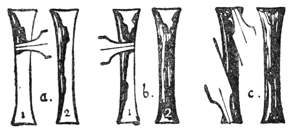
III. A method that may be found more convenient for heavy forms, is to hold the pen across the form to be gilded (which has previously been marked on the parchment) with its nib resting on the further outline (a, fig. 97). The nib being moved along that line, by contact with the parchment restrains the size from passing beyond it, while allowing it to flow out freely behind and below (a, 2). The opposite side is similarly treated, and, if the form be narrow, the size as it flows out blends with that already laid (b). The ends of the form are finished in like manner (c). [p150]
III. A method that might be more convenient for heavier forms is to hold the pen across the form to be gilded (which has been marked on the parchment beforehand) with its nib resting on the outer edge (a, fig. 97). As the nib moves along that line, its contact with the parchment keeps the size from going beyond it while letting it flow out freely behind and below (a, 2). The opposite side is treated in the same way, and if the form is narrow, the size blends with what’s already been laid (b). The ends of the form are completed in the same manner (c). [p150]
The angle of the pen with the parchment is less for a wider form (b, fig. 98).
The angle of the pen with the parchment is smaller for a broader shape (b, fig. 98).

As a general rule the size should stand pretty high when wet; it shrinks in drying, and, if it forms too thin a coat, it will neither hold the gold-leaf fast nor burnish well. While the size is still wet it is easy to raise it to any height desired by running more size into the form in the manner described above. It is well, however, not to raise the size too high, as burnished gold too much raised looks out of place on a page and has a heavy and vulgar appearance (p. 184). Very high raising also does not dry so well, and when dry it is more liable to chip.
As a general rule, the size should be pretty thick when wet; it shrinks as it dries, and if it becomes too thin, it won't hold the gold leaf properly or burnish well. While the size is still wet, it’s easy to build it up to any height you want by adding more size as mentioned above. However, it’s best not to raise the size too high, because burnished gold that is overly raised looks out of place on a page and can appear heavy and tacky (p. 184). Additionally, raising it too high doesn’t dry properly and is more prone to chipping once it’s dry.
The work of laying the size should be carried out as quickly as possible. If one part of the form is left any appreciable time before the remaining parts are sized, the first part will begin to settle and dry, and the different layings will not blend or lie evenly. Though the size is thick and awkward to use at first, a little skill will coax it quickly and evenly out of the pen, and it will all blend and dry with an even surface.
The process of applying the size should be done as quickly as possible. If one section of the form is left for any significant time before the other parts are sized, the first section will start to settle and dry, and the different applications won’t blend or lie flat. Even though the size is thick and difficult to handle at first, a bit of practice will help you use it smoothly and evenly from the pen, and it will all blend and dry with a uniform surface.
When it is sized, put the work away to dry in a [p151] drawer or safe place where it cannot be smudged or get dusty.
When it's sized, set the work aside to dry in a [p151] drawer or a secure spot where it won't get smudged or dusty.
Drying the Size.—The average time allowed is twenty-four hours, but it varies with the weather and the temperature; damp weather may make a longer time necessary, and dry weather or heat will shorten the time. The thickness of the raising affects the time very much; a very thin coat will dry in an hour or two, while an extra thick coat may take several days. Size not dry enough is too sticky to burnish; if too dry, it is so absorbent that it sucks up all the moisture which is breathed on it. To ensure the gold-leaf’s sticking thoroughly, it is safer on the whole to gild the size while it is still slightly damp, and delay the burnishing till it is drier.
Drying the Size.—The average time required is twenty-four hours, but it can vary based on the weather and temperature; humid weather might need more time, while dry weather or heat will speed things up. The thickness of the sizing plays a big role in the drying time; a very thin layer will dry in one to two hours, while a very thick layer may take several days. Size that isn’t dry enough is too sticky for burnishing; if it’s too dry, it becomes so absorbent that it soaks up all the moisture from your breath. To make sure the gold leaf adheres properly, it’s generally safer to apply gold while the size is still a bit damp and wait until it’s drier for burnishing.
The time to allow and the right condition of the size for gilding can only be accurately judged by experience.
The timing and proper conditions for gilding can only be accurately assessed through experience.
LAYING THE GOLD-LEAF
The process of gold-laying must be carried out steadily and quickly; all the necessary tools, &c., should be ready to hand (see p. 145).
The process of laying gold should be done steadily and quickly; all the necessary tools, etc., should be ready to go (see p. 145).
The Gold-Leaf.—This is sold in books of twenty-five leaves. The ordinary leaf, about 314 inches square, consisting of gold and alloy, is said to be beaten out to less than 1200,000 inch in thickness. As gold sticks readily to gold, especially when very thin and liable to wrinkle and fold over, or to paper, red [p152] bole or ochre is scattered between the leaves of the ordinary book. This powder will come off on the work and give it an ugly colour, when burnishing, unless it is dusted off very carefully.
The Gold-Leaf.—This is sold in packs of twenty-five leaves. Each leaf, measuring about 3 1/4 inches square, made of gold and alloy, is claimed to be beaten down to less than 1200,000 inch thick. Since gold adheres easily to gold, especially when it is very thin and prone to wrinkling and folding over, or to paper, red [p152] bole or ochre powder is sprinkled between the leaves of the regular book. This powder can transfer onto the finished work and create an unattractive color during burnishing, unless it is thoroughly dusted off.
It is better to get gold “double” (or “quadruple”) the ordinary thickness, specially prepared for fine work such as illuminating, quite pure, and put up in white books (without bole).
It’s better to get gold “double” (or “quadruple”) the regular thickness, specially made for delicate work like illumination, completely pure, and packaged in white books (without bole).
Cutting the Leaf.—With the scissors, which must be quite clean and sharp (or else the gold will stick to them and tear), cut a whole or half leaf of gold, together with the paper leaf on which it lies, out of the book.
Cutting the Leaf.—Using scissors that are clean and sharp (otherwise the gold will stick and tear), cut a whole or half leaf of gold, along with the paper leaf it’s resting on, out of the book.

The gold is cut on one paper (fig. 99) (not between papers, for then it would stick and tear), and the cut edges of the paper and the gold stick together slightly. If the edge of the gold is anywhere loose and apt to flap about, it and the corresponding paper edge can be nicked together with the scissors (fig. 100). The gold-leaf being lightly held to the paper in this way is easily handled.
The gold is cut on one piece of paper (fig. 99) (not between pieces of paper, because then it would stick and tear), and the cut edges of the paper and the gold stick together a bit. If the edge of the gold is loose and likely to flap around, it and the matching edge of the paper can be snipped together with scissors (fig. 100). The gold leaf being lightly held to the paper like this is easy to handle.

A piece of gold, about 18 inch larger all round than the form to be gilded, is cut from the leaf in the manner described above (a, b, fig. 100). Except in the case of a very large form, it is not worth trying [p153] to save gold by cutting it out in the same shape. Square, oblong, and triangular shaped pieces are suitable for ordinary use; these are laid in a convenient place—the edge of a book cover will do very well (fig. 101)—ready to be picked up at the right moment.
A piece of gold, about 18 inch larger all around than the item to be gilded, is cut from the leaf as described above (a, b, fig. 100). Unless you’re dealing with a very large form, it’s not worth trying [p153] to save gold by cutting it into the same shape. Square, rectangular, and triangular pieces work well for regular use; these can be placed in a convenient spot—the edge of a book cover works great (fig. 101)—ready to be picked up when needed.
The burnishing slab (a flat piece of vulcanite, celluloid, or metal) is placed under the page to give it a hard, firm back, which will make the pushing and rubbing of the burnisher effective.
The burnishing slab (a flat piece of vulcanite, celluloid, or metal) is placed under the page to provide a solid, firm backing, which will enhance the effectiveness of the pushing and rubbing done with the burnisher.

Preparing the Size.—If the size has dried rough, it may be lightly scraped with the pen-knife—removing as little as possible of the surface, in which the essential stickiness frequently seems to be concentrated. [p154]
Preparing the Size.—If the size has dried unevenly, you can gently scrape it with a knife—removing only a small amount of the surface, where the essential stickiness often appears to be concentrated. [p154]
Ordinarily a form should not require trimming, though if its edges have accidental roughnesses, these may be trimmed a little with the pen-knife.
Ordinarily, a form shouldn't need trimming, but if its edges have any rough spots, they can be trimmed a little with a pen knife.
Damping the Size.—The breathing tube is about 12 inch (or less) in diameter, and 6 inches or more in length; it may be made of paper or cane. One end of the tube being lightly held between the lips, the other is moved about over the size, which is gently breathed upon (fig. 102). The breath condensing on the surface of the size, moistens it and renders it sticky. The amount of moistening required depends on the condition of the size.
Damping the Size.—The breathing tube is about 12 inch (or less) in diameter, and 6 inches or more in length; it can be made from paper or cane. One end of the tube is lightly held between the lips, while the other end is moved around over the size, which is gently breathed on (fig. 102). The breath condenses on the surface of the size, moistening it and making it sticky. The amount of moisture needed depends on the condition of the size.

Care has to be taken that the breath does not condense in the tube and drop on to the work.
Care must be taken to ensure that the breath does not condense in the tube and drip onto the work.


The Rubbing Paper—a convenient piece of thin but tough paper (held ready in the left hand)—is immediately laid above the gold-leaf paper, and is then rubbed over firmly with the finger-tip, in order at once to attach the leaf to the size (fig. 104). It is then quickly rubbed with the soft pencil [p156] or chalk till the raised form underneath is indicated on the surface of the paper (fig. 105).
The Rubbing Paper—a handy piece of thin yet sturdy paper (held in the left hand)—is placed on top of the gold-leaf paper and then firmly rubbed with the fingertip to attach the leaf to the sizing (fig. 104). It is then quickly rubbed with a soft pencil [p156] or chalk until the raised design underneath is visible on the surface of the paper (fig. 105).
These two operations may be combined by having a little blue chalk either on the finger-tip or on the upper surface of the rubbing paper.
These two actions can be combined by placing a bit of blue chalk either on your fingertip or on the top surface of the rubbing paper.
The fore part of the burnisher is then passed rapidly all over the rubbing paper with a firm pressure (fig. 107).
The front part of the burnisher is then quickly rubbed all over the rubbing paper with strong pressure (fig. 107).

The rubbing paper and the other paper are picked off, and an experienced eye can usually tell if the gold is sticking properly by a peculiar, smooth appearance which it then has.
The rubbing paper and the other paper are removed, and an experienced eye can often tell if the gold is adhering correctly by its distinct, smooth appearance that it has at that point.
Several Letters or Forms which are close together may be gilded simultaneously—with one piece of gold-leaf—as if they were one complex form. This saves time, but if too many forms are gilded together, some of them are liable to be less thoroughly and effectually treated.
Several Letters or Forms that are close together can be gilded at the same time with one piece of gold leaf, as if they were a single complex shape. This saves time, but if too many forms are gilded together, some of them might not be as thoroughly and effectively treated.

Small Scattered Forms (dots, &c.).—For these the gold-leaf may be cut into a sufficient number of little pieces, which are allowed to fall (gold side downwards) on a sheet placed to receive them. [p157] They are picked up separately by means of a needle stuck into their backing-paper.
Small Scattered Forms (dots, etc.).—For these, you can cut the gold leaf into enough small pieces that are allowed to fall (gold side down) on a sheet prepared to catch them. [p157] They are picked up individually with a needle inserted into their backing paper.

Additional Coats of Gold-Leaf.—A second leaf of gold may be laid on immediately on the top of the first; this will ensure richness and facilitate burnishing. Additional leaves may be laid after burnishing, but, unless the first gilding is absolutely clean, there is a risk of the second leaf peeling off when re-burnished. [p158]
Additional Coats of Gold-Leaf.—You can apply a second layer of gold leaf directly on top of the first one; this will create a richer look and make burnishing easier. You can add more layers after burnishing, but if the first layer isn’t completely clean, the second layer might come off when you re-burnish it. [p158]
BURNISHING THE GOLD
The Burnisher.—A tooth-shaped agate burnisher (fig. 108) is commonly used.
The Burnisher.—A tooth-shaped agate burnisher (fig. 108) is often used.
The point is used for pushing the leaf into angles and for burnishing angles (a).
The point is used to push the leaf into corners and to smooth out angles (a).
The fore-part for general burnishing (b).
The front part for general burnishing (b).
The bend for cross-burnishing and for angles (c).
The bend for cross-burnishing and for angles (c).
The side for very gentle and light burnishing (d).
The side for very soft and light polishing (d).
The burnisher is kept scrupulously clean, and to ensure this it is frequently rubbed on a cloth.
The burnisher is kept very clean, and to make sure of this, it is often rubbed on a cloth.
Dusting off the Pounce.—The edge of the parchment may be tapped smartly on the desk to shake off the pounce, and a feather or a soft handkerchief may be used, care being taken not to brush the pounce over the gold. [p159]
Dusting off the Pounce.—The edge of the paper can be tapped sharply on the desk to shake off the pounce, and a feather or a soft cloth can be used, making sure not to brush the pounce onto the gold. [p159]
Brushing off Waste Leaf.—The superfluous gold round the edge of the gilded form may be lightly brushed off with the tip of the brush. This may be done after or before the burnishing—preferably after (see p. 170).
Brushing off Waste Leaf.—The excess gold around the edge of the gilded piece can be gently brushed off with the tip of the brush. This can be done either before or after burnishing—it's best to do it after (see p. 170).

Any gold which may have stuck to the surrounding parchment, in spite of the pouncing, may be removed with the knife or with the hard indiarubber point, great care being taken not to touch the gilded size.
Any gold that might have stuck to the surrounding parchment, despite the pouncing, can be removed with a knife or with the hard indiarubber point, making sure not to touch the gilded size.
Burnishing the Gold.—The gold-leaf may be burnished immediately after laying when the size is very dry, but it is safer to wait for a quarter of an hour—or longer, if the size is at all damp (see Drying, p. 151).
Burnishing the Gold.—You can burnish the gold leaf right after applying it when the adhesive is very dry, but it's safer to wait for about fifteen minutes—or longer if the adhesive is even slightly damp (see Drying, p. 151).
The slab is again put under the work, and the burnishing is begun very gently and cautiously: should the burnisher stick in the very least, it is instantly stopped (or else the gold will be scratched off), examined, and cleaned.
The slab is placed back under the work, and the burnishing starts off very gently and carefully: if the burnisher sticks even a little, it is immediately stopped (or the gold will get scratched off), checked, and cleaned.


As the gold gets smoother a little more pressure is used, and the burnisher is moved in straight lines in every direction across the gold (fig. 110). At this point the gold should have a peculiar and agreeable feeling of smoothness under the burnisher, an unmistakable sign that all is going well.
As the gold becomes smoother, a bit more pressure is applied, and the burnisher is moved in straight lines in all directions across the gold (fig. 110). At this stage, the gold should feel uniquely and pleasantly smooth under the burnisher, which is a clear indication that everything is going well.
A rapid light polish with the bend of the burnisher across a gold stem will give a very good finish (c, fig. 108).
A quick shine with the curve of the burnisher over a gold stem will result in a really nice finish (c, fig. 108).
Properly burnished gold in a right light is at first as bright as a mirror, and in some lights may look [p161] quite dark by reason of its smoothness. A piece of white paper may be held at such an angle that the white light from it is reflected by the gold; this will show the quality of the burnish, and also show up any brown spots which the leaf may have failed to cover. It is helpful, moreover, during the actual process of burnishing to have a reflecting paper folded and standing beside the work (fig. 111).
Properly polished gold in the right light first appears as bright as a mirror, and in certain lights, it can look [p161] rather dark due to its smoothness. You can hold a piece of white paper at a specific angle so that the white light reflects off the gold; this will reveal the quality of the polish and highlight any brown spots that the leaf might not have covered. Additionally, it’s useful during the burnishing process to keep a piece of reflective paper folded and next to your work (fig. 111).

At first the size under the burnished gold is not thoroughly hardened, and great care should be taken of it (not to breathe on nor finger the gold in any way, nor allow it to lie about and get dusty). It is best to put it away safely in a drawer for a week or two.
At first, the area under the shiny gold isn't fully set, so you need to handle it with care (don't breathe on it, touch the gold in any way, or let it sit out and gather dust). It's best to store it safely in a drawer for a week or two.
After a week or fortnight, when the size has set a little more, it may be very gently re-burnished, and this may be done again at the end of another [p162] fortnight. This final burnishing, when the size is nearly hard, will give it a very lasting polish. It is well, however, to take every care of burnished gold, and to secure it from risk of damage as soon as may be. Illuminated miniatures were often protected by a piece of silk between the leaves—and this should be done now, in the case of fine work. That a bound volume protects the burnished gold within it is proved by the large number of MSS. in which the gold, laid and burnished 500 years ago, is in perfect and brilliant preservation.
After a week or two, once the size has set a bit more, it can be very gently re-burnished, and this can be done again at the end of another [p162] fortnight. This final burnishing, when the size is nearly hard, will give it a very lasting shine. However, it’s important to take good care of burnished gold and to protect it from damage as soon as possible. Illuminated miniatures were often safeguarded by a piece of silk between the leaves—and this should be done now, especially for fine work. The fact that a bound volume protects the burnished gold inside it is evident from the many manuscripts in which the gold, laid and burnished 500 years ago, is still in perfect and brilliant condition.
REMEDYING FAULTS IN GILDING
To lay and burnish gold satisfactorily requires considerable experience. Careful practice with a good “size” will overcome the chief difficulties: these, and their probable causes, are here summarised:—
To apply and polish gold effectively takes a lot of experience. With careful practice using a good "size," you'll be able to tackle the main challenges: these, along with their likely causes, are summarized here: summarized:—
| To make the Size stick to the Surface. | Probable Causes of Size not sticking to Parchment or Paper. |
|---|---|
| Clean and pounce thoroughly: roughen if necessary (pp. 146, 167). | Dirty Surface. |
| Greasy Surface. | |
| Horny Surface or | |
| Non-porous Surface. | |
Procure or make a proper composition, mix thoroughly always, and
stir frequently when in use. If composition is at fault, add—
|
Size not sticky enough |
| Size not tough enough (and crumbling off) | |
| Both causes due to faulty composition, or mixing. [p163] | |
| To make the Gold-leaf stick to the Size. | Probable Causes of Gold-leaf not sticking to Size. |
| Breathe on thoroughly and avoid delay in laying the gold (p. 154). | Size not damped enough due to
|
| Do not allow size to dry too long (p. 151). | |
| More, and more careful, rubbing and pressure (p. 156). | Not sufficient rubbing and pressing on of gold. |
| (See above.) | Size not sticky enough. |
| Raise the size sufficiently (p. 150). If not enough when dry, roughen surface and add another coat. | Not enough size, particularly in thin lines and edges. |
| Try re-gilding (p. 157), or, if spots persist, scrape them gently and try again: failing that, gently scrape off all the gold and try white of egg (dilute), or a slight re-sizing (as above). | The gold may refuse to stick in spots with no apparent reason, but probably from one or other of the above causes. Or the size may have been touched accidentally and have become greasy or dirty. |
| If the spots are very small and there is not time to spare for re-gilding, they may be touched with powder gold and dilute white of egg, and burnished when dry. | |
| To make the Gold-leaf smooth and bright. | Probable Causes of Gold-leaf’s not burnishing properly. |
| a. Allow longer time (p. 151). | Size too sticky. Due to—
|
| b. Allow longer time (p. 151). | |
| c. Remove size and re-size with proper composition. | |
| Sometimes this difficulty may be overcome by using several coats of gold-leaf (p. 157). | |
| Scrape smooth with sharp knife. (Sometimes the size itself is burnished before the gold-leaf is laid.) | Size rough surfaced. |
| Clean burnisher frequently. | Burnisher becoming dirty. |
Both paper and parchment when much wet with size are apt to cockle. Generally it is not possible, or desirable (see p. 174), to guard against this by first stretching the material, but the size may be used with less water, so that it will dry sooner. In cases where there is a gold background it may often be divided into small parts (to be sized at different times) by the pattern (see p. 191). For large unbroken patches of gold several thin coats may be put on, one after the other.
Both paper and parchment, when soaked with size, tend to warp. Usually, it's not possible or desirable (see p. 174) to prevent this by stretching the material first, but you can use less water in the size so it dries faster. In cases with a gold background, it can often be broken down into smaller sections (to be sized at different times) by the pattern (see p. 191). For large, continuous areas of gold, several thin layers can be applied one after the other.
Some sizes have a tendency to crack: this is difficult to guard against. But, if the cracks are very minute—such as may be seen in many instances in the best early MSS.—they do not constitute a serious blemish.
Some sizes tend to crack: this is hard to prevent. However, if the cracks are very small—like those seen in many of the best early manuscripts—they don’t really affect the overall quality.
Burnished gold is often damaged by careless handling or insufficient protection.
Burnished gold can easily get damaged if not handled carefully or protected enough.
GOLD WRITING
The page (having been ruled as for ordinary writing) is thoroughly pounced all over.
The page (having been ruled for regular writing) is completely pounced all over.
The pen has an extra long slit, and the size is made a little more fluid than usual to allow of its flowing freely and making true pen-strokes (p. 63).
The pen has a longer slit, and it's designed to be a bit more flexible than usual to enable smooth writing and create genuine pen strokes (p. 63).
The desk is lowered (fig. 46, b), or flat, so that the size may flow freely.
The desk is lowered (fig. 46, b), or flat, so that the size can flow freely.
The nib sometimes makes only a wet down-stroke on the parchment, but, by lightly pushing the pen up again, the stroke will be filled by the size which flows out from under the nib. Simple pen-strokes in small writing hold but little, and so ought to be filled as full of size as possible (pp. 150, 184). They will be found to dry much more [p165] quickly than larger forms, and may be gilded within a few hours of writing. Half-a-dozen or more letters are gilded together (see p. 156).
The nib sometimes only leaves a wet down-stroke on the parchment, but by gently pushing the pen back up, the stroke will be filled with the size that flows out from under the nib. Simple pen strokes in small writing don’t hold much, so they should be filled with as much size as possible (pp. 150, 184). They dry much faster than larger forms and can be gilded within a few hours of writing. Half a dozen or more letters are gilded together (see p. 156).
OTHER METHODS & RECIPES FOR GILDING
Gold-leaf may be cut with a “gilder’s knife” on a “gilder’s cushion,” and picked up with a “gilder’s tip.”
Gold leaf can be cut with a “gilder’s knife” on a “gilder’s cushion,” and picked up with a “gilder’s tip.”
Water, white of egg, or alcohol may be used to make the gold-leaf adhere to the size.
Water, egg whites, or alcohol can be used to make the gold leaf stick to the surface.
“Transfer gold-leaf” is convenient, but the greasiness of the transfer paper is apt to dim the gilding.
“Transfer gold-leaf” is handy, but the greasiness of the transfer paper can dull the gilding.
Silver-leaf oxidises and turns black; platinum (a good substitute) costs about 2s. 6d., and aluminium (not so good) about 6d. per book.
Silver-leaf oxidizes and turns black; platinum (a good substitute) costs about 2s. 6d., and aluminum (not as good) about 6d. per book.
“Gold Ink” has been made with powdered gold: its effect is inferior to raised and burnished writing.
“Gold Ink” is made with powdered gold: its effect is not as good as raised and burnished writing.
The following is from “The Book of the Art of Cennino Cennini” (written about the beginning of the fifteenth Century): Translated by Christiana J. Herringham, 1899:—
The following is from “The Book of the Art of Cennino Cennini” (written around the early fifteenth century): Translated by Christiana J. Herringham, 1899:—
“Chap. 157.—How you must do miniature-painting and put gold on parchment.
“Chap. 157.—How to do miniature painting and apply gold to parchment.
“First, if you would paint miniatures you must draw with a leaden style figures, foliage, letters, or whatever you please, on parchment, that is to say, in books: then with a pen you must make the delicate permanent [p166] outline of what you have designed. Then you must have a paint that is a sort of gesso, called asiso, and it is made in this manner; namely, a little gesso sottile [see chap. 116, below], and a little biacca [whitelead], never more of this than equals a third part of the gesso; then take a little candy, less than the biacca; grind these ingredients very finely with clear water, collect them together, and let them dry without sun. When you wish to use some to put on gold, cut off a piece as large as you have need of, and temper it with the white of an egg, well beaten, as I have taught you. [The froth is allowed to stand for one night to clear itself.] Temper this mixture with it; let it dry; then take your gold, and either breathing on it or not, as you please, you can put it on; and the gold being laid on, take the tooth or burnishing-stone and burnish it, but hold under the parchment a firm tablet of good wood, very smooth. And you must know that you may write letters with a pen and this asiso, or lay a ground of it, or whatever you please—it is most excellent. But before you lay the gold on it, see whether it is needful to scrape or level it with the point of a knife, or clean it in any way, for your brush sometimes puts more on in one place than in another. Always beware of this.”
“First, if you want to paint miniatures, you need to sketch figures, foliage, letters, or anything else you like on parchment, meaning in books. Then, use a pen to create a delicate, lasting outline of your design. Next, you’ll need a type of paint that acts like gesso, called asiso, which is made this way: take a little gesso sottile [see chap. 116, below] and a bit of biacca [whitelead], making sure the biacca doesn’t exceed one-third of the gesso. Then, add a little candy, less than the biacca, and grind these ingredients very finely with clean water. Mix them together and let them dry without sunlight. When you're ready to use some for gold, cut off a piece as large as you need and mix it with well-beaten egg white, as I’ve taught you. [Let the froth stand for one night to clear.] Mix this together, let it dry, then apply your gold—either by breathing on it or not, as you prefer. Once the gold is on, use a tooth or burnishing stone to burnish it, but be sure to place a sturdy, smooth wooden tablet under the parchment. You should also know that you can write letters with a pen and this asiso, lay a base of it, or do whatever you wish—it’s excellent. But before you apply the gold, make sure to check if you need to scrape or smooth it with a knife or clean it in any way, because your brush might apply more in some areas than others. Always be cautious about this.”
“Chap. 116.—How to prepare gesso sottile (slaked plaster of Paris) for grounding panels.
“Chap. 116.—How to prepare gesso sottile (slaked plaster of Paris) for grounding panels.
“You must now prepare a plaster for fine grounds, called gesso sottile. This is made from the same plaster [plaster of Paris] as the last, but it must be well purified (purgata), and kept moist in a large tub for at least a month; renew the water every day until it almost rots, and is completely slaked, and all fiery heat goes out of it, and it becomes as soft as silk. Throw away the water, make it into cakes, and let it dry; and this gesso is sold by the druggists to our painters. It is used for grounding, for gilding, for working in relief, and other fine works.” [p167]
“You need to prepare a fine plaster called gesso sottile. This is made from the same plaster [plaster of Paris] as the previous one, but it must be well purified and kept moist in a large tub for at least a month; change the water every day until it almost decomposes, is completely slaked, and loses all its heat, becoming as soft as silk. Discard the water, shape it into cakes, and let it dry; this gesso is sold by druggists to our painters. It’s used for priming, gilding, creating reliefs, and other detailed work.” [p167]
APPENDIX: ON GILDING
(By Graily Hewitt)
Success with raised gilding can only be expected when practice has rendered attention to the details of the process automatic and there is no need to pause and think. Even then the results must be somewhat uncertain and experimental. For our own preparations of size are usually unsatisfactory, and the ingredients of the best we can buy are unknown to us. And our vellum is certainly not of the quality we find in the old books. Some one is badly wanted to investigate the chemistry of the one and an appropriate preparation of the other. But we can take as much care as our time allows, passing nothing as “good enough” which we have not well examined, and bringing to the business all the patience and deftness available.
Success with raised gilding can only be achieved when practice has made attention to the details of the process automatic, eliminating the need to stop and think. Even then, the results may still be somewhat uncertain and experimental. Our own preparations of size are usually not satisfactory, and we don't know the ingredients of the best options available for purchase. Additionally, our vellum certainly doesn't match the quality found in old books. There’s a real need for someone to explore the chemistry of one and find an appropriate preparation for the other. However, we can take as much care as our time allows, rejecting anything we haven't thoroughly examined as “good enough,” and approaching the task with all the patience and skill we can muster.
Vellum is too stiff, or too dry, or too greasy. When stiff, it is too thick for books; when dry, too apt to crack or cockle; when too greasy, exasperating. And yet the soft and rather greasy sort can be rendered more agreeable than the rest with labour. It should be rubbed by the flat of the hand with powdered pumice (or even fine sandpaper on the rough side) and French chalk, especially on its split (or rougher) side, until it is serviceable. A few trials will teach how long to give to this. Five minutes for one side of a lamb’s skin would not be too much. It can then be beaten with a silk handkerchief, but not rubbed with this until the size has been laid. It may be rubbed cleaner between the laying of the size and the gilding. Especially must those parts of pages be thoroughly rubbed clean which in the book, when made up, will lie upon and be pressed against gold letters on the page opposite; or the pumice left behind will scratch them. On the other hand, if the vellum has not been thoroughly pumiced on both pages, the greasiness in [p168] it will dim the gold in time, both from above and below; or even make the size flake off altogether. The size is often blamed for faults of the vellum and its want of preparation.
Vellum is either too stiff, too dry, or too greasy. When it’s stiff, it’s too thick for books; when it’s dry, it tends to crack or wrinkle; when it’s too greasy, it’s frustrating. However, the soft and slightly greasy type can be made more manageable with some effort. You should rub it with the flat of your hand using powdered pumice (or even fine sandpaper on the rough side) and French chalk, especially on its rougher side, until it’s usable. A few attempts will show you how long this should take. Five minutes on one side of a lambskin shouldn’t be too much. It can then be patted with a silk handkerchief, but not rubbed until the size has been applied. It can be cleaned up between applying the size and the gilding. Especially, you must make sure those areas of the pages that will lie against and be pressed against gold letters on the opposite page are thoroughly cleaned, or the pumice residue will scratch them. Conversely, if the vellum hasn’t been properly pumiced on both pages, the greasiness will dull the gold over time, both from the front and back; or it could even cause the size to flake off completely. The size is often blamed for issues with the vellum and its lack of preparation.
Again size, or “raising preparation,” is too sticky or too dry. If the former, the gold will not burnish well; if the latter, it will burnish, but will not stick at the edges, and will crack sooner or later. And though the essential quality of gilding is brightness, one may be content to fail of this rather than have letters ragged in outline or broken on the surface.
Again, the size, or "raising preparation," is either too sticky or too dry. If it's too sticky, the gold won't burnish well; if it's too dry, it will burnish but won't stick at the edges and will crack eventually. And while the main quality of gilding is brightness, one might prefer to sacrifice that rather than have letters with uneven outlines or cracks on the surface.
The size in use should be just liquid enough to flow evenly from the pen. More water makes it dry too brittle, and tends to cockle the vellum also; less tends to blobbiness and unevenness. Even when it is put on fairly an uncomfortable groove is apt to form as it dries down the centre of letters; but this can be either filled up as soon as the first layer is dryish, or the sides of the groove can be scraped (when the letter is quite dry) down to the level of the groove itself with a sharp knife. The knife must be sharp. As this scraping does not affect the extreme edges the power of the size there to hold the leaf is not impaired by it; and certainly a well-scraped surface is extremely even and pleasant to gild. If the surface, however, be burnished and not scraped before laying the leaf, it will not hold the size well, and remains lumpy also where lumps were there originally; while scraping gets rid of these. During use the size should be kept thoroughly mixed; and a small sable brush serves well for this purpose, as soon as it can be used so carefully as not to cause bubbles.
The sizing should be just liquid enough to flow smoothly from the pen. If it has too much water, it dries too brittle and can make the vellum buckle; if there's too little, it tends to blob and be uneven. Even when applied, an uncomfortable groove can form as it dries in the center of the letters; however, this can either be filled in as soon as the first layer is somewhat dry or the edges of the groove can be scraped down to level with the groove itself using a sharp knife once the letter is completely dry. The knife needs to be sharp. This scraping doesn't affect the very edges, so the sizing's ability to hold the leaf isn't compromised; plus, a well-scraped surface is very smooth and nice for gilding. However, if the surface is burnished and not scraped before applying the leaf, it won't hold the sizing well, and it will remain bumpy where there were lumps before; scraping eliminates those. During use, the sizing should be kept well mixed, and a small sable brush works great for this, as long as it's used carefully to avoid creating bubbles.
To know the exact time to allow between laying and gilding one had need to be a meteorologist, so much “depends on the weather.” Very dry and very wet weather are equally unkind. Generally an interval of about twenty-four hours is right; but it is better to gild too soon than too late, provided one can be content, on testing the naked surface of the gilded letter with a [p169] burnisher, and noting that the glitter is reluctant to come, to leave the burnishing for a while, and only lay the leaf, pressing it well home to the outline of the letters. The burnishing can then be done in a few more hours. But if the size be too dry, the difficulty will be to make the leaf stick to it at all. In this case the leaf adhering can be scraped off, the size scraped down further, and another thin coat added and gilded after a shorter interval. If the letter be so fouled that such repairs are difficult, it should be entirely scraped away and the size relaid altogether. In doing this care is needed that the vellum be not injured round the letter.
To know the exact time to wait between laying and gilding, you’d need to be a meteorologist since it “depends on the weather.” Extremely dry and extremely wet conditions are both problematic. Generally, an interval of about twenty-four hours is ideal; however, it’s better to gild a bit too soon than too late. If you test the unburnished surface of the gilded letter with a [p169] burnisher and see that the shine isn’t ready yet, it’s okay to hold off on burnishing for a while and just lay the leaf, pressing it firmly against the outline of the letters. The burnishing can be finished in a few more hours. But if the size is too dry, it’ll be challenging to get the leaf to stick at all. In that case, any leaf that has adhered can be scraped off, the size can be scraped down further, and another thin coat can be added and gilded after a shorter wait. If the letter is too damaged for such repairs, it should be completely scraped off and the size reapplied. Care must be taken not to damage the vellum around the letter during this process.
The best gold-leaf for ordinary work costs about 3s. for twenty-five pages. More expensive leaf, being thicker, does not stick so well to the edges; cheaper is too thin to burnish well. Two kinds may be used together with good results, the finer leaf being put on next the size, and the thicker at once on to the top of that. The letter is then pressed and outlined as usual through paper, and the thin leaf will be found of considerable assistance towards the making of a clean cut edge. Generally, however, the piling on of several leaves is inadvisable, as bits are liable to flake away as the letter goes on drying, leaving dim specks where they have been. Yet if, after the outlining through the paper, the leaf is seen to be very dull or speckled with the colour of the size, this means that the size has been partly pressed through the leaf; and another laid immediately will have enough to stick to, and will burnish well. The best result comes of one moderately thick leaf laid and burnished at the right time as quickly as possible. Thicker leaves need only be used for large surfaces, where the edge can be scraped even and clean, or where a black outline is to be added.
The best gold leaf for regular work costs about 3s for twenty-five pages. More expensive leaf, being thicker, doesn’t adhere as well to the edges; cheaper leaf is too thin to burnish properly. You can use two types together with good results, applying the finer leaf next to the size and the thicker one right on top of that. The letter is then pressed and outlined as usual through paper, and the thin leaf will really help create a clean cut edge. Generally, though, stacking several leaves is not recommended, as pieces may flake off as the letter dries, leaving dull spots where they were. However, if, after outlining through the paper, the leaf looks very dull or spotted with the color of the size, this means the size has partially pressed through the leaf; laying another leaf on immediately will have enough to stick to and will burnish well. The best outcome comes from using one moderately thick leaf laid and burnished quickly at the right time. Thicker leaves should only be used for large surfaces, where the edge can be scraped evenly and clean, or where a black outline needs to be added.
As soon as the leaf is laid, and from that point onward, the breath must be kept from the letter with a shield (of cardboard or tin) held in the left hand or otherwise. Inattention to this is responsible for many failures. Not [p170] only should the actual letters under operation be so protected, but where a quantity are sized ready for gilding on the page these should be protected also, as well as any parts already finished; for breath not only moistens but warms, and on warm size moisture condenses less easily. If the work to be done presently is so warmed, it will be found more difficult to deal with when its time comes. The first work done in the day is often the best, and for this reason, that the size for it is cool; but in gilding this portion one almost necessarily warms that to be done later. Two pages, where possible, should therefore be gilded alternately, one cooling while a portion of the other is gilded. Or thin plates of metal, or even cardboard, may be placed about as shields to protect all surfaces not under actual operation.
As soon as the leaf is laid down, and from that point on, you must keep your breath away from the letter with a shield (made of cardboard or tin) held in your left hand or in another way. Not paying attention to this leads to many mistakes. Not only should the actual letters being worked on be protected, but any letters that are prepped for gilding on the page should also be shielded, along with any parts that are already finished; because breath not only moistens but also warms, and on warm size, moisture doesn’t condense as easily. If the work that needs to be done is warmed up, it will be harder to manage when it’s time to work on it. The first tasks done during the day are often the best for this reason: the size is cool. But when gilding this part, you almost inevitably warm up what will be done later. Therefore, whenever possible, alternate gilding two pages, allowing one to cool while you gild part of the other. Or you can place thin metal plates, or even cardboard, around as shields to protect all surfaces that aren't currently being worked on.
Superfluous gold is best removed by dusting lightly with an old and very clean and dry silk handkerchief. Indiarubber will certainly remove gold from the vellum, but it will as certainly dim any part of the gilding it touches. If the vellum was properly pounced to start with the silk will easily remove all the leaf unstuck, except little odds and ends, and these are safeliest taken away with the point of a knife.
Superfluous gold is best removed by lightly dusting it with a very clean and dry old silk handkerchief. An eraser will definitely remove gold from the vellum, but it will also dull any part of the gilding it touches. If the vellum was properly prepared from the beginning, the silk will easily take off all the loose leaf, except for a few small bits, which are best removed with the tip of a knife.
As the pressure of burnishing helps the leaf to stick, it is best to wait till the letter has been burnished before this dusting. Such spots as are visible ungilded may be afterwards treated with a slight breath and transfer gold-leaf, or gold dust, may be painted on them. In the latter case the spots must be most carefully burnished, if burnished at all, or their surroundings will be scratched.
As the pressure from burnishing helps the leaf adhere, it's best to wait until the letter has been burnished before dusting. Any visible un-gilded spots can be addressed later with a gentle breath and applied gold leaf, or gold dust can be painted on them. In this case, the spots must be carefully burnished, if at all, to avoid scratching the surrounding areas.
When a gold letter is to be set on a coloured background, or in the neighbourhood of colour, it is best put on after the colour; as may be observed was the method occasionally with the old books. If the gold is put on first, it will certainly be dimmed by warmth and breath during the colouring. On the other hand, if it is put on last, great care must be taken that the gold-leaf shall not stick to the coloured portions. Where possible, a stencil [p171] pattern of the parts to be gilded should be cut out of paper. This is easily made from a pencil rubbing taken after the size is laid, the raised pattern being of course cut out carefully a trifle larger than the outline so obtained. The paper is then laid over all the work, and the sized portions showing through the cuttings can be gilded without injury to the colour.
When you're putting a gold letter on a colored background or near color, it's best to apply it after you’ve done the coloring, like was sometimes seen in old books. If you put the gold on first, it will likely get dull from heat and breath during the coloring process. However, if you apply it last, you need to be very careful that the gold leaf doesn’t stick to the colored areas. If possible, create a stencil pattern from paper for the parts you want to gild. You can easily make this by taking a pencil rubbing after the size is applied, ensuring the cut-out pattern is a bit larger than the outline you got. Then place the paper over your work, and you can gild the sized areas without damaging the color.
All gilded work should be retained, if possible, for a week or more, and then re-burnished. And in burnishing generally the burnisher should not be used, even when the size is hard, with any great force or pressure at first. For the size in drying sets as if moulded, and this mould cannot be squeezed about or actually crushed without being loosened or cracked. Throughout the whole process a gentle and vigilant alacrity is required. Success will come easily if it means to come. It cannot be forced to come.
All gilded work should be kept, if possible, for a week or more, and then polished again. When polishing, you generally shouldn't apply too much force with the burnisher, even when the size is hard. The size sets up while drying, almost like it’s molded, and it can’t be pushed around or crushed without becoming loose or cracked. A gentle and attentive approach is necessary throughout the entire process. Success will come easily if it’s meant to happen. It can’t be forced.
The binder of a book with gilding in it should be warned to press the sheets as little as possible, and to use all his care in handling it, so as to keep moisture, warmth, and fingering from the gold. The folding of the sheets, when left to him, should also be done rather differently from usual, for all gilded pages need to be kept as flat as possible. None of the sizes in use seem capable of resisting bending of their surfaces without crimping or cracking. Where there is much gilding, the book will be the better for being sewn with a zigzag32 through the sections, as this helps to “guard” the gilded work. [p172]
The binder of a book with gold on it should be careful to press the pages as little as possible and handle it with great care to keep moisture, heat, and fingerprints away from the gold. When folding the pages, he should do it differently than usual, since all gilded pages need to be kept as flat as possible. None of the current sizes seem to be able to resist bending their surfaces without crimping or cracking. When there’s a lot of gilding, the book will benefit from being sewn with a zigzag32 through the sections, as this helps to “protect” the gilded work. [p172]
CHAPTER X THE USE OF GOLD & COLORS IN INITIAL LETTERS & SIMPLE ILLUMINATIONTools & Materials for Simple Lighting — Parchment, “Vellum,” & Pounce — Colors — Simple Color Effects — Matte Gold — Burnished Gold — Burnished Gold Shapes and Outlines — Background Capitals — Applying the Background — Background Decorations.
TOOLS & MATERIALS FOR SIMPLE ILLUMINATION
TOOLS,
etc.,
FOR GILDING.—See Chapter IX. (pp. __A_TAG_PLACEHOLDER_0__–__A_TAG_PLACEHOLDER_1__).
IVORY TRACING POINT.—This is useful for various purposes, and for indenting patterns in burnished gold (see p. 191).
IVORY TRACING POINT.—This is useful for different purposes, including marking patterns in burnished gold (see p. __A_TAG_PLACEHOLDER_0__)
BRUSHES.—Red Sables are very good. A separate brush should be kept for each colour—or at least one brush each for Reds, Blues, Greens, White, and gold “paint”—and it is convenient to have a medium and a fine brush for each.
BRUSHES.—Red Sables are excellent. You should have a separate brush for each color—or at least one brush for Reds, Blues, Greens, White, and gold “paint”—and it's helpful to have both a medium and a fine brush for each.
PENS FOR COLOUR.—Quill pens are used: “Turkey” or “Goose.” The latter is softer, and is sometimes preferred for colour work. For very fine work (real) Crow Quills may be tried. A separate pen should be used for each colour.
PENS FOR COLOUR.—Quill pens are used: “Turkey” or “Goose.” The latter is softer and is sometimes preferred for color work. For very fine work (real) Crow Quills can be tried. A separate pen should be used for each color.
COLOURED INKS.—Brown ink (tempered with black if desired) may be used for fine outlines: if the outlined forms are to be coloured afterwards, it is convenient if the ink be waterproof. [p173] Coloured inks seldom have as good a colour as the best paint colours (see Colours for Penwork, p. 176).
COLOURED INKS.—Brown ink (mixed with black if you want) can be used for fine outlines; if you're going to color in the outlined shapes later, it's best if the ink is waterproof. [p173] Coloured inks usually don't have as vibrant a color as the best paint colors (see Colours for Penwork, p. __A_TAG_PLACEHOLDER_0__).
COLORS.—(p. __A_TAG_PLACEHOLDER_0__). MATT GOLD (see p. __A_TAG_PLACEHOLDER_1__).
PAINT-BOX.—The little chests of drawers, sold by stationers for 2s. 6d., make very convenient “paint-boxes”: pens, &c., may be kept in one drawer; gilding, tools, &c., in another; and colours and brushes in another.
PAINT-BOX.—The small drawers sold by stationery stores for 2s. 6d. make really handy "paint-boxes": you can keep pens, etc., in one drawer; gilding, tools, etc., in another; and colors and brushes in another.
PAPER (see pp. __A_TAG_PLACEHOLDER_0__, __A_TAG_PLACEHOLDER_1__, __A_TAG_PLACEHOLDER_2__).—PARCHMENT, VELLUM, & POUNCE (see below).
PARCHMENT, “VELLUM,” & POUNCE
(See also Appendix on Gilding, p. 167
and pp. 98, 356)
The name “Vellum” (strictly applicable only to calf-skin) is generally given to any moderately good skin prepared for writing or printing on. All the modern skins are apt to be too stiff and horny: chemical action (substituted for patient handling), followed by liberal sizing and “dressing,” is perhaps responsible. The old skins have much more life and character, and are commonly much softer. Their surface is generally very smooth—not necessarily glazed—often with a delicate velvety nap, which forms a perfect writing surface.
The term “Vellum” (technically referring only to calfskin) is usually used for any decent quality skin prepared for writing or printing. Most modern skins tend to be too stiff and horny: chemical treatments (replacing careful handling), along with heavy sizing and “dressing,” might be the cause. The older skins have a lot more life and character and are usually much softer. Their surface is typically very smooth—not necessarily glazed—often featuring a fine velvety nap, which creates a perfect writing surface.
Parchment (sheep-skin), as supplied by law-stationers, though rather hard, still retains the character of a skin, and is in every way preferable to the Vellum33 which is specially prepared for illuminators. A piece of parchment about 26 inches by 22 inches costs about 2s. 6d. Lambskin is still better.
Parchment (sheepskin), as supplied by law-stationers, although a bit stiff, still has the qualities of skin and is much better than the Vellum33 that is specifically prepared for illuminators. A piece of parchment measuring about 26 inches by 22 inches costs around £2.50. Lambskin is even better.
“Roman Vellum” is a fine quality of sheep or [p174] “lamb” skin, made in imitation of the Vellum used in the Vatican.
“Roman Vellum” is a high-quality sheep or [p174] “lamb” skin, created to mimic the Vellum used in the Vatican.
The surface of a modern skin may be greatly improved by “pouncing” but there seems to be a danger of its becoming rough or porous.
The surface of modern skin can be significantly enhanced by “pouncing,” but there appears to be a risk of it becoming rough or porous.
Pounce.—Fine powdered pumice (as supplied by drysalters) is very good. It is rubbed on with the hand (p. 167), or with a pad or a piece of rag. Law-stationers use a pounce in which the main constituents are chalk (or “whiting”) and powdered resin. The latter, when used before gilding, is apt to make the gold-leaf stick to the surrounding parchment. (Before Writing, see Note 7, p. 359.)
Pounce.—Fine powdered pumice (provided by drysalters) works really well. It's applied with your hand (p. 167), or with a pad or a piece of cloth. Law-stationers use a pounce made primarily of chalk (or “whiting”) and powdered resin. The resin, when applied before gilding, can often cause the gold-leaf to stick to the surrounding parchment. (Before Writing, see Note 7, p. 359.)
Chalk, “Whiting” “French Chalk,” and Powdered Cuttlefish Bone might be used as substitutes for pumice, or as ingredients in preparing a pounce. Sandarach (a resin) rubbed on an erasure appears to prevent ink spreading when the surface is written over.
Chalk, “Whiting,” “French Chalk,” and Powdered Cuttlefish Bone can be used as alternatives to pumice, or as components for making a pounce. Sandarach (a resin) applied to an erasure seems to stop ink from spreading when you write over it.
A skin of parchment has a smooth (whiter) side—the original flesh side—and a rougher, yellower side—the original hair side. The penman will find the smooth side preferable for writing on (though, of course, both sides must be used in a book: see p. 110). This side is more easily damaged, and erasures have to be very carefully made with a sharp knife, or by gentle rubbing with indiarubber. On the rough side, erasures cause little or no damage to the surface. A piece of rubber—or a paper stump—dipped in pounce may be used. It is better—as it is more straightforward—to avoid erasures if possible, and to correct mistakes frankly, as in ordinary writing (see p. 344).
A piece of parchment has a smooth (whiter) side—the original flesh side—and a rougher, yellower side—the original hair side. The writer will find the smooth side better for writing on (though, of course, both sides must be used in a book: see p. 110). This side is more prone to damage, and erasures need to be done very carefully with a sharp knife or by gently rubbing with an eraser. On the rough side, erasures damage the surface very little or not at all. A piece of rubber—or a paper stump—dipped in pounce can be used. It's better—since it's easier—to avoid erasures if possible and to correct mistakes directly, just like in regular writing (see p. 344).
Parchment is stained a fine purple with “Brazil-wood”: this may be obtained from a “store chemist.” Three teacups full of Brazil-wood are stewed in about two pints of water, with two teaspoonsful of alum (which acts as a mordant). The colour of this liquid is brownish-red, and to make it purple, carbonate of potash is added (very carefully, or it will become too blue). The liquid is poured into a tray, and the parchment skin is placed in it for half a day or a couple of days. The colour dries lighter, so it should be prepared rather dark, and diluted if necessary: strips of parchment should be used to test it; they are taken out and dried at the fire.
Parchment is dyed a nice purple with “Brazil-wood”: this can be found at a “chemist's shop.” Three teacups full of Brazil-wood are boiled in about two pints of water, along with two teaspoons of alum (which works as a mordant). The color of this liquid is brownish-red, and to turn it purple, carbonate of potash is added (very carefully, or it will turn too blue). The liquid is poured into a tray, and the parchment is put in it for half a day or a couple of days. The color dries lighter, so it should be mixed a bit darker, and thinned if needed: strips of parchment should be used to test it; they are removed and dried by the fire.
The parchment skin is stretched on a frame, the edges being caught up over little buttons or pegs, and tied at these points with string. It is allowed to dry slowly.
The parchment skin is stretched on a frame, the edges are secured over small buttons or pegs, and tied at these points with string. It is left to dry slowly.
COLOURS
PAN COLOURS are very safe for ordinary use.
PAN COLOURS are very safe for everyday use.
TUBE COLOURS sometimes seem to have too much glycerine; they are, however, very convenient for preparing mixed colours in any quantity, because of their semi-fluid condition, and because the amount of each colour in the mixture may be judged with considerable accuracy by the length which is squeezed out of the tube (p. 178).
TUBE COLOURS can sometimes feel like they have too much glycerin; however, they are very handy for mixing colors in any amount, thanks to their semi-fluid state, and because you can gauge the amount of each color in the mixture pretty accurately by the length squeezed out of the tube (p. __A_TAG_PLACEHOLDER_0__).
COLOURS FOR PENWORK, &c.—For simple letters or decoration it is well to use a pure
COLORS FOR PENWORK, &c.—For simple letters or decoration, it's best to use a pure
- RED—neither crimson nor orange tinged:
- BLUE—neither greenish nor purplish:
- GREEN—neither bluish nor “mossy.”
A little “body colour” is generally used with blues and greens to keep them “flat” (p. 118). These colours should be mixed as required, and be diluted to the right consistency with water (see p. 118). Colour which has been mixed and in use for some time—especially if it has been allowed to dry—is best thrown away (see mixing size, p. 148).
A little “body color” is usually used with blues and greens to keep them “flat” (p. 118). These colors should be mixed as needed and diluted to the right consistency with water (see p. 118). Color that has been mixed and used for a while—especially if it has dried—is best discarded (see mixing size, p. 148).

If there is much rubricating to be done, a quantity of each colour sufficient to last several days may be mixed, and kept in a covered pot. A little pomatum pot is convenient—the smaller the better, as it keeps the colour together, and does not allow it to dry so quickly.
If there's a lot of rubricating to do, you can mix enough of each color to last several days and keep it in a covered pot. A small pomatum pot works well—the smaller, the better, as it keeps the color contained and prevents it from drying out too quickly.
TINTS FEW AND CONSTANT.—Red, Blue, and Green (and perhaps purple) with Gold, White, and Black, are sufficient for everything but the most advanced type of Illumination. And it is in every way desirable that, until he has become a Master Limner, the Writer and Illuminator should strictly limit the number of his colours (see p. 215).
TINTS FEW AND CONSTANT.—Red, Blue, and Green (and maybe purple) along with Gold, White, and Black, are enough for everything except the most advanced kind of Illumination. And it is highly advisable that, until he becomes a Master Limner, the Writer and Illuminator should keep the number of his colors limited (see p. 215).
It is one of the “secrets” of good “design” to use a limited number of elements—forms or colours or materials—and to produce variety by skilful and charming manipulation of these.
It’s one of the “secrets” of good “design” to use a limited number of elements—shapes, colors, or materials—and to create variety through skillful and charming manipulation of these.
It is well to follow the early Illuminators in this also: that these few colours be kept constant. When you have chosen a Red, a Blue, and a Green—as pure and bright as you can make them—keep those particular tints as fixed colours to be used for ordinary purposes. For special purposes (pp. 182, 202) paler tints may be made by adding white, and varied tints may be mixed, but even when your work has advanced so that you require a more complex “palette,” you should stick to the principle of constant tints and modes of treatment for regular occasions: this is the secret of method.
It’s a good idea to follow the early Illuminators on this as well: keep these few colors consistent. Once you’ve picked a Red, a Blue, and a Green—as bright and pure as possible—make those specific shades your fixed colors for general use. For special purposes (pp. 182, 202), you can create paler shades by adding white, and you can mix different tints, but even when your work progresses and you need a more complex “palette,” you should adhere to the principle of constant tints and methods for regular occasions: that’s the key to having a consistent approach.
RED.—Vermilion is prepared in three forms: “Vermilion,” “Scarlet Vermilion,” and “Orange Vermilion.” For ordinary use “Scarlet Vermilion” is the best (it may be tempered with a minute quantity of white). “Vermilion” is not quite so bright, and tends more to crimson, but, mixed with [p178] “Orange Vermilion” it gives the “scarlet” form. The pan colour is generally most convenient.
RED.—Vermilion comes in three types: “Vermilion,” “Scarlet Vermilion,” and “Orange Vermilion.” For regular use, “Scarlet Vermilion” is the best choice (it can be lightened with a tiny bit of white). “Vermilion” isn’t as bright and leans more towards crimson, but when mixed with [p178] “Orange Vermilion” it creates the “scarlet” variant. The pan color is usually the most practical.
Where scarlet is in juxtaposition with gold, their effect may be harmonised by having a large proportion of blue in the neighbourhood: sometimes a more crimson colour than vermilion may be used.
Where scarlet is paired with gold, their impact can be balanced by including a significant amount of blue nearby; sometimes a deeper red than vermilion can be used.
Chinese Vermilion is a fine colour, but difficult to obtain; it is even said that the genuine pigment is reserved exclusively for the Chinese Emperor (whose edicts are written with “The Vermilion Pencil”).
Chinese Vermilion is a beautiful color, but hard to come by; some even say that the real pigment is reserved solely for the Chinese Emperor (whose decrees are written with “The Vermilion Pencil”).
GREEN.—Verdigris is a very fine colour, closely resembling, and possibly the same pigment as, the green in early MSS., but I believe that it has not been rendered permanent in modern use.
GREEN.—Verdigris is a really nice color, similar to, and maybe the same pigment as, the green found in early manuscripts, but I think that it hasn’t been made permanent in today's usage.
Green Oxide of Chromium (transparent) (or “Veridian”) is a very good permanent green. It is rather a thin colour, and requires body, which may be given with lemon yellow, or with white and yellow ochre; being a rather bluish green, it is the better for a little yellow. This (mixed) green is most conveniently prepared from tube colours.
Green Oxide of Chromium (transparent) (or “Veridian”) is a great permanent green. It's somewhat transparent and needs some weight, which can be added with lemon yellow or a mix of white and yellow ochre; since it's a somewhat bluish green, adding a little yellow improves it. This mixed green is easiest to prepare using tube colors.
BLUE.—Ultramarine Ash (whole tube about 4s.) is a very beautiful colour. It is rather pale and transparent (and a little “slimy” to work) when used alone. A mixture (preferably made with tube colours) consisting of Ultramarine Ash and Chinese White and (a very little) Prussian Blue makes an extremely fine, pure blue. A similar mixture with cobalt as a base makes a very good blue.
BLUE.—Ultramarine Ash (the whole tube costs about 4s.) is a really beautiful color. It’s quite light and transparent (and a bit “slimy” to work with) when used by itself. A mixture (ideally made with tube colors) of Ultramarine Ash, Chinese White, and just a tiny bit of Prussian Blue creates an exceptionally fine, pure blue. A similar mix using cobalt as a base produces a very nice blue.
The Blue in common use in early MSS. (before Ultramarine came into use) has a fine, pure colour, and considerable body: it is more raised than any other colour; it is often seen to be full of little sparkles, as though there were powdered glass in it. It is supposed to have been prepared from a copper ore.
The blue commonly used in early manuscripts (before ultramarine became available) has a nice, pure color and a good amount of body: it stands out more than any other color. It often appears to be filled with tiny sparkles, as if there's powdered glass mixed in. It's believed to have been made from a copper ore.
The following note on this blue has been given to me by Mr. C. M. Firth:—
The following note on this blue has been provided to me by Mr. C. M. Firth:—
“The blue is Native Carbonate of Copper finely powdered and tempered with white of egg (Vermilion is tempered with the Yolk).”
“The blue is finely powdered Native Carbonate of Copper mixed with egg white (Vermilion is mixed with egg yolk).”
“The ore is of two kinds, a crystalline of a medium hardness found in France at Chessy, and hence called Chessylite, and a soft earthy kind which is obtained in Hungary, and largely now from Australia. The latter is from its ease of manipulation the best for paint making. It should be ground dry till it is no longer gritty and is of a sky blue (pale) colour.”
“The ore comes in two types: a crystalline form of medium hardness found in France, referred to as Chessylite, and a softer, earthy type that is sourced from Hungary, and now primarily from Australia. The latter, due to its ease of processing, is the best choice for making paint. It should be ground dry until it feels smooth and has a pale sky blue color.”
“The Blue in MSS. was liable to wash off, but the oil in the Yolk prevented a similar result with the Vermilion. The Blue is identical with the Azzuro della magna (for d’allemaigne) of the Middle Ages. The frequently advanced hypothesis that the blue was due to a glass is based on the accounts of (I.) The Vestorian blue copper ‘frit’ for enamels probably; (II.) on the accounts in sixteenth century of the Manufacture of Smalt, which owes its colour to a glass tinted with Cobalt. This Azzuro is the oldest known Western blue, and was probably employed on Egyptian walls, where it has gone green, as also in Italian Frescoes.”
“The blue in manuscripts was likely to wash off, but the oil in the yolk prevented this from happening with the vermilion. The blue is the same as the Azzuro della magna (from d’allemaigne) of the Middle Ages. The often suggested theory that the blue was caused by glass is based on (I.) the Vestorian blue copper ‘frit’ for enamels probably; (II.) the reports from the sixteenth century about the manufacture of smalt, which gets its color from glass tinted with cobalt. This Azzuro is the oldest known Western blue and was likely used on Egyptian walls, where it has turned green, as well as in Italian frescoes.”
“The Green tint of the chemical change in the Copper is seen in initials in books too much exposed to the damp. These exhibit a bright green tint in places where the colour was thinly applied.” [p180]
“The green color from the chemical change in the copper is visible on the initials in books that have been exposed too much to moisture. These show a bright green hue in areas where the color was lightly applied.” [p180]
It appears that Yolk, besides being unsuited in colour for tempering this blue, changes it to a greenish colour (the effect of the oil, which forms about 30 per cent. of Yolk of Egg).
It seems that egg yolk, in addition to being the wrong color for mixing with this blue, turns it into a greenish shade (due to the oil, which makes up about 30 percent of egg yolk).
WHITE.—The tube Chinese White37 is the most convenient to use when tempering colours.
WHITE.—The tube Chinese White37 is the easiest to use when mixing colors.
“White Line or Hair Finishing” (see p. 183). Various tools have been recommended for this. A sable pencil with the outer hairs cut away, “the smallest brush” made, and even a fine steel pen. I am inclined to believe that some of the early Illuminators used a fine quill—such as a crow quill, or a goose quill scraped thin and sharply pointed.
“White Line or Hair Finishing” (see p. 183). Various tools have been suggested for this. A sable pencil with the outer hairs trimmed, "the smallest brush" made, and even a fine steel pen. I believe that some of the early Illuminators probably used a fine quill—like a crow quill or a goose quill that was scraped thin and sharply pointed.
PURPLE is seldom used in simple pen-work, lettering, &c., but largely and with very fine effect in complex illumination. A reddish-purple is to be preferred. A good colour can be made from the purple stain described on p. 175, or from Ruby madder and a little Rose madder, with a very little Ultramarine.
PURPLE is rarely used in basic pen work, lettering, etc., but it works great and looks really nice in detailed illumination. A reddish-purple is recommended. You can create a good color using the purple stain mentioned on p. 175, or by mixing Ruby madder with a bit of Rose madder and just a touch of Ultramarine.
SIMPLE COLOUR EFFECTS
| Red cap. | in columns of Versal letters (see fig. 93) |
RED | in lines of Caps. (see fig. 89). |
| Blue cap. | BLUE | ||
| Red cap. | RED | ||
| Green cap. | GREEN | ||
| &c. | &c. |
Repetition and Limitation of Simple Colours (and Forms).—The uniform treatment of a MS. necessitates that no colour (or form) in it should be quite singular, or even isolated if it can possibly be repeated. If, for example, there be a Red capital on the “Verso” page, the “opening” is improved by some Red—a capital, a rubric, or even a line-finishing—on the “Recto” page. Very often the one piece of colour is very small, and, as it were, an echo of the other (compare Line-finishings and Initials, pp. 205, 193). While it is not always possible or desirable so to treat both pages of an opening, yet, in the book taken as a whole, every colour used should be repeated as often as there is a reasonable opportunity. And, therefore, where the opportunities for colour in a book are few and far between, it is well to limit the “colours” used to two, or even one.
Repetition and Limitation of Simple Colours (and Forms).—The consistent treatment of a manuscript means that no color (or form) should stand out completely on its own; it should be repeated whenever possible. For instance, if there’s a Red capital on the “Verso” page, the “opening” looks better with some Red—like a capital, a rubric, or even a line-finish—on the “Recto” page. Often, the single color used is quite small and, in a way, reflects the other (see Line-finishings and Initials, pp. 205, 193). While it’s not always possible or ideal to treat both pages of an opening the same way, overall, every color used should be repeated as often as there’s a reasonable chance. Therefore, where opportunities for color in a book are limited, it’s best to stick to two colors, or even just one.
Proportions of Colours.—In Harmonious Illumination, Blue very commonly is the predominating colour; but no exact proportions can be laid down, for the combined colour effect depends so much on the arrangement of the colours.
Proportions of Colours.—In Harmonious Illumination, Blue is often the dominant color; however, there are no strict proportions to follow, since the overall color effect relies heavily on how the colors are arranged.
Effects of Neighbouring Colours.39—When blue and red are in juxtaposition, the blue appears bluër and greener; the red appears brighter and more scarlet. With Red and Green, the Red appears more crimson, and the green, greener and bluër. A greenish blue will appear plain blue beside a pure green; a blue with a purplish tinge will appear more purple. Experiments might profitably be made with simple arrangements of Red, Blue, Green, Black, White, and Gold in combinations of two or more.
Effects of Neighboring Colors.39—When blue and red are placed next to each other, the blue looks more vivid and greener; the red looks brighter and more of a scarlet shade. With Red and Green, the Red looks more crimson, and the green looks more vibrant and bluish. A greenish blue will seem like plain blue next to a pure green; a blue with a hint of purple will appear more purple. Simple experiments can be effectively conducted using arrangements of Red, Blue, Green, Black, White, and Gold in combinations of two or more.
Tempering Colours with White.—Forms such as flower petals, &c., may be painted in Blue or Red, paled with White, and then be shaded with the pure colour; this gives considerable richness, and the effect may be heightened by very careful white line work (q.v.). Green leaves, &c., may be made very pale and then touched with Yellow—this gives a brilliant effect.
Tempering Colours with White.—Shapes like flower petals, etc., can be painted in Blue or Red, lightened with White, and then shaded with the original color; this creates significant richness, and the effect can be enhanced with precise white line work (q.v.). Green leaves, etc., can be lightened and then accented with Yellow—this produces a striking effect.
Black Outlines.—The effect of these is to make a bright colour appear brighter and richer, to define, and, to a certain extent, harmonise, neighbouring colours and shapes, and to keep the design flat [p183] (see p. 186). For one or more of these reasons, all coloured forms—patterns, charges, &c.—in a compound colour scheme have an outline—strong or delicate, according to the strength or delicacy of the work (see pp. 188, 187, 202, 221, 165).
Black Outlines.—These outlines make bright colors look even brighter and richer, help define and somewhat harmonize adjacent colors and shapes, and keep the design flat [p183] (see p. 186). For one or more of these reasons, all colored forms—patterns, charges, etc.—in a complex color scheme have an outline—strong or delicate, based on the boldness or gentleness of the work (see pp. 188, 187, 202, 221, 165).
White Lining.—A black outline is often separated from the colour by a fine white line (see fig. 129). White lines also are used to harmonise colours, one or more commonly being painted (or “penned”) upon the colours. This tends to make the colours appear paler and lighter—brightening them if they are dark. Care must be taken not to overdo the white lining, or it will make the colours chalky and cold. White is also used in groups of dots, and in fine patterns on backgrounds (see pp. 213, 430).
White Lining.—A black outline is often separated from the color by a fine white line (see fig. 129). White lines are also used to harmonize colors, one or more commonly being painted (or “penned”) on the colors. This tends to make the colors appear paler and lighter—brightening them if they are dark. Care must be taken not to overdo the white lining, or it will make the colors look chalky and cold. White is also used in groups of dots and in fine patterns on backgrounds (see pp. 213, 430).
MATT GOLD
Matt gold, or gold “paint”—the pure gold powder with white of egg is best—is generally painted upon colour. It was much used in old miniatures for “hatching” and lighting landscapes, houses, costumes, &c.; and stars, rays of light, and outlines of clouds were painted in delicate gold lines upon the blue of the skies. Such gold lining has a very mellowing and pleasant effect upon colour, but it can easily be overdone. Matt gold may be used besides, for letters, ornament, and patterns painted upon colour. Such forms have either no outline, or a very faint one: their effect depends upon their lightness, and they are not made to appear solid. [p184]
Matt gold, or gold “paint”—the pure gold powder mixed with egg white is best—is generally applied over color. It was often used in old miniatures for “hatching” and highlighting landscapes, buildings, costumes, etc.; and stars, rays of light, and outlines of clouds were painted in delicate gold lines against the blue of the skies. This gold lining has a very softening and pleasing effect on color, but it can easily be overdone. Matt gold can also be used for letters, decorations, and patterns applied over color. These forms have either no outline, or a very faint one: their effect relies on their lightness, and they are not intended to look solid. [p184]

A very pretty effect may be obtained in a small and not very formal manuscript by painting into the spaces left for the capitals little squares of red and blue, and painting upon these the letters and ornament—all in gold powder—very freely and quickly. The kind of treatment is rather crudely suggested by fig. 113. The pleasant appearance of the pages—as though they were scattered over with tiny squares of cloth of gold and red and blue—is produced with comparative ease, while the use of leaf gold might entail an expenditure of more time and pains than the book was worth. In the finest class of manuscripts, however, these matt gold letters would be somewhat informal and out of place.
A really nice effect can be achieved in a small and somewhat casual manuscript by painting little squares of red and blue in the spaces reserved for the capital letters and then painting the letters and decorations—all in gold powder—very freely and quickly. This approach is somewhat rudely demonstrated by fig. 113. The attractive look of the pages, as if they were sprinkled with tiny squares of gold, red, and blue cloth, can be created with relative ease, while using leaf gold might require more time and effort than the book is worth. However, in the highest quality manuscripts, these matte gold letters would seem a bit too casual and inappropriate.
BURNISHED GOLD
Gold is always raised and burnished as bright as possible, unless there is a special reason for using matt gold.
Gold is always polished and made as bright as possible, unless there's a specific reason to use matte gold.
The height to which it is raised varies, according to the effect desired, from a considerable thickness to the thinnest possible coat of “size.” Extremely thin and extremely thick raising are both objectionable (see p. 150): roughly speaking, a suitable height for any ordinary purpose is between 1100 and 132 of an inch.
The height it is raised to changes based on the desired effect, ranging from a significant thickness to the thinnest layer of “size.” Both extremely thin and extremely thick applications are undesirable (see p. 150): generally, a proper height for any typical use is between 1100 and 132 of an inch.
The surface, in the case of large forms, is generally made as smooth and perfect as possible, so that, as Cennino Cennini says, the burnished gold “will appear almost dark from its own brightness”; and its [p185] brightness is only seen when the light falls on it at a particular angle. The gilding of a manuscript, however, is slightly flexible, and a large gilded surface is likely to be bent, so that some part of it is sure to catch the light.
The surface, particularly for large pieces, is usually made as smooth and perfect as possible, so that, as Cennino Cennini says, the burnished gold “will appear almost dark from its own brightness”; and its [p185] shine is only noticed when the light hits it at a certain angle. The gilding on a manuscript, however, is somewhat flexible, and a large gilded area is likely to bend, causing some part of it to catch the light.
Small surfaces highly burnished very often do not show the effect of, or “tell” as, gold, unless they catch the light by accident. It is well, therefore, where the forms are small to have several on the page, so that one or another will always shine out and explain the rest. And while the proper craftsman tries always to get the best finish which he reasonably can, the natural, slight unevennesses or varying planes of small gilded forms may be of advantage to the whole effect. The pleasant effect of such natural variations may be seen in thirteenth-century Initials, where numbers of little gold pieces are fitted into the backgrounds, and their changing surfaces cause the whole to be lit up with little sparkles of light. A parallel to this may be found in the hand-tooling of a book-cover, which sparkles with gold, because the binder could not press in each piece of gold-leaf absolutely level. On the other hand, the “deadness” of a machine-stamped cover is largely due to the dead level of its gilding.
Small, highly polished surfaces often don't reflect light like gold does, unless they happen to catch the light just right. So, when dealing with smaller forms, it's a good idea to have several on the page, ensuring that one or another will always catch the light and help explain the others. While a skilled craftsman should always strive for the best possible finish, the natural slight irregularities or varying levels of small gilded shapes can actually enhance the overall effect. This pleasing effect of such natural variations can be seen in thirteenth-century initials, where numerous tiny pieces of gold are embedded in the backgrounds, creating little sparkles of light thanks to their differing surfaces. A similar effect can be found in a hand-tooled book cover, which twinkles with gold because the binder couldn't press each piece of gold leaf perfectly flat. In contrast, the “flatness” of a machine-stamped cover is mainly due to the perfectly level nature of its gilding.
Black and Gold.—One of the finest effects in calligraphy can be obtained by the simple contrast of gold capitals with black writing (see p. 299).
Black and Gold.—One of the best effects in calligraphy can be achieved by the simple contrast of gold capital letters with black writing (see p. 299).
While, as in the case of black and red, the strongest effects are obtained by a marked contrast, gold may yet be very effectively used for small capitals throughout the black text. It does not lose or blend its brilliance with the black of the writing as colour is apt to do, but lights up and illuminates the page. For this reason gold will [p186] “help out” and make agreeable a black and colour effect which, by itself, would have been a failure (see p. 134).
While, like in the case of black and red, the most striking effects come from a strong contrast, gold can also be very effectively used for small capitals within the black text. It doesn’t lose or mix its shine with the black writing like color tends to do; instead, it brightens and enhances the page. For this reason, gold will [p186] “help out” and create a pleasant black and color effect that would have otherwise failed by itself (see p. 134).
BURNISHED GOLD FORMS & OUTLINES
Plain gold letters, symbols, and other detached forms, not having backgrounds, are usually not outlined. An outline cheapens their effect, making them darker and heavier, and, if the line be at all thick, concealing the true form of the letter, and giving it a clumsy appearance.
Plain gold letters, symbols, and other separate shapes, without backgrounds, typically aren't outlined. Adding an outline reduces their impact, making them look darker and heavier, and if the line is even slightly thick, it hides the actual shape of the letter, giving it a clumsy look.

It is an instructive experiment to make a gold (or plain white) letter with a thick outline (a, fig. 114), and then paint a background round it. The effect is quite altered, and greatly improved (b, fig. 114). The outline no longer tells as the outer line of the form, but partakes more of the nature of the background, in which it cuts out, as one might say, a little niche for the letter to rest in.
It’s a useful exercise to create a gold (or plain white) letter with a thick outline (a, fig. 114), and then paint a background around it. The effect changes significantly and improves a lot (b, fig. 114). The outline doesn’t stand out as the outer line of the shape anymore but instead blends more with the background, creating a little niche for the letter to sit in.
Gold-leaf forms on coloured backgrounds are [p187] outlined—generally in black—in order that letter and background may together form a flat design, stable and at rest in the page.
Gold-leaf forms on colored backgrounds are [p187] outlined—usually in black—so that the letters and background create a flat design that feels stable and at rest on the page.
The distinction between the use of gold “paint” and the treatment of a leaf gold form should be carefully observed: the matt gold powder lies upon colour, and may appear to blend with it (p. 183); the bright gold-leaf constitutes a distinct form, which either lies upon the surface of a page, or is, as it were, set in a background.
The difference between using gold “paint” and applying a gold leaf should be noted carefully: the matt gold powder sits on top of color and may seem to mix with it (p. 183); the bright gold-leaf is a separate form that either sits on the surface of a page or is, so to speak, set in a background.
Gold (leaf) Floral Ornament, &c.—If the stalk and leaves are both gold: they are commonly not outlined, unless on a background.
Gold (leaf) Floral Ornament, &c.—If both the stem and leaves are golden, they usually aren't outlined, unless set against a background.
If there be a thin stalk in black or colour with gold leaves: the leaves are outlined with the stalk-colour (they were commonly furred: c, fig. 115).
If there's a thin stalk in black or colored with gold leaves: the leaves are outlined with the color of the stalk (they were usually furred: c, fig. 115).
If there be a thick coloured stalk with gold leaves: both stalk and leaves commonly have a black outline, the “leaves” often being treated as spots of gold (below).
If there is a thick colored stalk with gold leaves: both the stalk and the leaves usually have a black outline, and the “leaves” are often seen as spots of gold (below).
Gold Spots or Dots are usually outlined and furred with black (fig. 115). The effect produced is of a bright gold form on a grey background.
Gold Spots or Dots are typically bordered and textured with black (fig. 115). The result is a vibrant gold shape on a grey background.

A simple “leaf” or detached spot of gold has a formless look, much as a small blot of colour or ink would have. The black outline and the grey background-effect seem in this case to give form and interest to the spot; at least they give it a place to rest in—a nest to hold the small golden egg. [p188]
A simple “leaf” or separate spot of gold looks formless, much like a small blot of color or ink would. The black outline and the gray background seem to provide shape and interest to the spot; at least they give it a place to rest—a nest to hold the small golden egg. [p188]
Even a stalk and tendril (d, fig. 115) has the same effect of giving intention and meaning to what might otherwise be a mere blot.
Even a stalk and tendril (d, fig. 115) has the same effect of giving intention and meaning to what could otherwise just be a random blot.
When several spots of gold (or colour) are arranged
in a simple design, together they constitute
a simple form which does not require a background.
Thus the line-finishing
 (a, fig.
126) has a formal
and intentional arrangement in itself, and therefore
need not be outlined.
(a, fig.
126) has a formal
and intentional arrangement in itself, and therefore
need not be outlined.
When several patches of gold (or color) are put together in a simple design, they create a straightforward form that doesn't need a background. So, the line-finishing
(a, fig.
126) has a deliberate and structured arrangement by itself, and thus doesn’t need to be outlined.
BACKGROUND CAPITALS
Background Capitals or Initials frequently employ burnished gold, either for the letters or the ground. All the parts (including “solid” patterns) are generally outlined in black, or dark colour.
Background Capitals or Initials often use polished gold, either for the letters or the background. All the elements (including “solid” patterns) are typically outlined in black or a dark color.
The commonest colours for grounds are Reds and Blues. The grounds are frequently countercharged, or made one colour inside and another outside the initial (p. 190). Sometimes little or no gold is used, and many fine white lines are employed to separate and harmonise the colours of the Initial and the ground. It is well, however, for the beginner to keep the letter and the ground distinct, by observing the Herald’s maxim, and using “Metal on colour, or colour on metal.”
The most common colors for backgrounds are reds and blues. The backgrounds are often countercharged, meaning one color is used inside and a different one outside the initial (p. 190). Sometimes, little or no gold is used, and many fine white lines help separate and harmonize the colors of the initial and the background. It's important for beginners to keep the letter and the background distinct by following the Herald’s rule of using “Metal on color, or color on metal.”
The forms of the letters vary from those of ordinary capitals in being thicker in proportion to their height, and frequently in having no serifs. A very thin line or serif is apt to be lost in the background.
The shapes of the letters differ from regular capitals by being thicker relative to their height and often lacking serifs. A very thin line or serif can easily get lost against the background.

APPLYING THE BACKGROUND

Such “flatness” is secured even more certainly and effectively by using two colours (e.g. red and blue) in the background—one inside and one outside the letter (see Plate XII.).
Such “flatness” is even more effectively achieved by using two colors (e.g. red and blue) in the background—one inside and one outside the letter (see Plate XII.).
The curves of the gold letter may with advantage slightly project, and so break the hard, square outline of the background.
The curves of the gold letter can slightly stick out, which would soften the hard, square shape of the background.
The letter should not have the appearance of being “stuck on,” as it is apt to if the background is large and empty, or if the ornament passes behind the letter (b, fig. 117).
The letter shouldn't look like it's just "stuck on," which can happen if the background is big and empty, or if the design goes behind the letter (b, fig. 117).

There is no limit to the variety of shapes which backgrounds may take—symmetrical or asymmetrical, regular or irregular—provided they fit the initial or the ornament (which may itself partially, or entirely, bound them), are properly balanced (see Plate XII., and p. 419), and take their right place on the page.
There’s no limit to the variety of shapes backgrounds can have—symmetrical or asymmetrical, regular or irregular— as long as they complement the main element or the ornament (which may partially or completely connect to them), are well-balanced (see Plate XII., and p. 419), and are positioned correctly on the page.
ORNAMENT OF BACKGROUNDS
The ornament, as a rule, covers the background evenly, and is closely packed or fitted into its place.
The ornament typically covers the background evenly and is tightly packed or fitted into place.

Gold grounds are generally plain, sometimes bearing patterns in dots. These are indented in the surface by means of a point (p. 172) which is not too sharp. It presses the gold-leaf into tiny pits, but does not pierce it. Gold grounds may be broken up into small parts by coloured chequers (p. 215) or floral patterns. [p192]
Gold grounds are usually simple, sometimes having dot patterns. These are pressed into the surface with a point (p. 172) that isn’t too sharp. It creates tiny pits in the gold leaf without cutting through it. Gold grounds can be divided into smaller sections using colored checkers (p. 215) or floral designs. [p192]
Coloured grounds are, as a rule, more or less evenly covered with some form of decoration in thin white or matt gold lines, or in “solid” patterns in various colours (see pp. 202, 212). A simple and pretty diaper pattern may be made by diagonal lines of matt gold, cutting up the colour into small “lozenges,” each alternate lozenge having a fleur-de-lis or little cross, or other simple ornament (fig. 119).
Colored grounds are usually covered fairly evenly with some kind of decoration in thin white or matte gold lines, or in “solid” patterns in various colors (see pp. 202, 212). A simple and attractive diaper pattern can be created using diagonal lines of matte gold, breaking up the color into small “lozenges,” with each alternate lozenge featuring a fleur-de-lis, a little cross, or another simple ornament (fig. 119).

The mimic slits are made by black lines drawn on the burnished gold of the letter. Where the stem of the ornament comes over the gold, the size is cut away with a pen-knife; the part hollowed out is painted with white to cover any blemishes, and then painted with the stem colour, and outlined.
The mimic slits are created by black lines drawn on the polished gold of the letter. Where the stem of the ornament overlaps the gold, the excess is trimmed away with a craft knife; the hollowed-out area is painted white to hide any imperfections, and then painted with the stem color and outlined.
A plain or pale stem may have a faint or brown outline, and be “shaded” at the sides (with greys, browns, or yellows) to give an effect of solidity; a stem that is painted in strong colour (e.g. red or blue) may have a central white line painted upon it.
A plain or light-colored stem might have a subtle or brown outline and can be "shaded" on the sides with grays, browns, or yellows to create a sense of depth; a stem that is painted in bold colors (e.g. red or blue) may feature a central white line.
CHAPTER XI A Theory of LightIllumination — “Barbaric or Color-Work Illumination” — “Filigree or Pen-Work Illumination” — “Natural or Limner’s Illumination.”
ILLUMINATION
It is convenient to give a wide meaning to the word when we speak of an “illuminated manuscript,” for the scribe works with a very free hand, and when he wishes to decorate his pages he can [p194] write the words themselves in red, green, or blue, as easily as he could have written them in black. He can take a clean pen and a new colour and initial and “flourish” any part of the work to his heart’s content. He may acquire the art of laying and burnishing gold, and no possible brilliance of effect is denied him—within the limits of his skill as an illuminator (see also pp. 298–299).
It’s convenient to have a broad meaning when we talk about an “illuminated manuscript,” because the scribe works with a lot of freedom. When he wants to decorate his pages, he can easily write the words in red, green, or blue, just as easily as he could write them in black. He can pick up a clean pen and a new color to embellish any part of the work however he likes. He might learn the art of applying and polishing gold, and nothing in terms of stunning effects is off-limits to him—within the limits of his skill as an illuminator (see also pp. 298–299).
A limited number of specially prepared printed books can likewise be illuminated. But the greater the number of copies, the less labour may be spent on each one, and the more their illumination tends to be simple “rubrication”—adding coloured capitals, flourishes, and the like (see p. 127). And, if a large edition is to be decorated, the printer must be content to use black, or black and red, in woodcut or “process” work (see pp. 365, 372).
A limited number of specially prepared printed books can also be illuminated. However, the more copies there are, the less effort can be put into each one, and their illumination tends to be just simple “rubrication”—adding colored capitals, flourishes, and similar elements (see p. 127). If a large edition is to be decorated, the printer must settle for using black, or black and red, in woodcut or “process” work (see pp. 365, 372).
Illumination proper may be defined as the decoration by hand, in bright gold or colours, of writing or printing.
Illumination can be defined as the artistic decoration by hand, using bright gold or colors, for writing or printing.
There are three broad types of illumination, which for want of better terms I distinguish as “Barbaric” (or colour-work), “Filigree” (or pen-work), and “Natural” (or limner’s). These types run naturally one into another, and they may be blended or combined in every possible way, but it is convenient to consider them and the distinctive treatments which they involve separately.
There are three main types of lighting, which for lack of better terms I’ll call “Barbaric” (or color work), “Filigree” (or pen work), and “Natural” (or limner's). These types flow into each other naturally, and they can be mixed or combined in countless ways, but it's helpful to consider them and their different techniques separately.
“BARBARIC, OR COLOUR-WORK, ILLUMINATION”
(See also pp. 203,
208, 209, 215–18,
414, 421, 422)
This is mainly a colour treatment in which forms seem to be regarded chiefly as vehicles for [p195] colour. Its effect appeals to the senses, rather than to the imagination; and such interest as the forms have lies greatly in their skilful disposal or intricate arrangement. Sometimes in their fantasy—where organic forms are introduced—as the “great fish” in the act of swallowing Jonah (in order to make the T of ET), Plate XII. This type of illumination appears to have reached its climax of barbaric splendour in the twelfth and thirteenth centuries.
This is mainly a color treatment where forms are mainly seen as tools for color. Its effect targets the senses more than the imagination, and the interest in the forms comes largely from their skillful arrangement. Sometimes in their creativity—where organic forms are introduced—like the “great fish” swallowing Jonah (to create the T of ET), Plate XII. This style of illumination seems to have peaked in its extravagant glory during the twelfth and thirteenth centuries.
Though its revival nowadays might seem a little out of keeping with the more sedate and grown-up point of view of modern life, we cannot doubt that it is still lawful to decorate our work with the brilliance and splendour of gold and colours. Whether it is expedient or not depends upon how it is done: to justify our work, it must succeed; it must be bright and splendid, and really gladden our eyes. And we must really take pleasure in the making of it, for if we do not, we can hardly expect that it will give pleasure to others.
Though its comeback today might seem a bit out of touch with the calmer, more mature view of modern life, we can't deny that it’s still acceptable to enhance our work with the brilliance and richness of gold and colors. Whether it’s practical or not depends on how it’s executed: to justify our work, it must be successful; it needs to be bright and stunning, and truly delight our eyes. We must genuinely enjoy creating it, because if we don’t, it’s unlikely to bring joy to others.
Simple and Complex Forms.—Between simple forms—which are in a sense permanent—and complex forms—which are always changing—it is necessary to make a careful distinction.
Simple and Complex Forms.—Between simple forms—which are somewhat permanent—and complex forms—which are constantly evolving—it’s important to make a clear distinction.
An equilateral triangle drawn by “Euclid” and one drawn by a modern Senior Wrangler are, or ought to be, practically the same thing. If the ancients made an ornamental band of geometrical forms, that is no bar to us; we also are at liberty to make decorative bands of circles, lozenges, or triangles.
An equilateral triangle created by “Euclid” and one made by a modern Senior Wrangler are, or should be, pretty much the same thing. If the ancients designed a decorative band of geometric shapes, that doesn't stop us; we are also free to create decorative bands of circles, diamonds, or triangles.
The ancient Romans made a capital A—its essential form (see fig. 142) two strokes sloped together and joined by a cross-bar (very like the [p196] “Pons Asinorum”), it could hardly be simpler—they used chisels and pens, which gave it its more characteristic and finished form. If we use chisels and pens properly we shall get a similar result—not absolutely the same—for no two chisels or two hands can be quite the same—but closely resembling it and belonging to our own time as much as to any other.
The ancient Romans created a capital A—its essential form (see fig. 142) consists of two strokes that slope together, connected by a cross-bar (similar to the [p196] “Pons Asinorum”), and it couldn’t be simpler. They used chisels and pens, which gave it its more distinctive and polished look. If we use chisels and pens correctly, we’ll achieve a similar result—not exactly the same—since no two chisels or hands are completely identical—but it will closely resemble it and be as much a part of our time as it is of any other.
The essential form of the “Roman” A is a purely abstract form, the common property of every rational age and country,41 and its characterisation is mainly the product of tools and materials not peculiar to the ancient Romans.
The basic shape of the “Roman” A is a completely abstract form, a shared feature of every rational era and place, 41 and its characteristics mainly come from tools and materials that aren't unique to the ancient Romans.
But when there is any real complexity of form and arrangement, or sentiment, we may reasonably suppose that it is peculiar to its time, and that the life and virtue of it cannot be restored.
But when there’s any real complexity in form and arrangement, or feeling, we can reasonably assume that it’s unique to its time, and that its life and essence can’t be brought back.
It was common enough in the Middle Ages to make an initial A of two dragons firmly locked together by claws and teeth. Such forms fitted the humour of the time, and were part of the then natural “scheme of things.” But we should beware of using such antique fantasies and “organisms”; for medieval humour, together with its fauna and flora, belong to the past. And our own work is only honest when made in our own humour, time, and place.
It was quite common during the Middle Ages to create an initial A featuring two dragons tightly intertwined by their claws and teeth. These designs suited the humor of that era and were part of the natural “scheme of things” back then. However, we should be cautious about using such outdated fantasies and “organisms”; medieval humor, along with its flora and fauna, is a relic of the past. Our own work is only genuine when it reflects our own humor, time, and context.
There are, however, an infinite variety of simple abstract forms and symbols, such as circles, crosses, squares, lozenges, triangles, and a number of Alphabets, such as Square and Round Capitals, [p197] Small Letters—upright and sloping—which—weeded of archaisms—we may use freely. And all these forms can be diversified by the tools with which they are made, and the manner in which the tools are used, and be glorified by the addition of bright colours and silver and gold. Very effective “designs” can be made with “chequers” and diaper patterns, and with the very letters themselves. And I have little doubt that an excellent modern style of illumination is quite feasible, in which the greatest possible richness of colour effect is achieved together with extreme simplicity of form.
There are, however, an infinite variety of simple abstract shapes and symbols, like circles, crosses, squares, diamonds, triangles, and several alphabets, like Square and Round Capitals, [p197] Small Letters—upright and slanted—which—free of outdated styles—we can use freely. All these shapes can be varied by the tools used to create them and the way those tools are applied, and can be enhanced with bright colors and silver and gold. Very effective “designs” can be made with “checks” and patterned backgrounds, and with the letters themselves. I have no doubt that a fantastic modern style of decoration is completely achievable, where we can obtain a rich color effect while maintaining extreme simplicity in shape.
“FILIGREE, OR PEN-WORK, ILLUMINATION”
(See also pp. 205–208,
209, 218–20,
425, 428–29;
figs.
79, 92,
125–26,
150, 188–89;
Plates XI., XIII.,
XIV., XVII.)
This is a type of illumination which can safely be attempted by one who, having learnt to write, is desirous of illuminating his writing; for it is the direct outcome of penmanship (see p. 204), and consists mainly of pen flourishes, or semi-formal lines and shapes which can be made with a pen, suitably applied to the part to be decorated. Its effect may be very charming and restful: no colour standing out as in a positive colour scheme, no individual form catching the eye; but the whole having a richness of simple detail and smooth colouring more or less intricate and agreeably bewildering.
This is a type of decoration that anyone who has learned to write and wants to enhance their writing can safely try. It directly stems from penmanship (see p. 204), and mainly involves pen flourishes or semi-formal lines and shapes that can be created with a pen, appropriately applied to the area being decorated. Its effect can be very beautiful and calming: no color stands out like in a bold color scheme, no individual shape draws attention; instead, the overall look has a richness of simple details and smooth coloring that is intricate and pleasantly bewildering.
It may be compared to the tooling of a book-cover, both in the method of producing it, and in its effect. A book-binder has a number of stamps which bear the simplest forms and symbols, such as [p198] little circles and “leaves” and stars and curved lines, and with these simple elements he builds up a pleasant “design,” which he tools, usually in gold-leaf, upon the cover.
It can be compared to the tooling of a book cover, both in how it’s made and in its impact. A bookbinder has various stamps that feature basic shapes and symbols, like [p198] small circles, leaves, stars, and curved lines. Using these simple elements, he creates an attractive “design,” which he tools, often in gold leaf, onto the cover.
The scribe can vary the forms which his pen produces, and the colours which he gives them, with a freedom that the set form and the method of using the binder’s tools do not allow. But the skilled penman will find that his pen (or, at any rate, his penmanship) largely determines the forms of his freest flourishes and strokes, and that the semi-formal nature of such ornament demands a certain simplicity and repetition of form and colour, which do not unduly tax his skill as a craftsman.
The scribe can change the styles his pen creates and the colors he uses with a freedom that the fixed shape and the method of using the binder’s tools don’t allow. However, the skilled penman will realize that his pen (or at least his penmanship) largely influences the shapes of his most creative flourishes and strokes, and that the semi-formal nature of such decoration requires a certain simplicity and repetition in form and color, which don't overly challenge his skills as a craftsman.

Suppose, for example, that the scribe wishes to illuminate the border of a page of writing. He may choose a limited number of simple, pen-made forms for the elements of his design; say, a circle, a “leaf,” and a “tendril,” and a few curved flourishes and strokes (fig. 121), and with these cover the allotted space evenly and agreeably. [p199]
Suppose, for instance, that the writer wants to decorate the edge of a page. They might select a few basic, hand-drawn shapes for their design—like a circle, a "leaf," and a "tendril," along with some curved embellishments and strokes (fig. 121), and use these to fill the designated area in a balanced and pleasing way. [p199]

The ornament being treated as though it were a sort of floral growth, requires a starting point or “root.” The initial letter is the natural origin of the border ornament, the stalk of which generally springs from the side or from one of the extremities of the letter. The main stem and branches are first made with a very free pen, forming a skeleton pattern (fig. 122).
The ornament is treated like a kind of floral growth, needing a starting point or "root." The initial letter serves as the natural origin of the border ornament, with the stalk usually extending from the side or one of the ends of the letter. The main stem and branches are first created with a very free pen, forming a skeleton pattern (fig. 122).
Note.—The numbers in the diagram indicate the order in which the strokes were made. The main stem (111) sweeps over and occupies most of the ground; the secondary stem (222) occupies the remainder; the main branches (333, &c.) make the occupation secure. [p200]
Note.—The numbers in the diagram show the sequence of the strokes made. The main stem (111) covers and takes up most of the area; the secondary stem (222) fills in the rest; the main branches (333, &c.) ensure the coverage is stable. [p200]


The “leaves” are placed all over, wherever there is convenient room for them (just as the leaves of a real plant are). Then the stalks of the leaves are added, and, lastly, the interspaces are filled with “tendrils,” which greatly contribute to the pleasant intricacy of the design (fig. 124). [p202]
Colour Schemes.—The safest treatment of such a “design” is in black and gold (see p. 187). The leaves, which are kept rather flat, may be outlined after gilding. The flowers, &c., may be made up in red and blue (tempered with white: see p. 182). This is the colour treatment of the example, Plate XVII.
Color Schemes.—The safest way to handle this “design” is in black and gold (see p. 187). The leaves, which should be kept somewhat flat, can be outlined after gilding. The flowers, etc., can be done in red and blue (mixed with white: see p. 182). This is the color treatment of the example, Plate XVII.
If the leaves are green, the stem and outline may be more delicately drawn in pale or grey-brown ink, and the green may be a delicate pale olive or grey-green. (A strong, black stem with bright green leaves is apt to look crude and hard.) In such a delicate green plant border, delicate blue and red flowers, and one or two rather flat gold “berries” (single, or in threes) may be placed.
If the leaves are green, the stem and outline can be drawn more lightly in pale or gray-brown ink, and the green might be a subtle pale olive or gray-green. (A strong black stem with bright green leaves tends to look rough and harsh.) In this delicate green plant border, you can add gentle blue and red flowers, along with one or two somewhat flat gold "berries" (either single or in groups of three).
A very effective colour decoration of a much simpler type may be made in red and green (or blue) pen-work—using the pen and the colours with which the Versal letters and line-finishings are made. A red flourished stem with red leaves or tendrils, and green berries (or leaves), or a green stem with green leaves and red berries.
A highly effective color decoration of a much simpler kind can be created using red and green (or blue) pen work—utilizing the pen and the colors for the Versal letters and line finishes. You can have a red flourished stem with red leaves or tendrils, and green berries (or leaves), or a green stem with green leaves and red berries.
A floral pattern may also be made in plain burnished gold—both stem and leaves—not outlined (p. 187 & Plate XXII.).
A floral pattern can also be created in plain shiny gold—both the stem and leaves—not outlined (p. 187 & Plate XXII.).
A more complex decoration resembling the “floral filigree” has a “solid” stem in light or dark colour on a dark or light ground (or on a gold ground), as suggested in the rough diagram, fig. 120.
A more intricate decoration that looks like “floral filigree” features a “solid” stem in a light or dark color on a dark or light background (or on a gold background), as indicated in the rough diagram, fig. 120.
“NATURAL, OR LIMNER’S,42 ILLUMINATION”
(See also pp. 212,
219–21, 227, 423–24, 426–28, 486; figs. 131a–141; Plates
XV., XVI., XXIII.)
This, the finest type of illumination, has very great possibilities; and it is to be hoped that some craftsmen, who have the necessary skill, will find an opening for their work in this direction. [p203]
This, the best kind of lighting, has incredible potential; and we can only hope that some skilled artisans will discover opportunities to showcase their work in this area. [p203]
Plate XV. is a thirteenth-century example of the transition from the “barbaric” to the “natural.” The dragon-tailed initial with its wonderful scroll-work and “ivy-leaf” being the perfection of barbaric form, carrying brilliant colour and serving to support and frame the delicate and beautiful drawing which it contains.43 But in the drawing itself the skill of a fine illuminator combines with the fancy of a cunning draughtsman to satisfy an æsthetic taste and appeal to the imagination.
Plate XV. is a 13th-century example of the shift from the “barbaric” to the “natural.” The dragon-tailed initial, with its amazing scrollwork and “ivy-leaf,” represents the peak of barbaric design, featuring vibrant colors that support and frame the delicate and beautiful drawing within it.43 However, in the drawing itself, the skill of an expert illuminator merges with the creativity of a clever draftsman to meet aesthetic taste and engage the imagination.
Plate XVI. shows a rare, and singularly beautiful, treatment of an Italian fourteenth-century MS. decorated with plant and insect forms (p. 427).
Plate XVI. presents a unique and stunning treatment of a fourteenth-century Italian manuscript adorned with plant and insect designs (p. 427).
Plate XXIII. (modern) show a border of wild roses and climbing plants: the colour treatment in the original is very brilliant (see p. 486).
Plate XXIII. (modern) features a border of wild roses and climbing plants: the color treatment in the original is very vibrant (see p. 486).
The “natural” type depends very much on the beauty and interest of its form; and a draughtsman before he had become an illuminator, might be content to decorate MSS. and printed books with pen drawings only faintly coloured or tinted; but when he had mastered the limitations which the craft would impose on his drawing for pure and bright colour, there is no degree of brilliance, even unto “barbaric splendour,” which he might not lay upon his trained and delicate forms. [p204]
The "natural" type relies heavily on the beauty and interest of its shape. A draftsman, before becoming an illuminator, might be satisfied with decorating manuscripts and printed books using only lightly colored or tinted pen drawings. However, once he has learned the constraints that the craft imposes on his artwork for pure and vivid color, there’s no level of brightness, even to the point of "barbaric splendor," that he can't apply to his trained and delicate forms. [p204]
CHAPTER XII THE DEVELOPMENT OF LIGHTING __A_TAG_PLACEHOLDER_0__The Development of Illumination — Line Finishes — Initial Letters — Borders & Backgrounds.
THE DEVELOPMENT OF ILLUMINATION
An art or craft is so largely dependent on the tools and materials which are used by the craftsman, that we may reasonably say that it begins with the tools and materials, through which it has been produced. Now, “illumination” can be traced back step by step to simple penmanship. And its true development is most graphically sketched by Ruskin (“Lectures on Art,” No. V.) when he says—
An art or craft heavily relies on the tools and materials used by the creator, so we can fairly say it starts with those tools and materials from which it is made. Now, “illumination” can be tracked back, piece by piece, to basic handwriting. Its real evolution is vividly illustrated by Ruskin (“Lectures on Art,” No. V.) when he says—
“The pen . . . is not only the great instrument for the finest sketching, but its right use is the foundation of the art of illumination. . . . Perfect illumination is only writing made lovely; . . . But to make writing itself beautiful—to make the sweep of the pen lovely—is the true art of illumination;” And also that those who have acquired “a habit of deliberate, legible and lovely penmanship in their daily use of the pen, . . . may next discipline their hands into the control of lines of any length, and, finally, add the beauty of colour and form to the flowing of these perfect lines.” [p205]
“The pen . . . is not just a great tool for fine sketching, but using it correctly is the foundation of the art of illumination. . . . Perfect illumination is merely beautiful writing; . . . But to make writing itself beautiful—to make the movement of the pen lovely—is the true art of illumination;” And also that those who have developed “a habit of deliberate, legible, and beautiful penmanship in their daily use of the pen, . . . can then train their hands to control lines of any length, and, ultimately, add the beauty of color and shape to the flow of these perfect lines.” [p205]
LINE-FINISHINGS
Line-finishings are used to preserve the evenness of the text when lines of writing fall short. When the space left is small, or occurs in the middle of a sentence, a quick stroke of the pen—often a continuation of the last letter, or springing from it—is sufficient (fig. 125); but where there are many and long gaps (as, for example, in a psalter at the ends of the verses), they may be filled in with dots (see Plate VIII.) or flourishes (a, b, c, fig. 126) either made in black with the script pen, or with another pen, in colour or gold.
Line finishings are used to keep the text looking even when lines of writing are too short. When the space left is small, or happens in the middle of a sentence, a quick stroke of the pen—often a continuation of the last letter, or stemming from it—is enough (fig. 125); but when there are many and long gaps (like, for example, in a psalter at the ends of the verses), they can be filled in with dots (see Plate VIII.) or decorative touches (a, b, c, fig. 126) either made in black with a script pen, or using another pen, in color or gold.
Line-finishings commonly echo the treatment of the initials (see p. 181). In twelfth-century MSS. long delicate flourishes are commonly found, in red, blue, or green—matching the colours of the Versals, and probably made with the same pen. The latter being rather finer than the text pen keeps these flourishes from appearing too prominent (see e, f, fig. 126).
Line finishings often reflect the design of the initials (see p. 181). In twelfth-century manuscripts, long, delicate flourishes are commonly found in red, blue, or green—matching the colors of the capital letters, and probably made with the same pen. The latter, being somewhat finer than the text pen, ensures that these flourishes don’t stand out too much (see e, f, fig. 126).
Such work should be simple and characteristic pen-work, showing the thicks and thins and crisp curves, the result of the position of the pen, which is usually “slanted” (see p. 43).
Such work should be straightforward and typical penmanship, highlighting the thick and thin lines and sharp curves, which come from the angle of the pen, which is usually “slanted” (see p. 43).
Bands of pen-made “geometrical” patterns—used with rather close writing—may be very simple and direct, though appearing pleasantly elaborate (see figs. 87 and (g) 126, Plate XIV., and pp. 215 & 25).
Bands of pen-created “geometric” patterns—utilized with fairly tight writing—can be very straightforward and clear, while still looking attractively intricate (see figs. 87 and (g) 126, Plate XIV., and pp. 215 & 25).
INITIAL LETTERS
(See also pp. 16,
48, 112–14,
124, 134, 181,
188–193,
193–99, 211–15,
and the Collotype Plates)
The development of Illumination proper was—and still is—bound up with the growth and decoration of the Initial Letter.
The development of Illumination itself was—and still is—linked to the growth and decoration of the Initial Letter.


The first step in this development is the mastery of the pen-made Versal letter, and the right treatment of simple coloured capitals (see chapters VII., VIII., and X.). The next step is their elaboration. The simplest ornamental treatment is found in the flourishing of a terminal of the initial letter (fig. 150), or the arrangement of the remaining letters of the word inside or beside it. Pen flourishes may consist of the simplest curved and zigzag strokes (sometimes springing from the actual letter: see p. 251), ending with a “twirl” of the pen in a loop or a “bud” (figs. 150, 79); or they may strike out a sort of formal floral pattern, filling or surrounding the initial (fig. 92), and such a pattern in its turn may spring from the letter into the margin, and grow into a complete “illuminated border” (see p. 199).
The first step in this process is to master the pen-made Versal letter and properly handle simple colored capitals (see chapters VII., VIII., and X.). The next step is to develop them further. The most basic decorative treatment involves adding flourishes to the end of the initial letter (fig. 150), or arranging the remaining letters of the word either inside or next to it. Pen flourishes can be made up of simple curved and zigzag strokes (sometimes coming directly from the letter: see p. 251), finishing with a “twirl” of the pen in a loop or a “bud” (figs. 150, 79); or they might create a formal floral pattern that fills or surrounds the initial (fig. 92), and that pattern could extend from the letter into the margin, evolving into a complete “illuminated border” (see p. 199).
Hollow Letters.—A large capital is often made hollow, primarily with a view to lightening its appearance, which might be rather heavy if the letter were made solid (p. 119). The hollow—which is commonly left plain (i.e. the colour of the paper or parchment)—may be a mere line, straight or curved or zigzag (fig. 189), or a pattern, or lettering (fig. 89). Sometimes it is made large and filled in with a contrasting colour, leaving a white line, however, between the two colours. And sometimes half the letter is made in one colour, and the other half (on the opposite side of the hollow centre) is made in a contrasting colour. A “hollow” letter (especially if very large) may be strengthened and improved by a filling of colour or ornament. (Addenda, p. 25.)
Hollow Letters.—A large capital letter is often designed to be hollow, mainly to make it look lighter, since a solid letter might appear too heavy (p. 119). The hollow part is usually left plain (i.e. the color of the paper or parchment) and can be just a line—straight, curved, or zigzag (fig. 189), or it can feature a pattern or lettering (fig. 89). Sometimes it's made larger and filled in with a contrasting color, with a white line left between the two colors. There are also cases where one half of the letter is in one color and the other half (on the opposite side of the hollow center) is in a contrasting color. A “hollow” letter (especially a very large one) can be enhanced and improved with a filling of color or ornament. (Addenda, p. 25.)

The elaborated
 (in fig.
127) is from a 10th
or 11th century MS. (Brit. Museum, Egerton,
608). The Initial and its inwoven ornament cut
up the background into a number of distinct parts
(distinctly coloured). Note also that the entire
background is contained by the Initial.
(in fig.
127) is from a 10th
or 11th century MS. (Brit. Museum, Egerton,
608). The Initial and its inwoven ornament cut
up the background into a number of distinct parts
(distinctly coloured). Note also that the entire
background is contained by the Initial.
The detailed
(in fig.
127) comes from a 10th or 11th century manuscript (Brit. Museum, Egerton, 608). The initial letter and its intertwined decoration divide the background into several separate areas (in different colors). Additionally, the whole background is framed by the initial letter.
Variety in Initials.—The sizes and styles of the initials which are used for the same purpose throughout the book vary very slightly or not at all. Generally, the more important the division which the [p210] initial marks, the larger the initial and the more ornate (p. 298). A slight complexity in the opening letter or word of a book does not seriously interfere with the readableness of the book as a whole. The general rule is followed that the greater the number of (decorative) forms the plainer they are kept (see p. 126), and if a book contained an “initial” on every page, it would be both an artistic and a working economy (if there were many pages) to make the majority of them rather plain.
Variety in Initials.—The sizes and styles of the initials used for the same purpose throughout the book vary very little or not at all. Typically, the more significant the section indicated by the [p210] initial, the larger and more decorative the initial is (p. 298). A bit of complexity in the first letter or word of a book doesn't significantly affect the readability of the book as a whole. The general rule is that the more (decorative) forms there are, the simpler they are kept (see p. 126), and if a book had an “initial” on every page, it would be artistically and practically efficient (if there were many pages) to make most of them rather simple.
But however simple the treatment of the initials may be, there is still room for considerable variety of form or ornament or type—as “round” or “square” letters (see fig. 80, and especially Plate XI.). Such variety is found in the best work; it adds a liveliness and charm which are quite lacking where there is unnecessary or mechanical repetition.
But no matter how simple the treatment of the initials might be, there's still plenty of room for a lot of different styles or designs—like “round” or “square” letters (see fig. 80, and especially Plate XI.). You can see this variety in the best work; it brings a liveliness and charm that are completely missing when there’s unnecessary or mechanical repetition.
“Lombardic” versus Roman Capitals.—The round, fat letters which are known as “Lombardic” (see fig. 1, and Plates XV., XVII.) have been generally used for “illuminated initials” in Northern Europe since the thirteenth century. But—though they are capable of very beautiful treatment—they are rather doubtful models for us to follow. The fact that such letters will always pack neatly into a square niche or background—though an obvious convenience—is not an unmixed advantage. And the majority of examples show a debased type of Letters—often so unlike their originals, and so like one another, as to be scarcely readable. For the sake of readableness the stems should be made longer (fig. 128). The more slender “Roman” type of initial, commonly used in Italy (Plate XVIII.), is in every way a more legible letter. The Roman Alphabet still remains the finest [p211] model, and it is better that fine lettering should be almost too slender and delicate, than that it should be at all heavy or clumsy.
Lombardic versus Roman Capitals.—The round, thick letters known as “Lombardic” (see fig. 1, and Plates XV., XVII.) have been commonly used for “illuminated initials” in Northern Europe since the 13th century. However—while they can be beautifully crafted—they aren’t the best models for us to emulate. The fact that these letters fit neatly into a square space or background—though convenient—is not entirely an advantage. Most examples show a degraded form of letters—often so different from their originals and so similar to each other that they are barely readable. For better readability, the stems should be extended (fig. 128). The more slender “Roman” type of initial, often seen in Italy (Plate XVIII.), is much more legible. The Roman Alphabet remains the best model, and it is preferable for fine lettering to be almost too slim and delicate rather than heavy or awkward.

BORDERS & BACKGROUNDS
The illuminated border was originally an extension or branching out of the initial decoration. It commonly occupied the greater part of the left-hand margin, and from thence it extended into the head45 or foot margin (or into both), or completely surrounded the text, and even the eight margins of a [p213] complete opening are sometimes covered with illumination. In late and modern usage the border is frequently separated from the initial, constituting a “framing border.”46
The illuminated border was originally an extension or branching out of the initial decoration. It typically took up most of the left-hand margin and then extended into the head45 or foot margin (or both), or completely surrounded the text. Even all eight margins of a [p213] complete opening are sometimes covered with illumination. In late and modern usage, the border is often separated from the initial, forming a “framing border.” 46

Note.—This diagram suggests a simple treatment of an initial word in colours and gold. The graphic method employed by heralds for indicating these—by lines and dots—is here discarded for the stronger contrasts of black, white, and “grey.”
Note.—This diagram proposes a straightforward approach to an initial word using colors and gold. The graphic technique used by heralds to represent these—through lines and dots—is set aside in favor of the bolder contrasts of black, white, and “grey.”
The letters contained inside the initial P are kept distinct—(1) crimson (“grey” in diagram) being used solely for the patches of ground adjoining the (gold) letters, and for filling the hollow part of the (gold) P, the whole word stands out in crimson and gold; (2) the floral pattern is also in gold, but it does not cover or hide any part of the word.
The letters inside the initial P are kept separate—(1) crimson (“gray” in the diagram) is used only for the patches of ground next to the (gold) letters, and for filling the hollow part of the (gold) P, making the whole word stand out in crimson and gold; (2) the floral pattern is also in gold, but it doesn’t cover or hide any part of the word.
The remaining ground is green inside
and blue outside the P. The dots

 are in red on the green ground, in cream with
a red centre dot on the blue.
are in red on the green ground, in cream with
a red centre dot on the blue.
The remaining area is green on the inside and blue on the outside of the P. The dots
are red on the green area, and cream with a red center dot on the blue.
The gold throughout is outlined black, and the blue ground has a black outline, separated from it by a white line.
The gold is outlined in black, and the blue background has a black outline, which is separated from it by a white line.
In some MSS. there are two side-borders on a page, one springing from the Initials on the left, the other sending branches into the gaps on the right (see Plates XVII., XVI.). In some cases the two pages of an opening are balanced by a side-border in each of the wide side margins (p. 428).
In some manuscripts, there are two side borders on a page, one starting from the initials on the left and the other extending branches into the gaps on the right (see Plates XVII., XVI.). In certain cases, the two pages of a spread are balanced by a side border in each of the wide side margins (p. 428).
Backgrounds of Initials (see pp. 188–193, 421–23) and borders are treated very similarly. It may be noted that, where a solid-stem pattern cuts up the ground into small pieces, these are often painted in different colours—commonly red, and green, and blue (see pp. 209, 430). And the groups of dots (fig. 129)—in white or other colours—may fill the interstices of a background, putting the finishing touch to the even covering and pleasant intricacy of the decoration (comp. p. 201). Or little flowers and leaves may be used instead—growing from a thin (white) stem which appears to twine throughout the main pattern—just as the smaller plants in a hedge creep and twine among the larger stems. There is no better model in nature for the illuminator than a country hedgerow. [p214]
Backgrounds of Initials (see pp. 188–193, 421–23) and borders are handled in a very similar way. It's worth noting that when a solid-stem pattern breaks up the background into smaller sections, these are often painted in various colors—usually red, green, and blue (see pp. 209, 430). The groups of dots (fig. 129)—in white or other colors—can fill the gaps of a background, adding the finishing touch to the smooth covering and appealing complexity of the decoration (comp. p. 201). Alternatively, small flowers and leaves can be used instead—growing from a thin (white) stem that seems to twist throughout the main pattern—just like the smaller plants in a hedge that weave among the larger stems. There’s no better model in nature for the illuminator than a country hedgerow. [p214]
CHAPTER XIII “Design” in Lighting"Design" — Basic Patterns in Decoration — Size & Range of Decoration — On "Designing" Manuscripts, in General.
“DESIGN”
Perhaps the nearest right definition of “design” is “contrivance”—applied to the actual doing of the work, rather than to the work when done: “decoration” (when that is the sense intended) is a safer word,47 because it implies “of something.” And generally that “something” lies at the root of the matter. For example: “illuminated initials” and “illuminated borders,” so called, are really illuminating: they are properly a decoration of manuscript or print.
Perhaps the closest accurate definition of “design” is “contrivance”—referring to the actual process of creating the work, not just the final product. The term “decoration” (when that’s the intended meaning) is a safer choice, as it suggests “of something.” Generally, that “something” is fundamental to the subject. For instance, “illuminated initials” and “illuminated borders” are technically illuminating: they are essentially a decoration of manuscript or print.
To consider a “piece-of-decoration” as a thing existing apart from that which it decorates, as something drawn or copied, and, so to speak, stuck on to the finished work, is as unnatural as it would be to contemplate the flame-of-a-candle as a thing apart from the candle. [p215]
To think of a “piece of decoration” as something separate from what it decorates, as something drawn or copied, and, in a sense, attached to the finished work, is just as unnatural as considering the flame of a candle as something separate from the candle. [p215]
The finest decoration is really part of the work itself, and may be described as the finishing touches given directly to the work by the tools which are properly employed on it.
The best decoration is truly part of the work itself and can be described as the final touches applied directly to the work using the appropriate tools.
The illuminator has, as a rule, to decorate a given manuscript with pen or brush work—it may be with the simplest pen flourishes, or with the most elaborate figure “design.” How to make that illumination part of the work, he can learn only by patient practice and by careful handling of his tools.
The illuminator typically has to decorate a specific manuscript using a pen or brush—it can be just some simple flourishes or a very detailed design. How to make that illumination a part of the work can only be learned through patience and careful use of his tools.
ELEMENTARY PATTERNS IN DECORATION
Nearly all simple Decoration consists of a comparatively limited number of elements—simple forms and pure colours—which are built up into more complex forms to occupy an allotted space. A primitive type of such built-up decoration is seen in the dotted patterns, which are found in every age—in the remains of the most ancient art, and in the shell decorations which children make on the sands at the present day. Examples of dotted “backgrounds” in the “Durham Book” are shown in fig. 130 (a and b). Chequers and Diapers—in which two or more elements are employed—are related patterns.48 (See also Addenda, p. 25 & fig. 191a.)
Almost all simple decoration consists of a relatively limited number of elements—basic shapes and solid colors—which come together to create more complex forms that fill a designated space. A basic example of this layered decoration can be seen in dotted patterns, which have appeared throughout history—in the remnants of the oldest art, and in the shell designs that children create in the sand today. Examples of dotted “backgrounds” in the “Durham Book” are shown in fig. 130 (a and b). Chequers and Diapers—where two or more elements are used—are related patterns. 48 (See also Addenda, p. 25 & fig. 191a.)
A simple way of filling a band (or long narrow [p216] space) is to run a zigzag line along it (c). This may be treated either as a line or wavy stem, which may send out buds, leaves, or flowers into the spaces (g), or as two series of triangles which may be “countercharged” (f).49 A second zigzag, cutting the first, would produce two series of triangles and a central row of lozenges (d). And it is not a very great step from this to the “twist” where the two lines pass over and under, the lines being made “solid” in white or gold on a coloured background (e, fig. 130). The main difference appears to be that while the one is of the nature of an abstract form, the other suggests a concrete form, such as might be made with twisted cords or rods.
A straightforward way to fill a band (or long narrow [p216] space) is to draw a zigzag line along it (c). You can treat this either as a line or a wavy stem, which can sprout buds, leaves, or flowers into the spaces (g), or as two sets of triangles that can be “countercharged” (f).49 A second zigzag, crossing the first, would create two sets of triangles and a central row of lozenges (d). It's not a big leap from this to the “twist,” where the two lines cross over and under each other, with the lines shown in “solid” white or gold on a colored background (e, fig. 130). The main difference seems to be that while one is more of an abstract form, the other hints at a concrete form, like one made with twisted cords or rods.

These primitive patterns never become antiquated; they are still the root forms of “design,” and the pleasant even covering of a given space by simple elements—which is their métier—accounts for much of the unconscious pleasure which we take in good bricklaying or sewing or writing, and in a thousand things, where “many littles make a mickle.”
These basic patterns never go out of style; they are still the fundamental forms of “design,” and the nice, even filling of a space with simple elements—which is their métier—brings a lot of the unconscious pleasure we feel in good bricklaying, sewing, or writing, and in countless other things, where “many littles make a mickle.”
For their decorative possibilities in Illumination we can experiment in the most delightful way—framing our writing with bands of countercharged triangles in burnished gold, and blue and white, or with golden zigzags on a blue ground, or chequering backgrounds with scarlet and blue, and trying a hundred and one other ways (p. 197). Such patterns have been made the most of in Heraldry, [p218] an art which in itself would form a foundation for a splendid and complete scheme of Illumination.
For their decorative potential in Illumination, we can have a lot of fun experimenting—framing our writing with bands of contrasting triangles in shiny gold, blue, and white, or with golden zigzags on a blue background, or creating checkered backgrounds with red and blue, and trying out a hundred more ideas (p. 197). Such patterns have been extensively used in Heraldry, [p218] an art that, on its own, could serve as a great foundation for a rich and complete plan of Illumination.
SCALE & SCOPE OF DECORATION
Penmanship.—Many of the most beautiful MSS. were made in pen-work throughout.50 And it is well that the penman should stick to his pen as much as is possible. Not only does it train his hand to make pen ornaments, the forms of which are in keeping with the writing, but it helps to keep the decoration proportionate in every way. It is an excellent plan for the beginner to use the writing-pen for plain black capitals or flourishes, and to make all other decoration with similar or slightly finer pens than the one used for the writing.
Penmanship.—Many of the most beautiful manuscripts were made entirely by hand. And it’s important for the penman to use his pen as much as possible. Not only does it train his hand to create decorative elements that match the writing, but it also helps maintain consistent proportions in the decoration. It’s a great idea for beginners to use the writing pen for plain black capitals or flourishes, while using similar or slightly finer pens for all other decorations.
Again, the direct use of the pen will prevent much mischievous “sketching.” Sketching is right in its proper place, and, where you know exactly what you wish to do, it is useful to sketch in lightly the main parts of a complex “design” so that each part may receive a fair portion of the available space. But do not spoil your MS. by experimental pencilling in trying to find out what you want to do. Experiments are best made roughly with a pen or brush on a piece of paper laid on the available space in the MS., or by colouring a piece of paper and cutting it out to the pattern desired and laying it on. Such means are also used to settle small doubts which may arise in the actual [p219] illuminating—as to whether—and where—some form or some colour should be placed on the page.
Again, using a pen directly will stop a lot of annoying "sketching." Sketching is fine in its right context, and, when you know exactly what you want to do, it’s helpful to lightly sketch the main elements of a complex design to ensure each part gets its fair share of space. But don’t ruin your manuscript with random pencil marks trying to figure out your ideas. It’s better to experiment roughly with a pen or brush on a separate piece of paper placed on the available space in the manuscript, or by coloring a piece of paper, cutting it to the desired shape, and laying it down. These methods are also useful for resolving any small uncertainties that may come up during the actual [p219] illumination—like deciding whether and where to place some form or color on the page.
Now all right decoration in a sense arranges itself, and we may compare the right action of the “designer’s” mind to that necessary vibration or “directive” motion which permeates the universe and, being communicated to the elements, enables the various particles to fall into their right places: as when iron filings are shaken near a magnet they arrange themselves in the natural curves of the magnetic field, or as a cello bow, drawn over the edge of a sand-sprinkled plate, gathers the sand into beautiful “musical patterns.”
Now, proper decoration in a way organizes itself, and we can liken the correct actions of the designer’s mind to that essential vibration or “directive” motion that flows through the universe. This motion, when passed on to the elements, allows various particles to settle into their proper spots: just like when iron filings are disturbed near a magnet, they align themselves in the natural curves of the magnetic field, or how a cello bow, gliding across a plate sprinkled with sand, collects the sand into stunning “musical patterns.”
And to most natural growths, whether of plants or ornament, this principle of self-arrangement seems common, that they spread out evenly and occupy to the greatest extent possible their allotted space. Branches and leaves most naturally grow away from the stem and from each other, and oppose elbows and points in every direction. In this way the growth fits its place, looking secure and at rest—while in disconnected parallels, or branches following their stem, there is often insecurity and unrest.51 (See also Addenda, p. 25.)
And with most natural growths, whether it's plants or ornaments, this idea of self-arrangement seems to be a common principle: they spread out evenly and take up as much of their designated space as possible. Branches and leaves naturally grow away from the stem and away from each other, creating elbows and angles in every direction. This way, the growth fits comfortably in its spot, appearing secure and at ease—while in disconnected lines or branches that follow their stem, there's often a sense of insecurity and restlessness.51 (See also Addenda, p. 25.)
For example: a circular space is filled more [p220] decoratively by a cross (a, fig. 131) than by a contained circle; a square is better filled by a “lozenge” or a circle (b and c) than by a smaller square set square and parallel (compare the diapering of the chequers in fig. 191 a). A circular or square space might be filled on this principle with a filigree arrangement such as is suggested by (d, fig. 131). Note.—In the case of two curves in the ornament touching (either internally or externally) they may be linked at this point by a (gold) band or circle or lozenge (e, fig. 131, see also Plate XVII.).
For example, a circular space looks more decorative when filled with a cross (a, fig. 131) than with a circle. A square is better filled with a “lozenge” or a circle (b and c) than with a smaller square set square and parallel (compare the pattern of the checks in fig. 191 a). A circular or square space can be filled based on this principle with a filigree arrangement as shown in (d, fig. 131). Note.—In cases where two curves in the ornament touch (either internally or externally), they can be connected at this point by a (gold) band, circle, or lozenge (e, fig. 131, see also Plate XVII.).

Miniatures and Drawing.—In drawing and painting, the difficulty which is apt to beset the illuminator is how to strike a balance between “Naturalism” and “Conventionalism,” so called. While the only criterion is good taste, we may be guided by certain general principles.
Miniatures and Drawing.—In drawing and painting, the challenge that often faces the illuminator is how to find a balance between “Naturalism” and “Conventionalism,” as it's referred to. While the only standard is good taste, we can follow some general principles for guidance.
To limit the number of elements in a “design”—whether of form or colour—is nearly always an [p221] advantage (pp. 177, 181, 198). And the miniaturist, while depicting the nature of a plant, usually limits the number of its branches and leaves and shades of colour. Every part of a “design” should be drawn clearly and distinctly, and in proportion to the whole. The miniaturist, therefore, usually draws in careful outline every branch and leaf, making the whole proportional with the MS. which it decorates.
To limit the number of elements in a “design”—whether it’s about form or color—is almost always an advantage (pp. 177, 181, 198). And the miniaturist, while capturing the essence of a plant, usually limits the number of branches, leaves, and color shades. Every part of a “design” should be drawn clearly and distinctly, and in proportion to the whole. The miniaturist, therefore, typically carefully outlines every branch and leaf, ensuring the entire piece is proportional to the manuscript it decorates.
In fact, the qualities of good illumination are the same as the qualities of good writing—Simplicity, Distinctiveness, Proportion, &c. (see p. 239). And the “convention” (here literally a coming together) required is only such as will make the drawing and colouring of the illumination and the form and colour of the writing go well together.
In fact, the qualities of good lighting are the same as the qualities of good writing—Simplicity, Distinctiveness, Proportion, etc. (see p. 239). And the “convention” (here literally a coming together) needed is just what will ensure the design and coloring of the illumination and the style and color of the writing go well together.
Note.—Figs. 135 to 141 (woodcuts—with part of the text—from a Herbal printed at Venice in 1571 [p. 369]) and figs. 132, 133, and 134a (wood engravings by T. Bewick, printed 1791) are suggested as examples of drawing—of plants and animals—suitable for book-decoration (see also figs. 134b, c, d; Plates XV., XVI., XXIII., and notes on “limner’s illumination,” p. 203).
Note.—Figs. 135 to 141 (woodcuts—featuring part of the text—from a Herbal printed in Venice in 1571 [p. 369]) and figs. 132, 133, and 134a (wood engravings by T. Bewick, printed 1791) are suggested as examples of drawings—of plants and animals—suitable for book decoration (see also figs. 134b, c, d; Plates XV., XVI., XXIII., and notes on “limner’s illumination,” p. 203).
OF “DESIGNING” MANUSCRIPTS GENERALLY
Use a limited number of pure, bright colours, and keep your work clean, neat, and definite.
Use a small number of pure, bright colors, and keep your work clean, tidy, and clear.
Go straight ahead, trusting to workman-like methods, and not calculating overmuch. Do the work in a regular order, settling, first, the general scheme, the size of the book, the writing, and the margins; then when you are ready—
Go straight ahead, relying on practical methods, and don't overthink it. Complete the work in a systematic way, starting with the overall plan, the book's size, the writing, and the margins; then when you are set—
2. Write the text—leaving spaces for decoration.
2. Write the text—leaving gaps for decoration.
- 3. Write in—
- (a) The coloured writing.
- (b) The coloured capitals.
- (c) The line-finishings.
- 4. Illuminate—Following a regular order in the various processes
engaged
- (a) The Initials.
- (b) Line-finishings.
- (c) The Borders.
5. Bind the book (p. 346), or have it bound, in order to make a real and finished piece of work.
5. Bind the book (p. 346), or get it bound, to create a complete and polished work.
Practise an artistic economy of time and space: usually the quicker you write the MS. the better it is. Allow sufficient margins to make the book readable and handsome, but not so wide as to make it appear fanciful. Allow sufficient ornament, not overloading the book with it. Let the ornament be of a type suited to the book and to the subject—not too painstaking or elaborate in an ordinary MS.; not too hasty and slight in an important work.
Practicing an artistic balance of time and space: usually, the faster you write the manuscript, the better it turns out. Provide enough margins to make the book readable and visually appealing, but not so wide that it looks extravagant. Include enough decoration without cluttering the book with it. The decoration should match the book's theme and subject—neither too meticulous or elaborate for a regular manuscript, nor too rushed or minimal for an important work.
Endeavour to strike a balance between what may be called “practical” and “ornamental” considerations: an illuminated MS. is not meant to be entirely “practical,” but it is a greater failure if made entirely “ornamental.” Let the text be readable in every sense, and let the ornament beautify it: there should be give and take, as it were, and that most desirable quality—“sweet reasonableness.” [p223]
Try to find a balance between what can be called “practical” and “ornamental” considerations: an illuminated manuscript isn’t meant to be completely “practical,” but it’s a bigger failure if it’s entirely “ornamental.” Make sure the text is readable in every way, and let the ornament beautify it: there should be a mutual exchange, so to speak, and that most desirable quality—“sweet reasonableness.” [p223]


Fig. 134c. (This and fig. 134d are copies from a thirteenth century MS. in the possession of Mr. Yates-Thompson.)
Fig. 134c. (This and fig. 134d are copies from a thirteenth century manuscript owned by Mr. Yates-Thompson.)
“The intricacies of a natural scene (fig. 134 a—after Bewick) may be simplified when rendered in such a simple medium as the pen drawings of a MS. (comp. fig. 134 b). Figs. 134 c & d are old examples of strong, simple drawing. Students should practise themselves by translating figs. 132, 133 into fine, Quill-pen drawings.”—(N. R.)
“The details of a natural scene (fig. __A_TAG_PLACEHOLDER_0__—later Bewick) can be simplified when depicted in a basic medium like the pen drawings of a manuscript (comp. fig. __A_TAG_PLACEHOLDER_0__). Figs. 134 c & d are classic examples of bold, simple drawing. Students should practice by translating figs. 132, 133 into fine quill-pen drawings.”—(N. R.)


5 “The alphabet which we use at the present day has been traced back, in all its essential forms, to the ancient hieratic writing of Egypt of about the twenty-fifth century before Christ. It is directly derived from the Roman alphabet; the Roman, from a local form of the Greek; the Greek, from the Phœnician; the Phœnician, from the Egyptian hieratic. . . . We may without exaggeration . . . carry back the invention of Egyptian writing to six or seven thousand years before Christ.”—Sir Edward Maunde Thompson, “Greek and Latin Palæography,” pp. 1–2.
5 “The alphabet we use today can be traced back, in all its essential forms, to the ancient hieratic writing of Egypt from around the twenty-fifth century BC. It is directly derived from the Roman alphabet; the Roman alphabet came from a local version of the Greek; the Greek came from the Phoenician; and the Phoenician came from the Egyptian hieratic. . . . Without exaggeration, we can extend the invention of Egyptian writing back to six or seven thousand years before Christ.” —Sir Edward Maunde Thompson, “Greek and Latin Palæography,” pp. 1–2.
6 Ibid., p. 196.
__A_TAG_PLACEHOLDER_0__ Same source, p. 196.
8 It is possible that their forms were influenced by the use of the brush in painting up public notices and the like. The introduction of the use of vellum—a perfect writing material—in the making of books, led to such a great advance in the formality and finish of the book-hands (especially of the Uncial character) that, practically, it may be said to mark the beginning of penmanship as a “fine” art. This change may be assigned to any time between the first and the third centuries (palæographical dates before the fifth century must generally be regarded as approximate).
8 It's possible that their styles were influenced by how brushes were used for painting public notices and similar things. The introduction of vellum—a great writing medium—for book creation significantly improved the formality and quality of book handwriting (especially in the Uncial style), effectively marking the beginning of penmanship as a "fine" art. This change likely occurred sometime between the first and third centuries (and any paleographical dates before the fifth century should generally be seen as estimates).
10 Some Eastern scribes use a “pad” of fur. This, or a piece of springy cloth, or other elastic substance, would probably be helpful, and experiments should be made in this direction.
10 Some Eastern scribes use a “pad” of fur. This, or a piece of flexible fabric, or another stretchy material, would likely be useful, and experiments should be conducted in this area.
11 The ordinary “Reed pen” of the artists’ colourman is rather soft and weak for formal writing. The reeds used by the native scribes in India and Egypt, and some of the harder English reeds, are excellent. A fine, hollow cane also makes a very good pen.
11 The typical "reed pen" from the art supply store is a bit too soft and flimsy for serious writing. The reeds used by native scribes in India and Egypt, along with some of the tougher English reeds, work really well. A fine, hollow cane can also serve as a great pen.
18 The two, four, eight (or more) pages are printed on both sides of the sheet before it is folded. Two or more sheets are generally folded and put together to form a folio “section.”
18 The two, four, eight (or more) pages are printed on both sides of the sheet before it gets folded. Usually, two or more sheets are folded and put together to create a folio “section.”
25 The mediæval scribes often made the first line of a chapter or book in uniform capitals (excepting the initial letter). The succeeding line generally was smaller, and of a different colour and type—even when a divided word was carried over into it.
25 Medieval scribes often wrote the first line of a chapter or book in uniform capitals (except for the first letter). The next line was usually smaller and in a different color and style—even when a broken word was carried over into it.
27 An illuminated Page will allow of a few lines of black text at the foot (an arrangement very common in the elaborate Initial Pages of the fifteenth century), but these should be quite subordinate to the “Illumination.”
27 An illuminated Page will have a few lines of black text at the bottom (a layout very common in the detailed Initial Pages of the fifteenth century), but these should be clearly secondary to the “Illumination.”
29 As this is usually allowed to dry for twenty-four hours, make sure, before laying the size, that you will be able to lay the gold-leaf on it at or near the same time on the next day.
29 Since this typically needs to dry for twenty-four hours, before applying the size, make sure you can lay the gold leaf on it at or around the same time the next day.
30 Should a drop fall on the page it can be removed quickly with the knife, but it is safer to allow it to dry and then to pick it off carefully. Size which has flowed beyond the bounds of the form may be trimmed away when it has set.
30 If a drop lands on the page, you can quickly remove it with a knife, but it's safer to let it dry and then carefully pick it off. Any size that has overflowed beyond the edges of the form can be trimmed away once it has set.
33 The very costly, specially prepared calf-skin is too highly “finished,” and has much the appearance of superior cardboard. It is stiff and shiny, and its surface is objectionable to work on.
33 The extremely expensive, specially crafted calfskin is overly "finished" and looks a lot like high-quality cardboard. It's rigid and glossy, and its surface is unpleasant to work with.
37 For white lining, &c.—if in constant use—the Chinese White in bottle is said to be the best; a little Spirits of Wine should be poured into it, to keep it moist and make it work better. It should be stirred well, and a sufficient quantity for immediate use is taken out and mixed in a small saucer. The bottle is kept tightly corked.
37 For white lining, etc.—if it's used regularly—the Chinese White in a bottle is considered the best; a bit of spirits should be added to keep it moist and improve its performance. It should be stirred well, and a sufficient amount for immediate use is taken out and mixed in a small saucer. The bottle should be kept tightly corked.
39 In “white light” three rays (known as the “Primary Colour-Sensations”) have been distinguished—Red, Green, and Blue; any two of these are complementary to the remaining colour, and appear to be induced optically in its neighbourhood.
39 In “white light,” three rays (called the “Primary Colour-Sensations”) are identified—Red, Green, and Blue; any two of these colors complement the third one and seem to be visually triggered in their vicinity.
(Yellow light is combined of Red and Green rays, and this may partly explain the particular fitness of Blue and Gold Illumination.)
(Yellow light is made up of red and green rays, which may partly explain why blue and gold lighting works so well together.)
41 It has even been supposed that we might make the inhabitants of Mars aware of the existence of rational Terrestrials, by exhibiting a vast illumination—in lamp-light—consisting of a somewhat similar form—the first Proposition in Euclid.
41 It has even been suggested that we could make the people of Mars aware of the existence of intelligent Earthlings by creating a large light display—in lamp-light—using a shape somewhat resembling the first Proposition in Euclid.
42 Note.—Limning strictly means Illuminating, but has come to imply drawing and painting, especially of portraits and miniatures. Here, all its senses are intended.
42 Note.—Limning literally means Illuminating, but it has evolved to refer to drawing and painting, particularly of portraits and miniatures. In this context, all its meanings are intended.
43 The modern illuminator, having no tradition for making such scroll-work, would find that natural or organic forms—as of trees or plants (see p. 221)—would serve the same end and have more “sweet reasonableness” in modern eyes. Excellent scroll-work, moreover, might be formed out of ornamental Capitals—if sufficient excuse could be found for introducing them: a large flourished L, for example, could be made exactly on the same lines as the pendant and scroll in Plate XV. Narrow gold rods also may be used in a border to support a floral growth, or as frames if necessary (compare rules, p. 364).
43 Today's designer, lacking a background in traditional scroll work, would see that using natural forms—like trees or plants (see p. 221)—would achieve a similar effect and have more “sweet reasonableness” in modern perspective. Additionally, beautiful scroll designs could be created using decorative Capitals—if a good reason could be found to include them: for instance, a large embellished L could be designed in the same way as the pendant and scroll in Plate XV.. Slim gold rods can also be incorporated into a border to support floral designs or serve as frames if needed (see rules, p. 364).
47 “Design” has been associated so much with bad cleverness in the artist, or clever badness in the natural man, that if we use the word in a good sense it is apt to be misunderstood.
47 "Design" has been linked so strongly with poor intelligence in the artist, or clever deceitfulness in people, that when we use the term positively, it tends to be misinterpreted.
Decoration is derived from decus, decor = comeliness or grace.
Decoration comes from decus, decor = beauty or elegance.
48 Chequers in colours and gold were largely used in the fourteenth-century MSS. for backgrounds in miniatures. There is an example of very beautiful heraldic diapering (in enamel) on the shield of William de Valence, Earl of Pembroke, in Westminster Abbey (A.D. 1296). On p. 336 of this book there is a diagram of a very fine shield bearing a diapered chequer.
48 Checks in colors and gold were commonly used in 14th-century manuscripts for miniature backgrounds. There's a stunning example of heraldic patterns (in enamel) on the shield of William de Valence, Earl of Pembroke, located in Westminster Abbey (CE 1296). On p. 336 of this book, you'll find a diagram of an impressive shield featuring a checkered design.
50 A most beautiful twelfth-century MS., known as the “Golden Psalter,” has many gold (decorated) Initials, Red, Blue, and Green (plain) Versals and Line-Finishings, every part being pen-made throughout the book.
50 A stunning twelfth-century manuscript, known as the “Golden Psalter,” features numerous gold-decorated initials, as well as red, blue, and green plain versals and line finishings, all of which are entirely handmade with a pen throughout the book.
51 In a spiral the stem, following itself, may be tied by an interlacing spiral, or the turns of the spiral may be held at rest by the interlocking of the leaves (see G, Plate XXII.).
51 In a spiral, the stem, following itself, can be tied by a twisting spiral, or the turns of the spiral can be kept in place by the leaves locking together (see G, Plate XXII.).
52 As an example of a good “rule of thumb,” use the ruled lines of a manuscript as a scale for other measurements and proportions, leaving one, two, three, or more of the line-spaces for capitals, ornaments, &c.: you have this scale—as it were, a “ready reckoner”—present on every page, and following it enables you more easily to make the decoration agree and harmonise with the written text and with the book as a whole (see p. 128 & figs. 89, 91, 71).
52 As a good “rule of thumb,” use the ruled lines of a manuscript as a guide for other measurements and proportions, leaving one, two, three, or more line spaces for capitals, decorations, etc.: you have this guide—essentially a “quick reference”—available on every page, and using it helps you more easily align the decoration with the written text and the overall book design (see p. 128 & figs. 89, 91, 71).
PART II
LETTERING
CHAPTER XIV GOOD LETTERING—SOME METHODS OF CONSTRUCTION & ARRANGEMENT Good Models — The Qualities of Good Lettering — Simplicity — Distinctiveness — Proportion — Aesthetic Appeal — Uniformity — Correct Arrangement — Setting Out & Fitting In — “Massed Writing” & “Fine Writing” — Even Spacing — Theory & Practice.
GOOD MODELS
If lettering is to be rightly constructed and arranged, the study of good models is essential. Some of the writing and lettering in the old MSS., and the letters used on various old tombstones and brasses, weeded of archaisms, will be found almost perfect models. Yet to select one of these from the many which are “more or less” good, requires much discrimination.
If lettering is to be properly created and organized, studying good examples is essential. Some of the writing and lettering in the old manuscripts, along with the letters found on various old tombstones and memorial plaques, stripped of outdated styles, are nearly perfect models. However, choosing one of these from the many that are "more or less" good takes a lot of discernment.
It is suggested below that the essential virtues of good lettering are readableness, beauty, and character. If, then, we can discover some of the underlying qualities which make for these, our choice will at least be better considered, and instead of [p238] forming our “style” on the first type of letter that pleases, we shall found our work on a good model, full of possibilities of development.
It’s suggested below that the key qualities of good lettering are readability, beauty, and character. If we can identify some of the core traits that contribute to these, our choice will be more thoughtful. Instead of [p238] basing our “style” on the first type of letter that we like, we’ll ground our work in a solid model, rich with opportunities for growth.
The Roman Capital (Chap. XV.).—The ancestor of all our letters is in undisputed possession of the first place: but it is open to comparatively few to make a practical study of its monumental forms by means of cutting inscriptions in stone with a chisel.
The Roman Capital (Chap. XV.).—The ancestor of all our letters holds the top position without question: however, only a limited number of people can practically study its monumental styles by chiseling inscriptions in stone.
The Pen-formed letters are more easily practised, and the mastery of the pen acquired in the practice of a root form—such as the half-uncial—is the key to the majority of alphabets (which are pen developed) and to those principles underlying the right construction and arrangement of lettering, which it is our business to discover.
The pen-written letters are easier to practice, and mastering the pen through practicing a root form—like the half-uncial—is the key to most alphabets (which are created with a pen) and to the principles that guide the proper construction and arrangement of lettering, which we aim to uncover.
Doubtless a “school” of lettering might be founded on any fine type, and a beautiful alphabet or fine hand might be founded on any fine inscription: but the practical student of penmanship may be sure of acquiring a knowledge of lettering which would be useful to any craftsman concerned with letters, be he printer, book-illustrator, engraver, or even inscription carver.
Certainly, a “school” of lettering could be established based on any high-quality typeface, and an attractive alphabet or elegant handwriting could be developed from any exquisite inscription. However, a practical student of penmanship can be confident that they will gain knowledge of lettering that would be beneficial to any artisan involved with letters, whether they are a printer, book illustrator, engraver, or even a stone carver.
THE QUALITIES OF GOOD LETTERING
The first general virtue of lettering is readableness, the second, fitness for a given Use. And the rational basis of the following summary is the assumption that such fitness is comprised in beauty and character, and that a given piece of lettering having readableness, beauty, and character has the essential virtues of good lettering.
The first main virtue of lettering is readability, the second is suitability for a specific purpose. The rationale behind the following summary is based on the idea that such suitability includes beauty and character, and that any piece of lettering that possesses readability, beauty, and character embodies the essential qualities of good lettering.
The qualities on which these virtues seem chiefly to depend, and their special significations in the case of plain writing, may be set forth as follows:— [p239]
The qualities that these virtues mainly rely on, and their specific meanings in the context of straightforward writing, can be outlined as follows:— [p239]
THE QUALITIES OF GOOD WRITING
- RIGHT FORM
- READABLENESS
- 1. Simplicity:
As having no unnecessary parts (and as being simply arranged: see 6). - 2. Distinctiveness:
As having the distinguishing characteristics of each letter strongly marked (and the words distinctly arranged: see 6). - 3. Proportion:
As having no part of a letter wrongly exaggerated or dwarfed (and as the lettering being proportionally arranged: see 6).
- 1. Simplicity:
- BEAUTY
- 4. Beauty of Form:
As having beautiful shapes and constructions, so that each letter is an individual and living whole (not a mere collection of parts) fitted for the position, office, and material of the object bearing the inscription. - 5. Beauty of Uniformity:
As the assimilation of the corresponding parts—“bodies,” “limbs,” “heads”—and as the “family likeness” of the different letters, so that they go well together.
- 4. Beauty of Form:
- READABLENESS
- RIGHT ARRANGEMENT
- BEAUTY
- 6. Beauty of Arrangement:
As having a general fitness in the placing, connecting, and spacing of letters, words, and lines, in the disposal of the lettering in the given space, and in the proportioning of every part of the lettering and its margins.
- 6. Beauty of Arrangement:
- BEAUTY
- RIGHT EXPRESSION
- CHARACTER
- 7. Essential qualities of (Hand and Pen) work:
As being genuine calligraphy, the direct outcome of a rightly made and rightly handled pen. (See p. 278.) - 8. Freedom:
As having skilled and unaffected boldness. (See pp. 122, 327, 323, 369.) - 9. Personality:
As having the characteristics which distinguish one person’s hand from another’s. (See also pp. 278, 323.)
- 7. Essential qualities of (Hand and Pen) work:
- CHARACTER
This summary, while not presuming to define the Virtues, or achieve Beauty by a formula, does indicate some guiding principles for the letter-maker, and does suggest a definite meaning which may be given to the terms “Right Form,” “Right Arrangement,” and “Right Expression” in a particular craft.
This summary, while not claiming to define the Virtues or to create Beauty through a formula, does point out some guiding principles for letter-writing and suggests a clear meaning that can be associated with the terms “Right Form,” “Right Arrangement,” and “Right Expression” in a specific craft.
It is true that “Readableness” and “Character” are comprised in Beauty, in the widest sense; but it is useful here to distinguish them: Readableness as the only sound basis for a practical theory of lettering, and Character as the product of a particular hand & tool at work in a particular craft.
It’s true that “Readability” and “Character” fall under Beauty in the broadest sense; however, it’s helpful to differentiate them: Readability serves as the sole solid foundation for a practical theory of lettering, while Character is the result of a specific hand and tool used in a particular craft.
The above table, therefore, may be used as a test of the qualities of any piece of lettering—whether Manuscript, Printing, or Engraving—provided that the significations of those qualities on which “Character” depends be modified and adapted to each particular instance. It is however a test for general qualities only—such as may help us in choosing a model: for as to its particular virtue each work stands alone—judged by its merits—in spite of all rules.
The table above can be used to evaluate the qualities of any type of lettering—whether it’s Manuscript, Printing, or Engraving—as long as the meanings of those qualities that define “Character” are adjusted to fit each specific case. However, it only serves as a general guide for qualities that can assist us in selecting a model: when it comes to its unique strengths, each piece stands on its own—assessed by its own merits—regardless of any rules.
SIMPLICITY
(As having no unnecessary parts)
Essential Forms and their Characterisation.—The “Essential Forms” may be defined briefly as the necessary parts (see p. 275). They constitute the skeleton or structural plan of an alphabet; and One of the finest things the letter-craftsman can do, is to make the Essential Forms of letters beautiful in themselves, giving them the character and finish which come naturally from a rightly handled tool. [p241]
Essential Forms and their Characterisation.—The “Essential Forms” can be simply defined as the necessary parts (see p. 275). They serve as the framework or structural design of an alphabet; and One of the best things a letter craftsman can do is to make the Essential Forms of letters beautiful in their own right, giving them the character and finish that naturally come from using a well-handled tool. [p241]
If we take the “Roman” types—the letters with which we are most familiar—and draw them in single pencil strokes (as a child does when it “learns its letters”), we get a rough representation of their Essential Forms (see diagram, fig. 142).
If we look at the "Roman" types—the letters we know best—and draw them with single pencil strokes (like a child does when it "learns its letters"), we get a basic representation of their Essential Forms (see diagram, fig. 142).
Such letters might be scratched with a point in wax or clay, and if so used in practice would give rise to fresh and characteristic developments,53 but if we take a “square cut” pen which will give a thin horizontal stroke and a thick vertical stroke (figs. 10 and 40), it will give us the “straight-pen,” or simple written, essential forms of these letters (fig. 143).
Such letters could be scratched into wax or clay, and if used in practice, would lead to new and distinctive developments,53 but if we use a "square cut" pen that produces a thin horizontal stroke and a thick vertical stroke (figs. 10 and 40), it will give us the “straight-pen,” or basic written, essential forms of these letters (fig. 143).
These essential forms of straight-pen letters when compared with the plain line forms show a remarkable degree of interest, brought about by the introduction of the thin and thick strokes and gradated curves, characteristic of pen work.
These basic types of straight-pen letters, when compared to plain line forms, show a notable level of interest due to the introduction of thin and thick strokes and smooth curves that are typical of pen work.
Certain letters (A, K, M, N, V, W, X, Y, and k, v, w, x, y) in fig. 143 being composed chiefly of oblique strokes, appear rather heavy. They are lightened by using a naturally “slanted” pen which produces thin as well as thick oblique strokes. And the verticals in M and N are made thin by further slanting the pen (fig. 144).
Certain letters (A, K, M, N, V, W, X, Y, and k, v, w, x, y) in fig. 143 are mainly made up of slanted strokes and look quite bold. They are softened by using a naturally “slanted” pen that creates both thin and thick slanted strokes. Additionally, the vertical strokes in M and N are thinned out by tilting the pen even more (fig. 144).


Finishing-Strokes.—The pen naturally produces a variety of finishing-strokes—“heads,” “feet,” serifs, &c.—each type of which strongly characterises the alphabet in which it is employed.
Finishing-Strokes.—The pen naturally creates different finishing strokes—“heads,” “feet,” serifs, etc.—each of which distinctly defines the alphabet it is used in.
The main types (fig. 145) are—
The main types (fig. __A_TAG_PLACEHOLDER_0__) are—
- (a) Hooks or beaks.
- (b) Straight (or curved) strokes, thick or thin according to the direction of the pen.
- (c) Triangular “heads” (and “feet”), straight or slanted, and more or less curved and sharpened.
- (d) Thin finishing-curves, horizontal or oblique.
To give uniformity to the various letters of an alphabet it is necessary to treat similar parts as consistently as possible throughout (see No. 5, p. 239). And the remarkable way in which “heads” impart a “family likeness” to letters closely resembles the same phenomenon among human beings (see pp. 324, 254).
If we consider the four types of serif, as applicable to straight-pen writing, we find— [p245]
If we look at the four types of serif, as they apply to straight-pen writing, we find— [p245]
| (a) Hooks or Beaks | Suitable only for certain parts of certain letters (and for informal writing). |
| (d) Thin Finishing-Curves | |
| (b) Straight (or Curved) THIN Strokes | Informal (or Ornamental). |
| (c) Triangular “Heads” | Formal and capable of imparting great elegance and finish. |

For a formal, straight-pen writing, therefore, we may assume that a form of triangular head is, on the whole, the most suitable, while some of the letters may be allowed to end naturally in finishing hooks and curves. [p246]
For formal writing with a straight pen, we can assume that a triangular head shape is generally the best choice, while some of the letters can have natural finishing hooks and curves. [p246]

Heads are easily built up at the ends of thick strokes, but some practice is required to enable a penman to make them on the thin strokes properly and skilfully. On the thin horizontals they are made with an almost continuous movement of the point of the nib from the thin stroke itself (see (a) to (h) fig. 146) closely resembling the termination of some of the thin strokes in the Irish half-uncial (Plate VI.). On the thin oblique or vertical stems a thin crossing stroke is first made, and then shaped [p247] with the pen point to meet the stem (see (i) and (k) fig. 146).
Heads are easily created at the ends of thick strokes, but some practice is needed for a penman to make them properly and skillfully on the thin strokes. On the thin horizontal strokes, they are formed with an almost continuous movement of the pen tip from the thin stroke itself (see (a) to (h) fig. 146) closely resembling the end of some of the thin strokes in the Irish half-uncial (Plate VI.). On the thin oblique or vertical stems, a thin crossing stroke is first made, and then shaped [p247] with the pen tip to connect with the stem (see (i) and (k) fig. 146).
| Slanted-pen characters and serifs (see fig. 145)— | |
|---|---|
| (a) Hooks or Beaks | Suitable for most of the letters, but tending to be informal. |
| (d) Thin Finishing-Curves | |
| (b) Straight (or Curved) THICK Strokes | Formal and strong. |
| (c) Triangular Heads | Formal and suitable for small-letters, and free capitals (see fig. 168). |


DISTINCTIVENESS
(As having the distinguishing characteristics of each
letter strongly marked)
The “Characteristic Parts” are those parts which most particularly serve to distinguish one letter from [p250] another (fig. 149). We should therefore, when constructing letters, give special attention to their preservation, and sometimes they may even be accentuated with advantage—always with an eye to the life-history, or evolution, of the letter in question, and allowing for the influence of the special tool with which it is to be made (see Proportion, below).
The “Characteristic Parts” are the features that help to differentiate one letter from another (fig. 149). So, when creating letters, we should focus on keeping these features intact, and sometimes it can be beneficial to highlight them—always considering the development or history of the letter and taking into account the specific tool used for its creation (see Proportion, below).

PROPORTION
(As having no part of a letter wrongly exaggerated
or dwarfed—see pp. 274,
277–78)

The right proportioning of letters entails the preservation of their Essential Forms and their Characteristic Parts, and, provided these are not [p252] seriously interfered with, a certain amount of exaggeration (and dwarfing)55 is allowable in special cases; particularly in ornamental writings, and Pen-flourished capitals or terminal letters (see figs. 79 and 125).
The correct proportioning of letters involves maintaining their essential shapes and distinctive features. As long as these aren't seriously altered, a degree of exaggeration (and shrinking) is acceptable in certain situations, especially in decorative writing and flourished capitals or ending letters (see figs. 79 and 125).
BEAUTY OF FORM (With beautiful shapes and designs, each letter stands out as a unique and complete entity (not just a random assembly of parts) suitable for its position, purpose, and the material of the item that displays the inscription.)
To choose or construct beautiful forms requires good taste, and that in its turn requires cultivation, which comes from the observation of beautiful forms. Those who are not accustomed to seeing beautiful things are, in consequence, often uncertain whether they think a thing beautiful or not. Some—perhaps all of us—have an intuition for what is beautiful; but most of us have to achieve beauty by taking pains.
To choose or create beautiful shapes takes good taste, and that, in turn, needs cultivation, which comes from observing beautiful forms. People who aren’t used to seeing beautiful things often find themselves unsure if they think something is beautiful or not. Some—maybe all of us—have a natural sense of what is beautiful; however, most of us have to work hard to achieve beauty.
At the least we are apt to be misled if we label abstract forms as essentially beautiful or essentially ugly—as by a mistaken recipe for beauty. For us as craftsmen “achieving beauty by taking pains,” means acquiring skill in a special craft and [p253] adapting that skill to a special piece of work. And perhaps the surest way to learn, is to let our tools and materials teach us and, as it were, make beautiful shapes for us.
At the very least, we can be easily misled if we call abstract forms essentially beautiful or essentially ugly—as if there’s a wrong recipe for beauty. For us as craftsmen, “achieving beauty through effort” means developing skill in a specific craft and [p253] applying that skill to a particular project. And maybe the best way to learn is to let our tools and materials guide us and, in a way, create beautiful shapes for us.
“Inside Shapes.”—The beauty of a letter depends very much on its inside shape—i.e. the shape of the space enclosed by the letter form. As this is often overlooked, it may be briefly referred to. Frequently when it seems difficult to say what is wrong with a piece of bad lettering, a glance at the inside shapes will reveal the fault. In simple writing, if the pen be properly cut and properly held, these shapes will generally take care of themselves, and internal angles or asymmetrical lines which occur are characteristic of that particular form of penmanship, and not accidental (b, fig. 151).
“Inside Shapes.”—The beauty of a letter relies heavily on its internal shape—i.e. the shape of the area enclosed by the letter itself. This aspect is often overlooked, so it’s worth mentioning. When it’s hard to pinpoint what’s wrong with poorly executed lettering, a quick look at the internal shapes usually reveals the issue. In simple writing, if the pen is properly shaped and held, these shapes typically align themselves, and the internal angles or asymmetrical lines present are part of that specific style of writing, not mistakes (b, fig. 151).

In making Built-up letters—which have both outer and inner strokes—the inner strokes should generally be made first (see p. 121).
In creating Built-up letters, which have both outer and inner strokes, you should usually start with the inner strokes first (see p. 121).
BEAUTY OF UNIFORMITY (As the incorporation of the matching elements—“bodies,” “limbs,” “heads”—and as the “family resemblance” of the various letters, ensuring they complement each other)
Right uniformity makes for readableness and beauty, and is the result of good craftsmanship.
Right uniformity creates readability and beauty, and comes from good craftsmanship.
Readableness.—Where the text letters are uniform, the reader is free to give his attention to the sense of the words, whereas the variations in an irregular or changing text are distracting.56
Readability.—When the text letters are consistent, the reader can focus on the meaning of the words, while variations in an irregular or changing text can be distracting.56
Beauty.—The abstract beauty-of-uniformity may be said to lie in this, that the different letters, or individual elements, “go well together.” The beautiful effect of uniform lettering is thus caused by the united forces, as it were, of all the letters.
Beauty.—The abstract beauty of uniformity can be described as the way different letters or individual elements “work well together.” The pleasing effect of consistent lettering is created by the combined strengths of all the letters.
Good Craftsmanship.—A pen, or other letter-making tool, being handled freely and regularly, the uniform movements of the tool in similar cases will produce uniform strokes, &c. (On the other hand, the interruption and loss of freedom to the [p255] writer who is irregular, or who forces an unnatural variety,57 results in inferior work.)
Good Craftsmanship.—When a pen or other writing tool is used regularly and with ease, the consistent movements of the tool in similar situations will create even strokes, etc. (On the flip side, interruptions and a lack of freedom for the [p255] writer who is inconsistent or tries to force an unnatural variety, 57 results in poorer quality work.)
RIGHT ARRANGEMENT
|
BEAUTY OF ARRANGE- MENT |
(As having a general fitness in the placing, connecting, and spacing of letters, words, and lines, in the disposal of the lettering in the given space, and in the proportioning of every part of the lettering and its margins) |
The particular fitness of a given inscription depends upon considerations of its particular office, position, material, &c. (see pp. 100, 351). For general use, however, the craftsman has certain regular modes of disposing and spacing the lettering, and proportioning the whole. And, as in constructing individual letters, so in treating lettering as a whole, he endeavours to give his work the qualities that make for readableness: viz. simplicity, distinctiveness, and proportion.
The specific suitability of an inscription depends on its particular purpose, location, material, etc. (see pp. 100, 351). For general use, however, the craftsman has established methods for arranging and spacing the letters, as well as for proportioning the overall design. And just like when creating individual letters, when it comes to designing lettering as a whole, he strives to give his work the qualities that improve readability: namely, simplicity, distinctiveness, and proportion.
Simplicity in the Disposal of the Lettering.—For convenience of construction, reading, or handling, the simple, traditional arrangement of lettering is generally followed in dealing with flat surfaces (paper, vellum, &c.):58—
Simplicity in the Disposal of the Lettering.—For ease of construction, reading, or handling, the straightforward, traditional layout of lettering is usually used for flat surfaces (paper, vellum, &c.):__A_TAG_PLACEHOLDER_0__—

Distinctiveness in the Spacing of the Lettering necessitates sufficient interspaces: the following common spacing of Letters, Words, Lines, &c., may be modified to suit special circumstances.
Distinctiveness in the Spacing of the Lettering requires enough space between elements: the usual spacing of letters, words, lines, etc., can be adjusted to meet specific needs.
Letters, as a rule, are not equidistant, but their interspaces are approximately equal (a, fig. 152).
Letters usually aren’t evenly spaced, but the gaps between them are roughly equal (a, fig. 152).
Words, commonly one letter-space apart (b and c).
Words, usually one space apart (b and c).
Lines of Capitals, frequently half (d) or whole (e) letter-height apart. Lines of Small-Letters, commonly ascenders and descenders just clearing (f).
Lines of capital letters are often half (d) or whole (e) letter-height apart. Lines of small letters usually have ascenders and descenders that just clear (f).
Proportion in the Treatment of the Whole Inscription.—The spacing-proportions referred to above apply to lettering generally, but the proportions of an inscription as a whole involve the consideration of a special case. Example:—
Proportion in the Treatment of the Whole Inscription.—The spacing proportions mentioned earlier apply to lettering in general, but the proportions of an inscription as a whole require a specific consideration. Understood. Please provide the text you'd like me to modernize.
| The Proportions to be Considered in the Case of a Manuscript Notebook (see pp. 100–108, 341, &c.). | |
|---|---|
| (1) Size and shape of the Book and its page (proportion of width to height) (see p. 103). | (Set by custom, use of Book, size of material, &c.) (see figs. 69, 70, and pp. 101, &c.). |
|
|
| (3) Size of Writing— Proportion of height of letter to length of line. | (Set by page, and margin, and number of words in the line; usually more than four words to the line) (see pp. 107–8). |
| (4) Number of lines— Proportion of text to page. | (Set by page, margin, and height-of-letter, and modified by treatment of spacing) (see pp. 108, 262). |
| (5) Size of Large Capitals, Initials, &c. | (Set by Small-Letter; commonly one, two, three, or more of the writing-line-spaces high) (see footnote, p. 221). |
| (6) Size of Decorative Divisions of the Text (marked by different treatment, colour, ornament, &c.). | (Set by page, &c.; usually such Division is relatively small or large—as a definite “heading,” or a whole page) (see p. 132). |

SETTING OUT, & FITTING IN
Ruling.—The approximate sizes of margins and letters, and the number of lines of text, having been estimated, guiding lines are ruled on the surface (see p. 343)—a right and a left vertical marginal line, with the necessary number of horizontals between them. (In the case of a manuscript, these lines are ruled faintly (or grooved), and are left to form a feature of the page; for inscriptions on other materials than paper, parchment, &c., they are generally removed after setting-out.)
Ruling.—After estimating the approximate sizes of the margins and letters, as well as the number of lines of text, guiding lines are drawn on the surface (see p. 343)—with a vertical line on the right and left margins, along with the necessary number of horizontal lines in between. (For a manuscript, these lines are drawn lightly (or grooved) and are left visible as part of the page design; for inscriptions on materials other than paper, parchment, etc., they are usually removed after being laid out.)
Setting-out.—An inscription of any size, or one requiring complex or very nice arrangement, is set-out in faint, sketchy outline of lead pencil or chalk. Simple writing is not set-out, but such slight calculation or planning as is necessary is carried out mentally, or on a scrap of paper. By practice the scribe, like the compositor, can fit his lettering to the given space with ease and accuracy. For writing and (to a large extent) printing, both combine setting-out and the act of “lettering” in one operation. And this shows how practice gives foreknowledge of the “mechanical” part of the work, leaving the mind free to take pleasure in its performance; and also how slight—if necessary at all—is the experimental setting-out of simple forms required by the practised workman.
Setting-out.—Any inscription, regardless of size, or one that needs a complex or precise arrangement, is outlined lightly with a pencil or chalk. Simple writing doesn’t require outlining, but any minimal calculation or planning needed is done mentally or on a scrap of paper. With practice, the scribe, like the compositor, can easily and accurately fit their letters into the designated space. For writing and (to a large extent) printing, both combine setting-out and the act of “lettering” in one operation. This shows how practice provides foresight into the “mechanical” aspect of the work, allowing the mind to enjoy the process; and it also illustrates how minimal—if necessary at all—is the experimental setting-out of simple forms needed by the skilled worker.

Dividing Monosyllables.—In simple writing—the beauty of which depends on freedom rather than on precision—I think that even such an awkward word as “through” should not be broken. If the space at the end of a line is insufficient, it should be left blank, or be filled in with a dash of the pen. But in the case of words in LARGE CAPITALS, especially in title-pages and the like, where spacing [p259] is more difficult, and smooth reading less essential, any word may be divided at any point if the necessity is sufficiently obvious. But (even when the division is syllabic) breaking words, as interfering with the ease of reading, may often be avoided with advantage, and divisions which give accidental words, especially when they are objectionable, as [p260] “TH-ROUGH,” or “NEIGH-BOUR,” should not be allowed. Among other ways of dealing with small spaces, without breaking words, are the following:—
Dividing Monosyllables.—In simple writing—the beauty of which relies on freedom rather than on precision—I believe that even a clumsy word like “through” should not be split. If there isn’t enough space at the end of a line, it should be left blank or filled in with a pen dash. However, for words in LARGE CAPITALS, especially on title pages and similar formats, where spacing is trickier and smooth reading isn’t as crucial, any word can be divided at any point if absolutely necessary. Still, even when the division is by syllables, breaking words can disrupt the flow of reading and should often be avoided when possible. Divisions that create unintended words, especially ones that are inappropriate, such as “TH-ROUGH” or “Neighbor,” should definitely be avoided. Some alternative methods for handling small spaces without splitting words include the following:—
Ending with Smaller Letters.—The scribe is always at liberty to compress his writing slightly, provided he does not spoil its readableness or beauty. Occasionally, without harming either of these, a marked difference in size of letter may be allowed; one or more words, or a part of one, or a single letter, being made smaller (a, b, fig. 153; see also Plate V.).
Ending with Smaller Letters.—The scribe can always choose to make his writing slightly smaller, as long as it doesn't affect its readability or appearance. Sometimes, without compromising either of these aspects, a noticeable difference in letter size may be acceptable; one or more words, or part of a word, or a single letter can be made smaller (a, b, fig. 153; see also Plate V.).
Monogrammatic Forms, &c.—In any kind of lettering, but more particularly in the case of capitals, where the given space is insufficient for the given capitals, monogrammatic forms resembling the ordinary diphthong Æ may be used; or the stem of one letter may be drawn out, above or below, and formed into another (c, fig. 153).
Monogrammatic Forms, &c.—In any type of lettering, especially with capitals, when the available space is too small for the desired capitals, you can use monogrammatic forms that look like the usual diphthong Æ. Alternatively, you can extend the stem of one letter above or below and transform it into another (c, fig. 153).
Care must be taken that none of these methods lead to confusion in the reading. Their “Quaintness”—as it is sometimes called—is only pleasing when their contrivance is obviously made necessary.
Care should be taken to ensure that none of these methods cause confusion in reading. Their "quirkiness" — as it is sometimes referred to — is only enjoyable when their use feels clearly necessary.
“MASSED WRITING” & “FINE WRITING”

“Massed Writing” (Close Spacing).—The written or printed page is very commonly set close, or “massed,” so that the letters support and enforce one another, their individual beauty being merged in and giving beauty to the whole. The closeness of the letters in each word keeps the words distinct, so that but little space is required between them,59 and the lines of writing are made close together (ascending and descending stems being shortened, if necessary, for this purpose).
“Massed Writing” (Close Spacing).—A written or printed page is often set close, or “massed,” so that the letters support and enhance each other, their individual beauty blending together to create overall beauty. The closeness of the letters in each word keeps the words clear, requiring very little space between them, 59 and the lines of writing are placed closely together (with ascending and descending stems shortened if needed for this purpose).
“Fine Writing” (Wide Spacing).—An inscription in “Fine Writing” may be spaced widely to display the finished beauty of the letters, or to give free play to the penman (or letter-craftsman). It consists generally of a number of distinct lines of Writing (or other lettering).
“Fine Writing” (Wide Spacing).—An inscription in “Fine Writing” can be spaced out to showcase the overall beauty of the letters or to allow the penman (or letter craftsman) some creative freedom. It usually consists of several distinct lines of Writing (or other lettering).
The two modes may be contrasted broadly, thus—
The two modes can be compared broadly, like this—
| MASSED WRITING (Lines near together.) |
FINE WRITING (Lines spaced and separated.) |
| Has an effect of richness, depending on tone of mass and close, even spacing. | Has an effect of elegance, depending on form of letters and distinct arrangement of lines. |
| Simple method (for ordinary use); saving of time and space,
suited for long inscriptions or small spaces. |
Refined method (for special use); lavish of space and time,
suited for large spaces or short inscriptions. |
| Lines generally of equal length, or if some fall short, end-fillings may be used—gaps are avoided if possible. | Lines may be of unequal length, giving irregular, right-hand edge, as in poetry (see p. 263)—gaps allowed on either side.[p263] |
| Ascending and descending stems—medium or short: serifs simple, and not strongly marked. | Stems—medium or long: long stems often a marked feature, ending in carefully made heads and feed, or flourishes. |
| Suited for slanted-pen forms of “gothic” tendency, and heavy, black writing (example, “black letter”).* | Suited for straight and slanted pen forms of “roman” tendency, and slender, light writing (example, “Italic”).* |
| Requires generally contrasts of colour or weight (p. 330), and will bear more and heavier illumination (Line-fillings, Initials, Borders, &c.). | Allows variety in size of Letters (see pp. 298, 328): its typical treatment is as plain, fine lettering—better without heavy Borders, &c. (p. 299). |
| * Note.—Both modes are suited for Roman Capitals and Small-Letters. | |
These two modes may not have been recognised by the ancient letter-craftsmen: their comparison here is intended chiefly as a stimulus to definite thought, not as a hard-and-fast division of two “styles”; for there may be any number of possible compromises between them. In practice, however, it will be found convenient to distinguish them as two modes of treating LINES OF WRITING which produce markedly different effects, the one, as it were, of COLOUR, the other of FORM.
These two approaches may not have been recognized by the ancient letter-makers: their comparison here is mainly meant to encourage clear thinking, not as a strict division of two “styles”; because there could be many possible compromises between them. In practice, however, it’s useful to think of them as two ways of handling Writing Lines that create distinctly different effects, one resembling Color, the other FORM.
Poetry (see p. 95), or any text consisting of, or which is conveniently broken up into unequal lines, may be treated as “Fine Writing.” There is no objection to a straight left-hand edge with an irregular right-hand edge,60 where the cause of the irregularity [p264] is natural and obvious, and no fault of the scribe’s. Such an arrangement, or rather, straightforward writing, of poetry is often the best by virtue of its freedom and simplicity (see p. 371).
Poetry (see p. 95), or any text made up of, or easily divided into unequal lines, can be considered “Fine Writing.” There’s no issue with a straight left-hand edge and an irregular right-hand edge, 60 where the cause of the irregularity [p264] is natural and obvious, and not a mistake of the writer’s. This setup, or rather, straightforward writing of poetry is often the best because of its freedom and simplicity (see p. 371).
In many cases, however, a more formal and finished treatment of an irregular line text is to be preferred (especially in inscriptions on stone, metal, &c.), and the most natural arrangement is then an approximately symmetrical one, inclining to “Fine Writing” in treatment. This is easily obtained in inscriptions which are previously set-out, but a good plan—certainly the best for MSS.—is to sort the lines of the text into longs and shorts (and sometimes medium lines), and to set-in or indent the short lines two, three, or more letters. The indentations on the left balance the accidental irregularities on the right (fig. 154, and Plate IV.), and give an appearance of symmetry to the page (see Phrasing, p. 384).
In many cases, though, it's better to have a more formal and polished look for irregular line text (especially for inscriptions on stone, metal, etc.), and the most natural layout is usually roughly symmetrical, leaning towards “Fine Writing” in style. This is easy to achieve in previously arranged inscriptions, but a good approach—definitely the best for manuscripts—is to categorize the lines of the text into longs and shorts (and sometimes medium lines), and to set in or indent the short lines by two, three, or more letters. The indentations on the left balance out the accidental irregularities on the right (fig. 154, and Plate IV.), creating a sense of symmetry on the page (see Phrasing, p. 384).
Either mode of spacing (close or wide) may be carried to an unwise or ridiculous extreme. “Leading” the lines of type was much in vogue a hundred years ago, in what was then regarded as “high-class” printing. Too often the wide-spaced line and “grand” manner of the eighteenth-century printer was pretentious rather than effective: this was partly due to the degraded type which he used, but form, arrangement, and expression all tended to be artificial. Of late years a rich, closely massed page has again become fashionable. Doubtless there has been a reaction in this from the eighteenth century to an earlier and better manner, but the effect is sometimes overdone, and the real ease and comfort of the reader has been sacrificed to his rather imaginary æstheticism.
Either way of spacing (close or wide) can be taken to an unwise or ridiculous level. “Leading” the lines of text was very popular a hundred years ago, in what was considered “high-class” printing at the time. Too often, the wide-spaced line and “grand” style of the eighteenth-century printer were more showy than effective: this was partly due to the inferior type they used, but the form, layout, and expression also tended to feel artificial. Recently, a rich, closely packed page has become trendy again. There has likely been a shift from the eighteenth century back to an earlier and better style, but sometimes it’s taken too far, and the true ease and comfort of the reader has been sacrificed for their somewhat imaginary sense of aesthetics.
By attaching supreme importance to readableness, [p265] the letter-craftsman gains at least a rational basis for his work, and is saved from the snares which lurk in all, even in the best, modes and fashions.
By prioritizing readability, [p265] the writer finds a solid foundation for their work and avoids the pitfalls that exist in all, even the finest, styles and trends.
EVEN SPACING
In the spacing of a given inscription on a limited surface, where a comparatively large size of letter is required, what little space there is to spare should generally be distributed evenly and consistently (a, fig. 155). Lavish expenditure of space on the margins would necessitate an undue crowding61 of the lettering (b), and wide interspacing62 would allow insufficient margins (c)—either arrangement suggesting inconsistency (but see p. 352).
In the layout of a specific inscription on a limited area, when you need to use relatively large letters, any available space should generally be evenly and consistently distributed (a, fig. 155). Spending too much space on the margins would lead to overcrowding of the letters (b), and having too much space between letters would result in narrow margins (c)—both setups imply a lack of consistency (but see p. 352).
Note.—A given margin looks larger the heavier the mass of the text,63 and smaller the lighter the mass of the text. And, therefore, if lettering be spread out, as in “Fine Writing,” the margins should be extra wide to have their true comparative value. The space available for a given inscription may in this way largely determine the arrangement of the lettering, comparatively small and large spaces suggesting respectively “Massed Writing” and “Fine Writing” (see p. 262).
Note.—A given margin appears larger the heavier the text,63 and smaller the lighter the text. So, if the lettering is spaced out, like in “Fine Writing,” the margins should be extra wide to show their true comparative value. The space available for a specific inscription can greatly influence the arrangement of the lettering, with comparatively small and large spaces suggesting “Massed Writing” and “Fine Writing” (see p. 262).

In certain decorative inscriptions, where letters are merely treated as decorative forms—readableness [p267] being a matter of little or no moment—the treatment of the spacing is adapted to a particular surface; and, for example:—
In certain decorative inscriptions, where letters are just used as decorative elements—how readable they are doesn’t really matter— the way the spacing is handled fits the specific surface; for example:—

THEORY & PRACTICE
The above discussion of theories and “rules” for the construction and arrangement of good lettering is intended to suggest some useful methods—not to provoke excessive fitting or planning, but rather to avoid it. Straightforwardness is perhaps the greatest virtue in a craft, and whatever “rules” it may break through, it is refreshing and charming.
The discussion above about theories and “rules” for creating and arranging good lettering aims to suggest some helpful methods—not to encourage overthinking or planning, but rather to prevent it. Simplicity might be the greatest virtue in a craft, and no matter what “rules” it might break, it remains refreshing and charming.
An excellent example for the scribe or inscription maker is the method of an early printer, who had only four or five sorts of type—say, “Small-Letters” and “Capitals” (Roman and Italic) and “Large Capitals,” and who, without any elaborate “design,” simply put his types into their proper [p268] places, and then pulled off his pleasant sheets of “commonplace” printing.
An excellent example for the writer or inscription maker is the method of an early printer, who only had four or five types of letters—let's say, “Small Letters,” “Capitals” (Roman and Italic), and “Large Capitals.” Without any complicated “design,” he simply placed his types where they belonged, and then created his nice sheets of “commonplace” printing.
The scribe should choose the best and simplest forms and arrangements, and master them before going further; he should have a few definite types “at his finger tips,” and, for everyday use, a matter-of-course way of putting them down on paper.
The writer should select the best and simplest styles and formats, and master them before progressing; they should have a few specific types "at their fingertips," and, for daily use, a straightforward method for putting them down on paper.
Ambiguity is one of the greatest faults in a craft. It comes often from vague ambitions. One may be inspired by good ambitions, but the immediate concern of the craftsman is to know what he is capable of doing at the present, and to do it.
Ambiguity is one of the biggest shortcomings in a craft. It often arises from unclear ambitions. A person may be motivated by positive goals, but the craftsman's main focus should be on understanding what he can currently achieve and doing it.
Let the meaning of your work be obvious unless it is designed purely for your own amusement. A good craftsman seeks out the commonplace and tries to master it, knowing that “originality” comes of necessity, and not of searching.
Let the meaning of your work be clear unless it's just for your own enjoyment. A good craftsman looks for the commonplace and aims to master it, understanding that “originality” arises naturally, not from searching for it.
CHAPTER XV THE ROMAN ALPHABET & ITS DERIVATIVESThe Roman Alphabet — Letter Proportions: Widths — Upper & Lower Parts — Essential or Structural Forms — Characterization of Forms — Built-Up Forms — Simple Written Capitals — Uncials — Capitals & Small Letters — Early, Round, Upright, Formal Hands — Slanted-Pen Small Letters — Roman Small Letters — Italics — Semi-Formal Hands — Formal Writing in General — Decorative Contrasts — Ornamental Letters.
The Latin Alphabet
The Roman Alphabet is the foundation of all our alphabets (see Chapter I.). And since the full [p269] development of their monumental forms about 2000 years ago, the Roman Capitals have held the supreme place among letters for readableness and beauty. They are the best forms for the grandest and most important inscriptions, and, in regard to lettering generally, a very good rule to follow is: When in doubt, use Roman Capitals.
The Roman Alphabet is the basis for all our alphabets (see Chapter I.). Since their fully developed monumental forms about 2000 years ago, Roman Capitals have held the top position among letters for readability and beauty. They are the best styles for the largest and most significant inscriptions, and a good rule to follow for lettering in general is: When in doubt, use Roman Capitals.
PROPORTIONS OF LETTERS: WIDTHS
The marked distinction between the “Square” and the “Round” forms, and the varying widths of the letters—as seen in the early inscriptions,64 are characteristic of the Roman Alphabet. We may broadly distinguish Wide and Narrow letters thus—
The clear difference between the “Square” and “Round” shapes, along with the different widths of the letters—as shown in the early inscriptions,64 are typical of the Roman Alphabet. We can generally classify Wide and Narrow letters like this—
| WIDE | O Q C G D | “Round.” |
| M W | “Square.” | |
| H (U) A N V T (Z) | ||
| NARROW | B E F R S Y (X) | |
| I J | ||
| K L P |
The “Round” Wide Letters—O, Q, C, G, D.—
O may be regarded as the Key letter of an alphabet. Given an O and an I of any alphabet, we can make a very good guess at the forms of the other letters.
O can be seen as the key letter of an alphabet. With an O and an I from any alphabet, we can make a pretty good guess about the shapes of the other letters.

Q, C, G, and D follow the proportions of O [p271] very nearly, and, though C, G, D are a little narrower, they have the same effect of roundness and width.
Q, C, G, and D closely follow the proportions of O [p271] and, although C, G, D are slightly narrower, they create the same impression of roundness and width.

The “Square” Wide Letters—M, W, and H, (U), A, N, V, T, (Z)—
M & W Their mean width is properly about equal to their height.
M & W Their average width is basically equal to their height.
H Width equal to, or a little less than, height (fig. 158), but if made too narrow it would look heavy, being double-stemmed.
H Width equal to, or slightly less than, height (fig. 158), but if it's made too narrow, it will appear heavy, being double-stemmed.
 (see pp.
 (see pp. __A_TAG_PLACEHOLDER_0__, __A_TAG_PLACEHOLDER_1__) looks like H.
T The cross-bar—the characteristic part of T—projects a fair way on either side of the stem.
T The cross-bar—the defining feature of T—extends out a good distance on both sides of the stem.
Z Either wide or (moderately) narrow (fig. 158).
Z Either wide or (moderately) narrow (fig. __A_TAG_PLACEHOLDER_0__).
The Narrow Letters, B, E, F, R, S, Y
(X)
(see fig. 159).

There is a point of division in these letters about the middle of the stem or a little above (see p. 273), and we may argue that each being composed, as it were, of two little letters—which are half-height, they are proportionately half-width: and this will be found approximately correct. B may be said to consist of one little D on the top of another, averaging respectively half the height and width of a full-sized D.
There is a dividing point in these letters around the middle of the stem or just a little above (see p. 273), and we can argue that each one is made up of two small letters—which are half-height, and they are proportionately half-width: and this will be found to be approximately correct. B can be said to consist of one small D on top of another, averaging about half the height and width of a full-sized D.
S may be made of one little tilted O on the top of another—joined together and having the superfluous parts removed.
S might consist of one small tilted O sitting on top of another—connected and with the extra parts trimmed away.
Y is like a little V upon a little I.
Y looks like a small V on top of a small I.
X Either narrow or wide (fig. 159).
X Either narrow or wide (fig. __A_TAG_PLACEHOLDER_0__).
The Narrow letters, K, L, and P—
These forms are related to the B, E forms, but it is permissible to make them a little wider to give clearance to the angles of the K and force to the single arm and loop—the characteristic parts (see fig. 149)—of L and P.
These forms are connected to the B and E forms, but it's okay to make them a bit wider to allow for the angles of the K and the strength of the single arm and loop—the key components (see fig. 149)—of L and P.
UPPER & LOWER PARTS
In the letters B, E, H, K, X (A), F, R, P (S), Y there is generally a tendency to enlarge the lower part, the cross-bar—or division—being set above mid-height. This tendency may reasonably be accounted for as follows:—
In the letters B, E, H, K, X (A), F, R, P (S), Y, there's typically a trend to make the lower part bigger, with the cross-bar—or division—positioned above the middle height. This trend can be explained as follows:—
The natural division of B, E, H, K, & X, regarded as abstract forms, would be symmetrical—i.e. at the centre of the stem.66 In order that its apparent position may be central, however, it is necessary, for optical reasons, to make [p274] its actual position above the centre.67 And further, by a reasonable enlargement of the lower part, these letters acquire a greater appearance of stability.
The natural division of B, E, H, K, & X, seen as abstract shapes, would be symmetrical—i.e. at the center of the stem.66 To make its apparent position look centered, though, it’s necessary, for visual reasons, to position [p274] slightly above the center.67 Additionally, by reasonably enlarging the lower part, these letters gain a stronger sense of stability.
It would be well, I think, for the letter-craftsman to begin by making such divisions at the apparent centre (i.e. very slightly above mid-height; see E, F, X, Plate II.), so keeping most nearly to the essential forms (see p. 275). Later he might consider the question of stability (see B, Plate II.). The exaggerated raising (or lowering) of the division associated with “Art Lettering” is illegible and ridiculous.
It would be a good idea, I think, for the letter designer to start by making divisions at the apparent center (i.e. just slightly above mid-height; see E, F, X, Plate II.), to stay closest to the essential forms (see p. 275). Later, he might want to think about the issue of stability (see B, Plate II.). The extreme raising (or lowering) of the division linked to “Art Lettering” is unreadable and absurd.
A The lower part is essentially bigger, and the cross-bar is not raised, as that would make the top part disproportionately small.
A The bottom part is basically larger, and the cross-bar isn't elevated, since that would make the upper part look way too small.
F usually follows E, but being asymmetrical and open below it may, if desired, be made with the bar at—or even slightly below—the actual centre.
F typically follows E, but since it's asymmetrical and open at the bottom, it can be positioned with the bar at—or even just below—the actual center if preferred.
P The characteristic part of P is the bow, which may therefore be a little larger than the bow of R (see Plate III.).
P The defining feature of P is the bow, which might be slightly bigger than the bow of R (see Plate III.).
Y varies: the upper part may be less than that of X, or somewhat larger.
Y changes: the top part might be smaller than X, or it could be a bit bigger.
ESSENTIAL OR STRUCTURAL FORMS The essential or structural forms (see p. __A_TAG_PLACEHOLDER_0__) are the most basic forms that maintain the unique structure, identity, and proportions of each individual letter.
The letter-craftsman must have a clear idea of the skeletons of his letters. While in every case the precise form which commends itself to him is matter for his individual choice, it is suggested in the following discussion of a typical form—the Roman B—that the rationale of his selection (whether conscious or unconscious) is in brief to determine what is ABSOLUTELY essential to a form, and then how far this may be amplified in the direction of the PRACTICALLY essential.
The letter designer needs to have a clear understanding of the framework of their letters. While the exact form they prefer is a matter of personal choice, the discussion that follows about a typical style—the Roman B—suggests that the reasoning behind their choice (whether they are aware of it or not) is essentially to figure out what is TOTALLY necessary for a design, and then how much this can be expanded in the direction of the Basically necessary.
The letter B reduced to its simplest (curved-bow) form—i.e. to the bare necessity of its distinctive structure—comprises a perpendicular stem spanned by two equal, circular bows (a, fig. 160).
The letter B simplified to its most basic (curved-bow) form—i.e. to the essential features of its unique structure—consists of a vertical stem connected by two equal, circular bows (a, fig. 160).
In amplifying such a form for practical or æsthetic reasons, it is well as a rule not to exceed one’s object—in this case to determine a reasonable (though arbitrary) standard essential form of B, having a distinctive and proportionate (f) structure. We may increase the arcs of the bows till their width is nearly equal to their height (b), make their outer ends meet the ends of the stem (c), and their inner ends coincide (d). Raising the division till its apparent position is at or about the middle of the stem entails a proportionate increase of width in the lower part, and a corresponding decrease in the upper part (e).
In expanding such a form for practical or aesthetic reasons, it's generally best not to go beyond your goal—in this case, determining a reasonable (though arbitrary) standard essential form of B, with a unique and proportionate (f) structure. We can increase the arcs of the bows until their width is nearly equal to their height (b), make their outer ends meet the ends of the stem (c), and have their inner ends align (d). Raising the division until its apparent position is about the middle of the stem requires a proportionate increase in width in the lower part, along with a corresponding decrease in the upper part (e).

The very idea of an essential form excludes the unnecessary, and its further amplification is apt to take from its distinctiveness and legibility. Where no limits are set, modification is apt to become [p276] exaggeration. And, though special forms and ornamental letters may be produced by “reasonable exaggeration” (k, l, m, fig. 161), if the tool be kept [p278] under proper control, yet, generally, such structural changes do not improve the appearance of the plain letter forms.
The concept of an essential form excludes the unnecessary, and making it more complex tends to lessen its distinctiveness and clarity. When there are no boundaries, modifications can easily lead to exaggeration. While special forms and ornamental letters might emerge from “reasonable exaggeration” (k, l, m, fig. 161), if the tool is kept under proper control, overall, such structural changes usually do not enhance the appearance of the basic letter forms.

We may test our “Standard” (a, fig. 161) by considering the effects of further amplification.
We can test our “Standard” (a, fig. 161) by looking at the effects of additional amplification.
(2) Widening both bows, or separating their junction from the stem, tends to dissociate the bows from the stem, making the letter less distinctive (g and i, fig. 161).
(2) Widening both ends, or separating them from the main part, tends to disconnect the ends from the main part, making the letter less recognizable (g and i, fig. 161).
Widening and narrowing are both allowable and occasionally desirable, but assuming that a standard or ideal width can be approximately determined, it is well to keep to it for common and ordinary use.
Widening and narrowing are both acceptable and sometimes preferable, but if we can roughly figure out a standard or ideal width, it’s best to stick with it for everyday use.
CHARACTERISATION OF FORMS(Also see Built-Up Forms, pp. __A_TAG_PLACEHOLDER_0__–__A_TAG_PLACEHOLDER_1__, and pp. __A_TAG_PLACEHOLDER_2__, __A_TAG_PLACEHOLDER_3__)
That the tool69 gives character and finish to the Essential Forms of letters, can easily be proved by a little practical experience of the natural action of a properly cut pen (see figs. 142 to 148, and 162). And the penman—or indeed any other letter-maker—is advised to allow the pen to train his hand to [p280] make the proper strokes automatically: then he may begin to master and control the pen, making it conform to his hand and so produce Letters which have every possible virtue of penmanship and are as much his own as his common handwriting.
That the tool69 adds character and finish to the Essential Forms of letters can be easily demonstrated through a bit of practical experience with the natural action of a well-crafted pen (see figs. 142 to 148, and 162). The penman—or really anyone creating letters—is encouraged to let the pen guide their hand to [p280] so that the proper strokes become automatic. Then, they can start to master and control the pen, shaping it to fit their hand, and create letters that possess all the qualities of fine penmanship and are just as much their own as their everyday handwriting.

Most of the letters in a good alphabet have specially interesting or characteristic parts (p. 250), or they exhibit some general principles in letter making, which are worth noting, with a view to making good letters, and in order to understand better the manner in which the tool—whether pen, chisel, or brush—should be used.
Most letters in a good alphabet have particularly interesting or unique features (p. 250), or they show some general principles in letter design that are worth mentioning. This helps in creating good letters and understanding how to use the tool—whether it's a pen, chisel, or brush—effectively.
The characterisation of the Roman Capital Form. Note.—The large types below are indices—not models.
1. A pointed form of A, M, and N (see Plate II.) may be suitable for inscriptions in stone, &c., but in pen work the top is preferably hooked (fig. 167), beaked (fig. 147), or broken (fig. 158), or specially marked in some way, as this part (both in Capital A and small a) has generally been (fig. 189).
2. The oblique strokes in A, K, M, N, R, V, W, X, Y, whether thick or thin, are naturally finished with a short point inside the letter and a long, sharp point, or beak, outside (see serifs of oblique strokes, p. 289).
2. The slanted lines in A, K, M, N, R, V, W, X, Y, whether thick or thin, end naturally with a short point inside the letter and a long, sharp point, or beak, outside (see serifs of slanted lines, p. 289).
3. The thin stem may be drawn out below for an occasional form (see F, 3).
3. The thin stem can be extended below for an occasional shape (see F, 3).
2. B, D, E, F, P, R (and T) have generally an angle between the stem and the top horizontal, while [p281]
2. B, D, E, F, P, R (and T) usually have an angle between the stem and the top horizontal, while [p281]
3. below in B, D, E (and L) the stem curves or blends with the horizontal.
3. below in B, D, E (and L) the stem curves or blends with the horizontal.
4. See O, 2.
4. See O, 2.
2. C, G, and S; the inside curve is best continuous—from the ‘bow’ to the ends of the ‘arms’—not being broken by the serifs, and
2. C, G, and S; the inside curve flows best continuously—from the ‘bow’ to the ends of the ‘arms’—without being interrupted by the serifs, and
3. it is best to preserve an unbroken inside curve at the termination of all free arms and stems in built-up Roman Capitals. In C, G, S, E, F, L, T, and Z the upper and lower arms are curved on the inside, and squared or slightly pointed outside (the vertical stems curve on either side) (fig. 163).
3. It’s best to keep a smooth inside curve at the end of all free arms and stems in built-up Roman Capitals. In C, G, S, E, F, L, T, and Z, the upper and lower arms are curved on the inside and squared or slightly pointed on the outside (the vertical stems curve on both sides) (fig. 163).
4. ‘Arms’ are best shaped and curved rather gradually out to the terminal or serif, which then is an actual part of the letter, not an added lump (p. 289).
4. ‘Arms’ should be shaped and curved gradually out to the terminal or serif, making it an actual part of the letter, not just an added lump (p. 289).
5. See O, 2.
5. See O, 2.
1. See B, 1.
See B, 1.
2. See B, 2 and 3.
2. See B, 2 and 3.
3. The curve may be considered as springing from the foot of the stem, and may therefore for an occasional form be separated from the stem at the top (D, fig. 177).
3. The curve can be seen as coming from the base of the stem, and it can occasionally be separated from the stem at the top (D, fig. 177).
4. See O, 2.
4. Check O, 2.
1. See B, 2 and 3.
1. See B, 2 and 3.
2. See C, 3 and 4.
2. See C, 3 and 4.
4. E’s three arms (& F’s two) are approximately equal in length in the best early forms (Plate II., &c.).
4. E’s three arms (& F’s two) are roughly the same length in the best early versions (Plate II., &c.).
1. See B, 2.
See B, 2.
2. See C, 3 and 4 (and E, 4 above).
2. See C, 3 and 4 (and E, 4 above).
3. One or more (the development of the letter and tradition may decide which) of the free stems of A, F, G, H, I, J, K, L, M, N, P, R, T, V, W, X, Y may be drawn out for occasional forms (see fig. 188).
3. One or more (the development of the letter and tradition may determine which) of the free stems of A, F, G, H, I, J, K, L, M, N, P, R, T, V, W, X, Y can be used for occasional forms (see fig. 188).
4. The elongated stems of F, I, J, P, T, Y may hang below the line, or they may (occasionally) stand on the line and overtop the other letters.
4. The long stems of F, I, J, P, T, Y might hang below the line, or they might (sometimes) sit on the line and rise above the other letters.

1. See C, 1, 2, 3, and 4.
1. Check C, 1, 2, 3, and 4.
2. The stem may be drawn out below the line (F, 3).
2. The stem can be extended below the line (F, 3).
4. The point of the lower ‘arm’ may project a very little beyond the stem to mark the outer angle.
4. The tip of the lower ‘arm’ might stick out a little bit beyond the stem to indicate the outer angle.
5. The wholly curved “gothic”
 (and also the other round letters: see p.
119) may be introduced occasionally among
Roman Capitals.
(and also the other round letters: see p.
119) may be introduced occasionally among
Roman Capitals.
5. The fully curved "gothic"
(and also the other round letters: see p.
119) can be used sometimes alongside Roman Capitals.
6. See O, 2.
See O, 2.
The left-hand stem is occasionally drawn out above (F, 3 & comp. fig. 3), and
The left-hand stem is sometimes extended above (F, 3 & comp. fig. 3), and
2. this form is sometimes associated with an ornamental cross-bar (fig. 189).
2. This form is sometimes associated with a decorative cross-bar (fig. 189).
3. H and N may slightly widen out above.
3. H and N may slightly widen out above.
1. The stem may be drawn out above or below (F, 3 and 4).
1. The stem can be extended above or below (F, 3 and 4).
2. See J, 2.
2. Refer to J, 2.
1. The stem or tail may be drawn out (F, 3 and 4).
1. The stem or tail can be extended (F, 3 and 4).
2. Note.—With regard to the use of I for J (and V for U): this is associated so much with the Latin usage, that it is perhaps permissible still in Latin.70 But for modern English, in which these letters are strongly differentiated, the tailed J and the round U are to be preferred. Besides the suspicion of affectation attaching to the other mode, its strangeness gives an appearance of awkwardness—almost amounting to illegibility—to common words, such as “A QVAINT IVG” or “IAM IAR.” And, at the least, very careful [p284] discrimination is desirable: “IVBILATE” may pass, but “IVIVBE” is not really readable.
2. Note.—Regarding the use of I for J (and V for U): this is closely tied to Latin usage, so it might still be acceptable in Latin.70 But in modern English, where these letters are clearly different, the curled J and the round U should be used. Additionally, the other method can seem pretentious, and its unfamiliarity makes common words look clumsy—almost unreadable—like “A QVAINT IVG” or “IAM IAR.” At the very least, careful [p284] distinction is necessary: “IVBILATE” may be fine, but “IVIVBE” is not really readable.
3. The tail of the J may be slight, provided it be
distinct, and the second stem of the U may match the first
(fig.
158); the ugly
 and
and
 in common use need not be copied.
3. The tail of the J can be small, as long as it’s clear, and the second part of the U can match the first (fig. 158); the unattractive
and
that are commonly used don’t need to be copied.
4. See also *Tails*, pp. __A_TAG_PLACEHOLDER_0__–__A_TAG_PLACEHOLDER_1__.
1. The stem is sometimes drawn out above (F, 3).
1. The stem is sometimes extended above (F, 3).
2. Both arms are occasionally lengthened,
and the width of the letter increased, by
joining the thin arm to the stem lower
down; the thick arm, or tail, then springs from
the side of the thin arm (compare
 ).
This tends away from the essential, and is therefore a
less safe form.
).
This tends away from the essential, and is therefore a
less safe form.
2. Sometimes both arms are made longer, and the letter's width is increased by connecting the thin arm to the stem lower down; then the thick arm, or tail, comes out from the side of the thin arm (compare ). This moves away from the essential, making it a less safe option.
4. Serifs on arms. See A, 2.
4. Serifs on arms. See A, 2.
1. See B, 3.
See B, 3.
2. See C, 3 and 4.
2. See C, 3 and 4.
3. See E, 3.
3. Check E, 3.
4. See F, 3.
4. See F, 3.
1. The stems are commonly slightly
spread out to give greater clearance for
the inner angles. An occasional form
is much spread out  .
.
1. The stems are usually a bit spread apart to provide more clearance for the inner angles. Sometimes, a variation is widely spread out .
3. The thin stem of M is occasionally drawn out (F, 3).
3. The thin stem of M is sometimes stretched out (F, 3).
1. Sec C, 3 and 4.
1. Sec C, 3 and 4.
2. See H, 3.
2. Check H, 3.
3. See M, 2, and A, 1 and 2.
3. See M, 2, and A, 1 and 2.
4. The first stem is drawn out below the line for an occasional form (most suitable for an Initial Letter): the right-hand stem is very occasionally raised (when a final letter) (F, 3).
4. The first stem is drawn below the line for an occasional form (most suitable for an Initial Letter): the right-hand stem is rarely raised (when it’s a final letter) (F, 3).
5. Note.—The stems of N (the only vertical thins—not counting M’s—in the Roman Capitals) tend sometimes to be thicker: see Plate II.
5. Note.—The stems of N (the only vertical thins—excluding M’s—in the Roman Capitals) can sometimes appear thicker: see Plate II.
1. O is the key letter of the curved
forms and, in a sense, of the whole
alphabet (p.
270). The upright
form— —may
be regarded as the ideal simple
letter.
—may
be regarded as the ideal simple
letter.
1. O is the key letter of the curved shapes and, in a way, the entire alphabet (p. 270). The upright version——can be seen as the perfect simple letter.
 —(see
fig.
—(see
fig.
1. See B, 1 and 2.
1. See B, 1 and 2.
2. See O, 2.
2. See O, 2.
4. The bow of P appears to be attached (to the stem) above: in certain forms it is slightly separated from the stem below: see Plate II.
4. The bow of P seems to be connected (to the stem) above: in some versions, it is slightly apart from the stem below: see Plate II.
1. Q resembles O with a tail: see O.
1. Q looks like O but with a tail: see O.
3. Note.—Q being always followed by U, it is convenient often to deal with the two letters together. (See Plate II.)
3. Note.—Since Q is always followed by U, it's often easier to consider the two letters together. (See Plate II.)
1. See B, 1 and 2.
1. See B, 1 and 2.
2. See O, 2.
2. Check O, 2.
3. In the form nearest the essential, the junction of the Bow and the Tail touches the stem. If the tail springs from the curve of the bow (Plate II.) greater care in construction is necessary (compare K). The treatment of the tail is very important. It may end in a serif (see A, 2), or it may be curved and pointed (see Tails, pp. 289–291). It may be drawn out (see fig. 50).
3. In its most essential form, the junction of the Bow and the Tail touches the stem. If the tail comes from the curve of the bow (Plate II.), then more care must be taken in construction (see K). The way the tail is treated is very important. It can end in a serif (see A, 2), or it might be curved and pointed (see Tails, pp. 289–291). It might also be elongated (see fig. 50).
4. See F, 3 (& comp. fig. 169).
4. See Fig. F, 3 (& comp. fig. __A_TAG_PLACEHOLDER_0__).
1. See C, 1, 2, 3, and 4.
1. See C, 1, 2, 3, and 4.
3. S very often leans slightly forward.
3. S often leans a bit forward.
1. See B, 2.
See B, 2.
2. See C, 3 and 4.
2. See C, 3 and 4.
3. Drawing out of stem: see F, 3 and 4.
3. Drawing out of stem: see F, 3 and 4.

1. Note.—The curve—if it be modelled on the common tilted O (see O, 2)—is thin where it meets the second stem.
1. Note.—The curve—if it's modeled on the usual tilted O (see O, 2)—is narrow where it connects with the second stem.
2. (V for U). See J, 2, 3, and footnote.
2. (V for U). See J, 2, 3, and footnote.
3. The foot of the second stem projects on the right only, and gives clearance to the angle of the curve on the left. Sometimes the second stem ends in a hook or beak, which (very occasionally) is drawn out below.
3. The foot of the second stem sticks out on the right only, providing space for the curve on the left. Sometimes the second stem finishes in a hook or beak, which is (rarely) extended below.
1. See M, 2, and A, 2.
1. See M, 2, and A, 2.
3. (See note on V for U, under J.)
3. (See note on V for U, under J.)

1. See M, 2, and A, 2.
1. See M, 2, and A, 2.
2. The best form is of two V’s
crossed,
.
2. The best shape is two V’s crossed,
.
3. The first or both the thick stems may be drawn up and the thins curved over (see V, 2).
3. Either one or both of the thick stems can be pulled up while the thinner ones are curved over (see V, 2).
1. See M, 2, and A, 2.
1. See M, 2, and A, 2.
2. There is sometimes a slight curving in of the stems, especially the thin stem (see fig. 80).
2. Sometimes the stems curve in slightly, especially the thin stem (see fig. 80).
3. The thin stem is sometimes drawn out below (F, 3), and commonly curved.
3. The thin stem is sometimes extended below (F, 3) and often curved.
1. See M, 2, and A, 2.
1. See M, 2, and A, 2.
2. See F, 3 and 4. (Y with stem below line (see Plate V.) must not be allowed to confuse with V.)
2. See F, 3 and 4. (Y with a stem below the line (see Plate V.) must not be confused with V.)

1. See C, 3 and 4.
1. See C, 3 and 4.
2. The lower arm of Z is sometimes drawn out (see E, 3): it may be curved and pointed (or flourished).
2. The lower arm of Z is sometimes extended (see E, 3): it can be curved and pointed (or embellished).
General Remarks on the characterisation of the Roman Capitals and related forms (see fig. __A_TAG_PLACEHOLDER_0__.) __A_TAG_PLACEHOLDER_1__
VERTICAL STEMS.—(a, fig. 163) Thick (excepting in the thin stemmed N (and M)).
VERTICAL STEMS.—(a, fig. 163) Thick (except for the thin-stemmed N (and M)).
(c) A fine effect is obtained when the stem is made wider above than below (see p. 119).
(c) A great effect is achieved when the stem is made wider at the top than at the bottom (see p. 119).
OBLIQUE STROKES or STEMS.—Thick,
to the left
![]() ,
thin, to the right
/ (see A, K, &c.),
otherwise like vertical stems (above)—(see also
SERIFS (e) below).
,
thin, to the right
/ (see A, K, &c.),
otherwise like vertical stems (above)—(see also
SERIFS (e) below).
OBLIQUE STROKES or STEMS.—Thick, leaning to the left
![]() ,
thin, leaning to the right
Understood! Please provide the text you'd like me to modernize. (see A, K, etc.),
otherwise similar to vertical stems (above)—(see also
SERIF FONTS (e) below).
,
thin, leaning to the right
Understood! Please provide the text you'd like me to modernize. (see A, K, etc.),
otherwise similar to vertical stems (above)—(see also
SERIF FONTS (e) below).
(e) The serifs of the oblique strokes in A, K, M, N,
R, V, W, X, Y are commonly not placed centrally,
but projecting in the direction of the stroke (i.e.
away from the letter, thus:
 ),
branching out
from the parent stem (see tails, below), and avoiding
an acute angle (as
),
branching out
from the parent stem (see tails, below), and avoiding
an acute angle (as
 ).
This has tended to
produce hooks and beaks (see fig.
163), which are
often used for the oblique strokes, particularly of
A and N (see figs.
189, 158), and the tails of K
and R (see below).
).
This has tended to
produce hooks and beaks (see fig.
163), which are
often used for the oblique strokes, particularly of
A and N (see figs.
189, 158), and the tails of K
and R (see below).
(e) The serifs of the angled strokes in A, K, M, N, R, V, W, X, Y are usually not centered, but extend in the direction of the stroke (i.e. away from the letter, like this: ), branching out from the main stem (see tails, below), and avoiding sharp angles (as hooks and beaks (see fig. 163), which are often found in the angled strokes, especially of A and N (see figs. 189, 158), and the tails of K and R (see below).
(f) There is a similar natural tendency to hook
or flourish the terminals of vertical stems on the left,
particularly of B, D, I, J, K, L, P, R; less often
of E, F, H. A very interesting and beautiful effect
may be obtained by delicately curving down the
upper serifs on the left (like thin beaks). Such serifs
are sometimes very slightly turned up on the right,
and it may be noted that this tendency of the
“horizontals” to curve up and forward
 is natural and characteristic of freely made, vigorous
lettering (see Uncial T, pen dashes, &c., figs.
169, 125, &c.).
is natural and characteristic of freely made, vigorous
lettering (see Uncial T, pen dashes, &c., figs.
169, 125, &c.).
(f) There’s a similar natural tendency to hook or flourish the ends of vertical stems on the left, especially for B, D, I, J, K, L, P, R; less frequently for E, F, H. You can achieve a really interesting and beautiful effect by gently curving down the upper serifs on the left (like thin beaks). These serifs are sometimes very slightly turned up on the right, and it’s worth noting that this tendency of the “horizontals” to curve up and forward is natural and characteristic of freely made, lively lettering (see Uncial T, pen dashes, &c., figs. 169, 125, &c.).

TAILS.—(a) The tails of K, Q, R [p291] (and J)—and the strokes in A, F, G, I, M, N, P, Y, &c., which may be drawn out tail-wise—play an important part in the right construction, and the occasional decoration, of plain lettering. They may end either in serifs or in curves (see SERIFS (e), above, and fig. 188).
TAILS.—(a) The tails of K, Q, R [p291] (and J)—and the strokes in A, F, G, I, M, N, P, Y, etc., that can be extended with tails—play a crucial role in the proper design and occasional embellishment of simple lettering. They can end either with serifs or with curves (see SERIFS (e), above, and fig. 188).
(c) An excellent form of tail for ordinary use, combining strength and grace, consists of a (strong) straight stroke ending more or less abruptly in a (graceful) finishing curve.
(c) A great tail design for everyday use, combining strength and elegance, features a (strong) straight stroke that ends somewhat abruptly in a (graceful) finishing curve.
(d) An extraordinarily long tail requires a slight double curve to take off its stiffness.
(d) An extremely long tail needs a slight double curve to relieve its stiffness.
(e) A good tail may be made by the addition of a double curved stroke on the under side of a straight tail (or of a single curve above).
(e) You can enhance a tail by adding a double curved stroke underneath a straight tail (or a single curve above).
(f) In treating the tail of J, or the drawn-out stems of A, F, G, I, M, N, P, Y, it is important to preserve the essential straightness of the stems. Therefore, if a finishing curve be used, its size is related to the length of the straight stroke, and, unless this be extraordinarily long, the curve is usually made rather small and abrupt. A curve which is too large is apt to weaken the form and “pull it out of the straight” (g, fig. 163).
(f) When working on the tail of J, or the elongated stems of A, F, G, I, M, N, P, Y, it's important to maintain the original straightness of the stems. So, if you use a finishing curve, its size should match the length of the straight stroke, and unless the stroke is exceptionally long, the curve is typically kept small and sharp. A curve that's too large can weaken the overall shape and "pull it out of the straight" (g, fig. 163).
BUILT-UP FORMS
Built-up Letters are composed of compound strokes (c, d, fig. 164); Simple-written Letters of simple strokes (a, b).
Built-up Letters are made up of compound strokes (c, d, fig. 164); Simple-written Letters consist of simple strokes (a, b).
The Pen being an instrument which produces [p292] definite thick and thin strokes on a smooth surface, is perfectly adapted to the construction of either simple or compound forms; other tools, such as the stylus, needle, graver, &c., produce various scratches, stitches, or cuts, generally of the nature of rather varying thin strokes, and to produce thick strokes a building-up process is required.
The pen is a tool that creates [p292] clear thick and thin lines on a smooth surface, making it ideal for creating both simple and complex shapes. Other tools, like the stylus, needle, graver, etc., make different kinds of marks, stitches, or cuts, which are usually just varying thin lines, and to create thicker lines, a building-up process is needed.
In making built-up forms the control exerted by the tool is less obvious, and more depends upon the craftsman, who must therefore use greater care and judgment. Not only is it possible, but, occasionally, it may be desirable to depart from the more obvious tool-forms; though generally the more simply and naturally tool-made a form is, the better it is.
In creating built-up forms, the influence of the tool is less apparent, and it relies more on the craftsman, who must exercise greater care and judgment. It’s not only possible but sometimes even preferable to stray from the more obvious tool shapes; however, in general, the simpler and more naturally tool-made a form is, the better.
The fine early inscriptions are supposed to have been first drawn or painted (in outline) and then cut into the stone. The chisel forms were doubtless affected in this way by brush (and indirectly by pen) forms, but these were of the simplest—nothing was sketched in that was unfitted for the chisel to make into a natural and true chisel-form.
The fine early inscriptions are believed to have been initially drawn or painted (as outlines) and then carved into the stone. The chisel forms were undoubtedly influenced in this way by brush (and indirectly by pen) forms, but these were very basic—nothing was sketched that wasn’t suitable for the chisel to transform into a natural and accurate chisel-form.
The action of the brush or “pencil” to a certain extent resembles that of the pen, but their effects are really distinct. In contrasting pen-made and brush-made letters, we may observe that a pen form tends to abrupt changes from thin to thick: a brush form to gradation (fig. 164). The pen particularly affects curved strokes (comp. a & b), generally making them more quick and abrupt (or even broken, see * * c), than brush curves. The brush will give more graceful and finished but less uniform letters (see p. 376).
The way a brush or “pencil” moves is somewhat similar to a pen, but the results they produce are really different. When we compare letters made with a pen to those made with a brush, we can see that a pen creates sharp changes from thin to thick, while a brush creates a smooth transition (fig. 164). The pen especially influences curved strokes (comp. a & b), usually making them quicker and more sudden (or even broken, see * * c), compared to brush strokes. The brush produces more elegant and polished letters, but they are less consistent (see p. 376).

A narrow nib may be used for special (built-up) Initials and Capitals, which are drawn rather than written (a, fig. 165). The horizontal arms (made by the pen held horizontally) are markedly affected, and if a very fine nib were used, the necessity of strengthening and thickening them would tend further to reduce the pen character.
A narrow nib can be used for special (built-up) initials and capitals, which are drawn instead of written (a, fig. 165). The horizontal arms (made by holding the pen horizontally) are significantly impacted, and if a very fine nib is used, the need to strengthen and thicken them would further diminish the pen's character.
A broad nib gives strong, uniform pen-letters (b).
A wide nib produces bold, consistent pen letters (b).


The remarks in Chapter VII. on the treatment of the more elastic “Gothic” Versal (a free variety [p297] of the Roman) may be taken as applying generally to (Coloured) Built-up Capitals—due allowance being made for the characteristic differences of the various types.
The comments in Chapter VII about the treatment of the more flexible "Gothic" Versal (a free version of Roman) can be considered applicable to (Coloured) Built-up Capitals—taking into account the distinct characteristics of the different types.
SIMPLE-WRITTEN CAPITALS
“Rustic Capitals” (fig. 4) may be referred to here as typical, simple-written capitals. Though not a very practical form,72 they are full of suggestions for a semi-ornamental lettering in which the pronounced treatment of the heads and feet might be a feature (comp. fig. 203). They were used as ornamental letters for titles and the like (see Plates VIII., IX., &c.) for centuries after they had gone out of ordinary use.
“Rustic Capitals” (fig. 4) can be referred to as typical, straightforward capitals. While not very practical 72, they are full of ideas for semi-decorative lettering in which the distinct treatment of the heads and feet could be a feature (comp. fig. 203). They were used as decorative letters for titles and similar purposes (see Plates VIII., IX., &c.) for centuries after they fell out of common use.
Uncials.—(Examples: see p. 300.)
Uncials.—(Examples: see p. __A_TAG_PLACEHOLDER_0__.)
Simple-written Capitals ordinarily conform to the writing line—as set by the small text (p. 82). This applies even where several words in capitals have to be inserted in the small text, though in special cases where these might look too crowded such capitals might be written on alternate lines.
Simple-written Capitals usually follow the writing line, as determined by the small text (p. 82). This is true even when multiple words in capitals need to be included in the small text, although in certain situations where they might appear too cramped, those capitals could be placed on alternating lines.
Simple-written Capitals are best composed of sharp, clean, pen-strokes: they may be quite plain [p298] or more or less decorative (fig. 168), subject to the general rule that the fewer the number of letters or the more ornamental their office, the more elaborate and fanciful may be the forms employed (see p. 294).
Simple-written capitals are best made with sharp, clean pen strokes: they can be either quite plain [p298] or somewhat decorative (fig. 168), following the general guideline that the fewer the letters or the more decorative their purpose, the more elaborate and imaginative the forms can be (see p. 294).

A freely used pen naturally produces occasional varieties for special or ornamental purposes: these tend to elegance and drawn out flourished strokes (p. 331); they vary chiefly in being extra large.73 [p299] Several of these may be used with fine effect in a page of plain Capitals, their “weight” (and generally their colour) being the same as that of the text (see Plate V., and p. 328).
A pen that's used regularly naturally creates occasional variations for special or decorative purposes: these aim for elegance and extended, decorative strokes (p. 331); they mainly differ by being extra large.73 [p299] Several of these can be effectively used in a page of plain uppercase letters, their “weight” (and usually their color) matching that of the text (see Plate V., and p. 328).
Whole Books or Pages written in Capitals.—A very grand effect may be produced by these at the expense of a little more time and material than a Small-letter MS. entails. The lines of writing are commonly made one-letter-height apart: this requires ordinary simple ruling—the capitals being written between every alternate pair of lines (see p. 412).
Whole Books or Pages written in Capitals.—A very impressive look can be achieved by these, though it takes a bit more time and material than a small-letter manuscript. The lines are usually spaced one letter height apart, which requires basic ruling—the capitals are written between every other pair of lines (see p. 412).
Such writing may conveniently be treated as “Fine Writing” (p. 262). It justifies the use of wider margins. It is generally more difficult (and less necessary) to keep the right-hand edge as straight as a small text permits. The irregularities of this edge may be balanced by setting out in the left margin the first letters of sentences, verses, and the like (see p. 264). Such initials may be written larger or more ornamentally as suggested above; or, if built-up Letters are required, plain, rather slender Roman Capitals are the most suitable: these look best in burnished gold.
Such writing can be conveniently regarded as “Fine Writing” (p. 262). It allows for wider margins. It's generally harder (and less necessary) to keep the right edge as straight as a smaller text allows. The irregularities of this edge can be balanced by highlighting the first letters of sentences, verses, and similar items in the left margin (see p. 264). These initials can be made larger or more decorative as suggested above; or, if bold letters are needed, plain, slender Roman Capitals work best: they look best in polished gold.
Perhaps the finest and most beautiful work which the penman can produce, is a book written entirely in gold74 capitals75 on purple vellum (see pp. 164, 175). This is only possible in special cases, but a book rightly so made being illuminated from within, has an incomparable simplicity and grandeur, surpassing that of the finest post-decorated and illuminated manuscripts. [p300]
Perhaps the most exquisite and beautiful work that a calligrapher can create is a book written entirely in gold74 capitals75 on purple vellum (see pp. 164, 175). This is only possible in special cases, but a book made like this, glowing from within, has an unmatched simplicity and elegance that outshines even the finest elaborately decorated and illuminated manuscripts. [p300]
UNCIALSUnderstood. Please provide the text.
Uncials are typical pen-capitals.76 Though not of such practical use as the simple-written Roman Capitals, their great possibilities and their beauty make them worth practising. (See Round, Upright, Formal Hands, p. 304.)
Uncials are standard pen capitals. Though they aren't as practical as the straightforward Roman capitals, their potential and beauty make them worth practicing. (See Round, Upright, Formal Hands, p. 304.)
Their use is limited by two considerations—
Their use is limited by two factors—
First: that while the round
 are essentially legible (p.
239), people generally are not
accustomed to them, and may find them hard to read; and
are essentially legible (p.
239), people generally are not
accustomed to them, and may find them hard to read; and
First: although the round
are generally readable (p.
239), most people aren't used to them and might find them difficult to read; and
Secondly: that 
 have ascending and descending strokes which are apt to
become too pronounced and give an unpleasant appearance of
“tailiness” to a page of Uncial
Writing (in English, see footnote, p.
326).
have ascending and descending strokes which are apt to
become too pronounced and give an unpleasant appearance of
“tailiness” to a page of Uncial
Writing (in English, see footnote, p.
326).
Secondly: that
have upward and downward strokes that can become too prominent, creating an unappealing “tailiness” on a page of Uncial Writing (in English, see footnote, p. 326).
The first difficulty may be met by keeping Uncials for special MSS.—for private use—and introducing them sparingly or not at all in Service Books, Placards, &c., where ease and quickness of reading are essential.
The first difficulty can be addressed by using Uncials for specific manuscripts—for personal use—and introducing them rarely or not at all in Service Books, posters, etc., where ease and speed of reading are crucial.

CAPITALS & SMALL-LETTERS
During the development of Small-Letters from Capitals but little distinction was made in their use, and such capital forms as N and R were freely and promiscuously used in the round minuscule writings, together with the small-letters n and r (see Plates VI., VII.). On the other hand, Small-Letter forms were frequently written larger and used as initials. In Irish and Anglo-Irish MSS. these were filled inside with green, yellow, or red, and surrounded outside with red dots, or otherwise decorated with colour (see fig. 7, and Plate VI.).
During the development of small letters from capitals, there wasn't much distinction in their use, and capital forms like N and R were used interchangeably in the round minuscule writings, alongside the small letters n and r (see Plates VI., VII.). On the other hand, small letter forms were often written larger and used as initials. In Irish and Anglo-Irish manuscripts, these were often filled with green, yellow, or red, and outlined with red dots or otherwise decorated with color (see fig. 7, and Plate VI.).
In early MSS., therefore, one does not find an alphabet of Simple-Written Capitals, which is peculiar to a given small text. But we may employ a kindred capital—such as the round Uncial for the round Half-Uncial. And a fitting alphabet may always be constructed, from the “Roman” or “Uncial” types of Capitals (footnote, p. 300), by taking the same pen with which the small-letters have been made and using it in a similar manner: “straight” for “straight-pen” writing, and “slanted” for “slanted-pen” writing (see figs. 147, 148).
In early manuscripts, you won't find an alphabet of Simple-Written Capitals unique to a specific small text. However, we can use a similar capital, like the round Uncial for the round Half-Uncial. A suitable alphabet can always be created from the “Roman” or “Uncial” types of capitals (footnote, p. 300), by using the same pen that was used for the small letters and applying it in a similar way: “straight” for “straight-pen” writing, and “slanted” for “slanted-pen” writing (see figs. 147, 148).
When in doubt as to the type of Capital—for any purpose—use Roman Capitals.
When you're unsure about the type of capital letters to use—for any reason—go with capital letters.
EARLY, ROUND, UPRIGHT, FORMAL HANDSExamples: Half-Uncials—fig. __A_TAG_PLACEHOLDER_0__ (Roman); __A_TAG_PLACEHOLDER_1__ (Irish), __A_TAG_PLACEHOLDER_2__ (English) fig. __A_TAG_PLACEHOLDER_3__ later; see also pp. __A_TAG_PLACEHOLDER_4__, __A_TAG_PLACEHOLDER_5__, __A_TAG_PLACEHOLDER_6__–__A_TAG_PLACEHOLDER_7__. Uncials (__A_TAG_PLACEHOLDER_8__ and p. __A_TAG_PLACEHOLDER_9__). [p304]

They are very useful as copy-book hands (see p. 70), for though the smooth gradation of their curves, their thin strokes, and their general elegance unfit them for many practical purposes, yet their essential roundness, uprightness, and formality afford the finest training to the penman, and prevent him from falling into an angular, slanting, or lax hand. Their very great beauty, moreover, makes them well worth practising, and even justifies their use (in a modernised form) for special MSS., for the more romantic books—such as poetry and “fairy tales”—and generally where speed in writing or reading is not essential.
They are very useful as copy-book examples (see p. 70), because although their smooth curves, thin strokes, and overall elegance make them less suitable for many practical purposes, their essential roundness, uprightness, and formality provide excellent training for the writer, helping them avoid an angular, slanted, or careless style. Their extraordinary beauty also makes them worth practicing, and even justifies their use (in a more modern form) for special manuscripts, particularly for more romantic works—like poetry and “fairy tales”—and generally where speed in writing or reading isn't crucial.
With an eye trained and a hand disciplined by the practice of an Irish or English Half-Uncial, or a modified type, such as is given in fig. 50, the penman may easily acquire some of the more practical later “slanted-pen” types.
With a trained eye and a disciplined hand from practicing an Irish or English Half-Uncial, or a modified version like the one shown in fig. 50, the penman can easily learn some of the more practical later “slanted-pen” styles.
“SLANTED-PEN” SMALL-LETTERS(Typical Examples:— Carolingian 9th-century MS.—Fig. __A_TAG_PLACEHOLDER_0__ (enlarged, fig. __A_TAG_PLACEHOLDER_1__): [p305] 10th-century English manuscript — __A_TAG_PLACEHOLDER_0__ (enlarged, fig. __A_TAG_PLACEHOLDER_1__): 11th-century English manuscript.—__A_TAG_PLACEHOLDER_0__ (enlarged, fig. __A_TAG_PLACEHOLDER_1__): Italian 12th-century MS.—__A_TAG_PLACEHOLDER_0__ (enlarged, fig. __A_TAG_PLACEHOLDER_1__).
In the Carlovingian MS.—which does not show these effects in any marked degree—we may note the wide letter forms, the wide spacing, the long stems (thickened above by additional strokes), the slight slope of the letters, and the general effect of gracefulness and freedom (see fig. 171). Carlovingian MSS. may be said to represent a sort of mediæval copy-books, and their far-reaching influence on writing makes them of great interest to the modern penman, who would, moreover, find one of these hands an excellent model for a free “formal hand.”
In the Carolingian manuscript—which doesn't show these effects significantly—we can see the broad letter shapes, ample spacing, long stems (thickened at the top with additional strokes), a slight slant to the letters, and an overall impression of elegance and ease (see fig. 171). Carolingian manuscripts can be seen as a kind of medieval copy-books, and their extensive impact on writing makes them very interesting for today's calligrapher, who would also find one of these styles to be a great example of a free “formal hand.”

For practical purposes the “slanted-pen” letter is generally superior to the “straight-pen” letter. The “slanted-pen” letters have greater strength and legibility, due mainly to the presence of the thick horizontals—often equal in width to the verticals. Their use saves both space and time, as they are narrower, and more easily and freely written78 than the straight-pen forms.
For practical purposes, the “slanted-pen” letter is usually better than the “straight-pen” letter. The “slanted-pen” letters are stronger and easier to read, mainly because of the presence of the thick horizontals—which are often the same width as the verticals. Using them saves both space and time, as they are narrower and can be written more easily and fluidly than the straight-pen forms.78

Fig. 172.—Fig. 12, enlarged twice linear (see p. 305 & Plate VIII.). Note: top line is cut down.
Fig. 172.—Fig. 12, enlarged to twice its linear size (see p. 305 & Plate VIII.). Note: the top line is trimmed.


ROMAN SMALL-LETTERS(Italian) Plates __A_TAG_PLACEHOLDER_0__, __A_TAG_PLACEHOLDER_1__ (15th century); figs. __A_TAG_PLACEHOLDER_2__, __A_TAG_PLACEHOLDER_3__ (16th century): figs. __A_TAG_PLACEHOLDER_4__, __A_TAG_PLACEHOLDER_5__ (modern MS.).
The Roman Small-Letter is the universally recognised type in which the majority of books and papers are printed. Its form has been in use for over 400 years (without essential alteration) and as far as we are concerned it may be regarded as permanent.
The Roman Small-Letter is the universally recognized typeface used in most books and documents. Its design has been in use for over 400 years (without any significant changes), and for our purposes, it can be considered permanent.
And it is the object of the scribe or letter-maker gradually to attain a fine, personal formal hand, assimilating to the Roman Small-Letter; a hand against the familiar and present form of which no allegations of unreadableness can be raised, and a hand having a beauty and character now absent or unfamiliar. The related Italic will be mastered for formal MS. work (p. 315), and the ordinary handwriting improved (p. 323). These three hands point the advance of the practical, modern scribe.
And the goal of the scribe or letter-maker is to gradually develop a beautiful, personal handwriting style, similar to the Roman Small-Letter. This style will be easy to read and will have a beauty and character that are currently missing or unfamiliar. The related Italic will be learned for formal manuscript work (p. 315), and everyday handwriting will be enhanced (p. 323). These three styles represent the progress of the practical, modern scribe.
The Roman Small-Letter is essentially a pen form (and preferably a “slanted-pen” form; p. 305), and we would do well to follow its natural development from the Roman Capital—through Round Letters and Slanted-Pen forms—so that we may arrive at a truly developed and characteristic type, suitable for any formal manuscript work and full of suggestions for printers and letter-craftsmen generally.
The Roman Small-Letter is essentially a pen style (ideally a “slanted-pen” style; p. 305), and it’s best for us to follow its natural progression from the Roman Capital—through Round Letters and Slanted-Pen styles—so that we can achieve a well-developed and distinctive type, suitable for any formal manuscript work and rich with ideas for printers and letter craftsmen in general.
A finished form, such as that in Plate XX.—or even that of fig. 175—would present many [p311] difficulties to the unpractised scribe, and one who so began would be apt to remain a mere copyist, more or less unconscious of the vitality and character of the letter. An earlier type of letter—such as that in Plate VIII.—enables the scribe to combine speed with accuracy, and fits him at length to deal with the letters that represent the latest and most formal development of penmanship.
A finished form, like the one in Plate XX.—or even the one shown in fig. 175—would pose many [p311] challenges for an inexperienced scribe. Someone starting out in this way is likely to remain just a copyist, without fully grasping the life and character of the letter. An earlier type of letter—such as the one in Plate VIII.—allows the scribe to blend speed with accuracy, eventually preparing them to handle the letters that showcase the latest and most formal style of penmanship.
And in this connection, beware of practising with a fine nib, which tends to inaccuracy and the substitution of prettiness for character. Stick to definite pen strokes, and preserve the definite shapes and the uniformity of the serifs (p. 324): if these be made clumsily, they become clumsy lumps. It may be impossible always to ascertain the exact forms—especially of terminals and finishing strokes—for the practised scribe has attained a great uniformity and some sleight of hand which cannot be deliberately copied. But—whatever the exact forms—we may be sure that in the best hands they are produced by uniform and proper pen strokes.
And in this regard, be careful not to use a fine nib, as it can lead to inaccuracies and prioritizing appearance over character. Stick to clear pen strokes, and maintain the distinct shapes and consistency of the serifs (p. 324): if they are done poorly, they just become awkward blobs. It might not always be possible to identify the exact shapes—especially for terminals and finishing strokes—because a skilled scribe has achieved great uniformity and some sleight of hand that can’t be easily replicated. But—regardless of the exact shapes—we can be certain that the best results come from consistent and proper pen strokes.
ITALICS Sure, I can help with that. Please provide the text you want me to modernize.
Italics79 closely resemble the Roman Small-Letters, but are slightly narrowed, slightly sloped to the [p314] right, and very freely written (commonly with a “slanted pen”). The serifs generally consist of slight natural terminal hooks, &c.—though in p and q a finishing stroke is sometimes added. Ascending and descending strokes (in b, d, f, h, k, l, g, j, p, q, y) are commonly rather long, and often end in curves, sometimes in flourishes (fig. 177).
Italics79 closely resemble Roman small letters but are slightly narrower, slightly slanted to the [p314] right, and are written quite freely (usually with a "slanted pen"). The serifs generally have slight natural terminal hooks, etc.—though for p and q, a finishing stroke is sometimes added. Ascending and descending strokes (in b, d, f, h, k, l, g, j, p, q, y) are usually quite long and often end in curves, sometimes in flourishes (fig. 177).


The lines of writing are generally widely spaced—allowing for the long stems: the bodies of the letters being narrow are generally rather closely packed, and frequently the lines of writing appear [p315] as almost continuous light but compact writing, while the ascenders and descenders and parts of the Capitals may be flourished freely in the spaces between the lines—sometimes filling them with ornamental pen work, which contrasts strongly with the extreme plainness and regularity of the bodies.
The lines of writing are usually spaced out, allowing for the long stems: the bodies of the letters are narrow and tend to be fairly close together, making the lines of writing appear as almost continuous light but compact text. Meanwhile, the ascenders, descenders, and parts of the Capitals can be ornamented freely in the spaces between the lines—sometimes filling those spaces with decorative pen work, which contrasts sharply with the simplicity and uniformity of the bodies.
Italic Capitals are a variety of the Roman Capitals, slightly sloped (frequently less sloped than the accompanying small-letters), and sometimes much flourished (fig. 177). The types modelled on the latter were called by printers in the seventeenth century, “Swash Letters.”
Italic Capitals are a type of Roman Capitals that are slightly slanted (often less slanted than the accompanying lowercase letters) and sometimes very ornate (fig. 177). The types based on these were referred to by printers in the seventeenth century as “Swash Letters.”
Use of Italics.—In printing they served at first to mark such portions of the text as—
Use of Italics.—In printing, they were initially used to highlight certain parts of the text like
|
and subsequently were used for |
|
In MSS. when it is not desirable to alter the character, Red Writing (see p. 130) may be substituted for italics. Italics—either in black or red—go best with “Roman” characters.
In manuscripts, when it's not ideal to change the font style, Red Writing (see p. 130) can be used instead of italics. Italics—whether in black or red—fit best with “Roman” characters.
Like the Roman Small-Letter, the Italic is a generally recognised and accepted form: this and other considerations, such as the peculiar elegance and charm of the letters, their formal relation to modern handwriting, their compactness and economy of space in the line, and the fact that they may be written easily and with extreme regularity—being indeed the most rapid of formal hands—are practical reasons for a careful study of the type, and justify the writing of certain MS. books entirely in Italics. [p317]
Like the Roman Small-Letter, Italic is a widely recognized and accepted style: this and other factors, like the unique elegance and charm of the letters, their formal connection to modern handwriting, their compactness and efficiency in space within a line, and the fact that they can be written easily and with great consistency—indeed, they are the fastest of formal scripts—are practical reasons for studying this style closely, and they support the creation of certain manuscript books entirely in Italic. [p317]

Fig. 178.—Part of Plate XXI., enlarged, (approx.) four times linear (see p. 483).
Fig. 178.—Part of Plate XXI., enlarged, (about) four times the length (see p. 483).
SEMI-FORMAL WRITING
The proportions of the Book,81 together with the good writing, have a very agreeable effect, and are interesting as being used by a writer over 300 years ago. The extra width of the side margins may have been allowed for annotations—some notes were written in by the scribe himself.
The proportions of the Book,81 combined with the quality of the writing, create a very pleasant effect and are fascinating since they were used by a writer over 300 years ago. The extra width of the side margins might have been intended for annotations—some notes were written in by the scribe himself.
- Page = 11 1/8 inches high, 8 inches wide.
- Margins
- Inner
(78
inch +
38
inch allowed for Small Capitals)
= 1/4 inch (approximate). - Top = 1 3/8 inch (constant).
- Side = 2/34 inch (approximate).
- Foot = 3 inch (approximate).
- Inner
(78
inch +
38
inch allowed for Small Capitals)
- Writing-Line Space nearly 516 inch high: length (varies), average 4 inches.
- Text Column nearly 6 3/4 inches high, consisting of 22 lines of MS.
Character of the Writing.—The good shapes of the letters, their great uniformity, and their easy yet formal arrangement, mark this MS. as the work of a skilful penman. But, while pen character of a sort is very evident, the writing approaches the stylographic (apparently a rather narrow blunt nib was used), and the absence of definite thicks and thins distinguishes it from all the formal hands hitherto discussed: it may conveniently be termed Semi-formal.
Character of the Writing.—The well-formed letters, their consistent style, and their neat yet structured layout show that this manuscript is the work of a skilled writer. While the penmanship is quite clear, the writing leans toward the stylographic (it seems a somewhat blunt nib was used), and the lack of distinct thicks and thins sets it apart from all the formal styles discussed earlier: it can be conveniently referred to as Semi-formal.


Construction.—The rapidity and uniformity of this writing are largely due to an extremely easy zigzag movement of the pen, such as is natural in writing m, n, and u—the final upstroke usually running on into the next letter. Note particularly that the round letters c, d, e, g, o, q generally begin with a nearly straight down stroke—like the first part of u—to which tops are added (see fig. 182). In the case of a, the first stroke curves forward to meet the second. [p322]
Construction.—The speed and consistency of this writing come from a really simple zigzag motion of the pen, which feels natural when writing m, n, and u—the final upward stroke usually connecting into the next letter. Pay close attention to the round letters c, d, e, g, o, q, which typically start with a nearly straight downward stroke—similar to the first part of u—to which the tops are added (see fig. 182). For the letter a, the first stroke curves forward to connect with the second. [p322]

In the straight-stemmed capitals B, D, E, F, H,
I, L, M, N, P, R, and T, the first stroke is made
rather like an
![]() (showing the tendency to a zigzag)
the foot of which is generally crossed horizontally
by a second stroke making a form resembling
(showing the tendency to a zigzag)
the foot of which is generally crossed horizontally
by a second stroke making a form resembling
![]() —on
this as a base, the rest of the letter is formed
(see fig.
182). This tends to preserve the uniformity
of the letters: and gives a fine constructive effect,
as, for example, in the letter
—on
this as a base, the rest of the letter is formed
(see fig.
182). This tends to preserve the uniformity
of the letters: and gives a fine constructive effect,
as, for example, in the letter
 .
.
In the straight-stemmed capitals B, D, E, F, H, I, L, M, N, P, R, and T, the first stroke is created somewhat like an
![]() (showing a zigzag tendency) whose foot is usually crossed horizontally by a second stroke, forming a shape similar to
(showing a zigzag tendency) whose foot is usually crossed horizontally by a second stroke, forming a shape similar to
![]() —on this base, the rest of the letter is constructed
(see fig.
182). This helps maintain the consistency of the letters and creates a nice structural effect, as seen in the letter
—on this base, the rest of the letter is constructed
(see fig.
182). This helps maintain the consistency of the letters and creates a nice structural effect, as seen in the letter
General Remarks.—The semi-formal nature of such a MS. would seem to permit of a good quill—not necessarily sharp—being used with the utmost freedom and all reasonable personal sleight of hand; of soft tinted inks—such as browns and brown-reds; of an un-ruled page (a pattern page ruled dark, being laid under the writing paper, will, by showing through, keep the writing sufficiently straight), and of a minimum of precision in the arrangement of the text. And in this freedom and informality lie the reasons for and against the use of such a hand. There is a danger of its becoming more informal and degenerating because it lacks the effect of the true pen in preserving form.82 But, on the other hand, it combines great rapidity and freedom with beauty and legibility: few printed books could compete in charm with this old “catalogue,” which took the scribe but little longer to write than we might take in scribbling it.
General Remarks.—The semi-formal nature of such a manuscript allows for using a decent quill—not necessarily sharp—with complete freedom and reasonable personal sleight of hand; soft tinted inks—like browns and reddish-browns; an un-ruled page (a dark-ruled pattern page placed underneath the writing paper will show through and keep the writing reasonably straight), and a minimal emphasis on the precision of text arrangement. In this freedom and informality lie the pros and cons of using such a hand. There’s a risk it could become too informal and lose its structure because it doesn't have the impact of a true pen in maintaining form. 82 However, it does combine great speed and freedom with beauty and clarity: few printed books could match the charm of this old “catalogue,” which the scribe took no longer to write than we might in scribbling it.
Many uses for such a hand will suggest themselves. Semi-formal documents which require to [p323] be neatly written out, and Books and Records of which only one or two copies are required, and even Books which are worthy to be—but never are—printed, might, at a comparatively low cost, be preserved in this legible and beautiful form.
Many uses for such a hand will come to mind. Semi-formal documents that need to be neatly written out, as well as books and records for which only one or two copies are necessary, and even books that deserve to be—but never are—printed, could be preserved in this clear and attractive format at a relatively low cost.
It suggests possibilities for an improvement in the ordinary present-day handwriting—a thing much to be desired, and one of the most practical benefits of the study of calligraphy. The practical scribe, at any rate, will prove the advantages of being a good all-round penman.
It offers ideas for enhancing everyday handwriting — something that is greatly needed and one of the most useful benefits of studying calligraphy. The practical writer, in any case, will demonstrate the benefits of being a skilled all-around penman.
OF FORMAL WRITING GENERALLY
On Copying a Hand.—Our intentions being right (viz. to make our work essentially readable) and our actions being expedient (viz. to select and copy the simple forms which have remained essentially the same, leaving the complex forms which have passed out of use—see pp. 195–6), we need not vex ourselves with the question of “lawfulness.”83
On Copying a Hand.—Since our intentions are good (specifically, to make our work essentially readable) and our actions are practical (specifically, to choose and copy the simple forms that have stayed mostly the same, while disregarding the complex forms that have become obsolete—see pp. 195–6), we don't need to worry about the question of “lawfulness.”83
Where beautiful character is the natural product of a tool, any person may at any time give such character to a useful form, and as at this time a properly cut and handled pen will produce letters resembling those of the early MSS., we may take as models such early, simple pen-forms as have remained essentially the same,84 and copy them as closely as we can while keeping them exact and formal.
Where beautiful character is naturally produced by a tool, anyone can, at any time, give that character to a useful form. Just as a well-cut and well-handled pen can create letters similar to those in early manuscripts, we can use as models the early, simple pen forms that have remained essentially the same,84 and replicate them as closely as we can while keeping them precise and formal.
Finally, personal quality is essential to perfect workmanship, but that is the natural and gradual—sometimes [p324] scarcely visible—departure from a model, that comes of practice and time.
Finally, personal quality is crucial for excellent workmanship, but that is the natural and gradual—sometimes [p324] hardly noticeable—departure from a standard, that develops through practice and time.
Forms of Letters: component pen-strokes.—In a good hand the chief component strokes—stems, bows, and serifs—are repeated again and again (see pp. 244, 254)—this is essential to the uniform character and the quickness of the writing. When substituting a new for an old letter a naturally used pen will produce such common pen-strokes, giving the desired “family likeness” to the new letter85 (b, fig. 183).
Forms of Letters: component pen strokes.—In a good handwriting, the main strokes—stems, bows, and serifs—are repeated consistently (see pp. 244, 254)—this is crucial for a uniform style and for writing quickly. When replacing an old letter with a new one, a naturally used pen will produce these familiar pen strokes, giving the new letter the desired “family resemblance” (85)(b, fig. 183).
Proportion86 of Thick Strokes.—The broader the thick stroke is in proportion to the height of a letter, the more the form of the letter is controlled and affected by the pen (c, fig. 183). For training and practice, therefore, the wide nib is the most useful. A narrower nib (d or e) allows of more freedom and variety, and there is a great charm in slender lettering—this the trained scribe may essay (see Plate XX., and p. 482).
Proportion86 of Thick Strokes.—The wider the thick stroke is compared to the height of a letter, the more the shape of the letter is influenced by the pen (c, fig. 183). For training and practice, the wide nib is the most effective. A narrower nib (d or e) offers more freedom and variety, and there's a unique beauty in slender lettering—this is something the skilled scribe can attempt (see Plate XX., and p. 482).

Proportion86 of Stem Height.—The character of a writing depends very much on whether the stems are short, medium, or long. The stems of b and p may be as short as half the height of the bodies (f, fig. 183); a medium stem for ordinary use might be two-thirds of, or equal to, the height of the body (g). Stems may be drawn out to almost any [p326] length, and may constitute a decorative feature of the writing, as in the Anglo-Saxon87 MS., Plate IX. (See p. 331, and fig. 188.)
Proportion86 of Stem Height.—The style of writing is greatly influenced by whether the stems are short, medium, or long. The stems of b and p can be as short as half the height of the bodies (f, fig. 183); a medium stem for regular use might be two-thirds of, or the same as, the height of the body (g). Stems can be extended to almost any [p326] length and can serve as a decorative element in the writing, as seen in the Anglo-Saxon87 MS., Plate IX. (See p. 331, and fig. 188.)

Distinct Lines of Writing.—The line—especially in MS. books—is really a more important unit than [p327] the page; and the whole question of the arrangement of Lettering hinges on the right treatment of the lines. One is particularly struck by the distinctness of the lines of writing in the old MSS., due mainly to—
Distinct Lines of Writing.—The line—especially in manuscript books—is actually a more important element than the page; and the entire issue of how lettering is arranged depends on the proper handling of the lines. One is especially impressed by the clarity of the writing lines in the old manuscripts, primarily due to—
It is a good rule (especially when practising) to space the lines fairly widely. Really fine writing shows generally to greater advantage if not too much crowded, and there is more danger of making reading hard by crowding the lines, than by crowding the words (see fig. 156).
It’s a good idea (especially when practicing) to space the lines out quite a bit. Really nice writing tends to look better if it isn’t too tightly packed, and it’s generally harder to read when the lines are crowded together rather than the words (see fig. 156).
Whatever mode of treatment be followed, each line should be written with as much freedom as possible, the simplest straightforward writing being preferable to that which is over-arranged.
Whatever treatment method you choose, each line should be written as freely as possible, with simple, straightforward writing being better than overly structured or complicated formats.
DECORATIVE CONTRASTS
The decorative treatment of lettering generally involves contrasts of size, weight, colour, or form—that is, of large and small, heavy and light, variously coloured, or variously shaped letters. As a general rule, marked contrasts are best; a slight contrast may fail of its effect and yet be sufficiently noticeable to give an unpleasant appearance of irregularity.
The decorative treatment of lettering usually involves contrasts of size, weight, color, or shape—that is, large and small, heavy and light, differently colored, or differently shaped letters. Generally, strong contrasts work best; a slight contrast might not have the desired effect and can still be noticeable enough to create an unpleasant sense of irregularity.
Contrasts of Colour (see pp. 144, 180).—Note that, while it is convenient to distinguish “colour”—as red, blue, green, &c.—weight strictly involves [p328] colour: built-up or heavy letters in black show extra black beside lighter writing, while the latter appears grey in comparison (see figs. 197, 186); in red writing the heavy letters appear red, the lighter letters, pink (see fig. 90).
Contrasts of Colour (see pp. 144, 180).—Keep in mind that, while it's easy to define “color”—like red, blue, green, etc.—weight is closely related to [p328] color: bold or heavy letters in black stand out as darker black next to lighter text, which looks grey by comparison (see figs. 197, 186); in red text, the bold letters appear red, while the lighter letters look pink (see fig. 90).
Contrast of Size.—The simplest decorative contrast is that of LARGE88 letters with smaller letters (fig. 185); the strokes being of equal, or nearly equal, weight, there is an harmonious evenness of tone throughout. Where the large letters are very much larger, their parts are made somewhat heavier to keep their apparent “weight” approximately equal (see p. 486). This is one of the most effective treatments for inscriptions generally (see p. 299, and Plates V. and XXIV.).
Contrast of Size.—The simplest decorative contrast is between LARGE88 letters and smaller letters (fig. 185); since the strokes have equal or nearly equal weight, there's a harmonious evenness of tone throughout. When the large letters are significantly larger, their parts are made somewhat heavier to maintain their apparent “weight” at a consistent level (see p. 486). This is one of the most effective approaches for inscriptions in general (see p. 299, and Plates V. and XXIV.).

Contrasts of “weight” and size.—In simple writing these are obtained by using two sizes of pen—the small, light letters being used for the bulk of the [p329] text, the larger heavier letters being used for occasional words or lines (or vice versâ). This is a very effective simple treatment for MSS. (fig. 186).
Contrasts of “weight” and size.—In straightforward writing, these are achieved by using two different pen sizes—the small, light letters for most of the [p329] text, and the larger, bolder letters for certain words or lines (or vice versâ). This is a very effective, simple approach for manuscripts. (fig. 186).

Contrasts of form, “weight,” and size.—These are generally obtained by the use of large built-up Capitals, together with a simple-written (or ordinarily printed) text (fig. 187).
Contrasts of form, “weight,” and size.—These are usually achieved by using large, bold Capitals, alongside a simple handwritten (or typically printed) text (fig. 187).

A marked contrast usually being desirable, the built-up capitals (especially if black) are kept quite distinct from the rest of the text (see fig. 197): if they are scattered among the other letters they are apt to show like blots and give an appearance of irregularity to the whole. As a rule, the effect is improved by the use of red or another colour (see figs. 91, 93).
A clear contrast is usually preferable, so the bold capitals (especially if they're black) are kept separate from the rest of the text (see fig. 197): if they’re mixed in with the other letters, they tend to look like blots and create an irregular appearance overall. Generally, using red or another color improves the effect (see figs. 91, 93).
ORNAMENTAL LETTERS (See Chaps. VII., VIII., X., XII., & pp. __A_TAG_PLACEHOLDER_0__, __A_TAG_PLACEHOLDER_1__, __A_TAG_PLACEHOLDER_2__)
To give ornament its true value we must distinguish between ordinary occasions when simplicity and directness are required, and special occasions when elaboration is desirable or necessary.
To appreciate ornament for what it truly is, we need to recognize the difference between regular situations that call for simplicity and straightforwardness, and special events that require or benefit from more embellishment.
The best way to make ornamental letters is to [p331] develop them from the simpler forms. Any plain type may be decoratively treated for special purposes—some part or parts of the letters usually being rationally “exaggerated” (p. 252). Free stems, “branches,” tails, &c., may be drawn out, and terminals or serifs may be decorated or flourished (fig. 203).
The best way to create decorative letters is to [p331] start from the basic forms. Any simple type can be stylishly altered for specific uses—certain parts of the letters are often intentionally “emphasized” (p. 252). Free stems, “branches,” tails, etc., can be extended, and ends or serifs can be embellished or styled (fig. 203).
Built-Up Forms.—Even greater license (see fig. 161) is allowed in Built-Up Letters—as they are less under the control of the tool (p. 292)—and their natural decorative development tends to produce a subordinate simple line decoration beside or upon their thicker parts (fig. 189 & p. 26). In MSS. the typical built-up, ornamental form is the “Versal” (see Chap. VII.), which developed—or degenerated—into the “Lombardic” (fig. 1). Here again it is preferable to keep to the simpler form and to develop a natural decorative treatment of it for ourselves.
Built-Up Forms.—Even more freedom (see fig. 161) is allowed in Built-Up Letters, as they are less dependent on the tool (p. 292)—and their natural decorative evolution tends to result in a simple linear decoration next to or on their thicker parts (fig. 189 & p. 26). In manuscripts, the typical built-up ornamental style is the “Versal” (see Chap. VII.), which evolved—or deteriorated—into the “Lombardic” (fig. 1). Again, it's better to stick with the simpler form and to develop a natural decorative style for ourselves.
“Black Letter” or “Gothic,” still in use as an ornamental letter (fig. 190), is descended from the fifteenth-century writing of Northern Europe (Plate XVII.). A better model may be found in the earlier and more lively forms of twelfth and thirteenth century writing (fig. 191).
“Black Letter” or “Gothic,” still used as a decorative letter (fig. 190), comes from the writing styles of Northern Europe in the fifteenth century (Plate XVII.). A better reference can be found in the earlier and more dynamic forms of writing from the twelfth and thirteenth centuries (fig. 191).


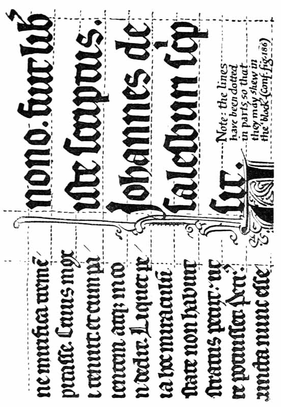
Fig. 191.—MS. written by an English Scribe, in 1269, at Mons, in Hainault—Part of Colophon in large text. (B. M. Egerton, MS. 2569. Reduced five-sixths Scale.)
Fig. 191.—Manuscript written by an English scribe in 1269 in Mons, Hainault—Part of the colophon in large text. (B. M. Egerton, MS. 2569. Scaled down to one-fifth.)
Rightly made, and used, it is one of the most picturesque forms of lettering—and therefore of ornament—and besides its ornamental value, there is still in the popular fancy a halo of romance about “black letter,” which may fairly be taken into account. Its comparative illegibility, however,—due mainly to the substitution of straight for curved strokes—debars it from ordinary use.89 Though its [p336] distinction in form and colour (p. 327) from ordinary small lettering, make it useful in arresting attention; as in a legal document, where the clauses are marked by
If done right and used properly, it's one of the most visually appealing styles of lettering—and therefore decorative—and besides its decorative value, there is still a sense of romance around "black letter" that people find appealing. However, its relative difficulty to read—mostly because of using straight instead of curved strokes—limits its everyday use.89 Yet its [p336] unique shape and color (p. 327) make it effective for grabbing attention; like in a legal document, where the sections are marked by
 &c.
&c.
&c.
Its most effective use, however, is as pure ornament—when it does not matter whether the words are easily read or not. For mottoes, &c., painted or carved on walls or furniture, and for ornamental borders round tapestry hangings, tombs, book-covers, bowls, flagons, plates, &c., bands of such ornamental lettering are extremely decorative (see footnote (2), p. 255, & also p. 364).
Its best use, however, is as pure decoration—when it doesn't really matter if the words are easy to read or not. For slogans, etc., painted or carved on walls or furniture, and for decorative borders around tapestry hangings, tombstones, book covers, bowls, jugs, plates, etc., bands of this kind of ornamental lettering are very attractive (see footnote (2), p. 255, & also p. 364).

Fig. 191a.—Shield of Arms of Earl de Warrenne, Castle Acre Priory, Norfolk (Gold and blue chequers, diapered—see p. 215): reproduced, by permission, from Boutell’s “English Heraldry,” No. 68.
Fig. 191a.—Shield of Arms of Earl de Warrenne, Castle Acre Priory, Norfolk (Gold and blue checks, patterned—see p. 215): reproduced, with permission, from Boutell’s “English Heraldry,” No. 68.
55 The exaggeration of one part may be said relatively to dwarf the other parts of a letter; but it is seldom advantageous, and often not permissible, to dwarf part of a letter absolutely.
55 Emphasizing one part can sometimes overshadow the other parts of a letter, but it's rarely beneficial and often not acceptable to completely overshadow any part of a letter.
56 As when the construction of a part of some letter is peculiar (all the y or g tails, for example, catching the eye, and standing out on the page), or, as when promiscuous types are used, giving the impression of a confused crowd of letters.
56 When a particular part of a letter stands out (like all the y or g tails grabbing attention and making an impression on the page), or when random font styles are mixed together, it creates the feeling of a chaotic jumble of letters.
58 “Bands” and symmetrical or asymmetrical groups of lettering adapted to the available space are used—usually as ornament—upon friezes, furniture, chests, book covers, flagons, dishes, and the like (see fig. 156 & p. 336). The special treatment of such things is a matter for the craftsman who makes them.
58 “Bands” and symmetrical or asymmetrical groups of lettering adjusted to fit the available space are typically used as decoration on friezes, furniture, chests, book covers, flagons, dishes, and similar items (see fig. 156 & p. 336). The unique design of these elements is the responsibility of the craftsman who creates them.
59 By closing up the letters and the words one may generally avoid “rivers,” or accidental spaces straggling through the text. The presence of “rivers” is at once made evident by slanting the page and looking along its surface, across the lines. Note, that whether the lines be close or wide, the interspacing of the Small-Letters does not vary very much.
59 By tightening the letters and words, you can usually prevent “rivers,” or unintentional spaces disrupting the text. You can easily spot “rivers” by tilting the page and looking across its surface, along the lines. Keep in mind that whether the lines are close together or spread out, the spacing of the Small-Letters doesn’t change much.
63 Experiment.—Cut out a piece of dark brown paper the exact size of the body of the text in an entire page of this Handbook, viz. 5116 inches by 3 inches, and lay it on the text: the tone of the brown paper being much darker than that of the print makes the margins appear wider.
63 Experiment.—Cut a piece of dark brown paper the exact size of the body text on a full page of this Handbook, which is 5 1/16 inches by 3 inches, and place it over the text: the darker tone of the brown paper makes the margins look wider.
64 Such inscriptions contrast favourably with that Nineteenth Century style in which it was customary to make every letter occupy the same space and look as much like its neighbour as possible.
64 Such inscriptions are a refreshing change from that 19th-century style where every letter was designed to take up the same amount of space and resemble its neighbor as closely as possible.
65 Note.—There is less danger of spoiling letters by narrowing them than by widening, because the limits to the possible narrowing of a letter are more obvious than the limits to its possible widening. Further, when letters are widened there is a tendency to thicken their parts and make them heavy and vulgar.
65 Note.—There's less risk of ruining letters by making them narrower than by making them wider, because it's clearer what the limits are for narrowing a letter than for widening it. Additionally, when letters are widened, they tend to become thicker and feel clunky and unrefined.
67 It is interesting to note in this connection that the eye seems to prefer looking upon the tops of things, and in reading, is accustomed to run along the tops of the letters—not down one stroke and up the next. This may suggest a further reason for smaller upper parts, viz. the concentration of as much of the letter as possible in the upper half.
67 It's interesting to point out that the eye tends to prefer looking at the tops of things, and when reading, it naturally scans along the tops of the letters—rather than moving down one stroke and up the next. This might suggest an additional reason for smaller upper parts: to maximize the concentration of as much of the letter as possible in the upper half.
68 The extremely beautiful and finished B in the “Trajan Alphabet” (Plate II.) has the division a little higher, and a marked enlargement of the lower part; until the letter-craftsman can approach the perfection of its execution he will find a simpler form more suitable for his “standard.” A curious form, in which the top lobe has nearly or quite disappeared (comp. c, fig. 161), is found in early Roman inscriptions. This form (which may have helped to give us the useful small b) is not suitable for a modern Capital, and would lack the distinctiveness of B.
68 The beautifully designed B in the "Trajan Alphabet" (Plate II.) has the division positioned slightly higher and a noticeable widening of the lower part; until letter designers reach the level of perfection in its execution, they will find a simpler form more appropriate for their "standard." An interesting version, where the top lobe has almost or completely vanished (comp. c, fig. 161), is seen in early Roman inscriptions. This style (which might have contributed to the development of the practical small b) is not ideal for a modern uppercase letter and would lack the distinctiveness of B.
70 J. C. Egbert in an “Introduction to the Study of Latin Inscriptions” says, “J was not specialised as a letter until the 15th Century.” It would seem that in early inscriptions a tall I was frequently used for J between vowels, and for I at the beginnings of words: later, while the medial I remained straight, the initial form was curved to the left and used for both I and J; this curved initial form, J, at length became identified with the letter J.
70 J. C. Egbert in an “Introduction to the Study of Latin Inscriptions” says, “J wasn't recognized as a letter until the 15th Century.” It appears that in early inscriptions a tall I was often used for J between vowels, and for I at the start of words: later, while the middle I stayed straight, the initial form was curved to the left and used for both I and J; this curved initial form, J, eventually became recognized as the letter J.
Similarly, it appears that V was used for an initial, and U for a medial; and later, the V form became identified with the consonant.
Similarly, it seems that V was used for an initial sound, and U for a middle sound; later on, the V form became associated with the consonant.
In the words
 in fig. 95, the initial I is curved like a J, while the
medial i’s are straight; the initial
V has a v form, while the medial V in
nativ(itatis) has a u form.
in fig. 95, the initial I is curved like a J, while the
medial i’s are straight; the initial
V has a v form, while the medial V in
nativ(itatis) has a u form.
In the words
in fig. 95, the initial I is curved like a J, while the medial i’s are straight; the initial V has a v shape, while the medial V in nativ(itatis) has a u shape.
79 It is convenient to use the term “Italics” for both the cursive formal writing and the printing resembling it. Italic type was first used in a “Virgil” printed by Aldus Manutius of Venice in 1500. The type was then called “Venetian” or “Aldine.” It was counterfeited almost immediately (in Germany and Holland it was called “cursive”); Wynkin de Worde used it in 1524. It seems to have been originally intended for printing entire Classics, but was afterwards used to distinguish portions of the text (see also p. 373).
79 It's convenient to use the term “Italics” for both the cursive formal writing and the similar printed style. Italic type was first used in a “Virgil” printed by Aldus Manutius of Venice in 1500. The type was then called “Venetian” or “Aldine.” It was quickly copied (in Germany and Holland, it was referred to as “cursive”); Wynkin de Worde used it in 1524. It seems it was originally meant for printing entire Classics, but was later used to distinguish parts of the text (see also p. 373).
84
E.g. the letters in the tenth-century
English hand—Plate VIII.: excepting the archaic long
 and round
 (b, fig.
183).
(b, fig.
183).
84
For example, the letters in the tenth-century
English handwriting—Plate VIII.: except for the old long
and round
(b, fig.
183).
87 In English so many ascending and descending letters are used, that it might be the best and most natural treatment of these to make them a marked feature of the writing (see also “Fine Writing,” pp. 261–63). Note, in this connection, that our a b c has been developed as a Latin alphabet, and that the evenness of Latin MS. is largely due to the infrequence of tailed letters.
87 In English, many ascending and descending letters are used, so it might be best and most natural to make them a noticeable feature of the writing (see also “Fine Writing,” pp. 261–63). Note, in this context, that our a b c has been developed as a Latin alphabet, and that the uniformity of Latin manuscript writing is largely due to the rarity of tailed letters.
89
Compare
 and monotone. For general purposes,
therefore, and particularly for forming a good hand, the
earlier scripts are to be preferred (or the late Italian): even
twelfth-century “Gothic” writing is hardly readable enough
for “practical” purposes.
and monotone. For general purposes,
therefore, and particularly for forming a good hand, the
earlier scripts are to be preferred (or the late Italian): even
twelfth-century “Gothic” writing is hardly readable enough
for “practical” purposes.
89
Compare
and monotone. For general use, especially when it comes to developing a good writing style, the earlier scripts are better (or the late Italian): even twelfth-century “Gothic” writing is barely readable enough for “practical” purposes.
APPENDIX A
CHAPTER XVI Special TopicsVarious Uses of Lettering — Manuscript Books, etc. — Binding Manuscripts (with Note by Douglas Cockerell) — Broadsides, Wall Inscriptions, etc. — Illuminated Addresses, etc. — Monograms & Devices — Title Pages — Lettering for Reproduction — Printing — Inscriptions on Metal, Stone, Wood, etc. — About Inscriptions Generally — Bibliography, etc.
DIVERS USES OF LETTERING
The following list of some of the uses of hand-made lettering, though necessarily very brief, will perhaps suggest possibilities both to the student and the craftsman:—
The following list of some uses for hand-made lettering, while necessarily brief, may inspire ideas for both the student and the artisan:—
| MS. BOOKS, &c.: | (see pp. 98, 341, & Author’s Preface). |
| Fine Literature: | |
| Single Poems, &c.: | Poems, cards, hymns, &c. (see pp. 137–139, & Poetry, above), preferably in the form of small books. |
| Tracts or Treatises: | Copies might be preserved (p. 323) in good writing (instead of Typewriting). |
| Church Services: | Prayers, Communion, Marriage, &c. (pp. 140, 144, 345). |
| Gospels & Psalters: | Note.—The Psalms, &c., may be treated as poetry (as in the “Revised Version”) or as prose (as in the “Authorised Version”), see Fine Literature above. |
| Almanacks: | These may be very varied; containing vacations, terms, sessions; public, church, or family festivals, personal memoranda or topical quotations. They offer great opportunities for heraldic or symbolic ornament (such as coats-of-arms, astronomical signs, &c.). |
| Dedications, &c., in Books: (Lettering on Architects’ Plans: see Maps & Plans, p. 339) |
These may be on a parchment leaf inserted and securely glued into the beginning (preferably bound up with book), or be written on a fly-leaf. Annotations, extracts, &c., may be written in colour in printed books (p. 144). |
| “Copy-Books:” | (see below). |
| BROADSIDES: | Sheets printed (or written) on one side: see p. 350. |
| Notices: | (Posters, Placards, Hand-bills, &c.). |
| Quotations: | (Texts, Mottoes, &c.) (see p. 336). |
| Church Texts, &c.: | (The Creed, Commandments, &c.). |
| Family Trees & Pedigrees: | These may be very decorative—in plain black and red, or with coats-of-arms or other ornament. They might also be made in book form. |
| WALL INSCRIPTIONS: | Carved or painted: see pp. 350, 375–385, & Chapter XVII. |
|
|
| (ILLUMINATED) ADDRESSES, &c.: | (Petitions, &c.) (see p. 353). |
| MONOGRAMS & DEVICES: | (see p. 361. These are frequently designed for stencilling or other mechanical reproduction). |
| LETTERING FOR REPRODUCTION: | (see p. 365). See also BROADSIDES, above. |
| Printer’s types and Ornamental letters: | (in woodcut and metal: pp. 365, 367). |
| Title Pages: | (see p. 363). |
| Paper and other Book covers: | (Magazines, Newspaper-Headings, Music, Catalogues, &c.). |
| Maps & Plans: | good, clear lettering may be used in these with fine effect. |
| Book Plates: | (preferably simple, with Arms, Crest, or Symbol, and suitable lettering). |
| Letter-paper Headings, Cards, &c.: | (preferably in copper-plate “Roman” and “Italic”). |
| Bill Heads, Receipt Forms, &c.: | (preferably in copper-plate or type: see p. 365). |
| Certificates: | (Testimonials, &c.) The plainer these are made, the better. |
| Programmes, Menus, Cards, &c.: | (Christmas cards, &c.). |
| Almanacks: | (see above). |
| MS. Books and “copy-books”: | Possibly might be reproduced by copper-plate if written well enough (p. 367). |
| Advertisements, &c.: | Better lettering in these would not only mitigate many eyesores, but would probably attract by its novelty (see p. 352). |
| ENGRAVING, &c.: | (see pp. 364, 365, 375). |
| Brasses, &c.: | (“Brasses,” Name-plates, Door-plates, &c.). |
| Punches: | (for naming, numbering, &c.). |
| Utensils: | (Bowls, flagons, plates, &c.). |
| Ornaments: | (Jewellery, &c.). |
| Die Sinking: | (for coins, medals, &c., and for embossed letter-paper headings, &c.). |
| INSCRIPTIONS IN STONE & WOOD: | (see pp. 375–385, & Chap. XVII.). |
| On Monuments & Buildings: | Also on mile-stones, boundary stones, bridges, &c. |
| Tombstones: | |
| Foundation Stones: | |
| Memorial Tablets: | |
| “SIGN WRITING”: | (see pp. 350, 376). |
| Signs: | (for stations, inns, shops, &c.). |
| Shop Fascias, &c.: | |
| Names, &c.: | (on doors & on carts, coaches, &c.). |
| Notice Boards: | |
| “Ticket Writing”: | |
| EMBROIDERY, &c.: | see remarks on built-up forms, p. 292: and Chapter XII. [on Lettering, &c.] of “Embroidery and Tapestry Weaving,” by Mrs. A. H. Christie, in this Series. |
| Decoration for hangings, (p. 336): | |
| Marking clothes, &c. |
All the arts employ lettering directly or indirectly, in fine decoration or for simple service.
All the arts use lettering, either directly or indirectly, whether for elaborate decoration or basic purposes.
The following list of ancient uses is interesting:90—
The following list of ancient uses is cool:__A_TAG_PLACEHOLDER_0__—
- “I. TITULI
- 1. Dedicatory and Votive Inscriptions (Tituli Sacri).
- 2. Sepulchral Inscriptions (Tituli Sepulchrales).
- 3. Honorary Inscriptions (Tituli Honorarii).
- 4. Inscriptions on Public Works (Tituli Operum Publicorum).
- 5. Inscriptions on Movable Objects (Instrumentum).
- II. INSTRUMENTA
- 1. Laws (Leges et Plebi Scita).
- 2. Decrees of the Senate (Senatus Consulta).
- 3. Imperial Documents (Instrumenta Imperatorum).
- 4. Decrees of Magistrates (Decreta Magistratuum).
- 5. Sacred and Public Documents (Acta Sacra et Publica).
- 6. Private Documents (Acta Privata).
- 7. Wall Inscriptions (Inscriptiones Parietariae).
- 8. Consular Diptychs (Diptycha Consularia).”
MS. BOOKS, &C.
Books in the making—as compared with ordinary inscriptions—are capable of great compression or expansion, and may be said to have a quality of elasticity. Nearly all other ordinary inscriptions are set inscriptions (p. 350), requiring a given number of words to be set out in a given space. But in books, while it is convenient that the treatment of the text should conform generally to a chosen size of page (p. 103), the contents of the page may vary according to the letter-form and the spacing (pp. 107, 262), and the number of the pages is not definitely limited, so that another page, or a [p342] number of additional pages, may always be taken to complete the text.
Books in progress—compared to regular inscriptions—can be greatly condensed or expanded, and they have a quality of elasticity. Nearly all other regular inscriptions are set inscriptions (p. 350), which need a specific number of words laid out in a fixed space. However, in books, while it's useful for the text layout to generally fit a chosen page size (p. 103), the content on the page can change based on the letter style and spacing (pp. 107, 262), and the total number of pages isn't strictly limited, so another page, or a [p342] number of extra pages, can always be added to finish the text.
The size of page, margin, and writing having been settled (see Chap. VI.)—and the pages ruled—the penman writes out the text with the utmost freedom, not stopping to make fine calculations, but leaving such spaces and lines, for Initials, Headings, &c., as his fancy and common-sense dictate, and letting the text—or its divisions—smoothly flow on from page to page till a natural termination is reached. And if the terminal page has only one or two lines on it, it is not necessary to attempt a balance with the previous page—the book or chapter91 ends just there, for the good reason that there is no more of it.
The size of the page, margins, and writing have been decided (see Chap. VI.)—and the pages ruled—the writer composes the text with complete freedom, not pausing to make precise calculations, but leaving spaces and lines for initials, headings, etc., as his instincts and common sense suggest, allowing the text—or its sections—to flow smoothly from page to page until it naturally concludes. And if the final page has only one or two lines, there’s no need to try to balance it with the previous page—the book or chapter91 ends right there, for the simple reason that there is no more of it.
Colophons, Tail-pieces, &c. (see p. 142), make a pleasant finish, and may complete the page or not as convenient.
Colophons, Tail-pieces, &c. (see p. 142), create a nice ending and can complete the page or not, depending on what’s convenient.
Planning: Sections and Pages.—Calculations of the amount of text, of the number of sections or pages required, and so on, are useful, and planning the pages may be convenient—for example, one or more of the verses of a poem, or a given number of words, may be allotted to the page—provided always that the scribe preserves his freedom, and treats each case on its merits. If he think it most suitable to devote a complete page to each paragraph, he may do so in spite of its resulting in the pages all being of different lengths.
Planning: Sections and Pages.—Calculating the amount of text and the number of sections or pages needed is helpful, and organizing the pages can be useful—for instance, assigning one or more verses of a poem or a specific number of words to a page— as long as the writer maintains their flexibility and assesses each situation individually. If they believe it best to dedicate an entire page to each paragraph, they can do so, even if it leads to pages of varying lengths.
The one general limitation which it is proper to [p343] observe is that of the Writing-line—its length92 and spacing—and to this may be added the desirability of beginning the text of every page on the first or head line.93 For most of us it is not practically possible to do without the aid of the writing-lines—which really lead, through uniformity, to greater freedom—though a book written without them94 might be as beautiful as any ruled manuscript.
The main limitation to keep in mind is the Writing-line—its length92 and spacing. It's also a good idea to start the text on every page on the first or head line.93 For most of us, it’s practically impossible to go without the aid of the writing lines, which actually promote greater freedom through uniformity. However, a book written without them94 could be just as beautiful as any ruled manuscript.
Marginal Lines.—These, the terminals of the writing-lines, are frequently made double, with about 14 inch between (see Plates XX. and XV.). On the left this space is utilised for marginal capitals, or is left blank; on the right the first line acts as a warning mark and the normal termination of the text, the second as a barrier beyond which the writing should not go. The double lines, in being more obvious than single lines, are also more effective in “straightening” the page (p. 109): presumably for this reason the two upper and two lower writing-lines were often ruled from edge to edge of the page (see Plate XI.).
Marginal Lines.—These, which mark the ends of the writing lines, are often drawn as double lines, with about 14 inch between them (see Plates XX. and XV.). On the left, this space is used for marginal capitals or left blank; on the right, the first line serves as a warning mark and the usual end of the text, while the second line acts as a barrier that should not be crossed by the writing. The double lines are clearer than single lines and help “straighten” the page (p. 109); likely for this reason, the two upper and two lower writing lines were often ruled all the way across the page (see Plate XI.).
Ruling.—Marginal and writing-lines, once ruled, are to be left intact, and may be regarded as actual component parts of the finished pages. They are best made with a hard blunt point (p. 108)—the furrows so made give an interesting character, almost a “texture,” to the smooth surface of the page. But they may be ruled with a fine lead pencil, or with a fine pen and faint black or [p344] coloured inks. Inked or coloured lines, however, are not generally written upon (see footnote, p. 305), but between (see Plates XIII., XVII., XX., &c.).
Ruling.—Margin lines and writing lines, once ruled, should be left as they are and can be seen as part of the final pages. It's best to use a hard blunt point (p. 108)—the furrows created add an interesting character, almost a “texture,” to the smooth surface of the page. However, they can also be ruled with a fine lead pencil or a fine pen using faint black or [p344] colored inks. Inked or colored lines, though, are not typically written upon (see footnote, p. 305), but rather between (see Plates XIII., XVII., XX., & c.).

Correcting Mistakes.—A neatly made rather small letter above and a “carat” below (as in ordinary writing) may be used for an omission (fig. 192). A superfluous letter may be neatly struck out. Erasures are usually unsatisfactory, and a simple, unostentatious correction, besides disarming criticism, is in accordance with the proper freedom of the craft (see p. 174).
Correcting Mistakes.—A small, neatly written letter above and a “caret” below (like in regular writing) can be used for an omission (fig. 192). A needless letter can be neatly crossed out. Erasures are usually not ideal, and a straightforward, unobtrusive correction, besides deflecting criticism, aligns with the proper freedom of the craft (see p. 174).
Special Books.—A MS. book is necessarily unique, and some special or personal interest—either of the craftsman (see p. 142) or his “client”—inevitably attaches to it. This may affect its size and form, the treatment of the text, and the decoration and construction generally (see p. 100). Every legitimate opportunity of adding to its individual character should be taken by the scribe and illuminator. [p345]
Special Books.—A manuscript book is inherently one-of-a-kind, and some specific or personal significance—either to the creator (see p. 142) or his “client”—is always associated with it. This can influence its size and shape, the way the text is handled, and the overall decoration and construction (see p. 100). Every legitimate chance to enhance its unique character should be embraced by the writer and illustrator. [p345]
Fig. 175 and Plate XX. are both taken from private prayer books or psalters; in each the name of the owner (e.g. “Euanzelista famulo tuo,” Plate XX.) is frequently inserted. Plates XV. and XXII. are also taken from specially commissioned MSS., and many evidences of their ownership, such as portraits or coats-of-arms, form part of the decoration of such books.
Fig. 175 and Plate XX. are both from private prayer books or psalters; in each, the owner's name (e.g. “Euanzelista famulo tuo,” Plate XX.) is often included. Plates XV. and XXII. also come from specially commissioned manuscripts, and many signs of their ownership, like portraits or coats-of-arms, are part of the decoration in these books.
Church Services, &c.—(For a special church or person.) Church uses are so varied, that it is most important to ascertain the custom, use, or taste of the persons concerned—especially as to the order of, and the introduction or omission of, certain words, paragraphs, or parts, the colours used in the text, the notation of the music—and the manner in which the book will be used.
Church Services, &c.—(For a special church or person.) Church practices are quite diverse, so it's really important to find out the preferences, customs, or needs of the people involved—especially regarding the order of service, the addition or removal of specific words, sections, or elements, the colors used in the text, the music notation—and how the book will be utilized.
A service book for the use of a priest gives prominence to the parts in which he is concerned—the responses95 may be smaller, and different in form or colour. The rubrics—in red (see pp. 140, 144)—are kept quite distinct, and may form a very decorative feature. For a private person the other parts—such as are said by the congregation—might be specially marked. In either case a certain amount of planning—e.g. completing prayers, &c., in an opening, to avoid turning over—may be justified by its convenience to the reader. Should very careful planning ever be required, a pattern-book may be made, having the contents of each page roughly indicated in it.
A service book for a priest highlights the sections he is involved in—the responses95might be smaller and have a different format or color. The rubrics—in red (see pp. 140, 144)—are kept very distinct and can be quite decorative. For an individual, the other sections—like those said by the congregation—could be specially marked. In either situation, some planning—e.g. completing prayers, etc., in an opening, to avoid flipping pages—can be incredibly helpful for the reader. If very careful planning is ever needed, a pattern-book can be created, showing a rough outline of the contents of each page.
Wedding Service Books, &c.—The interest and [p346] value is enhanced if the book is specially prepared—containing the proper names and dates, and only the special psalms, hymns, prayers, homilies, &c., which will be used. Dated pages may be provided at the end of the book for the signatures of the “friends and neighbours” of the principals.
Wedding Service Books, etc.—The interest and [p346] value increases if the book is specially created—featuring the correct names and dates, along with only the specific psalms, hymns, prayers, homilies, etc., that will be used. There can be dated pages at the end of the book for the signatures of the “friends and neighbors” of the main participants.
BINDING MSS.
MSS. should be bound without delay in order to complete and protect them.
MSS. should be bound right away to finish and protect them.
To bind books in stiff boards, in leather, requires considerable practice and skill, but a very effective limp vellum cover can be made by the scribe himself, who, in binding his own books, will learn to think of the binding as a part of the book, and to allow for it in the writing and planning (see p. 106).
To bind books with hard covers in leather takes a lot of practice and skill, but a simple soft vellum cover can be made by the scribe himself. By binding his own books, he will start to see the binding as part of the book and consider it when writing and planning (see p. 106).
The following note96 on covering books in limp vellum is specially contributed by Mr. Douglas Cockerell:—
The following note96 on covering books in soft vellum is specifically contributed by Mr. Douglas Cockerell:—
“How to cover a book in a limp vellum cover without using special appliances.
How to wrap a book in a soft vellum cover without using special tools.

“Cut four strips of stiff vellum 38 inch wide and about four inches long. On these slips you will sew the sections of your book.
“Cut four strips of stiff vellum 38 inches wide and about four inches long. You will sew the sections of your book onto these strips.
“Add to your book a plain section at either end;97 vellum for a vellum book, paper for a paper book. Knock up the backs of the sections squarely, keeping the heads level, and across the back mark with a soft pencil guided by a square, lines to show the position of the slips. The positions of the four slips should leave the space between the slips the same as that between the [p347] top slip and the head of the book; the space between the bottom slip and the tail should be a little longer than the spaces between the slips. At about 12 inch from either end make an additional line across the back for the “kettle” or catch stitch. These lines will show as dots on the back of single sections. Each individual section should now have at the back a dot at either end for the kettle stitches, and four pairs of dots 38 inch apart to show the position of the slips, ten dots in all.
“Add a simple section to either end of your book; 97 vellum for a vellum book, paper for a paper book. Square up the backs of the sections, keeping the tops level, and mark lines across the back with a soft pencil using a square to indicate the position of the slips. The positions of the four slips should keep the space between them the same as the space between the [p347] top slip and the head of the book; the space between the bottom slip and the tail should be a bit longer than the spaces between the other slips. Around 12 inch from either end, make an extra line across the back for the “kettle” or catch stitch. These lines will appear as dots on the back of single sections. Each section should now have a dot at both ends for the kettle stitches, and four pairs of dots 38 inch apart to indicate the position of the slips, making a total of ten dots.”
“To sew the book, fold the vellum slips about 112 inch from one end and bend to a right angle. Place your front end-paper outside downwards, with the back even with the edge of a table or board, and place your folded slips with their shorter ends under it. Then insert your needle from the outside, at the head “kettle stitch” mark, into the centre of the section and bring it out at the first band mark; put the slip in position and reinsert your needle at the mark on the other side of the slip, and so on to the end of the section, coming out at the tail kettle stitch. This should leave your section with a thread,98 passing alternately along the centre fold inside and across the slips outside, with a loose end hanging from the kettle stitch mark where you began, and a thread with the needle hanging from the other kettle stitch mark (fig. 193). [p348]
“To sew the book, fold the vellum slips about 1/12 inch from one end and bend it to a right angle. Place your front end-paper face down, with the back aligned with the edge of a table or board, and place your folded slips with their shorter ends underneath it. Then insert your needle from the outside, at the head “kettle stitch” mark, into the center of the section and bring it out at the first band mark; position the slip and reinsert your needle at the mark on the other side of the slip, and continue this to the end of the section, coming out at the tail kettle stitch. This should leave your section with a thread, 98 passing alternately along the center fold inside and across the slips outside, with a loose end hanging from the kettle stitch mark where you started, and a thread with the needle hanging from the other kettle stitch mark (fig. 193). [p348]

“Lay on your next section and sew it in the same way but in the reverse direction, tying up with the first loose end when you come to it. Sew the whole book in the same way, tying on a new needleful of thread as each is exhausted, making practically a continuous thread going backwards and forwards inside the sections and across the slips from end to end of the book. Each succeeding kettle stitch should be caught up by a loop (fig. 194), and it is well to catch together the loose threads crossing the slips.
“Attach your next section and sew it in the same way, but in the opposite direction, tying it off with the first loose end when you reach it. Sew the entire book in this manner, attaching a new needleful of thread as each runs out, creating a nearly continuous thread going back and forth inside the sections and across the slips from one end of the book to the other. Each subsequent kettle stitch should be secured by a loop (fig. 194), and it's a good idea to tie together the loose threads crossing the slips.”
“When the book is sewn, the back may be covered with thin glue and lined with a piece of leather, but as this is a little difficult to manage neatly, and as the book will hold together without it, for a temporary binding the sections may be left without glue.
“When the book is sewn, the back can be covered with thin glue and lined with a piece of leather, but since this can be a bit tricky to do neatly and the book will stay together without it, for a temporary binding the sections can be left without glue.”

“For the cover cut a piece of covering vellum99 (vellum with a surface) large enough to cover the book and to leave a margin of 112 inches all round. Mark this with a folder on the underside, as shown at A, fig. 195. Spaces (1) and (2) are the size of the sides of the book with the surrounding “squares,”100 space (3) is the width of the back, and space (4) the width for the overlaps on the foredge.101 Cut the corners as shown at (5), and fold the edges over as at B, and then fold over the overlaps [p349] and back as at C. Be sure to make all folds sharp and true.
“For the cover, cut a piece of covering vellum99 (vellum with a surface) that's large enough to wrap around the book, leaving a margin of 1/2 inches all around. Mark this with a folder on the underside, as shown at A, fig. 195. Spaces (1) and (2) are the dimensions of the book's sides along with the surrounding “squares,”100 space (3) is the width of the spine, and space (4) is the width for the overlaps on the foredge.101 Cut the corners as shown at (5), and fold the edges over as at B, then fold over the overlaps [p349] and back as at C. Make sure all folds are sharp and precise.
“To avoid mistakes it is well to make a cover of stiff [p350] paper first, and then, when that fits exactly, to mark up the vellum from it.
“To avoid mistakes, it's a good idea to create a cover out of stiff [p350] paper first. Then, when that fits perfectly, use it to mark up the vellum.”
“On the inside of the vellum cover, mark faint lines about 34 inch from, and parallel to, the creases of the back, and further lines about 14 inch from these. Place your book in the cover and mark the places where the slips cross these lines. Make slits in the cover there, and lace the slips through them (fig. 196), first putting a piece of loose, toned paper inside the cover to prevent any marks on the book from showing through the vellum. Then lace pieces of silk ribbon of good quality102 through the cover and end-papers, leaving the ends long enough to tie.”
“On the inside of the vellum cover, mark faint lines about 34 inch from, and parallel to, the creases of the back, and further lines about 14 inch from these. Place your book in the cover and mark the spots where the slips cross these lines. Make slits in the cover there, and lace the slips through them (fig. 196), first putting a piece of loose, toned paper inside the cover to prevent any marks on the book from showing through the vellum. Then lace pieces of good quality silk ribbon 102 through the cover and end-papers, leaving the ends long enough to tie.”

BROADSIDES, WALL INSCRIPTIONS, &C.
Set Inscriptions.—Ordinary inscriptions generally consist of a given number of words to be set out in [p351] a given space. Careful planning may sometimes be required to fit in the words suitably, or to adapt the lettering to the space. But setting-out (p. 258) becomes much simpler after a little practice, and the good craftsman avoids over-planning.
Set Inscriptions.—Regular inscriptions usually consist of a specific number of words to be arranged in [p351] a designated area. Sometimes, careful planning is needed to fit the words appropriately or to adjust the lettering to the space. However, setting out (p. 258) becomes much easier after some practice, and a skilled craftsman tends to avoid over-planning.
The Place of the Inscription.—The actual space for a wall inscription is commonly suggested by an architectural feature—a stone, a panel, or a niche—of the wall; but in choosing a suitable space for a given inscription, or suitable lettering for a given space, we must take into account—
The Place of the Inscription.—The actual area for a wall inscription is usually indicated by an architectural element—a stone, a panel, or a niche—of the wall; however, when selecting an appropriate space for a specific inscription, or appropriate lettering for a given space, we have to consider—
- 1. The office of the inscription.
- 2. How it is to be read—
- (a) “At a glance,” or
- (b) by close inspection.
- 3. The distance from the reader.
- 4. The lighting of the space.
- 5. The character of the surroundings.
- 6. Any special features.
The Size of the Letters.—The all-important question of readableness may be settled thus: the inscription having been planned suitably to fill the space, one or two words are written or painted (the exact size) on paper—smoked or otherwise coloured if necessary to resemble the background. This is stuck upon the chosen part of the wall, and then viewed from the ordinary position of a reader. When the inscription is high up, the thin parts—especially the horizontals of the letters—must be made extra thick to be seen properly from below.
The Size of the Letters.—The crucial question of readability can be decided this way: the inscription should be designed to fit the space, and then one or two words are written or painted (at the exact size) on paper—darkened or colored if needed to match the background. This is attached to the selected area of the wall and then viewed from a typical reader's position. When the inscription is placed high up, the thin parts—especially the horizontal strokes of the letters—need to be made thicker so they can be seen clearly from below.
Margins.—Wide margins are only required for comparatively small lettering which demands the close [p352] attention of the reader,103 and generally a set inscription looks best if the lettering be comparatively large—covering most of the given surface, and leaving comparatively narrow margins. The frame or moulding, or the natural edge or environment of the circumscribed space, is very often sufficient “margin” (see Plate XXIV.).
Margins.—Wide margins are only needed for relatively small text that requires the close [p352] attention of the reader,103 and generally, a set inscription looks best if the text is relatively large—filling most of the available space, and leaving relatively narrow margins. The frame or molding, or the natural edge or surroundings of the defined space, is often enough “margin” (see Plate XXIV.).
The margins vary, however, according to circumstances; especially the foot margin, which may be very narrow if all the space is required for the lettering (see fig. 211), or very large104 if there is plenty of space (see fig. 210). And, as in special pages or terminal pages of books, so in single sheets, panels, &c., the “foot margin” may show—as it really is—as the space which did not require to be filled, and was therefore “left over.”
The margins change depending on the situation; specifically, the foot margin can be very narrow if all the space is needed for the text (see fig. 211), or it can be quite large if there's plenty of space available (see fig. 104). Similarly, on special pages or terminal pages of books, as well as in single sheets, panels, etc., the "foot margin" may appear—as it actually is—as the space that didn't need to be filled, and was therefore “left over.”
Number of Different Types.—While in a book of many pages considerable diversity is allowed, it is essential to the strength and dignity of a single sheet or set inscription to limit the number of types employed in it. Three or four ordinary types will generally give sufficient variety, and if it be necessary—as in notices and placards—that Important Words be put in special types to catch the eye, let two—or at most three—special types suffice, and let the remainder of the text be as quiet and reserved as possible. “Display Types” commonly defeat their object by being overdone. A simple contrast is the most effective (fig. 197). [p353]
Number of Different Types.—In a book with many pages, a lot of variety is acceptable, but for a single sheet or set of inscriptions, it’s crucial to limit the number of types used. Usually, three or four standard types provide enough variety, and if it’s necessary—like in announcements and posters—to highlight Key Terms with special types to grab attention, then stick to two—or at most three—special types, keeping the rest of the text as understated as possible. “Display Types” often miss the mark by being overdone. A simple contrast is the most effective (fig. 197). [p353]

ILLUMINATED ADDRESSES, &C.
Forms of Addresses, &c.—The writer should be prepared to advise his “clients” on the form which the address may take, on special features in its writing and illuminating, and on its general treatment.
Forms of Addresses, &c.—The writer should be ready to advise his “clients” on the format of the address, specific features in its writing and decoration, and its overall handling.
The wording commonly consists of three parts: the Heading (usually the name of the addressee), the Text (usually divided into paragraphs), the Signatures (or a list of names) of the subscribers.
The wording typically includes three parts: the Heading (usually the name of the recipient), the Text (generally split into paragraphs), and the Signatures (or a list of names) of the signers.
An address is commonly in the 1st or 3rd person, and in case of any confusion of these, any slip of the pen, or other oversight in the draft, the penman [p354] should, if possible, call attention to it before the document is put into permanent form.
An address is usually written in the 1st or 3rd person, and if there's any mix-up between them, any mistakes made while writing, or other errors in the draft, the writer [p354] should, if possible, point it out before the document is finalized.
A very convenient and agreeable style of “address” is a formal letter, beginning “Dear Mr. A——— B———,” and ending in the ordinary way. This is a form which may be drawn up more simply, and which reads more naturally, than the ordinary 1st or 3rd personal statement.
A very convenient and friendly way to “address” someone is with a formal letter, starting with “Dear Mr. A——— B———,” and ending in a standard way. This format can be written more simply and feels more natural than a typical 1st or 3rd person statement.
An “address” is sometimes in the form of a resolution passed by a public or private body or committee. For municipal or other important corporations, such an extract from their minutes, neatly and “clerkly” written out on parchment, and duly attested by the signatures of their “head” and their secretary, and without ornament save their seal—on a dependent ribbon—or their coat-of-arms, or badge, would not only be the most natural, but possibly the most dignified and effective shape which might be given to the formal presentation of their compliments.
An “address” can sometimes be a resolution passed by a public or private organization or committee. For city governments or other significant corporations, an excerpt from their minutes, neatly written on parchment by the clerk, and properly signed by their leader and secretary, without any embellishments except for their seal on a ribbon or their coat of arms or badge, would likely be the most natural, as well as the most dignified and effective way to formally present their compliments.
An “address” accompanying a present is frequently little more than a list of names with a brief complimentary or explanatory statement. If possible such an inscription should be written or engraved on the article itself, or be specially designed to accompany it. In some cases this is very simple: when a volume, or set of volumes, is given, the inscription may be written in the first volume—or on a parchment which may be inserted—or it may be prepared in book form, in a binding to match. A silver or other ornament sometimes has a little drawer provided to hold a narrow scroll of names. A portrait may have an inscription on the frame—or even in a corner of the picture—or be accompanied by a simple, framed parchment. [p355]
An “address” that comes with a gift is often just a list of names along with a short complimentary or explanatory note. If possible, this inscription should be written or engraved directly on the item, or especially designed to go along with it. This can be quite straightforward: if a book or a set of books is given, the inscription could be written in the first volume—or on a piece of parchment that can be inserted—or it could be prepared as a book, bound to match. Sometimes, a silver or other ornament has a small drawer to hold a narrow scroll of names. A portrait might have an inscription on the frame—or even in a corner of the artwork—or be accompanied by a simple, framed piece of parchment. [p355]
Signatures.—A neatly written out list of subscribers—especially when their number is large—is very convenient: it does not require individual personal appointments, nor involve risks of damage to the address. The actual signatures of subscribers, however, are of greater interest and sentimental value, and on such grounds are preferable to a mere list of names.
Signatures.—A neatly typed list of subscribers—especially when there are a lot of them—is really convenient: it doesn’t need individual meetings or risk damaging the addresses. However, the actual signatures of the subscribers are more interesting and meaningful, making them preferable to just a plain list of names.
To avoid risks (or with a view to incorporating the signatures in the decorative scheme) the decoration, gilding, &c., may sometimes be deferred until after the signing of the address.
To minimize risks (or to include the signatures in the decorative design), the decoration, gilding, etc., may sometimes be postponed until after the signing of the address.
When the exact number and the names of the subscribers are known beforehand, lines may be provided for their signatures, marked with letters in alphabetical order (the proper number of lines under each). This method solves any difficulty in regard to precedence in signing.
When the exact number and names of the subscribers are known in advance, lines can be provided for their signatures, labeled with letters in alphabetical order (with the correct number of lines under each). This method eliminates any issues related to precedence in signing.
Note.—Ordinary signatures require about 12 inch by 3 inches space each. If there are many they may be conveniently arranged in two or more columns, according to the space available.
Note.—Regular signatures need about 12 inch by 3 inches of space each. If there are many, they can be easily organized into two or more columns, depending on the available space.
- Directions for
Signing106—
- Edges of parchment not to project beyond desk or table, lest they be creased.
- Paper to be provided to cover the address, with FLAPS to raise when signing.
- When lines for signatures are grooved (p. 108), signatories to face the light (this makes the lines more evident).
- Ink of one colour to be used if possible.
- Clean, COMMON pens to be provided, and pieces of paper for trying them on.
Framed Parchments.—The parchment may have—beyond the top and foot margins—spare pieces which (after the writing and illuminating is finished) are bent over the ends, and glued to the back, of a stout, white card, or millboard—covered with white or light coloured paper. Or—extra margin being allowed all round—the edges of the parchment are cut into tags or “scallops,” and folded over an ordinary canvas stretcher, and well tacked at the back with small brads. The wedges are carefully adjusted till the parchment lies flat.
Framed Parchments.—The parchment may have—beyond the top and bottom margins—extra pieces that (after the writing and decoration is complete) are folded over the ends and glued to the back of a sturdy, white card or board, which is covered with white or light-colored paper. Alternatively—if extra margin is allowed all around—the edges of the parchment are cut into tags or “scallops,” folded over a regular canvas stretcher, and securely tacked at the back with small brads. The wedges are carefully adjusted until the parchment lies flat.
A parchment glued to the surface of a millboard is more convenient for framing, but has a less natural surface, and is not so easily managed by the penman as the plain, flexible parchment.
A piece of parchment glued to a millboard is easier to frame, but it has a less natural surface and is not as easy for the writer to handle as plain, flexible parchment.
Frames should be gold, black, or white; very plain, and generally without mounts. The parchment, however, must be framed so that there is no danger of any part of it coming into contact with the glass (as that, being damp, would lead to cockling).
Frames should be gold, black, or white; very simple, and usually without mounts. The parchment, however, must be framed to ensure that no part of it touches the glass (since that, being damp, could cause it to buckle).
Parchment Scroll.—The foot edge of the parchment may be folded over twice,107 a strong, silk ribbon (see footnote, p. 350) is laced along through slits in the folded part (a, fig. 198), so that the two ends come out again at the centre—where they may be knotted together—and are ready to tie round the scroll when it is rolled up (b). A rather narrow, “upright” parchment is most convenient (c). An “oblong” parchment may be very effectively arranged in long lines of writing (d). If a special casket or case is not provided, a neat [p357] japanned tin case may be obtained for a few shillings.
Parchment Scroll.—The bottom edge of the parchment can be folded over twice, 107 a strong silk ribbon (see footnote, p. 350) is threaded through slits in the folded section (a, fig. 198), so the two ends come out at the center—where they can be tied together—and are ready to wrap around the scroll when it’s rolled up (b). A somewhat narrow, "upright" parchment is the most convenient (c). An "oblong" parchment can be arranged very effectively with long lines of writing (d). If a special box or case isn't available, a tidy [p357] japanned tin case can be purchased for a few shillings.

A small Bound MS. is certainly the most easily handled form in which an address may be prepared—its convenience to the penman, the signatories, the reader, and the addressee, is strongly in its favour. A lengthy address, or a very large number of names, may be contained in a comparatively small book.
A small Bound MS. is definitely the easiest format for preparing an address—its convenience for the writer, the signers, the reader, and the recipient is a major advantage. A lengthy address or a large number of names can fit into a relatively compact book.
Method of Planning out Addresses, &c.—If in the [p358] book form, the address is treated much as an ordinary book (see Chap. VI., and Binding, p. 346). The framed or scroll address is planned similarly to a single sheet (p. 90). The following notes of a working method were made during the planning out of an address:—
Method of Planning Addresses, & etc.—If in the [p358] book format, the address is handled like a regular book (see Chap. VI., and Binding, p. 346). The framed or scroll address is organized similarly to a single sheet (p. 90). The following notes on a working method were taken during the planning of an address:—
(1) Decide approximately the general form, shape, and decorative treatment of address. | ||
(2) Count words in TEXT (leaving
out HEADING and SIGNATURES) |
= 130 | |
Count paragraphs |
= 3 | |
(Decide whether first or last
paragraph is to be in a different form or colour.) | ||
Decide approximate width |
= 12 inches. | |
Decide approximate side margins
(2½ inches each) |
= 5 inches. | |
Hence length of
writing-line |
= 7 inches. | |
Allow
12
inch lines, and
approximately eight words to the line. |
||
(3) 130 words TEXT, approx. |
16 lines | = 8 in. deep. |
Allow extra (on account paragraphs) |
1 line | 1.2 in. deep. |
(Roughly sketch out HEADING on lines
each
12
inch by 7 inches.) Allow for HEADING |
6 lines | = 3 in. deep. |
Allow for two SIGNATURES, &c. |
3 lines | 1 1/2 in. deep. |
Total depth of Writing,
&c. |
26 lines | = 13 inches. |
Allow for Top margin |
2 inches. | |
Allow for Foot margin |
3 inches. | |
(Note.—This
was a “scroll,” and the foot margin was folded up to within an inch of the
SIGNATURES. A plain sheet would have required about 4 inches foot margin.) | ||
Length of Parchment |
18 inches. | |
(4) Cut a paper pattern, 12 inches by 18 inches. Rule
(in pencil) Side margins
(2 1/2 inches and
2 1/2 inches),
and Top margin (2 inches), and 26
(12
inch) lines. On this write
out the address in ordinary handwriting, using ordinary
black and red (or coloured) inks:
make approximately eight words to the line, and write as fast
as possible; this helps to keep the spacing uniform.
This written pattern should not take more than twenty minutes for
its entire preparation: it is intended to be used as a check on the
previous calculation (not as an exact plan),
and as a copy, it being easier to copy from
your own, than from another’s, handwriting.
If the original draft is typewritten, it is hardly necessary to make
such a pattern. | ||
(5) Check this copy very carefully with the
original to see that the words, &c., are correct. | ||
(7) On some scraps of
parchment, ruled with a few similar lines, and pounced, try one or
two lines of writing, both in vermilion and black, to see that all
goes well. | ||
This enables you to get the pens and inks into
working order, and will very likely save the carefully prepared parchment from being spoilt. | ||
(8) Write out the address, leaving suitable gaps for
gold or special letters. | ||
(9) Put in special letters, decorative capitals, and
any other decoration. | ||
(10) Check the finished address very carefully with the original draft
(see (5) above) and look it over for mistakes, dotting i’s, and
putting in commas, &c., if left out. It is important that such a
formal document should be accurate. | ||
General Remarks.—The above simple mode of planning out can be further simplified in custom and practice. By the penman keeping to regular shapes, proportions,108 and modes of treatment for regular [p360] occasions, the addresses, &c., will practically “plan themselves” (p. 101), and better workmanship is the natural result.
General Remarks.—The straightforward way of planning things can be simplified even more through experience. By the penman sticking to consistent shapes, proportions, 108 and methods for standard [p360] occasions, the addresses, etc., will basically “organize themselves” (p. 101), and higher quality work will naturally follow.

Generally the simpler the form and the treatment of an Illuminated Address, the better the effect. The most effective decoration is the plain coloured or gold capital, and the finest ornament is a coat-of-arms (see “Heraldry,” below; and for general, [p361] simple Illumination, see Chapters VII. to XIII.). A symbolical mark, such as a crest, badge, monogram, cypher, or other device (p. 362), boldly and decoratively treated, may be used in place of a coat-of-arms.
Generally, the simpler the design and approach to an Illuminated Address, the better the outcome. The most impactful decoration is a plain colored or gold capital letter, and the best embellishment is a coat of arms (see “Heraldry,” below; and for basic, [p361] simple Illumination, see Chapters VII. to XIII.). A symbolic mark, such as a crest, badge, monogram, cipher, or another design (p. 362), boldly and decoratively presented, can replace a coat of arms.
There is too much “Illumination” in the conventional “Address,” which looks like a “piece of decoration” with a little writing. A really reasonable and effective Illuminated Address is a piece of writing suitably decorated.
There’s too much “Illumination” in the traditional “Address,” which appears to be a “piece of decoration” with a bit of writing. A truly sensible and effective Illuminated Address is a piece of writing that’s properly decorated.
Heraldry.—A reliable handbook must be consulted, for accurate “blazoning” is essential. Early examples should be studied (see p. 387). The diagram, fig. 199, is given as an example of how a charge was evenly arranged on the shield (see balanced background, p. 419). Another example—showing a diapered chequer—is given on p. 336.
Heraldry.—You should refer to a trustworthy guide, as precise “blazoning” is crucial. Look at early examples (see p. 387). The diagram, fig. 199, provides an example of how a charge was evenly placed on the shield (see balanced background, p. 419). Another example—featuring a diapered chequer—is found on p. 336.
Shields in Illuminated borders may be coloured before the border, lest the brilliant mass of colour of the shield clash with the border. The shield, if large, may with advantage set the tone of the whole colour scheme.
Shields in Illuminated borders can be colored before the border to avoid the bright colors of the shield clashing with the border. If the shield is large, it can effectively set the tone for the entire color scheme.
MONOGRAMS & DEVICES
A Monogram consists of two or
more letters combined in one form, as the diphthong
 ,
and the amperzand109
,
and the amperzand109
 for
for
 :
its legibility may be helped by compound colouring. A Cypher consists of linked or interlaced
letters, as
:
its legibility may be helped by compound colouring. A Cypher consists of linked or interlaced
letters, as
 ,
[p362] and may be repeated and
reversed if desired (see fig.
200).
,
[p362] and may be repeated and
reversed if desired (see fig.
200).
A Monogram is created by combining two or more letters into a single design, like the diphthong
, and the ampersand
for
. Its readability can be enhanced with compound coloring. A Cypher is made up of interlinked or interwoven letters, such as
,
[p362] and it can be repeated or reversed if needed (see fig.
200).

Monograms and cyphers may be very decoratively employed as ornaments, and may be used to mark a man’s goods, or as a signature on his work: something easily recognized—either very legible or characteristic—is therefore desirable. The two modes may be combined, and there is no limit to [p363] the effective devices and ornaments which may be composed of letters. Simple and straightforward devices, however, are generally preferable to very ornate or intricate designs.
Monograms and symbols can be used as decorative elements and can mark a person's belongings or serve as a signature on their work: something that is recognizable—either quite clear or distinctive—is therefore important. The two methods can be combined, and there’s no limit to [p363] the effective designs and decorations that can be created using letters. Simple and straightforward designs, however, are usually better than very elaborate or complicated ones.
Chronograms.—A chronogram consists of a word or words in which the numerical letters indicate a date. The following is from a very fine memorial inscription at Rye (see fig. 207):—
Chronograms.—A chronogram is a word or words where the numerical letters point to a specific date. The following is from a very fine memorial inscription at Rye (see fig. 207):—
Ioannes ThreeLe MeDIo Lætæ ætatIs fLore obIIt.
Ioannes ThreeLe MeDIo Lætæ ætatIs fLore obIIt.
It expresses the date I + L + M + D + I + L + I + L + I + I (or 1 + 50 + 1000 + 500 + 1 + 50 + 1 + 50 + 1 + 1) = 1655. As every letter having a numerical value (i.e. C, D, I, (J), L, M, (U), V, (W), X) may be counted, a proper chronogram is not easily composed.
It shows the date I + L + M + D + I + L + I + L + I + I (or 1 + 50 + 1000 + 500 + 1 + 50 + 1 + 50 + 1 + 1) = 1655. Since every letter has a numerical value (i.e. C, D, I, (J), L, M, (U), V, (W), X) that can be counted, creating a proper chronogram isn’t easy.
The letter-craftsman will discover many ways of “playing” with letters, and of expressing—or concealing—names and numbers in other words, and he may take every liberty he chooses in his private pleasure, provided it does not clash with public convenience.
The letter artist will find plenty of ways to "play" with letters and to express—or hide—names and numbers in different words. He can take whatever creative liberties he wants for his personal enjoyment, as long as it doesn’t interfere with public convenience.
TITLE PAGES
If large capitals be used, the Name of the Book, the Author, &c., above; the Name of the Publisher, the Date, &c., below,110 may together fill the page. Ordinary capitals (as used in the text) leave a space in the centre (see Title Page of this book): often pleasantly filled by a small woodcut—a symbolical device, monogram, or printer’s mark.
If you use large capital letters, the Name of the Book, the Author, &c., should go above; the Name of the Publisher, the Date, &c., should go below, 110 can fill the page. Regular capital letters (like those used in the text) create space in the center (see Title Page of this book): that space is often nicely filled with a small woodcut—a symbolic design, monogram, or printer’s mark.
Generally, the fewer and simpler the types, the
better: though contrasts of size, form, or colour
[p364]
(see p.
327)—such as printing one or two words in
large CAPITALS, or in

 (p.
331),
or part in red—may sometimes be used with good
effect. When the types are rather varied, single
or double framing lines (called “rules”) placed
round the page have the effect of binding the
whole together. The page may also be divided
into parts by transverse “rules”—these further
solidify it. Black rules are preferable to red (p.
144): if they are double, the outer line may be
thicker than the
inner.111
(p.
331),
or part in red—may sometimes be used with good
effect. When the types are rather varied, single
or double framing lines (called “rules”) placed
round the page have the effect of binding the
whole together. The page may also be divided
into parts by transverse “rules”—these further
solidify it. Black rules are preferable to red (p.
144): if they are double, the outer line may be
thicker than the
inner.111
Generally, the fewer and simpler the types, the better. However, contrasts in size, shape, or color (see p. 327)—like printing one or two words in large CAPITALS, or in 331), or part in red—can sometimes be effective. When the types are somewhat varied, single or double framing lines (called “rules”) placed around the page help tie everything together. The page can also be divided into sections using horizontal “rules”—these make it feel more cohesive. Black rules are better than red (p. 144): if they are double, the outer line can be thicker than the inner. 111
Relation of Title Pages, &c., to the Text.—Generally the practical part of the book is to be considered and settled before the ornamental and the decorated Title page conforms to the treatment of the text pages, and should be clearly related to them by the character of its letters or its ornaments. Its margins (especially the top margin) should be approximately the same as those of the text pages, though framing borders may occupy part of, or nearly all, the marginal space. Without doubt the artless, ordinarily printed title page is preferable to those specially designed “title pages” that have little or no relation to the rest of the book.
Relation of Title Pages, &c., to the Text.—Generally, the practical part of the book should be finalized before focusing on the aesthetic elements. The decorated title page should match the style of the text pages and be clearly connected to them through the font or design elements used. Its margins (especially the top margin) should be roughly the same as those of the text pages, although framing borders can take up part or most of the marginal space. Undoubtedly, a simple, traditionally printed title page is better than those specially designed “title pages” that have little or no connection to the rest of the book.
Wood Engraving (see pp. 365, 371).—Of all the “processes,” wood engraving agrees best with printing. The splendid effect of Title and Initial pages engraved in wood may be seen in the books of the Kelmscott Press. In early printing, woodcut ornaments or borders were commonly used to [p365] decorate the printed title page. An example of this combined method—of which unfortunately the greater part of the borders have to be left out—is shown in fig. 201 (from a 16th century book).112
Wood Engraving (see pp. 365, 371).—Of all the "processes," wood engraving works best with printing. The amazing effect of Title and Initial pages engraved in wood can be seen in the books of the Kelmscott Press. In early printing, woodcut ornaments or borders were often used to [p365] embellish the printed title page. An example of this combined method—of which unfortunately many of the borders have to be left out—is shown in fig. 201 (from a 16th century book).112
Initial Pages and Openings.—The claim of these to decorative treatment should be considered (p. 128). We generally look at the outside of a book for the title—which should be clearly stamped on the cover. But inside the book we look rather for its actual beginning than for its name, and, while something in the nature of the “sub-title” might be used, it would be quite reasonable to revive the ancient fashion—especially in the case of MS. Books—of making the actual beginning the most decorative part of the book. Or a very fine effect may be obtained by the decoration of the entire initial opening—the title on the verso (left page), the beginning of the first chapter on the recto (right page).
Initial Pages and Openings.—We should think about how to decorate these elements (p. 128). Typically, we look at the cover of a book for the title—which should be clearly printed on the front. However, inside the book, we're more focused on its actual beginning than on its title, and while a kind of “sub-title” could be included, it would make sense to bring back the old style—especially for manuscripts—where the true beginning becomes the most decorative part of the book. A really nice effect can also be achieved by decorating the whole initial opening—the title on the verso (left page) and the start of the first chapter on the recto (right page).
LETTERING FOR REPRODUCTION

Wood and Metal Engraving.—If special forms or arrangements of letters are required, for which type is lacking or unsuited, they are best cut in wood or [p367] metal. The engraver leaves the mark of his tool and hand upon, and so gives character to, such lettering; while, if he has some knowledge of letters, he may give fresh beauty to their forms.
Wood and Metal Engraving.—If specific styles or arrangements of letters are needed that the available type doesn't offer or isn't suitable for, it's best to carve them in wood or [p367] metal. The engraver leaves the imprint of his tool and hand on the material, adding character to the lettering; and if he has some knowledge of lettering, he can enhance their forms with new beauty.
The Zincotype Process reproduces, either in facsimile or on a reduced scale, the “design” made by the craftsman in “black and white.” This it does more or less exactly according to the pains taken by the zincographer, the quality of the paper employed, &c. The literalness and facility of this process, however, seem to have had a prejudicial effect on the work of the designer. Unless he conscientiously determines that his design shall stand without “touching-up,” the knowledge that he may blot out or trim a faulty line with white, that he may fill out or finish a deficient stroke with black, that he may work large and zincograph small, is apt to result in carelessness combined with over-finishing—or a sort of perfection without character.
The Zincotype Process reproduces, either in facsimile or on a smaller scale, the “design” created by the artist in “black and white.” It does this pretty much exactly based on the effort put in by the zincographer, the quality of the paper used, etc. However, the straightforwardness and ease of this process seem to negatively impact the designer's work. Unless he intentionally decides that his design will be final without “touching up,” the awareness that he can erase or trim an imperfect line with white, that he can enhance or complete a weak stroke with black, and that he can work large and zincograph small can lead to a mix of carelessness and overworking—or a type of perfection without character.
If zincography be used, a strong, rather type-like letter, or a built-up letter—arranged to give a general effect of richness of mass, would appear more natural than the doubtful “reproduction” of delicate writing or fine pen-lettering.113
If zincography is used, a bold, somewhat type-like font or a solid letter style—designed to create an overall impression of richness—would look more natural than the questionable “reproduction” of delicate handwriting or fine pen lettering.113
Etching.—Calligraphy might be reproduced with very fine effect, retaining its natural delicacy and on a plane surface, if a process of etching writing in facsimile were possible.
Etching.—Calligraphy could be replicated with a very fine effect, maintaining its natural delicacy and on a flat surface, if a method of etching writing in facsimile were possible.
PRINTING
The general question of fine printing and its relation to calligraphy can only be briefly referred [p368] to here. A proper study of the art of typography necessitates practice with a printing press, and probably the help of a trained assistant.
The overall topic of fine printing and its connection to calligraphy can only be briefly mentioned here. A proper understanding of typography requires hands-on experience with a printing press, and likely the assistance of a trained helper.
To would-be printers, printers, and all interested in typography, the easily acquired art of writing may be commended as a practical introduction to a better knowledge of letter forms and their decorative possibilities.
To aspiring printers, printers, and anyone interested in typography, the easily learned skill of writing can be praised as a practical way to gain a deeper understanding of letter shapes and their decorative potential.
“The passage from the Written Book to the Printed Book was sudden and complete. Nor is it wonderful that the earliest productions of the printing press are the most beautiful, and that the history of its subsequent career is but the history of its decadence. The Printer carried on into Type the tradition of the Calligrapher and of the Calligrapher at his best. As this tradition died out in the distance, the craft of the Printer declined. It is the function of the Calligrapher to revive and restore the craft of the Printer to its original purity of intention and accomplishment. The Printer must at the same time be a Calligrapher, or in touch with him, and there must be in association with the Printing Press a Scriptorium where beautiful writing may be practised and the art of letter-designing kept alive. And there is this further evidence of the dependence of printing upon writing: the great revival in printing which is taking place under our own eyes, is the work of a Printer who before he was a Printer was a Calligrapher and an Illuminator, WILLIAM MORRIS.
“The shift from the Written Book to the Printed Book happened quickly and completely. It’s no surprise that the earliest works from the printing press are the most beautifully crafted, and that the story of its later development is mostly a story of decline. The Printer carried forward the tradition of the Calligrapher at their best. As this tradition faded away, the craft of the Printer diminished. It’s the Calligrapher's role to revive and restore the Printer's craft to its original purity and skill. The Printer needs to be a Calligrapher or closely connected with one, and there should be a Scriptorium alongside the Printing Press where beautiful writing can be practiced and the art of letter design can be maintained. Moreover, there’s clear evidence of the connection between printing and writing: the great revival in printing happening right now is led by a Printer who, before becoming a Printer, was a Calligrapher and an Illuminator, Williammorris.
“The whole duty of Typography, as of Calligraphy, is to communicate to the imagination, without loss by the [p369] way, the thought or image intended to be communicated by the Author. And the whole duty of beautiful typography is not to substitute for the beauty or interest of the thing thought and intended to be conveyed by the symbol, a beauty or interest of its own, but, on the one hand, to win access for that communication by the clearness and beauty of the vehicle, and on the other hand, to take advantage of every pause or stage in that communication to interpose some characteristic and restful beauty in its own art.”
“The primary responsibility of typography, like that of calligraphy, is to convey ideas or images to the imagination without any loss in the process. The goal of beautiful typography isn’t to overshadow the beauty or interest of the message that the author wants to share but to facilitate that communication through clarity and visual appeal. Additionally, it should use every break or moment in that communication to introduce its own distinctive and soothing beauty.”
Early Printing was in some points inferior in technical excellence to the best modern typography. But the best early printers used finer founts of type and better proportions in the arrangement and spacing of their printed pages; and it is now generally agreed that early printed books are the most beautiful. It would repay a modern printer to endeavour to find out the real grounds for this opinion, the underlying principles of the early work, and, where possible, to put them into practice.
Early Printing was, in some ways, less technically advanced than the best modern typography. However, the finest early printers utilized higher quality typefaces and had better layouts and spacing in their printed pages; it's widely accepted now that early printed books are the most beautiful. It would benefit a modern printer to explore the true reasons behind this viewpoint, the underlying principles of the early work, and, whenever possible, to apply them in their own practice.
Freedom.—The treatment or “planning” of early printing—and generally of all pieces of lettering which are most pleasing—is strongly marked by freedom. This freedom of former times is frequently referred to now as “spontaneity”—sometimes it would seem to be implied that there was a lawless irresponsibility in the early craftsman, incompatible with modern conditions. True spontaneity, however, seems to come from working by rule, but not being bound by it.
Freedom.—The approach to early printing—and really to all forms of lettering that are most appealing—is clearly defined by freedom. This freedom from the past is often called “spontaneity” today—sometimes implying that the early craftsmen operated without rules, which doesn't fit with modern standards. Yet, true spontaneity appears to come from working by a set of guidelines, but not being restricted by them.
For example, the old Herbal from which figs. 135 to 141 are taken contains many woodcuts of plants, &c., devoting a complete page to each. When a long explanation of a cut is required, a smaller type is used (comp. figs. 135 & 138); when [p370] the explanation is very short, it does not fill the page. This is a free and natural treatment of the greatest convenience to the reader, for illustration and text are always in juxtaposition. And though the size of the type and the amount of the text are varied, yet the uniform top margins, and the uniform treatment and arrangement of the woodcuts, harmonise the pages, and give to the whole book an agreeable effect of freedom combined with method.
For example, the old Herbal from which figs. 135 to 141 are taken contains many woodcuts of plants, etc., dedicating a full page to each. When a long explanation of a cut is needed, a smaller type is used (see figs. 135 & 138); when [p370] the explanation is very brief, it does not fill the page. This is a free and natural approach that is very convenient for the reader, as illustrations and text are always side by side. And although the size of the type and the amount of text vary, the consistent top margins, along with the uniform treatment and arrangement of the woodcuts, bring harmony to the pages and give the entire book a pleasant effect of freedom combined with structure.

An old way of treating a text and its commentary is indicated by the diagram (fig. 202). The text is printed in large type, the commentary, in smaller type, surrounds it; such portion of the text being printed on each page as will allow sufficient surrounding space for the accompanying [p371] commentary on that portion. The proportions and treatment of every page are uniform (note, particularly, the uniformity of the upper parts of the pages, five lines of commentary being allowed to enclose the text, or bound it above, on every page) with the exception that the height of the text-column varies—one page having as few as three lines of text to the column, another having fifty-nine lines. This free treatment of the text gives a charming variety to the pages.
An old way of presenting a text and its commentary is shown in the diagram (fig. 202). The text is printed in large font, while the commentary in smaller font surrounds it; each page includes just enough of the text to provide adequate space for the accompanying [p371] commentary on that section. The layout and style of each page are consistent (note, especially, the uniformity at the top of the pages, with five lines of commentary surrounding or framing the text above on every page), except that the height of the text column varies—one page may have as few as three lines of text in the column, while another may have fifty-nine lines. This flexible approach to the text adds a delightful variety to the pages.
Poetry.—A broader and freer treatment is desirable in the printing of poetry. The original lines and the arrangement of the verses should be more generally preserved. And though the opening lines of a poem may sometimes be magnified by printing them in capitals—which necessitate their division—to sacrifice the naturally varying line to the “even page” is questionable, and to destroy the form of a poem in order to compress it is a “typographical impertinence” (see p. 95).
Poetry.—A more flexible and open approach is needed in the printing of poetry. The original lines and verse arrangement should be better preserved. While the opening lines of a poem can sometimes be highlighted by printing them in all caps—which requires their division—it's debatable to compromise the naturally varying line structure for the sake of having an “even page.” Altering a poem's form to make it fit is a “typographical impertinence” (see p. 95).
![DECORATION OF PRINT [@Maltese Cross] MUCH MAY BE DONE BY ARRANGING IMPORTANT TEXT IN “ITS OWN” CAPITALS; OR BY THE OCCASIONAL USE OF EXTRA LARGE CAPITALS.](images/i371-2.jpg)
The judicious use of colour, especially of red (see pp. 127, 144), is very effective. The extra printings required for additional colours may make it worth while (in the case of limited editions) to put in simple initials, paragraph marks, notes, &c., by hand (see pp. 194, 113). The earliest printed books, being modelled on the MS. books, employed such rubrication freely, in spaces specially left in the text or in the margins. There are still great possibilities in the hand decoration of printed books.
The careful use of color, especially red (see pp. 127, 144), is very effective. The extra print runs needed for additional colors might make it worthwhile (especially in the case of limited editions) to add simple initials, paragraph marks, notes, etc., by hand (see pp. 194, 113). The earliest printed books, which were modeled after manuscript books, used such rubrication freely, in spaces specifically left in the text or in the margins. There are still great possibilities for hand-decorating printed books.
The following note on printing, reproduced here by the permission of Mr. Emery Walker, appeared in the Introductory Notes of the Catalogue of the first exhibition of The Arts and Crafts Exhibition Society, in 1888.
The following note on printing, reproduced here with the permission of Mr. Emery Walker, appeared in the Introductory Notes of the Catalogue of the first exhibition of The Arts and Crafts Exhibition Society, in 1888.
“PRINTING
PRINTING
“Printing, in the only sense with which we are at present concerned, differs from most if not from all the arts and crafts represented in the Exhibition in being comparatively modern. For although the Chinese took impressions from wood blocks engraved in relief for centuries before the wood-cutters of the Netherlands, by a similar process, produced the block books, which were the immediate predecessors of the true printed book, the invention of movable metal letters in the middle of the fifteenth century may justly be considered as the invention of the art of printing. And it is worth mention in passing that, as an example of fine typography, the earliest dated115 book, the Gutenberg Bible of 1455, has never [p373] been surpassed. Printing, then, for our purpose, may be considered as the art of making books by means of movable types. Now, as all books not primarily intended as picture-books consist principally of types composed to form letterpress, it is of the first importance that the letter used should be fine in form; especially, as no more time is occupied, or cost incurred, in casting, setting, or printing beautiful letters, than in the same operations with ugly ones. So we find the fifteenth and early sixteenth century printers, who were generally their own type-founders, gave great attention to the forms of their types. The designers of the letters used in the earliest books were probably the scribes whose manuscripts the fifteenth-century printed books so much resemble. Aldus of Venice employed Francesco Francia of Bologna, goldsmith and painter, to cut the punches for his celebrated italic letter. Froben, the great Basle printer, got Holbein to design ornaments for his press, and it is not unreasonable to suppose that the painter may have drawn the models for the noble Roman types we find in Froben’s books. With the decadence in handwriting which became marked in the sixteenth century, a corresponding change took place in the types; the designers, no longer having beautiful writing as a model and reference, introduced variations arbitrarily. The types of the Elzevirs are regular and neat, and in this respect modern, but they altogether lack the spirit and originality that distinguish the early Roman founts of Italy and Germany: Gothic characteristics inherited from their mediæval predecessors. In the seventeenth century type-founding began to be carried on as a craft apart from that of the printer, and although in this and the succeeding century many attempts were made to improve the “face” (as the printing surface of type is called), such examples as a rule reflect only too clearly the growing debasement of the crafts of design. Notable among these attempts were the founts cut by William Caslon, who started in business in London as a letter-founder in 1720, taking for his models the Elzevir [p374]
“Printing, in the only way we're focusing on right now, is different from most, if not all, the arts and crafts showcased in the Exhibition because it's relatively modern. Although the Chinese made impressions from carved wood blocks for centuries before the woodcutters of the Netherlands produced block books, which were the direct precursors to the true printed book, the invention of movable metal letters in the mid-fifteenth century can rightly be seen as the start of the art of printing. It's worth noting that, as an example of high-quality typography, the earliest dated book, the Gutenberg Bible of 1455, has never been surpassed. So, for our purposes, we can define printing as the art of creating books using movable types. Since all books that aren’t primarily picture books mainly consist of types arranged to create letterpress, it’s crucial that the letters used are well-designed; particularly because it takes the same amount of time and money to cast, set, and print beautiful letters as it does for poorly designed ones. Therefore, we see that printers from the fifteenth and early sixteenth centuries, who often made their own type, paid close attention to the shapes of their types. The designers of the letters used in the earliest books were likely the scribes whose manuscripts the printed books of the fifteenth century resemble closely. Aldus of Venice hired Francesco Francia of Bologna, a goldsmith and painter, to cut the punches for his famous italic letter. Froben, the renowned printer in Basle, got Holbein to design ornaments for his press, and it’s reasonable to assume that the painter may have created the models for the elegant Roman types found in Froben’s books. With the decline of beautiful handwriting that became apparent in the sixteenth century, a similar change took place in the types; designers, no longer having exquisite writing as a model, arbitrarily introduced variations. The types used by the Elzevirs are regular and neat, and in this sense, they are modern, but they completely lack the spirit and originality that characterize the early Roman fonts of Italy and Germany—Gothic features passed down from their medieval predecessors. In the seventeenth century, type-founding began to be recognized as a craft separate from that of printing, and although many attempts were made in this and the following century to enhance the “face” (which refers to the printing surface of the type), these examples often highlighted the declining standards in design. Among the notable attempts were the typefaces crafted by William Caslon, who began his letter-founding business in London in 1720, using the Elzevir models as his inspiration.”

“In 1844 the Chiswick Press printed for Messrs. Longmans ‘The Diary of Lady Willoughby,’ and revived for this purpose one of Caslon’s founts. This was an important step in the right direction, and its success induced Messrs. Miller & Richard of Edinburgh to engrave a series of ‘old style’ founts, with one of which this catalogue is printed. Most other type-founders now cast similar type, and without doubt if their customers, the printers, demanded it, they would expend some of the energy and talent which now goes in cutting Japanese-American and sham seventeenth-century monstrosities in endeavouring to produce once more the restrained and beautiful forms of the early printers, until the day when the current handwriting may be elegant enough to be again used as a model for the type-punch engraver.
“In 1844, the Chiswick Press printed ‘The Diary of Lady Willoughby’ for Messrs. Longmans, using one of Caslon’s typefaces for this purpose. This was a significant step forward, and its success encouraged Messrs. Miller & Richard of Edinburgh to create a series of 'old style' typefaces, one of which is used for this catalogue. Most other typefounders now cast similar type, and without a doubt, if their customers—the printers—requested it, they would invest some of the energy and creativity currently spent on crafting Japanese-American and fake seventeenth-century designs into efforts to recreate the simple and beautiful forms of the early printers, until the day when modern handwriting might be elegant enough to serve again as a model for type-punch engravers.”
“Next in importance to the type are the ornaments, initial letters, and other decorations which can be printed along with it. These, it is obvious, should always be designed and engraved so as to harmonise with the printed page regarded as a whole. Hence, illustrations drawn only with reference to purely pictorial effects are entirely out of place in a book, that is, if we desire seriously to make it beautiful.
“Next in importance to the type are the ornaments, initial letters, and other decorations that can be printed alongside it. These should clearly be designed and engraved to match the printed page as a whole. Therefore, illustrations created solely for visual effects are completely inappropriate in a book, especially if we genuinely want it to be beautiful.”
EMERY WALKER.”
EMERY WALKER.
INSCRIPTIONS ON METAL, STONE, WOOD, &C.
As the material naturally modifies the shapes of the letters cut or formed on its surface, and as the object bearing the inscription affects their arrangement, it is essential that the inscription cutter make himself familiar with various stones, metals, woods, &c., with the various chisels and gravers which are properly employed on them, and with fine inscriptions or examples of good pieces of lettering (see pp. 388, 237).
As the material naturally changes the shapes of the letters cut or shaped on its surface, and as the object holding the inscription affects their layout, it's important for the inscription cutter to get to know different stones, metals, woods, etc., the various chisels and gravers that are suitable for them, and high-quality examples of lettering (see pp. 388, 237).
A knowledge of penmanship will be found useful, and the pen may be appealed to to decide questions of abstract form in regard to letters which have come from pen forms (e.g. Roman Small-Letters, Italics, &c.). And in this connection it may be noted again that the “slanted-pen forms” (pp. 305, 43) are generally the most practical.
A good understanding of handwriting will be useful, and we can use the pen to settle questions about the abstract shapes of letters that originated from pen styles (e.g. Roman Small-Letters, Italics, etc.). It’s also worth mentioning that the “slanted-pen forms” (pp. 305, 43) are usually the most practical.
Engraving on Metal.—Letters incised in metal may most nearly approach pen forms, as the fine grain of the metal and the comparatively small scale of the work allow of fine “thin strokes.” The engraver, however, while following generally the “thicks” and “thins” of the penman, allows the metal and the tool and, to a large extent, his own hand, to decide and characterise the precise forms and their proportions.
Engraving on Metal.—Letters carved into metal can closely resemble pen styles, since the fine texture of the metal and the smaller size of the work enable delicate “thin strokes.” However, the engraver, while generally following the “thicks” and “thins” of the pen, lets the metal, the tool, and largely their own hand determine and shape the exact forms and their proportions.
Inscriptions in Stone (see Chap. XVII., Plates I., II., and XXIV., and pp. 292, 36).—The grain of stone does not generally allow of very fine thin strokes, and the “thicks” and “thins” therefore tend to differ much less than in pen-work. Their origin, moreover, is much less easily traced to the tool—i.e. the chisel—and the difference was less in the [p376] early inscriptions (see Plate II.) than we are now accustomed to (see Plate XXIV.): perhaps it may be explained as a fashion set by penmanship (see p. 241).
Inscriptions in Stone (see Chap. XVII., Plates I., II., and XXIV., and pp. 292, 36).—The texture of stone usually doesn't allow for very fine thin lines, so the "thicks" and "thins" end up being much less distinct than in pen work. Additionally, their origin is much harder to trace back to the tool—i.e. the chisel—and the difference was less in the [p376] early inscriptions (see Plate II.) compared to what we're used to now (see Plate XXIV.): perhaps this can be explained by a style influenced by penmanship (see p. 241).
Inscriptions on Wood are frequently in relief (see raised letters, p. 377), matching the carved ornament. Incised letters may be painted or gilded to make them show more clearly.
Inscriptions on Wood are often raised (see raised letters, p. 377), matching the carved decoration. Incised letters can be painted or gilded to enhance their visibility.
Sign-Writing and Brush-Work.—Inscriptions, such as shop signs, notices, &c., painted on wood or stone, require—besides a practical knowledge of materials—a considerable facility with the brush or “pencil.” Directness and freedom of workmanship are most desirable.116
Sign-Writing and Brush-Work.—Inscriptions, like shop signs, notices, etc., painted on wood or stone, require—not just a practical knowledge of materials—but also a good skill with the brush or “pencil.” A straightforward and free style of workmanship is highly desirable.116
A suitable brush will make letters closely resembling pen letters. But the pen automatically makes letters with a uniform precision, which it is neither desirable nor possible for the brush to imitate: and greater skill is required to control the brush, which in the hand of a good “Writer” will be permitted to give its own distinct character to the lettering (see also p. 292, and fig. 164).
A good brush can create letters that look similar to pen letters. However, the pen naturally produces letters with a consistent precision that the brush cannot replicate: using the brush requires more skill, allowing a talented “Writer” to give a unique character to the lettering (see also p. 292, and fig. 164).
OF INSCRIPTIONS GENERALLY
(See also Chapter XIV. and pp.
350–353)
Alphabets.—For practical purposes the best letters are the Roman Capitals, Roman Small-Letters, and Italics. These are susceptible of very decorative treatment without loss of legibility. And there are many varieties of the pure Roman Capital (see figs. 203–207), besides the “Gothicised” Roman and the simple “Gothic” Capitals, which are all essentially readable.
Alphabets.—For practical purposes, the best letters are the Roman Capitals, Roman Small Letters, and Italics. These can be decorated in various ways without losing readability. There are also many types of pure Roman Capital (see figs. 203–207), along with the “Gothicized” Roman and the basic “Gothic” Capitals, all of which remain essentially readable.
Incising is generally the most simple, and therefore the most natural, method for making an ordinary inscription. The letters should be large rather than small, and be deeply cut. Note, however, an incised stamp or die produces an impression in relief on clay, &c. This may be seen in the lettering on Roman pottery.
Incising is usually the easiest and thus the most natural way to create a standard inscription. The letters should be large instead of small and should be cut deeply. However, keep in mind that an incised stamp or die makes an impression in relief on clay, etc. This can be observed in the lettering on Roman pottery.
Raised Letters.—From the earliest times letters in relief (or litteræ prominentes) have been used for special purposes. They are generally rather more legible than the incised letters, and the difference between “thicks” and “thins” tends to disappear. [p378]
Raised Letters.—Since ancient times, raised letters (or litteræ prominentes) have been used for specific purposes. They are usually more readable than incised letters, and the distinction between “thicks” and “thins” tends to fade away. [p378]


Fig. 206.—(Two portions) From a Rubbing of a Florentine marble dated MCCCCLXVII., slightly reduced (scale twelve-thirteenths). Note the interlinear spaces are 134 inch.
Fig. 206.—(Two portions) From a rubbing of a Florentine marble dated 1467, slightly reduced (scale twelve-thirteenths). Note the interlinear spaces are 1 3/4 inch.


It is quite possible to make a beautiful and characteristic alphabet of equal-stroke letters, on the lines of the so-called “Block Letter” but properly proportioned and finished (such letters may be Raised, or Incised or Painted: see incised form, p. 391).
It’s definitely possible to create a beautiful and distinctive alphabet using uniform-stroke letters, based on the so-called “Block Letter” style, but properly proportioned and refined (these letters can be Raised, Incised, or Painted: see incised form, p. 391).
Raised letters, if exposed to wear or damage, may be protected by being on a sunk panel or having a raised frame or ornament. The background also may be left in raised strips flush with the letters, between the lines of the inscription.
Raised letters, if subjected to wear or damage, can be safeguarded by being placed on a recessed panel or surrounded by a raised frame or decorative element. The background may also be designed with raised strips that are level with the letters, positioned between the lines of the inscription.
Punctuation.—In early inscriptions the words
were separated by points; in the more ancient
they are square shaped
 ,
,
 ,
,
 , in the
more elaborate, triangular
, in the
more elaborate, triangular
 ,
,
 ,
,
 , sometimes
with curved-in sides
, sometimes
with curved-in sides
 (Plate I.). These
developed later into the ivy leaf
(Plate I.). These
developed later into the ivy leaf

 , or
“hederæ distinguentes.” Such points may be used
occasionally in modern work with fine effect, but
should seldom be used between every word, unless
the words are necessarily so close that distinguishing
marks are required.
, or
“hederæ distinguentes.” Such points may be used
occasionally in modern work with fine effect, but
should seldom be used between every word, unless
the words are necessarily so close that distinguishing
marks are required.
Punctuation.—In early inscriptions, words were separated by points; in the more ancient ones, they are square shaped
,
,
, in the more elaborate, triangular
,
,
, sometimes with curved-in sides
(Plate I.). These later evolved into the ivy leaf
, or “hederæ distinguentes.” While these points can occasionally be used effectively in modern work, they should rarely be placed between every word unless the words are necessarily so close that distinguishing marks are needed.
Phrasing and Arrangement.—An inscription may be arranged in sentences or phrases, and occasionally, by the use of larger letters, greater prominence is given to a word or phrase (see figs. 197, 204, 211). This method is particularly adapted to the nature of a set inscription (p. 264), and may help both its readableness and its appearance, but it must be borne in mind that to lay stress on any one statement or word may pervert its meaning or attract too much attention to it.
Phrasing and Arrangement.—An inscription can be organized into sentences or phrases, and sometimes, using larger letters gives more emphasis to a word or phrase (see figs. 197, 204, 211). This technique is especially suitable for a set inscription (p. 264) and can improve both its readability and appearance, but it’s important to remember that emphasizing a single statement or word may change its meaning or draw too much attention to it.
Any confusion of sense, or accidental word (p. 259) or phrase, appearing in the setting-out is [p385] avoided, if possible, by a slight rearrangement of the part, or, if necessary, of the whole inscription. Great care is taken that the spelling is accurate: a pocket dictionary should be carried.
Any confusion of meaning or accidental word (p. 259) or phrase, appearing in the presentation is [p385] avoided, if possible, by making a slight rearrangement of the section or, if needed, of the entire inscription. We take great care to ensure that the spelling is correct: it’s a good idea to carry a pocket dictionary.
Reading is further facilitated by avoiding, where possible, the dividing of words at the ends of lines. It may be observed that in the more ancient inscriptions words were generally kept entire.
Reading is made easier by avoiding, whenever possible, breaking words at the ends of lines. It's noticeable that in older inscriptions, words were usually kept whole.
Exercises in letter form and arrangement, more profitable than mere paper “designing,” might be devised by the craftsman. Inscriptions might be cut—on a small scale—in gesso or chalk, or inscriptions might be variously spaced and arranged on a properly coloured surface—such as a drawing-board covered with light or dark cloth—in letters cut out of sheet-lead or card.
Exercises in letter form and arrangement, more valuable than just basic paper “designing,” could be created by the craftsman. Inscriptions could be carved—on a small scale—in gesso or chalk, or inscriptions could be spaced and arranged in different ways on a suitably colored surface—like a drawing board covered with light or dark fabric—using letters cut out of sheet lead or cardstock.
BIBLIOGRAPHY, &C.
The few books and pamphlets given below are generally, of recent date, practical, and inexpensive. The prices quoted are, I believe, those at which the books are generally sold (not necessarily their published prices). They are all illustrated, except Nos. *9, 10, 11, and 19.
The few books and pamphlets listed below are mostly recent, practical, and affordable. I believe the prices mentioned are what they're typically sold for (not necessarily their published prices). All of them are illustrated, except for Nos. *9, 10, 11, and 19.
- WRITING, &c. (See also Nos. 8, 12, 14, 19, 28, 29, and 31.)
- 1. The Story of the Alphabet: Edward Clodd, 1900. 9d.
- 2. Greek and Latin Palæography: Edward Maunde Thompson. 3s. 9d. (The extracts in these pp. 36, 41, 416, &c., are from the 2nd edition, 1894.)
- 3. The Journal of the Society of Arts, No. 2726, Feb. 17, 1905; Papers on [p386] Calligraphy and Illumination: Edward Johnston and Graily Hewitt. 6d.
- 4. Fac-similés de Manuscrits Grecs, Latins et Français du Ve au XIVe Siècle exposés dans la Galerie Mazarine: Bibliothèque Nationale Département des Manuscrits. 5s.
- 5. “A Guide to the Manuscripts” in the British Museum, 1906 (30 plates). 6d.
- 6. Bible Illustrations: Oxford University Press, 1896. About 2s.
- ILLUMINATION, &c.
(See also Nos. 3, 4, 5, 12, 14, 29, and 31.)
- 7. Illuminated Letters and Borders: John W. Bradley, 1901 (19 plates). (Price at South Kensington Museum) 1s. 8d.
- 8. English Illuminated Manuscripts: Sir E. M. Thompson, 1895. (Now out of print.)
- *9. The Journal of the Society of Arts, No. 2368, April 8, 1898; a Paper on English Art in Illuminated Manuscripts: Sir E. M. Thompson. 6d.
- *10. The Book of the Art of Cennino Cennini (a contemporary practical treatise on 14th-century Italian painting): Translated by Christiana J. Herringham, 1899. 6s.
- *11. Some Hints on Pattern Designing: (lecture, 1881), William Morris, 1899. 2s. 6d.
- (11a. “Books for the Bairns.—No. 50,” contains 55 reproductions of Bewick’s Birds. 1d.)
- BOOKS—MANUSCRIPT & PRINTING. (See also Nos. 2 to 9, and 29 and 31.)
- 12. Books in Manuscript: Falconer Madan, 1893. 6s. (Frontispiece drawn from this by permission.)
- 13. The Story of Books: Gertrude Burford Rawlings, 1901. 9d.
- [p387]
- 14. The Old Service-Books of the English Church: Christopher Wordsworth and Henry Littlehales, 1904. 7s. 6d.
- 15. Early Illustrated Books: Alfred W. Pollard, 1893. 6s.
- 16. Facsimiles [in colour] from Early Printed Books in the British Museum, 1897. 7s. 6d.
- 17. A Guide to the Exhibition in the King’s Library (illustrating the History of Printing, Music Printing, and Bookbinding): British Museum, 1901 (36 illustrations). 6d.
- 18. “Arts and Crafts Essays by Members of the Arts and Crafts Exhibition Society”—Printing: William Morris and Emery Walker—(1st pub. 1893), 1899. 2s. 6d.
- *19. “Ecce Mundus,” containing The Book Beautiful: T. J. Cobden-Sanderson, 1902. 2s. 6d.
- 20. Printing (a technological handbook): Charles Thomas Jacobi, 1898. 3s. 9d.
- 21. Bookbinding and the Care of Books (The Artistic Crafts Series of Technical Handbooks), 1901: Douglas Cockerell. 5s.
- 22. A Note on Bookbinding: Douglas Cockerell, 1904. 1d.
- HERALDRY, SYMBOLISM, &c. (See also Nos. 1, 12, 15, 29, and 31.)
- 23. The Journal of the Society of Arts, No. 2309, Feb. 19, 1897; A Paper on The Artistic Treatment of Heraldry: by W. H. St. John Hope. 6d.
- 24. English Heraldry: Charles Boutell, 1867. 6th ed. 1899, about 3s. 9d.
- 25. The Stall Plates of the Knights of the Garter, 1348–1485: W. H. St. John Hope (90 coloured plates, Imp. 8vo). About £3. [p388]
- 26. Didron’s Christian Iconography (or the History of Christian Art in the Middle Ages): 2 vols. 3s. 9d. (each).
- LETTERING, &c. (See also Nos. 1 to 8, and 12 to 20.)
- 27. Lettering in Ornament: Lewis F. Day, 1902. 5s.
- 28. Alphabets: Edward F. Strange (1st ed. 1895). 4th ed., 3s. 9d.
- 29. The Palæographical Society’s Publications (out of print), containing hundreds of facsimiles (chiefly of MSS.), are of great interest. They may of course be seen in the British Museum Library. The New Palæographical Society publishes a selection of facsimiles annually.
- 30. Hübner’s Exempla Scripturae Epigraphicae Latinae a Caesaris dictatoris morte ad aetatem Justiniani (Berlin, 1885, price 46s.) contains many fine outline drawings of ancient Roman inscriptions (see figs. 203–5). It is kept with the books of reference in the Reading Room at the British Museum.
- 31. Photographs of fine pieces of lettering may be obtained at the Book Stall in South Kensington Museum (see footnote, p. 409).
Original MSS. or Inscriptions—from which we can learn much more than from photographs or drawings—may be found in most parts of the country, and in London especially in the British Museum, South Kensington Museum (see p. 391), the Record Office (Rolls Chapel, see p. 11), and Westminster Abbey (MSS. in the Chapter-House).
Original MSS. or Inscriptions—from which we can learn much more than from photographs or drawings—can be found in many areas of the country, particularly in London at the British Museum, South Kensington Museum (see p. 391), the Record Office (Rolls Chapel, see p. 11), and Westminster Abbey (MSS. in the Chapter-House).
91 If there is sufficient room left on the terminal page for a clearly marked beginning (such as a decorative initial), the next chapter may begin there, and so fill the page—but generally there is no objection to leaving blank what the text has failed to fill.
91 If there’s enough space left on the terminal page for a clearly marked beginning (like a decorative initial), the next chapter can start there and fill the page—but usually, it’s fine to leave blank any space that the text didn’t fill.
93 It would not be necessary for the first page of a chapter to have the ordinary dropped head and blank upper space if a fine initial or decorative heading were used to mark it.
93 The first page of a chapter wouldn't need the usual dropped head and empty top margin if a nice initial or decorative heading was used instead.
 (for Responsum) in red, placed before the
latter, as:
(for Responsum) in red, placed before the
latter, as:
102 A good, rather dark green ribbon looks well—such as that known as “Church lace,” used for the “tyers” in some of the Kelmscott books. Very good ribbons may be obtained from a bookbinder, at 6d. to 1s. 6d. a yard.
102 A nice, somewhat dark green ribbon looks great—like the kind called “Church lace,” which is used for the “tyers” in some of the Kelmscott books. You can find quality ribbons from a bookbinder, ranging from 6d. to 1s. 6d. per yard.
105 The addressee’s taste and convenience ought to be considered: e.g. to one the framed inscription might be an embarrassment, while by another it might be preferred.
105 The recipient's taste and convenience should be taken into account: e.g. for one person, the framed inscription might be awkward, while another might actually like it.
107 The original intention of this fold, in deeds, was to provide for the attachment of the seal, and, perhaps, to prevent any addition being made. If the folded part be fairly wide, say, 34 to 1 inch, little or no foot margin need be allowed.
107 The original purpose of this fold was to attach the seal and possibly to prevent any additions. If the folded part is reasonably wide, for example, 34 to 1 inch, then there is hardly any need for a bottom margin.
108 E.g. to keep to 12 inch writing-line spaces (except for extra small addresses, or small books). This being approximately the right space for ordinary SIGNATURES, results in further simplification of ruling and arrangement.
108 E.g. to maintain 12 inch writing-line spaces (except for extra small addresses or small books). This is about the right space for regular SIGNATURES, leading to additional simplification of ruling and layout.
 ,
the letters
,
the letters
 (see
(see 112 More, Sir Thomas: “Utopia, et Mori et Erasmi Epigrammata”: 4to, Froben, Basle, 1518. Woodcut borders and Title pages by Holbein. (The reproduction is from the title page to the Epigrams.) Note.—The exceptionally fine type of capitals (see p. 373) here shown is used throughout the book for headings, &c.
112 More, Sir Thomas: “Utopia, and the Epigrams of Mori and Erasmus:” 4to, Froben, Basel, 1518. Woodcut borders and title pages by Holbein. (The reproduction is from the title page of the Epigrams.) Note.—The exceptionally fine capital type (see p. 373) shown here is used throughout the book for headings, etc.
113 Doubtful, because, unless unusual care be taken, its delicate quality may be lost in the process, and also because of the type-like impress of the block on the paper.
113 Doubtful, because, unless special attention is given, its delicate quality might get lost in the process, and also because of the type-like impression of the block on the paper.
114 “Ecce Mundus (The Book Beautiful),” 1902.
__A_TAG_PLACEHOLDER_0__ “Ecce Mundus (The Beautiful Book),” 1902.
116 This is recognised in the Sign-writing profession, where, I understand, an applicant for work is sometimes given a blackboard or a piece of American cloth, on which he writes out a short inscription in “sharp white.” It is not necessary to watch the writer; good, direct workmanship shows itself, and also every hesitating stroke or fault, every patch or “touching-up” or “going over,” is made evident.
116 This is recognized in the sign-writing profession, where, I understand, a job applicant is sometimes given a blackboard or a piece of American cloth to write a short inscription in “sharp white.” There's no need to watch the writer; quality, straightforward workmanship stands out, and every hesitant stroke or mistake, every patch or “touching-up” or “going over,” is clearly visible.
APPENDIX B
CHAPTER XVII Engraved Stone Inscriptions (By A. E. R. Gill)Treatment & Arrangement — The Three Alphabets — Size & Spacing — The Material — Layout — Tools — Proper Use of the Chisel — Incised Letters & Relief Letters — The Parts of Letters — Working in situ.
TREATMENT & ARRANGEMENT
Treatment.—Inscriptions are carved in stone for many uses: for Foundation Stones and Public Inscriptions, for Tombstones and Memorial Inscriptions, for Mottos and Texts, for Names and Advertisements, and each subject suggests its own treatment.
Treatment.—Inscriptions are carved in stone for various purposes: for Foundation Stones and Public Inscriptions, for Tombstones and Memorial Inscriptions, for Mottos and Texts, for Names and Advertisements, and each topic implies its own style of presentation.
Names and Advertisements should be easily read, and usually entirely unornamental. The Treatment of Texts, Memorial Inscriptions, Foundation Stones, &c., may, according to the needs of the case or the opportunities of the carver, be either simple or elaborate.
Names and advertisements should be easy to read, and generally straightforward. The design of texts, memorial inscriptions, foundation stones, etc., can be either simple or detailed, depending on the requirements of the situation or the skills of the carver.
Colour and Gold may be used both for the beauty of them and, in places where there is little light, to increase legibility.
Colour and gold can be used for their beauty and, in areas with low lighting, to enhance readability.
Arrangement.—There are two methods of arranging Inscriptions: the “Massed” and the [p390] “Symmetrical.” In the former the lines are very close together, and approximately equal in length, and form a mass. Absolute equality is quite unnecessary. Where the lines are very long it is easy to make them equal; but with lines of few words it is very difficult, besides being derogatory to the appearance of the Inscription. In the “Symmetrical” Inscription the length of the lines may vary considerably, and each line (often comprising a distinct phrase or statement) is placed in the centre of the Inscription space.
Arrangement.—There are two ways to arrange Inscriptions: the “Massed” and the “Symmetrical.” In the first method, the lines are very close together and roughly the same length, creating a dense look. Perfect equality isn't necessary. When the lines are very long, it's easy to make them equal; but with shorter lines, it's really tough and can actually detract from the look of the Inscription. In the “Symmetrical” Inscription, the lengths of the lines can vary a lot, and each line (often featuring a separate phrase or statement) is centered within the Inscription space.
Short Inscriptions,such as those usually on Tombstones or Foundation Stones, may well be arranged in the “Symmetrical” way, but long Inscriptions are better arranged in the “Massed” way, though, sometimes, the two methods may be combined in the same Inscription.
Short inscriptions, like those typically found on tombstones or foundation stones, can be arranged in a “Symmetrical” style. However, longer inscriptions are more effectively arranged in a “Massed” style. Occasionally, both methods can be blended within the same inscription.
THE THREE ALPHABETS
The Roman Alphabet, the alphabet chiefly in use to-day, reached its highest development in Inscriptions incised in stone (see Plate I.), and it became absolutely suited to the material.
The Roman Alphabet, the alphabet mostly used today, reached its peak in inscriptions carved in stone (see Plate I.), and it became perfectly suited to the material.
Besides ROMAN CAPITALS, it is necessary that the letter-cutter should know how to carve Roman small-letters119 (or “Lower case”) and Italics, either of which may be more suitable than Capitals for some Inscriptions.
Besides Roman capitals, it is necessary that the letter-cutter should know how to carve Roman small letters (or “lowercase”) and italics, either of which may be more suitable than capitals for some inscriptions.
Where great legibility but less magnificence is required, use “Roman Small-Letters” or “Italics,” or Roman Capitals, either small, or close together, or both.
Where high readability but less grandeur is needed, use “Roman Small-Letters” or “Italics,” or Roman Capitals, either small, or spaced closely together, or both.
All three Alphabets may be used together, as, for instance, on a Tombstone, one might carve the Name in Capitals and the rest of the Inscription in Small-Letters, using Italics for difference.
All three alphabets can be used together, like on a tombstone, where you might carve the name in capital letters and the rest of the inscription in small letters, using italics for distinction.

Beauty of Form may safely be left to a right use of the chisel, combined with a well-advised study of the best examples of Inscriptions: such as that on the Trajan Column (see Plates I., II.) and other Roman Inscriptions in the South Kensington and British Museums, for Roman CAPITALS; and sixteenth and seventeenth century tombstones, for Roman small-letters and Italics.121 If the simple [p392] elementary form of the letter be cut firmly and directly, it will be found that the chisel will suggest how that form may be made beautiful. This may be shown, for example, by an attempt to carve a quite simple Incised letter with no Serifs and with all the strokes equally thick. In making the ends of the strokes nice and clean it will be found that there is a tendency to spread them into Serifs, and the letter is at once, in some sort, beautified (see fig. 209).
Beauty of Form can be trusted to a proper use of the chisel, paired with a thoughtful study of the best examples of Inscriptions, like those on the Trajan Column (see Plates I., II.) and other Roman Inscriptions at the South Kensington and British Museums for Roman CAPITALS; and sixteenth and seventeenth century tombstones for Roman small letters and Italics.121 If the basic element of the letter is carved firmly and directly, you'll find that the chisel will suggest ways to enhance its beauty. This can be illustrated by trying to carve a very simple incised letter without serifs and with all strokes being equally thick. When you make the ends of the strokes neat and clean, you'll notice a tendency for them to evolve into serifs, which instantly adds a certain beauty to the letter (see fig. 209).
SIZE & SPACING
Drawing out.—Take paper and pencil, or what you will, and write out the words of the Inscription in Capitals, or small-letters (or both), without any regard to scale or the shape of the space the Inscription is to go in. The carver will then see easily of what letters and words his Inscription is composed. Next draw the shape of the Inscription space (say to 1 inch or 112 inch scale), and in that space set out the Inscription, either “Massed” or “Symmetrical,” as has been decided. The drawing should be neither scribbled nor elaborated. A good plan is to cut the lead of the pencil to a chisel shape. The natural thicks and thins of the letters (see p. 44) may then be produced easily and quickly. The carver will thus be able, after a little experience, to calculate quite easily what size he will be able to carve his letters, what space he will be able to leave between the lines, and what margins he can afford.122 [p393]
Drawing out.—Take paper and pencil, or whatever you prefer, and write out the words of the Inscription in capital letters, lowercase letters (or both), without worrying about the scale or the shape of the space the Inscription will occupy. The carver will then easily see the letters and words that make up his Inscription. Next, draw the outline of the Inscription space (for example, using a 1 inch or 1/2 inch scale), and within that space, lay out the Inscription, whether it’s “Massed” or “Symmetrical,” as has been decided. The drawing should be neither hasty nor overly detailed. A good approach is to sharpen the pencil to a chisel point. The natural thicks and thins of the letters (see p. 44) can then be produced easily and quickly. As the carver gains experience, he will be able to easily determine the size he can carve his letters, the space he can leave between the lines, and the margins he can allow. 122 [p393]
The Size of Lettering depends on where it is to go (i.e. outdoors or indoors, far away or near), the material to be used, and the space at the carver’s disposal.
The Size of Lettering depends on its placement (i.e. outdoors or indoors, far away or close up), the materials being used, and the space available to the carver.
Out of Doors letters should not, as a rule, be less than 114 inch high, more if possible.123
Out of Doors letters shouldn't usually be less than 1/4 inch high, and more is better if possible.123
Indoors smaller lettering may be carved, but even then 1 inch is quite small enough, and that only in marble, slate, or the finest stones.
Indoors smaller lettering can be carved, but even then 1 inch is pretty small, and that’s only in marble, slate, or the highest quality stones.
In such stones as Ancaster or Ham-Hill it is not possible to carve good letters less than 3 inches high.
In stones like Ancaster or Ham-Hill, you can't carve decent letters that are less than 3 inches tall.


Spacing.—Proper spacing is essential to a good Inscription. As a general rule, Roman letters should not be crowded together. Space should be left between each, varying according to the letters—a narrower space between two O’s, for example, and, generally, a wider space between two straight letters. The lines may be about the height of the lettering apart (see Plate I.) or pretty close together (see Plate XXIV.).
Spacing.—Proper spacing is essential for a good inscription. As a general rule, Roman letters shouldn’t be crammed together. There should be space between each letter, varying depending on the letters—a narrower gap between two O’s, for example, and generally a wider gap between two straight letters. The lines can be about the height of the letters apart (see Plate I.) or quite close together (see Plate XXIV.).
Margins.—If the Inscription is to be carved in a panel, the surrounding mouldings take the place of margins, and the lettering may fill the panel (see fig. 211). If any space be left, let it come, as it [p395] naturally will, at the bottom. If the lettering is not to be in a panel, the margins depend primarily on what the carver can afford, and where the Inscription is to go. Every case must be treated on its own merits, but as a general rule one may say that the bottom margin should be the widest and the top margin the narrowest.
Margins.—If the inscription is going to be carved in a panel, the surrounding moldings act as margins, and the lettering can fill the panel (see fig. 211). If there’s any space left, it should naturally appear at the bottom, as it [p395] will. If the lettering isn’t going in a panel, the margins depend mainly on what the carver can afford and where the inscription will be placed. Each situation should be considered on its own, but as a general guideline, the bottom margin should be the widest, and the top margin should be the narrowest.
THE MATERIAL
The best quality a stone can have, from a letter-cutter’s point of view, is fineness or closeness of texture, combined with freedom from holes and flints or occasional shells, and the letter-cutter will do well to choose the stone himself, if possible, having regard to this quality.
The best quality a stone can have, from a letter-cutter’s perspective, is a smooth or tight texture, along with being free of holes, flints, or occasional shells. The letter-cutter should choose the stone personally, if possible, keeping this quality in mind.
The following is a list of a few of the best stones for outdoor and indoor use:—
The following is a list of some of the best stones for outdoor and indoor use:—
- Outdoors or Indoors.
- Portland.—Especially good for lettering on account of its fineness and its excellent weathering qualities, for it not only hardens on the surface, but also becomes quite white if exposed to wind and rain, thus showing very clearly any differences of light and shade.
-
Hoptonwood
SlateFine and hard: good weathering qualities. Great delicacy may be attained in these. -
Ancaster
Ham-Hill
KettonOnly suitable for large lettering.
- Indoors only.
-
Clunch
ChalkVery fine and delicate work may be done in these. - Bath.—A cheap stone, and easily carved; but unsuitable for small lettering.
- Marbles and Alabasters.—Excellent for Inscriptions indoors, but much colour or veining tends to confuse lettering.
-
SETTING OUT
The stone being ready for the setting out, i.e. smoothed and cleaned, lines are ruled on it for the lines of lettering and margins with a pencil or point. If the Inscription is to be arranged “Symmetrically,” a centre line is ruled from top to bottom.
The stone is prepared for the layout, i.e. smoothed and cleaned. Lines are drawn on it for the lettering and margins using a pencil or pointed tool. If the inscription is to be arranged “Symmetrically,” a center line is drawn from top to bottom.
The carver should rule and set out one line and carve that before ruling another, as pencil marks are liable to be rubbed off by the hand in carving.124
The carver should draw and create one line and carve that before making another, as pencil marks can easily be smudged by the hand during carving.124
In “Setting Out,” the spacing of the letters is thought of rather than their forms. And though the beginner may find careful drawing helpful, the forms which may best be produced with the chisel are found only by practice and experience (p. 399).
In "Setting Out," the focus is more on the spacing of the letters than on their shapes. While beginners might find that careful drawing is useful, the shapes that can be best created with the chisel are only discovered through practice and experience (p. 399).
TOOLS
The chisels needed for simple work are flat chisels of the following sizes:—
The chisels needed for simple work are flat chisels of the following sizes:
- 116 inch,
- 14 inch,
- 38 inch,
- 12 inch,
- 1 inch.
The shanks should be about 7 inches long.
The shanks should be around 7 inches long.

The chisels are either Hammer-headed or Mallet-headed, or they may have wooden handles [p397] (see fig. 212, and pp. 401–2). The Hammer-headed are the most used, and a good number should be procured. The best are made with cupped ends, to prevent them from slipping on the hammer (see 5, fig. 212). [p398]
The chisels come in either Hammer-headed or Mallet-headed, or they might have wooden handles [p397] (refer to fig. 212, and pp. 401–2). The Hammer-headed ones are the most commonly used, and it's a good idea to have a decent supply of them. The best ones have cupped ends to keep them from slipping on the hammer (see 5, fig. 212). [p398]

Temper and Sharpness.—Above all things the chisels must be of the right temper, and sharp.125 They may be tempered by a smith or tool-maker—if the craftsman can do it for himself, so much the [p399] better. They are sharpened on a piece of Grit-stone (hard York stone, for instance) with water. The Temper of a chisel may be seen by the colour (blue shows a soft or low-temper, straw colour a hard or high temper), and felt by the way it rubs on the Grit-stone (a hard tool will slide easily over the stone, while a soft one will seem to stick or cling).126
Temper and Sharpness.—First and foremost, the chisels need to be the right temper and sharp.125 They can be tempered by a blacksmith or toolmaker—if the craftsman can do it himself, that's even better. They are sharpened on a piece of grit stone (like hard York stone) with water. The temper of a chisel can be identified by its color (blue indicates a soft or low temper, while straw color indicates a hard or high temper) and felt by how it moves over the grit stone (a hard tool will glide easily over the stone, whereas a soft one will seem to stick or cling).126
Mallets.—A wooden mallet or Mell, a Zinc mallet or Dummy, and an iron or steel hammer are required (fig. 213).
Mallets.—A wooden mallet or Mell, a zinc mallet or Dummy, and an iron or steel hammer are required (fig. 213).
The Mell is made wholly of wood, and should, for letter cutting, be about 512 inches in diameter.
The Mell is made entirely of wood, and should, for letter cutting, be approximately 5 1/2 inches in diameter.
The Dummy has a head of zinc and a wooden handle. It should be about 212 inches in diameter.
The Dummy has a zinc head and a wooden handle. It should be about 2/12 inches in diameter.
The hammer should be about the same size and weight as the Dummy.
The hammer should be roughly the same size and weight as the Dummy.
A RIGHT USE OF THE CHISEL
The workman must find out, for himself, how best to use his tools. In the ordinary way, it is best to hold the chisel at an angle of about 45° with the surface of the stone—in the manner shown in fig. 214—in cutting both straight stems and curves. The chisel is held firmly (usually in the left hand, with the little finger about an inch from the cutting end of the chisel) and tapped rather than banged, and lightly rather than heavily.
The worker needs to figure out for themselves how to best use their tools. Generally, it’s best to hold the chisel at about a 45° angle to the surface of the stone—as shown in fig. 214—when cutting both straight lines and curves. The chisel should be held firmly (usually in the left hand, with the little finger about an inch from the cutting end of the chisel) and tapped gently rather than struck hard.
The best way to cut a letter is to start at the extreme left-hand point of the bottom Serif, and, working upwards, to cut the left side of the stroke first. Then start similarly at the extreme right-hand point of the bottom Serif, and cut the right side of the stroke. Then finish the Serifs. [p400]
The best way to cut a letter is to begin at the far left point of the bottom serif and, working upwards, cut the left side of the stroke first. Then, start at the far right point of the bottom serif and cut the right side of the stroke. Finally, finish the serifs. [p400]
When cutting a curve, cut the inside first (fig. 214), and start as near the narrowest part of the curve as possible.
When cutting a curve, cut the inside first (fig. 214), and begin as close to the narrowest part of the curve as you can.

In Incised letters unnecessary junctions of the parts may be avoided (see fig. 215). Where they are necessary, as in a capital E, or in a small y, cut [p401] away from the junction or down on to it, rather than towards it.
In incised letters, you can avoid unnecessary connections between parts (see fig. 215). When they are necessary, like in a capital E or a small y, cut away from the junction or down onto it, rather than towards it.

The Mallet-headed and wooden-handled chisels are used with the Mell for large work and for cutting surfaces. [p402]
The mallet-headed and wooden-handled chisels are used with the mallet for larger projects and for crafting surfaces. [p402]
The Hammer-headed chisels are used with the hammer for ordinary work, and with the Dummy for small and delicate work.
The hammer-headed chisels are used with a hammer for regular tasks, and with a dummy for small and delicate jobs.

In cutting an Incised Inscription with the ordinary “V” section (see fig. 217), use one size of chisel throughout. The width of the chisel should generally be about the width of the letter stem required. More elaborate sections necessitate the use of several sizes of chisels.
In cutting an incised inscription with the standard “V” section (see fig. 217), use one size of chisel throughout. The width of the chisel should generally match the width of the letter stem you want. More complex sections require using several sizes of chisels.
INCISED LETTERS & LETTERS IN RELIEF
Inscriptions may be Incised or in Relief, that is, sunk or raised.127 The modus operandi and the time spent in carving the actual letters are the same in either case, but whereas when the Incised letter is carved there is nothing more to be done, after the carving of the Raised letter there is still the stone surrounding it (i.e. the background) to be dealt with, and this may simply be carved smooth,128 or, if our imagination be strong enough, and our hand have the cunning, it may become under the tool a field of roses and lilies in which the letters are set.
Inscriptions can be Incised or in Relief, meaning they are either sunk or raised.127 The modus operandi and the time spent carving the actual letters are the same in both cases, but when you carve an Incised letter, there’s nothing more to do. After carving a Raised letter, however, you still have to deal with the stone around it (i.e. the background), which can simply be carved smooth,128 or, if our imagination is strong enough and our skills refined, it can transform under the tool into a field of roses and lilies that the letters are set against.
Other things being equal, it becomes a question of economy which form of lettering one will carve, as the necessity of dealing with the background of a Raised Inscription, while more than doubling the opportunities of the carver, at least doubles the time spent in carving.
Other things being equal, it turns into a matter of cost which type of lettering someone will carve, since handling the background of a Raised Inscription, while providing the carver with more chances, at the very least doubles the time spent carving.
Raised lettering will show out more clearly than Incised lettering where there is little light. [p404]
Raised lettering will stand out more clearly than incised lettering in low light. [p404]
Roman Capitals are more adapted for carving in Relief than are Roman small-letters or Italics, which are directly derived from the pen.
Roman Capitals are better suited for carving in relief than Roman small letters or Italics, which come directly from the pen.

Raised lettering is more allied to ordinary carving, while Incised lettering may be thought of as writing in stone. [p405]
Raised lettering is more similar to regular carving, while incised lettering can be seen as writing in stone. [p405]
THE SECTIONS OF LETTERS

Although the simple “V” section is the most useful, other sections may be used for large letters (i.e. letters more than 6 inches high), or letters in a very fine material (2 & 3, fig. 217).
Although the basic “V” section is the most helpful, other sections can be used for large letters (i.e. letters over 6 inches tall), or letters made of very fine material (2 & 3, fig. 217).
If the lettering is to be gilded, and the stone will permit of it, Section 4 (fig. 217) is a good one to use. Only the curved part is to be Gilded, and not the small bevelled sides.
If the lettering is going to be gold-leafed, and the stone can handle it, Section 4 (fig. 217) is a suitable choice. Only the curved part should be gold-leafed, not the small beveled edges.
For Raised letters, the best and most useful section is No. 5; the slightly bevelled sides tell as part of the letter. Experience, and the weathering conditions, will suggest the amount of Relief to be given. For letters 112 inch high, out of doors, 316 inch of relief is ample, and if there be good light 18 inch is enough. Excessive relief looks clumsy.
For Raised letters, the best and most useful section is No. 5; the slightly beveled sides are part of the letter's design. Experience and weather conditions will help determine the right amount of relief to use. For letters 1/2 inch high outdoors, 316 inch of relief is sufficient, and if there’s good lighting, 18 inch is plenty. Too much relief can look awkward.
Sections Nos. 6 and 7 are suitable only for large letters; and elaborate sections should as a rule be used only for letters standing alone.
Sections Nos. 6 and 7 are only suitable for large letters; and detailed sections should generally be used only for letters that stand alone.
WORKING IN SITU
If possible the carver should work in situ. When that is impracticable,129 he should consider most carefully where his Inscription is to go. [p406]
If possible, the carver should work on site. When that isn't feasible, he should think very carefully about where his inscription will be placed. [p406]
The advantages of working in situ are great, for by so doing the carver sees his job as he works under the same conditions of light and environment that it will finally be seen under, and the work is more likely to become a part of the place because it has grown there.
The benefits of working in situ are significant, as the carver experiences the job under the same lighting and environment in which it will ultimately be viewed, making it more likely that the work will become a part of the location because it has developed there.
And it is good to carve an Inscription on the actual wall of a fine building, and better still to work in the inspiriting atmosphere of building in progress, or to work in the open air where the artificial notions of workshop or studio are dissipated and the feeling of life and freedom gained.
And it's great to carve an inscription on the actual wall of a beautiful building, even better to work in the inspiring atmosphere of construction in progress, or to work outdoors where the artificial notions of a workshop or studio fade away and a sense of life and freedom takes over.
121 Roman small-letters and Italics, being originally pen letters, are still better understood if the carver knows how to use a pen, or, at least, has studied good examples of manuscripts in which those letters are used.
121 Roman lowercase letters and italics, originally derived from pen letters, are still more effectively understood if the carver knows how to use a pen or, at the very least, has studied good examples of manuscripts where those letters are used.
122 Some advice from the letter-cutter might be useful to the client as to the number of words and the space they will occupy in cases where it is possible to adapt the one to the other.
122 Some advice from the letter-cutter might be helpful for the client regarding the number of words and the space they will take up in situations where it’s possible to adjust one to fit the other.
124 Whenever it is possible the carver should not be bound to follow a drawing strictly, but should do his work in the straightforward manner described above. Unfortunately he is often obliged to set out the whole Inscription exactly before carving it, and in such a case it is usual to carve the bottom line of letters first and to work upwards, cutting the first line last.
124 Whenever possible, the carver shouldn’t have to stick to a drawing strictly but should create their work in the straightforward way described above. Unfortunately, they often have to lay out the entire inscription exactly before carving it. In such cases, it’s common to carve the bottom line of letters first and work upwards, finishing with the first line last.
128 Where the ground between the letters is left plain, an absolute flatness and evenness is not necessary. The common method of jabbing or “pecking” the background is objectionable.
128 Where the space between the letters is left untouched, a perfect flatness and smoothness isn't required. The usual technique of dabbing or “pecking” the background is undesirable.
NOTES ON THE COLLOTYPE PLATES (Note.—To ensure the illustrations [whether they are facsimiles or enlargements] are as large and comprehensive as possible, I have prioritized function over aesthetics and permitted most of the collotype plates, as well as many diagrams in the book, to extend into the margins.—E. J.)
GENERAL NOTE.—All the plates are in facsimile as to size (or nearly so, allowing for errors in reproduction) except I., II., XXII., and XXIV., which had to be reduced, and therefore only portions of the MSS. can be shown. Note.—All the MSS. are on “Vellum” (see p. 173). In order to get a better impression of the size and general proportion of a MS., the student might reconstruct it—or at least mark off the margins, text, &c.—on paper, from the measurements given. Or a sheet of paper might be cut to the size of the given page or opening, with an aperture (in its proper place) through which the plate might be viewed.
GENERAL NOTE.—All the plates are in facsimile as to size (or nearly so, allowing for errors in reproduction), except I., II., XXII., and XXIV., which had to be reduced, so only parts of the original manuscripts can be shown. Note.—All the manuscripts are on “Vellum” (see p. 173). To get a better idea of the size and general proportions of a manuscript, the student might recreate it—or at least outline the margins, text, etc.—on paper using the provided measurements. Alternatively, a piece of paper could be cut to match the size of the specified page or opening, with a cutout (in the right place) to view the plate.
The plates are arranged in chronological order as nearly as possible. They are intended briefly to illustrate the Development of the Formal Book Hands from the Roman Capital and the General Development of the Illuminated MS.: I hope, moreover, that, fragmentary as they are, they will prove usefully suggestive in regard to the Arrangement of Text and Lettering and Ornament. The wonderful effect of the colouring cannot be given here, but, in any case, the illuminator should look at some original MSS. Several of the MSS. from which the plates are taken are exhibited in the British Museum.
The plates are arranged in chronological order as closely as possible. They aim to briefly showcase the Development of the Formal Book Hands from the Roman Capital and the General Development of the Illuminated MS.: I also hope that, despite being fragmentary, they will be useful in suggesting ideas about the Arrangement of Text and Lettering and Ornament. The amazing impact of the coloring can't be fully captured here, but the illuminator should definitely take a look at some original manuscripts. Several of the manuscripts from which the plates are taken are on display at the British Museum.
PLATE I.—Portion of Inscription on base of Trajan Column,130 Rome, circa 114 A.D. Scale approx. 19th linear.
THE STONE (within the internal line of the moulding): 3 feet 9 inches high, and 9 feet 34 inch long. [p410]
THE STONE (inside the inner edge of the moulding): 3 feet 9 inches tall, and 9 feet 3 4 inches long. [p410]
THE BORDERS.—The lettering practically fills the panel (see p. 352): the surrounding moulding is approx. 4 inches wide.
THE BORDERS.—The lettering almost fills the panel (see p. 352): the surrounding molding is about 4 inches wide.
THE LETTERS (for their forms see next note).
THE LETTERS (for their forms see next note).
- First two lines: 4 1/2
- Second two lines: 4 3/8
- Fifth line: 4 1/8
- Last line:
3 7/8
All approximate heights, in inches
THE SPACES (between Lines) decrease from 3 inches to 234 inches. A decrease in the height of the letters from the top to the foot line is common in early inscriptions (see figs. 203–205). Several reasons for this suggest themselves: (a) (Sometimes the beginning words, being farther from the reader, may require to be larger). (b) The architectural beauty of a large heading (comp. stem heads, p. 288). (c) The importance of beginnings generally (there is very often a marked difference between the upper lines containing important words and the rest of the inscription: comp. figs. 197, 91).
THE SPACES (between Lines) decrease from 3 inches to 2 3/4 inches. It's common to see a decrease in the height of the letters from the top to the bottom line in early inscriptions (see figs. 203–205). Several reasons for this can be considered: (a) Sometimes the initial words, being farther from the reader, may need to be larger. (b) The architectural appeal of a large heading (see stem heads, p. 288). (c) The significance of beginnings in general (there is often a noticeable difference between the upper lines that contain important words and the rest of the inscription: see figs. 197, 91).
Note.—The WORDS are separated by triangular points (p. 384).
Note.—The WORDS are separated by triangular points (p. 384).
PLATE II.—Alphabet from Trajan Inscription. (Circa 114 CE) Scale approx. 16th linear. (See note above.)
SERIFS.—Small and carefully curved.
SERIFS.—Small and gently curved.
A (M and N), pointed (p. 280).
A (M and N), pointed out (p. __A_TAG_PLACEHOLDER_0__).
B—a very beautiful form, with large lower bow (p. 278).
B—a very beautiful shape, featuring a large lower bow (p. 278).
C, G, and (D)—Upper parts rather straight (p. 281).
C, G, and (D)—Upper parts are pretty straight (p. 281).
E and F—mid arm slightly shorter than upper arm.
E and F—mid arm a bit shorter than the upper arm.
LO (shown sideways in collotype) and LT show L’s arm projecting under next letter.
LO (shown sideways in collotype) and LT show L’s arm extending under the next letter.
M—pointed: slightly spread (p. 284), distance apart of points above equal to inside distance of stems below.
M—pointed: slightly spread (p. 284), the distance between the points above is equal to the inside distance of the stems below.
N—pointed: practically no difference in thickness of vertical and oblique parts (p. 285).
N—pointed: there's practically no difference in thickness between the vertical and slanted parts (p. 285).
P—Bow not joined to stem below (first P rounder topped).
P—Bow not attached to the stem below (first P rounded at the top).
Q—tail carried under V (U).
Q—tail carried under V (U).
R—large bow: straight tail, with finishing-curve (p. 291).
R—large bow: straight tail, with finishing curve (p. 291).
S—leans forward slightly (p. 286).
S—leans in slightly (p. __A_TAG_PLACEHOLDER_0__).

PLATE III.—Written Roman Capitals, Fourth or Fifth Century. (Virgil’s “Æneid”).
(From a facsimile in the Palæographical Society’s Publications, 1st Series, Vol. II., Pl. 208, of a MS. in the library of S. Gall, Switzerland. See also “Greek and Latin Palæography,” p. 185.)
(From a facsimile in the Palæographical Society’s Publications, 1st Series, Vol. II., Pl. 208, of a manuscript in the library of S. Gall, Switzerland. See also “Greek and Latin Palæography,” p. 185.)
LETTERS.—Simple-written (slanted-pen) Roman “Square Capitals.”
LETTERS.—Simple (slanted) Roman "Square Capitals."
WORDS in early MSS. were not separated (p. 112).
WORDS in early manuscripts weren't separated (p. 112).
PLATE IV.—Uncial Writing, probably Italian Sixth or Seventh Century. (Latin Gospels). Brit. Museum, Harl. MS. 1775.
(Shown in Brit. Mus. Department of MSS., Case G, No. 11.)
(Shown in Brit. Mus. Department of MSS., Case G, No. 11.)
THE VOLUME contains 468 leaves (7 inches by 434 inches).
THE VOLUME contains 468 pages (7 inches by 4¾ inches).
MARGINS, Approx.: Inner 58 inch, Head 78 inch, Side 98 inch, Foot 88 inch. (They may have been cut down by the binder.)
MARGINS, Approx.: Inner 58 inch, Head 78 inch, Side 98 inch, Foot 88 inch. (They might have been trimmed by the binder.)
SECTIONS.—Marked by built-up letters of an Uncial type, and numbered, mR cxxiiii to mR cxxvi (with references to “Harmonies”). The passage is S. Mark xi. 21–25. [p413]
SECTIONS.—Marked by uppercase letters in an Uncial type, and numbered, mR cxxiiii to mR cxxvi (with references to “Harmonies”). The passage is S. Mark xi. 21–25. [p413]
PLATE V.—Uncial Writing, probably Continental Seventh Century. (Gospel of S. John). Ex libris Stonyhurst College. (See also enlargement, fig. 169.)
(From a facsimile in the Palæographical Society’s Publications, 1st Series, Vol. II., Pl. 17.)
(From a facsimile in the Palæographical Society’s Publications, 1st Series, Vol. II., Pl. 17.)
THE VOLUME contains 90 leaves, approx. 538 inches by 358 inches. The Inner margin is approximately 12 inch wide.
THE VOLUME contains 90 pages, approximately 5 3/8 inches by 3 5/8 inches. The Inner margin is about 12 inch wide.
WRITING.—A very beautiful pointed (slanted-pen) Uncial. The “pointed” character of the letters, which yet retain their typical roundness, give this writing a peculiar charm. Note the top of the P has a marked angle, and the M and H, and even the O, have this slightly or strongly.
WRITING.—A very beautiful pointed (slanted-pen) Uncial. The “pointed” quality of the letters, which still keep their typical round shape, gives this writing a unique charm. Notice that the top of the P has a clear angle, and the M and H, and even the O, have this feature to varying degrees.
RULING.—Single lines, rather wide (p. 305).
RULING.—Single wide lines (p. __A_TAG_PLACEHOLDER_0__).
ARRANGEMENT.—Certain of the lines are indented one letter (p. 264).
ARRANGEMENT.—Certain of the lines are indented one letter (p. 264).
LARGE LETTERS.—On verso Col marking a “Chapter” is built-up in red, on recto the three large letters (marking sections) are simply written with the text pen (p. 299). (The passage is S. John xi. 46–56.)
LARGE LETTERS.—On verso Col, the word “Chapter” is highlighted in red, and on recto, the three large letters (indicating sections) are just written with the text pen (p. 299). (The passage is S. John xi. 46–56.)
PLATE VI.—Half-Uncial (Irish), Seventh Century. “Book of Kells” (Latin Gospels). Ex libris Trinity College, Dublin.
(From a facsimile—part of Pl. XLVII.—in “Celtic Ornaments from the Book of Kells,” by the Rev. Dr. T. K. Abbott.)
(From a facsimile—part of Pl. XLVII.—in “Celtic Ornaments from the Book of Kells,” by Rev. Dr. T. K. Abbott.)
THE LEAVES—which are cut down and much damaged—measure 13 inches by 10 inches.
THE LEAVES—which are cut down and heavily damaged—measure 13 inches by 10 inches.
ARRANGEMENT.—Long and short lines: wide spacing. [p414]
ARRANGEMENT.—Long and short lines: wide spacing. [p414]
THE LETTERS combine extreme gracefulness
with an unusual appearance of strength. This is mainly
due to the ends of all the strokes being finished; the
thick strokes have large, triangular heads (p.
327) on
the left, and bases broadened by an additional stroke
below on the right (thus
 ).
And the horizontal thin
strokes are either finished with a triangular terminal (p.
246), or run on into the next letter—joining the letters
together.
).
And the horizontal thin
strokes are either finished with a triangular terminal (p.
246), or run on into the next letter—joining the letters
together.
THE LETTERS combine elegance with a unique sense of strength. This is mainly because all the strokes are properly finished; the thick strokes have large, triangular ends (p. 327) on the left, and the bases are widened by an additional stroke below on the right (thus ). The horizontal thin strokes either end with a triangular tip (p. 246) or connect to the next letter—linking the letters together.
The pen not being quite “straight” (see footnote,
p.
304), together with a tendency to pull the left
hand curves, gives a characteristic shape to the letters


The pen not being completely “straight” (see footnote, p. 304), along with a tendency to pull the left-hand curves, creates a distinct shape for the letters
THE ILLUMINATION throughout the book is most elaborate and beautiful. Each division has an entire Initial page occupied with the first few letters. The COLOURS were “paled green, red, violet, and yellow, intense black, and white, but no gold”: see description of Celtic MSS., p. 40, Bradley’s “Illuminated Letters and Borders,” and also the Palæographical Society’s 1st Series, Vol. II., Pl. 55–58, 88, 89.
THE ILLUMINATION throughout the book is quite elaborate and beautiful. Each section includes a full Initial page featuring the first few letters. The COLORS were “paled green, red, violet, and yellow, intense black, and white, but no gold”: see description of Celtic MSS., p. 40, Bradley’s “Illuminated Letters and Borders,” and also the Palæographical Society’s 1st Series, Vol. II., Pl. 55–58, 88, 89.
This notable book may be taken as an example of the marvellous possibilities of pen-work and complex colour-work (see p. 216).
This remarkable book is a perfect example of the amazing possibilities of drawing and intricate color work (see p. 216).
In considering the value of the writing as a model,
it may be noted that its highly finished nature demands
practised skill on the part of the copyist, and that though
modern Irish writing (for which it would be an excellent
model) still employs

 these
letters would be apt to look peculiar in English. The Kells
MS.
these
letters would be apt to look peculiar in English. The Kells
MS.


 however, might be used, and a
very beautiful ornamental hand (p.
304) might be founded on
this writing. [p415]
however, might be used, and a
very beautiful ornamental hand (p.
304) might be founded on
this writing. [p415]
In looking at the writing's value as a model, it's important to note that its highly polished style requires a skilled copyist. While modern Irish writing (which would use it as an excellent model) still utilizes these letters, they could appear unusual in English. The Kells MS. however, might be a suitable reference, and a very beautiful decorative style (p. 304) could be developed based on this writing. [p415]
PLATE VII.—Half-Uncial (English), circa 700 CE “Durham Book” (Latin Gospels). Brit. Mus., Cotton MSS. Nero D. IV.
THE VOLUME contains 258 leaves (1312 inches by 978 inches).
THE VOLUME contains 258 pages (13 1/12 inches by 9 7/8 inches).
THE WRITING is an English—or rather Anglo-Irish—Half-Uncial, written at Lindisfarne (Holy I.) under Irish influence (p. 40). ARRANGEMENT—two columns of 24 lines—long and short—to the page (note how eis is got into the fifth line): wide spacing.
THE WRITING is an English—or rather Anglo-Irish—Half-Uncial, written at Lindisfarne (Holy I.) under Irish influence (p. 40). ARRANGEMENT—two columns of 24 lines—long and short—to the page (note how eis is included in the fifth line): wide spacing.
The writing bears a strong resemblance to that of the “Book of Kells,” but is generally much plainer; it is also less graceful, being heavier and wider in proportion. The “Book of Kells” O is a circle, while the “Durham Book” O is considerably wider than its height, and all the other letters are correspondingly wide. The RULING in both books consists of double lines, ruled with a hard point on both sides of each leaf.
The writing closely resembles that of the “Book of Kells,” but is generally much simpler; it is also less elegant, being heavier and wider in proportion. The “Book of Kells” features a circle, while the “Durham Book” is significantly wider than it is tall, and all the other letters are similarly wide. The RULING in both books consists of double lines, drawn with a hard point on both sides of each leaf.
THE ILLUMINATION also resembles that of the “Book of Kells” (see opposite), but a small amount of gold is employed in it. (See also Palæographical Society’s 1st Series, Vol. II., Pl. 3–6, 22.)
THE ILLUMINATION also looks similar to that of the “Book of Kells” (see opposite), but it uses a small amount of gold. (See also Palæographical Society’s 1st Series, Vol. II., Pl. 3–6, 22.)
Note.—The “Gloss,” or interlinear translation, is in the Northumbrian dialect, and was put in in the tenth century, more than 200 years after the book was written.
Note.—The “Gloss,” or interlinear translation, is in the Northumbrian dialect and was added in the tenth century, over 200 years after the book was written.
PLATE VIII.—English Tenth-century Writing. (Psalter). Brit. Mus., Harl. MS. 2904. (See enlargement, fig. 172). (Shown B. M. Grenville Lib. Case 2, No. 9.)
THE VOLUME contains 214 leaves (1314 inches by 10 inches), 18 lines to the page; probably written at Winchester in late tenth century. (Pl. reduced scale 89ths.)
THE VOLUME contains 214 leaves (13 1/4 inches by 10 inches), 18 lines per page; likely written at Winchester in the late tenth century. (Pl. reduced scale 89ths.)
WRITING.—An extremely good, formal, “slanted-pen” writing, having great freedom (note the very slight [p416] slope forward) and simplicity. This type of letter may be regarded as a link between the Half-Uncial and the Roman Small-Letter (see p. 310).
WRITING.—A really nice, formal, “slanted-pen” style that shows a lot of freedom (check out the slight forward slope) and simplicity. This kind of lettering can be seen as a bridge between the Half-Uncial and the Roman Small-Letter (see p. 310).
THE RULING: single lines (see footnote, p. 305).
THE RULING: single lines (see footnote, p. __A_TAG_PLACEHOLDER_0__).
THE LETTERS show very strongly the effects of
the “slanted pen” (see pp. 43,
305). Note the heavy
shoulders and feet in
 ,
&c., and the thick horizontals
in
,
&c., and the thick horizontals
in
 ,
The curved tops or arches are flattish and
strong: the thick strokes end in points and are hooked
below, thin strokes scarcely appear except as the finishing
strokes of
,
The curved tops or arches are flattish and
strong: the thick strokes end in points and are hooked
below, thin strokes scarcely appear except as the finishing
strokes of
 ,
while
,
while
 end in small heavy hooks. Note generally
the tendency to internal angles and external roundness (examples,
end in small heavy hooks. Note generally
the tendency to internal angles and external roundness (examples,
 ).
).
THE LETTERS clearly show the impact of the “slanted pen” (see pp. 43, 305). Notice the heavy shoulders and feet in
,
&c., and the thick horizontals in
. The curved tops or arches are flattish and strong: the thick strokes end in points and are hooked below, and thin strokes are hardly noticeable except as the finishing strokes of
, while
end in small heavy hooks. Generally, take note of the tendency towards internal angles and external roundness (examples,
Note the fine shape of the amperzand
( :
3rd line).
:
3rd line).
Note the nice shape of the amperzand
(:
3rd line).
THE ILLUMINATION (see Characteristics
of Winchester Illumination, or “Opus Anglicum,” pp.
82,
83, Bradley: “Illuminated Letters and Borders”). All the CAPITALS beginning the verses are
in raised, burnished gold, in the margin. The titles are in red in fancy “Rustic Capitals” (p.
297).
The Line-Fillings consist of groups of red dots, in threes
( ).
).
THE ILLUMINATION (see Characteristics of Winchester Illumination, or “Opus Anglicum,” pp. 82, 83, Bradley: “Illuminated Letters and Borders”). All the capital letters at the start of the verses are in raised, shiny gold, found in the margin. The titles are in red using decorative “Rustic Capitals” (p. 297). The line-fillings are made up of groups of red dots, in sets of three ().
This extremely legible MS. would form an almost perfect
model for a modern formal hand
( being substituted for long
 ,
and the straight
,
and the straight
![]() for the curved
for the curved
 (see fig.
183): the removal of the
(see fig.
183): the removal of the
 flourish would also help readableness).
And though it is somewhat large and heavy for ordinary use,
it is good for practising, and might be developed into a form
resembling any of the more difficult later forms (Plates
IX., X., XX.).
flourish would also help readableness).
And though it is somewhat large and heavy for ordinary use,
it is good for practising, and might be developed into a form
resembling any of the more difficult later forms (Plates
IX., X., XX.).
This very readable manuscript would make an almost perfect example of a modern formal handwriting style
(, replacing the long
,
and the straight
![]() for the curved
183): removing the
flourish would also improve readability). Although it's a bit large and heavy for everyday use, it's great for practice and could evolve into a form that looks like any of the more challenging later styles (Plates
IX., X., XX.).
for the curved
183): removing the
flourish would also improve readability). Although it's a bit large and heavy for everyday use, it's great for practice and could evolve into a form that looks like any of the more challenging later styles (Plates
IX., X., XX.).
PLATE IX.—English Writing, dated 1018. Two portions of a Charter of CNUT. Brit. Museum. (See also enlargement, fig. 173.) [Pl. reduced scale 1112ths.]
(Shown in Brit. Mus., Department of MSS., Case V., No. 3.)
(Shown in Brit. Mus., Department of MSS., Case V., No. 3.)
THE WRITING resembles that in Plate VIII. [p417] (see above), but is more slender and rounder—the pen being a little less slanted, and the arches more curved, and showing more of the thin stroke. The ascenders and descenders are longer, the heads are more marked, and there is a general elegance and distinction, due perhaps to the MS. being a charter. Charter-hands are generally more showy and less legible than Book-hands, but in this hand there is great legibility, and a very few changes (similar to those suggested above) would make it quite suitable for modern use. Its relation to the Roman Small-Letter is obvious.
THE WRITING looks similar to that in Plate VIII. [p417] (see above), but it's thinner and rounder—the pen is a bit less slanted, and the arches are more curved, showing more of the thin stroke. The ascenders and descenders are longer, the heads are more pronounced, and there's a general elegance and distinction, possibly because the MS. is a charter. Charter-hands are usually flashier and less legible than Book-hands, but this handwriting is very easy to read, and just a few adjustments (similar to those suggested above) would make it perfectly suitable for modern use. Its connection to the Roman Small-Letter is clear.
Notes.—The (black)
 were probably built-up
with the writing pen.
were probably built-up
with the writing pen.
Notes.—The (black)
were likely created using a pen.
The forms of a, e, g, (h), r, may be noted as differing considerably from the tenth-century hand.
The shapes of a, e, g, (h), r, can be seen as quite different from the handwriting of the tenth century.
The combined ra (in the 4th line) is curious; and the
r in Anglorum—this r (which represents the Bow and
Tail of R) commonly follows the round letters b, o, p,
in “Gothic” writing: there is another curious form in
the linked
 in cartula (last line).
The combined ra (in the 4th line) is interesting; and the r in Anglorum—this r (which represents the Bow and Tail of R) usually comes after the round letters b, o, p in “Gothic” writing: there's another interesting form in the linked
in cartula (last line).
The word CNUT and several other names are in ornamental “Rustic” Capitals (see p. 297).
The word CNUT and a few other names are in decorative “Rustic” Capitals (see p. 297).
The two lines of English from another part of the charter have very long stems and ornamental serifs, giving a very decorative effect (see footnote, p. 326).
The two lines of English from another part of the charter have very long stems and fancy serifs, creating a really decorative look (see footnote, p. 326).
PLATE X.—Italian (first half of) Twelfth-century Writing. (Homilies and Lessons). Brit. Mus., Harl. MS. 7183. (See also enlargement, fig. 174.)
(Shown in Brit. Mus., Department of MSS., Case C [lower part], No. 101.)
(Shown in Brit. Mus., Department of MSS., Case C [lower part], No. 101.)
THE VOLUME.—Homilies and Lessons for Sundays and Festivals from Advent to Easter Eve—contains 317 leaves (approximately 2112 inches by 15 inches); two columns, each of 50 lines, to the page. The MARGINS are, approximately, Inner 114 inch, Head [p418] 114 inch, Side 314 inches, Foot 414 inches (between columns 118 inch: see Plate). The portion of a page, shown in Plate X., consists of the last eleven lines, second column, of folio 78.
THE VOLUME.—Homilies and Lessons for Sundays and Festivals from Advent to Easter Eve—contains 317 leaves (approximately 21 1/2 inches by 15 inches); two columns, each with 50 lines per page. The MARGINS are approximately Inner 1 1/4 inch, Head [p418] 1 1/4 inch, Side 3 1/4 inches, Foot 4 1/4 inches (between columns 1 1/8 inch: see Plate). The part of a page, shown in Plate X., consists of the last eleven lines, second column, of folio 78.
WRITING.—This has all the qualities of good writing (p. 239) in a marked degree, and I consider it, taken all round, the most perfect and satisfactory penmanship which I have seen.
WRITING.—This displays all the qualities of good writing (p. 239) to a significant extent, and I believe it to be, overall, the most perfect and satisfying penmanship I have ever seen.
Its simplicity and distinctiveness are very marked, so also are its character and freedom. There is an almost entire absence of artificial finish—the terminals are natural hooks, beaks and “feet” made with a fine sleight of hand (p. 311)—and its very great beauty of form is the natural outcome of good traditions and eminently satisfactory craftsmanship.
Its simplicity and uniqueness are very evident, as are its character and freedom. There’s almost no artificial polish—the ends are natural hooks, beaks, and “feet” created with impressive skill (p. 311)—and its exceptional beauty in form comes from solid traditions and excellent craftsmanship.
Notes.—The letters are very wide, and the inside shapes differ considerably from those of the tenth-century MS. (above)—with which, however, there is a considerable affinity (see p. 416).
Notes.—The letters are really wide, and the inside shapes are quite different from those of the tenth-century manuscript (above)—but there’s still a significant resemblance (see p. 416).
The f is longer than the ſ, the g has a very fine form with a closed loop, the r is sharpened, the t straight.
The f is longer than the s, the g has a very fine shape with a closed loop, the r is sharp, and the t is straight.
Small (Uncial) CAPITALS um follow the Versal; the serifs on the S and E are made with dexterous movements of the nib (p. 246), and resemble those on the Versal C. V and U are both used for the consonant (V).
Small (Uncial) CAPITALS um follow the Versal; the serifs on the S and E are made with skillful movements of the nib (p. 246), and look similar to those on the Versal C. V and U are both used for the consonant (V).
There are very few VERSALS in this book: the C shown is in red (which has been smudged).
There are very few VERSALS in this book: the C shown is in red (which has been smudged).
The large “ILLUMINATED INITIALS” in the book are in yellow, blue, and red, and appear to me to be comparatively poor, at least, to fall short of the perfection of the MS.
The large “ILLUMINATED INITIALS” in the book are in yellow, blue, and red, and they seem to me to be fairly disappointing, at least when compared to the perfection of the manuscript.
“The sense of grace of form which we perceive in the Lombardic writing of Italy is maintained in that country in the later writing of the new minuscule type, which assumes under the pens of the most expert Italian scribes a very beautiful and round even style. This style, though peculiarly Italian, extended [p419] its influence abroad, especially to the south of France, and became the model of Spanish writing at a later time. We select a specimen from a very handsome MS. of Homilies of the first half of the 12th century (Pal. Soc. ii. pl. 55), written in bold letters of the best type, to which we shall find the scribes of the fifteenth century reverting in order to obtain a model for their MSS. of the Renaissance. The exactness with which the writing is here executed is truly marvellous, and was only rivalled, not surpassed, by the finished handiwork of its later imitators.
The sense of beauty in form that we see in Lombardic writing from Italy is carried on in the later writing of the new minuscule type, which, under the skilled hands of Italian scribes, takes on a very attractive and rounded style. This style, while uniquely Italian, spread its influence abroad, especially to southern France, and later became a model for Spanish writing. We choose an example from a beautifully crafted manuscript of Homilies from the first half of the 12th century (Pal. Soc. ii. pl. 55), written in bold letters of the finest type, to which 15th-century scribes would return to find a model for their Renaissance manuscripts. The precision with which this writing is executed is truly amazing, and was only matched, not surpassed, by the expert work of its later followers.
“It will of course be understood that this was not the only style of hand that prevailed in Italy. Others of a much rougher cast were also employed. But as a typical book-hand, which was the parent of the hands in which the greater proportion of carefully written MSS. of succeeding periods were written in Italy, it is to be specially noticed.”
“It’s important to note that this wasn't the only style of handwriting used in Italy. There were others that were much coarser as well. However, as a typical book hand, which influenced the styles in which most of the carefully written manuscripts of later periods were created in Italy, it deserves special attention.”
(P. 284)—“we give a specimen of a hand of the Italian Renaissance, a revival of the style of the eleventh or twelfth century, and a very successful imitation of a MS. of that period. It was this practice, followed by the scribes of the Renaissance, of reverting to that fine period of Italian writing (see p. 272) to find models for the exquisitely finished MSS. which they were compelled to produce in order to satisfy the refined taste of their day, that influenced the early printers of Italy in the choice of their form of type.”131
(P. 284)—“we present an example of a hand from the Italian Renaissance, a revival of the style from the eleventh or twelfth century, and a very successful imitation of a manuscript from that time. It was this practice, adopted by the scribes of the Renaissance, of going back to that remarkable period of Italian writing (see p. 272) to find inspiration for the beautifully crafted manuscripts they were required to produce to meet the sophisticated tastes of their era, that influenced the early printers of Italy in selecting their typeface.”131
(P. 285)—“in the comparatively small number of extant literary MSS. of a later date than the close of the [fifteenth] century it is noticeable that a large proportion of them are written in the style of the book-hand of the Italian Renaissance—the style which eventually superseded all others in the printing press. The scribes of these late examples only followed the taste of the day in preferring those clear and simple characters to the rough letters of the native hands.”
(P. 285)—“in the relatively small number of existing literary manuscripts from after the end of the [fifteenth] century, it's noticeable that a large portion of them are written in the style of the book-hand from the Italian Renaissance—the style that eventually replaced all others in the printing press. The scribes of these later examples simply followed the contemporary preference for those clear and simple characters over the rough letters of local traditions.”
131 The specimen hand given is of date 1466. Plate XVIII. may here be taken as an example of the Renaissance revival; Plate XX. and fig. 175 as examples of later MSS.
131 The hand shown here is dated 1466. Plate XVIII. can be considered an example of the Renaissance revival; Plate XX. and fig. 175 as examples of later manuscripts.
PLATE XI.—English (late) Twelfth-century Writing, with flourished Capitals. (Breviary). Brit. Mus., Royal MS. 2. A. x.
(Shown in Brit. Mus., Department of MSS., Case D, No. 111.)
(Shown in Brit. Mus., Department of MSS., Case D, No. 111.)
THE VOLUME—sometimes called the St. Albans or Albanus Psalter—contains 200 leaves (678 inches by [p420] 478 inches); twenty-seven lines to the page, some pages have two columns. MARGINS, approximately, Inner 58 inch, Head under 12 inch (see Plate), Side 114 inch (part occupied by Versals), Foot 118 inch.
THE VOLUME—often referred to as the St. Albans or Albanus Psalter—contains 200 leaves measuring (678 inches by [p420] 4 7/8 inches); there are twenty-seven lines per page, with some pages featuring two columns. The MARGINS are approximately: Inner 58 inch, Head under 12 inch (see Plate), Side 1 1/4 inch (part occupied by Versals), and Foot 1/18 inch.
THE WRITING is fairly legible, but approaches Black Letter (p. 331) too nearly to be of use to us for ordinary purposes. Note the ornamental Semi-Rustic Capitals in text. Note the RULING of the two head lines and of the foot line is carried into the margin.
THE WRITING is quite readable, but it gets too close to Black Letter (p. 331) to be useful for everyday purposes. Take a look at the decorative Semi-Rustic Capitals in the text. Also, notice that the RULING of the two head lines and the foot line extends into the margin.
THE VERSALS.—The main interest lies in the varied forms of the Versals, which are most beautifully made in red and green alternately. There is one elaborate gold initial in the book, and several Versals in blue and white (hollow: see p. 208).
THE VERSALS.—The main interest lies in the different styles of the Versals, which are beautifully done in red and green alternately. There is one intricate gold initial in the book and several Versals in blue and white (hollow: see p. 208).
The five
 ’s—and
the D in the text—on this page
(folio 85b) by no means exhaust the varieties of D alone,
and there are very many varieties of the forms of the
other letters. On some pages each line begins with a
small Versal, while the more important Initials are much
larger, varying in size and ornament.
’s—and
the D in the text—on this page
(folio 85b) by no means exhaust the varieties of D alone,
and there are very many varieties of the forms of the
other letters. On some pages each line begins with a
small Versal, while the more important Initials are much
larger, varying in size and ornament.
The five
’s—and
the D in the text—on this page
(folio 85b) definitely don't represent all the different types of D, and there are many variations in the forms of the other letters as well. On some pages, every line starts with a small capital, while the more significant initials are much larger, varying in size and decoration.
THE CONSTRUCTION of the Versals is unusually slender, curved, and gradated. A rather fine pen seems to have been used (p. 292), and though the letters are upright, the natural tendency to slant the pen can be detected in the thickening of the thin parts—above, on the right, and below, on the left—giving the suspicion of a tilt to the O.
THE CONSTRUCTION of the Versals is unusually slim, curved, and graduated. It looks like a fine pen was used (p. 292), and even though the letters are vertical, you can notice the natural inclination to angle the pen, which shows in the thickening of the thinner parts—above, on the right, and below, on the left—giving the impression of a tilt to the O.
The O-part of each
 was made first, and the tail
![]() added. This is very obvious in the D in the text, where
a stem
added. This is very obvious in the D in the text, where
a stem
![]() was added to O to make D.
was added to O to make D.
The O part of each
was created first, and then the tail
![]() was added. This is very clear in the D in the text, where a stem
was added. This is very clear in the D in the text, where a stem
![]() was added to O to form D.
was added to O to form D.
Note the dots inside the Versals, one above and one
below. Originally these may have been intended to
effect—or hide—the junction of the thin strokes, by a
twirl of the pen at the end of the first stroke and the
beginning of the second, thus
![]()
![]() .
Their use is very
common in Versal forms (see fig.
189), and besides being
decorative in the ordinary sense, they may be said to
[p421]
strengthen the thin parts (much as the weakest part of
the loop in an old key was thickened for strength).
.
Their use is very
common in Versal forms (see fig.
189), and besides being
decorative in the ordinary sense, they may be said to
[p421]
strengthen the thin parts (much as the weakest part of
the loop in an old key was thickened for strength).
Note the dots inside the capital letters, one above and one below. Originally, these may have been used to either enhance or conceal the joining of the thin strokes, by a twirl of the pen at the end of the first stroke and the beginning of the second, thus
![]()
![]() . Their use is very common in capital forms (see fig.
189), and besides being decorative in the usual sense, they can be said to
[p421]
reinforce the thin parts (similar to how the weakest part of the loop in an old key was thickened for added strength).
. Their use is very common in capital forms (see fig.
189), and besides being decorative in the usual sense, they can be said to
[p421]
reinforce the thin parts (similar to how the weakest part of the loop in an old key was thickened for added strength).
Note the right-hand Bows of the
’s are made thinner,
as though the Rubricator had been afraid of running into
the text in making their last curves—such an expert,
however, may well have had a better reason for it.
Note the right-hand bows of the
are thinner, as if the Rubricator was worried about interfering with the text while finishing their last curves—though such a skilled person might have had a more valid reason for this choice.
PLATE XII.—Illuminated Initial in a Flemish MS. CE 1148. (Latin Bible). Brit. Museum, Addl. MS. 14790.
(Shown in Brit. Museum, Department of MSS., Case C, No. 91.)
(Shown in Brit. Museum, Department of MSS., Case C, No. 91.)
THE VOLUME—the third, and most interesting, of this MS. Bible (Numbered 14788–89–90)—contains 223 leaves (17 inches by 1178 inches). MARGINS, approximately, Inner 118 inch, Head (cut) 1 inch, Side 238 inches, Foot 312 inches. (Between columns 1516 inch.)
THE VOLUME—the third, and most interesting, of this MS. Bible (Numbered 14788–89–90)—contains 223 leaves (17 inches by 11 7/8 inches). MARGINS, approximately, Inner 1/8 inch, Head (cut) 1 inch, Side 238 inches, Foot 3 1/2 inches. (Between columns 1516 inch.)
THE WRITING is a not very legible “Gothic.” The zigzag tendency exhibited, especially by the word niniuen (Niniveh), second line, is unsuited for such formal writing (see p. 484). The rapid placing of the Heads of the letters is such that they appear broken and partly detached from the stems. The VERSALS are of a good type.
THE WRITING is a not very readable “Gothic.” The zigzag tendency shown, especially by the word niniuen (Niniveh), second line, is not appropriate for such formal writing (see p. 484). The quick placement of the heads of the letters makes them look broken and partly disconnected from the stems. The VERSALS are of good quality.
THE INITIAL is a monogrammatic ET. The
arms of the round
 terminate in leaves folded back, its
form is hollow and inwoven (p.
208), and gives rise to
foliage, which fills the interior—passing over the fish and
behind Jonah. Note also how the jaws of the fish are
interlaced, and how compactly all the parts are put
together.
terminate in leaves folded back, its
form is hollow and inwoven (p.
208), and gives rise to
foliage, which fills the interior—passing over the fish and
behind Jonah. Note also how the jaws of the fish are
interlaced, and how compactly all the parts are put
together.
THE INITIAL is a monogrammatic ET. The arms of the round
end in leaves folded back; its shape is hollow and woven (p. 208), creating foliage that fills the interior—going over the fish and behind Jonah. Also, notice how the jaws of the fish are interlinked and how neatly all the parts are assembled.
The close application of the background to the curves adds to the general compactness, and together with its spacing from the straight front balances the masses (p. 424): it may be compared to the even spacing of curved and straight strokes (see fig. 53). There is an extension of the background to hold the fish’s tail. [p422]
The close relationship between the background and the curves adds to the overall compactness, and along with its distance from the straight front balances the masses (p. 424): it can be compared to the consistent spacing of curved and straight strokes (see fig. 53). The background extends to support the fish’s tail. [p422]
| THE COLOURS— | |
|---|---|
| Initial, Foliage, Fish: | red: outlined & lined; Parchment left plain. |
| Jonah: | black: outlined & lined; Parchment left plain. |
| Bands on Initial, | gold, outlined red. |
| Hollows in Initial, | gold, outlined red. |
| Backs of folded leaves: | gold, outlined red. |
| Outer background: | paled green. |
| Dots on outer ground: | red. |
| Inner background: | paled blue. |
We may not, I think, attempt to imitate the complex 12th-century decoration of this initial (see p. 196), but the treatment of the elements of form and colour is very suggestive, and the whole piece of lettering is characteristic of the grand style in which a book was at that time begun. The ARRANGEMENT of the letters themselves is very simple, and might be made good use of (fig. 220).
We probably shouldn't try to mimic the intricate decoration of this initial from the 12th century (see p. 196), but the way the elements of form and color are handled is quite inspiring, and the entire lettering style is typical of the grand approach used when a book was started back then. The layout of the letters is very straightforward and could be effectively utilized (fig. 220).

PLATE XIII.—English (2nd half) Thirteenth-century Writing and Illumination. (Latin Bible). Ex libris S. C. Cockerell.
THE VOLUME—probably written at York—contains 427 leaves (8 inches by 512 inches): two columns to the page: MARGINS, approx.: Inner 58 inch, Head 58 inch, Side 78 inch, Foot 1716 inch. (Between the columns 38 inch.) The pages have been cut down.
THE VOLUME—probably written in York—contains 427 leaves (8 inches by 5 1/2 inches): two columns per page. MARGINS, approximately: Inner 58 inch, Head 58 inch, Side 78 inch, Foot 1 7/16 inch. (Between the columns 38 inch.) The pages have been trimmed down.
THE WRITING is very small, and there are many
contractions.132
In the thirteenth and fourteenth centuries
the whole Bible, written in this fashion, was often small
enough to be carried in the pocket. Note the closed
![]() and the
and the
 form of &. The page is RULED with 50
lines; the 49 lines of writing lie between these, so that
in each case the ascenders touch the line above, and the
descenders, the line below. Note the double lines in the
Foot margin (see p.
343).
form of &. The page is RULED with 50
lines; the 49 lines of writing lie between these, so that
in each case the ascenders touch the line above, and the
descenders, the line below. Note the double lines in the
Foot margin (see p.
343).
THE WRITING is really small, and there are a lot of contractions.132 In the 13th and 14th centuries, the entire Bible, written like this, was often small enough to fit in a pocket. Check out the closed ![]() and the form of &. The page is RULED with 50 lines; the 49 lines of writing are between these, so in each case, the ascenders touch the line above, and the descenders touch the line below. Note the double lines in the foot margin (see p. 343).
and the form of &. The page is RULED with 50 lines; the 49 lines of writing are between these, so in each case, the ascenders touch the line above, and the descenders touch the line below. Note the double lines in the foot margin (see p. 343).
VERSALS.—A very narrow type is used in the narrow margins: the
example shown is in red, flourished blue; it begins the second
chapter (Et angelo
ephesi,
 c.),
which is also marked by coloured Roman
Numerals at the side (II). The page heading is “APOCA” in small
red and blue Versals.
c.),
which is also marked by coloured Roman
Numerals at the side (II). The page heading is “APOCA” in small
red and blue Versals.
VERSALS.—A very narrow type is used in the narrow margins: the example shown is in red, flourished blue; it starts the second chapter (Et angelo ephesi, c.), which is also marked by colored Roman Numerals at the side (II). The page heading is “APOCA” in small red and blue Versals.
THE ILLUMINATED INITIAL is “historiated”—i.e. it contains a picture illustrating the text, viz. a representation of S. John writing to the Seven Churches—purely conventional forms, or rather symbols, for the most part, are used and beautifully fitted into the available space. The greater size and more careful drawing of the human figure (the centre of interest) is characteristic of a fine convention. The slope of the vellum page on which S. John is writing, and even the manner in which the quill is held, are such as would naturally be employed by a scribe (see frontispiece, & p. 67). [p424]
THE ILLUMINATED INITIAL is “historiated”—i.e. it features an image that illustrates the text, specifically a depiction of St. John writing to the Seven Churches. Mostly, traditional forms or symbols are used, and they are beautifully arranged within the available space. The larger size and more detailed drawing of the human figure (the main focus) showcase a refined convention. The angle of the vellum page where St. John is writing, along with the way the quill is held, reflect what a scribe would naturally do (see frontispiece, & p. 67). [p424]
The capitals of the pillars mark the position of the cross-bar of A. The top serif is carried up and forms a bud, which gives rise to leaf-like flourishes; the free thin stem runs down forming a grotesque, which gives out a leaf-like tongue. In either case the object—in every sense recreative—is a renewal of interest in the designed, elongated, growth of the forms.
The capitals of the pillars indicate where the cross-bar of A is located. The top serif extends upwards and creates a bud, which leads to leaf-like flourishes; the slender, free stem descends and forms a grotesque figure, which has a leaf-like tongue. In both instances, the aim—in every sense recreative—is to renew interest in the designed, elongated growth of the shapes.
Note the balancing of the background mass on the straight and curved sides of the Initial (as in Plate XII., see above); also the extension and shape of the background accompanying the drawn out parts of the letter.
Note the balancing of the background mass on the straight and curved sides of the Initial (as in Plate XII., see above); also the extension and shape of the background accompanying the drawn-out parts of the letter.
| COLOURS of Initial— | |
|---|---|
| Right stem: | red with white lines and patterns. |
| Left stem and serif: | blue with white lines and patterns. |
| L. stem, lower half, & dragon: | pale “lake.” |
| The background (counter-charged) | |
| outer: | pale “lake.” |
| inner: | blue. |
| lower extension: | blue. |
| final flourish: | pale “lake.” |
| Band (dark) down left side, dragon’s wings, 6 “berries,” halo, seat, tops of pillar caps: | burnished gold. |
| Leaves (dark) & pillar caps: | red. |
| Small stems & leaves: | green. |
Here again no natural work would come of a modern attempt to imitate so complex a “design”—natural and even inevitable 600 years ago. But the spirit of delicacy and fantasy, the ingenious contrivance, and the balancing and disposal of form and colour shown by the antique art, may well be matter for imitation by the modern draughtsman-illuminator, and even by the mere penman.
Here again, no authentic creation would result from a modern effort to replicate such a complex “design”—natural and even inevitable 600 years ago. However, the essence of delicacy and imagination, the clever design, and the arrangement of form and color demonstrated by the antique art can certainly serve as inspiration for today’s draftsman-illuminator, and even for a simple calligrapher.

![i[=h]u](images/i423c4-2.jpg)
 ”
(for
”
(for
![I[=H]U](images/i423c5.jpg)
![X[=P]I](images/i423c5-2.jpg) ,
derived from the Greek and used as a
mediæval Latin contraction for Jesu
Christi).
,
derived from the Greek and used as a
mediæval Latin contraction for Jesu
Christi). PLATE XIV.—Thirteenth-century Line-finishings: Pen-work. (Psalter). Brit. Museum, Royal MS. 1. D. x.
The directions of the thick and thin strokes indicate a pen held at right angles to its usual position (almost “upside down,” in fact: see fig. 126, g), and the penmanship exhibits great speed and lightness of hand—the rapidity and skill are indeed quite remarkable (e.g. in the Lion in the eighth line).
The directions of the thick and thin strokes show a pen held at a right angle to its normal position (almost “upside down,” actually: see fig. 126, g), and the handwriting demonstrates great speed and lightness of hand—the quickness and skill are really impressive (e.g. in the Lion in the eighth line).
Note that, though the writing occasionally runs into the margin, the line-finishings stop at the marginal-line.
Note that, even though the writing sometimes goes into the margin, the line endings stop at the marginal line.
The photograph shows red dark and blue light: e.g. the Bird is red, the Lion and the Fish are blue. The fifth Line-finishing is a red filigree with blue “berries”—it can hardly be described as a “floral growth,” as the “branching” is reversed: the rubricator gained speed and uniformity by the simple repetition of the whorls all along the line—the upper branches were probably put in afterwards, and the “berries” were added later when he was making the blue Line-finishings.
The photograph features red dark and blue light: e.g. the Bird is red, while the Lion and the Fish are blue. The fifth line finish consists of a red filigree with blue “berries”—it can't really be called a “floral growth,” since the “branching” is reversed. The rubricator created speed and uniformity by simply repeating the whorls along the line—the upper branches were likely added later, and the “berries” were included at the end when he was working on the blue line finishings.
The more complex decoration (not shown in the plate) in this MS. is inferior to the penmanship: the small background Capitals with which the verses begin—presumably put in by a different hand—are more pretentious, and do not match the Line-finishings.
The more intricate decoration (not shown in the plate) in this manuscript is not as good as the handwriting: the tiny background capitals that start the verses—likely added by someone else—are more elaborate and don’t match the line endings.
General Note.—When a space occurs at the end of a line of writing, it is often best to leave it, and in a plain MS., if it be “well and truly” written, there is no objection to varying lengths of line (see pp. 263, 371). But a book, such as a Psalter, divided into many short verses—in which the last line usually falls short of the marginal [p426] line—offers a fair field for such simple and effective decoration. (See also pp. 428, 486, fig. 130, and Plate XXIII.)
General Note.—When there's a space at the end of a written line, it's often best to leave it as is, and in a straightforward manuscript, if it's “well and truly” written, there's no problem with varying line lengths (see pp. 263, 371). However, a book like a Psalter, which is divided into many short verses—often with the last line falling short of the edge of the page—provides a good opportunity for simple and effective decoration. (See also pp. 428, 486, fig. 130, and Plate XXIII.)
PLATE XV.—English Writing and Illumination, circa 1284 A.D. (Psalter). Brit. Museum, Addl. MS. 24686.
THE LARGE INITIAL, &c.—The plate shows the end of the
fourteenth and beginning of the fifteenth Psalm
(

 ).
Note “Arabic” numerals (15)
in margin.
).
Note “Arabic” numerals (15)
in margin.
THE LARGE INITIAL, &c.—The plate shows the end of the fourteenth and the beginning of the fifteenth Psalm
(
).
Note “Arabic” numerals (15) in the margin.
The tail of the Initial
is formed of a dragon, the
head of which rests on the O-part: its wings project into
the inner margin (and these in the plate, which shows a
fragment of a verso page, run into the fold between the
pages): the tail (together with the background) descends
till a convenient point is reached from which the lower
scroll-work springs. The tail, wing, and claws above,
belong to a magpie which is perched on the initial.
The tail of the Initial
is shaped like a dragon, whose head rests on the O-part: its wings extend into the inner margin (and in the plate, which shows a fragment of a verso page, they run into the fold between the pages): the tail (along with the background) goes down until it reaches a point where the lower scroll-work begins. The tail, wing, and claws above belong to a magpie that is perched on the initial.
THE DRAWING: see reference to this at p. 203, and below.
THE DRAWING: see reference to this at p. 203, and below.
Sir Edward Maunde Thompson (p. 39, “English Illuminated MSS.”) says of this—
Sir Edward Maunde Thompson (p. 39, “English Illuminated MSS.”) says of this
“—the Additional MS. 24686 in the British Museum, known as the Tenison Psalter, from its having once formed part of the library of Archbishop Tenison. This psalter is one of the most beautiful illuminated English manuscripts of its time, but unfortunately only in part, for it was not finished in the perfect [p427] style in which it was begun . . . in the first quire of the text the ornamentation is of peculiar beauty. . . .”133
“—the Additional MS. 24686 in the British Museum, known as the Tenison Psalter, because it was once part of Archbishop Tenison's library. This psalter is one of the most beautifully illuminated English manuscripts of its time, but unfortunately only partially so, as it wasn't completed in the perfect style it began with. In the first quire of the text, the decoration is particularly stunning...”
“—the progress of the art [since the earlier part of the thirteenth century] . . . is . . . manifest. There is more freedom in the drawing, the stiffness of the earlier examples is in great measure overcome; and the pendant has thrown out a branch which has already put forth leaves. A great variety of colours, blue, rose, vermilion, lake, green, brown, as well as burnished gold, is employed in the composition of the large initial and its accompanying pendant and border, and the small initials are of gold laid on a ground of blue or lake, and filled with lake or blue; while the ribbons which fill up the spaces at the ends of the verses are alternately of the same colours and are decorated with patterns in silver on the blue and in gold on the lake.”
“—the progress of the art [since the earlier part of the thirteenth century] . . . is . . . evident. There is more freedom in the drawing; the stiffness of the earlier examples has mostly been overcome, and the pendant has developed a branch that has already started to grow leaves. A wide range of colors, including blue, pink, vermilion, lake, green, brown, as well as burnished gold, is used in the composition of the large initial and its accompanying pendant and border, and the small initials are made of gold laid on a background of blue or lake, filled with lake or blue; while the ribbons that fill the spaces at the ends of the verses alternate in these colors and are decorated with silver patterns on the blue and gold patterns on the lake.”
“The group of the dismounted knight despatching134 a gryphon, which has proved too much for the horse, upon whose dying body the expectant raven has already perched, is tinted in lighter colours. It is an instance of the use to which marginal space was put, particularly by English artists, for the introduction of little scenes, such as episodes in romances or stories, games, grotesque combats, social scenes, &c., often drawn with a light free hand and most artistic touch. Without these little sketches, much of the manners and customs, dress, and daily life of our ancestors would have remained for ever unknown to us.”
“The scene of the dismounted knight taking down a gryphon, which has proven too much for the horse, whose dying body the waiting raven has already perched upon, is shown in lighter colors. This illustrates how marginal space was used, especially by English artists, to include small scenes like episodes from romances or stories, games, comical fights, social interactions, etc., often sketched with a light touch and great artistic flair. Without these little drawings, much of the customs, clothing, and daily life of our ancestors would have remained forever unknown to us.”
PLATE XVI.—Italian Fourteenth-century MS., Brit. Mus., Addl. MS. 28841.
THE VOLUME: one of two (the other numbered 27695), a Latin treatise on the Virtues and Vices (The miniatures, drawings, &c., probably by “the Monk of Hyères,” Genoa). The vellum leaves have been separated, and are now preserved in paper books. The leaf illustrated shows a margin of vellum of less than 316 inch all round (the plate).
THE VOLUME: one of two (the other numbered 27695), a Latin treatise on the Virtues and Vices (The miniatures, drawings, etc., probably by “the Monk of Hyères,” Genoa). The vellum pages have been separated and are now kept in paper books. The illustrated page shows a margin of vellum of less than 3/16 inch all around (the plate).
The decorative borders are much more naturalistic in [p428] form and colouring than any other old illumination that I have seen (see reference to Plate XVI., p. 203).
The decorative borders look much more realistic in [p428] design and color than any other old illumination I've seen (see reference to Plate XVI., p. 203).
The foliage is a delicate green, the berries are dark purple, the single fruits plain and pale orange-red; the two beetles in crimson and brown are made darker and too prominent in the photograph. The bands of small “Lombardic” Capitals are in burnished gold.
The leaves are a soft green, the berries are deep purple, and the individual fruits are a simple pale orange-red; the two beetles in crimson and brown appear darker and too prominent in the photo. The bands of small “Lombardic” capitals are in shiny gold.
Note how skilfully and naturally the upper corners of the border are managed, and also the beautiful way in which the branches run into and among the text (see p. 213).
Note how skillfully and naturally the upper corners of the border are handled, and also the lovely way the branches weave into and around the text (see p. 213).
PLATE XVII.—French Fifteenth-century Writing, with Illuminated Borders. Ex libris E. Johnston.
THE PAGE 912 inches by 618 inches: MARGINS, approx.: Inner 118 inch, Head 138 inch, Side 238 inches, Foot 278 inches (the edges have been slightly cut down). The marginal lines (from head to foot of the page) and the writing lines are RULED in faint red.
THE PAGE 9 1/2 inches by 6 1/8 inches: MARGINS, approx.: Inner 1/18 inch, Head 1 3/8 inch, Side 2 3/8 inches, Foot 2 7/8 inches (the edges have been slightly cut down). The marginal lines (from head to foot of the page) and the writing lines are RULED in faint red.
THE WRITING is a late formal “Gothic”—the thin strokes have evidently been added (p. 47). The written Capitals are blotted with yellow (see p. 140). The ILLUMINATED INITIAL Q is in blue, white lined, on a gold ground, contains a blue flower and five ornaments in “lake.” The LINE-FILLINGS are in blue and “lake,” separated by a gold circle, triangle, or lozenge.
THE WRITING is a late formal “Gothic”—the thin strokes have clearly been added (p. 47). The written Capitals are smudged with yellow (see p. 140). The ILLUMINATED INITIAL Q is in blue, outlined in white, on a gold background, featuring a blue flower and five decorative elements in “lake.” The LINE-FILLINGS are in blue and “lake,” divided by a gold circle, triangle, or diamond.
THE FILIGREE ILLUMINATION springs from the initial in the narrow margin, and from a centre ornament (see “knot,” fig. 127) in the wide side margin. The side margins are treated similarly on either page (see p. 213); the inner margins are generally plain. This repetition gives to the pages a certain sameness—which is a characteristic rather than a fault of the treatment.
THE FILIGREE ILLUMINATION starts from the initial in the narrow margin and from a center ornament (see “knot,” fig. 127) in the wide side margin. The side margins are handled in the same way on both pages (see p. 213); the inner margins are usually plain. This repetition gives the pages a certain uniformity—which is a characteristic rather than a flaw in the design.
The border on the recto of the vellum leaf shows through on the verso or back of the leaf. The main lines of the first border, however, are freely traced and [p429] followed on the verso (and so nearly hidden) by the second border. This is also suggestive of the more rapid methods of book production in the 15th century.
The border on the front of the vellum leaf shows through on the back of the leaf. The main lines of the first border, however, are drawn freely and [p429] followed on the back (and thus mostly hidden) by the second border. This also hints at the faster methods of book production in the 15th century.
| COLOURS— | |
|---|---|
| Stems, tendrils, &c.: | black. |
| Leaves ivy-shaped lanceolate: |
burnished gold, outlined black (p.
187). plain. furred. |
| Flowers, buds, centre ornaments, &c.: (See p. 182.) | blue, “lake,” or green tempered with white, and shaded with pure colour; white markings; the forms not outlined. |
PLATE XVIII.—Italian Fifteenth-century Writing and Illumination. (Perotti’s translation of Polybius). Ex libris H. Yates-Thompson.
THE VOLUME consists of 174 leaves (1318 inches by 9 inches); 35 lines to the page. The plate shows a portion of the upper part of the Initial (recto) page.
THE VOLUME consists of 174 leaves (13 1/8 inches by 9 inches); 35 lines to the page. The plate shows a portion of the upper part of the Initial (recto) page.
THE WRITING.—The Capitals are simple-written, slanted-pen “Roman”—slightly ornamental—forms. They are freely copied on a large scale in fig. 168: see p. 297. The Small-letters match the Capitals—they are “Roman” forms with a slight “Gothic” tendency. Both these and the Capitals would make very good models for free Roman hands.
THE WRITING.—The capital letters are written simply in a slanted pen style resembling “Roman”—with some ornamental touches. They are easily replicated on a large scale in fig. 168: see p. 297. The lowercase letters match the capitals—they are “Roman” forms with a slight “Gothic” influence. Both of these styles and the capitals would serve as excellent models for informal Roman handwriting.
The “White Vine Pattern” (see p.
202), most delicately
and beautifully drawn, interlaces with the letter
and itself, and covers the BACKGROUND very evenly.
The interstices of the background are painted in blue,
red, and green, and its edge is adapted to the slightly
projecting flowers and leaves. There are groups
(
and  )
of white dots on the blue parts of the background.
)
of white dots on the blue parts of the background.
The “White Vine Pattern” (see p. 202) is intricately and beautifully designed, weaving together with the letters and itself, covering the BACKGROUND evenly. The spaces in the background are painted in blue, red, and green, and its edge is shaped to fit the slightly protruding flowers and leaves. There are clusters ( and ) of white dots on the blue sections of the background.
THE BORDER (of which a small part is shown) is approximately 12 inch wide in the narrow margin at the side of the text—it is separate from the Initial. It extends above and below the text, where its depth is greater, matching the greater depth of the margins. Its treatment is similar to, though perhaps a little simpler than, that of the Initial decoration.
THE BORDER (of which a small part is shown) is about 12 inch wide in the narrow margin next to the text—it’s distinct from the Initial. It stretches above and below the text, where it’s deeper, matching the wider depth of the margins. Its design is similar to, although maybe a bit simpler than, that of the Initial decoration.
PLATE XIX.—Italian MS., dated 1481. Ex libris S. C. Cockerell.
“Part of a [verso] page from a book containing the Psalter of St. Jerome and various Prayers, written and decorated by Joachinus de Gigantibus of Rotenberg in 1481 for Pope Sixtus IV. Joachinus was employed at Naples by Ferdinand I., and there are other fine examples of his work at the British Museum and the Bibliothèque Nationale, Paris. In each of these, as well as in the present book, he states that he was both scribe and illuminator.”—[S. C. C.]
“Part of a [verso] page from a book featuring the Psalter of St. Jerome and various prayers, written and decorated by Joachinus de Gigantibus of Rotenberg in 1481 for Pope Sixtus IV. Joachinus was hired in Naples by Ferdinand I., and there are other impressive examples of his work at the British Museum and the Bibliothèque Nationale in Paris. In each of these, as well as in this book, he notes that he was both the scribe and the illuminator.”—[S. C. C.]
THE VOLUME contains 31 leaves (612 inches by 434 inches): MARGINS, approx.: Inner 78 inch, Head 78 inch, Side 112 inch, Foot 134 inch. (The head margin, together with the edge of the book-cover, is shown in the plate.)
THE VOLUME contains 31 pages (6 1/2 inches by 4⅗ inches): MARGINS, approx.: Inner 78 inch, Head 78 inch, Side 1/2 inch, Foot 1 3/4 inch. (The head margin, together with the edge of the book cover, is shown in the plate.)
THE WRITING.—Very clear, slightly slanted-pen “Roman.” Note the blending of b and p with e and o (see fig. 76, & p. 77). The CAPITALS are quite simple and plain, made (in (A)NIMA CHRISTI and in text) in black with the text pen. Note the long, waved serifs (see p. 289). The last two lines of the preceding prayer are made in burnished gold with a larger pen.
THE WRITING.—Very clear, slightly slanted "Roman" style. Notice the blending of b and p with e and o (see fig. 76, & p. 77). The CAPITALS are quite simple and straightforward, made (in (A)NIMA CHRISTI and in text) in black using the text pen. Notice the long, wavy serifs (see p. 289). The last two lines of the previous prayer are done in burnished gold with a larger pen.
[Continued on p. 481
[Continued at __A_TAG_PLACEHOLDER_0__
THE COLLOTYPE PLATES


Plate II.—Alphabet
from Trajan Inscription (Circa
114 A.D.) Scale approx.
16
linear. (See also Plate I). Note.—L
and O are shown sideways in the 2nd line.


Plate II.—Alphabet
from Trajan Inscription (Circa
114 A.D.) Scale approx.
16
linear. (See also Plate I). Note.—L
and O are shown sideways in the 2nd line.

Plate III.—Written
Roman Capitals, Fourth or Fifth
Century. (Virgil’s “Æneid”).

Plate III.—Written
Roman Capitals, Fourth or Fifth
Century. (Virgil’s “Aeneid”).


Plate VII.—Half
Uncial (English), circa 700 A.D.
“Durham Book” (Latin Gospels). Brit. Mus., Cotton MSS. Nero D. IV.

Plate VII.—Half
Uncial (English), around 700 A.D.
“Durham Book” (Latin Gospels). British Museum, Cotton MSS. Nero D. IV.

Plate VIII.—English
Tenth-century Writing. (Psalter).
Brit. Mus., Harl. MS. 2904. (See enlargement fig.
172.)

Plate VIII.—English
Tenth-century Writing. (Psalter).
Brit. Mus., Harl. MS. 2904. (See enlargement fig.
172.)


Plate XII.—Illuminated
Initial
in a Flemish MS. A.D. 1148
(Latin Bible). Brit. Museum, Addl. MS. 14790.

Plate XII.—Illuminated
Initial
in a Flemish manuscript, A.D. 1148
(Latin Bible). British Museum, Additional MS. 14790.

Plate XIII.—English
(2nd half)
Thirteenth-century Writing and Illumination (Latin Bible). Ex.
Libris S. C. Cockerell.

Plate XIII.—English
(2nd half)
Thirteenth-century Writing and Illumination (Latin Bible). Ex.
Libris S. C. Cockerell.

Plate XIV.—Thirteenth-century
Line-finishings:
Penwork. (Psalter). Brit. Museum, Royal MS. 1, D.X.

Plate XIV.—13th-century
Line-finishings:
Penwork. (Psalter). British Museum, Royal MS. 1, D.X.


Plate XVI.—Italian
Fourteenth-century MS.,
Brit. Mus., Addl. MS. 28841.

Plate XVI.—Italian
Fourteenth-century manuscript,
British Museum, Additional Manuscript 28841.

Plate XVII.—French
Fifteenth-century Writing,
with Illuminated Borders. Ex. Libris E. Johnston.

Plate XVII.—French
Fifteenth-century Writing,
with Illuminated Borders. Ex. Libris E. Johnston.

Plate XVIII.—Italian
Fifteenth-century Writing
and Illumination (Perotti’s translation of Polybius). Ex libris
H. Yates-Thompson.

Plate XVIII.—Italian
Fifteenth-century Writing
and Illumination (Perotti’s translation of Polybius). Ex libris
H. Yates-Thompson.

Plate XIX.—Italian
MS. dated 1481. Ex libris S.
C. Cockerell.

Plate XIX.—Italian
MS. dated 1481. Ex libris S.
C. Cockerell.


Plate XXI.—Italian
(early) Sixteenth-century
“cursive” or “Italic” MS. Ex. libris S. C. Cockerell. (See
enlargement, fig.
178.)

Plate XXI.—Italian
(early) Sixteenth-century
“cursive” or “Italic” MS. Ex. libris S. C. Cockerell. (See
enlargement, fig.
178.)

Plate XXII.—“Communion
Service” written and
illuminated by E. Johnston, 1902 A.D. (“Office Book,” Holy
Trinity Church, Hastings). Reduced (nearly
34
scale).

Plate XXII.—“Communion Service” written and illuminated by E. Johnston, 1902 A.D. (“Office Book,” Holy Trinity Church, Hastings). Reduced (nearly 34 scale).

Plate XXIII.—The
story of Aucassin and
Nicolette, written and illuminated by W. H. Cowlishaw, 1898
A.D.

Plate XXIII.—The
story of Aucassin and
Nicolette, written and illustrated by W. H. Cowlishaw, 1898
A.D.

Plate XXIV.—Inscription
cut in Stone
by A. E. R. Gill, 1903 A.D. Reduced
(316
scale). Note.—To view these incised letters have the
light on the left of the plate (or cover with
thin tissue paper).

Plate XXIV.—Inscription
cut in Stone
by A. E. R. Gill, 1903 A.D. Reduced
(316 scale). Note.—To see these engraved letters, position the light to the left of the plate (or cover with thin tissue paper).
NOTES ON THE PLATES Plate XIX, Continued
THE INITIAL A, its frame, the frame of the
border, and the “furred” berries
()
are all in burnished
gold, outlined black. The “white vine pattern”
is rather simpler, and has a rather thicker stalk (in proportion)
than that in the previous plate (see above). Its
treatment is very similar, but it may be noted that the
border is in this case attached to the Initial, and the
pattern has almost an appearance of springing from the
Initial. The pattern—save one escaped leaf—is straitly
confined, by gold bars, throughout the length of the text,
but at the ends it is branched out and beautifully flourished
in the free margins above and below. These terminals
of the pattern having a broad blue outline (dotted white)
may be said to carry their background with them.
THE INITIAL A, its frame, the border frame, and the “furred” berries () are all in shiny gold, outlined in black. The “white vine pattern” is simpler and has a thicker stalk (proportionately) than the one in the previous plate (see above). Its style is very similar, but it’s worth noting that the border is attached to the Initial this time, and the pattern appears to almost spring from the Initial. The pattern—except for one stray leaf—is tightly confined by gold bars throughout the text's length, but at the ends, it branches out and is beautifully ornate in the free margins above and below. These ends of the pattern have a wide blue outline (dotted white) and can be said to carry their background with them.
The (recto) page opposite that shown in the plate has an initial D and a border similarly treated, and each one of the Psalms and Prayers throughout the book is begun in like manner.
The (recto) page opposite the one shown in the plate has an initial D and a border designed in the same way, and each of the Psalms and Prayers throughout the book is started in a similar fashion.
PLATE XX.—One page of an Italian (late) Fifteenth-century MS. Ex libris S. C. Cockerell.
“From a book containing the Penitential Psalms in Italian, the Psalter of St. Jerome, and various prayers. Written with great delicacy by Mark of Vicenza for some one named Evangelista [see 11th line] in the last quarter of the fifteenth century. Other works of this accomplished scribe are known.”—[S. C. C.]
“From a book that includes the Penitential Psalms in Italian, the Psalter of St. Jerome, and various prayers. Written with great care by Mark of Vicenza for someone named Evangelista [see 11th line] in the last quarter of the fifteenth century. Other works by this skilled scribe are known.” —[S. C. C.]
THE VOLUME—of which a complete (recto) page is shown—contains 60 leaves (512 inches by 334 inches): MARGINS, approx.: Inner 12 inch, Head 78 inch, Side 1316 inch, Foot 11316 inch.
THE VOLUME—of which a complete (recto) page is shown—contains 60 leaves (5 1/2 inches by 3 3/4 inches): MARGINS, approx.: Inner 12 inch, Head 78 inch, Side 1 3/16 inch, Foot 1/13 16 inch.
It is written with a very narrow nib, hence the pen-forms [p482] are not so obvious as in some early formal hands; and for this reason alone it would be better to practise such a hand as the tenth-century MS. (Plate VIII.) before seriously attempting to model a hand on the above (see pp. 416, 311, 324).
It is written with a very fine nib, so the pen strokes aren’t as distinct as in some earlier formal styles; because of this, it would be advisable to practice a style like the tenth-century manuscript (Plate VIII.) before trying to replicate the one above (see pp. 416, 311, 324).
The use of a fine pen is apt to flatter the unskilled penman, and he finds it hard to distinguish between delicate pen-work which has much character, and that which has little or none. And he will find, after some knowledge of penmanship gained in practice with a broad nib, that the copying of this fine Italian writing—while in reality made much more feasible—may even appear more difficult than before.
The use of a nice pen tends to flatter the inexperienced writer, making it hard for them to tell the difference between delicate penmanship that has a lot of character and that which is uninspired or lacking. After gaining some experience with a broad nib, they may realize that copying this fine Italian script—though actually easier—might seem harder than it did before.
CONSTRUCTION.—The pen has a moderate slant—see thin stroke in e. The letters are very square, the tops flat (especially in m, n, and r), and the lower parts flat (as in u). This shows the same tendency that there is in the tenth century and other hands to avoid thin or high arches in the letters.
CONSTRUCTION.—The pen has a moderate slant—see the thin stroke in e. The letters are very square, with flat tops (especially in m, n, and r), and the lower parts are flat (like in u). This shows the same tendency found in the tenth century and other styles to avoid thin or tall arches in the letters.
The feet in some of the letters (in i, for example) are in the nature of stroke-serifs, but the pen probably made these with an almost continuous movement—from the stem.
The feet in some of the letters (like in i, for example) are similar to stroke-serifs, but the pen likely created these with a nearly continuous motion—from the stem.
Note—
Reminder—
- the fine form of the a;
- that b and l have an angle where the stem joins the lower part;
- that f was made something like t, and the upper part was added: this was a common mode—see fig. 180 (the f shown in plate is unfortunately not a good specimen);
- that g—a very graceful letter—lacks the coupling serif;
- that i, p, u have triangular heads, and m, n, r hooks;
- that the ascenders have triangular heads, and the descenders p and q, stroke-serifs;
- that the ascending and descending stems are longer than the bodies, and the writing is in consequence fairly widely spaced. [p483]
Like most of the finest writings, this bears evidences of considerable speed (see pp. 84, 311). Besides the great uniformity of the letters, the coupling strokes are occasionally carried over the succeeding stroke, the arches of b, h, m, n, p, r (and the heads of the ascenders) frequently are separated from the stems, and the o and b occasionally fail to join below. These broken forms are the results of speed, and are not to be imitated except as to that which is both a cause and a result—their uniformity (p. 254).
Like most great writing, this shows signs of significant speed (see pp. 84, 311). In addition to the consistent style of the letters, the coupling strokes are sometimes extended to the next stroke, the arches of b, h, m, n, p, r (and the heads of the ascenders) often detach from the stems, and the o and b sometimes fail to connect at the bottom. These broken forms are the results of speed and should only be mimicked in terms of what is both a cause and a result—their uniformity (p. 254).
The RULING is in faint ink: there are two vertical marginal lines on the left and one on the right of every page.
The RULING is in faint ink: there are two vertical marginal lines on the left and one on the right of every page.
The DECORATION of the MS. is very simple.
The Initial (here shown) is in green and powder-gold,
on a lake ground, with white pattern: there is a very
fine brownish outline, probably drawn first. The two
upper lines of writing and
 are in red.
The decoration of the manuscript is very simple. The initial (shown here) is in green and powder-gold, on a lake background, with a white pattern: there’s a fine brownish outline, probably done first. The two top lines of writing and
are in red.
PLATE XXI.—Italian (early) Sixteenth-century “cursive” or “Italic” MS. Ex libris S. C. Cockerell. (See enlargement, fig. 178.)
“From the Poems of Cardinal Bembo, a fine example of the cursive writing perfected in Italy in the first half of the sixteenth century. The book measures 812 by 514 inches, and contains 79 leaves.”—[S. C. C.]
“From the Poems of Cardinal Bembo, a great example of the cursive writing that was perfected in Italy during the first half of the sixteenth century. The book measures 8 1/2 by 5 1/4 inches, and contains 79 leaves.”—[S. C. C.]
THE MARGINS of the page from which the plate is taken are approximately: Inner 58 inch, Head 34 inch, Side 2 inches, Foot 112 inch. Note.—The lines of writing begin as usual at the left margin, but do not extend to the (true) margin on the right, hence the latter (the side margin on the recto, and the inner margin on the verso) would appear unnaturally wide, but the effect is carried off by the (true) side margins being already exceptionally wide (and by the writing on the backs of the leaves showing through the semi-transparent vellum and so marking the true margins). [p484]
THE MARGINS of the page from which the plate is taken are approximately: Inner 58 inch, Head 34 inch, Side 2 inches, Foot 1/2 inch. Note.—The lines of writing start at the left margin as usual, but do not reach the (true) margin on the right, which makes that margin (the side margin on the recto, and the inner margin on the verso) look unusually wide. However, this effect is balanced by the (true) side margins being already very wide, and by the writing on the backs of the pages showing through the semi-transparent vellum, which helps to define the true margins. [p484]
This mode is very suitable for a book of poems, in which the lengths of the lines of writing may vary considerably, because the writing-line being longer than the ordinary line of writing allows room for extraordinarily long lines, and any appearance of irregularity is carried off by the extra wide side margins.
This style works really well for a poetry book, where the lengths of the lines can change a lot. The writing-line being longer than a standard line gives space for much longer lines, and any irregularities are balanced out by the extra wide margins on the sides.
Note, also, the flatness of the curves in a c d e g o q
and the horizontal top stroke in a d g q, oblique in e c
(giving angular tops). The branching away from the stem
of the first part of the arch in b h m n p r (seen also reversed
in a d g q u), and the pointed, almost angular, quality of
the arch. This, which is apt to become a fault in a
more formal upright hand (see note on Plate XXII.) is
helpful in a more rapid running hand, and gives clearance
to the junctions of the strokes
( )—see
fig.
182.
)—see
fig.
182.
Note the flatness of the curves in a c d e g o q and the horizontal top stroke in a d g q, which are slanted in e c (creating angular tops). The way the first part of the arch in b h m n p r branches away from the stem (also seen in reverse in a d g q u) gives the arch a pointed, almost angular quality. While this can become a flaw in a more formal upright style (see note on Plate XXII), it is beneficial in a quicker, more flowing style, providing clearance for the junctions of the strokes ()—see fig. 182.
The heads, simple or built-up, hooks tending to become triangular.
The heads, whether simple or constructed, and the hooks are likely to take on a triangular shape.
The letters in this MS. are rarely coupled.
The letters in this manuscript are rarely paired.
The very graceful g has a large pear-shaped lower loop touching the upper part.
The elegant g has a big, pear-shaped lower loop that connects with the top part.
PLATE XXII.—“Communion Service” written and illuminated by E. Johnston, 1902 CE (“Office Book,” Holy Trinity Church, Hastings). Reduced (nearly 34 scale).
The MS. on 160 leaves (15 inches by 10 inches) of fine parchment (“Roman Vellum,” see p. 173), contains the Communion Service and many collects, epistles, and gospels for special festivals, &c. MARGINS: Inner 118 inch, Head 134 inch, Side 234 inches, Foot 334 inches. [p485]
The manuscript consists of 160 pages (15 inches by 10 inches) of high-quality parchment (“Roman Vellum,” see p. 173), and includes the Communion Service along with various collects, epistles, and gospels for special festivals, etc. MARGINS: Inner 1/18 inch, Head 1 3/4 inch, Side 2 3/4 inches, Foot 3¾ inches. [p485]
THE WRITING—after tenth century model (see Plate VIII.)—has the fault (referred to at p. 421) of showing too much thin line (running up obliquely), the upper and lower parts of the letters are not flat enough. The tail of the g is inadequate, and the lines of writing are too near together. The writing is readable, however, and fairly regular. The CAPITALS are Uncials (after Plate V.) and occasional “Romans.”
THE WRITING—based on a tenth-century style (see Plate VIII.)—has the flaw (mentioned on p. 421) of having too much thin line (slanting upwards), and the top and bottom parts of the letters aren't flat enough. The tail of the g is insufficient, and the lines of writing are too close together. However, the writing is readable and fairly consistent. The CAPITALS are Uncials (according to Plate V.) with some occasional “Romans.”
The RUBRIC (“¶ Then shall be said or sung”) is in red, fitted in beside the round initial and marking the top left-hand corner of the page (see footnote, p. 211).
The RUBRIC (“¶ Then shall be said or sung”) is in red, placed next to the round initial and marking the top left corner of the page (see footnote, p. 211).
The word “GLORY” (and decoration)—and also the F and T, showing in recto page—are in raised burnished gold, which, it will be seen, has cracked considerably in the G (see p. 164).
The word “GLORY” (and decoration)—and also the F and T, appearing on the right page—are in raised, shiny gold, which has noticeably cracked in the G (see p. 164).
The STAVES are in red (p. 140), the notes above GLORY in raised gold, those in the lower stave, black.
The STAVES are in red (p. 140), the notes above GLORY are in raised gold, and those in the lower stave are black.
The BOOK was of a special nature (see pp. 344–5), being intended for use in a certain church and on certain special festivals: hence a considerable degree of ornament and a generally decorative treatment was permitted (p. 330). The Prayer of Consecration, together with a miniature, occupied a complete opening, the eight margins of which were filled with solid, framing borders (p. 213) in red, blue, green, and gold. Coats-of-arms and other special symbols and devices were introduced on the Title page and in other places.
The BOOK was quite special (see pp. 344–5), made for use in a particular church and during specific festivals: therefore, it allowed for a significant amount of decoration and an overall decorative style (p. 330). The Prayer of Consecration, along with a miniature, filled an entire opening, with solid, decorative borders framing the eight margins (p. 213) in red, blue, green, and gold. Coats of arms and other unique symbols and designs were included on the Title page and in various sections.
PLATE XXIII.—The Story of Aucassin and Nicolette, written and illuminated by W. H. Cowlishaw, 1898 CE
THE VOLUME consists of 50 + leaves of “Roman Vellum” (712 inches by 512 inches).
THE VOLUME consists of over 50 pages of “Roman Vellum” (7 1/2 inches by 5 1/2 inches).
MARGINS, approx.: Inner 34 inch, Head 1516 inch, Side 138 inch, Foot 2 inches.
MARGINS, approx.: Inner 3¾ inch, Head 15/16 inch, Side 1⅜ inch, Foot 2 inches.
THE WRITING, very legible, rather “Gothic-Roman.” [p486]
THE WRITING is clear and somewhat “Gothic-Roman.” [p486]
THE CAPITALS are illuminated throughout the text in gold on blue and red grounds. The backgrounds are square, with edges pointed or indented, outlined black, and lined inside white. The INITIAL n is in gold on blue: the moon and stars are in white and gold and white.
THE CAPITALS are highlighted throughout the text in gold on blue and red backgrounds. The backgrounds are square, with pointed or indented edges, outlined in black, and lined inside with white. The INITIAL n is in gold on blue: the moon and stars are in white and gold.
THE LINE-FINISHINGS, mostly in black pen-work, consist of little groups (sometimes of sprays) of flowers, &c. Sprays from the border separate the “Song” from the “Tale.”
THE LINE-FINISHINGS, mostly in black ink work, consist of small groups (sometimes sprays) of flowers, etc. Sprays from the border separate the “Song” from the “Tale.”
THE MUSIC.—Staves black; Clefs, gold; Notes, red.
THE MUSIC.—Staves black; Clefs, gold; Notes, red.
THE BORDERS (in the opening from which the plate is taken) frame the text on both pages—nearly filling the margins (see p. 213): the side and foot edges of the (verso) page are shown in the plate. The main pattern is a wild rose, flowers and all, outlined with a rather broad blue line: the stalks and leaves (lined white) are apple-green, the flowers are painted white with raised gold hearts, the thorns are red. Through the wild rose is twined honeysuckle and woody nightshade: stalks—(h) red, (wn) black; and flowers—(h) red with yellow spots, (wn) purplish red with gold centres.
THE BORDERS (in the opening from which the plate is taken) frame the text on both pages—almost filling the margins (see p. 213): the side and bottom edges of the (verso) page are shown in the plate. The main pattern features a wild rose, flowers and all, outlined with a fairly broad blue line: the stalks and leaves (lined white) are apple-green, the flowers are painted white with raised gold hearts, and the thorns are red. Intertwined with the wild rose is honeysuckle and woody nightshade: stalks—(h) red, (wn) black; and flowers—(h) red with yellow spots, (wn) purplish red with gold centers.
The whole effect is very brilliant and charming. The freedom and naturalness of the “design” remind one of a country hedgerow (p. 213), and show that vital beauty which is the essence of true illumination.
The overall effect is really bright and appealing. The freedom and natural feel of the “design” remind you of a country hedgerow (p. 213), and reveal that essential beauty, which is the heart of true lighting.
PLATE XXIV.—Inscription cut in Stone by A. E. R. Gill, 1903 CE Reduced (316 scale). Note.—To view these incised letters have light on the left of plate (or cover with thin tissue-paper).
The STONE—a slab of “Hopton Wood” (p. 395), 30 inches by 18 inches by 2 inches, is intended to go over a lintel. It has a simple moulding. Note how the INSCRIPTION occupies the space (pp. 352, 394): the LETTERS have approximately the same apparent weight (p. 328)—the large stems are more than twice the height of the small; they are only 13 wider. [p487]
The STONE—a slab of “Hopton Wood” (p. 395), 30 inches by 18 inches by 2 inches, is meant to go over a lintel. It has a simple molding. Note how the INSCRIPTION fills the space (pp. 352, 394): the LETTERS have roughly the same apparent weight (p. 328)—the large stems are more than twice the height of the small ones; they are only 13 wider. [p487]
Note the strongly marked and elegantly curved serifs; the straight-tailed R; the I drawn out (marking the word IN); the beaked A, M, and N; the Capital form of U.
Note the distinct and stylishly curved serifs; the straight-tailed R; the elongated I (highlighting the word IN); the beaked A, M, and N; the capital version of U.
Even in the collotype, I think this inscription shows to what a high level modern inscription cutting might be raised by the use of good models and right and simple methods.
Even in the collotype, I believe this inscription demonstrates how modern engraving can be elevated to a higher standard through the use of quality examples and straightforward techniques.
INDEX
- A, 189, 271, 274, 280, 410–11
- A, Ancient & Modern, 195–196
- Abbott, Rev. Dr. T. K., 413
- Accidental words, 259, 384
- Acquiring a Formal Hand:
- Addenda & Corrigenda, 23
- Addresses, Illuminated, 353
- Advertisements, &c., 340, 352, 389
- Alabaster & Marbles, 395
- Alcuin of York, 41
- Aldus, 311, 373
- Alphabet, derivation of the, 36
- Alphabets, useful kinds of, 267, 377, 390
- Aluminium leaf, 165
- Amperzand (&), 361, 416
- (Amperzand; Examples.—Figs. 50, 79, 148, 172, 173, 208 & Plates)
- Analysis of Versals, 115
- Analysis of Writing, 72
- Ancaster (stone), 393, 395
- Angles in Writing, 43, 46, 118, 253, 416
- Anglo-Saxon writing, 326
- Annotations, &c., 144, 315, 317, 344
- “Arabic Numerals,” 82, 426
- Arms or branches, 120 (v. Letters)
- Arrangement of Lettering, 88, 122, 239, 255–268, 389
- “Ascenders” and Ascending strokes, 79, 97, 119, 300, 314
- Asiso (gesso), 166
- Azzuro della magna, 179
- B, 189, 272, 273, 275–279, 280, 410–11
- Backgrounds, 184, 186, 188–193, 211–213
- Bands of lettering, 123, 136, 267
- “Barbaric” illumination, 194
- “Basket work,” 208, 209
- Bath (stone), 395
- Beauty, 237–240, (12)
- Beauty of
- Bibliography, &c., 385
- Binding books, 346, 103, 106, 110, 111, 171, 185, 197
- Black and Gold, 185, 202
- Black and Red, 127, 328
- “Black letter,” 118, 141, 263, 331, 364
- Black outlines, 182, 188, 212
- Blake, William, (footnote) 343
- “Block letter,” 384, 390
- Blue, 176–180, 181, 182
- Book-hands, 36
- Book Marks, 142
- Books, binding, 346, 103, 106, 110, 111, 171, 185, 197
- Books, Manuscript, 98, 341, &c.
- Books, size and shape of, 100–101
- Books, size of writing in, 101, 107
- Book typography, foundations of, 13, 98
- Borders, Illuminated, 98, 198–203, 211, 214, 427–430
- Borders, penwork, 25
- Bows & Curves, 121
- Brasses, 237, 340, 375
- Brazil-Wood, 175
- British Museum, MSS. in, 386, 409, &c.
- Broadsides, 338, 350
- Brushes, 172
- Brush-made (painted) letters, 376, 280, (118), 292, 384
- Bubbles, in size, 148
- “Built-up” letters, 291, 118–119, 254, 289, 331
- Burnished gold, 160, 184 (see also Gold)
- Burnisher, the, 158, 166, 171
- Burnishing slab, 146, 153
- C, 270, 281, 410–11
- Cake colours, 175
- Calligraphy, 14, 368
- Cane, or Reed pens, 52
- Capitals (see also Letters)
- Capitals, arrangement of, 256, 258; (in Lines, Headings & Pages) 125–126, 128–136, 299, 422
- Capitals, coloured, 113, 118, 122, 123, 134, 185
- Capitals & Small letters, 40, 112, 122, 302
- Capitals, severe type of, 294
- Capitals, simple-written, 123, 297, 302
- Capitals, sizes of, 108, 119, 122
- Carbonate of Copper (blue), 179
- Caroline (or Carlovingian) Writing, 41–43, 45, 305
- Caslon, William, 373, (26)
- Cennino Cennini, 165, 184, 386
- Chalk, 395, 402
- Chapters, beginnings of, 125, (footnote 1) 342, (2) 343
- Character, 237–240, 323
- “Characteristic Parts,” 247, 252, 280
- Characterization of letters, 278
- Charlemagne, 41
- Charter hands, 417
- Chequers, 191, 197, 215–217
- Chinese printing, 372
- Chinese Vermilion, 178
- Chinese White, 180
- Chisel-made letters, 36, 196, 278, 280, 292, 375, 391, 396, 410
- Chisel-shape of nib, 57, 63
- Chiswick Press, the, 374
- Chronograms, 363
- Church Services, &c., 140, 345, 387, 484
- Close spacing, 262–267
- CNUT, charter of, 416
- Cobden-Sanderson, T. J., (13), 368, 387
- Cockerell, Douglas, 171, (on limp vellum bindings) 346, 387
- Cockerell, S. C., 423, 430–483
- Collotype plates, the, 407, 431
- Colophons, 142, 342
- Coloured “Inks,” 172, 322
- Coloured Letters (see Capitals, & Contrasts)
- Colour, cake & powder, 175
- Colour, pan & tube, 176
- Colour,
- Colours, Tints few & constant, 177
- Colours, Use of, 195, 202, 203, 216, 422, 424, (389)
- Colour-work Illumination, 17, 194
- Columns, double, 104, 134, 136, 370
- Commonplace, the, 268
- Complex and simple forms, 195
- Construction of writings, 73, 83–85, 118, 292, 311 (see also the Notes on the Collotypes)
- Continental Writing, 41, 413
- Contrasts, Decorative, 327, 363
- “Conventionalism,” 220
- “Copy book” hands, 304, 305
- Copying a hand, 71, 82, 311, 323
- Copying early work, 83, 114, 195, 323, 414–417, 422–424, 482
- Correcting mistakes, 174, 344
- Countercharging, 188, 216, 424
- Coupling-strokes, joining letters, 73
- Cowlishaw, W. H., 485
- Cursive Writing, 37, 317, 483
- Cutting sheets, 99
- Cutting-slab, 61
- Cutting the Pen, 52–60
- “Cyphers” & Monograms, 361
- D, 270, 281, 410–11
- “Deckle” edge, 111
- Decoration of Print, 194, 364, 371, 374
- Decorative Contrasts, 327, 363
- Decorative use of Red, 144
- “Descenders,” and Descending strokes, 79, 97, 300, 314
- “Design,” Decorative, 177, (183), 201, 210, 214–222
- “Design” in illumination, 214
- Designing in type, 365, 371
- Desk, the, 49
- Development of g, 325
- Development of illumination, 16, 127, 204, 409
- Development of illuminated initial, 48, 114, 205, 423
- Development of Versals, 112
- Development of Writing, the, 35, 409, & Author’s Preface
- Devices in Letters, 362
- Diaper patterns, 192, 215–217
- “Display types,” 352
- Distinct lines of writing, 326
- Distinctiveness, 221, 247, 256
- Divisions of the text, 123, 138, 256
- Dividing Words, 258, 385
- Dots, groups of, 188, 213
- Drawing, 165, 203, 220, 227
- Drawing letters, 118, 126, 146, 292, 293
- “Durham Book,” 41, 71, 215, 415
- E, 272, 273, 281, 410–11
- Edges of Books, rough, or smooth and gilt, 111
- Egg, white of, 163, 165, 166, 175, 179, 183
- Egg, yolk of, 175, 179, 180
- Egypt, Hieratic writing of, 36
- Eleventh Century Writing, 46, 47, 305, 416
- Elzevirs, the, 373
- English Half-Uncials, 40
- English, Writing, 40, 46, 47, 303, 305, (335), 415–417, 419, 423, 426
- English, modern, writing in, 300, 326, 484, 485
- Engraving, Metal, 365, 375
- “Essential Forms,” 240, 275
- Even Spacing, 265, 219
- “Expression,” 240
- F, 272, 274, 282, 410–11
- “Face,” of type, 373, (26)
- Fifteenth Century Writing, 46, 47, (326), 331, 428–483
- “Filigree” Illumination, 197, 428
- Filling the Pen, 51, 69
- “Fine Writing” and “Massed Writing,” 260, 265, 299
- Fine Pen Writing, 59, 86, 311, 324, 482, 26
- Firth, C. M., 179
- Flemish MS., 421
- Floral Ornaments & Decoration, 182, 187, 191, 192, 198–203, 219
- Fly-leaves, 111, 346
- “Folder,” 64, 99, 348
- Folding sheets for books, 99, 101–103, 111
- Folio, 102
- Foot margin, 106, 352, &c.
- Formal Hand, acquiring a—
- Formal Writing, 36, 317, 323
- Formal Writing, Modern, 71, 86, 114, 310, 315, 323, 414–417, 481
- Foundation Stones, 393
- Fourteenth Century Writing, 46, (114), 423, (427)
- Framed parchments, 356
- Framing borders, 25, 213, 371
- Freedom, 122, 126, 239, 258, 264, 324, 327, 342, 369, 21
- “French chalk,” 167, 174
- French Writing, 41, 305, 428
- Froben, (footnote) 365, 373
- G, 270, 282, 410–11
- g, Development of, 325
- “Geometrical” patterns, 205
- Gesso Sottile, 166
- Gilding (see Gold)
- Gill, A. E. R., 383, 486, (on Inscriptions in Stone) 389
- Gilt edges, 111
- Gold-leaf, 151, 165, 169
- Gold-leaf, Laying & Burnishing, 145–171, 184
- “Gold Ink,” 165
- Gold letters, 148, 166, 168, 186, 188, 299, 416, (405)
- Gold powder, “paint,” or matt gold, 163, 183, 187
- Gold, spots, bars, frames, 183
- Gold, use of, 183–193 (see also Other Colour Schemes, 127–145)
- Gold Writing, 164, 299
- “Golden Psalter,” the, 218
- “Gothic lettering,” 46, 118, 282, 331, 336, 373
- Greek Writing, 36, 320
- Green, 176–178, 181, 182, (202)
- Gum arabic, 147, 175
- Gutenberg, 372
- H, 271, 273, 282, 411
- Half-Uncials, 37, 40, 71, 238, 302, 413–415
- Ham-Hill (stone), 393, 395
- Hand-made paper, 111, 51
- Handwriting, ordinary, 14, 15, 77, 280, 315, 323, 374
- Headings in Capitals and Colour, 125, 132, 134, 297, (footnote 2) 343, 353
- Heads, feet, serifs, 84, 244, 311, 414, 416, 418, 482
- Heraldry, 216, 360, 361, 336
- Herbal, A, 221, 369
- Herringham, Christiana J., 165, 386
- Hewitt, Graily, 386, (Appendix: On Gilding) 167
- Historiated Initial, 423
- Holding the Pen, 64–68
- Holding the Horizontal shaft, 61, 67
- Hollow letters, 119, 208
- Holy Trinity Church, Hastings, Office Book, 484
- Hooks, or beaks, 244, 280, 289
- Hoptonwood (Stone), 395, 486
- Horizontal thin strokes, 65, 66, 72, 73, (footnote) 304
- Hübner’s Exempla, 378–380, 388
- I, 189, 283
- I for J., use of, 283
- Illuminated Addresses, 353
- Illuminated borders, 199, 211, 214
- Illuminated Initials, 214 (see Initial, also Collotype Notes)
- Illumination, 14, 486, 98
- Illumination, a definition of, 193, 194
- Illumination, a theory of, 193
- Illumination, heavy, 263
- Illumination, origin & development of, 48, 127, 204, 409, 16
- Illumination, tools for, 172
- Illustrations in MS. books, 13, 14, 221, (374)
- Incised Letters, 377–384, 403–405, 392
- Indented (set in) lines, 113, 264
- Initial, illuminated, development of, 48, 114, (134), 205, 330, 333, 423
- Initials, round or square, 210
- Initial Pages, &c., 112, 128, 365
- Initial word (IN), 128
- Inks, 51, 70 (see also Coloured “inks” and Gold)
- Inner margin, 106
- Inscription, modern, 487
- Inscriptions, size & arrangement of, 88, 265, 351, 392
- Inscriptions in stone, 389
- Inscriptions on metal, stone, wood, &c., 375, 377, 264
- “Inside Shapes,” 253, 281 (C)
- Irish Half-Uncials, 40
- Irish Writing, 34, 40, 302, 413-(415)
- Italian Writing, 47, 305, 312, 317, 412, 417–419, 429–484
- Italics, 311, 48, 130, 263
- Italic Capitals, 315
- “Italic” Writing, 138, 483
- J, 283, 411
- Joachinus de Gigantibus, 430
- Jonah & fish, 195, 421
- K, 273, 284, 401, 411
- Ketton (stone), 395
- Kells, Book of, 413, 40
- Kelmscott Press, the, 364
- Knife for pen cutting, 60
- L, 273, 284, 410–11
- Lamb’s skin, 167, 173–74
- Lapis Lazuli, 178
- Learning to Write, 48
- Legibility, 86, 390 (see Readableness)
- Lettering, arrangement of, 88, 122, 239, 255–268, 389
- Lettering, construction & arrangement of, 237, 17–19
- Lettering, contrasts of size, weight, &c., 327–328, 353
- Lettering, divers uses of, 337
- Lettering for Reproduction, 365
- Letters in Bands, 123, 136, 267
- Letters, Brush-made, (118), 292, 376
- Letters, “Built-up,” 291, 254, 289, 331, 118–119
- Letters, Characterization of, 278
- Letters, drawn, 292–93, 146, 118
- Letters, gold (see Gold)
- Letters, “Hollow,” 119, 208, 333
- Letters, incised & raised, 377–384, 403
- Letters in inscriptions, size of, 351, 393
- Letters, “Lombardic,” 119
- Letters, monogrammatic, 260
- Letters in outline, (294), 378–380
- Letters, round (see Round or Square types)
- Letters, Upper & Lower Parts, 273
- Letters, Varied types of, 114, 119, 209, 377; (on one page), 352
- Letters, Wide & narrow, 270, 278
- “Library gilt,” 111
- Lighting, 62
- Limitation in decoration, 177, 181, 198, 215, 220, 352
- “Limner’s” Illumination, 202
- Line-Finishings, 205, 123, 134, 193, 263, 425, 486
- Lines of Writing, 262, 326, 343
- Lines, red, 144
- Line-spaces in text, 123, 138, 256
- Linked letters, 260, 361
- “Lombardic” Capitals, 119, 210
- Loumyer, G., 147
- M, 271, 284, 410–11
- Magnifying glass, use of, 57, 61, 84
- Majuscules, (footnote) 300
- Marbles & Alabasters, 395
- Marginal lines, 109, 111, 136, 343
- Margin, the Foot, 352, (106)
- Margins, proportions of, 256, 89, 94, 95, 97, 103, 265, 394
- Margins, wide, 89, 103, 213, 222, 265, 299, 317, 351, 483
- “Massed writing,” 79, 260
- Matt gold, 183, 187
- Methods and Proportions, 100, 221, 256, 267
- Middle Ages, the, 196
- Miniatures, 98, 127, 165, 203, 220
- Minuscule, 37, 302
- Models of lettering, 70, 114, 237
- Modern Handwriting, 315–323 (see also Formal Writing & Handwriting, Ordinary)
- Monograms & Devices, 361, 260
- Morris, William, 368, 386-7
- MS. Books, 98, 256, 341
- Music with red staves, 140, 345
- N, 271, 285, 410–11
- Narrow letters, 269–273, 278
- “Natural” illumination, 202
- Nib (see Pen)
- Notes in red, &c., 130, 144
- Numbering pages, 110, 142, 144, 342
- Numerals, “Arabic,” 82
- O, 270, 285, 411
- “Oblong” shaped book, 103
- Obsolete letters, &c., 86, 323
- Octavo, 102
- Openings, 101, 106, 213, 365
- “Originality,” 268, 20
- Ornament
- Ornament, “woven,” 208
- Ornaments (see also Design & Decoration)
- Ornamental Letters, 330, 48, 114, 208, 276, 298, 364, 25
- Outlines, 186, &c.
- Outlines, in black, 182
- Oxgall, 175
- P, 273–274, 285, 411
- Page, proportions of a, 317
- Pages in Capitals, 125, 128, 132, 299, 363–365
- Pages, thickness of, 99
- Painted (brush-made) letters, 376, 280, (118), 292, 384
- Palæographical Society’s Publications, The, 388, 412, 413
- Pan colours, 176
- Paper, hand-made, 51, 111
- Paper Sheets, sizes of, 103
- Paragraphs & Paragraph marks, 112, 113, 123, 141, 144
- Parchment & “Vellum,” 173, 38, 107, 110, 167
- Parchment, framing of, 356
- Patterns, elementary, 215, 205
- Patterns, indented in gold, 191
- Pens,
- Pen, cutting the, 52–60
- Pen, holding the, 64–68
- Pen, Nibs
- Pen, Pressure on, 63, 23
- Pen-knife, 60
- Pen-wiper, 61
- Pen-work illumination, 197
- Penmanship (or use of the pen), 35–38, 84–85, 118, 197, 198, 204, 218, 238, 239, 241–247, 254, 262, 278, 291, 311, 317, 375, 414, 418, & Author’s Preface
- Personality, 239, 323
- Phrasing, 384
- “Plain song,” 140
- Planning MS., Spacing, &c., 97, 100, 358 (see also Scribes’ Methods)
- Planning sections & pages, 342
- Plaster of Paris, 166
- Platinum leaf, 165
- Poetry, long lines in, 95, 97, 138, 484
- Poetry, general treatment of, 95, 123, 138, 263, 337, 338, 371
- “Pointed” Writing, 40, 41
- Pounce, 145, 146, 167, 174
- Portland Stone, 395
- Powder Colours, 175
- Powder gold or “gold paint,” 146, 163, 170, (see Matt Gold, 183, 187)
- Practice (in Lettering), 21–22, 385
- Practice, acquiring a formal hand, 85, 327
- Practice & theory, 267
- Prayer Book, 345
- Prefaces in colour, &c., 130, 315
- “Primary Colour Sensations,” 182
- Printed books, Decoration of, 194, 369–372, 374
- Printers’ marks, 142
- Printers’ methods, 101, 113, 258, 264, 267, 363–374
- Printing, 367
- Proportion, 221, 251
- Proportions and Methods, 100, 221, 256, 267, 358
- Pumice, powdered, 146
- Punctuation marks, 82, 384
- Purple, 175, 177, 180
- Purple Vellum, 299
- Q, 270, 286, 411
- Qualities of good Writing, 239
- Quarto, 102
- Quill pens, 52, 54, 59, 172, 20, 23
- R, 272, 274, 286, 401, 411
- Raised Letters in stone, &c., 377, 384, 403
- Raising preparation (or “Size”), 145, 146, 166, 168
- Readableness, 237–240, 254, 259, 260, 264, 265
- Recto (right-hand page), 105, 112, 181, 365
- Red (paint), 176–78, 181, 182
- Red & Black, 127, 328, 364, 372
- Red lines, 144
- Red writing, 130, 144, 194, 315, 328, 345
- Reed or Cane pens, 51, 52, 63, 84
- Renaissance, the, and writing, 47, 419
- Repetition in decoration, 181, 215, 185, & see Limitation
- “Rivers,” (footnote) 262
- Roman Alphabet, the, 36, 114, 268, 390
- Roman Capitals, 189, 210, 238, 294, 297, 299, 302, 377, 390–391, 409–412
- Roman Capitals, Written, 297, 302
- “Roman” characters, 118, 241, 263, 278
- Roman Small Letters, 310, 47
- Roman Uncials, 38
- “Roman Vellum,” 173
- Roman Writing, 36–40, 297, 412
- Rooke, Noel, 227, 5
- “Round” and “Square” letters, 269
- Round or Square types of D, E, H, M, U, &c., 40, 119, 132, 210, 282, 300
- Round, Upright, Formal Hands, 65, 302
- Roundness in Writing, 38, 44, 45, 47, 304, 414
- Rubricating, 127, 98, 130, 144, 180, 194, 344, 345, 372
- “Rules,” 144, 364
- Ruling, double, 88, 304, 414
- Ruling pages, &c., 89, 99, 108, 258, 299, 343
- Ruling stylus, 89, 100, 108, 110, 343
- Rustic Capitals, 38, 297
- Rustic Capital in Stone, 378
- Rye, Slate at, 363, 382
- S, 273, 274, 286, 411
- “St. Albans Psalter,” the, 419
- Sandarach (resin), 174
- Scale for ruling, 99, 25
- Scalpel for pen-knife, 60
- Scribes’, methods, 65, 88, 101, 103, 113, 128, 130, 221, 258, 268
- Scriptorium, 4, 368
- Scroll work, 203
- “Section,” “Gathering”, (or “Quire”), 102, 110, 346
- Sections of Letters in stone, 405, 403
- Semi-formal Writing, 317
- Semi-Uncials, see Half-Uncials
- Serifs, 73, 84, 120, 241, 244–247, 288, 311, 314, 392
- Service Books, 140, 345, 387, 484
- Set Inscriptions, 350
- Setting out & spacing, 126, 128, 221, 258, 351, 384–5, 396
- Sgraffito, lettering in, 339
- Sharpening stones, 61, 399
- Sheets, cutting, folding & ruling, 99
- Sign Writing & Brush-Work, 376
- Silver leaf, 165, 299
- Simple and complex forms, 195, 323
- Simple Written Capitals, 123, 297, 302
- Simple-Written Letters, 291
- Simplicity, 240, 255
- “Size” or Raising preparation, 145, 146, 166, 168
- Size & arrangement of inscriptions, 88, 265, 351, 392
- Size & Shape of book, 100–101
- Sizes of Capitals, 119, 122, 256
- Sizes of paper sheets, 103
- Skeleton forms, 240, 247, 275
- “Sketching,” 126, 218, 258, 292
- “Slanted-Pen” or Tilted Writing, 43, 73, 241, 247, 304, 310, 415
- Slate, 382, 395
- Sleight of hand, 23, 85, 311, 322
- Small-letters and Capitals, 40, 112, 122, 302
- Small or Fine-pen Writing, 59, 86, 311, 324, 482, 26
- Spacing close, 262–67
- Spacing evenly, 265, 219
- Spacing letters, words & lines, 77, 128, 256, 394: see also—
- Spacing & planning MS., 89, 97
- Spacing & setting out, 126, 128, 221–22, 258, 351, 385, 396
- Spacing wide, 262–67, 314, 327
- Special Books, 300, 304, 344–346, 412, 485, 299
- Special words and letters, 123, 352
- Speed in writing, 84, 305, 311, 315, 322, 324, 483
- Spots, in “design,” 187–88
- “Spring” for pens, 54, 59
- “Square Capitals,” 37, 412
- “Square and Round” letters, 269
- Square or round types of D, E, H, M, U, &c., 40, 119, 132, 210, 282, 300
- Stanzas or Verses, 123, 138 (see also Poetry)
- Stones, best kinds of, for inscriptions, 395
- Stones, Foundation, 393
- Stonyhurst College, Gospel of S. John, in Uncials, 413
- Straightforwardness, 97, 101, 221–22, 258, 264, 267, 327, 342, 344, 351, 396
- “Straight pen,” 44, 241, 304
- Stylographic writing, 317
- “Swash Letters,” 315
- Symbolical devices, 142
- “Symmetrical” arrangement, 264, 389
- T, 272, 286, 411
- Tail-pieces, 142, 342
- “Tailiness,” 300
- Tenison Psalter, the, 426
- Tenth Century Writing, 46, 130, 295, 305, 325, (326), 415, 482, 485
- Theory & practice, 267
- Thicks & Thins, 43, 63, 83–85, 118, 292, 317, 375, 377, 392
- Thin strokes, horizontal, 65, 66, 72, 304
- Thirteenth Century Illumination, 185, 114, 195, 203, 210, 423–427
- Thirteenth Century Writing, 46, 114, (116), 331, 423, 425, 426
- Thompson, H. Yates-, 227, 429
- Thompson, Sir E. M., 385 (quotations from), 36, 37, 41, 127, 418, 426
- “Tilted” letters (O, &c.), 285, 44, 290
- Title pages, 128, 142, 258, 363
- Tombstones, 237, 394
- Tool-forms, 278, 292, 323, 392
- Tools and Materials for acquiring a formal hand, 48
- Tools & Materials for illumination, 172, 20
- Tools & Materials for laying & burnishing gold, 145
- Tools for inscriptions in stone—
- Top margin (or Head), 106, 111, 343
- Trajan Column, Inscription on, 409–411
- Turkey’s Quill, a, 54
- Twelfth Century Illumination, 195, 205, 218, 420–422
- Twelfth Century Writing, 46, 47, (116), 305, 331, 417–422
- “Tying up,” 260
- Typography, book, foundations of, 13, 98
- U, 271, 287, 411
- Ultramarine Ash, 178
- Uncials (Examples, &c.), 300
- Uncials, Roman, 38
- Uncials, Script II., 79
- Uniformity, 244, 254, 311, 324, 181
- Upright Round-hand, 44, 65, 70, 302–304, 412, 413–415
- “Upright” shaped book, 103
- V, 271, 287, 411
- V for U, use of, 283
- Variety, 177, 255, 352
- Variety in initials, 209
- Varied types of letters, 114, 119, 209, 377; (on one page) 352
- “Vellum” & Parchment, 173, 38, 107, 110, 167: framing of, 356
- Vellum for bindings, 348
- Verdigris, 178
- Vermilion, 177
- Versal Letters, 34, 112–126, 205, 208, 218, 294, 296, 331, 420, 423 (see also Chapter VIII.)
- Versal Letters, Examples of, 114 (and Plates)
- Verses, see Versals, Paragraphs, Stanzas, &c.
- Vicenza, Mark of, 481
- W, 287, 411
- Walker, Emery, 372, 387
- Wall Inscriptions, 350, 406
- Waterproof Ink, 51, 172
- “Weight” of lettering, 327–328, 353, 377
- Whall, C. W., 17
- White, Chinese, 180
- White, use of, 180, 182, 183, 212
- “Whiting,” 147, 174
- Whitelead (biacca), 166
- White-of-egg, 163, 165, 166, 175, 179, 183
- “White vine pattern,” 202, 430, 481
- Wide Margins, 89, 103, 213, 222, 265, 299, 317, 351, 483
- Wide spacing, 262–67, 314, 327
- Wood Engraving, 364, 365, 371, (221)
- Words in Capitals, 126, 136, 297 (see also Headings & Spacing)
- Words to the line, number of, 85, 107
- Working in situ, 405
- Writing,
- 1st to 5th century, 36–39, 412
- 6th to 9th century, 40–45, 303, 305, (326), 412–415
- 10th century, 46, 130, (295), 305, 325, (326), 415, 482, 485
- 11th century, 46, 47, 305, 416
- 12th century, 46, 47, (116), 305, 331, 417–422
- 13th century, 46, 114, (116), 331, 423, 425, 426
- 14th century, 46, (114), 423, (427)
- 15th century, 46, 47, (326), 331, 428–483
- 16th century, 310–323, (326), 483
- Writing, Analysis of, 72, (115)
- Writing, Anglo-Saxon, 326
- Writing, Fine & Massed, 260, 299
- Writing, ordinary Hand, 14, 15, 77, 280, 315, 323, 374
- Writing, size of, &c., 101, 107
- Writing, the Development of, 35, 409, & Author’s Preface
- Writings, construction of, 73, 83–85, 118, 292, 311 (see also Collotype Notes)
- Writing-Level, the, 62
- Writing-line, length of, 105, 107, 109, 262, 343
- “Writing-Pad,” 50, (fur or cloth for) 51
- X, 273, 287, 411
- Y, 273, 275, 287, 411
- Yolk of egg, 175, 179, 180
- Z, 272, 288, 411
- Zincotype process, the, 367
THE END
THE END
Printed by Ballantyne, Hanson & Co.
Printed by Ballantyne, Hanson & Co.
Edinburgh & London
Edinburgh & London
STONE
It is hard and of such fine and compact texture that the most intricate designs can be worked with sharpness and reliability, and it will take and retain a fine polish equal to any other Marble on the Market.
It’s tough and has such a fine, dense texture that the most detailed designs can be created with clarity and precision. It can also hold and maintain a shine that rivals any other marble available today.
It is a good weathering stone, and has never been known to deteriorate.
It’s a durable stone and has never been known to wear down.
London Agency—
London Agency—
134 Cheapside, E.C.
134 Cheapside, London, E.C.
Apply to—
Apply to


![Est.] [1840 A. COPLEY, 90 and 92 Oakley Street, London, S.E. Best and Largest Stock of Stone and Marble Working Tools in London. MAKERS TO THE L.C.C. Catalogues Free.](images/i503-2.jpg)


OF TECHNICAL HANDBOOKS
EDITED BY W. R. LETHABY
“We would have this series put artistic craftsmanship before people as furnishing reasonable occupation for those who would gain a livelihood.... In the blending of handwork and thought in such arts as we propose to deal with, happy careers may be found as far removed from the dreary routine of hack labour as from the terrible uncertainty of academic art. It is desirable in every way that men of good education should be brought back into the productive crafts: there are more than enough of us “in the City,” and it is probable that more consideration will be given in this century than in the last to Design and Workmanship.”
“We want to showcase artistic craftsmanship as a meaningful way for people to earn a living. By combining manual work and creativity in the arts we plan to explore, fulfilling careers can be found that are as far removed from the monotonous grind of low-wage jobs as they are from the unpredictable world of elite art. It's important that well-educated individuals return to productive crafts: there are already plenty of us “in the City,” and it's likely that this century will pay more attention to Design and Workmanship than the last one did.”
Projected as a Standard Series of Handbooks on the
Artistic Crafts, suitable for Schools, Workshops, Libraries,
and all interested in the Arts. Each Craft will be dealt with
by an Expert, qualified to speak with authority on Design as
well as on Workmanship.
Designed as a Standard Series of Handbooks on the
Artistic Crafts, ideal for Schools, Workshops, Libraries,
and anyone interested in the Arts. Each Craft will be handled
by an Expert who is qualified to discuss both Design and
Workmanship with authority.
BOOKBINDING, AND THE CARE OF BOOKS. A TEXT-BOOK FOR BOOKBINDERS AND LIBRARIANS. BY DOUGLAS COCKERELL. With 122 Diagrams and Illustrations by Noel Rooke, and 8 Pages of Collotype Reproductions of Bindings. 352 Pages. Price 5s. net
BOOKBINDING AND BOOK CARE: A TEXTBOOK FOR BOOKBINDERS AND LIBRARIANS BY DOUGLAS COCKERELL. Includes 122 diagrams and illustrations by Noel Rooke, plus 8 pages of collotype reproductions of bindings. Total of 352 pages. Price: 5s. net.
“An excellent book opens ‘The Artistic Crafts Series of Technical Handbooks.’”—Times.
“An excellent book kicks off ‘The Artistic Crafts Series of Technical Handbooks.’”—Times.
“It would be hard to find any technical book of this kind which gives more importance to considerations of good taste than this. . . . It leaves no part of its subject unaccounted for, and is in its own printing, binding, and illustration, a favourable example of good craftsmanship. Valuable in itself, it promises well for the series which it opens.”—Scotsman.
“It would be difficult to find any technical book like this one that values good taste as much as this does. . . . It covers every aspect of its subject thoroughly and, through its printing, binding, and illustrations, serves as a great example of quality craftsmanship. Not only is it valuable on its own, but it also bodes well for the series it starts.” —Scotsman.
“A special word of praise must be bestowed upon the illustrations.”— Athenæum.
“A special word of praise should be given to the illustrations.”— Athenæum.
“The first of a new series of technical handbooks, and an admirable work it is.”—Pall Mall Gazette.
“The first in a new series of technical handbooks, and it's an excellent piece of work.”—Pall Mall Gazette.
“In a manner lucid and practical the whole process of bookbinding is set forth, the matter being enhanced in usefulness by the drawings for which Mr. Noel Rooke is responsible. Altogether the volume gives the greatest promise for the success of the series.”—Newcastle Daily Journal.
“In a clear and practical way, the entire process of bookbinding is presented, made even more useful by the illustrations created by Mr. Noel Rooke. Overall, the book shows great potential for the success of the series.”—Newcastle Daily Journal.
“Workers of all degrees will find the book well worth acquisition alike from its valuable material and as inciting to a high standard of workmanship.”—The British Printer.
“Workers at all levels will find this book well worth getting, both for its valuable content and for motivating a high standard of quality in their work.” —The British Printer.
“Bookbinders and librarians will find much to interest them in this lucid, well-illustrated, and valuable little treatise.”—The Studio.
“Bookbinders and librarians will find a lot to interest them in this clear, well-illustrated, and valuable little guide.”—The Studio.
“Contains so much information useful to every book-owner that it will be found a very good investment even by the unprofessional.”—The Pilot.
“Contains so much information useful to every book owner that it will be recognized as a great investment even by those who aren’t professionals.”—The Pilot.
SILVERWORK AND JEWELLERY. A TEXT-BOOK FOR STUDENTS AND WORKERS IN METAL. BY H. WILSON. With 182 Diagrams by the Author, and 16 Pages of Collotype Reproductions. 348 Pages. Price 5s. net.
SILVERWORK AND JEWELRY: A TEXTBOOK FOR STUDENTS AND METAL WORKERS BY H. WILSON.With 182 diagrams by the author and 16 pages of collotype reproductions. 348 pages. Price: 5s. net.
“A lucid text-book for students and workers, well illustrated, being the second volume in the series which made a successful opening with Mr. D. Cockerell’s ‘Bookbinding.’”—The Times.
“A clear textbook for students and professionals, well illustrated, being the second volume in the series that had a successful start with Mr. D. Cockerell’s ‘Bookbinding.’”—The Times.
“It teaches not only processes and workshop practice, but also good taste in the making of objects in which in these days vulgarity is none too seldom seen. Admirably illustrated, well written, and practically serviceable, the book should prove welcome alike to craftsmen and to amateurs.”—The Scotsman.
“It teaches not just processes and workshop skills, but also how to have good taste when creating objects, especially in a time when vulgarity is all too common. Beautifully illustrated, well written, and genuinely useful, this book should be appreciated by both craftsmen and amateurs.” —The Scotsman.
“. . . The book will have a fascination for all craftsmen, and may be read with advantage by every one who wishes to understand the underlying principles of the art crafts.”—The Morning Post.
“. . . The book will be captivating for all craftsmen and can be beneficial for anyone who wants to grasp the fundamental principles of the art crafts.”—The Morning Post.
“Not only to apprentices and learners, but also to experienced craftsmen, the book can be most cordially commended. Its value is enhanced by a full glossary and an index.”—Glasgow Herald.
“Not only to apprentices and learners, but also to experienced craftsmen, this book comes highly recommended. Its value is boosted by a complete glossary and an index.”—Glasgow Herald.
“This volume, which belongs to the admirable Artistic Crafts Series of Technical Handbooks, gives practical instruction in one of the most beautiful of man’s handicrafts.”—The Newcastle Chronicle.
“This volume, part of the impressive Artistic Crafts Series of Technical Handbooks, offers practical guidance in one of the most beautiful of human crafts.”—The Newcastle Chronicle.
“We cannot imagine a better aid and supplement to practical experience in the workshop than this handbook. All necessary processes, from the simplest to the most complex, are explained in a methodical and logical order, with the aid of illustrations, in which each touch is eloquent and fresh from the master’s hand.”—The Athenæum.
“We can’t think of a better resource to complement hands-on experience in the workshop than this handbook. Every necessary process, from the simplest to the most complicated, is explained in a clear and logical sequence, supported by illustrations, where every detail is vivid and directly from the master’s expertise.”—The Athenæum.
WOOD CARVING: DESIGN AND WORKMANSHIP. BY GEORGE JACK. With 78 Drawings by the Author, and 16 Pages of Collotype Reproductions. 320 Pages. Price 5s. net
WOOD CARVING: DESIGN AND CRAFTSMANSHIP. BY GEORGE JACK. Includes 78 illustrations by the author and 16 pages of collotype reproductions. 320 pages. Price: 5s. net.
“The study of some form of handicraft has become an important matter in the training of an art student, and those who practise wood-carving will find in this admirably written and illustrated book a comprehensive treatise on the subject.”—Morning Post.
“The study of handicrafts is now a crucial part of an art student's training, and those who practice wood-carving will discover in this well-written and beautifully illustrated book a thorough exploration of the topic.” —Morning Post.
“In this notable addition to the Handbooks on the Artistic Crafts, Mr. Jack deals thoroughly not only with the craftsmanship of wood-carving, but also with the theory of design, and the subject-matter which the artist should select to carve.”—Newcastle Daily Journal.
“In this significant addition to the Handbooks on the Artistic Crafts, Mr. Jack explores not only the skills involved in wood-carving but also the principles of design and the topics that an artist should choose to carve.” —Newcastle Daily Journal.
“The illustrations complete in a very appreciable way the value of one of the soundest text-books within the reach of the student of wood-carving.”—Glasgow Herald.
“The illustrations significantly enhance the value of one of the best textbooks available to wood-carving students.”—Glasgow Herald.
“Quite up to the level of its predecessors.”—Studio.
“Just as good as its predecessors.” —Studio.
“His illustrations from both ancient examples and from his own work are excellently chosen and reproduced, and show that he has made himself the master and the pupil of the best traditions of his craft.”—Pall Mall Gazette.
“His illustrations from both ancient examples and his own work are beautifully selected and reproduced, demonstrating that he has become both the master and the student of the finest traditions in his craft.”—Pall Mall Gazette.
“Clear instruction, profusely illustrated, and admirably presented by the publisher.”—Sheffield Daily Telegraph.
“Clear instructions, well-illustrated, and expertly presented by the publisher.” —Sheffield Daily Telegraph.
“Mr. Jack’s love of his art is evidenced by every one of his chapters . . . To read his book is a pleasure, and we can very heartily commend it. It is fully illustrated, and contains a number of fine collotype plates and a good index. It is exceedingly cheap at the published price of 5s.”—Furniture Record.
“Mr. Jack’s passion for his art shows in every chapter. Reading his book is a delight, and we wholeheartedly recommend it. It's fully illustrated and includes several beautiful collotype plates and a helpful index. It’s incredibly affordable at the published price of 5s.”—Furniture Record.
“In its affirmative aspect the book is entirely admirable, . . . and its value is immensely enhanced by the numerous and excellent illustrations. Its literary quality is greatly superior to that of the average text-book.”—Builder.
“In its positive aspect, the book is completely impressive, . . . and its value is greatly increased by the many excellent illustrations. Its literary quality far surpasses that of the typical textbook.” —Builder.
THE ARTISTIC CRAFTS SERIES OF TECHNICAL HANDBOOKS
THE ARTISTIC CRAFTS SERIES OF TECHNICAL HANDBOOKS
STAINED GLASS WORK. A Text-Book for Students and Workers in Glass. By C. W. Whall. With 73 Diagrams by two of his Apprentices, and 16 pages of Collotype Reproductions. Now ready. 392 pages. Price 5s. net.
Stained Glass Work: A Textbook for Students and Workers in Glass. By C. W. Whall. With 73 Diagrams by two of his Apprentices, and 16 pages of Collotype Reproductions. Now available. 392 pages. Price 5s. net.
“No art student or art teacher could fail to derive benefit from a study of the book; and no connoisseur, whatever his special bent, could read it without profit as well as pleasure.”—The Aberdeen Daily Journal.
“No art student or art teacher could fail to gain something from studying this book, and no enthusiast, regardless of their specific interest, could read it without finding both value and enjoyment.” —The Aberdeen Daily Journal.
“The highest praise possible for this handbook would be to say that it is worthy of the remarkable series to which it belongs, and this, without reserve, we can affirm to be the case.”—Arts and Crafts.
“The highest praise possible for this handbook would be to say that it is worthy of the amazing series to which it belongs, and this, without hesitation, we can confidently affirm to be true.” —Arts and Crafts.
“The book is thoroughly practical, describing in detail the whole process of stained-glass manufacture, with illustrations and a large number of diagrams.”—The Newcastle Daily Journal.
“The book is very practical, detailing the entire process of making stained glass, with illustrations and numerous diagrams.”—The Newcastle Daily Journal.
“Apart from the craftsman, also, this book should prove of great service to those interested in painted glass, whether as custodians of buildings containing fine old windows or as architects or clients intent on securing good modern work.”—The Glasgow Herald.
“Apart from the craftsman, this book should also be very helpful to anyone interested in painted glass, whether you're looking after buildings with beautiful old windows or you're an architect or client wanting to get quality modern work.”—The Glasgow Herald.
“Students will appreciate the excellent material found in this book and the beautiful plates that accompany it.”—The Educational Review.
“Students will appreciate the great material in this book and the beautiful illustrations that come with it.”—The Educational Review.
EMBROIDERY AND TAPESTRY WEAVING: A Practical Text-Book of Design and Workmanship. By Mrs. A. H. Christie. With 187 Illustrations and Diagrams by the Author, and 16 pp. of Collotype Plates. 416 pp. Price 6s. net.
Embroidery and tapestry WEAVING: A Practical Textbook of Design and Craftsmanship. By Mrs. A. H. Christie. With 187 Illustrations and Diagrams by the Author, and 16 pages of Collotype Plates. 416 pages. Price 6s. net.
WRITING & ILLUMINATING, AND LETTERING. By E. Johnston. With 227 Illustrations and Diagrams by the Author and Noel Rooke. 8 pp. of Examples in Red and Black, and 24 pp. of Collotypes. 512 pp. Price 6s. 6d. net.
WRITING & ILLUMINATING, AND LETTERING. By E. Johnston. With 227 Illustrations and Diagrams by the Author and Noel Rooke. 8 pages of Examples in Red and Black, and 24 pages of Collotypes. 512 pages. Price 6s. 6d. net.

Original spelling and grammar has been generally retained, with some exceptions noted below. Illustrations are moved from inside paragraphs to between paragraphs. Original printed page numbers are shown like this: [p052]. Original small caps LOOKS Like This. Left-clicking on headings of html level h2 or h3 will take the user to the List of Contents.
Original spelling and grammar have mostly been kept the same, with some exceptions mentioned below. Illustrations are now placed between paragraphs instead of within them. Original printed page numbers are indicated like this: [p052]. Original small caps Looks Like This. Clicking on the headings of HTML levels h2 or h3 will direct the user to the Table of Contents.
There are a great many cross references to Figures and other pages and footnotes. To aid the user, an Index of Hyperlinks to Specific Pages has been added: see below. The user may find it convenient, before clicking on a link, to make a mental note of his/her current page number location, in order to return there easily.
There are numerous cross-references to figures, other pages, and footnotes. To help the user, we’ve added an index of hyperlinks to specific pages: see below. It might be helpful for the user to take note of their current page number before clicking on a link so they can easily return.
The symbol "", if it appears in a caption
to a Collotype Plate, links back to the Note describing that
Plate. The symbol " ", if it appears in a caption
to a figure, links to a larger version of the illustration.
The extra-large images are available only in the html version.
Most of the images have been refurbished, which means radically
brightened, whitened, and sharpened. The
Collotype Plates,
however, have been subjected to only minor brightening and
sharpening in the midrange, since radical changes necessarily
destroy detail.
", if it appears in a caption
to a figure, links to a larger version of the illustration.
The extra-large images are available only in the html version.
Most of the images have been refurbished, which means radically
brightened, whitened, and sharpened. The
Collotype Plates,
however, have been subjected to only minor brightening and
sharpening in the midrange, since radical changes necessarily
destroy detail.
The symbol "", if it shows up in a caption for a Collotype Plate, links back to the Note that describes that Plate. The symbol "", if it appears in a caption for a figure, links to a larger version of the illustration. The extra-large images are only available in the HTML version. Most of the images have been updated, meaning they've been significantly brightened, whitened, and sharpened. The Collotype Plates, however, have only undergone minor brightening and sharpening in the midrange, as drastic changes can lose detail.
Most of the footnotes are renumbered into a single sequence and moved from the ends of pages to the ends of major sections, which are: the Author’s Preface, Part I, Part II, Appendix A, and Appendix B. Footnotes in the section "Notes on the Collotype Plates" are relocated to the end of the relevant Plate description.
Most of the footnotes are renumbered into a single sequence and moved from the ends of pages to the ends of major sections, which are: the Author’s Preface, Part I, Part II, Appendix A, and Appendix B. Footnotes in the section "Notes on the Collotype Plates" are relocated to the end of the relevant Plate description.
Page viii: "ornamention" was changed to "ornamentation".
Page viii: "ornamention" was updated to "ornamentation".
Page 214: "illluminated borders" changed to "illuminated borders".
Page 214: "illluminated borders" changed to "illuminated borders".
Page 227: The Figure originally marked "Fig. 134a" on this page was changed to "Fig. 134d."
Page 227: The Figure that was originally labeled "Fig. 134a" on this page has been updated to "Fig. 134d."
Page 239: The complex table was recast as a nested list.
Page 239: The complicated table was transformed into a nested list.
Page 284: "occasionly" changed to "occasionally".
Page __A_TAG_PLACEHOLDER_0__: "occasionly" changed to "occasionally".
Page 430. The section "NOTES ON THE COLLOTYPE PLATES" was broken off in the midst of a paragraph on page 430, and continued on page 481, after the section "THE COLLOTYPE PLATES". Herein, this structure was retained, but the broken paragraph was closed, with all of it on page 430. A new html h2-level heading was inserted at the top of page 481.
Page 430. The section "NOTES ON THE COLLOTYPE PLATES" was interrupted in the middle of a paragraph on page 430 and continued on page 481, after the section "THE COLLOTYPE PLATES". In this format, the original structure was kept, but the interrupted paragraph was completed, now fully included on page 430. A new h2-level heading was added at the top of page 481.
Index, Entry "Black outlines": "88" changed to "188".
Index, Entry "Black outlines": "188" changed to "188".
Index, Entry "Proportions and Methods": this entry was repeated, once between "Letters in Bands" and "Letters, Brush-made", and once in its proper alphabetical order. The first entry was deleted.
Index, Entry "Proportions and Methods": this entry was duplicated, once between "Letters in Bands" and "Letters, Brush-made," and once in its correct alphabetical order. The first entry was removed.
The following links are based on the original printed numbers. A left-click on any page number in the text, or on any Figure or Plate Title located in a caption, will bring the user here.
- 035
- 037
- 039
- 041
- 043
- 045
- 047
- 049
- 051
- 053
- 055
- 057
- 059
- 061
- 063
- 065
- 067
- 069
- 071
- 073
- 076
- 077
- 079
- 082
- 083
- 085
- 087
- 089
- 091
- 094
- 095
- 097
- 099
- 101
- 102
- 104
- 107
- 109
- 111
- 113
- 115
- 118
- 119
- 121
- 123
- 125
- 127
- 129
- 131
- 133
- 135
- 137
- 139
- 141
- 144
- 145
- 147
- 149
- 151
- 153
- 155
- 157
- 159
- 161
- 163
- 165
- 167
- 169
- 171
- 173
- 175
- 177
- 179
- 181
- 183
- 185
- 187
- 189
- 191
- 193
- 195
- 197
- 199
- 201
- 203
- 205
- 208
- 209
- 211
- 214
- 215
- 218
- 219
- 221
- 223
- 227
- 237
- 239
- 241
- 244
- 245
- 247
- 250
- 251
- 253
- 255
- 258
- 259
- 262
- 263
- 265
- 267
- 269
- 271
- 273
- 275
- 278
- 281
- 283
- 285
- 287
- 289
- 291
- 293
- 296
- 297
- 299
- 302
- 304
- 305
- 310
- 311
- 314
- 315
- 317
- 321
- 323
- 326
- 327
- 329
- 331
- 336
- 337
- 341
- 343
- 345
- 347
- 349
- 351
- 353
- 355
- 357
- 360
- 361
- 363
- 365
- 367
- 369
- 371
- 373
- 375
- 377
- 378
- 384
- 385
- 387
- 389
- 391
- 393
- 395
- 397
- 399
- 401
- 403
- 405
- 406
- 409
- 411
- 413
- 415
- 417
- 419
- 421
- 423
- 425
- 427
- 429
- 431
- 481
- 483
- 485
- 487
- Index
- Ads
Download ePUB
If you like this ebook, consider a donation!