This is a modern-English version of Goethe's Theory of Colours, originally written by Goethe, Johann Wolfgang von.
It has been thoroughly updated, including changes to sentence structure, words, spelling,
and grammar—to ensure clarity for contemporary readers, while preserving the original spirit and nuance. If
you click on a paragraph, you will see the original text that we modified, and you can toggle between the two versions.
Scroll to the bottom of this page and you will find a free ePUB download link for this book.
GOETHE'S
THEORY OF COLOURS;
TRANSLATED FROM THE GERMAN:
WITH NOTES BY
CHARLES LOCK EASTLAKE, R.A., F.R.S.
"Cicero varietatem propriè in coloribus nasci, hinc in alienum migrare existimavit. Certè non alibi natura copiosius aut majore lasciviâ opes suas commendavit. Metalla, gemmas, marmora, flores, astra, omnia denique quæ progenuit suis etiam coloribus distinxit; ut venia debeatur si quis in tam numerosâ rerum sylvâ caligaverit."
"Cicero thought that variety originates in colors and then spreads into something different. Clearly, nature hasn’t displayed her wealth more richly or delightfully anywhere else. Metals, gems, marbles, flowers, stars—everything she created had its own unique colors; so, it’s understandable if someone feels lost in such an immense forest of things."
CELIO CALCAGNINI.
CELIO CALCAGNINI.
LONDON:
JOHN MURRAY, ALBEMARLE STREET.
1840
TO
JEREMIAH HARMAN, Esq.
Dear Sir,
Dear Sir,
I dedicate to you the following translation as a testimony of my sincere gratitude and respect; in doing so, I but follow the example of Portius, an Italian writer, who inscribed his translation of Aristotle's Treatise on Colours to one of the Medici.
I dedicate this translation to you as a token of my sincere gratitude and respect; in doing this, I’m taking inspiration from Portius, an Italian writer, who dedicated his translation of Aristotle's Treatise on Colours to a member of the Medici family.
I have the honour to be,
I am honored to be,
Dear Sir,
Dear Sir,
Your most obliged and obedient Servant,
Your most grateful and loyal servant,
C. L. EASTLAKE.
C. L. EASTLAKE.
THE TRANSLATOR'S PREFACE.
English writers who have spoken of Goethe's "Doctrine of Colours,"[1] have generally confined their remarks to those parts of the work in which he has undertaken to account for the colours of the prismatic spectrum, and of refraction altogether, on principles different from the received theory of Newton. The less questionable merits of the treatise consisting of a well-arranged mass of observations and experiments, many of which are important and interesting, have thus been in a great measure overlooked. The translator, aware of the opposition which the theoretical views alluded to have met with, intended at first to make a selection of such of the experiments as seem more directly applicable to the theory and practice of painting. Finding, however, that the alterations this would have involved would have been incompatible with a clear and connected view of the author's statements, he preferred giving the theory itself entire, reflecting, at the same time, that some scientific readers may be curious to hear the author speak for himself even on the points at issue.
English writers discussing Goethe's "Doctrine of Colours,"[1] have mostly focused on the sections where he explains the colors of the prismatic spectrum and refraction based on ideas different from Newton's widely accepted theory. As a result, the more undeniable strengths of the treatise, which includes a well-organized collection of observations and experiments—many of which are significant and intriguing—have largely been overlooked. The translator, recognizing the criticism that these theoretical views have faced, initially planned to select the experiments that seemed most relevant to the theory and practice of painting. However, after realizing that these changes would disrupt a clear and cohesive understanding of the author's ideas, he decided to present the complete theory, considering that some scientific readers might be interested in the author's perspective on the controversial points.
In reviewing the history and progress of his opinions and researches, Goethe tells us that he first submitted his views to the public in two short essays entitled "Contributions to Optics." Among the circumstances which he supposes were unfavourable to him on that occasion, he mentions the choice of his title, observing that by a reference to optics he must have appeared to make pretensions to a knowledge of mathematics, a science with which he admits he was very imperfectly acquainted. Another cause to which he attributes the severe treatment he experienced, was his having ventured so openly to question the truth of the established theory: but this last provocation could not be owing to mere inadvertence on his part; indeed the larger work, in which he alludes to these circumstances,[Pg ix] is still more remarkable for the violence of his objections to the Newtonian doctrine.
In looking back at the history and development of his ideas and research, Goethe tells us that he first shared his views with the public in two short essays called "Contributions to Optics." He notes that certain factors were not in his favor at that time, one being his choice of title, as referring to optics may have made it seem like he was claiming expertise in mathematics, a field he admits he didn’t know well. Another reason he believes he faced harsh criticism was his willingness to openly challenge the validity of the established theory; however, this last provocation couldn’t have been just a careless mistake on his part. In fact, his larger work, where he references these issues,[Pg ix] is even more notable for the intensity of his objections to the Newtonian theory.
There can be no doubt, however, that much of the opposition Goethe met with was to be attributed to the manner as well as to the substance of his statements. Had he contented himself with merely detailing his experiments and showing their application to the laws of chromatic harmony, leaving it to others to reconcile them as they could with the pre-established system, or even to doubt in consequence, the truth of some of the Newtonian conclusions, he would have enjoyed the credit he deserved for the accuracy and the utility of his investigations. As it was, the uncompromising expression of his convictions only exposed him to the resentment or silent neglect of a great portion of the scientific world, so that for a time he could not even obtain a fair hearing for the less objectionable or rather highly valuable communications contained in his book. A specimen of his manner of alluding to the Newtonian theory will be seen in the preface.
There’s no doubt that a lot of the pushback Goethe faced was due to both the way he said things and the content of his statements. If he had only focused on sharing his experiments and demonstrating how they applied to the laws of color harmony—leaving it to others to fit them into the established system, or even to question some of Newton’s conclusions—he would have received the recognition he deserved for the accuracy and usefulness of his research. Instead, his unapologetic stance on his beliefs led to resentment or indifference from many in the scientific community, making it hard for him to get a fair audience for the less controversial and actually very valuable insights in his book. You can see an example of how he referenced the Newtonian theory in the preface.
It was quite natural that this spirit should call forth a somewhat vindictive feeling, and with it not a little uncandid as well as unsparing criticism. "The Doctrine of Colours" met[Pg x] with this reception in Germany long before it was noticed in England, where a milder and fairer treatment could hardly be expected, especially at a time when, owing perhaps to the limited intercourse with the continent, German literature was far less popular than it is at present. This last fact, it is true, can be of little importance in the present instance, for although the change of opinion with regard to the genius of an enlightened nation must be acknowledged to be beneficial, it is to be hoped there is no fashion in science, and the translator begs to state once for all, that in advocating the neglected merits of the "Doctrine of Colours," he is far from undertaking to defend its imputed errors. Sufficient time has, however, now elapsed since the publication of this work (in 1810) to allow a calmer and more candid examination of its claims. In this more pleasing task Germany has again for some time led the way, and many scientific investigators have followed up the hints and observations of Goethe with a due acknowledgment of the acuteness of his views.[2]
It’s only natural that this spirit would evoke some vindictive feelings and result in not a little unfair and harsh criticism. "The Doctrine of Colours" faced this kind of reception in Germany long before it was acknowledged in England, where a kinder and fairer response was unlikely, especially at a time when, perhaps due to limited interactions with the continent, German literature was much less popular than it is today. While this fact may not matter much in this case, we must recognize that a shift in opinion regarding the genius of an enlightened nation is beneficial. However, I hope there isn’t a trend in science, and I want to clarify that in advocating for the overlooked merits of the "Doctrine of Colours," I’m not taking on the defense of its alleged errors. Enough time has passed since the publication of this work (in 1810) to allow for a more peaceful and honest evaluation of its claims. In this more enjoyable task, Germany has once again led the way for some time, and many scientific researchers have built upon the insights and observations of Goethe, acknowledging the sharpness of his ideas.[2]
It may require more magnanimity in English scientific readers to do justice to the merits of one who was so open and, in many respects, it is believed, so mistaken an opponent of Newton; but it must be admitted that the statements of Goethe contain more useful principles in all that relates to harmony of colour than any that have been derived from the established doctrine. It is no derogation of the more important truths of the Newtonian theory to say, that the views it contains seldom appear in a form calculated for direct application to the arts. The principle of contrast, so universally exhibited in nature, so apparent in the action and re-action of the eye itself, is scarcely hinted at. The equal pretensions of seven colours, as[Pg xii] such, and the fanciful analogies which their assumed proportions could suggest, have rarely found favour with the votaries of taste,—indeed they have long been abandoned even by scientific authorities.[3] And here the translator stops: he is quite aware that the defects which make the Newtonian theory so little available for æsthetic application, are far from invalidating its more important conclusions in the opinion of most scientific men. In carefully abstaining therefore from any comparison between the two theories in these latter respects, he may still be permitted to advocate the clearness and fulness of Goethe's experiments. The German philosopher reduces the colours to their[Pg xiii] origin and simplest elements; he sees and constantly bears in mind, and sometimes ably elucidates, the phenomena of contrast and gradation, two principles which may be said to make up the artist's world, and to constitute the chief elements of beauty. These hints occur mostly in what may be called the scientific part of the work. On the other hand, in the portion expressly devoted to the æsthetic application of the doctrine, the author seems to have made but an inadequate use of his own principles.
It may take a bigger open-mindedness from English scientific readers to acknowledge the value of someone who was so straightforward and, in many ways, believed to be a misguided opponent of Newton; however, it must be recognized that Goethe's statements contain more practical principles regarding the harmony of color than any derived from the established doctrine. It doesn't diminish the more crucial truths of the Newtonian theory to say that its concepts rarely appear in a way that can be directly applied to the arts. The principle of contrast, which is universally present in nature and evident in how the eye itself functions, is barely mentioned. The equal validity of seven colors, as such, and the fanciful comparisons that their assumed proportions could suggest have seldom been appreciated by those with a taste for aesthetics—in fact, they have long been disregarded even by scientific authorities. And here the translator stops: he understands that the shortcomings making the Newtonian theory so impractical for aesthetic applications do not invalidate its more significant conclusions in the eyes of most scientists. By carefully avoiding any comparison between the two theories regarding these later points, he may still advocate for the clarity and comprehensiveness of Goethe's experiments. The German philosopher simplifies colors down to their origins and basic elements; he continuously acknowledges and often skillfully explains the phenomena of contrast and gradation, two principles that compose the artist's realm and represent the core aspects of beauty. These insights mainly appear in what could be called the scientific part of the work. On the other hand, in the section specifically dedicated to the aesthetic application of the doctrine, the author seems to underutilize his own principles.
In that part of the chapter on chemical colours which relates to the colours of plants and animals, the same genius and originality which are displayed in the Essays on Morphology, and which have secured to Goethe undisputed rank among the investigators of nature, are frequently apparent.
In that section of the chapter on chemical colors that discusses the colors of plants and animals, the same brilliance and creativity seen in the Essays on Morphology, which have earned Goethe unquestionable recognition among nature's researchers, are often evident.
But one of the most interesting features of Goethe's theory, although it cannot be a recommendation in a scientific point of view, is, that it contains, undoubtedly with very great improvements, the general doctrine of the ancients and of the Italians at the revival of letters. The translator has endeavoured, in some notes, to point out the connexion between this theory and the practice of the Italian painters.
But one of the most interesting aspects of Goethe's theory, even though it may not be scientifically sound, is that it clearly incorporates, with significant enhancements, the general ideas of the ancients and the Italians during the Renaissance. The translator has tried, in some notes, to highlight the connection between this theory and the work of Italian painters.
The "Doctrine of Colours," as first published in 1810, consists of two volumes in 8vo., and sixteen plates, with descriptions, in 4to. It is divided into three parts, a didactic, a controversial, and an historical part; the present translation is confined to the first of these, with such extracts from the other two as seemed necessary, in fairness to the author, to explain some of his statements. The polemical and historical parts are frequently alluded to in the preface and elsewhere in the present work, but it has not been thought advisable to omit these allusions. No alterations whatever seem to have been made by Goethe in the didactic portion in later editions, but he subsequently wrote an additional chapter on entoptic colours, expressing his wish that it might be inserted in the theory itself at a particular place which he points out. The form of this additional essay is, however, very different from that of the rest of the work, and the translator has therefore merely given some extracts from it in the appendix. The polemical portion has been more than once omitted in later editions.
The "Doctrine of Colours," first published in 1810, is made up of two volumes in 8vo format and sixteen plates, each with descriptions, in 4to format. It has three parts: a didactic part, a controversial part, and a historical part; this translation focuses on the first part, with some excerpts from the other two included to fairly represent the author's statements. The controversial and historical sections are frequently referenced in the preface and throughout this work, but it's deemed important not to omit these references. No changes appear to have been made by Goethe in the didactic section in later editions, but he later wrote an additional chapter on entoptic colors, expressing a desire for it to be included in the theory at a specific point he indicates. However, this additional essay is structured quite differently from the rest of the work, so the translator has included only some excerpts from it in the appendix. The controversial section has been omitted multiple times in later editions.
In the two first parts the author's statements are arranged numerically, in the style of Bacon's Natural History. This, we are told, was for the[Pg xv] convenience of reference; but many passages are thus separately numbered which hardly seem to have required it. The same arrangement is, however, strictly followed in the translation to facilitate a comparison with the original where it may be desired; and here the translator observes, that although he has sometimes permitted himself to make slight alterations, in order to avoid unnecessary repetition, or to make the author's meaning clearer, he feels that an apology may rather be expected from him for having omitted so little. He was scrupulous on this point, having once determined to translate the whole treatise, partly, as before stated, from a wish to deal fairly with a controversial writer, and partly because many passages, not directly bearing on the scientific views, are still characteristic of Goethe. The observations which the translator has ventured to add are inserted in the appendix: these observations are chiefly confined to such of the author's opinions and conclusions as have direct reference to the arts; they seldom interfere with the scientific propositions, even where these have been considered most vulnerable.
In the first two parts, the author's statements are organized numerically, similar to Bacon's Natural History. This was supposedly for the[Pg xv] convenience of reference, but many of the separately numbered passages don’t seem to need it. The same structure is maintained in the translation to make it easier to compare with the original when desired. The translator notes that while he has occasionally made slight changes to avoid unnecessary repetition or to clarify the author's meaning, he feels he should apologize more for omitting so little. He was careful about this, having initially decided to translate the entire treatise, in part to treat a controversial writer fairly, and in part because many sections that don't directly discuss scientific views still reflect Goethe’s character. The observations the translator has chosen to add are included in the appendix; they mainly focus on the author’s opinions and conclusions that relate directly to the arts and rarely interfere with the scientific claims, even when those claims seem the most vulnerable.
[2] Sixteen years after the appearance of the Farbenlehre, Dr. Johannes Müller devoted a portion of his work, "Zur vergleichenden Physiologie des Gesichtssinnes des Menschen und der Thiere," to the critical examination of Goethe's theory. In his introductory remarks he expresses himself as follows—"For my own part I readily acknowledge that I have been greatly indebted to Goethe's treatise, and can truly say that without having studied it for some years in connexion with the actual phenomena, the present work would hardly have been undertaken. I have no hesitation in confessing more particularly that I have full faith in Goethe's statements, where they are merely descriptive of the phenomena, and where the author does not enter into explanations involving a decision on the great points of controversy." The names of Hegel, Schelling, Seebeck, Steffens, may also be mentioned, and many others might be added, as authorities more or less favourable to the Farbenlehre.
[2] Sixteen years after the release of Farbenlehre, Dr. Johannes Müller dedicated part of his work, "On the Comparative Physiology of Human and Animal Vision," to a critical analysis of Goethe's theory. In his introductory comments, he states—"I must admit that I owe a lot to Goethe's treatise, and I can honestly say that without studying it for several years alongside actual phenomena, this current work would likely never have happened. I have no qualms about admitting especially that I completely trust Goethe's descriptions when they solely detail the phenomena and where the author avoids explanations that require a stance on the major points of debate." The names of Hegel, Schelling, Seebeck, and Steffens can also be mentioned, along with many others who could be cited as authorities more or less supportive of the Farbenlehre.
[3] "When Newton attempted to reckon up the rays of light decomposed by the prism," says Sir John Leslie, "and ventured to assign the famous number seven, he was apparently influenced by some lurking disposition towards mysticism. If any unprejudiced person will fairly repeat the experiment, he must soon be convinced that the various coloured spaces which paint the spectrum slide into each other by indefinite shadings: he may name four or five principal colours, but the subordinate spaces are evidently so multiplied as to be incapable of enumeration. The same illustrious mathematician, we can hardly doubt, was betrayed by a passion for analogy, when he imagined that the primary colours are distributed over the spectrum after the proportions of the diatonic scale of music, since those intermediate spaces have really no precise and defined limits."—Treatises on Various Subjects of Natural and Chemical Philosophy, p. 59.
[3] "When Newton tried to count the rays of light split by the prism," says Sir John Leslie, "and claimed there were seven, he was likely influenced by a hidden tendency towards mysticism. If any unbiased person conducts the experiment fairly, they will soon realize that the different colored areas in the spectrum blend into one another with smooth gradations: they might identify four or five main colors, but the additional areas are obviously so numerous that they can't be counted. The same renowned mathematician, we can hardly doubt, was swayed by a love for analogy when he thought that the primary colors are arranged in the spectrum like the notes of a diatonic scale in music, as those intermediate areas indeed have no clear and defined boundaries."—Treatises on Various Subjects of Natural and Chemical Philosophy, p. 59.
PREFACE TO THE FIRST EDITION OF 1810.
It may naturally be asked whether, in proposing to treat of colours, light itself should not first engage our attention: to this we briefly and frankly answer that since so much has already been said on the subject of light, it can hardly be desirable to multiply repetitions by again going over the same ground.
It might be naturally questioned whether, in discussing colors, we shouldn't first focus on light itself. To this, we simply and honestly reply that since so much has already been said about light, it’s hardly useful to keep repeating what’s already been covered.
Indeed, strictly speaking, it is useless to attempt to express the nature of a thing abstractedly. Effects we can perceive, and a complete history of those effects would, in fact, sufficiently define the nature of the thing itself. We should try in vain to describe a man's character, but let his acts be collected and an idea of the character will be presented to us.
Indeed, to be precise, trying to explain the nature of something in an abstract way is pointless. We can observe the effects, and a thorough account of those effects would actually define the nature of the thing itself. We would struggle to describe a person's character, but if we gather their actions, we will get a clear sense of their character.
The colours are acts of light; its active and passive modifications: thus considered we may expect from them some explanation respecting light itself. Colours and light, it is true, stand in the most intimate relation to each other, but[Pg xviii] we should think of both as belonging to nature as a whole, for it is nature as a whole which manifests itself by their means in an especial manner to the sense of sight.
The colors are expressions of light; they show how light can change both actively and passively. When we think about this, we can look to them for some understanding of light itself. It’s true that colors and light are deeply connected, but[Pg xviii] we should see both as part of nature as a whole, since it’s nature as a whole that reveals itself to our sense of sight through them in a special way.
The completeness of nature displays itself to another sense in a similar way. Let the eye be closed, let the sense of hearing be excited, and from the lightest breath to the wildest din, from the simplest sound to the highest harmony, from the most vehement and impassioned cry to the gentlest word of reason, still it is Nature that speaks and manifests her presence, her power, her pervading life and the vastness of her relations; so that a blind man to whom the infinite visible is denied, can still comprehend an infinite vitality by means of another organ.
The completeness of nature reveals itself to another sense in a similar way. Close your eyes, activate your hearing, and from the softest whisper to the loudest noise, from the simplest sound to the richest melody, from the most passionate shout to the gentlest word of reason, it is still Nature that speaks and shows her presence, her power, her all-encompassing life, and the vastness of her connections; so a blind person, who cannot see the endless visible world, can still understand an infinite vitality through another sense.
And thus as we descend the scale of being, Nature speaks to other senses—to known, misunderstood, and unknown senses: so speaks she with herself and to us in a thousand modes. To the attentive observer she is nowhere dead nor silent; she has even a secret agent in inflexible matter, in a metal, the smallest portions of which tell us what is passing in the entire mass. However manifold, complicated, and unintelligible this language may often seem to us, yet its elements remain ever the same. With light poise[Pg xix] and counterpoise, Nature oscillates within her prescribed limits, yet thus arise all the varieties and conditions of the phenomena which are presented to us in space and time.
And so, as we move down the scale of existence, Nature communicates through various senses—some familiar, some misunderstood, and some completely unknown. She converses with herself and with us in countless ways. To those who pay attention, she is never lifeless or quiet; even in rigid matter, like a metal, the tiniest particles reveal what’s happening in the whole mass. Although this language can often seem diverse, complex, and confusing, its basic elements always remain the same. With precise balance and counterbalance, Nature fluctuates within her set boundaries, and from this, all the different varieties and states of phenomena present themselves to us in space and time.
Infinitely various are the means by which we become acquainted with these general movements and tendencies: now as a simple repulsion and attraction, now as an upsparkling and vanishing light, as undulation in the air, as commotion in matter, as oxydation and de-oxydation; but always, uniting or separating, the great purpose is found to be to excite and promote existence in some form or other.
There are countless ways we come to understand these general movements and trends: sometimes as simple repulsion and attraction, other times as a flickering and fading light, as ripples in the air, as activity in matter, as oxidation and de-oxidation; but always, whether coming together or pulling apart, the main goal is to stimulate and enhance existence in one way or another.
The observers of nature finding, however, that this poise and counterpoise are respectively unequal in effect, have endeavoured to represent such a relation in terms. They have everywhere remarked and spoken of a greater and lesser principle, an action and resistance, a doing and suffering, an advancing and retiring, a violent and moderating power; and thus a symbolical language has arisen, which, from its close analogy, may be employed as equivalent to a direct and appropriate terminology.
The observers of nature have noticed that this balance and counterbalance are not equal in effect, and they have tried to describe this relationship in terms we can understand. They have consistently pointed out and discussed a greater and lesser principle, an action and resistance, a doing and suffering, an advancing and retreating, a forceful and a moderating power; and so a symbolic language has developed, which, because of its close similarity, can be used as a substitute for a direct and suitable terminology.
To apply these designations, this language of Nature to the subject we have undertaken: to enrich and amplify this language by means of[Pg xx] the theory of colours and the variety of their phenomena, and thus facilitate the communication of higher theoretical views, was the principal aim of the present treatise.
To apply these designations and the language of Nature to our chosen subject: to enhance and expand this language through the theory of colors and the range of their phenomena, and thereby make it easier to communicate higher theoretical ideas, was the main goal of this treatise.
The work itself is divided into three parts. The first contains the outline of a theory of colours. In this, the innumerable cases which present themselves to the observer are collected under certain leading phenomena, according to an arrangement which will be explained in the Introduction; and here it may be remarked, that although we have adhered throughout to experiment, and throughout considered it as our basis, yet the theoretical views which led to the arrangement alluded to, could not but be stated. It is sometimes unreasonably required by persons who do not even themselves attend to such a condition, that experimental information should be submitted without any connecting theory to the reader or scholar, who is himself to form his conclusions as he may list. Surely the mere inspection of a subject can profit us but little. Every act of seeing leads to consideration, consideration to reflection, reflection to combination, and thus it may be said that in every attentive look on nature we already theorise. But in order to guard against the possible[Pg xxi] abuse of this abstract view, in order that the practical deductions we look to should be really useful, we should theorise without forgetting that we are so doing, we should theorise with mental self-possession, and, to use a bold word, with irony.
The work itself is divided into three parts. The first part outlines a theory of colors. In this section, the countless instances that an observer encounters are grouped under certain main phenomena, based on an organization that will be explained in the Introduction. It's worth noting that while we have consistently relied on experiments as our foundation, the theoretical ideas that led to this arrangement also need to be presented. Sometimes, it’s unreasonably expected by people—who often do not observe this requirement themselves—that experimental information should be provided without any connecting theory, leaving the reader or scholar to draw their own conclusions as they wish. Clearly, just looking at a subject doesn’t provide much benefit. Every act of seeing leads to thought, thought leads to reflection, reflection leads to integration, and so we can say that every careful observation of nature involves theorizing. However, to avoid any potential misuse of this abstract perspective and ensure that the practical conclusions we seek are genuinely useful, we should theorize while being aware that we're doing so; we should theorize with clear minds and, to put it boldly, with a sense of irony.
In the second part[1] we examine the Newtonian theory; a theory which by its ascendancy and consideration has hitherto impeded a free inquiry into the phenomena of colours. We combat that hypothesis, for although it is no longer found available, it still retains a traditional authority in the world. Its real relations to its subject will require to be plainly pointed out; the old errors must be cleared away, if the theory of colours is not still to remain in the rear of so many other better investigated departments of natural science. Since, however, this second part of our work may appear somewhat dry as regards its matter, and perhaps too vehement and excited in its manner, we may here be permitted to introduce a sort of allegory in a lighter style, as a prelude to that graver portion, and as some excuse for the earnestness alluded to.
In the second part[1], we look at Newtonian theory; a theory that, due to its prominence and attention, has so far slowed down open investigation into the nature of colors. We challenge that hypothesis, because even though it is no longer useful, it still holds traditional authority in the world. Its actual connections to its subject need to be clearly outlined; we must eliminate the old mistakes if the theory of colors is not to lag behind many other well-studied areas of natural science. However, since this second part of our work might seem a bit dry in content and perhaps overly intense in tone, we’d like to introduce a lighter allegory as a preface to the more serious section and as a way to justify the seriousness mentioned.
We compare the Newtonian theory of colours[Pg xxii] to an old castle, which was at first constructed by its architect with youthful precipitation; it was, however, gradually enlarged and equipped by him according to the exigencies of time and circumstances, and moreover was still further fortified and secured in consequence of feuds and hostile demonstrations.
We compare the Newtonian theory of colors[Pg xxii] to an old castle that was initially built by its architect with youthful haste; however, it was gradually expanded and upgraded by him based on the needs of the time and circumstances. Additionally, it was further fortified and secured due to conflicts and hostile encounters.
The same system was pursued by his successors and heirs: their increased wants within, the harassing vigilance of their opponents without, and various accidents compelled them in some places to build near, in others in connexion with the fabric, and thus to extend the original plan.
The same approach was followed by his successors and heirs: their growing needs inside, the constant scrutiny from their opponents outside, and various incidents forced them to build nearby in some areas, and in connection with the structure in others, thereby expanding the original design.
It became necessary to connect all these incongruous parts and additions by the strangest galleries, halls and passages. All damages, whether inflicted by the hand of the enemy or the power of time, were quickly made good. As occasion required, they deepened the moats, raised the walls, and took care there should be no lack of towers, battlements, and embrasures. This care and these exertions gave rise to a prejudice in favour of the great importance of the fortress, and still upheld that prejudice, although the arts of building and fortification were by this time very much advanced, and people had[Pg xxiii] learnt to construct much better dwellings and defences in other cases. But the old castle was chiefly held in honour because it had never been taken, because it had repulsed so many assaults, had baffled so many hostile operations, and had always preserved its virgin renown. This renown, this influence lasts even now: it occurs to no one that the old castle is become uninhabitable. Its great duration, its costly construction, are still constantly spoken of. Pilgrims wend their way to it; hasty sketches of it are shown in all schools, and it is thus recommended to the reverence of susceptible youth. Meanwhile, the building itself is already abandoned; its only inmates are a few invalids, who in simple seriousness imagine that they are prepared for war.
It became necessary to connect all these mismatched parts and additions with the strangest galleries, halls, and passages. All damages, whether caused by the enemy or by the passage of time, were quickly repaired. As needed, they deepened the moats, raised the walls, and ensured there were plenty of towers, battlements, and embrasures. This attention and effort created a belief in the fortress's great importance, which persisted even though the arts of building and fortification had advanced significantly, and people had learned to construct much better homes and defenses in other situations. But the old castle was mostly respected because it had never been taken, because it had withstood so many attacks, thwarted so many hostile efforts, and had always maintained its pristine reputation. This reputation and influence still endure today: no one thinks about the fact that the old castle has become uninhabitable. Its long existence and expensive construction are still frequently mentioned. Pilgrims make their way to it; quick sketches of it are shown in all schools, and it is thus recommended for the admiration of impressionable youth. Meanwhile, the building itself is already abandoned; its only residents are a few invalids who, in all seriousness, believe they are ready for war.
Thus there is no question here respecting a tedious siege or a doubtful war; so far from it we find this eighth wonder of the world already nodding to its fall as a deserted piece of antiquity, and begin at once, without further ceremony, to dismantle it from gable and roof downwards; that the sun may at last shine into the old nest of rats and owls, and exhibit to the eye of the wondering traveller that labyrinthine, incongruous style of building, with its scanty,[Pg xxiv] make-shift contrivances, the result of accident and emergency, its intentional artifice and clumsy repairs. Such an inspection will, however, only be possible when wall after wall, arch after arch, is demolished, the rubbish being at once cleared away as well as it can be.
So there's no question about a long, drawn-out siege or a questionable war; on the contrary, we see this eighth wonder of the world already tilting toward collapse like a forgotten relic, and we immediately start taking it apart from the top down; so that sunlight can finally shine into the old hideout of rats and owls, revealing to the curious traveler that confusing, mismatched architecture, with its makeshift fixes, born of chance and necessity, its deliberate tricks and awkward repairs. However, this kind of inspection can only happen once wall after wall, arch after arch, has been taken down, with the debris being cleared away as best as possible.
To effect this, and to level the site where it is possible to do so, to arrange the materials thus acquired, so that they can be hereafter again employed for a new building, is the arduous duty we have undertaken in this Second Part. Should we succeed, by a cheerful application of all possible ability and dexterity, in razing this Bastille, and in gaining a free space, it is thus by no means intended at once to cover the site again and to encumber it with a new structure; we propose rather to make use of this area for the purpose of passing in review a pleasing and varied series of illustrative figures.
To achieve this, and to flatten the site where possible, we will organize the materials we've gathered so that they can be reused for a new building later. This is the challenging task we've taken on in this Second Part. If we succeed, through dedicated effort and skill, in demolishing this Bastille and creating an open space, it's not our intention to immediately cover the site again with a new structure. Instead, we plan to use this area to showcase a nice and diverse collection of illustrative figures.
The third part is thus devoted to the historical account of early inquirers and investigators. As we before expressed the opinion that the history of an individual displays his character, so it may here be well affirmed that the history of science is science itself. We cannot clearly be aware of what we possess till we have the means of knowing what others possessed[Pg xxv] before us. We cannot really and honestly rejoice in the advantages of our own time if we know not how to appreciate the advantages of former periods. But it was impossible to write, or even to prepare the way for a history of the theory of colours while the Newtonian theory existed; for no aristocratic presumption has ever looked down on those who were not of its order, with such intolerable arrogance as that betrayed by the Newtonian school in deciding on all that had been done in earlier times and all that was done around it. With disgust and indignation we find Priestley, in his History of Optics, like many before and after him, dating the success of all researches into the world of colours from the epoch of a decomposed ray of light, or what pretended to be so; looking down with a supercilious air on the ancient and less modern inquirers, who, after all, had proceeded quietly in the right road, and who have transmitted to us observations and thoughts in detail which we can neither arrange better nor conceive more justly.
The third part is dedicated to the historical account of early researchers and investigators. Just as we stated earlier that a person's history reveals their character, we can also say that the history of science is science itself. We can’t fully appreciate what we have until we understand what those before us discovered. We can’t truly celebrate the benefits of our time unless we recognize the advantages of previous eras. However, it was impossible to write, or even lay the groundwork for, a history of color theory while the Newtonian theory was dominating; no elitist attitude has ever dismissed those outside its circle with such extreme arrogance as the Newtonian school, which judged everything done in earlier times and what was happening around it. With frustration and anger, we see Priestley, in his History of Optics, like many before and after him, marking the success of all color research from the time of a decomposed ray of light, or what claimed to be so; looking down with a condescending attitude on the older and less modern researchers who, after all, were quietly following the right path, and who passed down to us detailed observations and thoughts that we can neither organize better nor understand more accurately.
We have a right to expect from one who proposes to give the history of any science, that he inform us how the phenomena of which it treats were gradually known, and what was imagined,[Pg xxvi] conjectured, assumed, or thought respecting them. To state all this in due connexion is by no means an easy task; need we say that to write a history at all is always a hazardous affair; with the most honest intention there is always a danger of being dishonest; for in such an undertaking, a writer tacitly announces at the outset that he means to place some things in light, others in shade. The author has, nevertheless, long derived pleasure from the prosecution of his task: but as it is the intention only that presents itself to the mind as a whole, while the execution is generally accomplished portion by portion, he is compelled to admit that instead of a history he furnishes only materials for one. These materials consist in translations, extracts, original and borrowed comments, hints, and notes; a collection, in short, which, if not answering all that is required, has at least the merit of having been made with earnestness and interest. Lastly, such materials,—not altogether untouched it is true, but still not exhausted,—may be more satisfactory to the reflecting reader in the state in which they are, as he can easily combine them according to his own judgment.
We have the right to expect that anyone who wants to provide the history of a science will tell us how the phenomena it covers were gradually understood, and what was imagined, conjectured, assumed, or thought about them. Stating all this correctly is not an easy task; we don't need to say that writing a history is always a risky endeavor. Even with the best intentions, there's always a chance of being misleading because a writer implicitly declares from the start that they will highlight some things while downplaying others. Nevertheless, the author has long enjoyed working on this task: however, since the overall intention is clear in the mind, while the work is usually done bit by bit, he has to admit that instead of a complete history, he’s only providing materials for one. These materials include translations, extracts, original and borrowed comments, hints, and notes; a collection, in short, that may not meet every requirement but at least shows earnestness and interest. Finally, such materials—not entirely untouched, it's true, but still not exhausted—might be more satisfying to thoughtful readers in their current form, as they can easily arrange them according to their own judgment.
This third part, containing the history of the[Pg xxvii] science, does not, however, thus conclude the subject: a fourth supplementary portion[2] is added. This contains a recapitulation or revision; with a view to which, chiefly, the paragraphs are headed numerically. In the execution of a work of this kind some things may be forgotten, some are of necessity omitted, so as not to distract the attention, some can only be arrived at as corollaries, and others may require to be exemplified and verified: on all these accounts, postscripts, additions and corrections are indispensable. This part contains, besides, some detached essays; for example, that on the atmospheric colours; for as these are introduced in the theory itself without any classification, they are here presented to the mind's eye at one view. Again, if this essay invites the reader to consult Nature herself, another is intended to recommend the artificial aids of science by circumstantially describing the apparatus which will in future be necessary to assist researches into the theory of colours.
This third part, which includes the history of the[Pg xxvii] science, doesn’t completely wrap up the topic: a fourth supplementary section[2] is added. This section provides a summary or review; for this reason, the paragraphs are numbered. In creating a work like this, some details might be overlooked, some are deliberately left out to keep the focus clear, some can only be reached as conclusions, and others may need examples and verification: for all these reasons, updates, additions, and corrections are essential. This part also includes some standalone essays; for example, one on atmospheric colors. Since these are introduced in the theory without any classification, they are presented here for easy reference. Moreover, while one essay encourages readers to observe Nature directly, another aims to highlight the scientific tools needed for future exploration of color theory.
In conclusion, it only remains to speak of the[Pg xxviii] plates which are added at the end of the work;[3] and here we confess we are reminded of that incompleteness and imperfection which the present undertaking has, in common with all others of its class; for as a good play can be in fact only half transmitted to writing, a great part of its effect depending on the scene, the personal qualities of the actor, the powers of his voice, the peculiarities of his gestures, and even the spirit and favourable humour of the spectators; so it is, in a still greater degree, with a book which treats of the appearances of nature. To be enjoyed, to be turned to account, Nature herself must be present to the reader, either really, or by the help of a lively imagination. Indeed, the author should in such cases communicate his observations orally, exhibiting the phenomena he describes—as a text, in the first instance,—partly as they appear to us unsought, partly as they may be presented by contrivance to serve in particular illustration. Explanation and description could not then fail to produce a lively impression.
In conclusion, we only need to discuss the[Pg xxviii] plates that are included at the end of the work;[3] and here we acknowledge that this project has the same sense of incompleteness and imperfection as all others of its kind; because just like a good play can only be partially captured in writing, much of its impact relies on the setting, the actor's personal qualities, the tone of their voice, their unique gestures, and even the mood and goodwill of the audience; the same is even more true for a book that discusses the appearances of nature. To truly appreciate and utilize it, Nature herself must be present to the reader, either in reality or through the power of a vivid imagination. In fact, the author should ideally share their observations verbally, showcasing the phenomena they describe—as a text, initially—partly as they naturally occur, and partly as they may be arranged to illustrate specific points. This explanation and description would undoubtedly create a strong impression.
The plates which generally accompany works like the present are thus a most inadequate substitute[Pg xxix] for all this; a physical phenomenon exhibiting its effects on all sides is not to be arrested in lines nor denoted by a section. No one ever dreams of explaining chemical experiments with figures; yet it is customary in physical researches nearly allied to these, because the object is thus found to be in some degree answered. In many cases, however, such diagrams represent mere notions; they are symbolical resources, hieroglyphic modes of communication, which by degrees assume the place of the phenomena and of Nature herself, and thus rather hinder than promote true knowledge. In the present instance we could not dispense with plates, but we have endeavoured so to construct them that they may be confidently referred to for the explanation of the didactic and polemical portions. Some of these may even be considered as forming part of the apparatus before mentioned.
The illustrations that usually accompany works like this one are really an inadequate replacement[Pg xxix] for everything; you can't capture a physical phenomenon with lines or illustrate it through a section. No one thinks about explaining chemical experiments with drawings; yet it’s common in physical research that’s closely related because it somewhat helps achieve the goal. However, in many cases, such diagrams only represent abstract ideas; they are symbolic tools, like hieroglyphs, that gradually take the place of the actual phenomena and Nature itself, which often hinders rather than helps true understanding. In this case, we couldn't do without illustrations, but we've tried to design them in a way that they can reliably be used to clarify the teaching and argumentative sections. Some of these may even be viewed as part of the equipment mentioned earlier.
We now therefore refer the reader to the work itself; first, only repeating a request which many an author has already made in vain, and which the modern German reader, especially, so seldom grants:—
We now direct the reader to the work itself; first, we simply repeat a request that many authors have already made in vain, and which the modern German reader, in particular, rarely grants:—
Si quid novisti rectius istis
Candidus imperti; si non, his utere mecum.
If you have a better suggestion than these
Feel free to share; if not, use these with me.
[1] The Polemical part.
The Controversial section.
[2] This preface must have been written before the work was finished, for at the conclusion of the historical part there is only an apology for the non-appearance of the supplement here alluded to.
[2] This preface must have been written before the work was done, because at the end of the historical section, there’s just an apology for the lack of the supplement mentioned here.
CONTENTS
| INTRODUCTION | xxxvii | ||
|---|---|---|---|
| PART I. PHYSIOLOGICAL COLOURS. | |||
| I. | Effects of Light and Darkness on the Eye | 2 | |
| II. | Effects of Black and White Objects on the Eye | 5 | |
| III. | Grey Surfaces and Objects | 14 | |
| IV. | Dazzling Colourless Objects | 16 | |
| V. | Coloured Objects | 20 | |
| VI. | Coloured Shadows | 29 | |
| VII. | Faint Lights | 38 | |
| VIII. | Subjective Halos | 40 | |
| Pathological Colours—Appendix | 45 | ||
| PART II. PHYSICAL COLOURS. | |||
| IX. | Dioptrical Colours | 59 | |
| X. | Dioptrical Colours of the First Class | 60 | |
| XI. | Dioptrical Colours of the Second Class —Refraction | 74 | |
| Subjective Experiments | 80 | ||
| XII. | Refraction without the Appearance of Colour | 80 | |
| XIII. | Conditions of the Appearance of Colour | 81 | |
| XIV. | Conditions under which the Appearance of | ||
| Colour increases | 86 | ||
| XV. | Explanation of the foregoing Phenomena | 90 | |
| XVI. | Decrease of the Appearance of Colour | 100 | |
| XVII. | Grey Objects displaced by Refraction | 103 | |
| XVIII. | Coloured Objects displaced by Refraction | 106 | |
| XIX. | Achromatism and Hyperchromatism | 118 [Pg xxxii] | |
| XX. | Advantages of Subjective Experiments —Transition to the Objective | 123 | |
| Objective Experiments | 125 | ||
| XXI. | Refraction without the Appearance of Colour | 121 | |
| XXII. | Conditions of the Appearance of Colour | 128 | |
| XXIII. | Conditions of the Increase of Colour | 134 | |
| XXIV. | Explanation of the foregoing Phenomena | 139 | |
| XXV. | Decrease of the Appearance of Colour | 141 | |
| XXVI. | Grey Objects | 142 | |
| XXVII. | Coloured Objects | 143 | |
| XXVIII. | Achromatism and Hyperchromatism | 145 | |
| XXIX. | Combination of Subjective and Objective Experiments | 147 | |
| XXX. | Transition | 150 | |
| XXXI. | Catoptrical Colours | 154 | |
| XXXII. | Paroptical Colours | 163 | |
| XXXIII. | Epoptical Colours | 177 | |
| PART III. CHEMICAL COLOURS. | |||
| XXXIV. | Chemical Contrast | 202 | |
| XXXV. | White | 203 | |
| XXXVI. | Black | 205 | |
| XXXVII. | First Excitation of Colour | 206 | |
| XXXVIII. | Augmentation of Colour | 212 | |
| XXXIX. | Culmination | 214 | |
| XL. | Fluctuation | 217 | |
| XLI. | Passage through the Whole Scale | 218 | |
| XLII. | Inversion | 220 | |
| XLIII. | Fixation | 221 | |
| XLIV. | Intermixture, Real | 223 | |
| XLV. | Intermixture, Apparent | 226 | |
| XLVI. | Communication, Actual | 230 | |
| XLVII. | Communication, Apparent | 235 | |
| XLVIII. | Extraction | 237 | |
| XLIX. | Nomenclature | 242 | |
| L. | Minerals | 245 [Pg xxxiii] | |
| LI. | Plants | 247 | |
| LII. | Worms, Insects, Fishes | 252 | |
| LIII. | Birds | 259 | |
| LIV. | Mammalia and Human Beings | 262 | |
| LV. | Physical and Chemical Effects of the
Transmission of Light through Coloured Mediums | 266 | |
| LVI. | Chemical Effect in Dioptrical Achromatism | 270 | |
PART IV.
GENERAL CHARACTERISTICS.
PART IV.
GENERAL CHARACTERISTICS.
The Facility with which Colour appears 274
The Definite Nature of Colour 276
Combination of the Two Principles 277
Augmentation to Red 277
Junction of the Two Augmented Extremes 278
Completeness the Result of Variety in Colour 279
Harmony of the Complete State 280
Facility with which Colour may be made to tend either to
the Plus or Minus side 281
Evanescence of Colour 281
Permanence of Colour 282
The Ease with which Color appears 274
The Clear Nature of Color 276
Combining the Two Principles 277
Enhancement of Red 277
Connection of the Two Enhanced Extremes 278
Completeness as the Result of Variety in Color 279
Harmony of the Complete Condition 280
The Ease with which Color can lean towards either the
Positive or Negative side 281
Fading of Color 281
Stability of Color 282
PART V.
RELATION TO OTHER PURSUITS.
PART V.
RELATION TO OTHER ACTIVITIES.
PART VI.
EFFECT OF COLOUR WITH REFERENCE
TO MORAL ASSOCIATIONS.
PART VI.
EFFECT OF COLOR IN RELATION
TO MORAL ASSOCIATIONS.
Yellow 306
Red-Yellow 308
Yellow-Red 309
Blue 310
Red-Blue 312
Blue-Red 313
Red 313
Green 316
Completeness and Harmony 316
Characteristic Combinations 321
Yellow and Blue 322
Yellow and Red 322
Blue and Red 322
Yellow-Red and Blue-Red 323
Combinations Non-Characteristic 324
Relation of the Combinations to Light and Dark 325
Considerations derived from the Evidence of Experience
and History 326
Æsthetic Influence 330
Chiaro-Scuro 331
Tendency to Colour 334
Keeping 335
Colouring 337
Colour in General Nature 337
Colour of Particular Objects 338
Characteristic Colouring 339
Harmonious Colouring 341
Genuine Tone 342
False Tone 342
Weak Colouring 343
The Motley 344
Dread of Theory 344
Ultimate Aim 345
Grounds 345
Pigments 348
Allegorical, Symbolical, Mystical Application of Colour 350
Concluding Observations 352
Yellow 306
Red-Yellow 308
Yellow-Red 309
Blue 310
Red-Blue 312
Blue-Red 313
Red 313
Green 316
Completeness and Harmony 316
Characteristic Combinations 321
Yellow and Blue 322
Yellow and Red 322
Blue and Red 322
Yellow-Red and Blue-Red 323
Non-Characteristic Combinations 324
Relation of the Combinations to Light and Dark 325
Considerations based on Experience and History 326
Aesthetic Influence 330
Chiaroscuro 331
Tendency to Color 334
Keeping 335
Coloring 337
Color in General Nature 337
Color of Specific Objects 338
Characteristic Coloring 339
Harmonious Coloring 341
Genuine Tone 342
False Tone 342
Weak Coloring 343
The Motley 344
Dread of Theory 344
Ultimate Aim 345
Grounds 345
Pigments 348
Allegorical, Symbolic, Mystical Use of Color 350
Concluding Observations 352
OUTLINE OF A THEORY OF COLOURS.
"Si vera nostra sunt aut falsa, erunt talia, licet nostra per vitam defendimus. Post fata nostra pueri qui nunc ludunt nostri judices erunt."
"Whether our beliefs are true or false, they will remain that way, even if we defend them our whole lives. After we’re gone, the kids who are playing now will be the ones judging us."
INTRODUCTION.
The desire of knowledge is first stimulated in us when remarkable phenomena attract our attention. In order that this attention be continued, it is necessary that we should feel some interest in exercising it, and thus by degrees we become better acquainted with the object of our curiosity. During this process of observation we remark at first only a vast variety which presses indiscriminately on our view; we are forced to separate, to distinguish, and again to combine; by which means at last a certain order arises which admits of being surveyed with more or less satisfaction.
The urge to learn first sparks in us when amazing events catch our eye. For us to keep paying attention, we need to feel some interest in exploring further, and gradually we get to know the object of our curiosity better. During this observation process, we initially notice a huge variety that overwhelms us; we have to sort, distinguish, and then recombine it all, which ultimately creates a certain order we can view with more or less satisfaction.
To accomplish this, only in a certain degree, in any department, requires an unremitting and close application; and we find, for this reason, that men prefer substituting a general theoretical view, or some system of explanation, for the facts themselves, instead of taking the trouble to make themselves first acquainted with cases in detail and then constructing a whole.
To achieve this, to some extent, in any area requires constant and thorough effort; and for this reason, we see that people prefer to use a general theoretical perspective or some explanatory framework instead of bothering to first understand individual cases in detail and then putting everything together.
The attempt to describe and class the phenomena of colours has been only twice made: first by Theophrastus,[1] and in modern times by[Pg xxxviii] Boyle. The pretensions of the present essay to the third place will hardly be disputed.
The effort to define and categorize the phenomena of colors has been made only twice: first by Theophrastus,[1] and more recently by[Pg xxxviii] Boyle. It's hard to argue against the claim that this essay deserves a place as the third attempt.
Our historical survey enters into further details. Here we merely observe that in the last century such a classification was not to be thought of, because Newton had based his hypothesis on a phenomenon exhibited in a complicated and secondary state; and to this the other cases that forced themselves on the attention were contrived to be referred, when they could not be passed over in silence; just as an astronomer would do, if from whim he were to place the moon in the centre of our system; he would be compelled to make the earth, sun, and planets revolve round the lesser body, and be forced to disguise and gloss over the error of his first assumption by ingenious calculations and plausible statements.
Our historical survey goes into more detail. Here, we simply note that in the last century, such a classification was unthinkable because Newton based his hypothesis on a phenomenon shown in a complicated and secondary state; other cases that demanded attention were forced to fit into this framework when they couldn't be ignored. It's similar to an astronomer who, on a whim, decides to put the moon at the center of our system; he would have to make the earth, sun, and planets revolve around this smaller body and would need to cover up and justify the mistake of his initial assumption with clever calculations and convincing explanations.
In our prefatory observations we assumed the reader to be acquainted with what was known respecting light; here we assume the same with regard to the eye. We observed that all nature manifests itself by means of colours to the sense of sight. We now assert, extraordinary as it may in some degree appear, that the eye sees no form, inasmuch as light, shade, and colour together constitute that which to our vision distinguishes object from object, and the parts of an object from each other. From these three, light, shade, and colour, we construct the visible[Pg xxxix] world, and thus, at the same time, make painting possible, an art which has the power of producing on a flat surface a much more perfect visible world than the actual one can be.
In our introductory remarks, we assumed you are familiar with what is known about light; here, we make the same assumption regarding the eye. We noted that all of nature reveals itself through colors to our sight. Now, as strange as it may sound, we assert that the eye perceives no actual forms because light, shadow, and color together create what allows us to distinguish one object from another and the different parts of an object. From these three—light, shadow, and color—we build the visible[Pg xxxix] world, which also enables painting, an art that can create a far more complete visual world on a flat surface than the real one can offer.
The eye may be said to owe its existence to light, which calls forth, as it were, a sense that is akin to itself; the eye, in short, is formed with reference to light, to be fit for the action of light; the light it contains corresponding with the light without.
The eye can be said to exist because of light, which evokes a sense that is similar to itself; in short, the eye is designed to interact with light, made to respond to its actions; the light it perceives aligns with the light outside.
We are here reminded of a significant adage in constant use with the ancient Ionian school—"Like is only known by Like;" and again, of the words of an old mystic writer, which may be thus rendered, "If the eye were not sunny, how could we perceive light? If God's own strength lived not in us, how could we delight in Divine things?" This immediate affinity between light and the eye will be denied by none; to consider them as identical in substance is less easy to comprehend. It will be more intelligible to assert that a dormant light resides in the eye, and that it may be excited by the slightest cause from within or from without. In darkness we can, by an effort of imagination, call up the brightest images; in dreams objects appear to us as in broad daylight; awake, the slightest external action of light is perceptible, and if the organ suffers an actual shock, light and colours spring forth.[Pg xl] Here, however, those who are wont to proceed according to a certain method, may perhaps observe that as yet we have not decidedly explained what colour is. This question, like the definition of light and the eye, we would for the present evade, and would appeal to our inquiry itself, where we have circumstantially shown how colour is produced. We have only therefore to repeat that colour is a law of nature in relation with the sense of sight. We must assume, too, that every one has this sense, that every one knows the operation of nature on it, for to a blind man it would be impossible to speak of colours.
We're reminded of an important saying used by the ancient Ionian school—"Like is only known by Like;" and also of the words of an old mystic writer, which can be interpreted as, "If the eye weren't bright, how could we see light? If God's strength didn't exist in us, how could we find joy in Divine things?" No one would deny the immediate connection between light and the eye; however, understanding them as identical in substance is more challenging. It's easier to say that a dormant light exists in the eye, which can be triggered by the slightest cause from within or outside. In darkness, we can use our imagination to conjure the brightest images; in dreams, objects appear to us as if it's broad daylight; when we're awake, even the slightest external light action is noticeable, and if the eye experiences a real shock, light and colors emerge.[Pg xl] Here, however, those who usually follow a specific method may notice that we haven't clearly defined what color is yet. For now, we will avoid this question—like the definitions of light and the eye—and instead refer to our inquiry itself, where we've explained how color is produced in detail. Therefore, we can only reiterate that color is a natural law related to the sense of sight. We must also assume that everyone has this sense and is aware of nature's effects on it, because it would be impossible to discuss colors with someone who is blind.
That we may not, however, appear too anxious to shun such an explanation, we would restate what has been said as follows: colour is an elementary phenomenon in nature adapted to the sense of vision; a phenomenon which, like all others, exhibits itself by separation and contrast, by commixture and union, by augmentation and neutralization, by communication and dissolution: under these general terms its nature may be best comprehended.
That we shouldn’t seem too eager to avoid explaining this, let’s restate what has been said as follows: color is a basic phenomenon in nature that is suited to our sense of sight; it’s a phenomenon that, like all others, reveals itself through separation and contrast, blending and unity, intensification and neutralization, communication and dissolution. These general terms best capture its essence.
We do not press this mode of stating the subject on any one. Those who, like ourselves, find it convenient, will readily adopt it; but we have no desire to enter the lists hereafter in its defence. From time immemorial it has been dangerous to treat of colour; so much so, that[Pg xli] one of our predecessors ventured on a certain occasion to say, "The ox becomes furious if a red cloth is shown to him; but the philosopher, who speaks of colour only in a general way, begins to rave."
We don't force this way of discussing the subject on anyone. Those who, like us, find it useful will easily embrace it; however, we have no intention of defending it in the future. For a long time, it has been risky to talk about color; so much so that[Pg xli] one of our predecessors once said, "The ox becomes furious if a red cloth is shown to him; but the philosopher, who talks about color in a general sense, starts to lose it."
Nevertheless, if we are to proceed to give some account of our work, to which we have appealed, we must begin by explaining how we have classed the different conditions under which colour is produced. We found three modes in which it appears; three classes of colours, or rather three exhibitions of them all. The distinctions of these classes are easily expressed.
Nevertheless, if we are going to share some details about our work, which we've referenced, we should start by explaining how we've categorized the different conditions that produce color. We identified three ways that color appears; three categories of colors, or more precisely, three presentations of all of them. The differences between these categories are straightforward to explain.
Thus, in the first instance, we considered colours, as far as they may be said to belong to the eye itself, and to depend on an action and re-action of the organ; next, they attracted our attention as perceived in, or by means of, colourless mediums; and lastly, where we could consider them as belonging to particular substances. We have denominated the first, physiological, the second, physical, the third, chemical colours. The first are fleeting and not to be arrested; the next are passing, but still for a while enduring; the last may be made permanent for any length of time.
So, first, we looked at colors as they relate to the eye itself, depending on the actions and reactions of the organ; then, we noticed them as seen in or through colorless mediums; and finally, we considered them as part of specific substances. We called the first type physiological colors, the second physical colors, and the third chemical colors. The first are temporary and can't be captured; the second are also temporary, but last a bit longer; the last can be made permanent for as long as we want.
Having separated these classes and kept them as distinct as possible, with a view to a clear, didactic exposition, we have been enabled at[Pg xlii] the same time to exhibit them in an unbroken series, to connect the fleeting with the somewhat more enduring, and these again with the permanent hues; and thus, after having carefully attended to a distinct classification in the first instance, to do away with it again when a larger view was desirable.
Having separated these classes and kept them as distinct as possible for a clear and instructional presentation, we have also been able to show them in a continuous sequence, linking the temporary with the more lasting, and these again with the permanent colors; and so, after taking care to establish a clear classification initially, we can set it aside again when a broader perspective is needed.
In a fourth division of our work we have therefore treated generally what was previously detailed under various particular conditions, and have thus, in fact, given a sketch for a future theory of colours. We will here only anticipate our statements so far as to observe, that light and darkness, brightness and obscurity, or if a more general expression is preferred, light and its absence, are necessary to the production of colour. Next to the light, a colour appears which we call yellow; another appears next to the darkness, which we name blue. When these, in their purest state, are so mixed that they are exactly equal, they produce a third colour called green. Each of the two first-named colours can however of itself produce a new tint by being condensed or darkened. They thus acquire a reddish appearance which can be increased to so great a degree that the original blue or yellow is hardly to be recognised in it: but the intensest and purest red, especially in physical cases, is produced when the two extremes of the yellow-red and blue-red are[Pg xliii] united. This is the actual state of the appearance and generation of colours. But we can also assume an existing red in addition to the definite existing blue and yellow, and we can produce contrariwise, by mixing, what we directly produced by augmentation or deepening. With these three or six colours, which may be conveniently included in a circle, the elementary doctrine of colours is alone concerned. All other modifications, which may be extended to infinity, have reference more to the application,—have reference to the technical operations of the painter and dyer, and the various purposes of artificial life. To point out another general quality, we may observe that colours throughout are to be considered as half-lights, as half-shadows, on which account if they are so mixed as reciprocally to destroy their specific hues, a shadowy tint, a grey, is produced.
In the fourth section of our work, we've generally discussed what was previously described under various specific conditions, giving a preview for a future theory of colors. Here, we will only hint at our findings by noting that light and darkness, brightness and obscurity—or, if you prefer a broader term, light and its absence—are essential for producing color. Next to light, a color appears that we call yellow; another appears next to darkness, which we call blue. When these two colors are mixed in equal parts, they create a third color called green. Each of the first two colors can also create a new shade by being intensified or darkened, taking on a reddish appearance that can become so pronounced that the original blue or yellow is barely recognizable. However, the most intense and pure red, particularly in physical contexts, is produced when the two extremes of yellow-red and blue-red are combined. This is the current understanding of how colors appear and are generated. Furthermore, we can introduce an existing red alongside the clearly defined existing blue and yellow, allowing us to create a new result through mixing that we originally produced by intensifying. With these three or six colors, which can conveniently be arranged in a circle, we focus solely on the basic principles of color theory. All other variations, which can go on infinitely, relate more to their application — to the practical work of painters and dyers, and the different uses in artificial life. To highlight another general quality, it's important to view colors as half-lights, as half-shadows; thus, when mixed in a way that cancels out their unique hues, they produce a shadowy tint or grey.
In the fifth division of our inquiry we had proposed to point out the relations in which we should wish our doctrine of colours to stand to other pursuits. Important as this part of our work is, it is perhaps on this very account not so successful as we could wish. Yet when we reflect that strictly speaking these relations cannot be described before they exist, we may console ourselves if we have in some degree failed in endeavouring for the first time to define them. For undoubtedly we should first[Pg xliv] wait to see how those whom we have endeavoured to serve, to whom we have intended to make an agreeable and useful offering, how such persons, we say, will accept the result of our utmost exertion: whether they will adopt it, whether they will make use of it and follow it up, or whether they will repel, reject, and suffer it to remain unassisted and neglected.
In the fifth part of our investigation, we intended to highlight how we want our theory of colors to relate to other fields. Although this section of our work is significant, it might not be as successful as we would like. Still, when we consider that these relationships can’t really be defined before they’re established, we can feel a bit better if we haven't fully accomplished our goal of defining them for the first time. We should first[Pg xliv] see how those we aim to assist, who we hope to offer something enjoyable and useful, will respond to the outcome of our effort: whether they will embrace it, use it and explore it, or whether they will reject it, dismiss it, and leave it unacknowledged and ignored.
Meanwhile, we venture to express what we believe and hope. From the philosopher we believe we merit thanks for having traced the phenomena of colours to their first sources, to the circumstances under which they simply appear and are, and beyond which no further explanation respecting them is possible. It will, besides, be gratifying to him that we have arranged the appearances described in a form that admits of being easily surveyed, even should he not altogether approve of the arrangement itself.
Meanwhile, we want to share our beliefs and hopes. We think the philosopher deserves thanks for tracing the phenomena of colors back to their origins, to the conditions under which they appear and exist, beyond which no further explanation can be given. Additionally, it will please him that we've organized the described appearances in a way that's easy to review, even if he doesn't fully agree with the arrangement itself.
The medical practitioner, especially him whose study it is to watch over the organ of sight, to preserve it, to assist its defects and to cure its disorders, we reckon to make especially our friend. In the chapter on the physiological colours, in the Appendix relating to those that are more strictly pathological, he will find himself quite in his own province. We are not without hopes of seeing the physiological phenomena,—a hitherto neglected, and, we may add, most important branch of the theory of[Pg xlv] colours,—completely investigated through the exertions of those individuals who in our own times are treating this department with success.
The doctor, especially the one who focuses on eye health, to keep it safe, help with its issues, and treat its problems, we consider to be our close ally. In the section about physiological colors, and in the Appendix about those that are more specifically related to pathology, he will find himself right at home. We are hopeful that the study of physiological phenomena—a previously overlooked, and we might add, very important part of the theory of[Pg xlv] colors—will be thoroughly explored thanks to the efforts of those in our time who are succeeding in this field.
The investigator of nature should receive us cordially, since we enable him to exhibit the doctrine of colours in the series of other elementary phenomena, and at the same time enable him to make use of a corresponding nomenclature, nay, almost the same words and designations as under the other rubrics. It is true we give him rather more trouble as a teacher, for the chapter of colours is not now to be dismissed as heretofore with a few paragraphs and experiments; nor will the scholar submit to be so scantily entertained as he has hitherto been, without murmuring. On the other hand, an advantage will afterwards arise out of this: for if the Newtonian doctrine was easily learnt, insurmountable difficulties presented themselves in its application. Our theory is perhaps more difficult to comprehend, but once known, all is accomplished, for it carries its application along with it.
The nature investigator should welcome us warmly, since we allow them to present the theory of colors alongside other basic phenomena and also provide a matching vocabulary, almost using the same words and terms as in other categories. It's true that we give them a bit more work as a teacher, because the section on colors can't be wrapped up in just a few paragraphs and experiments like it was before; students won’t settle for such a limited experience anymore without complaining. On the upside, this will lead to a benefit later on: while Newton's theory was easy to learn, applying it brought significant challenges. Our theory might be harder to grasp at first, but once understood, everything falls into place since it naturally includes its application.
The chemist who looks upon colours as indications by which he may detect the more secret properties of material things, has hitherto found much inconvenience in the denomination and description of colours; nay, some have been induced after closer and nicer examination to look upon colour as an uncertain and fallacious criterion[Pg xlvi] in chemical operations. Yet we hope by means of our arrangement and the nomenclature before alluded to, to bring colour again into credit, and to awaken the conviction that a progressive, augmenting, mutable quality, a quality which admits of alteration even to inversion, is not fallacious, but rather calculated to bring to light the most delicate operations of nature.
The chemist who sees colors as clues to uncover the hidden properties of materials has often faced challenges with how to name and describe colors. In fact, some have been led, after careful scrutiny, to view color as an unreliable and misleading factor in chemical work. However, we hope that through our organization and the naming system mentioned earlier, we can restore the credibility of color and foster the belief that a changing, evolving quality—one that can even be reversed—is not misleading, but actually helps reveal the most subtle workings of nature.[Pg xlvi]
In looking a little further round us, we are not without fears that we may fail to satisfy another class of scientific men. By an extraordinary combination of circumstances the theory of colours has been drawn into the province and before the tribunal of the mathematician, a tribunal to which it cannot be said to be amenable. This was owing to its affinity with the other laws of vision which the mathematician was legitimately called upon to treat. It was owing, again, to another circumstance: a great mathematician had investigated the theory of colours, and having been mistaken in his observations as an experimentalist, he employed the whole force of his talent to give consistency to this mistake. Were both these circumstances considered, all misunderstanding would presently be removed, and the mathematician would willingly co-operate with us, especially in the physical department of the theory.
As we look around us, we can’t help but worry that we might not meet the expectations of another group of scientists. By an unusual mix of events, the theory of colors has ended up in the hands of mathematicians, a field it doesn’t really belong to. This happened because of its connection to other laws of vision that mathematicians are properly expected to examine. Additionally, a prominent mathematician explored the theory of colors, and after making errors in his experiments, he used all his talent to justify those errors. If both of these factors were taken into account, all misunderstandings would be cleared up, and the mathematician would be eager to work with us, particularly in the physical aspects of the theory.
To the practical man, to the dyer, on the other hand, our labour must be altogether acceptable;[Pg xlvii] for it was precisely those who reflected on the facts resulting from the operations of dyeing who were the least satisfied with the old theory: they were the first who perceived the insufficiency of the Newtonian doctrine. The conclusions of men are very different according to the mode in which they approach a science or branch of knowledge; from which side, through which door they enter. The literally practical man, the manufacturer, whose attention is constantly and forcibly called to the facts which occur under his eye, who experiences benefit or detriment from the application of his convictions, to whom loss of time and money is not indifferent, who is desirous of advancing, who aims at equalling or surpassing what others have accomplished,—such a person feels the unsoundness and erroneousness of a theory much sooner than the man of letters, in whose eyes words consecrated by authority are at last equivalent to solid coin; than the mathematician, whose formula always remains infallible, even although the foundation on which it is constructed may not square with it. Again, to carry on the figure before employed, in entering this theory from the side of painting, from the side of æsthetic[2] colouring generally, we shall be[Pg xlviii] found to have accomplished a most thank-worthy office for the artist. In the sixth part we have endeavoured to define the effects of colour as addressed at once to the eye and mind, with a view to making them more available for the purposes of art. Although much in this portion, and indeed throughout, has been suffered to remain as a sketch, it should be remembered that all theory can in strictness only point out leading principles, under the guidance of which, practice may proceed with vigour and be enabled to attain legitimate results.
To the practical person, to the dyer, our work must be completely acceptable; [Pg xlvii] because it was exactly those who contemplated the facts resulting from dyeing operations who were the least satisfied with the old theory: they were the first to realize the shortcomings of the Newtonian doctrine. The conclusions people reach can vary greatly depending on their approach to a science or area of knowledge; from which angle they enter in. The hands-on person, the manufacturer, who is constantly and directly confronted with the facts he observes, who benefits or suffers due to his beliefs, who cares about wasting time and money, and who is eager to improve, aiming to match or exceed others' achievements—such a person recognizes the flaws and errors of a theory much quicker than the scholar, who views established words as equivalent to solid currency; or the mathematician, whose formulas always seem infallible, even if the foundational principles on which they’re built don’t quite fit. Again, to continue the earlier analogy, if we approach this theory from the perspective of painting, from the angle of aesthetic[2] coloring in general, we will have achieved a highly commendable task for the artist. In the sixth part, we have aimed to define the effects of color as they address both the eye and mind, with the goal of making them more useful for artistic purposes. Although much in this section, and indeed throughout, has been left as a rough outline, it should be noted that all theory can only point out essential principles that guide practice to proceed effectively and achieve legitimate outcomes.
[2] Æsthetic—belonging to taste as mere internal sense, from αἰσθάνομαι, to feel; the word was first used by Wolf.—T.
[2] Aesthetic—relating to taste as just an internal sense, from αἰσθάνομαι, to feel; the word was first used by Wolf.—T.
PART I.
PHYSIOLOGICAL COLOURS.
We naturally place these colours first, because they belong altogether, or in a great degree, to the subject[1]—to the eye itself. They are the foundation of the whole doctrine, and open to our view the chromatic harmony on which so much difference of opinion has existed. They have been hitherto looked upon as extrinsic and casual, as illusion and infirmity: their appearances have been known from ancient date; but, as they were too evanescent to be arrested, they were banished into the region of phantoms, and under this idea have been very variously described.
We naturally put these colors first because they are mostly related to the subject[1]—to the eye itself. They are the foundation of the entire theory and reveal to us the color harmony that has sparked so much debate. Until now, they’ve been seen as external and random, as illusions and weaknesses: their appearances have been recognized since ancient times; however, since they were too fleeting to be captured, they were pushed into the realm of phantoms and have been described in many different ways under this notion.
Thus they are called colores adventicii by Boyle; imaginarii and phantastici by Rizetti; by Buffon, couleurs accidentelles; by Scherfer, scheinfarben (apparent colours); ocular illusions and deceptions of sight[Pg 2] by many; by Hamberger, vitia fugitiva; by Darwin, ocular spectra.
Thus, Boyle refers to them as colores adventicii; Rizetti calls them imaginarii and phantastici; Buffon uses the term couleurs accidentelles; Scherfer names them scheinfarben (apparent colors); many refer to them as ocular illusions and deceptions of sight[Pg 2]; Hamberger calls them vitia fugitiva; and Darwin refers to them as ocular spectra.
We have called them physiological because they belong to the eye in a healthy state; because we consider them as the necessary conditions of vision; the lively alternating action of which, with reference to external objects and a principle within it, is thus plainly indicated.
We call them physiological because they relate to the eye when it's healthy; we see them as essential for vision. The dynamic interaction between these conditions, in relation to outside objects and an internal principle, is clearly shown.
To these we subjoin the pathological colours, which, like all deviations from a constant law, afford a more complete insight into the nature of the physiological colours.
To these, we add the pathological colors, which, like all variations from a fixed rule, provide a deeper understanding of the nature of physiological colors.
I
EFFECTS OF LIGHT AND DARKNESS ON THE EYE.
The retina, after being acted upon by light or darkness, is found to be in two different states, which are entirely opposed to each other.
The retina, after being affected by light or darkness, exists in two completely opposed states.
If we keep the eyes open in a totally dark place, a certain sense of privation is experienced. The organ is abandoned to itself; it retires into itself. That stimulating and grateful contact is wanting by means of which it is connected with the external world, and becomes part of a whole.
If we keep our eyes open in complete darkness, we feel a sense of deprivation. The eye is left to its own devices; it withdraws into itself. It misses that stimulating and satisfying connection that ties it to the outside world, making it part of a greater whole.
If we look on a white, strongly illumined surface, the eye is dazzled, and for a time is incapable of distinguishing objects moderately lighted.
If we look at a bright, well-lit surface, our eyes can get dazzled, and for a while, we can't distinguish moderately lit objects.
The whole of the retina is acted on in each of these extreme states, and thus we can only experience one of these effects at a time. In the one case (6) we found the organ in the utmost relaxation and susceptibility; in the other (7) in an overstrained state, and scarcely susceptible at all.
The entire retina is affected in each of these extreme conditions, so we can only feel one of these effects at a time. In one situation (6), we found the organ completely relaxed and very sensitive; in the other (7), it was overstressed and hardly responsive at all.
If we pass suddenly from the one state to the other, even without supposing these to be the extremes, but only, perhaps, a change from bright to dusky, the difference is remarkable, and we find that the effects last for some time.
If we suddenly shift from one state to another, even if we don't think of these as extremes, but just as a change from bright to dim, the difference is striking, and we notice that the effects linger for a while.
In passing from bright daylight to a dusky place we distinguish nothing at first: by degrees the eye recovers its susceptibility; strong eyes sooner than weak ones; the former in a minute, while the latter may require seven or eight minutes.
As we move from bright daylight to a dim environment, we can’t see anything at first: gradually, our eyes adjust; stronger eyes adapt faster than weaker ones; the former in a minute, while the latter might take seven or eight minutes.
The fact that the eye is not susceptible to faint[Pg 4] impressions of light, if we pass from light to comparative darkness, has led to curious mistakes in scientific observations. Thus an observer, whose eyes required some time to recover their tone, was long under the impression that rotten wood did not emit light at noon-day, even in a dark room. The fact was, he did not see the faint light, because he was in the habit of passing from bright sunshine to the dark room, and only subsequently remained so long there that the eye had time to recover itself.
The eye isn’t sensitive to faint[Pg 4] light when moving from bright light to comparative darkness, which has led to some interesting errors in scientific observations. For example, an observer whose eyes needed time to adjust ended up thinking that rotten wood didn’t give off light at noon, even in a dark room. The truth was, he couldn’t see the faint light because he was used to going from bright sunlight into a dark room, and then he stayed there long enough for his eyes to adjust.
The same may have happened to Doctor Wall, who, in the daytime, even in a dark room, could hardly perceive the electric light of amber.
The same might have happened to Dr. Wall, who, during the day, even in a dark room, could barely see the amber electric light.
Our not seeing the stars by day, as well as the improved appearance of pictures seen through a double tube, is also to be attributed to the same cause.
Our inability to see the stars during the day, along with the clearer view of images seen through a double tube, can also be attributed to the same reason.
If we pass from a totally dark place to one illumined by the sun, we are dazzled. In coming from a lesser degree of darkness to light that is not dazzling, we perceive all objects clearer and better: hence eyes that have been in a state of repose are in all cases better able to perceive moderately distinct appearances.
If we move from a completely dark place to one lit by the sun, we get blinded. When we come from a dimmer area to a light that isn't too bright, we can see everything more clearly and better: so eyes that have been resting are always better at noticing things that are somewhat clear.
Prisoners who have been long confined in darkness acquire so great a susceptibility of the retina, that even in the dark (probably a darkness[Pg 5] very slightly illumined) they can still distinguish objects.
Prisoners who have been locked away in darkness for a long time develop such a heightened sensitivity in their eyes that even in the dark (likely a darkness[Pg 5] that's only slightly lit) they are still able to make out objects.
In the act which we call seeing, the retina is at one and the same time in different and even opposite states. The greatest brightness, short of dazzling, acts near the greatest darkness. In this state we at once perceive all the intermediate gradations of chiaro-scuro, and all the varieties of hues.
In the process we refer to as seeing, the retina is simultaneously in different and even opposing states. The brightest light, just before becoming blinding, exists alongside the deepest darkness. In this state, we simultaneously perceive all the shades of light and dark and all the variations of color.
We will proceed in due order to consider and examine these elements of the visible world, as well as the relation in which the organ itself stands to them, and for this purpose we take the simplest objects.
We will systematically look at and analyze these components of the visible world, along with the relationship that the organ itself has with them, and to do this, we will start with the most basic objects.
[1] The German distinction between subject and object is so generally understood and adopted, that it is hardly necessary to explain that the subject is the individual, in this case the beholder; the object, all that is without him.—T.
[1] The German distinction between subject and object is so widely recognized and accepted that it’s hardly necessary to explain that the subject is the individual, in this case the observer; the object, everything outside of him.—T.
II.
EFFECTS OF BLACK AND WHITE OBJECTS ON THE EYE.
In the same manner as the retina generally is affected by brightness and darkness, so it is affected by single bright or dark objects. If light and dark produce different results on the whole retina, so black and white objects seen at[Pg 6] the same time produce the same states together which light and dark occasioned in succession.
In the same way that the retina is influenced by brightness and darkness, it is also influenced by individual bright or dark objects. If light and dark create different effects on the entire retina, then black and white objects seen at[Pg 6] the same time create similar states that light and dark produced one after the other.
A dark object appears smaller than a bright one of the same size. Let a white disk be placed on a black ground, and a black disk on a white ground, both being exactly similar in size; let them be seen together at some distance, and we shall pronounce the last to be about a fifth part smaller than the other. If the black circle be made larger by so much, they will appear equal.[1]
A dark object looks smaller than a bright one of the same size. If you put a white disk on a black background and a black disk on a white background, both exactly the same size, and look at them together from a distance, we’ll perceive the black one as about a fifth smaller than the white one. If the black circle is made larger by that much, they will look equal.[1]
Thus Tycho de Brahe remarked that the moon in conjunction (the darker state) appears about a fifth part smaller than when in opposition (the bright full state). The first crescent appears to belong to a larger disk than the remaining dark portion, which can sometimes be distinguished at the period of the new moon. Black dresses make people appear smaller than light ones. Lights seen behind an edge make an apparent notch in it. A ruler, behind which the flame of a light just appears, seems to us indented. The rising or setting sun appears to make a notch in the horizon.
Thus, Tycho de Brahe noted that the moon during conjunction (the darker phase) looks about a fifth smaller than when it’s in opposition (the bright full phase). The first crescent seems to belong to a larger disc than the remaining dark part, which can sometimes be seen during the new moon. Black clothing makes people appear smaller than white ones. Lights seen behind an edge create an apparent notch in it. A ruler, behind which the flame of a light just appears, appears indented to us. The rising or setting sun seems to create a notch in the horizon.
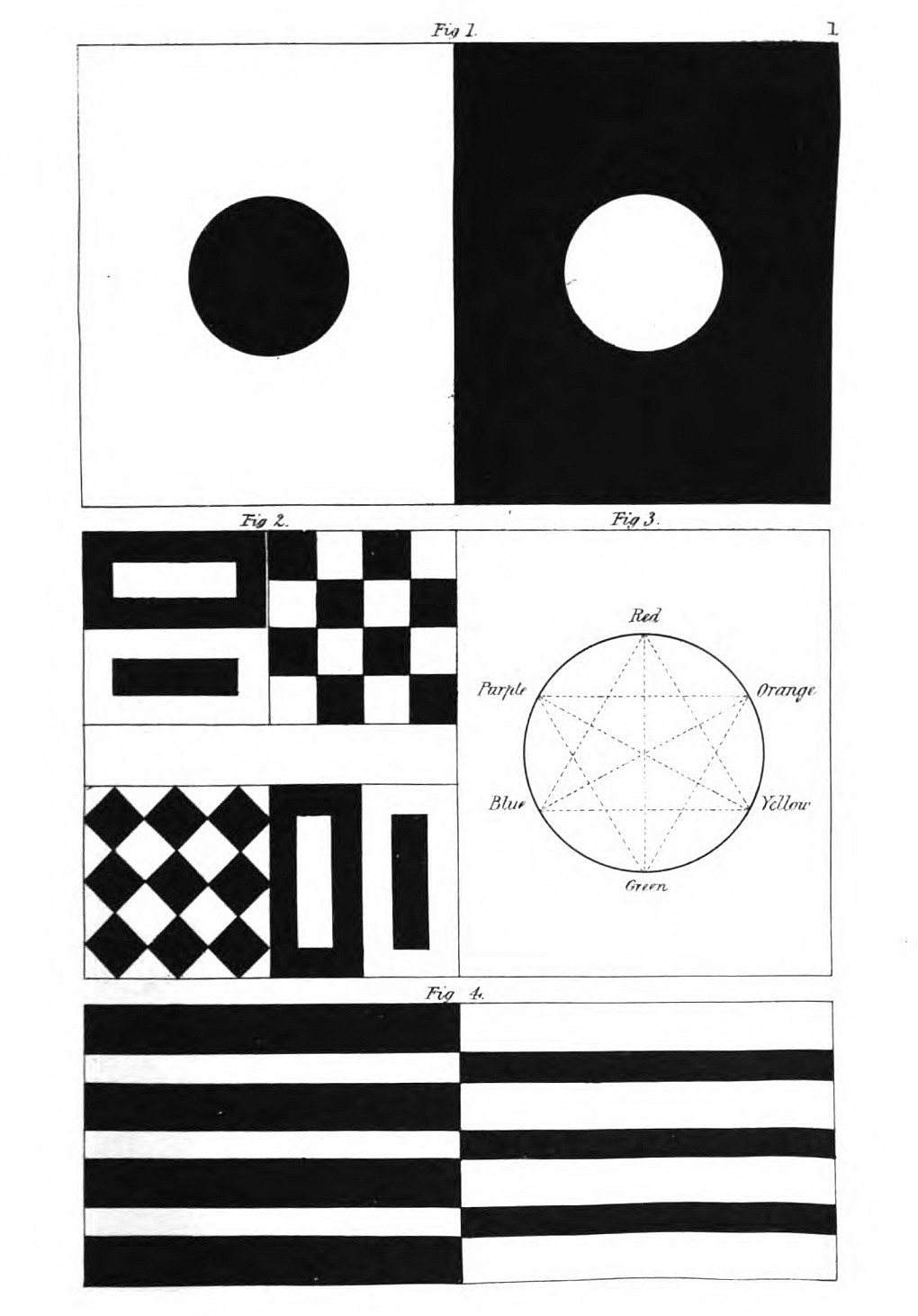
Black, as the equivalent of darkness, leaves[Pg 7] the organ in a state of repose; white, as the representative of light, excites it. We may, perhaps, conclude from the above experiment (16) that the unexcited retina, if left to itself, is drawn together, and occupies a less space than in its active state, produced by the excitement of light.
Black, representing darkness, puts the organ in a relaxed state; white, symbolizing light, stimulates it. We might conclude from the experiment above (16) that the unexcited retina, when left alone, contracts and takes up less space than when it is active due to light stimulation.
Hence Kepler says very beautifully: "Certum est vel in retinâ caussâ picturæ, vel in spiritibus caussâ impressionis, exsistere dilatationem lucidorum."—Paralip. in Vitellionem, p. 220. Scherfer expresses a similar conjecture.—Note A.
Hence Kepler beautifully states: "It is certain that either in the retina as the cause of the image, or in the spirits as the cause of the impression, there exists a dilation of light."—Paralip. in Vitellionem, p. 220. Scherfer expresses a similar idea.—Note A.
However this may be, both impressions derived from such objects remain in the organ itself, and last for some time, even when the external cause is removed. In ordinary experience we scarcely notice this, for objects are seldom presented to us which are very strongly relieved from each other, and we avoid looking at those appearances that dazzle the sight. In glancing from one object to another, the succession of images appears to us distinct; we are not aware that some portion of the impression derived from the object first contemplated passes to that which is next looked at.
However this may be, both impressions from such objects stay in the mind itself and last for a while, even after the external cause is gone. In everyday life, we hardly notice this because we rarely encounter objects that strongly stand out from each other, and we tend to avoid looking at things that are blinding. When we glance from one object to another, the flow of images seems distinct to us; we are not aware that some part of the impression from the first object transfers to the next one we look at.
If in the morning, on waking, when the eye is very susceptible, we look intently at the bars[Pg 8] of a window relieved against the dawning sky, and then shut our eyes or look towards a totally dark place, we shall see a dark cross on a light ground before us for some time.
If, in the morning, when we first wake up and our eyes are very sensitive, we focus intently on the bars[Pg 8] of a window against the brightening sky, and then close our eyes or look at a completely dark area, we will see a dark cross on a light background in front of us for a while.
Every image occupies a certain space on the retina, and of course a greater or less space in proportion as the object is seen near or at a distance. If we shut the eyes immediately after looking at the sun we shall be surprised to find how small the image it leaves appears.
Every image takes up a specific space on the retina, and naturally, it covers more or less space depending on whether the object is viewed up close or far away. If we close our eyes right after looking at the sun, we'll be surprised at how small the image seems.
If, on the other hand, we turn the open eye towards the side of a room, and consider the visionary image in relation to other objects, we shall always see it larger in proportion to the distance of the surface on which it is thrown. This is easily explained by the laws of perspective, according to which a small object near covers a great one at a distance.
If we look towards the side of a room and think about the visual image in relation to other objects, we will always see it as larger compared to the distance of the surface it's projected on. This can be easily explained by the laws of perspective, which state that a small object up close can cover a larger one that is farther away.
The duration of these visionary impressions varies with the powers or structure of the eye in different individuals, just as the time necessary for the recovery of the tone of the retina varies in passing from brightness to darkness (10): it can be measured by minutes and seconds,[Pg 9] indeed much more exactly than it could formerly have been by causing a lighted linstock to revolve rapidly, so as to appear a circle.—Note B.
The length of these vivid images changes depending on the capabilities or structure of a person’s eyes, just like the time it takes for the retina to adjust when moving from light to darkness (10): it can be measured in minutes and seconds,[Pg 9] and it's now much easier to measure than it used to be by spinning a lit torch quickly so that it looks like a circle.—Note B.
But the force with which an impinging light impresses the eye is especially worthy of attention. The image of the sun lasts longest; other objects, of various degrees of brightness, leave the traces of their appearance on the eye for a proportionate time.
But the intensity with which incoming light affects the eye is particularly noteworthy. The image of the sun lingers the longest; other objects, with varying levels of brightness, leave impressions on the eye for a corresponding amount of time.
These images disappear by degrees, and diminish at once in distinctness and in size.
These images fade away gradually, becoming less clear and smaller at the same time.
They are reduced from the contour inwards, and the impression on some persons has been that in square images the angles become gradually blunted till at last a diminished round image floats before the eye.
They shrink from the outline inward, and some people have the impression that in square images, the corners gradually soften until a smaller round image appears before the eye.
Such an image, when its impression is no more observable, can, immediately after, be again revived on the retina by opening and shutting the eye, thus alternately exciting and resting it.
Such an image, when its impression is no longer visible, can immediately be revived on the retina by opening and closing the eye, thus alternately stimulating and resting it.
Images may remain on the retina in morbid affections of the eye for fourteen, seventeen minutes, or even longer. This indicates extreme weakness of the organ, its inability to recover itself; while visions of persons or things which are the objects of love or aversion indicate the connexion between sense and thought.
Images can stay on the retina in severe eye conditions for fourteen, seventeen minutes, or even longer. This shows a significant weakness of the organ, indicating its inability to heal itself; while visions of people or things that are loved or disliked reveal the connection between sensation and thought.
If, while the image of the window-bars before mentioned lasts, we look upon a light grey surface, the cross will then appear light and the panes dark. In the first case (20) the image was like the original picture, so that the visionary impression also could continue unchanged; but in the present instance our attention is excited by a contrary effect being produced. Various examples have been given by observers of nature.
If we look at a light grey surface while the image of the window bars mentioned earlier is still in our mind, the cross will appear light and the panes dark. In the first case (20), the image resembled the original picture, allowing the mental impression to remain unchanged; but in this instance, our focus is drawn in by a different effect. Various examples have been provided by nature observers.
The scientific men who made observations in the Cordilleras saw a bright appearance round the shadows of their heads on some clouds. This example is a case in point; for, while they fixed their eyes on the dark shadow, and at the same time moved from the spot, the compensatory light image appeared to float round the[Pg 11] real dark one. If we look at a black disk on a light grey surface, we shall presently, by changing the direction of the eyes in the slightest degree, see a bright halo floating round the dark circle.
The scientists who studied the Cordilleras noticed a bright glow around the shadows of their heads on some clouds. This is a perfect example; because, while they focused on the dark shadow and simultaneously moved away from the spot, the compensatory light image seemed to float around the[Pg 11] actual dark one. If we look at a black disk on a light grey surface, we will soon see a bright halo floating around the dark circle by changing the direction of our eyes just slightly.
A similar circumstance happened to myself: for while, as I sat in the open air, I was talking to a man who stood at a little distance from me relieved on a grey sky, it appeared to me, as I slightly altered the direction of my eyes, after having for some time looked fixedly at him, that his head was encircled with a dazzling light.
A similar situation happened to me: while I was sitting outside, talking to a man who was standing a little distance away from me against a gray sky, it seemed to me that, as I slightly shifted my gaze after staring at him for a while, his head was surrounded by a bright light.
In the same way probably might be explained the circumstance that persons crossing dewy meadows at sunrise see a brightness round each other's heads[2]; the brightness in this case may be also iridescent, as the phenomena of refraction come into the account.
In a similar way, we can probably explain why people walking through dewy meadows at sunrise see a glow around each other's heads[2]; this glow can also be iridescent since it involves the effects of refraction.
Thus again it has been asserted that the shadows of a balloon thrown on clouds were bordered with bright and somewhat variegated circles.
Thus, it has once again been stated that the shadows of a balloon cast on clouds were outlined with bright and somewhat colorful circles.
Beccaria made use of a paper kite in some experiments on electricity. Round this kite appeared a small shining cloud varying in size; the same brightness was even observed round part of the string. Sometimes it disappeared,[Pg 12] and if the kite moved faster the light appeared to float to and fro for a few moments on the place before occupied. This appearance, which could not be explained by those who observed it at the time, was the image which the eye retained of the kite relieved as a dark mass on a bright sky; that image being changed into a light mass on a comparatively dark background.
Beccaria used a paper kite in some experiments on electricity. Around the kite, there was a small glowing cloud that changed size; the same brightness was even noticed around part of the string. Sometimes it disappeared,[Pg 12] and when the kite moved faster, the light seemed to flicker back and forth for a few moments in the spot where it had just been. This effect, which couldn't be explained by those who witnessed it at the time, was the image that the eye held onto of the kite as a dark shape against a bright sky; that image being transformed into a bright shape on a relatively dark background.
In optical and especially in chromatic experiments, where the observer has to do with bright lights whether colourless or coloured, great care should be taken that the spectrum which the eye retains in consequence of a previous observation does not mix with the succeeding one, and thus affect the distinctness and purity of the impression.
In optical experiments, especially those involving color, it's important for the observer to be cautious. When dealing with bright lights, whether they are colorless or colored, special care should be taken to ensure that the spectrum retained from a previous observation doesn't blend with the next one. This would help maintain the clarity and purity of the visual impression.
These appearances have been explained as follows: That portion of the retina on which the dark cross (29) was impressed is to be considered in a state of repose and susceptibility. On this portion therefore the moderately light surface acted in a more lively manner than on the rest of the retina, which had just been impressed with the light through the panes, and which, having thus been excited by a much stronger brightness, could only view the grey surface as a dark.
These appearances have been explained as follows: The part of the retina where the dark cross (29) was marked is seen as resting and sensitive. Therefore, on this area, the moderately bright surface had a more active effect than on the rest of the retina, which had just been exposed to the light through the panes and, having been stimulated by a much stronger brightness, could only perceive the grey surface as dark.
This mode of explanation appears sufficient for the cases in question, but, in the consideration of phenomena hereafter to be adduced, we are forced to trace the effects to higher sources.
This way of explaining seems adequate for the cases we're discussing, but when we look at other phenomena that will be presented later, we have to connect the effects to higher sources.
The eye after sleep exhibits its vital elasticity more especially by its tendency to alternate its impressions, which in the simplest form change from dark to light, and from light to dark. The eye cannot for a moment remain in a particular state determined by the object it looks upon. On the contrary, it is forced to a sort of opposition, which, in contrasting extreme with extreme, intermediate degree with intermediate degree, at the same time combines these opposite impressions, and thus ever tends to a whole, whether the impressions are successive, or simultaneous and confined to one image.
The eye after sleep shows its important flexibility mainly by its tendency to switch impressions, which in the simplest way change from dark to light and from light to dark. The eye can't stay in one particular state based on what it's looking at. Instead, it has to create a kind of contrast, mixing extreme and intermediate impressions together, and always striving for a complete image, whether the impressions come one after the other or happen at the same time for one image.
Perhaps the peculiarly grateful sensation which we experience in looking at the skilfully treated chiaro-scuro of colourless pictures and similar works of art arises chiefly from the simultaneous impression of a whole, which by the organ itself is sought, rather than arrived at, in succession, and which, whatever may be the result, can never be arrested.
Perhaps the unique feeling of gratitude we get from looking at the expertly handled light and shadow in colorless images and similar artworks mainly comes from the simultaneous impression of the whole. This is something our minds seek out, rather than experiencing it in succession, and no matter the outcome, it can never be paused.
[2] See the Life of Benvenuto Cellini, vol. i. p. 453. Milan edition, 1806.—T.
[2] See the Life of Benvenuto Cellini, vol. i. p. 453. Milan edition, 1806.—T.
III.
GREY SURFACES AND OBJECTS.
A moderate light is essential to many chromatic experiments. This can be presently obtained by surfaces more or less grey, and thus we have at once to make ourselves acquainted with this simplest kind of middle tint, with regard to which it is hardly necessary to observe, that in many cases a white surface in shadow, or in a low light, may be considered equivalent to a grey.
A neutral light is crucial for many color experiments. This can easily be achieved using surfaces that are various shades of grey. Therefore, we need to familiarize ourselves with this basic type of mid-tone, noting that in many instances, a white surface in shadow or low light can be considered similar to grey.
Since a grey surface is intermediate between brightness and darkness, it admits of our illustrating a phenomenon before described (29) by an easy experiment.
Since a gray surface is in between light and dark, we can illustrate a previously described phenomenon (29) with a simple experiment.
Let a black object be held before a grey surface, and let the spectator, after looking steadfastly at it, keep his eyes unmoved while it is taken away: the space it occupied appears much lighter. Let a white object be held up in the same manner: on taking it away the space it occupied will appear much darker than the[Pg 15] rest of the surface. Let the spectator in both cases turn his eyes this way and that on the surface, the visionary images will move in like manner.
If a black object is held up in front of a gray surface and the viewer focuses on it, then keeps their eyes still when the object is removed, the area it occupied will look much lighter. If a white object is held up the same way, when it is taken away, the space it occupied will seem much darker than the[Pg 15] rest of the surface. If the viewer then moves their eyes around the surface in both cases, the visual impressions will shift similarly.
A grey object on a black ground appears much brighter than the same object on a white ground. If both comparisons are seen together the spectator can hardly persuade himself that the two greys are identical. We believe this again to be a proof of the great excitability of the retina, and of the silent resistance which every vital principle is forced to exhibit when any definite or immutable state is presented to it. Thus inspiration already presupposes expiration; thus every systole its diastole. It is the universal formula of life which manifests itself in this as in all other cases. When darkness is presented to the eye it demands brightness, and vice versâ: it shows its vital energy, its fitness to receive the impression of the object, precisely by spontaneously tending to an opposite state.
A gray object on a black background looks much brighter than the same object on a white background. When both comparisons are viewed together, it's hard for the observer to believe that the two shades of gray are the same. We think this again proves the high sensitivity of the retina and the subtle resistance that every vital principle has to show when faced with any fixed or unchanging state. So, inspiration must come before expiration; every systole has its diastole. This is the universal principle of life that shows up here, just like in all other cases. When darkness is presented to the eye, it craves brightness, and vice versa: it demonstrates its vital energy and its ability to receive the impression of the object by naturally moving towards an opposing state.
IV.
DAZZLING COLOURLESS OBJECTS.
If we look at a dazzling, altogether colourless object, it makes a strong lasting impression, and its after-vision is accompanied by an appearance of colour.
If we look at a bright, completely colorless object, it leaves a strong and lasting impression, and afterwards, it seems to have color.
Let a room be made as dark as possible; let there be a circular opening in the window-shutter about three inches in diameter, which may be closed or not at pleasure. The sun being suffered to shine through this on a white surface, let the spectator from some little distance fix his eyes on the bright circle thus admitted. The hole being then closed, let him look towards the darkest part of the room; a circular image will now be seen to float before him. The middle of this circle will appear bright, colourless, or somewhat yellow, but the border will at the same moment appear red.
Make the room as dark as you can. There should be a circular opening in the window shutter about three inches wide, which can be opened or closed as needed. When sunlight shines through this onto a white surface, the viewer should stand a short distance away and focus on the bright circle created. Once the opening is closed, the viewer should look toward the darkest part of the room; a circular image will now appear to float in front of them. The center of this circle will look bright, colorless, or slightly yellow, while the edge will simultaneously appear red.
After a time this red, increasing towards the centre, covers the whole circle, and at last the bright central point. No sooner, however, is the whole circle red than the edge begins to be blue, and the blue gradually encroaches inwards[Pg 17] on the red. When the whole is blue the edge becomes dark and colourless. This darker edge again slowly encroaches on the blue till the whole circle appears colourless. The image then becomes gradually fainter, and at the same time diminishes in size. Here again we see how the retina recovers itself by a succession of vibrations after the powerful external impression it received. (25, 26.)
After a while, this red, growing toward the center, covers the entire circle, eventually obscuring the bright central point. However, as soon as the entire circle turns red, the edge starts to turn blue, and the blue gradually creeps inward, encroaching on the red. When the whole thing is blue, the edge turns dark and colorless. This darker edge slowly starts to invade the blue until the entire circle looks colorless. The image then gradually fades and also shrinks in size. This illustrates how the retina recovers through a series of vibrations after a strong external stimulus it experienced. (25, 26.)
By several repetitions similar in result, I found the comparative duration of these appearances in my own case to be as follows:—
By repeating the same actions multiple times, I discovered that the comparative duration of these appearances in my situation was as follows:—
I looked on the bright circle five seconds, and then, having closed the aperture, saw the coloured visionary circle floating before me. After thirteen seconds it was altogether red; twenty-nine seconds next elapsed till the whole was blue, and forty-eight seconds till it appeared colourless. By shutting and opening the eye I constantly revived the image, so that it did not quite disappear till seven minutes had elapsed.
I stared at the bright circle for five seconds, and then, after closing my eyes, I saw a colorful circle floating in front of me. After thirteen seconds, it was completely red; twenty-nine seconds later, it turned blue, and it took forty-eight seconds to look colorless. By opening and closing my eyes, I kept bringing the image back, so it didn’t fully fade away until seven minutes had passed.
Future observers may find these periods shorter or longer as their eyes may be stronger or weaker (23), but it would be very remarkable if, notwithstanding such variations, a corresponding proportion as to relative duration should be found to exist.
Future observers may find these periods shorter or longer depending on whether their vision is stronger or weaker (23), but it would be quite remarkable if, despite these variations, a corresponding proportion regarding relative duration were to be discovered.
But this remarkable phenomenon no sooner excites our attention than we observe a new modification of it.
But this amazing phenomenon captures our attention quickly, and we immediately notice a new variation of it.
If we receive the impression of the bright circle as before, and then look on a light grey surface in a moderately lighted room, an image again floats before us; but in this instance a dark one: by degrees it is encircled by a green border that gradually spreads inwards over the whole circle, as the red did in the former instance. As soon as this has taken place a dingy yellow appears, and, filling the space as the blue did before, is finally lost in a negative shade.
If we see the bright circle like we did before, and then look at a light grey surface in a dimly lit room, a dark image appears again. Slowly, it is surrounded by a green border that spreads inward over the entire circle, just like the red did before. Once this happens, a dull yellow appears and fills the space like the blue did before, eventually fading into a negative shade.
These two experiments may be combined by placing a black and a white plane surface next each other in a moderately lighted room, and then looking alternately on one and the other as long as the impression of the light circle lasts: the spectator will then perceive at first a red and green image alternately, and afterwards the other changes. After a little practice the two opposite colours may be perceived at once, by causing the floating image to fall on the junction of the two planes. This can be more conveniently done if the planes are at some distance, for the spectrum then appears larger.
These two experiments can be combined by placing a black and a white flat surface next to each other in a moderately lit room, and then alternately looking at each one as long as the light circle impression lasts. The viewer will initially see a red and green image alternating, followed by other changes. With some practice, both opposite colors can be seen at the same time by directing the floating image to the junction of the two surfaces. This is easier to do if the surfaces are spaced apart, as the spectrum then appears larger.
I happened to be in a forge towards evening at the moment when a glowing mass of iron was placed on the anvil; I had fixed my eyes steadfastly on it, and, turning round, I looked accidentally into an open coal-shed: a large red image now floated before my eyes, and, as I turned them from the dark opening to the light boards of which the shed was constructed, the image appeared half green, half red, according as it had a lighter or darker ground behind it. I did not at that time take notice of the subsequent changes of this appearance.
I happened to be at a forge in the evening when a hot chunk of iron was set on the anvil; I was staring at it intently, and when I turned around, I glanced into an open coal shed: a large red shape floated before my eyes, and as I shifted my gaze from the dark opening to the light boards of the shed, the image looked half green, half red, depending on whether it had a lighter or darker background behind it. At that moment, I didn’t pay attention to the later changes in this appearance.
The after-vision occasioned by a total dazzling of the retina corresponds with that of a circumscribed bright object. The red colour seen by persons who are dazzled with snow belongs to this class of phenomena, as well as the singularly beautiful green colour which dark objects seem to wear after looking long on white paper in the sun. The details of such experiments may be investigated hereafter by those whose young eyes are capable of enduring such trials further for the sake of science.
The after-image caused by a complete blinding of the retina is similar to that of a specific bright object. The red color seen by people who are dazzled by snow falls into this category of phenomena, along with the uniquely beautiful green color that dark objects seem to have after being stared at for a long time on white paper in the sun. The specifics of these experiments can be explored later by those whose young eyes can handle such challenges for the sake of science.
With these examples we may also class the black letters which in the evening light appear[Pg 20] red. Perhaps we might insert under the same category the story that drops of blood appeared on the table at which Henry IV. of France had seated himself with the Duc de Guise to play at dice.
With these examples, we can also categorize the black letters that appear red in the evening light[Pg 20]. We might also include the story about the drops of blood that showed up on the table where Henry IV of France sat down with the Duke of Guise to play dice.
V.
COLOURED OBJECTS.
We have hitherto seen the physiological colours displayed in the after-vision of colourless bright objects, and also in the after-vision of general colourless brightness; we shall now find analogous appearances if a given colour be presented to the eye: in considering this, all that has been hitherto detailed must be present to our recollection.
We have previously seen the physiological colors shown in the after-images of bright, colorless objects, as well as in the after-images of general brightness. Now, we will discover similar phenomena when a specific color is presented to the eye. In this consideration, everything that has been mentioned so far must be kept in mind.
The impression of coloured objects remains in the eye like that of colourless ones, but in this case the energy of the retina, stimulated as it is to produce the opposite colour, will be more apparent.
The impression of colored objects stays in the eye just like that of colorless ones, but in this case, the energy of the retina, which is stimulated to produce the complementary color, will be more obvious.
Let a small piece of bright-coloured paper or silk stuff be held before a moderately lighted white surface; let the observer look steadfastly[Pg 21] on the small coloured object, and let it be taken away after a time while his eyes remain unmoved; the spectrum of another colour will then be visible on the white plane. The coloured paper may be also left in its place while the eye is directed to another part of the white plane; the same spectrum will be visible there too, for it arises from an image which now belongs to the eye.
Hold a small piece of brightly colored paper or fabric in front of a moderately lit white surface. Have the observer focus steadily on the small colored object, then remove it while their eyes stay still. A spectrum of another color will then appear on the white surface. The colored paper can also remain in place while the observer looks at a different part of the white surface; the same spectrum will be visible there as well, since it comes from an image that now belongs to the eye.
In order at once to see what colour will be evoked by this contrast, the chromatic circle[1] may be referred to. The colours are here arranged in a general way according to the natural order, and the arrangement will be found to be directly applicable in the present case; for the colours diametrically opposed to each other in this diagram are those which reciprocally evoke each other in the eye. Thus, yellow demands purple; orange, blue; red, green; and vice versâ: thus again all intermediate gradations reciprocally evoke each other; the simpler colour demanding the compound, and vice versâ.—Note C.
To see what color is created by this contrast, you can refer to the color wheel[1]. The colors are generally arranged based on their natural order, and this arrangement is directly applicable here; the colors that are opposite each other on the diagram evoke each other in our eyes. So, yellow calls for purple; orange calls for blue; red calls for green; and vice versa. Additionally, all the colors in between evoke each other as well; the simpler colors require the more complex ones, and vice versa.—Note C.
The cases here under consideration occur oftener than we are aware in ordinary life; indeed,[Pg 22] an attentive observer sees these appearances everywhere, while, on the other hand, the uninstructed, like our predecessors, consider them as temporary visual defects, sometimes even as symptoms of disorders in the eye, thus exciting serious apprehensions. A few remarkable instances may here be inserted.
The situations we're discussing happen more often than we realize in everyday life; in fact,[Pg 22] a keen observer notices these phenomena all around us, while, on the flip side, those who aren't informed, like people in the past, think of them as just brief visual glitches, and sometimes even as signs of eye problems, which can lead to significant worry. Here are a few notable examples to consider.
I had entered an inn towards evening, and, as a well-favoured girl, with a brilliantly fair complexion, black hair, and a scarlet bodice, came into the room, I looked attentively at her as she stood before me at some distance in half shadow. As she presently afterwards turned away, I saw on the white wall, which was now before me, a black face surrounded with a bright light, while the dress of the perfectly distinct figure appeared of a beautiful sea-green.
I had walked into an inn in the evening when a striking girl with a fair complexion, black hair, and a red bodice entered the room. I watched her closely as she stood a little away from me in half shadow. When she turned away a moment later, I noticed on the white wall in front of me a dark face surrounded by a bright light, while the outfit of the clearly defined figure looked stunning in sea-green.
Among the materials for optical experiments, there are portraits with colours and shadows exactly opposite to the appearance of nature. The spectator, after having looked at one of these for a time, will see the visionary figure tolerably true to nature. This is conformable to the same principles, and consistent with experience, for, in the former instance, a negress with a white head-dress would have given me a white face surrounded with black. In the case[Pg 23] of the painted figures, however, which are commonly small, the parts are not distinguishable by every one in the after-image.
Among the materials for optical experiments, there are portraits with colors and shadows that are the exact opposite of how things naturally appear. After looking at one of these for a while, viewers will see the imaginary figure as fairly true to life. This aligns with the same principles and is consistent with experience, because in the earlier example, a Black woman with a white headscarf would have shown me a white face surrounded by black. However, in the case[Pg 23] of the painted figures, which are usually small, not everyone can distinguish the parts in the after-image.
A phenomenon which has before excited attention among the observers of nature is to be attributed, I am persuaded, to the same cause.
A phenomenon that has previously caught the attention of nature observers can, I believe, be attributed to the same cause.
It has been stated that certain flowers, towards evening in summer, coruscate, become phosphorescent, or emit a momentary light. Some persons have described their observation of this minutely. I had often endeavoured to witness it myself, and had even resorted to artificial contrivances to produce it.
It has been said that certain flowers, in the summer evenings, sparkle, glow in the dark, or give off a brief light. Some people have closely documented their observations of this phenomenon. I often tried to see it for myself and even used artificial methods to create it.
On the 19th of June, 1799, late in the evening, when the twilight was deepening into a clear night, as I was walking up and down the garden with a friend, we very distinctly observed a flame-like appearance near the oriental poppy, the flowers of which are remarkable for their powerful red colour. We approached the place and looked attentively at the flowers, but could perceive nothing further, till at last, by passing and repassing repeatedly, while we looked sideways on them, we succeeded in renewing the appearance as often as we pleased. It proved to be a physiological phenomenon, such as others we have described, and the apparent[Pg 24] coruscation was nothing but the spectrum of the flower in the compensatory blue-green colour.
On June 19, 1799, late in the evening, as twilight turned into a clear night, I was walking back and forth in the garden with a friend when we clearly noticed a flame-like glow near the oriental poppy, known for its striking red color. We approached the flowers and examined them closely, but couldn’t see anything more until, by passing by repeatedly while glancing at them from the side, we managed to recreate the appearance whenever we wanted. It turned out to be a physiological phenomenon, similar to others we've described, and the bright flicker was just the flower's spectrum in a complementary blue-green color.
In looking directly at a flower the image is not produced, but it appears immediately as the direction of the eye is altered. Again, by looking sideways on the object, a double image is seen for a moment, for the spectrum then appears near and on the real object.
When you look directly at a flower, you don't see an image; it just appears right away as soon as you change the direction of your gaze. If you look at the object from the side, you briefly see a double image because the spectrum then appears close to the actual object.
The twilight accounts for the eye being in a perfect state of repose, and thus very susceptible, and the colour of the poppy is sufficiently powerful in the summer twilight of the longest days to act with full effect and produce a compensatory image. I have no doubt these appearances might be reduced to experiment, and the same effect produced by pieces of coloured paper. Those who wish to take the most effectual means for observing the appearance in nature—suppose in a garden—should fix the eyes on the bright flowers selected for the purpose, and, immediately after, look on the gravel path. This will be seen studded with spots of the opposite colour. The experiment is practicable on a cloudy day, and even in the brightest sunshine, for the sun-light, by enhancing the brilliancy of the flower, renders it fit to produce the compensatory colour sufficiently distinct to be perceptible even in a bright light. Thus, peonies produce beautiful green, marigolds vivid blue spectra.
The twilight allows the eyes to relax completely, making them sensitive, and the color of the poppy is strong enough during the long summer twilights to have a full effect and create a counter image. I'm convinced these effects could be tested scientifically, and similar results could be achieved with colored paper. For those who want to effectively observe nature—like in a garden—they should focus on the bright flowers chosen for this purpose, and then immediately look at the gravel path. You'll notice it speckled with spots of the opposite color. This experiment can be done on a cloudy day and even in bright sunshine, since the sunlight enhances the brightness of the flowers, allowing the compensatory color to be distinct enough to see even in strong light. For example, peonies produce a beautiful green, while marigolds create vivid blue spots.
As the opposite colour is produced by a constant law in experiments with coloured objects on portions of the retina, so the same effect takes place when the whole retina is impressed with a single colour. We may convince ourselves of this by means of coloured glasses. If we look long through a blue pane of glass, everything will afterwards appear in sunshine to the naked eye, even if the sky is grey and the scene colourless. In like manner, in taking off green spectacles, we see all objects in a red light. Every decided colour does a certain violence to the eye, and forces the organ to opposition.
As the opposite color is produced by a consistent rule in experiments with colored objects on parts of the retina, the same effect occurs when the entire retina is exposed to a single color. We can see this for ourselves using colored glasses. If we look through a blue lens for a while, everything will later seem bright and sunny to our naked eye, even if the sky is gray and the scene lacks color. Similarly, when we take off green glasses, all objects appear in a red hue. Every strong color creates a kind of strain on the eye and compels the organ to react in contrast.
We have hitherto seen the opposite colours producing each other successively on the retina: it now remains to show by experiment that the same effects can exist simultaneously. If a coloured object impinges on one part of the retina, the remaining portion at the same moment has a tendency to produce the compensatory colour. To pursue a former experiment, if we look on a yellow piece of paper placed on a white surface, the remaining part of the organ has already a tendency to produce a purple hue on the colourless surface: in this case the small portion of yellow is not powerful enough to produce[Pg 26] this appearance distinctly, but, if a white paper is placed on a yellow wall, we shall see the white tinged with a purple hue.
We have seen until now that opposite colors can create each other one after the other on the retina: it’s now important to demonstrate through experiments that the same effects can occur at the same time. If a colored object hits one part of the retina, the rest of it tends to produce the compensatory color simultaneously. To revisit a previous experiment, if we look at a yellow piece of paper on a white surface, the remaining part of the organ already tends to produce a purple hue on the colorless surface: in this case, the small amount of yellow isn’t strong enough to create this effect clearly, but if we place a white paper on a yellow wall, we will see the white tinted with a purple hue.
Although this experiment may be made with any colours, yet red and green are particularly recommended for it, because these colours seem powerfully to evoke each other. Numerous instances occur in daily experience. If a green paper is seen through striped or flowered muslin, the stripes or flowers will appear reddish. A grey building seen through green pallisades appears in like manner reddish. A modification of this tint in the agitated sea is also a compensatory colour: the light side of the waves appears green in its own colour, and the shadowed side is tinged with the opposite hue. The different direction of the waves with reference to the eye produces the same effect. Objects seen through an opening in a red or green curtain appear to wear the opposite hue. These appearances will present themselves to the attentive observer on all occasions, even to an unpleasant degree.
Although this experiment can be done with any colors, red and green are especially recommended because these colors strongly evoke each other. Many examples can be found in everyday life. When you look at green paper through striped or floral muslin, the stripes or flowers will seem reddish. A gray building seen through green fences also appears reddish in the same way. A variation of this tint in the choppy sea is another example of compensatory color: the light side of the waves looks green in its own color, while the shadowed side takes on the opposite hue. The different angles of the waves in relation to your eye create the same effect. Objects viewed through an opening in a red or green curtain will look like they have the opposite color. These effects will be noticeable to an observant person at all times, sometimes even to an annoying extent.
Having made ourselves acquainted with the simultaneous exhibition of these effects in direct cases, we shall find that we can also observe them by indirect means. If we place a piece of[Pg 27] paper of a bright orange colour on the white surface, we shall, after looking intently at it, scarcely perceive the compensatory colour on the rest of the surface: but when we take the orange paper away, and when the blue spectrum appears in its place, immediately as this spectrum becomes fully apparent, the rest of the surface will be overspread, as if by a flash, with a reddish-yellow light, thus exhibiting to the spectator in a lively manner the productive energy of the organ, in constant conformity with the same law.
Once we understand the simultaneous display of these effects in direct cases, we can also observe them through indirect means. If we place a piece of[Pg 27] bright orange paper on a white surface and look at it intently, we will hardly notice the compensatory color on the rest of the surface. However, when we remove the orange paper and the blue spectrum appears in its place, as soon as this spectrum becomes fully visible, the rest of the surface will suddenly be lit up with a reddish-yellow light. This vividly shows the active response of the organ, consistently following the same principle.
As the compensatory colours easily appear, where they do not exist in nature, near and after the original opposite ones, so they are rendered more intense where they happen to mix with a similar real hue. In a court which was paved with grey limestone flags, between which grass had grown, the grass appeared of an extremely beautiful green when the evening clouds threw a scarcely perceptible reddish light on the pavement. In an opposite case we find, in walking through meadows, where we see scarcely anything but green, the stems of trees and the roads often gleam with a reddish hue. This tone is not uncommon in the works of landscape painters, especially those who practice in water-colours: they probably see it in[Pg 28] nature, and thus, unconsciously imitating it, their colouring is criticised as unnatural.
As complementary colors easily show up where they don’t exist in nature, especially near the original opposite ones, they become more vibrant when mixed with a similar real hue. In a courtyard paved with gray limestone slabs, where grass has grown between them, the grass looks an incredibly beautiful green when evening clouds cast a barely noticeable reddish light on the pavement. Conversely, when walking through meadows, where we mainly see green, the tree trunks and paths often shine with a reddish hue. This tone isn't uncommon in the works of landscape painters, particularly those who work with watercolors: they probably see it in[Pg 28] nature, and thus, unconsciously imitating it, their coloring gets criticized as unrealistic.
These phenomena are of the greatest importance, since they direct our attention to the laws of vision, and are a necessary preparation for future observations on colours. They show that the eye especially demands completeness, and seeks to eke out the colorific circle in itself. The purple or violet colour suggested by yellow contains red and blue; orange, which responds to blue, is composed of yellow and red; green, uniting blue and yellow, demands red; and so through all gradations of the most complicated combinations. That we are compelled in this case to assume three leading colours has been already remarked by other observers.
These phenomena are incredibly important because they focus our attention on the laws of vision and are a necessary preparation for future observations on colors. They demonstrate that the eye especially craves completeness and attempts to fill in the color spectrum on its own. The purple or violet suggested by yellow includes red and blue; orange, which corresponds to blue, consists of yellow and red; green, combining blue and yellow, requires red; and this pattern continues through all the intricate variations of combinations. It has already been noted by other observers that we are compelled to recognize three primary colors in this context.
When in this completeness the elements of which it is composed are still appreciable by the eye, the result is justly called harmony. We shall subsequently endeavour to show how the theory of the harmony of colours may be deduced from these phenomena, and how, simply through these qualities, colours may be capable of being applied to æsthetic purposes. This will be shown when we have gone through the whole circle of our observations, returning to the point from which we started.
When the elements that make it up are still noticeable to the eye, the result is rightfully called harmony. We will later try to demonstrate how the theory of color harmony can be derived from these phenomena, and how, simply through these qualities, colors can be used for aesthetic purposes. This will be explained after we have completed the entire range of our observations, returning to the starting point.
VI.
COLOURED SHADOWS.
Before, however, we proceed further, we have yet to observe some very remarkable cases of the vivacity with which the suggested colours appear in the neighbourhood of others: we allude to coloured shadows. To arrive at these we first turn our attention to shadows that are colourless or negative.
Before we go any further, we need to point out some really notable examples of how vibrantly the suggested colors show up next to others: we're talking about colored shadows. To understand these, we first focus on shadows that are colorless or negative.
A shadow cast by the sun, in its full brightness, on a white surface, gives us no impression of colour; it appears black, or, if a contrary light (here assumed to differ only in degree) can act upon it, it is only weaker, half-lighted, grey.
A shadow created by the bright sun on a white surface doesn’t give us any sense of color; it looks black, or if a different light (which we assume just varies in intensity) shines on it, it only seems duller, like a dimly lit gray.
Two conditions are necessary for the existence of coloured shadows: first, that the principal light tinge the white surface with some hue; secondly, that a contrary light illumine to a certain extent the cast shadow.
Two conditions are needed for colored shadows to exist: first, that the main light casts some color onto the white surface; secondly, that a different light partially illuminates the shadow being cast.
Let a short, lighted candle be placed at twilight on a sheet of white paper. Between it and the declining daylight let a pencil be placed[Pg 30] upright, so that its shadow thrown by the candle may be lighted, but not overcome, by the weak daylight: the shadow will appear of the most beautiful blue.
Let a short, lit candle be set at twilight on a sheet of white paper. Between it and the fading daylight, place a pencil upright, so that its shadow cast by the candle is illuminated but not overwhelmed by the dim daylight: the shadow will look a stunning blue.
That this shadow is blue is immediately evident; but we can only persuade ourselves by some attention that the white paper acts as a reddish yellow, by means of which the complemental blue is excited in the eye.—Note D.
That this shadow is blue is clearly obvious; however, we can only convince ourselves with a bit of focus that the white paper appears reddish yellow, which causes the blue to be activated in the eye.—Note D.
In all coloured shadows, therefore, we must presuppose a colour excited or suggested by the hue of the surface on which the shadow is thrown. This may be easily found to be the case by attentive consideration, but we may convince ourselves at once by the following experiment.
In all colored shadows, we must assume a color that is activated or suggested by the hue of the surface where the shadow falls. This can be easily understood through careful thought, but we can also confirm it right away with the following experiment.
Place two candles at night opposite each other on a white surface; hold a thin rod between them upright, so that two shadows be cast by it; take a coloured glass and hold it before one of the lights, so that the white paper appear coloured; at the same moment the shadow cast by the coloured light and slightly illumined by the colourless one will exhibit the complemental hue.
Place two candles facing each other at night on a white surface; hold a thin rod upright between them so that it casts two shadows; take a colored glass and hold it in front of one of the lights, making the white paper appear colored; at the same time, the shadow created by the colored light and slightly lit by the clear one will show the complementary color.
An important consideration suggests itself here, to which we shall frequently have occasion to return. Colour itself is a degree of darkness σκιερόν; hence Kircher is perfectly right in calling it lumen opacatum. As it is allied to shadow, so it combines readily with it; it appears to us readily in and by means of shadow the moment a suggesting cause presents itself. We could not refrain from adverting at once to a fact which we propose to trace and develop hereafter.—Note E.
An important point comes to mind here, which we will often revisit. Color itself is a form of darkness σκιερόν; that's why Kircher is completely correct in referring to it as lumen opacatum. Since it’s related to shadow, it easily combines with it; it becomes apparent to us in and through shadow the moment something prompts it. We couldn't help but mention a fact that we plan to explore and elaborate on later.—Note E.
Select the moment in twilight when the light of the sky is still powerful enough to cast a shadow which cannot be entirely effaced by the light of a candle. The candle may be so placed that a double shadow shall be visible, one from the candle towards the daylight, and another from the daylight towards the candle. If the former is blue the latter will appear orange-yellow: this orange-yellow is in fact, however, only the yellow-red light of the candle diffused over the whole paper, and which becomes visible in shadow.
Choose the moment during twilight when the sky's light is still strong enough to create a shadow that can’t be completely erased by a candle's glow. The candle can be positioned so that two shadows are seen: one extending from the candle towards the daylight, and another reaching from the daylight towards the candle. If the first shadow appears blue, the second will look orange-yellow. However, this orange-yellow is really just the yellow-red light of the candle spread over the entire paper, which becomes apparent in shadow.
This is best exemplified by the former experiment with two candles and coloured glasses.
This is best shown by the earlier experiment with two candles and colored glasses.
The surprising readiness with which shadow assumes a colour will again invite our attention in the further consideration of reflections and elsewhere.
The surprising way that shadows take on color will come up again as we look at reflections and other topics.
Thus the phenomena of coloured shadows may be traced to their cause without difficulty. Henceforth let any one who sees an instance of the kind observe only with what hue the light surface on which they are thrown is tinged. Nay, the colour of the shadow may be considered as a chromatoscope of the illumined surface, for the spectator may always assume the colour of the light to be the opposite of that of the shadow, and by an attentive examination may ascertain this to be the fact in every instance.
The phenomena of colored shadows can easily be traced back to their cause. From now on, anyone who observes such an instance should take note of the hue of the light surface onto which the shadows are cast. In fact, the color of the shadow can be seen as a sort of color reflection of the illuminated surface, since the viewer can always assume that the color of the light is the opposite of that of the shadow, and with careful observation, this can be confirmed in every case.
These appearances have been a source of great perplexity to former observers: for, as they were remarked chiefly in the open air, where they commonly appeared blue, they were attributed to a certain inherent blue or blue colouring quality in the air. The inquirer can, however, convince himself, by the experiment with the candle in a room, that no kind of blue light or reflection is necessary to produce the effect in question. The experiment may be made on a cloudy day with white curtains drawn[Pg 33] before the light, and in a room where no trace of blue exists, and the blue shadow will be only so much the more beautiful.
These appearances have puzzled past observers a lot: since they were mainly noticed outdoors, where they often looked blue, people thought it was because of something inherently blue in the air. However, anyone curious can easily see, by doing an experiment with a candle in a room, that no special blue light or reflection is needed to create this effect. You can set up the experiment on a cloudy day with white curtains drawn[Pg 33] in front of the light, and in a room that has no trace of blue, and the blue shadow will look even more beautiful.
De Saussure, in the description of his ascent of Mont Blanc, says, "A second remark, which may not be uninteresting, relates to the colour of the shadows. These, notwithstanding the most attentive observation, we never found dark blue, although this had been frequently the case in the plain. On the contrary, in fifty-nine instances we saw them once yellowish, six times pale bluish, eighteen times colourless or black, and thirty-four times pale violet. Some natural philosophers suppose that these colours arise from accidental vapours diffused in the air, which communicate their own hues to the shadows; not that the colours of the shadows are occasioned by the reflection of any given sky colour or interposition of any given air colour: the above observations seem to favour this opinion." The instances given by De Saussure may be now explained and classed with analogous examples without difficulty.
De Saussure, while describing his climb up Mont Blanc, notes, "A second observation, which might be of interest, has to do with the color of the shadows. Despite careful observation, we never saw them dark blue, even though this was often the case in the plains. Instead, in fifty-nine instances, we found them yellowish once, pale bluish six times, colorless or black eighteen times, and pale violet thirty-four times. Some natural philosophers believe that these colors come from vapor in the air, which gives the shadows their hues; the colors of the shadows aren't caused by the reflection of any specific sky color or by the presence of any particular air color: the observations mentioned seem to support this idea." The instances cited by De Saussure can now be easily explained and categorized alongside similar examples.
At a great elevation the sky was generally free from vapours, the sun shone in full force on the snow, so that it appeared perfectly white to the eye: in this case they saw the shadows quite colourless. If the air was charged with a[Pg 34] certain degree of vapour, in consequence of which the light snow would assume a yellowish tone, the shadows were violet-coloured, and this effect, it appears, occurred oftenest. They saw also bluish shadows, but this happened less frequently; and that the blue and violet were pale was owing to the surrounding brightness, by which the strength of the shadows was mitigated. Once only they saw the shadow yellowish: in this case, as we have already seen (70), the shadow is cast by a colourless light, and slightly illumined by a coloured one.
At a high altitude, the sky was usually clear of clouds, and the sun shone brightly on the snow, making it look perfectly white to the eye. In this situation, the shadows appeared completely colorless. When the air was filled with a certain amount of vapor, the light snow would take on a yellowish hue, and the shadows would turn violet, which seemed to happen most often. They also observed bluish shadows, but that was less common; and the blue and violet shades appeared pale because of the surrounding brightness, which lessened the intensity of the shadows. They only saw a yellowish shadow once: in that instance, as previously mentioned (70), the shadow was cast by a colorless light and slightly illuminated by a colored one.
In travelling over the Harz in winter, I happened to descend from the Brocken towards evening; the wide slopes extending above and below me, the heath, every insulated tree and projecting rock, and all masses of both, were covered with snow or hoar-frost. The sun was sinking towards the Oder ponds[1]. During the day, owing to the yellowish hue of the snow, shadows tending to violet had already been observable; these might now be pronounced to be decidedly blue, as the illumined parts exhibited a yellow deepening to orange.
While traveling over the Harz in winter, I happened to head down from the Brocken in the evening; the wide slopes above and below me, the heath, every single tree and protruding rock, and all the clumps of both were covered in snow or frost. The sun was setting towards the Oder ponds[1]. During the day, due to the yellowish color of the snow, shadows had already started to show a violet tint; they now appeared to be clearly blue, as the illuminated areas showed a yellow that deepened to orange.
But as the sun at last was about to set, and its rays, greatly mitigated by the thicker vapours,[Pg 35] began to diffuse a most beautiful red colour over the whole scene around me, the shadow colour changed to a green, in lightness to be compared to a sea-green, in beauty to the green of the emerald. The appearance became more and more vivid: one might have imagined oneself in a fairy world, for every object had clothed itself in the two vivid and so beautifully harmonising colours, till at last, as the sun went down, the magnificent spectacle was lost in a grey twilight, and by degrees in a clear moon-and-starlight night.
But just as the sun was about to set, and its rays, softened by the thicker mist,[Pg 35] started to spread a stunning red hue across the entire landscape around me, the shadow color shifted to a green, light like sea-green, and beautiful like emerald green. The scene grew more and more vibrant: one might have thought they were in a fairy tale, as every object adorned itself in these two bright and beautifully matching colors, until finally, as the sun sank, the magnificent view faded into a grey twilight and gradually into a clear night illuminated by the moon and stars.
One of the most beautiful instances of coloured shadows may be observed during the full moon. The candle-light and moon-light may be contrived to be exactly equal in force; both shadows may be exhibited with equal strength and clearness, so that both colours balance each other perfectly. A white surface being placed opposite the full moon, and the candle being placed a little on one side at a due distance, an opaque body is held before the white plane, A double shadow will then be seen: that cast by the moon and illumined by the candle-light will be a powerful red-yellow; and contrariwise, that cast by the candle and illumined by the moon will appear of the most beautiful blue. The shadow, composed of the union of the two shadows, where[Pg 36] they cross each other, is black. The yellow shadow (74) cannot perhaps be exhibited in a more striking manner. The immediate vicinity of the blue and the interposing black shadow make the appearance the more agreeable. It will even be found, if the eye dwells long on these colours, that they mutually evoke and enhance each other, the increasing red in the one still producing its contrast, viz. a kind of sea-green.
One of the most stunning examples of colored shadows can be seen during a full moon. The light from a candle and the light from the moon can be made to match in intensity; both shadows can appear with equal strength and clarity, so their colors balance each other perfectly. If a white surface is placed directly opposite the full moon, and the candle is positioned a little to the side at the right distance, holding an opaque object in front of the white surface creates a double shadow. The shadow cast by the moon, illuminated by the candlelight, will be a vibrant red-yellow. Conversely, the shadow cast by the candle and lit by the moon will look like a beautiful blue. Where these two shadows overlap, the combined shadow is black. The yellow shadow (74) could hardly be presented in a more striking way. The proximity of the blue shadow and the interposed black shadow makes the overall look even more appealing. You might also notice that if you stare at these colors for a while, they seem to influence and enhance each other, with the increasing red in one still generating its contrasting color, which is a sort of sea-green.
We are here led to remark that in this, and in all cases, a moment or two may perhaps be necessary to produce the complemental colour. The retina must be first thoroughly impressed with the demanding hue before the responding one can be distinctly observable.
We should note that in this case, as in all others, it might take a moment or two for the complementary color to appear. The retina needs to be fully exposed to the initial color before the corresponding one can be clearly seen.
When divers are under water, and the sunlight shines into the diving-bell, everything is seen in a red light (the cause of which will be explained hereafter), while the shadows appear green. The very same phenomenon which I observed on a high mountain (75) is presented to others in the depths of the sea, and thus Nature throughout is in harmony with herself.
When divers are underwater and sunlight shines into the diving bell, everything appears in a red light (which will be explained later), while the shadows look green. The same phenomenon I noticed on a high mountain (75) can be seen by others in the depths of the sea, showing that Nature is consistent with itself throughout.
Some observations and experiments which equally illustrate what has been stated with regard[Pg 37] to coloured objects and coloured shadows may be here added. Let a white paper blind be fastened inside the window on a winter evening; in this blind let there be an opening, through which the snow of some neighbouring roof can be seen. Towards dusk let a candle be brought into the room; the snow seen through the opening will then appear perfectly blue, because the paper is tinged with warm yellow by the candle-light. The snow seen through the aperture is here equivalent to a shadow illumined by a contrary light (76), and may also represent a grey disk on a coloured surface (56).
Some observations and experiments that equally illustrate what has been mentioned regarding[Pg 37] colored objects and colored shadows can be added here. Imagine a white paper blind secured inside the window on a winter evening; this blind has a gap through which you can see the snow on a neighboring roof. As dusk falls, bring a candle into the room; the snow seen through the gap will appear completely blue because the paper is tinted warm yellow by the candlelight. The snow viewed through the opening acts like a shadow lit by a contrasting light (76), and it may also represent a gray disk on a colored surface (56).
Another very interesting experiment may conclude these examples. If we take a piece of green glass of some thickness, and hold it so that the window bars be reflected in it, they will appear double owing to the thickness of the glass. The image which is reflected from the under surface of the glass will be green; the image which is reflected from the upper surface, and which should be colourless, will appear red.
Another really interesting experiment can wrap up these examples. If we take a piece of green glass that's somewhat thick and position it so that the window bars are reflected in it, they will appear doubled because of the thickness of the glass. The image reflected from the bottom surface of the glass will be green; the image reflected from the top surface, which should be clear, will appear red.
The experiment may be very satisfactorily made by pouring water into a vessel, the inner surface of which can act as a mirror; for both reflections may first be seen colourless while the water is pure, and then by tinging it, they will exhibit two opposite hues.
The experiment can be easily conducted by pouring water into a vessel with a surface that can reflect like a mirror; initially, both reflections appear colorless when the water is clear, and then by adding some color, they will show two contrasting hues.
[1] Reservoirs in which water is collected from various small streams, to work the mines.—T.
[1] Reservoirs where water is gathered from different small streams, to operate the mines.—T.
VII.
FAINT LIGHTS.
Light, in its full force, appears purely white, and it gives this impression also in its highest degree of dazzling splendour. Light, which is not so powerful, can also, under various conditions, remain colourless. Several naturalists and mathematicians have endeavoured to measure its degrees—Lambert, Bouguer, Rumford.
Light, at its brightest, looks completely white, and it creates this effect even in its most dazzling form. Light that isn’t as intense can still, in different situations, appear colorless. Various naturalists and mathematicians, like Lambert, Bouguer, and Rumford, have tried to measure its levels.
Yet an appearance of colour presently manifests itself in fainter lights, for in their relation to absolute light they resemble the coloured spectra of dazzling objects (39).
Yet a hint of color now shows up in softer lights, as they relate to pure light and resemble the colored spectra of bright objects (39).
A light of any kind becomes weaker, either when its own force, from whatever cause, is diminished, or when the eye is so circumstanced or placed, that it cannot be sufficiently impressed by the action of the light. Those appearances which may be called objective, come under the head of physical colours. We will only advert here to the transition from white to red heat in glowing iron. We may also observe[Pg 39] that the flames of lights at night appear redder in proportion to their distance from the eye.—Note F.
A light of any kind gets weaker either when its own intensity decreases for any reason or when the eye is positioned in a way that it can't be adequately affected by the light. The phenomena that can be described as objective fall under the category of physical colors. We will only mention here the change from white to red heat in glowing iron. We can also note[Pg 39] that the flames of lights at night look redder the farther away they are from the eye.—Note F.
Candle-light at night acts as yellow when seen near; we can perceive this by the effect it produces on other colours. At night a pale yellow is hardly to be distinguished from white; blue approaches to green, and rose-colour to orange.
Candlelight at night looks yellow up close; we can tell this by how it affects other colors. At night, a pale yellow is nearly indistinguishable from white; blue shifts towards green, and pink takes on an orange hue.
Candle-light at twilight acts powerfully as a yellow light: this is best proved by the purple blue shadows which, under these circumstances, are evoked by the eye.
Candlelight at dusk serves strongly as a yellow light: this is best shown by the deep blue shadows that, in these conditions, are created by the eye.
The retina may be so excited by a strong light that it cannot perceive fainter lights (11): if it perceive these they appear coloured: hence candle-light by day appears reddish, thus resembling, in its relation to fuller light, the spectrum of a dazzling object; nay, if at night we look long and intently on the flame of a light, it appears to increase in redness.
The retina can get so overwhelmed by bright light that it can’t pick up on dimmer lights (11): if it does notice them, they seem colored. That’s why candlelight during the day looks reddish, similar to how a bright object creates a spectrum. In fact, if we stare at a flame for a long time at night, it can seem to become more reddish.
There are faint lights which, notwithstanding their moderate lustre, give an impression of a[Pg 40] white, or, at the most, of a light yellow appearance on the retina; such as the moon in its full splendour. Rotten wood has even a kind of bluish light. All this will hereafter be the subject of further remarks.
There are faint lights which, despite their soft glow, create an impression of a[Pg 40] white, or at most, a light yellow appearance on the retina; like the moon in its full glory. Rotten wood even has a kind of bluish light. All of this will be discussed further later.
If at night we place a light near a white or greyish wall so that the surface be illumined from this central point to some extent, we find, on observing the spreading light at some distance, that the boundary of the illumined surface appears to be surrounded with a yellow circle, which on the outside tends to red-yellow. We thus observe that when light direct or reflected does not act in its full force, it gives an impression of yellow, of reddish, and lastly even of red. Here we find the transition to halos which we are accustomed to see in some mode or other round luminous points.
If we set a light next to a white or gray wall at night so that the surface is lit up from that central point to some extent, we notice, when looking at the spreading light from a distance, that the edge of the illuminated surface seems to have a yellow circle around it, which fades to a reddish-yellow on the outside. We see that when light, either direct or reflected, doesn't shine at its full intensity, it gives a feeling of yellow, then reddish, and finally even red. This is similar to the halos we often observe around bright lights.
VIII.
SUBJECTIVE HALOS.
Halos may be divided into subjective and objective. The latter will be considered under the physical colours; the first only belong here. These are distinguished from the objective[Pg 41] halos by the circumstance of their vanishing when the point of light which produces them on the retina is covered.
Halos can be categorized into subjective and objective. The latter will be looked at in relation to physical colors; the former is what we'll focus on here. These are different from objective[Pg 41] halos because they disappear when the light source creating them on the retina is blocked.
We have before noticed the impression of a luminous object on the retina, and seen that it appears larger: but the effect is not at an end here, it is not confined to the impression of the image; an expansive action also takes place, spreading from the centre.
We have previously observed the impact of a bright object on the retina and noted that it appears larger. However, the effect doesn't stop there; it's not limited to just the image itself. There's also an expansive action that spreads outward from the center.
That a nimbus of this kind is produced round the luminous image in the eye may be best seen in a dark room, if we look towards a moderately large opening in the window-shutter. In this case the bright image is surrounded by a circular misty light. I saw such a halo bounded by a yellow and yellow-red circle on opening my eyes at dawn, on an occasion when I passed several nights in a bed-carriage.
That a halo like this forms around the bright image in the eye is easiest to notice in a dark room when we look at a moderately large gap in the window-shutter. In this situation, the bright image is surrounded by a circular misty light. I noticed such a halo outlined by a yellow and yellow-red circle when I opened my eyes at dawn, after spending several nights in a sleeping carriage.
Halos appear most vivid when the eye is susceptible from having been in a state of repose. A dark background also heightens their appearance. Both causes account for our seeing them so strong if a light is presented to the eyes[Pg 42] on waking at night. These conditions were combined when Descartes after sleeping, as he sat in a ship, remarked such a vividly-coloured halo round the light.
Halos are most noticeable when your eyes are relaxed. A dark background also makes them stand out more. These factors explain why we see them so clearly when a light brightens our eyes after waking up at night[Pg 42]. Descartes experienced this combination when he saw a brightly colored halo around a light while sitting in a ship after sleeping.
A light must shine moderately, not dazzle, in order to produce the impression of a halo in the eye; at all events the halos of dazzling lights cannot be observed. We see a splendour of this kind round the image of the sun reflected from the surface of water.
A light should shine gently, not blindingly, to create the effect of a halo in the eye; in any case, halos from blinding lights can't be seen. We observe a brightness like this around the image of the sun reflected on the surface of water.
A halo of this description, attentively observed, is found to be encircled towards its edge with a yellow border: but even here the expansive action, before alluded to, is not at an end, but appears still to extend in varied circles.
A halo like this, when closely observed, has a yellow border around its edge. However, even here, the expansive action mentioned earlier isn’t finished; it seems to continue extending in various circles.
Several cases seem to indicate a circular action of the retina, whether owing to the round form of the eye itself and its different parts, or to some other cause.
Several instances suggest a circular function of the retina, whether due to the round shape of the eye itself and its various components, or for some other reason.
If the eye is pressed only in a slight degree from the inner corner, darker or lighter circles[Pg 43] appear. At night, even without pressure, we can sometimes perceive a succession of such circles emerging from, or spreading over, each other.
If the eye is pressed just a little at the inner corner, darker or lighter circles[Pg 43] show up. At night, even without any pressure, we can sometimes see a series of these circles appearing or overlapping each other.
We have already seen that a yellow border is apparent round the white space illumined by a light placed near it. This may be a kind of objective halo. (88.)
We have already noticed that a yellow border appears around the white area illuminated by a light nearby. This might be a kind of objective halo. (88.)
Subjective halos may be considered as the result of a conflict between the light and a living surface. From the conflict between the exciting principle and the excited, an undulating motion arises, which may be illustrated by a comparison with the circles on water. The stone thrown in drives the water in all directions; the effect attains a maximum, it reacts, and being opposed, continues under the surface. The effect goes on, culminates again, and thus the circles are repeated. If we have ever remarked the concentric rings which appear in a glass of water on trying to produce a tone by rubbing the edge; if we call to mind the intermitting pulsations in the reverberations of bells, we shall approach a conception of what may take place on the retina when the image of a luminous object impinges on it, not to mention[Pg 44] that as a living and elastic structure, it has already a circular principle in its organisation.—Note G.
Subjective halos can be seen as a result of a clash between light and a living surface. This clash between the source of excitement and what gets excited creates a wave-like motion, which can be related to the ripples on water. When a stone is thrown in, it sends the water splashing in all directions; the effect peaks, it pushes back, and continues beneath the surface. The effect keeps going, builds up again, and so the ripples repeat. If we've ever noticed the concentric circles that form in a glass of water when we try to create a sound by rubbing the edge; or if we think of the pulsing sounds in the echoes of bells, we can get an idea of what might happen on the retina when the image of a bright object hits it, not to mention that being a living and flexible structure, it already has a circular principle in its design.—Note G.
The bright circular space which appears round the shining object is yellow, ending in red: then follows a greenish circle, which is terminated by a red border. This appears to be the usual phenomenon where the luminous body is somewhat considerable in size. These halos become greater the more distant we are from the luminous object.
The bright circular area that surrounds the shining object is yellow, fading into red; following that is a greenish circle, edged with red. This seems to be the typical occurrence when the light source is relatively large. These halos get larger the farther away we are from the light source.
Halos may, however, appear extremely small and numerous when the impinging image is minute, yet powerful, in its effect. The experiment is best made with a piece of gold-leaf placed on the ground and illumined by the sun. In these cases the halos appear in variegated rays. The iridescent appearance produced in the eye when the sun pierces through the leaves of trees seems also to belong to the same class of phenomena.
Halos can seem really small and numerous when the image hitting them is tiny but has a strong effect. The best way to see this is by using a piece of gold leaf on the ground that's lit up by the sun. In these situations, the halos show up in colorful rays. The shimmering effect we see in our eyes when sunlight shines through tree leaves also seems to fall into this category of phenomena.
PATHOLOGICAL COLOURS.
APPENDIX.
We are now sufficiently acquainted with the physiological colours to distinguish them from the pathological. We know what appearances belong to the eye in a healthy state, and are necessary to enable the organ to exert its complete vitality and activity.
We now have enough knowledge about physiological colors to tell them apart from pathological ones. We understand what the eye looks like when it’s healthy, which is essential for the organ to function at its full vitality and activity.
Morbid phenomena indicate in like manner the existence of organic and physical laws: for if a living being deviates from those rules with reference to which it is constructed, it still seeks to agree with the general vitality of nature in conformity with general laws, and throughout its whole course still proves the constancy of those principles on which the universe has existed, and by which it is held together.
Morbid phenomena similarly indicate the existence of organic and physical laws: if a living being strays from the rules it was built upon, it still attempts to align with the overall vitality of nature in accordance with universal laws. Throughout its entire existence, it consistently demonstrates the reliability of the principles that support and bind the universe together.
We will here first advert to a very remarkable state in which the vision of many persons is found to be. As it presents a deviation from the ordinary mode of seeing colours, it might be fairly classed under morbid impressions; but as it is consistent in itself, as it often occurs,[Pg 46] may extend to several members of a family, and probably does not admit of cure, we may consider it as bordering only on the nosological cases, and therefore place it first.
We will first draw attention to a very unusual state that many people experience with their vision. While it deviates from the usual way of seeing colors, it could be classified as a disturbed perception; however, since it is consistent, often occurs, [Pg 46] may affect several family members, and likely cannot be cured, we can consider it as only bordering on medical classifications, and so we'll address it first.
I was acquainted with two individuals not more than twenty years of age, who were thus affected: both had bluish-grey eyes, an acute sight for near and distant objects, by day-light and candle-light, and their mode of seeing colours was in the main quite similar.
I knew two people who were both under twenty years old, and they were affected in a similar way: both had bluish-grey eyes, sharp vision for both close and far objects, whether in daylight or candlelight, and their color perception was mostly alike.
They agreed with the rest of the world in denominating white, black, and grey in the usual manner. Both saw white untinged with any hue. One saw a somewhat brownish appearance in black, and in grey a somewhat reddish tinge. In general they appeared to have a very delicate perception of the gradations of light and dark.
They agreed with everyone else in calling white, black, and grey by those names. Both viewed white as pure, without any color. One noticed a slightly brownish look in black, while in grey there was a hint of red. Overall, they seemed to have a very sensitive understanding of the shades between light and dark.
They appeared to see yellow, red-yellow, and yellow-red,[1] like others: in the last case they said they saw the yellow passing as it were over the red as if glazed: some thickly-ground carmine, which had dried in a saucer, they called red.
They seemed to see yellow, red-yellow, and yellow-red,[1] like others do: in the last case, they said they saw yellow kind of layering over red as if it were glazed: some thick carmine that had dried in a saucer was called red.
But now a striking difference presented itself. If the carmine was passed thinly over the white saucer, they would compare the light colour thus produced to the colour of the sky, and call it blue. If a rose was shown them beside it, they would, in like manner, call it blue; and in all the trials which were made, it appeared that they could not distinguish light blue from rose-colour. They confounded rose-colour, blue, and violet on all occasions: these colours only appeared to them to be distinguished from each other by delicate shades of lighter, darker, intenser, or fainter appearance.
But now a clear difference emerged. If the carmine was spread thinly over the white saucer, they would compare the light color created to the color of the sky and call it blue. If a rose was placed next to it, they would similarly call it blue; and in all the tests conducted, it seemed they couldn't tell light blue apart from rose color. They mixed up rose, blue, and violet all the time: these colors only seemed to them to be differentiated by subtle shades of being lighter, darker, more intense, or more faded.
Again they could not distinguish green from dark orange, nor, more especially, from a red brown.
Again, they couldn't tell green apart from dark orange, nor, more importantly, from a reddish-brown.
If any one, accidentally conversing with these individuals, happened to question them about surrounding objects, their answers occasioned the greatest perplexity, and the interrogator began to fancy his own wits were out of order. With some method we may, however, approach to a nearer knowledge of the law of this deviation from the general law.
If anyone, by chance, was talking to these people and asked them about things around them, their answers caused a lot of confusion, making the questioner think their own mind was playing tricks on them. However, with some method, we might get closer to understanding the reason for this deviation from the general rule.
These persons, as may be gathered from what has been stated, saw fewer colours than other people: hence arose the confusion of different colours. They called the sky rose-colour, and the rose blue, or vice versâ. The question now is: did they see both blue or both rose-colour? did they see green orange, or orange green?
These people, as we've noted, saw fewer colors than others: this led to confusion about different colors. They referred to the sky as pink and the rose as blue, or vice versa. The question now is: did they see both blue and pink? Did they see green as orange, or orange as green?
This singular enigma appears to solve itself, if we assume that they saw no blue, but, instead of it, a light pure red, a rose-colour. We can comprehend what would be the result of this by means of the chromatic diagram.
This unique mystery seems to resolve itself if we assume that they didn’t see blue, but instead saw a pure red light, a rose color. We can understand the outcome of this through the color diagram.
If we take away blue from the chromatic circle we shall miss violet and green as well. Pure red occupies the place of blue and violet, and in again mixing with yellow the red produces orange where green should be.
If we remove blue from the color wheel, we'll also lose violet and green. Pure red takes the place of blue and violet, and when it mixes with yellow again, red creates orange where green should be.
Professing to be satisfied with this mode of explanation, we have named this remarkable deviation from ordinary vision "Acyanoblepsia."[2] We have prepared some coloured figures for[Pg 49] its further elucidation, and in explaining these we shall add some further details. Among the examples will be found a landscape, coloured in the mode in which the individuals alluded to appeared to see nature: the sky rose-colour, and all that should be green varying from yellow to brown red, nearly as foliage appears to us in autumn[3].—Note H.
Claiming to be satisfied with this explanation, we have called this unusual deviation from normal vision "Acyanoblepsia."[2] We have created some colored figures for[Pg 49] further clarification, and while explaining these, we will add more details. Among the examples is a landscape colored in the way these individuals seemed to see nature: the sky is rose-colored, and everything that should be green varies from yellow to brown-red, similar to how foliage looks to us in autumn[3].—Note H.
We now proceed to speak of morbid and other extraordinary affections of the retina, by which the eye may be susceptible of an appearance of light without external light, reserving for a future occasion the consideration of galvanic light.
We will now discuss unusual and abnormal conditions of the retina that can cause the eye to perceive light without any external source, saving the discussion of galvanic light for another time.
If the eye receives a blow, sparks seem to spread from it. In some states of body, again, when the blood is heated, and the system much excited, if the eye is pressed first gently, and then more and more strongly, a dazzling and intolerable light may be excited.
If the eye gets hit, it looks like sparks are flying from it. In some physical conditions, when the blood is heated and the body is very stimulated, if you press the eye gently at first, and then more firmly, it can trigger a blinding and unbearable light.
If those who have been recently couched experience pain and heat in the eye, they frequently[Pg 50] see fiery flashes and sparks: these symptoms last sometimes for a week or fortnight, or till the pain and heat diminish.
If someone who has recently had their eyes examined feels pain and heat in their eye, they often[Pg 50] see bright flashes and sparks: these symptoms can last for a week or two, or until the pain and heat go away.
A person suffering from ear-ache saw sparks and balls of light in the eye during each attack, as long as the pain lasted.
A person with an earache saw sparks and orbs of light in their vision during each episode, lasting for as long as the pain did.
Persons suffering from worms often experience extraordinary appearances in the eye, sometimes sparks of fire, sometimes spectres of light, sometimes frightful figures, which they cannot by an effort of the will cease to see: sometimes these appearances are double.
People with worm infestations often see unusual things in their eyes, like sparks of fire, flashes of light, or frightening shapes that they can't will themselves to stop seeing; sometimes these visions appear to be doubled.
Hypochondriacs frequently see dark objects, such as threads, hairs, spiders, flies, wasps. These appearances also exhibit themselves in the incipient hard cataract. Many see semi-transparent small tubes, forms like wings of insects, bubbles of water of various sizes, which fall slowly down, if the eye is raised: sometimes these congregate together so as to resemble the spawn of frogs; sometimes they appear as complete spheres, sometimes in the form of lenses.
Hypochondriacs often notice dark shapes, like threads, hairs, spiders, and flies. These visuals can also show up in early-stage cataracts. Many people see semi-transparent small tubes, shapes resembling insect wings, and bubbles of varying sizes that slowly drift down when the eye is lifted. Sometimes these can group together to look like frog spawn; other times they appear as perfect spheres or in the shape of lenses.
As light appeared, in the former instances,[Pg 51] without external light, so also these images appear without corresponding external objects. The images are sometimes transient, sometimes they last during the patient's life. Colour, again, frequently accompanies these impressions: for hypochondriacs often see yellow-red stripes in the eye: these are generally more vivid and numerous in the morning, or when lasting.
As light emerged, just like before,[Pg 51] without any outside light, these images show up even without related external objects. Sometimes, these images are temporary, and other times they last throughout the patient's life. Color often goes along with these impressions; for people with hypochondria, they often see yellow-red stripes in their vision. These stripes are usually brighter and more abundant in the morning or when they stick around longer.
We have before seen that the impression of any object may remain for a time in the eye: this we have found to be a physiological phenomenon (23): the excessive duration of such an impression, on the other band, may be considered as morbid.
We have previously seen that the image of any object can linger in the eye for a while: this has been identified as a physiological phenomenon (23); however, if such an image lasts too long, it can be regarded as abnormal.
The weaker the organ the longer the impression of the image lasts. The retina does not so soon recover itself; and the effect may be considered as a kind of paralysis (28).
The weaker the organ, the longer the impression of the image sticks around. The retina takes longer to recover; and the effect can be seen as a sort of paralysis (28).
This is not to be wondered at in the case of dazzling lights. If any one looks at the sun, he may retain the image in his eyes for several days. Boyle relates an instance of ten years.
This isn't surprising when it comes to bright lights. If someone stares at the sun, they might hold onto the image in their eyes for several days. Boyle shares an example of someone who experienced this for ten years.
The same takes place, in a certain degree, with[Pg 52] regard to objects that are not dazzling. Büsch relates of himself that the image of an engraving, complete in all its parts, was impressed on his eye for seventeen minutes.
The same happens, to some extent, with[Pg 52] objects that aren't striking. Büsch mentions that the image of an engraving, fully detailed, stayed in his mind for seventeen minutes.
A person inclined to fulness of blood retained the image of a bright red calico, with white spots, many minutes in the eye, and saw it float before everything like a veil. It only disappeared by rubbing the eye for some time.
A person who had a lot of blood in their system saw a bright red patterned image, with white spots, in their vision for several minutes, as if it were floating in front of everything like a veil. It only went away after rubbing their eye for a while.
Scherfer observes that the red colour, which is the consequence of a powerful impression of light, may last for some hours.
Scherfer notes that the red color, which results from a strong light impression, can last for several hours.
As we can produce an appearance of light on the retina by pressure on the eyeball, so by a gentle pressure a red colour appears, thus corresponding with the after-image of an impression of light.
As we can create the appearance of light on the retina by applying pressure to the eyeball, a gentle push can produce a red color that matches the after-image of a light impression.
Many sick persons, on awaking, see everything in the colour of the morning sky, as if through a red veil: so, if in the evening they doze and wake again, the same appearance presents itself. It remains for some minutes, and[Pg 53] always disappears if the eye is rubbed a little. Red stars and balls sometimes accompany the impression. This state may last for a considerable time.
Many sick people, upon waking, see everything in a shade similar to the morning sky, as if looking through a red filter: similarly, if they doze off in the evening and wake up again, they see the same thing. This lasts for a few minutes and[Pg 53] always goes away if you rub your eyes a bit. Occasionally, red stars and orbs accompany this visual effect. This condition can persist for quite a while.
The aëronauts, particularly Zambeccari and his companions, relate that they saw the moon blood-red at the highest elevation. As they had ascended above the vapours of the earth, through which we see the moon and sun naturally of such a colour, it may be suspected that this appearance may be classed with the pathological colours. The senses, namely, may be so influenced by an unusual state, that the whole nervous system, and particularly the retina, may sink into a kind of inertness and inexcitability. Hence it is not impossible that the moon might act as a very subdued light, and thus produce the impression of the red colour. The sun even appeared blood-red to the aëronauts of Hamburgh.
The balloonists, especially Zambeccari and his team, reported seeing the moon blood-red at their highest point. Since they had risen above the earth's haze that typically gives the moon and sun that color, it's possible this appearance could be categorized with pathological colors. Our senses might be influenced by an unusual environment, causing the entire nervous system, particularly the retina, to become somewhat inactive and unresponsive. Therefore, it’s not unlikely that the moon could act as a very dim light, creating the illusion of a red hue. The sun also looked blood-red to the balloonists from Hamburg.
If those who are at some elevation in a balloon scarcely hear each other speak, may not this, too, be attributed to the inexcitable state of the nerves as well as to the thinness of the air?
If people in a balloon at a high altitude can barely hear each other speak, could this also be due to the unresponsive state of their nerves as well as the thin air?
Objects are often seen by sick persons in variegated colours. Boyle relates an instance[Pg 54] of a lady, who, after a fall by which an eye was bruised, saw all objects, but especially white objects, glittering in colours, even to an intolerable degree.
Objects are often seen by sick people in various colors. Boyle shares an example[Pg 54] of a woman who, after falling and bruising her eye, saw all objects—especially white ones—shimmering in colors, even to an overwhelming extent.
Physicians give the name of "Chrupsia" to an affection of the sight, occurring in typhoid maladies. In these cases the patients state that they see the boundaries of objects coloured where light and dark meet. A change probably takes place in the humours of the eye, through which their achromatism is affected.
Doctors refer to a condition called "Chrupsia," which affects vision during typhoid illnesses. In these instances, patients report seeing the edges of objects colored at the points where light and dark intersect. It’s likely that a change occurs in the eye's fluids, affecting their color perception.
In cases of milky cataract, a very turbid crystalline lens causes the patient to see a red light. In a case of this kind, which was treated by the application of electricity, the red light changed by degrees to yellow, and at last to white, when the patient again began to distinguish objects. These changes of themselves warranted the conclusion that the turbid state of the lens was gradually approaching the transparent state. We shall be enabled easily to trace this effect to its source as soon as we become better acquainted with the physical colours.
In cases of milky cataract, a very cloudy lens causes the patient to see a red light. In one such case, treated with electricity, the red light gradually changed to yellow and finally to white, allowing the patient to start distinguishing objects again. These changes alone indicated that the cloudy lens was slowly becoming clearer. We will be able to easily trace this effect to its source once we learn more about physical colors.
If again it may be assumed that a jaundiced[Pg 55] patient sees through an actually yellow-coloured humour, we are at once referred to the department of chemical colours, and it is thus evident that we can only thoroughly investigate the chapter of pathological colours when we have made ourselves acquainted with the whole range of the remaining phenomena. What has been adduced may therefore suffice for the present, till we resume the further consideration of this portion of our subject.
If we assume again that a jaundiced[Pg 55] patient sees through an actually yellow-colored lens, we are immediately directed to the field of chemical colors. This makes it clear that we can only fully explore the chapter on pathological colors after we have familiarized ourselves with the entire range of other phenomena. What we’ve discussed so far should be sufficient for now, until we revisit this part of our topic.
In conclusion we may, however, at once advert to some peculiar states or dispositions of the organ.
In conclusion, we can, however, immediately refer to some unique conditions or states of the organ.
There are painters who, instead of rendering the colours of nature, diffuse a general tone, a warm or cold hue, over the picture. In some, again, a predilection for certain colours displays itself; in others a want of feeling for harmony.
There are painters who, instead of capturing the colors of nature, apply a general tone, either a warm or cool hue, across the artwork. In some cases, a preference for specific colors stands out; in others, there’s a lack of sensitivity to harmony.
Lastly, it is also worthy of remark, that savage nations, uneducated people, and children have a great predilection for vivid colours; that animals are excited to rage by certain colours; that people of refinement avoid vivid colours in their dress and the objects that are about them, and seem inclined to banish them altogether from their presence.—Note I.
Lastly, it's worth noting that wild nations, uneducated people, and children really love bright colors; that certain colors can make animals go wild; that sophisticated people tend to steer clear of bright colors in their clothing and surroundings, and seem to want to eliminate them completely from their environment.—Note I.
[2] Non-perception of blue.
Non-seeing of blue.
[3] It has not been thought necessary to copy the plates here referred to.—T.
[3] It hasn't been considered necessary to include the plates mentioned here.—T.
PART II.
PHYSICAL COLOURS.
We give this designation to colours which are produced by certain material mediums: these mediums, however, have no colour themselves, and may be either transparent, semi-transparent yet transmitting light, or altogether opaque. The colours in question are thus produced in the eye through such external given causes, or are merely reflected to the eye when by whatever means they are already produced without us. Although we thus ascribe to them a certain objective character, their distinctive quality still consists in their being transient, and not to be arrested.
We refer to colors that come from specific materials: these materials, however, have no color of their own and can be transparent, semi-transparent while still allowing light through, or completely opaque. The colors we’re talking about are created in the eye through external causes, or they are simply reflected to the eye when they are produced independently of us. Although we attribute a certain objective nature to them, their defining feature remains that they are temporary and cannot be captured.
They are called by former investigators colores apparentes, fluxi, fugitivi, phantastici, falsi, variantes. They are also called speciosi and emphatici, on account of their striking splendour. They are immediately connected with the physiological colours, and appear to have but little more reality: for, while in the production[Pg 57] of the physiological colours the eye itself was chiefly efficient, and we could only perceive the phenomena thus evoked within ourselves, but not without us, we have now to consider the fact that colours are produced in the eye by means of colourless objects; that we thus too have a colourless surface before us which is acted upon as the retina itself is, and that we can perceive the appearance produced upon it without us. In such a process, however, every observation will convince us that we have to do with colours in a progressive and mutable, but not in a final or complete, state.
They are referred to by earlier researchers as apparent colors, flowing, fleeting, fantastic, false, variable. They are also called striking and emphatic because of their impressive brightness. They are closely linked to physiological colors and seem to be only slightly more real: while the physiological colors are primarily created by the eye itself, and we can only experience the phenomena they trigger within us, not outside of us, we now need to recognize that colors are generated in the eye through colorless objects. This means we also have a colorless surface in front of us that is affected just like the retina, enabling us to see the effects produced on it externally. However, in such a scenario, every observation will show us that the colors we deal with are in a changing and evolving state, but not in a final or complete form.
Hence, in directing our attention to these physical colours, we find it quite possible to place an objective phenomenon beside a subjective one, and often by means of the union of the two successfully to penetrate farther into the nature of the appearance.
Therefore, when we focus on these physical colors, we can easily compare an objective phenomenon with a subjective one. Often, by combining the two, we can gain a deeper understanding of the nature of the appearance.
Thus, in the observations by which we become acquainted with the physical colours, the eye is not to be considered as acting alone; nor is the light ever to be considered in immediate relation with the eye: but we direct our attention especially to the various effects produced by mediums, those mediums being themselves colourless.
Thus, in the observations that help us understand physical colors, we shouldn't think of the eye acting alone; the light shouldn't be viewed as directly linked to the eye either. Instead, we should focus on the different effects created by mediums, which are themselves colorless.
Light under these circumstances may be affected by three conditions. First, when it flashes back from the surface of a medium; in considering which catoptrical experiments invite our attention. Secondly, when it passes by the edge of a medium: the phenomena thus produced were formerly called perioptical; we prefer the term paroptical. Thirdly, when it passes through either a merely light-transmitting or an actually transparent body; thus constituting a class of appearances on which dioptrical experiments are founded. We have called a fourth class of physical colours epoptical, as the phenomena exhibit themselves on the colourless surface of bodies under various conditions, without previous or actual dye (βαφή).—Note K.
Light in these situations can be influenced by three factors. First, when it reflects off the surface of a medium; in this case, catoptrical experiments draw our attention. Second, when it moves past the edge of a medium: the phenomena created in this way were previously called perioptical, but we prefer the term paroptical. Third, when it goes through either a medium that only transmits light or one that is actually transparent; this results in a type of appearance on which dioptrical experiments are based. We have designated a fourth category of physical colors as epoptical, since these phenomena appear on the colorless surfaces of objects under various conditions, without any prior or actual dye (βαφή).—Note K.
In examining these categories with reference to our three leading divisions, according to which we consider the phenomena of colours in a physiological, physical, or chemical view, we find that the catoptrical colours are closely connected with the physiological; the paroptical are already somewhat more distinct and independent; the dioptrical exhibit themselves as entirely and strictly physical, and as having a decidedly objective character; the epoptical, although still only apparent, may be considered as the transition to the chemical colours.
In looking at these categories in relation to our three main divisions—considering color phenomena from physiological, physical, or chemical perspectives—we find that catoptrical colors are closely linked to the physiological; paroptical colors are somewhat more distinct and independent; dioptrical colors are entirely and strictly physical, having a clearly objective nature; and although epoptical colors are still only apparent, they can be viewed as a transition to chemical colors.
If we were desirous of prosecuting our investigation strictly in the order of nature, we ought to proceed according to the classification which has just been made; but in didactic treatises it is not of so much consequence to connect as to duly distinguish the various divisions of a subject, in order that at last, when every single class and case has been presented to the mind, the whole may be embraced in one comprehensive view. We therefore turn our attention forthwith to the dioptrical class, in order at once to give the reader the full impression of the physical colours, and to exhibit their characteristics the more strikingly.
If we want to carry out our investigation in a natural order, we should follow the classification we've just established. However, in educational texts, it's more important to clearly distinguish the different parts of a subject rather than just connect them. This way, when each category and case has been presented, we can understand the whole thing in one complete view. So, let's focus on the dioptrical category right away to give the reader a clear understanding of physical colors and showcase their characteristics more effectively.
IX.
DIOPTRICAL COLOURS.
Colours are called dioptrical when a colourless medium is necessary to produce them; the medium must be such that light and darkness can act through it either on the eye or on opposite surfaces. It is thus required that the medium should be transparent, or at least capable, to a certain degree, of transmitting light.
Colors are referred to as dioptrical when a colorless medium is needed to create them; the medium must allow light and darkness to interact through it, either on the eye or on opposite surfaces. Therefore, it is essential for the medium to be transparent, or at least able to transmit light to some extent.
According to these conditions we divide the dioptrical phenomena into two classes, placing in the first those which are produced by means of imperfectly transparent, yet light-transmitting mediums; and in the second such as are exhibited when the medium is in the highest degree transparent.
According to these conditions, we categorize dioptrical phenomena into two groups. The first includes those created by imperfectly transparent yet light-transmitting materials, while the second features those seen when the medium is highly transparent.
X.
DIOPTRICAL COLOURS OF THE FIRST CLASS.
Space, if we assume it to be empty, would have the quality of absolute transparency to our vision. If this space is filled so that the eye cannot perceive that it is so, there exists a more or less material transparent medium, which may be of the nature of air and gas, may be fluid or even solid.
Space, if we think of it as empty, would be completely transparent to our sight. If this space is filled in a way that the eye can't tell it's filled, then there’s a more or less physical transparent medium, which could be something like air or gas, and it might be fluid or even solid.
The pure and light-transmitting semi-transparent medium is only an accumulated form of the transparent medium. It may therefore be presented to us in three modes.
The clear and light-transmitting semi-transparent material is just a layered version of the transparent material. It can therefore be shown to us in three ways.
The extreme degree of this accumulation is white; the simplest, brightest, first, opaque occupation of space.
The extreme level of this buildup is white; the simplest, brightest, initial, solid filling of space.
Transparency itself, empirically considered, is already the first degree of the opposite state. The intermediate degrees from this point to opaque white are infinite.
Transparency itself, when looked at closely, is already the first level of the opposite state. There are countless intermediate levels between this point and opaque white.
At whatever point short of opacity we arrest the thickening medium, it exhibits simple and remarkable phenomena when placed in relation with light and darkness.
At any point before it becomes completely opaque, the thickening substance shows clear and striking phenomena when compared to light and dark.
The highest degree of light, such as that of the sun, of phosphorus burning in oxygen, is dazzling and colourless: so the light of the fixed stars is for the most part colourless. This light, however, seen through a medium but very slightly thickened, appears to us yellow. If the density of such a medium be increased, or if its volume become greater, we shall see the light gradually assume a yellow-red hue, which at last deepens to a ruby-colour.—Note L.
The brightest light, like that of the sun or burning phosphorus in oxygen, is blinding and colorless: similarly, the light from fixed stars is mostly colorless. However, when this light passes through a slightly denser medium, it appears yellow to us. If the density of that medium increases or its volume expands, we will see the light gradually take on a yellow-red tint, which eventually deepens to a ruby color.—Note L.
If on the other hand darkness is seen through a semi-transparent medium, which is itself illumined by a light striking on it, a blue colour appears: this becomes lighter and paler as the density of the medium is increased, but on the contrary appears darker and deeper the more transparent the medium becomes: in the least degree of dimness short of absolute transparence, always supposing a perfectly colourless medium, this deep blue approaches the most beautiful violet.
If, on the other hand, darkness is viewed through a semi-transparent medium that is lit by light hitting it, a blue color appears: this color becomes lighter and paler as the medium gets denser, but conversely looks darker and deeper the more transparent the medium is. Even with just a slight amount of dimness that isn't complete transparency, assuming the medium is perfectly colorless, this deep blue gets close to a beautiful violet.
If this effect takes place in the eye as here described, and may thus be pronounced to be subjective, it remains further to convince ourselves of this by objective phenomena. For a light thus mitigated and subdued illumines all objects in like manner with a yellow, yellow-red, or red hue; and, although the effect of darkness through the non-transparent medium does not exhibit itself so powerfully, yet the blue sky displays itself in the camera obscura very distinctly on white paper, as well as every other material colour.
If this effect happens in the eye as described here and is considered subjective, we still need to confirm this through objective phenomena. A light that is softened and dimmed casts a yellow, yellow-red, or red hue on all objects in the same way; and while the effect of darkness through the non-transparent medium isn’t as strong, the blue sky shows up very clearly in the camera obscura on white paper, as do all other colors.
In examining the cases in which this important[Pg 63] leading phenomenon appears, we naturally mention the atmospheric colours first: most of these may be here introduced in order.
In looking at the cases where this significant[Pg 63] leading phenomenon shows up, we will start by discussing the atmospheric colors: most of these can be introduced here in order.
The sun seen through a certain degree of vapour appears with a yellow disk; the centre is often dazzlingly yellow when the edges are already red. The orb seen through a thick yellow mist appears ruby-red (as was the case in 1794, even in the north); the same appearance is still more decided, owing to the state of the atmosphere, when the scirocco prevails in southern climates: the clouds generally surrounding the sun in the latter case are of the same colour, which is reflected again on all objects.
The sun viewed through a layer of vapor looks like a yellow disk; the center often shines a bright yellow while the edges are already red. When observed through a thick yellow mist, the orb appears ruby-red (as it did in 1794, even in the north); this effect is even more pronounced due to the atmospheric conditions when the scirocco winds blow in southern areas: the clouds typically surrounding the sun in this case are the same color, which reflects onto everything around.
The red hues of morning and evening are owing to the same cause. The sun is announced by a red light, in shining through a greater mass of vapours. The higher he rises, the yellower and brighter the light becomes.
The red colors of morning and evening come from the same reason. The sun shows up with a red light when it shines through a larger amount of vapor. The higher it climbs, the yellower and brighter the light gets.
If the darkness of infinite space is seen through atmospheric vapours illumined by the day-light, the blue colour appears. On high mountains the sky appears by day intensely blue, owing to the few thin vapours that float before the endless dark space: as soon as we descend in the[Pg 64] valleys, the blue becomes lighter; till at last, in certain regions, and in consequence of increasing vapours, it altogether changes to a very pale blue.
If you look at the darkness of infinite space through the atmospheric vapors lit by daylight, it appears blue. In high mountains, the sky looks very blue during the day because of the few thin vapors floating in front of the vast dark space. However, once we go down into the[Pg 64] valleys, the blue becomes lighter; eventually, in some areas, due to more vapors, it completely shifts to a very light blue.
The mountains, in like manner, appear to us blue; for, as we see them at so great a distance that we no longer distinguish the local tints, and as no light reflected from their surface acts on our vision, they are equivalent to mere dark objects, which, owing to the interposed vapours, appear blue.
The mountains, similarly, look blue to us; because we see them from such a great distance that we can't make out the local colors, and since no light reflected from their surface reaches our eyes, they are like dark objects that, because of the haze in between, seem blue.
So we find the shadowed parts of nearer objects are blue when the air is charged with thin vapours.
So we notice that the shaded areas of nearby objects appear blue when the air is filled with fine mist.
The snow-mountains, on the other hand, at a great distance, still appear white, or approaching to a yellowish hue, because they act on our eyes as brightness seen through atmospheric vapour.
The snow-capped mountains, however, from far away, still look white or a bit yellowish because they affect our eyes like brightness seen through misty air.
The blue appearance at the lower part of the flame of a candle belongs to the same class of phenomena. If the flame be held before a white ground, no blue will be seen, but this colour will immediately appear if the flame is opposed[Pg 65] to a black ground. This phenomenon may be exhibited most strikingly with a spoonful of lighted spirits of wine. We may thus consider the lower part of the flame as equivalent to the vapour which, although infinitely thin, is still apparent before the dark surface; it is so thin, that one may easily see to read through it: on the other hand, the point of the flame which conceals objects from our sight is to be considered as a self-illuminating body.
The blue color at the bottom of a candle's flame is part of the same set of effects. If you hold the flame in front of a white background, you won't see any blue, but this color will show up right away if the flame is against a black background. You can see this most clearly with a spoonful of burning alcohol. We can think of the lower part of the flame as similar to vapor that, while extremely thin, is still visible against the dark surface; it’s so thin that you can easily see through it. On the other hand, the tip of the flame, which blocks our view of objects, acts like a self-lighting object.
Lastly, smoke is also to be considered as a semi-transparent medium, which appears to us yellow or reddish before a light ground, but blue before a dark one.
Lastly, smoke should also be thought of as a semi-transparent medium, which looks yellow or reddish against a light background but appears blue against a dark one.
If we now turn our attention to fluid mediums, we find that water, deprived in a very slight degree of its transparency, produces the same effects.
If we now focus on liquids, we find that water, slightly less transparent, creates the same effects.
The infusion of the lignum nephriticum (guilandina Linnæi), which formerly excited so much attention, is only a semi-transparent liquor, which in dark wooden cups must appear blue, but held towards the sun in a transparent glass must exhibit a yellow appearance.
The infusion of lignum nephriticum (guilandina Linnæi), which once gained a lot of attention, is just a semi-transparent liquid that looks blue in dark wooden cups, but when held up to the sun in a clear glass, it shows a yellow color.
A drop of scented water, of spirit varnish, of several metallic solutions, may be employed to give various degrees of opacity to water for such experiments. Spirit of soap perhaps answers best.
A drop of scented water, spirit varnish, or various metallic solutions can be used to achieve different levels of opacity in water for these experiments. Soap spirit probably works best.
The bottom of the sea appears to divers of a red colour in bright sunshine: in this case the water, owing to its depth, acts as a semi-transparent medium. Under these circumstances, they find the shadows green, which is the complemental colour.
The bottom of the sea looks red to divers in bright sunlight: in this situation, the water, because of its depth, acts as a semi-transparent medium. Because of this, they see the shadows as green, which is the complementary color.
Among solid mediums the opal attracts our attention first: its colours are, at least, partly to be explained by the circumstance that it is, in fact, a semi-transparent medium, through which sometimes light, sometimes dark, substrata are visible.
Among solid materials, the opal catches our eye first: its colors can be partly explained by the fact that it is a semi-transparent medium, where sometimes light and sometimes dark layers are visible.
For these experiments, however, the opal-glass (vitrum astroides, girasole) is the most desirable material. It is prepared in various ways, and its semi-opacity is produced by metallic oxydes. The same effect is produced also by melting pulverised and calcined bones together[Pg 67] with the glass, on which account it is also known by the name of beinglas; but, prepared in this mode, it easily becomes too opaque.
For these experiments, though, opal glass (vitrum astroides, girasole) is the best material to use. It can be made in different ways, and its semi-opaque quality comes from metallic oxides. A similar effect can also be achieved by melting crushed and calcined bones with the glass, which is why it’s also called *beinglas*; however, when made this way, it can easily become too opaque.
This glass may be adapted for experiments in various ways: it may either be made in a very slight degree non-transparent, in which case the light seen through various layers placed one upon the other may be deepened from the lightest yellow to the deepest red, or, if made originally more opaque, it may be employed in thinner or thicker laminæ. The experiments may be successfully made in both ways: in order, however, to see the bright blue colour, the glass should neither be too opaque nor too thick. For, as it is quite natural that darkness must act weakly through the semi-transparent medium, so this medium, if too thick, soon approaches whiteness.
This glass can be modified for experiments in different ways: it can be made slightly non-transparent, allowing light passing through multiple layers to change from light yellow to deep red. Alternatively, if it's initially more opaque, it can be used in thinner or thicker layers. Both methods can yield successful results; however, to observe the bright blue color, the glass shouldn't be too opaque or too thick. It's only natural that darkness will lose its effect when passing through a semi-transparent medium, and if this medium is too thick, it will quickly become white.
Panes of glass throw a yellow light on objects through those parts where they happen to be semi-opaque, and these same parts appear blue if we look at a dark object through them.
Panes of glass cast a yellow light on objects in the areas where they are semi-opaque, and those same areas look blue when we view a dark object through them.
Smoked glass may be also mentioned here, and is, in like manner, to be considered as a semi-opaque medium. It exhibits the sun more[Pg 68] or less ruby-coloured; and, although this appearance may be attributed to the black-brown colour of the soot, we may still convince ourselves that a semi-transparent medium here acts if we hold such a glass moderately smoked, and lit by the sun on the unsmoked side, before a dark object, for we shall then perceive a bluish appearance.
Smoked glass is worth mentioning here as it serves as a semi-opaque material. It displays the sun in a more or less ruby color; and while this look might be due to the black-brown soot color, we can still confirm that a semi-transparent medium is at play if we hold a moderately smoked piece of glass, lit by the sun on the clear side, in front of a dark object—then we will notice a bluish tint.
A striking experiment may be made in a dark room with sheets of parchment. If we fasten a piece of parchment before the opening in the window-shutter when the sun shines, it will appear nearly white; by adding a second, a yellowish colour appears, which still increases as more leaves are added, till at last it changes to red.
A cool experiment can be done in a dark room using sheets of parchment. If we attach a piece of parchment in front of the window opening when the sun is shining, it will look almost white. When we add a second piece, a yellowish color shows up, which keeps getting stronger as we add more sheets, until it finally turns red.
A similar effect, owing to the state of the crystalline lens in milky cataract, has been already adverted to (131).
A similar effect, due to the condition of the crystalline lens in milky cataract, has already been mentioned (131).
Having now, in tracing these phenomena, arrived at the effect of a degree of opacity scarcely capable of transmitting light, we may here mention a singular appearance which was owing to a momentary state of this kind.
Having now explored these phenomena and reached the point where a certain level of opacity barely allows light to pass through, we can note a unique occurrence that was due to this brief state.
A portrait of a celebrated theologian had been painted some years before the circumstance to which we allude, by an artist who was known to have considerable skill in the management of his materials. The very reverend individual was represented in a rich velvet dress, which was not a little admired, and which attracted the eye of the spectator almost more than the face. The picture, however, from the effect of the smoke of lamps and dust, had lost much of its original vivacity. It was, therefore, placed in the hands of a painter, who was to clean it, and give it a fresh coat of varnish. This person began his operations by carefully washing the picture with a sponge: no sooner, however, had he gone over the surface once or twice, and wiped away the first dirt, than to his amazement the black velvet dress changed suddenly to a light blue plush, which gave the ecclesiastic a very secular, though somewhat old-fashioned, appearance. The painter did not venture to go on with his washing: he could not comprehend how a light blue should be the ground of the deepest black, still less how he could so suddenly have removed a glazing colour capable of converting the one tint to the other.
A portrait of a well-known theologian was painted a few years before the event we’re discussing, by an artist recognized for his skill with materials. The very reverend man was depicted in a rich velvet outfit, which was quite admired and caught the viewer’s eye even more than his face. However, due to the effects of lamp smoke and dust, the painting had lost much of its original vibrancy. So, it was handed over to a painter who was tasked with cleaning it and applying a fresh coat of varnish. This artist started his work by carefully washing the painting with a sponge. But no sooner had he gone over the surface a couple of times and wiped away some dirt than, to his shock, the black velvet dress suddenly transformed into a light blue plush, giving the cleric a more casual, albeit somewhat outdated, look. The painter hesitated to continue with his cleaning; he couldn’t understand how a light blue could be hiding behind the deepest black, let alone how he could have so quickly removed a glazing color that could change one shade into another.
At all events, he was not a little disconcerted at having spoilt the picture to such an extent. Nothing to characterize the ecclesiastic remained[Pg 70] but the richly-curled round wig, which made the exchange of a faded plush for a handsome new velvet dress far from desirable. Meanwhile, the mischief appeared irreparable, and the good artist, having turned the picture to the wall, retired to rest with a mind ill at ease. But what was his joy the next morning, when, on examining the picture, he beheld the black velvet dress again in its full splendour. He could not refrain from again wetting a corner, upon which the blue colour again appeared, and after a time vanished. On hearing of this phenomenon, I went at once to see the miraculous picture. A wet sponge was passed over it in my presence, and the change quickly took place. I saw a somewhat faded, but decidedly light blue plush dress, the folds under the arm being indicated by some brown strokes.
Anyway, he was quite upset about having ruined the painting to such a degree. There was nothing left to define the clergyman except for the richly-curled round wig, which made swapping a worn plush for a nice new velvet dress seem really undesirable. Meanwhile, the damage seemed permanent, and the poor artist, having turned the painting to the wall, went to bed feeling uneasy. But what joy he felt the next morning when, upon inspecting the painting, he saw the black velvet dress restored to its former glory. He couldn’t help but wet a corner again, causing the blue color to reappear briefly before disappearing once more. When I heard about this phenomenon, I immediately went to see the miraculous painting. A wet sponge was applied over it in my presence, and the change happened quickly. I saw a slightly faded, but definitely light blue plush dress, with some brown strokes indicating the folds under the arm.
I explained this appearance to myself by the doctrine of the semi-opaque medium. The painter, in order to give additional depth to his black, may have passed some particular varnish over it: on being washed, this varnish imbibed some moisture, and hence became semi-opaque, in consequence of which the black underneath immediately appeared blue. Perhaps those who are practically acquainted with the effect of varnishes may, through accident or contrivance, arrive at some means of exhibiting this singular appearance, as an experiment, to those[Pg 71] who are fond of investigating natural phenomena. Notwithstanding many attempts, I could not myself succeed in re-producing it.
I explained this phenomenon to myself using the idea of a semi-opaque medium. The painter, to give more depth to his black, might have applied a specific varnish over it: when this varnish was washed, it absorbed some moisture and became semi-opaque, which caused the black underneath to look blue. Perhaps those who are experienced with varnish effects could, through chance or design, find a way to demonstrate this unusual appearance as an experiment to those[Pg 71] who enjoy exploring natural phenomena. Despite many attempts, I couldn’t replicate it myself.
Having now traced the most splendid instances of atmospheric appearances, as well as other less striking yet sufficiently remarkable cases, to the leading examples of semi-transparent mediums, we have no doubt that attentive observers of nature will carry such researches further, and accustom themselves to trace and explain the various appearances which present themselves in every-day experience on the same principle: we may also hope that such investigators will provide themselves with an adequate apparatus in order to place remarkable facts before the eyes of others who may be desirous of information.
Having explored the most impressive examples of atmospheric phenomena, along with other less dramatic yet still noteworthy cases, through the main examples of semi-transparent mediums, we are confident that keen observers of nature will continue this research and get used to identifying and explaining the different phenomena that arise in everyday experience based on the same principle. We also hope that these researchers will equip themselves with the right tools to present remarkable facts clearly to others who seek information.
We venture, once for all, to call the leading appearance in question, as generally described in the foregoing pages, a primordial and elementary phenomenon; and we may here be permitted at once to state what we understand by the term.
We boldly call the main appearance in question, as generally described in the previous pages, a fundamental and basic phenomenon; and we can now clarify what we mean by that term.
The circumstances which come under our notice in ordinary observation are, for the most part, insulated cases, which, with some attention, admit[Pg 72] of being classed under general leading facts. These again range themselves under theoretical rubrics which are more comprehensive, and through which we become better acquainted with certain indispensable conditions of appearances in detail. From henceforth everything is gradually arranged under higher rules and laws, which, however, are not to be made intelligible by words and hypotheses to the understanding merely, but, at the same time, by real phenomena to the senses. We call these primordial phenomena, because nothing appreciable by the senses lies beyond them, on the contrary, they are perfectly fit to be considered as a fixed point to which we first ascended, step by step, and from which we may, in like manner, descend to the commonest case of every-day experience. Such an original phenomenon is that which has lately engaged our attention. We see on the one side light, brightness; on the other darkness, obscurity: we bring the semi-transparent medium between the two, and from these contrasts and this medium the colours develop themselves, contrasted, in like manner, but soon, through a reciprocal relation, directly tending again to a point of union.[1]
The situations we notice in everyday observation are mostly isolated cases that, with a little attention, can be grouped under general main facts. These facts, in turn, are organized under broader theoretical categories, which help us understand certain essential conditions of appearances in detail. From here, everything is gradually organized under higher rules and laws, which cannot just be understood through words and theories, but also through real phenomena that we can perceive with our senses. We refer to these as fundamental phenomena because nothing perceivable by the senses exists beyond them; rather, they serve as a stable point from which we first progress step by step, and from which we can similarly return to the most mundane aspects of everyday experience. A recent phenomenon of interest is this: we observe, on one hand, light and brightness; on the other hand, darkness and obscurity. We place a semi-transparent medium between the two, and from these contrasts and this medium, colors emerge, also contrasting, yet soon, through a reciprocal relationship, they tend to converge back to a unified point.
With this conviction we look upon the mistake that has been committed in the investigation of this subject to be a very serious one, inasmuch as a secondary phenomenon has been thus placed higher in order—the primordial phenomenon has been degraded to an inferior place; nay, the secondary phenomenon has been placed at the head, a compound effect has been treated as simple, a simple appearance as compound: owing to this contradiction, the most capricious complication and perplexity have been introduced into physical inquiries, the effects of which are still apparent.
With this belief, we see the mistake made in investigating this subject as very serious because a secondary phenomenon has been prioritized over the primary one; in fact, the secondary phenomenon has been put at the forefront, a complex effect has been treated as if it were simple, and a straightforward appearance has been considered complex. This contradiction has introduced a confusing and complicated mess into physical inquiries, the effects of which are still evident.
But when even such a primordial phenomenon is arrived at, the evil still is that we refuse to recognise it as such, that we still aim at something beyond, although it would become us to confess that we are arrived at the limits of experimental knowledge. Let the observer of nature suffer the primordial phenomenon to remain undisturbed in its beauty; let the philosopher admit it into his department, and he will find that important elementary facts are a worthier basis for further operations than insulated cases, opinions, and hypotheses.—Note M.
But even when we reach such a fundamental phenomenon, the problem is that we refuse to see it as it is; we still strive for something beyond it, even though we should acknowledge that we've hit the limits of what we can experimentally know. Let the observer of nature allow this fundamental phenomenon to exist in its beauty without interference; let the philosopher embrace it, and they will discover that significant basic facts provide a better foundation for further exploration than isolated cases, opinions, and theories.—Note M.
[1] That is (according to the author's statement 150. 151.) both tend to red; the yellow deepening to orange as the comparatively dark medium is thickened before brightness; the blue deepening to violet as the light medium is thinned before darkness.—T.
[1] That is (according to the author's statement 150. 151.) both tend to red; the yellow deepening to orange as the relatively dark medium thickens before becoming bright; the blue deepening to violet as the light medium thins before becoming dark.—T.
XI.
DIOPTRICAL COLOURS OF THE SECOND CLASS.—REFRACTION.
Dioptrical colours of both classes are closely connected, as will presently appear on a little examination. Those of the first class appeared through semi-transparent mediums, those of the second class will now appear through transparent mediums. But since every substance, however transparent, may be already considered to partake of the opposite quality (as every accumulation of a medium called transparent proves), so the near affinity of the two classes is sufficiently manifest.
The colors from both classes are closely related, as will soon be evident upon a brief examination. The first class shows colors through semi-transparent materials, while the second class will show colors through transparent materials. However, since every substance, no matter how transparent, can be seen as having the opposite quality (as shown by any buildup of a material termed transparent), the close connection between the two classes is quite clear.
We will, however, first consider transparent mediums abstractedly as such, as entirely free from any degree of opacity, and direct our whole attention to a phenomenon which here presents itself, and which is known by the name of refraction.
We will, however, first consider transparent materials in a purely abstract way, completely free from any level of opacity, and focus all our attention on a phenomenon that appears here, known as refraction.
In treating of the physiological colours, we have already had occasion to vindicate what[Pg 75] were formerly called illusions of sight, as the active energies of the healthy and duly efficient eye (2), and we are now again invited to consider similar instances confirming the constancy of the laws of vision.
In discussing the physiological colors, we've already had the chance to defend what[Pg 75] were previously referred to as optical illusions, as the active functions of a healthy and properly functioning eye (2), and we are now prompted to look at similar examples that reinforce the consistency of the laws of vision.
Throughout nature, as presented to the senses, everything depends on the relation which things bear to each other, but especially on the relation which man, the most important of these, bears to the rest. Hence the world divides itself into two parts, and the human being as subject, stands opposed to the object. Thus the practical man exhausts himself in the accumulation of facts, the thinker in speculation; each being called upon to sustain a conflict which admits of no peace and no decision.
Throughout nature, as we experience it, everything relies on the relationships between things, particularly the relationship between humans, the most significant of these, and everything else. As a result, the world splits into two parts, with the human as subject standing in contrast to the object. Therefore, the practical person wears themselves out gathering facts, while the thinker gets lost in ideas; both are faced with a struggle that offers no resolution or peace.
But still the main point always is, whether the relations are truly seen. As our senses, if healthy, are the surest witnesses of external relations, so we may be convinced that, in all instances where they appear to contradict reality, they lay the greater and surer stress on true relations. Thus a distant object appears to us smaller; and precisely by this means we are aware of distance. We produced coloured appearances on colourless objects, through colourless mediums, and at the same moment our[Pg 76] attention was called to the degree of opacity in the medium.
But the main point is always whether we truly understand the relationships. Just as our healthy senses are the most reliable witnesses of external connections, we can be sure that in every case where they seem to contradict reality, they actually highlight the true relationships more clearly. For instance, a distant object looks smaller to us, and that’s exactly how we become aware of the distance. We created colored appearances on colorless objects using colorless materials, and at the same time, our[Pg 76] attention was drawn to how opaque the medium was.
Thus the different degrees of opacity in so-called transparent mediums, nay, even other physical and chemical properties belonging to them, are known to our vision by means of refraction, and invite us to make further trials in order to penetrate more completely by physical and chemical means into those secrets which are already opened to our view on one side.
Thus, the varying levels of opacity in so-called transparent materials, and even other physical and chemical properties related to them, are perceived by our sight through refraction. This prompts us to continue experimenting to uncover more fully, through physical and chemical means, the secrets that are already partially revealed to us.
Objects seen through mediums more or less transparent do not appear to us in the place which they should occupy according to the laws of perspective. On this fact the dioptrical colours of the second class depend.
Objects viewed through somewhat transparent materials don't seem to be in the positions they should be based on the rules of perspective. This observation is the basis for the dioptrical colors of the second class.
Those laws of vision which admit of being expressed in mathematical formulæ are based on the principle that, as light proceeds in straight lines, it must be possible to draw a straight line from the eye to any given object in order that it be seen. If, therefore, a case arises in which the light arrives to us in a bent or broken line, that we see the object by means of a bent or broken line, we are at once informed that the[Pg 77] medium between the eye and the object is denser, or that it has assumed this or that foreign nature.
The laws of vision that can be expressed in mathematical formulas are based on the idea that, since light travels in straight lines, you should be able to draw a straight line from your eye to any object for it to be seen. So, if light reaches us in a bent or broken path and we see the object through this bent or broken line, it indicates that the[Pg 77] medium between the eye and the object is denser or has changed in some way.
This deviation from the law of right-lined vision is known by the general term of refraction; and, although we may take it for granted that our readers are sufficiently acquainted with its effects, yet we will here once more briefly exhibit it in its objective and subjective point of view.
This change from the law of straight-line vision is called refraction. While we can assume that our readers are familiar with its effects, we will briefly present it again from both objective and subjective perspectives.
Let the sun shine diagonally into an empty cubical vessel, so that the opposite side be illumined, but not the bottom: let water be then poured into this vessel, and the direction of the light will be immediately altered; for a part of the bottom is shone upon. At the point where the light enters the thicker medium it deviates from its rectilinear direction, and appears broken: hence the phenomenon is called the breaking (brechung) or refraction. Thus much of the objective experiment.
Let the sunlight shine diagonally into an empty cube-shaped container, so that the opposite side is lit up, but not the bottom: then pour water into this container, and the direction of the light will change immediately; part of the bottom gets illuminated. At the point where the light enters the denser medium, it shifts from its straight path and looks bent: this effect is known as bending (brechung) or refraction. That’s the objective experiment.
We arrive at the subjective fact in the following mode:—Let the eye be substituted for the sun: let the sight be directed in like manner [Pg 78] diagonally over one side, so that the opposite inner side be entirely seen, while no part of the bottom is visible. On pouring in water the eye will perceive a part of the bottom; and this takes place without our being aware that we do not see in a straight line; for the bottom appears to us raised, and hence we give the term elevation (hebung) to the subjective phenomenon. Some points, which are particularly remarkable with reference to this, will be adverted to hereafter.
We reach the subjective fact in this way:—Imagine the eye instead of the sun: let the gaze be directed similarly [Pg 78] diagonally over one side, so that we can see the entire opposite inner side, while no part of the bottom is visible. When we pour in water, the eye will notice part of the bottom; and this happens without us realizing that we're not seeing in a straight line; because the bottom seems raised to us, we call this phenomenon elevation (hebung). Some particularly noteworthy points regarding this will be discussed later.
Were we now to express this phenomenon generally, we might here repeat, in conformity with the view lately taken, that the relation of the objects is changed or deranged.
If we were to describe this phenomenon in general terms, we could say, in line with the recent perspective, that the relationship between the objects is altered or disrupted.
But as it is our intention at present to separate the objective from the subjective appearances, we first express the phenomenon in a subjective form, and say,—a derangement or displacement of the object seen, or to be seen, takes place.
But since we currently intend to separate the objective from the subjective appearances, we first express the phenomenon in a subjective way and say—there is a disruption or shift in the object being seen or that will be seen.
But that which is seen without a limiting outline may be thus affected without our perceiving the change. On the other hand, if what we look at has a visible termination, we have an evident indication that a displacement occurs. If, therefore,[Pg 79] we wish to ascertain the relation or degree of such a displacement, we must chiefly confine ourselves to the alteration of surfaces with visible boundaries; in other words, to the displacement of circumscribed objects.
But things that we see without a definite outline can change without us realizing it. On the other hand, if what we're looking at has a clear edge, we can easily tell that something has shifted. So, if we want to understand the relationship or extent of that shift, we need to focus mainly on changes in surfaces with clear borders; in other words, on the displacement of defined objects.
The general effect may take place through parallel mediums, for every parallel medium displaces the object by bringing it perpendicularly towards the eye. The apparent change of position is, however, more observable through mediums that are not parallel.
The overall effect can occur through parallel mediums, as each parallel medium moves the object closer to the viewer. However, the noticeable change in position is more evident through mediums that aren't parallel.
These latter may be perfectly spherical, or may be employed in the form of convex or concave lenses. We shall make use of all these as occasion may require in our experiments. But as they not only displace the object from its position, but alter it in various ways, we shall, in most cases, prefer employing mediums with surfaces, not, indeed, parallel with reference to each other, but still altogether plane, namely, prisms. These have a triangle for their base, and may, it is true, be considered as portions of a lens, but they are particularly available for our experiments, inasmuch as they very perceptibly displace the object from its position, without producing a remarkable distortion.
These lenses can be perfectly round or shaped as either convex or concave. We will use all of these as needed in our experiments. However, since they not only shift the object from its place but also alter it in different ways, we will usually prefer using mediums with surfaces that are not parallel to each other, but still completely flat, specifically prisms. These have a triangular base and can indeed be seen as sections of a lens, but they are especially useful for our experiments because they noticeably shift the object without causing significant distortion.
And now, in order to conduct our observations with as much exactness as possible, and to avoid all confusion and ambiguity, we confine ourselves at first to
And now, to carry out our observations with as much accuracy as possible and to avoid any confusion or unclear meaning, we initially limit ourselves to
SUBJECTIVE EXPERIMENTS,
in which, namely, the object is seen by the observer through a refracting medium. As soon as we have treated these in due series, the objective experiments will follow in similar order.
in which, specifically, the observer sees the object through a refracting medium. Once we have addressed these in the proper sequence, the practical experiments will follow in the same order.
XII.
REFRACTION WITHOUT THE APPEARANCE OF COLOUR.
Refraction can visibly take place without our perceiving an appearance of colour. To whatever extent a colourless or uniformly coloured surface may be altered as to its position by refraction, no colour consequent upon refraction appears within it, provided it has no outline or boundary. We may convince ourselves of this in various ways.
Refraction can happen without us seeing any color. No matter how much a colorless or uniformly colored surface shifts due to refraction, it doesn’t show any color as long as it has no outline or edge. We can confirm this in several ways.
Place a glass cube on any larger surface, and look through the glass perpendicularly or obliquely, the unbroken surface opposite the eye appears altogether raised, but no colour exhibits itself. If we look at a pure grey or blue sky or a uniformly white or coloured wall through a prism, the portion of the surface which the eye thus embraces will be altogether changed as to its position, without our therefore observing the smallest appearance of colour.
Set a glass cube on any bigger surface, and look through the glass straight on or at an angle; the smooth surface opposite your eye looks completely elevated, but you won't see any color. If we gaze at a clear grey or blue sky or a solid white or colored wall through a prism, the part of the surface our eye sees will be completely altered in terms of its position, yet we still won’t notice the slightest hint of color.
XIII.
CONDITIONS OF THE APPEARANCE OF COLOUR.
Although in the foregoing experiments we have found all unbroken surfaces, large or small, colourless, yet at the outlines or boundaries, where the surface is relieved upon a darker or lighter object, we observe a coloured appearance.
Although in the previous experiments we found all unbroken surfaces, large or small, to be colorless, at the edges or boundaries where the surface contrasts with a darker or lighter object, we see a colored appearance.
Outline, as well as surface, is necessary to constitute a figure or circumscribed object. We therefore express the leading fact thus: circumscribed objects must be displaced by refraction in order to the exhibition of an appearance of colour.
Outline and surface are essential to form a figure or defined object. So, we state the main point like this: defined objects must be shifted by refraction to show a color effect.
We place before us the simplest object, a light disk on a dark ground (A).[1] A displacement occurs with regard to this object, if we apparently extend its outline from the centre by magnifying it. This may be done with any convex glass, and in this case we see a blue edge (B).
We look at a basic object, a light disc on a dark background (A).[1] A shift happens with this object if we seem to stretch its outline from the center by making it larger. This can be done with any convex lens, and in this case, we see a blue edge (B).
We can, to appearance, contract the circumference of the same light disk towards the centre by diminishing the object; the edge will then appear yellow (C). This may be done with a concave glass, which, however, should not be ground thin like common eye-glasses, but must have some substance. In order, however, to make this experiment at once with the convex glass, let a smaller black disk be inserted within the light disk on a black ground. If we magnify the black disk on a white ground with a convex glass, the same result takes place as if we diminished the white disk; for we extend the black outline upon the white, and we thus perceive the yellow edge together with the blue edge (D).
We can visually shrink the size of the light disk towards the center by making the object smaller; the edge will then look yellow (C). This can be done using a concave lens, which should be thicker than regular eyeglasses and have some substance. To conduct this experiment simultaneously with a convex lens, place a smaller black disk inside the light disk against a black background. If we enlarge the black disk on a white background with a convex lens, we’ll get the same effect as if we shrank the white disk, as we extend the black outline onto the white, allowing us to see the yellow edge along with the blue edge (D).
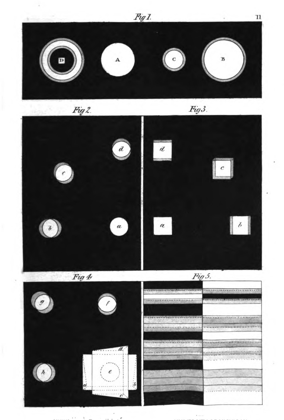
In this short statement we have described the primordial phenomena of all appearance of colour occasioned by refraction. These undoubtedly may be repeated, varied, and rendered more striking; may be combined, complicated, confused; but, after all, may be still restored to their original simplicity.
In this brief statement, we've described the basic phenomena of all color appearances caused by refraction. These can definitely be repeated, varied, and made more striking; they can be combined, complicated, and confused; but in the end, they can still return to their original simplicity.
In examining the process of the experiment just given, we find that in the one case we have, to appearance, extended the white edge upon the dark surface; in the other we have extended the dark edge upon the white surface, supplanting one by the other, pushing one over the other. We will now endeavour, step by step, to analyse these and similar cases.
In looking at the process of the experiment we just presented, we notice that in one instance, it seems like we've expanded the white edge on the dark surface; in the other, we've expanded the dark edge on the white surface, replacing one with the other, pushing one over the other. Now, let's try to analyze these and similar cases, step by step.
If we cause the white disk to move, in appearance, entirely from its place, which can be done[Pg 84] effectually by prisms, it will be coloured according to the direction in which it apparently moves, in conformity with the above laws. If we look at the disk a[3] through a prism, so that it appear moved to b, the outer edge will appear blue and blue-red, according to the law of the figure B (fig. 1), the other edge being yellow, and yellow-red, according to the law of the figure C (fig. 1). For in the first case the white figure is, as it were, extended over the dark boundary, and in the other case the dark boundary is passed over the white figure. The same happens if the disk is, to appearance, moved from a to c, from a to d, and so throughout the circle.
If we make the white disk appear to move entirely from its position, which can be effectively done with prisms, it will change color based on the direction it seems to move, following the laws mentioned above. If we look at the disk a[3] through a prism, so that it appears to shift to b, the outer edge will look blue and blue-red, according to the law of figure B (fig. 1), while the other edge will be yellow and yellow-red, according to the law of figure C (fig. 1). In the first scenario, the white figure is, in a sense, stretched over the dark boundary, and in the other case, the dark boundary moves over the white figure. The same effect happens if the disk appears to move from a to c, from a to d, and around the entire circle.
As it is with the simple effect, so it is with more complicated appearances. If we look through a horizontal prism (a b[4]) at a white disk placed at some distance behind it at e, the disk will be raised to f, and coloured according to the above law. If we remove this prism, and look through a vertical one (c d) at the same disk, it will appear at h, and coloured according to the same law. If we place the two prisms one upon the other, the disk will appear displaced diagonally, in conformity with a general law of nature, and will be coloured as[Pg 85] before; that is, according to its movement in the direction, e.g.:[5]
Just like simple effects, more complex appearances work the same way. If we look through a horizontal prism (a b[4]) at a white disk placed some distance behind it at e, the disk will appear raised to f and colored according to the earlier mentioned principle. If we take away this prism and look through a vertical one (c d) at the same disk, it will show up at h and colored according to that same principle. When we stack the two prisms, the disk will appear diagonally displaced, following a general rule of nature, and will be colored as[Pg 85] before; that is, according to its movement in the direction, e.g.:[5]
If we attentively examine these opposite coloured edges, we find that they only appear in the direction of the apparent change of place. A round figure leaves us in some degree uncertain as to this: a quadrangular figure removes all doubt.
If we closely look at these differently colored edges, we see that they only show up in the direction of the visible change in position. A round shape leaves us a bit unsure about this, while a square shape makes everything clear.
Thus, a former position (203) is here confirmed; viz. to produce colour, an object must be so displaced that the light edges be apparently carried over a dark surface, the dark edges over a light surface, the figure over its boundary, the boundary over the figure. But[Pg 86] if the rectilinear boundaries of a figure could be indefinitely extended by refraction, so that figure and background might only pursue their course next, but not over each other, no colour would appear, not even if they were prolonged to infinity.
So, a previous idea (203) is confirmed here: to create color, an object needs to be positioned in such a way that the light edges are apparently placed over a dark surface, the dark edges over a light surface, the figure over its boundary, and the boundary over the figure. But[Pg 86] if the straight edges of a figure could be endlessly extended through refraction, so that the figure and background could just move along next to each other, but not overlap, no color would appear, not even if they were extended infinitely.
[2] The author has omitted the orange and purple in the coloured diagrams which illustrate these first experiments, from a wish probably to present the elementary contrast, on which he lays a stress, in greater simplicity. The reddish tinge would be apparent, as stated above, where the blue and yellow are in contact with the black.—T.
[2] The author left out the orange and purple in the colored diagrams that show these initial experiments, likely to emphasize the basic contrast he focuses on, making it simpler. The reddish tint would be noticeable, as mentioned earlier, where the blue and yellow meet the black.—T.
[5] In this case, according to the author, the refracting medium being increased in mass, the appearance of colour is increased, and the displacement is greater.—T.
[5] In this case, the author states that as the mass of the refracting medium increases, the visibility of color increases, and the displacement becomes greater.—T.
XIV.
CONDITIONS UNDER WHICH THE APPEARANCE OF COLOUR INCREASES.
We have seen in the foregoing experiments that all appearance of colour occasioned by refraction depends on the condition that the boundary or edge be moved in upon the object itself, or the object itself over the ground, that the figure should be, as it were, carried over itself, or over the ground. And we shall now find that, by increased displacement of the object, the appearance of colour exhibits itself in a greater degree. This takes place in subjective experiments, to which, for the present, we confine ourselves, under the following conditions.
We have observed in the previous experiments that any appearance of color caused by refraction relies on the condition that the boundary or edge moves in toward the object itself, or the object moves over the surface, so that the shape seems to be shifted over itself or over the ground. We will now discover that by further displacing the object, the appearance of color becomes more pronounced. This is evident in subjective experiments, which we will focus on for now, under the following conditions.
First, if, in looking through parallel mediums, the eye is directed more obliquely.
First, if, while looking through similar mediums, the eye is directed more at an angle.
Secondly, if the surfaces of the medium are no longer parallel, but form a more or less acute angle.
Secondly, if the surfaces of the medium are no longer parallel but instead intersect at a sharper angle.
Thirdly, owing to the increased proportion of the medium, whether parallel mediums be increased in size, or whether the angle be increased, provided it does not attain a right angle.
Thirdly, due to the larger amount of the medium, whether the parallel mediums are enlarged or the angle is increased, as long as it doesn’t reach a right angle.
Fourthly, owing to the distance of the eye armed with a refracting medium from the object to be displaced.
Fourthly, due to the distance between the eye using a lens and the object that is being moved.
Fifthly, owing to a chemical property that may be communicated to the glass, and which may be afterwards increased in effect.
Fifthly, due to a chemical property that can be transferred to the glass and can later be enhanced in effect.
The greatest change of place, short of considerable distortion of the object, is produced by means of prisms, and this is the reason why the appearance of colour can be exhibited most powerfully through glasses of this form. Yet we will not, in employing them, suffer ourselves to be dazzled by the splendid appearances they exhibit, but keep the above well-established, simple principles calmly in view.
The biggest shift in perspective, without significantly altering the object, comes from using prisms. This is why the display of color can be most effectively shown through these types of glasses. However, as we use them, we won’t let ourselves be blinded by the impressive visuals they create, but instead, we’ll remain focused on the straightforward principles mentioned above.
The colour which is outside, or foremost, in the apparent change of an object by refraction, is always the broader, and we will henceforth call this a border: the colour that remains next the outline is the narrower, and this we will call an edge.
The color that stands out or is most visible in the change of an object due to refraction is always the broader one, and we will now refer to this as a border: the color that stays closest to the outline is the narrower one, and we will call this an edge.
If we move a dark boundary towards a light surface, the yellow broader border is foremost, and the narrower yellow-red edge follows close to the outline. If we move a light boundary towards a dark surface, the broader violet border is foremost, and the narrower blue edge follows.
If we shift a dark edge toward a light surface, the wider yellow border comes first, and the thinner yellow-red edge closely trails the outline. If we shift a light edge toward a dark surface, the wider violet border comes first, and the thinner blue edge follows.
If the object is large, its centre remains uncoloured. Its inner surface is then to be considered as unlimited (195): it is displaced, but not otherwise altered: but if the object is so narrow, that under the above conditions the yellow border can reach the blue edge, the space between the outlines will be entirely covered with colour. If we make this experiment with a white stripe on a black ground,[1] the two extremes will presently meet, and thus produce green. We shall then see the following series of colours:—
If the object is large, its center stays uncolored. Its inner surface can be seen as unlimited (195): it is shifted but not changed in any other way. However, if the object is narrow enough that the yellow edge can touch the blue edge under these conditions, the space between the outlines will be completely filled with color. If we conduct this experiment with a white stripe on a black background,[1] the two ends will soon meet, resulting in green. We will then observe the following series of colors:—
Yellow-red.
Yellow.
Green.
Blue.
Blue-red.
Yellow-red.
Yellow.
Green.
Blue.
Blue-red.
If we place a black band, or stripe, on white paper,[2] the violet border will spread till it meets[Pg 89] the yellow-red edge. In this case the intermediate black is effaced (as the intermediate white was in the last experiment), and in its stead a splendid pure red will appear.[3] The series of colours will now be as follows:—
If we put a black band or stripe on white paper,[2] the violet border will expand until it reaches[Pg 89] the yellow-red edge. In this case, the black in between disappears (just like the white did in the previous experiment), and instead, a bright pure red will show up.[3] The series of colors will now be as follows:—
Blue.
Blue-red.
Red.
Yellow-red.
Yellow.
Blue.
Blue-red.
Red.
Yellow-red.
Yellow.
The yellow and blue, in the first case (214), can by degrees meet so fully, that the two colours blend entirely in green, and the order will then be,
The yellow and blue, in the first case (214), can gradually come together so completely that the two colors mix entirely into green, and the sequence will then be,
Yellow-red.
Green.
Blue-red.
Yellow-orange.
Green.
Purple-red.
In the second case (215), under similar circumstances, we see only
In the second case (215), under similar circumstances, we see only
Blue.
Red.
Yellow.
Blue.
Red.
Yellow.
This appearance is best exhibited by refracting the bars of a window when they are relieved on a grey sky.[4]
This look is best shown by bending the lines of a window when they stand out against a gray sky.[4]
In all this we are never to forget that this appearance is not to be considered as a complete or final state, but always as a progressive, increasing, and, in many senses, controllable appearance. Thus we find that, by the negation of the above five conditions, it gradually decreases, and at last disappears altogether.
In all this, we should never forget that this appearance isn't meant to be seen as a complete or final state, but always as something progressive, growing, and, in many ways, manageable. So, we see that by negating the five conditions mentioned above, it gradually diminishes and eventually disappears completely.
XV.
EXPLANATION OF THE FOREGOING PHENOMENA.
Before we proceed further, it is incumbent on us to explain the first tolerably simple phenomenon, and to show its connexion with the principles first laid down, in order that the observer of nature may be enabled clearly to comprehend the more complicated appearances that follow.
Before we go any further, we need to explain the first fairly simple phenomenon and show how it connects with the principles we've established. This will help the observer of nature clearly understand the more complex occurrences that come next.
In the first place, it is necessary to remember that we have to do with circumscribed objects. In the act of seeing, generally, it is the circumscribed visible which chiefly invites our observation; and in the present instance, in speaking of the appearance of colour, as occasioned by refraction, the circumscribed visible, the detached object solely occupies our attention.
In the first place, we need to keep in mind that we are dealing with limited objects. When we see something, it's usually the defined visible elements that primarily draw our attention. In this case, when discussing how color appears due to refraction, it's the defined visible, the separate object, that captures our focus.
For our chromatic exhibitions we can, however, divide objects generally into primary and secondary. The expressions of themselves denote what we understand by them, but our meaning will be rendered still more plain by what follows.
For our color displays, we can generally categorize objects into primary and secondary. The terms themselves indicate what we mean by them, but our explanation will become even clearer with what comes next.
Primary objects may be considered firstly as original, as images which are impressed on the eye by things before it, and which assure us of their reality. To these the secondary images may be opposed as derived images, which remain in the organ when the object itself is taken away; those apparent after-images, which have been circumstantially treated of in the doctrine of physiological colours.
Primary objects can be seen first as original, as images that are impressed on our eyes by the things in front of us, confirming their reality. In contrast, secondary images can be thought of as derived images, which linger in our perception after the object is removed; these are the noticeable after-images that have been discussed in the study of physiological colors.
The primary images, again, may be considered as direct images, which, like the original impressions, are conveyed immediately from the object to the eye. In contradistinction to these, the secondary images may be considered as indirect, being only conveyed to us, as it were, at second-hand from a reflecting surface. These are the mirrored, or catoptrical, images, which in certain cases can also become double images:
The main images can once again be thought of as direct images, which, like the original impressions, are transmitted straight from the object to the eye. In contrast to these, the secondary images can be seen as indirect, since they are only presented to us, so to speak, second-hand from a reflecting surface. These are the mirrored, or catoptrical, images, which in some cases can also become double images:
When, namely, the reflecting body is transparent,[Pg 92] and has two parallel surfaces, one behind the other: in such a case, an image may be reflected to the eye from both surfaces, and thus arise double images, inasmuch as the upper image does not quite cover the under one: this may take place in various ways.
When the reflecting object is transparent,[Pg 92] and has two parallel surfaces, one behind the other, an image can reflect to the eye from both surfaces, resulting in double images since the upper image doesn't completely obscure the lower one. This can happen in different ways.
Let a playing-card be held before a mirror. We shall at first see the distinct image of the card, but the edge of the whole card, as well as that of every spot upon it, will be bounded on one side with a border, which is the beginning of the second reflection. This effect varies in different mirrors, according to the different thickness of the glass, and the accidents of polishing. If a person wearing a white waistcoat, with the remaining part of his dress dark, stands before certain mirrors, the border appears very distinctly, and in like manner the metal buttons on dark cloth exhibit the double reflection very evidently.
Let a playing card be held in front of a mirror. At first, we will see a clear image of the card, but the edge of the entire card, as well as every mark on it, will be framed on one side by a border, which is the start of the second reflection. This effect varies in different mirrors, depending on the thickness of the glass and how well it’s polished. If a person wearing a white waistcoat stands in front of certain mirrors, with the rest of their outfit in dark colors, the border will be very noticeable, and similarly, the metal buttons on dark clothing show the double reflection quite clearly.
The reader who has made himself acquainted with our former descriptions of experiments (80) will the more readily follow the present statement. The window-bars reflected by plates of glass appear double, and by increased thickness of the glass, and a due adaptation of the angle of reflection, the two reflections may be entirely separated from each other. So a vase full of[Pg 93] water, with a plane mirror-like bottom, reflects any object twice, the two reflections being more or less separated under the same conditions. In these cases it is to be observed that, where the two reflections cover each other, the perfect vivid image is reflected, but where they are separated they exhibit only weak, transparent, and shadowy images.
The reader who is familiar with our previous descriptions of experiments (80) will be able to follow the current explanation more easily. The window bars reflected by glass plates appear doubled, and by using thicker glass and adjusting the angle of reflection, the two reflections can be completely separated from each other. Similarly, a vase full of[Pg 93] water, with a flat, mirror-like bottom, reflects any object twice, with the reflections being more or less separated under the same conditions. It's important to note that when the two reflections overlap, a clear, vivid image is reflected, but when they are separated, they show only weak, transparent, and shadowy images.
If we wish to know which is the under and which the upper image, we have only to take a coloured medium, for then a light object reflected from the under surface is of the colour of the medium, while that reflected from the upper surface presents the complemental colour. With dark objects it is the reverse; hence black and white surfaces may be here also conveniently employed. How easily the double images assume and evoke colours will here again be striking.
If we want to tell which image is on the bottom and which is on the top, we just need to use a colored medium. When we do that, a light object reflected from the bottom surface will match the color of the medium, while the light reflected from the top surface will show the complementary color. With dark objects, it’s the opposite; so black and white surfaces can be used effectively here too. It will be noticeable how easily the double images take on and bring out colors.
Thirdly, the primary images may be considered as principal images, while the secondary can be, as it were, annexed to these as accessory images. Such an accessory image produces a sort of double form; except that it does not separate itself from the principal object, although it may be said to be always endeavouring to do so. It is[Pg 94] with secondary images of this last description that we have to do in prismatic appearances.
Thirdly, the main images can be thought of as primary images, while the secondary ones can be seen as secondary images that are attached to these. An accessory image creates a kind of dual form; however, it doesn't detach itself from the main object, even though it seems to always be trying to. It is[Pg 94] with secondary images of this type that we encounter in prismatic appearances.
A surface without a boundary exhibits no appearance of colour when refracted (195). Whatever is seen must be circumscribed by an outline to produce this effect. In other words a figure, an object, is required; this object undergoes an apparent change of place by refraction: the change is however not complete, not clean, not sharp; but incomplete, inasmuch as an accessory image only is produced.
A surface without a boundary shows no color when light is refracted (195). To perceive something, it needs to be defined by an outline to create this effect. In other words, a figure or an object is necessary; this object appears to shift position due to refraction: however, the change is not total, clear, or precise; instead, it’s partial, as it only creates an additional image.
In examining every appearance of nature, but especially in examining an important and striking one, we should not remain in one spot, we should not confine ourselves to the insulated fact, nor dwell on it exclusively, but look round through all nature to see where something similar, something that has affinity to it, appears: for it is only by combining analogies that we gradually arrive at a whole which speaks for itself, and requires no further explanation.
When looking at every aspect of nature, especially when we encounter something significant and impressive, we shouldn’t stay in one place or focus solely on that isolated fact. Instead, we should explore all of nature to find similar or related examples. Only by linking these analogies can we piece together a complete picture that is self-explanatory and doesn’t need any more clarification.
Thus we here call to mind that in certain cases refraction unquestionably produces double images, as is the case in Iceland spar: similar[Pg 95] double images are also apparent in cases of refraction through large rock crystals, and in other instances; phenomena which have not hitherto been sufficiently observed.[1]
But since in the case under consideration (227) the question relates not to double but to accessory images, we refer to a phenomenon already adverted to, but not yet thoroughly investigated. We allude to an earlier experiment, in which it appeared that a sort of conflict took place in regard to the retina between a light object and its dark ground, and between a dark object and its light ground (16). The light object in this case appeared larger, the dark one smaller.
But since in the situation we're talking about (227) the question is about accessory images rather than double images, we bring up a phenomenon we've mentioned before but haven't fully explored yet. We're referring to an earlier experiment where it seemed that there was a conflict for the retina between a light object and its dark background, and between a dark object and its light background (16). In this case, the light object looked larger, while the dark one looked smaller.
By a more exact observation of this phenomenon we may remark that the forms are not sharply distinguished from the ground, but that they appear with a kind of grey, in some degree, coloured edge; in short, with an accessory image. If, then, objects seen only with the naked eye produce such effects, what may not take place when a dense medium is interposed? It is not that alone which presents itself to us[Pg 96] in obvious operation which produces and suffers effects, but likewise all principles that have a mutual relation only of some sort are efficient accordingly, and indeed often in a very high degree.
By closely observing this phenomenon, we can notice that the shapes aren’t clearly defined against the background; instead, they have somewhat of a grey, colored edge; essentially, they appear with an overlay image. So, if objects observed with just the naked eye can create such effects, imagine what happens when a dense medium is in between. It’s not just the visible elements at play that create and experience effects; all principles that are somehow related also contribute significantly, often to a great extent.
Thus when refraction produces its effect on an object there appears an accessory image next the object itself: the real form thus refracted seems even to linger behind, as if resisting the change of place; but the accessory image seems to advance, and extends itself more or less in the mode already shown (212-216).
We also remarked (224) that in double images the fainter appear only half substantial, having a kind of transparent, evanescent character, just as the fainter shades of double shadows must always appear as half-shadows. These latter assume colours easily, and produce them readily (69), the former also (80); and the same takes place in the instance of accessory images, which, it is true, do not altogether quit the real object, but still advance or extend from it as half-substantial images, and hence can appear coloured so quickly and so powerfully.
We also noted (224) that in double images, the fainter ones seem only half real, having a sort of transparent, fleeting quality, much like how the lighter shades of double shadows always look like half-shadows. These lighter shades easily take on colors and produce them readily (69), and the same happens with accessory images, which, although they don’t completely detach from the real object, still emerge or extend from it as half-real images, making them appear colored very quickly and intensely.
That the prismatic appearance is in fact an[Pg 97] accessory image we may convince ourselves in more than one mode. It corresponds exactly with the form of the object itself. Whether the object be bounded by a straight line or a curve, indented or waving, the form of the accessory image corresponds throughout exactly with the form of the object.[2]
That the colorful look is really an[Pg 97] added image is something we can convince ourselves of in more than one way. It matches the shape of the actual object perfectly. Whether the object has straight lines or curves, dips or waves, the shape of the added image always exactly matches the shape of the object.[2]
Again, not only the form but other qualities of the object are communicated to the accessory image. If the object is sharply relieved from its ground, like white on black, the coloured accessory image in like manner appears in its greatest force. It is vivid, distinct, and powerful; but it is most especially powerful when a luminous object is shown on a dark ground, which may be contrived in various ways.
Again, not only the shape but other characteristics of the object are conveyed to the supporting image. If the object stands out sharply from its background, like white on black, the colored supporting image similarly appears with its full intensity. It is bright, clear, and impactful; however, it is particularly striking when a bright object is displayed against a dark background, which can be arranged in various ways.
But if the object is but faintly distinguished from the ground, like grey objects on black or white, or even on each other, the accessory image is also faint, and, when the original difference of tint or force is slight, becomes hardly discernible.
But if the object is only slightly different from the background, like gray objects on black or white, or even on each other, the additional image is also subtle, and when the original difference in color or intensity is small, it becomes barely noticeable.
The appearances which are observable when coloured objects are relieved on light, dark, or coloured grounds are, moreover, well worthy of attention. In this case a union takes place between the apparent colour of the accessory image and the real colour of the object; a compound colour is the result, which is either assisted and enhanced by the accordance, or neutralised by the opposition of its ingredients.
The visuals seen when colored objects are set against light, dark, or colored backgrounds are also worth noting. Here, there's a blend between the perceived color of the surrounding image and the actual color of the object; the result is a combined color that can either be boosted and enhanced by how they match or diminished by how they conflict with each other.
But the common and general characteristic both of the double and accessory image is semi-transparence. The tendency of a transparent medium to become only half transparent, or merely light-transmitting, has been before adverted to (147, 148). Let the reader assume that he sees within or through such a medium a visionary image, and he will at once pronounce this latter to be a semi-transparent image.
But the main characteristic of both the double and accessory image is semi-transparency. The way a transparent medium can become only partially transparent, or just light-transmitting, has been mentioned before (147, 148). If the reader imagines seeing a visionary image within or through such a medium, they would immediately describe this image as semi-transparent.
Thus the colours produced by refraction may be fitly explained by the doctrine of the semi-transparent mediums. For where dark passes over light, as the border of the semi-transparent accessory image advances, yellow appears; and, on the other hand, where a light outline passes over the dark background, blue appears (150, 151).
Thus, the colors created by refraction can be appropriately explained by the theory of semi-transparent materials. When dark overlaps light, as the edge of the semi-transparent accessory image moves forward, yellow appears; conversely, when a light outline overlaps a dark background, blue appears (150, 151).
The advancing foremost colour is always the broader. Thus the yellow spreads over the light with a broad border, but the yellow-red appears as a narrower stripe and is next the dark, according to the doctrine of augmentation, as an effect of shade.[3]
The dominant color always has a wider spread. So, yellow blankets the light with a wide edge, while yellow-red shows up as a thinner stripe next to the dark, based on the principle of enhancement as a result of shadow.[3]
On the opposite side the condensed blue is next the edge, while the advancing border, spreading as a thinner veil over the black, produces the violet colour, precisely on the principles before explained in treating of semi-transparent mediums, principles which will hereafter be found equally efficient in many other cases.
On the opposite side, the dense blue is next to the edge, while the advancing border, spreading as a thinner layer over the black, creates the violet color, just as explained earlier in discussing semi-transparent materials, principles that will later prove equally effective in many other situations.
Since an analysis like the present requires to be confirmed by ocular demonstration, we beg every reader to make himself acquainted with the experiments hitherto adduced, not in a superficial manner, but fairly and thoroughly. We have not placed arbitrary signs before him instead of the appearances themselves; no modes of expression are here proposed for his[Pg 100] adoption which may be repeated for ever without the exercise of thought and without leading any one to think; but we invite him to examine intelligible appearances, which must be present to the eye and mind, in order to enable him clearly to trace these appearances to their origin, and to explain them to himself and to others.
Since an analysis like this one needs to be confirmed through direct observation, we encourage every reader to familiarize themselves with the experiments presented so far, not just superficially, but thoroughly and fairly. We haven’t used arbitrary symbols instead of the actual appearances; no expressions are suggested for you to repeat endlessly without thinking or without encouraging anyone to think. Instead, we invite you to look at clear appearances that must be evident to both the eye and the mind, to help you accurately trace these appearances back to their origins and explain them to yourself and others.
[3] The author has before observed that colour is a degree of darkness, and he here means that increase of darkness, produced by transparent mediums, is, to a certain extent, increase of colour.—T.
[3] The author has previously noted that color is a type of darkness, and he indicates here that the increase in darkness caused by transparent materials is, to some extent, an increase in color.—T.
XVI.
DECREASE OF THE APPEARANCE OF COLOUR.
We need only take the five conditions (210) under which the appearance of colour increases in the contrary order, to produce the contrary or decreasing state; it may be as well, however, briefly to describe and review the corresponding modifications which are presented to the eye.
We just need to look at the five conditions (210) that lead to an increase in color appearance in the opposite order to create the opposite or decreasing state. It might also be helpful to briefly describe and go over the related changes that the eye experiences.
At the highest point of complete junction of the opposite edges, the colours appear as follows (216):—
At the highest point where the opposite edges meet, the colors look like this (216):—
| Yellow-red. | Blue. |
| Green. | Red. |
| Blue-red. | Yellow. |
| Yellow-red. | Blue. |
| Yellow. | Blue-red. |
| Green. | Red. |
| Blue. | Yellow-red. |
| Blue-red. | Yellow. |
Here, therefore, the surface still appears completely coloured, but neither series is to be considered as an elementary series, always developing itself in the same manner and in the same degrees; on the contrary, they can and should be resolved into their elements; and, in doing this, we become better acquainted with their nature and character.
Here, the surface still seems fully colored, but neither series should be regarded as a basic series that always develops in the same way and at the same levels; instead, they can and should be broken down into their elements. By doing this, we gain a better understanding of their nature and character.
These elements are then (__A_TAG_PLACEHOLDER_0__, __A_TAG_PLACEHOLDER_1__, __A_TAG_PLACEHOLDER_2__)—
| Yellow-red. | Blue. |
| Yellow. | Blue-red. |
| White. | Black. |
| Blue. | Yellow-red. |
| Blue-red. | Yellow. |
Here the surface itself, the original object, which has been hitherto completely covered, and as it were lost, again appears in the centre of the colours, asserts its right, and enables us[Pg 102] fully to recognise the secondary nature of the accessory images which exhibit themselves as "edges" and "borders."—Note N.
We can make these edges and borders as narrow as we please; nay, we can still have refraction in reserve after having done away with all appearance of colour at the boundary of the object.
We can make these edges and borders as narrow as we want; in fact, we can still have refraction available even after getting rid of any color at the edge of the object.
Having now sufficiently investigated the exhibition of colour in this phenomenon, we repeat that we cannot admit it to be an elementary phenomenon. On the contrary, we have traced it to an antecedent and a simpler one; we have derived it, in connexion with the theory of secondary images, from the primordial phenomenon of light and darkness, as affected or acted upon by semi-transparent mediums. Thus prepared, we proceed to describe the appearances which refraction produces on grey and coloured objects, and this will complete the section of subjective phenomena.
Having now thoroughly explored the display of color in this phenomenon, we reiterate that we cannot accept it as a basic phenomenon. On the contrary, we have linked it to a prior and simpler one; we have traced it, in relation to the theory of secondary images, back to the fundamental phenomenon of light and darkness, as influenced or altered by semi-transparent materials. With this foundation laid, we will now describe the effects that refraction creates on gray and colored objects, which will complete this section on subjective phenomena.
XVII.
GREY OBJECTS DISPLACED BY REFRACTION.
Hitherto we have confined our attention to black and white objects relieved on respectively opposite grounds, as seen through the prism, because the coloured edges and borders are most clearly displayed in such cases. We now repeat these experiments with grey objects, and again find similar results.
Until now, we have focused on black and white objects placed on contrasting backgrounds, as viewed through the prism, because the colored edges and borders are most clearly shown in those cases. We now repeat these experiments with gray objects and again find similar results.
As we called black the equivalent of darkness, and white the representative of light (18), so we now venture to say that grey represents half-shadow, which partakes more or less of light and darkness, and thus stands between the two. We invite the reader to call to mind the following facts as bearing on our present view.
As we refer to black as the equivalent of darkness and white as the symbol of light (18), we now propose that grey represents half-shadow, which shares qualities of both light and darkness, placing it in between the two. We encourage the reader to consider the following facts related to our current perspective.
The darker the grey the more it appears as a faint light on black, as a strong dark on white, and vice versâ; hence the accessory images of dark-grey on black are faint, on white strong: so the accessory images of light-grey on white are faint, on black strong.
The darker the grey, the more it looks like a faint light on black and a strong dark on white, and vice versa; therefore, the accessory images of dark grey on black are faint, while on white they are strong: similarly, the accessory images of light grey on white are faint, but on black they are strong.
Grey on black, seen through the prism, will exhibit the same appearances as white on black; the edges are coloured according to the same law, only the borders appear fainter. If we relieve grey on white, we have the same edges and borders which would be produced if we saw black on white through the prism.—Note O.
Grey on black, viewed through the prism, will show the same appearances as white on black; the edges are colored according to the same rule, just the borders look lighter. If we place grey on white, we get the same edges and borders as if we were looking at black on white through the prism.—Note O.
Various shades of grey placed next each other in gradation will exhibit at their edges, either blue and violet only, or red and yellow only, according as the darker grey is placed over or under.
Various shades of gray placed next to each other in a gradient will show at their edges either only blue and violet or only red and yellow, depending on whether the darker gray is placed on top or underneath.
A series of such shades of grey placed horizontally next each other will be coloured conformably to the same law according as the whole series is relieved, on a black or white ground above or below.
A series of shades of gray placed next to each other will be colored according to the same rule, depending on whether the entire series is set against a black or white background above or below.
The observer may see the phenomena exhibited by the prism at one glance, by enlarging the plate intended to illustrate this section.[1]
The observer can see the effects shown by the prism at a single glance by enlarging the plate meant to illustrate this section.[1]
It is of great importance duly to examine and consider another experiment in which a grey object is placed partly on a black and partly on a white surface, so that the line of division passes vertically through the object.
It is very important to carefully examine and think about another experiment where a gray object is placed partly on a black surface and partly on a white surface, so that the dividing line runs vertically through the object.
The colours will appear on this grey object in conformity with the usual law, but according to the opposite relation of the light to the dark, and will be contrasted in a line. For as the grey is as a light to the black, so it exhibits the red and yellow above the blue and violet below: again, as the grey is as a dark to the white, the blue and violet appear above the red and yellow below. This experiment will be found of great importance with reference to the next chapter.
The colors will show up on this grey object following the usual rules, but in the reverse relationship between light and dark, and will be contrasted in a line. Just as grey is light compared to black, it displays red and yellow above blue and violet below; similarly, since grey is dark compared to white, blue and violet appear above red and yellow below. This experiment will be very important for the next chapter.
XVIII.
COLOURED OBJECTS DISPLACED BY REFRACTION.
An unlimited coloured surface exhibits no prismatic colour in addition to its own hue, thus not at all differing from a black, white, or grey surface. To produce the appearance of colour, light and dark boundaries must act on it either accidentally or by contrivance. Hence experiments and observations on coloured surfaces, as seen through the prism, can only be made when such surfaces are separated by an outline from another differently tinted surface, in short when circumscribed objects are coloured.
An unlimited colored surface shows no prismatic color besides its own shade, which means it doesn’t differ at all from a black, white, or gray surface. To create the impression of color, light and dark boundaries must interact with it, either by chance or design. Therefore, experiments and observations on colored surfaces, as viewed through a prism, can only take place when those surfaces are outlined from another differently colored surface; in other words, when circumscribed objects are colored.
All colours, whatever they may be, correspond so far with grey, that they appear darker than white and lighter than black. This shade-like quality of colour (σκιέρον) has been already alluded to (69), and will become more and more evident. If then we begin by placing coloured objects on black and white surfaces, and examine them through the prism, we shall again have all that we have seen exhibited with grey surfaces.
All colors, no matter what they are, relate to grey in that they look darker than white and lighter than black. This shadow-like aspect of color (σκιέρον) has already been mentioned (69) and will become increasingly clear. If we start by placing colored objects on black and white surfaces and look at them through a prism, we'll see everything we observed with grey surfaces again.

If we displace a coloured object by refraction, there appears, as in the case of colourless objects and according to the same laws, an accessory image. This accessory image retains, as far as colour is concerned, its usual nature, and acts on one side as a blue and blue-red, on the opposite side as a yellow and yellow-red. Hence the apparent colour of the edge and border will be either homogeneous with the real colour of the object, or not so. In the first case the apparent image identifies itself with the real one, and appears to increase it, while, in the second case, the real image may be vitiated, rendered indistinct, and reduced in size by the apparent image. We proceed to review the cases in which these effects are most strikingly exhibited.
If we shift a colored object due to refraction, an additional image appears, just like with colorless objects and following the same principles. This additional image maintains its usual color characteristics, showing blue and blue-red on one side, and yellow and yellow-red on the other. Therefore, the apparent color of the edges and borders will either match the actual color of the object or not. In the first situation, the apparent image aligns with the real one and seems to enhance it, while in the second situation, the real image can be distorted, made unclear, and reduced in size by the apparent image. We will now examine the cases where these effects are most clearly demonstrated.
If we take a coloured drawing enlarged from the plate, which illustrates this experiment[1], and examine the red and blue squares placed next each other on a black ground, through the prism as usual, we shall find that as both colours are lighter than the ground, similarly coloured edges and borders will appear above and below,[Pg 108] at the outlines of both, only they will not appear equally distinct to the eye.
If we take a colored drawing enlarged from the plate, which illustrates this experiment[1], and look at the red and blue squares placed next to each other on a black background, through the prism as usual, we will find that since both colors are lighter than the background, similarly colored edges and borders will appear above and below,[Pg 108] at the outlines of both, but they will not appear equally clear to the eye.
Red is proportionally much lighter on black than blue is. The colours of the edges will therefore appear stronger on the red than on the blue, which here acts as a dark-grey, but little different from black. (251.)
Red looks much lighter against black than blue does. The edge colors will seem more vivid on red than on blue, which here appears more like a dark gray, not that different from black. (251.)
The extreme red edge will identify itself with the vermilion colour of the square, which will thus appear a little elongated in this direction; while the yellow border immediately underneath it only gives the red surface a more brilliant appearance, and is not distinguished without attentive observation.
The extreme red edge will match the bright red color of the square, making it seem slightly stretched in that direction; meanwhile, the yellow border directly beneath it enhances the brightness of the red surface and isn't noticed without careful observation.
On the other hand the red edge and yellow border are heterogeneous with the blue square; a dull red appears at the edge, and a dull green mingles with the figure, and thus the blue square seems, at a hasty glance, to be comparatively diminished on this side.
On the other hand, the red edge and yellow border clash with the blue square; a muted red appears at the edge, and a dull green mixes with the figure, making the blue square seem, at a quick glance, to be somewhat smaller on this side.
At the lower outline of the two squares a blue edge and a violet border will appear, and will[Pg 109] produce the contrary effect; for the blue edge, which is heterogeneous with the warm red surface, will vitiate it and produce a neutral colour, so that the red on this side appears comparatively reduced and driven upwards, and the violet border on the black is scarcely perceptible.
At the bottom of the two squares, a blue edge and a violet border will show up, and will[Pg 109] create the opposite effect; the blue edge, which contrasts with the warm red surface, will spoil it and create a neutral color, making the red on this side look somewhat diminished and pushed upward, while the violet border on the black is hardly noticeable.
On the other hand, the blue apparent edge will identify itself with the blue square, and not only not reduce, but extend it. The blue edge and even the violet border next it have the apparent effect of increasing the surface, and elongating it in that direction.
On the other hand, the blue apparent edge will identify itself with the blue square, and not only won’t reduce it but will actually extend it. The blue edge and even the violet border next to it have the effect of increasing the surface and stretching it in that direction.
The effect of homogeneous and heterogeneous edges, as I have now minutely described it, is so powerful and singular that the two squares at the first glance seem pushed out of their relative horizontal position and moved in opposite directions, the red upwards, the blue downwards. But no one who is accustomed to observe experiments in a certain succession, and respectively to connect and trace them, will suffer himself to be deceived by such an unreal effect.
The impact of uniform and varied edges, as I've detailed, is so strong and unique that the two squares initially appear to be shifted from their usual horizontal alignment, with the red square moving upwards and the blue square moving downwards. However, anyone who is used to observing experiments in a specific order and connecting and tracking them won’t be fooled by such an illusion.
A just impression with regard to this important[Pg 110] phenomenon will, however, much depend on some nice and even troublesome conditions, which are necessary to produce the illusion in question. Paper should be tinged with vermilion or the best minium for the red square, and with deep indigo for the blue square. The blue and red prismatic edges will then unite imperceptibly with the real surfaces where they are respectively homogeneous; where they are not, they vitiate the colours of the squares without producing a very distinct middle tint. The real red should not incline too much to yellow, otherwise the apparent deep red edge above will be too distinct; at the same time it should be somewhat yellow, otherwise the transition to the yellow border will be too observable. The blue must not be light, otherwise the red edge will be visible, and the yellow border will produce a too decided green, while the violet border underneath would not give us the impression of being part of an elongated light blue square.
A clear understanding of this important[Pg 110] phenomenon will, however, depend on some precise and even tricky conditions that are necessary to create the illusion in question. The paper should be tinted with vermilion or the best minium for the red square, and with deep indigo for the blue square. The blue and red prismatic edges will then blend seamlessly with the actual surfaces where they are homogeneous; where they aren’t, they distort the colors of the squares without creating a very distinct middle tint. The actual red shouldn’t lean too much toward yellow, or the apparent deep red edge above will stand out too much; at the same time, it should be slightly yellow, or the transition to the yellow border will be too noticeable. The blue shouldn’t be too light, or the red edge will be visible, and the yellow border will create a pronounced green, while the violet border beneath wouldn’t give us the impression of being part of a long light blue square.
All this will be treated more circumstantially hereafter, when we speak of the apparatus intended to facilitate the experiments connected with this part of our subject.[2] Every inquirer[Pg 111] should prepare the figures himself, in order fairly to exhibit this specimen of ocular deception, and at the same time to convince himself that the coloured edges, even in this case, cannot escape accurate examination.
All of this will be discussed in more detail later when we cover the tools designed to aid the experiments related to this topic.[2] Every researcher[Pg 111] should create the figures themselves to properly demonstrate this example of visual illusion and to ensure they see that the colored edges, even here, can't be overlooked under close scrutiny.
Meanwhile various other combinations, as exhibited in the plate, are fully calculated to remove all doubt on this point in the mind of every attentive observer.
Meanwhile, several other combinations shown in the plate are completely designed to eliminate any doubt about this point for every attentive observer.
If, for instance, we look at a white square, next the blue one, on a black ground, the prismatic hues of the opposite edges of the white, which here occupies the place of the red in the former experiment, will exhibit themselves in their utmost force. The red edge extends itself above the level of the blue almost in a greater degree than was the case with the red square itself in the former experiment. The lower blue edge, again, is visible in its full force next the white, while, on the other hand, it cannot be distinguished next the blue square. The violet border underneath is also much more apparent on the white than on the blue.
If we look at a white square next to a blue one on a black background, the colors on the opposite edges of the white square, which acts like the red in the previous experiment, will show their full intensity. The red edge seems to extend above the level of the blue edge even more than the red square did in the earlier experiment. The lower blue edge is fully visible next to the white square, but it’s hard to see next to the blue square. The violet border underneath is also much more noticeable on the white than it is on the blue.
If the observer now compares these double[Pg 112] squares, carefully prepared and arranged one above the other, the red with the white, the two blue squares together, the blue with the red, the blue with the white, he will clearly perceive the relations of these surfaces to their coloured edges and borders.
If the observer now compares these double[Pg 112] squares, carefully prepared and stacked on top of each other, the red with the white, the two blue squares together, the blue with the red, and the blue with the white, he will clearly see how these surfaces relate to their colored edges and borders.
The edges and their relations to the coloured surfaces appear still more striking if we look at the coloured squares and a black square on a white ground; for in this case the illusion before mentioned ceases altogether, and the effect of the edges is as visible as in any case that has come under our observation. Let the blue and red squares be first examined through the prism. In both the blue edge now appears above; this edge, homogeneous with the blue surface, unites with it, and appears to extend it upwards, only the blue edge, owing to its lightness, is somewhat too distinct in its upper portion; the violet border underneath it is also sufficiently evident on the blue. The apparent blue edge is, on the other hand, heterogeneous with the red square; it is neutralised by contrast, and is scarcely visible; meanwhile the violet border, uniting with the real red, produces a hue resembling that of the peach-blossom.
The edges and their relationships to the colored surfaces look even more striking when we examine the colored squares alongside a black square on a white background. In this scenario, the previously mentioned illusion completely disappears, and the effect of the edges is as clear as in any case we've observed. Let's first analyze the blue and red squares through the prism. In both cases, the blue edge appears at the top; this edge, which is consistent with the blue surface, merges with it and seems to extend it upward. However, the blue edge, because of its brightness, is a bit too pronounced in its upper part. The violet border below it is also clearly visible on the blue. On the other hand, the apparent blue edge is inconsistent with the red square; it gets washed out by contrast and is barely noticeable. Meanwhile, the violet border, merging with the actual red, creates a color similar to peach blossom.
If thus, owing to the above causes, the upper[Pg 113] outlines of these squares do not appear level with each other, the correspondence of the under outlines is the more observable; for since both colours, the red and the blue, are darks compared with the white (as in the former case they were light compared with the black), the red edge with its yellow border appears very distinctly under both. It exhibits itself under the warm red surface in its full force, and under the dark blue nearly as it appears under the black: as may be seen if we compare the edges and borders of the figures placed one above the other on the white ground.
If, for the reasons mentioned above, the top outlines of these squares don’t seem even with each other, the matching of the bottom outlines is even more noticeable. Both colors, red and blue, are darker compared to the white (just as they were lighter compared to the black before), so the red edge with its yellow border stands out clearly in both cases. It shows up strongly beneath the warm red surface and looks almost the same under the dark blue as it does under the black. This can be observed by comparing the edges and borders of the figures stacked one on top of the other on the white background.
In order to present these experiments with the greatest variety and perspicuity, squares of various colours are so arranged[3] that the boundary of the black and white passes through them vertically. According to the laws now known to us, especially in their application to coloured objects, we shall find the squares as usual doubly coloured at each edge; each square will appear to be split in two, and to be elongated upwards or downwards. We may here call to mind the experiment with the grey figure seen in like manner on the line of division between black and white (257).[4]
To showcase these experiments with maximum variety and clarity, squares of different colors are arranged[3] so that the boundary between black and white runs through them vertically. Based on the principles we currently understand, particularly regarding colored objects, we will see that the squares will typically exhibit two colors at each edge; each square will seem to be divided in half and will appear stretched either up or down. We can also recall the experiment with the gray figure that appears similarly at the dividing line between black and white (257).[4]
A phenomenon was before exhibited, even to illusion, in the instance of a red and blue square on a black ground; in the present experiment the elongation upwards and downwards of two differently coloured figures is apparent in the two halves of one and the same figure of one and the same colour. Thus we are still referred to the coloured edges and borders, and to the effects of their homogeneous and heterogeneous relations with respect to the real colours of the objects.
A phenomenon was demonstrated, even to the point of illusion, with a red and blue square on a black background; in the current experiment, the stretching upwards and downwards of two differently colored shapes is noticeable in the two halves of one single shape of the same color. Thus, we are still directed to the colored edges and borders, and to the effects of their similar and different relationships concerning the actual colors of the objects.
I leave it to observers themselves to compare the various gradations of coloured squares, placed half on black half on white, only inviting their attention to the apparent alteration which takes place in contrary directions; for red and yellow appear elongated upwards if on a black ground, downwards if on a white; blue, downwards if on a black ground, upwards if on a white. All which, however, is quite in accordance with the diffusely detailed examples above given.
I’ll let observers compare the different shades of colored squares that are placed half on black and half on white. I just want to point out the apparent changes that happen in opposite directions: red and yellow look taller when on a black background and shorter when on a white one; blue looks shorter on a black background and taller on a white one. This all fits perfectly with the detailed examples provided above.
Let the observer now turn the figures so that the before-mentioned squares placed on the line of division between black and white may be in a horizontal series; the black above, the white underneath. On looking at these squares[Pg 115] through the prism, he will observe that the red square gains by the addition of two red edges; on more accurate examination he will observe the yellow border on the red figure, and the lower yellow border upon the white will be perfectly apparent.
Let the observer now arrange the squares mentioned earlier on the dividing line between black and white in a horizontal series, with the black on top and the white below. When viewing these squares[Pg 115] through the prism, he will notice that the red square appears to gain two red edges; upon closer examination, he will see the yellow border on the red square and the lower yellow border on the white square will be clearly visible.
The upper red edge on the blue square is on the other hand hardly visible; the yellow border next it produces a dull green by mingling with the figure; the lower red edge and the yellow border are displayed in lively colours.
The upper red edge of the blue square is barely visible; the yellow border next to it creates a dull green by mixing with the shape; the lower red edge and the yellow border are shown in vibrant colors.
After observing that the red figure in these cases appears to gain by an addition on both sides, while the dark blue, on one side at least, loses something; we shall see the contrary effect produced by turning the same figures upside down, so that the white ground be above, the black below.
After noticing that the red figure in these scenarios seems to gain from an addition on both sides, while the dark blue at least loses something on one side, we will see the opposite effect when we turn the same figures upside down, with the white background on top and the black on the bottom.
For as the homogeneous edges and borders now appear above and below the blue square, this appears elongated, and a portion of the surface itself seems even more brilliantly coloured: it is only by attentive observation that we can distinguish the edges and borders from the colour of the figure itself.
For as the uniform edges and borders now show above and below the blue square, it looks stretched, and a part of the surface itself seems even more vividly colored: it's only through careful observation that we can tell the edges and borders apart from the color of the figure itself.
The yellow and red squares, on the other hand, are comparatively reduced by the heterogeneous edges in this position of the figures, and their colours are, to a certain extent, vitiated. The blue edge in both is almost invisible. The violet border appears as a beautiful peach-blossom hue on the red, as a very pale colour of the same kind on the yellow; both the lower edges are green; dull on the red, vivid on the yellow; the violet border is but faintly perceptible under the red, but is more apparent under the yellow.
The yellow and red squares, on the other hand, are somewhat diminished by the uneven edges in this part of the figures, and their colors are somewhat tainted. The blue edge in both is nearly invisible. The violet border looks like a lovely peach-blossom shade on the red, and a very light version of that color on the yellow; both lower edges are green—dull on the red and bright on the yellow. The violet border is only faintly noticeable under the red, but it's more visible under the yellow.
Every inquirer should make it a point to be thoroughly acquainted with all the appearances here adduced, and not consider it irksome to follow out a single phenomenon through so many modifying circumstances. These experiments, it is true, may be multiplied to infinity by differently coloured figures, upon and between differently coloured grounds. Under all such circumstances, however, it will be evident to every attentive observer that coloured squares only appear relatively altered, or elongated, or reduced by the prism, because an addition of homogeneous or heterogeneous edges produces an illusion. The inquirer will now be enabled to do away with this illusion if he has the[Pg 117] patience to go through the experiments one after the other, always comparing the effects together, and satisfying himself of their correspondence.
Every researcher should make it a priority to be thoroughly familiar with all the examples presented here and not find it tedious to explore a single phenomenon through numerous modifying circumstances. It's true that these experiments can be expanded infinitely with differently colored figures on and between various colored backgrounds. However, under all these circumstances, it will be clear to any observant viewer that colored squares only seem to appear relatively altered, stretched, or smaller because the addition of similar or different edges creates an illusion. The researcher will now be able to eliminate this illusion if they have the[Pg 117] patience to go through the experiments one by one, consistently comparing the effects and confirming their consistency.
Experiments with coloured objects might have been contrived in various ways: why they have been exhibited precisely in the above mode, and with so much minuteness, will be seen hereafter. The phenomena, although formerly not unknown, were much misunderstood; and it was necessary to investigate them thoroughly to render some portions of our intended historical view clearer.
Experiments with colored objects could have been designed in different ways: the reason they have been shown exactly like this, and with such detail, will be explained later. The phenomena, although not entirely unknown before, were widely misunderstood; and it was essential to examine them closely to make some parts of our planned historical overview clearer.
In conclusion, we will mention a contrivance by means of which our scientific readers may be enabled to see these appearances distinctly at one view, and even in their greatest splendour. Cut in a piece of pasteboard five perfectly similar square openings of about an inch, next each other, exactly in a horizontal line: behind these openings place five coloured glasses in the natural order, orange, yellow, green, blue, violet. Let the series thus adjusted be fastened in an opening of the camera obscura, so that the bright sky may be seen through the squares, or that the sun may shine on them; they will thus appear very powerfully coloured. Let the spectator now examine them through the prism, and observe the appearances, already[Pg 118] familiar by the foregoing experiments, with coloured objects, namely, the partly assisting, partly neutralising effects of the edges and borders, and the consequent apparent elongation or reduction of the coloured squares with reference to the horizontal line. The results witnessed by the observer in this case, entirely correspond with those in the cases before analysed; we do not, therefore, go through them again in detail, especially as we shall find frequent occasions hereafter to return to the subject.—Note P.
In conclusion, we want to highlight a device that will allow our scientific readers to see these appearances clearly all at once, and even in their full glory. Cut a piece of cardboard with five identical square openings, each about an inch wide, lined up horizontally next to each other. Behind these openings, place five colored glasses in the natural order: orange, yellow, green, blue, violet. Secure this setup in an opening of the camera obscura so that the bright sky can be seen through the squares or the sun can shine on them; they will then appear very vividly colored. The viewer should examine them through the prism and take note of the effects, which should be familiar from prior experiments with colored objects—specifically, the partially enhancing and partially neutralizing effects of the edges and borders, leading to the apparent stretching or shrinking of the colored squares in relation to the horizontal line. The results observed here are completely consistent with those discussed previously, so we won’t go through them again in detail, especially since we'll have plenty of chances to revisit this topic later.—Note P.
XIX.
ACHROMATISM AND HYPERCHROMATISM.
Formerly when much that is regular and constant in nature was considered as mere aberration and accident, the colours arising from refraction were but little attended to, and were looked upon as an appearance attributable to particular local circumstances.
Back when many things that are regular and constant in nature were seen as just anomalies and accidents, the colors created by refraction were rarely noticed and were regarded as something caused by specific local conditions.
But after it had been assumed that this appearance of colour accompanies refraction at all times, it was natural that it should be considered as intimately and exclusively connected with that phenomenon; the belief obtaining that the[Pg 119] measure of the coloured appearance was in proportion to the measure of the refraction, and that they must advance pari passu with each other.
But once it was assumed that this appearance of color always comes with refraction, it was natural to view it as closely and exclusively linked to that phenomenon; the belief took hold that the[Pg 119] extent of the colored appearance was proportional to the degree of refraction, and that they had to progress pari passu with each other.
If, again, philosophers ascribed the phenomenon of a stronger or weaker refraction, not indeed wholly, but in some degree, to the different density of the medium, (as purer atmospheric air, air charged with vapours, water, glass, according to their increasing density, increase the so-called refraction, or displacement of the object;) so they could hardly doubt that the appearance of colour must increase in the same proportion; and hence took it for granted, in combining different mediums which were to counteract refraction, that as long as refraction existed, the appearance of colour must take place, and that as soon as the colour disappeared, the refraction also must cease.
If philosophers attributed the phenomenon of stronger or weaker refraction, not entirely but to some extent, to the varying density of the medium (like purer air, air filled with moisture, water, and glass, which increase in density and thus cause more refraction or displacement of an object), then they could hardly doubt that the appearance of color would also increase in the same way. Therefore, when they combined different mediums to counteract refraction, they assumed that as long as refraction was present, color would also appear, and that as soon as color disappeared, refraction would stop as well.
Afterwards it was, however, discovered that this relation which was assumed to correspond, was, in fact, dissimilar; that two mediums can refract an object with equal power, and yet produce very dissimilar coloured borders.
Afterward, it was discovered that this relationship, which was assumed to be the same, was actually different; that two mediums can refract an object with equal strength, yet create very different colored edges.
It was found that, in addition to the physical principle to which refraction was ascribed, a[Pg 120] chemical one was also to be taken into the account. We propose to pursue this subject hereafter, in the chemical division of our inquiry, and we shall have to describe the particulars of this important discovery in our history of the doctrine of colours. What follows may suffice for the present.
It was discovered that, besides the physical principle attributed to refraction, a[Pg 120] chemical principle also needs to be considered. We plan to explore this topic further in the chemical section of our investigation, and we will detail the specifics of this significant discovery in our history of color theory. What follows should be enough for now.
In mediums of similar or nearly similar refracting power, we find the remarkable circumstance that a greater and lesser appearance of colour can be produced by a chemical treatment; the greater effect is owing, namely, to acids, the lesser to alkalis. If metallic oxydes are introduced into a common mass of glass, the coloured appearance through such glasses becomes greatly increased without any perceptible change of refracting power. That the lesser effect, again, is produced by alkalis, may be easily supposed.
In materials with similar or almost similar refracting ability, it's interesting that we can create more or less color through chemical treatment; the stronger effect comes from acids, while the weaker comes from alkalis. When metallic oxides are added to a typical batch of glass, the color viewed through those glasses greatly intensifies without any noticeable change in refracting power. It's easy to assume that the weaker effect comes from alkalis.
Those kinds of glass which were first employed after the discovery, are called flint and crown glass; the first produces the stronger, the second the fainter appearance of colour.
The types of glass that were first used after the discovery are called flint glass and crown glass; flint glass creates a stronger color effect, while crown glass produces a lighter color appearance.
We shall make use of both these denominations as technical terms in our present statement,[Pg 121] and assume that the refractive power of both is the same, but that flint-glass produces the coloured appearance more strongly by one-third than the crown-glass. The diagram (Plate 3, fig. 2,) may serve in illustration.
We will use both of these terms as technical terms in our current discussion,[Pg 121] and we’ll assume that they have the same refractive power, but that flint glass creates a more intense colored appearance by one-third compared to crown glass. The diagram (Plate 3, fig. 2) can help illustrate this.
A black surface is here divided into compartments for more convenient demonstration: let the spectator imagine five white squares between the parallel lines a, b, and c, d. The square No. 1, is presented to the naked eye unmoved from its place.
A black surface is divided into sections for easier demonstration: let the viewer imagine five white squares between the parallel lines a, b, and c, d. Square No. 1 is shown to the naked eye, remaining still in its position.
But let the square No. 2, seen through a crown-glass prism g, be supposed to be displaced by refraction three compartments, exhibiting the coloured borders to a certain extent; again, let the square No. 3, seen through a flint glass prism h, in like manner be moved downwards three compartments, when it will exhibit the coloured borders by about a third wider than No. 2.
But let square No. 2, seen through a crown-glass prism g, be assumed to be shifted by refraction three sections, showing the colored borders to a certain extent; similarly, let square No. 3, seen through a flint glass prism h, also be moved downwards three sections, which will cause it to display the colored borders about a third wider than No. 2.
Again, let us suppose that the square No. 4, has, like No. 2, been moved downwards three compartments by a prism of crown-glass, and that then by an oppositely placed prism h, of[Pg 122] flint-glass, it has been again raised to its former situation, where it now stands.
Again, let’s imagine that square No. 4 has been moved down three sections, just like No. 2, by a prism of crown glass. Then, with a prism h made of flint glass, placed in the opposite direction, it has been raised back to its original position, where it currently stands.
Here, it is true, the refraction is done away with by the opposition of the two; but as the prism h, in displacing the square by refraction through three compartments, produces coloured borders wider by a third than those produced by the prism g, so, notwithstanding the refraction is neutralised, there must be an excess of coloured border remaining. (The position of this colour, as usual, depends on the direction of the apparent motion (204) communicated to the square by the prism h, and, consequently, it is the reverse of the appearance in the two squares 2 and 3, which have been moved in an opposite direction.) This excess of colour we have called Hyperchromatism, and from this the achromatic state may be immediately arrived at.
Here, it's true that the refraction is canceled out by the opposition of the two; however, since prism h causes the square to shift by refraction through three sections, it creates colored edges that are a third wider than those produced by prism g. So, even though the refraction is neutralized, there will still be an excess of colored edge remaining. (The position of this color, as usual, depends on the direction of the apparent motion (204) communicated to the square by prism h, and therefore, it is the opposite of the appearance in squares 2 and 3, which have been moved in the opposite direction.) We have termed this excess of color Hyperchromatism, and from here, we can easily arrive at the achromatic state.
For assuming that it was the square No. 5 which was removed three compartments from its first supposed place, like No. 2, by a prism of crown-glass g, it would only be necessary to reduce the angle of a prism of flint-glass h, and to connect it, reversed, to the prism g, in order to raise the square No. 5 two degrees or compartments; by which means the Hyperchromatism[Pg 123] of the first case would cease, the figure would not quite return to its first position, and yet be already colourless. The prolonged lines of the united prisms, under No. 5, show that a single complete prism remains: again, we have only to suppose the lines curved, and an object-glass presents itself. Such is the principle of the achromatic telescopes.
If we assume that square No. 5 was moved three compartments from its original position, just like No. 2, by a crown-glass prism g, we would just need to reduce the angle of a flint-glass prism h and then connect it, upside down, to prism g to raise square No. 5 by two degrees or compartments. This would stop the Hyperchromatism[Pg 123] from the first case, and the figure wouldn’t quite return to its initial position, but it would already be colorless. The extended lines of the combined prisms under No. 5 indicate that only one complete prism is left: again, we just need to assume the lines are curved, and an objective lens comes into view. This is the principle behind achromatic telescopes.
For these experiments, a small prism composed of three different prisms, as prepared in England, is extremely well adapted. It is to be hoped our own opticians will in future enable every friend of science to provide himself with this necessary instrument.
For these experiments, a small prism made up of three different prisms, like the ones made in England, is really well suited. Hopefully, our own opticians will soon allow all science enthusiasts to get this essential tool for themselves.
XX.
ADVANTAGES OF SUBJECTIVE EXPERIMENTS.—TRANSITION TO THE OBJECTIVE.
We have presented the appearances of colour as exhibited by refraction, first, by means of subjective experiments; and we have so far arrived at a definite result, that we have been enabled to deduce the phenomena in question[Pg 124] from the doctrine of semi-transparent mediums and double images.
We have shown how colors appear through refraction, initially using subjective experiments. So far, we have reached a clear conclusion that allows us to explain the phenomena in question[Pg 124] based on the theory of semi-transparent materials and double images.
In statements which have reference to nature, everything depends on ocular inspection, and these experiments are the more satisfactory as they may be easily and conveniently made. Every amateur can procure his apparatus without much trouble or cost, and if he is a tolerable adept in pasteboard contrivances, he may even prepare a great part of his machinery himself. A few plain surfaces, on which black, white, grey, and coloured objects may be exhibited alternately on a light and dark ground, are all that is necessary. The spectator fixes them before him, examines the appearances at the edge of the figures conveniently, and as long as he pleases; he retires to a greater distance, again approaches, and accurately observes the progressive states of the phenomena.
In statements related to nature, everything relies on visual observation, and these experiments are more satisfying because they can be easily and conveniently conducted. Anyone can get the necessary equipment without much hassle or expense, and if they have some skill in creating things from cardboard, they can even make a significant part of their setup themselves. A few simple surfaces, where black, white, gray, and colored objects can be displayed alternately on light and dark backgrounds, are all that’s needed. The viewer can place these in front of them, examine the edges of the figures comfortably, and for as long as they want; they can step back, come closer again, and closely observe the changing states of the phenomena.
Besides this, the appearances may be observed with sufficient exactness through small prisms, which need not be of the purest glass. The other desirable requisites in these glass instruments will, however, be pointed out in the section which treats of the apparatus.[1]
Besides this, you can observe the appearances fairly accurately through small prisms, which don't have to be made of the purest glass. The other important features of these glass instruments will be detailed in the section that discusses the equipment.[1]
A great advantage in these experiments, again, is, that they can be made at any hour of the day in any room, whatever aspect it may have. We have no need to wait for sunshine, which in general is not very propitious to northern observers.
A major benefit of these experiments is that they can be conducted at any time of day in any room, regardless of its orientation. We don’t have to rely on sunlight, which typically isn’t very favorable for northern observers.
[1] This description of the apparatus was never given.
I need a phrase to modernize. Please provide a short piece of text (5 words or fewer). This description of the equipment was never provided.
OBJECTIVE EXPERIMENTS.
The objective experiments, on the contrary, necessarily require the sun-light which, even when it is to be had, may not always have the most desirable relation with the apparatus placed opposite to it. Sometimes the sun is too high, sometimes too low, and withal only a short time in the meridian of the best situated room. It changes its direction during the observation, the observer is forced to alter his own position and that of his apparatus, in consequence of which the experiments in many cases become uncertain. If the sun shines through the prism it exhibits all inequalities, lines, and bubbles in the glass, and thus the appearance is rendered confused, dim, and discoloured.
The objective experiments, on the other hand, definitely need sunlight which, even when available, might not always be ideal for the equipment set up in front of it. Sometimes the sun is too high, other times too low, and it only stays positioned perfectly for a brief time in the best room. Its direction changes during the observation, forcing the observer to adjust both their position and that of their equipment, which can make the experiments uncertain. When sunlight passes through the prism, it highlights all the imperfections, lines, and bubbles in the glass, making the results look confusing, dim, and discolored.
Yet both kinds of experiments must be investigated with equal accuracy. They appear to[Pg 126] be opposed to each other, and yet are always parallel. What one order of experiments exhibits the other exhibits likewise, and yet each has its peculiar capabilities, by means of which certain effects of nature are made known to us in more than one way.
Yet both types of experiments need to be examined with the same level of precision. They seem to[Pg 126] contradict each other, but they actually run parallel. What one type of experiment shows, the other shows as well, and yet each has its unique features that reveal certain aspects of nature to us in multiple ways.
In the next place there are important phenomena which may be exhibited by the union of subjective and objective experiments. The latter experiments again have this advantage, that we can in most cases represent them by diagrams, and present to view the component relations of the phenomena. In proceeding, therefore, to describe the objective experiments, we shall so arrange them that they may always correspond with the analogous subjective examples; for this reason, too, we annex to the number of each paragraph the number of the former corresponding one. But we set out by observing generally that the reader must consult the plates, that the scientific investigator must be familiar with the apparatus in order that the twin-phenomena in one mode or the other may be placed before them.
Next, there are important phenomena that can be shown through the combination of subjective and objective experiments. The advantage of objective experiments is that we can usually illustrate them with diagrams, highlighting the relationships between the phenomena. Therefore, as we describe the objective experiments, we'll arrange them to correspond with the similar subjective examples; for this reason, we’ll include the number of each paragraph along with the number of the related former one. However, we begin by noting that the reader should refer to the plates, and the scientific investigator should be familiar with the equipment so that the twin phenomena, in one way or another, can be properly presented.
XXI.
REFRACTION WITHOUT THE APPEARANCE OF COLOUR.
That refraction may exhibit its effects without producing an appearance of colour, is not to be demonstrated so perfectly in objective as in subjective experiments. We have, it is true, unlimited spaces which we can look at through the prism, and thus convince ourselves that no colour appears where there is no boundary; but we have no unlimited source of light which we can cause to act through the prism. Our light comes to us from circumscribed bodies; and the sun, which chiefly produces our prismatic appearances, is itself only a small, circumscribed, luminous object.
That refraction can show its effects without creating any color is easier to prove through subjective experiments than through objective ones. It's true that we have vast spaces we can view through the prism, and this allows us to see that no color appears where there are no boundaries; however, we don’t have an infinite source of light that we can use with the prism. Our light comes from defined sources, and the sun, which mainly creates our prismatic effects, is just a small, defined, bright object.
We may, however, consider every larger opening through which the sun shines, every larger medium through which the sun-light is transmitted and made to deviate from its course, as so far unlimited that we can confine our attention to the centre of the surface without considering its boundaries.
We can, however, view every larger opening where sunlight shines, every larger space that allows sunlight to pass through and change direction, as being virtually unlimited, so we can focus on the center of the surface without worrying about its edges.
If we place a large water-prism in the sun, a[Pg 128] large bright space is refracted upwards by it on the plane intended to receive the image, and the middle of this illumined space will be colourless. The same effect may be produced if we make the experiment with glass prisms having angles of few degrees: the appearance may be produced even through glass prisms, whose refracting angle is sixty degrees, provided we place the recipient surface near enough.
If we set a large water prism in the sunlight, a[Pg 128] large bright area is refracted upwards onto the surface meant to capture the image, and the center of this illuminated area will be colorless. We can get the same effect if we conduct the experiment with glass prisms that have angles of just a few degrees: the effect can even be achieved with glass prisms that have a refracting angle of sixty degrees, as long as we position the receiving surface close enough.
XXII.
CONDITIONS OF THE APPEARANCE OF COLOUR.
Although, then, the illumined space before mentioned appears indeed refracted and moved from its place, but not coloured, yet on the horizontal edges of this space we observe a coloured appearance. That here again the colour is solely owing to the displacement of a circumscribed object may require to be more fully proved.
Although the illuminated area mentioned earlier seems to be refracted and shifted from its position, it lacks color; however, at the horizontal edges of this area, we do see a colored appearance. It may need further demonstration that this color is entirely due to the displacement of a defined object.
The luminous body which here acts is circumscribed: the sun, while it shines and diffuses light, is still an insulated object. However small the opening in the lid of a camera obscura be made, still the whole image of the sun will[Pg 129] penetrate it. The light which streams from all parts of the sun's disk, will cross itself in the smallest opening, and form the angle which corresponds with the sun's apparent diameter. On the outside we have a cone narrowing to the orifice; within, this apex spreads again, producing on an opposite surface a round image, which still increases in size in proportion to the distance of the recipient surface from the apex. This image, together with all other objects of the external landscape, appears reversed on the white surface in question in a dark room.
The bright object acting here is defined: the sun, while shining and spreading light, is still a separate entity. No matter how small the opening in the lid of a camera obscura is, the entire image of the sun will[Pg 129] pass through it. The light coming from all parts of the sun's disk will intersect at the smallest opening, creating the angle that matches the sun's apparent diameter. Outside, we have a cone that narrows down to the opening; inside, this point expands again, producing a round image on the opposite surface, which continues to grow in size as the distance from the point increases. This image, along with all other objects in the outside world, appears inverted on the white surface in the dark room.
How little therefore we have here to do with single sun-rays, bundles or fasces of rays, cylinders of rays, pencils, or whatever else of the kind may be imagined, is strikingly evident. For the convenience of certain diagrams the sun-light may be assumed to arrive in parallel lines, but it is known that this is only a fiction; a fiction quite allowable where the difference between the assumption and the true appearance is unimportant; but we should take care not to suffer such a postulate to be equivalent to a fact, and proceed to further operations on such a fictitious basis.
How little we actually deal with individual sun-rays, bundles or groups of rays, cylinders of rays, beams, or any other similar concepts is clearly obvious. For the sake of certain diagrams, we can assume that sunlight comes in parallel lines, but we know that this is just a fabrication; a fabrication that's acceptable when the difference between the assumption and reality isn't significant. However, we must be careful not to treat such a postulate as a fact and then base further actions on this imaginary foundation.
Let the aperture in the window-shutter be now enlarged at pleasure, let it be made round[Pg 130] or square, nay, let the whole shutter be opened, and let the sun shine into the room through the whole window; the space which the sun illumines will always be larger according to the angle which its diameter makes; and thus even the whole space illumined by the sun through the largest window is only the image of the sun plus the size of the opening. We shall hereafter have occasion to return to this.
Let’s now enlarge the opening in the window shutter however we want; we can make it round[Pg 130] or square, or even open the whole shutter to let the sun flood the room through the entire window. The area that the sun lights up will always be larger depending on the angle of its rays. So, even the biggest space lit by the sun through the largest window is just the image of the sun plus the size of the opening. We’ll come back to this later.
If we transmit the image of the sun through convex glasses we contract it towards the focus. In this case, according to the laws before explained, a yellow border and a yellow-red edge must appear when the spectrum is thrown on white paper. But as this experiment is dazzling and inconvenient, it may be made more agreeably with the image of the full moon. On contracting this orb by means of a convex glass, the coloured edge appears in the greatest splendour; for the moon transmits a mitigated light in the first instance, and can thus the more readily produce colour which to a certain extent accompanies the subduing of light: at the same time the eye of the observer is only gently and agreeably excited.
If we project the image of the sun through a convex lens, we focus it down to a point. In this case, as previously explained, a yellow border and a yellow-red edge should appear when the spectrum is cast onto white paper. However, since this experiment can be blinding and uncomfortable, it can be done more pleasantly with the image of a full moon. By focusing this orb using a convex lens, the colored edge appears in its most vivid form; this is because the moon emits a softer light initially, making it easier to produce colors that somewhat accompany the dimming of light. At the same time, the observer's eye is gently and comfortably stimulated.
If we transmit a luminous image through concave[Pg 131] glasses, it is dilated. Here the image appears edged with blue.
If we send a bright image through concave[Pg 131] glasses, it gets enlarged. Here, the image looks like it has a blue outline.
The two opposite appearances may be produced by a convex glass, simultaneously or in succession; simultaneously by fastening an opaque disk in the centre of the convex glass, and then transmitting the sun's image. In this case the luminous image and the black disk within it are both contracted, and, consequently, the opposite colours must appear. Again, we can present this contrast in succession by first contracting the luminous image towards the focus, and then suffering it to expand again beyond the focus, when it will immediately exhibit a blue edge.
The two contrasting appearances can be created by a convex lens, either at the same time or one after the other. At the same time, this can be done by placing an opaque disk in the center of the convex lens and then projecting the sun's image. In this situation, both the bright image and the dark disk inside it are reduced in size, leading to the opposite colors being visible. Alternatively, we can show this contrast one after the other by first narrowing the bright image towards the focus and then allowing it to expand beyond the focus, where it will immediately show a blue edge.
Here too what was observed in the subjective experiments is again to be remarked, namely, that blue and yellow appear in and upon the white, and that both assume a reddish appearance in proportion as they mingle with the black.
Here too, what was noted in the subjective experiments is worth mentioning again: blue and yellow appear in and on the white, and both take on a reddish look as they mix with the black.
These elementary phenomena occur in all subsequent objective experiments, as they constituted the groundwork of the subjective ones.[Pg 132] The process too which takes place is the same; a light boundary is carried over a dark surface, a dark surface is carried over a light boundary. The edges must advance, and as it were push over each other in these experiments as in the former ones.
These basic events happen in all later objective experiments since they form the foundation of the subjective ones.[Pg 132] The process that occurs is the same; a light edge moves across a dark surface, and a dark surface moves over a light edge. The edges need to move forward and, in a sense, push against each other in these experiments just like in the earlier ones.
If we admit the sun's image through a larger or smaller opening into the dark room, if we transmit it through a prism so placed that its refracting angle, as usual, is underneath; the luminous image, instead of proceeding in a straight line to the floor, is refracted upwards on a vertical surface placed to receive it. This is the moment to take notice of the opposite modes in which the subjective and objective refractions of the object appear.
If we let the sun’s image enter a dark room through a larger or smaller opening, and if we pass it through a prism positioned with its refracting angle at the bottom, the light image, instead of moving straight down to the floor, is bent upwards toward a vertical surface set to catch it. This is the point at which we should observe the contrasting ways in which the subjective and objective refractions of the object are displayed.
If we look through a prism, held with its refracting angle underneath, at an object above us, the object is moved downwards; whereas a luminous image refracted through the same prism is moved upwards. This, which we here merely mention as a matter of fact for the sake of brevity, is easily explained by the laws of refraction and elevation.
If we look through a prism held with its refracting angle facing down at an object above us, the object appears to move down. In contrast, a light image refracted through the same prism seems to move up. This, which we mention here just to be brief, can be easily explained by the laws of refraction and elevation.
The luminous object being moved from its place in this manner, the coloured borders appear in the order, and according to the laws before explained. The violet border is always foremost, and thus in objective cases proceeds upwards, in subjective cases downwards.
The bright object being shifted from its position like this, the colored edges show up in the sequence and according to the rules explained earlier. The violet edge is always at the front, so in objective cases it moves up, while in subjective cases it moves down.
The observer may convince himself in like manner of the mode in which the appearance of colour takes place in the diagonal direction when the displacement is effected by means of two prisms, as has been plainly enough shown in the subjective example; for this experiment, however, prisms should be procured of few degrees, say about fifteen.
The observer can similarly assure themselves of how color appears diagonally when the shift occurs using two prisms, which has been clearly demonstrated in the subjective example. For this experiment, however, prisms with a small angle should be obtained, around fifteen degrees.
That the colouring of the image takes place here too, according to the direction in which it moves, will be apparent if we make a square opening of moderate size in a shutter, and cause the luminous image to pass through a water-prism; the spectrum being moved first in the horizontal and vertical directions, then diagonally, the coloured edges will change their position accordingly.
That the coloring of the image happens here too, based on the direction it moves, will be clear if we create a square opening of a reasonable size in a shutter and let the light image pass through a water prism; as we move the spectrum first horizontally and vertically, then diagonally, the colored edges will shift their position accordingly.
Whence it is again evident that to produce colour the boundaries must be carried over each other, not merely move side by side.
It is clear again that to create color, the boundaries must overlap each other, not just move next to each other.
XXIII.
CONDITIONS OF THE INCREASE OF COLOUR.
Here too an increased displacement of the object produces a greater appearance of colour.
Here too, a greater movement of the object creates a stronger appearance of color.
This increased displacement occurs,
This added displacement happens,
1. By a more oblique direction of the impinging luminous object through mediums with parallel surfaces.
1. By a more indirect way of the incoming light object passing through materials with flat surfaces.
2. By changing the parallel form for one more or less acute angled.
2. By altering the parallel form to have one angle sharper or more obtuse.
3. By increased proportion of the medium, whether parallel or acute angled; partly because the object is by this means more powerfully displaced, partly because an effect depending on the mere mass co-operates.
3. By increasing the amount of the medium, whether it's parallel or at an angle; partly because this way the object is displaced more effectively, and partly because an effect that depends solely on the mass plays a role.
4. By the distance of the recipient surface from the refracting medium so that the coloured [Pg 135] spectrum emerging from the prism may be said to have a longer way to travel.
4. By the distance of the receiving surface from the refracting medium, the colored [Pg 135] spectrum coming from the prism can be said to have a longer distance to travel.
5. When a chemical property produces its effects under all these circumstances: this we have already entered into more fully under the head of achromatism and hyperchromatism.
5. When a chemical property shows its effects in all these situations: we have already discussed this in more detail under the section on achromatism and hyperchromatism.
The objective experiments have this advantage that the progressive states of the phenomenon may be arrested and clearly represented by diagrams, which is not the case with the subjective experiments.
The advantage of objective experiments is that the different stages of the phenomenon can be paused and clearly shown through diagrams, unlike subjective experiments.
We can observe the luminous image after it has emerged from the prism, step by step, and mark its increasing colour by receiving it on a plane at different distances, thus exhibiting before our eyes various sections of this cone, with an elliptical base: again, the phenomenon may at once be rendered beautifully visible throughout its whole course in the following manner:—Let a cloud of fine white dust be excited along the line in which the image passes through the dark space; the cloud is best produced by fine, perfectly dry, hair-powder. The more or less coloured appearance will now be painted on the white atoms, and presented in[Pg 136] its whole length and breadth to the eye of the spectator.
We can see the bright image after it comes out of the prism, step by step, and note its changing colors by capturing it on a surface at different distances, showing us different sections of this cone with an elliptical base. Additionally, we can make the phenomenon beautifully visible along its entire path like this: Let a cloud of fine white dust be created along the line where the image moves through the dark space; the best source for the cloud is fine, perfectly dry hair powder. The colored appearance will now be displayed on the white particles, showing its full length and width to the viewer in[Pg 136].
By this means we have prepared some diagrams, which will be found among the plates. In these the appearance is exhibited from its first origin, and by these the spectator can clearly comprehend why the luminous image is so much more powerfully coloured through prisms than through parallel mediums.
By this means, we've created some diagrams that can be found among the plates. These show the appearance from its very beginning, and with these, the viewer can clearly understand why the bright image is so much more vibrantly colored through prisms than through parallel materials.
At the two opposite outlines of the image an opposite appearance presents itself, beginning from an acute angle;[1] the appearance spreads as it proceeds further in space, according to this angle. On one side, in the direction in which the luminous image is moved, a violet border advances on the dark, a narrower blue edge remains next the outline of the image. On the opposite side a yellow border advances into the light of the image itself, and a yellow-red edge remains at the outline.
At the two opposite edges of the image, a contrasting appearance emerges, starting from a sharp angle; [1] the appearance expands as it moves further away in space, following this angle. On one side, where the bright image shifts, a violet border extends over the dark area, while a narrower blue edge stays close to the edge of the image. On the opposite side, a yellow border moves into the brightness of the image itself, and a yellow-red edge remains at the outline.
Here, therefore, the movement of the dark against the light, of the light against the dark, may be clearly observed.
Here, you can clearly see the movement of the dark against the light and the light against the dark.
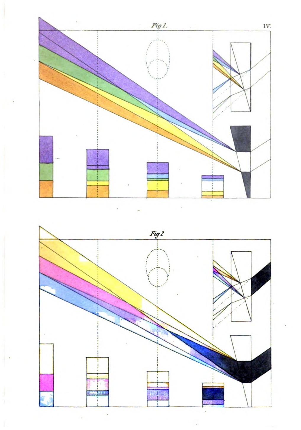
The centre of a large object remains long uncoloured, especially with mediums of less density and smaller angles; but at last the opposite borders and edges touch each other, upon which a green appears in the centre of the luminous image.
The center of a large object stays mostly uncolored for a long time, especially with less dense materials and smaller angles; but eventually, the opposite borders and edges connect, causing a green hue to appear in the center of the bright image.
Objective experiments have been usually made with the sun's image: an objective experiment with a dark object has hitherto scarcely been thought of. We have, however, prepared a convenient contrivance for this also. Let the large water-prism before alluded to be placed in the sun, and let a round pasteboard disk be fastened either inside or outside. The coloured appearance will again take place at the outline, beginning according to the usual law; the edges will appear, they will spread in the same proportion, and when they meet, red will appear in the centre[2]. An intercepting square may be added near the round disk, and placed in any direction ad libitum, and the spectator can again convince himself of what has been before so often described.
Objective experiments have typically been conducted using the sun's image: a similar experiment with a dark object hasn’t really been considered. However, we have created a convenient setup for this as well. Place the large water prism mentioned earlier in the sunlight, and attach a round cardboard disk either inside or outside. The colored effect will once again occur at the outline, starting according to the usual pattern; the edges will become visible, they will expand proportionally, and when they meet, red will appear in the center[2]. A blocking square can be added near the round disk and positioned in any direction ad libitum, allowing the viewer to again verify what has been described so many times before.
If we take away these dark objects from the[Pg 138] prism, in which case, however, the glass is to be carefully cleaned, and hold a rod or a large pencil before the centre of the horizontal prism, we shall then accomplish the complete immixture of the violet border and the yellow-red edge, and see only the three colours, the external blue, and yellow, and the central red.
If we remove these dark objects from the[Pg 138] prism, we need to carefully clean the glass first. Then, if we hold a rod or a large pencil in front of the center of the horizontal prism, we will fully mix the violet border and the yellow-red edge, and we will only see the three colors: the outer blue, yellow, and the central red.
If again we cut a long horizontal opening in the middle of a piece of pasteboard, fastened on the prism, and then cause the sun-light to pass through it, we shall accomplish the complete union of the yellow border with the blue edge upon the light, and only see yellow-red, green and violet. The details of this are further entered into in the description of the plates.
If we make a long horizontal cut in the middle of a piece of cardboard attached to the prism, and then let sunlight pass through it, we will achieve a complete blend of the yellow border with the blue edge in the light, resulting in only yellow-red, green, and violet being visible. More details on this are provided in the description of the plates.
The prismatic appearance is thus by no means complete and final when the luminous image emerges from the prism. It is then only that we perceive its elements in contrast; for as it increases these contrasting elements unite, and are at last intimately joined. The section of this phenomenon arrested on a plane surface is different at every degree of distance from the prism; so that the notion of an immutable series of colours, or of a pervading similar proportion between them, cannot be a question for a moment.
The prismatic appearance isn't complete or final when the light image comes out of the prism. It's only then that we notice the different elements in contrast; as the image gets brighter, these contrasting elements blend together and eventually become closely connected. The way this phenomenon looks on a flat surface changes at every distance from the prism, which means the idea of a fixed series of colors, or a consistent ratio between them, can't be taken seriously for a second.
XXIV.
EXPLANATION OF THE FOREGOING PHENOMENA.
As we have already entered into this analysis circumstantially while treating of the subjective experiments, as all that was of force there is equally valid here, it will require no long details in addition to show that the phenomena, which are entirely parallel in the two cases, may also be traced precisely to the same sources.
As we've already touched on this analysis while discussing the subjective experiments, everything that applied there is also relevant here. It won't take much more to show that the phenomena, which are completely similar in both cases, can also be traced back to the same sources.
That in objective experiments also we have to do with circumscribed images, has been already demonstrated at large. The sun may shine through the smallest opening, yet the image of the whole disk penetrates beyond. The largest prism may be placed in the open sun-light, yet it is still the sun's image that is bounded by the edges of the refracting surfaces, and produces the accessory images of this boundary. We may fasten pasteboard, with many openings cut in it, before the water-prism, yet we still merely see multiplied images which, after having been moved from their place by refraction, exhibit coloured edges and borders, and in these mere accessory images.
That in objective experiments we also deal with defined images has already been extensively proven. The sun can shine through the smallest opening, yet the image of the entire disk reaches beyond. The largest prism can be placed in direct sunlight, but it’s still the sun's image that is contained by the edges of the refracting surfaces and creates the additional images of this boundary. We can attach a piece of cardboard with several cut openings in front of the water prism, yet we still only see multiple images that, after being displaced by refraction, show colored edges and borders, and these are just additional images.
In subjective experiments we have seen that objects strongly relieved from each other produce a very lively appearance of colour, and this will be the case in objective experiments in a much more vivid and splendid degree. The sun's image is the most powerful brightness we know; hence its accessory image will be energetic in proportion, and notwithstanding its really secondary dimmed and darkened character, must be still very brilliant. The colours thrown by the sun-light through the prism on any object, carry a powerful light with them, for they have the highest and most intense source of light, as it were, for their ground.
In subjective experiments, we've noticed that objects that are clearly separated from each other create a very vibrant appearance of color, and this will be even more pronounced in objective experiments, with much greater intensity and brilliance. The sun’s image is the brightest source we know; therefore, its secondary image will also be strong in proportion. Despite its inherently dimmed and darker quality, it will still be quite bright. The colors projected by sunlight through a prism onto any object come with a strong light, as they originate from the most intense source of illumination available.
That we are warranted in calling even these accessory images semi-transparent, thus deducing the appearances from the doctrine of the semi-transparent mediums, will be clear to every one who has followed us thus far, but particularly to those who have supplied themselves with the necessary apparatus, so as to be enabled at all times to witness the precision and vivacity with which semi-transparent mediums act.
That we are justified in calling even these extra images semi-transparent, and thus deriving the visuals from the idea of semi-transparent mediums, will be clear to anyone who has followed our argument so far, especially to those who have equipped themselves with the necessary tools to consistently observe the accuracy and vibrancy with which semi-transparent mediums operate.
XXV.
DECREASE OF THE APPEARANCE OF COLOUR.
If we could afford to be concise in the description of the decreasing coloured appearance in subjective cases, we may here be permitted to proceed with still greater brevity while we refer to the former distinct statement. One circumstance, only on account of its great importance, may be here recommended to the reader's especial attention as a leading point of our whole thesis.
If we can be brief in describing the fading colorful appearance in subjective cases, we can be even more concise while referring back to the previous clear statement. One factor, due to its significant importance, deserves the reader's particular attention as a key point of our entire argument.
The decline of the prismatic appearance must be preceded by its separation, by its resolution into its elements. At a due distance from the prism, the image of the sun being entirely coloured, the blue and yellow at length mix completely, and we see only yellow-red, green, and blue-red. If we bring the recipient surface nearer to the refracting medium, yellow and blue appear again, and we see the five colours with their gradations. At a still shorter distance the yellow and blue separate from each other entirely, the green vanishes, and the image itself appears, colourless, between the coloured edges and borders. The nearer we bring the recipient surface to the prism, the[Pg 142] narrower the edges and borders become, till at last, when in contact with the prism, they are reduced to nothing.
The decline of the prismatic appearance must come after its separation, breaking down into its elements. At a certain distance from the prism, the sunlight is fully colored; the blue and yellow eventually blend together, and we only see yellow-red, green, and blue-red. If we move the receiving surface closer to the refracting medium, yellow and blue reappear, and we see the five colors with their shades. At an even closer distance, yellow and blue come completely apart, green disappears, and the image itself looks colorless between the colored edges. The closer we bring the receiving surface to the prism, the[Pg 142] narrower the edges become until, finally, when it touches the prism, they vanish entirely.
XXVI.
GREY OBJECTS.
We have exhibited grey objects as very important to our inquiry in the subjective experiments. They show, by the faintness of the accessory images, that these same images are in all cases derived from the principal object. If we wish here, too, to carry on the objective experiments parallel with the others, we may conveniently do this by placing a more or less dull ground glass before the opening through which the sun's image enters. By this means a subdued image would be produced, which on being refracted would exhibit much duller colours on the recipient plane than those immediately derived from the sun's disk; and thus, even from the intense sun-image, only a faint accessory image would appear, proportioned to the mitigation of the light by the glass. This experiment, it is true, will only again and again confirm what is already sufficiently familiar to us.
We have shown that gray objects are crucial to our investigation in the subjective experiments. They demonstrate, through the faintness of the additional images, that these images are always derived from the main object. If we also want to conduct the objective experiments alongside the others, we can easily do this by placing a more or less dull ground glass in front of the opening through which the sun's image comes in. This will create a softer image that, when refracted, will show much duller colors on the surface than those directly from the sun's disk; thus, even from the bright sun image, only a faint additional image will appear, depending on how much the light is softened by the glass. This experiment, it’s true, will repeatedly confirm what we already know well.
XXVII.
COLOURED OBJECTS.
There are various modes of producing coloured images in objective experiments. In the first place, we can fix coloured glass before the opening, by which means a coloured image is at once produced; secondly, we can fill the water-prism with coloured fluids; thirdly, we can cause the colours, already produced in their full vivacity by the prism, to pass through proportionate small openings in a tin plate, and thus prepare small circumscribed colours for a second operation. This last mode is the most difficult; for owing to the continual progress of the sun, the image cannot be arrested in any direction at will. The second method has also its inconveniences, since not all coloured liquids can be prepared perfectly bright and clear. On these accounts the first is to be preferred, and deserves the more to be adopted because natural philosophers have hitherto chosen to consider the colours produced from the sun-light through the prism, those produced through liquids and glasses, and those which are already fixed on paper or cloth, as exhibiting effects equally to be depended on, and equally available in demonstration.
There are different ways to create colored images in objective experiments. First, we can place colored glass in front of the opening, which instantly produces a colored image. Second, we can fill the water prism with colored liquids. Third, we can allow the colors, already vividly created by the prism, to pass through small openings in a tin plate, preparing small, defined colors for a second operation. This last method is the most challenging because, due to the constant movement of the sun, the image can't be captured in any specific direction at will. The second method also has its drawbacks, as not all colored fluids can be made perfectly bright and clear. For these reasons, the first method is preferred and is more worthy of use because natural philosophers have generally considered the colors produced by sunlight through the prism, those generated by liquids and glasses, and those already fixed on paper or fabric to be equally reliable and useful for demonstration.
As it is thus merely necessary that the image[Pg 144] should be coloured, so the large water-prism before alluded to affords us the best means of effecting this. A pasteboard screen may be contrived to slide before the large surfaces of the prism, through which, in the first instance, the light passes uncoloured. In this screen openings of various forms may be cut, in order to produce different images, and consequently different accessory images. This being done, we need only fix coloured glasses before the openings, in order to observe what effect refraction produces on coloured images in an objective sense.
It's simply necessary for the image[Pg 144] to be colored, so the large water prism previously mentioned gives us the best way to achieve this. A cardboard screen can be designed to slide in front of the large surfaces of the prism, through which light initially passes without color. Various shapes can be cut into this screen to create different images and, as a result, different accessory images. Once that’s done, we just need to place colored glasses in front of the openings to see what effect refraction has on colored images in an objective sense.
A series of glasses may be prepared in a mode similar to that before described (284); these should be accurately contrived to slide in the grooves of the large water-prism. Let the sun then shine through them, and the coloured images refracted upwards will appear bordered and edged, and will vary accordingly: for these borders and edges will be exhibited quite distinctly on some images, and on others will be mixed with the specific colour of the glass, which they will either enhance or neutralize. Every observer will be enabled to convince himself here again that we have only to do with the same simple phenomenon so circumstantially described subjectively and objectively.
A series of glasses can be made in a way similar to what was described earlier (284); they should be precisely designed to fit in the grooves of the large water prism. Then, let the sun shine through them, and the colored images refracted upward will appear bordered and edged, varying accordingly: these borders and edges will be clearly visible on some images, while on others, they will blend with the specific color of the glass, either enhancing or neutralizing it. Each observer will be able to verify once again that we are only dealing with the same basic phenomenon described in both subjective and objective terms.
XXVIII.
ACHROMATISM AND HYPERCHROMATISM.
It is possible to make the hyperchromatic and achromatic experiments objectively as well as subjectively. After what has been already stated, a short description of the method will suffice, especially as we take it for granted that the compound prism before mentioned is in the hands of the observer.
It’s possible to conduct hyperchromatic and achromatic experiments both objectively and subjectively. Given what has already been said, a brief description of the method will be enough, especially since we assume that the compound prism mentioned earlier is with the observer.
Let the sun's image pass through an acute-angled prism of few degrees, prepared from crown-glass, so that the spectrum be refracted upwards on an opposite surface; the edges will appear coloured, according to the constant law, namely, the violet and blue above and outside, the yellow and yellow-red below and within the image. As the refracting angle of this prism is undermost, let another proportionate prism of flint-glass be placed against it, with its refracting angle uppermost. The sun's image will by this means be again moved to its place, where, owing to the excess of the colouring power of the prism of flint-glass, it will still appear a little coloured, and, in consequence of the direction in which it has been moved, the blue and violet[Pg 146] will now appear underneath and outside, the yellow and yellow-red above and inside.
Let the sun's image pass through a sharp-angled prism of a few degrees, made from crown glass, so that the spectrum is refracted upward onto the opposite surface; the edges will show colors according to the consistent pattern, with violet and blue appearing above and outside, and yellow and yellow-red below and within the image. Since the refracting angle of this prism is at the bottom, place another appropriately sized prism of flint glass against it, with its refracting angle at the top. This will move the sun's image back to its original position, where, due to the stronger coloring power of the flint glass prism, it will still look slightly colored, and as a result of the direction it has been shifted, the blue and violet[Pg 146] will now appear beneath and outside, while the yellow and yellow-red will be above and inside.
If the whole image be now moved a little upwards by a proportionate prism of crown-glass, the hyperchromatism will disappear, the sun's image will be moved from its place, and yet will appear colourless.
If the entire image is now moved slightly upward by a proportional prism of crown glass, the hyperchromatism will vanish, the sun's image will shift from its original position, yet it will still look colorless.
With an achromatic object-glass composed of three glasses, this experiment may be made step by step, if we do not mind taking out the glasses from their setting. The two convex glasses of crown-glass in contracting the sun's image towards the focus, the concave glass of flint-glass in dilating the image beyond it, exhibit at the edges the usual colours. A convex glass united with a concave one exhibits the colours according to the law of the latter. If all three glasses are placed together, whether we contract the sun's image towards the focus, or suffer it to dilate beyond the focus, coloured edges never appear, and the achromatic effect intended by the optician is, in this case, again attained.
With an achromatic lens made up of three different glasses, this experiment can be conducted step by step, as long as we don't mind removing the glasses from their frame. The two convex crown-glass lenses focus the sun's image, while the concave flint-glass lens spreads the image out beyond this point, displaying the usual colors at the edges. When a convex lens is combined with a concave one, the colors appear based on the law governing the latter. However, if all three lenses are placed together, whether we focus the sun's image or allow it to spread out, colored edges don't show up, achieving the intended achromatic effect that the optician aimed for.
But as the crown-glass has always a greenish tint, and as a tendency to this hue may be more[Pg 147] decided in large and strong object-glasses, and under certain circumstances produce the compensatory red, (which, however, in repeated experiments with several instruments of this kind did not occur to us,) philosophers have resorted to the most extraordinary modes of explaining such a result; and having been compelled, in support of their system, theoretically to prove the impossibility of achromatic telescopes, have felt a kind of satisfaction in having some apparent ground for denying so great an improvement. Of this, however, we can only treat circumstantially in our historical account of these discoveries.
But since crown glass always has a greenish tint, and this hue can be more pronounced in larger and stronger lenses, which under certain conditions can create a compensatory red—even though we never encountered this in multiple tests with several instruments—philosophers have come up with some pretty outlandish explanations for this result. They have been forced to theoretically prove the impossibility of achromatic telescopes to support their arguments and have derived some satisfaction from having a seemingly valid reason to deny such a significant advancement. However, we will only discuss this in detail in our historical account of these discoveries.
XXIX.
COMBINATION OF SUBJECTIVE AND OBJECTIVE EXPERIMENTS.
Having shown above (318) that refraction, considered objectively and subjectively, must act in opposite directions, it will follow that if we combine the experiments, the effects will reciprocally destroy each other.
Having shown above (318) that refraction, viewed both objectively and subjectively, must operate in opposing directions, it follows that if we combine the experiments, the effects will cancel each other out.
Let the sun's image be thrown upwards on a[Pg 148] vertical plane, through a horizontally-placed prism. If the prism is long enough to admit of the spectator also looking through it, he will see the image elevated by the objective refraction again depressed, and in the same place in which it appeared without refraction.
Let the image of the sun be projected upwards onto a[Pg 148] vertical surface using a horizontally positioned prism. If the prism is long enough for the viewer to look through it as well, they will see the image raised by the objective refraction, but then lowered again, appearing in the same spot it did without refraction.
Here a remarkable case presents itself, but at the same time a natural result of a general law. For since, as often before stated, the objective sun's image thrown on the vertical plane is not an ultimate or unchangeable state of the phenomenon, so in the above operation the image is not only depressed when seen through the prism, but its edges and borders are entirely robbed of their hues, and the spectrum is reduced to a colourless circular form.
Here, a remarkable case appears, but it’s also a natural result of a general principle. As mentioned several times before, the image of the sun projected onto a vertical surface is not a final or fixed state of the phenomenon. In the operation described above, the image not only appears dimmer when viewed through the prism, but its edges and borders completely lose their colors, resulting in a colorless circular spectrum.
By employing two perfectly similar prisms placed next each other, for this experiment, we can transmit the sun's image through one, and look through the other.
By using two identical prisms placed next to each other for this experiment, we can project the sun's image through one and look through the other.
If the spectator advances nearer with the prism through which he looks, the image is again elevated, and by degrees becomes coloured according to the law of the first prism. If he[Pg 149] again retires till he has brought the image to the neutralized point, and then retires still farther away, the image, which had become round and colourless, moves still more downwards and becomes coloured in the opposite sense, so that if we look through the prism and upon the refracted spectrum at the same time, we see the same image coloured according to subjective and objective laws.
If the viewer moves closer with the prism they're using, the image rises again and gradually takes on color based on the properties of the first prism. If they[Pg 149] pull back until the image reaches a neutral point, and then move even farther away, the image, which had become round and colorless, shifts lower and takes on color in the opposite direction. This means that if we look through the prism while also observing the refracted spectrum, we see the same image colored according to both subjective and objective principles.
The modes in which this experiment may be varied are obvious. If the refracting angle of the prism, through which the sun's image was objectively elevated, is greater than that of the prism through which the observer looks, he must retire to a much greater distance, in order to depress the coloured image so low on the vertical plane that it shall appear colourless, and vice versâ.
The ways this experiment can be changed are clear. If the refracting angle of the prism that elevated the sun's image is greater than that of the prism the observer is looking through, they need to step back much further to lower the colored image on the vertical plane enough for it to look colorless, and vice versa.
It will be easily seen that we may exhibit achromatic and hyperchromatic effects in a similar manner, and we leave it to the amateur to follow out such researches more fully. Other complicated experiments in which prisms and lenses are employed together, others again, in which objective and subjective experiments are variously intermixed, we reserve for a future[Pg 150] occasion, when it will be our object to trace such effects to the simple phenomena with which we are now sufficiently familiar.
It will be clear that we can show achromatic and hyperchromatic effects in a similar way, and we encourage the enthusiast to explore these studies further. We will save other complex experiments that use prisms and lenses together, as well as those that mix objective and subjective experiments, for a future[Pg 150] opportunity, when we aim to connect these effects to the simple phenomena we are already familiar with.
XXX.
TRANSITION.
In looking back on the description and analysis of dioptrical colours, we do not repent either that we have treated them so circumstantially, or that we have taken them into consideration before the other physical colours, out of the order we ourselves laid down. Yet, before we quit this branch of our inquiry, it may be as well to state the reasons that have weighed with us.
Looking back on our description and analysis of optical colors, we don’t regret that we addressed them in detail or that we considered them before other physical colors, even though that wasn’t the order we initially set. However, before we move on from this part of our investigation, it might be good to explain the reasons behind our choices.
If some apology is necessary for having treated the theory of the dioptrical colours, particularly those of the second class, so diffusely, we should observe, that the exposition of any branch of knowledge is to be considered partly with reference to the intrinsic importance of the subject, and partly with reference to the particular necessities of the time in which the[Pg 151] inquiry is undertaken. In our own case we were forced to keep both these considerations constantly in view. In the first place we had to state a mass of experiments with our consequent convictions; next, it was our especial aim to exhibit certain phenomena (known, it is true, but misunderstood, and above all, exhibited in false connection,) in that natural and progressive development which is strictly and truly conformable to observation; in order that hereafter, in our polemical or historical investigations, we might be enabled to bring a complete preparatory analysis to bear on, and elucidate, our general view. The details we have entered into were on this account unavoidable; they may be considered as a reluctant consequence of the occasion. Hereafter, when philosophers will look upon a simple principle as simple, a combined effect as combined; when they will acknowledge the first elementary, and the second complicated states, for what they are; then, indeed, all this statement may be abridged to a narrower form; a labour which, should we ourselves not be able to accomplish it, we bequeath to the active interest of contemporaries and posterity.
If we need to apologize for discussing the theory of dioptrical colors, especially the second class, in so much detail, we should note that any subject matter is examined partly for its inherent significance and partly based on the specific needs of the time when the inquiry takes place. In our case, we had to keep both factors in mind. First, we had to present a wealth of experiments and our resulting beliefs; second, we aimed to illustrate certain phenomena that are known but often misunderstood, and importantly, shown in misleading contexts, in a natural and progressive way that truly aligns with observation. This was done so that in future discussions or historical analyses, we could apply a thorough preparatory analysis to clarify our overall perspective. The details we've included were, therefore, unavoidable; they can be seen as an unwilling result of the situation. In the future, when philosophers will recognize a simple principle as simple and a combined effect as combined; when they will see the first elementary state and the second complex state for what they are; then, indeed, this explanation could be condensed into a more concise form—a task we leave to the keen interest of our contemporaries and future generations.
With respect to the order of the chapters, it should be remembered that natural phenomena,[Pg 152] which are even allied to each other, are not connected in any particular sequence or constant series; their efficient causes act in a narrow circle, so that it is in some sort indifferent what phenomenon is first or last considered; the main point is, that all should be as far as possible present to us, in order that we may embrace them at last from one point of view, partly according to their nature, partly according to generally received methods.
Regarding the order of the chapters, it should be noted that natural phenomena,[Pg 152] even if they are related, are not arranged in any specific sequence or constant pattern; their effective causes operate within a limited range, so it doesn't really matter which phenomenon we examine first or last. The key is that we should have all of them as much as possible in front of us, so we can understand them from a single perspective, partly based on their characteristics and partly on commonly accepted methods.
Yet, in the present particular instance, it may be asserted that the dioptrical colours are justly placed at the head of the physical colours; not only on account of their striking splendour and their importance in other respects, but because, in tracing these to their source, much was necessarily entered into which will assist our subsequent enquiries.
Yet, in this specific case, it can be said that the optical colors are rightly considered the most significant among physical colors; not only because of their vibrant brilliance and their importance in other ways, but also because exploring their origins involves many details that will help with our future inquiries.
For, hitherto, light has been considered as a kind of abstract principle, existing and acting independently; to a certain extent self-modified, and on the slightest cause, producing colours out of itself. To divert the votaries of physical science from this mode of viewing the subject; to make them attentive to the fact, that in prismatic and other appearances we have not to do[Pg 153] with light as an uncircumscribed and modifying principle, but as circumscribed and modified; that we have to do with a luminous image; with images or circumscribed objects generally, whether light or dark: this was the purpose we had in view, and such is the problem to be solved.
For a long time, light has been seen as an abstract principle that exists and acts on its own; somewhat self-modifying, and creating colors with the slightest trigger. Our aim was to shift the focus of physical science away from this perspective; to highlight the fact that when we look at prismatic and other phenomena, we’re not dealing with light as an unlimited and modifying force, but rather as something limited and modified; that we are dealing with a luminous image; with images or defined objects in general, whether they are illuminated or not: this was our goal, and this is the problem we need to solve.
All that takes place in dioptrical cases,—especially those of the second class which are connected with the phenomena of refraction,—is now sufficiently familiar to us, and will serve as an introduction to what follows.
All that happens in optical cases—especially those of the second class related to refraction phenomena—is now well-known to us and will serve as an introduction to what comes next.
Catoptrical appearances remind us of the physiological phenomena, but as we ascribe a more objective character to the former, we thought ourselves justified in classing them with the physical examples. It is of importance, however, to remember that here again it is not light, in an abstract sense, but a luminous image that we have to consider.
Catoptrical appearances remind us of physiological phenomena, but since we attribute a more objective nature to the former, we felt justified in categorizing them with physical examples. However, it’s important to remember that, once again, it’s not light in an abstract sense that we’re talking about, but a luminous image that we need to consider.
In proceeding onwards to the paroptrical class, the reader, if duly acquainted with the foregoing facts, will be pleased to find himself once more in the region of circumscribed forms. The shadows of bodies, especially, as secondary[Pg 154] images, so exactly accompanying the object, will serve greatly to elucidate analogous appearances.
As we move on to the paroptrical class, the reader, if familiar with the previous information, will be glad to find himself back in the realm of defined shapes. The shadows of objects, particularly as secondary[Pg 154] images, closely matching the object, will greatly help to clarify similar appearances.
We will not, however, anticipate these statements, but proceed as heretofore in what we consider the regular course.
We won’t, however, jump ahead with these statements, but will continue as we have before in what we see as the usual course.
XXXI.
CATOPTRICAL COLOURS.
Catoptrical colours are such as appear in consequence of a mirror-like reflection. We assume, in the first place, that the light itself as well as the surface from which it is reflected, is perfectly colourless. In this sense the appearances in question come under the head of physical colours. They arise in consequence of reflection, as we found the dioptrical colours of the second class appear by means of refraction. Without further general definitions, we turn our attention at once to particular cases, and to the conditions which are essential to the exhibition of these phenomena.
Catoptrical colors are those that appear due to a mirror-like reflection. First, we assume that both the light itself and the surface it's reflected from are completely colorless. In this way, the colors in question fall under the category of physical colors. They occur as a result of reflection, just as we observed that the dioptrical colors of the second class come into being through refraction. Without getting into more general definitions, let's focus directly on specific cases and the conditions that are essential for these phenomena to occur.
If we unroll a coil of bright steel-wire, and after suffering it to spring confusedly together again, place it at a window in the light, we shall see the prominent parts of the circles and convolutions illumined, but neither resplendent nor iridescent. But if the sun shines on the wire, this light will be condensed into a point, and we perceive a small resplendent image of the sun, which, when seen near, exhibits no colour. On retiring a little, however, and fixing the eyes on this refulgent appearance, we discern several small mirrored suns, coloured in the most varied manner; and although the impression is that green and red predominate, yet, on a more accurate inspection, we find that the other colours are also present.
If we uncoil a bright steel wire and then let it spring back together randomly, and place it at a window in the light, we’ll see the raised parts of the circles and twists lit up, but not shiny or colorful. However, when the sun shines on the wire, that light will focus into a point, and we’ll see a small bright image of the sun, which appears colorless up close. But if we step back a bit and fix our eyes on this bright spot, we notice several small mirrored suns, showing a variety of colors; and although it seems like green and red are the most dominant, upon closer inspection, we realize that other colors are also present.
If we take an eye-glass, and examine the appearance through it, we find the colours have vanished, as well as the radiating splendour in which they were seen, and we perceive only the small luminous points, the repeated images of the sun. We thus find that the impression is subjective in its nature, and that the appearance is allied to those which we have adverted to under the name of radiating halos (100).
If we take a magnifying glass and look through it, we see that the colors have disappeared, along with the bright brilliance in which they were originally seen, and we only notice the tiny bright spots, the repeated images of the sun. This shows us that the impression is subjective and that the appearance is related to those we've mentioned before as radiating halos (100).
We can, however, exhibit this phenomenon objectively. Let a piece of white paper be fastened beneath a small aperture in the lid of a camera-obscura, and when the sun shines through this aperture, let the confusedly-rolled steel-wire be held in the light, so that it be opposite to the paper. The sun-light will impinge on and in the circles of the wire, and will not, as in the concentrating lens of the eye, display itself in a point; but, as the paper can receive the reflection of the light in every part of its surface will be seen in hair-like lines, which are also iridescent.
We can, however, demonstrate this phenomenon objectively. If we take a piece of white paper and place it under a small opening in the lid of a camera obscura, and when the sun shines through this opening, we hold a tangled piece of steel wire in the light so that it's facing the paper, the sunlight will hit the circles of the wire. Unlike the concentrated image formed by the lens of the eye, the light will not appear as a single point. Instead, since the paper can reflect light from every part of its surface, we will see it in fine, hair-like lines that also have a shimmering effect.
This experiment is purely catoptrical; for as we cannot imagine that the light penetrates the surface of the steel, and thus undergoes a change, we are soon convinced that we have here a mere reflection which, in its subjective character, is connected with the theory of faintly acting lights, and the after-image of dazzling lights, and as far as it can be considered objective, announces even in the minutest appearances, a real effect, independent of the action and reaction of the eye.
This experiment is purely about reflection; since we can't think of light penetrating the surface of the steel and changing, it becomes clear that we're really seeing just a reflection. This relates to the idea of lightly acting lights and the after-image from bright lights, and as much as it can be seen objectively, it still shows a real effect in even the tiniest details, which is independent of how the eye reacts.
We have seen that to produce these effects[Pg 157] not merely light but a powerful light is necessary; that this powerful light again is not an abstract and general quality, but a circumscribed light, a luminous image. We can convince ourselves still further of this by analogous cases.
We have seen that to produce these effects[Pg 157], not just any light but a strong light is needed; and this strong light is not an abstract or general quality, but a specific light, a bright image. We can further convince ourselves of this by looking at similar cases.
A polished surface of silver placed in the sun reflects a dazzling light, but in this case no colour is seen. If, however, we slightly scratch the surface, an iridescent appearance, in which green and red are conspicuous, will be exhibited at a certain angle. In chased and carved metals the effect is striking: yet it may be remarked throughout that, in order to its appearance, some form, some alternation of light and dark must co-operate with the reflection; thus a window-bar, the stem of a tree, an accidentally or purposely interposed object produces a perceptible effect. This appearance, too, may be exhibited objectively in the camera-obscura.
A shiny silver surface in the sun reflects a dazzling light, but in this case, it doesn’t show any color. However, if we gently scratch the surface, an iridescent effect with noticeable greens and reds appears at certain angles. The effect is even more striking on engraved and carved metals. It’s worth noting that for this effect to occur, there has to be some form, some contrast between light and dark working together with the reflection; for instance, a window bar, the trunk of a tree, or an object placed in a certain way creates a noticeable effect. This appearance can also be captured objectively in a camera obscura.
If we cause a polished plated surface to be so acted on by aqua fortis that the copper within is touched, and the surface itself thus rendered rough, and if the sun's image be then reflected from it, the splendour will be reverberated from every minutest prominence, and the surface will appear iridescent. So, if we hold a sheet of[Pg 158] black unglazed paper in the sun, and look at it attentively, it will be seen to glisten in its minutest points with the most vivid colours.
If we expose a polished metal surface to nitric acid in such a way that it affects the copper underneath, making the surface rough, and then reflect sunlight off it, the light will shine from every tiny bump, and the surface will look iridescent. Similarly, if we hold a piece of[Pg 158] black unglazed paper in the sun and stare at it closely, we can see it sparkle with bright colors in its smallest spots.
All these examples are referable to the same conditions. In the first case the luminous image is reflected from a thin line; in the second probably from sharp edges; in the third from very small points. In all a very powerful and circumscribed light is requisite. For all these appearances of colour again it is necessary that the eye should be at a due distance from the reflecting points.
All these examples can be traced back to the same conditions. In the first case, the bright image is reflected from a thin line; in the second, probably from sharp edges; and in the third, from very small points. In all instances, a very strong and focused light is needed. Additionally, for all these color effects, it's important that the eye is positioned at the right distance from the reflecting points.
If these observations are made with the microscope, the appearance will be greatly increased in force and splendour, for we then see the smallest portion of the surfaces, lit by the sun, glittering in these colours of reflection, which, allied to the hues of refraction, now attain their highest degree of brilliancy. In such cases we may observe a vermiform iridescence on the surface of organic bodies, the further description of which will be given hereafter.
If you look at these observations under a microscope, they will appear much more vibrant and spectacular. You can see the tiniest parts of the surfaces, shining in these reflective colors brought out by sunlight, combined with the colors from refraction, which reach their peak brilliance. In these instances, we can notice a worm-like shimmer on the surfaces of organic materials, which will be described in more detail later.
Lastly, the colours which are chiefly exhibited[Pg 159] in reflection are red and green, whence we may infer that the linear appearance especially consists of a thin line of red, bounded by blue on one side and yellow on the other. If these triple lines approach very near together, the intermediate space must appear green; a phenomenon which will often occur to us as we proceed.
Lastly, the colors that are mainly shown[Pg 159] in reflection are red and green. From this, we can conclude that the linear appearance primarily consists of a thin line of red, bordered by blue on one side and yellow on the other. If these three lines come very close to each other, the space in between will look green—a phenomenon we will often encounter as we continue.
We frequently meet with these colours in nature. The colours of the spider's web might be considered exactly of the same class with those reflected from the steel wire, except that the non-translucent quality of the former is not so certain as in the case of steel; on which account some have been inclined to class the colours of the spider's web with the phenomena of refraction.
We often encounter these colors in nature. The colors of a spider's web can be seen as similar to those reflected from steel wire, except that the non-transparent nature of the web isn't as definite as it is with steel. For this reason, some people have been inclined to associate the colors of the spider's web with the phenomena of refraction.
In mother-of-pearl we perceive infinitely fine organic fibres and lamellæ in juxta-position, from which, as from the scratched silver before alluded to, varied colours, but especially red and green, may arise.
In mother-of-pearl, we see incredibly fine organic fibers and layers positioned next to each other, from which, similar to the scratched silver mentioned earlier, various colors—especially red and green—can emerge.
The changing colours of the plumage of birds may also be mentioned here, although in all organic[Pg 160] instances a chemical principle and an adaptation of the colour to the structure may be assumed; considerations to which we shall return in treating of chemical colours.
The changing colors of bird feathers can also be noted here, although in every organic[Pg 160] case, a chemical principle and an adaptation of color to structure can be assumed; points we will revisit when discussing chemical colors.
That the appearances of objective halos also approximate catoptrical phenomena will be readily admitted, while we again do not deny that refraction as well may here come into the account. For the present we restrict ourselves to one or two observations; hereafter we may be enabled to make a fuller application of general principles to particular examples.
That the appearances of objective halos are similar to reflective phenomena will be easily accepted, while we also acknowledge that refraction might play a role here. For now, we will focus on one or two observations; later, we may be able to apply general principles more thoroughly to specific examples.
We first call to mind the yellow and red circles produced on a white or grey wall by a light placed near it (88). Light when reflected appears subdued, and a subdued light excites the impression of yellow, and subsequently of red.
We first think about the yellow and red circles created on a white or grey wall by a light positioned nearby (88). Reflected light looks softer, and this softer light triggers the feeling of yellow, and then red.
Let the wall be illumined by a candle placed quite close to it. The farther the light is diffused the fainter it becomes; but it is still the effect of the flame, the continuation of its action, the dilated effect of its image. We might, therefore, very fairly call these circles[Pg 161] reiterated images, because they constitute the successive boundaries of the action of the light, and yet at the same time only present an extended image of the flame.
Let a candle shine on the wall from a close distance. The farther the light spreads, the dimmer it gets; but it's still the result of the flame, the ongoing effect of its presence, and the expanded image of it. We could accurately refer to these circles[Pg 161] as repeated images since they represent the gradual limits of the light's action, while also merely showing a broader image of the flame.
If the sky is white and luminous round the sun owing to the atmosphere being filled with light vapours; if mists or clouds pass before the moon, the reflection of the disk mirrors itself in them; the halos we then perceive are single or double, smaller or greater, sometimes very large, often colourless, sometimes coloured.
If the sky is bright and glowing around the sun because the atmosphere is full of light vapors; if mists or clouds move in front of the moon, the reflection of the disk is mirrored in them; the halos we see can be single or double, smaller or larger, sometimes very large, often colorless, and sometimes colored.
I witnessed a very beautiful halo round the moon the 15th of November, 1799, when the barometer stood high; the sky was cloudy and vapoury. The halo was completely coloured, and the circles were concentric round the light as in subjective halos. That this halo was objective I was presently convinced by covering the moon's disk, when the same circles were nevertheless perfectly visible.
I saw a stunning halo around the moon on November 15, 1799, when the barometer was high; the sky was cloudy and misty. The halo was fully colored, with concentric circles around the light like subjective halos. I quickly became convinced that this halo was real when I covered the moon's disk, yet the same circles were still clearly visible.
The different extent of the halos appears to have a relation with the proximity or distance of the vapour from the eye of the observer.
The varying sizes of the halos seem to be related to how close or far the vapor is from the observer's eye.
As window-panes lightly breathed upon increase the brilliancy of subjective halos, and in some degree give them an objective character, so, perhaps, with a simple contrivance in winter, during a quickly freezing temperature, a more exact definition of this might be arrived at.
As window panes lightly fog up, they enhance the brightness of subjective halos and, to some extent, give them an objective quality. Similarly, with a simple setup in winter during a rapidly freezing temperature, we might achieve a clearer understanding of this.
How much reason we have in considering these circles to insist on the image and its effects, is apparent in the phenomenon of the so-called double suns. Similar double images always occur in certain points of halos and circles, and only present in a circumscribed form what takes place in a more general way in the whole circle. All this will be more conveniently treated in connexion with the appearance of the rainbow.—Note Q.
How important it is for us to focus on the image and its effects becomes clear when we look at the phenomenon of the so-called double suns. Similar double images often appear at certain points in halos and circles, and they only represent in a limited way what happens more broadly in the entire circle. We will discuss all of this more easily in relation to the appearance of the rainbow.—Note Q.
In conclusion it is only necessary to point out the affinity between the catoptrical and paroptical colours.
In conclusion, it's only important to highlight the connection between the catoptrical and paroptical colors.
We call those paroptical colours which appear when the light passes by the edge of an opaque colourless body. How nearly these are allied to the dioptrical colours of the second class will be easily seen by those who are convinced with us that the colours of refraction[Pg 163] take place only at the edges of objects. The affinity again between the catoptrical and paroptical colours will be evident in the following chapter.
We refer to the colors that appear when light passes by the edge of an opaque, colorless object as paroptical colors. Those who agree with us will easily see how closely these are related to the second class of dioptrical colors, which occur only at the edges of objects. The connection between catoptrical and paroptical colors will be clear in the next chapter.
XXXII.
PAROPTICAL COLOURS.
The paroptical colours have been hitherto called peri-optical, because a peculiar effect of light was supposed to take place as it were round the object, and was ascribed to a certain flexibility of the light to and from the object.
The paroptical colors have previously been referred to as peri-optical because it was believed that a unique effect of light occurred around the object, which was attributed to a certain flexibility of the light to and from the object.
These colours again may be divided into subjective and objective, because they appear partly without us, as it were, painted on surfaces, and partly within us, immediately on the retina. In this chapter we shall find it more to our purpose to take the objective cases first, since the subjective are so closely connected with other appearances already known to us, that it is hardly possible to separate them.
These colors can again be divided into subjective and objective, because they appear partly outside of us, almost as if painted on surfaces, and partly inside us, directly on the retina. In this chapter, it makes more sense to discuss the objective cases first, since the subjective ones are so closely tied to other familiar appearances that it's nearly impossible to separate them.
The paroptical colours then are so called because[Pg 164] the light must pass by an outline or edge to produce them. They do not, however, always appear in this case; to produce the effect very particular conditions are necessary besides.
The paroptical colors are named that way because[Pg 164] the light needs to pass by an outline or edge to create them. However, they don’t always show up in this situation; specific conditions must be met to achieve the effect as well.
It is also to be observed that in this instance again light does not act as an abstract diffusion (361), the sun shines towards an edge. The volume of light poured from the sun-image passes by the edge of a substance, and occasions shadows. Within these shadows we shall presently find colours appear.
It’s important to note that in this case too, light doesn’t just spread out evenly (361); the sun shines toward an edge. The light coming from the sun creates shadows as it passes by the edge of an object. Within these shadows, we will soon see colors emerge.
But, above all, we should make the experiments and observations that bear upon our present inquiry in the fullest light. We, therefore, place the observer in the open air before we conduct him to the limits of a dark room.
But, most importantly, we should conduct the experiments and observations related to our current inquiry in the clearest way possible. So, we first position the observer outdoors before leading them into a dark room.
A person walking in sun-shine in a garden, or on any level path, may observe that his shadow only appears sharply defined next the foot on which he rests; farther from this point, especially round the head, it melts away into the bright ground. For as the sun-light proceeds not only from the middle of the sun, but also acts cross-wise from the two extremes of every[Pg 165] diameter, an objective parallax takes place which produces a half-shadow on both sides of the object.
A person walking in the sunshine in a garden or on any flat path may notice that their shadow is clearly defined only next to the foot they're standing on; farther from that point, especially around the head, it fades into the bright ground. Since sunlight comes not just from the center of the sun, but also spreads sideways from both ends of every[Pg 165] diameter, an objective parallax occurs, creating a half-shadow on both sides of the object.
If the person walking raises and spreads his hand, he distinctly sees in the shadow of each finger the diverging separation of the two half-shadows outwards, and the diminution of the principal shadow inwards, both being effects of the cross action of the light.
If a person walking raises and spreads their hand, they can clearly see in the shadow of each finger the separate halves of the shadow spreading outwards, while the main shadow shrinks inwards, both due to the intersecting effects of the light.
This experiment may be repeated and varied before a smooth wall, with rods of different thicknesses, and again with balls; we shall always find that the farther the object is removed from the surface of the wall, the more the weak double shadow spreads, and the more the forcible main shadow diminishes, till at last the main shadow appears quite effaced, and even the double shadows become so faint, that they almost disappear; at a still greater distance they are, in fact, imperceptible.
This experiment can be repeated and adjusted in front of a smooth wall, using rods of different thicknesses, and then with balls. We will always observe that the farther the object is from the wall, the more the faint double shadow spreads, and the more the strong main shadow reduces, until eventually the main shadow seems completely erased, and even the double shadows become so faint that they nearly vanish; at an even greater distance, they are essentially unnoticeable.
That this is caused by the cross-action of the light we may easily convince ourselves; for the shadow of a pointed object plainly exhibits two points. We must thus never lose sight of the[Pg 166] fact that in this case the whole sun-image acts, produces shadows, changes them to double shadows, and finally obliterates them.
That this is caused by the interaction of the light is something we can easily convince ourselves of; the shadow of a pointed object clearly shows two points. We must always remember the[Pg 166] fact that in this situation, the entire sun image is at play, creating shadows, turning them into double shadows, and ultimately erasing them.
Instead of solid bodies let us now take openings cut of various given sizes next each other, and let the sun shine through them on a plane surface at some little distance; we shall find that the bright image produced by the sun on the surface, is larger than the opening; this is because one edge of the sun shines towards the opposite edge of the opening, while the other edge of the disk is excluded on that side. Hence the bright image is more weakly lighted towards the edges.
Instead of using solid objects, let's look at openings of different sizes placed side by side and let sunlight shine through them onto a flat surface a short distance away. We'll notice that the bright image created by the sunlight on the surface is larger than the opening itself. This happens because one edge of the sun's light reaches the opposite edge of the opening, while the other edge of the sun's disk is blocked on that side. As a result, the bright image is less brightly lit at the edges.
If we take square openings of any size we please, we shall find that the bright image on a surface nine feet from the opening, is on every side about an inch larger than the opening; thus nearly corresponding with the angle of the apparent diameter of the sun.
If we take square openings of any size we like, we’ll find that the bright image on a surface nine feet away from the opening is about an inch larger all around than the opening itself; this closely matches the angle of the sun's apparent diameter.
That the brightness should gradually diminish towards the edges of the image is quite natural, for at last only a minimum of the light can act cross-wise from the sun's circumference through the edge of the aperture.
It's completely normal for the brightness to fade towards the edges of the image because, in the end, only a little bit of light can come in sideways from the sun's outer edge through the aperture's edge.
Thus we here again see how much reason we have in actual observation to guard against the assumption of parallel rays, bundles and fasces of rays, and the like hypothetical notions.
So, we see once again how much we should be cautious about assuming parallel rays, groups and bundles of rays, and other similar hypothetical ideas based on real observation.
We might rather consider the splendour of the sun, or of any light, as an infinite specular multiplication of the circumscribed luminous image, whence it may be explained that all square openings through which the sun shines, at certain distances, according as the apertures are greater or smaller, must give a round image of light.
We could think of the brightness of the sun, or any light, as an endless reflection of the surrounded bright image. This explains why all square openings that let sunlight in, depending on how big or small they are, must produce a round image of light.
The above experiments may be repeated through openings of various shapes and sizes, and the same effect will always take place at proportionate distances. In all these cases, however, we may still observe that in a full light and while the sun merely shines past an edge, no colour is apparent.
The experiments mentioned above can be repeated through openings of different shapes and sizes, and you will always see the same effect at corresponding distances. In all these cases, though, we can still notice that in bright light, when the sun simply shines past an edge, no color is visible.
We therefore proceed to experiments with a subdued light, which is essential to the appearance of colour. Let a small opening be made in the window-shutter of a dark room; let the[Pg 168] crossing sun-light which enters, be received on a surface of white paper, and we shall find that the smaller the opening is, the dimmer the light image will be. This is quite obvious, because the paper does not receive light from the whole sun, but partially from single points of its disk.
We will now conduct experiments with low light, which is crucial for seeing color. Let's create a small opening in the window-shutter of a dark room; when sunlight comes through this opening and hits a surface of white paper, we’ll see that the smaller the opening, the dimmer the light will appear. This is easy to understand because the paper is only getting light from a few points on the sun's surface, not from the entire sun.
If we look attentively at this dim image of the sun, we find it still dimmer towards the outlines where a yellow border is perceptible. The colour is still more apparent if a vapour or a transparent cloud passes before the sun, thus subduing and dimming its brightness. The halo on the wall, the effect of the decreasing brightness of a light placed near it, is here forced on our recollection. (88.)
If we take a close look at this faint image of the sun, we notice it's even fainter along the edges where a yellow border is visible. The color becomes even more noticeable if mist or a thin cloud moves in front of the sun, softening and dimming its brightness. The halo on the wall, a result of the reduced brightness from a light positioned nearby, comes to mind here. (88.)
If we examine the image more accurately, we perceive that this yellow border is not the only appearance of colour; we can see, besides, a bluish circle, if not even a halo-like repetition of the coloured border. If the room is quite dark, we discern that the sky next the sun also has its effect: we see the blue sky, nay, even the whole landscape, on the paper, and are thus again convinced that as far as regards the sun, we have here only to do with a luminous image.
If we take a closer look at the image, we see that this yellow border isn't the only splash of color; there's also a bluish circle, or maybe even a halo-like repetition of the colored border. In a really dark room, we notice that the sky next to the sun also impacts the scene: we see the blue sky, and even the entire landscape, reflected on the paper, which makes us realize that, in relation to the sun, we’re only dealing with a bright image.
If we take a somewhat larger square opening, so large that the image of the sun shining through it does not immediately become round, we may distinctly observe the half-shadows of every edge or side, the junction of these in the corners, and their colours; just as in the above-mentioned appearance with the round opening.
If we use a larger square opening, big enough that the image of the sun shining through it doesn't immediately look round, we can clearly see the half-shadows on each edge or side, where they meet in the corners, and their colors; similar to what we mentioned before with the round opening.
We have now subdued a parallactic light by causing it to shine through small apertures, but we have not taken from it its parallactic character; so that it can produce double shadows of bodies, although with diminished power. These double shadows which we have hitherto been describing, follow each other in light and dark, coloured and colourless circles, and produce repeated, nay, almost innumerable halos. These effects have been often represented in drawings and engravings. By placing needles, hairs, and other small bodies, in the subdued light, the numerous halo-like double shadows may be increased; thus observed, they have been ascribed to an alternating flexile action of the light, and the same assumption has been employed to explain the obliteration of the central shadow, and the appearance of a light in the place of the dark.
We have managed to tame a parallel light by letting it shine through small openings, but we haven't stripped it of its parallel nature; it can still cast double shadows of objects, although with less intensity. These double shadows we've been discussing display alternating light and darkness, colored and colorless circles, and create repeated, even countless halos. These effects have often been illustrated in drawings and engravings. By placing needles, hairs, and other small objects in the softened light, the multiple halo-like double shadows can be enhanced; when observed this way, they have been attributed to a shifting, flexible action of the light, and the same idea has been used to explain the disappearance of the central shadow and the emergence of light in place of the dark.
For ourselves, we maintain that these again are parallactic double shadows, which appear edged with coloured borders and halos.
For us, we argue that these are also parallax double shadows, which show colored borders and halos around them.
After having seen and investigated the foregoing phenomena, we can proceed to the experiments with knife-blades,[1] exhibiting effects which may be referred to the contact and parallactic mutual intersection of the half-shadows and halos already familiar to us.
After observing and examining the phenomena mentioned above, we can move on to the experiments with knife blades,[1] showing effects that can be attributed to the contact and overlapping interactions of the half-shadows and halos we are already familiar with.
Lastly, the observer may follow out the experiments with hairs, needles, and wires, in the half-light produced as before described by the sun, as well as in that derived from the blue sky, and indicated on the white paper. He will thus make himself still better acquainted with the true nature of this phenomenon.
Lastly, the observer can continue the experiments with hairs, needles, and wires in the dim light created, as previously described, by the sun, as well as in the light coming from the blue sky, which is shown on the white paper. This will help him gain an even deeper understanding of the true nature of this phenomenon.
But since in these experiments everything depends on our being persuaded of the parallactic action of the light, we can make this more evident by means of two sources of light, the two shadows from which intersect each other, and may be altogether separated. By day this may be contrived with two small[Pg 171] openings in a window-shutter; by night, with two candles. There are even accidental effects in interiors, on opening and closing shutters, by means of which we can better observe these appearances than with the most careful apparatus. But still, all and each of these may be reduced to experiment by preparing a box which the observer can look into from above, and gradually diminishing the openings after having caused a double light to shine in. In this case, as might be expected, the coloured shadow, considered under the physiological colours, appears very easily.
But since these experiments rely on us being convinced of the parallactic action of light, we can make this clearer by using two light sources. The two shadows created intersect each other and can be completely separated. During the day, this can be achieved with two small[Pg 171] openings in a window shutter; at night, with two candles. There are also unintentional effects indoors when opening and closing shutters, which allow us to observe these phenomena better than with the most meticulous setup. However, all of these can still be turned into an experiment by preparing a box that the observer can look into from above and gradually decreasing the openings after letting a double light shine in. In this scenario, as expected, the colored shadow, when viewed under physiological colors, becomes quite visible.
It is necessary to remember, generally, what has been before stated with regard to the nature of double shadows, half-lights, and the like. Experiments also should especially be made with different shades of grey placed next each other, where every stripe will appear light by a darker, and dark by a lighter stripe next it. If at night, with three or more lights, we produce shadows which cross each other successively, we can observe this phenomenon very distinctly, and we shall be convinced that the physiological case before more fully treated, here comes into the account (38).
It's essential to remember what has already been said about double shadows, half-lights, and similar concepts. We should also conduct experiments with different shades of grey placed side by side, where each stripe will look lighter next to a darker one and darker next to a lighter one. At night, if we use three or more lights to create overlapping shadows, we can clearly observe this phenomenon, and we will see that the physiological situation discussed earlier is relevant here (38).
To what extent the appearances that accompany[Pg 172] the paroptical colours, may be derived from the doctrine of subdued lights, from half-shadows, and from the physiological disposition of the retina, or whether we shall be forced to take refuge in certain intrinsic qualities of light, as has hitherto been done, time may teach. Suffice it here to have pointed out the conditions under which the paroptical colours appear, and we may hope that our allusion to their connexion with the facts before adduced by us will not remain unnoticed by the observers of nature.
To what extent the appearances that come with[Pg 172] the paroptical colors can be traced back to the theory of subdued lights, half-shadows, and the physiological structure of the retina, or if we will have to rely on certain inherent qualities of light, as has been done so far, remains to be seen. It’s enough to highlight the conditions under which the paroptical colors show up, and we hope that our reference to their connection with the facts we’ve presented will not go unnoticed by nature observers.
The affinity of the paroptical colours with the dioptrical of the second class will also be readily seen and followed up by every reflecting investigator. Here, as in those instances, we have to do with edges or boundaries; here, as in those instances, with a light, which appears at the outline. How natural, therefore, it is to conclude that the paroptical effects may be heightened, strengthened, and enriched by the dioptrical. Since, however, the luminous image actually shines through the medium, we can here only have to do with objective cases of refraction: it is these which are strictly allied to the paroptical cases. The subjective cases of refraction, where we see objects through the medium, are quite distinct from the paroptical.[Pg 173] We have already recommended them on account of their clearness and simplicity.
The connection between the paroptical colors and the second class of dioptrics is clear and understandable for any reflective researcher. Just like in those other cases, we're dealing with edges or boundaries, and here too, light appears at the outline. It’s only logical to conclude that paroptical effects can be enhanced and enriched by the dioptrical. However, since the bright image actually shines through the medium, we can only consider objective cases of refraction in this context, as these are closely related to paroptical cases. The subjective cases of refraction, where we view objects through the medium, are completely different from the paroptical.[Pg 173] We have already suggested them because of their clarity and simplicity.
The connexion between the paroptical colours and the catoptrical may be already inferred from what has been said: for as the catoptrical colours only appear on scratches, points, steel-wire, and delicate threads, so it is nearly the same case as if the light shone past an edge. The light must always be reflected from an edge in order to produce colour. Here again, as before pointed out, the partial action of the luminous image and the subduing of the light are both to be taken into the account.
The connection between the paroptical colors and the catoptrical can already be inferred from what has been said: just as catoptrical colors only appear on scratches, points, steel wires, and fine threads, it’s almost like the light shining past an edge. The light always needs to reflect off an edge to create color. Again, as mentioned before, the partial effect of the bright image and the diminishing of the light both need to be considered.
We add but few observations on the subjective paroptical colours, because these may be classed partly with the physiological colours, partly with the dioptrical of the second order. The greater part hardly seem to belong here, but, when attentively considered, they still diffuse a satisfactory light over the whole doctrine, and establish its connexion.
We have only a few remarks on the subjective paroptical colors, as they can be partly classified with physiological colors and partly with second-order dioptrical colors. Most of them don’t seem to fit here, but upon closer examination, they still provide a satisfying insight into the overall theory and reinforce its connections.
If we hold a ruler before the eyes so that the flame of a light just appears above it, we see the ruler as it were indented and notched at the[Pg 174] place where the light appears. This seems deducible from the expansive power of light acting on the retina (18).
If we hold a ruler up to our eyes so that the flame of a light is just above it, we see the ruler as if it’s dented and has notches where the light is. This seems to be related to how light expands and affects the retina (18).
The same phenomenon on a large scale is exhibited at sun-rise; for when the orb appears distinctly, but not too powerfully, so that we can still look at it, it always makes a sharp indentation in the horizon.
The same large-scale phenomenon happens at sunrise; when the sun appears clearly, but not too intensely, allowing us to still look at it, it always creates a distinct dip in the horizon.
If, when the sky is grey, we approach a window, so that the dark cross of the window-bars be relieved on the sky; if after fixing the eyes on the horizontal bar we bend the head a little forward; on half closing the eyes as we look up, we shall presently perceive a bright yellow-red border under the bar, and a bright light-blue one above it. The duller and more monotonous the grey of the sky, the more dusky the room, and, consequently, the more previously unexcited the eye, the livelier the appearance will be; but it may be seen by an attentive observer even in bright daylight.
If we stand by a window when the sky is overcast, so that the dark outline of the window bars stands out against the sky; if we focus our eyes on the horizontal bar and lean our head slightly forward; by half-closing our eyes and looking up, we'll soon notice a vibrant yellow-red edge beneath the bar and a bright light-blue edge above it. The duller and more uniform the grey of the sky, the darker the room, and the less active the eye has been, the more vivid the effect will be; however, a careful observer can also notice it in bright daylight.
If we move the head backwards while half closing the eyes, so that the horizontal bar be seen below, the phenomenon will appear reversed.[Pg 175] The upper edge will appear yellow, the under edge blue.
If we tilt our head back and half-close our eyes, making the horizontal bar visible below, the effect will look flipped.[Pg 175] The top edge will seem yellow, while the bottom edge will appear blue.
Such observations are best made in a dark room. If white paper is spread before the opening where the solar microscope is commonly fastened, the lower edge of the circle will appear blue, the upper yellow, even while the eyes are quite open, or only by half-closing them so far that a halo no longer appears round the white. If the head is moved backwards the colours are reversed.
Such observations are best done in a dark room. If you place white paper in front of the opening where the solar microscope is usually attached, the bottom edge of the circle will look blue, and the top will look yellow, even when your eyes are fully open, or just by slightly closing them until there’s no longer a halo around the white. If you lean your head back, the colors will switch.
These phenomena seem to prove that the humours of the eye are in fact only really achromatic in the centre where vision takes place, but that towards the circumference, and in unusual motions of the eyes, as in looking horizontally when the head is bent backwards or forwards, a chromatic tendency remains, especially when distinctly relieved objects are thus looked at. Hence such phenomena may be considered as allied to the dioptrical colours of the second class.
These phenomena seem to show that the fluids in the eye are actually only colorless in the center where vision happens, but toward the edges, especially during unusual eye movements—like when looking sideways with the head tilted back or forward—there's a tendency for color to appear, especially when viewing distinctly outlined objects. Therefore, these phenomena can be seen as related to the second class of optical colors.
Similar colours appear if we look on black and white objects, through a pin-hole in a card.[Pg 176] Instead of a white object we may take the minute light aperture in the tin plate of a camera obscura, as prepared for paroptical experiments.
Similar colors show up when we look at black and white objects through a pinhole in a card.[Pg 176] Instead of using a white object, we can use the tiny light opening in the tin plate of a camera obscura, set up for paroptical experiments.
If we look through a tube, the farther end of which is contracted or variously indented, the same colours appear.
If we look through a tube that is narrower or has different shapes at the far end, we see the same colors.
The following phenomena appear to me to be more nearly allied to the paroptical appearances. If we hold up a needle near the eye, the point appears double. A particularly remarkable effect again is produced if we look towards a grey sky through the blades of knives prepared for paroptical experiments. We seem to look through a gauze; a multitude of threads appear to the eye; these are in fact only the reiterated images of the sharp edges, each of which is successively modified by the next, or perhaps modified in a parallactic sense by the oppositely acting one, the whole mass being thus changed to a thread-like appearance.
The following phenomena seem to be closely related to paroptical effects. If we hold a needle up close to our eye, the tip looks double. Another interesting effect occurs when we look at a gray sky through the blades of knives designed for paroptical experiments. It feels like we’re looking through a veil; a multitude of threads appears before our eyes; these are actually just repeated images of the sharp edges, each one being slightly altered by the next, or maybe changed from a different angle by the opposite edge, causing the whole thing to look thread-like.
Lastly, it is to be remarked that if we look through the blades towards a minute light in[Pg 177] the window-shutter, coloured stripes and halos appear on the retina as on the paper.
Lastly, it's worth noting that if we look through the blades at a small light in[Pg 177] the window-shutter, colored stripes and halos show up on the retina just like on the paper.
The present chapter may be here terminated, the less reluctantly, as a friend has undertaken to investigate this subject by further experiments. In our recapitulation, in the description of the plates and apparatus, we hope hereafter to give an account of his observations.[2]
The current chapter can be concluded here, without too much reluctance, since a friend has agreed to explore this topic through additional experiments. In our summary, as we describe the plates and equipment, we hope to provide a report of his findings later.[2]
XXXIII.
EPOPTICAL COLOURS.
We have hitherto had to do with colours which appear with vivacity, but which immediately vanish again when certain conditions cease. We have now to become acquainted with others, which it is true are still to be considered as transient, but which, under certain circumstances, become so fixed that, even after the conditions which first occasioned their appearance cease, they still remain, and thus constitute[Pg 178] the link between the physical and the chemical colours.
We've previously dealt with colors that show up vividly but quickly disappear when certain conditions stop. Now, we need to learn about others that, while still considered temporary, can become so stable under specific circumstances that, even after the original conditions that caused them to appear are gone, they still persist, thus forming[Pg 178] the connection between physical and chemical colors.
They appear from various causes on the surface of a colourless body, originally, without communication, die or immersion (βαφή); and we now proceed to trace them, from their faintest indication to their most permanent state, through the different conditions of their appearance, which for easier survey we here at once summarily state.
They emerge from different causes on the surface of a colorless object, initially, without any communication, dye, or immersion (βαφή); and we will now trace them, from their faintest signs to their most lasting state, through the various conditions of their appearance, which we will summarize here for easier understanding.
First condition.—The contact of two smooth surfaces of hard transparent bodies.
First condition.—The contact between two smooth surfaces of hard transparent materials.
First case: if masses or plates of glass, or if lenses are pressed against each other.
First case: if sheets or plates of glass, or if lenses are pressed together.
Second case: if a crack takes place in a solid mass of glass, chrystal, or ice.
Second case: if a crack occurs in a solid mass of glass, crystal, or ice.
Third case: if lamellæ of transparent stones become separated.
Third case: if layers of transparent stones come apart.
Second condition.—If a surface of glass or a polished stone is breathed upon.
Second condition.—If a surface of glass or a polished stone is fogged by breath.
Third condition.—The combination of the two last; first, breathing on the glass, then placing another plate of glass upon it, thus exciting the colours by pressure; then removing the upper glass, upon which the colours begin to fade and vanish with the breath.
Third condition.—The combination of the last two; first, breathing on the glass, then placing another piece of glass on top of it, thereby activating the colors through pressure; then lifting the upper glass, after which the colors start to fade and disappear with the breath.
Fourth condition.—Bubbles of various liquids, soap, chocolate, beer, wine, fine glass bubbles.
Fourth condition.—Bubbles of different liquids: soap, chocolate, beer, wine, and fine glass bubbles.
Fifth condition.—Very fine pellicles and lamellæ, produced by the decomposition of minerals and metals. The pellicles of lime, the surface of stagnant water, especially if impregnated with iron, and again pellicles of oil on water, especially of varnish on aqua fortis.
Fifth condition.—Very thin films and layers formed by the breakdown of minerals and metals. The films of lime, the surface of still water, especially if it contains iron, and also thin layers of oil on water, particularly varnish on aqua fortis.
Sixth condition.—If metals are heated; the operation of imparting tints to steel and other metals.
Sixth condition.—If metals are heated; the process of adding colors to steel and other metals.
Seventh condition.—If the surface of glass is beginning to decompose.
Seventh condition.—If the surface of the glass is starting to break down.
First condition, first case. If two convex glasses, or a convex and plane glass, or, best of all, a convex and concave glass come in contact, concentric coloured circles appear. The phenomenon exhibits itself immediately on the slightest pressure, and may then be gradually carried through various successive states. We will describe the complete appearance at once, as we shall then be better enabled to follow the different states through which it passes.
First condition, first case. If two convex lenses, or a convex lens and a flat lens, or, even better, a convex lens and a concave lens come into contact, concentric colored circles appear. The phenomenon happens immediately with the slightest pressure, and can then be gradually adjusted through various successive states. We will describe the full appearance right away, as it will help us better understand the different states it goes through.
The centre is colourless; where the glasses are, so to speak, united in one by the strongest pressure, a dark grey point appears with a silver[Pg 180] white space round it: then follow, in decreasing distances, various insulated rings, all consisting of three colours, which are in immediate contact with each other. Each of these rings, of which perhaps three or four might be counted, is yellow on the inner side, blue on the outer, and red in the centre. Between two rings there appears a silver white interval. The rings which are farthest from the centre are always nearer together: they are composed of red and green without a perceptible white space between them.
The center is colorless; where the lenses come together, under strong pressure, a dark gray dot appears surrounded by a silver[Pg 180] white area: then various isolated rings follow, spaced out less and less, all made up of three colors that touch each other directly. Each of these rings, of which there might be three or four, has yellow on the inner side, blue on the outer, and red in the center. A silver white gap appears between two rings. The rings that are farthest from the center are always closer together: they consist of red and green with no noticeable white space in between.
We will now observe the appearances in their gradual formation, beginning from the slightest pressure.
We will now look at how the appearances gradually form, starting from the smallest amount of pressure.
On the slightest pressure the centre itself appears of a green colour. Then follow as far as the concentric circles extend, red and green rings. They are wide, accordingly, and no trace of a silver white space is to be seen between them. The green is produced by the blue of an imperfectly developed circle, mixing with the yellow of the first circle. All the remaining circles are, in this slight contact, broad; their yellow and blue edges mix together, thus producing a beautiful green. The red, however, of[Pg 181] each circle, remains pure and untouched; hence the whole series is composed of these two colours.
With the slightest pressure, the center appears green. Then, extending outwards, there are red and green rings. They are wide, so there’s no trace of a silver-white space between them. The green comes from the blue of an imperfectly formed circle mixing with the yellow of the first circle. All the other circles are broad in this slight contact; their yellow and blue edges mix, creating a beautiful green. However, the red of[Pg 181] each circle remains pure and untouched; therefore, the whole series consists of these two colors.
A somewhat stronger pressure separates the first circle by a slight interval from the imperfectly developed one: it is thus detached, and may be said to appear in a complete state. The centre is now a blue point; for the yellow of the first circle is now separated from this central point by a silver white space. From the centre of the blue a red appears, which is thus, in all cases, bounded on the outside by its blue edge. The second and third rings from the centre are quite detached. Where deviations from this order present themselves, the observer will be enabled to account for them, from what has been or remains to be stated.
A slightly stronger pressure creates a small gap that separates the first circle from the less developed one: this makes it distinct and gives it a complete appearance. The center is now a blue dot; the yellow of the first circle is now set apart from this central point by a silver-white space. From the center of the blue dot, a red emerges, which is always bordered on the outside by the blue edge. The second and third rings from the center are completely separate. If any deviations from this order occur, the observer will be able to understand them based on what has already been mentioned or what is yet to be explained.
On a stronger pressure the centre becomes yellow; this yellow is surrounded by a red and blue edge: at last, the yellow also retires from the centre; the innermost circle is formed and is bounded with yellow. The whole centre itself now appears silver white, till at last, on the strongest pressure, the dark point appears, and the phenomenon, as described at first, is complete.
With stronger pressure, the center turns yellow; this yellow is surrounded by a red and blue edge. Eventually, the yellow retreats from the center, forming the innermost circle bordered in yellow. The entire center now looks silver-white until, under the most intense pressure, a dark point appears, completing the phenomenon as initially described.
The relative size of the concentric circles and their intervals depends on the form of the glasses which are pressed together.
The size of the concentric circles and the space between them relies on the shape of the glasses that are pushed together.
We remarked above, that the coloured centre is, in fact, an undeveloped circle. It is, however, often found, on the slightest pressure, that several undeveloped circles exist there, as it were, in the germ; these can be successively developed before the eye of the observer.
We noted earlier that the colored center is essentially an undeveloped circle. However, it's often the case that with just a little pressure, several undeveloped circles are present, so to speak, in their initial form; these can be gradually revealed to the observer's eye.
The regularity of these rings is owing to the form of the convex glasses, and the diameter of the coloured appearance depends on the greater or lesser section of a circle on which a lens is polished. We easily conclude from this, that by pressing plane glasses together, irregular appearances only will be produced; the colours, in fact, undulate like watered silks, and spread from the point of pressure in all directions. Yet, the phenomenon as thus exhibited is much more splendid than in the former instance, and cannot fail to strike every spectator. If we make the experiment in this mode, we shall distinctly see, as in the other case, that, on a slight pressure, the green and red waves appear; on a stronger, stripes of blue, red, and yellow, become detached.[Pg 183] At first, the outer sides of these stripes touch; on increased pressure they are separated by a silver white space.
The consistency of these rings comes from the shape of the curved glasses, and the size of the colored effect depends on how large or small the portion of the circle is on which a lens is polished. From this, we can easily conclude that pressing flat glasses together will only create irregular patterns; the colors actually ripple like water-dyed silk, spreading out from the point of pressure in all directions. However, the effect seen this way is much more vibrant than in the previous example and is sure to captivate every viewer. If we conduct the experiment this way, we will clearly see, as in the other case, that with a little pressure, the green and red waves appear; with more pressure, stripes of blue, red, and yellow start to emerge.[Pg 183] Initially, the outer edges of these stripes touch; with increased pressure, they are separated by a silvery white space.
Before we proceed to a further description of this phenomenon, we may point out the most convenient mode of exhibiting it. Place a large convex glass on a table near the window; upon this glass lay a plate of well-polished mirror-glass, about the size of a playing-card, and the mere weight of the plate will press sufficiently to produce one or other of the phenomena above described. So, also, by the different weight of plates of glass, by other accidental circumstances, for instance, by slipping the plate on the side of the convex glass where the pressure cannot be so strong as in the centre, all the gradations above described can be produced in succession.
Before we dive deeper into describing this phenomenon, we can highlight the easiest way to demonstrate it. Set a large convex lens on a table near a window; on this lens, place a well-polished mirror plate about the size of a playing card, and the weight of the plate will be enough to create one of the described phenomena. Similarly, by varying the weight of the glass plates and considering other accidental factors, like sliding the plate to the side of the convex lens where the pressure isn’t as strong as in the center, we can produce all the variations mentioned earlier in sequence.
In order to observe the phenomenon it is necessary to look obliquely on the surface where it appears. But, above all, it is to be remarked that by stooping still more, and looking at the appearance under a more acute angle, the circles not only grow larger but other circles are developed from the centre, of which no trace is to be discovered when we look perpendicularly, even through the strongest magnifiers.
To see the phenomenon, you need to look at the surface from an angle. However, it's important to note that if you bend down further and view the appearance from a sharper angle, the circles not only become bigger but new circles form from the center, which are completely invisible when we look straight down, even with the most powerful magnifiers.
In order to exhibit the phenomenon in its greatest beauty, the utmost attention should be paid to the cleanness of the glasses. If the experiment is made with plate-glass adapted for mirrors, the glass should be handled with gloves. The inner surfaces, which must come in contact with the utmost nicety, may be most conveniently cleaned before the experiment, and the outer surfaces should be kept clean while the pressure is increased.
To show the phenomenon in its full beauty, you need to pay close attention to keeping the glasses clean. If you're using plate glass designed for mirrors, make sure to handle the glass with gloves. The inner surfaces, which need to come together perfectly, should be cleaned beforehand, and the outer surfaces should stay clean as you increase the pressure.
From what has been said it will be seen that an exact contact of two smooth surfaces is necessary. Polished glasses are best adapted for the purpose. Plates of glass exhibit the most brilliant colours when they fit closely together, and for this reason the phenomenon will increase in beauty if exhibited under an air-pump, by exhausting the air.
From what has been said, it's clear that precise contact between two smooth surfaces is essential. Polished glass is ideal for this purpose. Glass plates display the most stunning colors when they fit closely together, and therefore, this phenomenon will become even more beautiful if showcased under a vacuum by removing the air.
The appearance of the coloured rings may be produced in the greatest perfection by placing a convex and concave glass together which have been ground on similar segments of circles. I have never seen the effect more brilliant than with the object-glass of an achromatic telescope,[Pg 185] in which the crown-glass and flint-glass were necessarily in the closest contact.
The colored rings can be created in the best way by putting a convex and concave glass together that have been shaped from matching segments of circles. I've never seen the effect more vivid than with the objective lens of an achromatic telescope,[Pg 185] where the crown glass and flint glass were in direct contact.
A remarkable appearance takes place when dissimilar surfaces are pressed together; for example, a polished crystal and a plate of glass. The appearance does not at all exhibit itself in large flowing waves, as in the combination of glass with glass, but it is small and angular, and, as it were, disjointed: thus it appears that the surface of the polished crystal, which consists of infinitely small sections of lamellæ, does not come so uninterruptedly in contact with the glass as another glass-plate would.
A striking effect occurs when different surfaces are pressed together; for instance, a polished crystal and a glass plate. The effect does not manifest in large, smooth waves like when glass is combined with glass, but instead it is small and angular, appearing somewhat disconnected. This suggests that the surface of the polished crystal, made up of countless tiny sections, doesn't come into contact with the glass as seamlessly as another glass plate would.
The appearance of colour vanishes on the strongest pressure, which so intimately unites the two surfaces that they appear to make but one substance. It is this which occasions the dark centre, because the pressed lens no longer reflects any light from this point, for the very same point, when seen against the light, is perfectly clear and transparent. On relaxing the pressure, the colours, in like manner, gradually diminish, and disappear entirely when the surfaces are separated.
The appearance of color disappears under strong pressure, tightly bonding the two surfaces so that they seem to form a single substance. This is what creates the dark center because the pressed lens no longer reflects light from that point. When viewed against the light, the same point appears completely clear and transparent. When the pressure is released, the colors gradually fade and vanish completely when the surfaces are separated.
These same appearances occur in two similar cases. If entirely transparent masses become partially separated, the surfaces of their parts being still sufficiently in contact, we see the same circles and waves more or less. They may be produced in great beauty by plunging a hot mass of glass in water; the different fissures and cracks enabling us to observe the colours in various forms. Nature often exhibits the same phenomena in split rock crystals.
These same appearances happen in two similar cases. If completely transparent masses become partially separated, with the surfaces of their parts still in enough contact, we see the same circles and waves to varying degrees. They can be beautifully displayed by plunging a hot mass of glass into water; the different fissures and cracks allow us to see the colors in various forms. Nature often shows the same phenomena in split rock crystals.
This appearance, again, frequently displays itself in the mineral world in those kinds of stone which by nature have a tendency to exfoliate. These original lamellæ are, it is true, so intimately united, that stones of this kind appear altogether transparent and colourless, yet, the internal layers become separated, from various accidental causes, without altogether destroying the contact: thus the appearance, which is now familiar to us by the foregoing description, often occurs in nature, particularly in calcareous spars; the specularis, adularia, and other minerals of similar structure. Hence it shows an ignorance of the proximate causes of an appearance so often accidentally produced, to consider it so important in mineralogy, and to attach especial value to the specimens exhibiting it.
This appearance often shows up in the mineral world in types of stone that naturally tend to flake. These original layers are so closely bonded that these stones seem entirely transparent and colorless. However, the internal layers can become separated due to various accidental reasons without completely losing their connection. As a result, the appearance we’ve described before frequently occurs in nature, especially in calcareous spars, specularis, adularia, and other minerals with similar structures. Therefore, it demonstrates a lack of understanding of the underlying causes of such a commonly occurring phenomenon to consider it particularly significant in mineralogy and to place special value on specimens that exhibit it.
We have yet to speak of the very remarkable inversion of this appearance, as related by men of science. If, namely, instead of looking at the colours by a reflected light, we examine them by a transmitted light, the opposite colours are said to appear, and in a mode corresponding with that which we have before described as physiological; the colours evoking each other. Instead of blue, we should thus see red-yellow; instead of red, green, &c., and vice versâ. We reserve experiments in detail, the rather as we have ourselves still some doubts on this point.
We haven’t yet discussed the fascinating flip of this phenomenon, as reported by scientists. If, instead of viewing colors through reflected light, we look at them through transmitted light, the opposite colors are said to show up, following a pattern similar to what we described earlier as physiological; the colors triggering each other. So instead of seeing blue, we would see red-yellow; instead of red, green, etc., and vice versa. We will save the detailed experiments for later, especially since we still have some doubts about this.
If we were now called upon to give some general explanation of these epoptical colours, as they appear under the first condition, and to show their connexion with the previously detailed physical phenomena, we might proceed to do so as follows:—
If we were asked to provide a general explanation of these visible colors as they appear under the initial conditions, and to show how they relate to the previously described physical phenomena, we could do so as follows:—
The glasses employed for the experiments are to be regarded as the utmost possible practical approach to transparence. By the intimate contact, however, occasioned by the pressure applied to them, their surfaces, we are persuaded, immediately become in a very slight degree dimmed. Within this semi-transparence[Pg 188] the colours immediately appear, and every circle comprehends the whole scale; for when the two opposites, yellow and blue, are united by their red extremities, pure red appears: the green, on the other hand, as in prismatic experiments, when yellow and blue touch.
The glasses used in the experiments are the best practical option for transparency. However, we believe that the surfaces become slightly dimmed due to the close contact caused by the pressure applied to them. Within this semi-transparency[Pg 188], colors become visible, and every circle includes the entire spectrum; when yellow and blue, the two opposites, are combined by their red ends, pure red appears. Green, on the other hand, emerges when yellow and blue touch, similar to what happens in prismatic experiments.
We have already repeatedly found that where colour exists at all, the whole scale is soon called into existence; a similar principle may be said to lurk in the nature of every physical phenomenon; it already follows, from the idea of polar opposition, from which an elementary unity or completeness results.
We have already found several times that wherever color exists, the entire spectrum quickly comes into play; a similar principle can be seen in the nature of every physical phenomenon; it follows from the concept of polar opposites, from which a basic unity or completeness emerges.
The fact that a colour exhibited by transmitted light is different from that displayed by reflected light, reminds us of those dioptrical colours of the first class which we found were produced precisely in the same way through semi-opacity. That here, too, a diminution of transparency exists there can scarcely be a doubt; for the adhesion of the perfectly smooth plates of glass (an adhesion so strong that they remain hanging to each other) produces a degree of union which deprives each of the two surfaces, in some degree, of its smoothness and transparence. The fullest proof may, however,[Pg 189] be found in the fact that in the centre, where the lens is most strongly pressed on the other glass, and where a perfect union is accomplished, a complete transparence takes place, in which we no longer perceive any colour. All this may be hereafter confirmed in a recapitulation of the whole.
The fact that a color seen through transmitted light is different from one seen through reflected light reminds us of those first-class optical colors we found were produced in the same way through semi-opacity. There’s hardly any doubt that a decrease in transparency exists here too; the strong adhesion between the perfectly smooth glass plates (so strong that they stick together) creates a level of bonding that somewhat reduces the smoothness and transparency of each surface. However, the strongest proof may [Pg 189] be found in the center, where the lens is pressed most firmly against the other glass and where a perfect bond is made, resulting in complete transparency, where we no longer see any color. All this may be confirmed later in a summary of the entire discussion.
Second condition.—If after breathing on a plate of glass, the breath is merely wiped away with the finger, and if we then again immediately breathe on the glass, we see very vivid colours gliding through each other; these, as the moisture evaporates, change their place, and at last vanish altogether. If this operation is repeated, the colours are more vivid and beautiful, and remain longer than they did the first time.
Second condition.—If after breathing on a glass plate, the breath is simply wiped away with a finger, and we then immediately breathe on the glass again, we see very bright colors blending together; as the moisture evaporates, they shift positions and eventually disappear completely. If this process is repeated, the colors are more vivid and beautiful, and last longer than they did the first time.
Quickly as this appearance passes, and confused as it appears to be, I have yet remarked the following effects:—At first all the principal colours appear with their combinations; on breathing more strongly, the appearance may be perceived in some order. In this succession it may be remarked, that when the breath in evaporating becomes contracted from all sides[Pg 190] towards the centre, the blue colour vanishes last.
Quickly as this appearance fades and confusing as it seems, I have noticed the following effects:—At first, all the main colors show up with their combinations; by breathing more deeply, the appearance can be seen in some order. It can be noted in this sequence that when the breath, while evaporating, retracts from all sides[Pg 190] toward the center, the blue color disappears last.
The phenomenon appears most readily between the minute lines, which the action of passing the fingers leaves on the clear surface; a somewhat rough state of the surface of the glass is otherwise requisite. On some glass the appearance may be produced by merely breathing; in other cases the wiping with the fingers is necessary: I have even met with polished mirror-glasses, one side of which immediately showed the colours vividly; the other not. To judge from some remaining pieces, the former was originally the front of the glass, the latter the side which was covered with quicksilver.
The phenomenon is most noticeable between the fine lines that your fingers leave on the clear surface; a slightly rough texture of the glass surface is also needed. On some glass, you can create this effect just by breathing on it; in other cases, you need to wipe it with your fingers. I've even encountered polished mirror glass where one side immediately displayed bright colors while the other side did not. From some remaining pieces, it seems the side showing colors was originally the front of the glass, while the other side had mercury coating.
These experiments may be best made in cold weather, because the glass may be more quickly and distinctly breathed upon, and the breath evaporates more suddenly. In severe frost the phenomenon may be observed on a large scale while travelling in a carriage; the glasses being well cleaned, and all closed. The breath of the persons within is very gently diffused over the glass, and immediately produces the most vivid play of colours. How far they may present a regular succession I have not been able to remark;[Pg 191] but they appear particularly vivid when they have a dark object as a background. This alternation of colours does not, however, last long; for as soon as the breath gathers in drops, or freezes to points of ice, the appearance is at once at an end.
These experiments are probably best done in cold weather because the glass can be breathed on more quickly and clearly, and the breath evaporates faster. In severe frost, you can see this effect on a larger scale while riding in a carriage; as long as the glasses are well cleaned and all sealed. The breath of the people inside gently spreads across the glass, creating a vivid display of colors immediately. I haven't been able to notice how consistent the colors are, but they seem especially vibrant against a dark background. However, this color shift doesn’t last long; once the breath forms drops or freezes into ice crystals, the effect disappears right away.[Pg 191]
Third condition.—The two foregoing experiments of the pressure and breathing may be united; namely, by breathing on a plate of glass, and immediately after pressing the other upon it. The colours then appear as in the case of two glasses unbreathed upon, with this difference, that the moisture occasions here and there an interruption of the undulations. On pushing one glass away from the other the moisture appears iridescent as it evaporates.
Third condition.—The two previous experiments regarding pressure and breathing can be combined; specifically, by breathing onto a glass plate and then immediately pressing another glass against it. The colors then show up as they do with two glasses that haven't been breathed on, with the exception that the moisture causes some interruptions in the undulations. When one glass is pushed away from the other, the moisture looks iridescent as it evaporates.
It might, however, be asserted that this combined experiment exhibits no more than each single experiment; for it appears the colours excited by pressure disappear in proportion as the glasses are less in contact, and the moisture then evaporates with its own colours.
It could be argued, though, that this combined experiment shows nothing more than each individual experiment does; it seems that the colors triggered by pressure fade as the glasses are less in contact, and the moisture then evaporates along with its own colors.
Fourth condition.—Iridescent appearances are observable in almost all bubbles; soap-bubbles[Pg 192] are the most commonly known, and the effect in question is thus exhibited in the easiest mode; but it may be observed in wine, beer, in pure spirit, and again, especially, in the froth of chocolate.
Fourth condition.—You can see iridescent colors in almost all bubbles; soap bubbles[Pg 192] are the most familiar examples, and this effect is demonstrated in the simplest way; however, it can also be seen in wine, beer, pure alcohol, and especially in the foam of chocolate.
As in the above cases we required an infinitely narrow space between two surfaces which are in contact, so we can consider the pellicle of the soap-bubble as an infinitely thin lamina between two elastic bodies; for the appearance in fact takes place between the air within, which distends the bubble, and the atmospheric air.
As in the cases mentioned above, we need an infinitely narrow space between two surfaces that are touching, so we can think of the soap bubble's film as an infinitely thin layer between two elastic materials; the effect actually happens between the air inside, which expands the bubble, and the air in the atmosphere.
The bubble when first produced is colourless; then coloured stripes, like those in marble paper, begin to appear: these at length spread over the whole surface, or rather are driven round it as it is distended.
The bubble, when first created, is clear; then colored stripes, like those on marbled paper, start to show up: these eventually spread over the entire surface or are pushed around it as it expands.
In a single bubble, suffered to hang from the straw or tube, the appearance of colour is difficult to observe, for the quick rotation prevents any accurate observation, and all the colours seem to mix together; yet we can perceive that the colours begin at the orifice of the tube. The solution itself may, however, be blown into carefully,[Pg 193] so that only one bubble shall appear. This remains white (colourless) if not much agitated; but if the solution is not too watery, circles appear round the perpendicular axis of the bubble; these being near each other, are commonly composed alternately of green and red. Lastly, several bubbles may be produced together by the same means; in this case the colours appear on the sides where two bubbles have pressed each other flat.
When a single bubble hangs from the straw or tube, it’s hard to see its colors because it spins too quickly for a clear view, making all the colors look mixed together; however, we can notice that the colors start at the opening of the tube. The solution can be blown in carefully,[Pg 193] so that only one bubble forms. This bubble stays white (colorless) if it’s not disturbed too much; but if the solution isn’t too watery, circles form around the vertical axis of the bubble, with these circles typically alternating between green and red. Finally, more bubbles can be produced at the same time; in this case, colors show on the sides where two bubbles have squished against each other.
The bubbles of chocolate-froth may perhaps be even more conveniently observed than those of soap; though smaller, they remain longer. In these, owing to the heat, an impulse, a movement, is produced and sustained, which appears necessary to the development and succession of the appearances.
The bubbles of chocolate foam might actually be easier to see than soap bubbles; even though they’re smaller, they last longer. In these, because of the heat, an impulse or movement is created and maintained, which seems essential for the development and progression of the appearances.
If the bubble is small, or shut in between others, coloured lines chase each other over the surface, resembling marbled paper; all the colours of the scale are seen to pass through each other; the pure, the augmented, the combined, all distinctly clear and beautiful. In small bubbles the appearance lasts for a considerable time.
If the bubble is small, or trapped among others, colored lines chase each other across the surface, looking like marbled paper; all the colors of the spectrum can be seen blending together; the pure, the enhanced, the mixed, all distinctly clear and beautiful. In small bubbles, this effect lasts for quite a while.
If the bubble is larger, or if it becomes by degrees detached, owing to the bursting of others near, we perceive that this impulsion and attraction of the colours has, as it were, an end in view; for on the highest point of the bubble we see a small circle appear, which is yellow in the centre; the other remaining coloured lines move constantly round this with a vermicular action.
If the bubble is bigger, or if it gradually detaches due to the bursting of nearby bubbles, we notice that the push and pull of the colors seems to have a purpose; because at the highest point of the bubble, a small circle appears, which is yellow in the center; the other colored lines continuously twist around this in a worm-like motion.
In a short time the circle enlarges and sinks downwards on all sides; in the centre the yellow remains; below and on the outside it becomes red, and soon blue; below this again appears a new circle of the same series of colours: if they approximate sufficiently, a green is produced by the union of the border-colours.
In a short time, the circle expands and sinks downwards on all sides; in the center, the yellow stays; below and on the outside, it turns red, and soon blue; beneath this, a new circle appears with the same series of colors: if they get close enough, a green is created by the mixing of the bordering colors.
When I could count three such leading circles, the centre was colourless, and this space became by degrees larger as the circles sank lower, till at last the bubble burst.
When I could see three of those leading circles, the center was colorless, and this area gradually got bigger as the circles sank lower, until finally the bubble burst.
Fifth condition.—Very delicate pellicles may be formed in various ways: on these films we discover a very lively play of colours, either in the usual order, or more confusedly passing through each other. The water in which lime[Pg 195] has been slaked soon skims over with a coloured pellicle: the same happens on the surface of stagnant water, especially if impregnated with iron. The lamellæ of the fine tartar which adheres to bottles, especially in red French wine, exhibit the most brilliant colours, on being exposed to the light, if carefully detached. Drops of oil on water, brandy, and other fluids, produce also similar circles and brilliant effects: but the most beautiful experiment that can be made is the following:—Let aqua fortis, not too strong, be poured into a flat saucer, and then with a brush drop on it some of the varnish used by engravers to cover certain portions during the process of biting their plates. After quick commotion there presently appears a film which spreads itself out in circles, and immediately produces the most vivid appearances of colour.
Fifth condition.—Very delicate films can form in different ways: on these films, we see a vibrant play of colors, either in the usual order or more chaotically blending together. The water where lime[Pg 195] has been mixed soon develops a colored film: the same occurs on the surface of stagnant water, especially if it contains iron. The layers of fine sediment that stick to bottles, particularly in red French wine, display the most brilliant colors when exposed to light, if carefully removed. Drops of oil on water, brandy, and other liquids also create similar circles and dazzling effects: but the most beautiful experiment you can do is the following:—Pour not-too-strong aqua fortis into a flat dish, and then, using a brush, drop some varnish used by engravers to cover certain areas while they bite their plates. After a little agitation, a film will quickly form that spreads out in circles, producing the most vivid colors.
Sixth condition.—When metals are heated, colours rapidly succeeding each other appear on the surface: these colours can, however, be arrested at will.
Sixth condition.—When metals are heated, colors quickly change on the surface: these colors can, however, be stopped at will.
If a piece of polished steel is heated, it will, at a certain degree of warmth, be overspread with yellow. If taken suddenly away from the fire, this yellow remains.
If you heat a piece of polished steel, it will turn yellow at a certain temperature. If you quickly remove it from the fire, that yellow color stays.
As the steel becomes hotter, the yellow appears darker, intenser, and presently passes into red. This is difficult to arrest, for it hastens very quickly to bright blue.
As the steel heats up, the yellow gets darker and more intense, eventually turning red. It's hard to stop this process, as it quickly moves on to bright blue.
This beautiful blue is to be arrested if the steel is suddenly taken out of the heat and buried in ashes. The blue steel works are produced in this way. If, again, the steel is held longer over the fire, it soon becomes a light blue, and so it remains.
This beautiful blue will be lost if the steel is suddenly removed from the heat and buried in ashes. This is how blue steel is made. If, on the other hand, the steel is kept over the fire for a longer time, it quickly turns a light blue, and stays that way.
These colours pass like a breath over the plate of steel; each seems to fly before the other, but, in reality, each successive hue is constantly developed from the preceding one.
These colors glide like a breath over the steel plate; each one appears to rush ahead of the next, but in reality, each new shade is constantly created from the one before it.
If we hold a penknife in the flame of a light, a coloured stripe will appear across the blade. The portion of the stripe which was nearest to the flame is light blue; this melts into blue-red; the red is in the centre; then follow yellow-red and yellow.
If we hold a penknife in the flame of a light, a colored stripe will appear across the blade. The part of the stripe closest to the flame is light blue; this melts into blue-red; the red is in the center; then follow yellow-red and yellow.
This phenomenon is deducible from the preceding[Pg 197] ones; for the portion of the blade next the handle is less heated than the end which is in the flame, and thus all the colours which in other cases exhibited themselves in succession, must here appear at once, and may thus be permanently preserved.
This phenomenon can be inferred from the previous[Pg 197] ones; because the part of the blade closest to the handle gets less hot than the end in the flame, all the colors that usually appear one after another will show up at once here, and can thus be kept permanently.
Robert Boyle gives this succession of colours as follows:—"A florido flavo ad flavum saturum et rubescentem (quem artifices sanguineum vocant) inde ad languidum, postea ad saturiorem cyaneum." This would be quite correct if the words "languidus" and "saturior" were to change places. How far the observation is correct, that the different colours have a relation to the degree of temper which the metal afterwards acquires, we leave to others to decide. The colours are here only indications of the different degrees of heat.—Note R.
Robert Boyle describes this sequence of colors like this:—"A bright yellow to a deep, saturated yellow and reddish (which artists call blood-red), then to a faint color, and finally to a more intense blue." This would be completely accurate if the terms "faint" and "more intense" were swapped. How accurate the observation is that these different colors relate to the level of temper the metal eventually gains is for others to determine. The colors here simply indicate the various levels of heat.—Note R.
When lead is calcined, the surface is first greyish. This greyish powder, with greater heat, becomes yellow, and then orange. Silver, too, exhibits colours when heated; the fracture of silver in the process of refining belongs to the same class of examples. When metallic glasses melt, colours in like manner appear on the surface.
When lead is heated, it first has a greyish appearance. This grey powder turns yellow with more heat, and then orange. Silver also shows colors when heated; the way silver breaks during refining is a similar example. When metallic glasses melt, colors similarly show up on the surface.
Seventh condition.—When the surface of glass becomes decomposed. The accidental opacity (blindwerden) of glass has been already noticed: the term (blindwerden) is employed to denote that the surface of the glass is so affected as to appear dim to us.
Seventh condition.—When the surface of glass breaks down. The accidental cloudiness of glass has already been mentioned: the term is used to refer to the situation where the surface of the glass is affected to the point that it looks dull to us.
White glass becomes "blind" soonest; cast, and afterwards polished glass is also liable to be so affected; the bluish less, the green least.
White glass becomes "opaque" the fastest; cast glass, and then polished glass, can also be affected this way; the bluish glass is affected less, and the green glass the least.
Of the two sides of a plate of glass one is called the mirror side; it is that which in the oven lies uppermost, on which one may observe roundish elevations: it is smoother than the other, which is undermost in the oven, and on which scratches may be sometimes observed. On this account the mirror side is placed facing the interior of rooms, because it is less affected by the moisture adhering to it from within, than the other would be, and the glass is thus less liable to become "blind."
Of the two sides of a piece of glass, one is called the mirror side; this is the side that is on top when it’s in the oven, and you can see roundish bumps on it. It’s smoother than the other side, which is underneath in the oven and may have some scratches. Because of this, the mirror side is placed facing the inside of rooms, since it’s less impacted by the moisture that clings to it from inside than the other side would be, making it less likely to become "blind."
This half-opacity or dimness of the glass assumes by degrees an appearance of colour which may become very vivid, and in which[Pg 199] perhaps a certain succession, or otherwise regular order, might be discovered.
This semi-transparency or dullness of the glass gradually takes on a colorful look that can become quite vivid, and in which[Pg 199] maybe a particular pattern, or some kind of regular sequence, could be found.
Having thus traced the physical colours from their simplest effects to the present instances, where these fleeting appearances are found to be fixed in bodies, we are, in fact, arrived at the point where the chemical colours begin; nay, we have in some sort already passed those limits; a circumstance which may excite a favourable prejudice for the consistency of our statement. By way of conclusion to this part of our inquiry, we subjoin a general observation, which may not be without its bearing on the common connecting principle of the phenomena that have been adduced.
Having traced physical colors from their simplest effects to the current instances, where these fleeting appearances are found to be fixed in substances, we've actually reached the point where chemical colors start; in fact, we've somewhat already moved beyond those boundaries. This might create a favorable bias towards the consistency of our argument. As a conclusion to this part of our investigation, we offer a general observation that could be relevant to the common connecting principle of the phenomena we've discussed.
The colouring of steel and the appearances analogous to it, might perhaps be easily deduced from the doctrine of the semi-opaque mediums. Polished steel reflects light powerfully: we may consider the colour produced by the heat as a slight degree of dimness: hence a bright yellow must immediately appear; this, as the dimness increases, must still appear deeper, more condensed, and redder, and at last pure and ruby-red. The colour has now reached the extreme point of depth, and if we suppose the same degree[Pg 200] of semi-opacity still to continue, the dimness would now spread itself over a dark ground, first producing a violet, then a dark-blue, and at last a light-blue, and thus complete the series of the appearances.
The coloring of steel and similar appearances can likely be traced back to the theory of semi-opaque materials. Polished steel reflects light strongly: we can think of the color created by heat as a slight darkness; thus, a bright yellow should appear right away. As the darkness increases, this yellow will seem deeper, more intense, and redder, eventually becoming pure ruby-red. The color has now reached its deepest point, and if we imagine the same level[Pg 200] of semi-opacity persisting, the darkness would then spread over a dark background, first creating a violet, then a dark blue, and finally a light blue, completing the series of appearances.
We will not assert that this mode of explanation will suffice in all cases; our object is rather to point out the road by which the all-comprehensive formula, the very key of the enigma, may be at last discovered.—Note S.
We can’t say that this way of explaining things will work for every situation; our goal is to highlight the path that leads to the all-encompassing formula, which is the key to solving the puzzle.—Note S.
PART III.
CHEMICAL COLOURS.
We give this denomination to colours which we can produce, and more or less fix, in certain bodies; which we can render more intense, which we can again take away and communicate to other bodies, and to which, therefore, we ascribe a certain permanency: duration is their prevailing characteristic.
We call this group of colors those that we can create and somewhat stabilize in specific materials; colors that we can make more vivid, which we can remove and transfer to other materials, and to which we attribute a degree of permanence: lastingness is their main feature.
In this view the chemical colours were formerly distinguished with various epithets; they were called colores proprii, corporei, materiales, veri, permanentes, fixi.
In this view, the chemical colors were previously categorized with different names; they were called colores proprii, corporei, materiales, veri, permanentes, fixi.
In the preceding chapter we observed how the fluctuating and transient nature of the physical colours becomes gradually fixed, thus forming the natural transition to our present subject.
In the previous chapter, we saw how the changing and temporary nature of physical colors gradually becomes stable, creating a natural transition to our current topic.
Colour becomes fixed in bodies more or less permanently; superficially, or thoroughly.
Color becomes permanently fixed in bodies to varying degrees; either superficially or deeply.
All bodies are susceptible of colour; it can[Pg 202] either be excited, rendered intense, and gradually fixed in them, or at least communicated to them.
All bodies can show color; it can[Pg 202] either be stimulated, made vibrant, and gradually set in them, or at least transferred to them.
XXXIV.
CHEMICAL CONTRAST.
In the examination of coloured appearances we had occasion everywhere to take notice of a principle of contrast: so again, in approaching the precincts of chemistry, we find a chemical contrast of a remarkable nature. We speak here, with reference to our present purpose, only of that which is comprehended under the general names of acid and alkali.
In examining colored appearances, we often noticed a principle of contrast. Similarly, as we delve into chemistry, we encounter a striking chemical contrast. For our current discussion, we are focusing only on what is generally referred to as acid and alkali.
We characterised the chromatic contrast, in conformity with all other physical contrasts as a more and less; ascribing the plus to the yellow side, the minus to the blue; and we now find that these two divisions correspond with the chemical contrasts. The yellow and yellow-red affect the acids, the blue and blue-red the alkalis; thus the phenomena of chemical colours, although still necessarily mixed up with[Pg 203] other considerations, admit of being traced with sufficient simplicity.
We described the color contrast as a more and less; assigning plus to the yellow side and minus to the blue side. Now we see that these two categories align with the chemical contrasts. The yellow and yellow-red interact with acids, while the blue and blue-red interact with alkalis. Thus, the phenomena of chemical colors, while still inevitably intertwined with[Pg 203] other factors, can be understood with enough clarity.
The principal phenomena in chemical colours are produced by the oxydation of metals, and it will be seen how important this consideration is at the outset. Other facts which come into the account, and which are worthy of attention, will be examined under separate heads; in doing this we, however, expressly state that we only propose to offer some preparatory suggestions to the chemist in a very general way, without entering into the nicer chemical problems and questions, or presuming to decide on them. Our object is only to give a sketch of the mode in which, according to our conviction, the chemical theory of colours may be connected with general physics.
The main phenomena behind chemical colors are caused by the oxidation of metals, and it's crucial to acknowledge this from the beginning. There are other relevant facts worth noting, which will be discussed under separate topics. However, we want to make it clear that our aim is to provide some preliminary suggestions for chemists in a broad sense, without diving into the more intricate chemical issues or attempting to resolve them. Our goal is simply to outline how we believe the chemical theory of colors can be linked to general physics.
XXXV.
WHITE.
In treating of the dioptrical colours of the first class (155) we have already in some degree anticipated this subject. Transparent substances[Pg 204] may be said to be in the highest class of inorganic matter. With these, colourless semi-transparence is closely connected, and white may be considered the last opaque degree of this.
In discussing the first class of dioptrical colors (155), we have already touched on this topic to some extent. Transparent substances[Pg 204] can be regarded as the highest level of inorganic matter. Colorless semi-transparency is closely related to these, and white can be seen as the final opaque stage of this.
Pure water crystallised to snow appears white, for the transparence of the separate parts makes no transparent whole. Various crystallised salts, when deprived to a certain extent of moisture, appear as a white powder. The accidentally opaque state of a pure transparent substance might be called white; thus pounded glass appears as a white powder. The cessation of a combining power, and the exhibition of the atomic quality of the substance might at the same time be taken into the account.
Pure water that freezes into snow looks white because the clear individual crystals don’t form a clear whole. Different crystallized salts, when they lose some moisture, appear as a white powder. The unintentional opaque state of a clear substance could be described as white; for instance, powdered glass looks like a white powder. The stopping of a combining ability and the display of the substance's atomic quality can also be considered at the same time.
The known undecomposed earths are, in their pure state, all white. They pass to a state of transparence by natural crystallization. Silex becomes rock-crystal; argile, mica; magnesia, talc; calcareous earth and barytes appear transparent in various spars.—Note T.
The known undecomposed earths are all white in their pure state. They become transparent through natural crystallization. Silica turns into rock crystal; clay becomes mica; magnesium turns into talc; limestone and barytes appear transparent in different types of spar.—Note T.
As in the colouring of mineral bodies the[Pg 205] metallic oxydes will often invite our attention, we observe, in conclusion, that metals, when slightly oxydated, at first appear white, as lead is converted to white lead by vegetable acid.
As we look at the coloring of mineral substances, the[Pg 205] metallic oxides often catch our eye. In conclusion, we see that metals, when they are slightly oxidized, initially look white, like how lead turns into white lead when exposed to acetic acid.
XXXVI.
BLACK.
Black is not exhibited in so elementary a state as white. We meet with it in the vegetable kingdom in semi-combustion; and charcoal, a substance especially worthy of attention on other accounts, exhibits a black colour. Again, if woods—for example, boards, owing to the action of light, air, and moisture, are deprived in part of their combustibility, there appears first the grey then the black colour. So again, we can convert even portions of animal substance to charcoal by semi-combustion.
Black is not found in such a basic state as white. We encounter it in the plant world during partial burning; charcoal, a substance that deserves special mention for other reasons, has a black color. Furthermore, when woods—like boards—are affected by light, air, and moisture, they lose some of their ability to burn, leading to the appearance of gray followed by black. Similarly, we can turn parts of animal material into charcoal through partial burning.
In the same manner we often find that a sub-oxydation takes place in metals when the black colour is to be produced. Various metals, particularly iron, become black by slight oxydation,[Pg 206] by vinegar, by mild acid fermentations; for example, a decoction of rice, &c.
In the same way, we often find that a slight oxidation occurs in metals when we want to create a black color. Various metals, especially iron, turn black due to minor oxidation,[Pg 206] vinegar, or mild acid fermentations; for example, a brew made from rice, etc.
Again, it may be inferred that a de-oxydation may produce black. This occurs in the preparation of ink, which becomes yellow by the solution of iron in strong sulphuric acid, but when partly de-oxydised by the infusion of gall-nuts, appears black.
Again, it can be inferred that a de-oxidation might produce black. This happens in the making of ink, which turns yellow when iron dissolves in strong sulfuric acid, but when it's partially de-oxidized with the infusion of gall-nuts, it appears black.
XXXVII.
FIRST EXCITATION OF COLOUR.
In the division of physical colours, where semi-transparent mediums were considered, we saw colours antecedently to white and black. In the present case we assume a white and black already produced and fixed; and the question is, how colour can be excited in them?
In the breakdown of physical colors, where translucent materials were taken into account, we observed colors before white and black. In this case, we assume that white and black are already created and established; the question is, how can color be generated from them?
Here, too, we can say, white that becomes darkened or dimmed inclines to yellow; black, as it becomes lighter, inclines to blue.—Note U.
Here, too, we can say, white that gets darker or dimmed tends to turn yellow; black, as it lightens, tends to turn blue.—Note U.
Yellow appears on the active (plus) side, immediately in the light, the bright, the white. All white surfaces easily assume a yellow tinge; paper, linen, wool, silk, wax: transparent fluids again, which have a tendency to combustion, easily become yellow; in other words they easily pass into a very slight state of semi-transparence.
Yellow shows up on the active (plus) side, right in the light, the bright, the white. All white surfaces can quickly take on a yellow hue; paper, linen, wool, silk, wax: transparent liquids too, which have a tendency to ignite, easily turn yellow; in other words, they easily enter a slight state of semi-transparency.
So again the excitement on the passive side, the tendency to obscure, dark, black, is immediately accompanied with blue, or rather with a reddish-blue. Iron dissolved in sulphuric acid, and much diluted with water, if held to the light in a glass, exhibits a beautiful violet colour as soon as a few drops only of the infusion of gall-nuts are added. This colour presents the peculiar hues of the dark topaz, the orphninon of a burnt-red, as the ancients expressed it.
So once more, the excitement on the passive side, the tendency to obscure, dark, black, is instantly paired with blue, or more accurately, a reddish-blue. Iron dissolved in sulfuric acid and heavily diluted with water, when held to the light in a glass, shows off a stunning violet color as soon as just a few drops of gall-nut infusion are added. This color showcases the unique shades of dark topaz, the orphninon of a burnt-red, as the ancients described it.
Whether any colour can be excited in the pure earths by the chemical operations of nature and art, without the admixture of metallic oxydes, is an important question, generally, indeed, answered in the negative. It is perhaps connected with the question—to what extent[Pg 208] changes may be produced in the earths through oxydation?
Whether any color can be produced in pure earths by natural and artistic chemical processes, without mixing in metallic oxides, is an important question, which is generally answered negatively. It might be related to the question of how much[Pg 208] change can occur in the earths due to oxidation?
Undoubtedly the negation of the above question is confirmed by the circumstance that wherever mineral colours are found, some trace of metal, especially of iron, shows itself; we are thus naturally led to consider how easily iron becomes oxydised, how easily the oxyde of iron assumes different colours, how infinitely divisible it is, and how quickly it communicates its colour. It were to be wished, notwithstanding, that new experiments could be made in regard to the above point, so as either to confirm or remove any doubt.
Undoubtedly, the opposite of the above question is supported by the fact that wherever mineral colors are found, there is some trace of metal, especially iron. This naturally leads us to consider how easily iron gets oxidized, how easily iron oxide takes on different colors, how infinitely divisible it is, and how quickly it spreads its color. However, it would be great if new experiments could be conducted on this point to either confirm or dispel any doubts.
However this may be, the susceptibility of the earths with regard to colours already existing is very great; aluminous earth is thus particularly distinguished.
However this may be, the earth's susceptibility to existing colors is very high; aluminum-rich soil is particularly notable.
In proceeding to consider the metals, which in the inorganic world have the almost exclusive prerogative of appearing coloured, we find that, in their pure, independent, natural state, they are already distinguished from the[Pg 209] pure earths by a tendency to some one colour or other.
In discussing metals, which in the inorganic world mostly stand out for their color, we see that in their pure, natural state, they already differ from the[Pg 209] pure earths by leaning towards a specific color.
While silver approximates most to pure white,—nay, really represents pure white, heightened by metallic splendour,—steel, tin, lead, and so forth, incline towards pale blue-grey; gold, on the other hand, deepens to pure yellow, copper approaches a red hue, which, under certain circumstances, increases almost to bright red, but which again returns to a yellow golden colour when combined with zinc.
While silver closely resembles pure white—actually, it really embodies pure white, enhanced by metallic shine—steel, tin, lead, and similar metals tend to have a light blue-grey tint; gold, on the other hand, turns into a rich yellow, copper leans towards a red tint, which, under specific conditions, can become almost bright red, but then shifts back to a yellow-golden color when mixed with zinc.
But if metals in their pure state have so specific a determination towards this or that exhibition of colour, they are, through the effect of oxydation, in some degree reduced to a common character; for the elementary colours now come forth in their purity, and although this or that metal appears to have a particular tendency to this or that colour, we find some that can go through the whole circle of hues, others, that are capable of exhibiting more than one colour; tin, however, is distinguished by its comparative inaptitude to become coloured. We propose to give a table hereafter, showing how far the different metals can be more or less made to exhibit the different colours.
But while pure metals have a specific tendency to show certain colors, their oxidation process somewhat levels their characteristics; the basic colors emerge in their pure form. Even though a particular metal seems to lean toward a specific color, some can display a full range of hues, while others can show more than one color. However, tin stands out for its limited ability to take on color. We plan to provide a table later that shows how different metals can be made to exhibit various colors.
When the clean, smooth surface of a pure metal, on being heated, becomes overspread with a mantling colour, which passes through a series of appearances as the heat increases, this, we are persuaded, indicates the aptitude of the metal to pass through the whole range of colours. We find this phenomenon most beautifully exhibited in polished steel; but silver, copper, brass, lead, and tin, easily present similar appearances. A superficial oxydation is probably here taking place, as may be inferred from the effects of the operation when continued, especially in the more easily oxydizable metals.
When the clean, smooth surface of a pure metal is heated, it gets covered with a layer of color that changes through various shades as the heat increases. We believe this shows the metal's ability to display the full spectrum of colors. This phenomenon is most beautifully seen in polished steel, but silver, copper, brass, lead, and tin can also show similar effects. A slight oxidation is likely happening here, as can be deduced from what occurs when the process continues, especially in metals that oxidize more easily.
The same conclusion may be drawn from the fact that iron is more easily oxydizable by acid liquids when it is red hot, for in this case the two effects concur with each other. We observe, again, that steel, accordingly as it is hardened in different stages of its colorification, may exhibit a difference of elasticity: this is quite natural, for the various appearances of colour indicate various degrees of heat.[1]
The same conclusion can be reached from the fact that iron is more easily oxidized by acidic liquids when it's red hot, as both effects work together in this case. We also see that steel, depending on how it's hardened during different stages of its color, can show different levels of elasticity: this makes sense, as the various colors reflect different degrees of heat.[1]
If we look beyond this superficial mantling,[Pg 211] this pellicle of colour, we observe that as metals are oxydized throughout their masses, white or black appears with the first degree of heat, as may be seen in white lead, iron, and quicksilver.
If we look past this superficial layer,[Pg 211] this coating of color, we can see that as metals are oxidized throughout their structure, white or black shows up with the first degree of heat, as seen in white lead, iron, and mercury.
If we examine further, and look for the actual exhibition of colour, we find it most frequently on the plus side. The mantling, so often mentioned, of smooth metallic surfaces begins with yellow. Iron passes presently into yellow ochre, lead from white lead to massicot, quicksilver from æthiops to yellow turbith. The solutions of gold and platinum in acids are yellow.
If we take a closer look and seek out the actual display of color, we often find it most often on the plus side. The draping, frequently mentioned, of smooth metallic surfaces starts with yellow. Iron transitions into yellow ochre, lead moves from white lead to massicot, and mercury shifts from æthiops to yellow turbith. The solutions of gold and platinum in acids are yellow.
The exhibitions on the minus side are less frequent. Copper slightly oxydized appears blue. In the preparation of Prussian-blue, alkalis are employed.
The exhibitions on the minus side are less frequent. Copper that is slightly oxidized looks blue. In making Prussian blue, alkalis are used.
Generally, however, these appearances of colour are of so mutable a nature that chemists look upon them as deceptive tests, at least in the nicer gradations. For ourselves, as we can only treat of these matters in a general way, we merely observe that the appearances of colour in metals may be classed according to their[Pg 212] origin, manifold appearance, and cessation, as various results of oxydation, hyper-oxydation, ab-oxydation, and de-oxydation.[2]
Generally, though, these color appearances are so changeable that chemists consider them misleading tests, at least in finer details. For our part, since we can only discuss these matters in a broad sense, we simply note that the color appearances in metals can be categorized based on their[Pg 212] source, varying appearances, and disappearance, as different outcomes of oxidation, hyper-oxidation, deoxidation, and reduction.[2]
XXXVIII.
AUGMENTATION OF COLOUR.[1]
The augmentation of colour exhibits itself as a condensation, a fulness, a darkening of the hue. We have before seen, in treating of colourless mediums, that by increasing the degree of opacity in the medium, we can deepen a bright object from the lightest yellow to the intensest ruby-red. Blue, on the other hand, increases to the most beautiful violet, if we rarefy and diminish a semi-opaque medium, itself lighted, but through which we see darkness (150, 151).
The increase of color appears as a concentration, a richness, a darkening of the shade. Previously, when discussing colorless materials, we found that by making the medium more opaque, we can transform a bright object from the lightest yellow to the deepest ruby-red. Blue, on the other hand, becomes the most stunning violet if we thin and reduce a semi-opaque medium that is itself lit, but through which we perceive darkness (150, 151).
If the colour is positive, a similar colour appears in the intenser state. Thus if we fill a white porcelain cup with a pure yellow liquor, the fluid will appear to become gradually redder[Pg 213] towards the bottom, and at last appears orange. If we pour a pure blue solution into another cup, the upper portion will exhibit a sky-blue, that towards the bottom, a beautiful violet. If the cup is placed in the sun, the shadowed side, even of the upper portion, is already violet. If we throw a shadow with the hand, or any other substance, over the illumined portion, the shadow in like manner appears reddish.
If the color is positive, a similar shade shows up in a more intense way. So, if we fill a white porcelain cup with pure yellow liquid, the fluid will gradually look redder[Pg 213] towards the bottom and eventually appears orange. If we pour a pure blue solution into another cup, the top will show a sky-blue, while the bottom will be a beautiful violet. If we place the cup in the sun, the shadowed side, even of the top part, already looks violet. If we cast a shadow with our hand or any other object over the lit portion, the shadow will also appear reddish.
This is one of the most important appearances connected with the doctrine of colours, for we here manifestly find that a difference of quantity produces a corresponding qualified impression on our senses. In speaking of the last class of epoptical colours (452, 485), we stated our conjecture that the colouring of steel might perhaps be traced to the doctrine of the semi-transparent mediums, and we would here again recall this to the reader's recollection.
This is one of the most important aspects related to the theory of colors, as we clearly see that a change in quantity leads to a corresponding change in our sensory experience. While discussing the last category of optical colors (452, 485), we mentioned our hypothesis that the coloring of steel might be linked to the theory of semi-transparent mediums, and we want to remind the reader of this idea once again.
All chemical augmentation of colour, again, is the immediate consequence of continued excitation. The augmentation advances constantly and unremittingly, and it is to be observed that the increase of intenseness is most common on the plus side. Yellow iron ochre increases, as well by fire as by other operations, to a very[Pg 214] strong red: massicot is increased to red lead, turbith to vermilion, which last attains a very high degree of the yellow-red. An intimate saturation of the metal by the acid, and its separation to infinity, take place together with the above effects.
All chemical enhancement of color is the direct result of continuous stimulation. The enhancement progresses constantly and relentlessly, and it's noticeable that the increase in intensity is most often observed on the positive side. Yellow iron ochre increases, both through heat and other methods, to a very[Pg 214] strong red: massicot is transformed into red lead, turbith into vermilion, the latter achieving a very high level of yellow-red. A close saturation of the metal by the acid occurs, along with its separation to infinity, in conjunction with the effects mentioned above.
The augmentation on the minus side is less frequent; but we observe that the more pure and condensed the Prussian-blue or cobalt glass is prepared, the more readily it assumes a reddish hue and inclines to the violet.
The increase on the minus side happens less often; however, we notice that the purer and more concentrated the Prussian blue or cobalt glass is made, the more easily it turns a reddish color and leans towards violet.
The French have a happy expression for the less perceptible tendency of yellow and blue towards red: they say the colour has "un œil de rouge," which we might perhaps express by a reddish glance (einen röthlichen blick).
The French have a cheerful way of describing the subtle tendency of yellow and blue to lean towards red: they say the color has "un œil de rouge," which we might express as a reddish glance.
[1] Steigerung, literally gradual ascent. See the note to par. 523.
I'm sorry, but there doesn't appear to be any text provided for me to modernize. Please provide the phrase you'd like me to work on. Increase, literally gradual ascent. See the note to par. 523.
XXXIX.
CULMINATION[1]
This is the consequence of still progressing augmentation. Red, in which neither yellow nor[Pg 215] blue is to be detected, here constitutes the acme.
This is the result of ongoing enhancement. Red, where neither yellow nor[Pg 215] blue can be found, represents the peak.
If we wish to select a striking example of a culmination on the plus side, we again find it in the coloured steel, which attains the bright red acme, and can be arrested at this point.
If we want to choose a standout example of a positive outcome, we see it again in the colored steel, which reaches its bright red peak and can be stopped at that point.
Were we here to employ the terminology before proposed, we should say that the first oxydation produces yellow, the hyper-oxydation yellow-red; that here a kind of maximum exists, and that then an ab-oxydation, and lastly a de-oxydation takes place.
If we were to use the terminology suggested earlier, we would say that the first oxidation produces yellow, the hyper-oxidation produces yellow-red; at this point, there is a kind of maximum, followed by an ab-oxidation, and finally a de-oxidation occurs.
High degrees of oxydation produce a bright red. Gold in solution, precipitated by a solution of tin, appears bright red: oxyde of arsenic, in combination, with sulphur, produces a ruby colour.
High levels of oxidation create a bright red color. Gold in solution, when precipitated by a tin solution, appears bright red; arsenic oxide combined with sulfur produces a ruby color.
How far, however, a kind of sub-oxydation may co-operate in some culminations, is matter for inquiry; for an influence of alkalis on[Pg 216] yellow-red also appears to produce the culmination; the colour reaching the acme by being forced towards the minus side.
How much a kind of sub-oxidation may play a role in some peaks is worth investigating; because the influence of alkalis on[Pg 216] yellow-red also seems to create the peak, with the color hitting the highest point by being pushed towards the minus side.
The Dutch prepare a colour known by the name of vermilion, from the best Hungarian cinnabar, which exhibits the brightest yellow-red. This vermilion is still only a cinnabar, which, however, approximates the pure red, and it may be conjectured that alkalis are used to bring it nearer to the culminating point.
The Dutch create a color called vermilion, made from the finest Hungarian cinnabar, which shows the brightest yellow-red. This vermilion is still a type of cinnabar, but it gets pretty close to pure red, and it can be guessed that alkalis are used to enhance its depth.
Vegetable juices, treated in this way, offer very striking examples of the above effects. The colouring-matter of turmeric, annotto, dyer's saffron,[2] and other vegetables, being extracted with spirits of wine, exhibits tints of yellow, yellow-red, and hyacinth-red; these, by the admixture of alkalis, pass to the culminating point, and even beyond it to blue-red.
Vegetable juices processed this way show clear examples of the effects mentioned above. The coloring compounds in turmeric, annatto, dyer's saffron,[2] and other vegetables, when extracted with alcohol, display shades of yellow, yellow-red, and hyacinth-red; these colors, when mixed with alkalis, can reach their peak and even shift to blue-red.
No instance of a culmination on the minus side has come to my knowledge in the mineral and vegetable kingdoms. In the animal kingdom the juice of the murex is remarkable; of its augmentation and culmination on the minus side, we shall hereafter have occasion to speak.
No example of a low point has come to my attention in the mineral and plant kingdoms. In the animal kingdom, the juice of the murex is noteworthy; we will discuss its decrease and low point later on.
[1] Culmination, the original word. It might have been rendered maximum of colour, but as the author supposes an ascent through yellow and blue to red, his meaning is better expressed by his own term.
[1] Peak, the original word. It could have been stated as highest point of color, but since the author imagines a rise through yellow and blue to red, his meaning is better conveyed by his own term.
XL.
FLUCTUATION.
The mutability of colour is so great, that even those pigments, which may have been considered to be defined and arrested, still admit of slight variations on one side or the other. This mutability is most remarkable near the culminating point, and is effected in a very striking manner by the alternate employment of acids and alkalis.
The changeability of color is so significant that even pigments thought to be stable and fixed can still show slight variations in one direction or another. This changeability is especially noticeable at the peak point and is dramatically influenced by the alternating use of acids and bases.
To express this appearance in dyeing, the French make use of the word "virer," to turn from one side to the other; they thus very adroitly convey an idea which others attempt to express by terms indicating the component hues.
To describe this look in dyeing, the French use the word "virer," which means to turn from one side to the other; they skillfully convey an idea that others try to express with words that describe the individual colors.
The effect produced with litmus is one of the most known and striking of this kind. This colouring substance is tendered red-blue by means of alkalis. The red-blue is very readily changed to red-yellow by means of acids, and again returns to its first state by again employing alkalis. The question whether a culminating point is to be discovered and arrested by[Pg 218] nice experiments, is left to those who are practised in these operations. Dyeing, especially scarlet-dyeing, might afford a variety of examples of this fluctuation.
The effect produced with litmus is one of the most recognized and striking of its kind. This coloring substance turns red-blue in the presence of alkalis. The red-blue quickly changes to red-yellow when acids are applied, and it reverts back to its original state with alkalis again. The question of whether a peak can be identified and controlled through[Pg 218] careful experiments is left to those experienced in these procedures. Dyeing, especially scarlet dyeing, could provide various examples of this fluctuation.
XLI.
PASSAGE THROUGH THE WHOLE SCALE.
The first excitation and gradual increase of colour take place more on the plus than on the minus side. So, also, in passing through the whole scale, colour exhibits itself most on the plus side.
The initial excitement and gradual increase of color happen more on the plus side than on the minus side. Similarly, as we go through the entire scale, color is most prominent on the plus side.
A passage of this kind, regular and evident to the senses, from yellow through red to blue, is apparent in the colouring of steel.
A passage like this, clear and noticeable to the senses, from yellow to red to blue, can be seen in the coloring of steel.
The metals may be arrested at various points of the colorific circle by various degrees and kinds of oxydation.
The metals can be stopped at different points of the color spectrum by various levels and types of oxidation.
As they also appear green, a question arises whether chemists know any instance in the[Pg 219] mineral kingdom of a constant transition from yellow, through green, to blue, and vice versâ. Oxyde of iron, melted with glass, produces first a green, and with a more powerful heat, a blue colour.
As they also look green, a question comes up about whether chemists know of any example in the[Pg 219] mineral world of a consistent transition from yellow, through green, to blue, and vice versa. Iron oxide, when melted with glass, first creates a green color, and with higher heat, a blue color.
We may here observe of green generally, that it appears, especially in an atomic sense, and certainly in a pure state, when we mix blue and yellow: but, again, an impure and dirty yellow soon gives us the impression of green; yellow and black already produce green; this, however, is owing to the affinity between black and blue. An imperfect yellow, such as that of sulphur, gives us the impression of a greenish hue: thus, again, an imperfect blue appears green. The green of wine bottles arises, it appears, from an imperfect union of the oxyde of iron with the glass. If we produce a more complete union by greater heat, a beautiful blue-glass is the result.
We can note that green typically shows up, especially in an atomic sense and in its pure form, when we mix blue and yellow. However, a dirty or impure yellow can also give us a green impression; yellow mixed with black can already create green, but that's because of the connection between black and blue. An imperfect yellow, like sulfur, can appear greenish; similarly, an imperfect blue can look green. The green color of wine bottles seems to come from an incomplete mix of iron oxide with the glass. If we create a more complete mix by applying more heat, we get a beautiful blue glass as a result.
From all this it appears that a certain chasm exists in nature between yellow and blue, the opposite characters of which, it is true, may be done away atomically by due immixture, and, thus combined, to green; but the true reconciliation between yellow and blue, it seems, only takes place by means of red.
From all this, it seems that there's a noticeable gap in nature between yellow and blue. While their opposing qualities can be neutralized through proper mixing to create green, the genuine blend of yellow and blue happens only with the addition of red.
The process, however, which appears unattainable in inorganic substances, we shall find to be possible when we turn our attention to organic productions; for in these, the passage through the whole circle from yellow, through green and blue, to red, really takes place.
The process that seems impossible in inorganic materials will prove feasible when we focus on organic products; because in these, the complete transition from yellow, through green and blue, to red actually occurs.
XLII.
INVERSION.
Again, an immediate inversion or change to the totally opposite hue, is a very remarkable appearance which sometimes occurs; at present, we are merely enabled to adduce what follows.
Again, an immediate switch or change to a completely opposite color is a really striking phenomenon that sometimes happens; for now, we can only present what comes next.
The mineral chameleon, a name which has been given to an oxyde of manganese, may be considered, in its perfectly dry state, as a green powder. If we strew it in water, the green colour displays itself very beautifully in the first moment of solution, but it changes presently to the bright red opposite to green, without any apparent intermediate state.
The mineral chameleon, a term used for a manganese oxide, can be seen, when completely dry, as a green powder. When we sprinkle it in water, the green color shows very beautifully at first, but it quickly shifts to a bright red, which is the opposite of green, without any visible transition in between.
The same occurs with the sympathetic ink, which may be considered a reddish liquid, but which, when dried by warmth, appears as a green colour on paper.
The same happens with sympathetic ink, which looks like a reddish liquid, but when it dries from heat, it appears green on paper.
In fact, this phenomenon appears to be owing to the conflict between a dry and moist state, as has been already observed, if we are not mistaken, by the chemists. We may look to the improvements of time to point out what may further be deduced from these phenomena, and to show what other facts they may be connected with.
In fact, this phenomenon seems to be due to the conflict between dry and moist conditions, as chemists have already noted, if we’re not mistaken. We can expect that future advancements will help clarify what else can be learned from these phenomena and what other facts they might be related to.
XLIII.
FIXATION.
Mutable as we have hitherto found colour to be, even as a substance, yet under certain circumstances it may at last be fixed.
Mutable as we have found color to be so far, even as a substance, it can still be fixed under certain circumstances.
There are bodies capable of being entirely converted into colouring matter: here it may be said that the colour fixes itself in its own substance,[Pg 222] stops at a certain point, and is there defined. Such colouring substances are found throughout nature; the vegetable world affords a great quantity of examples, among which some are particularly distinguished, and may be considered as the representatives of the rest; such as, on the active side, madder, on the passive side, indigo.
There are materials that can be completely transformed into color: in this case, the color becomes part of its own substance,[Pg 222] settles at a certain point, and is clearly defined there. These coloring substances are found all over nature; the plant world provides many examples, some of which stand out and can be seen as representatives of others, like madder on the active side and indigo on the passive side.
In order to make these materials available in use, it is necessary that the colouring quality in them should be intimately condensed, and the tinging substance refined, practically speaking, to an infinite divisibility. This is accomplished in various ways, and particularly by the well-known means of fermentation and decomposition.
To make these materials usable, the coloring quality needs to be closely condensed, and the tinting substance refined to an almost infinite level of fineness. This can be achieved in several ways, especially through the familiar processes of fermentation and decomposition.
These colouring substances now attach themselves again to other bodies. Thus, in the mineral kingdom they adhere to earths and metallic oxydes; they unite in melting with glasses; and in this case, as the light is transmitted through them, they appear in the greatest beauty, while an eternal duration may be ascribed to them.
These coloring substances now stick to other materials again. In the mineral world, they cling to earths and metallic oxides; they blend when melted into glass; and in this case, as light shines through them, they look incredibly beautiful, while their lasting nature can be attributed to them.
They fasten on vegetable and animal bodies with more or less power, and remain more or less[Pg 223] permanently; partly owing to their nature,—as yellow, for instance, is more evanescent than blue,—or owing to the nature of the substance on which they appear. They last less in vegetable than in animal substances, and even within this latter kingdom there are again varieties. Hemp or cotton threads, silk or wool, exhibit very different relations to colouring substances.
They attach themselves to plant and animal materials with varying degrees of permanence; some stay more or less[Pg 223] permanently. This can be partly due to their inherent qualities—like how yellow fades faster than blue—or due to the type of material they are on. Colors tend to fade quicker on plants than on animals, and even within the animal category, there are differences. Hemp or cotton threads, silk, and wool show very different interactions with coloring materials.
Here comes into the account the important operation of employing mordants, which may be considered as the intermediate agents between the colour and the recipient substance; various works on dyeing speak of this circumstantially. Suffice it to have alluded to processes by means of which the colour retains a permanency only to be destroyed with the substance, and which may even increase in brightness and beauty by use.
Here comes the important task of using mordants, which act as the middlemen between the dye and the material being dyed; various dyeing resources discuss this in detail. It's enough to mention the methods that allow the color to stay permanent until the material is gone, and that can even become brighter and more beautiful with use.
XLIV.
INTERMIXTURE, REAL.
Every intermixture pre-supposes a specific state of colour; and thus when we speak of intermixture, we here understand it in an atomic[Pg 224] sense. We must first have before us certain bodies arrested at any given point of the colorific circle, before we can produce gradations by their union.
Every mixture assumes a specific color state; so when we talk about mixing, we mean it in an atomic[Pg 224] way. We need to have certain bodies fixed at a specific point in the color spectrum before we can create variations through their combination.
Yellow, blue, and red, may be assumed as pure elementary colours, already existing; from these, violet, orange, and green, are the simplest combined results.
Yellow, blue, and red are considered pure primary colors that already exist; from these, violet, orange, and green are the simplest combinations.
Some persons have taken much pains to define these intermixtures more accurately, by relations of number, measure, and weight, but nothing very profitable has been thus accomplished.
Some people have worked hard to define these mixtures more precisely, using numbers, measurements, and weights, but not much useful progress has been made.
Painting consists, strictly speaking, in the intermixture of such specific colouring bodies and their infinite possible combinations—combinations which can only be appreciated by the nicest, most practised eye, and only accomplished under its influence.
Painting is, to put it simply, the mixing of various specific colors and their countless possible combinations—combinations that can only be truly appreciated by the most discerning and experienced eye, and can only be achieved with its guidance.
The intimate combination of these ingredients is effected, in the first instance, through the most perfect comminution of the material by means of grinding, washing, &c., as well as by vehicles[Pg 225] or liquid mediums which hold together the pulverized substance, and combine organically, as it were, the unorganic; such are the oils, resins, &c.—Note V.
The close blending of these ingredients is initially achieved through the thorough grinding, washing, etc., of the material, along with vehicles or liquid mediums that bind the powdered substance together and combine the inorganic components in an organic way; these include oils, resins, etc.—Note V.
If all the colours are mixed together they retain their general character as σκιερόν, and as they are no longer seen next each other, no completeness, no harmony, is experienced; the result is grey, which, like apparent colour, always appears somewhat darker than white, and somewhat lighter than black.
If all the colors are mixed together, they keep their overall character as shadowy, and since they are no longer seen next to each other, there’s no completeness or harmony; the result is gray, which, like apparent color, always looks a bit darker than white and a bit lighter than black.
This grey may be produced in various ways. By mixing yellow and blue to an emerald green, and then adding pure red, till all three neutralize each other; or, by placing the primitive and intermediate colours next each other in a certain proportion, and afterwards mixing them.
This gray can be created in several ways. One method is by mixing yellow and blue to create an emerald green, then adding pure red until all three colors balance each other out; another method is by placing the primary and secondary colors next to each other in a specific ratio and then mixing them.
That all the colours mixed together produce white, is an absurdity which people have credulously been accustomed to repeat for a century, in opposition to the evidence of their senses.
That all the colors mixed together create white is a ridiculous idea that people have blindly repeated for a hundred years, despite the evidence of their own senses.
Colours when mixed together retain their[Pg 226] original darkness. The darker the colours, the darker will be the grey resulting from their union, till at last this grey approaches black. The lighter the colours the lighter will be the grey, which at last approaches white.
Colors when mixed together keep their[Pg 226] original darkness. The darker the colors, the darker the grey will be that results from their combination, until eventually this grey gets close to black. The lighter the colors, the lighter the grey will be, which eventually approaches white.
XLV.
INTERMIXTURE, APPARENT.
The intermixture, which is only apparent, naturally invites our attention in connexion with the foregoing; it is in many respects important, and, indeed, the intermixture which we have distinguished as real, might be considered as merely apparent. For the elements of which the combined colour consists are only too small to be considered as distinct parts. Yellow and blue powders mingled together appear green to the naked eye, but through a magnifying glass we can still perceive yellow and blue distinct from each other. Thus yellow and blue stripes seen at a distance, present a green mass; the same observation is applicable with regard to the intermixture of other specific colours.
The mixture, which only seems to be together, naturally draws our attention in relation to what we discussed earlier; it's significant in many ways, and actually, the mixture we've identified as real could just be seen as seeming real. The components of the combined color are simply too small to be recognized as separate parts. When yellow and blue powders are mixed, they look green to the naked eye, but if we use a magnifying glass, we can still see the yellow and blue distinctly. Similarly, yellow and blue stripes viewed from a distance appear as a green surface; this observation also applies to the mixing of other specific colors.
In the description of our apparatus we shall[Pg 227] have occasion to mention the wheel by means of which the apparent intermixture is produced by rapid movement. Various colours are arranged near each other round the edge of a disk, which is made to revolve with velocity, and thus by having several such disks ready, every possible intermixture can be presented to the eye, as well as the mixture of all colours to grey, darker or lighter, according to the depth of the tints as above explained.
In describing our device, we’ll[Pg 227] need to mention the wheel that creates the illusion of blending through quick movement. Different colors are placed next to each other around the edge of a disk, which spins rapidly. By having several of these disks prepared, we can show every possible combination to the eye, as well as blends of all colors ranging from gray, darker, or lighter, depending on the depth of the colors as explained above.
Physiological colours admit, in like manner, of being mixed with others. If, for example, we produce the blue shadow (65) on a light yellow paper, the surface will appear green. The same happens with regard to the other colours if the necessary preparations are attended to.
Physiological colors can also be mixed with others. For instance, if we create a blue shadow (65) on light yellow paper, the surface will look green. The same applies to other colors if the proper preparations are made.
If, when the eye is impressed with visionary images that last for a while, we look on coloured surfaces, an intermixture also takes place; the spectrum is determined to a new colour which is composed of the two.
If, when our eyes are filled with images that stick around for a bit, we look at colored surfaces, a blending occurs; the spectrum shifts to a new color that combines the two.
Those who have prosecuted these inquiries have, however, paid most attention to the appearances which take place when the prismatic colours are thrown on coloured surfaces.
Those who have pursued these investigations have focused primarily on the effects that occur when prismatic colors are projected onto colored surfaces.
What is seen under these circumstances is quite simple. In the first place it must be remembered that the prismatic colours are much more vivid than the colours of the surface on which they are thrown. Secondly, we have to consider that the prismatic colours may be either homogeneous or heterogeneous, with the recipient surface. In the former case the surface deepens and enhances them, and is itself enhanced in return, as a coloured stone is displayed by a similarly coloured foil. In the opposite case each vitiates, disturbs, and destroys the other.
What we observe in these situations is pretty straightforward. First, it's important to note that prismatic colors are much more vibrant than the colors on the surface they shine on. Second, we need to think about whether the prismatic colors match the recipient surface. If they do, the surface amplifies and enriches them, and in turn, it becomes more vibrant itself, like a colored stone showcased against a similarly colored background. On the other hand, if they don't match, they can detract from, clash with, and diminish each other.
These experiments may be repeated with coloured glasses, by causing the sun-light to shine through them on coloured surfaces. In every instance similar results will appear.
These experiments can be repeated using colored glasses, allowing sunlight to shine through them onto colored surfaces. In every case, similar results will show up.
The same effect takes place when we look on coloured objects through coloured glasses; the colours being thus according to the same conditions enhanced, subdued, or neutralized.
The same effect occurs when we view colored objects through colored glasses; the colors are thus enhanced, subdued, or neutralized based on the same conditions.
If the prismatic colours are suffered to pass through coloured glasses, the appearances that take place are perfectly analogous; in these cases more or less force, more or less light and dark, the clearness and cleanness of the glass are all to be allowed for, as they produce many delicate varieties of effect: these will not escape the notice of every accurate observer who takes sufficient interest in the inquiry to go through the experiments.
If prismatic colors are allowed to pass through colored glasses, the resulting appearances are quite similar; in these situations, variations in intensity, lightness and darkness, as well as the clarity and cleanliness of the glass, all need to be considered, as they create many subtle changes in effect: these will attract the attention of any careful observer who is interested enough in the subject to conduct the experiments.
It is scarcely necessary to mention that several coloured glasses, as well as oiled or transparent papers, placed over each other, may be made to produce and exhibit every kind of intermixture at pleasure.
It’s hardly worth mentioning that various colored glasses, along with oiled or clear papers, stacked on top of each other can create and show every kind of mix as desired.
Lastly, the operation of glazing in painting belongs to this kind of intermixture; by this means a much more refined union may be produced than that arising from the mechanical, atomic mixture which is commonly employed.
Lastly, the process of glazing in painting falls into this category of blending; through this technique, a much more sophisticated combination can be achieved than the mechanical, atomic mixing that is usually used.
XLVI.
COMMUNICATION, ACTUAL.
Having now provided the colouring materials, as before shown, a further question arises how to communicate these to colourless substances: the answer is of the greatest importance from the connexion of the object with the ordinary wants of men, with useful purposes, and with commercial and technical interests.
Having now provided the coloring materials, as shown before, another question comes up about how to apply these to colorless substances: the answer is extremely important because of its connection to everyday human needs, useful applications, and commercial and technical interests.
Here, again, the dark quality of every colour again comes into the account. From a yellow, that is very near to white, through orange, and the hue of minium to pure red and carmine, through all gradations of violet to the deepest blue which is almost identified with black, colour still increases in darkness. Blue once defined, admits of being diluted, made light, united with yellow, and then, as green, it approaches the light side of the scale: but this is by no means according to its own nature.
Here, once more, the dark aspect of every color is taken into account. From a yellow that's very close to white, through orange and the hue of red lead to pure red and carmine, all the way through various shades of violet to the deepest blue, which is nearly indistinguishable from black, color continues to get darker. Once blue is defined, it can be lightened, mixed with yellow, and then, as green, it moves toward the lighter end of the spectrum: but this isn't in accordance with its inherent nature.
In the physiological colours we have already seen that they are less than the light, inasmuch[Pg 231] as they are a repetition of an impression of light, nay, at last they leave this impression quite as a dark. In physical experiments the employment of semi-transparent mediums, the effect of semi-transparent accessory images, taught us that in such cases we have to do with a subdued light, with a transition to darkness.
In the physiological colors we've already discussed, they are less than light because they are just a reflection of an impression of light. Eventually, they can even leave that impression looking quite dark. In physical experiments using semi-transparent materials and the effect of semi-transparent images, we learned that in these cases, we encounter subdued light that transitions into darkness.
In treating of the chemical origin of pigments we found that the same effect was produced on the very first excitement. The yellow tinge which mantles over the steel, already darkens the shining surface. In changing white lead to massicot it is evident that the yellow is darker than white.
In discussing the chemical origin of pigments, we discovered that the same effect occurs with the initial reaction. The yellow tint that covers the steel already dims the shiny surface. When transforming white lead into massicot, it's clear that the yellow is darker than white.
This process is in the highest degree delicate; the growing intenseness, as it still increases, tinges the substance more and more intimately and powerfully, and thus indicates the extreme fineness, and the infinite divisibility of the coloured atoms.
This process is very delicate; as the intensity increases, it gives the substance a deeper and more powerful tint, indicating the extreme fineness and infinite divisibility of the colored atoms.
The colours which approach the dark side, and consequently, blue in particular, can be made to approximate to black; in fact, a very perfect Prussian blue, or an indigo acted on by vitriolic acid appears almost as a black.
The colors that lean towards the dark side, especially blue, can come close to black; in fact, a really pure Prussian blue, or indigo treated with sulfuric acid, looks almost black.
A remarkable appearance may be here adverted to; pigments, in their deepest and most condensed state, especially those produced from the vegetable kingdom, such as the indigo just mentioned, or madder carried to its intensest hue, no longer show their own colour; on the contrary, a decided metallic shine is seen on their surface, in which the physiological compensatory colour appears.
A notable appearance can be mentioned here; pigments, in their most concentrated and intense form, especially those derived from plants, like the indigo mentioned earlier or madder at its deepest shade, no longer display their original color. Instead, a distinct metallic sheen is visible on their surface, where the physiological compensatory color emerges.
All good indigo exhibits a copper-colour in its fracture, a circumstance attended to, as a known characteristic, in trade. Again, the indigo which has been acted on by sulphuric acid, if thickly laid on, or suffered to dry so that neither white paper nor the porcelain can appear through, exhibits a colour approaching to orange.
All good indigo shows a copper color in its break, which is recognized as a known characteristic in trade. Additionally, indigo that has been treated with sulfuric acid, if applied thickly or allowed to dry so that white paper or porcelain can't be seen through it, shows a color closer to orange.
The bright red Spanish rouge, probably prepared from madder, exhibits on its surface a perfectly green, metallic shine. If this colour, or the blue before mentioned, is washed with a pencil on porcelain or paper, it is seen in its real state owing to the bright ground shining through.
The bright red Spanish paint, likely made from madder, has a shiny greenish metallic finish on its surface. When this color, or the previously mentioned blue, is applied with a pencil on porcelain or paper, it shows its true color because of the bright background shining through.
Coloured liquids appear black when no light[Pg 233] is transmitted through them, as we may easily see in cubic tin vessels with glass bottoms. In these every transparent-coloured infusion will appear black and colourless if we place a black surface under them.
Coloured liquids look black when no light[Pg 233] passes through them, as we can easily observe in cubic tin containers with glass bottoms. In these, any transparent-coloured liquid will appear black and colorless if we place a black surface underneath.
If we contrive that the image of a flame be reflected from the bottom, the image will appear coloured. If we lift up the vessel and suffer the transmitted light to fall on white paper under it, the colour of the liquid appears on the paper. Every light ground seen through such a coloured medium exhibits the colour of the medium.
If we arrange for the image of a flame to be reflected from the bottom, it will appear colored. If we lift the container and let the light pass through onto white paper underneath, the color of the liquid will show up on the paper. Any light surface viewed through this colored medium will display the color of the medium.
Thus every colour, in order to be seen, must have a light within or behind it. Hence the lighter and brighter the grounds are, the more brilliant the colours appear. If we pass lac-varnish over a shining white metal surface, as the so-called foils are prepared, the splendour of the colour is displayed by this internally reflected light as powerfully as in any prismatic experiment; nay, the force of the physical colours is owing principally to the circumstance that light is always acting with and behind them.
Thus, every color needs to have light within or behind it to be visible. Therefore, the lighter and brighter the background, the more vibrant the colors look. When we apply lacquer over a shiny white metal surface, like how foils are made, the brilliance of the color is showcased by this internally reflected light just as effectively as in any prismatic experiment; in fact, the intensity of the physical colors is mainly due to the fact that light is always working with and behind them.
Lichtenberg, who of necessity followed the[Pg 234] received theory, owing to the time and circumstances in which he lived, was yet too good an observer, and too acute not to explain and classify, after his fashion, what was evident to his senses. He says, in the preface to Delaval, "It appears to me also, on other grounds, probable, that our organ, in order to be impressed by a colour, must at the same time be impressed by all light (white)."
Lichtenberg, who had to adhere to the[Pg 234] received theory because of the time and circumstances he lived in, was too sharp an observer and too insightful not to explain and categorize, in his own way, what was clear to him. In the preface to Delaval, he states, "It also seems likely to me, for other reasons, that our organ must be affected by all light (white) in order to be influenced by a color."
To procure white as a ground is the chief business of the dyer. Every colour may be easily communicated to colourless earths, especially to alum: but the dyer has especially to do with animal and vegetable products as the ground of his operations.
To get white as a base is the main task of the dyer. Any color can be easily applied to colorless materials, especially alum: but the dyer primarily works with animal and plant products as the foundation of his work.
How this is put in practice in technical operations remains to be adverted to in the chapter on the privation of colour. With regard to the[Pg 235] communication of colour, we have especially to bear in mind that animals and vegetables, in a living state, produce colours, and hence their substances, if deprived of colours, can the more readily re-assume them.
How this is applied in technical operations will be discussed in the chapter on the loss of color. Regarding the[Pg 235] communication of color, we must keep in mind that living animals and plants produce colors, and therefore their substances, if stripped of colors, can more easily regain them.
[1] Verklärung, literally clarification.
__A_TAG_PLACEHOLDER_0__ Clarification, literally clarification.
XLVII.
COMMUNICATION, APPARENT.
The communication of colours, real as well as apparent, corresponds, as may easily be seen, with their intermixture: we need not, therefore, repeat what has been already sufficiently entered into.
The way colors are communicated, both real and perceived, clearly relates to how they mix together; hence, we don’t need to go over what has already been covered.
Yet we may here point out more circumstantially the importance of an apparent communication which takes place by means of reflection. This phenomenon is well known, but still it is pregnant with inferences, and is of the greatest importance both to the investigator of nature and to the painter.
Yet we can point out more specifically the importance of the apparent communication that happens through reflection. This phenomenon is well known, but it carries significant implications and is extremely important for both the scientist and the artist.
Let a surface coloured with any one of the positive colours be placed in the sun, and let its[Pg 236] reflection be thrown on other colourless objects. This reflection is a kind of subdued light, a half-light, a half-shadow, which, in a subdued state, reflects the colours in question.
Let a surface painted with any positive color be placed in the sun, and let its[Pg 236] reflection be cast onto other colorless objects. This reflection acts like a muted light, a semi-light, a semi-shadow, which, in a muted state, reflects the colors in question.
If this reflection acts on light surfaces, it is so far overpowered that we can scarcely perceive the colour which accompanies it; but if it acts on shadowed portions, a sort of magical union takes place with the σκιερῷ. Shadow is the proper element of colour, and in this case a subdued colour approaches it, lighting up, tinging, and enlivening it. And thus arises an appearance, as powerful as agreeable, which may render the most pleasing service to the painter who knows how to make use of it. These are the types of the so-called reflexes, which were only noticed late in the history of art, and which have been too seldom employed in their full variety.
If this reflection interacts with light surfaces, it's so dominant that we can hardly see the color that comes with it; but when it interacts with shadowed areas, a sort of magical connection occurs with the shadow. Shadow is the true element of color, and in this case, a muted color collaborates with it, illuminating, tinting, and energizing it. This creates an effect that is both striking and pleasant, which can greatly benefit a painter who knows how to utilize it. These are the types of so-called reflexes, which were only acknowledged late in the history of art and have been too rarely used in their full range.
The schoolmen called these colours colores notionales and intentionales, and the history of the doctrine of colours will generally show that the old inquirers already observed the phenomena well enough, and knew how to distinguish them properly, although the whole method of treating such subjects is very different from ours.
The scholars referred to these colors as colores notionales and intentionales, and the history of the color doctrine typically reveals that earlier investigators already noticed the phenomena clearly and knew how to identify them correctly, even though their approach to such topics is quite different from ours.
XLVIII.
EXTRACTION.
Colour may be extracted from substances, whether they possess it naturally or by communication, in various ways. We have thus the power to remove it intentionally for a useful purpose, but, on the other hand, it often flies contrary to our wish.
Color can be taken from substances, whether they have it naturally or obtain it through interaction, in several ways. We have the ability to intentionally remove it for a practical purpose, but, on the flip side, it often disappears against our wishes.
Not only are the elementary earths in their natural state white, but vegetable and animal substances can be reduced to a white state without disturbing their texture. A pure white is very desirable for various uses, as in the instance of our preferring to use linen and cotton stuffs uncoloured. In like manner some silk stuffs, paper, and other substances, are the more agreeable the whiter they can be. Again, the chief basis of all dyeing consists in white grounds. For these reasons manufacturers, aided by accident and contrivance, have devoted themselves assiduously to discover means of extracting colour: infinite experiments have been made in connexion with this object, and many important facts have been arrived at.
Not only are the basic earth materials naturally white, but plant and animal substances can also be made white without altering their texture. A pure white is highly desirable for various purposes, such as our preference for using uncolored linen and cotton fabrics. Similarly, some silk fabrics, paper, and other materials are more appealing when they are whiter. Additionally, the main foundation of all dyeing is white backgrounds. For these reasons, manufacturers, with the help of chance and invention, have worked hard to find ways to extract color: countless experiments have been conducted for this purpose, leading to many important discoveries.
It is in accomplishing this entire extraction of colour that the operation of bleaching consists, which is very generally practised empirically or methodically. We will here shortly state the leading principles.
It’s in achieving the complete removal of color that the process of bleaching takes place, which is commonly done either by trial and error or systematically. We will briefly outline the main principles here.
Light is considered as one of the first means of extracting colour from substances, and not only the sun-light, but the mere powerless day-light: for as both lights—the direct light of the sun, as well as the derived light of the sky—kindle Bologna phosphorus, so both act on coloured surfaces. Whether the light attacks the colour allied to it, and, as it were, kindles and consumes it, thus reducing the definite quality to a general state, or whether some other operation, unknown to us, takes place, it is clear that light exercises a great power on coloured surfaces, and bleaches them more or less. Here, however, the different colours exhibit a different degree of durability; yellow, especially if prepared from certain materials, is, in this case, the first to fly.
Light is considered one of the first ways to extract color from substances, not just sunlight but even the weak daylight. Both kinds of light—the direct sunlight and the reflected light from the sky—ignite Bologna phosphorus, and both affect colored surfaces. Whether the light attacks the color associated with it, igniting and consuming it, thereby transforming its specific quality into a more general state, or if some other unknown process happens, it's clear that light has a significant impact on colored surfaces, causing them to fade to varying degrees. In this context, different colors show different levels of durability; yellow, especially when made from certain materials, tends to fade the fastest.
Not only light, but air, and especially water, act strongly in destroying colour. It has been even asserted that thread, well soaked and[Pg 239] spread on the grass at night, bleaches better than that which is exposed, after soaking, to the sun-light. Thus, in this case, water proves to be a solving and conducting agent, removing the accidental quality, and restoring the substance to a general or colourless state.
Not just light, but also air, and especially water, have a strong impact on fading colors. It's even been claimed that thread, thoroughly soaked and[Pg 239] laid out on the grass at night, bleaches more effectively than thread that is soaked and then exposed to sunlight. So, in this instance, water acts as a dissolving and carrying agent, eliminating the temporary quality and returning the material to a neutral or colorless state.
The extraction of colour is also effected by re-agents. Spirits of wine has a peculiar tendency to attract the juice which tinges plants, and becomes coloured with it often in a very permanent manner. Sulphuric acid is very efficient in removing colour, especially from wool and silk, and every one is acquainted with the use of sulphur vapours in bleaching.
The extraction of color is also done using reagents. Alcohol has a unique ability to absorb the juice that colors plants and often retains that color very permanently. Sulfuric acid is very effective at removing color, especially from wool and silk, and everyone knows about using sulfur fumes in bleaching.
The strongest acids have been recommended more recently as more expeditious agents in bleaching.
The strongest acids have recently been recommended as faster agents for bleaching.
The alkaline re-agents produce the same effects by contrary means—lixiviums alone, oils and fat combined with lixiviums to soap, and so forth.
The alkaline reagents create the same effects through different methods—lye alone, oils and fats mixed with lye to make soap, and so on.
Before we dismiss this subject, we observe [Pg 240] that it may be well worth while to make certain delicate experiments as to how far light and air exhibit their action in the removal of colour. It might be possible to expose coloured substances to the light under glass bells, without air, or filled with common or particular kinds of air. The colours might be those of known fugacity, and it might be observed whether any of the volatilized colour attached itself to the glass or was otherwise perceptible as a deposit or precipitate; whether, again, in such a case, this appearance would be perfectly like that which had gradually ceased to be visible, or whether it had suffered any change. Skilful experimentalists might devise various contrivances with a view to such researches.
Before we wrap up this topic, we should note that it could be very worthwhile to conduct some delicate experiments on how light and air affect the removal of color. We could expose colored substances to light under glass jars, either without air or filled with various types of air. The colors might be ones known to fade easily, and we could see if any of the vaporized color stuck to the glass or appeared as a deposit or residue. Additionally, we could determine if this appearance matched perfectly with the color that gradually became invisible or if it underwent any changes. Skilled experimenters might come up with different methods to explore these studies.
Having thus first considered the operations of nature as subservient to our proposes, we add a few observations on the modes in which they act against us.
Having first looked at how nature's processes serve our purposes, we’ll add some observations on the ways they work against us.
The art of painting is so circumstanced that the most beautiful results of mind and labour are altered and destroyed in various ways by time. Hence great pains have been always taken to find durable pigments, and so to unite them with each other and with their ground, that their[Pg 241] permanency might be further insured. The technical history of the schools of painting affords sufficient information on this point.
The practice of painting is such that the finest expressions of creativity and effort can be changed or ruined over time in different ways. Because of this, a lot of work has always gone into finding long-lasting pigments and combining them with each other and their surfaces to ensure their[Pg 241] durability. The technical history of painting schools provides ample insight on this topic.
We may here, too, mention a minor art, to which, in relation to dyeing, we are much indebted, namely, the weaving of tapestry. As the manufacturers were enabled to imitate the most delicate shades of pictures, and hence often brought the most variously coloured materials together, it was soon observed that the colours were not all equally durable, but that some faded from the tapestry more quickly than others. Hence the most diligent efforts were made to ensure an equal permanency to all the colours and their gradations. This object was especially promoted in France, under Colbert, whose regulations to this effect constitute an epoch in the history of dyeing. The gay dye which only aimed at a transient beauty, was practised by a particular guild. On the other hand, great pains were taken to define the technical processes which promised durability.
We should also mention a lesser-known craft that we owe a lot to in relation to dyeing: tapestry weaving. As manufacturers were able to replicate the finest shades of images, they often combined a variety of colored materials. It was soon noticed that not all colors held up the same way; some faded from the tapestry more quickly than others. As a result, significant efforts were made to ensure all colors and their shades remained equally vibrant. This goal was particularly advanced in France under Colbert, whose regulations on this matter marked a significant turning point in the history of dyeing. The bright dye that only aimed for short-lived beauty was used by a specific guild. On the flip side, considerable care was taken to outline the technical processes that promised durability.
And thus, after considering the artificial extraction, the evanescence, and the perishable nature of brilliant appearances of colour, we are again returned to the desideratum of permanency.
And so, after thinking about the artificial extraction, the fleetingness, and the temporary nature of vibrant colors, we find ourselves back at the need for durability.
XLIX.
NOMENCLATURE.
After what has been adduced respecting the origin, the increase, and the affinity of colours, we may be better enabled to judge what nomenclature would be desirable in future, and what might be retained of that hitherto in use.
After what has been presented about the origin, the growth, and the relationship of colors, we will be better equipped to decide what naming conventions would be useful going forward and what can be kept from those currently in use.
The nomenclature of colours, like all other modes of designation, but especially those employed to distinguish the objects of sense, proceeded in the first instance from particular to general, and from general back again to particular terms. The name of the species became a generic name to which the individual was again referred.
The naming of colors, like all other ways of naming things, especially those used to identify sensory objects, started from specific to general and then back to specific terms. The name of the species became a general name that the individual was referred to again.
This method might have been followed in consequence of the mutability and uncertainty of ancient modes of expression, especially since, in the early ages, more reliance may be supposed to have been placed on the vivid impressions of sense. The qualities of objects were described indistinctly, because they were impressed clearly on every imagination.
This method might have been used because of the changing and uncertain ways of expressing things in the past, especially since, in earlier times, people probably relied more on strong sensory impressions. The qualities of objects were described vaguely because they were vividly imprinted on everyone's imagination.
The pure chromatic circle was limited, it is true; but, specific as it was, it appears to have been applied to innumerable objects, while it was circumscribed by qualifying characteristics. If we take a glance at the copiousness of the Greek and Roman terms, we shall perceive how mutable the words were, and how easily each was adapted to almost every point in the colorific circle.—Note W.
The pure color wheel had its limits, that's true; however, despite its specificity, it seems to have been used for countless objects while being defined by particular traits. If we look at the abundance of Greek and Roman terms, we can see how flexible the words were and how easily each one could fit into nearly every aspect of the color wheel.—Note W.
In modern ages terms for many new gradations were introduced in consequence of the various operations of dyeing. Even the colours of fashion and their designations, represented an endless series of specific hues. We shall, on occasion, employ the chromatic terminology of modern languages, whence it will appear that the aim has gradually been to introduce more exact definitions, and to individualise and arrest a fixed and specific state by language equally distinct.
In modern times, many new terms were introduced for various shades due to different dyeing processes. Even the colors of fashion and their names represented an endless range of specific tones. Sometimes, we will use the color terminology of modern languages, which shows that the goal has gradually been to create more precise definitions and to identify and capture a fixed and specific state with equally clear language.
With regard to the German terminology, it has the advantage of possessing four monosyllabic names no longer to be traced to their origin, viz., yellow (Gelb), blue, red, green. They represent the most general idea of colour to the imagination, without reference to any very specific modification.
In terms of German terminology, it has the benefit of having four monosyllabic names whose origins are no longer clear: yellow (Gelb), blue, red, and green. These colors represent the most basic idea of color in the imagination, without referring to any specific variations.
If we were to add two other qualifying terms to each of these four, as thus—red-yellow, and yellow-red, red-blue and blue-red, yellow-green and green-yellow, blue-green and green-blue,[1] we should express the gradations of the chromatic circle with sufficient distinctness; and if we were to add the designations of light and dark, and again define, in some measure, the degree of purity or its opposite by the monosyllables black, white, grey, brown, we should have a tolerably sufficient range of expressions to describe the ordinary appearances presented to us, without troubling ourselves whether they were produced dynamically or atomically.
If we were to add two more qualifying terms to each of these four, like red-yellow and yellow-red, red-blue and blue-red, yellow-green and green-yellow, blue-green and green-blue,[1] we would represent the shades of the color wheel clearly enough; and if we also included the terms for light and dark, and defined the level of purity or its opposite using the monosyllables black, white, grey, and brown, we would have a fairly good range of terms to describe the usual appearances we see, without worrying about whether they are created by dynamic or atomic means.
The specific and proper terms in use might, however, still be conveniently employed, and we have thus made use of the words orange and violet. We have in like manner employed the word "purpur" to designate a pure central red, because the secretion of the murex or "purpura" is to be carried to the highest point of culmination by the action of the sun-light on fine linen saturated with the juice.
The specific and proper terms in use might still be conveniently employed, so we have used the words orange and violet. Similarly, we have used the word "purpur" to refer to a pure central red because the secretion of the murex or "purpura" is taken to the highest point of perfection by the action of sunlight on fine linen soaked with the juice.
[1] This description is suffered to remain because it accounts for the terminology employed throughout.—T.
[1] This description stays unchanged because it explains the terms used throughout.—T.
L.
MINERALS.
The colours of minerals are all of a chemical nature, and thus the modes in which they are produced may be explained in a general way by what has been said on the subject of chemical colours.
The colors of minerals are all based on chemistry, and therefore the ways they are created can be generally explained by what has been discussed about chemical colors.
Among the external characteristics of minerals, the description of their colours occupies the first place; and great pains have been taken, in the spirit of modern times, to define and arrest every such appearance exactly: by this means, however, new difficulties, it appears to us, have been created, which occasion no little inconvenience in practice.
Among the external characteristics of minerals, the description of their colors is the most important; and a lot of effort has been made, in the spirit of modern times, to pinpoint and record every appearance accurately. However, we believe this has created new challenges that cause significant inconvenience in practice.
It is true, this precision, when we reflect how it arose, carries with it its own excuse. The painter has at all times been privileged in the use of colours. The few specific hues, in themselves, admitted of no change; but from these, innumerable gradations were artificially produced which imitated the surface of natural objects. It was, therefore, not to be wondered[Pg 246] at that these gradations should also be adopted as criterions, and that the artist should be invited to produce tinted patterns with which the objects of nature might be compared, and according to which they were to receive their designations.
It’s true that this precision, when we think about how it came about, has its own justification. The painter has always had the freedom to use colors. The limited specific shades couldn’t change on their own; however, from these, countless variations were created that mimicked the surface of natural objects. So, it’s not surprising[Pg 246] that these variations became standards, and that artists were encouraged to create colored patterns to compare with natural objects, which were then named based on those patterns.
But, after all, the terminology of colours which has been introduced in mineralogy, is open to many objections. The terms, for instance, have not been borrowed from the mineral kingdom, as was possible enough in most cases, but from all kinds of visible objects. Too many specific terms have been adopted; and in seeking to establish new definitions by combining these, the nomenclators have not reflected that they thus altogether efface the image from the imagination, and the idea from the understanding. Lastly, these individual designations of colours, employed to a certain extent as elementary definitions, are not arranged in the best manner as regards their respective derivation from each other: hence, the scholar must learn every single designation, and impress an almost lifeless but positive language on his memory. The further consideration of this would be too foreign to our present subject.[1]
But, after all, the terminology of colors introduced in mineralogy has a lot of issues. For instance, the terms haven’t been taken from the mineral kingdom as they could have been in most cases, but from all kinds of visible objects. Too many specific terms have been used; and in trying to create new definitions by combining these, the people creating the names didn’t realize that they completely erase the image from our minds and the idea from our understanding. Finally, these individual names for colors, used somewhat as basic definitions, aren't organized in the best way when it comes to how they relate to one another: as a result, students have to memorize every single name and imprint an almost lifeless but definite language in their minds. Discussing this further would stray too far from our current topic.[1]
[1] These remarks have reference to the German mineralogical terminology.—T.
[1] These comments relate to the terminology used in German mineralogy.—T.
LI.
PLANTS.
The colours of organic bodies in general may be considered as a higher kind of chemical operation, for which reason the ancients employed the word concoction, πέψις, to designate the process. All the elementary colours, as well as the combined and secondary hues, appear on the surface of organic productions, while on the other hand, the interior, if not colourless, appears, strictly speaking, negative when brought to the light. As we propose to communicate our views respecting organic nature, to a certain extent, in another place, we only insert here what has been before connected with the doctrine of colours, while it may serve as an introduction to the further consideration of the views alluded to: and first, of plants.
The colors of living things can be seen as a more advanced kind of chemical process, which is why the ancients used the term concoction, πέψις, to describe it. All the basic colors, as well as the combined and secondary shades, show up on the surface of organic matter, while the interior, if not colorless, often appears, strictly speaking, as negative when exposed to light. Since we plan to share our thoughts about organic nature in more detail elsewhere, we will only include here what has already been linked to the theory of colors, which may also serve as an introduction to the further discussion of the related concepts: starting with plants.
Seeds, bulbs, roots, and what is generally shut out from the light, or immediately surrounded by the earth, appear, for the most part, white.
Seeds, bulbs, roots, and things that are mostly hidden from light or directly surrounded by soil tend to be white.
Plants reared from seed, in darkness, are white, or approaching to yellow. Light, on the[Pg 248] other hand, in acting on their colours, acts at the same time on their form.
Plants grown from seeds in the dark are white or almost yellow. Light, on the[Pg 248] other hand, not only affects their colors but also their shape.
Plants which grow in darkness make, it is true, long shoots from joint to joint: but the stems between two joints are thus longer than they should be; no side stems are produced, and the metamorphosis of the plant does not take place.
Plants that grow in darkness do produce long shoots from joint to joint: however, the stems between two joints end up longer than they should be; no side stems are formed, and the plant's development doesn't occur.
Light, on the other hand, places it at once in an active state; the plant appears green, and the course of the metamorphosis proceeds uninterruptedly to the period of reproduction.
Light, on the other hand, puts it in an active state right away; the plant looks green, and the process of transformation continues smoothly until the reproduction phase.
We know that the leaves of the stem are only preparations and pre-significations of the instruments of florification and fructification, and accordingly we can already see colours in the leaves of the stem which, as it were, announce the flower from afar, as is the case in the amaranthus.
We know that the leaves of the stem are just early signs and hints of the tools for flowering and fruiting, and so we can already see colors in the leaves that, in a way, signal the flower from a distance, like in the amaranth.
There are white flowers whose petals have wrought or refined themselves to the greatest purity; there are coloured ones, in which the[Pg 249] elementary hues may be said to fluctuate to and fro. There are some which, in tending to the higher state, have only partially emancipated themselves from the green of the plant.
There are white flowers whose petals have achieved a high level of purity; there are colored ones, where the[Pg 249] basic colors seem to shift back and forth. There are others that, in striving for a more elevated state, have only partially freed themselves from the green of the plant.
Flowers of the same genus, and even of the same kind, are found of all colours. Roses, and particularly mallows, for example, vary through a great portion of the colorific circle from white to yellow, then through red-yellow to bright red, and from thence to the darkest hue it can exhibit as it approaches blue.
Flowers of the same genus, and even of the same species, come in all colors. For instance, roses and especially mallows show a wide range of colors, going from white to yellow, then through orange to bright red, and then to the darkest shade they can display as they near blue.
Others already begin from a higher degree in the scale, as, for example, the poppy, which is yellow-red in the first instance, and which afterwards approaches a violet hue.
Others start from a higher point on the scale, like the poppy, which is yellow-red at first and then transitions to a violet shade.
Yet the same colours in species, varieties, and even in families and classes, if not constant, are still predominant, especially the yellow colour: blue is throughout rarer.
Yet the same colors in species, varieties, and even in families and classes, while not constant, are still predominant, especially the yellow color: blue is generally rarer.
A process somewhat similar takes place in the juicy capsule of the fruit, for it increases in colour from the green, through the yellowish[Pg 250] and yellow, up to the highest red, the colour of the rind thus indicating the degree of ripeness. Some are coloured all round, some only on the sunny side, in which last case the augmentation of the yellow into red,—the gradations crowding in and upon each other,—may be very well observed.
A somewhat similar process occurs in the juicy part of the fruit, as it changes color from green to yellowish[Pg 250] and then to bright red, with the color of the skin indicating how ripe it is. Some fruits are colored all around, while others are only colored on the sunny side. In the latter case, you can easily see the shift from yellow to red, with the colors blending into one another.
Many fruits, too, are coloured internally; pure red juices, especially, are common.
Many fruits also have vibrant colors inside; bright red juices, in particular, are quite common.
The colour which is found superficially in the flower and penetratingly in the fruit, spreads itself through all the remaining parts, colouring the roots and the juices of the stem, and this with a very rich and powerful hue.
The color that's visible on the surface of the flower and deeply present in the fruit spreads throughout all the other parts, coloring the roots and the juices of the stem with a vibrant and strong shade.
So, again, the colour of the wood passes from yellow through the different degrees of red up to pure red and on to brown. Blue woods are unknown to me; and thus in this degree of organisation the active side exhibits itself powerfully, although both principles appear balanced in the general green of the plant.
So, once more, the color of the wood changes from yellow through various shades of red to pure red and then to brown. I’m not familiar with any blue woods; therefore, at this level of organization, the active side is quite dominant, even though both principles seem balanced in the overall green of the plant.
We have seen above that the germ pushing[Pg 251] from the earth is generally white and yellowish, but that by means of the action of light and air it acquires a green colour. The same happens with young leaves of trees, as may be seen, for example, in the birch, the young leaves of which are yellowish, and if boiled, yield a beautiful yellow juice: afterwards they become greener, while the leaves of other trees become gradually blue-green.
We’ve seen earlier that the germ pushing[Pg 251] up from the earth is usually white and yellowish, but through exposure to light and air, it turns green. The same occurs with young tree leaves, like those of a birch, which start off yellowish and, when boiled, produce a lovely yellow liquid. Eventually, they turn greener, while the leaves of other trees gradually become blue-green.
Thus a yellow ingredient appears to belong more essentially to leaves than a blue one; for this last vanishes in the autumn, and the yellow of the leaf appears changed to a brown colour. Still more remarkable, however, are the particular cases where leaves in autumn again become pure yellow, and others increase to the brightest red.
Thus, a yellow component seems to be more fundamentally part of leaves than a blue one; because the blue fades away in autumn, while the yellow of the leaf turns into a brown color. Even more astonishing, though, are the specific instances where leaves turn pure yellow again in autumn, and others become the brightest red.
Other plants, again, may, by artificial treatment be entirely converted to a colouring matter, which is as fine, active, and infinitely divisible as any other. Indigo and madder, with which so much is effected, are examples: lichens are also used for dyes.
Other plants can also be completely transformed into a coloring agent through artificial treatment, which is just as fine, effective, and infinitely divisible as any other. Indigo and madder, which have had such a significant impact, are examples; lichens are also used for dyes.
To this fact another stands immediately opposed;[Pg 252] we can, namely, extract the colouring part of plants, and, as it were, exhibit it apart, while the organisation does not on this account appear to suffer at all. The colours of flowers may be extracted by spirits of wine, and tinge it; the petals meanwhile becoming white.
Another fact directly contradicts this: we can extract the coloring from plants and, in a sense, show it separately without harming the plant's structure at all. The colors of flowers can be extracted using alcohol, which dyes it, while the petals turn white in the process.
There are various modes of acting on flowers and their juices by re-agents. This has been done by Boyle in many experiments. Roses are bleached by sulphur, and may be restored to their first state by other acids; roses are turned green by the smoke of tobacco.
There are different ways to affect flowers and their juices using reagents. Boyle has demonstrated this in many experiments. Roses can be bleached with sulfur and can be brought back to their original state with other acids; roses can also turn green from tobacco smoke.
LII.
WORMS, INSECTS, FISHES.
With regard to creatures belonging to the lower degrees of organisation, we may first observe that worms, which live in the earth and remain in darkness and cold moisture, are imperfectly negatively coloured; worms bred in warm moisture and darkness are colourless; light seems expressly necessary to the definite exhibition of colour.
When it comes to creatures that have simpler structures, we can first notice that worms, which live in the ground and stay in dark, damp conditions, have an incomplete lack of color; worms raised in warm, moist, and dark environments are colorless; light appears to be essential for clear display of color.
Creatures which live in water, which, although a very dense medium, suffers sufficient light to pass through it, appear more or less coloured. Zoophytes, which appear to animate the purest calcareous earth, are mostly white; yet we find corals deepened into the most beautiful yellow-red: in other cells of worms this colour increases nearly to bright red.
Creatures that live in water, which, despite being a very dense medium, allows enough light to pass through it, appear to be more or less colored. Zoophytes, which seem to bring life to the purest calcareous earth, are mostly white; however, we find corals that take on the most beautiful yellow-red. In other types of worms, this color intensifies almost to bright red.
The shells of the crustaceous tribe are beautifully designed and coloured, yet it is to be remarked that neither land-snails nor the shells of crustacea of fresh water, are adorned with such bright colours as those of the sea.
The shells of the crustacean family are beautifully designed and colored, but it's worth noting that neither land snails nor the shells of freshwater crustaceans are decorated with such bright colors as those found in the sea.
In examining shells, particularly such as are spiral, we find that a series of animal organs, similar to each other, must have moved increasingly forward, and in turning on an axis produced the shell in a series of chambers, divisions, tubes, and prominences, according to a plan for ever growing larger. We remark, however, that a tinging juice must have accompanied the development of these organs, a juice which marked the surface of the shell, probably through the immediate co-operation of the sea-water, with coloured lines, points, spots, and shadings:[Pg 254] this must have taken place at regular intervals, and thus left the indications of increasing growth lastingly on the exterior; meanwhile the interior is generally found white or only faintly coloured.
In looking at shells, especially spiral ones, we see that a series of similar animal organs must have moved forward progressively, and by twisting around an axis, formed the shell in a series of chambers, sections, tubes, and bumps, based on a plan that kept getting larger. We also note that a colored substance must have been present during the growth of these organs, a substance that marked the surface of the shell, likely through direct interaction with seawater, creating colored lines, dots, spots, and shades:[Pg 254] this must have happened at regular intervals, leaving signs of increased growth on the outside; meanwhile, the inside is usually found to be white or only lightly colored.
That such a juice is to be found in shell-fish is, besides, sufficiently proved by experience; for the creatures furnish it in its liquid and colouring state: the juice of the ink-fish is an example. But a much stronger is exhibited in the red juice found in many shell-fish, which was so famous in ancient times, and has been employed with advantage by the moderns. There is, it appears, in the entrails of many of the crustaceous tribe a certain vessel which is filled with a red juice; this contains a very strong and durable colouring substance, so much so that the entire creature may be crushed and boiled, and yet out of this broth a sufficiently strong tinging liquid may be extracted. But the little vessel filled with colour may be separated from the animal, by which means of course a concentrated juice is gained.
That a juice can be found in shellfish is clearly backed by experience; these creatures provide it in both liquid and color forms: the ink from cuttlefish is one example. However, a much stronger instance is the red juice found in many shellfish, which was well-known in ancient times and is still used effectively today. It seems that in the intestines of many crustaceans, there is a special vessel filled with red juice; this contains a very strong and lasting coloring agent. So much so that the whole creature can be crushed and boiled, and still, a strong dyeing liquid can be extracted from this broth. Additionally, the small vessel filled with color can be removed from the animal, allowing for a concentrated juice to be obtained.
This juice has the property that when exposed to light and air it appears first yellowish, then greenish; it then passes to blue, then to a[Pg 255] violet, gradually growing redder; and lastly, by the action of the sun, and especially if transferred to cambric, it assumes a pure bright red colour.
This juice changes when it's exposed to light and air; it starts off looking yellowish, then turns greenish, then blue, and then violet, gradually becoming redder. Finally, when it's exposed to sunlight, especially if it's on cambric, it turns a bright, pure red.
Thus we should here have an augmentation, even to culmination, on the minus side, which we cannot easily meet with in inorganic cases; indeed, we might almost call this example a passage through the whole scale, and we are persuaded that by due experiments the entire revolution of the circle might really be effected, for there is no doubt that by acids duly employed, the pure red may be pushed beyond the culminating point towards scarlet.
Thus, we should have an increase, even reaching its peak, on the minus side, which we can't easily find in inorganic situations; in fact, we could almost say this example covers the whole spectrum, and we believe that with the right experiments, the entire cycle could actually be completed, because there’s no doubt that by properly using acids, pure red can be pushed beyond the peak towards scarlet.
This juice appears on the one hand to be connected with the phenomena of reproduction, eggs being found, the embryos of future shell-fish, which contain a similar colouring principle. On the other hand, in animals ranking higher in the scale of being, the secretion appears to bear some relation to the development of the blood. The blood exhibits similar properties in regard to colour; in its thinnest state it appears yellow; thickened, as it is found in the veins, it appears red; while the arterial blood exhibits a brighter red, probably owing to the oxydation[Pg 256] which takes place by means of breathing. The venous blood approaches more to violet, and by this mutability denotes the tendency to that augmentation and progression which are now familiar to us.
This juice seems to be related to reproduction, as it contains embryos of future shellfish with a similar coloring principle. On the other hand, in more advanced animals, this secretion seems to be linked to blood development. The blood has similar color properties; in its thinnest form, it looks yellow; when thickened, as it is in the veins, it appears red; while arterial blood shows a brighter red, likely due to oxidation[Pg 256] that occurs through breathing. The venous blood is closer to violet, and this variability indicates a tendency for growth and progress that we are now familiar with.
Before we quit the element whence we derived the foregoing examples, we may add a few observations on fishes, whose scaly surface is coloured either altogether in stripes, or in spots, and still oftener exhibits a certain iridescent appearance, indicating the affinity of the scales with the coats of shell-fish, mother-of-pearl, and even the pearl itself. At the same time it should not be forgotten that warmer climates, the influence of which extends to the watery regions, produce, embellish, and enhance these colours in fishes in a still greater degree.
Before we leave the topic from which we derived the previous examples, we should add a few comments about fish, whose scaly surfaces are often colored in stripes or spots, and frequently show a certain iridescent quality. This quality suggests a connection between the scales and the shells of shellfish, as well as mother-of-pearl and even pearls. It’s also important to remember that warmer climates, which affect aquatic environments, produce, enhance, and intensify these colors in fish even more.
In Otaheite, Forster observed fishes with beautifully iridescent surfaces, and this effect was especially apparent at the moment when the fish died. We may here call to mind the hues of the chameleon, and other similar appearances; for when similar facts are presented together, we are better enabled to trace them.
In Otaheite, Forster noticed fish with stunning iridescent surfaces, and this effect was particularly noticeable when the fish died. We can compare this to the colors of the chameleon and other similar instances; when we see these similar phenomena side by side, it helps us understand them better.
Lastly, although not strictly in the same[Pg 257] class, the iridescent appearance of certain molluscæ may be mentioned, as well as the phosphorescence which, in some marine creatures, it is said becomes iridescent just before it vanishes.
Lastly, even though it doesn't exactly fit in the same[Pg 257] category, we should note the shiny look of some mollusks, along with the glow that certain sea creatures reportedly have, which is said to turn iridescent just before it disappears.
We now turn our attention to those creatures which belong to light, air and dry warmth, and it is here that we first find ourselves in the living region of colours. Here, in exquisitely organised parts, the elementary colours present themselves in their greatest purity and beauty. They indicate, however, that the creatures they adorn, are still low in the scale of organisation, precisely because these colours can thus appear, as it were, unwrought. Here, too, heat seems to contribute much to their development.
We now focus on those beings associated with light, air, and warmth, and it's here that we first encounter the vibrant world of colors. In these beautifully structured forms, the basic colors show up in their purest and most stunning forms. However, these colors suggest that the creatures they adorn are still simple in their organization, as they appear, so to speak, unrefined. Here, too, it seems that heat plays a significant role in their development.
We find insects which may be considered altogether as concentrated colouring matter; among these, the cochineals especially are celebrated; with regard to these we observe that their mode of settling on vegetables, and even nestling in them, at the same time produces those excrescences which are so useful as mordants in fixing colours.
We find insects that can be seen as concentrated sources of color; among these, cochineals are particularly well-known. We notice that their way of settling on plants and even nesting inside them also creates those growths that are very useful as mordants for fixing colors.
But the power of colour, accompanied by regular organisation, exhibits itself in the most striking manner in those insects which require a perfect metamorphosis for their development—in scarabæ, and especially in butterflies.
But the power of color, along with regular organization, shows itself in a striking way in those insects that need a complete metamorphosis to develop—in scarabs, and especially in butterflies.
These last, which might be called true productions of light and air, often exhibit the most beautiful colours, even in their chrysalis state, indicating the future colours of the butterfly; a consideration which, if pursued further hereafter, must undoubtedly afford a satisfactory insight into many a secret of organised being.
These last ones, which could be called genuine creations of light and air, often show the most beautiful colors, even in their chrysalis stage, hinting at the future colors of the butterfly. This idea, if explored further down the line, will surely provide a satisfying understanding of many mysteries of living beings.
If, again, we examine the wings of the butterfly more accurately, and in its net-like web discover the rudiments of an arm, and observe further the mode in which this, as it were, flattened arm is covered with tender plumage and constituted an organ of flying; we believe we recognise a law according to which the great variety of tints is regulated. This will be a subject for further investigation hereafter.
If we take a closer look at the butterfly's wings and find the beginnings of an arm in its net-like structure, and then notice how this flattened arm is covered in soft feathers and functions as a flying organ, we think we see a principle that controls the wide range of colors. This will be a topic for more exploration later on.
That, again, heat generally has an influence[Pg 259] on the size of the creature, on the accomplishment of the form, and on the greater beauty of the colours, hardly needs to be remarked.
That heat generally affects[Pg 259] the size of the creature, the formation, and the overall beauty of the colors is something that hardly needs to be pointed out.
LIII.
BIRDS.
The more we approach the higher organisations, the more it becomes necessary to limit ourselves to a few passing observations; for all the natural conditions of such organised beings are the result of so many premises, that, without having at least hinted at these, our remarks would only appear daring, and at the same time insufficient.
The closer we get to the higher organizations, the more we need to keep our comments brief; because all the natural conditions of such organized entities stem from so many underlying assumptions that, without at least mentioning these, our observations would seem bold yet inadequate.
We find in plants, that the consummate flower and fruit are, as it were, rooted in the stem, and that they are nourished by more perfect juices than the original roots first afforded; we remark, too, that parasitical plants which derive their support from organised structures, exhibit themselves especially endowed as to their energies and qualities. We might in some sense compare the feathers of birds with plants of this description; the feathers spring up as a last structural result from the surface of a body[Pg 260] which has yet much in reserve for the completion of the external economy, and thus are very richly endowed organs.
In plants, we see that the fully developed flower and fruit are, in a way, attached to the stem, and that they get nourishment from more refined nutrients than those originally provided by the roots. We also notice that parasitic plants that get their support from other living structures are particularly enhanced in terms of their energy and qualities. In a way, we can compare the feathers of birds to these types of plants; the feathers emerge as a final structural feature from the surface of a body[Pg 260] that still has a lot to offer for the overall structure, making them very well-equipped organs.
The quills not only grow proportionally to a considerable size, but are throughout branched, by which means they properly become feathers, and many of these feathered branches are again subdivided; thus, again, recalling the structure of plants.
The quills not only grow to a significant size but are also branched throughout, which allows them to properly become feathers, and many of these feathered branches are further divided; thus, they again resemble the structure of plants.
The feathers are very different in shape and size, but each still remains the same organ, forming and transforming itself according to the constitution of the part of the body from which it springs.
The feathers vary greatly in shape and size, yet they all remain the same organ, shaping and adapting themselves based on the specific part of the body they come from.
With the form, the colour also becomes changed, and a certain law regulates the general order of hues as well as that particular distribution by which a single feather becomes party coloured, It is from this that all combination of variegated plumage arises, and whence, at last, the eyes in the peacock's tail are produced. It is a result similar to that which we have already unfolded in treating of the metamorphosis of plants, and which we shall take an early opportunity to prove.
With the shape, the color also changes, and a certain rule governs the overall arrangement of shades as well as the specific way in which a single feather becomes multi-colored. This is where all the combinations of colorful feathers come from, and ultimately, where the eyes in the peacock's tail are produced. It is a result similar to what we've already discussed regarding the transformation of plants, and we will find an early opportunity to demonstrate this.
Although time and circumstances compel us here to pass by this organic law, yet we are bound to refer to the chemical operations which commonly exhibit themselves in the tinting of feathers in a mode now sufficiently known to us.
Although time and circumstances require us to skip over this organic law, we must mention the chemical processes that typically show up in the coloring of feathers in a way that is now well understood.
Plumage is of all colours, yet, on the whole, yellow deepening to red is commoner than blue.
Plumage comes in every color, but overall, yellow shifting to red is more common than blue.
The operation of light on the feathers and their colours, is to be remarked in all cases. Thus, for example, the feathers on the breast of certain parrots, are strictly yellow; the scale-like anterior portion, which is acted on by the light, is deepened from yellow to red. The breast of such a bird appears bright-red, but if we blow into the feathers the yellow appears.
The way light interacts with feathers and their colors is noticeable in every case. For instance, the feathers on the chests of certain parrots are purely yellow; the front, scale-like part that comes into contact with the light changes from yellow to red. As a result, the chest of the bird looks bright red, but if we blow into the feathers, the yellow shows up.
The exposed portion of the feathers is in all cases very different from that which, in a quiet state, is covered; it is only the exposed portion, for instance, in ravens, which exhibits the iridescent appearance; the covered portion does not: from which indication, the feathers of the tail when ruffled together, may be at once placed in the natural order again.
The visible part of the feathers is always very different from the part that stays covered when the bird is calm; only the visible part, like in ravens, shows the shiny colors, while the covered part doesn’t. This means that when the tail feathers are fluffed up, they can easily be put back in their natural order.
LIV.
MAMMALIA AND HUMAN BEINGS.
Here the elementary colours begin to leave us altogether. We are arrived at the highest degree of the scale, and shall not dwell on its characteristics long.
Here the basic colors start to fade away completely. We have reached the highest point on the scale, and we won't spend much time discussing its features.
An animal of this class is distinguished among the examples of organised being. Every thing that exhibits itself about him is living. Of the internal structure we do not speak, but confine ourselves briefly to the surface. The hairs are already distinguished from feathers, inasmuch as they belong more to the skin, inasmuch as they are simple, thread-like, not branched. They are however, like feathers, shorter, longer, softer, and firmer, colourless or coloured, and all this in conformity to laws which might be defined.
An animal in this category stands out among examples of organized life. Everything around it is alive. We won’t focus on its internal structure but will keep our discussion to the surface. The hairs are clearly different from feathers since they’re more related to the skin; they are simple, thread-like, and unbranched. However, similar to feathers, they can be short, long, soft, or firm, colorless or colored, all according to definable rules.
White and black, yellow, yellow-red and brown, alternate in various modifications, but they never appear in such a state as to remind us of the elementary hues. On the contrary,[Pg 263] they are all broken colours subdued by organic concoction, and thus denote, more or less, the perfection of life in the being they belong to.
White and black, yellow, yellow-red, and brown alternate in different variations, but they never show up in a way that reminds us of the basic colors. On the contrary,[Pg 263] they are all muted colors toned down by organic mixtures, representing, to some extent, the perfection of life in the being they belong to.
One of the most important considerations connected with morphology, so far as it relates to surfaces, is this, that even in quadrupeds the spots of the skin have a relation with the parts underneath them. Capriciously as nature here appears, on a hasty examination, to operate, she nevertheless consistently observes a secret law. The development and application of this, it is true, are reserved only for accurate and careful investigation and sincere co-operation.
One of the key things to consider about morphology, especially in relation to surfaces, is that even in four-legged animals, the spots on their skin are connected to the underlying structures. While it might seem like nature acts randomly at first glance, there’s actually a hidden law that it follows consistently. Understanding and applying this law requires thorough and careful research and genuine collaboration.
If in some animals portions appear variegated with positive colours, this of itself shows how far such creatures are removed from a perfect organisation; for, it may be said, the nobler a creature is, the more all the mere material of which he is composed, is disguised by being wrought together; the more essentially his surface corresponds with the internal organisation, the less can it exhibit the elementary colours. Where all tends to make up a perfect whole, any detached specific developments cannot take place.
If some animals have patches of bright colors, that alone shows how far they are from being perfectly organized. The nobler the creature, the more its materials are blended together, and the more its surface reflects its internal structure, the less it can show basic colors. When everything works together to form a perfect whole, no separate specific developments can happen.
Of man we have little to say, for he is entirely[Pg 264] distinct from the general physiological results of which we now treat. So much in this case is in affinity with the internal structure, that the surface can only be sparingly endowed.
Of man, we don't have much to say, since he is completely[Pg 264] separate from the general physiological outcomes we're discussing. There’s so much in this case that relates to the internal structure that the surface can only be minimally developed.
When we consider that brutes are rather encumbered than advantageously provided with intercutaneous muscles; when we see that much that is superfluous tends to the surface, as, for instance, large ears and tails, as well as hair, manes, tufts; we see that nature, in such cases, had much to give away and to lavish.
When we think about how animals have more problems than benefits from their skin muscles; when we notice that a lot of unnecessary features, like big ears, tails, and hair or manes, are on the surface, we realize that nature had a lot to spare and share in these cases.
On the contrary, the general surface of the human form is smooth and clean, and thus in the most perfect examples, the beautiful forms are apparent; for it may be remarked in passing, that a superfluity of hair on the chest, arms, and lower limbs, rather indicates weakness than strength. Poets only have sometimes been induced, probably by the example of the ferine nature, so strong in other respects, to extol similar attributes in their rough heroes.
On the other hand, the overall appearance of the human body is smooth and tidy, so in the finest examples, the beautiful shapes are clear; it’s worth noting that an excess of hair on the chest, arms, and legs tends to show weakness rather than strength. Poets have sometimes been inspired, likely by the example of wild nature, which is strong in other ways, to praise similar traits in their rugged heroes.
That the colour of the skin and hair has relation with the differences of character, is beyond question; and we are led to conjecture that the circumstance of one or other organic system predominating, produces the varieties we see. A similar hypothesis may be applied to nations, in which case it might perhaps be observed, that certain colours correspond with certain confirmations, which has always been observed of the negro physiognomy.
The connection between skin and hair color and differences in character is undeniable; it makes us think that the dominance of one organic system over another creates the varieties we observe. A similar theory can apply to nations, where it may be noted that certain colors align with specific physical traits, which has always been seen in people with black features.
Lastly, we might here consider the problematical question, whether all human forms and hues are not equally beautiful, and whether custom and self-conceit are not the causes why one is preferred to another? We venture, however, after what has been adduced, to assert that the white man, that is, he whose surface varies from white to reddish, yellowish, brownish, in short, whose surface appears most neutral in hue and least inclines to any particular or positive colour, is the most beautiful. On the same principle a similar point of perfection in human conformation may be defined hereafter, when the question relates to form. We do not[Pg 266] imagine that this long-disputed question is to be thus, once for all, settled, for there are persons enough who have reason to leave this significancy of the exterior in doubt; but we thus express a conclusion, derived from observation and reflection, such as might suggest itself to a mind aiming at a satisfactory decision. We subjoin a few observations connected with the elementary chemical doctrine of colours.—Note Y.
Lastly, we might consider the tricky question of whether all human appearances and skin tones are equally beautiful, and whether culture and self-importance are the reasons why some are favored over others. However, based on what has been discussed, we confidently state that the white person—specifically, someone whose skin tone ranges from white to reddish, yellowish, brownish, in short, whose skin appears the most neutral and least inclined towards any particular or strong color—is the most beautiful. Similarly, we can define a corresponding ideal in human shape when the topic shifts to form. We do not[Pg 266] believe this long-debated question can be definitively settled, since there are enough people who have reason to question the significance of appearance; rather, we offer this conclusion based on observation and reflection, something that may arise for a mind seeking a satisfying answer. We will add a few notes related to the fundamental chemical theory of colors.—Note Y.
LV.
PHYSICAL AND CHEMICAL EFFECTS OF THE TRANSMISSION OF LIGHT THROUGH COLOURED MEDIUMS.
The physical and chemical effects of colourless light are known, so that it is unnecessary here to describe them at length. Colourless light exhibits itself under various conditions as exciting warmth, as imparting a luminous quality to certain bodies, as promoting oxydation and de-oxydation. In the modes and degrees of these effects many varieties take place, but no difference is found indicating a principle of contrast such as we find in the transmission of coloured light. We proceed briefly to advert to this.
The physical and chemical effects of colorless light are well understood, so there’s no need to explain them in detail here. Colorless light shows itself in different situations by generating warmth, giving certain objects a glowing appearance, and promoting oxidation and reduction. While there are many variations in how these effects manifest, there’s no distinction that suggests a principle of contrast like we see in the transmission of colored light. We will briefly mention this.
Let the temperature of a dark room be observed by means of a very sensible air-thermometer; if the bulb is then brought to the direct sun light as it shines into the room, nothing is more natural than that the fluid should indicate a much higher degree of warmth. If upon this we interpose coloured glasses, it follows again quite naturally that the degree of warmth must be lowered; first, because the operation of the direct light is already somewhat impeded by the glass, and again, more especially, because a coloured glass, as a dark medium, admits less light through it.
Let’s observe the temperature of a dark room using a very sensitive air thermometer. If we then place the bulb in direct sunlight streaming into the room, it’s completely natural for the liquid to show a much higher temperature. If we place colored glass in front of it, it’s also natural that the temperature will drop; first, because the glass partially blocks the direct light, and second, because colored glass, being darker, lets in less light overall.
But here a difference in the excitation of warmth exhibits itself to the attentive observer, according to the colour of the glass. The yellow and the yellow-red glasses produce a higher temperature than the blue and blue-red, the difference being considerable.
But here, a difference in warmth excitation is noticeable to the careful observer, depending on the color of the glass. The yellow and yellow-red glasses generate a higher temperature than the blue and blue-red, with a significant difference.
This experiment may be made with the prismatic spectrum. The temperature of the room being first remarked on the thermometer, the blue coloured light is made to fall on the bulb, when a somewhat higher degree of warmth is exhibited, which still increases as the other colours[Pg 268] are gradually brought to act on the mercury. If the experiment is made with the water-prism, so that the white light can be retained in the centre, this, refracted indeed, but not yet coloured light, is the warmest; the other colours, stand in relation to each other as before.
This experiment can be done with a prism to create a spectrum. First, note the room's temperature on the thermometer. When blue light shines on the bulb, it shows a slightly higher temperature, which continues to rise as other colors[Pg 268] are gradually directed onto the mercury. If the experiment is conducted with a water prism, allowing white light to stay in the center, this light, although refracted, remains uncolored and is the warmest; the other colors relate to each other as before.
As we here merely describe, without undertaking to deduce or explain this phenomenon, we only remark in passing, that the pure light is by no means abruptly and entirely at an end with the red division in the spectrum, but that a refracted light is still to be observed deviating from its course and, as it were, insinuating itself beyond the prismatic image, so that on closer examination it will hardly be found necessary to take refuge in invisible rays and their refraction.
As we describe this phenomenon without trying to explain or deduce it, we just want to note that pure light doesn't suddenly end with the red part of the spectrum. Instead, there's refracted light that can still be seen bending away from its path, almost sneaking beyond the prismatic image. So, upon closer inspection, we may not need to rely on invisible rays and their refraction.
The communication of light by means of coloured mediums exhibits the same difference. The light communicates itself to Bologna phosphorus through blue and violet glasses, but by no means through yellow and yellow-red glasses. It has been even remarked that the phosphori which have been rendered luminous under violet and blue glasses, become sooner extinguished when afterwards placed under yellow and yellow-red glasses than those which have been[Pg 269] suffered to remain in a dark room without any further influence.
The way light is transmitted through colored materials shows the same variation. Light can pass through blue and violet glasses to reach Bologna phosphorus, but it doesn't work at all with yellow and yellow-red glasses. It has even been noted that phosphors that have been activated under violet and blue glasses extinguish more quickly when later placed under yellow and yellow-red glasses compared to those that have been[Pg 269] left in a dark room without any additional exposure.
These experiments, like the foregoing, may also be made by means of the prismatic spectrum, when the same results take place.
These experiments, similar to the previous ones, can also be conducted using the prismatic spectrum, yielding the same results.
To ascertain the effect of coloured light on oxydation and de-oxydation, the following means may be employed:—Let moist, perfectly white muriate of silver[1] be spread on a strip of paper; place it in the light, so that it may become to a certain degree grey, and then cut it in three portions. Of these, one may be preserved in a book, as a specimen of this state; let another be placed under a yellow-red, and the third under a blue-red glass. The last will become a darker grey, and exhibit a de-oxydation; the other, under the yellow-red glass, will, on the contrary, become a lighter grey, and thus approach nearer to the original state of more perfect oxydation. The change in both may be ascertained by a comparison with the unaltered specimen.
To determine the effect of colored light on oxidation and de-oxidation, you can use the following method: Take moist, perfectly white muriate of silver[1] and spread it on a strip of paper; then place it in the light until it turns a certain shade of grey, and cut it into three pieces. Keep one as a reference in a book to show this state; put the second piece under yellow-red glass, and the third under blue-red glass. The piece under the blue-red glass will turn a darker grey and show de-oxidation; the one under the yellow-red glass will become a lighter grey, moving closer to its original fully oxidized state. You can compare the changes in both with the unaltered reference piece.
An excellent apparatus has been contrived to[Pg 270] perform these experiments with the prismatic image. The results are analogous to those already mentioned, and we shall hereafter give the particulars, making use of the labours of an accurate observer, who has been for some time carefully prosecuting these experiments.[2]
An impressive device has been developed to[Pg 270] carry out these experiments with the prismatic image. The results are similar to those already discussed, and we will provide details later, drawing on the work of a careful observer who has been diligently conducting these experiments for some time.[2]
LVI.
CHEMICAL EFFECT IN DIOPTRICAL ACHROMATISM.
We can thus give a glass the property of producing much wider coloured edges without refracting more strongly than before, that is, without displacing the object much more perceptibly.
We can therefore give a lens the ability to create much broader colored edges without bending the light more than before, which means the object won’t be displaced much more noticeably.
This property is communicated to the glass by means of metallic oxydes. Minium, melted and thoroughly united with a pure glass, produces[Pg 271] this effect, and thus flint-glass (291) is prepared with oxyde of lead. Experiments of this kind have been carried farther, and the so-called butter of antimony, which, according to a new preparation, may be exhibited as a pure fluid, has been made use of in hollow lenses and prisms, producing a very strong appearance of colour with a very moderate refraction, and presenting the effect which we have called hyperchromatism in a very vivid manner.
This property is transferred to the glass using metallic oxides. Minium, melted and fully combined with pure glass, creates[Pg 271] this effect, and that's how flint glass (291) is made with lead oxide. These types of experiments have gone further, and the so-called butter of antimony, which can now be presented as a pure liquid due to a new preparation, has been used in hollow lenses and prisms. This produces a very strong color effect with relatively low refraction, showcasing what we refer to as hyperchromatism in a vivid way.
In common glass, the alkaline nature obviously preponderates, since it is chiefly composed of sand and alkaline salts; hence a series of experiments, exhibiting the relation of perfectly alkaline fluids to perfect acids, might lead to useful results.
In regular glass, the alkaline characteristics are clearly dominant, as it's mostly made of sand and alkaline salts; therefore, a series of experiments showing the relationship between completely alkaline fluids and strong acids could yield valuable results.
For, could the maximum and minimum be found, it would be a question whether a refracting medium could not be discovered, in which the increasing and diminishing appearance of colour, (an effect almost independent of refraction,) could not be done away with altogether, while the displacement of the object would be unaltered.
For if we could find the maximum and minimum, it would raise the question of whether a refracting medium could be discovered that would completely eliminate the increasing and decreasing appearance of color (an effect that is almost independent of refraction) while keeping the object's displacement unchanged.
How desirable, therefore, it would be with[Pg 272] regard to this last point, as well as for the elucidation of the whole of this third division of our work, and, indeed, for the elucidation of the doctrine of colours generally, that those who are occupied in chemical researches, with new views ever opening to them, should take this subject in hand, pursuing into more delicate combinations what we have only roughly hinted at, and prosecuting their inquiries with reference to science as a whole.
How great it would be regarding this last point, as well as for clarifying the entire third part of our work, and indeed for explaining the concept of colors in general, that researchers in chemistry, constantly discovering new insights, should take on this topic. They should explore finer combinations of what we have only briefly suggested and continue their investigations relevant to science as a whole.
PART IV.
GENERAL CHARACTERISTICS.
We have hitherto, in a manner forcibly, kept phenomena asunder, which, partly from their nature, partly in accordance with our mental habits, have, as it were, constantly sought to be reunited. We have exhibited them in three divisions. We have considered colours, first, as transient, the result of an action and re-action in the eye itself; next, as passing effects of colourless, light-transmitting, transparent, or opaque mediums on light; especially on the luminous image; lastly, we arrived at the point where we could securely pronounce them as permanent, and actually inherent in bodies.
We have previously, in a somewhat forceful way, kept phenomena apart, which, due to their nature and in line with our mental habits, have continually tried to come together. We have presented them in three categories. We first looked at colors as temporary, the result of actions and reactions in the eye itself; next, we considered them as fleeting effects of colorless, light-transmitting, transparent, or opaque materials on light, especially on the luminous image; finally, we reached a point where we could confidently assert that they are permanent and actually inherent in objects.
In following this order we have as far as possible endeavoured to define, to separate, and to class the appearances. But now that we need no longer be apprehensive of mixing or confounding them, we may proceed, first, to state the general nature of these appearances considered abstractedly, as an independent circle of facts, and, in the next place, to show how this particular circle is connected with other classes of analogous phenomena in nature.
By following this order, we have tried our best to define, separate, and categorize the appearances. Now that we don't have to worry about mixing or confusing them, we can first outline the general nature of these appearances as a distinct set of facts and then demonstrate how this specific set connects with other similar phenomena in nature.
THE FACILITY WITH WHICH COLOUR APPEARS.
We have observed that colour under many conditions appears very easily. The susceptibility of the eye with regard to light, the constant re-action of the retina against it, produce instantaneously a slight iridescence. Every subdued light may be considered as coloured, nay, we ought to call any light coloured, inasmuch as it is seen. Colourless light, colourless surfaces, are, in some sort, abstract ideas; in actual experience we can hardly be said to be aware of them.—Note Z.
We’ve noticed that color tends to show up easily in various conditions. The way our eyes react to light and the constant response of the retina to it instantly create a subtle iridescence. Any soft light can be seen as colored; in fact, we should think of any light as colored since we perceive it. Colorless light and colorless surfaces are somewhat abstract concepts; in real life, we can hardly say we’re aware of them.—Note Z.
If light impinges on a colourless body, is reflected from it or passes through it, colour immediately appears; but it is necessary here to remember what has been so often urged by us, namely, that the leading conditions of refraction, reflection, &c., are not of themselves sufficient to produce the appearance. Sometimes, it is true, light acts with these merely as light, but oftener as a defined, circumscribed appearance, as a luminous image. The semi-opacity of the medium is often a necessary condition; while half, and double shadows, are required for many coloured appearances. In all cases, however, colour appears instantaneously. We find, again, that by means of pressure, breathing heat (432, 471), by various kinds of motion and[Pg 275] alteration on smooth clean surfaces (461), as well as on colourless fluids (470), colour is immediately produced.
If light hits a clear object, is reflected off it, or passes through it, color appears instantly; however, it’s important to remember what we've often pointed out, which is that the main factors of refraction, reflection, etc., aren't enough on their own to create the appearance of color. Sometimes light acts just as light in these situations, but more often, it acts as a distinct, defined appearance, like a glowing image. The semi-transparency of the material is often a necessary factor, while half and double shadows are needed for many colors to appear. In any case, color appears right away. We also find that through pressure, heat from breathing (432, 471), various movements, and changes on smooth, clean surfaces (461), as well as on clear liquids (470), color is produced instantly.
The slightest change has only to take place in the component parts of bodies, whether by immixture with other particles or other such effects, and colour either makes its appearance or becomes changed.
The smallest change can happen in the components of substances, whether through mixing with other particles or similar effects, and color either shows up or changes.
THE FORCE OF COLOUR.
The physical colours, and especially those of the prism, were formerly called "colores emphatici," on account of their extraordinary beauty and force. Strictly speaking, however, a high degree of effect may be ascribed to all appearances of colour, assuming that they are exhibited under the purest and most perfect conditions.
The physical colors, especially those of the prism, were once referred to as "colores emphatici" because of their extraordinary beauty and vibrancy. However, to be precise, a strong impact can be attributed to all color appearances, assuming they are displayed under the purest and most perfect conditions.
The dark nature of colour, its full rich quality, is what produces the grave, and at the same time fascinating impression we sometimes experience, and as colour is to be considered a condition of light, so it cannot dispense with light as the co-operating cause of its appearance, as its basis or ground; as a power thus displaying and manifesting colour.
The deep quality of color is what creates the serious yet captivating impression we sometimes feel. Since color is dependent on light, it cannot exist without light as the essential factor for its appearance, serving as the foundation or basis; it is a force that reveals and expresses color.
THE DEFINITE NATURE OF COLOUR.
The existence and the relatively definite character of colour are one and the same thing. Light displays itself and the face of nature, as it were, with a general indifference, informing us as to surrounding objects perhaps devoid of interest or importance; but colour is at all times specific, characteristic, significant.
The existence and the relatively clear nature of color are essentially the same. Light presents itself and the landscape, in a way, with a general indifference, showing us surrounding objects that may lack interest or importance; however, color is always specific, distinctive, and meaningful.
Considered in a general point of view, colour is determined towards one of two sides. It thus presents a contrast which we call a polarity, and which we may fitly designate by the expressions plus and minus.
From a general perspective, color is determined on one of two sides. This creates a contrast that we refer to as polarity, which we can accurately describe with the terms plus and minus.
| Plus. | Minus. |
|---|---|
| Yellow. | Blue. |
| Action. | Negation.[1] |
| Light. | Shadow. |
| Brightness. | Darkness. |
| Force. | Weakness. |
| Warmth. | Coldness. |
| Proximity. | Distance. |
| Repulsion | Attraction. |
| Affinity with acids. | Affinity with alkalis. |
COMBINATION OF THE TWO PRINCIPLES.
If these specific, contrasted principles are combined, the respective qualities do not therefore destroy each other: for if in this intermixture the ingredients are so perfectly balanced that neither is to be distinctly recognised, the union again acquires a specific character; it appears as a quality by itself in which we no longer think of combination. This union we call green.
If these specific, contrasting principles are combined, the qualities don’t cancel each other out. If the ingredients in this mix are balanced perfectly so that neither is easily recognized, the combination takes on its own unique character; it emerges as a quality in which we no longer consider it a mix. This combination we call green.
Thus, if two opposite phenomena springing from the same source do not destroy each other when combined, but in their union present a third appreciable and pleasing appearance, this result at once indicates their harmonious relation. The more perfect result yet remains to be adverted to.
Thus, if two opposite phenomena arising from the same source don’t cancel each other out when mixed, but instead create a third noticeable and pleasing appearance, this outcome immediately shows their harmonious relationship. The even better result still needs to be addressed.
AUGMENTATION TO RED.
Blue and yellow do not admit of increased intensity without presently exhibiting a new appearance in addition to their own. Each colour, in its lightest state, is a dark; if condensed it must become darker, but this effect no sooner takes place than the hue assumes an appearance which we designate by the word reddish.
Blue and yellow can’t just get more intense without showing a new look along with their own. Each color, when it's at its lightest, is actually a dark. If you pack it more tightly, it'll get darker, but as soon as that happens, the color starts to look somewhat reddish.
This appearance still increases, so that when the highest degree of intensity is attained it predominates over the original hue. A powerful impression of light leaves the sensation of red on the retina. In the prismatic yellow-red which springs directly from the yellow, we hardly recognise the yellow.
This appearance continues to grow, so that when the highest level of intensity is reached, it overshadows the original color. A strong impression of light leaves the sensation of red on the retina. In the yellow-red that comes directly from the yellow, we can barely recognize the yellow.
This deepening takes place again by means of colourless semi-transparent mediums, and here we see the effect in its utmost purity and extent. Transparent fluids, coloured with any given hues, in a series of glass-vessels, exhibit it very strikingly. The augmentation is unremittingly rapid and constant; it is universal, and obtains in physiological as well as in physical and chemical colours.
This deepening happens again through colorless, semi-transparent mediums, and here we see the effect in its clearest and broadest form. Transparent liquids, colored with various hues, in a series of glass containers, showcase this very vividly. The increase is consistently fast and ongoing; it is universal and applies to physiological, physical, and chemical colors.
JUNCTION OF THE TWO AUGMENTED EXTREMES.
As the extremes of the simple contrast produce a beautiful and agreeable appearance by their union, so the deepened extremes on being united, will present a still more fascinating colour; indeed, it might naturally be expected that we should here find the acme of the whole phenomenon.
As the extremes of the simple contrast come together to create a beautiful and pleasing look, the intensified extremes, when united, will reveal an even more captivating color; in fact, it’s reasonable to expect that we will find the pinnacle of the entire phenomenon here.
COMPLETENESS THE RESULT OF VARIETY.
And such is the fact, for pure red appears; a colour to which, from its excellence, we have appropriated the term "purpur."[2]
And that's the reality, because pure red stands out; a color that, because of its excellence, we've named "purple."[2]
There are various modes in which pure red may appear. By bringing together the violet edge and yellow-red border in prismatic experiments, by continued augmentation in chemical operations, and by the organic contrast in physiological effects.
There are different ways pure red can show up. By combining the violet edge and yellow-red border in prismatic experiments, by continually increasing in chemical processes, and by the natural contrast in physiological effects.
As a pigment it cannot be produced by intermixture or union, but only by arresting the hue in substances chemically acted on, at the high culminating point. Hence the painter is justified in assuming that there are three primitive colours from which he combines all the others. The natural philosopher, on the other hand, assumes only two elementary colours, from which he, in like manner, developes and combines the rest.
As a pigment, it can't be created by mixing or uniting other colors, but only by capturing the color in substances that have undergone a chemical reaction at their peak. Therefore, the painter is right to assume that there are three primary colors from which he combines all the others. The natural philosopher, however, believes there are only two basic colors, from which he similarly develops and combines the rest.
COMPLETENESS THE RESULT OF VARIETY IN COLOUR.
The various appearances of colour arrested in[Pg 280] their different degrees, and seen in juxtaposition, produce a whole. This totality is harmony to the eye.
The different shades of color captured in[Pg 280] their varying intensities, and viewed side by side, create a complete picture. This complete view is harmony to the eye.
The chromatic circle has been gradually presented to us; the various relations of its progression are apparent to us. Two pure original principles in contrast, are the foundation of the whole; an augmentation manifests itself by means of which both approach a third state; hence there exists on both sides a lowest and highest, a simplest and most qualified state. Again, two combinations present themselves; first that of the simple primitive contrasts, then that of the deepened contrasts.
The color wheel has been slowly introduced to us; the different relationships in its progression are clear to us. Two pure original principles in contrast form the basis of everything; an increase occurs through which both reach a third state; therefore, there are lowest and highest points on both sides, as well as the simplest and the most complex state. Additionally, two combinations arise; first, that of the simple fundamental contrasts, and then that of the more complex contrasts.
HARMONY OF THE COMPLETE STATE.
The whole ingredients of the chromatic scale, seen in juxtaposition, produce an harmonious impression on the eye. The difference between the physical contrast and harmonious opposition in all its extent should not be overlooked. The first resides in the pure restricted original dualism, considered in its antagonizing elements; the other results from the fully developed effects of the complete state.
The complete ingredients of the chromatic scale, when placed next to each other, create a pleasing impression on the eye. The distinction between physical contrast and harmonious opposition in its entirety should not be missed. The first exists in the pure, narrow original dualism, viewed in its conflicting elements; the second comes from the fully developed effects of the finished state.
FACILITY WITH WHICH COLOUR MAY BE MADE TO TEND EITHER TO THE PLUS OR MINUS SIDE.
We have already had occasion to take notice of the mutability of colour in considering its so-called augmentation and progressive variations round the whole circle; but the hues even pass and repass from one side to the other, rapidly and of necessity.
We’ve already had the chance to notice how colors change when looking at their so-called enhancement and progressive variations throughout the entire spectrum; but the shades can also shift back and forth from one side to the other, quickly and inevitably.
Physiological colours are different in appearance as they happen to fall on a dark or on a light ground. In physical colours the combination of the objective and subjective experiments is very remarkable. The epoptical colours, it appears, are contrasted according as the light shines through or upon them. To what extent the chemical colours may be changed by fire and alkalis, has been sufficiently shown in its proper place.
Physiological colors look different depending on whether they are on a dark or light background. In physical colors, the mix of objective and subjective experiences is quite notable. The apparent colors seem to change based on whether light passes through them or shines on them. The extent to which chemical colors can be altered by fire and alkalis has been adequately demonstrated elsewhere.
EVANESCENCE OF COLOUR.
All that has been adverted to as subsequent[Pg 282] to the rapid excitation and definition of colour, immixture, augmentation, combination, separation, not forgetting the law of compensatory harmony, all takes place with the greatest rapidity and facility; but with equal quickness colour again altogether disappears.
All that has been mentioned as following[Pg 282] the quick stimulation and definition of color, blending, increasing, combining, separating, and not overlooking the principle of compensatory harmony, happens with remarkable speed and ease; but just as quickly, color can completely vanish again.
The physiological appearances are in no wise to be arrested; the physical last only as long as the external condition lasts; even the chemical colours have great mutability, they may be made to pass and repass from one side to the other by means of opposite re-agents, and may even be annihilated altogether.
The physical appearances can’t be stopped; the physical ones last only as long as the external conditions do; even the chemical colors change a lot, and they can shift back and forth with different reagents, and can even be completely destroyed.
PERMANENCE OF COLOUR.
The chemical colours afford evidence of very great duration. Colours fixed in glass by fusion, and by nature in gems, defy all time and re-action.
The chemical colors provide proof of an incredibly long-lasting nature. Colors that are fixed in glass through melting, and those found naturally in gems, resist the passage of time and any reactions.
The art of dyeing again fixes colour very powerfully. The hues of pigments which might otherwise be easily rendered mutable by re-agents, may be communicated to substances in the greatest permanency by means of mordants.
The art of dyeing strongly sets color in place. The shades of pigments that could easily change with different chemicals can be made permanent on materials through the use of mordants.
[1] Wirkung, Beraubung; the last would be more literally rendered privation. The author has already frequently made use of the terms active and passive as equivalent to plus and minus.—T.
[1] effect, deprivation; the last would be more literally rendered privatization. The author has already frequently used the terms active and passive as equivalents to positive and negative.—T.
[2] Wherever this word occurs incidentally it is translated pure red, the English word purple being generally employed to denote a colour similar to violet.—T.
[2] Whenever this word appears casually, it's translated as pure red, while the English term purple is usually used to represent a color close to violet.—T.
[3] No diagram or table of this kind was ever given by the author.—T.
[3] The author never provided a diagram or table like this.—T.
PART V.
RELATION TO OTHER PURSUITS—RELATION TO PHILOSOPHY.
The investigator of nature cannot be required to be a philosopher, but it is expected that he should so far have attained the habit of philosophizing, as to distinguish himself essentially from the world, in order to associate himself with it again in a higher sense. He should form to himself a method in accordance with observation, but he should take heed not to reduce observation to mere notion, to substitute words for this notion, and to use and deal with these words as if they were things. He should be acquainted with the labours of philosophers, in order to follow up the phenomena which have been the subject of his observation, into the philosophic region.
The nature investigator doesn’t need to be a philosopher, but they should have developed the ability to think philosophically enough to set themselves apart from the world, so they can engage with it again on a deeper level. They should create a method based on observation, but they must be careful not to turn observation into just an idea, substitute words for that idea, or treat those words as if they are real things. They should be familiar with the work of philosophers to explore the phenomena they have observed in a philosophical context.
It cannot be required that the philosopher should be a naturalist, and yet his co-operation in physical researches is as necessary as it is desirable. He needs not an acquaintance with details for this, but only a clear view of those conclusions where insulated facts meet.
It isn’t necessary for a philosopher to be a naturalist, but their involvement in scientific research is just as important as it is beneficial. They don’t need to know all the details, just a clear understanding of the conclusions that arise when separate facts come together.
We have before (175) alluded to this important consideration, and repeat it here where it is in its place. The worst that can happen to physical science as well as to many other kinds of knowledge is, that men should treat a secondary phenomenon as a primordial one, and (since it is impossible to derive the original fact from the secondary state), seek to explain what is in reality the cause by an effect made to usurp its place. Hence arises an endless confusion, a mere verbiage, a constant endeavour to seek and to find subterfuges whenever truth presents itself and threatens to be overpowering.
We have previously (175) mentioned this important point, and we restate it here where it belongs. The worst thing that can happen to physical science, as well as to many other fields of knowledge, is that people treat a secondary phenomenon as if it were the primary one. Since it's impossible to trace the original fact back from the secondary state, they end up trying to explain what is actually the cause by focusing on an effect that has taken its place. This leads to endless confusion, mere chatter, and a constant effort to seek out and find excuses whenever the truth emerges and threatens to overwhelm.
While the observer, the investigator of nature, is thus dissatisfied in finding that the appearances he sees still contradict a received theory, the philosopher can calmly continue to operate in his abstract department on a false result, for no result is so false but that it can be made to appear valid, as form without substance, by some means or other.
While the observer, the researcher of nature, feels frustrated to see that the appearances he observes still go against an accepted theory, the philosopher can calmly keep working in his abstract realm on a flawed outcome, since no outcome is so flawed that it can't be made to seem valid, like form without substance, by some means or another.
If, on the other hand, the investigator of nature can attain to the knowledge of that which we have called a primordial phenomenon, he is safe; and the philosopher with him. The investigator[Pg 285] of nature is safe, since he is persuaded that he has here arrived at the limits of his science, that he finds himself at the height of experimental research; a height whence he can look back upon the details of observation in all its steps, and forwards into, if he cannot enter, the regions of theory. The philosopher is safe, for he receives from the experimentalist an ultimate fact, which, in his hands, now becomes an elementary one. He now justly pays little attention to appearances which are understood to be secondary, whether he already finds them scientifically arranged, or whether they present themselves to his casual observation scattered and confused. Should he even be inclined to go over this experimental ground himself, and not be averse to examination in detail, he does this conveniently, instead of lingering too long in the consideration of secondary and intermediate circumstances, or hastily passing them over without becoming accurately acquainted with them.
If, on the other hand, the investigator of nature can achieve an understanding of what we’ve called a fundamental phenomenon, he is secure, and the philosopher is too. The investigator of nature is secure because he believes he has reached the limits of his science, finding himself at the peak of experimental research; from this height, he can reflect on all the steps of observation while looking ahead into, if not entering, the realm of theory. The philosopher is secure as well, receiving from the experimentalist a definitive fact, which in his hands becomes a foundational one. He rightly pays little attention to appearances understood to be secondary, whether they are already scientifically organized or presented to his casual observation in a disordered way. Even if he feels inclined to explore this experimental terrain himself and is willing to examine the details, he does so efficiently, rather than getting stuck on secondary and intermediate factors or rushing through them without truly understanding them.
To place the doctrine of colours nearer, in this sense, within the philosopher's reach, was the author's wish; and although the execution of his purpose, from various causes, does not correspond with his intention, he will still keep this object in view in an intended recapitulation,[Pg 286] as well as in the polemical and historical portions of his work; for he will have to return to the consideration of this point hereafter, on an occasion where it will be necessary to speak with less reserve.
The author aimed to make the concept of colors more accessible to philosophers. Although the way he approached this goal didn’t match his original intention for various reasons, he still plans to focus on it in a later summary, [Pg 286], as well as in the debate and historical sections of his work. He will need to revisit this topic later when he can speak more openly about it.
RELATION TO MATHEMATICS.
It may be expected that the investigator of nature, who proposes to treat the science of natural philosophy in its entire range, should be a mathematician. In the middle ages, mathematics was the chief organ by means of which men hoped to master the secrets of nature, and even now, geometry in certain departments of physics, is justly considered of first importance.
It’s reasonable to expect that someone studying the natural world, who intends to cover the full scope of natural philosophy, would be a mathematician. During the Middle Ages, mathematics was the main tool people relied on to uncover the mysteries of nature, and even today, geometry is rightly regarded as crucial in certain areas of physics.
The author can boast of no attainments of this kind, and on this account confines himself to departments of science which are independent of geometry; departments which in modern times have been opened up far and wide.
The author can't claim any achievements like that, and for this reason, he focuses on areas of science that don't rely on geometry; areas that have been greatly expanded in modern times.
It will be universally allowed that mathematics, one of the noblest auxiliaries which can be employed by man, has, in one point of view, been of the greatest use to the physical sciences; but that, by a false application of its methods,[Pg 287] it has, in many respects, been prejudicial to them, is also not to be denied; we find it here and there reluctantly admitted.
It is widely accepted that mathematics, one of the most valuable tools available to people, has been extremely helpful to the physical sciences in many ways. However, it's undeniable that a misguided use of its methods has, in several respects, harmed these sciences, and we see this acknowledgment here and there.
The theory of colours, in particular, has suffered much, and its progress has been incalculably retarded by having been mixed up with optics generally, a science which cannot dispense with mathematics; whereas the theory of colours, in strictness, may be investigated quite independently of optics.
The theory of colors, in particular, has really suffered, and its progress has been significantly slowed down because it has been confused with optics in general, a science that relies heavily on mathematics; while the theory of colors, strictly speaking, can be studied completely independently of optics.
But besides this there was an additional evil. A great mathematician was possessed with an entirely false notion on the physical origin of colours; yet, owing to his great authority as a geometer, the mistakes which he committed as an experimentalist long became sanctioned in the eyes of a world ever fettered in prejudices.
But besides this, there was another problem. A great mathematician had a completely wrong idea about the physical origin of colors; however, due to his significant authority as a geometer, the errors he made as an experimentalist were accepted for a long time by a world that was always bound by its biases.
The author of the present inquiry has endeavoured throughout to keep the theory of colours distinct from the mathematics, although there are evidently certain points where the assistance of geometry would be desirable. Had not the unprejudiced mathematicians, with whom he has had, or still has, the good fortune to be acquainted,[Pg 288] been prevented by other occupations from making common cause with him, his work would not have wanted some merit in this respect. But this very want may be in the end advantageous, since it may now become the object of the enlightened mathematician to ascertain where the doctrine of colours is in need of his aid, and how he can contribute the means at his command with a view to the complete elucidation of this branch of physics.
The author of this inquiry has tried to keep the theory of colors separate from the mathematics, even though there are clearly some areas where geometry would be helpful. If the unbiased mathematicians he has had the fortune to know,[Pg 288] hadn’t been busy with other commitments, they could have collaborated with him, which would have improved his work in this area. However, this lack of collaboration might ultimately be beneficial, as it could prompt enlightened mathematicians to identify where the theory of colors needs their support and how they can contribute their skills to fully explain this aspect of physics.
In general it were to be wished that the Germans, who render such good service to science, while they adopt all that is good from other nations, could by degrees accustom themselves to work in concert. We live, it must be confessed, in an age, the habits of which are directly opposed to such a wish. Every one seeks, not only to be original in his views, but to be independent of the labours of others, or at least to persuade himself that he is so, even in the course of his life and occupation. It is very often remarked that men who undoubtedly have accomplished much, quote themselves only, their own writings, journals, and compendiums; whereas it would be far more advantageous for the individual, and for the world, if many were devoted to a common pursuit. The conduct of our neighbours the French is, in this respect, worthy[Pg 289] of imitation; we have a pleasing instance in Cuvier's preface to his "Tableau Élémentaire de l'Histoire Naturelle des Animaux."
Generally, it would be great if the Germans, who contribute so much to science while adopting the best from other countries, could gradually learn to work together. We live in a time that, it must be said, is completely against this idea. Everyone is trying not just to have original opinions but also to be independent of the work of others, or at least to convince themselves that they are, even in their everyday lives and jobs. It's often pointed out that people who have achieved a lot tend to only reference themselves, their own writings, journals, and summaries; however, it would be much more beneficial for both individuals and society if more people focused on a shared goal. The behavior of our neighbors, the French, in this regard is worth[Pg 289] imitating; we see a nice example in Cuvier's preface to his "Tableau Élémentaire de l'Histoire Naturelle des Animaux."
He who has observed science and its progress with an unprejudiced eye, might even ask whether it is desirable that so many occupations and aims, though allied to each other, should be united in one person, and whether it would not be more suitable for the limited powers of the human mind to distinguish, for example, the investigator and inventor, from him who employs and applies the result of experiment? Astronomers, who devote themselves to the observation of the heavens and the discovery or enumeration of stars, have in modern times formed, to a certain extent, a distinct class from those who calculate the orbits, consider the universe in its connexion, and more accurately define its laws. The history of the doctrine of colours will often lead us back to these considerations.
Anyone who has looked at science and its advancements without bias might wonder if it’s really a good idea for so many different jobs and goals, though related, to be combined in one person. Would it be better for the limited capacity of the human mind to separate, for instance, the researcher and inventor from the person who uses and applies the results of experiments? Astronomers, who focus on observing the sky and discovering or cataloging stars, have, in recent times, become somewhat distinct from those who calculate orbits, analyze the universe in context, and define its laws more precisely. The history of color theory often brings us back to these thoughts.
RELATION TO THE TECHNICAL OPERATIONS OF THE DYER.
If in our labours we have gone out of the province of the mathematician, we have, on the other hand, endeavoured to meet the practical[Pg 290] views of the dyer; and although the chapter which treats of colour in a chemical point of view is not the most complete and circumstantial, yet in that portion, as well as in our general observations respecting colour, the dyer will find his views assisted far more than by the theory hitherto in vogue, which failed to afford him any assistance.
If in our work we've strayed beyond the mathematician's field, we’ve also tried to address the practical[Pg 290] concerns of the dyer. Even though the chapter discussing color from a chemical perspective isn't the most thorough or detailed, both that section and our overall insights on color will help the dyer much more than the existing theory, which offered no real support.
It is curious, in this view, to take a glance at the works containing directions on the art of dyeing. As the Catholic, on entering his temple, sprinkles himself with holy water, and after bending the knee, proceeds perhaps to converse with his friends on his affairs, without any especial devotion; so all the treatises on dyeing begin with a respectful allusion to the accredited theory, without afterwards exhibiting a single trace of any principle deduced from this theory, or showing that it has thrown light on any part of the art, or that it offers any useful hints in furtherance of practical methods.
It's interesting, from this perspective, to look at the works that provide instructions on dyeing. Just as a Catholic sprinkles himself with holy water upon entering the church and then kneels to maybe chat with friends about personal matters without much reverence, all the texts on dyeing start with a respectful nod to the established theory, but then fail to show any evidence of how this theory contributes to understanding the art, or provides any useful tips for practical techniques.
On the other hand, there are men who, after having become thoroughly and experimentally acquainted with the nature of dyes, have not been able to reconcile their observations with the received theory; who have, in short, discovered[Pg 291] its weak points, and sought for a general view more consonant to nature and experience. When we come to the names of Castel and Gülich, in our historical review, we shall have occasion to enter into this more fully, and an opportunity will then present itself to show that an assiduous experience in taking advantage of every accident may, in fact, be said almost to exhaust the knowledge of the province to which it is confined. The high and complete result is then submitted to the theorist, who, if he examines facts with accuracy, and reasons with candour, will find such materials eminently useful as a basis for his conclusions.—Note AA.
On the flip side, there are men who, after thoroughly and practically getting to know dyes, haven't been able to align their observations with the accepted theory; they have, in short, uncovered[Pg 291] its weaknesses and looked for a broader perspective that aligns better with nature and experience. When we discuss the names Castel and Gülich in our historical review, we'll dive deeper into this, and there will be a chance to demonstrate that consistent experience in seizing every opportunity can, in fact, nearly exhaust the knowledge of that specific area. The comprehensive and thorough outcome is then presented to the theorist, who, if he examines the facts carefully and reasons honestly, will find such insights extremely valuable as a foundation for his conclusions.—Note AA.
RELATION TO PHYSIOLOGY AND PATHOLOGY.
If the phenomena adduced in the chapter where colours were considered in a physiological and pathological view are for the most part generally known, still some new views, mixed up with them, will not be unacceptable to the physiologist. We especially hope to have given him cause to be satisfied by classing certain phenomena which stood alone, under analogous facts, and thus, in some measure, to have prepared the way for his further investigations.
If the phenomena discussed in the chapter on colors from a physiological and pathological perspective are mostly well-known, some new insights mixed in should still interest the physiologist. We particularly hope that we have given him reason to be pleased by categorizing certain phenomena that seemed isolated alongside similar facts, and in doing so, have somewhat paved the way for his further research.
The appendix on pathological colours, again,[Pg 292] is admitted to be scanty and unconnected. We reflect, however, that Germany can boast of men who are not only highly experienced in this department, but are likewise so distinguished for general cultivation, that it can cost them but little to revise this portion, to complete what has been sketched, and at the same time to connect it with the higher facts of organisation.
The appendix on pathological colors, again,[Pg 292] is recognized as being limited and disorganized. However, we note that Germany has experts who are not only very knowledgeable in this area, but are also well-rounded enough that it wouldn't be much of a challenge for them to review this section, fill in what's been outlined, and link it to the broader principles of organization.
RELATION TO NATURAL HISTORY.
If we may at all hope that natural history will gradually be modified by the principle of deducing the ordinary appearances of nature from higher phenomena, the author believes he may have given some hints and introductory views bearing on this object also. As colour, in its infinite variety, exhibits itself on the surface of living beings, it becomes an important part of the outward indications, by means of which we can discover what passes underneath.
If we can hope that natural history will slowly change by the principle of explaining the usual appearances of nature based on more complex phenomena, the author believes he has provided some insights and introductory thoughts related to this. As color, in its countless variations, shows itself on the surface of living beings, it becomes a key part of the external signs that help us understand what is happening beneath the surface.
In one point of view it is certainly not to be too much relied on, on account of its indefinite and mutable nature; yet even this mutability, inasmuch as it exhibits itself as a constant quality, again becomes a criterion of a mutable vitality; and the author wishes nothing more[Pg 293] than that time may be granted him to develop the results of his observations on this subject more fully; here they would not be in their place.
From one perspective, it definitely shouldn’t be relied upon too heavily because of its vague and changing nature; however, this very changeability, since it shows up as a consistent trait, becomes a measure of an ever-changing vitality. The author hopes for nothing more[Pg 293] than the time to explore the outcomes of his observations on this topic in greater detail; this isn't the right place for that.
RELATION TO GENERAL PHYSICS.
The state in which general physics now is, appears, again, particularly favourable to our labours; for natural philosophy, owing to indefatigable and variously directed research, has gradually attained such eminence, that it appears not impossible to refer a boundless empiricism to one centre.
The current state of general physics seems particularly good for our work; because natural philosophy, thanks to tireless and diverse research, has gradually reached such a high level that it doesn't seem impossible to connect endless observations to a single source.
Without referring to subjects which are too far removed from our own province, we observe that the formulæ under which the elementary appearances of nature are expressed, altogether tend in this direction; and it is easy to see that through this correspondence of expression, a correspondence in meaning will necessarily be soon arrived at.
Without discussing topics that are too distant from our own field, we notice that the ways in which the basic phenomena of nature are described all lean in this direction; and it is clear that through this similarity in expression, a similarity in meaning will inevitably follow soon.
True observers of nature, however they may differ in opinion in other respects, will agree that all which presents itself as appearance, all that we meet with as phenomenon, must either[Pg 294] indicate an original division which is capable of union, or an original unity which admits of division, and that the phenomenon will present itself accordingly. To divide the united, to unite the divided, is the life of nature; this is the eternal systole and diastole, the eternal collapsion and expansion, the inspiration and expiration of the world in which we live and move.
True observers of nature, no matter how much they might disagree on other issues, will all agree that everything we see as appearance, everything we encounter as a phenomenon, must either[Pg 294] show an original division that can be united, or an original unity that can be divided, and that the phenomenon will reflect this. Dividing what is united and uniting what is divided is the essence of nature; this is the eternal rhythm of contraction and expansion, the constant coming together and breaking apart, the inhalation and exhalation of the world in which we live and move.
It is hardly necessary to observe that what we here express as number and restrict to dualism is to be understood in a higher sense; the appearance of a third, a fourth order of facts progressively developing themselves is to be similarly understood; but actual observation should, above all, be the basis of all these expressions.
It’s pretty obvious that what we’re calling number and limiting to dualism should be taken in a broader sense; the emergence of a third or fourth level of facts that develop progressively should be understood similarly. However, actual observation should always be the foundation for all these expressions.
Iron is known to us as a peculiar substance, different from other substances: in its ordinary state we look upon it as a mere material remarkable only on account of its fitness for various uses and applications. How little, however, is necessary to do away with the comparative insignificancy of this substance. A two-fold power is called forth,[1] which, while it tends again to a[Pg 295] state of union, and, as it were, seeks itself, acquires a kind of magical relation with its like, and propagates this double property, which is in fact but a principle of reunion, throughout all bodies of the same kind. We here first observe the mere substance, iron; we see the division that takes place in it propagate itself and disappear, and again easily become re-excited. This, according to our mode of thinking, is a primordial phenomenon in immediate relation with its idea, and which acknowledges nothing earthly beyond it.
Iron is known to us as a unique material, distinct from others: in its usual form, we see it as just a substance noteworthy only for its various uses and applications. However, it takes very little to dispel the idea that this material is comparatively insignificant. A dual power emerges,[1] which, while it strives to return to a[Pg 295] state of unity, seeks to reconnect, forming a kind of magical connection with similar materials and spreading this dual characteristic, which is essentially a principle of reunion, throughout all bodies of the same type. Here, we first notice the simple substance, iron; we observe the division occurring within it, which propagates and then vanishes, only to easily be re-ignited. This, according to our way of thinking, is a fundamental phenomenon closely tied to its essence, acknowledging nothing earthly beyond it.
Electricity is again peculiarly characterised. As a mere quality we are unacquainted with it; for us it is a nothing, a zero, a mere point, which, however, dwells in all apparent existences, and at the same time is the point of origin whence, on the slightest stimulus, a double appearance presents itself, an appearance which only manifests itself to vanish. The conditions under which this manifestation is excited are infinitely varied, according to the nature of particular bodies. From the rudest mechanical friction of very different substances with one another, to the mere contiguity of two entirely similar bodies, the phenomenon is present and stirring, nay, striking and powerful, and so decided and specific, that when we employ the terms or formulæ[Pg 296] polarity, plus and minus, for north and south, for glass and resin, we do so justifiably and in conformity with nature.
Electricity is uniquely characterized again. As a simple quality, we don't really understand it; for us, it feels like nothing, a zero, just a point that exists in all visible things, and at the same time, it's the source from which, with the slightest trigger, a dual appearance emerges—one that appears only to disappear. The conditions that create this manifestation vary infinitely, depending on the nature of specific substances. From the most basic mechanical friction of very different materials rubbing against each other to just the close proximity of two identical objects, the phenomenon is active and engaging, even striking and powerful, so distinct and specific that when we use terms like polarity, plus and minus, or refer to north and south, glass and resin, it's totally justified and aligns with nature.
This phenomenon, although it especially affects the surface, is yet by no means superficial. It influences the tendency or determination of material qualities, and connects itself in immediate co-operation with the important double phenomenon which takes place so universally in chemistry,—oxydation, and de-oxydation.
This phenomenon, while primarily affecting the surface, is by no means trivial. It influences the inclination or characteristics of material qualities and works closely with the significant dual phenomenon that occurs so widely in chemistry—oxidation and reduction.
To introduce and include the appearances of colour in this series, this circle of phenomena was the object of our labours. What we have not succeeded in others will accomplish. We found a primordial vast contrast between light and darkness, which may be more generally expressed by light and its absence. We looked for the intermediate state, and sought by means of it to compose the visible world of light, shade, and colour. In the prosecution of this we employed various terms applicable to the development of the phenomena, terms which we adopted from the theories of magnetism, of electricity, and of chemistry. It was necessary, however, to extend this terminology, since we found ourselves in an abstract region, and had to express more complicated relations.
To introduce and include the appearances of color in this series, our work focused on this circle of phenomena. What we've been unable to achieve, others will. We discovered a fundamental contrast between light and darkness, which can be more generally described as light and its absence. We searched for the intermediate state and aimed to create the visible world of light, shadow, and color through it. In pursuing this, we used various terms related to the development of the phenomena, terms we borrowed from the theories of magnetism, electricity, and chemistry. However, it was necessary to expand this terminology, as we found ourselves in an abstract space and needed to express more complex relationships.
If electricity and galvanism, in their general character, are distinguished as superior to the more limited exhibition of magnetic phenomena, it may be said that colour, although coming under similar laws, is still superior; for since it addresses itself to the noble sense of vision, its perfections are more generally displayed. Compare the varied effects which result from the augmentation of yellow and blue to red, from the combination of these two higher extremes to pure red, and the union of the two inferior extremes to green. What a far more varied scheme is apparent here than that in which magnetism and electricity are comprehended. These last phenomena may be said to be inferior again on another account; for though they penetrate and give life to the universe, they cannot address themselves to man in a higher sense in order to his employing them æsthetically. The general, simple, physical law must first be elevated and diversified itself in order to be available for elevated uses.
If electricity and galvanism are generally seen as superior to the more limited display of magnetic phenomena, we can argue that color, while following similar principles, is even greater; because it appeals to the noble sense of sight, its beauties are more widely presented. Consider the different effects that come from increasing yellow and blue to red, from mixing these two extremes to create pure red, and combining the two lesser extremes to form green. There's a much richer variety here compared to what we see with magnetism and electricity. Additionally, these latter phenomena are considered inferior for another reason; while they penetrate and energize the universe, they don’t connect with humanity in a deeper sense for artistic use. The basic, simple physical laws must first be enhanced and diversified to be truly useful for higher purposes.
If the reader, in this spirit, recalls what has been stated by us throughout, generally and in detail, with regard to colour, he will himself pursue and unfold what has been here only lightly hinted at. He will augur well for[Pg 298] science, technical processes, and art, if it should prove possible to rescue the attractive subject of the doctrine of colours from the atomic restriction and isolation in which it has been banished, in order to restore it to the general dynamic flow of life and action which the present age loves to recognise in nature. These considerations will press upon us more strongly when, in the historical portion, we shall have to speak of many an enterprising and intelligent man who failed to possess his contemporaries with his convictions.
If the reader reflects on what we've discussed so far, both generally and specifically, about color, they will discover and expand on what we've only touched on lightly here. They will see promise for[Pg 298] science, technical processes, and art if we can bring the appealing topic of color theory out of the confinement and isolation it has been placed in and reintegrate it into the overall dynamic flow of life and action that this era loves to recognize in nature. These thoughts will weigh on us even more when we talk about many enterprising and intelligent individuals in the historical section who couldn't convince their contemporaries of their beliefs.
RELATION TO THE THEORY OF MUSIC.
Before we proceed to the moral associations of colour, and the æsthetic influences arising from them, we have here to say a few words on its relation to melody. That a certain relation exists between the two, has been always felt; this is proved by the frequent comparisons we meet with, sometimes as passing allusions, sometimes as circumstantial parallels. The error which writers have fallen into in trying to establish this analogy we would thus define:
Before we dive into the moral meanings of color and the aesthetic influences that come from them, we need to say a few things about its connection to melody. It's always been understood that there’s a certain relationship between the two; this is evidenced by the many comparisons we encounter, whether as casual references or detailed parallels. The mistake that writers make when trying to establish this analogy can be defined as follows:
Colour and sound do not admit of being directly compared together in any way, but both are referable to a higher formula, both are derivable,[Pg 299] although each for itself, from this higher law. They are like two rivers which have their source in one and the same mountain, but subsequently pursue their way under totally different conditions in two totally different regions, so that throughout the whole course of both no two points can be compared. Both are general, elementary effects acting according to the general law of separation and tendency to union, of undulation and oscillation, yet acting thus in wholly different provinces, in different modes, on different elementary mediums, for different senses.—Note BB.
Color and sound can't be directly compared in any way, but both can be traced back to a higher principle. They each derive from this greater law, although in their own unique ways. They are like two rivers that start from the same mountain but then flow through completely different landscapes, making it impossible to compare any two points along their paths. Both are fundamental, basic effects that follow the universal principles of separation and the tendency to unite, as well as vibration and oscillation, yet they operate in entirely different domains, in distinct ways, through different basic mediums, and for different senses.—Note BB.
Could some investigator rightly adopt the method in which we have connected the doctrine of colours with natural philosophy generally, and happily supply what has escaped or been missed by us, the theory of sound, we are persuaded, might be perfectly connected with general physics: at present it stands, as it were, isolated within the circle of science.
Could someone investigate and properly use the method we've employed to link the theory of colors with natural philosophy overall, and successfully fill in the gaps we've overlooked, we believe that the theory of sound could be fully integrated into general physics: right now, it feels somewhat isolated within the realm of science.
It is true it would be an undertaking of the greatest difficulty to do away with the positive character which we are now accustomed to attribute to music—a character resulting from the achievements of practical skill, from accidental,[Pg 300] mathematical, æsthetical influences—and to substitute for all this a merely physical inquiry tending to resolve the science into its first elements. Yet considering the point at which science and art are now arrived, considering the many excellent preparatory investigations that have been made relative to this subject, we may perhaps still see it accomplished.
It’s true that getting rid of the positive qualities we currently associate with music—qualities that come from practical skill, random influences, mathematical aspects, and aesthetic considerations—and replacing them with a purely physical inquiry aimed at breaking the science down to its basics would be incredibly challenging. However, given where science and art currently stand, and the numerous excellent preliminary studies that have been done on this topic, we might still see this accomplished.
CONCLUDING OBSERVATIONS ON TERMINOLOGY.
We never sufficiently reflect that a language, strictly speaking, can only be symbolical and figurative, that it can never express things directly, but only, as it were, reflectedly. This is especially the case in speaking of qualities which are only imperfectly presented to observation, which might rather be called powers than objects, and which are ever in movement throughout nature. They are not to be arrested, and yet we find it necessary to describe them; hence we look for all kinds of formulæ in order, figuratively at least, to define them.
We don’t often think enough about the fact that a language, strictly speaking, can only be symbolic and figurative. It can never express things directly, but only, in a way, indirectly. This is particularly true when we talk about qualities that can only be partially observed, which are better described as powers rather than objects, and that are always in motion throughout nature. They can’t be captured, and yet we feel the need to describe them; therefore, we search for all kinds of ways to figuratively define them.
Metaphysical formulæ have breadth as well as depth, but on this very account they require a corresponding import; the danger here is vagueness. Mathematical expressions may in many cases be very conveniently and happily[Pg 301] employed, but there is always an inflexibility in them, and we presently feel their inadequacy; for even in elementary cases we are very soon conscious of an incommensurable idea; they are, besides, only intelligible to those who are especially conversant in the sciences to which such formulæ are appropriated. The terms of the science of mechanics are more addressed to the ordinary mind, but they are ordinary in other senses, and always have something unpolished; they destroy the inward life to offer from without an insufficient substitute for it. The formulæ of the corpuscular theories are nearly allied to the last; through them the mutable becomes rigid, description and expression uncouth: while, again, moral terms, which undoubtedly can express nicer relations, have the effect of mere symbols in the end, and are in danger of being lost in a play of wit.
Metaphysical formulas have both breadth and depth, but because of this, they need a clear meaning; the risk here is vagueness. Mathematical expressions can often be used quite effectively, but they tend to be rigid, and we quickly notice their limitations; even in simple cases, we soon become aware of an idea that doesn’t fit neatly. Plus, they are only understandable to those who are well-versed in the sciences related to those formulas. The terminology of mechanics is more accessible to the average person, but in other ways, it feels common and somewhat rough around the edges; it undermines our inner experience to provide an inadequate external replacement. The formulas of particle theories are similar; they turn the changeable into something fixed, making description and expression awkward. Meanwhile, moral terms, which can express more nuanced relationships, often end up as mere symbols and risk getting lost in clever wordplay.
If, however, a writer could use all these modes of description and expression with perfect command, and thus give forth the result of his observations on the phenomena of nature in a diversified language; if he could preserve himself from predilections, still embodying a lively meaning in as animated an expression, we might look for much instruction communicated in the most agreeable of forms.
If a writer could skillfully use all these ways of describing and expressing ideas, and share his observations on the natural world in varied language; if he could avoid personal biases while still conveying a vivid meaning in a lively style, we could expect to gain a lot of insight presented in the most pleasing way.
Yet, how difficult it is to avoid substituting the sign for the thing; how difficult to keep the essential quality still living before us, and not to kill it with the word. With all this, we are exposed in modern times to a still greater danger by adopting expressions and terminologies from all branches of knowledge and science to embody our views of simple nature. Astronomy, cosmology, geology, natural history, nay religion and mysticism, are called in in aid; and how often do we not find a general idea and an elementary state rather hidden and obscured than elucidated and brought nearer to us by the employment of terms, the application of which is strictly specific and secondary. We are quite aware of the necessity which led to the introduction and general adoption of such a language, we also know that it has become in a certain sense indispensable; but it is only a moderate, unpretending recourse to it, with an internal conviction of its fitness, that can recommend it.
Yet, how hard it is to avoid confusing the sign with the thing; how hard it is to keep the essential quality alive in our minds, and not to stifle it with words. Furthermore, in modern times, we face an even greater danger by using expressions and terminology from all fields of knowledge and science to express our views on simple nature. Astronomy, cosmology, geology, natural history, and even religion and mysticism come into play; and we often find that a general idea and a basic state are more concealed and obscured than clarified and made accessible by using terms that are strictly specific and secondary. We understand the necessity that led to the introduction and widespread use of such language, and we also recognize that it has become somewhat indispensable; but it is only through a moderate, unpretentious approach to it, with a genuine belief in its appropriateness, that we can truly endorse it.
After all, the most desirable principle would be that writers should borrow the expressions employed to describe the details of a given province of investigation from the province itself; treating the simplest phenomenon as an elementary[Pg 303] formula, and deriving and developing the more complicated designations from this.
After all, the best approach would be for writers to take the phrases used to explain the details of a specific area of study from that area itself; treating the simplest phenomenon as a basic[Pg 303] formula, and building and expanding the more complex terms from this.
The necessity and suitableness of such a conventional language where the elementary sign expresses the appearance itself, has been duly appreciated by extending, for instance, the application of the term polarity, which is borrowed from the magnet to electricity, &c. The plus and minus which may be substituted for this, have found as suitable an application to many phenomena; even the musician, probably without troubling himself about these other departments, has been naturally led to express the leading difference in the modes of melody by major and minor.
The need for a standard language where the basic sign reflects the actual appearance has been recognized, for example, through the use of the term polarity, which is taken from magnetism and applied to electricity, and so on. The terms plus and minus have also been effectively used to describe many phenomena; even musicians, likely without considering these other fields, have intuitively differentiated the main types of melodies as major and minor.
For ourselves we have long wished to introduce the term polarity into the doctrine of colours; with what right and in what sense, the present work may show. Perhaps we may hereafter find room to connect the elementary phenomena together according to our mode, by a similar use of symbolical terms, terms which must at all times convey the directly corresponding idea; we shall thus render more explicit what has been here only alluded to generally, and perhaps too vaguely expressed.
For some time now, we've wanted to bring the term polarity into the study of colors; the justification and meaning of this will be clarified in this work. In the future, we may find a way to link the basic phenomena in our own manner using similar symbolic terms—terms that should always convey the corresponding idea directly. This will help make clearer what has only been mentioned generally here and may have been stated too vaguely.
[1] Eine Entzweyung geht vor; literally, a division takes place. According to some, the two magnetic powers are previously in the bar, and are then separated at the ends.—T.
[1] A division happens; literally, a division takes place. Some say that the two magnetic forces are already in the bar and are then separated at the ends.—T.
PART VI.
EFFECT OF COLOUR WITH REFERENCE TO MORAL ASSOCIATIONS.
Since colour occupies so important a place in the series of elementary phenomena, filling as it does the limited circle assigned to it with fullest variety, we shall not be surprised to find that its effects are at all times decided and significant, and that they are immediately associated with the emotions of the mind. We shall not be surprised to find that these appearances presented singly, are specific, that in combination they may produce an harmonious, characteristic, often even an inharmonious effect on the eye, by means of which they act on the mind; producing this impression in their most general elementary character, without relation to the nature or form of the object on whose surface they are apparent. Hence, colour considered as an element of art, may be made subservient to the highest æsthetical ends.—Note CC.
Since color plays such an important role in the range of basic phenomena, filling its limited space with the fullest variety, it's no surprise that its effects are always clear and significant, and that they are directly linked to our emotions. It’s also not surprising to see that these appearances, when presented individually, are specific, and when combined, they can create a harmonious or even disharmonious effect on the eye, influencing the mind. This impression arises in its most general form, regardless of the nature or shape of the object on which it appears. Therefore, color, when considered as an element of art, can be used to achieve the highest aesthetic purposes.—Note CC.
People experience a great delight in colour, generally. The eye requires it as much as it requires light. We have only to remember the[Pg 305] refreshing sensation we experience, if on a cloudy day the sun illumines a single portion of the scene before us and displays its colours. That healing powers were ascribed to coloured gems, may have arisen from the experience of this indefinable pleasure.
People generally find great joy in color. The eye needs it just as much as it needs light. We just have to recall the[Pg 305] refreshing feeling we get when, on a cloudy day, the sun lights up one part of the scene in front of us and reveals its colors. The belief that colored gems have healing powers may have come from this indescribable pleasure.
The colours which we see on objects are not qualities entirely strange to the eye; the organ is not thus merely habituated to the impression; no, it is always predisposed to produce colour of itself, and experiences a sensation of delight if something analogous to its own nature is offered to it from without; if its susceptibility is distinctly determined towards a given state.
The colors we see on objects aren't completely foreign to the eye; the eye isn't just used to the experience. No, it's naturally inclined to produce color itself and feels a sense of pleasure when something similar to its own nature is presented to it from the outside, especially if it's clearly tuned to a certain state.
From some of our earlier observations we can conclude, that general impressions produced by single colours cannot be changed, that they act specifically, and must produce definite, specific states in the living organ.
From some of our earlier observations, we can conclude that general impressions created by individual colors cannot be changed; they have a specific effect and must produce distinct, specific states in the living organism.
They likewise produce a corresponding influence on the mind. Experience teaches us that particular colours excite particular states of feeling. It is related of a witty Frenchman, "Il prétendoit que son ton de conversation avec[Pg 306] Madame étoit changé depuis qu'elle avoit changé en cramoisi le meuble de son cabinet, qui étoit bleu."
They also have a corresponding effect on the mind. Experience teaches us that certain colors provoke particular feelings. It is said of a witty Frenchman, "He claimed that his way of speaking with[Pg 306] Madame changed since she switched the furniture in her room from blue to crimson."
In order to experience these influences completely, the eye should be entirely surrounded with one colour; we should be in a room of one colour, or look through a coloured glass. We are then identified with the hue, it attunes the eye and mind in mere unison with itself.
To fully experience these influences, the eye should be completely surrounded by one color; we should be in a room of one color or look through a colored glass. We then become one with the hue, and it aligns our eye and mind in perfect harmony with itself.
The colours on the plus side are yellow, red-yellow (orange), yellow-red (minium, cinnabar). The feelings they excite are quick, lively, aspiring.
The colors on the plus side are yellow, red-yellow (orange), and yellow-red (minium, cinnabar). The feelings they evoke are quick, lively, and hopeful.
YELLOW.
This is the colour nearest the light. It appears on the slightest mitigation of light, whether by semi-transparent mediums or faint reflection from white surfaces. In prismatic experiments it extends itself alone and widely in the light space, and while the two poles remain separated from each other, before it mixes with blue to produce green it is to be seen in its utmost purity and beauty. How the chemical yellow developes itself in and upon the white, has been circumstantially described in its proper place.
This is the color closest to light. It shows up with even a slight change in light, whether because of semi-transparent materials or soft reflections from white surfaces. In experiments with prisms, it spreads out by itself in the illuminated area, and while the two extremes stay apart, before it blends with blue to create green, it can be seen in its highest purity and beauty. The way chemical yellow develops in and on white has been detailed in its proper section.
In its highest purity it always carries with it the nature of brightness, and has a serene, gay, softly exciting character.
In its purest form, it always embodies brightness and has a calm, cheerful, and gently thrilling quality.
In this state, applied to dress, hangings, carpeting, &c., it is agreeable. Gold in its perfectly unmixed state, especially when the effect of polish is superadded, gives us a new and high idea of this colour; in like manner, a strong yellow, as it appears on satin, has a magnificent and noble effect.
In this form, used for clothing, textiles, carpets, etc., it is appealing. Gold in its purest form, especially when polished, gives us a fresh and elevated perception of this color; similarly, a vibrant yellow as seen on satin has a stunning and regal appearance.
We find from experience, again, that yellow excites a warm and agreeable impression. Hence in painting it belongs to the illumined and emphatic side.
We see from experience that yellow creates a warm and pleasant feeling. Therefore, in painting, it represents the bright and prominent side.
This impression of warmth may be experienced in a very lively manner if we look at a landscape through a yellow glass, particularly on a grey winter's day. The eye is gladdened, the heart expanded and cheered, a glow seems at once to breathe towards us.
This feeling of warmth can be felt more vividly if we look at a landscape through yellow-tinted glass, especially on a gray winter day. Our eyes brighten, our hearts lift and are comforted, and a glow seems to radiate towards us.
If, however, this colour in its pure and bright[Pg 308] state is agreeable and gladdening, and in its utmost power is serene and noble, it is, on the other hand, extremely liable to contamination, and produces a very disagreeable effect if it is sullied, or in some degree tends to the minus side. Thus, the colour of sulphur, which inclines to green, has a something unpleasant in it.
If this color, in its pure and bright[Pg 308] state, is pleasing and uplifting, and at its fullest intensity is calm and dignified, it is also very susceptible to being tainted and can create a very unpleasant effect if it becomes dirty or leans toward the negative side. For example, the color of sulfur, which has a hint of green, has something off-putting about it.
When a yellow colour is communicated to dull and coarse surfaces, such as common cloth, felt, or the like, on which it does not appear with full energy, the disagreeable effect alluded to is apparent. By a slight and scarcely perceptible change, the beautiful impression of fire and gold is transformed into one not undeserving the epithet foul; and the colour of honour and joy reversed to that of ignominy and aversion. To this impression the yellow hats of bankrupts and the yellow circles on the mantles of Jews, may have owed their origin.
When yellow is seen on dull and coarse surfaces, like basic cloth, felt, or similar materials, it doesn't appear vibrant. This creates an unpleasant effect. With just a slight and barely noticeable change, the beautiful impression of fire and gold becomes one that can rightly be called ugly; the color of honor and joy turns into one of shame and aversion. This might be why bankrupts wear yellow hats and Jewish people have yellow circles on their cloaks.
RED-YELLOW.
As no colour can be considered as stationary, so we can very easily augment yellow into reddish by condensing or darkening it. The colour increases in energy, and appears in red-yellow more powerful and splendid.
As no color can be seen as fixed, we can easily shift yellow to a reddish hue by making it more intense or darker. The color gains in vibrancy and looks more powerful and brilliant as red-yellow.
All that we have said of yellow is applicable here in a higher degree. The red-yellow gives an impression of warmth and gladness, since it represents the hue of the intenser glow of fire, and of the milder radiance of the setting sun. Hence it is agreeable around us, and again, as clothing, in greater or less degrees is cheerful and magnificent. A slight tendency to red immediately gives a new character to yellow, and while the English and Germans content themselves with bright pale yellow colours in leather, the French, as Castel has remarked, prefer a yellow enhanced to red; indeed, in general, everything in colour is agreeable to them which belongs to the active side.
Everything we've said about yellow applies even more here. The red-yellow gives a sense of warmth and happiness because it reflects the intense glow of fire and the softer light of a setting sun. Therefore, it’s pleasant around us, and when worn as clothing, it can be cheerful and impressive to varying degrees. A slight hint of red instantly changes the character of yellow, and while the English and Germans are fine with bright pale yellow shades in leather, the French, as Castel noted, prefer a yellow with a red undertone; in fact, they generally find all colors on the active side appealing.
YELLOW-RED.
As pure yellow passes very easily to red-yellow, so the deepening of this last to yellow-red is not to be arrested. The agreeable, cheerful sensation which red-yellow excites, increases to an intolerably powerful impression in bright yellow-red.
As pure yellow easily turns into red-yellow, the shift from this to yellow-red can't be stopped. The pleasant, cheerful feeling that red-yellow brings builds up to an overwhelmingly intense impression in bright yellow-red.
The active side is here in its highest energy, and it is not to be wondered at that impetuous, robust, uneducated men, should be especially[Pg 310] pleased with this colour. Among savage nations the inclination for it has been universally remarked, and when children, left to themselves, begin to use tints, they never spare vermilion and minium.
The active side is at its highest energy here, and it’s no surprise that impulsive, strong, uneducated men are particularly[Pg 310] drawn to this color. Among primitive cultures, this preference has been widely noted, and when children are left to their own devices to experiment with colors, they often gravitate towards vermilion and minium.
In looking steadfastly at a perfectly yellow-red surface, the colour seems actually to penetrate the organ. It produces an extreme excitement, and still acts thus when somewhat darkened. A yellow-red cloth disturbs and enrages animals. I have known men of education to whom its effect was intolerable if they chanced to see a person dressed in a scarlet cloak on a grey, cloudy day.
When you stare intently at a bright yellow-red surface, the color seems to really get inside you. It creates an intense excitement, and it still has this effect even when it's a bit dimmer. A yellow-red fabric can disturb and irritate animals. I've seen educated people who found it unbearable if they happened to see someone wearing a scarlet cloak on a gray, cloudy day.
The colours on the minus side are blue, red-blue, and blue-red. They produce a restless, susceptible, anxious impression.
The colors on the minus side are blue, red-blue, and blue-red. They create a restless, sensitive, and anxious impression.
BLUE.
As yellow is always accompanied with light, so it may be said that blue still brings a principle of darkness with it.
As yellow is always associated with light, it can be said that blue still carries a sense of darkness with it.
This colour has a peculiar and almost indescribable[Pg 311] effect on the eye. As a hue it is powerful, but it is on the negative side, and in its highest purity is, as it were, a stimulating negation. Its appearance, then, is a kind of contradiction between excitement and repose.
This color has a strange and nearly indescribable[Pg 311] effect on the eye. As a shade, it's intense, but it leans toward the negative, and in its truest form, it's like an energizing void. Its look is essentially a contradiction between stimulation and calm.
As the upper sky and distant mountains appear blue, so a blue surface seems to retire from us.
As the sky above and the far-off mountains look blue, a blue surface seems to move away from us.
But as we readily follow an agreeable object that flies from us, so we love to contemplate blue, not because it advances to us, but because it draws us after it.
But just as we easily pursue something pleasant that moves away from us, we enjoy looking at blue, not because it comes closer, but because it pulls us in.
Blue gives us an impression of cold, and thus, again, reminds us of shade. We have before spoken of its affinity with black.
Blue gives us a feeling of coldness, and it again brings to mind the idea of shade. We've previously talked about its connection to black.
Rooms which are hung with pure blue, appear in some degree larger, but at the same time empty and cold.
Rooms that are painted pure blue seem somewhat larger, but they also feel empty and cold.
The appearance of objects seen through a blue glass is gloomy and melancholy.
The look of things viewed through a blue glass is dark and sad.
When blue partakes in some degree of the plus side, the effect is not disagreeable. Sea-green is rather a pleasing colour.
When blue has a bit of the plus side, it feels nice. Sea-green is a pretty color.
RED-BLUE.
We found yellow very soon tending to the intense state, and we observe the same progression in blue.
We noticed that yellow quickly shifted to a more intense state, and we see the same trend with blue.
Blue deepens very mildly into red, and thus acquires a somewhat active character, although it is on the passive side. Its exciting power is, however, of a very different kind from that of the red-yellow. It may be said to disturb rather than enliven.
Blue gradually shifts into red, giving it a slightly more active quality, even though it's still mostly passive. Its ability to excite is quite different from that of red-yellow. Instead of energizing, it tends to unsettle.
As augmentation itself is not to be arrested, so we feel an inclination to follow the progress of the colour, not, however, as in the case of the red-yellow, to see it still increase in the active sense, but to find a point to rest in.
As enhancement itself cannot be stopped, we feel a tendency to track the development of color, though not in the same way as with red-yellow, where we see it still intensifying in an active sense, but rather to identify a point to settle in.
In a very attenuated state, this colour is known to us under the name of lilac; but even in this degree it has a something lively without gladness.
In a very faded state, this color is known to us as lilac; but even at this level, it has a certain liveliness without joy.
This unquiet feeling increases as the hue progresses, and it may be safely assumed, that a carpet of a perfectly pure deep blue-red would be intolerable. On this account, when it is used for dress, ribbons, or other ornaments, it is employed in a very attenuated and light state, and thus displays its character as above defined, in a peculiarly attractive manner.
This restless feeling grows stronger as the color deepens, and we can safely say that a carpet that is a perfectly pure deep blue-red would be unbearable. For this reason, when this color is used for clothing, ribbons, or other decorations, it is typically presented in a much lighter and more diluted form, which showcases its qualities in an especially appealing way.
As the higher dignitaries of the church have appropriated this unquiet colour to themselves, we may venture to say that it unceasingly aspires to the cardinal's red through the restless degrees of a still impatient progression.
As the top officials of the church have claimed this restless color for themselves, we can say that it constantly aims for the cardinal's red through the endless stages of a still eager advancement.
RED.
We are here to forget everything that borders on yellow or blue. We are to imagine an absolutely pure red, like fine carmine suffered to dry on white porcelain. We have called this colour "purpur" by way of distinction, although we are quite aware that the purple of the ancients inclined more to blue.
We are here to forget everything that relates to yellow or blue. We are to envision a completely pure red, like fine carmine allowed to dry on white porcelain. We have named this color "purpur" for the sake of distinction, although we know that the purple of the ancients leaned more towards blue.
Whoever is acquainted with the prismatic[Pg 314] origin of red, will not think it paradoxical if we assert that this colour partly actu, partly potentiâ, includes all the other colours.
Whoever knows about the prismatic[Pg 314] origin of red won’t find it strange if we claim that this color partly actu, partly potentiâ, contains all the other colors.
We have remarked a constant progress or augmentation in yellow and blue, and seen what impressions were produced by the various states; hence it may naturally be inferred that now, in the junction of the deepened extremes, a feeling of satisfaction must succeed; and thus, in physical phenomena, this highest of all appearances of colour arises from the junction of two contrasted extremes which have gradually prepared themselves for a union.
We've noticed a steady increase in yellow and blue, and observed the impressions created by their different states; therefore, it can be reasonably concluded that at this point, where the deepened extremes meet, a sense of satisfaction must follow; thus, in physical phenomena, this ultimate appearance of color comes from the merging of two contrasting extremes that have slowly come together for a union.
As a pigment, on the other hand, it presents itself to us already formed, and is most perfect as a hue in cochineal; a substance which, however, by chemical action may be made to tend to the plus or the minus side, and may be considered to have attained the central point in the best carmine.
As a pigment, on the other hand, it shows up to us already formed and is most effective as a color in cochineal; a substance that, through chemical reactions, can shift toward the plus or minus side, and can be seen as having reached the ideal point in the best carmine.
The effect of this colour is as peculiar as its nature. It conveys an impression of gravity and dignity, and at the same time of grace and attractiveness. The first in its dark deep state,[Pg 315] the latter in its light attenuated tint; and thus the dignity of age and the amiableness of youth may adorn itself with degrees of the same hue.
The impact of this color is as unique as its characteristics. It gives off a sense of seriousness and respect, while also feeling graceful and appealing. The seriousness comes from its dark, rich shade, [Pg 315] while the appeal is found in its lighter, softer tone; thus, the dignity of age and the charm of youth can both wear variations of the same color.
History relates many instances of the jealousy of sovereigns with regard to the quality of red. Surrounding accompaniments of this colour have always a grave and magnificent effect.
History recounts many examples of rulers being jealous about the quality of red. The surrounding elements of this color always create a serious and impressive effect.
The red glass exhibits a bright landscape in so dreadful a hue as to inspire sentiments of awe.
The red glass shows a vibrant scene in such an intense color that it evokes feelings of awe.
Kermes and cochineal, the two materials chiefly employed in dyeing to produce this colour, incline more or less to the plus or minus state, and may be made to pass and repass the culminating point by the action of acids and alkalis: it is to be observed that the French arrest their operations on the active side, as is proved by the French scarlet, which inclines to yellow. The Italians, on the other hand, remain on the passive side, for their scarlet has a tinge of blue.
Kermes and cochineal, the two main materials used for dyeing to create this color, tend to lean towards either the plus or minus state and can transition back and forth across the peak point through the influence of acids and alkalis. It's worth noting that the French stop their process on the active side, which is evident in French scarlet that leans toward yellow. Italians, however, stay on the passive side, as their scarlet has a hint of blue.
By means of a similar alkaline treatment, the so-called crimson is produced; a colour which the French must be particularly prejudiced[Pg 316] against, since they employ the expressions—"Sot en cramoisi, méchant en cramoisi," to mark the extreme of the silly and the reprehensible.
Using a similar alkaline process, the color crimson is created; a shade that the French must really dislike since they use the phrases—"Sot en cramoisi, méchant en cramoisi," to describe the height of silliness and something blameworthy.[Pg 316]
GREEN.
If yellow and blue, which we consider as the most fundamental and simple colours, are united as they first appear, in the first state of their action, the colour which we call green is the result.
If yellow and blue, which we see as the most basic and straightforward colors, come together as they initially appear, in the first stage of their interaction, the color we refer to as green is the outcome.
The eye experiences a distinctly grateful impression from this colour. If the two elementary colours are mixed in perfect equality so that neither predominates, the eye and the mind repose on the result of this junction as upon a simple colour. The beholder has neither the wish nor the power to imagine a state beyond it. Hence for rooms to live in constantly, the green colour is most generally selected.
The eye feels a clear sense of gratitude from this color. When the two primary colors are mixed perfectly, with neither being more dominant, both the eye and the mind rest on the outcome of this combination as if it were a single color. The viewer neither wants nor is able to envision anything beyond it. Therefore, for spaces that people inhabit regularly, green is most commonly chosen.
COMPLETENESS AND HARMONY.
We have hitherto assumed, for the sake of clearer explanation, that the eye can be compelled to assimilate or identify itself with a single colour; but this can only be possible for an instant.
We have so far assumed, for the sake of clearer explanation, that the eye can be forced to process or identify with a single color; but this is only possible for a moment.
For when we find ourselves surrounded by a given colour which excites its corresponding sensation on the eye, and compels us by its presence to remain in a state identical with it, this state is soon found to be forced, and the organ unwillingly remains in it.
For when we find ourselves surrounded by a specific color that stimulates its related sensation in our eyes, and forces us to stay in a state that matches it, we soon realize that this state is artificial, and our eyes are reluctant to stay in it.
When the eye sees a colour it is immediately excited, and it is its nature, spontaneously and of necessity, at once to produce another, which with the original colour comprehends the whole chromatic scale. A single colour excites, by a specific sensation, the tendency to universality.
When the eye sees a color, it gets excited right away, and it’s in its nature to instantly produce another color, which, together with the original color, encompasses the entire color spectrum. A single color triggers, through a specific sensation, a drive towards universality.
To experience this completeness, to satisfy itself, the eye seeks for a colourless space next every hue in order to produce the complemental hue upon it.
To achieve this sense of wholeness and fulfill itself, the eye looks for a colorless area next to each shade to create the complementary color against it.
In this resides the fundamental law of all harmony of colours, of which every one may convince himself by making himself accurately acquainted with the experiments which we have described in the chapter on the physiological colours.
In this lies the basic rule of all color harmony, which anyone can verify by thoroughly understanding the experiments we've detailed in the chapter on physiological colors.
If, again, the entire scale is presented to the eye externally, the impression is gladdening, since the result of its own operation is presented to it in reality. We turn our attention therefore, in the first place, to this harmonious juxtaposition.
If the whole scale is shown to the eye from the outside, it creates a pleasing impression, as the outcome of its own process is actually visible. So, let's first focus on this harmonious arrangement.
As a very simple means of comprehending the principle of this, the reader has only to imagine a moveable diametrical index in the colorific circle.[1] The index, as it revolves round the whole circle, indicates at its two extremes the complemental colours, which, after all, may be reduced to three contrasts.
As a straightforward way to understand this principle, the reader just needs to picture a movable diametrical index in the color wheel.[1] The index, as it spins around the entire circle, shows at its two ends the complementary colors, which ultimately can be simplified to three contrasts.
Yellow demands Red-blue,
Blue demands Red-yellow,
Red demands Green,
and contrariwise.
Yellow demands Red-blue,
Blue demands Red-yellow,
Red demands Green,
and conversely.
In proportion as one end of the supposed index deviates from the central intensity of the colours, arranged as they are in the natural order, so the opposite end changes its place in the contrasted gradation, and by such a simple[Pg 319] contrivance the complemental colours may be indicated at any given point. A chromatic circle might be made for this purpose, not confined, like our own, to the leading colours, but exhibiting them with their transitions in an unbroken series. This would not be without its use, for we are here considering a very important point which deserves all our attention.[2]
As one end of the imagined spectrum shifts away from the central brightness of the colors, arranged in their natural sequence, the opposite end shifts position in the contrasting gradient. This simple [Pg 319] method allows for the complementary colors to be shown at any specific point. A color wheel could be created for this purpose, not limited, like ours, to the primary colors, but showing them along with their transitions in a continuous series. This wouldn't be without its benefits, as we are examining a very important issue that deserves our full attention. [2]
We before stated that the eye could be in some degree pathologically affected by being long confined to a single colour; that, again, definite moral impressions were thus produced, at one time lively and aspiring, at another susceptible and anxious—now exalted to grand associations, now reduced to ordinary ones. We now observe that the demand for completeness, which is inherent in the organ, frees us from this restraint; the eye relieves itself by producing the opposite of the single colour forced upon it, and thus attains the entire impression which is so satisfactory to it.
We previously mentioned that the eye can be somewhat pathologically affected by being confined to a single color for too long; this results in specific moral impressions being formed, sometimes lively and ambitious, at other times sensitive and anxious—occasionally elevated to grand associations, at other times brought down to ordinary ones. We now notice that the need for completeness, which is built into the organ, frees us from this limitation; the eye compensates by producing the opposite of the single color imposed on it, thereby achieving the full impression that it finds so satisfying.
Simple, therefore, as these strictly harmonious contrasts are, as presented to us in the narrow circle, the hint is important, that nature tends to emancipate the sense from confined[Pg 320] impressions by suggesting and producing the whole, and that in this instance we have a natural phenomenon immediately applicable to æsthetic purposes.
Simple as these strictly harmonious contrasts are within a limited scope, it's important to note that nature tends to free the senses from restricted impressions by suggesting and creating the whole. In this case, we see a natural phenomenon that can be directly applied for aesthetic purposes.
While, therefore, we may assert that the chromatic scale, as given by us, produces an agreeable impression by its ingredient hues, we may here remark that those have been mistaken who have hitherto adduced the rainbow as an example of the entire scale; for the chief colour, pure red, is deficient in it, and cannot be produced, since in this phenomenon, as well as in the ordinary prismatic series, the yellow-red and blue-red cannot attain to a union.
While we can say that the chromatic scale we provided creates a pleasant impression with its colors, it's worth noting that those who have pointed to the rainbow as an example of the complete scale have been mistaken. The main color, pure red, is missing from it and cannot be created. In this phenomenon, as well as in the regular prismatic series, yellow-red and blue-red cannot come together.
Nature perhaps exhibits no general phenomenon where the scale is in complete combination. By artificial experiments such an appearance may be produced in its perfect splendour. The mode, however, in which the entire series is connected in a circle, is rendered most intelligible by tints on paper, till after much experience and practice, aided by due susceptibility of the organ, we become penetrated with the idea of this harmony, and feel it present in our minds.
Nature maybe doesn’t show any overall phenomenon where everything is perfectly combined. By conducting artificial experiments, this kind of appearance can be achieved in all its glory. However, the way the entire series connects in a circle is made most clear through colors on paper, until after a lot of experience and practice, helped by the proper sensitivity of our senses, we truly grasp this harmony and feel it in our minds.
Besides these pure, harmonious, self-developed combinations, which always carry the conditions of completeness with them, there are others which may be arbitrarily produced, and which may be most easily described by observing that they are to be found in the colorific circle, not by diameters, but by chords, in such a manner that an intermediate colour is passed over.
Besides these pure, harmonious, self-developed combinations, which always embody the conditions of completeness, there are others that can be created at will, and these can be best described by noting that they are located in the color wheel, not by diameters, but by chords, in such a way that an intermediate color is skipped over.
We call these combinations characteristic because they have all a certain significancy and tend to excite a definite impression; an impression, however, which does not altogether satisfy, inasmuch as every characteristic quality of necessity presents itself only as a part of a whole, with which it has a relation, but into which it cannot be resolved.
We refer to these combinations as characteristic because they all have a certain significance and tend to create a specific impression; however, this impression doesn’t completely satisfy, since every characteristic quality inevitably presents itself only as part of a whole, with which it is related, but cannot be fully reduced to it.
As we are acquainted with the impressions produced by the colours singly as well as in their harmonious relations, we may at once conclude that the character of the arbitrary combinations will be very different from each other as regards their significancy. We proceed to review them separately.
As we are familiar with the effects created by colors individually and in their harmonious combinations, we can quickly conclude that the nature of random combinations will vary significantly in terms of their meaning. Let's examine them one by one.
YELLOW AND BLUE.
This is the simplest of such combinations. It may be said that it contains too little, for since every trace of red is wanting in it, it is defective as compared with the whole scale. In this view it may be called poor, and as the two contrasting elements are in their lowest state, may be said to be ordinary; yet it is recommended by its proximity to green—in short, by containing the ingredients of an ultimate state.
This is the simplest of these combinations. It could be argued that it has too little in it, as it lacks any trace of red, making it less complete compared to the entire scale. From this perspective, it might be considered lacking, and since the two contrasting elements are at their lowest levels, it can be seen as ordinary; however, its closeness to green is an advantage—in short, it has the elements needed for a final state.
YELLOW AND RED.
This is a somewhat preponderating combination, but it has a serene and magnificent effect. The two extremes of the active side are seen together without conveying any idea of progression from one to the other. As the result of their combination in pigments is yellow-red, so they in some degree represent this colour.
This is a pretty dominant combination, but it has a calm and stunning effect. The two extremes of the active side are seen together without suggesting any idea of moving from one to the other. Just as their combination in pigments results in yellow-red, they somewhat represent this color.
BLUE AND RED.
The two ends of the passive side, with the excess of the upper end of the active side. The effect of this juxtaposition approaches that of the blue-red produced by their union.
The two ends of the passive side, with the extra part of the upper end of the active side. The effect of this arrangement is similar to the blue-red created by their combination.
YELLOW-RED AND BLUE-RED.
These, when placed together, as the deepened extremes of both sides, have something exciting, elevated: they give us a presentiment of red, which in physical experiments is produced by their union.
These, when put together as the intensified extremes of both sides, have something thrilling and uplifting: they give us a sense of red, which in physical experiments is created by their combination.
These four combinations have also the common quality of producing the intermediate colour of our colorific circle by their union, a union which actually takes place if they are opposed to each other in small quantities and seen from a distance. A surface covered with narrow blue and yellow stripes appears green at a certain distance.
These four combinations also share the common trait of creating the intermediate color of our color wheel when they are mixed together. This mixing happens when they are placed opposite each other in small amounts and viewed from afar. A surface with narrow blue and yellow stripes looks green from a certain distance.
If, again, the eye sees blue and yellow next each other, it finds itself in a peculiar disposition to produce green without accomplishing it, while it neither experiences a satisfactory sensation in contemplating the detached colours, nor an impression of completeness in the two.
If the eye sees blue and yellow next to each other, it feels a strange urge to create green without actually doing so. At the same time, it doesn’t feel satisfied looking at the separate colors, nor does it feel a sense of wholeness with the two together.
Thus it will be seen that it was not without reason we called these combinations characteristic; the more so, since the character of each[Pg 324] combination must have a relation to that of the single colours of which it consists.
Thus it will be seen that it was not without reason we called these combinations characteristic; the more so, since the character of each[Pg 324] combination must have a relation to that of the single colors of which it consists.
COMBINATIONS NON-CHARACTERISTIC.
We now turn our attention to the last kind of combinations. These are easily found in the circle; they are indicated by shorter chords, for in this case we do not pass over an entire intermediate colour, but only the transition from one to the other.
We now focus on the final type of combinations. These can be easily seen in the circle; they are shown by shorter chords, as in this case we don’t skip an entire intermediate color, but only transition from one to another.
These combinations may justly be called non-characteristic, inasmuch as the colours are too nearly alike for their impression to be significant. Yet most of these recommend themselves to a certain degree, since they indicate a progressive state, though its relations can hardly be appreciable.
These combinations can rightly be called non-characteristic because the colors are too similar to make a meaningful impression. Still, most of these combinations appeal to a certain extent, as they indicate a progressive state, even though its relationships are hardly noticeable.
Thus yellow and yellow-red, yellow-red and red, blue and blue-red, blue-red and red, represent the nearest degrees of augmentation and culmination, and in certain relations as to quantity may produce no unpleasant effect.
Thus yellow and yellow-red, yellow-red and red, blue and blue-red, blue-red and red, represent the closest degrees of increase and peak, and in certain relationships regarding quantity, they may not create any unpleasant effect.
The juxtaposition of yellow and green has[Pg 325] always something ordinary, but in a cheerful sense; blue and green, on the other hand, is ordinary in a repulsive sense. Our good forefathers called these last fool's colours.
The combination of yellow and green has[Pg 325] always felt basic, but in a cheerful way; blue and green, on the other hand, comes off as basic in a distasteful way. Our wise ancestors referred to these last colors as fool's colors.
RELATION OF THE COMBINATIONS TO LIGHT AND DARK.
These combinations may be very much varied by making both colours light or both dark, or one light and the other dark; in which modifications, however, all that has been found true in a general sense is applicable to each particular case. With regard to the infinite variety thus produced, we merely observe:
These combinations can vary greatly by making both colors light, both dark, or one light and the other dark; in these variations, everything that has been generally true applies to each specific situation. Regarding the endless variety created this way, we simply note:
The colours of the active side placed next to black gain in energy, those of the passive side lose. The active conjoined with white and brightness lose in strength, the passive gain in cheerfulness. Red and green with black appear dark and grave; with white they appear gay.
The colors on the active side next to black become more vibrant, while those on the passive side fade. The active paired with white and brightness lose intensity, while the passive becomes more cheerful. Red and green look dark and serious with black; with white, they look bright and lively.
To this we may add that all colours may be more or less broken or neutralised, may to a certain degree be rendered nameless, and thus combined partly together and partly with pure colours; but although the relations may thus[Pg 326] be varied to infinity, still all that is applicable with regard to the pure colours will be applicable in these cases.
To this, we can add that all colors can be more or less muted or neutralized, can to some extent become nameless, and thus can be partially combined with each other and partially with pure colors; but even though the relationships can be varied endlessly, everything that applies to pure colors will also apply in these cases.
CONSIDERATIONS DERIVED FROM THE EVIDENCE OF EXPERIENCE AND HISTORY.
The principles of the harmony of colours having been thus far defined, it may not be irrelevant to review what has been adduced in connexion with experience and historical examples.
The principles of color harmony have been defined so far, so it might be helpful to review what has been discussed in relation to experience and historical examples.
The principles in question have been derived from the constitution of our nature and the constant relations which are found to obtain in chromatic phenomena. In experience we find much that is in conformity with these principles, and much that is opposed to them.
The principles in question come from our nature and the consistent relationships seen in color phenomena. In our experiences, we find a lot that aligns with these principles, and a lot that contradicts them.
Men in a state of nature, uncivilised nations, children, have a great fondness for colours in their utmost brightness, and especially for yellow-red: they are also pleased with the motley. By this expression we understand the juxtaposition of vivid colours without an harmonious balance; but if this balance is observed, through instinct or accident, an agreeable effect may be produced. I remember a Hessian officer, returned[Pg 327] from America, who had painted his face with the positive colours, in the manner of the Indians; a kind of completeness or due balance was thus produced, the effect of which was not disagreeable.
People in a natural state, uncivilized societies, and children have a strong interest in bright colors, especially yellow-red. They also enjoy a mix of colors. This means contrasting bright colors placed together without a harmonious arrangement; however, if a balance is achieved, either by instinct or chance, it can create a pleasing effect. I recall a Hessian officer who returned[Pg 327] from America and had painted his face in bright colors, similar to the Indians; this created a sort of completeness or appropriate balance, which was actually quite appealing.
The inhabitants of the south of Europe make use of very brilliant colours for their dresses. The circumstance of their procuring silk stuffs at a cheap rate is favourable to this propensity. The women, especially, with their bright-coloured bodices and ribbons, are always in harmony with the scenery, since they cannot possibly surpass the splendour of the sky and landscape.
The people in southern Europe wear very bright colors in their clothing. The fact that they can get silk fabrics at low prices supports this tendency. The women, in particular, with their colorful bodices and ribbons, always match the scenery because they can’t possibly outshine the beauty of the sky and landscape.
The history of dyeing teaches us that certain technical conveniences and advantages have had great influence on the costume of nations. We find that the Germans wear blue very generally because it is a permanent colour in cloth; so in many districts all the country people wear green twill, because that material takes a green dye well. If a traveller were to pay attention to these circumstances, he might collect some amusing and curious facts.
The history of dyeing shows us that specific technical perks have greatly impacted the clothing of different cultures. For instance, Germans predominantly wear blue because it’s a long-lasting color in fabric; similarly, in many regions, locals wear green twill because that material holds green dye well. If a traveler were to notice these details, they could gather some interesting and entertaining facts.
Colours, as connected with particular frames[Pg 328] of mind, are again a consequence of peculiar character and circumstances. Lively nations, the French for instance, love intense colours, especially on the active side; sedate nations, like the English and Germans, wear straw-coloured or leather-coloured yellow accompanied with dark blue. Nations aiming at dignity of appearance, the Spaniards and Italians for instance, suffer the red colour of their mantles to incline to the passive side.
Colors, linked to specific states of mind[Pg 328], are shaped by unique character and circumstances. Energetic nations, like the French, prefer bright colors, particularly on the active side; more reserved nations, such as the English and Germans, tend to favor muted tones like straw or leather-colored yellow paired with dark blue. Nations that aspire to a dignified appearance, like the Spaniards and Italians, allow the red of their capes to lean towards the more subdued side.
In dress we associate the character of the colour with the character of the person. We may thus observe the relation of colours singly, and in combination, to the colour of the complexion, age, and station.
In fashion, we link the nature of a color to the personality of the person wearing it. We can therefore notice how colors relate both individually and in combination to the person's skin tone, age, and social standing.
The female sex in youth is attached to rose-colour and sea-green, in age to violet and dark-green. The fair-haired prefer violet, as opposed to light yellow, the brunettes, blue, as opposed to yellow-red, and all on good grounds. The Roman emperors were extremely jealous with regard to their purple. The robe of the Chinese Emperor is orange embroidered with red; his attendants and the ministers of religion wear citron-yellow.
In youth, women are drawn to pink and teal, while in old age, they favor purple and dark green. Blondes tend to prefer purple over light yellow, while brunettes lean towards blue instead of reddish-yellow, and there are valid reasons for this. Roman emperors were very possessive about their purple attire. The robe of the Chinese Emperor is orange with red embroidery, while his attendants and religious ministers wear citron-yellow.
People of refinement have a disinclination to colours. This may be owing partly to weakness of sight, partly to the uncertainty of taste, which readily takes refuge in absolute negation. Women now appear almost universally in white and men in black.
People with good taste tend to avoid bright colors. This might be partly due to poor eyesight and partly because their taste is uncertain, leading them to prefer neutral options. Nowadays, women mostly wear white and men wear black.
An observation, very generally applicable, may not be out of place here, namely, that man, desirous as he is of being distinguished, is quite as willing to be lost among his fellows.
An observation that generally applies can be made here: even though people want to stand out, they are also just as willing to blend in with others.
Black was intended to remind the Venetian noblemen of republican equality.
Black was meant to remind the Venetian nobles of republican equality.
To what degree the cloudy sky of northern climates may have gradually banished colour may also admit of explanation.
To what extent the overcast sky of northern climates may have slowly diminished color could also be explained.
The scale of positive colours is obviously soon exhausted; on the other hand, the neutral, subdued, so-called fashionable colours present infinitely varying degrees and shades, most of which are not unpleasing.
The range of bright colors is clearly limited; on the other hand, the neutral, muted, so-called trendy colors offer countless different tones and shades, most of which are quite appealing.
It is also to be remarked that ladies, in wearing positive colours, are in danger of making a complexion which may not be very bright still less so, and thus to preserve a due balance with such brilliant accompaniments, they are induced to heighten their complexions artificially.
It’s also worth noting that when women wear bright colors, they risk making their complexions, which may not be very luminous, look even duller. To maintain a proper balance with such vibrant outfits, they often feel the need to enhance their complexions artificially.
An amusing inquiry might be made which would lead to a critique of uniforms, liveries, cockades, and other distinctions, according to the principles above hinted at. It might be observed, generally, that such dresses and insignia should not be composed of harmonious colours. Uniforms should be characteristic and dignified; liveries might be ordinary and striking to the eye. Examples both good and bad would not be wanting, since the scale of colours usually employed for such purposes is limited, and its varieties have been often enough tried.[3]
A funny question could be raised that would lead to a discussion about uniforms, outfits, badges, and other distinctions, based on the ideas mentioned earlier. It could generally be noted that these types of clothing and symbols shouldn’t be made up of matching colors. Uniforms should be distinctive and respectable; outfits might be common yet eye-catching. There would certainly be both good and bad examples since the range of colors typically used for these purposes is limited, and their variations have been tried frequently.[3]
ÆSTHETIC INFLUENCE.
From the moral associations connected with the appearance of colours, single or combined, their æsthetic influence may now be deduced[Pg 331] for the artist. We shall touch the most essential points to be attended to after first considering the general condition of pictorial representation, light and shade, with which the appearance of colour is immediately connected.
Based on the moral associations tied to the appearance of colors, whether alone or in combination, we can now infer their aesthetic influence for the artist[Pg 331]. We'll highlight the most important aspects to focus on after first looking at the overall state of pictorial representation, light and shade, which are directly related to how color appears.
CHIARO-SCURO.
We apply the term chiaro-scuro (Helldunkel) to the appearance of material objects when the mere effect produced on them by light and shade is considered.—Note DD.
We use the term chiaro-scuro (Helldunkel) to describe how material objects look when we focus on the effects of light and shadow on them.—Note DD.
In a narrower sense a mass of shadow lighted by reflexes is often thus designated; but we here use the expression in its first and more general sense.
In a more specific sense, a mass of shadow illuminated by reflections is often referred to this way; however, we are using the term in its original and broader sense.
The separation of light and dark from all appearance of colour is possible and necessary. The artist will solve the mystery of imitation sooner by first considering light and dark independently of colour, and making himself acquainted with it in its whole extent.
Separating light and dark from all colors is both possible and essential. An artist will better understand the mystery of imitation by first looking at light and dark on their own and familiarizing himself with them completely.
Chiaro-scuro exhibits the substance as substance, inasmuch as light and shade inform us as to degrees of density.
Chiaro-scuro shows the material as material, since light and shadow tell us about levels of density.
We have here to consider the highest light, the middle tint, and the shadow, and in the last the shadow of the object itself, the shadow it casts on other objects, and the illumined shadow or reflexion.
We need to think about the brightest light, the mid-tone, and the shadow. In the shadow, we should also consider the object's shadow, the shadow it creates on other objects, and the illuminated shadow or reflection.
The globe is well adapted for the general exemplification of the nature of chiaro-scuro, but it is not altogether sufficient. The softened unity of such complete rotundity tends to the vapoury, and in order to serve as a principle for effects of art, it should be composed of plane surfaces, so as to define the gradations more.
The globe is great for showing what chiaro-scuro is all about, but it’s not completely enough. The smooth, unified roundness tends to make things a bit hazy, and to effectively illustrate artistic effects, it should be made up of flat surfaces to better define the shades.
The Italians call this manner "il piazzoso;" in German it might be called "das Flächenhafte."[4] If, therefore, the sphere is a perfect example of natural chiaro-scuro, a polygon would exhibit the artist-like treatment in which all kinds of lights, half-lights, shadows, and reflexions, would be appreciable.—Note EE.
The Italians refer to this style as "il piazzoso;" in German, it could be called "das Flächenhafte."[4] So, while the sphere is a prime example of natural light-and-shadow contrast, a polygon would show the artist's approach where various lights, half-lights, shadows, and reflections would all be noticeable.—Note EE.
The bunch of grapes is recognised as a good example of a picturesque completeness in chiaro-scuro, the more so as it is fitted, from its form, to represent a principal group; but it is only[Pg 333] available for the master who can see in it what he has the power of producing.
The bunch of grapes is seen as a great example of beautiful completeness in light and shadow, especially since its shape is perfect for representing a main group; however, it is only[Pg 333] accessible to the artist who can envision what they have the ability to create.
In order to make the first idea intelligible to the beginner, (for it is difficult to consider it abstractedly even in a polygon,) we may take a cube, the three sides of which that are seen represent the light, the middle tint, and the shadow in distinct order.
To help beginners understand the first idea (since it's hard to think about it abstractly even in a polygon), we can use a cube. The three visible sides represent the light, the mid-tone, and the shadow in a clear sequence.
To proceed again to the chiaro-scuro of a more complicated figure, we might select the example of an open book, which presents a greater diversity.
To move on to the light and shadow of a more complex figure, we could choose the example of an open book, which shows more variety.
We find the antique statues of the best time treated very much with reference to these effects. The parts intended to receive the light are wrought with simplicity, the portion originally in shade is, on the other hand, in more distinct surfaces to make them susceptible of a variety of reflexions; here the example of the polygon will be remembered.—Note FF.
We see that the old statues from the best times are carefully designed with these effects in mind. The areas meant to catch the light are crafted simply, while the parts that were originally in shadow have more defined surfaces to allow for various reflections; here, we can remember the example of the polygon.—Note FF.
The pictures of Herculaneum and the Aldobrandini marriage are examples of antique painting in the same style.
The images of Herculaneum and the Aldobrandini marriage showcase ancient painting in the same style.
Modern examples may be found in single figures by Raphael, in entire works by Correggio, and also by the Flemish masters, especially Rubens.
Modern examples can be seen in individual pieces by Raphael, in complete works by Correggio, and also by the Flemish masters, especially Rubens.
TENDENCY TO COLOUR.
A picture in black and white seldom makes its appearance; some works of Polidoro are examples of this kind of art. Such works, inasmuch as they can attain form and keeping, are estimable, but they have little attraction for the eye, since their very existence supposes a violent abstraction.
A black and white picture rarely shows up; some of Polidoro's works are examples of this type of art. These works, as far as they can achieve structure and consistency, are valuable, but they don't attract the eye much because their very existence requires a strong abstraction.
If the artist abandons himself to his feeling, colour presently announces itself. Black no sooner inclines to blue than the eye demands yellow, which the artist instinctively modifies, and introduces partly pure in the light, partly reddened and subdued as brown, in the reflexes, thus enlivening the whole.—Note GG.
If the artist lets himself go with his emotions, color quickly makes its presence known. As soon as black shifts towards blue, the eye seeks out yellow, which the artist instinctively adjusts, introducing it partly as pure in the light and partly altered and muted as brown in the reflections, bringing the whole piece to life.—Note GG.
All kinds of camayeu, or colour on similar colour, end in the introduction either of a complemental contrast, or some variety of hue. Thus, Polidoro in his black and white frescoes[Pg 335] sometimes introduced a yellow vase, or something of the kind.
All kinds of camayeu, or color on similar color, either introduce a complementary contrast or some variation in hue. For example, Polidoro in his black and white frescoes[Pg 335] sometimes included a yellow vase or something similar.
In general it may be observed that men have at all times instinctively striven after colour in the practice of the art. We need only observe daily, how soon amateurs proceed from colourless to coloured materials. Paolo Uccello painted coloured landscapes to colourless figures.—Note HH.
In general, it's noticeable that men have always instinctively sought color in their artistic practice. We just need to look around us daily to see how quickly beginners move from using colorless to colored materials. Paolo Uccello painted colorful landscapes alongside colorless figures.—Note HH.
Even the sculpture of the ancients could not be exempt from the influence of this propensity. The Egyptians painted their bas-reliefs; statues had eyes of coloured stones. Porphyry draperies were added to marble heads and extremities, and variegated stalactites were used for the pedestals of busts. The Jesuits did not fail to compose the statue of their S. Luigi, in Rome, in this manner, and the most modern sculpture distinguishes the flesh from the drapery by staining the latter.
Even ancient sculptures weren’t free from this tendency. The Egyptians painted their bas-reliefs, and their statues had eyes made of colored stones. They added porphyry draperies to marble heads and limbs, and used colorful stalactites for the pedestals of busts. The Jesuits made sure to design the statue of S. Luigi in Rome like this, and even contemporary sculptures differentiate between the flesh and the clothing by dyeing the latter.
KEEPING.
If linear perspective displays the gradation of objects in their apparent size as affected by distance, aërial perspective shows us their gradation[Pg 336] in greater or less distinctness, as affected by the same cause.
If linear perspective shows how objects seem to change in size based on distance, aërial perspective illustrates how they appear with more or less clarity due to the same factor.[Pg 336]
Although from the nature of the organ of sight, we cannot see distant objects so distinctly as nearer ones, yet aërial perspective is grounded strictly on the important fact that all mediums called transparent are in some degree dim.
Although because of how our eyes work, we can't see distant objects as clearly as those that are closer, aerial perspective is fundamentally based on the important fact that all transparent materials are somewhat dim.
The atmosphere is thus always, more or less, semi-transparent. This quality is remarkable in southern climates, even when the barometer is high, the weather dry, and the sky cloudless, for a very pronounced gradation is observable between objects but little removed from each other.
The atmosphere is usually, more or less, semi-transparent. This feature is especially noticeable in southern climates, even when the barometer is high, the weather is dry, and the sky is clear, as you can see a clear difference between objects that are relatively close to each other.
The appearance on a large scale is known to every one; the painter, however, sees or believes he sees, the gradation in the slightest varieties of distance. He exemplifies it practically by making a distinction, for instance, in the features of a face according to their relative position as regards the plane of the picture. The direction of the light is attended to in like manner. This is considered to produce a gradation from side to side, while keeping has reference to depth, to the comparative distinctness of near and distant things.
The overall look is familiar to everyone; however, the painter sees, or thinks he sees, the subtle differences in distance. He shows this by distinguishing, for example, the features of a face based on their position in relation to the plane of the artwork. He also pays attention to the direction of the light. This is thought to create a transition from one side to the other while also considering depth and how clearly we perceive nearby versus faraway objects.
In proceeding to consider this subject, we assume that the painter is generally acquainted with our sketch of the theory of colours, and that he has made himself well acquainted with certain chapters and rubrics which especially concern him. He will thus be enabled to make use of theory as well as practice in recognising the principles of effect in nature, and in employing the means of art.
In discussing this topic, we assume that the painter is already familiar with our overview of color theory and has studied specific chapters and sections that are particularly relevant to him. This knowledge will help him apply both theory and practice in understanding the principles of effect in nature and in using artistic techniques.
COLOUR IN GENERAL NATURE.
The first indication of colour announces itself in nature together with the gradations of aërial perspective; for aërial perspective is intimately connected with the doctrine of semi-transparent mediums. We see the sky, distant objects and even comparatively near shadows, blue. At the same moment, the illuminating and illuminated objects appear yellow, gradually deepening to red. In many cases the physiological suggestion of contrasts comes into the account, and an entirely colourless landscape, by means of these assisting and counteracting tendencies, appears to our eyes completely coloured.
The first hint of color appears in nature along with the layers of atmospheric perspective; atmospheric perspective is closely linked to the idea of semi-transparent materials. We see the sky, faraway objects, and even nearby shadows as blue. At the same time, the light sources and the objects they illuminate look yellow, gradually shifting to red. Often, our perception of contrasts plays a role, and a completely colorless landscape, due to these complementary and contrasting tendencies, can seem fully colored to our eyes.
Local colours are composed of the general elementary colours; but these are determined or specified according to the properties of substances and surfaces on which they appear: this specification is infinite.
Local colors are made up of basic primary colors, but these colors are defined by the properties of the materials and surfaces they appear on: this definition is limitless.
Thus, there is at once a great difference between silk and wool similarly dyed. Every kind of preparation and texture produces corresponding modifications. Roughness, smoothness, polish, all are to be considered.
Thus, there is a significant difference between silk and wool that have been dyed in the same way. Each type of preparation and texture leads to different outcomes. Roughness, smoothness, and polish all need to be taken into account.
It is therefore one of the pernicious prejudices of art that the skilful painter must never attend to the material of draperies, but always represent, as it were, only abstract folds. Is not all characteristic variety thus done away with, and is the portrait of Leo X. less excellent because velvet, satin, and moreen, are imitated in their relative effect?
It is one of the harmful biases in art that a skilled painter should never focus on the fabric of draperies, but should instead represent only abstract folds. Doesn’t this eliminate all distinctive variety, and is the portrait of Leo X. any less remarkable because velvet, satin, and moreen are shown in their true effects?
In the productions of nature, colours appear more or less modified, specified, even individualised: this may be readily observed in minerals[Pg 339] and plants, in the feathers of birds and the skins of beasts.
In nature's creations, colors show variations, distinctions, and even uniqueness: you can easily see this in minerals[Pg 339], plants, the feathers of birds, and the hides of animals.
The chief art of the painter is always to imitate the actual appearance of the definite hue, doing away with the recollection of the elementary ingredients of colour. This difficulty is in no instance greater than in the imitation of the surface of the human figure.
The main skill of a painter is to replicate the true look of specific colors, eliminating the memory of the basic components of color. This challenge is never more pronounced than in capturing the surface of the human body.
The colour of flesh, as a whole, belongs to the active side, yet the bluish of the passive side mingles with it. The colour is altogether removed from the elementary state and neutralised by organisation.
The color of flesh, overall, belongs to the active side, but the bluish tint of the passive side blends with it. The color is completely far removed from its elemental state and is neutralized by organization.
To bring the colouring of general nature into harmony with the colouring of a given object, will perhaps be more attainable for the judicious artist after the consideration of what has been pointed out in the foregoing theory. For the most fancifully beautiful and varied appearances may still be made true to the principles of nature.
To align the color of nature with the color of a specific object might be more achievable for the discerning artist after reflecting on the ideas presented in the previous theory. Even the most imaginatively beautiful and diverse appearances can still adhere to the principles of nature.
CHARACTERISTIC COLOURING.
The combination of coloured objects, as well as the colour of their ground, should depend on[Pg 340] considerations which the artist pre-establishes for himself. Here a reference to the effect of colours singly or combined, on the feelings, is especially necessary. On this account the painter should possess himself with the idea of the general dualism, as well as of particular contrasts, not forgetting what has been adverted to with regard to the qualities of colours.
The mix of colored objects, along with the color of their background, should be based on[Pg 340] factors that the artist sets for himself in advance. It's especially important to consider how colors, whether used individually or in combination, affect emotions. For this reason, the painter should understand the concept of general dualism and specific contrasts, while also keeping in mind the qualities of different colors.
The characteristic in colour may be comprehended under three leading rubrics, which we here define as the powerful, the soft, and the splendid.
The characteristic in color can be understood in three main categories, which we define as the bold, the gentle, and the vibrant.
The first is produced by the preponderance of the active side, the second by that of the passive side, and the third by completeness, by the exhibition of the whole chromatic scale in due balance.
The first is created by the dominance of the active side, the second by the dominance of the passive side, and the third by wholeness, by showcasing the entire chromatic scale in proper balance.
The powerful impression is attained by yellow, yellow-red, and red, which last colour is to be arrested on the plus side. But little violet and blue, still less green, are admissible. The soft effect is produced by blue, violet, and red, which in this case is arrested on the minus side; a moderate addition of yellow and yellow-red, but much green may be admitted.
The strong impact comes from yellow, yellow-red, and red, with red being emphasized. There’s only a little room for violet and blue, and even less for green. A gentle effect is created with blue, violet, and red, where red is moderated. You can add a bit of yellow and yellow-red, but green can be included in larger amounts.
If it is proposed to produce both these effects in their full significancy, the complemental colours may be excluded to a minimum, and only so much of them may be suffered to appear as is indispensable to convey an impression of completeness.
If we want to achieve both of these effects in their entirety, we can minimize the complementary colors and allow only enough of them to be present to create a sense of completeness.
HARMONIOUS COLOURING.
Although the two characteristic divisions as above defined may in some sense be also called harmonious, the harmonious effect, properly so called, only takes place when all the colours are exhibited together in due balance.
Although the two characteristic divisions mentioned above could also be considered harmonious in a certain way, a truly harmonious effect occurs only when all the colors are displayed together in the right balance.
In this way the splendid as well as the agreeable may be produced; both of these, however, have of necessity a certain generalised effect, and in this sense may be considered the reverse of the characteristic.
In this way, both the beautiful and the pleasant can be created; however, both of these inevitably have a somewhat generalized effect, and in this sense, they can be seen as the opposite of the unique.
This is the reason why the colouring of most modern painters is without character, for, while they follow their general instinctive feeling only, the last result of such a tendency must be mere completeness; this, they more or less attain, but thus at the same time neglect the characteristic[Pg 342] impression which the subject might demand.
This is why the color choices of most modern painters lack character. They rely solely on their general instinctive feelings, which ultimately leads to mere completeness. While they achieve this to some extent, they end up neglecting the unique impression that the subject might require.
But if the principles before alluded to are kept in view, it must be apparent that a distinct style of colour may be adopted on safe grounds for every subject. The application requires, it is true, infinite modifications, which can only succeed in the hands of genius.
But if the previously mentioned principles are considered, it should be clear that a specific color style can be safely chosen for every subject. The application does require countless adjustments, which can only be effectively executed by someone with great talent.
GENUINE TONE.
If the word tone, or rather tune, is to be still borrowed in future from music, and applied to colouring, it might be used in a better sense than heretofore.
If the word tone, or rather tune, is still to be borrowed in the future from music and applied to color, it might be used in a better way than it has been before.
For it would not be unreasonable to compare a painting of powerful effect, with a piece of music in a sharp key; a painting of soft effect with a piece of music in a flat key, while other equivalents might be found for the modifications of these two leading modes.
For it wouldn't be unreasonable to compare a striking painting to a piece of music in a sharp key; a gentle painting to a piece of music in a flat key, while other equivalents could be found for the variations of these two main styles.
FALSE TONE.
The word tone has been hitherto understood to mean a veil of a particular colour spread over[Pg 343] the whole picture; it was generally yellow, for the painter instinctively pushed the effect towards the powerful side.
The word tone has previously been understood to mean a layer of a specific color spread over[Pg 343] the entire image; it was usually yellow, as the artist instinctively leaned towards the stronger effect.
If we look at a picture through a yellow glass it will appear in this tone. It is worth while to make this experiment again and again, in order to observe what takes place in such an operation. It is a sort of artificial light, deepening, and at the same time darkening the plus side, and neutralising the minus side.
If we look at a picture through yellow glass, it will take on that color. It's worth doing this experiment repeatedly to see what happens in the process. It acts like artificial light, making the bright areas richer while also darkening the dark areas, and balancing out the shadows.
This spurious tone is produced instinctively through uncertainty as to the means of attaining a genuine effect; so that instead of completeness, monotony is the result.
This false tone is created instinctively due to uncertainty about how to achieve a genuine effect; as a result, monotony instead of completeness occurs.
WEAK COLOURING.
It is owing to the same uncertainty that the colours are sometimes so much broken as to have the effect of a grey camayeu, the handling being at the same time as delicate as possible.
It’s because of that same uncertainty that the colors can sometimes appear so mixed that they look like a grey camayeu, with the technique being as delicate as it can be.
The harmonious contrasts are often found to be very happily felt in such pictures, but without spirit, owing to a dread of the motley.
The harmonious contrasts are often very enjoyable in such images, but they lack spirit because of a fear of the mix.
THE MOTLEY.
A picture may easily become party-coloured or motley, when the colours are placed next each other in their full force, as it were only mechanically and according to uncertain impressions.
A picture can easily become chaotic or mixed up when the colors are placed next to each other in their full intensity, almost as if just by chance and based on unclear impressions.
If, on the other hand, weak colours are combined, even although they may be dissonant, the effect, as a matter of course, is not striking. The uncertainty of the artist is communicated to the spectator, who, on his side, can neither praise nor censure.
If, however, weak colors are mixed, even if they clash, the outcome is not impactful. The artist's uncertainty is passed on to the viewer, who, in turn, can neither commend nor criticize.
It is also important to observe that the colours may be disposed rightly in themselves, but that a work may still appear motley, if they are falsely arranged in relation to light and shade.
It’s also important to note that the colors might be placed correctly on their own, but a piece could still look mismatched if they’re arranged poorly concerning light and shadow.
This may the more easily occur as light and shade are already defined in the drawing, and are, as it were, comprehended in it, while the colour still remains open to selection.
This may happen more easily since light and shadow are already defined in the drawing and are, in a sense, included in it, while the color is still open for choice.
DREAD OF THEORY.
A dread of, nay, a decided aversion for all[Pg 345] theoretical views respecting colour and everything belonging to it, has been hitherto found to exist among painters; a prejudice for which, after all, they were not to be blamed; for what has been hitherto called theory was groundless, vacillating, and akin to empiricism. We hope that our labours may tend to diminish this prejudice, and stimulate the artist practically to prove and embody the principles that have been explained.
A fear of, or rather, a strong dislike for all[Pg 345] theoretical views about color and everything related to it has been common among painters; a bias for which they shouldn't be blamed. That's because what has been labeled as theory so far was unfounded, shaky, and similar to trial and error. We hope that our work can help reduce this bias and encourage artists to practically test and represent the principles we've explained.
ULTIMATE AIM.
But without a comprehensive view of the whole of our theory, the ultimate object will not be attained. Let the artist penetrate himself with all that we have stated. It is only by means of harmonious relations in light and shade, in keeping, in true and characteristic colouring, that a picture can be considered complete, in the sense we have now learnt to attach to the term.
But without a complete understanding of our entire theory, the final goal won't be achieved. The artist needs to fully absorb everything we've mentioned. A painting can only be seen as complete, in the sense we've come to understand, through harmonious relationships in light and shadow, maintaining balance, and using true and characteristic colors.
GROUNDS.
It was the practice of the earlier artists to paint on light grounds. This ground consisted of gypsum, and was thickly spread on linen or panel, and then levigated. After the outline was drawn, the subject was washed in with a[Pg 346] blackish or brownish colour. Pictures prepared in this manner for colouring are still in existence, by Leonardo da Vinci, and Fra Bartolomeo; there are also several by Guido.—Note II.
It was common for earlier artists to paint on light backgrounds. This background was made of gypsum, which was thickly applied to linen or a panel and then smoothed out. After sketching the outline, the subject was filled in with a[Pg 346] blackish or brownish color. Pictures made this way for coloring still exist, created by Leonardo da Vinci and Fra Bartolomeo; there are also several by Guido.—Note II.
When the artist proceeded to colour, and had to represent white draperies, he sometimes suffered the ground to remain untouched. Titian did this latterly when he had attained the greatest certainty in practice, and could accomplish much with little labour. The whitish ground was left as a middle tint, the shadows painted in, and the high lights touched on.—Note KK.
When the artist started to add color and needed to depict white fabrics, he sometimes left the background untouched. Titian did this later in his career when he had gained a lot of skill and could achieve a lot with minimal effort. The light-colored background was used as a mid-tone, with shadows painted in and highlights added on. —Note KK.
In the process of colouring, the preparation merely washed as it were underneath, was always effective. A drapery, for example, was painted with a transparent colour, the white ground shone through it and gave the colour life, so the parts previously prepared for shadows exhibited the colour subdued, without being mixed or sullied.
In the coloring process, the preparation that was just washed underneath was always effective. For example, a drapery was painted with a transparent color, allowing the white base to shine through and bring the color to life. This meant that the areas prepared for shadows showed the color in a muted way, without being mixed or dirty.
This method had many advantages; for the painter had a light ground for the light portions of his work and a dark ground for the shadowed portions. The whole picture was prepared; the[Pg 347] artist could work with thin colours in the shadows, and had always an internal light to give value to his tints. In our own time painting in water colours depends on the same principles.
This method had many advantages; the painter had a light base for the bright areas of his work and a dark base for the shaded areas. The entire painting was set up; the[Pg 347] artist could work with thin colors in the shadows and always had an internal light to enhance the brightness of his hues. Nowadays, painting with watercolors relies on the same principles.
Indeed a light ground is now generally employed in oil-painting, because middle tints are thus found to be more transparent, and are in some degree enlivened by a bright ground; the shadows, again, do not so easily become black.
Indeed, a light base is now commonly used in oil painting because mid-tones are found to be more transparent and are somewhat enhanced by a bright base; the shadows, in turn, don't easily turn black.
It was the practice for a time to paint on dark grounds. Tintoret probably introduced them. Titian's best pictures are not painted on a dark ground.
It was once common to paint on dark backgrounds. Tintoretto probably started this trend. Titian's best works are not painted on a dark background.
The ground in question was red-brown, and when the subject was drawn upon it, the strongest shadows were laid in; the colours of the lights impasted very thickly in the bright parts, and scumbled towards the shadows, so that the dark ground appeared through the thin colour as a middle tint. Effect was attained in finishing by frequently going over the bright parts and touching on the high lights.
The ground in question was reddish-brown, and when the subject was placed on it, the intense shadows were created; the colors of the highlights were applied very thickly in the bright areas and blended toward the shadows, making the dark ground visible through the thin color as a mid-tone. The final effect was achieved by repeatedly going over the bright areas and adding touches to the highlights.
If this method especially recommended itself in practice on account of the rapidity it allowed of, yet it had pernicious consequences. The strong ground increased and became darker, and the light colours losing their brightness by degrees, gave the shadowed portions more and more preponderance. The middle tints became darker and darker, and the shadows at last quite obscure. The strongly impasted lights alone remained bright, and we now see only light spots on the painting. The pictures of the Bolognese school, and of Caravaggio, afford sufficient examples of these results.
If this method was particularly effective in practice because of the speed it allowed, it had harmful effects as well. The strong colors became more intense and darker, while the lighter colors gradually lost their brightness, making the shadowed areas stand out more. The mid-tones got darker and darker, and eventually, the shadows became completely obscure. Only the thickly applied highlights remained bright, leaving us with just light spots on the painting. The works of the Bolognese school and Caravaggio provide plenty of examples of these outcomes.
We may here in conclusion observe, that glazing derives its effect from treating the prepared colour underneath as a light ground. By this operation colours may have the effect of being mixed to the eye, may be enhanced, and may acquire what is called tone; but they thus necessarily become darker.
We can conclude that glazing gets its effect from using the prepared color underneath as a light base. This process allows colors to appear mixed to the eye, can enhance them, and gives them what is known as tone; however, they also inevitably become darker.
PIGMENTS.
We receive these from the hands of the chemist and the investigator of nature. Much has been recorded respecting colouring substances,[Pg 349] which is familiar to all by means of the press. But such directions require to be revised from time to time. The master meanwhile communicates his experience in these matters to his scholar, and artists generally to each other.
We get these from chemists and nature researchers. A lot has been documented about coloring materials,[Pg 349] which everyone knows about thanks to the media. But these guidelines need to be updated periodically. In the meantime, the expert shares his knowledge on these topics with his student, and artists typically share insights with one another.
Those pigments which according to their nature are the most permanent, are naturally much sought after, but the mode of employing them also contributes much to the duration of a picture. The fewest possible colouring materials are to be employed, and the simplest methods of using them cannot be sufficiently recommended.
The pigments that are the most durable by nature are highly sought after, but how they’re used also greatly impacts the longevity of a painting. It's important to use as few coloring materials as possible, and the simplest techniques for applying them are highly recommended.
For from the multitude of pigments colouring has suffered much. Every pigment has its peculiar nature as regards its effect on the eye; besides this it has its peculiar quality, requiring a corresponding technical method in its application. The former circumstance is a reason why harmony is more difficult of attainment with many materials than with few, the latter, why chemical action and re-action may take place among the colouring substances.
Coloring has been greatly affected by the wide variety of pigments available. Each pigment has its own unique properties that influence how it appears to the eye. Additionally, each pigment has specific qualities that require different techniques for application. This diversity makes it harder to achieve harmony with many materials instead of just a few, and it also means that chemical reactions can occur among the coloring substances.
We may refer, besides, to some false tendencies[Pg 350] which the artists suffer themselves to be led away with. Painters are always looking for new colouring substances, and believe when such a substance is discovered that they have made an advance in the art. They have a great curiosity to know the practical methods of the old masters, and lose much time in the search. Towards the end of the last century we were thus long tormented with wax-painting. Others turn their attention to the discovery of new methods, through which nothing new is accomplished; for, after all, it is the feeling of the artist only that informs every kind of technical process.
We can also mention some misleading trends[Pg 350] that artists get distracted by. Painters are always on the lookout for new coloring materials and believe that when a new substance is found, they've made a significant improvement in their art. They have a strong curiosity about the techniques of the old masters and waste a lot of time trying to uncover them. Towards the end of the last century, we were plagued by the craze for wax painting. Others focus on finding new methods, but ultimately achieve nothing innovative; because, in the end, it's the artist's emotion that drives every technical process.
ALLEGORICAL, SYMBOLICAL, MYSTICAL APPLICATION OF COLOUR.
It has been circumstantially shown above, that every colour produces a distinct impression on the mind, and thus addresses at once the eye and feelings. Hence it follows that colour may be employed for certain moral and æsthetic ends.
It has been shown above that every color creates a unique impression on the mind, appealing to both the eye and emotions. Therefore, it follows that color can be used for specific moral and aesthetic purposes.
Such an application, coinciding entirely with nature, might be called symbolical, since the colour would be employed in conformity with its effect, and would at once express its meaning. If, for example, pure red were assumed to[Pg 351] designate majesty, there can be no doubt that this would be admitted to be a just and expressive symbol. All this has been already sufficiently entered into.
Such an approach, perfectly aligned with nature, could be called symbolic, as the color would be used according to its effect and would immediately convey its meaning. For instance, if bright red were chosen to[Pg 351] represent majesty, it's clear that this would be recognized as an appropriate and expressive symbol. All of this has already been discussed in detail.
Another application is nearly allied to this; it might be called the allegorical application. In this there is more of accident and caprice, inasmuch as the meaning of the sign must be first communicated to us before we know what it is to signify; what idea, for instance, is attached to the green colour, which has been appropriated to hope?
Another application is closely related to this one; it could be called the allegorical application. In this case, there's more randomness and whim, since the meaning of the sign has to be explained to us first before we understand what it signifies; for example, what idea is linked to the green color, which has been associated with hope?
That, lastly, colour may have a mystical allusion, may be readily surmised, for since every diagram in which the variety of colours may be represented points to those primordial relations which belong both to nature and the organ of vision, there can be no doubt that these may be made use of as a language, in cases where it is proposed to express similar primordial relations which do not present themselves to the senses in so powerful and varied a manner. The mathematician extols the value and applicability of the triangle; the triangle is revered by the mystic; much admits of being expressed in it by diagrams, and, among other things, the law[Pg 352] of the phenomena of colours; in this case, indeed, we presently arrive at the ancient mysterious hexagon.
That, finally, color may have a mystical significance, is easy to guess, because every diagram that shows different colors points to those fundamental connections that exist both in nature and in our ability to see. There's no doubt that these can be used as a language when we want to express similar fundamental relationships that don't appear to our senses in such a strong and varied way. Mathematicians praise the value and usefulness of the triangle; the triangle is honored by the mystic; there’s a lot that can be illustrated with it through diagrams, including, among other things, the law[Pg 352] of color phenomena. In this case, we indeed come to the ancient mysterious hexagon.
When the distinction of yellow and blue is duly comprehended, and especially the augmentation into red, by means of which the opposite qualities tend towards each other and become united in a third; then, certainly, an especially mysterious interpretation will suggest itself, since a spiritual meaning may be connected with these facts; and when we find the two separate principles producing green on the one hand and red in their intenser state, we can hardly refrain from thinking in the first case on the earthly, in the last on the heavenly, generation of the Elohim.—Note LL.
When the difference between yellow and blue is properly understood, especially how they combine with red, which allows the opposing qualities to draw toward each other and merge into a third quality; it’s clear that a particularly profound interpretation will come to mind, as there may be a spiritual meaning linked to these observations. And when we see the two distinct principles creating green in one instance and red in a more intense form, we can't help but associate the former with earthly matters and the latter with heavenly creation of the Elohim.—Note LL.
But we shall do better not to expose ourselves, in conclusion, to the suspicion of enthusiasm; since, if our doctrine of colours finds favour, applications and allusions, allegorical, symbolical, and mystical, will not fail to be made, in conformity with the spirit of the age.
But in conclusion, it's probably best not to put ourselves at risk of being seen as overly enthusiastic; because if our theory of colors gains popularity, there will definitely be applications and references—allegorical, symbolic, and mystical—that align with the spirit of the times.
CONCLUDING OBSERVATIONS.
In reviewing this labour, which has occupied me long, and which at last I give but as a[Pg 353] sketch, I am reminded of a wish once expressed by a careful writer, who observed that he would gladly see his works printed at once as he conceived them, in order then to go to the task with a fresh eye; since everything defective presents itself to us more obviously in print than even in the cleanest manuscript. This feeling may be imagined to be stronger in my case, since I had not even an opportunity of going through a fair transcript of my work before its publication, these pages having been put together at a time when a quiet, collected state of mind was out of the question.[5]
As I review this work, which has taken me a long time to complete, and which I finally present as a[Pg 353] rough draft, I recall a wish from a thoughtful writer who mentioned that he would love to have his works published as soon as he finished them so he could approach them again with fresh eyes. He noted that any flaws become much clearer in print than in even the best handwritten drafts. I can relate to this feeling even more strongly, as I didn’t even have a chance to look over a clean copy of my work before it was published; these pages were assembled during a time when a calm and focused mindset was completely out of reach.[5]
Some of the explanations I was desirous of giving are to be found in the introduction, but in the portion of my work to be devoted to the history of the doctrine of colours, I hope to give a more detailed account of my investigations and the vicissitudes they underwent. One inquiry, however, may not be out of place here; the consideration, namely, of the question, what can a man accomplish who cannot devote his whole life to scientific pursuits? what can he perform as a temporary guest on an estate not his own, for the advantage of the proprietor?
Some of the explanations I wanted to provide can be found in the introduction, but in the section of my work focused on the history of color theory, I plan to give a more detailed account of my research and the challenges I faced. However, one question might be worth considering here: what can a person achieve if they can’t dedicate their entire life to scientific endeavors? What can they accomplish as a temporary visitor on someone else's property, for the benefit of the owner?
When we consider art in its higher character, we might wish that masters only had to do with[Pg 354] it, that scholars should be trained by the severest study, that amateurs might feel themselves happy in reverentially approaching its precincts. For a work of art should be the effusion of genius, the artist should evoke its substance and form from his inmost being, treat his materials with sovereign command, and make use of external influences only to accomplish his powers.
When we think about art in its purest form, we might hope that only true masters engage with it, that scholars are rigorously trained, and that amateurs find joy in respectfully entering its realm. A work of art should flow from genius; the artist should draw its substance and form from their deepest self, handle their materials with complete control, and use outside influences solely to enhance their abilities.
But if the professor in this case has many reasons for respecting the dilettante, the man of science has every motive to be still more indulgent, since the amateur here is capable of contributing what may be satisfactory and useful. The sciences depend much more on experiment than art, and for mere experiment many a votary is qualified. Scientific results are arrived at by many means, and cannot dispense with many hands, many heads. Science may be communicated, the treasure may be inherited, and what is acquired by one may be appropriated by many. Hence no one perhaps ought to be reluctant to offer his contributions. How much do we not owe to accident, to mere practice, to momentary observation. All who are endowed only with habits of attention, women, children, are capable of communicating striking and true remarks.
But if the professor in this case has many reasons to respect the amateur, the scientist has even more reasons to be lenient because the amateur can contribute something valuable and helpful. The sciences rely more on experimentation than art, and many enthusiasts are qualified to conduct experiments. Scientific results come from various methods and require many hands and minds. Science can be shared, knowledge can be passed down, and what one person learns can be utilized by many. So, no one should hesitate to share their contributions. Just think about how much we owe to chance, simple practice, and fleeting observations. Anyone who is just attentive, including women and children, can offer insightful and accurate observations.
In science it cannot therefore be required, that he who endeavours to furnish something in[Pg 355] its aid should devote his whole life to it, should survey and investigate it in all its extent; for this, in most cases, would be a severe condition even for the initiated. But if we look through the history of science in general, especially the history of physics, we shall find that many important acquisitions have been made by single inquirers, in single departments, and very often by unprofessional observers.
In science, it can't be expected that someone trying to contribute to the field should dedicate their entire life to it, or study and explore it in all its aspects; that would be a tough requirement even for experts. However, if we examine the history of science overall, particularly the history of physics, we will see that many significant advancements have come from individual researchers in specific areas, and often from casual observers.
To whatever direction a man may be determined by inclination or accident, whatever class of phenomena especially strike him, excite his interest, fix his attention, and occupy him, the result will still be for the advantage of science: for every new relation that comes to light, every new mode of investigation, even the imperfect attempt, even error itself is available; it may stimulate other observers and is never without its use as influencing future inquiry.
No matter which direction a person is drawn to by choice or chance, whatever type of phenomena particularly captures their interest, grabs their attention, and keeps them engaged, the outcome will still benefit science: every new relationship that emerges, every new way of investigating, even the flawed attempts, and even errors can be valuable; they can motivate other observers and are never without purpose in shaping future inquiries.
With this feeling the author himself may look back without regret on his endeavours. From this consideration he can derive some encouragement for the prosecution of the remainder of his task; and although not satisfied with the result of his efforts, yet re-assured by the sincerity of his intentions, he ventures to recommend his past and future labours to the interest of his contemporaries and posterity.
With this feeling, the author can reflect on his work without regret. From this perspective, he can find some motivation to continue with the rest of his task; and although he isn't completely happy with the outcome of his efforts, he feels reassured by the sincerity of his intentions. So, he dares to recommend both his past and future work to the attention of his peers and future generations.
Multi pertransibunt et augebitur scientia.
Many will pass through and knowledge will increase.
[3] Some early Italian writers, Sicillo, Occolti, Rinaldi, and others, have treated this subject in connexion with the supposed signification of colours.—T.
[3] Some early Italian writers, like Sicillo, Occolti, Rinaldi, and others, have discussed this topic in relation to the supposed meanings of colors.—T.
[5] Towards the close of 1806, when Weimar was occupied by Napoleon after the battle of Jena.—T.
[5] Towards the end of 1806, when Weimar was taken over by Napoleon after the battle of Jena.—T.
NOTES.
NOTE A.—Par. 18.
Leonardo da Vinci observes that "a light object relieved on a dark ground appears magnified;" and again, "Objects seen at a distance appear out of proportion; this is because the light parts transmit their rays to the eye more powerfully than the dark. A woman's white head-dress once appeared to me much wider than her shoulders, owing to their being dressed in black."[1] "It is now generally admitted that the excitation produced by light is propagated on the retina a little beyond the outline of the image. Professor Plateau, of Ghent, has devoted a very interesting special memoir to the description and explanation of phenomena of this nature. See his 'Mémoire sur l'Irradiation,' published in the 11th vol. of the Transactions of the Royal Academy of Sciences at Brussels."[2]—S. F.
Leonardo da Vinci notes that "a light object against a dark background looks larger;" and again, "Objects seen from a distance appear out of proportion; this is because the light parts send their rays to the eye more strongly than the dark. A woman's white headscarf once seemed much wider than her shoulders because she was wearing black." [1] "It is now widely accepted that the stimulation caused by light spreads slightly beyond the edges of the image on the retina. Professor Plateau from Ghent has written a very interesting paper explaining these kinds of phenomena. See his 'Mémoire sur l'Irradiation,' published in the 11th volume of the Transactions of the Royal Academy of Sciences in Brussels." [2]—S. F.
NOTE B.—Par. 23.
"The duration of ocular spectra produced by strongly exciting the retina, may be conveniently measured by minutes and seconds; but to ascertain the duration of more evanescent phenomena, recourse must be had to other means. The Chevalier d'Arcy (Mém. de l'Acad. des Sc.[Pg 358] 1765,) endeavoured to ascertain the duration of the impression produced by a glowing coal in the following manner. He attached it to the circumference of a wheel, the velocity of which was gradually increased until the apparent trace of the object formed a complete circle, and then measured the duration of a revolution, which was obviously that of the impression. To ascertain the duration of a revolution it is sufficient merely to know the number of revolutions described in a given time. Recently more refined experiments of the same kind have been made by Professors Plateau and Wheatstone."—S. F.
"The duration of visual effects caused by strongly stimulating the retina can easily be measured in minutes and seconds. However, to determine the duration of more fleeting phenomena, different methods are needed. The Chevalier d'Arcy (Mém. de l'Acad. des Sc.[Pg 358] 1765) attempted to measure the duration of the impression left by a glowing coal in the following way. He attached the coal to the edge of a wheel, which he spun faster and faster until the visible trace of the object formed a complete circle, and then measured the time it took for one full turn, which was essentially the duration of the impression. To figure out how long one revolution takes, you only need to know how many revolutions occur in a certain amount of time. Recently, more advanced experiments of a similar nature have been conducted by Professors Plateau and Wheatstone."—S. F.
[1] "Trattato della Pittura, Roma, 1817," p. 143-223. This edition, published from a Vatican MS., contains many observations not included in former editions.
[1] "Treatise on Painting, Rome, 1817," p. 143-223. This edition, published from a Vatican manuscript, includes many notes that were not part of earlier editions.
NOTE C.—Par. 50.
Every treatise on the harmonious combination of colours contains the diagram of the chromatic circle more or less elaborately constructed. These diagrams, if intended to exhibit the contrasts produced by the action and re-action of the retina, have one common defect. The opposite colours are made equal in intensity; whereas the complemental colour pictured on the retina is always less vivid, and always darker or lighter than the original colour. This variety undoubtedly accords more with harmonious effects in painting.
Every guide on the harmonious combination of colors includes a color wheel diagram, created with varying levels of detail. These diagrams, when meant to show the contrasts caused by the interaction of the retina, share a common flaw. The opposite colors are shown as being equal in intensity; however, the complementary color perceived by the retina is always less vibrant and typically darker or lighter than the original color. This variation undoubtedly aligns better with harmonious effects in painting.
The opposition of two pure hues of equal intensity, differing only in the abstract quality of colour, would immediately be pronounced crude and inharmonious. It would not, however, be strictly correct to say that such a contrast is too violent; on the contrary, it appears the contrast is not carried far enough, for though differing in colour, the two hues may be exactly similar in purity and intensity. Complete contrast, on the other hand, supposes dissimilarity in all respects.
The clash of two pure colors that have the same intensity but differ only in color would quickly be seen as harsh and unbalanced. However, it's not entirely accurate to say that this contrast is too harsh; rather, it seems the contrast doesn’t go far enough, because while the colors are different, they could be exactly the same in purity and intensity. A true contrast, on the other hand, involves differences in every aspect.
In addition to the mere difference of hue, the eye, it seems, requires difference in the lightness or darkness of the hue. The spectrum of a colour relieved as a dark on a light ground, is a light colour on a dark ground, and vice versâ. Thus, if we look at a bright red wafer on the whitest[Pg 359] surface, the complemental image will be still lighter than the white surface; if the same wafer is placed on a black surface, the complemental image will be still darker. The colour of both these spectra may be called greenish, but it is evident that a colour must be scarcely appreciable as such, if it is lighter than white and darker than black. It is, however, to be remarked, that the white surface round the light greenish image seems tinged with a reddish hue, and the black surface round the dark image becomes slightly illuminated with the same colour, thus in both cases assisting to render the image apparent (58).
Besides just the difference in color, it seems the eye also needs a difference in how light or dark the color is. A color that appears dark against a light background will look light against a dark background, and vice versa. For example, if we see a bright red wafer on a pure white surface, the complementary image will be even lighter than the white surface; if the same wafer is placed on a black surface, the complementary image will be even darker. Both of these colors could be described as greenish, but clearly, a color wouldn’t be very noticeable if it’s lighter than white and darker than black. However, it’s worth noting that the white surface around the light greenish image appears to have a reddish tint, and the black surface around the dark image gets slightly illuminated with the same color, making the image more noticeable (58).
The difficulty or impossibility of describing degrees of colour in words, has also had a tendency to mislead, by conveying the idea of more positive hues than the physiological contrast warrants. Thus, supposing scarlet to be relieved as a dark, the complemental colour is so light in degree and so faint in colour, that it should be called a pearly grey; whereas the theorists, looking at the quality of colour abstractedly, would call it a green-blue, and the diagram would falsely present such a hue equal in intensity to scarlet, or as nearly equal as possible.
The challenge of accurately describing different shades of color has often led to confusion, suggesting bolder colors than what the actual physiological contrast allows. For example, if we assume scarlet is contrasted with a dark shade, the opposite color is so light and subtle that it should really be called a pearly grey. However, theorists, considering color quality in a more abstract way, would label it as a green-blue, and the diagram would misleadingly show this color as having an intensity similar to scarlet, or as close as possible.
Even the difference of mass which good taste requires may be suggested by the physiological phenomena, for unless the complemental image is suffered to fall on a surface precisely as near to the eye as that on which the original colour was displayed, it appears larger or smaller than the original object (22), and this in a rapidly increasing proportion. Lastly, the shape itself soon becomes changed (26).
Even the difference in mass that good taste demands can be illustrated by physiological phenomena. If the complementary image isn't allowed to fall on a surface that is exactly as close to the eye as the one where the original color was shown, it will look larger or smaller than the original object (22), and this effect increases rapidly. Lastly, the shape itself will soon change (26).
That vivid colour demands the comparative absence of colour, either on a lighter or darker scale, as its contrast, may be inferred again from the fact that bright colourless objects produce strongly coloured spectra. In darkness, the spectrum which is first white, or nearly white, is followed by red: in light, the spectrum which is first black, is followed by green (39-44). All colour, as the author observes (259), is to be considered as half-light, inasmuch as it[Pg 360] is in every case lighter than black and darker than white. Hence no contrast of colour with colour, or even of colour with black or white, can be so great (as regards lightness or darkness) as the contrast of black and white, or light and dark abstractedly. This distinction between the differences of degree and the differences of kind is important, since a just application of contrast in colour may be counteracted by an undue difference in lightness or darkness. The mere contrast of colour is happily employed in some of Guido's lighter pictures, but if intense darks had been opposed to his delicate carnations, their comparative whiteness would have been unpleasantly apparent. On the other hand, the flesh-colour in Giorgione, Sebastian del Piombo (his best imitator), and Titian, was sometimes so extremely glowing[1] that the deepest colours, and black, were indispensable accompaniments. The manner of Titian as distinguished from his imitation of Giorgione, is golden rather than fiery, and his biographers are quite correct in saying that he was fond of opposing red (lake) and blue to his flesh[2]. The correspondence of these contrasts with the physiological phenomena will be immediately apparent, while the occasional practice of Rubens in opposing bright red to a still cooler flesh-colour, will be seen to be equally consistent.
That bright color needs a relative absence of color, either lighter or darker, to stand out, which can be seen from how bright colorless objects produce vivid spectra. In darkness, the spectrum starts with white or nearly white and is followed by red; in light, the spectrum starts with black and is followed by green (39-44). All color, as the author notes (259), should be seen as half-light because it's always lighter than black and darker than white. Therefore, no color vs. color contrast, or even color vs. black or white can be as striking (in terms of lightness or darkness) as the contrast between black and white or light and dark in general. This distinction between differences in degree and differences in kind is essential, as a well-applied color contrast can be undermined by an excessive difference in lightness or darkness. The simple color contrast is nicely used in some of Guido's lighter paintings, but if very dark colors had been placed against his delicate flesh tones, their comparative lightness would have been unpleasantly noticeable. Conversely, the flesh tones in Giorgione, Sebastian del Piombo (his best imitator), and Titian were sometimes so incredibly bright[1] that the deepest colors and black were necessary companions. Titian’s style, unlike his imitation of Giorgione, is more golden than fiery, and his biographers are right in saying he liked to contrast red (lake) and blue with his flesh tones[2]. The connection of these contrasts with physiological effects will be clear right away, while Rubens' occasional choice to pair bright red with a cooler flesh tone will also prove to be consistent.
The effect of white drapery (the comparative absence of colour) in enhancing the glow of Titian's flesh-colour, has been frequently pointed out:[3] the shadows of white thus opposed to flesh, often present, again, the physiological contrast, however delicately, according to the hue of the carnation.[Pg 361] The lights, on the other hand, are not, and probably never were, quite white, but from the first, partook of the quality of depth, a quality assumed by the colourists to pervade every part of a picture more or less.[4]
The impact of white drapery (which mostly lacks color) in highlighting the brightness of Titian's flesh tones has been noted frequently:[3] the shadows created by the white drapery contrast with the flesh, often presenting a physiological contrast, albeit delicately, depending on the shade of the skin tone.[Pg 361] The highlights, on the other hand, are not, and likely never were, completely white; from the beginning, they had a depth to them, a quality that painters believed to infuse every part of a painting to some degree.[4]
It was before observed that the description of colours in words may often convey ideas of too positive a nature, and it may be remarked generally that the colours employed by the great masters are, in their ultimate effect, more or less subdued or broken. The physiological contrasts are, however, still applicable in the most comparatively neutral scale.
It has been noted before that describing colors with words can often present ideas that are too definitive, and it's generally true that the colors used by great artists are, in their overall impact, more or less muted or blended. However, the physiological contrasts still apply within a relatively neutral scale.
Again, the works of the colourists show that these oppositions are not confined to large masses (except perhaps in works to be seen only at a great distance); on the contrary, they are more or less apparent in every part, and when at last the direct and intentional operations of the artist may have been insufficient to produce them in their minuter degrees, the accidental results of glazing and other methods may be said to extend the contrasts to infinity. In such productions, where every smallest portion is an epitome of the whole, the eye still appreciates the fascinating effect of contrast, and the work is pronounced to be true and complete, in the best sense of the words.
Once again, the works of the colorists demonstrate that these contrasts aren’t limited to large areas (except maybe in pieces meant to be viewed from far away); rather, they are noticeable in every part. When the artist's direct and intentional efforts might fall short in creating these subtler differences, the unexpected results from glazing and other techniques can amplify the contrasts infinitely. In such works, where even the tiniest part reflects the entirety, the eye is still drawn to the captivating effect of contrast, and the piece is regarded as genuine and complete, in the strongest sense of the terms.
The Venetian method of scumbling and glazing exhibits these minuter contrasts within each other, and is thus generally considered more refined than the system of breaking the colours, since it ensures a fuller gradation of hues, and produces another class of contrasts, those, namely, which result from degrees of transparence and opacity. In some of the Flemish and Dutch masters, and sometimes in Reynolds, the two methods are combined in great perfection.
The Venetian technique of scumbling and glazing shows these finer contrasts among themselves and is usually seen as more sophisticated than the method of breaking colors, as it allows for a fuller range of shades and creates another kind of contrast, specifically those that come from varying degrees of transparency and opacity. In some works by Flemish and Dutch masters, and occasionally in Reynolds' pieces, the two methods are skillfully blended.
The chromatic diagram does not appear to be older than the last century. It is one of those happy adaptations of exacter principles to the objects of taste which might have been expected from Leonardo da Vinci. That its true principle was duly felt is abundantly evident from the works of the colourists, as well as from the general observations of early writers.[5] The more practical directions occasionally to be met with in the treatises of Leon Battista Alberti, Leonardo da Vinci and others, are conformable to the same system. Some Italian works, not written by painters, which pretend to describe this harmony, are, however, very imperfect.[6] A passage in Lodovico Dolce's Dialogue on Colours is perhaps the only one worth quoting. "He," says that writer, "who wishes to combine colours that are agreeable to the eye, will put grey next dusky orange; yellow-green next rose-colour; blue next orange; dark purple, black, next dark-green; white next black, and white next flesh-colour."[7] The Dialogue on Painting, by the same author, has the reputation of containing some of Titian's precepts: if the above passage may be traced to the same source, it must be confessed that it is almost the only one of the kind in the treatise from which it is taken.
The color chart doesn't seem to date back further than the last century. It's one of those fortunate applications of precise principles to matters of taste that might have been expected from Leonardo da Vinci. That its true principle was acknowledged is clearly evident from the works of colorists, as well as from the general observations of early writers.[5] The more practical advice occasionally found in the writings of Leon Battista Alberti, Leonardo da Vinci, and others aligns with the same system. However, some Italian works not authored by painters that claim to explain this harmony are quite incomplete.[6] A section in Lodovico Dolce's Dialogue on Colours is perhaps the only one worth quoting. "He," says that writer, "who wants to combine colors that are pleasing to the eye, will place grey next to dusky orange; yellow-green next to rose-color; blue next to orange; dark purple and black next to dark green; white next to black, and white next to flesh-color."[7] The Dialogue on Painting by the same author is said to contain some of Titian's principles: if the passage above can be traced back to the same source, it must be noted that it's almost the only one of its kind in the treatise from which it is taken.
[1] "Ardito veramente alquanto, sanguigno, e quasi fiammeggiante."—Zanetti della Pittura Veneziana, Ven. 1771, p. 90. Warm as the flesh colour of the colourists is, it still never approaches a positive hue, if we except some examples in frescoes and other works intended to be seen at a great distance. Zanetti, speaking of a fresco by Giorgione, now almost obliterated, compares the colour to "un vivo raggio di cocente sole."—-Varie Pitture a fresco dei Principali Maestri Veneziani. Ven. 1760.
[1] "Truly bold, vibrant, and almost blazing."—Zanetti della Pittura Veneziana, Ven. 1771, p. 90. As warm as flesh tones can be, they never reach a strong hue, except in some frescoes and other works meant to be viewed from a distance. Zanetti, referring to a nearly faded fresco by Giorgione, likens the color to "a bright beam of scorching sun."—-Varie Pitture a fresco dei Principali Maestri Veneziani. Ven. 1760.
[2] Ridolfi.
__A_TAG_PLACEHOLDER_0__ Ridolfi.
[3] Zanetti, I. ii.
__A_TAG_PLACEHOLDER_0__ Zanetti, I. ii.
[4] Two great authorities, divided by more than three centuries, Leon Battista Alberti and Reynolds, have recommended this subdued treatment of white. "It is to be remembered," says the first, "that no surface should be made so white that it cannot be made more so. In white dresses again, it is necessary to stop far short of the last degree of whiteness."—Della Pittura, I. ii., compare with Reynolds, vol. i. dis. 8.
[4] Two major experts, separated by over three centuries, Leon Battista Alberti and Reynolds, have both suggested this subtle approach to white. "It’s important to remember," says the first, "that no surface should be made so white that it can’t be made whiter. In white dresses, it’s essential to stop well before reaching the ultimate level of whiteness."—Della Pittura, I. ii., compare with Reynolds, vol. i. dis. 8.
[5] Vasari observes, "L'unione nella pittura è una discordanza dicolori diversi accordati insième."—Vol. i. c. 18. This observation is repeated by various writers on art in nearly the same words, and at last appears in Sandrart: "Concordia, potissimum picturæ decus, in discordiâ consistit, et quasi litigio colorum."—P. i. c. 5. The source, perhaps, is Aristotle: he observes, "We are delighted with harmony, because it is the union of contrary principles having a ratio to each other."—Problem.
[5] Vasari notes, "The unity in painting is a dissonance of different colors brought together."—Vol. i. c. 18. This comment is echoed by various art writers almost word for word, and eventually appears in Sandrart: "Harmony, especially the beauty of painting, lies in dissonance and almost in a conflict of colors."—P. i. c. 5. The original source might be Aristotle: he states, "We find joy in harmony because it is the connection of opposing principles that have a relationship to one another."—Problem.
[7] "Volendo l'uomo accoppiare insième colori che all'occhio dilettino—porrà insième il berrettino col leonato; il verde-giallo con l'incarnato e rosso; il turchino con l'arangi; il morello col verde oscuro; il nero col bianco; il bianco con l'incarnato."—Dialogo di M. Lodovico Dolce nel quale si ragiona della qualità, diversità, e proprietà de' colori. Venezia, 1565.
[7] "If a person wants to combine colors that are pleasing to the eye—he can pair a cap with a lion design; yellow-green with skin tones and red; blue with orange; dark brown with dark green; black with white; white with skin tones."—Dialogue by M. Lodovico Dolce discussing the quality, diversity, and properties of colors. Venice, 1565.
NOTE D.—Par. 66.
In some of these cases there can be no doubt that Goethe[Pg 363] attributes the contrast too exclusively to the physiological cause, without making sufficient allowance for the actual difference in the colour of the lights. The purely physical nature of some coloured shadows was pointed out by Pohlmann; and Dr. Eckermann took some pains to convince Goethe of the necessity of making such a distinction. Goethe at first adhered to his extreme view, but some time afterwards confessed to Dr. Eckermann, that in the case of the blue shadows of snow (74), the reflection of the sky was undoubtedly to be taken into the account. "Both causes may, however, operate together," he observed, "and the contrast which a warm yellow light demands may heighten the effect of the blue." This was all his opponent contended.[1]
In some of these cases, there's no doubt that Goethe[Pg 363] attributes the contrast too solely to the physiological cause, without considering the actual difference in the color of the lights. Pohlmann pointed out the purely physical nature of some colored shadows, and Dr. Eckermann worked hard to convince Goethe of the need to make such a distinction. Goethe initially stuck to his extreme view, but later admitted to Dr. Eckermann that, in the case of the blue shadows on snow (74), the reflection of the sky definitely needs to be taken into account. "Both causes can, however, work together," he noted, "and the contrast that a warm yellow light creates may enhance the effect of the blue." This was all his opponent argued.[1]
With a few such exceptions, the general theory of Goethe with regard to coloured shadows is undoubtedly correct; the experiments with two candles (68), and with coloured glass and fluids (80), as well as the observations on the shadows of snow (75), are conclusive, for in all these cases only one light is actually changed in colour, while the other still assumes the complemental hue. "Coloured shadows," Dr. J. Müller observes, "are usually ascribed to the physiological influence of contrast; the complementary colour presented by the shadow being regarded as the effect of internal causes acting on that part of the retina, and not of the impression of coloured rays from without. This explanation is the one adopted by Rumford, Goethe, Grotthuss, Brandes, Tourtual, Pohlmann, and most authors who have studied the subject."[2]
With a few exceptions, Goethe's general theory about colored shadows is definitely correct; the experiments with two candles (68), along with those using colored glass and liquids (80), as well as the observations on the shadows of snow (75), are decisive. In all these cases, only one light actually changes color, while the other still presents the complementary hue. "Colored shadows," Dr. J. Müller notes, "are generally attributed to the physiological effects of contrast; the complementary color seen in the shadow is considered the result of internal processes in that part of the retina, rather than the effect of colored light rays from outside. This explanation is accepted by Rumford, Goethe, Grotthuss, Brandes, Tourtual, Pohlmann, and most scholars who have investigated the topic."[2]
NOTE E.—Par. 69.
NOTE E.—__A_TAG_PLACEHOLDER_0__
In order to see the general proposition in its true point of view, it will be necessary to forget the arbitrary distinctions of light and shade, and to consider all such modifications between highest brightness and absolute darkness only as so many lesser degrees of light.[1] The author, indeed, by the word shadow, always understands a lesser light.
To truly understand the general idea, we need to set aside the artificial differences between light and shadow, and view all variations between the brightest light and total darkness simply as different levels of light.[1] The author, in fact, always refers to shadow as a lesser light.
The received notion, as stated by Du Fresnoy,[2] is much too positive and unconditional, and is only true when we understand the "displaying" light to comprehend certain degrees of half or reflected light, and the "destroying" shade to mean the intensest degree of obscurity.
The accepted idea, as mentioned by Du Fresnoy,[2] is way too positive and absolute, and it's only accurate when we see the "displaying" light as referring to certain levels of half or reflected light, and the "destroying" shade as representing the deepest level of darkness.
There are degrees of brightness which destroy colour as well as degrees of darkness.[3] In general, colour resides in a mitigated light, but a very little observation shows us that different colours require different degrees of light to display them. Leonardo da Vinci frequently inculcates the general principle above alluded to, but he as frequently qualifies it; for he not only remarks that the highest light may be comparative[Pg 365] privation of colour, but observes, with great truth, that some hues are best displayed in their fully illumined parts, some in their reflections, and some in their half-lights; and again, that every colour is most beautiful when lit by reflections from its own surface, or from a hue similar to its own.[4]
There are levels of brightness that can wash out color, just as there are levels of darkness.[3] Generally, color exists in a balanced light, but just a bit of observation shows us that different colors need different levels of light to be seen properly. Leonardo da Vinci often emphasizes this general principle but also provides qualifications; he points out that the brightest light can sometimes lead to a lack of color, and importantly notes that some shades look best when fully lit, some in their reflections, and some in their mid-tones. Additionally, he observes that every color looks most beautiful when illuminated by reflections from its own surface or from a similar hue.[4]
The Venetians went further than Leonardo in this view and practice; and he seems to allude to them when he criticises certain painters, who, in aiming at clearness and fulness of colour, neglected what, in his eyes, was of superior importance, namely, gradation and force of chiaro-scuro.[5]
The Venetians took this idea and practice further than Leonardo did; he seems to refer to them when he criticizes some painters who, in their pursuit of clarity and richness of color, overlooked what he considered to be more important: the gradation and strength of light and shadow.[5]
That increase of colour supposes increase of darkness, as so often stated by Goethe, may be granted without difficulty. To what extent, on the other hand, increase of darkness, or rather diminution of light, is accompanied by increase of colour, is a question which has been variously answered by various schools. Examples of the total negation of the principle are not wanting, nor are they confined to the infancy of the art. Instances, again, of the opposite tendency are frequent in Venetian and early Flemish pictures resembling the augmenting richness of gems or of stained glass:[6][Pg 366] indeed, it is not impossible that the increase of colour in shade, which is so remarkable in the pictures alluded to, may have been originally suggested by the rich and fascinating effect of stained glass; and the Venetians, in this as in many other respects, may have improved on a hint borrowed from the early German painters, many of whom painted on glass.[7]
That increase in color implies an increase in darkness, as Goethe often mentioned, can be accepted easily. However, the extent to which increased darkness, or more accurately, reduced light, accompanies an increase in color is a question that various schools have answered differently. There are clear examples of the complete rejection of this principle, not limited to the early stages of art. Conversely, we frequently see instances of the opposite approach in Venetian and early Flemish paintings that reflect the growing richness of gems or stained glass:[6][Pg 366] indeed, it’s quite possible that the notable increase in color in shadows seen in these paintings was initially inspired by the appealing and rich effects of stained glass; and the Venetians, in this and many other ways, may have improved upon an idea borrowed from the early German painters, many of whom painted on glass.[7]
At all events, the principle of still increasing in colour in certain hues seems to have been adopted in Flanders and in Venice at an early period;[8] while Giorgione, in carrying the style to the most daring extent, still recommended it by corresponding grandeur of treatment in other respects.
At any rate, the idea of gradually intensifying color in specific shades seems to have been embraced in Flanders and Venice early on;[8] while Giorgione, by pushing this style to its limits, still supported it with a matching level of grandeur in other aspects.
The same general tendency, except that the technical methods are less transparent, is, however, very striking in some of the painters of the school of Umbria, the instructors or early companions of Raphael.[9] The influence of[Pg 367] these examples, as well as that of Fra Bartolommeo, in Florence, is distinctly to be traced in the works of the great artist just named, but neither is so marked as the effect of his emulation of a Venetian painter at a later period. The glowing colour, sometimes bordering on exaggeration, which Raphael adopted in Rome, is undoubtedly to be attributed to the rivalry of Sebastian del Piombo. This painter, the best of Giorgione's imitators, arrived in Rome, invited by Agostini Chigi, in 1511, and the most powerful of Raphael's frescoes, the Heliodorus and Mass of Bolsena, as well as some portraits in the same style, were painted in the two following years. In the hands of some of Raphael's scholars, again, this extreme warmth was occasionally carried to excess, particularly by Pierino del Vaga, with whom it often degenerated into redness. The representative of the glowing manner in Florence was Fra Bartolommeo, and, in the same quality, considered abstractedly, some painters of the school of Ferrara were second to none.
The same general tendency, though with less transparency in technical methods, is very noticeable in some painters from the Umbria school, who were teachers or early associates of Raphael.[9] The influence of[Pg 367] these artists, as well as that of Fra Bartolommeo in Florence, can clearly be seen in the works of Raphael, but neither influence is as strong as the impact of his rivalry with a Venetian painter during a later period. The rich colors, sometimes bordering on exaggeration, that Raphael adopted in Rome can definitely be linked to the competition with Sebastian del Piombo. This painter, the best imitator of Giorgione, came to Rome at the invitation of Agostini Chigi in 1511, and it was during the next two years that Raphael created some of his most powerful frescoes, including the Heliodorus and the Mass of Bolsena, along with several portraits in the same style. Some of Raphael's students, like Pierino del Vaga, sometimes took this intense warmth too far, often leaning into redness. In Florence, Fra Bartolommeo represented this vibrant style, and similarly, some painters from the Ferrara school were also highly regarded for this quality.
In another Note (par. 177) some further considerations[Pg 368] are offered, which may partly explain the prevalence of this style in the beginning of the sixteenth century; here we merely add, that the conditions under which the appearance itself is most apparent in nature are perhaps more obvious in Venice than elsewhere. The colour of general nature may be observed in all places with almost equal convenience, but with regard to an important quality in living nature, namely, the colour of flesh, perhaps there are no circumstances in which its effects at different distances can be so conveniently compared as when the observer and the observed gradually approach and glide past each other on so smooth an element and in so undisturbed a manner as on the canals and in the gondolas of Venice;[10] the complexions, from the peculiar mellow carnations of the Italian women to the sun-burnt features and limbs of the mariners, presenting at the same time the fullest variety in another sense.
In another note (par. 177), some additional thoughts[Pg 368] are provided, which might help explain why this style was so common at the start of the sixteenth century. Here, we simply add that the conditions under which this appearance is most noticeable in nature are perhaps clearer in Venice than anywhere else. The general color of nature can be seen almost equally well in all places, but when it comes to a significant aspect of living nature, specifically the color of flesh, there are likely no other circumstances where its effects at different distances can be compared as conveniently as when the observer and the observed gradually move closer and glide past each other smoothly and undisturbed on the canals and in the gondolas of Venice; [10] the complexions, from the distinctive warm tones of Italian women to the sun-kissed features and limbs of the sailors, showcase a remarkable variety in another sense.
At a certain distance—the colour being always assumed to be unimpaired by interposed atmosphere—the reflections appear kindled to intenser warmth; the fiery glow of Giorgione is strikingly apparent; the colour is seen in its largest relation; the macchia,[11] an expression so emphatically used by Italian writers, appears in all its quantity, and the reflections being the focus of warmth, the hue seems to deepen in shade.
At a certain distance—assuming the colors aren't affected by the atmosphere—the reflections look more vibrant and warmer; Giorgione's fiery glow is really noticeable; the color is seen in its widest context; the macchia,[11] a term so commonly used by Italian writers, is fully visible, and since the reflections are the main source of warmth, the color appears to become darker in shade.
A nearer view gives the detail of cooler tints more perceptibly,[12] and the forms are at the same time more distinct. Hence Lanzi is quite correct when, in distinguishing the style of Titian from that of Giorgione, he says that Titian's[Pg 369] was at once more defined and less fiery.[13] In a still nearer observation the eye detects the minute lights which Leonardo da Vinci says are incompatible with effects such as those we have described[14] and which, accordingly, we never find in Giorgione and Titian. This large impression of colour, which seems to require the condition of comparative distance for its full effect, was most fitly employed by the same great artists in works painted in the open air or for large altar-pieces. Their celebrated frescoes on the exterior of the Fondaco de' Tedeschi at Venice, to judge from their faint remains and the descriptions of earlier writers, were remarkable for extreme warmth in the shadows. The old frescoes in the open air throughout Friuli have often the same character, and, owing to the fulness of effect which this treatment ensures, are conspicuous at a very great distance.[15]
A closer view shows the cooler shades more noticeably,[12] and the shapes are also clearer. Thus, Lanzi is right when he points out that Titian's style is more defined and less fiery compared to Giorgione's[Pg 369].[13] When looked at even more closely, the eye catches the tiny highlights that Leonardo da Vinci claims are not compatible with the effects we've mentioned[14], and that we therefore never see in Giorgione and Titian. This overall impression of color, which seems to need some distance for its full effect, was best utilized by these great artists in works created outdoors or for large altarpieces. Their famous frescoes on the outside of the Fondaco de' Tedeschi in Venice, judging by their faint remains and descriptions from earlier writers, were known for their extreme warmth in the shadows. The old frescoes outdoors throughout Friuli often share the same quality, and due to the richness of effect this technique provides, they stand out from a considerable distance.[15]
In assuming that the Venetian painters may have acquired a taste for this breadth[16] of colour under the circumstances above alluded to, it is moreover to be remembered that the time for this agreeable study was the evening; when the sun had already set behind the hills of Bassano; when the light was glowing but diffused; when shadows[Pg 370] were soft—conditions all agreeing with the character of their colouring:[17] above all, when the hour invited the fairer portion of the population to betake themselves in their gondolas to the lagunes. The scene of this "promenade" was to the north of Venice, the quarter in which Titian at one time lived. A letter exists written by Francesco Priscianese, giving an account of his supping with the great painter in company with Jacopo Nardi, Pietro Aretino, the sculptor Sansovino, and others. The writer speaks of the beauty of the garden, where the table was prepared, looking over the lagunes towards Murano, "which part of the sea," he continues, "as soon as the sun was down, was covered with a thousand gondolas, graced with beautiful women, and enlivened by the harmony of voices and instruments, which lasted till midnight, forming a pleasing accompaniment to our cheerful repast."[18]
In assuming that the Venetian painters may have developed a preference for this broad range of color under the circumstances mentioned above, it should also be noted that the best time for this enjoyable study was the evening; when the sun had already set behind the hills of Bassano; when the light was glowing yet soft; when shadows were gentle—conditions that all matched the nature of their coloring; especially when the hour encouraged the more fashionable members of society to take their gondolas out to the lagoons. The setting for this "promenade" was to the north of Venice, in the area where Titian once lived. There exists a letter written by Francesco Priscianese, describing an evening spent dining with the great painter alongside Jacopo Nardi, Pietro Aretino, the sculptor Sansovino, and others. The writer highlights the beauty of the garden where the table was set, overlooking the lagoons towards Murano, "which part of the sea," he continues, "as soon as the sun went down, was filled with a thousand gondolas, adorned with beautiful women, and filled with the sounds of voices and instruments, which continued until midnight, providing a delightful backdrop to our joyful meal."
To return to Goethe: perhaps the foregoing remarks may warrant the conclusion that his idea of colour in shadow is not irreconcileable with the occasional practice of the best painters. The highest examples of the style thus defined are, or were, to be found in the works of Giorgione[19] and Titian, and hence the style itself, though "within that circle"[Pg 371] few "dare walk" is to be considered the grandest and most perfect. Its possible defects or abuse are not to be dissembled: in addition to the danger of exaggeration[20] it is seldom united with the plenitude of light and shade, or with roundness; yet, where fine examples of both modes of treatment may be compared, the charm of colour has perhaps the advantage.[21] The difficulty of uniting qualities so different in their nature, is proved by the very rare instances in which it has been accomplished. Tintoret in endeavouring to add chiaro-scuro to Venetian colour, in almost every instance fell short of the glowing richness of Titian.[22]
To go back to Goethe: perhaps the previous comments support the idea that his view of color in shadow isn't incompatible with the occasional practices of the best painters. The highest examples of this defined style can be found in the works of Giorgione[19] and Titian, so this style, although "within that circle"[Pg 371] few "dare walk," should be considered the grandest and most perfect. Its potential flaws or misuse shouldn't be ignored: besides the risk of exaggeration[20], it is rarely combined with a full presence of light and shade or with three-dimensionality; however, when fine examples of both approaches are compared, the appeal of color might have the upper hand.[21] The challenge of blending such different qualities is shown by the very rare cases in which it has been successfully done. Tintoretto, in trying to add chiaroscuro to Venetian color, often fell short of the vibrant richness of Titian.[22]
Giacomo Bassan and his imitators, even in their dark effects, still had the principle of the gem in view: their light, in certain hues, is the minimum of colour, their lower tones are rich, their darks intense, and all is sparkling.[23] Of the great painters who, beginning, on the other hand, with chiaro-scuro, sought to combine with it the full richness of colour, Correggio, in the opinion of many, approached perfection nearest; but we may perhaps conclude with greater justice that the desired excellence was more completely attained by Rembrandt than by any of the Italians.
Giacomo Bassan and his followers, even with their dark effects, still focused on the essence of the gem: their lighter shades, in certain colors, are minimal, their lower tones are rich, their darks are intense, and everything sparkles.[23] Among the great painters who began with chiaroscuro and aimed to combine it with a full richness of color, many believe Correggio came closest to perfection; however, we might more accurately conclude that Rembrandt achieved the desired excellence more completely than any of the Italians.
[1] Leonardo da Vinci observes: "L'ombra è diminuzione di luce, tenebre è privazione di luce." And again: "Sempre il minor lume è ombra del lume maggiore."—Trattato della Pittura, pp. 274-299.
[1] Leonardo da Vinci notes: "Shadow is a reduction of light, darkness is the absence of light." And again: "The lesser light is always the shadow of the greater light."—Trattato della Pittura, pp. 274-299.
N. B. The same edition before described has been consulted throughout.
N. B. The same edition previously mentioned has been referred to throughout.
"Lux varium vivumque dabit, nullum umbra colorem."
De Arte Graphicá.
"Light will provide various and living colors; no shadow will have color."
On Graphic Art.
"Know first that light displays and shade destroys
Refulgent nature's variegated dies."—Mason's Translation.
"Know first that light shows and darkness obscures
Bright nature's colorful hues."—Mason's Translation.
[3] A Spanish writer, Diego de Carvalho e Sampayo, quoted by Goethe ("Farbenlehre," vol. ii.), has a similar observation. This destroying effect of light is striking in climates where the sun is powerful, and was not likely to escape the notice of a Spaniard.
[3] A Spanish writer, Diego de Carvalho e Sampayo, quoted by Goethe ("Farbenlehre," vol. ii.), makes a similar point. The damaging impact of light is especially noticeable in places with strong sunlight, and it probably wouldn't have gone unnoticed by a Spaniard.
[5] Ib. pp. 85, 134.
__A_TAG_PLACEHOLDER_0__ Ib. pp. 85, 134.
[6] Absolute opacity, to judge from the older specimens of stained glass, seems to have been considered inadmissible. The window was to admit light, however modified and varied, in the form prescribed by the architect, and that form was to be preserved. This has been unfortunately lost sight of in some modern glass-painting, which, by excluding the light in large masses, and adopting the opacity of pictures (the reverse of the influence above alluded to), has interfered with the architectural symmetry in a manner far from desirable. On the other hand, if we suppose painting at any period to have aimed at the imitation of stained glass, such an imitation must of necessity have led to extreme force; for the painter sets out by substituting a mere white ground for the real light of the sky, and would thus be compelled to subdue every tone accordingly. In such an imitation his colour would soon deepen to its intensest state; indeed, considerable portions of the darker hues would be lost in obscurity. The early Flemish pictures seldom err on the side of a gay superabundance of colour; on the contrary, they are generally remarkable for comparatively cool lights, for extreme depth, and a certain subdued splendour, qualities which would necessarily result from the imitation or influence in question.
[6] Complete opacity, based on older stained glass examples, seems to have been seen as unacceptable. The window was supposed to let in light, no matter how it was modified or varied, in the way the architect specified, and that design was meant to be maintained. Unfortunately, this focus has been overlooked in some modern glass painting, which, by blocking out light in large areas and adopting the opacity of pictures (the opposite of what was previously mentioned), has disrupted the architectural balance in an undesirable way. Conversely, if we think of painting in any period as trying to imitate stained glass, such imitation would naturally require a very strong approach; because the painter starts out by using a plain white background instead of the genuine light of the sky, and would have to tone down every shade accordingly. In this kind of imitation, their colors would quickly become intense; indeed, large areas of darker tones would vanish into darkness. The early Flemish paintings rarely make the mistake of using an overly vibrant array of colors; instead, they are typically known for their relatively cool lights, deep shadows, and a certain muted brilliance, characteristics that would inevitably stem from the imitation or influence discussed.
[7] See Langlois, "Peinture sur Verre." Rouen, 1832; Descamps, "La Vie des Peintres Flamands;" and Gessert, "Geschichte der Glasmalerei." Stutgard, 1839. The antiquity of the glass manufactory of Murano (Venice) is also not to be forgotten. Vasari objects to the Venetian glass, because it was darker in colour than that of Flanders, France, and England; but this very quality was more likely to have an advantageous influence on the style of the early oil-painters. The use of stained glass was, however, at no period very general in Italy.
[7] See Langlois, "Peinture sur Verre." Rouen, 1832; Descamps, "La Vie des Peintres Flamands;" and Gessert, "Geschichte der Glasmalerei." Stuttgart, 1839. The long history of the glass factory in Murano (Venice) should also be noted. Vasari criticizes Venetian glass for being darker in color than that from Flanders, France, and England; however, this very quality likely had a positive effect on the style of early oil painters. Nevertheless, stained glass was never very common in Italy at any point.
[8] Zanetti, "Della Pittura Veneziana," marks the progress of the early Venetian painters by the gradual use of the warm outline. There are some mosaics in St. Mark's which have the effect of flesh-colour, but on examination, the only red colour used is found to be in the outlines and markings. Many of the drawings of the old masters, heightened with red in the shadows, have the same effect. In these drawings the artists judiciously avoided colouring the lips and cheeks much, for this would only have betrayed the want of general colour, as is observable when statues are so treated.
[8] Zanetti, "Della Pittura Veneziana," highlights the evolution of early Venetian painters through their increasing use of warm outlines. There are some mosaics in St. Mark's that give the appearance of flesh tones, but upon closer inspection, the only red used is in the outlines and details. Many drawings by the old masters, which emphasize red in the shadows, create a similar effect. In these drawings, the artists wisely avoided heavily coloring the lips and cheeks, as this would have revealed the lack of overall color, similar to what happens when statues are treated this way.
[9] Andrea di Luigi, called L'Ingegno, and Niccolo di Fuligno, are cited as the most prominent examples. See Rumohr, "Italienische Forschungen." Perogino himself occasionally adopted a very glowing colour.
[9] Andrea di Luigi, known as L'Ingegno, and Niccolo di Fuligno, are highlighted as the most notable examples. See Rumohr, "Italienische Forschungen." Perogino himself sometimes used very vibrant colors.
The early Italian schools which adhered most to the Byzantine types appear to have been also the most remarkable for depth, or rather darkness, of colour. This fidelity to customary representation was sometimes, as in the schools of Umbria, and to a certain extent in those of Siena and Bologna, the result of a religious veneration for the ancient examples; in others, as in Venice, the circumstance of frequent intercourse with the Levant is also to be taken into the account. The Greek pictures of the Madonna, not to mention other representations, were extremely dark, in exaggerated conformity, it is supposed, with the tradition respecting her real complexion (see D'Agincourt, vol. iv. p. 1); a belief which obtained so late as Lomazzo's time, for, speaking of the Madonna, he observes, "Leggesi però che fu alquanto bruna." Giotto, who with the independence of genius betrayed a certain contempt for these traditions, failed perhaps to unite improvement with novelty when he substituted a pale white flesh-colour for the traditional brown. Some specimens of his works, still existing at Padua, present a remarkable contrast in this respect with the earliest productions of the Venetian and Paduan artists. His works at Florence differ as widely from those of the earlier painters of Tuscany. This peculiarity was inherited by his imitators, and at one time almost characterised the Florentine school. Leon Battista Alberti was not perhaps the first who objected to it ("Vorrei io che dai pittori fosse comperato il color bianco assai più caro che le presiosissime gemme."—Della Pittura, I. ii.) The attachment of Fra Bartolommeo to the grave character of the Christian types is exemplified in his deep colouring, as well as in other respects.
The early Italian schools that stuck closely to Byzantine styles also seem to have been the most notable for their deep, or rather dark, colors. This commitment to traditional representation was sometimes, as seen in the schools of Umbria and, to some extent, in Siena and Bologna, a result of a religious respect for ancient examples. In other places, like Venice, the frequent interactions with the Levant also played a role. The Greek images of the Madonna, along with other depictions, were notably dark, likely reflecting the tradition about her actual complexion (see D'Agincourt, vol. iv. p. 1); this belief persisted as late as Lomazzo's time, as he noted about the Madonna, "It is stated that she was somewhat dark." Giotto, who, with his independent genius, showed a certain disdain for these traditions, perhaps didn't manage to combine improvement with novelty when he replaced the traditional brown with a light flesh tone. Some of his works, still found in Padua, present a striking contrast in this regard with the earliest works of Venetian and Paduan artists. His works in Florence differ greatly from those of Tuscany's earlier painters. This characteristic was passed down to his followers and almost defined the Florentine school at one point. Leon Battista Alberti may not have been the first to criticize it ("I would like the color white to be bought by painters for much more than the most precious gems."—Della Pittura, I. ii.) The commitment of Fra Bartolommeo to the serious nature of Christian representations is shown in his deep coloring, as well as in other aspects.
[11] Local colour; literally, the blot.
__A_TAG_PLACEHOLDER_0__ Local color; literally, the blot.
[12] Zanetti ventures to single out the picture of Tobit and the Angel in S. Marziale as the first example of Titian's own manner, and in which a direct imitation of Giorgione is no longer apparent. In this picture the lights are cool and the blood-tint very effective.
[12] Zanetti points out that the image of Tobit and the Angel in S. Marziale is an early example of Titian's unique style, where direct influence from Giorgione is no longer visible. In this artwork, the lighting is cool, and the blood-red tone is very striking.
[13] "Meno sfumato, men focoso."—Storia Pittorica.
"Less smoky, more fiery."—Storia Pittorica.
[14] "La prima cosa che de' colori si perde nelle distante è il lustro, loro minima parte."—Trattato, p. 213; and elsewhere, "I lumi principali in picciol luogo son quelli che in picciola distanza sono i primi che si perdono all' occhio."—p. 128.
[14] "The first thing that color loses over distance is its brightness, the least important part of it."—Treatise, p. 213; and elsewhere, "The main highlights in a small area are the first to disappear from the eye at a short distance."—p. 128.
[15] A colossal St. Christopher, the usual subject, is frequently seen occupying the whole height of the external wall of a church. We have here an example of the influence of religion, such as it was, even on the style of colouring and practical methods of the art. The mere sight of the image of St. Christopher, the type of strength, was considered sufficient to reinvigorate those who were exhausted by the labours of husbandry. The following is a specimen of the inscriptions inculcating this belief:—
[15] A massive St. Christopher, the usual subject, is often seen taking up the entire height of a church's external wall. This shows the influence of religion, as it was back then, on the style of coloring and the practical techniques in art. Just seeing the image of St. Christopher, a symbol of strength, was thought to be enough to uplift those worn out by farming work. Here’s an example of the inscriptions promoting this belief:—
"Christophori Sancti speciem quicumque tuetur,
Illo namque die nullo languore tenetur."
"Anyone who watches over Saint Christopher,
On that day, they won't be held down by any weakness."
Hence the practice of painting the figure on the outside of churches, hence its colossal size, and hence the powerful qualities in colour above described. See Maniago, "Storia delle Belle Arti Friulane."
Hence the practice of painting figures on the outside of churches, hence their massive size, and hence the intense qualities in color described above. See Maniago, "Storia delle Belle Arti Friulane."
[17] Zanetti quotes an opinion of the painters of his time to the same effect:—"Teneano essi (alcuni maestri) per cosa certa, che in molte opere Tiziano volesse fingere il lume—quale si vede nell' inclinarsi del sole verso la sera. Gli orizzonti assai luminosi dietro le montagne, le ombre incerte e più le carnagioni brunette e rosseggianti delle figure, gl'induceano a creder questo."—Lib. ii. Leonardo da Vinci observes, "Quel corpo che si troverà in mediocre lume fia in lui poca differenza da' lumi all' ombre. E questo accade sul far della sera—e queste opere sono dolci ed hacci grazia ogni qualità di volto," &c.—p. 336. Elsewhere, "Le ombre fatte dal sole od altri lumi particolari sono senza grazia."—p. 357; see also p. 247.
[17] Zanetti shares an opinion from the artists of his time that supports this: "Some masters believed for sure that in many works, Titian wanted to imitate the light—like what you see when the sun is setting. The very bright horizons behind the mountains, the unclear shadows, and especially the brownish and reddish skin tones of the figures led them to believe this."—Lib. ii. Leonardo da Vinci notes, "A body that is in dim light will show little difference between light and shadow. This happens at sunset—and these works are soft and bestow every quality of the face," &c.—p. 336. In another place, he states, "The shadows created by the sun or other specific lights lack grace."—p. 357; see also p. 247.
[18] See "Francesco Priscianese De' Primi Principii della Lingua Latina," Venice, 1550. The letter is at the end of the work. It is quoted in Ticozzi's "Vite de' Pittori Vecelli," Milan, 1817.
[18] See "Francesco Priscianese De' Primi Principii della Lingua Latina," Venice, 1550. The letter is included at the end of the work. It's referenced in Ticozzi's "Vite de' Pittori Vecelli," Milan, 1817.
[19] The works of Giorgione are extremely rare. The pictures best calculated to give an idea of the glowing manner for which he is celebrated, are the somewhat early works and several of the altar-pieces of Titian, the best specimens of Palma Vecchio, and the portraits of Sebastian del Piombo.
[19] Giorgione's works are very scarce. The paintings that best showcase the vibrant style he's known for are some of the earlier pieces and several altar paintings by Titian, the finest examples by Palma Vecchio, and the portraits by Sebastian del Piombo.
[20] Zanetti and Lodovico Dolce mention Lorenzo Lotto as an instance of the excess of Giorgione's style. Titian himself sometimes overstepped the mark, as his biographers confess, and as appears, among other instances, from the head of St. Peter in the picture (now in the Vatican) in which the celebrated St. Sebastian is introduced. Raphael was criticised by some cardinals for a similar defect. See "Castiglione, Il Cortigiano," 1. ii.
[20] Zanetti and Lodovico Dolce point out Lorenzo Lotto as an example of the excesses of Giorgione's style. Even Titian sometimes crossed the line, as noted by his biographers, including in the portrayal of St. Peter in the painting (now in the Vatican) where the famous St. Sebastian appears. Raphael faced criticism from some cardinals for a similar flaw. See "Castiglione, Il Cortigiano," 1. ii.
In the same paragraph to which the present observations refer, the authority of Kircher is quoted; his treatise, "Ars magna lucis et umbrae," was published in Rome in 1646. In a portrait of Nicholas Poussin, engraved by Clouet, the painter is represented holding a book, which, from the title and the circumstance of Poussin having lived in Rome in Kircher's time, Goethe supposes to be the work in question. The abuse of the principle above alluded to, is perhaps exemplified in the red half-tints observable in some of Poussin's figures.
In the same paragraph that these observations refer to, Kircher's authority is mentioned; his work, "Ars magna lucis et umbrae," was published in Rome in 1646. In a portrait of Nicholas Poussin, engraved by Clouet, the painter is depicted holding a book, which, based on the title and the fact that Poussin lived in Rome during Kircher's time, Goethe suggests is the work in question. The misuse of the principle mentioned earlier might be seen in the red half-tints present in some of Poussin's figures.
The augmentation of colour in subdued light was still more directly taught by Lomazzo. He composes the half-tints of flesh merely by diminishing the quantity of white, the proportions of the other colours employed (for he enters into minute details) remaining unaltered. See his "Trattato della arte della Pittura," Milan, 1584, p. 301.
The enhancement of color in low light was even more directly explained by Lomazzo. He creates the half-tones of skin by simply reducing the amount of white, while the proportions of the other colors used (he goes into great detail) stay the same. See his "Trattato della arte della Pittura," Milan, 1584, p. 301.
[21] In the Dresden Gallery, a picture attributed to Titian—at all events a lucid Venetian picture—hangs next the St. George of Correggio. After looking at the latter, the Venetian work appears glassy and unsubstantial, but on reversing the order of comparison, the Correggio may be said to suffer more, and for a moment its fine transitions of light and shade seem changed to heaviness.
[21] In the Dresden Gallery, there's a painting attributed to Titian—definitely a clear Venetian work—next to Correggio's St. George. When you look at the Correggio first, the Venetian piece seems shiny and lacking depth, but if you switch the order, the Correggio appears to be at a disadvantage, and for a moment, its beautiful shifts in light and shadow seem to turn into something heavy.
[22] The finest works of Tintoret—-the Crucifixion and the Miracolo del Servo (considered here merely with reference to their colour,) may be said to combine the excellences of Titian and Giacomo Bassan, on a grand scale; the sparkling clearness of the latter is one of the prominent characteristics of these pictures. Tintoret is reported to have once said that a union of his own knowledge of form with Bassan's colour would be the perfection of painting. See "Verei Notizie de' Pittori di Bassano;" Ven. 1775, p. 61.
[22] The best works of Tintoret— the Crucifixion and the Miracolo del Servo (discussed here just in terms of their color) can be seen as a grand combination of the strengths of Titian and Giacomo Bassano. The sparkling clarity of Bassano is a key feature of these paintings. It's said that Tintoret once remarked that merging his own understanding of form with Bassano's color would create the perfect painting. See "Verei Notizie de' Pittori di Bassano;" Ven. 1775, p. 61.
[23] That this last quality, the characteristic of Bassan's best pictures, was held in high estimation by Paul Veronese, is not only evident from that painter's own works, but from the circumstance of his preferring to place his sons with Bassan rather than with any other painter. (See "Boschini Carta del Navegar," p. 280.) The Baptism of Sta. Lucilla, in Boschini's time considered the finest of Giacomo's works, is still in the church of S. Valentino, at Bassano, and may be considered the type of the lucid and sparkling manner.
[23] It's clear that Paul Veronese held Bassan's last quality, which is a hallmark of his best paintings, in high regard. This is evident not only in Veronese's own artwork but also in his decision to have his sons study with Bassan instead of any other artist. (See "Boschini Carta del Navegar," p. 280.) The Baptism of Sta. Lucilla, which was considered the finest of Giacomo's works during Boschini's time, is still located in the church of S. Valentino in Bassano and can be seen as the epitome of the clear and radiant style.
NOTE F.—Par. 83.
The author, in these instances, seems to be anticipating his subsequent explanations on the effect of semi-transparent mediums. For an explanation of the general view contained in these paragraphs respecting the gradual increase of colour from high light, see the last Note.
The author, in these cases, appears to be anticipating his later explanations about the effect of semi-transparent mediums. For an explanation of the overall idea presented in these paragraphs regarding the gradual increase of color from highlights, see the last Note.
The anonymous French work before alluded to, among other interesting examples, contains a chapter on shadows cast by the upper light of the sky and coloured by the setting sun. The effect of this remarkable combination is, that the light on a wall is most coloured immediately under a projecting roof, and becomes comparatively neutralised in proportion to its distance from the edge of the darkest shade.
The anonymous French work mentioned earlier, among other intriguing examples, includes a chapter about shadows created by the overhead light from the sky and tinted by the setting sun. The result of this striking combination is that the light on a wall is most vivid right under a projecting roof and becomes more neutral as it moves away from the edge of the darkest shadow.
NOTE G.—Par. 98.
"The simplest case of the phenomenon, which Goethe calls a subjective halo, and one which at once explains its cause, is the following. Regard a red wafer on a sheet of white paper, keeping the eye stedfastly fixed on a point at[Pg 373] its center. When the retina is fatigued, withdraw the head a little from the paper, and a green halo will appear to surround the wafer. By this slight increase of distance the image of the wafer itself on the retina becomes smaller, and the ocular spectrum which before coincided with the direct image, being now relatively larger, is seen as a surrounding ring."—S. F. Goethe mentions cases of this kind, but does not class them with subjective halos. See Par. 30.
"The simplest example of the phenomenon, which Goethe refers to as a subjective halo, and one that clearly explains its cause, is as follows. Look at a red wafer on a piece of white paper, keeping your gaze steadily fixed on a point at[Pg 373] its center. When your retina gets tired, pull your head back a bit from the paper, and a green halo will appear around the wafer. This slight change in distance makes the image of the wafer on your retina smaller, causing the ocular spectrum that previously matched the direct image to appear larger and seen as a surrounding ring."—S. F. Goethe mentions cases like this, but does not categorize them as subjective halos. See Par. 30.
NOTE H.—Par. 113.
"Cases of this kind are by no means uncommon. Several interesting ones are related in Sir John Herschell's article on Light in the Encyclopædia Metropolitana. Careful investigation has, however, shown that this defect of vision arises in most, if not in all cases, from an inability to perceive the red, not the blue rays. The terms are so confounded by the individuals thus affected, that the comparison of colours in their presence is the only criterion."—S. F.
"Cases like this are actually pretty common. Sir John Herschell shares several interesting examples in his article on Light in the Encyclopædia Metropolitana. However, thorough investigation has shown that this vision impairment usually stems, if not always, from an inability to see the red rays rather than the blue ones. People affected by this condition often confuse the terms, so comparing colors around them is the only way to tell."—S. F.
NOTE I.—Par. 135.
The author more than once admits that this chapter on "Pathological Colours" is very incomplete, and expresses a wish (Par. 734) that some medical physiologists would investigate the subject further. This was afterwards in a great degree accomplished by Dr. Johannes Müller, in his memoir "Über die Phantastischen Gesichtserscheinungen." Coblentz, 1826. Similar phenomena have been also investigated with great labour and success by Purkinje. For a collection of extraordinary facts of the kind recorded by these writers, the reader may consult Scott's Letters on Demonology and Witchcraft.[1] The instances adduced by Müller and others are, however, intended to prove the inherent capacity of the organ of vision to produce light and colours. In some maladies of the eye, the patient, it seems,[Pg 374] suffers the constant presence of light without external light. The exciting principle in this case is thus proved to be within, and the conclusion of the physiologists is that external light is only one of the causes which produce luminous and coloured impressions. That this view was anticipated by Newton may be gathered from the concluding "query" in the third book of his Optics.
The author admits multiple times that this chapter on "Pathological Colours" is quite incomplete and wishes (Par. 734) that some medical physiologists would explore the topic further. This was largely achieved later by Dr. Johannes Müller in his paper "Über die Phantastischen Gesichtserscheinungen." Coblentz, 1826. Similar phenomena have also been thoroughly studied with great effort and success by Purkinje. For a collection of remarkable facts of this sort documented by these authors, readers can refer to Scott's Letters on Demonology and Witchcraft.[1] The examples provided by Müller and others aim to demonstrate the inherent ability of the visual organ to create light and colors. In certain eye diseases, it appears that the patient constantly experiences the presence of light without any external source. The stimulating factor in this situation is thus shown to be internal, and the conclusion from the physiologists is that external light is merely one of the factors that generate luminous and colored perceptions. This perspective was anticipated by Newton, as indicated in the concluding "query" of the third book of his Optics.
NOTE K.—Par. 140.
"Catoptrical colours. The colours included under this head are principally those of fibres and grooved surfaces; they can be produced artificially by cutting parallel grooves on a surface of metal from 2000 to 10,000 in the inch. See 'Brewster's Optics,' p. 120. The colours called by Goethe paroptical, correspond with those produced by the diffraction or inflection of light in the received theory.—See Brewster, p. 95. The phenomena included under the title 'Epoptical Colours,' are generally known as the colours of thin plates. They vary with the thickness of the film, and the colour seen by reflection always differs from that seen by transmission. The laws of these phenomena have been thoroughly investigated. See Nobili, and Brewster, p. 100."—S. F.
"Catoptrical colors. The colors included in this category are mainly those of fibers and grooved surfaces; they can be created artificially by cutting parallel grooves on a metal surface at a rate of 2000 to 10,000 per inch. See 'Brewster's Optics,' p. 120. The colors referred to by Goethe as paroptical correspond to those produced by the diffraction or bending of light in the established theory. —See Brewster, p. 95. The phenomena categorized as 'Epoptical Colors' are generally recognized as the colors of thin plates. They vary with the thickness of the film, and the color observed by reflection always differs from that seen by transmission. The laws governing these phenomena have been thoroughly researched. See Nobili, and Brewster, p. 100."—S. F.
The colours produced by the transmission of polarised light through chrystalised mediums, were described by Goethe, in his mode, subsequently to the publication of his general theory, under the name of Entoptic Colours. See note to Par. 485.
The colors created by polarized light passing through crystallized materials were described by Goethe, in his way, after he published his general theory, using the term Entoptic Colors. See note to Par. 485.
NOTE L.—Par. 150.
NOTE L.—__A_TAG_PLACEHOLDER_0__
We have in this and the next paragraph the outline of Goethe's system. The examples that follow seem to establish the doctrine here laid down, but there are many cases which it appears cannot be explained on such principles: hence, philosophers generally prefer the theory of absorption, according to which it appears that certain mediums "have the property of absorbing some of the component[Pg 375] rays of white light, while they allow the passage of others."[1]
We have in this and the next paragraph the outline of Goethe's system. The examples that follow seem to support the theory presented here, but there are many instances that seem difficult to explain using these principles. Therefore, philosophers generally prefer the theory of absorption, which suggests that certain mediums "have the property of absorbing some of the component[Pg 375] rays of white light, while they allow the passage of others."[1]
Whether all the facts adduced by Goethe—for instance, that recorded in Par. 172, are to be explained by this doctrine, we leave to the investigators of nature to determine. Dr. Eckermann, in conversing with Goethe, thus described the two leading phenomena (156, 158) as seen by him in the Alps. "At a distance of eighteen or twenty miles at mid-day in bright sunshine, the snow appeared yellow or even reddish, while the dark parts of the mountain, free from snow, were of the most decided blue. The appearances did not surprise me, for I could have predicted that the mass of the interposed medium would give a deep yellow tone to the white snow, but I was pleased to witness the effect, since it so entirely contradicted the erroneous views of some philosophers, who assert that the air has a blue-tinging quality. The observation, said Goethe, is of importance, and contradicts the error you allude to completely."[2]
Whether all the facts presented by Goethe—for example, the one mentioned in Par. 172, can be explained by this theory is something we leave for nature's researchers to decide. Dr. Eckermann, while talking with Goethe, described the two main phenomena (156, 158) he observed in the Alps. "At a distance of eighteen or twenty miles at midday in bright sunshine, the snow looked yellow or even reddish, while the darker parts of the mountain, free from snow, were a striking blue. I wasn't surprised by these appearances, as I could have predicted that the thickness of the air would give the white snow a deep yellow tone, but I was pleased to see the effect, as it completely contradicted the incorrect opinions of some philosophers who claim that the air has a blue tint. This observation, Goethe said, is important and completely refutes the error you mentioned."[2]
The same writer has some observations to the same effect on the colour of the Rhone at Geneva. A circumstance of an amusing nature which he relates in confirmation of Goethe's theory, deserves to be inserted. "Here (at Strasburg), passing by a shop, I saw a little glass bust of Napoleon, which, relieved as it was against the dark interior[Pg 376] of the room, exhibited every gradation of blue, from milky light blue to deep violet. I foresaw that the bust seen from within the shop with the light behind it, would present every degree of yellow, and I could not resist walking in and addressing the owner, though perfectly unknown to me. My first glance was directed to the bust, in which, to my great joy, I saw at once the most brilliant colours of the warmer kind, from the palest yellow to dark ruby red. I eagerly asked if I might be allowed to purchase the bust; the owner replied that he had only lately brought it with him from Paris, from a similar attachment to the emperor to that which I appeared to feel, but, as my ardour seemed far to surpass his, I deserved to possess it. So invaluable did this treasure seem in my eyes, that I could not help looking at the good man with wonder as he put the bust into my hands for a few franks. I sent it, together with a curious medal which I had bought in Milan, as a present to Goethe, and when at Frankfort received the following letter from him." The letter, which Dr. Eckermann gives entire, thus concludes—"When you return to Weimar you shall see the bust in bright sunshine, and while the transparent countenance exhibits a quiet blue,[3] the thick mass of the breast and epaulettes glows with every gradation of warmth, from the most powerful ruby-red downwards; and as the granite statue of Memnon uttered harmonious sounds, so the dim glass image displays itself in the pomp of colours. The hero is victorious still in supporting the Farbenlehre."[4]
The same writer has some observations on the color of the Rhône in Geneva. A funny situation he shares to support Goethe's theory deserves mention. "Here (in Strasbourg), I walked past a shop and saw a small glass bust of Napoleon. Set against the dark background of the room, it showed every shade of blue, from light blue to deep violet. I knew that looking at the bust from inside the shop with the light behind it would show every shade of yellow, and I couldn’t help but walk in and talk to the owner, even though I didn’t know him. My first glance was at the bust, and to my delight, I saw the most vibrant warm colors, from pale yellow to dark ruby red. I eagerly asked if I could buy the bust; the owner replied that he had only recently brought it back from Paris, feeling a similar attachment to the emperor as I seemed to have, but since my enthusiasm seemed to far exceed his, I deserved to have it. This treasure seemed so invaluable to me that I looked at the kind man in disbelief as he handed the bust to me for a few francs. I sent it, along with a unique medal I had bought in Milan, as a gift to Goethe, and when I was in Frankfurt, I received the following letter from him." The letter, which Dr. Eckermann includes in full, concludes this way—"When you get back to Weimar, you’ll see the bust in bright sunlight, and while the transparent face shows a calm blue, the thick mass of the chest and epaulettes glows with every shade of warmth, from the deepest ruby-red downwards; and just as the granite statue of Memnon produced harmonious sounds, this dim glass image displays itself in a splash of colors. The hero still triumphs in supporting the color theory."
One effect of Goethe's theory has been to invite the attention of scientific men to facts and appearances which had before been unnoticed or unexplained. To the above cases may be added the very common, but very important, fact in painting, that a light warm colour, passed in a semi-transparent[Pg 377] state over a dark one, produces a cold, bluish hue, while the operation reversed, produces extreme warmth. On the judicious application of both these effects, but especially of the latter, the richness and brilliancy of the best-coloured pictures greatly depends. The principle is to be recognised in the productions of schools apparently opposite in their methods. Thus the practice of leaving the ground, through which a light colour is apparent, as a means of ensuring warmth and depth, is very common among the Dutch and Flemish painters. The Italians, again, who preferred a solid under-painting, speak of internal light as the most fascinating quality in colour. When the ground is entirely covered by solid painting, as in the works of some colourists, the warmest tints in shadows and reflections have been found necessary to represent it. This was the practice of Rembrandt frequently, and of Reynolds universally, but the glow of their general colour is still owing to its being repeatedly or ultimately enriched on the above principle. Lastly, the works of those masters who were accustomed to paint on dark grounds are often heavy and opaque; and even where this influence of the ground was overcome, the effects of time must be constantly diminishing the warmth of their colouring as the surface becomes rubbed and the dark ground more apparent through it. The practice of painting on dark grounds was intended by the Carracci to compel the students of their school to aim at the direct imitation of the model, and to acquire the use of the brush; for the dark ground could only be overcome by very solid painting. The result answered their expectations as far as dexterity of pencil was concerned, but the method was fatal to brilliancy of colour. An intelligent writer of the seventeenth century[5] relates that Guido adopted his extremely light style from seeing the rapid change in some works of the Carracci soon after they were done. It[Pg 378] is important, however, to remark, that Guido's remedy was external rather than internal brilliancy; and it is evident that so powerless a brightness as white paint can only acquire the splendour of light by great contrast, and, above all, by being seen through external darkness. The secret of Van Eyck and his contemporaries is always assumed to consist in the vehicle (varnish or oils) he employed; but a far more important condition of the splendour of colour in the works of those masters was the careful preservation of internal light by painting thinly, but ultimately with great force, on white grounds. In some of the early Flemish pictures in the Royal Gallery at Munich, it may be observed, that wherever an alteration was made by the painter, so that a light colour is painted over a dark one, the colour is as opaque as in any of the more modern pictures which are generally contrasted with such works. No quality in the vehicle could prevent this opacity under such circumstances; and on the other hand, provided the internal splendour is by any means preserved, the vehicle is comparatively unimportant.
One result of Goethe's theory has been to draw the attention of scientists to facts and appearances that previously went unnoticed or unexplained. In addition to the above examples, there's a very common yet significant fact in painting: when a light warm color is applied in a semi-transparent state over a dark color, it creates a cold, bluish hue, while the reverse application produces intense warmth. The richness and vibrancy of the best-colored paintings heavily rely on the thoughtful use of both effects, especially the latter. This principle can be seen in the works of schools that seem to have opposing methods. For instance, leaving the ground visible, where a light color shows through, is a common technique among Dutch and Flemish painters to ensure warmth and depth. On the other hand, the Italians, who preferred solid under-painting, regard internal light as the most captivating quality in color. When the ground is completely covered by solid paint, as in the works of some colorists, warm tints in shadows and reflections become essential to depict it. This was a frequent practice of Rembrandt and a universal approach of Reynolds, but the overall glow of their colors still relies on the fact that they were enriched using the principles mentioned above. Lastly, works by masters who typically painted on dark grounds often appear heavy and opaque; even when the effect of the ground is overcome, the passage of time can diminish the warmth of their colors as surfaces wear down, revealing the dark ground beneath. The Carracci intended the practice of painting on dark grounds to push their students towards direct imitation of models and to master brushwork, since dark grounds could only be effectively painted over with solid applications. This approach met their goals regarding pencil dexterity, but unfortunately hindered the brightness of color. An insightful writer from the seventeenth century tells us that Guido adopted his very light style after observing the rapid changes in some of the Carracci's works shortly after they were completed. It's important to note, however, that Guido's solution was focused on external rather than internal brightness; clearly, such a weak brightness as white paint can only achieve the brilliance of light through significant contrast, particularly when viewed against darker backgrounds. The secret to the techniques of Van Eyck and his contemporaries is often thought to lie in the medium (varnish or oils) he used; however, a much more critical factor in the vibrant color of those masters' works was their careful maintenance of internal light by applying paint thinly yet forcefully onto white grounds. In some early Flemish paintings in the Royal Gallery in Munich, you can see that whenever the painter made a change, resulting in a light color being layered over a dark one, the color appears as opaque as in many more modern paintings usually contrasted with these works. No property of the medium could prevent this opacity under such conditions; conversely, as long as the internal brilliance is preserved in any way, the type of medium used becomes relatively less important.
It matters not (say the authorities on these points) whether the effect in question is attained by painting thinly over the ground, in the manner of the early Flemish painters and sometimes of Rubens, or by painting a solid light preparation to be afterwards toned to richness in the manner of the Venetians. Among the mechanical causes of the clearness of colours superposed on a light preparation may be mentioned that of careful grinding. All writers on art who have descended to practical details have insisted on this. From the appearance of some Venetian pictures it may be conjectured that the colours of the solid under-painting were sometimes less perfectly ground than the scumbling colours (the light having to pass through the one and to be reflected from the other). The Flemish painters appear to have used carefully-ground pigments universally. This is very evident in Flemish copies from Raphael, which, though[Pg 379] equally impasted with the originals, are to be detected, among other indications, by the finely-ground colours employed.
It doesn't matter (say the experts on these topics) whether the desired effect is achieved by applying thin layers over the base, like the early Flemish painters and sometimes Rubens did, or by using a solid light base that is later adjusted to achieve richness like the Venetians. One of the technical factors contributing to the clarity of colors layered over a light base is the careful grinding of the pigments. All art writers who have addressed practical details emphasize this point. From observing certain Venetian paintings, it can be inferred that the colors in the solid underpainting were sometimes not ground as finely as the scumbling colors (since the light needs to pass through one and reflect off the other). The Flemish painters seem to have consistently used finely-ground pigments. This is particularly clear in Flemish copies of Raphael, which, though[Pg 379] equally thick as the originals, can be identified, among other signs, by the finely ground colors used.
[1] See "Müller's Elements of Physiology," translated from the German by William Baly, M.D. "The laws of absorption," it has been observed, "have not been studied with so much success as those of other phenomena of physical optics, but some excellent observations on the subject will be found in Herschell's Treatise on Light in the Encyclopædia Metropolitana, § III."
[1] See "Müller's Elements of Physiology," translated from the German by William Baly, M.D. "The laws of absorption," it has been noted, "haven't been researched as thoroughly as other aspects of physical optics, but you'll find some great observations on the topic in Herschell's Treatise on Light in the Encyclopædia Metropolitana, § III."
[2] "Eckermann's Gespräche mit Goethe," vol. ii. p. 280. Leonardo da Vinci had made precisely the same observation. "A distant mountain will appear of a more beautiful blue in proportion as it is dark in colour. The illumined air, interposed between the eye and the dark mass, being thinner towards the summit of the mountain, will exhibit the darkness as a deeper blue and vice versâ."—Trattato della Pittura, p. 143. Elsewhere—"The air which intervenes between the eye and dark mountains becomes blue; but it does not become blue in (before) the light part, and much less in (before) the portion that is covered with snow."—p. 244.
[2] "Eckermann's Conversations with Goethe," vol. ii. p. 280. Leonardo da Vinci made the same observation. "A distant mountain appears more beautifully blue the darker its color is. The illuminated air, which separates the eye from the dark mass, is thinner towards the summit of the mountain, making the darkness appear as a deeper blue and vice versâ."—Treatise on Painting, p. 143. Elsewhere he states—"The air that sits between the eye and dark mountains turns blue; however, it doesn't turn blue in the light areas, and even less so in the parts that are covered with snow."—p. 244.
[3] This supposes either that the mass was considerably thicker, or that there was a dark ground behind the head, and a light ground behind the rest of the figure.
[3] This assumes either that the mass was much thicker, or that there was a dark background behind the head, and a light background behind the rest of the figure.
NOTE M.—Par. 177.
Without entering further into the scientific merits or demerits of this chapter on the "First Class of Dioptrical Colours," it is to be observed that several of the examples correspond with the observations of Leonardo da Vinci, and again with those of a much older authority, namely, Aristotle. Goethe himself admits, and it has been remarked by others, that his theory, in many respects, closely resembles that of Aristotle: indeed he confesses[1] that at one time he had an intention of merely paraphrasing that philosopher's Treatise on Colours.[2]
Without going into the scientific pros and cons of this chapter on the "First Class of Dioptrical Colours," it's worth noting that several examples align with Leonardo da Vinci's observations and also echo those of an even older authority, Aristotle. Goethe himself acknowledges, and others have pointed out, that his theory is quite similar to Aristotle's in many ways; in fact, he admits[1] that at one point he intended to simply rephrase that philosopher's Treatise on Colours.[2]
We have already remarked (Note on par. 150) that Goethe's notion with regard to the production of warm colours, by the interposition of dark transparent mediums before a light ground, agrees with the practice of the best schools in colouring; and it is not impossible that the same reasons which may make this part of the doctrine generally acceptable to artists now, may have recommended the very similar theory of Aristotle to the painters of the fifteenth and sixteenth centuries: at all events, it appears that the ancient theory was known to those painters.
We have already noted (Note on par. 150) that Goethe's idea about creating warm colors by placing dark transparent mediums in front of a light background aligns with the practices of the best coloring schools. It’s also possible that the same reasons making this aspect of the theory appealing to today’s artists may have also led painters in the fifteenth and sixteenth centuries to embrace Aristotle's similar theory. In any case, it seems that those painters were familiar with the ancient theory.
It is unnecessary to dwell on the fact that the doctrines of Aristotle were enthusiastically embraced and generally inculcated at the period in question;[3] but it has not been[Pg 380] observed that the Italian writers who translated, paraphrased, and commented on Aristotle's Treatise on Colours in particular, were in several instances the personal friends of distinguished painters. Celio Calcagnini[4] had the highest admiration for Raphael; Lodovico Dolce[5] was the eulogist of Titian; Portius,[6] whose amicable relations with the Florentine painters may be inferred from various circumstances, lectured at Florence on the Aristotelian doctrines early in the sixteenth century. The Italian translations were later, but still prove that these studies were undertaken with reference to the arts, for one of them is dedicated to the painter Cigoli.[7]
It’s unnecessary to point out that Aristotle's ideas were enthusiastically accepted and widely taught at that time;[3] but it hasn’t been[Pg 380] noted that the Italian writers who translated, summarized, and commented on Aristotle’s Treatise on Colours specifically were often personal friends of notable painters. Celio Calcagnini[4] greatly admired Raphael; Lodovico Dolce[5] praised Titian; and Portius,[6] whose friendly connections with Florentine painters can be inferred from various hints, lectured in Florence on Aristotle's doctrines early in the sixteenth century. The Italian translations came later, but they still demonstrate that these studies were related to the arts, as one of them is dedicated to the painter Cigoli.[7]
The writers on art, from Leon Battista Alberti to Borghini, without mentioning later authorities, either tacitly coincide with the Aristotelian doctrine, or openly profess to explain it. It is true this is not always done in the clearest manner, and some of these writers might say with Lodovico Dolce, "I speak of colours, not as a painter, for that would be the province of the divine Titian."
The writers on art, from Leon Battista Alberti to Borghini, not to mention later experts, either implicitly agree with the Aristotelian ideas or explicitly seek to clarify them. It's true that this isn't always done very clearly, and some of these writers might echo Lodovico Dolce's sentiment, "I talk about colors, not as a painter, because that would be the realm of the amazing Titian."
Leonardo da Vinci in his writings, as in everything else, appears as an original genius. He now and then alludes generally to opinions of "philosophers," but he quotes no authority ancient or modern. Nevertheless, a passage on the nature of colours, particularly where he speaks of the colours of the elements, appears to be copied from Leon Battista Alberti,[8] and from the mode in which some of Leonardo's propositions are stated, it has been supposed[9] that he had been accustomed at Florence to the form of the Aristotelian philosophy. At all events, some of the most important of his observations respecting light and colours, have a great analogy with those contained in the treatise in question. The following examples will be sufficient to prove this coincidence; the corresponding passages in Goethe are indicated, as usual, by the numbers of the paragraphs; the references to Leonardo's treatise are given at the bottom of the page.
Leonardo da Vinci, in his writings and everything else, stands out as an original genius. He occasionally references the opinions of "philosophers," but he doesn't quote any ancient or modern authority. Still, a section about the nature of colors, especially when he discusses the colors of the elements, seems to be borrowed from Leon Battista Alberti,[8] and the way some of Leonardo's statements are phrased suggests[9] that he was influenced by Aristotelian philosophy during his time in Florence. In any case, some of his most significant observations about light and color closely resemble those found in the relevant treatise. The following examples will be enough to demonstrate this similarity; the corresponding sections in Goethe are noted by paragraph numbers, while references to Leonardo's treatise are provided at the bottom of the page.
ARISTOTLE.
ARISTOTLE.
"A vivid and brilliant red appears when the weak rays of the sun are tempered by subdued and shadowy white,"—154.
"A bright and vibrant red appears when weak sunlight is filtered through muted, shadowy white,"—154.
LEONARDO
LEONARDO
A bright object loses its whiteness in proportion to its distance from the eye much more when it is illuminated by the sun, for it partakes of the colour of the sun mingled with the colour (tempered by the mass) of the air interposed between the eye and the brightness.[11]
A bright object loses its whiteness depending on how far it is from the eye, and this effect becomes even more noticeable when illuminated by sunlight. This is because sunlight merges with the color of the air between the eye and the brightness.[11]
ARISTOTLE.
ARISTOTLE.
"If light is overspread with much obscurity, a red colour appears; if the light is brilliant and vivid, this red changes to a flame-colour."[12]—150, 160.
LEONARDO.
LEONARDO.
"This (the effect of transparent colours on various grounds) is evident in smoke, which is blue when seen against black, but when it is opposed to the (light) blue sky, it appears brownish and reddening."[13]
"This effect of transparent colors on different backgrounds is evident in smoke, which appears blue against a black backdrop, but seems brownish and reddish when compared to the light blue sky."[13]
ARISTOTLE.
ARISTOTLE.
"White surfaces as a ground for colours, have the effect of making the pigments[14] appear in greater splendour."—594, 902.
LEONARDO.
LEONARDO.
"To exhibit colours in their beauty, the whitest ground should be prepared. I speak of colours that are (more or less) transparent."[15]
"To display colors at their best, you should use a white background. I'm referring to colors that are (more or less) transparent."[15]
ARISTOTLE.
ARISTOTLE.
"The air near us appears colourless; but when seen in depth, owing to its thinness it appears blue;[16] for where the light is deficient (beyond it), the air is affected by the darkness and appears blue: in a very accumulated state, however, it appears, as is the case with water, quite white."—155, 158.
LEONARDO.
LEONARDO.
"The blue of the atmosphere is owing to the mass of illuminated air interposed between the darkness above and the earth. The air in itself has no colour, but assumes qualities according to the nature of the objects which are beyond it. The blue of the atmosphere will be the more intense in proportion to the degree of darkness beyond it:" elsewhere—"if the air had not darkness beyond it, it would be white."[17]
"The blueness of the sky comes from the layer of illuminated air between the darkness above and the earth. The air itself is colorless but adopts characteristics based on what lies beyond it. The sky's blueness grows more intense the darker it is beyond that layer: elsewhere, it's said that 'if the air didn't have darkness beyond it, it would be white.'" [17]
ARISTOTLE.
ARISTOTLE.
"We see no colour in its pure state, but every hue is variously intermingled with others: even when it is uninfluenced by other colours, the effect of light and shade modifies it in various ways, so that it undergoes alterations and appears unlike itself. Thus, bodies seen in shade or in[Pg 384] light, in more pronounced or softer sun-shine, with their surfaces inclined this way or that, with every change exhibit a different colour."
"We don't perceive colors in their pure form; instead, every shade is mixed with others. Even when a color isn't influenced by other colors, the interplay of light and shadow alters its appearance, making it look different. Thus, objects seen in shadow or light, under bright or soft sunlight, and depending on the angle of their surfaces, reveal various colors with every change."
LEONARDO.
LEONARDO.
"No substance will ever exhibit its own hue unless the light which illumines it is entirely similar in colour. It very rarely happens that the shadows of opaque bodies are really similar (in colour) to the illumined parts. The surface of every substance partakes of as many hues as are reflected from surrounding objects."[18]
"No material shows its true color unless the light illuminating it is exactly that color. It's rare for the shadows of solid objects to mirror the colors of the illuminated areas. Every material’s surface reflects as many colors as it receives from the surrounding objects."[18]
Aristotle.
Aristotle.
"So, again, with regard to the light of fire, of the moon, or of lamps, each has a different colour, which is variously combined with differently coloured objects."
"So, again, regarding the light from fire, the moon, or lamps, each produces a different color that interacts diversely with objects of various colors."
LEONARDO.
LEONARDO.
"We can scarcely ever say that the surface of illumined bodies exhibits the real colour of those bodies. Take a white band and place it in the dark, and let it receive light by means of three apertures from the sun, from fire, and from the sky: the white band will be tricoloured."[19]
"We can hardly ever claim that the surface of illuminated objects displays their true color. Take a white strip and place it in the dark, then expose it to light from three sources: the sun, a fire, and the sky. The white strip will appear to have three different colors."[19]
ARISTOTLE.
ARISTOTLE.
"When the light falls on any object and assumes (for example) a red or green tint, it is again reflected on other substances, thus undergoing a new change. But this effect, though it really takes place, is not appreciable by the eye: though the light thus reflected to the eye is composed of a variety of colours, the principal of these only are distinguishable."
"When light strikes an object and takes on a red or green tint, it then reflects off other surfaces, causing another change. However, this effect, even though it occurs, isn't noticeable to the eye: while the light reflected to the eye consists of various colors, only the main ones can be recognized."
LEONARDO.
LEONARDO.
"No colour reflected on the surface of another colour, tinges that surface with its own colour (merely), but will be[Pg 385] mixed with various other reflections impinging on the same surface:" but such effects, he observes elsewhere, "are scarcely, if at all, distinguishable in a very diffused light."[20]
ARISTOTLE.
ARISTOTLE.
"Thus, all combinations of colours are owing to three causes: the light, the medium through which the light appears, such as water or air, and lastly the local colour from which the light happens to be reflected."
"Thus, all combinations of colors arise from three elements: the light itself, the medium that the light passes through, like water or air, and, lastly, the local color that the light reflects off of."
LEONARDO.
LEONARDO.
"All illumined objects partake of the colour of the light they receive.
"All illuminated objects adopt the color of the light they receive."
"Every opaque surface partakes of the colour of the intervening transparent medium, according to the density of such medium and the distance between the eye and the object.
"Every opaque surface takes on the color of the transparent medium in between, contingent on the density of that medium and the distance from the eye to the object."
In the observations on trees and plants more points of resemblance might be quoted; the passages corresponding with Goethe's views are much more numerous.
In the observations about trees and plants, there are many more similarities to mention; the sections that align with Goethe's ideas are far more plentiful.
It is remarkable that Leonardo, in opposition, it seems to some authorities,[22] agrees with Aristotle in reckoning black and white as colours, placing them at the beginning and end of the scale.[23] Like Aristotle, again, he frequently makes use of the term black, for obscurity; he even goes further,[Pg 386] for he seems to consider that blue may be produced by the actual mixture of black and white, provided they are pure.[24] The ancient author, however, explains himself on this point as follows—"We must not attempt to make our observations on these effects by mixing colours as painters mix them, but by remarking the appearances as produced by the rays of light mingling with each other."[25]
It’s interesting that Leonardo, contrary to what some experts believe,[22] agrees with Aristotle in considering black and white as colors, placing them at both ends of the spectrum.[23] Like Aristotle, he often uses the term black to signify darkness; he even goes a step further,[Pg 386] suggesting that blue can be created by actually mixing pure black and white.[24] However, the ancient author clarifies this point by saying, "We should not try to make our observations on these effects by mixing colors like painters do, but by noticing how the appearances are created by the rays of light blending together."[25]
When we consider that Leonardo's Treatise professes to embrace the subject of imitation in painting, and that Aristotle's briefly examines the physical nature and appearance of colours, it must be admitted that the latter sustains the above comparison with advantage; and it is somewhat extraordinary that observations indicating so refined a knowledge of nature, as regards the picturesque, should not have been taken into the account, for such appears to be the fact, in the various opinions and conjectures that have been expressed from time to time on the painting of the Greeks. The treatise in question must have been written when Apelles painted, or immediately before; and as a proof[Pg 387] that Aristotle's remarks on the effect of semi-transparent mediums were not lost on the artists of his time, the following passage from Pliny is subjoined, for, though it is well known, it acquires additional interest from the foregoing extracts.
When we think about how Leonardo's Treatise focuses on imitation in painting, and Aristotle's looks briefly at the physical nature and appearance of colors, it’s clear that Aristotle's work stands out in this comparison. It’s quite surprising that insights showing such a sophisticated understanding of nature, especially in relation to the visual arts, haven’t been fully considered, as evidenced by the various opinions and theories that have emerged over time regarding Greek painting. The treatise we're discussing must have been written when Apelles was painting, or just before that; as proof that Aristotle's thoughts on the effects of semi-transparent materials didn’t go unnoticed by the artists of his era, the following passage from Pliny is included. Though it’s well-known, it gains further significance from the earlier passages.[Pg 387]
"He (Apelles) passed a dark colour over his pictures when finished, so thin that it increased the splendour of the tints, while it protected the surface from dust and dirt: it could only be seen on looking into the picture. The effect of this operation, judiciously managed, was to prevent the colours from being too glaring, and to give the spectator the impression of looking through a transparent crystal. At the same time it seemed almost imperceptibly to add a certain dignity of tone to colours that were too florid." "This," says Reynolds, "is a true and artist-like description of glazing or scumbling, such as was practised by Titian and the rest of the Venetian painters."
"He (Apelles) applied a dark layer over his finished paintings, so thin that it enhanced the brilliance of the colors while protecting the surface from dust and dirt; it was only noticeable when you looked closely at the painting. The result of this careful technique was to prevent the colors from being overly bright and to give viewers the sensation of looking through clear glass. At the same time, it subtly added a level of sophistication to colors that were too vibrant." "This," says Reynolds, "is an accurate and artistic description of glazing or scumbling, like what was done by Titian and the other Venetian painters."
The account of Pliny has, in this instance, internal evidence of truth, but it is fully confirmed by the following passage in Aristotle:—"Another mode in which the effect of colours is exhibited is when they appear through each other, as painters employ them when they glaze (ἐπαλειφοντες)[26] a (dark) colour over a lighter one; just as the sun, which is in itself white, assumes a red colour when seen through darkness and smoke. This operation also ensures a variety of colours, for there will be a certain ratio between those which are on the surface and those which are in depth."—De Sensu et Sensili.
The account from Pliny has evidence of truth in this case, and it's fully backed up by the following statement from Aristotle:—"Another way that colors show their effects is when they appear through one another, just like painters do when they glaze (ἐπαλειφοντες)[26] a (dark) color over a lighter one; similar to how the sun, which is naturally white, takes on a red hue when viewed through darkness and smoke. This process also creates a variety of colors, as there will be a certain ratio between those on the surface and those in depth."—De Sensu et Sensili.
Aristotle's notion respecting the derivation of colours from white and black may perhaps be illustrated by the following opinion on the very similar theory of Goethe.
Aristotle's idea about how colors come from white and black can maybe be explained by Goethe's similar theory.
"Goethe and Seebeck regard colour as resulting from the mixture of white and black, and ascribe to the different[Pg 388] colours a quality of darkness (σκιερὸν), by the different degrees of which they are distinguished, passing from white to black through the gradations of yellow, orange, red, violet, and blue, while green appears to be intermediate again between yellow and blue. This remark, though it has no influence in weakening the theory of colours proposed by Newton, is certainly correct, having been confirmed experimentally by the researches of Herschell, who ascertained the relative intensity of the different coloured rays by illuminating objects under the microscope by their means, &c.
Goethe and Seebeck see color as coming from the mix of white and black, attributing a quality of darkness (σκιερὸν) to the various[Pg 388] colors, which are distinguished by their different degrees, moving from white to black through shades of yellow, orange, red, violet, and blue, with green seeming to be in between yellow and blue. This observation, while it doesn’t weaken Newton’s theory of colors, is definitely correct, as confirmed by experiments conducted by Herschell, who determined the relative intensity of different colored rays by illuminating objects under the microscope using them, etc.
"Another certain proof of the difference in brightness of the different coloured rays is afforded by the phenomena of ocular spectra. If, after gazing at the sun, the eyes are closed so as to exclude the light, the image of the sun appears at first as a luminous or white spectrum upon a dark ground, but it gradually passes through the series of colours to black, that is to say, until it can no longer be distinguished from the dark field of vision; and the colours which it assumes are successively those intermediate between white and black in the order of their illuminating power or brightness, namely, yellow, orange, red, violet, and blue. If, on the other hand, after looking for some time at the sun we turn our eyes towards a white surface, the image of the sun is seen at first as a black spectrum upon the white surface, and gradually passes through the different colours from the darkest to the lightest, and at last becomes white, so that it can no longer be distinguished from the white surface"[27]—See par 40, 44.
"Another clear proof of the difference in brightness among different colored rays is shown by the phenomenon of afterimages. If you look at the sun and then close your eyes to block out the light, the image of the sun initially appears as a bright or white spectrum against a dark background, but it gradually transitions through a series of colors to black, meaning it becomes indistinguishable from the dark field of vision; the colors it goes through are successively those that lie between white and black, based on their brightness, namely yellow, orange, red, violet, and blue. Conversely, if we look at the sun for a while and then turn our gaze to a white surface, the image of the sun initially appears as a black spectrum on the white surface and gradually shifts through the various colors from darkest to lightest until it finally appears white, making it indistinguishable from the white surface." [27]—See par 40, 44.
It is not impossible that Aristotle's enumeration of the colours may have been derived from, or confirmed by, this very experiment. Speaking of the after-image of colours he says, "The impression not only exists in the sensorium in the act of perceiving, but remains when the organ is at rest. Thus if we look long and intently on any object,[Pg 389] when we change the direction of the eyes a responding colour follows. If we look at the sun, or any other very bright object, and afterwards shut our eyes, we shall, as if in ordinary vision, first see a colour of the same kind; this will presently be changed to a red colour, then to purple, and so on till it ends in black and disappears."—De Insomniis.
It’s possible that Aristotle’s list of colors might have come from, or been supported by, this very experiment. When talking about the after-image of colors, he states, "The impression doesn’t just exist in the mind while perceiving, but lingers even when the organ is at rest. So, if we stare long and hard at any object,[Pg 389] when we shift our gaze, a corresponding color comes after it. If we look at the sun or any other really bright object, then close our eyes, we’ll first see a color similar to that one, then it will quickly change to red, then purple, and so on until it fades to black and disappears."—De Insomniis.
[2] The treatise in question is ascribed by Goethe to Theophrastus, but it is included in most editions of Aristotle, and even attributed to him in those which contain the works of both philosophers; for instance, in the Aldine Princeps edition, 1496. Calcagnini says, the treatise is made up of two separate works on the subject, both by Aristotle.
[2] The treatise in question is credited to Theophrastus by Goethe, but it appears in most editions of Aristotle and is even attributed to him in those that feature works by both philosophers; for example, in the Aldine Princeps edition from 1496. Calcagnini states that the treatise consists of two distinct works on the subject, both authored by Aristotle.
[3] His authority seems to have been equally great on subjects connected with the phenomena of vision; the Italian translator of a Latin treatise, by Portius, on the structure and colours of the eye, thus opens his dedication to the Cardinal Ercole Gonzaga, of Mantua:—"Grande anzi quasi infinito è l'obligo che ha il mondo con quel più divino che umano spirito di Aristotile."
[3] His authority appears to have been just as significant in discussing topics related to vision; the Italian translator of a Latin treatise by Portius on the structure and colors of the eye begins his dedication to Cardinal Ercole Gonzaga of Mantua with:—"The world has an immense, almost boundless, debt to that spirit of Aristotle, which is more divine than human."
[4] In a letter to Ziegler the mathematician, Calcagnini speaks of Raphael as "the first of painters in the theory as well as in the practice of his art." This expression may, however, have had reference to a remarkable circumstance mentioned in the same letter, namely, that Raphael entertained the learned Fabius of Ravenna as a constant guest, and employed him to translate Vitruvius into Italian. This MS. translation, with marginal notes, written by Raphael, is now in the library at Munich. "Passavant, Rafael von Urbino."
[4] In a letter to the mathematician Ziegler, Calcagnini refers to Raphael as "the greatest painter both in theory and practice." However, this might also relate to a notable detail mentioned in the same letter, specifically that Raphael hosted the learned Fabius of Ravenna as a regular guest and had him translate Vitruvius into Italian. This manuscript translation, along with marginal notes written by Raphael, is currently in the library in Munich. "Passavant, Rafael von Urbino."
[5] Lodovico Dolce's Treatise on Colours (1565) is in the form of a dialogue, like his "Aretino." The abridged theory of Aristotle is followed by a translation of the Treatise of Antonius Thylesius on Colours; this is adapted to the same colloquial form, and the author is not acknowledged: the book ends with an absurd catalogue of emblems. The "Somma della Filosofia d'Aristotile," published earlier by the same author, is a very careless performance.
[5] Lodovico Dolce's Treatise on Colours (1565) is presented as a dialogue, similar to his "Aretino." It starts with a simplified version of Aristotle's theory, followed by a translation of Antonius Thylesius's Treatise on Colours; this is also adapted into a conversational style, and the author's name is not mentioned. The book concludes with a ridiculous list of emblems. The "Somma della Filosofia d'Aristotile," published earlier by the same author, is rather poorly done.
[6] A Latin translation of Aristotle's Treatise on Colours, with comments by Simon Portius, was first published, according to Goethe, at Naples in 1537. In a later Florentine edition, 1548, dedicated to Cosmo I., Portius alludes to his having lectured at an earlier period in Florence on the doctrines of Aristotle, at which time he translated the treatise in question. Another Latin translation, with notes, was published later in the same century at Padua—"Emanuele Marguino Interprete:" but by far the clearest view of the Aristotelian theory is to be found in the treatise of Antonio Vidi Scarmiglione of Fuligno ("De Coloribus," Marpurgi, 1591). It is dedicated to the Emperor Rudolph II. Of all the paraphrases of the ancient doctrine this comes nearest to the system of Goethe; but neither this nor any other of the works alluded to throughout this Note are mentioned by the author in his History of the Doctrine of Colours, except that of Portius.
[6] A Latin translation of Aristotle's Treatise on Colours, with comments by Simon Portius, was first published, according to Goethe, in Naples in 1537. In a later Florentine edition from 1548, dedicated to Cosmo I., Portius references having lectured earlier in Florence on Aristotle's doctrines, during which he translated the treatise in question. Another Latin translation, with notes, was published later in the same century in Padua—"Emanuele Marguino Interprete:" but the clearest perspective on the Aristotelian theory can be found in the work of Antonio Vidi Scarmiglione of Fuligno ("De Coloribus," Marpurgi, 1591). It is dedicated to Emperor Rudolph II. Of all the paraphrases of the ancient doctrine, this one comes closest to Goethe's system; however, neither this nor any other works mentioned in this Note are referenced by the author in his History of the Doctrine of Colours, except for Portius's work.
[8] "Della Pittura e della Statua," Lib. I, p. 16, Milan edition, 1804. Compare with the "Trattato della Pittura," p. 141. Other points of resemblance are to be met with. The notion of certain colours appropriated to the four elements, occurs in Aristotle, and is indeed attributed to older writers.
[8] "On Painting and Sculpture," Book I, p. 16, Milan edition, 1804. Compare with "Treatise on Painting," p. 141. Other similarities can also be found. The idea that certain colors are associated with the four elements appears in Aristotle and is actually attributed to even earlier authors.
[10] Page 237.
[11] Page 301.
[12] In the Treatise De Igne, by Theophrastus, we find the same notion thus expressed: "Brightness (τὸ λευκὸν) seen through a dark coloured medium (διὰ του μέλανος) appears red; as the sun seen through smoke or soot: hence the coal is redder than the flame." Scarmiglione, from whom Kircher seems to have copied, observes:—"Itaque color realis est lux opaca; licet id e plurimis apparentiis colligere. Luna enim in magnâ solis eclipsi rubra conspicitur, quia tenebris lux præpeditur ac veluti tegitur."—De Coloribus.
[12] In the Treatise De Igne by Theophrastus, we find the same idea expressed: "Brightness (τὸ λευκὸν) seen through a dark-colored medium (διὰ του μέλανος) appears red; like the sun seen through smoke or soot: therefore, the coal is redder than the flame." Scarmiglione, from whom Kircher seems to have copied, notes:—"Thus the true color is opaque light; although this can be gathered from many appearances. The moon, during a significant solar eclipse, appears red because the light is obstructed and as if it is covered by darkness."—De Coloribus.
[13] Page 122.
[14] Τὰ ἂνθη: translated flores by Calcagnini and the rest, by Goethe, die Blüthe, the bloom. That the word sometimes signified pigments is sufficiently apparent from the following passage of Suidas (quoted by Emeric David, "Discours Historiques sur la Peinture Moderne") ἂνθεσι κεκοσμημέναι, οἶον ψιμμιωίῳ φύκει καὶ τοῖς ὸμοίοις. Variis pigmentis ornatæ, ut cerussâ, fuco, et aliis similibus. (Suid. in voc. Ἐξμηθισμένας.) A panel prepared for painting, with a white ground consolidated with wax, and perhaps mastic, was found in Herculaneum.
[14] Τὰ ἂνθη: translated as flores by Calcagnini and others, and as die Blüthe by Goethe, meaning the bloom. The fact that the word sometimes referred to pigments is clear from the following passage from Suidas (cited by Emeric David, "Discours Historiques sur la Peinture Moderne") ἂνθεσι κεκοσμημέναι, οἶον ψιμμιωίῳ φύκει καὶ τοῖς ὸμοίοις. Variis pigmentis ornatæ, ut cerussâ, fuco, et aliis similibus. (Suid. in voc. Ἐξμηθισμένας.) A panel prepared for painting, with a white ground solidified with wax, and possibly mastic, was discovered in Herculaneum.
[15] Page 114.
__A_TAG_PLACEHOLDER_0__ Page 114.
[16] Ἐν βάθει δὲ θεωρουμίνου ιγγυτάτω φαίνεται τῶ χρώματι κυανονοειδὴς διὰ τὴν ὰραιότητα. "But when seen in depth, it appears (even) in its nearest colour, blue, owing to its thinness." The Latin interpretations vary very much throughout. The point which is chiefly important is however plain enough, viz. that darkness seen through a light medium is blue.
[16] When viewed in depth, it appears even in its closest color, blue, because of its thinness. The Latin interpretations differ quite a bit. The main point is clear enough: darkness seen through a light medium looks blue.
[17] Page 136-430.
[18] Page 121, 306, 326, 387.
[19] Page 306.
[20] Page 104, 369.
[21] Page 236, 260, 328.
[22] "De' semplici colori il primo è il bianco: beuchè i filosofi non accettano nè il bianco nè il nero nel numero de' colori."—p. 125, 141. Elsewhere, however, he sometimes adopts the received opinion.
[22] "The simplest colors start with white: although philosophers don’t consider either white or black as part of the color spectrum."—p. 125, 141. However, in other contexts, he occasionally aligns with the common view.
[23] Leon Battista Alberti, in like manner observes:—"Affermano (i filosofi) che le spezie de' colori sono sette, cioè, che il bianco ed il nero sono i duoi estremi, infra i quali ve n'è uno nel mezzo (rosso) e che infra ciascuno di questi duoi estremi e quel del mezzo, da ogni parte ve ne sono due altri." An absurd statement of Lomazzo, p. 190, is copied verbatim from Lodovico Dolce (Somma della Filos. d'Arist.); but elsewhere, p. 306, Lomazzo agrees with Alberti. Aristotle seems to have misled the two first, for after saying there are seven colours, he appears only to mention six: he says—"There are seven colours, if brown is to be considered equivalent to black, which seems reasonable. Yellow, again, may be said to be a modification of white. Between these we find red, purple, green, and blue."—De Sensu et Sensili. Perhaps it is in accordance with this passage that Leonardo da Vinci reckons eight colours.—Trattato, p. 126.
[23] Leon Battista Alberti similarly notes: "Philosophers claim there are seven colors: white and black are the two extremes, with red in the middle, and between each of these extremes and the middle color, there are two others on each side." An absurd statement from Lomazzo, p. 190, is directly copied from Lodovico Dolce (Summary of Aristotle's Philosophy); however, elsewhere on p. 306, Lomazzo aligns with Alberti. Aristotle seems to have confused both of the first two because after stating there are seven colors, he only mentions six: he says, "There are seven colors if we consider brown as equivalent to black, which makes sense. Yellow, in turn, can be viewed as a variation of white. Between these, we find red, purple, green, and blue."—On Sense and Sensible. Perhaps it’s based on this passage that Leonardo da Vinci identifies eight colors.—Treatise, p. 126.
[24] Page 122, 142, 237.
[25] On the authority of this explanation the word μιλάν has sometimes been translated in the foregoing extracts obscurity, darkness.
[25] Based on this explanation, the word μιλάν has sometimes been translated in the previous excerpts as obscurity, darkness.
Raffaello Borghini, in his attempt to describe the doctrine of Aristotle with a view to painting, observes—"There are two principles which concur in the production of colour, namely, light and transparence." But he soon loses this clue to the best part of the ancient theory, and when he has to speak of the derivation of colours from white and black, he evidently understands it in a mere atomic sense, and adds—"I shall not at present pursue the opinion of Aristotle, who assumes black and white as principal colours, and considers all the rest as intermediate between them."—Il Riposo, 1. ii. Accordingly, like Lodovico Dolce, he proceeds to a subject where he was more at home, namely, the symbolical meaning of colours.
Raffaello Borghini, in his effort to explain Aristotle's ideas about painting, notes, "There are two key factors that contribute to the creation of color: light and transparency." However, he soon gets sidetracked from the most important part of the ancient theory. When he talks about how colors come from black and white, he clearly interprets it in a very simplistic way, adding, "I won’t delve into Aristotle’s view right now, which considers black and white as the main colors, seeing all the others as shades in between them."—Il Riposo, 1. ii. As a result, like Lodovico Dolce, he moves on to a topic where he feels more comfortable: the symbolic meaning of colors.
[26] This word is only strictly applied to unctuous substances, and may confirm the views of those writers who have conjectured that asphaltum was a chief ingredient in the atramentum of the ancients.
[26] This term is specifically used for oily substances and may support the opinions of those authors who have speculated that asphalt was a main component in the atramentum of ancient times.
"The appearance of white in the centre, according to the Newtonian theory, arises from each line of rays forming its own spectrum. These spectra, superposing each other on all the middle part, leave uncorrected (unneutralised) colours only at the two edges."—S.F.[1]
"The appearance of white in the center, according to the Newtonian theory, comes from each line of rays creating its own spectrum. These spectra overlap in the middle, leaving only the uncorrected colors at the two edges."—S.F.[1]
[1] This was objected to Goethe when his "Beyträge sur Optik" first appeared; he answered the objection by a coloured diagram in the plates to the "Farbenlehre:" in this he undertakes to show that the assumed gradual "correction" of the colours would produce results different from the actual appearance in nature.
[1] This was criticized by Goethe when his "Contributions to Optics" first came out; he responded to the criticism with a colored diagram in the plates to the "Theory of Colors": in this he aims to demonstrate that the supposed gradual "correction" of colors would lead to results different from what we actually see in nature.
NOTE O.—Par. 252.
These experiments with grey objects, which exhibit different colours as they are on dark or light grounds, were suggested, Goethe tells us, by an observation of Antonius Lucas, of Lüttich, one of Newton's opponents, and, in the opinion of the author, one of the few who made any well-founded objections. Lucas remarks, that the sun acts merely as a circumscribed image in the prismatic experiments, and that if the same sun had a lighter background than itself, the colours of the prism would be reversed. Thus in Goethe's experiments, when the grey disk is on a dark ground, it is edged with blue on being magnified; when on a light ground it is edged with yellow. Goethe acknowledges that Lucas had in some measure anticipated his own theory.—Vol. ii. p. 440.
These experiments with grey objects, which show different colors depending on whether they're against a dark or light background, were inspired, according to Goethe, by an observation made by Antonius Lucas from Liège, who was one of Newton's critics and, in the author's view, one of the few to raise valid objections. Lucas notes that the sun acts merely as a defined image in the prismatic experiments, and that if the same sun were placed against a lighter background, the colors of the prism would be reversed. In Goethe's experiments, when the grey disk is on a dark background, it appears edged with blue when magnified; when placed on a light background, it appears edged with yellow. Goethe admits that Lucas somewhat anticipated his own theory.—Vol. ii. p. 440.
NOTE P.—Par. 284.
The earnestness and pertinacity with which Goethe insisted[Pg 390] that the different colours are not subject to different degrees of refrangibility are at least calculated to prove that he was himself convinced on the subject, and, however extraordinary it may seem, his conviction appears to have been the result of infinite experiments and the fullest ocular evidence. He returns to the question in the controversial division of his work, in the historical part, and again in the description of the plates. In the first he endeavours to show that Newton's experiment with the blue and red paper depends entirely on the colours being so contrived as to appear elongated or curtailed by the prismatic borders. "If," he says, "we take a light-blue instead of a dark one, the illusion (in the latter case) is at once evident. According to the Newtonian theory the yellow-red (red) is the least refrangible colour, the violet the most refrangible. Why, then, does Newton place a blue paper instead of a violet next the red? If the fact were as he states it, the difference in the refrangibility of the yellow-red and violet would be greater than in the case of the yellow-red and blue. But here comes in the circumstance that a violet paper conceals the prismatic borders less than a dark-blue paper, as every observer may now easily convince himself," &c.—Polemischer Theil, par. 45. Desaguliers, in repeating the experiment, confessed that if the ground of the colours was not black, the effect did not take place so well. Goethe adds, "not only not so well, but not at all."—Historischer Theil, p. 459. Lucas of Lüttich, one of Newton's first opponents, denied that two differently-coloured silks are different in distinctness when seen in the microscope. Another experiment proposed by him, to show the unsoundness of the doctrine of various refrangibility, was the following:—Let a tin plate painted with the prismatic colours in stripes be placed in an empty cubical vessel, so that from the spectator's point of view the colours may be just hidden by the rim. On pouring water into this vessel, all the colours become visible in the same degree; whereas, it was contended, if the Newtonian doctrine were true, some[Pg 391] colours would be apparent before others.—Historischer Theil, p. 434.
Goethe's serious and persistent belief[Pg 390] that different colors don’t vary in their degrees of refrangibility shows he was genuinely convinced about it. Surprisingly, this conviction seemed to stem from countless experiments and solid visual evidence. He revisits the topic in the controversial section of his work, in the historical part, and again in the plate descriptions. In the first part, he attempts to demonstrate that Newton's experiment with blue and red paper relies entirely on the colors being arranged in a way that makes them look stretched or shortened by the prismatic edges. "If," he states, "we use light blue instead of dark blue, the illusion (with the dark blue) becomes immediately clear. According to Newton’s theory, yellow-red (red) is the least refrangible color, while violet is the most refrangible. So why does Newton place a blue paper next to the red instead of a violet? If his assertion were true, the difference in refrangibility between yellow-red and violet should be greater than between yellow-red and blue. However, a violet paper hides the prismatic edges less than a dark blue paper, which any observer can easily verify," etc.—Polemischer Theil, par. 45. Desaguliers, when repeating the experiment, admitted that if the background of the colors was not black, the effect was not as pronounced. Goethe adds, "not just less pronounced, but not apparent at all."—Historischer Theil, p. 459. Lucas of Lüttich, one of Newton's early critics, argued that two differently colored silks do not differ in distinctness when viewed through a microscope. Another experiment he proposed to challenge the concept of varying refrangibility was as follows:—Place a tin plate painted with prismatic stripes in an empty cubical container, so that from the observer's point of view, the colors are barely hidden by the rim. When water is poured into this vessel, all the colors become equally visible; however, it was argued that if Newton’s theory were accurate, some[Pg 391] colors would be visible before others.—Historischer Theil, p. 434.
Such are the arguments and experiments adduced by Goethe on this subject; they have all probably been answered. In his analysis of Newton's celebrated Experimentum Crucis, he shows again that by reversing the prismatic colours (refracting a dark instead of a light object), the colours that are the most refrangible in Newton's experiment become the least so, and vice versâ.
Here are the arguments and experiments presented by Goethe on this topic; they have likely been addressed. In his analysis of Newton's famous Experimentum Crucis, he again demonstrates that by reversing the prismatic colors (refracting a dark object instead of a light one), the colors that are most refracted in Newton's experiment become the least refracted, and vice versa.
Without reference to this objection, it is now admitted that "the difference of colour is not a test of difference of refrangibility, and the conclusion deduced by Newton is no longer admissible as a general truth, that to the same degree of refrangibility ever belongs the same colour, and to the same colour ever belongs the same degree of refrangibility."—Brewster's Optics, p. 72.
Without considering this objection, it is now accepted that "the difference in color is not a reliable indicator of differences in refrangibility, and Newton's conclusion can no longer be regarded as a general truth, that the same degree of refrangibility always corresponds to the same color, and the same color always corresponds to the same degree of refrangibility."—Brewster's Optics, p. 72.
NOTE Q—Par. 387.
With the exception of two very inconclusive letters to Sulpice Boisserée, and some incidental observations in the conclusion of the historical portion under the head of entoptic colours, Goethe never returned to the rainbow. Among the plates he gave the diagram of Antonius de Dominis. An interesting chapter on halos, parhelia, and paraselenæ, will be found in Brewster's Optics, p. 270.
With the exception of two vague letters to Sulpice Boisserée and some casual remarks at the end of the historical section about entoptic colors, Goethe never revisited the topic of the rainbow. Among the illustrations, he included the diagram from Antonius de Dominis. You can find an interesting chapter on halos, parhelia, and paraselenæ in Brewster's Optics, p. 270.
NOTE R.—Par. 478.
The most complete exhibition of the colouring or mantling of metals was attained by the late Cav. Nobili, professor of physical science in Florence. The general mode in which these colours are produced is thus explained by him:[1]—
The most comprehensive display of the coloring or finishing of metals was achieved by the late Cav. Nobili, a professor of physical science in Florence. He explains the general way these colors are produced as follows:[1]—
"A point of platinum is placed vertically at the distance of about half a line above a lamina of the same metal laid[Pg 392] horizontally at the bottom of a vessel of glass or porcelain. Into this vessel a solution of acetate of lead is poured so as to cover not only the lamina of platinum, but two or three lines of the point as well. Lastly, the point is put in communication with the negative pole of a battery, and the lamina with the positive pole. At the moment in which the circuit is completed a series of coloured rings is produced on the lamina under the point similar to those observed by Newton in lenses pressed together."
A point of platinum is positioned vertically about half a line above a horizontal layer of the same metal at the bottom of a glass or porcelain vessel. A solution of lead acetate is poured into this vessel to cover not only the platinum layer but also two or three lines of the point as well. Finally, the point is connected to the negative terminal of a battery, while the layer is connected to the positive terminal. When the circuit is completed, a series of colored rings appears on the layer beneath the point, similar to those observed by Newton in pressed lenses.[Pg 392]
The scale of colours thus produced corresponds very nearly with that observed by Newton and others in thin plates and films, but it is fuller, for it extends to forty-four tints. The following list, as given by Nobili, is divided by him into four series to agree with those of Newton: the numbers in brackets are those of Newton's scale. The Italian terms are untranslated, because the colours in some cases present very delicate transitions.[2]
The range of colors created this way is very similar to what Newton and others observed in thin plates and films, but it’s more comprehensive, extending to forty-four shades. The list provided by Nobili is divided into four series to match Newton's classification: the numbers in brackets correspond to Newton's scale. The Italian terms remain untranslated because the colors in some cases show very subtle transitions.[2]
| First Series. | |||
|---|---|---|---|
| 1. | Biondo argentino (4)[3] . | 6. | Fulvo acceso. |
| 2. | Biondo. | 7. | Rosso di rame (6). |
| 3. | Biondo d'oro. | 8. | Ocria. |
| 4. | Biondo acceso (5). | 9. | Ocria violacea. |
| 5. | Fulvo. | 10. | Rosso violaceo (7). |
| Second Series. | |||
| 11. | Violetto (8). | 20. | Giallo acceso. |
| 12. | Indaco (10). | 21. | Giallo-rancio. |
| 13. | Blu carico. | 22. | Rancio (13). |
| 14. | Blu. | 23. | Rancio-rossiccio. |
| 15. | Blu chiaro (11) | 24. | Rancio-rosso. |
| 16. | Celeste. | 25. | Rosso-rancio. |
| 17. | Celeste giallognolo. | 26. | Lacca-rancia (14). |
| 18. | Giallo chiarissimo (12). | 27. | Lacca. |
| 19. | Giallo. | 28. | Lacca accesa (15). |
| Third Series.[Pg 393] | |||
| 29. | Lacca-purpurea (16). | 34. | Verde-giallo (20). |
| 30. | Lacca-turchiniccia (17). | 35. | Verde-rancio. |
| 31. | Porpora-verdognola (18). | 36. | Rancio-verde (21). |
| 32. | Verde (19). | 37. | Rancio-roseo. |
| 33. | Verde giallognolo. | 38. | Lacca-rosea (22). |
| Fourth Series. | |||
| 39. | Lacca-violacea (24). | 43. | Verde-giallo rossiccio (28). |
| 40. | Violaceo-verdognolo (25). | 44. | Lacca-rosea (30). |
| 41. | Verde (26). | ||
| 42. | Verde-giallo (27). | ||
"These tints," Professor Nobili observes, "are disposed according to the order of the thin mantlings which occasion them; the colour of the thinnest film is numbered 1; then follow in order those produced by a gradual thickening of the medium. I cannot deceive myself in this arrangement, for the thin films which produce the colours are all applied with the same electro-chemical process. The battery, the solution, the distances, &c., are always the same; the only difference is the time the effect is suffered to last. This is a mere instant for the colour of No. 1, a little longer for No. 2, and so on, increasing for the succeeding numbers. Other criterions, however, are not wanting to ascertain the place to which each tint belongs."
"These colors," Professor Nobili notes, "are arranged according to the order of the thin layers that create them; the color of the thinnest layer is labeled as 1; then the subsequent colors follow based on the gradual thickening of the medium. I’m confident in this arrangement because the thin layers that create the colors are all applied using the same electro-chemical process. The battery, the solution, the distances, etc., remain consistent; the only difference is how long the effect is allowed to occur. This is just a moment for the color of No. 1, a bit longer for No. 2, and so forth, increasing for the following numbers. However, there are other criteria available to determine the category each color belongs to."
The scale differs from that of Newton, inasmuch as there is no blue in Nobili's first series and no green in the second: green only appears in the third and fourth series. "The first series," says the Professor, "is remarkable for the fire and metallic appearance of its tints, the second for clearness and brilliancy, the third and fourth for force and richness." The fourth, he observes, has the qualities of the third in a somewhat lesser degree, but the two greens are very nearly alike.
The scale is different from Newton's because there's no blue in Nobili's first series and no green in the second; green only shows up in the third and fourth series. "The first series," the Professor says, "is notable for the vibrant and metallic look of its colors, the second for its clarity and brightness, and the third and fourth for their strength and richness." He points out that the fourth series has the same qualities as the third, but to a slightly lesser extent, although the two greens are very similar.
It is to be observed, that red and green are the principal[Pg 394] ingredients in the third and fourth series, blue and yellow in the second and first.
It should be noted that red and green are the main[Pg 394] ingredients in the third and fourth series, while blue and yellow are in the second and first.
NOTE S.—Par. 485.
A chapter on entoptic colours, contained in the supplement to Goethe's works, was translated with the intention of inserting it among the notes, but on the whole it was thought most advisable to omit it. Like many other parts of the "Doctrine of Colours" it might have served as a specimen of what may be achieved by accurate observation unassisted by a mathematical foundation. The whole theory of the polarization of light has, however, been so fully investigated since Goethe's time, that the chapter in question would probably have been found to contain very little to interest scientific readers, for whom it seems chiefly to have been intended. One observation occurs in it which indeed has more reference to the arts; in order to make this intelligible, the leading experiment must be first described, and for this purpose the following extracts may serve.
A chapter on entoptic colors, found in the supplement to Goethe's works, was translated with the plan to include it in the notes, but overall it was decided it was better to leave it out. Like many other sections of the "Doctrine of Colors," it could have demonstrated what can be achieved through careful observation without relying on mathematical principles. However, the entire theory of light polarization has been so thoroughly studied since Goethe's time that the chapter would likely be found to contain very little of interest for scientific readers, who it seems was mainly aimed at. There is one observation in it that relates more to the arts; to clarify this, the main experiment needs to be described first, and for that purpose, the following extracts may be helpful.
"The experiment, in its simplest form, is to be made as follows:—let a tolerably thick piece of plate-glass be cut into several squares of an inch and a half; let these be heated to a red heat and then suddenly cooled. The squares of glass which do not split in this operation are now fit to produce the entoptic colours.
"The experiment, in its simplest form, can be done like this: take a fairly thick piece of plate glass and cut it into several squares that are one and a half inches each. Heat these squares until they’re red hot, then quickly cool them down. The squares of glass that don’t break during this process are now ready to produce the entoptic colors."
4.
4.
"In our mode of exhibiting the phenomenon, the observer is, above all, to betake himself, with his apparatus to the open air. All dark rooms, all small apertures[Pg 395] (foramina exigua),[2] are again to be given up. A pure, cloudless sky is the source whence we are derive a satisfactory insight into the appearances.
5.
5.
"The atmosphere being clear, let the observer lay the squares above described on a black surface, so placing them that two sides may be parallel with the plane of vision. When the sun is low, let him hold the squares so as to reflect to the eye that portion of the sky opposite to the sun, and he will then perceive four dark points in the four corners of a light space. If, after this, he turn towards the quarters of the sky at right angles with that where his first observation was made, he will see four bright points on a dark ground: between the two regions the figures appear to fluctuate.
"With clear skies, the observer should place the squares mentioned earlier on a black surface, aligning them so that two sides are parallel to the line of sight. When the sun is low, they should hold the squares to reflect that part of the sky opposite the sun, and they will then notice four dark spots in the corners of a lighter area. If they then turn towards the sections of the sky at right angles to where they first observed, they will see four bright spots against a dark background: between these two areas, the shapes seem to waver."
6.
6.
"From this simple reflection we now proceed to another, which, but little more complicated, exhibits the appearance much more distinctly. A solid cube of glass, or in its stead a cube composed of several plates, is placed on a black mirror, or held a little inclined above it, at sun-rise or sun-set. The reflection of the sky being now suffered to fall through the cube on the mirror, the appearance above described will appear more distinctly. The reflection of the sky opposite to the sun presents four dark points on a light ground; the two lateral portions of the sky present the contrary appearance, namely, four light points on a dark ground. The space not occupied by the corner points appears in the first case as a white cross, in the other as a black cross, expressions hereafter employed in describing the phenomena. Before sun-rise or after sun-set, in a very[Pg 396] subdued light, the white cross appears on the side of the sun also.[3]
From this simple reflection, we now move on to another that, while slightly more complicated, shows the appearance much more clearly. A solid cube of glass, or a cube made of several plates, is placed on a black mirror or held slightly above it during sunrise or sunset. When the reflection of the sky is allowed to pass through the cube onto the mirror, the described appearance becomes more distinct. The reflection of the sky opposite the sun shows four dark points on a light background; the two side portions of the sky display the opposite appearance, meaning four light points on a dark background. The area not covered by the corner points appears as a white cross in the first situation and a black cross in the other, terms that will be used later to describe the phenomena. Before sunrise or after sunset, in very subdued light, the white cross also appears on the side of the sun.
"We thus conclude that the direct reflection of the sun produces a light figure, which we call a white cross; the oblique reflection gives a dark figure, which we call a black cross. If we make the experiment all round the sky, we shall find that a fluctuation takes place in the intermediate regions."
"We conclude that direct sunlight creates a light shape, which we call a white cross; the angled reflection creates a dark shape, which we call a black cross. If we carry out the experiment all around the sky, we’ll notice that a fluctuation occurs in the areas in between."
We pass over a variety of observations on the modes of exhibiting this phenomenon, the natural transparent substances which exhibit it best, and the detail of the colours seen within[4] them, and proceed to an instance where the author was enabled to distinguish the "direct" from the "oblique" reflection by means of the entoptic apparatus, in a painter's study.
We skip over various observations on how this phenomenon is shown, the natural transparent materials that display it most effectively, and the details of the colors visible within[4] them. Instead, we move on to an example where the author was able to differentiate between "direct" and "oblique" reflections using the entoptic apparatus in a painter's studio.
40.
40.
"An excellent artist, unfortunately too soon taken from us, Ferdinand Jagemann, who, with other qualifications, had a fine eye for light and shade, colour and keeping, had built himself a painting-room for large as well as small works. The single high window was to the north, facing the most open sky, and it was thought that all necessary requisites had been sufficiently attended to.
"An amazing artist, sadly taken from us too soon, Ferdinand Jagemann, who, along with his other talents, had a great eye for light and shade, color and balance, had created a studio for both large and small works. The single high window faced north, looking out at the clearest sky, and it seemed that all the necessary details had been adequately addressed."
"But after our friend had worked for some time, it appeared to him, in painting portraits, that the faces he copied were not equally well lighted at all hours of the day, and yet his sitters always occupied the same place, and the serenity of the atmosphere was unaltered.
"But after our friend had worked for a while, he realized that in painting portraits, the faces he was copying didn’t have the same lighting at all times of the day, even though his sitters always sat in the same spot, and the calmness of the atmosphere stayed the same."
"The variations of the favourable and unfavourable light had their periods during the day. Early in the morning the light appeared most unpleasantly grey and unsatisfactory;[Pg 397] it became better, till at last, about an hour before noon, the objects had acquired a totally different appearance. Everything presented itself to the eye of the artist in its greatest perfection, as he would most wish to transfer it to canvas. In the afternoon this beautiful appearance vanished—the light became worse, even in the brightest day, without any change having taken place in the atmosphere.
"The changes in favorable and unfavorable light occurred at different times of the day. Early in the morning, the light looked unappealingly gray and disappointing;[Pg 397] it improved until, about an hour before noon, everything took on a completely different look. Everything appeared to the artist in its best form, just as he would want to capture it on canvas. In the afternoon, that beautiful look disappeared— the light got worse, even on the sunniest days, with no change in the atmosphere."
"As soon as I heard of this circumstance, I at once connected it in my own mind with the phenomena which I had been so long observing, and hastened to prove, by a physical experiment, what a clear-sighted artist had discovered entirely of himself, to his own surprise and astonishment.
"As soon as I heard about this situation, I immediately linked it in my mind to the things I had been observing for a long time, and I rushed to confirm, through a physical experiment, what a perceptive artist had discovered on his own, to his own surprise and amazement."
"I had the second[5] entoptic apparatus brought to the spot, and the effect on this was what might be conjectured from the above statement. At mid-day, when the artist saw his model best lighted, the north, direct reflection gave the white cross; in the morning and evening, on the other hand, when the unfavourable oblique light was so unpleasant to him, the cube showed the black cross; in the intermediate hours the state of transition was apparent."
"I had the second[5] entoptic device brought to the location, and the impact on it was what you could expect from the previous statement. At noon, when the artist could see his model best lit, the north, direct reflection produced the white cross; in the morning and evening, however, when the unfavorable oblique light was so unappealing to him, the cube showed the black cross; during the in-between hours, the transition was clearly visible."
The author proceeds to recall to his memory instances where works of art had struck him by the beauty of their appearance owing to the light coming from the quarter opposite the sun, in "direct reflection," and adds, "Since these decided effects are thus traceable to their cause, the friends of art, in looking at and exhibiting pictures, may enhance the enjoyment to themselves and others by attending to a fortunate reflection."
The author remembers moments when artworks amazed him with their beauty due to light coming from the opposite side of the sun, in "direct reflection," and adds, "Since these striking effects can be traced back to their source, art lovers, when viewing and showcasing paintings, can enhance their enjoyment and that of others by paying attention to a lucky reflection."
[2] In the historical part, Goethe has to speak of so many followers of Newton who begin their statements with "Si per foramen exiguum," that the term is a sort of by-word with him.
[2] In the historical section, Goethe mentions so many followers of Newton who start their statements with "If through a small hole," that the phrase has become somewhat of a catchphrase for him.
[3] At mid-day on the 24th of June the author observed the white cross reflected from every part of the horizon. At a certain distance from the sun, corresponding, he supposes, with the extent of halos, the black cross appeared.
[3] At noon on June 24th, the author saw the white cross reflected from all around the horizon. At a certain distance from the sun, which he believes corresponded with the range of halos, the black cross showed up.
[4] Whence the term entoptic.
__A_TAG_PLACEHOLDER_0__ Where the term entoptic comes from.
[5] Before described: the author describes several others more or less complicated, and suggests a portable one. "Such plates, which need only be an inch and a quarter square, placed on each other to form a cube, might be set in a brass case, open above and below. At one end of this case a black mirror with a hinge, acting like a cover, might be fastened. We recommend this simple apparatus, with which the principal and original experiment may be readily made. With this we could, in the longest days, better define the circle round the sun where the black cross appears," &c.
[5] As previously mentioned: the author goes on to explain several other designs that are more or less complicated, and suggests a portable option. "These plates, which only need to be an inch and a quarter square, can be stacked to form a cube and placed in a brass case, open at the top and bottom. At one end of this case, a black mirror with a hinge, functioning like a cover, can be attached. We recommend this simple device, which allows the main and original experiment to be conducted easily. With this, we could, during the longest days, better define the circle around the sun where the black cross appears," etc.
NOTE T.—Par. 496.
"Since Goethe wrote, all the earths have been decomposed, and have been shown to be metallic bases united with oxygen; but this does not invalidate his statement."—S. F.
"Since Goethe wrote, all the elements have been broken down and shown to be metallic bases combined with oxygen; but this doesn’t invalidate his statement."—S. F.
NOTE U.—Par. 502.
The cold nature of black and its affinity to blue are assumed by the author throughout; if the quality is opaque, and consequently greyish, such an affinity is obvious, but in many fine pictures, intense black seems to be considered as the last effect of heat, and in accompanying crimson and orange may be said rather to present a difference of degree than a difference of kind. In looking at the great picture of the globe, we find this last result produced in climates where the sun has greatest power, as we find it the immediate effect of fire. The light parts of black animals are often of a mellow colour; the spots and stripes on skins and shells are generally surrounded by a warm hue, and are brown before they are absolutely black. In combustion, the blackness which announces the complete ignition, is preceded always by the same mellow, orange colour. The representation of this process was probably intended by the Greeks in the black and subdued orange of their vases: indeed, the very colours may have been first produced in the kiln. But without supposing that they were retained merely from this accident, the fact that the combination itself is extremely harmonious, would be sufficient to account for its adoption. Many of the remarks of Aristotle[1] and Theophrastus[2] on the production of black, are derived from the observation of the action of fire, and on one occasion, the former distinctly alludes to the terracotta kiln. That the above opinion as to the nature of black was prevalent in the sixteenth century, may be inferred[Pg 399] from Lomazzo, who observes,—"Quanto all' origine e generazione de' colori, la frigidità è la madre della bianchezza: il calore è padre del nero."[3] The positive coldness of black may be said to begin when it approaches grey. When Leonardo da Vinci says that black is most beautiful in shade, he probably means to define its most intense and transparent state, when it is furthest removed from grey.
The cold nature of black and its connection to blue are assumed by the author throughout; if the quality is opaque and therefore greyish, that connection is clear. However, in many fine pictures, deep black seems to represent the final effect of heat, and when paired with crimson and orange, it shows more of a difference in degree than a difference in kind. When looking at the great picture of the globe, we see this result happening in climates where the sun has the most power, just like it's the immediate effect of fire. The lighter areas on black animals often have a warm color; the spots and stripes on their skin and shells are usually surrounded by a warm hue, and they appear brown before they turn completely black. During combustion, the blackness that indicates complete ignition is always preceded by that same warm orange color. The Greeks likely meant to represent this process in the black and subdued orange of their vases; indeed, those colors may have first been created in the kiln. But even without assuming they were kept this way due to coincidence, the fact that this combination is highly harmonious is enough to explain its use. Many of Aristotle's[1] and Theophrastus' [2] comments on the creation of black come from observing the action of fire, and at one point, Aristotle explicitly mentions the terracotta kiln. The belief about the nature of black was likely common in the sixteenth century, as suggested by Lomazzo, who notes, "As for the origin and generation of colors, coldness is the mother of whiteness; heat is the father of black."[3] The definite coldness of black can be said to begin when it gets closer to grey. When Leonardo da Vinci states that black is most beautiful in shade, he probably means to describe its most intense and transparent state, when it is farthest from grey.
[1] "De Coloribus."
"On Colors."
[2] "De Igne."
"On Fire."
NOTE V.—Par. 555.
The nature of vehicles or liquid mediums to combine with the substance of colours, has been frequently discussed by modern writers on art, and may perhaps be said to have received as much attention as it deserves. Reynolds smiles at the notion of our not having materials equal to those of former times, and indeed, although the methods of individuals will always differ, there seems no reason to suppose that any great technical secret has been lost. In these inquiries, however, which relate merely to the mechanical causes of bright and durable colouring, the skill of the painter in the adequate employment of the higher resources of his art is, as if by common consent, left out of the account, and without departing from this mode of considering the question, we would merely repeat a conviction before expressed, viz. that the preservation of internal brightness, a quality compatible with various methods, has had more to do with the splendour and durability of finely coloured pictures than any vehicle. The observations that follow are therefore merely intended to show how far the older written authorities on this subject agree with the results of modern investigation, without at all assuming that the old methods, if known, need be implicitly followed.
The way vehicles or liquid mediums mix with color has been a popular topic among contemporary art writers, and it might be said to have received about the amount of attention it deserves. Reynolds scoffs at the idea that we lack materials as good as those from the past, and while individual techniques will always vary, there seems to be no reason to believe that any major technical secrets have been lost. However, in these discussions, which focus only on the mechanical aspects of vibrant and lasting colors, the painter's skill in using the higher tools of their art is typically overlooked. Without shifting from this perspective, we’d like to reiterate a previously stated belief: that maintaining internal brightness, a quality that can be achieved through various methods, has played a bigger role in the brilliance and longevity of beautifully colored paintings than any vehicle. The following observations aim to demonstrate the extent to which older written sources on this topic align with the findings of modern research, without suggesting that the old methods, if known, should be followed blindly.
On a careful examination of the earlier pictures, it is said[Pg 400] that a resinous substance appears to have been mingled with the colours together with the oil; that the fracture of the indurated pigment is shining, and that the surface resists the ordinary solvents.[1] This admixture of resinous solutions or varnishes with the solid is not alluded to, as far as we have seen, by any of the writers on Italian practice, but as the method corresponds with that now prevalent in England, the above hypothesis is not likely to be objected to for the present.
Upon careful examination of the earlier images, it is noted[Pg 400] that a resinous substance seems to have been mixed with the colors along with the oil; that the break in the hardened pigment is glossy, and that the surface resists common solvents.[1] This mixture of resin solutions or varnishes with the solid aspect is not mentioned, as far as we've seen, by any of the writers on Italian practice, but since the method aligns with what is currently common in England, this hypothesis is unlikely to face objections for now.
Various local circumstances and relations might seem to warrant the supposition that the Venetian painters used resinous substances. An important branch of commerce between the mountains of Friuli and Venice still consists in the turpentine or fir-resin.[2] Similar substances produced from various trees, and known under the common name of balsams,[3] were imported from the East through Venice, for general use, before the American balsams[4] in some degree superseded them; and a Venetian painter, Marco Boschini, in his description of the Archipelago, does not omit to speak of the abundance of mastic produced in the island of Scio.[5]
Various local conditions and relationships might suggest that the Venetian painters used resinous materials. A significant trade still exists between the mountains of Friuli and Venice, focused on turpentine or fir resin.[2] Similar materials derived from different trees, commonly referred to as balsams,[3] were imported from the East through Venice for general use, before American balsams[4] somewhat replaced them; and a Venetian painter, Marco Boschini, mentions the plentiful mastic produced on the island of Chios in his description of the Archipelago.[5]
The testimonies, direct or indirect, against the employment[Pg 401] of any such substances by the Venetian painters, in the solid part of their work, seem, notwithstanding, very conclusive; we begin with the writer just named. In his principal composition, a poem[6] describing the practice and the productions of the Venetian painters, Boschini speaks of certain colours which they shunned, and adds:—"In like manner (they avoided) shining liquids and varnishes, which I should rather call lackers;[7] for the surface of flesh, if natural and unadorned, assuredly does not shine, nature speaks as to this plainly." After alluding to the possible alteration of this natural appearance by means of cosmetics, he continues: "Foreign artists set such great store by these varnishes, that a shining surface seems to them the only desirable quality in art. What trash it is they prize! fir-resin, mastic, and sandarach, and larch-resin (not to say treacle), stuff fit to polish boots.[8] If those great painters of ours had to represent armour, a gold vase, a mirror, or anything of the kind, they made it shine with (simple) colours."[9]
The testimonies, whether direct or indirect, against the use[Pg 401] of any such substances by the Venetian painters, in the solid part of their work, seem very convincing. Let's start with the previously mentioned writer. In his main work, a poem[6] that discusses the practices and creations of the Venetian painters, Boschini talks about certain colors they avoided and adds:—"Similarly (they steered clear of) shiny liquids and varnishes, which I would rather call lackers;[7] because the surface of skin, if natural and simple, definitely does not shine; nature makes this very clear." After mentioning the potential change of this natural look with cosmetics, he goes on: "Foreign artists value these varnishes so much that a shiny surface seems to them to be the only worthwhile aspect in art. What nonsense they hold dear! fir-resin, mastic, sandarach, and larch-resin (not to mention treacle), materials suitable for boot polishing.[8] If those great painters of ours had to depict armor, a gold vase, a mirror, or something similar, they made it shiny with (basic) colors."[9]
This writer so frequently alludes to the Flemish painters, of whose great reputation he sometimes seems jealous, that the above strong expression of opinion may have been pointed at them. On the other hand it is to be observed that the term forestieri, strangers, does not necessarily mean transalpine foreigners, but includes those Italians who were[Pg 402] not of the Venetian state.[10] The directions given by Raphael Borghini,[11] and after him by Armenini,[12] respecting the use and preparation of varnishes made from the very materials in question, may thus have been comprehended in the censure, especially as some of these recipes were copied and republished in Venice by Bisagno,[13] in 1642—that is, only six years before Boschini's poem appeared.
This writer often references Flemish painters, whose great reputation he sometimes seems envious of, so the strong opinion expressed above may have been directed at them. However, it's important to note that the term forestieri, meaning strangers, doesn’t necessarily refer only to foreigners from across the Alps but also includes Italians who were[Pg 402] not from the Venetian state.[10] The guidelines provided by Raphael Borghini,[11] and later by Armenini,[12] regarding the use and preparation of varnishes made from the very materials in question, may have been included in the criticism, especially since some of these recipes were copied and published in Venice by Bisagno,[13] in 1642—that is, only six years before Boschini's poem was released.
Ridolfi's Lives of the Venetian Painters[14] (1648) may be mentioned with the two last. His only observation respecting the vehicle is, that Giovanni Bellini, after introducing himself by an artifice into the painting-room of Antonello da Messina, saw that painter dip his brush from time to time in linseed oil. This story, related about two hundred years after the supposed event, is certainly not to be adduced as very striking evidence in any way.[15]
Ridolfi's Lives of the Venetian Painters[14] (1648) can be mentioned alongside the last two. His only comment regarding the medium is that Giovanni Bellini, after cleverly getting into Antonello da Messina's studio, observed that the painter occasionally dipped his brush in linseed oil. This story, told about two hundred years after the supposed event, shouldn't be considered very strong evidence in any regard.[15]
Among the next writers, in order of time prior to Bisagno, may be mentioned Canepario[16] (1619). His work, "De Atramentis" contains a variety of recipes for different purposes: one chapter, De atramentis diversicoloribus, has a more direct reference to painting. His observations under this head are by no means confined to the preparation of transparent colours, but he says little on the subject of[Pg 403] varnishes. After describing a mode of preserving white of egg, he says, "Others are accustomed to mix colours in liquid varnish and linseed, or nut-oil; for a liquid and oily varnish binds the (different layers of) colours better together, and thus forms a very fit glazing material."[17] On the subject of oils he observes, that linseed oil was in great request among painters; who, however, were of opinion that nut-oil-excelled it "in giving brilliancy to pictures, in preserving them better, and in rendering the colours more vivid."[18]
Among the next writers, in order of time before Bisagno, we can mention Canepario[16] (1619). His work, "De Atramentis," includes various recipes for different purposes: one chapter, De atramentis diversicoloribus, specifically relates to painting. His observations in this area are not limited to preparing transparent colors, but he provides little information about[Pg 403] varnishes. After describing a method for preserving egg white, he states, "Others usually mix colors in liquid varnish and linseed or nut oil; since a liquid and oily varnish holds the (different layers of) colors together better, forming a suitable glazing material."[17] Regarding oils, he notes that linseed oil was highly sought after by painters; however, they believed that nut oil surpassed it "in making pictures more vibrant, preserving them better, and enhancing the colors’ brilliance."[18]
Lomazzo (a Milanese) says nothing on the subject of vehicles in his principal work, but in his "Idea del Tempio della Pittura,"[19] he speaks of grinding the colours "in nut-oil, and spike-oil, and other things," the "and" here evidently means or, and by "other things" we are perhaps to understand other oils, poppy oil, drying oils, &c.
Lomazzo, a resident of Milan, doesn't mention vehicles in his main work, but in his "Idea del Tempio della Pittura,"[19] he talks about grinding colors "in nut oil, spike oil, and other stuff." The "and" here clearly implies or, and by "other stuff," we can probably interpret that as other oils, like poppy oil, drying oils, etc.
The directions of Raphael Borghini and Vasari[20] cannot certainly be considered conclusive as to the practice of the Venetians, but they are very clear on the subject of varnish. These writers may be considered the earliest Italian authorities who have entered much into practical methods. In the few observations on the subject of vehicles in Leonardo da Vinci's treatise, "there is nothing," as M. Merimée observes, "to show that he was in the habit of mixing varnish with his colours." Cennini says but little on the subject[Pg 404] of oil-painting; Leon Battista Alberti is theoretical rather than practical, and the published extracts of Lorenzo Ghiberti's MS. chiefly relate to sculpture.
The guidance of Raphael Borghini and Vasari[20] isn't definitive regarding Venetian practices, but they're pretty clear about varnish. These writers can be seen as some of the earliest Italian experts that delve into practical techniques. In the few comments on vehicles in Leonardo da Vinci's treatise, “there is nothing,” as M. Merimée points out, “to indicate that he regularly mixed varnish with his colors.” Cennini doesn’t say much about oil painting[Pg 404]; Leon Battista Alberti is more theoretical than practical, and the published excerpts from Lorenzo Ghiberti's manuscript mainly focus on sculpture.
Borghini and Vasari agree in recommending nut-oil in preference to linseed-oil; both recommend adding varnish to the colours in painting on walls in oil, "because the work does not then require to be varnished afterwards," but in the ordinary modes of painting on panel or cloth, the varnish is omitted. Borghini expressly says, that oil alone (senza più) is to be employed; he also recommends a very sparing use of it.
Borghini and Vasari both suggest using nut oil instead of linseed oil; they advise adding varnish to the paint for wall oil paintings, "so that the work doesn’t need to be varnished later," but in the usual methods of painting on panels or cloth, varnish is left out. Borghini specifically states that oil alone (senza più) should be used; he also recommends using it very sparingly.
The treatise of Armenini (1587) was published at Ravenna, and he himself was of Faenza, so that his authority, again, cannot be considered decisive as to the Venetian practice. After all, he recommends the addition of "common varnish" only for the ground or preparation, as a consolidating medium, for the glazing colours, and for those dark pigments which are slow in drying. Many of his directions are copied from the writers last named; the recipes for varnishes, in particular, are to be found in Borghini. Christoforo Sorte[21] (1580) briefly alludes to the subject in question. After speaking of the methods of distemper, he observes that the same colours may be used in oil, except that instead of mixing them with size, they are mixed on the palette with nut-oil, or (if slow in drying) with boiled linseed-oil: he does not mention varnish. The Italian writers next in order are earlier than Vasari, and may therefore be considered original, but they are all very concise.
The treatise by Armenini (1587) was published in Ravenna, and since he was from Faenza, his authority can't be seen as definitive regarding Venetian practice. He only suggests using "common varnish" for the ground or preparation, as a binding medium for glaze colors, and for dark pigments that take a long time to dry. Many of his recommendations are taken from earlier writers; in particular, the varnish recipes are found in Borghini. Christoforo Sorte[21] (1580) briefly mentions this topic. After discussing distemper methods, he notes that the same colors can be used in oil, but instead of mixing them with size, they are combined on the palette with nut oil, or (if slow to dry) with boiled linseed oil: he doesn’t mention varnish. The next Italian writers came before Vasari and can therefore be considered original, but they are all quite brief.
The treatise of Michael Angelo Biondo[22] (1549), remarkable for its historical mistakes, is not without interest in other respects. The list of colours he gives is, in all probability, a catalogue of those in general use in Venice at the period he wrote. With regard to the vehicle, he merely mentions oil and size as the mediums for the two distinct methods of oil-painting and distemper, and does not speak of varnish. The passages in the Dialogue of Doni[23] (1549), which relate to the subject in question, are to the same effect. "In colouring in oil," he observes, "the most brilliant colours (that we see in pictures) are prepared by merely mixing them with the end of a knife on the palette." Speaking of the perishable nature of works in oil-painting as compared with sculpture, he says, that the plaster of Paris (gesso) and mastic, with other ingredients of which the ground is prepared, are liable to decay, &c.; and elsewhere, in comparing painting in general with mosaic, that in the former the colours "must of necessity be mixed with various things, such as oils, gums, white or yolk of egg, and juice of figs, all which tend to impair the beauty of the tints." This catalogue of vehicles is derived from all kinds of painting to enforce the argument, and is by no means to be understood as belonging to one and the same method.
The treatise by Michael Angelo Biondo[22] (1549), known for its historical inaccuracies, is still interesting for other reasons. The list of colors he provides is likely a collection of those commonly used in Venice at the time he wrote. Regarding the medium, he only mentions oil and size as the materials for the two different methods of oil painting and distemper, and he doesn't mention varnish. The sections in the Dialogue of Doni[23] (1549) that address the topic are similar. “When coloring in oil,” he notes, “the brightest colors (that we see in paintings) are created by simply mixing them with the end of a knife on the palette.” He discusses the fragile nature of oil paintings compared to sculpture, saying that plaster of Paris (gesso) and mastic, along with other materials used to prepare the surface, can decay, etc.; and elsewhere, when comparing painting in general with mosaic, he points out that in painting, the colors “must necessarily be mixed with different substances, such as oils, gums, egg white or yolk, and fig juice, all of which can diminish the beauty of the colors.” This list of mediums is taken from various painting types to support the argument and should not be interpreted as belonging to just one method.
An interesting little work,[24] still in the form of a dialogue (Fabio and Lauro), appeared a year earlier; the author, Paolo Pino, was a Venetian painter. In speaking of the practical methods Fabio observes, as usual, that oil-painting is of all modes of imitation the most perfect, but his reasons for this opinion seem to have a reference to the Venetian[Pg 406] practice of going over the work repeatedly. Lauro asks whether it is not possible to paint in oil on the dry wall, as Sebastian del Piombo did. Fabio answers, "the work cannot last, for the solidity of the plaster is impenetrable, and the colours, whether in oil or distemper, cannot pass the surface." This might seem to warrant the inference that absorbent grounds were prepared for oil-painting, but there are proofs enough that resins as well as oil were used with the gesso to make the preparation compact. See Doni, Armenini, &c. This writer, again, does not speak of varnish. These appear to be the chief Venetian and Italian authorities[25] of the sixteenth and part of the following century; and although Boschini wrote latest, he appears to have had his information from good sources, and more than once distinctly quotes Palma Giovane.
An interesting little work, [24] still presented as a dialogue (Fabio and Lauro), came out a year earlier; the author, Paolo Pino, was a painter from Venice. When discussing practical methods, Fabio remarks, as usual, that oil painting is the most perfect form of imitation, but his reasons for this seem to relate to the Venetian[Pg 406] practice of repeatedly going over the work. Lauro asks if it’s possible to paint in oil on dry wall, like Sebastian del Piombo did. Fabio responds, "the work won’t last because the plaster is solid and impenetrable, and the colors, whether in oil or tempera, can’t penetrate the surface." This might suggest that absorbent grounds were prepared for oil painting, but there’s plenty of evidence that both resins and oil were used with the gesso to make the preparation solid. Refer to Doni, Armenini, and others. This writer also doesn’t mention varnish. These seem to be the main Venetian and Italian authorities[25] of the sixteenth century and part of the following century; and although Boschini wrote more recently, he appears to have gotten his information from reliable sources and often quotes Palma Giovane directly.
In all these instances it will be seen that there is no allusion to the immixture of varnishes with the solid colours, except in painting on walls in oil, and that the processes of distemper and oil are always considered as separate arts.[26][Pg 407] On the other hand, the prohibition of Boschini cannot be understood to be universal, for it is quite certain that the Venetians varnished their pictures when done.[27] After Titian had finished his whole-length portrait of Pope Paul III. it was placed in the sun to be varnished.[28] Again, in the archives of the church of S. Niccolo at Treviso a sum is noted (Sept. 21, 1521 ), "per far la vernise da invernisar la Pala dell' altar grando," and the same day a second entry appears of a payment to a painter, "per esser venuto a dar la vernise alla Pala," &c.[29] It is to be observed that in both these cases the pictures were varnished as soon as done;[30] the varnish employed was perhaps the thin compound of naphtha (oglio di sasso) and melted turpentine (oglio d'abezzo), described by Borghini, and after him by Armenini: the last-named writer remarks that he had seen[Pg 408] this varnish used by the best painters in Lombardy, and had heard that it was preferred by Correggio. The consequence of this immediate varnishing may have been that the warm resinous liquid, whatever it was, became united with the colours, and thus at a future time the pigment may have acquired a consistency capable of resisting the ordinary solvents. Not only was the surface of the picture required to be warm, but the varnish was applied soon after it was taken from the fire.[31]
In all these cases, it is clear that there’s no mention of mixing varnishes with solid colors, except when painting walls in oil, and that the methods of distemper and oil painting are always viewed as separate arts.[26][Pg 407] On the other hand, Boschini's prohibition shouldn't be viewed as absolute, since it's certain that the Venetians varnished their finished paintings.[27] After Titian completed his full-length portrait of Pope Paul III, it was placed in the sun to be varnished.[28] Additionally, in the archives of the church of S. Niccolo in Treviso, there's a record (Sept. 21, 1521) noting a payment "to make the varnish for varnishing the altar piece," and on the same day, there’s another entry for a payment to a painter "for coming to apply the varnish to the altar piece," etc.[29] It's important to note that in both instances, the paintings were varnished as soon as they were finished;[30] the varnish used was likely a thin mixture of naphtha (oglio di sasso) and melted turpentine (oglio d'abezzo), as described by Borghini and later by Armenini: the latter notes that he had seen[Pg 408] this varnish used by the best painters in Lombardy and had heard it was favored by Correggio. This immediate varnishing may have caused the warm resinous liquid, whatever it was, to blend with the colors, so that over time, the pigment could develop a consistency strong enough to resist ordinary solvents. Not only did the surface of the painting need to be warm, but the varnish was applied soon after it was removed from the fire.[31]
Many of the treatises above quoted contain directions for making the colours dry:[32] some of these recipes, and many in addition, are to be found in Palomino, who, however defective as an historian,[33] has left very copious practical details, evidently of ancient date. His drying recipes are numerous, and although sugar of lead does not appear, cardenillo (verdigris), which is perhaps as objectionable, is admitted to be the best of all dryers. It may excite some surprise that the Spanish painters should have bestowed so much attention on this subject in a climate like theirs, but the rapidity of their execution must have often required such an assistance.[34]
Many of the treatises mentioned above provide instructions for making colors dry:[32] some of these recipes, along with many others, can be found in Palomino, who, despite being a flawed historian,[33] has left behind very detailed practical information, obviously from an older time. His drying recipes are numerous, and while sugar of lead isn’t included, cardenillo (verdigris), which may have its own issues, is recognized as the best drying agent. It might be surprising that Spanish painters focused so much on this topic considering their climate, but the speed of their work likely made such assistance necessary.[34]
One circumstance alluded to by Palomino, in his very minute practical directions, deserves to be mentioned. After[Pg 409] saying what colours should be preserved in their saucers under water, and what colours should be merely covered with oiled paper because the water injures them, he proceeds to communicate "a curious mode of preserving oil-colours," and of transporting them from place to place. The important secret is to tie them in bladders, the mode of doing which he enters into with great minuteness, as if the invention was recent. It is true, Christoforo Sorte, in describing his practice in water-colour drawing, says he was in the habit of preserving a certain vegetable green with gum-water in a bladder; but as the method was obviously new to Palomino, there seems sufficient reason to believe that oil-colours, when once ground, had, up to his time, been kept in saucers and preserved under water.[35] Among the items of expense in the Treviso document before alluded to, we find "a pan and saucers for the painters."[36] This is in accordance with Cennini's directions, and the same system appears to have been followed till after 1700.[37]
One thing mentioned by Palomino in his detailed practical advice is worth noting. After[Pg 409] explaining which colors should be kept in their saucers under water and which should just be covered with oiled paper because the water damages them, he goes on to share "an interesting way to preserve oil colors" and transport them from place to place. The key is to seal them in bladders, and he describes how to do this in great detail, almost as if it’s a new invention. It's true that Christoforo Sorte, in his description of water-color techniques, mentions that he used to keep a specific vegetable green with gum-water in a bladder; however, since this method seems to be unfamiliar to Palomino, it suggests that oil colors were typically stored in saucers and kept under water until his time.[35] Among the costs listed in the Treviso document mentioned earlier, we see "a pan and saucers for the painters."[36] This aligns with Cennini's instructions, and this approach seems to have continued until after 1700.[37]
The Flemish accounts of the early practice of oil-painting are all later than Vasari. Van Mander, in correcting the Italian historian in his dates, still follows his narrative in other respects verbatim. If Vasari's story is to be accepted as true, it might be inferred that the Flemish secret consisted in an oil varnish like copal.[38] Vasari says, that Van[Pg 410] Eyck boiled the oils with other ingredients; that the colours, when mixed with this kind of oil, had a very firm consistence; that the surface of the pictures so executed had a lustre, so that they needed no varnish when done; and that the colours were in no danger from water.[39]
The Flemish accounts of early oil painting come later than Vasari. Van Mander, while correcting the Italian historian on his dates, still closely follows his narrative in other ways. If Vasari's story is taken as true, it could be suggested that the Flemish technique involved an oil varnish similar to copal.[38] Vasari states that Van[Pg 410] Eyck boiled the oils with other ingredients; that the colors mixed with this type of oil had a very solid consistency; that the surface of the paintings created in this way had a shine, so they didn't require varnish when finished; and that the colors were safe from water.[39]
Certain colours, as is well known, if mixed with oil alone, may be washed off after a considerable time. Leonardo da Vinci remarks, that verdigris may be thus removed. Carmine, Palomino observes, may be washed off after six years. It is on this account the Italian writers recommend the use of varnish with certain colours, and it appears the Venetians, and perhaps the Italians generally, employed it solely in such cases. But it is somewhat extraordinary that Vasari should teach a mode of painting in oil so different in its results (inasmuch as the work thus required varnish at last) from the Flemish method which he so much extols—a method which he says the Italians long endeavoured to find out in vain. If they knew it, it is evident, assuming his account to be correct, that they did not practice it.
Certain colors, as we know, can be washed off after a long time if mixed with just oil. Leonardo da Vinci notes that verdigris can be removed this way. Palomino points out that carmine can be washed off after six years. For this reason, Italian writers recommend using varnish with certain colors, and it seems that the Venetians, and possibly Italians in general, only used it in these situations. However, it’s quite strange that Vasari would teach a method of oil painting that leads to different outcomes (since the work eventually required varnish) compared to the Flemish method that he praises so highly—a method which he claims the Italians sought to discover for a long time without success. If they had known it, it’s clear, assuming his account is accurate, that they did not actually practice it.
[1] See "Marcucci Saggio Analitico-chimico sopra i colori," &c. Rome, 1816, and "Taylor's Translation of Merimée on Oil-painting," London, 1839. The last-named work contains much useful information.
[1] See "Marcucci's Analytical-Chemical Essay on Colors," &c. Rome, 1816, and "Taylor's Translation of Merimée on Oil Painting," London, 1839. The latter contains a lot of useful information.
[2] Italian writers of the 16th century speak of three kinds. Cardanus says, that of the abies was esteemed most, that of the larix next, and that of the picea least. The resin extracted by incision from the last (the pinus abies Linnæi) is known by the name of Burgundy pitch; when extracted by fire it is black. The three varieties occur in Italian treatises on art, under the names of oglio di abezzo, trementina and pece Greca.
[2] 16th-century Italian writers talk about three types. Cardanus notes that the one from the abies was considered the best, the one from the larix was second, and the one from the picea was the least valued. The resin obtained by cutting into the last one (the pinus abies Linnæi) is known as Burgundy pitch; when extracted by fire, it appears black. The three varieties are discussed in Italian art treatises under the names oglio di abezzo, trementina, and pece Greca.
[5] "L'Archipelago con tutte le Isole," Ven. 1658. The incidental notices of the remains of antiquity in this work would be curious and important if they could be relied on. In describing the island of Samos, for instance, the author asserts that the temple of Juno was in tolerable preservation, and that the statue was still there.
[5] "The Archipelago with All the Islands," Venice 1658. The incidental mentions of ancient ruins in this work would be interesting and significant if they could be trusted. For example, when describing the island of Samos, the author claims that the temple of Juno was in fairly good condition and that the statue was still present.
"O de che strazze se fan cavedal!
D'ogio d'avezzo, mastici e sandraca;
E trementina (per no'dir triaca)
Robe, che ilustrerave ogni stival."—p. 338.
"O how they rip apart!
Of fine oil, mastic, and sandarac;
And turpentine (not to mention triaca)
Things that would embellish every boot."—p. 338.
The alliteration of the words trementina and triaca is of course lost in a translation.
The alliteration of the words trementina and triaca is obviously lost in translation.
[9] "I li ha fati straluser co' i colori." Boschini was at least constant in his opinion. In the second edition of his "Ricche Minere della Pittura Veneziana," which appeared fourteen years after the publication of his poem, he repeats that the Venetian painters avoided some colours in flesh "e similmente i lustri e le vernici."
[9] "I have been successful with colors." Boschini was at least consistent in his view. In the second edition of his "Wealth of the Venetian Painting," which came out fourteen years after his poem was published, he reiterates that the Venetian painters steered clear of certain colors in flesh "and similarly the glazes and varnishes."
[11] "Il Riposo," Firenze, 1584.
__A_TAG_PLACEHOLDER_0__ "Il Riposo," Florence, 1584.
[13] "Trattato della Pittura fondato nell' autorità di molti eccellenti in questa professione." Venezia, 1642. Bisagno remarks in his preface, that the books on art were few, and that painters were in the habit of keeping them secret. He acknowledges that he has availed himself of the labours of others, but without mentioning his sources: some passages are copied from Lomazzo. He, however, lays claim to some original observations, and says he had seen much and discoursed with many excellent painters.
[13] "Treaty of Painting based on the authority of many excellent professionals in this field." Venice, 1642. Bisagno notes in his preface that there were few books on art and that painters often kept them secret. He admits that he has benefited from the work of others, though he doesn't specify his sources: some sections are taken from Lomazzo. However, he asserts that he has made some original observations and claims to have seen a lot and talked with many great painters.
[15] It has been conjectured by some that this story proved the immixture of varnishes with the colours, and that the oil was only used to dilute them. The epitaph on Antonello da Messina which existed in Vasari's time, alludes to his having mixed the colours with oil.
[15] Some have speculated that this story demonstrated the mixing of varnishes with paint, and that the oil was only used to thin them out. The epitaph for Antonello da Messina that was present during Vasari's time references his practice of mixing the paints with oil.
[17] "Ita quod magis ex hiis evadit atramentum picturæ summopere idoneum." Thus, if atramentum is to be understood, as usual, to mean a glazing colour, the passage can only refer to the immixture of varnish with the transparent colours applied last in order.
[17] "So, if ink is understood, as it usually is, to mean a glazing color, the passage can only refer to the mixing of varnish with the transparent colors applied last."
[18] In a passage that follows respecting the mode of extracting nut-oil, Caneparius appears to mistranslate Galen, c. 7—"De Simplicium Medicamentorum facultatibus." The observations of Galen on this subject, and on the drying property of linseed, may have given the first hint to the inventors of oil-painting. The custom of dating the origin of this art from Van Eyck is like that of dating the commencement of modern painting from Cimabue. The improver is often assumed to be the inventor.
[18] In a passage that follows regarding how to extract nut oil, Caneparius seems to misinterpret Galen, c. 7—"De Simplicium Medicamentorum facultatibus." Galen's observations on this topic, as well as on the drying property of linseed, might have first inspired the creators of oil painting. The tradition of tracing the origin of this art back to Van Eyck is similar to starting the history of modern painting with Cimabue. The person who improves something is often considered its inventor.
[19] Milan, 1590.
__A_TAG_PLACEHOLDER_0__ Milan, 1590.
[21] "Osservasioni nella Pittura." In Venezia, 1580. Sorte, who, it appears, was a native of Verona, had worked in his youth with Giulio Romano, at Mantua, and communicates the methods taught him by that painter, for giving the true effects of perspective in compositions of figures. He is, perhaps, the earliest who describes the process of water-colour painting as distinguished from distemper and as adapted to landscape, if the art he describes deserves the name.
[21] "Observations in Painting." In Venice, 1580. Sorte, who seems to be from Verona, worked in his youth with Giulio Romano in Mantua and shares the techniques he learned from that painter for achieving realistic perspective in figure compositions. He is probably the first to explain the process of watercolor painting as separate from distemper and suitable for landscapes, if the art he discusses can be called that.
[24] "Dialogo di Pittura," Venezia, 1548. Pino, in enumerating the celebrated contemporary artists, does not include Paul Veronese, for a very obvious reason, that painter being at the time only about 17 years of age. Sorte, who wrote thirty years later, mentions "l'eccellente Messer Paulino nostro," alone.
[24] "Dialogo di Pittura," Venice, 1548. Pino, in listing the famous artists of his time, omits Paul Veronese for a clear reason: the painter was only about 17 years old at the time. Sorte, writing thirty years later, refers to "the excellent Messer Paulino our own," by himself.
[25] The Dialogues of Lodovico Dolce, and various other works, are not referred to here, as they contain nothing on the subject in question. The latest authority at all connected with the traditions of Venetian practice, is a certain Giambatista Volpato, of Bassano: he died in 1706, and had been intimate with Ridolfi. The only circumstance he has transmitted relating to practical details is that Giacomo Bassan, in retouching on a dry surface, sometimes adopted a method commonly practised, he says, by Paul Veronese (and commonly practised still), namely, that of dipping his brush in spirits of turpentine; at other times he oiled out the surface in the usual manner. Volpato left a MS. which was announced for publication in Vicenza in 1685, but it never appeared; it, however, afterwards formed the ground-work of Verci's "Notizie intorno alla Vita e alle Opere de' Pittori di Bassano." Venezia, 1775. See also "Lettera di Giambatista Roberti sopra Giacomo da Ponte," Lugano, 1777. Another MS. by Natale Melchiori, of about the same date, is preserved at Treviso and Castel Franco: it abounds with historical mistakes; the author says, for instance, that the Pietro Martyre was begun by Giorgione and finished by Titian. The recipes for varnishes and colours are very numerous, but they are mostly copied from earlier works.
[25] The Dialogues of Lodovico Dolce and various other works aren't mentioned here because they don't cover the topic we're discussing. The most recent authority related to the traditions of Venetian practice is Giambatista Volpato from Bassano, who died in 1706 and was close to Ridolfi. The only detail he shared about practical techniques is that Giacomo Bassan, when retouching on a dry surface, sometimes used a method that Paul Veronese commonly practiced, which he says involves dipping his brush in turpentine. At other times, he would oil the surface in the usual way. Volpato left behind a manuscript that was announced for publication in Vicenza in 1685, but it never got published; however, it later became the basis for Verci's "Notizie intorno alla Vita e alle Opere de' Pittori di Bassano," published in Venice in 1775. Also see "Lettera di Giambatista Roberti sopra Giacomo da Ponte," Lugano, 1777. Another manuscript by Natale Melchiori from around the same time is kept in Treviso and Castel Franco; it contains many historical errors; for example, the author claims that the Pietro Martyre was started by Giorgione and finished by Titian. There are many recipes for varnishes and colors in it, but most are copied from earlier works.
[26] That distemper was not very highly esteemed by the Venetians may be inferred from the following observation of Pino:—"Il modo di colorir à guazzo è imperfetto et più fragile et à me non diletta onde lasciamolo all' oltremontani i quali sono privi della vera via." It is, however, certain that the Venetians sometimes painted in this style, and Volpato mentions several works of the kind by Bassan, but he never hints that he began his oil pictures in distemper.
[26] The fact that this method wasn't highly regarded by the Venetians can be gathered from Pino's remark: "The way of painting in water-based colors is imperfect and more fragile, and I don't like it, so let's leave it to those from the other side who lack the true technique." However, it is clear that the Venetians did sometimes use this style of painting, and Volpato mentions several works of this kind by Bassan, but he never suggests that he started his oil paintings in distemper.
[27] Boschini says, that the Venetians (he especially means Titian) rendered their pictures sparkling by finally touching on a dry surface (à secco). The absence of varnish in the solid colours, the retouching with spirit of turpentine, and even à secco, all suppose a dull surface, which would require varnish. The latter method, alluded to by Boschini, was an exception to the general practice, and not likely to be followed on account of its difficulty. Carlo Maratti, on the authority of Palomino, used to say, "He must be a skilful painter who can retouch without oiling out."
[27] Boschini mentions that the Venetians (specifically Titian) made their paintings shine by adding finishing touches on a dry surface (à secco). The lack of varnish in solid colors, the retouching with turpentine, and even à secco all imply a dull surface that would need varnish. The method Boschini refers to was an exception rather than the norm and was not often used because it was challenging. Carlo Maratti, citing Palomino, used to say, "Only a skilled painter can retouch without applying oil first."
[28] See a letter by Francesco Bocchi, and another by Vasari, in the "Lettere Pittoriche" of Bottari. The circumstance is mentioned incidentally; the point chiefly dwelt on is, that some persons who passed were deceived, and bowed to the picture, supposing it to be the pope.
[28] Refer to a letter by Francesco Bocchi and another by Vasari in Bottari's "Lettere Pittoriche." This situation is mentioned briefly; the main focus is that some people who walked by were fooled and bowed to the painting, thinking it was the pope.
[29] Federici, "Memorie Trevigiane," Venezia, 1803. The altar-piece of S. Niccolo at Treviso is attributed, in the document alluded to, to Fra Marco Pensabene, a name unknown; the painting is so excellent as to have been thought worthy of Sebastian del Piombo: for this opinion, however, there are no historical grounds. It was begun in 1520, but before it was quite finished the painter, whoever he was, absconded: it was therefore completed by another.
[29] Federici, "Memorie Trevigiane," Venice, 1803. The altar piece of S. Niccolo in Treviso is attributed, in the mentioned document, to Fra Marco Pensabene, a name that isn't known; the painting is so impressive that it was thought to be the work of Sebastian del Piombo. However, there is no historical evidence to support this claim. It was started in 1520, but before it could be fully completed, the painter, whoever he was, disappeared; therefore, it was finished by someone else.
[30] Titian's stay in Rome was short, and with respect to the Treviso altar-piece, a week or two only, at most, can have elapsed between the completion and the varnishing. Cennini, who recommends delaying a year at least before varnishing, speaks of pictures in distemper.
[30] Titian's time in Rome was brief, and regarding the Treviso altar-piece, only a week or two at most could have passed between its completion and the varnishing. Cennini, who suggests waiting at least a year before varnishing, refers to paintings done in distemper.
[31] See Borghini, Armenini, their Venetian copyist Bisagno, and Palomino. The last-named writer, though of another school and much more modern, was evidently well acquainted with the ancient methods: he says, "Se advierte que siempre que se huviere de barnizar alguna cosa conviene que la pintura y el barniz estèn calientes."—El Museo Pictorico, v. ii.
[31] See Borghini, Armenini, their Venetian copyist Bisagno, and Palomino. The last writer, while from a different school and much more modern, clearly understood the old techniques: he states, "It is noted that whenever something is to be varnished, both the paint and the varnish should be warm."—El Museo Pictorico, v. ii.
[33] Of the earlier Spanish writers Pacheco may be mentioned next to Palomino as containing most practical information. Carducho, De Butron, and others, seldom descend to such details. Palomino contains all the directions of Pacheco, and many in addition.
[33] Among the earlier Spanish writers, Pacheco stands out alongside Palomino for having the most practical information. Carducho, De Butron, and others rarely get into those kinds of details. Palomino includes all the guidance from Pacheco, plus many more insights.
[34] See Cean Bermudez, "Sobre la Escuela Sevillana," Cadiz, 1806. The same reasons induced the later Venetian machinists to paint on dark grounds, and to make use of (drying) oil in excess. See Zanetti, Della Pittura Veneziana, 1. iv.
[34] See Cean Bermudez, "Sobre la Escuela Sevillana," Cadiz, 1806. The same reasons led later Venetian craftsmen to paint on dark backgrounds and to use too much (drying) oil. See Zanetti, Della Pittura Veneziana, 1. iv.
[35] Borghini, in describing the method of making a gold-size (the same as Cennini's), speaks of boiling the "buccie de' colori" in oil; this only means the skin or pellicle of the colour itself—in fact, he proceeds to say that they dissolve in boiling. Vasari, in describing the same process, uses the expression "colori seccaticci."
[35] Borghini, while explaining how to make a gold-size (which is the same as Cennini's method), refers to boiling the "buccie de' colori" in oil; this simply means the skin or layer of the color itself—actually, he goes on to say that they dissolve in boiling. Vasari, when describing the same process, uses the term "colori seccaticci."
[36] "Maggio 4 (1520) Per un cadin (catino) per depentori. Per scudellini per li depentori."—Mem. Trev., vol. i. p. 131. Pungileoni ("Memorie Istoriche di Antonio Allegri") quotes a note of expenses relating to two oil-pictures by Paolo Gianotti; among the items we find "colori, telari, et brocchette."—vol. ii. p. 75.
[36] "May 4 (1520) For a basin for dispensers. For small bowls for the dispensers."—Mem. Trev., vol. i. p. 131. Pungileoni ("Historical Memories of Antonio Allegri") cites an expense note related to two oil paintings by Paolo Gianotti; among the items listed are "paints, canvases, and small jugs."—vol. ii. p. 75.
[37] Salmon, in his "Polygraphice" (1701), gives the following direction:—"Oyl colors, if not presently used, will have a skin grow over them, to prevent which put them into a glass, and put the glass three or four inches under water," &c.
[37] Salmon, in his "Polygraphice" (1701), provides the following advice:—"Oil colors, if not used right away, will develop a skin on top. To avoid this, place them in a glass and submerge the glass three or four inches underwater," &c.
NOTE W.—Par. 608.
In the second volume Goethe gives the nomenclature of the Greeks and Romans at some length. The general notions of the ancients with regard to colours are thus described:—"The ancients derive all colours from white and black, from light and darkness. They say, all colours are between white and black, and are mixed out of these. We must not, however, suppose that they understand by this a mere atomic mixture, although they occasionally use the word μίξις;[1] for in the remarkable passages, where they wish to express a kind of reciprocal (dynamic) action of the two contrasting principles, they employ the words κρᾶσις, union, σύγκρισις, combination; thus, again, the mutual influence of light and darkness, and of colours among each[Pg 411] other, is described by the word κεράννυστας, an expression of similar import.
In the second volume, Goethe elaborates on the terminology of the Greeks and Romans in detail. The ancient views on colors are described as follows: “The ancients believe that all colors come from white and black, from light and darkness. They say that all colors exist between white and black and are a mix of these. However, we shouldn't think they mean just a simple mixture, even though they sometimes use the word μίξις; for in the remarkable passages where they want to convey a sort of reciprocal (dynamic) action between the two opposing principles, they use the words κρᾶσις, meaning union, and σύγκρισις, meaning combination; thus, the mutual influence of light and darkness, and of colors with each other, is also described using the word κεράννυστας, which has a similar meaning.”
"The varieties of colours are differently enumerated; some mention seven, others twelve, but without giving the complete list. From a consideration of the terminology both of the Greeks and Romans, it appears that they sometimes employed general for specific terms, and vice versâ.
"The different colors are counted in various ways; some say there are seven, others say twelve, but they don't provide the full list. Looking at the language used by both the Greeks and Romans, it seems they sometimes used general terms for specific colors, and vice versa."
"Their denominations of colours are not permanently and precisely defined, but mutable and fluctuating, for they are employed even with regard to similar colours both on the plus and minus side. Their yellow, on the one hand, inclines to red, on the other to blue; the blue is sometimes green, sometimes red; the red is at one time yellow, at another blue. Pure red (purpur) fluctuates between warm red and blue, sometimes inclining to scarlet, sometimes to violet.
The names of colors aren't fixed and exact; instead, they're changeable and fluid because they're used even for similar shades on both the lighter and darker sides. Their yellow can lean towards red or blue; blue can sometimes look green or red; red might appear yellow at times and blue at others. Pure red (purpur) varies between warm red and blue, sometimes leaning towards scarlet and other times towards violet.
"Thus the ancients not only seem to have looked upon colour as a mutable and fleeting quality, but appear to have had a presentiment of the (physical and chemical) effects of augmentation and re-action. In speaking of colours they make use of expressions which indicate this knowledge; they make yellow redden, because its augmentation tends to red; they make red become yellow, for it often returns thus to its origin.
"Therefore, the ancients not only seemed to view color as a changing and fleeting quality, but also seemed to sense the (physical and chemical) effects of increase and reaction. When discussing colors, they used terms that reflect this understanding; they made yellow turn red, because increasing it often leads to red; they made red turn yellow, as it often reverts back to its original state."
"The hues thus specified undergo new modifications. The colours arrested at a given point are attenuated by a stronger light darkened by a shadow, nay, deepened and condensed in themselves. For the gradations which thus arise the name of the species only is often given, but the more generic terms are also employed. Every colour, of whatever kind, can, according to the same view, be multiplied into itself, condensed, enriched, and will in consequence appear more or less dark. The ancients called colour in this state," &c. Then follow the designations of general states of colour and those of specific hues.
"The specified colors go through new changes. The colors captured at a certain point are lightened by a stronger light and darkened by a shadow, even intensified and thickened within themselves. The resulting variations are often referred to by their specific names, but more general terms are also used. Every color, no matter the type, can be multiplied into itself, intensified, and will therefore appear more or less dark. The ancients referred to color in this state," &c. Then follow the names of general color states and specific shades.
Another essay on the notions of the ancients respecting[Pg 412] the origin and nature of colour generally, shows how nearly Goethe himself has followed in the same track. The dilating effect of light objects, the action and reaction of the retina, the coloured after-image, the general law of contrast, the effect of semi-transparent mediums in producing warm or cold colours as they are interposed before a dark or light background—all this is either distinctly expressed or hinted at; "but," continues Goethe, "how a single element divides itself into two, remained a secret for them. They knew the nature of the magnet, in amber, only as attraction; polarity was not yet distinctly evident to them. And in very modern times have we not found that scientific men have still given their almost exclusive attention to attraction, and considered the immediately excited repulsion only as a mere after-action?"
Another essay on the ideas of the ancients regarding[Pg 412] the origin and nature of color shows how closely Goethe himself has followed the same path. The expanding effect of light objects, the interaction of the retina, the colored after-image, the general law of contrast, and the way semi-transparent materials create warm or cool colors when placed in front of a dark or light background—all of this is either clearly stated or implied; "but," Goethe continues, "how a single element splits into two remained a mystery to them. They understood the nature of the magnet, like that of amber, only as attraction; polarity was not yet clearly evident to them. And in very recent times, haven’t we found that scientists have still focused almost exclusively on attraction and viewed the resulting repulsion merely as an after-effect?"
An essay on the Painting of the Ancients[2] was contributed by Heinrich Meyer.
An essay on the Painting of the Ancients[2] was written by Heinrich Meyer.
[1] See Note on Par. 177.
NOTE X.—Par. 670.
This agrees with the general recommendation so often given by high authorities in art, to avoid a tinted look in the colour of flesh. The great example of Rubens, whose practice was sometimes an exception to this, may however show that no rule of art is to be blindly or exclusively adhered to. Reynolds, nevertheless, in the midst of his admiration for this great painter, considered the example dangerous, and more than once expresses himself to this effect, observing on one occasion that Rubens, like Baroccio, is sometimes open to the criticism made on an ancient painter, namely, that his figures looked as if they fed on roses.
This aligns with the common advice frequently given by prominent figures in art to avoid giving skin tones a tinted appearance. The notable example of Rubens, whose approach sometimes contradicted this, illustrates that no artistic rule should be followed blindly or too rigidly. Reynolds, while admiring this great painter, saw this example as risky and expressed this concern multiple times, noting on one occasion that Rubens, like Baroccio, could be subjected to the criticism that was once leveled at an ancient artist, suggesting that his figures appeared as though they had fed on roses.
Lodovico Dolce, who is supposed to have given the vivâ voce precepts of Titian in his Dialogue,[1] makes Aretino[Pg 413] say: "I would generally banish from my pictures those vermilion cheeks with coral lips; for faces thus treated look like masks. Propertius, reproving his Cynthia for using cosmetics, desires that her complexion might exhibit the simplicity and purity of colour which is seen in the works of Apelles."
Lodovico Dolce, who is believed to have presented the verbal teachings of Titian in his Dialogue,[1] has Aretino[Pg 413] say: "I would generally remove those bright red cheeks with coral lips from my paintings; faces done this way look like masks. Propertius, criticizing his Cynthia for using makeup, wishes that her complexion could show the simplicity and purity of color found in the works of Apelles."
Those who have written on the practice of painting have always recommended the use of few colours for flesh. Reynolds and others quote even ancient authorities as recorded by Pliny, and Boschini gives several descriptions of the method of the Venetians, and particularly of Titian, to the same effect. "They used," he says, "earths more than any other colour, and at the utmost only added a little vermilion, minium, and lake, abhorring as a pestilence biadetti, gialli santi, smaltini, verdi-azzurri, giallolini."[2] Elsewhere he says,[3] "Earths should be used rather than other colours:" after repeating the above prohibited list he adds, "I speak of the imitation of flesh, for in other things every colour is good;" again, "Our great Titian used to say that he who wishes to be a painter should be acquainted with three colours, white, black, and red."[4] Assuming this[Pg 414] account to be a little exaggerated, it is still to be observed that the monotony to which the use of few colours would seem to tend, is prevented by the nature of the Venetian process, which was sufficiently conformable to Goethe's doctrine; the gradations being multiplied, and the effect of the colours heightened by using them as semi-opaque mediums. Immediately after the passage last quoted we read, "He also gave this true precept, that to produce a lively colouring in flesh it is not possible to finish at once."[5] As these particulars may not be known to all, we add some further abridged extracts explaining the order and methods of these different operations.
Those who have written about painting have always suggested using only a few colors for skin tones. Reynolds and others even reference ancient authorities, as noted by Pliny, and Boschini provides several descriptions of the Venetian method, especially that of Titian, supporting this idea. "They used," he says, "earth pigments more than any other color, and at most only added a little vermilion, minium, and lake, avoiding like a plague biadetti, gialli santi, smaltini, verdi-azzurri, giallolini."[2] He states elsewhere,[3] "Earths should be preferred over other colors:" after listing the previously mentioned forbidden colors, he adds, "I refer to the imitation of flesh, as in other subjects any color is acceptable;" again, "Our great Titian used to say that anyone wanting to be a painter should know three colors: white, black, and red."[4] Assuming this[Pg 414] statement is slightly exaggerated, it’s still worth noting that the monotony that could arise from using just a few colors is offset by the nature of the Venetian technique, which aligns well with Goethe's principles; the variations are increased, and the colors' effects are enhanced by using them as semi-opaque mediums. Right after the last quote, we find, "He also provided this valuable advice: to achieve a vibrant skin tone, it's not possible to finish all at once."[5] Since not everyone may be familiar with these details, we will include some more concise extracts explaining the sequence and methods of these different techniques.
"The Venetian painters," says this writer,[6] "after having drawn in their subject, got in the masses with very solid colour, without making use of nature or statues. Their great object in this stage of their work was to distinguish the advancing and retiring portions, that the figures might be relieved by means of chiaro-scuro—one of the most important departments of colour and form, and indeed of invention. Having decided on their scheme of effect, when this preparation was dry, they consulted nature and the antique; not servilely, but with the aid of a few lines on paper (quattro segni in carta) they corrected their figures without any other model. Then returning to their brushes, they began to paint smartly on this preparation, producing the colour of flesh." The passage before quoted follows, stating that they used earths chiefly, that they carefully avoided certain colours, "and likewise varnishes and whatever produces a shining surface.[7] When this second painting was dry, they proceeded to scumble over this or that figure with a low tint to make the one next it come forward, giving another, at the same time, an additional light—for example,[Pg 415] on a head, a hand, or a foot, thus detaching them, so to speak, from the canvas." (Tintoret's Prigionia di S. Rocco is here quoted.) "By thus still multiplying these well-understood retouchings where required, on the dry surface, (à secco) they reduced the whole to harmony. In this operation they took care not to cover entire figures, but rather went on gemming them (gioielandole) with vigorous touches. In the shadows, too, they infused vigour frequently by glazing with asphaltum, always leaving great masses in middle-tint, with many darks, in addition to the partial glazings, and few lights."
"The Venetian painters," says this writer,[6] "after outlining their subject, filled in the areas with solid colors, without relying on nature or statues. Their main goal at this stage of their work was to differentiate the parts that were coming forward from those that were receding, so the figures could stand out through the use of chiaroscuro—one of the most essential aspects of color and form, and indeed of creativity. Once they settled on their plan for the effect, and after this base layer dried, they looked to nature and classical art; not rigidly, but using a few sketches on paper (quattro segni in carta) to adjust their figures without needing any other model. Then, returning to their brushes, they began to paint quickly over this base layer, creating the flesh tones." The passage quoted continues, explaining that they primarily used earth tones, carefully avoided certain colors, "and also varnishes and anything that creates a shiny surface.[7] When this second layer of paint was dry, they went on to scumble over specific figures with a lighter tint to make the adjacent ones stand out, while giving another one additional light—for instance,[Pg 415] on a head, a hand, or a foot, effectively separating them from the canvas." (Tintoret's Prigionia di S. Rocco is referenced here.) "By continually adding these well-understood touch-ups where needed, on the dry surface, (à secco) they brought everything together in harmony. During this process, they made sure not to cover entire figures but instead focused on enhancing them (gioielandole) with bold touches. In the shadows, they often added depth by glazing with asphaltum, always leaving large areas in mid-tones, with plenty of darks, in addition to the selective glazings, and few highlights."
The introduction to the subject of Venetian colouring, in the poem by the same author, is also worth transcribing, but as the style is quaint and very concise, a translation is necessarily a paraphrase.[8]
The introduction to the topic of Venetian coloring in the poem by the same author is also worth sharing, but since the style is unique and very concise, any translation will inevitably be a paraphrase.[8]
"The art of colouring has the imitation of qualities for its object; not all qualities, but those secondary ones which are appreciable by the sense of sight. The eye especially sees colours, the imitation of nature in painting is therefore justly called colouring; but the painter arrives at his end by indirect means. He gives the varieties of tone in masses;[9][Pg 416] he smartly impinges lights, he clothes his preparation with more delicate local hues, he unites, he glazes: thus everything depends on the method, on the process. For if we look at colour abstractedly, the most positive may be called the most beautiful, but if we keep the end of imitation in view, this shallow conclusion falls to the ground. The refined Venetian manner is very different from mere direct, sedulous imitation. Every one who has a good eye may arrive at such results, but to attain the manner of Paolo, of Bassan, of Palma, Tintoret, or Titian, is a very different undertaking."[10]
"The art of coloring aims to imitate certain qualities, specifically those secondary ones that can be appreciated through sight. The eye, in particular, perceives colors, so the imitation of nature in painting is rightly referred to as coloring. However, the painter achieves this through indirect techniques. He varies tones in grouped areas; he skillfully contrasts highlights, he applies delicate local colors, and he layers and blends: everything hinges on the method and the process. If we consider color in isolation, the most vibrant might be seen as the most beautiful, but when we focus on imitation, this simplistic conclusion doesn’t hold up. The sophisticated Venetian style is quite distinct from mere straightforward imitation. Anyone with a good eye can achieve such results, but capturing the style of Paolo, Bassan, Palma, Tintoret, or Titian requires a different level of effort."
The effects of semi-transparent mediums in some natural productions seem alluded to in the following passage—"Nature sometimes accidentally imitates figures in stones and other substances, and although they are necessarily incomplete in form, yet the principle of effect (depth) resembles the Venetian practice." In a passage that follows there appears to be an allusion to the production of the atmospheric colours by semi-transparent mediums.[11]
The impact of semi-transparent materials in certain natural creations is hinted at in the following passage—"Nature sometimes accidentally mimics shapes in stones and other materials, and although they are inevitably incomplete in form, the principle of effect (depth) is similar to the Venetian technique." In the subsequent passage, there seems to be a reference to how atmospheric colors are produced using semi-transparent materials.[11]
[1] "Dialogo della Pittura, intitolato l'Aretino." It was first published at Venice in 1557; about twenty years before Titian's death. In the dedication to the senator Loredano, Lodovico Dolce eulogises the work, which he would hardly have done if it had been entirely his own: again, the supposition that it may have been suggested by Aretino, would be equally conclusive, coupled with internal evidence, as to the original source.
[1] "Dialogue on Painting, titled Aretino." It was first published in Venice in 1557, about twenty years before Titian passed away. In the dedication to Senator Loredano, Lodovico Dolce praises the work, which he likely wouldn't have done if it was entirely his own: additionally, the assumption that it may have been inspired by Aretino is equally convincing, supported by internal evidence regarding the original source.
[2] Introduction to the "Ricche Minere della Pittura Veneziana," Venezia, 1674. The Italian annotators on older works on painting are sometimes at a loss to find modern terms equivalent to the obsolete names of pigments. (See "Antologia dell 'Arte Pittorica.") The colours now in use corresponding with Boschini's list, are probably yellow lakes, smalt, verditer, and Naples yellow. Boschini often censures the practice of other schools, and in this emphatic condemnation he seems to have had an eye to certain precepts in Lomazzo, and perhaps, even in Leonardo da Vinci, who, on one occasion, recommends Naples yellow, lake, and white for flesh. The Venetian writer often speaks, too, in no measured terms of certain Flemish pictures, probably because they appeared to him too tinted.
[2] Introduction to the "Ricche Minere della Pittura Veneziana," Venice, 1674. The Italian commentators on older painting works often struggle to find modern terms equivalent to the outdated names of pigments. (See "Antologia dell 'Arte Pittorica.") The colors currently in use that match Boschini's list are likely yellow lakes, smalt, verditer, and Naples yellow. Boschini frequently criticizes the practices of other schools, and in this strong condemnation, he seems to reference certain principles from Lomazzo, and even Leonardo da Vinci, who at one point recommends Naples yellow, lake, and white for skin tones. The Venetian author also often speaks quite harshly about certain Flemish paintings, presumably because he found them too colored.
[4] Ib. p. 341. In describing Titian's actual practice ("Ricche Minere"), he, however, adds yellow (ochre). The red is also particularised, viz., the common terra rossa.
[4] Ib. p. 341. When discussing Titian's actual technique ("Ricche Minere"), he also includes yellow (ochre). The red is specified as well, specifically the common terra rossa.
[6] Introduction to the "Ricche Minere."
[8] The following quatrain may serve as a specimen; the author is speaking of the importance of the colour of flesh as conducive to picturesque effect:—
[8] The following four-line stanza illustrates the point; the author is discussing how the color of skin contributes to a striking visual effect:—
"Importa el nudo; e come ben l'importa!
Un quadro senta nudo è come aponto
Un disnar senza pan, se ben ghe zonto,
Per più delicia, confetura e torta."—p. 346.
"Importa el nudo; and how it matters!
A painting without a frame is like a meal
Without bread, no matter what else is on the table,
For more delight, jam and cake."—p. 346.
In his preface he anticipates, and thus answers the objections to his Venetian dialect—"Mi, che son Venetian in Venetia e che parlo de' Pitori Venetiani hò da andarme a stravestir? Guarda el Cielo."
In his preface, he addresses and responds to the criticisms of his Venetian dialect—"Me, who am Venetian in Venice and who talks about Venetian painters, why should I have to disguise myself? Look at the sky."
[9] The word Macchia, literally a blot, is generally used by Italian writers, by Vasari for instance, for the local colour. Boschini understands by it the relative depth of tones rather than the mere difference of hue. "By macchia," he says, "I understand that treatment by which the figures are distinguished from each other by different tones lighter or darker."—La Carta del Navegar, p. 328. Elsewhere, "Colouring (as practised by the Venetians) comprehends both the macchia and drawing;" (p. 300) that is, comprehends the gradations of light and dark in objects, and the parts of objects, and consequently, their essential form. "The macchia," he adds, "is the effect of practice, and is dictated by the knowledge of what is requisite for effect."
[9] The word Macchia, which literally means a spot, is often used by Italian writers, like Vasari, to refer to local color. Boschini interprets it as the relative depth of tones instead of just the difference in colors. "By macchia," he explains, "I mean the technique where figures are set apart from one another by different light or dark tones."—La Carta del Navegar, p. 328. In another instance, he states, "Coloring (as done by the Venetians) includes both the macchia and drawing;" (p. 300) meaning it covers the variations of light and dark in objects, their parts, and thus, their fundamental shape. "The macchia," he continues, "is the result of practice, guided by an understanding of what is needed for effect."
"Ma l'arivar a la maniera, al trato
(Verbi gratia) de Paulo, del Bassan,
Del Vechio, Tentoreto, e di Tician,
Per Dio, l'è cosa da deventar mato."—p. 294, 297.
"To arrive at the style and approach
(for example) of Paolo, of Bassano,
of Vecchio, Tintoretto, and Titian,
For God, it's enough to drive one crazy."—p. 294, 297.
[11] The traces of the Aristotelian theory are quite as apparent in Boschini as in the other Italian writers on art; but as he wrote in the seventeenth century, his authority in this respect is only important as an indication of the earlier prevalence of the doctrine.
[11] The influences of Aristotle's theory are just as visible in Boschini as in other Italian art writers; however, since he wrote in the seventeenth century, his significance in this area mainly highlights the earlier popularity of the concept.
The author's conclusion here is unsatisfactory, for the colour of the black races may be considered at least quite as negative as that of Europeans. It would be safer to say that the white skin is more beautiful than the black, because it is more capable of indications of life, and indications of emotion. A degree of light which would fail to exhibit the finer varieties of form on a dark surface, would be sufficient to display them on a light one; and the delicate mantlings[Pg 417] of colour, whether the result of action or emotion, are more perceptible for the same reason.
The author's conclusion here is unsatisfactory because the skin color of Black races can be seen as at least as negative as that of Europeans. It would be more accurate to say that white skin is more beautiful than black skin because it shows signs of life and emotion better. A level of light that wouldn't reveal the finer details on a dark surface would be enough to highlight them on a lighter one; and the subtle shifts[Pg 417] in color, whether caused by action or emotion, are also more noticeable for the same reason.
The author appears to mean that a degree of brightness which the organ can bear at all, must of necessity be removed from dazzling, white light. The slightest tinge of colour to this brightness, implies that it is seen through a medium, and thus, in painting, the lightest, whitest surface should partake of the quality of depth. Goethe's view here again accords, it must be admitted, with the practice of the best colourists, and with the precepts of the highest authorities.—See Note C.
The author seems to suggest that any level of brightness that the eye can tolerate must be different from blinding, white light. Even a hint of color in this brightness means it’s perceived through some filter, and therefore, in art, the lightest and whitest surfaces should have a sense of depth. Goethe's perspective aligns here, it must be acknowledged, with the techniques of the most skilled colorists and with the principles of the greatest experts.—See Note C.
NOTE AA.—Par. 732.
Ample details respecting the opinions of Louis Bertrand Castel, a Jesuit, are given in the historical part. The coincidence of some of his views with those of Goethe is often apparent: he objects, for instance, to the arbitrary selection of the Newtonian spectrum; observing that the colours change with every change of distance between the prism and the recipient surface.—Farbenl. vol. ii. p. 527. Jeremias Friedrich Gülich was a dyer in the neighbourhood of Stutgardt: he published an elaborate work on the technical details of his own pursuit.—Farbenl. vol. ii. p. 630.
Ample details about the opinions of Louis Bertrand Castel, a Jesuit, are provided in the historical section. The similarities between some of his views and those of Goethe are often clear; for example, he criticizes the arbitrary choice of the Newtonian spectrum, pointing out that the colors change with variations in distance between the prism and the receiving surface.—Farbenl. vol. ii. p. 527. Jeremias Friedrich Gülich was a dyer in the Stutgardt area: he published an extensive work on the technical details of his trade.—Farbenl. vol. ii. p. 630.
NOTE BB.—Par. 748.
Goethe, in his account of Castel, suppresses the learned Jesuit's attempt at colorific music (the claveçin oculaire), founded on the Newtonian doctrine. Castel was complimented, perhaps ironically, on having been the first to remark that there were but three principal colours. In asserting his claim to the discovery, he admits that there is nothing new. In fact, the notion of three colours is to be found in Aristotle; for that philosopher enumerates no[Pg 418] more in speaking of the rainbow,[1] and Seneca calls them by their right names.[2] Compare with Dante, Parad. c. 33. The relation between colours and sounds is in like manner adverted to by Aristotle; he says—"It is possible that colours may stand in relation to each other in the same manner as concords in music, for the colours which are (to each other) in proportions corresponding with the musical concords, are those which appear to be the most agreeable."[3] In the latter part of the 16th century, Arcimboldo, a Milanese painter, invented a colorific music; an account of his principles and method will be found in a treatise on painting which appeared about the same time. "Ammaestrato dal quai ordine Mauro Cremonese dalla viola, musico dell' Imperadore Ridolfo II. trovò sul gravicembalo tutte quelle consonanze che dall' Arcimboldo erano segnate coi colori sopra una carta."[4]
Goethe, in his account of Castel, leaves out the learned Jesuit's attempt at color music (the claveçin oculaire), based on Newton's ideas. Castel was praised, possibly sarcastically, for being the first to note that there are only three main colors. While claiming the discovery, he acknowledges that it's not a new idea. In fact, the concept of three colors can be traced back to Aristotle, who mentions no more than three when discussing the rainbow, and Seneca refers to them correctly. Compare this with Dante, Parad. c. 33. Aristotle also notes the connection between colors and sounds; he states, "It’s possible that colors relate to one another like harmonies in music, as colors that are in proportions akin to musical harmonies are those that seem to be the most pleasing." In the later part of the 16th century, Arcimboldo, a painter from Milan, created a color music; details about his principles and methods can be found in a painting treatise from around the same time. "Trained by this order, Mauro Cremonese, the musician of Emperor Rudolf II, found all those harmonies indicated by Arcimboldo with colors on a sheet of paper on the harpsichord."
[2] "De Ignib. cœlest." The description of the prism by Seneca is another instance of the truth of Castel's admission. The Roman philosopher's words are—"Virgula solet fieri vitrea, stricta vel pluribus angulis in modo clavæ tortuosæ; hæc si ex transverso solem accipit colorem talem qualis in arcu videri solet, reddit," &c.
[2] "On Heavenly Fires." Seneca's description of the prism is another example supporting Castel's point. The Roman philosopher says—"A stick is usually made of glass, straight or bent at various angles like a twisted staff; if it receives sunlight across its surface, it produces a color similar to what is seen in a rainbow," & etc.
[3] "De Sensu et sensili."
"On Sense and Sensibility."
[4] "Il Figino, overo del Fine della Pittura," Mantova, 1591, p. 249. An account of the absurd invention of the same painter in composing figures of flowers and animals, and even painting portraits in this way, to the great delight of the emperor, will be found in the same work.
[4] "Il Figino, or The End of Painting," Mantova, 1591, p. 249. There's a description of the ridiculous invention of the same painter, who created figures of flowers and animals, and even painted portraits this way, to the great delight of the emperor, in the same work.
NOTE CC.—Par. 758.
The moral associations of colours have always been a more favourite subject with poets than with painters. This is to be traced to the materials and means of description as distinguished from those of representation. An image is more distinct for the mind when it is compared with something that resembles it. An object is more distinct for the eye when it is compared with something that differs from it. Association is the auxiliary in the one case, contrast in the[Pg 419] other. The poet, of necessity, succeeds best in conveying the impression of external things by the aid of analogous rather than of opposite qualities: so far from losing their effect by this means, the images gain in distinctness. Comparisons that are utterly false and groundless never strike us as such if the great end is accomplished of placing the thing described more vividly before the imagination. In the common language of laudatory description the colour of flesh is like snow mixed with vermilion: these are the words used by Aretino in one of his letters in speaking of a figure of St. John, by Titian. Similar instances without end might be quoted from poets: even a contrast can only be strongly conveyed in description by another contrast that resembles it.[1] On the other hand it would be easy to show that whenever poets have attempted the painter's method of direct contrast, the image has failed to be striking, for the mind's eye cannot see the relation between two colours.
The moral meanings of colors have always been a more popular topic for poets than for painters. This distinction comes from the different materials and methods of description compared to those of representation. An image is clearer in the mind when it's compared to something similar. An object is clearer to the eye when it's compared to something different. Association helps in one case, while contrast helps in the other. Poets are better at expressing the impression of external things by using analogous qualities instead of opposites: rather than losing their impact, the images become clearer through this method. Comparisons that are completely false and baseless don’t bother us if the main goal is achieved—making the described thing more vivid in our imagination. In typical flattering descriptions, the color of flesh is compared to snow mixed with vermilion; these are the words Aretino used in one of his letters when discussing a figure of St. John by Titian. Countless similar examples could be cited from poets: even a contrast is best conveyed in description through another contrast that resembles it. On the other hand, it would be easy to demonstrate that whenever poets try to use the painter's technique of direct contrast, the image fails to be impactful, as the mind’s eye cannot perceive the relationship between two colors.
Under the same category of effect produced by association may be classed the moral qualities in which poets have judiciously taken refuge when describing visible forms and colours, to avoid competition with the painters' elements, or rather to attain their end more completely. But a little examination would show that very pleasing moral associations may be connected with colours which would be far from agreeable to the eye. All light, positive colours, light-green, light-purple, white, are pleasing to the mind's eye, and no degree of dazzling splendour is offensive. The moment, however, we have to do with the actual sense of vision, the susceptibility of the eye itself is to be considered, the law of comparison is reversed, colours become striking by being opposed to what they are not, and their moral associations are not owing to the colours themselves,[Pg 420] but to the modifications such colours undergo in consequence of what surrounds them. This view, so naturally consequent on the principles the author has himself arrived at, appears to be overlooked in the chapter under consideration, the remarks in which, in other respects, are acute and ingenious.
Under the same category of effects produced by association, we can include the moral qualities that poets wisely use when describing visible forms and colors to avoid competing with painters or to achieve their goals more fully. However, a bit of examination would reveal that very pleasing moral associations can be linked to colors that might not be visually appealing. All light, vibrant colors—like light green, light purple, and white—are appealing to the mind's eye, and no level of dazzling brilliance is off-putting. The moment we engage with actual vision, we need to consider the sensitivity of the eye itself; the law of comparison flips, and colors become striking by contrasting with what they are not. Their moral associations aren't due to the colors themselves, [Pg 420] but rather the changes those colors undergo because of their surroundings. This perspective, which naturally follows from the principles the author has reached, seems to be overlooked in the chapter being discussed, whose remarks are otherwise keen and clever.
[1] Such as—
__A_TAG_PLACEHOLDER_0__ Like—
"Her beauty hangs upon the cheek of night,
Like a rich jewel in an Ethiop's ear."
Romeo and Juliet.
"Her beauty rests on the cheek of night,
Like a precious jewel in the ear of an Ethiopian."
Romeo and Juliet
According to the usual acceptation of the term chiaro-scuro in the artist world, it means not only the mutable effects produced by light and shade, but also the permanent differences in brightness and darkness which are owing to the varieties of local colour.
According to the usual understanding of the term chiaro-scuro in the art world, it refers not only to the changing effects created by light and shadow but also to the lasting differences in lightness and darkness that come from variations in local color.
The mannered treatment of light and shade here alluded to by the author is very seldom to be met with in the works of the colourists; the taste may have first arisen from the use of plaster-casts, and was most prevalent in France and Italy in the early part of the last century. Piazzetta represented it in Venice, Subleyras in Rome. In France "Restout taught his pupils that a globe ought to be represented as a polyhedron. Greuze most implicitly adopted the doctrine, and in practice showed that he considered the round cheeks of a young girl or an infant as bodies cut into facettes."[1]
The way light and shadow are handled here, as mentioned by the author, is rarely found in the works of colorists. This style likely originated from the use of plaster casts and was most common in France and Italy during the early 18th century. Piazzetta showcased it in Venice, while Subleyras did so in Rome. In France, "Restout taught his students that a globe should be depicted as a polyhedron. Greuze fully embraced this idea and demonstrated in his work that he viewed the round cheeks of a young girl or an infant as shapes divided into facets."[1]
[1] See Taylor's translation of Merimée on oil-painting, p. 27. Barry, in a letter from Paris, speaks of Restout as the only painter who resembled the earlier French masters: the manner in question is undoubtedly sometimes very observable in Poussin. The English artist elsewhere speaks of the "broad, happy manner of Subleyras."—Works, London, 1809.
[1] Check out Taylor's translation of Merimée on oil painting, p. 27. Barry, in a letter from Paris, describes Restout as the only artist who was similar to the earlier French masters: this style is definitely noticeable at times in Poussin. The English artist also mentions the "broad, cheerful style of Subleyras."—Works, London, 1809.
NOTE FF.—Par. 859.
All this was no doubt suggested by Heinrich Meyer, whose chief occupation in Rome, at one time, was making[Pg 421] sepia drawings from sculpture (see Goethe's Italiänische Reise). It is hardly necessary to say that the observation respecting the treatment of the surface in the antique statues is very fanciful.
All of this was probably influenced by Heinrich Meyer, whose main job in Rome, for a time, was creating[Pg 421] sepia drawings from sculptures (see Goethe's Italiänische Reise). It's almost unnecessary to mention that the comment about how the surfaces of the ancient statues are treated is quite imaginative.
NOTE GG.—Par. 863.
This observation might have been suggested by the drawings of Claude, which, with the slightest means, exhibit an harmonious balance of warm and cold.
This observation might have been suggested by Claude's drawings, which, with minimal effort, show a harmonious balance of warm and cool colors.
NOTE HH.—Par. 865.
The colouring of Paolo Uccello, according to Vasari's account of him, was occasionally so remarkable that he might perhaps have been fairly included among the instances of defective vision given by the author. His skill in perspective, indicating an eye for gradation, may be also reckoned among the points of resemblance (see Par. 105).
The coloring of Paolo Uccello, based on Vasari's description of him, was sometimes so striking that he could possibly be included among the examples of vision impairment mentioned by the author. His talent in perspective, showing an eye for gradation, can also be considered as one of the similarities (see Par. 105).
NOTE II.—Par. 902.
The quotation before given from Boschini shows that the method described by the author, and which is true with regard to some of the Florentine painters, was not practised by the Venetians, for their first painting was very solid. It agrees, however, with the manner of Rubens, many of whose works sufficiently corroborate the account of his process given by Descamps. "In the early state of Rubens's pictures," says that writer,[1] "everything appeared like a thin wash; but although he often made use of the ground in producing his tones, the canvas was entirely covered more or less with colour." In this system of leaving the shadows transparent from the first, with the ground shining through them, it would have been obviously destructive of richness to use white mixed with the darks, the brightness, in fact, already existed underneath. Hence the[Pg 422] well-known precept of Rubens to avoid white in the shadows, a precept, like many others, belonging to a particular practice, and involving all the conditions of that practice.[2] Scarmiglione, whose Aristotelian treatise on colour was published in Germany when Rubens was three-and-twenty, observes, "Painters, with consummate art, lock up the bright colours with dark ones, and, on the other hand, employ white, the poison of a picture, very sparingly." (Artificiosissimè pictores claros obscuris obsepiant et contra candido picturarum veneno summè parcentes, &c.)
The quote provided earlier from Boschini indicates that the method described by the author, which applies to some of the Florentine painters, wasn't used by the Venetians, as their earliest paintings were quite solid. However, it aligns with Rubens's style, many of whose works support the account of his process described by Descamps. "In the early state of Rubens's pictures," says that writer,[1] "everything looked like a thin wash; but while he often used the ground to create his tones, the canvas was mostly covered with color." In this technique of keeping the shadows transparent from the start, allowing the ground to shine through them, using white mixed with darks would clearly undermine richness, as the brightness already existed underneath. Hence the[Pg 422] well-known advice from Rubens to avoid white in the shadows, a guideline that, like many others, pertains to a specific practice and involves all its conditions.[2] Scarmiglione, whose Aristotelian treatise on color was published in Germany when Rubens was twenty-three, notes, "Painters, with great skill, lock bright colors with dark ones, and on the other hand, use white, the poison of a painting, very sparingly." (Artificiosissimè pictores claros obscuris obsepiant et contra candido picturarum veneno summè parcentes, &c.)
[2] The method he recommended for keeping the colours pure in the lights, viz. to place the tints next each other unmixed, and then slightly to unite them, may have degenerated to a methodical manner in the hands of his followers. Boschini, who speaks of Rubens himself with due reverence, and is far from confounding him with his imitators, contrasts such a system with that of the Venetians, and adds that Titian used to say, "Chi de imbratar colori teme, imbrata e machia si medemi."—Carta del Navegar, p. 341. The poem of Boschini is in many respects polemical. He wrote at a time when the Flemish painters, having adopted and modified the Venetian principles, threatened to supersede the Italian masters in the opinion of the world. Their excellence, too, had all the charm of novelty, for in the seventeenth century Venice produced no remarkable talent, and it was precisely the age for her to boast of past glories. The contemptuous manner in which Boschini speaks of the Flemish varnishes, of the fear of mixing tints, &c., is thus always to be considered with reference to the time and circumstances. So also his boasting that the Venetian masters painted without nature, which may be an exaggeration, is pointed at the Naturalisti, Caravaggio and his followers, who copied nature literally.
[2] The method he suggested for keeping the colors vibrant in the highlights—by placing the hues side by side without mixing them and then blending them slightly—might have turned into a systematic approach in the hands of his followers. Boschini, who speaks of Rubens with proper respect and makes a clear distinction between him and his imitators, contrasts this approach with that of the Venetians. He also mentions that Titian used to say, "Whoever fears to stain colors, stains and affects them themselves."—Carta del Navegar, p. 341. Boschini's poem is quite argumentative. He wrote during a time when Flemish painters, having adopted and adapted Venetian techniques, were on the verge of overshadowing the Italian masters in the eyes of the world. Their skill had all the appeal of novelty, especially since Venice didn’t produce any remarkable talent in the seventeenth century, which was precisely the time for her to brag about past achievements. Boschini's dismissive comments about Flemish varnishes and the fear of mixing colors must always be understood in the context of the era and circumstances. Similarly, his claims that Venetian masters painted without nature, which might be overstated, were aimed at the Naturalisti, Caravaggio and his followers, who copied nature directly.
The practice here alluded to is more frequently observable in slight works by Paul Veronese. His ground was often pure white, and in some of his works it is left as such. Titian's white ground was covered with a light warm colour, probably at first, and appears to have been similar to that to which Armenini gives the preference, namely, "quella che tira al color di carne chiarissima con un non so che di fiammeggiante."[1]
The technique mentioned here is more often seen in minor works by Paul Veronese. He often used a pure white ground, and in some of his pieces, it's left that way. Titian's white ground was likely covered with a light warm color initially, and it seems to have been similar to the one that Armenini favors, specifically, "the one that leans toward very light flesh tones with a certain fiery quality."[1]
NOTE LL.—Par. 919.
The notion which the author has here ventured to express may have been suggested by the remarkable passage in the last canto of Dante's "Paradiso"—
The idea that the author is trying to convey may have been inspired by the striking passage in the final canto of Dante's "Paradiso"—
"Nella profonda e chiara sussistenza,
Dell' alto lume parremi tre giri
Di tre colori e d'una continenza," &c.
"Nella profonda e chiara sussistenza,
Dell' alto lume parremi tre giri
Di tre colori e d'una continenza," &c.
After the concluding paragraph the author inserts a letter from a landscape-painter, Philipp Otto Runge, which is intended to show that those who imitate nature may arrive at principles analogous to those of the "Farbenlehre."
After the concluding paragraph, the author includes a letter from a landscape painter, Philipp Otto Runge, which is meant to show that those who mimic nature can reach principles similar to those of the "Farbenlehre."
THE END.
Download ePUB
If you like this ebook, consider a donation!