This is a modern-English version of Lectures on Painting, Delivered to the Students of the Royal Acadamy, originally written by Armitage, Edward.
It has been thoroughly updated, including changes to sentence structure, words, spelling,
and grammar—to ensure clarity for contemporary readers, while preserving the original spirit and nuance. If
you click on a paragraph, you will see the original text that we modified, and you can toggle between the two versions.
Scroll to the bottom of this page and you will find a free ePUB download link for this book.

Painting Lectures
DELIVERED TO THE STUDENTS OF THE ROYAL
ACADEMY
BY
EDWARD ARMITAGE, R.A.
NEW YORK
G. P. PUTNAM’S SONS
27 & 29 WEST 23D STREET
1883
Press of
G. P. Putnam’s Sons
New York
DELIVERED TO THE STUDENTS OF THE ROYAL
ACADEMY
BY
EDWARD ARMITAGE, R.A.
NEW YORK
G. P. PUTNAM’S SONS
27 & 29 WEST 23D STREET
1883
Press of
G. P. Putnam’s Sons
New York
PREFACE.
These Lectures are a selection from those delivered by me to the students of the Royal Academy during the term of my professorship,—that is, between the years 1876 and 1882.
These Lectures are a collection of those I gave to the students of the Royal Academy during my time as a professor—from 1876 to 1882.
I have limited the selection to twelve, partly to keep the book of a modest size, and partly because many of the omitted lectures (and especially those which treat of the great masters of the fifteenth, sixteenth, and seventeenth centuries) would hardly be comprehensible without the numerous engravings with which they were illustrated at the time of delivery.
I have narrowed the selection down to twelve, partly to keep the book a manageable size, and partly because many of the lectures I left out (especially those about the great masters of the fifteenth, sixteenth, and seventeenth centuries) would be difficult to understand without the many engravings that accompanied them when they were given.
I ought, perhaps, to apologize for the roughness of my explanatory diagrams, but as they only aspire to represent the rude sketches done with white chalk during the actual delivery of the lectures, let us hope they will be leniently dealt with.
I should probably apologize for the roughness of my explanatory diagrams, but since they aim to represent the basic sketches made with white chalk during the actual delivery of the lectures, let’s hope they will be judged kindly.
It is a common practice with writers who are not yet hardened offenders, to seek some excuse for rushing into print, and the excuse usually offered is the “urgent entreaty of valued friends.” I certainly cannot avail myself of this customary but I fear often uncandid plea.
It’s common for writers who aren’t yet seasoned veterans to look for an excuse to publish, and the excuse they often give is the “urgent request of dear friends.” I certainly can’t use this typical but I fear often insincere excuse.
My only reason for publishing must be looked for in the large and very attentive audiences I have always had. This evident appreciation of my teaching by the Royal Academy students, has led me to think that some of these lectures might be interesting and instructive to other students outside the Academy, and possibly even to those who do not intend to follow art as a profession, but who would be glad to have a little daylight thrown on a subject which, though much written and lectured about of late years, does not seem to have been often treated in a simple, practical manner.
My only reason for publishing comes from the large and very engaged audiences I've always had. This clear appreciation for my teaching by the Royal Academy students has made me consider that some of these lectures might be interesting and helpful to other students outside the Academy, and maybe even to those who don’t plan to pursue art as a career, but would appreciate gaining some insight into a topic that, despite being frequently written and lectured about in recent years, doesn’t often get addressed in a straightforward, practical way.
At the same time I am fully aware that the practical part of drawing can only be learned by real work; and I am also inclined to believe that a knowledge of the old masters and their various schools is better acquired by frequent visits to galleries where their works can be seen, than by second-hand description from a lecture.
At the same time, I know that the practical side of drawing can only be learned through hands-on experience; and I also believe that understanding the old masters and their different styles is better gained by regularly visiting galleries where their works are displayed, rather than through someone else's description in a lecture.
In my opinion, the special duties of a professor and lecturer on Art ought to be, first, the general pilotage of the schools through the quicksands and mud-banks with which the deep-water channel leading to excellence is beset on every side; and, secondly, the alimentation of that subtle flame without which the architect degenerates into a builder, the sculptor into a statuary, and the painter into a handicraftsman.
In my view, the main responsibilities of a professor and lecturer in Art should be, first, to guide the schools through the challenges and obstacles that surround the path to excellence; and, second, to nurture that essential spark without which the architect becomes just a builder, the sculptor turns into a mere statuary, and the painter reduces to a craftsman.
E. A.
E. A.
February, 1883.
February 1883.
CONTENTS.
Lectures on Painting.
LECTURE I.
ANCIENT COSTUMES.
I do not purpose in this lecture to enter much into detail. Such a course would indeed be impossible, without having a large collection of costumes at hand to explain and illustrate my meaning as I go on. I may attempt something of this kind in a future year, but my object to-night is to make a few general observations on the dress of the ancients.
I’m in. not plan to go into much detail in this lecture. That would really be impossible without having a significant collection of costumes on hand to explain and illustrate my points as I speak. I might try something like that in a future year, but my goal tonight is to share a few general thoughts on the clothing of ancient cultures.
I will begin with the ancient Jews, from Noah downward. We have no pictorial record of the dress of the patriarchs; we have therefore no fixed data to guide us. We may, however, safely assume that a straight-cut under-garment was commonly worn; that a long, ample drapery or cloak was thrown over the shoulders; and that the head was protected from the sun by a cloth, or possibly by some kind of skull-cap. Turbans are essentially Mahometan, and the painters of the Flemish and Dutch schools were certainly wrong in representing Abraham with a turban.
I will start with the ancient Israelites, from Noah onward. We don't have any visual records of how the patriarchs dressed, so we don't have any solid data to rely on. However, we can reasonably assume that they typically wore a straight-cut undergarment, a long, loose drape or cloak over their shoulders, and that their heads were covered to protect against the sun, either with a cloth or possibly some type of skullcap. Turbans are fundamentally associated with Islam, and artists from the Flemish and Dutch schools definitely made a mistake by depicting Abraham wearing a turban.
The costume I have suggested as appropriate to{2} the patriarchal age is identical with the dress of the modern Arabs, and there is no doubt that, if not identical, it really was very similar. I think, however, that in painting Biblical subjects we ought to be careful not to carry the similitude too far. I see no objection to clothing Ishmael or any of the tribes of the desert like modern Arabs; but the Jews, even in the time of Abraham, were a peculiar people, and we may very well suppose that they would modify their dress in such a manner as would distinguish them from the wandering and predatory tribes.
The costume I’ve suggested for{2} the patriarchal age is the same as what modern Arabs wear today, and it’s clear that, if not exactly the same, it was very similar. However, I believe that in depicting Biblical subjects, we should be cautious about how far we take this resemblance. I have no issue with dressing Ishmael or any of the desert tribes like modern Arabs, but the Jews, even during Abraham's time, were a distinct group, and it’s reasonable to think that they would have adjusted their clothing to set themselves apart from the wandering and raiding tribes.
Besides, there is always a danger, in dressing Abraham or Jacob like an Arab chieftain, of importing into your picture that familiarity which breeds contempt. It has often been done in modern times, but I cannot say I approve of this easy way of solving the difficulty.
Besides, there’s always a risk in dressing Abraham or Jacob like an Arab chieftain, as it can introduce a familiarity that leads to contempt. This has been done frequently in modern times, but I can’t say I agree with this simple approach to resolving the issue.
I should put the cloak on differently to what the Arabs do. I should avoid the camel’s-hair cord which encircles the head, and thus, whilst preserving the simplicity of that early period, my patriarchs would not be mistaken for modern Arabs.
I should drape the cloak differently than the Arabs do. I should steer clear of the camel’s-hair cord that wraps around the head, so that, while keeping the simplicity of that early time, my ancestors won’t be confused with modern Arabs.
The women of the patriarchal age wore long straight-cut robes, longer than those of the men, gathered round the waist by means of a cord or narrow sash. They would have a cloth on their heads, falling a long way down the back; and the young women would probably have their arms bare.
The women of the patriarchal age wore long, straight-cut robes that were longer than the men's, cinched at the waist with a cord or a narrow sash. They had cloth on their heads that draped down their backs, and young women probably had their arms bare.

The ancient Jews certainly wore sandals (or shoes, as they are translated in our version of the Bible). These sandals were worn out-of-doors only, and consisted most likely of a rude leather sole, fastened to the foot and ankle by means of ligatures made of skin.
The ancient Jews definitely wore sandals (or shoes, as we translate them in our version of the Bible). These sandals were meant to be worn outside and likely had a rough leather sole, secured to the foot and ankle with straps made of skin.
I will now pass on to the costumes of Assyria and ancient Egypt.
I will now move on to the costumes of Assyria and ancient Egypt.
If we were to take literally the sculptured bas-reliefs of Nineveh, and the numerous wall-paintings of Egypt, we should come to the conclusion that the dress of those ancient peoples was of a very stiff, formal character. Such, however, was probably not the case. The stiffness and formality noticeable in these works is due rather to the want of skill in the sculptors than to the fashions of the period. In the Nineveh sculptures we notice everywhere the hair and beards of the kings arranged in symmetrical curls, which would lead one to suppose that these monarchs must not only have had beards of a very peculiar nature, but must have spent a great deal of time under the hands of the barber.{4}
If we take the sculptured bas-reliefs of Nineveh and the many wall paintings of Egypt at face value, we might think that the clothing of those ancient peoples was very stiff and formal. However, that probably wasn't the case. The stiffness and formality seen in these artworks is more likely a result of the sculptors' lack of skill rather than the fashion of the time. In the Nineveh sculptures, we can see that the hair and beards of the kings are arranged in symmetrical curls, which suggests that these rulers not only had very unique beards but also spent a lot of time with barbers.{4}
On further examination, however, we find that the manes of the lions are treated in the same way, and hence we conclude that these regular, basaltic-looking curls were merely the artist’s conventional way of representing crisp or knotted hair. The heavy fringes of the foldless dresses must be interpreted in the same way. We learn from them that Assyrian kings, priests, and high officials did wear fringes to their dresses, but it does not follow that these fringes were like those of a drop-curtain, or that the dresses were tight and uncomfortable.
On closer inspection, we discover that the manes of the lions are depicted similarly, leading us to conclude that these consistent, basalt-like curls were simply the artist’s standard method of showing crisp or knotted hair. The thick fringes of the unpleated dresses should be understood in the same manner. We learn from them that Assyrian kings, priests, and high officials did wear fringes on their clothing, but that doesn’t mean these fringes resembled those of a theater curtain, or that the dresses were tight and uncomfortable.
The peculiar-shaped hat is probably very much like what really was worn. Something of the sort is still to be found in Persia and on the Indian frontiers.
The oddly shaped hat is likely very similar to what was actually worn. Similar styles can still be found in Persia and along the Indian borders.
In treating of ancient Egyptian costume we must, in the same way as with Assyrian, make a liberal allowance for the imperfections and mannerisms of the art of the period. There is no doubt that the square shoulders and narrow hips of the Egyptian figures were not pure inventions of the artists. The peculiarity has often been noticed in ancient mummies and skeletons. The artists doubtless exaggerated and embellished what was possibly thought a beauty, just as we see more modern artists exaggerating the human form in another direction.
In discussing ancient Egyptian clothing, just like with Assyrian styles, we need to take into account the flaws and quirks of the art from that time. It's clear that the square shoulders and narrow hips of Egyptian figures weren't purely made up by the artists. This feature has often been observed in ancient mummies and skeletons. The artists surely exaggerated and enhanced what they considered attractive, much like contemporary artists exaggerate the human body in different ways.
The heavy fringes and tassels of the Assyrians seem to have been unknown in Egypt. The male costume is generally very simple and even scanty.{5} A cloth, about two feet wide, wound single round the waist so as to allow the hips and thighs to be covered, with the end brought from behind between the legs, and tucked in to the waist, is in most cases the only covering. Besides this garment, there is often a close-fitting kind of bodice with straps or braces over the shoulders. Of shirts and tunics there are a few examples cut in the Greek fashion, but these probably belong to a much later period than the time of the Pharaohs.
The heavy fringes and tassels worn by the Assyrians don't seem to have been common in Egypt. Male clothing is usually very simple and even quite minimal. {5} Typically, a piece of cloth, about two feet wide, is wrapped around the waist to cover the hips and thighs, with the end brought from behind between the legs and tucked into the waist, serving as the main form of covering. In addition to this, there is often a snug-fitting bodice with straps over the shoulders. There are a few examples of shirts and tunics designed in the Greek style, but these likely date to a much later period than that of the Pharaohs.
We must not, however, argue that because we have no satisfactory representation of these under-garments that therefore they did not exist. We read in Genesis, that Pharaoh arrayed Joseph in vestures of fine linen, and there is abundant evidence elsewhere that the rich Egyptians wore not only fine linen under-clothing, but rich mantles also.
We shouldn’t claim that just because we don’t have a good representation of these undergarments, they didn’t exist. In Genesis, we read that Pharaoh dressed Joseph in fine linen clothes, and there's plenty of evidence elsewhere that wealthy Egyptians wore not only fine linen underwear but also luxurious mantles.
The women in the ancient Egyptian paintings are represented in an impossibly tight dress descending to the ankles, but as no female could either walk or sit down in such a garment, we must suppose that the painters of the period did not know how to represent folds and therefore adopted this short and easy way of indicating clothing. This is evidently a case where it would be absurd to follow literally the old authorities. According to Herodotus, this robe was the only garment of the ancient Egyptian women, but there are indications on many of the bas-reliefs that some kind of thin tunic or under-garment was also worn.{6}
The women in ancient Egyptian paintings are shown wearing an impossibly tight dress that goes down to their ankles. Since no woman could walk or sit comfortably in such a garment, we can assume that the artists of that time didn’t know how to depict folds and chose this simple way to suggest clothing instead. Clearly, it wouldn’t make sense to take the old texts too literally. Herodotus states that this robe was the only piece of clothing worn by ancient Egyptian women, but many bas-reliefs suggest that they also wore some kind of thin tunic or undergarment.{6}
Most of the women in the ancient paintings, however, have no clothing above the waist; but the neck and shoulders are adorned with a number of necklaces, and we notice over the shoulders the same kind of bands I have already mentioned in speaking of the men’s dress.
Most of the women in the ancient paintings, however, have no clothing above the waist; but their neck and shoulders are decorated with several necklaces, and we see the same kind of bands over the shoulders that I mentioned when discussing the men’s attire.
Of course, if you have a Cleopatra to paint, you may allow yourselves a great departure from the scantiness of the ancient wardrobe.
Of course, if you have a Cleopatra to paint, you can take a big departure from the limited clothing of the ancient times.
The Roman fashions were in Cleopatra’s time grafted on the Egyptian, and there are plenty of sculptures of the time of Adrian representing Egyptian priestesses, sacrifices, and processions, which give ample materials for dressing Cleopatra and her attendants, both male and female.
The Roman styles during Cleopatra's era were combined with Egyptian influences, and there are many sculptures from the time of Hadrian depicting Egyptian priestesses, sacrifices, and processions, which provide plenty of inspiration for dressing Cleopatra and her attendants, both male and female.
The most singular and striking feature in the costume of the ancient Egyptians is the head-gear. This takes the most fantastic and extraordinary shapes. Many of these queer head-coverings are royal crowns. Thus, a was the crown of Lower Egypt, and was of a red color; b, of Upper Egypt, and white; c, the crown of the two countries united, which union took place about 3000 years B.C. Some of these singular forms are doubtless heraldic imitations of flowers and feathers.
The most unique and noticeable part of the ancient Egyptians' attire is their headwear. It comes in the most bizarre and extraordinary shapes. Many of these odd headpieces are royal crowns. For example, a was the crown of Lower Egypt and was red; b was of Upper Egypt and white; c was the crown representing the union of the two regions, which happened around 3000 years B.C. Some of these unusual forms are likely inspired by flowers and feathers used in heraldry.

It is probable also that many of them are mere symbols and were never worn.
It’s likely that many of them are just symbols and were never actually worn.
The rather hackneyed bird head-dress was peculiar to the queens of Egypt, and this, like the male crowns, was never worn except on state occasions. Thus it would be incorrect to give Pharaoh’s daughter the bird head-dress. If she had a right to it at all, she would not wear it when going out to bathe with her attendants. She would probably have a kind of veil fastened round her head with an ornamental band, but she would no more think of putting on the insignia of royalty than our Queen would dream of wearing her crown when taking a drive in the Highlands.
The rather clichéd bird headpiece was unique to the queens of Egypt, and like the male crowns, it was only worn on formal occasions. So, it would be incorrect to depict Pharaoh’s daughter wearing the bird headpiece. If she had any claim to it, she wouldn’t wear it while going out to bathe with her attendants. She would likely have some sort of veil tied around her head with a decorative band, but she wouldn’t even consider putting on royal insignia any more than our Queen would think about wearing her crown while taking a drive in the Highlands.
The Egyptian men shaved their heads, and commonly wore either a skull-cap or the well-known cloth which we find everywhere from the gigantic sphinx to the most minute coin.
The Egyptian men shaved their heads and typically wore either a skullcap or the famous cloth that we see everywhere, from the massive sphinx to the tiniest coin.

The best authorities give this head-dress an obtuse-angled triangle shape, but I never could make any thing of this hypothesis.
The best experts describe this headpiece as having the shape of an obtuse-angled triangle, but I could never figure out this theory.
When the cloth was tied on the head, the two outer divisions were brought over the shoulders, the middle one being left to hang down the back.
When the cloth was tied around the head, the two outer sections were brought over the shoulders while the middle one was left to hang down the back.
A very becoming and very common head-dress of the women was a narrow band or fillet round the black hair. This fillet was often embroidered with gold and bright colors, and a large water-lily, or an imitation of one, was fastened to it in front and projected over the forehead.
A stylish and popular hairstyle for women was a narrow band or ribbon around their black hair. This band was often decorated with gold and vibrant colors, and a large water lily, or a replica of one, was attached to it in front and extended over the forehead.

At the British Museum upstairs you will find modern representations of Egyptian warriors with their horses and chariots.
At the British Museum on the upper floor, you can see modern depictions of Egyptian warriors with their horses and chariots.
These are kings or great conquerors, and their clothing is exceptional. If I had to paint Pharaoh pursuing the Israelites, I should not be guided entirely by these representations without further research; but they give an idea of what the Egyptian paraphernalia of war was like in the time of Moses.
These are kings or great conquerors, and their clothing is impressive. If I had to paint Pharaoh chasing the Israelites, I wouldn’t rely solely on these depictions without doing more research; however, they provide a sense of what the Egyptian war gear was like during Moses' time.
The caution I would give you in painting Egyptian subjects is not to overdo the Egyptian element. If in your researches you find an extraordinary head-dress like a chemical retort, or a patent cowl for a smoky chimney, do not be in a hurry to introduce it. Be satisfied with the simpler and more generic forms of Egyptian head-gear.{9}
The advice I have for you when painting Egyptian themes is not to overdo the Egyptian aspect. If, in your research, you come across a bizarre headdress that looks like a chemical retort or a weird cowl for a smoky chimney, don't rush to include it. Stick with the simpler and more typical forms of Egyptian headgear.{9}
The transition from Egyptian to Greek costume, like the transition from Egyptian to Greek art, was very gradual. Without, however, stopping to speculate on the costume of the dubious Homeric period, we will proceed at once to the terra firma of the historical age.
The shift from Egyptian to Greek clothing, just like the change from Egyptian to Greek art, was very gradual. Without getting sidetracked by the uncertain fashion of the Homeric period, let’s move directly to the terra firma of the historical age.
I shall always use the word “tunic” to designate the under-garment, or that which was worn next the skin. If the tunic were never more seen than our under-garments, its fashion and form would be of little importance: but as it often (especially in early times) was the only garment worn, it is well to consider its construction.
I will always use the word "tunic" to refer to the undergarment, or what was worn closest to the skin. If the tunic were rarely seen, like our undergarments, its style and shape wouldn't matter much. However, since it often (especially in early times) was the only garment worn, it's important to think about how it was made.
The tunic for both men and women was made either of wool, linen, or some material resembling cotton. It was called by the Greeks “chiton,” and appears to have been of two kinds, the Dorian and the Ionian.
The tunic for both men and women was made from either wool, linen, or a cotton-like material. The Greeks referred to it as “chiton,” and it seems there were two types, the Dorian and the Ionian.
The “Dorian” (the earliest form) was a short woollen shirt for the men, without sleeves, and for the women a long linen garment, also without sleeves.
The “Dorian” (the earliest form) was a short wool shirt for men, sleeveless, and for women, it was a long linen dress, also sleeveless.
These chitons were, however, not made like our shirts and chemises. They consisted simply of two square pieces of stuff, one for the front and one for the back. These pieces were linked together on the shoulders by the means of clasps, brooches, or fibulæ, and the different varieties of the Dorian chiton were mainly due to the degree in which they{10} were sewn together at the sides. The pieces never appear to have been united above the waist or girdle, but below this zone they were sometimes united on both sides down to the ground. Sometimes one side was open as high as the middle of the thigh.
These chitons weren’t made like our shirts and blouses. They were just two square pieces of fabric, one for the front and one for the back. These pieces were connected at the shoulders using clasps, brooches, or fibulae, and the different styles of the Dorian chiton mainly varied based on how much they were sewn together at the sides. It seems that the pieces were never attached above the waist, but below this point they were sometimes sewn together on both sides all the way to the ground. Sometimes one side was open up to the middle of the thigh.
The Spartan girls, who were very active and athletic, adopted this fashion, as it gave their limbs freer play. When they married, and gave up active games, they wore the chiton close. The Amazons are always represented with this slit-up garment. Sometimes (as in the Bacchantes) one side is entirely open. Sometimes there is but one girdle, the usual one round the waist, which is said to have been put on under instead of over the garment it was intended to confine. In this case the chiton must have been tucked into the girdle, and this may have been done occasionally. But there are plenty of antiques where the girdle is plainly visible outside. Sometimes there is a second girdle round the hips, the use of which was to shorten the dress by pulling it up through it, and then allowing it to flap over, so that this hip girdle is never seen.
The Spartan girls, who were very active and athletic, adopted this style because it allowed them more freedom of movement. When they got married and stopped playing games, they wore the chiton fitted. The Amazons are always depicted in this slit garment. Sometimes (as with the Bacchantes) one side is completely open. Other times, there’s just one belt, usually around the waist, which is said to have been worn underneath the garment it was meant to hold. In this case, the chiton must have been tucked into the belt, which may have happened occasionally. However, there are plenty of antiques where the belt is clearly visible on the outside. Sometimes, there’s a second belt around the hips, which was used to shorten the dress by pulling it up through it, allowing it to hang over, so that this hip belt is never visible.
Before finishing with the Dorian chiton, I ought to mention that in cold weather two (and sometimes three) chitons were worn, one over the other. The rich people had inner chitons, made expressly for the purpose, but the poor simply wore their old and shabby ones next the skin, and their best of course outside.{11}
Before wrapping up the discussion about the Dorian chiton, I should point out that in cold weather, people wore two (and sometimes three) chitons layered on top of each other. Wealthier individuals had inner chitons tailored specifically for this purpose, while poorer people just wore their old and worn ones closest to their skin, with their best one on the outside.{11}
The Ionic chiton was a long and very loose garment, made shirt fashion, and with sleeves that seldom came below the elbow. These sleeves were often slit up, and fastened at intervals with small clasps or studs.
The Ionic chiton was a long, loose garment worn like a shirt, with sleeves that usually didn’t extend below the elbow. These sleeves were often split and fastened at intervals with small clasps or studs.
The Doric was the older garment of the two.
The Doric was the older of the two garments.
In later times the Ionic chiton worn by the men was of two kinds. The chiton worn by the freemen was a garment with openings, and sometimes even sleeves, for both arms. On the other hand, that peculiar to slaves had an opening only for the left arm, leaving the right shoulder and breast bare.
In later times, the Ionic chiton worn by men came in two types. The chiton worn by free men was a garment with openings and sometimes even sleeves for both arms. In contrast, the one worn by slaves only had an opening for the left arm, leaving the right shoulder and chest exposed.

The “diploidion” and “hemi-diploidion” are supposed by Müller and other authorities to have been a kind of double chiton, but I do not think this hypothesis to be correct. I rather believe these names to have been given to a kind of short mantle, which was quite independent of the chiton. Although, as I have already stated, the chiton was constantly worn alone, yet no person could be considered what we should call full dressed without the “pallium” or cloak. In Sparta, although the young girls invariably wore the chiton alone, it would have been considered highly improper for any married{12} woman to appear without some upper garment. Indeed, unless the climate has changed very much within the last two thousand years, a cloak, (and a good thick one too) would be indispensable. The only time I have ever landed at Athens snow lay thick on the ground, and a bitter cold wind swept down from Hymettus.
The “diploidion” and “hemi-diploidion” are thought by Müller and other experts to have been a type of double chiton, but I don't think this theory is accurate. I believe these terms actually referred to a type of short mantle that was completely separate from the chiton. As I've already mentioned, the chiton was usually worn alone, but no one could be considered fully dressed without the “pallium” or cloak. In Sparta, even though young girls always wore the chiton alone, it would have been seen as very inappropriate for any married{12} woman to be without some sort of upper garment. In fact, unless the climate has changed dramatically in the last two thousand years, a cloak (and a good thick one at that) would be essential. The only time I've ever been to Athens, there was a thick layer of snow on the ground, and a biting cold wind was blowing down from Hymettus.
The pallium was square-cut, but not necessarily a square. There were several ways of putting it on. It was sometimes wound round the body and thrown over the left shoulder. It was sometimes fastened on the right shoulder with a clasp, leaving the right arm free. In short, there were as many ways of wearing it as we have of wearing a Scotch plaid.
The pallium was cut into a square shape, but it didn’t have to be a perfect square. There were different ways to wear it. Sometimes, it was wrapped around the body and draped over the left shoulder. Other times, it was secured on the right shoulder with a clasp, leaving the right arm free. In short, there were as many ways to wear it as there are to wear a Scottish plaid.
The pallium was of all degrees of thickness and of every variety of color; scarlet, purple, saffron, olive, and pale green seem to have been the most fashionable colors.
The pallium came in various thicknesses and colors; scarlet, purple, saffron, olive, and pale green appeared to be the most popular choices.
For the poorer classes the pallium served as a covering by night as well as a garment by day. It was to them a blanket; and there is no doubt that our word “pall” is derived from pallium.
For the lower classes, the pallium acted as a covering at night and a garment during the day. It served as a blanket for them; and it's clear that our word “pall” comes from pallium.
The “peplon,” or shawl, was worn in Greece by the women only. It was much ampler and made of thinner material than the pallium; we find, however, that the Orientals of both sexes wore something very similar, and when we read of David or any other personage of the Bible rending his garment, the shawl is most probably meant.{13}
The “peplon,” or shawl, was worn exclusively by women in Greece. It was much wider and made of lighter material than the pallium; however, we see that people from the East, both men and women, wore something quite similar. When we read about David or any other biblical figure tearing their garment, it likely refers to the shawl.{13}
The modes of wearing the peplon were at least as numerous as the ways of adjusting the pallium. In many of the ancient alto-reliefs women are represented with both arms and hands concealed by the peplon. Indeed, there does not seem to have been much coquetry displayed in wearing the peplon. It was emphatically one of those garments used for comfort and not for show. Nevertheless, from the fineness of the material and the great area of the peplon, it was, perhaps, more picturesque and graceful than more formal pieces of finery.
The ways of wearing the peplon were at least as many as the ways to adjust the pallium. In many ancient alto-reliefs, women are shown with both arms and hands hidden by the peplon. In fact, there doesn’t seem to have been much effort to be fashionable while wearing the peplon. It was definitely one of those garments meant for comfort rather than for display. Still, because of the quality of the fabric and the large size of the peplon, it was probably more visually appealing and elegant than more formal clothing.
The Greek “chlamys” is best translated by the word scarf. Sometimes it seems exactly to correspond with what we understand by “scarf,” being a narrow strip of fine material, often embroidered and sometimes ornamented with a fringe. The drapery which is often introduced to give relief to a nude statue, is generally some kind of chlamys. The drapery of the Apollo Belvidere is a familiar example.
The Greek "chlamys" is best translated as a scarf. It often matches what we think of as a "scarf," being a narrow strip of fine material, usually embroidered and sometimes decorated with a fringe. The drapery commonly used to add detail to a nude statue is typically some form of chlamys. The drapery on the Apollo Belvidere is a well-known example.
There is another garment which was sometimes worn by the Greek women over the long tunic. This was a sleeveless short tunic much ornamented, but without a girdle. We have many examples of this dress in the figures on the Greek vases. I am told that modern milliners call this kind of thing a peplum, but this is quite a misnomer. A peplum or peplon is, as we have seen, an ample shawl.
There’s another piece of clothing that Greek women sometimes wore over their long tunics. This was a sleeveless short tunic that was quite decorative, but it didn’t have a belt. We can find many examples of this outfit in the images on Greek vases. I’ve heard that modern fashion designers refer to this as a peplum, but that’s not correct. A peplum or peplon, as we’ve seen, is a large shawl.
When the chlamys was worn as a cloak, it was{14} either fastened in front below the neck or on the right shoulder; in both cases by means of a brooch. As the chlamys when cut as a scarf would be wretchedly meagre and poor when worn as a cloak, it was modified and extended in shape, and, indeed, in this form (were it not for the thinness of the material) it would be hardly distinguishable from the pallium.
When the chlamys was worn as a cloak, it was{14} either fastened in front below the neck or on the right shoulder, using a brooch in both cases. Since the chlamys would look quite small and lacking as a cloak if cut like a scarf, it was modified and made larger. In this form, it would be hardly distinguishable from the pallium, except for the thinness of the material.
The female scarfs were almost always used as scarfs and not as cloaks. They were more ornamented than those of the men, and were often embroidered with gold.
The women's scarves were almost always used as scarves and not as cloaks. They were more decorative than the men's and were often embroidered with gold.
The Coa vestis, or robe of Cos, was made of the finest silk, and was as transparent as our thinnest veils. It was generally dyed either deep blue or purple, and I need hardly add, was never worn by any respectable female.
The Coa vestis, or robe of Cos, was made of the finest silk and was as see-through as our thinnest veils. It was usually dyed a deep blue or purple, and I hardly need to mention that it was never worn by any respectable woman.
Greek women do not appear to have worn much covering for the head, except when they got old. In youth the hair was so abundant and the art of arranging it was carried to such perfection, that to hide it would have been a great blunder. To protect themselves from the sun’s rays in summer and from the storms in winter they had parasols and umbrellas, shaped exactly like the modern Japanese article. These they either carried over their heads themselves, or had a female slave to carry them.
Greek women didn’t seem to wear much on their heads, except as they got older. In their youth, their hair was so full and stylishly arranged that hiding it would have been a major mistake. To shield themselves from the summer sun and winter storms, they used parasols and umbrellas that were shaped just like the modern Japanese ones. They either carried these themselves or had a female slave carry them.
Nothing, to my mind, shows the exquisite taste of the Greeks more than the way the women arranged their hair. The bands and jewels with which the{15} hair was often adorned, rather assisted nature instead of distorting her. If we compare these classical coiffures with the frightful wigs worn by the Roman ladies under the Cæsars, or with the plaited tresses of mediæval times, or again with the powder and pomatum structures of the last century, we are struck by the great superiority of the Greek fashion.
Nothing, in my opinion, highlights the exquisite taste of the Greeks more than the way the women styled their hair. The bands and jewels that adorned the hair enhanced its beauty instead of overshadowing it. When we compare these classical hairstyles with the exaggerated wigs worn by Roman women during the reign of the Caesars, or with the braided styles of the medieval period, or even with the powdered and oiled hairstyles of the last century, we can’t help but notice the clear superiority of the Greek fashion.
I am not giving a lecture on hair-dressing, and will say nothing about modern times, beyond emphatically condemning every fashion which distorts the shape of the head.
I’m not here to give a talk on hair styling, and I won’t say anything about the present day, except to strongly criticize any trend that changes the shape of the head.

The Greek modes of arranging the hair, however elaborate, never leave us in doubt as to what is underneath. We can always trace the shape of the head. We never fancy that the knots, chignons, and tresses conceal a sugar-loaf or a small portmanteau.
The Greek hairstyles, no matter how intricate, always make it clear what’s underneath. We can easily see the shape of the head. We never imagine that the buns, updos, and locks hide something like a sugar loaf or a small suitcase.
Sometimes, as in the Medici Venus, the hair was gathered in a knot in the front part of the head, but generally the knot was placed behind, where it balanced the face, and broke the nearly straight line formed by the neck and the back of the head.
Sometimes, like in the Medici Venus, the hair was styled in a knot at the front of the head, but usually the knot was positioned at the back, where it balanced the face and interrupted the almost straight line created by the neck and the back of the head.
Nets made either of thread or silk were also worn to confine the hair, but these nets fitted close to the head and were not much used for the chignon, as with us in the days of beavers’ tails.
Nets made of thread or silk were also used to hold the hair in place, but these nets fit snugly against the head and weren’t often used for the chignon, unlike in our beaver tail days.
The women of Lesbos had a peculiar way of dressing their hair, which savors rather more of the later Roman than of the Greek fashions. You will notice that none of these coiffures are suggestive of wigs. If false hair was worn, it was worn with judgment and discretion, and was never allowed to mar the symmetry of the head.
The women of Lesbos had a unique way of styling their hair, resembling later Roman styles more than Greek ones. You’ll see that none of these hairstyles look like wigs. If they did wear fake hair, it was done tastefully and carefully, ensuring it never disrupted the natural shape of their heads.
Greek men, like the women, seldom covered their heads, except when on a journey or at work in the sun.
Greek men, like women, rarely covered their heads, except when traveling or working in the sun.
The simplest and probably the oldest head-covering for the men was the conical skull-cap as seen on the head of Ulysses, but there are examples of soft broad-rimmed hats made either of felt, leather, or straw. These would have been worn by field laborers, masons, etc.
The simplest and probably the oldest head covering for men was the conical skullcap, like the one worn by Ulysses, but there are also examples of soft, wide-brimmed hats made from felt, leather, or straw. These would have been used by field workers, masons, and others.
The Phrygian cap is worn at the present day by almost all Mediterranean fishermen. This is the famous cap of liberty, and although in very bad repute since the French Revolution, it is a comfortable and inoffensive head-covering.
The Phrygian cap is worn today by nearly all Mediterranean fishermen. This is the well-known cap of liberty, and although it has a negative reputation since the French Revolution, it is a comfortable and harmless head covering.
After a time it was found that this primitive helmet did not protect the face; so a large piece was added in front. This covered the face, but was soldered to the helmet and not movable. It is this immovability of the vizor which throws the whole helmet back when the face is uncovered, and it is this backward position which gives the peculiar character to the Greek helmet. We see it constantly in the statues of Minerva, and we have adopted it for our figure of Britannia.
After a while, it became clear that this basic helmet didn't protect the face, so a large piece was added in front. This piece covered the face but was welded to the helmet and couldn't be moved. It's the fact that the visor doesn't move that pushes the whole helmet back when the face is exposed, and this backward tilt is what gives the Greek helmet its distinctive look. We see this regularly in the statues of Minerva, and we've used it for our representation of Britannia.

In later times still further improvements were made. A movable vizor was invented and flaps to protect the ears, and the coal-scuttle shape went out of fashion.
In later times, even more improvements were made. A movable visor was invented along with flaps to protect the ears, and the coal-scuttle shape went out of style.
The defensive body-armor of the Greeks consisted of a close-fitting leather jerkin terminating at the hips. Strips of leather loosely connected together sprang from the bottom of this jerkin, and reached nearly half-way down the thigh. Both the jerkin and the strips of this petticoat were often strengthened by bands of metal. Armor was also worn below the knees. These greaves protected the shins, but did not encircle the whole leg.{18}
The Greeks wore a tight-fitting leather tunic that ended at the hips. From the bottom of this tunic, strips of leather were loosely connected and extended down to nearly the middle of the thigh. Both the tunic and these skirt-like strips were often reinforced with metal bands. They also wore armor below the knees. These greaves protected the shins but didn’t cover the entire leg.{18}
There can be no doubt, from the descriptions of Homer and other ancient authors, that all this defensive armor was worn, but many of the elaborately ornamented and embossed breast-plates and greaves which are to be seen in every museum (though nominally Greek) are the works of a much later age.
There’s no doubt, based on the descriptions from Homer and other ancient writers, that all this defensive armor was used, but many of the intricately decorated and embossed breastplates and greaves displayed in every museum (even though they’re labeled as Greek) were made in a much later period.
Before finishing what I have to say about Greek costume, I ought to mention the coverings for the feet. These were of manifold shapes and fashions; sometimes they consisted of a mere sole fastened to the foot with thongs; sometimes the toes were covered, but as there were no sides nor heel-piece the thongs were still necessary. The most elegant form was that which we see in the statue of Diana.
Before I wrap up my thoughts on Greek clothing, I should mention the footwear. These came in various shapes and styles; sometimes they were just a simple sole strapped to the foot with thongs; other times the toes were covered, but without any sides or heels, so thongs were still needed. The most stylish version is the one we see in the statue of Diana.
In the very early days of Greece, it was considered effeminate to protect the foot, but at a later period every one except children, slaves, and ascetic philosophers wore some kind of sandal when they went out; and in the last two centuries before the Christian era, great luxury and elegance were displayed in the adornment of those sandals.
In the early days of Greece, it was seen as unmanly to protect the feet, but later on, everyone except children, slaves, and ascetic philosophers wore some form of sandals when going out. In the last two centuries before the Christian era, a lot of luxury and elegance were shown in the decoration of those sandals.
The costumes of some of the nations inhabiting Asia Minor differed greatly from those worn by the Greeks.
The costumes of some nations living in Asia Minor were quite different from those worn by the Greeks.
In several of the maritime provinces which had frequent intercourse, and indeed had been colonized by the Greeks, this difference was not very marked, although even here there was an Oriental or Assyrian element introduced; but the dresses of Phrygia{19} were much more Assyrian than Greek. In the first place, the Phrygians, like Oriental people generally, had a dislike to expose any part of the body, consequently they wore tight sleeves reaching down to the wrist. Drawers or close-fitting hose covered their legs and feet, and over these they wore regular shoes made of soft leather.
In several of the coastal provinces that had regular contact and were actually colonized by the Greeks, this difference wasn't very noticeable. However, there was still an Eastern or Assyrian influence present. The clothing of Phrygia{19} was much more Assyrian than Greek. First of all, like most Eastern people, the Phrygians preferred not to show any skin, so they wore tight sleeves that went down to their wrists. They wore pants or snug-fitting leggings that covered their legs and feet, and over those, they wore regular shoes made of soft leather.
To complete the costume, an armless tunic was worn, reaching to below the knees and girt by a leather belt. The whole of this rather elaborate dress was often embroidered and ornamented with the richest colors. It was altogether an effeminate and a gorgeous dress, such as Paris might have worn when he captivated Helen.
To finish the outfit, an armless tunic was worn that reached below the knees, held up by a leather belt. This elaborate garment was often embroidered and decorated in vibrant colors. It was ultimately a feminine and stunning outfit, reminiscent of what Paris might have worn when he enchanted Helen.
The dress of the women bore a greater resemblance to the Greek; but fashion insisted on having the arms and feet covered. Whilst the women of Lydia and the maritime provinces indulged in the most coquettish and elegant Greek fashions, the ladies of the interior had quite a Persian way of dressing. A very long close-fitting tunic or gown with tight sleeves reaching to the wrist, with a girdle for married women, and ungirt round the waist for young girls, seems to have been the usual costume. Like the men, they wore shoes, and often the Phrygian cap.
The women’s clothing looked more like Greek styles, but fashion required that their arms and feet be covered. While the women of Lydia and the coastal regions embraced the most stylish and elegant Greek trends, the women from the inland areas dressed in a distinctly Persian manner. Their typical outfit consisted of a long, form-fitting tunic or gown with tight sleeves that reached the wrists, a belt for married women, and no belt around the waist for young girls. Like the men, they wore shoes and often opted for the Phrygian cap.
If the men were fond of embroidered garments, it may be guessed that the ladies were not behind in the matter of ornament. Many of their dresses were{20} figured all over with spots, stars, and a kind of shawl pattern, whilst the coiffures sometimes developed into sultana-like turbans, and were enriched with the most showy jewels.
Jewelry of all kinds was indeed worn profusely by both sexes, and it was a common saying in ancient Greece, when a man was effeminate or voluptuous, that he ought to go to Lydia and have his ears pierced.
Jewelry of all kinds was definitely worn a lot by both men and women, and it was a common saying in ancient Greece that if a man was effeminate or overly indulgent, he should go to Lydia and get his ears pierced.
Before passing on to the dresses of Imperial Rome, it will not be out of place to consider the important question of how to clothe the personages of the New Testament.
Before moving on to the dresses of Imperial Rome, it's a good idea to consider the important question of how to dress the characters of the New Testament.
I call this question an important one, because the New Testament is, par excellence, the great field for subjects of a high class, and in the present era of research and investigation, it cannot be a matter of indifference to the painter how the Founder of Christianity and his disciples were dressed.
I consider this question significant because the New Testament is, par excellence, a major source for high-quality subjects. In today’s age of research and exploration, it’s essential for artists to know how the Founder of Christianity and his followers were dressed.
The Mosaic laws strictly forbade any representation of living organisms. We have therefore nothing to guide us in our research, as we have for Egyptian, Assyrian, and Greek costume. The dress of the Jewish priests is tolerably minutely described in Leviticus, and is indeed almost identical with that worn at the present day; but we have no authority whatever for the ordinary dress of the Jews in the time of Tiberius.
The Mosaic laws strictly prohibited any depiction of living beings. As a result, we have no reference points for our studies, unlike the Egyptian, Assyrian, and Greek clothing. The attire of the Jewish priests is fairly detailed in Leviticus and is almost identical to what is worn today; however, we have no source at all for the regular clothing of the Jews during Tiberius's reign.
This choice of colors seems to have originated somewhere about the sixth century, but it was not till much later that the Church adopted these colors so exclusively that the artist had no option in the matter. This traditional choice of colors became more and more binding as ages rolled on. It has lasted even to the present day, and few painters of religious subjects for church decoration would venture upon a departure from the time-honored red and blue.
This choice of colors seems to have started around the sixth century, but it wasn't until much later that the Church adopted these colors so strictly that artists had no choice in the matter. This traditional color scheme became more and more obligatory as time went on. It has persisted even to today, and few painters of religious subjects for church decoration would dare to stray from the traditional red and blue.
The practice may have some advantages. In the first place, these colors (when in combination) have come to have a kind of sacred significance, and from being reserved for the highest personages of the New Testament, they serve the same purpose that was formerly fulfilled by the nimbus.
The practice might have some benefits. Firstly, these colors (when combined) have taken on a sort of sacred meaning, and by being associated with the most important figures of the New Testament, they serve the same role that the nimbus used to play.
They attract the eye to the principal figure in the composition. Again, they are strong primary colors; their juxtaposition in a picture is unusual, and therefore likely to draw attention to the figure which is clothed in them.
They draw the eye to the main figure in the composition. Once again, they are bold primary colors; their placement in a picture is unique, making it likely to highlight the figure wearing them.
In the very early ages of Christianity, we never find this red and blue.
In the very early ages of Christianity, we never see this red and blue.
The Saviour, unless enthroned in glory, is generally represented as the Good Shepherd, and his garments are white or some shade of gray.
The Savior, unless seated on a throne of glory, is usually depicted as the Good Shepherd, and his clothes are white or some shade of gray.
It may be argued that as he personates the Good Shepherd, the artists of course give him a shepherd’s dress, but that this dress may have been totally unlike the one he actually wore.
It could be said that as he portrays the Good Shepherd, the artists naturally dress him in shepherd's attire, but this outfit might have been completely different from what he actually wore.
This is perfectly true, and I am not recommending the blind adoption of this shepherd’s tunic. I merely mention these earliest representations of Christ, as an answer to those who argue for the antiquity of the red and blue. If in the absence of precise information we allow ourselves to be guided by precedent, it is only logical to go to the earliest precedent.
This is completely true, and I'm not suggesting we blindly accept this shepherd’s tunic. I'm simply bringing up these earliest depictions of Christ to respond to those who claim that the red and blue have ancient origins. If we don’t have exact information and decide to rely on what came before, it makes sense to look at the earliest example.
The truth is that there are two distinct methods of treating subjects from the New Testament, especially those where Christ himself is introduced.
The truth is that there are two different ways to approach topics from the New Testament, especially those that involve Christ himself.
One is the traditional or mediæval method, and the other the naturalistic or (as I prefer to call it) the natural method, the word “naturalistic” being generally applied to the grotesque style of the early German and Dutch masters.
One is the traditional or medieval method, and the other is the naturalistic or (as I prefer to call it) the natural method, with the term “naturalistic” typically referring to the grotesque style of the early German and Dutch masters.
The figures are to a certain extent symbolical; they represent the personages beatified; and gorgeously colored mantles with jewelled borders, nimbi, and other mediæval ornaments are not so much out of place.
The figures are somewhat symbolic; they represent the blessed individuals, and the beautifully colored cloaks with jeweled borders, halos, and other medieval decorations are quite fitting.
Even here I would depart from the traditional red and blue for the dress of Christ. White and gold are more suggestive of perfection and purity than strong colors, and I cannot help thinking that the red tunic which tradition gives to St. John is singularly inappropriate to his character.
Even here, I'd move away from the traditional red and blue for Christ's attire. White and gold represent perfection and purity better than bold colors, and I can't help but feel that the red tunic traditionally assigned to St. John doesn't really fit his character.
I do not, however, wish to extend my remarks in this direction, but rather to confine what I have to say about costumes to real, and not to ideal dresses.
I don’t want to elaborate on this topic, but I’d prefer to focus my comments on real costumes rather than on idealized ones.
If there exists a danger of degrading the ancient Jewish patriarchs by giving them the dress which they probably wore, the danger becomes greatly intensified when we have to deal with the sacred personages of the New Testament. Nevertheless, I think that something might be done toward an approximation to truth without any irreverence.
If there’s a risk of belittling the ancient Jewish patriarchs by showing them in the clothing they likely wore, that risk increases significantly when we talk about the holy figures of the New Testament. Still, I believe there’s a way to get closer to the truth without being disrespectful.
In the first place, I would discard all strong positive reds, blues, and purples for the dresses, as inappropriate. To wear garments of these bright hues was the prerogative of kings, emperors, and great generals, and it is quite out of keeping with the spirit of the New Testament to clothe its personages in these imperial colors.{24}
First, I would eliminate all vibrant reds, blues, and purples for the dresses, as they are not suitable. Wearing clothes in these bold colors was reserved for kings, emperors, and great generals, and it really doesn't align with the spirit of the New Testament to dress its figures in these royal hues.{24}
White, dull yellow, brown, and black are the colors to which I should principally adhere. Linen, bleached and unbleached, goats’ hair, and wool of all shades, from creamy white to sooty black, would be the materials.
White, dull yellow, brown, and black are the colors I should mainly stick to. For materials, I would use linen, both bleached and unbleached, goats’ hair, and wool in all shades, from creamy white to sooty black.
Clemens of Alexandria says: “All dyed colors should be avoided in dress, for these are far away from man’s need and from truth; and besides they give proof of evil in the inward disposition.”
Clemens of Alexandria says: “All dyed colors should be avoided in clothing, because they're not needed and stray from the truth; also, they reflect a negative inner attitude.”
Tertullian, who wrote about two hundred years after Christ, has a whole chapter denouncing the iniquity of dyed colors.
Tertullian, who wrote about two hundred years after Christ, has an entire chapter criticizing the immorality of dyed colors.
Now it is hardly conceivable that these early Christian writers would have fulminated against red, purple, and blue garments if Christ and his apostles had been in the habit of wearing them.
Now it’s hard to imagine that these early Christian writers would have condemned red, purple, and blue clothing if Christ and his apostles had regularly worn them.
Secondly, I should endeavor, while preserving the tunic and outer cloak or pallium, to give to these garments something of an Oriental appearance. There is not much scope for doing this with the tunic. Rich men, like Joseph of Arimathea or Nicodemus, would wear long tunics reaching to their ankles; but it is very doubtful whether Christ himself, who denounces the scribes on account of their loving to go in long clothing, would wear a garment of this description.
Secondly, I should try, while keeping the tunic and outer cloak or pallium, to give these garments a bit of an Eastern look. There isn’t much room for doing this with the tunic. Wealthy men, like Joseph of Arimathea or Nicodemus, would wear long tunics that went down to their ankles; however, it’s quite unlikely that Christ himself, who criticized the scribes for their preference for long clothing, would wear something like that.
The under tunic (which would, in fact, be the Roman stola) would reach to the feet. The upper one would be shorter, and embroidered or ornamented with colors.
The under tunic (which would actually be the Roman stola) would reach down to the feet. The upper one would be shorter and would be embroidered or decorated with colors.
The pallium or cloak, both of the men and the women, should have a fringe; not a heavy gorgeous one, like the Assyrian kings, but a thin light one.
The pallium or cloak, for both men and women, should have a fringe; not a heavy, ornate one like the Assyrian kings, but a thin, light one.
In the 22d chapter of Deuteronomy, Moses commands: “Thou shalt make thee fringes upon the four quarters of thy vesture,” and in the Book of Numbers these fringes are again ordained. When we consider how particular the Jews were in observing their law, we may assume, as a fact, that the cloak or outer garment of the New Testament would have a fringe, and this would at once give it a Jewish or Oriental character. Broad vertical stripes again, either on the tunic or the cloak, of a different colored wool to the garment itself, would be unlike Greek or Roman fashions, and would be perfectly allowable.
In the 22nd chapter of Deuteronomy, Moses commands: “You shall make fringes on the four corners of your garments,” and in the Book of Numbers, these fringes are mentioned again. When we think about how careful the Jews were in following their laws, it’s safe to say that the cloak or outer garment of the New Testament would have a fringe, which would immediately give it a Jewish or Oriental feel. Broad vertical stripes, either on the tunic or the cloak, made from wool in a different color than the garment itself, would be unlike Greek or Roman styles, and would be perfectly acceptable.
Thirdly, I should not hesitate (when the subject required it) about covering the heads of my figures.
Thirdly, I shouldn't hold back (when needed) from covering the heads of my figures.
In most Biblical pictures by the old masters, particularly of the Roman school, we find the figures bareheaded.
In most biblical paintings by the old masters, especially from the Roman school, the figures are shown without hats.
St. Peter and the other Galilee fishermen may very likely have worn some kind of Phrygian cap, and we may be quite sure that all the personages of the New Testament would have had some protection for the head; probably a loose cloth bound round the head with a cord.
St. Peter and the other fishermen from Galilee likely wore some type of Phrygian cap, and we can be pretty sure that all the figures in the New Testament would have had some sort of head protection; probably a loose cloth wrapped around the head with a cord.
Some writers have said that they merely threw a portion of the cloak over their heads. This they very likely did on an emergency, but when undertaking a journey or wandering about the country, they must have had a proper head-covering.
Some writers say they just threw part of the cloak over their heads. They probably did this in a pinch, but when going on a journey or wandering around, they must have had an actual head covering.
As to the shoes, I should avoid both the elegant sandal of the Greeks, and the elaborate leggings and straps of the Roman soldier.
As for the shoes, I should steer clear of both the stylish sandals of the Greeks and the complicated leggings and straps of the Roman soldier.
The ordinary Jew, of the class to which the apostles belonged, was not in the habit of wearing any foot-covering at home, but when on a journey he would protect the soles of his feet with leather or goat-skin.
The typical Jew, from the same social class as the apostles, usually didn’t wear any shoes at home, but when traveling, he would safeguard the bottoms of his feet with leather or goat skin.
It is a mistake to suppose that garments made of coarse materials are incompatible with dignity. Any one who has seen the fishermen of the Adriatic or the Arabs of the desert, knows the contrary. It is not the material, but the amplitude of the garment and the mode of wearing it, which give grandeur and dignity.
It’s a mistake to think that clothes made of rough materials can't be dignified. Anyone who has seen the fishermen from the Adriatic or the Arabs from the desert knows otherwise. It's not about the material, but the size of the garment and how it’s worn that convey greatness and dignity.
We, as artists, have no means of making our personages speak. All we can do is to take care that their gestures, appearance, and dress, shall not{27} be inconsistent with the words they are supposed to utter. If we bear this in mind, and at the same time honestly endeavor to clothe them according to their station in life, we cannot be far wrong.
We, as artists, can't make our characters talk. All we can do is ensure that their gestures, looks, and clothing are consistent with the words they're supposed to say. If we keep this in mind and honestly try to dress them according to their social status, we won't go wrong.
Before leaving the subject of the New Testament, I should like to say a few words about the position the Jews assumed at their meals. I endeavored to get at the truth a year or two ago, and the results of my investigations were these.
Before moving on from the topic of the New Testament, I want to share some thoughts about the way the Jews sat during their meals. I tried to uncover the truth about this a year or two ago, and these are the findings from my research.
The rich Jews, like the rich Romans, reclined at their meals; the poor either stood or sat. Of this there can be no doubt, and it is only what might have been expected. The rich would have a proper dining-hall, fitted with a triclinium or couch. The poor would dine in the same room in which they worked, and would have no place for so bulky a piece of furniture as a broad couch.
The wealthy Jews, similar to the rich Romans, lounged during their meals; the poor either stood or sat. There's no doubt about this, and it’s just what you would expect. The wealthy had a proper dining room, equipped with a triclinium or couch. The poor would eat in the same space where they worked, with no room for such large furniture as a wide couch.
As for the Last Supper, it must be recollected that the room where it was eaten was an upper room, and therefore very unlikely to be furnished with a triclinium; and, secondly, it was more in keeping with Christ’s teaching to adopt the humble fashion of sitting rather than the luxurious one of reclining. Finally, all the Evangelists use the word “sat” and “sitting,” which, if correctly translated, ought surely to settle the question.
As for the Last Supper, it's important to remember that the room where it took place was an upper room, so it was very unlikely to have a triclinium; and, on top of that, it aligned more with Christ’s teachings to sit humbly rather than recline in luxury. Lastly, all the Evangelists use the words “sat” and “sitting,” which, if translated correctly, should clearly resolve the matter.
On the whole, therefore, I think that Leonardo, Andre del Sarto, Raffaelle, and all the old masters were right in giving the figures a sitting posture,{28} and that modern innovators are wrong in assuming that because Roman patricians and their imitators in Judæa reclined at their meals, our Lord, and his disciples would also adopt the same position.
Overall, I believe that Leonardo, Andrea del Sarto, Raphael, and all the old masters were correct in depicting figures with a sitting posture,{28} and that modern innovators are mistaken in thinking that just because Roman patricians and their followers in Judea reclined at their meals, our Lord and his disciples would also take that position.
The costume of the ancient Romans under the kings was very like that of the Greeks. The resemblance was especially noticeable in military costume. If, therefore, you have to paint any Roman or Sabine warriors of the time of the early kings, you should take Greek armor as your model, rather than the late Roman, such as is seen in the reliefs of the Trajan column. The Romans, however, appear never to have worn the peculiar Greek helmet which protected the face.
The clothing of the ancient Romans during the era of the kings was quite similar to that of the Greeks. This similarity was especially evident in military attire. So, if you need to depict any Roman or Sabine warriors from the time of the early kings, you should use Greek armor as your reference instead of the later Roman styles seen in the reliefs of the Trajan column. However, the Romans never seemed to wear the distinctive Greek helmet that protected the face.
In these early times there is no reason to suppose that the civil dress differed materially from that of the Greeks. Both sexes wore the tunic and pallium (or cloak). The Roman “toga” was a large semicircular pallium.
In these early times, there's no reason to believe that everyday clothing was significantly different from that of the Greeks. Both men and women wore the tunic and pallium (or cloak). The Roman “toga” was a large semicircular cloak.

The question as to the exact shape of the toga has never been settled, and most likely never will be. The older authorities say that it was rectilinear on one side and curvilinear on the other; but more modern writers say it was of the shape of two segments{29} of a circle joined together. I am inclined to favor this latter opinion. It would in this case be folded in two before being put on, and the complicated and multitudinous folds would be easily accounted for.
The exact shape of the toga has never been definitively established, and it probably never will be. Older sources claim that it had a straight edge on one side and a curved edge on the other, while more recent writers argue that it resembled two segments{29} of a circle joined together. I tend to agree with this more recent perspective. In this case, it would be folded in half before wearing, and the intricate and numerous folds would make perfect sense.
It is doubtful when it was first worn, but it certainly was in fashion during the kings, and it would therefore be the proper clothing for Numa Pompilius, the elder Brutus, Tarquin, and the other personages of that period. The mode of wearing it in these ancient times was slightly different to the fashion which prevailed in the time of the Cæsars. Instead of being brought round the body under the right arm it was laid over the shoulder, thus covering the whole right arm. This must have been extremely inconvenient, and although when sitting in judgment or taking part in some state ceremonials, the ancient Roman senators may have muffled themselves up in this way, it is impossible to believe that they did not adopt some more comfortable way of draping themselves when actively employed.
It’s unclear when it was first worn, but it was definitely in fashion during the kings, making it suitable clothing for Numa Pompilius, the elder Brutus, Tarquin, and others from that time. The way it was worn back then was a bit different from the style that was popular during the Cæsars’ era. Instead of wrapping it around the body under the right arm, it was draped over the shoulder, covering the entire right arm. This must have been really inconvenient, and while the ancient Roman senators might have wrapped themselves up like this when sitting in judgment or participating in state ceremonies, it’s hard to believe they didn’t find a more comfortable way to drape themselves when they were actively working.
We are told that in early times the toga was the only garment worn by the men, but I suspect that this is a mistake. I rather think that a short sleeveless tunic was always worn.
We are told that in early times the toga was the only garment worn by men, but I think that's a mistake. I believe a short sleeveless tunic was always worn.
I shall refer to the toga again, but I wish to proceed chronologically, and to finish what I have to say about the costume of the earliest Roman period. Whatever may have been the custom with the men, the women certainly wore a long tunic, and a shorter{30} one underneath. It is well to avoid giving them the chlamys, as we have no evidence that they wore it: but a cloak was certainly customary. It was either of the toga, semicircular make, or cut square like the Greek pallium. Care should be taken, in dressing Roman figures of this period, to keep the costumes very simple and primitive.
I’ll mention the toga again, but I want to stick to a timeline and finish discussing the clothing from the earliest Roman period. While I’m not sure about men’s fashion, it’s clear that women wore a long tunic with a shorter one underneath. It's best not to include the chlamys since we have no evidence they wore it, but a cloak was definitely common. It was either toga-shaped, semicircular, or cut square like the Greek pallium. When dressing Roman figures from this time, it’s important to keep the outfits very simple and basic.
The togas of the Roman kings are said to have been striped with purple. Pliny mentions this, and in a matter of this sort he is likely to have been correct.
The togas of the Roman kings are said to have had purple stripes. Pliny mentions this, and he is probably accurate about this kind of detail.
Silk was introduced into Europe about this time, but the material was far too costly to be generally worn. We may suppose that a luxurious monarch like Tarquinius Superbus may have worn a tunic of Oriental silk, but luxury of this kind was not general, as it became six hundred years later under the emperors.
Silk was brought to Europe around this period, but it was too expensive for most people to wear. We can assume that a lavish king like Tarquinius Superbus might have worn a tunic made of Eastern silk, but such luxury wasn't common, unlike it became six hundred years later under the emperors.
The same stern sobriety of costume should be observed in painting subjects of the Consulate.
The same serious style of clothing should be maintained when painting subjects from the Consulate.
Scipio Africanus, Regulus, Coriolanus, and the other heroes of this period, should be clothed with Spartan plainness. White (or at any rate monochromatic) cloaks and togas, armor composed of iron, bronze, and leather would be the proper clothing during the Consulate.
Scipio Africanus, Regulus, Coriolanus, and the other heroes of this period should be dressed in simple Spartan style. White (or at least monochromatic) cloaks and togas, along with armor made of iron, bronze, and leather, would be the right attire during the Consulate.
We now come to the Imperial period; and here I would remark that in the Augustine age, luxury had not reached that point of extravagance and bad{31} taste which it acquired afterward. The toga was still the ample woollen cloak of preceding ages, and was worn over a simple short tunic. I ought, however, to mention that in the time of Augustus the toga began to be discarded in favor of more convenient garments. It was, however, always worn on ceremonial or state occasions, and great care was taken with the adjustment of the folds. A Roman gentleman would dress for a dinner at Lucullus’, or a grand show at the Colosseum, by putting on a clean white toga.
We now enter the Imperial period; and I should point out that during the Augustan era, luxury hadn't reached the levels of extravagance and poor taste that followed later. The toga was still a generous wool cloak from earlier times, worn over a simple short tunic. However, I should note that during Augustus's reign, the toga started to fall out of favor in exchange for more practical clothing. Nevertheless, it was still worn for formal events or state occasions, with great attention given to how the folds were arranged. A Roman gentleman would prepare for a dinner at Lucullus's or a grand event at the Colosseum by donning a clean white toga.
The toga pulla was made of the wool of black sheep. It was of a coarser texture than the white toga, and was worn by mourners. The toga picta was, as its name implies, embroidered with colors. The toga prætexta had a purple or rather what we should call a lake-colored border. It was worn by young people, and also by magistrates and other officials. The purple and white striped toga, already mentioned as having been worn by the old Roman kings, was also worn, under the Empire, by the “equites,” or mounted knights. The emperor alone had the privilege of wearing a toga entirely of purple. The female cloak of this period was the palla, which is only another form of the word pallium. It differed only from the toga in being rectangular.
The toga pulla was made from the wool of black sheep. It had a rougher texture than the white toga and was worn by people in mourning. The toga picta, as its name suggests, was decorated with colors. The toga prætexta featured a purple or, as we would call it, a lake-colored border. It was worn by young people as well as magistrates and other officials. The purple and white striped toga, previously mentioned as being worn by the early Roman kings, was also worn during the Empire by the “equites,” or mounted knights. Only the emperor had the privilege of wearing a solid purple toga. The women’s cloak of this era was the palla, which is just another version of the word pallium. It only differed from the toga in being rectangular.
I ought not to omit mentioning a very important article of female dress, viz., the “strophium.” It was the same as the Greek “strophion,” and seems to have been of universal use. It was a broad band, supposed to have been made of kid leather, and was wound round the waist to give support, and to improve what dressmakers call the figure. It was put on over the inner tunic, and therefore corresponds exactly with the modern corset. It does not appear that either the Greek or Roman ladies attached any value to a thin waist, and this strophium was worn for comfort and not in compliance with the fashion.
I shouldn’t forget to mention a very important piece of women’s clothing, the “strophium.” It was similar to the Greek “strophion” and seems to have been widely used. It was a broad band, likely made of kid leather, wrapped around the waist for support and to enhance what dressmakers now call the figure. It was worn over the inner tunic and corresponds exactly to the modern corset. It seems that neither Greek nor Roman women cared much about having a slim waist; the strophium was worn for comfort rather than to follow trends.
The Romans (I am still speaking of the Augustan age) wore in time of war the “sagum.” This was a cloak made of thick woollen material, and fastened in front or on the shoulder with a brooch. It was, in fact, identical with some forms of the Greek chlamys. The “paludamentum” was the same kind of garment, made of finer wool, and used by the officers. The sagum and paludamentum were not exclusively military, as in time of war it was the custom for civilians to throw aside their togas and assume this war-like garb. The “lacerna” was very commonly worn by the Roman citizens either simply over the tunic, or in cold weather over the togas as well. It was very much the same kind as the sagum, and worn in{33} the same way. It was almost always of a dark color. The “pœnula” was a circular cloak, with a hole in the middle to put the head through. It was slit open in front from the bottom, about half-way up, so as to give a little freedom to the arms. It was made of thick cloth, and generally had a hood. It was a garment essentially for bad weather, and must have greatly resembled our Inverness capes, or rather what is called a “poncho.”
The Romans (still talking about the Augustan age) wore the “sagum” during wartime. This was a cloak made of thick wool, fastened in the front or on the shoulder with a brooch. It was basically the same as some styles of the Greek chlamys. The “paludamentum” was a similar garment, made of finer wool, and worn by officers. Both the sagum and paludamentum weren't just for military use; during war, civilians would also ditch their togas and put on this warrior-style clothing. The “lacerna” was commonly worn by Roman citizens, either over the tunic or, in cold weather, over the togas. It was quite similar to the sagum and was worn in the same way. It was almost always dark in color. The “pœnula” was a circular cloak with a hole in the middle for the head. It had a slit in the front, about halfway up from the bottom, allowing a bit of freedom for the arms. Made of thick cloth, it typically had a hood. It was primarily designed for bad weather and would have looked a lot like our Inverness capes, or more like what we call a “poncho.”
The want of head-coverings amongst the higher classes of both the ancient Greeks and Romans has always struck me as being very singular. The Etruscans, like the semi-oriental peoples of Asia Minor, had a great variety of head-gear.
The lack of head coverings among the upper classes of both the ancient Greeks and Romans has always seemed very unusual to me. The Etruscans, similar to the semi-oriental peoples of Asia Minor, had a wide variety of headgear.
Caps of all shapes, more or less richly ornamented, were common amongst the Etruscans; but the Roman citizens (at least the upper ten thousand) seem to have had nothing to protect the head from the sun’s rays. We all know that habit will do a great deal; our Bluecoat boys do not suffer by going about bareheaded; but I cannot help thinking that an elderly Roman senator must occasionally have found the want of a hat on his way to the forum.
Caps of various styles, decorated to different degrees, were popular among the Etruscans; however, Roman citizens (especially the wealthy) seemed to have nothing to shield their heads from the sun. We all know that getting used to something can make a difference; our Bluecoat boys don't seem to mind going around without hats; but I can't help but think that an older Roman senator must have occasionally missed having a hat on his way to the forum.
You will not often have to paint pictures of the ancient Etruscans. I need not therefore say much about their rich and varied dresses. I may, however, mention that their wardrobe bore about the same relation to the Roman costume that the Asia Minor dresses did to the Greek. There was an{34} Oriental and sometimes an Egyptian tendency about the cut and ornamentation of their garments. Instead of the classical sandal of the Romans they wore shoes, and even boots, made of some soft material. In short, they were more effeminate in their tastes. The more wealthy an Etruscan was, the richer would be his garments. He resembled in this respect many modern Orientals, whereas his neighbor of ancient Rome would (at least in the Augustan age) affect the greatest simplicity.
You won’t often need to describe the ancient Etruscans. So, I won't say much about their rich and diverse clothing. However, I will mention that their wardrobe was comparable to Roman attire in the same way that Asia Minor clothing was to Greek styles. Their garments had an Oriental and sometimes Egyptian influence in terms of cut and embellishments. Instead of the classic Roman sandals, they wore shoes and even boots made from soft materials. In short, their fashion was more refined. The wealthier an Etruscan was, the more lavish their clothing would be. In this way, they were similar to many modern-day Orientals, while their ancient Roman neighbor (at least in the Augustan age) favored simplicity.
A Roman patrician would as soon think of decking himself out in an embroidered and spangle tunic, as an English gentleman would of assuming the plush and gorgeous livery of a Belgravian footman.
A Roman patrician would just as soon think of dressing himself in an embroidered and sparkly tunic as an English gentleman would think of putting on the plush and extravagant uniform of a Belgravian footman.
Luxury and effeminacy of dress began to creep into fashion in Rome as early as the time of Tiberius, who (probably because he did not wish to have any imitation of the finery of his own court) promulgated very strict sumptuary laws as to dress.
Luxury and stylishness in clothing started to make their way into Roman fashion as early as the time of Tiberius, who (likely because he wanted to avoid any imitation of the lavishness of his own court) established very strict laws about what people could wear.
These laws were enforced and even made more stringent by some of his successors, but fashion was too strong even for Roman emperors; and under such sovereigns as Heliogabalus, but little was left of the ancient Roman simplicity. In one particular alone did the Romans of the Decadence contrast favorably with their neighbors the Etruscans—I mean in the matter of jewelry. The Roman noble, even of the most degraded period, never decked himself out with necklaces, armlets, and breast ornaments of{35} gold like the Etruscan. The only jewelry he wore was a signet ring.
These laws were enforced and even made stricter by some of his successors, but fashion was too powerful even for Roman emperors. Under rulers like Heliogabalus, very little remained of the ancient Roman simplicity. There was one area where the Romans of the Decadence stood out positively compared to their neighbors, the Etruscans—and that was jewelry. The Roman noble, even during the lowest points, never adorned himself with necklaces, armlets, and breast ornaments made of{35} gold like the Etruscans did. The only piece of jewelry he wore was a signet ring.
The Roman ladies were less sparing of ornament, but even they did not load themselves with gold trinkets of every description after the Oriental and Etruscan fashion. Much of this Roman jewelry was of very beautiful design, and has been most conscientiously imitated by Castellani.
The Roman women were more generous with their accessories, but even they didn't drape themselves in gold jewelry of every kind like the Orientals and Etruscans did. A lot of this Roman jewelry was designed beautifully and has been carefully copied by Castellani.
With regard to the fashion of wearing the hair and beard, it is certain that up to the third century B.C., the Romans wore their hair long and did not shave.
With respect to the style of wearing hair and beards, it's clear that until the third century B.C., the Romans had long hair and didn't shave.
If, therefore, you have to paint any subject of the time of the kings, it would be incorrect to represent your personages with cropped hair and clean shaven, as though they were Romans of the later Consulate and Augustan age.
If you need to paint any subjects from the time of the kings, it would be wrong to depict your characters with short hair and clean-shaven faces, as if they were Romans from the later Consulate and Augustan period.
Some Sicilian barbers, who came over to Rome about the beginning of the third century B.C., introduced the custom of shaving and having the hair cut short, and this custom continued without intermission until the time of Hadrian or Trajan, when beards came into fashion again. The Sybarites, of a later period than this, used to oil their hair and sprinkle it with gold-dust. Wigs were also worn, by men as well as by women. If the emperor of the time happened to have a crop of thick curly hair, it was astonishing what a number of curly crops of hair suddenly appeared in Rome. Perhaps{36} we need not go as far back as ancient Rome for phenomena of this kind. It is needless for me to describe the stiff, tasteless style of hair-dressing which prevailed amongst the ladies of the later Empire. It was their uncouth artificial coiffures which were imitated in France and England about the beginning of the century. It was this pseudo-classical style both of hair-dressing and apparel which made our grandmothers and great-grandmothers such unlovable objects.
Some Sicilian barbers, who arrived in Rome around the beginning of the third century B.C., brought with them the practice of shaving and keeping hair short. This trend continued uninterrupted until the time of Hadrian or Trajan, when beards became fashionable again. The Sybarites, from a later period, were known to oil their hair and dust it with gold. Wigs were also worn by both men and women. If the emperor of the time had a thick head of curly hair, it was surprising how many people suddenly started sporting curly hairstyles in Rome. Perhaps{36} we don't need to look back to ancient Rome for examples of this kind of phenomenon. I won’t even bother to describe the stiff, unappealing hairstyles that were popular among the women of the later Empire. It was their clumsy, artificial hairstyles that were copied in France and England at the beginning of the century. This pseudo-classical style of hair and clothing made our grandmothers and great-grandmothers such unlikable figures.
A real classical revival after the puff and powder of the preceding generation, a return to the best Greek and Roman fashions, would have been a great blessing both to society in general and to the arts especially; but such classicism as prevailed under the first Napoleon was hardly an improvement on the perruques and pig-tails that preceded it.
A true classical revival after the showy style of the previous generation, a return to the best Greek and Roman trends, would have been a significant benefit for society as a whole and especially for the arts; however, the classicism that was popular during the first Napoleon was hardly any better than the wigs and ponytails that came before it.
The Roman military dress is so well known from the bas-reliefs of the times of Trajan, Hadrian, and Vespasian, that I need not go into any details respecting it. The only remark I would make is, that the linen drawers we see indicated in the sculptures, were not worn in the army before the wars of Gaul and Germany.
The Roman military uniform is so well known from the bas-reliefs from the times of Trajan, Hadrian, and Vespasian that I don't need to provide any details about it. The only comment I would make is that the linen shorts seen in the sculptures weren't worn in the army before the wars in Gaul and Germany.
The dresses of the time of Constantine and his successors are very little known.
The dresses from the time of Constantine and his successors are not well known.
There are a few coins and medals in existence which give some idea of the appearance of an emperor or great personage, but of the dress of the common people we know nothing for certain.
There are a few coins and medals that exist which give some idea of what an emperor or important figure looked like, but we have no definite information about the clothing of ordinary people.
In conclusion, I would remark that correctness in the matter of costume is far more necessary to an artist now than it was formerly. In this age of archæology and research we find, even on the stage, the most scrupulous fidelity observed, and it behooves us, as artists, not to lag behind.
In conclusion, I would say that being accurate with costumes is much more important for an artist today than it used to be. In this age of archaeology and research, we see even on stage the utmost attention to detail, and it’s our responsibility as artists to keep up.
LECTURE II.
BYZANTINE AND ROMANESQUE ART.
In the lectures I am about to deliver on Early Italian Art, I shall not enter into minute detail, nor shall I attempt a history of all the painters of the fourteenth and fifteenth centuries who deserve mention. All I can hope to give you is a sort of bird’s-eye view of the various phases through which the Art of Painting passed from its lowest ebb to its highest development.
In the talks I'm about to give on Early Italian Art, I won't go into excessive detail, nor will I try to cover every artist from the fourteenth and fifteenth centuries who should be recognized. My aim is to provide you with an overview of the different stages that Painting went through, from its lowest point to its highest achievements.
I feel as if you were a party of excursionists about to be personally conducted across a great art continent, and as if it behooved me, as your conductor, to perform my duty with judgment and discretion.
I feel like you’re a group of tourists getting ready to be guided through a vast artistic landscape, and it’s my responsibility, as your guide, to carry out my role with care and good judgment.
We shall have a vast desert to cross, where nothing is found to break the dull and ugly monotony of the scene. We cannot do better than take the express train for this part of our journey, and get over the ground as quickly as possible.
We have a huge desert to cross, where there’s nothing to break the boring and ugly monotony of the landscape. It’s best for us to take the express train for this part of our trip and cover the distance as fast as we can.
Substituting miles for years, we shall, when we have accomplished something like a thousand miles, begin to notice signs of a more fertile soil. These indications will be very faint at first, but after a time the objects of interest will become more frequent,{39} and we shall leave our train and take to riding or driving so as to get a better view of what we are passing. After a drive of a hundred miles the country will become so interesting that we shall buckle on our knapsacks and perform the rest of the journey on foot.
Substituting miles for years, once we have traveled about a thousand miles, we'll start noticing signs of richer soil. These signs will be pretty subtle at first, but over time, interesting things will appear more often,{39} and we'll leave our train to ride or drive for a better look at what we're passing. After driving a hundred miles, the scenery will become so captivating that we'll strap on our backpacks and finish the journey on foot.
To continue the parallel, I would remind you that you are only excursionists, and not leisurely travellers desirous of becoming thoroughly acquainted with the products of the country they are about to traverse.
To keep with the analogy, I want to remind you that you are just visitors, not casual travelers looking to get to know the local culture and offerings of the area you’re about to explore.
To acquire a thorough knowledge of the decay and revival of art, it would be necessary to consult the numerous and learned treatises on the subject, and to study the political and social state of Italy during the Middle Ages.
To gain a complete understanding of the decline and resurgence of art, it would be essential to review the many scholarly writings on the topic and to examine the political and social conditions of Italy during the Middle Ages.
Such a study, though doubtless very instructive, would be rather a dry subject for a lecture, even if I were equal to the task. I shall, therefore, attempt nothing of the kind, and having always had a tender feeling for those whose attendance here is compulsory, and admiration for those who come of their own free will, I shall endeavor to be as little tedious as possible, whilst imparting to you a sort of résumé of mediæval painting and the early Italian schools.
Such a study, while undoubtedly very informative, would make for a rather dull lecture, even if I were up to the challenge. So, I won’t attempt anything like that. I’ve always had a soft spot for those who have to be here and admire those who choose to come on their own, so I’ll try my best not to bore you while providing a sort of summary of medieval painting and the early Italian schools.
The designs and paintings which have been discovered in the catacombs are commonly held to be the earliest specimens we possess of Christian art; and if by Christian art we mean the representation{40} of Biblical and New Testament subjects, they undoubtedly are the earliest. If, however, by Christian art we mean the peculiar style which grew up and was fostered by the early Church, we must look elsewhere, for these paintings are essentially pagan in style.
The designs and paintings found in the catacombs are widely considered to be the earliest examples of Christian art. If we define Christian art as the depiction of Biblical and New Testament themes, then these definitely are the earliest. However, if we think of Christian art as the distinctive style that developed and was encouraged by the early Church, we need to look in other places, since these paintings are fundamentally pagan in style.
In common with the paintings of the Constantine baths, and with the numerous decorative designs discovered in the pagan catacombs of the period, they are clearly derived direct from classical sources.
In line with the paintings from the Constantine baths, along with the many decorative designs found in the pagan catacombs of the time, they are clearly taken directly from classical sources.
They vary in merit according to the skill of the artist who executed them, and also according to the epoch of their production, those of the second century being infinitely superior to those of the third and fourth. In the earliest of these paintings, the Good Shepherd replaces Orpheus, Elias replaces Apollo, and so on, but the style is in no way distinguishable from contemporary Roman wall-paintings. The arabesque ornamentation of the panels is exactly similar, and although the subjects are such as Moses striking the rock, Jonah swallowed by the whale, Daniel in the lions’ den, and various Christian miracles, these interesting works cannot be considered in any other light than specimens of late Roman art adapted to the illustration of Scriptural subjects.
They vary in quality based on the skill of the artist who created them, as well as the time period in which they were made, with those from the second century being far superior to those from the third and fourth centuries. In the earliest of these paintings, the Good Shepherd takes the place of Orpheus, Elias replaces Apollo, and so on, but the style is indistinguishable from contemporary Roman wall paintings. The decorative patterns in the panels are exactly the same, and even though the subjects include Moses striking the rock, Jonah being swallowed by the whale, Daniel in the lions’ den, and various Christian miracles, these interesting pieces can only be viewed as examples of late Roman art reimagined to depict biblical themes.
These catacomb paintings look to me more like copies of better things than original paintings. They appear to have been done by decorative artists, who would naturally be more at home with the ornamental{41} borders and arabesques than with the figures. We may often notice this kind of inequality of work in modern houses.
These catacomb paintings seem to me more like reproductions of something better than original artworks. They look like they were created by decorative artists, who would likely be more comfortable with the ornamental{41} borders and designs than with the figures. We can often see this kind of inconsistency in modern homes.
The skilled workmen employed by the professional decorator will execute with consummate neatness all the ornamental parts, but if any figure is introduced into the panels it will be a coarse replica of some Pompeii muse, nymph, or cupid, possibly quite good enough for the purpose, but hardly indicative of the state of art of the period.
The skilled workers hired by the professional decorator will carry out all the decorative elements with great precision, but if any figures are added to the panels, they will likely be rough copies of some Pompeii muse, nymph, or cupid—maybe decent enough for the task, but not truly reflective of the artistic standards of the time.
In the paintings of the third and fourth centuries there is a very noticeable decline in the drawing and execution, but there is still a reminiscence of a classical style. The draperies are still disposed with something like taste, and the heads, though very rude and clumsy, have not the barbaric hideousness of a later period. The last flicker of the antique lamp is to be found in those catacomb paintings of the fourth and fifth centuries.
In the paintings from the third and fourth centuries, there's a clear decline in drawing and execution, but you can still see hints of a classical style. The draperies are arranged with some sense of taste, and the heads, although quite rough and awkward, lack the barbaric ugliness of a later time. The last flicker of the classical era can be seen in those catacomb paintings from the fourth and fifth centuries.
When I say that they are not Christian in style, I mean that they are not ecclesiastical. Speaking strictly, from a common-sense rather than from an art point of view, it appears to me that the simple garments and the un-nimbi’d heads of the personages are more in keeping with the spirit of the New Testament than the gold and the gorgeous ornamentation of a later period. However that may be, viewed simply as works of art, they are the natural sequence to Pompeii and the later forms of Roman mural painting.{42}
When I say they aren't Christian in style, I mean they're not church-related. To be clear, from a practical rather than an artistic perspective, it seems to me that the simple clothing and the lack of halos on the figures fit more with the spirit of the New Testament than the gold and elaborate decorations of a later time. Regardless, when looked at just as artworks, they are a natural progression from Pompeii and the later styles of Roman mural painting.{42}
The case is very different with the large Roman and Ravenna mosaics of the fourth and fifth centuries, but before proceeding to criticise these productions, I should wish to say a few words about antique mosaic work.
The situation is quite different with the large Roman and Ravenna mosaics from the fourth and fifth centuries, but before I criticize these works, I would like to say a few things about ancient mosaic art.
The art of depicting objects by means of small cubes of marble, stone, or terra-cotta was invented about 300 years before the Christian era.
The art of representing objects using small cubes of marble, stone, or clay was created around 300 years before the Common Era.
From a very simple beginning it gradually developed itself, until under the first emperors we find the most complicated ornaments, and even large historical compositions, executed in mosaic. The use of mosaic for the floors of temples and dwelling-houses was universal wherever the Romans spread. It was not confined to Imperial Rome or to luxurious Pompeii, but is invariably found wherever a wealthy Roman planted his villa, whether in the vicinity of the great Sahara Desert, or in the less savage neighborhood of the Isle of Wight. As your average modern Briton cannot do without his carpets, so the ancient Roman could not be happy without his tessellated pavement. In spite, however, of this widespread fashion, we do not find mosaic used as a means of wall decoration; it was almost exclusively employed for floors and tables. Some of these small cabinet pieces are beautifully inlaid, and, as works of art, are by no means contemptible. In a very few which have been preserved to us, we find specimens of the “opus sectile” of the Romans. This differed{43} from ordinary mosaic by the tesseræ being cut into the form of the object to be depicted, and then accurately put together like a puzzle map. The well-known four pigeons perched on a tazza, discovered at Tivoli, is, I believe, the most beautiful specimen extant of the ordinary Roman cabinet mosaic.
From a very simple beginning, it gradually developed until, under the first emperors, we see the most intricate designs and even large historical scenes created in mosaic. The use of mosaic for the floors of temples and homes was widespread wherever the Romans went. It wasn't limited to Imperial Rome or the luxurious Pompeii but can be found wherever a wealthy Roman established his villa, whether near the great Sahara Desert or the less harsh Isle of Wight. Just as your average modern Brit cannot do without carpets, the ancient Roman couldn't be happy without his tiled floor. Despite this widespread trend, mosaic wasn't used for wall decoration; it was mainly for floors and tables. Some smaller pieces are beautifully inlaid and are certainly valuable as works of art. Among a few that have been preserved, we find examples of the Romans' "opus sectile." This technique differed from regular mosaic because the tiles were cut into the shapes of the objects being depicted and then meticulously assembled like a puzzle. The well-known four pigeons perched on a tazza, found at Tivoli, is, I believe, the most beautiful example of ordinary Roman cabinet mosaic still in existence.
The examples of Roman tessellated work applied to perpendicular surfaces are so rare and so unimportant that we cannot consider them as prototypes of the subsequent gigantic mosaic wall-pictures. The intermediate links are at any rate wanting. There is one, and only one, mosaic, that of St. Costanza, near Rome, which might be viewed as the missing link. It is supposed to have been executed toward the end of the fourth century, and belongs essentially to the decorative school of ancient pagan art. Indeed, so numerous are the little cupids and genii, and so prodigal has the artist been of vine tendrils, that the building containing it was formerly supposed to have been a temple of Bacchus. It is now, however, known that this, the earliest specimen of wall mosaic, was executed not in honor of Bacchus, but as a monument to the Christian Emperor Constantine’s two daughters.
The examples of Roman tessellated work on vertical surfaces are so rare and insignificant that we can't really consider them as models for the later large mosaic wall pictures. The connecting pieces are definitely missing. There is one, and only one, mosaic—the one of St. Costanza, near Rome—that could be seen as the missing link. It’s believed to have been made around the end of the fourth century and is essentially part of the decorative style of ancient pagan art. In fact, the abundance of little cupids and genies, along with the lavish use of vine tendrils, previously led people to think that the building housing it was a temple of Bacchus. However, it is now understood that this earliest example of wall mosaic was created not in honor of Bacchus, but as a tribute to the Christian Emperor Constantine’s two daughters.
Not until the fifth century do we get to those colossal figures, those blue and gold backgrounds, those richly ornamented draperies, which constitute the true starting-point of ecclesiastical art. We often hear that Cimabue is the father of modern art, but{44} the only reason for making him a kind of art Adam is because his name has been handed down to us. The real fathers of modern Christian art are the nameless authors of these gorgeous though somewhat grim mosaics.
Not until the fifth century do we see those huge figures, those blue and gold backgrounds, those beautifully decorated draperies, which mark the real beginning of church art. We often hear that Cimabue is the father of modern art, but{44} the only reason he's considered a sort of art Adam is that his name has been passed down to us. The true pioneers of modern Christian art are the unknown creators of these stunning yet somewhat dark mosaics.
Most art historians have included these splendid works in the later Roman period. They cannot certainly be called truly Byzantine, although they have a decided Byzantine flavor about them, and it is probable that many of them were executed by Greek or Byzantine artists; but, on the other hand, they are so strikingly dissimilar to late Roman work that they ought to be classed in a school by themselves. The forms of the figures are of course stiff and lifeless, if compared to the antique or to sixteenth-century art; but they are quite graceful and animated when compared with the dead ugliness of the real Byzantine work. There is a certain grandeur, sui generis, about them (particularly in the Justinian and Theodora mosaics of Ravenna) quite independent of their size and gorgeous ornamentation, which we never find in later Byzantine work.
Most art historians have categorized these remarkable works as part of the later Roman period. They can't truly be described as Byzantine, even though they definitely have a Byzantine style, and it's likely that many of them were created by Greek or Byzantine artists. However, they are so distinctly different from late Roman art that they should be considered a unique school on their own. The figures are, of course, stiff and lifeless compared to classical or sixteenth-century art; but they appear quite graceful and lively when set against the dull ugliness of actual Byzantine work. There’s a certain grandeur, sui generis, in them (especially in the mosaics of Justinian and Theodora in Ravenna) that is independent of their size and stunning decoration, which we don't see in later Byzantine art.
The mosaics of the sixth century are in no way different in style from those of the fifth. The finest specimens of this period are the well-known mosaics of SS. Cosmo and Damiano in Rome. The head and figure of the gigantic Christ, which forms the centre, has been much eulogized by critics; but I confess I was disappointed when I last saw this{45} mosaic. Size, and perhaps antiquity, have a good deal to do with the awe-inspiring qualities attributed to this work.
The mosaics from the sixth century are really no different in style from those of the fifth. The best examples from this time are the famous mosaics of SS. Cosmo and Damiano in Rome. The massive head and figure of Christ at the center have received a lot of praise from critics; however, I have to admit I was let down when I last saw this{45} mosaic. Its size, and maybe its age, contribute a lot to the impressive qualities people attribute to this artwork.
If the art displayed in this figure were really of a high quality, some of its beauty would be retained in a reproduction on a small scale. However much the panels of the Sistine Chapel may be reduced, they always retain their original grandeur, whereas this over-praised figure appears to me to lose all its imposing appearance when copied or engraved on a small scale.
If the art shown in this image were genuinely high quality, some of its beauty would still come through in a smaller reproduction. No matter how much the panels of the Sistine Chapel are downsized, they still maintain their original grandeur. In contrast, this overly praised figure seems to lose all its impressive presence when copied or engraved on a smaller scale.
Of historical or Biblical compositions, properly so-called, there are none extant of this period. The cause of this is partly no doubt owing to the nature of the materials then in use. Mosaic is certainly not suitable for figures in action, nor for complicated compositions; but there is also another reason for the absence of subject-pictures during the whole of the long interval between the early Roman emperors and Giotto, and that is, they were not wanted.
Of historical or biblical compositions, strictly speaking, none from this period still exist. This is partly likely due to the materials that were available at the time. Mosaic is definitely not ideal for depicting figures in motion or for intricate scenes; however, there is another reason for the lack of subject-pictures during the long stretch between the early Roman emperors and Giotto, and that is that they simply weren't needed.
There were no wealthy patricians in those dark ages who required their villas decorated, no Mæcenas to give a helping hand to struggling genius. The Church was the only patron the poor artists of the period had, and a very hard and narrow-minded patron she was, reducing men who (for aught we know) may have had some talent, to the level of mere workmen and artificers, strictly limiting the range of their subjects and fettering them with traditional rules.{46}
There were no rich aristocrats in those dark ages needing their villas decorated, no Mæcenas to support struggling talent. The Church was the only patron the poor artists of the time had, and she was a very strict and narrow-minded one, reducing men who (for all we know) might have had some talent to the status of simple workers and craftsmen, strictly limiting their subjects and tying them down with traditional rules.{46}
We are now fast approaching the true Byzantine period of art. Historians tell us that Byzantine or Greek Christian art was the offspring of the Eastern Church, influenced originally by ancient Greek art. It seems hard to believe that these hideous deformities should have descended from ancient Greek sculpture. It is a kind of Darwinian theory turned upside down, but still it may be true.
We are now quickly approaching the real Byzantine period of art. Historians say that Byzantine or Greek Christian art came from the Eastern Church, originally influenced by ancient Greek art. It's hard to believe that these ugly distortions came from ancient Greek sculpture. It's like a twisted version of Darwin's theory, but it might still be true.
Ancient Greek does not necessarily mean the art of Phidias and Praxiteles. It may mean the barbaric sculpture which preceded the advent of these great masters, and I confess there is something in the odious grimace and the stiff draperies of Byzantine figures which reminds me of certain very early Greek work.
Ancient Greek doesn't just refer to the art of Phidias and Praxiteles. It can also mean the rough sculptures that came before these great masters, and I admit there's something in the ugly grimaces and rigid draperies of Byzantine figures that reminds me of some very early Greek work.
The introduction of the Byzantine style into Italy seems to have been very gradual. The school existed at Constantinople certainly in the fifth century, and possibly much earlier.
The introduction of the Byzantine style into Italy appears to have been very gradual. The school was definitely present in Constantinople by the fifth century, and possibly even earlier.
Its influence may be traced in the large Italian mosaics of the sixth century, but it was not till near the year 700, when Constantinople was fairly established as the capital of the world, that it became in all its ugliness the dominant school in Italy.
Its influence can be seen in the large Italian mosaics of the sixth century, but it wasn't until around the year 700, when Constantinople was firmly established as the capital of the world, that it emerged in all its ugliness as the dominant style in Italy.
Certain types were invented by monkish painters, that is, by men who were violently opposed to every thing that made life agreeable. These men, it is needless to say, were quite untrained artists, but in their uncouth way they endeavored to substitute their own ideal of humanity for the real thing, and they succeeded only too well. The ghastly type being once firmly established, all subsequent artists of this school were obliged to conform to it. In the second Nicene Council, A.D. 787, it was decreed that:
Certain types were created by monkish painters, meaning men who were strongly against anything that made life enjoyable. These individuals were obviously untrained artists, but in their awkward way, they tried to replace their own vision of humanity with the real thing, and they succeeded all too well. Once the grim type was firmly established, all later artists from this school had to conform to it. At the second Nicene Council, A.D. 787, it was decided that:
“It is not the invention of the painter which creates the picture, but an inviolable law, a tradition of the Church. It is not the painters, but the holy fathers, who have to invent and to dictate.
“It’s not the painter's creativity that makes the picture, but an unbreakable rule, a tradition of the Church. It’s not the painters, but the holy fathers, who need to create and direct.”
“To them manifestly belongs the composition, to the painter only the execution.”
“To them clearly belongs the concept, while the painter is only responsible for the execution.”
As I have already stated, there is good reason for believing that the holy fathers not only dictated the composition, but interfered pretty considerably with the execution, insisting as they did on ascetic, cadaverous heads and an indiscriminate use of gold.
As I’ve already mentioned, there’s a solid reason to think that the holy fathers not only wrote the composition but also had a significant impact on how it was carried out, insisting on ascetic, lifeless faces and a random use of gold.
There may have been another cause besides morbid asceticism which in the ninth century caused the Church to adopt such an unearthly type of humanity; namely, the fear of the Jews and Mahometans, who were very numerous at Constantinople.
There might have been another reason, besides extreme self-denial, that led the Church in the ninth century to embrace such a otherworldly type of humanity: the fear of the Jews and Muslims, who were quite numerous in Constantinople.
It was natural that the growing sanctity of the grim mosaics should be associated in the minds both{48} of Jew and Mahometan with idol-worship, and accordingly we find that the Emperor Leo the Isaurian wished to conciliate his non-Christian subjects by the prohibition of all representation of the human form.
It made sense that the increasing holiness of the dark mosaics would lead both Jews and Muslims to think of them as idol-worship. Because of this, we see that Emperor Leo the Isaurian wanted to win over his non-Christian subjects by banning all depictions of the human figure.
This, however, did not suit the monks. A synod was called, and ultimately it was agreed that sculpture alone should be interdicted; but may we not suppose that a kind of compromise was made about painting, and that it was settled that any near approach to the human form should be tabooed, that art in short was to be of the nature of that which graced the Auld Brig of Ayr?—
This, however, did not work for the monks. A meeting was called, and in the end, it was agreed that only sculpture should be banned; but can we not assume that a sort of compromise was reached regarding painting, and that it was decided any close representation of the human form should be off-limits, meaning that art was to be similar to what adorned the Auld Brig of Ayr?—
The wild inventions of a confused imagination,
Forms might be worshipped on bended knee,
And still the second terrifying command remains free,
"You can't find their likeness on land, in the air, or in the sea."
Kugler’s description of these Byzantine heads is so good that I cannot refrain from giving it. He says:
Kugler’s description of these Byzantine heads is so spot-on that I can’t help but share it. He says:
“The large ill-shaped eyes stare straight forward; a deep unhappy line, in which ill-humor seems to have taken up its permanent abode, extends from brow to brow beneath the bald and heavily-wrinkled forehead. The nose has the broad ridge of the antique still left above, but is narrow and pinched below, the anxious nostrils corresponding with the deep lines on each side of them.{49}
The large, awkward eyes gaze straight ahead; a deep, unhappy line, where foul mood seems to have settled in for good, stretches from one brow to the other beneath the bald, heavily-wrinkled forehead. The nose retains the wide ridge of an ancient style above but narrows and pinches below, with anxious nostrils matching the deep lines on either side of them.{49}
“The mouth is small, but the somewhat protruding lower lip is in character with the melancholy of the whole picture. As long as such representations are confined to gray-headed saints and ecclesiastics they may be tolerated, but when the introduction of a kind of smirk is intended to convey the idea of a youthful countenance this type becomes intolerable. Even the Madonna, to whose countenance the meagreness of asceticism was hardly applicable, here assumes a thoroughly peevish expression, and was certainly never represented under so unattractive an aspect.”
“The mouth is small, but the slightly sticking-out lower lip fits with the overall sadness of the picture. As long as these depictions are limited to gray-haired saints and church figures, they can be accepted, but when a sort of smirk is added to suggest a youthful look, this style becomes unacceptable. Even the Madonna, who typically doesn’t display the thinness of asceticism, here has a completely whiny expression and was definitely never shown in such an unappealing way.”
I have given you this quotation from Kugler, in order to show you the opinion of a learned and liberal-minded writer, who certainly cannot be called a severe critic.
I have shared this quote from Kugler to show you the thoughts of an educated and open-minded writer, who definitely can't be considered a harsh critic.
He goes on to compare Byzantine with Chinese art, which is, I think, rather hard upon the poor Celestials.
He continues to compare Byzantine art with Chinese art, which, I believe, is quite unfair to the Chinese.
Both styles of figure-painting are equally conventional, and equally untrue to nature, but Chinese figures are far more cheerful and decorative than the unhappy Byzantine.
Both styles of figure painting are equally traditional and equally untrue to nature, but Chinese figures are much more cheerful and decorative than the dismal Byzantine ones.
In these pictures the draperies gradually became more and more wooden, until at last they got to be thoroughly in keeping with the heads. There was a traditional arrangement of folds derived from the late Roman works, but this arrangement, though originally founded on sound principles, became in the hands of Byzantine artificers most untrue and stupid. The folds used to be indicated by a number of unmeaning straight lines, regardless of the form underneath.
In these pictures, the draperies gradually became stiffer and stiffer, until they finally matched the heads perfectly. There was a traditional way of folding inspired by late Roman works, but this method, though initially based on solid principles, became completely distorted and lacking in intelligence when adapted by Byzantine artists. The folds were represented by a series of meaningless straight lines, ignoring the shape beneath.
The one redeeming feature in the art of Byzantium was the treatment of ornament. Founded partly on the late Roman as existing in numerous temples of Asia Minor during the reign of the Cæsars, and partly on the Persian style as seen at Persepolis, Palmyra, and elsewhere, Byzantine ornamentation is both rich and graceful. The Arabs and Moors carried the intricacies of Byzantine tracery still further, until the ne plus ultra was reached at the Alhambra; but to my taste the original Byzantine style of ornamentation is bolder and more effective than the elaborate Mauresque.
The one redeeming quality in Byzantine art was its use of ornamentation. It was based partly on the late Roman style found in many temples of Asia Minor during the reign of the Caesars, and partly on the Persian style seen at Persepolis, Palmyra, and other locations. Byzantine ornamentation is both rich and elegant. The Arabs and Moors took the complexities of Byzantine designs even further, reaching a peak at the Alhambra; however, in my opinion, the original Byzantine ornamental style is bolder and more impactful than the intricate Mauresque.
There is no want of taste or invention betrayed here. Indeed there is far more variety than in the somewhat overloaded Roman style of ornamentation, as may be seen at once by comparing Byzantine capitals with the debased Corinthian of the Romans. This excellence (not only in architectural detail but in every department of ornamental art){51} shows clearly that when the artists had free play they where not deficient in taste, and that we must ascribe the utter badness of Byzantine figure-painting to the proper cause; namely, to the veto the Church seems to have set on the study of the human form.
There’s no shortage of taste or creativity here. In fact, there’s much more variety than in the somewhat excessive Roman style of decoration, which is obvious when you compare Byzantine capitals to the degraded Corinthian style of the Romans. This quality (not just in architectural details but in all areas of decorative art){51} clearly shows that when artists were given the freedom to express themselves, they weren’t lacking in taste. We should attribute the complete poor quality of Byzantine figure painting to the true reason; that is, the Church's restriction on studying the human form.
The principal difference between the Byzantine and Romanesque ornamentation is the more frequent occurrence in the latter of geometrical patterns, formed principally by squares and equilateral triangles intersecting each other. The walls and pavements of the Romanesque churches of Italy abound with examples of this geometric decoration. In Romanesque ornament again, gold and mosaic are not so universally used as in Byzantine; but the transition between the two styles was so gradual, and they were so closely connected, that it is almost impossible to draw the line between them.
The main difference between Byzantine and Romanesque decoration is that Romanesque design features more geometric patterns, mainly made up of squares and equilateral triangles that intersect. The walls and floors of Romanesque churches in Italy are full of examples of this geometric art. In Romanesque decoration, gold and mosaic are not used as widely as in Byzantine; however, the shift between the two styles was so gradual, and they were so closely related, that it’s nearly impossible to distinguish between them.
Italy was in a very miserable and disturbed state during the dark centuries of the Middle Ages, being overrun by barbarous invaders and often afflicted by internecine wars, so that even without the leaden hand of the Church stifling all original talent, it is very improbable that any improvement in art could have been made.
Italy was in a really miserable and chaotic state during the dark centuries of the Middle Ages, being invaded by brutal outsiders and often suffering from civil wars. Even without the Church's oppressive control over any original talent, it seems very unlikely that there could have been any progress in art.
For art to thrive, it is absolutely necessary that a country should be undisturbed and tolerably prosperous; although it by no means follows that a prosperous country must produce great artists. Take,{52} for instance, the Republic of Venice during the Middle Ages, which, whilst Italy was being vexed with endless invasions and civil war, enjoyed great prosperity; and yet not a single attempt was made by her artists to emancipate themselves from the dead level of Byzantine rules. On the contrary, the famous early mosaics of St. Mark’s are amongst the most characteristic specimens of Byzantine art which have been preserved to us.
For art to truly flourish, a country needs to be stable and reasonably prosperous; however, it's not guaranteed that a prosperous country must produce great artists. Take, {52} for example, the Republic of Venice during the Middle Ages, which, while the rest of Italy was plagued by constant invasions and civil wars, thrived economically; yet, none of its artists attempted to break free from the rigid constraints of Byzantine traditions. In fact, the well-known early mosaics of St. Mark’s are among the most distinctive examples of Byzantine art that we still have today.
Of their original splendor (as far as gold and workmanship could contribute to it) there can be no doubt, but of legitimate art there is no trace. Like all the work of this school, whether mosaic or fresco, the figures are done by routine, and are as lifeless and mean in character as the worst Byzantine types. Of course I am speaking of the series of early mosaics in St. Mark’s. The later ones executed in the twelfth century, although very Byzantine in character, partake largely of the general improvement which was noticeable at that time.
There’s no doubt about their original beauty (thanks to the gold and craftsmanship), but there’s no sign of true art. Like all the work from this school, whether mosaic or fresco, the figures are created mechanically, and they come off as lifeless and unremarkable, similar to the worst Byzantine examples. I’m specifically talking about the series of early mosaics in St. Mark’s. The later mosaics made in the twelfth century, although heavily Byzantine in style, show a significant improvement that was evident during that period.
The tremendous rapidity with which Byzantine frescoes used to be executed is no excuse for their badness. Had the artists given ten times the labor they would have done no better. All original design was prohibited; every thing was done from tracings of previous works. These tracings were reproduced on the wall to be painted, and the flesh tints were filled in with a uniform flat color, sometimes of a brick-dust and sometimes of a green hue. The{53} draperies were done in the same way, first a flat tint and then a few unmeaning black lines to represent folds. This process was entirely mechanical, the lines having no respect whatever for the limbs underneath.
The incredibly fast pace at which Byzantine frescoes were created is no excuse for their poor quality. Even if the artists had put in ten times the effort, they wouldn't have improved. Original designs were completely banned; everything was based on tracings of earlier works. These tracings were transferred to the wall for painting, and the flesh tones were filled in with a single flat color, sometimes brick-red and sometimes green. The{53} draperies were done the same way, starting with a flat color and then adding a few random black lines to suggest folds. This method was entirely mechanical, with the lines showing no consideration for the limbs beneath.
To give you a better idea of the rapidity with which whole churches can be decorated in the Byzantine style, I will give Didron’s description of Oriental fresco-painting. He was at Mount Athos about forty years ago, and had the opportunity of seeing a monk and his five assistants at work. Mount Athos has for the last thirteen centuries been the headquarters and principal laboratory of Byzantine art, and a countless number of pictures on wood are to this day exported thence as articles of commerce to the Russian Empire. M. Didron says: “One pupil spread the mortar on the wall; the master drew the outline, without either cartoon or tracings; another pupil laid on the colors; a third gilt the nimbi, painted the ornaments, and wrote the inscriptions, which the master dictated to him from memory; and lastly, two boys were fully occupied in grinding and mixing the colors.”
To give you a better idea of how quickly entire churches can be decorated in the Byzantine style, I'll share Didron’s description of Oriental fresco-painting. He visited Mount Athos about forty years ago and saw a monk and his five assistants at work. For the past thirteen centuries, Mount Athos has been the main hub and workshop of Byzantine art, and countless wooden paintings are still exported from there as trade items to the Russian Empire. M. Didron says: “One pupil spread the mortar on the wall; the master drew the outline, without any cartoon or tracings; another pupil applied the colors; a third gilt the halos, painted the decorations, and wrote the inscriptions as the master dictated them from memory; and finally, two boys were busy grinding and mixing the colors.”
The subject was a Christ and eleven apostles (life size), and the time taken to complete the work was under an hour!
The subject was Christ and eleven apostles (life size), and it took less than an hour to finish the work!
Our traveller adds (I think quite unnecessarily) that the work seemed to him very rude and coarse—but it can be easily understood that at this rate a whole church could be covered with frescoes in a few days. “C’est magnifique, mais ce n’est pas de l’art.”
Our traveler adds (I think quite unnecessarily) that the work seemed very rough and crude to him—but it’s easy to see that at this pace, an entire church could be covered in frescoes in just a few days. “It’s magnificent, but it’s not art.”
From what I have said, you will understand the unchangeable nature of Byzantine art. Pictures painted in this style may be more or less neatly executed, but their artistic merit varies very little, whether they be of the seventh or the nineteenth centuries, whether they decorate St. Mark’s at Venice or an obscure monastery on Mount Athos. As an illustration of this, note a picture in the National Gallery, by a Greek artist of the name of Emmanuel. The date of this work is 1650. It was therefore painted long after Titian, Raffaelle, P. Veronese, and all the great masters had departed this life, and yet with all their glorious works before his eyes what does this primeval artist produce? All I can say is, “Go and see for yourselves.” Other schools have their ups and downs. The Italian, the Flemish, the French, and the English schools have all had, and will continue to have, their periods of elevation and depression; but Byzantine painting always maintains its dead level, and will continue to do so as long as the Greek Church lasts.
From what I’ve said, you’ll understand the unchanging nature of Byzantine art. Pictures created in this style might be more or less skillfully done, but their artistic value doesn’t change much, whether they’re from the seventh or nineteenth centuries, whether they decorate St. Mark’s in Venice or a little-known monastery on Mount Athos. To illustrate this, look at a painting in the National Gallery by a Greek artist named Emmanuel. This piece dates back to 1650. So, it was painted long after Titian, Raphael, Veronese, and all the other great masters had passed away, and yet with all their remarkable works in front of him, what does this ancient artist create? All I can say is, “Go and see for yourselves.” Other art schools experience their highs and lows. The Italian, Flemish, French, and English schools have all had, and will continue to have, their peaks and valleys; but Byzantine painting always stays at a steady level, and it will keep doing so as long as the Greek Church exists.
Pictures of this school are often associated with{55} ideas of sanctity, not only in holy Russia but in Western Europe. Almost all miracle-working pictures belong to this class. The Calabrian peasant, or the Andalusian muleteer, who would probably be unmoved by the Madonna di S. Sisto, is wrought up to a high pitch of religious fervor at the shrine of some olive Byzantine Virgin, with her pinched peevish face and wooden shoulders.
Pictures of this school are often linked to {55} concepts of holiness, not just in sacred Russia but also in Western Europe. Almost all miracle-working images belong to this category. The Calabrian farmer or the Andalusian mule driver, who might be indifferent to the Madonna di S. Sisto, is stirred to a high level of religious passion at the shrine of some olive Byzantine Virgin, with her tight, frowning face and stiff shoulders.
That this class of pictures has at all times been held to be peculiarly sacred, is proved from the fact that at Venice (even in the time of Titian) the cultivation of the stiff Byzantine style, for popular devotion, was maintained in juxtaposition with that of the most perfectly developed form of painting.
That this type of artwork has always been considered especially sacred is shown by the fact that in Venice (even during Titian's time), the rigid Byzantine style was still practiced alongside the most advanced form of painting for the sake of popular devotion.
We may smile at the Venetian religious world, but I am not sure that at the present day an analogous tendency could not be imputed to some of us.
We might smile at the religious world of Venice, but I’m not sure that today we couldn’t find a similar tendency in some of us.
Is there not to some æsthetic nostrils a kind of odor of sanctity about mediæval perspective and composition? It is true that our revivalists do not wish to go back to the Byzantine period for our religious art; the Romanesque or at any rate the Quattro Cento style is the correct thing. But why go back at all? I can quite understand that in restoring an old cathedral it would be desirable to do so; but in a modern building (whether gothic or not) to reproduce forms which we know to be incorrect, and to introduce perspective which we know to be absurd, seems to me to be carrying our reverence for the past a little too far.{56}
Is there not, to some sensitive eyes, a certain kind of holiness about medieval perspective and composition? It's true that our revivalists don’t want to return to the Byzantine style for our religious art; the Romanesque or at least the Quattro Cento style is what's considered appropriate. But why look back at all? I can totally get that restoring an old cathedral makes sense; however, in a modern building (whether Gothic or not) to replicate forms we know are incorrect and to use perspective that we know is ridiculous seems to me to be taking our respect for the past a bit too far.{56}
A letter appeared in the Times last summer which is so much to the purpose that I really must read it to you:—
A letter was published in the Times last summer that is so relevant that I really have to read it to you:—
“To the Editor of the ‘Times.’”
“To the Editor of the ‘Times.’”
June 30th.
June 30.
“Sir,—I have before me a design for a window which it is proposed to place in a village church in Lincolnshire, as one of a group memorial of the late vicar, his widow, and two sons, clergymen, one of them a missionary of the Church Missionary Society who died in India. May I be allowed to describe the design? The window is of two lights. The dexter represents a cardinal in red hat and stockings, red robe with blue lining, and a nimbus round his head of a color resembling olive-green. The sinister light has an archbishop with mitre, pall, polychromatic vestments, and a blue nimbus round his head; in his left hand a pastoral staff, and in his right the Sacred Heart, crimson, with gold flames issuing from the top. The drawing is signed by an eminent London firm, and is submitted by the present vicar as a suitable memorial of his predecessor, who was an Evangelical of the old school, and of his widow, a lady whose dread of ‘Popery’ was almost morbid.”
“Dude,—I have a design for a window intended to be installed in a village church in Lincolnshire as part of a memorial for the late vicar, his widow, and two sons who are clergymen, one of whom was a missionary with the Church Missionary Society and died in India. Can I describe the design? The window has two sections. The right side shows a cardinal in a red hat and stockings, a red robe lined in blue, and a halo around his head that’s a shade of olive-green. The left side features an archbishop wearing a mitre, pall, colorful vestments, and a blue halo around his head; in his left hand, he holds a pastoral staff, and in his right, he clutches the Sacred Heart, which is crimson with gold flames rising from the top. The drawing is signed by a prominent London firm and is put forward by the current vicar as a fitting tribute to his predecessor, who was a traditional Evangelical, and his widow, a woman whose fear of ‘Popery’ was almost excessive.”
Writers on art are fond of asserting that in spite of the repulsive ugliness of the Byzantine types, we ought to be grateful to the school for keeping the lamp of art alive during seven or eight centuries; but I think that the history of the great revival does not bear out this assertion. We find Giotto and his followers hampered with the old traditions. We find Byzantine work rampant in Venice down to the time of the Bellinis, impeding and indeed excluding{57} all the various forms of progress which were spreading over Northern Italy; and it may be noticed that all the faults and weaknesses of the early Italian painters are traceable to Byzantine sources. I question very much whether the revival of art would not have been more rapid and complete had the Byzantine school never existed.
Writers about art often claim that despite the really unattractive style of Byzantine art, we should appreciate the school for keeping the spirit of art alive for seven or eight centuries. However, I believe the history of the great revival contradicts this claim. We see Giotto and his followers held back by old traditions. Byzantine art continued to dominate in Venice until the time of the Bellinis, obstructing and even preventing{57} all the different forms of progress that were emerging in Northern Italy; and it’s worth noting that all the flaws and shortcomings of the early Italian painters can be traced back to Byzantine influence. I seriously doubt that the revival of art wouldn’t have been faster and more complete if the Byzantine school had never existed.
The early reformers, Cimabue, Giotto, and Duccio, would have had the great mosaics of the fifth century, and such remnants of ancient pagan art as were then known, to inspire them. They would have been unfettered by Byzantine tradition, and I think it probable that their works would have been better in every respect.
The early reformers, Cimabue, Giotto, and Duccio, would have had the great mosaics from the fifth century, along with whatever pieces of ancient pagan art were known at the time, to inspire them. They would have been free from Byzantine tradition, and I believe it's likely that their works would have been better in every way.
Every one with any experience knows that it is easier to instil sound principles of art into one who is totally uninstructed, than into one who has already contracted a bad style of drawing; and as it is with individuals, so also is it with schools and phases of art.
Everyone with any experience knows that it's easier to teach solid art principles to someone who has no instruction than to someone who has already developed a bad drawing style; and just like with individuals, the same applies to schools and trends in art.
Then again it must be remembered that although the Byzantine school was the dominant one during the Middle Ages, there were, in Italy, France, and Germany, artists who had no connection with it, and whose compositions, as seen in manuscripts and missals, will bear favorable comparison with similar work by Greek artists of the same period.
Then again, it's important to remember that even though the Byzantine school was the main style during the Middle Ages, there were artists in Italy, France, and Germany who had no ties to it. Their works, as seen in manuscripts and missals, can favorably compare to similar creations by Greek artists from the same time.
In judging these works you must not, however, form your opinion as to their merits entirely by d’Agincourt’s illustrations. They give a very fair idea of the drawing and composition, but the charm of these small paintings lies in their color and execution, which are sometimes very beautiful.
In evaluating these works, you shouldn't base your opinion solely on d’Agincourt’s illustrations. They provide a good representation of the drawing and composition, but the real appeal of these small paintings comes from their color and execution, which can be quite beautiful at times.
The Bayeux tapestry, for instance, though charming in the original, becomes very uninteresting and ugly when translated into black and white.
The Bayeux tapestry, for example, while charming in its original form, looks quite dull and unattractive when turned into black and white.
The transition from Byzantine to Romanesque art was so gradual that it is very difficult to decide when the change took place. Byzantine rules and traditions had taken such firm root, that it was not till the end of the fourteenth century that its influence was finally overcome.
The shift from Byzantine to Romanesque art was so gradual that it's hard to pinpoint exactly when the change happened. Byzantine rules and traditions had become so deeply entrenched that it wasn't until the end of the fourteenth century that their influence was finally surpassed.
We are, however, approaching the time of Guido da Siena and Guinto da Pisa, and it is pleasant at last to know (or to suppose we know) the names of two artists after centuries of anonymous work. The fact of these names having been preserved shows at any rate that their bearers were not mere workmen bound to execute the morbid fancies of the Church, but painters of some repute, whose creations, though still very cramped and stiff, show better modelling and a more intelligent execution than are to be found in the works of their predecessors.
We are, however, getting closer to the era of Guido da Siena and Guinto da Pisa, and it's nice to finally know (or think we know) the names of two artists after centuries of anonymous work. The fact that these names have been preserved indicates that their bearers were not just laborers forced to carry out the morbid ideas of the Church, but rather respected painters whose works, while still quite rigid and confined, demonstrate better modeling and a more thoughtful execution than those of their predecessors.
The frescoes of Cimabue seemed to me infinitely better than his panel pictures, but they were (even then) in such a state of decay that it was difficult to form an opinion of them. This was twenty-two years ago, and since that time I believe that the progress of decay has been very rapid indeed. The Arundel Society had some admirable fac-simile drawings of these works executed five years ago.
The frescoes by Cimabue looked way better to me than his panel paintings, but even back then they were so damaged that it was hard to judge them. That was twenty-two years ago, and I think they’ve really deteriorated a lot since. The Arundel Society had some excellent fac-simile drawings of these works done five years ago.
It is curious how much more rapidly all the old frescoes are decaying now than formerly.
It’s interesting how much faster all the old frescoes are deteriorating now compared to before.
I attribute this accelerated rate of ruin to the presence of gas in the towns. At Pisa the Campo Santo frescoes are deteriorating much more rapidly than before the introduction of gas into the town. I don’t know whether Assisi is now blessed with a gasometer, but if it is, poor old Cimabue’s work is doomed.
I blame the faster rate of decay on the presence of gas in the towns. At Pisa, the frescoes in the Campo Santo are deteriorating way faster than they were before gas was introduced. I'm not sure if Assisi has a gasometer now, but if it does, poor old Cimabue’s work is in trouble.
His famous Madonna, which was carried in triumphant procession through the streets of Florence, is painted quite in the Greek style. The flesh is better modelled, and the draperies of the surrounding angels are much better drawn, than in any previous example of Byzantine work, but I cannot understand the enthusiasm of the Florentines.
His famous Madonna, which was carried in a triumphant parade through the streets of Florence, is painted in a distinctly Greek style. The flesh is more realistically sculpted, and the drapery of the surrounding angels is much more skillfully rendered than in any earlier Byzantine work, but I can't grasp the Florentines' excitement.
There are other artists of this period whose works show a great improvement on the old Byzantine. These are Toriti, who executed some fine mosaics in Rome; the brothers Cosmati, also of Rome; and Gaddo Gaddi, the Florentine. The mosaics of the last named in the dome of the baptistery at Florence are very highly commended, but they appear to me rather improved Byzantine than true Romanesque. Indeed, with the single exception of Cimabue’s frescoes at Assisi, I don’t know of any work of the thirteenth century which has a true Romanesque character at all. Giotto was (as every one knows) the pupil of Cimabue, and I believe that the truth of the old story about Cimabue finding him when a shepherd boy occupied in drawing a sheep, and taking him back to Florence as an apprentice, has not yet been doubted. We can easily imagine the respect and awe which this shepherd lad would feel for the greatest painter of the capital, and can readily believe that the work of his early youth would be founded entirely on that of his master. It is more than probable that he served his apprenticeship at the great sanctuary of piety and art which arose after the death of St. Francis at Assisi. At any rate it is there that his earliest known, and to{61} my mind his best, works are to be found. The series of frescoes illustrative of the life of the saint, may be considered as the starting-point of historical painting in Italy. Compare the figures in these frescoes with the best work of Cimabue, and notice what an enormous advance has been made. Here we have natural, if somewhat timid, action, well-proportioned figures, and skilful arrangement of drapery. I confess I was surprised to hear that these works were anterior to his larger frescoes in the lower church, which represent the glorification of St. Francis, and which appeared to me to indicate a step backward toward Cimabue. It is probable that in these last-named frescoes, which adorn the compartments under the high altar, Giotto did not venture to depart much from the traditional arrangement of his predecessors, and accordingly we find the poor, meagre composition and the horizontal lines of heads cherished by the thirteenth century painters.
There are other artists from this period whose works show a significant improvement over the old Byzantine style. These include Toriti, who created some beautiful mosaics in Rome; the Cosmati brothers, also from Rome; and Gaddo Gaddi, a Florentine. The mosaics by Gaddi in the dome of the baptistery in Florence are highly praised, but they seem more like improved Byzantine rather than true Romanesque. In fact, aside from Cimabue’s frescoes at Assisi, I’m not aware of any work from the thirteenth century that truly embodies a Romanesque character. Giotto was (as everyone knows) Cimabue’s pupil, and I don’t think anyone has questioned the old story about Cimabue discovering him as a shepherd boy drawing a sheep and then bringing him back to Florence as an apprentice. We can easily picture the respect and awe this shepherd lad would have felt toward the greatest painter in the city, and it’s reasonable to believe that his early work would be heavily influenced by his master. It’s likely that he completed his apprenticeship at the major center of faith and art that emerged after St. Francis’s death in Assisi. In any case, that’s where his earliest known, and in my opinion best, works can be found. The series of frescoes depicting the life of the saint can be considered the starting point of historical painting in Italy. If you compare the figures in these frescoes to Cimabue’s best work, you can see a huge advancement. There’s natural, albeit somewhat timid, action, well-proportioned figures, and a skilled arrangement of drapery. I admit I was surprised to learn that these works were done before his larger frescoes in the lower church, which illustrate the glorification of St. Francis, as they seemed to me to indicate a step backward toward Cimabue. It’s likely that in these later frescoes, which decorate the sections under the high altar, Giotto didn’t feel comfortable straying much from the traditional layout of his predecessors, resulting in the sparse composition and horizontal lines of heads favored by thirteenth-century painters.
Giotto would require a whole lecture to himself, were I to attempt an account of what he did at Padua, Florence, Rome, and Naples. His chefs-d’œuvre are said to be in Florence, at the Church of St. Croce. No less than four chapels in this church were decorated by him; but, alas! there is very little left. Time, whitewash, and the restorers, have done their work pretty effectually. Still, the mere outlines of many of the groups show that{62} these works may very well have been the finest that the master ever produced.
Giotto would need a whole lecture just for himself if I were to try to explain what he did in Padua, Florence, Rome, and Naples. His chefs-d’œuvre are said to be in Florence, at the Church of St. Croce. He decorated four chapels in this church, but sadly, very little remains. Time, whitewash, and restorers have done their jobs quite thoroughly. Still, the mere outlines of many of the groups suggest that{62} these works could have been some of the finest that the master ever created.
I have seen the Arena Chapel at Padua, which is literally covered with Giotto’s frescoes. It is many years since I was there, and very possibly, were I to revisit the chapel, I might form a different opinion, but at the time I was disappointed with the paintings, which appeared to me weak in design and feeble in execution.
I have visited the Arena Chapel in Padua, which is completely covered with Giotto’s frescoes. It’s been many years since I was there, and if I were to go back to the chapel, I might have a different opinion. However, at that time, I was disappointed with the paintings, which seemed weak in design and lacking in execution.
When we recollect that Giotto had the customs and prejudices of eight centuries to contend against, no antiques at hand to guide and purify his taste, no great predecessors to imitate, we cannot help paying homage to the genius of the man who produced the St. Francis series of frescoes at Assisi, and numberless other works, both at Florence and elsewhere. I think that the true explanation of his wonderful success is to be found in the old sheep-drawing anecdote. It shows that even as a shepherd boy he felt that nature was the foundation of art. Instead of working by mere routine, like the Byzantine painters, or, like his master Cimabue, endeavoring to improve in the same direction, he went direct to nature both for his compositions, his action, and his drapery.
When we remember that Giotto faced the customs and biases of eight centuries, had no antiques to guide and refine his taste, and no great predecessors to imitate, we can't help but admire the genius of the man who created the St. Francis series of frescoes in Assisi and countless other works in Florence and beyond. I believe the real reason for his incredible success can be found in the old sheep-drawing story. It illustrates that even as a shepherd boy, he understood that nature is the foundation of art. Rather than following a routine like the Byzantine painters or trying to improve in the same way as his master Cimabue, he went straight to nature for his compositions, actions, and drapery.
It may be argued that if he had lived in the tenth or eleventh century instead of the fourteenth, he would never have been allowed by his patrons to attempt such daring innovations. He must have remained in the old beaten track. This is no doubt true enough, and there may have been during the dark ages a dozen embryo Giottos whose genius had been strangled by ecclesiastical leading-strings; but we are none the less indebted to the man who gave the death-blow to the barbarous mechanical craft which for long centuries had usurped the place of art.
It could be argued that if he had lived in the tenth or eleventh century instead of the fourteenth, his patrons would never have allowed him to attempt such bold innovations. He would have had to stick to the old ways. This is probably true, and there might have been a number of budding Giottos during the dark ages whose talent was stifled by the constraints of the church; however, we are still indebted to the man who finally put an end to the primitive mechanical practices that had dominated art for many centuries.
Although anxious to do full justice to Giotto as a great art reformer, I must admit that he had some very unpleasant peculiarities which were blindly adopted, and, indeed, exaggerated, by many of his followers. The most repulsive of these peculiarities is the sameness and meanness of his heads. In the only specimen we have of his in the National Gallery this fault is not conspicuous, but it is very noticeable in the pictures of his school. Indeed, the family likeness which pervades all the heads in the large Orcagna is almost ludicrous. In Giottesque heads the eyes are a great deal too close together and never fairly open. The nose is thin and pinched, and the jaws weak and shapeless. The type, in short, is diametrically the opposite of the antique, and is (it must be confessed) a very ignoble one.
Although eager to give full credit to Giotto as a significant art reformer, I have to acknowledge that he had some rather unpleasant traits that many of his followers blindly adopted and even exaggerated. The most unappealing of these traits is the uniformity and lack of character in his heads. In the only piece of his that we have in the National Gallery, this issue isn't obvious, but it's quite noticeable in the works of his followers. In fact, the family resemblance among the heads in the large Orcagna is almost laughable. In Giottesque heads, the eyes are much too close together and never really open. The nose is thin and pinched, and the jaws are weak and shapeless. The type, in short, is completely the opposite of the classical style and is (it must be admitted) a very inferior one.
Italian sculpture, as well as Italian painting, is greatly indebted to Giotto, for it was he who designed the reliefs for the bronze gates of the baptistery at Florence. These designs were executed in masterly style by Andrea Pisano, and may be looked upon as the starting-point of Italian sculpture. In fact, it is as the father of modern art rather than as a perfect painter that the name of Giotto ought to be held in reverence. Many of his successors of the next century, whom I shall mention in the course of my lectures, approached much nearer to perfection than did Giotto. The composition of their pictures is less archaic, the heads have more individual character and are much better drawn; but we ought always to bear in mind, that had Giotto never lived, we should never have had a Masaccio, a Filippo Lippi, or a Beato Angelico, and probably neither a Leonardo nor a Raffaelle.
Italian sculpture, like Italian painting, owes a lot to Giotto, as he was the one who designed the reliefs for the bronze gates of the baptistery in Florence. These designs were skillfully made by Andrea Pisano and can be seen as the starting point of Italian sculpture. In fact, Giotto should be revered more as the father of modern art than as a flawless painter. Many of his successors in the following century, who I will mention during my lectures, came much closer to perfection than Giotto did. Their compositions are less archaic, the heads have more individual character and are much better drawn; however, we should always remember that if Giotto had never existed, we would likely never have had a Masaccio, a Filippo Lippi, or a Beato Angelico, and probably neither a Leonardo nor a Raphael.
Louis Quatorze is reported to have said: “L’etat c’est moi”; and Giotto might with equal truth have declared: “L’art Romanesque c’est moi,” so all-pervading was his influence. Besides the works of his immediate followers, such as Taddeo Gaddi and Orcagna, Italy abounds with Giottesque frescoes, whose authors are unknown, or at least doubtful.
Louis XIV is said to have declared, “I am the state”; and Giotto could just as accurately have claimed, “I am Romanesque art,” given how far-reaching his influence was. Besides the works of his direct followers, like Taddeo Gaddi and Orcagna, Italy is filled with Giottesque frescoes, many of whose creators are unknown or at least uncertain.
The most important of these nameless works are{65} the large frescoes which cover the walls of the Capella degli Spagnuoli, in Sta. Maria Novella at Florence. When I first saw these frescoes they were ascribed to Taddeo Gaddi and Simone Memmi of Siena; but modern critics have justly, I think, pronounced against this authorship. They appeared to me to be of a later date, but I may have been misled by the disgraceful way in which they have been retouched.
The most important of these unnamed works are{65} the large frescoes that cover the walls of the Capella degli Spagnuoli in Santa Maria Novella, Florence. When I first saw these frescoes, they were attributed to Taddeo Gaddi and Simone Memmi from Siena; but modern critics have rightly, in my opinion, disputed this authorship. They seemed to me to be from a later time, although I might have been influenced by the poor way they have been restored.
This retouching, or rather repainting, has been the ruin of many of the early frescoes, and it is most extraordinary that in Italy (of all places in the world) such barbarous mangling should ever have been allowed. The real culprits are not the obscure bunglers who did the work, but the ignorant monks or town councillors who employed them.
This touch-up, or actually repainting, has destroyed many of the early frescoes, and it's truly surprising that in Italy—of all places—such crude damage was ever permitted. The real offenders aren't the unknown amateurs who did the work, but the clueless monks or local officials who hired them.
These Sta. Maria Novella frescoes are very characteristic of the allegorical mania of the Romanesque period. One of them, we are told, is meant to represent the “Wisdom of the Church,” but the allegory is so obscure and the component parts so heterogeneous, that with the best intentions it is all but impossible to understand the painter’s meaning. Why should Grammar have a globe in her hand? and why should Logic have a serpent under her veil? What has Abraham done that he should be associated with arithmetic? and why should John of Damascus (who, for some occult reason, typifies Hope) be mending his pen? If the strange jumble in this fresco is bewildering, what shall we say to{66} the companion fresco which represents “the activity of the Church”? A dozen or more different centres of activity are in full play simultaneously. The faithful are portrayed in one part of the fresco as men and women, and in another part as a flock of sheep. The Dominicanes, or Dominicans, are playfully represented as black and white dogs, who are defending the sheep against wolves. St. Dominic himself is preaching against heretics, who are entreating pardon and burning their books; but it is hopeless to give an idea of the confusion of imagery, of the blending of piety with punning in this extraordinary fresco. If I again refer in the course of my lectures to the Romanesque allegories, it is not that I am fascinated by them, but because they are so numerous and so typical of the period that it is impossible to ignore them.
These Sta. Maria Novella frescoes are very representative of the allegorical obsession of the Romanesque period. One of them supposedly represents the “Wisdom of the Church,” but the allegory is so unclear and the elements so mixed that, despite the best efforts, it’s nearly impossible to grasp the painter’s intention. Why does Grammar hold a globe? And why does Logic have a serpent under her veil? What did Abraham do to be linked with arithmetic? And why is John of Damascus (who, for some mysterious reason, symbolizes Hope) repairing his pen? If the strange mix in this fresco is confusing, what can we say about{66} the companion fresco that depicts “the activity of the Church”? A dozen different activities are happening at once. The faithful are shown in one part of the fresco as men and women, and in another part as a flock of sheep. The Dominicans are humorously portrayed as black and white dogs protecting the sheep from wolves. St. Dominic himself is preaching against heretics, who are begging for forgiveness and burning their books; but it’s futile to convey the chaotic imagery, the mix of devotion with wordplay in this remarkable fresco. If I mention the Romanesque allegories again during my lectures, it’s not because I’m captivated by them, but because they’re so plentiful and so characteristic of the period that they cannot be overlooked.
It would, of course, be unjust to blame the artists for these allegories, or for the numerous “Inferno” pictures. They probably had to execute and make the best of the subjects that were given them. Dante may very likely be answerable for much of the questionable taste of the fourteenth century.
It would, of course, be unfair to blame the artists for these allegories or for the many "Inferno" pictures. They likely had to work with and do the best they could with the subjects assigned to them. Dante may very well be responsible for a lot of the questionable taste of the fourteenth century.
I shall endeavor, in my next lecture, to steer a middle course between the modern blind adoration of the fifteenth century work, and the cynical Philistinism which can discover nothing worthy of notice in this interesting period.[1]
I will try, in my next lecture, to find a balanced view between the modern, uncritical admiration for the work of the fifteenth century and the cynical attitude that sees nothing valuable in this fascinating period.[1]
LECTURE III.
ON THE PAINTERS OF THE EIGHTEENTH CENTURY.
Before proceeding to speak of the painters of the eighteenth century, it will not be out of place to give a general sketch of the state of the art toward the close of the seventeenth. I trust that in my last lecture I made it clear to you that after Rubens and Vandyke no painter of any talent appeared, to support the fame of the Flemish school, but that in the northern provinces of Flanders and in Holland a whole constellation of imitative painters arose, who, for truthful color and exquisite skill, have rarely been equalled, and never surpassed. This brilliant outburst of talent did not, however, last very long. Indeed, it may be said with truth, that all the best Dutch pictures were painted within the space of sixty years—from about 1620 to 1680. We then perceive a gradual decline of the school, not such a rapid decay as overtook the Antwerp and Brussels academies, but a perceptible inferiority both in the color and the handling; the former became more opaque and heavy, and less true, whilst the latter lost a good deal of its admirable dexterity.{68}
Before moving on to discuss the painters of the eighteenth century, it's worth taking a moment to provide a brief overview of the art scene at the end of the seventeenth century. I hope that in my last lecture, I made it clear that after Rubens and Vandyke, no other talented painters stepped up to uphold the reputation of the Flemish school. However, in the northern provinces of Flanders and in Holland, a whole new group of skilled painters emerged, known for their realistic colors and exceptional skill, which is rarely matched and never exceeded. Unfortunately, this surge of talent was short-lived. In fact, it’s accurate to say that all the greatest Dutch paintings were created in a period of about sixty years—from around 1620 to 1680. After that, we start to notice a gradual decline in the school; it's not as fast as the downfall of the Antwerp and Brussels academies, but there’s a clear decline in both color and technique. The colors became duller and heavier, less true to life, while the techniques lost much of their impressive finesse.{68}
I know of no Dutch paintings of first-rate excellence unless it be some of Van Huysum’s flower-pieces which were executed in the eighteenth century.
I don't know of any Dutch paintings of top-tier quality, except maybe a few of Van Huysum's flower pieces created in the eighteenth century.
If we turn to Italy, we find the art of painting, which had been partially arrested in its downward course by the Eclectic and Naturalistic schools, now getting lower and lower. Devoid alike of original conception or good execution, the Italian painters of this time were little better than coarse decorators. When I say that Luca Giordano towers like a giant over his contemporaries, it will be easily understood what a pigmy race they must have been.
If we look at Italy, we see that the art of painting, which had been somewhat held back from its decline by the Eclectic and Naturalistic schools, is now sinking even lower. Lacking both original ideas and skilled execution, the Italian painters of this era were hardly better than amateur decorators. When I say that Luca Giordano stands out like a giant among his peers, it's clear just how small the rest of them must have been.
In France, Poussin, Lesueur, Lebrun, and Claude Gelée, all died in the latter half of the seventeenth century, leaving no worthy successors behind them.
In France, Poussin, Lesueur, Lebrun, and Claude Gelée all died in the second half of the seventeenth century, leaving no worthy successors.
Germany, owing perhaps to her long civil wars and political troubles, had produced no great artist since Holbein, and the English school was as yet non-existent, so we may easily comprehend the very low level to which art sank toward the beginning of the eighteenth century. When I say that the English school was non-existent in the seventeenth century, I do not mean that there were no painters in England. The Stuart princes were generally liberal patrons of art, but all the best painters patronized by them were foreigners. Vandyke, Sir Peter Lely, and even Sir G. Kneller, were all foreigners, and the country was inundated with{69} third-rate Flemish and Italian painters. Of the latter, Verrio is a good typical example. Charles II employed him to cover the ceilings and walls of his palaces with tasteless sprawling allegories, and we learn from Walpole that the sums paid by the king, or rather by the unfortunate country, for these wretched parodies of Italian decorative painting, were very considerable.
Germany, maybe because of its long civil wars and political issues, hadn’t produced any great artists since Holbein, and there wasn’t really an English school yet, which helps explain the very low level to which art declined at the beginning of the eighteenth century. When I say that the English school didn’t exist in the seventeenth century, I don’t mean there were no painters in England. The Stuart princes were usually generous supporters of art, but all the best painters they backed were foreigners. Vandyke, Sir Peter Lely, and even Sir G. Kneller were all non-natives, and the country was flooded with{69}third-rate Flemish and Italian painters. A good example of the latter is Verrio. Charles II hired him to cover the ceilings and walls of his palaces with tasteless sprawling allegories, and we learn from Walpole that the amounts paid by the king, or rather by the unfortunate country, for these terrible imitations of Italian decorative painting were quite significant.
I think that of late years Sir Peter Lely has had scant justice done to his talent. A contemporary of Vandyke, his portraits have many points of resemblance with those of that master. His inferiority is chiefly noticeable in the hands, dresses, and accessories of his portraits, but his female heads are often very beautiful, and are singularly characteristic of the period.
I believe that in recent years, Sir Peter Lely hasn't received the recognition he deserves for his talent. A contemporary of Vandyke, his portraits share many similarities with those of that master. His shortcomings are mainly evident in the hands, clothing, and details of his portraits, but his female portraits are often quite beautiful and distinctly represent the period.
Sir Godfrey Kneller, although he lived well into the eighteenth century, must be looked upon as a seventeenth-century painter, all his best work having been done when he was comparatively young. He is another of those predecessors of Reynolds whom it has been the fashion to villify and decry. I have seen portraits by Kneller which were infinitely better than much of the highly-praised portraiture of the last century; but unfortunately this clever though intensely vain artist regarded painting more as a lucrative trade than as a liberal profession. No one can wish that Kneller had devoted his talents to the stupid allegorical style then in fashion, instead of{70} sticking to portraits; but what may be wished is that he had been more conscientious, and less greedy for money, in the particular branch of art to which he devoted himself.
Sir Godfrey Kneller, even though he lived into the eighteenth century, should be considered a seventeenth-century painter since most of his best work was created when he was relatively young. He is another one of those predecessors of Reynolds who have been unfairly criticized and dismissed. I have seen portraits by Kneller that are way better than much of the highly-praised portrait work from the last century; however, this talented yet deeply vain artist viewed painting more as a money-making business than as a respected profession. While no one would want Kneller to have wasted his skills on the silly allegorical style that was popular at the time instead of sticking to portraits, what could be hoped for is that he had been more serious and less driven by greed in the area of art he chose to focus on.
In speaking of court patronage I noticed that the painters encouraged by the Stuarts were all foreigners, but this does not seem to have been done from systematic neglect of native talent, but simply because no painters worthy of the name were born in England. The only real Englishman of the century who rose above mediocrity was William Dobson, and he had no reason to complain of want of royal patronage, for King Charles appointed him at a very early age to be court painter on the death of Vandyke, and used to call him the English Tintoretto.
In discussing court patronage, I noticed that the painters supported by the Stuarts were all foreigners. This doesn’t seem to be a result of intentionally ignoring local talent, but rather because there just weren’t any painters of note born in England. The only true English talent of the century who stood out was William Dobson, and he had no grounds to complain about a lack of royal support. King Charles appointed him as court painter at a very young age after Vandyke’s death and even referred to him as the English Tintoretto.
From what I have seen of Dobson’s I don’t think I should have compared him to Tintoretto. Nevertheless I consider him as a genuine artist, and had he not died at the age of thirty-six he would probably have achieved much greater fame.
From what I've seen of Dobson, I don't think I would compare him to Tintoretto. Still, I see him as a true artist, and if he hadn't died at thirty-six, he likely would have gained much greater recognition.
I ought not to omit mentioning John Riley, whose work was often taken for Lely’s. Walpole describes him as having been humble and modest, and adds that with a quarter of Kneller’s vanity he might have persuaded the world that he was as great a master. I think the anecdote told of him greatly in his favor, that Charles II, after sitting to him, exclaimed, on seeing the picture, “Is this like me? then, oddsfish! I am an ugly fellow.” In such an age of flattery and{71} falsehood it is quite refreshing to meet with an honest painter.
I shouldn't forget to mention John Riley, whose work was often mistaken for Lely’s. Walpole notes that he was humble and modest, adding that with even a fraction of Kneller’s vanity, he could have convinced everyone of his greatness. There’s a great story about him: after sitting for a portrait, Charles II looked at the painting and said, “Is this what I look like? Then, good grief! I’m an ugly guy.” In a time filled with flattery and {71} deceit, it's really refreshing to come across an honest painter.
To give you an idea of the deplorable state of the art of painting toward the beginning of the eighteenth century, I will quote from Horace Walpole, who, although by no means a good art-critic, was a man of great taste and shrewdness. Speaking of the accession of the House of Hanover, he says:—“We are now arrived at the period in which the arts were sunk to the lowest ebb in Britain. From the stiffness introduced by Holbein and the Flemish masters we were fallen into a loose and (if I may use the word) dissolute kind of painting. Sir Godfrey Kneller still lived, but only in name, which he prostituted by suffering the most wretched daubings of hired substitutes to pass for his works, while at most he gave himself the trouble of painting the face of the person who sat to him. His successors thought they had caught his free manner when they neglected drawing and finishing.”
To give you an idea of how terrible painting was at the start of the eighteenth century, I’ll quote Horace Walpole, who, while not a great art critic, had a good eye and common sense. Regarding the rise of the House of Hanover, he says: “We’ve now reached a time when the arts have hit rock bottom in Britain. After being influenced by the stiffness of Holbein and the Flemish masters, we’ve sunk into a loose and, if I can say it, sleazy sort of painting. Sir Godfrey Kneller was still around, but only in name, which he tarnished by allowing the most awful works from hired substitutes to be labeled as his, while at best he would only paint the face of the person posing for him. His followers thought they had captured his casual style by neglecting drawing and finishing.”
Walpole goes on to deplore the frightful fashions of the period, and remarks that Dahl, D’Agar, Richardson, Jervas, and others, “rebuffed by such barbarous forms, and not possessing genius enough to deviate from what they saw, clothed all their personages with a loose drapery and airy mantles, which not only were not but could not be the dress of any age or nation. All these casual and loose wrappings were imitated from nothing; they seldom{72} have any folds or chiaroscuro, drawing and color being equally forgotten.”
Walpole goes on to lament the terrible fashion of the time and notes that Dahl, D’Agar, Richardson, Jervas, and others, “turned off by such barbaric styles, and lacking the creativity to stray from what they observed, dressed all their characters in loose fabrics and light capes, which not only were not but could not be the attire of any era or culture. All these random and loose coverings were copied from nothing; they rarely{72} have any folds or shading, as both drawing and color were completely neglected.”
There are hundreds of these portraits still in existence, but they are generally relegated to attics and dark corridors of old country-seats, and no one ever thinks of looking at them. The owner does not like to make a bonfire of the effigies of his ancestors, but he stows them away where they will not be seen. Setting aside all questions of art, these insipid productions are valueless as likenesses. We feel that not only the dresses, but the faces themselves could not be of any age or nation.
There are hundreds of these portraits still around, but they’re mostly stuck away in attics and dark hallways of old estates, and no one thinks to look at them. The owner doesn’t want to burn the images of their ancestors, but they hide them where they can’t be seen. Putting aside any art critiques, these bland creations are worthless as representations. We sense that not only the outfits, but the faces themselves could belong to any time or place.
Walpole, like most men of his time, cared but little about historical or decorative painting, and his remarks on the decadence of art relate solely to portraiture, but there is no doubt that figure-painting had deteriorated just as much.
Walpole, like many men of his time, didn’t care much about historical or decorative painting, and his comments on the decline of art only refer to portraiture. However, there's no doubt that figure painting had also degraded just as much.
George I, was totally devoid of taste, and the second George (as is well known) hated “boetry and bainting.” The only employers of artists (I cannot call them patrons) were country gentlemen and a few noblemen who wanted their portraits painted. The wonder to me is, not that the portraits of Richardson and Jervas are so bad, but that they are not worse.
George I had no sense of taste, and George II (as we all know) despised “books and painting.” The only people hiring artists (I can't really call them patrons) were country gentlemen and a few nobles who wanted their portraits done. What surprises me is not that the portraits by Richardson and Jervas are so bad, but that they aren't worse.
As the century proceeded, portrait-painting in England did not improve. We find that, between 1730 and 1750, Thomas Hudson was at the head of the profession, and no words can express better than{73} this fact how deep the art had sunk. The only representative of large historical painting at the beginning of the century was Sir James Thornhill. I do not feel for this artist the same antipathy that I do for his predecessors, Verrio and Laguerre.
As the century went on, portrait painting in England didn’t get any better. Between 1730 and 1750, Thomas Hudson led the field, and nothing illustrates how far the art had declined better than{73} this fact. At the start of the century, the only notable figure in large historical painting was Sir James Thornhill. I don’t have the same dislike for this artist as I do for his predecessors, Verrio and Laguerre.
Indeed, I think that had Sir James lived at any other period he would have become a really great artist.
Indeed, I believe that if Sir James had lived in any other time, he would have become a truly great artist.
He was a very fair draughtsman, and understood the art of grouping with taste and dignity; but he had not the genius necessary to break away altogether from the ignoble style of his day.
He was a skilled draftsman and knew how to group things with style and grace, but he didn't have the creativity needed to completely move away from the uninspiring style of his time.
It would be a profitless task to enumerate the crowd of insipid foreign painters who found a market for their work in England during the first half of the eighteenth century. I prefer passing on at once to Hogarth, who stands up like a giant amongst his dwarfish contemporaries. He at any rate possessed original genius, and his manual skill, though inferior to that of the best Dutchmen, was by no means contemptible. His portraits are amongst the best and most characteristic of the century, and I can find nothing in his attempts at a higher kind of art, as illustrated by his “Sigismunda” (in the National Gallery), to justify either the savage onslaught of Walpole or the contemptuous pity of Reynolds. On the contrary, it appears to me that this much-abused picture is a very respectable performance, and I fail to see any presumption in a skilful and accomplished{74} artist like Hogarth seeking to escape from the loathsome task of always painting scenes of vice, misery, or folly.
It would be pointless to list the countless bland foreign painters who sold their work in England during the first half of the eighteenth century. I’d rather move on to Hogarth, who stands out like a giant among his small-minded peers. He definitely had original talent, and while his technical skills weren't as great as those of the best Dutch painters, they were definitely not lacking. His portraits are among the best and most defining of the century, and I find nothing in his attempts at more serious art, like his “Sigismunda” (in the National Gallery), to justify the harsh criticism from Walpole or the condescending pity from Reynolds. In fact, I think this much-maligned painting is a respectable piece of work, and I see no arrogance in a skilled artist like Hogarth wanting to move away from always depicting scenes of vice, misery, or foolishness.{74}
Sir Joshua ought to have recollected his own “Death of Dido,” and other attempts in what he calls “the great historical style,” before taxing Hogarth with imprudence and presumption.
Sir Joshua should have remembered his own “Death of Dido” and other efforts in what he calls “the great historical style” before criticizing Hogarth for being reckless and arrogant.
As in these lectures I have often ventured to criticise, and, as some may think, to speak disrespectfully of our first President and his discourses, I should like to state that though I do not admire his pictures as universally as some do, I consider him to have been a thorough artist; by which I mean that he was saturated with love for his profession. To him, painting, instead of being a task, was the greatest pleasure in life, and in pursuit of this pleasure he was indefatigable. We owe him a deep debt of gratitude as the great regenerator of art in this country.
As I've mentioned in these lectures, I have often critiqued, and some might say, spoken disrespectfully about our first President and his teachings. I want to clarify that while I don't admire his works as universally as others do, I believe he was a true artist; by that, I mean he was deeply passionate about his craft. For him, painting wasn't just a job, but the greatest joy in life, and he tirelessly pursued that joy. We owe him a significant debt of gratitude for being a major revitalizer of art in this country.
The great French art-reformer, David, went back to the antique, and to nature (who is older still); and this seems to me the more logical method. But there is no doubt that, practically (considering Sir Joshua’s own idiosyncrasies and the state in which he found English portraiture), an intelligent study of the old masters was the best rope for hauling British art off the mudbank on which she had so long been stranded.
The great French art reformer, David, returned to the classics and to nature (which is even older); and I think this is the more logical approach. However, there's no doubt that, practically speaking (taking into account Sir Joshua’s own quirks and the condition of English portraiture at the time), a thoughtful study of the old masters was the best way to pull British art out of the stagnation where it had been stuck for so long.
The name of Reynolds as a portrait-painter is{75} almost as much respected abroad as it is here. Most of his work is faded and otherwise much deteriorated, but fortunately the excellent engravings of his portraits will to all ages preserve his fame as a man of great power, taste, and refinement.
The name of Reynolds as a portrait painter is{75} almost as highly regarded abroad as it is here. Most of his work has faded and deteriorated significantly, but fortunately, the excellent engravings of his portraits will preserve his reputation for generations to come as a person of great skill, style, and sophistication.
I confess myself quite unable to appreciate Gainsborough’s pictures as they are at present appreciated. I don’t mean to say that I undervalue all his work. I have seen heads by him which I admired exceedingly, but I must protest against the blind fetishism which would compel us to accept as good work any weak, trashy picture which bears his name. I have read laudatory notices both of him and Romney which would tempt one to say with Borachio, “See what a deformed thief this Fashion is!”
I honestly can’t understand why Gainsborough’s paintings are appreciated the way they are today. I’m not saying that I don’t value all of his work. I’ve seen portraits by him that I admired a lot, but I have to speak out against the mindless obsession that makes us accept any weak, mediocre painting just because it has his name on it. I’ve read glowing reviews of both him and Romney that would make anyone want to say with Borachio, “See what a messed-up thief this Fashion is!”
I would recommend young artists to bear in mind a pithy old saying, to the effect that “One man may steal a horse while another may not look over the hedge”; and to beware of treating landscape, or portraiture either, in the Gainsborough style. Should they be misled into any thing of the kind, they will find to their cost that the loose, flimsy manner which is greatly admired in the fashionable painter of the last century, will not be tolerated for one instant in a modern picture.
I would advise young artists to remember the old saying, “One person can steal a horse while another can’t even look over the fence,” and to be cautious about approaching landscape or portrait painting in the Gainsborough style. If they are deceived into doing so, they will discover, to their detriment, that the loose, flimsy technique admired in last century's trendy painter won't be accepted at all in a modern artwork.
Amongst the early members of this Academy, Cotes, Dance, and Ramsay were all portrait-painters, who have, in my opinion, fully as good a right to{76} celebrity as Gainsborough; but their merits are ignored, whilst inferior works attributed to Gainsborough fetch thousands of pounds.
Among the early members of this Academy, Cotes, Dance, and Ramsay were all portrait painters who, in my opinion, deserve just as much recognition as Gainsborough. However, their contributions are overlooked, while lesser works attributed to Gainsborough sell for thousands of pounds.
Amongst the figure-painters of the eighteenth-century academicians, I consider Copley to have been far the best. When I compare his honest, manly work with that of his contemporaries, Angelica Kaufman and West, I am always struck by its immeasurable superiority. Indeed, considering that portraiture had been the only branch of the art cultivated in England since the days of Holbein, and bearing in mind how figure-drawing had been neglected, I look upon Copley’s pictures with something like admiration.
Among the figure painters of the eighteenth-century academies, I believe Copley was the best. When I compare his genuine, strong work with that of his contemporaries, Angelica Kaufman and West, I'm always amazed by its overwhelming superiority. In fact, considering that portraiture was the only art form developed in England since Holbein’s time, and keeping in mind how figure drawing had been overlooked, I view Copley’s paintings with a sense of admiration.
I cannot feel the same respect for Barry’s paintings at the Adelphi, although the effort evinced in these paintings is worthy of all praise. It was a much-needed protest against the all-absorbing fashionable portraiture of the day; but unfortunately the artist’s drawing was neither correct nor refined enough for this kind of work, and I fear it must be allowed that the execution of these heroic subjects is both weak and pretentious. In my opinion there are but two English figure-painters of the eighteenth century whose merit would be acknowledged by an intelligent foreign critic—by one, in short, who was ignorant of the market value of pictures, and whose judgment was, therefore, wholly unbiased. These two painters would be Hogarth and Copley.{77} We will now see what sort of artists this century of puff and powder produced in France.
I can't feel the same respect for Barry's paintings at the Adelphi, even though the effort shown in these works deserves all the praise. It was a much-needed protest against the overly fashionable portrait style of the time; however, the artist’s drawing wasn’t accurate or refined enough for this kind of work, and I have to admit that the execution of these grand subjects is both weak and pretentious. In my view, there are only two English figure painters from the eighteenth century whose quality would be recognized by a knowledgeable foreign critic—someone who didn't know the market value of paintings, so their judgment was completely unbiased. Those two painters would be Hogarth and Copley.{77} Now, let’s see what kind of artists this era of vanity and extravagance produced in France.
In France the seventeenth century had been a very remarkable period for art, for it was then that Poussin, Lesueur, Claude Gelée, and Lebrun all lived and died. Thus, while in England all historical and landscape painting was a complete blank, France produced some of the greatest artists that have ever lived. They (at least three of them, Poussin, Lesueur, and Claude) were great in the largest sense of the word. Classic, religious, and landscape painting must always, ceteris paribus, take precedence of homely genre and prosaic portraiture. Invention is a higher quality than power of imitation, particularly when, as in the case of these three painters, the inventive power flowed without effort and was exercised with rare taste and judgment. With these three great artists I coupled Lebrun, not because I consider him by any means their equal, but because he was the founder of a good deal of the art which found favor in France during the eighteenth century. It is with this century that we have to deal; so, without further preamble, I will begin with Jean Jouvenet.
In France, the seventeenth century was a remarkable time for art, as it was the era when Poussin, Lesueur, Claude Gelée, and Lebrun lived and died. While England was devoid of significant historical and landscape painting, France produced some of the greatest artists of all time. Three of them—Poussin, Lesueur, and Claude—were truly exceptional. Classic, religious, and landscape painting will always, ceteris paribus, take precedence over more everyday genre and straightforward portraiture. Originality is a higher quality than the ability to imitate, especially when, as was the case with these three painters, their creative power flowed effortlessly and was guided by rare taste and judgment. I include Lebrun alongside these three great artists, not because I believe he is their equal, but because he played a significant role in shaping a lot of the art that was popular in France during the eighteenth century. This is the century we need to discuss; so, without further delay, I will begin with Jean Jouvenet.
This artist (but little known out of France) narrowly escaped becoming a great painter. His early pictures have a good deal of Poussin’s classical manner about them. Lebrun thought so highly of the young artist that he employed him as an{78} assistant in the large battle-pieces he was executing for Louis XIV at Versailles.
This artist, not very well known outside of France, almost became a great painter. His early works are quite reminiscent of Poussin’s classical style. Lebrun thought so highly of the young artist that he hired him as an{78} assistant for the large battle scenes he was creating for Louis XIV at Versailles.
Here he no doubt acquired a good deal of Lebrun’s vigor and facility, but lost the pure taste and classical feeling he had derived from Poussin. He was a very prolific painter, and all his works are either life-size or larger than life. They are remarkably well drawn and vigorously colored, but they lack the one quality which makes Lesueur’s work so attractive, viz., simplicity and reverential feeling.
Here he undoubtedly gained a lot of Lebrun's energy and skill but lost the refined taste and classical sense he got from Poussin. He was an incredibly productive painter, and all his works are either life-size or larger. They are exceptionally well-drawn and vibrantly colored, but they lack the one quality that makes Lesueur's work so appealing, which is simplicity and a sense of reverence.
It is by no means necessary that the painter of religious subjects should be an ascetic, nor even what is commonly called a religious man, but it is necessary that he should import into his work some of the spirit of Christianity, just as it is necessary for the painter of pagan heroes and nymphs to imbue himself with the spirit of classical art until it becomes a second nature to him.
It’s not essential for a painter of religious themes to be an ascetic or even what people typically refer to as a religious person, but it is important for him to bring some of the spirit of Christianity into his work, just as it’s essential for a painter of pagan heroes and nymphs to soak himself in the spirit of classical art until it feels like second nature to him.
In Jouvenet’s numerous pictures of New Testament subjects the action is too violent, and the painter has evidently thought more about displaying his own skill than doing justice to his subject.
In Jouvenet’s many paintings of New Testament scenes, the action is overly dramatic, and the artist seems more focused on showcasing his talent than on accurately representing his subject.
In Rubens’ Biblical pictures we often find the same kind of vulgar bustle and common types, but every thing is pardoned to Rubens on account of his brilliant color.
In Rubens' Biblical paintings, we often see the same kind of loud activity and ordinary characters, but everything is forgiven for Rubens because of his vibrant colors.
With all his faults, Jouvenet is rather a favorite of mine. I like his thoroughly masculine style of work, and I admire his indomitable pluck and industry. It is related of him that some ten years before his death he became afflicted with paralysis, which completely crippled his right arm. He then took to painting with his left, and on recovering partially the use of his right fingers he used to hold his brush in his right hand and guide it with his left. It is said that the work thus done is hardly inferior to what he produced before his paralysis. Contrast this devotion and love for his art with the tradesman-like indifference of the English face-painters, of the Knellers, the Jervases, and the Richardsons, and others who, as soon as they had acquired wealth, shirked work as much as possible.
With all his flaws, Jouvenet is actually one of my favorites. I appreciate his truly masculine style of work, and I admire his unwavering determination and hard work. It’s said that about ten years before he died, he suffered from paralysis that completely impaired his right arm. He then started painting with his left hand, and after partially regaining the use of his right fingers, he would hold his brush in his right hand and guide it with his left. It’s noted that the work he produced this way is hardly any worse than what he created before his paralysis. Compare this dedication and passion for his art with the apathetic attitude of the English portrait painters, like Kneller, Jervase, Richardson, and others, who, once they made a lot of money, tried to avoid work as much as possible.
Antoine Watteau is another artist of great power and originality, who made a very marked impression on the Continental schools of the eighteenth century. Although he died at the early age of thirty-seven he became quite a chef d’école. Lancret was the best of his imitators, but dexterous and clever as Lancret’s pictures are, they hardly equal the best of Watteau’s. We have often read and heard about the humble beginnings of artists, who subsequently became famous, but the poverty and squalor of Watteau’s student life have, I should think, never been rivalled. He left his native town, Valenciennes, for Paris without money and with hardly a rag to cover him.{80} With difficulty he obtained work at a kind of sign-painter’s, whose principal business was in the religious votive picture line. A number of young students were employed by this dealer, and quantity was more insisted on than quality. Watteau got three francs a week, and as he was an excellent workman he had a bowl of soup given him every day. He did not stay very long with this man, but for many years his poverty compelled him to work for others. During all this time he never ceased taking every opportunity of sketching from nature, and thus laid the foundations of his subsequent extraordinary facility. Ultimately he was fortunate enough to meet with the best kind of patron, not a pompous big-wig who condescended to sit for his portrait, but a gentleman who possessed a first-class collection of drawings by the old masters, and who allowed Watteau to sketch and copy to his heart’s content. This completed our artist’s education. He formed his style of color on P. Veronese and Rubens, but his elegant and spirituel drawing and the crisp dexterity of his touch were all his own. It may surprise some to hear that the painter of the frivolous, masquerading scenes and of the foppish humors of his day was of a mild and rather melancholy disposition, longing for the quiet of a country life, and the unsophisticated joys of a poultry-yard and cabbage-garden. Watteau’s fame increased after his death, when it was found that not one of his numerous imitators could{81} equal him. This fame was completely swept away by the great classical wave which deluged France toward the close of the century. This wave in its turn receded, and Watteau is now again at high-water mark.
Antoine Watteau is another artist of great talent and originality who made a significant impact on the Continental schools of the eighteenth century. Although he died at the young age of thirty-seven, he became a true leader in his field. Lancret was the best of his imitators, but while Lancret’s paintings are skillful and clever, they hardly match the best of Watteau’s work. We often hear about the humble beginnings of artists who later became famous, but the poverty and hardships of Watteau’s student life were, I think, unmatched. He left his hometown, Valenciennes, for Paris without money and barely any clothes. With great difficulty, he found work with a sign painter whose main focus was religious votive pictures. Several young students were employed by this dealer, and quantity was prioritized over quality. Watteau earned three francs a week, and since he was a talented worker, he was given a bowl of soup each day. He didn’t stay with this man for long, but for many years, his poverty forced him to work for others. During this time, he never stopped taking every opportunity to sketch from nature, laying the groundwork for his later incredible skill. Eventually, he was fortunate enough to meet a generous patron, not some pompous big shot who condescended to sit for a portrait, but a gentleman with a first-rate collection of drawings by the old masters who allowed Watteau to sketch and copy freely. This completed his artistic education. He based his color style on P. Veronese and Rubens, but his elegant and refined drawing along with the sharp precision of his touch were uniquely his own. It might surprise some to learn that the painter of frivolous, masquerading scenes and the foppish behaviors of his time had a mild and somewhat melancholic nature, yearning for the tranquility of country life and the simple joys of a poultry yard and garden. Watteau’s fame grew after his death when it became clear that not one of his many imitators could equal him. This fame was completely overshadowed by the great classical wave that swept over France towards the end of the century. That wave eventually receded, and Watteau is now once again at the peak of recognition.
The able French critic, M. Villot, asks apropos of this flux and reflux of popular estimation—“Pourquoi ne pas rendre justice en tout temps (quel que soit le genre, quelle que soit la forme) à l’originalite, à la force, au sentiment, en un mot au vrai génie?” The answer is, Who is to determine what “vrai génie” is? It is just because the art-world in the time of David could see no genius in Watteau that they treated his work with the most ignominious contempt, and it is because the present French school is intensely anticlassical that the paintings of the first Empire are looked upon with loathing. I am afraid that fashion rules public opinion in art as much as she does in dress.
The skilled French critic, M. Villot, raises an interesting question about the ups and downs of public opinion—“Why not give credit to originality, strength, feeling, and ultimately true genius at all times, regardless of genre or form?” The answer is, who gets to decide what “true genius” actually is? It's precisely because the art world during David's time failed to recognize any genius in Watteau that they treated his work with the utmost disdain, and it's due to the current French school's strong aversion to classical styles that the paintings from the First Empire are viewed with disgust. Unfortunately, it seems that trends influence public opinion in art just as much as they do in fashion.
There are very few artists and still fewer critics who can (like M. Villot) give an unprejudiced opinion about two such dissimilar painters as Watteau and David.
There are very few artists and even fewer critics who can (like M. Villot) provide an unbiased opinion about two such different painters as Watteau and David.
They (like politicians) take either one side or the other. They are swayed by party, and we all know what that means. We all know the respectful homage paid by Liberals to Conservatives, and vice versâ.
They (like politicians) take one side or the other. They're influenced by their party, and we all know what that means. We're all aware of the respectful nods given by Liberals to Conservatives, and vice versa.
Gifted with a marvellous facility of brush, with great industry, and with no scruples about purity of style, these facile decorative painters got through an incredible amount of work. Boucher especially fairly glutted the market with pictures and drawings of every conceivable subject, and as (although a man of pleasure) he made it a rule to work ten hours a day, it may be understood that a good deal of this work was mechanical and commonplace.
Gifted with amazing skill with the brush, a strong work ethic, and no concerns about style purity, these talented decorative painters produced an astonishing amount of work. Boucher, in particular, flooded the market with pictures and drawings of every imaginable subject, and since he made it a point to work ten hours a day despite being a man of leisure, it can be understood that a lot of this work was routine and ordinary.
The color of all the pictures of this school is as fictitious as the drawing, but for all that it is not disagreeable from a decorative point of view; and none but very clever men could have ignored nature with so little impunity. When I was a student in Paris, the traditions of the David school had not died out, and to call an artist a Boucher or a Vanloo was the ne plus ultra of insult. Old David himself, however, seems to have been more just to Boucher, for when one of his fanatical classical followers was railing against that master, “I can tell you,” says David, “that it is not given to every one to be a Boucher.” No doubt he was right. It is not given to every one to produce over 10,000 works of art, none of which can be said to be much below mediocrity, and some greatly above it.{83}
The colors in all the pictures from this school are as unreal as the artwork itself, but they aren’t unpleasant from a decorative perspective; only very talented people could have disregarded nature with so little consequence. When I was a student in Paris, the traditions of the David school were still alive, and calling an artist a Boucher or a Vanloo was the ultimate insult. Old David himself, however, seemed to be more fair to Boucher, because when one of his zealous classical followers was criticizing that master, David said, “I can tell you that not everyone can be a Boucher.” He was probably right. Not everyone can create over 10,000 pieces of art, most of which are at least decent, and some of which are exceptional.{83}
Boucher, and even the much-abused Vanloo, were infinitely better painters in every respect than any artist Italy could produce at this period. They at any rate had a style of their own, which is more than can be said for Maratti, Pomponi, and the other miserable followers of the once great Italian school.
Boucher, and even the often criticized Vanloo, were far better painters in every way than any artist Italy could produce at this time. At least they had their own unique style, which is more than can be said for Maratti, Pomponi, and the other pathetic followers of the once-great Italian school.
The style was neither noble nor pure, but it was all the better suited for the decoration of Louis XV apartments. Another figure-painter contemporary with Boucher and the Vanloos was Greuze.
The style wasn’t noble or pure, but it was much better suited for decorating Louis XV's apartments. Another figure painter who was around at the same time as Boucher and the Vanloos was Greuze.
This artist is a very striking illustration of the power of fashion over the popularity of a painter. It is not many years ago since a good specimen of Greuze was worth more than a fine Rembrandt or Van der Helst. This strange Greuze mania lasted a few years, and then happily died gradually away.
This artist is a powerful example of how fashion can influence a painter's popularity. Not long ago, a decent piece by Greuze was valued more than a stunning work from Rembrandt or Van der Helst. This weird Greuze craze lasted a few years and then thankfully faded away gradually.
There is a certain prettiness about his female heads, and I have seen portraits by him which were remarkably good; but his pictures, such as “The Malédiction paternelle” and the “Fils puni,” are a curious mixture of nambypambyism and melodrama.
There’s a certain charm to his female portraits, and I’ve seen some of his works that are impressively well done; however, his paintings, like “The Malédiction paternelle” and “Fils puni,” are an interesting blend of sentimentality and melodrama.
There were two popular engravings of these pictures, which in Louis Philippe’s time were great favorites with the lower bourgeoisie; and it was curious to note how universally they were disliked by all artists, and how universally admired by all retired grocers, pork-butchers, and shopkeepers in general.
There were two popular engravings of these images that were really liked by the lower middle class during Louis Philippe’s time. It was interesting to see how much artists generally disliked them while retired grocers, pork butchers, and shopkeepers in general admired them.
I shall reserve David and his school for my next lecture, but before finishing what I have to say about the French artists of the eighteenth century, I wish to mention the portrait-painter Rigaud, and one or two landscape-painters. Portrait-painting in France was never debased to a trade as it was in England. Many of the historical painters I have mentioned executed portraits, and very fine ones too, but the best portraitist of the century was Hyacinthe Rigaud. His full-length of Louis XIV is really a grand work. His biographer informs us that he worked with his brush for sixty-two years, and averaged thirty portraits a year during the whole of that period. In addition to this he made a point of retouching the numerous copies and replicas which were made of his royal portraits. He painted five kings and innumerable princes and scions of royal blood. Probably no artist ever lived who painted so many great personages, or who gave such general satisfaction. No man, however, could possibly get through such a colossal amount of work without the quality suffering, and there is in Rigaud’s portraits of minor personages a monotony and mechanical sameness which is very tiresome, although I never yet saw a portrait by Rigaud which was ill drawn or badly posed.{85}
I’ll save discussing David and his school for my next lecture, but before I wrap up my thoughts on the French artists of the eighteenth century, I want to highlight the portrait painter Rigaud, along with a couple of landscape painters. Portrait painting in France was never reduced to just a trade like it was in England. Many of the historical painters I've mentioned also created portraits, and some were exceptionally good, but the standout portrait artist of the century was Hyacinthe Rigaud. His full-length portrait of Louis XIV is truly impressive. His biographer tells us that he painted for sixty-two years, averaging thirty portraits a year throughout that time. On top of that, he made it a point to retouch the many copies and replicas made of his royal portraits. He portrayed five kings and countless princes and members of royal families. Probably no other artist has painted so many prominent figures or achieved such widespread acclaim. However, it's hard to imagine someone handling that immense workload without the quality suffering a bit, and there is a certain monotony and mechanical uniformity in Rigaud’s portraits of less significant figures that can get tiresome, although I’ve never seen a portrait by him that was poorly drawn or awkwardly posed.{85}
It appears that this excellent artist distinguished himself in early life by his careful academical studies—studies which he continued long after he became well known as a portrait-painter; and the good results of this training are evident from the masterly treatment of the hands and all the accessories in his portraits. It is strange that Sir Joshua Reynolds, who was liberal enough (at any rate toward artists who were no longer living), should never have mentioned the portraits of Rigaud.
It seems that this talented artist made a name for himself early on through his diligent academic studies—studies he maintained even after he became famous as a portrait painter; the positive outcomes of this training are clear in the skilled depiction of hands and all the details in his portraits. It's surprising that Sir Joshua Reynolds, who was generous enough (at least towards artists who had passed away), never mentioned Rigaud's portraits.
Another excellent French painter of the eighteenth century was Joseph Vernet, the father of Carle and grandfather of Horace Vernet. His views of the seaports of France are evidence of his honest style of work and indefatigable industry. An able French critic, speaking of these and other numerous sea-pieces by Vernet, remarks that although he may not have the delicacy of touch possessed by Vandevelde, nor the glowing color of Claude, yet no landscape painter ever was more thorough and uniformly good than Vernet. His figures are always admirably arranged, and painted with great skill, and his way of viewing nature was simple, unaffected, and broad. Unfortunately his pictures have become very dark and brown, and the hanging of all the seaport views together in one gallery is not a happy arrangement. One’s first impression, on entering the room, is that they are a collection of old maps, and it is only after close and patient examination that their good qualities became apparent.{86}
Another great French painter from the eighteenth century was Joseph Vernet, who was the father of Carle and the grandfather of Horace Vernet. His paintings of the seaports of France showcase his earnest work style and tireless dedication. A knowledgeable French critic noted that while he might not have the delicate touch of Vandevelde or the vibrant colors of Claude, no landscape painter was ever as consistent and good as Vernet. His figures are always well-arranged and painted with impressive skill, and his perspective on nature was straightforward, unpretentious, and expansive. Unfortunately, his paintings have darkened and turned brown over time, and displaying all the seaport views together in one gallery isn’t ideal. The initial impression upon entering the room is that they resemble a collection of old maps, and it’s only after careful and patient viewing that their finer qualities become evident.{86}
Hubert Robert was another of the conscientious and indefatigable workers of the eighteenth century, whose pictures are hardly known at all in England. His forte was the delineation of old Roman buildings, and the Louvre possesses several examples of his careful, honest work. On account of his great reputation as an architect, he was much employed by Louis XV at Versailles, in designing the garden terraces and park buildings, and it was probably on this account that he was looked upon as a Royalist, and thrown into prison at the time of the great Revolution. There he remained for ten months, employing his time in sketching and painting his fellow-prisoners. Although he expected every day to be carted off to the guillotine, the pictures and portraits which he executed at this terrible time show no sign of careless haste or nervous indecision. They are extremely valuable as being true records of the scenes which took place in the prisons, but they are seldom seen in public galleries, as they were given by the painter to his companions in misfortune, and are treasured as heirlooms by their descendants.
Hubert Robert was another dedicated and tireless worker of the eighteenth century, whose artwork is hardly known at all in England. His specialty was depicting old Roman buildings, and the Louvre has several examples of his meticulous, sincere work. Due to his strong reputation as an architect, he was frequently commissioned by Louis XV at Versailles to design the garden terraces and park buildings. This likely led to him being seen as a Royalist and imprisoned during the great Revolution. He spent ten months in prison, where he occupied his time by sketching and painting his fellow prisoners. Even though he feared being taken to the guillotine every day, the artworks he created during this harrowing time show no signs of rush or uncertainty. They are incredibly valuable as authentic records of the events that occurred in the prisons, but they are rarely displayed in public galleries since the painter gifted them to his fellow inmates, and they are now cherished as heirlooms by their descendants.
When I mention that our painter was sixty years old at the time, I think it will be conceded that he was made of the right stuff.
When I say our painter was sixty years old at the time, I believe it's clear he had the right qualities.
Having exhausted what I can afford time to say about the French schools of the eighteenth century, I would gladly pick out a few Italian painters of merit of that period, but I find it utterly impossible{87} to do so. They were a race of bad copyists, without a spark of originality or independence of feeling. They had traditional receipts for covering large wall-spaces with figures in the Pietro di Cortona and Carlo Maratti style; and as the century wore on, these “pasticcios” became more and more insipid and commonplace. It is better by far to have a style of one’s own, though it be frivolous like Watteau’s, or artificial like Boucher’s, than to go on manufacturing pictures by routine. The only exception I know of to the universal decrepitude of the Italian eighteenth-century painters is Canaletti. He may not have been a great genius, but, at any rate, he was not an imitator of others, and his canal views of Venice are a great deal more truthful than any I have ever seen.
Having said all I can about the French schools of the eighteenth century, I would love to highlight a few Italian painters from that period, but I find it completely impossible{87} to do so. They were a group of poor copyists, lacking any originality or independent thought. They relied on traditional methods for filling large wall spaces with figures in the style of Pietro di Cortona and Carlo Maratti; and as the century progressed, these "pasticcios" became increasingly dull and unremarkable. It's much better to have your own style, even if it's lighthearted like Watteau's or artificial like Boucher's, rather than just churning out pictures by following a formula. The only exception I know of to the widespread mediocrity of Italian painters in the eighteenth century is Canaletto. He might not have been a great genius, but at least he wasn't just imitating others, and his canal views of Venice are far more realistic than any I've ever seen.
I am aware that his way of painting a ripple on the water was too mechanical, but his buildings are admirable; and whenever I go to Venice I am always more reminded of Canaletti’s pictures than of Turner’s. I am not expressing the heretical opinion that Canaletti was a greater artist than Turner. I am merely stating, as a matter of fact, that Canaletti’s Venice is much more like the real place than Turner’s; and it appears to me that an architectural painter should (of all painters) adhere strictly to local truth.
I know that his way of depicting a ripple on the water was too mechanical, but his buildings are impressive; and whenever I visit Venice, I always think of Canaletti’s paintings more than Turner’s. I'm not saying that Canaletti was a better artist than Turner. I'm just pointing out that Canaletti’s Venice really resembles the actual place much more than Turner’s does; and it seems to me that an architectural painter should (more than any other painter) stick closely to local reality.
I cannot find amongst the German painters of the eighteen century one single artist of first-rate excellence.{88} All the national talent seems to have found expression in the sister art of music. We find Handel, Haydn, Mozart, Beethoven, and a host of other musical giants, but not one man of exceptional stature amongst the painters.
I can't find a single top-tier artist among the German painters of the eighteenth century.{88} All the national talent seems to have been channeled into the related art of music. We have Handel, Haydn, Mozart, Beethoven, and many other musical legends, but there's not a single painter of exceptional quality.
Raphael Mengs was undoubtedly the best. Kugler tells us that from his twelfth year he was set to draw from the finest antiques, and from the masterpieces of M. Angelo and Raffaelle. He afterward studied color from Titian, chiaroscuro from Correggio, and so on. In short, he had a most thorough and systematic art education. He was a painstaking and intelligent man, and yet, though crammed with knowledge, he failed to leave a great name. The truth appears to be that he lacked originality and self-dependence. His pictures, therefore, though almost faultless in composition and drawing, are somehow cold and unsatisfactory.
Raphael Mengs was definitely the best. Kugler tells us that by the time he was twelve, he was already drawing from the finest antiques and the masterpieces of Michelangelo and Raphael. He later studied color under Titian, chiaroscuro from Correggio, and more. In short, he received a very comprehensive and systematic art education. He was a diligent and insightful person, yet despite being filled with knowledge, he didn’t leave behind a great legacy. The reality seems to be that he lacked originality and independence. As a result, his paintings, while almost perfect in composition and drawing, feel somewhat cold and unfulfilling.
Then there is Dietrich, whose peculiar talent lay in the imitation of other masters. Rembrandt, Ostade, and many other Dutch masters were most closely imitated by this artist.
Then there is Dietrich, whose unique talent was in copying other masters. Rembrandt, Ostade, and many other Dutch masters were closely imitated by this artist.
Denner, the most minute finisher that ever lived, and Sieboldt the portrait-painter, who had a smooth, highly polished manner of painting (not unlike Denner’s), pretty well exhaust the list of popular artists in Germany.
Denner, the tiniest detail-oriented artist to ever exist, and Sieboldt the portrait painter, who had a sleek, highly polished style (similar to Denner's), pretty much cover the list of well-known artists in Germany.
Many of the Italian painters of this century were very fond of introducing festoons of flowers in their pictures, and Boucher was pretty liberal too of Pompadour roses, but these floral accessories were treated in a decorative fashion, and could not be compared to Van Huysum’s exquisitely finished and richly colored flower pieces.
Many Italian painters of this century loved to include floral garlands in their artwork, and Boucher was also quite generous with Pompadour roses, but these floral details were handled in a decorative way and couldn’t compare to Van Huysum’s beautifully detailed and vibrantly colored flower arrangements.
To summarize what I have said about eighteenth-century painting, we find in England a very low level of dull portraiture until Reynolds revolutionized the art; historical painting altogether absent; incident painting with only one good representative (Hogarth), and landscape-painting also with only one (Richard Wilson), unless we count Crome, Cotman, and Constable as belonging to this century. It will, however, be observed, that during the latter half of the century, art was in a continued state of progress. The portraits which satisfied the public of the early Georges were no longer tolerated. Landscape art was seriously studied, and even what is called historical painting was feebly struggling into life.
To sum up what I've discussed about eighteenth-century painting, England had very dull portrait painting until Reynolds changed the game; historical painting was completely missing; incident painting had only one notable figure (Hogarth), and landscape painting also had just one strong representative (Richard Wilson), unless we include Crome, Cotman, and Constable as part of this century. However, it's important to note that during the second half of the century, art was steadily improving. The portraits that satisfied the public during the early Georges were no longer accepted. Landscape art was taken seriously, and even what we call historical painting was weakly starting to take shape.
In France, on the contrary, we find the art barometer falling during the century, until the fall was rudely arrested by David. Her painters were incomparably superior to ours in the early part of the{90} century, but the all-pervading influence of the Vanloos and Bouchers demoralized fatally the whole school, and prepared the way for the great classical revival.
In France, on the other hand, we see the art scene declining throughout the century, until that decline was abruptly stopped by David. Their painters were undoubtedly better than ours in the early part of the{90} century, but the overwhelming influence of the Vanloos and Bouchers severely weakened the entire school and set the stage for the significant classical revival.
Art was in a woful plight in Italy, hardly any better in Germany, and dead or not yet born in other countries. So that the eighteenth century, or at least the greater part of it, may be described in meteorological language as a widespread depression. This depression has, however, long passed away, and it rests with the coming generation of painters to take care that it should not occur again. We cannot control the weather. When a telegram is received from New York announcing “a disturbance which will develop energy” (meaning in plain English that we must look out for squalls), we cannot avert the coming storm; but when we are threatened from Paris, Vienna, or Rome, with an epidemic of false or meretricious art, we can resist the temptation of following, like the sheep of Panurge, any cracked bell-wether who may happen to be in fashion. Let every young artist work hard and conscientiously, and when he has thoroughly learned the technical part of his profession and stored his mind with knowledge likely to be useful to him, let him determine to carry out his own ideas, regardless whether they happen to coincide with the prevailing craze of the day, and I will venture to prophesy that no such a collapse of art as afflicted the first half of the eighteenth century will ever occur again.{91}
Art was in a terrible state in Italy, barely any better in Germany, and completely dead or yet to emerge in other countries. So, the eighteenth century, or at least most of it, can be described in meteorological terms as a widespread depression. However, this depression has long since passed, and it's up to the next generation of artists to ensure it doesn't happen again. We can't control the weather. When we get a telegram from New York saying “a disturbance which will develop energy” (which means we should expect storms), we can't stop the impending storm; but when we are faced from Paris, Vienna, or Rome with an outbreak of fake or superficial art, we can resist the urge to blindly follow any trendsetter who happens to be popular. Every young artist should work hard and diligently, and once they've mastered the technical side of their craft and filled their minds with useful knowledge, they should commit to pursuing their own ideas, no matter if they align with the current trends, and I predict that we will never see another decline in art like that which plagued the first half of the eighteenth century.{91}
LECTURE IV.
“DAVID” AND HIS SCHOOL.
In my last lecture I traced the progress or rather the retrogression of the French school of painting during the eighteenth century. I explained how, beginning fairly well with such painters as Lebrun, Sebastian, Bourdon, and Rigaud, the school gradually degenerated, and lost all traces of the pure and noble style of Poussin and Lesueur. Boucher and the numerous tribe of the Vanloos deluged the country with a species of art which, however suitable for decorative purposes in Louis XV galleries and boudoirs, could not be called historical painting, and the false sentiment, conventional color, and meretricious style peculiar to the school (if pardonable in the original founders) became unendurable in their followers and imitators. It is not surprising, therefore, that almost simultaneously with the great national Revolution, an art revolution should also have occurred.
In my last lecture, I outlined the decline of the French school of painting during the eighteenth century. I explained how, starting off strong with painters like Lebrun, Sebastian, Bourdon, and Rigaud, the school slowly deteriorated and lost any semblance of the pure and noble style of Poussin and Lesueur. Boucher and the many followers of Vanloo flooded the country with a type of art that, while fitting for decorative purposes in Louis XV's galleries and boudoirs, couldn't be categorized as historical painting. The false sentiment, conventional colors, and flashy style typical of the school—though maybe excusable in its original founders—became unbearable in their followers and imitators. So, it's not surprising that right alongside the major national Revolution, an art revolution happened as well.
At the time of our great Revolution, when we set the example of beheading royalty, Cromwell and his Roundheads were antagonistic to all art (at least to all painting), and no revival was possible. A gloomy{92} Puritanism would tolerate nothing but dull portraiture. In France, however, the case was different. Atheism and the worship of the goddess of Reason, though, of course, antagonistic to religious art, were not opposed to pagan or classic painting, and in the interval immediately preceding the establishment of the Empire, art suffered no discouragement.
At the time of our great Revolution, when we started the trend of executing royalty, Cromwell and his Roundheads were completely against all forms of art (especially painting), making any revival impossible. A bleak{92} Puritanism accepted only boring portrait art. In France, though, it was a different story. Atheism and the worship of the goddess of Reason, while clearly opposed to religious art, didn't reject pagan or classical painting, and right before the Empire was established, art faced no discouragement.
On the contrary, every thing was done to enlist the services of the best painters toward the glorification of the new régime; and as David, the most able artist of his day, happened to be an enthusiastic student of the antique, it is not surprising that he acquired unlimited influence over the school.
On the other hand, everything was done to recruit the best painters to glorify the new regime; and since David, the most talented artist of his time, was an enthusiastic student of the classics, it's not surprising that he gained considerable influence over the movement.
Artists (particularly when they are such men as David) do not spring up, like mushrooms, in a day, and it may surprise some to hear that he was born as early as 1748, and had therefore reached the mature age of forty-four when the Revolution broke out. He received his artistic education in the atelier of Vien. That painter, though not free altogether from the mannerism of the period, adhered more closely to nature than did the painters of the Vanloo school.
Artists (especially someone like David) don’t just appear out of nowhere, like mushrooms, in a day. Some might be surprised to learn that he was born as early as 1748, which means he was already forty-four when the Revolution started. He got his artistic training in Vien’s studio. That painter, while not entirely free from the style quirks of the time, was more committed to nature than the painters from the Vanloo school.
Vien rose to great eminence under Louis XVI, and held for many years the directorship of the French Academy at Rome. His pupil, David, having after three unsuccessful attempts at last obtained the prix de Rome, accompanied his master, and it was not till his residence in Rome that he finally and{93} completely emancipated himself from the Vanloo school. His study from the antique was unremittent. He drew more than he painted, but the few pictures he executed at this period were the best he ever did. I know of nothing in the whole range of art more exquisite in arrangement and drawing than the drapery of the woman in his “Belisarius.” This and several other excellent pictures were bought by Louis XVI, and the Count d’Artois, afterward Charles X, so that David in his best time was any thing but a ferocious revolutionist.
Vien rose to great prominence under Louis XVI and held the position of director of the French Academy in Rome for many years. His student, David, after three unsuccessful tries, finally won the prix de Rome and joined his mentor. It was during his time in Rome that he completely broke free from the Vanloo style. He studied ancient art tirelessly. He drew more than he painted, but the few paintings he created during this time are his best work. I can't think of anything in all of art more exquisite in arrangement and drawing than the drapery of the woman in his “Belisarius.” This and several other outstanding paintings were purchased by Louis XVI and the Count d’Artois, later Charles X, so at his peak, David was far from being a fierce revolutionary.
When the terrible time at last came, David appears to have given up his art, and to have joined the party of Robespierre. His biographer says, “Il se laissa entrainer,” but there is no doubt that he was a willing convert, and his name is associated with some of the most atrocious acts of the Jacobins. It is possible that, having once connected himself with that sanguinary set, he found he could not draw back, and must be as cruel and ferocious as his colleagues. It is difficult to believe that a man who had such an exquisite and refined taste for form (and especially the human form) should have taken a pleasure in ordering wholesale executions.
When the dreadful time finally arrived, David seemed to have abandoned his art and joined Robespierre's faction. His biographer mentions that he "let himself get carried away," but it's clear that he willingly became a part of it, and his name is linked to some of the most horrific actions of the Jacobins. It's possible that once he aligned himself with that violent group, he felt he couldn't pull back and had to be as brutal and ruthless as his peers. It's hard to believe that someone with such an exquisite and refined appreciation for form (especially the human form) would take pleasure in ordering mass executions.
After narrowly escaping the fate of his friend Robespierre, he wisely returned to art and humanity; nor did he ever afterward take any share in the political convulsions of his country. He was much patronized by the first Napoleon, as the huge{94} official pictures at Versailles amply testify. Official pictures, particularly during the hideous fashions which marked the Empire, must have been very awkward things to undertake, and David, with all his good qualities, had not the gift of color, which alone could enliven and give interest to such subjects as the crowning of Napoleon and the distribution of the eagles to the troops.
After narrowly escaping the same fate as his friend Robespierre, he wisely returned to focusing on art and humanity, and he never got involved in the political turmoil of his country again. He received significant patronage from Napoleon I, as the massive {94} official paintings at Versailles clearly show. Official paintings, especially during the grim styles that defined the Empire, must have been quite challenging to create, and David, despite his many talents, lacked the gift of color, which was essential to bring life and interest to subjects like Napoleon's coronation and the distribution of eagles to the troops.
He had, however, one quality in the highest perfection, and that was drawing. His monochrome cartoon for the great coronation picture is really a wonderful production. All the figures are completely nude, and it is a pity that his pontiffs, princes, and ambassadors could not be left in the state in which he first drew them from Academy models.
He had, however, one quality in the highest perfection, and that was drawing. His black-and-white cartoon for the grand coronation picture is truly an amazing piece of work. All the figures are completely nude, and it's a shame that his popes, princes, and ambassadors couldn't remain as he originally drew them from Academy models.
When he came to draw figures in violent action, as in his “Romans and Sabines” and the “Leonidas,” his drawing becomes rather stiff and constrained. This, coupled with his disagreeable color, makes these pictures odious in the sight of most artists, and to none more odious than to Frenchmen. But even in these works, if individual portions, heads, arms, and legs, are examined critically, it will be found how thoroughly masterly the drawing is. There is in his figures no display of anatomy (which display, by the way, generally indicates ignorance rather than knowledge of anatomy), no ugly realism perpetuating the bunions and other deformities of his models; and, on the other hand, none of that{95} fictitious decorative style of drawing which is so characteristic of Louis XV painters. David was a very great draughtsman, not exactly in the sense in which M. Angelo is considered a great draughtsman. He was singularly deficient in imagination, in power of grouping, and in poetic feeling; but probably no man ever lived who could paint so good an Academy figure. It may also be said of him, that he was not only a great master of drawing, but a great drawing-master. Such a man was sadly wanted after the demoralization of eighteenth century art; and, notwithstanding the jeers of the modern realists, I maintain that the pre-eminence of the French historical painters over those of other nations during the better part of this century is entirely due to old David and his teaching. Amongst his actual pupils may be mentioned Girodet, Drouais, Gros, Gérard, and Ingres; but his influence extended far beyond the walls of his atélier, and it is no exaggeration to say that the correct and refined though manly style of drawing inaugurated by David permeated the whole French school.
When he depicted figures in dynamic action, like in his “Romans and Sabines” and “Leonidas,” his drawing tends to be somewhat stiff and constrained. This, combined with his unpleasant color choices, makes these artworks off-putting to most artists, especially to French artists. However, if you closely examine individual elements—heads, arms, and legs—you'll find that the drawing is quite masterful. His figures don’t show off anatomy (which, by the way, usually shows a lack of understanding rather than a command of anatomy), nor do they feature the ugly realism that highlights the bunions and other imperfections of his models. On the flip side, he also avoids the fictitious decorative style characteristic of Louis XV painters. David was an exceptional draftsman, but not in the same way M. Angelo is regarded. He notably lacked imagination, grouping skills, and poetic feeling; however, probably no one else could paint such excellent Academy figures. It can also be said that he wasn’t just a master of drawing, but a great drawing teacher. Such a figure was greatly needed after the decline of 18th-century art. Despite the mockery from modern realists, I argue that the superiority of French historical painters over those from other countries for most of this century is mostly due to David and his teachings. Among his actual students are Girodet, Drouais, Gros, Gérard, and Ingres, but his influence reached far beyond his studio, and it's not an exaggeration to say that the accurate and refined yet masculine style of drawing introduced by David spread throughout the entire French school.
Of the above-mentioned pupils Drouais was undoubtedly the most promising. His picture of the “Canaanitish Woman,” which is now at the Louvre, was his “prix de Rome” work, corresponding to our gold-medal pictures, and it certainly is a most remarkable work for a young man. It has very little of the stiff academic manner about it. Moreover,{96} there is a feeling for color in it which is very rare in the David school. Unfortunately Drouais died in his twenty-fifth year, and France lost a man who fairly promised to be one of the greatest painters she ever had.
Of the students mentioned above, Drouais was definitely the most promising. His painting of the “Canaanite Woman,” now at the Louvre, was his “prix de Rome” work, similar to our gold-medal paintings, and it is truly an impressive piece for a young artist. It has very little of the rigid academic style. Additionally,{96} it showcases a sense of color that is quite rare in the David school. Unfortunately, Drouais passed away at just twenty-five, and France lost someone who was likely to become one of her greatest painters.
Gérard followed pretty closely in the footsteps of his master. His touch, however, was softer, and his color less unpleasant. Moreover, he abandoned Greek and Roman warriors, and painted a great variety of more pleasing subjects, from “Cupid and Psyche” down to the “Entry of Henry IV into Paris.”
Gérard closely followed in his master's footsteps. However, his technique was softer, and his colors were more appealing. Additionally, he moved away from painting Greek and Roman warriors, instead choosing a wide range of more enjoyable subjects, from “Cupid and Psyche” to the “Entry of Henry IV into Paris.”
Pierre Guérin was another artist of this group, who, although not a pupil of David, adopted his style completely. Guérin was an excellent draughtsman, but his taste in composition was theatrical, and in almost all his pictures his figures have a stagey look, as if they were on the boards of the Théatre Français, declaiming Racine. His picture of “Phèdre and Hyppolite” is a good example of this histrionic tendency.
Pierre Guérin was another artist in this group who, even though he wasn't a student of David, fully embraced his style. Guérin was a skilled draftsman, but his compositional choices were quite theatrical, making the figures in almost all his paintings look staged, as if they were on the set of the Théâtre Français, reciting Racine. His painting “Phèdre and Hyppolite” is a prime example of this dramatic tendency.
Both Gérard and Guérin were content to emulate not only the fine drawing of the master, but his false, unpleasant color, and their figures have, like David’s, rather the appearance of painted statues. Moreover, there is a degree of effeminacy about such pictures as the “Cupid and Psyche” of Gérard, and the “Dido and Æneas” of Guérin which we never find in old David’s work. Neither of these{97} painters appears to me to have in any way improved on the style of their master, whereas Girodet, Gros, and Ingres grafted on to the correct drawing of David qualities of their own.
Both Gérard and Guérin were happy to imitate not just the fine drawing of their master but also his false, unappealing colors, and their figures, like David’s, have more of a look of painted statues. Furthermore, there’s a certain softness in works like Gérard’s “Cupid and Psyche” and Guérin’s “Dido and Æneas” that we never see in the old master David’s art. To me, neither of these{97} painters seems to have improved upon their master’s style, while Girodet, Gros, and Ingres added their own qualities to David’s precise drawing.
Girodet emancipated himself completely from the stiff academic attitudes which David gave to his figures when he wanted to depict action. The scene from the “Deluge” (which every one who has been to the Louvre must have seen) is outrageously artificial; nevertheless, supposing it possible that a family of antediluvians should have performed the acrobatic feat here depicted, the action in all the figures is perfectly true. Moreover, there is a freedom and spirit about the attitudes which we do not find in David’s work.
Girodet freed himself entirely from the rigid academic styles that David used for his figures when he aimed to show action. The scene from the “Deluge” (which anyone who has visited the Louvre must have seen) is incredibly artificial; however, if we assume that a family of people before the flood could have done the acrobatic stunt shown, the action in all the figures is completely realistic. Additionally, there's a sense of freedom and energy in the poses that we don’t see in David’s work.
This picture competed with David’s “Romans and Sabines” for the grand decennial prize given in 1810, and the judges very justly gave the prize to Girodet. In the “Endymion” and the “Burial of Atala,” both at the Louvre, Girodet deserted the David system of coloring and adopted a color suitable to the subjects, which to my thinking is very impressive and poetic.
This painting competed with David’s “Romans and Sabines” for the prestigious decennial prize awarded in 1810, and the judges rightly awarded the prize to Girodet. In “Endymion” and “The Burial of Atala,” both housed at the Louvre, Girodet moved away from David's coloring style and chose a palette that fit the themes, which I find to be very striking and poetic.
The dead Atala is a most lovely creation, perfect in every way. Indeed, I consider it to be the chef-d’œuvre of the whole school. Girodet’s talent for composition was very great. He illustrated Virgil, Anacreon, Racine, and other poets with exquisite taste and skill. I have seen some of these illustrations.{98} They are more picturesque than Flaxman’s, and much more refined in drawing. Girodet was himself a poet of no mean order, and his translations from the Greek classics proves him to have been an accomplished scholar.
The dead Atala is a stunning creation, perfect in every way. I truly believe it’s the chef-d’œuvre of the whole school. Girodet had incredible talent for composition. He illustrated Virgil, Anacreon, Racine, and other poets with exquisite taste and skill. I’ve seen some of these illustrations.{98} They’re more picturesque than Flaxman’s and much more refined in drawing. Girodet was also a talented poet, and his translations of the Greek classics show that he was a highly accomplished scholar.
I should have much liked to have illustrated what I have been saying about these really great artists with a few engravings from their works. When I was a student in Paris one might have picked up any number of them from the portfolios on the quays, but now they are extremely scarce. The school has long since gone out of fashion in France, and in England it never was in fashion.
I would have really liked to show what I've been talking about regarding these truly great artists with a few engravings of their works. When I was a student in Paris, you could find plenty of them in the portfolios along the riverbanks, but now they are very hard to come by. The style has long since fallen out of favor in France, and it was never popular in England.
Before proceeding to speak of Gros, Ingres, and Granet, who, although pupils of David, departed gradually from their master’s style, I should like to notice two painters, Prudhon and Géricault, whose art was altogether antagonistic to the stiff classicism of the period.
Before talking about Gros, Ingres, and Granet, who, even though they were students of David, slowly moved away from their teacher's style, I want to mention two painters, Prudhon and Géricault, whose art was completely opposed to the rigid classicism of the time.
The former went to Rome in 1782, and, unlike his countrymen, devoted his time to the study of the old masters instead of adhering to nature and the antique. There is a pretty and true anecdote connected with this journey to Rome, which I should like to tell you. Whilst competing for the prix de Rome, one of his fellow-competitors was taken ill and was obliged to give up. Prudhon, out of compassion for the poor fellow, who had overworked himself, left his own picture and finished his{99} rival’s in such a style that he gained him the prize. The successful candidate was, however, not to be outdone in generosity, so he told the whole story to the judges, assuring them that had it not been for Prudhon’s assistance, his picture would by no means have been the best. Upon hearing this, the judges revised their decision, and declared Prudhon to be the victor.
The former went to Rome in 1782 and, unlike his fellow countrymen, spent his time studying the old masters instead of focusing on nature and antiques. There's a nice and true story connected to this trip to Rome that I want to share. While competing for the prix de Rome, one of his fellow competitors fell ill and had to withdraw. Out of compassion for the poor guy, who had pushed himself too hard, Prudhon left his own painting and finished his rival’s in such a way that it won him the prize. However, the successful candidate didn’t want to be outdone in generosity, so he told the judges the whole story, insisting that without Prudhon’s help, his painting wouldn't have been the best at all. Upon hearing this, the judges reconsidered their decision and declared Prudhon the winner.
I am not aware whether so much generosity on the one hand, and modesty on the other, is common amongst prize candidates and gold medallists. I fancy it is the exception rather than the rule, and this must be my excuse for relating the story.
I don't know if such generosity on one hand and modesty on the other are common among award nominees and gold medal winners. I think it's more of an exception than the norm, and that's my reason for sharing the story.
Prudhon’s pictures are very inferior to his small drawings. He never was a thorough draughtsman like his contemporaries, and when he attempted life-size figures, the form becomes incorrect and very vague. His favorite masters appear to have been Correggio and Andrea del Sarto, but he exaggerated their softness until his figures lost all texture and appeared to be made of cotton wool.
Prudhon’s paintings are far less impressive than his smaller drawings. He was never as skilled a draughtsman as his peers, and when he tried to create life-size figures, their forms turned out inaccurate and quite blurry. His favorite artists seemed to be Correggio and Andrea del Sarto, but he took their softness too far, making his figures lose all texture and look like they were made of cotton wool.
In aiming at breadth, he again overshot the mark. Simplicity is a very desirable quality, and one which is rarely found in our Academy schools, but at the same time, when carried to such extremes as in Prudhon’s “Crucifixion” it degenerates into mannerism. Of his small drawings I cannot speak too highly. They are greatly admired in France, but little known in England.{100}
In trying to cover too much ground, he missed the point again. Simplicity is a really valuable quality, and it’s something that’s hard to find in our academy schools. However, when taken to the extremes seen in Prudhon’s “Crucifixion,” it turns into a style that feels artificial. I can’t say enough good things about his small drawings. They are highly praised in France but not very well known in England.{100}
The other eccentric nonconformist to the David tradition, namely, Géricault, is much better known in England than Prudhon. His famous picture of the “Medusa Raft” was not liked when first exhibited in Paris. It was brought over to London, where it was much more appreciated. On its return to Paris, M. de Forbin, the director of the national collection, in vain urged the government to purchase it. It was disliked by Louis XVIII’s ministers, and it took M. de Forbin three years to persuade them to grant £200 for its purchase. After this it suddenly rose to great popularity, which went on increasing until my student days, when it was universally acknowledged to be the chef-d’œuvre of the modern French school. It is no doubt a fine, vigorous work, full of action and energy, but my enthusiasm was always rather cold compared to that of my fellow-students. Its realism appears to me to lie more in the execution than in the conception. It is too melodramatic to be true. We admire the technical qualities of the painting, the vigorous drawing, and the appropriate, if somewhat sombre, color, but somehow we feel that the mise en scène lacks truth, that the painter has thought more about displaying his own power than realizing the dreadful scene he had to depict. Compared with the artificial, classical works of David, this picture is nature itself; but measured by the modern standard of pictorial truth, it must be confessed that it is not quite satisfactory. The sea{101} ought surely in such a subject to play an important part. We miss altogether the long swell which always follows a storm, and the helpless condition of a rude raft as it plunges and rises on the big waves. Géricault’s single wave, which threatens to break over the raft, is a pasteboard, theatrical one, which need cause no alarm. To criticise the setting of the sail from a nautical point of view would be too matter-of-fact; but I cannot help thinking that if the canvas had been listlessly flapping, and consequently useless as a sail, the picture would have been truer, and therefore more touching.
The other unconventional nonconformist following the David tradition, Géricault, is much better known in England than Prudhon. His iconic painting “The Raft of the Medusa” wasn’t well received when it was first shown in Paris. It was taken to London, where it received a lot more appreciation. When it returned to Paris, M. de Forbin, the director of the national collection, tried unsuccessfully to get the government to buy it. Louis XVIII’s ministers disliked it, and it took M. de Forbin three years to convince them to allocate £200 for its purchase. After that, it quickly gained immense popularity, which continued to grow until my student days, when it was widely recognized as the chef-d’œuvre of the modern French school. It's undoubtedly a striking, dynamic piece, full of action and energy, but my enthusiasm has always been rather muted compared to that of my classmates. Its realism seems to me to come more from the execution than the concept. It feels too melodramatic to be believable. We admire the technical skills in the painting, the strong drawing, and the suitable, if somewhat dark, colors, but we somehow feel that the mise en scène lacks authenticity, that the painter focused more on showcasing his skill than on capturing the horrific scene he was depicting. Compared to the artificial, classical works of David, this painting feels like nature itself; but by modern standards of pictorial truth, it must be admitted that it’s not entirely convincing. The sea{101} should play a significant role in such a theme. We completely miss the long swell that always follows a storm and the vulnerable state of a crude raft as it bobbles and rises on the tall waves. Géricault’s single wave, threatening to crash over the raft, looks like a cardboard, theatrical one, which doesn’t seem alarming. To critique the sail’s positioning from a nautical perspective would be overly pragmatic; however, I can't help thinking that if the canvas had been lifelessly flapping and thus useless as a sail, the painting would have been more genuine and therefore more impactful.
Géricault’s other works in the Louvre are rather gigantic sketches than pictures. They all evince great power and facility, but the action is generally unnecessarily violent, and the relative proportion between man and horse not properly observed. In spite of his faults, Géricault was, however, a very great artist, and may justly be considered as the founder of the école romantique, which subsequently developed itself so greatly in France.
Géricault’s other works in the Louvre are more like huge sketches than actual paintings. They all show incredible strength and skill, but the action is usually overly intense, and the proportions between man and horse aren’t always accurate. Despite his flaws, Géricault was a truly great artist and can rightly be seen as the founder of the école romantique, which later flourished immensely in France.
We now come to Gros, who, although originally a pupil of David, abandoned in after-life the style of his master. Gros spent a good deal of his youth in Italy, and having pleased Buonaparte by a picture representing the battle of the Bridge of Arcola, the young general attached him to his staff, and thus fixed the painter’s career.
We now turn to Gros, who, although he started out as a student of David, later moved away from his master’s style. Gros spent a significant part of his youth in Italy, and after impressing Buonaparte with a painting of the battle of the Bridge of Arcola, the young general brought him onto his team, setting the course for the painter’s career.
Every one who has been to Paris knows the gigantic{102} pictures commemorative of Napoleon’s Egyptian campaign, the “Pestiferés de Jaffa,” the “Battaille des Pyramides,” and last, though not least, the “Battaille d’Aboukir.” This picture may be accepted as the chef-d’œuvre of that noble style of battle-painting which is intermediate between the academic manner of David and the thoroughly naturalistic style of modern battle-painters. The composition of this picture has always struck me as being most masterly, and I strongly recommend all students to study the subtle manner in which the lines of the groups and the masses of light and shade are made to express the action, quite independent of the individual attitudes. Murat, who is charging at the head of the French cavalry, looks like the forerunner of a great wave which is about to break over the unfortunate Turks, and the whole composition, viewed as a composition, is a masterpiece. The relative proportions of the figures are not properly observed, but the spirit and skill displayed are so great that this fault passes almost unnoticed. I do not wish to underrate the battle-pieces of H. Vernet, Bellanger, and Raffet, and I admire exceedingly those of De Neuville, but I must say that the art which could produce on canvas such an epic poem as this “Battaille d’Aboukir” is of a higher quality; and when we recollect that the figures are considerably larger than life, our respect and admiration for old Gros must be proportionately increased. When considerably past{103} fifty, Gros went to Brussels to visit his old master, David, who was living there in exile, and for whom he had always entertained the greatest affection.
Everyone who has been to Paris knows the massive{102} paintings that commemorate Napoleon’s Egyptian campaign: the “Pestiferés de Jaffa,” the “Battle of the Pyramids,” and last but not least, the “Battle of Aboukir.” This painting can be seen as the masterpiece of that impressive style of battle painting that sits between the academic approach of David and the completely naturalistic style of modern battle artists. The composition of this painting has always struck me as incredibly skillful, and I strongly recommend all students to study the subtle way in which the lines of the groups and the interplay of light and shadow convey the action, independent of the individual poses. Murat, charging at the forefront of the French cavalry, resembles the precursor of a massive wave about to crash over the unfortunate Turks, and the overall composition, as a whole, is a work of art. The relative sizes of the figures aren’t accurately represented, but the spirit and skill displayed are so impressive that this flaw is almost overlooked. I don’t want to downplay the battle scenes of H. Vernet, Bellanger, and Raffet, and I greatly admire those of De Neuville, but I must say that the artistry that can create such an epic piece as this “Battle of Aboukir” is of a higher caliber; and when we remember that the figures are considerably larger than life, our respect and admiration for Gros should be even greater. When he was well past{103} fifty, Gros went to Brussels to visit his old master, David, who was living there in exile, and for whom he had always felt deep affection.
Unfortunately for Gros, he allowed himself to be persuaded by the old man to give up painting modern battles, and to go back to the Greeks and Romans. A few attempts in this direction, made by Gros on his return to Paris, were so severely criticised, and greeted with such roars of laughter, that poor Gros drowned himself from sheer vexation. A coroner’s jury would have justly returned a verdict of temporary insanity, for previous to his suicide Gros had shown many symptoms of mental aberration independent of his egregiously bad pictures.
Unfortunately for Gros, he let himself be convinced by the old man to stop painting modern battles and go back to the Greeks and Romans. A few attempts in this direction, made by Gros when he returned to Paris, were criticized so harshly and met with such uproarious laughter that poor Gros took his own life out of sheer frustration. A coroner’s jury would have rightly concluded that he was temporarily insane, as leading up to his suicide Gros had displayed many signs of mental disturbance separate from his atrociously bad paintings.
His rival Ingres survived him for thirty years. This painter (also a pupil of David) departed from the master’s style, but in quite a different direction to that taken by Gros. Slow, laborious, and fastidious, he was a long time before gaining the front rank of French painters, which, however, when once gained he kept for forty years. He largely modified the David interpretation of the antique by studying the works of Raffaelle, and importing into his own much of the simplicity, dignity, and grace which characterize the best works of the great Roman painter. He deserves, however, more honor as the founder of a school than as a great painter. He may be said to have supplemented the schooling in draughtsmanship which the French artists got under{104} David. I can name but one very great artist amongst his pupils, namely, Flandrin, but there is no doubt that his severe and dignified style influenced, perhaps unconsciously, most of his younger contemporaries. My own master, P. Delaroche, was eclectic in his art; that is, he endeavored to unite the spirit and life of Gros with the severe drawing of Ingres. He was not always very successful in the attempt, but fortunately he had qualities of his own which will rescue his fame from the fate which attends that of most eclectic artists.
His rival Ingres outlived him by thirty years. This painter (also a student of David) moved away from the master’s style, but in a different direction than Gros. Slow, meticulous, and particular, it took him a long time to reach the top tier of French painters; however, once he got there, he maintained that status for forty years. He significantly altered David's interpretation of the antique by studying the works of Raphael and incorporating much of the simplicity, dignity, and grace that define the best pieces of the great Roman painter into his own work. However, he should be recognized more as the founder of a school than as a major painter. He can be seen as having supplemented the drawing skills that French artists gained under{104} David. I can only name one truly great artist among his pupils, namely Flandrin, but there’s no doubt that his strict and dignified style influenced, perhaps unknowingly, most of his younger contemporaries. My own teacher, P. Delaroche, was eclectic in his art; he tried to blend the spirit and life of Gros with the strict drawing of Ingres. He wasn't always very successful in that effort, but fortunately, he had his own qualities that will preserve his legacy from the fate that befalls most eclectic artists.
These qualities were great dramatic power and exquisite taste in the arrangement of his figures. I can bear witness to the care he bestowed on composition, never grudging time or labor if he could in any way improve the action of his figures or the outline of his groups. I have known him to efface no less than seventeen finished figures during the progress of his great mural painting at the Ecole des Beaux Arts; thus destroying at least two months’ work, simply because he was dissatisfied with the grouping.
These qualities were incredible dramatic power and a keen sense of taste in how he arranged his figures. I can attest to the attention he put into composition, never hesitating to spend time or effort if it would somehow enhance the action of his figures or the outline of his groups. I've seen him erase as many as seventeen finished figures while working on his major mural painting at the École des Beaux-Arts; this meant destroying at least two months of work just because he wasn't happy with the arrangement.
His atelier was about equally divided between the Ingrests and the partisans of the école romantique, but although a few men of extreme views would often quarrel over the respective merits of Ingres and Delacroix, the great majority were much better employed in endeavoring to draw and paint the model they had before them.{105}
His studio was roughly split between fans of Ingres and those who supported the romantic school, but while a few people with strong opinions frequently argued about the merits of Ingres versus Delacroix, most of them found it more productive to focus on drawing and painting the model in front of them.{105}
Some of Ingres’ portraits are fine works of art, but they want life. Old David’s portrait of “Pius VII” is far better than Ingres’ best. I consider the chef-d’œvre of Ingres to be the painting which he executed for one of the ceilings of the Louvre, representing the “Apotheosis of Homer.” This work has been removed to where it can be seen more comfortably, but when in situ it looked very noble and dignified, especially when contrasted with the trashy commonplace plafonds of the neighboring rooms.
Some of Ingres’ portraits are beautiful pieces of art, but they lack vitality. Old David’s portrait of “Pius VII” is much better than Ingres’ best. I consider Ingres’ masterpiece to be the painting he created for one of the ceilings of the Louvre, depicting the “Apotheosis of Homer.” This work has been moved to a place where it can be viewed more comfortably, but when it was in its original spot, it looked very noble and dignified, especially when compared to the ordinary, dull ceilings of the nearby rooms.
Many a young student has gazed with admiration at this work until he got a pain in his neck, and it is the powerful influence for good which the “Apotheosis of Homer” had on the then rising generation which constitutes Ingres’ best claim to the celebrity he enjoyed during a long life.
Many young students have looked at this work in awe until their necks hurt, and it’s the strong positive impact that the “Apotheosis of Homer” had on the rising generation that is Ingres’ greatest reason for the fame he had throughout his long life.
Surprise has been recently expressed at Ingres’ prejudice against anatomy. It is perfectly true that he disliked the look of a skeleton, and small blame to him, but I don’t think he was opposed to any of the students consulting the anatomical figure. He had never learned any thing about either bones or muscles himself, and therefore could not see any benefit to be derived from the study. His contempt for anatomy as an adjunct to art was shared by a good many other French masters, nor can I much wonder at it when I recollect the courses of anatomy we used to attend. A professor from the{106} Ecole de Médecine would give a dozen dry lectures on the bones and muscles, just as if he were addressing a lot of medical students who would be called upon in after years to perform difficult surgical operations.
Surprise has recently been expressed about Ingres’ bias against anatomy. It’s true that he didn’t like the look of a skeleton, which is understandable, but I don’t think he was against any of the students looking at anatomical figures. He had never learned anything about bones or muscles himself, so he couldn’t see any benefit in studying them. His disregard for anatomy as a supplement to art was shared by many other French masters, and I can’t say I blame them when I think back on the anatomy courses we used to attend. A professor from the{106} Ecole de Médecine would give a dozen boring lectures on bones and muscles as if he were talking to a bunch of medical students who would need to perform complex surgeries later on.
What would interest us, and be of use to us as artists, was never mentioned.
What would catch our interest and be helpful to us as artists was never talked about.
I don’t know whether a more artistic kind of anatomy is now taught in Paris; if not, I sympathize greatly with the students who attend the lectures.
I’m not sure if a more artistic form of anatomy is being taught in Paris now; if it isn’t, I really feel for the students who go to the lectures.
Another pupil of David’s who for a few years made a great sensation was Leopold Robert, the painter of “The Pêcheurs de l’Adriatique,” “The Moissonneurs,” and similar scenes of Italian peasant life. Two of these pictures are now hung in the Louvre, and it is marvellous to me how they could ever have been much admired by artists.
Another student of David's who created quite a buzz for a few years was Leopold Robert, the painter of “The Pêcheurs de l’Adriatique,” “The Moissonneurs,” and other scenes depicting Italian peasant life. Two of these paintings are now displayed in the Louvre, and I find it remarkable how they could have ever been so highly praised by artists.
I am not surprised at their popularity with the general public, for they made a very nice pair of engravings, and there is a beauty about the women which is captivating at first sight; but the figures are all posing, as if for a photographic group, and these once celebrated pictures now appear to me rather contemptible. L. Robert (like Gros) committed suicide, and it was perhaps on this account that the two men used often to be compared together, sometimes (I am ashamed to say) to the disadvantage of Gros.{107}
I'm not surprised that the general public loves them, as they created a really great pair of engravings, and there's a beauty in the women that's captivating at first glance. However, the figures are all posing, like they're ready for a group photo, and these once-famous pictures now seem pretty pathetic to me. L. Robert (like Gros) took his own life, and maybe that's why the two men were often compared, sometimes (I regret to say) to Gros's disadvantage.{107}
Granet is the last artist I shall mention who actually studied in David’s atelier. He never attempted the heroic style like Girodet, Guérin, and many others, nor did he endeavor, like Leopold Robert, to idealize Italian fishermen and peasants. He began with architectural interiors, and during a long life never changed his style. His figures, generally of medium or small size, are remarkably well drawn. Their action is perfectly natural, and they are always in their right places. Few artists ever lived whose work was more thorough and faultless than old Granet’s. An excellent colorist, a sound draughtsman, and by no means deficient in poetic feeling, he had but one blemish, and that was the habit of using bad materials.
Granet is the last artist I'll mention who actually studied in David’s studio. He never tried the heroic style like Girodet, Guérin, and many others, nor did he try to idealize Italian fishermen and peasants like Leopold Robert. He started with architectural interiors and never changed his style throughout his long life. His figures, usually medium or small in size, are incredibly well drawn. Their actions look completely natural, and they are always positioned correctly. Few artists have produced work as thorough and flawless as Granet’s. He was an excellent colorist, a skilled draftsman, and certainly not lacking in poetic feeling, but he had one flaw: he had a habit of using poor-quality materials.
I remember his large picture of the Mass at Assisi soon after it was painted. The dim but glowing light of the church was admirably rendered, but now, alas! the picture has become so black that it is difficult to make out the figures. I believe he was in the habit of using dark-red grounds for his pictures, and this no doubt accounts for their so rapidly losing their brilliancy.
I remember his big painting of the Mass at Assisi soon after it was completed. The soft, warm light of the church was beautifully captured, but now, unfortunately, the painting has darkened so much that it's hard to see the figures. I think he often used dark-red backgrounds for his paintings, and that probably explains why they lose their brightness so quickly.
I trust I have shown you that David, whatever we may think of his pictures, was at any rate a successful schoolmaster, or what the French call a chef d’école, and his influence continued to be felt very perceptibly in the second generation.
I hope I've demonstrated that David, regardless of our opinions on his art, was definitely a successful teacher, or what the French refer to as a chef d’école, and his impact was noticeably felt in the next generation.
Abel de Pujol, Leon Coignet, Delaroche, Couture, Flandrin, Alaux, etc., were all pupils either of Guérin, Ingres, or Gros, and they all preserved the David traditions of sound and careful drawing. Indeed, Flandrin carried the noble draughtsmanship of his master Ingres to such perfection that it seems to me impossible to advance any farther in this direction.
Abel de Pujol, Leon Coignet, Delaroche, Couture, Flandrin, Alaux, and others were all students of either Guérin, Ingres, or Gros, and they all upheld the David traditions of solid and precise drawing. In fact, Flandrin took the exceptional drawing skills of his mentor Ingres to such a high level that it feels impossible to go any further in this regard.
The two great pictorial heretics of this period were Delacroix and Decamps. The former learned his art under Guérin, and the latter under A. de Pujol, but in their case the maxim about “training up a child in the way he should go” certainly did not hold good, for both these great artists threw the time-honored atelier traditions overboard, and proceeded on diametrically opposed principles. Being both great colorists, and both unusually gifted with true artistic feeling, they succeeded at last in rivalling, if not eclipsing, the fame of their more orthodox contemporaries. With Delacroix, especially, the battle was a long one, and I well remember his “Entry of the Crusaders into Constantinople” (perhaps the finest picture he ever painted) being rejected at the Salon, and in the following year being hung{109} at the top of the gallery. Decamps was much more careful about his drawing than Delacroix, and his pictures being always small, he did not give so much offence to “Ces Messieurs de l’Institût.”
The two major artistic rebels of this time were Delacroix and Decamps. Delacroix studied under Guérin, while Decamps trained with A. de Pujol, but in their case, the saying about “raising a child in the right way” definitely didn’t apply, as both of these great artists discarded the traditional atelier practices and adopted completely different approaches. Being both excellent colorists and highly attuned to true artistic expression, they ultimately managed to rival, if not surpass, the fame of their more conventional peers. With Delacroix, in particular, the struggle was prolonged; I clearly remember his “Entry of the Crusaders into Constantinople” (which might be the best painting he ever created) being rejected at the Salon, only to be displayed{109} at the top of the gallery the following year. Decamps was much more meticulous about his drawing than Delacroix, and because his paintings were always smaller, he didn’t provoke as much disapproval from “Ces Messieurs de l’Institût.”
If I were addressing a French audience I should certainly not think of mentioning Ary Schäffer; but as in England he enjoys a kind of reputation, a few words about him may not be out of place. In the early part of his career he followed in the track of Delacroix, and the pictures he painted at this time show a great feeling for color.
If I were speaking to a French audience, I definitely wouldn’t mention Ary Schäffer; however, since he has some recognition in England, a few comments about him might be appropriate. Early in his career, he was influenced by Delacroix, and the paintings he created during this period demonstrate a strong appreciation for color.
All at once (after achieving considerable success in this style) he went about on the other tack, gave up color, and took to imitating Ingres. He was always a poor draughtsman. His “Paolo and Francesco,” and many of his best-known religious pictures, are wretchedly drawn, but there is a pretension to purity of style about them which takes people in. It is not many years ago since Schäffer, on the strength of these sentimental works of art, was considered in England to be the first of French painters.
Suddenly, after finding a lot of success with this style, he switched gears, ditched the color, and started copying Ingres. He was always not great at drawing. His “Paolo and Francesco” and many of his most famous religious paintings are poorly executed, but they have a sense of stylistic purity that fools people. Just a few years ago, Schäffer was regarded in England as the top French painter based on these sentimental pieces of art.
If we proceed to my own time, which I may call the third generation from David, we find decidedly less of that precision of drawing for which the French school was famous. There are, of course, exceptions, and one or two very notable ones, but the number of weak draughtsmen amongst painters of mature years has certainly increased. It is,{110} however, when we come to consider the pictures of the younger generation that we find how very much the impulse given by David to correctness and refinement of drawing has exhausted itself. French literature (speaking of course generally) is either mawkishly sentimental or brutally realistic, and these unpleasant characteristics seem to be reflected in the painting of many of their popular artists.
If we look at my own time, which I’ll call the third generation after David, we notice a significant decline in the precision of drawing that the French school was known for. There are, of course, exceptions, and a couple of them are quite noteworthy, but the number of weaker draftsmen among established painters has definitely increased. It is, {110} however, when we examine the works of the younger generation that we see how much the influence David had on correctness and refinement in drawing has faded. French literature (in general) tends to be either overly sentimental or harshly realistic, and these negative traits seem to be apparent in the art of many of their popular artists.
Eccentricity appears now to be the surest road to fame. Formerly it required a great deal of talent to leave successfully the beaten track, but now the eccentric painter finds himself famous, not in spite of his grotesque peculiarities, but on account of them. I consider the modern French school to be in a very critical state. They have acquired color, but at too great a sacrifice. Beauty and dignity of form, noble composition, and all the higher qualities of art, become rarer every year, and will, if the present downward tendency continue, soon be extinct. Of course I am speaking of historical painting, either sacred or profane; of the art, in short, of Girodet, Géricault, Gros, Ingres, and Flandrin; and I think it will be generally allowed that no school can hold its place in the art-world which allows the noblest branch of the profession to wither and decay.
Eccentricity seems to be the surest path to fame these days. In the past, it took a lot of talent to successfully step off the beaten path, but now the eccentric artist finds themselves famous not despite their unusual quirks, but because of them. I think the modern French art scene is in a very critical situation. They’ve gained color, but at too high a cost. The beauty and dignity of form, noble composition, and all the higher qualities of art are becoming rarer every year, and if this downward trend continues, they will soon vanish. Of course, I’m talking about historical painting, whether sacred or secular; in short, the art of Girodet, Géricault, Gros, Ingres, and Flandrin; and I believe it will be generally accepted that no school can maintain its position in the art world if it lets the noblest branch of the profession wither and decay.
I will now proceed to consider the influence of David on other European schools. This influence was very marked in Italy, where an uneasy feeling that their once famous school had sunk very low{111} had prevailed for some time. Raphael Mengs was too feeble, and Pompeo Battoni too meretricious, a painter to regenerate Italian art, but when David appeared, an effort was made. The antique was again studied, the pernicious practice of imitating the old masters was abandoned, and Nature, the fountainhead of all art, was more conscientiously imitated.
I will now look at the influence of David on other European schools. This influence was very noticeable in Italy, where there was a nagging feeling that their once-renowned school had fallen very low{111} for quite some time. Raphael Mengs was too weak, and Pompeo Battoni was too superficial of a painter to revive Italian art, but when David came on the scene, an effort was made. The classics were studied again, the harmful habit of copying the old masters was dropped, and Nature, the source of all art, was imitated more thoughtfully.
David’s example thus produced, amongst others, Benvenuto and Camuccini, both of whom were infinitely greater painters than had appeared in Italy for a century. Unfortunately, the revival so successfully begun was suffered to die out. The race of copyists became again in the ascendant, and no doubt reaped a rich harvest when, after the great Napoleonic wars, the Continent was overrun by wealthy dilettanti anxious to obtain (if not a genuine Caracci or Guido) at least a good imitation of one. The mania for collecting grimy old masters at last died out, and considering the shameless way in which the purchasers were imposed upon, it is a wonder that it lasted so long. When, however, this happy event took place, and a healthier taste became fashionable, Italian artists could not supply the demand. Small landscapes and pretty little costume pictures were painted in abundance, but for Biblical or historical art the public had to turn to the foreigner, to Overbeck or Cornelius.{112}
David’s influence led to the emergence of artists like Benvenuto and Camuccini, both of whom were much better painters than had been seen in Italy for a century. Sadly, the revival that started so promisingly was allowed to fade away. The trend of copyists reemerged, likely profiting greatly when, after the huge Napoleonic wars, wealthy art lovers flooded the Continent, eager to acquire (if not a genuine Caracci or Guido) at least a good imitation. The craze for collecting dusty old masters eventually fell out of fashion, and given how blatantly purchasers were taken advantage of, it’s surprising it lasted as long as it did. However, when this fortunate change occurred and a healthier taste became popular, Italian artists couldn’t keep up with the demand. While they painted plenty of small landscapes and charming costume scenes, the public had to look abroad for Biblical or historical art, turning to artists like Overbeck or Cornelius.{112}
Things are not quite so bad in Italy at the present day, but the school is very insignificant as compared with those of France, Belgium, England, and Germany.
Things aren't that bad in Italy today, but the school is pretty insignificant compared to those in France, Belgium, England, and Germany.
In Germany the great art-revival began between 1810 and 1820. Cornelius and Overbeck, the two founders of the modern German school of historical painting, can neither of them be included among the followers of David, and yet it is not improbable that had the French school remained as it was under Boucher and Vanloo, Germany would also have been content to go on in the vicious routine of the eighteenth century. David, therefore, though not the progenitor, may have been the indirect cause of the modern German school. Winkleman’s laborious researches, and the flood of light he threw on classical art and antiquities, had fully prepared the way for a revival; and in Cornelius, Germany found a man after her own heart. In 1825, when he was still young, he was made Director of the Academy at Munich, and commenced the gigantic series of mural paintings with which his name will always be associated. He had a great number of scholars, and his manner is more or less perceptible in all their works. It is a manner I never did like, and probably never shall. The effort made by the artist is too evident, and all the personages seem to be acting a part. This is particularly noticeable in Kaulbach’s and Piloty’s large compositions. These{113} works were greatly admired in Germany, and are so still, but I believe their popularity is on the wane.
In Germany, the great art revival started between 1810 and 1820. Cornelius and Overbeck, the two founders of the modern German school of historical painting, can't be counted among the followers of David, yet it's possible that if the French school had stayed the same under Boucher and Vanloo, Germany would have continued with the flawed practices of the eighteenth century. So, while David may not be the originator, he might have been the indirect cause of the modern German school. Winckelmann’s extensive research and the insight he provided into classical art and antiquities laid the groundwork for a revival, and in Cornelius, Germany found someone who resonated with its spirit. In 1825, when he was still young, he became the Director of the Academy in Munich and began the massive series of mural paintings that will always be linked to his name. He had many students, and his style can be seen in all their work. It's a style I never liked, and probably never will. The artist's effort is too obvious, and all the characters seem to be playing a role. This is especially clear in the large works of Kaulbach and Piloty. These works were greatly admired in Germany, and still are, but I think their popularity is declining.
As for Overbeck, he never could have become the founder of a durable school. Ascetic, exclusive, and narrow in his art views, the only charm of his pictures is indissolubly connected with the personal character of the painter. His admiration for Perugino and the Umbrian school was genuine and unbounded. He abhorred Titian and loathed Correggio. With such ideas on art he may justly be called an anachronism, and it will be easily understood that however leniently and even favorably we may judge the work of an enthusiast like Overbeck, we should not be disposed to extend the same leniency to his imitators.
As for Overbeck, he could never have become the founder of a lasting art movement. His views on art were ascetic, exclusive, and narrow-minded, and the only appeal of his paintings is deeply tied to his personal character. He had a genuine and boundless admiration for Perugino and the Umbrian school. He disliked Titian and had an intense disdain for Correggio. With such perspectives on art, he can rightly be seen as an anachronism, and it's easy to understand that while we may judge the work of an enthusiast like Overbeck leniently or even favorably, we would not extend the same leniency to those who imitate him.
We will now examine what influence the great classical revival, inaugurated by David, had on British art. I think it must be allowed that this influence (if it ever existed at all) was very slight. Our artists were content to tread in the path pointed out to them by Sir J. Reynolds, and to study with more or less intelligence the old masters. Their knowledge of the human form was very imperfect, and there were at that time no large ateliers where they could acquire such knowledge. The Continent was closed to them, and they were therefore debarred from seeing the works of David, Girodet, Guérin, and Gérard. It is probable, too, that even had they been able to visit the Paris galleries occasionally,{114} they would have been greatly disgusted; for it must be confessed that the later works of David are singularly repellent to an eye educated on Titian and Rubens.
We will now look at the impact the great classical revival, started by David, had on British art. It's fair to say that this influence (if it ever really existed) was very minimal. Our artists were happy to follow the path laid out by Sir J. Reynolds and to study the old masters with varying degrees of understanding. Their grasp of the human form was quite limited, and at that time, there were no large studios where they could gain such knowledge. The Continent was off-limits to them, so they couldn't see the works of David, Girodet, Guérin, and Gérard. It's likely that even if they had been able to visit the Paris galleries occasionally,{114} they would have found it really off-putting; because it must be said that David's later works are particularly unappealing to someone trained in the styles of Titian and Rubens.
In England, particularly during the reign of George III, there was no demand for large figure subjects. The government did nothing for historical art.
In England, especially during the rule of George III, there was no demand for large-scale figures. The government did nothing to support historical art.
The churches were ugly square boxes with whitewashed walls, sometimes be-plastered with black or white marble commemoration tablets, but in which paintings were tabooed. Private individuals could not, of course, find room in their houses for large pictures; so, as a natural consequence, the English school was forced into another direction, and we find accordingly the best and ablest artists of this period amongst the portrait and landscape painters.
The churches were plain square buildings with whitewashed walls, sometimes covered with black or white marble memorial plaques, but paintings were not allowed. Private individuals obviously didn’t have space in their homes for large paintings; therefore, it's no surprise that the English art scene shifted in another direction, and we see the top artists of this time among portrait and landscape painters.
A little of old David’s precision of drawing would not have hurt some of them, but landscape art depends more on color and effect than on fine perceptions of form, and careful study of the antique is obviously unnecessary to a man whose mission it is to paint mountains and trees, storm and sunshine.
A bit of old David’s accuracy in drawing wouldn’t have hurt some of them, but landscape art relies more on color and mood than on keen observations of form, and a detailed study of the classics is clearly not needed for someone whose goal is to paint mountains and trees, storms and sunshine.
Of the few artists who executed large figure pictures at this time I shall say very little, for the simple reason that there is very little to say. We all know Benjamin West’s pictures, and are fully aware of their tameness and insipidity.
Of the few artists who created large figure paintings during this period, I won't say much, simply because there's not much to say. We all know Benjamin West's paintings and recognize their dullness and lack of excitement.
I think that West is a striking example of a man{115} who succeeded in impressing his character on his work. Highly respectable, prosaic, unimaginative, and rather goody, we find all these characteristics reproduced in his pictures, and yet many of these pictures, particularly “Death on the Pale Horse,” created a perfect furore at the time, and the prices the artist got for his works would be considered high even at the present day.
I believe that West is a standout example of a man{115} who managed to infuse his personality into his work. Very respectable, straightforward, unoriginal, and somewhat overly virtuous, we see all these traits reflected in his paintings. Yet many of these artworks, especially “Death on the Pale Horse,” caused quite a stir back then, and the prices he received for his pieces would still be seen as high today.
Hilton was undoubtedly the best of the very few artists who endeavored to revive large historical painting in England. He was at any rate a good draughtsman and an accomplished painter, but his too palpable imitation of the old masters will always prevent his taking rank with such men as Girodet, Géricault, or Gros.
Hilton was definitely the best of the few artists who tried to bring back large historical painting in England. He was, at the very least, a skilled draftsman and a talented painter, but his obvious imitation of the old masters will always stop him from being considered alongside greats like Girodet, Géricault, or Gros.
Fuseli, with all his bombast and affectation of anatomical knowledge, showed occasionally that he possessed real genius. I know nothing finer in the whole English school than his ghost scene of “Hamlet.” The ghost is not one of those artificial bogies, so common in the works of Blake and Flaxman, but a right royal ghost, who stalks with gigantic strides across the stage. Fuseli was a very uneven painter. His pictures are generally ludicrous, but sometimes show real talent. He wanted ballast, and if West could have spared him a few tons of lead, both painters would have been greatly benefited.
Fuseli, with all his showiness and pretense of anatomical knowledge, occasionally demonstrated that he had genuine talent. I don’t think there’s anything more impressive in the entire English school than his ghost scene from “Hamlet.” The ghost isn’t one of those fake phantoms, which are so common in the works of Blake and Flaxman; instead, it’s a proper royal ghost, striding across the stage with immense presence. Fuseli was an inconsistent painter. His paintings often come off as ridiculous, but sometimes they reveal real skill. He needed balance, and if West could have given him a few tons of lead, both artists would have gained significantly.
My present lecture is on David and his school,{116} and therefore I might have omitted altogether the contemporary English painters. However, as I have mentioned some, I should be sorry to omit from my very short list the name of Stothard. Of all the English figure-painters of this period, Stothard had the greatest feeling for composition. With a little more power and correctness in his drawing, he would have been an English Prudhon. Even with all his feebleness of draughtsmanship he is to me always attractive. There is so much bonhomie about his work, such an absence of pretence and humbug, and so evident a desire always to do his best, that although we cannot close our eyes to his shortcomings, we may well condone them for the sake of the good honest feeling which pervades almost all his compositions.
My current lecture is about David and his school,{116} and so I could have skipped discussing contemporary English painters altogether. However, since I've already mentioned a few, I would regret leaving out Stothard from my very brief list. Among all the English figure painters of this time, Stothard had the strongest sense of composition. With a bit more skill and precision in his drawing, he could have been an English Prudhon. Despite his weak drawing skills, I always find his work appealing. There is so much friendliness in his art, a clear lack of pretension and nonsense, and a genuine desire to do his best. Even though we can't ignore his flaws, we can easily overlook them because of the sincere feeling that fills almost all his compositions.
I prefer to pass unnoticed one or two aspirants to high art, who in the first half of the present century were thought a good deal of. Some people still believe in them, but as I never did, I would, rather say nothing about them, particularly as their work is foreign to the subject of my lecture.
I’d rather not mention one or two hopefuls in high art who were highly regarded in the first half of this century. Some people still believe in them, but since I never did, I would prefer to say nothing about them, especially since their work is unrelated to the topic of my lecture.
It is pleasant to turn from a kind of art with which I have no sympathy, to more recent efforts, and to be able to speak more favorably of English historical painting before closing my lecture.
It’s nice to shift away from an art form that I don’t connect with, to discuss more recent works, and to be able to speak more positively about English historical painting before wrapping up my lecture.
I have often heard it remarked that Dyce’s mural paintings are very Germanic in style, but to my thinking there is but the slightest likeness to any work of the Munich or Dusseldorf masters. His figures never have the labored self-conscious action which is so characteristic of the school of Cornelius. Of course, frescoes representing King Arthur and his knights must have a sort of family resemblance to illustrations of the Niebelungen legends, but the resemblance is merely superficial. A closer comparison will prove how much more true, and therefore more dramatic, is the action in Dyce’s figures.
I've often heard people say that Dyce's mural paintings have a very Germanic style, but I believe there's only a slight resemblance to the works of the Munich or Düsseldorf masters. His figures lack the overly conscious and forced action that is typical of the Cornelius school. Sure, frescoes depicting King Arthur and his knights might share a family resemblance with illustrations of the Nibelungen legends, but that similarity is only surface deep. A closer look shows how much more genuine, and thus more dramatic, the action is in Dyce's figures.
There is an old adage which tells us that “knowledge is power,” but in art this hardly holds good. You may have plenty of knowledge and yet not have power; though, on the other hand, you can hardly have true power without knowledge.
There’s an old saying that “knowledge is power,” but in art, that doesn’t really apply. You can have a lot of knowledge and still lack power; however, you can’t really have true power without knowledge.
Dyce had both in an eminent degree, whereas Schadow, Kaulbach, Piloty, and most of the great German artists, though decidedly learned painters, had not the power of turning their learning to good account.
Dyce had both in a remarkable way, while Schadow, Kaulbach, Piloty, and most of the prominent German artists, despite being very skilled painters, lacked the ability to apply their knowledge effectively.
It is obvious that I cannot continue my remarks down to the present time, but I may be allowed to express an opinion that (in this Academy at least) feeble mysticism or blatant quackery is no longer associated with high art. We have, of course, our{118} faults, but history-painters do not, as formerly, lag hopelessly behind their colleagues in genre, portrait, and landscape art.
It’s clear that I can’t keep my comments going up to this point, but I want to share my view that (at least in this Academy) weak mysticism or obvious fraud is no longer linked to high art. We still have our{118} flaws, but history painters no longer fall hopelessly behind their peers in genre, portrait, and landscape art like they used to.
This happy result is entirely due to a return to old David’s system of teaching; namely, to a diligent study of the antique, supplemented by a long course of drawing from nature. Such an excellent competition as we recently had for the gold medal would have been simply impossible fifty years ago.
This great outcome is completely thanks to going back to old David’s teaching method; specifically, a careful study of the classics combined with extensive drawing from nature. The impressive competition we just had for the gold medal would have been totally impossible fifty years ago.
I don’t want to flatter the rising generation, nor to tell them that they have twice as much talent as their fathers, and ten times as much as their grandfathers; but what I wish to point out is, that by patient study and diligent work a much higher result can be obtained than by spasmodic effort or crazy enthusiasm.{119}
I don’t want to praise the younger generation or say they have twice the talent of their fathers and ten times that of their grandfathers. What I want to emphasize is that through consistent study and hard work, you can achieve much better results than through occasional bursts of effort or reckless enthusiasm.{119}
LECTURE V.
ON THE MODERN SCHOOLS OF EUROPE.
My first lecture of the present course will be devoted to a kind of review of the various painting schools of modern Europe. As one of the jurors at the Paris International Exhibition, I had a rare opportunity of comparing one school with another, and I think that a lecture embracing the conclusions I came to, may be more interesting to you, and possibly more instructive, than a discourse on the works of the old masters.
My first lecture of this course will focus on reviewing the different painting schools in modern Europe. As one of the jurors at the Paris International Exhibition, I had a unique chance to compare the various schools, and I believe that a lecture sharing my conclusions will be more interesting and possibly more informative for you than a discussion on the works of the old masters.
National schools of art can at this present time hardly be said to exist, at least not in the sense in which they existed 300 years ago. In those times the attributes and characteristics of each school were sharply defined. The Roman, the Venetian, the Spanish, the German, and the Flemish, were as distinct in character as it was possible to be. Now, however, the national characteristics are very slight, and in many countries there seem to me to be none. The French and the German are the two great Continental schools from which the others spring. England, Austria, Spain, and perhaps Holland, have certain features of their own; that is, speaking{120} generally, one would know an English, Austrian, Spanish, or Dutch picture at once.
National schools of art can hardly be said to exist anymore, at least not in the way they did 300 years ago. Back then, the traits and characteristics of each school were clearly defined. The Roman, Venetian, Spanish, German, and Flemish styles were distinctly unique. Today, however, the national characteristics are quite subtle, and in many countries, I don’t see any. The French and German schools are the two major Continental influences from which others emerge. England, Austria, Spain, and maybe Holland have their own specific features; generally speaking, you would recognize an English, Austrian, Spanish, or Dutch painting right away.
The Scandinavian and Danish schools are feeble offshoots of the German.
The Scandinavian and Danish schools are weak branches of the German.
The Belgian is a vigorous branch of the French, and the Swiss is a less robust child of the same parent.
The Belgian is a strong offshoot of the French, while the Swiss is a weaker offspring of the same origin.
The Italian seems to me to be a mixture of French and Spanish, with a little of the old Italian element surviving. By the old Italian element I do not mean a reminiscence of Raffaelle, Michael Angelo, or Titian, but rather of Carlo Dolce or Sassoferrato.
The Italian language appears to be a blend of French and Spanish, with a touch of the traditional Italian influence still present. When I refer to the traditional Italian influence, I don’t mean a memory of Raffaelle, Michelangelo, or Titian, but more like Carlo Dolce or Sassoferrato.
Russian and especially American art are of a nondescript character, and the reasons are sufficiently obvious.
Russian and especially American art have a vague quality, and the reasons are quite clear.
A young American or Russian artist goes to Paris or Rome, and puts himself to school under a certain master. After a time he will paint pictures more or less like his master’s; he will exhibit them, and may get rewards and medals for them; but he can hardly be called a representative of the American or Russian school. No American thinks of studying art in New York or Boston, and no Russian artist dreams of finishing his artistic education in St. Petersburg or Moscow. There can, therefore, be no American or Russian school properly so called.
A young American or Russian artist goes to Paris or Rome and trains under a specific master. After a while, he will create paintings that resemble his master’s style; he will showcase them and might win awards and medals for them. However, he can hardly be considered a true representative of the American or Russian school. No American thinks of studying art in New York or Boston, and no Russian artist imagines completing his education in St. Petersburg or Moscow. Therefore, there can't be a proper American or Russian school.
It has, I know, often been remarked that French artists appreciate best whatever is most unlike their own work, and it was a feeling of this kind which consoled the Belgians for the favor with which the English galleries were regarded. I confess that there is a good deal of truth in the remark.
It has, I know, often been said that French artists appreciate whatever is most different from their own work, and it was this feeling that comforted the Belgians regarding the admiration that English galleries received. I admit that there is quite a bit of truth in this observation.
English painting is so unlike French that there can be no direct rivalry between the two schools, whereas in Belgian work the rivalry is unpleasantly close.
English painting is so different from French that there’s no real competition between the two styles, while Belgian work is uncomfortably similar.
I may, perhaps, be allowed to add, that for the same reason those English painters who approximate most to the French school were precisely those who were the least appreciated. Novelty has a great charm, particularly to a Frenchman. If you ask a Parisian to dinner and wish to please him, do not give him delicate little French dishes, with light claret to drink. Give him half a codfish followed by a sirloin of beef, with plenty of bitter ale to wash it down with, and he will bless you and afterward cherish the memory of these alimens vraiment Britanniques.
I might as well add that, for the same reason, those English painters who come closest to the French style were exactly the ones who were least appreciated. Novelty is very appealing, especially to a French person. If you invite a Parisian to dinner and want to impress him, don’t serve him fancy little French dishes with light claret. Serve him half a codfish followed by a sirloin of beef, with plenty of bitter ale to wash it down, and he’ll thank you and remember those alimens vraiment Britanniques fondly.
Novelty of treatment was, however, certainly not the only reason of the success of the English school.
Novelty of treatment was definitely not the only reason for the success of the English school.
The English school was thought very highly of not on account of its color, still less on account of its drawing, but chiefly for the sake of the refined thought and invention shown in some of the pictures.
The English school was highly regarded not because of its color, even less because of its drawing, but mainly for the refined ideas and creativity displayed in some of the paintings.
Then, again, in some cases, the novelty of the mode of execution, or the delicacy of the color, pleased our foreign judges; but I am quite sure that the popularity which English art has undoubtedly gained in Paris is due more to our brains than to our brushes.
Then again, in some cases, the uniqueness of the execution or the subtlety of the color impressed our foreign judges; but I’m pretty sure that the popularity English art has definitely gained in Paris is more about our creativity than our techniques.
The remarks and criticisms I heard in Paris all tend to confirm the opinion I have often expressed about the importance of originality in painting; of every artist, in short, thinking out his subject for himself, with nature as his only guide. Of course, novelty of treatment, unless combined with truth, is valueless. It would not be difficult to mention some novelties about which the remarks of my French friends would be the reverse of complimentary.
The comments and criticisms I heard in Paris all support the opinion I've frequently shared about how essential originality is in painting; every artist, in other words, should think through their subject independently, using nature as their only guide. Obviously, being original in approach, if not paired with truth, is meaningless. It wouldn't be hard to bring up some new ideas that my French friends would definitely not have nice things to say about.
The first quality in the pictorial rendering of a subject must be truth, the second novelty or originality, and the third feeling or poetry. Where these three qualities are combined in a picture, it will more than hold its own in the eyes of competent judges against works far more brilliantly executed.{123}
The first important quality in the visual depiction of a subject must be truth, the second is originality or uniqueness, and the third is emotion or poetry. When these three qualities come together in a piece of art, it will stand up well in the eyes of knowledgeable critics compared to works that are much more skillfully done.{123}
It must not, however, be supposed that foreign artists were delighted with all they saw in the British galleries. Our old faults—namely, indifferent drawing, and feeble, scratchy execution—were often noticed, but were not nearly so prominent as twenty-three years ago. I have no doubt we have improved in these respects, but I also think that our foreign judges are apt to be much more lenient than of old as regards drawing.
It shouldn't be assumed that foreign artists were thrilled with everything they saw in the British galleries. Our usual problems—like poor drawing and weak, scratchy execution—were often pointed out, but they weren't nearly as noticeable as they were twenty-three years ago. I'm sure we've improved in these areas, but I also believe that our foreign critics tend to be much more forgiving about drawing than they used to be.
Their own drawing is not what it used to be in the days of Ingres and Flandrin. They have acquired other qualities, but they seem to me to have lost the art of expressing beautiful form. Of course, in my remarks to-night I shall speak of the general tendency of the schools. In every school there are exceptions to the rule, and amongst the French painters of the day there are at least one or two striking exceptions to the general decline of drawing power.
Their drawing isn't what it used to be back in the days of Ingres and Flandrin. They've gained new qualities, but to me, it seems they've lost the ability to express beautiful form. Of course, in my comments tonight, I'll address the general trend among the schools. Every school has exceptions to the rule, and among today's French painters, there are at least one or two notable exceptions to the overall decline in drawing skills.
To return to the English galleries. It would be impossible to retail to you the unfavorable remarks that were made without becoming disagreeably personal. This adverse criticism of a few pictures gave perhaps more value to the verdict that, speaking generally, the English school was distinguished by its intellectual, refined, and, above all, thoroughly national character.
To go back to the English galleries. It would be impossible to share the negative comments made without getting uncomfortably personal. This criticism of a few pictures actually added more weight to the overall opinion that, generally speaking, the English school was known for its intellectual, refined, and, most importantly, completely national character.
We will now leave the British section, and proceed to the French galleries. French art seems to me to be in a transition state. Public taste has been unsettled by the enormous success of Fortuny, Regnault, Corot, Daubigny, and other still more eccentric painters. Eccentricity is too often mistaken for genius, and coarseness for power. The last Salon (or annual exhibition) was the worst I ever saw. Of course, the French section of the International was rich both in quantity and quality, but I did not notice a single really fine picture that had been painted within the last three years. To what are we to attribute this unsatisfactory state of things? Although it has often been said that republicanism is fatal to art, it is difficult to believe that the present French Government can have any influence either for good or evil on artists’ studios. Indeed, French sculpture, which is certainly improving, is there to negative any such theory.
We will now leave the British section and move on to the French galleries. French art feels like it’s going through a transitional phase. Public taste has been confused by the huge success of Fortuny, Regnault, Corot, Daubigny, and other even more unconventional artists. Eccentricity is too often mistaken for genius and roughness for power. The last Salon (or annual exhibition) was the worst I’ve ever seen. Of course, the French section of the International had plenty of both quantity and quality, but I didn’t notice a single truly amazing painting created in the last three years. What should we attribute this unsatisfactory situation to? Although it's often said that republicanism is harmful to art, it's hard to believe that the current French Government has any real impact—positive or negative—on artists’ studios. In fact, French sculpture, which is clearly improving, contradicts that theory.
The reason of the decline of the older men is obvious enough. They have ceased to paint for fame; they paint for money. Country-houses, carriages, horses, and last, but perhaps not least, madame’s toilette, must be paid for, and the consequence is the production of what in a humbler sphere of art would be called pot-boilers. These inferior works are eagerly purchased at very high prices, and{125} the artist, finding he can coin as much money as he likes, takes less and less pains, till finally decadence sets in, and the men who from their age ought to be in the zenith of their artistic power, find themselves quite incapable of rivalling the productions of their youth.
The reason for the decline of the older men is pretty clear. They’ve stopped painting for fame; they’re painting for money. Country houses, carriages, horses, and last but not least, madame’s wardrobe have to be paid for, and as a result, they create what in a lower level of art would be called pot-boilers. These inferior works are eagerly bought at very high prices, and{125} the artist, seeing he can earn as much money as he wants, begins to put in less and less effort, until eventually a decline occurs, and the men who should be at the height of their artistic power because of their age find themselves unable to compete with the works from their younger years.
The cause for the manifest dearth of rising talent amongst the younger men must be looked for elsewhere. That this dearth really exists there can be no doubt. The French themselves allow it. Medals which used to be given at the close of the Salon for painting are now given for sculpture. There must be some reason for this marked decline. My old friends shrug their shoulders and say: “Oh, the kind of teaching which we had in our youth is now voted rococo. Sensational art” (by which they mean art that will produce a sensation) “is now the fashion.” The press has great power in France, and French critics, with few exceptions, like what is strange and eccentric. There are symptoms, however, that this quackery in art has had its day. The last two Salons have been too queer even for the new school of critics, and we may therefore hope that the sensational fit is over, and that the school may return again to the sound principles of design and drawing for which it has hitherto always been distinguished. I wish it understood that the deterioration I have been mentioning was not very noticeable on the walls of the International Exhibition. We had there the{126} cream of all that had been painted in France for the last ten years; and although the pictures bearing the greatest names were rather disappointing, there was evidence of abundance of talent in all departments of oil-painting.
The reason for the noticeable lack of emerging talent among young men has to be found elsewhere. There's no doubt that this lack genuinely exists. Even the French acknowledge it. Medals that were once awarded at the end of the Salon for painting are now given for sculpture. There has to be a reason for this significant decline. My old friends just shrug and say, “Oh, the type of teaching we had in our youth is now considered outdated. Sensational art”—which means art that grabs attention—“is the trend now.” The press wields considerable influence in France, and most French critics prefer what is unusual and eccentric. However, there are signs that this gimmicky approach to art has had its time. The last two Salons have been too strange even for the new wave of critics, so we can hope that the obsession with the sensational is over and that the art world may return to the solid principles of design and drawing it has always been known for. I want it to be clear that the decline I’ve mentioned wasn’t very noticeable at the International Exhibition. We showcased the{126} best of everything painted in France over the last decade; and although the works by the most famous artists were somewhat disappointing, there was plenty of evidence of significant talent across all areas of oil painting.
The last years of the Empire and the first years of the Republic seem to have been particularly prolific in good work. The portraits of that period, the battle episodes, the nude figures, the still-life pictures, are all characterized by a solidity and thoroughness which we rarely find now. The most unsatisfactory feature in the work of this period is, to my mind, the landscape. I confess to a want of appreciation of either Corot or Daubigny; and as almost every landscape-painter is an imitator of either one or the other, as a matter of course I cannot like their pictures.
The final years of the Empire and the early years of the Republic seem to have been especially productive in creating great work. The portraits from that time, the battle scenes, the nude figures, and the still-life paintings all show a level of solidity and craftsmanship that we rarely see nowadays. The most disappointing aspect of the work from this period, in my opinion, is the landscape painting. I have to admit that I don’t appreciate either Corot or Daubigny; and since almost every landscape painter is an imitator of one or the other, it’s natural for me not to like their artwork.
The landscape school of which I am speaking appears to me never to get beyond a sketch, and le culte du laid (the worship of ugly subjects) is carried too far.
The landscape school I'm talking about seems to me to never go beyond just a sketch, and le culte du laid (the worship of ugly subjects) is taken too far.
The greatest modern landscape-painters France ever had were Marillat and Theodore Rousseau, and I think they are much better models to follow than Corot or Daubigny.
The greatest modern landscape painters France ever had were Marillat and Theodore Rousseau, and I believe they are much better examples to follow than Corot or Daubigny.
As I am criticising, I may observe that much as I admire French pictures of a few years back, I must say that I think the key in which these works are painted too low; and there is another more serious{127} fault which I have often noticed; namely, the want of naïveté. The colors are simple enough, but the execution is obtrusive. In the portraits especially, one thinks more of the artist than of the sitter, whereas in certain portraits of the Belgian and German galleries at the International, the artist and his execution were completely forgotten, so life-like and natural were the heads.
As I'm critiquing, I should mention that while I really admire French paintings from a few years ago, I believe these works are painted in too low a key. There's a more serious{127} issue I've often noticed, which is the lack of naïveté. The colors are simple enough, but the technique is too obvious. In the portraits, especially, you end up thinking more about the artist than the person being portrayed, while in some portraits from the Belgian and German galleries at the International, you completely forget about the artist and their technique because the subjects look so lifelike and natural.
In speaking of French painting it is as difficult to generalize as it would be of English. One man paints his whole picture in a low key, another paints white figures on a black background, one plasters his color on with a trowel, another models it rather thin. Still I think I may safely say that the majority of French pictures are painted with thick, opaque color and in a very low key.
In talking about French painting, it's just as hard to generalize as it is with English painting. One artist paints their entire work in muted tones, while another uses bright figures against a dark background. Some apply paint heavily, while others layer it more lightly. Still, I believe I can confidently say that most French paintings use thick, opaque colors and tend to have a low tonal range.
Mannerism is perhaps the rock on which most rising reputations are shipwrecked, not only in France but everywhere else. A clever young artist paints a really fine picture, full of feeling, originality, and poetry, but rather low in tone. He has an immense success; a success which he too often ascribes to the wrong cause. The consequence is that his next picture will probably be less poetical, but still darker in color. His friends and admirers, instead of pulling him up sharp, are more prodigal than ever in their praise. He gets a higher price for the second picture than he did for the first. It is, therefore, not surprising that our promising artist{128} paints lower and lower in color every year, until at last he becomes a confirmed mannerist.
Mannerism is probably the foundation where many rising talents get stuck, not just in France but everywhere. A talented young artist creates a really impressive painting that’s full of emotion, originality, and poetry, but a bit muted in color. He achieves huge success, which he often mistakenly attributes to the wrong reasons. As a result, his next piece is likely to be less poetic but even darker in tone. His friends and fans, instead of setting him straight, are more generous than ever with their compliments. He gets a higher price for his second painting than he did for the first. So, it's no wonder that our promising artist{128} paints darker and darker each year, until eventually he becomes a confirmed mannerist.
The same danger exists in every department of the art. A young portrait-painter will perhaps have exhibited a full-length, distinguished by great character and breadth, but coarsely painted. The praise which he justly earns for this portrait prompts him to paint his next still more coarsely, and he too degenerates into a mannerist.
The same risk is present in every area of art. A young portrait artist might show a full-length piece that has impressive character and depth, but it’s painted roughly. The praise he rightfully receives for this portrait encourages him to paint his next one even more roughly, and he too ends up becoming a mannerist.
Mannerisms of various kinds are rampant in the present French school, and are in the present state of public opinion too strong for the more sober truthful work, which I am happy to say is not yet altogether extinct.
Mannerisms of different kinds are everywhere in today's French school, and in the current state of public opinion, they're too dominant for the more genuine, straightforward work, which I'm glad to say isn't completely gone yet.
Unfortunately the encouragement given to these mannerists (or “impressionists” as they love to be called) is not wholly derived from their friends of the press; it proceeds also from artists of real talent who ought to know better.
Unfortunately, the support given to these mannerists (or “impressionists,” as they like to call themselves) doesn't only come from their press buddies; it also comes from truly talented artists who should know better.
This seems to me the gravest symptom in the present condition of the French school. It is of little importance how enthusiastic the various literary or dilettanti cliques may be about their favorites. These are mere fashions, which sooner or later die a natural death, but when artists of standing give in to the prevailing delusions, the mischief becomes serious.
This seems to me the most concerning sign of the current state of the French school. It doesn't matter how enthusiastic the different literary or hobbyist groups are about their favorites. These are just trends that eventually fade away, but when respected artists go along with the dominant misconceptions, the damage becomes significant.
I can hardly believe that these artists of talent really admire the productions of which I am speaking,{129} but they are afraid of going against the stream of journalism, or else they wish to appear liberal in approving what is so diametrically opposed to their own practice. At any rate they acquiesce, and humbug flourishes. Before leaving the French painters, I ought, perhaps, to say something about the subjects principally affected by them.
I can hardly believe that these talented artists really admire the works I'm talking about,{129} but they're worried about going against the mainstream media, or maybe they want to seem open-minded by endorsing something that's completely contrary to their own approach. Either way, they go along with it, and the nonsense thrives. Before moving on from the French painters, I should probably mention the main topics they focus on.
No one can go through a French exhibition without being struck by the number of ghastly and horrible subjects which meet the eye on every side, and which seem to vie with each other in cruelty and brutality.
No one can attend a French exhibition without noticing the overwhelming number of shocking and horrific subjects that surround them, all seemingly competing in their cruelty and brutality.
Death and suffering in every form have always been favorite subjects with French artists. Delaroche was continually painting murders and executions, but the comparatively mild form of horrors affected by him is not sensational enough for the modern school.
Death and suffering in all their forms have always been popular topics for French artists. Delaroche was constantly painting murders and executions, but the relatively mild kind of horrors he depicted isn't shocking enough for today's art scene.
“Scene of the Inquisition—A man being Tortured to Death”; “Rizpah Driving away the Vultures from the Bodies of her Seven Sons, who are Swinging in the Wind”; “Roman Conspirators Drinking the Blood of a Slave whom they have just Murdered for this Festive Purpose”; “Nero Experimentalizing with Poison on his Slaves”; “Apollo Flaying Marsyas alive,”—are a few of the many pretty subjects which were conspicuous in the French galleries of the International Exhibition. One artist (and a very distinguished one too) has improved even upon{130} these subjects, and delights in painting not only death but decomposition.
“Scene of the Inquisition—A man being tortured to death”; “Rizpah driving away the vultures from the bodies of her seven sons, who are swinging in the wind”; “Roman conspirators drinking the blood of a slave they just murdered for this festive occasion”; “Nero experimenting with poison on his slaves”; “Apollo flaying Marsyas alive”—are a few of the many striking subjects that stood out in the French galleries of the International Exhibition. One artist (and a very distinguished one too) has taken these themes even further, finding pleasure in painting not just death but also decomposition.
At the Ecole des Beaux Arts the subject given last year to the students for their diploma pictures was “Augustus Causes the Tomb of Alexander the Great to be Opened, and Places a Crown of Gold on the Head of the Corpse.”
At the Ecole des Beaux Arts, the topic assigned to the students for their diploma paintings last year was “Augustus Has Alexander the Great's Tomb Opened and Places a Gold Crown on the Head of the Corpse.”
When we reflect that Alexander had been dead some three hundred years, it will easily be understood that his body was in that half-putrid, half-mummified condition which is apparently so attractive to the artistic world in France.
When we think about the fact that Alexander had been dead for about three hundred years, it becomes clear that his body was in a state that was partly decayed and partly preserved, which seems to be so appealing to the art community in France.
Another marked characteristic of a French exhibition is the number of nude female figures. This is notoriously very objectionable to many English visitors, but for my part I would rather see a dozen nude nymphs than a decapitated figure or a putrid corpse. Many of these figures are done by young painters as a kind of supplement to their art education; and instead of being offended at their frequency, I am always glad to see so much laudable ambition. I only wish we had a few more similar efforts in our English exhibitions. The Hanging Committee would, of course, eliminate those which were objectionable either from want of technical skill or from any other cause, and the remainder might be allowed to hang on our walls and irritate Mrs. Grundy.
Another noticeable feature of a French exhibition is the number of nude female figures. This is quite upsetting to many English visitors, but personally, I would prefer to see a dozen nude nymphs over a decapitated figure or a rotting corpse. Many of these figures are created by young artists as part of their art education; instead of being offended by their presence, I’m always pleased to see such commendable ambition. I just wish we had a few more similar pieces in our English exhibitions. The Hanging Committee would, of course, remove any that were objectionable due to lack of technical skill or any other reason, and the rest could stay on our walls and annoy Mrs. Grundy.
There is almost always in this class of subjects an honest attempt to give a truthful version of nature. There is a completeness about them that is very charming.
There’s usually a genuine effort in these topics to present an accurate depiction of nature. There’s a wholeness to them that is quite appealing.
The pictures of flowers, fruit, fish, and every thing coming under the head of nature morte, seem to me equally good. In fact, one hardly ever sees a bad still-life picture in a French exhibition. I suppose the jury is more strict about fruit, oysters, and copper kettles than about humanity, and particularly female humanity.
The images of flowers, fruit, fish, and everything that falls under the category of nature morte, all seem equally good to me. In fact, you rarely come across a bad still-life painting in a French exhibition. I guess the jury is stricter about fruit, oysters, and copper pots than they are about people, especially women.
Pictures of animal life are, I think, less common than in English exhibitions. Dogs especially are seldom painted. This may be partly owing to the currish aspect of French dogs. Our bloodhounds, mastiffs, newfoundlands, deerhounds, and all the aristocracy of the canine race, are hardly ever seen in France; and it must be confessed that a stumpy-tailed mongrel or a clipped poodle is not a very tempting model. The French are not a doggy nation. A well-off Parisian will often keep a couple of ugly pointers, but it is always understood that “Stop” and “Komeer” are indispensable “pour la chasse,” and not to be regarded as pets or companions.
Pictures of animals are, I believe, less common than in English exhibitions. Dogs, in particular, are rarely depicted. This might be partly due to the rough appearance of French dogs. Our bloodhounds, mastiffs, Newfoundlands, deerhounds, and all the elite breeds of dogs are hardly ever seen in France; and I must admit that a scruffy mutt or a clipped poodle isn’t a very appealing model. The French aren't really a dog-loving nation. A wealthy Parisian might have a couple of unattractive pointers, but it's always understood that “Stop” and “Come here” are essential “for hunting,” and not meant to be considered as pets or companions.
Finally, in every modern French exhibition the{132} influence of Fortuny is very perceptible; I believe, however, that almost all the disciples of this school are Spaniards or Italians residing in Paris, and that the French artists who devote themselves to microscopic painting have the good taste to follow the lines of Meissonier rather than those of Fortuny.
Finally, in every modern French exhibition the{132} influence of Fortuny is very noticeable; however, I believe that almost all the students of this style are Spaniards or Italians living in Paris, and that the French artists who focus on detailed painting have the good sense to follow the style of Meissonier rather than that of Fortuny.
We will now examine the Belgian pictures.
We will now take a look at the Belgian pictures.
Belgian art is derived entirely from France. At the International Exhibition one passed from the French to the Belgian galleries without being aware of the change of nationality. I think, however, that the branch is at present in a healthier state than the parent stem. When I compare the recent mural paintings which have been executed in Belgium with similar work done in Paris, I am struck with the vast superiority of the Belgian. Again, in landscape the Belgians are far in advance of their neighbors. Comparisons are proverbially odious, so I will not incur odium by comparing English landscape with Belgian, but I should recommend those who think that we specially excel in this branch of the art to go and look at what the Belgians are doing. The great men of the Belgian school—the men whose names are familiar to every artistic circle in Europe—are declining in power even more rapidly than their colleagues in France, but there seems to me to be more hope about the younger men. The Belgian portrait-painters are, I think, inferior to the French as a rule, but there were one or two portraits{133} in the Belgian galleries which attracted a great deal of attention from their unaffected simplicity, and in this respect contrasted very favorably with some more showy French work. The history pictures, again, were more careful and better drawn than analogous French work. There was less striving after effect and singularity, and much better composition. They reminded me more of what French painting used to be before the school became afflicted with what may be called “sentimental radicalism” in art.
Belgian art is completely influenced by France. At the International Exhibition, you could move from the French to the Belgian galleries without realizing there was a change in nationality. However, I believe that the Belgian scene is currently in a healthier state than its French counterpart. When I compare the recent mural paintings created in Belgium with similar works done in Paris, I am impressed by the clear superiority of the Belgian pieces. Additionally, in landscape painting, the Belgians are far ahead of their neighbors. Comparisons are often disliked, so I won’t create any negativity by comparing English landscape with Belgian, but I do suggest that those who believe we excel in this area of art should take a look at what the Belgians are accomplishing. The great figures of the Belgian school—individuals whose names are well-known in every artistic circle in Europe—are losing their influence even more quickly than their counterparts in France, but I see more promise in the younger generation. Generally, I think Belgian portrait painters are not as strong as the French, but there were one or two portraits{133} in the Belgian galleries that garnered a lot of attention for their genuine simplicity, contrasting favorably with some flashier French works. The historical paintings were also more careful and better drawn than similar French pieces. There was less emphasis on effect and uniqueness, with much better composition overall. They reminded me more of what French painting used to be like before the movement got caught up in what could be called “sentimental radicalism” in art.
I was glad to notice that Baron Leys, the painter of the strange mediæval pictures of the Antwerp town-hall, has not left a school of mediævalists behind him. The quaint ugliness of an old Flemish picture is interesting because it is real, but in these modern works the uncouth drawing and constrained stiff attitudes of the early Flemings are assumed, and therefore offensive. No doubt there are several excellent artists living who have studied under Leys, but they have all of them abandoned the affectation of their master.
I was happy to see that Baron Leys, the painter of the unusual medieval paintings of the Antwerp town hall, hasn’t created a school of medievalists behind him. The quirky ugliness of an old Flemish painting is intriguing because it’s authentic, but in these modern works, the clumsy drawing and awkward, stiff poses of the early Flemings are just imitated, which makes them unpleasant. There are definitely several talented artists today who studied under Leys, but they have all moved on from their master’s pretentiousness.
The influence of Rubens and his school is not perceptible in modern Belgian work. This is rather curious when we consider the immense amount of Rubens-worship which is perpetually going on at Antwerp. Rembrandt, Franz Hals, and Vanderhelst have had much more influence on the Belgian school than Rubens, but the modern artists of Brussels are{134} not a race of copyists. They evidently study nature a good deal, and this, it appears to me, is the secret of their strength. On the whole I have formed a very favorable opinion of the Belgian school, and when I recall to mind the excellent mural paintings at Ypres and Courtray, I must say that the old Parisian sneer about the “contrefaçon Belge” is quite inapplicable at the present day.
The influence of Rubens and his school isn't noticeable in modern Belgian art. This is quite interesting when you think about the immense amount of Rubens admiration that constantly happens in Antwerp. Rembrandt, Frans Hals, and Vanderhelst have impacted the Belgian school much more than Rubens, but the contemporary artists in Brussels are{134} not just imitators. They clearly study nature a lot, and this seems to be the secret to their strength. Overall, I have a very positive opinion of the Belgian school, and when I think about the fantastic mural paintings in Ypres and Courtray, I have to say that the old Parisian joke about “Belgian knockoffs” doesn't apply at all today.
It is manifestly unfair to compare the German gallery of the Great Exhibition with the French, English, or Belgian section. The pictures sent by Germany were hastily got together at the eleventh hour, and were notoriously inadequate specimens of German art. Still they were interesting, as showing the tendency of the school.
It’s clearly unfair to compare the German gallery of the Great Exhibition with the French, English, or Belgian sections. The artworks sent by Germany were thrown together at the last minute and were well-known for being poor representations of German art. Still, they were interesting because they reflected the trends of the school.
The first impression on entering the German gallery was a favorable one. It was like entering a gallery of old masters after a surfeit of garish, crude modern pictures. A closer examination led one, however, to form a less favorable opinion of the peculiarities of German art. The imitation of the old masters is, in my opinion, carried too far. Reminiscences of Holbein and Albert Durer crop up everywhere, and many pictures which are not directly imitative of the old masters have a brown old-varnished appearance. There may not have been any thing offensively bad or ludicrously absurd in the German gallery, but on the other hand, with a few exceptions, there appeared to me to be a sad{135} want of originality. These exceptional pictures were humble and unpretentious enough both in subject and dimensions, but full of truth and character.
The first impression upon entering the German gallery was a positive one. It felt like stepping into a gallery of old masters after being overwhelmed by bright, crude modern art. However, a closer look made me develop a less favorable view of the unique aspects of German art. I think the imitation of old masters is taken too far. References to Holbein and Albrecht Dürer pop up everywhere, and many paintings that aren’t directly imitating the old masters have a brown, old-varnished look. There might not have been anything offensively bad or ridiculously absurd in the German gallery, but on the other hand, with a few exceptions, I found there to be a disappointing lack of originality. Those exceptional pieces were modest and unpretentious in both subject and size but were full of truth and character.
The artist, Knaus, enjoys a great reputation both in Germany and Europe generally. His color, though true, is not very attractive. There is no great charm in his execution. The nature of his subjects precludes fine, classical drawing or noble composition. It may be asked, What, then, is his great merit? It is simply the intense realism of his figures. We always feel that we must have seen and known his peasants, his children, and his Jews. He has the same power of seizing types which John Leech so eminently possessed. Whether he quite deserves to be in the front rank of European painters is another question, but it is interesting to note the reputation such an artist has obtained in Germany, where art, though often learned, is seldom truthful or harmonious.
The artist, Knaus, has a strong reputation in Germany and across Europe. His colors, while accurate, aren't very appealing. There's not much charm in his technique. The nature of his subjects doesn't allow for fine, classical drawing or grand compositions. One might wonder, then, what his main strength is. It's simply the intense realism of his figures. We always feel like we've seen and known his peasants, his children, and his Jewish characters. He has the same ability to capture character types that John Leech was so well-known for. Whether he truly deserves to be among the top European painters is another discussion, but it's interesting to see the reputation he's gained in Germany, where art is often academic, but rarely truthful or harmonious.
It has often been said that German art is never seen at its best in easel pictures, and that to express an opinion about it one ought to go to Germany, and study the mural paintings which abound there. It is more than twenty-five years since I visited either Munich or Berlin, and I am therefore not qualified to give an opinion about the present state of art in Germany. I confess I was not favorably impressed with what I then saw; and have often in the course of these lectures found fault with Kaulbach and his{136} school for neglecting Horace’s well-known precept, “Artis est celare artem.”
It has often been said that German art is never at its best in easel paintings and that to truly understand it, you need to go to Germany and study the many mural paintings there. It’s been over twenty-five years since I visited Munich or Berlin, so I’m not really in a position to comment on the current state of art in Germany. I have to admit I wasn't impressed with what I saw at that time; and throughout these lectures, I have often criticized Kaulbach and his{136} school for ignoring Horace’s well-known saying, “Artis est celare artem.”
The large mural works at Munich and Berlin used to be considered by Germans as the highest development of heroic painting. They asserted that their country was at the top of the ladder in high art, just as it undoubtedly was in music, and my criticisms on their great painters have always been provoked by this assertion. I have never stigmatized these decorative paintings as being absolutely bad or contemptible, but as being unworthy of the great esteem in which they were held.
The large mural works in Munich and Berlin were once viewed by Germans as the pinnacle of heroic painting. They claimed their country was at the forefront of high art, just as it undeniably was in music, and my critiques of their prominent painters have always been sparked by this claim. I've never labeled these decorative paintings as entirely bad or worthless, but rather as unworthy of the high regard in which they were held.
I hear that at the present time other artists have in great measure superseded those of the school of Kaulbach, and that the highly artificial style of thirty years ago has been almost abandoned.
I hear that right now other artists have largely replaced those from Kaulbach's school, and that the overly artificial style from thirty years ago has almost been left behind.
Scandinavian and Danish art are derived from Germany, as Belgian and Swiss are derived from France. In the case of Norway and Sweden, however, all the best artists emigrate to more southern regions; and small blame to them, for when daylight begins at ten and ends at two, there is not much time for painting pictures. These artists, who are mostly landscape-painters, return to their native countries in summer and make their sketches and studies; but the pictures themselves are painted either in Germany, Belgium, or France.
Scandinavian and Danish art come from Germany, just like Belgian and Swiss art come from France. But in Norway and Sweden, all the top artists move to southern areas, and who can blame them? When daylight starts at 10 AM and ends at 2 PM, there’s not much time to paint. These artists, mostly landscape painters, go back to their home countries in the summer to make sketches and studies; however, the actual paintings are done in Germany, Belgium, or France.
Leaving these humble followers of the German school, we will now enter the Austrian and Hungarian galleries.
Leaving these humble followers of the German school, we will now enter the Austrian and Hungarian galleries.
Some French critic compared Austrian art to a noisy brass band, and the comparison is not inapt. No doubt the band is a very good one; the trumpets are loud, the trombones sonorous, and the big drum unexceptionable. Still it is not the kind of harmony which would please a musician. Austrian and Hungarian art, though apparently fascinating to the multitude, is too rich and cloying for a more fastidious taste. If you can fancy a mixture of plum-pudding and lobster-sauce, you will form a good idea of the most celebrated Austrian pictures. As the French school has a weakness for the horrible, and the English for the homely, so the Austrian delights in the showy. Pageants, royal receptions, and ceremonies of mediæval times are the subjects which the leading Austrian artists revel in; subjects in which there is not much story to tell, no human emotions to portray, nothing but silks, velvets, armor, and trappings to paint. All these accessories are marvellously well executed, a great deal too well indeed for the heads and the flesh; but it is this overpowering execution, united with a pseudo-Venetian coloring, which captivates the French bourgeois, just as it would captivate the London cockney.{138}
Some French critic compared Austrian art to a loud brass band, and that comparison isn't off the mark. No doubt the band is very good; the trumpets are loud, the trombones have depth, and the big drum is solid. Still, it’s not the kind of harmony that would appeal to a true musician. Austrian and Hungarian art, while seemingly captivating to the masses, is too rich and overwhelming for more discerning tastes. If you can imagine a mix of plum pudding and lobster sauce, you’ll get a good idea of the most famous Austrian paintings. Just as the French school tends to embrace the macabre, and the English prefer the simple, the Austrians are drawn to the extravagant. Pageants, royal receptions, and medieval ceremonies are the subjects that leading Austrian artists thrive on; topics that provide little storytelling, no human emotions to express, just silks, velvets, armor, and decorations to showcase. All these details are incredibly well-executed—perhaps too much so for the figures and faces—but it's this overwhelming skill, combined with a pseudo-Venetian color palette, that enchants the French middle class, just as it would charm the London working class.{138}
I wish to observe that I am speaking of the large Austrian and Hungarian pictures which attracted so much attention at the Paris exhibition. Amongst the portraits and the smaller pictures there were some which would have done credit to any school. Vigorous in drawing and execution, full of character, and harmonious though rather dark in color, they appeared to me far superior to the kindred pictures from North Germany. I should have formed a very high estimate of the Austrian school if two or three of the principle pictures had been absent.
I want to point out that I’m talking about the large Austrian and Hungarian paintings that drew so much attention at the Paris exhibition. Among the portraits and smaller works, there were some that would impress any art school. They were strong in drawing and execution, full of character, and while they had a darker color palette, they seemed to me much better than the similar paintings from North Germany. I would have had a very high opinion of the Austrian school if two or three of the main paintings hadn’t been missing.
It may be asked why, if these large pictures were so offensively meretricious, the jury awarded them medals of honor?
It might be questioned why, if these large pictures were so obviously gaudy, the jury gave them medals of honor?
I should be very sorry to have to defend all the decisions of the international jury, but in the present case I think I may say with truth that it was not admiration for this kind of art which dictated the award.
I would be really sorry to have to defend all the decisions of the international jury, but in this case, I can honestly say that it wasn't admiration for this kind of art that influenced the award.
Before leaving the Austrian and Hungarian galleries, I would observe, that whatever may be thought of the pretentious richness of these large pictures, there exists at any rate an Austrian school, and that this school seems full of power and vitality. Austrians, do not, as a rule, paint their pictures in Paris or Rome. Others may, like myself, deplore the overpowering gorgeousness of a good deal of their work, but amongst the canvasses of more modest proportion there was abundant evidence of sound training and original invention.{139}
Before leaving the Austrian and Hungarian galleries, I want to point out that, regardless of what people think about the flashy richness of these large paintings, there is definitely an Austrian school, and it appears to be full of energy and creativity. Austrians typically don't paint their works in Paris or Rome. Some, like me, may lament the overwhelming opulence of much of their art, but among the canvases that are more modest in size, there is plenty of evidence of solid training and original ideas.{139}
Dutch art is very national; that is, the subjects are national. Muddy seas, flat meadows with groups of cattle, canal and street scenes—in short, the same kind of subjects which were formerly painted by Teniers, Vandevelde, De Hoogh, and Paul Potter, are still the favorites with the Dutch artists.
Dutch art is very national, meaning the subjects are local. Muddy seas, flat meadows with groups of cows, canal and street scenes—in short, the same types of subjects that were once painted by Teniers, Vandevelde, De Hoogh, and Paul Potter, are still the favorites among Dutch artists.
In the Dutch school, as seen at the Great Exhibition, there was a laudable absence of priggishness or sensationalism, but the pictures appeared to me to lack the neat precision of touch and the delicacy of color which distinguished the old Dutchmen.
In the Dutch school, showcased at the Great Exhibition, there was a commendable lack of pretentiousness or sensationalism, but the paintings seemed to me to miss the clean precision and the subtlety of color that characterized the old Dutch masters.
Pathos will cover a multitude of sins, and in some of the best modern Dutch work this quality is not wanting; but in subjects which do not admit of pathos, such as the old familiar scenes of Teniers and Ostade, something more is wanted than indifferent execution and dull, inoffensive color. I am inclined to think that Dutch art was not only fairly, but even favorably represented at the Paris Exhibition, for in several recent visits to Holland I was always struck by the want of development of modern art. There are no great mural painters as in Belgium; the Church, being Protestant, does nothing for art. The rich Dutch citizens and merchants are equally unsympathetic; in short, there is no demand for a high class of art, so there is no supply.
Pathos can excuse a lot of flaws, and some of the best modern Dutch work has this quality; however, in subjects that don’t allow for pathos, like the familiar scenes by Teniers and Ostade, something more than mediocre execution and dull, neutral colors is needed. I believe that Dutch art was not only adequately represented but even positively showcased at the Paris Exhibition, because in my recent visits to Holland, I was consistently struck by the lack of progress in modern art. There are no great mural painters like in Belgium; the Protestant Church does nothing to support art. Wealthy Dutch citizens and merchants are equally indifferent; in short, there’s no demand for high-quality art, and therefore, there’s no supply.
I never heard of a Dutch collector who patronized modern painters. His rooms are always filled with Ostades, Wouvermans, Vanderveldes, etc., or more{140} frequently with wretched copies of these masters; but in these private collections, which are scattered all over Holland, one never meets with a good picture by a modern artist. Under these circumstances I think it very creditable to Dutch artists that painting should not have declined more than it has in Holland.
I’ve never heard of a Dutch collector who supports modern painters. Their collections are always filled with works by Ostades, Wouvermans, Vanderveldes, and so on, or more often with terrible copies of these masters; but in these private collections, which are all over Holland, you never come across a good piece by a modern artist. Given this situation, I think it’s quite impressive that painting hasn’t declined more than it has in Holland.
Swiss art can only be regarded as provincial French. It is, however (like the Dutch), very national in its subjects. Glaciers, snow mountains, pine forests, and châlets were the usual subjects in the Swiss section. Even the figure-subjects were redolent of Switzerland—peasants, guides, hunters, and tourists were the principal dramatis personæ. If a fault is to be found with these innocent works of art, it is that they look as if they were meant for the tourist or the Alpine Club market. A traveller who is detained by rain for a week at Interlacken would be just the man to purchase a good view of the Jungfrau, or perhaps he might be tempted by a group of Bernese Oberlanders at home. The native Swiss pictures are too much like their wood carvings, not works of good art but pleasant souvenirs.
Swiss art can only be seen as provincial French. However, similar to Dutch art, it has a strong national character in its themes. Glaciers, snowy mountains, pine forests, and chalets were common topics in the Swiss section. Even the figures depicted were quintessentially Swiss—peasants, guides, hunters, and tourists were the main characters. If there's a criticism to be made about these charming artworks, it's that they seem aimed at tourists or the Alpine Club market. A traveler stuck inside due to rain for a week at Interlaken would be just the person to buy a nice view of the Jungfrau or might be tempted by a scene featuring Bernese Oberlanders at home. The native Swiss paintings resemble their wood carvings too much; they're not great works of art but just nice souvenirs.
We will now cross the Alps and say a few words about Italian art.
We will now cross the Alps and talk a bit about Italian art.
Italy was wretchedly represented at the Great Exhibition. None of her greatest artists had contributed. The best pictures were by two or three Parisian Italians, and the worst by men whose proper{141} abode ought to be Hanwell or Colney Hatch. It has often been remarked that modern Italians labor under the same disadvantage which afflicts a man who has had illustrious progenitors. He may not be a greater fool than other men, indeed he may be rather above the average, but he gets no credit for it. People are always contrasting him with his illustrious father or his glorious grandfather, and the poor fellow has hard work to get any justice done him. This may be true enough at Venice, Florence, or Rome, where the chefs-d’œuvre of the old masters are in very close proximity. I can well understand that a stranger who has been feasting his eyes all the morning on Titians and Paul Veroneses, should find the descent very precipitous to the level of a modern Italian studio; but in Paris there were no such formidable rivals to fear, and it is much to be regretted that Italy did not put forth her whole strength. I am inclined, however, to give another reason why modern Italian art has suffered from the proximity of so many chefs-d’œuvre by the old masters, and that is the temptation to become copyists. Wealthy Americans, if they cannot carry away the originals, will have copies, and the harvest to be derived from this source by a clever painter is so rich a one that he is often tempted to abandon the paths of originality and virtue, and become a copyist.
Italy was poorly represented at the Great Exhibition. None of her greatest artists participated. The best works were by a couple of Italian artists from Paris, while the worst were by individuals who really should belong in places like Hanwell or Colney Hatch. It's often pointed out that modern Italians have the same disadvantage as someone with famous ancestors. They might not be any less capable than others, maybe even better, but they don't get any credit for it. People always compare them to their famous father or glorious grandfather, making it hard for them to get any recognition. This might be particularly true in Venice, Florence, or Rome, where the masterpieces of the old masters are so close by. I can totally understand why a visitor who has spent the morning admiring Titians and Paul Veroneses would find it tough to appreciate a modern Italian studio afterwards; however, in Paris, there weren’t such intimidating rivals, and it's a shame that Italy didn't showcase its full potential. I’m also inclined to suggest another reason why modern Italian art has struggled due to the abundance of masterpieces by old masters: the lure of becoming copyists. Wealthy Americans, if they can’t take home the originals, will settle for copies, and the profit a skilled painter can make from this is so tempting that they often abandon originality and integrity to become a copyist.
Of course the leading painters would not accept a commission for a copy of Beatrice Cenci, but there{142} have been (and doubtless are still) artists fitted for better things, who do accept these commissions and are glad of them. A friend of mine a good many years ago asked me to call and see a copy of this celebrated portrait which had just arrived from Italy. He had given the painter a commission for it two years before. I could not say much in praise of it. It was a fair average copy, but I could not help remarking that the artist had been a precious long time about it. “Oh,” says my friend, “mine was the seventh order for a Beatrice Cenci in his book, and he told me that nothing would induce him to paint more than four copies a year of this head. He had other work to attend to,” etc., etc. If a man once gets into the way of earning his living by copying, he will never get out of it (at least not in Italy).
Of course, top painters wouldn't take on a commission for a copy of Beatrice Cenci, but there{142} have been (and surely still are) artists suited for greater things who do take these jobs and are happy to do so. A friend of mine asked me to come by and see a copy of this famous portrait that had just arrived from Italy. He had commissioned the artist two years earlier. I couldn’t say much to praise it. It was an average copy, but I couldn’t help but point out that the artist took quite a while to finish it. “Oh,” my friend said, “mine was the seventh order for a Beatrice Cenci in his book, and he told me that nothing would make him paint more than four copies a year of this piece. He had other work to focus on,” etc., etc. Once someone starts making a living by copying, they can’t seem to break free from it (at least not in Italy).
Independently of downright copying there is the danger of imitating, and this is a danger to which Italian art has always been very much exposed. No good can ever come of imitating the old masters, but when the masters so imitated are men like Carlo Maratti or Luca Giordano, the downfall of the school is indeed precipitate.
Independently of just copying, there's the risk of imitating, and this has always been a significant risk for Italian art. Imitating the old masters never leads to anything good, but when the masters being imitated are figures like Carlo Maratti or Luca Giordano, the decline of the school happens very quickly.
Italian painters, like Italian sculptors are very skilful workmen, but they do not appear ever to get beyond a certain point of excellence.
Italian painters, like Italian sculptors, are very skilled artisans, but they never seem to go beyond a certain level of excellence.
The new school of Rome may be said to have been founded by Fortuny, and in this school execution{143} is every thing. Doubtless this phase of Italian art is better than the dreary decadence of the first half of the century, but I cannot say I am a great admirer of the new style. I will speak of Fortuny and his followers presently, when I get to the Spanish school, but before leaving the Italian Court I may mention that there were some specimens of microscopic painting which were marvellous if they were really legitimate pictures and not painted photographs. Admitting, however, that they were genuine pictures, the very fact of their looking like colored photographs relegates them to an inferior style of art. They are curiosities, and not much more.
The new school of Rome can be said to have been started by Fortuny, and in this school, execution{143} is everything. Sure, this phase of Italian art is better than the dull decline of the first half of the century, but I can't say I'm a big fan of the new style. I'll talk about Fortuny and his followers later when I get to the Spanish school, but before I leave the Italian Court, I should mention there were some examples of microscopic painting that were amazing if they were actually real paintings and not just painted photographs. However, even if they were authentic paintings, the fact that they look like colored photographs keeps them in a lower tier of art. They're curiosities, and not much more.
In justice to the Italian section I should mention that if the oil pictures were bad, the water-colors by Rota were excellent.
In fairness to the Italian section, I should note that while the oil paintings were subpar, the watercolors by Rota were outstanding.
There seems to me no reason whatever why Italy, the land of art (par excellence), should lag behind in the international race. Italians are quick, intelligent, and imaginative. If they would steer a middle course between the tame imitations of the old masters and the sensational quackeries of contemporary art, I have no doubt they would take a high place in the European school.
There’s no reason why Italy, the land of art (par excellence), should fall behind in the global race. Italians are quick, smart, and creative. If they could find a balance between the bland copies of the old masters and the flashy gimmicks of modern art, I’m sure they would earn a top spot in the European art scene.
The Spanish gallery was one of the most interesting in the whole exhibition. One or two of the large pictures showed great power and originality. I believe these pictures were painted by Spaniards{144} residing in Rome. Indeed all the best Spanish pictures are painted either in Paris or Italy. There is no native school, as in the days of Velasquez and Murillo.
The Spanish gallery was one of the most fascinating sections of the entire exhibition. One or two of the larger paintings displayed impressive strength and creativity. I think these paintings were created by Spanish artists{144} living in Rome. In fact, the best Spanish artwork is now produced either in Paris or Italy. There isn't a native school like there was during the time of Velasquez and Murillo.
The most attractive wall in this gallery was that devoted to the works of Fortuny. Fortuny’s mode of painting, his delicate sense of color, and the novelty of his subjects, took the artistic world by storm some fifteen years ago. Since that time a host of imitators have arisen, mostly Spaniards or Italians, so that the modern Spanish school has come to be identified with his very peculiar kind of art.
The most eye-catching wall in this gallery showcased the works of Fortuny. Fortuny’s painting style, his subtle use of color, and the originality of his subjects blew the artistic world away about fifteen years ago. Since then, many imitators have emerged, mainly from Spain or Italy, making the modern Spanish school synonymous with his unique type of art.
I have no doubt that if one were to go to Spain and visit the studios of the resident artists, one would find very little of the Fortuny element. Probably the pictures would be more like Portuguese work, which of all European schools is the most backward. Setting aside, however, the question as to how far the Fortuny style can be called national, I will hazard a few remarks about its merits and faults.
I have no doubt that if you were to go to Spain and visit the studios of the local artists, you would find very little of the Fortuny influence. Most likely, the paintings would resemble Portuguese work, which is the most underdeveloped of all European schools. However, putting aside the question of how much the Fortuny style can be considered national, I want to share a few thoughts about its strengths and weaknesses.
In the first place, I think we ought to welcome any novelty in art, provided the novelty is not downright absurd, and a man who like Fortuny revolutionized modern art (at any rate in the south of Europe), certainly deserves consideration.
In the first place, I think we should embrace any new ideas in art, as long as they aren’t completely ridiculous, and a person like Fortuny, who transformed modern art (at least in southern Europe), definitely deserves recognition.
His pictures are characterized by a wonderful delicacy of execution and brilliancy of color. His drawing is firm and masterly. With all these good{145} qualities I cannot consider him to have been a great artist. In the first place, the subjects he affected were of the most frivolous and meretricious description. Secondly, the general effect in his pictures is not sufficiently attended to. I have heard them compared to those sheets one sometimes sees composed of a jumble of small photographs. Each individual figure or gaudy bit of stuff is perfect by itself, but the whole picture is deficient in effect.
His paintings are known for their incredible delicacy and vibrant colors. His drawing is strong and skillful. Despite these good{145} qualities, I can’t consider him a great artist. First of all, the subjects he chose were very shallow and flashy. Secondly, the overall impact of his pictures lacks attention. I've heard them compared to those collage sheets that include a mix of small photographs. Each individual figure or bright piece is perfect on its own, but the entire picture falls short on impact.
Finally, the execution wants that breadth and manliness which are so conspicuous in the best works of Meissonier. Much as I admire any man of genius who departs from the beaten track and creates a style of his own, I cannot help thinking that Fortuny has been much over-rated.
Finally, the execution lacks the depth and strength that are so evident in the best works of Meissonier. As much as I admire any talented individual who ventures off the conventional path and develops a unique style, I can’t help but feel that Fortuny has been greatly overrated.
Many of his followers’ works resemble the crude wall-papers and chintzes which used to be common before South Kensington was in existence.
Many of his followers’ works look like the basic wallpapers and fabrics that were popular before South Kensington came about.
Pinks, light blues, and coal-tar dyes of the most violent hues (colors which would drive our æsthetic amateurs mad) here run riot. The execution is always clever, but the offence against good taste in color is not to be got over. I do not recollect any landscape work in the Spanish gallery except as backgrounds to the figure pictures. If I were a Spanish artist I should leave the fripperies of the boudoir, and turn my attention to the grand forms of rock and forest which abound in the Asturias, or to the sierras of Andalusia, with their semitropical vegetation.{146}
Pinks, light blues, and brightly colored coal-tar dyes (colors that would drive our art enthusiasts crazy) are everywhere in excess. The execution is always skillful, but the offense against good taste in color can't be overlooked. I don't recall any landscape works in the Spanish gallery except as backdrops to the figure paintings. If I were a Spanish artist, I would ditch the frills of the parlor and focus on the grand shapes of rocks and forests that are plentiful in Asturias, or the sierras of Andalusia, with their semi-tropical vegetation.{146}
Of Russia and the United States as picture-producing countries but little can be said. There are a few Russians scattered over Germany, France, and Italy, who paint and exhibit pictures which pass muster more or less creditably.
Of Russia and the United States as countries that produce art, not much can be said. There are a few Russians spread out across Germany, France, and Italy, who create and showcase paintings that are generally acceptable, to varying degrees.
Some give a Russian flavor to their work by painting Muscovite peasants, sledges, wolves and bears, but even these national pictures might have been done by French or German artists as far as the execution goes. The eye was not impressed in the Russian gallery, as it was in the English, Austrian, or Spanish departments, by some national peculiarity.
Some artists add a Russian touch to their work by depicting Moscow peasants, sleds, wolves, and bears, but even these national scenes could have been created by French or German artists in terms of technique. The Russian gallery didn't catch the eye like the English, Austrian, or Spanish sections did, as it lacked a distinct national quality.
The large picture which obtained one of the medals of honor was painted in Rome. It represented one of the most barbarous episodes of Nero’s persecution of the Christians.
The huge painting that won one of the medals of honor was created in Rome. It depicted one of the most brutal events from Nero’s persecution of the Christians.
I thought it clever as a decorative work, but very weak in drawing.
I thought it was clever as a decorative piece, but very weak in terms of drawing.
There were in the Russian gallery some good heads very boldly and forcibly painted. Their authors, though their names ended in “sky,” “vich,” or “koff,” were pupils of the French or German schools, and therefore these works, though painted by Russians, can hardly be considered as characteristic of the school. The Byzantine element was not in the least traceable in the Russian galleries. Probably Byzantine pictures were excluded, as coming under the head of manufactures.{147}
In the Russian gallery, there were some impressive portraits that were painted boldly and powerfully. Although the artists' names ended in “sky,” “vich,” or “koff,” they were actually students of French or German schools, which means these works, despite being created by Russians, can't really be seen as representative of the Russian style. The Byzantine influence was completely absent from the Russian galleries. It's likely that Byzantine paintings were left out because they were considered more like manufactured items.{147}
Greece exhibited a few pictures of modest proportions, and still more modest merit; but even this faint commendation cannot be accorded to Portugal, whose small contribution was ludicrous for its badness.
Greece showed a few small pictures that had some decent qualities, but even this slight praise can't be given to Portugal, whose tiny contribution was laughable because of its poor quality.
The art of the United States is even less national than the Russian. American artists seldom give us reminiscences of their country, and the American gallery was exactly like some of the rooms in the French Salon.
The art of the United States is even less national than that of Russia. American artists rarely share memories of their country, and the American gallery looked just like some rooms in the French Salon.
From their admiration of Parisian art it is probable that the American school of the future will, like the Belgian, be a branch of the French, unless indeed some American Fortuny should be raised in the States who would give an original impulse to Transatlantic art.
From their admiration of Parisian art, it's likely that the American school of the future will, like the Belgian, be a part of the French tradition, unless, of course, some American Fortuny emerges in the States to provide an original inspiration for Transatlantic art.
French critics were rather hard on the American figure-painters for choosing such subjects as the death of Cleopatra.
French critics were pretty tough on American figure painters for choosing subjects like the death of Cleopatra.
What in the world, they said, had Cleopatra and the Nile to do with America? About as much, I should say, as Nero and his atrocities had to do with France. According to these gentlemen, French artists may choose their subjects from any period and from any country; the same license may be allowed to Belgium, Germany, and possibly to England; but the American is to confine himself to the short and not very picturesque history of his own country.{148}
What in the world, they said, did Cleopatra and the Nile have to do with America? About as much, I’d say, as Nero and his crimes had to do with France. According to these guys, French artists can pick their subjects from any time and any place; the same freedom might be given to Belgium, Germany, and maybe England; but Americans are supposed to stick to the brief and not very interesting history of their own country.{148}
This seems to me very unfair, but at the same time I should have liked to have seen amongst the landscapes something more national than views of Bougival or Fontainebleau.
This feels really unfair to me, but at the same time, I would have liked to see something more representative of our country than just views of Bougival or Fontainebleau.
I have now taken you all round the picture galleries of the International Exhibition, and I may with truth say that we have no cause to be ashamed of the position we hold in the European art-world. The French were at home and able to exhibit nearly all their best works of the last ten years. We, from reasons that are very well known, were unable to do so, and yet we held a very respectable position. I am not John Bull enough to say, as some of my friends at the hotel did, that our school is the first in Europe. But what I do say is that English art (speaking of course generally) is in a thoroughly healthy state; that English artists (also speaking generally) think more of their subjects and less of themselves than Frenchmen, Belgians, or Austrians do; that whilst some of the leading foreign schools are past the zenith of their power, we, on the contrary, seem to be improving steadily, and gradually getting rid of our faults. Some may be inclined to attribute this marked improvement to the extraordinary sums of money which have of late years been spent on art in this country, some to the existence amongst us of a school of high-art criticism, some to foreign influence. I attribute it to none of these causes, but solely to better training and a more scrupulous regard for nature.{149}
I have now taken you all around the art galleries of the International Exhibition, and I can honestly say that we have no reason to be embarrassed about our standing in the European art scene. The French had the advantage and were able to showcase almost all their best works from the last ten years. We, for reasons that are well understood, couldn't do the same, yet we still held a very respectable position. I'm not bold enough to claim, as some of my friends at the hotel did, that our art school is the top in Europe. But what I will say is that English art (in general) is in a really good place; that English artists (generally speaking) focus more on their subjects and less on themselves compared to French, Belgian, or Austrian artists; that while some of the leading foreign schools are past their peak, we seem to be steadily improving and gradually correcting our shortcomings. Some might be tempted to credit this significant improvement to the huge amounts of money that have been spent on art in this country in recent years, some to the presence of a high-art criticism school among us, and some to foreign influence. I attribute it to none of these reasons, but solely to better training and a more careful observation of nature.{149}
It may be thought that in boasting about our better training I am blowing the academic trumpet pretty loudly, but I am not speaking so much of the training you get here and at other London art schools, as of the training which every young painter has to give himself after he has learned the A B C of his art. It is this training especially which is better than it used to be. The commonplace slap-dash way of going to work of former days is now the exception and not the rule with young painters.
It might seem like I'm bragging about our superior training, but I'm not just talking about the education you receive here and at other London art schools. I'm referring to the training that every young painter must pursue on their own after they've grasped the basics of their craft. This self-directed training, in particular, has improved compared to the past. The careless and haphazard approach that used to be common among young painters has become the exception rather than the norm.
One man may be careless or weak in his drawing, but he may have a keen sense for truthful atmospheric effect, and he labors away at his picture until he approximates to the out-of-door look of nature; another (a portrait-painter perhaps) wearies out his sitters in his endeavors to be truthful; a third will patiently brave the elements on a bare Scotch moor, humbly trying to imitate the fitful patches of sunshine and mist on the hillside before him.
One person might be sloppy or not very skilled in their drawing, but they could have a sharp eye for capturing the real atmosphere and work hard on their piece until it resembles the natural outdoor view. Another artist, maybe a portrait painter, exhausts their subjects in their attempts to be realistic. A third artist will patiently face the harsh conditions on a bare Scottish moor, humbly trying to replicate the changing patches of sunlight and mist on the hillside in front of them.
All this is what I call good training. It is honest, conscientious work, and it is this which tells favorably on a school, rather than Manchester patronage or Oxford æsthetics.
All of this is what I consider good training. It's honest, dedicated work, and that is what positively impacts a school, rather than support from Manchester or the aesthetics of Oxford.
I would observe, in conclusion, that in the appointment of our new President we have another cause for self-congratulation. It would be out of place here for me to dwell on all his qualifications for the important post he fills, but I should not like my first lecture under his presidency to pass without{150} expressing my thorough satisfaction with the choice we have made. To say more would probably be unpleasant to him, to have said less would have been unpleasant to me.
In conclusion, I want to point out that with the appointment of our new President, we have another reason to feel proud. It wouldn’t be right for me to go into detail about all his qualifications for the important role he’s taking on, but I don’t want my first lecture under his presidency to go by without expressing how pleased I am with our choice. Saying more might make him uncomfortable, but saying less would definitely make me uncomfortable.{150}
I may, however, point out that the progress of the English school of art does by no means rest with the President of the Royal Academy (however excellent he may be); it depends on the individual exertion of every member of the profession, from the President down to the probationer who seeks admission to the schools. Let us all do our best to produce careful, honest, and original work, and I have no doubt of the result.{151}
I should mention that the development of the English art school doesn't rely solely on the President of the Royal Academy (no matter how great he is); it depends on the efforts of every professional, from the President to the newcomer trying to get into the schools. Let’s all do our best to create careful, honest, and original work, and I'm sure it will pay off.{151}
LECTURE VI
ON DRAWING.
Drawing is the backbone of all great work, and it is an art which, if neglected when you are young, does not appear ever to be acquired in after-life.
Sketching is the foundation of all great work, and it’s an art that, if overlooked in youth, seems almost impossible to master later in life.
Most artists improve in color, and particularly in execution, as they get older, but in drawing they seldom acquire greater correctness. They acquire facility, but not accuracy. It is, therefore, of the highest importance that all students should carry out their studies in drawing as far as they possibly can whilst they are young. I am not speaking of their chalk studies alone, but also of their painted studies.
Most artists get better at color and especially at technique as they age, but they rarely become more accurate in drawing. They gain skill but not precision. Therefore, it’s really important for all students to complete their drawing studies as much as possible while they are still young. I'm not just talking about their chalk drawings, but also their painted works.
It often happens that as soon as a student gets a palette on his thumb, he considers himself completely emancipated from all the trammels of correct drawing, and after sketching his figure with a few hasty strokes of charcoal or red chalk, he smears on his color at once. I have known some who would not condescend to make any preliminary outline at all, but went in for drawing with the brush.
It often happens that as soon as a student gets paint on his thumb, he feels completely free from all the constraints of proper drawing. After quickly sketching his figure with a few hurried strokes of charcoal or red chalk, he immediately slaps on the color. I've known some who wouldn't even bother to create a preliminary outline but went straight to painting with the brush.
I can quite understand that when you first begin painting, the novelty of the material and the difficulties of color should prevent your drawing with the{152} same precision and firmness as you would with charcoal and chalk; but when these difficulties are overcome, you should endeavor to return to your former precision. It is very difficult, when once a slovenly habit of drawing has been contracted, to return to accuracy; but nevertheless it is possible.
I totally get that when you start painting, the excitement of using new materials and the challenges of color can make it tough to draw with the same precision and confidence as you would with charcoal and chalk. However, once you master those challenges, you should aim to get back to your original precision. It can be really hard to shake off a messy drawing habit and get back to accuracy, but it’s definitely possible.
The fact is, that an artist, to excel as a draughtsman, should consider himself a student all his life.
The truth is that an artist who wants to be great at drawing should see himself as a lifelong student.
The school of painting ought to be the school of drawing in color, and no student ought to be allowed to color a badly drawn figure or head. This was always the rule, not only in Delaroche’s School, but in all the ateliers of his contemporaries; and as more than half the present members of the Institute were students in these schools, the system cannot have been a bad one.
The painting school should be focused on color drawing, and no student should be allowed to add color to a poorly drawn figure or head. This has always been the rule, not just in Delaroche’s School, but in all the workshops of his peers; and since over half of the current members of the Institute were students in these schools, it must have been a good system.
It may surprise some of you to hear the time that was spent in drawing the figure before beginning to paint.
It might surprise some of you to know how much time was spent drawing the figure before starting to paint.
The model used to sit for six consecutive days: from seven to twelve in summer, and from eight to one in winter, and an hour was allowed every day for intervals of rest.
The model sat for six straight days: from seven to twelve in the summer, and from eight to one in the winter, with an hour each day set aside for breaks.
During the whole first day’s sitting, nothing but drawing was done. Sometimes the shades of the figure were rubbed in with bitumen or some transparent brown, but no color was ever used. The master would come early on the Tuesday, and until he had passed, as it were, every student’s drawing,{153} no one who studied seriously would think of laying on color. Six hours, therefore, out of the twenty-four were spent before the actual painting began; but, at any rate, good solid foundations had been laid: well-proportioned and carefully drawn figures were the rule and not the exception, and if the student had not time to finish his work by the end of the week, he would have at any rate a large portion of the figure carefully studied.
During the entire first day, only drawing took place. Occasionally, the shades of the figure were blended using bitumen or some transparent brown, but no colors were applied. The instructor would arrive early on Tuesday, and until he had reviewed every student’s drawing, {153} no serious student would consider adding color. Thus, six out of the twenty-four hours were spent before actual painting could begin. However, solid foundations were established: well-proportioned and accurately drawn figures were normal, not the exception, and even if a student couldn't finish their work by the end of the week, they would still have a significant portion of the figure thoroughly studied.
When a figure is well drawn, the master will take a pleasure in giving the student some hints about the color, and will perhaps take the palette himself; but to give instruction in color when there is no drawing, is like furnishing a house before the walls are built.
When a figure is well drawn, the master will enjoy giving the student some tips about color, and may even take the palette himself; but teaching color without drawing is like decorating a house before the walls are up.
I have noticed that some of you in the life school attach too much importance to the mere outline, and neglect the structure and internal markings of your figures. Now the bones and principal markings of a figure are of infinitely more consequence than the outline; it is they which give the action and proportion, and in every stage of figure-drawing they should be accurately and clearly defined, to serve as landmarks from which the outline may be mapped out. If you were drawing a head, you would not trace a sharp outline of the hair, ears, and cheeks, without having first indicated the position of the eyes, nose, and mouth. Why then should you proceed on a different principle in drawing a figure?{154}
I’ve noticed that some of you in the art class focus too much on just the outline and overlook the structure and internal details of your figures. The bones and main features of a figure are way more important than the outline; it’s these that provide the action and proportion. At every stage of figure drawing, they should be accurately and clearly defined to act as guides for mapping out the outline. If you were drawing a head, you wouldn’t just outline the hair, ears, and cheeks without first marking the positions of the eyes, nose, and mouth. So why would you take a different approach when drawing a figure?{154}
There is another bad habit of drawing which has of late become too common in the schools, and which I, as visitor, have often protested against; and that is the practice of blackening the figure all over, with the intention of working out the details with breadcrumb or the eraser. It maybe that this is the most expeditious way of producing a smoothly-finished drawing, but I am sure it is not the most artistic way.
There’s another bad habit in drawing that has recently become too common in schools, and as a visitor, I’ve often protested against it. This is the practice of completely filling in the figure with black, intending to work out the details later with a pencil or eraser. While this may be the fastest way to create a polished drawing, I’m convinced it’s not the most artistic approach.
An Academy figure should be drawn on the same principle that a ship is built. If you visit a ship-builder’s yard you will see vessels in all stages of progress, but the future character and destination of each are discernible almost from the first laying down of the keel. You can tell at a glance whether the future vessel is to be a clipper yacht, a collier brig, or a barge. If you revisit the yard a month or two afterward, you will find great progress. The builder has got the planking on, but the vessels have retained their original form. In another month, perhaps, they will be found decked, caulked, coppered, and ready for launching; but they have never lost the original lines given them.
An Academy figure should be designed based on the same idea as building a ship. If you go to a shipyard, you’ll see boats at different stages of construction, but you can almost tell what each one will be and where it’ll go just from the laying down of the keel. You can instantly recognize whether the future ship will be a sleek yacht, a cargo brig, or a barge. If you come back to the yard a month or two later, you’ll notice significant progress. The builder has added the planking, but the boats still keep their original shape. In another month, they may be decked, caulked, coppered, and ready for launch; however, they have never lost the original lines given to them.
So it should be with your Academy figures. They will, of course, be less complete on the third and fourth days than on the ninth or tenth; but in no stage of their progress should they present the formless, hopeless appearance they too often do.
So it should be with your Academy figures. They will, of course, be less complete on the third and fourth days than on the ninth or tenth; but at no point in their development should they look formless and hopeless as they often do.
I will now proceed to give you a few words of advice about figure-drawing after you have left the schools and are painting pictures of your own.
I’m now going to share some advice about figure drawing after you've finished school and are creating your own artwork.
It will seldom happen that when you have to introduce a nude or semi-nude figure into your picture, you can copy the model exactly as you would in the Academy schools. There all you have to do is to copy what you see, but if you have to represent a Moses, a Prometheus, or an Andromeda, and your model has short legs and deformed feet, it will not do to be too literal in your copy of him.
It’s rare that when you need to include a nude or semi-nude figure in your artwork, you'll be able to replicate the model exactly like you would in art school. There, you simply mirror what you see. However, if you’re depicting a Moses, a Prometheus, or an Andromeda, and your model has short legs and deformed feet, it won’t work to be too literal in your representation.
Artists often say on these occasions that the model puts them out, and that they can get on better without nature. Of course, if they copy all the defects of their model they may, to a certain extent, be right in saying that they do better without nature; but even in this case I doubt it. Nature, though cramped and vulgarized, is better than feeble reminiscences of Michael Angelo or Carracci. An accomplished draughtsman will constantly refer to nature without servilely copying her. It is not possible that the great sculptors of antiquity found (even in Greece) such matchless specimens of humanity as the Theseus, the fighting gladiator, or the Milo Venus. It is still more incredible that they evolved these perfect forms out of{156} their inner consciousness. No; they idealized and improved what they found, not so much by taking the head of one model and putting it on the shoulders of another, adding the arms of a third, as by the much more subtle process of keen and artistic observation of various types of beauty.
Artists often say that when they have a model in front of them, it limits their creativity and that they can create better art without nature. Sure, if they just replicate all the flaws of their model, they might have a point about being better off without nature, but I still doubt it. Nature, even when it’s limited and made ordinary, is preferable to weak imitations of Michelangelo or Carracci. A skilled draftsman will always refer back to nature without merely copying it. It’s hard to believe that the great sculptors of ancient times found (even in Greece) such perfect examples of humanity as the Theseus, the fighting gladiator, or the Milo Venus. It’s even more unlikely that they created these perfect forms purely from their imagination. No; they idealized and enhanced what they observed, not by combining the head of one model with the body of another and so on, but through the much more nuanced method of sharp and artistic observation of different types of beauty.
To descend from the time of Phidias to our own days, you must (if you wish to excel) pursue the same method. Do not copy all the defects of your model, but, on the other hand, do not fancy you can draw without a constant reference to nature. It is far from my intention to deprecate the study of anatomy, and particularly that kind of artistic anatomy which our Professor so ably teaches, but I am sure he would agree with me in saying that anatomy alone would only enable you to build up a coldly correct form of the human figure without either beauty or individuality.
To move from the time of Phidias to today, you need to follow the same approach if you want to excel. Don’t just copy the mistakes of your model, but at the same time, don’t think you can create without constantly referring to nature. I don’t mean to downplay the study of anatomy—especially the type of artistic anatomy that our Professor teaches so well—but I’m sure he would agree that anatomy alone will only help you create a lifelessly accurate representation of the human figure without beauty or individuality.
Anatomy, and, I may add, academic studies generally, must be looked upon as the grammar of figure-painting, and we all know that however necessary it may be for a writer to be grammatical, grammar alone will not give him an elegant or even a clear style.
Anatomy, and I should add, academic studies in general, should be seen as the foundation of figure painting. We all know that while it’s important for a writer to follow grammatical rules, simply being grammatical won’t ensure that their style is elegant or even clear.
So it is in drawing and painting. The knowledge of anatomy and drawing which you acquire here is not the end of art, but only the beginning.
So it is with drawing and painting. The understanding of anatomy and drawing that you gain here is not the end of art, but just the beginning.
It would be out of place in this lecture to give you rules of proportion for the human figure. These{157} rules you can learn (if you care about learning them) elsewhere, but it may be well for me to give you a few hints as to when and where it is right to depart from them. First, as to the size of the head. You probably all know that the head measures from one seventh to one eighth of the height of the figure. Seven and a half heads to the figure is a good average proportion. If, however, you have to draw figures of heroic size, you will have to make the head barely one eighth, and the larger the size of your figures the smaller ought to be the relative size of the head. Michael Angelo exceeded even these limits, and some of his imitators, who have always copied his defects rather than his good qualities, have caricatured him by giving their figures a height of ten or eleven heads. There is a point beyond which the sublime becomes the ridiculous.
It wouldn’t be appropriate in this talk to provide you with proportion rules for the human figure. You can learn those rules (if you're interested in learning them) elsewhere, but it might be helpful for me to offer some tips about when and where it’s acceptable to deviate from them. First, regarding head size. You probably know that the head measures about one-seventh to one-eighth of the figure's height. An average proportion is seven and a half heads to the figure. However, if you’re drawing figures that are heroic in size, you should make the head only about one-eighth, and as your figures increase in size, the head’s relative size should decrease. Michelangelo even surpassed these limits, and some of his imitators, who have often focused on copying his flaws instead of his strengths, have exaggerated his style by creating figures that are ten or eleven heads tall. There’s a point where what is meant to be majestic turns into something ridiculous.

Whilst on this subject, I would observe that these proportions can only be depended on when the head is neither inclined up nor down. An upturned head measured from the chin to the top of the head is always much shorter than one whose facial angle is vertical, and a head inclined downward and measured in the same way is considerably longer.
While we're on this topic, I should point out that these proportions can only be trusted when the head is neither tilted up nor down. An upturned head, measured from the chin to the top, is always much shorter than one with a vertical facial angle, and a head tilted downward, measured the same way, is significantly longer.
It is generally advisable to make the leg, from the patella downward, somewhat longer than it is in nature. Length of leg gives style and elegance to a figure.
It’s generally a good idea to make the leg, from the kneecap down, a bit longer than it naturally is. A longer leg adds style and elegance to a figure.
In many of the antique statues (the Apollo and the Venus de Medici, for instance) this method of improving nature seems carried to excess, and I should recommend a middle path between the extreme length of the antique tibiæ and the short Dachshund-like legs of our models.
In many of the old statues (like the Apollo and the Venus de Medici, for example), this approach to enhancing nature seems taken too far, and I would suggest a balanced approach between the extremely long legs of the antique figures and the short, Dachshund-like legs of our modern models.
It must be remembered, that if you preserve the centre of the figure where it ought to be, you can only lengthen the tibia at the expense of the femur; and although a great length from the knee to the instep may be desirable, yet a very short thigh is certainly not an element of beauty. In short, and even in medium-sized models, the middle of the figure is generally too low, so that you may increase the length of the leg without at all diminishing the proportions of the thigh. It is a curious fact, that sitting and especially kneeling figures by the side of standing ones always appear small if represented of their exact relative size. I have always found this to be the case, and have invariably had to increase the dimensions of my kneeling figures, although by so doing I knew I was violating strict truth. As another instance of a case where a departure from perfect accuracy is necessary, I may mention the drawing of foreshortened arms and legs, particularly{159} when they are only slightly foreshortened. Unless the outline and muscular development are kept rather fuller than it is in nature, the limbs will look withered and poor.
It’s important to remember that if you keep the center of the figure where it should be, you can only make the tibia longer by reducing the femur. While a longer length from the knee to the instep might be appealing, a very short thigh definitely doesn't add to beauty. Generally, even in shorter or average-sized models, the middle of the figure tends to sit too low, which means you can lengthen the leg without affecting the proportions of the thigh. Interestingly, sitting and especially kneeling figures appear smaller next to standing ones, even when they’re exactly sized relative to each other. I’ve always found this to be true and have often had to enlarge my kneeling figures, even though I knew I was straying from strict accuracy. Another example where you need to move away from perfect accuracy is in drawing foreshortened arms and legs, especially when they’re only slightly foreshortened. If the outline and muscle definition aren't a bit fuller than they are in reality, the limbs can look shriveled and weak.
Style in drawing is not synonymous with correctness. There can be no true style without a certain amount of correctness, but, on the other hand, a drawing may be very correct and yet deficient in style. Photographs are a good illustration of the distinction.
Style in drawing isn't the same as correctness. You can't have true style without some level of correctness, but at the same time, a drawing can be very correct and still lack style. Photographs serve as a great example of this difference.
No one will dispute the general accuracy of photography, and yet how few photographs possess the element of style!
No one will argue about the overall accuracy of photography, and yet how few photos have that touch of style!
A fine style of drawing may be defined as the delineation of beautiful forms in a masterly and simple manner. It must be founded on nature, but purified and refined by the continual study of the antique.
A great drawing style can be defined as the depiction of beautiful shapes in a skillful and straightforward way. It should be based on nature but enhanced and refined through ongoing study of classical art.
The execution should not be timid and labored, and on the other hand it should not obtrude itself by its dexterity. Michael Angelo and Raffaele are generally accepted as the great masters of style in drawing, and it is very noticeable how simple and unobtrusive their execution is.
The execution shouldn't be hesitant and forced, but it also shouldn't draw attention to itself with flashy skill. Michelangelo and Raphael are widely regarded as the great masters of style in drawing, and it's very clear how straightforward and subtle their execution is.
Michael Angelo’s departure from natural proportions, and his often forced attitudes, give great offence to many modern artists, particularly to the mediævalists; and instead of recognizing in him (as Sir Joshua did) the great master (par excellence) of{160} style in drawing, they strongly object to his peculiarities. For myself, I cannot say that I worship him to the extent that Sir Joshua did; but when I recollect the timid and meagre drawing of the Florentine and Umbrian schools of the period, and compare these poor forms with Michael Angelo’s “Creation of Adam and Eve” in the panels of the Sistine Chapel, I must acknowledge that his great reputation as a draughtsman and designer is fully deserved.
Michael Angelo’s departure from natural proportions and his often exaggerated poses upset many modern artists, especially the medievalists. Instead of seeing him, as Sir Joshua did, as the great master of style in drawing, they criticize his quirks. Personally, I can’t say I admire him as much as Sir Joshua, but when I think about the timid and sparse drawings from the Florentine and Umbrian schools of that time, and compare those weak forms to Michael Angelo’s “Creation of Adam and Eve” in the Sistine Chapel panels, I have to admit that his impressive reputation as a draftsman and designer is completely justified.
Sir J. Reynolds, in his discourses, with which most of you are familiar, has entered very fully into the question of style, or of what used in his day to be called the great style or the grand style.
Sir J. Reynolds, in his discussions, which most of you know well, has thoroughly explored the topic of style, or what was commonly referred to in his time as the great style or the grand style.
I am not going to inflict on you many quotations from the celebrated discourses, but there is one sentence which I shall quote, as it will serve as a text on which to graft my own remarks on the subject of style. The passage is this:
I’m not going to hit you with a bunch of quotes from the famous speeches, but there’s one sentence I’ll mention because it will provide a basis for my own thoughts on style. The passage is this:
“The whole beauty and grandeur of the art consists in being able to get above all singular forms, local customs, particularities, and details of every kind.”
“The true beauty and greatness of art lies in the ability to rise above all individual forms, local customs, specifics, and details of every kind.”
It appears to me that Sir Joshua ought to have added at the end of his condemnation of “singular forms, particularities, and details of every kind,” the words, “when they are mean or trivial.” Forms may be full of character, and even beautiful, though singular. Many of the antique fawns’ heads, though singular enough, have the elements of style in them.{161} Raffaelle’s cripple at the Beautiful Gate of the Temple is singular to the verge of grotesqueness, but he in no way detracts from the grand style of the cartoon. Many other examples of singular forms might be given from the works of acknowledged masters of style.
It seems to me that Sir Joshua should have added at the end of his criticism of “unique shapes, oddities, and details of every kind,” the phrase, “when they are low or unimportant.” Shapes can be full of character and even beautiful, even if they are unique. Many of the ancient fawn heads, although quite unique, contain elements of style. {161} Raffaelle’s disabled person at the Beautiful Gate of the Temple is unique to the point of being grotesque, but it doesn’t take away from the grand style of the cartoon. There are many other examples of unique forms in the works of well-respected masters of style.
Then, again, if by “details” ugly details are meant, I quite agree with Sir Joshua in thinking them incompatible with a grand style, but it is detail which gives individuality to a figure; and in the fighting gladiator, the dancing fawn, and indeed in all the masterpieces of antiquity, the detail is most elaborate.
Then again, if by “details” we mean unappealing details, I completely agree with Sir Joshua that they don't fit with a grand style. However, it's detail that gives a figure its uniqueness; and in the fighting gladiator, the dancing fawn, and indeed in all the masterpieces from ancient times, the detail is incredibly intricate.
Neglect of detail is the besetting sin of those painters who aim at the grand style. They fail to see that the same process of selection may be applied to the detail, as well as to the general proportions of the figure.
Neglecting details is a major flaw of painters who strive for a grand style. They overlook the fact that the same process of selection can be applied to details as well as to the overall proportions of the figure.
In a portrait you must of course copy your sitter. You must take him as you do a wife, for better, for worse. He may have a cast in his eye or a conspicuous pimple on his nose, which, of course, as a faithful portraitist you are bound to reproduce. You are under no such obligation if you are painting an ideal head from the same individual. You may omit the pimple, and make him look straight. But your same sitter may have finely-formed furrows across his brow, or delicate expressive wrinkles extending from the corners of his eyes. Are you, in{162} painting an ideal head, to neglect these landmarks of age and wisdom? I say, by no means, neither in painting nor sculpture.
In a portrait, you obviously have to replicate your subject. You need to accept them as they are, for better or worse. They might have a squint or a noticeable pimple on their nose, which, as a dedicated portrait artist, you are required to include. You don’t have the same obligation if you're creating an idealized version of that same person. You can leave out the pimple and make their gaze straight. However, your subject might have well-defined lines on their forehead or soft, expressive wrinkles around their eyes. Should you, when{162} painting an idealized version, ignore these signs of age and wisdom? I say absolutely not, in either painting or sculpture.
The word “ideal,” from a misconception of its meaning, has come to be almost a term of reproach, and at a recent lecture at the Royal Institution some ridiculous parody of Canova was nick-named “Ideal,” and contrasted unfavorably with a masterly portrait bust by Donatello.
The word “ideal,” due to a misunderstanding of its meaning, has almost become an insult. At a recent lecture at the Royal Institution, a silly parody of Canova was called “Ideal” and was compared unfavorably to a masterful portrait bust by Donatello.
This is about as fair as if I, holding a brief on the other side, were to produce the Theseus as a specimen of the ideal, and Madame Tussaud’s effigy of the Claimant, of the realistic.
This is about as fair as if I, representing the other side, were to showcase the Theseus as an example of the ideal, and Madame Tussaud’s wax figure of the Claimant as the realistic.
The “ideal,” or what Sir Joshua calls the grand style, means a generalization of beautiful forms, but it has nothing to do with neglect of detail, except when such detail is trivial, ugly, or superfluous.
The “ideal,” or what Sir Joshua refers to as the grand style, means a generalization of beautiful forms, but it doesn't involve ignoring detail, unless that detail is trivial, unappealing, or unnecessary.
It must also be remembered that detail does not mean furrows, wrinkles, and veins alone; it means also minute correctness in rendering of form.
It should also be noted that detail doesn't just refer to furrows, wrinkles, and veins; it also involves precise accuracy in the depiction of shape.
The outward contour of any portion of the human form is never perfectly spherical, nor perfectly elliptic, nor perfectly straight, and it is the delicate perception and artistic execution of form which constitutes beauty.
The outer shape of any part of the human body is never completely spherical, perfectly elliptical, or totally straight, and it's the subtle understanding and artistic representation of form that creates beauty.
Take the original of “The Laocoon,” and a common fourth-rate garden cast of the statue which has stood half-a-dozen English winters, and has had the benefit of several good coats of paint. In this cast{163} all the beautiful passages of the original have disappeared, and the neglecters of detail get what they think so desirable, namely, a general want of precision and individuality. Michael Angelo himself, who is Sir Joshua’s high-priest of the grand style, gives plenty of detail whenever his work is not meant to be seen at a distance. In his “Moses” and other statues even the veins are carefully studied.
Take the original of “The Laocoon” and a typical low-quality garden replica of the statue that has withstood several English winters and has had a few good coats of paint. In this replica{163}, all the stunning features of the original have vanished, and those who overlook details get what they think is so appealing: a general lack of precision and individuality. Michelangelo himself, who is Sir Joshua's high-priest of the grand style, includes plenty of detail whenever his work isn’t meant to be viewed from far away. In his “Moses” and other statues, even the veins are carefully crafted.
It is the custom, in this as in most other academies, for the student to begin with the Antique, and finish with the Life. The object of this is of course to avoid multiplying difficulties at first, and to accustom him to draw from an inanimate object before he proceeds to copy one that is always more or less moving.
It is the tradition, in this as in most other schools, for students to start with still life and finish with living subjects. The goal is to prevent overwhelming challenges at the beginning and to help them get used to drawing from a stationary object before moving on to one that is always somewhat in motion.
I should, however, very much wish that those who are ambitious of following the highest walk of art would supplement their life studies by a return to the antique.
I would really like to see those who aspire to pursue the highest level of art enhance their life studies by going back to the classics.
They would then perceive beauties which they little dreamt of during their apprenticeship. They would acquire a fine taste for form, and would learn to generalize the knowledge they had acquired in the life schools.
They would then notice beauties they never imagined during their training. They would develop a great appreciation for form and learn to generalize the knowledge they gained from real-life experiences.
I would make this class of students the highest in the Academy, so that no one should feel that by returning to the antique he was being subjected to degradation. In this last stage of the student’s education,{164} artistic studies from the antique should be made, and not what are called finished drawings, such as are at present executed to compete for prizes. The character and beauty of the antique should be given rapidly, and by simple means.
I would make this group of students the top tier in the Academy, so that no one feels that going back to the classics is a step down. In this final phase of the student’s education,{164} artistic studies from the classics should be emphasized, rather than what are currently called finished drawings, which are done to compete for awards. The essence and beauty of the classics should be captured quickly and through straightforward methods.
Before proceeding to speak of the difficult problem of drawing objects in motion, I should wish to impress on your minds the importance of being able to draw tolerably from memory.
Before moving on to discuss the challenging issue of drawing objects in motion, I want to emphasize how crucial it is to be able to draw reasonably well from memory.
All drawing is, strictly speaking, an effort of memory. You cannot look at your model and trace lines on your paper at one and the same time; there must be an interval of a second or two, and all that you have to do to acquire facility in drawing from memory, is gradually to prolong this interval.
All drawing is essentially an exercise of memory. You can't look at your model and draw lines on your paper simultaneously; there needs to be a gap of a second or two, and all you have to do to get better at drawing from memory is to slowly extend this gap.
If you visit a large forge, you are sure to see men in violent action, either working the rolling-mill, or forging large masses of iron under the Nasmyth hammer. You may be certain that their action is perfectly natural, and that it is not only natural but most appropriate to the work they are about. Men who have been rolling boiler-plate for years are sure to set about their work in the most practical way. Sketching on these occasions is impossible, except, perhaps, to a newspaper correspondent, but there is nothing to prevent your watching the action of these men intently.
If you visit a big forge, you're sure to see men working hard, either at the rolling mill or shaping large chunks of iron with the Nasmyth hammer. You can be confident that their movements are completely natural and very fitting for the tasks they're doing. Men who have been rolling boiler plate for years definitely approach their work in the most efficient way. Drawing in these situations is tough, maybe possible only for a newspaper reporter, but there's nothing stopping you from observing the actions of these men closely.
You will notice the various positions the body arms, and legs assume to accomplish various tasks;{165} how each action is fitted to the work. You will endeavor to draw from memory what you have noticed. Your drawings will doubtless be very imperfect, but they will be infinitely better than what you could have produced before taking stock of what you saw at the forge.
You’ll see the different positions the arms and legs of the body take to complete various tasks;{165} how each movement is suited to the job. You’ll try to sketch from memory what you observed. Your drawings might not be perfect, but they’ll be way better than what you could have made before you really paid attention to what you saw at the forge.
In London you may not have opportunities of seeing much in the way of action that is worth drawing, but even in London people skate, play lawn tennis, and other games which give rise to action, and in the country there is always plenty to observe if you keep your weather eye open.
In London, you might not find many exciting things to draw, but even in London, people skate, play lawn tennis, and engage in other activities that create movement. Plus, in the countryside, there’s always plenty to notice if you stay alert.
Every one cannot become a Horace Vernet, but I think that any fairly good draughtsman may, after examining an object carefully, learn to reproduce it two or three hours later when he reaches home; and this kind of power (though never cultivated in academic schools) is one which every young artist ought to endeavor to acquire. Very young children (unless they are asleep) cannot be studied in the deliberate manner in which a professional grown-up model is studied. Wild animals, again, are difficult things to draw, because they cannot be depended upon to retain the same position for any length of time.
Not everyone can become a Horace Vernet, but I believe that any decent draftsman can, after carefully observing an object, learn to recreate it a couple of hours later when they get home. This skill (though not typically taught in art schools) is something every young artist should strive to develop. Very young children (unless they’re asleep) cannot be studied in the careful way we study a professional adult model. Wild animals, on the other hand, are challenging to draw because they don’t stay in the same position for very long.
It is in these cases that an artist who has exercised his memory has an enormous advantage over one who is merely a good academic draughtsman.
It is in these situations that an artist who has trained their memory has a huge advantage over someone who is just a good technical sketch artist.
I will now turn to the question of how to represent{166} objects which are meant to appear in motion, as a man walking, running, or striking, a horse galloping, etc. I do not intend to investigate the laws of motion, nor to point out the muscles which are brought into action by violent movement, but simply to analyze the appearance to our sense of vision of these various actions.
I will now address how to represent{166} objects that are meant to show motion, like a man walking, running, or striking, or a horse galloping, etc. I don’t plan to explore the laws of motion or identify the muscles involved in intense movement but rather to analyze how these different actions appear to our vision.
In drawing inanimate objects which are at rest, that which is apparent to the eye really exists, and therefore by drawing what you see, you will be mathematically correct; but even this apparent truism does not hold good in every case.
In drawing still objects, what you see is what really exists, and by drawing what you observe, you'll be technically accurate; however, this seeming truth doesn't always apply in every situation.
For example, take the usual pictorial method of representing a star, which, although astronomically incorrect, gives the impression a bright star produces on our organs of sight, and is therefore the proper method. Seen through a telescope the planets become round disks, and the brightest fixed stars mere points, and there can be no doubt of the non-existence of any radiation; and yet the appearance of it is so constant that the terms “star-shaped,” “star-fish,” etc., are always used to designate objects of this form; and it is quite consistent with the soundest principles of art to represent what appears to be, rather than what is.
For example, consider the typical way we illustrate a star. Even though it’s not scientifically accurate, it conveys the visual impression a bright star has on our eyes, making it the right approach. When viewed through a telescope, planets appear as round disks, and the brightest stars look like mere points, which undeniably shows that there's no actual radiation. Still, the appearance of it is so consistent that we always use terms like “star-shaped,” “star-fish,” etc., to refer to objects with that shape. It’s entirely in line with solid art principles to depict what appears to be rather than what is.
When we come to consider moving objects, we find plenty of contradiction between what appears to be and what is. There are many moving objects which present no difficulty. Driving clouds or a{167} ship in full sail are easily drawn, because, although moving rapidly through the air, their form varies very little as they proceed, and their apparent form is in no way different from their true form. Even the ever-heaving waves of the open sea, though by no means easy to draw correctly, offer no discrepancy between what you see and what is.
When we think about moving objects, we often find contradictions between how they seem and what they really are. There are many moving objects that are straightforward to depict. Clouds on the move or a{167} ship with its sails full can be easily illustrated because, even though they're moving quickly through the air, their shape changes very little as they go, and their apparent shape is identical to their actual shape. Even the constantly rolling waves of the open sea, although certainly challenging to draw accurately, show no difference between what you can see and what is.
The big Atlantic rollers, and particularly the short, steep, irregular waves one sometimes meets with in the Channel, are awkward things to draw, especially to a sea-sick artist; but, at any rate, unless he is very far gone, he sees nothing which does not really exist, and no effect of wind on the waves is so rapid that he cannot see it.
The huge Atlantic waves, especially the short, steep, and choppy ones you sometimes encounter in the Channel, are tricky to draw, particularly for an artist who’s feeling seasick; however, as long as he’s not completely out of it, he won’t see anything that isn’t actually there, and no change in the wind’s effect on the waves happens so fast that he can’t notice it.
The case, however, is widely different if you have to represent a rotating wheel. The spokes of the wheel are there, but it is impossible to see them. All you will be able to make out is a kind of flickering radiation, with perhaps some faint traces of concentric circles caused by mud spots or other marks on the spokes.
The situation is totally different when you're trying to represent a rotating wheel. The spokes are present, but you can't see them. All you’ll notice is a sort of flickering effect, with possibly some faint traces of circular patterns caused by mud spots or other marks on the spokes.
Even when the wheel turns very slowly the spokes become blurred and confused, and when it revolves briskly they are lost sight of altogether.
Even when the wheel turns very slowly, the spokes get blurred and confused, and when it spins quickly, they can't be seen at all.
This is an extreme case, in which nothing in the way of spokes is distinguishable, and therefore nothing can be done; but when we see a man running or a horse galloping we do distinguish the legs both of man and horse. We get a decided impression{168} both of form and action, and it is our business as artists to convey that impression on paper or canvas. It is not our business to draw man or horse in positions which may be true, but which are contrary to our own impressions. That there are plenty of such positions I hope to prove by means of these diagrams.
This is an extreme case where no spokes are distinguishable, so nothing can be done. But when we see a person running or a horse galloping, we can identify the legs of both. We get a clear impression{168} of both form and action, and it’s our job as artists to capture that impression on paper or canvas. It’s not our job to depict a person or horse in poses that might be accurate but don't match our impressions. I hope to demonstrate that there are plenty of such poses through these diagrams.
We have here two men walking, one of whom has his left leg forward and the other his right leg.
We have two men walking here, one with his left leg forward and the other with his right leg.

This diagram represents them going along fair heel-and-toe, perhaps not very elegantly, but at any rate it conveys the idea of walking.
This diagram shows them walking in a somewhat clumsy heel-and-toe manner, but it still gets the idea of walking across.
Now it is self-evident that, in walking, the legs must pass each other at every step. Let us endeavor to draw our pedestrian at the moment when one leg is passing in front of the other, and we shall find it impossible to give the idea of fair heel-and-toe walking.
Now it's clear that when walking, the legs need to move past each other at every step. Let's try to illustrate our walker at the moment when one leg is crossing in front of the other, and we'll see that it's impossible to convey the concept of proper heel-and-toe walking.

Now, why is this? The reason appears to me to be twofold; in the first place, at each step there is a momentary pause when both feet{169} are on the ground; and the eye seizes on this pause, and naturally associates the position the legs are in with the action of walking. Secondly, it is only in this position that any idea can be given of the length of the step and the rate of the man’s progress. A photograph taken at the moment when one leg is passing the other, would not convey the impression of forward movement.
Now, why is this? It seems to me that there are two reasons. First, at each step, there’s a momentary pause when both feet{169} are on the ground. The eye catches this pause and naturally connects the position of the legs with the action of walking. Second, it’s only in this position that we can understand the length of the step and the man’s speed. A photo taken when one leg is passing the other wouldn’t give the impression of moving forward.
In nature it is the actual motion of the leg which causes the attitude to appear all right; but if we could arrest it instantaneously, the action would appear as cramped in nature as it does on paper.
In nature, it’s the actual movement of the leg that makes the posture look right; but if we could stop it all at once, the action would seem just as stiff in reality as it does on paper.
During a thunder-storm at night, if you should ever happen to see a walking or a running man illumined by a flash of lightning, you will notice that he does not appear to be moving at all, unless the flash occurs just at the time when his legs are fully extended. I have myself seen the curious effect of a sudden flash of light on a moving carriage and horses. The horses, though trotting fully eight miles an hour, did not seem to be moving, and every spoke in the wheels was as plainly seen as if they had not been rotating.
During a nighttime thunderstorm, if you ever happen to see a man walking or running illuminated by a flash of lightning, you’ll notice that he doesn’t seem to be moving at all, unless the flash happens just when his legs are fully extended. I’ve personally witnessed the strange effect of a sudden burst of light on a moving carriage and horses. The horses, even though they were trotting at eight miles an hour, looked like they weren’t moving at all, and every spoke in the wheels was as clearly visible as if they weren’t rotating.
What I have said about the action of walking applies equally to running. The attitude appears always more or less cramped unless the moment is seized when the runner’s legs are fully extended.
What I said about walking also applies to running. The stance always seems somewhat tense unless you catch the moment when the runner's legs are fully extended.
The illustration of running given in Flaxman’s lectures is wrong in more than one particular.{170} In the first place, the heel ought not to touch the ground; it never does in running. Secondly, the figure appears poised on his right foot; indeed, he would fall rather backward than forward; and it is essentially necessary, in expressing the action of running, that the figure should appear to fall forward whenever one foot is on the ground.
The depiction of running in Flaxman’s lectures is incorrect in several ways.{170} First, the heel shouldn't touch the ground; it never does when running. Second, the figure looks balanced on his right foot; in fact, he would fall backward rather than forward. It's crucial, when illustrating the action of running, that the figure seems to lean forward whenever one foot is on the ground.

In drawing the human figure either running or walking, this must always be attended to, otherwise the figure looks like an academy model, with his hind foot comfortably propped up on a box. It is possible that for a fractional part of a second, a running man’s leg might assume the vertical position given it by Flaxman; but this position, even if true, is one of those which ought never to be selected.
In drawing the human figure, whether it's running or walking, this always needs to be considered; otherwise, the figure ends up looking like a stiff model with its back foot resting on a box. It's true that for just a split second, a running person's leg might look vertical as Flaxman depicted it, but even if that's accurate, it's a pose that should never be chosen.
In the next fractional part of the second, the foot being arrested by the ground, and the body moving{171} rapidly forward, the leg must assume a slanting position, and our man will be off his balance, and under the necessity of rapidly bringing to the front his other leg; and thus the idea of running is given, as in the preceding diagram.
In the next fraction of a second, with the foot striking the ground and the body moving{171} quickly forward, the leg has to take a slanted position, causing our person to lose balance and needing to quickly bring the other leg forward; this illustrates the concept of running, similar to the previous diagram.
Flaxman’s floating and aërial female figures are exquisitely graceful, and here he is seen at his best; but I think that the action of his male figures is rather academic; that is, they suggest too much the life-school, where the model is placed in a position which he can hold for a considerable length of time.
Flaxman’s floating and airy female figures are beautifully graceful, and this is when he truly shines; however, I feel that the poses of his male figures come off as a bit academic. They seem to suggest too much of a life drawing class, where the model is put in a pose he can maintain for a long time.
I am quite aware that in a severe bas-relief composition, or in a grave historical picture, a runner should not be represented as he might appear at Lilliebridge grounds, or racing after a cricket-ball at Lord’s. He should proceed more by comparatively slow bounds than by quick steps, but the sentiment of forward impetus should be just the same. There is a fine example of a running figure in one of Raffaelle’s stanze. I think it is in the “Heliodorus Expelled from the Temple.”
I know that in a serious bas-relief or a solemn historical painting, a runner shouldn't be depicted like he would be at Lilliebridge grounds or chasing a cricket ball at Lord's. He should move more with slower leaps rather than quick steps, but the sense of forward motion should remain the same. There's a great example of a running figure in one of Raphael's stanze. I believe it's in "Heliodorus Expelled from the Temple."
In the next diagram, the action approximates to Flaxman’s, but there is this important difference, that the left foot is in the air, and we feel that before it gets a good grip of the ground, the body will have moved on considerably, and the balance of the figure will have a strong forward tendency, as in the last illustration.{172}
In the next diagram, the action is similar to Flaxman’s, but there’s an important difference: the left foot is in the air, and we sense that before it makes solid contact with the ground, the body will have moved forward quite a bit. This gives the figure a strong forward balance, like in the last illustration.{172}
Any attempt to represent a man running whilst one leg is crossing the other, will be just as hopeless as to give the idea of walking under similar conditions.
Any effort to show a man running with one leg crossed over the other will be just as futile as trying to convey the idea of walking in the same position.

In the action of striking, the proper moment for the draughtsman to seize is either just before or just after the blow has been given. Here, again, if the arm were arrested midway, the attitude of the striker would appear cramped and absurd. Moreover, there would be nothing in the position of the arm to indicate whether the blow was a heavy or a light one.
In the act of striking, the right moment for the artist to capture is either just before or just after the hit has been delivered. Again, if the arm were to be stopped halfway, the position of the striker would look awkward and ridiculous. Also, there would be nothing in the arm's position to show whether the strike was strong or weak.
Exactly the same remarks apply to the action of throwing. By accurately giving the thrower’s preparatory position, the power of the throw can be indicated; and the same may to a certain extent be done by taking him after the stone or ball has left{173} his hand, but nothing satisfactory can come of attempting to draw him in an intermediate stage.
Exactly the same comments apply to the action of throwing. By accurately showing the thrower’s starting position, the strength of the throw can be indicated; and the same can somewhat be done by capturing him after the stone or ball has left{173} his hand, but nothing satisfactory can come from trying to illustrate him in an intermediate stage.
If we have to represent men rowing, the best way is to draw them leaning forward and with outstretched arms, the oars just catching the water.
If we need to show men rowing, the best way is to illustrate them leaning forward with their arms extended, the oars just touching the water.

The degree in which they are reaching forward is the key to the length of the stroke, and, therefore, in great measure, to the velocity of the boat. If they are rowing a race, or spurting, their arms and backs would be almost horizontal; if they are merely paddling, their bodies would be only gently inclined forward. We have no means in painting, drawing, or photography, of indicating the number of strokes per minute, any more than we have of timing the rapidity of a man’s steps when he is walking or running; but we can in both cases indicate clearly the length of the stroke or step, and the length is generally a pretty good index of the rapidity.
The extent to which they reach forward is crucial for the length of the stroke and, therefore, largely determines the speed of the boat. When they're racing or pushing hard, their arms and backs are nearly horizontal; if they're just paddling along, their bodies lean only slightly forward. In painting, drawing, or photography, we can't capture how many strokes they take per minute, just like we can't measure how fast a person walks or runs. However, in both cases, we can clearly show the length of the stroke or step, and the length often serves as a good indicator of speed.
Supposing that, with the idea of being original, an artist should choose to represent the moment when the stroke is half rowed through, when the bodies of the crew are comparatively upright, and the arms beginning to bend, can any one suppose{174} that his drawing would have the same spirit as if he had taken the previous moment, when the men were all extended?
Supposing that, in an effort to be original, an artist decides to show the moment when the oar is halfway through the water, when the crew is sitting relatively upright and their arms are starting to bend, can anyone really think{174} that his drawing would capture the same energy as if he had chosen the moment before, when the men were fully extended?
From these examples we may deduce the rule, that to represent action of any kind, the figure should be extended to the full limit of the position necessary to produce that action.
From these examples, we can conclude that to depict any kind of action, the figure should be stretched to the maximum extent needed to create that action.
Having established this rule, we will now consider how far it is applicable to the action of animals.
Having set this rule, we will now look at how it applies to the behavior of animals.
We find but little amongst the works of the old Italian masters which can by any stretch of fancy be called a galloping horse.
We find very little among the works of the old Italian masters that could, with any imagination, be called a galloping horse.
But few of them attempted horse-painting at all, and those who did make the attempt were content to reproduce with more or less skill the heavy shapeless war-horse of Roman sculpture. These portly animals were represented either at rest or pawing the ground. Sometimes, as in Leonardo da Vinci’s “Fight for the Standard,” they are rearing, kicking, biting, and displaying every form of equine vice; but we very seldom come across a real galloping or even a trotting horse, until the end of the sixteenth century.
But few of them tried painting horses at all, and those who did were satisfied to recreate, with varying degrees of skill, the bulky, misshapen war horse from Roman sculptures. These hefty animals were shown either standing still or pawing the ground. Sometimes, like in Leonardo da Vinci’s “Fight for the Standard,” they are rearing, kicking, biting, and showing every kind of horse vice; however, it's rare to find a real galloping or even trotting horse until the end of the sixteenth century.
This old-fashioned way of representing a horse galloping was blindly adopted by successive generations of artists through the seventeenth and eighteenth centuries. I believe that Carl Vernet (the father of Horace) was the first to innovate. His studies of horses are admirable. Whether walking, trotting, or galloping, their action is always spirited and suggestive. His method has never been improved upon, and probably never will.
This outdated way of showing a horse galloping was mindlessly accepted by artists in the seventeenth and eighteenth centuries. I think Carl Vernet (Horace's father) was the first to make changes. His studies of horses are impressive. Whether they're walking, trotting, or galloping, their movements are always lively and expressive. His approach has never been bettered, and probably never will be.
It is now about two years since a very remarkable series of instantaneous photographs, representing a horse at full gallop, were brought over to England from America. They were executed with great skill and care by an ingenious gentleman of San Francisco, and have been tested in London by means of an instrument called the praxinoscope, which brings them in succession and at regular intervals before the eye. Their effect seen in this way is marvellous. The grotesque, absurd figures start into life, and the result is a wonderful representation of a race-horse at full speed.
It’s been about two years since a remarkable series of instant photos showing a horse at full gallop was brought to England from America. They were skillfully created by an inventive man from San Francisco and have been tested in London using a device called the praxinoscope, which presents them in sequence and at regular intervals. The effect viewed this way is incredible. The quirky, exaggerated figures come to life, resulting in an amazing depiction of a racehorse at full speed.
There is therefore no room for doubting the absolute correctness of every one of these diagrams, which I have had enlarged for this lecture. I need not describe in detail the manner in which the original negatives were taken. It will be sufficient to say that electricity was absolutely indispensable for the operation.
There’s no doubt about the complete accuracy of each of these diagrams, which I’ve had enlarged for this lecture. I don’t need to go into detail about how the original negatives were created. It’s enough to say that electricity was absolutely essential for the process.
Twelve cameras were set up in a line with the{176} track; they were placed twenty-seven inches apart, and each negative was taken instantaneously as soon as the galloping horse was opposite the camera. The word “instantaneously” does not at all represent the rapidity with which the negatives were taken. It was calculated that the time for each operation was under 1/2000th Part of a second. The interval between the production of the negatives was one twenty-fifth of a second, which, if multiplied by twelve, will give about half a second for the completion of the series. The original photographs are of course mere dark silhouettes, but it is very wonderful that any result at all should have been obtained in the 1/2000th part of a second. We are told that the “celebrated flyer Sally Gardner was ridden by the jockey Domm at a 1:40 gait in front of the apparatus.” The 1:40 gait translated into English means that Sally Gardner was going at the rate of a mile in one minute forty seconds, which certainly is a great pace even for a Derby winner.
Twelve cameras were arranged in a line along the{176} track; they were set twenty-seven inches apart, and each photograph was taken immediately as the galloping horse was in front of the camera. The word “immediately” doesn't fully capture how quickly the photos were snapped. It was estimated that each shot took less than 1/2000th of a second. The time between the photos was one twenty-fifth of a second, which means that all twelve photos were captured in about half a second. The original pictures are just dark silhouettes, but it's impressive that any image was captured at all in 1/2000th of a second. We're told that the “famous horse Sally Gardner was ridden by the jockey Domm at a 1:40 pace in front of the setup.” The 1:40 pace means that Sally Gardner was running at a speed of a mile in one minute and forty seconds, which is definitely a remarkable speed even for a Derby winner.
Now, it has been known for a great many years that the usual sporting way of representing a racer at full gallop is not correct. Stonehenge, in his book on the horse, published more than twenty years ago, says:—
Now, it has been known for a long time that the common way of showing a racer at full speed is not accurate. Stonehenge, in his book on horses, published over twenty years ago, states:—
“To represent the gallop pictorially in a perfectly correct manner is almost impossible; at all events it has never yet been accomplished; the ordinary and received interpretation being altogether erroneous.{177} When carefully watched, the horse in full gallop will be seen to extend himself very much, but not nearly to the length which is assigned to him by artists. To give the idea of high speed, the hind legs are thrust backward and the forelegs forward in a most unnatural position, which, if it could be assumed in reality, would inevitably lead to a fall and most probably to a broken back.”
“To accurately depict a gallop in a completely correct way is nearly impossible; in fact, it has never been done; the common interpretation is completely wrong.{177} When observed closely, a horse at full gallop appears to stretch significantly, but not nearly to the extent artists claim. To convey the sense of high speed, the hind legs are pushed backward and the forelegs forward in an unnatural stance, which, if it were possible in real life, would surely result in a fall and likely a broken back.”
Stonehenge goes on to observe that “many artists have tried to break through the time-honored recipe for drawing a galloping horse, but that the eye at once rebels. The new version may be scientifically correct, but the mind refuses its assent to the idea of great pace which is desired to be given.”
Stonehenge notes that “many artists have attempted to break away from the traditional method of drawing a galloping horse, but the eye immediately resists. The new approach might be scientifically accurate, but the mind rejects the idea of the speed that is intended to be conveyed.”
Amongst the “many artists” alluded to by Stonehenge I may mention my old acquaintance John Leech. Leech was far too keen an observer to be satisfied with the absolute truth of the ordinary method of representing a horse going across country, and accordingly he tried all kinds of positions for the legs, but always had to go back to some modification of the usually accepted one, viz., all four legs off the ground, and all more or less extended. He remarked to me thirty years ago how impracticable it was to represent the true action of a galloping horse satisfactorily.
Among the “many artists” mentioned by Stonehenge, I can bring up my old friend John Leech. Leech was too sharp of an observer to be satisfied with the conventional way of depicting a horse moving across country, so he experimented with all kinds of leg positions. However, he always had to revert back to some version of the standard one, which shows all four legs off the ground and generally extended. He pointed out to me thirty years ago how difficult it was to accurately depict the true movement of a galloping horse.
I wonder what Stonehenge and Leech would have said, could they have seen these extraordinary photographs. Out of the series of twelve there are only{178} two (Nos. 2 and 3) which give the least idea of galloping, and in these two all the legs are tucked under the horse in a bunch. Well may the editor of the Field have written back to America to say that there was some mistake, as, barring two, which looked something like galloping, all the others represented the horse as more or less stationary. To me they looked more like the tricks of a highly-trained steed in a circus.
I wonder what Stonehenge and Leech would have said if they could have seen these amazing photographs. Out of the twelve in the series, only{178} two (Nos. 2 and 3) even remotely suggest galloping, and in these two, all the legs are tucked under the horse in a bunch. It’s no surprise that the editor of the Field wrote back to America to say there was a mistake because, apart from those two that looked somewhat like galloping, all the others showed the horse as mostly stationary. To me, they seemed more like the tricks of a highly-trained horse in a circus.
However grotesque the position of a horse’s legs may be, we must (per force) accept them as truthful, and to those sceptics who cannot reconcile their minds to this fact, I would observe that four-footed animals don’t fly; their legs not only touch the ground, but must at one particular 2000th part of a second be vertical, and I am quite sure that under these conditions the cleverest draughtsman would fail to make the horse appear galloping. Géricault, Horace Vernet, and all the best delineators of horses galloping, have represented them with all the feet in the air and the legs more or less extended.
No matter how awkward a horse’s legs might look, we have to accept them as accurate. To those skeptics who can’t wrap their heads around this fact, I want to point out that four-legged animals don’t fly; their legs are not only on the ground, but for one specific 2000th of a second, they have to be vertical. I’m sure that under these circumstances, even the most skilled artist would struggle to make a horse look like it’s galloping. Géricault, Horace Vernet, and all the top artists who depict galloping horses have shown them with all four feet in the air and the legs stretched out to some degree.
It has now been proved, beyond the possibility of doubt, that this position is never assumed by the horse. Does it follow that the pictures of these artists are all wrong? By no means. Speaking scientifically, they are wrong, but science and art, though often bracketed together, are very distinct, and ought to be independent of each other; so that if the old-fashioned way of representing a racer conveys{179} to the mind a better idea of speed than any of these diagrams, we ought to continue to wallow in our ignorance. It is impossible to say what the art of the future may be. We may get valuable hints from these and future instantaneous photographs; we may learn to modify, to a considerable extent, the time-honored sporting way of depicting horseraces, but I can hardly believe that the struggle for the Derby of 1981 will be represented as above.[2]
It has now been proven, without a doubt, that this position is never taken by the horse. Does that mean that the paintings of these artists are all inaccurate? Not at all. To speak scientifically, they are incorrect, but science and art, while often grouped together, are quite different and should stand independently; so if the traditional way of depicting a racehorse gives a better sense of speed than any of these diagrams, we should still embrace our ignorance. It's impossible to predict what art will look like in the future. We might gain valuable insights from these and future instant photos; we might learn to significantly adjust the long-standing way of portraying horse races, but I can hardly believe that the fight for the Derby in 1981 will be shown in this way.[2]

The other paces of the horse, the walk and the trot, have also been photographed by the same gentleman. The results are curious, but there is nothing so outrageously absurd as the “1:40 gait” photographs.
The other gaits of the horse, the walk and the trot, have also been captured by the same guy. The results are interesting, but nothing is quite as ridiculous as the “1:40 gait” photos.
In conclusion, I would caution you against being{180} disquieted by any modern investigation of the true action of animals. In art, whatever appears right is right, and this seems to me to constitute one of the differences between art and science. I have already said that in drawing men or animals in motion artists are limited to one momentary position, and that care should be taken that that momentary position be characteristic of the general action. Thus in the greyhound pursuing the hare, the legs appear even more extended than in the racing horse, and we ought accordingly to represent them in this way, regardless of the literal truth.
In conclusion, I want to warn you not to be{180} unsettled by any modern studies of how animals truly behave. In art, whatever looks right is right, and I believe this is one of the key differences between art and science. I've mentioned before that when artists draw people or animals in motion, they're restricted to a single moment, and we must ensure that that moment captures the essence of the overall action. For example, when depicting a greyhound chasing a hare, the legs should appear even more extended than those of a racing horse, and we should portray them this way, regardless of literal accuracy.
What we call action, both in men and animals, is not the attitude at one particular moment, but the combination of various attitudes in rapid succession. To give a perfect representation of action lies, therefore, beyond the province of art. All we can do is to select, or sometimes even to invent, an attitude which, whether true or not true, shall accurately give the general impression of what we want to represent.
What we refer to as action, both in humans and animals, isn’t just a single moment’s stance, but rather a blend of different postures happening quickly one after another. Capturing a perfect representation of action is, therefore, beyond the realm of art. All we can do is choose, or occasionally even create, a stance that, whether it’s accurate or not, will effectively convey the overall impression of what we aim to depict.
We have heard a good deal lately of a new school of painters calling themselves Impressionists. I need hardly say I have but little sympathy with their work. To neglect form, as they ostentatiously do, is to abandon voluntarily the highest quality of art; but I must confess that in drawing animated objects in motion, I am somewhat of an Impressionist myself.{181}
We’ve been hearing a lot lately about a new group of painters calling themselves Impressionists. I should probably mention that I don’t have much appreciation for their work. Ignoring form, as they clearly do, means willingly giving up the highest quality of art; however, I have to admit that when it comes to drawing moving objects, I tend to lean a bit towards Impressionism myself.{181}
LECTURE VII.
COLOR.
Lectures on color are generally semi-scientific discourses. The lecturer explains the theory of primaries and secondaries, and the optical effects produced by contrast, illustrating what he has got to say on the subject by means of colored diagrams. Those who are interested in the singular effect produced by what are called simultaneous and successive contrasts of color had better consult Chevreuil’s book on color, which has been translated into English, and is a very exhaustive work on the subject.
Classes on color are usually semi-scientific talks. The lecturer covers the theory of primary and secondary colors, along with the optical effects created by contrast, using colored diagrams to illustrate their points. If you're interested in the unique effects of what's known as simultaneous and successive color contrasts, it's best to check out Chevreuil’s book on color, which has been translated into English and is a comprehensive resource on the topic.
From a very slight knowledge of the book I should say that it was more likely to be of use to the designer and manufacturer than to the artist. The author deals almost entirely with flat surfaces of color, and the weakest part of the book is that where he tackles the complex problem of reducing to rule the coloring of pictures. Some of his theories appear to me very fanciful, and some are quite contrary to my own experience. Indeed, it is a question to me whether a scientific knowledge of optics in their relation to color can be of any use to an artist in his profession.{183}
From my limited understanding of the book, I would say it’s likely more useful for designers and manufacturers than for artists. The author mostly focuses on flat surfaces of color, and the weakest part of the book is where he attempts to create rules for the coloring of images. Some of his theories seem quite imaginative to me, and some contradict my own experiences. In fact, I wonder whether having a scientific understanding of optics related to color is really helpful for an artist in their work.{183}
After this preamble you will not be surprised if I do not exhibit to-night any prisms or kaleidoscopic effects of color. Moreover, I don’t know enough of the subject to venture to lecture on it.
After this introduction, you won't be surprised if I don't show any prisms or colorful kaleidoscopic effects tonight. Besides, I don't know enough about the subject to risk giving a lecture on it.
I shall give you the results of my experiences (quantum valeant) not only about colors, but about such prosaic matters as brushes, palettes, and mediums. It appears to me that many a student is kept back or discouraged because his palette is in a hopeless mess; his brushes are like old birch-brooms, and his canvas is slippery and greasy.
I will share the results of my experiences (quantum valeant) not just about colors, but also about more practical things like brushes, palettes, and mediums. It seems to me that many students struggle or feel discouraged because their palette is a complete mess; their brushes look like old broomsticks, and their canvas is slick and greasy.
If you were learning to write, instead of learning to paint, you would not provide yourselves with stumpy worn-out pens, bad ink, and cartridge paper. You would get fairly good pens and ink and white foolscap, so as to give yourselves a chance.
If you were learning to write instead of learning to paint, you wouldn’t use old, worn-out pens, bad ink, and cheap paper. You’d use decent pens and good ink on quality paper to give yourself a fair shot.
I don’t wish you to be fastidious about the choice of your materials. This is as bad as being too careless; nor do I want to bind you to use the colors and brushes which I myself find most convenient for life studies.
I don’t want you to be overly particular about the materials you choose. That’s just as bad as being too careless; and I also don’t want to restrict you to the colors and brushes that I personally find easiest for life studies.
All I desire is that you should not multiply your difficulties unnecessarily by using bad materials.
All I want is for you to avoid making things harder for yourself by using poor materials.
Before, however, entering on these details, I wish to make a few observations about the effect and contrast of colors.
Before getting into these details, I want to share a few thoughts on the effect and contrast of colors.
Dirt has been defined as matter in the wrong place. No one while digging among his flower-beds would call the rich mould “dirt,” but if he proceeds to wipe his spade with his pocket-handkerchief, he will certainly “dirty” it. In the same way when in a picture we speak of a color being ugly or dirty, all we mean is that it appears so with reference to its surroundings. Take the same color and put it in a more harmonious setting, and it will appear all right.
Dirt is basically matter in the wrong spot. No one digging in their flower beds would call the rich soil “dirt,” but if they wipe their spade with their pocket handkerchief, it will definitely get “dirty.” Similarly, when we describe a color in a painting as ugly or dirty, we're just saying it looks that way compared to its surroundings. Change the setting to something more harmonious, and that same color will look just fine.
We are told by scientific writers on color, that the primaries (red, yellow, and blue) harmonize with their secondaries, viz., red with green, yellow with purple, and blue with orange. This is no doubt true in a general way, but it is by no means invariably true. Any color will, under certain conditions, harmonize with any other, provided they are of the proper shade, and the surrounding setting and background are suitable; whilst, on the other hand, we often see in pictures by bad colorists the most orthodox combination of reds and greens, which, instead of being harmonious, are painfully discordant.
Scientific writers on color tell us that the primary colors (red, yellow, and blue) work well with their secondary counterparts: red with green, yellow with purple, and blue with orange. While this is generally true, it's not always the case. Any color can harmonize with another under the right conditions, as long as they are the right shade and the surrounding setting and background fit well. Conversely, in artworks by poor colorists, we often find the most conventional combinations of reds and greens that, instead of being harmonious, are painfully clashing.
The truth is that color cannot be subjected to theoretical rules. The only safe book for the student to consult is the Book of Nature. He will there find no limit to the harmonious combinations of the primary and secondary colors. Do the golden blossoms{185} of the ragwort or the blue-bells of the wild hyacinth not harmonize with their respective green leaves? Are the orange orchards of the South, or the mingled blue, green, and gold of the peacock’s plumage, unpleasant to the eye? And yet these combinations of color violate the rules laid down by theorists.
The truth is that color can't be forced into theoretical rules. The only reliable resource for students is the Book of Nature. There, they'll discover limitless harmonious combinations of primary and secondary colors. Don’t the golden flowers{185} of the ragwort and the bluebells of the wild hyacinth look great with their green leaves? Are the orange orchards of the South or the mix of blue, green, and gold in a peacock’s feathers unpleasant to look at? Yet these color combinations go against the guidelines set by theorists.
Another obvious truth to be gleaned from Nature, and which may be made applicable to art, is that she varies her tints according to climate. In the plumage and coloring of exotic birds and insects we find the most gorgeous combinations of bright colors. In the parrot-house of the Zoölogical Gardens we see red and blue, orange and purple, blue and green plumages of the most brilliant hues. The coloring of these birds, although not as discordant as their voices, seems in our gray climate too crude and violent, but in their native tropical forests, with an intensely blue sky overhead, the crudity would disappear, and they would be as much in keeping with the surrounding scenery as eagles and hawks are on our mountains, black and white seafowl on our coasts, or sparrows in our streets.
Another clear truth we can learn from nature, which also applies to art, is that she changes her colors based on the climate. In the feathers and colors of exotic birds and insects, we see the most stunning combinations of bright shades. In the parrot house at the zoo, we notice the vivid red and blue, orange and purple, and blue and green feathers in the brightest colors. The colors of these birds, while not as jarring as their calls, seem too harsh and intense for our gray climate, but in their native tropical forests, under a bright blue sky, the harshness would fade away, and they would blend perfectly with the landscape, just like eagles and hawks do in our mountains, black and white seabirds on our coasts, or sparrows in our streets.
The truth appears to be that in color there are various scales of intensity and strength. If the key-note, or, in other words, the most decided color in your picture, be strong and vivid, you will have to carry out the whole picture on the same scale. If it be of a delicate or neutral tint, you must treat the remainder of the picture accordingly.{186}
Good specimens of old stained-glass windows, where the strongest reds, blues, greens, and yellows are seen in juxtaposition, are fine examples of a powerful rich harmony of color, and many pictures of the Dutch school are very good illustrations of harmony of a delicate gray kind.
Good examples of old stained-glass windows, where the brightest reds, blues, greens, and yellows are placed side by side, showcase a striking, rich harmony of color. Many paintings from the Dutch school also illustrate harmony in a subtle gray tone.
This sort of low-toned harmony is much more easily obtained than the stronger and richer kind. The reason for this is that faults of color and errors of taste are much less conspicuous in a gray picture than in a brilliantly colored one. In the former all the costumes are of a whitey-brown, buff, or slate color, and an injudicious distribution of these Quaker-like tints would be hardly noticeable; but in a work where strong reds, yellows, blues, and blacks predominate, the substitution of one color for another would be fatal to the picture.
This kind of muted harmony is much easier to achieve than a stronger and richer one. The reason is that issues with color and mistakes in taste are much less noticeable in a gray image than in one with bright colors. In the first case, all the outfits are in shades of off-white, brown, or gray, and a poor arrangement of these subdued colors would hardly be seen; but in a piece where bold reds, yellows, blues, and blacks dominate, swapping one color for another could ruin the artwork.
In landscape again, it is far easier to paint the gray land of mountain and mist than the brilliant sunshine of the South. Any one who honestly attempts to depict the blue Mediterranean sparkling in the sunshine will probably be severely criticised, whilst his neighbor who has painted the kind of Highland scenery we all know so well, will get praised for his painstaking truthfulness, although his picture may be in every respect inferior as a transcript of nature to the Southern one.
In landscapes, it's much easier to paint the gray mountains and mist than the bright sunshine of the South. Anyone who genuinely tries to capture the blue Mediterranean glistening in the sun will likely face harsh criticism, while his neighbor, who paints the familiar Highland scenery, will be praised for his diligent accuracy, even though his artwork may be a lesser reflection of nature compared to the Southern piece.
I do not mean to recommend any shirking of difficulties, and if your subject is of a nature which requires brilliant coloring, by all means endeavor to paint it up to the mark; but in decorative work, and in pictures which admit of a tender and soft coloring, you will do well to select grays, bluish greens, and broken tints generally.
I don’t mean to suggest avoiding challenges, and if your topic needs vibrant colors, definitely strive to achieve that; however, in decorative work and in artwork that can feature gentle and soft colors, it’s best to choose grays, bluish greens, and muted shades in general.
Your shortcomings will be less conspicuous, and you will avoid the risk of becoming tawdry and vulgar.
Your flaws will be less noticeable, and you'll steer clear of becoming cheap and crass.
Some men are born with a strong natural feeling for color, and a good many more fancy they have this gift without really possessing it. Some have an exceptionally dull sense for color, and although they may be quite able to distinguish red from green, yet they cannot be taught to discriminate between different shades of the same color.
Some people are born with a natural talent for color, and many others think they have this skill without actually having it. Some have a very limited sense of color, and while they might be able to tell red from green, they can't learn to differentiate between various shades of the same color.
To students belonging to any of these three classes I am afraid my lecture will be of no use.
To students in any of these three classes, I'm afraid my lecture won't be helpful.
The first—that is, the born colorists—will instinctively use harmonious tints, and their natural feeling will be a better guide to them than any lectures. The second class—namely, those who fondly believe themselves to be colorists—will, of course, not attend to any thing I may say; and those to whom nature has denied a sense of color are unteachable, just as it is hopeless to teach music to a man who has no ear.{188}
The first group—those who are naturally talented with color—will instinctively choose harmonious shades, and their innate sense will guide them better than any lecture. The second group—those who mistakenly think they are colorists—won't pay attention to anything I say, and those who lack a sense of color are impossible to teach, just like it’s futile to teach music to someone who has no ear.{188}
The great majority, however, of students belong to none of these exceptional classes. They have an average sense of color, just as they have an average sense of form; and although I am quite aware that practice and experience will alone improve and develop their power of coloring, yet a few practical hints may facilitate and shorten their studies.
The vast majority of students, however, don't belong to any of these exceptional categories. They have an average sense of color, just like they have an average sense of shape; and while I know that only practice and experience will truly enhance and develop their coloring abilities, a few practical tips might make their studies easier and quicker.
I assume that whatever method is adopted for painting flesh, the object ought to be to get it like nature. I don’t mean necessarily like the model, but like what nature would be under the conditions imposed by the subject, and it is very necessary continually to bear in mind what those conditions are. It will not do (if you have an open-air subject to paint) to copy your model faithfully as he appears in the studio, and then put in a sky and background from your out-of-door studies.
I believe that whatever technique is used for painting skin, the goal should be to make it look natural. I don’t mean it has to look exactly like the model, but rather how nature would appear under the specific conditions of the subject. It's really important to always keep those conditions in mind. If you’re painting a scene outdoors, you can't just faithfully replicate your model as they look in the studio and then add in a sky and background from your outdoor studies.
Although the whole picture might truly be said to be painted from nature, yet it would certainly not look right. The figures would have been painted under one condition of light, and the landscape under another.
Although the entire scene could genuinely be described as painted from nature, it wouldn’t really look right. The figures would have been painted in one kind of light, while the landscape would have been painted in a different light.
You cannot be expected, except under peculiar circumstances, to paint direct from your model out-of-doors, but you may take careful notice of the difference between studio light and shade and open-air effect. I must do modern painters the justice to say that this difference is much more generally recognized than it was twenty years ago. Formerly a{189} group of figures used to be painted with more or less care from models as they appeared in the studio, the aperture which admitted light being often not more than three or four feet wide. It was immaterial to the artist whether the scene of his subject was an apartment similarly lighted, or an open heath; and the consequence was that the picture, however cleverly it might be painted, had an unreal appearance whenever a landscape background was introduced. This discrepancy must have been felt, and hence no doubt we may account for the perfectly conventional landscape backgrounds we notice in many pictures by the masters of the last century. Instead of the old artifice of spoiling the landscape for the sake of the figures, it is much better and healthier art to paint the figures to suit the landscape. We cannot do this completely unless we paint the whole picture on the spot, and then we should not have the same command over the arrangement of the groups as we have in the studio; but we can make an approximation toward this desirable end, and it is satisfactory to notice that many young artists, both French and English, are making efforts in this direction, and thus studying the ever-varying effects of color and light in the only way in which they ought to be studied. If you do not feel equal to the task of thus modifying your studio work, choose some subject where the scene is an interior, analogous to your own room, and then you may{190} copy literally the color and light and shade of your models and draperies.
You can't be expected to paint directly from your model outdoors, except in some unusual situations, but you can pay attention to the differences between studio lighting and outdoor effects. I have to give credit to modern painters for recognizing this difference much more than they did twenty years ago. In the past, a{189} group of figures was typically painted with varying degrees of care from models as they appeared in the studio, where the light source was often just three or four feet wide. It didn’t matter to the artist whether the scene was set in a similarly lit room or an open field; as a result, the painting, no matter how skillfully done, often looked unrealistic whenever a landscape background was included. This inconsistency must have been apparent, which probably explains the very conventional landscape backgrounds seen in many works by masters from the last century. Instead of the outdated practice of compromising the landscape for the figures, it’s much better and healthier to paint the figures to fit the landscape. We can’t completely achieve this unless we paint the whole picture on location, and we would lose the same control over group arrangement as we have in the studio; however, we can aim towards this goal, and it’s encouraging to see that many young artists, both French and English, are making strides in this direction, thus studying the constantly changing effects of color and light in the only way they should be. If you don’t feel prepared to adjust your studio work in this way, pick a subject set in an interior similar to your own room, and then you can{190} literally copy the color, light, and shade of your models and draperies.
I am not going to give any recipe for painting flesh; some English artists and the great majority of foreigners paint it in at once as near nature as they can. Others model it first in what is technically called dead color, and finish with transparent or semi-transparent tints. If the result is good, it matters little how it has been obtained. Every artist has his own method, and he generally adheres to it, either because he is accustomed to it, or because it suits his style of composition and drawing. I shall therefore confine the remarks I have to make on color to the harmonious arrangement of backgrounds, draperies, and costumes.
I’m not going to provide a specific recipe for painting flesh. Some English artists and most foreign artists try to paint it as closely to nature as possible all at once. Others work with what’s known as dead color first, then finish with transparent or semi-transparent tints. If the end result looks good, it doesn’t really matter how it was achieved. Every artist has their own technique, and they usually stick to it, either because they’re used to it or because it fits their style of composition and drawing. Therefore, I will focus my comments on color to the harmonious arrangement of backgrounds, draperies, and costumes.
First, as to backgrounds. It is a curious fact, which any one can verify, that if you have painted a head and you find the color too hot and red, the proper remedy is to paint the background of a cool green or some cold color. Naturally one would suppose that on the principle of contrasts the cool-colored background would make the head appear redder. Such, however, is certainly not the case. A vermilion curtain behind your rubicund gentleman would make him appear more objectionably rubicund, but a cool gray or green would have the contrary effect.
First, let's talk about backgrounds. It's an interesting fact, which anyone can check, that if you've painted a face and find the color too bright and red, the best solution is to paint the background a cool green or some other cold color. Naturally, one might think that with the principle of contrasts, a cool-colored background would make the face look redder. However, that’s definitely not true. A bright red curtain behind your rosy-faced person would make him look even more unpleasantly red, but a cool gray or green would have the opposite effect.
The only explanation I can offer for this apparent anomaly is that the eye gets filled or saturated with the color of the background until the head seems to partake of it. In the first example the eye gets filled with cool green, and thus the redness of the head becomes less apparent. In the second example, the optic nerves get accustomed to a hot color, and so the pallor of the head disappears.
The only explanation I can give for this strange observation is that the eye becomes filled or saturated with the color of the background until the head seems to blend in with it. In the first example, the eye is filled with cool green, making the redness of the head less noticeable. In the second example, the optic nerves get used to a warm color, causing the brightness of the head to fade away.
In my opinion a colored sketch or water-color drawing gains brilliancy by being mounted on a white ground, whereas, according to theory, the dazzling whiteness of the mount ought to make the drawing look dingy.
In my view, a colored sketch or watercolor drawing looks more vibrant when it’s placed on a white background, even though by theory, the bright whiteness of the mount should make the drawing appear dull.
In the same way, supposing you have painted a series of figures for the decoration of a pediment or frieze, and you find that your figures are dull and heavy in color, how are you to remedy this without repainting them? My answer would be, Give them a gold or light bright-colored background. It is not only that this bright background enlivens the whole work, but it has the effect of making each individual figure appear less dull in color.
In the same way, if you've painted a series of figures for the decoration of a pediment or frieze and notice that your figures look dull and heavy in color, how can you fix this without repainting them? My answer would be to give them a gold or light bright-colored background. Not only does this bright background liven up the entire work, but it also makes each individual figure seem less dull in color.
Although experience has taught me that these apparently anomalous effects are produced with color, yet, of course, where black and white alone are concerned, the law of contrast follows its natural{192} course; that is, if you want to give brilliancy to a white spot, surround it with black; and if you want to give darkness to a black spot, surround it with white.
Although I've learned that these seemingly strange effects are created with color, when it comes to just black and white, the law of contrast takes its usual path{192}; if you want a white spot to stand out, place it against black, and if you want a black spot to appear darker, place it against white.
In a composition of several figures, it is almost always desirable to assist the effect by selecting white or light-colored draperies for the figures in the light, and dark colors for the figures in the shade.
In a composition with multiple figures, it’s usually a good idea to enhance the effect by choosing white or light-colored drapes for the figures in the light, and dark colors for the figures in the shadow.
This principle may, of course, be carried too far, but as a general rule it may be depended on.
This principle can definitely be taken too far, but as a general rule, it can be relied upon.
A good deal has been said by Sir J. Reynolds and others in praise of a simple palette, and with much of this I cordially agree; still I think that in the ordinary practice of figure-painting nine or ten colors are indispensable.
A lot has been said by Sir J. Reynolds and others about the benefits of a simple palette, and I wholeheartedly agree with much of that; however, I believe that in regular figure painting, nine or ten colors are essential.
If I give you my own palette, it is not that I wish to dictate to you what colors to employ, but simply as a foundation for the remarks I am going to make about the colors generally used. First, with regard to white.
If I share my own palette with you, it's not because I want to tell you what colors to use, but rather to provide a basis for the comments I'm going to make about the colors that are usually used. First, let's talk about white.

White lead is the pigment all but universally used in oil-painting. Many years ago I tried zinc-white. It was strongly recommended, on the ground that it did not turn yellow or black with age like white lead. I believe it has this good quality, but it wants opacity{193} and body; and although I think it might be used with great advantage in skies, or for scumbling, I don’t think it can ever replace white lead for flesh-painting.
White lead is the pigment almost universally used in oil painting. Many years ago, I tried zinc white. It was highly recommended because it doesn’t yellow or blacken with age like white lead does. I believe it has this benefit, but it lacks opacity{193} and body; and while I think it could be very useful for skies or for scumbling, I don’t think it can ever replace white lead for flesh painting.
We next come to Naples yellow. I am no chemist, and do not profess to tell you what Naples yellow is made of, any more than I could inform you of what London butter is made. There are a great many shades of this useful color, but I think that the pale greenish variety is the most serviceable. The French have jaune de Naples ordinaire, jaune brilliant, and three shades of jaune Pinard. Our colormen have pale and deep Naples yellow, of various shades, and lemon yellow besides. Of all these varieties, I prefer the light-colored jaune Pinard. In painting flesh it will be found useful, especially in the reflected light of the shadows, where white lead would probably create heaviness and opacity; but it is in light-colored draperies, in gold-embroidered brocades, and in glowing sunsets that Naples yellow of some kind becomes indispensable. Yellow ochre ought to be a simple earth, tinted yellow in nature’s laboratory; but, like the aforesaid Naples yellow, you cannot tell what the contents of the tube you purchase as yellow ochre really are.
We now move on to Naples yellow. I’m not a chemist, so I can’t tell you what Naples yellow is made of, just like I can’t explain what London butter contains. There are many shades of this useful color, but I think the pale greenish one is the most practical. The French have jaune de Naples ordinaire, jaune brillant, and three shades of jaune Pinard. Our paint suppliers offer pale and deep Naples yellow in various shades, along with lemon yellow. Of all these options, I prefer the light-colored jaune Pinard. It’s especially useful for painting skin tones, particularly in the reflected light of shadows, where white lead might make things look heavy and opaque. However, Naples yellow really becomes essential in light-colored fabrics, in gold-embroidered brocades, and in vibrant sunsets. Yellow ochre should be a simple earth mixed with yellow in nature’s workshop, but, like the previously mentioned Naples yellow, you can’t really tell what’s in the tube you buy as yellow ochre.
Hence I conclude that the yellow ochre of the trade is not a genuine earth. However that may be, it is quite indispensable on the palette, and in oil-paintings seems perfectly durable. Roman ochre, golden ochre, and other varieties are quite unnecessary if you have yellow ochre on your palette; but brown ochre is capital for one particular purpose, and for nothing else that I know of. The purpose of which I am speaking is for painting a dead white luminous bit of wall or pavement. If you mellow your white lead with a very little brown ochre, you will get a luminous compound which is neither yellow nor red, and is totally dissimilar to your flesh tint.
So I conclude that the yellow ochre sold in stores isn’t a true earth pigment. That said, it’s absolutely essential on the palette, and it seems to hold up perfectly well in oil paintings. You don’t really need Roman ochre, golden ochre, or other types if you already have yellow ochre. However, brown ochre is great for one specific use, and I don't know of any other. That use is for painting a bright white, luminous section of a wall or pavement. If you mix a tiny bit of brown ochre into your white lead, you’ll create a luminous compound that isn’t yellow or red and is completely different from your skin tone.
Of raw sienna I would speak with great respect, as it is perfectly durable in fresco-work, where yellow ochre drops off the wall and disintegrates every thing it is mixed with. Nevertheless, raw sienna wants body; when ground in oil, and except perhaps for landscape-painting, I hardly ever use it.
Of raw sienna, I would speak highly, as it holds up excellently in fresco work, while yellow ochre tends to peel off the wall and breaks down everything it’s mixed with. However, raw sienna lacks substance; when mixed with oil, and except maybe for landscape painting, I rarely use it.
Before exhausting the yellows, I may mention that the only violent yellow you ought ever to admit on your palette is cadmium. Chromes of all kinds are rank poison, and cadmium, though quite safe, is a difficult color to manage with discretion.
Before running out of yellow, I should mention that the only bright yellow you should ever keep on your palette is cadmium. All types of chrome yellow are highly toxic, and while cadmium is safe, it’s a tricky color to handle carefully.
Light red is burnt ochre, and is one of the most useful colors of the palette for painting flesh. Mixed with white and a very little yellow it is the foundation of all flesh-painting. The French light red, or{195} “brun rouge,” as it is called, is much better than ours. It is a little more pink in color, and is generally pleasanter to work with.
Light red is burnt ochre and is one of the most useful colors in the palette for painting skin. When mixed with white and just a bit of yellow, it serves as the base for all flesh-tones. The French light red, or{195} “brun rouge,” is much better than ours. It's slightly more pink and is generally more pleasant to work with.
We now come to vermilion. Of this color there are two kinds in common use, the Chinese and the so-called extract of vermilion. I should think it hardly necessary to have both kinds on the palette, but some artists, who are much better colorists than I can pretend to be, think otherwise; and although they omit altogether umbers and browns of all sorts, yet never lay their palette without both sorts of vermilion.
We now turn to vermilion. There are two types of this color commonly used: Chinese vermilion and what's known as extract of vermilion. I don't think it's essential to have both on the palette, but some artists, who are much more skilled at color than I can claim to be, feel differently; and even though they completely skip umbers and browns of all kinds, they never leave their palette without both types of vermilion.
Burnt sienna is the next color on our palette, and is of universal use. It is the best color to use for giving warmth to shades, and for preparing draperies or stuffs which are ultimately to be blue or green. Of course, one may use it too much, but it never gives opacity and heaviness, which any other red would do if employed for a similar purpose.
Burnt sienna is the next color on our palette and is universally useful. It’s the best color for adding warmth to shades and for preparing fabrics that will eventually be blue or green. Of course, you can overdo it, but it never creates the opacity and heaviness that any other red would if used for the same purpose.
There are many other reds. Venetian red is hardly to be distinguished from light red. Indian red is a deep laky red, and very opaque. I don’t think it is much used now, but formerly it was in great request for painting flesh. Etty was very fond of it.
There are many other shades of red. Venetian red is barely distinguishable from light red. Indian red is a deep, glossy red, and it's quite opaque. I don’t think it’s used much anymore, but in the past, it was highly sought after for painting skin tones. Etty was very fond of it.
The so-called Mars reds are perfectly durable, but all these colors are quite unnecessary.
The so-called Mars reds are incredibly durable, but all these colors are pretty unnecessary.
Of the lakes the most useful for general purposes is madder lake. Some of them, such as yellow lake{196} and scarlet lake, are very fugitive and not safe to use. Rose madder and purple madder are expensive, and, except for very rich stuffs, are seldom wanted. There are several varieties of brown and yellow madders, which may be used with advantage in landscape, but which are never really wanted for figure-painting.
Of the lakes, the most versatile for general use is madder lake. Some, like yellow lake{196} and scarlet lake, are very unstable and not reliable to use. Rose madder and purple madder are pricey, and except for very luxurious materials, they aren't often needed. There are various types of brown and yellow madders that can be beneficial in landscapes, but they're hardly ever desired for figure painting.
Green is a color which is not absolutely necessary if you have blue on the palette, still it is sometimes very useful for the half tones. Oxide of chromium is the best of the decided greens, but I think that the French vert de Cobalt is more generally useful. This is a bluish green, and a most excellent color for painting skies.
Green is a color that's not strictly essential if you have blue in your palette, but it can be quite helpful for creating half tones. Chromium oxide is the best of the vibrant greens, but I believe that the French vert de Cobalt is more versatile. This bluish green is an excellent color for painting skies.
Terra verte has no body in it, and I find it turns black very speedily. Malachite green is a sickly color that I cannot recommend; and what we used to call emerald green, but which the French call vert veronese, is rank poison on the palette.
Terra verte has no pigment, and I find it turns black really quickly. Malachite green is an unhealthy color that I can't recommend; and what we used to call emerald green, but which the French refer to as vert veronese, is toxic on the palette.
Almost all the rich dark greens required for foliage and verdure in landscape-painting can be obtained by a judicious mixture of blues and yellows. French ultramarine, mixed with raw or burnt sienna, gives a strong dark green, which is not at all heavy, and every landscape-painter discovers new combinations of blues and blacks with yellows and reds, which enable him to give the infinite variety of nature.
Almost all the rich dark greens needed for leaves and greenery in landscape painting can be achieved by carefully mixing blues and yellows. French ultramarine combined with raw or burnt sienna creates a strong dark green that feels light, and every landscape painter finds new ways to blend blues and blacks with yellows and reds, allowing them to capture the endless diversity of nature.
As for blues, the only colors I can recommend{197} are cobalt and French ultramarine. The colors known as ultramarine ash and mineral gray are sometimes useful, but they can very easily be imitated on the palette. I never use either Prussian, Antwerp, or any other cyaneous blue; and I think that, at any rate for figure-painting, they are unnecessary.
As for blues, the only colors I can recommend{197} are cobalt and French ultramarine. Colors like ultramarine ash and mineral gray can be useful sometimes, but they can be easily replicated on the palette. I never use Prussian, Antwerp, or any other cyaneous blue; and I believe that, at least for figure painting, they're unnecessary.
You will observe that I have not put any brown on the palette, not even umber.
You’ll notice that I didn’t put any brown on the palette, not even umber.
I am quite aware that with many painters, especially English ones, raw umber is considered a sine quâ non, and I thought so myself a few years ago.
I know that for many painters, especially English ones, raw umber is seen as a sine quâ non, and I believed that too a few years back.
I took, however, a dislike to it from a conviction that it turned black, and I fancy that I have done better since I discarded it. It is very seldom seen on the palettes of foreign artists. Asphaltum and bitumen are very seductive colors, but, as every one knows, they have been the ruin of many excellent pictures, and it is well to steer clear of them. I think, however, that either color, when mixed with white lead, is tolerably safe, and nothing else that I know of gives so effectively and pleasantly the gray hair and fur of animals.
I developed a dislike for it because I believed it turned black, and I think I've fared better since I got rid of it. It's rarely found on the palettes of foreign artists. Asphaltum and bitumen are very tempting colors, but as everyone knows, they've ruined many great paintings, so it's best to avoid them. However, I believe that either color, when mixed with white lead, is reasonably safe, and nothing else I know of reproduces the gray hair and fur of animals as effectively and pleasantly.
In blacks, you have ivory or blue black, both excellent colors, and there is also a charcoal black which is much more gray than either of the others, and has very little body. I think, when mixed with white, that it may be useful in painting clouds. It is generally gritty and badly ground, but for the{198} purpose I mention, I don’t think this fault matters much.
In blacks, you have ivory or blue-black, both great colors, and there's also a charcoal black that leans more gray than the others and is quite thin. I believe that when mixed with white, it could be helpful for painting clouds. It's usually gritty and poorly ground, but for the{198} purpose I've mentioned, I don’t think this flaw is a big deal.
Before taking leave of the palette, I may be expected to say something about brushes and mediums.
Before wrapping up the section on colors, I should probably mention brushes and mediums.
First, as to brushes:
First, about brushes:
As to the size of the brushes, this depends very much on the taste and habits of the artist.
As for the size of the brushes, it really depends on the artist's preferences and habits.
I am fond of small ones myself, not necessarily sables, but small hog’s hair tools, and I should recommend them to beginners, who wish to express form as well as color in their work.
I personally like smaller ones, not just sables, but small hog hair tools, and I would suggest them to beginners who want to express both shape and color in their work.
I never use flat brushes for painting flesh, and very seldom for any thing else, but this is merely an old habit.
I never use flat brushes for painting skin, and hardly ever for anything else, but that's just an old habit.
Every one is perfectly right to use the tools which he finds the most convenient, only let them be good of their kind, and always kept in working order.
Everyone is completely justified in using the tools that they find most convenient, as long as they are good quality and always kept in working condition.
Now as to mediums:
Now about mediums:
This is a subject on which I speak with diffidence, as opinions vary greatly about these compounds. I think, however, that I may safely say that the less they are used by students the better. By mediums, I mean the various copal jellies which are sold in tubes, and placed on the palette like the colors.
This is a topic I approach with hesitation, as opinions on these materials differ widely. However, I believe it’s safe to say that the less students use them, the better. By mediums, I’m referring to the different types of copal jellies sold in tubes and placed on the palette like paint colors.
For a great many years I used them, and have only quite lately discarded them altogether in favor of clarified poppy oil. This oil is a very slow drier, and is, therefore, peculiarly suitable for Academy students’ work. It continually happens that a student prepares a larger portion of the figure than he can finish in one day. The next day it is too dry to continue the modelling, and yet not dry enough for glazing and repainting.
For many years, I used them but have only recently switched to clarified poppy oil. This oil dries very slowly, making it particularly suitable for art students' projects. Students often find themselves working on a larger part of a figure than they can finish in one day. The next day, it's too dry to keep working on, yet not dry enough for glazing and repainting.
If he has painted it with poppy oil, he will find it in a very workable state for two or even three days.
If he's painted it with poppy oil, he'll find it in a very workable condition for two or even three days.
Nothing can be safer, provided of course the picture is painted throughout with the same slow drier. The best and purest poppy oil is known by the name of huile chromophile. It has a strong smell of castor-oil, which to susceptible persons may be rather an objection.
Nothing can be safer, as long as the picture is painted with the same slow drier throughout. The best and purest poppy oil is known as huile chromophile. It has a strong smell like castor oil, which may be a drawback for sensitive individuals.
I shall not attempt a criticism of the various oils and essences which are to be found at the color-man’s. What is one man’s meat is another man’s poison, and I even go farther and say, that the same man at one period of his career will swear by some compound which a few years afterward he will regard with special aversion. The only advice I give to young artists is to use the simplest materials they can, both for mediums and colors; and I may add, that the better the colorist, the simpler his palette generally is.{200}
I won’t try to critique the different oils and paints available at the art supply store. What works for one person might not work for another, and I’d even say that the same person might swear by a certain product at one point in their life, only to dislike it just a few years later. The only advice I have for young artists is to stick to the simplest materials for both mediums and colors; also, the better the artist, the simpler their palette usually is.{200}
I have seen on some foreign artists’ palettes as many as six different kinds of lake, when one would have been quite sufficient, and I need hardly say that whatever other merit their pictures may have had, they were not distinguished for brilliant color.
I’ve noticed some foreign artists using as many as six different types of lake paint on their palettes when just one would have been enough. I hardly need to mention that, regardless of any other qualities their paintings might have had, they weren’t known for their vibrant colors.
After all, it is only natural that it should be so.
After all, it's only natural for it to be that way.
An artist who is not a good colorist must (unless he is blinded by conceit) have some suspicion of his deficiency, and would naturally endeavor by a more elaborate palette to remedy his shortcomings, just as some of our bad cooks endeavor to improve their cuisine by a liberal use of made sauces. With artists as with cooks, the remedy is unsuccessful; in both cases it is taste that is wanted, and not a multiplicity of ingredients.
An artist who isn't great with color must (unless they are overly confident) have some awareness of their weakness, and would likely try to fix it by using a more complex palette, just like some bad cooks try to enhance their dishes with a lot of store-bought sauces. For both artists and cooks, this approach doesn't work; what’s needed in both cases is taste, not just a lot of different elements.
If a student has a germ of feeling for color, he may develop it into a plant of respectable growth. He will probably never become a great colorist, but he may at any rate learn to attain a certain degree of harmony and propriety, qualities which are not always found in the works of noted colorists.
If a student has a sense of color, he can nurture it into something impressive. He might not become a master colorist, but he can definitely learn to achieve a certain level of harmony and appropriateness, traits that aren't always present in the works of famous colorists.
I would strongly deprecate the habit of painting pictures up to exhibition pitch. Paint them up to the pitch you see in nature, and you will have quite enough to do. Exasperation is not force, and although a soberly-colored work may be eclipsed on the exhibition walls by a dazzling neighbor, yet it will more than hold its own when removed from the glare and glitter of its surroundings.{201}
I would really discourage the habit of creating artworks just for the purpose of exhibition. Paint them as you see them in nature, and that will be challenging enough. Frustration isn't talent, and even though a more colorfully painted piece might overshadow a more muted work in an exhibition, the latter will still stand out when taken away from the flashy environment.{201}
Color, as understood by many people, means violent contrasts of reds, blues, and yellows. Now, I am far from saying that strong contrasts and positive colors are always inharmonious. We have (even in our climate) plenty of wild flowers to prove the contrary. The scarlet poppy, the blue corn flower, the common yellow buttercup, are all as positive in color as red, blue, and yellow well can be, but the green stalk and leaves of each plant harmonize perfectly with the flower, and the contrast, though strong, is never offensive. The kind of contrasts I am deprecating are perhaps best known by the epithet “vulgar.” Look at the cheap colored glass windows which abound in our country churches, and which are generally much admired by the congregation. As a rule, the more crude the colors, the more grateful are the farmers and their wives to the donors of these windows for giving them something cheerful to look at during the service. We need not go into the country for specimens of vulgar taste in color. I never pass a London pillar letter-box without an uncomfortable feeling, particularly after it has been newly painted.
Color, as many people see it, means harsh contrasts of reds, blues, and yellows. I'm not claiming that strong contrasts and bright colors are always unappealing. We have plenty of wildflowers, even in our climate, to prove otherwise. The scarlet poppy, the blue cornflower, and the common yellow buttercup are all vibrant in color, but the green stems and leaves of each plant blend perfectly with the flowers, and the contrast, while bold, is never jarring. The type of contrasts I’m criticizing are often referred to as “tacky.” Take a look at the cheap colored glass windows that are so common in our rural churches, which are typically admired by the congregation. Generally, the more garish the colors, the more grateful farmers and their wives are to the donors for providing something cheerful to look at during the service. We don't even need to head to the countryside for examples of poor taste in color. I get an uneasy feeling every time I walk past a freshly painted London pillar box.
The post-office authorities are certainly not bound to educate the eye of the British public, and their object in painting these post-boxes vermilion was of course to make them more conspicuous, just as a red flag is used to indicate danger. But the daily press, and particularly that sheet which claims the{202} largest circulation in the world, praised the authorities for “giving us a bit of color” to refresh the eye. Had these letter-boxes been painted of a laky Indian red, or of a bronze color, they would have been unobjectionable, but no one would have thought of commending them as “bits of color.”
The post office officials aren’t required to educate the British public's eye, and their goal in painting these mailboxes bright red was obviously to make them more noticeable, just like a red flag signals danger. However, the daily newspapers, especially the one that claims the{202} largest circulation in the world, applauded the officials for “adding a splash of color” to brighten things up. If these mailboxes had been painted a dull Indian red or bronze, they wouldn't have drawn any complaints, but no one would have said they were “splashes of color.”
Again, if we consider the scheme of clothing the volunteer regiments in scarlet, and try to account for the enthusiasm with which certain corps have hailed the innovation, we shall find that the “bit of color” is at the bottom of it. It can hardly be supposed that the gallant East-end volunteers wish to be mistaken for militiamen; it must be that the scarlet cloth is thought becoming, both by themselves and their female relatives. If I am not mistaken, the West-end corps, such as the Queen’s, the Inns of Court, and especially the artists, will be very loth to give up their gray uniforms and don the national red.
Again, if we think about the idea of dressing the volunteer regiments in bright red and try to understand the excitement that some groups have expressed about it, we’ll see that the “pop of color” is really at the core of it. It’s hard to believe that the brave volunteers from the East End want to be confused with militiamen; it seems that they and their female relatives find the red fabric flattering. If I’m right, the West End groups, like the Queen’s, the Inns of Court, and especially the artists, will be very reluctant to give up their gray uniforms for the national red.
I am afraid that the average Englishman’s taste in color (though much improved of late years) is still but little more refined than the West African’s. If he no longer buys hideous wall-papers and vulgar carpets, it is not that he dislikes them, but that he does not know where to get them, so great has been the improvement in our manufactures. If we turn from the English Philistine to the English artist, we find ourselves at the opposite pole. He has often such a horror of loud, vulgar tints, that he is apt to fall into the affectation of painting on too subdued a{203} scale, and I would caution you against this affectation. Truth is not necessarily dull, nor is simplicity monochromatic. There is no danger of the general public, which delights in the red coats of our soldiers, and thinks the crudest colored dyes the prettiest, encouraging you to paint sad olive pictures. The danger comes from the select few who are gifted with æsthetic tastes, and who, having recently awakened to the fact that crude contrasts do not constitute color, fall into the opposite extreme, and praise whatever is negative and colorless.
I’m afraid that the average English person’s taste in color (although it’s improved a lot in recent years) is still not much more refined than that of a West African. If they no longer buy ugly wallpaper and cheap carpets, it’s not because they dislike them, but because they don’t know where to find them, thanks to the huge improvements in our manufacturing. If we shift our focus from the average English person to the English artist, we find a completely different situation. They often have such a dislike for loud, flashy colors that they tend to overdo it by painting in too muted a{203} palette, and I would warn you against this pretentious approach. Truth isn’t necessarily boring, and simplicity doesn’t mean being monochromatic. There’s no risk of the general public, who loves the red coats of our soldiers and thinks that the brightest dyes are the prettiest, encouraging you to paint dull olive pictures. The real issue comes from the select few with refined tastes who, having recently realized that loud contrasts don’t define color, swing to the opposite extreme and praise whatever is bland and colorless.
The dismal view of nature seems to me an unhealthy view; and although it may be commended as a reaction against vulgar, tawdry color, the art which it tends to foster is morbid and unsound.
The bleak perspective on nature feels unhealthy to me; and even though it might be praised as a response to cheap, gaudy colors, the art it promotes is disturbing and unhealthy.
Beauty of color is a much more subtle and indefinable quality than beauty of form. We are all pretty well agreed that the antique is the nearest approach to perfection of form which has ever been made, but we are by no means agreed about color. Some will think that Titian was the greatest colorist that ever lived, some Velasquez, some Paul Veronese, and some Rembrandt; and it is not only individual opinions that differ, but the collective opinion of the age. We all are familiar with instances of pictures which are now highly prized for their color, but which within the present century failed to gain admission to any exhibition.
The beauty of color is a much more subtle and hard-to-define quality than the beauty of form. Most of us agree that ancient art represents the closest thing to perfect form that's ever been created, but we don't all agree when it comes to color. Some people believe that Titian was the greatest colorist of all time, while others say it was Velasquez, some think it was Paul Veronese, and yet others claim it was Rembrandt. It’s not just individual opinions that vary, but the overall viewpoint of the time as well. We all know of examples of paintings that are now highly valued for their color, but which, within this century, failed to even make it into any exhibitions.
Delacroix’s pictures used to be regularly rejected,{204} or very badly hung, and these same pictures are now considered the gems of the gallery at Versailles. On our side of the Channel we used to turn out Muller’s, and, I believe, Constable’s pictures. These acts of what we should call injustice were not committed from any Academic spite or jealousy. They were simply the expression of the general public opinion at that time.
Delacroix’s paintings were often rejected,{204} or poorly displayed, and now those same works are regarded as the highlights of the gallery at Versailles. On our side of the Channel, we used to produce Muller's, and I think, Constable's paintings. These acts of what we would consider injustice weren't driven by any Academic spite or jealousy. They were just a reflection of the general public opinion back then.
It may be noted that our predecessors in this country were by no means indifferent to color. On the contrary, they prided themselves on being the crème de la crème of colorists, and any one who expressed admiration for the color of Gros and Géricault would be looked upon as a kind of traitor to the English school.
It should be noted that our predecessors in this country were not at all indifferent to color. On the contrary, they took pride in being the crème de la crème of colorists, and anyone who expressed admiration for the colors used by Gros and Géricault would be seen as a sort of traitor to the English school.
It was a generally accepted article of belief in England, that the French could draw, but knew nothing about color, and that for fine coloring you must look at home.
It was widely believed in England that the French could draw but didn't know anything about color, and that for great coloring, you had to look domestically.
We have less national prejudice now, and I hope that we are in a better path toward forming a right judgment than our predecessors were. They almost always judged of the color of a picture by comparing it with similar works by the old masters, and if it reminded them of Titian, Correggio, Rubens, or some other acknowledged colorist, it was pronounced a fine thing. If it were unlike the work of any accepted master of color, it was thought nothing of, however true it might be to nature. Hence as{205} Constable’s pictures resembled neither Claude, Cuyp, nor Ruysdael, they were disliked by the connoisseurs of the period, and were quite unsalable.
We have less national bias nowadays, and I hope we’re moving toward making better judgments than those who came before us. They usually assessed the quality of a painting by comparing it to works by the old masters, and if it reminded them of Titian, Correggio, Rubens, or any other recognized color experts, it was considered excellent. If it didn’t resemble the work of any accepted master of color, it was dismissed, no matter how true it was to nature. As{205} Constable's paintings didn't look like those of Claude, Cuyp, or Ruysdael, art critics of the time disliked them and they didn’t sell well.
A remnant of this artificial way of judging pictures still lingers amongst us, but, speaking generally, the present generation has ceased to take this narrow view of color.
A remnant of this artificial way of judging pictures still lingers among us, but overall, today's generation has stopped taking this limited view of color.
Mistakes in judgment are no doubt made, and posterity may pronounce a different verdict on some of our favorites; still the principle on which we decide whether a man is to be called a colorist or not, is sound.
Mistakes in judgment are definitely made, and future generations might have a different opinion about some of our favorites; still, the principle we use to decide whether a person is a colorist or not is solid.
The principle is briefly this:—That however unusual or novel the coloring of a picture may be, if it reminds one vividly of some harmony of nature, if there is space and air in it, and if the same atmosphere pervades the whole canvas, it is the work of a real colorist.
The principle is simply this:—No matter how unusual or unique the colors of a painting are, if they strongly evoke a sense of harmony found in nature, if there’s a sense of space and air in it, and if the same mood fills the entire canvas, it is the work of a true colorist.
I have abstained in this lecture from giving you any of the old-fashioned recipes for coloring (such as keeping the shades warm and lights cool, and vice versâ), because I think that all such rules have a tendency to cramp and fetter the artist who follows them. Nothing can be more dissimilar than the works of the Florentine Ghirlandajo and the portraits of Rembrandt, and yet few will deny the right of both these painters to rank as colorists. I might bracket Titian with Rubens, or Correggio with Ostade, to show how broad is the path which leads to excellence in color.{206}
I have avoided sharing any old-fashioned methods for coloring in this lecture (like keeping the shadows warm and the highlights cool, and vice versa) because I believe that such rules can restrict and limit the artist who tries to follow them. The works of the Florentine Ghirlandajo and the portraits of Rembrandt are incredibly different, yet few would argue against the merit of both painters as colorists. I could compare Titian with Rubens or Correggio with Ostade to illustrate how wide the path to excellence in color truly is.{206}
An innate sense of the harmonious color in nature, and a steadfast determination, by hook or by crook, to reproduce an echo of this harmony on your canvas, must ultimately lead to a good result.
A natural ability to appreciate the beautiful colors in nature, combined with a strong determination to capture this harmony on your canvas no matter what, will ultimately produce a great result.
No original colorist could tell you by what process he arrives at the effects he obtains. His only secret (if secret it be) is that he observes more closely and intelligently than other men. It is not the colors he uses, nor the canvas, nor the medium, nor even the technical skill of his hand which cause his pictures to look like nature, whilst his neighbor’s look like paint. It is simply what phrenologists would call his bump of color, but what I (who do not believe in bumps) would term his keen appreciation of the harmony of nature, and his retentive memory which enables him to reproduce in his studio the fleeting effects he has seen.
No original colorist can explain how he achieves the effects he gets. His only secret (if you can even call it a secret) is that he observes more closely and thoughtfully than others. It’s not the colors he uses, nor the canvas, nor the medium, nor even his technical skill that makes his paintings look like nature while his neighbor’s look like paint. It’s simply what phrenologists would describe as his bump of color, but I (who don’t believe in bumps) would call it his sharp appreciation of nature’s harmony and his strong memory that allows him to recreate the fleeting effects he has witnessed in his studio.
I cannot promise you that by adopting the same method you will all become great colorists; but of this you may rest assured, that habits of observation and repeated attempts at rendering honestly and faithfully what you have seen, will tend to improve your color far more than all the rules that have ever been laid down, and all the lectures that have ever been delivered.{207}
I can't guarantee that if you follow the same approach, you'll all become amazing colorists. However, you can be sure that developing good observation skills and repeatedly trying to represent what you've seen accurately will improve your color far more than any rules ever created or lectures ever given.{207}
LECTURE VIII.
ON DECORATIVE PAINTING.
By decorative painting, I mean moral figure-painting. Ornamental designs are a very important factor in all decorative work, but as this branch of the art is out of my province, I shall say nothing about it.
By decorative painting, I mean paintings that depict moral figures. Ornamental designs are a crucial element in all decorative work, but since this area of art isn't my expertise, I won’t discuss it further.
The great mistake most artists make when they have a large wall-space to decorate with figures, is to proceed in the same way as they would for an easel picture. Elaborate finish, powerful light and shade, expression and individuality in the heads, are all excellent qualities in an easel picture, but they are by no means necessary in decorative work.
The biggest mistake most artists make when they have a large wall to decorate with figures is treating it the same way they would an easel painting. Detailed finishes, strong light and shadow, and unique expressions in the faces are all great qualities for easel paintings, but they’re not necessary for decorative work.
On the other hand, a well-balanced and harmonious composition, a pure and grand style of drawing, and great breadth and luminosity of coloring are absolutely essential for good decorative work.
On the other hand, a well-balanced and harmonious composition, a clear and impressive drawing style, and great depth and brightness of color are absolutely essential for quality decorative work.
These are all qualities which are never got by dexterity of hand, dodges about color, or chance, to which much of the fascination of oil-painting on canvas must be attributed. They are only attainable by patient and laborious work. I will endeavor{208} to show you, step by step, what the nature of this work is.
These qualities can't be achieved through skillful handwork, tricks with color, or luck, which is a big part of what makes oil painting on canvas so captivating. They can only be gained through patient and hard work. I will try{208} to show you, step by step, what this work involves.
It is always advisable for decorative work of any importance to make a cartoon of the size of the painting, and, if possible, after the completion of the cartoon, to have it put up in situ, so that the size of the figures, the arrangement of the groups, and the general effect may be judged of.
It’s always a good idea for any significant decorative work to create a cartoon to the size of the painting, and, if possible, after finishing the cartoon, to have it displayed in situ, so that the size of the figures, the arrangement of the groups, and the overall effect can be assessed.
If the result is satisfactory, the work may be considered three parts done. Should there, however, be any alterations required, they should be carried out on the cartoon. Nothing which requires alteration should be left knowingly. There will always be plenty of unforeseen changes suggesting themselves during the progress of the painting, without complicating matters by having an imperfect cartoon.
If the outcome is good, we can consider the work three-quarters done. However, if any changes are needed, they should be made on the sketch. No alterations that are needed should be ignored. There will always be plenty of unexpected changes that come up while painting, so there’s no need to complicate things with an imperfect sketch.
For fresco-painting a cartoon is absolutely necessary.
For fresco painting, a cartoon is essential.
In the course of this lecture I will describe the process of fresco-painting. Before, however, proceeding to speak of the different methods of painting, we will first consider the preliminary operations.
In this lecture, I will explain the process of fresco painting. Before we dive into the various painting methods, let's first look at the preliminary steps involved.
The first thing to be done, even before a stroke of charcoal sullies the spotless purity of our cartoon paper, is to get an idea of the kind of arrangement which it will be best to adopt. This pursuit of an idea for the general arrangement of our subject is of course entirely brain-work, but as soon as an idea{209} is got, the hand comes into play; not, however, with charcoal on the big cartoon, but with pen and ink or pencil in the scrap-book.
The first step to take, before even a single stroke of charcoal marks the pristine surface of our drawing paper, is to figure out the best layout for our cartoon. This brainstorming for the overall arrangement of our subject is all about thinking, but as soon as we have a solid idea{209}, we can start working with our hands; not with charcoal on the large drawing, but with pen and ink or pencil in the sketchbook.
I always think the clearest way of describing any process is to take an example. We will therefore take an example, and suppose that we are lucky enough to have the decoration of a town-hall or some similar building in a large seaport town entrusted to us, and that it has been suggested to us by our employers that groups of figures representing all countries would be appropriate.
I always believe that the best way to explain any process is by using an example. So, let’s use an example and imagine that we've been given the task of decorating a town hall or a similar building in a large port city, and our employers have suggested that groups of figures representing all countries would be suitable.
Very well, we don’t at once seize a stick of charcoal and begin drawing promiscuously. We think first how we can best fit our subject into the space allotted to us.
Very well, we don’t just grab a piece of charcoal and start drawing randomly. We first consider how we can best fit our subject into the space we have.
How are we to arrange our personages? Shall we group them irrespective of their nationality, like the figures in Delaroche’s “Hemicycle”; or shall we adopt a kind of geographical arrangement? Shall we have a centre figure or group? Shall we introduce architecture into the background, as Raffaelle has done in the “School of Athens”?
How should we arrange our characters? Should we group them without considering their nationality, like the figures in Delaroche’s “Hemicycle,” or should we stick to a geographical layout? Should we feature a central figure or group? Should we include architecture in the background, like Raffaelle did in the “School of Athens”?
These and a dozen other questions of vital importance to our design have all to be settled before the cartoon is begun, and we must be guided in our settlement very much by the nature of the building, the shape of the panel, the height of the work from the ground, etc. The decorative painter ought always to bear in mind that his work is supplementary to{210} that of the architect. Inattention to this self-evident truism has been the cause of many failures. In an easel picture we order the frame to suit the picture. We don’t paint the picture to suit the frame; but in mural painting the reverse ought always to be the rule. Of course, there are cases—as, for instance, in museums and picture galleries—where the works of art are the jewel and the building the setting; but these works of art are not decorative. The very word decorative implies subserviency to that which has to be decorated.
These and a dozen other important questions about our design need to be resolved before we start the cartoon, and our decisions should largely depend on the nature of the building, the shape of the panel, the height of the work from the ground, and so on. The decorative painter should always remember that their work is meant to complement{210} the architect's. Ignoring this obvious truth has caused many failures. In easel paintings, we choose the frame to fit the artwork. We don’t create the artwork to fit the frame; however, in mural painting, the opposite should always apply. Of course, there are situations—like in museums and art galleries—where the works of art are the centerpiece and the building is the backdrop; but these artworks aren't decorative. The very term decorative suggests that it serves to enhance what needs to be decorated.
To return to our imaginary work; I will suppose we have decided that a central group of figures is desirable, and that England, as the greatest maritime power in the world, ought to occupy the place of honor. Moreover, not being of the “Perish India” school, we think that she ought to be supported by her colonies. We will, therefore, surround her with figures representing Canada, India, Australia, etc.
To get back to our imaginary project; let’s say we’ve agreed that a central group of figures is important, and that England, as the top maritime power in the world, should take the prime spot. Also, since we’re not part of the “Perish India” mindset, we believe she should be backed by her colonies. So, we’ll surround her with figures representing Canada, India, Australia, and so on.
Having so far settled our scheme of composition, we must abandon our idea of a geographical arrangement. We find that it is more logical to arrange our figures according to the importance of the countries they represent, than according to their latitude and longitude. We will accordingly place in the immediate vicinity of our central group, representatives of France, the United States, Germany, Italy, etc. We then gradually descend to less civilized countries, until finally we reach the remote corners, which we{211} reserve for barbarians like our late enemy King Coffee.
Having settled our plan for composition, we need to move away from the idea of organizing by geography. It makes more sense to arrange our figures based on the significance of the countries they represent, rather than their latitude and longitude. We'll place representatives from France, the United States, Germany, Italy, and others close to our central group. Then, we'll gradually move down to less developed countries, until we finally reach the far corners, which we{211} reserve for barbarians like our recent enemy King Coffee.
The next point for our consideration would be, ‘How are we to represent England?’ Certainly not as a pseudo-classical Minerva with a trident in her hand, and the British lion at her feet; still less as an obese, ill-tempered John Bull. We may leave this venerable joke to the comic press.
The next point for us to consider is, ‘How should we represent England?’ Definitely not as a fake classical Minerva holding a trident with the British lion at her feet; even less as a grumpy, overweight John Bull. We can leave this old joke to the comic press.
We must try and invent something new, which shall be characteristic of England, and yet neither commonplace nor grotesque.
We need to create something new that reflects England, but is neither ordinary nor bizarre.
We may, however, leave the costume and action of our Britannia for future consideration. We have made up our minds that Britannia must be typified by a female figure, but farther than this we need not go at present. Having got the key-note (as it may be called) of the composition, we shall have no difficulty in determining that all the other civilized countries must also be represented by female figures.
We can put aside the costume and behavior of our Britannia for now. We've decided that Britannia should be represented by a female figure, but we don't need to go any further at this moment. Now that we've established the main idea of the composition, it will be easy to conclude that all the other civilized countries should also be depicted with female figures.
It will not probably be advisable to clothe these figures in their respective national costumes; such a mode of treatment would be incompatible with a grand style of decoration. It will, nevertheless, be quite allowable to vary their features and complexion according to the nationality they represent, and to give them something, either flowers, fruit, grain, or produce, which will help to identify them.
It’s probably not a good idea to dress these figures in their national costumes; that approach wouldn’t match the overall decoration style. However, it’s perfectly fine to change their features and skin tone to reflect the nationality they represent, and to give them something like flowers, fruit, grain, or other produce to help identify them.
We do not engage models until we have approximately decided on the various attitudes we wish our figures to assume.
We don't start using models until we've roughly figured out the different poses we want our figures to take on.
Some must be standing, some sitting, and very possibly some kneeling or reclining. We try these various attitudes on the cartoon, sketching them in very lightly with soft charcoal. We transfer and shift them about until we get an harmonious and pleasant arrangement of line, not too symmetrical, and yet sufficiently so to give an air of grandeur and repose to the work. These figures need not, of course, be more than indicated, but they ought to be tolerably correct in proportion, and the attitudes should be natural, or at any rate possible.
Some people may be standing, some sitting, and quite possibly some kneeling or lying down. We experiment with these different poses on the drawing, sketching them lightly with soft charcoal. We move them around until we find a harmonious and pleasing arrangement of lines, not overly symmetrical, yet balanced enough to convey a sense of grandeur and calmness to the piece. These figures don’t need to be fully detailed, but they should be reasonably accurate in proportion, and the poses should feel natural, or at least feasible.
It is here that a knowledge of anatomy is especially useful to the young artist. When a man has been drawing figures for forty years he ought to draw the human form very much as he forms the letters of the alphabet when writing; but until long experience has given him this kind of facility, he will find his studies of anatomy and proportion of the greatest benefit to him. He will save many a long and profitless morning’s work from a model, and save his pocket too.
It’s here that understanding anatomy is particularly beneficial for the young artist. After spending forty years drawing figures, a person should be able to sketch the human body as effortlessly as they write the letters of the alphabet. However, until they gain that level of skill through extensive experience, they'll find that studying anatomy and proportion is incredibly helpful. This knowledge will save them from wasting many long, unproductive mornings working from a model and help them save money as well.
It is when the cartoon is in this state of progress—that is, when the size of the figures, the general arrangement of the different groups, and their relative position have been settled approximately—that it is so desirable to hoist it up to its place on{213} the wall. Any alteration can be made now much easier than later; certain figures or even whole groups may want to be shifted a few inches, certain actions modified, the line of heads may require revisal, and so on; and it is obvious that what can be done now with a few lines of charcoal, would at a later period involve a great amount of rubbing out and a great waste of labor.
It’s at this stage of the cartoon’s development—when the size of the figures, the overall layout of the different groups, and their positions have been roughly determined—that it's really important to lift it up to its spot on{213} the wall. Any changes can be made much more easily now than later; some figures or even entire groups might need to be moved a few inches, some actions adjusted, the arrangement of heads might need to be revised, and so on. It’s clear that what can be modified now with just a few lines of charcoal would require a lot of erasing and waste of effort later on.
Having at last decided on the proportions and positions of the various groups and single figures, we may now begin to work from the living model; and here it may perhaps not be out of place if I give you some advice about the selection of your models.
Having finally settled on the sizes and placements of the different groups and individual figures, we can now start working from the live model. It might be a good idea for me to offer you some advice on choosing your models.
I would strongly advise you to engage those who are intelligent and apt, rather than those who may be better proportioned, but who are stiff and awkward. What you want in the present stage of your work is natural and graceful action, and with some models it is hopeless to struggle in this direction.
I highly recommend that you work with those who are smart and capable, instead of those who might look better but are stiff and clumsy. What you need at this stage of your project is natural and graceful movement, and with some models, it's futile to try to achieve that.
When I was a student in Paris, there were some three or four models who were so intelligent (and I may say so artistic) that they naturally put themselves into the attitudes wanted, and even suggested and assumed other positions which were often adopted by the artist.
When I was a student in Paris, there were about three or four models who were so smart (and I can say so artistic) that they effortlessly got into the poses needed, and even suggested and took on other positions that the artist often used.
In violent and spontaneous action suitable for battle pictures these models were invaluable, and the decline of many a great reputation in historical{214} painting dates from the death of these humble assistants, some of whom could neither read nor write. I am afraid the race is extinct, but even in the present generations of models some are far superior in artistic feeling to others. In our present cartoon, however, we do not require any violent action; all we need is perfect ease and dignity.
In intense and spontaneous actions ideal for battle scenes, these models were essential, and the fall of many great reputations in historical{214} painting began with the passing of these unassuming assistants, some of whom couldn't read or write. I fear that this type has vanished, but even among today’s models, some have much better artistic sensibility than others. In our current cartoon, however, we don't need any intense action; all we require is complete ease and dignity.
As our personages are to be clothed, it will be unnecessary to make careful nude studies. Nevertheless, it will be well to get rough outline drawings from the nude of all the figures, just to correct and verify the proportions of our personages.
As we need to dress our characters, it won't be necessary to do detailed studies of them in the nude. Still, it’s a good idea to create some rough outline drawings from the nude for all the figures, just to check and confirm the proportions of our characters.
Two or three of these nude studies can be made in a day. If the artist is an experienced draughtsman, there may not be much to correct on the large cartoon; but let him be ever so experienced, there is always something wrong about the attitude of figures drawn without models, and occasionally very gross mistakes are made.
Two or three of these nude sketches can be done in a day. If the artist is an experienced draftsman, there might not be much to fix on the large sketch; but no matter how skilled he is, there's always something off about the pose of figures drawn without models, and sometimes major mistakes happen.
I knew a very clever draughtsman in Paris who made the mistake of giving one of his figures two right hands, and he did not find it out until he began to work from nature.
I knew a really skilled draftsman in Paris who made the mistake of giving one of his figures two right hands, and he didn’t realize it until he started working from nature.
In an outstretched arm, the twist of the radius and ulna makes all the difference about the position of the thumb, and if the thumb be placed on the wrong side of the hand, you immediately make a right hand of what ought to be a left, and vice versâ.
In an outstretched arm, the twist of the radius and ulna significantly affects the position of the thumb, and if the thumb is placed on the wrong side of the hand, you instantly turn a left hand into a right one, and vice versa.
We are fully aware that the drawing of every figure will have to be perfected from nature, that is, the head, neck, arms, hands, and feet; but we are satisfied that the attitudes are all possible, and that there is no great fault in the proportions. Now, therefore, we may look out for models for the heads, arms, feet, etc., and work with chalk or charcoal (if it can be fixed) on the cartoon itself.
We know that every figure needs to be refined based on real life, specifically the head, neck, arms, hands, and feet; however, we believe that the poses are all doable and that the proportions aren’t significantly off. Now, we can search for models for the heads, arms, feet, etc., and use chalk or charcoal (if it can be made permanent) directly on the cartoon.
And here let me caution you against ever working from a model whom you know to be unsuitable. If, as often happens, you engage a model, and find when you have got him into position that he won’t do, pay him his sitting and send him away. It is better to lose five shillings than to lose five shillings and your morning’s work into the bargain.
And let me warn you never to work with a model you know isn’t right for your needs. If you frequently hire a model and realize, once they’re in position, that they won't work out, just pay them for their time and send them on their way. It’s better to lose five shillings than to lose five shillings and your entire morning’s effort too.
At this stage of progress we ought to be draping our figures as well as drawing the heads and hands.
At this point in our progress, we should be draping our figures as well as sketching the heads and hands.
Whatever may be said about small easel pictures, I am quite sure that for large mural work a lay figure is indispensable. In adjusting draperies on a lay figure a good deal of ingenuity, and, above all, a good deal of patience, are necessary.
Whatever anyone says about small easel paintings, I’m completely convinced that for large mural work, a lay figure is essential. When arranging drapery on a lay figure, a fair amount of creativity, and most importantly, a lot of patience, are required.
I will now suppose that all our figures are draped, and the heads and hands finished. There still remains the selection of the different symbols or attributes which are to give nationality to our personages, and here we must endeavor to reconcile truth with pictorial fitness. We have the whole vegetable and animal kingdom to choose from, and it will go hard if we cannot fit each female figure with some flower, fruit, bird, or beast, which shall be typical of the country she represents and at the same time ornamental and graceful.
I will now assume that all our figures are dressed, and the heads and hands are done. We still need to choose the different symbols or attributes that will represent the nationalities of our characters, and here we must try to balance accuracy with artistic appeal. We have the entire plant and animal kingdom to select from, and it shouldn't be too difficult to match each female figure with a flower, fruit, bird, or animal that is representative of the country she symbolizes and is also decorative and elegant.
The cartoon is now at last finished, and the next thing to be done is to make a colored sketch. I need not go through this process at length. Every one knows that the scheme of color intended at first is often abandoned, and minor changes are innumerable. At last, however, we get what we think a good result, and all our preliminary work is over. Not quite, however, for we have to trace the cartoon on transparent paper, and prick the tracing.
The cartoon is finally finished, and the next step is to create a colored sketch. I won’t go into this process in detail. Everyone knows that the original color scheme is often set aside, and there are countless minor changes. Eventually, though, we arrive at what we think is a good result, and all our initial work is done. Not completely, though, because we still need to trace the cartoon on transparent paper and poke holes in the tracing.
Some artists omit the tedious process of pricking the tracing, but the labor that is thus saved is fully counterbalanced by the trouble of following all the lines of the tracing with a point before an impression can be got, whereas with a pricked tracing a bag of pounded charcoal does the work at once.
Some artists skip the tedious process of pricking the tracing, but the effort saved is completely offset by the hassle of going over all the lines of the tracing with a point before making an impression. In contrast, with a pricked tracing, a bag of powdered charcoal gets the job done instantly.
The first medium I shall notice is oil, or some modification of oil. The great objection to oil for mural work is the impossibility of seeing the painting when it faces the light. An absorbent ground will to a certain extent mitigate this evil. The use of spirits of turpentine, benzine, and other essences, will also contribute toward giving a flat surface; but do what we will, we can never get in an oil-painting the pure, clear qualities of water-color or fresco.
The first medium I’ll mention is oil or some variation of it. The main issue with using oil for wall paintings is that it’s hard to see the artwork when it’s in direct light. Using an absorbent base can somewhat reduce this problem. Additionally, using turpentine, benzene, and other solvents can help create a flatter surface; however, no matter what we do, we can never achieve the pure, clear qualities found in watercolor or fresco with oil painting.
The compound known as Parris’ medium and sold by Roberson, is not a bad thing for diminishing the shine of oil-painting. It is made of white wax dissolved in spirits of lavender, but I am inclined to think that an absorbent ground prepared with parchment size and whiting is the best preventive of the greasy surface inseparable from oil-painting. The great desideratum in all mural and decorative oil-painting is that every part should have an equal amount of shine.
The compound called Parris’ medium, which is sold by Roberson, is effective for reducing the shine of oil paintings. It's made from white wax dissolved in lavender spirits, but I believe that an absorbent base made with parchment size and whiting is the best way to prevent the greasy surface that comes with oil painting. The main goal in all mural and decorative oil painting is to ensure that every part has the same level of shine.
Take an ordinary oil-picture and place it opposite the light. The lighter parts will be tolerably well seen, but the oily or gummy darks will reflect the light of the sky and spoil the effect completely.
Take a regular oil painting and put it in front of the light. The lighter areas will be fairly visible, but the oily or sticky darks will reflect the light from the sky and ruin the whole effect.
All we can aspire to, in decorative oil-painting, is to give to the dark parts as little shine as there is in the light ones, where white lead and opaque colors generally have been freely used.
All we can aim for in decorative oil painting is to make the dark areas as glossy as the light ones, where white lead and opaque colors have usually been used generously.
I cannot say as much in favor of wax as a medium for grinding the colors in. It is neither fish, flesh,{218} nor good red herring; that is, it has neither the richness of oil nor the luminosity of fresco. Most of the modern decorative pictures in the Paris churches are painted with this medium. The colors are much the same as for oil-painting, but the blacks, browns, and lakes have a very dull appearance. The fluid medium used for painting is a kind of essential oil of lavender, so that this method, if somewhat deficient in light, is at any rate overflowing with sweetness.
I can't say much in favor of using wax as a medium for mixing colors. It's not really suitable; it lacks the richness of oil and the brightness of fresco. Most of the modern decorative paintings in Paris churches are done with this medium. The colors are similar to those used in oil painting, but the blacks, browns, and reds look quite dull. The liquid medium used for painting is a type of lavender essential oil, so while this method may be a bit lacking in brightness, it definitely has a pleasant sweetness.
I have found that to use the ordinary oil-colors diluted with a medium composed of wax, mastic varnish and turpentine, is by far preferable to legitimate wax-painting. The colors are much more manageable and dry brighter, without having any more shine than when actually ground with wax.
I’ve discovered that using regular oil paints mixed with a medium made of wax, mastic varnish, and turpentine is way better than traditional wax painting. The colors are much easier to work with and dry brighter, without having any more shine than when they’re actually ground with wax.
What is called encaustic painting has also wax as a foundation, but is quite a different process to “peinture à la cire.” “Encaustic” implies burning, and in this method of painting the colors are laid on rather thick, and when the work or any portion of it has to be finished, a hot iron is applied to melt the wax and allow the brush to do its softening and finishing work.
What we refer to as encaustic painting also uses wax as its base, but it’s a completely different process from “peinture à la cire.” “Encaustic” means burning, and in this painting method, the colors are applied quite thickly. When the artwork or any part of it needs to be finished, a hot iron is used to melt the wax, allowing the brush to soften and finish the work.
The Pompeii paintings are mostly done in this way, but it is very unfitted for large figure-painting.
The Pompeii paintings are mostly done this way, but it's not very suitable for large figure painting.
Distemper has many excellent qualities, but its want of durability will always prevent its being used for costly and important work.
Distemper has many great qualities, but its lack of durability will always stop it from being used for expensive and important projects.
Distemper is generally associated with scene-painting or some temporary work, for which any rubbish can be used; but if care were taken about the size and the colors, and above all if some coating of silica were floated over the finished painting to protect it from damp and atmospheric changes, I see no reason why this very pleasant method should not be generally used.
Distemper is usually linked to scene-painting or temporary work, where any material can be used; however, if attention is given to the size and colors, and especially if a layer of silica is applied over the finished painting to shield it from moisture and environmental changes, I don’t see why this enjoyable technique shouldn’t be widely adopted.
The so-called silica method has been much used in Germany under the name of Wasserglas. I have no experience in this method, and therefore cannot enter into detail. Speaking generally, the process consists in painting on a dry surface with colors simply ground in water, and fixing the colors afterward by the spray of silicated water. I believe that after this silication the work can be retouched and even repainted; subject, however, to another fixing by silication.
The so-called silica method has been widely used in Germany under the name Wasserglas. I have no experience with this method, so I can’t go into detail. Generally speaking, the process involves painting on a dry surface with colors that are simply mixed with water, and then setting the colors by spraying with silicated water. I believe that after this silication, the work can be touched up and even repainted; however, it will need another fixing by silication.
We now come to the best and grandest style of decorative work; namely, legitimate fresco. People who don’t know much about painting are very apt to call any picture on a wall a fresco, but I suppose I need hardly tell you that oil-or wax-paintings on walls are no more frescoes than is an oil sketch on paper a water-color.
We now arrive at the finest and most impressive type of decorative art: true fresco. Many people who aren’t familiar with painting often refer to any wall artwork as a fresco, but I believe it’s unnecessary to explain that oil or wax paintings on walls are no more frescoes than an oil sketch on paper is a watercolor.
In all the methods of painting I have mentioned, some medium is used to fix the color. It is either{220} oil, copal, wax, size, or silica, but in fresco no vehicle of any kind except water is used. How then is the color fixed? How have Michael Angelo’s and even Giotto’s frescoes lasted to the present day? We all know that if some powdered color is mixed with water and applied by a brush to a wall, it will stick as long as it is wet, but as soon as the water evaporates, the color returns to the powder it was before, and falls off, or brushes off with the slightest friction. The reason that frescoes can be dusted and washed without effacing the color, is that they were originally painted on wet mortar, and the lime of which the mortar is composed has the property of retaining and fixing the color.
In all the painting methods I've mentioned, some medium is used to fix the color. It can be oil, copal, wax, size, or silica, but in fresco, no vehicle other than water is used. So how is the color fixed? How have Michelangelo's and even Giotto's frescoes survived to this day? We all know that if powdered color is mixed with water and applied with a brush to a wall, it will stick only while it's wet. But as soon as the water evaporates, the color goes back to its powdered form and falls off or can be easily brushed away with minimal friction. The reason frescoes can be dusted and washed without losing their color is that they were originally painted on wet mortar, and the lime in the mortar has the ability to hold and fix the color.
I will now describe the whole process of fresco-painting.
I will now explain the entire process of fresco painting.
The first care ought to be the wall. A brick wall is the best, but stone will do very well, provided every precaution has been taken against damp. On this wall there ought to be a coating of strong rough mortar about half an inch thick. The surface ought not to be smoothed with the trowel, but left rather uneven. As soon as this mortar is thoroughly dry, the fresco may be begun. I have already told you that all real fresco is painted on wet mortar, but the mortar, or intonaco, as the Italians call it, is not the rough stuff which has already been used for coating the wall. The composition of this intonaco is all-important, and I am perfectly convinced that the rapid{221} decay of our modern frescoes is due entirely to the bad quality of the intonaco.
The first priority should be the wall. A brick wall is ideal, but stone works too, as long as you take steps to prevent moisture. This wall should have a layer of strong, rough mortar about half an inch thick. The surface shouldn't be smoothed out with a trowel; it should be left a bit uneven. Once this mortar is completely dry, you can start the fresco. I've already mentioned that all true fresco is painted on wet mortar, but the mortar, or intonaco, as the Italians refer to it, isn't the rough stuff used for the wall coating. The composition of this intonaco is crucial, and I'm completely convinced that the quick{221} deterioration of our modern frescoes is solely due to the poor quality of the intonaco.
The lime should be thoroughly slaked, so as to deprive it of its caustic properties, but it does not follow that it should be twenty or thirty years old. Lime can be kept in a slaked state and skimmed until it almost ceases to be lime at all, and this worn-out material is unfit for fresco. Then the sand should be gritty and hard to the touch. Clean river-sand collected in a granite country is very good; ground lava is used by modern Italian fresco-painters.
The lime should be completely slaked to remove its caustic properties, but that doesn't mean it has to be twenty or thirty years old. Lime can be stored in a slaked state and skimmed until it barely resembles lime anymore, and this exhausted material isn’t suitable for fresco. The sand should feel gritty and firm. Clean river sand from granite regions works well; modern Italian fresco painters use ground lava.
I do not know where the sand supplied to the fresco-painters of Westminster Palace came from, but it was a great deal too fine and soft to the touch.
I don't know where the sand used by the fresco painters at Westminster Palace came from, but it was way too fine and soft to the touch.
The older and more worn-out the lime is, the sharper and more tenacious ought to be the sand.
The older and more worn-out the lime is, the sharper and more durable the sand should be.
Having got some well-slaked but not worn-out lime and some good hard sand, the mortar that is required for the day’s use should be made fresh every day, or at least as often as twice a week.
Having some properly hydrated but not exhausted lime and quality coarse sand, the mortar needed for the day's work should be mixed fresh every day, or at least twice a week.
When I was painting some frescoes at Islington, I got my intonaco from a man who had had great experience. Instead, however, of sending me the lime and sand separate, he sent me about twenty small barrels of ready-made mortar. My work took me nearly two years, and every morning my plasterer had to go with a pick-axe and hack a piece of dry mortar out of the barrels.{222}
When I was painting some frescoes in Islington, I got my intonaco from a guy who had a lot of experience. Instead of sending me the lime and sand separately, he sent me about twenty small barrels of pre-mixed mortar. My work took nearly two years, and every morning my plasterer had to go with a pickaxe and chip away a piece of dry mortar from the barrels.{222}
This he beat up with water and spread it for my day’s work, smacking his lips as if he had got a most delicious compound on his trowel. I knew no better then, but now I am surprised, not that the frescoes should be decaying, but that the decay should not be more rapid. Improper colors and the omnipresent gas may have had something to do with the decay of all frescoes painted in London, but from experience I can assert with confidence that the main cause has been the weakness of the lime and sand.
This he mixed with water and spread it for my day's work, smacking his lips as if he had created the most delicious mixture on his trowel. I didn't know any better back then, but now I’m surprised, not that the frescoes are decaying, but that the decay isn’t happening faster. Poor colors and the constant gas might have contributed to the decline of all frescoes painted in London, but from my experience, I can confidently say that the main reason has been the weakness of the lime and sand.
We will suppose in our imaginary decoration that we don’t fall into this mistake, that we get lime of the proper strength and clean granite sand. We will also suppose that we don’t get a dozen barrels of mortar made up, but have our intonaco mixed fresh every other day.
We’ll imagine in our design that we avoid this mistake, using lime of the right strength and clean granite sand. We’ll also assume that we don’t prepare a dozen barrels of mortar at once, but mix our intonaco fresh every other day.
The first thing to be painted is the sky or background, whatever it may be. We mark out on the wall with charcoal the extreme extent of this background. We don’t trace the outline of the heads, but make our black mark well beyond where this outline should be.
The first thing to paint is the sky or background, whatever it is. We mark out on the wall with charcoal the full extent of this background. We don’t outline the heads, but we make our black mark well beyond where that outline should be.
The plasterer ought to be an early riser, so that by nine or ten o’clock when we arrive we may find the mortar all ready for us, even in surface, and tolerably firm or “set” as it is called.
The plasterer should be an early riser, so that by nine or ten o’clock when we arrive, we can find the mortar all ready for us, even on the surface, and reasonably firm or “set” as it's called.
His way of smearing or buttering the wall answers pretty well on a very rough surface, but on smooth stone or tiles it would not do at all. In Italy it is not at all uncommon to see marble columns coated with frescoes more than four hundred years old. The intonaco in these cases is very thin, not above one eighth of an inch in thickness.
His method of applying plaster or buttering the wall works pretty well on a very rough surface, but it doesn't work at all on smooth stone or tiles. In Italy, it’s quite common to see marble columns covered with frescoes that are over four hundred years old. The plaster in these cases is very thin, no more than one-eighth of an inch thick.
As a rule the thinner the intonaco the better it will stick.
As a general rule, the thinner the plaster, the better it will adhere.
We will suppose now that we have painted our flat background and finished our first day’s work. We now get our pricked tracing, and holding it so as to fit the panel, we apply our charcoal bag to the outline of the heads. When we remove the tracing-paper we find a black dotted line which gives us the outline against the sky. With a knife or a sharp spatule we cut away the superfluous mortar. The cut should not be at right angles with the wall, or the outline will be sure to be injured next day when the fresh mortar is joined on to it.
We’ll assume that we’ve painted our flat background and wrapped up our first day’s work. Now we take our pricked tracing and hold it to fit the panel, using our charcoal bag to outline the heads. When we pull away the tracing paper, we see a black dotted line that shows the outline against the sky. Using a knife or a sharp spatula, we remove the excess mortar. The cut shouldn’t be at a right angle to the wall, or the outline will definitely get damaged the next day when we add fresh mortar to it.
It should be inclined at an angle of fifty or sixty degrees. I always make a point of doing this cutting job myself. The dotted line is sometimes indistinct, and I have to cast a glance at the cartoon. Where, therefore, there is any complication of outline{224} or the least indistinctness, this operation ought to be done by the artist.
It should be tilted at an angle of fifty or sixty degrees. I always make sure to handle this cutting task myself. The dotted line can sometimes be hard to see, and I have to take a look at the cartoon. So, whenever there's any complicated outline{224} or any ambiguity, this task should be done by the artist.
Before leaving, we make a charcoal mark as before, which will completely cover our next day’s work and leave us a remnant to cut away. Our plasterer fits in the new mortar up to the charcoal mark the next morning, and so we proceed bit by bit as if we were putting together a puzzle, until the whole is completed.
Before leaving, we make a charcoal mark like before, which will fully cover the work we’ll do the next day and leave us a bit to trim away. The plasterer fills in the new mortar up to the charcoal mark the next morning, and we continue piece by piece as if we were assembling a puzzle, until everything is finished.
It is hardly necessary to say that it is very desirable that each cutting should correspond with some natural division of the work. Thus, in painting a female head, we might paint the hair and diadem the first day, and go on with the face and neck the next, stopping at the necklace. In real fresco nothing can be retouched. Every day’s work must be finished and complete in the minutest detail.
It’s pretty obvious that each section should align with some natural part of the work. For example, when painting a female head, we could start with the hair and tiara on the first day, then move on to the face and neck the next day, stopping at the necklace. In true fresco, nothing can be fixed later. Each day's work has to be finished and fully detailed.
I will now say something about the colors and execution of fresco.
I’ll now talk about the colors and technique of fresco.
In fresco (as in distemper) the colors in drying become of a much lighter shade. It is, therefore, very desirable to have a piece of some very absorbent material at hand to try the tints on. There are two distinct modes of painting fresco. One is the solid body-color method, as practised by M. Angelo, Raffaelle, and all the other masters of that period. The other is the thin water-color method.
In fresco (like in distemper), the colors lighten significantly as they dry. Therefore, it's important to have a piece of highly absorbent material nearby to test the shades. There are two distinct ways to paint fresco. One is the solid body-color technique, used by Michelangelo, Raphael, and other masters of that time. The other is the thin watercolor technique.
If we adopt the first mode, we get a porcelain or{225} metal palette, and set the colors on it just as we do for oil-painting. Lime takes the place of white lead. The only yellow it is safe to use, at least in England, is raw sienna; probably, however, Mars yellow, which is derived from iron, might be used with safety. Light red of various kinds and burnt sienna are the principal reds. Oxide of chromium is the green. Raw and burnt umber are quite safe, as is also black. Blue is a very difficult color to manage in fresco.
If we choose the first method, we end up with a porcelain or {225} metal palette, and we apply the colors on it just like we do for oil painting. Lime replaces white lead. The only yellow that's safe to use, at least in England, is raw sienna; however, Mars yellow, which comes from iron, might be safe as well. Various types of light red and burnt sienna are the main reds. Chromium oxide is used for green. Raw and burnt umber are completely safe, as is black. Blue is a very challenging color to work with in fresco.
It seems very antagonistic to lime, and it is almost impossible to paint a blue sky properly graduated. On the other hand, raw umber takes very kindly to fresco. Lakes and all vegetable colors are to be strictly avoided.
It seems very unfriendly to lime, and it's nearly impossible to paint a blue sky with a good gradient. On the other hand, raw umber works really well with fresco. Lakes and all plant-based colors should be strictly avoided.
The brushes ought to be hog’s hair tools, but long and soft, so as not to disturb the surface of the wet mortar.
The brushes should be made of hog’s hair, but they need to be long and soft, so they don’t disturb the surface of the wet mortar.
Painting fresco in this opaque, solid method is a very similar process to oil-painting. It is best to begin with the shades and work up to the lights, no scumbling is practicable, but at the end of the day, when the surface is becoming too dry for solid painting, thin washes of color may be used with great advantage.
Painting fresco using this dense, solid technique is quite similar to oil painting. It's best to start with the darker shades and gradually work up to the lighter ones; scumbling isn't really effective, but by the end of the day, when the surface is getting too dry for solid painting, using thin washes of color can be really beneficial.
The Italian terra rossa, burnt sienna, raw sienna, and even vermilion, may be of great service for these light glazings.
The Italian terra rossa, burnt sienna, raw sienna, and even vermilion may be very useful for these light glazes.
It will take three or four days (and often more, if{226} the intonaco is thick and the weather cool) before the colors begin to lose their dark, wet tint.
It will take three or four days (and often more, if{226} the plaster is thick and the weather is cool) before the colors start to lose their dark, wet look.
The beginner must not be discouraged if the colors seem to be drying not as he intended. Some colors take a longer time than others, and it is well to have a little patience. The old masters generally retouched defective parts with what was called fresco secco (dry fresco), but which was simply some compound of white of egg, vinegar, and garlic; but it is much better to cut the defective portions out, to have fresh intonaco laid on, and to repaint them. If once you begin to retouch, the whole work seems to require it, and you never know where to stop.
The beginner shouldn't get discouraged if the colors don’t dry the way they expected. Some colors take longer than others, so it’s important to be patient. The old masters often fixed flaws using what was called fresco secco (dry fresco), which was basically a mix of egg white, vinegar, and garlic; however, it’s much better to remove the flawed areas, apply fresh intonaco, and repaint them. Once you start retouching, it feels like the entire piece needs attention, and you can never tell when to stop.
The second method of painting fresco is totally different. I very much prefer it, as the work is done more rapidly, and the colors hardly change at all in drying. Besides (as far as my experience goes), the result is more durable.
The second method of painting fresco is completely different. I really prefer it since the work is done faster, and the colors barely change while drying. Also, based on my experience, the outcome is more lasting.
As soon as the fresh intonaco for the day’s work is sufficiently set, you mix some lime with water very fluid, something like milk (good milk, I mean, and not milk and water).
As soon as the freshly applied intonaco for the day is dry enough, you mix some lime with water until it's very runny, kind of like good milk (not a mix of milk and water).
You float this over the intonaco, and in about ten minutes you may give it a second coating of lime-water. This ought to smooth the surface, and remove any little grains of sand.
You spread this over the plaster, and in about ten minutes, you can apply a second coat of lime-water. This should smooth the surface and get rid of any tiny grains of sand.
Into one of these you put a small lump of raw umber and about the same quantity of oxide of chromium. You add water, and mix them well together. The result is of course a brownish olive green.[3] You pour half the mixture into another tumbler, and add water, thus getting a weaker solution of the same mixture. You repeat the process into a third tumbler, and get a still weaker tint.
Into one of these, you put a small chunk of raw umber and about the same amount of chromium oxide. Add water and mix them together well. The result is, of course, a brownish olive green.[3] Pour half of the mixture into another glass and add water, creating a weaker solution of the same mixture. Repeat the process in a third glass to get an even lighter tint.
With these three or more tints you begin to model your head, beginning with the dark parts and working up to the light. You must bear in mind that no rubbing out is possible; you cannot wash or sponge out as in water-color drawing.
With these three or more shades, you start to shape your head, starting with the dark areas and moving up to the light ones. Keep in mind that you can't erase anything; you can't wash or sponge it out like you can in watercolor painting.
You must therefore be very careful in approaching the light parts, and copy the cartoon as carefully as possible.
You need to be very careful when working with the lighter areas and replicate the cartoon as accurately as you can.
You continue thus to draw and model with your green color until the head looks like a finished drawing. This operation will take from two to four hours, according to the nature of the head.
You keep drawing and shaping with your green color until the head looks like a completed drawing. This process will take anywhere from two to four hours, depending on the characteristics of the head.
You now take three clean tumblers and put a small lump of light red or terra rossa into one of them, add water, and mix as before; you make weaker solutions, just as you did with the green. If the head is that of an old man or a bronzed warrior, you ought to add raw sienna to the light red, but for{228} ordinary complexions the light red is quite sufficient. You apply this flesh tint in washes with a very broad and soft brush, using the stronger solution for the lips and cheeks, the medium for the intermediate parts, and the weakest for the high lights. No modelling is required; the modelling has already been done, and this tinting is very soon accomplished.
You now take three clean glasses and put a small chunk of light red or terra rossa into one of them, add water, and mix just like before; you create weaker solutions, just as you did with the green. If the head is that of an old man or a bronzed warrior, you should add raw sienna to the light red, but for ordinary skin tones, the light red is quite enough. You apply this flesh tint in washes with a very wide and soft brush, using the stronger solution for the lips and cheeks, the medium for the areas in between, and the weakest for the highlights. No modeling is necessary; the modeling has already been done, and this tinting is finished very quickly.
You now take either burnt sienna pure, or burnt sienna and umber, and with a fine sable give strength and precision to the darkest parts, such as the nostrils, the division of the lips, the inside of the ears, etc. If a little black is necessary for the eyebrow or eyelashes, you now give these little finishing touches, and your head is complete.
You can now use either pure burnt sienna or a mix of burnt sienna and umber. With a fine sable brush, add strength and precision to the darkest areas like the nostrils, the shape of the lips, the inside of the ears, and so on. If you need a bit of black for the eyebrows or eyelashes, add those final touches, and your head is complete.
You have not used one grain of lime or of any solid color; the wall is stained rather than painted, and you have none of those strange and capricious changes of color to fear which are so constantly occurring in the solid method, where lime is used freely as a pigment.
You haven't used any lime or solid color; the wall is stained instead of painted, and you don't have to worry about the odd and unpredictable color changes that often happen with the solid method, where lime is used abundantly as a pigment.
I have now gone through the whole process of fresco-painting as far as I know it. I shall conclude with a few general observations.
I have now gone through the entire process of fresco painting as far as I know it. I'll finish with a few general observations.
The fresco-painter ought to be of a nature capable of continued exertion. Whatever the work is, whether head, torso, or drapery, it must be finished in a day. He must not, on the plea of headache{229} or seediness, give himself a half-holiday. He may of course abstain from work for a whole day, or for a week if he likes, but those little snatches of rest, involving a game at lawn-tennis, a good lunch, or a look at the papers, to which many artists are rather partial, are denied him.
The fresco painter needs to have a temperament suited for sustained effort. No matter the task, whether it’s a head, torso, or drapery, it has to be completed in a single day. He can't take a partial day off just because he has a headache{229} or isn’t feeling well. He can definitely take a full day off or even a week if he wants, but those little breaks, like playing lawn tennis, enjoying a nice lunch, or checking the news, which many artists tend to favor, are not allowed.
He is always working against time, and although this is trying at first, he soon gets accustomed to it.
He is always racing against the clock, and even though this is tough at first, he quickly gets used to it.
Secondly, he must be a man of fixed purpose. He has got his cartoon and his colored-sketch, and he must turn a deaf ear to all suggestions of alterations when once these preliminaries are settled.
Secondly, he needs to be a man with a clear goal. He has his cartoon and his colored sketch, and he must ignore any suggestions for changes once these initial plans are made.
An alteration in the turn or size of a head, or a change in the action of a figure, are very easily carried out in an oil picture, but in a fresco it is a very serious matter to begin alterations.
Changing the position or size of a head, or adjusting the movement of a figure, is quite simple in an oil painting, but making changes in a fresco is a significant issue.
Thirdly, he must not mind a bit what the workmen and people about the building think of him. I believe that the upper ten thousand (at least the æsthetically inclined amongst them) do not hold mural decoration in contempt, but the working class invariably take the fresco-painter in his blouse and on his scaffold to be one of their own fraternity.
Thirdly, he shouldn't care at all about what the workers and people around the building think of him. I believe that the wealthy elite (at least those with an appreciation for art) don't look down on mural decoration, but the working class always sees the fresco painter in his work clothes on the scaffold as one of their own.
When I was painting a large monochrome work at University Hall, there were some plumbers and glaziers employed in repairing gas-pipes and mending windows. One of them came down into the hall where I was at work, and began to look about for something amongst the pots and colors on my table. Apparently he did not find what he wanted, so he turned round and called to me, “I say, governor, you don’t happen to have a bit of putty in your pocket?”
When I was painting a large monochrome piece at University Hall, there were some plumbers and glaziers working on gas pipes and fixing windows. One of them came into the hall where I was working and started looking around the pots and paints on my table. It seemed he didn’t find what he was looking for, so he turned to me and said, “Hey, do you have a bit of putty in your pocket?”
Fourthly and finally, the mural painter ought to be satisfied with moderate pay.
Fourthly and finally, the mural painter should be satisfied with reasonable pay.
At the Tercentenary Rubens Festival celebrated at Antwerp, last year, an Art Congress was held, at which I assisted.
At the Tercentenary Rubens Festival celebrated in Antwerp last year, there was an Art Congress that I attended.
The principal question proposed for discussion was an eminently practical one. It was; “How can monumental and decorative painting be best encouraged and revived at the present time?”
The main question raised for discussion was a very practical one. It was: “How can we best promote and revive monumental and decorative painting today?”
In answer to this practical question I gave what I thought a practical answer. After passing in review various difficulties with which modern artists had to contend, I summed up by saying that the real impediment to the development of mural painting was its enormous cost, and I pointed out that it was only by the artist accepting very moderate pay, and having at his command a staff of efficient pupils who would be willing to work under him for little or no remuneration, that such works as were executed in{231} the fifteenth and sixteenth centuries could again become common. I said a good deal respecting the costliness of large mural paintings done by modern artists of any repute, and on the other hand gave examples of modern work, which, with the help of efficient assistants, had been done not only well but at a moderate cost.
In response to this practical question, I offered what I believed was a practical answer. After reviewing the various challenges modern artists face, I concluded that the main barrier to the growth of mural painting is its high cost. I emphasized that for such works, like those created in{231} the fifteenth and sixteenth centuries, to become common again, artists would need to accept low pay and have a team of skilled assistants willing to work for little or no pay. I discussed the expensive nature of large mural paintings by contemporary artists of any reputation, while also providing examples of modern works that were accomplished not only effectively but also affordably, thanks to capable help.
At the conclusion of my paper, up jumped a gifted orator, who knew no more about painting than a cobbler, and in a torrent of eloquence swept away the few grains of common-sense I had ventured to import into the congress.
At the end of my paper, a talented speaker jumped up, who knew as much about painting as a shoemaker, and in a flood of words wiped out the little bit of common sense I had dared to bring into the discussion.
It was a sacrilege (according to him) to profane the temple of high art with a dirty question of pounds, shillings, and pence.
It was a disgrace (according to him) to tarnish the temple of high art with a distasteful question of pounds, shillings, and pence.
Art was a subtle essence, a delicate perfume. Art was a religion. Art appealed to all our higher sympathies, and it was only by educating people up to a kind of art-millennium pitch that we could hope to see our public buildings decorated with historical paintings. He sat down and mopped himself amidst loud applause, and I felt considerably humiliated. We had a great deal more of this sort of thing at the congress. The few artists who were present sat dumb, and the high æsthetic gentlemen had it all their own way, so that the congress, which might have served some practical end, finished in vapor and smoke.
Art was an understated essence, a light fragrance. Art was a belief system. Art spoke to our better instincts, and the only way we could hope to see our public buildings adorned with historical paintings was by raising people's awareness to a kind of art-related climax. He sat down and wiped his brow amidst loud applause, and I felt quite embarrassed. We experienced a lot more of this sort of thing at the congress. The few artists who were there remained silent, and the high-minded gentlemen dominated the conversation, so the congress, which could have had some practical outcome, ended up being an empty gesture.
For the mural painter’s work, Manchester millionnaires do not vie with each other. No spirited and enterprising dealers beset his studio, eager to secure whatever he has on the easel. All of what Dr. Johnson called the “Potentiality of becoming rich beyond the dreams of avarice” is denied him. Pay of course he must have, but his patrons are generally committees or corporate bodies of some kind, who seldom give fancy prices.
For the mural painter's work, Manchester millionaires don't compete with each other. No enthusiastic and enterprising dealers crowd his studio, eager to snag whatever he has on the easel. All of what Dr. Johnson described as the "Potentiality of becoming rich beyond the dreams of avarice" is denied to him. He obviously needs to get paid, but his patrons are usually committees or corporate groups of some sort, who rarely offer extravagant prices.
Let him therefore console himself with the thought that his is the highest and noblest branch of the profession, and that whilst high-priced easel pictures are relegated to private galleries and dining-rooms, only to reappear at intervals at Christie’s salerooms, his work is a fixture, and can always be seen by the public.
Let him therefore find comfort in the fact that his is the highest and most honorable branch of the profession, and that while expensive easel paintings are kept in private galleries and dining rooms, only to show up occasionally at Christie’s auctions, his work is a permanent fixture that the public can always see.
LECTURE IX.
ON FINISH.
It has always been a disputed point, both amongst artists and writers on art, how near an approach to absolute truth is desirable in painting; some insisting on photographic accuracy, whilst others go to the opposite extreme, and consider mere suggestiveness to be the great desideratum in painting.
It has always been a debated topic, both among artists and writers on art, how close to absolute truth is ideal in painting; some insist on photographic accuracy, while others believe suggestiveness is the ultimate goal in painting.
Much may be argued in favor of both sides of the question, but a medium course is certainly the best.
Much can be said in support of both sides of the issue, but finding a middle ground is definitely the best approach.
Imitation of nature is no doubt the foundation-stone of all sound painting, and the natural inference would be, that the closer the imitation the better the picture. But, on the other hand, a picture which is not an exact counterpart of the object portrayed, but leaves something to be imagined, is generally more interesting than a more perfect copy would be.
Imitating nature is definitely the cornerstone of all good painting, and the logical conclusion would be that the closer the imitation, the better the picture. However, a picture that isn’t an exact replica of the object but allows for some imagination is usually more engaging than a perfect copy.
This fact is particularly noticeable in pictures of flowers, fruit, and still life generally.
This fact is especially clear in images of flowers, fruit, and still life in general.
A picture which at a little distance gives thoroughly the character of the fish, game, or flowers it is intended to represent, will be much more masterly and artistic if the scales of the fish, the feathers of{234} the birds, and the petals of the flowers are not individually studied with microscopic care, but treated in a broad, suggestive manner.
A picture that, from a distance, captures the essence of the fish, game, or flowers it represents will be much more skillful and artistic if the scales of the fish, the feathers of the birds, and the petals of the flowers aren't examined in minute detail, but instead handled in a broad, suggestive way.
In a painting so handled the loss of a few minute details is more than compensated by greater freshness of color, and the charm inseparable from a rapid and dexterous execution.
In a painting like this, the loss of a few tiny details is more than made up for by the vibrant colors and the appeal that comes with a quick and skillful execution.
If it were possible to combine the two qualities, if we could get breadth and brilliancy united with minute finish, it would even then be doubtful whether the picture would be any the better for the additional pains bestowed upon it.
If it were possible to merge the two qualities, if we could combine depth and brilliance with intricate detail, it would still be uncertain whether the artwork would actually benefit from the extra effort invested in it.
In looking at pictures, we require to be deceived only up to a certain point, and the whole question depends on where to fix that point. In to-night’s lecture I intend to investigate this subject, and to extend my remarks to other kindred questions connected with the finish of a work of art.
In looking at pictures, we only need to be deceived to a certain extent, and the entire question hinges on where to set that limit. In tonight's lecture, I plan to explore this topic and expand my comments to other related issues concerning the completion of a work of art.
All writers and lecturers on art are pretty well agreed that excessive finish is undesirable. I mean such finish as one sees in Bellini’s portrait of the Doge, where each individual hair is painted, and where every wrinkle or pimple is studied as though it were of the utmost importance.
All writers and speakers on art generally agree that too much detail is not a good thing. I'm talking about the kind of detail you see in Bellini’s portrait of the Doge, where every single hair is painted, and every wrinkle or blemish is examined as if it were of the utmost importance.
There is, however, a kind of finish of an infinitely more objectionable kind than Bellini’s.
There is, however, a type of finish that is infinitely more objectionable than Bellini’s.
If Bellini elaborated small details to an extensive extent, they were at any rate thoroughly and honestly studied. His minute, delicate work always had{235} a laudable object, whether it were the exact rendering of a stray hair or the microscopic modelling of the wrinkles about the eyes. But the finisher of whom I am now speaking has no object, beyond smoothness.
If Bellini developed small details extensively, they were nonetheless thoroughly and honestly examined. His intricate, delicate work always had{235} a commendable purpose, whether it was capturing a stray hair accurately or the microscopic shaping of the wrinkles around the eyes. However, the artist I’m describing now has no aim beyond smoothness.
Bad proportions and gross errors in drawing are nothing to him provided he gets a smooth, uniform surface. Like the old-fashioned provincial drawing-master, who taught oils, water-colors, and Poonah painting, smoothness and finish are with him synonymous terms.
Bad proportions and major mistakes in drawing don't bother him as long as he achieves a smooth, uniform surface. Like the old-school provincial art teacher who taught oils, watercolors, and Poonah painting, he equates smoothness with quality and polish.
Probably most of you are happily ignorant of the lost art of Poonah painting and drawing, and I certainly do not mean to waste our time in describing it. It will be sufficient to say that the process was almost entirely mechanical, and that the results exhibited the maximum of smoothness combined with the minimum of art.
Probably most of you are blissfully unaware of the lost skill of Poonah painting and drawing, and I definitely don't want to take up our time explaining it. It’s enough to say that the process was almost entirely mechanical, and the results showed a lot of smoothness but very little artistry.
It used often to be taught in young ladies’ schools. It would be both invidious and unjust to compare the work of any Academy student with these inane productions, but I wish to warn you, as I have often warned you before, against confounding “finishing” with mere polishing.
It was often taught in schools for young women. It would be both unfair and inappropriate to compare the work of any Academy student with these pointless creations, but I want to caution you, as I have done many times before, against confusing “finishing” with just shallow polishing.
Intelligent finishing consists in correcting small faults of detail, in revising the relative values of the shades and half-tones, in giving definite form to the fingers and toes, or any portion of the figure which may have been neglected. Unintelligent finishing,{236} or what I call polishing, consists in getting a nice even grain for all the modelling of the figure. This polishing process may not in itself be objectionable, but it becomes objectionable when it interferes (as it too often does) with necessary alterations and modifications.
Intelligent finishing involves fixing small details, adjusting the values of shades and half-tones, and giving clear shape to the fingers, toes, or any part of the figure that might have been overlooked. Unintelligent finishing, which I refer to as polishing, is about achieving a smooth, even texture across all the modeling of the figure. This polishing technique isn’t necessarily bad on its own, but it becomes a problem when it gets in the way of important changes and adjustments, which happens too often.{236}
You probably all know that I am no advocate of sketching in the schools. However much I may admire the nude studies of the great masters, I do not wish to see the same kind of work attempted by the students. I am decidedly for “finish,” “high finish” even, but by the term I mean accuracy of drawing and modelling, and not neatness or evenness of execution.
You all probably know that I’m not a supporter of sketching in schools. As much as I admire the nude studies from the great masters, I don’t want to see students trying to do the same kind of work. I strongly prefer “finish,” even “high finish,” but by that I mean accuracy in drawing and modeling, not just neatness or uniformity in execution.
To return to the Doge’s portrait, which I have taken as a thoroughly good specimen of minute finishing.
To go back to the Doge's portrait, which I consider a great example of detailed craftsmanship.
It is perfectly true that if you go close up to it and examine it with a lens, you will find it much more like nature than would be a head by Titian or Rembrandt if subjected to the same microscopic investigation; but pictures are not meant to be microscopic objects any more than human beings.
It’s absolutely true that if you get up close and examine it with a lens, you’ll find it much more like nature than a painting by Titian or Rembrandt would be under the same microscopic scrutiny; but paintings aren’t meant to be viewed as microscopic objects any more than people are.
If in some foreign town I meet unexpectedly my old friend Smith, I should probably recognize him some fifty yards off. I should say: “That must be Smith, it is so like his figure and general appearance.” As I approach him I begin to distinguish his features, and I become more and more certain, until finally I grasp his hand and all doubt as to his identity{237} vanishes. It is Smith all over, and, as I remark, not a bit changed since I last saw him.
If I unexpectedly run into my old friend Smith in some foreign town, I’d probably recognize him from about fifty yards away. I’d think, “That must be Smith; it really looks like his figure and overall appearance.” As I get closer, I start to make out his features, and my certainty grows until, finally, I shake his hand, and all doubt about his identity{237} disappears. It's definitely Smith, and as I notice, he hasn’t changed at all since the last time I saw him.
I do not pull out a pocket lens and count the number of gray hairs in his whiskers, or the small warts about his eyes.
I don’t take out a pocket magnifying glass and count the gray hairs in his beard or the tiny warts around his eyes.
It appears to me that a life-size portrait should be treated in the same way. Viewed from the end of the gallery, it should resemble the person it represents, and the likeness should become more and more striking the nearer we approach, until we get within a very short distance.
It seems to me that a life-size portrait should be approached in the same way. From the end of the gallery, it should look like the person it depicts, and the resemblance should become more and more noticeable the closer we get, until we are very close.
If we approach still nearer, the brush-work of the artist begins to appear, and finally, if we examine the features with a lens, we can discover but very little left of the resemblance which was so striking at a reasonable distance.
If we get even closer, the artist's brushwork starts to show, and finally, if we look at the features through a magnifying glass, we can see that there's barely any resemblance left that was so striking from a distance.
The whole question is, What is a reasonable distance? In portraits by the minute finishers, the point at which the work looks its best is evidently too near, and I think that in a good deal of modern painting it is too far off.
The real question is, What is a reasonable distance? In portraits by the minute finishers, the distance at which the work looks its best is clearly too close, and I believe that in a lot of modern painting, it’s too far away.
A life-size head should look its best at from about six to ten feet distance. Nearer than six feet the impasto and brush touches of the painter would be too apparent, and beyond ten feet the delicate modelling of details would begin to be lost.
A life-size head should look its best from about six to ten feet away. Closer than six feet, the thick paint and brush strokes of the artist would be too noticeable, and beyond ten feet, the fine details would start to fade.
Artists and the art-loving portion of the public delight no doubt in going close up to a fine Titian, Rembrandt, or Vandyck, but this is to see how the{238} marvellously life-like effect has been produced (to learn a lesson in short), but not to view the work from the most favorable standpoint. I think it will be found that, generally speaking, the old masterpieces of portraiture are best seen within the distances I have mentioned.
Artists and art enthusiasts definitely enjoy getting up close to a fine Titian, Rembrandt, or Vandyck, but this is more to see how the{238} incredibly lifelike effect has been created (basically to learn something), rather than to view the artwork from the best angle. Generally speaking, I believe that the classic masterpieces of portraiture are best appreciated from the distances I've mentioned.
There are, no doubt, exceptions. Thus the portraits of Holbein gain by being studied closely, and those of Velasquez are best appreciated at a considerable distance, whilst the figures of Van der Helst are so admirably painted that they will bear a very close scrutiny as well as a distant view.
There are definitely exceptions. The portraits by Holbein are enhanced when studied up close, while those by Velasquez are best appreciated from a considerable distance. On the other hand, the figures by Van der Helst are so well painted that they can be enjoyed whether viewed closely or from afar.
If an artist has the precision of a Holbein or the consummate execution of a Van der Helst, there is no harm in his following finish in portraiture almost to its extreme limit; but if not, he had better rest and be satisfied with less literal work.
If an artist has the accuracy of a Holbein or the flawless skill of a Van der Helst, there's no issue with pushing the boundaries of detail in their portraits; but if they don’t, it's better for them to take a step back and be content with less realistic work.
In spite of a few honorable exceptions, the tendency of modern artists is, however, not toward the finish of Holbein, but rather in the opposite direction.
In spite of a few noteworthy exceptions, modern artists tend to move away from the precision of Holbein and go in the opposite direction.
No one can walk through a Paris exhibition without being struck by the enormous amount of sketchy, imperfect work; the best specimens of which have, at a great distance, a look, a reminiscence of nature, but when viewed nearer, resolve themselves into smears of paint, generally plastered on with the knife.
No one can go through a Paris exhibition without noticing the huge amount of rough, unfinished work; the best examples of which have, from a distance, a resemblance to nature, but when seen up close, break down into smudges of paint, usually applied with a palette knife.
Now it is this kind of work which is so attractive{239} to the modern connoisseur. The peasant, the workman, the soldier pass it by with a laugh, or sometimes with an expression of bewilderment. The cultured artist shrugs his shoulders, but tries to view it leniently, as he would the work of a savage; but the dilettanti and those who have a smattering of art-knowledge delight in it. It flatters their vanity to supplement out of their inner consciousness the artist’s short-comings.
Now this kind of work is really appealing{239} to the modern connoisseur. The peasant, the worker, and the soldier walk past it with a laugh or sometimes look at it in confusion. The cultured artist rolls his eyes but tries to appreciate it, like he would the work of a primitive artist; however, the dilettanti and those with a bit of art knowledge love it. It boosts their ego to fill in the artist's shortcomings from their own imagination.
These pictures get talked about in the salons and praised in the newspapers, whilst good, honest, sober work is comparatively ignored. Public taste having thus declared itself, it is not surprising that an ever-increasing crop of these young “impressionists” should be forthcoming to minister unto it.
These pictures are discussed in social gatherings and praised in the newspapers, while genuine, straightforward work is mostly overlooked. With public taste clearly established, it’s no surprise that there’s a growing number of these young "impressionists" emerging to cater to it.
There is another kind of departure from truth in connection with finish, which is, I think, almost as much to be deprecated. I mean where the heads are painted in a different style to the rest of the picture.
There’s another type of departure from truth regarding finish that I believe is almost as unacceptable. I’m talking about when the heads are painted in a different style than the rest of the picture.
If we go back to the old masters, we shall never find this fault. Examine any of their works. Recall to mind the Raffaelles, the Titians, the Correggios, or the Poussins of the National Gallery, and observe that the draperies, accessories, and backgrounds are all in keeping with the heads. If, as in Perugino’s and Raffaelle’s early works, the painting of the flesh is delicate and smooth, though dry and hard, you will find the same qualities and defects in the whole picture.{240}
If we go back to the old masters, we'll never find this mistake. Look at any of their works. Think about the Raffaelles, the Titians, the Correggios, or the Poussins in the National Gallery, and notice that the draperies, accessories, and backgrounds all match the heads. If, like in Perugino’s and Raffaelle’s early works, the skin tones are soft and smooth, though dry and hard, you'll see the same qualities and issues reflected in the entire painting.{240}
If, on the other hand, as in Titian and Paul Veronese, the flesh-painting is rich and free, the draperies will be equally so. Take Rubens, again; how homogeneous is his work! Let us suppose that a picture by this master were unexpectedly discovered, and that by some accident all the flesh-painting in it had been destroyed, would any one hesitate, on inspection of what remained, in attributing it to Rubens? Would not the good and bad qualities of the master be apparent in every part?
If, on the other hand, like in Titian and Paul Veronese, the way the flesh is painted is rich and free, the draperies will be just as vibrant. Take Rubens, for example; how consistent is his work! Imagine that a painting by this master was suddenly found, and by some chance all the flesh-painting in it had been destroyed. Would anyone hesitate, upon looking at what was left, to attribute it to Rubens? Wouldn't the good and bad qualities of the master be visible in every part?
As the opposite extreme to the slapdash Rubens, take the careful Gerard Dow, and observe how the delicate and minute finish of the heads is carried out into every detail of his pictures. If we examine any genuine work of Rembrandt or of David Teniers, we shall always find the same homogeneous qualities. The heads may (as is often the case in Rembrandt) be more carefully painted than the unimportant parts of the picture; or contrariwise, as in David Teniers, we may sometimes find a stoneware flagon more elaborated than the hand of the boor who is holding it, but we recognize everywhere the touch of the master.
As a contrast to the haphazard style of Rubens, look at the meticulous work of Gerard Dow, and see how the intricate and detailed finish of the faces extends to every aspect of his paintings. If we take a close look at any authentic piece by Rembrandt or David Teniers, we'll always notice the same consistent qualities. The faces may be (as is often the case with Rembrandt) painted with greater care than the less significant parts of the piece; or conversely, as with David Teniers, we might find a clay jug more finely detailed than the hand of the peasant holding it, but we can always recognize the artist's touch.
I know of no example amongst the old masters where the kind of disparity in style which I am deprecating is observable.
I don't know of any examples among the old masters where the kind of difference in style that I'm criticizing is noticeable.
In certain modern pictures, however, this homogeneous quality in painting is sadly wanting. In the so-called Spanish school (by which I mean the school{241} of Fortuny), the background, draperies, and accessories are painted with a crisp dexterity which is quite marvellous, whilst the heads are labored like colored photographs.
In some modern paintings, though, this consistent quality is unfortunately missing. In the so-called Spanish school (by which I mean the school{241} of Fortuny), the backgrounds, draperies, and accessories are done with a sharp skill that’s quite amazing, while the faces are worked on like colored photographs.
The contrast is sometimes so great that it is difficult to believe that the picture is not the work of two artists. This fault has become apparent in certain pictures of the Austrian school; but the contagion does not appear to have extended to us, at least not to our oil-painters.
The difference is sometimes so huge that it's hard to believe the artwork wasn't created by two artists. This issue has become noticeable in some pieces from the Austrian school; however, it seems like it hasn't affected us, at least not our oil painters.
I have, however, noticed a tendency amongst a few of our water-color figure-painters toward this singular modern peculiarity.
I have, however, noticed that a few of our watercolor figure painters have a tendency toward this unique modern quirk.
The difficulties of giving color, form, and expression to a head, and at the same time preserving a free style of painting, are no doubt much greater in water-color than in oil, but I think it so desirable that a work should be homogeneous that I would sacrifice a good deal in the way of finish and even of expression in the faces, to obtain that quality.
The challenges of adding color, shape, and expression to a head while still maintaining a free painting style are definitely much tougher with watercolor than with oil. However, I believe it's so important for a piece to feel cohesive that I would be willing to give up a fair amount of detail and even expression in the faces to achieve that quality.
If a man has great versatility with his brush and wishes to display it, let him paint one picture in the style of Holbein or Memling, and another in the style of Velasquez, but he should not in the same picture (and à fortiori in the same figure) attempt to unite two dissimilar styles of painting.
If a man is really skilled with his brush and wants to show it off, he should paint one picture in the style of Holbein or Memling, and another in the style of Velasquez. However, he shouldn't try to combine two different painting styles in the same picture (and even more so in the same figure).
If they are painstaking and make an intelligent use of their models they will succeed with their heads, hands, and all their flesh-painting; or if they do not succeed, the way to success is so obvious that I need say but little about it.
If they work hard and use their models wisely, they'll succeed with their ideas, skills, and all their artistry; or if they don't succeed, the path to success is so clear that I don't need to say much about it.
I assume that our young artist has gone through a course of study, and is able to paint a nude figure or a head from nature tolerably correctly. His difficulty will be, not in copying his models, but in making use of them without copying them.
I assume that our young artist has completed some training and can paint a nude figure or a head from life fairly accurately. His challenge will be not in replicating his models but in utilizing them without directly copying.
He should form an ideal in his mind of the personage he means to represent, and take care to select either from professional models or from his friends those who approach nearest to this ideal. He will probably have to make use of casts. The small heads of the warriors on the Trajan Column are admirable in character and very suggestive. Casts from the mediæval heads of Pisano, Donatello, and Luca della Robbia are also very useful.
He should envision an ideal version of the character he wants to portray and make sure to choose either from professional models or his friends those who closely resemble this ideal. He will likely need to use casts. The small heads of the warriors on the Trajan Column are impressive in character and highly inspiring. Casts from the medieval heads of Pisano, Donatello, and Luca della Robbia are also very helpful.
All these and other means toward his end will suggest themselves to him, but his course is not so clear when he comes to tackle his draperies.
All these and other ways to achieve his goal will come to mind, but his path isn't so obvious when he tries to deal with his fabrics.
Every student must be aware that draperies adjusted on the lay figure and carefully copied, have always an unnatural and trivial look about them. The form underneath, if expressed at all, is the form of the lay figure, and not that of nature. It will not do therefore in a picture to adjust the drapery on a lay figure and copy the result.{243}
Every student should understand that drapery arranged on a mannequin and carefully copied always looks unnatural and simplistic. The shape underneath, if it’s expressed at all, is that of the mannequin, not the real thing. Therefore, it's not acceptable to set up drapery on a mannequin and then copy what you see in a painting.{243}
This may be done with advantage for those folds which hang altogether independent of the figure, but for all those which are in the slightest degree connected with the form underneath, some other method must be adopted.
This might be beneficial for those folds that hang completely independent of the shape, but for any that are even slightly connected to the underlying form, a different method must be used.
No doubt the best method of all (were it possible) would be to dress up the living model and paint direct on to the picture, but this is seldom practicable.
No doubt the best method of all (if it were possible) would be to dress up the living model and paint directly onto the picture, but this is rarely feasible.
Long before the artist has had time to study the folds, the model moves, and all has to be done over again.
Long before the artist has a chance to study the folds, the model moves, and everything has to be redone.
If an artist has great experience with drapery, and the attitude is a very easy one, he may make a charcoal study which will serve him for the picture without having subsequently to readjust his drapery on the lay figure, but no young hand would be able to do this in a satisfactory way. He must go more systematically to work. He must first get a characteristic study of the nude figure. I mean such a study as the old masters used to make, giving the exact attitude and the form of the salient parts. He must then make a replica in charcoal of this study and adjust the drapery on his living model. On this replica he will now, as far as he can, reproduce the arrangement of the folds he has before him. There are plenty of studies by Raffaelle and the old masters which explain better than words can, the process I am trying to describe.
If an artist is experienced with drapery and the pose is simple, he might make a charcoal study that can be used for the final painting without needing to adjust the drapery on the reference model. However, a beginner won't be able to achieve this satisfactorily. They need to approach it more methodically. They should start by creating a detailed study of the nude figure, similar to the studies done by the old masters, capturing the exact pose and prominent features. Next, they should create a charcoal replica of this study and then arrange the drapery on their live model. With this replica in front of him, he should aim to replicate the arrangement of the folds as accurately as possible. There are many studies by Raphael and the old masters that illustrate this process better than words can explain.
He has now two working drawings to guide him,{244} viz., his original nude study, and the study from the draped model. Having thus as it were laid his foundations, he may drape his lay figure and paint direct from it on to his picture, taking care (as he proceeds) to correct the form from his preliminary studies. He will thus be doing sound, honest work, and, even if dissatisfied with his finished drapery, he has always his studies to fall back upon.
He now has two working drawings to help him,{244} namely, his original nude study and the study from the draped model. Having laid his foundations like this, he can drape his lay figure and paint directly from it onto his canvas, making sure to adjust the form based on his preliminary studies as he goes along. This way, he'll be doing solid, honest work, and even if he's not happy with his finished drapery, he can always refer back to his studies.
Some artists, especially French and Italians, make a great use of photography, and, if kept within bounds, I see no objection whatever to the practice. It would hardly be legitimate art to dress up and pose a number of models and have them photographed with the intention of transferring the group to canvas, but it is perfectly allowable to call in the aid of photography for draperies or costumes, where, from the action of the figures, it would be impracticable to draw the folds from nature.
Some artists, especially French and Italian ones, make great use of photography, and as long as it's kept within limits, I don’t see any problem with it. It wouldn’t really be legitimate art to dress up a bunch of models, pose them, and have them photographed with the intent of transferring that group to canvas, but it’s completely acceptable to use photography for draperies or costumes, especially when the figures’ actions make it impractical to draw the folds from real life.
All portrait-painters know that it is not easy to get ladies and gentlemen to sit for their clothes, and it is far better to get help from a good photograph than from a model or a lay figure whom the clothes do not fit. I have no doubt that if photography had been known in the time of Raffaelle he would have largely availed himself of it. He often copied whole figures from his predecessors, and this is certainly more reprehensible.
All portrait painters know that it's not easy to get people to sit for their portraits, and it's much better to rely on a good photograph than on a model or a dummy that the clothes don't fit. I'm sure that if photography had been around in Raffaelle's time, he would have used it a lot. He often copied entire figures from earlier artists, and that's definitely more questionable.
Most of you will doubtless recollect the passage in Sir Joshua’s discourses where, speaking of drapery, he says: “It is the inferior style that marks the variety of stuffs. With the historical painter the clothing is neither woollen, nor linen, nor silk, nor satin nor velvet: it is drapery, nothing more.”
Most of you will likely remember the part in Sir Joshua’s talks where, discussing drapery, he says: “It is the lesser style that highlights the variety of fabrics. For the historical painter, clothing is not wool, linen, silk, satin, or velvet: it is just drapery, nothing more.”
I would fain believe that Sir Joshua meant to say that it was beneath the dignity of high art to trouble itself with surface texture, in which case I should certainly agree with him; but I am afraid this is hardly what he did mean. However that may be, it is certainly not the inferior style which by intelligent arrangement and careful study of the folds expresses the nature and quality of the various stuffs. How is it possible (using Sir Joshua’s own words) to “dispose the drapery with the nicest judgment, and to copy it carefully,” without clearly expressing the material out of which it is made?
I would like to believe that Sir Joshua was suggesting it’s beneath high art to worry about surface texture, and if that’s the case, I would definitely agree with him; but I’m afraid that’s not really what he meant. Regardless, it’s definitely not the lower quality style that, through smart arrangement and careful study of the folds, conveys the nature and quality of the different fabrics. How can one (using Sir Joshua’s own words) “arrange the drapery with the finest judgment and replicate it carefully,” without clearly indicating the material it’s made from?
Satin and velvet are very seldom wanted in pictures of subjects taken from the Bible, ancient history, or mythology. The figures should be clothed in woollen or linen stuffs, and without descending to minute imitation of texture, the nature of these garments should be clearly expressed.
Satin and velvet are rarely used in images of subjects from the Bible, ancient history, or mythology. The figures should be dressed in wool or linen fabrics, and without getting into detailed imitation of texture, the nature of these garments should be clearly shown.
If in Raffaelle’s frescoes, and in the works of the Roman school generally, we are in doubt as to whether the draperies are meant for wool, linen, or{246} silk, it is because their folds were not “studied with the greatest care,” and often not “disposed with the nicest judgment.” In many of Raffaelle’s works, and particularly in those of Giulio Romano, we feel that the draperies are wholly imaginary, and hence the vague uncertainty as to the material.
If in Raffaelle’s frescoes and in the works of the Roman school in general, we’re unsure whether the draperies are made of wool, linen, or{246} silk, it’s because their folds were not “studied with the greatest care” and often not “arranged with the finest judgment.” In many of Raffaelle’s works, especially those by Giulio Romano, it feels like the draperies are completely imaginary, leading to the vague uncertainty about the material.
This uncertainty, instead of being a quality to be imitated, appears to me as a blemish to be avoided.
This uncertainty, rather than being a trait to replicate, seems to me like a flaw to steer clear of.
In the highest style of landscape-painting, again, although it would doubtless be absurd for the artist to elaborate his foliage leaf by leaf, yet there would be nothing beneath the dignity of his art in faithfully giving the general characteristics of the oak, the beech, the ash, the bay, and the olive, so that each species should be distinctly recognized in the picture.
In the highest style of landscape painting, while it would certainly be ridiculous for the artist to painstakingly detail every single leaf, there would be nothing beneath the dignity of his art in accurately capturing the general features of the oak, the beech, the ash, the bay, and the olive, allowing each species to be clearly identified in the painting.
I am quite aware that in many classical landscapes by Poussin and the old masters, it is difficult to specify the kind of trees they contain, but the botanical uncertainty in which we are left, instead of enhancing the merit of the work, rather lessens it.
I know that in many classical landscapes by Poussin and the old masters, it's hard to pinpoint the types of trees they depict. However, this lack of botanical clarity doesn't enhance the artwork; it actually detracts from its value.
I remember going through an Italian gallery with a mixed company, and coming upon a magnificent Titianesque landscape.
I remember walking through an Italian gallery with a diverse group and stumbling upon a stunning Titianesque landscape.
This arrested the attention of all the party, and was greatly admired, until some botanical Philistine asked what kind of trees the artist had meant to represent. We none of us could tell; I thought they were evergreen oaks, another said they were elms, a third apple-trees, and so on; but we were all in doubt.{247}
This caught everyone's attention at the party and received a lot of praise until someone clueless about plants asked what kind of trees the artist was trying to show. None of us knew; I thought they were evergreen oaks, someone else said they were elms, another person claimed they were apple trees, and so on; but we were all uncertain.{247}
“Well,” says the questioner, “it cannot be much of a picture if the trees are done so badly that no one can tell what they are.”
“Well,” says the questioner, “it can’t be a very good picture if the trees are painted so poorly that no one can even tell what they are.”
Our Philistine was no doubt wrong, but, at the same time, the work would have been all the better, and would have lost none of its imposing grandeur if the specific characters of the trees had been given with greater care.
Our Philistine was definitely wrong, but at the same time, the work would have been even better, and would have retained all its impressive grandeur if the unique features of the trees had been described with more attention to detail.
I am glad to note that almost all modern landscape-painters are fully alive to the fact that a tree is not merely a tree, but a particular species of tree, and that the species can be thoroughly indicated without in any way lessening the grand character of the work.
I’m happy to see that nearly all contemporary landscape artists recognize that a tree isn’t just a tree, but a specific type of tree, and that this type can be clearly shown without diminishing the overall greatness of the artwork.
To return to draperies and costumes.
To get back to fabrics and clothing.
The artists of the Byzantine and Romanesque periods used to paint their heads of a conventional and very ugly type, without any attempt at individuality, and bestow all their care on the draperies, nimbi, and accessory parts, often enriching their work with real jewels.
The artists of the Byzantine and Romanesque periods used to paint heads in a conventional and quite unattractive style, showing no effort towards individuality, and focused all their attention on the draperies, halos, and other details, often enhancing their work with real jewels.
This fashion, which was rampant in the Byzantine period, began to wane in the fourteenth century, but lingered on almost till Leonardo da Vinci’s time.
This style, which was widespread during the Byzantine era, started to decline in the fourteenth century but stuck around until almost Leonardo da Vinci’s time.
During what may be called the golden age of art (that is, from Leonardo’s time down to Poussin’s) the proper balance of finish between flesh and drapery seems to have been well observed, but in the last century (especially in this country) the artists{248} of the time reversed the practice of the old Byzantine painters; that is, they painted the heads of the sitters as well as they could, and left the dress and accessories to be put in by their assistants.
During what can be called the golden age of art (from Leonardo’s time to Poussin’s), the right balance of detail between skin and fabric was well maintained. However, in the last century (especially in this country), the artists{248} of that time flipped the approach of the old Byzantine painters; they focused on painting the subjects' faces as well as possible while leaving the clothing and accessories to their assistants.
Bad as the flesh-painting was, the treatment of the dress was still more slovenly and inartistic. The apologists for this style of work say that the head is everything in a portrait, and that no one cares about the dress and background, but this was certainly not the opinion of the old masters. To take a familiar example. Is not the head of Gavartius greatly improved by the exquisitely-painted frill which surrounds it? Or, again, is not the life-like flesh in Bordoni’s female portrait rendered still more life-like by the gorgeous color and masterly execution of the crimson dress?
As bad as the flesh painting was, the way the dress was done was even more careless and unartistic. Supporters of this style argue that the head is all that matters in a portrait and that no one cares about the dress and background, but that definitely wasn’t the view of the old masters. For a familiar example, doesn’t the head of Gavartius look so much better with the beautifully painted frill around it? And isn’t the realistic flesh in Bordoni’s female portrait made even more lifelike by the stunning color and skillful execution of the red dress?
Our National Gallery teems with examples of the same kind, where judicious finish of the accessory parts assists rather than mars the effect of the flesh-painting.
Our National Gallery is full of examples like this, where careful attention to the details enhances rather than detracts from the impact of the flesh painting.
I do not wish to be understood as insisting that in all cases the dress and background should be as much finished as the heads, but there is a great difference between unfinished work and bad work, and it is this difference which the advocates for neglecting accessories seem unable to understand. I do not find fault with a certain charming unfinished portrait group by Rubens in the Louvre, because the accessory parts are merely indicated, but I should find{249} fault with it if they were clumsily and inartistically painted. The kind of work I am protesting against is that which is often noticeable in portraits of the Gainsborough and Lawrence schools, where the shoulders and hands are quite shapeless, and the folds of the dress utterly impossible.
I don't mean to say that in every case the clothing and background need to be as complete as the faces, but there’s a clear difference between unfinished work and poorly done work, and it seems that those who advocate neglecting details don’t grasp this difference. I don’t criticize a beautifully unfinished portrait group by Rubens in the Louvre because the extra details are just suggested, but I would criticize it if those details were painted poorly and without skill. The kind of work I'm against is often seen in portraits from the Gainsborough and Lawrence schools, where the shoulders and hands look completely unformed, and the drapery of the clothing is entirely unrealistic.{249}
It is very refreshing to me to emerge from a gallery containing pictures of this class, and to enter one devoted to pictures of the Dutch school. I feel as if I had reached terra firma after floundering about in a quagmire. We never find a want of intelligent and careful drawing in the hands and dresses of portraits by Rembrandt, Van der Heist, Franz Hals, Terburg, and all the other masters of the school.
It’s really refreshing for me to leave a gallery filled with this type of art and step into one dedicated to Dutch paintings. I feel like I've finally found solid ground after struggling in a swamp. We never lack for intelligent and careful drawing in the hands and clothing of portraits by Rembrandt, Van der Heist, Frans Hals, Terburg, and all the other masters of the school.
It may be objected that I am deprecating a fault which no longer exists, that my expressions of antipathy to a slovenly treatment of the accessory parts of a picture are out of date, and that the commonplace, simpering full-lengths of fifty years ago, with their impossible shoulders and badly-drawn hands, are no longer seen in an Academy exhibition. I am quite willing to grant this, but it does not follow that because this pseudo-Lawrence sort of work is no longer seen on the walls of the Academy, that therefore it is defunct.
It might be argued that I'm criticizing a flaw that no longer exists, that my dislike for a careless approach to the minor details of a painting is outdated, and that the cliché, overly posed full-length portraits from fifty years ago, with their unrealistic shoulders and poorly drawn hands, are no longer displayed in an Academy exhibition. I’m happy to agree with that, but it doesn’t mean that just because this pseudo-Lawrence style of work is no longer hanging in the Academy, it is completely gone.
There is a large and ever-increasing class of young artists who are treading in the footsteps of the old masters, who grudge no time and spare no pains in the study of their hands, costumes, and every{250} thing which will give finish and completeness to their work; but, on the other hand, there are still many who, to save themselves trouble, and perhaps misled by the present extraordinary popularity of Gainsborough, are satisfied with the most careless and weak treatment of all accessories in their pictures.
There is a growing group of young artists who are following the example of the old masters, dedicating plenty of time and effort to studying their techniques, outfits, and everything else that will enhance the quality and detail of their work; however, there are still many who, to avoid effort and possibly influenced by Gainsborough's current massive popularity, are content with a sloppy and weak approach to all the elements in their artwork.
That these pictures are not often seen on the Academy walls is due to the rejecting power of the Council, and not to the non-existence of their authors.
That these pictures are rarely seen on the Academy walls is because of the Council's power to reject them, not because their creators don't exist.
Having thus, I trust, given you to understand that by the word “finish” I mean something quite different from mere smoothness or polish, I will now give you a few hints as to how the work of finishing a picture is to be accomplished.
Having hopefully helped you understand that by the word “finish” I mean something quite different from just smoothness or polish, I will now offer you a few tips on how to complete a painting.
It was the habit of Horace Vernet to make a very rough pen-and-ink sketch for his elaborate battle-pieces. He would then, without further preamble, have his models, and paint direct from them on to the blank canvas, finishing every thing as he went on.
It was Horace Vernet's practice to first create a rough pen-and-ink sketch for his detailed battle scenes. He would then, without any further introduction, use his models and paint directly from them onto the blank canvas, finishing everything as he progressed.
When the whole canvas was covered, the picture was finished.
When the entire canvas was filled, the picture was complete.
I remember, on one occasion, he painted a most gorgeous Arab saddle, holsters, stirrups, and all, and several weeks afterward painted the horse which bore it.
I remember one time he painted a beautiful Arab saddle, complete with holsters, stirrups, and everything else, and then a few weeks later, he painted the horse that wore it.
Cocked-hats, kepis, etc., he would knock off by{251} the dozen, and then, when he could get his trooper models, he would paint the wearers. He was always, in the matter of finish, putting the cart before the horse. I don’t think that he did this intentionally, but he was of an impatient nature, and could not bear to sit idle, waiting for his sitters.
Cocked hats, kepis, etc., he would knock off by{251} the dozen, and then, when he could get his trooper models, he would paint the wearers. He was always putting the cart before the horse when it came to finishing. I don’t think he did this on purpose, but he was naturally impatient and couldn’t stand sitting around waiting for his models.
He was not a great colorist, like his contemporary Delacroix, nor a great draughtsman, like Flandrin, but his pictures have a manly, business-like look about them, and a homogeneous quality which is perfectly marvellous, considering the heterodox way in which they were put together.
He wasn't as skilled with color as his contemporary Delacroix, nor as talented in drawing as Flandrin, but his paintings have a strong, practical appearance and a consistent quality that is truly remarkable, given the unconventional method in which they were created.
No living artist, and probably none that ever lived, could have taken such liberties with his modus operandi without the most disastrous results; and I feel sure that no one present here to-night would think of painting a figure-picture in this haphazard fashion.
No living artist, and likely none ever, could have taken such liberties with his modus operandi without facing terrible consequences; and I'm certain that no one here tonight would consider painting a figure picture in such a random way.
Supposing the subject of the picture to be the time-honored one of “King John Signing Magna Charta.”
Supposing the subject of the picture is the classic scene of “King John Signing Magna Charta.”
Instead of (like Vernet) beginning by painting a mediæval inkstand, and then perhaps doing a bit of tapestry background, proceeding onward toward the figures, the proper process would be to get the figures done first, and finish with the accessory parts.
Instead of starting by painting a medieval inkstand like Vernet, and then maybe adding some tapestry in the background, followed by the figures, the right approach would be to complete the figures first and then finish with the additional elements.
I will assume, therefore, that this has been done, that the composition of the groups has been thoroughly{252} studied, that a colored sketch has been made, and that each individual figure has been carefully studied from nature. The picture, however, after all this work, would probably be far from finished.
I’ll assume that this has been done, that the makeup of the groups has been closely{252} examined, that a colored sketch has been created, and that each individual figure has been meticulously observed from real life. However, after all this effort, the picture would likely still be far from complete.
The general effect would have to be revised; certain portions which had cost hours, and even days of labor, would have to be sacrificed; other important parts, such as heads and hands, to be altered. Finally, the general scheme of color, which was pleasing enough in the sketch, but had somehow deteriorated in the picture, would have to be attended to.
The overall effect would need to be adjusted; certain parts that took hours, even days of work, would need to be cut; other key elements, like heads and hands, would need to be changed. Lastly, the overall color scheme, which looked nice in the sketch but somehow worsened in the painting, would need to be fixed.
A conscientious artist has often great difficulty in knowing when his picture may be called finished.
A dedicated artist often struggles to know when their artwork is truly finished.
Some men will carry their striving after perfection too far, and waste their time over really trivial details, or, like Penelope, be always undoing their previous day’s work. This is, no doubt, better than being too easily satisfied, but these vacillating artists should recollect that alterations are not always improvements.
Some men will take their pursuit of perfection too far and spend too much time on really minor details, or, like Penelope, constantly undoing what they accomplished the day before. This is certainly better than being too easily content, but these indecisive artists should remember that changes aren't always improvements.
On the whole, I think it may be safely said, that when the artist has fully carried out on the larger scale the intentions of his sketch, his work may be said to be done.
Overall, I think it’s safe to say that when the artist has fully executed the intentions of their sketch on a larger scale, their work can be considered complete.
By the word “fully” I mean that each figure should be executed in such a way as to give force and pathos to his version of the subject. In the designing{253} of hands, for instance, there are fifty ways (to return to our King John) of holding a pen. He should not hold it as if he were writing “Yours truly”; he should betray unwillingness mixed with fear both in his face and his hands.
By the word “fully,” I mean that each figure should be done in a way that gives strength and emotion to his interpretation of the subject. In the designing{253} of hands, for example, there are fifty ways (to return to our King John) to hold a pen. He shouldn't hold it as if he were writing “Yours truly”; instead, he should show reluctance mixed with fear in both his face and his hands.
The burly barons, again, should not appear to be inviting their monarch to kindly sign his name. Their hands ought to express a resolve that he should sign it, and in their muscular knotty fingers should be indicated a foreshadowing of the consequences if he refused.
The tough barons shouldn't seem like they're politely asking their king to sign. Their hands should show a determination that he must sign it, and in their strong fingers, there should be a hint of what might happen if he refuses.
Attention to all these points is what constitutes “finish” rather than the elaboration of detail.
Focusing on all these aspects is what defines "finish" rather than just the intricacy of details.
My master, Paul Delaroche, was a great adept at this dramatic completeness; indeed, it was this quality alone which earned him his reputation. His drawing was sound and correct, but nothing more; his color was generally inky and cold, but the dramatic force and truthfulness of his figures were quite enough to insure him a very high place amongst the artists of the nineteenth century.
My teacher, Paul Delaroche, was really skilled at creating dramatic impact; in fact, it was this quality that made him famous. His drawing was solid and accurate, but nothing extraordinary; his colors were usually dark and cold, but the dramatic power and realism of his figures were more than enough to secure him a prominent position among the artists of the nineteenth century.
When he was painting his well-known “Napoleon after Waterloo,” he wanted a pair of muddy boots. Some artists would have thought the mud-splashes of no importance whatever, and would have daubed them in at random; others, more careful, would have made their model put the boots on, and sent him for a walk in the muddy streets; but Delaroche, reflecting that boots are differently splashed{254} after riding to what they are after walking, hired a horse, and got one of his pupils to don the jackboots, and take a good gallop across the plain St. Denis. The boots were splashed to perfection, and it did not take the master long to do them full justice.
When he was painting his famous “Napoleon after Waterloo,” he needed a pair of muddy boots. Some artists might have thought the mud splatters didn’t matter and just randomly added them; others, who were more meticulous, would have had their model wear the boots and walk through the muddy streets. But Delaroche, realizing that boots get splashed differently after riding than they do after walking, rented a horse and had one of his students wear the jackboots for a good gallop across the plain of St. Denis. The boots were splashed perfectly, and it didn’t take the master long to depict them accurately.
Intelligent brain-work is of a higher order of excellence, and contributes more largely toward the completion of a work of art than mere execution. I am far from underrating executive skill, but the term is rather an elastic one, and generally includes good drawing and good color as well. Taken in its restricted sense, as meaning merely brilliant manual dexterity, I hold it to be of but little value. Of course a certain amount of dexterity is necessary, otherwise a fine sense of form could not be adequately expressed. If Leonardo and Raffaelle had not possessed considerable manipulative skill, they could not have produced a “Last Supper” and a “Madonna de S. Sisto.” Where would Holbein have been if he had not had great precision of touch as well as the keenest perception of form? Every painter should have sufficient power in his hand to give expression to what he feels, but this is not the kind of manual dexterity to which I have said I attach little importance. I mean the showy, impudent kind of work of which there are always numerous examples in foreign exhibitions—the kind of work which is too common amongst modern Italian{255} painters, and which seems to be rampant in the Austrian capital.
Intelligent creative work is of a higher standard and contributes more significantly to the creation of a work of art than just the act of making it. I definitely don't underestimate technical skill, but that term is quite flexible and usually encompasses good drawing and good color as well. In its narrowest sense, when it only refers to impressive manual dexterity, I believe it holds little value. Of course, some level of skill is necessary; otherwise, a refined sense of form couldn’t be properly expressed. If Leonardo and Raphael hadn’t had significant practical skill, they couldn’t have created "The Last Supper" and "Madonna de S. Sisto." Where would Holbein be without great precision as well as a sharp perception of form? Every painter should have enough skill to express what they feel, but that’s not the type of manual dexterity I consider unimportant. I’m referring to the flashy, arrogant style of work that's always present in international exhibitions—the type that’s all too common among modern Italian painters and seems to be widespread in the Austrian capital.{255}
To return to my subject, namely, the finishing of a picture. I would advise all young artists to beware of making alterations either in the composition or in the scheme of color of their pictures, when they are in an advanced state. A very slight change often brings in its wake many others, and gets the whole work into a muddle. Observations about incorrect drawing or faulty proportions are always valuable, as these imperfections can be remedied without disturbing the rest of the picture, but beware of suggestions which may in any way affect the general scheme of coloring.
To get back to my topic, specifically, finishing a painting. I would recommend all young artists to be cautious about making changes to the composition or color scheme of their artworks when they are nearly finished. Even a small adjustment can lead to a series of other changes and throw the entire piece into disarray. Feedback about incorrect drawing or bad proportions is always helpful, as these flaws can be fixed without impacting the rest of the painting, but be careful of suggestions that might alter the overall color scheme.
Thus, if it is suggested to you that a certain mass of white drapery would be better dark, and you happen to agree with the suggestion, do not be in a hurry to carry out the change. Try the effect with charcoal or water-color first, and if the result does not please you, no harm has been done. Even if it does please you, you should make a large allowance for the charm of novelty. You have had your picture before your eyes for a long time, and the change may be agreeable to you at first sight; and yet, if you carry it out, you may repent. Of course, if you do not agree with the suggestion, dismiss it from your minds.
So, if someone suggests that a certain amount of white fabric would look better in a darker shade, and you agree, don’t rush to make the change right away. Try out the effect with charcoal or watercolors first, and if you don’t like it, no harm done. Even if you do like it, keep in mind that the freshness of the change might be what’s appealing. You’ve been looking at the picture for a long time, and while the change might seem nice at first, you could regret it later. Of course, if you don’t agree with the suggestion, just forget about it.
The man who listens to every piece of advice that is given him will never finish his work. You probably{256} all know the story of the artist with many candid friends, who got so bewildered by their criticisms that he provided a large piece of chalk and requested each of them to mark the part he desired altered. By the end of the day the surface of the picture was like a section of a chalk-pit.
The guy who takes every piece of advice thrown his way will never get his work done. You probably{256} all know the story of the artist with a ton of honest friends, who got so confused by their feedback that he handed out a big piece of chalk and asked each of them to mark the areas they thought needed changing. By the end of the day, the surface of the artwork looked like it was covered in chalk dust.
A long experience has taught me that nothing ought to be left undone in the hope of retouching the picture on the so-called varnishing days. Such anticipations are almost always illusory; and it does not matter whether you have one or three days for retouching.
A long experience has taught me that nothing should be left unfinished in the hope of fixing things on the so-called varnishing days. Those expectations are almost always unrealistic; and it doesn't matter whether you have one day or three for touch-ups.
It often happens that one would like to have the picture home again and repaint it, but the few changes one has time to make during the purgatorial varnishing time are so trifling, that, except to the artist himself, they do not affect the general appearance of the picture, and they often interfere considerably with the rubbing-in of medium or some temporary varnish, which is generally indispensable for the exhibition of pictures painted with the ordinary materials.
It often happens that someone wants to bring the painting home and touch it up, but the few adjustments that can be made during the tedious varnishing process are so minor that, except for the artist, they don’t really change how the painting looks overall. These small changes can also complicate the application of a medium or some temporary varnish, which is usually essential for showing paintings made with standard materials.
As the professorship of sculpture is still vacant, I am not trespassing on any one’s ground if I say a word or two about finish in sculpture.
As the sculpture professor position is still open, I'm not stepping on anyone's toes if I share a few thoughts about finishing in sculpture.
In this art, even more than in painting, excessive smoothness is too often mistaken for high finish.
In this art, even more than in painting, too much smoothness is often confused with a high level of finish.
The sculptors of the female figure especially, are too prone to efface (even in the clay) details which{257} ought to be carefully preserved; and after the figure has been cast in plaster, the work of polishing goes on with file and sand-paper, until the few touches of nature which had been left are effaced.
The great mischief, however, is usually done when the plaster is copied into marble. The paid statuary who does this work strives to give still greater roundness to the already smooth and rounded limbs, and he generally succeeds too well. When the marble is ready for the finishing-touches of the sculptor, he sometimes endeavors to regain a little of the natural element, but generally he consoles himself with the reflection that high art is incompatible with detail, and so his Venus or nymph leaves his studio for the exhibition or the patron’s gallery, there to be admired as a model of beautiful carving and of exquisite taste; of the former, on account of its soft, boneless appearance; and of the latter, because, though a nude figure, there is no reminiscence of nature about it.
The real trouble usually happens when the plaster is turned into marble. The paid sculptor doing this work tries to make the already smooth and rounded limbs look even more lifelike, and he often does so too well. When the marble is ready for the sculptor's finishing touches, he sometimes tries to bring back a bit of the natural essence, but he often comforts himself with the thought that high art can't focus on detail. As a result, his Venus or nymph leaves his studio for the exhibition or the patron's gallery, where it is admired as a perfect example of beautiful carving and exquisite taste; the former due to its soft, boneless look, and the latter because, despite being a nude figure, it doesn't remind anyone of nature at all.
There is less of this kind of insipid sculpture now than formerly.
There are fewer pieces of this dull sculpture now than there used to be.
Terra cotta, which, as every one knows, is the direct impression of the artist’s modelling, has to a great extent supplanted marble, and the smooth pseudo-classical nymphs of forty years ago are rather out of favor.
Terra cotta, which everyone knows is the direct impression of the artist's modeling, has largely replaced marble, and the smooth, pseudo-classical nymphs of forty years ago are now pretty unpopular.
French sculptors of the nude have, in their horror of smoothness, gone into the opposite extreme;{258} and, thinking to give more realism to their work, have adopted a coarse granular style of modelling for their surface texture. I question, however, whether this new fashion at all meets the objection every artist must entertain toward the old style of work.
French sculptors of the nude, in their aversion to smoothness, have gone to the opposite extreme;{258} and, hoping to add more realism to their art, have taken on a rough, grainy style for their surface texture. However, I wonder if this new trend really addresses the concerns that every artist has with the old style of work.
Even supposing we grant that, in nature, the skin is of a granular hummocky texture, such as we see in the plaster statues by Carpeaux and his school, I cannot allow that any thing is gained by this piece of realism.
Even if we agree that, in nature, the skin has a grainy, bumpy texture like what we see in the plaster statues by Carpeaux and his followers, I can't see how this kind of realism adds anything.
Carpeaux himself was a man of genius, and in his work, nature (though not of a very beautiful kind) is apparent everywhere; but his imitators, like most imitators, copy his eccentricities rather than his good qualities.
Carpeaux was a genius, and in his work, nature (even if not particularly beautiful) shows up everywhere; however, his imitators, like most imitators, focus on copying his quirks instead of his positive traits.
The real objection to the work of the Canova school of sculpture is not that the surface is unlike the human skin, but that unintelligent carving and excessive polishing tend to obliterate all character and individuality of form.
The main criticism of the Canova school of sculpture isn't that the surface doesn't resemble human skin, but that mindless carving and over-polishing erase all character and uniqueness of shape.
This objection can only be met by sculptors aiming at a more discriminating perception of form, as well as what (from want of a better word) I may call a more conservative style of execution.
This objection can only be addressed by sculptors striving for a more refined understanding of form, as well as what I can only describe as a more traditional style of execution.
LECTURE X.
ON THE CHOICE OF A SUBJECT.
Before beginning to treat of the composition of a picture, I should like to make some remarks on the choice of a subject. Of course, no rule can be laid down in this matter. What strikes one artist as being a very good subject will appear totally uninteresting to another. It is, perhaps, fortunate that this should be so. The taste of the general public is at least as varied as that of the profession, and thus every one can be suited. I remember an old gentleman who has now been dead many years, but who in his day was a great patron of artists, telling me that he preferred pictures with little or no subject in them. He liked what he called nice “satiny” bits of painting, and the less story there was in them to distract his attention from the “satiny” painting the better. I fancy that this want of appreciation of composition is more common than is generally supposed. For one person who notices the skill shown in the general arrangement of a picture, fifty will be found to admire its color and execution.
Before diving into how to compose a picture, I want to share some thoughts on choosing a subject. There really aren't any hard and fast rules here. What one artist finds to be a great subject might seem completely dull to someone else. This variety is probably a good thing. The tastes of the general public are just as diverse as those of artists, so it means there’s something for everyone. I remember an older gentleman, who passed away many years ago but was a big supporter of artists in his time, telling me that he preferred pictures with little or no subject matter. He enjoyed what he called nice “satiny” bits of painting, and the less storytelling there was to distract him from the “satiny” painting, the better. I think this lack of appreciation for composition is more common than people realize. For every person who notices the skill in how a picture is arranged, there are fifty who admire its color and technique.
Now I do not wish in any way to depreciate the charm of harmonious color and brilliant execution.{261} Of all qualities in painting they are, perhaps, the most captivating; but they are not the alpha and omega of art. I purpose, therefore, to devote several lectures to the study of composition, and acting in conformity with the precept about “first catching your hare before you proceed to cook it,” we will this evening review the various kinds of subjects generally chosen by artists.
Now, I don’t want to undermine the appeal of harmonious color and excellent technique.{261} Out of all the qualities in painting, they might be the most fascinating; however, they aren't everything when it comes to art. So, I plan to dedicate several lectures to the study of composition, and following the advice of “first catch your hare before you cook it,” we’ll review the different types of subjects that artists typically choose this evening.
In my lecture on the International Exhibition, I mentioned with disapproval a certain class of subjects much affected by the modern French school. The artists seem to have ransacked history for every incident that was most loathsome and horrible. I am not at all squeamish, and should not object to blood and torture occasionally, but it is the morbid treatment of these ghastly subjects and their frequency which are offensive.
In my talk about the International Exhibition, I expressed my disapproval of a certain category of subjects heavily influenced by the modern French school. The artists seem to have searched through history for every incident that was most disgusting and horrific. I'm not squeamish at all and wouldn't mind seeing blood and torture every now and then, but it's the unhealthy portrayal of these gruesome topics and how often they appear that is offensive.
Perhaps it is hardly necessary to caution English students against painting death and putrefaction. They generally have a laudable desire to sell their pictures, and this desire would naturally tend to keep their subjects sweet. Some letters on the dismal tendency of modern British art appeared in the Times last autumn, and certainly I am not prepared to say that the writers were wholly in the wrong.
Perhaps it's hardly necessary to warn English students against depicting death and decay. They usually have a commendable wish to sell their artwork, and this ambition would naturally encourage them to keep their subjects appealing. Some letters addressing the gloomy trend in modern British art appeared in the Times last autumn, and I certainly can’t say that the writers were completely off base.
But if they had had an opportunity of comparing our school with the French, I think the letters would not have been written. Why, our deathbed scenes, funerals, etc., are positively cheerful, compared with{262} the sensational pictures of a French exhibition. No; whatever the faults of English pictures may be, I don’t think the subjects can be called dismal.
But if they had the chance to compare our school with the French one, I don’t think those letters would have been written. Our deathbed scenes, funerals, and so on, are actually quite cheerful compared to the dramatic images from a French exhibition. No; regardless of the flaws in English art, I wouldn’t describe the subjects as gloomy.
On the contrary, I should say, speaking generally, that they are too frivolous. Pictures are continually being painted which have little or no subject. The costumes of the period are pretty, the mild incident depicted happened, or might have happened, and these are quite sufficient reasons to many young artists for painting the picture.
On the other hand, I should say, generally speaking, that they are too shallow. Paintings are constantly being created that have little or no real subject. The fashion of the time is nice, the gentle scene shown actually happened or could have happened, and these are enough reasons for many young artists to create the artwork.
I am far from saying that such a picture must be a bad one. It may be, and often is, charming in color, arrangement, and execution.
I’m not saying that such a picture has to be a bad one. It can be, and often is, beautiful in color, layout, and craftsmanship.
Indeed, the better the painting, the more one regrets that so much good work should be spent on so trivial an incident.
Indeed, the better the painting, the more one laments that so much great effort goes into such a trivial incident.
Before proceeding to what I have to say about the choice of a subject, I would impress upon you that I only profess to give you my own opinions.
Before I dive into what I want to say about choosing a subject, I want to emphasize that I’m just sharing my own opinions.
If any student or young artist has a great fancy for a certain subject, the probability is that he will treat it better than he would one less congenial to him, and I should be very sorry to dissuade him from it. Indeed, I should be much pleased to find that he had a subject at all. If there is a rock ahead for the English school, it is a tendency to shirk the difficulties of composition.
If any student or young artist is really passionate about a certain subject, the chances are they will approach it with more skill than one that doesn’t resonate with them, and I would hate to discourage them from pursuing it. In fact, I would be quite happy to see that they have a subject they care about. If there's a challenge facing the English school, it's the tendency to avoid the tough aspects of composition.
Pictures representing single figures (mere models dressed up as men-at-arms, milk-maids, or Highland{263} lassies) are much commoner now than they used to be. Of course, in the minor exhibitions of London one expects to find plenty of work of this class, but the preponderance of these subjectless figure-pictures is becoming very marked even at the Academy; and as lecturer on painting, I should be neglecting my duty if I failed to notice it. It may be that these pictures pay, but art is not a trade; and even from a commercial point of view, I would suggest that there is such a thing as over-stocking the market.
Pictures featuring individual figures (just models dressed as knights, milkmaids, or Highland lassies) are much more common now than they used to be. Of course, in the smaller exhibitions of London, one expects to see plenty of this type of work, but the dominance of these subjectless figure paintings is becoming very noticeable even at the Academy; and as a lecturer on painting, I would be failing in my duty if I didn't point it out. It may be that these pictures are profitable, but art isn't just a business; and even from a commercial standpoint, I would argue that there is such a thing as flooding the market.
The whole domain of history, both sacred and profane, is open to the artist, besides which there are innumerable subjects which are not strictly historical, but are suggested by history. Finally, to those who prefer illustrating the poets, there are Homer, Dante, Shakespeare, and a whole host of more modern writers. Surely in such a vast quarry it cannot be difficult to dig out good subjects suitable to every mind. Many subjects are too hastily rejected because they have already been painted; when probably a new reading is very possible, or by slightly altering the moment chosen, the subject assumes another aspect.
The entire realm of history, both sacred and secular, is available to artists, along with countless topics that aren’t strictly historical but are inspired by historical events. Additionally, for those who enjoy illustrating poets, there are Homer, Dante, Shakespeare, and many other modern writers. Surely, in such a vast source of inspiration, it shouldn’t be hard to find great subjects that resonate with everyone. Many topics are dismissed too quickly simply because they’ve already been painted; when in fact, a fresh interpretation is very possible, or by slightly changing the selected moment, the subject takes on a whole new perspective.
Take the moment when the good Samaritan intrusts the wounded traveller to the care of the innkeeper, and leaves him money, adding that whatever more he may spend will be repaid him; and you have a capital subject, which has never, to my knowledge, been painted. Again, imagine the return of the Samaritan after a few days’ absence, and the gratitude of the injured man, now nearly restored to health, and you have another first-rate subject.
Take the moment when the good Samaritan entrusts the wounded traveler to the innkeeper’s care, leaving him money and saying that whatever more he spends will be covered; that’s a great scene that, to my knowledge, has never been depicted. Now, picture the Samaritan returning after a few days and the gratitude of the injured man, who is almost fully healed; that’s another fantastic scene.
As an extreme example, take the “Holy Family.” How often has this subject been painted! Raffaelle alone painted it over thirty times, and I should think that there are at least a thousand original Holy Families in existence; and yet the subject seems to me as fresh as ever. The reason of this is, because it embodies the purest form of maternal love in the same way that the good Samaritan illustrates human kindness.
As a clear example, consider the “Holy Family.” How many times has this subject been painted! Raffaelle alone painted it over thirty times, and I believe there are at least a thousand original Holy Families out there; and yet the subject feels as fresh as ever. The reason for this is that it represents the purest form of maternal love just as the good Samaritan represents human kindness.
Maternal love and humanity are many-sided, and hence the subjects which illustrate them will be many-sided too.
Maternal love and humanity are complex, so the topics that express them will also be diverse.
Some artists shrink from taking known subjects from a laudable modesty. They could not think of entering into rivalry with Raffaelle or André del Sarto.
Some artists hesitate to tackle well-known subjects out of a commendable modesty. They can't imagine competing with Raphael or Andrea del Sarto.
I deem this modesty unnecessary, provided they bestow on their work original thought and invention.{265}
I consider this modesty unnecessary, as long as they bring original ideas and creativity to their work.{265}
If they attempt to rival the manner of the great masters, then they may be taxed with presumption, but no artist need be deterred from painting such subjects as the “Last Supper,” or the “Walk to Emmaus,” because many great masters have treated the same themes. I have probably said enough in defence of taking subjects which have already been painted, and will now attempt some classification of subjects suitable for the higher class of figure-pictures.
If they try to imitate the style of the great masters, they might be seen as arrogant, but no artist should hold back from painting subjects like the “Last Supper” or the “Walk to Emmaus” just because many great masters have explored the same themes. I’ve probably defended the choice of previously painted subjects enough, and now I’ll attempt to classify subjects that are suitable for high-quality figure paintings.
The term “Religious,” in connection with art, ought, I think, to be confined to those subjects in which Divine personages are introduced, or to those which embody some miracle. Thus “The Creation of Adam,” “The Holy Family,” “The Raising of Lazarus,” or “The Conversion of St. Paul,” would all come under the head of religious subjects; but I think the term misapplied when speaking of such subjects as “Hagar in the Desert,” “The Finding of Moses,” “Samson and Delilah,” etc., which have no religious element in them, although they are of course strictly Scriptural.
The term “Religious,” when it comes to art, should really only apply to themes that feature Divine figures or depict some miracle. So, works like “The Creation of Adam,” “The Holy Family,” “The Raising of Lazarus,” or “The Conversion of St. Paul” would all be considered religious subjects. However, I believe the term is misused when referring to pieces like “Hagar in the Desert,” “The Finding of Moses,” “Samson and Delilah,” etc., which don’t have a religious aspect, even though they are strictly from the Scriptures.
It is almost needless for me to remark that the Old and New Testament offer an inexhaustible field for pictorial illustration. The Bible is more read and better known than any other book in the world, and this alone would preëminently distinguish it as a source whence artists should derive subjects for their pictures; but besides this, the costumes from Noah{266} down to St. Paul are simple and dignified, suggesting the highest style of art.
It’s hardly necessary for me to say that the Old and New Testament provide an endless source for visual inspiration. The Bible is read more widely and understood better than any other book in the world, and this alone makes it a top choice for artists seeking subjects for their works. Additionally, the costumes from Noah{266} to St. Paul are straightforward and elegant, embodying the finest style of art.
There are reasons which militate against young artists (or old ones either) attempting this highest class of religious subjects, the principal of which is the fear of failure; failure in this class being a much greater humiliation than in a lower walk of art. But there is also another good reason, and that is, the want of a market for their work.
There are reasons that discourage young artists (or even older ones) from taking on this highest level of religious subjects, the main one being the fear of failure; failing in this area is a much bigger embarrassment than in a lower level of art. There’s also another valid reason, which is the lack of a market for their work.
Our churches do not, as a rule, purchase Biblical pictures, and our lay patrons of art naturally enough object to importing a “Crucifixion” or a “Noli me Tangere” into galleries and rooms full of mundane-subject pictures.
Our churches generally don't buy Biblical art, and it’s not surprising that our art-loving patrons object to bringing in a “Crucifixion” or a “Noli me Tangere” into galleries and rooms filled with everyday subject paintings.
There seems, however, no reason why the second class of Scriptural subjects (those, I mean, which are simply historical or anecdotic) should not be more often painted than they are.
There doesn’t seem to be any reason why the second category of Scriptural subjects (the ones that are purely historical or anecdotal) shouldn’t be painted more often than they currently are.
Of allegory and allegorical subjects I need hardly say any thing. For mere decorative purposes they may sometimes be eligible, but even then I think them quite out of date, and should be sorry to see a revival of the painted riddles which were so much the fashion in the time of Giotto and his followers.
Of allegory and allegorical subjects, I don't really need to say much. For just decorative purposes, they might sometimes be suitable, but even then, I think they’re pretty outdated, and I would hate to see a comeback of the painted puzzles that were so popular during Giotto's time and that of his followers.
Mythology offers a much better field than allegory for decorative purposes. “Juno in her Peacock-drawn Car Ascending to Olympus,” “Orpheus and Eurydice,” “Prometheus Vinctus,” etc., etc., are all splendid subjects.
Mythology provides a much richer source than allegory for decorative purposes. “Juno in her Peacock-drawn Car Ascending to Olympus,” “Orpheus and Eurydice,” “Prometheus Vinctus,” and so on, are all fantastic subjects.
There is a bourgeois objection to them on the ground that nobody now cares for Juno or any of the heathen gods and demi-gods; but I should like to ask these objectors if they think that any one cares now for the “Vicar of Wakefield” and his family, or for “Tom Jones” and his Sophia, and yet pictures illustrative of these old-fashioned novels are painted every day, and often meet with great success.
There’s a bourgeois objection to them based on the idea that no one cares about Juno or any of the old gods and demigods anymore; however, I want to ask these critics if they believe anyone cares about the “Vicar of Wakefield” and his family, or about “Tom Jones” and his Sophia. Yet, illustrations of these classic novels are created every day and often find a lot of success.
It is quite a mistake to suppose that in order to admire or appreciate pictures we must take a lively interest in the biography of the dramatis personæ. Jove, Mars, Venus, and Hercules are of interest to us now, just as they probably were to the Athenians in the time of Phidias and Praxiteles, namely, as representatives of power, courage, beauty, and strength; and so long as these qualities are valued by the human race, so long will their personifications continue to be interesting.
It's a big mistake to think that to enjoy or appreciate art, we have to be really interested in the lives of the dramatis personæ. Jupiter, Mars, Venus, and Hercules matter to us today, just like they probably did for the Athenians back in the days of Phidias and Praxiteles—because they symbolize power, bravery, beauty, and strength. As long as people value these qualities, their representations will always be intriguing.
Historical subjects may be divided into two classes:—
Historical subjects can be categorized into two groups:—
2. Those which, from their nature, are dramatically interesting, independently of the names of the personages.
2. Those that are inherently dramatic and captivating, regardless of the characters' names.
What are commonly called “official pictures” belong to the first class, such as coronations, royal marriages, and ceremonials of all descriptions. Such pictures as Terburg’s “Council of Trent,” and others of the same kind, belong to this category, because all the interest of the work lies in the faithful portraiture of the figures. Deprive the figures of their historical importance, and all interest in the subject (as a subject) vanishes. Of course the picture may have technical excellences which may make it interesting and valuable, but this has nothing to do with the point at issue.
What people usually refer to as “official pictures” fall into the first category, like coronations, royal weddings, and all sorts of ceremonies. Works like Terburg’s “Council of Trent” and similar pieces also belong here, because the entire appeal of the artwork is in how accurately the figures are portrayed. If you take away the historical significance of the figures, all interest in the topic (as a topic) disappears. Sure, the artwork might have technical qualities that make it interesting and valuable, but that’s not the main point.
Any trivial incident from the domestic lives of Queen Elizabeth, Charles I, Cromwell, Frederick the Great, etc. (specimens of which are to be found in every exhibition), belong essentially to this class of subjects.
Any minor event from the everyday lives of Queen Elizabeth, Charles I, Cromwell, Frederick the Great, etc. (examples of which can be found in every exhibition), essentially falls into this category of subjects.
I would hardly class our old friend, “Alfred Minding the Cakes,” with these subjects, simply because he did not mind them; and the contrast between the disguised monarch’s thoughtful and anxious look and the humble task to which he had been set is sufficiently interesting per se. Had he done his task cleverly, and toasted the muffins to a turn, this time-honored but apocryphal subject would have been a good specimen of the class I am speaking of.{269}
I wouldn’t really put our old friend, “Alfred Minding the Cakes,” in the same category as these topics just because he did not care for them; and the difference between the disguised king’s worried and thoughtful expression and the simple job he was given is interesting enough on its own per se. If he had done his job well and perfectly toasted the muffins, this long-standing but questionable topic would have been a good example of the kind I’m talking about.{269}
The following are a few more subjects which will illustrate my meaning:—“Milton Dictating ‘Paradise Lost’ to his Daughters”; “Francis I Picking up Titian’s Brush”; “Sir Isaac Newton Watching an Apple Fall”; “Hampden Refusing to Pay Ship-money.” In all these and similar subjects you will observe that no human passions are concerned. The only reason for painting them at all is either because such famous men as Titian, Francis I, and Milton are engaged in them, or because they led to very important scientific and political consequences, as in the falling apple and the ship-money instances.
The following are a few more topics that will clarify my point:—“Milton Dictating ‘Paradise Lost’ to His Daughters”; “Francis I Picking Up Titian’s Brush”; “Sir Isaac Newton Watching an Apple Fall”; “Hampden Refusing to Pay Ship-Money.” In all these and similar topics, you'll notice that no human emotions are involved. The only reason for painting them at all is either because notable figures like Titian, Francis I, and Milton are part of them, or because they led to significant scientific and political outcomes, as seen in the cases of the falling apple and ship money.
I would give as instances of the second class of historical subjects:—“The Death of Seneca”; “Charlemagne Crossing the Alps”; “Cæsar Landing in Britain”; “Queen Boadicea Haranguing the Iceni.”
I would provide examples of the second category of historical subjects:—“The Death of Seneca”; “Charlemagne Crossing the Alps”; “Cæsar Landing in Britain”; “Queen Boadicea Addressing the Iceni.”
These are all well known, and, indeed, rather hackneyed subjects, but they will serve as examples of what I mean. There is a certain dramatic quality about them which fits them for pictorial treatment, independently of the particular history attached to each; and these are, in my opinion, the best kind of historical subjects.
These topics are all pretty familiar and, honestly, somewhat overused, but they illustrate my point well. There's a certain dramatic quality to them that makes them suitable for visual representation, regardless of the specific history behind each one; and I believe these are the best kinds of historical subjects.
Events which do not concern the life of any particular person are also very pictorial, provided always there is plenty of the dramatic element in them:—“A Man Escaping to a City of Refuge”; “A Departure of Emigrants”; “A Rescue from Fire”; “Launching the Life-Boat”; “Return from Victory,”{270} are all eminently suitable for painting, and yet there are no kings and queens, nor even distinguished statesmen, poets, or philosophers to be introduced. There are human interests of various kinds to be excited, and this is quite enough.
Events that don’t involve any specific individual can still be very visually appealing, especially if they contain a lot of dramatic elements: “A Man Escaping to a City of Refuge”; “A Departure of Emigrants”; “A Rescue from Fire”; “Launching the Life-Boat”; “Return from Victory,”{270} are all perfect subjects for painting, even without kings and queens or notable statesmen, poets, or philosophers. There are different types of human interests to engage with, and that’s more than enough.
War episodes are always interesting. We do not care to know the exact spot or date of the engagement, we have no curiosity about the names of the combatants, nor even much about their nationality. The scene itself is sufficiently exciting without any accompanying explanation. It is true that there are plenty of highly uninteresting battle-pictures, but the fault lies with the treatment and not with the subject.
War stories are always captivating. We don't need to know the exact location or date of the battle, we're not curious about the names of the fighters, or even much about their nationality. The scene itself is thrilling enough without any extra details. It's true that there are many dull battle depictions, but the issue is with the execution, not the subject itself.
In selecting a subject, no matter whether from mythology, Scripture, history, fiction, or every-day life, care should be taken to choose one which has unity of action. There ought to be a story in your subject, but not more than one story. In your secondary groups you may have separate action and by-play, but they ought somehow to be connected with the main story of the picture, and instead of distracting the attention from the subject, they ought rather to assist in concentrating it. Where there is more than one centre of interest in a picture, the effect, dramatically speaking, is weakened.
When choosing a subject, whether it’s from mythology, religious texts, history, fiction, or everyday life, it’s important to select one that has a unified storyline. Your subject should have one main story, not several. In your secondary groups, you can include separate actions and side plots, but they should somehow relate to the main story of the piece and help to focus attention rather than distract from it. If there are multiple points of interest in a picture, the overall impact tends to be diminished.
The old masters often disregarded the tolerably self-evident rule.
The old masters often ignored the fairly obvious rule.
The famous Transfiguration picture of Raffaelle is a well-known instance in point. The interest is divided{271} between the Transfiguration proper and the demoniac boy. Although some of the figures are pointing upward, yet the faces are all turned toward the demoniac, and he is certainly the principal focus of interest.
The famous Transfiguration painting by Raffaelle is a well-known example. The interest is split{271} between the Transfiguration itself and the possessed boy. While some figures are pointing upward, all the faces are directed towards the possessed boy, making him clearly the main focus of attention.
This blemish in Raffaelle’s picture is all the more unaccountable, as no mention is anywhere made of a demoniac having been present at the time; but the old masters (especially those of the German schools) abound in incongruities of this kind. I remember seeing somewhere a picture of the “Martyrdom of St. Lorenzo.”
This flaw in Raffaelle’s painting is even more puzzling since there's no mention of a demon being present at the time; however, the old masters (especially from the German schools) are full of inconsistencies like this. I recall seeing a painting of the “Martyrdom of St. Lorenzo” somewhere.
The saint is about to be roasted alive, but the largest and most prominent figure in the picture is one of the executioners, who is making a horrible face, having got some of the smoke in his eye. The introduction of these irrelevant and grotesque episodes cannot be justified, however well they may be painted; and if it be granted that it is undesirable to select a subject in which there is more than one centre of interest, how much more objectionable is it to invent disturbing incidents which are not recorded in the text of the subject.
The saint is about to be roasted alive, but the largest and most prominent figure in the picture is one of the executioners, who is grimacing horribly after getting some smoke in his eye. The inclusion of these irrelevant and grotesque moments can't be justified, no matter how well they’re painted; and if we agree that it’s undesirable to select a subject with more than one center of interest, how much worse is it to invent disturbing incidents that aren't mentioned in the text of the subject.
As an extreme instance of a bad selection of subject, I have always thought that nothing could beat Shakespeare’s “Seven Ages of Man.” The lines suggest seven distinct subjects having no connection whatever with each other. Each is very good of its kind; to attempt to amalgamate them all into one{272} picture is quite absurd. The result is extremely unpleasant; suggesting a company of strolling players, each rehearsing his part, or perhaps the court-yard of a mediæval lunatic asylum.
As a prime example of a poor choice of subject, I've always felt that nothing tops Shakespeare’s “Seven Ages of Man.” The lines imply seven separate subjects that are completely unrelated to each other. Each one is great in its own right; trying to combine them into one{272} image is totally ridiculous. The outcome is very uncomfortable, like a group of traveling actors, each practicing their lines, or maybe the courtyard of a medieval mental hospital.
In justice to Mulready I ought to mention that he did not select “the seven ages of man” as a subject for his picture. He had the impossible task imposed upon him by a liberal but injudicious patron.
In fairness to Mulready, I should point out that he did not choose “the seven ages of man” as the theme for his painting. He was given this impossible task by a generous but misguided patron.
For decorative work (for a frieze, for instance) such subjects as the “seven ages of man” are well suited, because each “age” can be treated separately, forming as it were a picture of itself, the only bond of union between the seven being that the figures should be of the same proportion, and should be similar in style and execution.
For decorative projects (like a frieze, for example), topics such as the “seven ages of man” work well because each “age” can be depicted individually, creating a distinct image on its own. The only connection among the seven is that the figures should have the same proportions and share a similar style and execution.
Another good rule to observe in selecting a subject is to choose one which has illustrative action in it. What I mean by this is that the action of the figures should be sufficient to explain the subject. You cannot put words issuing from their mouths as is done in caricature, you must therefore explain your story by action and expression. We will take as examples two not dissimilar subjects. One shall be a meeting of conspirators, and the other a conference of philosophers. Of course, I don’t mean to insinuate that there is any analogy between philosophers and conspirators, but that in both cases we have five or six figures seated round a table. In the first we should represent our conspirators, in{273} close conclave, leaning over the table with their heads near together, one or two perhaps grasping their daggers, another looking round anxiously—in short, it would be very evident from the expression and attitude of the figures that they were about some villainous work.
Another good rule to follow when picking a subject is to choose one that involves clear action. What I mean by this is that the actions of the characters should be enough to convey the subject. You can't just have words coming out of their mouths like in caricatures; you need to tell your story through their actions and expressions. Let's look at two similar subjects as examples. One will be a meeting of conspirators, and the other a discussion among philosophers. Of course, I’m not suggesting that there's any similarity between philosophers and conspirators, but in both cases, we have five or six figures seated around a table. In the first scenario, we'd depict our conspirators in{273} a secret meeting, leaning over the table with their heads close together, one or two maybe holding their daggers, another looking around nervously—basically, it would be very clear from the expressions and postures of the figures that they were up to something sinister.
If we now turn to the other subject, the conference of philosophers, how are we to express the purport of their conversation? What facial muscles are called into play when men are talking metaphysics or expounding their theories of evolution? It is clear that, however exquisite the execution of the picture may be, the subject of it will be unintelligible, without explanation, and even with the necessary elucidation it will be inferior to the conspirators in dramatic interest.
If we now shift to the other topic, the meeting of philosophers, how do we capture the essence of their conversation? Which facial muscles are engaged when people discuss metaphysics or explain their theories of evolution? It's evident that, no matter how beautifully the picture is crafted, the subject will be baffling without some explanation, and even with the needed clarification, it will still lack the dramatic appeal of the conspirators.
The subject I gave you in the life-school some time ago (I mean Peter’s denial of Christ) is an eminently good one, because if properly treated it is impossible to mistake the meaning of the figures. The menacing interrogatory of the woman, Peter’s alarm for his personal safety, and the jeers of the soldiers who are sitting round the fire, are all well adapted for pictorial expression. Any one who had never read the New Testament, an unconverted Chinaman for instance, would say at once: “This young woman is taxing a middle-aged man with something he denies, but there is such downright assertion in her action and such fear mixed up with{274} his denial, that the accusation, whatever it is, must be true.”
The topic I mentioned to you in the life-school a while back (I mean Peter’s denial of Christ) is really a great one. If handled correctly, it’s impossible to misunderstand the meaning behind the details. The aggressive questioning from the woman, Peter’s fear for his safety, and the mocking comments from the soldiers sitting around the fire all lend themselves well to visual representation. Anyone who had never read the New Testament, like an unconverted Chinese person, would immediately say: “This young woman is accusing a middle-aged man of something he denies, but there’s such a strong certainty in her actions and so much fear mixed in with his denial that whatever the accusation is, it must be true.”
No subject can be called a really good one which requires a long explanation to make it intelligible. Thus subjects in which the figures are assuming characters which do not properly belong to them are unfit for painting. For example, in the “conspirators” just mentioned, it might very well have happened that to conceal their sinister designs they assumed the mask of joviality, but you should not select this particular phase of the story.
No topic can be considered truly good if it needs a long explanation to be understood. Therefore, subjects where the figures take on roles that don't really suit them are not suitable for painting. For instance, in the “conspirators” just mentioned, it could very well happen that to hide their malicious plans, they put on a cheerful facade, but you shouldn't choose this specific moment of the story.
On the stage, this kind of make-believe is managed by an “aside.” The actor takes the audience into his confidence when he says, “Here comes the king, let us dissemble,” and accordingly for the next ten minutes or so you are to understand that he is not the obsequious sycophant he pretends to be, and lest by chance you should forget that he is dissembling, he will come forward and frown, clench his fist or point contemptuously over his shoulder at his fellow-actor, who, strangely enough, never seems to see these ominous gestures.
On stage, this type of acting is handled through an “aside.” The actor involves the audience by saying, “Here comes the king, let’s pretend,” and for the next ten minutes or so, you should understand that he’s not the submissive sycophant he seems to be. To make sure you don’t forget that he’s putting on an act, he’ll step forward, frown, clench his fist, or point dismissively over his shoulder at his fellow actor, who, oddly enough, never seems to notice these warning signs.
All this is understood and accepted on the stage, but it does not do in a picture. I would, therefore, advise you as much as possible to choose subjects which can be understood at a glance. Let your personages appear in their natural characters, and not assuming parts which do not belong to them.
All this is understood and accepted on stage, but it doesn't work in a picture. So, I’d recommend that you choose subjects that can be understood at a glance as much as possible. Let your characters show their true selves, and not play roles that don’t suit them.
Acts of mercy, such as clothing the naked, feeding{275} the hungry, visiting the sick, etc., are all good subjects, because the meaning is explained directly by the action of the figures.
Acts of kindness, like providing clothes for the naked, feeding the hungry, and visiting the sick, are all great topics because the meaning is made clear through the actions of the people involved.
Speaking for myself, I have but little sympathy with subjects taken from works of fiction.
Speaking for myself, I have very little sympathy for topics taken from fictional works.
The artist who selects them for pictorial treatment seems to me to abnegate whatever creative power he may possess, and to become an illustrator or translator of other men’s thoughts. Homer, Dante, and Milton are of course exceptional poets. Their creations are heroic, and the personifications of their heroes would be either nude or sternly classical. Besides, they never descend to minute particulars, and the artist is left very much to his own invention. The more detail an author gives, and the more picturesque the detail, the less fitted are his works for figure-pictures. Scott and Dickens are eminently unpaintable; that is, it is a hopeless task to illustrate them. Pictures taken from their works are always disappointing. The Ivanhoes, the Mrs. Gamps, and the Pecksniffs of our imagination are always superior to their effigies on canvas, and this is more or less the case with the personages of Shakespeare, Cervantes, and Molière.
The artist who chooses them for visual representation seems to give up any creative power he might have and turns into just an illustrator or translator of someone else’s ideas. Homer, Dante, and Milton are obviously exceptional poets. Their creations are heroic, and their heroes would either be depicted nude or in a strict classical style. Additionally, they don’t get bogged down in small details, which allows the artist a lot of freedom in their imagination. The more details an author provides, especially if they are vivid, the less suitable their work is for visual interpretation. Scott and Dickens are incredibly difficult to illustrate; it’s basically an impossible task to bring them to life through art. Images drawn from their works are always disappointing. The Ivanhoes, Mrs. Gamps, and Pecksniffs that we imagine are always better than their representations on canvas, and this is generally true for the characters of Shakespeare, Cervantes, and Molière as well.
Costume has a great deal to do with the choice of a subject, and this, no doubt, is the reason why the works of Shakespeare, Cervantes, and Molière are such favorite hunting-grounds for artists. If the Prince of Denmark had been a modern heir-apparent,{276} attired in a frock coat, tweed trousers, and a chimney-pot hat, or if Malvolio had worn the dress of an ordinary British butler, we should not often see them painted.
Costume plays a major role in choosing a subject, which is probably why the works of Shakespeare, Cervantes, and Molière are so popular among artists. If the Prince of Denmark had been a modern heir, dressed in a frock coat, tweed trousers, and a top hat, or if Malvolio had worn the outfit of a typical British butler, we wouldn't see them painted as often.
For one picture taken from Thackeray’s modern novels, we find dozens illustrating Tennyson’s “Idyls of the King,” or his “Holy Grail.”
For one image from Thackeray’s modern novels, we find dozens that illustrate Tennyson’s “Idyls of the King” or his “Holy Grail.”
Now, although the question of costume must always be an important factor in the selection of a subject, it ought not to be the only one. A picture should not be painted merely for the sake of the costumes. This seemed to me the principal fault in the large Austrian pictures of the International Exhibition; and I may add that it is a fault which is not altogether unknown in England.
Now, while the choice of costume is always an important factor in picking a subject, it shouldn't be the only consideration. A painting shouldn't be created just for the sake of the costumes. To me, this was the main flaw in the large Austrian paintings at the International Exhibition, and I should mention that it's a flaw that's not completely absent in England either.
There is one more class of subjects which I have not yet noticed, and that is the domestic or “genre” class; the pictures, in short, of every-day life. Pictures of this kind are much less dependent on a good choice of subject than those which illustrate some historical incident. They are generally prized for the brilliancy and harmony of their color, or for the delicacy of their execution; and if these qualities exist in a high degree, the subject is a minor consideration.
There is one more group of topics that I haven't addressed yet, and that's the domestic or “genre” category; in other words, the depictions of everyday life. These kinds of pictures rely far less on a good choice of subject compared to those that portray historical events. They're typically valued for the brightness and harmony of their colors or for the finesse of their execution; and when these qualities are exceptionally high, the subject itself becomes less important.
Still it ought to be a consideration, and in choosing subjects of this class you should prefer those which are typical of the personages you have to represent. If you attempt rustic pictures, not{277} only should your figures look like peasants, but the subject should be thoroughly bucolic.
Still, it should be something to think about, and when selecting subjects of this kind, you should choose those that are representative of the characters you need to portray. If you try rural scenes, your figures shouldn't just resemble peasants; the subject matter should be completely pastoral.
A dirty ploughman plodding wearily homeward along a muddy lane on a dull November evening seems commonplace and prosaic enough, and yet the subject would not be deficient in pictorial interest. It would be typical of the man’s hard and comfortless life. It would be in perfect harmony with his furrowed face, his bony limbs, and his stooping gait.
A dirty farmer trudging wearily home along a muddy road on a dreary November evening seems ordinary and unremarkable enough, yet the scene would still have visual appeal. It would reflect the man's tough and harsh life. It would perfectly match his wrinkled face, his thin limbs, and his slouched posture.
It would not only represent that particular ploughman in that particular lane, but it would give a true though mournful impression of farm-laborers generally.
It would not only depict that specific farmer in that specific lane, but it would also provide an accurate yet heavyhearted impression of farm workers overall.
I should much prefer for the subject of a picture, a common episode from the life of a laborer to an uncommon one.
I would much rather see a painting of a typical moment in a laborer's life than something unusual.
Again, if I wished to represent the same man at home, I should endeavor, without exaggeration, to give the squalor of his surroundings, and should not, out of my inner consciousness, evolve an ideal peasant surrounded by a comely family, and looking (as Dickens has somewhere said) as if he had “spent his little All in soap.”
Again, if I wanted to show the same man at home, I would try, without exaggeration, to depict the messiness of his environment, and I wouldn’t create an idealized peasant from my imagination, surrounded by a beautiful family, looking (as Dickens once said) as if he had “spent his little All in soap.”
There are pretty girls (even in France) amongst the peasant class, although they are certainly rare. There are plenty of fête days when every woman makes herself as smart as she can; but Millet knew better than to paint pretty girls and smart dresses. Instead of this, he depicted the true types of French peasantry, gaunt, hard-featured women, dressed in the coarsest garments, and shod with wooden sabots. The novelty of truth was unwelcome at first to the Parisian public. They had so long been accustomed to Opera Comique peasants that they had lost relish for the genuine article; but by degrees they began to perceive that these uncouth figures were very like the Jeannes and the Victoires they knew à la campagne. Moreover, they did not fail to observe that the subjects chosen by the artist were of that homely, agricultural kind peculiar to the French peasantry. They smelt of the village dunghill, and this was the great secret of their success.
There are pretty girls (even in France) among the peasant class, although they are definitely rare. There are many fête days when every woman tries to look her best; but Millet understood better than to paint pretty girls and fancy dresses. Instead, he portrayed the true types of French peasantry—thin, rugged women dressed in coarse clothes and wearing wooden clogs. At first, the Parisian public did not welcome the novelty of this truth. They had been so used to the polished representations of peasants in Opera Comique that they had lost their taste for the real thing; but gradually, they started to recognize that these rough figures resembled the Jeannes and the Victoires they knew à la campagne. Additionally, they couldn’t help but notice that the subjects chosen by the artist were of that everyday, agricultural nature unique to French peasants. They carried the scent of the village muck, and this was the key to their success.
I am often told by people who don’t know much about art, that they have thought of “such a capital subject for a picture,” and it generally turns out to be something odd or incongruous, and not at all fitted for painting. For several years we have had pictures sent in for exhibition, representing children playing at judge and jury, police-courts, auctions, etc. In these pictures the children are all dressed up to represent policemen, barristers, plaintiffs, and{279} defendants. Moreover, they have so thoroughly learned their parts that their action is no longer childlike. Some of these pictures are very well painted, but the principle is so wrong and false that we now invariably refuse them admission.
I often hear from people who don’t know much about art that they’ve thought of “such a great idea for a picture,” and it usually turns out to be something strange or mismatched, not really suitable for painting. For several years, we've received submissions for exhibitions featuring kids playing judge and jury, in police courts, at auctions, etc. In these pictures, the kids are all dressed up as policemen, lawyers, plaintiffs, and defendants. Plus, they’ve learned their roles so well that their actions are no longer childlike. Some of these pieces are really well painted, but the concept is so misguided and false that we now always reject them.
Children should, in a picture, be engaged on something childlike. Thus it would be perfectly natural for children to play at being wild beasts, making use of any bear or wolf skin which happened to be handy. Coach-and-horses, hen-and-chickens, are again legitimate games for children, and therefore proper for painting; but in the arts we don’t want elaborately got-up burlesque.
Children should be shown doing things that are playful and imaginative. So, it makes total sense for kids to pretend to be wild animals, using any bear or wolf skin they can find. Games like coach-and-horses or hen-and-chickens are also great activities for kids, making them suitable subjects for painting; however, we don’t want overly elaborate parodies in the arts.
A group of young children on the sea-sands, at work with their wooden shovels, would by some be thought a stupid kind of subject, hardly worthy of being painted at all; but make the same children overtaken by the tide, with a steep cliff behind them, and probably you will have a great success, especially if you make your little figures expressing their fear or courage in a theatrical and unchildlike manner.
A group of young kids playing in the sand with their wooden shovels might seem like a silly subject, hardly worth painting; but if you show the same kids caught by the tide, with a steep cliff behind them, you probably have a winning piece, especially if you depict their fear or bravery in an exaggerated and unrealistic way.
The first group would be a typical one—typical of the seaside and childhood; the second would not be absolutely impossible (like the bewigged and behelmeted youngsters above mentioned), but it would be somewhat exceptional, and therefore, in my opinion, not so suitable for painting as the first group.
The first group would be a typical one—typical of the beach and childhood; the second wouldn’t be totally impossible (like the kids in wigs and helmets mentioned earlier), but it would be somewhat unusual, and so, in my view, not as suitable for painting as the first group.
In the same way with landscape, the spot you{280} select for pitching your umbrella should not be mean and ugly, neither should it be overpoweringly grand and beautiful. Pictures representing the Falls of Niagara or the gorges of the Rocky Mountains are generally failures. I have in a former lecture praised the Belgian landscape-painters, and I think that a good deal of their merit lies in the happy choice of subjects. They are certainly not classical, like the old school of French landscape-painters, nor do they affect the dreariest commonplace, like some of the moderns. They neither paint precipices and snowy mountains, nor dull stretches of poplar-skirted high-road. Their pictures are to me most interesting, not only on account of their technical excellence, but from the good taste shown in the selection of the subjects.
Just like with landscapes, the spot you{280} choose for your umbrella shouldn’t be unappealing and ugly, but it also shouldn’t be overwhelmingly stunning and beautiful. Images depicting Niagara Falls or the gorges of the Rocky Mountains usually don’t work well. In a previous lecture, I praised Belgian landscape painters, and I believe a big part of their talent comes from their smart choice of subjects. They’re definitely not classical, like the old school of French landscape painters, nor do they choose the most mundane scenes, like some modern artists. They don’t paint cliffs and snowy mountains, nor do they depict boring stretches of tree-lined roads. To me, their paintings are really engaging, not just because of their technical skill, but also due to the good taste in their subject selections.
Incidents which are out of harmony with the character of the persons engaged, form capital materials for caricature. The late John Leech showed the nicest discrimination in his selection of subjects. When he gave us pictures of character, nothing could be better than his sporting scenes, or his bits from the mining districts. When he wanted to raise a laugh at something paradoxical, he would give us a lot of mutes making merry after a respectable funeral, or a used-up swell eating periwinkles with a pin on the top of a ’bus. In both these cases it was the sharp contrast between the usual habits of the persons and their exceptional occupation at the time{281} which made the fun, and very good fun it was too; but in an oil picture which takes some months to paint, the humor ought to be of a more delicate kind. I know of no better example of the kind of humor I mean than Wilkie’s “Blind Fiddler.”
Incidents that don’t match the character of the people involved provide great material for satire. The late John Leech had a keen eye for choosing his subjects. When he painted character scenes, his depictions of sporting events and moments from mining communities were outstanding. When he aimed to provoke laughter with something ironic, he would illustrate a group of mourners enjoying themselves after a respectable funeral or a worn-out socialite eating periwinkles with a pin on top of a bus. In both instances, it was the sharp contrast between the usual behavior of these individuals and their unusual situation that created the humor, and it was quite humorous indeed; however, in an oil painting that takes several months to complete, the humor should be of a subtler nature. I can think of no better example of this kind of humor than Wilkie’s “Blind Fiddler.”
Before closing my lecture I should wish to notice a certain kind of pictures which do not fit in well with any of the classes I have mentioned. The pictures I mean are those which are painted expressly to teach some lesson, or to inculcate some moral precept. The great originator of this kind of art was Hogarth. Before him nothing of the sort had ever been done, and since his death no artist has equalled him in this particular line. Much, however, as I admire Hogarth as a painter, I cannot coincide with all the praise that has been showered on him as a great moral teacher. He has often been compared to Molière, but the great Frenchman attacked the vices and follies of his day with a sharp rapier, whereas Hogarth wielded a heavy bludgeon. Indeed, I think it very doubtful whether our art can be converted into an active agent in the cause of morality. The touches of ridicule which a clever writer uses with so much effect are very apt to become ponderous when embedded in oil paint. Hogarth’s reputation may well be allowed to rest on his numerous technical excellences without hoisting him upon a pedestal as a great apostle of morality. In like manner the name of Cruickshank will be preserved as the clever{282} draughtsman and caricaturist, and not as the champion of teetotalism.
Before wrapping up my lecture, I want to highlight a specific type of artwork that doesn't quite fit into the categories I've mentioned. I'm referring to paintings that are created specifically to teach a lesson or promote a moral principle. The main pioneer of this kind of art was Hogarth. Before him, nothing like it had ever been done, and no artist has matched his work in this area since his death. However much I admire Hogarth as a painter, I don't agree with all the accolades he has received as a significant moral teacher. He's often compared to Molière, but while the great Frenchman targeted the vices and follies of his time with a sharp wit, Hogarth used a heavy-handed approach. In fact, I seriously doubt that our art can truly be turned into an effective tool for promoting morality. The clever satire a skilled writer employs can often seem clumsy when translated into oil paint. Hogarth's reputation can undoubtedly rest on his many technical skills without needing to elevate him to the status of a great moral advocate. Similarly, Cruickshank's name will be remembered as a talented draughtsman and caricaturist, not as a champion of teetotalism.
In mitigation, however, of Hogarth’s sledge-hammer style of belaboring vice, we must bear in mind that the age in which he lived was a very gross and brutal one, and that his “Rake’s Progress,” his “Marriage à la Mode,” and similar works, which to us appear exaggerated or caricatured, were considered by his contemporaries to be very true to nature.
In his defense, though, we have to remember that Hogarth lived in a pretty rough and brutal time, and that his works like "The Rake’s Progress," "Marriage à la Mode," and others, which seem exaggerated or like caricatures to us, were seen by people of his time as being very realistic.
To return to the proper business this evening, which is not to criticise painters and their work, but to discuss subjects for painting, I cannot say I particularly delight in the class under notice.
To get back to the main topic this evening, which isn’t to criticize painters and their work, but to talk about subjects for painting, I can’t say that I particularly enjoy this category.
Whoever takes up these subjects becomes (involuntarily perhaps) a kind of missionary agent for the cause he takes up, whether it be teetotalism, humanitarianism, or the redressing of the wrongs of our old friend, the “poor governess”; and as with some other agents, his zeal often outruns his discretion, and he is apt to thrust forward his moral too obtrusively. When this kind of picture is painted in pairs, after the fashion of Hogarth’s “Industrious and Idle Apprentice,” there is a sort of poster or advertisement flavor about the work, reminding one a little of “what I was, and what I am” in connection with Mrs. Allen’s hairwash, or of “before and after using anti-fat.”
Whoever takes up these topics becomes, perhaps unknowingly, a kind of advocate for the cause they support, whether it's sobriety, humanitarian efforts, or addressing the issues faced by our old acquaintance, the “poor governess.” And like some other advocates, their enthusiasm often exceeds their judgment, leading them to push their moral stance too forcefully. When this type of image is presented in pairs, similar to Hogarth's “Industrious and Idle Apprentice,” it has a sort of poster or advertisement vibe, reminiscent of “what I was, and what I am” related to Mrs. Allen’s hair wash, or “before and after using anti-fat.”
No one can, of course, object to such antithetic pictures as “Summer and Winter,” “Peace and{283} War,” “Youth and Age,” etc.; but where the practice of showing both sides of the medal becomes objectionable, is when the work is evidently intended to be didactic. I don’t know what effect these didactic pictures may have on others, but I always feel a kind of impatience at having the contrast between virtue and vice thrust before me in this infant-school fashion.
No one can really argue against contrasting images like “Summer and Winter,” “Peace and War,” “Youth and Age,” etc.; but it becomes a problem when the intent behind showing both sides is clearly meant to teach a lesson. I’m not sure how these instructional images impact others, but I always feel a bit annoyed when the difference between good and bad is presented to me in such a simplistic way.
I do not wish in these lectures to enter upon the domain of high-art ethics; I have a very decided aversion to the union of painting with abstruse theories of all kinds, but a few words on morality in art may not be out of place.
I don't want to delve into the realm of high-art ethics in these lectures; I have a strong dislike for combining painting with complicated theories of any kind, but it might be appropriate to say a few words about morality in art.
It must be generally allowed that certain pictures have an immoral tendency: we may, therefore conclude by analogy that others have a moral tendency, but beyond this general truism it is difficult to get.
It has to be generally accepted that some images have an immoral influence; we can, therefore, infer by comparison that others have a moral influence, but apart from this basic truth, it’s hard to say much more.
The art-loving portion of the public needs no Lord Chamberlain to ostracise immoral subjects, but on the other hand, it is rather intolerant of what are called “goody” pictures. Let us rather, instead of preaching homilies with our brush, endeavor to set an example of pictorial morality by adherence to truth, by abstaining from clap-trap tricks and meretricious execution; by ceasing to pilfer ideas and modes of painting from other artists, and by general honesty of purpose.
The art-loving part of the public doesn't need a Lord Chamberlain to banish immoral subjects, but on the flip side, it can be pretty intolerant of what are known as "goody" pictures. Instead of lecturing with our art, let's aim to set an example of visual morality by sticking to the truth, avoiding gimmicky tricks and flashy techniques; by stopping the theft of ideas and styles from other artists, and by maintaining honesty in our intentions.
LECTURE XI.
ON THE COMPOSITION OF DECORATIVE AND HISTORICAL PICTURES.
The art of composing figure-pictures may be divided into two categories, to each of which I intend devoting a lecture.
The art of creating visual representations can be split into two categories, and I plan to dedicate a lecture to each of them.
The first category will comprise all decorative or semi-decorative work, where grandeur and harmony of line is the great desideratum; the graphic rendering of the subject being of minor importance.
The first category will include all decorative or semi-decorative work, where the overall grandeur and harmony of line are the main goals; the graphic representation of the subject is less important.
The second category would include almost all easel pictures which aspire to represent some historical event, or to illustrate some anecdote. In these pictures the graphic rendering of the subject is the first desideratum, and the pleasant harmony of line only the second.
The second category would include almost all easel paintings that aim to depict a historical event or illustrate an anecdote. In these paintings, the visual representation of the subject is the primary goal, and the pleasing composition of lines comes second.
We will deal this evening with the laws of composition for decorative work.
We will discuss the rules of composition for decorative work this evening.
I ought perhaps to avoid using the word “laws”; art is not an exact science, and no strict law can be laid down about a matter of taste. Still there are certain principles which seem to be accepted by all masters of composition, and certain others which, although not generally accepted, occur to me as likely to be of use to you.{285}
The golden rule for the arrangement of figures in a picture, is that the nature of the subject ought to dictate the lines of the composition. If you have to paint a subject of a quiet, majestic, and dignified class, a subject for all ages, where you wish to express perfect repose and stability, you cannot do better than go back to the pyramid. This pyramidical theory of composition has been much quizzed and laughed at, but that is because the old-fashioned dilettanti who advocated it wanted to apply it universally. Now it is clearly unsuitable for subjects of action, or for filling with figures low long panels; but for altar pieces, or for pictures which are destined for central places, it is at once the most natural and the most effective method. The quiet and serene dignity of many of the ancient Holy Families and other subjects of sacred art is due mainly to the pyramidical form of grouping.
The key principle for arranging figures in a painting is that the subject should guide the composition's lines. If you're painting a subject that is calm, majestic, and dignified—something timeless that you want to convey perfect tranquility and stability—there's no better model than the pyramid. This pyramid structure of composition has often been mocked, but that's mainly because the old-school enthusiasts who promoted it tried to apply it too broadly. While it's clearly not suitable for dynamic subjects or for filling long panels with figures, it's the most natural and effective method for altarpieces or artworks meant for central locations. The calm and dignified beauty of many ancient Holy Families and other sacred subjects largely comes from this pyramid-like arrangement.
Sometimes the form is that of a truncated pyramid, as in the Hemicycle at the Ecole des Beaux Arts, where the object of the painter was to represent an ideal Areopagus of Art.
Sometimes the shape is like a truncated pyramid, as seen in the Hemicycle at the Ecole des Beaux Arts, where the artist's goal was to depict an ideal Areopagus of Art.
In the compositions of Masaccio and Filippino Lippi we have good examples of a horizontal style of arrangement. The structure of these groups is suggestive of solid simple architectural forms, and has a kind of dignity of its own; but though suitable enough for frescoes of the fifteenth century, it is hardly picturesque or varied enough for modern oil-pictures.{286}
In the works of Masaccio and Filippino Lippi, we see good examples of a horizontal layout. The arrangement of these groups hints at solid, simple architectural forms, giving them a unique dignity. While this style is well-suited for 15th-century frescoes, it lacks the picturesque and varied qualities needed for contemporary oil paintings.{286}
Mural paintings, particularly when they represent grave or sacred subjects, should more or less partake of this horizontal and rectilinear form of composition.
Mural paintings, especially when depicting serious or sacred themes, should generally follow this horizontal and linear style of composition.
A certain amount of deviation is necessary, and it is in fixing the limit of this deviation that the skill of the artist is shown.
A certain amount of deviation is necessary, and it's in determining the limit of this deviation that the artist's skill is displayed.
Too little would make his composition formal and lifeless.
Too little would make his writing stiff and dull.
Too much would take away from the symmetry which befits such subjects.
Too much would ruin the balance that suits such topics.
The Stanze of Raffaelle are noble examples of skill and taste in composition.
The Stanze of Raffaelle are excellent examples of skill and taste in composition.
Nothing can be finer than his “School of Athens,” his “Parnassus,” and his “Theology.”
Nothing is better than his “School of Athens,” his “Parnassus,” and his “Theology.”
Here we find variety of line combined with a dignified simplicity. It is the arrangement and composition of these grand frescoes which in my opinion justifies the position Raffaelle holds in the history of art, rather than the beauty of his Madonnas or the bold drawing of his somewhat over-rated cartoons.
Here we see a mix of lines paired with a dignified simplicity. It's the arrangement and composition of these grand frescoes that, in my view, justifies Raffaelle's place in art history, rather than the beauty of his Madonnas or the bold drawing of his somewhat over-hyped cartoons.
Later artists of the Roman school overdid the picturesque element, and lost the stately simplicity which characterizes the second manner of Raffaelle.
Later artists of the Roman school exaggerated the scenic element and lost the dignified simplicity that defines the second style of Raphael.
Flandrin’s frieze at St. Vincent de Paul is another magnificent specimen of an exquisite sense of fitness. There is hardly a figure in the whole procession of apostles, saints, and martyrs, which could be improved. I know of no modern work which is so perfect of its kind.
Flandrin’s frieze at St. Vincent de Paul is another stunning example of an exceptional sense of appropriateness. There’s barely a figure in the entire procession of apostles, saints, and martyrs that could be enhanced. I’m not aware of any modern work that is this perfect in its category.
It is, of course, preposterous to suppose that good composition can be taught in a couple of evenings; but if I succeed in impressing on you the importance of this rather neglected branch of study, I shall not have lectured in vain.
It’s obviously ridiculous to think that you can learn good writing in just a couple of evenings; however, if I manage to emphasize the importance of this often-overlooked subject, I won’t have wasted my time lecturing.
We will begin with the simplest problem, namely, how to fill up with figures an elongated rectangular space or frieze.
We will start with the simplest problem: how to fill an elongated rectangular area or frieze with figures.
The most obvious method is to set up a row of figures of the same size and all in profile, as was done by the ancient Egyptians. Now this mode of treatment, though suitable enough for the Nile temples, would obviously be unfit for buildings of the nineteenth century.
The most obvious method is to line up a row of figures that are the same size and all in profile, like the ancient Egyptians did. While this approach works well for the temples of the Nile, it would clearly be unsuitable for buildings in the nineteenth century.
The figures should preserve a certain regularity, a certain frieze-like arrangement, and yet the attitudes should be varied, and the work should not look as if it had been done by machinery.
The figures should maintain a certain regularity, a certain frieze-like layout, but the poses should be diverse, and the work shouldn’t appear as if it were created by machines.
The first improvement on the Egyptian method would be to break the monotony by here and there grouping two or even three figures together. As in these groups of two or three one figure must be behind the others, and therefore farther off from the{288} spectator, it would be smaller, the head would be lower, and you would at once get a little variety in the line of heads. To vary your line of heads simply by arguing that some people are six feet high whilst others are only five, does not answer in decorative painting. You may assume that the male figures are bigger than the female, but you must proceed as if your men were all of the same (or very nearly) of the same height, and your women ought also to vary very little in stature. Children you may introduce of any size, from the infant in arms to the youth or maiden of fifteen; but let them be unmistakably children, and not little men and women.
The first improvement on the Egyptian method would be to break the monotony by occasionally grouping two or even three figures together. In these groups, one figure must be behind the others, making it appear smaller and its head lower, which introduces a bit of variety to the line of heads. Simply varying your line of heads by claiming that some people are six feet tall while others are only five doesn't work in decorative painting. You can assume that male figures are taller than female ones, but you should treat your men as if they're all about the same height, and your women should also vary little in stature. You can include children of any size, from infants in arms to youth or maidens of fifteen; however, they should clearly be children, not just small adults.
The individual action of the figures would of course depend very much on the destination of the work. If it were intended for the decoration of a church, the figures would of course represent patriarchs, apostles, or martyrs, and a severe and simple arrangement would be necessary. If, on the other hand, your frieze were to decorate a theatre or ball-room, the figures should have more action, and naturally the lines would be more broken. Whatever the subject, however,—whether maskers, musicians, or morris-dancers,—there should be a certain frieze-like symmetry in the composition. You should never forget that you are engaged on a decorative work, and not on an easel picture.
The individual actions of the figures will depend heavily on the purpose of the work. If it’s meant for decorating a church, the figures would represent patriarchs, apostles, or martyrs, and a simple and straightforward arrangement would be necessary. Conversely, if your frieze is for a theater or ballroom, the figures should be more dynamic, with more varied lines. Regardless of the subject—be it maskers, musicians, or morris dancers—there should be a certain frieze-like symmetry in the composition. Always remember that you’re working on a decorative piece, not an easel painting.
A rule which it is well to observe in all decorative work is to avoid cutting off any portion of the figures.{289} This is quite unavoidable in many easel pictures. If you have a crowd of people to represent, you cannot isolate some of them so completely that no portion of the others should be visible.
An easel or gallery picture is bounded on every side by the frame, and the eye is not shocked at all by seeing portions of the figures cut off. Although every one knows that the figures do not extend behind the frame, yet it is easy to suppose that they do, and the eye allows itself to be cheated into this belief; but in decorative or mural painting there is no solid framework round the picture isolating it from the surrounding wall. There may be an ornamental border or possibly a light moulding, but this is not enough to permit the practice. Michael Angelo, in his decorations of the Sistine Chapel, often carried his figures and draperies right out of the panels allotted to them, and this boldness adds to the grand, free character of the work.
An easel or gallery painting is framed on all sides, and the viewer isn't disturbed by seeing parts of the figures cut off. Even though everyone knows that the figures don't extend behind the frame, it's easy to imagine that they do, and our eyes let us believe that. But in decorative or mural painting, there's no solid framework around the artwork separating it from the surrounding wall. There might be a decorative border or maybe a light molding, but that’s not enough to make it work the same way. Michelangelo, in his decorations of the Sistine Chapel, often extended his figures and drapery beyond the panels meant for them, and this daring approach enhances the grand, free nature of the work.
The problem of how to fill up the irregular-shaped wall spaces which continually occur both in Gothic and Palladian architecture is of course more complex.
The issue of how to fill the irregular-shaped wall spaces that keep appearing in both Gothic and Palladian architecture is definitely more complicated.
These spaces have generally curved sides, and in many of them—as, for instance, the spandrels of arches—the curve is concave. Straight horizontal lines of heads which are generally so desirable for long rectilinear spaces here become very objectionable.
These areas usually have curved edges, and in many cases—like the spandrels of arches—the curve is inward. Straight horizontal lines at the top, which are typically preferred for long straight spaces, become quite undesirable here.
Nothing can be finer than M. Angelo’s treatment of the sybils and prophets in the Sistine Chapel. There is a majestic dignity about them which is due rather to their full convex outlines than to their colossal proportions.
Nothing can be better than Michelangelo’s portrayal of the sibyls and prophets in the Sistine Chapel. There’s a majestic dignity to them that comes more from their full, rounded forms than from their massive size.
On the other hand, in many of the compositions by the early Florentines we have long horizontal rows of heads which seem out of harmony with the arched space they fill. The circular nimbi take off somewhat from the meagre character of these lines, and there is considerable beauty about the individual figures, but viewed as decorative works they are very unsatisfactory.
On the other hand, in many of the works by the early Florentines, we see long horizontal rows of heads that feel out of place with the arching space they occupy. The circular halos help soften the plainness of these lines, and there is significant beauty in the individual figures, but as decorative pieces, they are quite unfulfilling.
It is, of course, impossible to devise rules for all conditions of decorative and historical painting, but a few general hints may be useful to you.
It’s definitely impossible to create rules for every situation in decorative and historical painting, but a few general tips might be helpful for you.
1st. Beware of concave lines for the outlines of your groups.
1st. Be cautious of curved lines when outlining your groups.
2d. Avoid sharp angles, and particulary right angles, unless you wish to draw special attention to them.
2d. Avoid sharp angles, especially right angles, unless you want to highlight them.
3d. Be very careful about the relative position of the heads, so that viewed as points of interest they do not form any regular geometrical pattern.
3d. Be very careful about the relative position of the heads, so that viewed as points of interest they do not form any regular geometrical pattern.
The first rule I have given is to avoid concave forms for the general outline of the groups. There is no rule without exceptions, and to this one there are a good many; still it will be found that, speaking generally, convex outlines give grandeur wherever they are introduced. This convexity in the form of the groups need not be dependent on the outlines of the figures themselves; it may be got by introducing drapery or other accessories. I know of no example showing the value of full convex outlines more strikingly than the Madonna di S. Sisto. In the pictures of the Umbrian school, on the contrary, we find extreme poverty of line. The figures themselves are not particularly attenuated, but they are not sufficiently connected together nor enveloped in those useful pieces of flowing drapery which give such grandeur and fulness to the works of Fra Bartholomeo, Sebastian del Piombo, and other painters of the Roman school.
The first rule I’ve established is to avoid concave shapes for the overall outline of the groups. There are always exceptions to any rule, and this one has quite a few; however, generally speaking, convex outlines add a sense of grandeur wherever they are used. This convexity in the group’s form doesn’t have to rely solely on the shapes of the figures themselves; it can also be achieved by adding drapery or other elements. I can’t think of a better example to illustrate the importance of full convex outlines than the Madonna di S. Sisto. In the artworks of the Umbrian school, on the other hand, we see a noticeable lack of line. The figures aren’t particularly thin, but they aren’t connected well enough or wrapped in those useful flowing drapes that give such grandeur and fullness to the works of Fra Bartholomeo, Sebastian del Piombo, and other painters from the Roman school.
I have in former lectures entered fully into the subject of convex lines being almost always associated with forward movement, and concave with retreat, and need not go over the same ground again.
I have covered the topic of convex lines being almost always linked to forward movement and concave lines to retreat in previous lectures, so I won't repeat myself.
I would, however, observe that the terms boldness and convexity are almost synonymous when applied to outline; thus when we speak of a mountain having a bold outline, we mean that though steep and precipitous it is bluff or convex in form. A mountain with a depression on the top, or surmounted by a{292} sharp-pointed cone, would hardly ever be noted for its bold outline.
I would, however, note that the terms boldness and convexity are nearly the same when referring to outline; so when we say a mountain has a bold outline, we mean that although it’s steep and jagged, it has a rounded or convex shape. A mountain with a dip at the top, or topped by a{292} sharp-pointed cone, would rarely be recognized for its bold outline.
The second rule to which I wish to call your attention is the avoidance of right angles in the composition of your figures.
The second rule I want to highlight is to avoid right angles in the arrangement of your figures.
All angles, unless they be obtuse ones, are to be deprecated, but the most objectionable of all are the right angles. In a single figure, rectangular outlines are not so unpleasant, but I cannot agree with those who think that the big seated Egyptian figures with which we are all familiar, owe their grandeur to their rectangular contour. I have no doubt but that these gigantic figures in their native swamp, and illumined by an Egyptian moon, would look very imposing, but the solemn grandeur of their aspect would be due to their size and to their surroundings, and not to their harsh rectangular outline. If the “Moses” of Michael Angelo could be magnified to the size of these figures and transported to the banks of the Nile, I fully believe he would be far more impressive.
All angles, except for the obtuse ones, should be avoided, but the most problematic of all are right angles. In a single figure, rectangular shapes aren't that bad, but I disagree with those who believe that the large seated Egyptian statues we're all familiar with owe their grandeur to their rectangular shape. I have no doubt that these massive figures in their natural swamp, illuminated by an Egyptian moon, would look very impressive, but the solemn grandeur of their appearance would be because of their size and surroundings, not their harsh rectangular outline. If Michelangelo's "Moses" could be enlarged to the size of these statues and placed by the Nile, I truly believe he would be much more awe-inspiring.
Simplicity and grandeur are often bracketed together as though the terms were almost synonymous; but they certainly are not so. The street and chapel architecture of the Georgian era was simple even to baldness, but no one can call it grand.
Simplicity and grandeur are often grouped together as if the terms were nearly the same; however, they are definitely not. The street and chapel architecture of the Georgian era was simple to the point of being plain, but nobody would describe it as grand.
It is not, however, in single figures that right angles are so much to be avoided, as in complicated groups of several figures. Here they arrest and distract the eye, giving harshness to the composition,{293} and destroying the look of spontaneous action and easy-flowing movement which figures always should have.
It’s not just individual shapes where right angles should be avoided; they’re even more problematic in complex groups of several figures. In these cases, they catch and distract the eye, adding a harshness to the composition,{293} and ruining the sense of spontaneous action and natural movement that figures should always convey.
Rubens in his “Descent from the Cross” has avoided these disagreeable angles, but in many of his more careless compositions, where there is violent action, they are painfully conspicuous, in spite of his liberal use of flying draperies. Hence his cavalry skirmishes, though full of violence and contortion, are quite wanting in spontaneous “go.”
Rubens in his “Descent from the Cross” has steered clear of these awkward angles, but in many of his more casual compositions, where there’s intense action, they stand out painfully, despite his generous use of flowing fabrics. As a result, his cavalry skirmishes, though packed with violence and twisting forms, lack a natural sense of movement.
Right angles in a group of figures convey the idea of immovability. Hence, although generally undesirable, it is well sometimes to introduce them.
Right angles in a group of shapes suggest stability. So, even though they're usually not preferred, it can be beneficial to include them at times.

Thus a kneeling warrior firmly planted to resist onslaught might with propriety have both knees right angles.
Thus a kneeling warrior firmly positioned to withstand an attack might properly have both knees at right angles.

In this case we wish to give the idea of fixture, and therefore rectangular forms are not only allowable but very useful. Again, in the case of a wounded man endeavoring to raise himself, the angle formed by his right arm might{294} with propriety be a right angle, because we want to show that the man is wounded and cannot raise himself without difficulty.
In this case, we want to convey the idea of a fixture, so rectangular shapes are not just acceptable but also very helpful. Additionally, when depicting a wounded man trying to lift himself, the angle created by his right arm could appropriately be a right angle, as we want to illustrate that the man is injured and struggles to raise himself.

If he were uninjured and in full possession of his strength, we ought to represent his springing up in some other way.
If he were unharmed and fully strong, we should depict his jumping up differently.
In the very frequent case of two arms crossing each other, they should not cross at right angles.
In the common scenario of two arms crossing each other, they shouldn't cross at right angles.
There is no reason here for expressing immovability at the point where the arms cross, and therefore the formality of right angles should be avoided.
There’s no need to insist on immobility where the arms meet, so we should steer clear of rigid right angles.
We will now pass on to the third rule, namely, that relating to the heads of the figures.
We will now move on to the third rule, which is about the heads of the figures.
Whatever the subject of the picture, the eye is always attracted to the heads. It is therefore of the highest importance that their relative positions should be carefully considered.
Whatever the subject of the picture, the eye is always drawn to the heads. So, it's really important to carefully think about their relative positions.
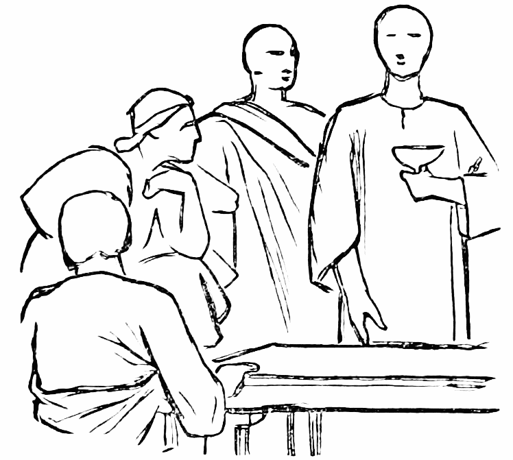
In the annexed diagram, it is of no use arguing that one of the heads is a full face, another three-quarters, a third a profile, and the fourth a back view of the head. The{295} four heads are all points of interest. They are equidistant, and placed on a segment of the same circle, and, turn them whichever way you will, you cannot get rid of the unpleasantness of the arrangement, so long as you keep them in their present relative positions.
In the attached diagram, it’s pointless to argue that one of the heads is a full face, another three-quarters, a third a profile, and the fourth a back view. The{295} four heads are all focal points. They are evenly spaced and placed on a segment of the same circle, and no matter how you turn them, you can’t escape the awkwardness of the arrangement as long as you keep them in their current positions.

In the next figure we have four heads suggesting a quadrilateral of lozenge shape.[4] This is also very objectionable, and it is a case of frequent occurrence. In both these diagrams, by shifting the position of one of the heads, we should break up the symmetrical arrangement which so much offends the cultivated eye.{296}
In the next figure, we see four heads forming a lozenge-shaped quadrilateral.[4] This is also very problematic and happens quite often. In both diagrams, if we move one of the heads, we can disrupt the symmetrical arrangement that so greatly bothers the discerning eye.{296}

There is no objection, in a composition of many figures, to placing two or more heads on the same horizontal line. Indeed, in many cases it is most advantageous to do so; but what ought to be avoided is having heads on the same vertical line. If you have a kneeling or sitting figure in front of an erect one, arrange your kneeling figure so that the one head shall not be perpendicularly below the other.
There’s no problem with having two or more heads on the same horizontal line in a composition with multiple figures. In fact, it can be very beneficial in many situations. However, you should avoid having heads on the same vertical line. If you have a kneeling or sitting figure in front of an upright one, position the kneeling figure so that one head isn’t directly below the other.

If you have two erect figures, arrange your kneeling figure so that the head shall not come on the same vertical line as either of the other heads, or half-way between the two.[5] I might urge a good deal more about the extreme importance of a picturesque and irregular arrangement of the heads; but I have probably said enough to call your attention to this very prominent feature in good designing, and will now give a few hints about other kindred matters.{297}
If you have two upright figures, position your kneeling figure so that its head is not on the same vertical line as either of the other heads, or directly in between the two.[5] I could definitely talk more about how crucial it is to have a visually appealing and irregular arrangement of the heads; but I've probably said enough to highlight this key aspect of good design, and now I'll provide a few tips about related topics.{297}

Converging lines are to be avoided, unless there is something of interest to which you wish to direct attention at the point of convergence. This is by no means an exaggerated specimen of the evil; but the effect of these four arms all converging toward one point is unpleasant. If the personages were disputing over a manuscript, or trying to clutch a bag of gold lying on the table, then the manuscript or the gold would be the centre of interest in the picture; and converging lines would not only be excusable, but absolutely necessary. Where there is nothing of particular interest at the point where the lines meet, the eye feels disappointed at being misled.
Converging lines should be avoided unless there's something interesting at the point where they meet that you want to highlight. This isn't an extreme example of the issue, but having these four lines come together at one point isn't appealing. If the characters were arguing over a manuscript or trying to grab a bag of gold on the table, then either the manuscript or the gold would become the focal point of the image; in that case, converging lines would be not only acceptable but essential. When there's nothing significant at the meeting point of the lines, the viewer feels let down by the misdirection.

Although converging lines are generally to be avoided, it often happens that a repetition of the same kind of curve gives force and unity of purpose to a group. Observe the convex curves formed by the backs of these suppliants. Their repetition gives unity of purpose. A perpendicular kneeling figure might individually be just as{298} expressive, but as one of a group he would take away somewhat from the general character of unity in supplication.
Although converging lines are usually to be avoided, it often occurs that repeating the same type of curve adds strength and a sense of purpose to a group. Notice the convex curves created by the backs of these supplicants. Their repetition provides a sense of unity. A straight, kneeling figure might be just as{298} expressive on its own, but as part of a group, it would somewhat detract from the overall sense of unity in their supplication.
One of the most difficult problems the designer of large mural pictures has to solve, is to introduce with good effect raised arms and hands, especially when they belong to the background figures. When possible, it is better to keep them out of sight altogether; but in some subjects you would by so doing inevitably lose expression and animation, and it becomes necessary to introduce here and there an upraised arm with extended hand. This is easy enough to do if you are reckless about the lines of your composition, but if you are fastidious, it is a very difficult problem.
One of the toughest challenges that a designer of large mural paintings faces is effectively incorporating raised arms and hands, particularly when they belong to figures in the background. When possible, it's usually better to keep them out of view entirely; however, in some subjects, doing so would inevitably sacrifice expression and movement, making it necessary to include an upraised arm with an extended hand here and there. This is fairly easy to achieve if you're unconcerned about the lines of your composition, but if you're particular, it becomes a very challenging issue.
In the first place, they distract the eye, destroying the full bold outline of your groups, and, secondly, there is a comic element about them which it is rather difficult to avoid. When, as in many of Raffaelle’s Loggie, the whole of the figures which are raising their arms are seen, the effect is bad and trivial; but there is nothing particularly comical about it. When, however, an arm crops up here and there from the unseen figures of the background, it is difficult to avoid the ludicrous. Cases may occur when a whole forest of hands will have to be raised, as in an oath of allegiance; but here the action of raising the arms is inseparable from the subject.
In the first place, they distract the eye, ruining the clear outline of your groups. Secondly, there's a funny element about them that's hard to ignore. When, as in many of Raffaelle’s Loggie, all the figures raising their arms are visible, it looks bad and trivial; but it’s not particularly funny. However, when an arm pops up here and there from the hidden figures in the background, it’s hard to avoid the ridiculous. There may be times when a whole bunch of hands need to be raised, like in an oath of allegiance; but in those cases, the action of raising the arms is closely tied to the subject.
All these hints about designing may appear to some of you rather far-fetched, but if ever you get experience in decorative painting, I think you will find they are not far from the truth.
All these tips about design might seem a bit unrealistic to some of you, but once you gain experience in decorative painting, I believe you'll find they are quite accurate.
The art of good grouping is not of spontaneous growth. You may have a general idea of how you are to fill your canvas or wall-space, and that idea may be a good one, but all the details of the groups have to be worked out bit by bit. A change in the attitude of one figure will be almost sure to entail a change in a good many others, and it often happens that, after giving yourself a good deal of trouble, you will have to go back to your first idea.
The skill of effective grouping doesn't happen by chance. You might have a basic concept of how to fill your canvas or wall space, and that concept could be a solid one, but every detail of the groups needs to be developed gradually. Adjusting the position of one figure will likely require adjusting several others, and it's common to find that after putting in a lot of effort, you end up returning to your initial idea.
A conscientious and fastidious designer may be compared to an Arctic explorer picking his way in an ice-pack. He will have to saw through one ice-barrier, to blow up another with gunpowder, to circumvent a third, and when, after surmounting all these difficulties, he thinks his course clear and open water at hand, he may have to retrace his steps and seek some other channel.
A careful and detail-oriented designer can be likened to an Arctic explorer navigating through an ice pack. They might need to cut through one ice barrier, blast another with explosives, and find a way around a third. And just when they believe they have overcome all these challenges and can see clear waters ahead, they might have to backtrack and look for another route.
I am perfectly aware that in painting small easel pictures all this groping after fine lines may be unnecessary, nay, even detrimental to the life-like spirit of the composition.
I fully understand that when painting small easel pictures, all this searching for fine lines may be unnecessary and even harmful to the lively spirit of the piece.
“Our own correspondent’s” sketches at the seat of war (if done on the spot, which I am afraid they not always are) will be not only more interesting but better composed than if he had sat at home and trusted{300} to his imagination; but in this lecture I am not dealing with easel pictures and realistic subjects, and I repeat that in decorative figure-painting excellence can only be obtained by a continuous process of altering, modifying, adding, and omitting.
“Our own correspondent’s” sketches from the battlefield (if they're actually created on-site, which I worry they aren't always) will be not just more interesting but also better composed than if he had stayed home and relied on his imagination; however, in this lecture, I’m not focusing on easel paintings and realistic subjects, and I want to emphasize that in decorative figure painting, excellence can only be achieved through a continuous process of changing, modifying, adding, and removing.
In the same way that the lines and general grouping of a picture should be arranged with a view to expressing the subject with dignity and grandeur, so the management of light and shade should tend toward the same end, and it is as impossible to lay down strict rules for light and shade as for outline designing. Didactic writers on art will tell you that the principal light ought to fall on the principal figure—
In the same way that the lines and overall layout of a picture should be organized to convey the subject with dignity and grandeur, the handling of light and shadow should aim for the same goal. It's just as impossible to establish strict rules for light and shadow as it is for outline design. Instructional writers on art will tell you that the main light should focus on the main figure—
"The hero of your story should be visible."
Sir Joshua Reynolds remarks very justly on this piece of doggerel, that there is no necessity for the principal figure to be placed in the middle of the picture, or receive the principal light. He goes on to say that “this conduct, if always observed, would reduce the art of composition to too great a uniformity,” and that “it is sufficient if the place he holds, or the attention of the other figures to him, denote him the hero of the piece.”
Sir Joshua Reynolds makes a good point about this piece of poorly written verse that there's no need for the main figure to be centered in the picture or to be in the main light. He goes on to say that “if this approach were always followed, it would make the art of composition too uniform,” and that “it’s enough if his position or the attention of the other figures toward him shows that he’s the hero of the piece.”
In the often-painted subject of the “Death of Cæsar,” I should be very much inclined to put the Cæsar in the shade, and the tyrannicides with their flashing daggers in the light. It appears to me that to throw a shade over the face of the prostrate emperor would somehow or other convey the idea of the shadow of death, which is overspreading him, and the reproachful “Et tu Bruté” would come with greater pathos from a figure half-veiled in shadow than from one in broad daylight. We will suppose now that instead of having the death of Cæsar to paint we have the “Stoning of St. Stephen.” The subject is analogous. The young man named Saul and the Jewish executioners of Stephen were not common assassins any more than the murderers of Cæsar. Shall we, therefore, adopt the same plan with the figure of Stephen as we did with that of Cæsar and put him in the shade? I say, Certainly not. Stephen was the first Christian martyr. We read that his face was as that of an angel, and he ought to be surrounded by an angelic halo of light, and this treatment need not be dictated by the text. We should come to the same conclusion simply on the grounds of pictorial fitness. Stephen was a voluntary martyr, and gloried in his own death. Cæsar was assassinated much against his will; and although we are told that he covered his face with{302} his toga and died with dignity, yet he certainly cannot be called a martyr.
In the commonly depicted scene of the “Death of Caesar,” I would prefer to put Caesar in shadow and the assassins with their gleaming daggers in the spotlight. To cast a shadow over the fallen emperor suggests the shadow of death enveloping him, and the reproachful “Et tu, Brute” would feel more poignant from a figure partially shrouded in darkness than from one in full light. Now, let’s say instead of painting the death of Caesar, we consider the “Stoning of St. Stephen.” The two subjects are similar. The young man named Saul and the Jewish executioners of Stephen weren’t ordinary killers, just like Caesar’s murderers weren’t. So, should we treat Stephen the same way we did Caesar and put him in shadow? I say, Absolutely not. Stephen was the first Christian martyr. We read that his face resembled that of an angel, and he should be surrounded by an angelic halo of light, a choice that doesn’t need to be dictated by the text. We would reach the same conclusion simply based on visual appropriateness. Stephen was a voluntary martyr and took pride in his own death. Caesar was assassinated against his will; even though it’s said he covered his face with{302} his toga and died with dignity, he certainly can't be called a martyr.
I have introduced these two subjects to show you how hopeless it is to attempt to lay down general rules such as old Du Fresnoy gives us in his poem on the art of painting. Every new theme you undertake to illustrate ought to have a treatment special to itself if you wish to produce a fresh and original picture. When the master of a vessel is starting on a voyage, he would not steer S. W. by W. ½ W. because that happened to be the course he steered the last time he was at sea, nor would he run up his skyscrapers and set his studding-sails because he carried all his light canvas the last voyage out.
I brought up these two topics to show you how pointless it is to try to establish general rules like the ones old Du Fresnoy presents in his poem about painting. Every new theme you take on should have a unique approach if you want to create a fresh and original artwork. When a ship's captain sets out on a journey, he wouldn’t navigate S.W. by W. ½ W. just because that was the route he took last time he was at sea, nor would he set up all his sails and rigging simply because he used all his light sails on the last trip.
He would consult his chart, the state of the tide, the direction of the wind, and act accordingly. In short, for this new voyage, the condition of the wind, tide, and barometer being new, he would give new orders to his mate and crew.
He would check his chart, the tide's condition, the wind's direction, and act accordingly. In short, for this new voyage, since the wind, tide, and barometer conditions were different, he would give new orders to his mate and crew.
Substituting the brain for the master, the hand for the mate, and the brushes for the crew, we ought to set about our pictures much in the same way.
Substituting the brain for the leader, the hand for the partner, and the brushes for the team, we should approach our artwork in a similar fashion.
After giving the subject of light and shade a good deal of thought, it appears to me that there is only one rule which invariably applies to all pictures, and that is, that there should be a uniform scale of tone throughout the work. The gradient, from light to shade, may be very steep as in Rembrandt, or very{303} gentle as in P. Veronese, but this gradient or transition should not be abrupt in one part of the picture, and gentle in another. The whole work (whatever scale you adopt) should be homogeneous.
After thinking a lot about light and shade, I believe there is only one rule that consistently applies to all artwork: there should be a uniform scale of tone throughout. The transition from light to dark can be very steep like in Rembrandt, or very{303} gentle like in P. Veronese, but this transition shouldn’t be abrupt in one part of the picture and gentle in another. The entire piece (regardless of the scale you choose) should be cohesive.
Sir. J. Reynolds and others have endeavored to ascertain the proportion of light to shade in the works of the old masters. I believe these experimental blots have been made rather with a view to black and white than legitimate light and shade; but whatever their object, I don’t think that any theory can be built up on them. I am convinced that what the old masters called the chiaro-oscuro of their pictures was a matter of feeling, and sometimes of accident, but never of calculation.
Sir J. Reynolds and others have tried to figure out the balance of light and shadow in the works of the old masters. I think these experimental tests were done more for black and white purposes than for true light and shade; but regardless of their intent, I don’t believe any solid theory can be based on them. I’m convinced that what the old masters referred to as the chiaro-oscuro of their paintings was based on feeling, and sometimes on chance, but never on calculation.
Theorists often talk learnedly about secondary and tertiary lights, but the artist never dreamt of them. They are nothing more than the efforts he has made, and the means to which he has resorted, in order to connect the highest light of his principal group with the gloom of his background.
Theorists often discuss things like secondary and tertiary lights in an educated way, but the artist has never thought about them. They are just the efforts he has made and the methods he has used to link the brightest light of his main subject with the darkness of his background.
Rembrandt’s vigorous light and shade and Correggio’s luminous breadth ought to be ascribed to the natural idiosyncrasies of the painters, intensified probably by the conditions under which their works were executed. They were assuredly not the results of calculation or learning.
Rembrandt’s bold use of light and shadow and Correggio’s bright expansiveness should be attributed to the unique styles of the artists, likely enhanced by the situations in which they created their works. They were definitely not the products of deliberate planning or formal education.
Modern artists are often credited by their critics with subtleties of which they are perfectly innocent. They introduce into their pictures certain harmonies{304} of tone or color by a kind of pictorial instinct, but certainly not in obedience to theoretical laws.
Modern artists are often praised by their critics for subtlety that they don't actually possess. They bring certain harmonies of tone or color into their artwork through instinct rather than following any theoretical rules.
In designing a composition of many figures, it is natural to begin with the principal group or centre of interest. When you have got this satisfactorily arranged, you proceed with the less important figures, and it is here that beginners (and some who are by no means beginners) often come to grief.
In creating a composition with multiple figures, it makes sense to start with the main group or focal point. Once that's arranged well, you can move on to the less important figures. This is where beginners (and even some who are not beginners) often run into trouble.
They get a fine action or a noble attitude for some accessory figure, and they are so much in love with it that they must introduce it, whether it is in keeping with the principal group or not. It may (viewed as a single figure) be very good, and yet be injurious to the general harmony of the composition.
They come up with a great action or a noble attitude for some minor character, and they love it so much that they must include it, regardless of whether it fits with the main group or not. It might (when seen as a single figure) be quite good, yet still disrupt the overall harmony of the composition.
Recollect that accessory figures, however good in themselves, if they mar the general effect, ought to be sacrificed.
Remember that additional elements, no matter how good they are on their own, should be sacrificed if they damage the overall effect.
By so doing you will doubtless raise a cry of lamentation from your friends. They will say, “What could have induced you to have scraped out that figure? Why, it was the best thing in the picture,” and so on. To which you might reply that you did not want it to be the best thing in the picture, and therefore you erased it.
By doing this, you're definitely going to get some complaints from your friends. They'll say, “What made you scrape that figure out? It was the best part of the picture,” and so on. To which you might respond that you didn’t want it to be the best part of the picture, so you erased it.
It was this tendency to introduce some favorite figure where it was not wanted, which rather mars Raffaelle’s latest manner, as exemplified in the “Transfiguration,” and in the “Incendio del Borgo”; and what in Raffaelle was only an incipient tendency{305} became a confirmed habit in the work of his imitators.
Sir J. Reynolds, in his discourses, is continually urging the student of composition to think how the old masters would have treated the subject he is engaged upon, and advises him to imitate their style and manner. Indeed, the sixth discourse is devoted entirely to this principle of imitation. Now, if we were vastly superior to M. Angelo, Raffaelle, and Titian, and held the same relative position to them that they did to their predecessors, I could understand our occasionally adopting their figures, after greatly improving them; but as we should not be likely to improve any figure we had appropriated, we had much better leave the old masters alone. Plagiarism, or, to use a plainer word, “stealing,” can only be excused when the plagiarist makes a better use of the property he has appropriated than the original possessor did.
Sir J. Reynolds, in his lectures, constantly encourages students of composition to consider how the old masters would have approached the subject they are working on and advises them to mimic their style and technique. In fact, the sixth lecture focuses entirely on this idea of imitation. Now, if we were vastly superior to Michelangelo, Raphael, and Titian, and had the same relative standing to them that they had to their predecessors, I could understand us occasionally using their figures, after significantly improving them; but since we're unlikely to enhance any figure we borrowed, it would be better to leave the old masters alone. Plagiarism, or to put it simply, "stealing," can only be justified if the person copying makes better use of the material they've taken than the original owner did.
Sir Joshua certainly says that you should “imitate,” and not copy servilely. Imitation is the sincerest form of flattery, and if Philippino Lippi could have seen Raffaelle transferring his St. Paul into the famous cartoon of the saint preaching at Athens, no doubt he would have felt flattered. But how about Raffaelle? Is it not true that this plagiarism on Raffaelle’s part detracts somewhat from his fame? Does not every one, on seeing the Carmine Chapel at Florence, and recognizing the{306} familiar figure of St. Paul, think somewhat more of Philippino Lippi and somewhat less of Raffaelle? I believe that nothing can be more fatal to the career of an artist than intentional imitation of another man’s work. I say “intentional,” because we are all more or less imitators quite unconsciously. We often confound a reminiscence of something we have seen in a picture with a reminiscence of nature, and so become unconscious imitators; but this is a very different thing from deliberately setting aside our own ideas and endeavoring to fancy what would be the ideas of some one else.
Sir Joshua definitely says that you should “imitate,” not just copy blindly. Imitation is the truest form of flattery, and if Philippino Lippi had seen Raffaelle adapting his St. Paul into the well-known cartoon of the saint preaching in Athens, he surely would have felt flattered. But what about Raffaelle? Doesn’t this borrowing on Raffaelle’s part take away from his reputation a bit? When people see the Carmine Chapel in Florence and recognize the{306} familiar figure of St. Paul, do they think more of Philippino Lippi and less of Raffaelle? I believe nothing can be more detrimental to an artist's career than deliberate imitation of someone else's work. I say “deliberate” because we’re all somewhat imitators unconsciously. We often confuse something we’ve seen in art with something from nature and become unconscious imitators; but that’s very different from purposely setting aside our own ideas and trying to envision what someone else would think.
It may be argued that Sir J. Reynolds addressed his advice to students and not to mature artists, but the habit of imitating others, when once acquired, is not easily got rid of. A certain degree of excellence may doubtless be attained by following this method, provided the masters imitated are excellent, but, after all, it is only a kind of reflected light, and not to be compared to the electric light of original genius. Besides, the student who follows Sir Joshua’s advice may begin by honestly attempting to paint his pictures in the style of Raffaelle without downright imitation of the figures, but he soon learns to adopt Raffaelle’s attitudes, Raffaelle’s expression, and even Raffaelle’s mannerisms. He becomes, in short, a mere copyist. If this be deplorable in the case of the imitator of Raffaelle, how much more deplorable is it to adopt the modes{307} of thought and expression of an inferior master! It may be thought by some that in these lectures I often speak disrespectfully of the old masters, but it is certainly not my intention so to do. I have the greatest respect for many of them, though not for all; but I respect nature and truth still more, and it appears to me that the true artist should go to the fountain-head for his ideas and inspiration, and not to second-hand sources.
It can be argued that Sir J. Reynolds directed his advice to students rather than to experienced artists, but once the habit of mimicking others is formed, it’s hard to shake. A certain level of skill can certainly be achieved by following this approach, as long as the masters being imitated are truly skilled, but ultimately, it’s just a kind of reflected light, not comparable to the bright light of original genius. Furthermore, a student who takes Sir Joshua’s advice might start by genuinely trying to paint in the style of Raffaelle without directly copying the figures, but they quickly end up adopting Raffaelle’s poses, expressions, and even his quirks. They become, in effect, just a copyist. If it’s unfortunate to imitate Raffaelle, how much more unfortunate is it to adopt the thoughts and expressions of an inferior master! Some might think I often speak disrespectfully of the old masters in these lectures, but that’s not my intention at all. I have great respect for many of them, though not for all; however, I hold nature and truth in even higher regard, and I believe that a true artist should seek inspiration and ideas from the original sources, not from second-hand ones.
It may be answered that it is all very well saying that an artist should go to nature and rely on his own powers of creation and invention, but supposing he is relying on a broken reed; suppose he cudgels his brain in vain for ideas, what is he to do? In this case I should advise him, instead of borrowing from the old masters, that he should turn his attention to portrait-painting, landscape, or some branch of the profession where the creative and imaginative faculties are not much required. He may have great imitative power with a dexterous execution; he may be a charming colorist, or, again, he may be a refined and accomplished draughtsman, and yet be totally unable to give dramatic vitality to a scene he has not himself witnessed.
It can be said that while it's nice to suggest an artist should look to nature and depend on their own creative skills, what if they feel stuck? What if they struggle to come up with ideas? In that case, I would recommend that instead of imitating the old masters, they focus on portrait painting, landscapes, or any area of art that doesn’t require much creativity or imagination. They might have strong skills in imitation and execution; they could be great with colors, or be a skilled and polished draftsman, yet still be completely unable to bring to life a scene that they haven't personally experienced.
It has always been the fashion to apply the term “high art” to heroic or Scriptural figure-subjects, but I think there is almost as much high art in a noble portrait of Titian or a fine landscape by{308} Claude as in any historical painting whatever. I object to the term altogether; but if it means any thing, it ought to mean a dignified and poetic view of nature, in contradistinction to a trivial or prosaic view. It ought certainly never to be applied to a pasticcio of the old masters, however plausible such an imitation may be.
It’s always been common to call works featuring heroic or biblical figures “high art,” but I believe there’s just as much high art in a noble portrait by Titian or a beautiful landscape by{308} Claude as in any historical painting. I really dislike the term; but if it means anything, it should refer to a dignified and poetic perspective of nature, as opposed to a trivial or mundane view. It certainly should never be used for a pasticcio of the old masters, no matter how convincing the imitation may be.
In my opinion there is high art in Turner’s early pictures, because in them we get the man’s own poetic interpretation of nature, but in those works where he attempts to rival Claude I can see nothing but the labor of a skilful imitator.
In my opinion, there's great artistry in Turner’s early paintings because they reflect his personal, poetic take on nature. However, in those works where he tries to compete with Claude, I see nothing but the effort of a skilled imitator.
I have wandered away from the proper subject of this lecture, and have but little time left; but before concluding I should wish to explain that although I am continually urging the extreme importance of originality in painting, I do not mean forced singularity or oddity. I mean by the word, the expression of the painter’s own sober ideas. A sane man should produce sane work. It may not be very powerful, it may in no way recall Michael Angelo, but it will have qualities of its own. How charming, simple, and unaffected are Flaxman’s designs until he got inoculated with the Sistine Chapel lymph! After this inoculation we notice (at least I do) a great change for the worse in his compositions. To graft successfully, the parent stem ought to be of the same nature as the scion or graft. Now Flaxman’s nature was gentle, and very appreciative of beauty{309} and grace. With such a nature he ought to have abstained from attempting the grand and the terrible.
I’ve strayed from the main topic of this lecture, and there's not much time left; but before I wrap things up, I want to clarify that while I keep emphasizing the extreme importance of originality in painting, I don’t mean forced uniqueness or eccentricity. What I mean is the expression of the artist’s own clear ideas. A rational person should create rational work. It might not be very powerful, nor will it remind anyone of Michelangelo, but it will have its own qualities. How charming, simple, and genuine are Flaxman’s designs until he got influenced by the Sistine Chapel! After that influence, I notice (at least I do) a significant decline in the quality of his compositions. To successfully graft, the original stem should be of the same kind as the scion or graft. Flaxman’s nature was gentle and deeply appreciative of beauty{309} and grace. With that kind of nature, he should have refrained from trying to tackle the grand and the terrifying.
If Flaxman erred in grafting Michael Angelo’s manner on his own, what shall we say about Blake? Flaxman was at any rate a good draughtsman, but Blake’s ignorance of the first principles of drawing makes his Michael Angelesque imitations simply ludicrous. The successful attempts which have been made of late years to rehabilitate Blake, and to elevate him into a kind of British Michael Angelo, make me almost despair of high art in this country. I do not wish to speak contemptuously of Blake as a poet, but in his pictures (even supposing he had grand ideas) I cannot accept the will for the deed. The frog in the fable had grand ideas when he wished to rival the ox in size, and yet he only made himself ridiculous. Were I to express all I think about the Blake revival, I could hardly confine myself to parliamentary language. I will, therefore, in closing my lecture, simply protest to the best of my power against this strange infatuation.{310}
If Flaxman made a mistake by trying to blend Michael Angelo’s style with his own, what can we say about Blake? Flaxman, at least, was a skilled draftsman, but Blake’s lack of understanding of basic drawing principles makes his attempts at imitating Michael Angelo laughable. The recent efforts to revive Blake and elevate him to the status of a British Michael Angelo leave me feeling hopeless about high art in this country. I don’t want to dismiss Blake as a poet, but when it comes to his artwork (even if we consider that he had grand ideas), I can’t accept intention in place of execution. The frog in the fable had grand aspirations when it wanted to match the ox in size, yet it only ended up looking foolish. If I were to share all my thoughts about the Blake revival, I wouldn’t be able to keep it within polite language. So, in closing my lecture, I will simply express my strong opposition to this peculiar obsession.{310}
LECTURE XII.
COMPOSITION OF INCIDENT PICTURES.
In my last lecture I treated the art of composition as applied to decorative or semi-decorative work—of work intended rather to cover a given wall-space with noble and picturesque forms than to give a dramatic version of any particular incident. My present lecture will be devoted to the composition and arrangement of figure-pictures, whether Biblical, historical, or anecdotic, whose object is to represent in the most forcible way any given incident.
In my last lecture, I discussed the art of composition as it relates to decorative or semi-decorative work—work that aims to fill a specific wall space with beautiful and striking forms rather than to dramatically depict a particular event. In this lecture, I will focus on composing and arranging figure-pictures, whether they are Biblical, historical, or anecdotal, with the goal of representing a specific incident in the most impactful way.
We are far more particular now about the arrangement, or what the French call the mise en scène, of a picture, than the old masters ever were. We may not be able to paint like Titian or Correggio, but we attempt an approximation to truth which they never did; and not only is a modern historical painter more truthful about the costumes of his personages and the architecture of his backgrounds, but in the disposition and action of his figures he honestly endeavors to represent the scene as it actually may have occurred. When I say that the modern painter does this, I mean that in my opinion he ought to do it. I am quite aware that many artists prefer to look{311} at nature through the spectacles of the old masters, but it appears to me that all art should be in some measure representative of the age in which it exists. When we come upon a Romanesque, Umbrian, Venetian, Flemish, or eighteenth-century work of art, we can tell at a glance to what period it belongs, and I think that our own time, being one of original thought and research, should in some measure be similarly reflected in our painting.
We’re much more particular now about the arrangement, or what the French call the mise en scène, of a painting than the old masters ever were. We might not be able to paint like Titian or Correggio, but we try to get closer to the truth in a way they didn’t. Not only is a modern historical painter more accurate about the costumes of his characters and the backgrounds, but in the positioning and actions of his figures, he honestly tries to portray the scene as it might have really happened. When I say that modern painters do this, I mean that they should do it. I'm fully aware that many artists prefer to view nature through the lens of the old masters, but it seems to me that all art should reflect, in some way, the era in which it exists. When we see a Romanesque, Umbrian, Venetian, Flemish, or eighteenth-century artwork, we can instantly identify its period, and I believe that our own time, being one of original thought and exploration, should also be reflected in our painting.
I have no objection to Gothic architects repeating in modern buildings the narrow staircases, the dim lighting, and other inconvenient peculiarities of the style.
I don’t mind Gothic architects incorporating the narrow staircases, dim lighting, and other awkward features of the style into modern buildings.
Were they to give us large plate-glass windows and noble flights of steps, they would cease to be Gothic architects; but I don’t think that, however much we painters may admire the old masters, we ought to adopt their modes of composition when we know them to be the result of ignorance, error, or carelessness.
If they were to give us big plate-glass windows and grand staircases, they would stop being Gothic architects; but I don’t think that, no matter how much we painters admire the old masters, we should adopt their ways of composition when we know they come from ignorance, mistakes, or carelessness.
The present graphic method of treating figure-pictures is of quite modern growth, and the innovation extends to all kinds of subjects. Compare any of Giulio Romano’s, Rubens’, or Lebrun’s battle-pieces with those of Raffet, Horace Vernet, or, better still, De Neuville. How unreal the old masters appear!
The current graphic approach to creating figure-pictures is relatively recent, and this innovation covers all types of subjects. Look at any of Giulio Romano's, Rubens', or Lebrun's battle scenes and compare them to those by Raffet, Horace Vernet, or even better, De Neuville. The old masters seem so unrealistic!
Recall to mind the Romans of David and his school, and compare them with the best modern representations{312} of Roman manners and customs. In the one case we may admire the noble drawing and even the classical lines of the composition, but we are never transported back to the scene; whereas in certain modern pictures we feel on much more intimate terms with the personages. We fancy we are actually a spectator at the Colosseum or a participator in a fête intime.
Think about the Romans depicted by David and his school, and compare them with the best modern representations{312} of Roman culture and customs. In one case, we can appreciate the great drawing and even the classical lines of the composition, but we never feel like we’ve been transported back to the scene; while in some modern artwork, we feel much closer to the characters. We imagine we are truly watching an event at the Colosseum or taking part in a fête intime.
The realism of modern art is due partly to a greater knowledge of, and a greater attention to, costume, architecture, furniture, and all the properties of the stage on which we place our personages, but it is also due to our making truth a primary object.
The realism of modern art comes in part from a deeper understanding and greater focus on costumes, architecture, furniture, and all the elements of the stage where we place our characters, but it's also because we prioritize truth as a main objective.
An incident may be treated truthfully in fifty different ways, but some of these versions of it will be dull, some obscure, and some vulgar, and it is for the artist to select a rendering which, though perfectly truthful, shall be neither dull, obscure, nor vulgar. As soon as he loses sight of truth he ceases to be a realistic painter. He may produce a beautiful picture, but it will partake more or less of what I call semi-decorative work. It is sometimes very difficult to fix a boundary-line between realistic and decorative painting. To which class, for instance, belong the cartoons of Raffaelle? Although designed for tapestry, and therefore for decorative purposes, there is too much truth and reality about them to allow of their being classed among purely decorative works;{313} whilst, on the other hand, we can hardly admit that they are like the scenes they are meant to represent.
An event can be described truthfully in a dozen different ways, but some of those descriptions will be boring, some unclear, and some cheap, and it’s the artist’s job to choose a version that, while completely truthful, isn’t dull, unclear, or cheap. Once they lose sight of the truth, they stop being a realistic painter. They might create a beautiful picture, but it will be more or less what I call semi-decorative work. It can be very challenging to draw a line between realistic and decorative painting. For example, where do the cartoons of Raphael fit in? Even though they were meant for tapestry and therefore for decorative use, there is so much truth and reality in them that they can’t just be categorized as purely decorative; on the other hand, it’s hard to say they’re like the scenes they are intended to depict.{313}
The heads are Italian rather than Jewish or Oriental, and sometimes (as, for instance, in the “Miraculous Draught of Fishes”) pictorial liberties are taken which are quite inadmissible in realistic work.
The heads are Italian instead of Jewish or Oriental, and sometimes (like in the “Miraculous Draught of Fishes”) artistic liberties are taken that are totally unacceptable in realistic work.
I may here observe that in this lecture I shall not use the word realistic in the bad sense in which it has generally come to be used.
I should note that in this lecture, I won't be using the word realistic in the negative way that it has typically been understood.
The term is now generally employed to designate some ugly or offensive piece of reality which is prominently thrust upon our notice by the artist; as when Quintin Matseys gives us wrinkled and abnormally ugly old men, or when a modern French painter throws all his talent into depicting the thick viscosity of a pool of arterial blood. Reality is only in rare instances repellent, and I can see no good reason for confining the word to these exceptional cases.
The term is now commonly used to refer to an ugly or offensive aspect of reality that an artist highlights for us; like when Quintin Matseys shows us wrinkled and unusually ugly old men, or when a modern French painter dedicates all his skill to capturing the thick texture of a pool of arterial blood. Reality is only rarely unpleasant, and I see no good reason to limit the word to these rare instances.
In historical, or what may be called incident pictures, the main object of the artist ought to be to tell his story forcibly, clearly, and pathetically.
In historical, or what could be called incident pictures, the primary goal of the artist should be to convey their story powerfully, clearly, and emotionally.
We have seen that in work partaking of a decorative character the principal object of the designer should be to group his figures in a noble and picturesque manner, to attend to his drawing, and if possible to add the charm of agreeable color to his work.
We have seen that in decorative work, the main goal of the designer should be to arrange his figures in a grand and visually appealing way, focus on his drawing, and, if possible, enhance his work with appealing colors.
In realistic historical painting he has something else to occupy his thoughts. He must by no means neglect the lines of his groups, he must avoid disagreeable{314} angles, equidistant heads, convergent lines where they are not wanted, and all the other rocks and shoals on which many a composition has been wrecked, but in addition to this he must tell his story truthfully and clearly.
In realistic historical painting, he has other things to focus on. He must not overlook the arrangement of his groups, steer clear of awkward angles, evenly spaced heads, unwanted converging lines, and all the other pitfalls that have doomed many compositions. On top of that, he needs to convey his story honestly and clearly.
Much more latitude in the matter of arrangement may be allowed him than would be conceded to the painter of decorative subjects.
He can be given much more freedom in how he arranges things than what would be allowed for an artist working on decorative themes.
He may (if he thinks fit) huddle up all his figures into a corner of the canvas, or he may place them all in the centre, leaving the sides unoccupied.
He can (if he thinks it’s best) cluster all his figures in one corner of the canvas, or he can put them all in the center, leaving the sides empty.
In short, he may take great liberties with the laws of composition, provided always these liberties tend to assist in giving reality to the scene.
In short, he can take a lot of creative freedom with the rules of composition, as long as these choices help make the scene feel real.
The more picturesque or melodramatic the subject, the more he may depart from the usual rules of composition.
The more visually appealing or dramatic the subject, the more he can break away from the typical rules of composition.
Paul Delaroche was, I think, the first of the numerous cohort of modern painters who have striven to combine truthful sentiment with pictorial fitness, and of all his works the “Assassination of the Duc de Guise” is perhaps the most striking.
Paul Delaroche was, I believe, the first of the many modern painters who tried to blend genuine emotion with visual appeal, and of all his pieces, the “Assassination of the Duc de Guise” is probably the most impactful.
The arrangement of this picture is as dramatic as it is truthful. On one side of the picture we have the murdered duke lying on his back, stone dead. The group of assassins are quite separated from their victim, and are giving themselves no further trouble about him; and yet the greatest ignoramus, who knew nothing whatever about the story, would{315} have no hesitation in divining it, so graphically is the incident told.
The way this image is set up is as striking as it is accurate. On one side, we see the murdered duke lying on his back, completely lifeless. The group of assassins is distanced from their victim, showing no concern for him anymore; yet even the most clueless person, who knows nothing about the story, would{315} easily figure it out, since the scene is depicted so vividly.
Again, if we recall to mind another and a better known picture by the same master, I mean that known as “Les Enfants d’Edouard,” we find the same subtle taste displayed.
Again, if we think about another and more famous painting by the same artist, which is known as “Les Enfants d’Edouard,” we see the same subtle taste showcased.
I may here note that the color of neither of these pictures is in any way remarkable. Indeed, that of the “Princes” is positively bad, being very purple and inky; but their enduring popularity rests on a more solid foundation than mere color. It rests entirely on their truthful and poetic treatment. I call the treatment “poetic,” because a dull prose reading of both these subjects would have represented the murders as actually being committed, whereas by choosing the moment in the one case immediately after the murder, and in the other just before, the artist avoids all the stabbing, hacking, and smothering business, and increases rather than diminishes our interest in the victims. Gerome’s “Death of Cæsar” is another example of novel treatment of a hackneyed subject. He also represents the deed as done. The conspirators have sneaked off. The benches of the senate-house are all but deserted, the only occupant being a very fat senator, who is fast asleep on one of the benches, somewhere near the centre of the amphitheatre. How much more empty the senate-house looks, with this portly old Roman snoring on his bench, than it would do if entirely deserted!{316}
I should point out that the colors of both these pictures are nothing special. In fact, the color in the "Princes" is pretty terrible, being overly purple and inky; however, their lasting popularity is based on something more substantial than just color. It's all about their truthful and poetic approach. I describe the approach as "poetic" because a straightforward prose depiction of these subjects would have shown the murders actually happening. Instead, by choosing the moment immediately after the murder in one case and just before in the other, the artist sidesteps all the stabbing, hacking, and smothering, which enhances rather than detracts from our interest in the victims. Gerome’s “Death of Cæsar” is another example of a fresh take on a well-worn subject. He also depicts the act as complete. The conspirators have slipped away. The benches in the senate-house are nearly empty, with only one very fat senator fast asleep on a bench, somewhere near the center of the amphitheater. The senate-house looks so much emptier with this heavy old Roman snoring on his bench than it would if it were completely deserted!{316}
I do not wish to lecture on modern pictures, but I mention this “Death of Caesar” by Gerome as an instance of a happy departure from the usual treatment of the subject. Indeed, it appears to me that all assassinations, martyrdoms, executions, and such-like subjects, if painted at all, should be approached in some roundabout way.
I don’t want to give a lecture on contemporary artwork, but I bring up Gerome's “Death of Caesar” as a good example of a different take on the topic. Honestly, I think that all portrayals of assassinations, martyrdoms, executions, and similar subjects, if they are depicted at all, should be handled in a more indirect manner.
The action of stabbing, cutting a head off, or sending a bullet through a man’s body, is instantaneous; and although an executioner, with his drawn sword and uplifted arm about to decapitate his victim, may be startling and sensational at first sight, yet after a time the feeling of horror or of pity gives place to a sort of impatience that he is so long before striking the blow.
The act of stabbing, chopping off a head, or shooting someone is quick; and while an executioner, with his sword drawn and arm raised ready to behead his victim, might seem shocking and dramatic at first glance, after a while the feeling of horror or pity turns into a kind of impatience for him to just get it over with.
One of the Orleans princes had a picture of a military execution, which he admired very much at first. By and by, however, he got tired of it, and ultimately sold it or gave it away, not because it was too much for his feelings, but because he was heartily sick of seeing the squad taking aim day after day and month after month, and never firing.
One of the Orleans princes had a painting of a military execution that he initially admired a lot. Over time, though, he became bored with it and eventually sold it or gave it away, not because it was too overwhelming for him, but because he was genuinely tired of seeing the squad aim day after day and month after month without ever firing.
Although the best modern masters of dramatic composition have probably been guided by sentiment rather than by rule, still a few observations on the treatment of certain subjects may not be out of place in this lecture. Thus, if the subject be a departure of pilgrims or emigrants, the figures should be placed on that side of the canvas which is {317}opposed to the direction in which they are going. If it be an arrival, they should be placed on the side opposed to the direction whence they came. In both these cases, the large portion of canvas without figures is not wasted; it assists materially in telling the story.
Although the best modern masters of dramatic composition are likely guided more by emotion than by strict rules, a few observations on how to handle certain subjects might be useful in this lecture. For example, if the subject is the departure of pilgrims or migrants, the figures should be positioned on the side of the canvas that faces away from the direction they are heading. If it's an arrival, they should be placed on the side that is opposite the direction they came from. In both scenarios, having a significant portion of the canvas without figures is not a waste; it greatly helps in conveying the story.
In the first case, it represents the journey to be undertaken, and in the second the journey just performed. If we had to paint a shipwrecked sailor who has just reached the shore, we ought to let very little of the shore be seen, but plenty of raging sea. Here the interest of the subject lies in the formidable dangers he has escaped, so we ought to devote the greater portion of our canvas to the breakers, and relegate our mariner and the bit of slippery rock to which he is clinging to a corner.
In the first instance, it represents the journey ahead, and in the second, the journey that has just been completed. If we were to depict a shipwrecked sailor who has just reached the shore, we should show very little of the shore but a lot of the tumultuous sea. The focus of the subject is on the terrifying dangers he has survived, so we should devote most of our canvas to the crashing waves, relegating our sailor and the small, slippery rock he is holding onto to a corner.
If, on the other hand, we wished to represent our shipwrecked man clinging to a spar in the open sea, with no land visible, we ought to place him right in the middle of the canvas, so as to give the impression of hopeless isolation; and if we wished to convey the idea that he might possibly be rescued, we would paint a sail on the horizon, and near the edge of the picture. I should place it near the edge, in order that it might appear to have just come in sight, and that hope of rescue was dawning. If we were to put the same vessel in the middle of the picture, and bearing down upon the drowning man, we might feel equally certain that he would be saved, but the effect would hardly be as dramatic.{318}
If we wanted to show our shipwrecked man hanging onto a piece of wood in the open sea, with no land in sight, we should place him right in the center of the canvas to create a sense of hopeless isolation. To suggest that he might be rescued, we would add a sail on the horizon, positioned near the edge of the picture. I would place it close to the edge so that it seems to have just come into view, signaling that the hope for rescue is beginning to emerge. If we were to put the same boat in the middle of the picture, heading straight for the drowning man, we could be just as sure that he would be saved, but the impact wouldn’t be as dramatic.{318}
Again, let us suppose that we have an elongated space to fill, and that the subject is a “fugitive escaping.” Where ought we to place him on the canvas? If we place him in the middle, he will look too much like a professional runner doing his ten miles within the hour, and we should feel inclined to pull out our watches and time him. Supposing him to be running from right to left, if we place him near the right side of the picture we shall not know whether his pursuers are not close at hand, and as our sympathies are always with the fugitive, whether he be a prisoner of war, a convict, or a fox, we should be glad to see him safe over to the other side of the picture.
Again, let’s imagine we have a long space to fill, and the subject is a “fugitive escaping.” Where should we put him on the canvas? If we position him in the center, he will look too much like a professional runner completing his ten miles in under an hour, and we might be tempted to pull out our watches and time him. Assuming he’s running from right to left, if we place him near the right side of the image, we won’t know if his pursuers are nearby. Since our sympathies are always with the fugitive, whether he’s a prisoner of war, a convict, or a fox, we will want to see him safely to the other side of the image.
If we place him near the left edge our wish is gratified. There is now the whole width of the picture intervening between him and any sign of pursuit, and we feel naturally, though perhaps illogically, that he has a better chance of escape.
If we position him close to the left edge, our desire is fulfilled. There's now the entire width of the picture separating him from any indication of being chased, and we instinctively, though maybe irrationally, feel that he has a greater chance of getting away.
The word “artful” has come to signify cunning, and is always taken in a bad sense, but I suppose that originally it meant literally “full of art,” full of that curious compound of observation, good-sense, and poetic feeling which is so noticeable in Raffaelle, Poussin, and all the great masters of composition.
The word “artful” now suggests being cunning and is typically viewed negatively, but I think it originally meant “full of art,” filled with that interesting blend of observation, commonsense, and poetic feeling that is so evident in Raphael, Poussin, and all the great masters of composition.
It may not be out of place here to say something about the size of the figures in proportion to the canvas. This is a very important element in the composition of a picture, and many a good and careful work has been spoiled by the figures being either too large or too small for the canvas.
It might be appropriate to mention the size of the figures in relation to the canvas. This is a crucial aspect of a picture's composition, and many well-executed works have been ruined because the figures were either too big or too small for the canvas.
In these days, when the general destination of pictures is to decorate dining-rooms or to fill small galleries, space ought to be economized. We should avoid, as a rule, large areas of background; but, on the other hand, when the figures are too large for the canvas the effect is very unpleasant. An erect figure with the head bent down should have space enough above it to allow of the head being raised, otherwise the figure has an uncomfortable look, as if she could not lift up her head without rapping it against the frame.
In today's world, where the main purpose of artwork is to decorate dining rooms or fill small galleries, we need to make the most of our space. Generally, we should steer clear of large background areas; however, if the figures are too big for the canvas, the impact can be quite off-putting. An upright figure with its head lowered should have enough room above it to raise its head; otherwise, the figure looks tense, as if it can't lift its head without hitting the frame.

Indeed all stooping, sitting, or kneeling figures should have space enough allowed them to stand up in. They should not, in short, look as if they had been put into those attitudes in order to pack them into the picture.
Indeed, all figures that are stooping, sitting, or kneeling should have enough space around them to be able to stand up. In short, they shouldn’t appear to have been placed in those positions just to fit into the picture.
In those early days the graving tools were very rude and coarse; moreover, the blocks were small, hence it became imperative to design the figures as large as possible; and the habit thus acquired spread to drawings and pictures.
In those early days, the engraving tools were really basic and rough; also, the blocks were small, so it became essential to create the figures as large as possible. This habit then carried over to drawings and pictures.
When, on the other hand, the figures are too small, the picture generally looks stagey, as if the artist had taken his composition from some genteel comedy-scene at a theatre. Cases frequently occur where it is desirable to keep the figures small, as in a caravan march across the desert, or in a procession moving down a cathedral nave.
When the figures are too small, the scene often appears artificially staged, as if the artist copied it from a refined comedy scene at a theater. There are many situations where it's important to keep the figures small, like in a caravan crossing the desert or in a procession moving down a cathedral aisle.
In the one case it is desirable to give an idea of the boundless waste of sand, and in the other the architecture of the cathedral is probably more interesting than the individual action of the priests composing the procession, and therefore the figures should be very small for the canvas.
In one instance, it's important to convey the endless expanse of sand, while in the other, the design of the cathedral is likely more fascinating than the individual actions of the priests in the procession. As a result, the figures should be quite small in relation to the canvas.
As to the actual dimensions of the figures in historical or “genre” subjects, there is only one size which I think objectionable, and that is rather smaller than life. Figures of four and a half or five feet high seldom look well. Half life-size, or rather more, is a very good proportion, and any size below this, down to the microscopic figures of Breughel or Meissonnier, is equally good.{321}
As for the actual dimensions of figures in historical or “genre” subjects, there's only one size I find objectionable, and that’s a bit smaller than life. Figures that are four and a half or five feet tall rarely look good. Half life-size, or slightly larger, is a really good proportion, and any size below that, down to the tiny figures of Breughel or Meissonnier, works just as well.{321}
In my former lectures on composition, I gave you several examples of the kind of mental analysis which ought to be brought to bear on every subject you wish to design. It will, I think, be unnecessary to go through all this again, as you are, I trust, more skilled in the art of composition than you were five years ago.
In my previous lectures on writing, I shared several examples of the kind of mental analysis that should be applied to every topic you want to create. I believe it’s unnecessary to go over all that again, as I trust you are now more skilled in the art of writing than you were five years ago.
Nevertheless it may not be unprofitable to some of you, if I work out again one or two of my old subjects. One of the themes I selected was from Exodus:—
Nevertheless, it might still be beneficial for some of you if I revisit one or two of my old topics. One of the themes I chose was from Exodus:—
“When Moses was grown, he went out unto his brethren, and looked on their burdens, and he spied an Egyptian smiting an Hebrew, and he looked this way, and that way, and when he saw that there was no man, he slew the Egyptian.”
“When Moses grew up, he went out to see his fellow Israelites and observed their struggles. He saw an Egyptian beating a Hebrew, and after looking around to make sure no one was watching, he killed the Egyptian.”
The subject to be the first part of the quotation, that is, where Moses is watching the Egyptian smiting the Hebrew.
The subject of the first part of the quotation, that is, where Moses is observing the Egyptian attacking the Hebrew.
Very well. Now there are two distinct centres of interest in this subject. One is the brutal treatment of the Hebrew by his taskmaster, and the other is the indignation of Moses. Under any circumstances, it would be advisable to sacrifice one of those centres of interest to the other; but the context absolutely prohibits all idea of uniting the three figures together in one group. Moses was certainly not visible to the two men. We must, therefore, allow a considerable space between the figures, and the question now arises: Which is to be our foreground group?{322}
Very well. Now there are two main points of interest in this topic. One is the harsh treatment of the Hebrew by his overseer, and the other is Moses's anger. Under any circumstances, it would make sense to prioritize one of these points over the other; however, the context completely rules out the idea of bringing the three figures together in one group. Moses was clearly not visible to the two men. Therefore, we need to leave a significant gap between the figures, and the question now is: Which should be our foreground group?{322}
Either mode of treatment seems to me equally good, but supposing I fancy making the Moses the principal figure in the picture, how am I to express what is passing in his mind? The other two figures will be in violent action, therefore it will be well to represent Moses in a quiet attitude, but with an expression of concentrated indignation about him.
Either way of treating this seems equally effective to me, but if I decide to make Moses the main focus of the picture, how can I convey what he’s thinking? The other two figures will be in intense action, so it would be best to depict Moses in a calm pose, but with an expression of deep indignation on his face.
I just hastily sketch an erect figure (any indication of a human figure will do) to represent Moses. I have some ideas floating in my mind about making him clutching at his dagger, and about the expression I will throw into his eyes, and so on; but, for the present, I leave all this alone, and occupy myself with the general arrangement of the picture.
I quickly sketch a standing figure (any hint of a human shape will work) to represent Moses. I have some ideas in my head about having him hold a dagger and the expression I want in his eyes, and so on; but for now, I set all that aside and focus on the overall layout of the picture.
I find that with my erect figure of Moses, it will be better to make the picture an upright one, and it will be necessary to make him in hiding, or partly concealed by some building, otherwise he would be in full view of the Egyptian, and I should not be in keeping with the word “spied” of the text. I, therefore, put in a line or two to represent a building behind which he might be hiding.
I think that with my upright figure of Moses, it makes more sense to create the image in a vertical format, and it will be important to have him partially hidden or obscured by some structure; otherwise, he would be fully visible to the Egyptian, which doesn’t align with the word “spied” in the text. So, I will add a line or two to depict a building behind which he could be concealing himself.
Now for the two men. I don’t at present elaborate the group at all.
Now for the two men. I'm not going to go into detail about the group right now.
I think the most natural reading is to suppose the Israelite on the ground, having fallen under his burden, and the Egyptian standing over him, and beating him; but for the present, I make a kind of scrawl which might mean any thing. I do not quite like{323} the place I have put it in; I rub it out, and shift it. I am better pleased with the place now, but the group looks too large; I rub it out again, and make it smaller. Now I find the Moses is not quite in his right place, I shift him about until I get him right; and here let me point out the great advantage of a rough indication at first. Had I drawn my principal figure carefully, with all the expression I meant to convey, I should have hesitated about rubbing him out, and my composition would eventually have suffered.
I think the most straightforward interpretation is to imagine the Israelite on the ground, having collapsed under his burden, while the Egyptian stands over him and beats him. For now, I'm just making a rough sketch that could mean anything. I'm not entirely happy with where I've placed it; I erase it and move it. I like the new spot better, but the group seems too large, so I erase it again and shrink it down. Now I notice that Moses isn't quite in the right position, so I adjust him until he looks right. This really shows the benefit of starting with a rough outline. If I had meticulously drawn my main figure, capturing all the nuances I wanted to express, I would have been reluctant to erase him, and it would have ultimately hurt my composition.
Designing a subject is like drawing a figure. In figure-drawing you do not begin (at least you ought not) with sketching the eyes, nose, and mouth. It is sheer waste of time to do so, as the chances are ten to one in favor of your having to shift the head or to alter its inclination. You make a simple oval with a line down the centre to indicate the inclination, and then you go on with the rest of the figure. If you have to change the head, you can do so in two or three strokes. The same method applies to the hands and feet. Students will often draw the fingers and toes, and when the master comes round he finds that the hands and feet are in their wrong places, and the work has to be done again. Never begin the detail of a figure until you feel sure that every thing is in its right place, and that the general proportions are correct. In the same way, in composition never begin to elaborate the figures until you{324} feel sure that your groups are in their right places and of the proper size.
Designing a subject is like drawing a figure. In figure drawing, you shouldn't start by sketching the eyes, nose, and mouth. It's a waste of time because there's a high chance you'll need to adjust the head or change its angle. You start with a simple oval and a line down the center to show the tilt, then move on to the rest of the figure. If you have to adjust the head, you can do it quickly with a couple of strokes. The same goes for the hands and feet. Students often draw the fingers and toes, but when the instructor checks in, they find the hands and feet are in the wrong spots, and the whole thing needs to be redone. Never start detailing a figure until you’re confident everything is positioned correctly and the overall proportions look right. Similarly, in composition, don’t start refining the figures until you know your groups are placed correctly and are the right size.
To return to our subject. I will suppose now that I have got my figures where I want them to be. I can go ahead now in all confidence. I can try various attitudes for my striking and prostrate figures. I can try different modes of giving to Moses the kind of expression I wish him to have. I stick to the ground plan of my design, and also to the general features of the arrangement, but I select my details as I go on.
To get back to our topic. I’ll assume that I have my figures positioned just how I want them. Now I can move forward confidently. I can experiment with different poses for my striking and reclining figures. I can explore various ways to give Moses the expression I want him to have. I stick to the basic layout of my design, as well as the main aspects of the arrangement, but I choose the details as I progress.
Now let us suppose that I have elected to take the other view of the subject. In this case the picture would be reversed; that is, the struggling figures would be in the foreground, and the Moses behind. I proceed always in the same manner. I make a very rough indication of my two figures, an indication which need not define either arms, bodies, or legs, but which gives me an approximate idea of the size and general shape of the group. This being done, it remains to place the Moses. It is clear I must not put him very far off, or his action and expression would be lost. On the other hand, I must not place him very near, or the interest would be equally divided between him and the other figures.
Now let’s say I’ve chosen to look at the subject differently. In this case, the scene would be flipped; the struggling figures would be front and center, with Moses behind them. I always follow the same process. I start with a rough sketch of my two figures, which doesn't need to detail arms, bodies, or legs, but gives me a basic idea of the size and overall shape of the group. Once that's done, I need to place Moses. It’s clear I shouldn’t position him too far away, or his action and expression would be lost. On the flip side, I shouldn’t put him too close, or the focus would be split between him and the other figures.
I might perhaps, by merely introducing his head with a pair of angry eyes glaring at the Egyptian, do something which would be original and telling; and in this case, with the head only seen, he might be{325} quite close to the struggling group. All these different versions of the subject should be carefully considered before I finally adopt any one of them; but when once I have made my choice, I ought to stick to it. There will be plenty of modifications to carry out in the individual action of the figures without again disturbing the general arrangement of the picture.
I could possibly create something original and impactful just by showing his head with a pair of furious eyes glaring at the Egyptian. In this scenario, with only the head visible, he might be{325} quite close to the struggling group. I need to carefully consider all these different versions of the subject before I settle on one; but once I make my choice, I should stick with it. There will be plenty of adjustments to make in the individual actions of the figures without disturbing the overall layout of the picture.
Another of my old illustrations of the reasoning an artist ought to bring to bear on his subject, was “The Return of a Crusader.” Now here the first question which suggests itself is: Where shall we place our returning warrior? On the road, catching a first glimpse of his home? on his threshold? or fairly inside his house and surrounded by his family?
Another one of my classic examples of the thought an artist should apply to their subject is “The Return of a Crusader.” The first question that comes to mind is: Where should we position our returning warrior? On the road, catching a first glimpse of his home? on his doorstep? or fully inside his house, surrounded by his family?
Something may be said in favor of all three readings, but if we place him at a distance on the road he will be alone, or at best accompanied only by a retainer or two, and we shall lose the best and most pathetic element in the subject.
Something can be said for all three interpretations, but if we set him far away on the road, he'll be alone, or at most with just one or two followers, and we'll lose the most important and moving part of the story.
If we place him inside the house and surrounded by his family, we shall certainly avoid the objection to the first treatment, but I think that the best moment to choose is when he has just crossed his threshold, with the open door behind him.
If we put him inside the house and with his family around him, we will definitely avoid the criticism of the first approach, but I believe the best time to choose is when he has just stepped over the threshold, with the open door behind him.
Admitting that we place him here, our first and most obvious idea would be to make him the centre of a group, his wife clinging to his neck, his children to his legs, his old dog licking his hand,{326} and the ancient retainer blubbering for joy in a corner. On second thoughts, however, it might strike us that this treatment would be a little theatrical; it would savor too much of the tableau vivant. Could not something more true to nature (and therefore better) be devised?
Admitting that we put him here, our first and most obvious thought would be to make him the center of a group, with his wife hugging his neck, his kids hanging onto his legs, his old dog licking his hand,{326} and the elderly servant crying with joy in a corner. However, on second thought, it might occur to us that this approach could be a bit overly dramatic; it would feel too much like a living picture. Couldn’t we come up with something more authentic (and therefore better)?
Let us remember that our crusader has not been away for merely a month or two on a foraging expedition; he has been away for years. The boy he left has become a young man; the infant a young girl, and she, of course does not remember him at all. Time and the sun of Palestine have also changed him greatly; his ruddy British complexion has vanished, his hair is grizzled, his polished armor is rusty, and hardly holds together.
Let’s remember that our crusader hasn’t just been gone for a month or two on a supply run; he’s been away for years. The boy he left behind has grown into a young man; the infant has turned into a young girl, and she, of course, doesn’t remember him at all. Time and the sun of Palestine have also changed him a lot; his rosy British complexion has faded, his hair is gray, his shiny armor is rusty, and barely holds together.
Then again his arrival is totally unexpected. He has not (as a more modern warrior would have done) telegraphed to his wife to expect him by the next train. All these causes tend to make it probable that on presenting himself on his own threshold, there would be a short period of uncertainty, of suspense, and of hope in the air, before he would be fully recognized. With the daylight at his back, his face would be in the shade, which would be an additional reason for his wife not rushing into his arms at once. Her face would, of course, be in the full light, and ought to express a yearning, eager hope. This expression would be difficult to depict, but all emotional expressions which are not downright sensational are difficult.{327}
Then again, his arrival is completely unexpected. He hasn't (like a more modern warrior would have) sent a text to his wife to let her know he was coming on the next train. All these factors make it likely that when he shows up at his own door, there will be a brief moment of uncertainty, suspense, and hope in the air before she fully recognizes him. With the daylight behind him, his face would be in the shadow, which would be another reason for his wife not to rush into his arms immediately. Her face, on the other hand, would be in full light and should show yearning, eager hope. Capturing that expression would be challenging, but all emotional expressions that aren't overly dramatic are difficult.{327}
It is very likely that in this, as in the other example I have given you, I might, when I came to the actual execution of the picture, adopt a different moment of time and a different treatment to the one which at present seems best to me.
It’s very likely that in this case, like in the other example I shared with you, I might choose a different moment and approach for the actual execution of the picture than what seems best to me right now.
My object in giving you these illustrations is not so much to recommend this or that particular mode of treatment, as to show you how you ought to examine a subject from every point of view before committing yourselves to one particular reading.
My goal in providing you with these examples isn’t just to endorse this or that specific method, but to illustrate how you should thoroughly explore a topic from all angles before settling on one particular interpretation.
In the prize for design which is associated with my name, I purposely gave a whole day (or one third of the time allowed) for the competitors to examine the subject in all its aspects, so as not to commit themselves hurriedly to a treatment of which they might repent when it was too late. For finished pictures, taking three months to paint, one third of the time would be too large a proportion to spend in making up one’s mind about the general arrangement; but even in this case I think that more time might often be advantageously devoted to the design and less to the execution than is generally done.
In the design prize that's named after me, I intentionally gave the competitors a full day (or one third of the time allowed) to explore the topic from every angle. This way, they wouldn’t rush into a decision they might regret later on. For completed artwork that takes three months to finish, spending one third of the time deciding on the overall layout would be too much; however, I believe that even in this situation, it would often be beneficial to allocate more time to the design process and less to the actual execution than what is usually done.
I cannot refer to these sketches without expressing my great satisfaction at the progress made within a very few years. Some of you probably recollect the first competition, and will doubtless agree with me that not only are the prize sketches greatly superior to those of the first year or two, but the general average is also very much higher.{328}
I can't talk about these sketches without sharing how pleased I am with the progress made in just a few years. Some of you might remember the first competition and will surely agree with me that not only are the prize sketches way better than those from the first year or two, but the overall quality is also much higher.{328}
Now I don’t suppose that (taking the average) you are a much cleverer set of students than your predecessors of six years ago, and therefore the marked improvement of which I have been speaking is due entirely to your attention having been drawn to the very important, and I may add attractive, study of composition.
Now I don’t think that, on average, you are any smarter than the students from six years ago, so the noticeable improvement I’ve been discussing is entirely because you’ve focused on the very important—and I might add, appealing—field of composition.
Although a great advocate for this study, I cannot say I approve of sketching clubs as usually constituted. Experienced painters may perhaps join them with impunity; their evening’s contribution is always a faint echo of something they have done fifty times before, but no good can come of any young artist cudgelling his brains to produce something original in two hours.
Although I strongly support this study, I can't say I approve of sketching clubs as they are typically organized. Experienced artists might join them without any issues; their contributions are just a weak reflection of works they've created dozens of times before, but no young artist will benefit from stressing about making something original in just two hours.
I don’t think a professor of music would approve of his pupils meeting once a fortnight to improvise something on a given subject.
I don’t think a music professor would be okay with their students getting together every two weeks to improvise something on a specific topic.
The result would be a farrago of stolen melodies and borrowed passages which could not lead to any good. He who had the best memory and the cleverest execution would carry off the honors of the evening.
The result would be a mix of stolen tunes and borrowed sections that wouldn't bring any good. The person with the best memory and the smartest execution would take home the accolades of the night.
The original genius, if there happened to be one present, would be nowhere.
The original genius, if there was one around, would be nowhere.
I think that friendly artistic gatherings are not only very enjoyable but very useful. A man who systematically keeps aloof from all his colleagues, generally deteriorates; but the object of these gatherings should be the interchange of ideas, and not the production of crude, hasty sketches.
I believe that friendly artistic get-togethers are not only fun but also really beneficial. A person who consistently isolates themselves from their peers usually declines; however, the purpose of these gatherings should be to share ideas, not to create rough, rushed sketches.
An historical or figure painter ought, in addition to his knowledge of the human frame, to study the connection between mind and expression, and to steer a middle course between the facial monotony of Giotto, Orcagna, and the early masters, and the grotesque grimacing of the Mantegna school. The works of Lebrun and Lavater on facial expression are ridiculous and useless; indeed, nature is the only book we ought to consult if we wish truly to depict the effects of anger, fear, love, and all the other human passions. Instead, therefore, of extending my observations in this direction, I will return to the proper object of my lecture and give you a few more hints about the arrangement of a picture.
A historical or figure painter should, besides understanding the human body, also study the link between the mind and expression. They need to find a balance between the facial dullness of Giotto, Orcagna, and the early masters, and the exaggerated grimacing of the Mantegna school. The works of Lebrun and Lavater on facial expression are silly and not helpful; after all, nature is the only reference we should rely on if we want to accurately portray the emotions of anger, fear, love, and all the other human feelings. So, instead of going further in this direction, I will return to the main topic of my lecture and share a few more tips about how to arrange a picture.
Many artists, in designing historical or what I call historical incident pictures, prefer oblique to parallel perspective. There are reasons for and against this practice, and I am far from condemning oblique perspective in every case; but I think that, speaking generally, the simpler method is preferable. Oblique perspective has the merit of being more picturesque and less formal; but, on the other hand, it is less easily understood, and although perfectly correct, often gives a figure-picture a lop-sided look.{330}
Many artists, when creating historical or what I refer to as historical incident pictures, tend to prefer oblique perspective over parallel perspective. There are pros and cons to this approach, and I’m not completely against using oblique perspective in every situation; however, I believe that, generally speaking, the simpler method is better. Oblique perspective can be more visually appealing and less rigid, but it’s also harder to grasp, and while it can be technically correct, it often makes a figure-picture look unbalanced.{330}
In every picture, the horizon should be either above or below the centre of the canvas, and not bisect it into two equal portions. This is evident enough in landscape-painting, but the reasons for observing this rule in figure-pictures (particularly in those where the scene is the interior of a room, and no horizon is visible) are not so obvious.
In every picture, the horizon should be either above or below the center of the canvas, not split it into two equal halves. This is pretty clear in landscape painting, but the reasons for following this rule in figure paintings (especially in those where the scene is the inside of a room and no horizon can be seen) aren't as obvious.
Practically, however, it will almost always be found desirable to place the horizon considerably below the centre.
Practically, though, it will almost always be better to position the horizon considerably below the center.
Similarly the point of sight (which in parallel perspective would, of course, coincide with the vanishing point) should not be in the centre of the picture, unless, indeed, the subject happens to be one of the severest kind.
Similarly, the viewpoint (which in parallel perspective would, of course, align with the vanishing point) shouldn't be in the center of the image, unless the subject is one of a very serious nature.
It should be nearest to that side of the picture from which the light comes.
It should be closest to the side of the picture where the light is coming from.
Suppose the figures in a picture to be lighted from the left of the spectator, and that the picture is hung in its proper light. You would not stand exactly opposite the centre of the canvas to get a good view. You would naturally place yourself a little on the side whence the light comes. Hence it is desirable that the point of sight should also be on that side.
Suppose the figures in a painting are lit from the left side of the viewer, and the painting is displayed in the right light. You wouldn't stand directly in front of the center of the canvas to get a good view. You would naturally position yourself a bit to the side where the light is coming from. Therefore, it’s important that the viewpoint is also on that side.
Where the perspective is parallel, the eye is not at all shocked when the point of sight is fairly out of the picture.
Where the perspective is parallel, the eye isn't bothered at all when the viewpoint is located outside the picture.
In the determination of all these points, as also in settling the height of your horizon, you must allow yourselves to be guided by the nature of your subject.
In figuring out all these details, as well as deciding the height of your horizon, you need to let the nature of your subject guide you.
What is right in one case is wrong in another.
What is right in one situation can be wrong in another.
In a “Prometheus Bound” you might with great propriety place your horizon below the picture altogether. Here, quite at the bottom of the canvas, you see the peaks of high mountains; the real horizon would therefore be a long distance below.
In "Prometheus Bound," you could very appropriately place your horizon completely below the image. At the very bottom of the canvas, you can see the tops of tall mountains; the actual horizon would therefore be far below that.

It would not be impossible to suggest subjects where the horizon should be above the picture, but I have probably said enough to show that exceptional subjects must be exceptionally dealt with.
It wouldn't be impossible to recommend topics where the horizon should be above the image, but I've likely said enough to indicate that exceptional subjects need to be handled exceptionally.
Beginners (when they have a subject of several figures to paint) will often find it of great assistance to make a small clay model of the whole design, and to clothe their little figures with rags of different shades, until they get an effect which they think will do. The figures would be mere rough clay sketches, just enough to give an idea of the proportions and attitudes. The rags should be wetted{332} with clay water, and then the folds when dry will become quite stiff, so that the figures can be moved about without disturbing the arrangement of drapery.
Beginners (when they have a subject with several figures to paint) will often find it helpful to create a small clay model of the entire design and dress their little figures in scraps of different shades until they achieve an effect they like. The figures will just be rough clay sketches, enough to convey the proportions and poses. The rags should be wet{332} with clay water, and when dry, the folds will become quite rigid, allowing the figures to be moved around without upsetting the arrangement of the drapery.
This plan is particularly applicable whenever the scene of the picture is a confined room or cell, with a strong concentrated light.
This plan works best when the setting of the image is a small room or cell with powerful, focused lighting.
Over the board on which your little figures are standing, you put an empty box or packing case, and you cut a hole in the side of the case, to represent the window. If you find the light on your group too concentrated, you can enlarge the hole, or cut a small aperture on the opposite side, so as to diffuse the light. In lamp or fire-lit subjects, this “maquette” method is most valuable. You admit no daylight into the box, but you place a small lamp or night-light wherever you wish the fire to be, and you have nothing to do but to copy the effect.
Over the board where your little figures are standing, place an empty box or packing case, and cut a hole in the side to represent a window. If the light on your group is too harsh, you can make the hole bigger or add a small opening on the opposite side to spread the light out. This “maquette” method is especially useful for scenes lit by lamps or fire. You should not let any daylight into the box; instead, put a small lamp or night-light where you want the fire to be, and then just replicate the effect.
You must, of course, bore a small spy-hole at the point of sight.
You need to drill a small peephole at the point of view.
In my early days in Paris, when pictures were painted, and not single figures for the market, almost every young artist had his little puppet-show, into which he was continually peeping during the progress of his work. Some of the pictures thus painted were badly composed, some were clumsily executed, some were crude in color, but all had a truthful look about them as far as light and shade were concerned.{333}
In my early days in Paris, when pictures were created as complete scenes rather than standalone pieces for sale, almost every young artist had their own little puppet show that they frequently glanced at while working. Some of the paintings were poorly composed, some were awkwardly made, and some had harsh colors, but all of them had a genuine appearance when it came to light and shadow.{333}
The real shadows, the reflected light, and the half-tones were all in their right places and of the right value.
The actual shadows, the reflected light, and the mid-tones were all in their proper spots and had the right value.
When a man has been painting pictures for twenty or thirty years, he knows pretty well what his effect ought to be under certain conditions. He knows when he may venture to copy the effect of light on the model before him, and when he must depart from it, but the beginner has no experience to guide him, and I would strongly recommend him to try the little clay figures. The whole group of say ten figures could be modelled in two days. The legs of those which are to be clothed in flowing drapery need, of course, not be indicated at all, and the roughest approximation to nature in the attitudes is all that is necessary, provided effect only is wanted. Of course, if you wish to study drapery from your small figures, you will have to elaborate them with greater care, and probably have to make them larger than would be convenient for the other purpose.
When someone has been painting for twenty or thirty years, they pretty much know what their desired effect should be under certain conditions. They understand when they can safely replicate the way light hits the model in front of them and when they need to change their approach. However, beginners don’t have that experience to rely on, so I highly recommend they start with small clay figures. A whole group of about ten figures can be made in two days. The legs of those meant to be dressed in flowing fabric don’t need to be detailed at all, and only a rough approximation of natural poses is necessary if the goal is just to achieve a certain effect. Of course, if you want to study drapery from your small figures, you’ll need to refine them more carefully and likely make them larger than would be practical for the other purpose.
Another advantage of pursuing this method is that it gives a little practice in modelling, and I think that every figure-painter ought to be able to give expression to his ideas in clay just as well as on canvas. There is no necessity for his learning to work out detail in the clay; he need never model nose, eyes, or mouth, and still less fingers and toes, but he ought to be able to give proportion and action to a small clay figure, just as easily as he would sketch with charcoal on a sheet of paper.{334}
Another benefit of using this method is that it provides some practice in modeling, and I believe every figure painter should be able to express their ideas in clay just as well as on canvas. There's no need for them to learn how to work out details in the clay; they don’t have to model the nose, eyes, or mouth, and even less so fingers and toes. However, they should be able to convey proportion and movement in a small clay figure as easily as they would sketch with charcoal on a sheet of paper.{334}
Before I have done with my little clay figures, I think it right to caution you against relying too implicitly on the effects of light and shade of your miniature figures. They are intended to serve as aids, but not as models to be servilely copied. When copied too closely, the shades are generally too black, and there is an absence of half-tones, which gives rather a harsh look to the picture.
Before I finish with my small clay figures, I want to warn you not to rely too heavily on the effects of light and shadow in your miniature figures. They're meant to be helpful guides, not meant to be copied exactly. When you try to replicate them too closely, the shadows often end up too dark, and you miss the half-tones, which can make the picture look pretty harsh.
An ingenious fellow-student of mine improved on the method by rigging up a light semi-transparent canvas box instead of the wooden one. He cut the usual opening to admit the light, and the canvas sides of the box let in just daylight enough to take away all unnatural blackness from the shadows. It may be asked: Why have a box at all? Why not model the little figures, clothe them, and put them on your studio table? In the first place, the light you require for your picture may be dissimilar to the light of your studio; and, secondly, one of the principal advantages of the box system is that the sides of the box represent the sides of the hall or room of the picture, so that you see at a glance how the shadows of the groups are cast, you see which portions of the figures stand out dark, and which light, against the background. In short, you get a much more complete idea of what you propose painting than you could possibly manage in any other way.
A clever classmate of mine improved the method by creating a lightweight, semi-transparent canvas box instead of using a wooden one. He cut the usual opening to let in light, and the canvas sides allowed just enough daylight to eliminate any unnatural darkness in the shadows. You might wonder: Why even have a box? Why not just model the small figures, dress them up, and place them on your studio table? First, the light you need for your painting might be different from the light in your studio; second, one of the main benefits of the box system is that the sides represent the walls of the room or hall in the painting, allowing you to see at a glance how the shadows of the groups are cast. You can easily identify which parts of the figures appear dark and which are light against the background. In short, you get a much clearer idea of what you plan to paint than you could using any other method.
In a composition of several figures, you will, after arranging your groups, often find large portions of the ground or floor space unoccupied. Don’t be in a hurry to fill up these spaces with unmeaning accessories. They are sometimes most valuable, as giving rest to the eye, and ought often to be preserved. At any rate, they ought never to be filled up promiscuously with objects which do not assist in telling the story.
In a composition with multiple figures, after you’ve arranged your groups, you’ll often notice that large areas of the ground or floor space are empty. Don’t rush to fill these spaces with random decorations. They can be quite valuable by providing a visual break and should often be left alone. In any case, you should never fill them with objects that don’t help convey the story.
I remember when I was a student we had a stopgap always ready in the shape of a pot of some sort or other. If Joseph was being sold by his brethren, and there was an awkward corner in the foreground, we would put in a water-pot. The Egyptian merchants who bought him would be sure to carry large pots with them. If Æneas was escaping from Troy with his father on his back, there would certainly be a large amphora in the corner, supposed to be too heavy for him to carry. The captive Jews could not wail by the waters of Babylon without a whole set of pots occupying the nooks and corners of the composition.
I remember when I was a student, we always had a backup plan in the form of some kind of pot. If Joseph was being sold by his brothers and there was an awkward gap in the scene, we would add a water pot. The Egyptian merchants buying him would definitely have large pots with them. If Aeneas was escaping from Troy with his father on his back, there would surely be a big amphora in the corner, meant to be too heavy for him to carry. The captive Jews couldn't mourn by the waters of Babylon without a whole bunch of pots filling the corners of the composition.
Now, an Oriental water-jar or an Etruscan vase may be beautiful objects and nice things to paint, but this is no reason why they should be invariably used as stop-gaps. In a subject like Hagar in the desert, the empty water-bottle is an essential element{336} in the story; or again, in Rebecca at the well, you may paint pots to your heart’s content, but in subjects where they are out of place it is best to refrain if you possibly can. All stop-gaps are very objectionable; and if I mention this particular kind, it is because it is the one usually resorted to. I do not by any means wish to imply that you are to leave a disagreeable vacant corner unoccupied, but whatever you put in it, whether it be some cast-off cloak, fruit, or flowers, dog or cat, or even the irrepressible jar, it ought not to look as if it had been purposely put there to fill up a hole. Doubtless it would be put there with that intention, but the artifice ought not to be readily detected.
Now, an Oriental water jar or an Etruscan vase can be beautiful items and nice to paint, but that doesn't mean they should always be used as fillers. In a scene like Hagar in the desert, the empty water bottle is a crucial part of the story; similarly, in Rebecca at the well, you can paint pots as much as you want, but in situations where they don't fit, it's best to avoid them if you can. All fillers are quite undesirable; I mention this specific kind because it's the one that’s most often used. I'm not suggesting you should leave an unattractive empty space unfilled, but whatever you choose to place there, whether it's an old cloak, some fruit, flowers, a dog or cat, or even the unavoidable jar, it shouldn't look like it was intentionally added just to fill a gap. It might have been put there with that intention, but that trick shouldn't be obvious.
My main object to-night has been to impress upon you that in designing figure-subjects you are not to take the first commonplace ideas which may occur to you, but to reason your subject out, and select whatever treatment you think most telling.
My main goal tonight has been to make it clear that when designing figure subjects, you shouldn't just go with the first ordinary ideas that come to mind. Instead, think through your subject and choose the approach you believe is the most impactful.
By so doing, you are on the only true high-road to originality.
By doing this, you're on the only real path to being original.
There is a kind of originality, or rather eccentricity, which may be easily enough attained by ignoring the natural laws of action, of light, and of color; but I am speaking of originality united with excellence. This, I am convinced, is seldom (if ever) attained by sitting idle and waiting for some happy thought to turn up. You must use your brains constantly, from the first charcoal sketch down to the finishing-touches on the Exhibition walls.{337}
There’s a type of originality, or maybe more accurately, eccentricity, that can be easily achieved by disregarding the natural laws of action, light, and color; but I’m talking about originality combined with excellence. I believe this is rarely (if ever) achieved by just sitting around and waiting for some brilliant idea to come to you. You have to constantly engage your mind, from the first rough sketch with charcoal to the final touches on the exhibition walls.{337}
Before closing this course of lectures, I should wish to disclaim any desire of imposing my individual opinions upon any of you. Like every one who has thought a good deal about painting and painters, I have formed my own ideas, and have, I think, expressed them pretty freely; but it would be quite contrary to my theory of free thought in art that you should accept as proven all the opinions I have expressed. Art (as I have already observed) is not a science. I cannot take up the white chalk and prove to you by x + y that my views are right and all others wrong. What would become of our friends the critics, if this could be done?
Before wrapping up this lecture series, I want to clarify that I don't want to impose my personal opinions on any of you. Like anyone who has spent a lot of time thinking about painting and artists, I've developed my own views and I believe I've shared them openly; however, it goes against my belief in artistic freedom for you to accept all my opinions as facts. Art (as I've mentioned before) isn't a science. I can't just take the white chalk and show you through x + y that my views are right and all others are wrong. What would happen to our critics if that were possible?
But although all assertions on art must be mere expressions of individual opinion, it appears to me that the professor of such a many-sided art as painting is better employed in giving his honest convictions (whether they coincide or not with the prevalent opinion of the day) than in prudently confining himself to dry history or hazy æsthetics.
But even though all statements about art are just personal opinions, I believe that a professor of a diverse art like painting is better off honestly sharing his true beliefs (regardless of whether they match the popular views of the time) than simply sticking to boring history or vague aesthetics.
THE END.
THE END.
PUBLICATIONS OF G. P. PUTNAM’S SONS.
PUBLICATIONS OF G. P. PUTNAM’S SONS.
Method of Learning to Draw from Memory. By Madame E. Cave. From 4th Parisian Edition, 12mo, cloth 1 00
How to Learn Drawing from Memory. By Ms. E. Cave. From the 4th Paris Edition, 12mo, hardcover $1.00
⁂ “This is the only method of drawing which really teaches anything. Mme. Cave * * * renders invaluable service to all who have marked out for themselves a career of Art.”—Extract from a long review in the “Revue des Deux Mondes,” written by Delacroix.
⁂ “This is the only way of drawing that truly teaches you anything. Mme. Cave * * * provides invaluable support to everyone who has chosen a career in art.”—Extract from a long review in the “Revue des Deux Mondes,” written by Delacroix.
“It is interesting and valuable.”—D. Huntington, Pres. Nat. Acad.
“It is interesting and valuable.”—D. Huntington, Pres. Nat. Acad.
“Should be used by every teacher of drawing in America.”—City Item, Phila.
“Every drawing teacher in America should use this.”—City Item, Phila.
“We wish that Madame Cave had published this work half a century ago, that we might have been instructed in this enviable accomplishment.”—Harper’s Mag.
“We wish that Madame Cave had published this work fifty years ago so that we could have learned from this impressive skill.” —Harper’s Mag.
Method of Teaching Color. By Madame Cave. 12mo, cloth 1 00
Teaching Color Methods. By Ms. Cave. 12mo, cloth $1.00
⁂ This work was referred by the French Minister of Public Instruction to a commission of ten eminent artists and officials, whose report, written by M. Delacroix, was unanimously adopted, indorsing and approving the work. The Minister thereupon, by a special decree, authorized the use of it in the French normal schools.
⁂ This work was referred by the French Minister of Public Instruction to a commission of ten distinguished artists and officials, whose report, written by M. Delacroix, was unanimously accepted, endorsing and approving the work. The Minister then, through a special decree, authorized its use in French normal schools.
“I cannot too highly commend these volumes. They are a perfect god-send to all students.”—Annie J. Kirk, Chicago.
“I cannot recommend these volumes enough. They are a perfect blessing for all students.”—Annie J. Kirk, Chicago.
Methode Cave, pour apprendre a dessiner juste de mémoire d’aprés les principes d’Albert Durer et de Leonardo da Vinci. Approved by the Minister of Public Instruction, and by Messrs. Delacroix, H. Verbet, etc. In eight series, folio, paper covers. Price $2 25 each. Shaded Models for more advanced students from 75 cents to $3 00 per plate.
Cave Method, for learning to draw purely from memory based on the principles of Albrecht Dürer and Leonardo da Vinci. Approved by the Minister of Public Instruction, and by Messrs. Delacroix, H. Verbet, etc. Available in eight series, folio, paper covers. Price $2.25 each. Shaded models for more advanced students range from 75 cents to $3.00 per plate.
N. B.—The Crayons, Paper, and other articles mentioned in the Cave Method may be obtained of any dealer in Artists’ Materials.
N. B.—You can get the Crayons, Paper, and other items listed in the Cave Method from any art supply store.
Linear Perspective. By Henry Hodge, of the Winchester School. 4to, boards 75
Linear Perspective. By Henry Hodge, from the Winchester School. 4to, boards 75
“I find this work excellently suited to my needs.”—A. Colin, Scientific Training School, New York.
“I think this work is perfectly suited to my needs.”—A. Colin, Scientific Training School, New York.
Pottery: How it is Made, Its Shape and Decoration. By George Ward Nichols. Practical instructions for Painting on Porcelain and all kinds of Pottery, with vitrifiable and common oil color; with a full bibliography of standard works upon the Ceramic Art, and 42 illustrations. 12mo, boards 1 25
Pottery: How it's Made, Its Shape and Decoration. By George Ward Nichols. Practical instructions for painting on porcelain and all types of pottery, using both vitrifiable and regular oil colors; includes a complete bibliography of essential works on ceramic art and 42 illustrations. 12mo, boards $1.25
“Attractive, practical and suggestive. * * * We commend it most heartily to all who take any interest in the subject of Pottery.”—Boston Traveller.
“Attractive, practical, and thought-provoking. * * * We wholeheartedly recommend it to everyone interested in pottery.” —Boston Traveller.
Perspective. The Theory and Practice of Linear Perspective, applied to Landscapes, Interiors, and the Figure, for the use of Artists, Art-Students, etc. By V. Pellegrin, M.S.A., Professor at the Military School of St. Cyr. 12mo, with chart 1 00
Perspective. The Theory and Practice of Linear Perspective, applied to Landscapes, Interiors, and the Figure, for the use of Artists, Art Students, etc. By V. Pellegrin, M.S.A., Professor at the Military School of St. Cyr. 12mo, with chart 1 00
“I can say nothing but good of this little book.”—Prof. F. L. Vinton, School of Mines, Columbia College.
“I can only say good things about this little book.”—Prof. F.L. Vinton, School of Mines, Columbia College.
“Comprehensive, and contains all that the student requires.”—Virginia Granbery, Prof. of Drawing, Packer Institute, Brooklyn.
“Thorough and includes everything the student needs.”—Virginia Granbery, Prof. of Drawing, Packer Institute, Brooklyn.
“The most practical work on the subject I have seen.”—M. Morse, Prof. of Drawing, New York.
“The most useful work on the topic I’ve seen.” —M. Morse, Professor of Drawing, New York.
“Thoroughly scientific and thoroughly practical.”—Susan V. Carter, Prin. School of Design, Cooper Union, New York.
“Completely scientific and completely practical.”—Susan V. Carter, Principal, School of Design, Cooper Union, New York.
Conversations on Art Methods. By Thomas Couture. Translated from the French, by S. E. Stewart. With an introduction by Robert Swain Gifford. 1 25
Conversations on Art Methods. By Thomas Couture. Translated from the French by S.E. Stewart. With an introduction by Robert Swain Gifford. 1 25
“Mr. Couture was not only an artist, but the sharpest literary critic of his day. It is safe to say that no volume of the size contains so much of value for the artist-student as this handsome little volume, so admirably translated by Mr. Stewart.”—Chicago Inter-Ocean.
“Mr. Couture wasn’t just an artist; he was also the keenest literary critic of his time. It’s fair to say that no book of this size offers as much valuable insight for the artist-student as this beautifully crafted volume, expertly translated by Mr. Stewart.”—Chicago Inter-Ocean.
“A most readable and entertaining work.”—Commonwealth.
“A highly readable and entertaining piece.”—Commonwealth.
“Couture talks with charming freedom on all subjects—on the critic, on woman, on the recent school of art, on the great old masters, on the divine art. It is all delightful.”—Hartford Courant.
“Couture speaks with delightful ease on all topics—about critics, women, the latest art movements, the great old masters, and the beautiful art itself. It's all wonderful.” —Hartford Courant.
“The simple way in which the book is written gives a pleasure to its perusal, which the translation has well succeeded in preserving.”—Art Interchange.
“The straightforward style of the book makes it enjoyable to read, and the translation has done a great job of maintaining that.” —Art Interchange.
“The work is thoroughly fascinating, and will be warmly welcomed and eagerly read by all.”—Boston Transcript.
“The work is completely captivating and will be warmly received and eagerly read by everyone.”—Boston Transcript.
“The book itself is of rare value. The faithful, spirited translation is in such good English that it might be taken for an original work.”—Newport Daily News.
“The book itself is extremely valuable. The accurate, lively translation is in such good English that it could easily be mistaken for an original piece of writing.”—Newport Daily News.
“It is amusing to the general reader, and it is of great practical value to the art student. M. Couture’s manner is conversational and familiar, so that when, as he often must, he deals with the technicalities of his subject, he is never dry or obscure.”—Worcester Spy.
“It is entertaining for the average reader, and it is really useful for art students. M. Couture’s style is chatty and approachable, so that when he discusses the technical aspects of his topic, he never comes off as boring or unclear.”—Worcester Spy.
“Very curious and suggestive are Couture’s ideas about the old masters and the modern French painters. The great point in all his book is to impress on artists that they should dare, above all things, to be themselves.”—New York Times.
“Couture’s thoughts on the old masters and modern French painters are very interesting and thought-provoking. The main point of his entire book is to encourage artists to, above all, have the courage to be themselves.”—New York Times.
“A volume so characteristic, so entirely stamped with the individuality of the writer, that those who know him recognize his peculiar expressions, his eccentricities of manner, and almost seem to see his familiar gestures through its pages. * * * It should be in the hands of every student, and many besides artists will find a charm and a pleasure in reading it. It will take an important place in art literature.”—Catholic World.
“A book so unique, so clearly marked by the writer's personality, that those who are familiar with him can recognize his distinctive phrases, his quirky behaviors, and can almost picture his familiar gestures while reading it. * * * It should be in the hands of every student, and many others besides artists will find it enjoyable and captivating. It will hold a significant spot in art literature.”—Catholic World.
“We heartily recommend the book to all who are seeking to cultivate their artistic perceptions, whether as practical artists or connoisseurs.”—Christian Union.
“We strongly recommend this book to anyone looking to enhance their artistic understanding, whether as practicing artists or enthusiasts.”—Christian Union.
“Artists cannot fail to derive many valuable suggestions from this work, even though they do not agree with some of the radical ideas of the author, and to all who are interested in art it will prove of much interest.”—Boston Post.
“Artists will definitely find many valuable insights in this work, even if they disagree with some of the author's radical ideas; it will be very interesting to anyone who cares about art.”—Boston Post.
“M. Couture has laid bare, in these ‘Conversations,’ the whole theory and practice of painting. The philosophy of the delightful art is made clear, and the application of obvious principles is so precisely defined that the student can be at no loss to comprehend the groundwork of his art.”—New Orleans Picayune.
“M. Couture has revealed, in these ‘Conversations,’ the entire theory and practice of painting. The philosophy of this beautiful art is explained clearly, and the application of straightforward principles is so clearly outlined that the student will have no trouble understanding the foundation of their art.”—New Orleans Picayune.
“This fascinating little book is thrice welcome. It is important to the practical painter, valuable to the connoisseur and cultivated art-critic, and interesting to the general reader. It is the work of an artist with his pen as well as with his brush; the composition forming a beautiful and artistic poem rendered in the most rhythmical prose. We close this book with regret, it is a rare treat, and we feel assured no one will read it once without turning to it again and again.”—Robinson’s Epitome of Literature.
“This fascinating little book is welcome in three ways. It's important for the practical painter, valuable for the connoisseur and educated art critic, and interesting for the general reader. It’s created by an artist who is skilled with both his pen and his brush; the composition is a beautiful and artistic poem expressed in the most rhythmic prose. We close this book with regret; it’s a rare delight, and we are sure that no one will read it once without coming back to it again and again.”—Robinson’s Epitome of Literature.
WORKS ON ART.
ART PROJECTS.
LEARNING TO DRAW; or, the Story of a Young Designer. By Viollet le Duc. Translated by Virginia Champlin. Octavo, with 130 illustrations. 2 00
LEARNING TO DRAW; or, the Story of a Young Designer. By Viollet-le-Duc. Translated by Virginia Champlin. Octavo, with 130 illustrations. 2 00
A work full of practical suggestions, not only for the student of art or of decorative designing, but for students and teachers in other departments. The author’s theories of the art of teaching are both original and practical.
A book packed with practical tips, not just for art or decorative design students, but for students and teachers in other fields as well. The author's ideas about teaching are both innovative and useful.
ART SUGGESTIONS FROM THE MASTERS. Selected from the Works of Artists and Writers on Art, with Reference to their Practical Value for Art Students. Compiled by Susan N. Carter, Principal of the Woman’s Art School, Cooper Union. 1 25
ART SUGGESTIONS FROM THE MASTERS. A collection from the works of artists and writers about art, focusing on their practical value for art students. Compiled by Susan N. Carter, Principal of the Woman’s Art School, Cooper Union. 1 25
CONVERSATIONS ON ART METHODS. By Thomas Couture. Translated from the French, by S. E. Stewart. With an Introduction by Robert Swain Gifford. 1 25 /
CONVERSATIONS ON ART METHODS. By Thomas Couture. Translated from the French by S. E. Stewart. With an Introduction by Robert Swain Gifford. 1 25 /
Contents: Elementary Drawing—Elementary Principles of Drawing from Nature—The First Principles of Painting—The Occupation of a Young Painter first Commencing his Art—Elements of Composition—Introduction to High Art—On Drawing in its most Beautiful Expression—The Portrait—Confession—The Times in which we Live—The Critic—A Review of the Schools for more than Thirty Years—The Golden Medium—Jean Goujon—Monsieur X—Eugene Delacroix—Decamps—On Painting—Titian—The Sketch—On Composition—Simplicity in Composition—Exaltation—Originality—A few Words on Antique Art—On French Art—Prudhon—The Fathers of their Country—My Master Gros—Is Art Superior to Nature?—Divine Art—Adieu.
Contents: Basic Drawing—Basic Principles of Drawing from Nature—The Fundamentals of Painting—The Journey of a Young Painter Starting Out—Elements of Composition—Introduction to Fine Art—On Drawing in its Most Beautiful Form—The Portrait—Confession—The Times We Live In—The Critic—A Review of Art Schools Over Thirty Years—The Golden Mean—Jean Goujon—Monsieur X—Eugene Delacroix—Decamps—On Painting—Titian—The Sketch—On Composition—Simplicity in Composition—Exaltation—Originality—A Few Thoughts on Ancient Art—On French Art—Prudhon—The Founding Fathers—My Mentor Gros—Is Art Greater than Nature?—Divine Art—Goodbye.
“This fascinating little book is thrice welcome. It is important to the practical painter, valuable to the connoisseur and cultivated art critic, and interesting to the general reader. It is the work of an artist with his pen as well as with his brush, the composition forming a beautiful and artistic poem rendered in the most rhythmical prose. We close this book with regret; it is a rare treat; and we feel assured no one will read it once without turning to it again and again.”—Robinson’s Epitome of Literature.
“This fascinating little book is welcomed on three levels. It’s important for practical painters, valuable for connoisseurs and cultured art critics, and interesting for general readers. It’s the work of an artist who excels with both his pen and his brush, creating a beautiful and artistic piece that reads like a rhythmic poem. We close this book with regret; it’s a rare treat, and we’re sure that no one will read it just once without coming back to it over and over again.”—Robinson’s Epitome of Literature.
“Very curious and suggestive are Couture’s ideas about the old masters and the modern French painters. The great point in all this book is to impress on artists that they should dare, above all things, to be themselves.”—New York Times.
“Couture’s thoughts on the old masters and modern French painters are very interesting and insightful. The main message of this book is to encourage artists to be brave and, above all, to be true to themselves.” —New York Times.
“A volume so characteristic, so entirely stamped with the individuality of the writer, that those who know him recognize his peculiar expressions, his eccentricities of manner, and almost seem to see his familiar gestures through its pages. * * * It should be in the hands of every student, and many besides artists will find a charm and a pleasure in reading it. It will take an important place in art literature.”—Catholic World.
“A book that is so distinctive, fully reflecting the personality of the author, that those who are familiar with him can easily recognize his unique phrases, his quirky mannerisms, and can almost envision his familiar gestures as they read. * * * It should be in the hands of every student, and many others beyond artists will find it captivating and enjoyable. It will hold a significant position in art literature.”—Catholic World.
“We heartily recommend the book to all who are seeking to cultivate their artistic perceptions, whether as practical artists or connoisseurs.”—Christian Union.
“We strongly recommend this book to anyone looking to enhance their artistic insights, whether they are practicing artists or enthusiasts.”—Christian Union.
PUBLICATIONS OF
PUBLICATIONS ON
G. P. PUTNAM’S SONS.
G.P. Putnam's Sons.
ART, GENERAL AND TECHNICAL.
Art, general and technical.
ART HAND-BOOKS (PUTNAM’S SERIES OF). Edited by Susan N. Carter, Supt. of Woman’s Art School of Cooper Union:
ART HAND-BOOKS (PUTNAM’S SERIES OF). Edited by Susan N. Carter, Director of the Women’s Art School at Cooper Union:
| I. | —Sketching from Nature. By Thomas Rowbotham. Reprinted from the thirty-eighth English edition. 27 illustrations. 16mo, boards | 50 |
| II. | —Landscape Painting in Oil Colors. By W. Williams. Reprinted from the thirty-fourth English edition. 16mo, boards | 50 |
| III. | —Flower Painting. By Mrs. Will Duffield. Reprinted from the twelfth English edition. 12 illustrations. 16mo, boards | 50 |
| IV. | —Figure Drawing. By C.H. Weigall | 50 |
| V. | —Water-Color Painting. By Aaron Pauley. Reprinted from the thirty-eighth English edition. 16mo, boards | 50 |
| VI. | —An Artistic Treatise on the Human Figure. By Henry Warren. 16mo, boards | 50 |
| VII. | —Sketching in Water-Colors. By Hatton | 50 |
| VIII. | —Drawing in Black and White, Charcoal, Crayon, Pencil, and Pen and Ink. By S.M. Carter | 50 |
“We can, from personal knowledge, recommend them as excellent hand-books for amateurs.”—Christian Union.
“We can, from personal experience, recommend them as great handbooks for beginners.”—Christian Union.
“The rules and principles they lay down are safe and practical guides to the student.”—N. E. Journal of Education.
“The rules and principles they set forth are reliable and practical guides for the student.”—N. E. Journal of Education.
ART SUGGESTIONS FROM THE MASTERS. Selected from the works of artists and writers of art, with reference to their practical value for art students. Compiled by Susan N. Carter, Principal of the Woman’s Art School, Cooper Union. 12mo, cloth extra $1 25
ART SUGGESTIONS FROM THE MASTERS. Selected from the works of artists and writers on art, focusing on their practical value for art students. Compiled by Susan N. Carter, Principal of the Women’s Art School, Cooper Union. 12mo, cloth extra $1.25
“Full of good advice, and of interest and importance to students, artists, and lovers of art.”—N. Y. Herald.
“Packed with great advice, plus it's relevant and important for students, artists, and art enthusiasts.”—N. Y. Herald.
“A good idea, deserving of success. The volume is made up of artistic and often brilliant selections.”—Philadelphia Times.
“A great idea that deserves to succeed. This collection features artistic and often outstanding selections.”—Philadelphia Times.
CAVÉ (E.) Method of Learning to Draw from Memory. From fourth Parisian edition. 12mo, cloth 1 00
CAVÉ (E.) How to Learn to Draw from Memory. From the fourth Paris edition. 12mo, cloth 1 00
A work full of practical suggestions, not only for the student of art or of decorative designing, but for students and teachers in other departments. The author’s theories of the art of teaching are both original and practical.
A text packed with practical tips, not just for art or decorative design students, but also for students and teachers in other fields. The author's ideas about teaching are both unique and useful.
“It is a valuable, carefully-prepared work, full of practical hints and suggestions from one who had attained preëminence in his special field of work.”—Chicago Tribune.
“It’s a valuable, well-prepared piece, packed with practical tips and suggestions from someone who has excelled in their area of expertise.” —Chicago Tribune.
LUKIN (John) The Young Mechanic; Practical Carpentry. Containing directions for the use of all kinds of tools, and for the construction of steam-engines and mechanical models; including the art of turning in wood and metal. By the author of “The Lathe and its Uses,” etc. Authorized reprint from the English edition, with corrections, etc. Illustrated. Small 4to, cloth extra 1 75
LUKIN (John) The Young Mechanic; Practical Carpentry. This book provides instructions for using various tools and building steam engines and mechanical models; it also covers the techniques for turning wood and metal. Written by the author of “The Lathe and its Uses,” among others. This is an authorized reprint of the English edition, featuring corrections and additional content. Illustrated. Small 4to, extra cloth $1.75
“A valuable book, eminently useful to beginners, and suggestive even to the experienced and skilful.”—Albany Journal.
“A valuable book, extremely helpful for beginners, and thought-provoking even for the experienced and skilled.”—Albany Journal.
—— Amongst Machines. “The Boy with an Idea Series.” By the author of “The Young Mechanic.” Embracing descriptions of the various mechanical appliances used in the manufacture of wood, metal, and other substances. Profusely illustrated. 8vo, cloth 1 75
—— Amongst Machines. “The Boy with an Idea Series.” By the author of “The Young Mechanic.” This book includes descriptions of different machines used in the production of wood, metal, and other materials. Filled with illustrations. 8vo, cloth 1 75
“A book of wondrous fascination, written in a clear, bright, pointed style. A volume to be commended above a dozen stories.”—Boston Traveller.
“An incredibly captivating book, written in a clear, engaging, and sharp style. A work that deserves praise above many other stories.” —Boston Traveller.
—— The Boy Engineers; What they did and How they did it. A book for boys. Fully illustrated. 8vo, cloth extra 1 75
—— The Boy Engineers; What They Did and How They Did It. A Book for Boys. Fully Illustrated. 8vo, Extra Cloth $1.75
“Practical, suggestive, and full of interest.”—St. Louis Globe-Democrat.
“Practical, insightful, and engaging.”—St. Louis Globe-Democrat.
—— The Amateur Mechanic’s Workship. A treatise, containing plain and concise directions for the manipulation of wood and metals; including casting, forging, brazing, soldering, and carpentry. By the author of “The Young Mechanic.” Sixth edition. Illustrated. 8vo 3 00
—— The Amateur Mechanic’s Workshop. A guide with straightforward and clear instructions for working with wood and metals; including casting, forging, brazing, soldering, and carpentry. By the author of “The Young Mechanic.” Sixth edition. Illustrated. 8vo 3 00
NICHOLS (Geo. Ward, author of “Art Education Applied to Industry.”) Pottery: How it is Made, its Shape and Decoration. Practical instructions for painting on porcelain and all kinds of pottery with vitrifiable and common oil color; with a full bibliography of standard works upon the ceramic art, and 42 illustrations. 12mo, boards 1 25
NICHOLS (Geo. Ward, author of “Art Education Applied to Industry.”) Pottery: How It's Made, Its Shape and Decoration. Practical instructions for painting on porcelain and all kinds of pottery with vitrifiable and regular oil paint; along with a complete bibliography of standard works on ceramic art, and 42 illustrations. 12mo, boards 1 25
“Attractive, practical, and suggestive. * * * We commend it most heartily to all who take any interest in the subject of pottery.”—Boston Traveller.
“Appealing, functional, and thought-provoking. * * * We wholeheartedly recommend it to anyone interested in pottery.” —Boston Traveller.
PELLEGRIN (V., M.S.A., Professor at the Military School of St. Cyr.) Perspective. The Theory and Practice of Linear Perspective, applied to Landscapes, Interiors and the Figure, for the use of Artists, Art Students, etc. 12mo, with chart 1 00
PELLEGRIN (V., M.S.A., Professor at the Military School of St. Cyr.) Perspective. The Theory and Practice of Linear Perspective, applied to Landscapes, Interiors, and Figures, for the use of Artists, Art Students, etc. 12mo, with chart 1 00
“We know of no work on the subject in which so much invaluable material is condensed.”—Prof. Thompson, of Rensselaer Institute, Troy, N. Y.
“We know of no work on the subject that condenses so much valuable material.” —Prof. Thompson, Rensselaer Institute, Troy, N. Y.
“I can say nothing but good of this little book.”—Prof. J. L. Vinton, School of Mines, Columbia College.
“I can say nothing but good things about this little book.”—Prof. J.L. Vinton, School of Mines, Columbia College.
“Comprehensive, and contains all that the student requires.”—Virginia Granbery, Prof. of Drawing, Packer Institute, Brooklyn.
“Complete and includes everything the student needs.” —Virginia Granbery, Prof. of Drawing, Packer Institute, Brooklyn.
“The most practical work on the subject I have seen.”—M. Morse, Prof. of Drawing, New York.
“The most practical work on the subject I have seen.”—M. Morse, Prof. of Drawing, New York.
“The idea of the work is excellent.”—S. Edward Warren, Boston.
"The idea of the work is great."—S. Edward Warren, Boston.
“Thoroughly scientific and thoroughly practical.”—Susan N. Carter, Prin. School of Design, Cooper Union, New York.
“Completely scientific and completely practical.”—Susan N. Carter, Prin. School of Design, Cooper Union, New York.
RYDBERG (Viktor) Roman Days. Translated by Alfred Corning Clark, with Memoir of the author by H. A. W. Lindehn. Illustrated. 8vo, cloth 2 00
RYDBERG (Viktor) Roman Days. Translated by Alfred Corning Clark, with a memoir of the author by H.A.W. Lindehn. Illustrated. 8vo, cloth 2.00
The volume embodies the results of careful historical studies, and gives some legendary matters not heretofore brought forward. The art criticisms are the work of a poet and scholar; the brief historical and topographical sketches, those of a clear-headed philosopher and eager traveller, a quick observer, a man of general and thorough culture. The book is a picturesque mosaic of the many brilliant, sober, gay, comic, dramatic, tragic, poetic, vulgar elements that make up the past history of that wonderful city and the physiognomy it bears to-day.
The book presents the outcomes of thorough historical research and includes some legendary stories that haven’t been shared before. The art critiques are written by a poet and scholar; the concise historical and geographical sketches come from a sharp-minded philosopher and enthusiastic traveler, a keen observer, a person of broad and deep knowledge. This book is a vibrant mix of the many brilliant, serious, cheerful, funny, dramatic, tragic, poetic, and everyday aspects that make up the rich history of that amazing city and its current character.
“We welcome this work from the hardy North for its broad scholarship, its freshness and ripeness. The articles betray an artistic discrimination rare in one not a sculptor by profession, and experienced and enthusiastic in that art. Rydberg possesses the pure plastic spirit.”—N. Y. Herald.
“We welcome this work from the resilient North for its extensive scholarship, its freshness, and depth. The articles show an artistic sensitivity that is rare in someone who isn't a professional sculptor but is knowledgeable and passionate about the art. Rydberg has the true spirit of plasticity.”—N. Y. Herald.
TECHNICAL DRAWING AND DESIGN. For Architects and Builders, Carpenters, etc. In 2 parts, 4to, boards. Part I, Outline Drawing, with 29 plates 1 00
TECHNICAL DRAWING AND DESIGN. For Architects and Builders, Carpenters, etc. In 2 parts, 4to, boards. Part I, Outline Drawing, with 29 plates $1.00
Part II, in press.
Part II, in press.
TOMKINS (Prof. E., Queen’s College, Liverpool.) Machine Construction and Drawing. In Elementary Series. 16mo, with plates 75
TOMKINS (Prof. E., Queen’s College, Liverpool.) Machine Construction and Drawing. In Elementary Series. 16mo, with plates 75
—— In Advanced Series. Text 12mo, plates. 4to. In preparation. Illustrated 3 75
—— In Advanced Series. Text 12mo, plates. 4to. In preparation. Illustrated 3.75
TREADWELL (John H.) Pottery and Porcelain. A Manual for Amateurs. Illustrated. 8vo, gilt top 2 75
TREADWELL (John H.) Pottery and Porcelain. A Guide for Beginners. Illustrated. 8vo, gilt top 2.75
“A highly creditable and most useful addition to American art literature.”—N. Y. Nation.
“A highly credible and very useful addition to American art literature.”—N. Y. Nation.
FOOTNOTES:
FOOTNOTES:
[1] For the reason stated in my preface, I have not thought it expedient to publish my lectures on the great masters of the fifteenth, sixteenth, and seventeenth centuries.
[1] For the reason mentioned in my preface, I decided not to publish my lectures on the great masters of the fifteenth, sixteenth, and seventeenth centuries.
[3] The old masters used terra verte for this preparatory modelling; but modern terra verte will not withstand the action of the lime, so it is necessary to compound a substitute, and the above mixture answers very well.
[3] The old masters used terra verte for this initial modeling; however, today’s terra verte doesn’t hold up against lime, so it’s essential to create a substitute, and the mixture described above works quite well.
Download ePUB
If you like this ebook, consider a donation!