This is a modern-English version of Books and Printing; a Treasury for Typophiles, originally written by unknown author(s).
It has been thoroughly updated, including changes to sentence structure, words, spelling,
and grammar—to ensure clarity for contemporary readers, while preserving the original spirit and nuance. If
you click on a paragraph, you will see the original text that we modified, and you can toggle between the two versions.
Scroll to the bottom of this page and you will find a free ePUB download link for this book.

TRANSCRIBER'S NOTES:
TRANSCRIBER'S NOTES:
There are some characters quoted in the text that cannot be reproduced in the text version of the book.
There are some characters mentioned in the text that can't be shown in the text version of the book.
The sign ſ represents the ancient long s; the sign [ct] represents the ct ligature and the sign [ffi] represents the ffi ligature.
The sign ſ represents the old long s; the sign [ct] represents the ct ligature and the sign [ffi] represents the ffi ligature.
A number of words in this book have both hyphenated and non-hyphenated variants. For the words with both variants present the one more used has been kept.
A number of words in this book have both hyphenated and non-hyphenated versions. For the words that have both versions, the more commonly used one has been kept.
Not all the font families used for the different articles included in the book were availabe for the HTML version. The font families that could be used for the transcription are Times New Roman, Gill Sans, Garamond, Bodoni MT (instead of Bodoni Book), Baskerville, Centaur, Perpetua and Bell. Most of the currently available browsers are compatible with those fonts. However, it is not certain that the currently available hand-held devices would be able to reproduce the text with those fonts.
Not all the font families used for the various articles in the book were available for the HTML version. The font families that could be used for the transcription are Times New Roman, Gill Sans, Garamond, Bodoni MT (instead of Bodoni Book), Baskerville, Centaur, Perpetua, and Bell. Most of the browsers currently available are compatible with those fonts. However, it's uncertain whether the hand-held devices available now would be able to display the text with those fonts.
Punctuation and other printing errors have been corrected. Nevertheless, there are some portions where the author quotes text written in ancient style in which the punctuation rules applicable nowadays were not followed. Those have been left unchanged.
Punctuation and other printing errors have been fixed. However, there are some parts where the author quotes text written in an ancient style that didn't follow today's punctuation rules. Those have been left as they are.
FORUM BOOKS
Community Reads

BOOKS
AND PRINTING
A TREASURY FOR TYPOPHILES
edited by Paul A. Bennett
edited by Paul A. Bennett

Forum Books
THE WORLD PUBLISHING COMPANY
CLEVELAND AND NEW YORK
Forum Books
The World Publishing Co.
CLEVELAND AND NEW YORK
A FORUM BOOK
Published by The World Publishing Company
2231 West 110th Street, Cleveland 2, Ohio
A FORUM BOOK
Published by The World Publishing Company
2231 West 110th Street, Cleveland 2, Ohio
Revised Edition
Revised Edition
First Forum printing February 1963
First Forum print February 1963
Copyright 1951 by The World Publishing Company.
All rights reserved. No part of this book may be reproduced in
any form without written permission from the publisher, except for brief
passages included in a review appearing in a newspaper or magazine.
Library of Congress Catalog Card Number: 52-612
Copyright 1951 by The World Publishing Company.
All rights reserved. No part of this book may be reproduced in
any form without written permission from the publisher, except for brief
passages included in a review appearing in a newspaper or magazine.
Library of Congress Catalog Card Number: 52-612
Printed in the United States of America. WP263
Printed in the U.S. WP263
ACKNOWLEDGMENTS
I am deeply grateful to many friends who have helped in the preparation of material for this book, and have freely granted permission to reprint their brain children.
I’m really thankful to all the friends who assisted in putting together the material for this book and generously allowed me to reprint their ideas.
To the Typophiles of New York, and to the individual authors in their series of Chap Books, I am indebted for including: T. M. Cleland's Harsh Words; W. A. Dwiggins' celebrated "Investigation Into the Physical Properties of Books," first published for the Society of Calligraphers and included in Mss. by WAD; Evelyn Harter's Printers As Men of the World; and Lawrence C. Wroth's "First Work With American Types," from Typographic Heritage.
To the Typophiles of New York and the individual authors in their series of Chap Books, I am grateful for including: T. M. Cleland's Harsh Words; W. A. Dwiggins' famous "Investigation Into the Physical Properties of Books," first published for the Society of Calligraphers and featured in Mss. by WAD; Evelyn Harter's Printers As Men of the World; and Lawrence C. Wroth's "First Work With American Types," from Typographic Heritage.
To the editors of The Colophon, and the three authors, I am indebted for reprinting the essays of Earnest Elmo Calkins on "The Book and Job Print," Ruth S. Granniss on "Colophons" and Sir Francis Meynell's "Some Collectors Read."
To the editors of The Colophon, and the three authors, I owe my gratitude for reprinting the essays of Earnest Elmo Calkins on "The Book and Job Print," Ruth S. Granniss on "Colophons," and Sir Francis Meynell's "Some Collectors Read."
To the individual authors, the editors of The Publishers' Weekly and its publisher, R. R. Bowker Company, I am indebted for permission to include W. A. Dwiggins' "Twenty Years After," the sequel to his "Investigation"; excerpts from two articles by Robert Josephy; and Will Ransom's introduction from his Private Presses and Their Books.
To the individual authors, the editors of The Publishers' Weekly, and its publisher, R. R. Bowker Company, I am grateful for the permission to include W. A. Dwiggins' "Twenty Years After," the sequel to his "Investigation"; excerpts from two articles by Robert Josephy; and Will Ransom's introduction from his Private Presses and Their Books.
To Beatrice Warde, who has graciously permitted reprinting her classic "Printing Should Be Invisible."
To Beatrice Warde, who has kindly allowed the reprinting of her classic "Printing Should Be Invisible."
I appreciate greatly the counsel of the good friends who made possible the symposium on "The Anatomy of the Book": Peter Beilenson, Joseph Blumenthal, P. J. Conkwright, Morris Colman, Milton Glick and Evelyn Harter, William Dana Orcutt, Ernst Reichl, Carl Purington Rollins, Bruce Rogers and Arthur W. Rushmore. To Mergenthaler Linotype Company I am indebted for reprinting the text of the "Anatomy," now slightly revised, from The Manual of Linotype Typography.
I really appreciate the advice from the great friends who made the symposium on "The Anatomy of the Book" possible: Peter Beilenson, Joseph Blumenthal, P. J. Conkwright, Morris Colman, Milton Glick, Evelyn Harter, William Dana Orcutt, Ernst Reichl, Carl Purington Rollins, Bruce Rogers, and Arthur W. Rushmore. I also want to thank the Mergenthaler Linotype Company for reprinting the text of the "Anatomy," which has been slightly revised, from The Manual of Linotype Typography.
To both authors and their publisher, William E. Rudge's Sons, I am indebted for including the extracts from Bruce Rogers' Paragraphs on Printing and Merle Armitage's Notes on Modern Printing.
To both the authors and their publisher, William E. Rudge's Sons, I owe thanks for featuring excerpts from Bruce Rogers' Paragraphs on Printing and Merle Armitage's Notes on Modern Printing.
To George Macy, and the directors of the Limited Editions Club, I am indebted for reprinting Porter Garnett's prize-winning essay, "The Ideal Book." And also for the illustration of the punch-cutting machine (from The Dolphin, No. 2) to accompany Carl Purington Rollins' essay, "American Type Designers and Their Work," for which permission to reprint was granted by R. R. Donnelley & Sons Company, Chicago.
To George Macy and the directors of the Limited Editions Club, I am grateful for reprinting Porter Garnett's award-winning essay, "The Ideal Book." I also appreciate the illustration of the punch-cutting machine (from The Dolphin, No. 2) that accompanies Carl Purington Rollins' essay, "American Type Designers and Their Work," for which we received permission to reprint from R. R. Donnelley & Sons Company, Chicago.
To my good friend, James Shand, publisher of Alphabet and Image in London, I am indebted for including his account of George Bernard Shaw's relations with his printer (first published in A & I No. 8), and for assistance in securing electrotypes of the illustrations.
To my good friend, James Shand, publisher of Alphabet and Image in London, I owe my thanks for including his account of George Bernard Shaw's relationship with his printer (first published in A & I No. 8), and for helping me secure electrotypes of the illustrations.
To Oscar Ogg and the editors of The American Artist I owe thanks for reprinting his "Lettering and Calligraphy," with its illustrations.
To Oscar Ogg and the editors of The American Artist, I extend my thanks for reprinting his "Lettering and Calligraphy," complete with its illustrations.
To Edwin Grabhorn I am indebted for including "The Fine Art of Printing," his address to the Roxburghe Club of San Francisco.
To Edwin Grabhorn, I owe thanks for including "The Fine Art of Printing," his speech to the Roxburghe Club of San Francisco.
I particularly appreciate the assistance of the late Otto Ege, Mrs. Anne Lyon Haight and Lawrence C. Wroth in revising their essays for publication here, and the thoughtfulness of Robert Josephy, Will Ransom and Arthur W. Rushmore in writing postscripts to enhance their essays.
I especially want to thank the late Otto Ege, Mrs. Anne Lyon Haight, and Lawrence C. Wroth for their help in revising their essays for publication here, and I appreciate the thoughtfulness of Robert Josephy, Will Ransom, and Arthur W. Rushmore for writing postscripts to enhance their essays.
I am thankful to Mrs. Caroline Anderson of Los Angeles; my colleague Jackson Burke at Linotype; to Christopher Morley of Roslyn, L. I., and Arthur W. Rushmore of Madison, N. J., for valuable suggestions and help in research.
I want to thank Mrs. Caroline Anderson from Los Angeles; my colleague Jackson Burke at Linotype; Christopher Morley from Roslyn, L. I.; and Arthur W. Rushmore from Madison, N. J., for their valuable suggestions and assistance with research.
For assistance in securing illustrative material I am indebted to my Typophile friends: John Archer, A. Burton Carnes, Lester Douglas, George L. McKay and William Reydel. To Fred Anthoensen of Portland, Maine, I am thankful for help in securing electrotypes to illustrate two articles.
For help in obtaining visual materials, I want to thank my Typophile friends: John Archer, A. Burton Carnes, Lester Douglas, George L. McKay, and William Reydel. I'm also grateful to Fred Anthoensen from Portland, Maine, for his assistance in getting electrotypes to illustrate two articles.
The publisher, and I as editor, acknowledge our appreciation to the authors of the other essays included, and to their editors and publishers, for permission to reprint this valuable material, for which detailed mention of copyright and publication date is printed elsewhere.
The publisher and I, as the editor, want to express our gratitude to the authors of the other essays included, as well as to their editors and publishers, for allowing us to reprint this valuable material. Detailed information about copyright and publication dates is provided elsewhere.
And I hope my apologies may be accepted, should there be inadvertent omission of appreciation to the numerous other individuals who have so generously assisted me in preparing this book for the printer.
And I hope my apologies will be accepted if I accidentally overlook expressing gratitude to the many other people who have so generously helped me get this book ready for the printer.
P.A.B.
P.A.B.
| BY WAY OF INTRODUCTION | Page ix |
| OTTO F. EGE. The Story of the Alphabet | 3 |
| LANCELOT HOGBEN. Printing, Paper and Playing Cards | 15 |
| RUTH S. GRANNISS. Colophons | 31 |
| EDWIN ELIOTT WILLOUGHBY. Printers' Marks | 45 |
| A. F. JOHNSON. Title Pages: Their Forms and Development | 52 |
| LAWRENCE C. WROTH. The First Work with American Types | 65 |
| RONALD B. MCKERROW. Typographic Debut | 78 |
| EDWARD ROWE MORES. Metal-Flowers | 83 |
| JAMES WATSON. The History of the Invention and Progress of the Mysterious Art of Printing &c. |
85 |
| EVELYN HARTER. Printers As Men of the World | 88 |
| ANNE LYON HAIGHT. Are Women the Natural Enemies of Books? | 103 |
| BEATRICE WARDE. Printing Should Be Invisible | 109 |
| PORTER GARNETT. The Ideal Book | 115 |
| W. A. DWIGGINS. Extracts from an Investigation into the Physical Properties of Books |
129 |
| W. A. DWIGGINS. Twenty Years After | 145 |
| DESMOND FLOWER. The Publisher and the Typographer | 153 |
| WILLIAM DANA ORCUTT, BRUCE ROGERS, CARL PURINGTON ROLLINS, JOSEPH BLUMENTHAL, P. J. CONKWRIGHT, ARTHUR W. RUSHMORE, MILTON GLICK, MORRIS COLMAN, EVELYN HARTER, PETER BEILENSON, and ERNST REICHL. The Anatomy of the Book: A Symposium |
160 |
| ROBERT JOSEPHY. Trade Bookmaking: Complaint in Three Dimensions | 169 |
| WILL RANSOM. What Is a Private Press? | 175 |
| ALFRED W. POLLARD. The Trained Printer and the Amateur: and the Pleasure of Small Books |
182 |
| SIR FRANCIS MEYNELL. Some Collectors Read | 191 |
| CHRISTOPHER SANDFORD. Printing for Love | 212 |
| ARTHUR W. RUSHMORE. The Fun and Fury of a Private Press: Some Voyages of The Golden Hind |
220 |
| EDWIN GRABHORN. The Fine Art of Printing | 226 |
| HOLBROOK JACKSON. The Typography of William Morris | 233 |
| STANLEY MORISON. First Principles of Typography | 239 |
| CARL PURINGTON ROLLINS. American Type Designers and Their Work | 252 |
| ERIC GILL. Typography | 257 |
| FREDERIC W. GOUDY. Types and Type Design | 267 |
| THEODORE LOW DE VINNE. The Old and the New: A Friendly Dispute between Juvenis & Senex |
274 |
| BRUCE ROGERS. Paragraphs on Printing | 281 |
| PAUL A. BENNETT. B.R.—Adventurer with Type Ornament | 290 |
| DANIEL BERKELEY UPDIKE. Some Tendencies in Modern Typography | 306 |
| PETER BEILENSON. The Amateur Printer: His Pleasures and His Duties | 313 |
| T. M. CLELAND. Harsh Words | 321 |
| OSCAR OGG. A Comparison of Calligraphy & Lettering | 337 |
| ALDOUS HUXLEY. Typography for the Twentieth-Century Reader | 344 |
| MERLE ARMITAGE. Notes on Modern Printing | 350 |
| JOHN T. WINTERICH. Benjamin Franklin: Printer and Publisher | 352 |
| EARNEST ELMO CALKINS. The Book & Job Print | 368 |
| JAMES SHAND. Author and Printer: G.B.S. and R.&R.C.: 1898-1948 | 381 |
| PAUL A. BENNETT. On Type Faces for Books | 402 |
| PAUL A. BENNETT. Notes on the Type Faces Used in This Book | 411 |
| Index | 421 |
 BY WAY OF INTRODUCTION

Labeling these observations "introductory" isn't to confuse the purist. He knows that the terms preface, foreword and introduction become mixed frequently, he doesn't like it and he much prefers retaining the proper distinctions.
Labeling these observations "introductory" isn't meant to confuse the purist. He knows that the terms preface, foreword, and introduction are often mixed up, and he doesn't like it; he much prefers keeping the proper distinctions.
"An introduction," he will insist, "should be solely concerned with the subject of the book, and introduce or supplement its text. And the preface or foreword should properly deal with the book's purpose, and define its limitation and scope. Let's keep things that way."
"An introduction," he will insist, "should focus only on the topic of the book and either introduce or complement its content. The preface or foreword should clearly address the book's purpose and outline its limitations and scope. Let's stick to that."
Unfortunately, there isn't one term that covers comment which flows from one division to the other in a miscellany like this. At times—and at the risk of editorial modesty—I may seem something of a typographic barker, singing the praises of certain essays and pointing up different attractions. At others, the text will be supplemented with an explanatory note, or amplified to bring it up to date, as in the Josephy, Ransom and Rushmore articles.
Unfortunately, there's no single term that captures comments that flow from one section to another in a collection like this. Sometimes—and I hope I don’t come off as too boastful—I might seem like a typographic promoter, highlighting certain essays and showcasing various points of interest. At other times, the text will be enhanced with an explanatory note or updated, as seen in the Josephy, Ransom, and Rushmore articles.
It amounts to an assist in getting back to purpose: that of informing on matters typographic, and on books, their printing and some of the fascinating steps along the way. In selecting material of appeal to the collector, printer, typographer and student, I have not overlooked the professional curiosity of editors and technicians. That's the thinking behind the inclusion of extracts from McKerrow and Mores and Watson, among other scholarly contributions.
It helps get back to the main goal: to provide information on typography and books, their printing, and some of the interesting steps in the process. When choosing material that would interest collectors, printers, typographers, and students, I made sure to consider the professional interests of editors and technicians as well. That's why there are excerpts from McKerrow and Mores and Watson, along with other academic contributions.
Where there was a choice, the preference was for the author with a point of view and the ability to express it interestingly. Four articles indicate this approach. "Printing, Paper and Playing Cards," the brilliant survey of Lancelot Hogben, illumines the birth and spread of writing and printing as nothing else I know. Otto Ege's brief account of the development of our alphabet, with its memorable letter-diagrams, has a different, not less valuable appeal, as does Oscar Ogg's comparison of "Lettering and Calligraphy," with its specimens of his own distinguished hand. And in "Printers As Men of the World," Evelyn Harter writes of a number of great printers as men of intellect, at home in the world of ideas. Her stimulating[Pg x] text suggests the compensation of looking at the background of printing in relation to world events.
Where there was a choice, people preferred authors who had a distinct point of view and could express it in an engaging way. Four articles exemplify this approach. "Printing, Paper and Playing Cards," the brilliant survey by Lancelot Hogben, shines a light on the origin and spread of writing and printing like nothing else I know. Otto Ege's concise explanation of how our alphabet developed, along with its memorable letter-diagrams, offers a different but equally valuable perspective, as does Oscar Ogg's comparison of "Lettering and Calligraphy," featuring samples of his own exceptional handwriting. In "Printers As Men of the World," Evelyn Harter writes about several great printers as intellectuals who are comfortable in the world of ideas. Her thought-provoking[Pg x] text highlights the benefit of examining the background of printing in relation to global events.
There was no preconceived attitude to consider in evaluating the essays included: no restriction by country of origin; no fixation about the traditional or modern in typographic approach; no desire to slant, or plant, ideas; no intent other than to select much of the best writing in English by authors of substance. That the gathering may provide riches to be added to "the savings account of your memory" is my hope.
There was no preset viewpoint to consider when assessing the included essays: no limitations based on country of origin; no obsession with traditional or modern typographic styles; no intention to bias or manipulate ideas; only the goal of selecting some of the best writing in English from meaningful authors. My hope is that this collection adds valuable insights to "the savings account of your memory."
In a quite real sense, the experience has been something like spending many long weekends with friends in good, solid talk—some of it controversial, much of it illuminating and informing. The re-reading has not only opened "doors and windows for a welcome flood" of ideas, it has suggested new trails and made for valuable comparisons of favorites first met with years ago.
In a very real way, the experience has been similar to enjoying many long weekends with friends, engaging in meaningful conversation—some of it controversial, but a lot of it insightful and educational. Going over the material again has not only opened "doors and windows for a welcome flood" of ideas, it has pointed out new paths and allowed for valuable comparisons of favorites first encountered years ago.
It has been difficult to resist the temptation to include more essays of historic and technical appeal to typographers and printers. Many of the present generation, I presume, may not know De Vinne's authoritative account of the development of the American Point System, which occurred in the late eighties and is detailed at length in his Plain Printing Types; or the invaluable Meynell and Morison essay on "Printer's Flowers and Arabesques," with its fascinating reproductions, from The Fleuron. I have omitted these two with reluctance, and have used the space they would occupy for a half-dozen shorter essays not less worthy in themselves, but on different topics.
It has been hard to resist the urge to include more essays that would interest typographers and printers historically and technically. Many people today probably aren't familiar with De Vinne's authoritative account of how the American Point System developed in the late 1880s, which he covers extensively in his Plain Printing Types; or the invaluable essay by Meynell and Morison on "Printer's Flowers and Arabesques," featuring its captivating reproductions from The Fleuron. I reluctantly left these two out and used their space for a handful of shorter essays that are also valuable, but on different topics.
Since space was limited, I needed to be. I would have welcomed the opportunity to include additional essays by D. B. Updike, whose incomparable Printing Types: Their History, Forms and Use; In the Day's Work, and Some Aspects of Printing: Old and New, and other writings on typography should not be missed; by W. A. Dwiggins, the distinguished American letter artist and designer, who writes as well as he draws; and by Holbrook Jackson, the great English critic, literary historian and essayist, whose Anatomy of Bibliomania, Fear of Books and Printing of Books are required reading.
Since space was limited, I had to be selective. I would have loved to include more essays by D. B. Updike, whose incredible Printing Types: Their History, Forms and Use, In the Day's Work, and Some Aspects of Printing: Old and New, along with other writings on typography, are must-reads; by W. A. Dwiggins, the renowned American letter artist and designer, who is as skilled in writing as he is in drawing; and by Holbrook Jackson, the esteemed English critic, literary historian, and essayist, whose Anatomy of Bibliomania, Fear of Books, and Printing of Books are essential reading.
There are other favorites omitted too, for unlike Jackson's remark about the house of books, "There are many mansions and room for all trades, whims, and even fads"—this book could comfortably hold no more.
There are other favorites left out as well, because unlike Jackson's comment about the house of books, "There are many mansions and room for all trades, whims, and even fads"—this book simply can't accommodate any more.
It has not seemed desirable, as it would be possible, to eliminate a degree of duplication in part among some of the essays. That would have required an amount of editorial surgery and revision unfair to the authors concerned. More importantly, it would have assumed that every reader would read every essay—hardly an attainable ideal.
It hasn't seemed worthwhile, even though it could be done, to reduce some of the overlap among the essays. Doing so would take a lot of editing and revisions that wouldn't be fair to the authors involved. More importantly, it would assume that every reader would read every essay—which is hardly a realistic expectation.
Nor has any documentation been attempted to reconcile opposing viewpoints—that of A. W. Pollard and Holbrook Jackson, for instance, in respect to William Morris as printer and typographer. Happy will that reader be who finds this and other instances sufficiently provocative to embark upon further research of his own.
Nor has anyone tried to document a reconciliation of opposing viewpoints—like those of A. W. Pollard and Holbrook Jackson, for example, regarding William Morris as a printer and typographer. That reader will be delighted who finds this and other examples provocative enough to start their own research.
And while it is easier to come upon material in a collection such as this than to track down each item individually, much of the fun of the search is missing, along with the memorable thrills of discoveries in scattered places. There's much gold yet to be found by even moderate digging.
And while it's easier to find material in a collection like this than to search for each item individually, a lot of the excitement of the hunt is lost, along with the memorable thrills of discovering things in different places. There's still plenty of treasure to be uncovered with even a little digging.
The greatest area for argument is that within the opposing views of the modern and traditional approach to book design. It is unrealistic to oppose the concept that contemporary typography should reflect some of the differences that mark our time from other epochs. Defining distinctions and relating them precisely to the arts of the book is something else again.
The biggest point of contention is between the differing perspectives on modern and traditional book design. It’s unrealistic to deny that contemporary typography should show some of the differences that set our time apart from others. However, defining these distinctions and accurately connecting them to the arts of the book is another matter entirely.
In his eloquent Harsh Words, T. M. Cleland decries the restless craving for something new. "This poison is aggravated in printing and typography," he insists, "by the fact that of all the arts it is, by its very nature and purpose, the most conventional. If it is an art at all, it is an art to serve another art. It is good only so far as it serves well and not on any account good for any other reason.
In his powerful Harsh Words, T. M. Cleland criticizes the constant desire for something new. "This issue is intensified in printing and typography," he argues, "because, of all the arts, it is, by its very nature and purpose, the most conventional. If it is an art at all, it serves another art. It is good only to the extent that it serves well, and not for any other reason."
"It is not the business of type and printing to show off, and when, as it so frequently does, it engages in exhibitionistic antics of its own, it is just a bad servant.... Typography, I repeat, is a servant—the servant of thought and language to which it gives visible existence. When there are new ways of thinking and a new language, it will be time enough for a new typography."
"It’s not the job of type and printing to show off, and when it often does, it simply becomes a bad servant.... Typography, I say again, is a servant—the servant of thought and language that gives them visible form. When there are new ways of thinking and a new language, then it will be time for a new typography."
The modern designer disagrees. He believes books can be freshened, made more appealing to eye and hand, and more inviting to read, just as product-packaging has benefited by the imaginative conceptions of skilled industrial designers. He concedes that books remain unsurpassed as a medium for transmitting thought to the[Pg xii] reader's mind—and admits they do it best with a minimum of visual distraction. But, he asks, "is it not reasonable to remain open-minded and appraise the modern artist for what he may contribute?
The modern designer disagrees. He thinks books can be refreshed, made more visually appealing and tactile, and more inviting to read, just like product packaging has improved thanks to the creative ideas of skilled industrial designers. He acknowledges that books are unmatched as a medium for conveying thoughts to the[Pg xii] reader’s mind—and agrees they do this best with minimal visual distractions. But he questions, "Isn't it reasonable to be open-minded and consider what the modern artist might contribute?"
"Books, to be sure, are much more than packages to be styled for shelf attention and sparkle. Yet it seems reasonable to believe they also may benefit by traveling the road of visual appeal and design attractiveness, and that they may be assisted in typographic handling to convey the author's words with a minimum of reading effort."
"Books are definitely more than just attractive packages meant to catch your eye on a shelf. However, it makes sense to think that they can also gain from being visually appealing and well-designed, and that the typography can help deliver the author's message with less effort required to read it."
It isn't difficult to dismiss the modern approach and call it uninformed nonsense, but that doesn't lift the curtain and illumine the problem—or settle the continuing debate.
It’s easy to dismiss the modern approach as uninformed nonsense, but that doesn’t reveal the issue or resolve the ongoing debate.
I recall discussing modern typography some years ago with the late D. B. Updike, in his library at the Merrymount Press in Boston. A catalog from the Museum of Modern Art was at hand, designed by Herbert Bayer of Bauhaus fame.
I remember talking about modern typography a few years back with the late D. B. Updike in his library at the Merrymount Press in Boston. There was a catalog from the Museum of Modern Art nearby, designed by Herbert Bayer, who was well-known from the Bauhaus movement.
It looked strange in its all-lower-case typography, and seemed to slow reading because of that strangeness. To many it was the newest of the new ... perhaps it would institute a trend? Mr. Updike smiled, reached to a shelf for a book. It was printed more than a hundred years earlier in Paris and set throughout in lower-case. "So far as this had any influence, then or later," he remarked, "the experiment of Typographie Economique is as dead as Queen Anne."
It looked odd with its all-lower-case typography and seemed to slow down reading because of that quirk. For many, it was the latest trend... maybe it would start a new one? Mr. Updike smiled, reached for a book on a shelf. It was published more than a hundred years earlier in Paris and printed entirely in lower-case. "As far as this had any impact, then or later," he said, "the experiment of Typographie Economique is as dead as Queen Anne."
All of which points up Bertrand Russell's remarks, "On Being Modern Minded," in his recent Unpopular Essays[1]: "The desire to be contemporary is new only in degree," he declares, "it has existed to some extent in all previous periods that believed themselves to be progressive.
All of this highlights Bertrand Russell's comments, "On Being Modern Minded," in his recent Unpopular Essays[1]: "The desire to be modern is only new in degree," he asserts, "it has always existed to some extent in all earlier periods that considered themselves progressive."
"The Renaissance had a contempt for the Gothic centuries that had preceded it; the seventeenth and eighteenth centuries covered priceless mosaics with whitewash; the Romantic movement despised the age of the heroic couplet.... But in none of these former times was the contempt for the past nearly as complete as it is now.
"The Renaissance looked down on the Gothic periods that came before it; the seventeenth and eighteenth centuries hid priceless mosaics under whitewash; the Romantic movement rejected the age of the heroic couplet.... But none of these earlier times displayed the same level of contempt for the past as we see today."
"From the Renaissance to the end of the eighteenth century men admired Roman antiquity; the Romantic movement revived the Middle Ages.... It is only since the 1914-18 war that it has become fashionable to ignore the past en bloc.
"From the Renaissance to the late eighteenth century, people admired Roman antiquity; the Romantic movement brought back the Middle Ages.... It’s only since the 1914-18 war that it has become trendy to overlook the past en bloc.
Really thinking through the design potential not only seems the nub of the matter, but is basically sound typographically. Read Peter Beilenson attentively as he discusses the amateur printer and the development of a new style (page 313). "It is simple, but dull, to copy an old style," he points out. "It is hard, but exciting, to work out a new one. And while you are working at it, you must expect cynical observers to give your experiments the adjective 'wacky'; you must expect certain curious kinds of people to praise your work for the wrong reasons; and you must expect alternating moods of conceit and confusion. The proofs you gloat over at night will become commonplace by dawn....
Really thinking through the design potential not only seems to be the heart of the matter, but is also fundamentally sound from a typographic perspective. Read Peter Beilenson closely as he talks about the amateur printer and the emergence of a new style (page 313). "It’s easy, but boring, to imitate an old style," he notes. "It’s challenging, but thrilling, to create a new one. And while you’re doing that, you should be ready for cynical onlookers to label your experiments as 'wacky'; you should anticipate that some uniquely curious people will praise your work for the wrong reasons; and you should expect fluctuating feelings of arrogance and confusion. The proofs you revel in at night will seem ordinary by dawn..."
"You will make misjudgments about the intelligence of ordinary readers. You will make mistakes of taste. You will find it too easy to get an effect by means of shock, and you will forget that any book, even a twenty-first-century book, must be a coherent unit. And you will often, since there are no highway markers for the explorer, feel lonely and discouraged and want to go back to the old familiar, well-traveled roads again....
"You will misjudge the intelligence of regular readers. You will make errors in taste. It will be too tempting to create impact through shock, and you will overlook that any book, even one from the twenty-first century, needs to be a unified whole. And you will often, as there are no clear signs for the explorer, feel isolated and disheartened and want to return to the old, well-worn paths again....
"You can be subtle or bold, as you feel the urge ... you can advance your own work by looking to other fields of creation, enjoying and profiting by the experiments going on in them. You can feel yourself part of the whole forward-looking culture of today ... and if you do strike a vein with the least glitter of real gold in it, you will become rich indeed. For you will have become a creator in a new sense; your duty done as an amateur will be compensated with a twenty-four-carat satisfaction...."
"You can be subtle or bold, depending on your instincts ... you can enhance your own work by exploring other areas of creativity, enjoying and benefiting from the experiments happening in them. You can feel connected to the entire forward-thinking culture of today ... and if you discover a hint of real worth in your work, you will indeed become quite successful. Because you will have become a creator in a new way; your contributions as an amateur will be rewarded with pure satisfaction...."
There's sense in that essay, as there is in the views of Merle Armitage, T. M. Cleland, Porter Garnett, Eric Gill, Frederic W. Goudy, Edwin Grabhorn, Robert Josephy, Aldous Huxley, Stanley Morison, Bruce Rogers, Carl Purington Rollins, D. B. Updike and Beatrice Warde on related topics. Admittedly, some are in opposition—yet that very quality of provocativeness may help in dispelling the fog.
There's a point in that essay, just like in the perspectives of Merle Armitage, T. M. Cleland, Porter Garnett, Eric Gill, Frederic W. Goudy, Edwin Grabhorn, Robert Josephy, Aldous Huxley, Stanley Morison, Bruce Rogers, Carl Purington Rollins, D. B. Updike, and Beatrice Warde on similar topics. Sure, some of them disagree—yet that very aspect of being provocative might actually help clear up the confusion.
Whether we like it or not, the factor of competition affects the sale of books and their reading. Because so many elements compete for reading time, we frequently forget that they comprise the[Pg xiv] obvious: sports and the allure of the outdoors, newspapers and magazines, the theater and movies, radio and television, as well as social and family distractions.
Whether we like it or not, competition impacts book sales and reading habits. With so many distractions vying for our reading time, we often overlook the obvious: sports and the attraction of being outside, newspapers and magazines, theater and movies, radio and TV, along with social and family diversions.
These elements are real, measurable to a degree, and materially affect the reading of books and consequently their sales. To the trade publisher and printer they affect the business future and may be considered opponents. To them, the question of whether the modern approach is more effective than the traditional is no academic matter.
These factors are real, measurable to some extent, and have a tangible impact on book reading and, as a result, their sales. For trade publishers and printers, they influence the future of their business and could be seen as rivals. For them, whether the modern approach is more effective than the traditional one is not just an academic question.
We have indicated the problem at length, though only in part, because of its consuming interest. For a comprehensive and sympathetic account of the modern view, see Books for Our Time. That illustrated record of the exhibition sponsored by the American Institute of Graphic Arts (recently published by Oxford University Press), was designed and edited by Marshall Lee, and has essays by Merle Armitage, Herbert Bayer, John Begg, S. A. Jacobs, George Nelson and Ernst Reichl.
We’ve discussed the issue in detail, though only partially, due to its compelling nature. For a thorough and understanding overview of the modern perspective, check out Books for Our Time. This illustrated documentation of the exhibition organized by the American Institute of Graphic Arts (recently published by Oxford University Press) was designed and edited by Marshall Lee, featuring essays by Merle Armitage, Herbert Bayer, John Begg, S. A. Jacobs, George Nelson, and Ernst Reichl.
It was Henry Watson Kent who sagely pointed out that the collector who has affection for the book's format is not necessarily indifferent to its soul—"the thought enshrined in it." And so, as the one may proudly discuss his Kelmscott, Doves or Ashendene items and their literary background, so the other—more knowledgeable in graphic arts lore—may find equal pleasure in his discoveries: John Winterich on Franklin as printer and publisher, possibly, or Sir Francis Meynell on collectors who also read, or James Shand's revealing account of G.B.S., his interest in typography and his relations with his printers.
It was Henry Watson Kent who wisely noted that a collector who loves the format of a book doesn’t necessarily disregard its essence—“the thought captured within it.” Just as one might enthusiastically talk about their Kelmscott, Doves, or Ashendene pieces and their literary significance, another—more knowledgeable in graphic arts—might equally enjoy their findings: John Winterich on Franklin as a printer and publisher, perhaps, or Sir Francis Meynell discussing collectors who also read, or James Shand’s insightful portrayal of G.B.S., his passion for typography, and his relationships with his printers.
Instead of asking the fine press enthusiast to show his Doves Bible, his B. R. Pierrot, Nonesuch Dickens, or Grabhorn Leaves of Grass, the collector who reads about the making of books may get even more satisfaction in discussing his favorite essays or his most recent "find."
Instead of asking the fine press fan to show off his Doves Bible, his B. R. Pierrot, Nonesuch Dickens, or Grabhorn Leaves of Grass, the collector who enjoys reading about bookmaking might feel even more satisfied discussing his favorite essays or his latest "find."
That the one can be as satisfying as the other is quite definite in my mind. In fact, I am certain that the collector who learns to appreciate book-making details will find the greater pleasure: his knowledge becomes a part of him as prized items on his shelves never can; he will enjoy looking in books even more than looking at them.
That one can be just as satisfying as the other is clear to me. In fact, I'm sure that a collector who learns to appreciate the details of book-making will find even greater pleasure: their knowledge becomes a part of them in a way that prized items on their shelves never can; they'll enjoy looking in books even more than looking at them.
A concluding typographic note: Excepting for strictly type specimen material, and the degree of typographic expression attempted[Pg xv] in Parts six and seven of The New Colophon for a different reason, I don't recall any other book set in such a variety of distinguished body types. Yet that seemed so natural and sensible an idea for this that it has been stimulating to work it out.
A final note on typography: Aside from strictly type specimen material, and the level of typographic expression explored in Parts six and seven of The New Colophon for a different reason, I don't remember any other book using such a diverse range of impressive body types. However, this approach felt so natural and logical for this project that it has been exciting to bring it to life.[Pg xv]
Much of the detail and burden has fallen to the willing hands of Joseph Trautwein, the able designer responsible for this format, and the continuing interest of Joseph and Miriam Schwartz of Westcott and Thomson, the superior Philadelphia typesetters, whose wealth of typographic resources is evidenced in these pages.
Much of the detail and responsibility has been taken on by the dedicated Joseph Trautwein, the skilled designer behind this format, and the ongoing enthusiasm of Joseph and Miriam Schwartz from Westcott and Thomson, the top-notch typesetters from Philadelphia, whose extensive typographic resources are reflected on these pages.
Some of the reasons for coupling specific essays and types are detailed in the final chapter, which includes also a brief specimen of each face with a note on its attribution.
Some of the reasons for pairing specific essays and types are explained in the final chapter, which also includes a short example of each face along with a note on its attribution.
And finally, I want to salute William Targ, World's editor, for inviting me to put this miscellany together, and for his patience in watching the book develop. That hasn't proved anything like the challenging experience I envisioned, but instead became a spare-time, weekend pleasure I've enjoyed for months. Indirectly, of course, this is related to the great fraternity of book-makers and typophiles, rich in its friendships and international in scope, that I have been privileged to enjoy through the years. As I scan the contents again, I see not only the names of many good friends and the rewarding associations they bring to mind, but also some of their best writing. My chief regret is that there just wasn't room for more of it in this collection. But that's a different adventure—and possibly another book.
And finally, I want to thank William Targ, the editor of World's, for inviting me to put this collection together and for his patience as the book took shape. It hasn't been the challenging experience I expected, but rather a fun weekend project that I've enjoyed for months. This is partly connected to the great community of book lovers and typographers, rich in friendships and internationally minded, that I've been lucky to be a part of over the years. As I look over the contents once more, I see not just the names of many good friends and the valuable connections they remind me of, but also some of their best writing. My biggest regret is that there simply wasn't space for more of it in this collection. But that's a different journey—and possibly another book.
PAUL A. BENNETT
PAUL A. BENNETT
FOOTNOTES:
FOOTNOTES:
BOOKS AND PRINTING
BOOKS AND PRINTING
OTTO F. EGE
The Story of the Alphabet
ITS EVOLUTION AND DEVELOPMENT
Its evolution and development
Copyright 1921 by Norman T. A. Munder & Company. Reprinted by permission of the author.
Copyright 1921 by Norman T. A. Munder & Company. Reprinted with permission from the author.
Do you know your A B C's? Each Letter Character Has a History and a Reason for Its Present Form. Have you Ever Questioned the Origin and Significance of the Alphabet?
Do you know your ABCs? Every letter has a history and a reason for its current shape. Have you ever wondered about the origin and meaning of the alphabet?
Our transition from barbarism to civilization can be attributed to the alphabet. Those great prehistoric discoveries and inventions such as the making of a fire, the use of tools, the wheel and the axle, and even our modern marvelous applications of steam and electricity pale into insignificance when compared with the power of the alphabet. Simple as it now appears after the accustomed use of ages, it can be accounted not only the most difficult, but also the most fruitful of all the achievements of the human intellect.
Our shift from primitive society to modern civilization can be credited to the alphabet. Those important discoveries and inventions from prehistory, like creating fire, using tools, the wheel and axle, and even our amazing modern applications of steam and electricity, seem minor compared to the power of the alphabet. Although it looks simple now after ages of use, it is actually one of the most challenging and impactful achievements of human intelligence.
Man lived by "bread alone" and without the alphabet untold ages, and with a practical alphabetic system not more than 3,000 years. So important and wonderful was this step deemed by those who lived nearer the time of its inception—in the time before the wonder of its extraordinary powers had been blunted by long possession and common use—that its invention, as well as that of writing, was invariably attributed to divine origin.
Man lived by "bread alone" for countless ages and without an alphabet for not much more than 3,000 years. This advancement was seen as incredibly important and impressive by those who lived closer to when it was first created—in the time before its extraordinary abilities became dull from long use and familiarity—so much so that its invention, along with writing, was always believed to come from a divine source.
Modern investigation always seeks sources other than mythological ones, and thus the science of ancient hand-writing, paleography, came into existence. In the last hundred and twenty-five years the writing of the ancient Egyptians, which was a "sealed book" for nearly twenty centuries, has been deciphered through the efforts of Champollion and Young; the mysterious cuneiform characters of ancient Assyria and Babylon have been interpreted by Grotofend and Rawlinson, and the "missing link" to connect [Pg 4]our present alphabetic system to these ancient ones is being partly completed by Sir Arthur Evans, who is compiling and analyzing Cretan characters and pre-Phoenician writing. The story, however, will probably never be told in its entirety.
Modern investigation always looks for sources beyond just myths, which is how the science of ancient handwriting, paleography, came into being. In the last one hundred and twenty-five years, the writing of the ancient Egyptians, which was a "sealed book" for nearly two thousand years, has been decoded thanks to the work of Champollion and Young; the mysterious cuneiform characters of ancient Assyria and Babylon have been interpreted by Grotofend and Rawlinson, and the "missing link" that connects our current alphabetic system to these ancient forms is being partly established by Sir Arthur Evans, who is compiling and analyzing Cretan characters and pre-Phoenician writing. However, the full story will probably never be completely revealed.
The forms of our letters, with the exception of G, J, U, W, reached their full development two thousand years ago. The Roman letter was the parent of all the styles notwithstanding the diversity that has appeared in Europe since the beginning of the Christian era. With a little imagination it is not difficult to note the resemblance between similar letters of the old Roman capitals and those following that have been designated as script, Italic, Old English or black-letter, versal, uncial and an endless list of alphabet families. The desire for speed, and the influence of the tool, pen, reed, chisel, brush, were the determining factors in the change of form. Curiously enough instead of being archaic, the Roman alphabet, which is now 2,000 years old, is still the most useful because of its legibility, and also the most beautiful.
The shapes of our letters, except for G, J, U, and W, were fully developed two thousand years ago. The Roman letter was the foundation of all styles, despite the variations that have emerged in Europe since the start of the Christian era. With a bit of imagination, it's easy to see the similarities between the old Roman capitals and later styles like script, Italic, Old English or black-letter, versal, uncial, and a long list of alphabet families. The need for speed and the influence of the writing tools—pen, reed, chisel, brush—were key factors in these changes. Interestingly, instead of feeling outdated, the Roman alphabet, which is now 2,000 years old, remains the most practical due to its readability and also the most aesthetically pleasing.
We derived twenty-three of our letters from the Romans. They had taken probably eighteen of these from the Greeks about the fourth century B.C. and afterwards borrowed elsewhere or invented seven more. Instead of giving them names as the Greeks did, they simply called them by the sounds for which they stood: A (ah), B (bay). They introduced the curve wherever possible, whereas the early Greek letters were all angular—what an interesting analogy is evident in the architecture of those two peoples, the temple pediment and angularity of the Greeks as contrasted with the dome and arch of the Romans.
We got twenty-three of our letters from the Romans. They likely took around eighteen of these from the Greeks in the fourth century B.C. and later borrowed or created seven more. Instead of naming them like the Greeks did, they just called them by the sounds they represented: A (ah), B (bay). They added curves wherever they could, while early Greek letters were all angular—there's an interesting similarity between the architecture of the two cultures, with the Greek temple pediment and angles compared to the dome and arch of the Romans.
The Greeks, in their contact with those great traders and "Yankees of ancient time," the Phoenicians, saw the value of their alphabetic writing and inaugurated its use about the time of the first Olympiad, 776 B.C. Three or four centuries before they gave it to the Romans the ancient Greeks found use for fifteen of the Phoenician letters and then conceived enough to round out an alphabet of twenty-four characters. The changes that took place in the shape of their letters can be attributed to their sense of order; the letters are balanced better and the parts better related.
The Greeks, during their interactions with the great traders and "Yankees of ancient times," the Phoenicians, recognized the importance of their alphabetic writing and started using it around the time of the first Olympiad, 776 B.C. Three or four centuries before passing it to the Romans, the ancient Greeks adapted fifteen of the Phoenician letters and then innovated to create a complete alphabet of twenty-four characters. The changes in the shape of their letters reflect their sense of order; the letters are more balanced, and their components are better connected.
The Greeks were interested in the sound value only, not in[Pg 5] the picture value of the symbol, and, therefore, they probably did not notice that A, for instance, had ever been a picture of the head of an ox and that it was now drawn upside down; and that the Phoenician name "Aleph" meant ox and that they mispronounced the sound in calling it "Alpha."
The Greeks focused solely on the sound value, not the visual representation of the symbol, so they likely didn’t realize that A, for example, used to be a depiction of an ox's head and was now drawn upside down. They also didn’t recognize that the Phoenician name "Aleph" meant ox and that they mispronounced it as "Alpha."
The Romans borrowed from the Greeks and the Greeks had borrowed from the Phoenicians, but where did the Phoenicians obtain their letters? Did they invent them? To what extent were these letters influenced by earlier systems of writings as those employed by the Cretan, Assyrian and Egyptian civilizations? These are questions that probably will never be answered satisfactorily. Many arguments and theories are advanced. We can, however, trace back with certainty a number of our letters to the Phoenician alphabet of 1000 B.C. Beyond this all is, at present, a matter of conjecture.
The Romans took inspiration from the Greeks, and the Greeks, in turn, borrowed from the Phoenicians. But where did the Phoenicians get their letters? Did they create them? To what degree were these letters shaped by earlier writing systems like those used by the Cretan, Assyrian, and Egyptian civilizations? These are questions that may never be fully answered. Many debates and theories exist. However, we can definitely trace several of our letters back to the Phoenician alphabet from 1000 B.C. Beyond that, everything else is currently just speculation.
The Phoenician alphabet consisted of twenty-two pictures of familiar objects. These pictures were rudely and simply made, for writers and readers soon recognized the fundamental characteristics and all unnecessary details were eliminated. The great advance that can be credited to them is that they realized that a small number of sound-expressing characters, if well selected, are sufficient to express any word. Other races at this period had phonetic systems but they consisted of numerous symbols and cumbersome appendages of non-alphabetic characters—"eye pictures" side by side with "ear pictures." No doubt earlier Phoenician writing passed through the stages of development traceable in so many countries:
The Phoenician alphabet had twenty-two symbols representing common objects. These symbols were crafted in a basic and straightforward way, as writers and readers quickly recognized the key features, eliminating any unnecessary details. Their significant achievement was understanding that a small number of well-chosen characters could effectively represent any word. Other cultures at that time had phonetic systems too, but these included many symbols and complex additions of non-alphabetic characters—“eye symbols” alongside “sound symbols.” It’s clear that early Phoenician writing underwent various developmental stages found in many other regions:
1. The pictures or characters suggesting the thing or incident (picture writing).
1. The images or characters that represent the object or event (picture writing).
2. The pictures or characters symbolizing the thing or idea (ideographic or symbolic writing).
2. The images or characters that represent the thing or idea (ideographic or symbolic writing).
3. The pictures or characters representing the sound of the thing or idea (phonograms).
3. The images or symbols that represent the sound of the thing or idea (phonograms).
4. The sign suggesting the various sounds of the language (alphabetic system).
4. The sign indicating the different sounds of the language (alphabet system).
To free this last stage from the others was the great Phoenician contribution.
To separate this final stage from the others was the significant contribution of the Phoenicians.
A
Why is A the first letter? It represents one of the commonest vowel sounds in ancient languages. Naturally the Phoenician alphabet makers selected a familiar object in the name of which this particular vowel sound was emphasized. Since food is of primal importance, it is not surprising to find that he chose the ox—"Alef" (ah´lef), or rather the head of the ox, for the characteristics of animals are chiefly embodied in the head. Not only was the ox important as food but also as a beast of burden, for the ox had been harnessed to the plow centuries before the horse was domesticated. Thus one of the earliest and most important of man's friends among the brute creatures was honored.
Why is A the first letter? It represents one of the most common vowel sounds in ancient languages. Naturally, the creators of the Phoenician alphabet chose a familiar object that emphasized this particular vowel sound. Since food is crucial for survival, it's not surprising they picked the ox—"Alef" (ah'lef), or more specifically, the head of the ox, since the traits of animals are mostly represented in their heads. The ox was not only vital as food but also as a work animal, having been used with plows centuries before horses were domesticated. So, one of the earliest and most important friends of humans among the animal kingdom was honored.
In making this letter repeatedly and rapidly they became careless and instead of crossing the letter V they tried to make it with one continuous scratching, hence when the Greeks became acquainted with it three to five centuries after its invention, the picture had deteriorated almost beyond recognition. They introduced balance and the V was inverted, and the cross-bar was retained between the lines. Unknowingly they were drawing the ox head upside down; and it remains so with us to this day. The Greeks called the first letter alpha, the Romans called it A (ah) and we call it A (ay), a sound it never possessed in Latin.
In repeatedly and quickly creating this letter, they got careless and instead of crossing the letter V, they tried to make it with a single continuous scratch. As a result, when the Greeks learned about it three to five centuries after it was invented, the shape had changed nearly beyond recognition. They introduced balance, flipping the V upside down, and kept the cross-bar between the lines. Unknowingly, they were drawing the ox head upside down, and it’s stayed that way with us to this day. The Greeks called the first letter alpha, the Romans called it A (ah), and we call it A (ay), a sound it never had in Latin.
B
The second letter of the alphabet represents a crude house, roughly outlined. After food, shelter is an important consideration and this fact was expressed by the early alphabet maker. The Greeks again were ignorant of the picture and careless or indifferent as to the exact name of the character, and thus two triangles instead of the square supporting a triangle were made and the name changed from "beth" to "beta" (ba´ta). Combine the Greek names for the first two letters and we have (alphabeta) "alphabet." The Romans shortened the name "beta," calling it B (bay) and introduced the curved loops. The original name is familiar to us through names found in the Scriptures: Bethel (house of God) and Bethlehem (house of bread).
The second letter of the alphabet represents a simple house, roughly sketched. After food, having shelter is a key need, and this truth was highlighted by the early creators of the alphabet. The Greeks didn’t understand the original image and were careless or indifferent about the exact name of the letter, so they created two triangles instead of the square supporting a triangle and changed the name from "beth" to "beta" (ba´ta). When we combine the Greek names for the first two letters, we get "alphabeta," which we now call "alphabet." The Romans shortened "beta," calling it B (bay) and added the curved loops. We recognize the original name in terms from the Scriptures like Bethel (house of God) and Bethlehem (house of bread).
C-G
The "ship of the desert," the camel, gave its name to the third letter. Our name for this animal is traceable back to the Phoenician "gimel" (ghe´mel) or "gamel" (gah´mel). The long neck and the peculiar angle of the neck in relation to the head could easily be represented. The Greeks made changes similar to those in other letters—they improved the shape and changed the name to "gamma." The Romans did not forget the curve and gave it both the hard and soft sounds (kay and gay). Later on, about the third century A.D. to distinguish the "g" sound from the "k" sound they added a little bar below the opening. Thus we get both C and G from the picture of the camel.
The "ship of the desert," the camel, gave its name to the third letter. Our name for this animal traces back to the Phoenician "gimel" (ghe´mel) or "gamel" (gah´mel). The long neck and the unique angle of the neck in relation to the head could easily be depicted. The Greeks made similar changes to other letters—they improved the shape and changed the name to "gamma." The Romans remembered the curve and gave it both hard and soft sounds (kay and gay). Later, around the third century A.D., to differentiate the "g" sound from the "k" sound, they added a small bar below the opening. Thus, we get both C and G from the image of the camel.
Stevenson said that when he was a child the capital G always impressed him as a genii swooping down to drink out of a handsome cup. Kipling's story of the invention of the alphabet is filled with similar delightful stories of the picture origin of letter forms.
Stevenson mentioned that when he was a child, the capital G always struck him as a genie swooping down to drink from a beautiful cup. Kipling's tale about the invention of the alphabet is filled with equally charming stories about the pictorial origins of letter shapes.
D
The next letter, D, came from a representation of a door—"daleth" (dah´leth). It probably pictures the door of a tent. A custom that prevails among the Arabs and in a number of countries gave particular importance to the door of a tent—a stranger, or even an enemy, if he entered through the door of a tent must receive food, drink and shelter. "Daleth" became "delta" with the Greeks and D (day) with the Romans, who, of course, rounded the angle.
The next letter, D, came from a representation of a door—"daleth" (dah´leth). It likely depicts the door of a tent. A tradition that is common among Arabs and in various countries emphasized the importance of the tent door—a stranger, or even an enemy, who entered through it had to be offered food, drink, and shelter. "Daleth" evolved into "delta" with the Greeks and D (day) with the Romans, who, of course, rounded the angle.
E
The house picture gave us B, the door, D, and the window, E. "He" (hay) meant to look, to see, or window, and one writer asserts our familiar street cry "hey, there" can be traced to these ancient times. One side bar of the window was lost early.
The house picture showed us B for the door, D, and the window, E. "He" (hay) was meant to indicate looking or seeing, or window, and one writer claims our common street call "hey, there" can be traced back to these ancient times. One side of the window was lost early.
The Greeks at first used this sound for the long "e" (epsilon) but afterwards employed the character H or "eta" for the long sound. The Romans at first made no change except to call it "eh."
The Greeks initially used this sound for the long "e" (epsilon) but later started using the character H or "eta" for the long sound. The Romans didn’t change it much at first; they just referred to it as "eh."
F
Our letter order does not agree with that of the Phoenicians or the early Greeks. Our sixth letter, F, is missing in classical Greek, but it is found in earlier writings. It comes from a Phoenician representation of a hook or nail (?) "vau." The Hebrew form resembles the latter object. The nail was important in shipbuilding, a common industry of the early traders. When the Greeks used this letter they called it "digamma" (double gamma) and its form represented one "gamma" (Greek c) superimposed over the other. The Romans called it F (ef) and during the reign of Emperor Claudius the consonant V was represented by the F inverted. This was done because the Latin alphabet had but one character to represent U and V and OCTAVIA became OCTAℲIA.
Our letter order is different from that of the Phoenicians and the early Greeks. Our sixth letter, F, doesn't exist in classical Greek, but it appears in older texts. It comes from a Phoenician symbol for a hook or nail (?) "vau." The Hebrew version looks similar to that object. The nail was crucial in shipbuilding, a common practice among early traders. When the Greeks used this letter, they called it "digamma" (double gamma), and its shape was one "gamma" (Greek c) on top of another. The Romans referred to it as F (ef), and during Emperor Claudius's reign, the consonant V was shown as an inverted F. This was because the Latin alphabet had only one character for both U and V, so OCTAVIA became OCTAℲIA.
H
Two fence posts and three horizontal boards gave us our eighth letter, H. The fence was called "cheth" (haith). The Greeks omitted the upper and lower boards thus making it like our H, and called it "eta" (ata). The Romans gave it a soft sound H (hah) just as we do today.
Two fence posts and three horizontal boards gave us our eighth letter, H. The fence was called "cheth" (haith). The Greeks left out the top and bottom boards, making it look like our H, and named it "eta" (ata). The Romans pronounced it with a soft sound H (hah) just like we do today.
I-J
The parts of the human body also played an important part in giving form to the letters of the alphabet. The early peoples recognized the value of the hand and the head and these members gave rise to the letters I and K, and Q and R respectively. The hand in profile bent at the knuckles and wrist gives us the character "yod" (the hand) as used by the Phoenicians. The Greeks, who always liked to have their words end in vowels, added "a" and called it "Iota" (e-o´ta). When the Romans received it, it was simply a vertical stroke, I (ee) which represented the same long "e" sound as it did with the Greeks, but later they used it both as a consonant and vowel, differentiating the consonant by making the letter I longer, J; but they did not give a distinct letter form for the capital J until the sixteenth century.
The parts of the human body also played a significant role in shaping the letters of the alphabet. Early peoples recognized the importance of the hand and the head, which led to the letters I and K, and Q and R, respectively. The hand in profile, bent at the knuckles and wrist, gives us the character "yod" (the hand) as used by the Phoenicians. The Greeks, who always preferred their words to end in vowels, added "a" and called it "Iota" (e-o´ta). When the Romans adopted it, it was simply a vertical line, I (ee), which represented the same long "e" sound as it did in Greek. However, they later used it as both a consonant and a vowel, differentiating the consonant by extending the letter I to J; but they didn’t create a distinct form for the uppercase J until the sixteenth century.
The small j came into being nearly a century later. The dot over the i was first introduced in a thirteenth century manuscript.
The small j came into existence almost a hundred years later. The dot over the i was first added in a thirteenth-century manuscript.

(*) Until the 3rd Century B.C. the character c represented the sounds of both g and k when a slight modification of the character c was made for the g sound.
(*) Until the 3rd Century B.C., the character c represented the sounds of both g and k, with a slight modification of the character c used for the g sound.
In a table of this sort, dates, forms, and even meanings must be arbitrary. For instance, Koph can be spelled Goph or Qoph; He may have no meaning; Lamed (Lamedh) may mean teacher's rod; Samech (Samekh) may mean fish or fulcrum; Zayin may mean olive or balance.
In a table like this, dates, forms, and even meanings have to be arbitrary. For example, Koph can be spelled Goph or Qoph; He might not have any meaning; Lamed (Lamedh) could mean teacher's rod; Samech (Samekh) might mean fish or fulcrum; Zayin could mean olive or balance.
K
The silhouette of the open hand, with its radiating lines, discloses the origin of the letter K, "kaph," which signified hollow or palm. We know that palmistry was practiced by the ancients, and probably the association of reading the hand and writing influenced the inclusion of this character. The Greeks added their favorite vowel sound, "a," again and thus obtained their "Kappa." The Romans had no need for this letter at first, as C furnished the same sound. When they did accept it, they made no change.
The outline of the open hand, with its spreading lines, reveals the origin of the letter K, "kaph," which meant hollow or palm. We know that palm reading was practiced by ancient cultures, and it's likely that the connection between reading hands and writing influenced the addition of this character. The Greeks then added their preferred vowel sound, "a," resulting in "Kappa." Initially, the Romans didn't need this letter since C provided the same sound. When they eventually adopted it, they made no changes.
L
The ox goad or whip lash, "lamed" (lah´med) gave rise to the next letter. Herding oxen and sheep was the important occupation of the slaves of the Phoenicians and hence the last, an object so unfamiliar to us, was easily recognized by them. The Greeks again added an "a" and called it "lambda" and made it in the form of an inverted V. The Romans, strangely, adhered more closely to the original form than did the Greeks.
The ox goad or whip, "lamed" (lah´med), led to the next letter. Herding oxen and sheep was a crucial job for the Phoenician slaves, so the last object, which is quite unfamiliar to us, was easily recognized by them. The Greeks then added an "a," calling it "lambda" and shaped it like an inverted V. The Romans, surprisingly, stuck more closely to the original form than the Greeks did.
M-N
The Phoenicians were lovers of the sea, and from this source two letters were derived, M and N. They explored not only all of the Mediterranean shore at an early date, but they also sailed boldly through the gates of Gibraltar, and "beyond the world" where they found Britain. They were the first navigators that sailed by night and it is said they discovered the north star. Therefore it is not surprising that water "mem" (maim) is the source of M and that fish, "nun" (noon) the source of N. The letter M has changed but little in form, it is the Greek letter "Mu" and the Roman M (em). The head of the fish, from which the letter N is pictured, was simplified even more than the head of the ox,[Pg 11] in A. It no doubt represents the fisherman's viewpoint—not a swimming fish but a suspended one. The Greeks reversed the stroke and called it "Nu" and the Romans did not change its form but called it N (en).
The Phoenicians loved the sea, and from this came two letters, M and N. They explored not just all the Mediterranean coast early on, but they also sailed boldly through the Straits of Gibraltar and ventured "beyond the world," where they discovered Britain. They were the first navigators to sail at night, and it's said they found the North Star. So, it's not surprising that the water "mem" (maim) is the source of M and that fish, "nun" (noon), is the source of N. The letter M has changed very little in shape; it's the Greek letter "Mu" and the Roman M (em). The depiction of the fish representing the letter N was simplified even more than the head of the ox,[Pg 11] in A. It likely shows the fisherman’s viewpoint—not a swimming fish but one hanging still. The Greeks flipped the stroke and called it "Nu," while the Romans kept its shape but called it N (en).
O
In Phoenicia, as in Egypt, China and Mexico, the eye is one of the commonest elements found in the writing. It was called "Ayin" (ah-yin). The Greeks used it for two sounds now designated by "Omicron," little "o," and "omega," great "o," the letter which, strangely, was placed at the end of the Greek alphabet. We find in the Bible: "I am the Alpha and the Omega, the beginning and the end, the first and the last." How many today would think of using the alphabet for such an important illustration? It is easy to trace the Roman O (oh) from its Greek parent, "omicron."
In Phoenicia, as in Egypt, China, and Mexico, the eye is one of the most common elements found in writing. It was called "Ayin" (ah-yin). The Greeks used it for two sounds now represented by "Omicron," the little "o," and "Omega," the large "o," a letter that, oddly enough, was placed at the end of the Greek alphabet. In the Bible, we find: "I am the Alpha and the Omega, the beginning and the end, the first and the last." How many people today would think of using the alphabet for such an important illustration? It’s easy to trace the Roman O (oh) back to its Greek ancestor, "omicron."
P
Many letter pictures run in pairs—finger and hand, water and fish—and now after eye we find mouth "pi" (pe) which represents the lower lip. The Greeks made little change in the name or shape at first, but later they introduced the angles and made the downward strokes equal. The Romans formed the letter by continuing the curve farther than the Phoenicians and called it "pe" (pay).
Many letter symbols come in pairs—finger and hand, water and fish—and now after eye we find mouth "pi" (pe), which represents the lower lip. The Greeks didn't change the name or shape much at first, but later they added angles and made the downward strokes equal. The Romans created the letter by extending the curve further than the Phoenicians and named it "pe" (pay).
Q-R
Now we come to Q and R, the letters which were mentioned above as those probably coming from the head. Whether Q (koph) was derived from the picture of the back view of the head and neck, or whether it represents a knot, which, no doubt, was as important to navigators then as it is now, is a mooted question. The Q sound is guttural and the tail of the letter is supposed to indicate the throat sound. The Greeks soon discarded "koppa," as it was called, and the Romans went back to the original source for their Q (koo).
Now we come to Q and R, the letters mentioned earlier as likely coming from the head. Whether Q (koph) was based on a depiction of the back view of the head and neck, or if it represents a knot, which was undoubtedly as important to navigators back then as it is today, is a debated topic. The Q sound is harsh, and the tail of the letter is thought to represent that throat sound. The Greeks quickly abandoned "koppa," as it was known, and the Romans reverted to the original source for their Q (koo).
The back view of the head is the unusual one, for as we look[Pg 12] at the drawing of the early races, or memory pictures, or the delineations of a child of seven or eight we find they are almost without exception profile pictures. The Phoenician "resh" represents the profile and shows very little resemblance to a human being, although at first the features may have been more clearly indicated. The Greeks, as was to be expected, turned the letter around, and later, oddly enough, introduced a curve making it exactly like the Roman letter P. The extra stroke which we find in the Roman letter was no doubt due to the carelessness in copying. They pronounced it R (air).
The back view of the head is the unusual perspective because when we look at drawings from early races, memory images, or sketches by a child who is seven or eight, we see that they are almost always profile views. The Phoenician "resh" symbolizes the profile and doesn’t resemble a human being much at all, even though early on the features might have been clearer. As expected, the Greeks flipped the letter around, and later on, interestingly, they added a curve that made it look just like the Roman letter P. The additional stroke seen in the Roman letter likely came from carelessness in copying. They pronounced it R (air).
S
There is a common legend explaining S, the letter with the hissing sound. Because of its curved shape and its hissing sound many people believe it to be derived from a snake. Its real history is easily followed from Phoenician "shin" or "sin" (teeth) to the present day. Its form closely resembled our W. The Greeks made it perpendicular for their "sigma" and the Romans simplified and curved it giving S (ess).
There is a popular legend about S, the letter that hisses. Because of its curved shape and hissing sound, many people think it comes from a snake. Its actual history traces back easily from the Phoenician "shin" or "sin" (meaning teeth) to today. Its shape was similar to our W. The Greeks made it upright for their "sigma," and the Romans simplified and curved it, giving us S (ess).
T
Our twentieth letter, T, is particularly interesting because it is derived from "tahv" a mark or cross made by people who could not write, and no doubt their signature frequently resembled it. We must not forget that even Charlemagne and other kings of the middle ages had to make their mark or trace their initials through stencil plates. The only change of "tahv" to Greek "tau," and to Roman T (tay) was the raising of the cross-bar.
Our twentieth letter, T, is quite fascinating because it comes from "tahv," a mark or cross made by people who couldn't write, and their signature likely looked like it. We shouldn't forget that even Charlemagne and other kings of the Middle Ages had to make their mark or trace their initials using stencil plates. The only change from "tahv" to the Greek "tau," and then to the Roman T (tay) was the raising of the cross-bar.
U-V-Y
The letters U, V and Y were all taken from the letter "Upsilon," and it may have been derived from the queer Hebrew form of "Ayin" which closely resembles Y. The letters U and V were interchangeable. Upsilon, known as the "Samian letter," was used by Pythagoras as an emblem to represent the parting of the ways—the young man making a choice in life.
The letters U, V, and Y all came from the letter "Upsilon," which might have originated from the strange Hebrew form of "Ayin" that looks a lot like Y. The letters U and V could be used interchangeably. Upsilon, referred to as the "Samian letter," was used by Pythagoras as a symbol for the moment of decision—the young man choosing his path in life.
W
Our Anglo-Saxon forefathers contributed two letters, W (wen) and another often confused with Y, called "thorn." These were introduced during the thirteenth century. The French always called the former letter double vay, and in English it may be said to represent double U, as its name indicates. The letter "thorn" had the value of the digraph "th," and "ye" in old English should be pronounced "the" like the definite article.
Our Anglo-Saxon ancestors gave us two letters, W (wen) and another often mixed up with Y, called "thorn." These were introduced in the 13th century. The French referred to the first letter as "double vay," and in English, it's understood to represent "double U," as its name suggests. The letter "thorn" represented the "th" sound, and "ye" in Old English should be pronounced as "the," similar to the definite article.
X-Z
Although we have no direct need for the letter X, for Z can be substituted for it when it is used as an initial letter, and "ks" when used elsewhere, it has remained in the alphabet since its frequent use by the Greeks. It came from the Roman X (eex) which may have been derived from the Greek "ksi." The latter resembles the Phoenician character "samech," meaning a post or support.
Although we don't really need the letter X, since we can replace it with Z when it's used at the beginning of a word, and with "ks" in other positions, it has stayed in the alphabet because of its common use by the Greeks. It originated from the Roman X (eex), which might have come from the Greek "ksi." The Greek character is similar to the Phoenician letter "samech," which means a post or support.
The dagger "zayin" from which we obtain our Z must have been important in the daily lives of the Greeks, Hebrews and Phoenicians for it occupies the sixth place (Zeta) and the seventh in the latter alphabets. The Romans did not change its name or shape, but although there has been little change in 2,000 years we see little resemblance to the short sword in the letter the Romans gave to us.
The dagger "zayin," from which we get our Z, must have been significant in the everyday lives of the Greeks, Hebrews, and Phoenicians since it holds the sixth position (Zeta) and the seventh in the latter alphabets. The Romans kept its name and shape, but even though there has been little change in 2,000 years, we see only a slight resemblance to the short sword in the letter that the Romans passed down to us.
Many slight changes that have occurred in the formation of the letters of the alphabet may be accounted for. At first the Greeks wrote from left to right in one line and from right to left on the next line—a mode of writing which has been termed "boustrophedon" because it runs as an ox plow does in a field, up one furrow and down another. It is due to this fact that many letters were reversed from their original prototypes. It is interesting to note that recently books for the blind have been embossed in this manner.
Many small changes in how the letters of the alphabet are formed can be explained. Initially, the Greeks wrote from left to right on one line and from right to left on the next line—a style of writing called "boustrophedon," which is like how an ox plows a field, going up one row and down the next. Because of this, many letters were flipped from their original designs. It's also interesting to see that books for the blind have recently been embossed in this way.
The small letters of the alphabet, sometimes called "lower case" letters because printers keep them in a case below the capitals, or "minuscule letters" in contrast with "majuscule," or capital let[Pg 14]ters, illustrate further changes due to rapid writing of capitals in a cursive or running hand.
The small letters of the alphabet, often called "lowercase" letters because printers store them in a case beneath the capitals, or "minuscule letters" in contrast with "majuscule," or capital letters, illustrate additional changes caused by the quick writing of capitals in a cursive or running hand.[Pg 14]
The few characters selected by the Phoenicians, the great traders, artificers and farmers of the ancient world, not only influenced Greek literature and life, Roman and modern nations in Europe, but also spread eastward to the very walls of China. The Hebrews copied them as a whole and retained the original names with only slight variations. They did change the shapes because a different writing instrument was employed.
The few characters chosen by the Phoenicians, the great traders, craftsmen, and farmers of the ancient world, not only impacted Greek literature and culture, Roman societies, and modern nations in Europe, but also spread eastward to the very borders of China. The Hebrews adopted them entirely and kept the original names with only minor changes. They did alter the shapes because a different writing tool was used.
According to a legend, Jehovah gave the letters to Moses, hence all the left curves in Hebrew letter form turn upward—as symbols of a finger pointing heavenward.
According to a legend, God gave the letters to Moses, which is why all the left curves in Hebrew letters turn upward—as symbols of a finger pointing toward heaven.
The Phoenician alphabet is also the parent of the Arabic, Indian, Javanese, Corean, Tibetan, Coptic syllabaries and alphabets. No small country ever gave such a great gift to humanity; no large country could have given a greater gift.
The Phoenician alphabet is the ancestor of the Arabic, Indian, Javanese, Korean, Tibetan, and Coptic writing systems and alphabets. No small nation has ever contributed such a significant gift to humanity; no large nation could have provided a greater one.
THIS ARTICLE COMPOSED IN JANSON TYPES, AS ARE THOSE
ARTICLES FOLLOWING FOR WHICH NO OTHER
TYPE FACE IS INDICATED.
THIS ARTICLE IS WRITTEN IN JANSON TYPES, JUST LIKE THE
FOLLOWING ARTICLES FOR WHICH NO OTHER
TYPEFACE IS SPECIFIED.
LANCELOT HOGBEN
Printing, Paper and Playing Cards
From Cave Painting to Comic Strip by Lancelot Hogben. Copyright 1949 by The Chanticleer Press. Reprinted in abridged form by permission of author and publisher.
From Cave Painting to Comic Strip by Lancelot Hogben. Copyright 1949 by The Chanticleer Press. Reprinted in abridged form by permission of the author and publisher.
Twenty thousand years or more separate the way of life of the Aurignacian hunters, who contributed the first pictures to the modern symposium of human communications, from the beginnings of settled community life and the beginnings of a priestly script. Fully three thousand years separate the way of life of the first Semitic trading folk who had an alphabet from the vast expansion of knowledge which occurred in Northern Europe after the spread of printing from movable type during the half century before the voyages of Columbus. Civilised mankind had to surmount many hurdles before it was possible to exploit to the fullest extent the considerable economy signalised by the introduction of alphabetic writing.
Twenty thousand years or more separate the lifestyle of the Aurignacian hunters, who created the first images in the modern landscape of human communication, from the beginnings of settled community life and the start of a written script. A full three thousand years separate the way of life of the first Semitic trading people who had an alphabet from the significant expansion of knowledge that happened in Northern Europe after the spread of printing with movable type during the fifty years leading up to Columbus's voyages. Civilized humanity had to overcome many obstacles before it could fully take advantage of the considerable economic benefits marked by the introduction of alphabetic writing.
At first, there were few people who had any use for the art of writing except as a convenience of commercial intercourse. There was in fact no incentive to adapt the art of writing with letters to the flexible uses of daily speech.... An age-long popular tradition of community singing and community dancing lies back of Aeschylus, Euripides and Aristophanes; but it was one which could assume so novel an aspect only in the trading communities of the islands in the Mediterranean, where constant interchange of personnel promoted conditions less propitious to the dominance of a priestly class of avaricious landed proprietors than under the earlier dynasties of Egypt and the near East. Thus and there, at an early date, a segment of tribal ritual crystallises as a secular pursuit; and where there is a flourishing drama there is also a motive for writing, equally aloof from association with the repetition of sacred texts or from the limited requirements of the counting-house. There is, in fact, an incentive to write down [Pg 16]what is more than a ceremonial password, an epitaph or a bill of goods, an incentive to record in writing what living people actually speak.
At first, only a few people found any real use for writing, mostly for business transactions. There wasn't much motivation to adapt written language to reflect everyday conversation. A long-standing tradition of community singing and dancing underpins the works of Aeschylus, Euripides, and Aristophanes. However, this tradition could only take on a fresh form in the trading communities of the Mediterranean islands, where the constant exchange of people created conditions that were less favorable for a greedy priestly class of landowners compared to the earlier dynasties of Egypt and the Near East. In this setting, a part of tribal rituals evolved into a secular activity early on; and where drama thrived, there was also a reason to write that was separate from both sacred texts and the limited needs of bookkeeping. There was, indeed, a reason to write down [Pg 16] more than just a ceremonial password, an epitaph, or an invoice—an incentive to document in writing what real people were actually saying.
It is indeed a far cry from the Greek drama to the free-and-easy visual speech of a modern novel or of a modern newspaper in the Western world; but we unduly belittle our too often overrated debt to Greek civilisation, if we fail to pay tribute to an innovation which entitles Greek literature to rank as a cardinal contribution to the self-education of the human species. To a far greater extent than the Romans, the Greeks wrote about the life of their times with an intimacy and liveliness which foreshadows the adaptation of writing to all the familiar uses of speech. For the Latin which generations of schoolboys reluctantly construed in the grammar schools, Latin in the Gladstone tradition, was actually dead when committed to writing, a language as remote from the common speech of the Italian peninsula as the idiom of Gertrude Stein from that of the contemporary American household.
It's really different from Greek drama to the casual visual storytelling of modern novels or newspapers in the Western world, but we underestimate our often overrated debt to Greek civilization if we don’t recognize an innovation that allows Greek literature to be seen as a key part of humanity's self-education. The Greeks wrote about their contemporary life with a closeness and vibrancy that goes beyond what the Romans did, hinting at how writing adapted to the familiar uses of speech. The Latin that generations of schoolboys begrudgingly translated in grammar schools—Latin in the Gladstone tradition—was actually dead by the time it was written down, a language as distant from everyday speech in Italy as Gertrude Stein's style is from the language of modern American households.
Within the framework of Greco-Latin society, the written word became available to the more prosperous citizens on a scale unprecedented in the civilisations which had preceded them; but there were still very few who read much or read often. The spoken word was still the main instrument of instruction and of political persuasion. Even among those who could read, there were still few who could also write. There were in fact two formidable impediments alike to the use of the written word as a medium of instruction or of propaganda and to the availability of any considerable body of written matter for those with inclination and training in the art of reading. Needless to say, one was the laborious nature of the only available means of multiplying the products of the pen, when it was necessary to copy every script individually by hand; and since this was a labour commonly entrusted to slaves, deficiency in penmanship gave little affront to self-esteem among the still privileged few who could read with ease. The other handicap was the writing surface itself, often of its very nature inadaptable to free circulation and at best costly.
Within Greco-Roman society, written language became accessible to wealthier citizens like never before in previous civilizations; however, very few people actually read a lot or frequently. The spoken word remained the primary tool for education and political influence. Even among those who could read, few were able to write. There were, in fact, two significant barriers to using writing for teaching or propaganda and to having a substantial amount of written material available for those interested in reading. One was the tedious process of reproducing written documents, as every script had to be copied by hand, a task usually assigned to slaves; because of this, poor handwriting didn’t bother the privileged few who could read easily. The other obstacle was the writing surface itself, which was often expensive and not easily circulated.
PAPER is so much a part of every-day life that we too easily overlook the significance of writing material as a circumstance limiting the advancement of literacy. It is on that account worthy of more than a single sentence. The clay tablets of Babylon and[Pg 17] Crete might serve the purpose of stocking a temple or a palace library; but no household of modest size could have accommodated the contents of several issues of the New Yorker, if transcribed in the cuneiform tradition. Much the same may be said about the wax tablets in common use among the Roman contemporaries of Cicero. Indeed the advantage Egyptian civilisation, and thereafter the mainland Greek, Alexandrian, and late Latin, enjoyed from the use of papyrus is difficult to exaggerate. Papyrus consists of longitudinal ribbons of reed laid on a wet surface, stuck with gum to an overlaying layer of similar strips at right angles, dried in the sun and subsequently polished. It has a double advantage over clay and wax. It is not bulky, and its smooth surface permits an easy cursive style of writing. On the other hand, its manufacture is tedious; and it does not stand up to a moist climate.
PAPER is such an integral part of everyday life that we often overlook how much writing materials impact literacy development. This is why it deserves more than just a brief mention. The clay tablets of Babylon and [Pg 17] Crete might have been suitable for filling a temple or palace library, but no average household could fit the contents of several issues of the New Yorker if they were written in cuneiform. The same can be said for the wax tablets commonly used by the Romans during Cicero's time. In fact, the advantage that Egyptian civilization, and later mainland Greek, Alexandrian, and late Latin cultures, gained from using papyrus cannot be overstated. Papyrus is made from long strips of reed laid on a wet surface, bonded with gum to another layer of similar strips placed at right angles, dried in the sun, and then polished. It has two main advantages over clay and wax: it is lightweight, and its smooth surface allows for easy cursive writing. However, its production is labor-intensive, and it doesn't hold up well in humid climates.
Long before printing began in Europe—during the Han dynasty in the first century A.D.—the Chinese had taken a lesson from the wasp, which makes its nest by chewing vegetable fibre and pressing the moist suspension into a film of even thickness. As a source of vegetable fibre, the Chinese used anything which came to hand: old fishing nets, worn-out rope and hemp, macerating it in tubs before removing with a sieve the artificial detritus. It is then possible to compress the latter to required thickness, and the triturated fibres adhere when dry. The Mandarin had now material far superior to papyrus, alike for copying or for storing the written word; but he lacked the incentive to share the advantage of this invention with his underprivileged compatriots. Chinese literature received a new impetus; but there were still few who could enjoy its benefits....
Long before printing started in Europe—during the Han dynasty in the first century A.D.—the Chinese learned from the wasp, which builds its nest by chewing plant fibers and pressing the wet mixture into a thin, even layer. As sources of plant fiber, the Chinese used whatever they could find: old fishing nets, worn-out ropes, and hemp, soaking them in tubs before filtering out the unwanted debris. They could then compress the remaining material to the desired thickness, and the mashed fibers would stick together when dry. The Mandarin now had a material far better than papyrus, useful both for copying and storing written information; however, he had no motivation to share the benefits of this invention with his less fortunate fellow citizens. Chinese literature gained a new boost; yet, there were still few who could enjoy its advantages...
The capture of Samarkand by the Arabs in A.D. 750 marks the date when paper starts on its trek to the as yet non-existent printing presses of Europe. The Moslem invaders of Spain and Sicily brought it with them into the territories they conquered, and with it a recipe for deriving the fibre basis from old rags. For three centuries after its introduction to Christendom, somewhere about A.D. 1200, it had to compete with parchment or vellum made from stretched, pressed and dried animal membranes. What was probably decisive in establishing its supremacy was the spread of water mills in the two centuries before Caxton. Power was necessary to speed up maceration of the raw material; and we[Pg 18] have record of paper mills in Germany by A.D. 1336. Had it not been for this new tempo and economy of production of thin, smooth and flexible material for the impress of the written word, the vastly increased volume of written matter put into circulation by the printing press could not have come about.
The capture of Samarkand by the Arabs in A.D. 750 marks the point when paper begins its journey to the future printing presses of Europe. The Muslim invaders of Spain and Sicily brought it along into the lands they conquered, along with a method for making paper from old rags. For about three centuries after it was introduced to Christendom, around A.D. 1200, paper had to compete with parchment or vellum made from stretched, pressed, and dried animal hides. What likely played a crucial role in establishing its dominance was the spread of water mills in the two centuries before Caxton. Power was essential for speeding up the breakdown of raw materials; we[Pg 18] have records of paper mills in Germany as early as A.D. 1336. Without this new pace and efficiency in producing thin, smooth, and flexible material for written communication, the significantly increased amount of written material circulated by the printing press wouldn’t have been possible.
As we all know, printing from movable type began in Europe about fifty-years before Columbus set out on his first voyage; but few of us reflect upon the dramatic speed with which the new trade spread from one city or one country to another. A single leaf of a sibylline poem called the Fragment of World Judgment is supposedly the earliest extant product of the new technique, probably issued about the year 1445 from the press of Gutenberg, a master printer, then resident in Strasbourg. From law-suit records we know that Fust, a goldsmith of Mainz who financed Gutenberg's earliest trials, was printing there during the fifties; and McMurtrie, author of The Book, states that
As we all know, printing with movable type started in Europe about fifty years before Columbus embarked on his first voyage; however, not many of us consider the rapid pace at which this new industry spread from one city to another, and from one country to another. A single page of a sibylline poem titled the Fragment of World Judgment is believed to be the oldest surviving product of this new technique, likely produced around 1445 by Gutenberg, a master printer who was then living in Strasbourg. Legal records show that Fust, a goldsmith from Mainz who funded Gutenberg's initial experiments, was printing there during the 1450s; and McMurtrie, the author of The Book, states that
the first dated piece of printing preserved to us appeared in 1454, which is thus the earliest date that can be set beyond any speculation or controversy. In that year four different issues of a papal indulgence appeared in printed form. The occasion was historic. Constantinople had fallen to the Turks the year before. At the solicitation of the king of Cyprus, Pope Nicholas V granted indulgences to those of the faithful who should aid with gifts of money the campaign against the Turks. Paulinus Chappe, as representative of the king of Cyprus, went to Mainz to raise money of this cause. Ordinarily, these indulgences would have been written out by hand, but in this case, as there were a considerable number to be distributed, the aid of the new art of printing was enlisted, and forms were printed with blank spaces left for filling the dates, the names of the donors to whom they were issued, and other details.
the first dated printed document we have dates back to 1454, making it the earliest date that can be established without doubt. In that year, four different versions of a papal indulgence were printed. This event was significant. Constantinople had fallen to the Turks the year before. At the request of the king of Cyprus, Pope Nicholas V granted indulgences to the faithful who contributed money to support the campaign against the Turks. Paulinus Chappe, representing the king of Cyprus, traveled to Mainz to raise funds for this cause. Normally, these indulgences would have been written by hand, but since there were a large number to distribute, they used the new printing technology, creating forms with blank spaces for filling in dates, the names of the donors, and other details.
The new art turned out to be a double-edged weapon in the hands of papal authority. A Latin Bible in two columns of forty-two lines to the page came out in 1456, most probably, according to McMurtrie, from the press of Fust, now in competition with Gutenberg. As early as 1478, a Cologne master printer issued a Bible in two different German dialects with well over a hundred illustrations. There were 133 editions of it during the next fifty years. To be sure, a century was to elapse before printed Bibles[Pg 19] were available in the home tongue throughout Germany, Britain, Scandinavia and the Low Countries; but it was a disastrous step to make the poorer clergy Bible-conscious.
The new art turned out to be a double-edged sword in the hands of papal authority. A Latin Bible in two columns of forty-two lines per page was published in 1456, likely from the press of Fust, who was now competing with Gutenberg, according to McMurtrie. As early as 1478, a master printer in Cologne released a Bible in two different German dialects with over a hundred illustrations. There were 133 editions of it in the following fifty years. It would take another century before printed Bibles[Pg 19] were available in the local language throughout Germany, Britain, Scandinavia, and the Low Countries, but making the poorer clergy aware of the Bible was a disastrous move.
Within ten years of the issue of the Indulgence mentioned above, printing by movable type was going on in several German cities other than Mainz and Strasbourg. German printers brought the art to Rome in 1467, and two years later John of Spire, like Fust a goldsmith, had started work in Venice. In Switzerland, says McMurtrie, it seems likely that "the first printing office in Basle began work about 1467." Printing in Paris starts about a year later. In 1469, Caxton, a Kentishman, who had occupied consular status to the English Merchant Adventurers at Bruges, began translating into his own tongue for the press the Recuyell of the Histories of Troye, printed there in 1475. A year later, he returned to England, set up business with Colard Mansion in the Almonry near Westminster Abbey, and from that office produced The Dictes or Sayengis of the Philosophers. This, states McMurtrie,
Within ten years of the issuance of the Indulgence mentioned earlier, printing with movable type was happening in several German cities besides Mainz and Strasbourg. German printers introduced the art to Rome in 1467, and two years later, John of Spire, who was also a goldsmith like Fust, started working in Venice. In Switzerland, McMurtrie notes that "the first printing office in Basle seems to have begun operations around 1467." Printing in Paris kicked off about a year later. In 1469, Caxton, a man from Kent who had held a consular position with the English Merchant Adventurers in Bruges, began translating the Recuyell of the Histories of Troye into English for printing, which was completed there in 1475. A year later, he returned to England, set up a business with Colard Mansion in the Almonry near Westminster Abbey, and from that office produced The Dictes or Sayengis of the Philosophers. This, according to McMurtrie,
was the first dated book printed in England, the Epilogue being dated 1477 and in one copy November 18. Though this was the first dated book, it was not certainly the first issue of the press, Caxton's translation of Jason and a few other publications of slight extent having probably preceded it.
was the first dated book printed in England, the Epilogue being dated 1477 and in one copy November 18. Though this was the first dated book, it was not definitely the first release from the press, as Caxton's translation of Jason and a few other small publications likely came out before it.
Within twenty years from the start, on the threshold of the discovery of the New World, printing from movable type is thus in full swing throughout Europe. The speedy and consequent intellectual ferment is an oft-told tale, scarcely worth further comment, if it were not too customary to dwell on the alleged impact on natural knowledge, as on biblical criticism and political theory, of Greek scholarship imported into Europe by Byzantine immigrants in flight from the victorious Turks. The fact is that the positive outcome of Alexandrian mathematics, astronomy, medicine and mechanics had long ago penetrated north-western Europe through visits of students to the Moorish universities in Spain, where positive knowledge had attained a higher level than ever before through the marriage of Alexandrian science to Hindu number-lore. Equally indisputable is the fact that the universities of Toledo, Cordova and Seville were midwives of the cartography which Jewish pilots put at the service of Henry the Navigator.[Pg 20] That the new technique of printing made available for the great explorations of the fifteenth century a new scientific amenity for which there was a pre-existing and insistent demand is evident from the mounting number of nautical almanacks published between Gutenberg's first productions and the project of Columbus. Soon there were to follow manuals of military science propounding problems of ballistics created by the introduction of gunpowder into warfare—like paper, from Chinese sources by way of the Moslem world.
Within twenty years from the start, just before the discovery of the New World, printing with movable type was booming all over Europe. The rapid and significant intellectual excitement is a familiar story, hardly worth repeating, if it weren't so common to focus on the supposed effects on natural knowledge, as well as biblical criticism and political theory, of Greek scholarship brought to Europe by Byzantine immigrants fleeing from the victorious Turks. The reality is that the advances in Alexandrian mathematics, astronomy, medicine, and mechanics had already reached northwestern Europe through students visiting Moorish universities in Spain, where established knowledge had achieved new heights by combining Alexandrian science with Hindu numeric systems. It’s also clear that the universities of Toledo, Cordova, and Seville were instrumental in the cartography that Jewish sailors provided for Henry the Navigator.[Pg 20] The fact that the new printing technology created resources for the great explorations of the fifteenth century, in response to a growing demand, is evident from the increasing number of nautical almanacs published between Gutenberg's first works and Columbus's plans. Shortly after, manuals on military science emerged, addressing the challenges of ballistics introduced by the use of gunpowder in warfare—like paper, which came from Chinese sources through the Muslim world.
Why monks, such as Adelard of Bath, should disguise themselves as Moslems to study in the Moorish universities during the twelfth century is easy to understand. The Church had assumed the responsibilities of the ancient priesthoods as custodians of the calendar, and hence of astronomical lore, when Christianity became the official religion of the Roman Empire. As founders of hospitals in conformity with the beatitude of the sick visitor, they were prohibited from active participation in the advancement of medicine as a science by Papal bulls against dissection of the human body, but on that account the more well-disposed to Jewish missionaries of the Moorish culture, when the latter set up schools of medicine on the campuses of the mediaeval universities....
Why monks, like Adelard of Bath, chose to disguise themselves as Muslims to study in Moorish universities during the twelfth century is quite understandable. The Church took on the role of the ancient priesthoods as guardians of the calendar and therefore of astronomical knowledge when Christianity became the official religion of the Roman Empire. As founders of hospitals in line with the beatitude of caring for the sick, they were banned from actively contributing to the advancement of medicine as a science due to Papal decrees against dissecting the human body. Because of this, they became more open to Jewish missionaries from Moorish culture when the latter established medical schools at medieval universities....
That Ionian scientific speculations exerted a salutary influence on Newtonian science, when the atomic concept invaded modern European thought after the seventeenth-century translations of Gassendi and others, is not open to dispute. Nor need we rob the fugitive scholars of Constantinople of the credit for playing a minor part in this climax off-stage; but the efflorescence of science in the seventeenth century was the immediate consequence of technological advances made in the preceding century, and put into circulation through a commercial undertaking which had to sell science to a reading public of master pilots, mining engineers, artillery commanders and spectacle-makers before naturalistic science had paid its way into university cloisters under a more accommodating sobriquet as natural philosophy.
The influence of Ionian scientific ideas on Newtonian science is undeniable, especially when the atomic concept entered modern European thought after the translations of Gassendi and others in the seventeenth century. We also shouldn't overlook the role that the scholars from Constantinople played, however minor, in this background. The surge of science in the seventeenth century was a direct result of the technological advancements from the previous century. This knowledge was spread through a commercial effort that had to market science to an audience of master pilots, mining engineers, artillery commanders, and craftsmen before natural science could find its way into university settings under a more palatable name—natural philosophy.
With this overdue obituary on the immigrants from the fall of Constantinople in the year preceding the first dated product of the new printing technique let us leave them; and again get into focus the astonishing speed of its spread in an age when the craft guilds jealously guarded their secrets. Here is a technical revolu[Pg 21]tion of the first magnitude at a time when technical innovations diffused leisurely against menacing obstacles of custom thought and of legal sanctions. As such, its tempo is a challenge to curiosity; and part of the answer to the enigma is that there was already a flourishing craft of printing to take advantage of the economy of movable type, when Gutenberg and Fust began their partnership.
With this long-overdue tribute to the immigrants from the fall of Constantinople in the year before the first dated product of the new printing technique, let’s move on; and once again focus on the incredible speed of its spread during a time when craft guilds tightly held onto their secrets. This is a groundbreaking technical revolution happening at a time when new inventions spread slowly, facing significant challenges from traditional thinking and legal restrictions. Its rapid advancement invites curiosity; and part of the solution to this mystery is that there was already a thriving printing craft ready to capitalize on the benefits of movable type when Gutenberg and Fust started their collaboration.
Again, we must pause to pay a debt of gratitude to China, and to civilisations far older than the Chinese. We have seen that the seal is the oldest form of signature; and that all our knowledge of one of the earliest literatures of the world comes from clay tablets on which the Sumerian priesthoods engraved their sign-language with a punch to which it owes the characteristic style called cuneiform. The same impulse to impose the signature of a sky-sign on the clay tablet had led men to impress symbols of ownership or good omen on the soft clay products of the potter's wheel before the baking began. A stamp is, after all, a seal to carry a pigment; and the practice of stamping pottery with coloured patterns is of great antiquity. The next step is intelligible in its own territory. In China, whence the silkworm made its lethargic way across the great trade routes of Asia, stamping patterns on silk was probably a practice before the Christian era began; and it was China which produced the first paper. Probably about A.D. 700, though it may well be earlier, the practice of stamping charms by wood blocks on paper began there. In A.D. 767 the Empress Shotoku of Japan ordered a million Buddhist charms to be printed from wood blocks on paper for placing in miniature pagodas.
Once again, we need to take a moment to express our gratitude to China and to civilizations that are much older than the Chinese one. We've seen that the seal is the oldest type of signature; and that all our understanding of one of the earliest literatures in the world comes from clay tablets where Sumerian priests engraved their sign language with a tool that gave rise to the style called cuneiform. The same motivation to mark a sky symbol on the clay tablet led people to press symbols of ownership or good fortune into the soft clay of pottery before it was baked. A stamp is essentially a seal that applies color; and the practice of stamping pottery with colored designs goes way back. The next step makes sense in its own context. In China, from where the silkworm slowly traveled across the major trade routes of Asia, stamping designs on silk was probably common practice even before the Christian era began; and it was China that created the first paper. Likely around A.D. 700, although it could have occurred earlier, the practice of stamping charms with wooden blocks on paper started there. In A.D. 767, Empress Shotoku of Japan ordered a million Buddhist charms to be printed from wooden blocks on paper for placement in miniature pagodas.
The Chinese predilection for games such as Mah Jongg is an ancient tradition; and an early use of block printing—long before it came into Europe—is the production of sheet dice or, as we should say, playing cards. As charms—pictures of saints—and as playing cards, wood-block printing established a market in Europe at least a century before Gutenberg's Bible. Fortunately, we know some facts about this, as often by a happy dispensation. For the age-long obstruction of the legal mind to progress conspires with its obsessional drive to record its own ineptitudes and us to perpetuate milestones of progress by the resistance it offers to innovation. Thus we have the record of a prohibition issued by the Provost of Paris in A.D. 1397 against working men[Pg 22] playing cards on working days; and there were many such prohibitions in German towns about this time. We have also originals of contemporaneous wood-block prints portraying saints for sale at shrines by travelling pedlars and palmers, encouraged to foregather by papal indulgences for the pilgrims.
The Chinese love for games like Mah Jongg is an ancient tradition; and one of the early uses of block printing—long before it arrived in Europe—was the creation of sheet dice or, as we would call them, playing cards. As charms—images of saints—and as playing cards, wood-block printing created a market in Europe at least a century before Gutenberg's Bible. Luckily, we know some facts about this, often due to fortunate circumstances. For the long-standing resistance of the legal mind to progress works against its obsessive need to document its own failures and for us to preserve milestones of progress by the resistance it shows to change. Thus, we have a record of a ban issued by the Provost of Paris in A.D. 1397 against working men[Pg 22] playing cards on workdays; and there were numerous such bans in German towns around this time. We also have originals of contemporary wood-block prints depicting saints for sale at shrines by traveling vendors and pilgrims, encouraged to gather by papal indulgences for the travelers.
Like Snap and other children's card games of today, the first playing cards were wholly pictorial, in suits exhibiting the feudal hierarchy, starting with the king and queen. The joker is a relic. Sometimes, the wood block of the picture card accommodated a title or epithet, and often the Heiligen, or shrine charms promoted by the clergy as an antidote to the carnal indulgence of card-playing, would carry the name of the saint. Either way, the next step was inevitable. We are now in sight of printing as a medium for the rapid circulation of knowledge; but we have to take stock of several features of the folk ways of Europe in the Middle Ages before we take the next hurdle.
Like Snap and other children's card games today, the first playing cards were entirely visual, featuring suits that represented the social hierarchy, starting with the king and queen. The joker is a leftover from that time. Sometimes, the woodblock on the picture card included a title or nickname, and often the Heiligen, or shrine charms promoted by the clergy as a remedy for the sinful pleasure of card-playing, would have the name of a saint on them. Either way, the next step was unavoidable. We are now approaching the use of printing as a means for the quick spread of knowledge; however, we need to consider several aspects of European folk traditions from the Middle Ages before moving forward.
When we reach the threshold of the fifteenth century, writing is no longer the prerogative of a priestly caste. There are merchants with big balances in the wool trade, the herring trade and the spice trade. There are pilots who have to rely on their rutter books to navigate cargoes of the spice trade over long ocean routes. There is a mounting volume of manorial accountancy and litigation connected with the exchange of produce between the countryside and the boroughs where master-craftsmen and merchants are now aspiring to domestic conveniences heretofore inaccessible to the landed gentry. All this signifies the pre-existence of considerable semi-literate personnel to provide a market for the products of Gutenberg's trade. It is necessary to say this, because school history too often exhibits the Church and the Law as the custodians of literacy.
When we get to the brink of the fifteenth century, writing is no longer just for the clergy. There are merchants with substantial profits from the wool, herring, and spice trades. There are navigators who depend on their rutter books to transport spice trade goods over long ocean routes. There's an increasing amount of manorial accounting and disputes related to the trade of produce between rural areas and towns, where skilled workers and merchants are now looking to acquire home comforts that were previously unavailable to the landed gentry. All of this indicates the existence of a significant number of semi-literate people who create a demand for Gutenberg's printing products. It's important to mention this because history classes often present the Church and Law as the sole guardians of literacy.
What is true is that the monks, and to a less extent the lawyers, were the only people who had time to write at length during the century we have now reached. The lawyers we may leave to their own sadistic pursuits.... The Church deserves kinder consideration, even if the Church had outstayed its welcome. For Catholicism kept alive the lucidity of picture-language in an age when a new technique of illustration offered the only means of grace to the few men who saw the light of science through a miasma of verbal puns.
What’s true is that the monks, and to a lesser extent the lawyers, were the only people who had time to write at length during the century we’ve now reached. We can leave the lawyers to their own sadistic pursuits.... The Church deserves more compassion, even if it had overstayed its welcome. Because Catholicism kept the clarity of picture-language alive in a time when a new illustration technique provided the only means of grace to the few who could see the light of science through a fog of verbal puns.
In short, we are here talking of the Missals, a form of sacred[Pg 23] art with a charm to which even a hard-boiled technician such as the writer is not entirely indifferent. There is a pathetic earnestness about the tender care with which the monks illuminated their copies of devotional texts, and one which established what we may fairly call the first experiment in visual education for the people. The monks who made the missals offered a helping hand to the new industry. To be sure, we read a lot of rubbish written about what we owe to them; but they did one thing of enduring value besides starting hospitals and nursing the spectacle trade for the benefit of "poor blind men." They made block-books possible. In the admirable book already cited, this is what McMurtrie has to say about their contribution:
In short, we're discussing the Missals, a type of sacred[Pg 23] art that even a tough technician like me can't completely ignore. There's a touching sincerity in the care with which monks decorated their copies of devotional texts, establishing what we can fairly call the first experiment in visual education for the public. The monks who created the missals played a significant role in the emerging industry. Sure, we hear plenty of nonsense about what we owe to them, but they did one thing of lasting importance beyond starting hospitals and supporting the spectacle trade for the sake of "poor blind men." They made block-books possible. In the excellent book already mentioned, McMurtrie states the following about their contribution:
There is ... one exceedingly primitive block book, the Exercitium super Pater Noster, in which the illustrations are printed from woodcuts and the text added in manuscript.... The costume is that of the Burgundian court of the second quarter of the century, and this feature, in conjunction with the technique of design and cutting led Hind to date the book about 1430 and hardly later than 1440.
There is ... one very primitive block book, the Exercitium super Pater Noster, where the illustrations are printed from woodcuts and the text is added by hand. The clothing depicted is from the Burgundian court during the second quarter of the century, and this aspect, along with the style of design and carving, led Hind to date the book around 1430, and certainly not later than 1440.
There is still argument about whether devotional block-books with both illustrations and text produced from fixed blocks antedated or synchronised with printing from movable type; but it seems fairly certain that block-books were in circulation before the wastefulness of cutting the same letter over and over again on the same block occurred to Gutenberg, and likely enough to many others. The issue is of academic interest only. What we can say certainly is that the printers of playing cards and of Heiligen were already involved in the book industry before it occurred to anyone to make punches and dies for letters of the alphabet in order to dispense with the necessity of repeatedly carving the same sign on a composite block. Metal-founders of the thirteenth century already knew the art of using stamps with single letters in relief to make an impress on fine sand for molten metal when making inscriptions, themselves to appear in relief on the finished casting. In bell foundries, among craftsmen who made pewter vessels with inscriptions, in the minting of coin and the casting of medals, the use of metal single-letter punches and dies was also commonplace.
There’s still debate about whether devotional block-books with both illustrations and text produced from fixed blocks came before or at the same time as printing with movable type. However, it seems pretty clear that block-books were circulating before the idea of cutting the same letter repeatedly on a single block occurred to Gutenberg, and probably to many others too. This is mainly of academic interest. What we can definitely say is that the printers of playing cards and of Heiligen were already in the book industry before anyone thought of making punches and dies for letters of the alphabet to avoid the need to keep carving the same letter on a composite block. Metalworkers in the thirteenth century already knew how to use stamps with single letters in relief to create an impression in fine sand for molten metal when making inscriptions, which would appear in relief on the finished casting. In bell foundries, among artisans who crafted pewter vessels with inscriptions, during coin minting and medal casting, the use of metal single-letter punches and dies was also quite common.
In short, there is already in existence an industry of master[Pg 24] printers when the record of Gutenberg's law-suit bequeaths the first documentary evidence of printing as we use the term today—moreover an industry working in close contact with ancillary crafts which had already solved the technical problems on whose solution printing on a larger scale at less cost was attendant. There is a market for books, with richer profits if the printer can solve the technical problem of outsmarting the monks in the art of making the first copy, as he can already outsmart them by reproducing the first copy without limit. In one sense, we now have a press.
In short, there's already an industry of master[Pg 24] printers when Gutenberg's lawsuit provides the first documented proof of printing as we know it today. Additionally, this industry is closely connected to related crafts that have already figured out the technical challenges involved in printing on a larger scale at a lower cost. There’s a market for books, with better profits if the printer can solve the technical challenge of outsmarting the monks in creating the first copy, since he can already outsmart them by endlessly reproducing that first copy. In one sense, we now have a press.
Still, we have not explained the phenomenal rapidity with which the new technique of cutting stamps to make up a frame of continuous type spread throughout Europe, unless we look at our period in its social entirety; and if we are to do so we must take stock of many things which were not happening in China, the parent civilisation of the printing art. One of them is sufficiently obvious to be easily overlooked in an age of central heating. Europe, as post-war American tourists will agree, is rather cold and rather cloudy. That is why it is important to bring glass into the picture. GLASS is an invention of great antiquity, being in fact an early Egyptian amenity; but the very qualities we admire in the iridescent glass of Etruscan or Roman vessels make it equally unsuitable to the uses of domestic life or to the science of gas or temperature measurement. Before you have leisure to read, in the chilly north of the Hanseatic League or the Flemish wool trade, you must have a technique of house design utterly different from what meets your requirements in the sunny south of Greece and Italy, Crete or Egypt. It is therefore relevant that there is now, in the fifteenth century, a prosperous burgher class with houses equipped with windows made of glass, glass of poor quality by our standards but vastly better fitted to its principal use than the glass of antiquity. Nor is it irrelevant that spectacles are now coming into use for the old folk who have time on their hands.
Still, we haven't explained the incredible speed at which the new method of cutting stamps to create a frame of continuous type spread across Europe, unless we consider our era in its entirety. To do this, we need to take into account many factors that weren't happening in China, the original civilization of the printing art. One factor is so obvious that it can easily be overlooked in a time of central heating. Europe, as post-war American tourists will confirm, is pretty cold and often cloudy. That’s why it’s important to consider glass. GLASS is a very old invention, tracing back to early Egypt; however, the very qualities we admire in the iridescent glass of Etruscan or Roman vessels make it unsuitable for domestic life or for measuring gas or temperature. Before you have time to read in the chilly northern regions of the Hanseatic League or the Flemish wool trade, you need a totally different approach to house design than what works in the sunny south of Greece, Italy, Crete, or Egypt. So, it's relevant to note that now, in the fifteenth century, there's a prosperous middle class with homes that have windows made of glass—glass that may be of poor quality by our standards but is much better suited for its main purpose than the glass of ancient times. Additionally, it’s worth mentioning that eyeglasses are becoming available for older folks who have some free time.
The very fact that we now have windows brings into focus that we have an emergent class of semi-literate and relatively prosperous merchants and craftsmen, a class which is beginning to send its sons to grammar schools to get a smattering of reading and of the art of cyphers. This consideration prompts reflection upon the almost ubiquitous association of the goldsmith as the patron,[Pg 25] partner or financier of the earliest master printers of books. There is now a wealthy craft of jewellers and armourers skilled in the art of using punches and dies to make patterns in relief on a metal surface, with a secure trade among the nobles and the wealthier merchants; and there are already the beginnings of a new trade in pictorial reproduction fostered by artists seeking patrons among them. Before printing by movable type begins, the wood-block illustration is competing with a better technique. Instead of smearing a sticky ink on a raised surface, it is now possible to achieve the same end by filling the crevices in a metal plate wiped clean; and who should be more concerned with promoting the use of pictorial reproduction by engraving than goldsmith and jeweller well versed in the uses of impressing a pattern in relief or intaglio?
The fact that we now have windows highlights the rise of a new class of semi-literate but relatively well-off merchants and craftsmen. This class is starting to send their sons to grammar schools to learn some reading and basic arithmetic. This makes us think about the widespread role of goldsmiths as patrons, partners, or financiers of the earliest master printers of books. There is now a prosperous community of jewelers and armorers who are skilled in using punches and dies to create patterns in relief on metal surfaces, establishing a solid trade among nobles and wealthy merchants. Additionally, there are early signs of a new market for pictorial reproduction, supported by artists looking for patrons among these craftsmen. Before movable type printing starts, woodblock illustrations are competing with a more advanced technique. Instead of applying sticky ink to a raised surface, it’s now possible to achieve the same result by filling the grooves of a clean metal plate, and who would be more interested in promoting pictorial reproduction through engraving than goldsmiths and jewelers, who are already skilled in impressing patterns in relief or intaglio?[Pg 25]
What is happening in the fifteenth century is not the outcropping of inborn genius. Contrariwise, we should regard it as the confluence of a large number of new techniques, individually of little import to human advancement, collectively with a new momentum. Nor need we pride ourselves on the fact that European civilisation proved equal to exploiting to greater advantage what it had thanklessly received from the Eastern world. Paul Pelliot has discovered wooden types attributed to Wang Cheng in the beginning of the fourteenth century, well over a hundred years before the first dated printing from movable type in Germany; and if this invention came to nothing, have we far to seek the explanation? With twenty-six pigeonholes for a box of letter type at his elbow, the European compositor of the fifteenth century enjoys an immeasurable advantage over his fourteenth-century fellow craftsman who has to manipulate several thousand Chinese characters. Korea took up movable type, probably through Chinese influence, about fifty years before Europe.
What’s happening in the fifteenth century isn't just a burst of natural talent. Instead, it should be seen as the coming together of many new techniques that, by themselves, weren't that significant for human progress, but together gave rise to new energy. We shouldn't take pride in the fact that European civilization was better at taking advantage of what it received from the Eastern world, often without gratitude. Paul Pelliot discovered wooden types from Wang Cheng dating back to the early fourteenth century, well over a hundred years before the first documented printing with movable type in Germany. And if this invention didn’t take off, isn't the reason obvious? The European printer in the fifteenth century, with twenty-six letter types at his disposal, has an immense advantage over his fourteenth-century counterpart who had to work with several thousand Chinese characters. Korea adopted movable type, likely due to Chinese influence, about fifty years before Europe.
No intelligent Anglo-American needs to be told at length how printing contributed to the diffusion of knowledge previously transmitted by oral tradition, how much more the master printers and book-makers from Gutenberg to Benjamin Franklin contributed to the making of our language habits than all the professors of their time, how much the trade in reading matter contributed to the great enlightenment of the four centuries which followed, how it also contributed to the liberation of Christendom from papal authority, what it bestowed on the age of Galileo and Newton, how it catalysed man's thought about human dignity[Pg 26] and fundamental human rights. What we are prone to forget is how much water had to pass under the bridges before the homeland of Caxton or that of Franklin could assert the ability to read and to transcribe the written word as the birthright of every citizen.
No smart Anglo-American needs a lengthy explanation about how printing helped spread knowledge that was once shared through oral tradition, how much more the master printers and book-makers from Gutenberg to Benjamin Franklin shaped our language habits than all the professors of their time, how the trade in reading materials contributed to the great enlightenment of the four centuries that followed, how it also helped free Christendom from papal authority, what it offered to the era of Galileo and Newton, and how it sparked ideas about human dignity[Pg 26] and fundamental human rights. What we often forget is how much time and effort went into ensuring that the homelands of Caxton and Franklin could claim the ability to read and write as a right for every citizen.
In North America and in Northwestern Europe, literacy is today a medical diagnosis. That a person cannot read or write is now a sufficient criterion of mental defect; and this is so in a sense which would have been utterly false of Britain or the United States alike when Charles Dickens wrote an uncharitable record of his transatlantic itinerary. Until the middle of the nineteenth century there was everywhere a large underprivileged class cut off from the possession of books and without the incentive to purchase reading matter....
In North America and Northwestern Europe, being unable to read or write is now considered a medical condition. Today, if someone can't read or write, it's seen as a sign of mental deficiency; this perspective would have been completely inaccurate in Britain or the United States during the time Charles Dickens wrote a critical account of his travels across the Atlantic. Until the mid-19th century, there was a significant underprivileged class everywhere, lacking access to books and the motivation to buy reading materials...
By attaching a cast of the hand-set type to cylinders it was possible to take advantage of the introduction of steam power with considerable economy of time entailed in running off the printed sheet; but it was impossible to reap the harvest of this economy while it was still necessary to set type by manual extraction from a box of each die for a letter, cypher or punctuation mark. Also, the manufacturer of paper from rag was a relatively costly process by modern standards; and the discovery of a cheaper source of raw material was a precondition of expanding trade in the printed word. Rag, be it said, is simply woven fibre of cotton or flax; and any vegetable fibre is good enough for the work of the wasp. It was therefore a great advance, when it was possible to use the by-products of the lumber camps for paper manufacture. Wood pulp as a source of paper came into its own in the eighties, though its use goes back to a German patent about 1840. In 1857 Routledge had introduced, as an alternative source of raw material, esparto grass from Spain and North Africa; and there had been notable advances in the mechanics of paper production during the preceding fifty years.
By attaching a cast of hand-set type to cylinders, it became possible to take advantage of steam power, significantly speeding up the printing process. However, this efficiency couldn't be fully realized as long as setting type still required manually extracting each letter, number, or punctuation mark from a box. Additionally, making paper from rags was quite expensive by today's standards; finding a cheaper raw material was essential for expanding trade in printed materials. Rags are simply woven fibers from cotton or flax, and any plant fiber works for the task. So, it was a significant advancement when the by-products from lumber camps could be used to make paper. Wood pulp started gaining popularity in the 1880s, although its use dates back to a German patent around 1840. In 1857, Routledge introduced esparto grass from Spain and North Africa as an alternative raw material, and there had been impressive developments in paper production mechanics over the previous fifty years.
In 1803 the French printer Didot brought into England a device which took advantage of steam power by running wet pulp on to a moving, endless belt of wire mesh through which the water drained off. It could run off in a day six miles of paper of uniform width. In 1821 Crompton invented the process of drying by steam-heated rollers. Between 1803 and 1815 König in Germany and Cowper in Britain had perfected power-driven[Pg 27] machinery for printing off a continuous roll of paper from cylinders carrying the type cast. The four-cylinder machine patented by Cowper and Applegarth in 1827 ran off 5,000 sheets per hour of the London Times simultaneously printed on both sides. The Walter Rotary of 1866 appears to have been the first cylinder machine to print on both sides of an unwinding roll of paper with a power-driven mechanism to cut the sheets, previously fed to the machine by hand. By that time a cheaper source of paper was available.
In 1803, the French printer Didot introduced a machine to England that used steam power to run wet pulp onto a continuous belt made of wire mesh, allowing the water to drain off. It could produce six miles of paper with consistent width in a single day. In 1821, Crompton developed the process of drying paper using steam-heated rollers. Between 1803 and 1815, König in Germany and Cowper in Britain improved power-driven machinery that could print a continuous roll of paper using cylinders with cast type. The four-cylinder machine patented by Cowper and Applegarth in 1827 could print 5,000 sheets per hour of the London Times, simultaneously on both sides. The Walter Rotary, introduced in 1866, seems to be the first cylinder machine that printed on both sides of a paper roll unwinding automatically, with a power-driven mechanism to cut the sheets, which were previously fed into the machine by hand. By then, a more affordable source of paper had become available.
The advent of cheap paper accommodated the purchase of reading matter to the purse of the poorer classes in the community; but it did not bring into their lives a daily stimulus to read. While type-setting remained a manual operation, the maintenance of a daily press was beset by many difficulties and possible only because it did not as yet aspire to the topical immediacy which could coax a large semi-literate section of the population into the habit of daily reading. What made possible a truly popular press was an invention thus described by McMurtrie:
The introduction of inexpensive paper made it easier for lower-income individuals to buy reading materials; however, it didn’t create a daily motivation for them to read. As long as typesetting was done by hand, running a daily newspaper faced numerous challenges and was feasible only because it hadn't yet aimed for the kind of immediate news coverage that could encourage a sizable semi-literate portion of the population to develop a routine of daily reading. The invention that truly enabled a popular press was described by McMurtrie as follows:
Setting extensive manuscripts by hand is, of course, a very slow and laborious process, and as the printing industry grew in extent and importance it was only natural that efforts should be made to devise a means of setting type mechanically at greater speed and less cost.... The failures were myriad. All efforts to take the foundry type used by the compositor and set it up mechanically came to naught. Finally, however, Ottmar Mergenthaler invented a machine which, by the action of a keyboard somewhat resembling that of a type-writer, assembled not type but matrices and, when a whole line was set and spaced, cast this line in one piece, or "slug," of type metal. This machine, which was first put into practical use in 1886, and appropriately christened a "linotype," gave a revolutionary impetus to the printing industry ... as with all new inventions of importance it was expected that thousands of compositors would be thrown out of work. But, again as usual, the industry grew so fast that more men were employed than before.
Setting large manuscripts by hand is, of course, a very slow and labor-intensive process. As the printing industry expanded in significance, it was only natural to try to develop a way to set type mechanically at a faster pace and lower cost. There were countless failures. All attempts to use the foundry type managed by the compositor and automate it mechanically didn't succeed. Eventually, though, Ottmar Mergenthaler invented a machine that, through a keyboard similar to that of a typewriter, assembled not type but matrices. When an entire line was set and spaced, it cast that line as a single piece, or "slug," of type metal. This machine, which was first used effectively in 1886 and aptly named a "linotype," gave a groundbreaking boost to the printing industry. As with all significant inventions, there were fears that thousands of compositors would lose their jobs. But, as usual, the industry grew so quickly that more people were employed than ever before.
This device is not the only machine which sets type. On its heels came the monotype which employs the pianola principle for power transmission and is for some purposes preferable. The technical advantages of one or the other are irrelevant to our[Pg 28] theme. What makes printing by linotype an outstanding achievement of nineteenth-century technology is that it permits type-setting to keep pace with the tempo of topical affairs at a time when a railroad schedule co-ordinated by telegraphy has made man minute-conscious for the first time in history. It is at once a new goad to the new social discipline of punctuality and a new means of satisfying an appetite for sensation among a section of the population not as yet attuned to habitual reading....
This device isn't the only machine that sets type. Following it came the monotype, which uses the pianola principle for power transmission and is preferable for certain purposes. The technical advantages of either are not relevant to our[Pg 28] topic. What makes linotype printing a remarkable achievement of nineteenth-century technology is that it allows typesetting to keep pace with the fast-moving world of current events at a time when a railroad schedule coordinated by telegraph has made people more aware of time than ever before. It serves both as a new push towards the emerging social discipline of punctuality and as a new way to feed a growing appetite for excitement among a part of the population that hasn't yet developed a habit of reading....
That the Moslem world of Omar Khayyam and Alkarismi transmitted so many of the benefits of Chinese civilisation to the West, reaping themselves no advantage from the invention of printing, illustrates a truth which Marxist dogma ignores. Fruitful innovation is, as the Marxist rightly asserts, the result of interplay between human needs and natural resources; but the triple formula of means, motive and opportunity suffices to account for the vagaries of man's history only if we recognise the inherent inertia of human motivation. Beliefs do not come from heaven; but they have a remarkable tenacity in the teeth of worldly profit, a tenacity forcefully illustrated by two facets of the Moslem creed. In the racy, though none the less scholarly, account of the history of printing already cited several times in this chapter, McMurtrie states:
That the Muslim world of Omar Khayyam and Al-Khwarizmi passed on so many benefits of Chinese civilization to the West, without gaining any advantage from the invention of printing, highlights a truth that Marxist doctrine overlooks. Useful innovation, as Marxists correctly point out, arises from the interaction between human needs and natural resources; however, the three components of means, motive, and opportunity only explain the unpredictability of human history if we acknowledge the inherent inertia of human motivation. Beliefs don't come from above; yet they possess a remarkable resilience in the face of material gain, which is strongly demonstrated by two aspects of the Muslim faith. In the engaging, yet still scholarly, account of the history of printing referenced several times in this chapter, McMurtrie states:
The Koran forbade games of chance.... The Koran had been given to the Moslems in written form, and writing, therefore, was the only means by which it might ever be transmitted. To this day the Koran has never been printed from type in any Mohammedan country; it is always reproduced by lithography.
The Koran banned gambling.... The Koran was provided to Muslims in written form, so writing was the only way it could ever be shared. Even today, the Koran has never been printed from type in any Muslim country; it is always produced through lithography.
One consequence of this is that Moslem countries, and African communities which have received their script from Moslem missionaries, suffer from the educational disability of a cursive style which is ill-suited to easy reading. If we are tempted to ascribe this to defective hereditary equipment of peoples whose culture was the inspiration of Europe in the Middle Ages, we may well reflect with moral and intellectual benefit to ourselves on the complacency with which western scholars disown the constructive tasks of language-planning at a time when scientific journals embodying new discoveries are appearing in twenty or more languages.
One consequence of this is that Muslim countries, as well as African communities that received their writing system from Muslim missionaries, struggle with an educational disadvantage due to a cursive style that is not ideal for easy reading. If we feel tempted to blame this on the supposed lack of inherent ability in peoples whose culture inspired Europe in the Middle Ages, we should take a moment to reflect on the complacency with which Western scholars reject the need for language planning, especially when scientific journals featuring new discoveries are being published in twenty or more languages.
Statistics which convey a clear picture of the mounting volume[Pg 29] of printed matter issued annually during the four centuries of European printing are hard to come by. The number of editions printed in England increased from 13 in 1510 to 219 in 1580, to about 600 a year in the first two decades of the nineteenth century and 12,379 in 1913. Unhappily, an edition is a grossly misleading index of production, even of new books. What we call a modern best seller signifies a first edition of over 25,000 copies. In the fifteenth century, the average edition was about 300 copies. Till the middle of the eighteenth, an edition rarely exceeded 600; but there were notable exceptions. There were 34 editions of the Adagia of Erasmus, each of a thousand copies, in the first few decades of the sixteenth century, and 24,000 copies of his Colloquia Familiaria came out in the same author's lifetime. Of Luther's tract To the Christian Nobility 4,000 copies were sold within five days. The Bible Society, founded in 1711 by Baron von Canstein in Halle, printed within a short space of time 340,000 copies of the New Testament and 480,000 copies of the Scriptures as a whole. The British and Foreign Bible Society, founded in 1804 by Thomas Charles of Bala as an incident in his crusade against Welsh illiteracy, was responsible for the issue of 237 million copies in the three decades 1900-1930....
Finding statistics that clearly show the rising volume[Pg 29] of printed material published each year during the four centuries of European printing is challenging. The number of editions printed in England went from 13 in 1510 to 219 in 1580, then to about 600 a year in the first two decades of the nineteenth century, and reached 12,379 in 1913. Unfortunately, the count of editions is a highly misleading measure of production, even for new books. Today’s best sellers usually mean a first edition of over 25,000 copies. In the fifteenth century, the average edition was about 300 copies. Until the mid-eighteenth century, an edition rarely went over 600; however, there were significant exceptions. There were 34 editions of the Adagia by Erasmus, each consisting of a thousand copies, in the first few decades of the sixteenth century, and 24,000 copies of his Colloquia Familiaria were published during his lifetime. Luther's tract To the Christian Nobility sold 4,000 copies in just five days. The Bible Society, established in 1711 by Baron von Canstein in Halle, printed 340,000 copies of the New Testament and 480,000 copies of the entire Scriptures in a short time. The British and Foreign Bible Society, created in 1804 by Thomas Charles of Bala as part of his effort against Welsh illiteracy, was responsible for distributing 237 million copies during the three decades from 1900 to 1930....
So far, we have taken no cognisance of the formative role of the master printer vis-à-vis the culture of contemporary western civilisation. We shall now try to get into focus the consequences of something quite new in the history of our species, the emergence of a social personnel with a vested interest in the enlightenment of mankind. Of such was the inventor of the first saleable electrical device, the originator of the very names positive and negative in their now most common technical context, a man who rendered signal service for his country at the court of France and put his signature to the Declaration of Independence, the man whose last will and testament begins "I, Benjamin Franklin, Printer...."
So far, we haven't considered the important role of the master printer in shaping contemporary Western culture. Now, we’ll focus on the consequences of something new in our history: the rise of a group of people with a genuine interest in educating humanity. This includes the inventor of the first sellable electrical device, the person who coined the terms positive and negative in their most recognized technical context, a man who served his country well at the court of France and signed the Declaration of Independence, whose last will and testament starts with "I, Benjamin Franklin, Printer...."
At first, the master printer was also a publisher, till the trade began to expand a book-seller as well, and sometimes, like Caxton, translator or author. Nor is it surprising that printing and bookselling still preserve the professional outlook of the mediaeval craftsman far more than any other contemporary commercial undertaking, with mores peculiar to themselves. Today, as[Pg 30] throughout the past four centuries, there is still a place for the small-scale high-quality firm in printing, publishing or bookselling alike. Throughout the five centuries of printing from movable type the small proprietor has ever been the ally of novel thought; and the book trade still thrives on the free expression of views which are anathema to big business, oil politicians and Wall Street tycoons. To say this is not to say that every publisher, every partner in a printing firm or every back-street book-seller is in the vanguard of liberal sentiment and fertile cerebration; but to be blind to their contribution to our common culture is to be blind to one of the burning issues of our age. Even to say that the publisher, the printer or the book-seller is always ahead of his business colleagues in joining the bandwagon of progress is to dispel a miasma of moral indignation which distorts our view of a decision contemporary man has to make wisely or incur the prospect of a dark age of superstition and authority....
At first, the master printer was also a publisher, until the trade began to expand to include booksellers as well, and sometimes, like Caxton, translators or authors. It's not surprising that printing and bookselling still maintain the professional vibe of medieval craftsmen much more than any other modern commercial endeavor, with unique customs of their own. Today, as throughout the past four centuries, there’s still a space for small-scale, high-quality firms in printing, publishing, or bookselling alike. Over the five centuries of printing with movable type, the small business owner has always been an ally of new ideas; and the book trade continues to flourish on the free expression of views that big businesses, political figures, and Wall Street tycoons find objectionable. Saying this doesn't mean that every publisher, every partner in a printing company, or every small bookstore owner is leading the way in liberal beliefs and innovative thinking; but ignoring their contribution to our shared culture means overlooking one of the pressing issues of our time. Even claiming that the publisher, printer, or bookseller is always ahead of their business peers in embracing progress helps clear away a fog of moral outrage that skews our understanding of a decision contemporary society must make wisely or face the risk of a dark age of superstition and authority....
Colophons. Ruth S. Granniss

Copyright 1930 by The Colophon. Reprinted by permission of the author.
Copyright 1930 by The Colophon. Reprinted with permission from the author.
The late printer-scholar, Theodore Low De Vinne, was wont to exclaim with regret over a puzzling bookish question, "Alas, bibliography is not an exact science!" Since his day, what with the learned publications of bibliographical societies (first and foremost—that of England), with such scholarly independent productions as Ronald B. McKerrow's Introduction to Bibliography and some of its followers, and with such undertakings as the Gesamtkatalog der Wiegendrucke—not to speak of the many masterly library catalogues and bibliographies which these late years have brought us—we are almost tempted to reverse his dictum. We have all these, added to the wealth of pioneer writings of book-lovers like Richard de Bury, Gabriel Naude, Guillaume François De Bure, Gabriel Peignot, Thomas Frognall Dibdin, and the more scientific but no more (nor less) book-loving Panzer, Hain, Brunet, Renouard, Bradshaw, Haebler, Proctor, Claudin, and our own Wilberforce Eames. We pause for breath, but have only picked a few random names from the long roll of those who have loved and worked for the arts that go into the making, and the science that goes into the understanding of a printed book—the vehicle which must continue to preserve and to carry down through the ages the results of men's thoughts and the records of their deeds.
The late printer-scholar, Theodore Low De Vinne, often lamented over a perplexing literary question, saying, "Unfortunately, bibliography isn't an exact science!" Since then, thanks to the scholarly publications of bibliographical societies (especially the one in England), along with independent works like Ronald B. McKerrow's Introduction to Bibliography and its successors, and projects like the Gesamtkatalog der Wiegendrucke—not to mention the numerous excellent library catalogs and bibliographies that have emerged in recent years—we might be tempted to rethink his statement. We have all of this, plus the rich contributions from book enthusiasts like Richard de Bury, Gabriel Naude, Guillaume François De Bure, Gabriel Peignot, Thomas Frognall Dibdin, and the more academic yet equally passionate Panzer, Hain, Brunet, Renouard, Bradshaw, Haebler, Proctor, Claudin, and our own Wilberforce Eames. We take a moment to catch our breath, but we’ve only mentioned a few names from the extensive list of those who have cherished and labored for the arts involved in creating and the science needed to understand a printed book—the medium that must continue to preserve and transmit the outcomes of human thought and the accounts of their actions through the ages.
All this is as it should be, but of late, and especially in connection with the present vogue for collecting the works of living authors, a certain quality (shall we call it self-consciousness) has crept in, an undue stressing of small technicalities, and we blush to confess a confused feeling of sympathy for the modern book-hunter, who is having so much of his fun taken away from him by neat little textbooks and articles, bristling with allusions to "points," "right copies," "firsts" and the like (with the inevitable quotation marks) [Pg 32]and filled with weighty questions of dollars and pounds—the seemingly all-important matter of the investment value of our treasures. This surely is not the fine frenzy which possessed Charles Lamb when he wrote: "Do you remember the brown suit which you made to hang upon you, till all your friends cried 'Shame upon you!' It grew so threadbare—and all because of that folio 'Beaumont and Fletcher,' which you dragged home late at night from Barker's in Covent Garden. Do you remember how we eyed it for weeks before we could make up our minds to the purchase, and had not come to a determination till it was near ten o'clock of the Saturday night, when you set off from Islington, fearing you should be too late. And when the old book-seller with some grumbling opened his shop, and by the twinkling taper (for he was setting bedwards), lighted out the relic from his dusty treasures, and when you lugged it home, wishing it were twice as cumbersome, and when you presented it to me, and when we were exploring the perfectness of it (collating you called it), and while I was repairing some of the loose leaves with paste, which your impatience would not suffer to be left till daybreak—was there no pleasure in being a poor man!"
All of this is as it should be, but recently, especially with the current trend of collecting works by living authors, a certain aspect (let’s call it self-awareness) has emerged, an excessive focus on minor details, and we’re embarrassed to admit we feel a bit of sympathy for the modern book collector, who is losing a lot of the joy in the hunt because of neat little textbooks and articles packed with references to "points," "right copies," "first editions," and so on (with those annoying quotation marks) [Pg 32] and filled with heavy discussions about money—the seemingly crucial issue of the investment value of our treasures. This can’t be the same exhilarating experience that Charles Lamb described when he wrote: "Do you remember the brown suit you made to wear until all your friends scolded you? It became so worn out—all because of that folio 'Beaumont and Fletcher,' which you dragged home late one night from Barker's in Covent Garden. Do you remember how we stared at it for weeks before deciding to buy it, and how we hadn't made up our minds until it was close to ten o'clock that Saturday night when you set off from Islington, worried you’d be too late? And when the old bookseller, grumbling a bit, opened his shop, and by the flickering candlelight (since he was heading to bed), pulled out that treasure from his dusty collection, and when you brought it home, wishing it were twice as heavy, and when you gave it to me, and we were marveling at its perfection (collating is what you called it), and while I was fixing some of the loose pages with paste, which your impatience wouldn’t let me leave until morning—was there no joy in being poor!"
Where there is much smoke, however, there is fire, and it is assuredly good that this interest in bibliographical things should have swept the country, and incidentally that the joys of the bibliomaniac and the bibliophile are being experienced today by many more than the elect few of the past, on whom we love to dwell. But if we moderns are doomed to buy our first editions ready labelled and to have our equations worked out in advance, if a fine copy must be termed immaculate and the back of a book must be its spine, etc., etc., ad infinitum, let us start with the right premises, and hold on to the terms which were proverbial before we were born. Which brings us to our point—What is a Colophon?
Where there’s a lot of smoke, there's definitely fire, and it’s great that interest in bibliographical topics has spread across the country. It’s also nice to see that the pleasures of bibliomaniacs and bibliophiles are being enjoyed today by many more people than just the select few of the past, who we often like to reminisce about. But if we modern folks have to buy our first editions already labeled and have our solutions figured out ahead of time, if a fine copy has to be called immaculate and the back of a book has to be referred to as its spine, and so on, let’s start with the right basics and stick to the terms that were commonly used before we were born. Which brings us to our question—What is a Colophon?
The question would seem a reflection upon the intelligence of the average book-lover, at this late day, were it not that there seems to be a growing tendency, shared (even instigated) by lexicographers, to mis-define the word, or to use it out of its truly bibliographical and philological meaning. To book-lovers and collectors of even the preceding generation, acquainted as they were with[Pg 33] the niceties of their vocation, or avocation, the suggestion of more than one signification would have seemed well-nigh an insult. Perhaps it is even because we are living in this late day that heresies have crept in. After all, it is nearly a quarter of a century since the Caxton Club of Chicago brought out An Essay on Colophons, by Dr. Alfred W. Pollard, later Keeper of Printed Books at the British Museum, whose word on all bibliographical matters carries the highest authority—the Club thereby performing one of those great services to students of bibliography for which it and similar institutions are acclaimed by an appreciative, if limited, circle. Perhaps the very limits of the circle are accountable for lack of knowledge, and it may be that a book, printed nearly twenty-five years ago in an edition of some two hundred and fifty copies, may never have come within the ken of a writer on bookish things today—even of an earnest one. But that is just where our quarrel begins—ought anyone to write on colophons, or on anything else, without some knowledge of at least the chief literature of the subject, and should the next man, and the next, be allowed to hand on an error, or perhaps a misconception, without a thought of the original sources of information? For that is just what has been happening in America in this matter, and what it seems must also be occurring in greater ones. There is plenty of thorough scholarship here, scholarship that shrinks from no drudgery—then why is it that so much hasty, slipshod work is allowed to pass?
The question might reflect on the intelligence of the average book lover today if it weren't for the growing trend, even encouraged by dictionary writers, to misdefine the word or to use it outside its actual bibliographical and philological meaning. For book lovers and collectors from even the last generation, who were familiar with the nuances of their hobby or profession, suggesting more than one meaning would have felt almost insulting. Perhaps it’s precisely because we’re living in these times that misunderstandings have arisen. After all, it’s been almost twenty-five years since the Caxton Club of Chicago published An Essay on Colophons, by Dr. Alfred W. Pollard, who later became Keeper of Printed Books at the British Museum, and whose words on bibliographical topics are highly respected—the Club thereby providing a significant service to bibliography scholars for which it, and institutions like it, are recognized by a dedicated, albeit small, audience. Perhaps the very limitation of that audience explains the lack of awareness, and it’s possible that a book printed almost twenty-five years ago in an edition of about 250 copies has never come to the attention of a contemporary writer focused on book-related topics—even one who is serious about it. But that’s where our dispute begins—should anyone write about colophons, or anything else, without some knowledge of at least the key literature on the subject? And should one person be allowed to pass along a mistake or misunderstanding without considering the original sources of information? Because that’s precisely what has been happening in America regarding this issue, and it seems likely occurring even more broadly. There is plenty of thorough scholarship here, scholarship that doesn’t shy away from hard work—so why is so much careless, rushed work allowed to go unchecked?
But we were speaking of colophons—a word which, to many people who trouble with it at all, seems to mean almost anything,—for instance the mark or device of a printer or publishing firm, placed anywhere at random in a book, possibly bearing a motto or a name. Indeed, this is the signification which has frequently been given to it of late in print and in common speech by people who should have known better, and whom a little thought or a little more research would have taught better. For instance, a publisher's assistant suggested that a given place upon the title page is the proper location for the colophon; a librarian wrote to request a copy of the "colophon of the Grolier Club" to add to a collection; a book-trade magazine issued an article on devices or trade-marks of publishers of today, appearing on the title pages of their publi[Pg 34]cations, and dubbed them all colophons; a college professor used the term in like manner; and all this occurred within a period of a few months.
But we were talking about colophons—a term that, for many people who think about it at all, seems to mean almost anything. For example, it could refer to a printer's or publishing firm's mark or logo, placed randomly in a book, possibly including a motto or a name. In fact, this is the meaning that has often been given to it recently in print and everyday conversation by people who should have known better, and who could have learned more with a little thought or research. For instance, an assistant at a publishing house suggested that a specific spot on the title page is the right place for the colophon; a librarian wrote asking for a copy of the "colophon of the Grolier Club" to add to a collection; a book trade magazine published an article about the logos or trademarks of today’s publishers found on the title pages of their publications, calling them all colophons; and a college professor used the term in the same way. This all happened within just a few months.
The only protest to be raised in print seems to be that of Leonard L. Mackall, in his dependable "Notes for Bibliophiles," a department of the Herald Tribune's Sunday magazine, Books. In the issue of March 17, 1929, he wrote: "Right here we must call special attention to the fact that, some modern ignorant or careless misuse to the contrary, notwithstanding, a colophon is not really a colophon at all unless it appears at the end of the book. Most certainly the word does not properly mean merely a publisher's device wherever used, as stated in a [recent] anonymous illustrated article."
The only printed protest seems to come from Leonard L. Mackall in his reliable "Notes for Bibliophiles," a section of the Herald Tribune's Sunday magazine, Books. In the March 17, 1929 issue, he wrote: "We need to highlight the fact that, despite some modern ignorant or careless misuse, a colophon is not really a colophon at all unless it appears at the end of the book. The word definitely does not just mean a publisher's device wherever it's used, as stated in a [recent] anonymous illustrated article."
No one has heeded him, however, and my own like-minded objections were met with the advice to look in the dictionary, and then the blow fell! It is true that some dictionaries, but by no means all, countenance this usage of colophon as a device upon a title page. Before quoting their definitions, let us look at the Oxford English Dictionary, where we find:
No one has listened to him, though, and my similar objections were met with the suggestion to check the dictionary, and then the fallout happened! It's true that some dictionaries, but definitely not all, accept this use of "colophon" as a term for a device on a title page. Before sharing their definitions, let's check the Oxford English Dictionary, where we find:
1. "Finishing stroke"; "crowning touch," obs.
"Finishing touch"; "final detail," obs.
2. The inscription or device, sometimes pictorial or emblematic, formerly placed at the end of a book or manuscript, and containing the title, the scribe's or printer's name, date and place of printing, etc. Hence, from title page to colophon.
2. The inscription or device, which can be pictorial or emblematic, was often found at the end of a book or manuscript. It includes details like the title, the name of the scribe or printer, the date, and the place of printing, etc. Therefore, from title page to colophon.
It may be noted that, of the various examples (1774-1874) quoted by the Oxford English Dictionary, not one refers to the colophon as placed elsewhere than at the end of the book.
It’s worth mentioning that, of the various examples (1774-1874) cited by the Oxford English Dictionary, none refer to the colophon being located anywhere other than at the end of the book.
Our Century Dictionary is sound on the subject, but we have in Funk & Wagnalls' Standard Dictionary:
Our Century Dictionary is reliable on the topic, but we also have Funk & Wagnalls' Standard Dictionary:
1. An inscription or other device formerly placed at the end of books and writings, often showing the title, writer's or printer's name and date and place of printing.
1. An inscription or other mark that used to be placed at the end of books and writings, often displaying the title, author's or printer's name, and the date and location of printing.
2. An emblematic device adopted by a publisher and impressed on his books, usually on the title page of each volume (accompanied by an illustration of the printer's mark of Nicolas Jenson, inscribed: "Colophon of Nicolas Jenson" [1481]).
2. A symbol used by a publisher, typically found on the title page of each book, often featuring an illustration of Nicolas Jenson's printer's mark, labeled: "Colophon of Nicolas Jenson" [1481].
The corresponding definition in late editions of Webster's Dictionary is:
The definition in the latest editions of Webster's Dictionary is:
An emblem, usually a device assumed by the publishing-house, placed either on the title page, or at the end of a book.
An emblem is typically a symbol used by the publishing house, found either on the title page or at the end of a book.
In what subtle way this secondary and inadequate definition has crept into American usage we do not know, and we plead earnestly for its abandonment.
In what subtle way this secondary and insufficient definition has made its way into American usage, we don't know, and we strongly urge its removal.
In the encyclopedias consulted, there is nothing disturbing, the definition of the Encyclopaedia Britannica, written by Dr. Pollard, being especially clear and concise. It runs in part as follows:
In the encyclopedias reviewed, there’s nothing alarming; the definition from the Encyclopaedia Britannica, authored by Dr. Pollard, is particularly clear and to the point. It goes in part as follows:
... a final paragraph in some manuscripts and many early printed books, giving particulars as to authorship, date and place of production, and sometimes expressing the thankfulness of the author, scribe or printer on the completion of his task ... the importance of these final paragraphs slowly diminished, and the information they gave was gradually transferred to the title page. Complete title pages bearing the date and name of the publishers are found in most books printed after 1520, and the final paragraph, if retained at all, was gradually reduced to information as to the printer and date. From the use of the word in the sense of a "finishing stroke" (from the story that the final charge of the cavalry of Colophon was always decisive) such a final paragraph as has been described is called by bibliographers a "colophon," but this name for it is quite possibly not earlier than the eighteenth century.
... a final paragraph in some manuscripts and many early printed books, providing details about authorship, the date and place of production, and sometimes expressing gratitude from the author, scribe, or printer upon completing their work ... the significance of these final paragraphs gradually declined, and the information they contained was slowly moved to the title page. Full title pages displaying the date and publisher's name can be found in most books printed after 1520, and if the final paragraph was kept at all, it was often trimmed down to just the printer's information and the date. The term "colophon," referring to such a final paragraph, originates from the idea of a "finishing stroke" (based on the story that the last charge of the cavalry of Colophon was always decisive), but this term likely didn't appear until the eighteenth century.
Let us turn from general works to those specifically bibliographical. In his Introduction to Bibliography,[2] Dr. McKerrow writes: "In the early days of printing, the end of the book was the normal place for the printer's name and the place and date of printing to appear. The history of the colophon is merely that of the gradual transference of this information to the title page. When this was [Pg 36]complete the colophon was as a rule of no use and it was abandoned."
Let’s shift our focus from general works to those that are specifically bibliographical. In his Introduction to Bibliography,[2] Dr. McKerrow writes: "In the early days of printing, the end of the book was typically where the printer's name, along with the place and date of printing, would be found. The history of the colophon is simply about the gradual move of this information to the title page. Once this was [Pg 36]done, the colophon was generally unnecessary and it was phased out."
Later, among his cataloguing instructions we find: "A colophon should always be noticed, if there is one. It is also, I think, desirable to record the occurrence of a printer's device (even without a verbal imprint) at the end of a book, as this often appears to take the place of a colophon."
Later, in his cataloging instructions, he states: "A colophon should always be noted if it exists. I also believe it's important to document the presence of a printer's device (even without a verbal imprint) at the end of a book, as this often serves as a substitute for a colophon."
Iolo Williams' Elements of Book-Collecting[3] contains this paragraph: "In the earliest printed books the title page's functions were performed by the colophon, a word which is a transliteration of the Greek, a summit or finishing stroke. The colophon is put, not near the beginning of the book, like the title page, but at the end, and it usually takes the form of a statement that here ends such-and-such a book, written by so-and-so, printed by so-and-so at such-and-such a place and date. The use of the colophon has been revived in certain finely-printed modern books, but such modern volumes usually contain both a title page and a colophon."
Iolo Williams' Elements of Book-Collecting[3] contains this paragraph: "In the earliest printed books, the title page's functions were handled by the colophon, a term that comes from the Greek, meaning a peak or finishing touch. The colophon is placed not at the beginning of the book like the title page, but at the end, and it typically reads as a statement declaring that this is the conclusion of a book, written by a specific author and printed by a particular publisher at a certain place and date. The use of the colophon has been brought back in some finely printed modern books, but these modern editions usually include both a title page and a colophon."
Though not quite as satisfying, the following allusion in Van Hoesen and Walter's Bibliography[4] should be quoted, as occurring in a modern American treatise on the subject: "The early printers used the colophon at the end of the book instead of a title page, and the colophon is still used to indicate the printing firm in cases where it is not part of the publishing firm given on the title page."
Though not as satisfying, the following reference in Van Hoesen and Walter's Bibliography[4] should be mentioned, as it appears in a modern American discussion on the topic: "Early printers used the colophon at the end of the book instead of a title page, and the colophon is still used to indicate the printing company in cases where it's not part of the publisher listed on the title page."
These are the latest printed words that we have noticed. Suffice it to say that we have nowhere found in earlier important manuals anything but the (to us) proper explanation of the term. In other words, we gather from important sources that, while a colophon may include or even take the form of a printer's mark or device, such a mark, placed upon a title page, is not a colophon.
These are the most recent printed words we've come across. It’s enough to say that we haven’t found any earlier key guides that offer anything but what we consider the correct explanation of the term. In other words, we understand from reputable sources that, while a colophon may include or even resemble a printer’s mark or logo, such a mark on a title page is not a colophon.
Aroused by the dictionary findings, and discovering those American students of bibliography whom I consulted to be in agreement with me, I wrote to Dr. Pollard, as to a court of final appeal, to inquire if he considered it meticulous to object to the intrusion of [Pg 37]this illogical trade definition which some dictionaries and many people are giving us. His answer, which I am allowed to quote, seems definite and wise enough to carry conviction, coming as it does from the admitted authority on the subject: "If a sufficient number of people misuse a word, Dictionaries have to record the wrong use as well as the right, as in the case of hectic and crowds of other words. But the misuse of the word colophon as a synonym for the printer's mark or device, without regard to position, has not yet gone as far as this and should be strenuously resisted. By standard use as well as by etymology, the word means the crowning stroke, or finishing touch, to a book or part of a book, and it must come at the end of the book, or part of a book, rightly to be given this title.
Excited by the dictionary results and finding that the American students of bibliography I consulted agreed with me, I wrote to Dr. Pollard, as a final authority, to ask if he thought it was necessary to object to the introduction of [Pg 37] this confusing trade definition that some dictionaries and many people are using. His response, which I can quote, seems clear and wise enough to be convincing, coming from a recognized authority on the subject: "If enough people misuse a word, dictionaries have to include both the incorrect and correct usage, as seen with hectic and many other words. However, the misuse of the word colophon as a synonym for the printer's mark or device, without consideration of its position, hasn't reached that point yet and should be strongly opposed. By standard usage and etymology, the word refers to the final touch, or finishing detail, of a book or part of a book, and it should appear at the end of the book or part of a book to rightfully hold that title."
"In cataloguing early books it would not in my judgment be incorrect to enter the printer's device at the end of a book, under the heading colophon."
"In cataloging early books, I believe it's appropriate to include the printer's device at the end of a book under the heading colophon."
And now, the unpleasantly controversial side of the matter having been disposed of (if so large an adjective as controversial may be applied to so small a paper), let us devote our little remaining space to the colophons themselves, first turning our attention to Dr. Pollard's book,[5] with his own rendering into English of the unwieldy fifteenth-century Latin.
And now that we’ve dealt with the unpleasantly controversial aspect of the issue (if such a strong word as controversial can be used for such a brief paper), let’s focus the little space we have left on the colophons themselves, starting with Dr. Pollard's book, [5] where he provides his own English translation of the cumbersome Latin from the fifteenth century.
In the introduction, Dr. Richard Garnett gives a brief sketch of the derivation and earliest uses of the term. He quotes the Greek word colophon, the head or summit of anything, usually used in a figurative sense, the position on a crest of the City of Colophon (whence its name), the first appearance of the word in the seventeenth century, with its secondary classical sense of a "finishing stroke" or a "crowning touch," and goes on to say: "Of the use of the word colophon in the particular significance elucidated in this essay—the end or ultimate paragraph of a book or manuscript—the earliest example quoted in the New English Dictionary is from Warton's History of English Poetry published in 1774. A quarter of a century before this it is found as a term needing no explanation [Pg 38]in the first edition of the Typographical Antiquities of Joseph Ames, published in 1749. How much older it is than this cannot lightly be determined. The bibliographical use appears to be unknown to the Greek and Latin lexicographers, medieval as well as classical. Pending further investigation, it seems not unlikely that it may have been developed out of the secondary classical sense already mentioned sometime during the seventeenth century, when the interest in bibliography which was then beginning to be felt would naturally call into existence new terms of art."
In the introduction, Dr. Richard Garnett provides a brief overview of the origin and earliest uses of the term. He cites the Greek word colophon, meaning the top or peak of anything, typically used in a figurative way, referring to the location on the crest of the City of Colophon (from which it gets its name). He notes the first appearance of the word in the seventeenth century, with its additional classical meaning of a "finishing touch" or "crowning stroke," and goes on to say: "Regarding the use of the word colophon in the specific sense discussed in this essay—the end or final paragraph of a book or manuscript—the earliest example mentioned in the New English Dictionary is from Warton's History of English Poetry published in 1774. A quarter of a century earlier, it appears as a term needing no explanation [Pg 38]in the first edition of Joseph Ames's Typographical Antiquities, published in 1749. How much older it is than this cannot be easily determined. The bibliographical use seems to be unknown to both medieval and classical Greek and Latin dictionaries. Until further research is done, it seems probable that it may have derived from the secondary classical meaning already mentioned sometime during the seventeenth century, when the growing interest in bibliography would logically lead to the creation of new specialized terms."
While acknowledging the great interest that many authors have found in individual colophons, Dr. Pollard states that his task is the more ambitious, if less entertaining one of making a special study of this feature in fifteenth century books with the object of ascertaining what light it throws on the history of printing, and on the habits of the early printers and publishers. His first conclusion being that colophons are the sign and evidence of the printer's pride in his work, he draws attention to the utter lack of such information as they give in the very earliest books of all, as contrasted with the self-glorification of Fust and Schöffer when, printing independently, they affixed the first known printed colophon to their Psalter of 1457 (in at least one copy accompanied by their device):
While recognizing the strong interest that many authors have shown in individual colophons, Dr. Pollard mentions that his task is more ambitious, though less entertaining, as he aims to study this feature in fifteenth-century books to discover what insights it provides about the history of printing and the practices of early printers and publishers. His first conclusion is that colophons reflect the printer's pride in their work, and he points out the complete absence of such information in the very earliest books, in contrast to the self-promotion of Fust and Schöffer when they independently printed the first known printed colophon in their 1457 Psalter (with at least one copy featuring their device):
The present copy of the Psalms, adorned with beauty of capital letters, and sufficiently marked out with rubrics, has been thus fashioned by an ingenious invention of printing, and stamping without any driving of the pen. And to the worship of God has been diligently brought to completion by Johann Fust, a citizen of Mainz, and Peter Schöffer of Gernsheim, in the year of the Lord 1457, on the vigil of the Feast of the Assumption.
The current version of the Psalms, beautifully formatted in capital letters and clearly organized with headings, has been created using the clever invention of printing, accomplished without the need for a pen. It has been carefully completed for the worship of God by Johann Fust, a citizen of Mainz, and Peter Schöffer of Gernsheim, in the year 1457, on the eve of the Feast of the Assumption.
Of Peter Schöffer's later allusion to the shields of his device Dr. Pollard writes: "Needless discussions have been raised as to what was the use and import of printers' devices, and it has even been attempted to connect them with literary copyright, with which they had nothing whatever to do, literary copyright in this decade depending solely on the precarious courtesy of rival firms, or possibly on the rules of their trade-guilds. But here, on the authority of the printer who first used one, we have a clear indication of the reason which made him put his mark on a book—the simple reason that he was proud of his craftsmanship and wished it to be recognized as his. 'By signing it with his shields Peter Schöffer has brought the book to a happy completion.'"
Of Peter Schöffer's later reference to the shields of his logo, Dr. Pollard writes: "Unnecessary debates have arisen about the purpose and significance of printers' devices, and there have even been attempts to link them to literary copyright, which they had nothing to do with. In this decade, literary copyright relied solely on the unstable goodwill of competing firms or the rules set by their trade guilds. However, with the backing of the printer who first used one, we have a clear understanding of why he put his mark on a book—the straightforward reason that he was proud of his work and wanted it recognized as his. 'By signing it with his shields, Peter Schöffer has successfully finished the book.'"

Psalter. Mainz, Fust and Schöffer, 1457. THE FIRST PRINTED COLOPHON.
Psalter. Mainz, Fust and Schöffer, 1457. THE FIRST PRINTED COLOPHON.
Again he calls attention to the boast of John of Speier at Venice, "primus in Adriaca formis impressit aenis," by which he asserts his individual priority over any other firm in that city. And here is the rhyming colophon used by the same John, in which he boasts with some ambiguity of the number of copies of Cicero which he has printed in his two editions:
Again, he points out the claim of John of Speier in Venice, "first in the Adriatic he printed with bronze," where he asserts his individual lead over any other company in that city. And here is the rhyming colophon used by the same John, where he ambiguously boasts about the number of copies of Cicero he has printed in his two editions:
From Italy once each German brought a book.
A German now will give more than they took.
For John, a man whom few in skill surpass,
Has shown that books may best be writ with brass.
Speier befriends Venice; twice in four months has he
Printed this Cicero, in hundreds three.[6]
From Italy, each German brought back a book.
Now, a German will give more than they received.
For John, a man whose skills few can match,
Has proven that the best books can be crafted in brass.
Speier teams up with Venice; he has printed this Cicero
Three hundred copies in just four months.[6]
In wording their colophons, the early printers were only following the constant practice of medieval scribes, of whose many colophons a selection of examples is given in Bradley's Dictionary of Miniaturists.
In writing their colophons, the early printers were simply following the ongoing practice of medieval scribes, from whose many colophons a selection of examples is provided in Bradley's Dictionary of Miniaturists.
The moving of printers from one town to another, transference of their stocks, their quarrels, their boastings and pleas for favor with those in high places, all are followed, and much information gathered in the Essay. There is simple pathos in the colophon of the Chronicles of the londe of England printed at Antwerp in 1493, which records the death of its famous printer, Gerard Leeu,
The relocation of printers from one town to another, the transfer of their stocks, their disputes, their boasts, and their pleas for favor with those in high positions are all closely observed, with plenty of information collected in the Essay. There's a heartfelt sadness in the colophon of the Chronicles of the londe of England printed in Antwerp in 1493, which notes the death of its renowned printer, Gerard Leeu.
a man of grete wysedom in all manner of kunnyng; whych nowe is come from lyfe unto the deth, which is grete harme for many of poure man. On whos sowle God almyghty for hys hygh grace haue mercy. Amen.
a man of great wisdom in all kinds of knowledge; who has now passed from life to death, which is a great loss for many of the poor. May God Almighty have mercy on his soul for His high grace. Amen.
The days when we find the book trade highly organized and the functions of printers and publishers clearly separated, are pictured in the following colophon:
The days when the book industry is well-organized and the roles of printers and publishers are clearly defined are described in the following colophon:
Here you have, most honest reader, six works, etc. It remains, therefore, for you to make grateful acknowledgement to those who have produced them: in the first place to that eminent man Master Simon Radin, who saw to their being brought to light from the obscurity in which they were buried; next to F. Cyprian Beneti for his editorial care; then to Jean Petit, best of book-sellers, who caused them to be printed at his expense; nor less than these to Andrieu Bocard, the skilful chalcographer, who printed them so elegantly and with scrupulous correctness, June 28, 1500. Praise and glory to God.[7]
Here you go, most honest reader, six works, etc. Now, it's up to you to give thanks to those who made them possible: first to the esteemed Master Simon Radin, who brought them to light from their obscurity; next to F. Cyprian Beneti for his editing work; then to Jean Petit, the best bookseller, who had them printed at his own expense; and equally to Andrieu Bocard, the skilled engraver, who printed them beautifully and with great accuracy, June 28, 1500. Praise and glory to God.[7]
Here are men making aspersions on the editions of rival publishers, with warnings against them:
Here are men casting doubts on the editions from competing publishers, warning against them:
Here end the Decretals, most correctly printed in the bounteous city of Rome, queen of the whole world, by those excellent men Master Ulrich Han, a German, and Simon di Niccolo of Lucca: with the ordinary glosses of Bernard of Parma and his additions, which are found in few copies; both printed and corrected with the greatest diligence. Purchase these, book-buyer, with a light heart, for you will find such excellence in this volume that you will be right in easily reckoning other editions as worth no more than a straw.[8]
Here end the Decretals, beautifully printed in the generous city of Rome, the queen of the whole world, by the talented Master Ulrich Han, a German, and Simon di Niccolo from Lucca: along with the usual comments of Bernard of Parma and his additions, which are found in only a few copies; all printed and proofread with great care. Buy these, book buyer, with a happy heart, because you will find such quality in this volume that you will rightly consider other editions as worth no more than a straw.[8]
We find that the Nuremberg Chronicle is the only book which Dr. Pollard can call to mind that gives explicit information as to its illustrators, Michael Wolgemut and Wilhelm Pleydenworff; and finally we come to books where the author takes a hand, and we sometimes have a double colophon, as in the case of the Morte d'Arthur. Here we have Sir Thomas Malory's colophon, requesting the reader's prayer for his deliverance, and for the repose of his [Pg 42]soul, and William Caxton's business-like statement as editor, printer and publisher.
We find that the Nuremberg Chronicle is the only book that Dr. Pollard remembers that provides detailed information about its illustrators, Michael Wolgemut and Wilhelm Pleydenworff; and finally, we get to books where the author contributes directly, and we sometimes have a double colophon, like in the case of the Morte d'Arthur. Here we have Sir Thomas Malory's colophon, asking the reader to pray for his salvation and for the peace of his [Pg 42] soul, along with William Caxton's straightforward statement as editor, printer, and publisher.
The author's struggle with the printer, to obtain his own way, is no new thing, as proved by this late colophon of the musician, Johann von Cleve, affixed to his Cantiones, 1580:
The author's fight with the printer to get things done his way is nothing new, as shown by this recent note from the musician, Johann von Cleve, attached to his Cantiones, 1580:
As I come to the end of my task it seems worth while to inform students and amateurs of music that this collection of Motets was in the first place entrusted to Philip Ulhard, citizen and printer of Augsburg, to be printed, and that he (as often happens), being made unreasonably capricious by bodily ill-health, often did not carry out our intention, and compelled me, by leaving out some motets (which however, if life bears me company and God helps, will shortly be published), to abridge the work, and more especially as the same printer, when the work was not yet finished, came to an end of his days, and there upon the work was entrusted to Andreas Reinheckel to be completed, if anything, therefore, is found which might disturb a connoisseur, I pray musicians to bear with it with equanimity. Farewell. In the year of the Lord 1580, in the month of January.
As I finish my work, I think it's important to let students and music enthusiasts know that this collection of Motets was originally assigned to Philip Ulhard, a citizen and printer from Augsburg, for printing. Unfortunately, he became unreasonably difficult due to health issues and often didn’t follow through with our plans. This led to some motets being left out (which, if I’m fortunate and with God’s help, will be published soon), forcing me to shorten the collection. More so because the same printer, before the work was completed, passed away, and then the project was handed over to Andreas Reinheckel to finish. Therefore, if anything frustrates a connoisseur, I kindly ask musicians to accept it with patience. Goodbye. In the year of our Lord 1580, in January.
We have noted one rhyming colophon, a mannerism much affected by Italian printers. Another fanciful custom by which the early printers called attention to their colophons was the use of eccentric arrangements of types, by which these final paragraphs appeared in the shape of wedges, funnels, diamonds, drinking glasses and the like.
We have observed one rhyming colophon, a style often used by Italian printers. Another creative practice early printers used to highlight their colophons was employing unusual arrangements of type, making these final paragraphs look like wedges, funnels, diamonds, drinking glasses, and similar shapes.
The earliest known title page is in a Bull of Pius IX, printed in Mainz by Fust and Schöffer in 1463, but it was some twenty years before the custom became common. At first the title only, taking the form of a single sentence, appeared at the top of a title page, but it was not long before, either in the interests of decoration or of advertising, a simple woodcut or the device of the printer appeared below the title. In his A Treatise on Title-pages, 1902, Mr. De Vinne proposes the following ingenious explanation of the evolution of the printer's mark: "It was hoped that the distinctiveness of a peculiar device would be remembered by the book-buyer who had forgotten the name of his preferred printer.
The earliest known title page is in a Bull of Pius IX, printed in Mainz by Fust and Schöffer in 1463, but it took about twenty years for this practice to become widespread. Initially, only the title appeared at the top of the title page as a single sentence, but it wasn't long before a simple woodcut or the printer's logo started showing up below the title, either for decoration or advertising purposes. In his A Treatise on Title-pages, 1902, Mr. De Vinne offers an interesting explanation for the development of the printer's mark: "It was hoped that the uniqueness of a specific design would be remembered by the book-buyer who had forgotten the name of their favorite printer.
"In the beginning the device was put at the end of the book, above or below the colophon. It was at first a small and simple design ... but the eagerness to have a device that should be striking led to its enlargement and afterward to an entire change of position. When the greater part of the last page was preoccupied by the last paragraph of the text, the device required a separate page. This led to making full-page devices and afterward to the putting of the device on the first page."
"In the beginning, the device was placed at the end of the book, either above or below the colophon. It started out as a small and simple design... but the desire for a more eye-catching device led to it being enlarged and eventually moved to a different position. When most of the last page was taken up by the final paragraph of the text, the device needed its own page. This resulted in full-page devices being created and eventually placing the device on the first page."
As time went on it was only natural that the remaining space at the foot of the title pages should be utilized for brief details of printing and publishing, but the transition was gradual and unsystematic. Indeed, some printers continued to use colophons alone well into the sixteenth century, and there are frequent instances during that century of books containing both title pages and colophons, the latter being a repetition, at the end of the book, of the imprint, as the few business-like lines at the foot of the title page had come to be named.
As time passed, it made sense that the space at the bottom of the title pages would be used for brief details about printing and publishing, but the change happened slowly and without a clear system. In fact, some printers kept using colophons alone well into the sixteenth century, and there are many examples from that century of books that included both title pages and colophons, which were just a repeat at the end of the book of the imprint, as the few business-like lines at the bottom of the title page had come to be called.
By the time that title pages were firmly established, publishing had become a separate business, and the publisher was not long in assuming the ascendency, often pushing the printer altogether into the background and appearing alone in the imprint. For a long time the printer modestly tucked in his name wherever he could, sometimes on the verso of the title page, and sometimes at the bottom of the last page, but in a formal manner, without the naive and often delightful and useful details which make the early colophons so interesting.
By the time title pages became a standard fixture, publishing had turned into its own industry, and publishers quickly took the lead, often leaving printers behind and appearing alone on the imprint. For a long time, printers humbly included their names wherever they could—sometimes on the back of the title page and other times at the bottom of the last page—but in a formal way, lacking the simple yet charming details that make early colophons so fascinating.
With the nineteenth-century revival of interest in typography, the printer came to the fore again and we see his name appearing in a new place, the certificate, preceding the title page—an entire leaf, moreover, on which are set forth the details in which he is interested, the paper, number of copies, and so on. This use seems to have been introduced by the finely printed volumes of the French book clubs, with their "Justification du tirage," and it was followed through the later decades of the nineteenth century, in the publications of book clubs and many other privately and finely printed volumes. Simultaneously with these came the publications of the Kelmscott and other private presses, which revived the use of colophons in the early manner. The separate page, placed at the end of the finely printed book of today, giving details of the making of the volume, is the result of this modern impetus in book-making[9]—the interest in fine production of the person for whom the book is made, added to the desire of the modern printer for recognition of himself as the producer.
With the revival of interest in typography in the nineteenth century, printers became prominent again, and we see their names appearing in a new place—the certificate—right before the title page. It’s an entire page dedicated to detailing their interests, like the paper type and number of copies, among other things. This practice seems to have started with the beautifully printed volumes of French book clubs, which featured "Justification du tirage," and it continued throughout the later decades of the nineteenth century in the publications of book clubs and many other privately and beautifully printed books. Around the same time, private presses like Kelmscott embraced the traditional use of colophons. The separate page at the end of today’s finely printed books—giving details about how the volume was made—is the result of this modern drive in book-making[9]—the interest in quality production by the person the book is made for, combined with the modern printer's desire for recognition as the creator.

St. Bernard. Sermones. Rostock, Fratres Domus Horti Viridis, 1481.
COLOPHON WITH PRINTER'S MARK.
St. Bernard. Sermones. Rostock, Fratres Domus Horti Viridis, 1481.
COLOPHON WITH PRINTER'S MARK.
This is but the very logical expression in the books themselves of the modern trend, so assiduously cultivated, toward the making of good books, and the return to prominence of the printer after the long period of his subservience to the publisher. In the present-day notice of its makers, on the final page of a book, the colophon is revived, and once more the printer has the last word!
This is just the logical expression in the books themselves of the modern trend, carefully developed, towards creating good books, and the renewed status of the printer after a long time being overshadowed by the publisher. In today's acknowledgment of its creators, on the last page of a book, the colophon is brought back, and once again, the printer gets the final say!
COMPOSED IN GARAMOND TYPES
COMPOSED IN GARAMOND FONT
FOOTNOTES:
FOOTNOTES:
[5] Alfred W. Pollard, An Essay on Colophons, with Specimens and Translations; with an Introduction by Richard Garnett (Chicago: The Caxton Club, 1905).
[5] Alfred W. Pollard, An Essay on Colophons, with Specimens and Translations; with an Introduction by Richard Garnett (Chicago: The Caxton Club, 1905).
EDWIN ELIOTT WILLOUGHBY
Printers' Marks
From Fifty Printers' Marks by Edwin E. Willoughby. Copyright 1947 by the author and reprinted by his permission. Published by the University of California Press.
From Fifty Printers' Marks by Edwin E. Willoughby. Copyright 1947 by the author and reprinted by his permission. Published by the University of California Press.
A printer's mark is a trade-mark. Printers used them in the fifteenth, sixteenth and seventeenth centuries for the same purpose that printers employ them today—to ornament their books and to make each volume readily recognizable as the product of the printing establishment which produced it.
A printer’s mark is a trademark. Printers used them in the fifteenth, sixteenth, and seventeenth centuries for the same reason they do today—to decorate their books and to make each volume easily identifiable as the product of the printing house that created it.
The printer's mark was but one of the many types of marks which, largely because of the widespread illiteracy of the people, were used throughout all phases of medieval life. The ownership of objects, for example, was often shown by means of a regularly used mark. Two examples of this type of mark, the seal and the cattle brand, go back to the dawn of history and have continued in use to the present time. Merchants in the Middle Ages often identified their property by placing on it their merchants' marks.
The printer's mark was just one of the many types of marks that were used during medieval times, mainly because a lot of people couldn't read. For instance, ownership of items was often indicated by a commonly used mark. Two examples of this type of mark, the seal and the cattle brand, date back to the very beginning of history and are still in use today. During the Middle Ages, merchants often marked their property with their own merchant marks.
The mark of a merchant was legally recognized as his by his guild or by the town government. Often it was a representation of the tools of the man's trade or a replica of his house sign. Sometimes it was an animal or object which formed a pun on the merchant's name. Frequently, simple geometric designs were used. Toward the latter part of the Middle Ages, as merchants grew richer and more powerful, they aped the upper class by making their marks resemble, as closely as they dared, the heraldic devices of the knights and nobles. These marks enabled employees or hired porters to recognize at a glance a merchant's property.
The mark of a merchant was officially recognized by his guild or the town government. It often represented the tools of his trade or a copy of his house sign. Sometimes, it was an animal or object that played on the merchant's name. Simple geometric designs were frequently used. Toward the end of the Middle Ages, as merchants became wealthier and more influential, they tried to mimic the upper class by making their marks look as much like the heraldic symbols of knights and nobles as possible. These marks helped employees or hired porters quickly identify a merchant's property at a glance.
Places, as well as objects, were identified by means of marks. Inns, shops and similar public places in those days before houses were numbered were designated by house signs. The Tabard, the inn from which Chaucer's pilgrims started for Canterbury under [Pg 46]the leadership of its host, Harry Baillie, took its name from its sign—a representation of a short outer jacket. An equally famous tavern, patronized by Shakespeare, Ben Jonson and other "sirenical gentlemen," bore the "Sign of the Mermaid." And over the door of the Globe, Shakespeare's theater, hung a picture of Atlas bearing the world on his shoulders.
Places and objects were identified by various marks. Inns, shops, and similar public places back then, before houses had numbers, were indicated by signs. The Tabard, the inn from which Chaucer's pilgrims set off for Canterbury under the guidance of its host, Harry Baillie, got its name from its sign—a depiction of a short outer jacket. Another well-known tavern frequented by Shakespeare, Ben Jonson, and other "sirenical gentlemen," displayed the "Sign of the Mermaid." And above the entrance of the Globe, Shakespeare's theater, there was a picture of Atlas carrying the world on his shoulders.
Printing houses, like other business establishments, were known by house signs. The printer's mark of Adrien van Berghen supplies an illustration. [Page 48.]
Printing houses, like other businesses, were identified by their signs. The printer's mark of Adrien van Berghen serves as an example. [Page 48.]
Not only were objects and places designated by marks in the Middle Ages, but under certain conditions people were recognized by them also. A knight, his face obscured by his helmet, made his identity known by wearing on his helmet, shield and tabard simple pictures or symbols by which he could be recognized. As it was usual for members of the same family to wear the same emblems, these simple pictures, many of which became conventionalized, descended from father to son, indicated relationships, and finally developed under the control of officers of the king into the elaborate system of heraldry.
Not only were objects and places marked in the Middle Ages, but people were also recognized by these marks under certain conditions. A knight, with his face hidden by his helmet, revealed his identity by displaying simple pictures or symbols on his helmet, shield, and tabard that others could recognize. Since it was common for members of the same family to use the same emblems, these simple designs, many of which became standardized, were passed down from father to son, indicated family connections, and eventually evolved under the authority of the king's officers into the complex system of heraldry.
Marks, then, were widely used in the Middle Ages. It was inevitable that they should be used to identify the makers of manufactured goods. Craftsmen with pride in their work naturally desired others to recognize their products. As a result, the use of trade-marks became common. Craftsmen of every trade were frequently compelled either by law or by guild regulations, to affix a mark to their products as a guarantee of their honesty and good workmanship. Such marks were required especially of goldsmiths, silversmiths and other artisans who were under unusual temptation to misrepresent the quality of their goods. In England, to take another example, arrowheads, the quality of which might determine the issue of a battle, were ordered, by a statute of Henry IV, to be "marked with the mark of him who made the same."
Marks were widely used in the Middle Ages. It was inevitable that they would be used to identify the makers of products. Craftsmen who took pride in their work naturally wanted others to recognize their creations. As a result, the use of trademarks became common. Craftsmen from every trade were often required by law or guild rules to put a mark on their products as a guarantee of their honesty and good craftsmanship. Such marks were especially necessary for goldsmiths, silversmiths, and other artisans who faced a greater temptation to misrepresent the quality of their goods. In England, for example, arrowheads, the quality of which could determine the outcome of a battle, were mandated by a law from Henry IV to be "marked with the mark of the maker."
These trade-marks performed much the same function as the house mark or the merchant's mark; indeed, the three were often the same. They enabled a purchaser, literate or illiterate, to identify the maker of a product and to buy thereafter according as he had been satisfied or displeased with the first article purchased.
These trademarks served basically the same purpose as the house mark or the merchant's mark; in fact, the three were often the same. They allowed a buyer, whether they could read or not, to recognize the maker of a product and to make future purchases based on whether they were satisfied or unhappy with the first item they bought.

GUY MARCHANT printed his first book at Paris in 1483. His motto, Sola fides sufficit (Faith alone suffices) appears above the clasped hands, with the first word represented by the musical notation, sol and la.
GUY MARCHANT printed his first book in Paris in 1483. His motto, Sola fides sufficit (Faith alone suffices), appears above the clasped hands, with the first word represented by the musical notes sol and la.

JACQUES MAILLET began publishing at Lyons in 1482, and probably began printing at the same time. His mark represents a shield, supported by two dogs, which bears his initials and a mallet (maillet in French), hanging from a tree.
JACQUES MAILLET started publishing in Lyon in 1482 and likely began printing around the same time. His logo features a shield supported by two dogs, displaying his initials and a mallet (maillet in French) hanging from a tree.
The printer, to be sure, was under few of the compulsions to use a trade-mark that beset his fellow craftsmen. His patrons were literate; they could read his name and address—when he chose to set them down—either in the colophon at the end of the book or on the title page. But the example of other craftsmen was not to be resisted. Besides, a well-made printer's mark, or a publisher's device, could be both useful and ornamental. Put at the end of the book, it could give it a fitting close. Used in the middle of a book, it could set off chapters and parts. Above all, especially when it was printed in red, it could give life and balance to a title page.
The printer didn’t really face the same pressures to use a trademark that other craftsmen did. His customers were educated; they could read his name and address—when he decided to include them—either in the colophon at the end of the book or on the title page. However, the influence of other craftsmen was hard to resist. Plus, a well-designed printer's mark or publisher's device could be both practical and attractive. Placed at the end of the book, it could provide a proper conclusion. Used in the middle of a book, it could highlight chapters and sections. Most importantly, especially when printed in red, it could add vibrancy and balance to a title page.

ADRIEN VAN BERGHEN in his mark pictures his printing house "at the Sign of the Great Golden Mortar in the market place" at Antwerp, where he started in 1500.
ADRIEN VAN BERGHEN in his mark depicts his printing house "at the Sign of the Great Golden Mortar in the marketplace" in Antwerp, where he began in 1500.
By the printer's mark, also, a prospective purchaser could recognize at a glance the product of a press. It could prevent a careful purchaser from being deceived by a false imprint. "Look at my sign," warns Benedictus Hector of Bologna, "which is represented on the title page and you can never be mistaken." It was harder to counterfeit a printer's mark than to filch his name.
By the printer's mark, a potential buyer could easily identify the output of a press. It helped a cautious buyer avoid being misled by a fake imprint. "Check out my sign," warns Benedictus Hector of Bologna, "shown on the title page, and you won't be mistaken." It was tougher to forge a printer's mark than to steal his name.
Even a mark, however, was not infallible protection. The "prince of printers," Aldus Manutius, complains that his Florentine competitors "have affixed our well known sign of the dolphin wound around an anchor. But," he adds, "they have so man[Pg 49]aged that any person who is in the least acquainted with the books of our production cannot fail to observe that this is an impudent fraud; for the head of the dolphin is turned to the left, whereas that of ours is well known to be turned toward the right."
Even a mark, though, wasn’t foolproof protection. The "prince of printers," Aldus Manutius, complains that his Florentine competitors "have attached our well-known logo of a dolphin wrapped around an anchor. But," he adds, "they have so manipulated it that anyone who is slightly familiar with our books can’t help but notice this is a blatant fraud; the dolphin’s head is turned to the left, while ours is well known to face right."

WILLIAM CAXTON, the first English printer, printed his own translation of a French romance, Recuyell of the Histories of Troy, in 1474. At his press at Westminster he completed nearly eighty books between 1477 and 1491, many of which he also translated from the French.
WILLIAM CAXTON, the first English printer, printed his own translation of a French romance, Recuyell of the Histories of Troy, in 1474. At his press in Westminster, he finished almost eighty books between 1477 and 1491, many of which he also translated from French.
In one country only, and there for but a brief period, was the use of a mark made compulsory. In 1539, François I, in an act intended to suppress both the piracy of copyrighted works and the printing of heretical books, ordered every printer and book-seller in France to have his own device so that purchasers might easily ascertain where books were printed and sold.
In only one country, and for just a short time, the use of a mark was made mandatory. In 1539, François I, in an effort to fight against the piracy of copyrighted works and the printing of heretical books, ordered every printer and bookseller in France to have their own device so that buyers could easily identify where books were printed and sold.
Although (with this exception) the use of marks was voluntary with printers, they were early adopted. In 1457 Fust and Schöffer, the successors of Gutenberg, first employed one in the Mainz Psalter, the first book to contain the name of the printer and the place and date of printing. [Page 39.] The device con[Pg 50]sisted of two shields resembling coats of arms. Other printers quickly followed their example. As the fifteenth century saw the rise of the mercantile class, it is not surprising that printers used in their marks heraldic devices, if they had the right to bear arms, or shields displaying their merchant's marks in a manner often resembling armorial bearings.
Although (with this exception) the use of marks was optional for printers, they were quickly adopted. In 1457, Fust and Schöffer, the heirs of Gutenberg, were the first to use one in the Mainz Psalter, which was the first book to include the printer's name along with the place and date of printing. [Page 39.] The mark consisted of two shields that looked like coats of arms. Other printers soon followed their lead. As the fifteenth century witnessed the emergence of the merchant class, it’s not surprising that printers incorporated heraldic symbols into their marks if they had the right to bear arms, or shields displaying their merchant's marks, often resembling armorial designs.
Frequently, printers used as the central part of their marks the signs which served to designate their places of business. Pierre LeRouge, for example, used a red rosebush for his sign and in his device. The London printer, Berthelet, used in like manner the figure of Lucrece.
Frequently, printers used signs as the main part of their marks to identify their businesses. For example, Pierre LeRouge used a red rosebush as his sign and in his design. Similarly, the London printer Berthelet used the figure of Lucrece.

WILLIAM FAQUES began printing in London about 1503. His mark represents a hexagram of interlocking triangles bearing biblical quotations, which enclose his monogram pierced by an arrow. The initials "GF" are those of the French form of his name.
WILLIAM FAQUES started printing in London around 1503. His mark features a hexagram made up of interlocking triangles that have biblical quotes, surrounding his monogram that’s pierced by an arrow. The initials "GF" represent the French version of his name.
If the printer's name could be punned on, it was common to use for a mark an object the name of which sounded like the printer's own. Jacques Maillet's surname means mallet. He made it easy to remember by displaying a mallet in his device. [Page 47.] A few printers, among them Aldus Manutius, John Day, John Wight and Willem Vorsterman, even used their own portraits in their marks.
If a printer's name could be played with, it was common to use an object that sounded like the printer's own name as their mark. Jacques Maillet's last name means mallet, so he made it easy to remember by featuring a mallet in his logo. [Page 47.] A few printers, including Aldus Manutius, John Day, John Wight, and Willem Vorsterman, even included their own portraits in their marks.
Many other signs and emblems were employed. In an age fond of symbolism it is not surprising to find that many marks had[Pg 51] symbolic and mystical meanings—not only in the earlier period, when ecclesiastical symbols were often used, but in the later period also, when devices were frequently copied from emblem books. Sometimes a printer would use a woodcut to illustrate a book and then, because it struck his fancy, adopt it as his mark. Thomas Gardiner and Thomas Dawson, partners, on the other hand, had a block which contained, around a central open square, figures forming a rebus of their names: a gardener, a daw and the sun. With their initials in the open square, it served as a mark; with the appropriate display letter, it was a factotum bearing the initial letter of the first word of a chapter.
Many other signs and emblems were used. In a time that loved symbolism, it’s no surprise that many marks had[Pg 51] symbolic and mystical meanings—not only in the earlier days when religious symbols were commonly used, but also later when designs were often copied from emblem books. Sometimes a printer would use a woodcut to illustrate a book and then, simply because he liked it, adopt it as his mark. Thomas Gardiner and Thomas Dawson, who were partners, had a block that featured figures forming a rebus of their names around a central open square: a gardener, a daw, and the sun. With their initials in the open square, it acted as a mark; with the right display letter, it was a factotum carrying the initial letter of the first word of a chapter.
Printers' marks, in fact, took a multitude of forms during the fifteenth, sixteenth and seventeenth centuries. In the late seventeenth, eighteenth and early nineteenth centuries, they became conventionalized and were used infrequently; but they did not die out altogether. The Oxford and Cambridge University presses, for example, continued to put them on the title pages of their books.
Printers' marks took on many different forms during the fifteenth, sixteenth, and seventeenth centuries. In the late seventeenth, eighteenth, and early nineteenth centuries, they became more standardized and were used less often; however, they didn't completely disappear. For instance, the Oxford and Cambridge University presses still included them on the title pages of their books.
The revival of printing late in the nineteenth century saw an increased use of the printer's mark. This was almost inevitable, for when the craftsmen strove to do fine printing, they desired, just as did the craftsmen of the fifteenth century, to have their work easily recognized. Today, private presses which specialize in fine printing, some university presses, and many publishing firms, frequently use marks which both ornament their title pages and identify for the reader the creator of the volume.
The resurgence of printing in the late nineteenth century led to a greater use of printer's marks. This was almost unavoidable, as when the craftsmen aimed to produce quality prints, they wanted their work to be easily identifiable, just like the craftsmen of the fifteenth century. Nowadays, private presses that focus on fine printing, some university presses, and many publishing companies often use marks that both decorate their title pages and indicate to the reader who created the book.

THE GROLIER CLUB. A rendering of the Club's familiar mark by Rudolph Ruzicka.
THE GROLIER CLUB. A version of the Club's well-known logo by Rudolph Ruzicka.
A. F. JOHNSON
Title Pages: THEIR FORMS AND DEVELOPMENT
From One Hundred Title Pages: 1500-1800, selected and arranged with an Introduction and Notes by A. F. Johnson. Copyright 1928 by John Lane, The Bodley Head, Ltd. Reprinted by permission of the publisher.
From One Hundred Title Pages: 1500-1800, selected and arranged with an Introduction and Notes by A. F. Johnson. Copyright 1928 by John Lane, The Bodley Head, Ltd. Reprinted by permission of the publisher.
It is a curious fact that the title page was evolved at a comparatively late date in the history of the book, and is indeed almost unknown before the printed book. There are a few examples among early surviving manuscripts of a separate leaf being used for the title, but they are quite exceptional, and even these give the title on the back of this leaf. The usual practice of the calligrapher was to give any information considered desirable as to the author and the date and place of the making of the manuscript in the colophon. This practice was taken over by the printers, although in the first years of the new art they frequently said nothing as to place of printing, probably with the deliberate intention of concealing the fact that the book was produced by mechanical means. The title page as we know it, giving the title, author's name and an imprint, being, in fact, a kind of advertisement of the book, was not well established until some years after 1500....
It’s an interesting fact that the title page developed relatively late in the history of books and was almost nonexistent before the printed book. There are a few examples among early surviving manuscripts where a separate page was used for the title, but these are quite rare, and even then, the title usually appears on the back of that page. The common practice for calligraphers was to include useful information about the author, as well as the date and place of the manuscript’s creation in the colophon. This practice was adopted by printers, although in the early years of this new art, they often left out the printing location, likely to intentionally hide the fact that the book was produced mechanically. The title page as we recognize it today, which included the title, author’s name, and publication information—essentially acting as a sort of advertisement for the book—didn’t become well established until several years after 1500...
The title page owes its origin, according to one theory, to the fact that printers found it necessary to protect the first leaf of the text. Whereas a manuscript would be bound as soon as the calligrapher had finished the text, most of the copies of a printed edition were delivered to a book-seller in sheets, and many might remain unbound for years. Hence arose the practice of beginning the book on the second leaf or on the back of the first leaf. The first page could then be used for the purpose of advertising the book, for the fully-developed title page arose out of a commercial need. A few early examples of the addition of a brief title on [Pg 53]the first page are known, the first being that of a Bull of Pope Pius II, printed by Fust and Schöffer at Mainz in 1463. But the blank title leaf is found for many years after that date, and to the end of the fifteenth century a title leaf containing a brief description in a few words is common. As late as 1548 we find the brothers Dorici at Rome printing several volumes of the works of Cardinal Bembo with the title on the back of the first leaf. An edition of the Vulgate printed at Venice in 1487 by Georgius Arrivabene offers an example of the most rudimentary form of a title page, with the single word Biblia on the first leaf.
The title page originated, according to one theory, because printers needed to protect the first page of the text. While a manuscript would be bound as soon as the calligrapher finished the text, most copies of a printed edition were delivered to a bookseller in sheets, and many might stay unbound for years. This led to the practice of starting the book on the second page or on the back of the first page. The first page could then be used for advertising the book, as the fully-developed title page came from a commercial need. A few early examples of adding a brief title on [Pg 53]the first page are known, with the first being a Bull of Pope Pius II, printed by Fust and Schöffer in Mainz in 1463. However, the blank title leaf persisted for many years after that date, and by the end of the fifteenth century, a title leaf containing a brief description in a few words was common. As late as 1548, we see the Dorici brothers in Rome printing several volumes of Cardinal Bembo's works with the title on the back of the first leaf. An edition of the Vulgate printed in Venice in 1487 by Georgius Arrivabene shows an example of the most basic form of a title page, featuring just the word Biblia on the first leaf.
The example of Ratdolt at Venice, who in 1476 printed a Calendar of Regiomontanus with woodcut borders and an imprint on the first leaf, was not followed by contemporary printers. Even this solitary case hardly presents a title page in the form in which we know it, since the leaf, in place of a title, has a poem in praise of the book. Of the fully developed title page, giving title, author and full imprint, Dr. Haebler, the German authority on incunabula, knows of only one instance in the fifteenth century, a book by Johannes Glogoviensis printed by Wolfgang Stöckel at Leipzig in 1500; the title itself, however, is cut on wood.
The example of Ratdolt in Venice, who in 1476 printed a Calendar of Regiomontanus with woodcut borders and an imprint on the first page, was not followed by contemporary printers. Even this unique case hardly represents a title page as we know it today, since instead of a title, the page features a poem praising the book. Regarding the fully developed title page that includes the title, author, and complete imprint, Dr. Haebler, the German expert on incunabula, knows of only one instance in the fifteenth century—a book by Johannes Glogoviensis printed by Wolfgang Stöckel in Leipzig in 1500; however, the title itself is carved on wood.
The lettering of the simple fifteenth-century title page was often that of the text of the book, or sometimes a larger, heading type was used. Very frequently the words were cut on wood, and since for the printer it was as easy to print from a block containing a design in addition to a brief title, the woodcut illustration on the first leaf soon followed. The examples of the John Lydgate, printed by Pynson, c. 1515, and of the Deceyte of Women, printed by Abraham Vele about 1550, are typical title pages of popular books of the earlier printers. In Spain especially this combination of title and illustration, in that country often an heraldic cut, both cut on wood, became the fashion and persisted for many years in the next century. Scenes from school life often illustrated educational texts, while a school of woodcutters at Florence designed a famous series of illustrations which decorated the title pages of devotional tracts by Savonarola and other works. The first printers' devices, the two shields of Fust and Schöffer and the double cross rising out of a circle at Venice, were added to the colophons, and it was only when the French printers began to use large devices surrounded by borders, for which there was no room on the last leaf, that the printer's name, or at least mark, began to appear on the title page. Thus one further step was taken towards the title page as we know it.
The lettering on simple 15th-century title pages often matched the text of the book, or sometimes a larger heading type was used. The words were frequently carved into wood, and since it was just as easy for the printer to print from a block that included a design along with a short title, woodcut illustrations on the first page quickly became common. Examples like John Lydgate’s work, printed by Pynson around 1515, and the book Deceyte of Women, printed by Abraham Vele around 1550, are typical title pages of popular books from those early printers. In Spain, this combination of title and illustration, often featuring an heraldic design cut into wood, became trendy and continued for many years into the next century. Scenes from school life were often used to illustrate educational texts, while a group of woodcutters in Florence created a well-known series of illustrations that adorned the title pages of devotional tracts by Savonarola and other works. The first printers' logos, like the two shields of Fust and Schöffer and the double cross rising from a circle in Venice, were added to the colophons. It wasn't until French printers began using large logos with borders, for which there was no space on the last page, that the printer's name, or at least a mark, started to appear on the title page. Thus, one more step was taken toward the title page as we know it.

MACHIAVELLI, SOPRA LA PRIMA DECA DI TITO LIVIO, ANTONIO BLADO, ROME, 1531. The formal Italic below the device, designed by Lodovico Vincentino, the calligrapher, was used in many of Blado's books. It has been revived and is known as Blado Italic. (Size, 5-1/2x8-1/4 inches.)
MACHIAVELLI, ON THE FIRST DECADE OF TITUS LIVIUS, ANTONIO BLADO, ROME, 1531. The formal Italic below the device, designed by Lodovico Vincentino, the calligrapher, was used in many of Blado's books. It has been revived and is known as Blado Italic. (Size, 5-1/2x8-1/4 inches.)
The sixteenth century is especially the age of the woodcut title-border (or metal-cut, for the material used for blocks was frequently metal). The practice of decorating the first leaf of the text with a woodcut border had been started by Ratdolt at Venice, and after 1490 was common among the printers of that city. In fact, several of the borders originally used for an opening were actually converted into title-borders after 1500. During the following century the variety of borders used in all the countries where printing was practised is remarkable. In Germany especially, during the years of the Reformation, when the printing press was unusually active, a very large number of decorative borders were cut, many of them by artists of the first rank, including even Dürer and Holbein. The work of the Holbeins and Urs Graf at Basle is well known to English book collectors. Perhaps less familiar is the work of Hans Baldung Grien, Hans Weiditz and Daniel Hopfer at Strasbourg and Augsburg, and that extraordinary series of designs which appear on the Luther tracts printed at Wittenberg and on similar works produced in Saxony. Many of these borders are highly successful as decorative pieces. The fact that they are less familiar to us may be accounted for by two circumstances. In the first place the earlier book collectors were almost all collectors of the classics, and the first writers on the history of printing, except in the matter of the invention of printing, approached the subject from the point of view of the student of the Greek and Roman classical writers. In the second place the German printers cut themselves off from Western Europe by clinging to the gothic letter after Italy, France and finally England had adopted Roman and Italic, even for books in the vernacular....
The sixteenth century is particularly known for the woodcut title border (or metal-cut, since the blocks were often made of metal). The practice of decorating the first page of the text with a woodcut border was started by Ratdolt in Venice, and by 1490, it became common among the printers of that city. In fact, several of the borders initially used for an opening were actually converted into title borders after 1500. During the following century, the variety of borders used in all the countries where printing was practiced is impressive. In Germany, especially during the Reformation when the printing press was very active, a large number of decorative borders were created, many by top artists like Dürer and Holbein. The work of the Holbeins and Urs Graf in Basel is well-known among English book collectors. Perhaps less recognized are the works of Hans Baldung Grien, Hans Weiditz, and Daniel Hopfer in Strasbourg and Augsburg, along with the remarkable series of designs found on the Luther tracts printed in Wittenberg and similar works produced in Saxony. Many of these borders are quite successful as decorative pieces. The fact that they are less familiar to us might be attributed to two reasons. First, early book collectors were mostly classicists, and the first writers on printing history primarily focused on the invention of printing from the viewpoint of Greek and Roman literature. Secondly, German printers isolated themselves from Western Europe by sticking to the Gothic script after Italy, France, and eventually England had adopted Roman and Italic scripts, even for vernacular books.
There is one point about the early woodcut borders which must seem strange to the printer of today, and that is the suitability of the decoration to the subject matter of the book. The sixteenth-century printer naturally found it economical to ignore the fact that a border originally intended for a Bible was not suitable for a medical work. He did not regard it as incongruous to use a border depicting scenes from Greek mythology on a French medieval romance. Even a printer of the class of Jean de Tournes uses the same piece on the title page of a Xenophon and of a book of French verse. Nor was the average printer very particular about the state of a block. Especially in England, where the general standard was lower than on the Continent, a damaged block would be used as long as it held together.
One aspect of the early woodcut borders that might seem odd to today’s printers is how well the decoration matched the content of the book. Printers in the sixteenth century found it practical to overlook that a border meant for a Bible might not fit a medical text. They didn’t see anything wrong with using a border featuring scenes from Greek mythology on a French medieval romance. Even a printer like Jean de Tournes would use the same design on the title page of a Xenophon and a book of French poetry. Additionally, the average printer wasn’t too bothered about the condition of a block. Particularly in England, where the overall standard was lower than in continental Europe, a damaged block would still be used as long as it stayed intact.

O. FINE, QUADRANS ASTROLABICUS, S. DE COLINES, PARIS, 1534. The border was probably designed by the author. His mathematical diagrams are generally decorated with leaf forms like the "petits fers" of this title. (Size, 7-5/8x11-5/8 inches.)
O. FINE, QUADRANS ASTROLABICUS, S. DE COLINES, PARIS, 1534. The border was likely designed by the author. His mathematical diagrams are usually embellished with leaf shapes similar to the "petits fers" in this title. (Size, 7-5/8x11-5/8 inches.)
In the second half of the century two rival fashions of decoration were developed which finally banished the woodcut border, first the method of decoration by type ornaments or printers' flowers, and secondly the engraved title page. There is one example of type ornament known even in the fifteenth century, in an Aesop printed at Parma in 1483. After 1500, examples of borders made up of separate cast pieces are fairly frequent and are especially common in England in the books of Wynkyn de Worde and his contemporaries. But it is not until about 1560 that we find borders built up of type ornaments worked into arabesque patterns. It seems to have been Robert Granjon, the engraver of types at Paris and Lyons, who cut arabesque fleurons, divided them up and built up fresh patterns out of their component parts. The use of printers' flowers in borders is found at most centers of printing towards the end of the century and obtained its greatest popularity in the Netherlands and in England. Many fine examples are found in English books from about 1570 for the next fifty years. Joseph Moxon, who wrote on English letter-founding in 1683, tells us that they were considered old-fashioned in his day. They were revived again in the eighteenth century by P. S. Fournier at Paris, who cut many new designs which were copied all over Europe. Fournier's flowers could be built up to form all manner of ornaments and were more adaptable than the arabesques of the sixteenth century, when the original unit always resulted in the same pattern. Just as Granjon had devised a method of decorating without the use of the woodcut block, so Fournier designed his new flowers in order that printers might dispense with engraved vignettes. However, the vogue of the Fournier designs had a shorter life, and may be said to have been killed by the classical school of printing of the end of the century.
In the second half of the century, two competing styles of decoration emerged that eventually replaced the woodcut border. The first was the use of type ornaments or printers' flowers, and the second was the engraved title page. One example of type ornament can be traced back to the fifteenth century, found in an Aesop printed in Parma in 1483. After 1500, borders made up of separate cast pieces became quite common, especially in England in the books of Wynkyn de Worde and his peers. However, it wasn't until around 1560 that we see borders created from type ornaments arranged into arabesque patterns. Robert Granjon, the type engraver in Paris and Lyon, is credited with cutting arabesque fleurons, dividing them up, and creating new patterns from their individual components. The use of printers' flowers in borders appeared at most printing centers toward the end of the century, gaining the most traction in the Netherlands and England. Many excellent examples can be found in English books from about 1570 for the next fifty years. Joseph Moxon, who wrote on English letter-founding in 1683, noted that they were considered outdated in his time. They resurfaced in the eighteenth century thanks to P. S. Fournier in Paris, who created many new designs that were replicated all over Europe. Fournier's flowers could be arranged to create a variety of ornaments and were more versatile than the arabesques of the sixteenth century, which consistently produced the same pattern. Just as Granjon had developed a method of decoration without woodcut blocks, Fournier designed his new flowers to allow printers to avoid using engraved vignettes. However, the popularity of Fournier's designs was short-lived and could be said to have been overshadowed by the classical printing style that emerged at the end of the century.

J. LONGLOND, A SERMON, LONDON, 1536. Wynkyn de Worde and his contemporaries used cast pieces as ornaments, at least from 1504. Although their use was frequent, the arrangement of this title page is uncommon. (Size 5-1/4x7-1/4 inches.)
J. LONGLOND, A SERMON, LONDON, 1536. Wynkyn de Worde and his contemporaries used cast pieces as decorations, starting at least from 1504. While they were commonly used, the layout of this title page is unusual. (Size 5-1/4x7-1/4 inches.)
Engraving on copper was practised in the fifteenth century, but the engraved title page originates about 1550. Curiously enough, the earliest known engraved border occurs in an English book, the Anatomy of Thomas Geminus, printed in London in 1545. In the following year we find a second example, cut by
Engraving on copper was done in the fifteenth century, but the engraved title page started around 1550. Interestingly, the earliest known engraved border appears in an English book, the Anatomy of Thomas Geminus, printed in London in 1545. The following year, we find a second example, cut by
Corneille de La Haye for Balthazar Arnoullet at Lyons, where there was a remarkable group of engravers at work about this time. From 1548 the books of Enea Vico printed at Venice begin the fashion in Italy, where, after 1550, examples are fairly numerous. In the Netherlands also, beginning with the work of Hubert Goltzius at Bruges, they are met with almost as frequently as in Italy. It was, perhaps, Christopher Plantin at Antwerp who, more than any other printer, made the engraved title-border the fashion for all larger and more important publications. But it is with the seventeenth century especially that engraved borders are associated. The Elzevirs used them even on their pocket editions, while at the other extreme the massive volumes issued at Amsterdam and at Paris in the reign of Louis XIV are almost invariably introduced by an elaborate engraved frontispiece....
Corneille de La Haye worked for Balthazar Arnoullet in Lyon, where a notable group of engravers was active around this time. Starting in 1548, Enea Vico's books printed in Venice set the trend in Italy, where, after 1550, there are quite a few examples. In the Netherlands too, beginning with Hubert Goltzius's work in Bruges, they appeared almost as frequently as in Italy. It was perhaps Christopher Plantin in Antwerp who, more than any other printer, popularized the engraved title border for all larger and more significant publications. However, it is particularly in the seventeenth century that engraved borders became associated. The Elzevirs even used them on their pocket editions, while conversely, the large volumes published in Amsterdam and Paris during Louis XIV's reign are almost always prefaced by an elaborate engraved frontispiece....

DUGUÉ, ARIETTE, FOURNIER, PARIS, 1765. This rather ornate border shows what could be done with Fournier's new type ornaments. (Size, 7-1/4x10-1/4 inches).
DUGUÉ, ARIETTE, FOURNIER, PARIS, 1765. This elaborate border demonstrates the possibilities of Fournier's new type ornaments. (Size, 7-1/4x10-1/4 inches).
Perhaps the worst examples of these overloaded frontispieces are to be found in German books of the period. Often, also, the engraved border is only a bastard title, the proper title page being set up in type. The earlier examples, dating from the sixteenth century, are in general the best, being simpler and not yet overburdened with a mass of detail. The good taste of the eighteenth century brought about a reform. But at Paris most books of this period had a typographic title page and the work of the famous school of French engravers was lavished on the illustrations. However, the engraved vignettes of that age were often very effectively used. Even Baskerville did not always disdain the vignette, and it was the last form of decoration abandoned by Bodoni.
Perhaps the worst examples of these overloaded frontispieces can be found in German books from that time. Often, the engraved border serves as a mere placeholder, with the actual title page printed in type. The earlier examples, from the sixteenth century, are usually the best, as they are simpler and not yet cluttered with excessive detail. The good taste of the eighteenth century led to a reform. However, in Paris, most books from this period featured a typographic title page, while the renowned French engravers focused on the illustrations. Nonetheless, the engraved vignettes from that era were often used very effectively. Even Baskerville sometimes included the vignette, and it was the last decorative element abandoned by Bodoni.
One other form of decoration may be mentioned, that of metal rules. Rules have been used occasionally at almost all periods, by Geofroy Tory, for example, among others. But as far as title pages are concerned they are found most often in the seventeenth century.
One more type of decoration worth mentioning is metal rules. Metal rules have been used at nearly all times, for instance, by Geofroy Tory, among others. However, when it comes to title pages, they appear most frequently in the seventeenth century.

THE DECEYTE OF WOMEN, A. VELE, LONDON, C. 1550. The combination of black-letter and a woodcut is a usual title page in an early English book. This undated example is probably mid-century, as the printer, Vele, is not heard of before 1548. The cut seems to date much earlier. (Size, 5-1/4x7-1/2 inches.)
THE DECEYTE OF WOMEN, A. VELE, LONDON, C. 1550. The mix of blackletter type and a woodcut is a common title page style in early English books. This undated example is likely from the mid-1500s, as the printer, Vele, isn't mentioned before 1548. The woodcut appears to be from even earlier. (Size, 5-1/4x7-1/2 inches.)
The purely typographic title page is naturally of greater interest to the modern producer of books. At all periods the title page which was effective mainly by the arrangement of type has been common, and at most periods there have been printers who preferred to dispense with ornament of any kind. In the sixteenth century the books of the Paris printer, Michel de Vascosan, illustrate this severer manner, and the classical style of the great printers at the close of the eighteenth century was likewise independent of decoration. Some sort of arrangement of the letters displayed on the title page suggested itself from the first, and very soon various shapes were tried. Perhaps the commonest arrangement was the conical one, or the so-called hour-glass shape, in which the lines of type begin by being long, to become short at the center, lengthening again in the imprint at the foot. Others have preferred a natural arrangement, printing the matter exactly as if on a page of the text. Geofroy Tory, a book producer whose work was of great importance in the history of the book, seems to have been against the fashion of his day in his choice of the natural layout. It has certainly been the usual custom to aim at some sort of pattern in the division of the lines of type. In this respect the earlier printers had one advantage which was not enjoyed by their successors. They felt no difficulty about dividing a word in a title, even when the second part of the word was to be set in a different size or even a different kind of type. Frequently we find examples of such breaks in words as custom has made impossible for the modern printer. The simplification of the task for whoever was responsible for the layout is obvious. One rule which seems to have been almost universally observed is that the mass of the type must be in the top half of the page and not evenly distributed. [Page 69.]
The purely typographic title page is obviously more interesting to today's book producers. Throughout history, title pages that primarily relied on the arrangement of type have been common, and many printers preferred to avoid any kind of decoration. In the sixteenth century, the books of the Paris printer Michel de Vascosan showcase this simpler style, and the classical design of the great printers at the end of the eighteenth century also avoided embellishments. From the beginning, some kind of arrangement of letters on the title page was considered, and various shapes were quickly experimented with. Perhaps the most common layout was the conical or hourglass shape, where the lines of type start long, shorten in the middle, and then lengthen again at the bottom. Others chose a straightforward arrangement, printing the content just like it would appear on a text page. Geofroy Tory, a significant figure in book production history, seemed to go against the trend of his time by opting for a natural layout. It has generally been the standard practice to create some sort of pattern in the line divisions. In this regard, earlier printers had an advantage that their successors did not: they had no issue with breaking a word in a title, even if the latter part was set in a different size or even a different font. We frequently find examples of such word breaks that modern printers cannot use. This certainly simplified the work for whoever was in charge of the layout. One rule that seems to have been almost universally followed is that the bulk of the type should be in the top half of the page, rather than evenly distributed. [Page 69.]
Equally important with the distribution of the matter is the question of the kind of type to be used, the sizes of type, upper- or lower-case, and the number of different fonts. The simplest manner of using the letter employed in the text met with little favour and was soon displaced by the use of larger types and especially by the use of capitals. The heavy, square Roman capitals, like those of Froben at Basle, for the first line, with smaller capitals for succeeding lines, were more or less customary in Northern Europe in the first quarter of the sixteenth century. In some countries a mixture of a "lettre de forme" and Roman capitals was not unusual at the same period. With the introduction of the new Garamond romans at Paris about 1530 began the fashion of using the Canon and Double Canon sizes of the lower-case letters for titles. In the seventeenth century we find large and heavy Roman capitals again in favour, often balanced by a woodcut ornament or a basket of flowers. This century, undoubtedly the worst in the history of typography, notwithstanding the Elzevirs, is especially remarkable for its crowded title pages. It had [Pg 63] become the custom to give as much information as possible about the contents of the book and the qualifications of author, editor, etc., and the printer took the opportunity of displaying as large a variety of his types as possible. No doubt the use of title pages as posters for advertising is partly responsible for the custom. It has been established by documentary evidence that such methods of advertising books were usual in England and in Germany, and probably this was so in other countries also. Incidentally it may be pointed out that the posting up of title pages accounts for some of the early collections, such as that of Bagford, now in the British Museum. Bagford has been attacked for his vandalism in mutilating books for the sake of his hobby, but it now appears that he may have been quite innocent of the charge. In any case the result on the title page as a specimen of typographical arrangement was deplorable....
Equally important as the layout of the content is the choice of typeface, the sizes of the type, whether to use upper or lower case, and the variety of fonts. The most straightforward approach of using the same type as in the text was not very popular and was quickly replaced by larger types, particularly capital letters. The bold, square Roman capitals, like those used by Froben in Basel for the first line, along with smaller capitals for the lines that followed, were somewhat standard in Northern Europe during the early sixteen hundreds. In some regions, it wasn’t uncommon to mix a "lettre de forme" with Roman capitals at that time. With the introduction of the new Garamond romans in Paris around 1530, the trend of using Canon and Double Canon sizes of lowercase letters for titles began. In the seventeenth century, large and heavy Roman capitals made a comeback, often enhanced by woodcut decorations or floral arrangements. This century, considered by many to be the worst in typography history—despite the work of the Elzevirs—is particularly noted for its cluttered title pages. It became standard practice to provide as much information as possible about the book's contents and the credentials of the author, editor, etc., and printers seized the chance to showcase as many of their types as they could. The use of title pages as marketing tools likely contributed to this trend. Historical evidence indicates that these advertising methods for books were common in England and Germany, and likely other countries as well. Additionally, the practice of displaying title pages has led to some early collections, like Bagford's, now housed in the British Museum. Bagford has faced criticism for his vandalism in damaging books for his collection, but it seems he may not be as guilty as once thought. Regardless, the result on the title page, as an example of typographical design, was unfortunate....

ISAIAH THOMAS, A SPECIMEN OF PRINTING TYPES, WORCESTER, 1785. As with most type specimens, this early American title page displays many different types and flowers. (Size, 5-3/8x7-5/8 inches.)
ISAIAH THOMAS, A SPECIMEN OF PRINTING TYPES, WORCESTER, 1785. Like most type specimens, this early American title page shows various types and floral designs. (Size, 5-3/8x7-5/8 inches.)
With the eighteenth century title pages became simpler and letters became lighter, and the result is again work as good in its different style as that of the sixteenth century. The eighteenth century is certainly a great period in the history of book production, with its center in Paris. In England the influence of Caslon and Baskerville at length raised our typography to a level with Continental work. For one innovation P. S. Fournier is mainly responsible, the introduction of outline and other decorative capitals which were so successfully used at Paris. At the end of the century we have the work of the Didots and Bodoni, the classical school, whose technical achievement has hardly been surpassed at any period. One may cavil at their conception of the ideal shape of letters, one may dislike their excessive use of hair lines and their flat serifs, but it must be admitted that as practical printers and type-cutters their work was of first rate quality. These classical printers were proud of their types and wished them to stand alone. Bodoni, who at the beginning of his career used ornaments copied from Fournier and engraved vignettes, in his later years more and more abandoned decoration and outline letters. The classical title page is composed in Roman capitals of varying size, but without the admixture of lower-case letters or italics and without the aid of decoration. Like Baskerville, these printers considered that type is itself sufficiently interesting to stand alone.
With the eighteenth century, title pages became simpler and the letters lighter, resulting in work that’s just as good in its own style as that of the sixteenth century. The eighteenth century is definitely a significant time in the history of book production, with Paris as its center. In England, the influence of Caslon and Baskerville ultimately elevated our typography to the same level as Continental work. One major innovation credited to P. S. Fournier is the introduction of outline and other decorative capitals, which were successfully used in Paris. By the end of the century, we see the work of the Didots and Bodoni, from the classical school, whose technical accomplishments have rarely been matched since. While one might critique their ideal shapes for letters or dislike their heavy use of hairlines and flat serifs, it’s undeniable that their work as practical printers and type-cutters was of top-notch quality. These classical printers took pride in their types and wanted them to stand on their own. Bodoni, who initially used ornaments copied from Fournier and engraved vignettes early in his career, later moved away from decoration and outline letters more and more. The classical title page consists of Roman capitals of varying sizes, but without any lower-case letters or italics, and without additional decoration. Like Baskerville, these printers believed that the type itself is interesting enough to stand alone.
Lawrence C. Wroth
THE FIRST WORK WITH AMERICAN TYPES
From Typographic Heritage. Copyright 1949 by The Typophiles.
Reprinted by permission of the author.
From Typographic Heritage. Copyright 1949 by The Typophiles.
Reprinted by permission of the author.
On 7 April 1775 there appeared in Philadelphia the initial issue of Story & Humphrey's Pennsylvania Mercury. This newspaper was referred to by a contemporary diarist as "The first Work with Amer. Types" and with certain qualifications, later to be made, it seems to be entitled to the distinction of priority implied in this descriptive phrase. Type founding in the colonies went through those phases of tentative effort, complete failure, and partial achievement which are normal to the beginnings of great industries, and before going on with the story of the font of type from which the Pennsylvania Mercury was printed, it is proposed to give briefly an account of earlier attempts at the establishment of letter founding in English America. By doing this it will be possible to secure correctness of sequence and of relationship among the several elements of this study in origins.
On April 7, 1775, the first issue of Story & Humphrey's Pennsylvania Mercury was published in Philadelphia. A contemporary diarist called this newspaper "The first Work with Amer. Types," and with some qualifications that will be addressed later, it seems to deserve the recognition of priority suggested by this phrase. Type founding in the colonies experienced the usual phases of hesitant effort, complete failure, and partial success that are typical in the early stages of major industries. Before continuing with the story of the typeface used to print the Pennsylvania Mercury, a brief overview of earlier attempts to establish letter founding in English America will be provided. This will help ensure accuracy in the sequence and relationships among the various elements of this study of origins.
The first font of types cast in English America was that which resulted from the painful efforts of Abel Buell, a silversmith and lapidary of Killingworth, Connecticut. Shortly before 1 April 1769 Buell cast a small font of letters, crude in design and in execution, from which proofs were taken for the examination and the criticism of his friends. In October of the same year, using a different and much better type of his own making, he presented to the Connecticut Assembly a printed petition in which he asked that body for financial assistance in his proposed establishment of a letter foundry. In reply to this memorial he received a loan from the colony for the purposes of his venture, and soon afterwards he [Pg 66]removed to New Haven and prepared to manufacture type for the printers of a continent. The story of his failure at this time, and of his success on a much smaller scale twelve years later, is a part of the present study only in the sense which has been indicated in the introductory sentences.
The first typeface cast in English America came from the hard work of Abel Buell, a silversmith and lapidary from Killingworth, Connecticut. Just before April 1, 1769, Buell created a small set of letters that were simple in design and execution, from which he took proofs for his friends to review and critique. In October of that same year, using a different and much better type he made himself, he presented the Connecticut Assembly with a printed petition asking for financial help to set up a letter foundry. In response to his request, he received a loan from the colony to support his venture, and soon after, he [Pg 66]moved to New Haven to prepare to produce type for printers across the continent. The tale of his failure at that time, and his later success on a much smaller scale twelve years after, only relates to the current study in the way described in the introductory sentences.

Abel Buell's First Font. From a proof of May 1769.
Courtesy of the Yale University Library.
Abel Buell's First Font. From a proof from May 1769.
Courtesy of the Yale University Library.
Buell was not without a rival in his ambitious plans. David Mitchelson of Boston, possibly acting under the direction of John Mein, a printer of that city, is reported by a contemporary newspaper writer to have attained as great a degree of success as the Connecticut silversmith in the difficult art of letter casting. In the Massachusetts Gazette and Boston Weekly News-Letter for 7 September 1769 there appeared among the local news items a report on recent developments in American manufacturing activities in which are certain sentences of interest in the story of colonial type founding. "We are assured by a Gentleman from the Westward," said the writer, "that Mr. Abel Buell, of Killingworth in Connecticut, Jeweller and Lapidary, has lately, his own Genius, made himself Master of the Art of Founding Types for Printing. Printing Types are also made by Mr. Mitchelson of this Town [Boston] equal to any imported from Great-Britain; and might, by proper Encouragement soon be able to furnish all the Printers in America at the same price they are sold in England." The absence of a[Pg 67] known specimen of Mitchelson's letters or of any specific information as to his operations is enough, however, to require a verdict of "not proven" on any claim to priority in American type casting that has yet been made on his behalf.
Buell had a competitor in his ambitious plans. David Mitchelson from Boston, possibly working under the guidance of John Mein, a printer from that city, was reported by a contemporary newspaper writer to have achieved similar success as the Connecticut silversmith in the challenging craft of letter casting. In the Massachusetts Gazette and Boston Weekly News-Letter on September 7, 1769, there was a local news report about recent advancements in American manufacturing that included some interesting details about colonial type founding. "We have been informed by a gentleman from the West," said the writer, "that Mr. Abel Buell from Killingworth in Connecticut, a jeweler and lapidary, has recently mastered the art of founding types for printing. Mr. Mitchelson from this town [Boston] also makes printing types that match those imported from Great Britain; and with the right support, he could soon supply all the printers in America at the same price they’re sold in England." However, the lack of a[Pg 67] known example of Mitchelson's letters or any specific details about his operations is enough to necessitate a verdict of "not proven" on any claims to priority in American type casting made on his behalf.
Because of the unfruitful nature of the enterprises which have been spoken of, the year 1770 found the American printer still dependent upon European importation for his printing type, and at the moment there existed little prospect of relief from a situation which in the years of the Revolution was to become a hardship rather than the simple inconvenience of the earlier period. The policy of non-importation, however, was stirring the colonies to the establishment of local manufactures, and under the whip of necessity, type founding, among other essential industries, was to take its rise in the United States. The carrying to success of this manufacture in Pennsylvania in the year 1775 was undoubtedly assured by the political and economic situation of the country, but its beginning, which must first be described, had its cause in a set of circumstances of a more general character.
Because the ventures that have been mentioned were unsuccessful, by 1770, American printers were still relying on European imports for their printing type, and at that time, there seemed to be little hope for relief from a situation that would soon become a burden during the Revolutionary years, rather than just a minor inconvenience like before. However, the non-importation policy was motivating the colonies to start local manufacturing, and out of necessity, type founding, along with other essential industries, began to emerge in the United States. The successful establishment of this manufacturing in Pennsylvania in 1775 was definitely influenced by the country's political and economic circumstances, but its inception, which needs to be described first, stemmed from a broader set of circumstances.
"The secular history of the Holy Scriptures," wrote Henry Stevens, "is the sacred history of printing." In these words the Vermonter gave sententious expression to the truth that the printing of the Bible has been in all ages an appreciable factor in the development of typography. The successful beginnings of type founding in English America, it is believed, may be traced to the desire of Christopher Sower Jr. of Germantown, Pennsylvania, to issue a third edition of that German Bible which first had made its appearance at the pains and expense of his father in the year 1743. It is said that the younger Sower's dissatisfaction with the conditions of type importation from Germany led him to conceive the idea of importing thence matrices and moulds instead of finished type, and with these placed in the cunning hands of Justus Fox, his journeyman, of casting his own letters for use in the proposed edition of Die Heilige Schrift. An enterprising man, a religious zealot, and the proprietor of one of the most extensive printing offices in America, he was able, partly at least, to carry out his intention.
"The secular history of the Holy Scriptures," wrote Henry Stevens, "is the sacred history of printing." In these words, the Vermonter effectively captured the idea that the printing of the Bible has always been an important part of the development of typography. The successful beginnings of type founding in English America are believed to start with Christopher Sower Jr. of Germantown, Pennsylvania, who wanted to publish a third edition of the German Bible that his father first published in 1743. It’s said that Sower Jr. was unhappy with the conditions for importing type from Germany, which led him to think about importing matrices and molds instead of finished type. He then had Justus Fox, his journeyman, cast his own letters for the upcoming edition of Die Heilige Schrift. An enterprising man, a passionate believer, and the owner of one of the largest printing offices in America, he was able, at least in part, to achieve his goal.

Abel Buell's Second Font, October 1769.
Courtesy of the Connecticut State Archives.
Abel Buell's Second Font, October 1769.
Courtesy of the Connecticut State Archives.
The exact date of the first use by Sower of locally cast German letters evades determination. Sometime in the year 1770, he began the publication of the "second part" of a periodical known as Ein Geistliches Magazien. The title page of No. I, Part II, of this early religious magazine tells us that it was printed by Christopher Sower [Pg 68][Pg 69]at Germantown in the year 1770, and the undated colophon of No. XII of the series contains information of singular interest in the words, "Gedruckt mit der ersten Schrift die jemals in America gegossen worden." The probability is that this issue of Ein Geistliches Magazien was published late in 1771 or early in the ensuing year. Upon the basis of this quoted statement and in view of the knowledge that when his estate was sold in 1778 there were disposed of to Jacob Bay and others certain lots of letter moulds, crucibles and a large quantity of antimony[10] it becomes clear that Sower's interest in type making developed well beyond the stage of thinking it would be a nice thing to do.
The exact date when Sower first used locally cast German letters is hard to pinpoint. At some point in 1770, he started publishing the "second part" of a periodical called Ein Geistliches Magazien. The title page of No. I, Part II, of this early religious magazine indicates that it was printed by Christopher Sower [Pg 68][Pg 69]in Germantown in the year 1770, and the undated colophon of No. XII in the series includes intriguing information, stating, "Gedruckt mit der ersten Schrift die jemals in America gegossen worden." It's likely that this issue of Ein Geistliches Magazien was published in late 1771 or early the following year. Based on this quoted statement and knowing that when his estate was sold in 1778, certain lots of letter molds, crucibles, and a large quantity of antimony were sold to Jacob Bay and others, it's evident that Sower's interest in type-making went well beyond just thinking it would be a nice hobby.
The initiatory efforts of Sower have a particular significance in the story of American type founding; for the tradition is that while engaged in the casting process of type making in the Germantown foundry, Justus Fox and Jacob Bay learned the more difficult mysteries of an art in which later they attained proficiency. Because of the link of continuous effort thus formed between Sower's initiation of the business in 1770 and the later cutting and casting of Roman letter by these artisans, there must be conceded to him the distinction of having begun in English America the industry of type manufacturing, regardless of whether or not his casting of German letter from imported matrices was as extensive as has been supposed.
The early work of Sower is really important in the history of American type founding. Legend has it that while working on type casting at the Germantown foundry, Justus Fox and Jacob Bay learned the more complex aspects of this craft, which they later mastered. Because of the ongoing effort established by Sower starting the business in 1770 and the later development of Roman letters by these craftsmen, he deserves credit for launching the type manufacturing industry in English America, regardless of whether his casting of German letters from imported molds was as large-scale as some have believed.
Our knowledge of Fox and of Bay is derived largely from the Additions to Thomas's History of Printing, a body of tradition of uneven reliability transmitted to Isaiah Thomas by William McCulloch, a Philadelphia printer active in the early years of the century. Selections from the six communications of the period 1812-1814 in which this information was transmitted were incorporated by Thomas in the revision of his book upon which was based the second edition brought out by the American Antiquarian Society in 1874. Long afterward the series of letters was published as a whole in the Proceedings of the Society for April 1921 under the title, William McCulloch's Additions to Thomas's History of Printing.
Our understanding of Fox and Bay mainly comes from the Additions to Thomas's History of Printing, a collection of traditions with varying degrees of reliability that Isaiah Thomas received from William McCulloch, a Philadelphia printer who was active in the early part of the century. Thomas included selections from the six communications from 1812 to 1814, which contained this information, in the revised version of his book that formed the basis for the second edition published by the American Antiquarian Society in 1874. Much later, the entire series of letters was published in the Proceedings of the Society for April 1921, titled William McCulloch's Additions to Thomas's History of Printing.
In these letters to Isaiah Thomas, McCulloch was recording his own memories and the accepted Philadelphia tradition. Because he [Pg 70]was well advanced in years at the time of writing, one is not surprised to find that now and then he trips over the barrier that separates documented fact from hearsay and personal recollection. It is much to our comfort in the present instance, however, to learn that he possessed and made use of unusual opportunities to obtain correct information as to the craftsmen who are the subject of our interest. These facts which he records of Justus Fox, for example, he obtained from Emmanuel, the son and partner in type founding of that artisan, and in Justus Fox, a German Printer of the Eighteenth Century, Dr. Charles L. Nichols accepts his testimony as of general reliability. He was indebted to various relatives of Bay, among them a sister, "a plump lady of 68," for the account of him which is found in the pages of the Additions. It is possible to compare various items in McCulloch's sketches of these men with records unknown to him, but available to us, with results so little at variance that one is inclined to accord a high degree of credence to all that he wrote concerning their activities.
In these letters to Isaiah Thomas, McCulloch was recording his own memories and the established Philadelphia tradition. Because he was quite advanced in years when he wrote, it's not surprising that he occasionally confuses documented facts with hearsay and personal recollections. However, it is reassuring to know that he had and utilized unique opportunities to get accurate information about the craftsmen we’re interested in. For instance, the facts he documents about Justus Fox came from Emmanuel, the son and partner of that artisan, and in *Justus Fox, a German Printer of the Eighteenth Century*, Dr. Charles L. Nichols considers his testimony generally reliable. He relied on various relatives of Bay, including a sister, "a plump lady of 68," for the account of him that appears in the pages of the *Additions*. We can compare various details in McCulloch's sketches of these men with records unknown to him but available to us, with results that align so closely that it's reasonable to give high credibility to everything he wrote about their activities.
At the time of Sower's importation of German equipment, McCulloch informed Isaiah Thomas, he had among his journeymen an ingenious general mechanic, Justus Fox, whom he charged with the responsibility for casting the letters to be used in the great Bible. In April 1772 he employed a newly arrived Swiss silk weaver, Jacob Bay,[11] to assist Fox. Two years later Bay left Sower's service and set up a foundry on his own account in a near-by house in Germantown. Fox remained in Sower's establishment, presumably engaged in casting the large quantity of type required to keep standing an edition of the Bible. In addition to this routine work he is said to have cut and cast an unspecified amount of Roman letter before 1774, the year of Bay's separation from the Sower establishment. Working in his separate foundry, it is recorded by our volunteer historian, Bay "cast a number of fonts, cutting all the punches, and making all the apparatus pertaining thereto, himself, for Roman Bourgeois, Long Primer, etc."
At the time Sower brought in German equipment, McCulloch told Isaiah Thomas that among his workers was a skilled general mechanic, Justus Fox, who was in charge of casting the letters for the big Bible. In April 1772, he hired a newly arrived Swiss silk weaver, Jacob Bay, to help Fox. Two years later, Bay left Sower's team and set up his own foundry in a nearby house in Germantown. Fox stayed at Sower's establishment, likely focused on casting the large amount of type needed to keep an edition of the Bible running. Besides this regular work, he reportedly cut and cast an unknown amount of Roman letters before 1774 when Bay left Sower’s place. Working in his own foundry, our volunteer historian records that Bay “cast a number of fonts, cutting all the punches, and making all the apparatus pertaining thereto, himself, for Roman Bourgeois, Long Primer, etc.”
That this reported activity in type casting in Germantown about [Pg 71]the year 1774 was not a play of the imagination on the part of its historian is made certain by the definite statement that occurs in one of the non-importation resolutions of the Pennsylvania Convention. On 23 January 1775 the Convention "Resolved unanimously, That as printing types are now made to a considerable degree of perfection by an ingenious artist in Germantown; it is recommended to the printers to use such types in preference to any which may be hereafter imported."[12] Referring somewhat vaguely to this resolution, both as to content and as to origin, McCulloch tells us that even at the time of its passage Fox and Bay each claimed the honor implied in its terms. To this day the identity of the "ingenious artist" remains uncertain.
That the reported typecasting activity in Germantown around 1774 wasn't just a figment of the historian's imagination is confirmed by a clear statement found in one of the non-importation resolutions of the Pennsylvania Convention. On January 23, 1775, the Convention "Resolved unanimously, That since printing types are now being made to a significant level of quality by a skilled artist in Germantown; it is recommended that printers use these types instead of any that may be imported in the future." Referring somewhat vaguely to this resolution, both in terms of content and origin, McCulloch notes that even at the time this resolution was passed, both Fox and Bay claimed the credit implied in its wording. To this day, the identity of the "skilled artist" remains unknown.
It is not clear by what evidence it was known to the Convention that "a considerable degree of perfection" had been attained in the making of type in Germantown. The only known specimen of printing type cast at that place before the meeting of the Convention in January 1775 is the German letter employed in Sower's periodical, Ein Geistliches Magazien, and it is not likely that this or any other specimen of German type would have led the Convention to a recommendation as sweeping as that which has been quoted from its journal. It could only have been a Roman letter that the delegates had in mind for a usage so general as was indicated in their resolution, and we must remain in doubt as to what specimen or specimens they had seen of locally cast type in this character. It is certain, however, that at the time of their action a font of Roman letter had been completed, or at any rate, that it was then in the process of casting. It is quite possible that a trial specimen of this font had been submitted to the Convention for its examination and approval.
It’s unclear what evidence made the Convention think that "a considerable degree of perfection" had been achieved in type production in Germantown. The only known example of printing type created there before the Convention gathered in January 1775 is the German letter used in Sower's periodical, Ein Geistliches Magazien. It seems unlikely that this or any other German type specimen would have led the Convention to endorse such a broad recommendation as recorded in their journal. The delegates likely envisioned a Roman letter for the general use suggested in their resolution, and we can only speculate about which locally cast type specimens they had seen. However, it is certain that by the time of their decision, a font of Roman letter had either been finished or was in the process of being cast. It's quite possible that a test specimen of this font had been presented to the Convention for review and approval.
It is a satisfaction to be able to introduce the new font through the medium of a contemporary reference to its use. We are indebted to the correspondence and to the diary of the Rev. Ezra Stiles of Newport, later President of Yale College, for some important information on early American type founding. Excited by Buell's efforts to make type in the year 1769, his interest in the manufacture seems to have remained in being, for on 9 May 1775 he appended the following comment to an entry in his Diary: "Extracted from the Pennsylva Mercury, whose first No was pub. the [Pg 72]7th of April last: printed with types of American Manufacture. The first Work with Amer. Types: tho' Types were made at N. Haven years ago."[13] The fact that Ezra Stiles was one of the earliest patrons of Abel Buell's venture in letter casting, supported as this fact is by his interest in American manufactures generally, lends a certain amount of weight to any observation that he might make on the subject of American type founding, although it is probable that he was ignorant of Sower's partial achievement of the art, just as Sower some years earlier in his claim to priority had seemed to be unaware of Buell's technically successful effort. If we may interpret Dr. Stiles's words as meaning that Story & Humphreys's Pennsylvania Mercury[14] of 7 April 1775, Vol. I, No. I, was the first published work printed in Roman letter which had been cut and cast in English America, we may unhesitatingly repeat his description of it as "The first Work with Amer. Types."
It’s satisfying to be able to introduce the new font by referencing its contemporary use. We owe thanks to the letters and diary of Rev. Ezra Stiles from Newport, who later became President of Yale College, for some key insights into early American type founding. Inspired by Buell's efforts to create type in 1769, his interest in manufacturing seems to have persisted. On May 9, 1775, he added this remark to an entry in his Diary: "Extracted from the Pennsylva Mercury, whose first No was published on the [Pg 72] 7th of April: printed with types of American Manufacture. The first Work with Amer. Types: though Types were made at N. Haven years ago."[13] The fact that Ezra Stiles was one of Abel Buell's earliest supporters in letter casting, bolstered by his interest in American manufacturing overall, gives weight to any comments he might have on American type founding. However, it's likely he was unaware of Sower's partial achievement in the art, just as Sower years earlier in his claim to priority seemed unaware of Buell’s technically successful attempt. If we interpret Dr. Stiles’s words to mean that Story & Humphreys's Pennsylvania Mercury[14] from April 7, 1775, Vol. I, No. I, was the first published work printed in Roman letters cut and cast in English America, we can confidently repeat his description of it as "The first Work with Amer. Types."
The Philadelphia newspaper which has been referred to is one of the rarest of American journals of the period. Complete files, comprising issues from 7 April to 27 December 1775, are found only in the Library of Congress and in the Harvard College Library. From the first page of its first issue, the publisher's announcement is here reproduced.
The Philadelphia newspaper mentioned is one of the rarest American journals from that time. Complete files, covering issues from April 7 to December 27, 1775, can only be found at the Library of Congress and Harvard College Library. The publisher's announcement from the first page of its first issue is reproduced here.
A glance at the pages of the newspaper in which the new Roman letter was first used makes us feel that in his commendable willingness to admit imperfection the publisher paid small tribute to the skill of his "ingenious artist." The letters of "rustic manufacture" were far from perfect, it is true, and in later issues of the newspaper it is observable that they had not worn especially well, but nonetheless they composed agreeably and they were sufficiently well executed to entitle them to something more than the half apology with which they were offered to the public. Their interest, however, as the first American-made Roman type to be used in a publication intended for circulation transcends considerations of worth and appearance.
A look at the pages of the newspaper where the new Roman letter was first used makes us realize that the publisher, in his commendable willingness to acknowledge imperfections, paid little respect to the talent of his "ingenious artist." The letters, described as having a "rustic manufacture," were not flawless, and in later editions of the newspaper, it was clear that they hadn't held up particularly well. However, they still looked good together and were executed well enough to deserve more than the half-hearted apology with which they were presented to the public. Their significance, though, as the first American-made Roman type used in a publication meant for distribution goes beyond considerations of quality and appearance.

Extract from The Pennsylvania Mercury of 7 April 1775.
Courtesy of the Harvard College Library.
Extract from The Pennsylvania Mercury of 7 April 1775.
Courtesy of the Harvard College Library.
Rejoicing in their encouragement of native manufactures, the practical support they were giving to the Pennsylvania non-importation resolutions of six months earlier, the publishers of the Mercury advertised on 23 June 1775 The Impenetrable Secret as a work "Just Published and Printed with Types, Paper and Ink, Manufactured in this Province." If they had added, as possibly they might have done with truth, "on a press of Philadelphia make," we could regard this statement as the declaration of independence of the American printer from the English manufacturer.[15]
Rejoicing in their support of local manufacturing, and backing the Pennsylvania non-importation resolutions from six months earlier, the publishers of the Mercury advertised on June 23, 1775, The Impenetrable Secret as a work "Just Published and Printed with Types, Paper and Ink, Manufactured in this Province." If they had added, as they might have truthfully done, "on a press made in Philadelphia," we could consider this statement a declaration of independence for the American printer from the English manufacturer.[15]
Isaiah Thomas says that the Pennsylvania Mercury was established with the backing of Joseph Galloway as a substitute for the Pennsylvania Chronicle, that disastrous earlier venture in journalism in which the Quaker politician had engaged with William Goddard. If this was the case, certain features of the new publication must have been displeasing to the silent partner, for Galloway the Tory could hardly have rejoiced with the publishers in their virtuous encouragement of native type founding, with all its patriotic implications. Furthermore, from an advertisement of John Willis and Henry Vogt in the first issue of the paper one learns that the publishers were making use of other articles of printing equipment made by these general craftsmen, who here announced their ability to make presses and any and all of the mechanical appurtenances required in a printing shop. This well-advertised Americanism of the publishers, however, seems not to have availed them in the attainment of success, and after their establishment had been destroyed by fire in the closing days of the year the business was never resumed.
Isaiah Thomas states that the Pennsylvania Mercury was created with Joseph Galloway's support as a replacement for the Pennsylvania Chronicle, that unfortunate earlier journalism attempt where the Quaker politician teamed up with William Goddard. If this was true, some aspects of the new publication probably frustrated the silent partner, since Galloway, the Tory, likely did not celebrate the publishers' strong promotion of local type founding, which carried patriotic connotations. Additionally, an advertisement from John Willis and Henry Vogt in the first issue of the paper reveals that the publishers were also utilizing other printing equipment made by these general craftsmen, who advertised their capabilities to produce presses and all necessary mechanical components for a printing shop. However, this well-promoted American spirit from the publishers didn’t seem to help them succeed, and after their establishment was destroyed by fire in the final days of the year, they never resumed the business.
It is not certainly known who was the maker of the significant Mercury types. Assuming that Sower's foundry was in full operation in the early months of 1775, we must assume also, in the absence of knowledge to the contrary, that its principal activity was in the manufacture of German letters for the great Bible, first published in 1776, and that Sower would not have been likely to engage in the making of Roman type on a large scale until this work had been completed. Because of our ignorance of other possibilities there remain to be considered only the two craftsmen, Fox and Bay, as the probable makers of this first successful American letter. According to McCulloch, Fox had cut and cast Roman letter at some period before the year 1774 while still working for Sower. [Pg 75] This statement contains all that is known of his efforts at making Roman type during the years that he remained with Sower, but there is the chance to be taken into account that the Mercury font was the result of his experimentation during this period in an art which later he pursued with no small degree of local success. On the same authority it is said, it will be remembered, that Jacob Bay had left Sower in 1774, and in a near-by house in Germantown had set up a type foundry on his own account. In this separate establishment, it is likely that he was able to devote to the business such time and energy as would be required in making a font of sufficient size to accommodate the needs of such a newspaper as the Pennsylvania Mercury. The fact of his separate foundry having been established sometime in 1774, the reference in the Convention resolution of January 1775 to the "ingenious artist" at Germantown and the appearance in April 1775 of the new font of type acclaimed by the publishers as "an attempt to introduce so valuable an art into these colonies" are considerations which, taken in their order, seem to give ground for an assumption that it was Jacob Bay who cut and cast the letters for "The first Work with Amer. Types." Until proof is forthcoming, however, this must remain an assumption and nothing more.
It isn't exactly known who created the important Mercury typefaces. Assuming that Sower's foundry was fully operational in the early months of 1775, we must also assume, in the absence of evidence to the contrary, that its main focus was on producing German letters for the great Bible, which was first published in 1776, and that Sower probably wouldn't have engaged in producing Roman type on a large scale until that work was finished. Due to our lack of knowledge about other options, we are left to consider only the two craftsmen, Fox and Bay, as the likely makers of this first successful American type. According to McCulloch, Fox had cut and cast Roman letters at some point before 1774 while still working for Sower. [Pg 75] This statement encompasses all that is known about his efforts in making Roman type during the time he spent with Sower, but there is a possibility that the Mercury font was the result of his experimentation during this period in a craft that he later pursued with notable local success. It is also noted that Jacob Bay had left Sower in 1774 and had set up his own type foundry in a nearby building in Germantown. In this separate establishment, he likely had the time and energy needed to create a font of a suitable size for a newspaper like the Pennsylvania Mercury. The fact that he established a separate foundry sometime in 1774, the reference in the Convention resolution of January 1775 to the "ingenious artist" in Germantown, and the appearance in April 1775 of the new typeface which was praised by publishers as "an attempt to introduce so valuable an art into these colonies" all seem to support the assumption that it was Jacob Bay who cut and cast the letters for "The first Work with Amer. Types." However, until more evidence is provided, this remains just an assumption.
It is certain that both Fox and Bay maintained their interest in letter casting for many years. At the sale of Sower's confiscated property in the year 1778 both of these artisans were present as purchasers of type-making tools and material.[16] Bay especially seems to have taken advantage of the opportunity to secure equipment at this dispersal of his old master's goods. Among other purchases which he made at the sale of what was probably at the time the largest typographical establishment in the country were "a lot of letter moles" at three pounds, "a Box with 9 Crusibles" at £5 15s., a quantity of worn type at 8d. a pound and antimony worth £8 18s. 3d. He was living at the time in a house rented from Sower,[17] and at the sale of the printer's real property in September 1779 he purchased another house belonging to the estate for £4200, a sum which he paid in two installments before 28 October 1779.[18] In recording from tradition the fact that Bay secured at [Pg 76]this time one of the Sower houses, McCulloch asserts that he purchased it from John Dunlap, the printer, whom he paid in type of his own making. It is possible that he borrowed the purchase price from Dunlap on this or a similar basis of repayment, a transaction that would explain McCulloch's version of the story. It is said that he conducted his foundry until the year 1789, and that between this year and 1792 he sold the business to Francis Bailey. Fox continued the making of type until his death in the year 1805, when his son and partner Emmanuel Fox sold the equipment to Samuel Sower of Baltimore, the son of Christopher Sower, the Second, of Germantown, whose enterprise had been the determining cause of its existence.
It's clear that both Fox and Bay kept their interest in letter casting for many years. At the sale of Sower's confiscated property in 1778, both of these artisans were there buying type-making tools and materials. Bay, in particular, seems to have seized the chance to acquire equipment from his old master's belongings. Among other items he bought at the sale of what was probably the largest printing establishment in the country at that time were "a lot of letter moles" for three pounds, "a box with 9 crucibles" for £5 15s., a quantity of worn type at 8d. a pound, and antimony valued at £8 18s. 3d. He was living in a house rented from Sower, and at the sale of the printer's real estate in September 1779, he bought another house from the estate for £4200, which he paid in two installments before October 28, 1779. In recounting tradition, McCulloch notes that Bay secured one of the Sower houses at this time, stating that he bought it from John Dunlap, the printer, whom he paid in type he had made himself. It's possible that he borrowed the purchase price from Dunlap under a similar repayment agreement, which could explain McCulloch's version of the story. It's said that he ran his foundry until 1789, and that between then and 1792, he sold the business to Francis Bailey. Fox continued to make type until his death in 1805, at which point his son and partner, Emmanuel Fox, sold the equipment to Samuel Sower of Baltimore, the son of Christopher Sower, the Second, from Germantown, whose business had been the main reason for its existence.
McCulloch was emphatic in his praise of the sturdiness of Fox's types, but when he remarked to Archibald Binny upon the excellent wearing quality of a set of figures and capitals cast by the Germantown founder, which he and his father before him had been using for many years, that gentleman replied with scorn that they were "at first so devilish ugly ... the longest using cannot mar their deformity."
McCulloch strongly praised the durability of Fox's typefaces, but when he mentioned to Archibald Binny how well a set of figures and capitals cast by the Germantown founder was holding up—a set that he and his father had used for many years—Binny scoffed, saying they were "initially so incredibly ugly... no amount of use can fix their awkwardness."
The type-founding operations of Fox and of Bay have greater importance in the history of the art in America than is usually conceded them. When they are referred to at all by general writers, their activities are mentioned briefly or in such a manner as to give one the impression that their efforts were sporadic or tentative. It is with the work of the Scotch founder Baine, using imported equipment, that the story of American type founding is usually begun, but with the Mercury font before us, cut and cast thirteen years before Baine's first operations, and with assurances by McCulloch that Fox cut and cast the letters used in the McKean edition of the Acts of the Pennsylvania Assembly, printed by Francis Bailey in 1782,[19] and with references by McCulloch to fonts produced by Bay, it seems certain that there exists material which will require a revision of the story of American type-founding origins. Beginning with the incontestable fact of the successful Mercury font of 1775 and accepting McCulloch's relation of later events as a working hypothesis, there is seen to exist a field for research which should prove productive of discoveries, inasmuch as the fact and the tradition indicate a continuous activity on the part of one or the other of these early Pennsylvania founders, Fox and Bay, from 1775 to 1805. In the course of these years other founders, better known to us, began their work, and between the years 1796 and 1801, more than one hundred American printers, from Massachusetts to Georgia, purchased type from the foundry of Binny & Ronaldson of Philadelphia.[20]
The type-founding work of Fox and Bay is more significant in the history of American art than is commonly acknowledged. When mentioned by general writers, their contributions are often described briefly or in a way that suggests their efforts were irregular or hesitating. The story of American type founding typically starts with the Scotsman Baine, who used imported equipment. However, with the Mercury font created and cast thirteen years before Baine's first activities, and with McCulloch confirming that Fox cut and cast the letters used in the McKean edition of the Acts of the Pennsylvania Assembly, printed by Francis Bailey in 1782, along with references from McCulloch to fonts produced by Bay, it appears there's evidence that calls for a reevaluation of the origins of American type founding. Starting with the undeniable achievement of the successful Mercury font from 1775 and considering McCulloch’s account of later events as a working hypothesis, a research field emerges that should yield significant discoveries. This is based on the fact that both the evidence and tradition suggest ongoing activity by either Fox or Bay, the early Pennsylvania founders, from 1775 to 1805. During these years, other more well-known founders also began their work, and between 1796 and 1801, over one hundred American printers, from Massachusetts to Georgia, purchased type from the Binny & Ronaldson foundry in Philadelphia.
The identification of the various fonts of locally made type used in Pennsylvania in the quarter century following "The first Work with Amer. Types" would form an interesting chapter in the story of early American type founding.
The identification of the different styles of locally made type used in Pennsylvania in the 25 years after "The first Work with Amer. Types" would create an intriguing chapter in the history of early American type founding.
COMPOSED IN MONTICELLO TYPES
WRITTEN IN MONTICELLO FONT
FOOTNOTES:
FOOTNOTES:
[10] Editor's Note: Pennsylvania Archives, 6th Series, 12:887-919. In Typographic Heritage, the second printing of this essay, Sower's type founding venture is more extensively treated, and the rare existing issues of Part II of Ein Geistliches Magazien are located (pp. 143-144).
[10] Editor's Note: Pennsylvania Archives, 6th Series, 12:887-919. In Typographic Heritage, the second printing of this essay, Sower's type founding venture is discussed in more detail, and the rare existing issues of Part II of Ein Geistliches Magazien are identified (pp. 143-144).
[11] McCulloch, p. 181, gives the middle of December 1771 as the date of Bay's arrival in Philadelphia. In Rupp's Collection of Thirty Thousand Names of German, Swiss, Dutch, French, and other Immigrants in Pennsylvania from 1727 to 1776, p. 398, Jacob Bay is among the arrivals on the Brig Betsey on 1 December 1771. The name is spelled Bey by McCulloch, Bäy by Rupp, Bay in various lists and documents in the Pennsylvania Archives. The last-named spelling is used in the present study on this authority.
[11] McCulloch, p. 181, states that Bay arrived in Philadelphia in mid-December 1771. In Rupp's Collection of Thirty Thousand Names of German, Swiss, Dutch, French, and other Immigrants in Pennsylvania from 1727 to 1776, p. 398, Jacob Bay is listed among the arrivals on the Brig Betsey on December 1, 1771. McCulloch spells the name as Bey, Rupp uses Bäy, and various lists and documents in the Pennsylvania Archives show it as Bay. The latter spelling is used in this study based on that authority.
[15] It well may be that this production was not a book or pamphlet but a popular card game of the educational sort. See A. T. Hazen, A Bibliography of Horace Walpole, p. 173, and the same author's bibliography of the Strawberry Hill Press, pp. 145-148.
[15] It’s possible that this work wasn’t a book or pamphlet but rather a popular educational card game. See A. T. Hazen, A Bibliography of Horace Walpole, p. 173, and the same author's bibliography of the Strawberry Hill Press, pp. 145-148.
[16] Pennsylvania Archives, 6th Series, 12:887-919.
__A_TAG_PLACEHOLDER_0__ Pennsylvania Archives, 6th Series, 12:887-919.
[18] Pennsylvania Archives, 6th Series, 12:918-919.
__A_TAG_PLACEHOLDER_0__ Pennsylvania Archives, 6th Series, 12:918-919.
[19] McCulloch gives the date indefinitely as about the year 1784. His father, John McCulloch, from whom he received much information embodied in the "Additions," was at one time foreman in Bailey's shop.
[19] McCulloch gives the date as around 1784. His father, John McCulloch, who provided him with a lot of the information included in the "Additions," was once the foreman at Bailey's shop.
[20] One Hundred Years, MacKellar, Smiths and Jordan Foundry, Philadelphia, Pennsylvania (1896), p. 12, where is given a list of printers found in Binny & Ronaldson's ledgers from 1796 to 1801. The original books are in the Typographic Library and Museum of the American Type Founders Company, now a part of the Columbia University Library.
[20] One Hundred Years, MacKellar, Smiths and Jordan Foundry, Philadelphia, Pennsylvania (1896), p. 12, which provides a list of printers found in Binny & Ronaldson's ledgers from 1796 to 1801. The original books are held in the Typographic Library and Museum of the American Type Founders Company, now included in the Columbia University Library.
RONALD B. McKERROW
Typographic Debut
Notes on the Long ſ and other Characters in Early English Printing.
Notes on the Long s and other Characters in Early English Printing.
From An Introduction to Bibliography by Ronald B. McKerrow.
Copyright 1927 by the Clarendon Press. Reprinted by permission of the publisher.
From An Introduction to Bibliography by Ronald B. McKerrow.
Copyright 1927 by the Clarendon Press. Reprinted by permission of the publisher.
The letters ſ and s
From the beginning of printing until towards the end of the eighteenth century ſ was used initially and medially and s finally, following of course the practice of the MSS. There were certain exceptions: Sweynheim and Pannartz, setting up the first press in Italy at Subiaco in 1465, used a type transitional in character though with marked gothic features, which used the long ſ in all positions, a practice which may have been imitated from Neapolitan MSS. of the period. Other printers sometimes followed the same usage in Roman type.
From the start of printing until the late eighteenth century, the long "ſ" was used in the initial, medial, and final positions, following the conventions of manuscripts. There were a few exceptions: Sweynheim and Pannartz, who set up the first press in Italy at Subiaco in 1465, used a type that was transitional in style but had distinct Gothic features, employing the long "ſ" in all positions, a practice that may have been copied from Neapolitan manuscripts of that time. Other printers occasionally adhered to this usage in Roman type.
The first book to discard ſ is said to have been Joseph Ames's Typographical Antiquities of 1749, but this was regarded as an eccentricity, and the normal ſ is used in Herkert's edition of 1785-90. The effective introduction of the reform has been credited to John Bell who in his British Theatre of 1791 used s throughout, the same practice being followed in the Boydell Shakespeare, of which vol. I appeared in 1792.[21]
The first book to drop the letter ſ is said to be Joseph Ames's Typographical Antiquities from 1749, but that was seen as unusual, so the regular ſ was used in Herkert's edition from 1785-90. The real introduction of the change has been credited to John Bell, who used s throughout his British Theatre in 1791, and this approach was followed in the Boydell Shakespeare, with volume I published in 1792.[21]
In London printing the reform was adopted very rapidly and, save in work of an intentionally antiquarian character, we do not find much use of ſ in the better kind of printing after 1800. The provincial presses seem, however, to have retained it somewhat longer and it is said to have been used at Oxford until 1824.
In London, the reform was adopted quite quickly, and apart from works that deliberately aimed for an old-fashioned style, we don't see much use of ſ in higher-quality printing after 1800. However, regional presses appeared to have kept it a bit longer, and it's reported that it was used in Oxford until 1824.
The letters i, j, u and v
As a general rule, until early in the seventeenth century there
was only one capital letter, I (in Roman) or  (in black-letter),
for the letters now represented by I and J; and only one capital
letter V (in Roman) or
(in black-letter),
for the letters now represented by I and J; and only one capital
letter V (in Roman) or  (in black-letter) for the letters U and
V. As was pointed out by F. W. Bourdillon, this has in early
French books the odd result that a libraire juré is liable to
appear in capitals as "I V R E." When reprinting a black-letter
text in Roman it seems logical to represent these by I and V in
all cases, though some editors have preferred to use J and U,
perhaps because the black-letter forms approximate more
closely to these letters in shape.
(in black-letter) for the letters U and
V. As was pointed out by F. W. Bourdillon, this has in early
French books the odd result that a libraire juré is liable to
appear in capitals as "I V R E." When reprinting a black-letter
text in Roman it seems logical to represent these by I and V in
all cases, though some editors have preferred to use J and U,
perhaps because the black-letter forms approximate more
closely to these letters in shape.
As a general rule, until the early seventeenth century, there was only one capital letter, I (in Roman) or (in black-letter), for the letters we now represent as I and J; and only one capital letter V (in Roman) or (in black-letter) for the letters U and V. As noted by F. W. Bourdillon, this leads to the quirky situation in early French books where a libraire juré might appear in capitals as "I V R E." When reprinting a black-letter text in Roman, it seems reasonable to use I and V in all instances, although some editors have chosen to use J and U, possibly because the black-letter forms look more similar to these letters in shape.
In lower-case most founts had i, j, u and v, but j was only used in the combination ij (often a ligature) or in numerals, as xiij, while v and u were differentiated according to position, not according to pronunciation; v being always used at the beginning of a word and u always medially.
In lowercase, most fonts had i, j, u, and v, but j was only used in the combination ij (often a ligature) or in numerals, like xiij, while v and u were distinguished by their position rather than pronunciation; v was always used at the beginning of a word and u was used in the middle.
Thus the following are the normal spellings: iudge, inijcere or iniicere (= lat. injicere), vse, euent, vua (= lat. uva). Certain printers varied the practice in a few books, but the rule followed by most was absolutely rigid. It is quite incorrect to say that the letters were used indifferently, or that the sixteenth-century usage was the converse of the modern.... Rimes and puns show that the Elizabethans called V by the name we now give to U (hence W is called double-u). I have failed to discover the originator of the modern name "ve...."
Thus, the following are the standard spellings: judge, inijcere or iniicere (= lat. injicere), use, event, vua (= lat. uva). Some printers varied this in a few books, but the rule followed by most was strictly enforced. It's completely incorrect to say that the letters were used interchangeably, or that the usage in the sixteenth century was the opposite of modern usage.... Rhymes and puns show that the Elizabethans called V by the name we now use for U (which is why W is called double-u). I haven’t been able to find out who first used the modern name "ve...."
In England no example of the distinction [between i and j, u and v] seems to have been found earlier than J. Banister's History of Man, printed by John Day in 1578. The new method is followed in a few other books of Day, and in 1579-80 we find it followed by Henry Middleton in reprinting a Latin Bible from a Frankfurt edition in which the distinction had been made. From that time onwards to the end of the century we find a certain number of books following the new system either completely or with certain modifications, and thereafter the number gradually increased until between 1620 and 1630 it became the general rule.
In England, no instance of the distinction [between i and j, u and v] appears to have been identified before J. Banister's History of Man, published by John Day in 1578. This new method is used in a few other books by Day, and in 1579-80, we see Henry Middleton adopting it when reprinting a Latin Bible from a Frankfurt edition that had already implemented the distinction. From that point until the end of the century, a number of books either completely or partially utilized the new system, and the quantity gradually increased until it became the standard practice between 1620 and 1630.
The majuscule U at first employed was of the general design of the lower-case u with a small tail or serif at the foot (which has been revived in some modern fonts). The modern U begins to come into use in English printing about the middle of the seventeenth century.
The capital U that was initially used had a similar design to the lowercase u, featuring a small tail or serif at the bottom (a style that has been revived in some modern fonts). The modern U started to be used in English printing around the mid-seventeenth century.
The letter w
In early fonts this is often represented by vv. In later times the same is often found in fonts of extra large size (presumably of foreign origin), and in ordinary fonts when there happened to be a run on the w and the compositor had not enough.
In early fonts, this is often shown by vv. In later times, the same can frequently be found in extra-large fonts (likely of foreign origin), and in regular fonts when there was a shortage of the w and the typesetter didn't have enough.
Ligatures
Two or more letters joined together, or differing in design
from the separate letters, and cast on one type-body, such as
 or ffi, are called a ligature. There were two reasons for their
being so cast, custom and convenience.
or ffi, are called a ligature. There were two reasons for their
being so cast, custom and convenience.
Two or more letters that are connected or look different from the individual letters and are created on a single type-body, like or ffi, are known as a ligature. There were two main reasons for creating them this way: tradition and practicality.
In the early fonts the great majority of the ligatures were
due to custom alone and represented a following of scribal
practice which commonly joined together certain pairs of letters.
Thus in the fount used by Caxton in the Dictes and Sayings of
the Philosophers we find such ligatures as ad, be, ce, ch, co, de,
en, in, ll, pa, pe, po, pp, re, ro, te, &c., all of which owe their
existence solely to imitation of MSS. of the time. Many of these
customary ligatures persisted throughout the sixteenth century,
and even later in black-letter founts ... while a few have combi[Pg 81]nations
with certain capitals such as Ch, Sh, Th, Wh.... Even in
Roman founts we find , ꝏ, &c., of which has persisted until
modern times. In Italic fonts we also find es, us, st, and others.
(The original Aldine Italic had many more.)
In the early typefaces, most ligatures were just a matter of tradition and represented a continuation of scribes' practices that typically connected specific pairs of letters. For example, in the font used by Caxton in the Dictes and Sayings of the Philosophers, we see ligatures like ad, be, ce, ch, co, de, en, in, ll, pa, pe, po, pp, re, ro, te, etc., all of which exist purely because of imitation of manuscripts from that time. Many of these common ligatures continued into the sixteenth century and even later in black-letter fonts... while a few have combinations with certain capital letters like Ch, Sh, Th, Wh.... Even in Roman typefaces, we encounter , ꝏ, etc., with having remained into modern times. In Italic fonts, we also see es, us, st, and others. (The original Aldine Italic had many more.)
When a letter part of which overhangs the body of the type,
such as f or  ,
happens to be followed by such an upright letter
as l or h, or by an i, the overhanging part or "kern" of the first
letter comes in contact with the top of the second, and either
the two types do not fit together properly or the kern of the
first letter gets broken off. To avoid this, most fonts even at
present have ligatures of f with l, i and another f (the end of the
curve of the first letter or the dot of the i being suppressed),
and of ff with l and i. In early times these ligatures for convenience
included also a set with ſ. The f and
ligatures are
also presumably copied from the MSS., where they frequently
occur, though not in all hands....
,
happens to be followed by such an upright letter
as l or h, or by an i, the overhanging part or "kern" of the first
letter comes in contact with the top of the second, and either
the two types do not fit together properly or the kern of the
first letter gets broken off. To avoid this, most fonts even at
present have ligatures of f with l, i and another f (the end of the
curve of the first letter or the dot of the i being suppressed),
and of ff with l and i. In early times these ligatures for convenience
included also a set with ſ. The f and
ligatures are
also presumably copied from the MSS., where they frequently
occur, though not in all hands....
When a letter has a part that extends beyond the body of the type, like f or , and it’s followed by an upright letter like l or h, or by an i, the overhanging part, or "kern," of the first letter touches the top of the second. This can cause the two types to not fit together properly or the kern of the first letter to break off. To prevent this, most fonts today still have ligatures of f with l, i, and another f (the curve of the first letter or the dot of the i being omitted), as well as of ff with l and i. In the past, these ligatures also included a set with ſ for convenience. The f and ligatures are likely derived from manuscripts, where they often appear, though not in all handwriting....
Punctuation marks
/ In quite early fonts this sign is used for the comma, or perhaps we should rather say to indicate any short pause in reading.... The modern comma seems to have been introduced into England about 1521 (in Roman type) and 1535 (in black-letter). It occurs in Venetian printing before 1500.
/ In very early fonts, this symbol was used for the comma, or maybe we should say to show any short pause while reading.... The modern comma appears to have been introduced in England around 1521 (in Roman type) and 1535 (in black-letter). It was seen in Venetian printing before 1500.
? The query mark seems to have been used in England from about 1521.
? The question mark seems to have been used in England since around 1521.
; The semicolon seems to have been first used in England about 1569, but was not common until 1580 or thereabouts.
; The semicolon appears to have first been used in England around 1569, but it didn't become common until around 1580.
. The full stop was commonly used before as well as after Roman, and sometimes also arabic, numerals until about 1580. Thus ".xii." It was also used before and after i (.i. = id est) and ſ (.ſ. = scilicet), and I have found it once with q = cue: "as though his .q. was then to speake."
. The period was commonly used before and after Roman, and sometimes also Arabic, numerals until about 1580. Thus ".xii." It was also used before and after i (.i. = id est) and ſ (.ſ. = scilicet), and I found it once with q = cue: "as though his .q. was then to speak."
‘ and ’ were used indifferently in such abbreviations as th’ or th‘ for ‘the.’ It may be noted that ‘t’is’ or ‘t‘is’ (instead of ‘ ’tis’) was so common in the Elizabethan period that it should perhaps be regarded as normal.
‘ and ’ were used interchangeably in abbreviations like th’ or th‘ for ‘the.’ It's worth noting that ‘t’is’ or ‘t‘is’ (instead of ‘ ’tis’) was so common in the Elizabethan period that it should probably be seen as normal.
" Inverted commas were, until late in the seventeenth century, frequently used at the beginnings of lines to call attention to sententious remarks. Modern editors have occasionally regarded such passages as quotations and completed the quotes, which is generally wrong. So far as I have observed they were not especially associated with quotations until the eighteenth century, although, owing to their use for calling especial attention to a passage, they often appear in passages which are actually quoted.
"Inverted commas were, until late in the seventeenth century, frequently used at the beginnings of lines to highlight significant remarks. Modern editors have sometimes seen these sections as quotations and have completed the quotes, which is usually incorrect. As far as I can tell, they were not particularly linked to quotations until the eighteenth century. However, because they were used to draw special attention to a passage, they often show up in sections that are actually quoted."
Even after they become clearly used to mark quotations they generally appear at the beginning of the passage and at the beginning of every line, but not always at the end. The practice of closing the quotation with two apostrophes seems to be comparatively modern. (I have found it in the middle of the eighteenth century, but it does not seem to have been regularly observed until much later.)
Even after they clearly became the standard for marking quotations, they usually show up at the start of the passage and at the beginning of each line, but not always at the end. The habit of ending the quotation with two apostrophes seems to be relatively modern. (I found it used in the mid-eighteenth century, but it doesn't appear to have been consistently followed until much later.)
Inverted commas, as well as many other signs, Greek letters (sometimes inverted) &c., were used in sixteenth- and seventeenth-century printing as reference marks directing to side- or footnotes.
Inverted commas, along with many other symbols, Greek letters (sometimes inverted), etc., were used in sixteenth- and seventeenth-century printing as reference marks pointing to side or footnotes.
( ) were often used in the sixteenth century where we now use quotation marks, and were indeed the general way of indicating a short quotation, e.g.:
( ) were often used in the sixteenth century where we now use quotation marks, and were indeed the general way of indicating a short quotation, e.g.:
"she was neuer heard to giue any the lie, nor so much as to (thou) any in anger."—STUBBES, Christal Glasse, 1591.
"she was never heard to give anyone the lie, nor even to (you) anyone in anger."—STUBBES, Christal Glasse, 1591.
They also seem sometimes to be used merely for emphasis, e.g.:
They also sometimes seem to be used just for emphasis, e.g.:
"What yesterday was (Greene) now's seare and dry"—COOKE, Greene's Tu Quoque, 1614.
"What used to be (Greene) is now bare and dry"—COOKE, Greene's Tu Quoque, 1614.
[ ] Square brackets are common in some Elizabethan fonts, being used as we now use round ones. They were also sometimes used instead of round ones for the purposes mentioned above; e.g.:
[ ] Square brackets are common in some Elizabethan fonts, used the same way we use round ones today. They were also sometimes used instead of round ones for the purposes mentioned above; e.g.:
"which is as much as [of olde] or [in times past]."—PLUTARCH, Morals, 1603.
"which is as much as [of old] or [in the past]."—PLUTARCH, Morals, 1603.
COMPOSED IN CASLON 337 TYPES
Composed in Caslon 337 type
FOOTNOTES:
FOOTNOTES:
[21] NOTE: In the Birrell & Garnett catalog, Typefounders' Specimens, London 1928, pp. 39-40, it is pointed out that the short s was effectively introduced by the Martins "who worked the Apollo Press at Edinburgh, and their London publisher, John Bell. The first book of theirs that I have seen is the series of Poets, for example the Dryden of 1777...." Graham Pollard relates there the instructive and amusing history of the error, for which Hansard was responsible: J. Johnson in Typographia, London 1824, wrote "... for which we are indebted to the ingenious Mr. John Bell, who introduced them in his edition of the British Classics." In copying this, Hansard (1825) made the error in transcribing "British Theatre." He was followed by C. H. Timperley in 1842, who added the qualifying phrase "about 1795," by J. B. Nichols in his Illustrations of Literature, 1858, and by R. B. McKerrow in 1927, "where it has been given a new lease of life by correcting the obvious mistake in date to 1791."
[21] NOTE: In the Birrell & Garnett catalog, Typefounders' Specimens, London 1928, pp. 39-40, it notes that the short s was effectively introduced by the Martins "who operated the Apollo Press in Edinburgh, and their London publisher, John Bell. The first book of theirs that I’ve seen is the series of Poets, like the Dryden from 1777...." Graham Pollard shares the interesting and humorous history of the mistake, which was due to Hansard: J. Johnson in Typographia, London 1824, wrote "... for which we are indebted to the clever Mr. John Bell, who introduced them in his edition of the British Classics." In copying this, Hansard (1825) made the mistake of transcribing "British Theatre." He was followed by C. H. Timperley in 1842, who added the phrase "about 1795," by J. B. Nichols in his Illustrations of Literature, 1858, and by R. B. McKerrow in 1927, "where it has been given a new lease of life by correcting the obvious mistake in date to 1791."
EDWARD ROWE MORES

Metal-Flowers
Metal Flowers
From a Dissertation upon English Typographical Founders and Foundries by Edward Rowe Mores. London 1778. Reprinted by The Grolier Club, 1924.
From a Dissertation on English Typographical Founders and Foundries by Edward Rowe Mores. London 1778. Reprinted by The Grolier Club, 1924.
Metal-flowers were the firſt ornaments uſed in printed books, to be ſet at the head of the firſt page and the tail of the laſt page, as well as at the head and tail of any ſeparate part of the whole work, and they were ſometimes uſed as an edging to the matter according to the taſte of the author or the printer, they were uſed ſparingly and with ſmall variety, but in time they became more numerouſ, and were cut in ſeveral ſhapes, forms and devices, and continued in reputation till Cutters in Wood ſupplanted them, when Mr. Moxon wrote they were accounted old-fashioned. but the uſe of them was revived by the French and Germans and the variety of them conſiderably encreased by the Two Mr. James's in England.
Metal flowers were the first decorations used in printed books, placed at the top of the first page and the bottom of the last page, as well as at the beginning and end of any separate section of the entire work. They were sometimes used as borders for the text, according to the author's or printer's taste. Initially, they were used sparingly and with little variety, but over time they became more numerous and were created in various shapes, forms, and designs. Their popularity lasted until Cutters in Wood took over, at which point Mr. Moxon noted that they were considered old-fashioned. However, their use was revived by the French and Germans, and the variety of designs significantly increased thanks to the two Mr. James's in England.
The flower-matrices in their foundery have been divided into old and new, which to be ſure is a diviſion, but ſuch as conveys nothing or a falſe idea to the underſtanding.
The flower-matrices in their workshop have been separated into old and new, which is definitely a division, but it conveys little or a misleading idea to the understanding.
We are to obſerve then that the latter, though moſtly now in vogue, are mere figures of fancy, made up of circular oval and angular turns, contrived to look light, airy and unmeaning, and to try the genius or patience of a compoſitor.
We should note that the latter, although mostly popular now, are just fanciful designs made up of circular, oval, and angular shapes, created to appear light, airy, and meaningless, and to test the skill or patience of a typesetter.
But the former expreſſed ſome meaning and were adapted to other purpoſes than barely to dress and decorate a page. they were formed from real objects natural and artificial, civil and [Pg 84]military, as from weeds and flowers of the field and garden, leaves, branches, fruits, flower-baſkets, flower-pots, urns, croſſes, banners, launces, ſwords, and tilting ſpears, and other ſamples culled from the fields of nature and of heraldry; yet germane to the ſubject matter of the work.
But the former conveyed some meaning and were meant for purposes beyond just decorating a page. They were created from real objects, both natural and artificial, civil and military, like weeds and flowers from the field and garden, leaves, branches, fruits, flower baskets, flower pots, urns, crosses, banners, lances, swords, and tilting spears, along with other examples drawn from both nature and heraldry; yet relevant to the subject matter of the work.
They were frequently emblematical and monitory; as cherubs' faces for the hymns of charity girls, hour-glaſſes for lugubrious orators, and mort-heads for the pariſh-clerks. they were ſymbolical of nations; as the crown and roſe, the crown and lyz, the crown and harp;—of dignities and orders; as diadems, crowns, mitres and coronets; the red hat called at Camb. the Cardinal's cap, where too the mitre is called the golden night-cap; the courtelass; the arms of Ulſter, and the anchor of hope; the Scotch-thiſtle and ſprigs of rue; both ſub-ſymbolical; the former rendered more ſo by the cry de guerre "Noli me Tangere";—of ſtates and conditions; as the myrtle, the weeping willow, and the bugle-horn. with many others which to enumerate would be tedious here.
They were often symbolic and cautionary; like cherubs' faces for charity girls' hymns, hourglasses for somber speakers, and skulls for parish clerks. They represented nations; like the crown and rose, the crown and lily, the crown and harp;—of ranks and orders; like diadems, crowns, mitres, and coronets; the red hat known in Camb. as the Cardinal's cap, where the mitre is also called the golden night-cap; the courtelass; the arms of Ulster, and the anchor of hope; the Scotch thistle and sprigs of rue; both sub-symbolic; the former made more so by the cry de guerre "Noli me Tangere";—of states and conditions; like the myrtle, the weeping willow, and the bugle-horn. There are many others, but listing them all would be tedious here.

COMPOSED IN CASLON 337 TYPES
COMPOSED IN CASLON 337 FONT
JAMES WATSON
The HISTORY of the Invention and Progress of the Mysterious Art of PRINTING & c.
From The History of the Art of Printing ... printed by James Watson, Edinburgh, 1713.
From The History of the Art of Printing ... printed by James Watson, Edinburgh, 1713.
If the Ignorant look upon PRINTING without admiring It; it is, because they do not understand the same: The Learned have always judged far otherways; and have, with Reason, thought, That, for almost the Three Ages wherein this Wonder hath been seen in Europe, the Wit of Man did never invent any Thing that was either more lucky, or more useful for Instruction.
If the ignorant look at printing without admiring it, it's because they don’t understand it. The educated have always seen it differently and, with good reason, have believed that for almost three centuries, there hasn’t been anything invented by human intelligence that is both more fortunate or more useful for learning.
This Truth is so universally acknowledged, that it needs no Proof: Every one knows, that, without this marvellous Art, the Studies, Labours, and Works of great Men, would have been of no Use to Posterity. We are then obliged to this Art, for the Knowledge of the Works of the old Philosophers, Physicians, Astronomers, Historians, Orators, Poets, Lawyers, Theologues; and, in a Word, of all that hath been writ upon any Art, and Science whatsoever. It is by the Means of PRINTING that Theologues do attain to the sacred Mysteries of our Religion; That the Doctors of Law, do teach those admirable Laws, which do regulate the Society of Men; That Historiographers do furnish us with Examples, which we are either to follow or shun; That Astronomers do make every Day such fine Discoveries in the Heavens. It is this very Art which furnisheth Physicians with Means to preserve and recover the Health of Man's Body; Which discovereth to Philosophers the more hid Secrets of Nature; Which furnisheth Geometricians with Ability to measure the Earth; And to Arithmeticians, to give every Man his Due. In fine, what would the Moderns know [Pg 86]in any one Science, and Art, if PRINTING did not furnish them with All that the Ancients found out? All the Elogiums which we make of PRINTING, and the Honours which we pay to It, come far short of It's Merit: And we cannot but easily consent to this, if we consider the vast Expences which the Ancients were obliged to be at, in procuring Manuscripts....
This truth is so widely accepted that it doesn’t need proof: Everyone knows that without this amazing art, the studies, efforts, and works of great individuals would have been of no use to future generations. We owe this art for our knowledge of the works of ancient philosophers, doctors, astronomers, historians, speakers, poets, lawyers, and theologians; in short, everything that has been written about any art or science at all. It is through PRINTING that theologians understand the sacred mysteries of our religion; that law scholars teach the remarkable laws that govern society; that historians provide us with examples to follow or avoid; and that astronomers make such amazing discoveries in the heavens every day. This very art provides doctors with the means to maintain and restore health; reveals deeper secrets of nature to philosophers; gives mathematicians the ability to measure the earth; and helps accountants ensure everyone gets their fair share. In the end, what would modern people know in any science or art if PRINTING didn't provide them with everything the ancients discovered? All the praise we give to PRINTING and the honors we bestow on it fall far short of its true value: we can’t help but agree with this if we consider the enormous expenses the ancients had to incur to obtain manuscripts.
THE PUBLISHER'S PREFACE TO THE
PRINTERS IN SCOTLAND
THE PUBLISHER'S PREFACE TO THE
PRINTERS IN SCOTLAND
Gentlemen,
Guys,
That Men are not born for themselves, but for the Republick, is an ancient and universally applauded Maxim. And it is so agreeable to right Reason, that the wisest and best Part of Mankind, in every Age since the Creation, have endeavour'd to lay the Foundation of a lasting good Name, by every Action of their Life; whereby they might improve the Body or Society of which they were Members. To this Principle it is, that we owe the Invention or Improvement of all the Arts and Sciences that are instructive or beneficial to Man. 'Mongst which the Invention, and vast Improvement, of the no less honourable, than useful and admirable Art of PRINTING, which we profess, deserves a very eminent Place: Since by It, all Sorts of Learning, Sacred or Profane, and every Kind of profitable Instruction and Invention are both publish'd and preserv'd; as my Author, I here give you the Translation of, shews clearly and copiously enough.
That people are not born just for themselves, but for the greater good of society, is an old and widely accepted belief. It's so reasonable that the wisest and most virtuous individuals throughout history have sought to build a lasting reputation through their actions, aiming to benefit the community they belong to. This principle is what has led to the creation and advancement of all the arts and sciences that educate or benefit humanity. Among these, the creation and significant enhancement of the invaluable and impressive art of PRINTING, which we are involved in, stands out prominently. Through it, all kinds of knowledge, whether sacred or secular, along with every form of useful instruction and invention, are published and preserved, as my author, whom I am translating, clearly and thoroughly demonstrates.
This Book, being the History of the Beginning and Advancement of our Art, shews the Character of the Men who first profess'd It, the Marks of Honour paid them, wilst alive; nay, and the Monuments rais'd to preserve their Memories after Death. By all which 'tis plain, That those illustrious Persons were honour'd, and ranked among the best of their fellow Citizens, in those Times: Whereas now we are scarcely class'd or esteem'd above the lower Forms of Mechanicks. How we came to lose that Honour and Respect due to our Profession, (since the present Age is much more learned, and I believe, as just too, and discerning of Merit as their Ancestors) shall be a little inquir'd into. But first let me give some general Account of this Work.
This book tells the story of the beginnings and progress of our art, showcasing the character of the men who first mastered it, the honors they received during their lives, and the monuments created to celebrate their memories after death. It’s clear that these remarkable individuals were respected and regarded among the best of their peers in those times. Now, however, we are barely seen or valued above the lower ranks of craftsmen. We will explore how we lost the honor and respect that our profession deserves, especially since today's society is much more knowledgeable and, I believe, just as discerning of merit as those who came before. But first, let me provide a general overview of this work.
It bears the Title of, The History, &c. of our Mysterious Art; and the Author, with great Exactness and Candor, fairly shews the Claims, Reasons and Authority supporting them, on both Sides, in the lasting Contest betwixt the Towns of Mentz and Harlem; for the Glory of the Invention. A clear Mark, what a solid Honour 'tis esteem'd for a Town to have been the noble Theatre, where so wonderful an Art was first brought to Light.
It’s titled, The History, & etc. of our Mysterious Art; and the Author, with great precision and honesty, clearly presents the Claims, Reasons, and Authority backing them, on both Sides, in the ongoing Debate between the Towns of Mentz and Harlem; for the Glory of the Invention. A clear indication of what a great Honor it is considered for a Town to have been the noble Stage where such an amazing Art was first revealed.
He next gives the Names of the first learned Printers, together with a Catalogue of the Works printed by them, and the Marks of Honour paid to them by their Fellow-Citizens and Country-Men; which will more than enough justify what I have affirm'd above.
He then provides the names of the earliest skilled printers, along with a list of the works they printed and the honors given to them by their fellow citizens and countrymen; which will more than sufficiently support what I have claimed above.
The Author wrote in French, and I have caus'd translate it for my own, and the common Benefit of these practising the Art in this Part of Britain; without proposing any other Advantage or Gain by it, but the Improvement of the Art, or at least raising It to the Pitch of Perfection It was at here in former Times. And since we are, I trust, all of us honest Men, and of better Spirits than to propose the Earning our Bread as the chief and only End of our Labour; I entertain a settled well grounded Hope, that the Perusal of this, will inspire us all with a noble and generous Emulation of equalling, nay, exceeding, if we can, the best Performances of our laudable Ancestors in the Employment. That since our Native Country has at present as many good Spirits, and Abundance of more Authors than in any former Age; we may make it our Ambition, as well as it is our Interest and Honour, to furnish them with Printers that can serve them so well, that they need not, as many of our former Authors have been forc'd to do, go to other Countries to publish their Writings, lest a learn'd Book should be spoil'd by an ignorant or careless Printer.
The Author wrote in French, and I had it translated for my own benefit and for the common good of those practicing the art in this part of Britain; without aiming for any other advantage or profit from it, but to improve the art, or at least bring it back to the level of perfection it had in earlier times. And since I trust we are all honest people, with better spirits than to make earning a living our only goal in our work; I have a strong hope that reading this will inspire us all with a noble and generous desire to match, or even surpass, if possible, the best efforts of our admirable ancestors in the field. Given that our native country currently has as many talented individuals and a greater number of authors than in any previous age; we should make it our ambition, as it is both our interest and honor, to provide them with printers who can support them so well that they won’t have to, as many of our past authors have been forced to do, go to other countries to publish their works, fearing that a learned book might be ruined by an ignorant or careless printer.
Thus, Gentlemen, we shall have this Honour, which is truly more valuable than immense Sums of Money or opulent Estates, that, for the Glory of our Country, we have retrieved the Art of PRINTING, and brought It to as great Perfection as ever It was here in former Times....
So, gentlemen, we have the honor, which is genuinely more valuable than large amounts of money or lavish estates, that for the glory of our country, we have revived the art of printing and brought it to as great perfection as it was in past times....
EDINBURGH, MAY 29TH, 1713
EDINBURGH, MAY 29, 1713
Printers as Men of the World

EVELYN HARTER
Evelyn Harter
Copyright 1947 by The Typophiles. Reprinted by permission of the author.
Copyright 1947 by The Typophiles. Reprinted with the author's permission.
Printers are usually judged as printers, and there are those who hold that this is as it should be, that the printer should stick to his pica rule and follow copy out the window. But in their spare time printers also eat, vote, marry and go to war. It would therefore be possible to look at them from various points of view, as, for instance, how many were vegetarians, anarchists, bigamists and top sergeants. This could be so of any group of craftsmen. If we look at printers from another viewpoint, as to whether they were men of the world, it is because of the nature of the stuff with which they work.
Printers are typically seen just as printers, and some believe this is appropriate, that a printer should stick to their pica rule and follow the copy exactly. However, in their free time, printers also eat, vote, marry, and go to war. So, it is possible to consider them from different perspectives, such as how many were vegetarians, anarchists, bigamists, and top sergeants. This could apply to any group of craftsmen. If we examine printers from a different angle, considering whether they were worldly individuals, it’s due to the nature of the material they work with.
I should like to begin obliquely by speaking first of an approach to the history of printing. Probably the history of printing is more limited, definite and easy to encompass than that of almost any subject. That is not to say that anyone can ever learn all of it, or that we cannot go on learning something new about it all our lives. But printing started fairly recently in time; it is its own record. Excluding the science of bibliography, the literature is not large compared, for example, with that of art or philosophy or geology. Yet few people know as much of it as they might know with pleasure, and perhaps the reason for that might be a faulty approach. It is customary to send beginners to study Updike, but it is easy for beginners to get bogged down in Printing Types, particularly if they start to read it from the beginning. Updike's magnificent work is, in its writing and its outline, gratifying to the student whose basic knowledge has been fixed and matured. Beginners move more freely in the pages of George Parker Win[Pg 89]ship, possibly because he related printing events to world events to a greater extent than does Updike. Usually the person who wishes to learn more about printing has already at hand a lot of names and dates and places vaguely relating to world events of the past. To such a person printing history lends itself readily to the method of study by association. It can be a good game to find out what was happening in printing when Napoleon was looking at the Pyramids, or when Charles I was beheaded. If one is interested in art, he can correlate artists and printers, and find that Leonardo was born about the same time that printing was born in Europe, or he can correlate printing with advances in the knowledge of medicine or agriculture. There are small but interesting links between the history of printing and that of music. For instance William Caslon the elder loved music, and it is possible that the composer Handel sometimes played his new pieces at the concerts held in Caslon's organ room, since the two men had mutual friends in the musical world of London.
I want to start by discussing an approach to the history of printing. The history of printing is probably more limited, clear, and straightforward to cover than almost any other subject. That doesn’t mean anyone can learn everything about it or that we can’t keep discovering new things throughout our lives. But printing began relatively recently, and it provides its own record. Excluding the field of bibliography, the literature around printing isn’t extensive compared to, say, art, philosophy, or geology. Still, few people know as much about it as they could, and this might be due to a misguided approach. It's common to direct beginners to study Updike, but newcomers can easily get lost in Printing Types, especially if they start from the beginning. Updike's remarkable work is more rewarding for students whose basic understanding is already established and developed. Beginners tend to find it easier to navigate the pages of George Parker Win[Pg 89]ship, likely because he connects printing events to larger world events more than Updike does. Typically, someone wanting to delve deeper into printing already has a rough collection of names, dates, and places tied to past world events. For such a person, the history of printing fits well with the study method of making connections. It can be an engaging exercise to discover what was happening in printing while Napoleon was examining the Pyramids or when Charles I lost his head. If you’re into art, you can find connections between artists and printers, realizing that Leonardo was born around the same time that printing emerged in Europe, or draw links between printing and developments in medicine or agriculture. There are also intriguing connections between the history of printing and music. For example, William Caslon the elder loved music, and it’s possible that the composer Handel sometimes showcased his new works at concerts in Caslon's organ room, as the two men shared friends in London’s music scene.
There have been printers who were interested in other worlds. The Dutch printer Blaeu studied astronomy under Tycho Brahe, and himself produced in 1600 a celestial globe. The Scottish type-founder Alexander Wilson, although educated as a doctor, became interested in type and left a considerable foundry to his sons before he himself moved on to become professor of astronomy at the University of Glasgow.
There have been printers who were curious about other worlds. The Dutch printer Blaeu studied astronomy with Tycho Brahe and created a celestial globe in 1600. The Scottish type-founder Alexander Wilson, although trained as a doctor, became interested in type and left a substantial foundry to his sons before going on to become a professor of astronomy at the University of Glasgow.
If you wish to make the most of this method, you must do it yourself. Then it is you who will have the fun, and then what you learn will stick. What follows illustrates the method briefly by looking at a number of printers in the past five hundred years from one angle, judging them not simply as printers but as men of the world.
If you want to get the most out of this method, you need to do it yourself. That way, you'll have the fun, and what you learn will really stick. What comes next briefly illustrates the method by examining various printers over the last five hundred years from one perspective, evaluating them not just as printers but as people in the world.
It would be nice if we could start with a definition of "man of the world" and a definition of "printer" but actually this small investigation is an attempt at definition. We cannot mean "man of the world" in the Chesterfieldian sense, although there have been many printers who knew how to dress and carry themselves in court and salon, notably Aldus, Caxton and members of the[Pg 90] Didot family. Chesterfield would be obliged to allow some of our printers in his company, but I doubt if we could allow him in ours, for in one of his letters to his son he says, "Due attention to the inside of books and due contempt for the outside is the proper relation between a man of sense and his books." Perhaps he was thinking of the vanity of fancy bindings, though it is more likely that he was beguiling himself into one of those untruths common to aphorizers. However that may be, our man of the world does not mean gentleman of the world as Chesterfield thought of gentleman, although there are printers who are both—not all dead.
It would be great if we could start with a definition of "man of the world" and a definition of "printer," but actually, this short investigation is an attempt at defining both. We can't interpret "man of the world" in the Chesterfield sense, even though many printers have known how to dress and carry themselves in high society, notably Aldus, Caxton, and members of the[Pg 90] Didot family. Chesterfield would have to allow some of our printers in his circle, but I doubt we could allow him in ours, since in one of his letters to his son he states, "Proper attention to the content of books and proper disdain for their exterior is the right relationship between a sensible person and their books." Maybe he was thinking about the vanity of fancy bindings, although it's more likely he was deceiving himself with one of those common lies of aphorizers. Regardless, our "man of the world" doesn't refer to a gentleman of the world as Chesterfield envisioned, although there are printers who fit both descriptions—not all are deceased.
If we were to speak of the printer as a citizen of the world, we would be coming a little closer to it, but citizen implies being at home in the geographical world, whereas we are thinking of him being at home in the world of ideas. When we say "of" the world, we mean that he knows that he belongs to his contemporary world, that the people and events are of interest to him, the politics, art, science and poetry—not only some particular dexterity, professional specialization or money-making device of his own.
If we were to talk about the printer as a global citizen, we’d be getting closer to the idea, but being a citizen suggests a comfort in the physical world, while we’re thinking about their comfort in the realm of ideas. When we say "of" the world, we mean that the printer understands they belong to their contemporary world, that they find the people and events interesting, including politics, art, science, and poetry—not just their specific skills, professional expertise, or ways to make money.
It might be argued that the bulk of printing has not now, and never has had, much relation to ideas, that in the early days its chief business was dubious theological disputes and that its chief business now is advertising soap flakes and the like. But printing, in its entirety, is a description of the world, and if a great deal of print is devoted to murder cases, toothpaste ads and income tax blanks—well, that must be the kind of world we have. However, when new ideas have been advanced, they have been advanced in print, so that the printer has never been safe from them. Even now, in the event that they be promulgated by radio, they must be fixed in print in order to stick and sink in. Let us only say then that with regard to gaining knowledge of the world in which we live, the printer is in an exposed position—nothing more.
It could be said that most printing now, and historically, hasn’t really been about ideas. In the early days, it focused mainly on questionable theological arguments, and today it’s largely about advertising things like soap flakes. However, printing as a whole represents the world, and if a lot of what we see is about murder cases, toothpaste ads, and tax forms—then that reflects the kind of world we live in. Still, whenever new ideas emerge, they always find a way into print, so printers are never completely shielded from them. Even today, if new ideas are spread through radio, they need to be captured in print to really take hold. So, let’s just say that when it comes to understanding the world we live in, printers are in a vulnerable spot—nothing more.
Although we do not know much about Gutenberg,[22] the first
Although we don't know much about Gutenberg, [22] the first
printer, we doubt that he was a man of the world in our sense. How could he have been? For the preceding four or five hundred years to be a man of the world was to be unworldly; people had been concerned with building cathedrals, making religious paintings, going on crusades. Printing was the chief factor in making the man of the world in our modern sense. Printing enabled him to know what was going on so that he might take part in it, although printers did not realize this during the cradle days of printing. Great events were occurring then; the Turks captured Constantinople; the Hundred Years' War came to an end with the English driven off the continent of Europe; the Portuguese sailed to the Canaries and the Azores; but these events found little mention in early printing. The Nuremberg Chronicle, as Helen Gentry and David Greenhood point out in their Chronology, made no mention of Columbus' discovery of America in the previous year. First came religious books, then school books, law books and classics. It is true that Fust and Schöffer printed proclamations and information for the archbishop, but it was not until Von Olpe at Basle printed The Ship of Fools in 1494 that we have "a book dealing with contemporary people and their exploits instead of with historical accounts of the past."
printer, we doubt he was a worldly man in our sense. How could he be? For the last four or five hundred years, to be a worldly man meant being unworldly; people were focused on building cathedrals, creating religious art, and going on crusades. Printing was the main factor in shaping the modern idea of a worldly man. It allowed him to stay informed about current events so he could participate in them, even though printers didn't realize this in the early days of printing. Significant events were happening then; the Turks took Constantinople, the Hundred Years' War ended with the English being pushed off the European continent, and the Portuguese sailed to the Canary Islands and the Azores; but these events were hardly mentioned in early printed works. The Nuremberg Chronicle, as Helen Gentry and David Greenhood highlight in their Chronology, made no mention of Columbus' discovery of America the year before. First came religious texts, then school books, legal books, and classics. It's true that Fust and Schöffer printed proclamations and news for the archbishop, but it wasn't until Von Olpe in Basle printed The Ship of Fools in 1494 that we see "a book focusing on contemporary people and their actions rather than historical accounts from the past."
Although Gutenberg had been involved in the politics of Mainz in his youth, probably he thought of nothing but printing after he began work on his invention. We have an old book of stories for children which describes Gutenberg in a dream: "He thought of the great harm which might be done through the printing of bad books—how they would corrupt the minds of the innocent, how they would stir up the passions of the wicked. Suddenly he seized a heavy hammer and began to break his press in pieces. But then a voice seemed to come from the press itself saying, 'Hold your hand, John Gutenberg. The art of printing will enlighten the world.'" I have no idea where the author could have found source material for this little fantasy, for we can feel quite sure that Gutenberg had little conception of the influence of his invention. He was all craftsman and inventor and carried his world in his head. His financial reverses alone would indicate that.
Although Gutenberg was involved in the politics of Mainz when he was younger, he probably focused solely on printing after he started working on his invention. There's an old storybook for children that describes Gutenberg in a dream: "He thought about the great harm that could come from printing bad books—how they would corrupt the minds of the innocent and stir up the passions of the wicked. Suddenly, he grabbed a heavy hammer and started breaking his press into pieces. But then a voice seemed to come from the press itself, saying, 'Hold your hand, John Gutenberg. The art of printing will enlighten the world.'" I have no idea where the author found inspiration for this little fantasy, as we can be fairly certain that Gutenberg was not fully aware of the influence of his invention. He was entirely a craftsman and inventor, carrying his world in his mind. His financial struggles alone suggest that.
The word "printer" has been an elastic word from the very[Pg 92] beginning, including scholars and artists, businessmen and craftsmen. If we were to consider the term "printer" narrowly in the sense of a typesetter or a pressman or a man who supervises these operations, we should still have to make room in our history for men like Jean Grolier, the patron, and Geoffroy Tory, the artist. We know of many printers who were first and last businessmen. Johann Fust was a banker until he put money in Gutenberg's project. The first English printer, Caxton, was a retired wool merchant who liked to translate French romances for his friends and became tired of writing them out in longhand. Anton Koberger, who was Dürer's godfather, the publisher of The Nuremberg Chronicle and a great entrepreneur in his day, began as a printer; he printed books in various languages, did sub-contracting and printed advertising circulars. Probably if the plain motives of most printers could be discovered, making a living would loom large.
The word "printer" has always been a flexible term, encompassing scholars and artists, entrepreneurs and craftsmen. If we were to define "printer" strictly as a typesetter, pressman, or someone overseeing these tasks, we’d still need to acknowledge figures like Jean Grolier, the patron, and Geoffroy Tory, the artist. We have many printers who were primarily businesspeople. Johann Fust was a banker before he invested in Gutenberg's venture. The first English printer, Caxton, was a retired wool merchant who enjoyed translating French romances for his friends and eventually got tired of writing them out by hand. Anton Koberger, who was Dürer's godfather and the publisher of The Nuremberg Chronicle, was a significant entrepreneur in his time and started as a printer; he printed books in various languages, did subcontracting, and produced advertising flyers. If we could uncover the true motivations of most printers, the desire to make a living would likely stand out.
There have been many printers who were also scholars, beginning with Aldus and including the Estiennes and the Didots. And there are the typecutter-printers who combined letter-founding and printing—Nicolas Jenson, Giambattista Bodoni, John Baskerville, as well as the names equally brilliant in printing history of those who devoted themselves to founding—Claude Garamond, William Caslon and the Fourniers. A general haze surrounds the subject of the contribution of less well-known type-cutters to printing. Although the use of a distinguished type may be one of the chief reasons for the printer's success, compare the fame of the printer Aldus with that of his type designer, Francesco da Bologna, of John Bell with that of Richard Austin, of Thomas Bensley with that of Vincent Figgins, of Bulmer with William Martin, of Elzevir with Christoffel van Dyck, of François Ambroise Didot with that of Waflard. On the subject of the share which these printers had in suggesting the nature of the type to the men who cut it, typographical writers are almost consistently inexplicit, although we do know that William Martin brought his types with him when he started work for Bulmer. Even Updike, who gives credit to the type designer and cutter wherever he is known, says, "At[Pg 93] first the best printers were often type-founders too, although Garamond merely (sic!) cut and cast type for the use of others." Binders and papermen, ink-makers and machinery manufacturers have always had an affectionate and proprietary air about printing. Rather than try to define "printer" strictly, it may be truer to say that printers are an adjectival lot, and that printing can honorably be a very inclusive term, but that we might have a new printing terminology which would better define the various contributions.
There have been many printers who were also scholars, starting with Aldus and including the Estiennes and the Didots. There are the typecutter-printers who combined making letters and printing—Nicolas Jenson, Giambattista Bodoni, John Baskerville, as well as other equally brilliant names in printing history who dedicated themselves to designing—Claude Garamond, William Caslon, and the Fourniers. There's a general haze around the contributions of less well-known type-cutters to printing. While having a distinguished type may be one of the main reasons for a printer's success, consider the fame of printer Aldus compared to his type designer, Francesco da Bologna; John Bell compared to Richard Austin; Thomas Bensley compared to Vincent Figgins; Bulmer compared to William Martin; Elzevir compared to Christoffel van Dyck; François Ambroise Didot compared to Waflard. When it comes to the role these printers played in suggesting the type design to the men who cut it, typographical writers are almost always vague, although we do know that William Martin brought his types with him when he started working for Bulmer. Even Updike, who credits the type designer and cutter whenever known, says, "At[Pg 93] first the best printers were often type-founders too, although Garamond merely (sic!) cut and cast type for the use of others." Binders, papermen, ink-makers, and machinery manufacturers have always had a fond and possessive attitude about printing. Instead of trying to define "printer" strictly, it might be more accurate to say that printers are quite varied, and that printing can rightfully be an inclusive term, but we may need a new printing terminology that better defines the different contributions.
What was happening in the world about the year 1500 when Aldus Manutius[23] had his great printing shop in Venice working at its peak? Columbus had made several voyages, and the Portuguese had been around the tip of Africa although Magellan had not yet sailed around the world. Leonardo da Vinci had left Milan for political reasons, and was working in Venice, as was Giovanni Bellini and his pupils Titian and Giorgione. Northern Italy was the scene of much brawling between rival princes, with Emperor Maximilian I stepping in now and then to make things worse. The battles were nuisances to Aldus, for they interfered with the production and distribution of his books. I do not know how much he knew about the geographical discoveries of his time, but we can be sure that a man of his cultivation knew about the great painting and sculpture being done. Ralph Roeder says of this time that its "triumphs are preserved in art, its reverses in its spiritual story, and both are the result of the same cause—its supreme vitality."
What was happening in the world around the year 1500 when Aldus Manutius[23] had his great printing shop in Venice running at its peak? Columbus had made several voyages, and the Portuguese had rounded the tip of Africa, though Magellan had not yet sailed around the world. Leonardo da Vinci had left Milan for political reasons and was working in Venice, as were Giovanni Bellini and his students Titian and Giorgione. Northern Italy was filled with brawls between rival princes, with Emperor Maximilian I occasionally stepping in to make things worse. The battles were a hassle for Aldus, as they disrupted the production and distribution of his books. I don’t know how much he was aware of the geographical discoveries of his time, but we can be sure that a man of his knowledge was aware of the great painting and sculpture being created. Ralph Roeder notes about this time that its "triumphs are preserved in art, its reverses in its spiritual story, and both are the result of the same cause—its supreme vitality."
It is one more indication of that vitality that Aldus at the age of forty embarked on a project which was to bring about a tremendous enlargement of the conception of the purpose of books. Many printers in history have drifted into printing or its allied trades by [Pg 94]chance, but there seems to be no doubt that Aldus knew exactly what he was doing all the time. He was a man who knew what he wanted. He had been a scholar and tutor to Alberto and Lionello Pio, princes of Carpi, when he first saw printed books and realized what could be done to make classical manuscripts generally available. With the aid of the Pio family he went to Venice, which, since the fall of Constantinople, had been the richest repository of manuscripts and a residence of Greek scholars. In order to have reference books available for his proof-readers and editors, he first printed a Greek dictionary and a Greek grammar and himself prepared a Greek-Latin dictionary. He gave Venice a university when he started the New Academy of Venice. For his press he hired the finest scholars of the day—Bembo and Reuchlin, Musurus and Erasmus. We, in the twentieth century, have a tendency to think of scholars as removed from the affairs of life. Aldus was a scholar who was also in the midst of life, because scholarship was an important affair in the world of Renaissance man. He must have been a true cosmopolitan as well, commanding, as he did, the friendship of men as different as Erasmus of Rotterdam and Jean Grolier of France, from whom he had a commission to print special copies of his books on vellum.
It’s another sign of Aldus’s energy that, at the age of forty, he took on a project that would greatly expand the idea of what books could do. Many printers throughout history have stumbled into printing or related trades by chance, but it’s clear that Aldus always knew exactly what he was doing. He was someone with clear goals. He had been a scholar and tutor to Alberto and Lionello Pio, princes of Carpi, when he first encountered printed books and realized how they could make classical manuscripts widely accessible. With help from the Pio family, he moved to Venice, which had become the richest collection of manuscripts and a home for Greek scholars since the fall of Constantinople. To ensure his proofreaders and editors had the reference materials they needed, he first printed a Greek dictionary and a Greek grammar and created a Greek-Latin dictionary himself. He established a university in Venice by founding the New Academy of Venice. For his press, he hired the best scholars of the time—Bembo and Reuchlin, Musurus and Erasmus. In the twentieth century, we often view scholars as disconnected from everyday life. Aldus was a scholar deeply engaged with life because scholarship was a vital pursuit during the Renaissance. He must have been a true cosmopolitan, as he cultivated friendships with diverse figures like Erasmus of Rotterdam and Jean Grolier of France, from whom he received a commission to print special copies of his books on vellum.
The 1500's were a time of religious bickerings and of religious wars, of Henry the VIII's break with Rome, of the German wars following the death of Martin Luther, and the Inquisition in Spain. In the early part of the century there was working at Lyons, which was then second only to Paris as a printing center in France, a young scholar and printer named Etienne Dolet.[24] There is a story that he was the illegitimate son of Francis I, but at any rate he came of a wealthy family, having been to Venice as secretary to the French Ambassador and to Toulouse to study law. By the time he was twenty-seven he had published a Latin Dictionary which was "one of the most important contributions to classical scholarship in the century" and was given a license by Francis I [Pg 95]providing that Dolet might print for ten years any books written or supervised by him. His great range of taste and interests may be judged by the fact that he printed the New Testament in Latin and Rabelais in French.
The 1500s were a time of religious conflicts and wars, marked by Henry VIII's split from Rome, the German wars that followed Martin Luther's death, and the Inquisition in Spain. In the early part of the century, a young scholar and printer named Etienne Dolet was working in Lyons, which was then the second largest printing center in France after Paris. There’s a story that he was the illegitimate son of Francis I, but regardless, he came from a wealthy family. He had been to Venice as the secretary to the French Ambassador and went to Toulouse to study law. By the time he was twenty-seven, he had published a Latin Dictionary, which was considered "one of the most important contributions to classical scholarship in the century." He also received a license from Francis I that allowed him to print any books he wrote or supervised for ten years. His wide range of interests can be seen in the fact that he printed the New Testament in Latin and Rabelais in French. [Pg 95]
He had met Rabelais when he first went to Lyons to work under Sebastian Gryphius as proof-reader, and there gained his practical knowledge of printing under the foreman, Jean de Tournes. E. D. Christie, Dolet's biographer, says that Dolet, arriving in Lyons with a fever, may have been taken directly to Rabelais, who was at that time practising medicine, with the position of Physician to the Great Hospital. Christie also thinks it possible that Dolet may have seen Rabelais perform a dissection on a man's body ten years before Vesalius. Everything Dolet did shows him to have been a man with lively fearless intellect and no talent for playing safe and keeping out of trouble. He spent several terms in jail for lack of orthodoxy on religious questions, was pardoned by Francis I for killing a man, and was denounced by Rabelais for printing an unexpurgated edition of Pantagruel after Rabelais had fixed it up to suit the Sorbonne.
He met Rabelais when he first went to Lyon to work as a proofreader for Sebastian Gryphius, gaining hands-on experience in printing under the foreman, Jean de Tournes. E. D. Christie, Dolet's biographer, mentions that Dolet arrived in Lyon with a fever and may have been taken directly to Rabelais, who was practicing medicine at the time and working as the Physician to the Great Hospital. Christie also thinks it's possible that Dolet saw Rabelais perform a dissection on a man’s body ten years before Vesalius. Everything Dolet did indicates he was a man with a lively, fearless intellect who didn’t shy away from trouble. He spent several terms in prison for his unorthodox views on religious matters, was pardoned by Francis I for killing a man, and was criticized by Rabelais for printing an unedited edition of Pantagruel after Rabelais had revised it to meet the Sorbonne's standards.
At Lyons in the months of April and May, 1539, there occurred the first large organized printers' strike. It was no wonder, for Updike says that it was not unusual for the printers' day to begin at two in the morning and last until eight or nine at night. The workmen said that the masters did not supply sufficient food, that wages had been reduced, that there were too many compulsory holidays. The Seneschal of Lyons was empowered to meet a committee of journeymen and one of masters; at this conference rules were drawn up. But the trouble spread to Paris, and as a result of arbitration there, the working day was set from five in the morning till eight at night. Then there was a flare-up at Lyons again because the master printers threatened to move away; this was some years in settlement.
In Lyons during April and May of 1539, the first major organized printers' strike took place. It was no surprise, as Updike mentions that printers often started their day at two in the morning and worked until eight or nine at night. The workers complained that the bosses didn't provide enough food, that their pay had been cut, and there were too many mandatory holidays. The Seneschal of Lyons was authorized to meet with a committee of journeymen and one of the masters; during this meeting, new rules were established. However, the issue spread to Paris, where arbitration led to the working hours being set from five in the morning until eight at night. Then, tensions flared up in Lyons again when the master printers threatened to relocate; this took several years to resolve.
Of all the master printers of Lyons, the only one who sided with the strikers was Dolet. This was held against him later when he was imprisoned on a charge of atheism, tortured, hanged and finally burned on his thirty-seventh birthday. (See Chronology of Books and Printing.) On his way to his death he made a Latin[Pg 96] pun on his name. If we speak of him as a man of the world, the accent is on man.
Of all the master printers in Lyons, the only one who supported the strikers was Dolet. This was held against him later when he was imprisoned on a charge of atheism, tortured, hanged, and finally burned on his thirty-seventh birthday. (See Chronology of Books and Printing.) On his way to his death, he made a Latin[Pg 96] pun on his name. If we refer to him as a man of the world, the emphasis is on "man."
It is said that it was this event—the burning of Dolet—which decided Christopher Plantin[25] to leave France in 1548 for Antwerp, though Plantin never exhibited the uncompromising attitude of Dolet; rather he showed a business toughness and adaptability which enabled him to survive and stay in this world, which was no small feat for a printer in the sixteenth century. It was a time when empires and ideologies were in tremendous conflict; the period of the German religious wars following the death of Martin Luther; of Spain and England in unrelenting struggle for control of the sea, culminating in the destruction of the Spanish Armada in 1588. Antwerp itself was a focal point of disorder after Philip II sent the Duke of Alba to subdue the Netherlanders. Plantin had built up a good printing and publishing business when, in 1562, it was liquidated because of his alleged unorthodoxy. Within a few years he had recovered to the extent that he was made Printer to the King of Spain, from whom he received assurances of help on his Polyglot Bible. Again, in the sack of Antwerp by Spanish soldiers in 1576 his business was all but ruined; he went to Leyden for a few years, but returned to finish his days at Antwerp. To a man living in those times, the issues must have seemed even more confused and difficult than ours do now. Recent investigations indicate that Plantin belonged to a sect of heretics for which he printed books secretly, while also doing books for the church.
It is said that it was this event—the burning of Dolet—that prompted Christopher Plantin[25] to leave France in 1548 for Antwerp, though Plantin never took the firm stance of Dolet; instead, he displayed a business savvy and adaptability that allowed him to survive and thrive in a world that was challenging for a printer in the sixteenth century. This was a time when empires and ideologies faced immense conflict; during the German religious wars following Martin Luther's death; with Spain and England locked in a relentless fight for control of the seas, culminating in the defeat of the Spanish Armada in 1588. Antwerp itself was a center of turmoil after Philip II sent the Duke of Alba to suppress the Dutch. Plantin had built a successful printing and publishing business when, in 1562, it was shut down due to accusations of unorthodoxy. Within a few years, he managed to bounce back to the point of being appointed Printer to the King of Spain, from whom he received promises of support for his Polyglot Bible. Yet again, in the sack of Antwerp by Spanish soldiers in 1576, his business was nearly destroyed; he moved to Leyden for a few years but returned to finish his life in Antwerp. For a man living in those times, the issues must have seemed even more complicated and challenging than they do for us today. Recent research suggests that Plantin belonged to a group of heretics for whom he secretly printed books, while also producing works for the church.
Another sixteenth-century printer who could hardly be oblivious to the events of his time—he was so knocked about by them—was Robert Estienne.[26] Even though he was at one time Royal Printer, [Pg 97]liked and respected by Francis I, he sometimes had to seek the sanctuary of the King's court to escape the King's censors. Robert must have been a man of stature, for he published his New Testament in defiance of the Sorbonne, and only after Francis I died did he leave Paris for Geneva. He was a believer in one of the springs of Renaissance thought—that through scholarship it is possible to come to the truth, and through printing all men may recognize and know the truth.
Another printer from the sixteenth century who was definitely impacted by the events of his time—he was really affected by them—was Robert Estienne. Even though he was once the Royal Printer and held in high regard by Francis I, he sometimes had to find refuge at the King's court to escape the King's censors. Robert must have been a person of considerable influence, as he published his New Testament in opposition to the Sorbonne, and it was only after Francis I passed away that he left Paris for Geneva. He believed in one of the key ideas of Renaissance thought—that through education, one can discover the truth, and through printing, everyone can recognize and understand that truth.
It would be possible for a man of the world to be so without ever stirring from the town of his birth, yet oftener than not the man with breadth of interest is a cosmopolitan and a traveller. Such cosmopolitans were fourteen members of the Elzevir[27] family, who, over a period of one hundred and thirty years, engaged in printing and selling small books chiefly intended for poor scholars. This Dutch family of practical internationalists established their bookshops and printing offices in nearly every large city on the continent, from Denmark to Italy, printing their books in Latin and Greek, French and Arabic, on subjects ranging from medicine to political science. All this in spite of the Thirty Years' War, which was to bring about the decline of the artificial internationalism of the Hapsburgs and the Holy Roman Empire, and in spite of similar disturbances before and after.
A worldly person could exist without ever leaving their hometown, but more often than not, someone with broad interests is a cosmopolitan and a traveler. This was true for the fourteen members of the Elzevir[27] family, who, over a span of one hundred and thirty years, were involved in printing and selling small books mainly aimed at less fortunate scholars. This Dutch family of practical internationalists set up their bookstores and printing shops in almost every major city across the continent, from Denmark to Italy, publishing their books in Latin and Greek, French and Arabic, covering topics from medicine to political science. They accomplished all this despite the Thirty Years' War, which led to the decline of the Hapsburgs' and the Holy Roman Empire's artificial internationalism, as well as other similar upheavals before and after.
During the sixteenth and seventeenth centuries, the geographical boundaries of printing were extended vastly outside of Europe. The colonization of North and South America was going forward. The first press in America had been established at Mexico City in 1539 by agents of Kromberger of Seville. European printing was carried to India in 1561, to China in 1589, and to Japan in 1591. The first printing was done in Russia in 1563.
During the sixteenth and seventeenth centuries, the geographical boundaries of printing expanded greatly beyond Europe. Colonization of North and South America was underway. The first press in America was set up in Mexico City in 1539 by agents of Kromberger of Seville. European printing was introduced to India in 1561, to China in 1589, and to Japan in 1591. The first printing in Russia occurred in 1563.
Credit for doing the first printing in the American colonies, The Freeman's Oath, was once given to Stephen Daye, is sometimes latterly given to his young son, Matthew Daye. Were they [Pg 98]more than mechanic, compositor and pressman? Who chose the copy, proofread it, set policies, pushed the work along? Possibly some of the founders of the new Harvard College, or possibly Mrs. Glover, the widow of the man who originated the idea of the press. She was probably a woman of education, since she settled in Cambridge to be near the new college and later married the President, Henry Dunster. She undoubtedly shared her first husband's independent views—he had been suspended from his parsonage in Surrey because of his nonconformity; she might have picked The Freeman's Oath for the first copy. She may have been more of a printer and more of a woman of the world than the fragments of knowledge which we have about her disclose.... Whoever guided the destiny of the first press, it was a person not completely confined by dogma, for the books included almanacs, law books and college thesis lists, as is pointed out by Carl Purington Rollins, himself perhaps our best example of a modern fine printer conscious of what is going on around him.
Credit for the first printing in the American colonies, The Freeman's Oath, was initially attributed to Stephen Daye, but is now sometimes credited to his young son, Matthew Daye. Were they just mechanics, typesetters, and pressmen? Who selected the text, proofread it, established guidelines, and pushed the work forward? It might have been some of the founders of the new Harvard College, or perhaps Mrs. Glover, the widow of the man who came up with the idea for the press. She likely had some education, as she moved to Cambridge to be near the new college and later married President Henry Dunster. She certainly shared her first husband’s independent views—he had been suspended from his position in Surrey because of his nonconformity; she might have chosen The Freeman's Oath for the first print. She may have been more of a printer and more worldly than the little we know about her suggests.... Whoever was behind the first press, it was someone not completely limited by dogma, since the books included almanacs, law books, and college thesis lists, as noted by Carl Purington Rollins, who is perhaps our best modern example of a fine printer aware of his surroundings.
During the late 1700's the Industrial Revolution began, but its implications were not guessed by artisan or statesman, and the best printers were still in the age of elegance. Baskerville was businessman, eccentric, free-thinker, but his printing, as much as that of Bodoni who was employed by the Duke of Parma, was regal.
During the late 1700s, the Industrial Revolution started, but neither artisans nor politicians anticipated its impact, and the top printers were still part of the elegant era. Baskerville was a businessman, eccentric, and a free thinker, but his printing, just like that of Bodoni, who worked for the Duke of Parma, had a royal quality.
Probably Horace Walpole,[28] more than any other printer, felt that the world was his house, in which he could move about freely from room to room, always at ease. He had the wit and manners to be an ornament to French salons, the originality to introduce a new brand of literature in his Castle of Otranto—the forerunner of our mystery novel of today, the personal force to influence the trend of English architecture with his "little Gothic castle" at Strawberry Hill in Twickenham. In one of his letters to the artist Richard Bentley he says that he can't resist going to fires, and there is something of this spirit in his activities. The collector W. S. Lewis says, "He was not only, in his own word, a 'gazetteer' [Pg 99]but the historian of English painting and gardening, an essayist, poet, novelist, pamphleteer, dramatist, printer, antiquarian, and arbiter elegantiarum and in the modern sense and phrase a 'debunker' of historical figures.... It was his main purpose in life to be the official historian of his time."
Probably Horace Walpole, [28] more than any other printer, felt that the world was his home, where he could move around freely from room to room, always at ease. He had the charm and sophistication to be a highlight in French salons, the creativity to introduce a new type of literature in his Castle of Otranto—the predecessor of today’s mystery novel, and the personal influence to affect the style of English architecture with his "little Gothic castle" at Strawberry Hill in Twickenham. In one of his letters to the artist Richard Bentley, he says that he can’t help but go to fires, and there’s something of that adventurous spirit in his activities. The collector W. S. Lewis states, "He was not only, in his own words, a 'gazetteer' [Pg 99] but the historian of English painting and gardening, an essayist, poet, novelist, pamphleteer, dramatist, printer, antiquarian, and in the modern sense and phrase a 'debunker' of historical figures.... It was his main purpose in life to be the official historian of his time."
Although he had a seat in Parliament, he paid little attention to the nation's business. He represented those parts of life in the eighteenth century which had natured and were drawing to a close, as Fielding and Goldsmith, the American Revolution and the French Revolution represented things to come. Printing being one of his minor activities, he is of more interest as a human being than as a craftsman.
Although he had a seat in Parliament, he paid little attention to the country's affairs. He symbolized aspects of life in the eighteenth century that had matured and were coming to an end, much like Fielding and Goldsmith, while the American and French Revolutions represented the future. While printing was one of his lesser pursuits, he is more intriguing as a person than as a creator.
If Walpole was a man of the world and man of letters, John Bell[29] was man of the world and man of business. During a lifetime of eighty-six years he was, as Stanley Morison pictures him, book-seller, printer, publisher, type-founder and journalist. Like a lesser Franklin—he had not Franklin's scientific interest, integrity, or vision—he was endowed with the ability to grasp the salient facts of a trade or profession, and a wealth of exuberant interest in life around him. At the beginning of his career as a book-seller, he published a sort of early version of Wilson's Cumulative Book Index, a list of current books for the use of the trade. As type-founder (and introducer of the short "s") he employed the talent of the punch cutter Richard Austin to produce the first English "modern" type. In addition to a successful fashion magazine, he published at different times four newspapers. At one time he even made himself a war correspondent, when he visited the British Army then fighting the French Revolutionaries in Flanders. He reported the action at Ypres, made a march with the troops from Courtrai to Tournai and pursued his object of finding "active and well-informed persons in different parts of the continent" who would act as regular correspondents for his paper, The Oracle. [Pg 100] The books he published included law books, Shakespeare, a series of the poets of Great Britain; he engaged members of the Royal Academy to illustrate the plays of a series called The British Theatre and hired the best engravers of the day to copy the paintings. He knew the literary men of the day—Sheridan wrote for his World—and even had a balloonist for a friend—Lunardi, who made the first ascent in London. Compared to his contemporary Bulmer, who could be called a printer's printer, Bell was a promoter whose medium was printing.
If Walpole was both a worldly man and a literary figure, John Bell was a worldly man and a businessman. Over his eighty-six years, he was, as Stanley Morison describes, a bookseller, printer, publisher, type founder, and journalist. Like a lesser Franklin—lacking Franklin's scientific curiosity, integrity, or vision—he had the knack for understanding the key aspects of a trade or profession and a lively enthusiasm for life around him. Early in his bookselling career, he published an early version of Wilson's Cumulative Book Index, which listed current books for the trade. As a type founder (and the one who introduced the short "s"), he brought in the punch cutter Richard Austin to create the first English "modern" type. Alongside a successful fashion magazine, he published four newspapers at various times. He even acted as a war correspondent when he visited the British Army fighting the French Revolutionaries in Flanders. He reported on the action at Ypres, marched with the troops from Courtrai to Tournai, and sought out "active and well-informed people in different parts of the continent" to serve as regular correspondents for his paper, The Oracle. [Pg 100] The books he published included law books, Shakespeare, and a series of British poets; he enlisted members of the Royal Academy to illustrate plays in a series called The British Theatre and hired the best engravers of the time to replicate the paintings. He was well acquainted with the literary figures of his time—Sheridan wrote for his World—and even had a balloonist friend—Lunardi, who made the first ascent in London. Compared to his contemporary Bulmer, who could be called a printer's printer, Bell was a promoter whose medium was printing.
Of all the Didots, and they seem to have been able men, Firmin Didot[30] is of most interest to us. He taught many of the printers of Greece out of sympathy for the cause of Greek independence, the same for which Byron died. He wrote plays, translated classics, and after he retired from business he entered the Chamber of Deputies; he learned Spanish at the age of sixty-three. Desmond Flower says, in writing of him, "Printing is a curious and perhaps unsatisfactory hybrid between a profession and an art; the men who have caught the sense of it most successfully have been intelligent people who could see it whole—scholar-printer-publishers—for whom some other rivers flowed beyond the simple floods of printing ink." Perhaps when Mr. Flower wrote this he had forgotten how "tacky" printing ink is, but his meaning is a large part of what I am trying to say.
Of all the Didots, who seem to have been capable individuals, Firmin Didot[30] is the most intriguing to us. He taught many printers in Greece out of sympathy for the Greek independence movement, the same cause for which Byron sacrificed his life. He wrote plays, translated classics, and after retiring from business, he became a member of the Chamber of Deputies; he even learned Spanish at the age of sixty-three. Desmond Flower writes about him, "Printing is a curious and perhaps unsatisfactory blend of a profession and an art; the people who have truly grasped its essence have been intelligent individuals who could see the big picture—scholar-printer-publishers—who recognized that there are many other avenues to explore beyond the mere flow of printing ink." Perhaps when Mr. Flower expressed this, he didn't remember how "tacky" printing ink actually is, but his message is a key part of what I'm trying to convey.
The question of what world one chooses to recognize—that of courts and salons or of slums—arises in connection with the great printer of the nineteenth century, William Morris.[31] He saw what was happening as a result of machinery and large industry, and he did not like it. He must have seen it very plainly in order to revolt against it so strongly. His printing period was the last in his life, following the chintzes, stained glass windows, tapestries, rugs [Pg 101]and furniture. He felt that people would be better people if they made and owned beautiful things, and he also saw, like his contemporary, Karl Marx, that the economic structure would have to be changed before the best qualities in people could operate, though he was not willing to follow Marx in his methods. When we think of the William Morris who printed the Kelmscott Chaucer, we do not always remember the William Morris who stood in Hyde Park near the Marble Arch talking to the street crowds about socialism, wondering if the police were coming; who for years travelled about speaking in a thousand stuffy halls in England, Ireland and Scotland. When he was old, tears would come to his eyes when the misery of the poor was mentioned. It is easy to say that his socialism was vague and his desire to return to the methods of the thirteenth century unrealistic, but considering the sincerity of his motives and the breadth of his interests, I think that we must say that he was not so much a man of this world as a man of a better world.
The question of what world one chooses to acknowledge—whether it's the courts and salons or the slums—comes up in relation to the great printer of the nineteenth century, William Morris.[31] He observed the changes brought about by machinery and large-scale industry, and he was not a fan. He must have recognized it very clearly to rebel against it so passionately. His time in printing was the final chapter of his life, following his work with chintzes, stained glass windows, tapestries, rugs [Pg 101]and furniture. He believed that people would be better individuals if they created and owned beautiful things, and he also recognized, like his contemporary Karl Marx, that the economic system needed to change before the best qualities in people could emerge, although he didn't agree with Marx's approach. When we think of William Morris who printed the Kelmscott Chaucer, we often forget the William Morris who stood in Hyde Park near the Marble Arch, discussing socialism with street crowds and wondering if the police were on their way; who traveled for years speaking in countless cramped venues across England, Ireland, and Scotland. In his later years, tears would well up in his eyes at the mention of the poor's suffering. It's easy to claim that his socialism was vague and his desire to revert to the methods of the thirteenth century unrealistic, but considering the sincerity of his motivations and the breadth of his interests, I believe we must acknowledge that he was less a man of this world and more a man of a better world.
Perhaps we must return to America to find the printer who has made the greatest contribution to political history. We can hardly detail here the cosmopolitan accomplishments of Benjamin Franklin. We might rather examine what right we have to call him a printer, in view of the magnitude of his other accomplishments. He liked to think of himself as a printer, and started his will with the words, "I, Benjamin Franklin, printer." Once when he visited the establishment of the Didots in France he stopped at a hand press and pulled a few proofs. When the workman exclaimed at his dexterity he said, "Do not be surprised. Printing is my real trade." Wherever he went in England or France he corresponded with printers and visited their establishments. We know about his private press at Passy and about his wholesome influence on American printing. Carl Van Doren, in his biography of Franklin, says that when he died the printers of Philadelphia walked in his funeral procession and that the printers of Paris gathered to honor him, listened to a eulogy by one of them while others set it in type as fast as it was delivered and distributed printed copies as souvenirs. If then we can claim him as a printer, we can feel sure that the man who helped draft the Declaration of Independence, who was sent to negotiate the peace and was a delegate to the Constitutional Convention was, more than any other printer, a man of the world.
Perhaps we need to go back to America to find the printer who made the biggest impact on political history. We can hardly cover the diverse achievements of Benjamin Franklin here. Instead, we should consider what gives us the right to call him a printer, given how extraordinary his other accomplishments were. He liked to identify himself as a printer and began his will with the words, "I, Benjamin Franklin, printer." Once, during a visit to the Didot printing house in France, he stopped at a hand press and pulled a few proofs. When the worker remarked on his skill, he replied, "Don't be surprised. Printing is my real trade." Wherever he traveled in England or France, he kept in touch with printers and visited their shops. We know about his personal press in Passy and his positive influence on American printing. Carl Van Doren, in his biography of Franklin, states that when he passed away, the printers of Philadelphia marched in his funeral procession, and the printers of Paris came together to pay their respects, listening to a eulogy from one of them while others set it in type as it was spoken and distributed printed copies as keepsakes. So, if we can consider him a printer, we can be confident that the man who helped draft the Declaration of Independence, who was sent to negotiate peace, and who was a delegate at the Constitutional Convention, was, more than any other printer, a true man of the world.
It could hardly be maintained that being connected with printing makes one a man of the world. It might even be argued and proved by examples past and present that preoccupation with the problems of the craft is a narrowing influence. Since most of the circumstances of our lives are arranged for us when we are born, it is possible to travel through life as on a conveyor belt, having things done to us along the way, and this can be as true of a fine printer as of a bank president. Each can go through life utterly ignorant of the economic and mental processes that bring food to his table and send his son to the wars. It was always a question, now more than ever critical, what part of a man's life must be given to being a citizen against the claims of livelihood, philosophy, family and amusement. The events of the past few years have dramatized the dilemma. Printing has helped bring us to this place in history. And so, although we cannot condemn a good craftsman because he is interested in nothing except shop talk, we might say that printers who are also men of the world realize that they are working in a bigger shop.
It’s hard to argue that being involved in printing makes someone a worldly person. In fact, one could argue and provide examples from the past and present that being focused on the craft can be limiting. Since most aspects of our lives are predetermined when we are born, it’s possible to go through life like riding a conveyor belt, having things happen to us along the way, and this can apply just as much to a skilled printer as to a bank president. Both can navigate life completely unaware of the economic and mental processes that put food on their tables and send their children to war. It's always been a question, and now it’s more important than ever, how much of a person’s life should be dedicated to being a citizen, considering the demands of work, philosophy, family, and entertainment. Recent events have highlighted this struggle. Printing has played a role in bringing us to this moment in history. So, while we can't fault a talented craftsman for being solely interested in shop talk, we can say that printers who also engage with the world understand that they’re part of a larger picture.

WOOD ENGRAVING BY REYNOLDS STONE, 1937.
WOOD ENGRAVING BY REYNOLDS STONE, 1937.
COMPOSED IN GRANJON TYPES
Composed in Granjon typeface
FOOTNOTES:
FOOTNOTES:
[22] Johann Gutenberg (c. 1397-1468). Gutenberg is considered the effective inventor of printing, but his biography is written darkly only in the records of the law courts to which he was constantly summoned on money matters. His was a complex of inventions: he not only cast type in single pieces, but devised a chase to hold it, mixed suitable ink and perfected a technique for register and good impression, with the result that the first printing remains among the best.
[22] Johann Gutenberg (c. 1397-1468). Gutenberg is seen as the true inventor of printing, but his life story is often overshadowed by the legal troubles he faced over financial issues. He developed a range of inventions: he not only created individual pieces of type but also designed a frame to hold them, formulated the right ink, and perfected the technique for alignment and clear impressions, resulting in some of the finest early printed works.
[23] Aldus Manutius (1450-1515). Aldus' contributions to printing—small capitals, the first Italic, the popularization of the small type page—centered about his wish to help scholars. He wrote to a friend: "We send these Satires to you, my dear Scipio, that they may through their brevity become once more your intimate friends, as they were formerly during your stay at Rome as a young man, when you possessed them as thoroughly in your memory as your own fingers and fingernails."
[23] Aldus Manutius (1450-1515). Aldus' contributions to printing—small capitals, the first Italic type, and the popularization of the small type page—were focused on his desire to assist scholars. He wrote to a friend: "We're sending you these Satires, my dear Scipio, so that their brevity can once again make them your close companions, just like they were when you were a young man in Rome, when you knew them as well as you know your own fingers and fingernails."
[24] Etienne Dolet (1509-1546). Dolet belongs with the great scholar-printers Aldus Manutius and Robert Estienne, although he did not live long enough to compare with them in volume of work. His career of collision with the authority of the church, the state and other printers terminated when he was tortured, hanged and burned on his thirty-seventh birthday.
[24] Etienne Dolet (1509-1546). Dolet is on par with the famous scholar-printers Aldus Manutius and Robert Estienne, even though he didn't live long enough to match their output. His clashes with the authority of the church, the state, and other printers ended when he was tortured, hanged, and burned on his thirty-seventh birthday.
[25] Christopher Plantin (1514-1589). Plantin, a Frenchman who migrated to Belgium, printed in many languages, using fonts by the best contemporary type-cutters; he undertook work for the King of Spain and the City of Antwerp, which honored him in death by burying him in its cathedral, with the inscription "... king of typography."
[25] Christopher Plantin (1514-1589). Plantin, a Frenchman who moved to Belgium, printed in various languages, using fonts created by the finest type designers of his time; he worked for the King of Spain and the City of Antwerp, which honored him after his death by burying him in its cathedral, with the inscription "...king of typography."
[26] Robert Estienne (c. 1503-1559). In Robert Estienne, as in Aldus and Dolet, the scholar and printer combined to produce tools for humanism: dictionaries, lexicons, grammars, editions of the classics. On his death his son Henri Estienne, grandson of the first Henri, augmented the family tradition of scholarly publishing, though he never surpassed the books of his father and grandfather in typographical brilliance.
[26] Robert Estienne (c. 1503-1559). Like Aldus and Dolet, Robert Estienne was both a scholar and a printer who created resources for humanism, such as dictionaries, lexicons, grammars, and editions of the classics. After his death, his son Henri Estienne, the grandson of the first Henri, continued the family legacy of scholarly publishing, though he never matched the typographical excellence of his father and grandfather's works.
[27] Louis Elzevir (1540-1617). About one hundred and thirty years after the invention of printing, Louis Elzevir became the first publisher in the modern sense; not primarily a scholar or craftsman, but a businessman who undertook the risk of production and distribution of quantities of books for a variety of readers throughout Europe.
[27] Louis Elzevir (1540-1617). About one hundred and thirty years after the invention of printing, Louis Elzevir became the first publisher in a modern way; not just a scholar or craftsman, but a businessman who took on the risk of producing and distributing large numbers of books for different readers across Europe.
[28] Horace Walpole (1717-1797). Walpole is the great example of the gentleman-amateur in printing. His fame as a printer has been bolstered by his renown in other fields, especially in literature and architecture.
[28] Horace Walpole (1717-1797). Walpole is a prime example of the gentleman-amateur in printing. His reputation as a printer has been enhanced by his recognition in other areas, particularly in literature and architecture.
[29] John Bell (1749-1831). Bell was a journalist and impresario in printing whose enterprises ranged from publishing fashion magazines to sets of Shakespeare. If he did not entirely realize the ambition announced when he started his foundry—"... I am not without hopes of raising my fame in this pursuit beyond the reach of competition in any country whatever"—the type which bears his name remains today his best memorial.
[29] John Bell (1749-1831). Bell was a journalist and printing entrepreneur whose work included publishing fashion magazines and editions of Shakespeare. Although he may not have fully achieved the ambition he expressed when starting his foundry—"... I am not without hopes of raising my fame in this pursuit beyond the reach of competition in any country whatever"—the type that carries his name still stands as his most lasting legacy today.
[30] Firmin Didot (1764-1836). The Didot family illustrates again that printing ink seems to linger in the blood longer in France than in other countries; of the Didots, Firmin stands out as a man who loved his profession and constantly looked beyond it.
[30] Firmin Didot (1764-1836). The Didot family again shows that printing ink seems to run deeper in the blood in France than in other countries; among the Didots, Firmin stands out as someone who loved his craft and was always looking for ways to expand beyond it.
[31] William Morris (1834-1896). William Morris was a man who looked backward in the crafts and forward in human relations, yet had a full life in the world of his own time. As a printer he had great influence, not all good.
[31] William Morris (1834-1896). William Morris was a man who valued the craftsmanship of the past and envisioned better human connections for the future, yet he fully engaged with the world of his own era. As a printer, he had significant influence, though it wasn't entirely positive.
ANNE LYON HAIGHT
Are Women the Natural Enemies of Books?
From Bookmaking on the Distaff Side by Anne Lyon Haight. Copyright 1937 by the author and reprinted by her permission.
From Bookmaking on the Distaff Side by Anne Lyon Haight. Copyright 1937 by the author and reprinted by her permission.
In my search for knowledge about lady bibliophiles I climbed the library ladder and among the books on collecting saw The Library, by Andrew Lang, London, 1881. Confident that I would find some charming and sympathetic essay on the subject, I took it down and turned to the index, but evidently I had forgotten Lang's prejudice, for to my horror the startling lines "Women the natural foes of books" met my eye. They were classed with the other enemies of books: damp, dust, dirt, book-worms, careless readers, borrowers, book stealers, book-ghouls, etc., so I hastily turned to the page and read: "Almost all women are the inveterate foes, not of novels, of course, nor peerages and popular volumes of history, but of books worthy of the name. It is true that Isabelle d'Este and Madame de Pompadour and Madame de Maintenon were collectors; and, doubtless, there are many other brilliant exceptions to a general rule. But broadly speaking, women detest the books which the collector desires and admires. First, they don't understand them; second, they are jealous of their mysterious charms; third, books cost money, and it really is a hard thing for a lady to see money expended on what seems a dingy old binding, or yellow paper scored with crabbed characters. Thus ladies wage a skirmishing war against book-sellers' catalogues, and history speaks of husbands who have had to practise the guile of smugglers when they conveyed a new purchase across their own frontier. Thus many married men are reduced to collecting Elzivers, which go readily into the pocket, for you cannot smuggle a folio volume easily."
In my quest for information about female book lovers, I climbed the library ladder and among the books on collecting, I found The Library by Andrew Lang, published in London in 1881. Thinking I would discover a delightful and understanding essay on the topic, I took it down and flipped to the index, but I clearly overlooked Lang's bias, as I was horrified to read the shocking lines, "Women the natural foes of books." These were listed alongside other enemies of books: dampness, dust, dirt, bookworms, careless readers, borrowers, book thieves, book-ghouls, etc. I quickly turned to the page and read: "Almost all women are persistent enemies, not of novels, of course, nor of peerages and popular history books, but of books truly deserving the name. It's true that Isabelle d'Este, Madame de Pompadour, and Madame de Maintenon were collectors; no doubt there are many other remarkable exceptions to this general rule. But broadly speaking, women dislike the books that collectors want and admire. First, they don't understand them; second, they feel envious of their mysterious allure; third, books cost money, and it's really difficult for a woman to watch money spent on something that seems like a dull old binding or yellowed pages filled with scrawled characters. Thus, women engage in a bit of a war against booksellers' catalogs, and history tells of husbands who had to resort to smuggling tactics when bringing a new purchase past their wives. Many married men end up collecting Elzevirs, which can easily fit in their pockets, because you can't easily hide a folio volume."
Poor man, his experience with the fair sex must have been a very unfortunate one. Perhaps he had been disillusioned by reading of the sixteenth-century abbess of the convent of Rumsey in Hampshire, whom Dibdin tells about. She was bibulously rather than bibliographically inclined and bartered the books of the abbey for strong liquors and consequently was accused of immoderate drinking, especially in the nighttime when she invited the nuns to her chamber to participate in these excesses. But fortunately the women whom Lang describes in his diatribe are really the rare exception to the rule and only lack of space prevents my writing a folio volume about the many famous women collectors who have been friends not foes to books throughout the ages.
Poor guy, his experiences with women must have been really unfortunate. Maybe he got disillusioned after reading about the sixteenth-century abbess of the convent of Rumsey in Hampshire, whom Dibdin writes about. She was more into drinking than reading and traded the abbey's books for strong alcohol, which led to accusations of excessive drinking, especially at night when she invited the nuns to her room to join in. But thankfully, the women Lang talks about in his criticism are actually a rare exception, and only space constraints keep me from writing a whole book about the many famous women collectors who have been friends, not enemies, to books throughout history.
It is true though that the female of our species has never been as susceptible to the malady of book madness as the male, possibly because she has not had the same opportunity. Unless a woman is economically independent there are many demands upon her allowance and consequently she must really want a book very much to buy it instead of a new hat or something else that is dear to her heart. She is not as apt to buy for speculation or because a book is one of the conventional collector's items, but is more independent and adventurous in following her personal taste, although the spirit of a true collector of books is the same whether it be possessed by man or woman.
It’s true that women have never been as prone to the obsession with books as men, possibly because they haven’t had the same opportunities. Unless a woman is financially independent, she has many demands on her budget, so she has to really want a book to choose it over a new hat or something else she loves. She’s not as likely to buy books for investment or because they’re conventional collector’s items; instead, she tends to follow her personal taste with more independence and adventure. However, the passion of a true book collector is the same, whether it's a man or a woman.
Strange to say, the first bibliophile on record is a woman. She was a Benedictine abbess named Hroswitha. She lived in the Nunnery of Gandersheim in Saxony in the tenth century. She not only read all the parchment rolls and great codices which came into her hands, but caused books to be written for her Convent, wrote plays in Latin and translated Terence. Hroswitha probably knew but little Greek, as certain monks of the period considered the language an invention of the devil. Her example was followed in the next century by the lovely and intelligent Countess Judith of Flanders, who, wherever she followed her warring English husband, caused the most exquisite illuminated manuscripts to be made. She continued her interests on the continent when she later married the Duke of Bavaria. Four of her manuscripts, magnificently bound, are now safely housed in the Pierpont Morgan Library where "though they are books worthy of the name" their beauty may be appreciated by women who are[Pg 105] not even "the brilliant exception to the general rule" of collectors.
Strangely enough, the first known book lover is a woman. Her name was Hroswitha, a Benedictine abbess who lived in the Nunnery of Gandersheim in Saxony during the tenth century. She not only read all the parchment rolls and great manuscripts that came her way, but also had books created for her convent, wrote plays in Latin, and translated Terence. Hroswitha probably knew very little Greek, as some monks of her time considered the language to be a devil's invention. Following her example in the next century was the beautiful and intelligent Countess Judith of Flanders, who, wherever she accompanied her warring English husband, had the most exquisite illuminated manuscripts produced. She continued her literary interests on the continent when she later married the Duke of Bavaria. Four of her magnificently bound manuscripts are now safely housed in the Pierpont Morgan Library where "though they are books worthy of the name," their beauty can be appreciated by women who are[Pg 105] not even "the brilliant exception to the general rule" of collectors.
The Golden Age of women bibliophiles in France from the fifteenth through the eighteenth centuries must have been a glorious time to have lived. The Queens, the Princesses, the Mistresses of the Kings and all the great ladies had their libraries. They were composed of beautifully illuminated breviaries, missals and manuscripts, and from the presses of the great printers of the day came romances, histories, plays and religious books, veritable works of art. These books and manuscripts were bound in gold and silver and jewels, embroidered velvet, and in some of the most beautiful leather bindings the world has ever seen. Briefly: Marguerite of Navarre was one of the famous scholars of her day and the author of a collection of love stories, The Heptameron. It is said of her "L'amour du livre, chez la fille de Catherine fut une véritable passion." Her books were bound by the famous Clovis and Nicolas Eve and were decorated with daisies. Madame de Pompadour was for many years an inspiring influence in art and letters, although she owned more plays, novels and other "productions légères" than serious works. She had a printing press at Versailles and also etched plates for illustrations and as gifts for her friends. La Countesse de Verrue was a discriminating collector, a patroness of all the arts and a fascinating woman. The Du Barry acquired 1,068 volumes. When she began to form her library she could scarcely read or write. However, with practise, she soon learned to read well, but like many of us never to spell. Anne of Austria was fortunate in having her friend Mazarin, a kindred spirit in bibliomania, to advise her. Marie Antoinette had two libraries. She kept her particular books in her boudoir in the Trianon and the titles in the catalogue are very entertaining. Mary Stuart had a catholic taste in literature and her books were exceptionally well chosen. In deference to the loss of her first husband some were bound in black with black edges. It is comforting to know that when she left France as a young widow to return to her native Scotland where so much tragedy awaited her "qu'elle avait pour les livres un goût profond, et ils etaient pour ainsi dire sa seule consolation loin de ce beau Pays de France." In England, one of the most fortunate of the many ladies who appreciated literature was Queen Elizabeth, for she lived in an age when masterpieces were being written, many of them dedicated to her[Pg 106] and many inspired by her. When she was young she embroidered velvets in gold and silver threads to bind her treasures. Among the manuscripts in the Bodleian Library are the Epistles of St. Paul, etc., which was Elizabeth's own book. She has written at the beginning "I walke many times into the pleasant fields of the Holy Scriptures, where I plucke up the goodlie-some herbes of sentences by pruning: chaw them by musing: and laie them up at length in the hie seate of memorie by gathering them together: that so having tasted their sweetness I may the less perceave the bitterness of this miserable life."
The Golden Age of women book lovers in France from the fifteenth to the eighteenth centuries must have been an amazing time to live. Queens, princesses, royal mistresses, and all the highborn ladies had their own libraries. These collections included beautifully illustrated breviaries, missals, and manuscripts, along with romances, histories, plays, and religious texts printed by the best printers of the time—truly pieces of art. The books and manuscripts were bound in gold, silver, and jewels, with embroidered velvet and some of the most stunning leather bindings ever seen. In short, Marguerite of Navarre was one of the famous scholars of her era and authored a collection of love stories called The Heptameron. It is said of her, "Her love for books was a true passion." Her books were bound by the renowned Clovis and Nicolas Eve and featured decorative daisies. Madame de Pompadour had a significant impact on art and literature for many years, although she collected more plays, novels, and other light works than serious pieces. She had a printing press at Versailles and also etched illustrations and gifts for her friends. Countess de Verrue was a discerning collector and a patron of the arts, an intriguing woman. The Du Barry amassed 1,068 volumes. When she started her library, she could hardly read or write. However, with practice, she quickly learned to read well, but like many of us, never quite mastered spelling. Anne of Austria was lucky to have her friend Mazarin, a fellow book lover, to guide her. Marie Antoinette had two libraries. She kept her favorite books in her boudoir at the Trianon, and the catalog titles are quite entertaining. Mary Stuart had a wide-ranging taste in literature, and her books were exceptionally well-selected. In honor of her first husband's loss, some were bound in black with black edges. It’s comforting to know that when she left France as a young widow to return to her native Scotland—where much tragedy awaited her—“she had a deep love for books, which were, so to speak, her only comfort far from that beautiful country of France.” In England, one of the luckiest women who appreciated literature was Queen Elizabeth, as she lived at a time when masterpieces were being written, many dedicated to her and many inspired by her. When she was young, she embroidered velvets with gold and silver threads to bind her treasures. Among the manuscripts in the Bodleian Library are the Epistles of St. Paul, which was Elizabeth's own book. She wrote at the beginning, "I walk many times into the pleasant fields of the Holy Scriptures, where I gather the lovely herbs of sentences, pruning them: musing on them: and laying them up at length in the high seat of memory by gathering them together: so that having tasted their sweetness, I may the less perceive the bitterness of this miserable life."
One of the most touching and beautiful tributes ever written to a woman is Sir Philip Sidney's dedication of his Arcadia to his "deare ladie and sister," the Countess of Pembroke, to whom he wrote in part: "you desired me to do it, and your desire, to my hart is an absolute commandment. Now it is done onely for you, onely to you." She was his great inspiration and helped him in the editing of the book.
One of the most moving and beautiful tributes ever written to a woman is Sir Philip Sidney's dedication of his Arcadia to his "dear lady and sister," the Countess of Pembroke, to whom he wrote in part: "You asked me to do it, and your request is a command to my heart. Now it is done only for you, only to you." She was his greatest inspiration and assisted him in editing the book.
Where there's a will there's a way and women seem able to smuggle folios as well as duodecimos into the library. Catherine de Médici, for instance, had such a passion for books that she got them by fair means or foul. She longed for the library of her cousin Marshal Strozzi and as soon as he died appropriated it for her own. Catherine neglected to pay for it and owed the book-sellers as well, so after her death when her books were about to be seized by her creditors, De Thou raised the money to pay for them and they were saved for the state. The fascinating and glamorous Diane de Poitiers was a practical business executive as well as a bibliophile, for it was she who supposedly advised Henry II to pass an ordinance requiring publishers to present a copy of each book they published to the royal libraries at Blois and Fontainebleau, thereby increasing these collections by more than seven hundred volumes. Thus the present-day copyright law was initiated by a woman. Catherine of Russia was also courageous in her methods of gratifying her literary tastes. She partitioned Poland in 1772 and seized enough books to form the foundation of the Imperial Library at the Hermitage. She used to ask the Ambassadors, particularly the Ambassador from England, to get foreign books for her and if she did not have the money to pay for them at the time she conveniently forgot about it.
Where there's a will, there's a way, and women seem to be able to smuggle folios as well as duodecimos into the library. Catherine de Médici, for instance, had such a passion for books that she acquired them by any means necessary. She longed for the library of her cousin Marshal Strozzi and, as soon as he died, claimed it for herself. Catherine didn't bother to pay for it and owed money to the booksellers as well, so after her death, when her books were about to be seized by her creditors, De Thou raised the money to pay for them, and they were saved for the state. The fascinating and glamorous Diane de Poitiers was not just a bibliophile but also a savvy businesswoman, for it was she who supposedly advised Henry II to enact an ordinance requiring publishers to provide a copy of each book they published to the royal libraries at Blois and Fontainebleau, thereby expanding these collections by more than seven hundred volumes. Thus, the modern copyright law was initiated by a woman. Catherine of Russia also showed courage in her methods of satisfying her literary tastes. She partitioned Poland in 1772 and seized enough books to establish the foundation of the Imperial Library at the Hermitage. She often asked the Ambassadors, especially the Ambassador from England, to acquire foreign books for her, and if she didn’t have the money to pay for them at the time, she conveniently acted like she forgot about it.
In later days there were women in the young colony in America who enjoyed their books in the midst of their primitive surroundings. In 1643 in Emans, New York, the inventory of the Widow Bronck included Danish books. Mrs. Willoughby of Virginia left over one hundred volumes at her death in 1673, and in 1700 Elizabeth Tatham of New Jersey left five hundred and fifty-two volumes, while their New England contemporary, Hannah Sutton, acquired a library of about seventeen hundred volumes.
In later years, there were women in the young colony in America who enjoyed their books despite their simple surroundings. In 1643 in Emans, New York, the inventory of Widow Bronck included Danish books. Mrs. Willoughby of Virginia left over one hundred volumes at her death in 1673, and in 1700, Elizabeth Tatham of New Jersey left five hundred and fifty-two volumes, while their New England contemporary, Hannah Sutton, built a library of about seventeen hundred volumes.
In the early nineteenth century Miss Richardson Currer of Eshton Hall, Craven, Yorkshire, amassed a large and scholarly collection of books on many subjects. It was housed in a great room with a gallery which must have been the envy of all book-lovers. She was the fond possessor of the rare Book of St. Albans, written and compiled by Juliana Berners, prioress of the nunnery of Sopwith in Hertfordshire. It is said that the ardent book collector Richard Heber, being unable to secure the book in any other way, ardently proposed marriage to Miss Currer. She was firm in her refusal however, preferring to keep this first book about sport to be written by a woman to herself.
In the early nineteenth century, Miss Richardson Currer of Eshton Hall, Craven, Yorkshire, built an impressive and scholarly collection of books on a wide range of topics. It was displayed in a large room with a gallery that must have made all book lovers envious. She proudly owned the rare Book of St. Albans, which was written and compiled by Juliana Berners, the prioress of the nunnery of Sopwith in Hertfordshire. It’s said that the passionate book collector Richard Heber, unable to obtain the book any other way, fervently proposed marriage to Miss Currer. However, she firmly declined, preferring to keep this first book on sports written by a woman for herself.
One of the most learned lady bibliophiles of this century in America was Miss Amy Lowell of Cambridge, Massachusetts. Her books and manuscripts, including her collection of Keats, are being preserved for posterity in the Harry Elkins Widener Memorial at Harvard. She always enjoyed smoking a good cigar while writing or carrying on her sparkling conversations, as she thought it made her thoughts flow more easily.
One of the most knowledgeable female book lovers of this century in America was Miss Amy Lowell from Cambridge, Massachusetts. Her books and manuscripts, including her collection of Keats, are being preserved for future generations in the Harry Elkins Widener Memorial at Harvard. She always enjoyed smoking a fine cigar while writing or engaging in her lively conversations, as she believed it helped her thoughts flow more freely.
One could not write of women in connection with books without speaking of two distinguished custodians of famous libraries, scholars, who are as well known abroad as in America: [the late] Miss Belle Da Costa Greene, the brilliant Director of the Pierpont Morgan Library, and Miss Ruth Sheppard Granniss, former Librarian of the Grolier Club and sympathetic friend of all bibliophiles, male or female. They, of course, come under Lang's category of exceptional examples.
One cannot discuss women and books without mentioning two notable guardians of famous libraries, scholars who are well known both internationally and in America: the late Miss Belle Da Costa Greene, the brilliant Director of the Pierpont Morgan Library, and Miss Ruth Sheppard Granniss, former Librarian of the Grolier Club and a supportive friend of all book lovers, regardless of gender. They definitely fit into Lang's category of exceptional examples.
But what of the many other exceptions? Would Lang have thought that Miss Lowell could not understand books? Or that Diane de Poitiers could be jealous of their mysterious charms? Or that Catherine of Russia would hesitate to spend what money[Pg 108] she could procure to satisfy her passion for them? What could his lady friends have been like to be classed with the enemies of books—and such enemies at that?
But what about all the other exceptions? Would Lang have thought that Miss Lowell couldn't understand books? Or that Diane de Poitiers could be jealous of their mysterious appeal? Or that Catherine of Russia would hesitate to spend whatever money[Pg 108] she could get to satisfy her passion for them? What must his lady friends have been like to be put in the same category as the enemies of books—and such enemies at that?
It would appear that book collecting is a truly feminine pastime, containing many elements which appeal to their sex; romance, intellectual curiosity, love of the beautiful and the quest of something difficult to obtain. But feminine collectors should beware of pitfalls, for sometimes this mania arouses the baser instincts such as envy, extravagance and self-indulgence. Wives have even been known to spend their marketing money on books instead of daily bread, and to waste hours reading book catalogues instead of attending to their housewifely duties. Book collecting, however, is a common denominator of all ages and a medium through which the minds of both sexes may meet with pleasure, and therefore greatly to be recommended as a delightful occupation.
It seems that collecting books is really a feminine hobby, featuring many elements that appeal to women, like romance, curiosity, an appreciation for beauty, and the challenge of finding something rare. However, female collectors should be cautious of the downsides, as this passion can sometimes trigger negative traits like jealousy, overspending, and indulgence. There are even instances of wives using their grocery money to buy books instead of food, or spending hours browsing book catalogs instead of focusing on their household responsibilities. Still, book collecting transcends age and is a way for both men and women to connect and enjoy each other’s company, making it a highly recommended and enjoyable activity.
BEATRICE WARDE
PRINTING SHOULD BE INVISIBLE
Copyright 1932 by The Marchbanks Press. Reprinted by permission of the author.
Copyright 1932 by The Marchbanks Press. Reprinted with permission from the author.
Imagine that you have before you a flagon of wine. You may choose your own favorite vintage for this imaginary demonstration, so that it be a deep shimmering crimson in color. You have two goblets before you. One is of solid gold, wrought in the most exquisite patterns. The other is of crystal-clear glass, thin as a bubble, and as transparent. Pour and drink; and according to your choice of goblet, I shall know whether or not you are a connoisseur of wine. For if you have no feelings about wine one way or the other, you will want the sensation of drinking the stuff out of a vessel that may have cost ten thousand dollars; but if you are a member of that vanishing tribe, the amateurs of fine vintages, you will choose the crystal, because everything about it is calculated to reveal rather than to hide the beautiful thing which it was meant to contain.
Imagine you have a bottle of wine in front of you. You can pick your favorite type for this scenario, so let’s say it’s a deep, shiny crimson color. There are two glasses in front of you. One is solid gold, crafted with the most intricate designs. The other is crystal-clear glass, as thin as a bubble and completely transparent. Pour and drink; based on your choice of glass, I'll know if you appreciate wine. If you don’t have strong feelings about it, you’ll want the experience of drinking from a vessel that might cost ten thousand dollars. But if you belong to that rare group who enjoys fine wines, you’ll choose the crystal, because everything about it is meant to reveal rather than conceal the beautiful wine it was designed to contain.
Bear with me in this long-winded and fragrant metaphor; for you will find that almost all the virtues of the perfect wineglass are parallel in typography. There is the long, thin stem that obviates finger-prints on the bowl. Why? Because no cloud must come between your eyes and the fiery heart of the liquid. Are not the margins on book pages similarly meant to obviate the necessity of fingering the type-page? Again: the glass is colorless or at the most only faintly tinged in the bowl, because the connoisseur judges wine partly by its color and is impatient of anything that alters it. There are a thousand mannerisms in typography that are as impudent and arbitrary as putting [Pg 110]port in tumblers of red or green glass! When a goblet has a base that looks too small for security, it does not matter how cleverly it is weighted; you feel nervous lest it should tip over. There are ways of setting lines of type which may work well enough, and yet keep the reader subconsciously worried by the fear of "doubling" lines, reading three words as one, and so forth.
Bear with me in this lengthy and vivid metaphor; you’ll find that almost all the qualities of a perfect wineglass parallel those of typography. There’s the long, thin stem that prevents fingerprints on the bowl. Why? Because nothing should come between your eyes and the vibrant heart of the liquid. Aren’t the margins on book pages similarly designed to avoid the need to touch the text directly? Also, the glass is clear or at most only lightly tinted in the bowl, because the connoisseur assesses wine partly by its color and is annoyed by anything that alters it. There are countless quirks in typography that are as bold and arbitrary as serving port in red or green glasses! When a goblet has a base that seems too small for stability, it doesn’t matter how well it’s weighted; you feel anxious that it might tip over. Certain ways of arranging lines of type might work well enough, yet still leave the reader subconsciously uneasy about "doubling" lines, reading three words as one, and so on.
Now the man who first chose glass instead of clay or metal to hold his wine was a "modernist" in the sense in which I am going to use that term. That is, the first thing he asked of this particular object was not "How should it look?" but "What must it do?" and to that extent all good typography is modernist.
Now, the man who first opted for glass instead of clay or metal to hold his wine was a "modernist" in the way I'm going to use that term. In other words, the first question he asked about this particular object wasn't "How should it look?" but "What must it do?" and in that sense, all good typography is modernist.
Wine is so strange and potent a thing that it has been used in the central ritual of religion in one place and time, and attacked by a virago with a hatchet in another. There is only one other thing in the world that is capable of stirring and altering men's minds to the same extent, and that is the coherent expression of thought. That is man's chief miracle, unique to man. There is no "explanation" whatever of the fact that I can make arbitrary sounds which will lead a total stranger to think my own thought. It is sheer magic that I should be able to hold a one-sided conversation by means of black marks on paper with an unknown person half-way across the world. Talking, broadcasting, writing and printing are all quite literally forms of thought transference, and it is this ability and eagerness to transfer and receive the contents of the mind that is almost alone responsible for human civilization.
Wine is such a strange and powerful thing that it has been at the center of religious rituals in one place and time, while being attacked by a fierce woman with an ax in another. There is only one other thing in the world that can stir and change people's minds to the same degree, and that's the clear expression of thoughts. This is humanity’s greatest miracle, unique to us. There’s no real "explanation" for why I can make random sounds that make a total stranger understand my thoughts. It’s pure magic that I can have a one-sided conversation through black marks on paper with someone halfway around the world. Talking, broadcasting, writing, and printing are all literally forms of thought transference, and this ability and desire to share and receive the contents of the mind is largely what has built human civilization.
If you agree with this, you will agree with my one main idea, i.e., that the most important thing about printing is that it conveys thought, ideas, images, from one mind to other minds. This statement is what you might call the front door of the science of typography. Within lie hundreds of rooms; but unless you start by assuming that printing is meant to convey specific and coherent ideas, it is very easy to find yourself in the wrong house altogether.
If you agree with this, you will agree with my main point, i.e., that the most important thing about printing is that it communicates thoughts, ideas, and images from one mind to another. This statement is what you could consider the front door of typography. Inside are hundreds of rooms; but unless you begin by assuming that printing is meant to convey specific and coherent ideas, it's easy to end up in the wrong place entirely.
Before asking what this statement leads to, let us see what it does not necessarily lead to. If books are printed in order to be read, we[Pg 111] must distinguish readability from what the optician would call legibility. A page set in 14-point Bold Sans is, according to the laboratory tests, more "legible" than one set in 11-point Baskerville. A public speaker is more "audible" in that sense when he bellows. But a good speaking voice is one which is inaudible as a voice. It is the transparent goblet again! I need not warn you that if you begin listening to the inflections and speaking rhythms of a voice from a platform, you are falling asleep. When you listen to a song in a language you do not understand, part of your mind actually does fall asleep, leaving your quite separate aesthetic sensibilities to enjoy themselves unimpeded by your reasoning faculties. The fine arts do that; but that is not the purpose of printing. Type well used is invisible as type, just as the perfect talking voice is the unnoticed vehicle for the transmission of words, ideas.
Before asking what this statement implies, let’s look at what it doesn't necessarily imply. If books are printed to be read, we[Pg 111] need to differentiate readability from what an optician would refer to as legibility. A page set in 14-point Bold Sans is, according to lab tests, more "legible" than one set in 11-point Baskerville. In this sense, a public speaker is more "audible" when they shout. However, a good speaking voice is one that is inaudible as a voice. It’s like the clear goblet again! I shouldn’t need to point out that if you start paying attention to the inflections and rhythms of a voice from the stage, you’re starting to zone out. When you listen to a song in a language you don’t understand, part of your mind actually does zone out, allowing your separate aesthetic senses to enjoy themselves without interference from your reasoning. The fine arts do that; but that’s not the purpose of printing. Well-used type is invisible as type, just as the perfect speaking voice is the unnoticed way of delivering words and ideas.
We may say, therefore, that printing may be delightful for many reasons, but that it is important, first and foremost, as a means of doing something. That is why it is mischievous to call any printed piece a work of art, especially fine art: because that would imply that its first purpose was to exist as an expression of beauty for its own sake and for the delectation of the senses. Calligraphy can almost be considered a fine art nowadays, because its primary economic and educational purpose has been taken away; but printing in English will not qualify as an art until the present English language no longer conveys ideas to future generations, and until printing itself hands its usefulness to some yet unimagined successor.
We can say that printing can be enjoyable for many reasons, but it's most important as a way of getting things done. That’s why it’s misleading to label any printed material as a work of art, especially fine art, because that suggests its main purpose was to be a beautiful expression for its own sake and to please the senses. Calligraphy can almost be seen as fine art these days since its primary economic and educational function has largely disappeared; however, printing in English won't be regarded as art until the current English language no longer communicates ideas to future generations and until printing itself hands its usefulness over to some yet-to-be-imagined successor.
There is no end to the maze of practices in typography, and this idea of printing as a conveyor is, at least in the minds of all the great typographers with whom I have had the privilege of talking, the one clue that can guide you through the maze. Without this essential humility of mind, I have seen ardent designers go more hopelessly wrong, make more ludicrous mistakes out of an excessive enthusiasm, than I could have thought possible. And with this clue, this purposiveness in the back of your mind, it is possible to do the most unheard-of things, and find that they justify you triumphantly. It[Pg 112] is not a waste of time to go to the simple fundamentals and reason from them. In the flurry of your individual problems, I think you will not mind spending half an hour on one broad and simple set of ideas involving abstract principles.
There’s no end to the complexity of typography practices, and the concept of printing as a medium is, at least in the minds of all the great typographers I’ve had the chance to speak with, the key that can help you navigate through this complexity. Without this crucial mindset of humility, I’ve seen passionate designers go hopelessly astray, making ridiculous mistakes out of excessive enthusiasm, more than I could have imagined. However, with this guiding principle and a clear purpose in mind, it becomes possible to achieve remarkable results that truly validate your approach. It’s definitely worth your time to revisit the basic fundamentals and think through them. Amid the whirlwind of your individual challenges, I believe you won’t mind dedicating half an hour to explore a broad and straightforward set of ideas grounded in abstract principles. It[Pg 112]
I once was talking to a man who designed a very pleasing advertising type which undoubtedly all of you have used. I said something about what artists think about a certain problem, and he replied with a beautiful gesture: "Ah, madame, we artists do not think—we feel!" That same day I quoted that remark to another designer of my acquaintance, and he, being less poetically inclined, murmured: "I'm not feeling very well today, I think!" He was right, he did think; he was the thinking sort; and that is why he is not so good a painter, and to my mind ten times better as a typographer and type designer than the man who instinctively avoided anything as coherent as a reason.
I once talked to a guy who created a really appealing advertising typeface that I’m sure all of you have used. I mentioned something about what artists think regarding a particular issue, and he responded with a lovely gesture: "Ah, madam, we artists do not think—we feel!" That same day, I shared that remark with another designer I know, and he, being less poetic, replied: "I'm not feeling very well today, I think!" He was right; he did think. He was the analytical type, and that's why he isn't as good at painting, though in my opinion, he’s ten times the typographer and type designer compared to the guy who instinctively avoided anything that resembled a reason.
I always suspect the typographic enthusiast who takes a printed page from a book and frames it to hang on the wall, for I believe that in order to gratify a sensory delight, he has mutilated something infinitely more important. I remember that T. M. Cleland, the famous American typographer, once showed me a very beautiful layout for a Cadillac booklet involving decorations in color. He did not have the actual text to work with in drawing up his specimen pages, so he had set the lines in Latin. This was not only for the reason that you will all think of, if you have seen the old typefoundries' famous Quousque Tandem copy [i. e., that Latin has few descenders and thus gives a remarkably even line]. No, he told me that originally he had set up the dullest "wording" that he could find [I dare say it was from the Congressional Record], and yet he discovered that the man to whom he submitted it would start reading and making comments on the text. I made some remark on the mentality of Boards of Directors, but Mr. Cleland said "No: you're wrong; if the reader had not been practically forced to read—if he had not seen those words suddenly imbued with glamor and significance—then the layout would[Pg 113] have been a failure. Setting it in Italian or Latin is only an easy way of saying 'This is not the text as it will appear.'"
I always question the typography enthusiast who takes a printed page from a book and frames it to hang on the wall because I believe that to satisfy a sensory pleasure, he has destroyed something far more significant. I remember T. M. Cleland, the well-known American typographer, once showing me a stunning layout for a Cadillac booklet featuring colorful decorations. He didn't have the actual text to work with for his sample pages, so he used lines in Latin. This was not just for the reason you might think of, if you've seen the old typefoundry's famous Quousque Tandem copy [i.e., that Latin has few descenders and thus creates a remarkably even line]. No, he told me that initially he had set up the dullest text he could find [I dare say it was from the Congressional Record], and yet he discovered that the person he submitted it to would start reading and commenting on the text. I made a remark about the mindset of Boards of Directors, but Mr. Cleland said, "No, you're wrong; if the reader hadn’t been almost compelled to read—if he hadn’t seen those words suddenly filled with glamour and meaning—then the layout would [Pg 113] have been a failure. Setting it in Italian or Latin is just an easy way of saying 'This is not the text as it will appear.'"
Let me start my specific conclusions with book typography, because that contains all the fundamentals, and then go on to a few points about advertising.
Let me begin my specific conclusions with book typography, as that covers all the basics, and then I'll discuss a few points about advertising.
The book typographer has the job of erecting a window between the reader inside the room and that landscape which is the author's words. He may put up a stained glass window of marvellous beauty, but a failure as a window; that is, he may use some rich superb type like text gothic that is something to be looked at, not through. Or he may work in what I call transparent or invisible typography. I have a book at home, of which I have no visual recollection whatever as far as its typography goes; when I think of it, all I see is the Three Musketeers and their comrades swaggering up and down the streets of Paris. The third type of window is one in which the glass is broken into relatively small leaded panes; and this corresponds to what is called "fine printing" today, in that you are at least conscious that there is a window there, and that someone has enjoyed building it. That is not objectionable, because of a very important fact which has to do with the psychology of the subconscious mind. This is the fact that the mental eye focusses through type and not upon it. The type which, through any arbitrary warping of design or excess of "color," gets in the way of the mental picture to be conveyed, is a bad type. Our subconsciousness is always afraid of blunders [which illogical setting, tight spacing and too-wide unleaded lines can trick us into], of boredom, and of officiousness. The running headline that keeps shouting at us, the line that looks like one long word, the capitals jammed together without hairspaces—these mean subconscious squinting and loss of mental focus.
The book typographer creates a connection between the reader inside the room and the landscape formed by the author's words. He might create a stunning stained glass window that's beautiful but not functional, using rich, eye-catching type like text gothic which is more for admiring than reading through. Alternatively, he might use what I call transparent or invisible typography. I have a book at home whose typography I can't even picture; when I think about it, all I can see is the Three Musketeers and their friends strutting around the streets of Paris. The third type of window has small leaded panes, similar to what we refer to as "fine printing" today, where you’re at least aware that there’s a window there, and you can tell someone took pleasure in creating it. This isn't a problem because of an important fact related to the psychology of the subconscious mind: the mental eye focuses through type instead of upon it. Type that, due to awkward design or too much “color,” interferes with the mental imagery that’s meant to be conveyed is considered poor type. Our subconscious is always on guard against mistakes [which can be caused by illogical settings, tight spacing, and excessively wide line spacing], boredom, and intrusiveness. An ongoing headline that keeps interrupting us, a line that appears as one long word, or block capitals crammed together without spaces—these result in subconscious strain and loss of mental clarity.
And if what I have said is true of book printing, even of the most exquisite limited editions, it is fifty times more obvious in advertising, where the one and only justification for the purchase of space is that you are conveying a message—that you are implanting a desire,[Pg 114] straight into the mind of the reader. It is tragically easy to throw away half the reader-interest of an advertisement by setting the simple and compelling argument in a face which is uncomfortably alien to the classic reasonableness of the book-face. Get attention as you will by your headline, and make any pretty type pictures you like if you are sure that the copy is useless as a means of selling goods; but if you are happy enough to have really good copy to work with, I beg you to remember that thousands of people pay down hard-earned money for the privilege of reading quietly-set book-pages, and that only your wildest ingenuity can stop people from reading a really interesting text.
And if what I’ve said about book printing is true, especially regarding the most beautiful limited editions, it’s even more evident in advertising, where the only reason to buy ad space is to share a message—to create a desire, [Pg 114] straight in the mind of the reader. It’s shockingly easy to waste half the reader's interest in an ad by presenting a simple and compelling argument in a way that feels oddly disconnected from the classic appeal of a book. You can grab attention with your headline and create any appealing visuals you want, but if the copy doesn’t sell, it’s all for nothing. However, if you’re fortunate enough to have really strong copy to work with, please remember that thousands of people spend their hard-earned money to enjoy well-designed book pages, and only your most creative tactics can prevent them from engaging with a truly interesting text.
Of course every one of you realizes that whatever interesting effects you can produce with displayed advertising, Direct Mail is your paradise. It is here that you approach the august precincts of the designer of books; here you can deal in the fascinating questions of paper, ink, presswork, and all those minute and thrilling technicalities by which the craftsman proves his worth. You also have the satisfaction of knowing that the better and more mannerly Direct Mail advertising looks, the more solid returns it will bring in.
Of course, each of you knows that while displayed advertising can create some interesting effects, Direct Mail is your true paradise. Here, you step into the esteemed realm of book design; this is where you can engage with the captivating issues of paper, ink, printing, and all those intricate and exciting details that showcase a craftsman’s skill. You also get the satisfaction of realizing that the more polished and sophisticated your Direct Mail advertising looks, the better the results it will deliver.
To sum up: printing demands a humility of mind, for the lack of which many of the fine arts are even now floundering in self-conscious and maudlin experiments. There is nothing simple or dull in achieving the transparent page. Vulgar ostentation is twice as easy as discipline. When you realize that ugly typography never effaces itself, you will be able to capture beauty as the wise men capture happiness by aiming at something else. The "stunt typographer" learns the fickleness of rich men who hate to read. Not for them are long breaths held over serif and kern, they will not appreciate your splitting of hair spaces. Nobody [save the other craftsmen] will appreciate half your skill. But you may spend endless years of happy experiment in devising that crystalline goblet which is worthy to hold the vintage of the human mind.
To sum up: printing requires a humble mindset, and without it, many fine arts are still struggling with self-absorbed and overly sentimental experiments. Creating a clear page is neither simple nor boring. Showy displays are much easier than discipline. When you understand that ugly typography sticks around, you'll be able to find beauty like wise people find happiness by focusing on another goal. The "stunt typographer" learns the unpredictability of wealthy people who dislike reading. They won't hold their breath over serif and kerning, and they won't care about your detailed adjustments. Nobody, except for other craftsmen, will recognize half your skill. But you can spend countless joyful years experimenting to create that clear goblet worthy of holding the vintage of the human mind.
COMPOSED IN BEMBO TYPES
Set in Bembo typeface
PORTER GARNETT
The Ideal Book
Copyright 1931 by The Limited Editions Club. Reprinted by permission of the publisher.
Copyright 1931 by The Limited Editions Club. Reprinted with permission from the publisher.
In adopting a prescribed title for this paper, I must begin by registering my dissent to its validity. There is no such thing nor can there be such a thing as "the ideal book." No single book, no particular style of book can be said to represent in itself an ideal below which all other books and other styles which differ from it fall. A certain book may be ideal for its purpose, but books can no more conform to a fixed ideal than can churches, cocktail-shakers, or hats. The best that one can do is to attempt to enumerate and codify those elements of good book-making that enter into what may be called the "fine" book.
In choosing a title for this paper, I need to express my disagreement with its validity. There's no such thing, nor can there be, as "the ideal book." No single book or specific style can be deemed an ideal that all other books and differing styles fall short of. A certain book may be perfect for its purpose, but books cannot conform to a fixed ideal any more than churches, cocktail shakers, or hats can. The most we can do is try to list and define the elements of good book-making that contribute to what might be called the "fine" book.
It is difficult to declare oneself an advocate or exponent of fine printing or fine book-design without being misunderstood. Such a declaration, however, is not to arrogate superiority. It merely means that one believes in certain principles of craftsmanship and in upholding certain standards based upon a scrupulous and uncompromising observance of refinements and minutiæ. It is a mistake to assume that the word "fine," as applied to printing and to books, is a comparative term meaning a grade or measure of merit. Consider for a moment its true meaning: delicate, studied, subtly calculated. It represents not a grade of excellence, but a quality, a quality distinguishing those books and pieces of printing which the term properly describes from other books or pieces of printing. It may be allowed, however, that fineness is itself a comparable term; that there are, in other words, degrees of fineness. Thus a book may be fine without being of the first order of fineness. But if we are to seek for a standard of excellence equivalent to what is implied by the word "ideal," it should be obvious that only fineness of the first order can be considered. A fine [Pg 116]book of the first order is the end-result of a sedulous effort on the part of designer, printer, and binder to bring to their artifact every care for physical and technical details, every revision in the interest of betterment, of which they are capable, to the end that the finished product shall represent the capacity of each for the fulfilment of his artistic wish, his desire for perfection. To slacken this effort, to compromise wittingly (or wilfully), to surrender to expediency, is to repudiate fineness of the first order.
It’s tough to identify as a supporter or promoter of fine printing or book design without being misunderstood. However, this declaration isn’t about claiming superiority. It simply means believing in certain craftsmanship principles and maintaining standards based on a careful and unwavering attention to details and subtleties. It's a mistake to think that the term "fine," when used for printing and books, is a comparative term referring to a level or measure of quality. Consider its true definition: delicate, intentional, subtly measured. It signifies not a level of excellence, but a quality, a quality that differentiates those books and prints it properly describes from others. However, it can be acknowledged that fineness itself is a comparable term; in other words, there can be varying degrees of fineness. Therefore, a book can be fine without being the highest level of fineness. But if we are searching for a standard of excellence that aligns with the term "ideal," it should be clear that only the finest quality should be considered. A fine [Pg 116]book of the highest quality is the result of careful effort from the designer, printer, and binder, who work to infuse their creation with attention to physical and technical details, making revisions aimed at improvement, so that the final product reflects each person's ability to fulfill their artistic vision and desire for perfection. To reduce this effort, to make compromises knowingly (or intentionally), or to give in to convenience is to reject first-order fineness.
It is this concern for perfection that Mr. Stanley Morison means when he says "The fine printer begins where the careful printer has left off." It is this concern with perfection that Conrad celebrated when he wrote:
It is this worry about perfection that Mr. Stanley Morison is referring to when he says, "The fine printer begins where the careful printer has left off." It is this focus on perfection that Conrad celebrated when he wrote:
"Now the moral side of an industry, productive or unproductive, the redeeming and ideal aspect of this bread-winning, is the attainment of the highest possible skill on the part of the craftsman. Such skill, the skill of technique, is more than honesty; it is something wider, embracing honesty and grace and rule in an elevated and clear sentiment, not altogether utilitarian, which may be called the honor of labor. It is made up of accumulated tradition, kept alive by individual pride, rendered exact by professional opinion, and, like the higher arts, it is spurred on and sustained by discriminating praise. This is why the attainment of proficiency, the pushing of your skill with attention to the most delicate shades of excellence, is a matter of vital concern. Efficiency of a practically flawless kind may be reached naturally in the struggle for bread. But there is something beyond—a higher point, a subtle and unmistakable touch of love and pride beyond mere skill; almost an inspiration which gives to all work that finish which is almost art, which is art."
"Now, the moral aspect of an industry, whether it's productive or unproductive, the redeeming and ideal part of this way of making a living, is achieving the highest possible skill as a craftsman. This skill, the skill of technique, goes beyond honesty; it encompasses honesty, grace, and a sense of order within a broad and clear sentiment that isn't purely utilitarian, which can be called the honor of labor. It consists of accumulated traditions, fueled by individual pride, made precise by professional standards, and, like the higher arts, it thrives on thoughtful recognition. This is why achieving proficiency, refining your skills with a focus on the most delicate nuances of excellence, is critically important. You can naturally achieve a nearly flawless efficiency in the struggle for survival. However, there’s something more—a higher level, a subtle and unmistakable touch of love and pride that goes beyond mere skill; it’s almost an inspiration that gives all work a finish that is nearly art, which is art."
In dealing with the constituents of the fine book I intend no disparagement of seemly, modest, and honestly-made books to which the term "fine" is not strictly applicable. Even the humblest volume, ad pauperum commoditatum, may be, by virtue of its suitability to purpose and its seemliness, wholly admirable. As for the better class of trade books, the productions of university and great commercial presses, they often display qualities of design and workmanship of a high order. Though not of the first order of fineness, they represent, with gratifying frequency, what Conrad called "efficiency of a practically flawless kind."[Pg 117] That the best of them belong, however, to a lower stratum than the truly fine book may be, I think, quite easily demonstrated. One does not have to consider the work of the Doves Press or the Bremer Presse or the finer examples of French printing of the sixteenth or eighteenth century the ne plus ultra of book-making in order to recognize in them a quality (mark the word) which the trade edition, however charming, never does and never can attain. By reason of this quality—the quality of fineness—they are different from trade books, whether or not they are superior must remain for each of us a question of personal values. Since that is true, let us now—having cleared the ground and removed perhaps the possibility of a misapprehension with regard to the title of this paper—consider the values and the physical constituents of the fine book.
In discussing the elements of fine books, I don't mean to put down the decent, modest, and well-made books to which the term "fine" doesn't strictly apply. Even the simplest book, ad pauperum commoditatum, can be completely admirable due to its suitability for its purpose and its overall quality. As for higher-quality trade books from university and major commercial presses, they often showcase a high level of design and craftsmanship. While they might not be in the top tier of fineness, they often achieve what Conrad referred to as "efficiency of a practically flawless kind."[Pg 117] However, it can be quite easily shown that the best among them exist in a lower category than truly fine books. You don’t have to consider the works of the Doves Press or the Bremer Presse or even the finer examples of French printing from the sixteenth or eighteenth century as the peak of book-making to recognize that they possess a quality (note that word) that trade editions, no matter how charming, can never reach. Because of this quality—the quality of fineness—they are different from trade books, and whether or not they are superior is a matter of personal values for each of us. With that established, let's now—having clarified things and hopefully avoided any misunderstandings about the title of this paper—explore the values and physical elements of fine books.
These constituents fall into three divisions: first, Dimensional (size and proportions); second, Tectonic (plan and construction); and third, Visual (appearance).
These components are divided into three categories: first, Dimensional (size and proportions); second, Tectonic (layout and construction); and third, Visual (appearance).
It would be absurd to contend that, ideally, a book should be of a certain size. Very large books are, of course, awkward to handle and are unsuitable, let us say, for reading in bed or in a railway train. But it does not follow that, because our habits of life differ so radically from those of the more leisurely and contemplative past, the tall volume is no longer justified. The large book is not an impediment to meditative reading and, although the "handy volume" will, in most circumstances, serve every purpose, there are those who, undeluded by pragmatism and undebased by false ideas of efficiency, may still, in the seclusion of study or library, find pleasure in the leisurely perusal of, let us say, The Golden Legend, in folio, nobly enthroned upon its lectern. Again, there is nothing incongruous or unpractical about the scholar (perhaps I should say, "research-worker") making use of a huge volume, spread before him on a library table. Large volumes are, moreover, frequently justified by the fact that illustrative plates of a large size are often desirable or essential. Who will deny that reproductions of Egyptian papyri, of eighteenth century engraved portraits, of Oriental carpets, in fact, of almost all works of art other than such small objects as miniatures or jewelry, would be better in folio than in octavo or duodecimo? It can be said, I think, that the very large book should be unconditionally condemned only when its size defeats the purpose to[Pg 118] which, by reason of its content, it would normally be put. Stateliness of form imparts dignity. It may be argued, therefore, that a great work on engraved gems, imposing in size, with plates, each showing many specimens, comports better with the character of its subject matter quite aside from any advantage it offers for comparative study, than would the same work printed as a book one might slip in one's pocket. Stateliness of form implies stateliness of content, and vice versa. Let a book be, for a generation, of such good report that it may be said to have become a classic, and a large-paper edition is justified. Let those who must cavil do so. If they cannot rise above the utilitarian ideal, they can easily obtain the work in a small format and be happy.
It would be ridiculous to argue that a book should ideally be a specific size. Sure, large books can be awkward to hold and are not great for reading in bed or on a train. But just because our lifestyles are so different now from the more relaxed past doesn’t mean that big books aren't still valuable. A large book doesn’t hinder thoughtful reading, and while a "handy volume" usually works well in most situations, some people, not fooled by practicality or misguided ideas about efficiency, might still enjoy slowly reading something like The Golden Legend from a folio edition, proudly displayed on a lectern in their study or library. There's nothing odd or impractical about a scholar (or maybe I should say, "researcher") using a big book laid out on a library table. Additionally, large books are often warranted since larger illustrations are sometimes needed or essential. Who can argue that reproductions of Egyptian papyri, 18th-century engraved portraits, or Oriental carpets—almost all art aside from small things like miniatures or jewelry—would be better in a small format than a folio? I think it's fair to say that a very large book should only be dismissed when its size actually hinders its intended purpose based on its content. A grand format adds a sense of dignity. So it can be argued that an impressive book on engraved gems, with size and plates showcasing many specimens, fits its subject matter better than if it were printed as something you could just slip in your pocket. A stately format suggests a stately subject, and vice versa. If a book gains a reputation over time to the point of being considered a classic, then a large-paper edition is warranted. Let those who want to nitpick do so. If they can’t look beyond utilitarian views, they can easily get a smaller version of the work and be satisfied.
It may not be out of order to say at this point that, while a considerable range in the size of books is not only permissible but desirable, there are limits at both ends of the scale where practicability ceases to exist and we pass into the realm of curiosities and tours de force. Thus the miniature book, for all its charm, lies outside the confines of normal book-design. As to the maximum size that may be legitimately allowed for a book, it should never, I think, exceed the normal folio height (defined approximately by the larger moulds employed for manufacturing hand-made paper) while its bulk and weight should not preclude the possibility of holding it by the spine with one hand while turning the leaves with the other, when such a method of referring to its contents may be necessary. And now a final word as to dimensions. Large or small, the most perfect book will always be one of which the thickness bears a just and agreeable relation to its height and width. Small and slender books are delightful objects which no one could wish to abolish (one cannot say as much for the lamelliform folio, a veritable atrocity), but their inferiority to books of a meet thickness becomes apparent when, with (or, worse yet, without) their vertical, neck-twisting titles they are placed on a shelf.
It’s worth mentioning that while there’s a wide range in book sizes that is not only acceptable but also desirable, there are limits on both ends where practicality disappears and we enter the territory of curiosities and tours de force. So, while miniature books are charming, they fall outside normal book design. As for the largest size a book can legitimately be, I believe it should never exceed the typical folio height (which is roughly defined by the larger molds used to make handmade paper). Additionally, its bulk and weight should allow it to be held by the spine with one hand while the other hand turns the pages, especially when that way of referencing its contents is needed. Finally, regarding dimensions, whether large or small, the ideal book will always have a thickness that is proportionate and pleasing in relation to its height and width. Small and slim books are delightful items that no one would want to get rid of (though the lamelliform folio is truly an eyesore), but their inferiority to books of a suitable thickness becomes obvious when they’re placed on a shelf, especially if their awkward, neck-twisting titles are either present or absent.
We must next turn our attention to those aspects of a book which have to do with its plan and construction and which we have called tectonic.
We now need to focus on the parts of a book related to its layout and structure, which we've referred to as tectonic.
In its physical character a book addresses itself to two of our senses, the sense of sight and the sense of touch. Because the tactile qualities of a book are relatively of less importance than its visual[Pg 119] aspects, let us first deal with those elements which are, in part at least, evaluated through the sense of touch.
Our first impression of a book is received from its exterior, its binding. Now the qualities to be looked for in the binding of a book are: (1) the character and quality of the material, (2) suitability, (3) soundness and charm of design, (4) agreeable color (a relative term), (5) workmanship, (6) pleasantness to the touch. Granting adequacy in all of these (and no book can pretend to fineness without such adequacy), there is still another desideratum less easy to specify. It might be called (7) "the evidence of durability." A book when taken in the hand should have a feeling of compactness, almost of solidity. I do not mean by this that it should feel like a block of wood, but it should, when picked up, when opened, or when its hinges are tested, give the impression that leaves and cover are so firmly (and honestly) knit together that they constitute a unit, having in its "feel" the evidence (or the assurance) of durability.
Our first impression of a book comes from its cover and binding. The qualities to look for in a book's binding are: (1) the type and quality of the materials, (2) suitability, (3) sturdiness and attractiveness of the design, (4) pleasing color (which is subjective), (5) craftsmanship, and (6) a nice texture. Assuming all these aspects are adequate (and no book can claim to be of high quality without this), there’s still another factor that’s harder to define. It could be called (7) "the sign of durability." A book should feel compact and almost solid when held. I don't mean it should feel like a block of wood, but when you pick it up, open it, or check its hinges, it should give the impression that the pages and cover are tightly and reliably bound together, conveying a sense of durability.
The next characteristic of a book to be noted through the sense of touch is the texture of the paper. By "texture" several things are meant: a surface agreeable to the hand, the degree of crispness, an impression of toughness (again the evidence of durability), and the degree of flexibility. Ideally, the paper in a book should satisfy all these requirements and should possess as well certain qualities of character, style, and color, pleasing to the informed eye. These will be dealt with in their proper place. The paper should be flexible, without the flimsiness characteristic of papers weak in substance. It should bend readily when the leaves are turned and should flow smoothly through the hand when all the leaves are bent at once. Stiffness in the leaves of a book (an all too common defect) is not, it should be observed, always the fault of the paper. It is often due to the choice of a paper too heavy for the size of the leaf. The same paper in a larger leaf might have the desired flexibility.
The next characteristic of a book to notice through touch is the texture of the paper. When we say "texture," we mean several things: a surface that's pleasant to feel, how crisp it is, a sense of toughness (which indicates durability), and how flexible it is. Ideally, the paper in a book should meet all these criteria and also have certain qualities of character, style, and color that are appealing to the discerning eye. These aspects will be addressed later. The paper should be flexible, without the flimsy quality typical of papers that are weak in substance. It should bend easily when the pages are turned and should flow smoothly through the hand even when all the pages are bent at once. Stiffness in a book's pages (a common issue) is not always the fault of the paper itself. It often occurs because the paper is too heavy for the size of the page. The same paper in a larger format might have the desired flexibility.
The final tactile test of a fine book (applicable, alas, to very few books indeed) resides in the character of the impression of the type on the paper. In the best printing, the surface of the page, if rubbed with the palm of the hand, shows a slight and pleasant roughness due to the sinking of the type into the paper. Such printing is rare in modern books because it is difficult of[Pg 120] attainment with machines designed for quantity production. To attain the effect described the paper should be dampened before printing, and an ink employed that is adaptable only to the hand press. Dry paper, particularly when heavily sized, resists a deep impression. It can be heavily impressed, but there is not the same difference between the impressed and unimpressed portions, due to the impaction of the substance caused by the pressure of the type, which results when dampened paper is used. In the latter instance, the depth of impression is within the sheet, not an embossment on the reverse side. This incisiveness, without a corresponding relief on the back of the sheet, is shown when an impression without ink is made on a hand press with dampened paper and a hard packing.
The final tactile test of a good book (which unfortunately applies to very few books) lies in how the type leaves an impression on the paper. In the best printing, if you rub the surface of the page with your hand, it should feel slightly rough and pleasant because the type has sunk into the paper. This kind of printing is rare in modern books since machines made for mass production find it hard to achieve. To get this effect, the paper needs to be damp before printing, and the ink should be suitable only for a hand press. Dry paper, especially if it's heavily sized, doesn't allow for a deep imprint. It can be heavily impressed, but you won't see much difference between the impressed and unimpressed areas because the type doesn't push into the paper as much when dry. With dampened paper, the depth of the impression is *inside* the sheet, not just a bump on the back. This precision, without a corresponding relief on the back, is evident when an uninked impression is made on a hand press using damp paper and firm packing.
In printing on dry paper it is necessary, if adequate color is to be obtained, to use such a quantity of ink, of a consistency suitable to machine-press printing, that a really deep (not merely heavy) impression cannot be imparted to paper without "spreading," which slightly modifies the sharpness of the type. The machine printer must choose therefore between a surfacy quality with sharpness and a heavy (not necessarily deep) impression with a loss of sharpness, neither of which is ideal. There are some that will question the truth of this statement, calling attention to specimens of machine printing on dry paper in which the ink has been driven into the sheet and perfect sharpness maintained. It may be said, however, in support of our contention, that, under the test of hand and eye, this perfectly printed dry sheet will be found, in the last analysis, to lack, in comparison with a sheet perfectly printed by hand on dampened paper, a certain almost-indefinable something that can perhaps be best described as a living quality. This ultimate grace arises, I think, from the fact that in competent hand-press printing the third dimension is not merely suggested but actual; we have, in other words, not merely sharpness but crispness; the effect attained is sculptural. No printing that is lifeless, or to which such terms as "slick" and "dry" may be appropriately applied can be called fine printing.
In printing on dry paper, it’s important to use enough ink, with a consistency suitable for machine-press printing, to achieve sufficient color. However, this can lead to a deep (not just heavy) impression because it can cause the ink to "spread," which slightly affects the sharpness of the type. Therefore, machine printers have to choose between a surface quality with sharpness and a heavy (but not necessarily deep) impression at the cost of sharpness, neither of which is ideal. Some may question this claim, pointing to examples of machine printing on dry paper where the ink has penetrated the sheet while maintaining perfect sharpness. However, we can argue that, under careful inspection, that perfectly printed dry sheet will ultimately lack, compared to a sheet flawlessly printed by hand on dampened paper, a certain almost-indefinable quality that might be best described as a living quality. This ultimate elegance stems, I believe, from the fact that in skilled hand-press printing, the third dimension is not just suggested but actual; we have, in other words, not just sharpness but crispness; the result achieved is sculptural. No printing that appears lifeless, or to which terms like "slick" and "dry" can be accurately applied can be considered fine printing.
Turning now from the tactile to the visual elements of the fine book, we shall consider, first of all, that fundamental factor of all books, the text-page, upon the form or "layout" of which all other typographic elements must, to a large extent, depend. The[Pg 121] text-page is of primary importance because by its rightness or wrongness a book must stand or fall.
Turning now from the tactile to the visual aspects of a fine book, we will first look at the essential element of all books, the text page, which the overall "layout" relies on to a significant degree. The[Pg 121] text page is crucial because the quality of its design can determine whether a book succeeds or fails.
The elements of the text-page that call for consideration may be grouped under three heads: first, Form (the proportions—width to height—of the type-page and the balance of the rectangle of type with the rectangle of paper); second, Space (the ratio between the areas of the type-page and the paper-page); third, Tone (the tonal value of the type mass and the relation between its tone and the white area of the margins). In the perfect text-page all these elements may be observed in nice adjustment, severally and mutually.
The components of the text page that deserve attention can be grouped into three categories: first, Form (the proportions—width to height—of the type page and the balance between the type rectangle and the paper rectangle); second, Space (the ratio of the areas of the type page to the paper page); third, Tone (the tonal value of the type mass and the relationship between its tone and the white area of the margins). In an ideal text page, all these elements are nicely balanced, both individually and in relation to each other.
There are those who contend that a proper relation of margins to type-page may be arrived at by employing ratios identical with those to be found in the well-proportioned pages of the early printers. Others declare that correct margins can be created by the application of an arithmetical or a geometrical formula. It can be admitted that such procedures are, at least, safe; that is to say, the danger of malproportioned margins will be avoided. But neither the method nor the result can be ideal for the simple reason that, while providing for the factors of form and space, they fail to provide for the factor of tone. It should be obvious that a rectangle of black type, with no space (leading) between lines, and a rectangle of the same shape and size printed from light-face type and generously leaded call for different margining.
Some people argue that you can find the right relationship between margins and the text area by using ratios similar to those seen in the well-designed pages of early printers. Others believe that you can achieve the right margins through mathematical or geometric formulas. It can be agreed that these methods are, at least, safe; in other words, they help avoid poorly proportioned margins. However, neither the approach nor the outcome can be perfect because, while they consider form and space, they overlook the element of tone. It's clear that a block of black type with no spacing between lines, compared to a block of the same size and shape printed with light type and ample spacing, requires different margin settings.
All of this may seem to be supervacaneous, but the stubborn fact remains that no one of the factors set forth above can be ignored. It is perfectly true that the accomplished book designer will compass the desired end through a sagacious application of his knowledge and taste, but we are concerned here with presenting the elements of the ideal book and it is therefore essential that all the elements, no matter how much the initiated may take some of them for granted, should be, for the benefit of the layman, categorically enumerated.
All of this may seem unnecessary, but the stubborn fact remains that none of the factors mentioned above can be overlooked. It’s true that a skilled book designer will achieve the desired result through a wise application of their knowledge and taste, but here we’re focused on presenting the elements of the ideal book, so it’s essential that all the elements, regardless of how much the experienced may take some of them for granted, are clearly listed for the benefit of the average person.
It is necessary at this point to allude to the dictum—voiced in high places as well as in low—that a book is primarily something to be read; that every factor which does not contribute to that end is an impertinence. The worthy champions of this faith would be on firmer ground if they heaped their condemnation[Pg 122] upon such adjuncts of a book as actually lessen its readability. M. Paul Valéry has disposed of the matter so effectively from the aesthetic point of view in his essay, Les deux vertus d'un livre, that nothing remains to be said on that side of the question. But there are other objections to be raised to this ipse dixit of the mechanists. Their contention that what we all grant is at once the basic and paramount function of a book, its readability, is its only function would, if carried to its logical conclusion, lead to a doctrine in book design equivalent to what is known in present-day architecture as "functionalism." Since functionalism or, as it is sometimes called, the "machine and function" principle, demands that the design of a building must grow out of and be restricted by its predetermined use or purpose, it should follow that, if the sole purpose of a book is that it be something to read, there is no reason, based upon utility, for not using the whole area of the paper-page, with margins of no more, let us say, than a quarter of an inch or so. The uncomely, marginless illustrations of certain recent books represent an application of this principle. If the protagonists of the utilitarian ideal admit that margins are other than a waste of usable space, they make a concession to the aesthetic conception of a book, for the determination of margins, the mise en page, is primarily an element of design. It will be argued no doubt, in contravention of this statement, that margins make for ease of reading (utility), but that this is an untenable defensive assumption should be proved by the perfect readability of newspaper columns separated only by a light rule, or by the two-column book or magazine page with only a pica of white between the columns. Since it cannot be denied that the margins of a book, if well proportioned, promote pleasure, an aesthetic function, the true functionalist should, to be consistent, insist upon doing away with them.
At this point, it's important to mention the saying—echoed by both the influential and the everyday—that a book is primarily meant to be read; any aspect that doesn't help with that is seen as unnecessary. The strong supporters of this belief would be on steadier ground if they focused their criticism on elements of a book that actually reduce its readability. M. Paul Valéry has covered this topic so convincingly from an aesthetic standpoint in his essay, Les deux vertus d'un livre, that there's not much left to say on that side of the argument. But there are other issues to consider regarding this ipse dixit of the mechanics. Their claim that what we all agree on as the core and most important function of a book, its readability, is its only function would, if taken to its logical extreme, result in a design philosophy akin to what is known today in architecture as "functionalism." Since functionalism, or the "machine and function" principle, requires that a building's design must evolve from and be limited by its intended use or purpose, it follows that if the sole aim of a book is to be something to read, there’s no reason, based on practicality, not to use the entire area of the paper page, with margins no more than about a quarter inch or so. The unattractive, marginless illustrations found in some recent books illustrate this principle. If the advocates of the utilitarian view concede that margins aren't just wasted space, they are acknowledging the aesthetic aspect of a book, as the definition of margins, the mise en page, is primarily a design choice. It will likely be argued against this viewpoint that margins enhance readability (utility), but this defense is shaky, as evidenced by the clear readability of newspaper columns that are only separated by a thin line, or by the two-column layout in books or magazines that have just a small amount of white space between them. Since it can’t be denied that well-proportioned margins contribute to enjoyment, an aesthetic function, a true functionalist should, for consistency's sake, argue for their removal.
We may turn now from that major fundamental of the fine book—a text-page of perfect seemliness—to a consideration of other elements. But before doing so, it may be proper to explain what some of my readers may deem an omission. I have said nothing about the choice of type. It is axiomatic that good letter is a prime essential of the good book. There are only two kinds of type, good and bad. Good types, whether based upon classical models or the quasi-original forms of contemporary type-designers, are sufficiently numerous to make a suitable selection, pro[Pg 123]vided the printer knows anything whatever about the subject, quite simple. It should be pointed out, however, that, other things being equal, type cast from matrices struck from hand-cut punches is superior to machine-cut type. This superiority is a matter of real importance, chiefly in printing by means of the hand press. Only in such printing is the difference between the hand-cut and machine-cut letter fully apparent.
We can now shift our focus from the main essential of a fine book—a perfectly presented text page—to other elements. But before we do that, it’s important to address what some readers might see as a gap in my discussion. I haven’t mentioned the choice of type. It’s a given that good typography is crucial for a good book. There are only two types of type: good and bad. Good types, whether inspired by classic designs or the original creations of modern type designers, are plentiful enough to make a suitable choice, as long as the printer knows something about the subject. However, it’s worth noting that, all else being equal, type cast from matrices made with hand-cut punches is better than machine-cut type. This difference is particularly significant in printing with a hand press. Only in this method of printing does the distinction between hand-cut and machine-cut letters become fully visible.
No type is good if some of the characters are marked by eccentricity. Unorthodox peculiarities in the forms of certain letters sometimes lend charm to a type-face, but there is a difference between a peculiarity of shape thoughtfully and discreetly arrived at and freakish variations which do not justify themselves and bespeak only a stupid desire for novelty at any cost.
No type is effective if some of the characters are marked by oddities. Unusual quirks in the shapes of certain letters can sometimes add charm to a typeface, but there’s a difference between a shape that has been thoughtfully and carefully designed and strange variations that don’t justify themselves and only reflect a foolish desire for novelty at any price.
Given the seemly text-page as the prime requisite of the fine book, our next consideration should be what may be called integration of the parts. Here we must again think in terms of architecture, with which art book-design has so much in common. Let the parts of a book be few or many, simple or complex, it is of the first importance that they be, one to the other and each to all, harmoniously correlated.
Given that the appearance of the text page is the main requirement of a fine book, our next focus should be on what could be described as integration of the parts. Here, we need to think in terms of architecture, which shares a lot in common with art book design. Whether the parts of a book are few or many, simple or complex, it is crucial that they be harmoniously connected to each other and to the whole.
In the simple undecorated and unillustrated book it is not only desirable that sunken pages, if any (the first pages of chapters or sections, for example), should show an equal sinkage. But all isolated typographic elements, such as half-titles, elements of the title page, copyright notice, dedication, headings of preliminary and supplementary matter, etc., should fall on levels which, though not necessarily identical, bear a mensural, not an arbitrary, relation one to the other and to the structure of the book as a whole. This requires, perhaps, some elucidation. Suppose we give the first pages of our chapters a uniform sinkage. These pages, let us say, establish three levels for us—(1) the chapter heading, (2) chapter title, and (3) the first line of text. If we adopt the same sinkage for Contents, Illustrations, Appendices, and Index, putting the headings of this group on the same level as the chapter headings (LEVEL 1), the first text lines of this group should be on the same level as the chapter titles (LEVEL 2), or on the level of the first text lines of the chapters (LEVEL 3). If, on the other hand, we adopt a different sinkage (smaller) for the second group, we may still relate it mensurally to the first group by placing the first text lines of Group 2 on the same level as the chapter headings[Pg 124] of Group 1. Suppose further that we place our half-titles on one of the three or four levels that have been established. We still have to deal with a copyright notice, perhaps a limit notice, a bibliographical note, and a dedication. It is not essential that all of these should fall on the same level, but it is essential that each be related to some one of the established levels. Finally, it is desirable that such major elements of the title page as a subtitle or the author's name should be placed on one of the established levels.
In the simple, plain, and unillustrated book, it's important that any sunken pages, like the first pages of chapters or sections, show the same amount of indents. Additionally, all standalone typographic elements, such as half-titles, title page components, copyright notices, dedications, and headings for preliminary and supplementary content, should be at levels that, while not necessarily identical, maintain a measurable relationship with each other and the overall structure of the book. This might need some clarification. Let's say we give the first pages of our chapters a consistent indent. These pages create three levels for us—(1) the chapter heading, (2) chapter title, and (3) the first line of text. If we use the same indent for the Contents, Illustrations, Appendices, and Index, placing the headings of this group at the same level as the chapter headings (LEVEL 1), then the first lines of text in this group should align with the chapter titles (LEVEL 2) or the first lines of chapter text (LEVEL 3). However, if we use a different, smaller indent for the second group, we can still connect it to the first group by aligning the first lines of Group 2 with the chapter headings of Group 1. Furthermore, if we place our half-titles on one of the three or four established levels, we must also consider a copyright notice, maybe a limitation notice, a bibliographical note, and a dedication. It's not crucial that all of these elements be on the same level, but it is essential that each one is related to one of the established levels. Finally, it would be good to position significant components of the title page, like a subtitle or the author's name, on one of the established levels.
An observance of this principle makes for homogeneity of design. In reading a book so put together we are spared (without knowing that we are spared) the disturbance of our sense of balance which results, almost without our knowing it, when our eyes fall upon a page some part of which is not "tied in" architecturally with the rest of the book. The effect is similar to that of a many-paneled room with an impost cornice at a certain height in all the panels except two or three where it is either higher or lower. We have, in one case, faulty architecture; in the other, faulty book-making. In judging a book or a building, it should be borne in mind that, however charming its parts, it must be regarded as a whole. If our contemplation of it is to be attended with pleasure and comfort, its parts must be so disposed, so correlated, that they will not produce a "jumpy" effect.
Observing this principle creates a consistent design. When we read a book structured this way, we are unconsciously spared the disruption of our sense of balance that happens when we see a page that doesn't fit architecturally with the rest of the book. The impact is similar to that of a room with many panels where the cornice is at a certain height in all panels except for two or three that are either higher or lower. In one case, there’s bad architecture; in the other, poor book-making. When evaluating a book or a building, it’s important to remember that no matter how appealing its parts are, it must be viewed as a whole. For our experience to be enjoyable and comfortable, the parts must be arranged and connected in a way that doesn’t create a "jumpy" effect.
It is not contended that every book in which this refinement of perfectly integrated parts has been ignored should be considered a failure because it is less than perfect. If that were true, few books would pass the test. It would indeed be hypercritical to insist that a failure to observe this principle actually spoils an otherwise well-made book. It is desirable, however, that the principle should be observed as far as the material will permit. It must be recognized, also, that sometimes the elements are so diverse—chapter headings or the internal titles of essays, short stories or poems—that a strict adherence to the principle becomes impossible. In such instances, the designer's task is still to strive for order and integration. Perfect order, symmetry, and balance may be unattainable, but this does not justify him in being haphazard. When order is observed we may not be conscious of it; when it is not observed we are aware of its absence. Movement is of the highest importance as a factor of design—such movement, for example, as is imparted to a book by this very diversity of its elements—but good design demands movement that is ordered,[Pg 125] not arbitrary. If liberties are taken (and it is desirable, in the interest of vitality and charm, that they should be taken) they must justify themselves aesthetically; they should not only please us in themselves but as evidence of the designer's intelligence, his insight, subtlety, sensitiveness, discrimination, and tact. However diverse the elements or parts of a book may be, however they may, by reason of such diversity, render perfect order and balance impossible, their arrangement should at least possess a rationale.
It’s not argued that every book lacking this fine-tuned integration of parts should be seen as a failure just because it’s not perfect. If that were the case, very few books would succeed. It would be overly critical to claim that ignoring this principle ruins an otherwise well-crafted book. However, it is preferable that this principle is followed as much as the material allows. It should also be acknowledged that sometimes the elements are so varied—like chapter titles or the titles of essays, short stories, or poems—that sticking to the principle becomes unfeasible. In these cases, the designer's job is still to aim for order and cohesion. While achieving perfect order, symmetry, and balance might not be possible, that doesn’t give one permission to be careless. When order exists, we might not notice it; when it’s absent, we definitely do. Movement is crucial in design—like the movement that comes from the very variation of its elements—but good design requires that movement to be organized,[Pg 125] not random. If liberties are taken (and it’s beneficial for energy and charm that they are), they need to be justified aesthetically; they should not only be enjoyable on their own but also as proof of the designer's intelligence, insight, subtlety, sensitivity, discernment, and tact. Regardless of how varied the elements or parts of a book might be, and despite how that diversity might make perfect order and balance unattainable, their arrangement should at least have a rationale.
This need of a fundamental balance has its basis in its pleasure-giving value. I have adverted to the analogy between book-design and architecture, let me point now to an equally pertinent analogy with the structure of poetry. "Verse," says Poe, "originates in the human enjoyment of equality, fitness. To this enjoyment, also, all the moods of verse—rhythm, meter, stanza, rhyme, alliteration, the refrain, and other analogous effects—are to be referred." Specifically, the parts of a book—half-titles, headings, etc., etc.—should be, severally and collectively, related as are such structural elements in verse as recurrent rhythms, rhymes, and refrains.
This need for a fundamental balance stems from its value in providing pleasure. I've mentioned the similarities between book design and architecture; now, let’s also consider a relevant comparison with the structure of poetry. "Verse," as Poe said, "comes from the human enjoyment of equality and fit. To this enjoyment, we can also relate all the aspects of verse—rhythm, meter, stanza, rhyme, alliteration, the refrain, and other similar effects." Specifically, the parts of a book—half-titles, headings, etc.—should be related both individually and collectively, much like the structural elements in poetry that include recurring rhythms, rhymes, and refrains.
We must now consider the decorated or illustrated book. In the first place, it should be understood that no form of decoration or illustration is legitimate in the strictly fine book except such as are printed from wood or metal engraved by hand, preferably in relief which comports with type both in physical character and in the means by which the image is imparted to the paper. Process-engravings are disqualified not only because of the preponderant mechanical factor, but because mechanical engraving in relief cannot produce a line of the delicacy and purity obtained with the engraving tool. As a corollary to the principle of integration set forth above let us take first the type of decorated book to which most obviously it applies. A book carrying on various pages head-bands of varying depth and varying tone—deep, shallow, black and heavy, light and delicate—will produce a disturbing effect. Less obvious but hardly less disturbing is a succession of initial letters differing in size, in tone, or in position on the page. The book with initial letters strewn through the text, sometimes several on a single page, is a challenge to the designer. When thus arbitrarily employed it is important, in order that the initials shall not be obtrusive, that they be so selected as to size (in proportion to the page) and so integrated with the book as a whole that their[Pg 126] "accidental" character is either disguised or lost and their recurrence actually contributes to the unity of the volume by virtue of their consistent accentual value.
We now need to look at decorated or illustrated books. First, it’s important to understand that in the realm of fine books, the only acceptable forms of decoration or illustration are those that are printed from wood or metal engraved by hand, ideally using relief methods that match the type in both physical quality and printing technique. Process engravings are not suitable, not only because they are overly mechanical, but also because mechanical engravings can’t achieve the delicacy and purity of lines made with traditional engraving tools. Following the principle of integration mentioned earlier, let’s focus first on the type of decorated book that this most clearly applies to. A book that has different head-bands on various pages—varying in depth and tone, whether deep, shallow, bold, or delicate—can create a jarring effect. Less obvious, but still quite disruptive, is the appearance of initial letters that differ in size, tone, or placement on the page. A book that has initial letters scattered throughout the text, sometimes several on one page, poses a challenge for the designer. When used in this haphazard manner, it’s crucial to ensure that the initials are chosen in a way that matches their size (in relation to the page) and integrates well with the overall design of the book, so their “accidental” nature is either hidden or diminished, allowing their recurring presence to enhance the harmony of the volume through their consistent emphasis.
An arbitrary arrangement of tailpieces is likely to produce a "jumpy" effect. Since the spaces (at the ends of chapters or sections) within which tailpieces may be placed differ in area, such decorative elements cannot always fall on the same level. This irregularity can be compensated for in a measure by adjusting the size of the decoration to the area of the space it occupies. By what may seem to be a negation of the law of balance here insisted upon, such a variation is more productive of architectural harmony than tailpieces of uniform size would be if disposed in spaces of varying area.
An arbitrary arrangement of tailpieces is likely to create a "jumpy" effect. Since the spaces (at the ends of chapters or sections) where tailpieces can be placed vary in size, these decorative elements can't always align at the same level. This irregularity can be somewhat balanced by adjusting the size of the decoration to fit the area it occupies. What might seem like a contradiction to the principle of balance that's being emphasized here, such variation actually contributes more to architectural harmony than using tailpieces of the same size in spaces of varying dimensions would.
Returning for a moment to the undecorated book, it may be remarked in passing that verse, particularly a collection of short lyrics, does not lend itself to good book-design. It should be enough to point out that the disproportion between type mass and white paper caused by short measure and the frequently meager letter-press deprive books of verse of the book's basic structural factor, the rectangle of type. How decoration can be employed to overcome this deficiency is perfectly exemplified in the original edition of Dorat's Les Baisers.
Returning for a moment to the plain book, it’s worth noting that poetry, especially a collection of short lyrics, doesn’t really work well with book design. It’s enough to point out that the mismatch between the amount of text and the blank space caused by short pages and often sparse printing takes away the book's essential design element, the rectangle of text. How decoration can be used to fix this issue is perfectly shown in the original edition of Dorat's Les Baisers.
With the principles of balance and unity still in mind, it will hardly, I think, admit of contradiction that the scattering of odd-sized illustrations through the text is incompatible with both of these principles. Such illustrations, particularly those of irregular shape bounded on two or three sides by type, are as destructive of balance and unity as is poor fenestration in a building. It is not enough that something like a balance is effected on facing pages (an elementary principle in layout); the lack of a complete integration of the pictures with the book and the disturbance created by distorting the letter-press into odd shapes preclude the possibility of such a book being regarded as well-planned, much less ideal, however charming it may be in detail.
Keeping the principles of balance and unity in mind, I believe it's hard to argue that randomly placing oddly sized illustrations throughout the text goes against both principles. Such illustrations, especially those with irregular shapes bordered by text on two or three sides, destroy balance and unity just like poor window placement can ruin a building. It’s not enough to achieve some sort of balance on opposite pages (which is a fundamental layout principle); the lack of complete integration of the images with the book and the disruption caused by distorting the text into strange shapes make it impossible for the book to be seen as well-designed, let alone ideal, no matter how appealing it may be in individual details.
We have seen, while considering the major aspects of book-design, in what wise paper must be judged with regard to those first or immediate impressions gained from seeing and feeling it. I must now carry the consideration of paper a little farther. Since style and character are essential qualities of the fine book, we must insist upon these qualities in every element of its substance. Now[Pg 127] style and character at their utmost are peculiar (for reasons that have to do with the methods of manufacture) to hand-made paper only, laid or wove, and, it may be further insisted, to only the best hand-made paper. Desirable as wove paper is for certain purposes, it cannot be denied that it has less character than the laid sheet. It is also true that no feature of fine laid paper gives more character to a sheet than the so-called "antique" factor, a slight thickening of the pulp and greater opacity along the chain-lines. By an "improved" method of mould-making, introduced by Baskerville, this thickening was eliminated, but, whatever mechanical superiority its absence may represent, there can be no question but that it represents a loss of character. All book papers produced by machinery (particularly the laids in which the effect of laid lines is mechanically faked) are as much imitations of and substitutes for hand-made paper as machine-made lace is a substitute for hand-made lace, and the disparity in quality is as great. We speak of "imitation lace" and "real lace," meaning machine-made and hand-made; we might, with equal propriety, speak of "imitation paper" and "real paper." Ideally, then, the fine book, in the fullest and strictest sense of the term, can be printed on no other than paper that is hand-made and of the best quality.
We've looked at the important aspects of book design and how paper should be evaluated based on the immediate impressions it gives when seen and touched. Now, I need to take the discussion about paper a bit further. Since style and character are key qualities of a fine book, we should expect these qualities in every component of its material. Now[Pg 127] style and character at their highest levels are unique (due to the manufacturing methods) to hand-made paper, whether laid or wove, and it's also fair to say that this applies only to the best hand-made paper. While wove paper is suitable for certain uses, it's clear that it has less character than laid paper. Also, one of the most distinguishing features of fine laid paper is the so-called "antique" effect, which involves a slight thickening of the pulp and greater opacity along the chain lines. An "improved" mould-making method introduced by Baskerville removed this thickening, but regardless of what mechanical advantages this might suggest, it undeniably results in a loss of character. All book papers produced by machines (especially the laids that mimic the effect of laid lines) are as much imitations and substitutes for hand-made paper as machine-made lace is for hand-made lace, and the difference in quality is significant. We refer to "imitation lace" and "real lace" to differentiate between machine-made and hand-made; similarly, we could appropriately refer to "imitation paper" and "real paper." Ideally, a truly fine book, in the most complete and strict sense of the term, should be printed on nothing less than hand-made paper of the highest quality.
As to the color of paper for fine books, the whole question may be considerably clarified at once by the statement that everything suggestive of artificiality should be avoided. A paper that is chalky white or bluish white tells us at once that the rags which went into its manufacture were chemically (that is to say, artificially) bleached. A great many toned papers, described as "cream" or "india," are artificially colored and show it. The most desirable tone for fine book paper is the "natural" tone of unbleached (and sorted as such) linen rags. Its slight creamish color is at once pleasant to the eye and holds the promise of that agreeable mellowness which comes, very slowly, with age. A number of very pleasant books have been printed in recent years on gray, blue, green, and brownish papers (the last usually a deliberate simulation of ancient paper), but, despite their charm, they are, I think, open to the charge of affectation, against which, if true, there is of course no defense. If not actually "arty," they come perilously near to it.
When it comes to the color of paper for high-quality books, the issue can be greatly simplified by saying that anything that seems artificial ought to be avoided. Paper that is bright white or bluish white immediately indicates that the rags used in its production were chemically bleached. Many toned papers, labeled as "cream" or "india," are artificially colored and it’s obvious. The best color for fine book paper is the "natural" shade of unbleached (and sorted as such) linen rags. Its subtle cream color is pleasing to the eye and suggests that lovely warmth that develops very slowly over time. Several attractive books have been printed recently on gray, blue, green, and brownish papers (the last generally a deliberate imitation of ancient paper), but despite their appeal, I think they can be criticized for being pretentious, and if that’s the case, there’s really no defending it. If they’re not outright "arty," they come uncomfortably close.
It has not been my purpose in this paper to lay down the rules[Pg 128] for making a fine book, for, after all, rules are of no use whatever (in an art or in a craft) except to be broken—wisely. Neither has any attempt been made, since this is not a technical treatise, to outline the methods by which the results described may be produced. I have tried merely to set forth the various criteria by which fine books should be judged and the principles (quite different from rules) that underlie them. If the "specifications" seem over-exacting, if they are to be dismissed as trop raffinés, I must ask the caviler if that which purports to be "fine" can be "too refined"? Let those who wish to compromise (with popular taste, with outlay and returns, with honesty, with self-respect, or with machinery) do so, but unless the thing they produce represents, with eloquence and beauty, the full and unconditional employment of every realizable aid to betterment, physical and technical, it is something other than a fine book of the first order. We must discourage ourselves in order that we may be strong.
My goal in this paper isn't to set strict rules[Pg 128] for creating a great book, because, after all, rules in art or craft are only useful if they’re broken—wisely. I also haven’t tried to map out the specific methods for achieving the results described here, since this isn’t a technical guide. I've simply aimed to outline the different criteria for judging fine books and the principles (which are quite different from rules) that support them. If the "specifications" seem too demanding or are dismissed as trop raffinés, I challenge the critic: can something that claims to be "fine" ever be "too refined"? Those who want to compromise (with popular taste, budget and profits, honesty, self-respect, or machinery) can go ahead, but unless what they create passionately and beautifully embodies the full and unwavering use of every achievable resource for improvement, both physical and technical, it isn't truly a fine book of the highest caliber. We must push ourselves to be strong.
W. A. DWIGGINS
EXTRACTS FROM AN INVESTIGATION INTO THE PHYSICAL PROPERTIES OF BOOKS
AS THEY ARE AT PRESENT PUBLISHED UNDERTAKEN BY THE SOCIETY OF CALLIGRAPHERS, 1919
Copyright 1919 by L. B. Siegfried. Reprinted by permission of the author.
Copyright 1919 by L. B. Siegfried. Reprinted with permission from the author.
NOTE: The accompanying extracts from the Transactions of the Society of Calligraphers are published with the approval of the Society. They form a part of the exhaustive and unbiased Report returned by the Committee in charge of the Investigation, which Report will be presented in its entirety in the Annual Bulletin. The report is of so surprising a nature that it was deemed unwise to withhold all notice of the findings until the annual publication. The Society, therefore, has the honour to present certain portions of the Inquiry together with an abstract of the Committee's recommendations.
NOTE: The following excerpts from the Transactions of the Society of Calligraphers are shared with the Society's approval. They are part of the thorough and impartial Report submitted by the Committee overseeing the Investigation, which will be published in full in the Annual Bulletin. The findings are so remarkable that it was considered unwise to keep all details hidden until the annual release. The Society is therefore pleased to present selected parts of the Inquiry along with a summary of the Committee's recommendations.
W. A. DWIGGINS, Secretary
W. A. DWIGGINS, Secretary
384A Boylston Street, Boston
December 1, 1919
384A Boylston Street, Boston
December 1, 1919
Editor's Note: In commenting on the reception of the now famous Investigation, Watson Gordon pointed out (in Mss. by WAD, a collection of the writings of Dwiggins on various subjects, published by The Typophiles, New York, 1947) that it "received wide attention in publishing circles where some exceptions were taken to the findings. Certain publishers felt sure that some of those replying to the pertinent and impertinent questions of the investigator were members of their organizations who preferred to remain anonymous." The complete report, with its original note and illustration, as well as the sequel of twenty years later, follow.
Editor's Note: In discussing the response to the now-famous Investigation, Watson Gordon noted (in Mss. by WAD, a collection of Dwiggins' writings on various topics, published by The Typophiles, New York, 1947) that it "gained significant attention in publishing circles, although some disagreed with the findings. Some publishers were convinced that some of those answering the relevant and irrelevant questions from the investigator were members of their organizations who wanted to stay anonymous." The complete report, along with its original note and illustration, as well as the sequel from twenty years later, follows.
It may be said in introduction that the Society's Investigation into the Physical Properties of Books was undertaken by a special committee whose personnel insured that its consideration would be thorough and unbiased.
It can be said in the introduction that the Society's Investigation into the Physical Properties of Books was carried out by a special committee whose members ensured that the review would be comprehensive and impartial.
The Committee began its labour by an examination of all books published in America since the year 1910. This examination forced upon the investigators the conclusion that "All Books of the present day are Badly Made." The conclusion was unanimous.
The Committee started its work by reviewing all the books published in America since 1910. This review led the investigators to the conclusion that "All Books of the present day are Badly Made." The conclusion was unanimous.
Working out from this basic fact in an effort to arrive at the reasons underlying the evil, the Committee held numerous sittings in consultation with men concerned with various branches of printing and publishing. From these sittings there developed a mass of information of an unusual and stimulating character.
Working from this basic fact to understand the reasons behind the issue, the Committee held many meetings with people involved in different areas of printing and publishing. From these meetings, a large amount of interesting and thought-provoking information emerged.
The publishers have chosen from the Record of the examination a few examples, not because they are extraordinary but because they present typical points of view. They are transcribed verbatim. It will be obvious that in certain cases it has been no more than courteous to suppress the names of the persons assisting the investigation. For the sake of uniformity it has been deemed wise to follow this practice throughout.
The publishers have selected a few examples from the examination records, not because they stand out, but because they reflect common perspectives. They are transcribed exactly as they were. In some instances, it was simply polite to omit the names of those involved in the investigation. To keep everything consistent, this approach has been applied throughout.
I. MR. B.
I. M.R. B.
Q: Mr. B——, will you please tell the committee why you printed this book on card-board?
Q: Mr. B——, can you please explain to the committee why you published this book on cardboard?
A: To make it the right thickness. It had to be one inch thick.
A: To get it to the right thickness. It needed to be one inch thick.
—Why that thick, particularly?
—Why is that so thick?
—Because otherwise it would not sell. If a book isn't one inch thick it won't sell.
—Because otherwise it wouldn’t sell. If a book isn’t at least an inch thick, it won’t sell.
—Do you mean to say that people who buy books select them with the help of a foot rule?
—Are you trying to say that people who buy books choose them with a ruler?
—They have to have some standard of selection.
—They need to have some criteria for selection.
—So that it is your practice to stretch out the text if it is too short by printing it on egg-box stock?
—So it's your habit to expand the text if it’s too short by printing it on egg carton material?
—Not my practice, particularly. All publishers do it. We are obliged to use this and other means to bring the book up to a proper thickness. You must remember that our prices are not based on the contents of a book but on its size.
—Not really my thing, to be honest. All publishers do this. We have to use this and other methods to make the book a suitable thickness. You need to keep in mind that our prices aren’t based on the content of a book but on its size.

A chart showing the percentage of excellence in the physical properties of books published since 1910.
A chart showing the percentage of quality in the physical characteristics of books published since 1910.
—You mention other methods. Would you mind telling us what other method you use?
—You mention other methods. Could you tell us what other method you use?
—We can expand the letter-press judiciously. We limit the matter to seven words on a page, say, and so get a greater number of pages. We can use large type and can lead considerably.
—We can wisely increase the letter size. We restrict the text to seven words per page, for instance, allowing for more pages. We can use larger font and space things out significantly.
—But does not that practice hurt the appearance of the page? Make a poor-looking page?
—But doesn't that practice hurt the look of the page? Make the page look bad?
—I am afraid I do not get your meaning.
—I’m afraid I don’t understand what you mean.
—I mean to say, is not the page ugly and illegible when you expand the matter to that extent?
—I mean to say, isn’t the page ugly and hard to read when you blow it up that much?
—You don't consider the look of a page in making a book. That is a thing that doesn't enter into the production of a book. If I understand you correctly, do you mean to say that it matters how a book looks?
—You don't think about how a page looks when you're creating a book. That doesn't factor into the book's production. If I understand you right, are you saying that a book's appearance matters?
—That was the thought in my mind.
—That was what I was thinking.
—That's a new idea in book publishing!
—That's a fresh idea in book publishing!
—You were speaking of the pressure of industrial conditions since the war. Under these conditions what percentage of the traditions of the craft can you preserve, would you say?
—You were talking about the pressure of industrial conditions since the war. Given these conditions, what percentage of the craft's traditions do you think you can preserve?
—The traditions of what craft?
—The traditions of which craft?
—The craft of printing, obviously. What I am trying to get at is this:—There are certain precise and matured standards of workmanship in the printing craft; these standards are the results of experiment through nearly five hundred years. How far are these standards effective under your present-day conditions?
—The craft of printing, obviously. What I'm trying to say is this:—There are specific and established standards of quality in the printing trade; these standards are the outcome of nearly five hundred years of experimentation. How effective are these standards in today's conditions?
—Those standards, so far as I know anything about them, are what you would call academic. In the first place, book-manufacturing is not a craft, it is a business. As for standards of workmanship—I can understand the term in connection with cabinet-making, for example, or tailoring, but I should not apply the expression to books. You do not talk about the "standards of workmanship" in making soap, do you?
—Those standards, as far as I know, are what you'd call academic. First of all, book production isn't a craft; it's a business. When it comes to standards of quality—I get the term when talking about things like cabinet-making or tailoring, but I wouldn’t use it for books. You don’t refer to the "standards of quality" in soap making, do you?
—Then in your mind there does not linger any atmosphere of an art about the making of books?
—So, in your mind, there isn't any sense of artistry involved in creating books?
—When you talk about "atmosphere" you have me out of my depth. There isn't any atmosphere of art lingering about making soap, is there?
—When you talk about "atmosphere," you have me confused. There isn’t any artistic vibe hanging around when making soap, right?
—You would class soap-making with book-making?
—You think making soap is the same as writing a book?
—I can see no reason why not.
—I can’t see any reason not to.
—May I ask you why you were selected by —— Company to manage their manufacturing department?
—May I ask why you were chosen by —— Company to run their manufacturing department?
—Really, I must say that you overstep the borders—
—Honestly, I have to say that you’re overstepping your bounds—
—Please do not misinterpret my question. It is really pertinent to the inquiry.
—Please don’t misunderstand my question. It’s really important to the inquiry.
—I think that is what we want. Would you then consider yourself as happily employed in making soap as in making books?
—I think that's what we want. Would you consider yourself just as happy making soap as you would be making books?
—Quite as well employed, if making soap paid the dividend.
—Just as well spent, if making soap earned the profit.
—While we are on this subject, may I ask you how you choose the artists who make your illustrations?
—While we're on this topic, can I ask how you select the artists for your illustrations?
—My practice is to select an illustrator whose name is well known.
—My practice is to choose an illustrator who has a well-known name.
—Is that the only point you consider?
—Is that the only thing you're thinking about?
—I should say, yes. I am not aware of any other reason for spending money on this feature. It is always an uncertain detail and this way of making a choice puts the matter on a safe basis.
—I should say, yes. I don’t know of any other reason to spend money on this feature. It’s always a bit uncertain, and this way of making a choice keeps things secure.
—It is sometimes assumed that the illustrations should have a sympathetic bearing on the story. Does not that consideration have some weight with you in choosing your artist?
—It’s sometimes thought that the illustrations should resonate with the story. Does that factor influence your choice of artist at all?
—None, I should say. You see, the pictures are not really a necessary part of the book. They are a kind of frill that the public has got in the way of expecting, and we have to put them in. Illustrations as a rule stand us as a dead loss unless they are made by a well-known artist. Then, of course, they help sell the book.
—None, I should say. You see, the pictures aren't really necessary to the book. They're just a sort of extra that the public has come to expect, and we have to include them. Illustrations usually end up being a loss for us unless they're created by a well-known artist. Then, of course, they help sell the book.
II. MR. MCG.
II. MR. MCJ.
A: The gentlemen of the committee must remember that the book-publishing business is a gamble. Each new issue, particularly in the department of fiction, is a highly adventurous risk. Our percentage of blanks would astonish you if we dared to state it. But any book may turn out a best-seller. This hope keeps us going. It is absolutely a gamble, as I say. You can see that under these conditions we cannot spend very much money on non-essentials. We have to strip the books down to the barest necessities.
A: The guys on the committee need to remember that the book-publishing industry is a gamble. Every new release, especially in fiction, is a big risk. You’d be shocked by our percentage of flops if we shared it. But any book could become a best-seller. That hope drives us forward. It really is a gamble, as I mentioned. Given these circumstances, we can’t spend much on extras. We have to simplify the books to just the essentials.
Personally I should like to see the firm put out nothing that is not well designed and well printed. But as an agent of the firm I have to set aside my personal preferences. The directors are very much down on what they call art.
Personally, I'd like to see the company release only well-designed and well-printed materials. But as an agent of the company, I have to put my personal preferences aside. The directors are really against what they call art.
—Has the firm ever looked into the question of good workmanship as a possible aid to sales?
—Has the company ever considered how quality workmanship could help boost sales?
—Not under the present management. The founder looked at good work as more or less a marketing advantage.
—Not with the current management. The founder viewed quality work as more or less a marketing advantage.
—What do you think caused the present management to change from that opinion?
—What do you think made the current management change their mind?
—They haven't changed. They never had it. They get at the matter from another angle altogether. Their policy is to reduce the production cost to the minimum. The minimum in theory would be reached when the public complained. The public hasn't complained, so you can't tell when to stop cheapening.
—They haven't changed. They never had it. They tackle the issue from a completely different perspective. Their strategy is to cut production costs to the bare minimum. The minimum, in theory, would be achieved when the public starts to complain. Since the public hasn't complained, there's no clear point at which to stop cutting costs.
You see the directors don't look at a book as a fabricated thing at all. Books are merely something to sell—merchandise. Our management—and all the rest of them, for that matter—come from the selling side of the business and do not have any pride in the product. Old Mr. —— was a publisher because he liked books. That made an entirely different policy in the old firm, of course.
You see, the directors don’t view a book as something that’s just been made. Books are simply products to sell—just merchandise. Our management—and everyone else, really—comes from the sales side of the business and lacks any pride in the product. The old Mr. —— was a publisher because he genuinely loved books. That created a completely different approach in the old company, of course.
—To get back to the question of good workmanship helping sales:—Here are two books published abroad to be sold at 50 cents and 80 cents. They can very well be called works of art. Do you not think that these well designed paper covers would stand out among other books and invite customers to themselves?
—To get back to the question of good workmanship helping sales:—Here are two books published overseas priced at 50 cents and 80 cents. They can definitely be considered works of art. Don’t you think these well-designed paper covers would stand out among other books and attract customers?
—Undoubtedly they would.
—They definitely would.
—Have you ever tried the experiment of putting out editions in paper covers of attractive design?
—Have you ever tried the experiment of releasing editions with eye-catching paper covers?
—Never. It couldn't be done. People wouldn't buy them.
—Never. It just couldn't happen. People wouldn't buy them.
—But you said a moment ago—
—But you just said a moment ago—
—Moreover the difference of cost between cheap cloth sides and paper covers of the kind you have there is so slight that it wouldn't pay to try the experiment. People want stiff board covers. It doesn't much matter what is inside, but they insist on board covers.
—Moreover, the cost difference between inexpensive cloth bindings and the type of paper covers you have there is so minimal that it wouldn't be worth trying out. People prefer hardcover versions. It doesn’t really matter what’s inside, but they insist on hard covers.
—How do you arrive at that fact?
—How did you come to that conclusion?
—Through our salesmen.
—Through our sales reps.
—And you say that paper covers have never been tried?
—And you say that paper covers have never been tested?
—Never. None of our travellers would go out on the road with a sample in paper covers.
—Never. None of our travelers would hit the road with a sample in paper covers.
—A little while ago you said something about your salesmen helping you to an understanding of the public taste. I infer that you get considerable help from this source?
—A little while ago, you mentioned that your salespeople help you understand what the public likes. I take it that you get a lot of support from this?
—Most valuable help indeed. We depend entirely on the reports the sales force turns in in these matters. The salesmen are in direct contact with the retailers and are naturally in a position to feel the public pulse, so to speak. Their help is invaluable. They can anticipate the demand very often.
—Most valuable help indeed. We rely completely on the reports that the sales team submits regarding these matters. The salespeople are in direct contact with the retailers and are naturally in a position to sense the public's needs, so to speak. Their assistance is essential. They can often predict demand.
I had reference more particularly to the way books are made.
I was specifically referring to how books are made.
—Oh, on that point too. We never make a final decision on a cover design, for instance, without showing it to the salesmen. They very often make valuable suggestions as to changes of colour, etc. They run largely to red.
—Oh, on that note. We never finalize a cover design, for example, without showing it to the sales team. They often provide valuable suggestions for changes in color, etc. They tend to favor red.
—It would seem, then, that the designing of the books is very much in the hands of the salesmen?
—It seems, then, that the design of the books is mostly in the hands of the salespeople?
—Quite in their hands.
—Completely in their control.
—Are the office-boys often called into consultation?
—Are the office boys often called in for meetings?
—Mr. —— finds his stenographer a very great help in passing upon certain points—illustrations, etc.
—Mr. —— finds his assistant a big help in evaluating certain aspects—examples, etc.
—Does it appear to you that the sales department would be the one best qualified to pass on points of design?
—Do you think the sales department would be the best qualified to provide feedback on design?
—Well, there, you see—the books have to be sold—that is what we make them for—and the sales department is the one in closest touch with the people that buy the books—that knows just what they want.
—Well, there you go—the books need to be sold—that's what we create them for—and the sales department is the one that’s closest to the people who actually buy the books—that understands exactly what they want.
—The standards of quality, then, are set by the people who buy the books?
—So, the quality standards are determined by the people who purchase the books?
—Oh, absolutely so. How else would you move the books? It is a merchandising proposition, you must remember.
—Oh, definitely. How else would you get the books moved? It’s a marketing strategy, just so you know.
—But do you not think that people would buy decently made books as willingly as poorly made books?
—But don't you think that people would buy well-made books just as eagerly as poorly made ones?
—Your opinion is that the price of a well made book would be so high as to prevent its sale?
—Do you think the price of a well-made book would be too high to sell?
—In the case of fiction, yes. The price has become almost a fixture.
—In the case of fiction, yes. The price has become almost a constant.
—We shall have to go outside of fiction, then, to look for well made books?
—So, we need to look beyond fiction to find good books?
—It amounts to that.
—It comes down to that.
—You have said that certain unproductive factors prevent you from spending what you otherwise might on good workmanship. What specific factors would you mention?
—You've mentioned that certain unproductive factors stop you from spending what you could on quality work. What specific factors would you point out?
—Plates—electros. We plate everything on the chance of its running into several printings. 80 per cent of the books are not reprinted. You can see that the money tied up in plates is a very considerable sum, and, as I say, 80 per cent of it is dead loss. We are obliged to take the chance, however.
—Plates—electros. We create plates for everything just in case it gets multiple printings. 80 percent of the books are never reprinted. You can see that the money invested in plates is a significant amount, and, as I mentioned, 80 percent of it is a total loss. We have to take the risk, though.
—Has any remedy occurred to you?
—Have you thought of any solutions?
—If stereotyping could be revived as an accurate process it might help us out. It would cost much less to make and to store paper matrices than to make electrotypes. The difficulty here is that no one knows how to make good stereotypes, and the stereotype plates at their best are more trouble to make ready. Trouble with the press-room, you see.
—If we could bring back stereotyping as a reliable method, it might be beneficial. It would be a lot cheaper to produce and store paper matrices than to create electrotypes. The challenge is that no one knows how to create effective stereotypes, and even the best stereotype plates are more complicated to prepare. This causes issues in the press room, you see.
—Is it possible under good conditions to get satisfactory results from stereotype plates?
—Is it possible to get good results from stereotype plates under favorable conditions?
—Unquestionably. The books printed from this kind of plates in the first days of the invention are entirely satisfactory.
—Absolutely. The books printed from this type of plates in the early days of the invention are completely satisfactory.
III. MR. L.
III. Mr. L.
Q. Can a trade-edition book be well made and sell for $1.50?
Q. Can a trade edition book be made well and sell for $1.50?
—That depends on how high you set your standard.
—That depends on how high you set your standards.
—Well, let us not be too rigorous. Can it be made better, say, than this book?
—Well, let's not be too strict. Can it be improved, for instance, more than this book?
—Beyond question. It will all depend upon whether or not the printer has a few lingering memories of the standards of printing.
—No doubt about it. It will all depend on whether the printer still remembers the standards of printing.
—But should not the setting of standards come from the publisher?
—But shouldn't the publisher set the standards?
—Oh yes, under ideal conditions. Both printer and publisher should have a hand in it.
—Oh yes, in perfect conditions. Both the printer and the publisher should be involved in it.
—How would you make a book of fiction to be sold for $1.50?
—How would you create a fictional book to sell for $1.50?
—Well, such a book could have a good title-page as cheaply as a bad one—and the whole typographic scheme would cost no more if it were logically done instead of crudely strung together. By logically done I mean with well proportioned, practicable margins and legible headings, etc. The press-work on books is reasonably good but the "layout" or design is entirely neglected. It calls for a little planning, of course, but no more than should be available in any reputable plant. It isn't so much that these books are badly planned as it is that they are not planned at all.
—Well, a book can have an attractive title page just as easily as a bland one—and the entire design would cost the same if it was done thoughtfully instead of just thrown together. By thoughtfully, I mean with well-proportioned margins and readable headings, etc. The printing quality on books is generally good, but the "layout" or design is completely overlooked. It requires a bit of planning, of course, but no more than any decent publisher should be able to provide. It's not so much that these books are poorly planned; it's that they aren’t planned at all.
—But most printing firms have a planning department, do they not?
—But most printing companies have a planning department, right?
—The planning in most presses is concerned with the handling of material, not with the designing of material. This is no doubt due to the fact that the Taylor System has not yet got around to Aesthetic Efficiency.
—Most presses focus on managing materials rather than on the design of materials. This is likely because the Taylor System has yet to address Aesthetic Efficiency.
—Are not the typographical unions concerned to train their men on these points of design that you mention?
—Aren't the typographical unions focused on training their members on these design aspects you mentioned?
—The unions have only one idea—and it is not concerned with the improvement of printing.
—The unions have just one idea—and it's not about improving printing.
—Are there any trade schools that teach these things? Are not the employers' associations promoting schools to train men in the craft?
—Are there any trade schools that teach these skills? Aren't the employers' associations supporting schools to train people in the craft?
—The employers' associations have one idea—a little different from the idea of the unions, perhaps, but not concerned with the improvement of printing. There are trade schools but they teach only the mechanics of the craft.
—The employers' associations have one perspective—a bit different from the unions' view, maybe, but not focused on enhancing printing. There are trade schools, but they only cover the mechanics of the craft.
—Apparently, then, there is no place in this country where one can learn how to design printing?
—So, is there really no place in this country where you can learn how to design printing?
—You can safely say that there is no such place.
—You can confidently say that there is no such place.
IV. MR. A.
IV. MR. A.
Q: What is your own opinion on the subject of illustrations in books?
Q: What do you think about illustrations in books?
—In what particular do you mean?
—What do you mean exactly?
—I mean, do you think that illustrations help or hinder the quality of a book?
—I mean, do you think illustrations improve or hurt the quality of a book?
—The question is too general to be answered easily. May I ask you to be more specific?
—The question is too broad to answer easily. Could you please be more specific?
—For example, here is a "best-seller" with several—five or six—half-tone illustrations. Do you consider that these pictures make the book a more complete thing as a specimen of book-making?
—For example, here's a "best-seller" with several—five or six—half-tone illustrations. Do you think these pictures make the book a more complete example of book-making?
—Most certainly not.
—Definitely not.
—Then would you say that illustrations in such books were a detraction?
—So, would you say that illustrations in those books were a distraction?
—Illustrations such as these, yes. Though it would be hard to detract from this particular book.
—Illustrations like these, sure. Although it would be difficult to take away from this specific book.
—It is a standard book—a standard type of book.
—It’s a typical book—a typical kind of book.
—I fear that it is.
—I think it might be.
—What kind of illustrations would you favour?
—What type of illustrations do you prefer?
—For many books, none at all. In these books of current fiction the pictures are either futile or else detrimental to the development of the plot. They give the game away, so to speak, when the author may wish to hold the story in suspense. The effort to avoid this disaster accounts for the multitude of undramatic pictures you see in books.
—For a lot of books, not at all. In these contemporary fiction books, the pictures are either pointless or harmful to the plot's development. They spoil the surprise, so to speak, when the author may want to keep the story suspenseful. The attempt to avoid this issue explains the many boring pictures you see in books.
—Your theory of no pictures should appeal to the publishers but I doubt if the illustrators will stand with you.
—Your idea of having no illustrations might impress the publishers, but I’m not sure the illustrators will agree with you.
—Illustration is a trade as well as an art.
—Illustration is both a profession and an art form.
—True. But we are trying to limit the inquiry to the artistic side at present. When, then, according to your deductions, would illustrations be called for?
—True. But we're trying to keep the focus on the artistic side for now. So, when do you think illustrations would be necessary based on your conclusions?
—When they can make a stage-setting for the story. When they ornament it or suggest it, perhaps, instead of reveal it. Impressions and "atmosphere" instead of literal diagrams with a cross marking the spot where, etc.
—When they can create a backdrop for the story. When they decorate it or hint at it, maybe, instead of showing it outright. Feelings and "vibe" instead of exact maps with a cross marking the spot where, etc.
—But perhaps people like the cross marking the spot where.
—But maybe people enjoy the cross marking the spot where.
—We are limiting the discussion to the artistic side, are we not?
—We're focusing the discussion on the artistic side, right?
—What about the half-tone process of engraving?
—What’s the deal with the half-tone engraving process?
—The process is a way of doing a thing that cannot be done cheaply by any other means.
—The process is a method for accomplishing something that can't be done affordably through any other approach.
—Do you consider it a process that adds to the artistic possibilities of book printing?
—Do you see it as a process that enhances the artistic possibilities of book printing?
—You mean according to the standards that prevailed in the earlier days of the craft?
—You mean based on the standards that existed in the earlier days of the craft?
—I do. Yes.
—I do. Yes.
—According to those standards it seems to me that half-tones will always have to be considered as necessities forced upon the book-printer. They demand a kind of paper that is never a satisfactory book-paper. In the case of the kind of books we are talking about the relief line methods have always given the most artistic results, because they are so closely related to the character of type.
—According to those standards, it seems to me that half-tones will always need to be seen as necessary evils for the book printer. They require a type of paper that is never really a good book paper. For the kinds of books we're discussing, relief line methods have always produced the most artistic results because they are so closely connected to the nature of the type.
One regrets, however, to give up the chances for tonal designs that the half-tone process provides. Probably the designers and printers will work out a satisfactory relation between half-tones and type when the craze for photographic detail passes a little. As things stand, I should say that the best results are to be had with uncoated book-papers and with line plates. It is true books are rarely illustrated this way—current fiction, I mean—but the method might be used to produce a very attractive and unusual result.
One regrets, however, giving up the opportunities for tonal designs that the half-tone process offers. Probably, designers and printers will find a good balance between half-tones and type once the obsession with photographic detail fades a bit. As it is, I'd say that the best results come from uncoated book papers and line plates. It’s true that books are rarely illustrated this way—current fiction, that is—but this method could create a very appealing and unique outcome.
—Then you would condemn the use of half-tones in this kind of book?
—So you would reject the use of half-tones in this type of book?
—If you mean the usual kind of half-tones printed separately and inserted, I do. But if you are making a book of travel, for example, the half-tones from photographs explain and justify themselves.
—If you’re talking about the usual type of half-tones that are printed separately and added in, then yes, I do. But if you’re creating a travel book, for example, the half-tones from photographs make sense and provide their own justification.
But on this whole subject of book illustration it strikes me that if you are to make the design from the start you might as well make it in harmony with the kind of paper and printing you are planning to use, and get all the artistic advantage of fitting your means to your limitations.
But regarding the entire topic of book illustration, it seems to me that if you're going to create the design from the beginning, you might as well align it with the type of paper and printing you plan to use, and gain all the artistic benefits of matching your resources to your constraints.
Are you familiar with the Christy-Holbein Test?
Are you familiar with the Christy-Holbein Test?
—Yes. That is to say, I have heard of your applying it, and remember that the percentages were very much against Holbein.
—Yes. I mean, I've heard about you using it, and I recall that the percentages were really not in favor of Holbein.
—Ninety-three to seven, on an average. How do you explain such a crudity of taste in these groups of people otherwise well educated?
—Ninety-three to seven, on average. How do you explain such a lack of taste in these groups of people who are otherwise well educated?
—By the deduction that they are not educated. That is to say that these people, cultivated in other ways, react precisely like savages when confronted with pictures or drawings. They "go for" the tinsel and glitter and are opaque to the higher and more civilized values. They get the most pleasure from drawings that they think they could make themselves. This is the basis of the Eight-year-old Formula widely applied in the department of newspaper comics: "Make your drawing so that it can be understood by a child eight years old."
—By the conclusion that they lack education. In other words, these individuals, who are skilled in different areas, respond just like uncivilized people when faced with images or illustrations. They are drawn to flash and sparkle and are blind to deeper, more cultured values. They derive the most enjoyment from drawings that they believe they could create themselves. This is the foundation of the Eight-year-old Formula frequently used in the realm of newspaper comics: "Make your drawing so that an eight-year-old can understand it."
All of this is clearly lack of training, because their taste is good in other matters—music, for example, and house furnishings.
All of this clearly shows a lack of training because they have good taste in other areas—like music, for example, and home decor.
—You would deduce, then, that the periodical and book-publishing industry has failed to train the taste of its public in such matters?
—So, you would conclude that the magazine and book publishing industry has not succeeded in educating the public's taste in these matters?
—It has done worse: it has depraved that taste. Because there was, not very long ago, a fine tradition in this country in the line of illustration.
—It has done even worse: it has corrupted that taste. Because there was, not too long ago, a great tradition in this country in the field of illustration.
—Why should the publishers find any advantage in depraving the taste of the public—as you say they have done?
—Why would publishers gain anything by lowering the public's taste—as you claim they have?
—Because they turned their backs on the standards of the publishing business and became merchandisers solely. They had to sell the goods and they had to "sell" a big new public. The quickest way to this public—through flash-and-crash tactics—they adopted. And naturally ran themselves and the public down hill.
—Because they ignored the standards of the publishing industry and focused solely on selling products. They needed to sell the goods and attract a large new audience. The fastest way to reach this audience—using flashy and aggressive tactics—they chose. And of course, they ended up dragging themselves and the audience down.
—May there not be other sides to it, too? May it not be that the art schools are not now producing draughtsmen of a calibre to support the fine tradition you mention?
—Could there be other aspects to consider as well? Is it possible that the art schools aren't producing artists of the quality needed to uphold the fine tradition you mention?
—And the public?
—And the audience?
—The public will follow if the publishers lead.
—The public will follow if the publishers take the lead.
V. MR. S.
V. MR. S.
A. Are you not making the mistake of keeping too close to the publishers? It seems to me that you will not get at all the facts behind the situation until you get in touch with the people we sell the books to. They are the factors that bring about the conditions you object to. The publisher is merely a machine for selling the public what it wants.
A. Are you sure you're not making the mistake of getting too close to the publishers? It seems to me that you won't really understand the facts behind the situation until you connect with the people we sell the books to. They are the ones who create the conditions you’re concerned about. The publisher is just a tool for selling the public what it wants.
—Then the publisher has no selective function?
—So the publisher doesn't have any selective function?
—Absolutely none.
—None at all.
—How does the public bring about the condition we object to?
—How does the public create the situation we disagree with?
—Obviously by buying the books.
—Clearly by purchasing the books.
—I mean to say, how does the public prevail upon you to sell it trashy books instead of well made books?
—I mean to say, how does the public convince you to sell them cheap books instead of well-crafted ones?
—The public is entirely uneducated on the subject of books, in your sense. People know nothing at all about paper or printing or pictures or things of that sort. One book is as good as another to any educated man so long as he can read it. He doesn't know that there is any such thing as good printing or bad printing or good or bad taste in making books. Under these conditions we should be fools to spend money on features that do not have any bearing on sales. It's a simple business proposition.
—The public is completely uninformed about books, as you see it. People have no idea about paper, printing, illustrations, or anything similar. To any educated person, one book is just as good as another as long as they can read it. They don’t understand that there’s such a thing as good or bad printing or good or bad taste in book design. Given these circumstances, it would be foolish for us to spend money on features that don’t impact sales. It’s just simple business logic.
—Would the public that you are discussing buy well made books as willingly as trashy books?
—Would the audience you’re talking about buy well-made books as eagerly as they buy trashy ones?
—Oh, absolutely. It's the books they are interested in—what they contain, not how they are made. They wouldn't know the difference.
—Oh, totally. It's the books they're into—what's inside them, not how they're made. They wouldn't even notice the difference.
VI. MR. G.
VI. M.R.G.
A: What's the use of talking about standards in connection with things like these? These are not books. They aren't fit to wad a gun with. I wouldn't have them in the house. Nobody pays any attention to stuff like that.
A: What's the point of discussing standards regarding things like these? They're not books. They're not even good enough to use as wadding for a gun. I wouldn't have them in my house. No one cares about stuff like that.
There isn't what you would call a book on the table, except this one, perhaps. That's printed in England and sent over in sheets and bound on this side. But that one is set in a bastard Caslon. It isn't the original Caslon but a revision with the descenders cut off. See how he's got his O upside down!
There isn't really a book on the table, except maybe this one. It's printed in England and shipped here in sheets, then bound here. But that one's set in a messed-up Caslon. It's not the original Caslon but a version that has the descenders chopped off. Look how he has his O upside down!
Those others—what's the use of talking about them at all? It reminds me of the story about the Chinaman—
Those others—what's the point of even talking about them? It reminds me of the story about the Chinese guy—
—But, Mr. ——, do you not think it possible to get up this class of books in a manner that would suit you better?
—But, Mr. ——, don't you think it's possible to create this type of book in a way that would suit you better?
—You can't hope to get anything like a decent book until you do away with the damnable cheap paper and the vile types. And then you will have to start in and teach the printer how to print. There aren't more than a half a dozen presses in the country that know how to print. Most printing looks like it had been done with apple-butter on a hay-press—
—You can't expect to get a decent book until you get rid of the terrible cheap paper and the awful types. Then you'll have to start teaching the printer how to actually print. There are only about half a dozen presses in the country that know how to print properly. Most printing looks like it was done with apple butter on a hay press—
—What you say is unhappily true. What we are trying to find out are the causes of this state of things.
—What you’re saying is unfortunately true. We’re trying to discover the reasons behind this situation.
—The causes are everywhere—all through the rattletrap, cheap-jack, shoddy work that is being done in every kind of trade. Nobody cares for making decent things any more.
—The causes are everywhere—all through the rundown, low-quality, poorly made work that is happening in every type of trade. Nobody cares about creating decent things anymore.
The only cure is to get back to decent standards of workmanship in everything again. But the case seems to me to be hopeless. I try to do printing up to a decent standard—and that is about all any of us can do. I don't believe you can hope to do much good through your societies and investigations. I believe in each one doing his own job in the best way he knows how. That's the only way you can raise the standard. It's the work you turn out that counts.
The only solution is to return to good standards of workmanship in everything. But it seems pretty hopeless to me. I try to do printing at a high standard—and that's about all any of us can do. I don't think you can expect to make a significant impact through your societies and studies. I believe everyone should focus on doing their own job the best way they know how. That's the only way to raise the standard. What really matters is the quality of the work you produce.
AN ABSTRACT OF THE COMMITTEE'S RECOMMENDATIONS
AN ABSTRACT OF THE COMMITTEE'S RECOMMENDATIONS
Two main questions resulting from the Inquiry present themselves to the Committee. The first question is: Is it within the power of the Society of Calligraphers, of any society, or of Society itself, to restore to the printing of books a standard of good work? The second and major question: Are books necessary to the present social state?
Two main questions from the Inquiry come up for the Committee. The first question is: Does the Society of Calligraphers, any society, or society itself have the power to bring a standard of quality back to book printing? The second and more significant question is: Are books essential to our current social situation?
I. When the Committee began its work it assumed as a matter of course that the established standards of printing would serve it as guide-posts and criteria. It expected to traverse a country where the highways were in need of repair, perhaps, and the marks of direction dim, but on the whole a negotiable country. It found a very different state of things.
I. When the Committee started its work, it naturally assumed that the established printing standards would act as guideposts and criteria. It expected to navigate a country that might need some road repairs and where direction signs were somewhat unclear, but overall, it thought it would be manageable. Instead, it discovered a completely different situation.
Instead of roads to be followed with some excusable discomfort it found not even trails. Such highways as had once been charted were obliterated. Not only hair-lines but the most elementary blazemarks were overgrown and lost beyond any hope of recovery. Instead of following the planned course of visit and consultation the Committee was forced to reorganize itself into an expedition of discovery. It has been fortunate to return at all.
Instead of roads to navigate with some acceptable discomfort, it found not even paths. The highways that had once been mapped out were destroyed. Not only were the most intricate markers gone, but even the simplest ones were overgrown and lost beyond any chance of recovery. Instead of sticking to the planned itinerary of visits and consultations, the Committee had to restructure itself into a discovery expedition. It was lucky to return at all.
The collected data of the exploration can lead to but one conclusion: That the whole fabric of Standards of Workmanship will have to be rebuilt from the beginning. Whether this can be done under the present state of society is a matter to be discussed in connection with the second question.
The data collected from the exploration leads to one conclusion: the entire framework of Workmanship Standards will need to be restarted from scratch. Whether this is possible given the current state of society is a topic for discussion in relation to the second question.
II. Are books necessary to the present social state? The Committee's finding is, unanimously and conclusively, No.
II. Are books necessary for today's social situation? The Committee's conclusion is, unanimously and decisively, No.
During the past twenty years many influences have been at work to wean mankind from the use of books. Automobiles, the motion-picture drama, professional athletics, the Saturday Evening Post—these operated even before the Great War to discourage the habit of reading. Since the war the progress of society—culminating, in America, in the dictatorship of the proletariat—has effectually completed the process. Books as an element vital to the welfare of the race have been eliminated.
During the last twenty years, many factors have been influencing people to move away from reading books. Cars, movies, professional sports, the Saturday Evening Post—these were already discouraging reading before World War I. Since the war, societal changes—culminating in America with the rise of the working class—have essentially finished the job. Books, once essential for the well-being of society, have been pushed aside.
The Society of Calligraphers is thus freed at one stroke from the obligations implied in the first question. But there are still books in existence, and for these the Committee feels a professional concern. For the Investigation, if it has done nothing else, has disclosed the most cogent and ineluctable fact: that wherever there is contact between books and the public, the effect upon the books is deleterious.
The Society of Calligraphers is now completely released from the obligations mentioned in the first question. However, there are still existing books, and the Committee feels a professional responsibility towards them. The Investigation, even if it achieved nothing else, has revealed a crucial and undeniable truth: that wherever books interact with the public, the impact on the books is harmful.
So far as the immediate situation is concerned, the public, by[Pg 144] discontinuing the contact, has obviated the danger. But in a period of revolution no condition can be taken for granted as fixed. It is quite within the range of possibility that the public, under compulsion, may turn again to books and reading; and this, the Committee believes, is a contingency the Society should be prepared to meet.
As for the current situation, the public, by[Pg 144] cutting off contact, has eliminated the risk. But during a time of revolution, nothing can be assumed to be stable. It's entirely possible that the public, under pressure, might return to books and reading; the Committee believes this is a scenario the Society should be ready for.
Publishers as a group promise, for the immediate future, to be a harassed and unimpressionable body. Influence upon them can be brought to bear only through public demand. Should a public demand for books revive, it will be imperative for the Society either to quench it altogether—a project which the Committee has discarded as visionary—or to take it in hand at its inception and give it constructive shape by forcing upon public attention such knowledge of the more elementary points of good taste as shall make impossible the further prostitution of standards. As the most direct means to this end it is urgently recommended by the Committee that the Society take up at once the study of advertising.
Publishers, as a whole, are set to be a stressed and unyielding group in the near future. The only way to influence them is through public demand. If the demand for books picks up again, the Society must either suppress it entirely—a plan the Committee has deemed unrealistic—or manage it from the start and shape it positively by ensuring the public is aware of the basic principles of good taste, making it impossible to further degrade standards. To achieve this goal, the Committee strongly recommends that the Society immediately begin studying advertising.
W. A. DWIGGINS
TWENTY YEARS AFTER: MR. MCG., MR. A., MR. L. and
THE SOCIETY OF CALLIGRAPHERS
From Publishers' Weekly, Sept. 2, 1939. Copyright 1939 by R. R. Bowker Co.
Reprinted by permission of the publisher.
From Publishers' Weekly, Sept. 2, 1939. Copyright 1939 by R. R. Bowker Co.
Reprinted by permission of the publisher.
NOTE: In 1919 the Society of Calligraphers published a pamphlet: Extracts From An Investigation Into the Physical Properties of Books. In the summer of 1939, three of the people who reported in the investigation were visited again and their opinions solicited as to what had happened in the interval of twenty years to change the physical characteristics of books. Transcriptions of parts of the three interviews follow.
NOTE: In 1919, the Society of Calligraphers published a pamphlet: Extracts From An Investigation Into the Physical Properties of Books. In the summer of 1939, three of the people who were part of the investigation were contacted again and asked for their thoughts on how the physical characteristics of books had changed over the past twenty years. The transcriptions of those three interviews are provided below.
MR. MCG.
M.R. McG.
Q: Twenty years ago you were kind enough to discuss book-manufacturing with us.
Q: Twenty years ago, you were generous enough to talk about book production with us.
—Twenty years. Remarkable memory!
—Twenty years. Amazing memory!
—It meant a great deal to us—your help. It was in 1919. We were conducting an inquiry—perhaps you remember—into the physical qualities of books.
—Your help meant a lot to us. It was in 1919. We were doing an investigation—maybe you recall—into the physical qualities of books.
—Oh, yes! How you could improve them, and so on. Yes.
—Oh, definitely! How you could make them better, and so on. Yes.
—Now we are back again—to see what you think now.
—Now we're back again—to see what you think now.
—Good. Interesting idea. Ask me questions.
—Good. Interesting idea. Ask me questions.
—For instance ... Does it strike you that trade books have improved in the twenty years?—as physical objects,—packages?
—For example ... Do you think that trade books have gotten better over the past twenty years?—as physical items,—packages?
—Packages. Very neat. Sums up the situation.
—Packages. Very organized. That sums up the situation.
—We mean, both as implements, tools, for getting a job done; and as pleasant things to look at, handle, use ... or the contrary.
—We mean, both as tools for getting a job done and as enjoyable things to look at, hold, or use... or the opposite.
—Well. Let's see. Yes. I think trade books have improved decidedly in twenty years. Decided improvement.
—Well. Let's see. Yes. I think trade books have definitely improved over the past twenty years. Definitely better.
—What points of improvement, would you say?
—What areas for improvement would you mention?
—You said, twenty years ago, that your directors' lack of interest in the product hampered you. Since you have been in charge here have you been able to bring your books up to a level that suits you better?
—You mentioned, twenty years ago, that your directors' disinterest in the product was holding you back. Since you've taken charge, have you managed to elevate your books to a level that fits your standards better?
—Yes ... and no.... Costs have climbed in twenty years, materials, labor. We've pushed up retail prices, but the manufacturing costs eat up all we gain. More than eat it up. Less margin now for design or style or whatever than twenty years ago, I'd say.
—Yes ... and no.... Costs have gone up in twenty years, materials, labor. We've raised retail prices, but the manufacturing costs consume all our profits. More than consume it. There's less margin now for design or style or whatever than twenty years ago, I'd say.
—That looks like faulty adjustment somewhere, doesn't it?
—That seems like a wrong adjustment somewhere, doesn't it?
—Situation needs adjusting, certainly!
—The situation definitely needs adjusting!
—I mean, maybe you are paying out money for quite unnecessary features.
—I mean, maybe you’re spending money on features you don’t really need.
—Possibly.
—Maybe.
—Not a strictly factual meeting of the conditions, perhaps?—not "realistic," as the dictators say. Have you ever thought how you might study the market-product relations from an entirely new and fresh angle?
—Not a strictly factual meeting of the conditions, perhaps?—not "realistic," as the dictators say. Have you ever considered how you could analyze the market-product relationships from a completely new and fresh perspective?
—Now there! ... that's interesting ... I have. I've thought a lot about it. When I get off into the Maine woods and look back at it there's one thing that sticks out like a sore thumb. We've got into a rut. The whole trade has. Not a shadow of a doubt about it. We let ourselves be ruled by a whole catalog of standards and values and "musts" that are as dead as the dodo. Standards inherited from an entirely different state of society. A thousand years different, you might say. It is amazing how conservative a tribe we are, we book people.... Take the cover of a book, for example. Take this cover here, for instance. We spent a lot of trouble and money dickering it up—worry about the colors and the design—cost of dies, cost of stamping, cost of foil ... and not a soul will ever see it! It's all hidden away under the jacket, and it'll stay hidden under the jacket! All this book-cover stuff is ... what's the word? ... vestigial—like your appendix—something no longer used—something useless left over from an earlier stage of evolution. Did you ever see anybody in a book store turn the jacket back and look at the cover? Did you ever hear of a cover[Pg 147] that helped sell a book?—to the slightest extent? No. And when they get 'em home and read 'em and lend them to their friends the jacket stays on. Never comes off. Book-covers are just expense—useless expense—the decoration and things, I mean.
—Now there! ... that's interesting ... I have. I've thought a lot about it. When I get into the Maine woods and look back at it, one thing stands out like a sore thumb. We’ve gotten into a rut. The whole industry has. No doubt about it. We let ourselves be controlled by a whole list of standards and values and "musts" that are as dead as a doornail. Standards passed down from a society that was completely different—maybe a thousand years different. It’s amazing how conservative we are as a group, we book people.... Take the cover of a book, for example. Take this cover here, for instance. We spent a lot of time and money messing with it—worrying about the colors and the design—the cost of dies, the cost of stamping, the cost of foil ... and not a single person will ever see it! It's all hidden away under the jacket, and it’ll stay hidden under the jacket! All this book-cover stuff is ... what’s the word? ... vestigial—like your appendix—something no longer used—something pointless left over from a previous stage of evolution. Have you ever seen anyone in a bookstore turn the jacket back and look at the cover? Have you ever heard of a cover[Pg 147] that helped sell a book?—even a little bit? No. And when they get them home and read them and lend them to their friends, the jacket stays on. It never comes off. Book covers are just unnecessary expenses—useless expenses—the decorations and things, I mean.
—You would do away with covers, then?
—So, you want to get rid of the covers, then?
—No. It's got to be in boards—people want them that way—it's one of your "realistic" details.
—No. It has to be in boards—people prefer it that way—it’s one of your "realistic" details.
—In your "new angle" volume would you have the insides as you do them now?
—In your "new angle" volume, would you include the insides like you do now?
—No. There again I'd let the demand shape the product. Your market doesn't give a hang about the type and printing so long as they can read it.
—No. I would again allow the demand to influence the product. Your audience doesn’t care about the typeface or the printing as long as they can read it.
—That sounds like twenty years ago!
—That sounds like it was twenty years ago!
—I know. Very likely it does.
—I know. It likely does.
—Haven't things changed?
Haven't things changed?
—Not much. It's as true now as it was then.
—Not much. It's just as true now as it was back then.
—But all this talking and writing and lecturing....
—But all this talking and writing and lecturing....
—Two or three thousand persons, perhaps—two or three thousand have become "book conscious" as they say—the limited edition crowd. I'm dealing with the ten million.... There's a lot of whoosh in all that book beautiful stuff, you know.
—Two or three thousand people, maybe—two or three thousand have become "book conscious," as they put it—the limited edition crowd. I'm talking about the ten million.... There's a lot of hype in all that beautiful book stuff, you know.
—Mr. —— thinks it helps to tell them about type and paper, etc.
—Mr. —— thinks it helps to explain the types and paper, etc.
—I know. It doesn't. They don't understand his little notices—it's all shop talk. He likes 'em. He thinks they give the books tone, I daresay. I think it doesn't matter a damn one way or the other. All that shop detail is zero. They don't care to know and they don't need to know. Just make your book so it will read handily and let it go at that.
—I know. It doesn't. They don't get his little notes—it's all industry jargon. He likes them. He thinks they add style to the books, I guess. I think it doesn't matter at all. All that industry detail is pointless. They don't want to know and they don't need to know. Just make your book easy to read and leave it at that.
—Have you got this "new angle" idea to a point where you could describe a book made that way?
—Have you developed this "new angle" idea enough that you could describe a book created with it?
—Well. I might. Take the cover—I'd have board covers and cloth. But I wouldn't stamp them. Bright color. Gay. Patterned cloth sometimes. I'd have the simplest kind of paper label on the backbone. Printed from type—standard affair—library label that you could read. No embroidery, just plain function. On the least expensive terms possible. Make it a kind of house-trademark[Pg 148] feature.... Inside I'd forget all I knew about fine printing—the art—it's a great art—forget all I knew—start fresh with the use.
—Well. I might. Take the cover—I’d go for board covers and cloth. But I wouldn’t stamp them. Bright color. Fun. Sometimes patterned cloth. I’d have the simplest kind of paper label on the spine. Printed from type—standard deal—library label that you could read. No fancy designs, just pure function. At the least expensive cost possible. Make it a kind of house trademark[Pg 148] feature.... Inside I’d forget everything I knew about fine printing—the art—it’s a great art—forget all I knew—start fresh with the use.
—You like fine printing.
You enjoy fine printing.
—That's right. I do. In its place. The place isn't trade books. You can't have fine printing in trade books. All you can have along that line is cheap imitation—celluloid collar and no shirt. If you go out with your imitation fine printing as a mark to shoot at you come back with what we turn out now, all of us—shabby genteel, to the limit. My book won't try to get by with a paper collar. My book won't have any collar. It will get down to the basis of realism—a handy, efficient, cheap tool for temporary use. Read it—throw it away. Who saves a book now? If you save it, where are you going to put it? In the car?
—That's right. I do. In its place. The place isn't trade books. You can't have fine printing in trade books. All you can have along that line is cheap imitation—like a plastic collar with no shirt underneath. If you go out with your fake fine printing as a target, you end up with what we're all producing now—shabby and pretentious to the max. My book won't try to get by with a paper collar. My book won't have any collar. It will stick to the basics of realism—a practical, efficient, inexpensive tool for temporary use. Read it—then toss it. Who saves a book these days? If you do save it, where are you going to keep it? In your car?
—That suggests question of size—what do you think about size?
—That raises the question of size—what are your thoughts on size?
—Oh, small, by all means. For the usual job not larger than the 5-1/2x7-3/4 range. Smaller than that when you can.
—Oh, small, definitely. For the usual job, keep it no larger than the 5-1/2x7-3/4 range. Smaller than that when possible.
—You think people do not want a big package for their money?
—You think people don’t want a lot of value for their money?
—Not when they want a book to read. If we can get the price down they'll flock to small size, I'm sure. When they pay two-fifty, three, perhaps they want their poundage. Books for gifts too, possibly—want 'em impressive. But on my basis of a good workable tool they'll like them small and handy.
—Not when they want a book to read. If we can lower the price, they'll definitely prefer smaller sizes, I'm sure. When they pay two-fifty or three, they probably want more for their money. Books for gifts too, maybe—they want them to look impressive. But based on my idea of a good, practical tool, they'll prefer them small and portable.
—Your point in general, then, is that modern books should be looked at as temporary affairs.
—So your main point is that modern books should be seen as temporary things.
—Absolutely. Temporary affairs. Like magazines. And they ought to be produced as temporary affairs. Paper a little better than newsprint, but not much better—better color, on the warmish side instead of blue-grey. "Guaranteed by the Bureau of Standards to last three hundred years." Bosh. Presswork: set your standard at the level of legibility. That's low—look at the newspapers. Get it so you can read it easily and let the fine points ride. Give up points of paper and make-ready to get a cheaper package. You are making a tool, remember, not a bijou—you're making a sound, efficient, easy-working tool—tools don't need paper lace and fake-leather upholstery to make them sound—when a tool is efficient it has a style of its own, inevitably.
—Absolutely. Temporary things. Like magazines. And they should be made as temporary things. Paper a little better than newsprint, but not much better—better color, on the warmer side instead of blue-grey. "Guaranteed by the Bureau of Standards to last three hundred years." Nonsense. Printing: set your standard at the level of legibility. That's low—look at the newspapers. Make it easy to read and let the finer details slide. Sacrifice paper quality and setup to create a cheaper package. Remember, you’re making a tool, not a bijou—you’re creating a sound, efficient, easy-to-use tool—tools don’t need decorative paper and fake-leather covering to make them effective—when a tool is efficient, it has its own style, naturally.
—Your dictum is, "books as tools."
—Your saying is, "books as tools."
—Books as tools. Right. But here's a point. All this is on the technical side. Treat a book as a temporary affair. But while it lasts I'd take considerable pains to have it be a lively affair. Not freakish—you can't play tricks with the reading process—but lively, like a good, interesting talker. Little fresh twists, but hardly noticeable in detail. A lot of ways to do it in an inconspicuous way. Mustn't be conspicuous—mustn't interfere with the reading job. Little touches of ornament in the right places. Pictorial bits—pictures are coming back into trade books again, in a new form—easy, swift, simple illustrations that fit in with the "temporary affair" style. Some of the money saved by a strategic retreat from impossible printing standards I'd put into things like that—to keep the pages gay and interesting.
—Books as tools. Right. But here’s a thought. All of this is on the technical side. Treat a book as a temporary thing. But while it lasts, I’d make a real effort to make it a lively experience. Not in a weird way—you can’t play tricks with the reading process—but lively, like a good, engaging conversationalist. Small fresh twists, but barely noticeable in detail. There are many ways to do it subtly. It shouldn’t be obvious—shouldn’t interfere with the reading experience. Small decorative touches in the right spots. Visual elements—pictures are making a comeback in trade books, but in a new format—easy, quick, simple illustrations that match the “temporary affair” vibe. Some of the money saved by stepping back from unrealistic printing standards I’d invest in things like that—to keep the pages vibrant and interesting.
—In this connection, do you think that modern books ought to be "modernistic" in design?
—In this context, do you think that modern books should have a "modern" design?
—Absolutely not. As I said a minute ago, you can't play tricks with the process of reading.... One of the necessities of the modernistic stuff is the necessity to shock you—to make people jump. You can't set off firecrackers on a book page every few paragraphs without taking the reader's mind off the text. You simply can't read in the neighborhood of modernistic design. It isn't because you are not used to it. It's in the very nature of the style.... I'm talking about books, of course. For advertising, it's prime. Have all the modernistic design you want on your jacket. The more the better.
—Absolutely not. Like I mentioned a minute ago, you can’t mess around with how reading works.... One of the key things about modernist stuff is its need to shock you—to make people react. You can’t set off firecrackers on a page every few paragraphs without distracting the reader from the text. You just can’t read effectively with modernist design around. It’s not because you’re not used to it. It’s just the very nature of the style.... I’m talking about books, of course. For advertising, it’s perfect. Go ahead and use all the modernist design you want on your cover. The more, the better.
—And that brings us....
—And that brings us up to...
—Yes. I've been waiting for it. That brings us to book-jackets!
—Yes. I've been waiting for it. That brings us to book covers!
—Yes. What do you think....
—Yes. What are your thoughts?
—Now there you are in another country entirely. Now's the time to beat the drums and run up the flags and drape the bunting.... All the money you can't afford to spend on covers you can afford to spend on jackets. Because, first, the jacket is the cover; and second, the jacket helps directly in selling the book. Jackets are advertising—posters—billboards—so make 'em shout.
—Now there you are in a totally different country. Now's the time to celebrate—bang the drums, raise the flags, and hang the bunting.... All the money you can't afford to spend on covers you can afford to spend on jackets. Because, first, the jacket is the cover; and second, the jacket plays a direct role in selling the book. Jackets are marketing—posters—billboards—so make them stand out.
—Attractive?
—Good-looking?
—What is your own formula?
—What's your personal formula?
—Formula? I haven't any formula.... If I had I think it would be contrast. Contrast with all the other books on the table. Don't follow anybody's style. Get away from the prevalent "successful" style of the moment. Take a look at the tables—what would stick out now more than plain white paper with plain black type? I'd probably varnish it. Contrast.
—Formula? I don’t have a formula.... If I did, I think it would be contrast. Contrast with all the other books on the table. Don’t follow anyone else’s style. Move away from the popular "successful" style of the moment. Look at the tables—what would stand out more than plain white paper with simple black text? I’d probably add a gloss finish. Contrast.
—Do jackets sell books?
Do jackets sell books?
—Oh ... no. Jackets don't sell books. They help. What sells a book is the stuff inside—story—text. But books need to be seen. Jackets help make them visible.
—Oh ... no. Covers don't sell books. They help. What sells a book is the content—story—text. But books need to be seen. Covers help make them visible.
—You save on covers and spend on jackets. You save on paper and printing, and put some of the saving into pictorial and design features. Would you come out with enough saving to get the retail price down from two fifty?
—You cut costs on covers and invest in jackets. You save on paper and printing, and put some of those savings into graphics and design elements. Would you end up with enough savings to lower the retail price from two fifty?
—I think so. I think if the thing were studied out on our "new angle" basis you'd find that you not only liked my books a lot better—as "packages"—but that you'd be able to buy more of them.
—I think so. I believe that if you looked at this from our "new angle" perspective, you'd realize that not only would you enjoy my books way more—as "packages"—but you’d also be able to buy more of them.
MR. A.
Mr. A.
Q: One thing I wanted to ask ... you have had a considerable part in shaping your juvenile department.
Q: One thing I wanted to ask ... you have played a significant role in developing your youth department.
—Yes. I have.
—Yes, I have.
—My question may seem a little ... cool.... Do you prepare your juvenile titles with the children themselves in view—the ultimate consumers?
—My question might come off as a bit ... reserved.... Do you create your kids' books with the children themselves in mind—the ultimate readers?
—The question's quite proper. I am glad you asked it—it goes straight to the heart of a big trouble about children's books.... The children themselves in view, eh? The ultimate consumers.... No. I am sorry to say, we do not. We can't. Because children do not buy books.... You see, a juvenile, like any other book on our list, has to please the person that's likely to buy it. And that[Pg 151] means, a book to please adults—a book that a grown-up will mark down as something a child ought to like. Ought to, you see—the adult's judgment, not the child's. We can't get past it. We can't find out what the child really does like. When children rally to an author, or a style of book, then we get a glimpse of the children's state of mind. But that is our only contact.... All our new ventures have to be baited and primed to catch the fancy of the mothers and the cousins and the aunts—against the interests of the ultimate consumer, you might say, when that is necessary. Sometimes a juvenile runs to large sales purely on the strength of adult appreciation alone, like Ferdinand, for instance.... If it were possible, there is nothing I should like better than to deal with the children direct. I have children of my own. I think I understand them ... to a certain extent. I think I could please them. Once or twice—this is a confession—I did take a direct hand—made a couple the way I thought they ought to be. My judgment against the child's, eh?... Complete failures—drugs.... I couldn't move them—couldn't get past the censor—couldn't sell the grown-ups.
—That’s a fair question. I'm glad you asked it—it really gets to the core of a big issue with children's books.... Thinking about the kids, right? The end users.... Unfortunately, no. We just can't. Because kids don’t buy books.... You see, a children's book, like any other book on our list, has to appeal to the person most likely to buy it. And that[Pg 151] means it’s a book made to impress adults—a book that an adult would decide a child should enjoy. Should enjoy, you see—it's the adult's opinion, not the child's. We can’t get around that. We struggle to understand what kids truly do like. When children show enthusiasm for an author or a certain type of book, then we get a glimpse into their mindset. But that’s our only connection.... All our new projects have to be designed to attract the interests of mothers, cousins, and aunts—often in ways that may not align with what the end consumer actually wants, when required. Occasionally, a children's book sells well purely because adults like it, like Ferdinand, for example.... If it were possible, I would love to work directly with kids. I have children of my own. I think I understand them ... to a degree. I believe I could make them happy. Once or twice—I admit this—I tried to directly create a couple of books the way I thought they should be. My opinion versus the child's, right?... Total flops—bombs.... I couldn’t sell them—couldn't get past the gatekeepers—couldn’t convince the adults.
—Have you ever thought of ways for getting into direct touch with the children?
—Have you ever thought about ways to directly connect with the children?
—I can see no practicable way. As the case stands you can't penetrate the Adult Front Line.
—I can't see any workable solution. As it currently stands, you can't get through the Adult Front Line.
MR. L.
Mr. L.
Q: This scheme of Mr. McG.'s for a different kind of book—what do you think of it?
Q: What do you think of Mr. McG.'s idea for a different kind of book?
—If he can control his "decline from a high estate" I am with him, emphatically. Books need to be cheaper. Books vis-à-vis market certainly need to be studied all over again—from a new base line. I agree with his findings about shabby-genteel. And I'm sure that I'd like his "cheap" books much better than the kind I buy now, if he can liven them up as he suggests. The question is, can he stop his "strategic retreat" at the right point? It's like inflation: easy to start, but...! He drops the standard of material and process—will his proofreading go down hill too?... Many French books in paper wrappers—made at the lowest cost-level, badly[Pg 152] printed on cheap paper—have an air and a style that our own more expensive affairs can't quite achieve. Somebody laid a finger on them. Who, in Mr. McG.'s scheme, is to be this somebody whose touch creates liveliness and interest? A highly important factor in the product!... If we can get the liveliness and interest, we will be glad to trade more expensive paper and printing to get it. Our books are pretty dull.... But, just inferior printing on cheap paper, without the lively touch and style, is going to bore us worse yet!
—If he can manage his "fall from a high status," I’m totally on board with him. Books need to be more affordable. Books vis-à-vis the market definitely need to be re-evaluated—from a fresh perspective. I agree with his observations about shabby-genteel. And I’m sure I’d prefer his "cheap" books much more than the ones I buy now, if he can energize them the way he suggests. The question is, can he halt his "strategic retreat" at the right moment? It’s like inflation: easy to begin, but...! If he lowers the quality of materials and processes—will his proofreading decline too?... Many French books with paper covers—produced at the lowest cost, poorly[Pg 152] printed on cheap paper—have a vibe and style that our own pricier options can’t quite replicate. Somebody gave them that special touch. Who, in Mr. McG.'s plan, is meant to be this somebody whose influence brings energy and interest? It’s a crucial aspect of the product!... If we can get that energy and interest, we’d be happy to trade for more expensive paper and printing to achieve it. Our books are pretty dull.... But, just subpar printing on cheap paper, without that lively touch and style, is going to bore us even more!
—You mean dull in content?
—You mean boring in content?
—I mean dull optically, visually.... Like—to put it into terms of sound—like a long, droning recital of a tedious story—no inflection—no climax—no motion. ... I like Mr. McG.'s figure of a "good, interesting talker."
—I mean dull optically, visually.... Like—to put it in sound terms—like a long, droning recital of a boring story—no inflection—no climax—no movement. ... I like Mr. McG.'s idea of a "good, interesting talker."
—You'd spice it up with "modernist" feeling?
—You’d make it more exciting with a “modernist” vibe?
—No. He's right, there. No fireworks. Keep the explosions outside the book.
—No. He's right about that. No fireworks. Keep the explosions outside the book.
—You have used "contemporary" design.
—You have used "modern" design.
—Yes, but you'll notice, not in places where reading is going on.... Another point: letting the market set the tone is not good merchandising. The market needs to be led, by a tone a little higher than its average taste.... And Mr. McG.'s good tool isn't made by majority vote in Congressional committee—it's made by somebody who knows, expertly and practically, just what the tool is intended to do and how it works.
—Yes, but you'll notice, not in places where reading is happening.... Another point: letting the market set the tone isn't effective merchandising. The market needs guidance, with a tone a bit higher than its average preference.... And Mr. McG.'s effective tool isn't created by majority vote in a congressional committee—it's made by someone who knows, expertly and practically, exactly what the tool is meant to do and how it functions.
—You are for "books as tools."
—You are for "books as tools."
—I am for books as tools—and that means cheaper books.... I think, too, that a lot of the things that make books expensive are false value—brummagem.... But the trade is so firmly established in the tradition of false-front and bustle-rear that I'm afraid it's going to take an awful tussle to get it back to real values again—to the tool basis—to the simplicity and directness and general fitness-for-its-job, for example, that makes a carpenter's plane a masterpiece of appropriate design.
—I support books as tools—and that means making them cheaper.... I also believe that many of the factors that drive up book prices are based on false value—cheap imitations.... However, the industry is so deeply rooted in the tradition of superficial appearances that I’m afraid it’s going to be a tough battle to return to true value—to a tool-oriented approach—to the simplicity, directness, and overall suitability for its purpose, for instance, that makes a carpenter's plane a perfect example of good design.
COMPOSED IN ELECTRA TYPES
Typed on an Electra typewriter
DESMOND FLOWER
The Publisher and the Typographer
From The Penrose Annual, Vol. 44. Copyright 1950 by Lund Humphries Ltd., London, and Pitman Publishing Corp., New York. Reprinted by permission of the publishers.
From The Penrose Annual, Vol. 44. Copyright 1950 by Lund Humphries Ltd., London, and Pitman Publishing Corp., New York. Reprinted by permission of the publishers.
We live in an unhappy age. I suppose that it must be the most wretched known in history since the hordes of Genghis Khan swept across the face of the eastern world. Yet it is not the physical losses—though these are bad enough—which are responsible for the malaise, but a spiritual shortcoming: a lack of direction and a lack of faith. Ours is an age in which there is no single thing, not great or small, which can escape our petty probing, our questioning and our doubts. Nothing is because it is: a shadowy reason must be sought behind.
We live in a pretty unhappy time. I guess it must be one of the most miserable in history, second only to when Genghis Khan's armies invaded the eastern world. But it’s not just the physical losses – although those are pretty bad too – that are causing this feeling of discontent; it's a deeper issue: a lack of purpose and a lack of belief. We’re living in a time where nothing, whether big or small, can escape our constant questioning, our doubts, and our scrutiny. Nothing just exists for what it is; we always feel the need to find some obscure reason behind it.
In the course of man's desire to examine and explain away everything, one of the multitudinous minutiæ which have come in for worried attention is the position of printers, particularly in relation to the publishers they serve. The first four centuries of printing produced ninety-nine per cent of all the books which are worth looking at: yet, at what time during that period did anyone worry about the division of responsibility in a book's production? Then, it was a matter which somehow got done; now, unfortunately, it is a subject for discussion.
In the quest to analyze and rationalize everything, one of the many small details that has received a lot of anxious focus is the role of printers, especially in relation to the publishers they work for. The first four centuries of printing produced ninety-nine percent of all the books that are still worth reading: yet, when during that time did anyone concern themselves with the division of responsibilities in a book's production? Back then, it was just something that happened; now, unfortunately, it has become a topic for debate.
When Sweynheim and Pannertz started work at Subiaco in 1465 they were at the same time both printers and publishers, and this represents a dual personality. But when Fichet, the Rector of the Sorbonne, decided to set up the first French press five years later within the precincts of the University, he imported three printers from Germany, and possibly the first printer-publisher relationship was born. That this relationship was a living thing is shown by the fact that Fichet had the books which the press produced printed in Roman type. Soon after the great Rector [Pg 154]had gone into voluntary exile for his political opinions, the press moved out of the University precincts to become a normal commercial printing shop, and Gering and Krantz reverted to the use of gothic type! Since the use of Roman lay within the high road of French classical development—France being the only country in Europe which did not begin its printing history in gothic—this stands as the first instance of the views of a publisher, as a man ordering the print, being in advance of the more timorous craftsmen, who were glad to revert to their old, safe and conventional ways as soon as the refining influence was removed.
When Sweynheim and Pannertz started working in Subiaco in 1465, they acted as both printers and publishers, which reflects a mixed role. However, when Fichet, the Rector of the Sorbonne, decided to establish the first French press five years later at the University, he brought in three printers from Germany, possibly marking the beginning of the printer-publisher relationship. This relationship was dynamic, as demonstrated by Fichet’s decision to have the books produced by the press printed in Roman type. Shortly after the great Rector [Pg 154]went into voluntary exile due to his political views, the press left the University and became a standard commercial printing shop, prompting Gering and Krantz to switch back to gothic type! Since the use of Roman type was aligned with the trajectory of French classical development—given that France was the only country in Europe that didn't start its printing history in gothic—this serves as the initial example of a publisher’s perspective, with the person directing the printing being ahead of the more cautious craftsmen, who were quick to return to their familiar, conventional practices once the progressive influence was gone.
French printing as a whole in the late fifteenth and early sixteenth centuries is full of printer-publisher problems for our questing minds. Simon le Vostre, the great ecclesiastical publisher of his age, used Pigouchet mostly for his printing; the Hardouyn brothers commissioned several lovely books from Anabat: why, and who dictated the terms? The balance of power may then well have lain with the printer, since in the Hardouyn's 1500 Book of Hours the first page is filled with Anabat's superb device. But what shall we say of the Hours printed in 1527 by Simon du Bois, but which bears on every page the unmistakable stamp and signature of its publisher, Geoffroy Tory? Now, they say, too, that Tory was not a binder: yet from him we have two gilt panels done to his order and to his design, matching exactly the work which he hired his printers to do for him.
French printing in the late fifteenth and early sixteenth centuries is loaded with printer-publisher issues that intrigue us. Simon le Vostre, the leading ecclesiastical publisher of his time, mostly used Pigouchet for his printing; the Hardouyn brothers commissioned several beautiful books from Anabat: why did they do this, and who set the terms? The balance of power might have favored the printer, considering that in the Hardouyn's 1500 Book of Hours, the first page showcases Anabat's impressive device. But what can we say about the Hours printed in 1527 by Simon du Bois, which carries the unmistakable stamp and signature of its publisher, Geoffroy Tory, on every page? They also say that Tory wasn't a binder; however, we have two gilt panels created at his request and designed by him, perfectly matching the work he had his printers do for him.
I feel we are too certain in our minds that in the past printers were ipso facto publishers, or that those "for" whom they printed were merely agents. Like a fatal crack hidden for many years in the foundations of an outwardly sound edifice, the split between printer and publisher had occurred at the Sorbonne in 1470, but was patched, mended and ignored from time to time for long thereafter. Yet like that neglected flaw which, having widened until it defies repair, will in the end bring the whole building down, the printer-publisher relationship has now some time ago irrevocably divided.
I think we’re too confident in believing that in the past, printers were automatically publishers, or that those they printed for were just middlemen. Like a hidden flaw in the foundation of a seemingly solid building, the divide between printer and publisher started at the Sorbonne in 1470, but it was patched up, fixed, and often ignored for a long time afterward. Yet, like that overlooked defect that eventually becomes too big to fix and will ultimately cause the entire structure to collapse, the printer-publisher relationship has now been permanently split for quite some time.
Today the publisher and the printer are two separate men: there are few exceptions to this rule. Mr. Oliver Simon recently began one of his all too rare essays with the words "Printing is a way of life"; and later he remarked that "if he (the printer) is not something of an artist, he cannot hope to evolve and maintain a typographic style." But these words must be read in con[Pg 155]junction with one of Holbrook Jackson's many wise remarks: "whether it (printing) is an art or not is a secondary affair, so long as it is good printing. 'Art happens' says Whistler, and the printer who sets out to be an artist is liable to make a mess of both art and print." One further quotation will show how readily Holbrook Jackson's wisdom can be thrown out of the window; in these pages last year Mr. Herbert Read criticised the English and American editions of his own book, The Grass Roots of Art. He wrote "On balance, I do not find much to choose between these two designs from a functional point of view, but discounting a poverty due to material restrictions imposed on the English publisher, there is a certain liveliness in the American production, which, were I a purchaser faced with a choice, would induce me to buy the American edition, even if it cost me rather more. But if the English edition had been printed on better paper, it would have been the easier of the two editions to read...." With the exception of the last sentence, the whole of this passage seems misleading and irrelevant. The use of the word "functional" is one of the crosses which we in the twentieth century have to bear, but, since it has occurred, we must presume the function of printing to be that of presenting the written word to the reader in its most easily assimilated form; if the English edition in question is, apart from its paper, more easily readable, how can both editions be equally functional? The implication that a piece of printing—particularly when the text is a work of serious criticism—is to be purchased (even at a higher price) for its liveliness at the expense of its readability is particularly unfortunate. If for "liveliness" we read "speciousness" or "pretention" we have found a ready definition of the one quality which should be excluded from book printing at almost any cost. For this reason I am frightened of Mr. Simon's statement that "printing is a way of life"; good printing implies a philosophy, it is true, but I fear that printers who are far from good may assume airs above their station and, when they produce a perfect horror, state "that is my way of life—take it or leave it." If they do, they may be astonished at how fast any decent publisher will embrace the latter course. I disagree with a great deal more which Mr. Read wrote in his article, but there is room here for comment only upon his remarks about Baskerville type. Baskerville is not an easy type, nor a safe one (though printers may find that it satisfies their[Pg 156] customers). The "gentlemanly sort of type which passes unnoticed, unquestioned" is undoubtedly Caslon and all its derivatives. Baskerville with its broad face and flourishing Italic is hard to handle, and in consequence is employed in a higher percentage of bad printing than any other type face.
Today, the publisher and the printer are usually two different people, with very few exceptions. Mr. Oliver Simon recently started one of his rare essays with the phrase "Printing is a way of life"; he later commented that "if the printer is not somewhat of an artist, he can't expect to create and sustain a typographic style." However, these statements should be considered alongside one of Holbrook Jackson's many insightful observations: "whether printing is an art or not is less important, as long as it's good printing. 'Art happens,' says Whistler, and a printer who sets out to be an artist may end up ruining both art and print." One more quote shows how easily Holbrook Jackson's wisdom can be overlooked; last year, Mr. Herbert Read criticized the English and American versions of his own book, The Grass Roots of Art. He stated, "On balance, I don't find much distinction between these two designs from a functional standpoint, but aside from the limitations imposed by the English publisher's materials, there is a certain liveliness in the American edition that would lead me to choose it over the English version, even if it costs slightly more. However, if the English edition had been printed on better paper, it would have been easier to read." Except for the last sentence, the rest of this passage seems misleading and irrelevant. The term "functional" is one of the burdens we have to bear in the twentieth century, but since it's been used, we must assume the purpose of printing is to present the written word to the reader in the easiest way to digest. If the English edition is more readable despite its paper quality, how can both editions be considered equally functional? The suggestion that a printed work—especially when it's a serious critique—is to be chosen (even at a higher price) for its liveliness over its readability is particularly unfortunate. If we equate "liveliness" with "flashiness" or "pretentiousness," we have easily defined the one quality that should almost never be present in book printing. For this reason, I'm concerned about Mr. Simon's statement that "printing is a way of life"; while good printing does reflect a philosophy, I worry that lesser printers may act above their level and, when they produce something terrible, declare, "That's my way of life—take it or leave it." If they do, they might be surprised at how quickly any respectable publisher will choose the latter option. I disagree with a lot of what Mr. Read wrote in his article, but there’s room to comment specifically on his thoughts about Baskerville type. Baskerville is not an easy or safe type (even though printers might find that it satisfies their customers). The "gentlemanly type that goes unnoticed and unquestioned" is definitely Caslon and its variations. Baskerville, with its broad face and cursive Italic, is challenging to handle, which is why it appears in a higher percentage of poorly printed works than any other typeface.
It is generally agreed that when an irresistible force meets an immovable body, the result is a stalemate; equally obviously, whichever power wanes first will suffer an immediate eclipse. From this we may proceed by a process of elimination. A publisher who knows what he wants employs a printer who is an artist, and the result should be a masterpiece of give and take. A publisher who does not know what he wants employs a printer who is an artist, and the result should be a piece of fine printing. A publisher who knows what he wants employs a printer who is not an artist, and the result will depend on the degree of taste of the publisher. A publisher who either does not know what he wants or does not care, and employs a printer who is not an artist, will both get and deserve a shambles. From these simple equations one constant factor emerges—the publisher; and this fact is not at all at variance with the traditional saw that he who pays the piper calls the tune.
It's widely accepted that when an unstoppable force meets an immovable object, the outcome is a standstill; it's also clear that whichever force weakens first will face a quick decline. From this, we can go through a process of elimination. A publisher who knows what they want hires a printer who is an artist, and the outcome should be a piece of art. A publisher who doesn’t know what they want hires a printer who is an artist, and the result will be high-quality printing. A publisher who knows what they want hires a printer who isn’t an artist, and the outcome will depend on the publisher's taste. A publisher who either doesn’t know what they want or doesn’t care, and hires a printer who isn’t an artist, will end up with and deserve a mess. From these straightforward scenarios, one constant factor stands out—the publisher; and this is entirely consistent with the saying that he who pays the piper calls the tune.
There have been a number of eminent publisher-printer relationships in the past. I have mentioned the French of 1500-1550, where there seems already to be evidence of a publisher's taste exerting an influence. The seventeenth and eighteenth centuries offer no examples which are worthy of study: the works undertaken by one printer on behalf of a syndicate of publishers produce no evidence of the book's appearance being dictated by any taste other than that of the printer himself.
There have been several notable publisher-printer relationships in the past. I've mentioned the French during 1500-1550, where there appears to be evidence of a publisher's taste having an influence. The seventeenth and eighteenth centuries don't provide any examples that are worth studying: the works carried out by one printer on behalf of a group of publishers show no signs that the book's design was guided by any taste other than that of the printer himself.
The nineteenth century saw the publisher come into his own. One of the greatest publisher-printer partnerships in the history of British book-production is that of Pickering and Whittingham. It would be reasonable to suppose that Pickering was the moving force in this partnership, since the ideas are publishing ideas mainly exemplified by the Aldine poets and the Diamond classics, and their starting point is Pickering's choice of the anchor and dolphin with the motto grouped about it: Aldi Discip. Anglus. To the same taste of Pickering and his delight in the printing of Aldus and his contemporaries may be attributed the gracious and restrained use of sixteenth-century fleurons which[Pg 157] in the eighteen-thirties are not readily to be found elsewhere, and the curiously appropriate renaissance borders occasionally introduced. Another partnership in which I suspect that the publisher had a considerable say was that of Edward Moxon and Bradbury & Evans. In 1850 Moxon issued the first edition of two most important works, Wordsworth's Prelude and Tennyson's In Memoriam; both were printed by the same printer. But eight years later we may point to John Murray's edition of Coleridge's Table Talk; this, too, was printed by Bradbury & Evans with more than a glance over the shoulder at Pickering's publications, but without the guiding hand of Moxon. It is an interesting book, for it just fails before every problem which the text sets. Pickering would have set the solid prose at least a point smaller and increased the margins; in the same way he would have managed to get more space between each specimen of Table Talk. Instead of a page of grace and readability, there is in consequence a slightly crowded air and the eye skips disconcertingly from line to line.
The nineteenth century marked the rise of the publisher. One of the greatest publisher-printer partnerships in British book history is that of Pickering and Whittingham. It’s fair to think that Pickering was the driving force in this partnership, given that the ideas behind their publications are primarily reflected in the Aldine poets and the Diamond classics. Their starting point is Pickering's choice of the anchor and dolphin featuring the motto: Aldi Discip. Anglus. Pickering's tastes and his appreciation for the works of Aldus and his contemporaries likely influenced the elegant and subtle use of sixteenth-century fleurons, which[Pg 157] were not commonly found elsewhere in the 1830s, along with the fitting renaissance borders occasionally used. Another partnership where I suspect the publisher had significant input was that of Edward Moxon and Bradbury & Evans. In 1850, Moxon published the first editions of two very important works, Wordsworth's Prelude and Tennyson's In Memoriam; both were printed by the same company. However, eight years later, we can look at John Murray's edition of Coleridge's Table Talk; this was also printed by Bradbury & Evans, reflecting some influence from Pickering's publications but lacking Moxon’s direction. It’s an intriguing book, as it almost addresses every issue the text presents. Pickering would have likely set the solid prose at least one point smaller and widened the margins; similarly, he would have created more space between each excerpt from Table Talk. As a result, instead of a page that feels graceful and easy to read, there is a slightly cluttered appearance, causing the eye to skip uneasily from line to line.
Little more than thirty years later British book production was influenced by the most powerful small group of publishers which had ever turned printing upside down: it was indeed a small group—it consisted of three men: John Lane, Elkin Mathews and Leonard Smithers. The splendid series of publications for which each of these extraordinary individuals was responsible need no enumeration here ... but it is worth pointing out that they were the pioneers of the asymmetry which Mr. Read praises as an unusual and notable feature in the American edition of his book already mentioned. Holbrook Jackson said the last word on the publisher-printer relationship: "it was publishers like Pickering, Moxon, Field and Tuer, Elkin Mathews, John Lane and J. M. Dent who by their example in the nineteenth century helped to defend [my italics] printing from printers who were content to do as they were told, and, if no one told them, to follow rule-of-thumb methods which tended always to become worse rather than better."[32]
Little more than thirty years later, British book production was shaped by the most powerful small group of publishers ever to revolutionize printing: it was indeed a small group—it consisted of three men: John Lane, Elkin Mathews, and Leonard Smithers. The impressive range of publications for which each of these remarkable individuals was responsible doesn't need to be listed here... but it’s worth noting that they were the pioneers of the asymmetry that Mr. Read praises as an unusual and notable feature in the American edition of his previously mentioned book. Holbrook Jackson summed up the publisher-printer relationship: "it was publishers like Pickering, Moxon, Field and Tuer, Elkin Mathews, John Lane, and J. M. Dent who by their example in the nineteenth century helped to defend [my italics] printing from printers who were content to just follow orders, and, if no one instructed them, to use trial-and-error methods that tended to get worse rather than better."[32]
To quote again from Holbrook Jackson: "It was long before the average printer took advantage of the awakening of typographical taste which began in the eighteen-nineties. The men who extended and consolidated that taste came from anywhere but the printing offices. The majority of modern typographers [Pg 158]are intellectuals or scholars who have forced themselves on the trade, often through the publishing houses." In almost every age there have been a few commercial printers of first-class standing, but perhaps it is no coincidence that it would be difficult to name one who was at work in the eighteen-nineties—the most lively age of the publisher's influence. The situation has not materially changed by the middle of the twentieth century, except that in our own age we are fortunate in having among us a few printers who bow to no man, and have left their mark upon this country's production. First among them stands Mr. Oliver Simon, whose steady output of fine printing must command unqualified admiration. Both the Cambridge and the Oxford University Presses have evolved styles of their own, and there are a few others who are fine printers in their own right. But on the other side of the ledger there is Sir Francis Meynell, who, despite the criticism that much of his work is pastiche, showed with exquisite taste [in the first hundred Nonesuch Press books] what could be made of the types and ornaments which Mr. Stanley Morison had made available through the Monotype Corporation, and all this with a multitude of printers who were set to work and produced but one result—pure Meynell. There is also the more recent example of Mr. Jan Tschichold at work in the Penguin pool.
To quote Holbrook Jackson again: "It took a while for the average printer to take advantage of the rise in typographical taste that started in the 1890s. The people who developed and solidified that taste came from anywhere but printing offices. Most modern typographers [Pg 158] are intellectuals or scholars who have entered the field, often through publishing houses." In nearly every era, there have been a few top-tier commercial printers, but it might not be a coincidence that it’s tough to name one active in the 1890s—the most vibrant time for publisher influence. The situation hasn't changed much by the mid-twentieth century, except that today we’re lucky to have a few printers who answer to no one and have made a significant impact on this country's production. Leading the pack is Mr. Oliver Simon, whose consistent output of quality printing deserves unreserved praise. Both the Cambridge and Oxford University Presses have developed their own distinct styles, and there are a few others who are also excellent printers in their own right. However, on the flip side, there is Sir Francis Meynell, who, despite criticism that much of his work is pastiche, demonstrated with remarkable taste [in the first hundred Nonesuch Press books] what could be achieved with the types and ornaments that Mr. Stanley Morison made available through the Monotype Corporation, all while a multitude of printers worked to produce just one result—pure Meynell. There is also the more recent example of Mr. Jan Tschichold working in the Penguin pool.
This lamentable lack of taste among the generality of printers led publishers to give instructions as to their wishes, and this in turn has created a new position in publishing offices: the typographer. Once this person made his appearance on the payroll, the initiative passed from the printer for ever. In the first place, if the publisher employs a typographer he is going to be sure he gets his money's worth; in the second, human nature being what it is, most printers will willingly accept a publisher's design because it is the line of least resistance, and because, according to the best principles of business, the customer is always right.
This unfortunate lack of taste among most printers led publishers to express their preferences, which then created a new role in publishing offices: the typographer. Once this position was added to the payroll, the control shifted forever from the printer. First, if a publisher hires a typographer, they can be confident they're getting their money's worth; second, since human nature is what it is, most printers will happily go along with a publisher's design because it’s the easiest path and, according to good business principles, the customer is always right.
I cannot see why the initiative in design should ever pass back to the printer. The problem was admirably expressed by D. B. Updike in his little book of essays on the craft, In the Day's Work: "If printers had more of a standard and a stiffer one, both about the types they employ and the way in which they use them, printing would be better. The printer, if he has no standard, must allow the customer to dictate his own wishes about types." I hope that there will always be the handful of printers who are great enough to say "you will do it my way—or else," but the rest will do as they are told by publishers' typographers, which amounts to the substitution of house styles for printers' styles. Printing, like so many arts, has fallen into the hands of the middleman—for such indeed the publisher is. There I am sure it will remain, and it is now for the middleman to justify himself. If he will take his responsibilities seriously he can do nothing but good. The good printer's compositor who is "something of an artist" will go on setting the target; but the publisher's typographer can, if he will, go far towards dragging the mediocre printers up towards the same high standard. If this is done, design in British printing will show a welcome overall improvement.
I don’t understand why the creative control of design should ever go back to the printer. D. B. Updike summed it up perfectly in his short book of essays on the craft, In the Day's Work: "If printers had a more defined and stricter standard regarding the types they use and how they use them, printing would be better. The printer, without a standard, must let the customer dictate their preferences for types." I hope there will always be a few printers strong enough to say, "you’ll do it my way—or else," but the rest will follow the instructions of publishers' typographers, which basically means replacing printers' styles with house styles. Printing, like many other arts, has ended up in the hands of the middleman—as the publisher is. I’m sure that’s where it will stay, and now it's up to the middleman to prove their worth. If they take their responsibilities seriously, they can only bring about positive change. The skilled printer's compositor who is "somewhat of an artist" will continue to set the target; but if the publisher's typographer chooses to, they can significantly elevate the quality of mediocre printers to the same high standard. If this happens, design in British printing will see a much-needed overall improvement.
FOOTNOTES:
FOOTNOTES:
[32] The Printing of Books.
__A_TAG_PLACEHOLDER_0__ Book Printing.
WILLIAM DANA ORCUTT
The Anatomy of the Book
From the Manual of Linotype Typography, Copyright 1923 by Mergenthaler Linotype Company, Brooklyn, N. Y. Reprinted by permission of the publishers. Corrected and amended by the Editor.
From the Manual of Linotype Typography, Copyright 1923 by Mergenthaler Linotype Company, Brooklyn, N. Y. Reprinted by permission of the publishers. Corrected and amended by the Editor.
The experienced designer is familiar with the successive parts of a complete book. All less formal embodiments of the book idea have some of these parts, and their position in the whole scheme should be governed by the traditions of the book proper.
The experienced designer knows the different components of a complete book. All less formal versions of the book concept include some of these components, and their placement within the overall structure should follow the established conventions of a proper book.
In order to leave complete freedom as to number of pages, the favorite custom is to number the text pages in arabic folio numbers, beginning with 1. The front pages are then numbered with Roman folios, and thus it makes no difference with the body how many or few front pages are finally found necessary.
To allow for total flexibility in the number of pages, the common practice is to number the text pages using Arabic numerals, starting with 1. The front pages are then numbered with Roman numerals, so it doesn't matter how many or few front pages are ultimately needed.
The typographical treatment of front matter and chapter pages throughout the book should be in perfect harmony, whether the treatment is simple typography or calls for elaborate embellishment. The character of the book is largely decided by what is done in this respect, and the intelligent designer fully realizes its importance and the chance thus given him for distinguished work.
The typographical design of the front matter and chapter pages throughout the book should be in complete harmony, whether it’s simple typography or requires elaborate decoration. The overall feel of the book is mostly determined by how this is handled, and a thoughtful designer understands its significance and the opportunity it presents for outstanding work.
The following summary gives these parts in proper sequence, and the nature of each.
The following summary presents these parts in the correct order and explains the nature of each.
BASTARD TITLE (always a right-hand page)
BASTARD TITLE (always on the right-hand page)
Nowadays this page (often miscalled "Half Title") is used merely because custom demands the familiar resting place for the eye in advance of the Title Page. It should never be omitted in work of any pretension to style and quality, and it should never be made unduly prominent by decoration or other treatment. Conventional dignity is the safe note for this page in the book.
Nowadays, this page (often incorrectly called "Half Title") is used simply because tradition requires a familiar spot for the eye before the Title Page. It should never be left out in works that aspire to style and quality, and it should never be overly emphasized through decoration or other treatments. A conventional dignity is the safest approach for this page in the book.
ADVERTISING CARD (always a left-hand page)
ADVERTISING CARD (always a left-hand page)
If an Advertising Card or other similar announcement is required, it should be typographically a part of the book, no mat[Pg 161]ter what the client's style in his advertising typography may be. If a customer has a special or unique form of advertising, and insists on its use, the printer should inform him that it conflicts with the harmony of the book to do so.
If an Advertising Card or any similar announcement is needed, it should be integrated into the book's design, regardless of the client’s advertising style. If a customer wants to use a specific or unique advertising format and insists on it, the printer should explain that it disrupts the overall look of the book.
THE TITLE PAGE (always a right-hand page)
THE TITLE PAGE (always a right-hand page)
The Title Page gives the reader his sense of the whole book's quality. It should, therefore, be as nearly perfect as may be. Its first essential is that the eye shall read instantly the three important facts that it has to tell: the title of the book, the name of the author, and the imprint. In the case of a business volume this means the merchandise or business subject, the name of the business house, and the address or addresses. The typography should make these three divisions clear at a glance. There should be as little else on the title page as possible. Everything that can be left out is an aid to quality. The principle of the page is that it is an announcement of the book's contents and that it should not go beyond a very few display lines. It is the door to the house. White space is of the greatest value in this part of the book. If decoration is used, it should never be made more important than the type lines. The use of different faces of type is almost always bad, and success is obtained only occasionally by a genius. So important is harmony that it is not safe even to combine lines of capitals and lower case letters, except after careful planning and with assured understanding and talent.
The Title Page gives readers their initial impression of the book's quality. It should, therefore, be as close to perfect as possible. The first priority is that the three key pieces of information are instantly readable: the book's title, the author's name, and the publisher. For a business book, this includes the product or business topic, the name of the business, and the address or addresses. The typography should clearly distinguish these three elements at a glance. There should be minimal additional content on the title page. Anything that can be omitted improves quality. The purpose of the page is to announce the book's content without exceeding a few display lines. It is the entrance to the house. White space is extremely valuable in this section of the book. If decorative elements are used, they should never overshadow the text. Using different font types is usually a mistake, and success in doing so is rare and only achieved by a few. Harmony is so important that combining capital and lowercase letters should only be done with careful planning and a solid understanding of design.
COPYRIGHT (always a left-hand page)
COPYRIGHT (always on the left page)
The Copyright of the volume should be placed a little above the center of the page. The best taste calls for caps and small caps, or small caps alone. It is customary to use the bottom of this page for the printer's imprint or the international requirement, "Printed in the United States of America," or both, but the size of page should be considered.
The copyright for the volume should be positioned slightly above the center of the page. It's best to use all caps and small caps, or just small caps. It's standard to use the bottom of this page for the printer's imprint or the international requirement, "Printed in the United States of America," or both, but the page size should be taken into account.
DEDICATION (always a right-hand page)
DEDICATION (always on the right page)
PREFACE [OR FOREWORD] (always a right-hand page)
PREFACE [OR FOREWORD] (always on the right-hand page)
A Preface that has simply the ordinary character usual to most prefaces should be set in the same size of type as the body of the book, and in the same face. For any preface of unusual importance, the page may be double-leaded, or set in a type one size larger than the body. If the book has both Preface and Introduction, the Preface may be set in italics to mark the distinction. Italics may also be employed if the Preface has been written by a person other than the author. In this case, however, the Preface is preferably placed after the Contents and the List of Illustrations.
A preface that is just the usual kind seen in most books should be in the same font size and style as the main text. For any preface that is particularly important, the page can be double-spaced or in a font one size larger than the main text. If the book includes both a Preface and an Introduction, the Preface can be in italics to show the difference. Italics can also be used if the Preface was written by someone other than the author. In this situation, it’s better to place the Preface after the Table of Contents and the List of Illustrations.
CONTENTS (always a right-hand page)
CONTENTS (always on the right)
The Contents or Table of Contents, filling as many pages as necessary, follows the Preface. The quality of this part of the book-job depends on the little niceties of spacing, margin, and proportion of white space to type which are too often ignored, even in otherwise pretentious books. The Contents pages are almost as important as the Title Page in establishing a sense of quality.
The Contents or Table of Contents, taking as many pages as needed, comes after the Preface. The quality of this section of the book relies on the small details of spacing, margins, and the balance of white space to text, which are often overlooked, even in other otherwise fancy books. The Contents pages are nearly as vital as the Title Page in creating a sense of quality.
THE LIST OF ILLUSTRATIONS (always a right-hand page)
THE LIST OF ILLUSTRATIONS (always on the right-hand page)
The List of Illustrations follows the Contents pages, but no matter where the Contents finishes, the List of Illustrations should begin on a right-hand page. Obviously its typographical style should be the same as the Contents.
The List of Illustrations comes after the Contents pages, but regardless of where the Contents ends, the List of Illustrations should start on the right-hand page. Clearly, its typographical style should match that of the Contents.
INTRODUCTION (always a right-hand page)
INTRODUCTION (always a right-hand page)
The Introduction follows the List of Illustrations, and its composition should be in the same size and face as the body of the book. Any typographical distinction between Preface and Introduction should be limited to the former, as stated under "Preface." Authors are not always clear in their understanding of the difference between a Preface and an Introduction. Their Introduction often is really a Preface, and should be so entitled[Pg 163] and placed in the book accordingly. The Preface is the author's personal remarks to the reader, and these may be of any character, treating of any subject. The Introduction, on the other hand, should treat specifically of the subject of the book, and should contain only statements of direct bearing and importance.
The Introduction comes after the List of Illustrations, and it should match the size and font of the book's main text. Any typographical differences between the Preface and Introduction should only apply to the Preface, as mentioned in "Preface." Authors often confuse the difference between a Preface and an Introduction. Their Introduction is usually just a Preface and should be titled as such[Pg 163] and positioned accordingly in the book. The Preface consists of the author's personal comments to the reader, which can cover any topic. In contrast, the Introduction should focus specifically on the book's topic and only include statements that are directly relevant and significant.
HALF TITLE (always a right-hand page)
HALF TITLE (always a right-hand page)
As the Bastard Title always precedes the Title Page, so the Half Title always precedes the first page of the text—the page which carries the title of the book at its top. The Half Title must always be on the right-hand page immediately preceding this page, and it should consist of not more than the title of the volume. Half Titles may run through a book before various divisions.
As the Bastard Title always comes before the Title Page, the Half Title always comes before the first page of the text—the page that has the book's title at the top. The Half Title should always be on the right-hand page directly before this page and should only include the title of the volume. Half Titles may appear throughout a book before different sections.
Those sections of a book which follow the text must be treated with the same typographic care as the pages which precede the text. These sections are usually as follows:
Those sections of a book that come after the main text should be given the same attention to typography as the pages that come before it. These sections usually include:
APPENDIX (always a right-hand page)
APPENDIX (always on the right page)
This should be set in the same face as the text, but in one size smaller type. If the text ends on the left-hand page, a Half Title may be thrown between the text and the Appendix.
This should be set in the same font as the text, but in a one size smaller type. If the text ends on the left-hand page, a Half Title may be inserted between the text and the Appendix.
GLOSSARY (preferably a right-hand page)
GLOSSARY (preferably on the right page)
The size of type used for the Glossary depends wholly upon its nature, but it usually is two full sizes smaller than that used in the text of the volume. A Half Title may be thrown in before the Glossary, if the text ends on the left-hand page.
The size of the type used for the Glossary entirely depends on its nature, but it’s typically two full sizes smaller than the type used in the main text of the volume. A Half Title may be included before the Glossary if the text ends on the left-hand page.
BIBLIOGRAPHY (preferably a right-hand page)
BIBLIOGRAPHY (ideally a right-hand page)
The comments made under "Glossary" apply equally to the Bibliography. The combination of titles of books and the names of authors offers an attractive opportunity for artistic treatment.
The comments made under "Glossary" apply equally to the Bibliography. The mix of book titles and author names provides a great chance for artistic design.
INDEX (always a right-hand page)
INDEX (always the right page)
If the text ends on the left-hand page, a Half Title may be thrown in before the Index. The type used for the Index is[Pg 164] usually 8 point size set in double column. There is so much difference in the way the index entries read that great care should be exercised to select a model which will fit the particular case in hand.
If the text ends on the left-hand page, a Half Title may be added before the Index. The type used for the Index is[Pg 164] usually 8 point size set in double column. There is a significant difference in how the index entries are presented, so it’s important to choose a model that fits the specific situation.
A SYMPOSIUM: By Bruce Rogers, Carl Purington Rollins, Joseph Blumenthal, P. J. Conkwright, Arthur W. Rushmore, Milton Glick, Morris Colman, Evelyn Harter, Peter Beilenson and Ernst Reichl.
A SYMPOSIUM: By Bruce Rogers, Carl Purington Rollins, Joseph Blumenthal, P. J. Conkwright, Arthur W. Rushmore, Milton Glick, Morris Colman, Evelyn Harter, Peter Beilenson, and Ernst Reichl.
Have there been any material changes in the anatomy of the book in the past quarter century? Should there be, to have the contemporary book reflect the times in which it is designed, set and printed?
Have there been any significant changes in the structure of the book in the last twenty-five years? Should there be, so that the modern book reflects the era in which it is created, designed, and printed?
As these and other questions occurred, we re-appraised the Anatomy of the Book summation in The Manual of Linotype Typography, reprinted in the foregoing pages. That text seemed to stand up pretty well. It was written originally by William Dana Orcutt for the Manual, whose typographical plan and critical comment was prepared with the co-operation of the late Edward E. Bartlett, then Director of Linotype Typography.
As these and other questions came up, we reviewed the Anatomy of the Book summary in The Manual of Linotype Typography, which we reprinted in the previous pages. That text seemed to hold up pretty well. It was originally written by William Dana Orcutt for the Manual, whose typographical layout and critical commentary were prepared with the cooperation of the late Edward E. Bartlett, who was then the Director of Linotype Typography.
What revisions or additions would Mr. Orcutt suggest for a reprinting? What would other prominent designers and book-makers suggest?
What changes or additions would Mr. Orcutt recommend for a new edition? What would other notable designers and book-makers propose?
The idea of a symposium appealed. The counsel of Bruce Rogers, Carl Purington Rollins and Joseph Blumenthal, in the field of fine and privately printed books, was invited, with that of P. J. Conkwright in the university press field.
The idea of a symposium was appealing. The advice of Bruce Rogers, Carl Purington Rollins, and Joseph Blumenthal, who are experts in fine and privately printed books, was sought, along with input from P. J. Conkwright in the university press sector.
Trade book-makers would also have opinions and suggestions, in all probability. Counsel was sought from Milton Glick, who heads the Viking Press design and production activity; Morris Colman, former chairman of the A.I.G.A. Trade Book Clinic and one of Viking's top designers; Arthur W. Rushmore, former Harper vice-president in charge of design and production, now retired to the delights of his Golden Hind Press, at Madison, N. J.; and Ernst Reichl, one of our ranking modern designers,[Pg 165] whose long association in book manufacturing with H. Wolff and as a free-lance brought an unmatched experience in working with many publishers. Mr. Reichl also has been prominent in A.I.G.A. Book and Magazine Clinic activities.
Trade book-makers would likely have their own opinions and suggestions. Advice was sought from Milton Glick, who leads the design and production team at Viking Press; Morris Colman, former chair of the A.I.G.A. Trade Book Clinic and one of Viking's top designers; Arthur W. Rushmore, a former Harper vice-president in charge of design and production, now enjoying retirement at his Golden Hind Press in Madison, N.J.; and Ernst Reichl, one of our leading modern designers,[Pg 165] whose extensive experience in book manufacturing with H. Wolff and as a freelancer working with many publishers is unmatched. Mr. Reichl has also been active in A.I.G.A. Book and Magazine Clinic events.
The comment of an author and a publisher also seemed in order, and happily one in each field with a considerable appreciation of the graphic arts was obtained: Evelyn Harter, whose novel, Dr. Katherine Bell, was recently published by Doubleday, and who formerly headed design and production activity for Random House, Smith and Haas and other firms before retiring to private life as Mrs. Milton Glick. As publisher-designer-printer all in one, Peter Beilenson was invited to comment. He, with Mrs. Edna Beilenson, directs the Peter Pauper Press in Mt. Vernon, and is consistently represented in the A.I.G.A. "Fifty Books of the Year" selections.
The input from an author and a publisher also seemed appropriate, and fortunately, we were able to get one from each field who has a strong appreciation for the graphic arts: Evelyn Harter, whose novel, Dr. Katherine Bell, was recently published by Doubleday, and who previously led design and production at Random House, Smith and Haas, and other companies before retiring to private life as Mrs. Milton Glick. Peter Beilenson, who wears many hats as a publisher, designer, and printer, was invited to share his thoughts. Along with Mrs. Edna Beilenson, he runs the Peter Pauper Press in Mt. Vernon and is consistently featured in the A.I.G.A. "Fifty Books of the Year" selections.
"So far as I know," Mr. Orcutt wrote, "the Anatomy remains the same today and I can think of no changes I would want to make. I may be wrong, but I am still hoping that it is one thing that doesn't change."
"So far as I know," Mr. Orcutt wrote, "the Anatomy remains the same today and I can’t think of any changes I would want to make. I might be wrong, but I’m still hoping that it’s one thing that doesn’t change."
To Joseph Blumenthal, who directs the Spiral Press in New York, and whose books are famed for their simplicity of design and excellence of typography and presswork, the statements of the Anatomy are sane and safe. "In the hands of a sufficiently experienced and versatile designer," he added, "no rule is absolute to the point where it cannot be broken, at least in part, where occasion requires."
To Joseph Blumenthal, who runs the Spiral Press in New York and whose books are known for their simplicity in design and high-quality typography and printing, the statements in the Anatomy are sensible and reliable. "With a designer who is experienced and adaptable," he added, "no rule is so absolute that it can't be broken, at least to some extent, when the situation calls for it."
To Bruce Rogers, most distinguished of designers of books, the Anatomy "is an excellent short treatise that covers all the points of a well-designed volume.... I recommend it for the perusal of anyone engaged in book-making. Following it literally would result in a decided advance in that art."
To Bruce Rogers, the most renowned book designer, the Anatomy "is a fantastic brief guide that touches on all the key aspects of a well-designed book.... I suggest it for anyone involved in book-making. Following it to the letter would lead to a significant improvement in that craft."
Several minor suggestions that B.R. made have been incorporated in the text of the Anatomy as here reprinted. These concerned the substitution of "should" for "must" in several instances, "in order not to be too dogmatic." His other points were: 1, "that it is frequently preferable to place the preface before the contents"; and 2, "that there seem to be too many half-titles recommended for anything else than a de luxe book—especially at the end, for the index and vocabulary."
Several minor suggestions that B.R. made have been included in the text of the Anatomy as presented here. These changes involved replacing "must" with "should" in several cases, "to avoid being too dogmatic." His other points were: 1, "that it’s often better to place the preface before the contents"; and 2, "that there seem to be too many half-titles suggested for anything other than a deluxe book—especially at the end, for the index and vocabulary."
To Carl Purington Rollins, Printer Emeritus to Yale University, lecturer and writer on the graphic arts and one of the foremost American masters of the book, the Anatomy "is a very sound and sensible guide for young book makers—and, to judge from the queer books coming out of New York, older ones could profit from it. I have no disagreement with it in any particular," he continued, "and if it will not make a genius, it will at least prevent a diligent reader from going astray."
To Carl Purington Rollins, Printer Emeritus at Yale University, lecturer and writer on graphic arts, and one of the leading American masters of the book, the Anatomy "is a solid and practical guide for young book makers—and, judging by the strange books coming out of New York, even older ones could benefit from it. I have no objections to it at all," he went on, "and while it may not turn someone into a genius, it will at least help a dedicated reader avoid going off track."
P. J. Conkwright found the text clear and concise. "Any extensive elaboration would defeat its usefulness, I think, to those approaching the subject for the first time.
P. J. Conkwright found the text clear and straightforward. "Any long-winded explanation would undermine its usefulness, I believe, for those coming to the topic for the first time.
"My only quarrel," he added, "is with the paragraph concerning Copyright. If there is no Dedication I like the Copyright statement and printer's imprint grouped together a little above the center of the page. If there is a Dedication, I like the Copyright statement at the top of the page lining with the top line of the title page, and the printer's imprint at the bottom of the page, lining with the bottom line of the title page.
"My only issue," he added, "is with the paragraph about Copyright. If there’s no Dedication, I prefer the Copyright statement and printer's imprint to be grouped slightly above the center of the page. If there is a Dedication, I like the Copyright statement at the top of the page aligned with the top line of the title page, and the printer's imprint at the bottom of the page, aligned with the bottom line of the title page."
"This is a good example, however, of how an elaboration of the text can get too involved for a beginner."
"This is a good example, though, of how going into detail about the text can become too complicated for a beginner."
To several experienced trade-book designers with considerable production and manufacturing experience, the Anatomy text was less satisfactory.
To several experienced trade book designers with significant production and manufacturing experience, the Anatomy text was less satisfactory.
Both Evelyn Harter and Milton Glick found the text too dogmatic in its dicta. They were bothered most by the first two sentences under Copyright, the last sentence under title page and "references to 'genius.'" They both liked best the remarks regarding Contents, Preface and Introduction.
Both Evelyn Harter and Milton Glick found the text too rigid in its statements. They were most troubled by the first two sentences under Copyright, the last sentence under title page, and the references to 'genius.' They both liked the comments on Contents, Preface, and Introduction the most.
"Ought not the topics of chapter openings be included," Mr. Glick inquired, "also illustrations, captions, running page heads, folios and such?"
"Oughtn't we to include the chapter opening topics," Mr. Glick asked, "as well as illustrations, captions, running page headers, folios, and so on?"
As an ex-designer turned author, Miss Harter has "come to appreciate more than ever the values of legibility and simplicity, with no extraneous tricks."
As a former designer now turned author, Miss Harter has "come to appreciate more than ever the importance of legibility and simplicity, without any unnecessary gimmicks."
Morris Colman concurred in feeling the Anatomy text is pretty arbitrary for today, and that chapter openings, running page heads and all other normal elements of a book should be included.
Morris Colman agreed that the Anatomy text is quite arbitrary for today, and that chapter openings, running page headers, and all the usual elements of a book should be included.
"For example, the title page is not only the 'main entrance' but it also is the source of the bibliographic information which appears in hundreds of library cards, catalogs, etc., and its contents and arrangement determines whether it will be listed in all these places in such form that you or I could find it if we wanted it.
"For example, the title page is not just the 'main entrance' but also the source of the bibliographic information that appears on hundreds of library cards, catalogs, and more. How it's organized and what it contains determines whether it will be listed in all these places in a way that you or I could easily find it if we wanted to."
"There are certain legal requirements which influence the form and content of copyright pages. Dedications, while formal in a technical sense, may need to be treated quite informally to express the spirit of the particular dedicator.
"There are certain legal requirements that affect how copyright pages are formatted and what content they include. Dedications, although they are formal in a technical sense, might need to be approached more casually to convey the true intent of the person making the dedication."
"And with many kinds of contemporary books," he continued, "the contents page is made to precede any other preliminary matter, despite tradition, for the greater convenience of the reader. I am sure that this is always why the Index is invariably the last element in back matter."
"And with many kinds of modern books," he continued, "the contents page is placed before any other introductory material, even though it's against tradition, for the reader's convenience. I believe that's why the Index is always the last part in the back matter."
To Arthur Rushmore, the Anatomy "is darn good copy, clearly stated. There are a couple of amplifications that might help give more clarity:
To Arthur Rushmore, the Anatomy "is really good writing, clearly explained. There are a couple of additions that could help provide more clarity:
"Advertising Card seems a little vague. This is more likely to be a 'List of Author's Books' or 'Series Title and Titles of Books already issued' if the book is in a historical or other series.
"Advertising Card seems a bit unclear. It’s more likely to be a 'List of the Author's Books' or 'Series Title and Titles of Books Already Released' if the book is part of a historical or other series."
"Copyright: Relatively few books carry the Printer's name on copyright and the line 'Printed in the United States of America' looks better and obviates a printing problem if run as a line directly under the copyright notice. A single line at the foot of the page, after the first 500 impressions of 1951 printing, is either bold face or completely unreadable.
"Copyright: Not many books display the Printer's name on the copyright, and the phrase 'Printed in the United States of America' looks better and avoids a printing issue if placed directly below the copyright notice. A single line at the bottom of the page, after the first 500 copies of the 1951 printing, is either bold or completely illegible."
"Dedication: To me, 'small caps are the best' is doubtful. Small caps are the worst printing of all characters in a font, and unless small caps of a larger size than text will look too weak and small. I'd say 'should be planned with the utmost care for balance and position on page.'
Dedication: To me, 'small caps are the best' is questionable. Small caps are the least appealing type of all characters in a font, and unless small caps are larger than the text, they will appear too weak and insignificant. I'd say 'should be designed with the greatest attention to balance and placement on the page.'
"Half Title: First paragraph too dogmatic. If book is a novel, or book without 'Parts' then half title should be 'book title' backed blank and folioed in Roman front matter. If book has 'Parts,' the half title should not bear book title, but should carry the Part or[Pg 168] Section Title and folio arabic 1, backed blank 2 and first page of text folio 3. Similar half title for all other Parts or Sections folioed in."
"Half Title: The first paragraph is too rigid. If the book is a novel or a book without 'Parts,' then the half title should be 'book title' on a blank page and numbered in Roman numerals in the front matter. If the book has 'Parts,' the half title should not include the book title, but should display the Part or [Pg 168] Section Title and use Arabic numerals for page numbering starting from 1, with a blank page numbered 2 and the first page of text numbered 3. The same half title format should be used for all other Parts or Sections with appropriate page numbering."
Peter Beilenson, whose comment on the pleasures and duties of the amateur printer is well worth reading (page 313), thinks the Anatomy "perfectly all right, so far as it goes. If it wavers from the perfect, it is in being too strict—vide the remarks about the title page, the "it should never" of the bastard title, etc.
Peter Beilenson, whose thoughts on the joys and responsibilities of amateur printing are definitely worth checking out (page 313), believes the Anatomy is "perfectly fine, as far as it goes. If there are any issues, it's because it's too rigid—vide the comments about the title page, the "it should never" of the bastard title, and so on.
"But," he asks in suggesting the text be extended, "what about additions to the coverage? Footnotes, running heads, chapter titles, initials, etc., are not the limbs of the anatomy, but they are organs. What about the binding? The jacket? The direction of the stamping of the title on the spine?"
"But," he asks while suggesting that the text be extended, "what about adding to the coverage? Footnotes, running heads, chapter titles, initials, etc., aren't the main parts of the anatomy, but they are important. What about the binding? The jacket? How is the title stamped on the spine?"
To Ernst Reichl, the Anatomy comprises "what might be called the basic minimum. Any designer worth his salt should not only start with this standard but also allow his imagination to roam far beyond it.
To Ernst Reichl, the Anatomy includes "what could be called the basic minimum. Any designer who knows their stuff should not only start with this standard but also let their imagination wander well beyond it.
"An 'anatomy,' however precise and objective, necessarily breaks down a living entity into component parts. These parts in reality show much more cohesion than is apparent in their piece-by-piece description.
"An 'anatomy,' no matter how precise and objective, inevitably breaks a living being down into its individual parts. In reality, these parts demonstrate much more connection than what is shown in their separate descriptions."
"In the modern book, in particular, we tend to treat the volume as a whole and to submerge the importance of the single page in it. The bastard title, for instance, might be left entirely blank; the title page may be spread over two pages and the advertising card incorporated into it; the copyright page and the dedication page might be treated as a double-page spread, etc.
"In today's books, we often view the entire volume as a single entity and overlook the significance of individual pages within it. For example, the bastard title might be completely blank; the title page could extend across two pages with the advertising card included; the copyright page and dedication page might be presented as a double-page spread, and so on."
"The tendency today," he summarized, "is altogether to handle the double-page spread as the unit of the layout, rather than the single page. This may help to break down in some degree the rigidity and formality which awes ordinary human beings, and makes them as reluctant to touch a book as to put on a dress suit. It may also help to make our books a little more ordinary and lively."
"The trend these days," he summarized, "is to treat the double-page spread as the main unit of the layout instead of just the single page. This might help to lessen the stiffness and formality that intimidates everyday people and makes them as hesitant to pick up a book as they are to wear a tuxedo. It could also make our books feel a bit more relatable and lively."
ROBERT JOSEPHY
Trade Bookmaking:
COMPLAINT IN THREE DIMENSIONS
From Publishers' Weekly, Oct. 5, 1935. Copyright 1935 by R. R. Bowker Co. Reprinted by permission of the publisher.
From Publishers' Weekly, Oct. 5, 1935. Copyright 1935 by R. R. Bowker Co. Reprinted by permission of the publisher.
The development of trade book-making since 1920 has been an extraordinary phenomenon in the conservative business of publishing. At that time most publishers looked upon "manufacturing" as a necessary but routine activity, ranking with accounting, shipping and such, and on a far lower intellectual plane than the cultivation of authors and reviewers, or the writing of good blurbs. The production of books was usually entrusted to an uninspired saint who was expected to be hard on his printer's back and soft under his boss's feet. The idea of the publisher himself taking any interest in the aesthetics of book-making was thought to be a trifle queer.
The development of trade book-making since 1920 has been an amazing change in the conservative world of publishing. Back then, most publishers saw "manufacturing" as a necessary but mundane task, akin to accounting, shipping, and similar activities, and not nearly as intellectually engaging as working with authors and reviewers, or crafting compelling blurbs. The production of books was typically left to an uninspired individual who was expected to be tough on the printer and accommodating to the boss. The thought of a publisher taking any interest in the aesthetics of book-making seemed a bit odd.
There was, to be sure, a small traffic in books printed for collectors, and the term "fine printing" had already come to mean "not printed to be read." Typography, as usual, was less than twenty years behind current architecture, and American type founders had already cleaned up the Renaissance and were well on their way into the eighteenth century, while American typographers, like interior decorators, were learning to hop nimbly from period to period. Everyone was learning to blame the machine for the things we were too greedy or too lazy to do properly; fortunately small power presses could be made to imitate hand-press printing, so it was not really necessary to do business at hand-press rates.
There was definitely a small market for books printed for collectors, and the term "fine printing" had already come to mean "not printed for reading." Typography, as usual, lagged behind contemporary architecture by less than twenty years, and American type founders had already refined the Renaissance styles and were well into the eighteenth century. Meanwhile, American typographers, like interior decorators, were quickly adapting to different design periods. Everyone was starting to blame machines for the things we were too greedy or lazy to do properly; fortunately, small power presses could mimic hand-press printing, so it wasn't really necessary to operate at hand-press prices.
In the field of general publishing, however, the hand-press page was out of the question, period styles were incongruous, and the real problem of designing the trade book had never been attempted, because it had never been seen with any clarity. There [Pg 170]were many experiments with new binding materials and designs, and with printers' flowers and other typographic embellishment, but these were all attempts to "dress up" the old formats, and arose from no real understanding of the problem.
In the world of general publishing, though, using a hand-press page was not an option, period styles didn’t fit, and the actual challenge of designing a trade book had never been addressed since it had never been clearly understood. There were many experiments with new binding materials and designs, as well as with printers' flowers and other typographic decorations, but these were all just attempts to "dress up" the old formats and came from no genuine understanding of the issue. [Pg 170]
Today [1935], thanks to the leadership of a very few publishers, the educational work of the American Institute of Graphic Arts, and perhaps to the enthusiasm of the designers themselves, there is a steadily widening appreciation of good trade book-making, and a better perception of the problem among book-makers. We are learning to plan books in three dimensions, considering proportion and weight and the texture of materials—designing for the hand as well as for the eyes. We are getting free of "period" styles and "period" motifs, and developing a new idiom to suit new methods of production. We are finally trying to make the physical aspect of our books bear some relation to the culture of our own time.
Today [1935], thanks to the efforts of a small number of publishers, the educational initiatives of the American Institute of Graphic Arts, and perhaps the passion of the designers themselves, there is a growing appreciation for quality trade book-making and a better understanding of the challenges among book-makers. We are learning to design books in three dimensions, taking into account proportion and weight and the texture of materials—creating for the hand as well as for the eye. We are moving away from "period" styles and "period" motifs, and developing a fresh language to match modern production methods. We are finally attempting to make the physical design of our books reflect the culture of our own time.
Everyone has come to recognize certain aesthetic values in cheap machine-made glass and metal-ware, if it be designed for the machine and does not attempt to imitate the hand-made, and we find in it a quality different from, but not necessarily inferior to, that of the more elegant article. Thus in printing we are coming to realize that electrotyped plates, made from machine-set type and printed on wood-pulp paper on a perfecting cylinder press can produce a page quite as satisfactory, aesthetically, as the product of the hand-press. It is this new sense of values, born of respect for the machine and for what it can do if used with character, that must be the basis of the designer's attitude. If he is working with his fingers crossed, his work will show it.
Everyone has begun to appreciate certain aesthetic qualities in inexpensive machine-made glass and metal items, as long as they are designed for machines and don’t try to mimic handmade products. We see in these items a quality that is different from, but not necessarily worse than, that of the more refined pieces. Similarly, in printing, we’re realizing that electrotyped plates, created from machine-set type and printed on wood-pulp paper using a perfecting cylinder press, can produce a page that is just as aesthetically pleasing as that from a hand-press. This new appreciation for value, founded on respect for the machine and what it can achieve when used with intention, should be the foundation of the designer's mindset. If he's working with reservations, it will be evident in his work.
The problem of suiting type to subject is the cause of much confusion. We give too little study to the characteristics of type-faces, and the announcements of the foundries and composing-machine people frequently attribute the most fantastic qualities to their new types.
The issue of matching type to subject causes a lot of confusion. We don’t pay enough attention to the features of typefaces, and the ads from the foundries and typesetting machine companies often claim the most outrageous qualities for their new fonts.
Furthermore, most of the faces available on the composing machines have been cut to reproduce some earlier design, and few to meet the contemporary technical or literary requirements, so that we have several great gaps in the line of type resources that need to be filled. Recent books examined, and a great part of all current book-making, show that we have largely thrown off the[Pg 171] reactionary hand-press ideal, and that we are learning to construct instead of decorate. We have finally obtained a supply of modern book cloth; Europe has given us a supply of modern display types; and we are anxiously awaiting the composing-machine companies' arrival in the Twentieth Century.
Furthermore, most of the typefaces available on the typesetting machines have been designed based on older styles, and very few meet today’s technical or literary standards. As a result, there are significant gaps in our typesetting resources that need to be addressed. Recent books reviewed, along with a large portion of all current book production, indicate that we've largely moved away from the outdated hand-press ideal and are now focusing on creating rather than just decorating. We finally have access to modern book cloth; Europe has provided us with a range of contemporary display types; and we are eagerly waiting for the typesetting machine companies to catch up with the 20th century.[Pg 171]
Two years later:
Two years later
From Publishers' Weekly, April 3, 1937. Copyright 1937 by R. R. Bowker Co. Reprinted by permission of the publisher.
From Publishers' Weekly, April 3, 1937. Copyright 1937 by R. R. Bowker Co. Reprinted by permission of the publisher.
The end of a three-hour period spent examining a month's output of American trade books leaves one thinking much more about the book making situation in general than about the four books one has chosen. What impresses one is not that four books, or forty, are decently made, but that all the rest are so badly made.
The end of a three-hour session reviewing a month's worth of American trade books leaves you thinking more about the overall state of book production than about the four books you've selected. What stands out isn't that a few books, or even forty, are well made, but that the majority are so poorly produced.
After my last experience in inspecting a collection of this kind, I wrote, with some satisfaction and much optimism: "We are learning to plan books in three dimensions ... designing for the hand as well as for the eye.... We are finally trying to make the physical aspect of our books bear some relation to the culture of our own time." Well, I still think we are only trying.
After my last experience inspecting a collection like this, I wrote, feeling satisfied and optimistic: "We are learning to design books in three dimensions ... creating for the hand as well as for the eye.... We are finally attempting to make the physical aspect of our books connect to the culture of our own time." Well, I still believe we are only trying.
Designing a book is a problem in three dimensions. The first essential is good and suitable materials, the second good proportions, the third a good type, and the last good typographic arrangement. Good decoration (or any decoration) is not essential at all. If the materials are poor in quality and unsuitable to the idea of a book; if the proportions detract from the aesthetic effect, or from the book's practical usefulness, typography can do very little to save it.
Designing a book is a challenge in three dimensions. The first essential is quality and appropriate materials, the second is good proportions, the third is a suitable typeface, and the last is effective typographic layout. Good decoration (or any decoration) isn't essential at all. If the materials are low quality and not fitting for the concept of a book; if the proportions undermine the visual appeal or the book's practical usefulness, typography won’t be able to fix much.
In the last two years the publishers have been increasing trim sizes without increasing list prices, and at the same time increasing bulks, instead of reducing them to compensate. What that means in simple arithmetic is that when a novel is increased from a 7-1/2 inch 12mo to an 8-1/8 inch large 12mo, and the bulk from 1 inch to 1-1/8 inches, it requires a third more cubic inches of paper, a seventh more square inches of cloth, a sixth more board, etc.—all for the same money. It means even softer, less printable, less bindable paper; cheaper binding materials throughout; sewing in 32's and other skimping in workmanship. And it means clumsier, uglier, more perishable books.
In the last two years, publishers have been increasing book sizes without raising prices, while also making them bulkier instead of reducing their thickness to balance it out. In simple terms, when a novel goes from a 7.5-inch 12mo to an 8.125-inch large 12mo, and the thickness goes from 1 inch to 1.125 inches, it uses a third more cubic inches of paper, a seventh more square inches of cloth, a sixth more board, etc.—all for the same price. This results in even softer, less printable, and less durable paper; cheaper binding materials all around; and sewing in 32's and other shortcuts in quality. Overall, it leads to clumsier, uglier, and more fragile books.
While other industries are seeking to make the implements of living more convenient and more durable and more beautiful, we are deliberately making books less convenient and less durable and less beautiful. While other industries are helping to develop popular taste and anticipating changes in it, we are waiting for our customers to get mad at us. While we see the masses getting wise to other frauds of branding and packaging, we still hand our "intelligent minority" the old fraud of inflated books.
While other industries are trying to make everyday items more convenient, durable, and attractive, we are intentionally making books less convenient, less durable, and less beautiful. While other sectors are working to improve popular taste and predict shifts in it, we're just sitting back and waiting for our customers to get frustrated with us. As we watch the masses become aware of the scams in branding and packaging, we continue to feed our "smart minority" the same old scam of overpriced books.
The digest magazines can get millions of readers, though magazines have always had large pages, but "that's not the book business." A few of the publishers can sell small books, but "that's all right for their lists." Booksellers can tell us the public is on to us, but "their customers aren't typical book buyers." Our friends can tell us they like to carry books in their pockets, and that they have no more room on their shelves, or under their beds, but they're only our crazy friends. Our salesman can tell us he got a bad order because the book was too thin—and ah! there we have the real and only truth.
The digest magazines can reach millions of readers, even though magazines have always had large pages, but "that’s not the book business." A few of the publishers can sell small books, but "that’s fine for their lists." Booksellers might say the public is onto us, but "their customers aren't typical book buyers." Our friends might say they like carrying books in their pockets and that they have no more room on their shelves or under their beds, but they're just our eccentric friends. Our salesman might say he received a bad order because the book was too thin—and ah! there we find the real and only truth.
Publishers of new books blame this practice on the reprints, but they themselves control much of the offending reprint output. We allow the cheapest and shoddiest goods to set our styles; as if Fourteenth Street were to lead our dress industry, and jerry-built Queens our builders. Publishing is indeed, as we are so often told, a "different" kind of business!
Publishers of new books blame this practice on reprints, but they control a lot of the poor-quality reprint production themselves. We let the cheapest and lowest-quality products dictate our standards; it's like Fourteenth Street driving our fashion industry and poorly made buildings in Queens guiding our construction. Publishing is, as we often hear, a "different" kind of business!
Most of the books I examined suffered from this inflation. In most cases the money spent on them would have produced a sound, handsome, and durable book in a smaller size, and without small type or crowding. Books printed on proper paper were so rare that I found myself reluctant to discard the few I found, however undistinguished in other respects some of them were. (I felt the same way about the few books with trimmed edges—but that is a delicate subject better discussed face to face, and with weapons, than in a family journal.)
Most of the books I looked at suffered from this issue. In many cases, the money spent on them could have created a solid, attractive, and long-lasting book in a smaller size, without small print or overcrowding. Books printed on good-quality paper were so uncommon that I was hesitant to get rid of the few I came across, even if some of them were otherwise unremarkable. (I felt the same way about the few books with trimmed edges—but that's a sensitive topic better talked about in person, and with weapons, rather than in a family publication.)
Most of the books suffered also from too much typography. I think we are all trying desperately to overcome typographically the handicap of paper and materials. Some of us find that if we don't do stunts the publisher will think we're not trying. Some of us are still suffering a little from Rogers-complaint. And some of us are perhaps just too anxious to express ourselves.
Most of the books also struggled with excessive typography. I think we’re all trying hard to overcome the limitations of paper and materials through design. Some of us feel that if we don’t do flashy things, the publisher will think we’re not putting in the effort. Some of us are still a bit affected by the Rogers complaint. And some of us might just be too eager to share our thoughts.
Whatever the reason, we seldom have the courage to let a simple book stay simple. We are very particular about the type[Pg 173] we select, and then we are afraid to use it boldly, and to depend on the design of the letter for our effects. Books with illustrations, diagrams, complicated heads, or other special matter, we are apt to handle well; but when the copy is simple we do insist on using rules and/or ornament. When we use ornament we are inclined to have meaningless little units repeated endlessly throughout the book, instead of a few positive, significant elements, used with proper restraint.
Whatever the reason, we rarely have the guts to keep a simple book simple. We are very picky about the type[Pg 173] we choose, and then we hesitate to use it confidently and rely on the design of the letters for our impact. We tend to handle books with illustrations, diagrams, complex headings, or other special features well; but when the text is simple, we insist on adding rules and/or decorations. When we do use decorations, we often end up with meaningless little elements repeated over and over throughout the book, instead of just a few meaningful, significant features used with proper restraint.
In many of the books I saw, the design bore no relation to the subject matter, either in materials, format, or typography, and these were by no means all from the hands of inexperienced designers. Many suffered, of course, because good types are not available for certain problems. None of the composing machines has a really suitable type for books on contemporary subjects: the natural and social sciences, architecture and technology, etc. There should be several such types, comparable to the old numbered "moderns" and "old styles" but better in design, traditional in general form but impersonal and mechanized in drawing; and cut in several weights for different papers. If I may conclude by quoting again from my last effort in this medium, we are still "anxiously awaiting the composing-machine companies' arrival in the Twentieth Century."
In many of the books I came across, the design had no connection to the subject matter, whether in terms of materials, format, or typography, and these weren’t all created by inexperienced designers. Many faced challenges, of course, because good typefaces aren't available for certain topics. None of the typesetting machines have a truly suitable type for books on modern subjects: natural and social sciences, architecture, technology, etc. There should be several of these types, similar to the old numbered "modern" and "old style" fonts but with better design, traditional in overall form but impersonal and mechanical in appearance; and available in various weights for different papers. If I may conclude by quoting again from my latest work in this medium, we are still "anxiously awaiting the composing-machine companies' arrival in the Twentieth Century."
Postscript, 1951:
P.S., 1951:
Re-reading the above complaints, I am saddened to find how many of them I would repeat today. Many of them, but not all. The inflated book is becoming rare, but it took a world war to finish it off. With it we are losing the sloppy rough-cut fore-edge. "Period" typography is quite dead, but its belated and tortured passing is no credit to any of us.
Re-reading the complaints above, I'm disheartened to see how many I would still echo today. Many, but not all. The oversized book is becoming scarce, but it took a world war to bring it to an end. With it, we are losing the messy, rough-cut fore-edge. "Period" typography is pretty much extinct, but its slow and painful decline reflects poorly on all of us.
We still have too much typography, however; too many self-conscious tricks, too much un-discipline. And we still lack many of the types we need. The war may fairly be blamed for disrupting the programs of the machine people, for a book face takes years of labor and trial to produce. But where are the new hand-types?
We still have too much typography, though; too many gimmicks, too much lack of discipline. And we still don’t have many of the fonts we need. The war can be blamed for interrupting the plans of the design people, since creating a book font takes years of hard work and testing. But where are the new hand-drawn typefaces?
A healthy printing industry needs a prolific type design program. Creative type-founding stimulates the typographer, and paves the way for the machine cutting. We need ignore competition in the foundry field, and all we have is one tired monopoly.[Pg 174] Perhaps most of us are too polite to point, but let us not think that we can ignore the foundry situation, and supply the lack of types with calligraphy. Every creative period in printing history has produced its own new types. The present period can make no important contribution without doing the same.
A thriving printing industry requires a strong type design program. Innovative type creation energizes typographers and sets the stage for machine cutting. We need to overlook competition in the foundry sector, as we currently only have one exhausted monopoly.[Pg 174] Many of us may be too courteous to point it out, but we shouldn't assume we can ignore the foundry situation and fill the gap with calligraphy. Every significant era in printing history has produced its own new typefaces. The current era cannot make any meaningful contribution without doing the same.
WILL RANSOM
WHAT IS A PRIVATE PRESS?
From Private Presses and Their Books, by Will Ransom. Copyright 1929 by R. R. Bowker Co. Reprinted by permission of author and publisher. Corrected and amended by the author.
From Private Presses and Their Books, by Will Ransom. Copyright 1929 by R. R. Bowker Co. Reprinted by permission of the author and publisher. Corrected and updated by the author.
Whenever private presses are mentioned, one of two questions is certain to be heard. The layman asks, "What do you mean, a private press?" while a collector smiles quizzically and inquires, with gentle malice, "How do you define a private press?" There have been many answers and much discussion, but common agreement has not yet fixed upon a single definite phrase. Perhaps one fascinating element of the subject is this very uncertainty.
Whenever private presses come up, you're bound to hear one of two questions. The average person asks, "What do you mean, a private press?" while a collector grins knowingly and asks, with a hint of mischief, "How do you define a private press?" There have been numerous answers and plenty of discussion, but there’s still no widespread consensus on a single clear phrase. Perhaps one intriguing aspect of the topic is this very ambiguity.
There is really little question about the meaning of "private" in any connection, with its connotation of complete personal freedom in thought and expression and exemption from exterior influence or compulsion. So it is a simple matter to define a private press in those terms. The usual argument, however, is less concerned with a fundamental definition than with its interpretation. The uncertainty is about which of the many presses of past and present shall be considered, from the collector's viewpoint, private enterprises as distinguished from commercial ventures. Actually the line of demarcation is so broad and nebulous that decision must always remain a matter of personal opinion. For a working basis, the following statements provide the best available material.
There’s really no doubt about what “private” means in any context; it suggests complete personal freedom in thoughts and expression and protection from outside influence or pressure. So, defining a private press in those terms is straightforward. However, the usual debate is less about a clear definition and more about how to interpret it. The uncertainty lies in deciding which of the many presses, both past and present, should be viewed as private enterprises compared to commercial ones, from the collector’s perspective. In reality, the distinction is so broad and vague that the decision will always come down to personal opinion. As a working basis, the following statements offer the best available information.
John Martin, in his Bibliographical Catalogue of Books Privately Printed (1834), included certain presses whose productions "were not intended by the writers for sale, and the circulation of which has been confined entirely to their friends and connexions or to those who took an interest in the matter contained in them." The intent is apparent, but it applies equally to privately printed and private press printing, which [Pg 176]are different matters. The restriction to "writers" is unfortunate, and Martin contradicts himself by including at least one press, Strawberry Hill, many of whose books were offered for public sale. On the other hand, he omitted many which were clearly within his own terms.
John Martin, in his Bibliographical Catalogue of Books Privately Printed (1834), included certain presses whose works "were not meant for sale by the authors and were only shared with their friends and acquaintances or those who were interested in the content." The intention is clear, but it applies to both privately printed and private press printing, which are different issues. The limitation to "writers" is unfortunate, and Martin contradicts himself by including at least one press, Strawberry Hill, where many of the books were sold to the public. Conversely, he left out many that clearly fit his own criteria.
M. Claudin, the French bibliographer, explains at greater length that a private press is "one set up in a monastery, a palace, a residence, or a private house, not the office of a printer. In fact it is a press reserved for personal and not for public use, patronized, held, owned, or hired for the occasion by a private person at his own house, or by a congregation in, or close to, their buildings. Whether the copies issued were merely intended for the use of an ecclesiastical order or to be presented to high personages, whether they were exposed for sale or reserved for exchange ... makes no essential difference." That seems to cover the ground pretty thoroughly.
M. Claudin, the French bibliographer, explains in more detail that a private press is "one set up in a monastery, a palace, a residence, or a private house, not the office of a printer. In fact, it is a press reserved for personal and not for public use, sponsored, held, owned, or rented for the occasion by a private individual at his own home, or by a group in, or near, their buildings. Whether the copies produced were simply meant for the use of an ecclesiastical order or to be given to important figures, whether they were sold or meant for exchange ... does not make a significant difference." That seems to cover the topic pretty thoroughly.
Alfred W. Pollard, one of the foremost English authorities, says: "For a press to be private a double qualification seems to be necessary: the books it prints must not be obtainable by any chance purchaser who offers a price for them and the owner must print for his own pleasure and not work for hire for other people." And Falconer Madan, another noted English bibliographer, condenses his decision into "a press carried on unofficially by a person or group of persons for his or their private purposes."
Alfred W. Pollard, a leading English expert, states: "For a press to be considered private, it seems to need two conditions: the books it prints shouldn't be accessible to any random buyer willing to pay for them, and the owner must print for their own enjoyment rather than working for someone else." Falconer Madan, another prominent English bibliographer, summarizes his conclusion as "a press operated unofficially by an individual or group for their private use."
The following paragraph, as originally written, erroneously ascribed the quotation to John T. Winterich. It should have read: Still another neatly phrased version occurs in English Books 1475-1900, by Sawyer and Darton: "Perhaps, in the end, the best definition of a private press is that it is an enterprise conceived, and masterfully and thoroughly carried out, by a creative artist who (whether or not he likes to cover some of his expenses by sales) does his work from a sincere conviction that he is so expressing his own personality."
The following paragraph, as originally written, mistakenly attributed the quote to John T. Winterich. It should have stated: Another well-crafted version appears in English Books 1475-1900, by Sawyer and Darton: "Maybe, in the end, the best way to define a private press is that it's a venture envisioned and expertly executed by a creative artist who (regardless of whether he wants to offset some of his costs through sales) does his work out of a genuine belief that he is expressing his own personality."
Except that any book offered for sale may easily come into the hands of "any chance purchaser" who learns of it, and that "creative artist" is a severe limitation, the common factor of independent expression is apparent in all these.
Except that any book for sale can easily end up in the hands of "any random buyer" who finds out about it, and that "creative artist" is a significant restriction, the shared element of independent expression is clear in all of these.
Granting the connotation of "privacy" as an imperative factor, a survey of impulses and characteristics provides a better understanding of the matter. Actually, the principal differences of opinion and the major argument derive from the question of whether or not the productions of a press are sold or given away. But what difference does that make if the fundamental impulse and continued purpose prove monetary[Pg 177] return to be a minor consideration, a casual effect rather than a desired result? It is true that many private presses, even some of the greater ones, continued for longer and more prolifically than they would have without patronage, but that was because their subscribers liked the result of what was done in free personal expression. Even the Kelmscott Press produced an edition for Way and Williams with a Chicago imprint, but it should be noted that the publishers bought the book and the book-making of Morris' choice instead of engaging him to carry out their wishes. So there seems to be sufficient justification for disregarding the financial element, so long as it is clearly secondary, except to note that a private press must be free from the necessity of considering that phase of the matter.
Recognizing that "privacy" is a crucial factor, looking at various impulses and traits gives us a clearer understanding of the issue. The main disagreements and the key argument arise from whether press productions are sold or given away. But why does it matter if the core motivation and ongoing purpose show that monetary return is a minor factor, more of a side effect than a main goal? It is true that many private presses, even some of the larger ones, lasted longer and produced more than they would have without support, but that’s because their subscribers appreciated the outcome of authentic personal expression. Even the Kelmscott Press published a book for Way and Williams with a Chicago imprint, but it's important to note that the publishers purchased the book and the type of craftsmanship Morris preferred instead of hiring him to fulfill their demands. Therefore, there's enough reason to dismiss the financial aspect, as long as it remains secondary, except to mention that a private press should be free from needing to consider that side of the issue. [Pg 177]
As individual expression chooses many avenues, each with its particular attraction, the reasons for establishing private presses are numerous and varied. They have sprung from the dreams and desires of craftsmen, authors and artists, prophets and dilettantes. Broadly, they divide into two general classes, one being concerned with literary content and the other with typographic form, with perhaps a third division concerned only with enjoying something to play with. The typographic viewpoint seems to attract popular interest to the greatest extent.
As personal expression takes many paths, each with its own appeal, the reasons for starting private presses are countless and diverse. They have emerged from the ambitions and passions of creators, writers, and artists, as well as visionaries and hobbyists. Generally, they can be categorized into two main types: one focused on literary content and the other on typographic design, with possibly a third category that’s all about just having fun with it. The typographic perspective seems to draw the most attention from the public.
The simplest and perhaps the truest type of private press is that maintained by one who is, at least by desire, a craftsman and finds a peculiar joy in handling type, ink, and paper, with sufficient means and leisure to warrant such an avocation. His literary selection may leave something to be desired and art may be disregarded or amazingly interpreted, but he has a good time. As a correspondent recently wrote: "This small effort shows the difficulties of an amateur both with ink and with type. But as it is a matter of the mere fun of the thing, rather than business, I am in that singularly fortunate position of being able to tell anyone who doesn't like it to go jump in the lake." Another version of the same spirit was happily expressed by Edwin Roffe (Rochester Press) in 1861:
The simplest and probably the most genuine type of private press is run by someone who, at least in their heart, is a craftsman and takes a special pleasure in working with type, ink, and paper, having enough time and resources to justify this hobby. Their choice of literature might not be perfect, and the design could be overlooked or interpreted in a unique way, but they enjoy the process. As one correspondent recently wrote: "This small effort shows the struggles of an amateur working with ink and type. But since it’s all about having fun rather than running a business, I’m in the lucky position of being able to tell anyone who doesn’t like it to go jump in the lake." Another version of this idea was beautifully expressed by Edwin Roffe (Rochester Press) in 1861:
I must confess,
I love my Press;
For when I print,
I know no stint,
Of joy.
I have to admit,
I love my printing press;
Because when I print,
I hold nothing back,
From happiness.
At the other extreme is the author who is entirely or largely concerned with producing his own writings. He may turn printer by choice[Pg 178] or for economy, or may hire a workman, but he must, to qualify as a private press, maintain the equipment in his own ownership or control. In this group the personal element is usually the one point of interest, as the typography is generally a mere means to an end. Somewhere in this rating may be included the secret presses devoted to political and religious propaganda in the days when free speech was a hazardous adventure; also those which, like Middle Hill, were established to preserve and distribute rare or unique items of information and record.
At the other end of the spectrum is the author who is completely or mostly focused on creating their own writings. They might choose to be their own printer for personal reasons or to save money, or they could hire someone else, but to be considered a private press, they need to own or control the equipment. In this category, the personal aspect is usually the main point of interest, as the typography is typically just a tool to achieve a goal. This group may also include the secret presses that were used for political and religious propaganda during times when free speech was dangerous; as well as those like Middle Hill, which were set up to preserve and share rare or unique pieces of information and records.[Pg 178]
Then there is the dilettante who dabbles a little in both phases but performs few of the functions in his own person. His viewpoint is more nearly that of a publisher, yet insofar as he maintains a press and follows an individual program he is a member of this goodly company. Horace Walpole was an excellent example. "Present amusement is all my object," he said at the start, and no doubt he accomplished that purpose not only for himself but for many of his friends.
Then there's the hobbyist who dabbles a bit in both areas but doesn’t do much of the work himself. His perspective is more like that of a publisher, yet as long as he runs a press and sticks to a personal agenda, he’s part of this impressive group. Horace Walpole was a perfect example. "Having fun in the moment is all I care about," he said at the beginning, and he definitely achieved that goal not just for himself but for many of his friends.
Another distinct approach to private press activity, most familiar because its results have been more significant and have affected typography as a whole more emphatically, is from the standpoint of aesthetic or artistic vision. Men with a fine feeling for beauty have done marvels with available materials, but the impulse usually includes type design. "Let's make a new fount of type" voiced the conception of the Kelmscott Press and the next ten or twelve years saw almost as many types designed, not all successful but certainly bearing the impress of individual expression. Even Dr. Daniel, with no assumption of creative ability, served the cause well by searching out and reviving the Fell types.
Another distinct approach to private press activity, most recognized because its outcomes have been more significant and have influenced typography as a whole more strongly, comes from an aesthetic or artistic vision. People with a keen appreciation for beauty have accomplished wonders with the materials at hand, but the motivation often includes type design. "Let's create a new typeface" captured the idea of the Kelmscott Press, and over the next ten to twelve years, nearly as many types were designed, not all of them successful but certainly reflecting individual expression. Even Dr. Daniel, without any claim to creative talent, contributed significantly by discovering and reviving the Fell types.
Finally, there is a kind of press which may or may not be considered private but is certainly not commercial, a press maintained by a school for educational purposes of one form or another. Rarely do these reach a collector's attention, since their products are distinctly localized, but there are instances of significant accomplishment. The notable example is the Laboratory Press where, under the direction of Porter Garnett, students of printing learn something of typography in terms of the ideal, not to mention other cultural by-products. Mr. Garnett's statement may well be added to the definitions already quoted. "Issuing publications (for such, in spite of their slenderness, our students' specimens are), and having no commercial function, the Laboratory Press is, in the purest sense of the term, a private press; and its purpose being solely educational, it may be said to be the first private press to be dedicated exclusively to educational ends." On the sole point of priority the[Pg 179] Whitnash and School Presses might be offered in evidence, but no comparison of purpose can fairly be suggested.
Finally, there's a type of press that might be seen as private but is definitely not commercial; it's a press run by a school for various educational purposes. These rarely catch the eye of collectors, as their products are usually quite localized, but there are examples of noteworthy achievements. A key example is the Laboratory Press, where, under the guidance of Porter Garnett, students learn about typography in an idealistic way, along with other cultural aspects. Mr. Garnett's statement could be included in the definitions already mentioned: "By issuing publications (which, despite their small size, our students' works are), and having no commercial purpose, the Laboratory Press is, in the truest sense, a private press; and since its goal is solely educational, it can be considered the first private press dedicated exclusively to educational purposes." While the Whitnash and School Presses could be cited as evidence in terms of priority, it would be unfair to compare their purposes.
Somewhat in the same spirit is the use of a private press for experimental work, as proposed by James Guthrie, who has said: "The artist at the press is, before everything, an explorer. His true mission is to suggest and demonstrate, not ideas thirty years old, but new ideas, which may take our friend the fine printer (by easy methods) another thirty years to see the drift of!" That approach, as well as another stated intention towards "a gesture of protest and criticism," is of a part with the purpose animated by vision of new and finer achievement. That there was feeling of experiment in the first Kelmscott type and book is a matter of record, as is the fact that subsequent experience and development have changed the result in some important details.
Similarly, using a private press for experimental work reflects the ideas proposed by James Guthrie, who stated: "The artist at the press is, above all, an explorer. His main goal is to suggest and demonstrate not ideas that are thirty years old, but new ideas, which might take our talented printer (using straightforward methods) another thirty years to fully grasp!" This mindset, along with another aim of "a gesture of protest and criticism," aligns with a vision for new and better achievements. It's documented that there was a spirit of experimentation in the first Kelmscott type and book, and it's also true that subsequent experiences and developments have significantly altered some of the results.
While these groups serve to distinguish the main differences between various kinds of private presses, very few individual instances lie within one classification. Craftsmen have turned to writing, authors to printing, and dilettantes to both. Some have achieved simultaneous distinction in type design, writing, and book-making. Such versatility is rare, yet it is illuminating to note that the outstanding figures, those who have contributed most of permanent worth to subsequent culture, of which William Morris is the chief example, are the ones who have combined the greatest number of elements in their activities.
While these groups help highlight the main differences between various types of private presses, very few individual examples fit neatly into one category. Craftspeople have taken up writing, authors have moved into printing, and enthusiasts have dabbled in both. Some have managed to gain recognition in type design, writing, and book-making all at once. This kind of versatility is uncommon, but it’s interesting to point out that the most notable figures—those who have made significant contributions to culture, with William Morris being the prime example—are the ones who have combined the greatest variety of activities in their work.
Out of all these has come something more than individual purpose and personal endeavor. Though the poorest of them have earned nothing more than pity or at best a genial tolerance, the significant presses have contributed richly to the program of typography and to aesthetic progress in general. Although the story of private presses is no more than a tiny chapter in the annals of graphic art, although all of them are but an infinitesimal part of the deluge of printers and printing since the middle of the fifteenth century, their influence, particularly upon book design, is strikingly impressive out of all proportion to their size and number. Verily, they are "the little leaven that leaveneth the whole lump."
Out of all of this has come something bigger than just individual goals and personal efforts. Even though the least fortunate among them have only gained pity or, at best, a kind of tolerance, the notable presses have greatly contributed to the field of typography and to aesthetic advancement overall. While the history of private presses is just a small section in the story of graphic art, and while they represent only a minuscule part of the overwhelming number of printers and printing since the mid-fifteenth century, their impact—especially on book design—is impressively significant considering their size and quantity. Truly, they are "the little leaven that leaveneth the whole lump."
After all is said, the distinguishing quality of a private press is no less than a matter of spirit, indefinable except by inference. Whatever decision is made concerning the status of a press, with regard to its being private or not, must be based upon a recognition of the ideal apparent in its works, with due consideration for the human elements of its activities. Freed from the confining strictures of details, a private press may be defined as the typographic expression of a personal ideal, conceived in freedom and maintained in independence.
After everything is said and done, the unique quality of a private press is essentially a matter of spirit, which can only be understood through inference. Any decision about whether a press is private or not should be based on an acknowledgment of the ideals reflected in its works, while also considering the human aspects of its operations. Unbound by restrictive details, a private press can be described as the typographic expression of a personal ideal, created freely and upheld independently.

PRESS MARK, ITS SECOND, BY FREDERIC W. GOUDY. Mr. Ransom was associated with the Village Press during its beginning months at Park Ridge, Ill., in the Summer of 1903.
PRESS MARK, ITS SECOND, BY FREDERIC W. GOUDY. Mr. Ransom was part of the Village Press during its early months in Park Ridge, IL, in the summer of 1903.
POSTSCRIPT, 1951:
POSTSCRIPT, 1951:
Twenty-four years later the question is still academic. Instead of a few distinguished private presses there is now a spate of "press books," some of which are produced in home privacy, others designed or printed or published by an outstanding personality, and a few, regrettably, on the border line of the commercial limited editions racket. But the meaning of "privacy" remains unchanged and a private press is what it has always been, a personal activity. I cannot improve on my original statement.
Twenty-four years later, the question is still theoretical. Instead of just a few notable private presses, there is now an abundance of "press books," some created in the comfort of home, others designed, printed, or published by a well-known figure, and a few, unfortunately, teetering on the edge of the commercial limited editions scheme. However, the essence of "privacy" hasn’t changed, and a private press is still what it has always been: a personal endeavor. I can’t improve on my original statement.
To fill out the record with some definitions that were unknown or omitted in the earlier chapter, and to get all of the statements into one place, we may begin with William Morris's Note on His Aims in Founding the Kelmscott Press (1898): "I began printing books with the hope of producing some which would have a definite claim to beauty, while at the same time they should be easy to read and should not dazzle the eye, or trouble the intellect of the reader by eccentricity of form in the letters."
To add some definitions that were missing or not included in the previous chapter and to gather all the statements in one spot, we can start with William Morris's Note on His Aims in Founding the Kelmscott Press (1898): "I started printing books with the hope of creating some that would definitely be beautiful, while also being easy to read and not overwhelming to the eyes or confusing to the reader's mind with unusual letter forms."
C. R. Ashbee, of the Essex House Press, stated in The Private Press: A Study in Idealism (1909): "A private press as we understand it at the present day in England and America is a Press whose objective is first of all an aesthetic one, a press that if it is to have real worth challenges support on a basis of Standard, caters for a limited market and is not concerned with the question of the Commercial development of printing by machinery." In 1933 (also twenty-four years later) he repeated that definition in The Book-Collector's Quarterly (No. XI, p. 72) and added: "That, I think, is as near as we shall get."
C. R. Ashbee, from the Essex House Press, stated in The Private Press: A Study in Idealism (1909): "A private press, as we understand it today in England and America, is a press whose main goal is aesthetic. It's a press that, if it's to be truly valuable, must earn support based on quality, serves a niche market, and isn't focused on the commercial growth of printing through machinery." In 1933, twenty-four years later, he repeated that definition in The Book-Collector's Quarterly (No. XI, p. 72) and added, "I think that's as close as we'll get."
For the Doves Press, T. J. Cobden-Sanderson explained his purpose in the three Catalogues Raisonné of 1908, 1911, and 1916, shortened[Pg 181] in the last: "... to attack the problem of Typography as presented by ordinary books in the various forms of Verse, Prose, and Dialogue and, keeping always in mind the principles laid down in the Book Beautiful, to attempt its solution by the simple arrangement of the whole Book, as a whole, with due regard to its parts and to the emphasis of its capital divisions rather than by the addition & splendour of applied ornament."
For the Doves Press, T. J. Cobden-Sanderson explained his purpose in the three Catalogues Raisonné of 1908, 1911, and 1916, shortened[Pg 181] in the last: "... to tackle the issue of Typography as presented by ordinary books in various forms of Verse, Prose, and Dialogue and, always keeping in mind the principles outlined in the Book Beautiful, to try to solve it by simply arranging the entire Book as a whole, with proper attention to its parts and to the emphasis of its major divisions rather than by adding the flash and extravagance of decorative elements."
Among the commentators and bibliographers, Robert Steele, in The Revival of Printing (1912) makes no attempt at definition, and G. S. Tomkinson, in his Select Bibliography of Modern Presses (1928) "still seeks the right answers." In the latter book, Bernard H. Newdigate's introduction contains two statements which indicate the spirit that informs private presses and in recent years has expanded into more public book-making: "... a zeal in the pursuit of their art which has been inspired by something more than mere money-making, and in many cases by the attainment of a degree of excellence which invests their work with a peculiar interest for all those who study printing..." and specifically about operators of private presses who "have printed their books because they have judged the books worth printing for their own sakes, or worth printing in some particular way; and it is the particular way in which each of these printers has sought to give expression to his conception of how his books should be printed and the way in which he has overcome the limitations of his type and plant and solved the several problems which beset the studious printer in every detail of his work, that give them so much individual interest...."
Among the commentators and bibliographers, Robert Steele, in The Revival of Printing (1912), doesn't provide a definition, and G. S. Tomkinson, in his Select Bibliography of Modern Presses (1928), "is still looking for the right answers." In the latter book, Bernard H. Newdigate's introduction includes two statements that reflect the spirit behind private presses and how it has recently grown into more public book-making: "...a passion for their craft that’s driven by more than just profit, and in many cases, by a pursuit of excellence that makes their work particularly interesting to anyone who studies printing..." Specifically about private press operators who "have printed their books because they believed those books were worth printing for their own sake, or worth printing in a specific way; and it’s the unique approach each of these printers has taken to express their vision of how their books should be printed, along with how they’ve tackled the challenges of their equipment and resolved the various issues that every dedicated printer encounters in every aspect of their work, that gives them such individual appeal...."
In later years, we have had noble bibliographies of the Nonesuch, Grabhorn, and Ashendene Presses, Bruce Rogers' Paragraphs on Printing, and Daniel Berkeley Updike's Notes on the Merrymount Press and Some Aspects of Printing, Old and New. All of these are required reading for collectors of press books, and each represents a personal viewpoint, but only one defines a private press.
In recent years, we've seen impressive bibliographies from the Nonesuch, Grabhorn, and Ashendene Presses, as well as Bruce Rogers' Paragraphs on Printing and Daniel Berkeley Updike's Notes on the Merrymount Press and Some Aspects of Printing, Old and New. All of these are essential reading for collectors of press books, and each offers a unique perspective, but only one defines a private press.
That is the Ashendene Bibliography, but one who seeks for a formal declaration will not find it. The few phrases that can be isolated—" ... the absorbing interest of an otherwise busy life...."—"The Press was started solely for the sake of the interest and amusement I expected to derive from it...."—"... the striving after an ideal...."—these casual comments are slender evidence. If, however, the entire Foreword is read, one discovers just why and how a private press is operated—"the letter killeth, but the spirit maketh alive."
That’s the Ashendene Bibliography, but if someone is looking for a formal statement, they won’t find it. The few phrases that can be pulled out—“... the captivating interest of an otherwise busy life....”—“The Press was established solely for the enjoyment and amusement I expected to get from it....”—“... the pursuit of an ideal....”—these casual remarks provide weak evidence. However, if you read the entire Foreword, you’ll understand why and how a private press works—“the letter kills, but the spirit gives life.”
COMPOSED IN ELDORADO TYPES
COMPOUNDED IN ELDORADO TYPES
ALFRED W. POLLARD
The Trained Printer and the Amateur:
and The Pleasure of Small Books
From the Centaur announcement booklet, Lanston Monotype Corporation, Ltd., London, 1929.
From the Centaur announcement booklet, Lanston Monotype Corporation, Ltd., London, 1929.
Printers, as a class, like all other craftsmen, can only thrive by supplying their customers with what they want at prices which they are willing to pay. Here and there an exceptionally gifted and courageous craftsman may rely on being able to obtain a better price for better work, and be rewarded for his confidence, but success will always depend not only on himself but also on two external factors over which he has very little control; the existence of enough customers, or potential customers, able to recognise better work than that which they have been getting, and the ability and willingness of these customers to pay a higher price for it as long as a higher price is necessary for its production. But occasionally the discriminating customer (or potential customer) may not find a master-craftsman able and willing to do for him what he wants, and if so, if he cares enough about it to be an enterprising amateur, he starts a press of his own to print the books he wants as he thinks they ought to be printed. Very often he fails; almost always he finds that he must engage at least one skilled journeyman to help him through. But occasionally he succeeds, and when he succeeds he brings new life into the craft of printing.
Printers, like all other artisans, can only thrive by giving their customers what they want at prices they’re willing to pay. Here and there, an exceptionally talented and bold craftsman might manage to charge a higher price for better work and be rewarded for their confidence, but success will always hinge not only on their own skills but also on two external factors over which they have very little control: the presence of enough customers, or potential customers, who can recognize better work than what they’ve been getting, and the ability and willingness of these customers to pay a higher price for it, as long as a higher price is necessary for its production. However, there are times when the discerning customer (or potential customer) may not find a master craftsman able and willing to create what they desire, and if they care enough about it to become an ambitious amateur, they may start their own press to print the books they want as they feel they should be printed. Often, they fail; almost always, they find they need to hire at least one skilled journeyman to help them along. But sometimes they succeed, and when they do, they bring new energy to the craft of printing.
Definitions of what constitutes an "amateur" have always proved difficult. The two characteristics of the class of which I am thinking are that they have been readers and lovers of books before they have become printers and that they will not knowingly print any book badly for the sake of making a profit off it. [Pg 183]As a rule they will only print the books they like, and they will print them according to their own standards. That some of them have made a good living by their work, does not alter their status.
Definitions of what counts as an "amateur" have always been tricky. The two traits that come to mind are that they have been readers and book lovers before becoming printers, and they won't intentionally print a book poorly just to make a profit. [Pg 183]Typically, they will only print the books they appreciate, and they will do so based on their own standards. The fact that some of them have made a decent living from their work doesn’t change their status.
In the early days of printing amateurs abounded, but not at the very first. When printing was invented it was applied first of all to multiplying a few much-used Latin grammars and calendars for which there was a large and steady sale, because the production of manuscript copies had been too slow and too expensive. These early efforts, which have come down to us mainly in fragments found in binding, are rude and ugly enough. There is no evidence of any effort to make them beautiful for the sake of making them beautiful, and there was no need to do so. Fifteenth-century schoolmasters did not cosset their pupils with pretty school-books; they beat them. Their standard in printing was strictly utilitarian. But when the adventure was once undertaken, whether it was by Gutenberg, or by Fust and Schöffer, of printing large Bibles for use in church, there was at once admitted a standard of dignity, and this the Church for centuries did more than any other body to maintain. Furthermore when the goldsmith Fust and the scribe Peter Schöffer, greatly daring, set themselves to produce psalters for use in choir which, by red printing and by large and small capitals in red and blue, should rival the beauty of the hand-written and hand-painted psalters then in use, to the dignity of the first Bibles there was added beauty and charm, and in a few years bookmen all over Europe were eager to apply the new craft to multiplying the books in which they were specially interested. A few secular highbrows stood aloof. As some old ladies still drive out in their carriage and pair (a very pleasant and dignified way of getting about) and abjure motor-cars, so there were a few great bookmen who clung to manuscripts and would not have a printed book in their libraries. In the same way for some twenty years bishops looked askance at presses and types, and it was not until 1474 that a printed missal was placed upon an altar, and not until 1479 that more than two editions were printed in any year, or anywhere outside Italy. But when Milan and Rome had continued to set the example, German bishops were content to follow it, and when they decided to print they found a vigorous way of maintaining a high standard. They commissioned the best printer they could get to do the work; they allowed him to charge an agreed price[Pg 184] for it, and they obliged every Church in their province or diocese to provide itself with a copy before a specified date.[33]
In the early days of printing, there were plenty of amateurs, but not at the very beginning. When printing was first invented, it was primarily used to produce a few commonly used Latin grammars and calendars that had a steady demand, as creating manuscript copies was too slow and costly. These early printed works, which we mainly see today as fragments in book bindings, are quite crude and unattractive. There’s no indication that there was any attempt to make them beautiful for beauty's sake, nor was there a need. Fifteenth-century schoolteachers didn’t pamper their students with nice schoolbooks; they punished them. Their printing standards were strictly practical. However, when the venture began—whether it was Gutenberg, or Fust and Schöffer printing large Bibles for church use—a standard of dignity was immediately recognized, which the Church maintained more than any other group for centuries. Moreover, when the goldsmith Fust and the scribe Peter Schöffer boldly aimed to produce psalters for choirs that, with red ink and large and small red and blue capitals, could rival the beauty of hand-written and hand-painted psalters then in use, they added beauty and charm to the dignity of the first Bibles. Within a few years, book enthusiasts all over Europe were eager to apply this new craft to print the books they were particularly interested in. A few secular intellectuals remained detached. Just as some elderly ladies still prefer to travel in horse-drawn carriages (a very pleasant and dignified mode of transport) and avoid cars, there were a few prominent book lovers who clung to manuscripts and refused to have printed books in their libraries. Similarly, for about twenty years, bishops were skeptical of presses and types, and it wasn’t until 1474 that a printed missal was placed on an altar, and not until 1479 that more than two editions were printed in any year, or anywhere outside of Italy. But once Milan and Rome led the way, German bishops were ready to follow, and when they decided to print, they found an effective method to uphold a high standard. They hired the best printer available, allowed him to charge a set price[Pg 184] for his work, and required every Church in their province or diocese to obtain a copy by a certain date.[33]
In France in several instances a Bishop, or the Canons of a Cathedral, arranged with a printer to come to the Cathedral town and print a missal or breviary under their supervision. These good men were perhaps rather amateur publishers than amateur printers working private presses with a hired man to do the heavy work. But if we choose to think of them only as customers, they were customers who knew what they wanted and brought the printer under their roof as the best means of seeing that they got it.
In France, there were several occasions where a Bishop or the Canons of a Cathedral would arrange for a printer to come to their town and print a missal or breviary under their supervision. These individuals were probably more like amateur publishers than amateur printers, operating private presses with a hired person to handle the heavy lifting. However, if we consider them solely as customers, they were well-informed customers who knew exactly what they wanted and invited the printer into their space to ensure they got it.
As regards the printing of secular books in the fifteenth century, since the craft was a new one, it was necessarily run in the first instance by men who had been brought up in other occupations. In this sense nearly every native printer outside Germany was an amateur. At the outset the newcomers were largely clerks in minor orders and professional scribes; but merchants, professors and men of letters generally were attracted to the new craft, many of them doubtless only to make money, others to print books in which they were specially interested. Even more than in the case of the bishops or canons who commissioned missals and breviaries, we must think of this motley crowd of recruits rather as amateur publishers than amateur printers. It may be doubted whether even Caxton (who was by trade a mercer) in all his fifteen years in the business, set up the equivalent of one of his small folios with his own hands. He started his press because [Pg 185]he wanted to get his books into print as the easiest way of circulating them; but there are no signs that he took any special interest in fine printing for its own sake, or took any joy in producing a handsome book. His standards were those of a competent but unenterprising scribe, who only wanted to set his words down accurately on the page so that they could be easily read. The master printers all over the Continent of Europe, when they had the courage to stand out against the pressure to cut prices or increase profits by using cheaper and cheaper paper, and crowding more on to it, were doing much better work than Caxton, and when they found customers who encouraged them to do their best, their work altogether outclassed his.
When it comes to printing secular books in the fifteenth century, the craft was new, and it was initially run by people trained in other professions. So, nearly every printer outside Germany was an amateur. At first, most of these newcomers were clerks in minor roles and professional scribes. However, merchants, professors, and literary figures were also drawn to this new craft—many just to make money, and others to print books they cared about. More than in the case of bishops or canons who commissioned missals and breviaries, we should see this diverse group of recruits as amateur publishers rather than amateur printers. It's doubtful that even Caxton, who was a mercer by trade, set up the equivalent of one of his small folios by himself during his fifteen years in the business. He started his press to print his books as a simple way to distribute them, but there’s no evidence that he had a particular interest in fine printing for its own sake or took pleasure in creating beautiful books. His standards were those of a skilled but unambitious scribe, focused on accurately getting his words on the page for easy reading. Master printers across Europe, when they had the courage to resist pressures to lower prices or boost profits by using cheaper paper and cramming more onto it, produced much better work than Caxton. When they found customers who pushed them to deliver their best, their work completely surpassed his.
When we turn to the scholar-printers of the sixteenth century I think it would be hard to deny the claim of Aldus and the Estiennes to a disinterested love of good printing, as well as a desire to get the books in which they were interested into print. It is true that the rich scholars of Italy and France were used to a high standard of excellence in the books, manuscript or printed, which they put on their shelves, but it is to the credit of Aldus and the Estiennes and Simon Colines and Geoffroy Tory that they catered also for the needs of less wealthy scholars, not by cheapening paper or crowding more old types on a page, but by designing, or causing to be designed, new fonts, with which they could print more economically without loss of beauty. Moreover, more especially at Lyons, the new ideals of compact printing, of the small book beautiful, were applied to printing not only in Greek and Latin, but in the vernacular, and these sixteenth century models can still be imitated without archaism or ostentation, which, when fifteenth century masterpieces are followed, are often difficult to avoid.
When we look at the scholar-printers of the sixteenth century, it's hard to deny that Aldus and the Estiennes truly cared about quality printing and wanted to publish the books they were passionate about. It's true that wealthy scholars in Italy and France expected high standards in the books, whether manuscript or printed, that they added to their collections. However, Aldus, the Estiennes, Simon Colines, and Geoffroy Tory deserve recognition for also addressing the needs of less affluent scholars. They didn’t achieve this by skimping on paper or cramming more old types onto a page, but by creating or commissioning new fonts that allowed for more economical printing without sacrificing beauty. Additionally, especially in Lyons, new ideals of compact printing and the idea of beautiful small books were applied to printing not just in Greek and Latin but also in the vernacular. The models from the sixteenth century can still be replicated today without appearing outdated or overly showy, which is often a challenge when trying to emulate the masterpieces of the fifteenth century.
"A penny, I trow, is enough for books," said one of Robert Copland's customers to him, somewhere about 1530, and the spirit of that remark haunted the vernacular English book trade for nearly a century and a half. Amid all the outpouring of the wonderful Elizabethan and Jacobean literature, though no printing was allowed in the provinces except at Oxford and Cambridge, there was not a sufficient demand for books in all England to provide work for more than about five and twenty master printers many of whom had only a single press, with a couple of journeymen and an apprentice. The Privy Council was always trying to[Pg 186] keep down the number, both of printers and presses, and its action in so doing is usually represented as solely dictated by the fear of their being employed in producing seditious or schismatic pamphlets. No doubt this fear was the main cause of the Council's action. But if there had been enough lawful work for twice as many printers and presses, the number might have been doubled with no increase of risk. The risk lay solely in the fact that a man who owned and could use a press, if he could not get enough lawful work to give him a living, might be tempted to take secret work. Unless they were desperate, men would not risk hanging to earn a few shillings, or a few pounds, but there is ample evidence that in Shakespeare's day some of the small master printers really were desperate, and it was only natural that they should do bad work—as indeed they did. All over Europe printing at the beginning of the seventeenth century was bad; in England it was very bad indeed.
"A penny, I suppose, is enough for books," said one of Robert Copland's customers to him around 1530, and the essence of that remark lingered in the English book trade for nearly a century and a half. Despite the flood of amazing Elizabethan and Jacobean literature, and even though printing was only allowed in Oxford and Cambridge, there wasn't enough demand for books across all of England to provide work for more than about twenty-five master printers, most of whom had just a single press, along with a couple of journeymen and an apprentice. The Privy Council was always trying to[Pg 186]limit the number of printers and presses, and their actions in this regard are generally thought to be driven solely by the fear that these printers might produce seditious or schismatic pamphlets. While this fear was certainly a primary reason for the Council's actions, if there had been enough legal work for twice as many printers and presses, their numbers could have been doubled without any extra risk. The risk stemmed entirely from the fact that a person who owned and operated a press, if he couldn't find enough legitimate work to earn a living, might be tempted to take on secret jobs. Unless they were truly desperate, no one would risk execution to make a few shillings or pounds, but there’s plenty of evidence that during Shakespeare's time some small master printers were indeed desperate, and it was only natural for them to produce poor work—as they did. Throughout Europe, printing at the start of the seventeenth century was subpar; in England, it was exceptionally bad.
During the second half of the seventeenth century and the whole of the eighteenth, the wealth of England steadily increased, and with its wealth the standard of education. There was a much greater demand for books, and though printing was permitted after 1693 in the provinces without restrictions, there was clearly more work to do in London. Printing became neat, and on occasion elaborate, and throughout the eighteenth century, both in England and Scotland, there were constant experiments and efforts to improve it, to which full justice has not yet been done. Among these efforts to improve it there is no reason to include Horace Walpole's private press at Strawberry Hill, or any of the other private presses which, possibly in imitation of his example, subsequently sprang up, except perhaps that at Lee Priory. The Strawberry Hill books were handsomely printed according to the taste of the day, but they showed no originality, such as was displayed by Baskerville or even the Foulises, and they certainly started no style. The other private presses of the eighteenth and early nineteenth centuries were purely literary in their aims, and many of the books produced at them are below the average good commercial work of the day.
During the second half of the seventeenth century and throughout the eighteenth, England's wealth consistently grew, and with that wealth, the level of education improved. There was a significantly higher demand for books, and although printing was allowed in the provinces without restrictions after 1693, there was obviously more work to be done in London. Printing became neat and occasionally elaborate, and throughout the eighteenth century, both in England and Scotland, there were ongoing experiments and efforts to enhance it, which have not yet been fully acknowledged. Among these efforts to improve printing, there's no reason to include Horace Walpole's private press at Strawberry Hill or any of the other private presses that emerged, possibly inspired by his example, except maybe the one at Lee Priory. The books from Strawberry Hill were beautifully printed in line with the tastes of the time, but they lacked the originality seen in the works of Baskerville or even the Foulises, and they certainly didn’t set any trends. The other private presses of the eighteenth and early nineteenth centuries were strictly literary in their intentions, and many of the books produced there are below the quality of good commercial work from that era.
In the middle of the nineteenth century the great spread of education caused a demand for very cheap books, both for amusement and instruction, which led to some lowering of standard.[Pg 187] More dangerous still were the very gaudy ideals of decorative work which found favour during the era inaugurated by the Great Exhibition of 1851. There was an epidemic of bad taste among book buyers and publishers, and therefore printers responded to it, as they always will, whether gladly or reluctantly, respond to any popular demand which brings grist to their mill. Meanwhile much quite good work was being done by the Chiswick Press and other firms, but the influence of the amateur on the professional printing of that period is not much in evidence, either for good or for evil.
In the mid-nineteenth century, the growth of education created a demand for very cheap books, both for entertainment and learning, which resulted in a drop in quality.[Pg 187] Even more concerning were the overly flashy ideals of decorative design that became popular during the period started by the Great Exhibition of 1851. There was a wave of bad taste among book buyers and publishers, and printers, as always, responded to it, whether they wanted to or not, to meet any popular demand that would turn a profit. Meanwhile, quite a bit of good work was being done by the Chiswick Press and other companies, but the impact of amateurs on professional printing during that time is not very apparent, for better or worse.
The Daniel Press, worked as an amusement by the Rev. C. H. O. Daniel, Provost of Worcester College, Oxford, for a good many years, beginning about 1874, seems to me one of the best examples of a really amateur press that can be adduced. The interest of its books is mainly literary, but it is also typographical, and though the performance is usually slight, and even thin, Dr. Daniel showed real flair in his revival of the old Fell types, his uses of italics, and the happy knack with which the work was put on the page. I think that Dr. Daniel's influence may possibly be traced, though only quite slightly, in some of the pretty books (often a little spoilt by the weakness of the ink) published by Kegan Paul, Trench & Co., in the eighties, most of them printed by Messrs. Ballantyne. If this is true, it is so much more to Dr. Daniel's credit.
The Daniel Press, run for many years as a hobby by Rev. C. H. O. Daniel, Provost of Worcester College, Oxford, starting around 1874, stands out as one of the best examples of a true amateur press. Its books are mainly literary but also focus on typography. While the quality is usually modest and even a bit thin, Dr. Daniel had a genuine flair for reviving the old Fell types, using italics, and arranging the work nicely on the page. I believe Dr. Daniel's influence can be seen, even if just a little, in some of the charming books published by Kegan Paul, Trench & Co. in the eighties, most of which were printed by Messrs. Ballantyne. If that's the case, it only adds to Dr. Daniel's reputation.
We come now to the movement of which William Morris was the leader, which placed to the credit of English typography some of the finest books the world has ever seen. Morris must be classed as an amateur, and his press as a private press, because he printed to please himself, and no offer of money, however great, would have induced him to print anything he really disliked. We must not, however, allow the private income which enabled Morris to carry out his ideas without worrying over cash-returns, or the fact that he sold most of his books by means of circulars from a private house instead of over a counter, or any other consideration, to blind us to the fact that he was one of the world's greatest craftsmen, and certainly, if we consider his versatility, his sureness of touch and his imagination, the finest that the British Isles have ever produced. If he had had the largest printing house in London, and had printed the Kelmscott books in a special depart[Pg 188]ment of it to advertise the rest, it could not have made him more of a craftsman than he was. He stands in a very real sense alone by virtue of his unique and splendid personality.
We now turn to the movement led by William Morris, which added some of the finest books the world has ever seen to English typography. Morris should be considered an amateur, and his press a private press, because he printed for his own enjoyment, and no amount of money would have convinced him to print anything he truly disliked. However, we shouldn’t let his private income, which allowed him to pursue his ideas without stressing about profits, or the fact that he sold most of his books through circulars from a private residence instead of a retail space, blind us to the reality that he was one of the world’s greatest craftsmen. Certainly, when we look at his versatility, finesse, and imagination, he is the finest craftsman ever produced by the British Isles. Even if he had operated the largest printing house in London and printed the Kelmscott books in a special department to promote the rest, it wouldn’t have made him any more of a craftsman than he already was. He stands alone in a very real sense because of his unique and remarkable personality.

Admiration for Morris led to the setting up of several private or amateur presses, which did excellent work in his spirit: notably the Doves Press, conducted at first by Mr. Cobden-Sanderson, an ex-barrister, who had produced some real masterpieces as a bookbinder, and Mr. Emery Walker, the photo-engraver, who had ever been ready to help anyone trying to promote good printing; afterwards by Mr. Cobden-Sanderson alone. There was also the Ashendene Press of Mr. St. John Hornby, one of the partners in Messrs. W. H. Smith & Son, who, I fancy, has done rather more of the work with his own hands than most other private printers. Robert Proctor's Greek type, again, was brought into existence by love of Morris, but Proctor, like Messrs. Ricketts and Shannon, who were responsible for the Vale Press books, had no press of his own.
Admiration for Morris led to the establishment of several private or amateur presses that produced excellent work in his spirit. Notably, the Doves Press, initially run by Mr. Cobden-Sanderson, a former barrister who created some real masterpieces as a bookbinder, and Mr. Emery Walker, the photo-engraver, who was always ready to help anyone trying to promote good printing; later Mr. Cobden-Sanderson managed it alone. There was also the Ashendene Press founded by Mr. St. John Hornby, one of the partners at W. H. Smith & Son, who I believe has done a bit more of the work with his own hands than most other private printers. Robert Proctor's Greek type was also inspired by admiration for Morris, but Proctor, like Messrs. Ricketts and Shannon, who were behind the Vale Press books, did not have his own press.
The beauty of all these books reinforced the influence of the Kelmscott Press ones, by proving that what Morris had done on his own lines could be done by lesser men with the variations suggested by their individual tastes. They reinforced also the proof which Morris had given, that so long as it is regarded as a hobby (or in a commercial house as an advertisement) the production of really fine specimens of printing is not an impossibly expensive one. Morris made no profit from the Kelmscott books as a pub[Pg 189]lisher; could allot himself no payment for all the magnificent decorative work which he put into them with his own hands. He got nothing from his venture save the joy of achievement and pleasure of giving copies to his friends. But he proved the existence of a public willing to pay for the cost of print and paper, even when both print and paper were the best which money could buy; and I believe that most venturers in the same field have been supported to about the same extent. From our present point of view, this is one of the most important results which Morris achieved. The direct influence of his work on men like Mr. Updike and Mr. Bruce Rogers can only be reckoned very slight. But if the Kelmscott books had not made the success they did, neither Mr. Updike nor Mr. Bruce Rogers would have been given his chance, and to make it possible for younger men to get their chance is one of the finest things a master craftsman can do.
The beauty of all these books highlighted the impact of the Kelmscott Press editions, showing that what Morris accomplished on his own could be replicated by others with different tastes. They also reinforced Morris's point that as long as it is seen as a hobby (or in a commercial context as a promotional tool), producing truly fine printing doesn't have to be prohibitively expensive. Morris didn’t profit from the Kelmscott books as a publisher; he couldn't pay himself for the exquisite decorative work he did by hand. He gained nothing from his efforts except the satisfaction of accomplishment and the enjoyment of gifting copies to his friends. Yet, he demonstrated that there was an audience willing to pay for high-quality print and paper, even when both were the best money could buy; and I believe most others in the same field have experienced similar support. From our current perspective, this is one of the most significant outcomes of Morris's work. The direct influence of his work on people like Mr. Updike and Mr. Bruce Rogers can only be considered minimal. However, if the Kelmscott books had not succeeded, neither Mr. Updike nor Mr. Bruce Rogers would have had their opportunity, and enabling younger generations to seize their chances is one of the greatest legacies a master artisan can leave.
Private presses have multiplied greatly in the last thirty years, and some of them have done fine work. But the influence which they are exercising on the commercial printing of the present day is not in any way comparable to that which the Kelmscott and Doves books exercised a generation ago. There is no virtue in a book being printed in a small edition or in a private house, and no virtue in producing endless specimens of printing rather than books. Mr. Meynell and the Nonesuch Press (whose achievements I should admire much more joyously if it had not been called a "press") have shown what a diversity of interesting work can be obtained from commercial printers by a man who has good taste and knows how to get what he wants. When fine work can be obtained in this way private presses seem of little use save as an amusement to their owners. But no one is as yet making full use of the revolution (a much greater revolution than that inaugurated by the Aldine italics) which the "Monotype" machine has effected in modern printing just at the moment when (owing to the economic conditions, compositors having at last secured a fair wage) it was most needed. Thanks to the wonderful facility with which small types can now be cut and the greater quickness of machine-setting there is now only one obstacle to a new triumph of the Small Book Beautiful; and that is the obsession of the paymaster, the Customer, that it is unreasonable to expect him to pay anything approaching the same price for compact books in small clear type with no needless expanse of blank paper around the type page, as for the same number of words printed in larger type and with much more blank paper. The obsession is fostered by the fact that the reprints of popular books which have passed out of copyright and which often are produced in very pretty forms, are sold in large quantities at small prices, because no author has to make a livelihood out of them. But if a book does not appeal to a large public and yet has to earn money for its author it cannot be sold at a low price, and it is childish for the customer to insist that this fact should be concealed from him by books being made needlessly large in order that he may persuade himself that he is still getting plenty for his money. Publishers and Printers and Authors should unite to educate their paymaster the Customer on this point, and it is much to their interest to do so, for the book space which is now occupied by a couple of hundred volumes might easily hold two or three times as many if all books were printed with pleasant compactness. If an Amateur would arise who would help to train Customers to pay high prices for beautiful compact books he would be doing good service. At present most of the finely printed books are needlessly and inconveniently large.
Private presses have greatly increased over the last thirty years, and some have produced excellent work. However, their impact on today's commercial printing is nothing like the influence that the Kelmscott and Doves books had a generation ago. There’s no inherent value in a book being printed in a small edition or a private house, nor is there any merit in creating endless examples of printing instead of actual books. Mr. Meynell and the Nonesuch Press (whose work I would admire much more if it weren’t called a "press") have demonstrated the diverse and interesting work that can be achieved by commercial printers through a person with good taste who knows how to get what he wants. When high-quality work can be obtained this way, private presses seem mostly useful as a hobby for their owners. Yet, no one has fully utilized the revolution (which is much greater than that initiated by the Aldine italics) that the "Monotype" machine has brought to modern printing just when it was most needed (thanks to economic conditions with compositors finally earning fair wages). Due to the amazing ease with which small types can now be produced and the quicker machine-setting process, there’s only one hurdle to a new triumph of the Small Book Beautiful: the stubbornness of the paymaster, the Customer, who thinks it's unreasonable to expect to pay anywhere close to the same price for compact books in small, clear type with no unnecessary blank space around the type page, as for the same word count printed in larger type with a lot more blank paper. This mindset is encouraged by the fact that reprints of popular books that are out of copyright, often made in very nice formats, are sold in large quantities at low prices since no author relies on them for income. However, if a book doesn’t attract a large audience and still needs to generate income for its author, it can’t be sold at a low price, and it’s silly for the customer to insist that this reality should be hidden from him by making books unnecessarily large so he can convince himself he’s getting a good deal. Publishers, Printers, and Authors should come together to educate their paymaster, the Customer, on this issue, as it’s in their best interest, since the book space currently taken up by a couple hundred volumes could easily fit two or three times as many if all books were printed more compactly. If an enthusiast appeared who could help educate Customers to pay higher prices for beautiful compact books, it would be a real service. Right now, most finely printed books are unnecessarily and inconveniently large.
FOOTNOTES:
FOOTNOTES:
[33] The story of Bible-printing in England runs on very much the same lines. As soon as it was decided that English Bibles were to be placed in all churches, the printers were chosen, the price was fixed and every Parish was ordered to supply itself with a copy. From that day to this, with only a very partial exception for a few years under Queen Elizabeth, the printing of the plain text of the Bible has been a monopoly in England. Since the seventeenth century it has been kept absolutely in the hands of the King's Printers and the Universities of Oxford and Cambridge. From about 1770 onwards various provincial printers tried to circumvent this monopoly by printing Bibles with only a nominal amount of commentary, but hardly any of them found it worth while to issue a second edition. The monopolists knew that to maintain their rights in the nineteenth century, which made unrestricted competition into a fetish, they must give good value to buyers, ensure good workmanship, and give their workmen no ground for complaint. They have fulfilled all three conditions, and as a result we still have a Bible Trust in England, which is a Trust in the true meaning of the word, because it is worked in the interest of everyone concerned.
[33] The history of Bible printing in England follows a similar pattern. Once it was decided that English Bibles should be available in all churches, the printers were selected, the price was set, and each parish was instructed to obtain a copy. From that point onwards, except for a brief period during Queen Elizabeth's reign, the printing of the plain text of the Bible has been exclusively controlled in England. Since the seventeenth century, it has remained solely in the hands of the King's Printers and the Universities of Oxford and Cambridge. Starting around 1770, various regional printers attempted to bypass this monopoly by publishing Bibles with only minimal commentary, but very few found it worthwhile to produce a second edition. The monopolists recognized that to protect their rights in the nineteenth century, which valued unrestricted competition, they needed to provide good value to buyers, ensure high-quality workmanship, and avoid giving their workers any reason for dissatisfaction. They have met all three requirements, and as a result, we still have a Bible Trust in England, which is a genuine Trust because it operates in the interest of everyone involved.
FRANCIS MEYNELL
SOME COLLECTORS READ
This essay appeared originally in The Colophon, Part IV, 1930. It was revised and retitled The Personal Element for inclusion in The Nonesuch Century, 1936, from which it is here reprinted.
This essay was originally published in The Colophon, Part IV, 1930. It was updated and retitled The Personal Element for inclusion in The Nonesuch Century, 1936, from which it is reprinted here.
It wouldn't be easy to imagine an idea, a policy and a business more "personal" than our Nonesuch has been. This is my excuse for the personal (worse, the first-personal) character of these ensuing notes.
It’s hard to think of an idea, a policy, and a business more “personal” than our Nonesuch has been. This is my reason for the personal (even worse, the first-person) tone of these upcoming notes.
Nonesuch was started by three of us in the close quarters of a basement room (two of the three became husband and wife); at our busiest and most successful we have never had an office staff of more than three, usually our friends as well as our associates; we later lived above and in our office; we have been responsible ourselves not only for every decision of policy of what to publish and not to publish but also for every piece of printing, of make-up, of advertising; for jackets, catalogues, specimen pages and a vast deal of miscellaneous editing. And, more than anything else, it is our own taste which has determined our choice of books and choice of styles. In short everything (except typing and account-adding in later days) has been done by Vera Meynell or David Garnett or me.
Nonesuch was started by three of us in the cramped space of a basement room (two of the three ended up getting married); at our busiest and most successful times, we’ve never had more than three office staff, usually our friends as well as our colleagues; we later lived above and in our office; we have taken responsibility for every decision about what to publish and what not to publish, as well as for every piece of printing, layout, advertising; for covers, catalogs, sample pages, and a lot of miscellaneous editing. More than anything else, it’s our own taste that has shaped our selection of books and styles. In short, everything (except typing and bookkeeping in later years) has been done by Vera Meynell, David Garnett, or me.
When I set myself to the making of these notes I thought I should only have to remember, not to reconstruct. I had by heart all that was worth knowing about the beginnings of the Nonesuch in itself. But for its remoter beginnings in myself I found that I had in fact to go back to my childhood.
When I started writing these notes, I thought all I had to do was remember, not recreate. I knew everything important about the beginnings of the Nonesuch. But for its further origins within me, I realized I had to go back to my childhood.
What induced this revision of my opinion was a phrase (quoted in my brother Everard's "Life" of Francis Thompson) from a letter of my mother's. "Please return" she had written to Thompson, "the revise proofs sixteen pages at a time."
What made me change my mind was a line (quoted in my brother Everard's "Life" of Francis Thompson) from a letter my mom wrote. "Please return," she had written to Thompson, "the revised proofs sixteen pages at a time."
First of all (said I to myself) I am the son of a mother who was not only a poet but who knew also that page proofs have to be dealt with in units of sixteen. Yes, and that was only a trifle of the family's knowledge. I have often seen my mother unflinchingly cut a treasurable phrase in one of her essays so that it should end to the line or paragraph of the printer's prescription; and correct a proof so that a word deleted here would be promptly balanced by an added word there to save the over-running of the corrected lines. Where did she learn this tenderness towards my craft? But from my father, of course.
First of all (I said to myself), I’m the son of a mother who wasn’t just a poet, but who also understood that you have to handle page proofs in groups of sixteen. Yeah, and that was just a small part of what our family knew. I’ve often watched my mother calmly cut a precious phrase in one of her essays so it would fit the line or paragraph according to the printer’s guidelines; and she’d correct a proof by deleting a word here and balancing it with an added word there to avoid overflowing the corrected lines. Where did she develop this sensitivity toward my craft? But from my father, of course.
And then I realised that, if he likes it or not, the Nonesuch Press is really my father's grand-son. In establishing it I was doing no more than reverting to type.
And then I realized that, whether he likes it or not, the Nonesuch Press is truly my father's legacy. By starting it, I was just going back to my roots.
There was of course the literary background, the great names and exciting personalities of the writers who were my parents' friends. There was George Meredith whose limping descent of the staircase I can just, and whose yearly tip of a pound at Christmas I can very easily, remember. There was the silver teapot which I never carried to be replenished without remembering my father's solemn sanctification of it: "Robert Browning has taken his tea from this." There was W. B. Yeats standing owl-like at the door blinking to discover my mother through the smoke emitted from the Egyptian cigarettes which I had lately been sent at top speed to buy, my father sometimes going twice through his pockets before he assembled the necessary tenpence halfpenny. (Tenpence halfpenny was also the price of a box of soldiers, and once I thought of buying soldiers instead of cigarettes and running away from home.) There was Francis Thompson, "The Poet" as we children always called him, fragile, mannered, and complaining of the weather or of the quality of our food. Much later I remember Jack Squire discussing the plans for the first London Mercury; and Hilaire Belloc brought by Wilfrid Blunt because of my[Pg 193] father's "discovery" of his first writing in the Morning Post. I don't remember Stevenson or Patmore; but framed holographs of In the Highlands and The Toys were set between the gold Japanese embroideries which surrounded the sitting room. This literary "atmosphere" was more continuously and intensively itself than anything I know today—even in psycho-analytic or Communist circles. "Does he write? Then do bring him." "Is he a Thompsonian? Of course he must come."
There was, of course, the literary background, with the big names and exciting personalities of the writers who were my parents' friends. There was George Meredith, whose awkward walk down the staircase I can barely remember, and whose annual Christmas tip of a pound I can clearly recall. There was the silver teapot that I always had to take for refilling, which reminded me of my father's serious blessing of it: "Robert Browning has had his tea from this." There was W. B. Yeats, standing like an owl at the door, squinting to find my mother through the smoke from the Egyptian cigarettes I had been sent to buy at high speed, often with my father going through his pockets twice to gather the necessary ten and a half pence. (Ten and a half pence was also what a box of toy soldiers cost, and at one point I thought about buying soldiers instead of cigarettes and running away from home.) There was Francis Thompson, whom we children always referred to as "The Poet," delicate, particular, and often complaining about the weather or the quality of our food. Much later, I remember Jack Squire talking about the plans for the first London Mercury; and Hilaire Belloc was brought by Wilfrid Blunt because of my father's "discovery" of his early writing in the Morning Post. I don't remember Stevenson or Patmore, but framed holographs of In the Highlands and The Toys were displayed among the gold Japanese embroideries that decorated the sitting room. This literary "atmosphere" was more stable and intense than anything I know today—even in psychoanalytic or Communist circles. "Does he write? Then do bring him." "Is he a Thompsonian? Of course, he must come."
Every Sunday afternoon and evening my parents were "at home." There was endless poetry-reading, endless "literary talk" by my mother's devoted admirers. No, not endless. There were two signals for their departure. The first gong, so to speak, was the arrival of the hot blackcurrant jam drink. The second was my father unbuttoning, almost unostentatiously, the top button of his boots.
Every Sunday afternoon and evening, my parents hosted gatherings at our home. There was a never-ending flow of poetry readings and literary discussions from my mother's loyal fans. Well, not really endless. There were two signals that it was time for them to leave. The first was when the hot blackcurrant jam drink was served. The second was when my dad subtly unbuttoned the top button of his boots.
But all this was literature, not letters, and letters was after all the chief occupation of the house. A literary hot-house should have produced in me, very nearly did produce, an over-sensitive literary plant. And sure enough I wrote poetry, with three of my sisters and one of my brothers. (George Moore in one of the "Hail and Farewell" volumes has a disconcerting fancy of the young Meynells assembling for their verse-writing hour once a week.) But letters made me into a printer.
But all this was literature, not correspondence, and correspondence was, after all, the main focus of the household. A literary environment should have made me, and almost did make me, an overly sensitive literary figure. Sure enough, I wrote poetry with three of my sisters and one of my brothers. (George Moore in one of the "Hail and Farewell" volumes has a surprising image of the young Meynells coming together for their poetry writing session once a week.) But correspondence turned me into a printer.
In a play about Francis Thompson which was lately produced my father had necessarily to be represented. He objected to his portrayal under his own name, and he was therefore made to appear as John Oldcastle, his writing-name before I was born. In one scene he was shown sitting in the office of the paper which he edited, Merry England. He struck the bell twice for his sub-editor, once for his office boy, three times for his secretary. There was indeed such a magazine. But there was never an office, never a secretary, never a sub-editor, never an office boy. The whole work was done by my mother and father and amateur helpers on and about the library table. If I was allowed in the room on press-days the bargain was that I was to sit under the table. Mostly this was fun. I learned a lot[Pg 194] about the leg-fidgets of writers. And "under the table" became my own kingdom, from which I could at the age of seven declaim without embarrassment Gray's "Elegy" to the Sunday night supper guests. But one memory survives which still carries horror with it—the memory of my mother suddenly going down on her knees, down to my level, and burying her face in her hands. She had just been told, in the midst of proof-correcting, of the death of Coventry Patmore.
In a recent play about Francis Thompson, my father had to be represented. He didn’t want to be portrayed under his own name, so he appeared as John Oldcastle, the pen name he used before I was born. In one scene, he was depicted sitting in the office of the magazine he edited, Merry England. He rang the bell twice for his sub-editor, once for his office boy, and three times for his secretary. There really was a magazine, but there was no office, no secretary, no sub-editor, and no office boy. Everything was done by my mother and father with the help of amateur assistants at the library table. If I was allowed in the room on press days, the deal was that I had to sit under the table. Most of the time, it was fun. I learned a lot about the restless habits of writers. "Under the table" became my own little kingdom, where I could confidently recite Gray's "Elegy" to the Sunday night dinner guests at the age of seven. But one memory still haunts me: the moment my mother suddenly dropped to her knees, down to my level, and buried her face in her hands. She had just been told, while correcting proofs, about the death of Coventry Patmore.
"The Poet" was one of the helpers—a feared helper. He would wish to engage all the rest in argument as to the desirability of this or that paragraph. On one occasion, J. L. Garvin, who could disturb by his brilliant relevance almost as much as Thompson by his dull irrelevance, made an unexpected call. Proofs were already overdue. By a masterly manoeuvre "the poet" was sent to entertain him. Garvin, the liveliest talker of our day, was overwhelmed by Thompson's discussion of the relative merits of Lyons and A.B.C. tea shops. He sat mumchance an afternoon through. Thompson reported: "Never have I known Garvin so brilliant."
"The Poet" was one of the helpers—a feared helper. He loved to debate with everyone over the value of this or that paragraph. One time, J. L. Garvin, who could spark a conversation with his sharp insights almost as much as Thompson could bore everyone with his pointless chatter, made an unexpected visit. The proofs were already overdue. With a clever move, "the Poet" was sent to keep him entertained. Garvin, the most engaging speaker of our time, was completely taken aback by Thompson's discussion on the pros and cons of Lyons and A.B.C. tea shops. He sat in stunned silence for an entire afternoon. Thompson reported, "I've never seen Garvin so brilliant."
Merry England was a monthly, but its crises were not less acute for that. You can put off so easily until too late what has to be done only once a month. But The Weekly Register, which was also my father's property, and which was written almost wholly by himself and my mother, was a weekly. The correction of proofs was a diurnal occupation with Thursdays as the grand climax. It was printed by the Westminster Press; and here, too, my father was the begetter of my trade. For he was part-owner of the Westminster Press and helped to establish with it a style of typography and a care for detail in printing which were far ahead of the run of commercial presses.
Merry England was a monthly publication, but that didn't make its crises any less urgent. It's easy to delay something that only needs to be done once a month until it's almost too late. In contrast, The Weekly Register, which was also owned by my father and mostly written by him and my mother, came out every week. Correcting proofs was a daily task, with Thursdays being the peak of activity. It was printed by Westminster Press, where my father was the driving force behind my career. He was a part-owner of Westminster Press and played a key role in establishing a typography style and attention to detail in printing that was well ahead of most commercial presses.
When he was over fifty my father added the last segment to the circle. Magazine proprietor, editor, writer, printer, he now became book publisher, as managing director of Burn & Oates. He transferred from John Lane Francis Thompson's books and my mother's, and he gave me my first job. He gave me also my first lesson in detail. The Collected Works of Francis Thompson were issued by Burns & Oates a few months after I had joined the firm, and I was allowed to have a hand in designing the edition. When it was printed my father discovered that several commas had broken away from the ends of lines and that a number of the kerns or top loops of the letter "f" had been broken. Day after day piles of the imperfect volumes were massed in his flat, which was immediately above the office. We had a sort of fire-bucket drill. One of my sisters would find the page, my father would dab in the comma, I would do the blotting and another sister would restack the books. Some scores of thousands of pen corrections were thus made. I don't think my father would have trusted any one of us to do the actual pen work. He leant back, he quizzed, he admired after every stroke.
When he was over fifty, my father completed the final piece of the puzzle. As a magazine owner, editor, writer, and printer, he became a book publisher, taking on the role of managing director at Burn & Oates. He switched from John Lane to publishing Francis Thompson's books and my mother's work, and he gave me my first job. He also taught me my first lesson in detail. The Collected Works of Francis Thompson were released by Burns & Oates a few months after I joined the company, and I got to help with the edition's design. When it was printed, my father found that several commas had fallen off the ends of lines and that some of the tops of the letter "f" had been damaged. Day after day, stacks of the flawed books were piled up in his apartment, which was just above the office. We had a kind of fire-drill routine. One of my sisters would find the page, my father would insert the comma, I would do the blotting, and another sister would restack the books. Thousands of corrections were made this way. I don’t think my father would have trusted any of us to do the actual pen work. He would lean back, observe, and admire after every stroke.

The title page of Bunyan's classic, composed in Caslon and Deutsche Zeitschrift, printed by the Kynoch Press, edition, 1600 copies.
The title page of Bunyan's classic, made in Caslon and Deutsche Zeitschrift, printed by the Kynoch Press, edition, 1600 copies.
In 1913, pursuing a common typographical errand, I chanced to meet Stanley Morison, who had just emerged from a bank and was anxious to concern himself with book-production, and he joined forces with me at Burns & Oates. A year later as a personal venture I purchased a hand press, which I kept in my dining room; and my next step was to persuade the delegates of the Oxford University Press to let me use some of their seventeenth century Fell types. They were very obliging, and they let me have what I wanted, charged me for it as if it were sold, but very properly kept the legal title to it, so that if I were to misuse this cherished type they could at any time call upon me to surrender it. I still have these Fell types in my possession. "The Romney Street Press," since I lived in that street, was my new "style," and I issued a prospectus, which I regard now with mixed feelings of shame and admiration at my audacity; for if ever there was a gold-brick prospectus this was one! Here it is:
In 1913, while on a typical printing errand, I happened to meet Stanley Morison, who had just come out of a bank and was eager to get involved in book production. He teamed up with me at Burns & Oates. A year later, as a personal project, I bought a hand press, which I set up in my dining room. My next move was to convince the delegates of the Oxford University Press to let me use some of their seventeenth-century Fell types. They were very accommodating and allowed me access to what I needed, charging me as if it were a sale, but rightly kept the legal ownership. This way, if I ever misused this prized type, they could demand that I return it at any time. I still have these Fell types in my possession. "The Romney Street Press," named after the street I lived on, became my new "style," and I put together a prospectus that I now look back on with mixed feelings of embarrassment and admiration for my boldness; because if there was ever a dubious prospectus, this was it! Here it is:
"The Romney Street Press at 67 Romney Street, Westminster, has been set up for the better and unaffected production of Books, & Pamphlets, & single sheets of poetry. The type of the Press (used for this prospectus) is the finest of the series imported from Holland in about 1660 by Bishop Fell for the Oxford University Press, by whose courtesy it is now used. The editions of the Romney Street Press will be limited to a maximum of fifty copies. The preliminary[Pg 197] costs of equipment amount to £40, & Francis Meynell, the Director of the Press, invites subscriptions to cover this amount. Subscribers will have first call upon the publications of the Press at cost price, upon the amount of their subscription. The first publications will be Seven Poems by Alice Meynell, written since the issue of the Collected Poems. There will follow Mary Cary, the meditations, occasional poems and spiritual diary of the wife of a Cromwellian captain, now first published, from her MS. note-book; & Love in Dian's Lap, by Francis Thompson. But the process of production will be slow. Suggestions for other books, particularly of 17th century reference, will be welcome. APRIL 1915."
"The Romney Street Press at 67 Romney Street, Westminster, has been established for the better and unpretentious production of books, pamphlets, and single sheets of poetry. The type used for this prospectus is the finest from a series imported from Holland around 1660 by Bishop Fell for the Oxford University Press, and it's now used with their permission. Editions from the Romney Street Press will be limited to a maximum of fifty copies. The initial costs for equipment amount to £40, and Francis Meynell, the Director of the Press, invites subscriptions to help cover this amount. Subscribers will have first access to the publications of the Press at cost price, based on their subscription amount. The first publications will include Seven Poems by Alice Meynell, written since the release of the Collected Poems. This will be followed by Mary Cary, the meditations, occasional poems, and spiritual diary of the wife of a Cromwellian captain, now published for the first time from her manuscript notebook; and Love in Dian's Lap, by Francis Thompson. However, the production process will be slow. Suggestions for other books, especially those related to the 17th century, will be appreciated. APRIL 1915."
I may say at once that the only two books which I issued (Ten Poems by Alice Meynell, and The Diary of Mary Cary) were, with a good deal of difficulty, disposed of—yes, the whole of the fifty copies; but there were no general subscriptions to the Press, not one, and the cost of equipment, forty pounds, bore heavily upon me. Perhaps because of this, perhaps because my dining room was my workshop, and printer's ink was apt to get into the soup, I discontinued the venture—which in any case (since I had no technical assistance and very little competence myself) was decidedly irksome.
I can say right away that the only two books I published (Ten Poems by Alice Meynell and The Diary of Mary Cary) were, after a lot of effort, sold out—yes, all fifty copies. However, there were no general subscriptions to the Press, not a single one, and the cost of equipment, forty pounds, weighed heavily on me. Maybe because of this, or maybe because my dining room was also my workshop and printer's ink kept getting into the soup, I decided to stop the project—which, in any case, was pretty frustrating since I had no technical help and very little skill myself.
Meantime decisive things had happened to me. I had met George Lansbury, inspiration of my politics, and I had met Bruce Rogers, inspiration of all eager typographers. For the next five years I worked in close association with George Lansbury. (I suppose that he has lately become one of the most generally loved men in England. To anyone who has known him in times of deep stress as intimately as I have that cannot be surprising. There is no qualification in my admiration and affection.[34]) In him I found a most ready support for [Pg 198]my "propaganda" view of good printing and good craftsmanship of any kind. Lansbury secured the financial support which made it possible for me to start the Pelican Press. I think the Pelican was a pioneer in the policy of having very few types but all of them of good design. We set advertisements for commerce, which was in those days something of an innovation; and we printed political pamphlets in the Minority Labour interest. These pamphlets are odd to look at now. The slogan of "fitness for purpose" had not yet informed us. A report of the great meetings which we held at the Albert Hall after the first Russian revolution was designed with the mannered elegance which would have suited better an essay by Walter Pater. And I remember myself writing a double-page political manifesto for the Weekly Herald, calling upon the proletariat to rise and end the war, which was set in Cloister Old Face with a seventeenth century flower border and sixteenth century initials.... I set up with elegance what must be the rarest of Siegfried Sassoon first editions. I myself have no copy. Bertrand Russell brought him to see me when Sassoon had decided to refuse to go back to the war, and I made into a leaflet his letter of explanation to his Commanding Officer. I am now astonished at what we published without prosecution. Now it would be "seditious propaganda." I can only put it down to the innocent elegance of typography!
In the meantime, significant things happened to me. I met George Lansbury, who inspired my political views, and I met Bruce Rogers, who inspired all eager typographers. For the next five years, I worked closely with George Lansbury. (I assume he has recently become one of the most beloved men in England. For anyone who has known him during tough times as intimately as I have, that’s no surprise. My admiration and affection for him are absolute.) In him, I found strong support for my "propaganda" approach to good printing and craftsmanship of any kind. Lansbury secured the funding that allowed me to start the Pelican Press. I believe the Pelican was a pioneer in the policy of using very few typefaces, but ensuring all of them had good design. We set ads for commerce, which was quite innovative back then; and we printed political pamphlets in the Minority Labour interest. Those pamphlets look strange to us now. The slogan of "fitness for purpose" had not yet influenced us. A report on the great meetings we held at the Albert Hall after the first Russian revolution was designed with the kind of elegant style that would have better suited an essay by Walter Pater. I remember writing a double-page political manifesto for the Weekly Herald, calling on the working class to rise and end the war, set in Cloister Old Face with a seventeenth-century flower border and sixteenth-century initials. I elegantly produced what must be the rarest first edition of Siegfried Sassoon. I don’t have a copy. Bertrand Russell brought him to see me when Sassoon decided to refuse to go back to the war, and I turned his letter of explanation to his Commanding Officer into a leaflet. I'm now amazed at what we published without facing any prosecution. Today it would be considered "seditious propaganda." I can only attribute it to the innocent elegance of typography!
Soon after the war I began making proposals from the Pelican Press to various publishers. Would they allow me to print for them this that and the other book in a "really nice" edition? I pointed out that if they were in fact wrecked upon the conventional desert island and wished to take with them the conventional choice of two books, Shakespeare and the Bible, they would not find a current edition of either fit for a tasteful shipwreck. But my arguments were fruitless—except of a plan for myself. Why shouldn't I do what I wanted them to do? Why wait on them? So I began to hanker after the as yet unnamed, unmanned and unfinanced Nonesuch Press. The next step was to bind David Garnett and Vera Mendel to the adventure.
Soon after the war, I started reaching out to various publishers through the Pelican Press. I asked if they would let me produce a "really nice" edition of this, that, and the other book. I argued that if they found themselves stranded on a deserted island and could only bring two books—Shakespeare and the Bible—they wouldn’t be able to find a decent edition of either for a stylish shipwreck. But my arguments didn't get anywhere—except for one idea for myself. Why not do what I wanted them to do? Why wait for them? So I began to dream about the still-unnamed, unstaffed, and unfunded Nonesuch Press. The next step was to get David Garnett and Vera Mendel on board for the adventure.
David Garnett's family history, like my own, is full of literature.[Pg 199] He is the son of two writers and the grandson of a third. He too, after a brief excursion into the Natural Sciences, reverted to type, opened a book-shop (with Francis Birrell), wrote his first novel and, in the same year, lent both the cellar of his book-shop and the assistance of his critical and book-learned mind to our new venture. He too "liked" books. He could, I mean, enjoy the feel of a book, its weight, shape, edges, the synthesis of sensitive things which is represented by that most insensitive word "format."
David Garnett's family history, like mine, is filled with literature.[Pg 199] He’s the son of two writers and the grandson of another. After a short detour into the Natural Sciences, he returned to his roots, opened a bookstore (with Francis Birrell), wrote his first novel, and that same year, lent both the basement of his bookstore and his knowledgeable and critical insight to our new project. He also "liked" books. He could genuinely enjoy the feel of a book, its weight, shape, edges, the combination of delicate elements captured by that rather dull word "format."
Vera Mendel was the useful necessary incubator for our schemes. She provided our small capital and she did the routine work. She was also our fearless critic-in-chief. The things she stopped us doing! She, too, developed in me the sense which David Garnett already shared with her—the sense of responsibility about texts. And she put sobriety whenever she could into my lush "blurbs." Her flexibility of mind made our work, too, flexible. She translated Toller's first play, which was among our earliest books; and shared with me the editing of The Week-End Book. For the first eighteen months, while I was working full time at the Pelican Press and David Garnett at his book-shop, and before we felt justified in employing as much as an office girl, she did everything, from editing to stamp-licking, that I could not steal time to do.
Vera Mendel was the essential incubator for our plans. She provided the small amount of capital we needed and handled all the routine work. She was also our fearless chief critic. Just think of all the things she stopped us from doing! She instilled in me the same sense of responsibility towards texts that David Garnett shared with her. Plus, she added a touch of seriousness to my often over-the-top "blurbs." Her flexibility of thought made our work adaptable as well. She translated Toller's first play, which was one of our earliest books, and co-edited The Week-End Book with me. For the first eighteen months, while I was working full-time at the Pelican Press and David Garnett at his bookshop, and before we felt justified in hiring even an office girl, she handled everything, from editing to licking stamps, that I couldn’t find the time to do.
This about ourselves. Whence our corporate name? We began by looking not for a name, but for a device; and we found in a tapestry surviving from Nonesuch Palace the elements which Stephen Gooden made into our first "mark." In adapting the device, we took also the name; and I silenced an early objection that it was too boastful by pointing out that Nonesuch means "nonpareil" and so had an esoteric meaning. For nonpareil is the name of a very small and very humble size of type. Nonesuch was chosen, then, in a spirit of mixed hope and humility. Ralph Hodgson, the poet, who was interested in my enterprise, was most anxious that I should call it the Pound Press. (He had lately seen and admired my father's seventeenth-century farmhouse, which has in front of it a delightful yard or "pound.") Every book, he urged, warming to his subject, should weigh a pound and cost a pound! After some intensive correspondence his enthusiasm was routed, and the Nonesuch Press came into being.
This is about us. Where did our corporate name come from? We started off not looking for a name, but for a symbol; and we found the elements for our first "mark" in a tapestry that survived from Nonesuch Palace. In adapting the symbol, we also adopted the name; and I addressed an early concern that it sounded too arrogant by explaining that Nonesuch means "nonpareil," which has a deeper meaning. Nonpareil is actually the name for a very small and humble size of type. So, we chose Nonesuch with a mix of hope and humility. Ralph Hodgson, the poet who was interested in my project, strongly encouraged me to call it the Pound Press. (He had recently seen and admired my father's seventeenth-century farmhouse, which has a lovely yard or "pound" in front of it.) He insisted that every book should weigh a pound and cost a pound! After a lot of back-and-forth, his enthusiasm was overcome, and the Nonesuch Press was created.

Page from Montaigne's Essays, composed in Poliphilus and Koch Antiqua, printed by R. & R. Clark. Published 1931; edition, 1375 sets of two volumes.
Page from Montaigne's Essays, composed in Poliphilus and Koch Antiqua, printed by R. & R. Clark. Published 1931; edition, 1375 sets of two volumes.
So there we were, in 1923, in our cellar under Birrell & Garnett's book-shop, book-enthusiasts, amateurs in the literal, though not, I hope, the derogatory sense of the word, tackling the donkey work of book production and the mule work of book distribution.
So there we were, in 1923, in our basement under Birrell & Garnett's bookstore, book lovers, amateurs in the literal sense, though not, I hope, in a negative way, handling the tough jobs of book production and the heavy lifting of book distribution.
For nearly two years we continued in the half light of our limited premises, producing illuminating works in limited editions, and varying the daily task with such occasional diversions as "invoice bees"—parties to which our friends were bidden in order to help us between drinks with the task of writing our invoices, "statements," et caetera.
For almost two years, we carried on in the dim light of our small space, creating enlightening works in limited editions, while mixing up our daily routine with occasional get-togethers like "invoice bees"—parties where we invited our friends to help us out with writing invoices, "statements," and all that.
It is scarcely worth recording the vicissitudes of those underground activities. Only when we tried to stop an ever-rising tide of Congreves—which, as with breaking back I eagerly unloaded the volumes from the lorries, narrowly escaping immuring V.M. in that unhistoric cellar for good—only then did we wonder whether, for purposes of self-preservation, the Press might not have to expand. (Indeed, one wall did bulge alarmingly.) Happily, part of the edition of Congreve got lost in Devonshire.... The lorries which were carrying the bound books from the printers at Plymouth broke down before we did.
It’s hardly worth documenting the ups and downs of those underground activities. It was only when we tried to stop the constantly increasing amount of Congreves—which, while I was hastily unloading the volumes from the trucks, I nearly trapped V.M. in that forgettable cellar for good—that we started to question whether, for our own survival, the Press would need to expand. (In fact, one wall was bulging dangerously.) Fortunately, some of the Congreve editions went missing in Devonshire.... The trucks that were taking the bound books from the printers in Plymouth broke down before we did.
I myself travelled the first books, being received with varying degrees of courtesy by the book-sellers. Of those who were civil some were encouraging, some politely discouraging. When, very soon, we were obliged to "ration" orders, these were rewarded and persuaded, and the discourteous received no more than their small deserts.
I personally traveled to the first bookstores, where I was received with different levels of courtesy by the booksellers. Among those who were polite, some were supportive, while others were politely dismissive. When we were soon forced to "ration" orders, those who were pleasant received their rewards and encouragement, while the rude got only what they deserved, which was little.
We meant to have fun with our business and fun we have had. Even when it had outgrown its puppyhood we continued to button-hole our customers and sell them not only our goods but our tastes and our views. Let me anticipate for a moment and quote a sample from the opening paragraph of our 1929 catalogue.
We intended to enjoy our business, and enjoy it we have. Even after it grew past its early days, we kept approaching our customers directly, selling them not just our products but also our preferences and opinions. Let me jump ahead for a moment and share a snippet from the opening paragraph of our 1929 catalog.
"In these days of literary censorship exercised by Sir Archibald Bodkin (of Savidge case fame), Sir William Joynson-Hicks and a Detective-Inspector of Scotland Yard, no publisher can be positive in his announcement that he will issue such and such a book. Chaucer? Fie, his language is coarse. Plato? The less said about Socrates and his young friends, if you please, the better. Shakespeare? He will perhaps pass unchallenged, for Lamb's Tales doubtless exhausted the censors' interest in this prurient author. Farquhar, Don Quixote even—these too may corrupt the corrupt, which is the current legal test of obscenity. With a propitiatory bow to Sir Archibald and to the potent and anonymous Detective-Inspector (the unlamented Home Secretary gets no more than a distant nod), we therefore give to this list of announcements the precautionary title, 'Bodkin Permitting.'"
"In today's world of literary censorship enforced by Sir Archibald Bodkin (known for the Savidge case), Sir William Joynson-Hicks, and a Detective Inspector from Scotland Yard, no publisher can confidently declare that they will publish a certain book. Chaucer? No way, his language is too rough. Plato? It's better not to mention Socrates and his young friends, if you don't mind. Shakespeare? He might get a pass since Lamb's Tales likely took all the attention from the censors on this scandalous author. Farquhar, even Don Quixote—these could corrupt those who are already corrupt, which is the current legal standard for obscenity. With a respectful nod to Sir Archibald and the powerful yet unnamed Detective Inspector (the unregretted Home Secretary barely gets a mention), we give this list of announcements the cautionary title, 'Bodkin Permitting.'"
But this jape, and others, were part of a serious and deliberate policy. From the beginning we had a plan and hoped to have a public. In the words of our first (1923) catalogue, we intended to make books "for those among collectors who also use books for reading." We intended to choose our books to suit our tastes, not the imputed taste of a hypothetical public.
But this joke, along with others, was part of a serious and intentional strategy. From the start, we had a plan and aimed to have an audience. In the words of our first (1923) catalog, we wanted to create books "for those collectors who also read books." We aimed to select our books based on our preferences, not the assumed tastes of a fictional public.
Not that we felt ego-centric and exclusive about it, like the Californian millionaire who, I am told, caused a Shakespeare to be printed to suit his own taste and his own library—an edition of one copy. We have made now over a hundred editions to suit our own personal requirements—the author we wanted, the text we wanted, the format we wanted, the decorations we wanted. And if there had been no other profit from the Press, this shelf of my library would have seemed in itself a sufficient recompense for my share of the work. But fortunately, many other people also wanted these books. For our taste proved to be a normal contemporary taste. We did not create the vogue for Donne, for instance—we were ourselves part of that general tendency which has in these days found him afresh.
Not that we felt self-centered and exclusive about it, like the Californian millionaire who, I’ve heard, had a Shakespeare printed just for himself and his library—an edition of one copy. We have now made over a hundred editions to meet our own personal needs—the author we wanted, the text we wanted, the format we wanted, the decorations we wanted. And even if there had been no other benefit from the Press, this shelf in my library would have felt like enough reward for my share of the work. But luckily, many other people also wanted these books. Our taste turned out to be a typical contemporary taste. We didn’t set the trend for Donne, for example—we were simply part of that broader movement that has rediscovered him in recent times.
My previous experience in printing had shown me quite clearly[Pg 203] that, in order to avoid monotony and to produce desirable editions at a reasonable cost, one must intelligently exploit the best mechanical equipment and the highest technical skill available. Today there is more fine typographical material to be had than even the largest printing house in the country could possess; and the various commercial presses have developed technical skill and variety along various lines. There was therefore no good reason, we thought, for a new "private press" in the old style, arrogantly self-contained, and with but one type and obsolete "hand" machinery.
My previous experience in printing made it clear to me[Pg 203] that to avoid boredom and create appealing editions at a reasonable price, you need to make smart use of the best mechanical equipment and top-notch technical skills available. Today, there's more high-quality typographical material available than even the biggest printing house in the country could handle, and various commercial presses have developed skills and diversity in many areas. So, we believed there was no real reason for a new "private press" in the old-fashioned style, self-sufficient and with just one type and outdated "hand" machinery.
Our stock-in-trade has been the theory that mechanical means could be made to serve fine ends; that the machine in printing was a controllable tool. Therefore we set out to be mobilisers of other people's resources; to be designers, specifiers, rather than manufacturers; architects of books rather than builders.
Our main focus has been the idea that we can use mechanical methods for great purposes; that the printing machine is a tool we can control. So, we aimed to be people who mobilize others' resources; to be designers and planners, rather than producers; architects of books instead of builders.
The propriety of our use of the word "Press" was called in question by Arnold Bennett and others. Pedantically it may be wrong; by the spirit it is nearly right. There is no exact word for our function, which was new. Nor for my own part in that function. When I have wanted to "sign" a book, at first I wrote "Typography by." But typography is only a quarter of my battle, and that phrase puts undue emphasis on one department, one only, of a job the essence of which is that it is manifold. A number of books I signed F. M. Finx. But "finxit" means "fashioned," and so "made," rather than "designed." I also used the phrase "under the care of," but this is vague and inaccurate, suggesting merely the oversight of someone else's designs. Perhaps "This book was planned by" is the least inaccurate formula, though this again leaves out the whole business of overseeing. Overseeing is no purely typographical matter. It means the planning and coordinating of the whole book—text, editor, and artist, as well as paper-maker, printer and binder. In fact, it involves an editorial as well as a typographical attitude.
The appropriateness of using the word "Press" was questioned by Arnold Bennett and others. Technically, it might be incorrect; in spirit, it’s nearly right. There isn’t a precise word for our role, which was new. For my part in that role, I initially wrote "Typography by" when I wanted to "sign" a book. But typography is just a quarter of my job, and that phrase gives too much weight to just one part of a task that is multi-faceted. For several books, I signed F. M. Finx. However, "finxit" means "fashioned," which implies "made," rather than "designed." I also tried "under the care of," but that’s vague and not quite right, suggesting just the oversight of someone else's designs. Maybe "This book was planned by" is the least inaccurate option, though it still misses the whole aspect of overseeing. Overseeing isn’t purely about typography. It involves planning and coordinating the entire book—text, editor, artist, paper-maker, printer, and binder. In fact, it requires both an editorial and a typographical perspective.

Opening page from Voltaire's Princess of Babylon with line drawing by Thomas Lowinsky. Composed in Caslon, printed by the Westminister Press. Published 1928; edition, 1500 copies.
Opening page from Voltaire's Princess of Babylon with line drawing by Thomas Lowinsky. Composed in Caslon, printed by the Westminster Press. Published 1928; edition, 1500 copies.
Foulk Grevill writing of the posthumous edition of Sidney's Arcadia said "This requyres the care of his friends, not to amend (for I think that falls within the reach of no man living) but only to see to the paper, and other common errors of mercenary printing." My own interest and ambition in founding the Nonesuch was to see to the paper and other common errors of mercenary printing; but D. G. and V. M. aspired to tackle the question of amendments as well. From our fourth book onwards that policy has governed all our major publications. When, as sometimes happens, a text needs no more editing: when it is adequately and accurately "established," there is still the quasi-editorial function of the illustrator. He may, he should, become in his designs more than a decorator; he should, I believe, become a significant commentator. "Kauffer on Burton" is, for example, how I would describe the drawings for our edition of The Anatomy.
Foulk Grevill, commenting on the posthumous edition of Sidney's Arcadia, stated, "This requires the attention of his friends, not to revise (since I believe that's beyond the capability of anyone alive) but merely to check the paper and other common mistakes of commercial printing." My own interest and goal in establishing the Nonesuch was to address the paper and other common errors of commercial printing; however, D. G. and V. M. aimed to take on the issue of revisions as well. Since our fourth book, that approach has guided all our major publications. When, as sometimes occurs, a text needs no further editing—when it's sufficiently and accurately "established"—there's still the quasi-editorial role of the illustrator. He may, and should, in his designs be more than just a decorator; I believe he should become a meaningful commentator. "Kauffer on Burton" is, for instance, how I would describe the illustrations for our edition of The Anatomy.
Our books were published in "limited editions" because we had to rope in the collector as well as the reader and student. We have found that it was necessary to impose another sort of limit on our output—a limit to the number of titles we could conveniently and properly publish in a given time. We came to the conclusion that eight books a year was about as much as we could manage if every detail was to be our personal concern and if all were to be freshly designed. The making of our books in a great variety of styles was an early principle, firmly held to. I did not want people to be able to say at the first sight of our books, "Oh yes, that must be a Nonesuch book." I wanted them to say, "That's not a bad looking book," and then to find that it was ours. My calculation—it was a calculation, not a programme—proved surprisingly right. Our first hundred books have taken us twelve years to make.
Our books were published in "limited editions" because we needed to attract both collectors and readers. We realized it was necessary to put another limit on how many titles we could realistically and properly publish in a given time. We concluded that eight books per year was about the most we could handle if we wanted to oversee every detail and have each one designed from scratch. Creating our books in a variety of styles was an early principle that we firmly believed in. I didn’t want people to look at our books and immediately say, "Oh yes, that must be a Nonesuch book." I wanted them to think, "That's a nice looking book," and then discover that it was ours. My calculation—it was a calculation, not a program—turned out to be surprisingly accurate. It has taken us twelve years to produce our first hundred books.
Our friends have been our editors; and our editors have been our friends. We have had the most valuable suggestions for books, and the most valuable criticism of details of production even, from them. I have seldom "passed" a binding, for example, without asking Geoffrey Keynes's opinion of it. His well-wishing has been of extraordinary value to us, apart from the many editions which he has himself admirably edited for the Nonesuch. It was he who introduced us to those other excellent editors of our texts, John Hayward [Pg 206] and John Sparrow—the former a keen critic and helpful adviser. E. McKnight Kauffer, Stephen Gooden and T. L. Poulton have also done for us much more than illustrate a number of our books.
Our friends have been our editors, and our editors have been our friends. They've given us great suggestions for books and valuable feedback on production details. For instance, I rarely approve a binding without asking Geoffrey Keynes for his opinion. His support has meant a lot to us, in addition to the many editions he has expertly edited for Nonesuch. He also introduced us to other fantastic editors of our texts, John Hayward and John Sparrow—the former being a sharp critic and helpful advisor. E. McKnight Kauffer, Stephen Gooden, and T. L. Poulton have also contributed much more than just illustrating several of our books.
E. McKnight Kauffer (who drew us from the life for the last of his illustrations to The Anatomy of Melancholy) at one time had office-room with us. The hours I spent in discussing aesthetics with him were stimulating—over-stimulating, we found, when there was work to do. So, in the end, we nailed up a list of "red-herring words" ("functional," "the Artist" and so forth) which were not to be used during office hours on pain of a fine of sixpence for each use. But there was no sixpenny escape from George Moore. While Ulick and Soracha was at the printers, he came almost daily, hung up his square bowler hat and settled down to read aloud to us the revisions he had made in his last batch of proofs. Each time it was an entirely new text. The first version was almost illiterate. The second grammatical but undistinguished. The third a transfiguration. It was fascinating to see the process of his composition at close quarters: and our feelings were undisturbed by anxieties about the printer's bill, for he had proposed at the outset that he should pay for his own corrections. They exceeded the original cost of the setting. In any event, who am I to be critical? For one book I had 37 different varieties of title-page set up. My friend William Maxwell, who printed this book, said that he did not mind "losing" (printers are like farmers) on the text of a Nonesuch book because he always made up his loss on the title-page....
E. McKnight Kauffer (who sketched us for the last of his illustrations for The Anatomy of Melancholy) once shared an office with us. The hours I spent discussing aesthetics with him were inspiring—maybe even too inspiring, especially when we had work to do. So, in the end, we put up a list of "red-herring words" ("functional," "the Artist," and so on) that we weren’t allowed to use during office hours, with a fine of sixpence for each use. But there was no escaping George Moore for sixpence. While Ulick and Soracha was at the printers, he came almost every day, hung up his square bowler hat, and settled down to read aloud the revisions he had made in his latest batch of proofs. Each time, it was a completely new text. The first version was nearly illiterate. The second was grammatical but bland. The third was a transformation. It was captivating to witness his writing process up close, and we weren’t worried about the printer's bill since he suggested from the start that he would cover his own corrections. Those costs ended up exceeding the original setting. Anyway, who am I to judge? For one book, I had 37 different versions of the title page set up. My friend William Maxwell, who printed this book, said he didn’t mind "losing" (printers are like farmers) on the text of a Nonesuch book because he always made up for his loss on the title page....
In 1925 we moved from our cellar to Great James Street and we decided (with some misgivings) to incorporate the firm. It seemed better to our auditors although we had suspicions that our subscribers might be discouraged from collecting when they saw first the formula "Ltd." on our letter-paper. We did them an injustice. The partners became directors and shareholders. Vera Meynell bought a little book entitled "The Secretary and His Directors" and, impressed by the legal penalties that hedge about these offices, occasionally wound up one of our long triangular discussions by taking down the minutes book and saying: "Well, I suppose that this might as well have been a board meeting." Once a year, for the benefit of Somerset House we (the directors) presented to ourselves (the shareholders) with all due formalities, a report on the year's accounts and progress. Otherwise it made no difference.
In 1925, we moved from our basement to Great James Street, and after some hesitation, we decided to incorporate the company. Our auditors thought it was a better idea, but we worried that our subscribers might be put off when they first saw "Ltd." on our letterhead. We were wrong to think that way. The partners became directors and shareholders. Vera Meynell bought a little book called "The Secretary and His Directors" and, impressed by the legal responsibilities tied to these roles, would sometimes end one of our lengthy discussions by grabbing the minutes book and saying, "Well, I guess this could count as a board meeting." Once a year, for Somerset House's sake, we (the directors) formally presented ourselves (the shareholders) with a report on the year's financials and progress. Other than that, nothing changed.

The Antigone Greek type used in Homer's Iliad, decorated by Rudolph Koch. Printed by Joh. Enschedé en Zonen. Published 1931; edition, 1450 copies.
The Antigone Greek type used in Homer's Iliad, designed by Rudolph Koch. Printed by Joh. Enschedé en Zonen. Published 1931; edition, 1450 copies.
Even the "mundial bad-time" (to quote the phrase of an Indian friend) of 1930 did not seem to affect us or our customers much. But the second year of the great depression brought onto the market many hoarded copies of our books from the pickle-shelves of profiteers and deflated some of their more astronomical prices. Our survival-value (as luxury trades go) is perhaps due to the fact that even in boom-time we tried to be honest traders, not using our success with collectors to put prices as high as the traffic would bear, but giving a constant ratio of good value in the sheer materials of book-making, so that our paper, printing, binding were as good as any to be had at the price.
Even the "worldwide bad times" (to quote an Indian friend) of 1930 didn’t seem to impact us or our customers much. However, the second year of the Great Depression flooded the market with hoarded copies of our books from the shelves of profiteers and lowered some of their outrageous prices. Our survival as a luxury business is likely due to the fact that even during prosperous times, we aimed to be honest traders. We didn't exploit our success with collectors to set prices as high as possible; instead, we consistently offered good value in the quality of our book-making materials, ensuring that our paper, printing, and binding were among the best available for the price.
No book-producing of our kind can subsist without sales in America. It was our good fortune to ally ourselves in 1927 with Random House of New York. No collaboration could be more satisfactory from a technical or a personal point of view. It survived the get-rich-quick temptations of 1929; it has survived the difficulties of the depression. New blood and money entered the Press two years ago when Cecil Harmsworth, Desmond Harmsworth and Eric Harmsworth joined our board. But they belong to our Second Century, not to our first.
No book publisher like us can survive without sales in America. We were lucky to partner with Random House of New York in 1927. There couldn't be a better collaboration, both technically and personally. It withstood the get-rich-quick temptations of 1929 and has endured the challenges of the depression. Two years ago, we welcomed new leadership and funding when Cecil Harmsworth, Desmond Harmsworth, and Eric Harmsworth joined our board. However, they belong to our Second Century, not our first.
We have avoided antagonisms, even avoided competition. My friend Osbert Sitwell suggested that we should publish a satire on Noel Coward; Coward that we should publish his satire on the Sitwells. To both we said "no." How pleasant it would have been to issue them together in a single book! When I found that Peter Davies and the Nonesuch were both planning to reissue Cobbett's Rural Rides, we met and tossed for it. He won; and our editorial work was made over to him.
We have steered clear of conflicts and even competition. My friend Osbert Sitwell suggested that we should publish a satire on Noel Coward; Coward suggested we should publish his satire on the Sitwells. We said "no" to both. How nice it would have been to release them together in one book! When I learned that Peter Davies and Nonesuch were both planning to reissue Cobbett's Rural Rides, we got together and flipped a coin for it. He won, and our editorial work was handed over to him.
Of all Nonesuch books that by which I should best like the venture [Pg 209] to be judged is our Shakespeare, edited by Herbert Farjeon. It brought us, among other things, a characteristic contact with T. E. Lawrence. Lawrence had written a letter of fervent praise of the Shakespeare to David Garnett; and I sought permission to use it. David Garnett was himself our ambassador. Lawrence appealed to the group of friends with whom he happened to be. "I don't want my letter to be reprinted. I hate the advertising of my name and opinions," he protested. To his obvious chagrin (for Lawrence had a passion for publicity as great as his passion against it) his friends supported his view. "After all," said they "you are not a Shakespeare expert." That decided Lawrence. "I think it is my duty to give permission," he said. This was his letter:
Of all the Nonesuch books, the one I would most like to be remembered for is our edition of Shakespeare, edited by Herbert Farjeon. It gave us, among other things, a unique connection with T. E. Lawrence. Lawrence had written a letter enthusiastically praising the Shakespeare edition to David Garnett, and I asked for permission to use it. David Garnett was our representative in this matter. Lawrence appealed to the group of friends he happened to be with. "I don’t want my letter to be reprinted. I dislike the attention my name and views receive," he argued. To his evident frustration (since Lawrence had a strong desire for publicity as much as he had an aversion to it), his friends supported his stance. "After all," they said, "you’re not a Shakespeare expert." That settled it for Lawrence. "I think it's my duty to give permission," he said. This was his letter:
"We turn over to the Nonesuch Shakespeare. There you have created a most marvellous pleasure. I have handled it ever so many times, and read THE TEMPEST right through. It satisfies. It is final, like the Kelmscot Chaucer or the Ashendene Virgil. And it is a book which charms one to read slowly, an art which is almost gone from us in these times. Every word which Shakespeare uses stands out glowing. A really great edition. The tact and grace of your editor have been surpassing. I think I like the size and shape and binding almost as much as the text. The paper, too, is just right. Altogether a triumph. One of the best things is that it can be done again. Nobody will ever dare to produce the old type of edition now, while your text stands there to reproach them. It means a permanent improvement in Shakespeares."
"We turn to the Nonesuch Shakespeare. You've created a truly wonderful experience. I've held it countless times and read THE TEMPEST from start to finish. It delivers. It's final, like the Kelmscott Chaucer or the Ashendene Virgil. It's a book that invites you to read slowly, a skill that's nearly vanished in today's world. Every word Shakespeare uses shines brightly. It's a really great edition. The sensitivity and elegance of your editor have been exceptional. I think I appreciate the size, shape, and binding almost as much as the text itself. The paper is just right, too. Overall, it's a triumph. One of the best parts is that it can be replicated. No one will dare produce the old-style editions now that your text exists to challenge them. It signifies a lasting improvement in Shakespeare's works."
"There they are, my fifty men and women." They must speak for themselves, and I have almost silenced them with my chatter. For their successors I can say only this: that it remains the ambition of the Press to make a worthy edition, textually and typographically, of every major English writer who has not already been appropriately served. It will make these books for money, and has no shame in that. We are not "Gentlemen Farmers" but workers at our trade. But we are enthusiasts also, even in our middle years; and still propagandists. Every well-designed book or advertisement or prospectus is the begetter of others; and good printing is one of the graces of life even where life is ungracious.
"There they are, my fifty men and women." They need to speak for themselves, and I've nearly silenced them with my talking. As for their successors, I can only say this: it remains the goal of the Press to create a quality edition, both textually and typographically, of every major English writer who hasn't been properly served yet. These books will be made for profit, and there's no shame in that. We aren't "Gentlemen Farmers," but workers in our craft. However, we're also enthusiasts, even in our middle years; and still advocates. Every well-designed book, ad, or prospectus leads to the creation of more; and good printing is one of life's pleasures, even when life is unkind.

Title page for small book edited by Francis Meynell, composed in Janson and "printed on the premises" at the Press on Van Gelder mould-made paper. Edition, 1250 copies.
Title page for small book edited by Francis Meynell, composed in Janson and "printed on the premises" at the Press on Van Gelder mould-made paper. Edition, 1250 copies.
In a letter from Vienna in 1717, Lady Mary Wortley Montagu writes of Prince Eugene's library that it is "though not very ample, well chosen; but as the Prince would admit into it no editions but what are beautiful and pleasing to the eye and there are nevertheless numbers of excellent books that are but indifferently printed, this finikin and foppish taste makes many disagreeable chasms in this collection!"
In a letter from Vienna in 1717, Lady Mary Wortley Montagu writes about Prince Eugene's library, saying it's "not very large, but well curated. However, since the Prince only allows editions that are beautiful and visually appealing, there are plenty of great books that are poorly printed. This overly particular and fussy taste creates many unpleasant gaps in this collection!"
I should like to make Prince Eugene patron saint of the Nonesuch. And dear Lady Mary as well; for it remains the object of the Nonesuch Press to meet tastes finikin and foppish like his, studious like hers.
I want to make Prince Eugene the patron saint of the Nonesuch. And dear Lady Mary too; because it’s still the goal of the Nonesuch Press to cater to tastes that are both fussy and fancy like his, and intellectual like hers.
COMPOSED IN POLIPHILUS AND BLADO TYPES
COMPOSED IN POLIPHILUS AND BLADO TYPES
FOOTNOTES:
FOOTNOTES:
[34] When we published the Compendious William Morris I sent copies to G. L., to Ramsay MacDonald and to Mr. Baldwin—the last a stranger to me. Their replies make almost a résumé of their political characters. G. L. saw in the social essays a conscience-pricking reproach about things left long undone. J. R. M. saw in them a cause for self-congratulation. Mr. Baldwin did not answer for nearly two years: the book had been mislaid. But when he did answer he covered two pages with his close hand-writing to apologise and explain. The Perfect Gentleman!
[34] When we published the Compendious William Morris, I sent copies to G. L., Ramsay MacDonald, and Mr. Baldwin—the last one being a stranger to me. Their responses almost summarize their political beliefs. G. L. saw the social essays as a nagging reminder of things that needed to be done. J. R. M. viewed them as a reason for self-satisfaction. Mr. Baldwin didn’t reply for almost two years because the book had been misplaced. But when he finally did respond, he filled two pages with his neat handwriting to apologize and explain. The Perfect Gentleman!
CHRISTOPHER SANDFORD
Printing for Love
From Cockalorum: A Bibliography of the Golden Cockerel Press, June 1943-December 1948. (An address to the Art Society, University of the South West of England in Exeter, June, 1947.) Copyright 1950 by the Golden Cockerel Press. Reprinted by permission of author and publisher.
From Cockalorum: A Bibliography of the Golden Cockerel Press, June 1943-December 1948. (A talk given to the Art Society, University of the South West of England in Exeter, June 1947.) Copyright 1950 by the Golden Cockerel Press. Reprinted with permission from the author and publisher.

I have called this talk "Printing for Love." I have not come to preach a gospel to you, but, as I proceed to discuss printing and publishing and book-illustration, it will be apparent to you that one of the tenets of my religion is that we workers should do our job, whether it be farming, or gardening, book-keeping or building, hewing coal or engineering, with a will. In Ecclesiastes the Preacher advises us: "Whatsoever thy hand findeth to do, do it with thy might." (Ch. 9, v. 10.) You may say that my job is a nice job; that it is all very well for me to talk. I can assure you that book-manufacture is a most intricate process. Things tend to go wrong at every stage of production. Of worries we printers have no end.
I’ve named this talk "Printing for Love." I’m not here to preach to you, but as I talk about printing, publishing, and book illustration, you'll see that one of my core beliefs is that we workers should do our jobs, whether it’s farming, gardening, bookkeeping, building, mining coal, or engineering, with enthusiasm. In Ecclesiastes, the Preacher advises us: "Whatever your hand finds to do, do it with all your strength." (Ch. 9, v. 10.) You might think my job is easy and that it’s easy for me to say this. But I can assure you that making books is a very complicated process. Things can go wrong at every step of production. We printers have endless worries.
I often feel like an Irish farmer driving his pig to market. In one hand he holds a stick to prod the pig. In the other a string tied to the pig's leg. The pig goes to the right and then to the left and the countryman wonders will he ever get that pig to the market. Many of my books are like that pig. They drive me to despair. And yet I love my printing like a mountaineer loves his mountains, which he climbs arduously with sweat and aching limbs. He has his reward when he reaches the summit and enjoys a fine view, much as I enjoy the appearance of a book which I have made with infinite pains. For both of us there is the joy of achievement—of something attempted, something done.
I often feel like an Irish farmer trying to take his pig to the market. In one hand, he has a stick to poke the pig, and in the other, a string tied to the pig's leg. The pig goes right, then left, and the farmer wonders if he’ll ever get that pig to the market. A lot of my books are like that pig. They drive me crazy. And yet, I love my writing like a mountaineer loves his mountains, which he climbs with sweat and sore muscles. He feels rewarded when he reaches the top and enjoys a great view, much like I feel when I see a book I have painstakingly created. For both of us, there’s the satisfaction of accomplishment—of something attempted, something completed.
"Oh, but," you may expostulate, "supposing you were a sewer-man, could you bring love into your work?" I am sure I would. In fact this case in point was quoted recently on the wireless. If [Pg 213]I remember rightly, a speaker had referred with commiseration to the lot of the sewer-man working underground among the rats in the muck and stench of drains. He was called to task by a most insulted sewer-man, who explained that his was a good job—as good as any other. All the artists and the craftsmen who co-operate with me—the paper-makers, the cloth-makers, the tanners, the brass-cutters, the illustrators, the compositors, the pressmen, the binders—aye, and the authors too, who write and rewrite their text until it seems to me just right for the Golden Cockerel—all of them have their worries and their toil, but their work for me is done with love.
"Oh, but," you might argue, "if you were a sewer worker, could you find love in your job?" I'm sure I could. In fact, this example was mentioned recently on the radio. If[Pg 213]I remember correctly, a speaker had expressed sympathy for the sewer worker toiling underground among rats in the filth and stench of the drains. He was challenged by a very offended sewer worker, who pointed out that he had a good job—just as good as any other. All the artists and craftsmen who collaborate with me—the paper makers, the cloth makers, the tanners, the brass cutters, the illustrators, the typesetters, the press operators, the binders—oh, and the authors too, who keep writing and rewriting their texts until they feel perfect for the Golden Cockerel—all of them have their own struggles and hard work, but they do their jobs for me with love.
This is a question you might ask yourselves: can a beautiful thing be made cynically? The dice is loaded against the unwanted child of a loveless marriage. You cannot divorce your work from your life. The two are parts of a whole. My religion is that love should be the basis of all one's living and all one's work. In so far as my books have been successful as works of art, it is because they have been made with love.
This is a question you might ask yourselves: can something beautiful be created with cynicism? The odds are stacked against the unwanted child of a loveless marriage. You can't separate your work from your life. They are interconnected. I believe that love should be the foundation of all our lives and all our work. To the extent that my books have succeeded as works of art, it's because they were created with love.
Only with great self-restraint can I refrain from reading you again that beautiful thirteenth chapter of St. Paul's First Epistle to the Corinthians on Faith, Hope and Love—you remember "Love suffereth long and is kind, love envieth not, love vaunteth not itself, is not puffed up." Please read it now and then. It is so important.
Only with a lot of self-control can I stop myself from reading you again that beautiful thirteenth chapter of St. Paul's First Letter to the Corinthians about Faith, Hope, and Love—you remember "Love is patient and kind, love doesn’t envy, love doesn’t boast, it’s not proud." Please read it now and then. It’s really important.
Perhaps, when you heard my talk was to be called "Printing for Love," you thought, "Oh, he means printing without financial reward." Believe me, love, too, hath its reward. Make what you have to make, and do what you have to do, the way I advocate, and you will have your reward. You must have faith in this. We have got to fight our battles against obstructions, but, if we fight well, and do what we are intended to do, everything is made possible for us: the most miraculous things happen in their due time.
Maybe when you heard my talk was titled "Printing for Love," you thought, "Oh, he means printing without any financial gain." Believe me, love also brings its own rewards. Create what you need to create, and do what you need to do, the way I suggest, and you will find your reward. You must have faith in this. We have to fight our battles against obstacles, but if we fight well and do what we’re meant to do, everything becomes possible for us: the most amazing things happen in their own time.
At the Golden Cockerel I never choose a book because I think it a good seller. Publishing friends are astonished when I admit that quite recently I refused books offered to me by Evelyn Waugh—one of the best selling novelists of today—and Sir Osbert Sitwell. Of course I do not disapprove of the authors. I admire them greatly. But in each case the manuscript submitted was not one I wanted for the Cockerel.
At the Golden Cockerel, I never pick a book just because I think it will sell well. My publishing friends are shocked when I confess that not long ago I turned down books offered to me by Evelyn Waugh—one of today's bestselling novelists—and Sir Osbert Sitwell. Of course, I don’t have anything against the authors. I really admire them. But in each case, the manuscript they submitted just wasn’t what I wanted for the Cockerel.
I choose those books which I believe are right for this gay, mirthful, versatile bird. At times he likes to play, at times to be serious. He is interested in genuine old tales of adventure written by explorers and missionaries, who may have travelled in birch-bark canoes or quaint unwieldy ships. He is interested in old peoples and their poetry. At present he is printing a translation of the epic of Gilgamesh preserved on stone tablets. It is at least six thousand years old and refers to a flood—like Noah's Flood—which was recent history to people then. They were either more or less civilized then than we are now, according to your view of what constitutes civilization. They appear to have had more to eat than we have now; they spent more time in making life beautiful, and in thoughtful enquiry into spiritual things, such as survival after death. They had libraries of books, not printed like Golden Cockerels, but inscribed on series of stone tablets. There were several "copies" of the epic of Gilgamesh in the library at Nineveh.
I choose the books that I think are right for this cheerful, playful, and adaptable bird. Sometimes he wants to play, and sometimes he wants to be serious. He’s interested in genuine old stories of adventure written by explorers and missionaries who may have traveled in birch-bark canoes or unusual, awkward ships. He's interested in old cultures and their poetry. Right now, he’s working on a translation of the epic of Gilgamesh, which has been preserved on stone tablets. It’s at least six thousand years old and talks about a flood—similar to Noah’s Flood—which was recent history for people back then. They were either more or less civilized than we are today, depending on your view of civilization. They seemed to have had more food than we do now; they dedicated more time to making life beautiful and to thoughtful exploration of spiritual matters, like life after death. They had libraries filled with books, not printed like Golden Cockerels, but etched on various stone tablets. There were several "copies" of the epic of Gilgamesh in the library at Nineveh.
To return to the Golden Cockerel, he also loves the masterpieces of English and French literature and classical literature. He is really a very human bird, kind and sometimes very amorous, never spiteful, never morbid, never cruel. I personally pretend to run this Press, but you know this chimeric cockerel really rules the roost. When I and two friends took over the Press in 1933, I had quite different ideas for it from those I had accepted a few months later. This Cockerel had his own personality and traditions. I have rather enjoyed following his gaudy plumage along the aerial avenues in which he seems to want to fly.
To get back to the Golden Cockerel, he really loves the great works of English and French literature and classical literature. He’s truly a very human bird, kind and sometimes quite romantic, never mean, never gloomy, never cruel. I like to say that I'm in charge of this Press, but you know that this fantastical cockerel really runs the show. When I and two friends took over the Press in 1933, I had very different ideas for it than what I ended up accepting a few months later. This Cockerel had his own personality and traditions. I've really enjoyed following his vibrant feathers along the aerial paths where he seems to want to soar.
This has not always been easy for me. From time to time I had partners to help me. Their ideas and mine naturally did not always coincide. They gave in to me so often that just occasionally I had, in common charity, to print and publish some book favoured by one of them and which I did not myself like. Usually on such occasions the finished book was to me abortive—a baby cuckoo among my own fledglings. And they usually did not sell well. Try as you may, you cannot do quite as well for someone else's offspring.
This hasn’t always been easy for me. Sometimes I had partners to help me. Naturally, their ideas and mine didn’t always line up. They often gave in to me, so now and then, I had to publish a book that one of them liked but that I didn’t care for. Usually, in those cases, I saw the finished book as a failure—like a cuckoo chick among my own young. And they typically didn’t sell well. No matter how hard you try, you can’t put in the same effort for someone else’s creation.
It has always been of paramount importance that my books should sell. As a husband and a father of three children, I have had to make the Cockerel pay. Otherwise I should have had to work at something else. Obviously you cannot make a large[Pg 215] income from the sale of, say, half a dozen books a year in small limited editions. But the Cockerel has never let me down and always made it possible for me to keep on with this work. The late St. John Hornby, who used to publish those monumental Ashendene Press books at prices in the neighbourhood of 100 gns. has said that, taken all over, he would just approximately cover his costs. No profit! He was in a financial position to ignore costs and the necessity to make his books pay. In theory that is good. In practice I think it is wholesome that the products of your labour should be commercially right. The absolute necessity for you to sell what you produce makes you take notice of the reactions of your patrons, keeps you from being too personal, too idiosyncratic, too precious, shall I say too amateurish? Here I am on difficult ground. It depends what you mean by amateurish. I think of myself as a professional, but, to the trade publishers (who would not dream of rejecting a manuscript from Evelyn Waugh), I, and others like me, are looked on as amateurs, because we do what we like.
It has always been incredibly important that my books sell. As a husband and father of three, I have had to make the Cockerel profitable. Otherwise, I would have had to find work elsewhere. Clearly, you can’t make a decent income from selling just a handful of books a year in small, limited editions. But the Cockerel has never let me down and has always allowed me to continue this work. The late St. John Hornby, who published those impressive Ashendene Press books at prices around 100 gns., mentioned that overall, he would just about break even. No profit! He was in a financial position to overlook costs and the need for his books to make money. In theory, that sounds great. In practice, I believe it’s healthy for the things you create to be commercially viable. The absolute need to sell what you produce makes you pay attention to how your audience reacts, preventing you from being too personal, too quirky, or, shall I say, too amateurish? Now, I'm on shaky ground. It really depends on what you mean by amateurish. I see myself as a professional, but to the trade publishers (who would never think of rejecting a manuscript from Evelyn Waugh), I, along with others like me, am regarded as an amateur because we create what we enjoy.
This type of amateur, who does what he likes, scientifically, is, I believe, very important. Into this category would fall research students, and poets, and scholars, and inventors, and all sorts of people. Has a scientific study ever been made of the amateur throughout the ages and his influence on our life? If not, there is a noble thesis for a research student, and he could make of it a most interesting and I think saleable book. Perhaps one of you will do it!
This kind of amateur, who pursues their interests scientifically, is, I think, really important. This group includes research students, poets, scholars, inventors, and many others. Has anyone ever done a scientific study on amateurs throughout history and their impact on our lives? If not, that would be a great topic for a research student, and it could turn into a fascinating and, I believe, marketable book. Maybe one of you will take it on!
Now you may be thinking, "here's this chap and they tell me he has a certain reputation as a printer. We get him down here to talk to us about printing, and off he goes gassing about love, and Noah's flood, and how to make money without trying to."
Now you might be thinking, "Here’s this guy and they say he has a certain reputation as a printer. We brought him here to talk to us about printing, and instead, he starts rambling about love, Noah's flood, and how to make money without putting in any effort."
Please forgive me! You see I started as a printer and taught myself how to dress a book according to my tastes. Then I became a publisher. Let us make no mistake: the important thing is the literary content of the book. How it is dressed is only of secondary importance. It can be dressed any old how. Obviously it is better when it is suitably dressed. But the dress, that is, the printing and binding, must not be accorded too great importance—it must not vaunt itself. If you ask a book-seller who has built up a circle of people who collect "cockerels" why they like cockerels, he will answer "because they are cockerels." By this[Pg 216] he does not, I hope, mean "because they wear cockerel dress"—or, shall I say, "plumage"?—but rather that they are, in their literary content, in their dress, and in their illustration, examples of the cockerel idea of what a book should be.
Please forgive me! You see, I started as a printer and taught myself how to design a book according to my tastes. Then I became a publisher. Let’s be clear: the most important thing is the literary content of the book. How it looks is only of secondary importance. It can be dressed any old way. Obviously, it's better when it's well designed. But the design, meaning the printing and binding, shouldn't be given too much importance—it must not show off. If you ask a bookseller who has a group of people that collect "cockerels" why they like cockerels, he will answer "because they are cockerels." By this[Pg 216] I hope he doesn’t mean "because they wear cockerel outfits"—or, shall I say, "plumage"?—but rather that they are, in their literary content, in their design, and in their illustrations, examples of the cockerel idea of what a book should be.
Of course it is no good the author thinking he has done everything—it is the composite whole which is so engaging. I have known some illustrators who think the author doesn't count. And authors tend to think the artist a hack who should do what he is told. Both may think that my own small contribution, as the architect of the whole structure, is unimportant. Quite the greatest joy for me in publishing is being in constant delightful intercourse with these beautiful authors and artists. Beautiful is the right word. I don't mean physically, of course, but in their natures. Compare them if you like, to the most sensitive instruments designed by man and you behold these God-made beings a hundred-fold more sensitive. Go to the races and delight in the controlled nervousness and the pent-up fire of enthusiasm in those beautiful thoroughbred horses, and yet these dreamers of dreams, these passionate romancers, these scholars, in all the controlled exuberance of their knowledge and their zeal for research, these drawers of pictures, who "see the light that never was on sea or land": the horses are as nothing beside them!
Of course, it’s pointless for the author to believe he’s done everything himself—it’s the whole combined effort that’s so captivating. I’ve known some illustrators who think the author doesn’t matter. And authors often see the artist as a simple laborer who should just follow instructions. Both might consider my own small role, as the architect of the entire project, to be insignificant. The greatest joy for me in publishing is being in constant, wonderful interaction with these incredible authors and artists. "Incredible" is the right word. I don’t mean it in a physical sense, of course, but in terms of their personalities. If you compare them to the most delicate instruments created by man, you realize that these God-given beings are a hundred times more sensitive. Go to the races and marvel at the controlled excitement and the pent-up enthusiasm in those magnificent thoroughbred horses, yet these dreamers, these passionate storytellers, these scholars, with all their controlled exuberance of knowledge and zeal for research, these artists who "see the light that never was on sea or land": the horses pale in comparison!
Now, who are these authors and scholars and artists? Well, some are, of course, professionals, in the sense that they live by their art, and others, a lot of them, are civil servants, or architects, or even prime ministers, who make their art a hobby. But can we end there? Is not every roadman tidying his road, every thatcher on the roof, or every good accountant neatly writing his accounts, and every worker planting his allotment of a summer's evening, an artist to a greater or less degree? He seems to me, watching him, to be working for love. And so with those of us who make seemly books.
Now, who are these authors, scholars, and artists? Well, some are professionals who make a living from their art, while many others are civil servants, architects, or even prime ministers who treat their art as a hobby. But can we stop there? Isn't every road worker keeping the streets tidy, every thatcher up on the roof, and every diligent accountant carefully balancing the books, as well as every person tending to their garden on a summer evening, an artist to some extent? It seems to me, watching them, that they’re all working for the love of it. And this goes for those of us who create meaningful books, too.
Normally you have the publisher who chooses what books he will publish, and contracts with the author to produce and sell his work in book form. You have also the paper-maker, the ink-maker, the type-founder, the maker of printing machinery and plant. You have the printer, with his compositors who prepare the type for press, his proof-readers, his pressmen who print the corrected type on the paper, and his warehousemen, who deal out the paper, and pack the printed sheets. You have the binders and[Pg 217] manufacturers of material and machinery used in binding. Normally a host of people have taken their part, however small, in processes which go to the making of the finished book.
Usually, there's a publisher who decides which books to publish and signs contracts with the author to produce and sell their work in book form. Then you have the paper manufacturer, the ink producer, the type founder, and the makers of printing machinery and equipment. You have the printer, along with their typesetters who arrange the type for printing, proofreaders, press operators who print the corrected type onto the paper, and warehouse staff who handle the paper and pack the printed sheets. There are also binders and manufacturers of the materials and machinery used in binding. Typically, a lot of people play their part, no matter how small, in the processes that contribute to creating the final book.
In a "private press" a very great deal of the work is concentrated in the hands of its owner. In certain cases the owner himself has set the type and printed it on a hand-press. His output has thus been severely limited to the productivity of one single pair of hands. This is not practical politics today—one's turnover is too small to cover overheads. An alternative is to employ skilled help with the type-setting and presswork. This was the method employed by the Golden Cockerel up to 1933. For reasons I need not go into, this method does not now pay.
In a "private press," a lot of the work is done by the owner. In some cases, the owner has actually set the type and printed it on a hand press. This means that the output is limited to what one pair of hands can produce. This isn't practical today—there's not enough turnover to cover the overhead costs. An alternative is to hire skilled workers for typesetting and presswork. This was the approach used by the Golden Cockerel until 1933. For reasons I won’t explain, this method is no longer profitable.
The survival of the Golden Cockerel, since I and my friends took it over in the midst of the great depression, has been due in large measure to the method of production which we adopted. By working in with the Chiswick Press, a famous old firm of trade printers, we arranged that the Cockerel should have the use of their plant and their skilled labour precisely as and when we wanted it, without the necessity for capital expenditure on plant or of providing the wages of skilled craftsmen, week in week out, whether or not fully employed. Those were terrible times, and our solution was the only one practicable. It was a great experiment, but it worked. Of all the important private presses in this country, the Cockerel alone has carried on—and right through the war. In the books of the Golden Cockerel a great tradition survives.
The survival of the Golden Cockerel, since my friends and I took it over during the Great Depression, has largely depended on the production method we chose. By collaborating with the Chiswick Press, a well-known old printing company, we arranged for the Cockerel to use their equipment and skilled labor exactly when we needed it, without having to invest in our own equipment or pay skilled workers’ wages every week, regardless of whether they were busy or not. Those were tough times, and our solution was the only viable one. It was a big experiment, but it worked. Of all the significant private presses in this country, the Cockerel is the only one that has continued—and right through the war. In the books of the Golden Cockerel, a great tradition continues.
But the survival of the Golden Cockerel, and of the tradition which it holds dear, is not achieved solely by its method of production. On the contrary, there are other prime factors. I have said that in my view the literary content of the book is more important than its dress. We must not print for the sake of printing. Firstly then I only print what I greatly desire to publish—something that is really good. I think I have been successful in finding a lot of new literary material which a sophisticated section of the community does enjoy to read. Of course some of my book-seller friends often beg me to print the old favourites, for which there is such a great demand. Occasionally I oblige. I have a Gray's Elegy at the binders now and a Keats' Endymion in the press. But generally the Cockerel prefers to be more enterprising. Look at all the literature we unearthed and published on the sub[Pg 218]ject of the Mutiny on the Bounty—book after book. And then those volumes of Shelley's letters to Hogg. We found and published the journal kept by the Pilgrim Fathers when they went to America. Then there were the four previously unpublished books by that legendary character, Lawrence of Arabia, and so on. These are typical of the sort of thing we've found and published for the first time. Not the old favorites, but, because they add to literature and knowledge, so well worth making known.
But the survival of the Golden Cockerel, along with the tradition it cherishes, isn't just about how it's produced. In fact, there are other key factors. I've mentioned that I believe the literary content of the book is more important than its presentation. We shouldn't print just for the sake of printing. First of all, I only print what I truly want to publish—something that’s genuinely good. I think I've been successful in discovering a lot of new literary material that a discerning part of the community enjoys reading. Of course, some of my bookseller friends often urge me to print the old favorites, as there's a huge demand for them. Occasionally, I comply. I have a Gray's Elegy at the binders now and a Keats' Endymion in the press. But generally, the Cockerel prefers to be more adventurous. Look at all the literature we've uncovered and published on the topic of the Mutiny on the Bounty—book after book. And then those volumes of Shelley's letters to Hogg. We found and published the journal kept by the Pilgrim Fathers when they went to America. Then there were the four previously unpublished books by that legendary figure, Lawrence of Arabia, and so on. These are typical examples of the kind of work we've discovered and published for the first time. Not the old favorites, but because they contribute to literature and knowledge, they are certainly worth sharing.
The second important feature of Cockerels is their illustration with engravings. More than any other process, engraving harmonizes with type. Engraved wood-blocks and copper-plates are very difficult to print as they should be printed, especially on a durable rag-paper. They are therefore little used in these days of mass-production. In the hands of the team of artists who work for the Golden Cockerel, engraving as an artistic medium is flowering as never before. By the enthusiasm and love which these artists bring to their work, they advance their techniques year by year, always improving on their own previous best, or the previous best of their competitors, till there sometimes seems to be no limit to the new effects they will obtain in their illustrations. It is an undying satisfaction to the Golden Cockerel to be able to encourage and advise talented engravers, and, by displaying their work to the best advantage, to build up for them the reputations they deserve. In the twenties it was Eric Gill, Robert Gibbings, Eric Ravilious, David Jones, Blair Hughes-Stanton, Agnes Miller-Parker and John Nash. In the thirties, and more recently, other engravers like Clifford Webb, John Buckland-Wright, Reynolds Stone, Gwenda Morgan, Peter Barker-Mill, and John O'Connor have come to the fore. You have seen a few examples of my own wife's work among the books I have brought along. And now we have others too, of an astonishing brilliance, like Dorothea Braby, coming on. It is impossible for me to be sufficiently grateful for the privilege of being able in my small way to nurture this flowering and progressive art.
The second important feature of Cockerels is their illustrations with engravings. More than any other method, engraving goes well with type. Engraved wood blocks and copper plates are very challenging to print as they should be, especially on durable rag paper. Because of this, they are rarely used in today's mass-production era. However, the team of artists working for the Golden Cockerel is elevating engraving as an art form like never before. Thanks to the enthusiasm and love these artists bring to their craft, they improve their techniques year by year, consistently outdoing their own past work or that of their competitors, reaching new heights in their illustrations. It’s a lasting pleasure for the Golden Cockerel to support and guide talented engravers and showcase their work to help them gain the recognition they deserve. In the 1920s, there were Eric Gill, Robert Gibbings, Eric Ravilious, David Jones, Blair Hughes-Stanton, Agnes Miller-Parker, and John Nash. In the 1930s, and more recently, engravers like Clifford Webb, John Buckland-Wright, Reynolds Stone, Gwenda Morgan, Peter Barker-Mill, and John O'Connor have emerged. You’ve seen a few examples of my wife's work in the books I’ve brought. Now we also have others with remarkable talent, like Dorothea Braby, rising to prominence. I can’t express enough gratitude for the opportunity to support this flourishing and evolving art in my small way.
After their literary content and their illustration, the third feature of Cockerels which has sustained the Press, when other presses have fallen out, is my policy of co-operating with the buying public—of producing books which they can afford to buy. Obviously the very rich men who can pay 100 gns. for a book are now very few and far between. I have resisted the temptation[Pg 219] to compete with the 100 gn. books—the "museum pieces." I have resisted the temptation to spend so much on the production of my books that they are inaccessible. With the levelling of incomes there is now a considerable public, which, if it appreciates them, can buy Cockerels at the 2 guineas or 4 guineas which their production necessitates.
After their literary content and illustrations, the third thing that has kept Cockerels going, while other publishers have failed, is my approach of working together with the buying public—creating books they can afford. Clearly, the extremely wealthy individuals who can pay 100 guineas for a book are now very few and far between. I have resisted the temptation[Pg 219] to compete with the 100 guineas books—the "museum pieces." I have avoided spending so much on my books' production that they become unaffordable. With incomes becoming more equal, there is now a significant audience that, if it appreciates them, can purchase Cockerels at the 2 guineas or 4 guineas that their production requires.

Those, then are the particular features of Cockerels which have maintained the Press through difficult years. That they are works of art—the conceptions of a book-architect—would not have sufficed, but, since they are expressions of the art of the book, let us consider them architecturally for a few minutes. The subject is vast: I must try to epitomise it....
Those are the specific features of Cockerels that have kept the Press going through tough times. The fact that they are works of art—the designs of a book-architect—wouldn't have been enough on their own, but since they represent the art of the book, let’s examine them in architectural terms for a few minutes. The topic is broad: I’ll try to summarize it...
COCKEREL DEVICES BY MARK SEVERIN
COCKEREL DEVICES BY MARK SEVERIN
ARTHUR W. RUSHMORE
THE FUN AND FURY OF A PRIVATE PRESS.
Some Voyages of The Golden Hind
From Bookmaking and Kindred Amenities edited by Earl Schenck Miers and Richard Ellis. Copyright 1942 by Rutgers University Press. Reprinted by permission of the publisher.
From Bookmaking and Kindred Amenities edited by Earl Schenck Miers and Richard Ellis. Copyright 1942 by Rutgers University Press. Reprinted by permission of the publisher.

"It's fun, isn't it?" said my wife. "I've gotten so that I can recall whole sonnets just by reading these first lines." We were sitting in a patch of warm September sunshine under the walnut, trimmed high like a giant umbrella, over the terrace back of the press. Proof and copy of the long Contents of Edna Millay's new volume of collected sonnets lay on the table between us as we idled, savoring the first signs of Fall in the yellow leaves that the breeze scattered about the gray flagstones. The air was spicy and the ageratum and marigolds in the border matched the autumn colors of the goldenrod and wild asters by the roadside. "I love gardening, too," she said loyally. "I must pot those double begonias before the frost gets them." I lit my pipe again and we went on with the proofs. One hundred ninety-two pages set in Bruce Rogers' beautiful Centaur, corrected, tied and wrapped, lay in neat piles waiting to be taken to Camden for printing. We had worked at it off and on all summer—painstaking work, but as rewarding, in our eyes at least, as any labor we could think of—interesting copy, lots of problems to argue over, the excitement of watching the author's mind at work as proofs came back with alterations, changes that in some miraculous way always added clarity or cadence to the lines; reading and re-reading proof until the sonnets became part of us. Now it was finished, [Pg 221]and we had added one more book to the world's store and to our little shelf of Golden Hind Press imprints. This book will be published by Harper & Brothers in an edition which would take us the rest of our lives to print by hand. The design, the whole format and all the composition is ours. The printing and binding will be done elsewhere. Thousands of people will share our pleasure (or brand us failures). We feel that books of this type offer golden opportunities for the private press. We are not selling them, we are making them our way for someone else to sell. However, most of our books are printed on an old hand press, and given to our friends. So far we still have our friends.
"It's fun, isn't it?" my wife said. "I've gotten to the point where I can remember entire sonnets just by reading their first lines." We were sitting in a warm patch of September sunshine under the walnut tree, trimmed high like a giant umbrella, over the terrace behind the press. Proofs and a copy of Edna Millay's new collection of sonnets were on the table between us as we relaxed, enjoying the first signs of Fall in the yellow leaves scattered by the breeze on the gray flagstones. The air was fragrant, and the ageratum and marigolds in the border matched the autumn colors of the goldenrod and wild asters by the roadside. "I love gardening too," she said loyally. "I need to pot those double begonias before the frost kills them." I lit my pipe again, and we continued with the proofs. One hundred ninety-two pages set in Bruce Rogers' beautiful Centaur type, corrected, tied, and wrapped, sat in neat piles waiting to be taken to Camden for printing. We had been working on it on and off all summer—meticulous work, but for us, it was as rewarding as any labor we could think of—interesting content, lots of issues to debate, the thrill of seeing the author's mind at work as proofs came back with edits that somehow always enhanced the clarity or rhythm of the lines; reading and re-reading proofs until the sonnets felt like a part of us. Now it was finished, [Pg 221] and we had added one more book to the world's collection and to our little shelf of Golden Hind Press titles. This book will be published by Harper & Brothers in an edition that would take us the rest of our lives to print by hand. The design, the entire format, and all the composition are ours. The printing and binding will be done elsewhere. Thousands of people will share in our joy (or label us failures). We believe that books like this offer incredible opportunities for a private press. We’re not selling them; we're creating them our way for someone else to sell. However, most of our books are printed on an old hand press and given to our friends. So far, we still have our friends.
As a hobby, a private press may be as extravagant, or as inexpensive, as one chooses to make it. It's fun and hard work and a challenge to all the intelligence one possesses.
As a hobby, a private press can be as lavish or as affordable as you decide. It’s enjoyable, demanding, and a challenge that tests all your intellect.
We started our press in 1927, named it The Golden Hind after Drake's flagship that went on adventures no more hazardous than ours. Elmer Adler called it "A Busman's Holiday" for a publisher's production man. Perhaps he was right. At that time we knew little about the problems—about as much as parents do about the first baby. We don't know much yet, but we've had a swell time and through it have made a jolly lot of friends which in itself is reward enough.
We started our press in 1927, calling it The Golden Hind after Drake's flagship that went on adventures no more dangerous than ours. Elmer Adler referred to it as "A Busman's Holiday" for someone in publishing. Maybe he was right. Back then, we knew very little about the challenges—about as much as parents do when they first have a baby. We still don’t know a lot, but we've had a great time and made a ton of friends, which is rewarding enough on its own.
We started with an ancient hand press of unknown vintage that had been in use in the cut-room at the old Harper plant in Pearl Street since before the knowledge of any man now living. I've an idea that it may have come from England when Harpers started in 1817. Until the 1830's all their books were printed on hand presses—so close are we to the beginnings of the art of printing.
We began with an old hand press of unknown age that had been used in the cut-room at the old Harper plant on Pearl Street since before anyone alive today can remember. I suspect it might have come from England when Harpers started in 1817. Until the 1830s, all their books were printed on hand presses—so close are we to the origins of the printing art.
Later, in Philadelphia, we found a big Washington hand press in perfect condition that was going out as old metal. The bed was smooth though the edges showed the nicks of hard wear from the endless up-ending of the forms of some country newspaper. With decent treatment it will be just as good a hundred years from now.
Later, in Philadelphia, we found a big Washington hand press in perfect condition that was being sold as scrap metal. The bed was smooth, though the edges showed the wear and tear from the constant flipping of the forms of a local newspaper. With proper care, it will be just as good a hundred years from now.
We made up in enthusiasm what we lacked in knowledge. It's not always wise to know too much—it's a great damper on ambition. Shortly after we started, a chance came to do a proposed definitive edition of a well-known poet's works. It was to be in seven folio volumes on handmade paper and no effort was to be spared to make it right. Six hundred pounds of 18 point Lutetia and weight fonts of the smaller sizes were ordered cast at the Enschedé Foundry in[Pg 222] Haarlem, Holland, for the job. The type duly came, pages were set, and sample forms printed and bound—and then the project was withdrawn! In the light of accumulated experience I still break out in a cold sweat at the thought of our colossal nerve to have taken on such a task. Anyhow we had the type, and have used it many times. With it we have set the limited editions of each new book of Edna St. Vincent Millay's poems as they have come along, since 1928.
We made up for what we lacked in knowledge with enthusiasm. It's not always smart to know too much—it can really dampen ambition. Shortly after we started, an opportunity arose to create a definitive edition of a well-known poet's works. It was set to be in seven folio volumes on handmade paper, and no effort was to be spared to get it right. We ordered six hundred pounds of 18-point Lutetia type and weights of smaller sizes from the Enschedé Foundry in[Pg 222] Haarlem, Holland, for the job. The type arrived, pages were set, and sample forms were printed and bound—and then the project was pulled! Looking back, I still break out in a cold sweat at the thought of how bold we were to take on such a task. Regardless, we had the type and have used it many times. With it, we've set the limited editions of each new book of Edna St. Vincent Millay's poems as they've been released since 1928.
The status of a private press is difficult to define. As far as we are concerned it is to make as well as we can only those books that we want to do and to turn down all else; to have no "help," no payroll, keep no books; to care not a hoot about a balance sheet which has no column for satisfaction; and to take all the time we want to do the job the way we want it. From the standpoint of factory speed we are nothing to write home about—but we are not a factory and have no ambitions in that direction. Ours is a private press and we work as we please: that is where the fun comes in. We can work hard if need arises; then hours have no meaning, and we work till we get exhausted, fed up, and solemnly vow that we'll never do another book. But we have been at it nearly fifteen years and we still think, even though composition is exacting work, that such congenial labor is the best fun in the world. Sometimes we have furious arguments over punctuation, as though life depended on it. It is surprising how much warmth can be generated over the position of a comma. When we set Shakespeare's Sonnets we had at least six different sources to work from, including a facsimile of the first edition. A single punctuation mark will completely change the meaning of a sonnet, so condensed is the wording to fit the mould. No two sources agreed throughout—who were we to put in Shakespeare's points for him—so the smoke got pretty thick sometimes, and the result was still another reading of the sonnets embodying those details we preferred from each: that's the fury of it.
The status of a private press is hard to define. For us, it’s about creating the books we really want to make and rejecting everything else; we don’t have “help,” no payroll, we don’t keep records; we couldn’t care less about a balance sheet that doesn’t include a satisfaction column; and we take all the time we need to do the job the way we want. From a factory-speed perspective, we aren’t very impressive—but we aren’t a factory and we have no ambitions to become one. We are a private press and we work as we see fit: that’s where the enjoyment comes in. We can work hard if necessary; then hours lose their meaning, and we push ourselves until we’re worn out, fed up, and we seriously promise never to do another book. But we’ve been at it for nearly fifteen years, and we still believe, even though typesetting is tough work, that such enjoyable labor is the best fun in the world. Sometimes we have intense debates over punctuation, as if our lives depended on it. It’s surprising how much heat can arise over the position of a comma. When we set Shakespeare's Sonnets, we had at least six different sources to work from, including a facsimile of the first edition. A single punctuation mark can completely change the meaning of a sonnet, given how condensed the wording is to fit the form. No two sources agreed completely—who were we to decide Shakespeare’s punctuation for him—so things got pretty heated at times, and the outcome was yet another edition of the sonnets that included those details we preferred from each source: that’s the intensity of it.
The dream of every private press is to own its own private face. We had our chance but didn't know what to use for money so we let it go. One of the best presses in the United States now owns that type—alas! We have many, too many, faces and borders and florets collected from Europe when the world was sane, yet every new volume seems to need something we do not have. Fred Goudy cast for us at his shop at Marlboro two sizes of Mediaeval. We did Mrs. Browning's Sonnets from the Portuguese in it. That type is precious now since the matrices were lost in the fire that destroyed all his[Pg 223] equipment at Deepdene. Long before the Monotype cut the Deepdene face, Fred cast it for us. We used it for Dr. North's Hymns. Then along came a book my wife wanted to do. Two hundred and eighty-eight pages of 14 pt. A.T.F. Garamond all standing in galleys made a lot of type for us to store. We used it again for Frederic Prokosch's The Assassins and later for The Carnival. Gradually the metal has crept into the house until scarcely a room is spared. We sleep with 60 cases of type in stands on our sleeping porch. We should be safe in a tornado—we have plenty of ballast.
The dream of every private press is to have its own unique identity. We had our chance but didn’t know how to fund it, so we let it slip away. Now, one of the best presses in the U.S. owns that type—sadly! We have many, too many, types and borders and decorations collected from Europe when the world was sane, yet every new book seems to need something we don’t have. Fred Goudy cast two sizes of Mediaeval type for us at his shop in Marlboro. We used it for Mrs. Browning's Sonnets from the Portuguese. That type is precious now since the matrices were lost in the fire that destroyed all his[Pg 223] equipment at Deepdene. Long before Monotype created the Deepdene face, Fred cast it for us. We used it for Dr. North's Hymns. Then my wife wanted to create a book. Two hundred and eighty-eight pages of 14 pt. A.T.F. Garamond all sitting in galleys made for a lot of type for us to store. We used it again for Frederic Prokosch's The Assassins and later for The Carnival. Gradually, the metal has crept into the house until hardly a room is left untouched. We sleep with 60 cases of type on stands in our sleeping porch. We should be safe in a tornado—we have plenty of ballast.
A couple of years ago we did a group of Edmund Spenser's Amoretti for Christmas. The lines breathe the spirit of another day and we wanted to preserve, if we could, the romantic atmosphere. I remembered that for the titles of the poems in The Queen's Garland, printed for R. H. Russell in 1898, D. B. Updike had used an odd Italic which he told me was Original Old Style cast by the old Farmer foundry in 1854. Some one had had fun with the 18 point size—it had a swell set of oversized vowels and all the long ſſ ligatures. The resulting effect looked much like very early printing. The mats were in the possession of the A.T.F. though they seemed never to have heard of them and were a bit annoyed by my insisting on seeing their file copy of the Farmer type book. There it was, and eventually they dug them out and cast them for us. We printed the book on our old Hoe hand press on Arak Ash white paper. For a frontispiece we used Virtue's beautiful engraving of Spenser. It was bound in tan boards with dusty rose cloth spine and a bright yellow label. In many ways it is our favorite book.
A couple of years ago, we put together a collection of Edmund Spenser's Amoretti for Christmas. The lines capture the essence of a different time, and we wanted to keep that romantic feel if possible. I remembered that for the titles of the poems in The Queen's Garland, printed for R. H. Russell in 1898, D. B. Updike had used a unique Italic type that he told me was Original Old Style cast by the old Farmer foundry in 1854. Someone had played around with the 18-point size—it featured a great set of oversized vowels and all the long ſſ ligatures. The result looked a lot like very early printing. The mats were held by the A.T.F., although they seemed to have never heard of them and were a bit annoyed when I insisted on seeing their file copy of the Farmer type book. There it was, and eventually, they dug it out and cast it for us. We printed the book on our old Hoe hand press on Arak Ash white paper. For a frontispiece, we used Virtue's beautiful engraving of Spenser. It was bound in tan boards with a dusty rose cloth spine and a bright yellow label. In many ways, it's our favorite book.
Last year we had fun (perhaps I should say I did as my wife did not give her fullest sympathy). 1940 was celebrated, and how! as the 500th Anniversary of the Invention of Printing. The whole country broke out in a rash of exhibitions, lectures, special articles and such like, on poor old Gutenberg about whom practically nothing is known to begin with, not even that he invented movable type. If he did, he was only trying to fake manuscript writing and should have been hung as a forger. I got pretty fed up on the tosh that was being handed out. So, to even the score, I "discovered" in a garret in Mainz, Germany, the private diary of Gutenberg's wife (no one but I knew he had one). By quoting from her diary I showed conclusively that all the credit was really hers. I had cuts made of the old leather-bound volumes of the diary (four old volumes from the Harper Medical Library) and a page of the manu[Pg 224]script (translated into German and written in the lovely hand of Dr. Otto Fuhrmann). Dr. Herman Püterschein, that infallible authority on things typographic, wrote a Foreword. It was titled The Mainz Diary: New Light on the Invention of Printing and 200 copies went out for Christmas. Then the unexpected happened. Letters began pouring in showing it was being taken as gospel. Pundits, librarians, experts in the graphic arts, fell for it hard. My wife threatened to disown me. Of course the tale hadn't a word of truth in it. I had been in Mainz and Frankfort a few years before so that the thing started off with some element of reality. A friend in London gobbled it whole—I had to send a letter by Clipper to keep him from showing it proudly to his friends. After all, my yarn had about as much truth in it as most of the hash that I'd been forced to listen to during the year and I'd gotten quite fond of Frau Gutenberg. I felt, too, that I'd done my bit for the cause. Many of the biggest libraries, including the Library of Congress, had requested and received copies. Ten years from now it will pop up in some bibliography of a Ph.D. thesis.
Last year was fun (though I should say it was for me since my wife wasn’t exactly supportive). 1940 was celebrated big time as the 500th Anniversary of the Invention of Printing. The whole country exploded with exhibitions, lectures, special articles, and more about poor old Gutenberg, about whom almost nothing is known, including whether he actually invented movable type. If he did, he was just trying to fake manuscript writing and should’ve been hanged as a forger. I got really tired of all the nonsense being spread around. So, to even things out, I "discovered" in an attic in Mainz, Germany, the private diary of Gutenberg's wife (no one else knew he had one). By quoting from her diary, I proved that all the credit really belonged to her. I had cuts made of the old leather-bound volumes of the diary (four old volumes from the Harper Medical Library) and a page of the manu[Pg 224]script (translated into German and written in the beautiful handwriting of Dr. Otto Fuhrmann). Dr. Herman Püterschein, the go-to expert on anything typographic, wrote a Foreword. It was titled The Mainz Diary: New Light on the Invention of Printing and 200 copies were sent out for Christmas. Then the unexpected happened. Letters started flooding in, showing that people were taking it seriously. Scholars, librarians, experts in the graphic arts believed it completely. My wife threatened to disown me. Of course, the story was completely untrue. I had been in Mainz and Frankfurt a few years earlier, so it started with some hint of reality. A friend in London bought it completely—I had to send a letter by Clipper to stop him from proudly sharing it with his friends. After all, my story was about as truthful as most of the nonsense I’d had to listen to that year, and I had grown quite fond of Frau Gutenberg. I also felt that I’d done my part for the cause. Many of the largest libraries, including the Library of Congress, had requested and received copies. Ten years from now, it will show up in someone’s Ph.D. thesis bibliography.
I had my fun all right.
I definitely had my fun.
But the boys got even with me. A year later, the editor of a well-known art magazine and his wife, with careful deliberation and much ingenuity, sold me down the river with a hoax that I gobbled whole. So we are even and everybody is happy.
But the guys got back at me. A year later, the editor of a popular art magazine and his wife, with careful thought and a lot of creativity, tricked me with a hoax that I totally fell for. So we're even and everyone is happy.
Why are we so cracked about a private press? I often wonder myself. The house smells of printer's ink and type wash. Right now there are eleven metal-strapped type boxes on the sunporch where the expressman left them a week ago; and my wife is to have a luncheon tomorrow. Fine looking mess. I'll get around to them soon. There are piles of printed signatures of our Christmas book all over the place. The composing room is crawling with undistributed type. Can hardly work without spilling it. My pet Vandercook brayer has fallen arches—it was left in the sun yesterday and its insides turned to soup.
Why are we so obsessed with a private press? I often wonder. The house smells like printer's ink and type wash. Right now, there are eleven metal-strapped type boxes on the sun porch where the delivery guy left them a week ago, and my wife is hosting a luncheon tomorrow. What a nice mess. I'll get to them soon. There are piles of printed sheets for our Christmas book all over the place. The composing room is full of type that hasn’t been distributed. I can hardly work without spilling it everywhere. My favorite Vandercook brayer has fallen arches—it was left in the sun yesterday, and its insides turned to mush.
Next morning on my desk I found the proof of our new broadside Emmer Jane with the drawing at the top beautifully colored by the artist. It's swell. Presently the messenger brought in the advance copies of the new Sonnets bound in blue natural-finished cloth stamped in gold, just as I wanted it. I can hardly wait to get home to show them to my wife. We must get that new type to use for[Pg 225] The Ghost Ship. We'll start it this week-end. How slow the days go. Isn't a private press fun!
Next morning on my desk, I found the proof of our new broadside Emmer Jane with the drawing at the top beautifully colored by the artist. It looks amazing. Soon, the messenger brought in the advance copies of the new Sonnets bound in blue natural-finished cloth stamped in gold, just like I wanted. I can hardly wait to get home to show them to my wife. We need to get that new type to use for [Pg 225] The Ghost Ship. We’ll start it this weekend. How slowly the days go. Isn't a private press fun!
Postscript 1951:
PS 1951:
Still hard at it. We are older but no wiser. Nowadays the grand-children come in the back door and call up the composing-room stairs, "Arthur, may we play type and picture cuts?" They spend hours at it and I spend hours putting things to rights.
Still hard at it. We are older but no wiser. Nowadays, the grandkids come in the back door and call up the stairs to the composing room, "Arthur, can we play with type and picture cuts?" They spend hours doing that, and I spend hours cleaning up the mess.
The check-list has grown to 186 books and pamphlets. The work is still as exciting as ever, though we try to check the fury a bit. The skipper of the Golden Hind retired in January 1950, which released more time for the press; being in business always was a nuisance.
The checklist has expanded to 186 books and pamphlets. The work is still as exciting as ever, although we try to temper the enthusiasm a bit. The captain of the Golden Hind retired in January 1950, which freed up more time for the press; being in business was always a hassle.
We spent the summer doing a first edition of a Mark Twain book for Harpers—mixed with a lot of farming. For a retirement occupation we can commend a private press. It keeps up the interest in life.
We spent the summer working on a first edition of a Mark Twain book for Harpers—while also doing a lot of farming. For a retirement hobby, we recommend a private press. It keeps life interesting.
Offers of work flow in, much more than we care to accept. We are not in business and we have more projects of our own than we shall ever complete.
Offers for work keep coming in, way more than we want to take on. We're not really in the business, and we have more projects of our own than we will ever finish.
It's fun to get up with the chickens and work together all morning, spend the afternoon puttering about outdoors, and retire at night dog tired—what my wife calls "nice tired," no nervous tension.
It's enjoyable to wake up early and work together all morning, spend the afternoon messing around outside, and go to bed at night completely worn out—what my wife calls "nice tired," without any stress.
The Golden Hind is twenty-four years old but her seams are tight and she manages nicely—who knows, maybe the voyage is only nicely begun.
The Golden Hind is twenty-four years old, but her seams are tight and she’s holding up well—who knows, maybe the journey has just nicely started.
COMPOSED IN FAIRFIELD TYPES
Written in Fairfield Types
EDWIN GRABHORN
The Fine Art of Printing
An address before the Roxburghe Club of San Francisco at its meeting in the Allied Arts Guild, Menlo Park, California, May 15, 1933. Fifty copies printed by Edwin and Robert Grabhorn for members of the Roxburghe Club, May 15, 1933. Reprinted by permission of the author.
An address to the Roxburghe Club of San Francisco at its meeting in the Allied Arts Guild, Menlo Park, California, May 15, 1933. Fifty copies printed by Edwin and Robert Grabhorn for members of the Roxburghe Club, May 15, 1933. Reprinted by permission of the author.

I know of no better way of beginning this talk to you tonight on PAPER, INK and TYPE than by first sketching a brief outline of the Art of Printing.
I can’t think of a better way to start this talk with you tonight about PAPER, INK, and TYPE than by briefly outlining the Art of Printing.
Printing in its childhood was an art. The highest period of any art is its childhood, because childhood moves by spontaneous inner urge, not by rules and intellectual bondage that runs all into fixed moulds. It is an accepted truth that as skill and elaboration creep into development of an art, simplicity, feeling and beauty decline. The early printers were not weighed down with rules, formulas and theories which have smothered us today. With but one font of type, a wooden frame with a screw attachment and a crude inking device, they have given us books of strength and beauty that we have never equalled.
Printing in its early days was an art. The peak of any art form is during its early stages because it operates through spontaneous creativity rather than strict rules and intellectual constraints that confine it to rigid structures. It's widely accepted that as skills and complexity enter the development of an art form, simplicity, emotion, and beauty tend to fade away. The early printers weren’t burdened by the rules, formulas, and theories that overwhelm us today. With just one typeface, a wooden frame with a screw attachment, and a basic inking tool, they produced books of strength and beauty that we have never matched.
We all like to think of the invention of printing as springing Minerva-like from the brain of man. Printing is, of course, the combination of paper, type, ink and the press; and these various elements were some three hundred years in the process of springing. Paper was the cheap substitute for vellum, and type the substitute for hand-writing.
We all like to think of the invention of printing as if it just popped fully formed out of someone's head. Printing is really the combination of paper, type, ink, and the press; and these different elements took about three hundred years to develop. Paper was the affordable alternative to vellum, and type was the replacement for handwriting.
All of us are more or less familiar with the invention of printing and with its God-like first-born, the Gutenberg Bible. Those who have had the thrill of examining the great 42-line Bible have told us that it is the most beautiful book ever printed. This is a magnificent tribute—one that I have never heard contradicted. [Pg 227] Just how much of the beauty of this Bible is due to the art of the illuminator and how much to the skill of the printer has never been told by those who represent it to be the most perfect specimen of printing.
We’re all pretty familiar with the invention of printing and its incredible first product, the Gutenberg Bible. Those who have had the excitement of looking at the great 42-line Bible say it’s the most beautiful book ever printed. That’s a remarkable compliment—one I've never heard anyone disagree with. [Pg 227] Just how much of the beauty of this Bible comes from the illuminator's art and how much comes from the printer's skill has never been clarified by those who claim it's the most perfect example of printing.
A few years ago a book speculator dissected an incomplete copy, selling the leaves with beautifully hand-illumined initials at twice the price of those pages without decoration. I hope this speculator lost his ill-gotten gains in the stock market.
A few years ago, a book dealer cut up an incomplete copy, selling the pages with beautiful hand-painted initials for double the price of those without decoration. I hope this dealer lost his ill-gotten money in the stock market.
A thing of beauty stands alone, and I know of no fixed law by which we can judge beauty except through the emotions; and emotions are rather difficult to tabulate. I, myself, can only contemplate the childhood of printing with amazement and admiration. In its youth it exhausted every possibility of type arrangement.
A thing of beauty stands on its own, and I don't know any solid rule to judge beauty other than through emotions; and emotions are pretty hard to quantify. Personally, I can only look back at the early days of printing with wonder and respect. In its early years, it explored every possibility of type arrangement.
An estimate of the activity of those first wooden frames can only be guessed at. In Venice alone, as early as 1472, over two million separate volumes were printed. By the opening of the sixteenth century the art of printing had spread to every civilized country and the supply of its raw materials became so great that the process of cheapening set in.
An estimate of the activity of those early wooden frames can only be speculated. In Venice alone, as early as 1472, more than two million individual volumes were printed. By the start of the sixteenth century, the printing industry had expanded to every civilized country, and the availability of its raw materials became so abundant that the cost started to drop.
The first printers had selected as models for their types the beautiful hand-written books of their day. The second generation of printers modelled their types from those of the first printers. The illuminator gave way to the wood-cutter and the fine art of printing became a science, then a craft, and when William Morris tried to stop its downward slide, in 1891, it was a trade.
The first printers took inspiration for their typefaces from the beautiful hand-written books of their time. The next generation of printers based their type on that of the first printers. The illuminator was replaced by the woodcutter, and the fine art of printing transformed into a science, then a craft. By the time William Morris attempted to reverse this decline in 1891, it had become just a trade.
During this downward trip through four centuries, weak attempts to restore the art of printing to its first high place in the life of man were made. Benjamin Franklin wrote on the "Improvement of Printing Backwards," protesting the discontinuance of the tall "f." But man was not interested in the intangible influence of art as much as he was in the perfection of the machine.
During this decline over four centuries, feeble efforts were made to bring the art of printing back to its former glory in human life. Benjamin Franklin wrote about the "Improvement of Printing Backwards," objecting to the removal of the tall "f." But people were more focused on perfecting the machine than on the unseen impact of art.
The ink was hardly dry on the effusions of our modern printing critics, when the collapse of over-production set in and silenced them, I hope, permanently.
The ink was barely dry on the writings of our contemporary printing critics when the downfall of over-production began and silenced them, I hope, for good.
Writing about modern books in the latest edition of the Encyclopaedia Britannica, Francis Meynell of the Nonesuch Press says: "The type-setting machines used with as much skill as hand-set type will give a better result, and in alliance with fast but[Pg 228] very perfect cylinder printing presses, will give this result not to a few, but to a multitude. It has taken us from the day of 'the book beautiful,' and given us the day of the beautiful book."
Writing about modern books in the latest edition of the Encyclopaedia Britannica, Francis Meynell of the Nonesuch Press says: "The typesetting machines, when used with the same skill as hand-set type, will produce a better result, and together with fast yet very precise cylinder printing presses, this outcome will be available not just to a select few, but to many. We’ve moved from the era of 'the beautiful book' to the era of the beautiful book."
The fast moving cylinder presses of the Nonesuch Press have slowed up since this was written. And we can thank God that we have some opportunity for reflection.
The fast-moving cylinder presses of the Nonesuch Press have slowed down since this was written. And we can be grateful that we have some time for reflection.
One of the modern criticisms of William Morris and the private presses that he inspired is that too much stress was placed on method. Method means how a thing is done and how a thing is done is of very vital importance if we want to give our work durability.
One of the current criticisms of William Morris and the private presses he inspired is that too much emphasis was placed on method. Method refers to how something is done, and how something is done is crucial if we want our work to last.
I have said before that it was William Morris who attempted to stop the downward slide of printing. He was the leader in the revival of what is known as "modern fine printing." It has been said that Morris was inspired by a lecture of Emery Walker's on the Golden Age of Printing. While not denying Walker's position in this revival, we must admit that there is a vast gulf between talking and doing. Morris's was a very simple yet positive personality. There were no tints in his make-up. When asked if he liked colors, his answer: "blue and red," tells us whole volumes in folio. He had no tolerance for the effeminate printing of his day. He even scorned the sunny pages of the Italian Renaissance printers. It is no wonder that his Gothic books, in violent contrast to the weak old styles and modern type faces of his time—and our time, too—were startling. I have no doubt that some antiquarian hundreds of years hence, delving among musty tomes, will find Morris's books still giants in a land of dwarfs.
I’ve mentioned before that it was William Morris who tried to reverse the decline of printing. He was the leading figure in the revival of what’s known as "modern fine printing." It’s been said that Morris was inspired by a lecture from Emery Walker about the Golden Age of Printing. While we can’t overlook Walker’s role in this revival, we have to acknowledge that there's a big difference between talking and taking action. Morris had a straightforward yet strong personality. There were no shades of gray in his character. When asked if he liked colors, his response—"blue and red"—says a lot in just a few words. He had no patience for the delicate printing of his time and even looked down on the bright pages of Italian Renaissance printers. It’s no surprise that his Gothic books, which starkly contrasted the weak old styles and modern typefaces of his era—and ours too—were shocking. I have no doubt that some book lover hundreds of years from now, rummaging through dusty old books, will find Morris’s works still towering over a sea of mediocrity.
Whether you like or dislike Morris's books is of little concern to me. But what is of vital importance to me as a printer, and should be to all printers who are endeavoring to print books that will last, is the honesty of William Morris. Morris knew, because he was a collector of the earliest printed books, that those early printed books could not have descended to him, looking as sparkling and vital as the day they left their makers' hands, without honesty of craftsmanship. It was this craftsmanship that Morris revived, and that we today will have to revive again before our books can have any claims to a long life.
Whether you like or dislike Morris's books doesn't really matter to me. But what’s really important to me as a printer, and should be to all printers who want to create books that will last, is the integrity of William Morris. Morris understood, because he was a collector of the earliest printed books, that those early texts could not have come to him looking as bright and lively as the day they were made without honest craftsmanship. It was this craftsmanship that Morris brought back, and that we need to restore today if our books are to have any claim to longevity.
Let me briefly describe to you the various processes used in the making of books, beginning with the paper on which the book is printed. Morris found no paper being manufactured that[Pg 229] was suitable for his use. It was only after months of experiment and failure, during which he worked at the paper mill himself, that a satisfactory sheet was made for him. With the closing of the Kelmscott Press after Morris's death, T. J. Cobden-Sanderson and Emery Walker used his specifications for this paper at their Doves Press. This mill still manufactures this paper, and it can be obtained easily enough. But it is not popular with the printers of today because its texture is so tough, its resistance to type so great, that we rather choose the short cut to the Royal Road to Fine Bookmaking, using the many counterfeits with their imitation deckle edges and their artificial ageing at the mill. We also like opaqueness in our paper, although transparency is usually a guarantee of its quality. All-linen-rag quality paper can easily enough be printed on if dampened first. By lessening the resistance of the paper through dampening, the type can penetrate its tough fiber, and the ink thus becomes a part of the paper itself. But by taking the short cut and not dampening the paper, at least four times the quantity of pressure and ink must be used. This over-abundance of pressure and ink still does not penetrate the paper but leaves the ink upon the paper's surface so that it looks to me as if printed from an etcher's plate. The excessive amount of ink, because of the heavy varnish used in its manufacture, has a tendency to shine when dry, producing a luster that is hard on the eyes. In time a film of oil will encircle each individual letter, discoloring the paper, and the page will look like those cheaply printed eighteenth-century books do to us today.
Let me briefly describe the different processes involved in making books, starting with the paper on which they are printed. Morris couldn't find any paper being made that[Pg 229] was suitable for his needs. It wasn't until after months of experimentation and failure, during which he worked at the paper mill himself, that a satisfactory sheet was produced for him. After Morris's death and the closing of the Kelmscott Press, T. J. Cobden-Sanderson and Emery Walker used his specifications for this paper at their Doves Press. This mill still produces this paper, and it's relatively easy to get. However, it's not popular with today's printers because its texture is tough and it offers a lot of resistance to type. As a result, we usually opt for the shortcut on the Royal Road to Fine Bookmaking, using various fakes with imitation deckle edges and artificial aging done at the mill. We also prefer our paper to be opaque, even though transparency generally indicates higher quality. All-linen-rag quality paper can be printed on just fine if it's dampened first. By dampening the paper, we reduce its resistance, allowing the type to penetrate through its tough fibers, making the ink become part of the paper itself. But if we skip the dampening step, we end up needing at least four times more pressure and ink. This excess pressure and ink still can't penetrate the paper, leaving the ink on the surface, which gives it the appearance of being printed from an etcher's plate. The high amount of ink, due to the heavy varnish used in its production, tends to shine when dry, creating a glare that's hard on the eyes. Over time, a film of oil will surround each letter, discoloring the paper, and the page will resemble those cheaply printed eighteenth-century books we see today.
I know of no process in the making of a fine book more difficult of perfecting than getting the right amount of pressure and ink into the paper. In hand-made paper there is only an approximate uniformity in the thickness of the sheets, and these variations can be overcome by using a hand-press. The sense of touch must be developed until you can feel the right amount of pressure through the lever. The mechanical press is so regulated that it cannot control the variations of the paper's thickness. The right pressure can, of course, be applied to the average sheet—the heavier and lighter sheets can be sorted out before printing. However, this is seldom done. The paper is usually sorted when the finished book is being collated.
I don't know of any process in creating a great book that's harder to perfect than getting the right amount of pressure and ink onto the paper. With hand-made paper, the thickness of the sheets is only roughly uniform, and these variations can be managed using a hand-press. You need to develop your sense of touch to feel the right amount of pressure through the lever. A mechanical press is set up in such a way that it can't adjust for the differences in paper thickness. You can, of course, apply the right pressure to the average sheet—the heavier and lighter sheets can be sorted out before printing. But this is rarely done. The paper is usually sorted when the finished book is being put together.
I can speak with some authority on the importance of dampening a sheet of fine paper. Such a process takes lots of time, but if[Pg 230] you think the time not well spent compare a book from the Kelmscott Press with any of the books of our best machine printers of today. You will see that decay is already beginning to set in in the machine book. The edges of the paper will soon turn yellow and the ink begin to spread.
I can confidently talk about the importance of dampening a sheet of fine paper. This process takes a lot of time, but if[Pg 230] you think the time is wasted, just compare a book from the Kelmscott Press with any of the books from our best machine printers today. You’ll notice that decay is already starting in the machine-printed book. The edges of the paper will soon turn yellow and the ink will start to bleed.
I hesitate to turn from the processes of making a fine book endure without impressing upon you the importance of using the finest quality of paper. The paper, and the ink that becomes a part of that paper, determines the life of the book, just as stones and mortar do in architecture. No matter how fine the type or how beautiful the decorations, the book must die if quality be lacking in both paper and ink.
I hesitate to step away from discussing the processes of creating a great book without stressing how crucial it is to use the best quality paper. The paper, along with the ink that gets absorbed by it, determines the book's longevity, just like stones and mortar do in construction. No matter how great the typeface or how beautiful the decorations are, the book will ultimately fail if the paper and ink are lacking in quality.
And now just a few remarks about the binding of a book. Bindings are the protection for the body of a book. Here permanency decreases as use increases. Only those books that have escaped usage have come down to us with their original bindings, except those bound in limp vellum. Heavy boards encased in leather were the protection of many early books. The swinging of the heavy covers breaks the hinges of the book, and this leads to destruction. William Morris revived the use of limp vellum as a book covering.
And now a few thoughts on bookbinding. Bindings protect the core of a book. The sturdiness of the binding tends to diminish with use. Only books that haven’t been heavily used still have their original bindings, aside from those made with flexible vellum. Many early books were protected by heavy boards covered in leather. The heavy covers can stress the hinges of the book, leading to damage. William Morris brought back the use of flexible vellum for book covers.
Of far more importance than the cover in the making of a fine book is the gathering and sewing. When the printed sheets are folded a trained eye should put them together so that pages either under- or over-inked may be taken out. If there are no extras, then all the light pages can be put into one book, and the dark in another. If this is done, the critic will say that the press work is even.
Of much greater importance than the cover in creating a great book is the assembly and binding. When the printed sheets are folded, a skilled eye should arrange them so that any pages that are either under- or over-inked can be removed. If there are no extras, then all the lighter pages can go into one book, and the darker pages into another. If this is done, the critic will note that the printing is consistent.
After the book is assembled the sheets are sewn together by hand, using a strong linen thread. Of course, they can be sewn on a machine, but you might just as well save that expense by gluing the sheets together. If you don't believe me, take a machine-sewn book, before it is glued, pull off the first section, hold it up by the last page and watch the book fall to pieces. Hand-sewn books are sewn on either cords or tapes. Of course, you can have cords and tapes on a machine-sewn book, but they will be false ones, pasted on after the book has been stabbed to death.
After the book is put together, the sheets are hand-sewn using strong linen thread. Sure, they can be sewn by machine, but you might as well save that money and just glue the sheets together. If you don't believe me, take a machine-sewn book, before it's glued, tear off the first section, hold it up by the last page, and watch the book fall apart. Hand-sewn books are done using cords or tapes. Of course, you can have cords and tapes on a machine-sewn book, but they'll be fake, glued on after the book has been damaged.
I do not want to give you the impression that I am some sort of John the Baptist crying in a wilderness of machines. Machines are designed for special purposes and when we try to use them for[Pg 231] a different purpose from that for which they were intended we fail. You would think a carpenter who used a machine that was made to drive nails in an orange box unbalanced if he tried to adjust that machine to build a house. The delicately adjusted printing press that Francis Meynell idealizes was designed for producing our ephemeral printing.
I don't want to give you the idea that I'm like John the Baptist shouting in a desert of machines. Machines are created for specific tasks, and when we try to use them for[Pg 231] something other than their intended purpose, we end up failing. You'd think a carpenter would seem unbalanced if he tried to adjust a machine made for driving nails to build a house. The finely tuned printing press that Francis Meynell admires was made for producing our temporary prints.
A machine cannot create—it can only assist, directed by the mind and imagination. The more that is left to the machine, the worse the work. The machine can arrive at perfection, perfection that is cold and dead and mechanical. And it is this cold and dead perfection that brings me to the beauty of the book of today.
A machine can’t create—it can only help, guided by the mind and imagination. The more that is left to the machine, the worse the result. The machine can achieve perfection, but that perfection is cold, lifeless, and mechanical. And it’s this cold and lifeless perfection that leads me to appreciate the beauty of today’s books.
I would say that "Post-Modern" Fine Printing began in America with Bruce Rogers, at the plant of William Rudge. It was Bruce Rogers' books that have influenced American and English printers more than any other recent single force. It was the "charm" and finish of this man's work that none of us escaped. During the years that Bruce Rogers was designing special editions at the Riverside Press there were few collectors of his books. As late as 1920, I bought some of these books from the publishers. They had been in stock nearly twenty years! Among them was "The Song of Roland" at the publisher's price. When I first started printing I was already an admirer and collector of these Riverside Press limited editions.
I would say that "Post-Modern" Fine Printing began in America with Bruce Rogers at the William Rudge plant. It was Bruce Rogers' books that influenced American and English printers more than any other recent single force. The "charm" and quality of this man's work captivated all of us. During the time Bruce Rogers was designing special editions at the Riverside Press, there were few collectors of his books. As late as 1920, I bought some of these books directly from the publishers. They had been in stock for nearly twenty years! Among them was "The Song of Roland" at the publisher's price. By the time I began printing, I was already an admirer and collector of these Riverside Press limited editions.
Now William Rudge was a better business man than a printer. He recognized the ability of Rogers and engaged him. Then things began to happen to our Fine Art of Printing. The typographical designer came into fashion, the machine was glorified and we all became theorists. Printing was aimed at suitability. The scholar and critic displaced the master craftsman and the advertising artist was added by way of variety.
Now William Rudge was a better businessman than a printer. He saw the potential in Rogers and brought him on board. That's when things started to change for our Fine Art of Printing. The typographical designer became trendy, the machine was celebrated, and we all turned into theorists. Printing started to focus on suitability. The scholar and critic took the place of the master craftsman, and the advertising artist was included for variety.
Each new type face, faithfully re-cut by the aid of the pantograph and resurrected from our admittedly worst periods of printing, was eagerly bought by our typographical experts. The printers who had been quietly producing books, trying to make them a little better than necessary, fell into the hands of the publisher and the publicity agent. And the publisher announced that the next limited edition of 1600 copies was completely over-subscribed—the poor printer got one-third of what you had to pay. It was a Wonderland, indeed, until Alice woke up, and the printer was left with all the cards, and they were all blank.
Each new typeface, carefully re-cut with the help of the pantograph and brought back from our admittedly worst times in printing, was eagerly snapped up by our typography experts. The printers who had been quietly creating books, trying to make them a bit better than necessary, found themselves being taken over by the publisher and the marketing agent. And the publisher announced that the next limited edition of 1600 copies was completely sold out—the poor printer received only one-third of what you had to pay. It was a true Wonderland until Alice woke up, and the printer was left with all the cards, and they were all blank.
I am very glad it all happened. I would go through any form of hysteria again, if we could produce another Leaves of Grass. Since I am going to talk about type, I know of nothing better than to relate our experience in printing Walt Whitman's masterpiece, for it has shown me the folly of theory and intellect in art.
I’m really glad everything worked out. I’d go through any kind of chaos again if it meant we could create another Leaves of Grass. Since I’m going to discuss type, I can’t think of anything better than sharing our experience of printing Walt Whitman’s masterpiece, because it has taught me the limits of theory and intellect in art.
We accepted this undertaking with enthusiasm. Here was an opportunity to prove that we could print a book. The first deposit had no more than been spent when the publishers announced it as the finest book to be printed in America, and off we started on the wrong track.
We took on this project with excitement. This was a chance to show that we could publish a book. As soon as the first payment was made, the publishers claimed it was the best book ever printed in America, and that's when we got off on the wrong foot.
Well, the finest book had to have the finest type and the finest type was the latest type. And it had to be a folio in size, because for One Hundred Dollars you had to get a folio. We bought one thousand pounds of the finest type; 18 point Lutetia, fresh from a new designer in Holland. And we hired two printers to set this bright new type and when it was all set, we pulled a proof and started to put grass into it—pale green grass, and it looked like grass and we pulled it out and tried again. Well, every time we tried that bright new type it didn't look right. So we dug up some of the latest theories about suitability, tried again, but it was no use. The brain told us one thing and our eyes another.
Well, the best book had to have the best type, and the best type was the newest type. It also had to be folio-sized because for One Hundred Dollars, you needed to get a folio. We bought a thousand pounds of the best type; 18 point Lutetia, straight from a new designer in Holland. We hired two printers to set this shiny new type, and once it was all set, we pulled a proof and started adding grass to it—pale green grass, which looked like grass, but we took it out and tried again. Every time we tested that bright new type, it just didn’t look right. So, we dug up some of the latest theories about suitability and tried again, but it was no use. Our brains told us one thing, and our eyes told us another.
Meanwhile, one thousand pounds of bright new type and months of labor were tied up with strings and the Master Craftsman was getting worried. He went to specialists for advice. They said: "Try this new initial or this new picture," and the Master Craftsman went back to his shop and bowed his head.
Meanwhile, a thousand pounds of shiny new type and months of work were bound up with strings, and the Master Craftsman was getting anxious. He consulted specialists for guidance. They suggested, “Try this new initial or this new image,” and the Master Craftsman returned to his workshop, feeling defeated.
Then his tired eyes lighted on a dusty case of type, designed by the artist Goudy but the critics had condemned it to the graveyard. Wearily the Craftsman dug it up and set a page of Whitman in it. Then he pulled a proof and Lo! He saw something that the machine had discarded; he saw strength: he saw the strong, vigorous lines of Whitman, born of the soil, without grass. He saw what he had heard whispered before. He saw strong, vigorous, simple printing—printing like mountains, rocks and trees, but not like pansies, lilacs and valentines; printing that came from the soil and was not refined in the class-room.
Then his tired eyes landed on a dusty case of type, created by the artist Goudy, but the critics had written it off. Exhausted, the Craftsman dug it out and set a page of Whitman in it. Then he pulled a proof and, wow! He noticed something the machine had overlooked; he saw strength: he saw the bold, vigorous lines of Whitman, rooted in the earth, without pretension. He recognized what he had heard whispered before. He saw strong, vibrant, simple printing—printing like mountains, rocks, and trees, not like pansies, lilacs, and valentines; printing that came from the ground and wasn’t polished in a classroom.
And the printer knew that the limited edition was not a racket as long as he had honesty and sincerity, and reverence for the best traditions of his craft.
And the printer knew that the limited edition wasn’t a scam as long as he had honesty, sincerity, and respect for the best traditions of his craft.
HOLBROOK JACKSON
THE TYPOGRAPHY OF WILLIAM MORRIS
From The Printing of Books by Holbrook Jackson. Copyright 1938 by Cassell & Company, Ltd. Reprinted by permission of the publisher. First read as a paper, at the William Morris Centenary Dinner of the Double Crown Club, London, May 2, 1934.
From The Printing of Books by Holbrook Jackson. Copyright 1938 by Cassell & Company, Ltd. Reprinted by permission of the publisher. First presented as a paper at the William Morris Centenary Dinner of the Double Crown Club, London, May 2, 1934.
William Morris is an ironic figure. His achievements not only missed their mark, but hit marks he was not aiming at. His printing is no exception. The masterpieces of the Kelmscott Press which he aimed at making "useful pieces of goods" were typographical curiosities from birth, and so far removed from the common way of readers that they have become models of what a book should not be.
William Morris is an ironic figure. His achievements not only missed their target but also hit targets he wasn't aiming for. His printing is no exception. The masterpieces of the Kelmscott Press that he intended to make "useful pieces of goods" turned out to be typographical curiosities from the start, and so far removed from the typical experience of readers that they have become examples of what a book shouldn't be.
He was a Bibliophile, or more exactly, a typophile whose affections became unruly in the presence of decorated incunabula, and, although he was outwardly correct towards pure printing, his heart was not there. According to Sir Sydney Cockerell he flirted with the idea of a folio edition of The Earthly Paradise, "profusely illustrated by Sir Edward Burne-Jones," a quarter of a century before the inception of the Kelmscott Press. His personal taste was much the same then as later, although he continued to pay homage to good as distinct from fine printing. It was the "essence of my undertaking," he said, "to produce books which it would be a pleasure to look upon as pieces of printing and arrangement of type." Thus inspired by the example of "the calligraphy of the Middle Ages, and the earlier printing which took its place," and in spite of his passion for decorated books he observed that the early printed books "were always beautiful by force of the mere typography, even without the added ornament with which many of them are so lavishly supplied."
He was a book lover, or more specifically, a typography enthusiast whose passions became wild in the presence of beautifully decorated early printed books. While he appeared to respect pure printing on the outside, his heart wasn't really in it. According to Sir Sydney Cockerell, he toyed with the idea of a folio edition of The Earthly Paradise, "profusely illustrated by Sir Edward Burne-Jones," a quarter of a century before the Kelmscott Press was founded. His personal tastes remained consistent over time, even as he continued to honor good printing as distinct from fine printing. It was the "essence of my undertaking," he said, "to produce books that would be a pleasure to look at as pieces of printing and arrangement of type." Inspired by the example of "the calligraphy of the Middle Ages, and the earlier printing that replaced it," he noted that early printed books "were always beautiful purely because of the typography, even without the extra decoration that many of them have in abundance."
Much has been made of the emphasis he laid upon the book as an organic assembly of paper, type, and binding. But although few printers or publishers in the nineteenth century had insisted upon [Pg 234]the excellence of these ingredients, as he did, the architectonic principle had never been wholly ignored. But in the main it was unconsciously observed. Deliberation is evident in the construction of the Pickering books, in the Keepsakes and Table Books of the thirties and forties, in the illustrated books of the sixties, and the later productions of the Daniel Press; and, if we may leave England for a moment, in such convenient publications as those of Bernhard Tauchnitz, where there is rectitude to satisfy the demands of the most austere of functionalists.
A lot has been said about the importance he placed on the book as a cohesive combination of paper, type, and binding. While not many printers or publishers in the nineteenth century emphasized the quality of these materials as much as he did, the fundamental principle was never completely overlooked. It was mostly observed unconsciously. Careful thought is clear in the design of the Pickering books, in the Keepsakes and Table Books of the 1830s and 1840s, in the illustrated books of the 1860s, and in the later works from the Daniel Press; and if we can briefly step outside of England, we can see it in practical publications like those from Bernhard Tauchnitz, where there is precision that meets the expectations of even the most serious functionalists.
It was not, then, the architectonics of the Kelmscott books which evoked a typographical revolution. Nor was it the pursuit of beauty which always haunted Morris's intentions. "I began printing books," he said, "in the hope of producing some which would have a definite claim to beauty." Many printers and publishers of the time would have claimed as much. Bad taste in the arts and crafts is invariably the result of beauty-mongering, and the more costly books of the nineteenth century are littered with beauty from cover to cover.
It wasn't the design of the Kelmscott books that sparked a typographical revolution. Nor was it the quest for beauty that consistently drove Morris's goals. "I started printing books," he said, "hoping to create some that would genuinely deserve to be called beautiful." Many printers and publishers back then would have said the same. Poor taste in the arts and crafts usually comes from an obsession with beauty, and the more expensive books of the nineteenth century are filled with beauty from cover to cover.
Neither was it originality. Morris never sought to be original. He was a revivalist, and all his work is derivative. There is nothing new even in that, for all the arts and crafts are derivative, and originality is apt to be a myth and often a nuisance. Morris was even less original than many other earnest innovators, and the Kelmscott books are derivatives twice removed. They are modern variations of the early printed books of northern Europe, as they in turn were but mechanical imitations of the manuscripts which preceded the invention of movable types.
Neither was it originality. Morris never aimed to be original. He was a revivalist, and all his work is derivative. There’s nothing new about that, because all arts and crafts are derivative, and originality tends to be a myth and often a hassle. Morris was even less original than many other sincere innovators, and the Kelmscott books are derivatives that are twice removed. They are modern versions of the early printed books of northern Europe, which were themselves just mechanical imitations of the manuscripts that came before the invention of movable type.
Nor again was there anything peculiar even in that, for all mechanical evolution seems to proceed in the same manner. The earliest railway carriages followed the lines of the stage-coach; the earliest steamships were schooners and brigantines with funnels and paddle-boxes; and the earliest motor-car was a horseless-carriage complete with tail-board. It is not surprising to learn that the earliest printed books were imitations of manuscripts, but it is surprising to find a nineteenth-century printer of genius imitating the imitations.
Nor was there anything unusual about that either, since all mechanical progress seems to happen in a similar way. The first railway carriages were modeled after stagecoaches; the first steamships resembled schooners and brigantines, but with funnels and paddle boxes; and the first motorcar was just a horseless carriage with a tailboard. It's not shocking that the earliest printed books copied manuscripts, but it's surprising to see a brilliant nineteenth-century printer copying those copies.

A page from Poems By The Way, written by Morris and set in the Kelmscott Golden type. This small quarto was the first book printed at the Press in two colors, black and red. Issued in October, 1891, in an edition of 300 copies on paper and 13 on vellum.
A page from Poems By The Way, written by Morris and set in the Kelmscott Golden type. This small quarto was the first book printed at the Press in two colors, black and red. Released in October 1891, with an edition of 300 copies on paper and 13 on vellum.
There is, however, more than one difference between these mechanical devices and the Kelmscott books. The engineers copied because they could not think of anything better. Now and then they even made concessions to beauty, in the form of superadded decorations, much as Morris did. But there was a marked difference between them, for Morris knew better. Although to him beauty meant decoration or ornament, yet in the first edition of The Roots of the Mountains he actually produced an undecorated book of great distinction. The book is not only admirable in itself, but it has had a better influence on recent typography than all the Kelmscott books together. Morris himself was delighted with the book. He declared it to be "the best-looking book issued since the seventeenth century," and added: "I am so pleased with my book, typography, binding, and must I say it, literary matter, that I am any day to be seen huggling it up, and am become a spectacle to Gods and men because of it." His enthusiasm rings true, but this was a passing fancy, for even then he was in hot pursuit of more opulent beauties.
There are, however, several differences between these mechanical devices and the Kelmscott books. The engineers copied because they couldn’t think of anything better. Occasionally, they even added decorative touches, similar to what Morris did. But there was a clear distinction between them, as Morris understood better. To him, beauty was all about decoration or ornament, yet in the first edition of The Roots of the Mountains, he actually created an undecorated book of great significance. The book is not only impressive in itself, but it has also had a more positive impact on modern typography than all the Kelmscott books combined. Morris himself was thrilled with the book. He called it "the best-looking book issued since the seventeenth century," and added: "I am so pleased with my book, typography, binding, and must I say it, literary matter, that I am often seen hugging it, and have become a spectacle to both gods and men because of it." His enthusiasm is genuine, but this was a fleeting passion, as he was even then eagerly seeking more extravagant beauties.
It was the magnificence of the Kelmscott adventure which impressed and influenced printers, professional and amateur, and resuscitated the curious vogue for so-called "Private Press" books artificially rarefied and deliberately beautified. But, in spite of many extravagances and some few absurdities, the Kelmscott influence has been beneficial. Morris reasserted sound principles, and the richness of his books helped to secure their acceptance. "The road of excess leads to the palace of wisdom." The style of the books themselves, because of their massive individuality, must always provoke differences of opinion, but in the house of books there are many mansions, and room for all tastes, whims, and even fads.
It was the brilliance of the Kelmscott adventure that captivated and inspired printers, both professional and amateur, and revived the quirky trend for so-called "Private Press" books that were intentionally made rare and beautifully crafted. However, despite some extravagances and a few absurdities, the impact of Kelmscott has been positive. Morris reaffirmed solid principles, and the richness of his books contributed to their acceptance. "The road of excess leads to the palace of wisdom." The style of the books themselves, due to their unique character, will always spark differing opinions, but in the world of books, there are many different styles, and space for all preferences, quirks, and even fads.
I prefer my books pocketable, flexible, and legible. In the Kelmscott books these qualities are not sufficiently balanced. Each is there in some measure, but something is invariably added to weaken proportion. William Morris (or worse, Burne-Jones) is always getting between reader and author. I like my Chaucer neat. Morris produced Chaucer as Henry Irving and Beerbohm Tree produced Shakespeare. I suspect that enthusiasts for such productions are not readers. The idea is supported by the fact that the majority of Kelmscotts are still in mint state; it is not easy to meet a copy bearing the honourable and endearing scars of use.
I like my books to be portable, flexible, and easy to read. In the Kelmscott editions, these qualities aren’t balanced enough. Each one has them to some extent, but something always detracts from that balance. William Morris (or even worse, Burne-Jones) constantly gets in the way between the reader and the author. I prefer my Chaucer to be straightforward. Morris created Chaucer like Henry Irving and Beerbohm Tree created Shakespeare. I think that fans of such productions aren’t really readers. This idea is backed up by the fact that most Kelmscott books are still in perfect condition; it’s hard to find a copy that shows the lovable signs of being read.

A page from the first book printed in the Kelmscott Troy type, The Recuyell of the Histories of Troye, a large quarto printed in black and red and published by Bernard Quaritch in 1892. The edition: Two volumes, 300 copies on paper and 5 on vellum. "As to the matter of the book," wrote Morris, "it makes a thoroughly amusing story, instinct with medieval thought and manners."
A page from the first book printed in the Kelmscott Troy type, The Recuyell of the Histories of Troye, a large quarto printed in black and red and published by Bernard Quaritch in 1892. The edition: Two volumes, 300 copies on paper and 5 on vellum. "Regarding the content of the book," Morris wrote, "it presents a thoroughly entertaining story, filled with medieval ideas and customs."
Legibility is relative, as I am reminded by my own experience, for myself when young did eagerly frequent Pickering's Diamond Classics—a practice I should probably have defended with conviction based upon sight rather than insight. I take a different view today, not only of miniature types, but of rules and spacings generally. Morris granted the necessity of legibility. In this he differed from another poet and amateur of printing, Robert Bridges, who used Gothic characters for the Daniel Press edition of his poems to induce slow ingestion. Morris believed that solidity of type and setting made for easy reading. By solid type he meant "without needless excrescences" or "the thickening or thinning of the line," which, with reservations, can be defended. Density of type area is a different matter and, if I admit charm, I reserve the right to question even aesthetical propriety in favour of legibility. The solid page is impressive: solidity inspires confidence, but confidence, as we know, is often illusion and not always guiltless of trickery. The first edition of The Roots of the Mountains would probably have been more readable with than without rules.
Legibility is relative, as I realize from my own experience. When I was younger, I eagerly read Pickering's Diamond Classics—a choice I would likely have defended based on appearance rather than deeper understanding. I see things differently now, not just regarding small types, but about rules and spacing in general. Morris acknowledged the importance of legibility. This set him apart from another poet and printing enthusiast, Robert Bridges, who used Gothic characters for the Daniel Press edition of his poems to promote slow reading. Morris believed that solid type and layout contributed to easy reading. By solid type, he meant "without unnecessary embellishments" or "the thickening or thinning of the line," which can be justified with some caveats. The density of the type area is another issue, and while I can appreciate its charm, I reserve the right to question its aesthetic appropriateness in favor of legibility. A solid page is impressive: solidity builds confidence, but as we know, confidence is often an illusion and not always innocent of manipulation. The first edition of The Roots of the Mountains would likely have been more readable with rules than without.
But although legibility must always be the first rule of printing, there are other important principles. Morris summed them up in the word "beauty" with impressive but dubious results, because of his predilection for ornamentation. Any plain space for him was an opportunity for decoration, or, in Ruskin's words, for "the expression of man's joy in his work." He would go out of his way to make books bigger than they need be so that he might have more space to fill with his and Burne-Jones's illustrations. His type-faces became picturesque, his margins inclined to pomposity, and his paper was pretentious. The Kelmscott books are overdressed. They ask you to look at them rather than to read them. You can't get away from their overwhelming typography, and, even if you could, you might still be cheated of your author by their high-minded purpose, for in addition to being the creations of an impressive genius the Kelmscott books were protests against the logical conclusions of mechanical book-production.
But while readability should always be the top rule in printing, there are other key principles to consider. Morris summed them up with the term "beauty," which led to some impressive yet questionable outcomes due to his love for embellishment. For him, any blank area was a chance for decoration, or, as Ruskin put it, for "the expression of man's joy in his work." He often went out of his way to make books larger than necessary just to have more room for his and Burne-Jones's illustrations. His typefaces became visually busy, his margins tended to be ostentatious, and his paper felt showy. The Kelmscott books are over-the-top. They invite you to admire them rather than to read them. You can’t escape their overwhelming typography, and even if you could, you might still miss out on the author’s work because of their lofty intentions. Besides being the products of a remarkable talent, the Kelmscott books were also protests against the logical outcomes of mechanical book production.
All these things are hindrances to reading, and I still believe that to be read is the destiny of a book, and that reading is best when you are least conscious of print or paper or binding. Since the Kelmscott books are not likely to induce that condition they must remain museum pieces, typographical monuments—beautiful and ineffectual angels beating in the void their luminous wings in vain.
All these things get in the way of reading, and I still believe that a book’s purpose is to be read, and that reading is most enjoyable when you’re least aware of the print, paper, or binding. Since the Kelmscott books probably won’t create that experience, they must stay as museum pieces—typographical monuments that are beautiful yet ineffective, like angels fluttering their bright wings in the empty space without purpose.
COMPOSED IN EMERSON TYPES
Written in Emerson style
Stanley Morison
FIRST PRINCIPLES OF TYPOGRAPHY
Published 1951 by the syndics of the Cambridge University Press. Reprinted by permission of the publisher.
Published 1951 by the syndics of Cambridge University Press. Reprinted with permission from the publisher.
NOTE: This essay towards a rationale of book-typography was first attempted as an article, s.v. "Typography," in the twelfth edition of the Encyclopedia Britannica (Chicago and London, 1929). It was reconsidered and entirely rewritten for No. 7 of The Fleuron (Cambridge, 1930) when it also went out of print.... Although several reprints have been brought out and extracts have been made, demands continue for the whole text from printers as well as from those outside the trade for whom the article was originally written.... As the brevity of the essay seems to be one of its most approved qualities, no expansion, and only slight revision, was made.... The present reprint is that of the Amsterdam edition published in 1947, in which the first paragraph was interpolated.... It may be added that while the principles here set forth apply to the typography of books, the sections dealing with composition may be adapted to the design of newspapers and publicity....
NOTE: This essay on the rationale of book typography was originally written as an article titled "Typography" for the twelfth edition of the Encyclopedia Britannica (Chicago and London, 1929). It was reviewed and completely rewritten for No. 7 of The Fleuron (Cambridge, 1930) when it also went out of print.... Even though several reprints have been published and excerpts have been made, there continues to be demand for the full text from printers and others outside the industry for whom the article was initially intended.... Since the essay's brevity seems to be one of its most appreciated qualities, no major expansions, only minor revisions, were made.... The current reprint is from the Amsterdam edition published in 1947, which includes an added first paragraph.... It should be noted that while the principles outlined here pertain to book typography, the sections on composition can be adapted for designing newspapers and promotional materials....
S.M.
S.M.
I
Letters of the alphabet that are cast or founded for the purpose of impressing upon paper are known as "types" and the impression thus made as a "print." But every impression, from any raised surface, is a "print." Hence the impression from the particular raised surfaces known as "types" is called a "typographical" impression; or, to use a more old-fashioned term, "letter-press." The precise form of the "types" and the exact position they need [Pg 240]to occupy upon the selected paper involve skill in the art that is called "typography."
Letters of the alphabet that are created for the purpose of printing on paper are called "types," and the result of this process is known as a "print." However, any impression made from a raised surface is a "print." Therefore, the impression made by the specific raised surfaces known as "types" is referred to as a "typographical" impression, or, in a more traditional term, "letterpress." The exact shape of the "types" and their precise placement on the selected paper require expertise in the art known as "typography." [Pg 240]
Typography may be defined as the art of rightly disposing printing material in accordance with specific purpose; of so arranging the letters, distributing the space and controlling the type as to aid to the maximum the reader's comprehension of the text. Typography is the efficient means to an essentially utilitarian and only accidentally aesthetic end, for enjoyment of patterns is rarely the reader's chief aim. Therefore, any disposition of printing material which, whatever the intention, has the effect of coming between author and reader is wrong. It follows that in the printing of books meant to be read there is little room for "bright" typography. Even dullness and monotony in the type-setting are far less vicious to a reader than typographical eccentricity or pleasantry. Cunning of this sort is desirable, even essential in the typography of propaganda, whether for commerce, politics, or religion, because in such printing only the freshest survives inattention. But the typography of books, apart from the category of narrowly limited editions, requires an obedience to convention which is almost absolute—and with reason.
Typography can be defined as the art of effectively organizing printed material for a specific purpose; it's about arranging letters, managing space, and controlling the type in a way that maximizes the reader's understanding of the text. Typography serves as an efficient means to a practical goal and is only accidentally aesthetic, as readers rarely prioritize the enjoyment of patterns. Therefore, any arrangement of printed material that disrupts the connection between the author and reader is incorrect. This means that in books intended for reading, there's little room for "fancy" typography. In fact, dullness and monotony in the typesetting are often less harmful to readers than typographical quirks or frivolities. Such cleverness is necessary, even vital, in propaganda typography for commerce, politics, or religion, because only the most engaging content captures attention. However, the typography of books, aside from a few specialized editions, requires a near-complete adherence to convention—and for good reason.
Since printing is essentially a means of multiplying, it must not only be good in itself—but be good for a common purpose. The wider that purpose, the stricter are the limitations imposed upon the printer. He may try an experiment in a tract printed in an edition of 50 copies, but he shows little common sense if he experiments to the same degree in the tract having a run of 50,000. Again, a novelty, fitly introduced into a 16-page pamphlet, will be highly undesirable in a 160-page book. It is of the essence of typography and of the nature of the printed book qua book, that it perform a public service. For single or individual purpose there remains the manuscript, the codex; so there is something ridiculous in the unique copy of a printed book, though the number of copies printed may justifiably be limited when a book is the medium of typographical experiment. It is always desirable that experiments be made, and it is a pity that such "laboratory" pieces are so limited in number and in courage. Typography today does not so much need Inspiration or Revival as Investigation. It is proposed here to formulate some of the principles already known to book-printers, which investigation confirms and which non-printers may like to consider for themselves.
Since printing is basically a way to multiply, it should not only be good on its own, but also serve a shared purpose. The broader that purpose is, the stricter the limits are on the printer. He might try an experiment with a tract printed in an edition of 50 copies, but it would be unwise to experiment to the same extent with a tract that has a run of 50,000. Similarly, a novelty that works well in a 16-page pamphlet might be very inappropriate in a 160-page book. It's essential to typography and the nature of the printed book as a book that it serves the public. For personal or individual purposes, there's still the manuscript, the codex; it's somewhat absurd to have a unique copy of a printed book, even though the number of copies printed can justifiably be limited when a book is used for typographical experimentation. It's always a good idea to conduct experiments, and it's unfortunate that such "laboratory" pieces are so few and lack boldness. Typography today requires less Inspiration or Revival and more Investigation. This text aims to outline some of the principles already recognized by book printers, which investigation supports and that non-printers might find worth considering.
II
The laws governing the typography of books intended for general circulation are based first upon the essential nature of alphabetical writing, and secondly upon the traditions, explicit or implicit, prevailing in the society for which the printer is working. While a universal character or typography applicable to all books produced in a given national area is practicable, to impose a universal detailed formula upon all books printed in Roman types is not. National tradition expresses itself in the varying separation of the book into prelims, chapters, etc., no less than in the design of the type. But at least there are physical rules of linear composition which are obeyed by all printers who know their job.
The rules for the typography of books meant for public distribution are based first on the fundamental nature of alphabetical writing and second on the traditions, whether obvious or subtle, that exist in the society where the printer operates. While it is possible to have a universal style or typography that applies to all books produced in a particular national area, enforcing a universal detailed formula on all books printed in Roman types isn't feasible. National traditions are reflected in how books are divided into preliminaries, chapters, and so on, as much as they are in the design of the type. However, there are basic guidelines for linear composition that all knowledgeable printers follow.
The normal Roman type (in simple form without special sorts, etc.) consists of an upright design, and a sloping form of it:
The standard Roman type (in its basic form without special characters, etc.) consists of a straight design, and a slanted version of it:
ABCDEFGHIJKLMNOPQRSTUVWXYZ&
ABCDEFGHIJKLMNOPQRSTUVWXYZ&
ABCDEFGHIJKLMNOPQRSTUVWXYZ
ABCDEFGHIJKLMNOPQRSTUVWXYZ
abcdefghijklmnopqrstuvwxyz
abcdefghijklmnopqrstuvwxyz
ABCDEFGHIJKLMNOPQRSTUVWXYZ&
ABCDEFGHIJKLMNOPQRSTUVWXYZ&
abcdefghijklmnopqrstuvwxyz
abcdefghijklmnopqrstuvwxyz
The printer needs to be very careful in choosing his type, realizing
that the more often he is going to use it, the more closely its
design must approximate to the general idea held in the mind's eye
of readers perforce ruled by the familiar magazine, newspaper and
book. It does no harm to print a Christmas card in  but who nowadays would read a book in that type? I may believe,
as I do, that black-letter is in design more homogeneous, more lively
and more economic a type than the grey round Roman we use, but
I do not now expect people to read a book in it. Aldus' and Caslon's
are both relatively feeble types, but they represent the forms
accepted by the community; and the printer, as a servant of the
community, must use them, or one of their variants. No printer
should say, "I am an artist, therefore I am not to be dictated to. I
will create my own letter forms," for, in this humble job, no printer
is an artist in this sense. Nor is it possible today, as it just was in
the infancy of the craft, to persuade society into the acceptance of
strongly marked and highly individualistic types—because literate
society is so much greater in mass and correspondingly slower in[Pg 242]
movement. Type design moves at the pace of the most conservative
reader. The good type-designer therefore realizes that, for a new
fount to be successful, it has to be so good that only very few
recognize its novelty. If readers do not notice the consummate
reticence and rare discipline of a new type, it is probably a good
letter. But if my friends think that the tail of my lower-case r or the
lip of my lower-case e is rather jolly, you may know that the fount
would have been better had neither been made. A type which is to
have anything like a present, let alone a future, will neither be very
"different" nor very "jolly."
but who nowadays would read a book in that type? I may believe,
as I do, that black-letter is in design more homogeneous, more lively
and more economic a type than the grey round Roman we use, but
I do not now expect people to read a book in it. Aldus' and Caslon's
are both relatively feeble types, but they represent the forms
accepted by the community; and the printer, as a servant of the
community, must use them, or one of their variants. No printer
should say, "I am an artist, therefore I am not to be dictated to. I
will create my own letter forms," for, in this humble job, no printer
is an artist in this sense. Nor is it possible today, as it just was in
the infancy of the craft, to persuade society into the acceptance of
strongly marked and highly individualistic types—because literate
society is so much greater in mass and correspondingly slower in[Pg 242]
movement. Type design moves at the pace of the most conservative
reader. The good type-designer therefore realizes that, for a new
fount to be successful, it has to be so good that only very few
recognize its novelty. If readers do not notice the consummate
reticence and rare discipline of a new type, it is probably a good
letter. But if my friends think that the tail of my lower-case r or the
lip of my lower-case e is rather jolly, you may know that the fount
would have been better had neither been made. A type which is to
have anything like a present, let alone a future, will neither be very
"different" nor very "jolly."
The printer needs to be very careful when choosing their type, understanding that the more frequently it will be used, the more closely its design should align with the general image readers have in mind, shaped by the familiar look of magazines, newspapers, and books. It's fine to print a Christmas card in but who would read a book in that style nowadays? I might believe, as I do, that black-letter is a more cohesive, lively, and economical type than the grey round Roman we use, but I don't expect people to read a book in it anymore. Aldus' and Caslon's types are both relatively weak, but they represent forms that the community accepts; and the printer, as a servant of the community, must use them or one of their variations. No printer should claim, "I am an artist, so I won't be told what to do. I will create my own letter forms," because in this humble job, no printer is an artist in that sense. Nor is it possible today, as it was in the early days of the craft, to get society to accept strongly distinctive and individualistic types—because the literate population is much larger and moves more slowly.[Pg 242] Type design moves at the pace of the most conservative reader. A good type designer knows that for a new font to be successful, it needs to be so excellent that very few people recognize its novelty. If readers don’t notice the subtlety and discipline of a new type, it’s probably a good one. But if my friends think the tail of my lower-case r or the lip of my lower-case e looks cute, then you can be sure that the font would have been better off without either. A type that has any chance of being relevant today or in the future won’t be very “different” or very “cute.”
So much for Type. The printer possesses also Spaces and Leads as a normal part of his typographical material, straight lines of metal known as rules, braces, and finally a more or less indiscriminate collection of ornaments—head and tailpieces, flowers, decorated initial letters, vignettes and flourishes. Another decorative medium at his option lies in his command of colour; red is, with sound instinct, the most frequently used. For emphasis, heavy faces are used. White space is an important item of composing-room equipment—margins, blanks, etc., being filled in with what are known as "quotations." The selecting and arranging of these elements is known as Composition. Imposition is the placing of the composed matter upon the sheet. Printing includes impressing in due order, perfecting the sheet in due register (backing up), regulating the inking, and achieving a crisp type-page. Finally the tone, weight and texture of the paper are important factors entering into the completed result.
So much for type. The printer also has spaces and leads as a standard part of his typographic tools, straight lines of metal known as rules, braces, and finally a somewhat random assortment of ornaments—head and tailpieces, flowers, decorated initial letters, vignettes, and flourishes. Another decorative option at his disposal is his command of color; red is, with good reason, the most commonly used. For emphasis, bold fonts are preferred. White space is a crucial part of the composing room equipment—margins, blanks, etc., being filled in with what are called "quotations." The selecting and arranging of these elements is known as composition. Imposition is the process of placing the composed material onto the sheet. Printing involves impressing in the correct order, perfecting the sheet in the right alignment (backing up), regulating the ink, and achieving a sharp type page. Lastly, the tone, weight, and texture of the paper are significant factors in the final result.
Typography, therefore, controls the composition, imposition, impression and paper. Of paper, it is at least necessary to demand that it be capable of expressing the value of the composition; of imposition, that the margins be proportionate to the area of the text, affording decent space for thumbs and fingers at the side and bottom of the page. The old-style margins are handsome in themselves and agreeable to the purpose of a certain kind of book, but are obviously not convenient in books where the page dimension is unavoidably small or narrow, or the purpose of the book is to be carried in the pocket. For these and other kinds of book, the type may be centred on the measure of the page, and slightly raised above ocular centre.
Typography, then, manages the layout, arrangement, impression, and paper. Regarding paper, it’s essential that it effectively represents the value of the layout; for arrangement, the margins should be proportional to the text area, providing enough space for hands along the sides and bottom of the page. Traditional margins are visually appealing and suitable for certain types of books, but they are clearly impractical for books with smaller or narrower pages, or for those meant to fit in a pocket. For these and other types of books, the text can be centered on the page's dimensions and slightly elevated above the visual center.
Imposition is the most important element in typography—for no page, however well composed in detail, can be admired if the mise-en-page is careless or ill-considered. In practical printing today, [Pg 243] these details of imposition are on the whole adequately cared for; so that it is possible to report that the mass of books presents a tolerable appearance. Even a badly composed work may give a good appearance if it is well imposed—good imposition redeeming bad composition, while a good composition would be effectively ruined by bad imposition.
Imposition is the most crucial aspect of typography—no page, no matter how well designed in detail, can be appreciated if the mise-en-page is careless or poorly thought out. In today’s practical printing, [Pg 243] these elements of imposition are generally well handled; thus, we can say that most books look decent. Even a poorly composed work can appear good if it’s well imposed—good imposition can save bad composition, while good composition can be completely ruined by bad imposition.
III
The designer of the book, therefore, first determines his imposition and then tackles the details of composition. The first principles of composition do not require much discussion since they necessarily follow from the conventions of alphabetical printing in the Roman letter accepted by those for whom we are printing. The matter is relatively simple. First, it is certain that the eye cannot read with ease any considerable number of words composed of letters embodying sharply contrasted thicks and thins; secondly, it is none the less certain that the eye cannot agreeably read a mass of words composed even in a rightly constructed letter, if the lines are beyond a certain length. The most expert reader's eye cannot seize more than a certain number of words in a given size except in a proportionate length of line. Thirdly, practice proves that the size of the letter must be related to the length of line. Respect for these principles will generally protect the reader from the risk of "doubling" (reading the same line twice). The average line of words which the reader's eye can conveniently seize is between ten and twelve. Nevertheless, the typographer, while exerting himself to the utmost to respect this ocular truth, is daily confronted with the fact that unavoidable conditions make it impossible for him to secure a type of the duly related size, and that he is driven to use a relatively small type. To obviate here the risk of "doubling," he consistently inserts proportionate leads through the matter, so opening the lines that the eye comfortably travels and returns from beginning to end and from end to beginning.
The designer of the book first decides on the layout and then works on the details of the composition. The basic principles of composition don’t need much discussion because they naturally come from the conventions of alphabetical printing in the Roman typeface that are accepted by our intended audience. The process is quite straightforward. First, it’s clear that the eye struggles to read a large number of words made up of letters with sharp contrasts in thickness; secondly, it’s also true that the eye finds it difficult to read a block of text even in properly constructed letters if the lines are too long. No matter how skilled the reader is, their eye can only capture a limited number of words in a given size unless the line length is proportionate. Thirdly, experience shows that the font size must relate to the line length. Following these principles usually helps prevent the reader from "doubling" (reading the same line twice). The average number of words that the reader’s eye can easily grasp is between ten and twelve. However, the typographer, while trying hard to honor this visual insight, often faces the reality that certain constraints make it impossible to use a type size that fits this guideline, forcing him to use relatively small type. To reduce the chance of "doubling," he consistently adds proper spacing between the lines to allow the eye to move smoothly from the beginning to the end and back again.
The practice of leading, denounced in certain quarters as essentially evil, is an inevitable necessity to a large proportion of printing; and the skilled typographer, making the best use of his material, makes in turn, wise use of leads. The orthodox high-brow view that leads produce in every instance an unhappy weak-looking effect will not survive a wide experience. On the contrary, it will be[Pg 244] found that their absence may effectively ruin even a composition in large type, so that it is true to say that the intelligent use of leading distinguishes the expert from the inexpert printer. A slight differentiation of type-face may make the practice advisable. Clearly, while a letter of the size now under the reader's eye, with fairly long ascenders and descenders, would not require leading unless set to a measure of more than 3-1/2 in., there exist letters with short descenders designed rather to sustain leading by rule than by exception. Baskerville's is a type to which leading is invariably an advantage. The problem of determining the amount to be given is not to be settled by considering only the ascenders or the body of the type, because breadth of letter is also a factor to be reckoned with—some letters are narrow in respect to their height, while others are wide. A composition in a round, open, wide letter, chosen because it is rather loose (that is to say, the space between the letters is greater, or appears greater, by reason of the curves of the c, o, e, g), gains in consistency when there is a satisfactory lead between the lines. It is often argued that loose setting is not admirable in itself; to which it might be replied that the printer is generally bound to carry out the instructions of his customer; often to respect the wishes of an artist who may be illustrating the work; and, not seldom, committed by the publisher to a paper-size dictated by irrelevant considerations.
The practice of leading, criticized by some as fundamentally wrong, is actually essential to a significant amount of printing. A skilled typographer, who uses his materials wisely, also makes smart choices about leads. The traditional highbrow belief that leads always create a weak and unhappy appearance won't hold up under broader experience. In fact, it's often true that not using leads can completely ruin even large type compositions. Thus, it's accurate to say that the intelligent use of leading sets apart the expert printer from the novice. A slight change in typeface may make leading advisable. Clearly, while a letter size currently being viewed, with fairly long ascenders and descenders, doesn’t need leading unless it exceeds a width of 3-1/2 inches, some letters with short descenders are designed more for leading than against it. Baskerville’s type is one where leading is always beneficial. Determining how much leading to apply can't be based solely on ascenders or the body of the type since the width of the letter also matters—some letters are narrow compared to their height, while others are wide. A composition in a round, open, wide letter, chosen for its loose appearance (meaning the space between the letters looks greater due to the curves of the letters c, o, e, g), benefits from having a good amount of lead between the lines. Some argue that loose setting isn’t ideal; however, it can be noted that printers usually have to follow their customers' instructions, often catering to an artist’s preferences when illustrating the work, and frequently are limited by the publisher's choice of paper size based on unrelated factors.
Further, it is obvious that the space between words composed in a condensed letter may be less than that between words in a round, wide form of letter. Where there is no leading between the lines, and the composition is, for extrinsic reasons, necessarily tight, it may be an advantage to set leads between the paragraphs, even though this result in pages with uneven tails. In paragraphing, it is important to realize that the opening sentence of a work should automatically manifest itself as such. This may be secured by the use of the large initial letter; the printing of the first word in CAPITALS, or SMALL CAPITALS; CAPITALS and SMALL CAPITALS; or by setting the first word into the margin. On no account should the opening of a chapter be indented, since indention should mark (and always mark) the subsequent sections, i.e., the paragraphs, of the text. The abolition of paragraph-indentions is plainly an undesirable practice; nor is setting the first word in capitals or small capitals an agreeable substitute for the indention. The space of the indention should be sufficient to be noticeable.
Furthermore, it's clear that the space between words in a condensed font can be smaller than that between words in a round, wide font. When there’s no leading between the lines, and the layout is tight for outside reasons, it can be beneficial to insert leads between the paragraphs, even if this results in uneven page edges. In paragraphing, it's crucial to ensure that the opening sentence of a work is clearly recognizable as such. This can be achieved by using a large initial letter; printing the first word in ALL CAPS or SMALL CAPS; CAPITALS and SMALL CAPITALS; or by placing the first word in the margin. Under no circumstances should the start of a chapter be indented, as indentation should indicate (and always indicate) the following sections, i.e., the paragraphs of the text. Eliminating paragraph indentations is clearly an undesirable practice; nor does using ALL CAPS or SMALL CAPS for the first word serve as a suitable replacement for indentation. The indentation space should be noticeable enough.
As both measures must be related, displaying a proportion pleasing to the eye, the depth of the page follows from its width. It seems that the proportions of the oblong are more pleasing than those of the square; and as a horizontal oblong drives out the line to an impossible length, and a two-column arrangement is tedious, the vertical oblong has become the normal page.
As both measurements need to be connected, creating a visually appealing ratio, the height of the page depends on its width. It appears that the proportions of a rectangle are more attractive than those of a square; and since a wide rectangle stretches the line to an unreasonable length, and a two-column layout is cumbersome, the vertical rectangle has become the standard page format.
Such are the elements of typography; and a volume built up of type-pages composed in accordance with them will be generally satisfactory. There remain only the page headings and the folio. By ranging the headings inside towards the gutter, to the left and right respectively, two pages are fixed as a unity; but they can also be ranged outside to the right and left, or they may be centered. The folio may be centered at the foot, or range either way at the top or bottom (preferably, for quicker reference, on the outside), but it cannot be centered at the top without cancelling the running page headline—only to be done by exception. The running headlines may be set in capitals of the text, in upper and lower-case of the text, or in a combination of capitals. Full-sized capitals overemphasize what is, after all, a repetitive page-feature inserted chiefly for the convenience of librarians and readers interested in the identification of leaves which have worked loose. If set in upper and lower-case, the headline loses in levelness, so that it seems well to employ SMALL CAPITALS; these are best separated by hair spaces, since the unrelieved rectangular structure and perpendicularity of capitals tend to defeat instantaneous recognition. Full-sized capitals may well be used for chapter headings, with the number of the chapter in smalls; both indications being hair-spaced.
These are the key elements of typography, and a book assembled from type pages following these guidelines will generally meet expectations. The only remaining details are the page headings and the folio. By positioning the headings toward the gutter, on the left and right sides respectively, the two pages are unified; however, they can also be placed on the outside edges or centered. The folio can be centered at the bottom or positioned on either side at the top or bottom (preferably on the outside for quicker reference), but it cannot be centered at the top without eliminating the running page headline—this should only occur in exceptional cases. The running headlines can be set in capital letters, in a mix of upper and lower case, or in a combination of both. Full-sized capitals tend to overemphasize what is essentially a repetitive page element included mainly for the convenience of librarians and readers trying to identify loose leaves. If presented in upper and lower case, the headline loses uniformity, so it's better to use SMALL CAPITALS; these should be spaced by hair spaces, as the stark rectangular shape and vertical alignment of capitals can hinder quick recognition. Full-sized capitals are appropriate for chapter titles, with the chapter number in small letters; both elements should be hair-spaced.
The reader, travelling from the generally invariable blank at the end of a chapter to the beginning of the next, finds a dropped chapter head an agreeably consistent feature, which saves him from feeling suffocated or overpowered by the text.
The reader, moving from the usually empty space at the end of a chapter to the start of the next, finds a chapter heading offers a nice consistency that prevents them from feeling overwhelmed or smothered by the text.
IV
The foregoing elementary directions affect the main part of the book, its body. There remains a section which goes before the text, known as the "preliminaries," often complicated both in respect to arrangement and draftsmanship. Before considering these, it may be well to summarize our present findings—to concentrate them into a formula. According to our doctrine, a well-built book is made up from vertical oblong pages arranged in paragraphs[Pg 246] having an average line of ten to twelve consistently spaced words, set in a fount of comfortable size and familiar design; the lines sufficiently separated to prevent doubling and the composition being headed by a running title. This rectangle is so imposed upon the page as to provide centre, head, fore-edge and tail margins of dimensions suitably related not only to the length of line but to the disposition of space at those points where the text is cut into chapters, and where the body joins the prefatory and other pages known as "preliminaries."
The earlier basic instructions are important for the core of the book, its main body. There is still a section that comes before the main text, called the "preliminaries," which is often complex in terms of organization and layout. Before we dive into those, it might be helpful to sum up our current findings into a clear formula. According to our principles, a well-structured book consists of vertical rectangular pages arranged in paragraphs[Pg 246] with an average line length of ten to twelve evenly spaced words, printed in a comfortable size and familiar font; the lines are spaced apart enough to avoid crowding, and the content is topped with a running title. This rectangle is positioned on the page to create appropriate margins at the center, top, side, and bottom that relate not only to the line length but also to the arrangement of space at the points where the text is divided into chapters, and where the body connects to the introductory and other pages called the "preliminaries."
Now these first pages, being intended rather for reference than for reading and re-reading, are less strictly governed by convention than the text-pages. They consequently offer the maximum opportunity for typographic design. The history of printing is in large measure the history of the title-page. When fully developed, the title occupied a recto page, either partially or wholly; and the title-phrase, or the principal words of it, has generally been set in a conspicuous size of type. Sixteenth-century Italian printers generally used large capitals copied from inscriptions, or by exception, from medieval manuscripts; while English use emulated the French in employing a canon line of upper and lower-case, followed by a few lines of pica capitals. Next came the printer's device, and at the foot of the page, his name and address. These large sizes of upper and lower-case, an inheritance from printers who were accustomed to black-letter (which cannot be set in solid capitals), have gone. The device has also vanished (it has been revived by a few publishers), and thus the contemporary title page is generally a bleak affair, exhibiting in nine out of ten cases a space between the title and the imprint of the printer-publisher, so that this blank tends to be the strongest feature on the page. When the device was first abandoned, the author, printer or publisher took advantage of the leisure of the reader and the blank at their disposal, to draft a tediously long title, subtitle and list of the author's qualifications, designed to fill the entire page. The present-day publisher goes to the other extreme, reducing the title to as few short words as possible, followed with "by" and the author's name. A professional writer may insert, e.g., "Author of The Deluge" under his name or there may be incorporated a motto; but apart from such exceptions, three and sometimes four inches of space separate the author's name from the first line of the imprint.
Now, these first pages are meant more for reference than for casual reading, so they're less strictly bound by conventions than the main text pages. This gives them a lot of room for creative typography. The history of printing largely revolves around the title page. When fully developed, the title would occupy a right-hand page, either partially or completely, with the main title words usually displayed in a prominent font size. Sixteenth-century Italian printers often used large capitals inspired by inscriptions or occasionally from medieval manuscripts, while English printers looked to the French style, using a combination of upper and lower case with some lines in larger capitals. Then came the printer's device, followed by the printer's name and address at the bottom of the page. Those large sizes of upper and lower case, leftover from printers familiar with black-letter (which can't be set in all capitals), have disappeared. The device has also faded away (though a few publishers have brought it back), resulting in today's title pages usually looking quite bare, often showing a gap between the title and the printer-publisher's imprint, making that blank space the most noticeable feature on the page. When the device was first removed, authors, printers, or publishers took advantage of the reader's time and this whitespace to create overly long titles, subtitles, and lists of qualifications that filled up the entire page. Nowadays, publishers go in the opposite direction, condensing the title to as few words as possible, followed by "by" and the author's name. A professional writer might include, for example, "Author of The Deluge" beneath their name, or sometimes a motto is added; but apart from these exceptions, there’s generally about three to four inches of space between the author's name and the first line of the imprint.
The result is that unless the title is set in a size of type out of all[Pg 247] relation to that of the remainder of the book, this space is more conspicuous than the chief line. It is more reasonable to lessen this space by shortening the depth of the whole piece from title to imprint. It is clear that a volume in 12-point does not require a 30-point title unless it be a folio in double-column; and it is of no consequence if the title page is a little shorter than the text pages. There is no reason, other than a desire to be "different," for a title page to bear any line of type larger than twice the size of the text letter. If the book be set in 12-point, the title need be no larger than 24-point—and may decently enough be smaller. As lower-case is a necessary evil, which we should do well to subordinate since we cannot suppress, it should be avoided when it is at its least rational and least attractive—in large sizes. The main line of a title should be set in capitals; and, like all titling capitals, they should be spaced. Whatever may happen to the rest of the composition, the author's name, like all displayed proper names, should be in capitals.
The result is that unless the title is set in a type size that's dramatically different from the rest of the book, this space becomes more noticeable than the main line. It makes more sense to reduce this space by shortening the depth of the entire section from title to imprint. It's obvious that a book in 12-point doesn't need a 30-point title unless it's a folio in double-column format, and it doesn't matter if the title page is a bit shorter than the text pages. There's no real reason, other than wanting to stand out, for a title page to have any text larger than twice the size of the body text. If the book is set in 12-point, the title doesn’t need to be larger than 24-point—and it can even be smaller without issue. Since lower-case letters are a necessary compromise that we should keep to a minimum because we can't eliminate them, they should be avoided when they’re at their least sensible and least appealing—in large sizes. The main line of a title should be in capital letters; and like all titling capitals, they should be properly spaced. Regardless of what happens with the rest of the layout, the author's name, like all prominent names, should be in capitals.
V
Here we may pause to counter an objection. It will be contended that whatever the value of our preceding conclusions, their adoption must mean an increase in standardization—all very well for those who have an economic objective but very monotonous and dull for those whose aim is that books shall possess more "life." This means that the objectors want more variety, more "differentness," more decoration. The craving to decorate is natural, and only if it is allowed the freedom of the text pages shall we look upon it as a passion to be resisted. The decoration of title pages is one thing—that of a fount to be employed in books is another. Our contention, in this respect, is that the necessities of a mass-production book and the limited edition differ neither in kind nor in degree, since all printing is essentially a means of the multiplication of a text set in an alphabetical code of conventional symbols. To disallow "variety" in the vital details of the composition is not to insist upon uniformity in display. As already pointed out, the preliminary pages offer scope for the utmost typographical ingenuity. Yet even here, a word of caution may be in place, so soon do we forget, in arranging any piece of display (above all, a title page), the supreme importance of sense. Every character, every word, every line should be seen with maximum clearness. Words should[Pg 248] not be broken except unavoidably, and in title pages and other compositions of centred matter, lines should hardly begin with such feeble parts of speech as prepositions and conjunctions. It is more reasonable, as assisting the reader's immediacy of comprehension, to keep these to the ends of lines or to centre them in smaller type and so bring out the salient lines in a relatively conspicuous size.
Here, we can pause to address an objection. Some may argue that regardless of the value of our earlier conclusions, adopting them would lead to increased standardization—great for those with an economic focus but boring and dull for those who want books to have more "life." This suggests that the objectors crave more variety, more "difference," more decoration. The desire to decorate is natural, and only if it is allowed to flourish can we see it as a passion to be managed. Decorating title pages is one thing; choosing a font for books is another. Our point here is that the needs of a mass-produced book and those of a limited edition differ neither in kind nor in degree, since all printing is fundamentally a way to replicate a text written in an alphabetical code using conventional symbols. Rejecting "variety" in crucial compositional details does not mean insisting on uniformity in presentation. As we've already noted, the introductory pages allow for tremendous typographical creativity. However, even here, we should be cautious, as it's easy to overlook, especially when arranging any kind of display (particularly a title page), the vital importance of clarity. Every character, every word, every line should be presented as clearly as possible. Words shouldn't be split unless absolutely necessary, and in title pages and other centered layouts, lines should rarely start with weak parts of speech like prepositions and conjunctions. It makes more sense, as it aids the reader's immediate understanding, to place these at the end of lines or to center them in smaller type to highlight the more important lines in a relatively larger size.
No printer, in safeguarding himself from the charge of monotony in his composition, should admit, against his better judgment, any typographical distraction doing violence to logic and lucidity in the supposed interests of decoration. To twist his text into a triangle, squeeze it into a box, torture it into the shape of an hour-glass or a diamond is an offence requiring greater justification than the existence either of Italian and French precedents of the fifteenth and sixteenth centuries, or of an ambition to do something new in the twentieth. In truth, these are the easiest tricks of all, and we have seen so much of them during the late "revival of printing" that we now need rather a revival of restraint. In all permanent forms of typography, whether publicly or privately printed, the typographer's only purpose is to express, not himself, but his author. There are, admittedly, other purposes which enter into the composition of advertisement, publicity and sales matter; and there is, of course, a very great deal common to both book and advertisement composition. But it is not allowable to the printer to relax his zeal for the reader's comfort in order to satisfy an ambition to decorate or to illustrate. Rather than run this risk the printer should strive to express himself by the use of this or that small decorative unit, either of common design supplied by the type founders or drawn for his office by an artist. It is quite true that to an inventive printer decoration is not often necessary. In commercial printing, however, it seems to be a necessity, because the complexity of our civilization demands an infinite number of styles and characters. Publishers and other buyers of printing, by insisting upon a setting which shall express their business, their goods, their books and nobody else's business or goods or books, demand an individuality which pure typography can never hope to supply. But book-printers, concerned with the permanently convenient rather than with the transiently sensational or the merely fashionable, should be on their guard against title-page borders, vignettes and devices invented to ease their difficulties. There is no[Pg 249] easy way with most title pages; and the printer's task is rendered more difficult by the average publisher's and author's incompetence to draft a title or to organize the preliminaries in reasonable sequence.
No printer, in trying to avoid the charge of boring design, should let typographical distractions compromise clarity and logic just for the sake of decoration. Twisting text into a triangle, squeezing it into a box, or shaping it into an hourglass or diamond requires more justification than just referencing Italian and French styles from the 15th and 16th centuries or wanting to innovate in the 20th century. These are the easiest tricks to pull off, and after seeing so many of them in the recent "revival of printing," we need more restraint. In all permanent forms of typography, whether printed publicly or privately, the role of the typographer is to express the author's work, not their own style. Of course, there are other purposes in designing advertisements and promotional materials, and many elements overlap between book and advertisement layouts. However, printers shouldn't sacrifice the reader’s comfort to indulge in decorative ambitions. Instead, they should focus on expressing themselves with small decorative elements, either from common designs provided by type founders or created by an artist specifically for their work. While inventive printers often don’t need decoration, it seems essential in commercial printing because our complex civilization requires a vast variety of styles and characters. Publishers and other buyers of printing insist on a design that represents their business, their products, and their books, rather than anyone else's, which demands a level of individuality that plain typography can't provide. However, book printers, who prioritize lasting usability over fleeting trends or mere fashion, should be cautious of title-page borders, illustrations, and devices that are just shortcuts. There is no[Pg 249] easy method for most title pages, and the printer's job is complicated by the average publisher's and author's inability to create a solid title or organize the front matter in a sensible order.
VI
Those who would like to lessen or vary the tendency towards standardization in day-today book production have a field for their activity in the last-mentioned pages. The position on the page of the half-title, title, dedication, etc., and their relation to each other, are not essentially invariable. Nevertheless, as it is well for printers and publishers to have rules, and the same rules, it may be suggested that the headings to Preface, Table of Contents, Introduction, etc., should be in the same size and fount as the chapter heads; and should be dropped if they are dropped. The order of the preliminaries remains to be settled. With the exception of the copyright notice, which may be set on the verso of the title page, all should begin on a recto. The logical order of the preliminary pages is Half-title or Dedication (I see no reason for including both), Title, Contents, Preface, Introduction. The certificate of "limitation," in the case of books of that class, may face the title where there is no frontispiece, be incorporated with the half-title, or be taken to the end of the volume. This order is applicable to most categories of books. Novels need neither Table of Contents nor List of Chapters, though one or the other is too often printed. If it is decided to retain either, it would be reasonable to print it on the back of the half-title and facing the title page, so that the structure, scope and nature of the book will be almost completely indicated to the reader at a single opening. Where the volume is made up of a few short stories, their titles can be listed in the otherwise blank centre of the title page.
Those who want to reduce or change the tendency toward standardization in everyday book production have opportunities in the previously mentioned pages. The placements of the half-title, title, dedication, etc., and their relationship to each other aren’t set in stone. However, it’s useful for printers and publishers to follow rules, and to use the same rules consistently. It might be suggested that the headings for the Preface, Table of Contents, Introduction, etc., should be in the same font size and style as the chapter titles; and should be omitted if the chapter titles are. The order of the preliminary pages still needs to be determined. Except for the copyright notice, which can be placed on the back of the title page, everything else should start on a right-hand page. The logical order of the preliminary pages is Half-title or Dedication (there's no reason to include both), Title, Contents, Preface, Introduction. The certificate of "limitation," for books in that category, can face the title page if there’s no frontispiece, can be combined with the half-title, or can be moved to the end of the book. This order works for most types of books. Novels don’t need a Table of Contents or List of Chapters, though one or the other is often included. If one is kept, it would make sense to print it on the back of the half-title facing the title page, so that the structure, scope, and nature of the book are almost completely evident to the reader at a single glance. If the volume consists of a few short stories, their titles can be listed in the otherwise blank center of the title page.
VII
Fiction, Belles-Lettres and Educational books are habitually first published in portable, but not pocketable formats; crown octavo (5 by 7-1/2 in.) being the invariable rule for novels published as such. The novel in the form of Biography will be published as a Biography, demy octavo (5-5/8 by 8-3/4 in.), the size also for History, Political Study, Archaeology, Science, Art and almost everything but Fiction. Novels are only promoted to this format when they[Pg 250] have become famous and "standard"; when they are popular rather than famous they are composed in pocket (4-1/2 by 6-3/4 in.) editions. Size, therefore, is the most manifest difference between the categories of books.
Fiction, literature, and educational books are usually first published in portable, but not pocket-sized formats; crown octavo (5 by 7-1/2 in.) is the standard size for novels. Biographies are published in the biography format, demy octavo (5-5/8 by 8-3/4 in.), which is also the size used for history, political studies, archaeology, science, art, and nearly everything else except fiction. Novels are only upgraded to this format once they become well-known and "standard"; if they are popular but not famous, they are released in pocket (4-1/2 by 6-3/4 in.) editions. Size is, therefore, the most obvious distinction between the categories of books.
Another obvious difference is bulk, calculated in accordance with the publisher's notion, first, of the general sense of trade expectation and, secondly, of the purchasing psychology of a public habituated to certain selling prices vaguely related to number of pages and thickness of volume (inconsistently enough, weight does not enter into these expectations). These habits of mind have consequences in the typography; they affect the choice of fount and size of type, and may necessitate the adoption of devices for "driving out," i.e., making the setting take up as much room as possible. By putting the running headline between rules or rows of ornaments; introducing unnecessary blanks between chapters; contracting the measure; exaggerating the spaces between the words and the lines; excessively indenting paragraphs; isolating quoted matter with areas of white space: inserting wholly unnecessary sectional titles in the text and surrounding them with space; contriving to drive a chapter ending to the top of a recto page so that the rest of it and its verso may be blank; using thick paper; increasing the depth of chapter beginnings and inserting very large versals thereto; and so on, the volume can be inflated to an extra sixteen pages and sometimes more—which is a feat the able typographer is expected to accomplish without showing his hand.
Another clear difference is bulk, based on the publisher's idea of trade expectations and how buyers think, who are used to certain price points vaguely related to the number of pages and the thickness of the book (notably, weight doesn't factor into these expectations). These thought patterns impact typography; they influence font choice and size, and may require methods to "inflate" the content, meaning making the layout take up as much space as possible. By placing the running headline between lines or decorative elements; adding unnecessary blank spaces between chapters; shortening the text measure; excessively enlarging the spaces between words and lines; overly indenting paragraphs; isolating quotes with white space; inserting unnecessary section titles in the text with surrounding space; ensuring a chapter ends at the top of a right-hand page so that the rest and its back can be blank; using thick paper; increasing the length of chapter beginnings and adding large initials; and so on, the volume can be puffed up to an extra sixteen pages or more—which is a task that a skilled typographer is expected to achieve without revealing their techniques.
Limited editions of standard authors, or of authors whose publishers desire them to rank as such, are commonly given a rubricated title or some other feature not strictly necessary. A dreadful example of overdone rubrication is to be found in an edition of Thomas Hardy's verse, in which the running heads throughout the book are in red—the production of a firm which desired to make an impression on the purchaser in view of the price asked for the edition. This could have been better done by reserving colour for the initial letters. Handmade paper is generally used for éditions de luxe, and none but the brave among publishers will disregard the superstitious love of the book-buying classes for its untrimmed, ugly and dirt-gathering edges. That most of the public prefer to have it so is because a trimmed book looks "ordinary" to them. Any book which is "different" from the "ordinary" in one superficial way or another is apt to impress those lacking trade experience. And there[Pg 251] has been a notable increase during recent years in the category of books, generally illustrated, known to the trade as fine printing, éditions de luxe, press-books, limited editions, collectors' books, etc. Hence, it is hoped that the above setting out of the first principles of typography may give the discriminating reader some sort of yardstick which he can apply not only to the entries catalogued by the book-sellers as limited editions, but to the output of publishers responsible for printing the literary and scientific books which are more necessary to society, and are often designed with greater intelligence.
Limited editions of standard authors, or of authors whose publishers want them to be seen as such, often have a decorative title or some other unnecessary feature. A terrible example of excessive decoration can be found in an edition of Thomas Hardy's poetry, where the running heads throughout the book are in red—produced by a company that aimed to impress buyers considering the price of the edition. This could have been more effectively achieved by reserving color for the initial letters. Handmade paper is typically used for éditions de luxe, and only the boldest publishers will ignore the superstitious affection of book buyers for its untrimmed, unattractive, and dirt-collecting edges. Most people prefer it this way because a trimmed book seems "ordinary" to them. Any book that is "different" from the "ordinary" in some superficial way tends to impress those without industry experience. Moreover, there has been a significant rise in recent years in the category of books, usually illustrated, known in the industry as fine printing, éditions de luxe, press-books, limited editions, collectors' books, etc. Therefore, it is hoped that this explanation of the basic principles of typography will provide discerning readers with a benchmark they can use not just for the entries cataloged by booksellers as limited editions, but also for the work of publishers responsible for printing literary and scientific books that are more essential to society and are often designed with greater thought.
COMPOSED IN NEW TIMES ROMAN TYPES
COMPOSED IN NEW TIMES ROMAN TYPES
CARL PURINGTON ROLLINS
American Type Designers and Their Work
Published by The Lakeside Press 1947-1948. Reprinted by permission of the publisher.
Published by The Lakeside Press 1947-1948. Reprinted by permission of the publisher.
A piece of paper about two inches square, originally pinned to the manuscript of the Rev. Ezra Stiles's diary in the Yale University Library is all that remains of the first original American type design. It is a proof of letters made by Abel Buell, a Connecticut Yankee, in 1769.[35] Buell was his own designer, punch cutter, and caster, since in his day, as for many years after, the making of type was entirely a hand operation. Not the least exacting part of the work was the cutting of the punch on the end of a short bar of softened steel. It was not until the invention of the Benton pantograph punch-cutting machine in 1885 that any other method was known. All type made before 1885 was therefore dependent on hand punch cutting, and the designer of the type was almost always the same man who cut the punches.
A piece of paper about two inches square, originally pinned to the manuscript of Rev. Ezra Stiles's diary in the Yale University Library, is all that remains of the first original American type design. It is a proof of letters made by Abel Buell, a Connecticut native, in 1769.[35] Buell was his own designer, punch cutter, and caster, because back then, like for many years after, making type was entirely a manual process. One of the most demanding parts of the job was cutting the punch on the end of a short bar of softened steel. It wasn’t until the invention of the Benton pantograph punch-cutting machine in 1885 that any other method was known. Therefore, all type made before 1885 relied on hand punch cutting, and the designer of the type was usually the same person who cut the punches.
Who these type designers were after Buell is a matter of uncertainty and obscurity. The first type specimen book in America was that of Binny & Ronaldson of Philadelphia, issued in 1812; and from then almost to our own day the type foundries have taken the credit for the type designs which they have offered for sale. Type designers, like architects, got no credit; possibly Modesty, with a backward glance at old specimen books, raised a warning finger, and the designers were willing to let the foundries have whatever glory there was.
Who the type designers were after Buell is unclear and remains unknown. The first type specimen book in America was published by Binny & Ronaldson of Philadelphia in 1812; and ever since, up to the present day, type foundries have claimed credit for the type designs they sold. Type designers, much like architects, received no recognition; perhaps Modesty, recalling old specimen books, suggested caution, and the designers were content to let the foundries take whatever credit there was.

The Punch Cutting Machine. Courtesy George Macy Publications.
The Punch Cutting Machine. Courtesy George Macy Publications.
Abel Buell and his contemporaries and successors followed the [Pg 253]general trends in design in the arts as a whole. The Greek Revival and the Victorian Age, marked by the two great expositions at London and Philadelphia with their crudities and extravagancies in design, found echoes in our imitative craft of printing. So it is not surprising that type design began to improve, along with the other arts, with the advent of the '90's. We have always followed European and especially English models, and it is natural that the upheaval in type design in England under Morris's influence had immediate repercussions here. But while imitations of Kelmscott types were soon on the market, two surprisingly original American designs appeared at the same time as the imitations. About 1894 or 1895 the Central Type Foundry of St. Louis introduced a face which became widely used, called (for no better reason than attends the christening of most type faces) "De Vinne." It is of unknown parentage, though there is some reason to suppose that it descended from the Elzevirs; but it was a face of character and distinction. At the same time the same foundry brought out another design which had an acknowledged father—Will Bradley. Of this face it has been said that it has "remarkably bold letters, with peculiarities of form never before attempted." Thus we have in the De Vinne and the Bradley faces[Pg 254] two fresh and distinctively American types, destined to be the forerunners of many others. And in one case the name of the designer was definitely attached.
Abel Buell and his contemporaries and successors kept up with the overall design trends in the arts. The Greek Revival and the Victorian Age, highlighted by the two major exhibitions in London and Philadelphia featuring their rough and extravagant designs, also influenced our printing craft. It's not surprising that type design started to improve along with other arts in the 1890s. We have always looked to European, especially English, models, so it makes sense that the shake-up in type design in England due to Morris's influence had quick effects here. While copies of Kelmscott types quickly hit the market, two surprisingly original American designs emerged around the same time as these imitations. Around 1894 or 1895, the Central Type Foundry of St. Louis launched a typeface that gained widespread popularity, named “De Vinne” (for no better reason than most typefaces get named). Its origins are unclear, though it’s believed to be related to the Elzevirs; nonetheless, it had character and distinction. At the same time, the same foundry released another design with a recognized creator—Will Bradley. Of this design, it was said to have "remarkably bold letters, with unique features never attempted before." Thus, we have the De Vinne and the Bradley faces, two fresh and distinctly American types set to lead the way for many others. And in one case, the designer’s name was clearly attached.
With the invention of the pantograph punch cutter, type design became an "art" rather than a craft, and as might be expected the personality of the designer became for various reasons more important. It is not without interest that the chief designer of the American Type Founders Company—a man responsible for almost the whole type output of that foundry for many years—Morris Fuller Benton, was the son of the man whose machines were responsible for this revolution in type design. For it was the two basic machines invented and developed by Linn Boyd Benton which made it possible for those unskilled in the intricacies of type making to provide the basic designs for type. The machines were very ingenious, and the designs partook of the "faultily faultless, icily regular" perfection of the mechanical device. This method of making type faces involved the drawing of the design and the making of two or three patterns in thin brass of the outline of the letter—each pattern good for several sizes of type, and slightly modified for another group of sizes. This is the way in which modern type is designed. It is the reason why such a type series as "Cheltenham," designed by the architect Bertram G. Goodhue in 1900 for the Mergenthaler Linotype Company, while very expertly handled in the details, seems monotonous in mass; whereas the Caslon type of the original cutting shows all the inevitable variations of hand work.
With the invention of the pantograph punch cutter, type design became more of an "art" than just a craft, and naturally, the designer's personality became increasingly important for various reasons. It's interesting to note that the head designer of the American Type Founders Company—a man who was responsible for almost all the type produced by that foundry for many years—Morris Fuller Benton, was the son of the inventor whose machines triggered this revolution in type design. The two key machines created and refined by Linn Boyd Benton enabled those who weren’t skilled in the complexities of type making to create fundamental type designs. These machines were quite clever, and their designs achieved a kind of "faultily faultless, icily regular" perfection typical of mechanical devices. This method of creating typefaces involved drawing the design and making two or three patterns in thin brass that outlined the letter—each pattern adaptable to several sizes of type, with slight modifications for different size groups. This is how modern type is designed, explaining why a type series like "Cheltenham," created by architect Bertram G. Goodhue in 1900 for the Mergenthaler Linotype Company, although very skillfully executed in detail, appears monotonous in bulk; while the Caslon type from the original cutting reflects all the natural variations of hand craftsmanship.
A survey of the types of the first quarter of the present century, made by the Editor of the Inland Printer in 1927, displays 161 type faces brought out by seven or eight of the leading foundries between 1900 and 1925. Of these, it was possible to name the designers of 72, almost all from the Barnhart Brothers & Spindler foundry of Chicago, whose records seem to have been in better shape, or whose generosity was more spontaneous. Oswald Cooper, Sydney Gaunt, Will Ransom, Robert Wiebking, and George Trenholm were the chief names. It is unfortunate that the names of the designers of the types put out by the American Type Founders Company have not been preserved except in rare instances. Of course, Benton was responsible for the greater portion, and on the aesthetic side they occasionally scored a triumph as in the case of the "Cloister" face.
A survey of the types from the first quarter of this century, conducted by the editor of the Inland Printer in 1927, lists 161 typefaces released by seven or eight of the leading foundries between 1900 and 1925. Of these, the designers of 72 can be named, almost all from the Barnhart Brothers & Spindler foundry in Chicago, which seemed to have better records or was more generous in sharing information. The key names included Oswald Cooper, Sydney Gaunt, Will Ransom, Robert Wiebking, and George Trenholm. It's unfortunate that the names of the designers from the American Type Founders Company haven't been preserved, except in a few rare cases. Of course, Benton created most of the designs, and aesthetically, they occasionally achieved remarkable successes, as seen with the "Cloister" face.
The list included in the Inland Printer's survey fails to include some of the outstanding designs of the period. Goodhue's "Merrymount" was done in 1894, but after 1900 we have Mr. Rogers's "Centaur," Mr. Hunter's odd but forceful types (properly cut on punches by the designer), the output of the rapidly growing composing-machine industry, and Frederic W. Goudy's fifty designs completed in that quarter century. Goudy's output of six score type designs in fifty years is an amazing record, one probably never equalled. Such designs as those for "Goudy Modern," "Goudy Text," and "Hadrian" would establish his reputation. He had his limitations as a designer—most of his designs lack a certain crispness—but his versatility was extraordinary.
The list in the Inland Printer's survey misses some of the standout designs from that time. Goodhue's "Merrymount" was created in 1894, but after 1900, we have Mr. Rogers's "Centaur," Mr. Hunter's unique yet compelling types (correctly cut on punches by the designer), the rapid growth of the composing-machine industry, and Frederic W. Goudy's fifty designs completed in those twenty-five years. Goudy's impressive record of sixty type designs in fifty years is remarkable, likely unmatched. Designs like "Goudy Modern," "Goudy Text," and "Hadrian" would solidify his reputation. While he had some limitations as a designer—many of his works lack a certain sharpness—his versatility was truly exceptional.
In the years since 1925 new designers have come to the fore: Blumenthal with his "Emerson," Dwiggins with his "Electra" and "Caledonia," Ruzicka with his "Fairfield," and Chappell with his "Lydian." This brief survey cannot hope to mention all types or designs which American designers have contributed, but it is well to see if any tendencies can be detected.
In the years since 1925, new designers have emerged: Blumenthal with his "Emerson," Dwiggins with "Electra" and "Caledonia," Ruzicka with "Fairfield," and Chappell with his "Lydian." This quick overview can't cover all the types or designs contributed by American designers, but it's worth looking for any noticeable trends.
The type which Buell made in 1759, as well as the type of his immediate successors into the first decades of the nineteenth century, were mainly variations on the so-called "modern romans" of Didot, Bodoni, Austen, and Thorowgood. As the artistic styles in design in general, not alone in type, gradually lost the evolutionary force which has developed letter forms through the centuries, eccentricity and anarchy came into play. The nineteenth-century types as shown in the specimen books of Bruce, Connor, Farmer, etc., and exhibited in all their grotesque horror in Fred Phillips' "Old-fashioned Type Book," had no legitimate parentage, and they are as well relegated to the bizarre and pseudo-nostalgic advertisement. The result of the Kelmscott "revival" was to turn attention to type forms of the past which could be revived for modern use, and the type designers after 1900 did a remarkable piece of work in introducing good type faces. The advertisers have been eager to use new and novel faces, and have greatly stimulated this activity, even in many cases over-exciting it. The most interesting result has been the renewed interest in calligraphy. First directed toward new forms of script, the truer form of broad pen lettering is now beginning to influence type design, to free it from too slavish a devotion on the one hand to the serif, and on the other to a too-free rejection of the serif altogether. Such a face as Mr. Chappell's "Lydian" is an example of real advance in design, and if one could adduce European examples, more could be cited.
The type that Buell created in 1759, along with the styles of his immediate successors into the early decades of the nineteenth century, were mainly variations on the so-called "modern romans" from Didot, Bodoni, Austen, and Thorowgood. As design styles in general, not just in type, gradually lost the evolutionary momentum that had shaped letter forms over the centuries, eccentricity and chaos took over. The types from the nineteenth century, as seen in the specimen books of Bruce, Connor, Farmer, and others, and displayed in their outrageous forms in Fred Phillips' "Old-fashioned Type Book," lacked legitimate lineage and are better suited to bizarre and pseudo-nostalgic advertising. The outcome of the Kelmscott "revival" was to redirect attention to historical type forms that could be revived for contemporary use, and designers after 1900 made remarkable strides in introducing quality typefaces. Advertisers have been eager to adopt new and unique typefaces, which has significantly fueled this activity, sometimes even overshooting the mark. The most intriguing result has been a renewed interest in calligraphy. Initially focused on new styles of script, the genuine form of broad pen lettering is now beginning to influence type design, freeing it from being overly tied to serifs on one side and completely ignoring them on the other. A typeface like Mr. Chappell's "Lydian" represents a true advancement in design, and if European examples were to be cited, even more could be included.
American designers have not developed many new or good book faces; such types as Oxford, Centaur, Emerson, Fairfield, Electra, are the exception. Their efforts have been given to the drawing of display and advertising types—too often not to the enrichment of the printer's repertory. It is quite as true now as in the past that distortions of the normal Roman letter form in the direction of extra condensed or extra heavy or very light mono-line letters result in eccentricities which have no permanent value. On the other hand such novel type designs as Garamond Bold Italic, Hadriano, the newspaper Ionics, and Lydian are meritorious additions to the printer's fonts. When it is realized that eccentricity and originality are not the same thing, we may expect from our increasingly intelligent designers indigenous types of usefulness and charm.
American designers haven't created many new or good book fonts; types like Oxford, Centaur, Emerson, Fairfield, and Electra are exceptions. Their focus has been on creating display and advertising types—often without enhancing the printer's collection. It's just as true now as it was in the past that distortions of the typical Roman letter form, such as overly condensed, overly heavy, or very light mono-line letters, result in oddities that lack lasting value. On the flip side, innovative type designs like Garamond Bold Italic, Hadriano, the newspaper Ionics, and Lydian are valuable additions to the printer's type inventory. Once we understand that eccentricity and originality are not the same, we can expect our increasingly talented designers to produce distinctive types that are both practical and appealing.
FOOTNOTES:
FOOTNOTES:
TYPOGRAPHY—ERIC GILL
From Printing & Piety, An Essay on Typography by Eric Gill. Copyright 1931 by J. M. Dent and Sons, Ltd., London. Reprinted by permission of the publisher.
From Printing & Piety, An Essay on Typography by Eric Gill. Copyright 1931 by J. M. Dent and Sons, Ltd., London. Reprinted by permission of the publisher.
One of the most alluring enthusiasms that can occupy the mind of the letterer is that of inventing a really logical and consistent alphabet having a distinct sign for every distinct sound. This is especially the case for English speaking people: for the letters we use only inadequately symbolize the sounds of our language. We need many new letters and a revaluation of existing ones. But this enthusiasm has no practical value for the typographer; we must take the alphabets we have got, and we must take these alphabets in all essentials as we have inherited them.
One of the most captivating passions that can engage a letterer's mind is creating a truly logical and consistent alphabet with a unique symbol for each distinct sound. This is particularly true for English speakers, as the letters we use only partially represent the sounds of our language. We need many new letters and a reassessment of the existing ones. However, this passion has no practical benefit for the typographer; we must work with the alphabets we have, and we must accept these alphabets in all their essential forms as we have inherited them.
First of all, then, we have the ROMAN ALPHABET of CAPITAL letters (Upper-case), and second the alphabet which printers call ROMAN LOWER-CASE. The latter, tho' derived from the Capitals, is a distinct alphabet. Third we have the alphabet called ITALIC, also derived from the Capitals but through different channels. These are the three alphabets in common use for English people.
First of all, we have the ROMAN ALPHABET of CAPITAL letters (Upper-case), and second, the alphabet that printers refer to as ROMAN LOWER-CASE. The latter, although derived from the Capitals, is a separate alphabet. Third, we have the alphabet called ITALIC, which is also derived from the Capitals but through different means. These are the three alphabets commonly used by English speakers.
Are there no others? It might be held that there are several; there are, for example, the alphabet called Black Letter, and that called Lombardic. But these are only partial survivals, and very few people could, without reference to ancient books, write down even a complete alphabet of either. As far as we are concerned in modern England, Roman Capitals, Lower-case and Italics are three different [Pg 258]alphabets, and all are current "coin." But however familiar we are with them, their essential differences are not always easily discovered. It is not a matter of slope or of serifs or of thickness or thinness. These qualities, though one or other of them may be commonly associated with one alphabet more than another, are not essential marks of difference. A Roman Capital A does not cease to be a Roman Capital A because it is sloped backwards or forwards, because it is made thicker or thinner, or because serifs are added or omitted; and the same applies to Lower-case and Italics (see Fig. 1).
Are there no others? One could argue that there are several; for instance, the alphabet known as Black Letter and the one called Lombardic. However, these are just partial remnants, and very few people could, without looking at old books, write out even a full alphabet of either. In modern England, Roman Capitals, Lower-case, and Italics are three distinct alphabets, and all are commonly used. But even though we're familiar with them, their fundamental differences aren't always easy to spot. It's not just about slant, serifs, or thickness. These features, while often linked to one alphabet more than another, aren't the main distinguishing characteristics. A Roman Capital A doesn't stop being a Roman Capital A just because it's slanted forward or backward, made thicker or thinner, or has serifs added or removed; the same holds true for Lower-case and Italics (see Fig. 1).

Figure 1 illustrates the contention that slope in either direction does not deprive Capitals, Lower-case or Italics of their essential differences.
Figure 1 shows that a slope in either direction doesn’t take away from the fundamental differences between Capitals, lowercase letters, or italics.

Figure 2 in which the upper line of letters is essentially "Roman Lower-case"; the lower essentially "Italic."
Figure 2 where the top line of letters is basically "Roman lowercase"; the bottom line is essentially "Italic."
The essential differences are obviously between the forms of the letters. The following letters, abdefghklmnqrtu and y, are not Roman Capitals, and that is all about it. The letters shown in the lower line of Fig. 2 are neither Capitals nor Lower-case. The conclusion is obvious: there is a complete alphabet of Capital letters, but the Lower-case takes ten letters from the Capital alphabet, and the Italic takes ten from the Capitals and twelve from the Lower-case. Figure 3 shows the three alphabets completed, and it will be seen that CIJOPSVWX and Z are common to all three, that bdhklmnqrtu and y are common to Lower-case and Italics; that ABDEFGHKLMNQRTU and Y are always Capitals; and that aef and g are always Lower-case.
The main differences are clearly in the shapes of the letters. The letters abdefghklmnqrtu and y are not Roman Capitals, and that's all there is to it. The letters shown in the bottom line of Fig. 2 are neither Capitals nor Lower-case. The conclusion is clear: there is a complete alphabet of Capital letters, but Lower-case uses ten letters from the Capital alphabet, and Italic uses ten from Capitals and twelve from Lower-case. Figure 3 shows the three alphabets completed, and it will be evident that CIJOPSVWX and Z are found in all three, that bdhklmnqrtu and y are common to Lower-case and Italics; that ABDEFGHKLMNQRTU and Y are always Capitals; and that aef and g are always Lower-case.

Figure 3 shows the differences and similarities between the three "current" alphabets. Note: the curve of the Italic y's tail is due to exuberance, and not to necessity.
Figure 3 shows the differences and similarities between the three "current" alphabets. Note: the curve of the Italic y's tail is due to flair, not necessity.
But tho' this is a true account of the essential differences between the three alphabets, there are customary differences which seem almost as important. It is customary to make Roman Capitals upright. It is customary to make Lower-case smaller than Capitals when the two are used together; and it is customary to make Italics narrower than Lower-case, sloping towards the right and with certain details reminiscent of the cursive hand-writing from which they are derived. Fig. 4 shows the three alphabets with their customary as well as their essential differences.
But even though this is a true account of the essential differences between the three alphabets, there are customary differences that seem almost as important. It's standard to make Roman Capitals upright. It's standard to make lower-case letters smaller than capitals when both are used together; and it's standard to make italics narrower than lower-case, slanted to the right and with certain features reminiscent of the cursive handwriting from which they are derived. Fig. 4 shows the three alphabets with their customary as well as their essential differences.

Figure 4 shows the Capitals, Roman Lower-case and Italics with their customary as well as their essential differences.
Figure 4 shows the Capitals, Roman Lower-case, and Italics along with their common features and key differences.
Properly speaking there is no such thing as an alphabet of Italic Capitals, and where upright or nearly upright Italics are used ordinary upright Roman Capitals go perfectly well with them. But as Italics are commonly made with a considerable slope and cursive freedom, various sorts of sloping and quasi-cursive Roman Capitals have been designed to match. This practice has, however, been carried to excess; the slope of Italics and their cursiveness have been[Pg 261] much overdone. In the absence of punch cutters with any personal sensibility as letter designers, with punch cutting almost entirely done by machine, the obvious remedy is a much more nearly upright and non-cursive Italic, and for Capitals the ordinary upright Roman. Even with a nearly upright Italic, the mere presence of the Italic aef and g alters the whole character of a page, and with a slight narrowness as well as a slight slope, the effect is quite different from that of a page of Lower-case.
Technically, there’s no specific alphabet for Italic Capitals, and when upright or nearly upright Italics are used, standard upright Roman Capitals work just fine with them. However, because Italics are usually designed with a noticeable slope and a cursive flair, various types of sloped and somewhat cursive Roman Capitals have been created to match. Unfortunately, this trend has gone too far; the slant of Italics and their cursiveness have been[Pg 261] overdone. Since punch cutters lack a personal touch in letter design and most punch cutting is done by machines now, a better solution would be to use a much more upright and less cursive Italic, paired with standard upright Roman Capitals. Even with an almost upright Italic, the presence of the Italic aef and g changes the overall look of a page, and with a slight narrowness along with a subtle slope, the visual effect is quite different from that of a page filled with Lower-case letters.
The common practice of using Italics to emphasize single words should be abandoned in favour of the use of the ordinary Lower-case with spaces between the letters (letter-spaced). The proper use of Italics is for quotations and footnotes, and for books in which it is or seems desirable to use a lighter and less formal style of letter. In a book printed in Italics upright Capitals may well be used, but if sloping Capitals be used they should only be used as initials—they go well enough with Italic Lower-case, but they do not go with one another.
The typical practice of using italics to emphasize single words should be replaced with regular lowercase letters spaced out (letter-spaced). Italics should be reserved for quotations and footnotes, and for books where a lighter, less formal style is preferred. In a book printed in italics, upright capitals can be appropriate, but if you use slanted capitals, they should only be used as initials—they work well with italic lowercase, but they don’t match together.
We have, then, the three alphabets, and these are the printer's main outfit; all other sorts of letters are in the nature of fancy letters, useful in inverse proportion to the importance and quantity of his output. The more serious the class of book he prints, the wider the public to whom he appeals, so much the more solemn and impersonal and normal will be and should be his typography. But he will not call that book serious which is merely widely bought, and he will not call that a wide appeal which is made simply to a mob of forcibly educated proletarians. A serious book is one which is good in itself according to standards of goodness set by infallible authority, and a wide appeal is one made to intelligent people of all times and nations.
We have three alphabets, which make up the essential tools for printers; all other types of letters are just decorative and their usefulness decreases based on how important and plentiful their work is. The more serious the type of book he prints, and the broader the audience it reaches, the more formal, neutral, and standard his typography should be. However, he won't consider a book serious just because it sells well, nor will he see a wide appeal as one that merely caters to an uneducated crowd. A serious book is one that is considered good in itself, based on standards set by an unquestionable authority, and a wide appeal is one that resonates with knowledgeable individuals from all eras and cultures.
The invention of printing and the breakdown of the medieval world happened at the same time; and that breakdown, tho' hastened by corruption in the Church, was chiefly caused by the recrudescence of a commercialism which had not had a proper chance since the time of the Romans. The invention of double-entry book-keeping also happened about the same time, and though, as with modern mechanical invention, the work was done by men of brains rather[Pg 262] than men of business, it was the latter who gained the chief advantage.
The invention of printing and the collapse of the medieval world occurred simultaneously; this collapse, although sped up by corruption in the Church, was mainly driven by a resurgence of commercialism that had been suppressed since the time of the Romans. The development of double-entry bookkeeping also took place around the same period, and although, like modern mechanical inventions, it was created by intellectuals rather than businesspeople, it was the latter who reaped the main benefits. [Pg 262]
Printing, a cheaper method of reproducing books than hand-writing, came therefore just at the right moment. Since its first fine careless rapture, and in spite of the genuinely disinterested efforts of ecclesiastical presses, University presses and the work of many notable individual printers and type-founders, the history of printing has been the history of its commercial exploitation. As is natural with men of business, the worse appears the better reason. Financial success is, rightly, their only aim, and technical perfection the only criterion they know how to apply to their works.
Printing, a more affordable way to reproduce books than handwriting, arrived at just the right time. Since its initial exciting burst and despite the genuinely selfless efforts of church presses, university presses, and many notable individual printers and type founders, the history of printing has largely been about its commercial exploitation. As is typical with businesspeople, the worse the situation seems, the better the justification for it. Financial success is, understandably, their only goal, and technical perfection is the only standard they know how to use for their works.
TYPOGRAPHY (the reproduction of lettering by means of movable letter types) was originally done by pressing the inked surface or "face" of a letter made of wood or metal against a surface of paper or vellum. The unevenness and hardness of paper, the irregularities of types (both in respect of their printing faces and the dimensions of their "bodies") and the mechanical imperfections of presses and printing methods made the work of early printers notable for corresponding unevennesses, irregularities and mechanical imperfections. To ensure that every letter left its mark more or less completely and evenly, considerable and noticeable impression was made in the paper. The printed letter was a coloured letter at the bottom of a ditch.
TYPOGRAPHY (the creation of lettering using movable letter types) was originally done by pressing the inked surface or "face" of a letter made of wood or metal against paper or vellum. The roughness and toughness of paper, the inconsistencies in the types (both in their printing faces and the sizes of their "bodies"), and the mechanical flaws of presses and printing methods meant that early printers produced work that was notable for its unevenness, irregularities, and mechanical imperfections. To ensure that each letter made its mark more or less completely and evenly, a significant and noticeable impression was made in the paper. The printed letter looked like a colored letter at the bottom of a ditch.
The subsequent development of typography was chiefly die development of technical improvements, more accurately cast types, smoother paper, mechanically perfect presses. Apart from the history of its commercial exploitation, the history of printing has been the history of the abolition of the impression. A print is properly a dent made by pressing; the history of letter-press printing has been the history of the abolition of that dent.
The later development of typography was mainly about technical improvements: better-cast type, smoother paper, and mechanically flawless presses. Besides its commercial use, the history of printing has been about eliminating the impact of the impression. A print is essentially a mark made by pressing; the history of letterpress printing has been about getting rid of that mark.
But the very smooth paper and the mechanically very perfect presses required for printing which shall show no "impression" can only be produced in a world which cares for such things, and such a world is of its nature inhuman. The industrial world of today is such, and it has the printing it desires and deserves. In the industrial world Typography, like house building and sanitary engineering, is one of the necessary arts—a thing to be done in working hours,[Pg 263] those during which one is buoyed up by the knowledge that one is serving one's fellow men and neither enjoying oneself like an artist nor praising God like a man of prudence. In such a world the only excuse for anything is that it is of service.
But the extremely smooth paper and the perfectly engineered presses needed for printing that show no "impression" can only exist in a world that values such things, and that kind of world is inherently unfeeling. The industrial world today is just like that, and it has the printing it wants and deserves. In this industrial world, typography, like construction and sanitation, is one of the essential crafts—a task to be accomplished during work hours,[a id="Page_263">[Pg 263] when one feels uplifted by the knowledge that they are serving others, not enjoying themselves like an artist or worshipping like a wise person. In such a world, the only justification for anything is its usefulness.
Printing which makes any claim on its own account, printers who give themselves the status of poets or painters, are to be condemned; they are not serving; they are shirking. Such is the tone of the more romantic among men of commerce; and the consequence is a pseudo-asceticism and a bastard aesthetics. The asceticism is only a sham because the test of service is the profits shown in the accounts; and the aesthetics is bastard because it is not founded upon the reasonable pleasure of the mind of the workman and of his customer, but upon the snobbery of museum students employed by men of commerce to give a saleable appearance to articles too dull otherwise to please even the readers of The Daily Mail.
Printing that makes claims for itself, and printers who see themselves as poets or painters, should be criticized; they aren’t fulfilling their role; they’re avoiding responsibility. This is the attitude of the more romantic among businesspeople, leading to a fake asceticism and a flawed sense of aesthetics. The asceticism is just a façade because the real measure of service is the profits shown in the financial records; and the aesthetics is flawed because it isn’t based on the genuine enjoyment of both the worker and the customer, but rather on the pretentiousness of art students hired by businessmen to make dull products look appealing to even the readers of The Daily Mail.
Nevertheless, as we have already shown, commercial printing, machine printing, industrial printing would have its own proper goodness if it were studiously plain and starkly efficient. Our quarrel is not with such a thing but only with the thing that is neither one nor the other—neither really mechanically perfect and physically serviceable nor really a work of art, i.e., a thing made by a man who, however laughable it may seem to men of business, loves God and does what he likes, who serves his fellow men because he is wrapped up in serving God—to whom the service of God is so commonplace that it is as much bad form to mention it as among men of business it is bad form to mention profits.
Still, as we've already demonstrated, commercial printing, machine printing, and industrial printing could have their own proper value if they were intentionally simple and efficiently functional. Our issue isn't with something like that, but with what falls short—neither truly mechanically flawless and practically useful nor genuinely a piece of art. That is, a creation made by someone who, however laughable it might seem to business-minded people, loves God and does what they enjoy, who serves others because they're dedicated to serving God—where serving God is so ordinary that it's as socially awkward to bring it up as it is among business people to mention profits.
There are, then, two typographies, as there are two worlds; and, apart from God or profits, the test of one is mechanical perfection, and of the other sanctity—the commercial article at its best is simply physically serviceable and, per accidens, beautiful in its efficiency; the work of art at its best is beautiful in its very substance and, per accidens, as serviceable as an article of commerce.
There are, then, two types of writing, just like there are two worlds; and, aside from God or profits, one measures up through mechanical perfection, while the other is judged by sanctity. The best commercial product is basically functional and, by chance, beautiful in its efficiency; however, the best artwork is inherently beautiful and, by chance, as functional as a commercial product.
The typography of Industrialism, when it is not deliberately diabolical and designed to deceive, will be plain; and in spite of the wealth of its resources—a thousand varieties of inks, papers, presses and mechanical processes for the reproduction of the designs of tame designers—it will be entirely free from exuberance and fancy.[Pg 264] Every sort of ornament will be omitted; for printers' flowers will not spring in such a soil, and fancy lettering is nauseating when it is not the fancy of type-founders and printers but simply of those who desire to make something appear better than it is. Paradoxical though it be, the greater the wealth of appliances, the less is the power of using it. All the while that the technical and mechanical good quality is increasing, the de-humanizing of the workmen is also increasing. As we become more and more able to print finer and more elaborate and delicate types of letter it becomes more and more intellectually imperative to standardize all forms and obliterate all elaborations and fancifulness. It becomes easier and easier to print any kind of thing, but more and more imperative to print only one kind.
The typography of Industrialism, when it isn't intentionally misleading, will be straightforward; and despite having access to a wealth of resources—countless types of inks, papers, presses, and mechanical methods for reproducing the designs of tame designers—it will be completely devoid of excess and ornamentation.[Pg 264] Every type of decoration will be left out; because printers' flourishes won't thrive in such an environment, and decorative lettering is off-putting when it doesn't come from skilled type-founders and printers, but rather from those who want to make something look better than it actually is. Paradoxically, the more resources we have, the less ability we have to use them effectively. Even as the quality of technical and mechanical processes improves, the dehumanization of workers also increases. As we become more proficient at printing finer, more intricate, and delicate letter forms, it becomes increasingly vital to standardize all styles and eliminate all embellishments and fanciful designs. Printing anything becomes simpler, but the need to print only one type becomes more pressing.
On the other hand, those who use humane methods can never achieve mechanical perfection, because the slaveries and standardizations of Industrialism are incompatible with the nature of men. Humane Typography will often be comparatively rough and even uncouth; but while a certain uncouthness does not seriously matter in humane works, lack of uncouthness is the only possible excuse for the productions of the machine. So while in an industrialist society it is technically easy to print any kind of thing, in a humane society only one kind of thing is easy to print, but there is every scope for variety and experiment in the work itself. The more elaborate and fanciful the industrial article becomes, the more nauseating it becomes—elaboration and fancifulness in such things are inexcusable. But there is every excuse for elaboration and fancy in the works of human beings, provided that they work and live according to reason; and it is instructive to note that in the early days of printing, when human exuberance had full scope, printing was characterized by simplicity and decency; but that now, when such exuberance no longer exists in the workman (except when he is not at work), printing is characterized by every kind of vulgarity of display and complicated indecency.
On the other hand, those who use humane methods can never achieve mechanical perfection because the constraints and standardization of Industrialism don't align with human nature. Humane Typography may often appear rough and even awkward, but while a certain awkwardness isn't a big deal in humane works, the absence of it is the only valid reason for the output of machines. So, although it's technically easy to print anything in an industrial society, in a humane society, only one type of thing is easy to print, but there's plenty of room for variety and experimentation in the work itself. The more complex and creative an industrial product gets, the more off-putting it becomes—complexity and creativity in such items are unacceptable. However, there’s every reason for creativity and complexity in human works, as long as those involved work and live sensibly; it's interesting to observe that in the early days of printing, when human creativity was fully expressed, printing was marked by simplicity and decency. Now, when that creativity is lacking in the worker (except when they’re off the job), printing is characterized by all sorts of vulgar displays and complicated indecency.
But, alas for humanity, there is the thing called compromise; and the man of business who is also the man of taste, and he of taste also who is also man of business will, in their blameless efforts to earn a living (for using one's wits is blameless, and earning a living is[Pg 265] necessary), find many ways of giving a humane look to machine-made things or of using machinery and the factory to turn out, more quickly and cheaply, things whose proper nature is derived from human labor. Thus we have imitation "period" furniture in Wardour Street, and we have imitation "arts and crafts" in Tottenham Court Road. The-man-of-business-who-is-also-man-of-taste will tend to the "period" work, the-man-of-taste-who-is-also-man-of-business will tend to the imitation handicrafts. And, in the printing world, there are business houses whose reputation is founded on their resuscitations of the eighteenth century, and private presses whose speed of output is increased by machine-setting and gas engines. These things are more deplorable than blameworthy. Their chief objectionableness lies in the fact that they confuse the issue for the ordinary uncritical person, and they turn out work which is neither very good nor very bad. "Period" printing looks better than the usual vulgar products of unrestrained commercialism, and there is no visible difference, except to the expert, between machine-setting and hand-setting, or between sheets worked on a hand-press and those turned out on a power-driven Platen.
But, sadly for humanity, there's something called compromise; and the businessman who also has taste, and the one with taste who is also a businessman will, in their innocent attempts to make a living (since using your skills is innocent, and making a living is [Pg 265] necessary), find many ways to give a human touch to machine-made products or use machinery and factories to produce, more quickly and cheaply, things that should ideally come from human labor. So we have imitation "period" furniture on Wardour Street, and imitation "arts and crafts" on Tottenham Court Road. The businessman-with-taste will focus on the "period" work, while the taste-driven businessman will work on imitation handicrafts. In the printing industry, there are businesses known for reviving the styles of the eighteenth century, and private presses that have sped up their output using machine-setting and gas engines. These practices are more regrettable than blameworthy. Their main issue is that they muddle the details for the average uncritical person, producing work that is neither particularly good nor particularly bad. "Period" printing looks better than the usual low-quality results of unchecked commercialism, and there’s no clear difference, except to the expert, between machine-setting and hand-setting, or between sheets printed on a hand-press and those produced on a power-driven Platen.
Nevertheless, even if these things be difficult to decide in individual instances, there can be no sort of doubt but that as industrialism requires a different sort of workman so it also turns out a different kind of work—a workman sub-human in his irresponsibility, and work inhuman in its mechanical perfection. The imitation of the work of pre-industrial periods cannot make any important ultimate difference; the introduction of industrial methods and appliances into small workshops cannot make such workshops capable of competition with "big business." But while false standards of good taste may be set up by "period" work, this "good taste" is entirely that of the man of business and his customers; it is not at all that of the hands—they are in no way responsible for it or affected by it; on the other hand, the introduction of mechanical methods into small workshops has an immediate effect on the workmen. Inevitably they tend to take more interest in the machine and less in the work, to become machine-minders and to regard wages as the only reward. And good taste ceases to be the result of the restraint put upon his conscience by the workman himself; it becomes a[Pg 266] thing imposed upon him by his employer. You cannot see the difference between a machine-set page and one set by hand. No, but you can see the difference between Cornwall before and after it became "the English Riviera"; you can see the difference between riding in a hansom and in a motor-cab—between a "cabby" and a "taxi-man"; you can see the difference between the ordinary issue of The Times today and its ordinary issue a hundred years ago; you can see the difference between an ordinary modern book and an ordinary book of the sixteenth century. And it is not a question of better or worse; it is a question of difference simply. Our argument here is not that Industrialism has made things worse, but that it has inevitably made them different; and that whereas before Industrialism there was one world, now there are two. The nineteenth century attempt to combine Industrialism with the Humane was necessarily doomed, and the failure is now evident. To get the best out of the situation we must admit the impossibility of compromise; we must, in as much as we are industrialists, glory in Industrialism and its powers of mass-production, seeing that good taste in its products depends upon their absolute plainness and serviceableness; and in so much as we remain outside Industrialism, as doctors, lawyers, priests and poets of all kinds must necessarily be, we may glory in the fact that we are responsible workmen and can produce only one thing at a time.
Nevertheless, even if it's hard to determine in individual cases, there's no doubt that as industrialism needs a different kind of worker, it also produces a different kind of work—workers who are almost sub-human in their lack of responsibility, and work that is inhuman in its mechanical perfection. Trying to replicate pre-industrial work won't make a significant difference; bringing industrial methods into small shops won't make them competitive with "big business." Although "period" work may create false standards of good taste, this "good taste" is purely that of the businessman and his clients; the workers aren't responsible for it or affected by it. On the flip side, introducing machines in small workshops immediately impacts the workers. They inevitably start to focus more on the machines and less on the actual work, becoming machine operators who see wages as their only reward. Good taste stops being something shaped by the worker's conscience; it becomes something enforced by their employer. You can't tell the difference between a machine-set page and one set by hand. True, you can see the change in Cornwall before and after it became "the English Riviera"; or notice the difference between riding in a hansom and in a motor cab—between a "cabby" and a "taxi driver"; or distinguish an ordinary issue of The Times today from one from a century ago; or tell apart a modern book from one of the sixteenth century. It’s not a matter of better or worse; it's simply a matter of difference. Our point isn’t that industrialism has made things worse, but that it has inevitably changed them; where there was once one world, now there are two. The nineteenth-century effort to merge industrialism with humanity was bound to fail, and that failure is now clear. To make the most of the situation, we have to accept that compromise is impossible; as industrialists, we should take pride in industrialism and its mass-production capabilities, knowing that good taste in its products relies on their sheer simplicity and utility. Meanwhile, as we remain outside industrialism—doctors, lawyers, priests, and all kinds of poets must inevitably do so—we can take pride in being responsible workers who can create only one thing at a time.
That if you look after goodness and truth beauty will take care of itself, is true in both worlds. The beauty that Industrialism properly produces is the beauty of bones; the beauty that radiates from the work of men is the beauty of the living face.
That if you focus on goodness and truth, beauty will take care of itself, is true in both worlds. The beauty that Industrialism creates is the beauty of structures; the beauty that comes from human effort is the beauty of a vibrant face.
COMPOSED IN PERPETUA TYPES
Set in Perpetua typeface

FREDERIC W. GOUDY
TYPES AND TYPE DESIGN
The Syracuse University School of Journalism awarded its first medal of honor to F. W. G. in 1936, "for distinctive achievement in typographic design." His address then, reflecting the typographic philosophy and practice of two-score years, is reprinted as published by the University in 1936.
The Syracuse University School of Journalism gave its first medal of honor to F. W. G. in 1936, "for outstanding achievement in typographic design." His address at that time, which reflects the typographic philosophy and practice of twenty years, is reprinted as it was published by the University in 1936.
It would be mere affectation on my part were I to pretend not to be touched by the signal honor you extend to me this evening, and I would be ungrateful indeed if I neglected to voice my very great appreciation of your kindness. I wish that I might express that appreciation in words that would leave no shadow of doubt in your minds as to the depth and sincerity of my feeling.
It would be totally fake of me to act like I'm not moved by the incredible honor you're showing me tonight, and I would be really ungrateful if I didn't share just how much I appreciate your kindness. I wish I could find words that would make it completely clear to you how deep and sincere my feelings are.
I am not conscious of any outstanding reasons for the kind words spoken here tonight of my work. At the same time I am under no illusions as to the ultimate value of the work I have attempted to do, although it is, after all, merely the every-day work of an earnest craftsman who endeavors to perform each task well and the next one, if possible, even better; and withal no thought or expectation of acclaim.
I’m not aware of any specific reasons for the kind words spoken here tonight about my work. At the same time, I’m not fooling myself about the actual value of what I’ve tried to do, even though it’s really just the everyday work of a dedicated craftsman who aims to do each task well and, if possible, do the next one even better, without any thought or expectation of praise.
My craft is a simple one. For nearly two score years it has been my constant aim and endeavor to create a greater and more general esteem for printing and type design; to give to printers and readers of print more legible and more beautiful types than those in current use. This has involved some little sacrifice; the missionary seldom [Pg 268]acquires much more than the satisfaction of work well done, and yet, on the whole, I haven't done badly, since my work has brought me a wealth of friendship beyond measure.
My craft is a simple one. For almost forty years, my constant goal has been to create a greater and broader appreciation for printing and type design; to provide printers and readers with more legible and beautiful typefaces than what’s commonly available. This has required some sacrifice; a missionary rarely gains much more than the satisfaction of a job well done, and still, overall, I haven’t done too badly, as my work has brought me an immeasurable wealth of friendship. [Pg 268]
And now to the subject which has been assigned to me for this occasion—something about types of the past, type revivals, and a bit about type design, as I see it. I trust you will not find that my brief postprandial attempt bears out Gay's lines too literally:
And now to the topic that I’ve been given to discuss today—something about past typefaces, type revivals, and a little about type design, as I see it. I hope you won’t find that my short talk after lunch is too literal in reflecting Gay’s lines:
So comes the reckoning when the banquet's o'er,
A dreadful reckoning, when men smile no more.
So comes the moment of truth when the feast is done,
A terrible reckoning, when no one smiles anymore.
One hundred and twelve years ago type design was generally imagined to be a matter that concerned only the letter cutter. J. Johnson, author of Typographia (published in 1824), wrote of a type face that the printer needed only to "observe that its shape be perfectly true, and that it lines or ranges with accuracy, and that by noting certain mathematical rules the letter cutter may produce Roman characters of such harmony, grace and symmetry as will please the eye in reading; and by having their fine strokes and swells blended together in due proportion, will excite admiration." He says further that "if the letter stands even and in line, which is the chief good quality in letter, it makes the face thereof sometimes to pass, though otherwise ill-shaped." Type design as a profession evidently did not exist in 1824. And even today many printers are uninformed as to the various steps that must be taken between the inception of a type face in the designer's mind and its eventual appearance on the printed page.
One hundred and twelve years ago, type design was mostly thought to be something that only letter cutters cared about. J. Johnson, the author of Typographia (published in 1824), described a typeface that the printer needed to "make sure its shape is perfectly true, and that it aligns accurately, and that by following certain mathematical rules, the letter cutter can create Roman characters that are harmonious, graceful, and symmetrical, pleasing to the eye when reading; and by having their fine strokes and swells blended together in the right proportion, will inspire admiration." He goes on to say that "if the letter stands even and in line, which is the chief good quality in letter, it can make the typeface seem acceptable, even if it otherwise looks poorly shaped." Clearly, type design as a profession did not exist in 1824. Even today, many printers are unaware of the various steps that must be taken between the initial concept of a typeface in the designer's mind and its final appearance on the printed page.
Today the designing of type is practiced by few artists as a separate craft; it is an humble art at best—and a minor one. Yet every user of types demands in them certain artistic qualities, i. e., invention, novelty, style, beauty, distinction (a few insist on legibility); most of those users forget or do not realize that these are qualities an artist only may secure, and even the artist cannot always insure that his design will present all of them.
Today, type design is a rare skill practiced by only a few artists as an independent craft; it's considered a humble art, and a minor one at that. However, every user of typefaces expects certain artistic qualities from them, such as creativity, originality, style, beauty, and uniqueness (a few prioritize legibility); most users either forget or fail to understand that these qualities can only be guaranteed by an artist, and even then, the artist can't always ensure that their design will embody all of them.
First: Invention requires that we soar above mere caprices of fashion or the demands of passing fancy. Our letter forms have become fixed in their essentials by long use and tradition, yet a study of all that has gone before will enable the designer seeking new expres[Pg 269]sions to infuse new life and character into traditional shapes and inspire him to create new designs based on the broad impressions stored in the granary of his mind.
First: Invention requires us to rise above the whims of trends or the needs of fleeting fancies. Our letter forms have become established in their basics through long use and tradition, yet examining everything that has come before will enable the designer looking for new expressions to breathe new life and character into classic shapes and motivate them to create fresh designs based on the wide impressions stored in the warehouse of their mind.[Pg 269]
Second: Novelty gives us some new impression suited to and brought about by new conditions of life and environment—by the changes that time has wrought. By novelty I do not mean, however, the imitation novelty so frequently met with and presented as something new; too often it means simply some older thing newly described. Achieving the fantastic quality reminiscent of the "slimy trail" of Art Nouveau, which you older ones will recall as rampant in the 1890's, produces freaks of fashion in an attempt to be novel, but may not, necessarily, always secure the novelty desired. Traditions of the past need not be disregarded nor overlooked in order to meet the prejudices of the present.
Second: New experiences give us fresh impressions that are shaped by and arise from the changing conditions of life and environment—by the changes that time brings. However, when I say "new," I don’t mean the fake novelty that we often come across and is passed off as something original; too often, it’s just an old idea rehashed. Achieving that surreal quality reminiscent of the "slimy trail" of Art Nouveau, which those of you who are older might remember as being everywhere in the 1890s, creates trends in fashion in an effort to be novel, but this doesn’t always guarantee the fresh perspective that’s sought after. We don’t have to ignore or dismiss the traditions of the past to satisfy the biases of today.
Just now a seemingly insatiable demand for novelty is giving us a senseless and ridiculous riot of "beautiful atrocities." The inundation of freak types is largely due to a revival of some former products of ignorance bringing in their train new designs even more bizarre in the attempt to secure "novelty"—a detestable word used frequently, I fear, like charity, to cover a multitude of sins. It has no place in artistic considerations, as a thing that really is good should be good for all time. Sporadic outbreaks in the name of novelty inevitably occur from time to time and fortunately have usually only their little day in the sun before vanishing forever into the limbo of the forgotten.
Right now, a seemingly endless craving for newness is leading to a senseless and absurd mix of "beautiful atrocities." The flood of bizarre styles is mostly due to a resurgence of some outdated ideas, which, in turn, brings in even stranger designs in an effort to achieve "novelty"—a detestable word that’s often used, I fear, like charity, to justify a lot of wrongs. It really has no place in artistic discussions, as something that is truly good should remain good for all time. Random bursts of so-called novelty pop up from time to time and, thankfully, usually have just their brief moment in the spotlight before disappearing forever into the void of forgetfulness.
I do not wish to imply that novelty itself is undesirable—by no means; striving for newness keeps things fresh and alive. It is the re-presentation of the extraordinarily ugly and bizarre types of the middle of the last century with no exceptional artistic warrant for their revival, in an attempt to do something different, that I deprecate. Newness for its own sake only may not always be worth while.
I don't mean to suggest that being new is a bad thing—far from it; seeking out fresh ideas keeps things interesting and vibrant. What I criticize is the revival of the extremely ugly and strange styles from the middle of the last century without any strong artistic reason to bring them back, just to try something different. Newness for the sake of newness alone isn't always worthwhile.
I find it difficult to speak dispassionately of some of the types advertisers are using nowadays, because I am too deeply steeped in the traditions of the past to accept them. I cannot be accused of intolerance, however. The best art of the designer, the highest skill of the printer, and the clear, lucid argument of the advertisement writer must be requisitioned. Yet in much of the typography of today many[Pg 270] of the new types display a marked avoidance of everything that is plain, simple and legible. Why are simplicity and easy readability no longer esteemed as desirable qualities in print? Why are these outlandish characters selected? For four hundred years the Roman types of the early Italian printers have furnished models to suit all tastes and serve every purpose.
I find it hard to talk calmly about some of the types advertisers are using these days because I'm too rooted in the traditions of the past to accept them. I can't be called intolerant, though. The best skills of the designer, the highest expertise of the printer, and the clear, straightforward approach of the ad writer must all be valued. Yet, in much of today's typography, many[Pg 270] of the new types show a clear disregard for everything that is plain, simple, and easy to read. Why are simplicity and easy readability no longer considered valuable traits in print? Why are these bizarre characters chosen? For four hundred years, the Roman types of the early Italian printers have provided models to fit all preferences and serve every need.
For several years past advertisers and even our magazine and book printers have somewhat strayed from a definite standard of dignity and beauty in the quest for novelty. Foreign types, imported to add a touch of novelty to our advertising (types which, no doubt, are good enough for the conditions in the bailiwicks that gave them birth), too frequently impart to print a fantastic or a too fanciful effect when used under the entirely different conditions found here. These types are likely to impart to our printing an air of incongruity displeasing to the trained taste. En passant, I am reminded of a suggestion offered by Reinhardt, the scenic designer: "Do not try to inspire from foreign ideas. Be interested in them, of course, and they will help to fertilize your own."
For several years now, advertisers and even our magazine and book printers have kind of strayed from a clear standard of dignity and beauty in their search for novelty. Foreign typefaces, brought in to add a hint of novelty to our advertising (typefaces that, no doubt, work well in the places they originated), often give print a bizarre or overly fanciful appearance when used in our completely different context. These types are likely to make our printing feel mismatched, which isn’t appealing to those with a refined taste. En passant, I’m reminded of a suggestion made by Reinhardt, the scenic designer: "Don’t try to draw inspiration from foreign ideas. Be interested in them, of course, and they will help inspire your own."
Third: Style is a subtle quality that comes from an intelligent use of a good tradition renewed and advanced into our own times; it is a quality inseparable from the tools and materials employed, and is not to be acquired simply by taking thought or by a determination to attain it. Style is the living expression controlling both the form and the vital structure of the vehicle which presents thought in tangible form—an intimate and inseparable something in the work of a craftsman wholly unconscious of style or of any definite aim towards beauty for itself.
Third: Style is a nuanced quality that arises from a smart use of a good tradition, refreshed and pushed forward into our current era; it is a quality that can’t be separated from the tools and materials used, and it can't be achieved merely by thinking about it or deciding to pursue it. Style is the dynamic expression that governs both the shape and the essential structure of the medium that translates thought into a physical form—an inherent and inseparable aspect of a craftsman’s work, who is completely unaware of style or any specific goal for beauty in itself.
Fourth: Distinction is more difficult to secure, yet, when a type presents an unassuming simplicity; when it expresses thought in every detail; when it is clear, elegant, strong; nothing in it that is loose and vague, no finesse of design, but showing clearly in every line the spirit the designer has put into the body of his work, that type can hardly fail of real distinction. To meet the demands of utility and to preserve also an esthetic standard is the problem the type designer must attempt to solve. Obviously a large order for a mere amateur (or even for a professional designer).
Fourth: Achieving distinction is more challenging, but when a type has a straightforward simplicity; when it conveys meaning in every detail; when it's clear, elegant, and strong; with nothing loose or vague, and no intricate design, but instead showing clearly in every line the spirit that the designer has put into their work, that type is bound to have real distinction. Balancing utility and maintaining an aesthetic standard is the challenge that type designers must tackle. Clearly, that's a big task for an amateur (or even a professional designer).
As to legibility, I shall not here comment. Everyone knows (or[Pg 271] thinks he knows) just what constitutes it; I fear I do not, or I would never permit myself consciously to make a type that was not the quintessence of legibility.
As for legibility, I won’t comment on it here. Everyone knows (or thinks they know) what makes something legible; I’m afraid I don’t, or I would never allow myself to intentionally create a typeface that wasn’t the very essence of legibility.
I am frequently asked how I design a type face. There are so many things that lead up to one that it is difficult to give a specific reply. I once told a student that "I think of a letter and then mark around the thought." That is hardly real designing. It may be easy to think of one letter, but to think also of its twenty-five relations which with it form the alphabet and so to mark around them that they will combine in complete harmony and rhythm with each other and with all—that is the difficult thing, the successful doing of which constitutes design. What is the inspiration for a new face? That also is difficult to answer. In the first place, it is hardly possible to create an absolutely new type or one that will not be reminiscent of the past.
I often get asked how I design a typeface. There are so many factors that contribute to it that it's hard to give a clear answer. I once told a student, "I picture a letter and then sketch around that idea." But that’s not really true design. It might be easy to come up with one letter, but considering its twenty-five relationships that together form the alphabet and sketching them in a way that makes them harmonize and flow with each other and with everything else—that's the real challenge, and doing that successfully is what defines design. What inspires a new typeface? That’s also tough to explain. First off, it’s almost impossible to create a completely new type or one that doesn’t remind us of the past.
It is quite within the province of the letter artist to take his inspiration for a new face from any source—the lapidary inscriptions of the first centuries of the Imperial age of Rome; a mediaeval brass that marks the last resting place of a departed ruler; a manuscript letter by some unsung scribe of the Renaissance, or an early type of the golden age of typography. Or maybe he may even strive to put into tangible form on his drawing board some vision from out of nowhere—the realization of a chance thought straying through an idle reverie which he will whip into a satisfactory medium of intellectual exchange. On the other hand, he may prefer to attempt the re-creation of new letter from the bones of a more ancient form, endeavoring to secure in it a new expression of life and vigor, with new graces suited to our times and our use.
It’s completely up to the letter artist to draw inspiration for a new typeface from any source—like the stone carvings of early Imperial Rome; a medieval plaque marking a ruler's burial site; a handwritten letter from some overlooked scribe of the Renaissance, or an early example from the golden age of printing. He might even try to bring to life an idea that came to him spontaneously—a realization of a few stray thoughts during a moment of daydreaming that he will transform into a meaningful way of sharing ideas. Alternatively, he may choose to recreate new letters from the remains of an older style, aiming to capture a fresh expression of life and energy, with new features suited to our current times and needs.
If the designer chooses to disregard old types and go direct to their source, the manuscript hands of the scribes, well, why not? By revising their forms, refining them, eliminating their whimsicalities and vagaries and formalizing their irregularities, he may meet, too, the mechanical requirements and technical limitations of type founding. This, probably, is the more legitimate method, since in this way he will inspire from the real beginnings of our lower case forms. For myself I am inclined to agree with a writer who maintains that "it[Pg 272] is doubtful whether the type designer benefits from a close study of hand lettering," meaning of course the manuscript hands of the past. Interesting as old manuscripts are, I find them of little practical use as offering models for new types. Speaking for myself only I find it more feasible to get my inspirations from a study of the earlier types that appeal to me. They frequently offer opportunity for new expression. With no attempt to copy their particular forms, or to make changes merely in weight or serif, I endeavor rather to tear from them the qualities and the spirit that makes them good, for incorporation in my own letter shapes.
If a designer decides to ignore traditional styles and go straight to their origins, the handwritten manuscripts of scribes, then why not? By revising those forms, refining them, getting rid of their quirks and inconsistencies, and standardizing their irregularities, they can also satisfy the mechanical needs and technical constraints of type creation. This is likely a more legitimate approach, as it draws inspiration from the true beginnings of our lowercase letters. Personally, I tend to agree with a writer who suggests that "it[Pg 272] is uncertain whether the type designer gains from closely studying hand lettering," referring to the manuscripts of the past. While old manuscripts can be fascinating, I find them to be of little practical value as models for new typefaces. Speaking only for myself, I find it more effective to draw inspiration from earlier type designs that resonate with me. They often present opportunities for new expression. Without trying to replicate their specific forms or just altering their weight or serifs, I aim to capture the qualities and the essence that make them appealing, so I can incorporate them into my own letter designs.
I realize, of course, that the letters I may select as my models were, without doubt, inspired by some manuscript hand that personally I may find offers little for use in my own work. With complete independence of calligraphy I attempt, instead, to secure the negative quality of unpretentiousness; I strive for the pure contour and monumental character of the classic lapidary forms of the first centuries of the Christian era; I endeavor in my work to avoid any bizarre quality or exhibition of conscious preciosity. (It has been said that in this latter aim I sometimes fail.)
I understand that the letters I choose as my models were definitely inspired by some manuscript style that, personally, I find doesn’t really help my own work. Instead of focusing on traditional calligraphy, I try to achieve an understated simplicity; I aim for the clean outlines and impressive feel of the classic stone-carved styles from the early centuries of the Christian era. In my work, I work hard to steer clear of any strange qualities or showiness. (People have said that I sometimes miss the mark in this effort.)
Once in a while a type face by some other designer seems to present an interesting movement or quality that I like. I take early opportunity to make it mine, frankly and openly, in the same way that a writer might use exactly the same words as another, but by a new arrangement of them present a new thought, a new idea, or a new subtlety of expression. Or as two painters using identical tools and colors, each might produce a masterpiece, yet the work of one probably would not resemble that of the other in any detail. By copying carefully a few characters of the type that appeals to me drawn by another hand, I try to secure in my own drawings some certain movement or rhythm his may present. I soon discard my model and proceed from there, as it were, under my own steam, and sometimes produce a face which my good friend Kent Currie says "has an acid, typy quality" and (in substance) that it is regular and well-ordered, that it has interest, color, movement, and sometimes quaintness.
Every now and then, I come across a typeface designed by someone else that has an interesting style or quality that resonates with me. I quickly make it my own, directly and transparently, similar to how a writer might use the same words as another but rearranges them to express a new thought or idea. Or like two painters using the same tools and colors, each can create a masterpiece, but their works likely wouldn't look alike in detail. By carefully copying a few characters from the type that I find appealing, created by someone else, I aim to capture the rhythm or flow that their design has in my own sketches. I soon move away from my model and continue, essentially, on my own, sometimes creating a typeface that my good friend Kent Currie describes as having "an acid, typy quality," saying that it’s regular and well-ordered, with interest, color, movement, and sometimes a bit of quirkiness.
Several years ago I accepted a commission to make a type for a magazine of large circulation. At that time it was my practice to make drawings from which matrices were engraved for me by the[Pg 273] late Robert Wiebking of Chicago. His death occurred just about the time I was to send him my originals for translation into "mats" from which to cast the type. In order to carry out my arrangement with the magazine, and finding difficulty in procuring the work elsewhere, I determined to try doing also the mechanical work of matrix engraving myself. Like Moxon, I "learnt it of my own genuine inclination," with no previous instruction in the craft. With no engraving or casting plant ready to my hand I began the getting together of the various paraphernalia of a type foundry. Procuring machines for a type foundry was comparatively simple; the operation of them, making patterns for use in the engraving machines, the lining and fitting of the cast types, etc., all after I had reached my sixtieth birthday, was something else. Looking back, I am amazed at my temerity. It was literally a case of rushing in where angels might well fear to tread. Yet, since that time I have engraved many hundreds of matrices.
Several years ago, I accepted a commission to create a typeface for a popular magazine. At that time, I typically made drawings that Robert Wiebking, who has since passed away, engraved for me in Chicago. He died just as I was about to send my original designs to him for translation into "mats" to cast the type. To fulfill my contract with the magazine and facing challenges in finding someone else to do the work, I decided to try engraving the matrices myself. Like Moxon, I "learned it out of my own genuine passion," with no prior training in the craft. With no engraving or casting equipment readily available, I started gathering all the necessary tools for a type foundry. Acquiring machines for a type foundry was relatively straightforward; however, operating them, creating patterns for use in the engraving machines, and aligning and fitting the cast types after I turned sixty was quite another challenge. Looking back, I’m amazed by my boldness. It was truly a situation of diving in where even angels might hesitate to go. Yet, since then, I have engraved hundreds of matrices.
And now, one other personal note. It is my credo. For nearly two score years I have made use and beauty the great desiderata. I have never permitted myself intentionally to utilize the message I was attempting to present, to serve as a mere framework or scaffolding upon which to exploit my own skill, nor ever to allow my craft to became an end in itself instead of a means only to a desirable and useful end.
And now, one more personal note. This is my guiding principle. For almost 40 years, I have viewed usefulness and beauty as my top priorities. I have never intentionally used the message I was trying to convey as just a framework or support to showcase my own talent, nor have I allowed my skills to become an end in themselves rather than a tool to achieve a desirable and useful outcome.
COMPOSED IN DEEPDENE TYPES
COMPOSED IN DEEPDENE FONT
THEODORE LOW DE VINNE
The Old and the New
A FRIENDLY DISPUTE BETWEEN JUVENIS AND SENEX
with a note by FREDERIC W. GOUDY
with a note by FREDERIC W. GOUDY
Published by The Village Press, Marlboro, New York, 1933.
Published by The Village Press, Marlboro, New York, 1933.
Juvenis: What is it that you admire in the types of old books? Don't you love them more for their quaintness than for their beauty? I have seen originals or accredited facsimiles of the best books of Gutenberg, Jenson, Aldus, Kerver, Caxton, and other notable printers, but I prefer modern types.
Juvenis: What do you find appealing about old books? Don’t you think you appreciate them more for their charm than their beauty? I’ve seen genuine originals or approved copies of the best works by Gutenberg, Jenson, Aldus, Kerver, Caxton, and other famous printers, but I prefer modern fonts.
Senex: Then you have seen the pointed black-letter, the round gothic, the aldine Italic, the flemish black, and the early Roman. Did not any of these styles please you?
Senex: So you've seen the sharp blackletter, the rounded gothic, the Aldine italic, the Flemish black, and the early Roman. Did any of these styles appeal to you?
Juvenis: Not one. To try to read the pointed black of Gutenberg and Kerver is as repelling as a walk through the crypts of an old church; the round gothics are as scraggy as a heap of oyster shells; the Aldine italics are squeezed as to width, elongated as to height, and incongruously mated with absurdly small capitals; the flemish black-letter is the 'tour de force' of a literary acrobat. In all these characters I see bad drawing and disregard of proportion. The founding is as bad as the design; some characters are fitted too near, others too wide, and many letters are out of line.
Juvenis: Not one. Trying to read the sharp black type of Gutenberg and Kerver is as off-putting as strolling through the crypts of an old church; the round gothic letters are as messy as a pile of oyster shells; the Aldine italics are squished too much in width, stretched too much in height, and inappropriately paired with absurdly small capitals; the Flemish black-letter is the 'tour de force' of a literary acrobat. In all these types, I see poor drawing and a lack of proportion. The spacing is as bad as the design; some characters are too close together, others are too wide apart, and many letters are misaligned.
Senex: You surely cannot censure Jenson's Roman for bad fitting?
Senex: You can't really criticize Jenson's Roman for not fitting well, can you?
Juvenis: I do except that, for Jenson was a good mechanic, and so was Kerver. Their types are well fitted and neatly lined. But I have small praise to give Jenson for his much admired Roman letter. Better, no doubt, than any other Roman of the period, but was it perfection? Bibliophiles forget that this Jenson Roman [Pg 275]was out of fashion fifty years after his death, and that his models have been altered by every succeeding punch-cutter.
Juvenis: I do accept that, since Jenson was a good mechanic, and so was Kerver. Their types are well designed and neatly aligned. However, I have little praise for Jenson's much-admired Roman letter. It's certainly better than any other Roman of the time, but was it perfect? Bibliophiles forget that this Jenson Roman [Pg 275]was out of style fifty years after his death, and that his models have been changed by every subsequent punch-cutter.
Senex: How, then, can you explain the favor shown to the recent types of William Morris? His 'Golden' type is based on the Jenson model; his 'Troy' and 'Chaucer' types are modeled after the round gothic of the fifteenth century.
Senex: So, how do you explain the preference for the recent styles by William Morris? His 'Golden' type is inspired by the Jenson model; his 'Troy' and 'Chaucer' types are based on the round gothic design from the fifteenth century.
Juvenis: I do not pretend to explain freaks of fashion in typography any more than in religion or art or music. The Athenians who worshiped an unknown or forgotten god have successors in every generation. There are Englishmen, nursed in the Catechism, who try to be devout Buddhists; there are Impressionists, Pre-Raphaelites, and Wagnerians.
Juvenis: I'm not trying to explain the crazes of typography any more than I am with religion, art, or music. The Athenians who worshiped an unknown or forgotten god have their counterparts in every generation. There are English people raised in the Catechism who attempt to be sincere Buddhists; there are Impressionists, Pre-Raphaelites, and Wagner fans.
The lover of singularity who can invent nothing that is new must hunt up something that is old, or at least odd, to keep up his reputation for discernment. It is enough for me to know that the literary world, outside of Germany, moved by common impulse, discarded all the early types. The sacred black-letter of Gutenberg, and other forms, went to oblivion for good reason. All were of bad form and hard to read—obscured by abbreviations, misuse of capital letters, absurd divisions, and inconsistent orthography. Much as a student of our time may profess admiration for early typography, he will not consult the 'Bible of Forty-two Lines' for a disputed text, when a more readable edition is accessible.
The fan of uniqueness who can't come up with anything new has to dig up something old, or at least strange, to maintain their reputation for having good taste. I only need to know that the literary scene, outside of Germany, generally agreed to move on from all the early styles. The sacred black-letter of Gutenberg and other formats fell into obscurity for good reasons. They were poorly designed and hard to read—clouded by abbreviations, misuse of capital letters, ridiculous divisions, and inconsistent spelling. Even though a student today might claim to admire early typography, they’re not going to reference the 'Bible of Forty-two Lines' for a questioned text when a more readable version is available.
Senex: You confound two features of typography that should be kept separate. The shapes of early types should be considered apart from the skill, or want of skill, in their compositors. The black-letter types of the fifteenth century are often fair copies of the admirable manuscripts of the period.
Senex: You're mixing up two aspects of typography that need to be distinguishable. The designs of early typefaces should be viewed separately from the ability, or lack thereof, of those who set them. The black-letter types from the fifteenth century often closely resemble the excellent manuscripts of that time.
Juvenis: The black-letter of every early printer was but a servile copy of the manuscript most attainable. Malformations were copied, but the flowing graces of penmanship could not be reproduced in mechanically square types. No punch-cutter of the period improved on the manuscript copy. All the early books abound in infelicities of design and cutting, indicating that the work was not as thoughtfully done as similar work is done now. It is a begging of the question to assume that the early punch-cutters were demigods in art. To say that they were right is to say that Albrecht Dürer and Geoffroy Tory, who wrote books on[Pg 276] the true proportions of letters, and Granjon and Garamond, who gave a lifetime to type-making, were wrong. I prefer to accept the teachings of known artists as of higher authority.
Juvenis: The blackletter style of every early printer was just a basic copy of the most accessible manuscript. They copied errors, but the elegant flow of handwriting couldn't be captured in rigid, mechanical types. No punch-cutter from that time improved upon the manuscript copy. All the early books are filled with design flaws and cutting mistakes, showing that the work wasn't done with the same care as it is today. It’s unreasonable to think that early punch-cutters were masters in the art. To claim they were correct means saying that Albrecht Dürer and Geoffroy Tory, who wrote books on the proper proportions of letters, as well as Granjon and Garamond, who dedicated their lives to type-making, were wrong. I prefer to trust the insights of recognized artists as having greater authority.
Senex: Is not the difficulty of reading old black-letter due to its unfamiliar abbreviations and to mannerisms in type-setting now out of fashion? Would not modern types be obscure if similarly treated?
Senex: Isn't the challenge of reading old black-letter because of its strange abbreviations and outdated printing styles? Wouldn't modern fonts be confusing if they were treated the same way?
Juvenis: They would; but the fault begins with the shapes of the printed letters. You note it in the modern German fraktur, always a perplexity to every English-born student. The Germans themselves practically admit its inferiority. Their scientific books are usually in Roman. Their preference for Roman is a confession that Roman types are better, and that the printers of the seventeenth century did wisely in their general abandonment of pointed letters. The reading world had outgrown them. Why should we revive them?
Juvenis: They would, but the problem starts with the shapes of the printed letters. You can see it in the modern German fraktur, which is always confusing for any English-born student. The Germans themselves practically acknowledge its shortcomings. Their scientific books are typically in Roman. Their preference for Roman is an admission that Roman types are superior, and that the printers of the seventeenth century were right to largely abandon pointed letters. The reading public had outgrown them. So why should we bring them back?
Senex: Let us not trouble ourselves about pointed letters. There is no probability that they will ever be accepted by Americans for the texts of ordinary books. Let us consider the Roman types that have been in use by the Latin races and by English-speaking people for three centuries. Are modern types as readable as those of Jenson? Here is his Pliny of 1472, and here is the 'soprasilvio' of Bodoni, as exhibited in his Manuale Tipografico of 1818. Which is better?
Senex: Let's not worry too much about fancy letters. There’s little chance they’ll ever be accepted by Americans for regular books. Let’s look at the Roman type that has been used by Latin cultures and English speakers for three centuries. Are modern fonts as easy to read as those by Jenson? Here is his Pliny from 1472, and here’s the 'soprasilvio' by Bodoni, shown in his Manuale Tipografico from 1818. Which one is better?
Juvenis: I am surprised at the question. Every character in the Bodoni type is correctly drawn; every system of uniform thickness, every hair-line and serif sharp as a knife-edge. Curves are true and graceful, angles exact; fitting and lining beyond criticism. In the Jenson type there is not one perfect letter. The hair-lines are scant and of unequal thickness, the serifs are stubby, the stems of uneven width, the characters out of proportion. Raggedness of drawing and roughness of cutting are not concealed by its fairly good fitting and lining. No publisher of the last two centuries would dare to print, and no reader consent to buy, a contemporary book in this type.
Juvenis: I'm surprised by the question. Every character in the Bodoni type is drawn perfectly; each one has consistent thickness, and every hair-line and serif is sharp. The curves are smooth and elegant, and the angles are precise; the fitting and alignment are impeccable. In contrast, the Jenson type has not a single flawless letter. The hair-lines are thin and inconsistent, the serifs are clumsy, the stems vary in width, and the characters are out of proportion. The roughness in the drawing and cutting isn’t masked by its reasonably good fitting and alignment. No publisher in the last two centuries would dare to print, and no reader would agree to buy, a contemporary book in this type.
Senex: Can you not see something more in this Jenson type? Is it not more readable? I put them side by side at a distance of ten feet, where you can read the Jenson and cannot read the Bodoni.
Senex: Can't you see something better in this Jenson type? Isn't it more readable? I placed them next to each other at a distance of ten feet, where you can read the Jenson and can't read the Bodoni.
Juvenis: True: but types in great primer are not made to be read at ten feet distance.
Juvenis: True, but big print isn’t meant to be read from ten feet away.
Senex: True again; but the mannerisms that obscure the Bodoni type at ten feet are more distressing in his small types, usually read at the distance of fifteen inches. The over-sharp hair-line, the dazzling serif, and the vanishing curve are more irritating in the smaller than in the larger sizes. Ordinary eyesight does not seize at a glance the entire face of modern type; it dimly sees hair-lines or serifs; it deciphers the stems only; it sees but half of the letter, and guesses at the invisible. The type of Bodoni is a wearying strain on the eye.
Senex: That's true; however, the quirks that make the Bodoni type hard to read from ten feet away are even more frustrating with its smaller types, which are typically read from about fifteen inches. The overly sharp hairline, the bright serif, and the disappearing curve are more annoying in the smaller sizes compared to the larger ones. Regular eyesight doesn't instantly capture the full shape of modern type; it vaguely notices hair-lines or serifs; it can only make out the stems; it sees only part of the letter and has to guess the rest. Bodoni type is really tough on the eyes.
Juvenis: Your remarks do not fairly apply to readers of good sight.
Juvenis: Your comments don't accurately reflect the views of readers who can see well.
Senex: They do apply to the majority of readers. It is a mistake to make for ordinary texts types with lines that cannot be easily seen by all.
Senex: They apply to most readers. It's a mistake to create regular text types with lines that aren’t easily visible to everyone.
Juvenis: If you think boldness of most importance in a type, why make Jenson's type your model? Why not go back still farther? Why not take up the lapidary letters of old Rome, Greece, or Etruria?
Juvenis: If you believe that boldness is the most important quality in a typeface, why use Jenson's type as your example? Why not go even further back? Why not adopt the carved letters from ancient Rome, Greece, or Etruria?
Senex: They are uncouth and wasteful of space. Designed to be chiseled on stone, they are unfit for types. The 'Caroline minuscule,' which is the basis of our Roman text letter, is more compact, quite as irregular, and much more readable.
Senex: They are rough and wasteful of space. Made to be carved in stone, they aren't suitable for printing. The 'Caroline minuscule,' which forms the basis of our Roman text letter, is more compact, just as irregular, and much more readable.
Juvenis: If you believe that there was a gradual improvement in the shapes of letters between the first and fifteenth centuries, why stop at the fifteenth? Why not admit that this improvement continues?
Juvenis: If you think there was a gradual improvement in the shapes of letters from the first to the fifteenth century, why stop at the fifteenth? Why not acknowledge that this improvement keeps going?
Senex: Because the changes that followed were not always improvements. The faultless curves, sharp lines, and exact angles of Bodoni were disfigurements made at the expense of readability. Types are made to be easily read, not to show the skill of the designer. When they fail in readability the fault is fatal. The proper development of typography was checked by the invention of copper-plate that trod on its heels. Its delicacy of line, its perfect graduation of shadows, its vigorous blacks, and its facile rendering of a receding perspective put out of fashion all strong and manly work on wood. Dürer's 'Little Passion,' Hol[Pg 278]bein's 'Dance of Death,' and Vostre's Book of Hours were put aside, and the insipid effeminacies of overworked line-engraving took their place. Punch-cutters of the sixteenth century thought that printing would be improved if they imitated the methods of line-engravers, and so they cut their types sharper and thinner. They would not see that relief engraving and incised engraving are diametrically opposed in theory and practice, and that the imitation of one process by the other is impossible. Repeated failures did not check this desire to imitate. Increasing refinements in types produced a corresponding degradation in printing. The inferiority of the average book of the eighteenth century is largely due to the so-called 'improved' faces of type. The most irrepressible imitator of copper-plate effects was Bodoni of Parma. William Morris is right in saying that his imitations of copper-plate delicacy indicate a real abasement of the typographic art.
Senex: Because the changes that followed weren't always for the better. The flawless curves, sharp lines, and precise angles of Bodoni were distortions made at the expense of readability. Typefaces are meant to be easily read, not to showcase the designer's skills. When they fail in readability, it's a serious flaw. The proper development of typography was hindered by the invention of copper-plate printing that followed closely behind it. Its delicate lines, perfect shading, bold blacks, and smooth rendering of depth made strong, masculine woodwork go out of style. Dürer's 'Little Passion,' Holbein's 'Dance of Death,' and Vostre's Book of Hours were set aside, replaced by the bland delicacies of overly refined line engraving. Sixteenth-century punch-cutters thought they could improve printing by mimicking line-engraving methods, leading them to cut their types sharper and thinner. They failed to see that relief engraving and incised engraving are fundamentally different in theory and practice, making it impossible to truly imitate one with the other. Despite repeated failures, this desire to copy persisted. Increasing refinements in type led to a corresponding decline in printing quality. The overall inferiority of average books from the eighteenth century is largely due to the so-called "improved" typefaces. The most relentless imitator of copper-plate effects was Bodoni of Parma. William Morris was correct in saying that Bodoni's attempts at copper-plate delicacy indicate a real decline in typographic art.
Juvenis: If correct drawing, exact proportion, and high finish are merits in other arts, why should they be faults in type-making?
Juvenis: If accurate drawing, perfect proportion, and high-quality finishing are considered strengths in other arts, why should they be seen as flaws in typography?
Senex: 'Finish' is a merit only when it improves; when it over-elaborates, when it leads the reader to think more of the means employed than of the object sought, it is a fault. Bodoni's careful drawing and finical cutting defeat the purpose for which types were made. They do not fully show the letter; they do show Bodoni; and it is a fair supposition that he was more intent on showing his skill than he was on aiding the reader. Your ideal of merit in types is that of mechanical precision. You forget that letters are of irregular shapes, with intent to make them distinct. The more you prune away the irregularities, the more indistinct they become. Readers do not isolate and critically examine each letter; they read words at a glance. They prefer characters with enough of irregularity to arrest the eye and fix the thought of the writer. It is with types as with penmanship. Has it been your misfortune to revise a long manuscript written in feminine style with a crow-quill pen, and with admirable precision, but with almost invisible hair strokes? Recollect your exasperation at its mechanical precision and wearisome monotony. How gratefully you turned to a jagged and masculine but readable style of penmanship, in which you were content to have all the rules of writing-masters violated! Recall these experiences, and then un[Pg 279]derstand why I prefer old types. Not because they are old, or of faultless form, but because the letters are more distinct. They were made, not to show the skill of the punch-cutter, but to help the reader; and they deserve the credit due to straightforward workmanship.
Senex: "Finish" is only a virtue when it enhances; when it becomes overly detailed, leading the reader to focus more on the techniques used than on the actual aim, it’s a flaw. Bodoni's meticulous design and fussy cuts undermine the very purpose of typefaces. They don’t fully represent the letters; they showcase Bodoni instead, and it’s reasonable to conclude he cared more about displaying his talent than helping the reader. Your idea of quality in typefaces prioritizes mechanical precision. You overlook that letters have irregular shapes to make them stand out. The more you eliminate these irregularities, the less distinct they become. Readers don’t dissect and critically analyze each letter; they read words at a glance. They favor characters that have enough irregularity to catch the eye and convey the writer's intention. It’s like handwriting. Have you ever had the unfortunate task of revising a long manuscript written in a delicate feminine style with a crow-quill pen, featuring admirable precision but nearly invisible hair strokes? Remember your frustration with its mechanical precision and dull uniformity. How refreshing it was to switch to a jagged, masculine, yet legible handwriting style that didn't adhere to all the rules of calligraphy! Reflect on these experiences, and then understand why I prefer traditional types. Not because they’re old or flawless, but because the letters are more distinct. They were created not to showcase the skill of the punch-cutter, but to assist the reader; and they deserve recognition for their straightforward craftsmanship.
A NOTE BY FREDERIC W. GOUDY
A NOTE BY FREDERIC W. GOUDY
In 1898 the name "De Vinne" meant little more to me than the name of a then popular display printing type, until the day, in a book-shop in Detroit, I chanced on a copy of The Book-lover's Almanac for 1896. Of the eight or ten articles listed in the table of contents one was by Theo. Low De Vinne. The article was written in the form of a discussion between "Senex" and "Juvenis" on the comparative merits of the early type faces and those of Bodoni and his successors. This was, I believe, my first realization that "De Vinne" was the name of a living personality.
In 1898, the name "De Vinne" meant little more to me than a popular display printing type. That changed one day in a bookstore in Detroit when I came across a copy of The Book-lover's Almanac for 1896. Of the eight or ten articles listed in the table of contents, one was by Theo. Low De Vinne. The article was written as a conversation between "Senex" and "Juvenis" discussing the relative merits of early typefaces compared to those of Bodoni and his successors. This was, I believe, my first realization that "De Vinne" referred to a real person.
I was just becoming interested in the history of the typography of books and was making also a closer study of type design, but it did not occur to me that such study would ever lead to the actual practise of the art I have since made peculiarly my own....
I was just starting to get interested in the history of book typography and was also taking a closer look at type design, but I never thought that studying it would actually lead me to practice the art that I have since made distinctly my own....
When I first read Mr. De Vinne's article it seemed to me that "Senex" had rather the better of the argument, indeed, I have not found, during the nearly two score years that have elapsed, any statements elsewhere that have changed materially the opinions then formed as to the soundness of his asseverations....
When I first read Mr. De Vinne's article, I thought that "Senex" had a stronger point. In fact, over the nearly twenty years since, I haven't encountered any statements elsewhere that have significantly altered my views on the validity of his claims....
If I were asked to say what I think has been the greatest single influence in my work as a type designer I would be hard put to find a satisfactory reply; but there is no doubt in my mind that the principles set forth in this article and in his book Notable Printers of Italy During the 15th Century have certainly loomed large in crystallizing the character of my types. The consistency of thought he displayed, his sound knowledge of old types, his fairness in the consideration of each moot point, the simple yet lucid presentation of his ideas and opinions interested me; they influenced my own thought, and in turn are reflected in my work.
If I had to name the biggest influence on my work as a type designer, I would struggle to provide a solid answer; however, I am certain that the principles outlined in this article and in his book Notable Printers of Italy During the 15th Century have had a significant impact on shaping the character of my types. His consistent thinking, deep understanding of old types, fairness in considering each contentious issue, and the straightforward yet clear way he presented his ideas and opinions captivated me; they influenced my own thinking and are reflected in my work.
If, to my more mature consideration of this discussion there is[Pg 280] any lapse of the author's pen, it seems to me it is, that "Senex" failed to stress more strongly a demand for greater grace and beauty in types in closer combination with legibility. I feel that the proper standard of beauty in types basically resides in their utility, but there are, nevertheless, secondary esthetic attributes which may be included without any sacrifice of life and vigor and legibility. A certain rugged beauty is perceived without difficulty, and irregularities which in isolated or individual characters, might seem objectionable from the standpoint of grace alone, may prove highly desirable in the composed line. Readability is of course to be considered above every other quality, because, failing this it fails utterly, regardless of every other excellence; yet, while striving for legibility, beauty of form should also be given almost equal consideration.... I venture to disagree with Senex's statement that "the lapidary letters of old Rome are uncouth and ... unfit for types"....
If I reflect more maturely on this discussion, it seems to me that if there’s any oversight on the author's part, it’s that "Senex" didn’t emphasize enough the need for more elegance and beauty in typefaces alongside legibility. I believe the key standard for beauty in type mainly lies in its usefulness, yet there are also secondary aesthetic qualities that can be added without compromising vitality and readability. A certain rugged beauty is easily noticeable, and irregularities that might seem ungraceful in individual characters can actually be quite appealing in a complete line. Readability, of course, should be prioritized above all other qualities because without it, all other merits are meaningless; still, while pursuing legibility, the beauty of form should also be given almost equal importance. I must respectfully disagree with Senex's claim that "the lapidary letters of old Rome are uncouth and ... unfit for types."...
Marlboro, N. Y., May, 1933
Marlboro, NY, May 1933

PARAGRAPHS ON PRINTING
From Paragraphs on Printing. Copyright 1943 by William E. Rudge's Sons. Reprinted by permission of author and publisher
From Paragraphs on Printing. Copyright 1943 by William E. Rudge's Sons. Reprinted by permission of author and publisher
NOTE: The text for this book on the functions of the book designer was elicited from B.R. in talks with James Hendrickson. These informal observations on typographical problems were accompanied by numerous reproductions of pages of Mr. Rogers' design, by way of illustration and example.
NOTE: The text for this book on the roles of the book designer was gathered from B.R. during conversations with James Hendrickson. These casual observations on typographical issues were supported by several reproductions of pages from Mr. Rogers' design, serving as illustrations and examples.
You think of the book, the size and shape of the book, before you consider type or anything else. What kind of a volume should it be? In what particular form and in what face of type would you like to read it? The type and format should be governed by your conception of the character of the subject matter. As an instance take Conrad's tale, The Tremolino, recently printed. It is a slight but vivid story, to be read almost at a glance, so it would have been a misfit to make it larger, say in octavo size. The vividness is indicated by the dramatic little cuts in color, the slightness by the dimensions and open character of the pages.
You first think about the book, its size and shape, before considering the typeface or anything else. What kind of volume should it be? What specific format and typeface would you like to read it in? The type and design should reflect your understanding of the subject matter. For example, take Conrad's story, The Tremolino, which was recently published. It's a brief but striking story that can be read almost in one sitting, so making it larger, like in octavo size, would not have been appropriate. The vividness is shown by the dramatic little color illustrations, while the slightness is indicated by the dimensions and open layout of the pages.
After the size is determined the selection of a suitable type [Pg 282]comes next. And that depends usually on what types are available in the office in which the book is to be made. Even this is not always necessary, as many offices have composition done outside by type-composition firms, so that an almost unlimited choice may be yours. There are so many varieties of type now, that for almost any size or kind of book you plan you will readily find an appropriate face. At any rate it isn't so vitally important as other things.
After determining the size, the next step is to choose a suitable type. Usually, this depends on what types are available in the office where the book will be produced. Even this isn't always required, as many offices outsource composition to type-composition companies, giving you almost unlimited options. There are so many types available now that for nearly any size or kind of book you have in mind, you will easily find an appropriate font. At any rate, it's not as critically important as other factors.
It is a great advantage in laying out a page, especially a title or display page, if the designer can handle pen or pencil; and the more definitely he can represent the type he proposes to use, the greater saving of time and expense there will be when it comes to the setting of it. It is true that some masters of printing do not resort to sketching—at least not more than mere lines on the paper, labeled with the kinds and sizes of type they represent. But to visualize the completed page in such slight indications is an unusual gift, and if one does not possess this gift there is the probability that the first setting of the page will have to be torn apart several times before a satisfactory one is produced. It is sometimes well worth while to work a page out very carefully, even in pen-and-ink, so that it will be a pretty close approximation to the finished thing; especially if you have to submit the scheme to a customer for his approval, or if he asks to see alternative treatments.
It’s a big advantage when designing a page, especially a title or display page, if the designer is skilled with a pen or pencil. The clearer they can represent the type they plan to use, the more time and money they'll save when it comes to actually setting it. It's true that some printing experts don't sketch—at least not beyond simple lines on paper with labels for the types and sizes of the fonts. However, being able to visualize the final page with such minimal indications is a rare talent. If someone doesn’t have this talent, chances are the initial layout will need to be redone several times before achieving a satisfactory result. Sometimes, it's really worthwhile to work out a page very carefully, even in pen-and-ink, so that it closely resembles the final product—especially if you need to show the design to a customer for approval or if they want to see different options.
Of course, after many years of familiarity with type faces, it isn't necessary to draw them accurately for your own guidance, even though you should possess that ability; but some nevertheless find it a pleasant thing to see the page take form under their pencil or pen before it goes into actual type. Frequently, however, there is a sense of disappointment in[Pg 283] seeing the first type proof, for the freedom and swing of your sketch has usually vanished in its translation into type; and the more formal the style of type the less it will retain the quality of your sketch.
Of course, after many years of working with font styles, you don’t need to draw them perfectly for your own reference, even though it’s a useful skill to have; but some people still enjoy watching the page come together under their pencil or pen before it gets typeset. However, there’s often a feeling of disappointment when seeing the first proof, because the freedom and flow of your original sketch usually disappear in the transition to type; and the more formal the font style, the less it will capture the essence of your sketch.[Pg 283]
Making an "allusive" format for a book—that is, casting it in the style of the period of the original text—is in a small way something like planning the stage setting for a play. An up-to-date style for an ancient text would compare with staging Hamlet in modern dress. However novel and effective in its own way, you feel it to be strange, and this sense of strangeness is an annoying distraction; you are forced to think of the setting and the designer rather than of the text.
Making an "allusive" format for a book—that is, presenting it in the style of the time when the original text was written—is somewhat like designing the stage for a play. An updated style for an ancient text would be similar to putting on Hamlet in modern clothing. While it may be new and interesting in its own right, it feels odd, and this feeling of oddness becomes a distracting annoyance; you find yourself focusing on the setting and the designer instead of the text.
The character of the text to be printed is of course the first thing to consider in selecting the kind of type; and the number of pages to which the book will probably run is the determining factor as to what size of type is possible. The width and length of the type page are then to be proportioned to the paper page, which in turn also helps to determine the size of the type. All these considerations are interlocking.
The character of the text to be printed is obviously the first thing to think about when choosing the type; and the estimated number of pages the book will likely have is the key factor in deciding what size type is feasible. The width and length of the type page should then be matched to the paper page, which also influences the size of the type. All these factors are interconnected.
There have been several rules formulated for page proportions. One is that the width of the page should approximate one-half of the diagonal. Another is that the length of line should be one-half more than the length of a line of the twenty-six lower-case letters of the type used. But all such rules are only guides, to be discarded when the effect you are after seems to require something else; this something else to be determined only by the judgment of the designer and his feeling for the appearance of the page. In the reproduction of the styles of early typography the designer should avoid setting[Pg 284] small type in too wide a measure. The old printers in their folio volumes did not seem to mind very long lines of comparatively small type. But most of these ancient books in Roman type were never intended for rapid reading. They were generally Latin texts where the eye follows the line better than in English or French composition. Latin composition naturally makes more beautiful pages on account of the preponderance of short letters—m, n, u, etc., with comparatively few ascenders and descenders. The evenness of spacing that the early printers got came from their abundant use of Latin abbreviations and their indifference as to how many consecutive word divisions occurred at the ends of lines, but it was never a conscious effort to obtain what is called "texture" in the page. There should be no laboring to produce a perfectly spaced page but rather an endeavor to avoid a badly spaced one.
There are several guidelines for page proportions. One is that the width of the page should be about half of the diagonal. Another is that the length of a line should be one and a half times the length of a line of the twenty-six lower-case letters of the type used. However, these rules are just suggestions to be set aside when the desired effect calls for something different; this alternative should be determined by the designer’s judgment and their sense of the page's appearance. When replicating styles from early typography, the designer should avoid using small type in too wide a measure. The old printers in their folio volumes didn’t seem to mind having very long lines of relatively small type. But most of these ancient books in Roman type weren’t meant for quick reading. They were typically Latin texts where the eye follows the line better than in English or French writing. Latin composition naturally creates more aesthetically pleasing pages due to the prevalence of short letters—like m, n, u, etc.—with relatively few ascenders and descenders. The even spacing achieved by early printers came from their frequent use of Latin abbreviations and their indifference to how many consecutive word breaks occurred at the ends of lines, but it was never a deliberate attempt to achieve what is known as "texture" on the page. There should be no striving to create a perfectly spaced page, but rather an effort to avoid a poorly spaced one.
The amount of leading that a page requires depends on so many factors that it is difficult to give any fixed method of procedure. The kind of type, the size of type, the length of line and the general character of the text all bear on this point. Generally speaking, most types should be at least slightly leaded, especially if the lines are fairly long. This helps the eye to catch the following line in rapid reading more easily than when the type is set solidly. The solid pages were usually adopted when old-style types were used exclusively; but when modern type came in, beginning with Bodoni, the custom of leading, sometimes double-leading, arose. The effect of these new types was helped by a generous amount of white paper between the lines. This applies to Bodoni, Bulmer, and the Scotch face and their derivatives. Antique types were, however, occasionally very freely leaded, especially in Spanish books of the late fifteenth and early sixteenth centuries.
The amount of leading a page needs depends on so many factors that it’s tough to recommend a fixed method. The typeface, size of the type, line length, and overall character of the text all play a role. Generally, most types should have at least a little leading, especially if the lines are quite long. This makes it easier for the eye to catch the next line while reading quickly than if the type is set solidly. Solid pages were usually used when old-style types were used exclusively; however, when modern type started to appear, beginning with Bodoni, the practice of leading, sometimes even double-leading, emerged. The impact of these new types was enhanced by a generous amount of white space between the lines. This applies to Bodoni, Bulmer, and the Scotch face and their derivatives. Antique types were, however, sometimes very freely leaded, especially in Spanish books from the late 15th and early 16th centuries.
The conventional use of quotation marks is to place a double mark at the beginning and end of the passage quoted, with single marks for any quotations within it. In books with much conversation the use of double quotes frequently results in very mottled typography, and for many years some English printers have adopted the single mark for the major quotations, using double marks only if an inner quote occurs. This violates, a little, one's sense of relative importance, but in a book where there are only simple quotations there is no reason why the single mark should not suffice, much to the visual improvement of the typography. There is some possibility of confusion if the last word of the extract should chance to be a possessive plural, with an apostrophe, as the two marks are identical; but this occurs so infrequently as to be negligible.
The usual way to use quotation marks is to place a double mark at the beginning and end of the quoted passage, with single marks for any quotes inside it. In books with a lot of dialogue, using double quotes can create awkward typography. For many years, some English printers have switched to using single marks for the main quotations, only using double marks when there’s a quote within a quote. This does slightly disrupt the sense of relative importance, but in a book with only straightforward quotes, there's no reason the single mark shouldn’t work, greatly enhancing the typography. There’s a small chance of confusion if the last word of the quoted text happens to be a possessive plural with an apostrophe, since the marks look the same; however, this situation is rare enough to be considered negligible.
Inverted commas were used for opening quotes in most founts until comparatively recent years, but now a separate pattern is provided for most founts. Reversed, instead of inverted commas now accompany many founts, particularly the reproductions of late nineteenth- and early twentieth-century types, at which time they were first introduced.
Inverted commas used to be the standard for opening quotes in most fonts until fairly recently, but now there's a different pattern for most fonts. Reversed commas, instead of inverted commas, now accompany many fonts, especially the reproductions of late nineteenth- and early twentieth-century types, when they were first introduced.
French, Spanish and other continental founders furnish a special design of marks, « »; but these look rather strange to Anglo-Saxon eyes.
French, Spanish, and other European founders provide a unique style of quotation marks, « »; however, these appear quite unusual to Anglo-Saxon readers.
In Elizabethan printing the quotation marks sometimes ran entirely down the margins of the extracts, and if, as was frequently the case, the page was enclosed with rules, they were often placed outside the rules. This treatment occurs in one of the handsomest books of that period, Nobilitas Politica vel Civilis, printed in 1608 by William Jaggard, the printer of the First Folio fifteen years later. The Nobilitas is generally accounted the masterpiece of his press, and in itself comprises nearly all of the various typographical features of books of[Pg 286] that time. Large and small types, Roman, Italic, black-letter and Anglo-Saxon, both solid and leaded pages, tabular work with handsome braces, side notes, woodcut initials, head-pieces and tailpieces, and a series of costume plates engraved on copper and printed within the rules on folioed blank pages left for them in the form—all go toward making a book that is a compendious example for students of Elizabethan typography.
In Elizabethan printing, the quotation marks sometimes extended all the way down the margins of the quotes, and if the page was often bordered with lines, they were frequently placed outside those lines. This style is seen in one of the most beautiful books of that era, Nobilitas Politica vel Civilis, printed in 1608 by William Jaggard, who would later be the printer of the First Folio fifteen years later. The Nobilitas is generally regarded as the finest work from his press, encompassing nearly all the various typographical features of books from[Pg 286] that time. It includes large and small types, Roman, Italic, black-letter, and Anglo-Saxon fonts, both solid and leaded pages, tabular designs with elegant brackets, marginal notes, woodcut initials, decorative headpieces and tailpieces, along with a series of costume plates engraved on copper and printed within the borders on blank folio pages set aside for them—all contributing to a book that serves as a comprehensive example for students of Elizabethan typography.
Red is the most satisfactory secondary color with black, and you will often find that it is better to use just one spot of color on the page. In using red for an occasional display line, blue-red or purple-red or orange-red should be avoided. A red such as the early printers had, a full-bodied, rather dull vermilion, which will hold up well with the black, is the most successful. If it is desirable to employ the blue for a border or an initial it shows up much more brilliantly when the design is in white on a solid or stippled ground of the blue. An outline design in blue is too light in mass to accompany the black of the type. But black and blue alone are never so pleasing a combination as when red is introduced as the second color, with blue as the third.
Red is the most satisfying secondary color with black, and you'll often find that it's better to use just one splash of color on the page. When using red for an occasional display line, avoid blue-red, purple-red, or orange-red. A red like the early printers used—a deep, rather dull vermilion—works best with black. If you want to use blue for a border or an initial, it looks much more vibrant when the design is in white on a solid or stippled blue background. An outline design in blue is too light to pair well with the black type. However, black and blue alone aren’t as pleasing as when red is added as the second color, with blue as the third.
The black for the text or reading types should be intense without being glossy, because the gloss causes a reflection of light and interferes with legibility. The same objection does not apply to colors, for a moderate gloss enriches them and overcomes a sort of dustiness that their surfaces take on.
The black used for text or reading types should be deep without being shiny, as the shine creates a glare that affects readability. This concern doesn’t apply to colors, as a slight shininess enhances them and reduces the dullness that can develop on their surfaces.
The text pages of most books should be printed in black ink.[36] The tendency of a young printer is often to try for novelty by printing with color rather than with black, not [Pg 287]realizing that most types were not designed for anything but black on white. If, however, the job is somewhat aside from the usual run of books, and is not of too great extent, a brown or green ink may be substituted for black if the tint be dark enough to afford perfect legibility. But the result then acquires something of the character of an object of art rather than a book.
The text pages of most books should be printed in black ink. [36] Young printers often try to be creative by using color instead of black, not realizing that most typefaces were made for black on white. However, if the project is different from typical books and not too lengthy, dark brown or green ink can be used instead of black, as long as it's dark enough for clear readability. But in that case, the result starts to resemble an art piece rather than a book.
Letter-spacing is often misused. It is safe to say that lower-case type should practically never be letter-spaced, for the individual letters were designed for close combination with other letters of the alphabet. If it becomes necessary to fill out a line it is preferable to put all the extra space between the words even though the resultant "holes" are distressing to the eye. Sometimes with very large types it is permissible to letter-space in a minor degree, as the spaces between the letters naturally are larger and letter-spacing does not detract too much from the appearance of the line, especially if it is distributed according to the irregular space between the different letters as normally set.
Letter-spacing is often misused. It's safe to say that lowercase type should practically never be letter-spaced, since the individual letters were designed to fit closely together with other letters of the alphabet. If you need to fill out a line, it’s better to add extra space between the words, even though the resulting "holes" can be visually jarring. Sometimes with very large type, it’s okay to letter-space a little, as the spaces between the letters are naturally larger and letter-spacing doesn’t really hurt the look of the line, especially if it’s adjusted based on the irregular spacing between the different letters as they are normally set.
With capitals or upper-case letters the conditions are different. Then it is frequently a great advantage to use letter-spaces, even considerably; but this depends upon the general style of the typography adopted for the book. In the hands of some contemporary printers the Aldine practice of wide letter-spacing of small capitals has been followed quite skilfully in title- or subtitle lines, chapter headings, and other display work. This is of particular advantage with the rather heavy-faced modern types, i.e., Scotch, Bodoni, etc.
With capital or upper-case letters, the situation is different. It’s often really beneficial to use letter-spacing, sometimes quite a bit; however, this depends on the overall style of typography used in the book. Some modern printers have skillfully adopted the Aldine practice of wide letter-spacing for small capitals in title or subtitle lines, chapter headings, and other display work. This is especially useful with the heavier modern typefaces, like Scotch, Bodoni, and so on.
It is well to avoid too many, and too open letter-spaced lines in any kind of display composition, for the effect is sometimes disastrous. Baskerville was very fond of letter-[Pg 288]spacing and most of his work is, in that respect, extremely ugly.[37] He sometimes pushed spacing to the point of absurdity; notably in his great Bible, where in the heading of the Book of Job he set the letters J O B in capitals of about 48-point size with three inches of space between them. It could hardly be called a word, but rather just a bad job of type-setting.
It's best to avoid using too many letters with wide spacing in any kind of display design because the result can often be terrible. Baskerville really liked letter-spacing, and most of his work ends up looking pretty ugly because of it. He sometimes took spacing to an absurd level; for example, in his grand Bible, where he set the letters J O B in capitals about 48-point size with three inches between them. It was less of a word and more of a poor type-setting job.
The practice of letter-spacing to produce blocked-out lines of capitals must be done with great caution and skill or else a very uneven texture will be produced. Frequently it is better to abandon the idea of a block of type if the spacing cannot be done with a fairly uniform effect. It is a mistake to start with a determination to produce a block of type and then to persist in it at any cost of legibility or appearance. When lines of capitals are set without leading, letter-spacing should never be used. The leading should be in proportion to the spacing in order to keep the continuity of the lines of type, otherwise you will produce columns of letters instead of lines. It is hardly necessary to say that the best letter-spacing is not done with uniform spaces between the letters. The spacing on either side of a letter should be determined by the shape of the adjacent letters. Most compositors have now learned to use spaces according to the shape of the letters, but the cutting of such letters as V, W, to make them set closer than their natural width is usually very much overdone. The new logotypes cut for this purpose are equally faulty in this respect. The resulting effect is more noticeable and more objectionable than the natural setting of the type would be. Anything that strikes the eye as strange or unusual in a line of type is to be avoided.
The practice of letter-spacing to create solid lines of capital letters needs to be done with great care and skill, or else the result will be very uneven. Often, it's better to drop the idea of a block of type if the spacing can't achieve a fairly uniform look. It's a mistake to insist on creating a block of type at any cost to legibility or appearance. When lines of capitals are set without leading, letter-spacing should never be applied. The leading should match the spacing to maintain the continuity of the lines; otherwise, you'll end up with columns of letters instead of lines. It’s worth noting that the best letter-spacing doesn’t involve equal spaces between letters. The spacing around each letter should be influenced by the shape of the letters next to it. Most typesetters have now learned to space based on letter shapes, but making letters like V and W fit closer than their natural width is often overdone. The new logotypes designed for this purpose are also flawed in this regard. The resulting appearance is more noticeable and less desirable than the natural arrangement of the type would be. Anything that looks strange or unusual in a line of type should be avoided.
Periods and commas of letter-spaced capitals should not be set off from the last letter of the word, regardless of the amount of spacing used elsewhere in the line.
Periods and commas in letter-spaced capitals shouldn't be separated from the last letter of the word, no matter how much spacing is used in the rest of the line.
Colons and semicolons have traditionally been set apart from the word they follow, whether in capitals or lower case. In old books they are frequently centered in the space between the words where they occur. Exclamation and interrogation points should if possible be set off with thin spaces because they often form disagreeable and confusing combinations with the last letter of the word, such as ff!, ll!, f?, etc.
Colons and semicolons have traditionally been placed apart from the word they follow, whether in uppercase or lowercase. In older books, they are often centered in the space between the words where they appear. Exclamation and question marks should, if possible, be separated by thin spaces because they can create awkward and confusing combinations with the last letter of the word, like ff!, ll!, f?, etc.
COMPOSED IN CENTAUR AND ARRIGHI TYPES
COMPOSED IN CENTAUR AND ARRIGHI TYPES
FOOTNOTES:
FOOTNOTES:
[36] Of the more than half-thousand books that Mr. Rogers has designed, only four come to mind as having the text matter printed in anything other than black; and these four were all slight volumes, more or less in the gift-book classification.
[36] Of the more than five hundred books that Mr. Rogers has designed, only four stand out as having the text printed in anything other than black; and these four were all small volumes, generally fitting into the gift-book category.
[37] "When we look at his books we think of Baskerville; while to look at the work of Jenson is to think but of its beauty, and almost to forget that it was made with hands!" UPDIKE, Printing Types, II, p. 116.
[37] "When we see his books, we think of Baskerville; but when we look at Jenson's work, we only think of its beauty and almost forget that it was crafted by hand!" UPDIKE, Printing Types, II, p. 116.
ADVENTURER WITH TYPE ORNAMENT

B.R.
B.R.
Paul A. Bennett
Paul A. Bennett
Revised and amended from P.M., Vol. II, No. 5, New York, January 1936.
Revised and updated from P.M., Vol. II, No. 5, New York, January 1936.
To anyone who has set or handled type, the achievements of Bruce Rogers in combining decorative type units to form a design are extraordinary. This may seem undiluted enthusiasm; actually and sincerely it is but simple fact.
To anyone who has set or handled type, Bruce Rogers' achievements in combining decorative type elements to create a design are incredible. This might sound like pure enthusiasm; in reality, it’s just the truth.
How? Why? Only a detailed examination of a particular B.R. design with type ornaments will reveal. An examination, that is, accompanied by simultaneous scanning of a proof of the individual elements comprising the design. When one sees the units alone—some of them so seemingly useless that one wonders that anything, even second-rate stuff, could possibly be done with such drab material—then one appreciates the typographic magic B.R. has accomplished.
How? Why? Only a close look at a specific B.R. design with type decorations will show. This examination should happen while also checking a proof of the different elements that make up the design. When you see the pieces on their own—some of them appearing so pointless that you wonder how anything, even mediocre work, could come from such dull material—then you truly appreciate the typographic magic that B.R. has created.
His experiments date back to Riverside Press days, though in that period no attempts were made to use type ornament except by conventional combinations into borders or head-pieces. But even at that time he had several seventeenth-century flowers recut for the decoration of a collection of early American documents, titled Sailors Narratives of Voyages Along the New England Coast, 1524-1624, edited by George Parker Winship.
His experiments go back to the days of Riverside Press, but during that time, no one tried to use type ornament except for standard combinations into borders or headings. However, even then, he had several seventeenth-century flowers redesigned for the decoration of a collection of early American documents titled Sailors Narratives of Voyages Along the New England Coast, 1524-1624, edited by George Parker Winship.
Interest in combining type ornaments was shown again while at the University Press in Cambridge, England, during 1918-19, but he developed it there into nothing more than the revival of two or three other earlier ornaments which were used, as at Riverside, in conventional ways. A page of his scrapbook shows also a number of trials with Egyptian hieroglyphs, but apparently nothing came of these.
Interest in combining type ornaments resurfaced at the University Press in Cambridge, England, during 1918-19, but he only evolved it into a revival of two or three earlier ornaments that were used, like at Riverside, in traditional ways. A page from his scrapbook also displays several experiments with Egyptian hieroglyphs, but it seems nothing came of these.
The germ of his allusive use of ornaments is probably to be found in the "Goosefest" menu which he concocted at Carl Rollins' Montague Press; when at the bottom of an elaborate bill of fare three of Will Bradley's strutting little figures are set (or laid) flat on their backs in a row, with the legend, "Turn over (not us but the leaf)."
The idea behind his creative use of decorations likely comes from the "Goosefest" menu he put together at Carl Rollins' Montague Press; at the bottom of a detailed menu, three of Will Bradley's charming little figures are placed flat on their backs in a line, accompanied by the phrase, "Turn over (not us but the leaf)."

The earliest traceable use of ornaments and punctuation marks that in combination bear directly upon the text thus decorated was in the heading for the first page of The Symbol and the Saint, where a line of parentheses, a cross and three dolphins symbolize the overseas quest of the hero of the tale. This same motif was developed and elaborated later in Joseph Conrad the Man, The Ancient Mariner, and other pieces. His scrapbook shows many unused variations on this theme. The sea and leaping dolphins and palms seem to be his favorite preoccupation.
The earliest identifiable use of decorative elements and punctuation that directly relate to the text was in the heading of the first page of The Symbol and the Saint, where a series of parentheses, a cross, and three dolphins represent the hero's quest across the sea. This same theme was further developed and expanded in Joseph Conrad the Man, The Ancient Mariner, and other works. His scrapbook contains numerous unused variations on this theme. The sea, along with leaping dolphins and palm trees, appears to be his favorite focus.

Probably the most difficult compositions of this kind he has produced are to be found in Conrad's unfinished novel, The Sisters; where in a space the width of the page and one-quarter to one-half inch in depth may be found suggestions of illimitable Russian wheat fields, Paris with its mansard roofs and French roads leading into it, a farewell scene at sunset on a winding Spanish road, etc., each based upon some phrase or paragraph in the story itself.
Probably the most challenging pieces of this type he has created can be found in Conrad's unfinished novel, The Sisters; where a space the width of the page and one-quarter to one-half inch deep features hints of endless Russian wheat fields, Paris with its mansard roofs and French roads leading into it, a farewell scene at sunset on a winding Spanish road, and so on, each inspired by some phrase or paragraph in the story itself.


Most certainly B.R.'s accomplishments surpass those decorative combinations of type ornaments shown in early printers' and type-founders' specimens—yes, even including the foremost achievements of the hallowed rule benders.
Most definitely, B.R.'s achievements go beyond those decorative mixes of type ornaments seen in the early examples from printers and type founders—yes, even when compared to the top accomplishments of the esteemed rule benders.

Little research is necessary to support these rather inclusive statements. An excellent example is the Utopia title page, done for the Limited Editions Club. Here is swirling movement in a border, if ever you saw it. And accomplished, mainly, with two traits of ornament and their reverses. The entire border took but several more.
Little research is needed to back up these fairly broad statements. A great example is the Utopia title page created for the Limited Editions Club. There’s a swirling motion in the border, if you’ve ever seen one. It’s mainly achieved with two types of ornament and their opposites. The whole border took just a few more elements.
Setting them out individually, doesn't give a hint of their possibilities. Yet look at the result of their use by B.R., scan the design closely to discover just where and how each element is placed with such telling effect—and you begin to appreciate the man's ability.
Setting them out individually doesn't reveal their potential. But look at the outcome of their use by B.R., examine the design closely to see exactly where and how each element is placed with such impactful effect—and you start to recognize the man's talent.
Another example—old stuff B.R. will call it—is the title page of a little Christmas book issued a dozen years ago by Rudge. Could one reasonably expect anything remotely approaching typographic whimsy from a few typographic toy soldiers, a dog, an elephant, a few Christmas trees, a half moon and some stars? Just glance at The Symbol and the Saint title page though, and see how B.R.'s subtle skill utilized material teetering toward the junk pile.
Another example—old stuff B.R. would call it—is the title page of a little Christmas book released about twelve years ago by Rudge. Could anyone reasonably expect anything even close to typographic whimsy from a few typographic toy soldiers, a dog, an elephant, some Christmas trees, a half moon, and a few stars? Just take a look at The Symbol and the Saint title page and see how B.R.'s subtle skill made use of material that was on the verge of being thrown away.

"Never," your perceptive collector will say, "has anything more masterful been done with type ornaments than in the Grolier Club Pierrot of the Minute." Few would disagree, for if ever there was a typographic jewel, the Pierrot is it. Yet B.R., in discussing it critically, termed it "French millinery. Probably all right for its purpose. Rather over-decorated, but then the poem itself seems over-decorative."
"Never," your insightful collector will say, "has anything been done with type ornaments that compares to the Grolier Club Pierrot of the Minute." Few would argue, because if any work is a typographic gem, it’s the Pierrot. However, B.R., in a critical review, called it "French millinery. Probably suitable for its purpose. Somewhat over-decorated, but then the poem itself seems overly decorative."
There are dozens of other examples of B.R.'s mastery of typographic decoration. But space is not limitless, and I want particularly to say something about some designs with Linotype ornaments (drawn by T. M. Cleland) that Mr. Rogers devised a few years ago for the Linotype Company. These were used for the first time in the insert discussing the auction prices of twenty B.R. books, which appeared in Barnacles From Many Bottoms, several of which are shown on pages 290, 299 and 300.
There are many other examples of B.R.'s skills in typographic decoration. However, I don't have unlimited space, and I'd like to focus on a few designs with Linotype ornaments (created by T. M. Cleland) that Mr. Rogers developed a few years ago for the Linotype Company. These were first used in the insert discussing the auction prices of twenty B.R. books, which appeared in Barnacles From Many Bottoms, several of which can be found on pages 290, 299, and 300.
That "something" may best be told, I believe, by excerpts from letters written to a Company executive, in April and May 1931, by B.R., who then was in London:
That "something" might be best explained through excerpts from letters sent to a Company executive in April and May 1931 by B.R., who was in London at the time:
"... In an odd hour I got to playing about with some of the Cleland ornaments, cutting them out of a specimen and pasting them into a design which finally evolved itself into several amusing compositions. Later on it occurred to me that you might be able to use them in some piece....
"... One day, I started playing around with some of the Cleland decorations, cutting them out of a sample and gluing them into a design that eventually turned into several fun compositions. Later, it struck me that you might find them useful for something..."
"Having only a limited number of proofs, and no slugs whatever, I was able to work out the idea in only the roughest fashion—not fit to show anyone—but the principal one of the designs is for a page heading ... or the elements composing it could be used singly—as tail pieces, initial letters, etc.
"With only a few proofs and no slugs at all, I managed to sketch out the idea in a very rough way—not good enough to show anyone—but the main design is for a page heading... or the individual elements could be used separately—as tail pieces, initial letters, etc."
"This probably is an impractical idea [a suggestion by Mr. Rogers on how the material might be used], but I only make it to put into action more or less work that I have already done to save it from the scrap basket—work that might be useful to your firm as a demonstration of what can be done with some of your product. I really don't think anyone has yet worked out the possibilities of your ornamental material, much of which is the best on the market."
"This might not be the most practical idea [a suggestion by Mr. Rogers on how the material might be used], but I’m bringing it up to put into action some work I’ve already done to prevent it from being thrown away—work that could be useful to your company as a demonstration of what can be created with some of your products. I honestly don’t believe anyone has fully explored the potential of your decorative material, much of which is among the best available."


Additional proofs of the Cleland ornaments were sent immediately to Mr. Rogers in London. With them he made eight designs, cutting the proofs and pasting the ornaments to show the desired effect. This tree, for instance, was used on the title page of the Barnacles insert:
Additional proofs of the Cleland ornaments were sent right away to Mr. Rogers in London. He used them to create eight designs, cutting out the proofs and pasting the ornaments to demonstrate the intended look. This tree, for example, was featured on the title page of the Barnacles insert:

This was printed from a line engraving made direct from Mr. Rogers' paste-up, and used "as is" to show how accurately his layouts for this type of work reach the composing-room.
This was printed from a line engraving made directly from Mr. Rogers' paste-up, and used "as is" to demonstrate how accurately his layouts for this type of work reach the composing room.
A month later, in May 1931, Mr. Rogers returned his layouts with this note: "... I have only just been able to complete the designs I had begun.... One or two other combinations occurred to me, which I have also put in—but we could go on endlessly, almost, when once started on this kind of thing.... I would have built up the designs with impressions from sections of a slug, had you sent an inch or two of each unit; but it is perhaps better, though slower, to cut and paste proofs, as each cutting is a guide to the compositor as to how and where trimming or beveling the ornaments are necessary. But only a few such trimmings are required, and all the bevelings are at 45 degrees—as is the diagonal composition of the oak tree heads.
A month later, in May 1931, Mr. Rogers sent back his layouts with this note: "... I’ve just managed to finish the designs I started.... I had a couple of other combinations that came to mind, which I included too—but we could keep going endlessly once we start on this kind of thing.... I could have built up the designs using impressions from sections of a slug if you had sent an inch or two of each unit; but it’s probably better, although slower, to cut and paste proofs, as each cut guides the compositor on how and where to trim or bevel the ornaments. But only a few of those trimmings are needed, and all the bevels are at 45 degrees—just like the diagonal layout of the oak tree heads.
"If at all possible I would like to have a chance to revise proofs of these, before they are actually printed—but if that isn't feasible, then I must rely on the compositors getting the closest possible approximation to my pasted-up designs. As close setting as possible is the secret of most work of this kind. The various parts must hang together well—though I do not mind a slight indication at the joints that they are made of individual pieces of type. I once had an over-zealous electrotyper fill up all the joints with solder—and ruined the appearance of the design—it looked like a drawn one."
"If possible, I would like the chance to revise the proofs before they are printed. However, if that’s not feasible, I will have to trust the compositors to get as close as possible to my pasted-up designs. The key to this kind of work is to have the closest setting possible. The different parts need to fit together well, though I don’t mind a slight hint at the joints that they are made of individual pieces of type. I once had an overly eager electrotyper fill in all the joints with solder, and it ruined the look of the design—making it appear overly drawn."
It wasn't possible to show Mr. Rogers what had been done with his layouts for the insert in Barnacles, which was essentially a surprise book distributed as a keepsake at a dinner in his honor.
It wasn't possible to show Mr. Rogers what had been done with his layouts for the insert in Barnacles, which was basically a surprise book given out as a keepsake at a dinner in his honor.
The "fighting cocks," to cite one instance, were originally suggested by B.R. to be used to dress a page folio at the bottom of the page; in the insert they were raised to the top of the page and printed with his initials. Other slight adaptations of similar character were taken in that piece of printing.
The "fighting cocks," for example, were initially proposed by B.R. to be used as a decoration at the bottom of a page folio; in the final design, they were moved to the top of the page and printed with his initials. Other minor changes of a similar nature were made in that piece of printing.

"Typographic whimsy," wrote Carl Purington Rollins in B.R.—America's Typographic Playboy, in 1927, "is a pretty difficult achievement. The compositor at the case is too much concerned with the practical minutiæ of his craft to have much time for such trivialities, and the man who designs printing at a draughting board is apt to find his humor, if he attempts it in type, limping like a thrice-told jest. Mr. Rogers has had the advantage of enough familiarity with type to know what can be done, and he has been able at times to work with compositors who take a large and robust view of their calling."
"Typographic whimsy," wrote Carl Purington Rollins in B.R.—America's Typographic Playboy, in 1927, "is quite a challenging feat. The typesetter at the case is too focused on the practical details of his work to have much time for such trivialities, and the designer at the drafting board often finds that his attempts at humor in type fall flat like a well-worn joke. Mr. Rogers has had enough experience with type to understand what is possible, and at times he has collaborated with typesetters who have a broad and confident perspective on their craft."
That "whimsy" Mr. Rollins had reference to lies in many of B.R.'s more ephemeral efforts, frequently reproduced. It is reflected to a measure, by The Symbol and the Saint page. But there is considerably more than whimsy in the type ornament designs by B.R. These have graced dozens of books of varying subjects ... and the marvel of it all is, to me, that the man never repeats himself—he swings off on a new tack ... adventurous, exploring, mastering new trails, scattering typographic inspiration for dozens of others, pointing up paths they previously never even suspected.
That "whimsy" Mr. Rollins mentioned can be seen in many of B.R.'s more fleeting works, which are often reproduced. It is somewhat reflected in The Symbol and the Saint page. However, there's much more to B.R.'s type ornament designs than just whimsy. These designs have enhanced dozens of books on various topics... and what amazes me is that the man never duplicates himself—he constantly shifts direction... adventurous, exploring, conquering new avenues, spreading typographic inspiration to countless others, revealing paths they never even imagined.
Postscript, 1951: It is fitting to add a note concerning one of B.R.'s more distinguished recent projects, the great folio Bible designed for The World Publishing Company, which was four years in the making.
Postscript, 1951: It's appropriate to mention one of B.R.'s more notable recent projects, the impressive folio Bible created for The World Publishing Company, which took four years to complete.
The design of the World Bible employed decorative treatment for the bordered title page, the sixty-six book openings, initial letters and numerous tailpieces. "These, together with the type selected [a revised, special cutting of Goudy New-style], are intended to give a slightly oriental flavor to the volume," B.R. pointed out, "indicative of the Syriac and Hebrew sources of the text on which the King James translators based their classic version."
The design of the World Bible used decorative elements for the bordered title page, the sixty-six book openings, initial letters, and various tailpieces. "These, along with the chosen type [a revised, special version of Goudy New-style], aim to add a touch of oriental flair to the volume," B.R. noted, "reflecting the Syriac and Hebrew sources of the text that the King James translators relied on for their classic version."
In discussing the matter of ornaments in the Bible with the publishers, B.R. revealed his thinking concerning their use: "... Most of the Books will probably not begin at the top of the page and the use of ornaments are to me necessary to separate the end of the preceding book from the title of the following one.
In talking about the use of ornaments in the Bible with the publishers, B.R. shared his thoughts on their purpose: "... Most of the books will probably not start at the top of the page, and I find the use of ornaments necessary to separate the end of the previous book from the title of the next one."

"The Bible has always been a book on which much decoration and illustrations have been lavished, and there is no reason in tradition why it should be treated solemnly in that respect. The very first edition (of which I have specimen sheets and a whole Bible printed from the same type and with the same decorations by the same printer, twenty-five years later, 1635) is just peppered with woodcut decorations and type ornaments. So we have a good precedent for a decorated treatment—if any were needed. You know the Bible is on the whole one of the most exciting texts in existence, and the modern 'practical' treatment of it as mainly a book of devotion is ignoble, to say the least...."
"The Bible has always been a book filled with decoration and illustrations, and there's no traditional reason for it to be treated seriously in that regard. The very first edition (which I have sample sheets of and a complete Bible printed from the same type and with the same decorations by the same printer, twenty-five years later, in 1635) is loaded with woodcut decorations and type ornaments. So we have a solid example for a decorative approach—if one was even needed. You know, the Bible is generally one of the most exciting texts out there, and the modern 'practical' approach to it as mostly a book of devotion is, to put it mildly, beneath it..."
Some of the typographic decoration and initials used in the Bible are included here. William Targ's detailed account, The Making of the Bruce Rogers World Bible, contains most of the decorative elements—initials, tailpieces and chapter initials—and reveals the intimate story of the progress of the book's production through the four years. It was published by World in 1949, in a limited edition of 1875 copies, 500 of which were for sale.
Some of the typography and initials found in the Bible are included here. William Targ's detailed account, The Making of the Bruce Rogers World Bible, features most of the decorative elements—initials, tailpieces, and chapter initials—and tells the in-depth story of the book's production over four years. It was published by World in 1949, in a limited edition of 1,875 copies, 500 of which were available for purchase.
COMPOSED IN CENTAUR AND ARRIGHI TYPES
COMPOSED IN CENTAUR AND ARRIGHI FONTS

Book labels devised with typographic ornament by B. R. In the originals, a second color was used for each excepting the Reydel.
Book labels designed with decorative fonts by B. R. In the original versions, a second color was used for each except the Reydel.
SOME TENDENCIES IN MODERN TYPOGRAPHY

Daniel Berkeley Updike
Daniel Berkeley Updike
From Some Aspects of Printing Old and New by D. B. Updike. Copyright 1941 by the author. Reprinted by permission of the Providence Public Library, Providence, Rhode Island.
From Some Aspects of Printing Old and New by D. B. Updike. Copyright 1941 by the author. Reprinted by permission of the Providence Public Library, Providence, Rhode Island.
Not very long since I was asked by a printer to what extent he should accept or avoid modern trends in the design of types and books. I attempt here to answer that question.
Not too long ago, a printer asked me how much he should embrace or steer clear of modern trends in type and book design. I’ll try to answer that question here.
I have a friend, connected with one of the great companies supplying machines for type composition. Not long since he spoke to me in unflattering terms of the examples of typography shown at an exhibition of the products of the Bauhaus School, originally of Weimar and later of Munich. He protested against a practice there manifested of discarding capital letters and depending solely on those in the lower-case. I consoled him by showing him a French book, printed entirely in this style. This volume, entitled Typographie Économique, was published in Paris in 1837 and so far as it had any influence on printing, then or later, is as dead as Queen Anne. The author, the Count de Lasteyrie, who promoted this scheme, was one of a race of French scientists, of some intellectual and social importance—one of the daughters of Lafayette married into that family. In the eighteenth century no less a person than the German writer Grimm tried a similar typographical [Pg 307]plan. In the Fairy Tales containing "Snow White and the Seven Dwarfs," later compiled by Jacob and Wilhelm Grimm, the practice was not continued. This supports the contention that many new and disturbing experiments, under the patronage of distinguished names, are merely survivals or revivals of ancient failures. Thus in the light of experience, there is in Bauhaus typography nothing for my acquaintance—or anybody else—to be excited about.
I have a friend who works with one of the major companies providing machines for typesetting. Recently, he expressed his displeasure with the typography examples displayed at a Bauhaus School exhibition, which originated in Weimar and later moved to Munich. He criticized the practice there of abandoning capital letters and relying solely on lowercase ones. I reassured him by showing him a French book printed entirely in this style. This book, titled Typographie Économique, was published in Paris in 1837, and as far as its influence on printing goes, then or now, it's as relevant as Queen Anne. The author, Count de Lasteyrie, who advocated for this approach, belonged to a group of French scientists with some intellectual and social significance—one of Lafayette's daughters married into that family. In the eighteenth century, the German writer Grimm also attempted a similar typography plan. In the Fairy Tales that include "Snow White and the Seven Dwarfs," later compiled by Jacob and Wilhelm Grimm, this practice wasn’t carried on. This supports the idea that many new and disruptive experiments, backed by notable figures, are really just remnants or revivals of old failures. So, based on experience, there’s nothing in Bauhaus typography for my friend—or anyone else—to get excited about.
Now Bauhaus typography is of the essence of modernism. That its position may be fairly stated I quote the following from a Bauhaus Year Book:—verbatim and (I may add) literatim:
Now Bauhaus typography is at the heart of modernism. To clarify its importance, I quote the following from a Bauhaus Year Book:—verbatim and (I may add) literatim:
["] why should we write and print with two alphabets? both a large and a small sign are not necessary to indicate one single sound.
["] Why should we write and print using two alphabets? We don’t need both a capital and a lowercase letter to show one single sound.
A = a
A = a
we do not speak a capital A and a small a.
we don’t say a big A and a small a.
we need only a single alphabet. it gives us practically the same result as the mixture of upper and lower-case letters, and at the same time is less of a burden on all who write—on school children, students, stenographers, professional and business men. it could be written much more quickly, especially on the type-writer, since the shift key would then become unnecessary, typewriting could therefore be more quickly mastered and typewriters would be cheaper because of simpler construction, printing would be cheaper, for fonts and type cases would be smaller, so that printing establishments would save space and their clients money. with these common sense economies in mind ... the bauhaus made a thorough alphabetical house-cleaning in all its printing, eliminating capitals from books, posters, catalogs, magazines, stationery and even calling cards.
we only need one alphabet. it gives us almost the same result as using both upper and lower-case letters, while being easier for everyone who writes—like school kids, college students, secretaries, professionals, and businesspeople. it could be written much faster, especially on a typewriter, since we wouldn't need the shift key, making typing easier to learn and typewriters cheaper to make due to simpler design. printing would also be cheaper because fonts and type cases would be smaller, allowing printing companies to save space and their clients to save money. with these practical savings in mind... the bauhaus did a complete overhaul of their printing, removing capitals from books, posters, catalogs, magazines, stationery, and even business cards.
dropping capitals would be a less radical reform in english. indeed the use of capital letters occurs so infrequently in english in comparison with german that it is difficult to understand why such a superfluous alphabet should still be considered necessary.["]
dropping capital letters would be a less radical reform in English. in fact, the use of capital letters happens so rarely in English compared to German that it's hard to see why such an unnecessary feature of the alphabet is still thought to be essential.
Now in German printing all nouns have capital letters. In the sentence "A Dog chases a Cat into a Barn," dog, cat, barn are all capitalized. No one can be blamed for wanting to be rid of so much capitalization. But when Germans purge anything the innocent invariably suffer with the guilty. Thus all capitals must go. While it may have overcome a difficulty felt in Germany, this imported missionary zeal corrects no difficulty in the printing of English prose or poetry. In some instances such a custom brings about surprising results. Suppose, for example, a newspaper says "the white house favors black and prefers even green to a dyed-in-the-wool red." To make the sentence intelligible would need the addition of a number of words—which would not be typographie économique! We need labour this point no further but leave these experiments to the advertising of Coty and Elizabeth Arden. Such effects have what is called attention value—like Neon signs—but I am not considering that kind of typography. I have, however, here traced the source of a current fashion of printing signs and advertisements without capital letters.
Now in German printing, all nouns have capital letters. In the sentence "A dog chases a cat into a barn," dog, cat, and barn are all capitalized. No one can be blamed for wanting to get rid of so much capitalization. But when Germans remove anything, the innocent usually suffer along with the guilty. So, all capitals have to go. While this change might have solved a problem in Germany, it doesn’t address any issues in the printing of English prose or poetry. In some cases, such a custom leads to surprising outcomes. For example, if a newspaper says "the white house favors black and prefers even green to a dyed-in-the-wool red," making the sentence clear would require adding several words—which wouldn’t be typographie économique! We don’t need to elaborate on this point any further and can leave these experiments to the advertising of Coty and Elizabeth Arden. Such effects have what’s called attention value—like neon signs—but I'm not focusing on that type of typography. However, I have pointed out the origin of a current trend of printing signs and advertisements without capital letters.
I have been classed by my work as a conservative, but I am a liberal conservative or a conservative liberal—whichever you like or dislike. All I wish to conserve, either in traditionalism or modernism, is common sense. What little I have was gained by experience. I regard many typographic experiments with good will and many traditional viewpoints with tolerance. I agree wholeheartedly with neither. I remember—or try to do so—that every generation has in turn to be told that there was once a man named Caesar, who wrote a very dull book called the Commentaries, of which the first sentence is all that most people remember; that the makers of Baker's Chocolate did not invent the familiar picture of a chocolate girl, which was an eighteenth-century painting by Jean Etienne Liotard now in a Dresden picture gallery, and that William Blake did not write, but only illustrated, the Book of Job. We who have long known these things forget that people are born not knowing them. We should therefore[Pg 309] look tenderly on many typographic experiments. To us elders they may seem akin to lighting a fire with kerosene or applying one's tongue to metal in zero temperatures, but it is by such unwise ventures that we outgrow them. And as I have spent a long life learning, and to most questions do not yet know the answers, I have no right to frown on more youthful and enterprising enquirers.
I’ve been labeled a conservative because of my work, but I see myself as a liberal conservative or a conservative liberal—whichever term you prefer. All I want to preserve, whether it’s traditional values or modern ideas, is common sense. The little I have comes from experience. I look at many typographic experiments with goodwill and approach traditional viewpoints with tolerance. I don’t fully agree with either side. I remember—at least I try to—that every generation needs to be reminded that there was once a man named Caesar, who wrote a very dull book called the Commentaries, of which most people only recall the first sentence; that the folks behind Baker's Chocolate didn’t invent the well-known image of a chocolate girl, which is actually a painting from the 1700s by Jean Etienne Liotard, now in a gallery in Dresden; and that William Blake didn’t write, but only illustrated, the Book of Job. We who have known these things for a long time forget that new people are born not knowing them. So we should be understanding of many typographic experiments. To us older folks, they might seem like trying to start a fire with gasoline or putting your tongue on metal in freezing weather, but it’s through these foolish attempts that we grow out of them. And after a long life of learning, where I still don’t have answers to many questions, I have no right to criticize younger and more adventurous seekers.
Obviously some of the eccentricities of present-day typography are a natural reflection of that rather tortured world in which we find ourselves. If art, the drama, literature, and music reflect current trends of life it is natural that printing should in a measure do so. If we throw overboard old standards of conduct, we may far more readily throw over old standards of taste. When one casts a convention away as useless and outmoded, we often learn for the first time why it was there! It is urged that fuller expression of individuality, unhampered by rules, is development. It seems to me more accurate to say that through the experience of trying these experiments development comes—though not always of a kind expected. Such development ought never to stop until in the exact sense of the word we are "accomplished"—finished—which few live to be.
Clearly, some of the quirks in today’s typography reflect the complicated world we live in. Just as art, drama, literature, and music capture current life trends, it makes sense that printing would do the same, to some extent. If we abandon old standards of behavior, we’re likely to discard old standards of taste even more easily. When we reject a convention as outdated and unnecessary, we often realize for the first time why it existed in the first place! Some argue that expressing individuality without restrictions is progress. But I think it’s more accurate to say that true development comes from the process of trying these new approaches—though it doesn’t always lead to the outcomes we expect. This growth should never stop until we are, in the truest sense, "accomplished"—fully developed—which is something few actually attain.
The problem is to distinguish between a true development, and a false one. In judging either modernistic or retrospective typography, that is what must be decided. Do these developments—wise or otherwise, produce a well-made and readable book—in short a good book? "In the printing of books meant to be read," says an authority, "there is little room for 'bright' typography. Even dullness and monotony in the type-setting are far less vicious to a reader than typographical eccentricity or pleasantry. Cunning of this sort is desirable, even essential in the typography of propaganda, whether for commerce, politics, or religion because in such printing only the freshest survives inattention. But the typography of books, apart from the category of narrowly limited editions, requires an obedience to convention which is almost absolute—and with reason."
The problem is to tell the difference between real development and fake ones. When evaluating either modern or traditional typography, that’s what needs to be determined. Do these developments—good or bad—result in a well-made and readable book—in short, a good book? "In printing books intended for reading," says an expert, "there's little room for 'flashy' typography. Even dullness and monotony in the typesetting are much less harmful to a reader than typographical oddities or quirky styles. Creativity like this is beneficial, even necessary, in the typography of advertising, whether for business, politics, or religion because, in this kind of printing, only the most engaging pieces catch attention. However, the typography of books, aside from a few limited editions, demands an almost absolute adherence to convention—and for good reason."
It is the fashion, just now, to decry typographic conventions. Some conventions and traditions deserve to be decried and some have already been laughed out of existence. There are, however, good and bad conventions and traditions in printing, just as there are true and false developments, and the trick is to know which is which! Convention and particularly tradition are, generally, the crystallized result of past experiments, which experience has taught us are valuable. In some of the extreme modernistic typography a little more tradition might come in handy. The trouble with the modernist is that he seems afraid not to throw everything overboard and mistakes eccentricity for emancipation. Thus some books of today seem to be the arrangement of a perverse and self-conscious eccentricity. Such printing is often the work of eager, ambitious, and inexperienced men, and because they are young and God is good, one can afford to be patient; sure that they will, in the long run, outgrow the teething, mumps, and measles of typography. Their convalescence will possibly be hastened by meditating on the saying of Lord Falkland that "when it is not necessary to change, it is necessary not to change."
It's currently trendy to criticize typographic conventions. Some conventions and traditions deserve this criticism, and some have already been laughed out of existence. However, there are good and bad conventions and traditions in printing, just like there are true and false developments, and the challenge is to differentiate between them! Convention, and especially tradition, generally represents the distilled results of past experiments that experience has shown to be valuable. In some of the extreme modernist typography, a bit more tradition could be useful. The issue with modernists is that they seem overly eager to discard everything and confuse eccentricity with freedom. As a result, some books today resemble the work of a willfully odd and self-aware eccentricity. Such printing often comes from eager, ambitious, and inexperienced individuals, and since they are young and good-hearted, we can be patient, knowing they will eventually outgrow the growing pains of typography. Their recovery might be sped up by reflecting on Lord Falkland's saying, "when it is not necessary to change, it is necessary not to change."
No movement ever accomplishes all that its first promoters intended or hoped for; almost all movements make some lasting contributions to our common stock. Every new idea, every new invention brings along with its expected benefits unforeseen evils. Modernistic architecture is at present exciting because new and unusual; when more common it will become commonplace. When it becomes difficult to differentiate the exterior of a modernistic church from a warehouse, we may get very, very tired of it. Then a compensating reaction will set in and balance will be restored. The same thing is true of modernistic typography. At present, it shocks us into attention, but we get tired of being shocked, for we do not want printing to surprise but to soothe us. The modernist must remember, too, that "such a thing as an underivative work of art does not and cannot exist, and no great master in the arts has thought or asserted otherwise."[Pg 311] We gladly admit that some modernistic formulas have had good results. In architecture, perhaps to some degree in typography, they have taught us to get rid of clutter and useless ornamentation. But neither the one nor the other leads anywhere—except to a dead end.
No movement ever achieves everything its initial supporters intended or hoped for; almost all movements contribute something lasting to our collective knowledge. Every new idea or invention brings along expected benefits and unforeseen drawbacks. Modern architecture is exciting right now because it’s new and different; when it becomes more common, it will turn into the ordinary. When it becomes hard to tell the exterior of a modern church from a warehouse, we might get really tired of it. Then a reaction will occur and balance will be restored. The same applies to modern typography. Right now, it grabs our attention, but we grow weary of being surprised, as we prefer printing to comfort us instead. Modernists must also remember that "no such thing as an original work of art exists, and no great master in the arts has thought or claimed otherwise."[Pg 311] We acknowledge that some modern formulas have yielded positive results. In architecture and possibly in typography to some extent, they have encouraged us to eliminate clutter and unnecessary decoration. But neither leads to any real progress—only to a dead end.
The conservative, however, need not think that all truth is on his side. However much he tries to practise retrospective or "period" typography, consciously or unconsciously his work will show the influence of his time. Just as there is a popular idiom in speech which varies in each decade, so there is a current idiom in printing. All these idioms, literary and typographic, have not come to stay, but some become accepted terms. Under Theodore Roosevelt we suffered from the word "strenuous." President Harding inflicted the word "normalcy" on American speech. We now have "reactions," and "contacts." Clergymen "challenge" things, have "spiritual adventures," talk of "strategic positions" for their parish houses and aid parochial charities by "clarion calls," though if confronted with a "clarion" (if this instrument exists outside of sermons) they would be quite unable to blow it. All these catch-words and stock phrases are in the air. We suffer much the same thing in typography, about which there is also a new jargon which replaces the old clichés of my youth about rhythm, balance, and colour. Neither in speech nor printing can one make a clean sweep of the past nor help being of the present, no matter how hard one tries. I deplore violent attempts to make current printing accord with the spirit of the age. It always has, always will, and does now.
The conservative doesn’t need to believe that all truth is on his side. No matter how much he tries to use old-fashioned typography, whether he realizes it or not, his work will reflect the influence of his time. Just like there’s a popular way of speaking that changes with each decade, there’s also a current style in printing. All these styles, both in writing and printing, aren’t permanent, but some become accepted terms. During Theodore Roosevelt's time, we dealt with the word "strenuous." President Harding introduced the term "normalcy" into American conversation. Now we have words like "reactions" and "contacts." Clergymen "challenge" ideas, have "spiritual adventures," discuss "strategic positions" for their parish houses, and support local charities with "clarion calls," even though if faced with an actual "clarion" (if that instrument exists outside of sermons), they wouldn’t know how to play it. All these buzzwords and phrases are everywhere. We experience a similar situation in typography, where there’s also a new jargon replacing the old clichés from my youth about rhythm, balance, and color. In both speech and printing, it’s impossible to completely erase the past, nor can anyone help but be influenced by the present, no matter how hard they try. I dislike extreme attempts to align current printing with the spirit of the times. It always has, always will, and it does right now.
Nor need the conservative sniff at typographic experimentation. To turn to another department of daily life, what would happen if no one had ever tried experiments with food? In the distant past there was the first human being who—as an experiment—ate an oyster, though perhaps first trying jelly-fish with less comfortable results. Others died of eating toadstools before people learned that they could survive on mushrooms. Almost all our vegetable food we owe to gastronomic adventurers. Thus the hide-bound conservative[Pg 312] owes sustenance to the fruits, and vegetables, of experiment.
Nor should the conservative dismiss typographic experimentation. To look at another part of everyday life, what if no one ever experimented with food? In the distant past, there was the first person who—out of curiosity—ate an oyster, although they might have first tried jellyfish with less pleasant results. Others perished from eating toadstools before learning that mushrooms were safe. Almost all our vegetable food comes from culinary adventurers. So, the rigid conservative[Pg 312] relies on the fruits and vegetables that came from experimentation.
To speak more seriously, both modernist and conservative should lay to heart what Benedetto Croce says in his Autobiography about "the impossibility of resting on the results of past thought" and the necessity of modesty in stating one's present position. "I see," he writes, "a new crop of problems springing up in a field from which I have but now reaped a harvest of solutions; I find myself calling in question the conclusions to which I have previously come; and these facts ... force me to recognize that truth will not let itself be tied fast.... They teach me modesty towards my present thoughts, which tomorrow will appear deficient and in need of correction, and indulgence towards myself of yesterday or the past, whose thoughts, however inadequate in the eyes of my present self, yet contained some real element of truth; and this modesty and indulgence pass into a sense of piety towards thinkers of the past, whom now I am careful not to blame, as once I blamed them, for their inability to do what no man, however great, can do ... to fix into eternity the fleeting moment."
To speak more seriously, both modernist and conservative thinkers should pay attention to what Benedetto Croce says in his Autobiography about "the impossibility of relying on past ideas" and the need for humility when expressing one's current views. "I see," he writes, "a new set of problems emerging in a field where I've just harvested solutions; I find myself questioning the conclusions I previously reached; and these facts ... force me to acknowledge that truth cannot be pinned down.... They teach me to be humble about my current thoughts, which tomorrow will seem inadequate and in need of revision, and to be forgiving towards my past self, whose ideas, though imperfect by my current standards, still had some genuine truth; and this humility and forgiveness transform into a sense of respect for past thinkers, whom I now make sure not to criticize, as I once did, for their failure to achieve what no one, no matter how great, can do ... to trap the fleeting moment in eternity."
There is, to the reasonable mind, no real quarrel between modernism and traditionalism in printing, except in degree. Modernism must and does influence the conservative in spite of himself—if by modernism we mean a healthy awareness of the needs of the time in which we are living. Tradition must and does influence the modernist, if by tradition we mean patient and respectful appraisal of what that accumulation of yesterdays, which we call the past, has to teach. It is only by experience that we can effect a wise blend of the two. Then we produce books which, while representing the best practice of our time, will outlast it. The appraisal of their ultimate values we must leave to the future.
There’s really no significant clash between modernism and traditionalism in printing, except in degree. Modernism inevitably influences conservatives, even if they resist it—if we define modernism as a clear understanding of the needs of our current time. Tradition also influences modernists, if we see tradition as a careful and respectful evaluation of what the collection of past experiences can teach us. It’s through experience that we can wisely combine the two. This allows us to create books that, while showcasing the best practices of our time, will endure beyond it. We’ll have to leave the assessment of their ultimate value to the future.
"There is no past that we need long to return to," said Goethe, "there is only the eternally new which is formed out of enlarged elements of the past; and our real endeavor must always be towards new and better creation."
"There isn’t a past we need to dwell on," said Goethe, "there's only the constantly fresh that comes from expanded aspects of the past; and our true aim should always be to create something new and better."
COMPOSED IN BELL TYPES
COMPOSED IN BELL TYPE
PETER BEILENSON
The Amateur Printer:
HIS PLEASURES AND HIS DUTIES
From Graphic Forms: The Arts As Related to the Book. Copyright 1949 by Harvard University Press. Reprinted by permission of the publisher.
From Graphic Forms: The Arts As Related to the Book. Copyright 1949 by Harvard University Press. Reprinted by permission of the publisher.
Although the title of this piece is sufficiently long to be impressive and important-sounding, all I really want to write about is printing as fun. I am going to write about the amateur printer, and the amateur is the fellow who has fun.
Although the title of this piece is long enough to sound impressive and important, all I really want to talk about is printing as a fun activity. I’m going to focus on the amateur printer, who is the person that enjoys the process.
I do not wish to belittle the affection a professional printer may have for his work. He should love his work. But he can love it only in a different way: for after all he is essentially a businessman about it. His work, like that of any other businessman, is something he has to sit down to by nine in the morning and something he can't leave until five at night. It is something that involves landlords and labor unions, payrolls and tax inspectors, truckmen, office-boys, salesmen, compositors, pressman, bindery workers—and customers. He has to worry about payments, and depreciation, and publicity, and time sheets.
I don't want to downplay the passion a professional printer has for their work. They should love what they do. But their love is different: after all, they're fundamentally a business person. Their job, like any other business, requires them to be at their desk by nine in the morning and they can't leave until five at night. It involves dealing with landlords, labor unions, payrolls, tax inspectors, truck drivers, office assistants, salespeople, typesetters, press operators, bindery workers—and customers. They have to stress about payments, depreciation, marketing, and time sheets.
The professional has to concern himself with all these things which are not printing at all, because he is in business and has to make money. His primary yardstick of success as a professional is: How much money did we make last year? Of course he has other minor yardsticks of success too: he may be successful because his presses turn out useful things like timetables, or gratifying things like corporation reports for the year, or beautiful things like four-color reproductions of Varga girls. To make these things well is a kind of fun; and insofar as the fun comes from the satisfaction in the thing itself rather than in the profit that derives from it, I'd like to call it amateur satisfaction.
The professional needs to pay attention to all these aspects that aren’t directly related to printing, because he's running a business and needs to make money. His main measure of success as a professional is: How much money did we make last year? Of course, he has other minor measures of success as well: he might find success in producing useful items like timetables, or satisfying items like annual corporate reports, or beautiful items like four-color prints of Varga girls. Doing these well can be enjoyable; and as long as the enjoyment comes from the satisfaction of the work itself rather than the profit it generates, I’d call it amateur satisfaction.
But essentially our professional printer—and permit me to limit myself to the professional book printer—is supposed to make money, not to have fun. And he makes money best, nowadays, [Pg 314]if his plant is equipped with the efficient modern machinery which is designed for maximum production. Such machinery is a wonderful creation of man; it is thrilling to watch in action; and it gets results. But it has its disadvantages. Now that mechanization is becoming more and more complete in more and more places, we can begin to see clearly the greatest disadvantage of all: under such mechanization individual workers have lost pride and satisfaction in their work, because they have become mere replaceable units of less and less importance; whereas the machines they operate are more and more important, and have become the essential units.
But basically, our professional printer—and let's focus on the professional book printer—is supposed to make a profit, not have a good time. And he makes the most money nowadays, [Pg 314]if his facility is equipped with efficient modern machines designed for high production. This machinery is an amazing invention; it's exciting to watch it work; and it delivers results. However, it has its downsides. As more and more places become completely mechanized, we can start to see the biggest downside: with this level of mechanization, individual workers have lost pride and satisfaction in their jobs because they’ve become just interchangeable parts of less and less significance, while the machines they operate are becoming more and more crucial and have turned into the core components.
A generation ago the professional printer might have boasted of his skilled compositors, who could set type more expertly, or his skilled pressmen, who could make more careful overlays or match ink better than someone else's craftsmen. Today he boasts of his remote-control composing machines, his presses which come close to eliminating make-ready altogether, and his ink supplier's new gadget which matches colors scientifically. Today the most successful printer is the one who with the least possible dependence on man-power, can keep the most presses running fastest for the greatest number of hours per day and days per year. He is not the one with the most skilled craftsmen.
A generation ago, a professional printer might have bragged about his talented compositors, who could set type more skillfully, or his expert pressmen, who could create more precise overlays or match ink better than other craftsmen. Today, he takes pride in his remote-controlled composing machines, his presses that nearly eliminate setup time altogether, and his ink supplier's new device that scientifically matches colors. Nowadays, the most successful printer is the one who, with minimal reliance on manual labor, can keep the most presses running at high speeds for the greatest number of hours each day and days each year. He’s not the one with the most skilled craftsmen.
In such a world, where the executive's function is to feed the machine and the workman's is to tend it, the human spirit begins to cry out for the fun in work which I have called the amateur satisfaction. It is true that today's shorter working hours—which the machine makes possible—permit people to have more outside fun; permit the manager to play more golf, and the workman to play more softball (or more pinball) in the late afternoon; it is true that more people now see more beer advertised on more television programs, and may even drink more of it, in the evenings. But managers and workmen alike turn so avidly to such kinds of fun because they no longer get fun out of their daily work. It is becoming harder and harder for people to equate work and happiness.
In a world like this, where the executive's job is to keep the machine running and the worker's job is to take care of it, the human spirit begins to crave enjoyment in work, which I've referred to as amateur satisfaction. It's true that today's shorter work hours—made possible by the machine—allow people to have more fun outside of work; they enable managers to play more golf and workers to play more softball (or more pinball) in the late afternoon. It’s also true that more people are seeing more beer commercials on more TV shows, and might even be drinking more of it in the evenings. However, both managers and workers eagerly seek out these types of fun because they no longer find enjoyment in their daily work. It's becoming increasingly difficult for people to connect work with happiness.
Now I do not set myself up as a social reformer dedicated to the dream that all people should be happy in their work. Nor do I propose as a step to this end that we revert, smash the wonderful machines, and go back to the good old days when everyone really did work with his hands—usually from dawn to dark, six[Pg 315] days a week. There was no pinball or television then, but still I do not wish to go back! Nor do I suggest that the solution is the promised thirty-hour week, with all the workmen driving their own Buicks home at two each afternoon, and taking out the wife and kiddies to Braves Field or the Gardner Museum.
Now, I’m not claiming to be a social reformer who believes that everyone should be happy in their jobs. I also don’t think that the solution is to tear down all the amazing machines and go back to the so-called good old days when everyone actually did manual labor—usually from dawn until dusk, six[Pg 315] days a week. Back then, there was no pinball or TV, but still, I don’t want to go back! And I’m not saying that the answer is the promised thirty-hour workweek, with all the workers driving their own Buicks home at two in the afternoon and taking their wives and kids to Braves Field or the Gardner Museum.
But I do suggest that some of you people who really love printing, but are too involved with the nine-to-five daily business of it to enjoy it much, should enrich your lives by becoming amateur printers in your spare time. You will have fun.
But I suggest that some of you who really love printing, but are too caught up in the daily grind of it to enjoy it fully, should enrich your lives by becoming amateur printers in your spare time. You'll have fun.
I yield to no man in my boredom with vegetables and salads. I see green at every meal save breakfast. I have eaten enough stringbeans to stretch—if they were straightened out and laid end to end—from Fordhook Nurseries in Delaware to the city of Burbank, California. If you could see all the lettuce leaves I have consumed in my lifetime, piled leaf on leaf and dripping in their oils, their vinegar, their mayonnaise, and their roquefort dressings, you would be absolutely appalled. But, bored as I am with green things on the table—bored because despite their goodness they have been too plentiful and too easily come by—I am not bored on those occasions when, like Candide, I cultivate my garden, get my hands into the dirt, and smell God's good fragrance in the loam. To watch the power of living things like salad greens and stringbeans pushing their way out of the seed, up through the earth, reaching down for water and up for sunlight with an irresistible drive, is to realize afresh the power of life on this planet. It is a reinvigorating and religious experience. It is impossible to watch seeds grow into plants and flowers and fruit and still to believe cynically in a mere mechanistic explanation for such a life drive. To get back to the seed, the earth, and the root is to re-experience the fun and meaning of life.
I don't shy away from admitting that I'm really bored with vegetables and salads. I see greens at every meal except breakfast. I've eaten enough string beans to reach—if they were laid out end to end—from Fordhook Nurseries in Delaware all the way to Burbank, California. If you could see all the lettuce leaves I've piled up over my lifetime, one on top of the other, soaked in their oils, vinegar, mayonnaise, and blue cheese dressing, you'd be absolutely horrified. But as tired as I am of green things on the table—bored because they’ve been too plentiful and too easy to get—I'm not bored when I, like Candide, tend to my garden, get my hands into the soil, and take in the fresh scent of rich earth. Watching the power of living things like salad greens and string beans push their way out of the seeds, break through the soil, stretch down for water and up for sunlight with such determination, makes me appreciate the vibrancy of life on this planet all over again. It's a refreshing and almost spiritual experience. It's impossible to see seeds transform into plants, flowers, and fruit and still hold a cynical view of life as simply mechanical. Returning to the seed, the earth, and the root helps me rediscover the joy and meaning of life.
In the same way that I have become bored with salad, we have all become bored with words, printed words. We have seen too many of them, we have read too many of them, we have measured, or proofread, or edited, or sold, too many of them. We have forgotten their primal power, their irresistible living urge. We have forgotten that sincere authors have not put them down on paper because of two cents a word or 10 per cent of the retail gross—that they have been written (in the best cases) out of human necessity, human ebullience, human passion, human sym[Pg 316]pathy, or human understanding. The industrial book-printing world cannot ever think of words in that way. It must always think of them as areas of type 22 by 28 picas, as numbers of pages which do or do not make up a multiple of thirty-two, as units of sale at $3.00 less 40 per cent.
Just like I’ve grown tired of salad, we’ve all grown tired of words, printed words. We’ve seen too many of them, read too many of them, measured, proofread, edited, or sold too many of them. We’ve forgotten their original power, their compelling urge to live. We’ve forgotten that sincere authors didn’t write them down on paper for two cents a word or 10 percent of the retail gross—they wrote them (in the best cases) out of human necessity, excitement, passion, empathy, or understanding. The commercial book-printing industry can never view words that way. It always sees them as blocks of type 22 by 28 picas, as numbers of pages that do or don’t form a multiple of thirty-two, as units for sale at $3.00 minus 40 percent.[Pg 316]
To go back to nature and become an amateur printer in such an industrialized book world is like working in the garden when you are bored with salad. You really get back to the roots of words. If you are a genuine amateur printer, and set the type and print the pages yourself, you actually can share in the creative agonies and satisfactions of the author. For you put down his words, letter for letter in your type-stick, just as he did with his quill or his battered Remington. The best way on earth to appreciate an author and his creative spirit (or for that matter to realize more quickly the faults in him) is to pick him up letter by letter from a California case. An even more acid test is to distribute the type after printing him. In such a case you pick up half a dozen lines of type at once and work backwards, distributing the last word of the last line first. It is a revelation how the hollowness of an author can show up under this treatment. It is especially cruel to poets, for every word which is not really necessary, which is there just for padding or for a rhythm or a rhyme, becomes as noticeable as the well-known sore thumb. But the genuine, sincere author with a pure style stands up beautifully under such treatment, and has his reward in your pleasure at this discovery.
Going back to nature and becoming an amateur printer in such an industrialized book world is like gardening when you’re tired of salads. You really get back to the roots of words. If you’re a true amateur printer and set the type and print the pages yourself, you can actually share in the creative struggles and joys of the author. You lay down their words, letter for letter on your type-stick, just like they did with their quill or old Remington. The best way to appreciate an author and their creative spirit (or to quickly notice their flaws) is to pick them apart letter by letter from a California case. An even tougher test is to put the type back after printing. In that case, you grab half a dozen lines of type at once and work backwards, starting with the last word of the last line first. It’s eye-opening how an author’s weaknesses can become evident under this process. It's especially harsh on poets, because every unnecessary word—those added just for padding, rhythm, or rhyme—stands out like a sore thumb. But a genuine, sincere author with a clear style shines beautifully through this process, rewarding you with the pleasure of that discovery.
After you have set your author's type you must make up his pages, choose his decorations or illustrations, and set his headings. You must decide whether to stretch him to twenty-four pages or condense him to sixteen. You must buy his paper, lock up his pages in your chase, make him ready, curse your press which is printing him, apply your ink to his words, and impress him for posterity. Perhaps you will thereafter fold him, sew him, and encase him in boards.
After you've determined your author's style, you need to format his pages, select his decorations or images, and set his headings. You have to decide whether to expand him to twenty-four pages or condense him to sixteen. You'll need to purchase his paper, lock his pages in place, prepare him for printing, curse the press that's printing him, apply ink to his text, and create copies for the future. Perhaps you'll then fold him, sew him together, and cover him with boards.
In so doing, you become, to the extent of sixteen or twenty-four pages, in an edition of one hundred or three hundred copies, God. You have created something which did not exist before, and which would not have existed save for your thinking brain and tired back and dirty hands. True, you have not created Heaven and Earth, and you have undoubtedly worked at your creation[Pg 317] for more than the original quota of six days. But anyway you have given the world something which was at first only words you loved, and is now a whole, real book, which you love all the more because it is your book, your child, your embodiment of those words. That is the fun and satisfaction of being an amateur. In our printing world there is no other satisfaction equal to it.
By doing this, you become, for about sixteen to twenty-four pages, in an edition of one hundred or three hundred copies, God. You've created something that didn't exist before, and wouldn't have existed without your thoughtful mind, weary back, and dirty hands. Sure, you haven't created Heaven and Earth, and you've definitely spent more than six days on your creation[Pg 317]. But still, you've given the world something that was initially just words you loved, and is now a complete, real book, which you cherish even more because it's your book, your child, your manifestation of those words. That’s the joy and fulfillment of being an amateur. In our world of printing, there's no satisfaction that compares to it.
Good old Ralph Waldo Emerson was mortally right when he wrote down his doctrine of Compensation. His doctrine of Compensation says that every pleasure carries some penalty, every gain some kind of loss. Every duty accepted gives you a satisfaction, and every satisfaction received involves you in a duty. Thus far I have written of the satisfaction of your being an amateur printer. Now I wish to write of your duty and obligation.
Good old Ralph Waldo Emerson was spot on when he articulated his idea of Compensation. His idea of Compensation states that every pleasure comes with a penalty, and every gain involves some kind of loss. Every duty you take on brings you satisfaction, and every satisfaction you receive comes with a responsibility. So far, I’ve talked about the satisfaction that comes from being an amateur printer. Now, I want to discuss your duty and obligation.
The amateur book printer has a duty which, if he will accept it, will in the long run return to him the greatest satisfaction. This duty is to teach the professional, by example, about the outer cultural world, and to experiment for him in matters of printing style. Now this is directly contrary to what ninety out of one hundred current amateurs would seem to think, and I must therefore beg their ninety pardons if I disturb their habits of mind.
The amateur book printer has a responsibility that, if he embraces it, will ultimately bring him the greatest satisfaction. This responsibility is to show the professional, through example, about the wider cultural world, and to experiment with printing style for him. This idea is completely opposite to what ninety out of one hundred current amateurs seem to believe, and so I must apologize to those ninety if I challenge their way of thinking.
Most amateurs either don't trouble their minds about problems of printing style at all, or else they fall too easily into the habit of working in the Colonial style, or Venetian style, or some other historical style, rather than in a contemporary one. Maybe they do so for psychological reasons. And maybe not. I am too set in my diction to learn the trick of talking in psychological terms. I would express their case like this: Amateurs who work in historical styles do so because they are romantics, romantics who turn away from the impersonal machine world of the present for a breath of the more human and glamorous-seeming past. I sympathize with such an instinct, and hold myself ready to defend any man who seeks to re-inject a human element into the printing craft.
Most amateurs either don’t think much about printing style at all, or they easily fall into the habit of using Colonial style, Venetian style, or some other historical style, instead of a contemporary one. Maybe they do it for psychological reasons. Or maybe not. I’m too set in my way of speaking to figure out how to talk in psychological terms. I would put it like this: Amateurs who use historical styles do so because they are romantics, romantics who turn away from the impersonal, machine-driven world of today for a taste of the more human and glamorous-seeming past. I understand that instinct and am ready to defend anyone who tries to bring a human element back into the printing craft.
The trouble is, such amateurs think that because printing in the past was done by hand, and because there is something more satisfying and human about printing by hand, they must therefore work in an antique printing style and make Colonial and Venetian books in order to enjoy themselves. This is a false syllogism. I[Pg 318] strongly recommend printing by hand to amateurs because it will give them greater satisfaction, not because it will make their books look like antiques. It is too easy to fabricate such antiques, and to do so will in the long run give you less enjoyment than making something which in style is original and new.
The problem is, some amateurs believe that because printing used to be done by hand, and there's something more fulfilling and personal about hand printing, they should only work in an old-fashioned style and create Colonial and Venetian-style books to have fun. This is a mistaken idea. I[Pg 318] highly recommend hand printing to amateurs because it provides greater satisfaction, not because it will make their books look old-fashioned. It’s too easy to create such replicas, and in the long run, it will bring you less joy than creating something that's original and contemporary in style.
As a matter of fact it is already too late to think in terms of revivals and reproductions. In printing, the revival habit started over a hundred years ago with Whittingham and Pickering, when they dusted off the forgotten Caslon types and the eighteenth-century style. It has been going on ever since, and reached a climax of understanding and skill in our century at the hands of Updike, Rogers, Rollins, Goudy, and others. This revivalism was a kind of search for humanism, and a kind of rebellion against commercialism. These men were not unique. In every generation since 1800, in every art and craft, every field of thought, the Industrial Revolution has prompted men to make the same search backward for satisfactions which the modern world did not seem to offer.
Actually, it's already too late to think about revivals and reproductions. In printing, the revival trend started over a hundred years ago with Whittingham and Pickering when they brought back the forgotten Caslon types and the eighteenth-century style. It has continued ever since and peaked in our century with Updike, Rogers, Rollins, Goudy, and others showcasing a deep understanding and skill. This revivalism was a kind of quest for humanism and a rebellion against commercialism. These individuals were not one-of-a-kind. In every generation since 1800, across every art and craft and every area of thought, the Industrial Revolution has led people to search back for the satisfactions that the modern world didn't seem to provide.
Too many of our amateurs are still making the same search, although the Industrial Revolution is well over one hundred years old, all the necessary backward searching has been done, and all the historical styles have been reworked. Our predecessors have made it unnecessary for us to go through the process once again. We can see now that their work was an escape perhaps for them, but that it can never be a durable way of creative realization for us. From now on, we must join up with the forward-looking crowd who think they can build a new world.
Too many of our amateurs are still searching in the same way, even though the Industrial Revolution ended over a hundred years ago. All the necessary historical research has been done, and all the past styles have been reinterpreted. Our predecessors took care of this for us, so we don't need to do it again. We can see now that their work may have been an escape for them, but it won't serve as a lasting way for us to create. Going forward, we need to align ourselves with the forward-thinking group who believe they can build a new world.
The book-printing industry has not been very forward-looking in matters of style. With the exception of a few printers and designers, book printers have been unhealthily backward. Therefore the time is ripe for amateur book-experimentalists to prod and teach them. The amateur can do it.
The book-printing industry hasn’t been very innovative when it comes to style. Aside from a few printers and designers, most book printers have lagged behind. So, now is the perfect time for amateur book experimenters to push them and show them new ideas. Amateurs can make it happen.
He is, or should be, a man with interests in other fields of culture than his own. He is aware already of what has been done in painting and music, in fabrics and furniture design, in architecture too—most important of all. He must now help printing to develop its own new styles, equivalent to those in other fields. That he can do so is evidenced by the fact that in recent years the greatest strides forward have been taken not by the profes[Pg 319]sionals but by people who in a sense are amateurs, but who have known how to apply modern ideas from other fields.
He is, or should be, a person interested in areas of culture outside his own. He already understands what has been accomplished in painting and music, textiles and furniture design, and particularly in architecture—most crucial of all. He now needs to assist printing in developing its own new styles that match those in other disciplines. That he can achieve this is shown by the fact that in recent years, the biggest advancements have come not from the professionals but from those who, in a way, are amateurs, yet have been able to integrate modern ideas from other sectors.
The Bauhaus group first became notable, between the wars, by applying the functional theories of modern architecture to the printed page. The Black Sun Press and Harrison of Paris applied the ideas of Monroe Wheeler and others who were stimulated by modern painting. There may be similar publishing projects in this country today, but they are not yet influential. The most effective, most vocal, most lovable of contemporary American influences is that rugged individual Merle Armitage, whose ideas have been influential in shaping my own attitude. Such people all know that the world has changed; that it will never turn back again; and that it is up to us to catch on to the flying coattails of Today. I urge other amateurs to join the ranks of these apostles of change. It will be a great day for all of us when ninety out of one hundred are experimentalists, and not the other way around.
The Bauhaus group first gained recognition, between the wars, by applying the functional ideas of modern architecture to print. The Black Sun Press and Harrison of Paris embraced the concepts of Monroe Wheeler and others inspired by modern art. There might be similar publishing initiatives in this country today, but they haven't made a significant impact yet. The most effective, most outspoken, most endearing contemporary American influence is the rugged individual Merle Armitage, whose ideas have significantly shaped my perspective. These individuals all understand that the world has changed; that it will never go back; and that it's our responsibility to grab hold of the fleeting opportunities of Today. I encourage other enthusiasts to join the ranks of these champions of change. It will be a great day for all of us when ninety out of one hundred are experimentalists, rather than the other way around.
Of course in urging amateurs to develop new styles, I am not recommending any easy hobby. It is simple, but dull, to copy an old style. It is hard, but exciting, to work out a new one. And while you are working at it, you must expect cynical observers to give your experiments the adjective "wacky"; you must expect certain curious kinds of people to praise your work for the wrong reasons; and you must expect alternating moods of conceit and frustration. The proofs you gloat over at night will become commonplace by dawn. Your wife may go back to her mother in rage and despair. You may need sleeping pills.
Of course, when I encourage amateurs to develop new styles, I'm not suggesting it's an easy hobby. It's simple but boring to copy an old style. It's tough but thrilling to create a new one. While you're at it, you should anticipate that cynical onlookers will call your experiments "wacky"; expect certain quirky people to praise your work for the wrong reasons; and prepare for mood swings between confidence and frustration. The proofs you take pride in at night will feel ordinary by morning. Your wife might storm off to her mother in anger and despair. You might need sleeping pills.
You will make misjudgments about the intelligence of ordinary readers. You will make mistakes of taste. You will find it too easy to get an effect by means of shock, and you will forget that any book, even a twenty-first-century book, must be a coherent unit. And you will often, since there are no highway markers for the explorer, feel lonely and discouraged, and want to go back to the old familiar well-traveled roads again.
You’ll underestimate the intelligence of regular readers. You’ll make mistakes in your tastes. You’ll find it too easy to create an impact through shock, and you’ll forget that any book, even one from the twenty-first century, needs to be a cohesive whole. Often, since there are no clear signs for the explorer, you’ll feel lonely and discouraged, wishing to return to the comfortable, well-trodden paths.
But if you go through with it, or even if you just play with it sometimes as a hobby, you can have great fun. For it will put you out in the open, free to please yourself, with the boss and the customer left far behind. You can be subtle or bold, as you feel the urge, for you do not have to please the great common denominator, the common man. You can advance your own work[Pg 320] by looking to other fields of creation, enjoying and profiting by the experiments going on in them. You can feel yourself a part of the whole forward-looking culture of your day, and not someone off in a little forgotten corner.
But if you go for it, or even if you just dabble in it as a hobby sometimes, you can have a lot of fun. It will put you out there, free to do what you want, leaving the boss and the customers far behind. You can be subtle or bold, depending on what you feel like, since you don’t have to cater to the average person. You can enhance your own work[Pg 320] by exploring other creative fields, enjoying and benefiting from the experiments happening in them. You can feel like part of the entire progressive culture of your time, rather than someone stuck in a forgotten corner.
And, if you do strike a vein with the glitter of real gold in it, you will become rich indeed. For you will have become a creator in a new sense; your duty done as an amateur will be compensated with a twenty-four-carat satisfaction. At such a moment of realization you will have earned the privilege to rest and feel content. As on a seventh day after six of creation, standing late at night with bloodshot eyes and inky fingers and aching back in a paper-littered room, you have become a creator. You have not merely escaped from the flattened monotony of the machine age—you have become one of the shapers of its future. More power to you in that work!
And if you happen to discover a real gold vein, you’ll become truly rich. You’ll have stepped into a new role as a creator; your efforts as an amateur will be rewarded with a deep, genuine satisfaction. In that moment of realization, you’ll have earned the right to relax and feel fulfilled. Just like on the seventh day after six days of creation, standing late at night with tired eyes, ink-stained fingers, and a sore back in a messy room, you have become a creator. You haven't just escaped the dull routine of the machine age—you've become one of the people shaping its future. Good luck with that work!
T. M. CLELAND
Harsh Words
An address delivered at a meeting of The American Institute of Graphic Arts, in New York City, February 5th, 1940, on the occasion of the opening of the eighteenth annual exhibition of the Fifty Books of the Year. Copyright 1940 by T. M. Cleland. Reprinted by permission.
An address given at a meeting of The American Institute of Graphic Arts in New York City, on February 5th, 1940, to mark the opening of the eighteenth annual exhibition of the Fifty Books of the Year. Copyright 1940 by T. M. Cleland. Reprinted by permission.
Mr. Chairman and Members of The American Institute of Graphic Arts:
Mr. Chairman and Members of The American Institute of Graphic Arts:
The generosity of your invitation to me to speak on this important occasion leaves me a trifle bewildered. I am so accustomed to being told to keep my opinions to myself that being thus unexpectedly encouraged to express them gives me some cause to wonder if I have, or ever had, any opinions upon the graphic arts worth expressing. But since it is the theory of your Committee that I have, and it may never be anybody's theory again, and they have gone so far as to give me no instructions or suggestions as to the scope or the limitations of what I might say, it would seem as ungracious to decline such an exceptional offer as it would be to abuse it. So if I accept it as wholeheartedly as I believe it was given—if I take you at your word and say things that I have long wanted to hear somebody say—I hope it will not be thought an abuse of this kindly tendered privilege.
The kindness of your invitation to speak on this important occasion has me a bit confused. I'm so used to being told to keep my thoughts to myself that this unexpected encouragement to share them makes me question whether I actually have any opinions about the graphic arts that are worth mentioning. But since your Committee believes that I do, and it may never be anyone's belief again, and they haven’t provided any guidance on what I can or can't say, it would feel rather ungrateful to turn down such a rare opportunity as it would to misuse it. So, if I accept this with the same sincerity with which it was offered—if I take you at your word and share things I've long wanted someone to say—I hope it won't be seen as an abuse of this generous privilege.
I realize that, nominally at least, my subject must be that of printing and typography as exemplified by the selection of the fifty best books of the year which we are here to celebrate; and I suppose, by comparison to deplore the fifty thousand worst books which may be seen elsewhere. But by what may seem a very odd paradox, I don't quite know how to stick to this subject without [Pg 322]wandering a good way off it. Or, perhaps I should say that I cannot approach it directly except by a very roundabout way.
I understand that, at least on the surface, my topic has to be about printing and typography as shown by the selection of the fifty best books of the year that we are here to celebrate; and I guess, by comparison, to lament the fifty thousand worst books that can be found elsewhere. But in what might seem like a strange paradox, I don't really know how to focus on this topic without [Pg 322] veering off course. Or maybe I should say that I can't approach it directly except through a very roundabout path.
If I have a thesis for these remarks, I can only develop it in terms of a tree. This is because I do not believe that invention in the arts can be picked from empty space like objects in a prestidigitator's act. Fruits really grow on trees and trees have roots in the earth. The tree I have in mind is cultural civilization: one of its limbs is art and a branch of this we call the graphic arts, and a twig on this branch is printing and typography. I promise not to dig into the roots of this tree, but I may be found, monkey-wise, climbing all over it before I am through.
If I have a main idea for these remarks, I can only express it in terms of a tree. This is because I don’t think that creativity in the arts can just be pulled out of thin air like tricks from a magician. Real fruits grow on trees, and trees have roots in the ground. The tree I’m thinking of represents cultural civilization: one of its branches is art, and a part of that branch is what we call the graphic arts, with a smaller branch being printing and typography. I promise not to dig into the roots of this tree, but I might find myself, like a monkey, climbing all over it before I’m done.
I am at some disadvantage in that I do not belong to any organizations for the advancement of typography and the graphic arts—not even to this one—and I am ill-informed and out of touch with what is going on in these fields except by casual observation. But as members of this very useful organization, you are not engaged in printing or other graphic arts, I take it, solely for each other, but for the enjoyment and delectation of the world at large. So there is a partially compensating advantage in my being "at large" myself, and thus able to speak of present trends in the graphic arts as they appear from the outside, looking in. But this advantage may in turn be offset by the fact that I cannot honestly speak of what I see with much enthusiasm. I can bring you no message of hope or light of inspiration. Much as I am filled with admiration and respect for many individual talents and accomplishments that still contrive to exist, they seem to me to stand unhappily isolated in what I can't help viewing as artistic bankruptcy and cultural chaos. Among them are printers making beautiful books and other things about as well as these things have ever been made. But as to the general volume of printing, no one has asked me, to be sure, what I thought was the lowest point of artistic taste in the five hundred years of its existence which we are celebrating this year, but if anyone should ask me, I would be bound to say that we have reached that point just about now. Things may get worse, but it's hard to see how they can. To paraphrase a remark in the concluding chapter of Updike's classic work on printing types, it has taken printers and publishers[Pg 323] five hundred years to find out how wretchedly books and other things can be made and still sell.
I have a bit of a disadvantage because I’m not part of any organizations that promote typography and the graphic arts—not even this one—and I’m not well-informed or in touch with what’s happening in these areas except through casual observation. But as members of this very useful organization, you’re not involved in printing or other graphic arts just for each other, but for the enjoyment of the larger world. So, there’s a slight advantage to me being “at large,” which allows me to talk about current trends in the graphic arts from an outside perspective. However, this benefit is countered by the fact that I can’t honestly express much enthusiasm for what I see. I have no uplifting message or spark of inspiration to share. While I deeply admire and respect many individual talents and accomplishments that still manage to shine, they seem isolated in what I can’t help but view as artistic bankruptcy and cultural chaos. Among them are printers producing beautiful books and other works as well as they ever have been made. But as for the overall state of printing, no one has asked me what I think is the lowest point of artistic taste during the five hundred years of its existence that we’re celebrating this year, but if someone were to ask me, I would have to say we’ve hit that point right about now. Things might get worse, but it’s hard to see how they could. To paraphrase a comment from the last chapter of Updike's classic work on printing types, it has taken printers and publishers[Pg 323] five hundred years to realize just how poorly books and other things can be made and still sell.
I am not forgetting that there were some very benighted periods of taste in other centuries that would seem to refute this sweeping assertion. Perhaps it is worth noting here—and the fact is peculiarly ironical—that the design and style of official and governmental things—money, postage stamps, bonds and stock certificates—was created and solidified into a seemingly unalterable convention at that hitherto all time low point of the decorative arts in the mid-nineteenth century. So powerful is this convention that we would be suspicious of a ten dollar bill that was not visually saturated with ugliness. A counterfeiter with aesthetic sensibilities must not only sweat blood but weep tears over the job of imitating one. But in the sadly perverted taste of that epoch there was a kind of innocence: standards were still respected, and proficiency, though overworked and misdirected, was recognized and not condemned.
I’m not forgetting that there were some really dark times for taste in other centuries that would seem to challenge this broad claim. It’s worth mentioning here—and it’s quite ironic—that the design and style of official and government items—money, postage stamps, bonds, and stock certificates—were created and set into what seems like an unchangeable convention at that all-time low in the decorative arts during the mid-nineteenth century. This convention is so strong that we would be suspicious of a ten-dollar bill that wasn't packed with ugliness. A counterfeiter with an eye for aesthetics must not only work hard but also shed tears over the task of copying one. Yet, in the sadly twisted taste of that time, there was a sort of innocence: standards were still honored, and skill, even though overused and misguided, was recognized and not looked down upon.
Today when I look about in the bookstore, and more especially on the newsstands, or open the pages of most of the magazines with the biggest circulations, I want to do what the little boy did in the story which was a favorite of my friend, the late Hal Marchbanks. The little boy had been to his first party, and when he arrived home, his mother said: "Did mama's little boy have a nice time at the party?" "Yep," he replied. "What did mama's little boy do at the party?" "I thow'd up."
Today, when I look around the bookstore, especially at the newsstands, or flip through the pages of most popular magazines, I want to do what the little boy did in the story that was a favorite of my friend, the late Hal Marchbanks. The little boy had just been to his first party, and when he got home, his mother asked, "Did mommy's little boy have a good time at the party?" "Yep," he replied. "What did mommy's little boy do at the party?" "I threw up."
Against this steady decline in both taste and workmanship, your fifty books selection and exhibit each year has been a noble effort, and in this country, almost the only concerted one of consequence to uphold some standards. You have inspired both publishers and printers to earnest endeavor to improve their products with frequently admirable results. But these are only fifty books out of how many other books and other printed things. Without this good work of yours, one wonders if any standards at all would survive the flood of cheap and easy mechanization, careless workmanship and bad taste. Not that there is anything wrong with machines. The first hand press, it should be remembered by its sentimental admirers, was also a machine. We have[Pg 324] not learned to use the machines at their best, but accepted them like fruits in the Garden of Eden, and thought of nothing but how much we could get out of them in speed and quantity and profit. Because we can do with them easily what formerly demanded time and pains to do at all, we have too easily assumed that they delivered us from the need of any time or pains.
Against this ongoing decline in both taste and craftsmanship, your selection and exhibition of fifty books each year has been a commendable effort, and in this country, it's nearly the only significant initiative aimed at maintaining some standards. You have motivated both publishers and printers to genuinely strive to enhance their products, often with impressive results. But these are just fifty books out of how many other books and printed materials? Without your valuable work, one wonders if any standards would survive the overwhelming tide of cheap and easy mechanization, careless workmanship, and poor taste. Not that there's anything inherently wrong with machines. The first hand press, as sentimental admirers should remember, was also a machine. We have[Pg 324] not learned to use machines to their full potential; instead, we've embraced them like fruit in the Garden of Eden, focusing solely on how much we can extract from them in terms of speed, quantity, and profit. Because we can easily accomplish with them what once required time and effort, we've too readily assumed that they've freed us from the need for any time or effort.
Before I go any farther on or off the track with these random remarks, I should like it to be understood that I am addressing them particularly to any students and beginners in the graphic arts that may be present, rather than to those who are arrived. I am a student and still a beginner myself, and so my interest and my heart are naturally with my own kindred. I speak as an old beginner to younger ones. I am at a great disadvantage with regard to the number of years I have left in which to get started, and if I have any advantage at all, it is only in experience with the bewilderments and illusions that clutter our common way in learning and trying to practice one or more of the graphic arts. The confusions and distraction of this day make the path of the student and beginner rough and tortuous. Having travelled it for more years than I like to admit, when I look backward, I am astonished to discover the number of twists and turns and pitfalls I might just as well have spared myself.
Before I go any further with these random thoughts, I want to make it clear that I’m addressing them especially to any students and beginners in the graphic arts who might be here, rather than to those who are more advanced. I’m a student and still a beginner myself, so my interest and my heart are naturally with my fellow newcomers. I speak as an experienced beginner to those who are younger in their journey. I feel at a significant disadvantage regarding the number of years I have left to get started, and if I have any advantage at all, it’s just in the experience I’ve gained from the confusions and illusions that clutter our shared path while learning and trying to practice one or more of the graphic arts. The distractions and confusion of today make the path for students and beginners rough and winding. Having traveled this road for more years than I care to admit, I’m amazed to look back and see how many twists, turns, and pitfalls I could have avoided.
Perhaps the most foolish of these was the fear of not being original—what Romain Rolland calls "the fear of the already said." The notion that I must do something new every day, or I would not be creative—forgetting that God made the planets all the same shape as far as we can see, and that the oak tree does not alter the form of its leaves from year to year. There is no supposition so pathetically misleading as that creative originality is within your own volition—the notion that it can be acquired leads to deplorable results. It distracts the mind and energies of the young student from gaining needful technical competence—from learning his trade, and in more mature stages tempts the would-be artist into vulgar mannerisms and formulas which he will call his "style."
Perhaps the most foolish of these fears was the anxiety about not being original—what Romain Rolland calls "the fear of the already said." The idea that I need to do something new every day to be considered creative—forgetting that God made the planets all the same shape as far as we can tell, and that the oak tree doesn’t change the shape of its leaves year after year. There’s no misconception as tragically misleading as believing that true creative originality is completely within your control—the idea that it can be learned leads to unfortunate outcomes. It diverts the focus and energy of young students from acquiring essential technical skills—from learning their craft, and at more mature stages, it tempts aspiring artists into cheap styles and formulas that they will label as their "style."
The idea that originality is essential to the successful practice of the graphic arts is more prevalent today than it ever was in the[Pg 325] days when the graphic arts were practiced at their best. The current belief that everyone must now be an inventor is too often interpreted to mean that no one need any longer be a workman. Hand in hand with this premeditated individualism goes, more often than not, a curious irritation with standards of any kind. The conscious cultivator of his own individuality will go to extravagant lengths to escape the pains imposed by a standard.
The idea that being original is crucial for succeeding in the graphic arts is more common now than it ever was in the[Pg 325] times when the graphic arts were at their peak. The current belief that everyone should be an inventor is too often taken to mean that no one needs to be a craftsman anymore. Along with this deliberate focus on individuality comes, more often than not, a strange annoyance with any kind of standards. Someone who consciously nurtures their own uniqueness will go to great lengths to avoid the difficulties that come with adhering to a standard.
But of all the perils that lie in wait for adolescent artists there is none more seductive than the bewildering array of ologies and isms that leer and beckon to him at every crossroad of his journey. Just as isms and ologies have taken the place, in social and political life, of right and wrong; so have they become the accepted terms of the arts. In fact, nonsense is now so universally the language of art that it is nearly hopeless to try to make oneself understood in any other.
But of all the dangers that threaten young artists, none is more tempting than the confusing mix of ologies and isms that call to them at every turn on their journey. Just as isms and ologies have replaced clear notions of right and wrong in social and political contexts, they've also become the standard vocabulary in the arts. In fact, nonsense is so widely accepted as the language of art now that it's almost impossible to be understood in any other way.
Brood mare to all of these extravagancies—and I have lived to see many of them come and go—is that one which achieves the super absurdity of calling itself "modernism"; and none has been expounded and exploited in more contradictory and antic ways. To deliberately call oneself "modern" is no less ludicrous than something an old Danish friend told me years ago about a line in one of the books of a very prolific writer of historical romances in his country. In a tale with a medieval setting this writer had one of his knights in armour cry out to another: "We men of the middle ages never take insults, etc."
Brood mare to all these excesses—and I have lived to see many of them come and go—is the one that absurdly calls itself "modernism"; none has been discussed and exploited in more contradictory and ridiculous ways. To intentionally refer to oneself as "modern" is just as absurd as something an old Danish friend told me years ago about a line from one of the books by a very prolific writer of historical romances in his country. In a story set in medieval times, this writer had one of his armored knights shout to another: "We men of the middle ages never take insults, etc."
Embraced with fanatic enthusiasm by many architects and designers is the current quackery called "Functionalism." It, in common with its many predecessors, offers a new gospel for the regeneration of our aesthetic world by restricting all design to the function of its object or its materials. Like the new religions and philosophies that have paraded in and out of our social history for countless generations, it purports to be an original concept. It has brought to us such gladsome gifts as concrete boxes with holes in them for buildings, chairs of bent pipe with no hind legs, glass fireplaces, beds of cement blocks joined by structural steel, the queer agglomeration of unsightly edifices we call the World's Fair and many other specimens of stark and for[Pg 326]bidding claptrap. Unless all signs are misleading me, it is another mass vulgarity like the age of golden oak and mission furniture, even now on its way to the junk pile or the attic, perhaps to be someday rediscovered there and dragged out by future generations in search of quaintness.
Embraced with extreme enthusiasm by many architects and designers is the current trend known as "Functionalism." Like many of its predecessors, it offers a new doctrine for revitalizing our aesthetic world by limiting all design to the function of its object or its materials. Similar to the new religions and philosophies that have come and gone throughout our social history for countless generations, it claims to be an original idea. It's given us such joyful creations as concrete boxes with holes in them for buildings, chairs made from bent pipes with no back legs, glass fireplaces, beds made from cement blocks connected by structural steel, the bizarre collection of unattractive buildings we call the World's Fair, and many other examples of stark and uninviting nonsense. If all signs aren't misleading me, it's just another widespread trend like the era of golden oak and mission furniture, already on its way to the junk pile or the attic, possibly to be rediscovered there and brought out by future generations in search of something unique.
It seems to me, ladies and gentlemen, that all art was modern when it was made, and still is if it is suitable to life as we now live it; and I look in vain for any applied art worthy the name that was not also, in some sense functional. From the buttresses of a gothic cathedral to the gayest Chippendale chair one finds, upon analysis, a perfect work of engineering perfectly adapted to its purpose. If this were not so, these things would hardly have endured for so long a time. So that common regard for function which has always been the basic principle of first-rate design, assumes the impressive aspect of a religion, with high priests and ritual, by the simple addition of an "ism." As students and beginners in search of truth, we are today being pushed and pulled about by no end of such bogus preachments—familiar faces with false whiskers—old and common principles dolled up with new names and often used to account for incompetence and laziness.
It seems to me, ladies and gentlemen, that all art was modern when it was created, and still is if it fits our current way of life; and I look in vain for any applied art worthy of the name that wasn’t also, in some way, functional. From the buttresses of a gothic cathedral to the most vibrant Chippendale chair, we find that, upon analysis, each is a perfectly engineered work, perfectly suited to its purpose. If this weren’t the case, these things wouldn’t have lasted as long as they have. So, this common respect for function, which has always been the fundamental principle of top-notch design, takes on the impressive quality of a religion, with high priests and rituals, simply by adding an "ism." As students and newcomers in search of truth, we are being pushed and pulled by countless such fake teachings—familiar faces with phony beards—old and basic principles dressed up with new names, often used to cover up incompetence and laziness.
And what is the meaning of this term "functionalism"? Must a design be related to no functions except mechanical and material ones? Might not the most fantastic and elaborate works of the geniuses of the baroque and rococo styles have also been functional in that they expressed the spirit and fitted perfectly the life they were intended to serve?
And what does the term "functionalism" really mean? Does a design have to only relate to mechanical and material functions? Could it be that the most incredible and detailed works from the baroque and rococo geniuses were also functional in that they embodied the spirit and perfectly suited the life they were meant to serve?
We hear much holy talk of "simplicity" in this day and the idea of simplicity expressed by a total absence of everything not essential to mechanical function has been elevated to a fetich. We have divorced simplicity from its old mate charm as we might break up the happy relationship of ham and eggs or pork and beans. But in this reverent renunciation of all adornment not strictly functional in this limited sense, have we paused to ask whether we are in fact following a basic human instinct, or merely attempting to make a virtue out of poverty of invention? There is no evidence that man is imbued with an instinctive love of simplicity in the objects with which he finds it useful to surround[Pg 327] himself. Indeed, our museums are bulging with evidence to the contrary. From the Cro-Magnon cave to gothic cathedrals, from the temples of India to the palace of Versailles, the earth has been made to flower with man's inherent love of ornament. It would seem then that ornamentation is deeply rooted in the human instinct since no tribe, however primitive in other respects, is without it. The restraints of this instinct and the tempering of it with what we call taste is a cultivated faculty like the restraint of our other appetites; but to be a teetotaler in ornament or in anything else, is to confess to either weakness of control or incapacity for enjoyment. "A teetotaler," said Whitman, "is just another kind of toper."
We hear a lot of talk about "simplicity" these days, and the idea of simplicity defined by a complete lack of anything that's not essential to functionality has become almost a fetish. We've separated simplicity from its old partner, charm, like breaking up a happy pairing of ham and eggs or pork and beans. But in this respectful rejection of all decoration that isn’t strictly functional, have we stopped to consider whether we’re really following a basic human instinct, or just trying to make a virtue out of a lack of creativity? There’s no proof that humans have an instinctive love for simplicity in the things they find useful. In fact, our museums are full of evidence to the contrary. From Cro-Magnon caves to Gothic cathedrals, from the temples of India to the Palace of Versailles, the world has been enriched by our natural appreciation for decoration. It seems that a love for ornamentation is deeply embedded in human nature since no tribe, no matter how primitive in other ways, is without it. The control of this instinct, combined with what we call taste, is a developed skill like managing our other desires; but to be overly strict about ornamentation, or anything else, is to admit a weakness in self-control or an inability to appreciate enjoyment. "A teetotaler," said Whitman, "is just another kind of toper."
This instinctive yearning for ornamentation is well demonstrated in the case of our own Rockefeller Center; where it has been catered to with peculiar ineptitude. Here all the important structures have been piously stripped of everything non-essential to mechanical function. Pillars, pilasters, cornices and mouldings—ornaments that at least have their genesis in structural functions—have all been piously renounced. And then because it was found that the human spirit could not tolerate such barren starkness, and business might suffer from it, ornaments have been pasted around its doorways and approaches like gold paper lace on a pasteboard box—ornaments completely unrelated to any structural function of any kind. Sculptures, fountains, trees, flowers and awnings have all been pressed into service to compensate for this spurious simplicity. Many of these things are beautiful in their own right like Mr. Manship's golden figure of Prometheus. One of the little office girls that further decorate the scene at the noon hour, was overheard the other day explaining to another that this was a statue of "Primiscuous escaping from Responsibility."
This instinctive need for decoration is clearly shown in our own Rockefeller Center, where it has been handled with unusual clumsiness. Here, all the important buildings have been stripped of anything not essential to their mechanical function. Columns, pilasters, cornices, and moldings—decorations that at least have roots in structural purposes—have all been renounced. Then, because it was realized that the human spirit couldn’t handle such empty starkness, and that business might suffer from it, decorations have been added around its doorways and entrances like gold paper lace on a cardboard box—decorations completely unrelated to any structural purpose. Sculptures, fountains, trees, flowers, and awnings have all been brought in to make up for this false simplicity. Many of these things are beautiful in their own right, like Mr. Manship's golden figure of Prometheus. One of the little office girls that adds to the scene at noon was overheard the other day explaining to another that this was a statue of "Primiscuous escaping from Responsibility."
So under this wildly flapping banner of "Modernism" marches a quaint array of worn and shabby syntheses for art, each day parading a new dress and a new alias. The common urge for self-expression can always find one or another of them at its service. For those who are particularly deficient in the talent, energy and patience demanded for the mastery of an art, something called[Pg 328] "non-objective" art has been invented. For this the only things required are a box of paints, brushes and a surface to exercise them on. With these simple and easily procurable tools you express your own inner emotions and need not trouble yourself with anyone else's or with what anyone else sees. If you watch the others you will see that it is mostly being done with triangles, circles or vortexes of paint just as it comes from the tube. If you have no paint, toothpaste will do as well. If, after a few minutes of this, you are tired, stop—you will have added spontaneity to its other attractions. The fact that it deals only with your own emotions will not prevent you putting it on exhibition for other people to enjoy. If anyone balks at enjoying it, you smile wanly and shrug your shoulders and pity them for their dumb enslavement to outworn tradition. It works like a charm—no one will dare attack you—they will all be afraid that you've got something there. People have a terror of making mistakes—as if they had not been made by the best people in all ages. It is the most perfect device yet invented for attracting attention to yourself with the least trouble. A generation ago we heard a great deal about "art for art's sake": now it is art for the artist's sake, like bread for the baker's sake or medicine for the doctor's sake. And I say, for God's sake, tell me what art made through the vision of a human eye with a brain behind it is not "non-objective"? No two men will ever draw or paint the same picture of the same object. Only the lens of a camera will render it quite objectively, and even the camera in the hands of an artist is capable of some degree of subjectivity.
So, under this wildly waving banner of "Modernism," a quirky mix of old and tattered ideas about art marches along, each day showing off a new look and a new name. The common desire for self-expression can always find one or another of these ideas to help it out. For those who lack the talent, energy, and patience needed to master an art form, something called[Pg 328] "non-objective" art has been created. All you need for this is a box of paints, some brushes, and a surface to work on. With these simple and readily available tools, you express your own inner feelings without worrying about anyone else's or what anyone else sees. If you watch others, you'll see that it usually involves triangles, circles, or swirls of paint right out of the tube. If you don't have paint, toothpaste will work too. If, after a few minutes of this, you get tired, stop—you'll have added spontaneity to its other appeals. The fact that it only reflects your own emotions won't stop you from exhibiting it for other people to appreciate. If anyone hesitates to enjoy it, you just smile faintly and shrug, feeling sorry for them and their outdated traditions. It works like a charm—no one will dare criticize you; they'll all be too afraid that you’ve got something valuable. People are terrified of making mistakes—as if the best people throughout history haven't made them. It’s the most perfect way to attract attention to yourself with minimal effort. A generation ago, we heard a lot about "art for art's sake": now it's art for the artist's sake, like bread for the baker's sake or medicine for the doctor’s sake. And I ask, for goodness' sake, tell me what art created through the vision of a human eye with a brain behind it is not "non-objective"? No two people will ever draw or paint the same picture of the same object. Only a camera can capture it completely objectively, and even a camera in the hands of an artist can have some level of subjectivity.
And since I have inadvertently mentioned the camera, I ought to say a good word for it too. It is just now in its hey-day and people are taking greater pains with it than they are willing to take with any other medium of artistic expression. I see a great many very fine pictures made with it, in spite of its obvious limitations. But it has also been tortured into serving as a medium for self-conscious originality until its "new ideas" have come to be, in their way, in their monotony and staleness, an intolerable bore.
And since I’ve accidentally brought up the camera, I should give it some credit too. It's currently having its moment, and people are putting more effort into it than they are willing to with any other form of artistic expression. I see a lot of really great photos taken with it, despite its clear limitations. But it has also been twisted into a tool for forced originality to the point that its "new ideas" have become, in their own way, monotonous and stale, which is just plain boring.
The marvels of color photography have revealed to us hitherto unsuspected depths of aesthetic sordidness. This factual repro[Pg 329]duction of what we are told are "Nature's colors," I am given to understand, is not yet wholly perfected. Only when it is will we know the worst—only then will we know what the things that through our eyes have stirred us by their beauty, really are! Perhaps another super instrument of disillusionment will be invented to reveal us, not in form and color alone, but in spirit, to each other as we really are. Good-by then to human love, respect and friendship!
The wonders of color photography have shown us previously unknown levels of aesthetic ugliness. This factual reproduction of what we're told are "Nature's colors," I understand, isn't fully perfected yet. Only when it is will we truly know the worst—only then will we understand what the things that have captivated us with their beauty really are! Perhaps another incredible tool of disillusionment will be created to reveal not just our forms and colors, but also our true spirits to one another. Goodbye then to human love, respect, and friendship!
I have strayed a good way from my subject, as I warned you that I might; and these remarks must appear by now to be not only ramblings but the ravings of an old reactionary who is blind to anything that is new. That deduction will be almost literally correct, ladies and gentlemen. There is no denying that I am old, and toward much that I see around me, I am reactionary; and I have learned nothing in all my years of striving for knowledge, more convincing than that statement in the Book of Ecclesiastes to the effect that there is nothing new under the sun. I plead guilty to this hideous indictment and throw myself on the mercy of this court. I am even happy to have learned that much, and wish, in the manner of the camp meeting revivalist, that I might pass on something of this blessed revelation to the "brethern and sistern" present.
I have wandered quite a bit off-topic, as I warned you I might; and these comments probably seem like not just rambling but the rants of an old traditionalist who can't see anything new. That assumption will be almost completely accurate, ladies and gentlemen. There's no denying that I'm old, and I'm conservative about a lot of what I see around me; and I haven't learned anything in all my years of seeking knowledge that's more convincing than that statement in the Book of Ecclesiastes that says there's nothing new under the sun. I admit to this harsh accusation and throw myself on the mercy of this court. I'm even glad to have learned this much, and I wish, like a camp meeting revivalist, that I could share this blessed revelation with the "brothers and sisters" here.
While I thus brazenly deny the existence of anything really new, and fail to recognize what is called "progress" and deplore the waste of talent and energy that is dissipated in striving for these things, I am far from blind to the value of revolt. Our creative sense is all too prone to doze off into dreams of past glories. From these, and the sterile copying of them, we may be awakened and rescued by even the crudest of revolutions. We may benefit from them provided we do not let them tear up our roots—provided we still can recognize an illusion when we meet it. The squirrel in his revolving cage must have some illusion of progress, else he would not take any exercise, and without exercise he would fatten and sicken and die.
While I boldly deny that anything truly new exists, and I don't see what people call "progress" and lament the waste of talent and energy spent chasing these notions, I'm not blind to the importance of rebellion. Our creative instincts often drift off into fantasies of past achievements. Even the most basic revolutions can wake us up and pull us out of those stagnant dreams. We can gain from them as long as we don’t allow them to uproot us— as long as we can still spot an illusion when we encounter one. The squirrel in his spinning cage must have some sense of progress, or else he wouldn’t bother exercising, and without that exercise, he would just get fat, unhealthy, and eventually die.
And, remember, there is always progress to be made within yourselves, no matter if it is the same progress in the same direction that has been made by countless other souls. And there will,[Pg 330] I hope, always be things new to you, as there are every day things new to me, even if the sun has seen them all before. I don't want to live a day longer than I can learn.
And remember, there’s always room for personal growth, even if it’s the same kind of progress many others have made. I hope there will always be new experiences for you, just as there are new things for me every day, even if the sun has seen it all before. I don't want to live a single day longer than I can learn. [Pg 330]
There is no reason to suppose that there is not today as much latent talent for the arts in existence, as at any time in their history. But talent for art is not talent for being an artist—one may have much of the one, without much of the other. It seems to me that there are more temptations and distractions working against the talent to be an artist today than ever before. More alluring short cuts and seductive philosophies—a disturbing babel of undigested ideas and indigestible objectives. If in this riot you can keep your heads and not lose sight of the important difference between "a grain of truth" and the whole truth, if you can grow in understanding of what it is you want to do, you may, even now, have a good chance of doing it.
There’s no reason to think that there isn’t as much hidden talent for the arts today as there has been at any point in history. But having talent for art doesn’t mean you have the talent to be an artist—one can have a lot of the first without much of the second. It seems to me that there are more temptations and distractions making it harder to be an artist today than ever before. There are more tempting shortcuts and alluring philosophies—a confusing mix of half-baked ideas and unrealistic goals. If, in this chaos, you can stay focused and remember the important difference between "a grain of truth" and the whole truth, if you can clarify what it is you want to achieve, you still have a good chance of making it happen.
But what has all this to do with printing and typography and their related graphic arts? I seem by now to be so far off the track that it will take a derrick and wrecking crew to get me back on again. As a matter of fact I have not forgotten the subject altogether and have, in my lumbering way, been working toward it. But because I can't think of typography as an art in itself, unrelated to all the other arts, I could not approach it except by the way I have.
But what does all this have to do with printing, typography, and the related graphic arts? I feel like I've strayed so far off course that it would take a crane and a demolition team to get me back on track. The truth is, I haven’t completely forgotten the topic and have, in my awkward way, been getting to it. However, since I can’t see typography as a standalone art, separate from all the other arts, I could only approach it in the way I have.
All of these things that I have been complaining about in the other arts, have their counterparts in present-day typography and printing. The same restless craving for something "new," the same preoccupation with isms, the same monotonous sameness. But this poison is aggravated in the case of printing and typography, by the fact that of all the arts, it is, by its very nature and purpose, the most conventional. If it is an art at all, it is an art to serve another art. It is good only in so far as it serves well and not on any account good for any other reason. It is not the business of type and printing to show off, and when, as it now so frequently does, it engages in exhibitionistic antics of its own, it is just a bad servant.
All the things I've been complaining about in other arts also apply to modern typography and printing. There's the same constant desire for something "new," the same focus on trends, and the same boring uniformity. But this issue is even worse in printing and typography because, by its very nature and purpose, it is the most conventional of all the arts. If it is an art at all, it's an art that serves another art. It's only valuable to the extent that it functions well, and not for any other reason. Typography and printing shouldn't be about showing off, and when they often engage in self-indulgent displays, they become poor servants.
For this reason the embarrassing ineptitude of the current efforts toward a "new typography" are even more distressing[Pg 331] than similar contortions in other fields. Typography, I repeat, is a servant—the servant of thought and language to which it gives visible existence. When there are new ways of thinking and a new language, it will be time enough for a new typography. When we have altered all of our manners and social customs, only then will it be time to radically alter the well grounded conventions of this very minor art. Within them there is now ample room, as there always has been, for the exercise of ingenuity, skill and individual taste. I suggest that those who cannot abide the conventions of typography are mostly those who have never tried them.
For this reason, the embarrassing clumsiness of the current efforts toward a "new typography" is even more upsetting than similar struggles in other areas. Typography, I say again, is a servant—the servant of thought and language that gives them visible form. When there are new ways of thinking and a new language, it will be time for a new typography. Only after we’ve changed all our manners and social customs will it be the right time to drastically change the well-established conventions of this relatively minor art. Within these conventions, there's plenty of space, as there always has been, for creativity, skill, and personal style. I propose that those who can't stand the conventions of typography are mostly people who have never truly engaged with them.[Pg 331]
In what does the newness of this new typography consist? It seems to be new as the neu in neurosis from which it largely derives. It is new as it would be new for a man to enter the dining room on his hands instead of his feet, and instead of eating his soup, to pour it into his hostess's lap. It is as new and agreeable and pleasing to look at as delirium tremens which it closely resembles. The new typography engages in such side-splitting pranks as putting the margins of a book page in just the opposite arrangement to that which practical utility and well founded tradition have always placed them. It might with equal reason and originality, turn the type page upside down. In advertising display it makes use of that highly original and refreshing device of printing what is to be read at a cockeyed angle. The make-up expert indulges that other fresh and original dodge of bleeding pictures off the edge of the page so that a flat two dimensional photograph is viewed without a frame on two of its sides and must compete with a background of all the three dimensional things in the room.
In what does the newness of this new typography consist? It seems to be new like the "neu" in neurosis from which it largely comes. It’s new as it would be for someone to enter the dining room on their hands instead of their feet, and instead of eating their soup, to pour it into their hostess's lap. It’s as new and visually appealing as delirium tremens, which it closely resembles. The new typography engages in such hilarious antics as putting the margins of a book page in exactly the opposite arrangement from what practical utility and well-established tradition have always set. It could just as easily and originally turn the page upside down. In advertising, it uses that highly original and refreshing technique of printing what needs to be read at a crooked angle. The layout expert enjoys another fresh and original trick of bleeding images off the edge of the page so that a flat two-dimensional photograph is seen without a frame on two sides and has to compete with the backdrop of all the three-dimensional things in the room.
I refuse to bore you or myself by enumerating all the tiresome stock-in-trade eccentricities of the typographic expert in search of something new—the epileptic fits he throws to attract attention to himself at the expense of the words he is printing. You see enough of them every day to know what I mean. Nearly every magazine and newspaper page, not to mention a good many books, present the same revolting spectacle—the order of the day, it seems, is disorder.
I won’t bore you or myself by listing all the annoying quirks of the typography expert looking for something fresh—the dramatic stunts he pulls to grab attention, often overshadowing the actual words he’s printing. You see enough of them every day to get my point. Almost every magazine and newspaper, not to mention a lot of books, showcase the same unsettling scene—apparently, chaos is the trend of the day.
And speaking of magazines, it has fallen to my lot from time to time in the past thirty-five years to design and redesign a number of periodicals of one kind and another. Such jobs require really very little actual work—it's by endless argument and conference that they can wear you to the bone. My simple purpose with these things has always been to bring any measure of order the case will permit out of the disorder in which I generally find it. My mission, if I have any, is to suppress typography, not to encourage it—to put it in its place and make it behave like a decently trained servant. I find magazines rolling in the gutter covered with the accumulated mud of years of dissipation. I pick them up and brush them off, give them a cup of black coffee and a new suit of clothes and start them off on respectable typographic careers. But like other missionaries, more often than not, I find them a year or so later, back in the same gutter, drunk and disorderly and remorselessly happy about it.
And speaking of magazines, over the past thirty-five years, I've had the chance to design and redesign a bunch of different publications. These projects don’t require much actual work—it's the endless discussions and meetings that can really drain you. My main goal with these projects has always been to bring some order to the chaos I usually find. If I have a mission, it's to control typography, not to hype it up—to put it in its place and make it act like a well-trained servant. I find magazines lying in the gutter, covered in years of grime. I pick them up, clean them off, give them a cup of black coffee and a fresh outfit, and set them on respectable typographic paths. But like other missionaries, I often find them a year later, back in the same gutter, drunk and disorderly, and blissfully happy about it.
If the philosophy of functionalism has hit the new typography as it has the other applied arts, I see no evidence of it. On the contrary, in this field, anything goes, so long as it is eccentric, free from the restraints of reason, and can successfully discourage the reader from reading. All the distortions of the Roman alphabet that were discarded a half century ago—in fact any types which are as nearly unreadable as types can be made—have been dragged out again and called "modern." These range from the elaborately ornamental letters of the most depraved periods of design to the stark diagrams of letters that were called by type-founders in my youth: "Printer's lining gothic"—as absurd a misnomer as could be imagined, since they have nothing whatsoever to do with gothic letters or any other letter forms known to history. Laymen called them, more accurately, "block letters"; but in the new typography they are elegantly referred to as "sans serifs" because, among other features of the Roman alphabet which they lack, is a total absence of serifs. They bear the same relation to Roman letters as would an engineer's drawings for a trolley track. At the moment they are very much in vogue and are widely believed to be modern and to be a simplification in harmony with the new architecture, furniture and other things. They[Pg 333] are supposed to represent the spirit of our day like the noise of rivetting hammers in a modern musical composition. They simplify the traditional forms of type as you might simplify a man by cutting his hands and feet off. You can no more dispense with the essential features of the written or printed Roman alphabet, ladies and gentlemen, than you can dispense with the accents and intonations of human speech. This is simplification for simpletons, and these are block letters for blockheads.
If the philosophy of functionalism has influenced the new typography like it has other applied arts, I see no proof of it. On the contrary, in this area, anything goes as long as it’s quirky, free from logical constraints, and can effectively discourage the reader from actually reading. All the bizarre versions of the Roman alphabet that were thrown out fifty years ago—in fact, any type that’s nearly unreadable—have made a comeback and are labeled "modern." These range from the highly decorative letters of the most misguided design periods to the stark letter diagrams that typefounders in my youth called "Printer's lining gothic"—an utterly ridiculous label since they have nothing to do with gothic letters or any other historical letterforms. Laypeople more accurately called them "block letters"; but in the new typography, they are stylishly called "sans serifs" because they lack serifs, among other features of the Roman alphabet. They relate to Roman letters like engineer drawings for a trolley track. Right now, they’re really trendy and widely seen as modern, representing a simplification that aligns with new architecture, furniture, and other trends. They’re thought to embody the spirit of our time, like the noise of riveting hammers in a modern music piece. They simplify traditional type forms as you might reduce a person by removing their hands and feet. You can't eliminate the essential features of the written or printed Roman alphabet, folks, any more than you can do away with the accents and intonations of human speech. This is simplification for simpletons, and these are block letters for blockheads.
The users of typography and printing, the publishers and advertisers, are also confused by illusions of their own. Foremost among these is the notion that they require every week new types to give freshness and effectiveness to what they print and publish. This wholly unwarranted assumption is undoubtedly a godsend to the type-founders, however disastrous it is to the development of a sane and ordered typography. It has peopled the earth with typographic experts who know "the latest thing" and not much else, and it has relieved the designers of printing from the burden of knowing anything about design. It is so much easier to buy new types than to learn how to use effectively the types we already have. And if, instead of flooding our composing rooms with new types, which are seldom more than variations upon old themes of distortion, our type-founders would give us at least twice as many sizes as they now make, of a few good types, we should have a really flexible medium to work in. We would have to make fewer compromises with good design, and they might profit commercially, as typography surely would profit artistically.
The people who use typography and printing, like publishers and advertisers, are often misled by their own misconceptions. Chief among these is the belief that they need new typefaces every week to keep their print materials fresh and effective. This totally unfounded idea is a huge win for type-founders, but it's disastrous for the growth of a sensible and organized typography. It has filled the world with typography "experts" who know about the latest trends but not much else, and it has freed designers from needing to understand design principles. It's much easier to buy new typefaces than to learn how to use the ones we already have effectively. If, instead of overwhelming our design studios with new types that are usually just slight variations of old styles, type-founders provided us with at least twice as many sizes of a few quality typefaces, we would have a much more versatile medium to work with. We would have to make fewer compromises with good design, and they might benefit commercially, just as typography would benefit artistically.
And this constructive suggestion reminds me that I ought perhaps to temper this hurricane of destructive criticism with some further helpful hints. At the moment I can only think of two that might relieve the dreadful situation that I have pictured. One is that we organize a pogrom of all type designers—a little hard on them perhaps, but they would gain martyrdom to a cause—and the other is that we establish a concentration camp in which to intern all those who think up or think they think up new ideas in typography for such time as it will take them to recover from their delusion. There they might while away pleasant hours in[Pg 334] the distinguished company of the inventors of paper-towels, pasteboard milk bottles and beer in cans.
And this constructive suggestion reminds me that I should probably balance this storm of harsh criticism with some additional helpful tips. Right now, I can only think of two that might improve the awful situation I've described. One is that we organize a purge of all type designers—a bit tough on them, perhaps, but they'd become martyrs for a cause—and the other is that we set up a detention center for everyone who comes up with or thinks they come up with new ideas in typography until they can recover from their delusion. There, they could spend their time in[Pg 334] the esteemed company of the inventors of paper towels, pasteboard milk bottles, and canned beer.
With my younger colleagues still in mind, I ought to say something of the practical problems that we encounter in professing and practicing one or other of the graphic arts. We are, or should be, if we are really artists, more concerned with what we give to our art than with what we get out of it. But we have to live—or think we do—and to do that by the practice of art is certainly no easier now than it ever was. If anything, it's a little harder. Beyond that inner satisfaction with what we can give—and there is only a little of that and at rare intervals—the only two things to be got out of art are money and fame; and I daresay there are few of us who would not welcome a little of both. But we must compete today with a great many of those who work for nothing else; and who, under the banner of one or another of these isms of which I've been prating, can concentrate upon that unique objective unhampered by any serious interest in art itself. They are devotees of success, like their commercial brethren, and by means of the same promotional paraphernalia they succeed so well that one is tempted at times to believe that the only living art is the art of self promotion.
With my younger colleagues in mind, I should mention the practical challenges we face in practicing one of the graphic arts. If we're truly artists, we should care more about what we contribute to our art than what we gain from it. However, we need to make a living—or at least think we do—and making a living through art is definitely no easier now than it has ever been. In fact, it might be a bit tougher. Aside from the inner satisfaction we get from our contributions—and that's only a little and comes infrequently—the only two things we can really get out of art are money and fame; and I bet there are few of us who wouldn't appreciate a bit of both. Yet, we have to compete with many people who are only focused on that, and who, under the banner of various movements I've mentioned, can focus on that unique goal without any serious interest in art itself. They are obsessed with success, like their commercial counterparts, and with the same promotional tactics, they succeed so well that it sometimes feels like the only relevant art is the art of self-promotion.
Another curious development of these times is the classification of artists according to political ideology. We hear now of "left wing" artists. As nearly as I can discover, these are to be recognized by their contempt for any sort of craftsmanship and a peculiar inability to keep their drawings clean. They make penury—the unhappy lot of nearly all artists—a pious virtue, and they are not infrequently big with pretension to being the only serious interpreters of life and truth. These are balanced on the other end of the political see-saw by a school of "economic royalists" who have made of art a commercial opportunity. As Industrial Designers with large staffs and control boards and troops of indefatigable press agents, they have welded art and commerce so successfully that it is nearly impossible to tell them apart. Somewhere between the two is the artist; and he is as often as not a forgotten man. Not quite poor enough to be picturesque or heartrending, just well enough off to keep his collar and his[Pg 335] drawings clean, he must nevertheless spend an exorbitant part of his life and energies in worrying about bills.
Another interesting development these days is the classification of artists based on political beliefs. We now hear about "left-wing" artists. As far as I can tell, these artists can be identified by their disdain for any kind of craftsmanship and a strange inability to keep their work tidy. They turn their poverty—the unfortunate reality for almost all artists—into a noble virtue, and they often act like they are the sole serious interpreters of life and truth. On the other side of the political spectrum, there’s a group of "economic royalists" who view art as a commercial opportunity. As industrial designers with large teams, control boards, and relentless publicists, they have merged art and commerce so effectively that it’s nearly impossible to distinguish between them. Somewhere in between the two lies the artist, who is frequently overlooked. Not quite poor enough to be seen as tragic or romanticized, but just well-off enough to keep his collar and his [Pg 335] drawings neat, he still has to spend a huge portion of his life and energy worrying about bills.
And now to stop the clamor of the butcher, the baker et al., to whom must we sell our graphic arts? For the most part, I suppose, it will be to publishers, industrialists and advertising agents. The publisher is a pretty decent sort, on the whole, but if he is a book publisher, he can generally be recognized as such by the fact of having very little money to spend on art. In my own experience, the most generous and appreciative customer for our wares has been the industrialist. What you do for him can often increase his profit very materially, and he is not slow to recognize that fact.
And now to quiet the noise from the butcher, the baker et al., who will we sell our graphic arts to? Mostly, I guess it will be to publishers, industrialists, and advertising agents. The publisher is generally a decent person, but if they are a book publisher, they can usually be identified by the fact that they have very little money to spend on art. From my experience, the most generous and appreciative customer for our work has been the industrialist. What you create for them can often significantly boost their profits, and they aren't shy about acknowledging that.
The advertising agent, speaking very generally and with the particular exception of one very dear friend in mind, deals largely in what might be called scientifically organized fraud. I am aware that to say this now is to risk being called a "communist transmission belt"—whatever that may be. It has even been suggested that by these animadversions upon advertising, I am biting the hand that fed me; but I suggest that I am biting the hand that I have fed until I am fed up on feeding it. It may be that you will find, as I sometimes have, in the ranks of these shock troops of deception, sympathetic and amiable clients for your work who can deal differently with artists than they deal with the public—but not very often. Each of them employs what is called an Art Director whose importance is derived, not so much from art as from the financial size and number of advertising accounts toward which he directs it. It is his duty to furnish you with what he calls "ideas," upon the theory that an artist is not mentally up to having any of his own. Ten to one he will end by altering your drawing to give it the "wallop" thought to be essential to all advertising. A public, already groggy and half blind from the incessant battering of advertisements with a punch, will hardly notice the difference.
The advertising agent, speaking quite broadly and with one very close friend in mind, mostly engages in what could be called systematically organized deception. I realize that saying this now could get me labeled a "communist transmission belt"—whatever that means. It's even been suggested that my criticism of advertising means I'm biting the hand that fed me; however, I argue that I’m actually biting the hand I’ve fed until I’m tired of doing so. You might find, as I sometimes have, sympathetic and friendly clients among these deceptive shock troops who treat artists differently than the public—but not very often. Each of these clients has an Art Director whose significance comes not from art itself but from the financial weight and number of advertising accounts he oversees. It’s his job to provide you with what he calls “ideas,” based on the assumption that an artist isn’t capable of having his own. Chances are, he’ll end up changing your artwork to give it the impact that’s believed to be crucial for all advertising. A public that's already dazed and half-blind from the constant onslaught of punchy ads will hardly notice the difference.
"To think at all," says the Spanish philosopher, Ortega y Gasset, "is to exaggerate." A careful measurement of anatomical detail in the drawings and sculptures of Michelangelo will reveal startling exaggerations of fact, but these enlargements upon fact[Pg 336] are but his medium for truthful expression. He gives us the figure of a man or woman more essentially true than could be made by any anatomist with micrometer calipers. So, I humbly pray, ladies and gentlemen, that you will apply no instruments of precision to my words—they are the best I could find in this emergency for saying what I believe to be true. If you think me guilty of exaggeration, the foregoing remarks are my only defense. But if you accuse me of being facetious, I will tell you that I have never been more serious in my life.
"To think at all," says the Spanish philosopher Ortega y Gasset, "is to exaggerate." A close examination of the anatomical details in Michelangelo's drawings and sculptures will reveal surprising exaggerations of reality, but these enhancements are just his way of conveying truth. He presents us with the figure of a man or woman that is more fundamentally true than anything an anatomist with precise tools could create. So, I sincerely ask you, ladies and gentlemen, not to apply any precise measuring instruments to my words—they are the best I could come up with in this situation for expressing what I believe to be true. If you think I'm exaggerating, my earlier comments are my only defense. But if you say I'm being sarcastic, I'll let you know that I've never been more serious in my life.
COMPOSED IN BODONI BOOK TYPES
Composed in Bodoni Book font
OSCAR OGG
A Comparison of Calligraphy & Lettering
Copyright 1947 by the American Artist. Reprinted by permission of the publisher and author.
Copyright 1947 by the American Artist. Reprinted with permission from the publisher and author.
Superior writing and able lettering have never made inconsequential literature valuable, nor have poorly conceived, incompetent calligraphy and lettering ever invalidated good literature. Letters which are well considered, expertly executed, conscientiously fitted to their purpose, however, can create visually a spiritual state in a reader which will influence him to be receptive to the message he reads. It may even be possible that beautiful writing, aside from the intense pleasure it gives us as graphic art, helps to make uninspired authors seem more profound.
Superior writing and good lettering have never made unimportant literature valuable, nor have poorly designed, incompetent calligraphy and lettering ever diminished the quality of good literature. Well-crafted letters that are thoughtfully designed, skillfully done, and carefully tailored to their purpose can visually create a spiritual state in a reader that makes them more open to the message they’re reading. It might even be true that beautiful writing, aside from the deep pleasure it provides as graphic art, helps uninspired authors appear more profound.
Perhaps it is this realization that has made graphic artists in recent years exhibit a notable increase in interest in American "calligraphy." The quotes are intentional. So much which is not calligraphy has had the term applied to it and so much which is calligraphy has been considered something else, that some sort of evaluation and comparative definition now appears to be wise.
Perhaps this realization has led graphic artists in recent years to show a significant increase in interest in American "calligraphy." The quotes are intentional. So much that is not calligraphy has been labeled as such, and so much that is calligraphy has been seen as something else, that some kind of evaluation and comparative definition now seems wise.
The aura of romance which has surrounded the tools, the methods, and the products of the scribe has tended, we believe, to place them in the eyes of practicing letter artists somewhat higher in the scale of the arts than those of the letterer. Hence the "lettering man" likes to call himself a "calligrapher." This same snobbishness is often evident between easel painters and illustrators, between book illustrators and magazine illustrators, between book designers and advertising typographers. And all of it is false. By simple definition lettering and writing are related but certainly not competitive arts.
The charm of romance surrounding the tools, methods, and products of script writers has, we believe, led practicing letter artists to view them as somewhat superior to those of typical letterers. As a result, the "lettering guy" prefers to refer to himself as a "calligrapher." This same kind of snobbery is often noticeable between easel painters and illustrators, between book illustrators and magazine illustrators, and between book designers and advertising typographers. Yet, all of this is misleading. By simple definition, lettering and writing are related but definitely not competing arts.
Calligraphy is "beautiful writing."
Calligraphy is "artistic writing."
Lettering, in modern usage, refers to built-up, designed forms.
Lettering today refers to shaped, crafted designs.
Stanley Morison, in the Encyclopaedia Britannica, says: "Calligraphy is the art of fine writing. Writing is a means of communication by agreed signs; if these signs or symbols are painted or engraved on stone or wood [or paper] we have that extension and application of writing known as lettering, i.e. a script generally formed with mechanical aids such as the rule, compass, and square. But it is the essence of hand-writing that it be free from such, though not from all, government.... Calligraphy may be defined as freehand in which freedom is so nicely reconciled with order that the understanding eye is pleased to contemplate it."
Stanley Morison, in the Encyclopaedia Britannica, says: "Calligraphy is the art of beautiful writing. Writing is a way to communicate using agreed symbols; when these symbols are either painted or carved on stone, wood, or paper, we refer to that extension and application of writing as lettering, i.e. a script typically created with tools like a ruler, compass, and square. However, the essence of handwriting is that it remains free from such tools, though not entirely without any guidelines.... Calligraphy can be defined as freehand writing where freedom is perfectly balanced with order, making it pleasing for the discerning eye to appreciate."

The same nib was used for built-up and written forms in this freely rendered fragment of a ninth-century manuscript.
The same nib was used for both built-up and written forms in this freely rendered fragment of a ninth-century manuscript.
Built-up and written forms each have their place. One of the tenets of fine letter art is that the forms be in perfect taste; that is, that the letter and its method of production be in harmony with its use. A delicately drawn cursive is as out of place on a subway card advertising a cough remedy as is a poster egyptienne on the title page of a small volume of romantic poetry. To assume, however, that either the written or the drawn form is the more aristocratic is unsound. To attempt a representation of either by the other is likewise illogical. Written letters, based on traditional manuscript usage, are more serious in concept than their less restrained contemporary built-up characters and do not permit of the same unconcern with anatomical discrimination. Both, properly executed, can be superb examples of letter art—and both can be terrible.
Built-up and written forms each have their place. One of the core principles of fine lettering is that the forms should be in perfect taste; that is, the letter and its production method should align with its intended use. A finely crafted cursive font is just as unsuitable on a subway card promoting a cough remedy as a poster egyptienne would be on the title page of a small romantic poetry book. However, assuming that either the written or the drawn form is more elite is a flawed notion. Trying to represent one with the other is also illogical. Written letters, based on traditional manuscript style, have a more serious concept than their less formal contemporary built-up characters and require greater attention to anatomical accuracy. Both can be excellent examples of letter art when executed properly—and both can also be terrible.

A simple Roman, executed entirely with a broad nib.
Characteristic strokes employed in writing the above.
A simple Roman, done completely with a broad nib.
Distinct strokes used in writing the above.

A similar letter designed and built up using a brush.
Characteristic outlines to be filled in for above.
A similar letter created and developed with a brush.
Characteristic outlines to be filled in above.
The growing practice of calling all script-like letters "calligraphy" is unjust to writing and lettering alike. Particularly the practice of producing with a pointed pen or brush the built-up, tricked-out impersonations of broad nib writing must be abandoned if the art of making letters is to remain honorable.
The increasing tendency to refer to all script-like letters as "calligraphy" is unfair to both writing and lettering. Especially the practice of using a pointed pen or brush to create flashy imitations of broad nib writing needs to stop if the art of creating letters is to stay respected.
Having defined, then, the general limitation of the terms, let us look at some of the principal differences in character between the two. Historically, we find them side by side. Since they were both produced by scribes and illuminators working in like tradition, there was no question of fitness one with the other. Both stemmed from the same source and were produced with the same type of tool. They were necessarily in harmony.
Having established the general limits of the terms, let’s examine some of the key differences in character between the two. Historically, they existed alongside each other. Since both were created by scribes and illuminators working in a similar tradition, there was no issue of compatibility between them. They both came from the same origin and were made with the same kinds of tools. They were naturally in harmony.
Contemporarily, however, much lettering is executed by craftsmen who neither know or care about the historical background of the alphabet. The responsibility for this lies, we believe, as much with the purchaser as with the producer of letters. The art director, working in a viciously competitive field, demands of the letterer something "different." The result is usually a built-up form which has little in common with its ancestors, either in shape or method of production. But, if it is handsome in itself, it may have a real affinity for a text of type. A written element may also serve beautifully as a foil for the rigidity of a type page.
Nowadays, a lot of lettering is done by craftsmen who neither know nor care about the historical background of the alphabet. We believe the responsibility for this lies as much with the buyer as with the letter producer. The art director, working in a highly competitive field, demands that the letterer create something "different." The result is often a constructed form that has little in common with its predecessors, either in shape or in how it's made. However, if it looks good on its own, it can create a real connection to a typeface. A handwritten element can also work beautifully as a contrast to the rigidity of a typeset page.

These two treatments of a title are by no means the only likely ones by either method. The lower form was actually used. The letter was designed in the spirit of the type which was used in conjunction with it. Perhaps if a written title had been chosen, one based on an Italian rather than an English hand would have been more suitable. The great difference in these two treatments is that the written serves as a contrast, while the built-up harmonizes with the type on the page.
These two ways of handling a title are definitely not the only possibilities for either method. The simpler style was actually used. The letter was created in line with the type that went along with it. Maybe if a handwritten title had been selected, one influenced by Italian style instead of English would have been a better fit. The main difference between these two treatments is that the handwritten style contrasts, while the constructed style blends well with the type on the page.
To establish further the variance between calligraphy and lettering, a brief inspection of the methods of production may be advantageous. The designed form is conceived as a drawing—it is a device which may be finished up with any instrument at hand. The only limitation which the designer must not exceed is the recognizability of the particular letter.
To further clarify the difference between calligraphy and lettering, a quick look at the production methods might be helpful. The designed form is thought of as a drawing—it's something that can be completed with any tool available. The only rule the designer needs to follow is that the specific letter must still be recognizable.
The written form depends upon tradition for letter shape and upon tool for letter character. Distortion is possible and poor form not unusual, but since the pen is essentially the letter-making tool, the natural action of a properly cut pen eliminates at least some of the opportunities for improbable forms.
The written form relies on tradition for letter shape and on tools for letter style. Distortion can happen, and bad form is fairly common, but since the pen is basically the tool for creating letters, the natural motion of a properly shaped pen reduces at least some chances of unusual forms.

These two letters, enlarged from the two renderings of "Wartime Correspondence," illustrate the control which is exerted by the cut and size and handling of a square nib upon the calligraphic form as opposed to the freedom from constraint in the built-up treatment. The tool decided the shape of the first. A careful patterning of curves and weights to conform to the type of the book page (Poliphilus) determined the second. A Soennecken steel pen was used for the written, and a pointed brush for the built-up.
These two letters, enlarged from the two versions of "Wartime Correspondence," show how the cut, size, and handling of a square nib influence the calligraphic style compared to the more freeform built-up treatment. The tool dictated the shape of the first letter. A careful arrangement of curves and weights to match the book page style (Poliphilus) shaped the second letter. A Soennecken steel pen was used for the handwritten piece, and a pointed brush for the built-up letter.
The calligraphic and the built-up approach to the execution of a book title may indicate how each may be employed frankly and honestly without recourse to camouflage to procure particular effects. The size, general weight, and disposition of the letters are indicated in the rough layout. The artist who executes the built-up rendering will keep the weight of letters even by constant checking of one against the other. The calligrapher will cut a reed or pen to this weight and thus maintain even color.
The calligraphic and structured approach to creating a book title can show how each can be used openly and sincerely without any tricks to achieve specific effects. The size, overall weight, and arrangement of the letters are shown in the initial layout. The artist who creates the structured design will keep the weight of the letters consistent by constantly comparing one against the other. The calligrapher will trim a reed or pen to match this weight and maintain an even color.
It will be noted that the designed form is completely and finally established in the penciled form. The laying-out for the written form is less accurate and is the product of a double pointed tool, set to the width of the nib to be used. In any but a very tight design such as this, the pen-executed letter requires rather less preliminary penciling than is here indicated. A line for the bottom of the letters is usually sufficient.
It’s important to note that the designed shape is fully established in the pencil sketch. The layout for the written form is less precise and is done with a double-pointed tool set to the width of the nib that will be used. In most cases, except for very tight designs like this one, pen-drawn letters need less initial penciling than shown here. A line for the bottom of the letters is typically enough.
It has been impossible to crowd all one should like to write on this subject into these few words. If, however, this first voicing of a need for a sane concept of the relations between lettering and calligraphy has even the smallest influence, the author will bear with pleasure the rightful criticism of incompleteness.
It has been impossible to fit everything one would like to say about this topic into these few words. However, if this initial expression of the need for a clear understanding of the relationship between lettering and calligraphy has even the slightest impact, the author will gladly accept any valid criticism of its shortcomings.

The width of the nib is that of the widest part of the down-stroke.
Strokes 5 and 6 fill the openings thus left.
The width of the nib is the same as the widest part of the downstroke.
Strokes 5 and 6 fill in the gaps left.

Layout and demonstration of the written form (calligraphic).
Layout and demonstration of the written form (calligraphy).

The center line is drawn by compass. Width of the swell is arrived at by moving the point 1/2 this width to right and left.
The center line is drawn with a compass. The width of the swell is determined by moving the point half of this width to the right and left.

Layout and demonstration of the designed form (lettered).
Layout and demonstration of the designed form (labeled).
ALDOUS HUXLEY
Typography for the Twentieth-Century Reader
The introduction from Printing of Today, an illustrated survey of post-war typography in Europe and the United States, by Oliver Simon and Julius Rodenberg. Copyright 1928 by Peter Davies, Ltd., London, and Harper and Brothers. Reprinted by permission of the publisher.
The introduction from Printing of Today, an illustrated overview of post-war typography in Europe and the United States, by Oliver Simon and Julius Rodenberg. Copyright 1928 by Peter Davies, Ltd., London, and Harper and Brothers. Reprinted by permission of the publisher.
In our enthusiasm for the spirit we are often unjust to the letter. Inward and outward, substance and form are not easily separated. In many circumstances of life and for the vast majority of human beings they constitute an indissoluble unity. Substance conditions form; but form no less fatally conditions substance. Indeed, the outward may actually create the inward, as when the practice of religious rites creates religious faith, or the commemoration of the dead revives, or even calls into existence, the emotions to which the ceremonial gives symbolical expression.
In our excitement for the spirit, we often underestimate the importance of the letter. Inside and outside, essence and appearance are not easily divided. In many parts of life and for most people, they make up an inseparable whole. Essence shapes appearance, but appearance just as importantly shapes essence. In fact, the external can even create the internal, like when participating in religious rituals fosters religious faith, or when remembering the dead rekindles, or even brings to life, the feelings that the ceremony symbolizes.
There are other cases, however, in which spirit seems not to be so closely dependent on letter, in which the quality of the form does not directly affect the quality of the substance. The sonnets of Shakespeare remain the sonnets of Shakespeare even in the most abominable edition. Nor can the finest printing improve their quality. The poetical substance exists independently of the visible form in which it is presented to the world. But though, in this case, the letter is powerless to make or mar the spirit which it symbolizes, it is not for that reason to be despised as mere letter, mere form, mere negligible outside. Every outside has a corresponding inwardness. The inwardness of letters does not happen to be literature; but that is not to say that they have no inwardness at all. Good printing cannot make a bad book good, nor bad printing ruin a good book. But good printing can create a valuable spiritual state in the reader, bad printing a certain spiritual discomfort. The inwardness of letters is the inwardness of any piece [Pg 345]of visual art regarded simply as a thing of beauty. A volume of the Penny Classics may give us the sonnets of Shakespeare in their entirety; and for that we may be duly grateful. But it cannot at the same time give us a work of visual art. In a finely printed edition we have Shakespeare's sonnets plus the lovely equivalent of, say a Persian rug or a piece of Chinese porcelain. The pleasure we should derive from bowl or carpet is added to that which the poetry gives us. At the same time our minds are sensitized by the contemplation of the simple visual beauty of the letters: they are made more susceptible of receiving the other and more complex beauties, all the intellectual and spiritual content, of the verse. For our sensations, our feelings and ideas do not exist independently of one another, but form, as it were, the constituent notes of what is either a discord or a harmony. The state of mind produced by the sight of beautiful letters is in harmony with that created by the reading of good literature. Their beauty can even compensate us, in some degree, for what we suffer from bad literature. They can give us intense pleasure, as I discovered in China, even when we do not understand what they signify. For what astounding elegances and subtleties of form stare out in gold or lampblack from the shop-fronts and the hanging scarlet signs of a Chinese street! What does it matter if the literary spirit expressed by these strange symbols is only "Fried Fish and Chips," or "A Five Guinea Suit for Thirty Shillings"? The letters have a value of their own apart from what they signify, a private inwardness of graphic beauty. The Chinese themselves, for whom the Fish-and-Chips significance is no secret, are the most ardent admirers of this graphic beauty. Fine writing is valued by them as highly as fine painting. The writer is an artist as much respected as the sculptor or the potter.
There are other instances, though, where the essence doesn’t rely so much on the text, where the quality of how it’s presented doesn’t directly impact the quality of what it contains. Shakespeare's sonnets still hold their value even in the worst editions. And no amount of fancy printing can enhance their quality. The poetic content exists separately from the visible form it’s shown in. However, while the text can't alter the spirit it represents, that doesn’t mean we should dismiss it as just text, just form, just something insignificant on the outside. Every exterior has a corresponding inner meaning. The inner meaning of letters might not be literature itself, but that doesn't mean they lack inner significance. Good printing can't turn a bad book into a good one, nor can poor printing ruin a good book. But good printing can create a valuable emotional state in the reader, while bad printing can cause a certain discomfort. The inner meaning of letters is similar to that of any artwork viewed simply as beauty. A collection like the Penny Classics can give us all of Shakespeare’s sonnets, and we can be grateful for that. But it can’t also provide us with a work of visual art. In a well-printed edition, we get Shakespeare's sonnets along with the beautiful equivalent of, say, a Persian rug or a piece of Chinese porcelain. The enjoyment from the bowl or carpet adds to the pleasure we get from the poetry. At the same time, our minds are tuned by the simple visual beauty of the letters, making us more receptive to the other and more complex beauties—the full intellectual and spiritual content of the verse. Our sensations, feelings, and ideas don’t exist on their own but instead form the basic notes of either a discord or harmony. The mental state created by seeing beautiful letters aligns with that produced by reading good literature. Their beauty can even somewhat compensate for the negative aspects of bad literature. They can provide us with great enjoyment, as I found out in China, even when we don’t understand their meaning. Just look at the stunning elegance and intricacies of form showcased in gold or black ink from the storefronts and the brightly colored signs of a Chinese street! What does it matter if the literary message expressed by these unfamiliar symbols is just "Fried Fish and Chips" or "A Five Guinea Suit for Thirty Shillings"? The letters have intrinsic value apart from their meaning, a unique inner beauty in their design. The Chinese people, who know well what “Fish-and-Chips” refers to, are the most passionate admirers of this graphic beauty. They regard fine writing as highly as fine painting. The writer is considered an artist just as much as the sculptor or the potter.
Writing is dead in Europe; and even when it flourished, it was never such a finely subtle art as among the Chinese. Our alphabet has only six and twenty letters, and when we write, the same forms must constantly be repeated. The result is, inevitably, a certain monotonousness in the aspect of the page—a monotonousness enhanced by the fact that the forms themselves are, fundamentally, extremely simple. In Chinese writing, on the other hand, the ideographs are numbered by thousands and have none of the rigid, geometrical simplicity that characterizes European letters. The rich flowing brushwork is built up into elaborate[Pg 346] forms, each form the symbol of a word, distinct and different. Chinese writing is almost the artistic image of thought itself, free, various, unmonotonous. Even in the age of hand-writing, the European could never hope to create, by means of his few and simple signs, an art of calligraphy comparable to the Chinese. Printing has rendered the Chinese beauty yet more unrealizable. Where the Chinese freely painted we must be content with reproducing geometrical patterns. Pattern making is a poorer, less subtle art than painting. But it is still an art. By some one who understands his business the printed page can be composed into patterns almost as satisfyingly beautiful as those of the carpet or the brocade.
Writing is dead in Europe; and even when it thrived, it was never as finely nuanced an art as it is among the Chinese. Our alphabet has only twenty-six letters, and when we write, the same shapes have to be repeated over and over. The result is inevitably a certain monotony on the page—a monotony made worse by the fact that the shapes themselves are fundamentally quite simple. In contrast, Chinese writing has thousands of ideographs that lack the rigid, geometric simplicity characteristic of European letters. The beautiful, flowing brushwork is crafted into intricate[Pg 346] forms, each one representing a distinct word. Chinese writing is almost an artistic representation of thought itself: free, diverse, and unmonotonous. Even in the era of handwriting, Europeans could never hope to create a calligraphy art form that compares to that of the Chinese, using their few and simple symbols. Printing has made it even harder to capture the beauty of Chinese writing. Where the Chinese artist painted freely, we are forced to settle for reproducing geometric patterns. Pattern making is a simpler, less nuanced art than painting. But it is still an art. A skilled person can arrange the printed page into patterns that are nearly as aesthetically pleasing as those found in carpets or brocade.
The problem which confronts the contemporary printer may be briefly stated as follows: to produce beautiful and modern print-patterns by means of labour-saving machinery. There have been numerous attempts in recent years to improve the quality of printing. But of these attempts too many have been made in the wrong spirit. Instead of trying to exploit modern machinery, many artistic printers have rejected it altogether and reverted to the primitive methods of an earlier age. Instead of trying to create new forms of type and decoration, they have imitated the styles of the past. This prejudice in favour of hand-work and ancient decorative forms was the result of an inevitable reaction against the soulless ugliness of nineteenth-century industrialism. Machines were producing beastliness. It was only natural that sensitive men should have wished to abandon the use of machines and to return to the artistic conventions in vogue before the development of machinery. It has become obvious that the machine is here to stay. Whole armies of William Morrises and Tolstoys could not now expel it. Even in primitive India it has proved itself too strong for those who would, with Gandhi, resist its encroachments. The sensible thing to do is not to revolt against the inevitable, but to use and modify it, to make it serve your purposes. Machines exist; let us then exploit them to create beauty—a modern beauty, while we are about it. For we live in the twentieth century; let us frankly admit it and not pretend that we live in the fifteenth. The work of the backward-looking hand-printers may be excellent in its way; but its way is not the contemporary way. Their books are often beautiful, but with a borrowed beauty expressive of nothing in the world in which we happen to live.[Pg 347] They are also, as it happens, so expensive, that only the very rich can afford to buy them. The printer who makes a fetish of hand-work and medieval craftsmanship, who refuses to tolerate the machine or to make any effort to improve the quality of its output, thereby condemns the ordinary reader to a perpetuity of ugly printing. As an ordinary reader, who cannot afford to buy handmade books, I object to the archaizing printer. It is only from the man with the machine that I can hope for any amelioration of my lot as a reader.
The challenge facing today's printer can be summed up like this: to create beautiful and modern print patterns using labor-saving machines. There have been many attempts recently to enhance print quality. However, too many of these efforts have been misguided. Instead of utilizing modern machinery, many artistic printers have completely dismissed it and gone back to the outdated methods of earlier times. Instead of innovating new types and designs, they have copied styles from the past. This bias toward hand-crafted work and old decorative styles comes from a natural reaction against the bland ugliness of nineteenth-century industrialism. Machines were producing unattractive work. It's only natural that sensitive people wanted to ditch the machines and return to the artistic standards prevalent before machinery took over. It's clear now that machines are here to stay. No number of William Morrises or Tolstoys could drive them out. Even in primitive India, they have proven too powerful for those trying to resist, like Gandhi. The sensible approach is not to fight against reality but to use and adapt it so that it serves our needs. Machines exist; let's take advantage of them to create beauty—a modern beauty, at that. We live in the twentieth century; let's accept this truth and not pretend we're in the fifteenth. The work of the nostalgia-driven hand-printers can be excellent, but it's not the way we do things today. Their books may often be beautiful, but that beauty is borrowed and reflects nothing of the world we currently inhabit.[Pg 347] They are also so costly that only the very wealthy can afford them. A printer who idolizes hand-crafted work and medieval techniques, refusing to accept machines or improve their output quality, is dooming regular readers to a future of unattractive printing. As a regular reader who can't afford handmade books, I have a problem with such printers. It's only through the work of those who embrace machines that I can hope for any improvement in my experience as a reader.
To his credit be it spoken, the man with the machine has done his duty. He has set himself to improve the sordid typographical surroundings in which the impecunious reader was so long condemned to pass his life. He has shown that cheap books need not necessarily be ugly, and that machinery directed by a judicious mind can do as well as, or much better than, the hand of an uninspired craftsman. There are publishers in business today whose seven-and-sixpennies, regarded as typography, are worth a guinea apiece. (What they are worth as literature is another question.) There are a dozen Presses producing fine work at moderate prices. The men behind the machines have used their brains.
To his credit, the man with the machine has done his job. He has committed himself to improving the grim typographical environment where the struggling reader had to spend so much of their life. He has proved that inexpensive books don't have to be ugly, and that technology, when guided by a thoughtful mind, can produce results as good as, or even better than, a craftsman who lacks inspiration. There are publishers today whose seven-and-sixpenny books, when it comes to design, are worth a guinea each. (What they’re worth in terms of content is a different issue.) There are several presses creating quality work at reasonable prices. The people operating the machines have put their brains to work.
Some of our excellent machine-printers are still, it is true, too fond of using decorations borrowed from the past, and types that savour of another age than ours. So long as our sense of period remains as strong as it is, so long as we retain our love of the quaint and its more modern equivalent, the "amusing," this tendency to substitute pastiche for original creation is bound to persist. There is an incessant demand for the antique: we should not be too hard on the printers who supply it. If they are sinning, they are at least sinning in company. Let the architects and painters, the interior decorators, and the theatrical producers throw the first stone. There are pastichers among the printers, just as there are pastichers among the professors of every art. But there are also more original men, who are prepared to encourage modern decorators and to use types that are elegant and striking without being affectedly archaic.
Some of our great machine printers are still, it’s true, a bit too attached to using decorations from the past and fonts that feel out of sync with our times. As long as we have a strong sense of style from different eras and keep our love for the quirky and its modern equivalent, the “funny,” this habit of replacing original creativity with imitation is likely to continue. There’s always a demand for the vintage: we shouldn’t be too hard on the printers who provide it. If they’re making mistakes, they’re at least not alone in it. Let the architects, painters, interior designers, and theater producers be the first to criticize. There are imitators among the printers, just like there are imitators in every field of art. But there are also many original creators who are ready to support modern designers and use fonts that are stylish and eye-catching without being overly old-fashioned.
With this last phrase I may seem to be damning the moderns with the faintest of praise. But the truth is that Typography is an art in which violent revolutions can scarcely, in the nature of things, hope to be successful. A type of revolutionary novelty may be extremely beautiful in itself; but, for the creatures of[Pg 348] habit that we are, its very novelty tends to make it illegible, at any rate to begin with. I know a rather eccentric German typographical reformer, for whom legibility is the greatest enemy, the infamous thing that must at all costs be crushed. We read, he argues, too easily. Our eyes slide over the words, and the words, in consequence, mean nothing to us. An illegible type makes us take trouble. It compels us to dwell on each separate word: we have time, while we are deciphering it, to suck out its whole significance. Putting his theory into practice, this reformer had designed a set of letters so strangely unlike those with which the typographical practice of generations has made us familiar, that I had to pore over a simple English sentence as though it were Russian or Arabic. My friend was perhaps justified in thinking that we read too much and too easily. But his remedy, it seems to me, was the wrong one. It is the author's business to make reading less facile, not the printer's. If the author concentrated more matter into the same number of sentences, his readers would have to read more carefully than they do at present. An illegible type cannot permanently achieve the same result, for the simple reason that it does not permanently remain illegible. If we are prepared to make the effort to read until the novel forms have become familiar, the illegible type will come to be perfectly legible. In practice, however, we are reluctant to make this effort. We demand that typographical beauty shall be combined with immediate legibility. Now, in order that it may be immediately legible, a type must be similar to the types with which we are familiar. Hence, the practical printer, who has to live by selling his wares to a large public, is debarred from making revolutionary innovations in the designs of his type. He must content himself with refining on the ordinary, accepted types of commerce. If he has great typographical reforms in view, he must proceed towards them by degrees, modifying the currently accepted designs gradually, so as not to repel the ordinary lazy reader, who is frightened by the idea of making any unnecessary effort. In other arts, where form and substance are directly associated, revolution is possible, may even be necessary. But the outward form of literature is not typography. The association, in a book, of literature with one of the graphic arts is in the nature of an accident. The printer who would at one stroke revolutionize his art frightens away readers, for whom the idea of revolution in literature, or[Pg 349] in any one of the graphic arts that is independent of literature, has no terrors. The reason for this is obvious. People buy books for the sake of the literature contained in them and not, primarily, as specimens of graphic art. They demand of the typography that it shall be beautiful, yes; but also that it shall give them immediate and unhampered access to the literature with which it is associated. Printers may desire to be revolutionary; but unless they can afford to sell no books, they are compelled by the force of circumstances to adopt a cautious policy of gradual reform. The Communist must either turn Liberal or retire from business.
With this last statement, I might come off as slightly criticizing modern designers while offering faint praise. But the reality is that typography is an art where drastic changes rarely succeed. A revolutionary new style might be beautiful in its own right, but for us habitual beings, its very novelty often makes it hard to read, at least at first. I know an eccentric German typographical reformer who sees legibility as the ultimate enemy, something that must be crushed at all costs. He argues that we read too easily. Our eyes skim over the words, and as a result, they lose their meaning. An illegible type forces us to focus. It compels us to linger on each individual word, allowing us the time to draw out its full significance. Putting his ideas into practice, this reformer created a set of letters so bizarrely different from the types that generations of typographers have used that I had to struggle to read a simple English sentence as if it were Russian or Arabic. My friend might have been right in believing we read too much and too effortlessly. But his solution seems wrong to me. It's the author's job to make reading more challenging, not the printer's. If the author packed more substance into fewer sentences, readers would naturally have to pay more attention than they do now. An illegible type can't achieve the same lasting outcome because, ultimately, it won't remain illegible forever. If we're willing to work at it until the new forms become familiar, that type will eventually become perfectly legible. However, in practice, we shy away from making that effort. We expect typographical beauty to go hand in hand with instant legibility. To ensure immediate readability, a type must resemble the styles we're used to. Thus, practical printers, who need to sell to a broad audience, are forced to avoid major design changes. They have to stick to refining the already accepted types. If they have big typographical reforms in mind, they must take small steps, gradually altering the current popular designs to avoid alienating the generally complacent reader, who is put off by the notion of any unnecessary work. In other arts where form and content directly relate, revolution can be possible and sometimes necessary. However, in literature, the form is not typography. The connection of literature with one aspect of graphic arts in a book is somewhat accidental. A printer who attempts to completely overhaul his art in one go will scare off readers, as the idea of a revolution in literature or any graphic art independent of literature doesn't intimidate them. The reason for this is clear. People buy books primarily for the literature inside them, not as examples of graphic design. They expect typography to be beautiful, yes, but also to provide them immediate and unobstructed access to the literature it's connected to. Printers may wish to be revolutionary, but unless they can afford not to sell any books, circumstances force them to adopt a cautious approach to gradual reform. A communist must either become a liberal or exit the business.
MERLE ARMITAGE
NOTES ON MODERN PRINTING
From Notes on Modern Printing by Merle Armitage. Copyright 1945 by William E. Rudge's Sons. Reprinted by permission of author and publisher.
From Notes on Modern Printing by Merle Armitage. Copyright 1945 by William E. Rudge's Sons. Reprinted by permission of author and publisher.
HOW DOES ONE DESIGN A BOOK? I CONCLUDE AS I BEGAN WITH A FEW GENERAL IDEAS AND SUGGESTIONS:
HOW DOES ONE DESIGN A BOOK? I END AS I STARTED WITH A FEW GENERAL IDEAS AND SUGGESTIONS:
1. Allow the subject of a book to determine its design and format.
1. Let the topic of a book dictate its design and layout.
2. Design a book for effortless reading, utilizing the format to enhance or interpret the text.
2. Create a book that's easy to read, using the layout to improve or clarify the text.
3. Use the prime materials—type, paper and space—to achieve your results. Meaningless decorations disclose the designer's poverty of invention.
3. Use the essential elements—type, paper, and space—to get the results you want. Useless decorations show a lack of creativity from the designer.
4. Simplicity is the best policy.
4. Keeping it simple is the best approach.
5. Make no attempt to design every page ... let type and space have their natural rhythm.
5. Don't try to design every single page ... let the type and spacing flow naturally.
6. Understand the text ... know your primary aims ... let form follow function.
6. Understand the text ... know your main goals ... let the form support the function.
7. Type ornaments have their place ... but an ornament designed for general use has no particular significance.
7. Type ornaments have their place ... but an ornament made for general use holds no specific meaning.
8. A brilliantly designed book can't save a dull or mediocre text.
8. A beautifully designed book can't make up for a boring or average text.
9. A page of type can be a thing of unique, arresting beauty.
9. A page of text can be uniquely beautiful and captivating.
10. Mere type legibility is to a book as mere shelter is to architecture.
10. The legibility of the type in a book is like a basic shelter in architecture.
11. Book design should be a synonym for the arrangement and integration of materials—paper, binding, illustration, type and space.
11. Book design should mean the organization and combination of materials—paper, binding, illustrations, type, and space.
My friends of the musical world believe that music is the most important thing in life. Painters are absolutely certain that the reformation will come only through an understanding of art. Acquaintances among the engineers are sure that by technological development alone can emancipation come to man, while scientists rightfully take the credit for progress in the contemporary world. Friends in industry insist that mass production is the great panacea. The photographers can prove that photography makes the pictorial painters unnecessary, and the writers I have encountered are convinced that the written word is the one route to world unity.
My friends in the music scene believe that music is the most important thing in life. Painters are completely convinced that true change will only happen through understanding art. People I know in engineering think that technological advancement alone can bring freedom to humanity, while scientists rightly claim the credit for progress in today’s world. Friends in the industry argue that mass production is the ultimate solution. Photographers can show that photography makes traditional painters redundant, and the writers I've met are sure that the written word is the key to global unity.
However, the painter ... the musician ... the engineer ... the photographer ... the industrialist ... the scientist ... and the writer have a rendezvous with the book. Here, the knowledge, the romance, the fiction, the facts, the speculations, the opinions, and the accomplishments of the world are made permanently articulate.
However, the painter ... the musician ... the engineer ... the photographer ... the industrialist ... the scientist ... and the writer have a meeting with the book. Here, the knowledge, the romance, the fiction, the facts, the speculations, the opinions, and the achievements of the world are expressed in a lasting way.
This is our day, our time, our environment. We can make a statement, through the employment of design, that is valid and true ... not divorced from tradition, but using the great works of the past as a springboard toward new horizons!
This is our day, our time, our world. We can make a statement with design that is meaningful and authentic... not disconnected from tradition, but using the great works of the past as a launching pad for new possibilities!
COMPOSED IN GILL SANS TYPES
Composed in Gill Sans font
Benjamin Franklin:
PRINTER and PUBLISHER
JOHN T. WINTERICH
JOHN T. WINTERICH
From Early American Books and Printing by John T. Winterich. Copyright 1935 by Houghton Mifflin Company. Reprinted by permission of Curtis Brown, Ltd., agent.
From Early American Books and Printing by John T. Winterich. Copyright 1935 by Houghton Mifflin Company. Reprinted by permission of Curtis Brown, Ltd., agent.
Josiah Franklin was reared a dyer in the village of Ecton in Northamptonshire, but soon after his arrival in America, about 1682, he foresaw a greater future in the trade of tallow-chandler and soap-boiler. It was a calling which seems humble enough in a day that has evolved such mouth-filling occupational designations as sales engineer, merchandising counsel, and mortician. Josiah Franklin, had the locution been available in his era, might have asserted with all accuracy that he was an important factor in public utilities—even our own catch-phrase epoch has not been quite equal to the coinage of the label "public utilitarian." For when the Boston town watch wanted fresh candles they bought them from Josiah Franklin—from other tallow-chandlers too, perhaps, but at least some, by documentary evidence, from Josiah Franklin.
Josiah Franklin was raised as a dyer in the village of Ecton in Northamptonshire, but shortly after he arrived in America around 1682, he saw a better future in the business of making candles and soap. It was a job that seems humble enough in an era that has produced such impressive job titles as sales engineer, merchandising consultant, and mortician. Josiah Franklin, had such a term existed in his time, might have accurately claimed he was a significant contributor to public services—even our current era hasn't quite come up with the term "public utilitarian." Because when the Boston town watch needed new candles, they bought them from Josiah Franklin—possibly from other candle makers as well, but at least some, according to historical records, came from Josiah Franklin.
The close relationship between progress in the science of artificial illumination and progress in the dissemination of the printed word could be charted with almost mathematical accuracy.... Most of the books of colonial days were designed for the use of those whose professions exacted some considerable amount of "required reading"—ministers, physicians, lawyers, public officials, schoolmen. The man who toiled with his hands (and hands are eminently useful in the building-up of a new country) labored while the light of heaven would let him and then returned to a home wherein the conveniences were hardly such as to make reading a pleasure. Lincoln studied by the glare of blazing pine-knots, but the middle-class Bostonian and New Yorker and Philadelphian of the generations immediately pre[Pg 353]ceding Lincoln (to say nothing of their country cousins) had to depend on illuminants that offered no greater inducements to either the solace or the benefits of type.
The strong connection between advancements in artificial lighting and the spread of printed materials can be tracked almost mathematically. Most of the books from colonial times were meant for people whose jobs required a significant amount of "required reading"—like ministers, doctors, lawyers, government officials, and educators. Those who worked with their hands (and hands are crucial for building a new country) worked as long as natural light allowed and then went home, where the conditions hardly made reading enjoyable. Lincoln learned by the bright light of burning pine knots, but the middle-class residents of Boston, New York, and Philadelphia just before Lincoln (not to mention their rural relatives) had to rely on lighting options that offered little comfort or benefit for reading.
Josiah Franklin's wife and their three children accompanied him to America. Before her death she bore him three more children. Josiah remarried, and of the second union ten children were born. Of this multitudinous offspring thirteen grew to maturity—a remarkable proportion for the time and region. The eighth child and last son of the second marriage, christened Benjamin after a paternal uncle, was at first intended for the Church, but Josiah could not afford to give him the education which this most learned of the professions demanded, and at the age of ten, after receiving as thorough an intellectual rearing as could be expected in so short a space, Benjamin Franklin quit school to assist his father in the fabrication of candles and soap. An elder brother, John, had already become proficient in the twin arts of illumination and sanitation and had gone to the bustling colony of Rhode Island to practice them. Another brother (and another Josiah) had also investigated them, found them not to his liking, and run away to sea.
Josiah Franklin's wife and their three kids traveled with him to America. Before she passed away, she had three more children. Josiah remarried, and from that second marriage, they had ten kids. Out of this large group, thirteen reached adulthood—a notable achievement for that time and place. The eighth child and youngest son from the second marriage, named Benjamin after a paternal uncle, was initially meant to join the Church. However, Josiah couldn't afford the education needed for such a scholarly profession, and at the age of ten, after getting as much education as possible in such a short time, Benjamin Franklin left school to help his father make candles and soap. An older brother, John, had already become skilled in the twin trades of lighting and hygiene and had moved to the busy colony of Rhode Island to practice them. Another brother (also named Josiah) had tried them, found them unsatisfactory, and ran away to sea.
Benjamin, also, made it clear that the parental pursuits were not to taste, and a wise father, fearing another abrupt departure, took Benjamin walking about Boston, that he might "see joiners, bricklayers, turners, braziers, etc., at their work" and thereby, boywise, make known to his elder which way his inclinations lay. A patent leaning toward books at length persuaded the father to make him a printer, despite the fact that another brother, James, Benjamin's elder by nine years ... had adopted the craft. Benjamin conceded a preference to the claims of printing over those of tallow-chandlery, but he still sniffed, with the true landsman's appetite, the tang of the salt breeze that blew in from the east. Josiah, however, was insistent, and the parental insistence of 1718 was no toy scepter to swing above the head of a sub-adolescent boy. Accordingly, Benjamin was duly indentured to James "to serve as an apprentice till I was twenty-one years of age, only I was to be allowed journeyman's wages during the last year."
Benjamin also made it clear that he wasn't interested in the family trades, and a wise father, worried about another sudden departure, took Benjamin for walks around Boston so he could "see joiners, bricklayers, turners, braziers, etc., at their work," hoping to give his son a glimpse of what he might prefer. Eventually, Benjamin's evident interest in books convinced his father to have him trained as a printer, even though his older brother James, who was nine years ahead of him, had already chosen that path. Benjamin preferred printing to candle-making, but he still eagerly caught the smell of the salty breeze coming in from the east. However, Josiah was adamant, and the parental urgency of 1718 was not something a young boy could easily ignore. As a result, Benjamin was officially apprenticed to James "to serve as an apprentice until I was twenty-one years old, with journeyman's wages during the last year."
Before long, Benjamin was writing odds and ends of verse, and James, with the inbred Franklin sagacity, encouraged him in his endeavors and let him put some of his compositions in type.
Before long, Benjamin was writing bits and pieces of poetry, and James, with the natural Franklin wisdom, encouraged him in his efforts and allowed him to print some of his works.
One (declared Benjamin) was called The Lighthouse Tragedy, and contained an account of the drowning of Captain Worthilake, with his two daughters: the other was a sailor's song, on the taking of Teach (or Blackbeard) the pirate. They were wretched stuff, in the Grub-street-ballad style; and when they were printed he sent me about the town to sell them. The first sold wonderfully, the event being recent, having made a great noise. This flattered my vanity; but my father discouraged me by ridiculing my performances, and telling me verse-makers were generally beggars.
One (Benjamin declared) was titled The Lighthouse Tragedy, and it told the story of Captain Worthilake drowning along with his two daughters. The other was a sailor's song about the capture of Teach (or Blackbeard) the pirate. They were pretty terrible, in the style of Grub Street ballads; and when they were printed, he had me run around town to sell them. The first one sold really well since the event was recent and had caused quite a stir. This boosted my ego; but my father brought me down by mocking my work and telling me that poets usually end up as beggars.
The importance of these two pieces consists in the fact that they were "the first with which Franklin's name can be identified as either author or printer," according to Dr. William J. Campbell, who adds that "no copy is known to exist, nor is the exact title of either of them known." This was true in 1918, when Dr. Campbell's admirable catalogue of The Collection of Franklin Imprints in the Museum of the Curtis Publishing Company was issued, and it is unfortunately still true today [1935]. If they were at all like similar productions of both earlier and later date, they were broadsides—single sheets that were distributed like handbills, the main difference being that they commanded a price. They would command a fantastic price today, together or singly, and their eventual discovery is by no means beyond the bounds of possibility. A copy of one—or copies of both—may be tucked away in some forgotten contemporary theological compendium which has not been opened for a century.
The significance of these two pieces lies in the fact that they were "the first with which Franklin's name can be identified as either author or printer," according to Dr. William J. Campbell, who also notes that "no copy is known to exist, nor is the exact title of either of them known." This was true in 1918, when Dr. Campbell's excellent catalogue of The Collection of Franklin Imprints in the Museum of the Curtis Publishing Company was published, and unfortunately, it is still true today [1935]. If they were anything like similar works from both before and after, they were broadsides—single sheets distributed like handouts, the main difference being that they had a price. They would fetch an incredible price today, whether together or separately, and their eventual discovery is definitely possible. A copy of one—or copies of both—might be hidden away in some forgotten contemporary theological text that hasn't been opened for a century.
The disappearance of these broadsides is regrettable on many counts, not least of which is the fact that even if Benjamin had never accomplished anything else, he could at least claim credit for sponsoring perhaps the most textually interesting productions of his brother's press. James Franklin was a skilled printer—London trained, and "no slovenly self-taught colonial," in Paul Leicester Ford's phrase—and James was not, of course, in any degree responsible for the dullness of the copy that was brought to his shop. A brief glance at a few of his imprints of this period is of interest mainly because of the certainty that Benjamin worked on many of them.
The loss of these broadsides is a shame for many reasons, not least because even if Benjamin had never done anything else, he could at least take credit for supporting perhaps the most textually interesting works produced by his brother's press. James Franklin was a skilled printer—trained in London, and "no lazy self-taught colonial," as Paul Leicester Ford put it—and James wasn’t, of course, in any way responsible for the dullness of the material that came to his shop. A quick look at some of his imprints from that time is mainly interesting because we know that Benjamin worked on many of them.
The product of James Franklin's press (says Ford in The Many-Sided Franklin, New York, 1899) is a dreary lot of "gone-nothing-[Pg 355]ness." A few of the New England sermons of the day; Stoddard's Treatise on Conversion; Stone's Short Catechism; A Prefatory Letter about Psalmody, in defense of church singing, which many Puritans still held to be unholy; an allegory styled The Isle of Man, or, Legal Proceedings in Manshire Against Sin; Care's English Liberties; sundry pamphlets on the local politics of the moment, such as A Letter from One in the Country to his Friend in Boston, News from the Moon, A Friendly Check from a Kind Relation to the Chief Cannonneer, and A Word of Comfort to a Melancholy Country; two or three tractates on inoculation, and one aimed half at the Boston clergy and half at the fair sex, entitled Hooped Petticoats Arraigned by the Light of Nature and the Law of God, were the chief output of the new printer during the years his brother served him.
The products from James Franklin's press (as Ford mentions in The Many-Sided Franklin, New York, 1899) are a pretty dull collection of "gone-nothing-[Pg 355]ness." Included are a few New England sermons from that time; Stoddard's Treatise on Conversion; Stone's Short Catechism; A Prefatory Letter about Psalmody, which defends church singing—something many Puritans still considered unholy; an allegory called The Isle of Man, or, Legal Proceedings in Manshire Against Sin; Care's English Liberties; various pamphlets on local politics, like A Letter from One in the Country to his Friend in Boston, News from the Moon, A Friendly Check from a Kind Relation to the Chief Cannonneer, and A Word of Comfort to a Melancholy Country; two or three pieces on inoculation; and one targeting both the Boston clergy and women, titled Hooped Petticoats Arraigned by the Light of Nature and the Law of God. These were the main outputs from the new printer during the years his brother worked for him.
In the summer of 1721, James Franklin established a newspaper, The New England Courant. Two years earlier he had been engaged to print the Boston Gazette, but with the transfer of its management a few months later the contract had gone elsewhere. The Courant was a new departure even for the novelty that was American journalism—so extensive and violent a departure, indeed, that in the following year the authorities sentenced the printer-proprietor to a month's imprisonment for his insolence. The punishment did not improve him; free again, he pressed the thorn of the Courant deeper into the flesh of his persecutors, with the consequence that he was soon forbidden "to print or publish" either the Courant "or any other pamphlet or paper of the like nature" unless it were first submitted to the secretary of the province.
In the summer of 1721, James Franklin started a newspaper, The New England Courant. Two years earlier, he had been hired to print the Boston Gazette, but when its management transferred a few months later, the contract went elsewhere. The Courant was a groundbreaking step for American journalism—so radical, in fact, that the following year, the authorities sentenced the printer-owner to a month in jail for his defiance. The punishment didn’t deter him; once free, he pushed the edge of the Courant even further against his oppressors, leading to the consequence that he was soon banned from "printing or publishing" either the Courant "or any other pamphlet or paper of a similar nature" unless it was first approved by the province's secretary.
There were two apparent ways out of the dilemma, and one was as eminently unsatisfactory as the other. The first was to quit printing and publishing. The second was to submit to the censorship. James hit upon a more ingenious solution. He turned the Courant over to sixteen-year-old Benjamin. Benjamin's indentures as apprentice to James had five years to run, and in order to forestall any objection on the part of the authorities that an apprentice was not competent to manage the paper, the indentures were ostentatiously canceled and a new document drawn up as a private and confidential (but none the less binding) memorandum which in theory was no one's affair save James's and Benjamin's. The half-sheet issue of the Courant[Pg 356] for February 4-11, 1723, identified it as "printed and sold by Benjamin Franklin in Queen Street, where Advertisements are taken in." Benjamin Franklin's name thus first appeared in an imprint. It remained on the tail-board of the Courant until the paper's discontinuance in 1726, long after Benjamin had left Boston.
There were two obvious ways out of the situation, and neither was very appealing. The first was to stop printing and publishing. The second was to accept the censorship. James came up with a more clever solution. He handed the Courant over to sixteen-year-old Benjamin. Benjamin's apprenticeship with James still had five years left, and to avoid any objections from the authorities about an apprentice not being able to run the paper, the apprenticeship was formally canceled, and a new document was created as a private and confidential (but still binding) memo that was technically just between James and Benjamin. The half-sheet issue of the Courant[Pg 356] for February 4-11, 1723, listed it as "printed and sold by Benjamin Franklin in Queen Street, where Advertisements are taken in." This was the first time Benjamin Franklin's name appeared in an imprint. It continued to be on the back of the Courant until the paper stopped publishing in 1726, long after Benjamin had left Boston.
The gratifying tableau of two stalwart brothers battling loyally side by side for freedom of the press, however, was not the whole picture. James and Benjamin had differences, and Benjamin later admitted that he himself was "perhaps ... too saucy and provoking," and that James, despite "the blows his passion too often urged him to bestow upon me," was "otherwise not an ill-natur'd man." Benjamin, at all events, decided to take advantage of the freedom accorded him by the cancellation of his indentures, which act he later conceded to have been "not fair" and "one of the first errata of my life." James spread the tidings of this perfidy throughout Boston, and every local printing establishment thereupon became a closed shop to Benjamin Franklin.
The satisfying scene of two strong brothers fighting loyally side by side for freedom of the press, however, wasn't the whole story. James and Benjamin had their differences, and Benjamin later admitted that he was "perhaps ... too cheeky and irritating," and that James, despite "the blows his passion too often urged him to deliver to me," was "otherwise not a bad guy." Benjamin, in any case, decided to take advantage of the freedom he gained from the cancellation of his indentures, which he later admitted was "not fair" and "one of the first mistakes of my life." James spread the news of this betrayal throughout Boston, and as a result, every local printing shop there became a closed door to Benjamin Franklin.
If James assumed that Benjamin would thus be forced to return to his own shop, he reckoned without his Benjamin. For not long thereafter, with the connivance of a friend, John Collins, Benjamin was smuggled aboard a New York-bound sloop, and three days later, thanks to a fair wind, he was in a city which was not yet a metropolis judged even by easy colonial standards. He called on "old Mr. William Bradford" (aged sixty), who had nothing to offer, but who suggested that his son Andrew, then flourishing (after a fashion) in Philadelphia, might have a position for him, since Andrew's "principal hand," Aquila Rose, had just died.
If James thought that Benjamin would have to go back to his own shop, he didn't know his Benjamin. Not long after, with the help of a friend, John Collins, Benjamin was secretly put on a sloop heading to New York. Three days later, thanks to a good wind, he arrived in a city that wasn't even considered a metropolis by colonial standards. He visited "old Mr. William Bradford" (who was sixty) who had nothing to offer, but suggested that his son Andrew, who was getting by in Philadelphia, might have a job for him since Andrew's "main worker," Aquila Rose, had just died.
Franklin set out by water by way of Perth Amboy. It is interesting to note, in view of the dispute regarding the earliest New Jersey imprint ... that the trip from New York to the New Jersey port took thirty hours. All in good time he reached Philadelphia.
Franklin set off by boat from Perth Amboy. It's interesting to mention, considering the debate about the earliest New Jersey print... that the journey from New York to the New Jersey port took thirty hours. Eventually, he arrived in Philadelphia.
Washington did not cut down a cherry tree and then inform his father that he could not tell a lie; Wellington did not say "Up, Guards, and at 'em!" or Pershing, "Lafayette, we are here." The dear old legends explode all about us; it is gratifying to[Pg 357] recall that there is one at least the accuracy of which is unimpeachable. Walking up Market Street, Philadelphia, Benjamin Franklin did pass the home of his wife-to-be with a roll under each arm and munching a third, and his wife-to-be did see him and note that he made "a most awkward, ridiculous appearance."
Washington didn't cut down a cherry tree and then tell his dad that he couldn't lie; Wellington never shouted, "Up, Guards, and at 'em!" and Pershing didn’t say, "Lafayette, we are here." The old legends fall apart around us; it's nice to remember that at least one of them is definitely true. While walking up Market Street in Philadelphia, Benjamin Franklin did pass by the home of his future wife with a roll under each arm and munching on a third, and she did see him and think that he looked "most awkward and ridiculous." [Pg 357]
Andrew Bradford had nothing to offer—the vacancy left by the death of Aquila Rose had already been filled. But Franklin was not yet done with the ghostly trail of Aquila. At Andrew Bradford's suggestion he waited on Samuel Keimer, who had recently set up as a printer despite a meager endowment of equipment, native ability, or acquired skill. He found Keimer "composing an Elegy on Aquila Rose" directly from the type.
Andrew Bradford had nothing to offer—the position left vacant by Aquila Rose's death had already been filled. But Franklin still felt the pull of Aquila’s lingering presence. At Andrew Bradford's suggestion, he waited for Samuel Keimer, who had recently started printing despite having very little equipment, natural talent, or learned skill. He found Keimer "composing an Elegy on Aquila Rose" directly from the type.
So there being no copy (recorded Franklin), but one pair of cases, and the Elegy likely to require all the letters, no one could help him. I endeavor'd to put his press (which he had not yet us'd, and of which he understood nothing) into order fit to be work'd with; and, promising to come and print off his Elegy as soon as he should have got it ready, I return'd to Bradford's, who gave me a little job to do for the present, and there I lodged and dieted. A few days after, Keimer sent for me to print off the Elegy. And now he had got another pair of cases, and a pamphlet to reprint, on which he set me to work.
So, there being only one copy (recorded by Franklin) and one pair of cases, and since the Elegy was likely to need all the letters, no one could assist him. I tried to organize his press (which he hadn't used yet and didn't understand at all) so it would be ready to work with; and, promising to come back and print his Elegy as soon as he finished it, I returned to Bradford's, where he gave me a small job to do for the time being, and I stayed there for meals and lodging. A few days later, Keimer called for me to print the Elegy. He had managed to get another pair of cases and a pamphlet to reprint, so he set me to work on that.
This broadside poem, therefore, was the first piece of Philadelphia printing with which Franklin's name is clearly identified. The "pamphlet to reprint" may have been A Letter to a Friend in Ireland, The Doctrine of Absolute Reprobation Refuted, A Letter from One in the Country to His Friend in the City, A Parable, or (and this would certainly have been Franklin's choice) The Curiosities of Common Water, all of which Keimer imprints of 1723 are listed in the short-title check list which follows the Curtis catalogue. No more specifically is it possible to identify the "little job" which Andrew Bradford gave him.
This broadside poem was the first piece of printing in Philadelphia that is clearly linked to Franklin's name. The "pamphlet to reprint" could have been A Letter to a Friend in Ireland, The Doctrine of Absolute Reprobation Refuted, A Letter from One in the Country to His Friend in the City, A Parable, or (which would definitely be Franklin's choice) The Curiosities of Common Water. All of these 1723 Keimer imprints are listed in the short-title checklist that follows the Curtis catalogue. It isn't possible to identify more specifically the "little job" that Andrew Bradford assigned to him.
It is not likely that Franklin would have long continued with Keimer (who was "an odd fish; ignorant of common life, fond of rudely opposing receiv'd opinions, slovenly to extream dirtiness, enthusiastic in some points of religion, and a little knavish withal") even if a roundabout coincidence had not brought him[Pg 358] to the attention o£ the governor of the province, Sir William Keith, whose quarrel with William Bradford had been one of the impulses that had established the latter as New York's first printer. Keimer "star'd like a pig poison'd" one day when no less a worthy than Sir William entered the shop in search of the new assistant from Boston. Governor and assistant adjourned to a tavern, where the former disclosed a grandiose idea for setting the newcomer up in a shop of his own. He must first, of course, go to London to buy equipment, and to this end the governor loaded him down with enthusiasm and letters of credit. After a short visit to Boston, where all "made me welcome, except my brother," who "receiv'd me not very frankly, look'd me all over, and turn'd to his work again", Franklin sailed for London, which he reached the day before Christmas, 1724—to learn, to his intense mortification, that Sir William's letters of credit were worthless, since that gentleman's prowess as a promiser and his shortcomings as a performer were rather more familiar in the old country than in the new.
It’s unlikely that Franklin would have stayed with Keimer for long (who was “an odd fish; clueless about everyday life, quick to rudely oppose popular opinions, messy to an extreme, enthusiastic about some religious points, and a bit devious too”), even if a strange coincidence hadn’t brought him[Pg 358] to the attention of the governor of the province, Sir William Keith. The quarrel between Keith and William Bradford was one of the reasons that established Bradford as New York’s first printer. One day, Keimer “stared like a poisoned pig” when none other than Sir William entered the shop searching for the new assistant from Boston. The governor and the assistant went to a tavern, where the former shared a grand idea for setting the newcomer up in his own shop. First, of course, he needed to go to London to buy equipment, and to help with that, the governor showered him with enthusiasm and letters of credit. After a brief visit to Boston, where everyone “welcomed me, except my brother,” who “didn’t greet me very well, looked me over, and went back to his work,” Franklin set sail for London, arriving the day before Christmas, 1724—only to discover, to his great embarrassment, that Sir William’s letters of credit were worthless, as the governor's reputation for making promises but failing to follow through was better known in the old country than in the new.
Franklin, however, had little difficulty in extricating himself from the crisis into which he was precipitated on his arrival in London by the non-negotiability of Sir William Keith's commercial paper. "I immediately got into work at Palmer's," he says, "then a famous printing house in Bartholomew Close, and here I continu'd near a year." Samuel Palmer, declares John Clyde Oswald in Benjamin Franklin, Printer (New York, 1917), "was more than an ordinary printer. He had visited America, was letter-founder as well as printer, and was engaged in the writing of 'A History of Printing,' only a third of which he had completed when he died in 1732."
Franklin, however, had no trouble getting out of the crisis he found himself in when he arrived in London due to the non-negotiable commercial paper of Sir William Keith. "I immediately got a job at Palmer's," he says, "then a well-known printing house in Bartholomew Close, and I worked there for nearly a year." John Clyde Oswald states in Benjamin Franklin, Printer (New York, 1917) that "Samuel Palmer was more than just an ordinary printer. He had visited America, was both a letter founder and a printer, and was working on 'A History of Printing,' of which he had only completed a third before he died in 1732."
Franklin identifies only one of the jobs on which he worked at Palmer's. "I was employed," continues the Autobiography, "in composing for the second edition of Wollaston's Religion of Nature." The name of William Wollaston (1659-1724) now survives mainly by virtue of this adventitious association with a nineteen-year-old immigrant compositor. The Religion of Nature Delineated first appeared in 1722 in a small privately printed edition. Presumably this first edition is now rare, but no collector is impressed thereby, preferring above it that on which Franklin worked (the third in strict sequence, but the[Pg 359] second published edition), which, happily, is relatively common. It bears the imprint: "London: Printed by S. Palmer, and sold by B. Lintott, W. and J. Innys, J. Osborn, J. Batley, and T. Longman. 1725." The printer from America pondered over the copy as he set it, and out of his ruminations came a pamphlet reply to the recently deceased author: A Dissertation on Liberty And Necessity, Pleasure and Pain (London, 1725). Franklin printed one hundred copies, gave a few to friends, and then, repenting of his materialistic agnosticism, "burnt the rest except one copy"; pride of authorship would not wholly down. That copy may be one of the four known to survive today, all in institutional collections.
Franklin only mentions one of the jobs he had at Palmer's. "I was employed," the Autobiography states, "in composing for the second edition of Wollaston's Religion of Nature." The name William Wollaston (1659-1724) is mostly remembered today because of this random connection with a nineteen-year-old immigrant typesetter. The Religion of Nature Delineated first came out in 1722 in a small privately printed version. This first edition is likely quite rare now, but collectors are more interested in the edition Franklin worked on (the third in order, but the[Pg 359] second published edition), which is fortunately fairly common. It has the imprint: "London: Printed by S. Palmer, and sold by B. Lintott, W. and J. Innys, J. Osborn, J. Batley, and T. Longman. 1725." The American printer thought deeply about the text as he set it, and from his reflections came a pamphlet response to the recently deceased author: A Dissertation on Liberty And Necessity, Pleasure and Pain (London, 1725). Franklin printed one hundred copies, gave a few to friends, and then, feeling regret for his materialistic agnosticism, "burnt the rest except one copy"; his pride in authorship wouldn’t fully fade. That copy may be one of the four known to still exist today, all housed in institutional collections.
Receiving a better offer from John Watts, who conducted a larger printing establishment, Franklin went thither, remaining six months, when he accepted the proposal of a Philadelphia merchant then in London that he return and act "as his clerk, keep his books, in which he would instruct me, copy his letters, and attend the store." In leaving London, therefore, Franklin supposed that he thereby "took leave of printing forever."
Receiving a better offer from John Watts, who ran a larger printing business, Franklin went there and stayed for six months. After that, he accepted an offer from a Philadelphia merchant who was in London, asking him to come back and work "as his clerk, keep his books, where he would teach me, copy his letters, and help in the store." So, when leaving London, Franklin thought that he was "saying goodbye to printing forever."
Man proposes. Franklin and his new employer reached Philadelphia; the store was duly opened and its new clerk installed; four months later the employer died. The establishment was taken over by the executors and Franklin was out of work. Keimer wanted him back as foreman of his new and larger shop, but Franklin, who knew well his Keimer, first sought a place at his new trade of clerk and salesman. Nothing offered, so he reluctantly accepted Keimer's bid. The affiliation did not last long. Franklin and Keimer quarreled over "a trifle" that represented the culmination of a long series of abuses:
Man makes plans. Franklin and his new boss arrived in Philadelphia; the store was officially opened and its new clerk was set up; four months later, the boss passed away. The establishment was taken over by the executors, and Franklin was left jobless. Keimer wanted him back as the manager of his new and larger shop, but Franklin, who knew Keimer well, first looked for a position in his new role as a clerk and salesman. Nothing was available, so he reluctantly accepted Keimer's offer. This arrangement didn’t last long. Franklin and Keimer argued over "a small matter" that was the result of a long series of grievances:
A great noise happening near the courthouse, I put my head out of the window to see what was the matter. Keimer, being in the street, look'd up and saw me, call'd out to me in a loud voice and angry tone to mind my business, adding some reproachful words, that nettled me the more for their publicity, all the neighbors who were looking out on the same occasion, being witness how I was treated. He came up immediately into the printing-house, continu'd the quarrel, high words pass'd on both sides, he gave me the quarter's warning we had stipulated, expressing a wish that he[Pg 360] had not been oblig'd to so long a warning. I told him that his wish was unnecessary, for I would leave him that instant; and so, taking my hat, walk'd out of doors.
There was a loud commotion near the courthouse, so I leaned out the window to see what was going on. Keimer, who was in the street, looked up and shouted at me in an angry tone to mind my own business, adding some insulting remarks that embarrassed me even more because everyone around was watching how I was being treated. He came into the printing house right away, and we continued the argument with heated words on both sides. He gave me the notice of a quarter’s warning we had agreed on, expressing that he wished he didn’t have to give me such a long warning. I told him his wish was pointless because I was ready to leave right then, and with that, I took my hat and walked out.
Had affairs not fallen out thus ludicrously, then some other incident would have "snapt our connections." If no "great noise" had occurred near the courthouse (what, one wonders, was the cause of the disturbance?), there would still have been a subsequent great noise in Keimer's shop, and the hireling would have spoken his piece to the overlord and walked out of the identical door to the fulfillment of his high destiny.
Had things not turned out so absurdly, some other event would have "snapped our connections." If no "great noise" had happened near the courthouse (what, one wonders, caused the disturbance?), there would still have been a significant commotion in Keimer's shop, and the worker would have said his piece to the boss and walked out the same door to fulfill his grand destiny.
Franklin was of more than half a mind to return to Boston, in which event Philadelphia would one day have been compelled to seek another patron saint. Fortunately for Philadelphia, while working at Keimer's, Franklin had struck up a friendship with Hugh Meredith, a fellow craftsman, who suggested a partnership. A secret agreement was drawn up, and pending the completion of arrangements for launching the venture, Franklin sought temporary work at Bradford's. Keimer meanwhile was negotiating with the provincial government of New Jersey for the printing of an issue of paper money at Burlington, and urged Franklin to accompany him if he was awarded the job. The plan went through, and the pair were in Burlington three months. "There is not a single piece of this paper money known to exist today," says Dr. Campbell, "and of the New Jersey Laws that they printed at the same time there are only two known copies...."
Franklin was seriously considering going back to Boston, which would have forced Philadelphia to find another patron saint someday. Luckily for Philadelphia, while he was working at Keimer's, Franklin developed a friendship with Hugh Meredith, a fellow craftsman, who proposed a partnership. They drafted a secret agreement, and while they finalized the details for starting the business, Franklin looked for temporary work at Bradford's. Meanwhile, Keimer was in talks with the New Jersey provincial government about printing an issue of paper money in Burlington and encouraged Franklin to join him if he got the job. The plan went ahead, and the two spent three months in Burlington. "There is not a single piece of this paper money known to exist today," says Dr. Campbell, "and of the New Jersey Laws that they printed at the same time, there are only two known copies...."
In the summer of 1728 the new firm of B. Franklin and H. Meredith came into existence. They had scarce "opened our letters" (their cases, that is, not the morning mail) when a friend "brought a countryman to us, whom he had met in the street inquiring for a printer." The identity of this bucolic, casual, but superlatively important patron of the typographic arts is unknown and probably forever unknowable, for he could hardly have been aware that he was the instrument of Providence chosen to motivate the first imprint issued by Franklin as a master printer. Dr. Campbell surmised the job was "probably stationery or a small handbill." Whatever it was, it has probably vanished beyond hope of recall, or at least beyond hope of positive identification.
In the summer of 1728, the new company of B. Franklin and H. Meredith was established. They had barely "opened our letters" (referring to their cases, not the morning mail) when a friend "brought a countryman to us, whom he had met in the street asking for a printer." The identity of this rural yet incredibly significant supporter of the printing arts is unknown and likely will never be known, as he could hardly have realized he was the agent of Providence meant to inspire the first print issued by Franklin as a master printer. Dr. Campbell speculated that the job was "probably stationery or a small handbill." Whatever it was, it has likely disappeared beyond any hope of retrieval, or at least beyond any hope of accurate identification.
Almost on the heels of this first customer came another—none other than Samuel Keimer, whose general ineffectualness and chronic state of panic provide much of the comic relief in the history of early American printing. Keimer had been working off and on for three years on William Sewell's History of the Rise, Increase, and Progress of the Christian People Called Quakers: The Third Edition, Corrected. The end was not in sight, and Keimer, evidently in a condition of acute mental distress, rushed to the new shop for assistance. Franklin and Meredith composed and printed "forty sheets," totaling nearly a third of the seven hundred pages—the first known job to issue from their shop, even though it did not bear their imprint. Sewell's History is doubly a Franklin item, as Franklin must have worked on the book while he was still in Keimer's employ.
Almost immediately after the first customer came another—none other than Samuel Keimer, whose general ineffectiveness and constant state of anxiety provide much of the comic relief in the story of early American printing. Keimer had been working on and off for three years on William Sewell's History of the Rise, Increase, and Progress of the Christian People Called Quakers: The Third Edition, Corrected. The end was not in sight, and Keimer, clearly in a state of severe mental distress, rushed to the new shop for help. Franklin and Meredith composed and printed "forty sheets," amounting to nearly a third of the seven hundred pages—the first known job to come from their shop, even though it didn't carry their imprint. Sewell's History is doubly a Franklin item, as Franklin must have worked on the book while he was still employed by Keimer.
Thanks to the diligence of its proprietors—or of one of them, for Meredith "was often seen drunk in the streets, and playing at low games in alehouses"—the new shop prospered. But about the middle of 1730 it encountered a hazard which its sponsors had not foreseen. Meredith's father had advanced one hundred pounds to put the enterprise on its feet and had promised another hundred. When the time came for him to meet his obligation, he could not, and "the New Printing-Office near the Market" was faced with a creditor's suit. This crisis confirmed young Meredith's conviction that he was not cut out for the printing business; moreover, he was anxious to join a company of fellow Welshmen who were planning a settlement in North Carolina. Two of Franklin's friends offered to come to the aid of the senior partner, and the difficulty was amicably adjusted. Thus was the "B. Franklin" imprint born. It appeared for the first time not on anything in English, but at the bottom of the title-page of Mystische und Sehr Geheyme Sprueche, by Conrad Beissel, whose religio-communistic Ephrata colony, itself to become one day an important printing center, had been organized only a few years before.
Thanks to the hard work of its owners—or just one of them, since Meredith "was often seen drunk in the streets and playing low games in pubs"—the new shop thrived. But around the middle of 1730, it faced a challenge that its backers had not anticipated. Meredith's father had lent a hundred pounds to get the business started and had promised another hundred. When it was time for him to fulfill his promise, he couldn’t, and "the New Printing-Office near the Market" found itself in a creditor's lawsuit. This crisis reinforced young Meredith's belief that he wasn’t meant for the printing business; additionally, he was eager to join a group of fellow Welshmen planning to settle in North Carolina. Two of Franklin's friends stepped in to help the senior partner, and the issue was resolved amicably. Thus, the "B. Franklin" imprint was created. It first appeared not on anything in English, but at the bottom of the title page of Mystische und Sehr Geheyme Sprueche, by Conrad Beissel, whose religious and communal Ephrata colony, which would eventually become an important printing hub, had been established only a few years earlier.
Shortly before the dissolution of the firm of Franklin and Meredith there had been another odd run-in with Keimer. Franklin was already planning a newspaper, and "foolishly" imparted the secret to a friend who forthwith made it known to Keimer. Toward the end of 1728 the not-to-be-anticipated[Pg 362] Keimer issued the first number of The Universal Instructor in all Arts and Sciences: and Pennsylvania Gazette. It was Keimer's inescapable genius to start what he could not finish, and he was soon glad to dispose of the paper to Franklin and Meredith, whose control dates from October 2, 1729. One of Franklin's first acts as a newspaper publisher—his memory must have harked back to the old Boston days—was to shorten the too comprehensive title to The Pennsylvania Gazette.
Shortly before Franklin and Meredith's firm dissolved, there was another strange encounter with Keimer. Franklin was already in the process of planning a newspaper and, "foolishly," shared the secret with a friend who immediately told Keimer. By the end of 1728, unexpectedly, Keimer published the first issue of The Universal Instructor in all Arts and Sciences: and Pennsylvania Gazette. It was Keimer's unfortunate talent to start projects he couldn't finish, and he soon happily sold the paper to Franklin and Meredith, who took control on October 2, 1729. One of Franklin's first actions as a newspaper publisher—he must have remembered his old Boston days—was to simplify the overly broad title to The Pennsylvania Gazette.
Probably some three months after the departure of Meredith, Franklin initiated a new partnership. He married. "Partnership" is no romantic figure of speech. The name of Deborah Read has an honored place on the roster of women who helped to make American printing. By her husband's own testimony, her share in the work of the establishment included, in some measure, the "folding and stitching" of pamphlets, and it is not unlikely that her hands had a busy share in the preparation of some of the series of pamphlets with which, more than with any other, Franklin's name is most clearly associated as author-printer-publisher—the Poor Richard almanacs.
Probably about three months after Meredith left, Franklin started a new partnership. He got married. "Partnership" isn’t just a romantic term. The name Deborah Read is honored among the women who contributed to American printing. According to her husband, her role in the business included, to some extent, the "folding and stitching" of pamphlets, and it's likely that she played a significant part in preparing some of the series of pamphlets that are most closely linked to Franklin as an author-printer-publisher—the Poor Richard almanacs.
The importance of the almanac in the colonial scheme has already been stressed. Franklin was naturally alert to this importance; in fact, as soon as the house of Franklin and Meredith was in existence he had commissioned Thomas Godfrey to compile an almanac. Godfrey was "a self-taught mathematician, great in his way," but "he knew little out of his way," and there was considerable of the prima donna in his make-up. He prepared almanacs for 1730, 1731, and 1732, and then, in an outburst of temperament, transferred his skill to the shelter of Andrew Bradford. The fortunate result, certainly not anticipated by Thomas Godfrey in his dudgeon, was, as Paul Leicester Ford defines it, the birth of American humor. Franklin initiated the Poor Richard series, compiling the bulk of the contents himself, but attributing their authorship to Richard Saunder or Saunders, whose almanacs had enjoyed enormous popularity in England and were still enjoying it, though Saunders had been gone this many a year. A Poor Robin series of almanacs was also popular in England, and James Franklin a few years earlier had begun a series of Rhode Island almanacs under this title. Poor Richard was an immediate success, and though the first number was not advertised in The Pennsylvania Gazette until December[Pg 363] 19, 1732, which was rather late in the year for a new almanac, three printings were necessary to supply the demand. Poor Richard thereafter issued regularly every December under Franklin's own editorship until 1757 (for 1758).
The significance of the almanac in the colonial context has already been highlighted. Franklin was naturally aware of this significance; in fact, as soon as the partnership of Franklin and Meredith was established, he had asked Thomas Godfrey to create an almanac. Godfrey was "a self-taught mathematician, talented in his own right," but "he wasn't well-versed in much beyond his expertise," and he had quite a dramatic personality. He created almanacs for 1730, 1731, and 1732, and then, in a fit of frustration, moved his skills to work with Andrew Bradford. The surprising outcome, definitely not anticipated by Thomas Godfrey during his upset, was, as Paul Leicester Ford describes it, the emergence of American humor. Franklin launched the Poor Richard series, compiling most of the content himself but crediting it to Richard Saunder or Saunders, whose almanacs had been hugely popular in England and continued to be, even though Saunders had passed away many years before. A Poor Robin series of almanacs was also well-liked in England, and James Franklin had started a series of Rhode Island almanacs under this name a few years earlier. Poor Richard was an instant success, and even though the first issue wasn’t announced in The Pennsylvania Gazette until December[Pg 363] 19, 1732—a bit late in the year for a new almanac—three printings were needed to meet demand. Poor Richard continued to be published every December under Franklin's own editorship until 1757 (for 1758).
Poor Richard's rich wisdom has become part of common speech wherever English or any other language is spoken. Everyone from China to Peru knows that God helps those that help themselves, that three removes are as bad as a fire, that
Poor Richard's rich wisdom has become part of everyday language wherever English or any other language is spoken. Everyone from China to Peru knows that God helps those who help themselves, that three moves are as bad as a fire, that
Vessels large may venture more,
But little boats should keep near shore.
Big ships can take bigger risks,
But small boats should stick close to the shore.
A recent commentator—Carl L. Becker in the Dictionary of American Biography—says of the Poor Richard almanacs:
A recent commentator—Carl L. Becker in the Dictionary of American Biography—says about the Poor Richard almanacs:
Nothing better exhibits the man, or better illustrates his ingenuity as an advertiser.... "Richard Saunders," the Philomath of the Almanack, was the Sir Roger de Coverley of the masses, pilfering the world's store of aphorisms, and adapting them to the circumstances and the understanding of the poor. "Necessity never made a good bargain." "It is hard for an empty sack to stand upright." "Many dishes make diseases." "The used key is always bright." The Almanack was immediately successful and commonly sold about ten thousand copies. "As Poor Richard says" became a current phrase, used to give weight to any counsel of thrift. The work made Franklin's name a household word throughout the colonies.... The introduction to the last Almanack (Father Abraham's speech at the auction) spread the fame of Poor Richard in Europe. It was printed in broadsides and posted on walls in England, and, in translation, distributed by the French clergy among their parishioners. It has been translated into fifteen languages, and reprinted at least four hundred times.
Nothing better showcases the man, or better illustrates his skill as an advertiser, than "Richard Saunders," the know-it-all of the Almanack. He was the Sir Roger de Coverley for the masses, borrowing the world's collection of sayings and adapting them to fit the situations and understanding of everyday folks. "Necessity never made a good bargain." "It's tough for an empty sack to stand upright." "Too many dishes cause diseases." "A used key is always shiny." The Almanack was an instant hit and typically sold about ten thousand copies. "As Poor Richard says" became a popular phrase used to lend weight to any advice about saving money. The work made Franklin's name well-known throughout the colonies. The introduction to the last Almanack (Father Abraham's speech at the auction) spread the fame of Poor Richard in Europe. It was printed on posters and plastered on walls in England, and, in translation, shared by the French clergy with their parishioners. It has been translated into fifteen languages and reprinted at least four hundred times.
Franklin's rise to the position of the most important printer in the colonies after the well-entrenched Bradfords was now rapid. Before long he was official printer to Pennsylvania, New Jersey, and Delaware. Of the bulk of his non-governmental productions, Ford writes that while generally "of little moment," still "there can be no doubt that as a whole they contain more of genuine merit than those of any other printer of the same or previous periods in the colonies, the amount of doctrinal and polemical theology being a minimum, and bearing a less pro[Pg 364]portion to the whole mass than can be found in the books of contemporary American printers." In 1735 appeared over Franklin's imprint James Logan's Cato's Moral Distichs Englished in Couplets. Nine years later Franklin sponsored Samuel Richardson's Pamela—not only the first American edition, but the first novel to be printed in America, "Price 6 s." In the same year, 1744, he issued what is generally regarded as the typographical masterpiece of his press, M. T. Cicero's Cato Major, or His Discourse of Old-Age: With Explanatory Notes (also Englished by James Logan), referring to it in a four-page foreword of his own composition as "this first Translation of a Classic in this Western World." This was a wide error, for George Sandys had translated Ovid on the banks of the James River a life-span earlier, and the translation had been printed in London in 1626; moreover, Franklin forgot those Moral Distichs of Cato and James Logan which he himself had issued in 1735.
Franklin quickly rose to become the most important printer in the colonies, surpassing the established Bradfords. Before long, he became the official printer for Pennsylvania, New Jersey, and Delaware. Regarding his non-government work, Ford states that while they were mostly "of little moment," it's clear that overall, they showcase more genuine merit than those of any other printer from the same or earlier periods in the colonies, with much less doctrinal and polemical theology compared to the works of contemporary American printers. In 1735, James Logan's Cato's Moral Distichs Englished in Couplets was published under Franklin's imprint. Nine years later, Franklin published Samuel Richardson's Pamela—not only the first American edition but also the first novel printed in America, priced at "6 s." That same year, 1744, he released what is generally considered the typographical masterpiece of his press, M. T. Cicero's Cato Major, or His Discourse of Old-Age: With Explanatory Notes (also translated by James Logan). He referred to it in a four-page foreword of his own writing as "this first Translation of a Classic in this Western World." However, this was a significant error, as George Sandys had translated Ovid on the banks of the James River a lifetime earlier, with that translation printed in London in 1626. Additionally, Franklin overlooked the Moral Distichs of Cato and James Logan, which he had published in 1735.
In 1748, Franklin formed a partnership with an alert young Scotchman whom he had engaged five years before, and the "Franklin and Hall" imprint thereupon replaced (with a few exceptions) the familiar "B. Franklin." A few earlier connections must be mentioned. Franklin's name is found on several German titles in combination with that of Gotthard Armbruester and with that of Johannes Böhm, and, apparently once only, with that of Johannes Wüster, but these seem to have been purely partnerships of convenience, and suggest no such dual affiliations as those with Meredith and Hall. The Hall partnership lasted eighteen years, and during that period Franklin's connection with printing and publishing became less and less important as the crisis in international affairs that was bringing on the American Revolution grew more and more acute. But the printer in him could not wholly be suppressed. When he went to Paris in 1776 as representative of the colonies, he established a little press for his own amusement at his home in Passy, then a suburb, now as much a part of the metropolis as Greenwich Village is of New York. It was not quite such a toy as Robert Louis Stevenson and his stepson Lloyd Osbourne were one day to set up in Switzerland, the main difference being that the Stevenson-Osbourne combination knew nothing about printing and was joyously aware of it, whereas Franklin, with just as joyous awareness, knew as much about it as any man of his time.[Pg 365] One factor the two private presses of Passy and Davos-Platz have in common—their productions are excessively rare and costly collector's playthings. The story of the French venture is authoritatively set forth in Luther S. Livingston's Franklin and His Press at Passy, issued by the Grolier Club of New York in 1914. Livingston listed thirty-two entries, and since his monograph was published six others have come to light, according to Will Ransom's Private Presses and Their Books (New York, 1929).
In 1748, Franklin teamed up with a sharp young Scotsman he had hired five years earlier, and the "Franklin and Hall" brand replaced the familiar "B. Franklin" imprint (with a few exceptions). A few earlier partnerships should be noted. Franklin's name appears on several German titles alongside Gotthard Armbruester and Johannes Böhm, and apparently once with Johannes Wüster. However, these seem to have been solely for convenience and don't indicate the same type of partnerships as those with Meredith and Hall. The Hall partnership lasted eighteen years, during which Franklin's involvement in printing and publishing became less significant as the international crisis leading to the American Revolution intensified. But he couldn't fully suppress the printer in him. When he went to Paris in 1776 as a representative of the colonies, he set up a small press for his own enjoyment at his home in Passy, then a suburb that is now as much a part of the city as Greenwich Village is of New York. It wasn't quite as much of a toy as the press that Robert Louis Stevenson and his stepson Lloyd Osbourne later established in Switzerland, mainly because the Stevenson-Osbourne duo had no knowledge of printing and was happily aware of it, while Franklin, with just as much joy, knew as much about it as anyone of his time.[Pg 365] One thing that the two private presses in Passy and Davos-Platz have in common is their extremely rare and valuable products, treasured by collectors. The story of the French venture is thoroughly detailed in Luther S. Livingston's Franklin and His Press at Passy, published by the Grolier Club of New York in 1914. Livingston listed thirty-two entries, and since his monograph was published, six more have been discovered according to Will Ransom's Private Presses and Their Books (New York, 1929).
The output of Franklin's press from 1729 to the termination of the Hall partnership (1766) is statistically impressive. The following summary is tabulated from the short-title check list of all Franklin imprints known in 1918 which Dr. Campbell appended to the Curtis catalogue (excluding The Pennsylvania Gazette and the numerous issues of paper currency printed by Franklin from 1731 to 1764):
The output of Franklin's press from 1729 until the end of the Hall partnership in 1766 is statistically impressive. The following summary is compiled from the short-title checklist of all Franklin imprints known in 1918, which Dr. Campbell added to the Curtis catalog (excluding The Pennsylvania Gazette and the many issues of paper currency printed by Franklin from 1731 to 1764):
| 1729 8 | 1748 30 | |||
| 1730 15 | 1749 33 | |||
| 1731 8 | 1750 19 | |||
| 1732 15 | 1751 24 | |||
| 1733 14 | 1752 18 | |||
| 1734 15 | 1753 16 | |||
| 1735 20 | 1754 15 | |||
| 1736 8 | 1755 27 | |||
| 1737 13 | 1756 26 | |||
| 1738 9 | 1757 31 | |||
| 1739 12 | 1758 13 | |||
| 1740 46 | 1759 16 | |||
| 1741 45 | 1760 10 | |||
| 1742 31 | 1761 12 | |||
| 1743 25 | 1762 8 | |||
| 1744 25 | 1763 15 | |||
| 1745 15 | 1764 18 | |||
| 1746 23 | 1765 19 | |||
| 1747 27 | 1766 4 |
Any book, pamphlet, broadside, or periodical that bears a Franklin imprint, alone or in combination, is worth treasuring on that account alone. In general, the scale of desirability is set by scarcity, this scale one might suppose, should follow the line of chronology with reasonable accuracy, but it happens that it[Pg 366] does not. The Sewell History, for instance, ought by chronological measurement to be an excessively rare book as the first book on which Franklin worked as an independent printer, and rare it assuredly is, but by no means to the point of utter elusiveness.
Any book, pamphlet, poster, or magazine that has a Franklin imprint, whether alone or in combination, is definitely worth keeping for that reason alone. Generally, how desirable something is is determined by how scarce it is. One might expect this scale to follow the timeline pretty closely, but surprisingly, it doesn’t. The Sewell History, for example, should be extremely rare based on its chronology as the first book Franklin worked on as an independent printer. It is indeed rare, but not to the extent of being completely unattainable.
Twelve years later the total of Franklin imprints was moving toward two hundred—and in that twelfth year, 1740, there issued from his press the second edition of David Evan's A Short, Plain Help for Parents and Heads of Families, to Feed Their Babes with the Sincere Milk of God's Word. Being a Short, Plain Catechism, Grounded Upon God's Word, and Agreeable to the Westminster Assembly's Excellent Catechism. No copy of the first edition is known to be extant—Dr. Campbell quoted the title imperfectly from a contemporary advertisement—and neither Hildeburn nor Campbell knew that a second edition had ever been issued. Neither did anyone else until 1929, when a copy came to light and won its way to a New York book-seller's catalogue. The book is mentioned here, not because it possesses great intrinsic importance (it would be of trivial note if a hundred or two copies of it survived), but as an indication of the fact that unrecorded Franklin imprints are likely to appear at any time, and as indication, further, that the scarcity of Franklin imprints does not altogether parallel the dates of his activity as printer and publisher.
Twelve years later, the total number of Franklin imprints was approaching two hundred—and in that twelfth year, 1740, he published the second edition of David Evan's A Short, Plain Help for Parents and Heads of Families, to Feed Their Babes with the Sincere Milk of God's Word. Being a Short, Plain Catechism, Grounded Upon God's Word, and Agreeable to the Westminster Assembly's Excellent Catechism. No copy of the first edition is known to exist—Dr. Campbell quoted the title inaccurately from a contemporary advertisement—and neither Hildeburn nor Campbell realized that a second edition had ever been published. No one did until 1929, when a copy surfaced and made its way into a New York bookseller's catalogue. The book is mentioned here not because it is of great intrinsic importance (it would be of little significance if a hundred or two copies of it survived), but as an indication that unrecorded Franklin imprints could surface at any time, and further as evidence that the scarcity of Franklin imprints does not completely align with the timeline of his work as a printer and publisher.
In these notes it has been necessary to neglect Franklin, the author (save as Poor Richard), in favor of Franklin, the printer and publisher. But it would be an effrontery to allude even briefly to Franklin without mention of the Autobiography. Begun in 1771 in the quiet charm of an English country-seat, the first great American classic never was completed. The manuscript first appeared in print, by an odd series of accidents, in French in 1791. Subsequently Franklin's grandson, William Temple Franklin, issued it in a Bowdlerized English version that would have afforded the old man quiet and somewhat indignant laughter. The text was not definitely published until 1868, soon after John Bigelow had come into possession of the original manuscript.
In these notes, I've had to focus on Franklin the printer and publisher rather than Franklin the author (except for Poor Richard). However, it would be a mistake to mention Franklin without referencing the Autobiography. Started in 1771 at a lovely English country estate, the first great American classic was never finished. The manuscript was first published, through a series of strange events, in French in 1791. Later, Franklin's grandson, William Temple Franklin, released it in a censored English version that would have made the old man chuckle and feel a bit offended. The text wasn't officially published until 1868, shortly after John Bigelow acquired the original manuscript.
Franklin's epitaph is easily the most familiar in American history, and almost as well-known a document, perhaps, as Lincoln's Gettysburg Address. It is not generally known, however, that[Pg 367] the original version of it was composed in 1728, the very year in which its author, a youth of twenty-two, entered into partnership with Meredith. The version written in that year, which differs in minor details from the final draft, was this:
Franklin's epitaph is probably the most recognized in American history, and it's almost as famous as Lincoln's Gettysburg Address. However, it's not widely known that[Pg 367] the original version was written in 1728, the same year its author, a twenty-two-year-old, partnered with Meredith. The version from that year, which has some minor differences from the final draft, was this:
THE BODY OF
B FRANKLIN PRINTER,
(LIKE THE COVER OF AN OLD BOOK
ITS CONTENTS TORN OUT
AND STRIPT OF ITS LETTERING & GILDING)
LIES HERE, FOOD FOR WORMS.
BUT THE WORK SHALL NOT BE LOST;
FOR IT WILL, (AS HE BELIEV'D) APPEAR ONCE MORE,
IN A NEW AND MORE ELEGANT EDITION
REVISED AND CORRECTED,
BY THE AUTHOR.
THE BODY OF
B FRANKLIN, PRINTER,
(LIKE THE COVER OF AN OLD BOOK
ITS CONTENTS REMOVED
AND STRIPPED OF ITS LETTERING & GILDING)
LIES HERE, FOOD FOR WORMS.
BUT THE WORK WON'T BE LOST;
FOR IT WILL, (AS HE BELIEVED) APPEAR ONCE MORE,
IN A NEW AND MORE ELEGANT EDITION
REVISED AND CORRECTED,
BY THE AUTHOR.
Note: A documented account of the various transcripts of Franklin's celebrated epitaph appeared in The New Colophon, Volume 3, New York, 1950. It discusses the date of its composition, place of first publication and the differing texts, and was written by Lyman H. Butterfield, associate editor of the Jefferson papers.
Note: A documented account of the various versions of Franklin's famous epitaph was published in The New Colophon, Volume 3, New York, 1950. It covers when it was written, where it was first published, and the different texts, and was authored by Lyman H. Butterfield, associate editor of the Jefferson papers.
COMPOSED IN BASKERVILLE TYPES
Written in Baskerville font
EARNEST ELMO CALKINS
The Book & Job Print
From The Colophon, New Graphic Series No. 1. Copyright 1939 by the publisher.
Reprinted by permission of the author and Mr. Elmer Adler.
From The Colophon, New Graphic Series No. 1. Copyright 1939 by the publisher.
Reprinted by permission of the author and Mr. Elmer Adler.
I
The printing office was a long narrow room over a store. One front window was appropriated to a cubicle known as "the office"—seldom used, its desk piled high with galley proofs and dusty government reports. Frames for type cases occupied the two remaining front windows and the three at the back. In between were the hand-power cylinder press, the two Gordon jobbers, an imposing stone for the newspaper and one for job work. Along the walls ran the dump—sloping shelves divided longitudinally by strips of wood, holding galleys and standing jobs tied up with white packthread. The prevalent odor was a mixture of benzine and warm roller composition familiar to old-time printers, but sweeter than the scents of Araby to the young apprentice about to be initiated into the craft and mystery of printing.
The printing office was a long, narrow room above a store. One front window was set aside for a cubicle called "the office"—rarely used, its desk cluttered with galley proofs and dusty government reports. The two remaining front windows and the three in the back were filled with frames for type cases. In between were the hand-powered cylinder press, two Gordon jobbers, a large stone for the newspaper, and another for job work. Along the walls was the dump—sloping shelves divided lengthwise by wooden strips, holding galleys and completed jobs tied together with white string. The dominant smell was a blend of benzene and warm roller ink, familiar to veteran printers, but it was a sweeter scent than the fragrances of Araby for the young apprentice about to be introduced to the art and mystery of printing.
They seated him on a high stool before a case in the darker part of the room, with a composing stick, a setting rule, and a piece of patent medicine reprint. A slug on a string hung on his upper case to hold the copy in place, for the oldest rule of the printing trade is "follow copy though it goes out the window." In each corner of the lower case boxes Big Sweeny, the foreman, had stuck letters from a job font to guide the youngster in learning the case.
They sat him on a tall stool in the dimmer area of the room, with a composing stick, a setting rule, and a reprint of a medicine advertisement. A weight on a string was attached to his upper case to keep the copy steady because the oldest rule in the printing trade is "follow the copy, even if it goes out the window." In each corner of the lower case boxes, Big Sweeny, the foreman, had placed letters from a job font to help the young guy learn the case.
For days the tyro was absorbed in the seemingly impossible task of setting a stick full of type and "dumping" it on the galley. The first lot exploded in the air; it took hours to distribute the "pi."
For days, the beginner was totally focused on the seemingly impossible task of setting a stick full of type and "dumping" it onto the galley. The first batch exploded into the air; it took hours to sort out the "pi."
In a few weeks he had learned his case, except the small boxes around the edge, double ffls and ffis and little-used punctuation points. He could distinguish a 3-em space from a 5-em, and justify a line by distributing them judiciously, remembering, as was often [Pg 369]impressed on him, to put more space between words ending in tall letters. He began to look about him and take stock of the curious world in which he found himself.
In just a few weeks, he had learned about his case, except for the small boxes on the edges, double ffls and ffis, and rarely used punctuation marks. He could tell the difference between a 3-em space and a 5-em, and he could align a line by distributing them wisely, keeping in mind, as he was often reminded, to leave more space between words that ended with tall letters. He started to observe his surroundings and assess the strange world he was in.
For years he had dreamed of printing, his appetite whetted by the life of Franklin in the Harper Story Books, and a manual of instructions for young printers in the same volume. He pored over type specimen books obtained from Barnhart Brothers & Spindler, and reveled in the amazing faces shown. Other boys had their ambitions—firemen, policemen, railroad engineer—but his hero was the journeyman printer, a green shade over his eyes, sleeves rolled to display a bright red undershirt, spitting tobacco with an accuracy that missed nothing but the spittoon. Tales told by typographical tourists, the tramp printers, were his folklore, and for some years after he learned his trade his chance to work came mostly in "subbing" for printers frankly laying off to get drunk.
For years, he had dreamed of being a printer, inspired by the life of Franklin in the Harper Story Books and a guide for young printers in the same book. He studied type specimen books from Barnhart Brothers & Spindler, fascinated by the incredible typefaces. While other kids had their dreams of becoming firefighters, police officers, or train engineers, his hero was the journeyman printer, with a green shade over his eyes and rolled-up sleeves showcasing a bright red undershirt, spitting tobacco with precision that only missed the spittoon. Stories shared by traveling printers were his folklore, and for a few years after he learned the trade, his opportunities to work mostly came from filling in for printers who were honestly taking time off to drink.
Type had two names. He was setting brevier Roman; the smaller size used for quotations and for county correspondence was nonpareil. Other sizes with equally picturesque names piqued his curiosity. In the early eighties the point system had not reached the prairies. Later he became familiar with it. The old names of the types with approximate sizes in points that prevailed in the days of our young apprentice were as follows:
Type had two names. He was using brevier Roman; the smaller size used for quotes and county correspondence was nonpareil. Other sizes with equally interesting names caught his interest. In the early eighties, the point system hadn’t made it to the prairies. He later got to know it well. The old names of the typefaces with approximate sizes in points that were common in the days of our young apprentice were as follows:
Diamond, 4-1/2-point; Pearl, 5-point; Agate, 5-1/2-point; Nonpareil, 6-point; Minion, 7-point; Brevier, 8-point; Bourgeois, 9-point; Long Primer, 10-point; Small Pica, 11-point; Pica, 12-point; English, 14-point; Columbian, 16-point; Great Primer, 18-point; Paragon, 20-point; Double Pica (strictly this should be Double Small Pica), 22-point; Two-line Pica, 24-point; Two-line English, 28-point; Two-line Great Primer, 36-point; Two-line Double Pica, 44-point; Canon, 48-point.
Diamond, 4.5-point; Pearl, 5-point; Agate, 5.5-point; Nonpareil, 6-point; Minion, 7-point; Brevier, 8-point; Bourgeois, 9-point; Long Primer, 10-point; Small Pica, 11-point; Pica, 12-point; English, 14-point; Columbian, 16-point; Great Primer, 18-point; Paragon, 20-point; Double Pica (technically, this should be Double Small Pica), 22-point; Two-line Pica, 24-point; Two-line English, 28-point; Two-line Great Primer, 36-point; Two-line Double Pica, 44-point; Canon, 48-point.
It must not be supposed that all these sizes were found in the office of the Book & Job Print, nor for that matter probably anywhere but in the warehouses of Barnhart Bros. & Spindler, Marder, Luse & Co., MacKellar, Smiths & Jordan Co., Bruce, or other type-founders.
It shouldn't be assumed that all these sizes were found in the office of the Book & Job Print, nor probably anywhere else but in the warehouses of Barnhart Bros. & Spindler, Marder, Luse & Co., MacKellar, Smiths & Jordan Co., Bruce, or other type-founders.
Our apprentice was afflicted with one of those curious prying minds that sought to know the reason for all things. Much typographical history lurked behind the names given to type sizes. Diamond, agate and nonpareil, it seemed, were merely fancy[Pg 370] names, but brevier was so-called because it had been used to print breviaries; canon, from the first lines of the canonical mass, and primer for primaries or elementary prayer books. Bourgeois has been attributed to the city of Bourges, to a printer named Bourgeois, and to having been used in cheap books for the middle classes, the bourgeoisie. Minion was said to be the French word mignon, darling. But the origin of pica, so constantly used as a yardstick for measuring leads, slugs, reglets, and the width of columns and pages, is as fascinating as it is baffling.
Our apprentice had one of those curious minds that wanted to know the reasons behind everything. There was a lot of typographical history behind the names given to type sizes. Diamond, agate, and nonpareil seemed to be just fancy[Pg 370] names, but brevier was named because it was used to print breviaries; canon came from the first lines of the canonical mass, and primer referred to primary or elementary prayer books. Bourgeois has been linked to the city of Bourges, a printer named Bourgeois, and its use in cheap books for the middle classes, the bourgeoisie. Minion was said to be the French word mignon, meaning darling. But the origin of pica, commonly used as a standard for measuring leads, slugs, reglets, and the width of columns and pages, is as intriguing as it is puzzling.
Pica is Latin for magpie, and it has been ingeniously supposed that some work now lost, an account of that thievish and mischievous bird, was printed in type now bearing that name. De Vinne[38] cites a far more amusing derivation: "Like great primer, pica takes its name from its early use as a text letter. 'The Pie,' writes Mores, 'was a table showing the course of the service of the church in the time of darkness. It was called the Pie because it was written in letters of black and red, as the Friars de Pica were so named from their party-colored raiment black and white, the plumage of the magpie.'" And is it not at least probable that "pi," a jumble of unsorted type, is also derived from the same source, either because of the pied feathers of the bird, or from its habit of assembling a miscellaneous collection of objects in some hiding place?
Pica is Latin for magpie, and it has been cleverly suggested that a now-lost work, detailing that thieving and playful bird, was printed in the type that now carries this name. De Vinne cites a much more entertaining origin: "Like great primer, pica gets its name from its early use as a text letter. 'The Pie,' writes Mores, 'was a table showing the church's service schedule during the dark ages. It was called the Pie because it was written in black and red letters, as the Friars de Pica were named for their party-colored clothing of black and white, resembling the plumage of the magpie.'" And isn't it at least likely that "pi," a mix of random type, is also derived from the same source, either because of the bird's spotted feathers or from its tendency to collect an assortment of objects in a hidden spot?
As he explored his upper case, our apprentice discovered that while the capitals and small capitals were ranged in alphabetical order, J and U were left to the end like substitute ball players on the bench. By studying an unabridged dictionary he learned that those letters were late comers into the alphabet; the old scribes, finding that I tended to become confused with the last stroke of the previous letter, gave it a tail to distinguish it. The two forms were used indiscriminately for the consonant and vowel sounds of I until in due course they were separated. In the same way V was half of W, distinguished as singleyou and doubleyou. V was carelessly written as U and even as Y, and had all the sounds, but was at length assigned one job, and the U added to the alphabet. How long ago that happened! So conservative was the printing art that even after two hundred years the case had not been shifted to accommodate them, and dictionaries as late as 1800 [Pg 371]still used both forms in the same classification. Our apprentice felt that the office where he was learning his trade had not changed greatly, typographically at least, since Plantin.
As he examined his uppercase letters, our apprentice noticed that while the capitals and small capitals were arranged in alphabetical order, J and U were left at the end like substitute players on the bench. By studying an unabridged dictionary, he learned that those letters were late arrivals to the alphabet; the old scribes, finding that I often got confused with the last stroke of the previous letter, added a tail to distinguish it. The two forms were used interchangeably for the consonant and vowel sounds of I until eventually, they were separated. Similarly, V was the first part of W, identified as singleyou and doubleyou. V was often written as U or even as Y, covering all the sounds, but ultimately it was assigned one role, and U was added to the alphabet. How long ago that was! The printing industry was so traditionalistic that even after two hundred years, the type case had not been updated to include them, and dictionaries as late as 1800 [Pg 371] still used both forms within the same classification. Our apprentice felt that the office where he was learning his trade hadn't changed much, at least typographically, since Plantin.
II
The number and variety of faces at the disposal of the master printer equalled their ugliness, though this apprentice considered them all beautiful. There were of course the Roman faces, some of which were good, and still are, but these were strangely distorted as condensed, extra-condensed, extended, expanded, as well as shaded, open, skeleton, contour, sloped (both ways), ornamented, and hair-line letters.
The number and variety of typefaces available to the master printer matched their ugliness, but the apprentice thought they were all beautiful. There were, of course, the Roman typefaces, some of which were nice and still are, but these were oddly distorted as condensed, extra-condensed, extended, expanded, as well as shaded, open, skeleton, contour, sloped (both ways), ornamented, and hairline letters.
One would think these were enough for all the printing anyone would want to do, but there was also a bewildering multitude of so-called job types of fancy and fantastic design. Each foundry put out a book as big as a dictionary, filled with bizarre creations in which the innocent alphabet was twisted and tormented and decorated until some of its masterpieces were illegible.
One might assume these were sufficient for all the printing anyone could want, but there was also a confusing variety of so-called job types with elaborate and imaginative designs. Each foundry produced a book as large as a dictionary, filled with strange creations where the innocent alphabet was contorted, tortured, and adorned until some of its masterpieces became unreadable.
Among them were a number informally standardized and cast by all foundries. Such were Antique, Boldface, Gothic, Lightface, Clarendon, Caledonian, Ionic, Doric, Egyptian, Runic, Celtic, Rustic, Script, Grecian, Monastic, Norman, Title, and these too were also condensed, extended and otherwise squeezed, stretched and pulled about. When the type-writer came there was added that monstrosity, type-writer type. But the pride of each foundry was its own exclusive creations, to which were given names as fantastic as the designs, putting Pullman nomenclature to shame, such as Pansy, Olive, Asteroid, Van Dyke, Vulcan, Schwabacher, Florist, Teuton, Text, Eastlake.
Among them were several types that were informally standardized and produced by all foundries. These included Antique, Boldface, Gothic, Lightface, Clarendon, Caledonian, Ionic, Doric, Egyptian, Runic, Celtic, Rustic, Script, Grecian, Monastic, Norman, Title, and they were also condensed, extended, and otherwise manipulated. With the arrival of the typewriter, that eyesore known as typewriter type was introduced. However, each foundry took pride in its unique creations, which were given names as imaginative as the designs themselves, putting Pullman naming to shame, such as Pansy, Olive, Asteroid, Van Dyke, Vulcan, Schwabacher, Florist, Teuton, Text, Eastlake.
From such an array the country printer was expected to choose the types to equip his shop. His outfit consisted of fair quantities of Roman, nonpareil, brevier and long primer for straight matter—the weekly newspaper, booklets and pamphlets, with larger sizes for job work, too many faces with few fonts large enough to set more than a line or two. This did not matter since it seemed obligatory to set in a different letter each line of display, advertisements, title pages, as well as dodgers and handbills, the greater the contrast and variety the better, with "ands" and "thes" in lines by themselves, centered and flanked by flourishes on each[Pg 372] side. Type larger than two-line canon was made of wood, and was called "stud-horse type" because used for the big bills tacked up on barns and trees to advertise the services of a stallion.
From such a selection, the local printer was expected to pick out the types to set up his shop. His setup included decent amounts of Roman, nonpareil, brevier, and long primer for standard print—the weekly newspaper, booklets, and pamphlets, with larger types for job work, too many styles with not enough fonts large enough to handle more than a line or two. This wasn't an issue since it seemed mandatory to use a different font for each line of display, advertisements, title pages, as well as flyers and handbills; the greater the contrast and variety, the better, with "ands" and "thes" appearing by themselves, centered and adorned with flourishes on each side. Types larger than two-line canon were made of wood and were referred to as "stud-horse type" because they were used for the large bills posted on barns and trees to promote the services of a stallion.[Pg 372]
Small fonts of job type were listed in foundry catalogues "5A 13a," to indicate quantity, other letters being in proportion. There was seldom more than one of little used letters, necessitating a shift to another font when a line turned up with two Xs or two Zs. Job types were laid in cases like the uppers of Roman, the boxes all of a size, capitals on one side, lower case on the other.
Small job type fonts were listed in foundry catalogs "5A 13a" to show quantity, with other letters sized proportionally. There were usually no more than one of the less commonly used letters, which meant that a different font had to be used when a line required two Xs or two Zs. Job types were arranged in cases similar to Roman uppers, with all boxes being the same size, capitals on one side and lowercase on the other.
New type was an abomination. The compositor's fingers, already tender from the lye used to wash forms, were cut by the sharp edges, and his eyes blinded by the glare from sorts, and the printers were forever prowling the shining metal. There was chronic clack of up and down the live bank with tweezers, pulling out the needed letters, and inserting an equal-sized type upside down to mark the place. Another source of trouble was the font from a different foundry, supposedly the same body, but with a slight variation, that was forever getting into the wrong case and being set up, dropping out when the form was lifted.
The new type was a nightmare. The compositor's fingers, already sore from the lye used to clean the forms, were cut by the sharp edges, and his eyes were blinded by the glare from the type. The printers were constantly moving around the shiny metal. There was a constant clack as they moved up and down the live bank with tweezers, pulling out the letters they needed and inserting a similarly sized type upside down to mark the spot. Another problem was the font from a different foundry, which was supposed to be the same size but had a slight variation, always ending up in the wrong case and getting set incorrectly, falling out when the form was lifted.
III
The apprentice was kept too busy to have much time for the acquisition of abstract knowledge. In return for instruction in the art and mystery of printing he was expected to perform the duties of a "devil." He arrived at half-past six, started the fire in the pot-bellied stove, swept up (no light job, for the continuous barrage of fine-cut and plug formed a coping around the feet of every frame, and the trimmings from the big knife lay in windrows). All day he ran errands with proofs, handbills, billheads, advertisements, to submit to customers; wet down paper for the weekly run of the newspaper, and pasted the subscribers' names on them for the mail; distributed "pi," and rushed the growler for thirsty journeymen.
The apprentice was kept too busy to have much time to gain any abstract knowledge. In exchange for learning the art and craft of printing, he was expected to do the work of a "devil." He showed up at six-thirty, lit the fire in the pot-bellied stove, and cleaned up (not an easy task since the constant flow of fine-cut and plug created a pile around the legs of every frame, while shavings from the large knife were scattered everywhere). All day, he ran errands with proofs, flyers, invoices, and ads to show to customers; soaked paper for the weekly newspaper, and added the subscribers' names for mailing; distributed "pi," and hurried to get drinks for the thirsty journeymen.
But he learned that the printers in one shop were a "chapel," the head was the "father," who was not the foreman. It thrilled him that such expressions went back to the time when Caxton had his press in Westminster Abbey. A small group of men working on the same job was a companionship, and had strict rules as to who was to do what. Points of procedure, such as the first or a "fat take," or the selection of a victim to set up the beer, was[Pg 373] determined by a curious custom. The men gathered around the imposing stone, and each in turn shook out a few em-quads, five or seven, throwing them on the stone like dice. The one with the most nicks uppermost was the winner.
But he found out that the printers in one shop were a "chapel," with the head being the "father," who wasn’t the foreman. He was excited that such terms dated back to the time when Caxton had his press in Westminster Abbey. A small group of men working on the same project formed a close-knit team and had strict rules about who did what. Procedures, like the first or a "fat take," or picking someone to get the beer, were determined by a unique tradition. The men would gather around the large stone, and each would take turns shaking out a few em-quads, five or seven, tossing them on the stone like dice. The one with the most nicks facing up was the winner.[Pg 373]
These were time-honored practices, but each shop had customs peculiar to itself. He learned not to whistle at his case, for a sponge of dirty water was apt to take him squarely in the mouth. When late he found lines set up in his composing stick, which he had to distribute before he began work, at his own expense—when he was finally promoted to piece work,—
These were traditional practices, but each shop had its own unique customs. He learned not to whistle at his case, because a sponge full of dirty water was likely to hit him right in the mouth. When he was late, he found lines set up in his composing stick, which he had to distribute before he could start working, at his own cost—when he was finally promoted to piece work,—
A diller, a dollar, a ten-o'clock scholar,
What makes you come so soon?
You used to come at ten o'clock,
But now you come at noon.
A diller, a dollar, a ten o'clock scholar,
What makes you arrive so early?
You used to arrive at ten o'clock,
But now you arrive at noon.
For some time his tormentors had alluded mysteriously to the "type louse" that haunted the forms, and promised to show him one when found. A journeyman working at the stone over a newspaper form wet down for distribution called him over, and pointing excitedly, cried,
For a while, his tormentors had hinted mysteriously about the "type louse" that infested the forms, and they promised to show him one when they found it. A journeyman working at the stone over a newspaper form that was wet down for distribution called him over and, pointing excitedly, exclaimed,
"Now, there, look!"
"Look over there!"
He looked.
He glanced.
Handfuls of type had been removed, and the water gathered in small pools between the columns. The apprentice bent over eagerly to behold the strange insect, whereupon the journeyman shoved up a column of type, forcing the water to rise like a fountain into the apprentice's innocent face, while the force roared with laughter and pounded with their composing sticks on the frames.
Handfuls of type had been removed, and water collected in small pools between the columns. The apprentice eagerly leaned over to see the strange insect, when the journeyman pushed up a column of type, making the water splash up like a fountain into the apprentice's unsuspecting face, while the others roared with laughter and pounded their composing sticks on the frames.
IV
In a small office in pre-union days, every printer was or became an "all-round" man. Not only could he stick type (and some old-time printers had a wonderful instinct for spacing), but he could "kick" a jobber, impose, make ready, and feed a cylinder press. Some of the vagabond printers who drifted back and forth across the West, working a few days at each halt, were not only craftsmen but characters. It was amazing how promptly they became at home in a strange shop, in a few moments working as if they[Pg 374] had been there for years. The saga of the typographic tourist has yet to be told.
In a small office before unions were formed, every printer was or became a true "jack-of-all-trades." Not only could he set type (and some old-school printers had a great instinct for spacing), but he could run a job press, set up jobs, make ready, and operate a cylinder press. Some of the wandering printers who moved around the West, working just a few days at each stop, were not only skilled craftsmen but also unique characters. It was impressive how quickly they adapted to a new shop, working as if they had been there for years. The story of the traveling typographer still needs to be told.
It was not long before he found himself standing on one leg like a stork, working the treadle of the Gordon jobber with the other, feeding some small job, milk tickets or dodgers or billheads, against three 3-em quads pasted to the tympan in lieu of gaugepins. As the press had no grippers the feeder must grab the printed sheet before the ink pulled it off and insert the next, regulating the speed according to his need. Pasting scraps of cardboard on the quads to project a bit helped hold the printed card or paper. The regular gaugepins sold never seemed to work as well as quads, and anyway, old-time printers were self-helpful and never bought what they could make.
He soon found himself balancing on one leg like a stork, working the treadle of the Gordon press with the other, feeding in small jobs like milk tickets, dodgers, or billheads against three 3-em quads stuck to the tympan instead of gauge pins. Since the press didn’t have grippers, he had to grab the printed sheet before the ink pulled it away and insert the next one, adjusting the speed as needed. Gluing scraps of cardboard on the quads to extend them a bit helped hold the printed card or paper. The standard gauge pins that were available never seemed to work as well as quads, and besides, old-school printers were resourceful and rarely bought what they could make themselves.
From feeding press he graduated to making ready and locking up forms. There were always enough odds and ends of furniture for small jobs without cutting new, but for big work, particularly a book or pamphlet, the furniture was cut to fit the job. The form was "locked" by driving quoins, wedge-shaped bits of hard wood, along the tapering side sticks with an implement known as a shooting stick, notched at one end. The form was planed with a block of wood beaten over the form to drive down type that might stick above the printing surface. Something like this still prevails, no doubt, but not with such primitive tools, and very little printing is now done from the type. I am sure the shooting stick and wooden quoins must be as obsolete as ink balls.
From feeding the press, he moved on to preparing and locking up forms. There were usually enough leftover pieces of furniture for smaller jobs without needing to cut new ones, but for larger projects, especially a book or pamphlet, the furniture was cut to match the task. The form was "locked" by driving quoins, wedge-shaped pieces of hard wood, along the tapered side sticks using a tool called a shooting stick, notched at one end. The form was then planed with a block of wood pounded onto the form to push down any type that might be higher than the printing surface. Something like this likely still exists, but not with such basic tools, and very little printing is done from type nowadays. I bet the shooting stick and wooden quoins are as outdated as ink balls.
The night before the newspaper was run off, the paper was laid down on a broad platform, a quire at a time, drenched with water, covered with a wide board, and a heavy stone placed on top to squeeze the water out. Dampening was necessary to make the ink stick. Subscribers received their papers so wet they had to dry them before reading. The press was a cylinder with a large flywheel having a handle attached. It was run by human power—a husky Negro, who also furnished the muscle for the big knife, or guillotine, with which books were trimmed. In the words of the proprietor he "always gives a scent back no matter what we pay him." The apprentice and devil doubled for the porter when he was otherwise engaged, but shortly steam was installed, adding greatly to the excitement on press day.
The night before the newspaper was printed, it was stacked on a large platform, one sheet at a time, soaked with water, covered with a big board, and weighed down with a heavy stone to press out the water. Dampening was necessary to make the ink adhere. Subscribers received their papers so wet that they had to dry them before reading. The press was a cylinder with a large flywheel and a handle. It was powered by a strong Black man, who also provided the strength for the big guillotine that trimmed the books. As the owner said, he "always gives a scent back no matter what we pay him." The apprentice and helper took on the porter’s duties when he was busy, but soon steam power was introduced, adding a lot of excitement on press day.
Feeding the dampened sheets against the gripper was not easy, and often he missed. To stop the press he grasped the long switch[Pg 375] lever and threw the overhead belt on to the idle pulley. If it failed, as it sometimes did, the tympan was inked, and several sheets must be run through before it ceased to offset on the wrong side of the paper, a waste of which his employer made him emphatically aware. It had been easier to stop the press when it was turned by hand.
Feeding the damp sheets into the gripper was challenging, and he often missed. To stop the press, he grabbed the long switch lever and flipped the overhead belt onto the idle pulley. If it didn't work, which it sometimes did not, the tympan got inked, and he had to run several sheets through before it stopped inking the wrong side of the paper, which his boss made sure he knew was a waste. It had been easier to stop the press when it was operated manually.
A daily chore which fell to his lot cruelly sharpened the appetite of a hungry boy toward the noon hour. This was the menu card from the local hotel with corrections for the day's dinner (square meal, 25 cents). He picked up the standing type, slid it on a galley, and proceeded to pull out yesterday's banana fritter and stewed corn and insert today's pear fritter and stewed tomatoes. He then ran off thirty copies, taking extra care as the stock was special and had the word Menu embossed in gold and other decorations. It was a sort of Barmecide's feast for him, whetting an appetite that needed no whetting.
A daily task that he was assigned cruelly increased the hunger of a hungry boy around noon. This was the menu from the local hotel with updates for that day's dinner (full meal, 25 cents). He picked up the standing type, slid it onto a galley, and proceeded to replace yesterday's banana fritter and stewed corn with today's pear fritter and stewed tomatoes. He then printed off thirty copies, being extra careful since the stock was special and had the word Menu embossed in gold and other decorations. It was like a tempting feast for him, sharpening an appetite that didn’t need sharpening.
Every printing office boasted one of those geniuses expert at rule twisting, who with shears, file and pliers bent brass rule into patterns that would print scrolls and flourishes around headlines and on title pages, ornaments for the corners of boxes, and when needed extra long braces. Some could create intricate designs, birds with streamers in their beaks in which type could be set, like those that were the pride of the writing masters. Like leads, brass rule was bought in lengths of a foot or so, and cut as needed. Much ingenuity was required to make the corners meet, until the arrival of "labor-saving," with corners mitered or beveled.
Every printing shop had one of those talented experts at bending rules, who used shears, files, and pliers to shape brass rules into designs that would print scrolls and flourishes around headlines and on title pages, decorations for the corners of boxes, and, when necessary, extra long brackets. Some could craft intricate designs, like birds with streamers in their beaks where type could be set, similar to those that were the pride of calligraphers. Like leads, brass rules were sold in lengths of about a foot and cut as needed. It took a lot of creativity to make the corners fit together until "labor-saving" tools arrived, with mitered or beveled corners.
V
When work in the printing office became slack he was moved to the bindery, where the files of Godey's, Peterson's and Ballou's Magazines were put in dull black covers with names lettered on the spine. Its principal work, however, was the manufacture of account books, made to order to fit the individual book-keeping methods of bank or merchant. The ancient ruling machine of mahogany looked something like a loom for weaving cloth. Until the advent of loose-leaf books and adding machines, business men kept their accounts in three enormous tomes labeled respectively Day Book, Journal, and Ledger. Every transaction was entered in the Day Book chronologically. It was reëntered in the Journal to separate outgo from income. Finally, each item appeared in[Pg 376] the Ledger under the name of the customer, or creditor, to show the status of individual accounts.
When things slowed down at the printing office, he was transferred to the bindery, where they put dull black covers on the issues of Godey's, Peterson's, and Ballou's Magazines, with the names printed on the spine. The main job there was making customized account books tailored to the specific bookkeeping methods of banks or merchants. The old ruling machine made of mahogany resembled a loom for weaving fabric. Before loose-leaf books and adding machines became popular, business owners recorded their accounts in three huge books called the Day Book, Journal, and Ledger. Every transaction was logged in the Day Book in chronological order. It was then re-entered in the Journal to differentiate expenses from income. Lastly, each item was listed in the Ledger under the name of the customer or creditor to show the status of individual accounts.[Pg 376]
Sheets of paper, bearing picturesque old names—Royal, Crown, Demy, or Foolscap—were fed to the ruling machine, and came into contact with a battery of pens, each with its own little fountain of ink, red or blue, as the line demanded—both colors ruled at once. The sheets were then printed at the top of each page with the name of the firm, numbered by hand, and bound in the familiar heavy books, with covers half an inch thick, hinges of rawhide, red leather backs and corners, and sides decorated with marbled paper.
Sheets of paper, sporting charming old names—Royal, Crown, Demy, or Foolscap—were fed into the printing machine, coming into contact with a set of pens, each with its own small fountain of ink, either red or blue, depending on the line—both colors used at the same time. The sheets were then printed at the top of each page with the company name, numbered by hand, and bound in the well-known heavy books, featuring covers that were half an inch thick, rawhide hinges, red leather spines and corners, and sides adorned with marbled paper.
The marbled paper was made in the shop. A square tray or pan of slate was filled with a thin sizing of water and gum tragacanth. On its surface were gently shaken little blobs of color that spread slowly on the surface of the pool. The fashion in blank books seemed to run to red, blue and white. The spots of color were combed into the wavy patterns peculiar to such books. A sheet of paper laid on the surface of the water took off a fine impression of the pattern. These sheets were used for end-papers as well as covers. The edges of the book were also marbled. All this was once done in a small printing office in a prairie town of about 12,000 inhabitants. The books were sturdy and durable. I have seen many of them preserved in vaults beneath banks, filled with the neat Spencerian hand of the bookkeepers of that era, the pupils of the writing masters who drew without taking pen from paper the flowing florid birds trailing messages from their bills.
The marbled paper was created in the shop. A square tray or pan made of slate was filled with a thin mixture of water and gum tragacanth. On its surface, little blobs of color were gently shaken, spreading slowly across the surface of the water. The trend for blank books seemed to lean towards red, blue, and white. The spots of color were organized into the wavy patterns typical of such books. When a sheet of paper was placed on the water's surface, it picked up a fine impression of the pattern. These sheets were used for endpapers as well as covers. The edges of the book were also marbled. All this was once done in a small printing office in a prairie town with about 12,000 residents. The books were sturdy and durable. I have seen many of them preserved in vaults beneath banks, filled with the neat Spencerian handwriting of the bookkeepers of that time, students of the writing masters who created flowing, ornate letters without lifting their pens from the paper, leaving behind trailing messages from their bills.
He was for some years a "two-thirder." A two-thirder received two-thirds the wages of a journeyman printer, which were fifteen dollars a week. They did not have piece work at the Book & Job Print, but later he entered another world, worked on the evening newspaper of the town and tasted the excitement of a race against bogie, the average day's work of ten thousand ems, the printer's measure familiar to all crossword puzzle fans. The piece rate was twenty-five cents a thousand, whether leaded brevier or solid nonpareil. A rapid compositor could set ten or more thousand a day, according to luck with "takes." One learned the fine art of jockeying for position, slowing up when the next take on the hook, was an undesirable one, or speeding in the race for a fat one. Fat takes were pickups—railroad time table, baseball score, market report, taken from the live bank, corrected and added to one's[Pg 377] string to be paid for as if set. Each compositor had a numbered slug that he dumped on the galley with his stickful of set matter. When the galley was proved he kept a copy, and at the end of the day pasted up his work, being careful to join the takes closely, signed his name and turned it in. As soon as the paper was up there was a let-down, the tension relaxed, pipes were lit, conversation was possible, and the men picked up incredibly long handfuls of type from the forms returned from the pressroom, and proceeded to throw in a thumping big case against next day's work.
He was for a few years a "two-thirder." A two-thirder earned two-thirds of a journeyman printer’s wages, which were fifteen dollars a week. They didn’t have piece work at the Book & Job Print, but later he entered a different world, working for the town’s evening newspaper and experiencing the thrill of racing against time, with an average day’s output of ten thousand ems, the printer's measure known to all crossword puzzle fans. The pay rate was twenty-five cents per thousand, whether leaded brevier or solid nonpareil. A fast compositor could set ten thousand or more in a day, depending on luck with the "takes." One learned the skill of jockeying for position, slowing down when the next take was not a good one, or speeding up in the race for a better one. Good takes were valued—railroad time tables, baseball scores, market reports, taken from the live bank, corrected, and added to one’s[Pg 377] string to be paid for as if they were set. Each compositor had a numbered slug that he dropped into the galley with his stickful of set type. Once the galley was proofed, he kept a copy, and at the end of the day, he pasted up his work, making sure to join the takes closely, signed his name, and submitted it. Once the paper was printed, there was a letdown, the tension eased, pipes were lit, friendly conversation flowed, and the men picked up incredibly long handfuls of type from the forms returned from the pressroom, preparing to throw in a hefty case for the next day’s work.
Cuts, if any, were of wood. There was an engraver in the town who supplied illustrations when badly enough needed and plenty of time was available. He made both the drawing and the block, and was a better engraver than artist. His pictures were what is now modernist and even surrealist. An ingenious method of making cuts in an emergency was nipped in the bud by the progress of zinc etching. That was the chalk plate. A metal plate coated with a film of chalk could be drawn on with a sharp instrument, cutting through the chalk to the plate. The plate was then used as a matrix to make a casting that would print the lines drawn, something after the manner of a stereotype.
Cuts, if there were any, were made of wood. There was an engraver in town who supplied illustrations when absolutely necessary and when there was enough time. He did both the drawing and the engraving, and he was a better engraver than artist. His images were what we would now call modernist and even surrealist. An innovative way to make cuts in an emergency was halted by the advancement of zinc etching. That was the chalk plate. A metal plate coated with a layer of chalk could be drawn on with a sharp tool, cutting through the chalk to the metal beneath. The plate was then used as a mold to create a casting that would print the lines drawn, somewhat like a stereotype.
But the pride of the country press was its stock of ready-made cuts—Lodge emblems: Masonic, Odd Fellows, I.O.G.T.; patriotic: eagle, star, flag, Liberty Bell; trade symbols: mortar and pestle, false teeth, piano, anvil, watch, domestic animals, together with the inevitable pointing finger (fist) and clasped hands. There were houses, ships, buggies, and, even still on hand in some offices, runaway slaves. These were used to embellish circulars, invitations, or programs, and were also used in small ads in the newspaper.
But the pride of the local press was its collection of ready-made cuts—Lodge symbols: Masonic, Odd Fellows, I.O.G.T.; patriotic: eagle, star, flag, Liberty Bell; trade symbols: mortar and pestle, dentures, piano, anvil, watch, farm animals, along with the classic pointing finger (fist) and clasped hands. There were images of houses, ships, buggies, and, still available in some offices, runaway slaves. These were used to enhance circulars, invitations, or programs, and were also featured in small ads in the newspaper.
There were molds for casting rollers that looked much like huge candle molds. The roller composition was a mixture of glue and molasses, consistency varying according to the season of the year. It was more practicable to buy rollers by this time, but homemade rollers were still cast occasionally. In a near-by village as late as 1889 a four-column folio weekly newspaper was run off—pulled, I should say—on a hand-lever press, one page at a time, the same method and almost the same press as that which printed the Virginia Gazette, or the earlier Saturday Evening Post, or for that matter all incunabula.
There were molds for making rollers that looked a lot like giant candle molds. The roller mixture was a blend of glue and molasses, with the consistency changing depending on the season. By this time, it was easier to buy rollers, but homemade ones were still made occasionally. In a nearby village as late as 1889, a four-column folio weekly newspaper was produced—actually pulled—on a hand-lever press, one page at a time, using the same method and almost the same press that printed the Virginia Gazette or the earlier Saturday Evening Post, or really any early printed works.
It is quite likely that all the old-time editors of country news[Pg 378]papers were printers. The tradition no longer holds, but one apprentice printer in my old shop whose destiny was no doubt influenced by this early contact with type was John Finley, who became editor of the country's greatest newspaper. There are still men, though not so many as there were once, playing important roles in world affairs who at some time in their lives experienced the thrill of handling the twenty-four (now twenty-six) potent little lead soldiers that change the history of the world. No man ever loses that sense of the importance of printing, or can look upon a printed thing with indifference, who has once felt it. Nor for that matter does he ever forget the lay of the case. It is a craft that gets into the blood.
It's pretty likely that all the old-school editors of country newspapers were also printers. That tradition isn't really a thing anymore, but one apprentice printer I knew back in my old shop, whose future was definitely shaped by early exposure to typesetting, was John Finley, who went on to become editor of the country's biggest newspaper. There are still a few men, although not as many as there used to be, who play important roles in global affairs and at some point in their lives felt the excitement of handling those twenty-four (now twenty-six) powerful little lead letters that change the course of history. No one who has felt it ever loses that understanding of the significance of printing or can look at something printed without feeling something. And as for remembering how to set the type, that knowledge sticks with you. It’s a craft that gets in your blood.
In 1889 or thereabouts I witnessed a scene which foretold the great change that was coming to the art I had learned with such patience and diligence, as revolutionary as the change of shipping from sail to steam. There arrived and was set up a machine intended to set type. Its name was Thorne, and its principle was to release the letter called for when the key was pressed by means of nicks in the body of the type, like the tumblers of a Yale lock. The type travelled in the channels to a galley, and was justified by hand, if I remember rightly. Obviously the device depended upon a hair-trigger nicety of adjustment. Even the mechanics who came with it had difficulty in making it work. It jammed repeatedly, and before many hours the floor was covered with broken sorts. After a few months it was packed up and sent back, and the old-fashioned method of setting by hand was reinstated, until that day when that office, like every one of its class, was equipped with a battery of linotypes. Thus vanished a craft that had been four hundred years in the making, that uncanny skill with which a good printer manipulated type.
In 1889 or around that time, I witnessed a scene that signaled a major shift coming to the art I had learned with so much patience and effort, as revolutionary as moving from sail to steam in shipping. A machine arrived to set type. It was called Thorne, and its design aimed to release the required letter when the key was pressed, using nicks in the body of the type, similar to the tumblers of a Yale lock. The type would move in channels to a galley and was justified by hand, if I recall correctly. Clearly, this device relied on precise adjustments. Even the mechanics who came with it struggled to make it work. It jammed repeatedly, and after just a few hours, the floor was littered with broken sorts. A few months later, it was packed up and sent back, and the traditional method of hand setting returned until that day when the office, like every similar one, was outfitted with a battery of linotypes. Thus, a craft that had taken four hundred years to develop, that incredible skill with which a good printer handled type, disappeared.
The tramp printer, with his thirst, his steel setting rule, his budget of gossip of all the printing offices in a wide territory, has become extinct. The callous forefinger of the printer is as much a legend as the miller's sensitive thumb.
The wandering printer, with his thirst, his steel setting rule, and his collection of gossip from all the printing shops in a large area, has disappeared. The rough forefinger of the printer is just as much a myth as the miller's delicate thumb.
VI
Did they print books in those far-away prairie printing offices? They certainly did. One of the rarest items of Western Americana bears a Galesburg imprint. A pioneer of that town, a genius who played the flute and made many inventions, one of them the rotary[Pg 379] plow still used to clear snow from the tracks of western railroads, was Riley Root. In 1849 he caught the gold fever and made the trip to Oregon and California over-land in a covered wagon. He had many adventures, and on his return wrote a book that was printed in Galesburg and is now a collector's item. A famous Boston book-seller became excited when he discovered a copy. "Unknown," he wrote in 1932, "to Wagner, Smith, Cowan, or as far as we know to any other bibliographer of the West, and unrecorded in the entire run of American Book Prices Current."
Did they print books in those distant prairie printing offices? They definitely did. One of the rarest pieces of Western Americana has a Galesburg imprint. A pioneer from that town, a talented individual who played the flute and made several inventions, including the rotary[Pg 379] plow still used to clear snow from the tracks of western railroads, was Riley Root. In 1849, he caught the gold fever and made the journey to Oregon and California overland in a covered wagon. He had many adventures, and on his return, he wrote a book that was printed in Galesburg and is now a collector's item. A famous Boston bookseller got excited when he discovered a copy. "Unknown," he wrote in 1932, "to Wagner, Smith, Cowan, or as far as we know to any other bibliographer of the West, and unrecorded in the entire run of American Book Prices Current."
The front wrapper reads:
The front cover says:
Journal of Travels / from / St. Josephs to Oregon / with / observations of that country / together with / a Description of California, / its agricultural interests, / and / a full description / of / its Gold Mines. / By Riley Root / Galesburg, Ill. / Intelligencer Print / 1850.
Journal of Travels / from / St. Joseph to Oregon / with / observations of that area / along with / a description / of California, / its agricultural interests, / and / a complete description / of / its Gold Mines. / By Riley Root / Galesburg, Ill. / Intelligencer Print / 1850.
The matter on the wrapper is repeated on the title page with some minor variations. The book is a substantial pamphlet, size 9-1/2 by 6 inches, 144 pages, uncut. The Boston bookman continues:
The content on the wrapper is echoed on the title page, with a few small changes. The book is a significant pamphlet, measuring 9-1/2 by 6 inches, with 144 pages that are uncut. The Boston bookman goes on:
"Riley Root's Journal has everything that a rare piece of Western Americana should have. In the first place, it looks rare. Like several rare Western items of which only a few copies exist, it was printed in a small mid-Western town. 'Galesburg, Illinois, 1850' is an imprint that has charm for the collector."
"Riley Root's Journal has everything a rare piece of Western Americana should have. First of all, it looks rare. Like several rare Western items of which only a few copies exist, it was printed in a small Midwestern town. 'Galesburg, Illinois, 1850' is an imprint that holds appeal for collectors."
It must be excessively rare. The only other copy of which I know, besides the one described, is now appropriately in the Seymour Library of Knox College. Of this copy the librarian said (when he acknowledged the gift to the Library in 1931):
It must be incredibly rare. The only other copy I know of, besides the one described, is now fittingly in the Seymour Library of Knox College. About this copy, the librarian said (when he recognized the donation to the Library in 1931):
"This little unbound pamphlet was written by Riley Root who came with his family to this prairie country in 1836, when he was 37 years old, and helped to build the houses of Log City, the forerunner of Galesburg.... It was printed in Galesburg in 1850 by the 'Intelligencer Print' and bears in the border of the cover the name of the compositor, Southwick Davis, who graduated from Knox in the first class—that of 1846. This creditable piece of printing was done only about fourteen years after Galesburg was staked out and when Knox College was graduating its fifth class.
"This small unbound pamphlet was written by Riley Root, who moved to this prairie region with his family in 1836 at the age of 37. He played a role in constructing the houses of Log City, which was the precursor to Galesburg. It was printed in Galesburg in 1850 by 'Intelligencer Print' and features the name of the compositor, Southwick Davis, in the border of the cover. Davis graduated from Knox in the first class of 1846. This impressive piece of printing was completed just fourteen years after Galesburg was founded and while Knox College was celebrating its fifth graduation."
"In April 1848 Riley Root left Galesburg to make this over-land journey, crossing the continent by way of the Oregon Trail to Oregon City, a distance of 1846 miles from St. Josephs on the Missouri River, which was regarded as the starting point for the long journey through the Indian Country. Although gold had been discovered at Sutter's sawmill in California on February 10th, 1848, nearly two months before Mr. Root left Galesburg, it is not probable that he learned of that famous event until he reached Oregon in mid-September. The news spread slowly even on the Pacific coast, credible reports reaching San Francisco only in May. Mr. Root says that the excitement ('yellow fever,' he calls it) began in Oregon about the middle of August, and that within one month nearly 2,000 persons left Oregon for the gold fields. The purpose of Mr. Root's over-land journey to Oregon is not stated, but it would seem from an entry in his diary seven months after reaching Oregon City, to the effect that he had been 'roaming up and down the valley, in pursuit of information,' that he was scouting for new lands on a new frontier. Finding himself in the midst of all the gold rush 'commotion' he may very well have been attacked by the 'yellow fever' bug himself. At any rate he left Oregon in April, 1849, just a year after leaving Galesburg, and going to San Francisco and the California gold fields, spent five months, returning to Illinois by way of Panama and New Orleans. He arrived in Galesburg, January 8, 1850.
"In April 1848, Riley Root left Galesburg to embark on an overland journey, crossing the continent via the Oregon Trail to Oregon City, covering a distance of 1,846 miles from St. Joseph on the Missouri River, which was seen as the starting point for the lengthy trip through Indian Country. Even though gold was discovered at Sutter's sawmill in California on February 10, 1848, nearly two months before Mr. Root departed from Galesburg, it's unlikely he heard about that significant event until he reached Oregon in mid-September. News traveled slowly, even on the Pacific coast, with credible reports only reaching San Francisco in May. Mr. Root mentioned that the excitement ('yellow fever,' as he referred to it) began in Oregon around mid-August, and within a month, nearly 2,000 people left Oregon for the gold fields. Although Mr. Root's reason for his overland journey to Oregon isn't explicitly stated, an entry in his diary seven months after arriving in Oregon City, mentioning that he had been 'roaming up and down the valley, in pursuit of information,' suggests he was scouting for new land in a new frontier. As he found himself amidst the chaos of the gold rush, he may have caught the 'yellow fever' himself. In any case, he left Oregon in April 1849, just a year after leaving Galesburg, headed for San Francisco and the California gold fields, spending five months there before returning to Illinois via Panama and New Orleans. He arrived in Galesburg on January 8, 1850."
"This little pamphlet records the details of this epic journey, and if Riley Root's reputation rested on this alone he would take high rank as a historian. It is extremely well done and is a faithful journal of not only the day to day happenings, but of the country and its climate, the wild animals, the Indians, the geology and botany, the mountains, the forests and streams, and many other features that give evidence of the observant eye of the author. One interesting and important chapter relates the harrowing details of the Indian massacre of November, 1847, in which Dr. Marcus Whitman and his wife lost their lives. This story was supplied to Mr. Root by eye-witnesses and is said to be its earliest publication in book or pamphlet form."
"This little pamphlet details this epic journey, and if Riley Root's reputation relied on this alone, he would be held in high regard as a historian. It's extremely well done and serves as a true journal of not just the daily events but also the landscape and climate, the wildlife, the Native Americans, the geology and botany, the mountains, the forests and streams, and many other aspects that showcase the author's keen observations. One interesting and significant chapter recounts the distressing details of the Indian massacre in November 1847, where Dr. Marcus Whitman and his wife lost their lives. This account was provided to Mr. Root by eyewitnesses and is believed to be its earliest publication in book or pamphlet form."
Among the many changes of ownership of presses in Galesburg, it would be difficult to decide whether the shop in which I learned my trade was a descendant of the Intelligencer Print or not, but it was produced in just such a primitive and resourceful plant.
Among the many changes in ownership of printing presses in Galesburg, it would be hard to determine whether the shop where I learned my trade was a descendant of the Intelligencer Print, but it was created in a similarly basic and inventive facility.
FOOTNOTES:
FOOTNOTES:
James Shand
AUTHOR AND PRINTER: G.B.S. AND R. & R. C.: 1898-1948
From Alphabet and Image: 8, Winter, 1948. Copyright by Art and Technics, Ltd. Reprinted by permission of the author and publisher.
From Alphabet and Image: 8, Winter, 1948. Copyright by Art and Technics, Ltd. Reprinted by permission of the author and publisher.

Topolski's drawing from
the illustrated Penguin Pygmalion.
Topolski's drawing from the illustrated Penguin Pygmalion.
Author and printer, publisher and book-seller; these conjunctions flow too easily from the pen. They cover an immeasurable sum of human experience, both melancholy and magnificent, in the long history of the book trade; they should be used with more reserve.
Author, printer, publisher, and bookseller; these terms roll off the pen too easily. They encompass an immense range of human experience, both sad and extraordinary, in the long history of the book trade; they should be used more thoughtfully.
Fortunately for the reader, the writer is no doctor in bibliography expounding the perils and diseases of textual transmission, but a typographical reporter, with an interim case-history of a particular author, a particular printer and a healthy body of work in progress.
Fortunately for the reader, the writer is not a doctor of bibliography explaining the dangers and issues of textual transmission, but a typographical reporter, presenting a brief case study of a specific author, a specific printer, and a thriving body of work in progress.
Our author is George Bernard Shaw, sometime of Dublin: our printer, R. & R. Clark, now, as always, of Edinburgh. The association is unique in more than a geographical sense; in time it covers fifty years; in space it defies quantitative analysis. Bernard Shaw's quota, if consigned to the Society of Authors, would probably make that body independent of the publishing trade for years to come.
Our author is George Bernard Shaw, formerly of Dublin; our printer, R. & R. Clark, as always, from Edinburgh. This partnership is unique not just geographically; it spans fifty years in time and transcends any numerical analysis. If Bernard Shaw's contributions were submitted to the Society of Authors, it would likely make that organization self-sufficient from the publishing industry for years to come.
Miss Marjorie Plant has pointed out, in her always readable economic history, The English Book Trade, that there was once a time when "the person who was of no account whatever in the early years of the book industry was the author." At a later period when the printer was dominated by book-seller and publisher, Dr. Johnson wrote in The Gentleman's Magazine in 1739, "We can produce some who threatened printers with their highest displeasure for having dared to print books for those who wrote them!"
Miss Marjorie Plant has noted in her always engaging economic history, The English Book Trade, that there was a time when "the author was of no importance whatsoever in the early years of the book industry." Later, when printers were under the control of booksellers and publishers, Dr. Johnson wrote in The Gentleman's Magazine in 1739, "We can name some who warned printers of their greatest displeasure for daring to print books for those who wrote them!"
In the history of English literature the relations of author, printer and publisher have often been bitter and obscure, posing many problems in bibliography and textual criticism. Dr. McKerrow, introducing the literary student to bibliography, suggests that "the best way of obtaining a clear and lively comprehension of the processes by which the books of Shakespeare's time were produced" would be by actually composing a sheet or two in exact facsimile of an Elizabethan quarto and printing it on a hand-press. "Once he does this," he adds, "he will find that the material book, apart altogether from its literary content, can be a thing of surprising interest."
In the history of English literature, the relationships between authors, printers, and publishers have often been tense and unclear, creating many issues in bibliography and textual criticism. Dr. McKerrow, while introducing literary students to bibliography, suggests that "the best way to gain a clear and engaging understanding of how books from Shakespeare's time were made" is by actually creating a sheet or two that closely resembles an Elizabethan quarto and printing it on a hand press. "Once they do this," he adds, "they will discover that the physical book, separate from its literary content, can be surprisingly interesting."
The surprise of Dr. McKerrow's student trying to disentangle the impositions by which the Penguin edition of more than a million copies of Shaw's plays were produced on modern perfector printing presses and automatic folding machines would indeed be considerable. Nevertheless it is to be doubted whether there are as many bibliographical vagaries and obscurities in Shaw as in the folios and quartos of Shakespeare. Certainly there is something of the same fascination in the printing and production of the "material" books of the later playwright; apart from the literary antics of an ebullient Irish author with that most emotional of all romantic characters: seemingly hard-headed Scots printers.
The shock of Dr. McKerrow's student trying to figure out the constraints imposed by the Penguin edition, which sold over a million copies of Shaw's plays produced on modern printing presses and automatic folding machines, would indeed be significant. However, it's debatable whether there are as many bibliographical quirks and mysteries in Shaw as there are in the folios and quartos of Shakespeare. There is certainly a similar intrigue in the printing and production of the "material" books by the later playwright; aside from the literary antics of a lively Irish author with that most emotional of all romantic characters: seemingly pragmatic Scots printers.
Since we are presenting the romance of playwright and printer, without benefit of publisher, let us set our characters in their dramatic place and scene. The place is Edinburgh; the scene R. & R. Clark; the principal characters, Edward Clark, Bernard Shaw and William Maxwell; with a faint echo off-stage from that habitual bankrupt, Grant Richards, later deserted for the more solid attractions of a "commissioned" Constable.
Since we're telling the story of the playwright and the printer without a publisher, let's set our characters in their dramatic setting. The location is Edinburgh; the scene is R. & R. Clark; the main characters are Edward Clark, Bernard Shaw, and William Maxwell; with a faint off-stage echo from the frequent bankrupt, Grant Richards, who was later abandoned for the more stable appeal of a "commissioned" Constable.

Shaw's original shorthand draft of his letter to Maxwell on the centenary of R. & R. Clark in 1946.
Shaw's original shorthand draft of his letter to Maxwell on the 100th anniversary of R. & R. Clark in 1946.
Professor G. M. Trevelyan, in one of those two brilliant chapters on Scotland in his English Social History, points out that rapidly developing eighteenth-century Edinburgh "was hardly less important than London in the British field of letters."
Professor G. M. Trevelyan, in one of those two brilliant chapters on Scotland in his English Social History, points out that rapidly growing eighteenth-century Edinburgh "was hardly less important than London in the British literary scene."
Mr. Stanley Morison, speaking in Edinburgh in 1944 on the subject of The Typographic Arts, pointed out that the first history of typography ever written for the instruction of the trade was James Watson's The Art of Printing, published in Edinburgh in 1713.[39] A few years later the Edinburgh book-seller, Alexander Donaldson, who set up shop in the Strand and put Edinburgh printed classics on sale at 30 per cent to 50 per cent below the usual prices, was largely responsible for the creation of a "permanent and enlarged printing and type-founding industry in Edinburgh." Mr. Morison also asserts that in the last quarter of the eighteenth century Scotland led the interest in technicalities of printing.
Mr. Stanley Morison, speaking in Edinburgh in 1944 about The Typographic Arts, noted that the first history of typography ever created for trade education was James Watson's The Art of Printing, published in Edinburgh in 1713.[39] A few years later, the Edinburgh bookseller Alexander Donaldson, who opened a shop on the Strand and sold Edinburgh-printed classics at 30 to 50 percent off the usual prices, played a significant role in establishing a "permanent and expanded printing and type-founding industry in Edinburgh." Mr. Morison also claims that in the last quarter of the eighteenth century, Scotland was at the forefront of interest in the technical aspects of printing.
The first edition of the Encyclopaedia Britannica, printed in Edinburgh in 1771, was brought out by "a Society of Gentlemen of Scotland." John Bell's British Poets and British Theatre were printed at the Apollo Press by Gilbert Martin, an Edinburgh printer of whom Mr. Morison would gladly know more.
The first edition of the Encyclopaedia Britannica, printed in Edinburgh in 1771, was published by "a Society of Gentlemen from Scotland." John Bell's British Poets and British Theatre were printed at the Apollo Press by Gilbert Martin, a printer from Edinburgh whom Mr. Morison would like to learn more about.
"The social, imaginative and intellectual life" of Scotland in the early nineteenth century centred largely in Edinburgh on Burns and Scott, Adam Smith and The Edinburgh Review. The familiar publisher names, Ballantyne, Blackwood, Chambers, Constable, Nelson, were also printers. In type-founding, Miller & Richards' Scotch Roman cut in 1803, and the later Old Style, were widely used throughout the trade, at home and abroad, right up to the present day.
"The social, imaginative, and intellectual life" of Scotland in the early nineteenth century was primarily centered in Edinburgh around Burns and Scott, Adam Smith, and The Edinburgh Review. Well-known publishers like Ballantyne, Blackwood, Chambers, Constable, and Nelson were also printers. In type-founding, Miller & Richards' Scotch Roman cut from 1803, along with the later Old Style, were widely used throughout the industry, both domestically and internationally, and continue to be used today.
It was in 1846, six years before Alexander Phemister cut the now famous Old Style, that Robert Clark, with a loan of £200, laid the modest foundations of R. & R. Clark. After serving his apprenticeship in Montrose as compositor and pressman (what is called in the Edinburgh trade a "twicer") he sought experi[Pg 385]ence in London as a journeyman, before returning to Edinburgh to start his own business. His London experience must have been of some value to him because it was not long before he and his partner, James Kirkwood, had developed an active business with London publishers: Macmillans, Bentley, John Murray, Smith Elder, A. & C. Black, amongst others.
It was in 1846, six years before Alexander Phemister created the now-famous Old Style, that Robert Clark, with a loan of £200, laid the modest foundations of R. & R. Clark. After completing his apprenticeship in Montrose as a compositor and pressman (what’s known in Edinburgh trade as a "twicer"), he sought experience in London as a journeyman before returning to Edinburgh to start his own business. His time in London must have been valuable because it didn't take long for him and his partner, James Kirkwood, to build a thriving business with London publishers like Macmillans, Bentley, John Murray, Smith Elder, and A. & C. Black, among others.
Robert Clark's policy of providing fine quality, with conscientious service at the highest possible price, no doubt contributed to the financial success of a rapidly developing business which moved to the present printing works at Brandon Street in 1883. Robert Clark's only surviving son, Edward, took over sole control after his father's death in 1894. William Maxwell first appears on the scene at this time, entering R. & R. Clark as a shorthand writer in 1892.
Robert Clark's strategy of offering high-quality products along with attentive service at the highest possible price clearly played a role in the financial success of a rapidly growing business that relocated to the current printing facility on Brandon Street in 1883. After Robert Clark passed away in 1894, his only surviving son, Edward, assumed full control of the company. William Maxwell first joined the company around this time, starting as a shorthand writer at R. & R. Clark in 1892.
It was in 1892 that Shaw's first play, Widowers' Houses, was produced; 1898 when Plays Pleasant and Unpleasant, published by Grant Richards, were printed by R. & R. Clark.
It was in 1892 that Shaw's first play, Widowers' Houses, was produced; 1898 when Plays Pleasant and Unpleasant, published by Grant Richards, were printed by R. & R. Clark.
Few living authors nowadays can claim continuous direct relations with one printer over a period of fifty years. Books are now the product of mechanical composing machines, automatic printing presses, and mechanized binderies. They require expert control by experienced production staffs dealing with many different paper-makers, printers and binders. For this reason alone the printed works of such a productive author as Bernard Shaw are a remarkable exception to the general rule in the highly-organized printing and publishing trades.
Few living authors today can claim a direct relationship with one printer for fifty years. Books are now produced by mechanical typesetting machines, automatic printing presses, and mechanized binding processes. They require skilled oversight from experienced production teams working with various paper makers, printers, and binders. For this reason alone, the printed works of a highly productive author like Bernard Shaw stand out as a remarkable exception to the norm in the well-organized printing and publishing industries.
Commission publishing is the resort of authors whose reputation guarantees a lucrative circulation and who can afford the necessary capital. Shaw now deals directly with his printer and binder, buying and paying for his own composition, machining, paper and binding.
Commission publishing is the choice of authors whose reputation ensures a profitable circulation and who can afford the required capital. Shaw now works directly with his printer and binder, purchasing and paying for his own typesetting, machinery, paper, and binding.
Shaw had always very definite ideas about the format of his books and, with the complete and friendly co-operation of his present publisher, has dealt continuously with R. & R. Clark since 1898. Clarks are now 102, Shaw 92, Maxwell 75; this unique association of author and printer is also a competition in longevity.
Shaw has always had clear ideas about the format of his books, and with the full and friendly cooperation of his current publisher, he has worked with R. & R. Clark continuously since 1898. Clark is now 102, Shaw is 92, and Maxwell is 75; this unique relationship between the author and printer is also a contest in longevity.

Page from the Standard Edition, which began publication in 1931, in Fournier small pica, 1-1/2 points leaded, large crown octavo, 5x8 inches.
Page from the Standard Edition, which started publishing in 1931, in Fournier small pica, 1-1/2 points leaded, large crown octavo, 5x8 inches.
The influence of Bernard Shaw on our time has been profound; in the theatre, in films and in broadcasting. The circulation of his printed works has been immense. His direct collaboration with his printer over a long period is of more than professional interest to publishers, printers and bibliographers. This unique author-printer relationship provides an unusual aspect for us of the wit, vigour and working methods of one of the most successful authors and playwrights of our time; demonstrating also in no uncertain terms the integrity, craftsmanship and mechanical resource of the printing house of R. & R. Clark, so soundly based and flexibly developed over the last hundred years in the solid traditions of the Edinburgh book-printing trade.
The impact of Bernard Shaw on our era has been significant; in theater, films, and broadcasting. The distribution of his written works has been huge. His direct involvement with his printer for a long time is of more than just professional interest to publishers, printers, and bibliographers. This unique author-printer relationship offers us a rare glimpse into the wit, energy, and working methods of one of the most successful authors and playwrights of our time; it also clearly shows the integrity, craftsmanship, and technical skill of the printing house of R. & R. Clark, which has been solidly established and adaptively developed over the past hundred years within the strong traditions of the Edinburgh book-printing industry.
In 1946, on the occasion of the centenary of R. & R. Clark, Shaw wrote of that renowned Edinburgh printing firm, "Ever since it printed my first plays, Pleasant and Unpleasant, in 1898, it has been as natural a part of my workshop as the pen in my hand." Few printers can ever have received so eloquent a tribute from so eminent an author.
In 1946, to mark the 100th anniversary of R. & R. Clark, Shaw remarked about that famous Edinburgh printing company, "Ever since it printed my first plays, Pleasant and Unpleasant, in 1898, it has been as natural a part of my workspace as the pen in my hand." Few printers have ever received such a heartfelt tribute from such a distinguished author.
As a young author, Shaw's experiences with publishers had not been exactly encouraging. Between 1879 and 1883, as regularly as clockwork, at the rate of one a year, they rejected all his novels. The climate in publishing at that time is best described by Shaw himself writing to Daniel Macmillan in 1943. The letter is quoted in full in Charles Morgan's The House of Macmillan; a small portion bears reprinting here. After describing how Meredith turned him down for Chatto's without extenuating circumstances; how Blackwood accepted his first novel but reneged; how Smith Elder were polite and asked to see future efforts, Shaw goes on to write: "I am now one of the few who personally remember the Grand Old Men of the publishing world of that day: Alexander Macmillan, Longmans and Bentley. They were so powerful that they held the book-sellers in abject subjection, and were denounced by Walter Besant and his newly-organized Society of Authors as remorseless sharks. When they died and were succeeded by their sons, the hereditary system did not always work as well as it did in Bedford Street; and the book-sellers got the upper hand. John Murray's[Pg 388] Byronic prestige was so select that I did not dream of trying him until years later, when I was an author of some note and had already helped to bankrupt three publishers. I offered him Man and Superman. He refused in a letter which really touched me. He said he was old-fashioned and perhaps a bit behind the times; but he could not see any intention in my book but to wound, irritate and upset all established constitutional opinion, and therefore could not take the responsibility of publishing it. By that time I could command sufficient capital to finance my books and enter into direct friendly relations with the printers (this began my very pleasant relations with Clarks of Edinburgh). I took matters into my own hands and, like Herbert Spencer and Ruskin, manufactured my books myself, and induced Constables to take me "on commission."
As a young author, Shaw's experiences with publishers weren't exactly encouraging. Between 1879 and 1883, consistently like clockwork, they rejected all his novels at the rate of one a year. The publishing landscape at that time is best captured by Shaw himself in a letter to Daniel Macmillan in 1943. The letter is quoted in full in Charles Morgan's The House of Macmillan; a small portion is worth mentioning here. After recounting how Meredith turned him down for Chatto's without any good reason; how Blackwood accepted his first novel but then backed out; and how Smith Elder were polite and asked to see future work, Shaw continues: "I am now one of the few who personally remember the Grand Old Men of the publishing world back then: Alexander Macmillan, Longmans, and Bentley. They were so powerful that they kept the booksellers in total subservience and were criticized by Walter Besant and his newly-formed Society of Authors as unyielding sharks. When they died and their sons took over, the hereditary system didn't always work as smoothly as it did in Bedford Street; and the booksellers gained the upper hand. John Murray's[Pg 388] Byronic prestige was so elite that I didn't even consider trying him until years later, when I was a well-known author and had already helped bankrupt three publishers. I offered him Man and Superman. He declined in a letter that genuinely moved me. He said he was old-fashioned and perhaps a bit out of touch; but he couldn’t see any intention in my book other than to wound, irritate, and upset all established constitutional opinions, and therefore couldn’t take the responsibility of publishing it. By that point, I had enough capital to finance my own books and establish direct friendly relationships with the printers (this began my very pleasant relationship with Clarks of Edinburgh). I took matters into my own hands and, like Herbert Spencer and Ruskin, produced my own books and got Constables to take me "on commission."
Sidney and Beatrice Webb sent Shaw to their Edinburgh printer. An informative and amusing correspondence reprinted at length by Grant Richards in Author Hunting reveals how he was ruled and educated by Shaw in the choice of type, "Morris" margins, specimen pages, paper and other details of production. Holbrook Jackson has pointed out in an article in number four of The Fleuron that Shaw's books followed the model of William Morris's Roots of the Mountains, printed in Caslon Old Face at the Chiswick Press in 1892. Shaw, Socialist intimate and admirer of Morris, was also in close touch with Emery Walker, and familiar no doubt with the typographical ideas of Morris, Walker and Cobden-Sanderson, first elaborated in Edinburgh in 1889 at a meeting of the National Association for the Advancement of Art, and later published in Arts and Crafts Essays printed in Edinburgh in 1893.
Sidney and Beatrice Webb sent Shaw to their Edinburgh printer. An informative and entertaining exchange, extensively reprinted by Grant Richards in Author Hunting, shows how Shaw influenced and educated him on choosing type, "Morris" margins, sample pages, paper, and other production details. Holbrook Jackson pointed out in an article in issue four of The Fleuron that Shaw's books were modeled after William Morris's Roots of the Mountains, which was printed in Caslon Old Face at the Chiswick Press in 1892. Shaw, a socialist friend and admirer of Morris, was also closely connected with Emery Walker and was likely familiar with the typographical ideas of Morris, Walker, and Cobden-Sanderson, which were first discussed in Edinburgh in 1889 at a meeting of the National Association for the Advancement of Art, and later published in Arts and Crafts Essays printed in Edinburgh in 1893.
In preliminary discussions of the production of Plays Pleasant and Unpleasant, Shaw insisted on a trade union printer. Grant Richards doubted whether a union house could do justice to his ideal of the book beautiful. "I had few notions of what makes a union house," wrote Grant Richards. "I do not think I had a union house on my list. The problem shifted to the question of fair wages, and R. & R. Clark were approved." Shaw, in a letter to Grant Richards in 1897, observed, "Clark is all right; a first-[Pg 389]rate house. I enclose a letter which you can hold as a certificate of compliance with my fair wages clause."...
In initial talks about producing Plays Pleasant and Unpleasant, Shaw insisted on using a union printer. Grant Richards was skeptical that a union shop could create a book that met his standards of beauty. "I didn’t really understand what a union shop was," Grant Richards wrote. "I don’t think I had one on my list. The focus then shifted to fair wages, and R. & R. Clark were approved." In a letter to Grant Richards in 1897, Shaw noted, "Clark is fine; a top-notch shop. I'm including a letter that you can use as proof of my fair wages requirement."...
Edward Clark doubtless also got much entertainment from his dealings with a teetotal, non-smoking, vegetarian, Socialist of an author. There is a story that, on one specimen, Shaw's instructions for close and mechanically-equal spacing between words were so precisely followed by the pragmatical Scots, that at the end of some closely spaced lines the definite article "the" was divided "t-" and "he" turned over, and the indefinite article "a-" with "n" turned over. Shaw's comment when returning the specimen, as Maxwell tells the story, was, "Excellent; but please do not go so far as to prove the author is really a damn fool." Shaw denies the story; nevertheless, true or untrue, it has a Shavian flavour.
Edward Clark probably got a lot of laughs from working with a teetotal, non-smoking, vegetarian, Socialist author. There's a story about one draft where Shaw's instructions for evenly spaced words were followed so strictly by the practical Scots that by the end of some tightly spaced lines, the definite article "the" was split into "t-" and "he" on the next line, and the indefinite article "a-" with "n" turned over. According to Maxwell's account, Shaw's response when he returned the draft was, "Excellent; but please don’t go so far as to prove the author is really a damn fool." Shaw denies the story; however, whether it’s true or not, it definitely has a Shavian vibe.
Shaw's choice of Caslon for his original edition was inevitable. We know that he picked up the pre-Kelmscott formula ready-made from William Morris; but, unlike the founding fathers of the private press movement, he lacked the unearned income to indulge in a privately-cut type-face. In 1897 we must remember that there were only two text-types available in most book-houses: Old Style or Modern. More often than not, before mechanical type-setting, there was not even any choice. Publisher and author often had to accept the type of which there happened to be, at any given moment, the greatest amount of "dis."
Shaw's choice of Caslon for his original edition was inevitable. We know he adopted the pre-Kelmscott formula directly from William Morris; however, unlike the pioneers of the private press movement, he didn’t have the luxury of unearned income to invest in a custom typeface. Back in 1897, it’s important to remember that there were only two text types available in most publishing houses: Old Style or Modern. Before mechanical typesetting became common, there often wasn't even a choice. Publishers and authors frequently had to settle for whatever type had the most "dis" available at that moment.
Shaw's original hand-set page in type-founder's Caslon, long primer solid, stood up to thirty years' constant use. To our post-war eyes, conditioned by authorized economy standards, the precise and consistent setting of the plays, with their even Roman small caps, lower-case italics in square brackets, with occasional lower-case Roman words letter-spaced, has considerable nostalgic typographical charm. Here is sense and sensibility in book-making, well ahead of its typographical time. Of course, there are many people, William Maxwell and Bernard Newdigate amongst them, who protested that long primer Caslon set solid was too small and too difficult to read. But Shaw proved faithful to his original style and to his original setting until the plates wore out. He liked a colourful block of letter-press with[Pg 390]out white "rivers." He complains that modern printing ink is not black enough.
Shaw's original hand-set page in Caslon type, long primer solid, lasted for thirty years of constant use. To our post-war perspective, shaped by approved economic standards, the precise and consistent layout of the plays—featuring even Roman small caps, lower-case italics in square brackets, and occasional lower-case Roman words with letter spacing—holds a charming nostalgic value in typography. This reflects a sense and sensibility in book-making that was way ahead of its typographical era. Of course, many people, including William Maxwell and Bernard Newdigate, argued that long primer Caslon set solid was too small and hard to read. However, Shaw remained true to his original style and setting until the plates were worn out. He preferred a colorful block of letterpress without white "rivers." He noted that modern printing ink isn’t dark enough.
In the middle twenties when the project of a Limited Collected Edition was discussed, Shaw still preferred Caslon, but agreed to a larger size, pica solid, on a larger page, medium octavo. But, and to William Maxwell it was a considerable but, Shaw specified hand-setting. As a disciple of William Morris, Shaw objected to setting his books by machine. Our William from Edinburgh thereafter called on Shaw with two different specimen pages, one hand-set in original Caslon and one "machine-justified" in Monotype Caslon. Both were submitted to Shaw without saying which was which. The suspected Monotype "justification" was preferred. Maxwell triumphed. Emery Walker, consulted by letter, also approved the machine-set page.
In the mid-twenties, when they were discussing a Limited Collected Edition, Shaw still favored Caslon but agreed to a larger size, pica solid, on a bigger page, medium octavo. However, and this was a big deal for William Maxwell, Shaw insisted on hand-setting. As a follower of William Morris, Shaw was against using machines to set his books. Our friend from Edinburgh then visited Shaw with two different sample pages—one hand-set in original Caslon and the other "machine-justified" in Monotype Caslon. Both were presented to Shaw without revealing which was which. He preferred the suspected Monotype "justification." Maxwell had his victory. Emery Walker, who was consulted via letter, also approved the machine-set page.
What a victory for the machine! Or rather, what a subtle example of Maxwell's typographical tact and persuasiveness! The re-setting of the whole of Shaw by hand would have been an inexcusable and expensive drudgery. Maxwell convinced Shaw that the mechanical composing machine could equal hand-setting in typographical quality and close spacing between words and sentences.
What a win for the machine! Or rather, what a clever example of Maxwell's skill and ability to persuade! Resetting all of Shaw's work by hand would have been a pointless and costly hassle. Maxwell persuaded Shaw that the mechanical typesetting machine could match the quality of hand-setting and achieve close spacing between words and sentences.
The devotion to Monotype Caslon in the middle twenties seems strange to us now, looking back from a wealth of typographical equipment, including Bembo, Bell and Times. But if we look round the literature of the trade at that time, particularly at The Fleuron, we note that Caslon in its Monotype version had a vogue, almost a kind of typographical Indian summer. The Fleuron number one was set in the "then fashionable" design known as Garamond; number two in Baskerville; numbers three and four reverted to Caslon. When Mr. Stanley Morison took over the editing of numbers five, six and seven, and the printing moved from Curwen to Cambridge, the final volumes were all set in Fournier.
The devotion to Monotype Caslon in the mid-1920s seems odd to us now, given the wide range of type options available, like Bembo, Bell, and Times. However, if we look back at the trade literature from that time, especially at The Fleuron, we can see that Caslon in its Monotype version had a moment of popularity, almost like a typographical Indian summer. The Fleuron number one used the "then trendy" design known as Garamond; number two featured Baskerville; while numbers three and four returned to Caslon. When Mr. Stanley Morison took over editing numbers five, six, and seven, and the printing switched from Curwen to Cambridge, all the final volumes were set in Fournier.
It was about this same time that William Maxwell told Shaw that his old Caslon plates were worn out and suggested complete resettings in a new Standard Edition in large crown octavo in small-pica Fournier 1-1/2-points leaded. In the final choice of type[Pg 391] for the Standard Edition, we detect again how Shaw trusted William Maxwell's judgment and accepted his advice. No doubt there was an improvement in readability over the original edition, but my own feeling is that the Standard Edition, as at present printed, has none of the evocative charm of the original edition. It may be that the Sundour binding seems prosaic. But Shaw, disgusted by the fading of his green covers, was converted to Sundour by a Winterbottom director emphasizing that not even the Indian sun could change it.
It was around this time that William Maxwell informed Shaw that his old Caslon plates were worn out and suggested a complete resetting for a new Standard Edition in large crown octavo with small-pica Fournier, 1-1/2 points leaded. In the final choice of type[Pg 391] for the Standard Edition, we see again how much Shaw relied on William Maxwell's judgment and welcomed his advice. There was definitely an improvement in readability compared to the original edition, but I personally feel that the Standard Edition, as it is currently printed, lacks the evocative charm of the original. The Sundour binding might come off as dull. However, Shaw, frustrated by the fading of his green covers, was convinced to use Sundour by a director from Winterbottom who emphasized that even the Indian sun couldn't fade it.
When Shaw first saw Maxwell's specimens for the new Standard Edition in various type-faces, Caslon, Baskerville, Scotch Roman, Old Style and Fournier amongst others, he replied, "I like them all but I'll stick to Caslon until I die: and after I am dead you can do what you like." Fortunately, Shaw is still alive and the Standard Edition is in Fournier.[40]
When Shaw first saw Maxwell's samples for the new Standard Edition in different typefaces—Caslon, Baskerville, Scotch Roman, Old Style, and Fournier among others—he responded, "I like them all, but I'll stick with Caslon until I die. After I'm gone, you can do whatever you want." Fortunately, Shaw is still alive, and the Standard Edition is in Fournier.[40]
I cross-examined William Maxwell closely and at some length on this switch from Caslon to Fournier. His persuasive and peculiar ability to get his own way, even in face of such a do-or-die statement of Shaw's, must be remarked here. I am afraid, however, the only light I can throw on this, the greatest typographical conversion of all time, is that Maxwell himself is very fond of Fournier italics. Maxwell is no hard-headed Scot. He comes from the soft Hyperborean north, where the Gulf Stream makes the fuchsias grow six feet high. When he confesses to an affair with an elegant French type there isn't much chance for even an Irish author, much less the English public, to break up the "auld alliance." Thus Shaw's Standard Edition, now running into some thirty-five volumes, began publication in Fournier in 1931 and has steadily reprinted in this type and format at intervals ever since.
I interviewed William Maxwell thoroughly about the switch from Caslon to Fournier. His persuasive and unique ability to get his way, even against such a strong statement from Shaw, should be noted here. Unfortunately, the only insight I can offer about this significant typographical change is that Maxwell really likes Fournier italics. Maxwell isn’t a tough-minded Scot; he’s from the mild northern region where the Gulf Stream allows fuchsias to grow six feet tall. When he admits to an affinity for an elegant French typeface, there's little chance for even an Irish author, let alone the English public, to disrupt the "old alliance." So, Shaw's Standard Edition, now totaling around thirty-five volumes, started publishing in Fournier in 1931 and has been consistently reprinted in this type and format ever since.
In an article on "Author and Printer" in the eleventh impression of the ninth edition of Collins's Authors' and Printers' Dictionary Dr. R. W. Chapman observes: "The prolixity of modern writing, fostered by cheap paper and print, by the habit of making books out of articles and lectures, by the use of typewriters and stenographers, is a positive evil."
In an article on "Author and Printer" in the eleventh impression of the ninth edition of Collins's Authors' and Printers' Dictionary, Dr. R. W. Chapman notes: "The wordiness of modern writing, encouraged by inexpensive paper and printing, by the trend of turning articles and lectures into books, and by the use of typewriters and stenographers, is a real problem."

Shaw's meticulous proofreading is indicated by this heavily-corrected proof of On the Rocks, with a complete retyping of the passage below.
Shaw's careful proofreading is shown by this heavily-corrected proof of On the Rocks, which includes a complete retyping of the passage below.
Shaw's method, probably verging on the diabolical to Dr. Chapman, is to write everything first in shorthand. A double-spaced typescript then becomes his working copy, to be sent to the printer only after careful emendation and revision, in Shaw's always clear hand.
Shaw's method, which likely seems a bit outrageous to Dr. Chapman, is to write everything first in shorthand. A double-spaced typed version then becomes his working copy, which is sent to the printer only after thorough editing and revision, all in Shaw's consistently neat handwriting.
The manuscripts, typescripts, galley, page and final press proofs, indeed the whole apparatus of the Shavian "workshop" in William Maxwell's collection, show the great pains Shaw takes in writing and revising before setting. His meticulous proof reading is as characteristic as the clarity of his proof correction. William Maxwell tells me that Shaw's first-proof corrections are often heavy, sometimes involving considerable re-setting and re-make-up. But wherever lengthy excisions or additions are made in final proofs, Shaw is always careful to supply the exact number of words; sometimes in shorter corrections counting individual letters in substituted words in order to avoid over-running and re-justification.
The manuscripts, typescripts, galley proofs, page proofs, and final press proofs, along with the entire setup of the Shavian "workshop" in William Maxwell's collection, demonstrate the great effort Shaw puts into writing and revising before finalizing. His careful proofreading is as distinctive as the clarity of his corrections. William Maxwell tells me that Shaw's corrections on the first proof are often substantial, sometimes requiring significant re-setting and adjustments. But whenever there are large cuts or additions in the final proofs, Shaw always makes sure to note the exact word count; sometimes for shorter corrections, he counts the individual letters in the substituted words to avoid overruns and re-justification.
By all the standards of Horace Hart and Howard Collins, Shaw would qualify as an admirable and expert author in the technical aspect of his relations with his printer—except, perhaps, for Dr. Chapman's scholarly strictures on prefatorial prolixity and diabolonian authorship.
By all the standards of Horace Hart and Howard Collins, Shaw would qualify as an impressive and skilled author in how he works with his printer—except, maybe, for Dr. Chapman's academic criticisms on lengthy introductions and devilish writing style.
Shaw's plays are drafted in what he calls Author's Shorthand (simplified Pitman); typed by his secretary; revised; printed; and passed for press after two more revisions. For rehearsal, fifty copies are struck off as "By a Fellow of the Royal Society of Literature." If more are required they are "By Bernard Shaw." These sets are "privately printed." Alterations and additions in rehearsal and during the run of the play are incorporated as final corrections before publication.
Shaw's plays are written in what he refers to as Author's Shorthand (a simplified version of Pitman); typed by his secretary; revised; printed; and approved for publication after two additional revisions. For rehearsals, fifty copies are made as "By a Fellow of the Royal Society of Literature." If more are needed, they are labeled "By Bernard Shaw." These copies are "privately printed." Changes and additions made during rehearsals and while the play is running are included as final corrections before being published.
One of the most interesting Shaw exhibits in William Maxwell's possession is the original of the filmscript of Pygmalion. Shaw allowed no hand but his own on the scripts of his films. The corrected copy of the play, with alterations in dialogue and time scheme for the screen and the additional scenes and sequences, is in itself remarkable visual evidence of Shaw's nimble-witted inventiveness. Few playwrights at the age of[Pg 394] eighty-five have tackled so successfully the transition into another medium, cooperating with director and producer to present in all its freshness and verve the authentic Shavian touch on both sound-track and screen.
One of the most interesting items in William Maxwell's collection is the original film script of Pygmalion. Shaw personally handled all the scripts for his films. The edited version of the play, which includes changes to the dialogue and timeline for the screen as well as extra scenes and sequences, serves as remarkable visual proof of Shaw's quick-witted creativity. Few playwrights at the age of [Pg 394] eighty-five have so successfully made the switch to another medium, working alongside the director and producer to bring the authentic Shavian style to life, both in sound and on screen.
The original edition, the Limited Collected edition, the Standard edition, form the bulk of Shaw's printed works; his printed ephemera are not my concern here. There are, however, various editions of what we might call out-of-the-run-plays-and-prefaces books: The Intelligent Woman's Guide, Everybody's Political What's What, the two-column quarto editions of the Prefaces and The Complete Plays, the illustrated Black Girl, the illustrated Good King Charles's Golden Days (there was also an illustrated edition of Geneva printed by the Chiswick Press) and the illustrated Penguin edition of Pygmalion. "Omnibus" editions of the Plays and Prefaces have been published by Odhams, cheap editions by Penguin; and Back to Methuselah by the Oxford University Press in World's Classics. The Odhams omnibus was reprinted from Shaw's plates; the Penguin editions were re-set in Times.
The original edition, the Limited Collected edition, and the Standard edition make up the majority of Shaw's published works; his printed ephemera aren’t my focus here. However, there are several editions of what we might call out-of-the-run plays and prefaces books: The Intelligent Woman's Guide, Everybody's Political What's What, the two-column quarto editions of the Prefaces and The Complete Plays, the illustrated Black Girl, the illustrated Good King Charles's Golden Days (there was also an illustrated edition of Geneva printed by the Chiswick Press), and the illustrated Penguin edition of Pygmalion. "Omnibus" editions of the Plays and Prefaces were published by Odhams, affordable editions by Penguin; and Back to Methuselah by the Oxford University Press in World's Classics. The Odhams omnibus was reprinted from Shaw's plates; the Penguin editions were re-set in Times.
The Intelligent Woman was instructed in Caslon on a page dimension decided by William Maxwell; a binding design by Douglas Cockerell; and a four-colour half-tone jacket from an original drawing by Eric Kennington of a nude female Intelligencer looking down a well. She, needless to add, had a much less shapely figure than the Black Girl.
The Intelligent Woman was printed in Caslon on pages sized by William Maxwell; it featured a binding design by Douglas Cockerell; and a four-color half-tone jacket from an original drawing by Eric Kennington of a nude female Intelligencer looking down a well. She, needless to say, had a much less shapely figure than the Black Girl.
The typography of The Intelligent Woman's Guide (1928) is in the Caslon formula. We need only note in passing that the drop initials at the beginning of chapters are tightly fitted and spill over into the margins. The binding suggests that too much Cockerell can spoil a trade binding. The jacket was regrettable: the externals of this book seem out of character with the rest of Shaw's production. A more acceptable popular edition, printed from the same plates, with reduced margins in small demy octavo, was published a year later in 1929.
The typography of The Intelligent Woman's Guide (1928) follows the Caslon style. It's worth mentioning that the drop initials at the start of the chapters are closely fitted and extend into the margins. The binding suggests that too much Cockerell can ruin a trade binding. The jacket is unfortunate; the look of this book feels out of sync with the rest of Shaw's work. A more suitable popular edition, printed from the same plates but with smaller margins in a small demy octavo size, was released a year later in 1929.

Shaw's note on the corrected Pygmalion filmscript in which he altered the dialogue and time scheme, providing additional scenes and sequences for the film as shown in the two pages following.
Shaw's note on the revised Pygmalion screenplay, where he changed the dialogue and timeline, adding more scenes and sequences for the film as seen in the two pages that follow.


The two-column edition of the Complete Plays, set in Scotch Roman in quarto, is a skillful piece of book-making; a pleasant, readable page, which William Maxwell can appropriate entirely to his own credit. For size, weight and general colour the Scotch Roman was eminently successful for all the plays in one volume, not too heavy in the hand, in a format which makes for easy reference and re-reading.
The two-column edition of the Complete Plays, printed in Scotch Roman in quarto, is a well-crafted book; a nice, easy-to-read page that William Maxwell can fully take credit for. The Scotch Roman typeface was really effective for all the plays in one volume, being just the right size and weight, making it comfortable to hold and easy to look up or read again.
The contrast of the two-column Fournier setting of the Prefaces with the two-column setting of the Complete Plays in Scotch Roman is to the advantage of the Scotch Roman. The small pica Fournier is too large in relation to the width of the column and, to my eye, does not look at all happy in this two-column setting.
The contrast between the two-column Fournier layout of the Prefaces and the two-column layout of the Complete Plays in Scotch Roman favors the Scotch Roman. The small pica Fournier seems too large compared to the column width and, in my opinion, doesn’t look good at all in this two-column format.
Everybody's Political What's What provides us with an interesting example of the close collaboration in proof-reading between William Maxwell, his press-readers and Shaw. Shaw, to illustrate some argument, asserted erroneously that so many codfish were being caught at one period that great quantities were being thrown back into the sea. Maxwell pointed out that codfish were never thrown back into the sea; they are salted, dried, preserved and disposed of in many other ways. Shaw, hazy about varieties, intended fish in general and not codfish in particular.
Everybody's Political What's What gives us a fascinating look at the close teamwork in proofreading between William Maxwell, his proofreaders, and Shaw. Shaw, trying to make a point, mistakenly claimed that so many codfish were caught at one time that large amounts were thrown back into the ocean. Maxwell corrected him by noting that codfish are never thrown back; they are salted, dried, preserved, and processed in various other ways. Shaw, unclear about the types of fish, meant fish in general and not specifically codfish.
Also in this book, Shaw mentioned that when an outsider wins a race, book-makers lose. William Maxwell, no mean expert in the making of these other kinds of "books" and having absorbed, no doubt, from Edward Clark some knowledge and appreciation of "the sporting spirits," questioned this; and innumerable letters from punters and bookies overloaded Shaw's letterbox. He re-worded the passage to silence the rule-of-thumb practitioners.
Also in this book, Shaw pointed out that when an outsider wins a race, bookmakers lose. William Maxwell, who was quite knowledgeable about creating these other kinds of "books" and had undoubtedly learned some insights about "the sporting spirit" from Edward Clark, questioned this. Countless letters from bettors and bookmakers flooded Shaw's inbox. He rephrased the passage to quiet the rule-of-thumb practitioners.
We have all been afflicted from time to time in prefaces and authors' notes with the names of odd people who have also "read the proofs." There can be few authors who get the benefit of skilled press-reading and skilled scrutiny from a managing director so knowledgeable about fish and about "bookies." The codfish and "bookie" stories are an interesting indication of how every page of Shaw's goes through a double sieve at Brandon Street, such is the passion of Scots for accuracy in type-setting. The Scots' passion for perfection in press-work comes to light in this association with the production of The Black Girl.
We’ve all come across quirky mentions in prefaces and author notes about unusual individuals who have also “read the proofs.” There are probably very few authors who benefit from thorough proofreading and careful review by a managing director who knows so much about fish and about "bookies." The stories about codfish and "bookies" really show how every page of Shaw’s work is rigorously checked at Brandon Street, reflecting the Scottish passion for accuracy in typesetting. This dedication to perfection in printing shines through in the production of The Black Girl.
Some time prior to 1932, Shaw asked Maxwell to suggest an engraver-illustrator for this Voltairean tale; Maxwell suggested John Farleigh. With that thorough attention to detail characteristic of the Scot, he not only ensured that Shaw should have an illustrator capable of interpreting his ideas, he also took care that the engravings, paper and ink should all be happily matched and tested. By accepting full responsibility for the typography of the illustrated page, he undoubtedly produced an illustrated Shaw of a quality and at a price which was a credit to author and printer.
Some time before 1932, Shaw asked Maxwell to recommend an engraver-illustrator for this Voltairean story; Maxwell suggested John Farleigh. With his typical attention to detail as a Scot, he made sure that Shaw would have an illustrator who could capture his ideas, and he also ensured that the engravings, paper, and ink were all well-matched and tested. By taking full responsibility for the typography of the illustrated pages, he undoubtedly produced an illustrated version of Shaw that was both high quality and reasonably priced, benefiting both the author and the printer.
My typographical feelings about The Black Girl are mixed. The engravings seem rather too heavy for the Fournier setting; it may be an odd observation to make about a Shaw book, but the illustrations overload the text of this slim book; the binding is too much and too black. Shaw's own wash drawings of the Black Girl are much more subtle in suggestion than John Farleigh's white line. But there was little doubt about the success of The Black Girl with a large public. It is an interesting and successful example of a short book with text and illustrations printed at one impression, and without any complications in binding.
My thoughts on the typography of The Black Girl are mixed. The engravings feel a bit too heavy for the Fournier setting; it might be a strange thing to point out about a Shaw book, but the illustrations overwhelm the text in this slim volume; the binding is excessive and overly dark. Shaw's own wash drawings of the Black Girl are much more subtle in their suggestions than John Farleigh's white line work. However, there’s no doubt that The Black Girl has been successful with a wide audience. It serves as an interesting and effective example of a short book with text and illustrations printed in a single impression, without any complications in the binding.
The contrast between Farleigh's sharp white line and Topolski's loose black squiggle in the illustrated edition of Good King Charles's Golden Days demonstrates what I mean by the rigidity of The Black Girl page. Shaw as an author is impossible to illustrate; he can only be annotated and decorated. There is an engaging light-hearted quality about Topolski's cosmopolitan draughtsmanship which seems to suit Shaw better than Farleigh's engravings.
The difference between Farleigh's crisp white line and Topolski's freeform black squiggle in the illustrated edition of Good King Charles's Golden Days shows what I mean about the stiffness of the The Black Girl page. Shaw as an author is tough to illustrate; he can only be annotated and adorned. There’s a fun, light-hearted vibe to Topolski's worldly drawing style that seems to fit Shaw better than Farleigh's engravings.
Maxwell's earliest recollection of meeting Shaw is of going to see Mrs. Shaw at the Adelphi about the printing of her translations of some plays by Brieux, the author of Damaged Goods. Shaw had written an introduction to them.
Maxwell's earliest memory of meeting Shaw is of visiting Mrs. Shaw at the Adelphi regarding the printing of her translations of a few plays by Brieux, the writer of Damaged Goods. Shaw had written an introduction for them.
In the centenary letter to William Maxwell in November 1946, Shaw wrote: "I remember Edward Clark very kindly and very well; but it was with you that our business relations developed into a cordial personal relationship which has been of inestimable value to me as an author...."
In the centenary letter to William Maxwell in November 1946, Shaw wrote: "I remember Edward Clark very kindly and very well; but it was with you that our business relationship grew into a warm personal connection that has been incredibly valuable to me as a writer...."

Correction in popular edition of The Intelligent Woman's Guide showing careful count of words and letters for exact fit of substituted passage.
Correction in the popular edition of The Intelligent Woman's Guide showing a careful count of words and letters for the precise fit of the substituted passage.
William Maxwell at an early stage in his career became aware of the printer's responsibility to the author. Clark's work for Robert Louis Stevenson must often have been recollected and discussed. Many other authors have passed through Brandon Street on their way. It is one of the doubtful pleasures of a book-printing establishment to deal direct with authors. Maxwell has had his full share of that kind of mixed pleasure and responsibility with Hardy, Kipling, the Webbs, Sir James Frazer, Hugh Walpole, Virginia Woolf, Charles Morgan, Osbert and Edith Sitwell.
William Maxwell, early in his career, recognized the printer's responsibility to the author. Clark's work with Robert Louis Stevenson must have often been remembered and talked about. Many other authors have come through Brandon Street on their way. It's one of the uncertain pleasures of a book-printing business to engage directly with authors. Maxwell has had his fair share of that mixed pleasure and responsibility with Hardy, Kipling, the Webbs, Sir James Frazer, Hugh Walpole, Virginia Woolf, Charles Morgan, and Osbert and Edith Sitwell.
I began with an Edinburgh book-printer; I conclude with an honorary LL.D. of Edinburgh University. In 1947 that ancient University conferred on William Maxwell that honour which he values above any personal recognition. It was a deserved compliment to R. & R. Clark and to Scottish printing as a whole.
I started my journey with a book printer in Edinburgh, and now I've earned an honorary LL.D. from Edinburgh University. In 1947, that historic university awarded William Maxwell this honor, which he values more than any personal recognition. It was a well-deserved acknowledgment of R. & R. Clark and Scottish printing overall.
No man is self-made; but so far as any one individual can by his own efforts raise the standard of his trade, the renown of his firm and add to the lustre of his native city, Dr. William Maxwell has done so by his devoted and sedulous years in the service of many authors and many publishers....
No one is truly self-made; however, to the extent that an individual can improve the quality of their profession, enhance the reputation of their company, and contribute to the greatness of their hometown, Dr. William Maxwell has accomplished this through his dedicated and hardworking years serving numerous authors and publishers....
This inadequate typographical report is in no sense intended to be either accurate or inclusive. Nor do I make any claim for startling innovations in graphic design or any particularly noteworthy contributions to typography. This productive association has covered fifty of the most inventive years in the mechanical development of book-printing; Bernard Shaw himself wrote, "I have not had to think about my printing. I have left it to do itself, which means that R. & R. Clark had to do it." All the same he thought a lot about it.
This insufficient typographical report is not meant to be accurate or comprehensive. I also don't claim to have made any groundbreaking changes in graphic design or any particularly remarkable contributions to typography. This fruitful partnership has spanned fifty of the most creative years in the mechanical evolution of book printing; Bernard Shaw himself said, "I haven't had to worry about my printing. I've let it do its own thing, which means that R. & R. Clark had to take care of it." Still, he thought a lot about it.
I may well conclude with the final paragraph of Shaw's letter to William Maxwell of November 1946. "Long may you and R. & R. Clark Ltd. flourish after we have said our last farewell which we shall both, I hope, be still too busy to attend to."
I can wrap this up with the last paragraph of Shaw's letter to William Maxwell from November 1946: "May you and R. & R. Clark Ltd. thrive long after we’ve said our final goodbye, which I hope we’ll both be too busy to attend."
COMPOSED IN CALEDONIA TYPES
Written in Caledonia types
FOOTNOTES:
FOOTNOTES:
PAUL A. BENNETT
On Type Faces For Books
It is simple enough to understand that type, paper and ink are components of book printing. But not so easy to comprehend the reasons for the variety of papers available, nor the many dozens of type faces offered for book composition.
It’s easy to see that type, paper, and ink are essential elements of book printing. However, it’s not as straightforward to grasp why there are so many different kinds of paper or the numerous typefaces available for book design.
The reasons for this great variety are partly functional, partly aesthetic, and competitive. Papers differ in many ways—color, finish, opacity, strength and bulk are some of them.
The reasons for this wide variety are partly functional, partly aesthetic, and competitive. Papers differ in many ways—color, finish, opacity, strength, and bulk are just a few of them.
Type faces differ, too, and for equally valid reasons. There are the important design and style differences that comprise the old style, transitional and modern faces suitable for books. And distinctions in weight or "color"; distinctions in roundness, in degree of compactness, and distinctions in legibility, and in size.
Typefaces vary as well, and for equally valid reasons. There are significant design and style differences among old style, transitional, and modern fonts that are suitable for books. There are also distinctions in weight or "color"; differences in roundness, compactness, legibility, and size.
To the designer of books, type face selection is important in relation to the character of the text to be printed. The size of type selected, and the amount of "leading," or space between its lines, has a bearing upon the number of pages the manuscript will make.
To a book designer, choosing the right typeface is crucial for the character of the text being printed. The size of the type and the amount of "leading," or space between the lines, affects how many pages the manuscript will have.
Some shorter manuscripts, for instance, need to be "driven out" or padded, to make the book appear greater in content than it actually is, to justify its price. Others need every possible degree of compression to get the manuscript into a lesser number of pages, which, in turn, means fewer "forms" to print, fewer "signatures" to bind, and less paper to use.
Some shorter manuscripts, for example, need to be "expanded" or padded to make the book seem more substantial than it really is, to justify its price. Others require every possible degree of compression to fit the manuscript into fewer pages, which means fewer "forms" to print, fewer "signatures" to bind, and less paper to use.
To turn from the functional use of type to the aesthetic, and also make a rather loose analogy, one may think of the type face as a garment with which the designer dresses the author's words.
To shift from the practical use of type to the aesthetic, and also to make a somewhat loose comparison, one might consider the typeface as an outfit that the designer uses to style the author's words.
In this instance the designer selects a type face to develop an "allusive" format—to reflect something of the style of the period of the manuscript. Bruce Rogers, the greatest master of allusive book-making, in his "Paragraphs on Printing" points out that in a small way this is "like planning the stage setting for a play.
In this case, the designer chooses a typeface to create an "allusive" format that captures the style of the period of the manuscript. Bruce Rogers, the greatest master of allusive book-making, mentions in his "Paragraphs on Printing" that in a small way this is "like planning the stage setting for a play."
"An up-to-date style for an ancient text would compare with staging Hamlet in modern dress. However novel and effective in its own way, you feel it to be strange, and this sense of strangeness is an annoying distraction; you are forced to think of the setting and the designer rather than the text."
"Using a modern style for an ancient text is like putting on Hamlet in contemporary clothing. While it might be fresh and interesting in its own right, it feels odd, and that sense of oddity can be distracting; you end up focusing more on the setting and the designer instead of the actual text."
It is easier to suggest a feminine appeal with types like Estienne or Fairfield or Garamond, than with less decorative faces such as[Pg 403] Baskerville, Bodoni or Janson. Yet it is foolish to go too far in this direction. Strictly speaking, there are no definitely feminine or masculine types—the way type is handled has much to do with the mood it evokes. And it is dangerous to pin labels on types without knowing a great deal of their background and derivation.
It's easier to convey a feminine appeal with typefaces like Estienne, Fairfield, or Garamond than with simpler designs like[Pg 403] Baskerville, Bodoni, or Janson. However, it's unwise to go too far in that direction. Frankly, there are no types that are strictly feminine or masculine—the way type is used greatly influences the mood it creates. It's risky to label types without having a deep understanding of their history and origins.
The idea of using many distinguished types for the composition of this book was deliberate: The intent was to demonstrate, on a uniform paper surface and under identical printing conditions, the "behavior" of twenty of the finest types of our time.
The idea of using various distinguished typefaces for this book was intentional: The aim was to show, on a consistent paper surface and under the same printing conditions, the "behavior" of twenty of the best typefaces of our time.
And to afford a basis for comparison that might not only illumine some of the points mentioned, but also provide reference specimens of these notable book faces. To that end, a complete alphabet showing in caps and lower-case of each face is included, with a brief account of its background and development.
And to provide a basis for comparison that can not only shed light on some of the points mentioned but also offer reference examples of these remarkable typefaces. To achieve this, a complete alphabet displaying both uppercase and lowercase letters of each typeface is included, along with a brief history of its background and development.
Not every essay will be equally appealing, typographically. Yet the variety of faces used in setting them seems more successful than would be the less sensitive treatment of uniform typography. Reading the articles and studying the performance of the individual types should provide an increased appreciation of the part typography plays in developing the book's format.
Not every essay will look equally great, typographically. However, the different typefaces used in formatting them seem to be more effective than a less thoughtful approach to uniform typography. Reading the articles and examining how each type performs should lead to a greater appreciation of the role typography plays in shaping the book's design.
In this present instance, the designer has chosen one basic "background" face, Janson, for the majority of the essays. And has "interleaved," so to speak, many of the essays set in different types. This treatment lessens any tendency toward uneven color and spottiness, and minimizes some of the potential "scrap book" feel of many differing type specimens.
In this case, the designer has picked one main "background" font, Janson, for most of the essays. They've also mixed in several essays featuring different fonts. This approach reduces any chance of uneven coloring and patchiness, and it helps to minimize the possible "scrapbook" vibe that comes from using too many different type specimens.
The problem of coupling face with essay was carefully considered. There could be none but the obvious selection of the author's own design in connection with five of the essays: Electra for W. A. Dwiggins' "Investigation into the Physical Properties of Books"; Perpetua for Eric Gill's "Typography"; Times Roman for Stanley Morison's "First Principles of Typography"; Deepdene for Frederic Goudy's "Types and Type Design"; and Centaur for the extracts from Bruce Rogers' Paragraphs on Printing.
The issue of matching covers with the essays was thoughtfully examined. The only logical choice was the author's own designs linked to five of the essays: Electra for W. A. Dwiggins' "Investigation into the Physical Properties of Books"; Perpetua for Eric Gill's "Typography"; Times Roman for Stanley Morison's "First Principles of Typography"; Deepdene for Frederic Goudy's "Types and Type Design"; and Centaur for the excerpts from Bruce Rogers' Paragraphs on Printing.
Some background on the type selections for other essays may be of interest: Monticello, a recutting of one of the earliest American types, was a natural and excellent choice for Lawrence Wroth's "First Work with American Types," as was Bembo, one of Beatrice Warde's favorite faces for her "Printing Should Be Invisible." Bell, which Mr. Updike was one of the first to use with distinction—he called it Mountjoye when he acquired it in 1903—was the choice for his "Some Tendencies in Modern Typography."
Some background on the type selections for other essays might be interesting: Monticello, a reworking of one of the earliest American types, was a natural and great choice for Lawrence Wroth's "First Work with American Types," just as Bembo was one of Beatrice Warde's favorite fonts for her "Printing Should Be Invisible." Bell, which Mr. Updike was one of the first to use effectively—he referred to it as Mountjoye when he got it in 1903—was chosen for his "Some Tendencies in Modern Typography."
The selection of Poliphilus for Sir Francis Meynell's "Some Collectors Read" seemed appropriate in recognition of the many fine[Pg 404] Nonesuch books he had set in English Monotype faces; while that of Baskerville for John Winterich's essay on Franklin as printer and publisher was because Baskerville was a type Franklin greatly admired. Caledonia, an original Dwiggins face influenced by Scotch Roman, was the more subtle choice for Scot printer James Shand's revealing account of George Bernard Shaw's relations with his printer—more appropriate to Shand's preference and background, than would have been the choice of Caslon or Fournier, in which Shaw's books have been set.
The choice of Poliphilus for Sir Francis Meynell's "Some Collectors Read" felt fitting as a nod to the many fine[Pg 404] Nonesuch books he created in English Monotype typefaces; meanwhile, Baskerville was selected for John Winterich's essay on Franklin as a printer and publisher because it was a type that Franklin greatly appreciated. Caledonia, an original Dwiggins type influenced by Scotch Roman, was the more nuanced choice for Scot printer James Shand's insightful exploration of George Bernard Shaw's relationship with his printer—better aligning with Shand's taste and background than the selections of Caslon or Fournier, which had been used for Shaw's books.
The brief mention of old style, transitional and modern faces may need amplification. And also the descriptive terms Linotype and Monotype, which are trade-marked words that indicate methods of composition.
The short mention of old style, transitional, and modern typefaces might need further explanation. Also, the terms Linotype and Monotype, which are trademarked names that refer to methods of composition, may require clarification.
In Linotype, the product is an actual line of type, called "slug" in printer's parlance. This is produced by one machine, from matrices assembled through finger action on a keyboard. In operation, the assembled line moves to the mold for casting and the matrices are then returned (distributed) to their channels in the magazine for use in other lines.
In Linotype, the product is a real line of type, known as a "slug" in printer's language. This is created by one machine, using matrices put together by typing on a keyboard. During operation, the assembled line goes to the mold for casting, and then the matrices are sent back to their slots in the magazine for use in other lines.
In Monotype, the product is individual pieces of type—letters and spaces assembled into a line of many elements, as in hand type. The Monotype machine consists of two units: the keyboard (which resembles a type-writer) punches holes in a roll of paper, not unlike that in a player piano. This roll is then fed into the casting unit, where it functions by controlling levers which bring the matrix of each character into position for casting letters and spaces in sequence in the lines.
In Monotype, the product consists of individual pieces of type—letters and spaces put together into a line of various elements, similar to hand type. The Monotype machine has two parts: the keyboard (which looks like a typewriter) punches holes in a roll of paper, much like a player piano. This roll is then fed into the casting unit, where it operates by controlling levers that position the matrix of each character for casting letters and spaces in order in the lines.
The distinctions between type faces called old style, transitional or modern,
The differences between font types known as old style, transitional or modern,

are apparent at a glance to the technician. Just as, for instance, you distinguish instantly between a Scandinavian, a Latin-American, or a Mongolian. Analysis may indicate that the chief factor in your instant recognition of these types is memory of features.
are obvious at a glance to the technician. Just like you can quickly tell the difference between a Scandinavian, a Latin American, or a Mongolian. Analysis may show that the main reason you recognize these types so quickly is your memory of their features.
So too in type faces. Here the differences are more minute, and essentially a matter of design distinctions: the weight and relation[Pg 405] of thick and thin strokes, the treatment and stress of curves, and the handling of "serifs." There is little difference in the actual shapes of letters, which is as it should be.
So it is with fonts. Here the differences are subtler and mainly about design details: the weight and relationship of thick and thin lines, the way curves are treated and emphasized, and the design of "serifs." There’s not much difference in the actual shapes of the letters, which is how it should be.
One of the more lucid accounts of the development of letter forms is W. A. Dwiggins' "The Shapes of Roman Letters," included in his Mss. by WAD. Illustrations from this minor classic are used here by permission.
One of the clearer explanations of how letter forms evolved is W. A. Dwiggins' "The Shapes of Roman Letters," found in his Mss. by WAD. Illustrations from this lesser-known classic are used here with permission.
Remember that most of the letter forms we meet are modifications of written letters, shaped by pen action. Some differences in the details of serif treatment are indicated by these Dwiggins drawings:
Remember that most of the letter forms we see are adaptations of handwritten letters, influenced by how a pen moves. Some variations in the details of serif design are shown in these Dwiggins drawings:

a b c d
a shows a commonly designed serif detail, much better handled by natural pen action in b. The arch of a letter, frequently handled in type as c, is more crisp and attractive in d, the natural pen form.
a shows a commonly designed serif detail, much better executed by natural pen action in b. The arch of a letter, often depicted in type as c, is more crisp and appealing in d, the natural pen form.
In type, serifs help carry the eye in a horizontal direction, a designer friend points out, setting up a "flow" from letter to letter within the word, and from word to word across the line.
In typography, serifs guide the eye horizontally, a designer friend notes, creating a "flow" from letter to letter within a word, and from word to word across a line.

e f
e f
Contrast the "degenerate, commonly used" form of o shown in e, with the more attractive pen form in f. Here is graphic distinction in the treatment and stress of curves.
Contrast the "degenerate, commonly used" version of o shown in e, with the more appealing pen version in f. There is a clear graphic distinction in the way curves are handled and emphasized.
The two most common classes of type faces are "old style" and "modern." The "transitional," a merging of the old style form into the modern—is typified by the illustration of Bulmer, between the Janson and Bodoni specimens used for the visual presentation on page 404.
The two most common types of fonts are "old style" and "modern." The "transitional" style, which blends old style features into the modern, is represented by the Bulmer example, located between the Janson and Bodoni samples shown on page 404.
Our old style faces descend from the early Italian Roman types and differ in minor details and "national" characteristics. Among the old style faces used in this book are Bembo and Centaur, which reflect the Italian form; Estienne, Granjon and Garamond, which reflect the French form; Caslon and Janson, typical of the English-Dutch form; and Fairfield and Times Roman, as differing expressions of contemporary old style types.
Our old style typefaces come from the early Italian Roman types and differ in subtle details and "national" traits. The old style typefaces featured in this book include Bembo and Centaur, which showcase the Italian style; Estienne, Granjon, and Garamond, representing the French style; Caslon and Janson, typical of the English-Dutch style; and Fairfield and Times Roman, which offer different takes on modern old style types.
Modern faces, the result of a swing of taste in the opposite direction, stemmed from an effort to copy in type the letters of eighteenth-century copper-plate engravers. Bodoni, the classic form of the modern, is included in its lighter rendering, named Bodoni Book.[Pg 406] The first English modern, named Bell, is also included; together with two contemporary moderns, the Dwiggins-designed Electra and Caledonia faces, cut by Linotype. All three are less severe than Bodoni and retain elements of the transitional form in some letters.
Modern typefaces, born from a shift in design preferences, were created to mimic the style of eighteenth-century copperplate engravers. Bodoni, the quintessential modern typeface, comes in a lighter version known as Bodoni Book.[Pg 406] The first English modern typeface, called Bell, is also included, along with two contemporary designs: Dwiggins's Electra and Caledonia, produced by Linotype. All three are less rigid than Bodoni and incorporate some features of transitional letter forms.
The two really transitional faces included are the classic Baskerville, and Monticello, which verges somewhat more to the old style character.
The two main transitional typefaces included are the classic Baskerville and Monticello, which leans a bit more towards the old-style look.
"Letters," as Mr. Dwiggins illustrates graphically, "are made out of thick 'stems,' thin 'hair-lines,' loops and 'serifs,' or finishing strokes."
"Letters," as Mr. Dwiggins shows clearly, "are made up of thick 'stems,' thin 'hair-lines,' loops, and 'serifs,' or finishing strokes."

How the variations that produce the different styles of Roman types actually came about is easily understood by seeing how the nib of the pen is slanted to write an old style letter like Caslon (g), as against holding it at right angles to the written line for the modern letter, such as Scotch (h):
How the variations that create the different styles of Roman types originated is easily understood by looking at how the nib of the pen is tilted to write an old style letter like Caslon (g), compared to holding it perpendicular to the writing line for the modern letter, such as Scotch (h):

g h
g h
Differences in curve and finish are a natural result of these two pen positions.
Differences in curve and finish naturally arise from these two pen positions.
As Mr. Dwiggins explains: "In writing lower-case 'a,' for example, the stroke begins at the little bulb at the upper left-hand corner, passes over the arch at the top, descends to form the straight stem, and finishes with an upward flick; a second motion forms the loop. As the line moves, it swells and thins in accordance with the shape of the pen and the direction of the movement.
As Mr. Dwiggins explains: "When you write a lower-case 'a,' the stroke starts at the small bulb in the upper left corner, goes over the arch at the top, drops down to create the straight stem, and ends with a little upward flick; a second motion creates the loop. As you move the line, it thickens and thins based on the shape of the pen and the direction you're moving."

i j
i j
"In the Caslon letter (i), the swelling at the top begins at the bulb or dot; the arch expands throughout its whole curve; the loop has a decided tilt, as has the finishing stroke.
"In the Caslon letter (i), the swelling at the top starts at the bulb or dot; the arch broadens along its entire curve; the loop has a noticeable tilt, as does the finishing stroke."
"In the Scotch letter (j), the arch is a thin line; the expansion does not begin until the downward stroke of the stem; the swelling of the loop is at right angles to the line of writing, and the letter ends with a perpendicular flick.
"In the Scotch letter (j), the arch is a thin line; the expansion doesn’t start until the downward stroke of the stem; the swelling of the loop is at a right angle to the line of writing, and the letter finishes with a straight flick."
"In the 'b,' one notices the difference in the loops and in the serifs at the tops of the letters.
"In the 'b,' you can see the difference in the loops and in the serifs at the tops of the letters."

k l
k l
"The typical 'old style' serif at the top (k) tilts as the pen is tilted; the loop is a tilted sweep of the slanted pen; while the serif and loop of the 'modern' letter (l) partake of the perpendicular position of the pen. These characteristics of tilt or perpendicularity appear in all the lower-case letters and to a limited extent in the capitals."
"The usual 'old style' serif at the top (k) angles as the pen is held at an angle; the loop is a slanted sweep from the tilted pen; whereas the serif and loop of the 'modern' letter (l) reflect the straight position of the pen. These features of tilt or straightness show up in all the lowercase letters and, to some degree, in the capital letters."
To check the distinctions in different characters in the following twenty types, a magnifying glass will be helpful.
To see the differences between the various characters in the following twenty types, a magnifying glass will be useful.
"The artistic quality of a type letter," Mr. Dwiggins concludes, "is determined by its degree of grace of line and proportion. The standards of grace and proportion are to be looked for in the natural motions of the pen. But the quality called art is dependent, too, upon [Pg 409] the artist's appreciation of the material in which he works—namely metal. The draughtsman does not attempt to copy exactly the form of his pen-written model, but modifies the pen form to a shape suitable to its final state—that of a metal punch."
"The artistic quality of a type letter," Mr. Dwiggins concludes, "is determined by how graceful the lines and proportions are. You can find the standards for grace and proportion in the natural movements of the pen. However, what we call art also relies on the artist's understanding of the material they're working with—specifically, metal. The designer doesn’t try to replicate the exact shape of their pen-written model but adjusts the pen shape to fit its final form—that of a metal punch."
NOTES ON THE TYPE FACES
USED IN THIS BOOK
By Paul A. Bennett
By Paul A. Bennett
NOTE: The following specimens are set in a 10 point type size, except Centaur, in 14 point, and Eldorado, in 11 point, which were the only sizes available for this book.
NOTE: The following samples are shown in a 10 point font size, except for Centaur, which is in 14 point, and Eldorado, which is in 11 point, as these were the only sizes available for this book.
BASKERVILLE, the fine transitional face named for the eighteenth-century English printer, is available in several contemporary versions. The Linotype cutting used here, most faithful to the original Roman, was produced from a complete font cast from the original matrices, exhumed at Paris in 1929. For twenty years Baskerville has been a favored type with American book-makers.
BASKERVILLE, the elegant transitional typeface named after the 18th-century English printer, is available in several modern versions. The Linotype version used here, which closely resembles the original Roman, was created from a complete font cast from the original matrices, which were discovered in Paris in 1929. For the past twenty years, Baskerville has been a popular typeface among American book publishers.

BASKERVILLE was used for setting Benjamin Franklin: Printer and Publisher, pp. 352-367.
BASKERVILLE was used for setting Benjamin Franklin: Printer and Publisher, pp. 352-367.
BELL, the fine English transitional-modern, was cut by Richard Austin about 1788 for John Bell, a leading English book and newspaper publisher. The English Monotype version used here was reproduced in 1931 from the original punches, then in possession of the Stephenson-Blake foundry in Sheffield. Bruce Rogers used the type (calling it Brimmer) for many fine Riverside Press books.
BELL, the elegant English transitional-modern typeface, was designed by Richard Austin around 1788 for John Bell, a prominent English book and newspaper publisher. The English Monotype version used here was created in 1931 from the original punches, which were then owned by the Stephenson-Blake foundry in Sheffield. Bruce Rogers used this typeface (calling it Brimmer) for numerous exquisite books published by Riverside Press.

BELL was used for setting Some Tendencies in Modern Typography, pp. 306-312.
BELL was used for setting Some Tendencies in Modern Typography, pp. 306-312.
BEMBO, the fine Venetian old face, is a revival by English Monotype of one of the earliest Aldine romans. That was cut before 1500 by Francesco Griffo of Bologna, the designer responsible for the first Italic type a half-dozen years later, and named for Pietro Bembo, the humanist scholar (later Cardinal and secretary to Pope Leo X), whose De Aetna was printed by Aldus in 1495.
BEMBO, the elegant old Venetian typeface, is a revival by English Monotype of one of the earliest Aldine romans. It was created before 1500 by Francesco Griffo of Bologna, the designer who later developed the first Italic type about six years after, and it’s named after Pietro Bembo, the humanist scholar (who later became a Cardinal and secretary to Pope Leo X), whose De Aetna was published by Aldus in 1495.

BEMBO was used for setting Printing Should Be Invisible, pp. 109-114.
BEMBO was used for setting Printing Should Be Invisible, pp. 109-114.
BODONI BOOK, a light weight rendering of the popular A.T.F. Bodoni, is widely used in the United States for book and periodical composition. Introduced in 1910, it is not a copy of the types of the great Italian, Giambattista Bodoni, but rather a version retaining his principle of modern letter design. The lessened degree of contrast between its thick and thin lines make it gain in reading ease.
BODONI BOOK, a lightweight version of the well-known A.T.F. Bodoni, is commonly used in the U.S. for books and magazines. Introduced in 1910, it isn't an imitation of the types created by the famous Italian Giambattista Bodoni, but rather a version that maintains his principles of modern letter design. The reduced contrast between its thick and thin lines enhances readability.

BODONI BOOK was used for setting Harsh Words, pp. 321-336.
BODONI BOOK was used for setting Harsh Words, pp. 321-336.
CALEDONIA, a contemporary Linotype face designed by W. A. Dwiggins, was inspired by the work of Scotch type-founders, in particular by a lighter weight, more slender transitional face cut by William Martin for Bulmer around 1790. Christened for its forebears, Caledonia resembles neither—though it has touches of both Bulmer's Martin and Wilson's Scotch, and also "something of the simple, hard-working, feet-on-the-ground quality of Scotch Modern."
CALEDONIA, a modern Linotype font created by W. A. Dwiggins, was inspired by the designs of Scottish type founders, especially a lighter, slimmer transitional typeface cut by William Martin for Bulmer around 1790. Named after its predecessors, Caledonia doesn't exactly resemble either—though it has elements of both Bulmer's Martin and Wilson's Scotch, along with a bit of the straightforward, practical feel of Scotch Modern.

CALEDONIA was used for setting Author and Printer: G.B.S. and R. & R.C., pp. 381-401.
CALEDONIA was used for setting Author and Printer: G.B.S. and R. & R.C., pp. 381-401.
CASLON, the great eighteenth-century English old style, has suffered more from "improvement and refinement" by succeeding generations of type founders than most celebrated types. A development based on Dutch models rather than an original creation, Caslon has been eloquently termed "the finest vehicle for the printed conveyance of English speech that the art of the punch-cutter has yet devised." Monotype's excellent rendering used here (No. 337) reflects the essential qualities of the original.
CASLON, the famous old style typeface from the eighteenth century, has experienced more "improvement and refinement" from later generations of type founders than many other well-known types. It was developed based on Dutch models rather than being an original creation, and it's been beautifully described as "the finest vehicle for the printed conveyance of English speech that the art of the punch-cutter has yet devised." The excellent version from Monotype that’s used here (No. 337) captures the key qualities of the original.

CASLON was used for setting Typographic Debut, pp. 78-82 and Metal-Flowers, pp. 83-84.
CASLON was used for setting Typographic Debut, pp. 78-82 and Metal-Flowers, pp. 83-84.
CENTAUR, a distinguished Italian Renaissance face designed by Bruce Rogers, was cut by Robert Wiebking of Chicago in 1914, in the 14 point size. Its first use by BR was in a limited edition of De Guerin's The Centaur, printed at Carl Rollins' Montague Press. The face, recut by English Monotype in 1929, seemed to D. B. Updike to be "one of the best Roman founts yet designed in America." The Italic is Arrighi, designed by Frederic Warde, used since there is no Centaur Italic.
CENTAUR, a renowned Italian Renaissance typeface designed by Bruce Rogers, was cut by Robert Wiebking in Chicago in 1914, in 14 point size. Its first use by BR was in a limited edition of De Guerin's The Centaur, printed at Carl Rollins' Montague Press. The typeface, recut by English Monotype in 1929, was regarded by D. B. Updike as "one of the best Roman fonts ever designed in America." The Italic used is Arrighi, designed by Frederic Warde, since there is no Centaur Italic.

CENTAUR was used for setting Paragraphs On Printing, pp. 281-289, and B.R.: Adventurer With Type Ornament, pp. 290-305.
CENTAUR was used for setting Paragraphs On Printing, pp. 281-289, and B.R.: Adventurer With Type Ornament, pp. 290-305.
DEEPDENE, designed and cut by Frederic W. Goudy in 1927, was named for his estate at Marlboro-on-Hudson. In his A Half Century of Type Design, Mr. Goudy mentions the face was "suggested by a Dutch type (the Lutetia of Van Krimpen) which had just been introduced ... but as with some of my previous designs, I soon got away from my exemplar to follow a line of my own." The Monotype recutting, done later, is used here.
DEEPDENE, created and designed by Frederic W. Goudy in 1927, was named after his estate in Marlboro-on-Hudson. In his A Half Century of Type Design, Goudy notes that the typeface was "inspired by a Dutch type (the Lutetia of Van Krimpen) that had just come out ... but like some of my earlier designs, I quickly diverged from my model to pursue my own style." The Monotype recut done later is used here.

DEEPDENE was used for setting Types and Type Design, pp. 267-273.
DEEPDENE was used for setting Types and Type Design, pp. 267-273.
ELDORADO, the latest Linotype face designed by W. A. Dwiggins, was developed through the war years and completed in 1951. It was suggested by an uncommonly compact and distinctive eighteenth-century face used in Madrid by the Spanish printer, DeSancha. In no sense a copy, Eldorado retains in its letter anatomy something of the treatment of curves, arches and junctions that brought distinction to its antecedent, as well as flavor of Spanish typographic tradition.
ELDORADO, the newest Linotype typeface designed by W. A. Dwiggins, was created during the war years and finished in 1951. It was inspired by a uniquely compact and distinctive 18th-century typeface used in Madrid by the Spanish printer DeSancha. While not a replica, Eldorado incorporates aspects of the curve, arch, and junction styles that made its predecessor stand out, as well as a touch of Spanish typographic tradition.

ELDORADO was used for setting What is a Private Press, pp. 175-181.
ELDORADO was used for setting What is a Private Press, pp. 175-181.
ELECTRA, an original modern, designed for Linotype by W. A. Dwiggins, reflects the warmth and distinction of his personal lettering. The effort was to work into Electra letter shapes, where possible, some of the twentieth-century spirit: electricity, high-speed steel, streamlined curves, the readers' familiarity with newspaper and type-writer faces ... to develop letters filled with energy, human warmth and personality. Electra is available with either an oblique Roman lower-case companion form, or the more familiar cursive.
ELECTRA, an original typeface designed for Linotype by W. A. Dwiggins, captures the warmth and uniqueness of his personal lettering style. The goal was to infuse Electra's letter shapes, whenever possible, with elements of the twentieth-century spirit: electricity, high-speed steel, streamlined curves, and readers' familiarity with newspaper and typewriter fonts ... to create letters that are vibrant, warm, and full of character. Electra comes with either an oblique Roman lower-case companion form or the more traditional cursive style.
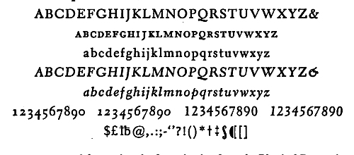
ELECTRA was used for setting the Investigation Into the Physical Properties of Books, pp. 129-144 and Twenty Years After, pp. 145-152.
ELECTRA was used for setting the Investigation Into the Physical Properties of Books, pp. 129-144 and Twenty Years After, pp. 145-152.
EMERSON was designed by Joseph Blumenthal and cut by Monotype in England in 1934. The face is a duplicate of his Spiral Press type, designed several years earlier and cut for him by Louis Hoell in Frankfort, Germany, in 1931. This face was initially used for a limited edition of Ralph Waldo Emerson's essay on Nature, printed on a hand press at Croton Falls in 1932, and privately published. The accompanying Emerson Italic was designed in 1936.
EMERSON was created by Joseph Blumenthal and manufactured by Monotype in England in 1934. The typeface is a copy of his Spiral Press type, which he designed a few years earlier and was cut for him by Louis Hoell in Frankfort, Germany, in 1931. This typeface was first used for a limited edition of Ralph Waldo Emerson's essay on Nature, printed on a hand press at Croton Falls in 1932, and published privately. The accompanying Emerson Italic was designed in 1936.

EMERSON was used for setting Typography of William Morris, pp. 233-238.
EMERSON was used for setting Typography of William Morris, pp. 233-238.
FAIRFIELD, a slightly decorative, original and contemporary old style, was designed for Linotype by Rudolph Ruzicka, the distinguished American wood engraver. Sharply cut, as though the letters came from the artist's graver rather than pen, Fairfield was designed for reading by "one of the most knowledgeable men in the country about letter forms and their style." To invite continuous reading, the designer feels, "type must have a subtle degree of interest and variety of design."
FAIRFIELD, a somewhat decorative, unique and modern take on an old style, was created for Linotype by Rudolph Ruzicka, the renowned American wood engraver. It has sharp cuts, as if the letters were made by the artist's graver instead of a pen. Fairfield was designed for reading by "one of the most knowledgeable men in the country about letter forms and their style." To encourage continuous reading, the designer believes, "type must have a subtle degree of interest and variety of design."

FAIRFIELD was used for setting The Fun and Fury of a Private Press, pp. 220-225.
FAIRFIELD was used for setting The Fun and Fury of a Private Press, pp. 220-225.
GARAMOND was introduced in America by ATF in 1919, when their cutting, based on the caractères de l'Université of the Imprimerie Nationale, appeared. Since, at least eight other versions have been made: by the English and American Linotype and Monotype, by Intertype, Ludlow, and the Stempel foundry. A documented article considering the XVI and XVII sources of the Garamond types, by Paul Beaujon, appeared in The Fleuron, V. This version is the American Monotype.
GARAMOND was introduced in America by ATF in 1919, when their cut, based on the caractères de l'Université from the Imprimerie Nationale, was released. Since then, at least eight other versions have been created: by English and American Linotype and Monotype, Intertype, Ludlow, and the Stempel foundry. A documented article discussing the XVI and XVII sources of the Garamond types, by Paul Beaujon, was published in The Fleuron, V. This version is the American Monotype.

GARAMOND was used for setting Colophons, pp. 31-44.
GARAMOND was used for setting Colophons, pp. 31-44.
GILL SANS, designed by Eric Gill in 1928, was patterned after lettering done for the Douglas Cleverdon book-shop in Bristol. First offered by English Monotype as a titling font (caps, figures and points only), the lower-case was added as the face grew in favor. Today, Gill is the most popular sans serif in England. It ranges through a variety of weights, including light, normal, heavy, extra heavy, and shadow and outline display and condensed versions.
GILL SANS, designed by Eric Gill in 1928, was inspired by the lettering created for the Douglas Cleverdon bookshop in Bristol. Initially, it was offered by English Monotype as a titling font (only in caps, figures, and points), but lowercase letters were added as the font became more popular. Today, Gill is the most popular sans serif typeface in England. It comes in various weights, including light, regular, bold, extra bold, as well as shadow, outline display, and condensed versions.

GILL SANS was used for setting Notes on Modern Printing, pp. 350-351.
GILL SANS was used for setting Notes on Modern Printing, pp. 350-351.
GRANJON was designed for Linotype by the late George W. Jones, one of England's greatest printers. It is neither a copy of a classic face nor an original creation, but rather something between the two, with its basic design stemming from classic Garamond sources. An exceedingly compact and useful old style, Granjon is exceptionally clear in small sizes. Its space-saving virtues are important in the book and periodical field.
GRANJON was created for Linotype by the late George W. Jones, one of England's top printers. It's not just a replica of a classic typeface or an entirely new design, but something in between, with its core design inspired by classic Garamond. An extremely compact and practical old style, Granjon is incredibly clear even in small sizes. Its ability to save space is crucial in the book and magazine industry.

GRANJON was used for setting Printers as Men of the World, pp. 88-102.
GRANJON was used for setting Printers as Men of the World, pp. 88-102.
JANSON, the distinguished seventeenth-century old style face, is presumed Dutch in origin. It was issued by Anton Janson, a Leipsic punch-cutter and type-founder, between 1660 and 1687. Little is known of Janson to supplement his first type specimen issued in 1675. The original matrices, bought in Holland from the heirs of Edling, Janson's successor, are possessed by the Stempel foundry in Frankfort, Germany. The Linotype recutting of Janson was made from type cast from the original matrices.
JANSON, the renowned old style typeface from the seventeenth century, is believed to be of Dutch origin. It was created by Anton Janson, a punch-cutter and type founder from Leipsic, between 1660 and 1687. There isn't much information about Janson beyond his first type specimen released in 1675. The original matrices, acquired in Holland from the heirs of Edling, Janson's successor, are held by the Stempel foundry in Frankfurt, Germany. The Linotype recutting of Janson was made from type cast from these original matrices.

JANSON was used for setting all the essays in this book excepting those indicated in other faces.
JANSON was used to format all the essays in this book, except for those specified in different typefaces.
MONTICELLO is a recutting of the famous Binny & Ronaldson Roman No. 1, a distinguished early American face cut in 1796 in Philadelphia. Type cast from the original matrices by A. T. F. has been favored for years by such discriminating printers as D. B. Updike, Fred Anthoensen and the Grabhorns. Linotype's remodeling of the type for modern use was named for the Papers of Thomas Jefferson, a fifty-volume publishing project by Princeton, for which the face was adopted.
MONTICELLO is a modern version of the well-known Binny & Ronaldson Roman No. 1, a notable early American typeface created in 1796 in Philadelphia. A. T. F. cast the type from the original molds, and it has been favored for years by discerning printers like D. B. Updike, Fred Anthoensen, and the Grabhorns. Linotype redesigned the type for contemporary use and named it after the Papers of Thomas Jefferson, a fifty-volume publishing project by Princeton, which adopted the typeface.

MONTICELLO was used for setting the First Work With American Types, pp. 65-77.
MONTICELLO was used for setting the First Work With American Types, pp. 65-77.
PERPETUA was designed by Eric Gill, the eminent English sculptor and maker of letters with pen, chisel and graver. Mr. Gill's account of his type (cut in England): "from drawings made by me. Those drawings were not made with special reference to typography—they were simply drawn with brush and ink. For the typographical quality of the fount, as also for the remarkably fine and precise cutting of the punches, the Monotype Corporation is to be praised."
PERPETUA was created by Eric Gill, the renowned English sculptor and letter designer using pen, chisel, and graver. Mr. Gill describes his type (crafted in England): "from drawings made by me. Those drawings weren't made specifically for typography—they were simply created with a brush and ink. The typographical quality of the font, as well as the exceptionally fine and precise cutting of the punches, should be credited to the Monotype Corporation."

PERPETUA was used for setting Typography, pp. 257-266.
PERPETUA was used for setting Typography, pp. 257-266.
POLIPHILUS is a literal reproduction of the Aldine Roman used in the Hypnerotomachia Poliphili in 1499, cut by Francesco Griffo. The recutting, by the English Monotype organization in 1923 (from sheets of the book) was attempted with the thought of providing a type to convey an old-world atmosphere appropriate for reprinting fifteenth-century classics. The accompanying Italic, named Blado, was the first of a number of Chancery italics to come from European type-founders.
POLIPHILUS is an exact reproduction of the Aldine Roman used in the Hypnerotomachia Poliphili in 1499, created by Francesco Griffo. The recutting, done by the English Monotype organization in 1923 (from sheets of the book), aimed to provide a typeface that conveys an old-world feel suitable for reprinting 15th-century classics. The accompanying Italic, called Blado, was the first of several Chancery italics produced by European type-founders.

POLIPHILUS was used for setting Some Collectors Read, pp. 191-211.
POLIPHILUS was used for setting Some Collectors Read, pp. 191-211.
TIMES ROMAN was designed by Stanley Morison for the London Times, and first used in that great newspaper. Its masculine simplicity, directness of design and excellent color makes it exceptionally useful for periodicals and general commercial work. The basic design objective of maximum legibility in minimum space has resulted in the larger letter-structure that makes each point size seem the equivalent of a size larger in most other types.
TIMES ROMAN was designed by Stanley Morison for the London Times, and it was first used in that prestigious newspaper. Its strong simplicity, straightforward design, and excellent color make it incredibly useful for magazines and general commercial work. The main design goal of ensuring maximum legibility in minimal space has led to a larger letter structure, which makes each point size appear to be the equivalent of one size larger in most other typefaces.

TIMES ROMAN was used for setting The First Principles of Typography, pp. 239-251.
TIMES ROMAN was used for setting The First Principles of Typography, pp. 239-251.
INDEX
advertising card, 160-61, 167, 168
Aesop (Parma, 1483), 57
Aldine Poets series, 156
Aldine type face, 241
Italic, __A_TAG_PLACEHOLDER_0__
Aldus; see Manutius, Aldus
alphabet
Greek, __A_TAG_PLACEHOLDER_0__-__A_TAG_PLACEHOLDER_1__
Hebrew, __A_TAG_PLACEHOLDER_0__-__A_TAG_PLACEHOLDER_1__
letters of, __A_TAG_PLACEHOLDER_0__-__A_TAG_PLACEHOLDER_1__
Phoenician, __A_TAG_PLACEHOLDER_0__-__A_TAG_PLACEHOLDER_1__
Roman, __A_TAG_PLACEHOLDER_0__-__A_TAG_PLACEHOLDER_1__
sources of, __A_TAG_PLACEHOLDER_0__-__A_TAG_PLACEHOLDER_1__
American Institute of Graphic Arts, xiv, 170
"Fifty Books of the Year," __A_TAG_PLACEHOLDER_0__, __A_TAG_PLACEHOLDER_1__-__A_TAG_PLACEHOLDER_2__
Trade Book Clinic, __A_TAG_PLACEHOLDER_0__, __A_TAG_PLACEHOLDER_1__
American Type Founders Co., 254
Ames, Joseph, Typographical Antiquities, 38, 78
Anabat, 154
Anne of Austria, 105
Anthoensen, Fred, 419
Antigone Greek type, 207
Apollo Press, 384
appendix, 163
Applegarth, Augustus, 27
Armitage, Merle, xii-xiv, 319
Notes on Modern Printing, __A_TAG_PLACEHOLDER_0__
Arnoullet, Balthazar, 60
Arrighi type face, 414
Arrivabene, Georgius, 53
Ashbee, C. R., The Private Press, 180
Ashendene Press, 181, 188, 215
Bibliography, __A_TAG_PLACEHOLDER_0__
Virgil, __A_TAG_PLACEHOLDER_0__
Austin, Richard, 92, 99, 411
back matter, 163-64
Bagford, John, 64
Bailey, Francis, 76
Baldwin, Stanley, 197 n.
Barker-Mill, Peter, 218
Barnacles from Many Bottoms, 297
Barnhart Brothers & Spindler (Chicago), 254, 369
Bartlett, Edward E., 164[Pg 422]
Baskerville, John, 60, 64, 92, 98, 186
letter-spacing of, __A_TAG_PLACEHOLDER_0__-__A_TAG_PLACEHOLDER_1__
Baskerville type face, 155-56, 244, 404
sample, __A_TAG_PLACEHOLDER_0__
bastard title, 160, 168
Bauhaus School, typography of, 306-7, 319
Bay, Jacob, 69-77
Bayer, Herbert, xii, xiv
Beaujon, Paul, 417
Becker, Carl L., 363
Begg, John, xiv
Beilenson, Peter, xiii, 164, 165, 168
Graphic Design, __A_TAG_PLACEHOLDER_0__
Bell, John, 92, 411
British Poets, __A_TAG_PLACEHOLDER_0__, __A_TAG_PLACEHOLDER_1__
UK Theatre, __A_TAG_PLACEHOLDER_0__, __A_TAG_PLACEHOLDER_1__
career of, __A_TAG_PLACEHOLDER_0__-__A_TAG_PLACEHOLDER_1__
Bell type face, 403
specimen, __A_TAG_PLACEHOLDER_0__
Belloc, Hilaire, 192
Bembo, Pietro, 53, 94, 412
Bembo type face, 403
specimen, __A_TAG_PLACEHOLDER_0__
Beneti, Cyprian, 41
Bennett, Arnold, 203
Bennett, Paul A., xv, 290
Bensley, Thomas, 92
Benton, Linn Boyd, 254
Benton, Morris Fuller, 254
Berghen, Adrien van, 46, 48
Bernard, St., Sermones (1481), 44
Berners, Juliana, comp., Book of St. Albans, 107
Berthelet, Thomas, 50
Besant, Walter, 387
Bible
Estienne, __A_TAG_PLACEHOLDER_0__
first printed, __A_TAG_PLACEHOLDER_0__-__A_TAG_PLACEHOLDER_1__
German (1478), __A_TAG_PLACEHOLDER_0__
Gutenberg, __A_TAG_PLACEHOLDER_0__-__A_TAG_PLACEHOLDER_1__
Latin (1456), __A_TAG_PLACEHOLDER_0__
Plantin polyglot, __A_TAG_PLACEHOLDER_0__
printing monopoly in England, __A_TAG_PLACEHOLDER_0__ n.
Rogers World, __A_TAG_PLACEHOLDER_0__-__A_TAG_PLACEHOLDER_1__
Sower speaks German, __A_TAG_PLACEHOLDER_0__, __A_TAG_PLACEHOLDER_1__
Vulgate (Venice, 1487), __A_TAG_PLACEHOLDER_0__
bibliography, 163
binding, 119[Pg 423]
binding, limp vellum, 230
Binny, Archibald, 76
Binny & Ronaldson (Philadelphia), 77, 252, 419
Birrell, Francis, 199
black-letter
Gutenberg, __A_TAG_PLACEHOLDER_0__-__A_TAG_PLACEHOLDER_1__
modern, __A_TAG_PLACEHOLDER_0__
Black Sun Press, 319
Blado, Antonio, 54
Blado Italic type face, 54, 420
Blaeu, Willem J., 89
Blumenthal, Joseph, 164, 165
Emerson, __A_TAG_PLACEHOLDER_0__, __A_TAG_PLACEHOLDER_1__
Blunt, Wilfrid, 192
Bocard, Andrieu, 41
Bodoni, Giambattista, 60, 64, 92, 98
Typographic Manual (1818), __A_TAG_PLACEHOLDER_0__
Bodoni Book type face
specimen, __A_TAG_PLACEHOLDER_0__
Bodoni's 'soprasilvio,' 276-78, 284, 287
Bologna, Francesco da, 92
book, anatomy of; see under individual headings
book design, principles of, 115-28, 281-89, 350-51
Book of St. Albans, 107
Bourdillon, F. W., 79
Boydell, John, Shakespeare, 78
Braby, Dorothea, 218
Bradbury & Evans, 157
Bradford, Andrew, 356-57, 362
Bradford, William, 356, 358
Bradley, J. W., Dictionary of Miniaturists, 40
Bradley, Will, 253, 291
Bradley type face, 253
Bridges, Robert, 238
Brimmer type face, 411
Browning, Robert, 192
Buckland-Wright, John, 218
Buell, Abel, 65-66, 68, 71-73, 252, 255
Bull of Pius IX (Mainz, 1463), 42, 53
Bulmer, William, 92, 100, 413
Burn & Oates, 194, 196
Burne-Jones, Sir Edward, 233, 236, 238
Caledonia type face, 255, 404
specimen, __A_TAG_PLACEHOLDER_0__
Calkins, Earnest Elmo, 368
calligraphy, 255, 337-43
[Pg 424]defined, __A_TAG_PLACEHOLDER_0__-__A_TAG_PLACEHOLDER_1__
Cambridge University Press, 51, 158, 184 n., 185, 291
Campbell, Dr. William J., Collection of Franklin Imprints, 354, 357, 360, 365
Canstein, Baron von, 29
Capell, Edward, Prolusions, 78
capital letters, 257-61
Cary, Mary, Diary, 197
Caslon, William, 63, 64, 89, 92
Caslon type face, 142, 156, 195, 204, 241, 254, 391
rediscovery of, __A_TAG_PLACEHOLDER_0__
Shaw's preference for, __A_TAG_PLACEHOLDER_0__
sample, __A_TAG_PLACEHOLDER_0__
Catherine de Médici, 106
Catherine the Great, 106
Caxton, William, 19, 29, 42, 49, 89, 92, 184-85
Dictes or Sayengis, __A_TAG_PLACEHOLDER_0__, __A_TAG_PLACEHOLDER_1__
Caxton Club, 33
Centaur type face, 220, 255-56, 403
specimen, __A_TAG_PLACEHOLDER_0__
Central Type Foundry (St. Louis), 253
Century Dictionary, 34
Champollion, J. F., 3
Chapman, Dr. R. W., 392, 394
Chappe, Paulinus, 18
Charlemagne, 12
Charles, Thomas, 29
Cheltenham type face, 254
Chesterfield, Earl of (Philip Stanhope), 90
Chiswick Press, 217
Christie, E. D., 95
Chronicles of the londe of England, 40
Cicero, Epistolae (Venice, 1469), 40
Clark, Edward, relations with Shaw, 382-401
Clark, Robert, 384-85
Clark, R. & R., Shaw's printer, 381-401
Claudin, Anatole, 176
Cleland, T. M., xiii, 112-13
Mean Words, __A_TAG_PLACEHOLDER_0__, __A_TAG_PLACEHOLDER_1__
type ornaments, __A_TAG_PLACEHOLDER_0__, __A_TAG_PLACEHOLDER_1__
Cleve, Johann von, Cantiones, 42
Cloister type face, 254
Cobbett, William, Rural Rides, 208
Cobden-Sanderson, T. J., 180-81, 188, 229, 388
Cockerell, Douglas, 395
Cockerell, Sir Sydney, 233
Coleridge, S. T., Table Talk, 157[Pg 425]
Colines, Simon, 185
Collins, F. H., Authors' and Printers' Dictionary, 392
Collins, Howard, 394
Colman, Morris, 164, 166-67
colophon, 32-44, 52
defined, __A_TAG_PLACEHOLDER_0__-__A_TAG_PLACEHOLDER_1__
examples of, __A_TAG_PLACEHOLDER_0__-__A_TAG_PLACEHOLDER_1__, __A_TAG_PLACEHOLDER_2__
composition, defined, 242
Conkwright, P. J., 164, 166
Conrad, Joseph, 116
Cooper, Oswald, 254
Copland, Robert, 185
copyright, notice of, 161, 166, 167, 168
Coward, Noel, 208
Cowper, Edward, 26-27
Croce, Benedetto, Autobiography, 312
Crompton, 26
Currer, Mrs. Richardson, 107
Currie, Kent, 272
Daniel, Rev. C. H. O., 178, 187
Daniel Press, 187, 234, 238
Darton, F. J. H.; see Sawyer, C. J.
Davies, Peter, 208
Davis, Southwick, 379
Dawson, Thomas, 51
Day, John, 50, 80
Daye, Matthew, 97
Daye, Stephen, 97
Deceyte of Women, The, 53, 61
Decretals of Gregory IX (Rome, 1474), 41
dedication, 161-62, 166-68
Deepdene type face, 223, 403
specimen, __A_TAG_PLACEHOLDER_0__
de La Haye, Corneille, 60
Dent, J. M., 157
DeSancha, Antonio, 415
De Vinne, Theodore Low, x, 31
Notable Printers in Italy, __A_TAG_PLACEHOLDER_0__
Basic Printing Types, __A_TAG_PLACEHOLDER_0__
Treatise on Title Pages, __A_TAG_PLACEHOLDER_0__-__A_TAG_PLACEHOLDER_1__, __A_TAG_PLACEHOLDER_2__
De Vinne type face, 253
Diamond Classics, 156, 236
Diane de Poitiers, 106
Dibdin, T. F., 104
Dictionary of American Biography, 363
Didot, Firmin, 26
career, __A_TAG_PLACEHOLDER_0__
Didot, François Ambroise, 92[Pg 426]
Didot family, 64, 90, 92, 101
Diui Athanasii (Paris, 1500), 41
Dolet, Etienne, 94-96
Donaldson, Alexander, 384
Dorici brothers, 53
double-page spread, 168
Doves Press, 117, 180, 188, 229
Du Barry, Countesse, 105
du Bois, Simon, Hours (1527), 154
Dunlap, John, 76
Dunster, Henry, 98
Dunster, Mrs. Henry, 98
Dürer, Albrecht, 55, 92, 275, 277
Dwiggins, W. A., x
Caledonia, __A_TAG_PLACEHOLDER_0__, __A_TAG_PLACEHOLDER_1__
Eldorado, __A_TAG_PLACEHOLDER_0__
Electra, __A_TAG_PLACEHOLDER_0__, __A_TAG_PLACEHOLDER_1__
MSS by WAD, __A_TAG_PLACEHOLDER_0__, __A_TAG_PLACEHOLDER_1__
"Roman Letter Shapes," __A_TAG_PLACEHOLDER_0__-__A_TAG_PLACEHOLDER_1__
Dyck, Christoffel van, 92
Edinburgh, publishing history of, 384-85
Ege, Otto, ix, 3
Eldorado type face, specimen, 415
Electra type face, 255-56, 403
specimen, __A_TAG_PLACEHOLDER_0__
Elizabeth, Queen, 105-6
Elzevir family, 60, 92, 97
Emerson type face, 255-56
specimen, __A_TAG_PLACEHOLDER_0__
Encyclopaedia Britannica, 35, 227, 239, 338
first edition, __A_TAG_PLACEHOLDER_0__
engraving
for example, __A_TAG_PLACEHOLDER_0__
invention of, __A_TAG_PLACEHOLDER_0__
Enschedé Foundry, 221-22
Erasmus, Desiderius, 94
Sayings, __A_TAG_PLACEHOLDER_0__
Family Discussions, __A_TAG_PLACEHOLDER_0__
Essex House Press, 180
Estienne, Robert, 94 n.
career, __A_TAG_PLACEHOLDER_0__-__A_TAG_PLACEHOLDER_1__
Estienne family, 92, 96 n., 185
Eugene, Prince of Savoy, 211
Evans, Sir Arthur, 4
Eve, Clovis, 105
Eve, Nicolas, 105
Exercitium super Pater Noster, 23
Fairfield type face, 255-56[Pg 427]
Fairfield type faces, specimen, 416
Faques, William, 50
Farjeon, Herbert, 209
Farleigh, John, 399
Fell types, 178, 187, 196
Fichet, Guillaume, 153-54
Field and Tuer, 157
Figgins, Vincent, 92
Fine, Oronce, Quadrans Astrolabicus, 56
Finley, John, 378
Fleuron, The, x, 388, 391, 417
Flower, Desmond, 100, 153
Ford, Paul Leicester, Many-Sided Franklin, 354-55, 362, 363-64
foreword; see preface
format; see book design
Foulis, Andrew, 186
Foulis, Robert, 186
Fournier, P. S., 57, 59, 64
Fournier family, 92
Fournier type face, Shaw's choice of, 392
Fox, Emmanuel, 70, 76
Fox, Justus, 67-77
Fragment of World Judgment, 18
François I, 49, 94-95, 97
Franklin, Benjamin, 29
Memoir, __A_TAG_PLACEHOLDER_0__
career, __A_TAG_PLACEHOLDER_0__-__A_TAG_PLACEHOLDER_1__; as printer, __A_TAG_PLACEHOLDER_2__-__A_TAG_PLACEHOLDER_3__
Dissertation on Free Will, __A_TAG_PLACEHOLDER_0__
epitaph, __A_TAG_PLACEHOLDER_0__-__A_TAG_PLACEHOLDER_1__
and Hall, __A_TAG_PLACEHOLDER_0__
imprints, __A_TAG_PLACEHOLDER_0__, __A_TAG_PLACEHOLDER_1__, __A_TAG_PLACEHOLDER_2__, __A_TAG_PLACEHOLDER_3__
"Improving Reverse Printing," __A_TAG_PLACEHOLDER_0__
New England Courant, __A_TAG_PLACEHOLDER_0__-__A_TAG_PLACEHOLDER_1__
Poor Richard almanacs, __A_TAG_PLACEHOLDER_0__-__A_TAG_PLACEHOLDER_1__
Franklin, Deborah Read, 362
Franklin, James, 353-56, 358, 362-63
imprints, __A_TAG_PLACEHOLDER_0__-__A_TAG_PLACEHOLDER_1__
Franklin, Josiah, 352-53
Freeman's Oath, The, 97-98
Froben, Johann, 62
front matter
elements of, __A_TAG_PLACEHOLDER_0__-__A_TAG_PLACEHOLDER_1__, __A_TAG_PLACEHOLDER_2__-__A_TAG_PLACEHOLDER_3__
typography of, __A_TAG_PLACEHOLDER_0__-__A_TAG_PLACEHOLDER_1__
Fuhrmann, Dr. Otto, 224
Funk & Wagnalls' Standard Dictionary, 34[Pg 428]
Fust, Johann, 18, 38-39, 42, 49, 53, 91, 92, 183
Galesburg imprint, 378-80
Galloway, Joseph, 74
Garamond, Claude, 92, 93, 276
Garamond type face, 62, 223, 256
specimen, __A_TAG_PLACEHOLDER_0__
Gardiner, Thomas, 51
Garnett, David, and Nonesuch Press, 191, 198-99, 205, 209
Garnett, Porter, xiii, 115, 178
Garnett, Richard, 37-38
Garvin, J. L., 194
Gaunt, Sydney, 254
Geistliches Magazien, Ein, 67-69, 71
Geminus, Thomas, Anatomy, 57
Gentry, Helen, Chronology, 91
Gering, Ulrich, 154
Gesamtkatalog der Wiegendrucke, 31
Gibbings, Robert, 218
Gilgamesh, epic of, 214
Gill, Eric, xiii, 218, 257, 417
Perpetua, __A_TAG_PLACEHOLDER_0__
Gill Sans type face, specimen, 417
Glick, Milton, 164, 166
Glogoviensis, Johannes, 53
glossary, 163
Godfrey, Thomas, 362
Golden Cockerel Press, 212-19
imprints, __A_TAG_PLACEHOLDER_0__-__A_TAG_PLACEHOLDER_1__
Golden Hind Press, 164, 220-25
imprints, __A_TAG_PLACEHOLDER_0__-__A_TAG_PLACEHOLDER_1__
Goltzius, Hubert, 60
Gooden, Stephen, 199, 206
Goodhue, Bertram G., 254
Gordon, Watson, 129
Goudy, Frederic W., xiii, 222, 232, 267, 274, 279, 318
Deepdene, __A_TAG_PLACEHOLDER_0__
50 Years of Type Design, __A_TAG_PLACEHOLDER_0__
type designs, __A_TAG_PLACEHOLDER_0__, __A_TAG_PLACEHOLDER_1__
Grabhorn, Edwin, xiii, 226
Grabhorn Press, 181, 226-32, 419
Whitman, *Leaves of Grass*, __A_TAG_PLACEHOLDER_0__
Graf, Urs, 55
Granjon, Robert, 57, 276
Granjon type face, specimen, 418
Granniss, Ruth Sheppard, 31, 107
Greene, Belle Da Costa, 107
Greenhood, David; see Gentry, Helen
Grevill, Sir Foulk, 203[Pg 429]
Grien, Hans Baldung, 55
Griffo, Francesco, 412, 420
Grimm, Baron Melchior von, 306
Grimm, Jacob, 307
Grimm, Wilhelm, 307
Grolier, Jean, 92, 94
Grolier Club, 51, 83 n., 107, 365
Dowson's Pierrot of the Minute, __A_TAG_PLACEHOLDER_0__-__A_TAG_PLACEHOLDER_1__
Grotefend, G. F., 3
Gryphius, Sebastian, 95
Gutenberg, Johann, 18, 23-24, 90-92, 183
Bible, __A_TAG_PLACEHOLDER_0__-__A_TAG_PLACEHOLDER_1__
Rushmore hoax, __A_TAG_PLACEHOLDER_0__-__A_TAG_PLACEHOLDER_1__
types of, __A_TAG_PLACEHOLDER_0__
Guthrie, James, 179
Hadrian type face, 255
Haebler, Dr. Konrad, 53
Haight, Anne Lyon, 103
half title, 163, 165, 167-68
Hall, D., 364-65
Han, Ulrich, 41
Hardouyn brothers, 154
Book of Hours (1500), __A_TAG_PLACEHOLDER_0__
Harmsworth, Cecil, 208
Harmsworth, Desmond, 208
Harmsworth, Eric, 208
Harper & Brothers, 221, 225
Harrison, Henry, 319
Hart, Horace, 394
Harter, Evelyn, ix, 88, 164-66
Hayward, John, 205
Heber, Richard, 107
Hector, Benedictus, 48
Heiligen, 22
Hendrickson, James, 281
Henry II of France, 106
Hind, Arthur M., 23
Hodgson, Ralph, 199
Hoell, Louis, 416
Hogben, Lancelot, ix, 15
Holbein, Hans, the Elder, 55
Holbein, Hans, the Younger, 55
"Dance of Death," __A_TAG_PLACEHOLDER_0__-__A_TAG_PLACEHOLDER_1__
Hopfer, Daniel, 55
Hornby, St. John, 188, 215
Hroswitha, 104
Hughes-Stanton, Blair, 218
Huxley, Aldous, xiii, 344
Hypnerotomachia Poliphili, 420[Pg 430]
imposition, defined, 242-43
impression, 119-20, 229-30
index, 163-64
ink
colors used, __A_TAG_PLACEHOLDER_0__-__A_TAG_PLACEHOLDER_1__
varnish in, __A_TAG_PLACEHOLDER_0__
Inland Printer, 254
Intelligencer Print (Galesburg), 378-80
introduction, 162-63
Italic type, 257-61
first used, __A_TAG_PLACEHOLDER_0__
proper use of, __A_TAG_PLACEHOLDER_0__
Jackson, Holbrook, xi, 155, 388
Anatomy of Bibliomania, __A_TAG_PLACEHOLDER_0__
Fear of Books, __A_TAG_PLACEHOLDER_0__
Book Printing, __A_TAG_PLACEHOLDER_0__, __A_TAG_PLACEHOLDER_1__-__A_TAG_PLACEHOLDER_2__, __A_TAG_PLACEHOLDER_3__
Jacobs, S. A., xiv
Jaggard, William, Nobilitas Politica (1608), 285-86
Janson, Anton, 418
Janson type face, 210, 403
specimen, __A_TAG_PLACEHOLDER_0__
Jenson, Nicolas, 34, 92, 274, 288 n.
Pliny (1472), __A_TAG_PLACEHOLDER_0__
Jenson's Roman type face, 274-77
John of Speier (Spire), 19, 40
Johnson, A. F., 52
Johnson, J., Typographia, 78 n., 268
Johnson, Samuel, 382
Jones, David, 218
Jones, George W., 418
Josephy, Robert, ix, xiii, 169
Judith, Countess of Flanders, 104
Kauffer, E. McKnight, 205-6
Keimer, Samuel, 357-58, 359-62
imprints, __A_TAG_PLACEHOLDER_0__
Universal Instructor, __A_TAG_PLACEHOLDER_0__
Keith, Sir William, 358
Kelmscott Press, 43, 177-80, 187-88, 233-38
binding, __A_TAG_PLACEHOLDER_0__
Chaucer, __A_TAG_PLACEHOLDER_0__, __A_TAG_PLACEHOLDER_1__, __A_TAG_PLACEHOLDER_2__
paper, __A_TAG_PLACEHOLDER_0__-__A_TAG_PLACEHOLDER_1__
Recuyell of the Histories of Troye, __A_TAG_PLACEHOLDER_0__
types, __A_TAG_PLACEHOLDER_0__, __A_TAG_PLACEHOLDER_1__
see also William Morris
Kennington, Eric, 395
Kent, Henry Watson, xiv
[Pg 431]
Kerver, Thielman, 274
Keynes, Geoffrey, 205
Kipling, Rudyard, 7
Kirkwood, James, 385
Koberger, Anton, 92
Koch, Rudolph, design, 207
König, Friedrich, 26
Krantz, Martin, 154
Kromberger, Johann, 97
Laboratory Press, 178
Lamb, Charles, 32
Lane, John, 157, 194
Lang, Andrew, The Library, 103-4
Lansbury, George, 197-98
Lasteyrie, Count de, Typographie Economique (1837), xii, 306
Lawrence, T. E., 209, 218
leading; see letter-spacing
Lee, Marshall, ed., Books for Our Time, xiv
Lee Priory Press, 186
Leeu, Gerard, 40
LeRouge, Pierre, 50
lettering, 338-43, 405-7
defined, __A_TAG_PLACEHOLDER_0__
letter-spacing, 287-88
leading, __A_TAG_PLACEHOLDER_0__-__A_TAG_PLACEHOLDER_1__, __A_TAG_PLACEHOLDER_2__
"driving out," __A_TAG_PLACEHOLDER_0__, __A_TAG_PLACEHOLDER_1__
Lewis, W. S., 98-99
ligature, 80-81
Linotype, defined, 404
list of illustrations, 162
Livingston, Luther S., Franklin and His Press at Passy, 365
Longlond, J., A Sermon (1536), 58
Lowell, Amy, 107
lower-case letters, 257-61
Lowinsky, Thomas, drawing, 204
Lutetia type face, 232, 414
Luther, Martin
To the Christian Nobility, __A_TAG_PLACEHOLDER_0__
tracts, __A_TAG_PLACEHOLDER_0__
Lydgate, John, 53
Lydian type face, 255-56
McCulloch, William, 69-71, 74, 76
MacDonald, James Ramsay, 197 n.
Machiavelli, Nicolò, Discorsi (1531), 54
Mackall, Leonard L., "Notes for Bibliophiles," 34
[Pg 432]
McKerrow, Ronald B., ix, 78
Introduction to Bibliography, __A_TAG_PLACEHOLDER_0__, __A_TAG_PLACEHOLDER_1__-__A_TAG_PLACEHOLDER_2__, __A_TAG_PLACEHOLDER_3__
Macmillan, Daniel, 387
McMurtrie, D. C., The Book, 18-19, 23, 27, 28
Madan, Falconer, 176
Maillet, Jacques, 47, 50
Mainz Diary: New Light on the Invention of Printing, 224
Malory, Sir Thomas, Morte d'Arthur, 41
Mansion, Colard, 19
Manutius, Aldus, 48-49, 50, 89, 92, 156, 185
Bembo's De Aetna, __A_TAG_PLACEHOLDER_0__
career, __A_TAG_PLACEHOLDER_0__-__A_TAG_PLACEHOLDER_1__
Marchant, Guy, 47
Marguerite of Navarre, 105
Marie Antoinette, 105
Martin, Gilbert, 384
Martin, John, Bibliographical Catalogue of Books Privately Printed, 175-76
Martin, William, 92, 413
Mary Stuart, 105
Massachusetts Gazette and Boston Weekly News-Letter, 66
Mathews, Elkin, 157
Maxwell, William, 206
relations with Shaw, __A_TAG_PLACEHOLDER_0__-__A_TAG_PLACEHOLDER_1__
Mazarin, Jules, 105
Mendel, Vera; see Meynell, Vera
Meredith, George, 192, 387
Meredith, Hugh, 360-62
Mergenthaler, Ottmar, 27, 254
Merry England, 193-94
Merrymount Press, xii, 181
Merrymount type face, 254
metal flower; see printer's flower
Meynell, Alice, 192-94
Ten Poems, __A_TAG_PLACEHOLDER_0__
Meynell, Everard, 192
Meynell, Sir Francis, xiv, 158, 189, 231
Nonesuch Press, __A_TAG_PLACEHOLDER_0__-__A_TAG_PLACEHOLDER_1__
"Printer's Flowers and Arabesques," __A_TAG_PLACEHOLDER_0__
on typesetting machines, __A_TAG_PLACEHOLDER_0__-__A_TAG_PLACEHOLDER_1__
Meynell, Vera
and Nonesuch Press, __A_TAG_PLACEHOLDER_0__, __A_TAG_PLACEHOLDER_1__-__A_TAG_PLACEHOLDER_2__, __A_TAG_PLACEHOLDER_3__, __A_TAG_PLACEHOLDER_4__, __A_TAG_PLACEHOLDER_5__-__A_TAG_PLACEHOLDER_6__
Meynell, Wilfrid, 192-96, 199[Pg 433]
Middle Hill Press, 178
Middleton, Henry, 80
Miller & Richards, 384
Miller-Parker, Agnes, 218
missals, first printed, 22-23
Mitchelson, David, 66-67
Monotype, 158, 189
defined, __A_TAG_PLACEHOLDER_0__
Montagu, Lady Mary Wortley, 211
Montague Press, 291
De Guerin's The Centaur, __A_TAG_PLACEHOLDER_0__
Monticello type face, 403
specimen, __A_TAG_PLACEHOLDER_0__
Moore, George, 193
Ulick and Soracha, __A_TAG_PLACEHOLDER_0__
Mores, Edward Rowe, ix, 83, 370
Morgan, Charles, House of Macmillan, 387
Morgan, Gwenda, 218
Morison, Stanley, x, xiii, 99, 116, 158, 196, 384
on handwriting, __A_TAG_PLACEHOLDER_0__
"Typography Basics," __A_TAG_PLACEHOLDER_0__ Times New Roman, __A_TAG_PLACEHOLDER_0__
Morris, William, xi, 179, 390
achievement and influence, __A_TAG_PLACEHOLDER_0__-__A_TAG_PLACEHOLDER_1__, __A_TAG_PLACEHOLDER_2__, __A_TAG_PLACEHOLDER_3__-__A_TAG_PLACEHOLDER_4__, __A_TAG_PLACEHOLDER_5__, __A_TAG_PLACEHOLDER_6__
career, __A_TAG_PLACEHOLDER_0__-__A_TAG_PLACEHOLDER_1__
Note on His Goals in Starting the Kelmscott Press, __A_TAG_PLACEHOLDER_0__
Roots of the Mountains, __A_TAG_PLACEHOLDER_0__, __A_TAG_PLACEHOLDER_1__, __A_TAG_PLACEHOLDER_2__
typography of, __A_TAG_PLACEHOLDER_0__-__A_TAG_PLACEHOLDER_1__, __A_TAG_PLACEHOLDER_2__, __A_TAG_PLACEHOLDER_3__
see also Kelmscott Press
Mountjoye type face, 403
Moxon, Edward, 83, 157
Moxon, Joseph, 57
Murray, John, 157, 387-88
Musurus, Marcus, 94
Nash, John, 218
National Association for the Advancement of Art, 388
Nelson, George, xiv
New Colophon, The, xv
New England Courant, The, 355-56
New York Herald Tribune, 34
Newdigate, Bernard H., 181, 390
Niccolo, Simon di, 41
Nichols, Dr. Charles L., Justus Fox, 70
Nonesuch Press, 158, 181, 189, 228
[Pg 434]history of, __A_TAG_PLACEHOLDER_0__-__A_TAG_PLACEHOLDER_1__
Nonesuch Press, imprints, 195, 200, 204-5, 207, 209-10
press mark, __A_TAG_PLACEHOLDER_0__
and Random House, __A_TAG_PLACEHOLDER_0__
Shakespeare, __A_TAG_PLACEHOLDER_0__
Nuremberg Chronicle, The, 41, 91, 92
O'Connor, John, 218
Ogg, Oscar, ix, 337
Olpe, J. von, 91
Orcutt, William Dana, Manual of Linotype Typography, 160-65
Original Old Style type face (Italic), 223
ornament; see type ornament
Oswald, John Clyde, Benjamin Franklin, Printer, 358
Oxford English Dictionary, 34-35
Oxford type face, 256
Oxford University Press, 51, 79, 158, 184 n., 185, 196
Palmer, Samuel, 358-59
Pannartz, Arnold, 78, 153
paper, 16-18, 26-27
Chinese invention of __A_TAG_PLACEHOLDER_0__
dampening of, __A_TAG_PLACEHOLDER_0__
esparto grass, __A_TAG_PLACEHOLDER_0__
mills, __A_TAG_PLACEHOLDER_0__-__A_TAG_PLACEHOLDER_1__, __A_TAG_PLACEHOLDER_2__-__A_TAG_PLACEHOLDER_3__
papyrus, __A_TAG_PLACEHOLDER_0__
rag, __A_TAG_PLACEHOLDER_0__
texture of, __A_TAG_PLACEHOLDER_0__
wood pulp, __A_TAG_PLACEHOLDER_0__
Patmore, Coventry, 193, 194
Pelican Press, 198
Pelliot, Paul, 25
Pembroke, Countess of (Mary Herbert), 106
Penguin Books, 158
editions of Shaw, __A_TAG_PLACEHOLDER_0__-__A_TAG_PLACEHOLDER_1__, __A_TAG_PLACEHOLDER_2__
Pennsylvania Gazette, The, 362-63
Pennsylvania Mercury, The, 65, 68, 71-74
types for, __A_TAG_PLACEHOLDER_0__-__A_TAG_PLACEHOLDER_1__
Perpetua type face, 403
specimen, 419
Peter Pauper Press, 165
Petit, Jean, 41
Phillips, Fred, Old-Fashioned Type Book, 255
pi, derivation of name, 370
pica, derivation of name, 370[Pg 435]
Pickering, William, 156-57, 234, 318
Pigouchet, Phillipe, 154
Pio family, 94
Plant, Marjorie, English Book Trade, 382
Plantin, Christopher, 60, 96
playing cards, 21-22
Pleydenworff, Wilhelm, 41
Poe, E. A., "The Gold Bug," 8
point system, x, 369
Poliphilus type face, 200, 403
specimen, __A_TAG_PLACEHOLDER_0__
Pollard, Alfred W., xi, 35, 36-37, 176, 182
Essay on Colophons, __A_TAG_PLACEHOLDER_0__, __A_TAG_PLACEHOLDER_1__-__A_TAG_PLACEHOLDER_2__, __A_TAG_PLACEHOLDER_3__-__A_TAG_PLACEHOLDER_4__
Pollard, Graham, 78 n.
Pompadour, Mme. de, 105
Poulton, T. L., 206
preface, 162-63
printer, amateur, 182-90
see also indie press
printer's flower, 57-59, 83-84, 156-57
see also type ornament
printer's mark, 45-51
printing
development of, __A_TAG_PLACEHOLDER_0__-__A_TAG_PLACEHOLDER_1__
importance of, __A_TAG_PLACEHOLDER_0__-__A_TAG_PLACEHOLDER_1__
principles of, __A_TAG_PLACEHOLDER_0__-__A_TAG_PLACEHOLDER_1__
restricted in England, __A_TAG_PLACEHOLDER_0__-__A_TAG_PLACEHOLDER_1__
private press
defined, and aims of, __A_TAG_PLACEHOLDER_0__-__A_TAG_PLACEHOLDER_1__, __A_TAG_PLACEHOLDER_2__
influence of, __A_TAG_PLACEHOLDER_0__-__A_TAG_PLACEHOLDER_1__
principles and pleasures of, __A_TAG_PLACEHOLDER_0__-__A_TAG_PLACEHOLDER_1__
types of, __A_TAG_PLACEHOLDER_0__-__A_TAG_PLACEHOLDER_1__
see also printer, hobbyist
Proctor, Robert, 188
Proctor's Greek type face, 188
Psalter (Mainz, 1457), 38-39, 49, 183
punch-cutting machine, Benton pantograph, 252-54
punctuation marks, 81-82, 285, 289
Püterschein, Dr. Herman, 224
Pynson, Richard, 53
Pythagoras, 12
Rabelais, François, Pantagruel, 95
Radin, Simon, 41
Random House, and Nonesuch Press, 208
Ransom, Will, ix, 254
Independent Publishers, __A_TAG_PLACEHOLDER_0__, __A_TAG_PLACEHOLDER_1__
Ratdolt, Erhard, 53, 55[Pg 436]
Ravilious, Eric, 218
Rawlinson, Sir Henry C., 3
Read, Herbert, Grass Roots of Art, 155, 157
Recuyell of the Histories of Troye, 19, 49
Regiomontanus (Müller, J.), Calendar, 53
Reichl, Ernst, xiv, 164-65, 168
Reinheckel, Andreas, 42
Reuchlin, Johann, 94
Richards, Grant, 384, 385
Finding Authors, __A_TAG_PLACEHOLDER_0__
Ricketts and Shannon, 188
Riverside Press, 231, 291, 411
Rochester Press, 177
Rodenberg, Julius; see Simon, Oliver
Roeder, Ralph, 93
Roffe, Edwin, 177
Rogers, Bruce, xiii, 164, 165, 188, 220, 318, 411
Centaur, __A_TAG_PLACEHOLDER_0__, __A_TAG_PLACEHOLDER_1__
designs, __A_TAG_PLACEHOLDER_0__-__A_TAG_PLACEHOLDER_1__
influence, __A_TAG_PLACEHOLDER_0__
Printing Paragraphs, __A_TAG_PLACEHOLDER_0__, __A_TAG_PLACEHOLDER_1__-__A_TAG_PLACEHOLDER_2__, __A_TAG_PLACEHOLDER_3__
World Bible, __A_TAG_PLACEHOLDER_0__-__A_TAG_PLACEHOLDER_1__
Rollins, Carl Purington, xiii, 98, 164, 166, 252, 291, 318, 414
B. R.—America's Typographic Playboy, __A_TAG_PLACEHOLDER_0__-__A_TAG_PLACEHOLDER_1__
"Romney Street Press," 196-97
Root, Riley, Journal of Travels (Galesburg, 1850), 379-80
Rose, Aquila, 356-57
Routledge, George, 26
Rudge, William, 231
Rudge Press, 295
running head, 245
Rushmore, Arthur W., ix, 164, 167-68, 220
Russell, Bertrand, 198
Unpopular Essays, __A_TAG_PLACEHOLDER_0__-__A_TAG_PLACEHOLDER_1__
Ruzicka, Rudolph
design, __A_TAG_PLACEHOLDER_0__
Fairfield, __A_TAG_PLACEHOLDER_0__, __A_TAG_PLACEHOLDER_1__
Sandford, Christopher, Cockalorum, 212
sans serif type face, 332-33, 417
specimen, __A_TAG_PLACEHOLDER_0__
Sassoon, Siegfried, 198[Pg 437]
Savonarola, Girolamo, tracts, 53
Sawyer, C. J., and Darton, F. J. H.,
English Books 1475-1500, __A_TAG_PLACEHOLDER_0__
Schöffer, Peter, 38-40, 42, 49, 53, 91, 183
School Press, 179
Scotch Modern type face, 284, 287, 413
Schwartz, Joseph, xv
Schwartz, Miriam, xv
serifs, 255, 405-7
Shand, James, xiv, 381
Shaw, G. B., xiv
editions, __A_TAG_PLACEHOLDER_0__-__A_TAG_PLACEHOLDER_1__, __A_TAG_PLACEHOLDER_2__-__A_TAG_PLACEHOLDER_3__, __A_TAG_PLACEHOLDER_4__, __A_TAG_PLACEHOLDER_5__-__A_TAG_PLACEHOLDER_6__
screenplays, __A_TAG_PLACEHOLDER_0__-__A_TAG_PLACEHOLDER_1__
letters quoted, __A_TAG_PLACEHOLDER_0__, __A_TAG_PLACEHOLDER_1__-__A_TAG_PLACEHOLDER_2__
proof correction, __A_TAG_PLACEHOLDER_0__-__A_TAG_PLACEHOLDER_1__, __A_TAG_PLACEHOLDER_2__-__A_TAG_PLACEHOLDER_3__, __A_TAG_PLACEHOLDER_4__, __A_TAG_PLACEHOLDER_5__
relationships with R. & R. Clark, __A_TAG_PLACEHOLDER_0__-__A_TAG_PLACEHOLDER_1__
shorthand, __A_TAG_PLACEHOLDER_0__, __A_TAG_PLACEHOLDER_1__
type preferences, __A_TAG_PLACEHOLDER_0__-__A_TAG_PLACEHOLDER_1__
Shaw, Mrs. G. B., 399
Ship of Fools, The (1494), 91
Sidney, Sir Philip, Arcadia, 106, 203
Simon, Oliver, 154, 158
and Rodenberg, Julius, Today's Printing, __A_TAG_PLACEHOLDER_0__ n.
Sitwell, Sir Osbert, 208, 213
Smithers, Leonard, 157
Sower, Christopher, Jr., 67-70, 72, 74-75
Sower, Samuel, 76
Sparrow, John, 206
Spiral Press, 165, 416
Squire, Sir John C., 192
Steele, Robert, Revival of Printing, 181
Stevenson, R. L., 7
Stiles, Rev. Ezra, Literary Diary, 71-72, 252
Stöckel, Wolfgang, 53
Stone, Reynolds, 218
design, __A_TAG_PLACEHOLDER_0__
Strawberry Hill Press, 176, 186
Strozzi, Piero, 106
Sutton, Hannah, 107
Sweynheim, Conrad, 78, 153
table of contents, 162, 167
Targ, William, xv
Creating the Bruce Rogers World Bible, __A_TAG_PLACEHOLDER_0__
Tatham, Elizabeth, 107
Tauchnitz, Bernhard, 234[Pg 438]
Tennyson, Alfred, Lord, In Memoriam (1850), 157
Thomas, Isaiah
Updates to Thomas's History of Printing, __A_TAG_PLACEHOLDER_0__-__A_TAG_PLACEHOLDER_1__, __A_TAG_PLACEHOLDER_2__
Sample of Printing Fonts, __A_TAG_PLACEHOLDER_0__
Thompson, Francis, 192-94
Times Roman type face, 403
specimen, __A_TAG_PLACEHOLDER_0__
title page
Bagford collection, __A_TAG_PLACEHOLDER_0__
development of, __A_TAG_PLACEHOLDER_0__-__A_TAG_PLACEHOLDER_1__, __A_TAG_PLACEHOLDER_2__-__A_TAG_PLACEHOLDER_3__
engraved, __A_TAG_PLACEHOLDER_0__-__A_TAG_PLACEHOLDER_1__
type ornaments, __A_TAG_PLACEHOLDER_0__-__A_TAG_PLACEHOLDER_1__
typographic, __A_TAG_PLACEHOLDER_0__-__A_TAG_PLACEHOLDER_1__
typography of, __A_TAG_PLACEHOLDER_0__, __A_TAG_PLACEHOLDER_1__-__A_TAG_PLACEHOLDER_2__, __A_TAG_PLACEHOLDER_3__-__A_TAG_PLACEHOLDER_4__
woodcut, __A_TAG_PLACEHOLDER_0__-__A_TAG_PLACEHOLDER_1__
Tomkinson, G. S., Select Bibliography of Modern Presses, 181
Topolski, Feliks, 399
drawing, __A_TAG_PLACEHOLDER_0__
Tory, Geoffroy, 60, 62, 92, 154, 185, 275
Tournes, Jean de, 55, 95
Trautwein, Joseph, xv
Trenholm, George, 254
Trevelyan, G. M., English Social History, 384
Tschichold, Jan, 158
type faces
modern, __A_TAG_PLACEHOLDER_0__-__A_TAG_PLACEHOLDER_1__, __A_TAG_PLACEHOLDER_2__, __A_TAG_PLACEHOLDER_3__-__A_TAG_PLACEHOLDER_4__
old school, __A_TAG_PLACEHOLDER_0__-__A_TAG_PLACEHOLDER_1__
design principles, __A_TAG_PLACEHOLDER_0__-__A_TAG_PLACEHOLDER_1__
transitional, __A_TAG_PLACEHOLDER_0__-__A_TAG_PLACEHOLDER_1__
used by job printers in the 1880s, __A_TAG_PLACEHOLDER_0__-__A_TAG_PLACEHOLDER_1__
see also fonts, and under specific names
type founding, early history of, in U. S., 65-77
type ornament, 57-59
Cleland's designs, __A_TAG_PLACEHOLDER_0__, __A_TAG_PLACEHOLDER_1__
Rogers's designs, __A_TAG_PLACEHOLDER_0__-__A_TAG_PLACEHOLDER_1__
see also printer’s flower
typographer, and publisher, 153-59
Typographie Economique; see Lasteyrie, Count de
typography
Bauhaus, __A_TAG_PLACEHOLDER_0__-__A_TAG_PLACEHOLDER_1__
characters in early English, __A_TAG_PLACEHOLDER_0__-__A_TAG_PLACEHOLDER_1__
defined, __A_TAG_PLACEHOLDER_0__-__A_TAG_PLACEHOLDER_1__
in modern trade books, __A_TAG_PLACEHOLDER_0__-__A_TAG_PLACEHOLDER_1__
of William Morris, __A_TAG_PLACEHOLDER_0__-__A_TAG_PLACEHOLDER_1__
[Pg 439]old vs. new, __A_TAG_PLACEHOLDER_0__-__A_TAG_PLACEHOLDER_1__
typography, principles of, 109-14, 160-68, 239-51, 257-66
problems in modern, __A_TAG_PLACEHOLDER_0__-__A_TAG_PLACEHOLDER_1__, __A_TAG_PLACEHOLDER_2__-__A_TAG_PLACEHOLDER_3__
trends in modern, __A_TAG_PLACEHOLDER_0__-__A_TAG_PLACEHOLDER_1__, __A_TAG_PLACEHOLDER_2__-__A_TAG_PLACEHOLDER_3__
check out typefaces
Typophiles, The, 102, 129
Ulhard, Philip, 42
Updike, Daniel Berkeley, xii, xiii, 92-93, 95, 188, 223, 288 n., 318, 403, 414, 419
In the Day's Work, __A_TAG_PLACEHOLDER_0__, __A_TAG_PLACEHOLDER_1__
Notes on the Merrymount Press, __A_TAG_PLACEHOLDER_0__
Printing Types, __A_TAG_PLACEHOLDER_0__, __A_TAG_PLACEHOLDER_1__
Some Aspects of Printing, __A_TAG_PLACEHOLDER_0__, __A_TAG_PLACEHOLDER_1__, __A_TAG_PLACEHOLDER_2__
Vale Press, 188
Valéry, Paul, Les deux vertus d'un livre, 122
Van Doren, Carl, 101
Van Hoesen, H. B., Bibliography, 36
Vascosan, Michel de, 60
Vele, Abraham, 53, 61
Verrue, Countesse de, 105
Vico, Enea, 60
Vincentino, Lodovico, 54
Vorsterman, Willem, 50
Vostre, Simon le, 154
Book of Hours, __A_TAG_PLACEHOLDER_0__
Waflard, 92
Walker, Emery, 188, 228, 229, 388
Walpole, Horace, 98-99, 178, 186
Walter, F. K., Bibliography, 36
Wang Cheng, 25
Warde, Beatrice, xiii, 109
Warde, Frederic, 414
Warton, Thomas, History of English Poetry, 37
Watson, James, ix
Printing Art, __A_TAG_PLACEHOLDER_0__, __A_TAG_PLACEHOLDER_1__
Watts, John, 359
Waugh, Evelyn, 213[Pg 440]
Way & Williams, 177
Webb, Beatrice, 388
Webb, Clifford, 218
Webb, Sidney, 388
Webster's Dictionary, 35
Week-End Book, The, 199
Weekly Register, The, 194
Weiditz, Hans, 55
Westcott and Thomson (Philadelphia), xv
Westminster Press, 194
Wheeler, Monroe, 319
Whitnash Press, 179
Whittingham, Charles, 156, 318
Wiebking, Robert, 254, 273, 414
Wight, John, 50
Williams, Iolo, Elements of Book-Collecting, 36
Willoughby, Edwin Eliott, 45
Wilson, Alexander, 89
Winship, George Parker, 88-89
Winterich, John T., xiv, 176
Early American Books and Printing, __A_TAG_PLACEHOLDER_0__
Wolff, H., Co., 165
Wolgemut, Michael, 41
Wollaston, William, Religion of Nature Delineated, 358-59
women, as bibliophiles, 103-8
wood-block printing
Chinese origins, __A_TAG_PLACEHOLDER_0__
Heiligen, __A_TAG_PLACEHOLDER_0__
playing cards, __A_TAG_PLACEHOLDER_0__-__A_TAG_PLACEHOLDER_1__
Worde, Wynkyn de, 57, 58
Wordsworth, William, Prelude (1850), 157
World Publishing Co., xv
World Bible, __A_TAG_PLACEHOLDER_0__-__A_TAG_PLACEHOLDER_1__
Wroth, Lawrence C., 65
Yeats, W. B., 192
Young, Thomas, 3
This book was composed in twenty-two different type faces
by Westcott & Thomson, Inc., Philadelphia.
Typography and design by Jos. Trautwein.
This book was created using twenty-two different typefaces
by Westcott & Thomson, Inc., Philadelphia.
Typography and design by Jos. Trautwein.
Download ePUB
If you like this ebook, consider a donation!