This is a modern-English version of Early Woodcut Initials: Containing over Thirteen Hundred Reproductions of Ornamental Letters of the Fifteenth and Sixteenth Centuries, originally written by Jennings, Oscar.
It has been thoroughly updated, including changes to sentence structure, words, spelling,
and grammar—to ensure clarity for contemporary readers, while preserving the original spirit and nuance. If
you click on a paragraph, you will see the original text that we modified, and you can toggle between the two versions.
Scroll to the bottom of this page and you will find a free ePUB download link for this book.
Please see the Transcriber’s Notes at the end of this text.
Please see the Transcriber’s Notes at the end of this text.
Many of the initials in this text are displayed reduced in size. Full size images may be opened by clicking on the images (this option may not be available in all formats).
Many of the initials in this text are shown in a smaller size. Full-size images can be opened by clicking on the images (this option might not be available in all formats).

EARLY WOODCUT INITIALS
EARLY
WOODCUT INITIALS
EARLY
WOODCUT INITIALS
CONTAINING OVER THIRTEEN
HUNDRED REPRODUCTIONS OF
ORNAMENTAL LETTERS OF THE
FIFTEENTH AND SIXTEENTH
CENTURIES, SELECTED AND
ANNOTATED BY
OSCAR JENNINGS, M.D.
MEMBER OF THE
BIBLIOGRAPHICAL SOCIETY
FEATURING OVER THIRTEEN
HUNDRED REPRODUCTIONS OF
ORNAMENTAL LETTERS FROM THE
15TH AND 16TH
CENTURIES, CHOSEN AND
ANNOTATED BY
OSCAR JENNINGS, M.D.
Member of the Bibliographical Society

METHUEN AND CO.
36 ESSEX STREET
LONDON
METHUEN AND CO.
36 ESSEX STREET
LONDON
First published in 1908
First published in 1908
I DEDICATE THESE PAGES TO
MY WIFE
AS A SLIGHT RECOGNITION OF
HER CONSTANT PATIENCE
AND DEVOTION
I dedicate these pages to
MY WIFE
As a small gesture of
her endless patience
and loyalty
[vii]
[vii]
PREFACE

From the number of works that have been published within the last few decades on early printing and the decoration of early books, it is evident that an increasing interest is taken in these subjects, not only by those whose studies have specially fitted them to appreciate such researches, but also by the general educated public.
From the number of works that have been published in the last few decades on early printing and the decoration of early books, it's clear that there's a growing interest in these topics, not just among those whose studies have specifically prepared them to appreciate such research, but also among the general educated public.
There is, however, one variety of engraving that has hitherto attracted but little attention, and the importance of which, both from artistic and documentary points of view, is still unrecognised, and it may even be said unsuspected by the great majority of students. Whilst every engraving that may technically be termed a cut or an illustration is catalogued and recorded in the different monographs on special printers, those which take the form of initial letters, often of equal, if not superior merit, are represented much more sparsely, and as having a secondary importance only.
There is, however, one type of engraving that has so far received very little attention, and its significance, both artistically and historically, is still not recognized, and it might even be said to be overlooked by most students. While every engraving that can technically be called a cut or an illustration is listed and documented in various monographs on specific printers, those that take the form of initial letters, often with equal or even greater merit, are represented much less frequently and are considered to have only secondary importance.
In a monograph on fifteenth-century printing in a certain German town, for instance, the writer, a professional bibliographer, gives about ten or twelve initial letters, whereas the extent of the material upon which he might have drawn may be judged from the fact that a more recent authority, in his history of one printer only of this town, has been able to reproduce more than fifty specimens, many of which are quite equal in interest to illustrations proper, some of them having been recently pointed out by a London expert as constituting the chief attraction of a volume[1] with both initials and illustrations which came under his hammer.
In a study on fifteenth-century printing in a certain German town, for example, the author, a professional bibliographer, includes about ten or twelve initial letters, while the amount of material he could have referenced is evident from the fact that a more recent expert, in his history of just one printer from this town, has managed to reproduce over fifty examples, many of which are just as interesting as actual illustrations. Some of these were recently highlighted by a London expert as the main draw of a volume[1] that featured both initials and illustrations which were auctioned off.
[viii]
[viii]
The above lines, written ten years ago, when I first began to collect material for this volume, are perhaps no longer as true absolutely as when first penned. Besides the works of Butsch, Reiber, and Heitz which were already in existence, Ongania’s book on Venice bibliography contains a great many initials; Heitz has devoted a volume to those of Holbein and other artists of the school of Basle, and others to certain initials of Strasburg and Hagenau; and Redgrave, Haebler, Claudin, Schorbach, Spirgatis, and Kristeller give a certain prominence to initials in their respective monographs.
The lines above, written ten years ago when I first started gathering material for this book, might not be as completely accurate now as they were when I originally wrote them. In addition to the works of Butsch, Reiber, and Heitz that already existed, Ongania’s book on Venice bibliography includes many initials. Heitz has published a volume focusing on the initials of Holbein and other artists from the Basle school, while others cover specific initials from Strasburg and Hagenau. Redgrave, Haebler, Claudin, Schorbach, Spirgatis, and Kristeller also highlight initials in their respective monographs.
I still think, however, that a special work on the subject is needed to do justice to the richness of artistic material available in this special matter.
I still believe that a dedicated work on the subject is necessary to truly capture the richness of the artistic material available in this area.
The woodcuts in early books are often merely illustrative, that is to say explanatory of the text, and were not designed as ornaments; but the initials were intended to be decorative, and one can see in them a real artistic effort and sentiment.
The woodcuts in early books are often just for illustration, meaning they explain the text, and weren't meant to be decorative; however, the initials were made to be decorative, and you can really see the artistic effort and feeling behind them.
Quaritch, indeed, has recently called attention to this fact, of the superiority in some early books of the initials over the woodcuts, and it is beginning to be recognised also by several great booksellers, whose catalogues contain increasing numbers of reproductions of ornamental letters in preference to other specimens of early engraving.
Quaritch has recently pointed out that in some early books, the initials are often more impressive than the woodcuts. This fact is starting to be acknowledged by several major booksellers as well, as their catalogs increasingly feature reproductions of decorative letters instead of other types of early engravings.
Unfortunately, circumstances have prevented my completing my first programme, and what I offer here can only be considered as a general introduction to the subject. But such as they are, these fragmentary notes will not, I hope, be found entirely devoid of interest.
Unfortunately, circumstances have kept me from finishing my first program, and what I present here can only be seen as a general introduction to the topic. But I hope these incomplete notes won't be found completely lacking in interest.
In conclusion, I have to express my thanks to Mr. A. W. Pollard, the amiable and indefatigable secretary of the Bibliographical Society, for help in seeing this volume through the press, and for many valuable suggestions and criticisms.
In conclusion, I want to thank Mr. A. W. Pollard, the friendly and tireless secretary of the Bibliographical Society, for his assistance in getting this volume published, and for his many valuable suggestions and feedback.
OSCAR JENNINGS.
OSCAR JENNINGS.
[ix]
[ix]
CONTENTS
| PAGE | |||
|---|---|---|---|
| Introduction, | vii | ||
| Intro, | 1 | ||
| CHAP. | |||
| I. | Block-Books: The Invention of Printing: The Mayence Psalter, | 6 | |
| II. | Augsburg, | 14 | |
| III. | Ulm and Nuremberg, | 22 | |
| IV. | Basel and Zurich, | 29 | |
| V. | Lübeck & Bamberg, | 39 | |
| VI. | Strasbourg and Reutlingen, | 43 | |
| VII. | Cologne and Geneva, | 51 | |
| VIII. | Venice, | 55 | |
| IX. | Other Italian cities, | 64 | |
| X. | Lyons, | 73 | |
| XI. | Paris, | 82 | |
| XII. | French Provincial Towns, | 90 | |
| XIII. | Spanish Towns,[x] | 96 | |
| XIV. | Early Dutch initials, | 101 | |
| XV. | Later German Initials: Hagenau, Magdeburg, Metz, Oppenheim, Ingolstadt, etc. etc., | 103 | |
| XVI. | English initials, | 108 | a |
| Initials Reproductions, | 111 | ||
| Table of Contents, | 281 | ||
[1]
[1]
INTRODUCTION

The ornamentation of books dates probably from the time of their invention, that is to say, it goes back to a very remote antiquity. From Greece, where the book-trade was flourishing at an early period, it passed into Italy, extending thence to the provinces of the Empire, to Gaul and Spain, where book-lovers became more and more numerous, and as civilisation became more refined, increasingly particular about bindings and ornamentation.
The decoration of books probably began when they were first created, which means it goes back to very ancient times. It started in Greece, where the book trade was thriving early on, then moved to Italy and spread to other parts of the Empire, including Gaul and Spain. As civilization became more advanced, book lovers in these areas grew in number and became more particular about book covers and decorations.
The verse of Tibullus,
Tibullus's verse,
shows the extent of the embellishments to which bibliophiles had then become accustomed, requiring the titles of their favourite authors to be engrossed in coloured or illuminated letters.[2]
shows the extent of the embellishments that book lovers had become used to, needing the titles of their favorite authors to be written in colored or illuminated letters.[2]
[2] Numerous passages might be quoted from Latin writers to show how great an interest they took in books, and how valuable rare, and what might be called original, editions had even then become. It would seem, too, that they even knew the pleasures of book-hunting, for Aulus Gellius relates how, having a few hours to spare after landing at Brindisi, he spent his time looking through the contents of an old book-stall, and was lucky enough to discover a very old work on occult science.
[2] There are many quotes from Latin writers that demonstrate their strong interest in books and how valuable rare and what could be called original editions had already become. It seems they also understood the joys of hunting for books, as Aulus Gellius shares how, with a few hours to spare after arriving in Brindisi, he spent his time browsing an old book stall and was fortunate enough to find a very old work on occult science.
Besides the title, the headings of chapters and the initial letters were also distinguished in the same way from the rest of the work, a custom which passed from the Roman copyists to those of the Lower Empire, and in course of time became generally adopted in the preparation of manuscripts. But this was not all. It is now recognised that book illustration[2] was known to the Romans, and that the miniatures of the mediæval manuscripts only followed the fashion of the rich and sumptuous volumes transcribed by the copyists of Athens and Rome. The fourth-century Virgil, for instance, one of the treasures of the Vatican, which has been so well described by M. Pierre de Nolhac, is an example of this, containing as it does a large number of figures. Like all manuscripts of the time, it was written exclusively in majuscules, very similar to those used in Roman inscriptions.[3]
Besides the title, the chapter headings and the initial letters were also set apart from the rest of the text in the same way, a practice that was passed down from the Roman copyists to those of the Lower Empire, and over time became a common practice in manuscript preparation. But that wasn't all. It's now recognized that book illustration[2] was known to the Romans, and that the miniatures in medieval manuscripts just followed the trend of the luxurious volumes copied by the scribes of Athens and Rome. The fourth-century Virgil, for example, one of the treasures of the Vatican, which has been well described by M. Pierre de Nolhac, is a case in point, as it contains a large number of figures. Like all manuscripts of that era, it was written entirely in uppercase letters, very similar to those used in Roman inscriptions.[3]
The taste for luxury spreading from the third century, Byzantium became the centre of the most extravagant and costly elegance in all its manifestations, and books of that origin have come down to us written on purple parchment in letters of gold. It was not until several centuries later that a reaction took place, when Leo the Isaurian, in 741, considering such refinement as sinful, put an end to it by burning the public library, together with its staff of bibliothecarii and copyists, the survivors finding a refuge for their art in the western cloisters and monasteries.
The desire for luxury grew starting in the third century, and Byzantium became the center of the most extravagant and expensive elegance in all its forms. We have inherited books from that time written on purple parchment in gold letters. It wasn't until several centuries later that a backlash occurred when Leo the Isaurian, in 741, deemed such refinement sinful. He ended it by burning the public library, along with its staff of bibliothecarii and copyists, with the survivors seeking refuge for their craft in the Western cloisters and monasteries.
The intelligent protection and encouragement and hospitality afforded to men of letters by Charlemagne was a great contrast to the bigotry of Leo the Byzantine. Interesting himself warmly in all questions relating to instruction, he took a special interest in the copying and transcription of manuscripts, inviting to his kingdom the Irish and Anglo-Saxon monks, who from the sixth century had made a special study of calligraphy, and were celebrated all over Europe for their miniatures and historiation.
The support, encouragement, and hospitality that Charlemagne provided to writers and scholars stood in stark contrast to the intolerance of Leo the Byzantine. He was genuinely interested in educational matters and paid particular attention to the copying and transcription of manuscripts. He invited Irish and Anglo-Saxon monks to his kingdom, who had been studying calligraphy since the sixth century and were famous throughout Europe for their miniatures and historical illustrations.
In consequence of the patronage of Charlemagne and of Charles the Bald, son of Louis the Débonnaire, artists of all nationalities, but more particularly Germans and Italians, who had come from Oriental schools, received a warm welcome. At first in the sixth century the initial letter was of the same size as the others, only distinguished by the difference of colour, being in minium or cinnabar. A hundred years later, under the Byzantine influence, the letter grows[3] larger, until it occupies the whole page, at the same time being painted with the most vivid colours according to the fancy and caprice of the artist. Little by little the Byzantine style first introduced became modified, and assumed by degrees a national character. The decoration of the initials took the form of interlaced chequer-work or of historiated arabesques, resembling the mosaics of enamelled specimens of Gallo-Frank jewellery.
Due to the support of Charlemagne and Charles the Bald, the son of Louis the Débonnaire, artists from all over, especially Germans and Italians who had come from Eastern schools, were warmly welcomed. Initially, in the sixth century, the first letter was the same size as the others, only distinguished by a different color, either in minium or cinnabar. A hundred years later, influenced by Byzantine art, the letter grew larger, eventually taking up the whole page, and was painted in vibrant colors based on the artist's imagination. Gradually, the initial Byzantine style evolved and started to take on a national identity. The decoration of the initials transformed into interlaced check patterns or intricate arabesques that resembled the mosaics found in enamelled Gallo-Frank jewelry.
Then come figures of animals, in which the imagination of the artist runs riot, as in the alphabet of which Montfaucon has given a specimen in his Origins of the French Monarchy.
Then come figures of animals, where the artist’s imagination goes wild, like in the alphabet that Montfaucon has provided an example of in his Origins of the French Monarchy.
To quote the opinion of a contemporary writer, there was nothing under heaven or earth that had not served as a model for designers of ornamental letters.
To quote a modern writer, there was nothing in heaven or on earth that hadn't been used as inspiration for designers of decorative letters.
Towards the fourteenth century this exuberance of decoration quiets down. Fancy is by no means excluded, but it becomes more regulated and more sure, to the advantage of art itself, which speaks through the skill of the painters, whose names, however, with but few exceptions, unfortunately remain unknown to us.
Towards the fourteenth century, this enthusiasm for decoration starts to calm down. Imagination isn't completely left out, but it becomes more structured and confident, benefiting the art itself, which expresses itself through the skill of the painters, whose names, unfortunately, remain mostly unknown to us, with only a few exceptions.
Paris was renowned at an early period for the excellence of its manuscripts, and the talents of its copyists and illuminators. Richard de Bury, Bishop of Durham and Chancellor of England, speaks in his Philobiblion of the five libraries he had seen in that town, and the magnificent books that he had been able to buy.
Paris was well-known early on for the quality of its manuscripts and the skills of its copyists and illuminators. Richard de Bury, Bishop of Durham and Chancellor of England, mentions in his Philobiblion the five libraries he had visited in that city and the incredible books he was able to purchase.
In England, illumination had flourished from before the twelfth to the fourteenth century, but by the middle of the fifteenth art was dead, and when handsome miniatures or other decorations were required for books, it was to French artists that it was necessary to apply.
In England, illumination thrived from before the twelfth to the fourteenth century, but by the mid-fifteenth century, the art was gone, and when beautiful miniatures or other decorations were needed for books, it became essential to turn to French artists.
In Italy, the influence, as regards book ornamentation, of French art may be judged from the passage of Dante, who, speaking to a miniaturist of his profession, is obliged to use a periphrase to design it:
In Italy, the impact of French art on book decoration can be seen in Dante's words, where he talks to a miniaturist in his field and has to use a roundabout way to describe it:
[4]
[4]
The dawn of printing was at hand. Manuscripts, whether handsomely embellished or copied simply without ornament, were expensive luxuries which only the rich could purchase. With the revival of learning, for students in general, for the poorer classes, for school children, cheap books costing as little as possible, but serving the same end as the manuscript, were necessary, and the xylograph came at its hour.[4]
The era of printing was beginning. Manuscripts, whether beautifully decorated or simply copied without any embellishments, were pricey luxuries that only wealthy people could afford. With the resurgence of education, there was a need for affordable books for everyone—students, the working class, and school children—books that cost as little as possible but still served the same purpose as the manuscripts, and the woodblock print arrived just in time. [4]
[4] It should be mentioned that block-books are now considered by some authorities to have come later than the invention of printing with movable type, i.e. about 1460.
[4] It should be noted that block books are now regarded by some experts as having emerged after the invention of printing with movable type, i.e. around 1460.
From the earliest times copyists had used stamps[5] and copper stencillings in order to apply initials that recurred frequently, a practice which contains in it the first germ of printing. Playing-cards were printed by the same process and afterwards illuminated.
From the earliest times, copyists used stamps[5] and copper stencils to apply commonly used initials, a practice that holds the first hint of printing. Playing cards were printed using the same process and then decorated.
[5] Passavant.
__A_TAG_PLACEHOLDER_0__ Passavant.
Picture-books came next, with text and illustrations cut on the same block, the leaves being printed on one side only, and afterwards gummed back to back.
Picture books came next, with text and illustrations carved onto the same block, the pages being printed on one side only, and then glued back to back.
Such was the book known as the Biblia Pauperum, ‘Figurae typicae veteris atque antitypicae novi testamenti,’ a short pictorial history in forty leaves of the Old and New Testament. Another of these block-books is devoted to the history of St. John the Evangelist and his apocalyptic dreams, of which there are six different editions, with texts in Flemish, Saxon, and German. The Ars Moriendi, or temptations of the dying, with terrifying pictures, shows a moribund man assailed by devils,[6] but, as in all similar productions, the terrible is relieved by a touch of the grotesque. The Speculum humanae salvationis is remarkable for being printed partly from blocks and partly with movable characters. This shows the transition from xylography to printing proper. The printer of this work, in order to economise the composition of twenty-seven leaves, used the blocks he possessed, and printed them together with twenty-seven others composed with movable type. The example is not unique.
Such was the book known as the Biblia Pauperum, ‘Figurae typicae veteris atque antitypicae novi testamenti,’ a brief pictorial history in forty pages of the Old and New Testament. Another one of these block books is focused on the history of St. John the Evangelist and his prophetic visions, of which there are six different versions, with texts in Flemish, Saxon, and German. The Ars Moriendi, or temptations of the dying, with disturbing images, depicts a dying man besieged by devils, [6] but, like in all similar works, the horror is softened by a hint of the absurd. The Speculum humanae salvationis is notable for being printed partly from blocks and partly with movable type. This illustrates the shift from woodblock printing to actual printing. The printer of this work, to save time in creating twenty-seven pages, used the blocks he had and printed them alongside twenty-seven others made with movable type. This example is not one of a kind.
A last variety of xylographic impressions is known under the generic name of ‘Donatus.’ This is a little primer of[5] Latin grammar first compiled by the grammarian Aelius Donatus, by whose name it was afterwards known.
A final type of woodblock print is called 'Donatus.' This is a small primer for[5] Latin grammar that was first put together by the grammarian Aelius Donatus, after whom it was later named.
We have mentioned the xylographic publications, because in a certain number of them ornamental initials are to be met with. These, as would naturally be supposed, are of the same style as those found in manuscripts of the same period. It may be observed here, that whilst books of price were embellished with expensive work, the less valuable manuscripts were left either without initials at all, or with ornamental letters of a few stereotyped patterns, that experience had shown to be most harmonious to the written text. Of these patterns the most popular is the Maiblümchen, or lily of the valley design, constantly seen in manuscript books, and adopted by many of the early printers. This design will be seen in many of the first initials of the Augsburg printers, and especially of Rihel of Basle.
We’ve talked about xylographic publications because many of them feature decorative initials. As you would expect, these are in the same style as those found in manuscripts from the same era. It's worth noting that while higher-priced books were adorned with intricate work, the less valuable manuscripts either had no initials at all or only featured decorative letters in a few standard designs that were proven to complement the written text. Among these designs, the most popular is the Maiblümchen, or lily of the valley design, which frequently appears in manuscript books and was used by many early printers. You can see this design in many of the initial letters from the Augsburg printers, particularly from Rihel of Basle.
Historiated initials are less frequent in the block-books, the only one we have found being the S of an Ars Memorandi, of which a reproduction is given.
Historiated initials are less common in block-books; the only one we’ve found is the S from an Ars Memorandi, for which a reproduction is provided.
We have noted briefly the successive changes in the manuscript book, the different phases of its evolution towards its final formula and expression as an impression from movable type.
We have briefly noted the various changes in the manuscript book, the different stages of its evolution toward its final form and expression as a print from movable type.
This brings us to the invention of printing, but it must be noted that printing, which revolutionised in so many ways the world, did not immediately put an end to the professions of the rubricator and illuminator. Some printed works of the end of the fifteenth and the beginning of the sixteenth centuries are embellished with miniatures of the very highest merit and illuminated letters of the greatest beauty.
This brings us to the invention of printing, but it's important to note that printing, which changed the world in many ways, didn’t immediately eliminate the professions of the rubricator and illuminator. Some printed works from the late fifteenth and early sixteenth centuries are decorated with miniatures of exceptional quality and beautifully illuminated letters.
[6]
[6]
Chapter 1
BLOCK-BOOKS: THE INVENTION OF PRINTING: THE PSALTER OF MAYENCE

Printing, with the discovery or invention of which the name of Gutenberg is intimately associated, goes back to the year 1454, or, if we accept the recent discovery of an almanac which can only refer to 1448, some six years earlier.
PPrinting, which is closely linked to the name of Gutenberg, dates back to 1454, or if we consider the recent finding of an almanac that can only relate to 1448, then it's about six years earlier.
This is not the place to relate its general history, which is to be found in all the special works on the question. We shall set down here only the facts which concern our subject more particularly, and show the evolution of ornamental letters in books of the first period after the discovery of the new art.
This isn't the place to share its overall history, which can be found in all the specialized works on the topic. We'll only record here the facts that are more specifically related to our subject and demonstrate the evolution of decorative letters in books from the early period after the discovery of this new art.
It is known that Gutenberg, after the expensive experiments that had crippled his resources, had borrowed money from his fellow-citizen Fust, for the purpose of developing his new discovery.
It is known that Gutenberg, after the costly experiments that had drained his resources, borrowed money from his fellow citizen Fust to develop his new invention.
His methods were, however, incomplete, and, according to one of many conjectures, it was not until two or three years later that Peter Scheffer, presumably a workman in Gutenberg’s office, perfected it by the invention of punches and matrices, so discovering a means of founding the type for which he devised a more suitable alloy instead of engraving each letter. This brought Scheffer into favour with Fust, who gave him his daughter in marriage. A quarrel with the original inventor ensued, and Gutenberg, nearly ruined, was[7] forced to retire, leaving the two others in possession of the field.
His methods were, however, incomplete, and according to one of many theories, it wasn’t until two or three years later that Peter Scheffer, likely a worker in Gutenberg’s shop, improved it by inventing punches and matrices, thereby finding a way to cast the type for which he created a better alloy instead of engraving each letter. This made Scheffer popular with Fust, who gave him his daughter in marriage. A conflict with the original inventor followed, and Gutenberg, nearly broke, was[7] forced to step back, leaving the two others in control of the situation.
The object of the first printers was no doubt to imitate the manuscript book as closely as possible. Gutenberg in his Bible had only attempted to copy the letterpress proper. The two partners gave in 1457 as their diploma piece an edition of the Psalter with two hundred and eighty-eight capitals in two colours, besides the great initial B, the whole forming a perfect imitation by the press of a highly decorated manuscript.
The goal of the first printers was clearly to replicate the handwritten book as closely as possible. Gutenberg, in his Bible, only tried to mimic the actual letterpress. The two partners presented their diploma piece in 1457, which was an edition of the Psalter featuring two hundred and eighty-eight capital letters in two colors, along with the large initial B, all creating a perfect printed imitation of a richly decorated manuscript.
At the present time an expert could see at a glance that this book is printed, instead of being written. But in 1457, and until the invention of printing had become generally known, no one could have guessed that it was anything but what it appeared, a beautifully finished manuscript.
At this moment, an expert could instantly recognize that this book is printed rather than handwritten. However, in 1457, and until the invention of printing became widely known, no one would have suspected that it was anything other than what it looked like: a beautifully finished manuscript.
Of the letters, which are mostly in red and blue, the handsomest is the initial B at the beginning of the first psalm, which is surrounded by arabesques, continued along the margin. Besides these ornaments, figures of a dog and bird are stencilled, as it were, in white on the red ground of the letter.
Of the letters, which are mostly in red and blue, the most beautiful is the initial B at the start of the first psalm, surrounded by intricate designs that continue along the margin. In addition to these decorations, images of a dog and a bird are stenciled in white on the red background of the letter.
Writers are by no means agreed as to the way in which these initials were executed, but until recently the explanation most generally accepted was that of emboîtement, each part of the letter being inked separately and afterwards joined. According to Mr. Gordon Duff, it is impossible to determine exactly how they were produced, but in one edition, that of 1515, the exterior ornament has been printed, while the letter itself and the interior ornament have not. This shows that the letter and ornament were not on one block, and that the exterior and interior ornaments were on different blocks. Mr. Blades thought that the design was not printed but impressed in blank, and afterwards filled in with colour by the illuminator. The last opinion, that of Mr. Weale, is that the letters were not set up and printed with the rest of the book, but subsequently to the typography, not by a pull of the press but by a blow of the mallet on the superimposed block.
Writers don’t all agree on how these initials were created, but until recently, the most widely accepted explanation was that of emboîtement, where each part of the letter was inked separately and then joined together. According to Mr. Gordon Duff, it’s impossible to determine exactly how they were made, but in one edition from 1515, the outer ornament was printed while the letter itself and the inner ornament were not. This indicates that the letter and ornament were not part of the same block, and that the outer and inner ornaments were on different blocks. Mr. Blades believed that the design wasn’t printed but instead stamped in blank and later filled in with color by the illuminator. Mr. Weale’s opinion is that the letters weren’t set up and printed along with the rest of the book, but added after the printing—not by a press pull but by striking the superimposed block with a mallet.
[8]
[8]
It is not, perhaps, without interest to note that the white ornaments which have been already mentioned are reproduced on one of the initials of the Bamberg missal. Whether or not this lends additional likelihood to the Bamberg printer having been a workman of Gutenberg, the reader must judge for himself.
It might be interesting to point out that the white decorations mentioned earlier appear on one of the initials of the Bamberg missal. Whether or not this suggests that the Bamberg printer was a worker of Gutenberg is something the reader must decide for themselves.
We have said that the object of the first printers was to produce an imitation manuscript. It has even been suggested that Scheffer tried to palm off some of the copies of the Bible as, and at the price of, the manuscripts.
We have said that the goal of the first printers was to create a copy that looked like a handwritten manuscript. It has even been suggested that Scheffer attempted to sell some copies of the Bible as though they were original manuscripts, and at the same price.
Gabriel Naudé, in his addition to the history of King Louis XI., is responsible for this accusation, which has been reproduced without investigation by several historians. The passage is too long to quote here, but he states positively that Scheffer sold the first copies pour manuscrites at seventy-five écus a copy, selling others afterwards at from twenty to thirty. Those who had paid the higher price brought an action against him for survente, and he had to fly from Paris to Mayence, where not being in safety he took refuge at Strasburg, living for a time with Messire Philippe de Commines.
Gabriel Naudé, in his addition to the history of King Louis XI, is behind this accusation, which has been repeated without verification by several historians. The excerpt is too lengthy to quote here, but he clearly states that Scheffer sold the first copies pour manuscrites at seventy-five écus each, selling others later for between twenty and thirty. Those who had paid the higher price sued him for survente, and he had to flee from Paris to Mayence, where he wasn't safe and took refuge in Strasbourg, living for a time with Messire Philippe de Commines.
The story is charmingly circumstantial but hardly convincing. At any rate, it is certain that no sharp practice could have been attempted after 1457, as the colophon of the Psalter states the volume ‘Venustate capitalium decoratus rubricationibusque sufficienter distinctus adinventione artificiosa imprimendi et characterizandi; absque calami ulla exaratione sic effigiatus.’
The story is charmingly elaborate but not very believable. In any case, it's clear that no shady dealings could have been attempted after 1457, as the colophon of the Psalter states the volume was ‘decorated with the beauty of its capitals and sufficiently distinguished by the artful invention of printing and characterization; created without any penmanship in this way.’
It has also been said that Scheffer was not the first to use the Psalter initials, which formed part of the stock which Gutenberg was compelled to relinquish in payment of the money he had borrowed of Fust.
It has also been said that Scheffer wasn't the first to use the Psalter initials, which were part of the assets that Gutenberg had to give up to pay back the money he borrowed from Fust.
Fischer at the beginning of the last century published the description of a Donatus of 1451 with some of these initials, of which he gave a facsimile, and which he attributes to Gutenberg, but this book is no longer to be found, and it is supposed that he was the victim of a hoax.[7] The only[9] copy now known with these initials has come down to us in the shape of a fragment which is preserved in the Bibliothèque Nationale. The catalogue gives the date as 1468, but Hessels and many other good judges place it at 1456. It is printed in the type of the forty-two line Bible, with thirty-five lines to the page. In the colophon Scheffer makes use of the expression ‘cum suis capitalibus,’ which Hessels translates ‘with his capital letters,’ a rendering, says Mr. Gordon Duff, which is surely impossible.
Fischer, at the start of the last century, published a description of a Donatus from 1451 featuring some of these initials, including a facsimile, which he attributed to Gutenberg. However, this book can no longer be found, and it is thought that he fell victim to a hoax.[7] The only[9] known copy bearing these initials has survived as a fragment stored in the Bibliothèque Nationale. The catalog lists the date as 1468, but Hessels and many other reputable experts date it to 1456. It is printed in the type of the forty-two line Bible, with thirty-five lines per page. In the colophon, Scheffer uses the phrase ‘cum suis capitalibus,’ which Hessels translates as ‘with his capital letters.’ Mr. Gordon Duff argues that this translation is definitely not accurate.
[7] According to M. de Laborde, ‘Bodman archiviste de Mayence, tourmenté par Oberlin, Fischer et tous les bibliographes du temps pour leur trouver quelques nouveaux renseignements sur Gutenberg, n’imagina rien de mieux que d’en fabriquer.’ Fischer in his Essai sur les monuments Typographiques de Jean Gutenberg declares that he found two leaves of a Donatus, which was printed by Gutenberg with the same initials as were afterwards used by Scheffer. These leaves were in the cover of an account-book dated 1451, which was discovered in the Archives of Mayence by Bodman. These leaves have since disappeared.
[7] According to M. de Laborde, "Bodman, the archivist of Mainz, tormented by Oberlin, Fischer, and all the bibliographers of the time to find some new information about Gutenberg, thought of nothing better than to invent some." Fischer, in his Essay on the Typographic Monuments of Jean Gutenberg, states that he found two pages of a Donatus, which was printed by Gutenberg using the same initials that were later used by Scheffer. These pages were in the cover of a ledger dated 1451, found in the Archives of Mainz by Bodman. These pages have since disappeared.
Two other questions remain to be considered: Why Scheffer should have used the initials frequently until 1462, and then (with the exception of successive editions of the Psalter) have given up their use entirely? Who was their author?
Two other questions still need to be addressed: Why did Scheffer frequently use the initials until 1462, and then completely stop using them after that (except for the later editions of the Psalter)? Who was the author of these initials?
For the first there was a combination of several reasons. The opposition of the Formschneiders may have had something to do with it. On the other hand, Scheffer may have got tired of always using the same initials which had been cut for him by an exceptionally clever engraver, of whom he had afterwards lost sight. In the third place, the sack of Mayence in 1462, which led to the dispersion of his workmen, may have been partly the reason, but that he did not lose his material is proved by the initials appearing in the antiquarian reprints of the Psalter.
For the first reason, there were several factors at play. The resistance from the Formschneiders might have contributed. On the flip side, Scheffer might have grown weary of always using the same initials that a particularly skilled engraver had created for him, someone he later lost track of. Additionally, the sack of Mayence in 1462, which caused his workers to scatter, could have played a role, but the fact that he didn’t lose his materials is shown by the initials appearing in the antiquarian reprints of the Psalter.
In our opinion the second reason is most probable, and it is supported by the testimony of Papillon as to the identity of the artist, which seems to have escaped recent bibliographers.
In our opinion, the second reason is the most likely, and it's backed by Papillon's account regarding the artist's identity, which seems to have been overlooked by recent bibliographers.
According to Heineken, a certain Meydenbach is mentioned in Sebastian Münster’s Cosmographia, and also by an anonymous author in Serarius, as being one of Gutenberg’s assistants. Heineken on these grounds considers that he accompanied Gutenberg from Strasburg to Mayence, also[10] that he was probably an engraver or illuminator, and Von Murr thinks he was the artist who engraved the large initials.
According to Heineken, a certain Meydenbach is mentioned in Sebastian Münster’s Cosmographia, and also by an anonymous author in Serarius, as one of Gutenberg’s assistants. Heineken believes that he traveled with Gutenberg from Strasbourg to Mainz, and also[10] thinks he was likely an engraver or illuminator, while Von Murr believes he was the artist who engraved the large initials.
Fischer is convinced that they were engraved by Gutenberg himself, ‘a person experienced in such work, as we are taught by his residence in Strasburg,’ which Jackson declares teaches no such thing.
Fischer believes that Gutenberg himself did the engraving, ‘a person skilled in this kind of work, as we learn from his time in Strasburg,’ which Jackson argues doesn’t prove anything.
Papillon’s history is too long to be related here verbatim, but in substance it is as follows: A German who was making the tour de France applied to him for work. He stated that his name was Cocksperger, and that he was descended from Peter Cocksperger who had engraved the initials of the Psalter of Mayence. Papillon only saw him three times in 1737, when he showed him some of his work, which, although somewhat coarse, was well cut, of a pretty taste, and not common. His ancestors had lived in Mayence, Cologne, and Nuremberg. One of them, Peter, had worked with Fust and Scheffer at their first impressions, and it was a tradition in the family that he was a scribe and miniaturist, and also engraved neatly on wood. He had been engaged by Scheffer, who lodged him in his house, to design and engrave on wood large initials embellished with ornaments like those he was in the habit of drawing and painting. Also that one of his brothers, Jacques, together with a friend named Thomas Forkanach who also engraved on wood, had helped him to engrave the initials for Scheffer’s Psalter. He showed Papillon a book of ‘figures of the mass,’ a xylographic tract printed au frotton. Not being able to get acceptable work, he left Paris. ‘This man,’ says Papillon, was ‘franc et de très bon caractère,’ he had means to live quietly at home, had not l’envie de voyager made him leave Germany.[8]
Papillon’s history is too long to tell here verbatim, but basically, it goes like this: A German who was touring France asked him for a job. He said his name was Cocksperger and that he was a descendant of Peter Cocksperger, who engraved the initials of the Psalter of Mayence. Papillon saw him three times in 1737 when he showed him some of his work, which, although a bit rough, was well-crafted, aesthetically pleasing, and not typical. His ancestors had lived in Mayence, Cologne, and Nuremberg. One of them, Peter, had worked with Fust and Scheffer on their first prints, and it was a family tradition that he was a scribe and miniaturist, also engraving finely on wood. He had been hired by Scheffer, who provided him housing, to design and engrave large initials decorated with ornaments like those he usually drew and painted. Additionally, one of his brothers, Jacques, along with a friend named Thomas Forkanach, who also engraved on wood, had helped him engrave the initials for Scheffer’s Psalter. He showed Papillon a book of ‘figures of the mass,’ a xylographic tract printed au frotton. Unable to find satisfactory work, he left Paris. ‘This man,’ says Papillon, was ‘franc et de très bon caractère,’ he had the means to live comfortably at home, and it wasn’t l’envie de voyager that made him leave Germany.
[8] Papillon, Histoire de la gravure sur bois.
__A_TAG_PLACEHOLDER_0__ Papillon, History of Wood Engraving.
We have not seen any references to Cocksperger in modern works, but Dibdin in one of his books quotes Papillon’s account of him. It would be curious to know whether there was really a family of this name in Mayence at the date Papillon gives, and whether there is any trace there of such a tradition.
We haven't come across any mentions of Cocksperger in recent works, but Dibdin quotes Papillon’s account of him in one of his books. It would be interesting to find out if there was actually a family with that name in Mayence at the time Papillon mentions, and if there's any evidence of such a tradition there.
[11]
[11]
Besides the initials used in the different editions of the Psalter, and in some other publications such as the Rationale Durandi, which has the same subscription as the Psalter, but with the date changed to 1459, Scheffer had a splendid bichrome T for the Canon of the Mass, considered by many as quite equal to the B of the Psalter.
Besides the initials used in the different editions of the Psalter, and in some other publications like the Rationale Durandi, which has the same inscription as the Psalter but with the date updated to 1459, Scheffer created a beautiful two-color T for the Canon of the Mass, regarded by many as just as impressive as the B from the Psalter.
Later in the century polychrome initials, as these letters in two colours are somewhat incorrectly termed, are said to have been used in early Dutch impressions. Humphreys in his History of Printing gives the reproduction of a Q in two colours from the Dyalogus Creaturarum, printed at Gouda in 1480 by Gerard Leeu, which he supposes to be printed, and which he considers, as we think erroneously, to be quite equal to Scheffer’s B.
Later in the century, multicolored initials, as these letters in two colors are somewhat inaccurately called, are said to have been used in early Dutch prints. Humphreys in his History of Printing reproduces a Q in two colors from the Dyalogus Creaturarum, printed at Gouda in 1480 by Gerard Leeu. He believes it to be printed, and he thinks, as we believe incorrectly, that it's on par with Scheffer’s B.
Initials printed in one colour are not uncommon. They are to be found, for instance, in the Etymologicum Magnum of Callierges, and sometimes in missals, such as the Missale Olumucense of Bamberg and the Rouen Missal, ‘ad usum insignis ecclesie Atrebatensis.’
Initials printed in one color are quite common. You can find them, for example, in the Etymologicum Magnum by Callierges, and occasionally in missals, like the Missale Olumucense from Bamberg and the Rouen Missal, ‘for the use of the notable church of Arras.’
It has been said that the Psalter letters ceased to be used in 1462. Whatever may have been the reason for this, and it is possible after all that it was simply from motives of economy, Scheffer’s example, as regards the suppression of ornament, was followed by the other printers, and with the exception of Pfister, whose impressions from movable characters have every appearance of xylographic productions, for some years no books were issued with typographical embellishments.
It is said that the Psalter letters stopped being used in 1462. Whatever the reason for this may be, it’s possible that it was simply for cost-saving reasons. Scheffer's approach to removing decorations was followed by other printers, and with the exception of Pfister, whose prints from movable type look like woodblock prints, no books were published with typographical decorations for several years.
It is probable that, for the two years during which he flourished, Pfister’s illustrated publications were tolerated because they were generally supposed to be block-books, and that he was compelled to stop operations by the Guilds, as soon as they found out that he was in reality one of the hated printers. For it was not only as craftsmen that the Formschneiders were hostile to the members of the new trade. The engravers had become the printers of the xylographic books, then a new and profitable industry, and they were afraid of the sale of their own productions being interfered with by the illustrated works of the type-printers.
It’s likely that for the two years he was active, Pfister’s illustrated publications were allowed because they were generally thought to be block-books, and that he was forced to stop by the Guilds as soon as they discovered he was actually one of the disliked printers. The Formschneiders were not only opposed to the new trade as craftsmen but also because the engravers had become the printers of xylographic books, which was a new and lucrative industry, and they were worried that the sale of their own works would be harmed by the illustrated books from the type-printers.
[12]
[12]
From the point of view of ornamental initials there is little to say about the xylographic impressions.
From the perspective of decorative initials, there's not much to say about the woodblock prints.
Before the invention of printing, the copies of block-books were obtained, as has been already mentioned, by what is known as the frotton process, the paper being placed over the engraved block and rubbed with a special pad. The ink in the originals is of a brownish yellow. After the invention of the press, certain popular treatises continued to be struck off from xylographic cuts, but by impression, like ordinary books. One of these, the Mirabilia Romae, a guide-book to Rome at the end of the fifteenth century, has a large historiated S at the beginning. It is remarkable from the fact that the letterpress, of which a specimen is given with the initial, is not cut in imitation of type, but, as can be seen in our reproduction, of ordinary hand-writing.
Before the invention of printing, copies of block-books were made, as previously mentioned, using the frotton process, where the paper was placed over the engraved block and rubbed with a special pad. The ink in the originals is a brownish yellow. After the printing press was invented, some popular texts continued to be produced from woodblock cuts, but they were printed like regular books. One of these, the Mirabilia Romae, a guidebook to Rome from the late fifteenth century, features a large decorative S at the beginning. It is noteworthy because the letterpress, of which a specimen is provided with the initial, is not carved to look like type, but is, as shown in our reproduction, done in regular handwriting.
Another specimen of this kind of printing is the P, which we reproduce with a border, from a Donatus, the first and eighth leaves of which were preserved for centuries in an old binding.
Another specimen of this kind of printing is the P, which we show with a border, from a Donatus, the first and eighth leaves of which were kept for centuries in an old binding.
This Donatus, of which the only leaves remaining belong to the Leipsic Museum, was printed by Dinckmut. There is another xylographic fragment with a colophon bearing the same name in the Bodleian Library. The initial itself represents a schoolmaster surrounded by his pupils, a subject frequently met with as a frontispiece to books of this class, and it is prolonged into a border which frames the page.
This Donatus, of which the only remaining pages are in the Leipsic Museum, was printed by Dinckmut. There's another woodblock fragment with a colophon featuring the same name in the Bodleian Library. The initial itself shows a schoolmaster surrounded by his students, a common theme seen as a frontispiece in books of this kind, and it's extended into a border that frames the page.
When the initial of a Donatus does not represent a pedagogue and his class, the subject is often the Virgin and Holy Family. J. Rosenthal has an extremely valuable edition with the Virgin, the Child, and St. Catherine. Amongst our specimens of Cologne is a Donatus without name of printer or date, but no doubt printed by Quentell towards 1500, in which, besides the Virgin and Child, there are grotesque profiles in the two left corners which look as if copied from the same source as one of the Bämler initials, and the initial with grotesques in the Bâle Psalters.[9]
When the initial of a Donatus doesn’t represent a teacher and their class, the focus is often on the Virgin and the Holy Family. J. Rosenthal has an incredibly valuable edition that features the Virgin, the Child, and St. Catherine. Among our collection from Cologne is a Donatus that doesn’t include the printer’s name or date, but was likely printed by Quentell around 1500. In this work, along with the Virgin and Child, there are quirky profiles in the two left corners that seem to have been copied from the same source as one of the Bämler initials, and the initial with grotesques in the Bâle Psalters.[9]
[9] The Donatus, always being in demand, was generally one of the first books printed at a new press. It was the first work issued by Pannartz and Sweynheim when they started at Subiaco.
[9] The Donatus, always popular, was typically one of the first books printed at a new press. It was the first work published by Pannartz and Sweynheim when they began their operations at Subiaco.
[13]
[13]
During the remainder of the fifteenth century there was very little in the way of initial ornamentation in books published at Mayence, where Scheffer, who was always the chief printer, seems to have exhausted his possibilities in this direction with his first experiment.
During the rest of the fifteenth century, there was hardly any initial ornamentation in books published in Mainz, where Scheffer, who was always the main printer, seems to have run out of ideas in this area after his first attempt.
There is, however, a fine large historiated D in a German translation of Æsop—Das Buch und Leben des Fabeldichters Æsop—without printer’s name or date, but attributed to Scheffer, towards 1480. This initial has already been reproduced in Muther’s Bücher-Illustration, and more recently in a bibliography of incunabula and books printed before 1501, by Ludwig Rosenthal. The only other interesting ornamental letter we are acquainted with of Mayence origin before 1500 is the G at the commencement of Erhardt Reuwich’s Breidenbach.
There is, however, a beautiful large historiated D in a German translation of Æsop—Das Buch und Leben des Fabeldichters Æsop—without a printer's name or date, but attributed to Scheffer, around 1480. This initial has already been featured in Muther’s Bücher-Illustration, and more recently in a bibliography of incunabula and books printed before 1501, by Ludwig Rosenthal. The only other interesting ornamental letter we know of from Mayence origin before 1500 is the G at the beginning of Erhardt Reuwich’s Breidenbach.
During the first two decades of the sixteenth century there is the same dearth of anything like ornament in Mayence books, but towards 1520 John, the grandson of the first Peter Scheffer, has several alphabets, one of very large letters with arabesques of flowers, foliage, and birds, used first in his Livy of 1518, published under the patronage of Brandeburg, Archbishop of Magdeburg and Mayence. There is also a smaller one with the most varied subjects, besides a few letters with children on a black ground, and one or two linear initials also with children, copied from Venetian models.
During the first two decades of the sixteenth century, there was still a lack of any real ornamentation in books from Mayence. However, around 1520, John, the grandson of the original Peter Scheffer, introduced several alphabets. One featured very large letters adorned with floral and bird arabesques, first used in his 1518 edition of Livy, which was published under the patronage of Brandeburg, the Archbishop of Magdeburg and Mayence. There was also a smaller alphabet with a wide variety of designs, along with a few letters depicting children on a black background, and one or two linear initials also featuring children, modeled after Venetian styles.
[14]
[14]
CHAPTER 2
Augsburg

From what has been already said, it seems evident that the aim of the first printers was to produce by the new art as perfect as possible an imitation of the manuscript.
From what has already been mentioned, it's clear that the goal of the first printers was to create, using this new technology, the most accurate imitation of the manuscript as possible.
Scheffer printed books with ornamental letters in the manuscript style. The other printers left them to be added by hand, which produced the same effect. It was not until the beginning of the seventies that the printed book assumed its definite form, and that it was recognised that new methods and new processes were necessary. The printed book was henceforth to be a printed book, and not an imitation manuscript. It was no longer to pass, for accessory embellishment, through a number of successive hands, but to be finished at a single impression.
Scheffer printed books with decorative letters in a manuscript style. Other printers left those to be added by hand, which created a similar effect. It wasn’t until the early seventies that printed books took on their definitive form, and it was acknowledged that new methods and processes were necessary. From then on, a printed book was meant to be just that—a printed book, not a copy of a manuscript. It would no longer go through several hands for additional decoration, but would be completed in a single print run.
It would not be exact to say that it was Günther Zainer who relinquished the fiction of a printed manuscript, and who recognised that, in virtue of the economic principle of which the press itself is a manifestation, text and ornamental embellishments should be produced as simply as possible.
It wouldn’t be accurate to say that it was Günther Zainer who gave up the idea of a printed manuscript, and who realized that, due to the economic principle that the press itself represents, text and decorative elements should be created as simply as possible.
The alteration was brought about by the Augsburg printers generally, rather than by any one in particular, and was a matter of evolution rather than of sudden change.
The change was brought about by the Augsburg printers as a whole, rather than by any individual, and it was a gradual evolution instead of an abrupt shift.
It was hindered, too, to a great extent by the opposition of the Guild of Engravers, who saw in the innovation a menace to their privileges, and who brought an action against[15] Zainer and Schussler in 1471 to prevent them using wood-engraving in their books, and even opposed their admission as burgesses. It was only at the intervention of Melchior Stanheim, Abbot of St. Ulrich, that the matter was arranged, on the understanding that they should insert in their books neither woodcut pictures nor letters, a prohibition that was only withdrawn after a new arrangement which bound the printers to employ only recognised members of the Formschneider Guild.
It was also significantly hindered by the Guild of Engravers, who viewed the innovation as a threat to their privileges. They filed a lawsuit against[15] Zainer and Schussler in 1471 to stop them from using wood engraving in their books and even opposed their admission as citizens. The issue was only resolved through the intervention of Melchior Stanheim, Abbot of St. Ulrich, with the agreement that they would not include woodcut images or letters in their books, a ban that was only lifted after a new arrangement that required the printers to hire only recognized members of the Formschneider Guild.
As an example of the jealousy with which these privileges of corporations were maintained, it may be mentioned that Albert Dürer was compelled to pay four florins to the Society of Painters of Venice for working at his profession during his stay in that city.
As an example of the jealousy with which these privileges of corporations were maintained, it may be mentioned that Albert Dürer was forced to pay four florins to the Society of Painters of Venice for practicing his art during his time in that city.
Günther Zainer’s first woodcut initials, if they can be called ‘woodcuts,’ are merely outline letters without any kind of ornament. They were intended simply as a guide to the rubricator.
Günther Zainer’s first woodcut initials, if you can really call them ‘woodcuts,’ are just outline letters without any decoration. They were meant to serve only as a guide for the rubricator.
In the next stage we have a framed initial with an ornamental groundwork, but the composition is less effective in black and white than when the letter itself is picked out in red. A good example of this is in the alphabet of the Zainer German Bible, afterwards used in the Summa Confessorum of J. Friburgensis. In these initials, what a contemporary authority on lettering calls a ‘friskiness’ of the design leads to a difficulty of distinguishing between the ornamental prolongation of the different parts of the letter, and the very similar decorative groundwork,—so much so, that even the rubricator was sometimes mistaken, the colour being left unapplied where needed, and vice versâ.
In the next stage, we have an initial that’s framed with decorative elements, but the overall look is less striking in black and white compared to when the letter itself is highlighted in red. A good example of this can be found in the alphabet of the Zainer German Bible, which was later used in the Summa Confessorum by J. Friburgensis. In these initials, what a modern expert on lettering refers to as a ‘playfulness’ in the design makes it hard to tell apart the decorative extensions of the various parts of the letter and the very similar ornamental background—so much so that even the rubricator occasionally got confused, leaving out color where it was needed and mistakenly applying it where it shouldn’t be.
Finally we come to initials, of which the specimens that have come down to us are coloured as often as not. These are more effective when not so treated, and were probably intended to be left as printed. The reader can judge from the specimens reproduced.
Finally, we come to initials, of which the examples we have are often colored. They are more impactful when left uncolored, and they were probably meant to be printed that way. The reader can judge from the specimens reproduced.
Butsch (Bücher-Ornamentik) mentions the Gulden Bibel of Rampigollis, the Belial of 1472, and the Glossae of Salemo, as the earliest works of G. Zainer with woodcut initials.[16] The Belial, he says, has a large ornamental initial of arabesque design.
Butsch (Bücher-Ornamentik) notes the Gulden Bibel of Rampigollis, the Belial from 1472, and the Glossae of Salemo as the earliest works by G. Zainer featuring woodcut initials.[16] According to him, the Belial includes a big ornamental initial with an arabesque design.
Our first selections are from the Summa Confessorum; the large P is from the Margarita Davitica of 1475.
Our first selections comes from the Summa Confessorum; the large P is from the Margarita Davitica of 1475.
The new plan was soon adopted by the other Augsburg printers, and spread thence to other towns and countries.
The new plan was quickly embraced by the other printers in Augsburg and then spread to other towns and countries.
As far as Augsburg is concerned, it should be noted that the same letters were often used by different printers, and they are therefore as much illustrative of the town and period, as of any one particular press. Ludwig Hohenwang, for instance, uses the same initials in his Gulden Bibel of 1477, as does J. Pflantzmann in his Glossa of Salemo of the same year. The two specimens given of these printers might have been taken from either volume.
As for Augsburg, it's important to mention that the same letters were often used by different printers, making them representative of the town and era, not just of any specific printing press. For example, Ludwig Hohenwang uses the same initials in his Gulden Bibel from 1477, as does J. Pflantzmann in his Glossa of Salemo from the same year. The two specimens provided by these printers could have come from either book.
Our other examples are taken from works published by Sorg, Keller, Bämler, and Schönsperger.
Our other examples come from works published by Sorg, Keller, Bämler, and Schönsperger.
The Bämler selection is exceedingly curious as presenting probably the first example, if our date is correct, of what was afterwards so common—the grotesque profile.
The Bämler selection is incredibly interesting as it likely showcases the first instance, if our timing is right, of what became very common later—the bizarre profile.
Unfortunately we are unable to give their exact origin, as they form part of a collection of initials, cut from early books, but if the attribution ‘Bämler, 1475,’ is correct, they are of the same date as the Rihel Bible of 1475, in which there are two initials with profiles, but neither of them grotesque.[10]
Unfortunately, we can't pinpoint their exact origin since they are part of a collection of initials taken from early books. However, if the attribution ‘Bämler, 1475,’ is accurate, they would date back to the same time as the Rihel Bible of 1475, which contains two initials with profiles, though neither of them is grotesque.[10]
The five specimens given are selected from the thirteen letters comprised in the collection, and need no description. The others consist of a D, which is in reality the same as our C but reversed; a G, two L’s, an R, a T, and a V. One of the L’s has a sun with full face, and the T, besides being of an unusual pattern, has also a grotesque profile. Unfortunately it has been daubed over by a rubricator too badly for reproduction. The S with the two human figures occurs several times in Rihel’s Latin Bible, and was given by us in a former essay[11] as a specimen of Basle woodcuts. We now class it provisionally with Augsburg.
The five specimens listed are chosen from the thirteen letters in the collection and don’t need any explanation. The others include a D, which is actually the same as our C but flipped; a G, two L’s, an R, a T, and a V. One of the L’s features a sun with a full face, and the T, besides having a unique design, also has a weird profile. Unfortunately, it has been smudged by a rubricator so badly that it can't be reproduced. The S with the two human figures appears several times in Rihel’s Latin Bible and was mentioned in a previous essay[11] as an example of Basle woodcuts. We’re now tentatively grouping it with Augsburg.
[17]
[17]
Of Sorg, our earliest specimens are of the pure Maiblümchen pattern, the S without any trace of historiation being from a copy of St. Ambrosius on St. Luke of 1476. Other letters of this type are to be found in his Breidenbach and other works, but later on they become almost identical with those of Keller. Compare the A and the H from the Valerius Maximus of Sorg of 1480, with the E and V from the Keller edition of Aristotle’s Opera Nonnulla of 1479. The S with a grotesque profile at each end and the letters G I A dates from 1480, and is the first initial we have met with in which the fool, so popular in the imagery of the period, here complete with cap, ass’s ears, bells and cockscomb, is represented.
Of Sorg, our earliest specimens are of the pure Maiblümchen pattern, the S without any trace of historical embellishment, being from a copy of St. Ambrosius on St. Luke from 1476. Other letters of this type can be found in his Breidenbach and other works, but later they become almost identical to those of Keller. Compare the A and the H from Sorg's Valerius Maximus of 1480, with the E and V from the Keller edition of Aristotle’s Opera Nonnulla from 1479. The S features a grotesque profile at each end, and the letters G I A date from 1480, making it the first initial we have encountered where the fool, so popular in the imagery of the period, is depicted here complete with a cap, ass’s ears, bells, and cockscomb.
Schönsperger’s initials, of which four reproductions are given, are a little later, 1489.
Schönsperger’s initials, four of which reproductions are provided, date to a bit later, 1489.
We come now to pictorial initials, and in this respect the printers of Augsburg had been anticipated by those of Ulm and Nuremberg.
We now turn to illustrated initials, and in this regard, the printers in Augsburg were preceded by those in Ulm and Nuremberg.
It was in 1473 that the fourth German Bible was published at Nuremberg. It was probably the success of this edition that induced Günther Zainer to bring out the magnificent folio classed as fifth, which may truly, from its size and solidity, be considered as a typographical monument.
It was in 1473 that the fourth German Bible was published in Nuremberg. The success of this edition likely prompted Günther Zainer to release the impressive folio classified as the fifth, which can truly be seen as a typographical landmark due to its size and sturdiness.
Zainer’s first edition (the fifth German Bible) was undated, but was published either in 1474 or 1475. It succeeded so well that another edition, this time dated and in two volumes, was published in 1477, with small ornamental initials at the beginnings of the chapters, as well as the large pictorial letters previously used at the commencement of each book.
Zainer's first edition (the fifth German Bible) didn't have a date, but it came out in either 1474 or 1475. It was so successful that a new edition, this time dated and split into two volumes, was released in 1477. This edition featured small decorative initials at the start of the chapters, along with the large illustrated letters that had been used at the beginning of each book.
The difference between the Augsburg and Nuremberg initials can be seen in our reproductions, the former being taller and surrounded with accessory ornaments. In the Nuremberg Bible, Corinthians 1 and 2, Ephesians, Philippians, Thessalonians 1 and 2, Timothy 1 and 2, Titus and Philemon, all have the same initial. Hebrews has no initial at all, nor has Galatians. In the Augsburg edition the letters are all different; Galatians has its initial, and Hebrews begins with a pictorial Z.
The difference between the Augsburg and Nuremberg initials can be seen in our reproductions, with the former being taller and surrounded by decorative elements. In the Nuremberg Bible, Corinthians 1 and 2, Ephesians, Philippians, Thessalonians 1 and 2, Timothy 1 and 2, Titus, and Philemon all share the same initial. Hebrews doesn’t have an initial at all, and neither does Galatians. In the Augsburg edition, the letters are all different; Galatians has its initial, and Hebrews starts with a decorative Z.
[18]
[18]
In Sorg’s Bible of 1477, the only large historiated letter is the B at the beginning of the dedicatory epistle, with bishop and cardinal in a cell which, as can be seen in the corresponding Nuremberg initial, looks like a third-class railway compartment. There is a smaller D, not worth reproducing. The different books of the Bible are mostly preceded by small engravings.
In Sorg’s Bible from 1477, the only large illustrated letter is the B at the start of the dedicatory letter, featuring a bishop and a cardinal in a cell that, as shown in the related Nuremberg initial, resembles a third-class train compartment. There is a smaller D, but it's not worth reproducing. The various books of the Bible are mostly introduced by small engravings.
But Sorg’s best historiated initials, in fact the only ones with which we are acquainted (for the B in his Bible is a copy of Zainer’s), are to be found in a work by Henricus Suso, ‘dictus Amandus,’ published in 1482: Das Buch das heisset Der Seusse, a translation of his Horologium aeternae Sapientiae.
But Sorg’s best illustrated initials, in fact the only ones we know of (since the B in his Bible is a copy of Zainer’s), are found in a work by Henricus Suso, ‘called Amandus,’ published in 1482: The Book that is Called Der Seusse, a translation of his Horologium aeternae Sapientiae.
This book contains a number of engravings on Biblical subjects, which are most often painted over beyond the possibility of reproduction. Such is the case with the copies both in the British Museum and in the Paris National Library.
This book includes several engravings on Biblical topics, which are usually painted over to the point where they can't be reproduced. This is true for the copies in both the British Museum and the Paris National Library.
Besides these illustrations there are three large pictorial initials, C, R, and S, of which the C alone occurs twice, representing, the C an angel appearing to a woman, the R a saint with a crozier, and the S an eagle, the background being filled up with Maiblümchen.
Besides these illustrations, there are three large pictures initials, C, R, and S. The C appears twice, depicting an angel appearing to a woman; the R shows a saint with a crozier; and the S features an eagle, with the background filled with Maiblümchen.
Towards the end of the century Ratdolt, who had returned from Venice, was the chief printer at Augsburg.
Towards the end of the century, Ratdolt, who had come back from Venice, was the main printer in Augsburg.
Amongst his other productions, Ratdolt printed a number of liturgical works, the most beautiful that we have seen being the folio Breviary of 1493. The type is admirable, and those pages which begin with the large letters, such as the C with the Pope, or the H (All Saints), printed as they are with the brilliant black ink of the period, are particularly effective. The B at the beginning of the Psalter is used again in the smaller Psalter of 1499, as are several of the smaller initials. The pars aestivalis begins with the U. The C with St. Urban is at the commencement of the section De Sanctis.
Among his other works, Ratdolt printed several religious texts, the most stunning we’ve seen being the folio Breviary from 1493. The typeface is impressive, and those pages that start with the large letters, like the C with the Pope or the H (All Saints), printed in the vibrant black ink of the time, are especially striking. The B at the beginning of the Psalter appears again in the smaller Psalter from 1499, along with several of the smaller initials. The pars aestivalis starts with the U. The C with St. Urban appears at the start of the De Sanctis section.
Two of the smaller initials occur in the larger Psalter, which are not in the smaller one. A D representing a kind of Indian with a club and feathers is the fool referred to in the opening words of the Psalm Dixit insipiens. Another D[19] has Jesus kneeling to His father (Dixit Deus Domino meo). On the other hand, the crucifixion initials of the Psalter of 1499 are not in this edition.
Two of the smaller initials appear in the larger Psalter that aren't found in the smaller one. One D shows a type of Indigenous person with a club and feathers, representing the fool mentioned in the opening lines of the Psalm Dixit insipiens. Another D[19] depicts Jesus kneeling to His father (Dixit Deus Domino meo). However, the crucifixion initials from the Psalter of 1499 are missing in this edition.
The Psalter of 1499, Psalterium cum apparatu vulgari familiariter impresso—Lateinisch Psalter mit dem teutschen nutzlichen dabey gedruckt, has not the imposing appearance of the earlier folio volume, but like all Ratdolt’s work is well printed. This would appear to have been taken as a model for Psalters in the Vulgate. There are several editions of different towns with the text framed, as it were, by a translation in the vernacular in smaller type. The Psalter of Furter has the same disposition, the initial letters, although different in treatment, corresponding almost exactly with those of Ratdolt’s Psalter. Knoblouch has a similar Psalter, but with non-historiated initials. In the Metz Psalter of Hochffeder, otherwise on the same plan, the only initial is on the title-page.
The Psalter of 1499, Psalterium cum apparatu vulgari familiariter impresso—Lateinisch Psalter mit dem teutschen nutzlichen dabey gedruckt, doesn’t have the impressive look of the earlier folio volume, but like all of Ratdolt’s work, it’s well printed. This seems to have served as a model for Psalters in the Vulgate. There are several editions from different towns, with the text framed by a translation in the vernacular in smaller type. The Psalter of Furter has the same layout, with initial letters that, while differently styled, closely match those of Ratdolt’s Psalter. Knoblouch has a similar Psalter, but with unhistorical initials. In the Metz Psalter of Hochffeder, which follows the same basic plan, the only initial appears on the title page.
In the Missal of Frisingen of 1492 there are no historiated letters, and the ornamental initials in the Venetian style are unfortunately most outrageously coloured in the only copy we have seen. Amongst other letters there is in it an extremely curiously designed S which is difficult to describe, but which we would recommend to students of lettering. In the D, which is in the shape of a Gothic German Q reversed, and the P, there is a branch-work pattern starting tangentially from a central circle and ending in trifoliated ornaments altogether graceful and harmonious. Ratdolt’s mark is on the last page, and above it:
In the Missal of Frisingen from 1492, there are no decorated letters, and the ornamental initials in the Venetian style are unfortunately garishly colored in the only copy we have seen. Among the other letters, there is a very uniquely designed S that’s hard to describe but we highly recommend it to students of lettering. The D, shaped like a reversed Gothic German Q, and the P feature a branch pattern that starts tangentially from a central circle and ends in gracefully harmonious trifoliated ornaments. Ratdolt’s mark is on the last page, and above it:
Ratdolt continued to print liturgical works for some part of the sixteenth century, but the only other volume of the kind that we have had at our disposal is the Pars Aestivalis of the Breviarium Constantiense. Ratdolt, Aug Vindel, 1516. In this book there are four pages with borders, one of which is reproduced, and on the opposite sides are full-page engravings. There are eight initials, which we reproduce, and[20] which are also, we believe, to be found in his Ratisbon Breviary.
Ratdolt continued to print liturgical works for part of the sixteenth century, but the only other volume of this type that we have is the Pars Aestivalis of the Breviarium Constantiense. Ratdolt, Aug Vindel, 1516. In this book, there are four pages with borders, one of which is reproduced, and on the opposite sides are full-page engravings. There are eight initials, which we reproduce, and[20] which we believe can also be found in his Ratisbon Breviary.
Hitherto, with the exception of the last-mentioned work, we have had to do with what may be called the first style of engraving, in which designs and pictures drawn by the artist were executed by the wood-cutter in linear reproduction only.
So far, except for the last-mentioned work, we've been dealing with what can be called the first style of engraving, where the designs and pictures created by the artist were produced by the wood-cutter in a linear reproduction only.
With Albert Dürer, however, came a new epoch, and it became the custom for artists not only to design but also to engrave their own work. This practice, which was commenced by Dürer, who served a long apprenticeship to the celebrated Wohlgemuth, was continued by most of his pupils, and new technical methods were naturally the consequence. Henceforth the more liberal use of shading, and the invention of cross-hatching, enabled effects to be produced which had been before impossible.
With Albert Dürer, however, a new era began, and it became common for artists not just to design but also to engrave their own work. This practice, started by Dürer, who apprenticed for a long time under the renowned Wohlgemuth, was carried on by most of his students, leading to new technical methods. From that point on, the more extensive use of shading and the invention of cross-hatching allowed for effects that were previously impossible.
The results may be seen to this day in the magnificent engravings by the great artists of the beginning of the sixteenth century, which, notwithstanding the difficulties under which they laboured, have never been excelled.[12] Their productions, even when it comes to initials, are real compositions with a personal character.
The results can still be seen today in the amazing engravings by the great artists from the early sixteenth century, which, despite the challenges they faced, have never been surpassed.[12] Their works, even when it comes to initials, are genuine compositions with a personal touch.
[12] At this time the wood employed for engraving was pear, and the surface of the block was parallel to the fibre. This made cross-hatching most difficult of execution, and in consequence of the extreme care and attention necessary, it is said that the work took eight or nine times as long as at present. It is only since the days of Bewick that boxwood has been used, and the blocks cut with the fibre of the wood perpendicular to the surface.
[12] Back then, the wood used for engraving was pear, and the surface of the block was aligned with the grain. This made cross-hatching very challenging to do, and because of the intense care and attention required, it’s said that the work took eight or nine times longer than it does today. Only since the days of Bewick has boxwood been used, and the blocks are cut with the wood grain perpendicular to the surface.
To mention those only who designed initial letters, and of whose works we shall give specimens, there were Albert Dürer, Hans Burgkmair, Hans Holbein, Hans Schauffelein, Anton von Worms, Lucas Cranach, Hans Baldung Grün.
To name just those who created initial letters, and of whose works we will provide examples, there were Albert Dürer, Hans Burgkmair, Hans Holbein, Hans Schauffelein, Anton von Worms, Lucas Cranach, and Hans Baldung Grün.
We have here to speak of the initials generally attributed to Hans Burgkmair, but which, according to Dr. H. Röttinger, ought to be assigned to Hans Weiditz, one of his pupils.
We need to discuss the initials commonly linked to Hans Burgkmair, but according to Dr. H. Röttinger, they should actually be credited to Hans Weiditz, one of his students.
These initials are to be met with for the most part in the publications of Heinrich Steyner in 1531 and the following ten or eleven years, and come mostly from German translations of classical authors. The influence of Albert Dürer, of whom Burgkmair was himself the pupil, is clearly seen.[21] Different treatises and different editions of Cicero were published in 1531, 1535, 1540; of Herodianus in 1531; Justinus, 1531; Boccaccio, 1532; Cassiodorus, 1533; Plutarch, 1534; Petrarch, 1542, in all of which we meet with specimens of these letters.
These initials mostly appear in the publications of Heinrich Steyner from 1531 and in the following ten or eleven years, primarily coming from German translations of classical authors. The influence of Albert Dürer, who was a student of Burgkmair, is clearly evident.[21] Various treatises and editions of Cicero were published in 1531, 1535, and 1540; Herodianus in 1531; Justinus in 1531; Boccaccio in 1532; Cassiodorus in 1533; Plutarch in 1534; and Petrarch in 1542, all of which include examples of these letters.
The Z with a fox trying to get at the poultry in the market-woman’s basket is from the German Cicero. The C (bagpiper) and the N (caricature with big head and small legs) and the P with a peacock are from the Magni Aurelii Cassiodori variarum libri xii. The E with the monk and nun, and the C and H in a different style, are from the German Petrarch. The other initials are from one or other of the volumes mentioned.
The Z features a fox trying to steal from the market-woman’s basket of poultry, taken from the German Cicero. The C (bagpiper) and the N (caricature with a big head and small legs) and the P with a peacock are from the Magni Aurelii Cassiodori variarum libri xii. The E with the monk and nun, and the C and H in a different style, are from the German Petrarch. The other initials are from one or more of the volumes mentioned.
[22]
[22]
CHAPTER 3
Ulm and Nuremberg

Most writers on early bibliography, amongst others Bodemann and Muther, who both give reproductions of the initial border at the beginning of the Latin Boccaccio, quote J. Zainer as the first printer in Ulm to use woodcut initials. The date of the Boccaccio is 1473. In addition to the initial border it contains a complete alphabet,[13] of which we give several specimens. From a decorative point of view this alphabet is not very remarkable, the letters being of small size, but the book is interesting on account of the very large historiated initial at the beginning, which is prolonged along the side and upper margins into a floro-foliated border in imitation of the more elaborate decoration of the old manuscripts. The subject represents that very unfortunate incident in the history of the first woman which was the cause of all the subsequent unhappiness of mankind. Eve, who is the heroine of the first chapter of this book on celebrated women, is represented in the act of receiving the apple from the arch deceiver, who is ensconced in the branches of the fatal tree with his tail twisted into the letter S. Above, in the branches of the tree, are small personages emblematic of the seven deadly sins. In a German edition of the same book of the same year, the initial becomes a D, and contains[23] the arms of the noble to whom the work is dedicated, with winged angels at the corners, being prolonged into borders along the two adjacent margins. In these two instances the initial letter forms part of the general composition.
Mlost writers on early bibliography, including Bodemann and Muther, who both provide reproductions of the initial border at the start of the Latin Boccaccio, cite J. Zainer as the first printer in Ulm to use woodcut initials. The Boccaccio was published in 1473. Besides the initial border, it includes a complete alphabet, [13] of which we give several specimens. From a decorative standpoint, this alphabet is not particularly impressive, as the letters are small, but the book is noteworthy because of the large historiated initial at the beginning, which extends along the side and upper margins into a floro-foliated border that imitates the more intricate decorations of old manuscripts. The subject portrays the unfortunate event in the history of the first woman that led to all the subsequent suffering of humanity. Eve, the heroine of the first chapter of this book about celebrated women, is depicted receiving the apple from the arch deceiver, who is nestled in the branches of the fateful tree with his tail formed into the letter S. Above, in the branches of the tree, are small figures symbolizing the seven deadly sins. In a German edition of the same book published the same year, the initial becomes a D and features the arms of the noble to whom the work is dedicated, with winged angels at the corners, extending into borders along the two adjacent margins. In these two cases, the initial letter is part of the overall design.
In another style of border the initial is merely placed in juxtaposition, and the same design is thus able to serve for any book with any letter.
In another style of border, the initial is simply placed next to it, allowing the same design to be used for any book with any letter.
There is a remarkably vigorous folio-floral border with the head and shoulders of a fool with his cap, bells, and other insignia, at the angle of the two margins in the Liber Biblie Moralis, 1474. The same composition is used in the Alvarus Pelagius the year before.[14]
There is a strikingly vibrant floral border featuring the head and shoulders of a jester with his cap, bells, and other symbols, at the corner where the two margins meet in the Liber Biblie Moralis, 1474. The same design appears in the Alvarus Pelagius from the year before.[14]
[14] In church architecture, and in early book ornamentation, which reflects so well the ideas and customs of the time, the fool did not make his appearance before the middle of the fifteenth century. Wright, in his History of Caricature, mentions as early instances some sculptures of this date in churches of Cornwall, and it was about the same time that this personage is first seen in manuscript decoration.
[14] In church architecture and early book decoration, which capture the ideas and customs of the time, the fool didn't show up until the middle of the fifteenth century. Wright, in his History of Caricature, points out some early examples of sculptures from this period in churches in Cornwall, and it was around the same time that this character first appeared in manuscript decoration.
The idea, however, was much older, springing from that taste for the grotesque which characterised the Middle Ages, and the relics of which are seen in so many artistic remains of the period. From the tenth century and even earlier, companies of fools existed in all large towns, and on certain occasions Mother Folly and the Lord of Misrule reigned supreme. The cult of the ass, whose ears were to become later part of the fool’s insignia, was another outcome of this love of the burlesque.
The idea, however, was much older, stemming from the fascination with the grotesque that marked the Middle Ages, with traces of it still visible in many artistic remnants from that time. Since the tenth century and even earlier, groups of jesters existed in all major towns, and on specific occasions, Mother Folly and the Lord of Misrule held ultimate power. The worship of the donkey, whose ears would later become a symbol for the fool, was another result of this appreciation for the absurd.
In printed books, the first engraving we are acquainted with of a fool is in the border to the Liber Biblie Moralis of 1475. In initial letters, as far as we have been able to ascertain, this subject was not used before 1480, when it is to be found in specimens both of Augsburg and of Strasburg. A remarkable portrait of a fool is contained in an O in Schott’s Plenarium, printed, as is stated in the colophon, at ‘Strospurg,’ in 1481. Knoblochtzer’s large S, for the Dyalogus Solomonis et Marcolfi, gives a fool with another personage at full length, and at last the typical fool, with a marotte and all other accoutrements, is met with in initials of different Psalters, being well seen in that of Fürter of Basle.
In printed books, the first engraving we know of depicting a fool is in the border of the Liber Biblie Moralis from 1475. As far as we can tell, this theme wasn’t used in initial letters before 1480, when it appeared in examples from both Augsburg and Strasburg. A notable portrait of a fool is found in an O in Schott’s Plenarium, which is stated in the colophon to have been printed at ‘Strospurg’ in 1481. Knoblochtzer’s large S, for the Dyalogus Solomonis et Marcolfi, features a fool alongside another character in full view, and eventually, the typical fool, complete with a marotte and all the usual accessories, can be seen in initials of various Psalters, particularly in that of Fürter from Basle.
Henceforth, with a face characterised by leering cunning, the type is to remain unchanged, and Brandt, Erasmus, and Holbein only add to its popularity, without modifying the general conception. There is a little pictorial initial by Quentell, in which the usual expression is replaced by one of extreme finesse, but coarser cunning is the rule, and it is under this aspect that the fool is depicted by Holbein in the R of the alphabet of Death.
Henceforth, with a face marked by sneaky cunning, this type will stay the same, and Brandt, Erasmus, and Holbein only boost its popularity without changing the general idea. There’s a small illustrated initial by Quentell, where the usual expression is swapped for one of extreme finesse, but coarser cunning is the norm, and it's in this way that the fool is portrayed by Holbein in the R of the alphabet of Death.
In the Quadragesimale of Gritsch there is a similar border, but the fool is replaced by a personage with a doctor’s bonnet. The letters accompanying these borders belong to the alphabet, of which we give several reproductions, and which is the most frequently used in J. Zainer’s works.[15]
In the Quadragesimale by Gritsch, there's a similar border, but the fool is swapped out for a character wearing a doctor's hat. The letters that go along with these borders are from the alphabet, of which we provide several reproductions, and which is the most commonly used in J. Zainer’s works.[15]
[24]
[24]
Another great work from the Ulm press is the Cosmographia of Ptolemy, printed by Leonard Holl, in which there is an alphabet of initials not unlike those of Schönsperger already given. Those of L. Holl ought to have been preferred as illustrations, inasmuch as they are earlier than the others, 1482, but they are almost invariably painted and unfit for zincotype reproduction. The chief interest, moreover, in the book is in its two large historiated initials on the first two pages, the first showing the printer offering his book to the Pope, the second representing probably Ptolemy himself.
Another great work from the Ulm press is the Cosmographia of Ptolemy, printed by Leonard Holl, which features an alphabet of initials similar to those of Schönsperger already given. The initials from L. Holl should have been preferred as illustrations since they are from 1482, making them older than the others, but they are almost always painted and unsuitable for zincotype reproduction. The main interest in the book lies in its two large historiated initials on the first two pages, with first showing the printer presenting his book to the Pope, and second likely depicting Ptolemy himself.
Our last specimen of J. Zainer’s engraving is the F which begins the dedicatory epistle of the Latin Bible of 1480, and which is a curious example of the peregrinations of woodcuts through different workshops, and of the incongruous uses to which they were put.
Our last specimen of J. Zainer’s engraving is the F that starts the dedicatory letter of the Latin Bible from 1480, which is an interesting example of how woodcuts traveled through various workshops and the mismatched ways they were used.
In the Ulm Bible the letter is much fresher and the border-line very little broken, but our reproduction is from an impression made when it was much the worse for wear, and had passed into the hands of Hupfuff of Strasburg. It has been used by him without any kind of apropos, not as an initial but as a frontispiece to a tract published in 1507 with the following title: Canon Sacratissime Misse una cū; Expositione ejusdem ubi in primis praemittitur pulchra contemplatio ante missam habenda de Cristi pulchritudine.[16]
In the Ulm Bible, the letter looks much fresher and the border is hardly broken, but our reproduction comes from a copy that was in much worse condition and had passed into the hands of Hupfuff of Strasburg. He used it without any kind of apropos, not as an initial but as a frontispiece to a pamphlet published in 1507 with the title: Canon Sacratissime Misse una cū; Expositione eiusdem ubi in primis praemittitur pulchra contemplatio ante missam habenda de Cristi pulchritudine.[16]
[16] On the title-page of a little pamphlet entitled ‘Deploration sur le Trepas de tres noble Princesse Madame Magdalain de France Royne Descoce,’ of which only one copy is known, the frontispiece is a B showing the Queen holding up a dagger, and with the motto ‘Memento mori.’
[16] On the title page of a small pamphlet called ‘Deploration sur le Trepas de tres noble Princesse Madame Magdalain de France Royne Descoce,’ of which only one copy exists, the frontispiece shows the Queen holding up a dagger, with the motto ‘Memento mori.’
Every student of bibliography has met with instances of the use of illustrations having no reference to the text, simply to fill up a space and because nothing more suitable was at hand. Cuts, for instance, from Brandt’s illustrations to Grüninger’s Virgil are to be found in some volumes of Geyler’s Sermons. The same indifference to the reader’s opinion was often displayed in connection with ornamental letters. When the letter is simply ornamental it does not much matter: a C turned over becomes a D, and vice versâ.[25] An M at a pinch serves reversed as a W, an N on its side does for a Z. But when, as is sometimes the case, the letter taken liberties with is pictorial or historiated, the resulting effect is far from artistic.
Every student of bibliography has encountered examples where illustrations are used without any connection to the text, just to fill a space because something more appropriate wasn’t available. For instance, cuts from Brandt’s illustrations in Grüninger’s Virgil appear in some editions of Geyler’s Sermons. A similar disregard for the reader’s perspective is often seen with decorative letters. When a letter is strictly decorative, it doesn’t matter much: a C flipped upside down becomes a D, and vice versa. An M can be used as a W if turned around, and an N lying on its side works as a Z. However, when the letter being manipulated has a pictorial or historical significance, the overall effect is far from artistic.[25]
Here there is, of course, no absolute incompatibility between text and illustration, which was probably considered a very satisfactory makeshift for the cut which often adorns the recto or verso of contemporary title-pages, representing the author presenting his book to a patron.
Here, there's clearly no absolute conflict between text and illustration, which was likely seen as a pretty good workaround for the images that often decorate the front or back of today's title pages, showing the author presenting their book to a patron.
In 1496 J. Reger published books with initials, of which we have selected the M, the C, and the S. They come from the Obsidionis Rhodie Urbis descriptio of Caoursin, a work very much sought after on account of its full-page woodcuts, some of which represent incidents in the siege, others the entertainment of an ambassador by the Grand Master. The M and the C are the only letters with animated subjects; the others, R, H, N, and G are simply foliated, and the proofs are too inferior for reproduction.
In 1496, J. Reger published books featuring initials, of which we have selected the M, the C, and the S. They come from the Obsidionis Rhodie Urbis descriptio by Caoursin, a work highly sought after because of its full-page woodcuts, some illustrating events from the siege and others depicting an ambassador's entertainment by the Grand Master. The M and the C are the only letters that have lively subjects; the others, R, H, N, and G, are just decorative, and the proofs are too poor for reproduction.
The same printer has another book of the same date about Rhodes, the Stabilimenta Rhodiorum militum, with three interesting initials, an F, a boy with a dog, an O, a naked winged babe, and an X, a bird with foliage.
The same printer has another book from the same date about Rhodes, the Stabilimenta Rhodiorum militum, featuring three interesting initials: an F, a boy with a dog; an O, a naked winged baby; and an X, a bird with foliage.
Nuremberg.
—If Zainer at Augsburg was the first to introduce woodcut letters printed in black ink, the practice was adopted very soon after at Nuremberg, if indeed, setting aside the outline initials already mentioned, Nuremberg has not the priority as regards genuine ornamental woodcutting. For whereas the Belial of 1472 is the first work mentioned by Butsch with woodcut letters at Augsburg, at Nuremberg, where J. Müller of Königsberg (Regiomontanus), as is stated by Panzer, settled in 1471, his first publication, the Theoricae Novae Planetarum of Georgius Purbachius, is embellished with eight initials. These are interesting as affording another example of the fact that the earlier designs were generally taken from manuscripts, for Olschki, in his Monumenta Typographica, gives the reproduction of a manuscript initial which is of the same size and of the same pattern as the S[26] we have given from the Theoricae Novae, and which contains besides eight smaller initials, D, L, M, O, P, Q, S, V, measuring 2·4 centimetres.
—If Zainer in Augsburg was the first to print woodcut letters in black ink, this practice was quickly adopted in Nuremberg. In fact, aside from the outlined initials already mentioned, Nuremberg may have been the first place to genuinely excel in ornamental woodcutting. While the Belial of 1472 is the first work noted by Butsch featuring woodcut letters in Augsburg, at Nuremberg, where J. Müller of Königsberg (Regiomontanus) settled in 1471, his first publication, the Theoricae Novae Planetarum by Georgius Purbachius, showcases eight embellished initials. These are notable as they further illustrate that earlier designs were typically borrowed from manuscripts. Olschki, in his Monumenta Typographica, reproduces a manuscript initial that matches in size and design the S[26] we've included from the Theoricae Novae, along with eight smaller initials: D, L, M, O, P, Q, S, V, each measuring 2.4 centimeters.
There is a Q of the same style and size in the Astronomicon of M. Manilius, published by Müller in 1473.
There is a Q of the same style and size in the Astronomicon of M. Manilius, published by Müller in 1473.
Müller, or Regiomontanus, as he styles himself in his colophons, was not only a printer, but one of the most learned mathematicians of the day. In 1471 he printed a Calendarium of his own with many astronomical figures and woodcut initials.
Müller, or Regiomontanus, as he calls himself in his colophons, was not just a printer, but one of the smartest mathematicians of his time. In 1471, he printed a Calendarium of his own with many astronomical illustrations and woodcut initials.
In 1476 Ratdolt and his partners printed an edition of this with a charming border and initials at Venice, and in 1496 it was published by J. Hamman de Landoia.
In 1476, Ratdolt and his partners printed an edition of this with a beautiful border and initials in Venice, and in 1496, it was published by J. Hamman de Landoia.
In 1473 appeared the first German Bible with large pictorial initials, the Nuremberg Bible of Frisner and Sensenschmidt, known as the fourth German Bible. In our opinion the work on these initials is amongst the best of the time, and often much superior to what is to be found in ordinary illustrative cuts of the same date. The subjects are the same as in the Augsburg Bible, but the initials differ in being wider than tall in the Nuremberg edition, and in the absence of the Maiblümchen decorative border which is a feature of the others.
In 1473, the first German Bible with large illustrated initials was published, known as the Nuremberg Bible by Frisner and Sensenschmidt, which is considered the fourth German Bible. We believe that the work on these initials is among the best of its time, often far better than the typical illustrated cuts from the same period. The subjects are the same as those in the Augsburg Bible, but the initials in the Nuremberg edition are wider than they are tall, and they lack the Maiblümchen decorative border found in the others.
After the German Bible, we know of no initials of very great interest in Nuremberg books for some years. Koberger, who reigned supreme in this town, did not favour their use.[17]
After the German Bible, we don't see any initials of significant interest in Nuremberg books for several years. Koberger, who was the dominant figure in this town, didn’t support their use.[17]
In 1489 a book was published, generally attributed to G. Stuchs, which is interesting in many ways.[18] The title, which is xylographic, runs as follows:
In 1489, a book was published, mostly credited to G. Stuchs, which is intriguing for various reasons.[18] The title, which is woodcut, reads as follows:
‘Versehung leib sel er unnd gut,’
‘i>Versehung leib sel er unnd gut,’
anglicé: ‘The way to preserve body, soul, honour, and means,’ and on the verso is a remarkable engraving of a sick person in bed surrounded by attendants, which evidently suggested the cut representing the sick fool in Brandt’s celebrated Navis Fatuorum. At the end of the volume is a great[27] typographical curiosity, which constitutes, when completed by hand, an ex-libris. This is a woodcut engraving occupying nearly the whole of the page, with a shield in blank and two scrolls. On one of these are engraved the words, Das Puch und der Schild ist, the corresponding one being intended for the owner’s name, and the shield for his coat of arms.
in English: ‘The way to maintain body, soul, honor, and resources,’ and on the back is an impressive engraving of a sick person in bed surrounded by caregivers, which clearly inspired the illustration of the sick fool in Brandt’s famous Navis Fatuorum. At the end of the volume is a fascinating[27] typographical piece that, when filled in by hand, serves as an ex-libris. This is a woodcut engraving that takes up almost the entire page, with a blank shield and two scrolls. One of these features the words, Das Puch und der Schild ist, while the other is meant for the owner’s name, and the shield for their coat of arms.
In our copy this book-plate remains in its original condition, but we have seen another that was filled up at the time, and which has been the means of rescuing the name of a worthy monk from oblivion. In it, the first part of the sentence is completed by the addition of the words, des Closters zum Parfusen hat Eundres Gewder gemacht, the whole forming an ex-libris of the Monastery of Barefooted Brothers of St. Francis, and testifying to the skill of the ‘bibliothecarius,’ Andrew Gewder, who engrossed and illuminated it.
In our copy, this bookplate is in its original condition, but we have seen another one that was filled out at the time, which has helped bring back the name of a deserving monk from being forgotten. In it, the first part of the sentence is completed with the words, des Closters zum Parfusen hat Eundres Gewder gemacht, making it an ex-libris of the Monastery of Barefooted Brothers of St. Francis, and showcasing the skill of the 'bibliothecarius,' Andrew Gewder, who wrote and decorated it.
There are two specimens of this page also in the Franks collection of book-plates at the British Museum. In one of these the space is blank, in the other it is filled up with the name of a nun, Barbara.
There are two examples of this page in the Franks collection of bookplates at the British Museum. In one of these, the space is empty; in the other, it features the name of a nun, Barbara.
The chief interest of this volume, however, resides in its initial letters, after the designs which are preserved at the Pinacothek at Munich, of Israel von Mecken. Many of them are repeated a great many times, there being altogether between seventy and eighty impressions; but these represent only eight different letters of the alphabet, A, D, E, H, I, M, P, S. Of these the E, which we give, is the only letter which is both engraved and printed perfectly, the A being the next best. Nearly all the others are flat, often wanting in depth and relief, besides being badly printed.
The main focus of this book is its initial letters, based on the designs by Israel von Mecken that are stored at the Pinacothek in Munich. Many of these letters appear numerous times, totaling between seventy and eighty impressions; however, they include only eight different letters of the alphabet: A, D, E, H, I, M, P, S. Of these the E, which we present here, is the only letter that is both engraved and printed perfectly, while the A is the next best. Almost all the others appear flat, often lacking depth and relief, and are poorly printed.
Altogether this book is one of the most interesting relics of early typography, and is especially noticeable as being the first volume illustrated by a known artist.
Altogether, this book is one of the most fascinating remnants of early printing and stands out as the first volume illustrated by a recognized artist.
In the early sixteenth century, works published at Nuremberg were not as a rule well supplied with ornamental initials, the complicated calligraphic letters that became so common in German books, and that were little used elsewhere, taking[28] their place. Butsch in his reproductions of alphabets of this period does not give any specimens. This is all the more remarkable in that Nuremberg was the home of Albert Dürer and the great centre of the wood-engraver’s art. The few examples, moreover, that we have seen, are very primitive both in design and in execution, as the reader can see from the reproductions taken from the Missale Pataviense, printed by Jodocus Gutnecht, 1514.
In the early 1500s, books published in Nuremberg typically didn't feature decorative initials, the intricate calligraphic letters that became popular in German publications but were rarely seen elsewhere. Butsch, in his reproductions of alphabets from this time, doesn't show any examples. This is especially notable since Nuremberg was home to Albert Dürer and a major hub for wood engraving. Additionally, the few examples we have encountered are quite basic in both design and execution, as you can see from the reproductions taken from the Missale Pataviense, printed by Jodocus Gutnecht in 1514.
[29]
[29]
CHAPTER 4
Basel and Zurich

Printing was introduced into Basle before 1468, having been preceded, as in most other towns of the upper Rhine, by xylographic publications. No Basle book bears a printed date earlier than 1473, but the absence of such printed date does not prove that the introduction of printing into Basle did not take place earlier, and a note of the purchase in 1468 of a copy of St. Gregory’s Moralia in Job, printed by Berthold Rodt or Ruppel of Hanau, shows that he must have been at work at that time.
Pprinting was introduced in Basle before 1468, following the trend in most other towns along the upper Rhine where woodblock printing had already begun. No printed Basle book has a date earlier than 1473, but just because there's no printed date doesn’t mean printing wasn’t introduced in Basle earlier. A note about the purchase in 1468 of a copy of St. Gregory’s Moralia in Job, printed by Berthold Rodt or Ruppel of Hanau, indicates that he must have been active at that time.
From the point of view of initial letters we will pass over Berthold Rodt and Michael Wenssler, to come to the publications of Bernard Richel, the most interesting of which are his Sachsenspiegel of 1474 and the Latin Bible, which had several editions, these appearing in 1471-75-77. In describing this work, Panzer in his Annales Typographici remarks that the woodcut initials do not occur in all the copies. In some of them their place is left blank. This is another evidence of the early printer’s reluctance to adopt printed ornaments as the definite formula, and if any further proof is necessary it will be found in the fact that even where woodcut letters are used, they are often more or less enlivened with colours.
From the perspective of initial letters, we will skip over Berthold Rodt and Michael Wenssler to focus on the publications of Bernard Richel. The most notable among these are his Sachsenspiegel from 1474 and the Latin Bible, which had several editions published in 1471, 1475, and 1477. In describing this work, Panzer in his Annales Typographici notes that the woodcut initials do not appear in all copies. In some, their spots are left blank. This further shows the early printers' hesitance to fully adopt printed decorations as a standard practice. Additionally, even in cases where woodcut letters are used, they are often enhanced with colors.
We have already alluded to these initials in describing those of Bämler, and we have touched upon the point as to[30] who was the first to make use of the historiated S which has a certain analogy with the xylographic letter mentioned in a former chapter, from the Ars Memorandi.
We have already referenced these initials when discussing those of Bämler, and we've briefly covered who was the first to use the historiated S, which is somewhat similar to the xylographic letter mentioned in a previous chapter from the Ars Memorandi.
There are in this Bible four different sets of letters, but of none of these is there a complete alphabet, although but few letters are wanting of the largest. The next nearly complete is the second in size.
There are four different sets of letters in this Bible, but none of them contain a complete alphabet, although the largest set is missing only a few letters. The next one that is almost complete is the second largest.
Of the four different sets, the second in size is of a special design, different to anything we have met with. The others are pure specimens of Maiblümchen ornamentation, and amongst the best of the kind.
Of the four different sets, the second largest features a unique design that we've never encountered before. The others are classic examples of Maiblümchen decoration and rank among the best of their kind.
The three different-sized initials with human faces are the only letters in the volume with any trace of historiation.
The three different-sized initials featuring human faces are the only letters in the book that have any hint of historical context.
Several Psalters were published either at the end of the fifteenth or at the beginning of the sixteenth century, of exactly the same size and general disposition, two of them with initial letters that correspond in subject although very different in treatment. These are the Psalters of Basle and Augsburg.
Several Psalters were published either at the end of the fifteenth or the beginning of the sixteenth century, all of the same size and layout. Two of them have initial letters that relate in topic, although they are very different in style. These are the Psalters of Basle and Augsburg.
The latter has been dealt with in a previous chapter. The Basle Psalter was published by Furter in 1501, and the initials of the two volumes can be contrasted and compared with those that have just been dealt with.
The latter has been addressed in a previous chapter. The Basle Psalter was published by Furter in 1501, and the initials of the two volumes can be compared and contrasted with those that have just been discussed.
In these letters, the fool who saith in his heart there is no God (Dixit insipiens), is represented in the D which begins the Psalm as a jester, which is not quite appropriate. In the Mallermi Bible, where there is instead of an historiated letter a little cut, the rendering is more correct. The fool is there, a man with dishevelled hair, and having every appearance of having lost his reason. The C with Absalom hanging by his hair is reproduced as an example of Basle woodcutting in Muther’s Bücherillustration.
In these letters, the fool who says in his heart there is no God (Dixit insipiens) is shown in the D at the start of the Psalm as a jester, which isn't quite fitting. In the Mallermi Bible, where instead of a decorative letter there's a small illustration, the depiction is more accurate. There, the fool appears as a man with messy hair, looking like he's completely lost his mind. The C featuring Absalom hanging by his hair is presented as an example of Basle woodcutting in Muther’s Bücherillustration.
There is amongst these initials a nondescript kind of letter which is an example of the carelessness that sometimes occurred in the workshop. It was intended for an E, but the draughtsman forgot that the drawing would be reversed in the printing, and the printer has arranged matters in the text by turning the letter upside down.
There is among these initials a plain type of letter that shows the carelessness that sometimes happened in the workshop. It was meant to be an E, but the drafter forgot that the drawing would be flipped in the printing, and the printer dealt with it in the text by turning the letter upside down.
[31]
[31]
In a former essay (The Library, 1901) we gave three specimens—S, T, and V—from a book entitled Liber Decretorum sive panormia, etc. etc., as examples of Furter’s ornamentation. Letters of this alphabet occur also in an extremely rare book unknown to Hain, without date or name of printer, but undoubtedly printed at Basle, the Decreta Consilii Basiliensis. It is, however, certain that they were used in a work printed at Besançon some ten years before the Liber Decretorum, and although the fifth volume of Claudin’s Histoire de l’Imprimerie en France in which this work was to be described has not yet appeared, we have reason to believe that they are to be attributed to this town, and were to be given in the chapter in which it is mentioned.
In a previous essay (The Library, 1901), we presented three examples—S, T, and V—from a book called Liber Decretorum sive panormia, etc. etc., as illustrations of Furter’s ornamentation. Letters from this alphabet also appear in a very rare book that Hain doesn’t mention, which has no date or printer’s name but was definitely printed in Basel, the Decreta Consilii Basiliensis. However, it's certain that these letters were used in a work printed in Besançon about ten years before the Liber Decretorum. Although the fifth volume of Claudin’s Histoire de l’Imprimerie en France, which would describe this work, hasn’t been published yet, we have reason to believe it can be linked to this town and should be included in the chapter where it’s mentioned.
We shall have to refer later to the frequency of the repetition in some volumes of the same initial. In the German Bibles, for instance, the different books most often begin by the word ‘Der,’ and consequently by an initial D. In a book of sermons by that extraordinarily fertile writer, Geyler von Kaisersperg, not only does every section commence with the letter D, but with the same identical initial. In this volume, the Christianliche Bilgerschaft, printed by Adam Petri in 1512, the preface begins by a floral letter of no consequence. After that the D, with a pilgrim and a cross on his shoulder, is repeated at the commencement of every chapter, possibly thirty times. The title-page has an illustration by Urs Graf with the same subject.
We’ll need to revisit the frequency of repetition in some books with the same initial later on. In the German Bibles, for example, different books often start with the word ‘Der,’ and therefore have an initial D. In a collection of sermons by the incredibly prolific author, Geyler von Kaisersperg, every section not only starts with the letter D but with the exact same initial. In this book, the Christianliche Bilgerschaft, printed by Adam Petri in 1512, the preface starts with a decorative letter that isn’t significant. After that the D, featuring a pilgrim with a cross on his shoulder, is repeated at the beginning of every chapter, possibly around thirty times. The title page includes an illustration by Urs Graf depicting the same subject.
The last years of the fifteenth century had passed away, but the German printers, including even Ratdolt, who had returned to Augsburg from Venice, still resisted the influence of Renaissance art. In the Narrenschiff of Brandt of 1493 we can see the science of the draughtsmen excellently interpreted, but the Gothic facture still holds good against the encroachment of more modern artistic tendencies, and it is not until towards 1512 or 1513 that the new ideas begin to be more generally accepted.
The last years of the fifteenth century had passed, but the German printers, including Ratdolt, who had returned to Augsburg from Venice, still resisted the influence of Renaissance art. In the Narrenschiff by Brandt from 1493, we can see the skills of the artists brilliantly displayed, but the Gothic style still holds strong against the rise of newer artistic trends, and it isn’t until around 1512 or 1513 that the new ideas start to gain wider acceptance.
But as a modern writer has said: ‘Dès que la Renaissance lumineuse a paru, traînant derrière elle l’admirable cortège de ses maîtres délicats, fils de la Grèce antique qui moulaient la[32] feuille divine de l’acanthe sur le sein d’une vierge endormie, le vieux monde s’écroula et l’ornement gothique fit place à la triomphante et poétique arabesque devenue l’aurore nouvelle.’
But as a modern writer has said: ‘As soon as the bright Renaissance appeared, bringing with it the amazing entourage of its delicate masters, descendants of ancient Greece who shaped the divine leaf of the acanthus on the breast of a sleeping virgin, the old world collapsed and Gothic ornamentation gave way to the triumphant and poetic arabesque, which became the new dawn.’
It is in the Ritter von Thurn, published by Furter in 1515, that we see first this influence in the form of a title by Urs Graf, copied from the Venetian original, and ornamented with dolphins and acanthus. Besides a great many titles, Urs Graf also engraved a certain number of alphabets, inspired to a great extent by those of Tacuinus de Tridino, but wanting in originality, and generally inferior to the originals. The reader can compare the two kinds of initials.
It is in the Ritter von Thurn, published by Furter in 1515, that we first see this influence in the form of a title by Urs Graf, which was copied from the Venetian original and decorated with dolphins and acanthus. Along with many titles, Urs Graf also engraved a number of alphabets, greatly inspired by those of Tacuinus de Tridino, but lacking originality and generally inferior to the originals. The reader can compare the two types of initials.
But it was the arrival of a young artist of genius that completed the revolution at Basle in the ornamentation of books. This is not the place to discuss the merit of Holbein as a painter, nor to study the long series of title-pages, borders, friezes, and printers’ marks which he composed for different printers of Basle and elsewhere.
But it was the arrival of a young genius artist that completed the revolution in book decoration at Basle. This isn't the place to evaluate Holbein's skills as a painter, nor to examine the long list of title pages, borders, friezes, and printer's marks that he created for various printers in Basle and beyond.
We are concerned here only with his alphabets; and of those which bear more particularly the mark of his genius, the alphabet of Death occupies the first place.
We are focused here only on his alphabets; and among those that particularly showcase his genius, the alphabet of Death holds the top position.
This as a composition is a chef d’œuvre, and it was engraved on wood by an artist of the very highest merit, Hans Lützelberger.
This composition is a chef d’œuvre, and it was engraved on wood by an exceptionally talented artist, Hans Lützelberger.
These initials, notwithstanding their small dimensions, about twenty-four millimetres square, can well bear comparison with the larger engravings in Les Simulachres et Historiées Faces de la Mort which was to appear several years later at Lyons, in 1538, chez les frères Trechsel Soubz l’escu de Coloigne. The alphabet is composed of twenty-four letters, and several of the original proof-sheets are to be found in different Continental museums. Basle and Dresden each possess one.
These initials, despite being small—about twenty-four millimeters square—can definitely stand up to the larger engravings in Les Simulachres et Historiées Faces de la Mort, which was published several years later in Lyon, in 1538, chez les frères Trechsel Soubz l’escu de Coloigne. The alphabet consists of twenty-four letters, and several of the original proof sheets can be found in various museums across Europe. Basle and Dresden each have one.
The letters of this alphabet may be met with in different works published by Bebelius, such as the New Testament in Greek of 1525, that of 1531, the Galen of 1538, and particularly in the two folio volumes of Aristotle which appeared in 1532. In the five first, A to E, the body of the letter is in[33] white. In the others there is a double outline which softens their appearance and reduces their size. Each of the letters merits a separate description, but the reproductions given, as far as they go, obviate all commentary, permitting the reader to judge for himself, and to appreciate the justice of the praise that has been lavished upon them by art critics.
The letters of this alphabet can be found in various works published by Bebelius, such as the New Testament in Greek from 1525, the one from 1531, the Galen from 1538, and especially in the two folio volumes of Aristotle released in 1532. In the first five letters, A to E, the main part of the letter is in[33] white. In the others, there is a double outline that softens their look and reduces their size. Each letter deserves its own description, but the reproductions provided, as far as it goes, eliminates the need for further commentary, allowing the reader to form their own opinion and appreciate the praise given to them by art critics.
The subjects in the alphabet of Death are the same as in the celebrated Basle frescoes. In each of these scenes, men and women of all sorts and conditions are invited to accompany him by Death, who will take no refusal nor hear of any previous engagement; from B and C the Pope and Emperor, to V the merchant, from the Hermit full of years W, to the child in its cradle V, the Last Judgment Z, finishing the series.
The characters in the alphabet of Death are the same as those in the famous Basle frescoes. In each scene, people of all kinds and backgrounds are invited to follow Death, who will accept no refusals and won't consider any prior commitments; from B and C, the Pope and Emperor, to V, the merchant, from the elderly Hermit W, to the child in its cradle V, leading up to the Last Judgment Z, ending the series.
The Latin alphabet (for there are some Greek initials) contains two subjects not to be found either in the frescoes or in the larger illustrations for the well-known satire, V the horseman with Death sitting behind like black care, and S the courtesan. In the Greek alphabet of inferior execution, certainly not the work of Lützelberger, of which we give three specimens, there are also two other subjects, the Σ and the Ω, a peasant and a smith.
The Latin alphabet (since there are some Greek initials) includes two subjects that you won't find in the frescoes or in the larger illustrations for the famous satire, V, featuring the horseman with Death sitting behind like a dark burden, and S the courtesan. In the less impressive Greek alphabet, definitely not by Lützelberger, of which we provide three specimens, there are also two other subjects, the Σ and the Ω, a peasant and a blacksmith.
Curiously enough, an enlarged copy of this alphabet, but of much inferior merit, was used more than ten years before by Cephaleus of Strasburg, who also had a smaller series in the same coarse engraving. Some of the letters are given for comparison.
Curiously enough, a larger version of this alphabet, though not as high quality, was used over ten years earlier by Cephaleus of Strasburg, who also had a smaller set in the same rough style. Some of the letters are shown for comparison.
A very curious alphabet, which although not equalling Lützelberger’s is of more than average execution, can be but little known to bibliographers, for as far as we have ascertained it only occurs in a few books published at Stella, in Spain. The scenes are selected from the Simulachres, and each letter is a complete little picture.
A very interesting alphabet, which, although not as good as Lützelberger's, is above average in quality, is probably not well-known to bibliographers. As far as we know, it only appears in a few books published in Stella, Spain. The images are taken from the Simulachres, and each letter is a complete little picture.
Besides these alphabets a certain number of Dance of Death letters are to be found in other books of Basle, of which the V, with Death on horseback with an hour-glass, will serve as an example. They are also to be met with in books of Cologne.
Besides these alphabets, some Dance of Death letters can be found in other books from Basel, such as the V, featuring Death on horseback with an hourglass, which will serve as an example. They can also be found in books from Cologne.
The Dance of Death, although intimately associated with[34] the name of Holbein, was not his creation, the subject having always been a favourite one in the Middle Ages, and having been treated also by Albert Dürer. It was the general rule to represent Death, who although a skeleton was endowed with motion, with withered muscles. In an extremely precious book, printed by Meydenbach at Mayence, Der Doten Tantz mit Figuren Clage unt Antwort schon von Allen Staten der Welt, which is illustrated with forty-one curious cuts with the same subjects as Holbein’s alphabet, Death is thus represented, and the same thing is seen in other German editions of this work of the fifteenth century, and in the numerous French editions of the Danse Macabre which appeared about the same time. Holbein, however, preferred to suppress these, and in so doing exhibited his ignorance of the anatomy of the human frame. Not only are the shoulder-blades and pelvis wrongly drawn, but the arm and thigh are represented each with two bones, whilst the fore-arm has only one.
The Dance of Death, while closely linked to Holbein's name, wasn't his original work. This theme was popular during the Middle Ages and had also been explored by Albert Dürer. Typically, Death was depicted as a skeleton with skeletal features yet capable of movement. In a highly valued book printed by Meydenbach in Mainz, Der Doten Tantz mit Figuren Clage unt Antwort schon von Allen Staten der Welt, which includes forty-one unique illustrations reflecting the same themes as Holbein’s alphabet, Death is portrayed this way. Similar depictions can be found in other German editions of this fifteenth-century work, as well as in the many French editions of the Danse Macabre that emerged around the same time. However, Holbein chose to omit these details, revealing his lack of understanding of human anatomy. The shoulder blades and pelvis are inaccurately drawn, the arm and thigh are each shown with two bones, while the forearm has just one.
These mistakes have frequently been pointed out before, but the fact that they furnish an argument in the controversy about Holbein’s possible sojourn in Italy seems to have been less noticed. There is no positive evidence on this point, but arguing from a change in Holbein’s style after a certain period, in which the influence of Mantegna and Leonardo da Vinci is manifest, it is said by some of his biographers that he must have studied under these masters. It must be remembered, however, that in Italy at this time there were regular schools of painting, and it is difficult to suppose the masters above-named to have been as ignorant of anatomy as must have been the case had Holbein been their pupil. If his knowledge was derived, on the contrary, from contemporary German books, his mistakes become more comprehensible.
These mistakes have often been pointed out before, but the fact that they provide an argument in the debate about whether Holbein spent time in Italy seems to have been less recognized. There’s no solid evidence on this matter, but some of his biographers suggest that because Holbein’s style changed after a certain period, showing the influence of Mantegna and Leonardo da Vinci, he must have studied under these masters. However, it’s important to remember that during this time in Italy, there were established art schools, making it hard to believe that the mentioned masters would have been as unaware of anatomy as Holbein would have had to be if he were their student. If his knowledge actually came from contemporary German books, then his mistakes become easier to understand.
The peasants’ alphabet, also composed of twenty-four letters but of a different character, is another of his best compositions. The museums of Basle and Dresden possess proofs of this alphabet.
The peasants’ alphabet, also made up of twenty-four letters but with a different style, is another one of his top works. The museums in Basle and Dresden have examples of this alphabet.
The letters are to be found in the publications of Froben,[35] Cratander, and Bebelius, and Voltmann in his Bibliography of Holbein has given some specimens of them. Butsch reproduces the whole alphabet, as indeed he does several others, including that of the Dance of Death. The realistic scenes depicted in some of the letters, taken from life, are not always edifying, but this is the fault of the models rather than that of the artist.
The letters can be found in the works of Froben,[35] Cratander, Bebelius, and Voltmann, who has included some examples in his Bibliography of Holbein. Butsch reproduces the entire alphabet, as well as several others, including the one from the Dance of Death. The realistic scenes shown in some of the letters, drawn from real life, aren't always uplifting, but that's more about the models than the artist's skill.
In A, we have musicians playing on their instruments, B to K show some couples dancing, L is a love-scene, M a fight with swords, O a boy holding a girl, while another boy is cooling his ardour by throwing water over him. In P the water is being offered to a girl from a pail, V shows a bowling ground, with a game of nine-pins, W the ride home.
In A, we have musicians playing their instruments, B to K show some couples dancing, L is a love scene, M is a sword fight, O is a boy holding a girl, while another boy is cooling off his feelings by throwing water on him. In P, the water is being offered to a girl from a bucket, V shows a bowling alley, with a game of nine-pins, and W is the ride home.
Our three specimens are taken not from this alphabet but from letters with similar subjects in the Galen.
Our three specimens are taken not from this alphabet but from letters with similar topics in the Galen.
Of the same size as the peasants’ is the children’s alphabet, which is treated with the same happiness and talent of observation. Holbein must have been especially fond of children, for they figure in a great many of his compositions, titles, borders, and printers’ marks, and he paints them with a grace that Lützelberger, for it is probable that he engraved them, has caught most happily. The different incidents of juvenile life, chiefly games, are rendered with great realism. Sixteen letters of this alphabet can be found in the Lactantius of Cratander and Bebelius of 1532, others in various Basle works. In a larger alphabet, children are engaged in all sorts of trades—forging, cooking, baking, building, carpentering, fishing, playing at coopering, at being bath-keepers and tanners. The W, which is rarely met with, represents a boy taking off a doctor with spectacles on his nose, whilst another is reading a book, and the third preparing some physic.
Of the same size as the peasants’ is the children’s alphabet, which is treated with the same joy and keen observation. Holbein must have especially liked children because they appear in a lot of his paintings, titles, borders, and printer’s marks, and he captures them with a grace that Lützelberger, who probably engraved them, has depicted beautifully. The various events of childhood, mainly games, are portrayed with great realism. Sixteen letters of this alphabet can be found in the Lactantius by Cratander and Bebelius from 1532, while others appear in different works from Basle. In a larger alphabet, children are engaged in all sorts of trades—forging, cooking, baking, building, woodworking, fishing, pretending to be coopers, bathkeepers, and tanners. The W, which is rarely seen, shows a boy pretending to be a doctor with glasses on his nose, while another reads a book, and a third prepares some medicine.
This playing at adult occupations has been taken as a subject for alphabets by other artists, the best being that of J. van Calcar, to be mentioned presently.
This play-acting at adult jobs has inspired other artists to create alphabets about it, with the best one being by J. van Calcar, which will be mentioned shortly.
Holbein composed two sets of initials for Valentin Curio, whose name appears on publications which are often on philological questions.
Holbein created two sets of initials for Valentin Curio, whose name is found on publications that frequently address philological issues.
These letters, also with children, are to be found in volumes[36] often ornamented with pictorial borders by the same hand, our reproductions, C, D, O, Q, being taken from the Strabo of Walder, and others being met with in the Enchiridion of Erasmus. From a smaller set by the same printer we select A, I, N, Q, V, X, Y, Z. The A, C, D, D, H, I, O, P, Q, V, with animals and personages, are also from the same press.
These letters, along with those for children, can be found in volumes[36] often decorated with illustrations by the same artist. Our reproductions, C, D, O, Q, are taken from Walder's Strabo, and others are found in Erasmus's Enchiridion. From a smaller collection by the same printer, we choose A, I, N, Q, V, X, Y, Z. The A, C, D, D, H, I, O, P, Q, V, featuring animals and characters, also come from the same press.
Of the many other initials we will mention the Greek capitals of the Lexicon Graeco-Latinum of René Gelli, published by Froben in 1532, found also in the Lexicon Graecum of J. Walder, 1539, in which the Δ represents a young woman struggling as she is carried off by Death. This letter is of singular beauty. This leads us to speak of the four large Greek initials which we give from the Galen of 1538, of Bebelius and Cratander, remarkable from every point of view. The Δ represents Silenus on a pig, the Θ Samson with the jaw-bone of the ass, the Π the prodigal son eating at the same trough as the swine, the Ω a child sailing on a shell.
Of the many other initials, we will mention the Greek capitals from the Lexicon Graeco-Latinum by René Gelli, published by Froben in 1532, which also appear in the Lexicon Graecum by J. Walder, 1539. In this, the Δ shows a young woman struggling as she is taken away by Death. This letter is exceptionally beautiful. This brings us to discuss the four large Greek initials we provide from the Galen of 1538, by Bebelius and Cratander, notable from every perspective. The Δ depicts Silenus on a pig, the Θ shows Samson with the jawbone of the ass, the Π illustrates the prodigal son eating at the same trough as the swine, and the Ω features a child sailing on a shell.
Besides these four beautiful letters, of which there are only five proofs in the work, one at the beginning of each of the five folio volumes, the Θ occurring twice, there are numerous initials from other alphabets scattered through its pages, such as the series of which we give a Π with a child and a ram, and some specimens of the alphabet engraved on metal, of which we reproduce the F representing the Deluge, Noah’s Ark being dimly perceived through the rain, the M Jacob’s ladder, and the Q Joseph and Potiphar’s wife. These initials, although generally in very bad impressions, are to be met with in volumes of Bebelius and others, and were even copied abroad. They are to be found, for instance, in the Commentaires sur l’Histoire des Plantes printed by Jacques Gazeau in 1549.
Besides these four beautiful letters, of which there are only five proofs in the work—one at the beginning of each of the five folio volumes, with the Θ appearing twice—there are many initials from other alphabets scattered throughout its pages, such as the series represented by a Π featuring a child and a ram. Additionally, there are some examples of the alphabet engraved on metal, which we reproduce as the F depicting the Deluge, with Noah's Ark faintly visible through the rain, the M showing Jacob's ladder, and the Q illustrating Joseph and Potiphar's wife. These initials, although usually in very poor quality, can be found in volumes by Bebelius and others, and were even copied abroad. For instance, they appear in the Commentaires sur l’Histoire des Plantes printed by Jacques Gazeau in 1549.
An alphabet, of which we give the B, I, and M, is found in the Cyprianus of Froben of 1521, and in many of his later impressions. The I with the three children, the front one with the basket on his back, is generally by itself, that is to say, not with initials of the same size and character.
An alphabet, which we provide in the B, I, and M, is found in the Cyprianus by Froben from 1521, and in many of his later editions. The I with the three children, the front one carrying a basket on his back, usually stands alone, meaning it's not paired with initials of the same size and style.
The O, also with three children, belongs to one of the[37] alphabets in the same style, which are no doubt imitated from Venetian models. We must mention the alphabet of the Master I F on a black ground in publications by Froben after 1518, the first letters of which represent the labours of Hercules, the following ones different scriptural and classical subjects. The B with a child in its cradle, and the E (a winged child on a sea-horse), are samples of the initials from Basle books of the time, which are possibly by Ambrose rather than Hans Holbein, as are the K and Z with children and grotesques, on a black ground with stars.
The O, also with three kids, is part of one of the[37] alphabets in the same style, clearly inspired by Venetian designs. We should highlight the alphabet of the Master I F on a black background in publications by Froben after 1518, where the first letters depict the labors of Hercules, followed by different scriptural and classical themes. The B with a baby in its crib, and the E (a winged child on a sea-horse), are examples of the initials from Basle books of that time, possibly by Ambrose instead of Hans Holbein, along with the K and Z featuring children and grotesques, on a black ground with stars.
But, however interesting the work of Holbein, however varied and supple his genius, we cannot do more than give specimens of the whole. The reader who is desirous of fuller documentation can refer to Woltmann’s Holbein und seine Zeit, Leipsic, 1872; to the Bücher-Ornamentik of Butsch, or to the more complete collection of Holbein’s Initials, recently published by Heitz.
But no matter how interesting Holbein's work is, and no matter how varied and flexible his talent, we can only provide a glimpse of the whole. For those looking for more detailed information, you can check out Woltmann’s Holbein und seine Zeit, Leipsic, 1872; Butsch's Bücher-Ornamentik; or the more comprehensive collection of Holbein’s initials, recently published by Heitz.
Holbein’s alphabets and initials were soon adopted by all the printers of Basle, and with few exceptions until 1545 there is nothing to note of any other artist. It was in this year, the date of Holbein’s death, that the Basle edition of Vesalius’s De Corporis humani fabrica was printed, a work that may be considered as one of the most remarkable products of the German Renaissance.
Holbein’s alphabets and initials were quickly embraced by all the printers in Basel, and with few exceptions until 1545, there’s nothing noteworthy from any other artist. It was in this year, the year of Holbein’s death, that the Basel edition of Vesalius’s De Corporis humani fabrica was published, a work that can be regarded as one of the most remarkable achievements of the German Renaissance.
This book had been previously published at Venice, and its success was so great that it was shortly after pirated at Cologne. Vesalius, in his preface to the Basle edition, alludes to the want of international copyright, to the dishonesty, and particularly to the vandalism, of publishers who substituted detestable copies for the wonderful originals of his anatomical plates, which he would have preferred to lend them. Besides these plates, which have never been surpassed in beauty, there is the admirable frontispiece by J. van Calcar representing a lesson on anatomy, and two series of initial letters depicting children, who, with inimitable seriousness, are acting as medical consultants. In a later edition Van Calcar’s initials are replaced by a much inferior set by another hand.
This book was previously published in Venice, and it was so popular that it was soon pirated in Cologne. In his preface to the Basle edition, Vesalius comments on the lack of international copyright, the dishonesty, and especially the vandalism of publishers who replaced his amazing anatomical plates with terrible copies that he would have preferred to lend them. Besides these plates, which have never been matched in beauty, there is the impressive frontispiece by J. van Calcar showing a lesson on anatomy, and two series of initial letters featuring children who, with unmatched seriousness, are acting as medical consultants. In a later edition, Van Calcar’s initials are replaced by a much lesser quality set by someone else.
[38]
[38]
Zurich.
—There are several interesting alphabets in the books published by Froschouer of Zurich, the most important of which is illustrated with scenes from the Bible. The two A’s, the D, the reversed D that serves as a C, and the F, are said to be by N. Manuel, the S with Jesus overturning the money-changers’ tables in the Temple by Ambrose Holbein.
—There are several interesting alphabets in the books published by Froschouer of Zurich, the most important of which is illustrated with scenes from the Bible. The two A’s, the D, the reversed D that serves as a C, and the F, are said to be by N. Manuel, the S with Jesus overturning the money-changers’ tables in the Temple by Ambrose Holbein.
[39]
[39]
CHAPTER 5
Lübeck and Bamberg

Lübeck is represented here by two printers, Lucas Brandis and Bartholomew Ghotan. In one of his recent catalogues J. Rosenthal has given the reproduction of an alphabet from a Herbal, but the letters are of very little interest, being about the same size as those of the Ulm Boccaccio and with the same kind of ornamentation. As the first letters used in the town of Ulm, and one of the first sets used by any printer, and so showing the evolution of typographical ornamentation, the Ulm initials have a certain interest, but they would not have been worth reproducing from a book dated almost twenty years later.
LLübeck is represented here by two printers, Lucas Brandis and Bartholomew Ghotan. In one of his recent catalogs, J. Rosenthal included a reproduction of an alphabet from a herbal, but the letters are not very interesting, being about the same size as those from the Ulm Boccaccio and featuring the same kind of decoration. While the Ulm initials are significant as the first letters used in the town of Ulm and one of the initial sets used by any printer, showcasing the evolution of typographical decoration, they wouldn't have been worth reproducing from a book that is nearly twenty years newer.
Lucas Brandis published two immense folios, the Rudimenta Novitiorum, the Latin original of the Mer des Hystoires, the other the History of the Jews by Josephus. The first, which appeared in 1477, is a kind of History of the World, and, like the Nuremberg Chronicle, is full of cuts representing towns, kings, philosophers, and other subjects. These, however, are much less interesting than the initials, which are the first examples of what are called passe-partouts, the central picture being removable at will and adaptable to any frame. Some of them are special to one or other volume, but most of them are to be found in both.
Lucas Brandis published two huge folios, the Rudimenta Novitiorum, the Latin original of the Mer des Hystoires, and the History of the Jews by Josephus. The first, which came out in 1477, is a sort of History of the World, and like the Nuremberg Chronicle, it is full of cuts depicting towns, kings, philosophers, and other topics. However, these are much less engaging than the initials, which are the first examples of what are called passe-partouts, where the central image can be removed at will and fit into any frame. Some of them are unique to one or the other volume, but most can be found in both.
The most curious is perhaps the I at the beginning of the volume on page 3, of the purest manuscript character,[40] and entirely different from anything we have met with elsewhere.
The most curious is maybe the I at the beginning of the volume on page 3, which has the purest manuscript style,[40] and is completely different from anything we've encountered before.
The Q of the Quinta Ætas, with a battle-scene, is a favourite one for reproduction. Dibdin, who gives it in the Bibliotheca Spenceriana, considers it to be ‘the most remarkable’ of a ‘very splendid and noteworthy book,’ and it has lately been reproduced in a monograph on Lübeck printing, but a quarter only of its right size, giving no idea whatever of how it looks in the original.
The Q of the Quinta Ætas, featuring a battle scene, is a popular choice for reproduction. Dibdin, who includes it in the Bibliotheca Spenceriana, believes it to be ‘the most remarkable’ of a ‘very splendid and noteworthy book,’ and it has recently been reproduced in a monograph on Lübeck printing, but at only a quarter of its actual size, which does not convey its original appearance at all.
On page 289 is a C with the Virgin, unfortunately too badly daubed over in the Bibliothèque Nationale copy to permit of reproduction. The interior, the Virgin and Child, is given as a cut by itself without the letter, on the verso of the same page, and in other places.
On page 289, there's a C with the Virgin, but it's unfortunately too poorly painted over in the Bibliothèque Nationale copy to allow for reproduction. The interior, featuring the Virgin and Child, is shown as a separate cut without the letter, on the back of the same page, as well as in other locations.
Of our three other specimens Mr. Pollard has already given one, the ‘Knight Templar,’ in an essay on the subject now reprinted in a volume called Old Picture-Books.
Of our three other specimens Mr. Pollard has already given one, the ‘Knight Templar,’ in an essay on the subject now reprinted in a volume called Old Picture-Books.
The Rudimenta itself was one of the great picture-books at the end of the fifteenth century, and as in the Nuremberg Chronicle, the same cuts often did duty for more than one subject. On the verso of p. 404 is a picture representing a few buildings with a windlass behind a wall, with a gate in it from which a man is emerging; and in the foreground an imposing draped figure giving directions to three little fellows, who are severally trundling a wheelbarrow, carrying a flask, and flourishing an adze. This is at the beginning of the chapter ‘Turris confusionis Babel.’ On p. 107 the same cut is the foundation of the kingdom of Assyria. On p. 117 it serves for the Constructio Treveri, and successively for Spires, Lüneburg, and Wismaria. Athenodorus and Philo Judaeus have the same cut, and the same counterfeit presentment does for Demosthenes, Pericles, Parmenides, Aristides, and Xenophon. Another series represents indifferently Crato, Cicero, Cato, Virgil, Simonides, Plotinus, Theophrastus, Menander, Paulus, and Archephilus.
The Rudimenta was one of the great picture books at the end of the 15th century, and similar to the Nuremberg Chronicle, the same illustrations were often used for multiple subjects. On the back of page 404, there's an illustration showing some buildings with a windlass behind a wall, and a gate from which a man is coming out; in the foreground, there’s a grand, draped figure giving instructions to three small guys, each pushing a wheelbarrow, carrying a flask, and waving an adze. This is at the start of the chapter ‘Turris confusionis Babel.’ On page 107, the same image represents the foundation of the Assyrian kingdom. On page 117, it depicts the Constructio Treveri, and it’s used successively for Spires, Lüneburg, and Wismaria. Athenodorus and Philo Judaeus also have the same illustration, and the same false portrait represents Demosthenes, Pericles, Parmenides, Aristides, and Xenophon. Another set of illustrations features Crato, Cicero, Cato, Virgil, Simonides, Plotinus, Theophrastus, Menander, Paulus, and Archephilus without distinction.
The little D would appear to be a first attempt at book ornamentation, and was used at the beginning of the Leben des heil. Hieronymus by Bartholomew Ghotan in 1486.[41] Our other Lübeck initials are taken from the 1493 edition of the Meditations of St. Bridget by the same printer, in which there are altogether ten or a dozen different ornamental letters, one of them being repeated twice, another three or four times.
The little D seems to be an initial effort at book decoration and was used at the start of the Leben des heil. Hieronymus by Bartholomew Ghotan in 1486.[41] Our other Lübeck initials come from the 1493 edition of the Meditations of St. Bridget by the same printer, which includes a total of ten or twelve different ornamental letters, with one being used twice and another three or four times.
This book is chiefly esteemed on account of the engravings, representing the miracles of the saint, some of which are full-page size.
This book is mainly valued for the engravings depicting the miracles of the saint, some of which are full-page illustrations.
Like all works of the kind, it was very popular in its day and went through many editions, but the Lübeck impression is the most rare, most of the copies having been destroyed by accident before the book was published.
Like all works of this type, it was very popular in its time and went through many editions, but the Lübeck printing is the rarest, as most of the copies were accidentally destroyed before the book was published.
Bamberg.
—Independently of accessory ornamentation, the missals printed at Bamberg by J. Sensenschmidt, either by himself or with a partner, have always been considered by bibliographers as models of beautiful letterpress. Lippmann gives amongst his reproductions of early typographical monuments a page of the Missale Olumucense with one of the large red initials used only in these Bamberg missals.
—Regardless of extra decoration, the missals printed in Bamberg by J. Sensenschmidt, whether on his own or with a partner, have always been seen by bibliographers as examples of beautiful printing. Lippmann includes in his reproductions of early printing landmarks a page from the Missale Olumucense featuring one of the large red initials used only in these Bamberg missals.
The first in which they occur is the Missale Freysingense, printed in 1487 by Sensenschmidt and Heinrich Pelgensteiner; here the initials would seem to be slightly smaller than in the succeeding volumes.
The first one they appear in is the Missale Freysingense, printed in 1487 by Sensenschmidt and Heinrich Pelgensteiner; here the initials seem to be a bit smaller than in the following volumes.
It was in the following year that Sensenschmidt published the Missale Olumucense,[19] in 1489 the Liber Missalis Bambergensis. Mr. Weale[20] mentions two other editions from this press in the two following years. The letters reproduced here were taken from the copy in the Bibliothèque Nationale, in which there are ten of these special red initials, beginning with the A of the opening line of the mass (Ad te Dominum), and comprising one of each of the following: B, C, D, E, P, R, S, and two different varieties of the T. There is besides a large historiated T, in black, representing the sacrifice of Abraham, at the commencement of the Canon of the Mass (Te igitur). This is the only volume that we have been able[42] to examine personally, but we have seen a G in a collection of initials with a different text on the verso, which probably comes from one of the other editions.
It was the following year that Sensenschmidt published the Missale Olumucense, and in 1489 the Liber Missalis Bambergensis. Mr. Weale mentions two other editions from this press in the next two years. The reproductions here were taken from the copy in the Bibliothèque Nationale, which has ten of these special red initials, starting with the A of the opening line of the mass (Ad te Dominum), along with one each of the following: B, C, D, E, P, R, S, and two different types of T. Additionally, there is a large historiated T in black, depicting the sacrifice of Abraham, at the beginning of the Canon of the Mass (Te igitur). This is the only volume we have been able[42] to examine personally, but we have noticed a G in a collection of initials with a different text on the reverse, which likely comes from one of the other editions.
[19] See also in Burger, Monumenta Germaniae et Italiae Typographica, Deutsche und Italiänische Inkunabeln.
[19] See also in Burger, Monumenta Germaniae et Italiae Typographica, German and Italian Incunabula.
[20] Bibliotheca Liturgica.
__A_TAG_PLACEHOLDER_0__ Liturgical Library.
Of other Bamberg missals with other ornamental letters, the most interesting is that of Johann Pfeyl, the initials being entirely different in style to any that we have seen elsewhere. The colophon has it: ‘Missale speciale divinorum officiorum secundum chorum alme et imperialis ecclesie Bambergensis,’ and states that it was printed in 1506 ‘by the industry and exact diligence of that “disert” and expert master Johann Pfeyl.’ In the splendid full-page engraving on vellum, which in many missals is the chief attraction to collectors, there is a view in the distance of the town of Bamberg.
Of other Bamberg missals featuring different decorative letters, the most interesting one belongs to Johann Pfeyl. The initials are completely unique compared to anything we've seen before. The colophon reads: ‘Missale speciale divinorum officiorum secundum chorum alme et imperialis ecclesie Bambergensis,’ and it notes that it was printed in 1506 ‘through the skill and meticulous attention of the talented and experienced master Johann Pfeyl.’ In the stunning full-page engraving on vellum, which is often the main draw for collectors in many missals, there is a view of the town of Bamberg in the distance.
The initials are so curious that we have reproduced them all. One or two are repeated; the G, representing Jehovah crowning a martyr, serves for three different saints. The somewhat smaller linear T, of the Canon of the Mass, is a reduced copy of the corresponding initial in the Sensenschmidt missals.
[43]
[43]
CHAPTER 6
Strasbourg and Reutlingen

With Knoblochtzer, Schott, and Prusz, the first commencing in 1477, Grüninger and Hupfuff at the end of the fifteenth century, we have printers who made a liberal use of initials. Knoblochtzer has been thoroughly explored by MM. Schorbach and Spirgatis, and a monograph upon Strasburg book-illustration has been published by Dr. Kristeller. Although many of our specimens were known to these bibliographers, a few of them, and these by no means the least interesting, have escaped their observation.
Wwith Knoblochtzer, Schott, and Prusz, starting in 1477, along with Grüninger and Hupfuff at the end of the fifteenth century, we have printers who made extensive use of initials. Knoblochtzer has been thoroughly studied by MM. Schorbach and Spirgatis, and Dr. Kristeller has published a monograph on book illustration in Strasbourg. While many of our specimens were recognized by these bibliographers, a few, and definitely some of the most interesting, have gone unnoticed by them.
One of them, the splendid A representing Jesus washing the feet of a disciple, is what one might expect to find at the beginning of a thirteenth- or fourteenth-century manuscript, and the artist in cutting it has managed to make it retain this appearance.
One of them, the splendid A showing Jesus washing a disciple's feet, is something you'd typically see at the start of a thirteenth- or fourteenth-century manuscript, and the artist has successfully maintained that look.
It is to be found in an undated volume without name of printer, but identified as having been printed by Knoblochtzer in 1478, and entitled Thomas (Ebendorfer) de Haselpach: Sermones dominicales super Epistolas Pauli. This A at the beginning of the first volume is the only typographical ornament in the book, and seems to have been entirely unknown to either of the Strasburg bibliographers.
It is located in an undated book with no printer's name, but it's identified as having been printed by Knoblochtzer in 1478, titled Thomas (Ebendorfer) de Haselpach: Sermones dominicales super Epistolas Pauli. This A at the start of the first volume is the only typographical decoration in the book and appears to have been completely unknown to either of the Strasburg bibliographers.
The D, with two armed figures and the two coats of arms, is given by MM. Schorbach and Spirgatis as the earliest specimen of Strasburg ornamentation. It occurs for the first[44] time at the beginning of Knoblochtzer’s Burgundische Historie, in which there is no other woodcut. It represents the Duke René of Lothringen and Charles the Fearless of Burgundy with their shields at their feet, and was cut specially for the History of Burgundy, although it occurs several times also in the Schachzabelbuch of Jacobus de Cessolis. The latter volume contains also the large S, with two personages, one in a fool’s cap, which also ornaments the first page of the Dyalogus Salomonis et Marcolfi.
The D, featuring two armed figures and two coats of arms, is noted by MM. Schorbach and Spirgatis as the earliest example of Strasburg ornamentation. It first appears at the beginning of Knoblochtzer’s Burgundische Historie, which has no other woodcuts. It depicts Duke René of Lothringen and Charles the Fearless of Burgundy with their shields at their feet, and was specifically created for the History of Burgundy, though it also appears multiple times in the Schachzabelbuch by Jacobus de Cessolis. The latter volume also includes the large S, featuring two characters, one wearing a fool’s cap, which also decorates the first page of the Dyalogus Salomonis et Marcolfi.
Another handsome initial from the Knoblochtzer press, and especially well engraved, is the I, with an angel with outspread wings above, Samson forcing open the lion’s mouth below, and branching ornaments on either side. It is to be found on the first page of the Belial of 1483, and several times in the Leben der Heiligen Drei Könige; also in the chess-book of De Cessolis already mentioned.
Another striking initial from the Knoblochtzer press, which is particularly well engraved, is the I, featuring an angel with outstretched wings above, Samson forcing open the lion's mouth below, and decorative branches on either side. You can find it on the first page of the Belial from 1483, as well as multiple times in the Leben der Heiligen Drei Könige; it's also in the chess book by De Cessolis that was mentioned earlier.
In the last two volumes there are eleven of the twelve initials representing the months of the year, which are to be found complete in a Deutscher Kalender, having the form of a little volume. There is a calendar printed probably at Nuremberg, on a single sheet, with the whole of the alphabet, but the letter for January is replaced by one having the Nativity as its subject, the general disposition being much the same as in the initials of Geneva or of Bamberg similarly historiated. These calendar letters are to be met with in a great many Strasburg publications, as, for example, in the Tractatus clarissimi philosophi et medici Matheoli perusini de memoria augēda per regulas et medicinas. They also occur in the De valore et utilitate Missarū pro defuntis celebratarū per sacre theologie professorē Jacobū ordinis cartusiensis edita. This little tract, which contains amongst other initials the calendar D representing a man trimming the vines, is dated 1493, and as Knoblochtzer ceased to print in 1485, making over his material to Mathias Hupfuff, it is to the latter that it must be attributed.
In the last two volumes, there are eleven of the twelve initials representing the months of the year, which can be found complete in a Deutscher Kalender, formatted as a small book. There’s a calendar printed, likely in Nuremberg, on a single sheet, featuring the entire alphabet, but the letter for January is replaced by one depicting the Nativity, with the overall layout being quite similar to the initials from Geneva or Bamberg that have similar illustrations. These calendar letters appear in many publications from Strasburg, such as in the Tractatus clarissimi philosophi et medici Matheoli perusini de memoria augēda per regulas et medicinas. They also show up in the De valore et utilitate Missarū pro defuntis celebratarū per sacre theologie professorē Jacobū ordinis cartusiensis edita. This small treatise, which includes among other initials the calendar D that depicts a man trimming the vines, is dated 1493, and since Knoblochtzer stopped printing in 1485 and passed his materials to Mathias Hupfuff, it must be attributed to the latter.
The two P’s, one with a doctor, the smaller with a king, are at the beginning, the first of a De secretis mulierum, the second of a tract entitled De ritu et moribus Indorum. The[45] letter itself, in the smaller initial, is entirely white, but in the copy from which it was reproduced it is painted in blue and red.
The two P’s, one with a doctor, the smaller with a king, are at the start, the first of a De secretis mulierum, the second of a text called De ritu et moribus Indorum. The[45] letter itself, in the smaller initial, is completely white, but in the version from which it was copied, it is painted in blue and red.
The anthropomorphic letters are to be found in many of the publications both of Knoblochtzer, Schott, and others. These letters are reduced copies of a very celebrated alphabet known as the alphabet of the master E. S. of 1464, specimens of which are given in several works on early engraving. The British Museum has a somewhat similar alphabet, but with the personages in different attitudes, printed originally au frotton. Some letters of this were given by Jackson, and the whole was reproduced a few years since by the trustees of the Museum.[21] One of our reproductions, the one with a man holding up a dog by the tail, is from the Vier und Zwanzig Gulden Harpfen. The D with a saint is the only initial in an Albertus Magnus of Knoblochtzer; the three others were reproduced from two impressions of Hupfuff, a Melusine and a Boethius of 1500. In the latter is an I of this alphabet which we have not seen elsewhere, but of which the impression is slightly defective.[22]
The anthropomorphic letters can be found in many publications by Knoblochtzer, Schott, and others. These letters are reduced versions of a very famous alphabet known as the alphabet of the master E. S. from 1464, examples of which are included in several works on early engraving. The British Museum has a somewhat similar alphabet, but with the figures in different poses, originally printed au frotton. Some letters from this were provided by Jackson, and the entire set was reproduced a few years ago by the museum's trustees.[21] One of our reproductions, the one showing a man holding a dog by its tail, is from the Vier und Zwanzig Gulden Harpfen. The D with a saint is the only initial in an Albertus Magnus by Knoblochtzer; the other three were reproduced from two impressions of Hupfuff, a Melusine and a Boethius from 1500. In the latter, there’s an I from this alphabet that we haven't seen anywhere else, but the impression is slightly flawed.[22]
[21] Grotesque Alphabet of 1464, with an Introduction by Campbell Dodgson.
[21] Grotesque Alphabet of 1464, with an Introduction by Campbell Dodgson.
[22] The six other initials, the M with two dragons, the S with the letters P, A, and a fool’s head with cap and bells, and the four smaller ones, are from different publications of Knoblochtzer.
[22] The six other initials, the M featuring two dragons, the S including the letters P, A, and a fool’s head with cap and bells, along with the four smaller ones, come from various publications by Knoblochtzer.
The M and the P, the Crucifixion and the Nativity, are also taken from a work without date or name of printer, and have hitherto remained undescribed, as far as we know. The work is entitled Commentarius Sancti Johannis Episcopi Constantinopolitani cognomento Crisostomi in epistolam Sancti Pauli Apostoli ad Hebreos. The letters would appear to belong to the same alphabet as the C, representing saints and others being put to the torture, which is used by Schott sometimes as a D. This latter is to be found twice in a rare book, the Scriptum in primum librum Sentenciarum Venerabilis inceptoris fratris Guilhelmi de Ockam, dated 1483, but without printer’s name, and it occurs as a D in an undated Secreta of Aristotle.
The M and the P, the Crucifixion and the Nativity, are taken from a work that has no date or printer's name and has, as far as we know, not been described until now. The work is titled Commentarius Sancti Johannis Episcopi Constantinopolitani cognomento Crisostomi in epistolam Sancti Pauli Apostoli ad Hebreos. The letters seem to belong to the same alphabet as the C, which shows saints and others being tortured, and is sometimes used by Schott as a D. This latter appears twice in a rare book, the Scriptum in primum librum Sentenciarum Venerabilis inceptoris fratris Guilhelmi de Ockam, dated 1483, but without a printer's name, and it is also found as a D in an undated Secreta of Aristotle.
The rabbit occurs again in the Plenarium of Urach of 1481, with floral letters somewhat larger than those given here, and also in the Stella Meschia printed at Esslingen, the first book published with Hebrew characters. It has also two full-page illustrations.
The rabbit appears again in the Plenarium of Urach from 1481, featuring floral letters that are somewhat larger than those shown here. It also appears in the Stella Meschia printed in Esslingen, which is the first book published with Hebrew characters. It includes two full-page illustrations.
The six large historiated initials which follow are taken from a Psalter without date or printer’s name. Van Praet in his catalogue of books printed upon vellum belonging to the King’s Library, says that it ‘comes from a German Press.’
The six large illustrated initials that follow are from a Psalter that has no date or printer's name. Van Praet, in his catalog of books printed on vellum for the King’s Library, states that it ‘comes from a German Press.’
Mr. Weale attributes it to Basle, and it is interesting to compare these initials with those which illustrate Furter’s Psalter of 1501-3. It would seem, however, that it is to be attributed to J. Prusz, and that it was printed in 1499 or 1500.
Mr. Weale connects it to Basle, and it's interesting to compare these initials with those in Furter’s Psalter from 1501-3. However, it seems that it should be credited to J. Prusz, and that it was printed in 1499 or 1500.
Two of our reproductions are from the copy in the Bibliothèque Nationale. For the others, which are defective in this copy, we are indebted to M. Jacques Rosenthal, who considers that the volume was printed in 1480. In our own opinion the later date is more probable.
Two of our reproductions are from the copy in the Bibliothèque Nationale. For the others, which have defects in this copy, we owe thanks to M. Jacques Rosenthal, who believes the volume was printed in 1480. In our view, a later date seems more likely.
The four initials, of uniform size and style, A, C, E, and S, the E with the Nativity being certainly one of the prettiest we have seen, have every appearance of being taken from a missal. We cannot affirm for certain that they have no such origin, but the book from which they were reproduced is an edition of Pogge, printed by Knoblouch in 1513. Two of them, the E with the Nativity and another, occur in an Interpretatio Sequentiarum of the same year. Other printers used them, however, before this. We are unable to give exact references for the whole series, but the E had served already in a volume of sermons of Geyler von Kaisersperg, published by Matthias Schurer in 1505. In this, with the exception of a floral V on the second page, it is the only woodcut initial.
The four initials, all the same size and style, A, C, E, and S, the E featuring the Nativity being certainly one of the most beautiful we've seen, seem to have been taken from a missal. We can't say for sure that they don't have such an origin, but the book they were copied from is a 1513 edition of Pogge, printed by Knoblouch. Two of them, the E with the Nativity and another one, appear in an Interpretatio Sequentiarum from the same year. Other printers, however, had used them before this. We can't provide exact references for the whole series, but the E had already been used in a volume of sermons by Geyler von Kaisersperg, published by Matthias Schurer in 1505. In this book, apart from a floral V on the second page, it is the only woodcut initial.
There is a Psalter of Knoblouch of 1513 of the same size as those of Augsburg, Basle—and Metz—Psalterium cum[47] apparatu vulgari firmiter appresso. Like the Metz Psalter, it has an initial on the title, this being ornamented with a moth and dragon-fly and bunches of leaves and flowers. Below is a cut of David with his harp, the Almighty looking down, and a German castle in the background. There are two strips of border, one on each side of the cut, but descending lower, one of a conventional foliated pattern, the other with strawberry leaves, flowers, and fruit. The initial B is of the same design; the other letters have dragon-flies or butterflies, a D has a geometrical pattern something like the Maiblümchen.
There is a Psalter of Knoblouch from 1513 that matches the size of those from Augsburg, Basle, and Metz—Psalterium cum[47] apparatu vulgari firmiter appresso. Similar to the Metz Psalter, it features an initial on the title, decorated with a moth, a dragonfly, and clusters of leaves and flowers. Below, there’s an image of David with his harp, the Almighty looking down, and a German castle in the background. There are two strips of border, one on each side of the image, extending lower—one with a traditional leafy design and the other adorned with strawberry leaves, flowers, and fruit. The initial B is designed similarly; the other letters have dragonflies or butterflies, while the D features a geometric pattern reminiscent of the Maiblümchen.
Grüninger began to decorate his publications with ornamental letters at the end of the last decade of the fifteenth century. They are of a very special kind, and the only other printer who occasionally used them was Quentell of Cologne.[23] Some of them occur in a small folio by Braunschweig—Liber Pestilentialis de venenis epidemie, 1500, with pictures on nearly every page, manufactured according to the system he adopts in many of his illustrated books of bringing three factors of the picture together, and so obtaining variety with an economy of engraving. The centre of a picture on one page, for instance, will be found a few pages later with the two outer thirds replaced by different blocks, the variety introduced into the general appearance being sufficient for it to pass as a different composition. A few pages later, it is the centre that is replaced with the same effect. Such pictures are to be seen in the different editions of Braunschweig’s De Cyrurgia, in which there are only insignificant nonhistoriated initials.
Grüninger started decorating his publications with decorative letters at the end of the 15th century. They are quite unique, and the only other printer who occasionally used them was Quentell from Cologne.[23] Some of these decorative letters can be found in a small folio by Braunschweig—Liber Pestilentialis de venenis epidemie, 1500, which features illustrations on almost every page. This was created using his method of combining three elements of the image to achieve variety with less engraving work. For example, the center of an image on one page will appear a few pages later with the two outer sections replaced by different blocks, making the overall look different enough to be viewed as a separate composition. A few pages later, it’s the center that gets swapped out with the same result. These illustrations are present in the different editions of Braunschweig’s De Cyrurgia, which only contain minor nonhistoriated initials.
[23] An M with a bear’s tooth, and two others, a D representing a saint sitting on the desert with what looks like a monkey (perhaps St. Roch and his dog), and an O with an angel with large wings, are to be found in the Tractatus Consultatorii Venerandi Magistri Henrici de Gorychum, printed by Quentell, ‘anno supra Jubileum tertio.’ These initials are generally too smudgy to be copied.
[23] An M with a bear’s tooth, and two others, a D representing a saint sitting in the desert with what looks like a monkey (maybe St. Roch and his dog), and an O with an angel with large wings, can be found in the Tractatus Consultatorii Venerandi Magistri Henrici de Gorychum, printed by Quentell, 'year after the third Jubilee.' These initials are usually too smudged to be copied.
In this same book, the chapter ‘De Observatione Festorum’ commences with the O with a fool’s head.
In this same book, the chapter ‘De Observatione Festorum’ starts with the O with a fool’s head.
Grüninger’s finest picture-book is probably his splendid edition of Virgil, with engravings by Brandt, the author of the Ship of Fools. In this work he makes use of nearly all the letters of this smaller historiated alphabet, which are also[48] found afterwards constantly in his impressions, and particularly in the publications of the reformer, Geyler von Kaisersperg. In these, many of the initials, as is only appropriate, represent religious subjects—David and his harp, St. Sebastian full of arrows, and in a slightly different style, St. Laurence carrying his own gridiron. Two of them are framed. One of these represents Adam and Eve; the other, a D with a charming little love-scene, would seem frequently to have excited the reprobation of devout readers, for in three different works we have found this initial defaced almost beyond recognition. A larger initial of the unframed series, representing a swordsman, we have only met with in the 1501 edition of Boethius, De Philosophico consolatu sive de consolatione Philosophiae, etc., with commentaries of St. Thomas.
Grüninger’s best picture book is likely his amazing edition of Virgil, featuring engravings by Brandt, the creator of the Ship of Fools. In this work, he utilizes almost all the letters from this smaller historiated alphabet, which later appeared consistently in his prints, especially in the works of the reformer, Geyler von Kaisersperg. Many of the initials in these pieces, as is fitting, depict religious themes—like David with his harp, St. Sebastian surrounded by arrows, and in a slightly different style, St. Laurence with his own gridiron. Two of these initials are framed. One shows Adam and Eve; the other, a D, features a charming little love scene that seems to have often upset devout readers, as we've found this initial defaced nearly beyond recognition in three different works. A larger initial from the unframed series, depicting a swordsman, only appears in the 1501 edition of Boethius, De Philosophico consolatu sive de consolatione Philosophiae, etc., with commentaries by St. Thomas.
Grüninger’s largest letters would appear to have been reserved exclusively for Geyler’s publications. We have seen them in a great many of his books of sermons and nowhere else. They are most numerous in his Evangelia, where there are between thirty and forty different varieties, but even then they do not constitute a complete alphabet, as Geyler’s sermons most often commence with the word der or die, the letter D occurring as frequently as all the others together, and several other letters much more often than the remainder.
Grüninger’s largest letters seem to have been used only for Geyler’s publications. We’ve seen them in many of his sermon books and nowhere else. They’re most common in his Evangelia, where there are around thirty to forty different types, but even then they don’t make up a complete alphabet, since Geyler’s sermons usually start with the word der or die, making the letter D appear as often as all the others combined, and some other letters appear even more frequently than the rest.
Geyler and Grüninger were evidently made to write and publish for one another, for whilst the preacher often loses the thread of his subject in amusing but not always relevant anecdotes, the printer would seem to have set up his copy much on the same principle, embellishing the sermons with illustrations, many of which, inserted apparently at haphazard, are entirely foreign to the subject. In one of these collections, for instance, there are a number of cuts from the Virgil.[24]
Geyler and Grüninger were clearly meant to write and publish for each other, because while the preacher often gets sidetracked by funny yet not always relevant stories, the printer seems to have created his text in a similar way, decorating the sermons with illustrations, many of which appear to be added randomly and have nothing to do with the topic. In one of these collections, for example, there are several illustrations from Virgil.[24]
[24] Geyler von Kaisersperg was one of the most curious figures of the fifteenth century, a precursor of Luther, a ‘free preacher,’ and for the first twenty years of the sixteenth century his sermons were published by nearly every printer in Strasburg, as well as by many others in Basle and other towns.
[24] Geyler von Kaisersperg was one of the most intriguing figures of the fifteenth century, a forerunner of Luther, a 'free preacher,' and for the first twenty years of the sixteenth century, his sermons were published by almost every printer in Strasbourg and by many others in Basel and other towns.
Luther has a more extensive bibliography, but with Geyler each item means a volume, whereas the sermons of the great reformer were published as a rule separately, and as soon as they were preached. Like the celebrated Maillard, he did not hesitate to denounce the selfishness of the rich, the extravagance and coquetry of women, and the licentiousness and corruption of the clergy.
Luther has a bigger bibliography, but with Geyler, each entry represents a single volume, while the sermons of the great reformer were usually published individually, right after they were delivered. Like the famous Maillard, he wasn’t afraid to call out the selfishness of the wealthy, the extravagance and vanity of women, and the immoral behavior and corruption of the clergy.
From a documentary point of view, Geyler’s sermons are most interesting, for in reprobating the follies of his time he gives a number of details concerning the manners of the period, which would be difficult to find elsewhere. On the verso, for instance, of the initial B, with David and his harp, there is a fragment of one of his discourses on ‘bathing,’ which gives a good idea of ecclesiastical proprieties at the end of the fifteenth century.
From a documentary perspective, Geyler’s sermons are really intriguing because, while criticizing the foolishness of his time, he offers a wealth of details about the customs of the era that are hard to find elsewhere. On the back of the initial B, featuring David and his harp, there’s a snippet from one of his talks on 'bathing' that provides a clear picture of church decorum at the end of the fifteenth century.
‘Is it,’ says Geyler, ‘allowable, balnea intrare, on Sunday?’
‘Is it,’ says Geyler, ‘permissible to go to the baths on Sunday?’
‘Dico,’ he replies, that ‘pro voluptate’ and ‘pro luxuria,’ it is forbidden at all times, but it is allowed on necessity.
'Dico,' he replies, that 'for pleasure' and 'for luxury,' it is always forbidden, but it is permitted in case of necessity.
By ‘voluptas’ he says, he understands ‘superfluous delectation,’ which is a sin but not mortal. By ‘necessity,’ honest and opportune recreation. He next asks, ‘Liceat clericis vel religiosis balnea intrare?’ Again he replies, ‘Dico, yes, upon necessity’; but necessity not only means infirmity, but also any lawful ‘refocillatio’ of the body. The apostle John, he says, ‘ingressus est balnea gratia lavandi.’ The first line of his tertio starts with the question as to whether it was licit to take a bath with a Jew, but here the cutting ends.
By ‘voluptas,’ he means ‘excessive pleasure,’ which is a sin but not a serious one. By ‘necessity,’ he refers to appropriate and timely recreation. He then asks, ‘Is it permissible for clerics or religious people to enter baths?’ Again, he answers, ‘I say yes, for necessity’; but necessity includes not only illness but also any lawful way to refresh the body. The apostle John, he notes, ‘entered the baths for the sake of washing.’ The first line of his third section begins with the question of whether it was acceptable to bathe with a Jew, but that’s where the discussion ends.
It must be remembered that in the fifteenth century, hot air and vapour baths were most popular, but they had anything but a good reputation. It is probable that the prohibitions of Geyler were directed rather against the place of evil resort, than, as would at first seem, against cleanliness.
It should be noted that in the fifteenth century, steam rooms and vapor baths were very popular, but they didn’t have a good reputation. It’s likely that Geyler's prohibitions were more aimed at the shady places people frequented rather than, as it might seem at first, against cleanliness.
But the most amusing of Geyler’s publications is a series of sermons, ‘Navicula sive speculum Fatuorum,’ an imitation of Brandt’s celebrated satire on Fools, which had recently appeared. In the earliest edition, each section begins with an initial representing a fool’s cap with large bells. In that before us, each sermon is preceded by an apposite illustration from the work in question, but there are no ornamental initials. The first concerns foolish aspirants for mitres and birettes. The second, which is illustrated by the well-known cut representing a spectacled fool in his library—in the original, the fool who collects books he does not read—here deals with bad judges and senators.
But the most entertaining of Geyler’s publications is a series of sermons called ‘Navicula sive speculum Fatuorum,’ which is a take on Brandt’s famous satire about fools that had just come out. In the earliest edition, each section starts with an initial that looks like a fool’s cap with big bells. In the version we have, each sermon is preceded by a relevant illustration from the original work, but there are no decorative initials. The first sermon is about foolish people aiming for mitres and birettes. The second, which includes the well-known image of a spectacled fool in his library—in the original, it’s a fool who collects books he doesn’t read—talks about bad judges and senators.
The best section, and that giving the best idea of Geyler’s manner, is that which treats of the sick fool. Beginning with the quotation ‘Stultorum infinitus est numerus,’ the picture shows the disobedient patient in bed, in the act of kicking over a table, whilst the nurse is looking on in astonishment, and the doctor seems to be reflecting as to what should be done under the circumstances.
The best part, which really captures Geyler’s style, is the one about the sick fool. Starting with the quote ‘Stultorum infinitus est numerus,’ the scene depicts the unruly patient in bed, kicking over a table while the nurse watches in disbelief, and the doctor seems to be pondering what to do in this situation.
These fools, says Geyler, are foolish in the first place because they despise medicine: ‘sunt qui medicinam prorsus contemnunt et abjiciunt’; ‘clearly fools,’ says Geyler, ‘stulti plane’! ‘Nescientes quia scriptum est, eccles. xxxviii., Altissimus creavit de terra medicinam, et vir prudens non horrebit eam. Notate verba—signate mysteria. Vir prudens non horrebit eam! Non horruit eam beatus Augustinus de quo legitur: quod egrotante eo neminem admiserat, nisi medicos.’
These fools, Geyler says, are foolish primarily because they look down on medicine: ‘some completely disdain and reject medicine’; ‘clearly fools,’ Geyler states, ‘absolutely foolish’! ‘Not knowing that it is written in Ecclesiasticus 38: The Most High created medicine from the earth, and a wise person will not ignore it. Pay attention to the words—mark the mysteries. A wise person will not ignore it! The blessed Augustine did not ignore it; it is said that when he was ill, he admitted no one but doctors.’
It will be too long to quote the whole sermon, but Geyler has a word to say about those fools, ‘sunt quædam fatuelle,’ who, out of curiosity, tried to catch their doctors at fault, ‘quas sola curiositas impellit et titillat ad explorandum peritiam medici.’ But they catch nothing but their own purses, and it is the doctor who is most tickled, for he pockets the fee. ‘Tales se decipiunt et bursam: quod medicus accipit pecuniam.’
It would be too lengthy to quote the entire sermon, but Geyler has something to say about those fools, ‘sunt quædam fatuelle,’ who, out of curiosity, attempted to catch their doctors making mistakes, ‘quas sola curiositas impellit et titillat ad explorandum peritiam medici.’ However, they end up only emptying their own wallets, while the doctor is the one who benefits, because he keeps the payment. ‘Tales se decipiunt et bursam: quod medicus accipit pecuniam.’
He tells here the tale, so often related since, of the patient who in answer to the doctor’s question as to what was the matter with him—where he was in pain—how long he had been ill, ‘respondit nescio,’ and again and again, ‘respondit nescio.’
He shares the story, often told since then, of the patient who, when asked by the doctor what was wrong—where he felt pain—how long he had been sick, kept saying, “I don’t know,” and over and over again, “I don’t know.”
‘Bene,’ replied the doctor; ‘under these circumstances, this is my prescription: “Recipe nescio quid: repone nescio ubi: et sanaberis nescio quando.”’ ‘Magna stultitia,’ remarks Geyler, ‘nolle obedire medico quem queris: aut non quesivisses, et sic pecunie pepercisses.’
‘Bene,’ replied the doctor; ‘given these circumstances, here’s my prescription: “Take something I don’t know: store it somewhere I don’t know: and you’ll heal whenever I don’t know.”’ ‘Great foolishness,’ remarks Geyler, ‘to refuse to follow the advice of a doctor you sought: or you wouldn’t have asked, and thus you would have saved your money.'
The fifth and sixth follies are to seek help from empirics, magicians, and Jews, which is expressly forbidden (if any one else is available) by the Decretals.
The fifth and sixth mistakes are to seek help from quacks, magicians, and Jews, which is clearly forbidden (if anyone else is available) by the Decretals.
[49]
[49]
Besides the initials already enumerated, Grüninger has a few historiated letters on a black ground, of intermediate size and different complete foliated or floral alphabets, all of them uniformly uninteresting.
Besides the initials already mentioned, Grüninger has a few illustrated letters on a black background, of medium size and various complete foliated or floral alphabets, all of which are consistently uninteresting.
Reutlingen.
—The large S, with a personage in a doctoral bonnet, is taken from an Albertus Magnus, Secreta mulierum[50] et virorum, in the Paris Bibliothèque Nationale (Res. 826), described in Mlle. Pellechet’s Catalogue des Incunables under No. 372 as being without typographical indications. It also occurs at the commencement of a Physiognomia of Michael Scotus, which is stated by Mr. Proctor to have been printed by M. Greyff at Reutlingen, the date being probably 1482. We have not seen this volume, but thanks to the courtesy of Professor Ferguson of Glasgow, who sent a photograph of the initial, we have found that it is identically the same.
—The large S, featuring a character in a doctoral cap, is taken from an Albertus Magnus, Secreta mulierum[50] et virorum, in the Paris Bibliothèque Nationale (Res. 826), described in Mlle. Pellechet’s Catalogue des Incunables under No. 372 as lacking typographical details. It also appears at the beginning of a Physiognomia by Michael Scotus, which Mr. Proctor notes was printed by M. Greyff in Reutlingen, likely in 1482. We haven’t seen this volume, but thanks to the kindness of Professor Ferguson of Glasgow, who sent a photograph of the initial, we’ve discovered that it is exactly the same.
The reproduction does not render exactly the peculiar impression of the ink, which gives the initial the appearance of having been drawn in fusain. Another initial, the P with the Pope, is taken from a volume printed at Reutlingen by Greyff—the De ritu et Moribus Indorum—which has exactly the same typographical disposition as the edition printed by Knoblochtzer at Strasburg, a P at the beginning with the Pope, and a border on the margin of the front page.
The reproduction doesn't capture the unique texture of the ink, which makes the initial look like it was drawn with charcoal. Another initial, the P with the Pope, is from a book printed in Reutlingen by Greyff—the De ritu et Moribus Indorum—which has the exact same layout as the edition printed by Knoblochtzer in Strasburg, featuring a P at the start with the Pope and a border on the margin of the front page.
It may be noted here that in previous chapters no attempt has been made to distinguish between metal-cut initials and those cut on wood. Many printers, such as Grüninger, Gering, and Rembolt, etc., undoubtedly used soft metal, but this was cut in the same way as wood, the blocks were inked in the same manner, and printed in the same way with the type, so that for all practical purposes they belong to the same class.
It should be noted that in previous chapters, there hasn't been any effort to differentiate between metal-cut initials and those cut in wood. Many printers, like Grüninger, Gering, and Rembolt, clearly used soft metal, but this was carved in the same way as wood, the blocks were inked similarly, and printed alongside the type, so for all practical reasons, they fall into the same category.
[51]
[51]
CHAPTER 7
Cologne and Geneva

The early printers at Cologne do not appear to have made much use of woodcut initials, the first known to us being the R of a missal by H. Quentell of 1494. This, although cut somewhat roughly, shows considerable vigour. It is highly probable that the splendid P with the Virgin and Child and grotesque profiles in two of the corners is of the same or earlier date. The book in which it occurs is an undated Donatus, which J. Rosenthal, to whom the volume was submitted, thinks was printed by H. Quentell towards the end of the fifteenth century. It looks at first sight as if a missal or Psalter letter had been used, as was so often the case at the time, because it happened to be in stock, but the Donatus, as has been said, often began with an initial of the kind. We have not been able to trace this P to any other press or publication.
The early printers in Cologne don't seem to have used woodcut initials much, with the first one we know of being the R from a missal by H. Quentell in 1494. Although it's cut a bit roughly, it shows a lot of energy. It's very likely that the splendid P featuring the Virgin and Child along with grotesque profiles in two corners is from the same time or even earlier. The book where it appears is an undated Donatus, which J. Rosenthal, who examined the volume, believes was printed by H. Quentell towards the end of the fifteenth century. At first glance, it seems like a missal or Psalter letter was used, as was often the case back then, because it happened to be available, but the Donatus frequently started with an initial like this. We haven't been able to link this P to any other press or publication.
The D with a fool’s head in cap and bells is to be found frequently in Quentell’s books. The specimen from which it was copied is in a book already mentioned, the Tractatus Consultatorii Venerandi Magistri Henrici de Gorychum, printed anno supra Jubileum tertio. It is to be found at the beginning of the chapter, De observatione Festorum.
The D with a fool's head wearing a cap and bells often appears in Quentell's books. The example it was taken from is in a book previously mentioned, the Tractatus Consultatorii Venerandi Magistri Henrici de Gorychum, printed in the year three after the Jubilee. It can be found at the start of the chapter, On the Observation of Festivals.
On the title-page of a treatise called Quodlibeta, by St. Thomas Aquinas, is a curious black U. This is also by Quentell.
On the title page of a work titled Quodlibeta by St. Thomas Aquinas, there is an interesting black U. This is also by Quentell.
[52]
[52]
Another class book, a Latin verse primer, entitled Sequentiarum et hymnorum Expositio, etc. etc., printed by Herman Bumgart de Ketwyck in 1501, has the strangest initials that can be conceived. The book was a very well known one, and other editions exist with a similar cut on the title-page, representing a master at his desk surrounded by scholars.
Another class book, a Latin verse primer, called Sequentiarum et hymnorum Expositio, etc. etc., printed by Herman Bumgart de Ketwyck in 1501, has the strangest initials that can be imagined. The book was very well-known, and other editions exist with a similar design on the title page, showing a master at his desk surrounded by scholars.
But Cologne, like other German towns, was now to feel the influence of the Renaissance, and adopt for book ornamentation such artists as Albert Dürer, Holbein, and Anton von Worms. In the case of Holbein, such ornamental letters as appeared in Cologne books were copied from models that had been used previously at Basle, in the same way that the letters of other artists were copied from books of Hagenau and elsewhere, but Dürer and Anton von Worms’s designs were printed first in works of Cologne.
But Cologne, like other German towns, was now feeling the influence of the Renaissance and started using artists like Albert Dürer, Holbein, and Anton von Worms for book decorations. In Holbein's case, the decorative letters seen in Cologne books were inspired by models that had been previously used in Basel, just as the letters from other artists were copied from books from Hagenau and other places. However, the designs by Dürer and Anton von Worms were first printed in works from Cologne.
Of the initials attributed to Albert Dürer, the finest are those comprising the alphabet used by Eucharius Hirtzhorn, who latinised his name to Cervicornus. These initials, which are the largest of their kind, represent children playing and romping sometimes with animals, such as horses and monkeys, and make up a very remarkable set. It is highly probable that Albert Dürer, as is generally admitted, was the designer of this alphabet, but there is no positive proof, and a writer on this special question in Le Livre, M. Glucq, gives it as his opinion that these letters were designed by Hans Burgkmair, and instances the treatment of the horses’ heads in borders by the latter as being identical with the heads in some of the letters.
Of the initials attributed to Albert Dürer, the best ones are those that make up the alphabet used by Eucharius Hirtzhorn, who latinized his name to Cervicornus. These initials, which are the largest of their kind, show children playing and having fun, sometimes with animals like horses and monkeys, and form a very impressive set. It’s highly likely that Albert Dürer, as is generally accepted, was the designer of this alphabet, but there’s no definite proof. A writer on this particular subject in Le Livre, M. Glucq, believes that these letters were created by Hans Burgkmair and points out that the way the horses’ heads are treated in the borders by Burgkmair is identical to the heads in some of the letters.
This alphabet was often copied by printers of other towns, particularly Lyons, and by Hubert de Crooce of Bruges, but the copies are always greatly inferior in execution, and can be distinguished also by having a wavy linear, or criblé, groundwork instead of a black one.
This alphabet was frequently reproduced by printers in other towns, especially Lyons, and by Hubert de Crooce of Bruges, but the copies are always significantly poorer in quality and can also be identified by having a wavy line or criblé background instead of a solid black one.
[53]
[53]
The smallest of the Cologne children’s alphabets is to be found almost complete in different works by J. Gymnicus, and was designed by the painter Anton von Worms. The C with a child playing with a snake is an example. The D and O, from a somewhat larger alphabet, are principally found in the works of Melchior Novesianus, as are also those imitated from Holbein’s alphabet of Death. The largest Q, the S with the bishop and the symbols of the Apostles in the corners, also by Anton von Worms, and the Q with the death’s head, all come from volumes by Quentell. The three smallest letters belong to an alphabet used by Melchior Novesianus.
The smallest of the Cologne children’s alphabets is found almost intact in various works by J. Gymnicus and was created by the painter Anton von Worms. The C featuring a child playing with a snake is one example. The D and O, from a slightly larger alphabet, can mainly be found in the works of Melchior Novesianus, as well as those inspired by Holbein’s alphabet of Death. The largest Q, the S featuring the bishop and the symbols of the Apostles in the corners, also by Anton von Worms, and the Q with the skull, all come from volumes by Quentell. The three smallest letters are part of an alphabet used by Melchior Novesianus.
Geneva.
—Genevan incunabula are of the very greatest rarity, and very few initials of that town are mentioned by bibliographers. Of very large letters the most curious are two of the calligraphic L’s that are so popular on the title-pages of French impressions, and the larger of which is evidently inspired by a Paris or Lyons L of the same general design. Our reproduction comes from the Doctrinal de Sapience, printed in 1493, no doubt by Bellot, as the book has two impressions of the C of his alphabet. This composition is greatly superior to the French original, known as the January and May initial, and if the artist has intended to represent innocence and cunning, he has succeeded to perfection. Compared with it, that which may be found on the title-page of Verard’s edition of the Doctrinal de Sapience and in many other works, is insipid.
—Genevan incunabula are extremely rare, and very few initials from that town are noted by bibliographers. Among the large letters, the most interesting are two of the calligraphic L’s that are so popular on the title pages of French prints, with the larger one clearly inspired by a Paris or Lyons L of a similar design. Our reproduction comes from the Doctrinal de Sapience, printed in 1493, likely by Bellot, as the book features two impressions of the C from his alphabet. This design is significantly better than the French original, known as the January and May initial, and if the artist aimed to depict innocence and cunning, he achieved it perfectly. In comparison, the version found on the title page of Verard’s edition of the Doctrinal de Sapience and in many other works is bland.
The letter with a hooded dog, or perhaps a monkey holding a book, with a clerk below, is accompanied on the title-page by a border representing the birth of Eve.
The letter featuring a hooded dog, or possibly a monkey holding a book, with a clerk below, is framed on the title page by a border depicting the birth of Eve.
As regards the volume itself, which is entitled Les Fleurs et Manières des Temps passés, it is without date or printer’s name, but at the beginning of the front page after the title is a Bellot A, whilst on the verso of the title is the mark of Loys M. Cruse.
As for the book itself, titled Les Fleurs et Manières des Temps passés, it doesn't have a date or printer's name, but at the top of the front page after the title, there's a Bellot A, and on the back of the title page, there's the mark of Loys M. Cruse.
A still earlier Doctrinal de Sapience of 1488, also without printer’s name or date, has a C on the second page of comparatively[54] little interest, which has been reproduced by Humphreys in his History of Printing. The C reproduced here is at the beginning of the fourth page. A Kalendrier des Bergers of J. Bellot, 1497, has a Q with a cock in the Lyons style, a curious U, and the P of his fine alphabet.
A much earlier Doctrinal de Sapience from 1488, also with no printer’s name or date, features a C on the second page that is of relatively[54] little interest, which has been reproduced by Humphreys in his History of Printing. The C shown here is at the start of the fourth page. A Kalendrier des Bergers by J. Bellot, 1497, includes a Q with a rooster in the Lyons style, an interesting U, and the P from his beautiful alphabet.
Initials are occasionally met with in which the printer’s mark is worked into the design, as, for instance, a D of Kobel of Oppenheim. In a treatise on the right way of preaching, by that sacratissimus doctor of the Christian Church, St. Thomas Aquinas, L. M. Cruse of Geneva in 1485 uses capitals which he embellishes with his own initials. Sorg and some Strasburg printers have ornamental letters with initials on them, but not corresponding to their own names—most likely to those of the artists.
Initials are sometimes found in which the printer's mark is incorporated into the design, like the D from Kobel of Oppenheim. In a treatise on proper preaching by the esteemed doctor of the Christian Church, St. Thomas Aquinas, L. M. Cruse of Geneva in 1485 uses capital letters that he decorates with his initials. Sorg and some printers from Strasbourg create decorative letters with initials on them, but those initials don’t match their names—probably belonging to the artists.
Better known than the large historiated letters just described is the alphabet of which we give the M, the N, and the T. These letters occur in many of Bellot’s publications, but in the Dialogus Creaturarum it is nearly complete.
Better known than the large illustrated letters just described is the alphabet of which we give the M, the N, and the T. These letters appear in many of Bellot’s publications, but in the Dialogus Creaturarum it is almost complete.
This is one of the most decorative alphabets of the time, but good proofs of the Wagner alphabet of Nuremberg, in which the same design had already been used, are even more effective—compare this M, N, or T with the Wagner E. Unfortunately, very few of the latter, which are on a black ground, print well. The Avignon initials given further on are also of this pine-cone pattern, as are those also in the Psalterium Virginis Marie of Alanus de Rupe, printed, it is stated, in the most Christian kingdom of Sweden, cum initialibus ligno incisis, in 1498. It is quite possible that the later printers copied from Wagner, but the design they all use is one that is frequently met with in old manuscripts, and, like most other fundamental patterns, there is no doubt that this was its origin.
This is one of the most decorative alphabets of the time, but good proofs of the Wagner alphabet from Nuremberg, which had already used the same design, are even more striking—compare this M, N, or T with the Wagner E. Unfortunately, very few of the latter, which are on a black background, print well. The Avignon initials mentioned later also feature this pine-cone pattern, as do those in the Psalterium Virginis Marie by Alanus de Rupe, printed, it is said, in the most Christian kingdom of Sweden, cum initialibus ligno incisis, in 1498. It's quite possible that later printers copied from Wagner, but the design they all use is one that frequently appears in old manuscripts, and, like most other fundamental patterns, there’s no doubt that this was its origin.
Our last Geneva specimens are taken from the very rare missal printed by Bellot. The M is from the title-page. The other initials are somewhat in the style of the Lyons Catalogus Sanctorum, but they are even more like those of a Troyes missal printed by Lecoq.
Our last Geneva specimens comes from the very rare missal printed by Bellot. The M is from the title page. The other initials are somewhat like those in the Lyons Catalogus Sanctorum, but they're even more similar to the ones in a Troyes missal printed by Lecoq.
[55]
[55]
CHAPTER 8
Venice

It was at Subiaco, not far from Rome, that printing was first introduced by the Germans, Conrad Sweynheim and Arnold Pannartz, who commenced operations most probably in 1464, their first book being a Donatus. The second was a Lactantius, the earliest book in which legible Greek characters were used, for those which appeared in a few words in the Offices of Cicero, printed at Mayence in the same year, were mingled with Roman letters, and with so many errors, that it must have needed a clever reader to guess the meaning. The Lactantius was finished on the 25th of October 1465, ‘in venerabili Monasterio Sublacensi.’
It was at Subiaco, not far from Rome, that printing was first introduced by the Germans, Conrad Sweynheim and Arnold Pannartz, who started their work probably in 1464, with their first book being a Donatus. The second was a Lactantius, the first book to use clear Greek characters, whereas the few Greek words in Cicero's Offices, printed in Mayence that same year, were mixed with Roman letters and contained so many mistakes that it would have taken a skilled reader to understand it. The Lactantius was completed on October 25, 1465, ‘in venerabili Monasterio Sublacensi.’
After Subiaco, presses were established successively in different towns of Italy, first at Rome, where Ulric Han or Hahn of Ingoldstadt, in Bavaria (Gallus in the latinised form of the name), commenced operations in 1467. Sweynheim and Pannartz also removed to Rome at that date, where they printed for about ten years, dying respectively in 1477 and 1478.
After Subiaco, printing presses were set up one after another in various towns across Italy, starting in Rome. Ulric Han, or Hahn, from Ingoldstadt in Bavaria (Gallus in the Latin version of his name), began his work there in 1467. Sweynheim and Pannartz also moved to Rome around the same time, where they printed for about ten years, passing away in 1477 and 1478, respectively.
The next comers were George Lauer of Würtzburg and Giovanni Filippo di Lignamine, whose celebrated Cronica Summorum Pontificum imperatorumque contains interesting information about the first printers of Mayence, Strasburg, and Rome.
The next arrivals were George Lauer from Würtzburg and Giovanni Filippo di Lignamine, whose famous Cronica Summorum Pontificum imperatorumque includes fascinating details about the first printers in Mayence, Strasburg, and Rome.
But books with initials printed at Rome before the end of[56] the fifteenth century are not common, and even when met with, if we except some handsome ones used in some of their books in 1470 by Sweynheim and Pannartz, the ornamental letters of this town are relatively of but little interest.
But books with initials printed in Rome before the end of[56] the fifteenth century are rare, and even when they do appear, aside from a few nice ones used in some of their books in 1470 by Sweynheim and Pannartz, the decorative letters from this city are generally not very interesting.
It was at Venice that this branch of typographical art was to reach its highest perfection, especially in the use of beautiful initials, and was to make its impressions renowned throughout the world and sought after by collectors in future days.
It was in Venice that this aspect of printing art would achieve its highest perfection, particularly with the use of stunning initials, and would become famous worldwide and sought after by collectors in the future.
John of Spire celebrates his arrival on the shores of the Adriatic in the following lines, which are to be found at the end of his first production in that town, The Letters of Cicero:—
John of Spire celebrates his arrival on the shores of the Adriatic in the following lines, which are to be found at the end of his first production in that town, The Letters of Cicero:—
MCCCCLXVIII.’
MCDLXVIII.
John of Spire was succeeded by his brother Vindelin.
John of Spire was succeeded by his brother Vindelin.
It was in 1470 that the first book appeared with the name of Nicolas Jenson—the Preparatio Evangelica of Eusebius—and this was followed soon by other works which are justly considered as chefs-d’œuvre of typographical art.
It was in 1470 that the first book appeared with the name of Nicolas Jenson—the Preparatio Evangelica of Eusebius—and this was soon followed by other works that are rightfully seen as masterpieces of typographical art.
According to a story which has passed current for a century and a half, though its authority is now questioned, Jenson had been formerly an engraver at the Mint of Tours, and had been sent to Germany by the French king to investigate the truth about the discovery of Gutenberg. On his return, Charles VII. having died, Jenson met with no encouragement from his successor, Louis XI., and decided to go to Venice. Here he published books by himself for ten years, taking as a partner in 1480, the year before his death, John of Cologne, who had come to Venice about the same time as himself.
According to a story that's been around for a century and a half, although its credibility is now under scrutiny, Jenson was previously an engraver at the Mint of Tours. He was sent to Germany by the French king to check out the truth behind Gutenberg’s discovery. When he returned, Charles VII. had died, and Jenson didn’t receive any support from his successor, Louis XI., so he decided to move to Venice. There, he published books on his own for ten years and in 1480, the year before he died, he took on John of Cologne as a partner, who had arrived in Venice around the same time as him.
Even in his own days Jenson was justly celebrated, Andrea Torresano stating with pride in the colophon of the Lectura in I. et II. Decretalium that he had printed it ‘inclytis famosisque characteribus optime (sic) quondam in[57] hac parte magistri Nicolai Jenson gallici quo nihil prestantius, nihil melius, nihil dignius.’
Even during his time, Jenson was rightly celebrated, with Andrea Torresano proudly stating in the colophon of the Lectura in I. et II. Decretalium that he had printed it ‘with outstanding and famous characters (sic) once in this part by Master Nicolaus Jenson from France, of which there is nothing more excellent, nothing better, nothing more worthy.’
This Andrea Torresano was the head of the new firm ‘J. de Colonia, N. Jenson, sociorumque,’ and he afterwards married his daughter to Aldus Manutius.
This Andrea Torresano was the head of the new company ‘J. de Colonia, N. Jenson, and partners,’ and he later married his daughter to Aldus Manutius.
So great was the success of printing in Venice at this period, that more than one hundred and fifty presses were established during the last thirty years of the fifteenth century, and upwards of fifty were in full work in the year 1500.
So significant was the success of printing in Venice during this time that more than one hundred and fifty presses were set up in the last thirty years of the fifteenth century, and over fifty were fully operational by the year 1500.
Aldus had come to Venice with the intention of publishing works in Greek, but this did not prevent him printing in Latin and Italian. His most famous book in the latter language was the Hypnerotomachia Poliphili, which besides the most beautiful woodcuts that have ever been printed contains also some ornamental initials generally considered to be in the best taste. An edition of Aristophanes from the same press also contains large interlaced letters, which are given by Ongania.
Aldus arrived in Venice wanting to publish works in Greek, but that didn’t stop him from printing in Latin and Italian. His most famous book in Italian was the Hypnerotomachia Poliphili, which features some of the most stunning woodcuts ever printed and also includes decorative initials that are widely regarded as top-notch. An edition of Aristophanes from the same press also has large interlaced letters, as noted by Ongania.
With reference to these initials it is to be remarked that, although in the best taste and admirably suitable to the work they embellish, they are less interesting when seen by themselves, that is to say independently of the text, than many others.
With regard to these initials, it's worth noting that while they are beautifully designed and perfectly suited to the work they enhance, they are less engaging when viewed on their own, meaning separate from the text, compared to many others.
Our earliest specimens are taken from the works of Ratdolt, whose books are also renowned for their beautiful borders, which in some cases match in style the initials that accompany them. This style is even more effective in the border than in the letters, as can be seen by reference to his Appianus of 1478, the first page of which is reproduced in Butsch’s Bücherornamentik.
Our earliest specimens come from the works of Ratdolt, whose books are famous for their beautiful borders that often match the style of the accompanying initials. This style is even more striking in the borders than in the letters, as you can see in his Appianus from 1478, the first page of which is reproduced in Butsch’s Bücherornamentik.
The three outline initials, much more artistic in our opinion than the interlacing letters of Aldus, are from Ratdolt’s first alphabet in the Calendarium of J. de Monteregio of 1476. The border of this book is frequently mentioned in the earlier monographs upon the first printers as being composed literis florentibus, the initials being of the same design. It is supposed by Passavant that these letters were designed by Ratdolt’s partner, Bernard Maler or Pictor, i.e. Bernard the painter, and executed by another German engraver.
The three outlines initials, which we think are much more artistic than Aldus's intertwined letters, come from Ratdolt’s first alphabet in the Calendarium by J. de Monteregio from 1476. The border of this book is often mentioned in earlier studies about the first printers as being made up of literis florentibus, with the initials designed in the same style. Passavant believes that these letters were created by Ratdolt’s partner, Bernard Maler or Pictor, meaning Bernard the painter, and were completed by another German engraver.
[58]
[58]
Ongania, in his work on Venetian printing,[25] has also reproduced four of these initials, the whole alphabet, as far as it is complete, in Ratdolt’s impressions, being given in a monograph on Ratdolt by Mr. Redgrave.[26] Later on we find this printer preferring larger sized initials with a white pattern on a black ground, smaller letters of the same general design being used in some volumes. The later publications being also more frequently met with, these large black initials are also more commonly known and are more characteristic of Ratdolt’s work than the others. They became one of the recognised types for Venetian typography, and were imitated more or less by other Venice printers, in the same way that the Maiblümchen pattern was adopted as one of the most suitable for the early German press.
Ongania, in his work on Venetian printing, [25] has also reproduced four of these initials, with the complete alphabet as far as it exists, included in a monograph on Ratdolt by Mr. Redgrave.[26] Later on, we see this printer favoring larger initials with a white pattern on a black background, while smaller letters of the same general design are used in some volumes. The later publications, which are encountered more frequently, also make these large black initials more commonly recognized and more characteristic of Ratdolt’s work than the others. They became one of the recognized styles of Venetian typography and were imitated to some extent by other printers in Venice, just as the Maiblümchen pattern was embraced as one of the most fitting for the early German press.
[25] L’art de l’Imprimerie à Venise.
__A_TAG_PLACEHOLDER_0__ The Art of Printing in Venice.
In a volume by Jacopo Publicio called the Oratoriae artis epitomata; ars memoriae, ars epistolandi, and which has numerous other cuts, there is a curious alphabet in which each initial is represented by an emblem serving to fix the letter on the memory. As far, however, as we know, this alphabet, which is engraved on one block, consists of specimens of letters useful in mnemonics, but which have never served in books as ornamental initials. They are only mentioned here as a typographical curiosity.
In a book by Jacopo Publicio titled Oratoriae artis epitomata; ars memoriae, ars epistolandi, which includes various illustrations, there's an interesting alphabet where each letter is represented by an emblem designed to help remember the letter. However, as far as we know, this alphabet, which is carved on a single block, contains examples of letters useful for memory techniques, but they have never been used in publications as decorative initials. They are only noted here as a typography curiosity.
Subsequent printers adopted a design with white leaves on a black ground, the white ornament standing out very sharply, and often with an exceedingly brilliant effect. In other initials, in white on a black ground, we have children playing at all sorts of games by themselves or with dogs, monkeys, dragons, lizards, and dolphins; sometimes there is a large bird looking like a wild goose. In some cases there is a combination of the two last mentioned compositions, such as a child playing with a dog, with a foliated background. There is a very effective F of this kind, and an O with a child making a dog sit up and beg, in the Epigrammata of J. B. Cantalycius, printed by Matteo Capcasa.
Subsequent printers adopted a design featuring white imagery on a black background, with the white elements standing out sharply and often creating a striking effect. In other initials, white on a black backdrop, we see children playing various games, either by themselves or with dogs, monkeys, dragons, lizards, and dolphins; occasionally, there’s a large bird resembling a wild goose. In some instances, there’s a mix of the last two mentioned scenes, like a child playing with a dog against a leafy background. One particularly effective example is an F of this kind, and an O featuring a child making a dog sit up and beg, found in the Epigrammata of J. B. Cantalycius, printed by Matteo Capcasa.
The brothers De Gregoriis used various kinds of initials.[59] The large A and V are from their Herodotus, the first page of which is ornamented with a magnificent border, which has often been reproduced. Several other initials in different styles are from books by these printers, amongst others the large outline P and the smaller A and E. An interesting alphabet, most of the letters of which represent children playing with different kinds of animals, is taken from a small treatise on Geography by Zacharius Lilius, entitled Orbis breviarium, etc., printed at this press.
The De Gregorio brothers used various styles of initials.[59] The large A and V are from their Herodotus, whose first page features a stunning border that's been frequently copied. Several other initials in different styles come from books by these printers, including the large outline P and the smaller A and E. An interesting alphabet, most of the letters of which depict children playing with different animals, is taken from a small treatise on Geography by Zacharius Lilius, called Orbis breviarium, etc., printed at this press.
Sessa, whose mark consists of a cat with a mouse in her mouth on a crowned shield with the initials I B S, has some of the letters just described.
Sessa, whose seal features a cat with a mouse in its mouth on a crowned shield with the initials I B S, has some of the letters mentioned earlier.
Ongania gives amongst others, as coming first from a 1496 edition of Marco Polo’s De le Maravigliose cose del mondo, the D with two children and a dog, the P with the children and bird, and a P with the portrait of a man, here printed in red, but which is found elsewhere, like all the other letters, printed in black. The very small initials, mostly with heads, the H with a rabbit and the T with rabbits dancing, are also to be found in Sessa’s impressions.
Ongania lists, among other things, from a 1496 edition of Marco Polo’s De le Maravigliose cose del mondo, the D featuring a woman with two children and a dog, the P showing the children and a bird, and a P displaying a portrait of a man, printed here in red, but found elsewhere, like all the other letters, printed in black. The very small initials, mostly with heads, the H featuring a rabbit and the T with dancing rabbits, are also included in Sessa’s prints.
Several very large letters, two more particularly, the M and the S, were used by Bernardinus Benalius and Matteus Capcasa in 1498, and often printed in red. They were afterwards adopted by the Paris printer Josse Bade.
Several very large letters, two in particular, the M and the S, were used by Bernardinus Benalius and Matteus Capcasa in 1498, often printed in red. They were later adopted by the Paris printer Josse Bade.
Of the linear initials used in the missals, the beautiful B representing Mary Regina cœlorum amongst others, appeared for the first time in the Missale Romanum of 1499 by George Arrivabene. Our reproductions are taken from missals and breviaries of Lucantonio di Giunta, himself especially a printer of music, but who edited a great many liturgical works.
Of the decorative initials used in the missals, the lovely B representing Mary Queen of Heaven, among others, first appeared in the Missale Romanum of 1499 by George Arrivabene. Our reproductions are taken from missals and breviaries by Lucantonio di Giunta, who was particularly known as a music printer but also edited many liturgical works.
The largest in size of all our initials are from another missal of Giunta, the Missale Vallisumbrose of 1503. The first letter of this series has been given by Mr. Pollard in an essay on ‘Pictorial Initials.’
The biggest initials of all are from another missal by Giunta, the Missale Vallisumbrose of 1503. The first letter of this series was provided by Mr. Pollard in an essay on ‘Pictorial Initials.’
An alphabet of large letters of an interlacing pattern is to be met with in several works, first in Plutarch’s Lives, translated by Guarino of Verona and published by Melchior[60] Sessa and Petrus de Ravenis in 1505. They have been described as of great elegance and finished beauty, but they are as a rule badly printed and do not look well in reproduction, as can be seen by reference to Ongania.
An alphabet featuring large, interlaced letters can be found in several works, first in Plutarch’s Lives, translated by Guarino of Verona and published by Melchior[60] Sessa and Petrus de Ravenis in 1505. They are noted for their elegance and beauty, but typically, the printing quality is poor, and they don’t reproduce well, as noted in Ongania.
The alphabet of children already mentioned is more or less completed by letters from different works published by Tacuinus de Tridino, amongst others the Euclid of 1517 and several earlier volumes. The C with a child on a dolphin, the L with one child riding another, and the N with children and dog; the grotesque O, the P also with children and a dragon, are one from the 1517 Euclid, others from a Justinian, the remainder from works of Horace by the same printer.
The children's alphabet mentioned earlier is mostly complete with letters from various works published by Tacuinus de Tridino, including the Euclid of 1517 and several earlier volumes. The C features a child on a dolphin, the L shows one child riding another, and the N includes children and a dog; the quirky O and the P also have children and a dragon. Some of these are from the 1517 Euclid, others from a Justinian, and the rest from works of Horace by the same printer.
The C with a child on the back of a horse is first met with in a Practica of Serapion by Bonetus Locatellus, ‘mandato Octaviani Scoti,’ the outlines C, P, and S with children or amorini having the same origin.
The C with a child on the back of a horse is first encountered in a Practica of Serapion by Bonetus Locatellus, ‘mandato Octaviani Scoti,’ the outlines C, P, and S with children or amorini sharing the same origin.
An alphabet, remarkable from the fact that it is generally found complete, by Bernardino Vitali, serves as a rule in publications of Sessa to initial the index. It is to be found serving this purpose at the beginning of this printer’s edition of the Lives of Plutarch and also for the index to the works of Pliny.
An alphabet, notable because it is usually found complete, created by Bernardino Vitali, is used as a standard in publications from Sessa to begin the index. You can see this being used at the start of this printer’s edition of the Lives of Plutarch and also for the index to the works of Pliny.
Pliny’s Natural History was a popular book at this time, and two editions of it have the large interlaced initials used in the Plutarch. In a third, in Italian, by Sessa and Petrus de Ravenna in 1516, there are a number of ornamental letters with children: a P, with child and dragon, precedes the eighth book; an S, with a child above and a bird below, the tenth and thirty-second books; the thirty-first having what at first appears to be the same, but which is really a copy. The letters C, G, R, N are also with children, either by themselves or with birds or dogs. As an example of the indifference to appearances, a historiated A is used upside down as a V, in Tacuinus de Tridino’s Homer of 1503. A fine V with children does duty as an A, and an E all the way through as an F, in the Justin of 1508 of the same printer.
Pliny’s Natural History was a popular book back then, and two editions feature the large interlaced initials seen in Plutarch. In a third edition, in Italian, published by Sessa and Petrus de Ravenna in 1516, there are several decorative letters that include children: a P with a child and a dragon comes before the eighth book; an S with a child above and a bird below appears in the tenth and thirty-second books; the thirty-first book has what initially looks the same but is actually a copy. The letters C, G, R, and N also include children, either on their own or alongside birds or dogs. For instance, a historiated A is used upside down as a V in Tacuinus de Tridino’s Homer from 1503. A nice V featuring children serves as an A, and an E throughout is used as an F in the Justin from 1508 by the same printer.
The L with a satyr, and the very handsome G, are from[61] the same book. The P with a child and bird is repeated eleven times in this volume, and from the dilapidated condition the block is its chief disfigurement. In the Horace of Guglielmo Fonteneto Monteserrati, we find it at the beginning of the ode ‘Phoebe silvarumque potens Diana,’ but the bird is changed into what is apparently a goose. The children have older faces, and there is a slight difference in the ornament.
The L with a satyr and the very handsome G are from[61] the same book. The P with a child and a bird appears eleven times in this volume, and its main flaw is its damaged condition. In the Horace of Guglielmo Fonteneto Monteserrati, we see it at the start of the ode ‘Phoebe silvarumque potens Diana,’ but the bird is replaced with what looks like a goose. The children have older faces, and there's a small difference in the decoration.
In their original condition, these children initials are most decorative, but many of the copies are greatly inferior. These are to be found not only in Venetian impressions by other printers, but also in some books printed in provincial towns, and they evidently inspired many of the children’s alphabets that were used afterwards in Basle, Cologne, Hagenau, and one or two initials we have given of Paris.
In their original form, these children's initials are very decorative, but many of the copies are much less impressive. You can find these not only in Venetian prints by different printers but also in some books printed in smaller towns. They clearly inspired many of the children's alphabets that were later used in Basel, Cologne, Hagenau, and a couple of initials we've shown from Paris.
At Turin some of them were used in the Epistole Heroidum of Ovid published by F. Silva in 1510, in which we find that the L with the satyr, the P with a bird, the T with children playing with a skipping rope, an M with an eagle, the N with a child and dolphin, and the G, but of much coarser execution than the original. From a documentary point of view these letters are perhaps not so interesting as the alphabet used currently half a century later by Giolito and other Venetian printers, in which the games then in vogue are represented in linear engraving upon a white ground. But the introduction of animals in the earlier alphabet is not entirely fanciful, and the classical student will no doubt be able to understand many of the allusions.
At Turin, some of them were used in the Epistole Heroidum by Ovid, published by F. Silva in 1510. In it, we see the L with a satyr, the P with a bird, the T with children playing with a skipping rope, an M with an eagle, the N with a child and dolphin, and the G, but it's much rougher than the original. From a documentary perspective, these letters might not be as interesting as the alphabet used about fifty years later by Giolito and other Venetian printers, which features games popular at the time depicted in line engravings on a white background. However, the inclusion of animals in the earlier alphabet isn't completely whimsical, and a classical student will likely recognize many of the references.
The A, for instance, with a boy riding upon the back of a dolphin, is a case in point and no doubt refers to the tale of Arion told by Herodotus, and more fully by Ovid in the Fasti.[27]
The A, for example, shows a boy riding on the back of a dolphin, which clearly relates to the story of Arion mentioned by Herodotus, and in more detail by Ovid in the Fasti.[27]
[27] In the eighth chapter of his ninth book, Pliny speaks of a dolphin that had conceived a wonderful affection for the child of a poor man. At whatever hour of the day he might happen to be called by the boy, he would instantly fly to the surface, and sportively taking him up on his back, he would carry him over a wide expanse of sea to the school at Puteoli, and in like manner bring him back again. Other instances of the same kind are related, which he says give an air of credibility to the one that is told of Arion.
[27] In the eighth chapter of his ninth book, Pliny talks about a dolphin that developed a remarkable bond with the child of a poor man. No matter what time of day the boy called out, the dolphin would immediately leap to the surface and playfully carry him on its back across a vast stretch of sea to the school in Puteoli, and then bring him back in the same way. He mentions other similar stories that add credibility to the one about Arion.
[62]
[62]
We give a somewhat numerous selection from a work which has hitherto remained but little known to bibliographers, by a printer whose publications are far from common, the Vita di Sancti Padri vulgare historiada of Otino da Pavia de la Luna, 1501. In an earlier edition, also very rare, the initials are insignificant, and the chief interest of the volume is in the little cuts which precede the lives of the different saints. The edition from which our initials are taken is on the contrary a perfect storehouse of interesting ornamental letters. At the commencement of each book there is a half-page engraving representing an incident in the life of the first saint whose history follows, and this is surrounded by a handsome ornamental border which sometimes surrounds the whole page. Each book commences by an initial of larger size than the others. Some of these are given—the C with a saint holding a bag to another, the D with a dog, the L with four ecclesiastics, and two U’s, one with a monk tempted of the devil in the form of a beautiful woman. The smaller letters, of which there are sometimes as many as three or four on a single page, also represent incidents in the lives of the different saints, the devil being often the subject of the picture. The title-page has on it the mark of Otino da Pavia de la Luna in black and red. Some of the initials of this volume afterwards found their way into the possession of Bernardino Vitali, who used them in an Omiliario quadragesimale, published in 1518. We have not seen this volume, but Ongania gives reproductions of its principal typographical ornaments, amongst them a P and a U from the Otino da Pavia de la Luna alphabets.
We provide a somewhat extensive selection from a work that has previously been largely unknown to bibliographers, by a printer whose publications are quite rare, the Vita di Sancti Padri vulgare historiada by Otino da Pavia de la Luna, 1501. In an earlier edition, also very rare, the initials are unremarkable, and the main interest of the volume lies in the small illustrations that precede the lives of different saints. The edition from which our initials are taken, on the other hand, is a true treasure trove of decorative letters. At the beginning of each book, there is a half-page engraving depicting an event in the life of the first saint whose story follows, surrounded by a beautiful ornamental border that sometimes encircles the entire page. Each book starts with an initial letter that is larger than the others. Some of these are featured—C with a saint handing a bag to another, the D with a dog, the L with four clergy members, and two U’s, one with a monk being tempted by the devil in the form of an attractive woman. The smaller letters, sometimes numbering three or four on a single page, also depict scenes from the lives of various saints, frequently featuring the devil as the subject of the illustration. The title page displays the mark of Otino da Pavia de la Luna in black and red. Some of the initials from this volume later came into the possession of Bernardino Vitali, who used them in an Omiliario quadragesimale, published in 1518. We have not seen this volume, but Ongania provides reproductions of its main typographical decorations, including a P and a U from the Otino da Pavia de la Luna fonts.
Of the initials not yet mentioned, the D and the Q, the former with a monk wearing spectacles, are from a treatise on animals by Aristotle, printed by Sessa. The curious L, with a personage in a turban, looking at a castle on the walls of which are the heads of three of its defenders, comes from an edition of the Legendario de Sancti of Jacobus de Voragine, printed by Nicolo è Domenico dal Gesu. We are almost sure, however, that we have met with it in an earlier missal,[63] and it was subsequently used in at least one impression of Lyons. The remaining letters are by different printers.
Of the initials not yet mentioned, the D and the Q, featuring a monk in glasses, are from a treatise on animals by Aristotle, published by Sessa. The curious L, showing a figure in a turban looking at a castle with the heads of three defenders on its walls, is from an edition of the Legendario de Sancti by Jacobus de Voragine, published by Nicolo è Domenico dal Gesu. However, we are pretty sure we have seen it in an earlier missal,[63] and it was later used in at least one printing in Lyons. The remaining letters are from different printers.
The two large initials with portraits of a much later date represent respectively—the C, Cosmo de Medici; the P, Pius Romae Pontifex.
The two large initials with portraits from a much later time represent—C, Cosmo de Medici; P, Pius Romae Pontifex.
[64]
[64]
CHAPTER 9
OTHER ITALIAN CITIES
Rome

We have alluded in the preceding chapter to the paucity of woodcut initials in early works printed at Rome, and it is well known that the opinions of the clergy were divided with respect to the propriety of adding decorative embellishments to books. Some church dignitaries considered it a pious occupation, whilst others, who looked upon the copying of manuscripts as a sure way of attaining salvation,[28] were entirely against book ornamentation. It is probably on account of some such hostility on the part of the ecclesiastical authorities that ornamental initials are so seldom met with in books of the early Roman printers. In a list, for instance, of seventy-nine works published by Planck, only one, a Pontificale of 1485, is mentioned as having woodcut initials; in the same list, of thirty-nine books by Eucharius Silber, there is one only with ornamental letters. Lastly, of one hundred and seventy-eight other works by seventeen known and six unknown printers, only two are reported as being so embellished. Of the earlier printers, Sweynheim[65] and Pannartz used some very handsome initials in a few of their publications after 1470, the D reproduced being from their Suetonius, Vitæ Cæsarum. We give also a P from one of E. Silber’s publications, and a C with the portrait of Ariosto from a work published by Jacobus Mazochius, 1515.
We mentioned in the previous chapter the scarcity of woodcut initials in early works printed in Rome, and it’s well known that the clergy had mixed feelings about whether adding decorative features to books was appropriate. Some church leaders saw it as a noble pursuit, while others, who believed that copying manuscripts was a guaranteed path to salvation, were completely against decorating books. It’s likely that this kind of opposition from church authorities is why ornamental initials are rarely seen in books from early Roman printers. For example, in a list of seventy-nine works published by Planck, only one, a Pontificale from 1485, is noted to have woodcut initials; similarly, in a list of thirty-nine books by Eucharius Silber, only one includes decorative letters. Finally, out of one hundred and seventy-eight other works by seventeen known and six unknown printers, just two are documented as having such embellishments. Among the earlier printers, Sweynheim[65] and Pannartz used some very attractive initials in a few of their publications after 1470, the D taken from their Suetonius, Vitæ Cæsarum. We also show a P from one of E. Silber’s publications, and a C with a portrait of Ariosto from a work published by Jacobus Mazochius in 1515.
[28] A propos of manuscript copying, there was an anecdote current in Scriptoria concerning a brother who had sinned very constantly whilst in the flesh, and who was challenged by St. Peter at the Gate of Paradise. The tally at first seemed to go against the applicant, but at last it was found that he had been for some time a scribe; written letters were checked against sins, and the frater was found to have a small but sufficient balance in his favour.
[28] About manuscript copying, there was a story going around in Scriptoria about a brother who had sinned a lot while he was alive, and who was confronted by St. Peter at the Gate of Paradise. At first, it looked like things were not in his favor, but in the end, it turned out that he had been a scribe for a while; his written letters were compared to his sins, and the brother was found to have a small but enough balance in his favor.
Siennese impressions are anything but common, and as the early typography of this town still awaits a historian, a short account of a few works from its chief press will not be out of place. The most important is no doubt the Datus, printed by Simeon Nardi in 1503. The title consists of two lines in small Gothic characters, Augustini dati senensis opera, and underneath come three sonnets by admirers of Datus (for the name is spelt indifferently, Datus or Dathus), in each of which he is compared to Cicero. ‘Read through,’ says Angelus Fundius, ‘this venerable volume of the facund Dathus, but take care I advise you to glance first at the title page.’ ‘Nam si forte vagus legeres, mihi crede putares non esse hoc Dathi sed Ciceronis opus.’ The others are equally complimentary. The volume is a folio collection of speeches and essays on all kinds of subjects, and consists of fourteen preliminary, followed by two hundred and ninety numbered leaves, or twice as many pages. There are sixty lines to the page of small, clear Roman type, pleasantly relieved by curious little capitals. The colophon gives ‘Impressum Senis ex Architypo per Symeonem Nicolai Nardi, Anno salutis MDIII Sexto Kal Novembris,’ and on the verso is Nardi’s mark representing a child holding a banneret astride a wolf, which is suckling another child beneath. The whole is surrounded by a highly ornamented border.
Siennese impressions are anything but ordinary, and since the early typography of this town still needs a historian, a brief overview of a few works from its main press is definitely warranted. The most significant is the Datus, printed by Simeon Nardi in 1503. The title features two lines in small Gothic letters, Augustini dati senensis opera, followed by three sonnets from Datus's admirers (the name is spelled either Datus or Dathus), each comparing him to Cicero. "Read through," says Angelus Fundius, "this esteemed volume of the eloquent Dathus, but make sure to take a look at the title page first." "For if you happened to read it casually, believe me, you would think this was not Dathi’s but Cicero’s work." The others are just as flattering. The volume is a folio collection of speeches and essays on various topics, containing fourteen preliminary leaves followed by two hundred and ninety numbered leaves, or twice as many pages. Each page has sixty lines of small, clear Roman type, nicely complemented by curious little capitals. The colophon states, ‘Impressum Senis ex Architypo per Symeonem Nicolai Nardi, Anno salutis MDIII Sexto Kal Novembris,’ and on the verso is Nardi’s mark depicting a child holding a banner while sitting on a wolf, which is nursing another child below. The entire work is framed by a richly decorated border.
The most interesting feature, however, of the book is its series of large initials, which, taking into consideration the two different states of the Q, are fourteen in number.[29] The most characteristic, and perhaps the most effective, are those on a black ground, but the others are equally free and vigorous in treatment. One of them, the R, has the same subject (Romulus and Remus with the wolf) as the printer’s mark,[66] a subject which is used in other volumes as a pictorial title-page. The reason of this is explained in the motto at the bottom of the mark in another book,
The most interesting aspect of the book is its series of large initials, which, considering the two different states of the Q, number fourteen in total.[29] The most notable, and possibly the most striking, are those on a black background, but the others are also quite bold and energetic in their approach. One of them, the R, features the same subject (Romulus and Remus with the wolf) as the printer’s mark,[66] a theme that appears in other volumes as a visual title page. The reason for this is explained in the motto at the bottom of the mark in another book,
‘ROMAE QUE ORIGO SENAE INSIGNIA.’
‘City of Rome, origin of the ancient.’
Unfortunately, as is so often the case, the impressions are not all equally good, but it is easy to see that where anything is wanting, it is the fault of the printing and not of the artist.
Unfortunately, as happens often, the impressions aren't all equally good, but it's clear that where something is missing, it's due to the printing and not the artist.
The letters of this series were much used in subsequent publications, but with the exception of an ornamental M of the same style which comes from a book of poetry published by Simon Rubeo in 1513, and an I in a tract by Marcellus Beringhuccius not of the same merit, we have not seen any Sienna letters that are not in the Dathus. It is to be remarked that the volumes which have an ornamental title-page have no printer’s mark, and vice versa, the first not occurring in publications before 1539.
The letters in this series were widely used in later publications, but aside from a decorative M from a poetry book published by Simon Rubeo in 1513, and an I in a tract by Marcellus Beringhuccius that doesn't have the same quality, we haven't found any Sienna letters outside of the Dathus. It's worth noting that the volumes with decorative title pages don't have a printer's mark, and vice versa; the first type doesn't appear in publications until after 1539.
Two of the Nardi initials, the P and the C, are to be met with in a quarto volume, ‘C Plinio de li homini illustri in lingua senese traducto et brevemente commentato,’ which is printed in the Inclyta & Excelsa citta di Sena by that accurate man Symeone di Nicolao Carrolaro Senese, 1506. The mark is different in some details, although practically the same as in the Dathus.
Two of the Nardi initials, P and C, can be found in a quarto volume titled ‘C Plinio de li homini illustri in lingua senese traducto et brevemente commentato,’ printed in the Inclyta & Excelsa citta di Sena by the meticulous Symeone di Nicolao Carrolaro Senese in 1506. The mark has some variations in details, but it is almost the same as the one in the Dathus.
The Vespertinæ lectiones of Marcellus Beringhuccius has the H and some others. The printer’s name varies again, being given as ‘Impressum per Calistrum Symeonis Senen. Ad instantiam Ioannis Alixandri Libraio 1511.’ The title is surrounded by a border of oak leaves and acorns. On the verso of the first page the dedication to Cosmo de Medici begins with the handsome H, and is followed on the next page by an interesting cut representing the burial of Christ. The text on the verso of this page begins with the L. The second part of the book, ‘For the comfort of those who wish to live well, etc.,’ begins with the historiated N, ‘Impresso in Siena per Calisto Francese di Simeone Bindi, 1541. Ad instantiam d’Giovanni di Alisandro Libraio.’
The Vespertinæ lectiones by Marcellus Beringhuccius has the H and some others. The printer's name changes again, listed as 'Printed by Calistrum Symeonis Senen. At the request of Ioannis Alixandri, Bookseller 1511.' The title is framed by a border of oak leaves and acorns. On the back of the first page, the dedication to Cosmo de Medici starts with an elegant H, followed on the next page by an intriguing illustration depicting the burial of Christ. The text on the back of this page begins with the L. The second part of the book, 'For the comfort of those who wish to live well, etc.,' starts with a decorative N, 'Printed in Siena by Calisto Francese di Simeone Bindi, 1541. At the request of Giovanni di Alisandro, Bookseller.'
[67]
[67]
Another volume of Vespertinæ lectiones of the same author was published in 1539, the printer’s name being given in the same way, and the same bookseller being mentioned. It has the N and the D, as well as a new I, mentioned above. The book, published on the 5th of March, has a title-page with a border of foliated branches that spring below from a common trunk and meet together above. The lower third is occupied by the Siennese wolf and children, with a town in the distance. Two tracts of Marcus Antonius Belarmatus on legal subjects were published by Symeon Nicolai in 1539, with the same ornamental border. In one of them the only large initial is the N. In the other, the title is printed in black, and the D and the Q of the white variety complete its ornamentation. The last book chronologically in which we have met with the Nardi initials is a Life by Feo Belcari of Beato Columbini da Siena, ‘fondatore del ordine di poveri giesuati.’
Another volume of Vespertinæ lectiones by the same author was published in 1539, with the printer’s name listed in the same way and the same bookseller mentioned. It includes the N and the D, along with a new I mentioned earlier. The book, published on March 5th, features a title page bordered with leafy branches that spring up from a common trunk and come together at the top. The lower third showcases the Siennese wolf and children, with a town in the distance. Two writings by Marcus Antonius Belarmatus on legal topics were published by Symeon Nicolai in 1539, featuring the same decorative border. One of them has the only large initial as N. In the other, the title is printed in black, and the D and the Q of the white variety complete its decoration. The last book chronologically featuring the Nardi initials is a Life by Feo Belcari about Beato Columbini da Siena, ‘founder of the order of poor Jesuits.’
Like so many of the Venetian ornaments, the borders and initials of Fossombrone are mostly with a black ground, but this is criblé in a special manner.
Like many of the Venetian decorations, the borders and initials of Fossombrone mostly have a black background, but this is criblé in a unique way.
The most important book of this town, where printing was introduced in 1513 by Ottaviano dei Petrucci, is a treatise by Paul de Middelburg with beautiful borders and initials, On the right way of celebrating Easter, and the day of the passion of our Lord Jesus Christ, a work of great rarity and filled with singular researches for fixing Easter Day, and the date of the death of our Saviour.
The most important book in this town, where printing started in 1513 thanks to Ottaviano dei Petrucci, is a treatise by Paul de Middelburg featuring beautiful borders and initials, On the right way of celebrating Easter, and the day of the passion of our Lord Jesus Christ. It's a rare work filled with unique research aimed at determining Easter Day and the date of our Savior's death.
The initials have branching ornaments, and children playing with one another, one holding up a mask, or with birds. One of them can be seen in Butsch.
The initials have decorative branches, and kids are playing together, one holding up a mask, or with birds. One of them can be seen in Butsch.
The principal printer of Pavia, at the beginning of the sixteenth century, was Jacobus Paucidrapensis de Burgofranco, whose books have very handsome ornamental and historiated initials, the latter with portraits of celebrated men. His Hyginus de Stellis, published in 1513 at the expense of the heirs of ‘that late nobleman Octavianus Scot and his associates,’ has several. The D given here is from this volume. The O with another portrait, and the four other[68] letters F, L, N, P, are also specimens of this press, but we have not been able to identify them more particularly.
The main printer in Pavia at the start of the sixteenth century was Jacobus Paucidrapensis de Burgofranco, whose books feature beautiful decorative elements and illustrations, including portraits of famous individuals. His Hyginus de Stellis, published in 1513 at the expense of the heirs of ‘the late nobleman Octavianus Scot and his associates,’ includes several of these portraits. The D provided here is from this volume. The O, along with another portrait, and the four other letters F, L, N, P are also examples from this press, but we haven't been able to identify them specifically.
J. de Burgofranco also uses a smaller alphabet in the same style of ornament.
J. de Burgofranco also uses a smaller alphabet in the same ornamental style.
Printing was introduced at Como in 1521, the seven initials given being taken from the first book printed there, the treatise of Vitruvius on Architecture. In this remarkably handsome volume, full of architectural diagrams and plans, there is, amongst others, an ‘elevation’ of the cathedral of Milan. Como had long been celebrated for the beauty of its situation, for the colophon, after giving the names of the ‘magnificent’ and ‘noble commentators,’ ‘emendators,’ and ‘castigators,’ states that the volume was printed by Gotardus de Ponte in the Amoena & delecteuole citate de Como. In one of the initials, a D, there is a view of a lake with sailing boats in a shower of rain, no doubt intended to be Como.
Printing was introduced in Como in 1521, with the seven initials being taken from the first book printed there, Vitruvius's treatise on Architecture. This beautifully crafted volume, filled with architectural diagrams and plans, includes, among other things, an ‘elevation’ of the cathedral of Milan. Como had long been praised for its stunning location, and the colophon, after listing the names of the ‘magnificent’ and ‘noble commentators,’ ‘emendators,’ and ‘castigators,’ notes that the book was printed by Gotardus de Ponte in the Amoena & delecteuole citate de Como. In one of the initials, a D, there is a view of a lake with sailing boats amidst a shower of rain, likely representing Como.
The U with the Crucifixion and the O representing St. Jerome are our only specimens of the press of Guillaume le Signerre, a Rouen printer who set up at the beginning of the sixteenth century at Saluzzo.
The U with the Crucifixion and the O representing St. Jerome are our only specimens of the press of Guillaume le Signerre, a Rouen printer who started at the beginning of the sixteenth century in Saluzzo.
The book from which they are taken is an extremely handsome edition of the Aureum Opus of Vivaldus, so often reprinted, and it has a full-page engraving with St. Jerome, the same subject as in one of the initials, and on another page the portrait of Le Signerre’s patron; at the end the printer’s mark. The colophon states that it was printed at Saluzzo by the most deserving brothers, Le Signerre of Rouen, at the expense of that most illustrious and clement prince, Lodovicus, Marquis of Saluzzo, and viceregent of Naples. With the exception of an insignificant floral letter at the beginning of the preface, the two initials given are the only ones in the book, the T with the Crucifixion occurring twice. The brothers Signerre would appear to have tried their fortune elsewhere before going to Saluzzo. In 1496 they were printing at Milan, giving the Practica Musice of Franchini Gafori, with fine borders and initials.
The book they're taken from is a really beautiful edition of the Aureum Opus by Vivaldus, which has been reprinted many times. It features a full-page engraving of St. Jerome, the same subject as one in the initials, and there's a portrait of Le Signerre’s patron on another page. At the end, there's the printer’s mark. The colophon says it was printed in Saluzzo by the talented brothers Le Signerre from Rouen, funded by the most illustrious and kind prince, Lodovicus, Marquis of Saluzzo, and viceroy of Naples. Aside from a small floral letter at the start of the preface, the two initials provided are the only ones in the book, with the T and the Crucifixion appearing twice. The Signerre brothers probably tried their luck elsewhere before arriving in Saluzzo. In 1496, they were printing in Milan, producing the Practica Musice by Franchini Gafori, complete with fine borders and initials.
[69]
[69]
Ferrara,[30] Milan, etc.—One of the most celebrated books of its day was the De plurimis claris selectisque mulieribus of Philip Bergomensis, described as being revised and ‘castigated’ with great diligence by that ‘great doctor in theology, Master Albert de Placentia and brother Augustinus de Casili maiori,’ Ferrarie impressum opera et impensa magistri Laurentii de Rubeis de Valencia.
Ferrara,[30] Milan, etc.—One of the most famous books of its time was the De plurimis claris selectisque mulieribus by Philip Bergomensis, which was said to be carefully revised and 'corrected' by the 'great scholar in theology, Master Albert de Placentia and brother Augustinus de Casili maiori,' Ferrarie impressum opera et impensa magistri Laurentii de Rubeis de Valencia.
[30] Ferrara is known to art students in connection with initial letters by the alphabet of Fra Vespasiano Amphiareo, a Renaissance calligraphist, which is often reproduced in works on manuscript ornamentation.
[30] Ferrara is known to art students for its association with the initial letters created by Fra Vespasiano Amphiareo, a Renaissance calligrapher, which are frequently reproduced in books about manuscript decoration.
For the general student this work, which took rank at once as one of the most artistic publications of the time, is chiefly interesting on account of the portraits of the celebrated women whose histories it relates, but besides these there is a nearly complete alphabet of initials which harmonise perfectly with the woodcut engravings. Although different in treatment, the design is very similar to that used by Regiomontanus of Nuremberg, but with the addition of an occasional mascaron, or head of a dolphin. Very decorative, although simple, on the printed page, they lose some of their effect when brought together as an alphabet.
For today's student, this work, which was immediately recognized as one of the most artistic publications of its time, is mainly interesting because of the portraits of the famous women whose stories it shares. In addition to these, there is almost a complete alphabet of initials that perfectly matches the woodcut engravings. Although the treatment differs, the design is quite similar to that used by Regiomontanus of Nuremberg, but with the occasional addition of a mascaron, or dolphin head. Very decorative yet simple on the printed page, they lose some of their impact when combined as an alphabet.
The volume begins with a linear M representing the Virgin and child.
The volume starts with a linear M depicting the Virgin and child.
The other set of initials, of an entirely different kind, is taken from the Missale Carthusiense, printed by the monks at their monastery at Ferrara in 1503, and generally known as the Missal of Ferrara. Missale secundum ordinem Carthusiensem. Impressum in Monasterio Carthusie Ferrarie Diligenter emendatum per Monachos ejusdem Domus Regnante Excellentissimo D.D. Duce Hercule Esten. Anno a nativitate domini MCCCCCIII.
The other set of initials, which is completely different, comes from the Missale Carthusiense, published by the monks at their monastery in Ferrara in 1503, commonly referred to as the Missal of Ferrara. Missale secundum ordinem Carthusiensem. Impressum in Monasterio Carthusie Ferrarie Diligenter emendatum per Monachos ejusdem Domus Regnante Excellentissimo D.D. Duce Hercule Esten. Anno a nativitate domini MCCCCCIII.
In many of the other Italian towns, although printing was established at an early date, the ornamentation of books was comparatively neglected, and there are few or no initials of interest to be mentioned.
In many other Italian towns, even though printing started early, the decoration of books was relatively overlooked, and there are few or no noteworthy initials to mention.
Foligno, for example, was one of the first places where the art of printing was introduced. J. Neumeister, one of the workmen and associates of Gutenberg, published there in[70] 1470 a superb folio, Leonardi Aretini Bruni de bello italico adversus Gothos.
Foligno, for instance, was one of the first places where printing was introduced. J. Neumeister, one of Gutenberg's workers and associates, published a magnificent folio there in [70] 1470 titled Leonardi Aretini Bruni de bello italico adversus Gothos.
At Milan, Philip of Lavagna gave a small quarto, the Miracoli de la Gloriosa Verzene Maria, dated 1469; but this date is a mistake, and it was really in 1474 or 1479 that the tract appeared.
At Milan, Philip of Lavagna published a small quarto, the Miracoli de la Gloriosa Verzene Maria, which was dated 1469; however, this date is incorrect, and the tract actually came out in 1474 or 1479.
Zarotus was printing at this town in 1471, and three years later Christopher Valdarfer began operations.
Zarotus was printing in this town in 1471, and three years later, Christopher Valdarfer started his work.
When initials occur in the books of these printers they resemble somewhat those of Venice, but they are of unequal merit, some being coarsely cut and merely curious, others of the highest artistic excellence. Of the first, the M and T from the Opus auree et inexplicabilis bonitatis et continentie, printed by Joannes de Castellione in 1513, will serve as an example.
When initials appear in the books of these printers, they are somewhat similar to those from Venice, but their quality varies; some are roughly cut and just interesting, while others are of the highest artistic quality. An example of the former is the M and T from the Opus auree et inexplicabilis bonitatis et continentie, printed by Joannes de Castellione in 1513.
The six other letters are from works by Gotardus de Ponte, and are to be found also in a book called Calipsychia of 1511; in the Life of Saint Veronica by Isidorus de Isolanis, of 1518; also in an Opus auree which seems to have been printed everywhere, dated 1513.
The six other letters come from works by Gotardus de Ponte and can also be found in a book called Calipsychia from 1511; in the Life of Saint Veronica by Isidorus de Isolanis from 1518; and also in an Opus auree that appears to have been printed everywhere, dated 1513.
The Q with a very black border, a circle of white dots, an ornament in each corner, and a saint with crozier looking to the right, comes from the Sermons of St. Bernard, Milan, Leonard Pachel, 1495.
The Q with a thick black border, a circle of white dots, an ornament in each corner, and a saint with a staff looking to the right, comes from the Sermons of St. Bernard, Milan, Leonard Pachel, 1495.
The smallest series is from a volume of Decretals by Ulric Scinzenzeller.
The smallest series is from a collection of Decretals by Ulric Scinzenzeller.
At Florence printing was introduced in 1471 by Bernardo Cennini, who commenced at once the composition of the Commentaries of Servius on Virgil, which was published the following year.
At Florence, printing was introduced in 1471 by Bernardo Cennini, who immediately started working on the Commentaries of Servius on Virgil, which was published the following year.
To Giovanni Tedesco we are indebted for editions of the Philocolo of Boccaccio and the Trionfi of Petrarch. But the most celebrated Florence printer of the fifteenth century was Nicolo di Lorenzo (Nicolaus Laurentii) of Breslau, the publisher of the celebrated Dante with engravings of 1481.
To Giovanni Tedesco, we owe versions of the Philocolo by Boccaccio and the Trionfi by Petrarch. However, the most famous printer in Florence during the fifteenth century was Nicolo di Lorenzo (Nicolaus Laurentii) from Breslau, the publisher of the renowned Dante with engravings from 1481.
Books printed at Verona at the beginning of the sixteenth century are not common, and woodcut initials are even more seldom met with, but we have been able to find one or two[71] in a tract printed by Lucas Antonius, or Luc Antonio Giunta, of Florence, in 1504, which is extremely curious in many ways. The text on the title-page is arranged in the form of a cross, and runs as follows: Delitiosam explicationem de sensibilibus deliciis paradisi a D. Celso Mapheo Veronense Canonico regulari editam hoc libello lector agnoscere poteris et ipsa plurimum oblectari valebis. On the verso of the last page is a very fine mark of Lucas Antonius. The ornamentation of the book is completed by numerous woodcut initials of various sizes, but mostly as badly cut as printed. There are several letters of an interlaced pattern, but the two we have selected are the most interesting, the C with the gladiator and lion occurring at the beginning of the first chapter, the Q being repeated twice. There is also a historiated P with a child, a little smaller.
Books printed in Verona at the start of the sixteenth century are rare, and woodcut initials are even harder to find, but we managed to locate one or two[71] in a tract published by Lucas Antonius, or Luc Antonio Giunta, from Florence, in 1504, which is quite fascinating in many ways. The text on the title page is arranged in the shape of a cross and reads: Delitiosam explicationem de sensibilibus deliciis paradisi a D. Celso Mapheo Veronense Canonico regulari editam hoc libello lector agnoscere poteris et ipsa plurimum oblectari valebis. On the back of the last page is a beautiful mark of Lucas Antonius. The book is decorated with numerous woodcut initials of various sizes, but most are poorly cut and printed. There are several letters in an interlaced pattern, but the two we’ve selected are the most interesting, the C with the gladiator and lion appearing at the beginning of the first chapter, the Q being repeated twice. There is also a decorated P with a child, slightly smaller.
Books of the beginning of the fifteenth century published at Brescia have a few good initials, more or less in the Venetian style. An S, with a winged child with bow and arrows, probably a Cupid, is to be met with in several impressions. The P, with a saint in the same style, and a somewhat larger P, prolonged as a border, have the same origin.
Books from the early fifteenth century published in Brescia feature some nice initials, mostly in the Venetian style. There’s an S that has a winged child holding a bow and arrows, likely a Cupid, which appears in several editions. The P, which has a saint in the same style, and a slightly larger P that extends into a border, come from the same source.
The very wide C, with a monk at a latticed window, is from a volume of Brescia, in which there are also three or four insignificant floral initials in the style of Grüninger’s least interesting letters, an engraved title-page with the portraits of celebrated men in compartments, and on the verso of the last page a Virgin and child with irradiating flames. The title, Theophrasti Natalii Cychuthoe Teutonici Invectivae, Maxima cum diligentia Brixiae impressum, it is said, but without giving the printer’s name.
The very wide C, featuring a monk at a latticed window, comes from a book from Brescia. This volume also includes three or four basic floral initials in the style of Grüninger’s least interesting letters, an engraved title page with portraits of famous men in compartments, and on the back of the last page, there’s an image of the Virgin and child surrounded by radiant flames. The title, Theophrasti Natalii Cychuthoe Teutonici Invectivae, Maxima cum diligentia Brixiae impressum, is mentioned, but it doesn't specify the printer's name.
At Vicenza initials were also mostly in the Venetian style, but inferior as a rule to the originals. In one volume, a Catalogus Sanctorum, printed by Henricus de Sancto Urso in 1493, there are two typographical eccentricities which, as they have to do with initials, are worth pointing out. In some early volumes ornamental initials are occasionally met with of such primitive execution, that the only possible[72] explanation is, that the necessary letter being wanting, it was cut on the spur of the moment by an entirely unskilled hand. Amongst the initials which occur the least often at the beginning of Latin paragraphs are the B and G, and of course such letters as X, Y, Z. It is probable that when this Catalogus was being set up, there was no G amongst the ornamental alphabets available, for no other paragraph in the book begins with this letter. To meet this contingency, the required initial was cut forthwith, the result being the G in question, roughly representing a human face. The other singularity is an instance of the transposition of letters, of which examples have been already given, but here, instead of turning an A or a C upside down to serve as a V or a D, it is an F that does duty both for an F and an E. At the beginning of the eighth book there is an E for St. Ezekiel, which has evidently been made from an F, the lower transversal part having been cut afterwards, as can be seen by the rough execution and the disturbance of the general ornamentation. But the transposition of an F into an E is a thing that often occurs. The peculiarity here is that at the tenth book, which begins with the feast of All Saints, Festivitas omnium Sanctorum, an F being required, the same block is used as for Ezekiel, the letter being restored to its first condition by a plug, but showing clearly traces of its transformations.
At Vicenza, initials were mostly in the Venetian style, but generally they were not as good as the originals. In one book, a Catalogus Sanctorum, printed by Henricus de Sancto Urso in 1493, there are two unique features related to initials worth mentioning. In some early volumes, ornamental initials sometimes appear so poorly made that the only explanation is that the needed letter was missing, so it was quickly carved by someone who was completely unskilled. Among the initials that are the least common at the start of Latin paragraphs are B and G, along with letters like X, Y, and Z. It seems that when this Catalogus was being printed, there was no G available in the ornamental types, as no other paragraph in the book starts with that letter. To solve this problem, the necessary letter was made on the spot, resulting in a G that roughly resembles a human face. The other unusual feature is a case of letter swapping that has already been mentioned, but instead of flipping an A or a C upside down to stand in for a V or a D, it’s an F that's used for both an F and an E. At the beginning of the eighth book, there is an E for St. Ezekiel that was clearly made from an F, with the bottom crossbar added later, which is evident from the rough appearance and the disruption of the overall design. However, swapping an F for an E is something that happens often. The interesting point here is that in the tenth book, which starts with the feast of All Saints, Festivitas omnium Sanctorum, an F is needed, and the same letter block used for Ezekiel was repurposed; it was restored to its initial state with a plug, but still shows clear signs of its transformations.
[73]
[73]
CHAPTER X
LYONS

By its geographical situation, by its proximity to Basle, by its condition as a free town, and through the fairs that attracted within its walls the merchants from other parts of France, as well as from Germany, Italy, and Holland, Lyons became at once a typographical centre of the first importance, even preceding Paris as regards book illustration. In 1473 Barthelemy Buyer, a rich Lyons merchant, founded the first press with the help of William Leroy, publishing first the Compendium of Lotharius, then La Legende Dorée, six months before the appearance of the Chroniques de Saint Denis at Paris. Ornamental letters occur for the first time in the Mirouer Hystorial.[31] The specimens given were used by Leroy in 1479, and are known as lettres tourneures fleuronnées. On the title-page of the Prestre Jehan of the same publisher is a historiated P showing the three companions travelling in the land of Prester John, arriving before a castle of the ‘paynims.’ The text begins with a smaller initial, also a P with a serpent’s head which forms part of the alphabet of the Statuta Lugdunensia, and takes the place of the larger initial on the title-page of a later edition. The initials of the Statuta Synodalia are very much like those occurring in the Quatre Fils Aymon and in the[74] Dechier de Nobles Hommes et Femmes, a translation of the De casibus illustrium virorum of Boccaccio (Mathieu Husz and Jean Schabeler, 1483), and, although differently treated, the same subjects, grotesque profiles, are to be found in the first Paris letters of Dupré and Vérard. For the other letters of these early alphabets, of which specimens are not given here, the reader is referred to Claudin’s great work on the History of Printing in France, unfortunately left incomplete by the death of the author, but of which the third volume, the first of the two intended to relate to Lyons, is finished.
By its geographical location, its closeness to Basle, its status as a free town, and the fairs that drew merchants from various parts of France, as well as Germany, Italy, and Holland, Lyons quickly became a major center for printing, even before Paris when it came to book illustration. In 1473, Barthelemy Buyer, a wealthy merchant from Lyons, established the first printing press with help from William Leroy, initially publishing the Compendium of Lotharius, followed by La Legende Dorée, six months before the Chroniques de Saint Denis appeared in Paris. Ornamental letters appeared for the first time in the Mirouer Hystorial.[31] The specimens used were created by Leroy in 1479, and are known as lettres tourneures fleuronnées. On the title page of the Prestre Jehan from the same publisher is a historiated P depicting three companions traveling in the land of Prester John, arriving at a castle of the 'paynims.' The text starts with a smaller initial, also a P with a serpent's head, which is part of the alphabet from the Statuta Lugdunensia, and replaces the larger initial found on the title page of a later edition. The initials of the Statuta Synodalia closely resemble those found in the Quatre Fils Aymon and in the [74] Dechier de Nobles Hommes et Femmes, a translation of Boccaccio's De casibus illustrium virorum (Mathieu Husz and Jean Schabeler, 1483), and while treated differently, similar grotesque profiles can be found in the first Paris printed works of Dupré and Vérard. For examples of the other letters from these early alphabets, which are not presented here, readers are directed to Claudin's significant work on the History of Printing in France, regrettably left incomplete due to the author's death, but the third volume, the first of the two meant to cover Lyons, is complete.
It is chiefly in the French books of this period that we meet with those large calligraphic initials for title-pages, generally taking the form of the letter L in the style of the tenth century, which are said by Claudin to be known as lettres de forme, dites cadeaux. The two largest are to be found in the Mer des Histoires, printed first by Le Rouge in 1488, the initials of which were copied by Dupré in 1491. They exceed the dimensions of this page, and are consequently too tall for reproduction here. M. Thierry Poux in his Origines de l’Imprimerie en France, and Claudin (op. cit.), have given good copies. They represent knights in armour, probably St. George or St. Michael spearing the dragon, with different accessory ornaments along the margin.
It is mainly in the French books from this period that we encounter those large, decorative initials for title pages, usually shaped like the letter L in a style from the tenth century, which Claudin refers to as lettres de forme, dites cadeaux. The two largest examples can be found in the Mer des Histoires, first printed by Le Rouge in 1488, with the initials later copied by Dupré in 1491. They are bigger than this page, making them too tall to reproduce here. M. Thierry Poux, in his Origines de l’Imprimerie en France, along with Claudin (op. cit.), have provided excellent reproductions. They depict armored knights, likely St. George or St. Michael, battling the dragon, with various decorative elements along the margins.
The most common of all these initials is the one which occurs on the title-page of the Doctrinal de Sapience, and of this we have preferred the Geneva copy. The French composition which is known as the January and May L, and is much more insipid, would appear to have been most popular, recurring in a great many books both of Paris and Lyons. Another L frequently seen, of which Mr. Pollard in his Early Illustrated Books gives a copy, was first used for the Livre du Faulcon; the top of the letter curves down to end in the head of some imaginary bird, between the two grotesque profiles. In some books this part has been removed, the letter presenting the appearance of having been cut down.
The most common of all these initials is the one that appears on the title page of the Doctrinal de Sapience, and for this, we have chosen the Geneva copy. The French composition known as the January and May L, which is much duller, seems to have been quite popular, appearing in many books from both Paris and Lyons. Another L that is frequently seen, which Mr. Pollard shows in his Early Illustrated Books, was first used in the Livre du Faulcon; the top of the letter curves down to finish in the head of an imaginary bird, between two grotesque profiles. In some books, this part has been removed, making the letter look like it has been trimmed down.
Of our selections, the L with two heads on the left and a collection of dragons on the right, one of which is disgorging a fool complete with cap, bells, and marotte, is from[75] the title-page of a Melusine, but is met with in other books. The letter with the two heads, a monkey and two birds, which occurs also in other publications, was taken from the Somme Rurale of Pierre Boutellier. The L with only one human head and a bird separated by the head and neck of an imaginary reptile can be seen in Demandes d’Amour, Le Cordial, Les Quinze, Joies de Marriage, Le Doctrinal des Femmes mariées. As to the initial with Eve, it is to be found on the title-page of the Livre des Marchands, of the Legende Dorée, as well as on some others.
Of our selections, the L with two heads on the left and a collection of dragons on the right, one of which is regurgitating a fool complete with cap, bells, and marotte, is from[75] the title page of a Melusine but can also be found in other books. The letter with the two heads, a monkey and two birds, which also appears in other publications, was taken from the Somme Rurale by Pierre Boutellier. The L with only one human head and a bird separated by the head and neck of an imaginary reptile can be seen in Demandes d’Amour, Le Cordial, Les Quinze, Joies de Marriage, Le Doctrinal des Femmes mariées. As for the initial with Eve, it can be found on the title page of the Livre des Marchands, the Legende Dorée, as well as in some other works.
As a last example of these large calligraphic letters, we give the large L with three profiles.
As a final example of these large calligraphic letters, we present the large L with three profiles.
In an entirely different style is a magnificent Q on a black ground, representing St. George and the Dragon, from an edition of the Mer des Hystoires by Michel Topie, without doubt one of the most effective of the Lyons initials. There is a well-cut A at the commencement of Breidenbach’s Sainct voyage de la cité de Hierusalem, which Claudin attributes to Gaspard Ortuin. This book contains the first specimens of Arabic characters printed in France.
In a completely different style is a magnificent Q on a black background, showing St. George and the Dragon, from an edition of the Mer des Hystoires by Michel Topie, definitely one of the most striking of the Lyons initials. There is a well-cut A at the start of Breidenbach’s Sainct voyage de la cité de Hierusalem, which Claudin credits to Gaspard Ortuin. This book includes the first examples of Arabic characters printed in France.
We now come to a series of letters from the missal of Pierre Hongre of 1500, some of which had been used in the missal of Uzès, published by Jean Neumeister and Michel Topie in 1497. This lending or hiring of typographical ornaments was very common amongst Lyons printers, as can be seen by a comparison of the books of different publishers, and as is proved by an agreement of the time, between Michel Topie and an Angevin printer, discovered by the Abbé Requin amongst some old notarial deeds.
We now come to a series of letters from the missal of Pierre Hongre from 1500, some of which were used in the missal of Uzès, published by Jean Neumeister and Michel Topie in 1497. This sharing or renting of typographical designs was very common among printers in Lyons, as can be seen by comparing the books of different publishers. This is also proven by an agreement from the time between Michel Topie and an Angevin printer, found by Abbé Requin among some old notarial records.
The letters of Pierre Hongre’s missal represent, as usual, Biblical scenes, and although of an archaic type, the attitudes are true, and they are animated by a sincere and artistic sentiment. The subjects of the different letters speak for themselves. The T, as usual, is the sacrifice of Abraham; the C the martyrdom of St. Stephen; the D the Nativity, etc.
The letters of Pierre Hongre’s missal show, as always, Biblical scenes, and while they have an old-fashioned style, the poses are authentic, and they express genuine artistic feeling. The themes of the various letters are clear. The T, as usual, depicts the sacrifice of Abraham; the C shows the martyrdom of St. Stephen; the D illustrates the Nativity, and so on.
Many of these are to be found afterwards in other missals, such as the missals Narbone, Aquensis, Matisconensis, etc.
Many of these can be found later in other missals, like the missals Narbone, Aquensis, Matisconensis, and so on.
The historiated initials from the Saccon Missal, also of[76] 1500, all of the same type, are interesting from the fact that we are able to give the name of the engraver. In our collection of cut initials there is, amongst others, the S with several personages, and from the same book from which it is taken, and in the same type as on the verso of this initial, is a ‘dixit’ of five lines which speaks for itself:—
The illustrated initials from the Saccon Missal, dated 1500, all share the same style and are notable because we can identify the engraver. In our collection of cut initials, there is an S featuring several figures, and from the same book it originates, there's also a five-line 'dixit' in the same style as on the back of this initial, which is quite self-explanatory:—
The three little pictures, one of which represents the expulsion of a devil, the two others the Apostles in a boat, are in reality ornamental initials with the letter, an I, in the right border, and belong to a volume of homilies printed by J. Poullet in 1505, in which every paragraph begins with the same letter. The fourth is one of those little cuts that are sometimes used in missals in the place of pictorial initials, and which, according to Dibdin, are to be classed with initials.
The three little pictures, one of which symbolizes the banishment of a devil, while the other two depict Apostles in a boat, are actually decorative initials featuring the letter "I" on the right side, and are part of a collection of homilies printed by J. Poullet in 1505, where each paragraph starts with the same letter. The fourth is one of those small illustrations that are occasionally found in missals instead of illustrated initials, and which, according to Dibdin, should be categorized with initials.
It is not often that we meet with complete alphabets from single books, except in the case of works arranged by alphabetical order and dictionaries. Such is the case with the Catholicon, of which J. Wolff published an edition in 1503. Unfortunately the alphabet is not uniform, either in size, style, or subject, and some of the letters are of minor interest. We have selected the most curious and most uncommon. The four initials of the same kind, the halberdier U, the standard-bearer O, the page P, and the king D, are sometimes[77] found in other volumes—in the Aureum Opus, for example. It is from the prologue of an edition of this work, printed for Gueynard in 1505 by De Vingle, that we have taken the very interesting Q of St. Jerome, which is also the subject of the first initial in the Saluzzo edition. We only know of one other letter of this size in the style of the Catalogus series. As can be seen from our reproduction, it represents the Virgin, and is to be found at the beginning of a very rare and curious plaquette entitled ‘Plusieurs gentillesses pour faire en toutes bonnes compaignies. Et aussi plusieurs bonnes et utiles receptes esprouvées par Maistre Symon de Millan. On les vend a Lyon en la maison de feu Barnabé Chaussard.’
It’s not common to encounter complete alphabets from single books, except for works organized alphabetically and dictionaries. One such example is the Catholicon, which J. Wolff published in 1503. Unfortunately, the alphabet lacks consistency in size, style, and subject, and some letters are of minor interest. We have selected the most curious and uncommon ones. The four initials of the same type, the halberdier U, the standard-bearer O, the page P, and the king D, can sometimes[77] be found in other volumes—like in the Aureum Opus, for instance. We have taken the very interesting Q of St. Jerome from the prologue of an edition of this work, printed for Gueynard in 1505 by De Vingle, which is also the focus of the first initial in the Saluzzo edition. We only know of one other letter of this size in the style of the Catalogus series. As shown in our reproduction, it represents the Virgin and appears at the start of a very rare and interesting pamphlet titled ‘Plusieurs gentillesses pour faire en toutes bonnes compaignies. Et aussi plusieurs bonnes et utiles receptes esprouvées par Maistre Symon de Millan. On les vend a Lyon en la maison de feu Barnabé Chaussard.’
The two curious L’s are from the title-page and from the beginning of one of the chapters of a Lyons Proprietaire, wanting the last page, but of which we have not seen any other copy. The L with a profile and crowned lion is from the title-page. The other letters, D, H, M, are from the treatise on men and women at the end of the volume, arranged according to the signs of the Zodiac. The M shows the author meditating the effect of his opening remarks. The D and the H are at the beginning of a paragraph referring to Virgo and the Gemini respectively.
The two curious L's come from the title page and the start of one of the chapters of a Lyons Proprietaire, missing the last page, but we haven't seen any other copy of it. The L with a profile and crowned lion is from the title page. The other letters, D, H, M, are from the section on men and women at the end of the volume, organized by the Zodiac signs. The M shows the author reflecting on the impact of his opening comments. The D and H are at the start of a paragraph that talks about Virgo and Gemini, respectively.
The two large letters C and D, representing the Viaticum and the Nativity, with the seven smaller ones, are to be found in an edition of the Regimen Sanitatis, with comments by Magnini, attributed by Claudin, on the strength of an initial on the title-page with a bird, to Fradin, 1505. This is no doubt correct, for the large C (a priest carrying the host), with several of the smaller letters, is to be found in an undoubted edition by that printer of Platina’s De Honestate Voluptate of 1505.[32]
The two large letters C and D, representing the Viaticum and the Nativity, along with the seven smaller ones, can be found in an edition of the Regimen Sanitatis, which has notes by Magnini. Claudin attributes it to Fradin from 1505 based on a bird image in the title page. This is likely accurate, as the large C (a priest carrying the host), along with several of the smaller letters, appears in a verified edition by that printer of Platina’s De Honestate Voluptate from 1505.[32]
[32] The G, C, and I, with profiles and grotesques, were used two years before in a Lyons edition of the Rommant de la Rose, by G. Balsarin, 1503.
[32] The G, C, and I, along with their designs and weird figures, were used two years earlier in a Lyons edition of the Rommant de la Rose, by G. Balsarin, 1503.
From a technical point of view, from the elegance of the design and the delicacy of the execution, the series taken from works by Blanchard and others, with masters and scholars in costumes of the time of Louis XII., is particularly[78] interesting, the S with pope and cardinals being quite remarkable.
From a technical perspective, considering the elegance of the design and the finesse of the execution, the series sourced from works by Blanchard and others, featuring masters and scholars in outfits from the time of Louis XII., is especially[78] interesting, the S with the pope and cardinals being notably impressive.
The children’s alphabet was used by Fradin and four or five different printers, perhaps by more. A certain number of children’s letters, but enlarged to the size of the initials of Cologne of Albert Dürer, are in the Graduale Viennense of 1534. One of them, the R, is a coarse copy of the same Dürer letter, and has been given under Cologne for the sake of comparison. The others, eleven in number, although not exact copies of the smaller letters, are very much like our smaller reproductions and are treated in the same manner, but the best proofs we have seen of the specimens we give are in a copy on vellum of the Narbonne Missal of Fradin of 1528, from which the P with the Nativity, the smaller P with a saint about to be beheaded, and the R with Death, are also taken. There is a very similar set in the German Psalter of Nuremberg, printed by J. Petreius in 1525.
The children’s alphabet was used by Fradin and four or five different printers, possibly more. A number of children’s letters, enlarged to match the size of the initials by Cologne’s Albert Dürer, are found in the Graduale Viennense of 1534. One of these, the R, is a rough copy of the same Dürer letter, and it’s been included from Cologne for comparison. The other eleven letters, while not exact replicas of the smaller letters, closely resemble our smaller versions and are handled in a similar way. However, the best examples we have seen of the specimens we present are in a vellum copy of the Narbonne Missal by Fradin from 1528, which includes the P with the Nativity, the smaller P with a saint about to be beheaded, and the R with Death. There’s a very similar set in the German Psalter of Nuremberg, printed by J. Petreius in 1525.
Two of the most characteristic sets of Lyons letters are those taken from the Biblia cum Summariis et cum Concordantiis, printed by John Moylin for Stephen Gueynard in 1516, and from the Catalogus Sanctorum of Saccon of 1514. The Bible letters represent necessarily scenes in Scripture history, often being inspired by the initials in the Bibles of Nuremberg and Augsburg.
Two of the most characteristic sets from Lyons letters are those taken from the Bible with Summaries and Concordances, printed by John Moylin for Stephen Gueynard in 1516, and from the Catalogus Sanctorum by Saccon from 1514. The Bible letters depict scenes from Scripture, often inspired by the initials found in the Bibles of Nuremberg and Augsburg.
The initials used in the different books of Lives of the Saints, the chief of which were the Golden Legend, the Catalogus Sanctorum, and the Lives of the Holy Fathers, are miniature pictures, and, although of small size, they contain quite as many details as the larger engravings that illustrate some of the more pretentious editions. It may be noted that when there are historiated letters, there are no pictures properly so called, but, as the numerous editions testify, those with pictorial initials, which the unlearned were able to understand, as well as the illustrations proper, were[79] amongst the most popular of the publications of the beginning of the sixteenth century.
The initials in various editions of the Lives of the Saints, mainly the Golden Legend, the Catalogus Sanctorum, and the Lives of the Holy Fathers, are small illustrations that, despite their size, are just as detailed as the larger engravings found in some of the more elaborate versions. It's worth noting that when there are ornate letters, there aren't actual pictures, but as many editions show, those with illustrated initials—understandable for the less educated—and true illustrations were among the most popular publications at the start of the sixteenth century.[79]
In an edition of the Golden Legend now before us, printed in 1514 for Martin Boillon, by Gilbert de Villiers, the same year as the Catalogus Sanctorum of Saccon, of which we give the letters, the text begins with a large A, representing the Advent of Christ, of the same size as the Bible initials. A little further on, another A stands for St. Andrew with his cross. Next comes an N, for the patron of children, St. Nicholas, who is depicted with three of them apparently in a pickle tub. As the letters nearly always correspond to the saint’s name, the historiated initials, for those who knew their alphabets, were even more useful than the large engravings, which required for their comprehension a competent knowledge of the attributes of the saints.
In a version of the Golden Legend that we have, printed in 1514 for Martin Boillon by Gilbert de Villiers, the same year as Saccon's Catalogus Sanctorum, which we mention in letters, the text starts with a large A, symbolizing the Advent of Christ, matching the size of Bible initials. A bit further on, another A represents St. Andrew with his cross. Next is an N, for the patron saint of children, St. Nicholas, who is shown with three kids apparently in a pickle tub. Since the letters almost always correspond to the saint’s name, the historiated initials were even more helpful for those who were familiar with their alphabets than the large engravings, which needed a solid understanding of the saints’ attributes for comprehension.
Proceeding further, an N with an ass, a cow, a child in a cradle, and a star, stands for the Nativity. Saint John the Evangelist has an I, with his eagle. Another I, with three soldiers, one of them stabbing a child, and a woman with another child on her lap, represents the Massacre of the Innocents, and both for composition and execution it is superior to the larger cuts of the illustrated volumes.
Proceeding further, an N with a donkey, a cow, a child in a crib, and a star represents the Nativity. Saint John the Evangelist is shown with an I and his eagle. Another I, featuring three soldiers—one of them stabbing a child—and a woman with another child on her lap, illustrates the Massacre of the Innocents. Both in terms of composition and execution, it’s better than the larger prints in the illustrated volumes.
St. Paul the Hermit, and St. Remy, may be recognised by the bird which is bringing them a ring. The M with a naked saint shows St. Macarius in the desert, where for killing a gnat ‘nudus sex mensibus in deserto mansit et inde a scabronibus totus laceratus exivit.’ The first letter, with the saint kneeling down, and a soldier about to wield an immense sword, is an F, for St. Fabian, and this subject with variations recurs frequently, St. Longinus, St. Gregory, and many others being so represented. In the B of St. Basil we see for the first time the Father of Evil in the shape of a dog-faced monkey, so often depicted both in the architecture and in book ornamentation of the period. He is disputing with St. Basil about the kneeling child, but of course gets the worst of the argument. The same B does for St. Benedict; the A with two devils with hair standing on end is for St. Amandus. The same initial does for St. Ambrosius. George[80] of England is shown on horseback with the slaughtered dragon. An S, with a number of people lying down, is for the seven sleepers. In another S, what looks like a crowd of students illustrates the section ‘De septem fratribus qui fuerunt filii beati felicitatis’; St. Christine is looking at what appears to be a house on fire. The M of St. Macarius recurs to illustrate the nakedness of St. Mamertinus, who is left in that condition by robbers, and the N of the Nativity does again for the Nativity of the Virgin.
St. Paul the Hermit and St. Remy can be identified by the bird bringing them a ring. The M with a naked saint depicts St. Macarius in the desert, where for killing a gnat, “he remained naked in the desert for six months and came out completely torn by hornets.” The first letter, featuring a saint kneeling and a soldier about to swing a huge sword, is an F for St. Fabian, and this theme with variations often appears, with St. Longinus, St. Gregory, and many others represented this way. In the B of St. Basil, we see for the first time the Father of Evil represented as a dog-faced monkey, commonly shown in the architecture and book decorations of the time. He is arguing with St. Basil about the kneeling child but of course loses the argument. The same B represents St. Benedict; the A with two devils with their hair standing on end is for St. Amandus. The same initial also stands for St. Ambrosius. George[80] of England is depicted on horseback with the slain dragon. An S, with several people lying down, represents the seven sleepers. In another S, what looks like a crowd of students illustrates the section "About the seven brothers who were the sons of blessed Felicity”; St. Christine is looking at what appears to be a house on fire. The M of St. Macarius recurs to illustrate the nakedness of St. Mamertinus, who was left in that condition by robbers, and the N of the Nativity appears again for the Nativity of the Virgin.
The two medical saints, St. Cosmo and St. Damian, are shown together as usual in a C, one of them holding in his hand a flask of special shape. Of the remainder, the most interesting are the M of St. Michael the Archangel, who is attacking with his sword a devil with horns and a very pointed nose; St. Denis, who is carrying his head in his hand; a P, for the ten thousand martyrs, two of whom are shown with swords coming through their bodies from underneath, just as in one of the Schott initials of Strasburg. In the initial for the eleven thousand Virgins, one girl is about to be beheaded whilst two others are looking on. St. Eustace is at his anvil, with fire and bellows in the background. St. Martin is shown, with his cloak, on horseback, and St. Elizabeth of Hungary with a castle in the background. The last with a pictorial initial is St. Bernardinus, to whom the Virgin and Child are appearing in a vision.
The two medical saints, St. Cosmo and St. Damian, are depicted together as usual in a C, one of them holding a uniquely shaped flask. Among the others, the most interesting are the M of St. Michael the Archangel, who is attacking a devil with horns and an extremely pointed nose; St. Denis, who is carrying his head in his hand; a P for the ten thousand martyrs, with two of them shown with swords piercing their bodies from underneath, similar to one of the Schott initials from Strasburg. In the initial for the eleven thousand Virgins, one girl is about to be beheaded while two others watch. St. Eustace is at his anvil, with fire and bellows in the background. St. Martin is shown on horseback with his cloak, and St. Elizabeth of Hungary is depicted with a castle in the background. The last with a pictorial initial is St. Bernardinus, who receives a vision of the Virgin and Child.
There is another edition of the Catalogus Sanctorum with only one large introductory initial, but in which the different chapters are preceded by little woodcuts. In one of these, which is repeated several times, the saint is shown with an instrument for execution on the same principle as the modern guillotine. Of Saccon’s many other alphabets the two outline initials, two Q’s, one a monkey riding a monster, the other an owl, five other letters with heads, and the little black animal letters, must serve as examples.
There’s another version of the Catalogus Sanctorum that features only one large introductory letter, but the various chapters are introduced by small woodcuts. In one of these, depicted several times, the saint is shown with a device for execution similar to today’s guillotine. Among Saccon’s many other alphabets, the two outline initials, two Q’s—one with a monkey riding a creature and the other with an owl—five other letters with heads, and the small black animal letters, should be used as examples.
The L with two peasants looking at an angel in the clouds is to be found in a Bible and on the title-page of a Liber Cathonis.
The L featuring two peasants gazing at an angel in the clouds can be found in a Bible and on the title page of a Liber Cathonis.
An amusing little set comes from a printer whose name[81] is unknown to us, the book being entitled Morale Reductorium Petri Berthorii. The C is probably a convent cellarer, whilst the N is a study in contemporary costume, and remarkable for the number of details that have been condensed into so small a space.
An entertaining little set comes from a printer whose name[81] we don't know, in a book titled Morale Reductorium Petri Berthorii. The C is likely a convent cellarer, while the N showcases a modern outfit and stands out for the many details packed into such a small area.
The C with the Crucifixion is an example of the extraordinary incongruity that is sometimes seen between ornaments and text. In a book of devotions we sometimes meet with the most scabrous subjects; here the reverse is the case, this reproduction, whatever may have been its origin, being taken from a military treatise published by Jacques Modernes, Vallo, Du Faict de la Guerre et Art militaire. The other letters in the work are from worn-out blocks from the stock of Saccon.
The C with the Crucifixion is an example of the unusual mismatch that can sometimes be found between visuals and text. In a book of devotions, we occasionally encounter the most shocking topics; here, it's the opposite—this reproduction, regardless of its origin, is taken from a military manual published by Jacques Modernes, Vallo, Du Faict de la Guerre et Art militaire. The other letters in the work come from old blocks from the stock of Saccon.
Although of later date than the majority of our reproductions, our remaining initials are so frequently found in Lyons books that they are representative, as it were, of Lyons ornamentation.
Although they are from a later date than most of our reproductions, the initials we have left are commonly found in books from Lyons, making them quite representative of the ornamentation typical of that region.
There are several different-sized alphabets of philosophers, but the one given is by far the best in execution. Our reproductions are as good as possible, but the proofs in the original are of a greyish colour which, taken together with the clear way in which they are printed, is most ornamental.
There are several different-sized alphabets of philosophers, but the one given is definitely the best in execution. Our reproductions are as good as they can be, but the proofs in the original have a grayish color that, along with the clear printing, is very attractive.
The mythological letters are from a book of Italian poetry, ‘Stampato in Lione, per Jacopo Fabio. Appresso Bastiano di Bartholomeo Honorati, 1556,’ and, with the exception of the S, which is signed with the initials H F (Hans Frank), the other letters are attributed to the Petit Bernard. The three large lettres parlantes, D for Diana, etc., are from Lyons impressions of about the same time.
The mythological letters come from a book of Italian poetry, ‘Printed in Lyon, by Jacopo Fabio. Afterward by Bastiano di Bartolomeo Honorati, 1556,’ and, except for the S, which is signed with the initials H F (Hans Frank), the other letters are credited to the Petit Bernard. The three large lettres parlantes, D for Diana, and so on, are from Lyon prints from around the same time.
[82]
[82]
CHAPTER 11
Paris

As with Lyons, the material upon which one could draw for Paris is almost inexhaustible. Dibdin considers the initials of this town to be the finest that can be found, and gives the letters of Josse Bade with branches growing out of the heads of the personages as examples. As regards book illustration, however, Paris was behind Lyons, where the earliest attempts at decoration were made in 1478.
As with Lyons, the resources available for Paris are nearly limitless. Dibdin believes the initials of this city are the best you'll find, and he provides the letters of Josse Bade, featuring branches sprouting from the characters' heads as examples. However, when it comes to book illustrations, Paris lagged behind Lyons, which saw its first attempts at decoration in 1478.
The first book printed in Paris with ornamental letters was the Vies des Anciens Sainctz Pères of Dupré, which appeared in 1486, that is to say, eight years later. Mr. Pollard thinks that these initials, of which there are only eight, five of which we reproduce, afforded the first hint for the first calligraphic initials used for title-pages, of which several have been given under Lyons. Dupré was one of the printers who worked for Vérard, who was chiefly a publisher. An alphabet of small calligraphic initials was frequently used in the volumes printed for him by the Lerouges of Paris and Troyes, and is to be found complete in the Jardin de Santé. Pen-letters, as they are called, of this type, are of frequent occurrence in manuscripts.
The first book printed in Paris with decorative letters was the Vies des Anciens Sainctz Pères of Dupré, which came out in 1486, eight years later. Mr. Pollard believes that these initials, of which there are only eight and five of which we show, provided the initial inspiration for the first calligraphic initials used on title pages, several of which have been featured from Lyons. Dupré was one of the printers who worked for Vérard, who was mainly a publisher. A set of small calligraphic initials was often used in the volumes printed for him by the Lerouges of Paris and Troyes and is completely found in the Jardin de Santé. Pen letters, as they are called, of this style are commonly seen in manuscripts.
Of the large calligraphic initials a sufficient number of specimens have been given under the heading of Lyons, and, as a rule, they are more quaint than those used by Paris printers.
Of the large calligraphic initials, a good number of specimens have been provided under the heading of Lyons, and generally, they are more charming than those used by Paris printers.
[83]
[83]
The huge initials already spoken of in the Mer des Hystoires are too large for our format. In the same work is a serpentine S equally out of proportion to this volume, an I with a picture of Christ, and a P of similar size in the style of those that often occur in works of Vérard, representing a scribe at work, and recalling the cuts so often seen on the verso of title-pages. For these initials, which are too large for reproduction in this volume, the reader is referred to Claudin’s History of French Printing and Monceau’s monograph on the Lerouges. Of those more moderate in size, the January and May initial on the title-pages of the Doctrinal de Sapience, the Quinze Joyes du mariage, and many other works by Vérard, Trepperel, and Lenoir, is the best known (see under Geneva). The Livre du Faulcon has an initial with two grotesque profiles, also very frequently met with on other title-pages. This, together with the L with three monkeys, is reproduced by Mr. Pollard in his Early Illustrated Books, to which the reader is referred.
The large initials mentioned earlier in the Mer des Hystoires are too big for our format. This work also features a winding S that is similarly out of proportion, along with an I that includes an image of Christ and a P of comparable size in the style often found in works by Vérard, depicting a scribe at work and reminiscent of the illustrations frequently seen on the back of title pages. For these oversized initials, which cannot be included in this volume, readers are directed to Claudin’s History of French Printing and Monceau’s study on the Lerouges. Among those that are more reasonably sized, the January and May initials found on the title pages of the Doctrinal de Sapience, Quinze Joyes du mariage, and numerous other works by Vérard, Trepperel, and Lenoir, are the most recognized (see under Geneva). The Livre du Faulcon features an initial with two grotesque profiles, which is also often seen on other title pages. This, along with the L that features three monkeys, is shown by Mr. Pollard in his Early Illustrated Books, which readers are referred to.
Shortly before the end of the fifteenth century, in 1497, Bocard published an edition of Robert Gaguin’s De origine et gestis Francorum, with a few large grotesque initials, and a very pretty one of the Virgin of the same size, as well as an alphabet of smaller letters. The first leaf of this book begins with an initial which is badly coloured in the only original at our disposal, but which is interesting as forming at the same time an ex-libris. The letter in question is an F, and in each of the segments (separated by the central bar) is a scroll, in which an early owner of the volume had written his name.
Shortly before the end of the fifteenth century, in 1497, Bocard published an edition of Robert Gaguin’s De origine et gestis Francorum, featuring a few large grotesque initials and a very nice one of the Virgin in the same size, along with an alphabet of smaller letters. The first page of this book starts with an initial that is poorly colored in the only original we have, but it's interesting as it also serves as an ex-libris. The letter in question is an F, and in each segment (separated by the central bar) is a scroll where an early owner of the book wrote his name.
In the Nef de Santé et Condemnacion des Banquetz of Trepperel are some other grotesques, found also in others of his publications.
In the Nef de Santé et Condemnacion des Banquetz by Trepperel, there are some other grotesques, which can also be found in his other works.
About the same time the use of ornamental initials was commenced by Rembolt and Gering. Gering, who was one of the earliest German printers to settle in Paris, published with his partner, in 1499, a book entitled Divi Augustini in sacras Pauli epistolas Interpretatio, with the large P, representing, no doubt, St. Augustine preaching to[84] his followers, which occurs at the beginning of almost every chapter, and a number of smaller ones.
About the same time, Rembolt and Gering started using decorative initials. Gering, one of the first German printers to move to Paris, published a book with his partner in 1499 titled Divi Augustini in sacras Pauli epistolas Interpretatio. The large letter P, which surely represents St. Augustine preaching to[84] his followers, appears at the beginning of nearly every chapter, along with several smaller letters.
It is in the smaller initials of Gering and Rembolt that we have some of the best examples, as far as historiated letters are concerned, of those compound animals so often met with in the ornamentation of the fifteenth century. If we look at the records of antiquity, such as Egyptian hieroglyphs, Roman medals and pottery, and other artistic remains, it will be seen that from a very early time it was considered humorous to represent animals carrying on the occupations of men, or doing the duties of other animals. By a natural extension of this idea, men were depicted in the roles of animals who had usurped their supremacy, and who are represented as treating their tyrant in the way that they themselves were accustomed to be treated. Wright and Champfleury in their Histories of Caricature have given numerous examples. In an Egyptian papyrus, a cat is seen walking erect and driving a flock of geese, a fox is carrying a basket and playing the flute, and the lion and the unicorn are playing at chess. In a thirteenth-century tile, a rabbit going a-hunting is riding his hereditary foe the dog, and in a manuscript of the fourteenth, a dog with his paws tied is being conveyed in a cart drawn by two rabbits and led by a third, towards a hill on which a gallows has been prepared for him. In a carving of the same period, another example of ‘the world turned upside down,’ four geese are shown hanging their old enemy the fox. Roman statuettes still exist, in which the personages represented are satirised by their heads being replaced by those of animals, such as rats or wolves.
It’s in the smaller initials of Gering and Rembolt that we find some of the best examples of historiated letters featuring those compound animals often seen in the ornamentation of the fifteenth century. Looking at ancient records like Egyptian hieroglyphs, Roman medals, pottery, and other artistic remnants, we can see that for a very long time, it’s been seen as funny to show animals engaging in human activities or doing the tasks of other animals. Naturally extending this idea, humans were depicted in the roles of animals that had taken over their dominance, shown as treating their oppressor in the same way they were treated themselves. Wright and Champfleury, in their Histories of Caricature, provide many examples. In an Egyptian papyrus, a cat stands upright and herds a flock of geese, a fox carries a basket and plays the flute, and the lion and the unicorn are playing chess. In a thirteenth-century tile, a rabbit goes hunting while riding his traditional enemy, the dog, and in a fourteenth-century manuscript, a dog with his paws tied is being carted away by two rabbits and led by a third, toward a hill where a gallows has been set up for him. In a carving from the same period depicting ‘the world turned upside down,’ four geese are shown hanging their old enemy, the fox. Roman statuettes still exist where characters are depicted with their heads replaced by those of animals like rats or wolves.
These fancies, which are said to have come from Greece, led to the creation of such beings as the Sphinx, the most celebrated of the compound animals of antiquity, and later on to the Chimerae and Grylli, which were the predecessors of the innumerable fantastic hybrids that the imaginations of the artists of the Middle Ages called into existence. These creatures have already been represented in our Lyons initials. In one of Saccon’s letters there is a kind of armadillo with a human head, and amongst the reproductions from the[85] Regimen Sanitatis there are two copied from Gering and Rembolt originals, which are also given.
These ideas, said to have originated in Greece, led to the creation of beings like the Sphinx, the most famous of the ancient hybrid creatures, and later to the Chimerae and Grylli, which were the forerunners of the countless fantastical hybrids that the artists of the Middle Ages imagined into being. These creatures have already been depicted in our Lyons initials. In one of Saccon’s letters, there’s a sort of armadillo with a human head, and among the reproductions from the [85]Regimen Sanitatis, there are two copied from Gering and Rembolt originals, which are also included.
In these latter the R, with a monster with a neck ending in a human head, is particularly noticeable, as it occurs frequently in the borders of the same printers, and the Books of Hours of other presses. It is to be remarked that the belief in the existence of these unnatural monsters was quite general. Wright quotes Giraldus Cambrensis as describing animals in Ireland, some half bulls, half men, others half stags, half cows, others half monkeys, half dogs. The dog-faced monkeys had always been worshipped in Egypt, and for this reason possibly had become an object of suspicion to the mediæval clergy, who made them figure as devils both in church architecture and manuscript decoration. It is in this rôle that they are constantly represented in woodcut initials.
In these later the R, a creature with a neck that ends in a human head stands out, as it appears frequently in the margins of the same printers' works, as well as in the Books of Hours from other presses. It's worth noting that the belief in these unnatural monsters was quite widespread. Wright cites Giraldus Cambrensis, who described animals in Ireland, some being half bulls and half men, others half stags and half cows, and others half monkeys and half dogs. The dog-faced monkeys had always been revered in Egypt, which may have led the medieval clergy to view them with suspicion, portraying them as devils in both church architecture and manuscript art. This is the role they are often depicted in woodcut initials.
The following year the first edition of the Cornucopia of Perottus appeared, the first part of which has one of the larger initials on every twentieth or thirtieth page. Towards the end of the volume they become much more frequent; not only are they to be met with on every page, but on some there are half a dozen or more. Another edition of this work, which was often printed, was published by Rembolt in 1507, mostly with the same initials, but the P with the Nativity was not used in the second edition.
The following year, the first edition of the Cornucopia by Perottus was released, featuring one of the larger initials on every twentieth or thirtieth page in the first part. Towards the end of the volume, these initials appear much more frequently; not only are they found on every page, but some pages have six or more. Another edition of this work, which was printed many times, was published by Rembolt in 1507, mostly retaining the same initials, but the P with the Nativity was not included in the second edition.
The two armorial initials are from a French translation of the History of Denmark by Saxo Grammaticus, published by Josse Bade in 1514. Besides these there are three others in the same style, a D, an I, and a P. The D is like the N in general arrangement, but without the supporters, and the legend ‘Arma regis Dacie’ is in scrolls with the letters C. P. and C. L. In the I the central shield is suppressed, and the shields are framed by banderolles with the legend: ‘Arma regis Dacie Swecie Norvegie, sclavorum gottorumque anno domini MDXIIII.’ The P is similar to the two others in being without supporters, and the legend is slightly modified: ‘Arma regis Dacie Swecie Norvegie.’ These initials were particularly admired by Dibdin, who calls attention to their beauty.
The two coat of arms initials are from a French translation of the History of Denmark by Saxo Grammaticus, published by Josse Bade in 1514. In addition to these, there are three others in the same style: a D, an I, and a P. The D is similar to the N in overall layout, but without the supporters, and the inscription ‘Arma regis Dacie’ appears in scrolls with the letters C. P. and C. L. In the I, the central shield is absent, and the shields are surrounded by banners with the inscription: ‘Arma regis Dacie Swecie Norvegie, sclavorum gottorumque anno domini MDXIIII.’ The P is like the other two in lacking supporters, and the inscription is slightly altered: ‘Arma regis Dacie Swecie Norvegie.’ Dibdin particularly admired these initials and highlighted their beauty.
[86]
[86]
Amongst the publications of Trepperel are several editions of the Jardin de Santé, which, in the Latin Hortus Sanitatis, is a thick folio dealing first with birds, beasts, and fishes, and finishing with an alphabetical account of medicinal plants, and finally stones (minerals). A treatise, De urinis, completes the whole.
Among the works of Trepperel are several editions of the Jardin de Santé, which, in Latin known as Hortus Sanitatis, is a large book focused first on birds, animals, and fish, and concluding with an alphabetical list of medicinal plants, and finally minerals. A section titled De urinis wraps it all up.
Vérard’s edition already mentioned was of the same proportions, but Trepperel published his as an octavo on plants only. The initials are not always well printed, rather the reverse. The best are given in our illustrations. A few of these letters are to be found in a small folio with woodcuts, entitled Les œuvres de Justin, vray hystoriographe sur les faictz et gestes de Troge Pompee, etc. etc., in much better proof. In this same book is the L with a harpy, which, together with the M, the only other letter of the kind we have seen, is to be frequently met with in the Chroniques de France and in a great many other books by Philippe Lenoir, finally in a Paris Missale Carthusiense. The two letters with children, inspired by Venetian initials, with the linear R of the same size and the big ‘philosophus’ Q, are taken from a work on the Logic of Aristotle by Jacobus Stapulensis, published by H. Estienne in 1510. In other works the same initial occurs, but the word ‘philosophus’ is replaced by ‘Aristoteles,’ or by some other philosopher’s name. We have met with several varieties. The smaller letters are to be found also in books printed by J. Petit, H. Estienne, and Josse Bade.
Vérard’s edition mentioned earlier had the same size, but Trepperel released his as an octavo focused solely on plants. The initials aren't always printed well—often quite the opposite. The best ones are found in our illustrations. A few of these letters appear in a small folio with woodcuts titled Les œuvres de Justin, vray hystoriographe sur les faictz et gestes de Troge Pompee, etc., which has much better quality. This same book features the L with a harpy, which, along with the M— the only other letter of its kind we've seen—often shows up in the Chroniques de France and in many other books by Philippe Lenoir, and finally in a Paris Missale Carthusiense. The two letters with children, inspired by Venetian initials, along with the linear R of the same size and the large 'philosophus' Q, are taken from a work on Aristotle's Logic by Jacobus Stapulensis, published by H. Estienne in 1510. The same initial appears in other works, but the word 'philosophus' is replaced with 'Aristoteles,' or another philosopher’s name. We’ve encountered several variations. The smaller letters can also be found in books printed by J. Petit, H. Estienne, and Josse Bade.
It may be here observed that the Paris printers had quite a specialty for missals, and in some of them initial letters of the most varied origin are mixed together. In one of them, the Missale ad consuetudinem insignis ecclesie Parisiensis, by Wolfgang Hopyl, in 1504, the initials belong to different alphabets. The best are the A (Annunciation), the P (Nativity), another P (the Circumcision), an E (visit of the wise men), S (Pentecost), C (a priest saying mass), and when the proofs are perfect it would be difficult to imagine anything more effective. But the handsomest set is in the Missale Leodiense, also printed by Wolfgang Hopyl, in 1513. These initials are used in other missals, but are here in their best[87] condition. Some of them are to be found in the 1526 edition of the Liége missal by Marnef and Hopyl, and again in the Missel de Chartres of Kerver, 1529.
It can be noted that the printers in Paris had a special focus on missals, and in many of them, initial letters from various origins are combined. In one of them, the Missale ad consuetudinem insignis ecclesie Parisiensis, by Wolfgang Hopyl, published in 1504, the initials come from different alphabets. The best ones include the A (Annunciation), the P (Nativity), another P (Circumcision), an E (visit of the wise men), S (Pentecost), C (a priest saying mass), and when the proofs are perfect, it’s hard to imagine anything more striking. However, the most beautiful set is in the Missale Leodiense, also printed by Wolfgang Hopyl, in 1513. These initials appear in other missals, but here they are in their finest[87] state. Some of them can also be found in the 1526 edition of the Liège missal by Marnef and Hopyl, and again in the Missel de Chartres by Kerver, 1529.
In most works of this kind the subjects of the histoires are of a Biblical nature, particularly incidents in the lives of the saints, although relieved sometimes by a touch of the grotesque.
In most works like this, the stories are often based on the Bible, especially events in the lives of the saints, though they’re occasionally mixed with a sense of the bizarre.
In other missals the grotesque reigns supreme, showing how intimately it was associated with the idea of Church Art, as is well seen in the beautiful Books of Hours by Philippe Pigouchet and others, in which the borders are a mixture of the grotesque and the macabre.
In other missals, the grotesque is dominant, illustrating how closely it was linked to the concept of Church Art, as clearly seen in the stunning Books of Hours by Philippe Pigouchet and others, where the borders blend the grotesque and the macabre.
One of the books most frequently reprinted at this period was the Propriétaire, the translation of the work of Bartolomæus de Glanville, De proprietatibus rerum, which was the book on which Caxton worked at Cologne. It is a kind of general encyclopædia, beginning with a disquisition on the Trinity, and ending with a chapter on Astrology. It is from this work that we have reproduced the twelve letters, amongst others the Q with a bagpiper, and an L representing a person in a fool’s cap giving a baby pap. These occur in a great many other works of Philippe Lenoir.
One of the books that was reprinted most often during this time was the Propriétaire, a translation of Bartolomæus de Glanville's work, De proprietatibus rerum, which was the book Caxton worked on in Cologne. It's a sort of general encyclopedia, starting with a discussion about the Trinity and ending with a chapter on astrology. From this work, we have reproduced the twelve letters, including a Q with a bagpiper and an L depicting a person in a fool's cap feeding a baby. These images appear in many other works by Philippe Lenoir.
In the treatise ‘On Men and Women,’ the different sections are preceded by initials which correspond to the signs of the Zodiac, as in the Lyons copy, of which we have given specimens. But in the Paris edition, curiously enough, the first two sections, Aries and Taurus, have no initials, although ornamental letters with a ram and bull respectively, and entirely inappropriate anywhere else, are to be found in other books published by this printer, such as the Chroniques de France and the Saint Graal.
In the essay ‘On Men and Women,’ the different sections start with initials that match the Zodiac signs, just like in the Lyons copy, which we have given specimens. However, in the Paris edition, interestingly, the first two sections, Aries and Taurus, don't have initials. Instead, there are decorative letters featuring a ram and a bull, which don't really fit anywhere else, found in other books published by this printer, such as the Chroniques de France and the Saint Graal.
The two large initials, one of them with a portrait, formed part of the alphabet of Vascosan, used in, amongst other books, the work of Oronce Fine, or Finée, as he is variously called. The vignette of the O is said to be his portrait. It is authenticated by the initials O. F.
The two large initials, one featuring a portrait, were part of the Vascosan alphabet, used in several books, including the work of Oronce Fine, or Finée, as he is sometimes called. The vignette of the O is said to be his portrait, authenticated by the initials O. F.
Josse Bade has some large initials in the Venetian style, with intertwisting bands and no historiation, generally described[88] in book catalogues as ‘magnificent ornamental letters.’ We admit to a predilection for initials with personages, and prefer to give here some of the smaller set, sometimes printed in red in the original, which particularly excited Dibdin’s admiration, and which are graceful, even when not historiated. They are to be found in a great many of this printer’s productions, as well as in those of Simon de Colines and others.
Josse Bade has some large initials in the Venetian style, with intertwining bands and no images or narratives, generally referred to[88] in book catalogs as ‘magnificent ornamental letters.’ We admit to a preference for initials featuring characters, and we prefer to showcase some of the smaller set, occasionally printed in red in the original, which particularly impressed Dibdin and which are elegant, even when not depicting specific scenes. These can be found in many of this printer’s works, as well as in those of Simon de Colines and others.
The missal letters of two sizes, beginning with an A representing the Trinity, are considered by experts to have been designed by Geoffroy Tory or members of his school. They form part of a fragment consisting of eight or nine pictorial pages, such as are to be met with in the missals. Several have the Crucifixion surrounded by an ornamental border, in one of which is the mark of Tory’s atelier—the cross of Lorraine. On these leaves, which have not been identified—they were perhaps only proof-sheets—the letters did not serve as initials, but were placed end to end, to form a compartment border.
The missal letters comes in two sizes, starting with an A that represents the Trinity, and experts believe it was created by Geoffroy Tory or members of his workshop. It includes a fragment of eight or nine illustrated pages, which are typically found in missals. Several of these pages depict the Crucifixion framed by decorative borders, one of which features Tory’s atelier mark—the cross of Lorraine. These pages, which haven’t been identified—possibly just proof-sheets—didn’t use the letters as initials; instead, they arranged them end to end to create a border design.
In two instances where initials were used at the beginning of the text, they came from an alphabet of one of the missals given above.
In two instances where initials were used at the beginning of the text, they came from an alphabet of one of the missals mentioned above.
The smaller of the two remaining sets, with the little D dated 1526, was used in the publications of Simon de Colines and others.
The smaller of the two remaining sets, with the little D dated 1526, was used in the publications of Simon de Colines and others.
A similar initial used by Chevallon at the beginning of a treatise of diseases of women by Hippocrates is dated 1524, but after 1545 the date is replaced by the letters C. G., the initials of Chevallon’s widow, Charlotte Guiard.
A similar initial used by Chevallon at the start of a treatise on women's diseases by Hippocrates is dated 1524, but after 1545, the date is replaced by the letters C. G., the initials of Chevallon’s widow, Charlotte Guiard.
In a large folio edition published by Chevallon in 1528 of the Digesta seu Pandectae Juris Civilis, most of the initials are too badly printed for reproduction. One of them, however, is of good impression, and besides that is supremely interesting, as it forms a little picture representing a scene from one of the xylographic Ars Moriendi. It is the only letter of the kind we know, and this is the only time we have met with it. In the original the initial is of the smaller dimension, but it is so interesting that we have had it enlarged. In the block[89] books, scrolls are generally seen emerging from the mouths of the devils, with the suggestions printed on them by which they attempt to turn aside the dying soul from thoughts of piety. This miniature composition is too small for such insertions, but the attitude of the arch fiend shows that he is ready to seize any opportunity that may present itself.
In a large folio edition published by Chevallon in 1528 of the Digesta seu Pandectae Juris Civilis, most of the initials are printed too poorly to reproduce. However, one of them is printed well and is extremely interesting, as it depicts a scene from one of the xylographic Ars Moriendi. It’s the only letter of its kind that we know of, and this is the only instance we've encountered it. In the original, the initial is smaller, but it’s so interesting that we have had it enlarged. In the block[89] books, scrolls usually appear coming out of the mouths of devils, with messages printed on them that attempt to distract the dying soul from thoughts of piety. This miniature composition is too small for such details, but the stance of the archfiend indicates he is ready to take any opportunity that arises.
There are a great many more alphabets of Paris printers that we should have liked to reproduce, had it been possible to multiply our examples indefinitely—amongst them that of Kerver, of which we give the C with a knight in armour. The three others, B, C, and L, are coarse copies of Kerver letters used in England, these being taken from a medical work by Bullein. Of the next three, the L with a saint is a copy of the same letter of Rembolt, the two others from Philip le Noir both recurring frequently in his impressions.
There are many more alphabets from Paris printers that we would have liked to showcase if we could endlessly replicate our examples—among them is Kerver’s, which we feature in the C with a knight in armor. The other three, B, C, and L, are rough copies of Kerver's letters used in England, taken from a medical book by Bullein. Of the next three, the L with a saint is a replica of the same letter by Rembolt, while the other two from Philip le Noir appear frequently in his prints.
The P with a master and pupils is from the press of N. de la Barre.
The P with a master and students is from the press of N. de la Barre.
The three little pen letters are from the same source.
The three little pen letters come from the same source.
We cannot bring this short selection of Parisian letters to a close without mentioning the Royal letters designed by Geoffroy Tory and used by Robert Estienne in a Bible and in other books after 1536. Independently of the accessory ornamentation, the letters themselves have since served as models of proportion.
We can’t finish this brief collection of Parisian letters without mentioning the Royal letters designed by Geoffroy Tory and used by Robert Estienne in a Bible and in other books after 1536. Besides the decorative additions, the letters themselves have since become models of proportion.
[90]
[90]
CHAPTER 12
French provincial towns

Of provincial French towns after Lyons the most important as regards the history of printing are Troyes and Rouen. In the former the chief printers using initial letters were the Lerouges and J. Lecoq. The five large letters, C, C, D, L, S, with Chinese-looking dragons and birds, together with the B of an entirely different character representing David and his harp, no doubt the initial letter of some Psalter, were used in the impressions of the Lerouges, and were taken from one of their finest books, La thoison d’or.
Of provincial French towns after Lyon, the most significant ones for the history of printing are Troyes and Rouen. In Troyes, the main printers who used initial letters were the Lerouges and J. Lecoq. The five large letters, C, C, D, L, S, featuring Chinese-style dragons and birds, along with the B of a completely different style depicting David and his harp—probably the initial letter of some Psalter—were used in the prints by the Lerouges and were taken from one of their finest books, La thoison d’or.
These printers worked for Paris publishers, particularly for Vérard, and the calligraphic alphabet of the latter, given above, formed part of their material.
These printers worked for publishers in Paris, especially for Vérard, and the calligraphic alphabet from him, mentioned above, was part of their materials.
Of Lecoq we give two sets. The specimens, with grotesque profiles, are from a monumental Graduale Trecense in which there are altogether between twenty and thirty different varieties, from the Vie de Monseigneur St. Bernard, printed for Macé Panthoul, and from a Statuta synodalia of the ‘State and Diocese of Troyes,’ printed by order of the Reverend Bishop Odard Hennequin. The I, the Q with a fool and his accoutrements, the S with a profile on each side and a bird’s head and upper beak above, the larger F and the V also with two profiles and a face with porcine snout on the top, are only to be found in the Statuta Synodalia.
Of Lecoq, we provide two sets. The specimens, featuring grotesque profiles, come from a monumental Graduale Trecense, which includes around twenty to thirty different varieties, from the Vie de Monseigneur St. Bernard, printed for Macé Panthoul, and from a Statuta synodalia of the 'State and Diocese of Troyes,' printed by order of Reverend Bishop Odard Hennequin. The I, the Q with a fool and his gear, the S with a profile on each side and a bird’s head and upper beak above, as well as the larger F and V also featuring two profiles and a face with a pig-like snout on top, can only be found in the Statuta Synodalia.
[91]
[91]
It may be here observed that it has been our constant practice to reproduce our specimens exactly as they appear in the original, in order to give them the documentary interest that they lose when retouched. In this case these initials were too badly daubed over with paint for gillotype reproduction, and the first nine were obtained by photographing on wood and then engraving. They are good facsimiles of the originals, but without what may be called their patine. It was subsequently ascertained that the colour in most instances was easily removable, and the other five letters were copied in the usual way. The reader can compare the results of the two processes.
It’s worth noting that we usually reproduce our samples exactly as they appear in the original to retain the documentary interest that is lost when they are altered. In this case, the initials were too heavily painted over for gillotype reproduction, so the first nine were created by photographing on wood and then engraving. They are good replicas of the originals, though they lack their patina. Later, we found out that the color could be easily removed in most cases, and the other five letters were copied in the usual manner. The reader can compare the results of the two processes.
The smaller alphabet, engraved also on wood, is complete in the Vie de Monseigneur St. Bernard, but occasional letters are to be met with in many of Lecoq’s later impressions. Amongst these may be mentioned an excessively rare little Latin primer on the plan of the Donatus, with Lecoq’s marque parlante on the title-page, and with the E of this alphabet at the beginning of the title, which runs as follows: Epithoma sive breviarium octo partium orationis gramaticalis adiectis grãmatice principiis ad completam grammaticam introductoriũ.
The smaller alphabet, also engraved on wood, is complete in the Vie de Monseigneur St. Bernard, but you can find occasional letters in many of Lecoq’s later prints. Among these is a very rare little Latin primer based on the plan of the Donatus, featuring Lecoq’s marque parlante on the title page, with the letter E from this alphabet at the beginning of the title, which reads: Epithoma sive breviarium octo partium orationis gramaticalis adiectis grãmatice principiis ad completam grammaticam introductoriũ.
Rouen was an important centre of printing at the beginning of the sixteenth century, a great many publishers in other towns and countries having the works which they edited printed in this city. This was often the case with books apparently of Caen. We shall have to speak of a Histoire de Commines, supposed to have been printed at Paris, but really printed at Rouen. The earliest work from which we have made reproductions is an exposition of the Psalms by Petrus de Harentals, with a very long title beginning Psalterii expositio Petri de Harentals viri religione clarissimi, etc.; at the end ‘Impressum in officina Laurentii Hostingue et Jameti Loys,’ 1504. It is stated, moreover, to be sold at Paris by J. Petit and Robert Macé, the large mark of the latter occupying the verso of the last leaf. From this book the series of letters with heads, curious little animals, and compound monstrosities are taken. The large[92] P with a man holding up his hand is on the title-page. In another volume, the Singularissimum et eximium opus universis mortalibus sacratissimi ordinis Seraphici patris nostri francisci, etc., printed by Martin Morin in 1509, are the I with two dragons, the H corresponding to it, and the second H with a woman in a Norman bonnet such as the peasants wear to this day.
Rouen was a major printing hub at the start of the sixteenth century, with many publishers from other towns and countries having their works printed in this city. This was often true for books that seemed to be from Caen. We'll need to discuss a Histoire de Commines, which is said to have been printed in Paris, but was actually printed in Rouen. The earliest work we've referred to is an exposition of the Psalms by Petrus de Harentals, with a very long title starting with Psalterii expositio Petri de Harentals viri religione clarissimi, etc.; it was printed at 'Impressum in officina Laurentii Hostingue et Jameti Loys,' 1504. It also mentions that it was sold in Paris by J. Petit and Robert Macé, with the large mark of the latter on the back of the last page. From this book come the series of letters with heads, quirky little animals, and mixed monstrosities. The large[92] P featuring a man holding up his hand is on the title page. In another book, the Singularissimum et eximium opus universis mortalibus sacratissimi ordinis Seraphici patris nostri francisci, etc., printed by Martin Morin in 1509, are the I featuring two dragons, the H corresponding to it, and the second H showing a woman in a Norman bonnet like the ones peasants still wear today.
The only remaining initial we have met with of this style and size, the P with a man with a pointed cap and tassel, is to be found on the first page of the text of a Coustumier de Normandie, belonging to Mr. Quaritch.
The only remaining initial we've encountered in this style and size, the P featuring a man with a pointed cap and tassel, can be found on the first page of the text of a Coustumier de Normandie, owned by Mr. Quaritch.
The large calligraphic M with the arms of Normandy adorns the title-page of the missal of Arras, Missale Atrebatense, and also that of the Missale Noviomense of 1506, both of which were printed by Martin Morin, and the twelve initials in red comprise most of the ornamental letters distributed through the two volumes. There are also some grotesque lettrines similar to those found in many Rouen impressions, and such as have been given from the Psalterium of Harentals.
The large calligraphic M featuring the arms of Normandy decorates the title page of the missal of Arras, Missale Atrebatense, as well as that of the Missale Noviomense from 1506, both printed by Martin Morin. The twelve initials in red make up most of the decorative letters found throughout the two volumes. There are also some quirky decorative letters similar to those seen in many Rouen printings, like those from the Psalterium of Harentals.
Another large calligraphic initial, and nine smaller ones, are from a Rouen edition of the Propriétaire, printed for Francis Regnault by Jacques le Forestier, which, unlike the Lyons and Paris editions of the same date, 1520-30, is without the series of twelve Zodiac letters that precedes the paragraphs of the little treatise ‘On Men and Women’ at the end of the volume.
Another large calligraphic initial, and nine smaller ones, come from a Rouen edition of the Propriétaire, printed for Francis Regnault by Jacques le Forestier. This edition, unlike the Lyons and Paris versions from the same period, 1520-30, does not include the series of twelve Zodiac letters that precede the paragraphs of the short treatise ‘On Men and Women’ at the end of the volume.
The three smaller initials of the same size, A, B (David and his harp), and R, the two somewhat larger—a D with a compound animal with a long snaky neck, and a P with a grotesque, together with the P with a schoolmaster armed with his birch and about to operate, are from another edition of the Coustumier de Normandie of 1523.
The three smaller initials of the same size, A, B (David and his harp), and R, the two somewhat larger—a D featuring a compound animal with a long, snaky neck, and a P with a grotesque design, along with the P depicting a schoolmaster holding his birch and ready to begin, are from a different edition of the Coustumier de Normandie from 1523.
The A, surmounted by a crown with a saint below, with the D, a swan, and the S with two animals, are met with also in other books, but were reproduced from the Opera Guilelmi Monachi Valladii, without name of printer or date, but printed at Rouen by Hostingue in 1505. The[93] M is the same as in the missals of M. Morin, and there is the same P as in Harentals’ Psalter, but in very bad proofs.
The A, topped with a crown and a saint underneath, along with the D, a swan, and the S featuring two animals, can also be found in other books, but they were copied from the Opera Guilelmi Monachi Valladii, which has no printer's name or date, though it was printed in Rouen by Hostingue in 1505. The[93] M matches the one in the missals by M. Morin, and the P is the same as in Harentals’ Psalter, but the print quality is very poor.
Our last specimens are from the alphabet of Jacques Forestier, or rather of Jacques le Gentil. Most of the letters are to be found in a 1525 edition of Commines which had always, on the authority of Brunet, passed for having been printed at Paris. Claudin, however, noticed that the verso of the last page had the arms of Rouen and the mark of Jacques Forestier, and the recto says ‘Imprimé par J. G.’ This J. G. was Jacques le Gentil, son-in-law to J. Forestier, to whose business he succeeded, using for a time his father-in-law’s mark.
Our last specimens are from the alphabet of Jacques Forestier, or rather Jacques le Gentil. Most of the letters can be found in a 1525 edition of Commines, which had always been considered, based on Brunet's account, to have been printed in Paris. However, Claudin noticed that the back of the last page featured the arms of Rouen and the mark of Jacques Forestier, while the front stated 'Printed by J. G.' This J. G. was Jacques le Gentil, the son-in-law of J. Forestier, who took over his business, temporarily using his father-in-law’s mark.
In the Commines there are sixteen different initials, but neither of the two with profiles, D and G. These, with some of the others, are to be found in the Grand Coustumier du Pays et Duché de Normandie of 1523, already mentioned, and in a book entitled Divi Gregorii Magni et ecclesie doctoris precipua opera, printed at Rouen in 1521 at the expense of that most honest man and most famous bookseller, Francis Regnault of Paris.
In the Commines, there are sixteen different initials, but neither of the two with profiles, D and G. These, along with some others, can be found in the Grand Coustumier du Pays et Duché de Normandie from 1523, which was mentioned earlier, and in a book called Divi Gregorii Magni et ecclesie doctoris precipua opera, printed in Rouen in 1521 at the expense of the very honest and well-known bookseller, Francis Regnault of Paris.
From a typographical point of view Avignon is interesting on account of the claim that has been made for it as the birthplace of printing by the Abbé Requin. This is based upon notarial records of 1444, but the invention, in the opinion of the late M. Claudin, was in reality a primitive form of typewriting.
From a typography perspective, Avignon is intriguing because of the assertion made by Abbé Requin that it is the birthplace of printing. This claim is supported by notarial records from 1444, but according to the late M. Claudin, the invention was actually a basic form of typewriting.
The chief printer there at the beginning of the sixteenth century was Jean de Chauny, and our specimens of initials are from two volumes printed by him for Jehan François de Saint Nazaire, otherwise called De Ripa. The first is a small quarto with a curious ornamental title-page, De Peste libri tres, dedicated by the ‘celeberrimus atque acutissimus’ author to the citizens of Avignon; the other, Interpretationum et responsorum acutissimi atque clarissimi jurisconsulti dōmi Joan francisci de Sancto Nazario cognomento de Ripa libri tres, is a very large quarto printed in 1527. Like most books of the kind, both volumes commence by complimentary verses, the carmen ‘Jacobi Meigroni Novensis,[94] ad studiosos legum juvenes,’ being a good specimen of the punning panegyric of the period.
The main printer at the start of the sixteenth century was Jean de Chauny, and our specimens of initials comes from two volumes he printed for Jehan François de Saint Nazaire, also known as De Ripa. The first is a small quarto with an interesting decorative title page, De Peste libri tres, dedicated by the 'very famous and sharp-witted' author to the citizens of Avignon; the second, Interpretationum et responsorum acutissimi atque clarissimi jurisconsulti dōmi Joan francisci de Sancto Nazario cognomento de Ripa libri tres, is a very large quarto printed in 1527. Like most books of this type, both volumes start with complimentary verses, and the carmen ‘Jacobi Meigroni Novensis,[94] ad studiosos legum juvenes,’ is a good example of the witty praise common in that era.
In a similar composition mentioned under the heading ‘Sienna,’ Dathus is preferred to Cicero. According to Meigronus, De Ripa is more reliable than the Delphic oracle.
In a similar piece mentioned under the title ‘Sienna,’ Dathus is favored over Cicero. According to Meigronus, De Ripa is more trustworthy than the Delphic oracle.
Of the larger Avignon initials two only occur in the larger volume, the F reproduced in the text at the beginning of the privilege, and an S at the beginning of the third book, which is somewhat imperfectly printed. The smaller letters are much more numerous, especially in the Libri Interpretationum et responsorum.
Of the larger Avignon initials, only two are found in the larger volume: the F, which is shown in the text at the start of the privilege, and an S at the beginning of the third book, which is printed somewhat imperfectly. The smaller letters are much more common, especially in the Libri Interpretationum et responsorum.
A very important work[33] has been devoted to the early printing of Poitiers, one volume of which consists chiefly of facsimiles. As a rule the initials are devoid of interest, but there is a large grotesque L from a Costumier de Poitou printed by J. de Marnef, a P from a missal, and a few with human faces, such as the one that we reproduce.
A significant work[33] focuses on the early printing of Poitiers, with one volume primarily featuring facsimiles. Generally, the initials lack interest, but there is a large grotesque L from a Costumier de Poitou printed by J. de Marnef, a P from a missal, and a few that depict human faces, like the one that we reproduce.
Later in the century a legal work was published with a nearly complete alphabet representing the different occurrences that might happen to an accused person, such as the stocks and the rack. They are, however, as a rule, too poorly printed, and the copies we have seen are not worth reproducing.
Later in the century, a legal document was published containing almost a complete alphabet representing the various situations that could be faced by an accused person, like the stocks and the rack. However, they are usually printed poorly, and the copies we've come across aren't worth reproducing.
In books printed at other French towns we have discovered but few initials. There is a large but uninteresting one at the beginning of a Chambéry edition of the Roy Modus.
In books printed in other French towns, we have found only a few initials. There's a large but dull one at the start of a Chambéry edition of the Roy Modus.
On the only leaf that has come down to the present time of a Limoges missal, and which forms the subject of a memoir by M. Claudin, is an R, with the Resurrection.
On the only leaf that has survived to today from a Limoges missal, which is the focus of a memoir by M. Claudin, is an R, featuring the Resurrection.
In an early Albi edition of Æsop, with cuts, in what is called the manière éraillée, which look as if executed by scratching the block with a rusty nail, there are some initials of which the N will give an idea of the éraillée manner. In a later tract, La vie et légende de Mme. Ste. Petroine, there is an A, which may possibly have been used first for a missal.
In an early Albi edition of Æsop, featuring illustrations created in what’s known as the manière éraillée, which appear to have been made by scratching the block with a rusty nail, there are some initials that the N will give an idea of the éraillée style. In a later publication, La vie et légende de Mme. Ste. Petroine, there is an A, which may possibly have been originally used for a missal.
In the chapter about Basle, mention has been made of an alphabet which is nearly complete, used by Furter in his[95] Liber Decretorum sive Panormia, and which also occurs in a much rarer book without date or printer’s name, the Decreta Consilii Basiliensis. This alphabet, it now seems, was used in 1488, at Besançon, in the Speculum Humanae Vitae of Rodoricus Zamorensis. Sotheby, in his Typography of the Fifteenth Century, has given a reproduction of one of the pages on which there is the very characteristic serpentine S, which is here given with the T and the V.
In the chapter about Basel, mention has been referenced regarding an almost complete alphabet that Furter used in his Liber Decretorum sive Panormia, which also appears in a much rarer book without a date or the printer's name, the Decreta Consilii Basiliensis. This alphabet, it seems, was utilized in 1488, in Besançon, in the Speculum Humanae Vitae by Rodoricus Zamorensis. Sotheby, in his Typography of the Fifteenth Century, reproduced one of the pages that features the distinctive serpentine S, which is shown here alongside the T and the V.
Printers in the other towns would seem to have been supplied with the worn-out initials of the Rouen and Lyons presses.
Printers in the other towns appeared to have been given the faded initials from the Rouen and Lyons presses.
In the few books with ornaments printed at Caen, Rouen letters are found; whilst in those published in the south of France, there are chiefly the floral initials from the presses of Saccon, De Vingle, and other Lyons printers.
In the few books with decorations printed in Caen, you can find Rouen letters; whereas in those published in the south of France, the main feature is floral initials from the presses of Saccon, De Vingle, and other printers from Lyons.
[96]
[96]
CHAPTER 13
Spanish towns

‘Spanish books,’ says Mr. Pollard, ‘are distinguished by the excellence of their initial letters, which are always as plentiful as they are good, the great majority of books after 1485 being fully provided with them.’
'SSpanish books,’ says Mr. Pollard, ‘are known for their impressive initial letters, which are always abundant and high-quality, with most books published after 1485 featuring them.’
Our own experience confirms this statement, but we have found that they are as a rule ornamental rather than historiated, and that there is, moreover, a certain sameness about them.
Our own experience supports this statement, but we have noticed that they are usually decorative rather than illustrative, and there is, besides, a certain repetitiveness to them.
For this reason we shall only give six specimens of the first variety, but these will serve to give an idea of the initials of this kind usually met with in Spanish books. The C and the M are taken from a volume printed by G. Castilla at Valencia, the E from a Comento di Eusebio, printed in 1522 by order of the Reverend Archbishop of Toledo, at the noble town of Salamanca, by Hans Gyffer Aleman di Silgenstat. The origin of the three others, L, P, U, is uncertain, but is referred to further on. The seven smaller initials, or ‘lettrines,’ as they are called, are taken from the Eusebius.
For this reason, we will only provide six specimens of the first type, but these will give you an idea of the initials of this kind typically found in Spanish books. The C and M are from a volume printed by G. Castilla in Valencia, the E from a Comento di Eusebio, printed in 1522 by order of the Reverend Archbishop of Toledo, in the noble town of Salamanca, by Hans Gyffer Aleman di Silgenstat. The origin of the three others, L, P, U, is unclear, but will be discussed later. The seven smaller initials, or ‘lettrines,’ as they are called, are taken from the Eusebius.
Our historiated specimens are much more numerous. The first set of nine letters is taken from a work of the very greatest rarity, to which Mr. Pollard has called attention, the Compilacion de Leyes, printed at Zamora in 1485. This consists of eight different sections and a preface, each of which is preceded by one of the initials.
Our illustrated specimens are far more numerous. The first set of nine letters comes from an incredibly rare work that Mr. Pollard has pointed out, the Compilacion de Leyes, printed in Zamora in 1485. This contains eight different sections and a preface, each of which is introduced by one of the initials.
[97]
[97]
In the I, which is the first in the book and precedes the preface, there is amongst others a personage with a black rod, probably symbolising the dignity of the Court. On the first page of the text is a P with the King and Queen, Ferdinand and Isabella. ‘The first section of the laws,’ says Mr. Pollard, ‘treating of the Santa Fé, has an initial E showing God the Father upholding the Crucified Christ; the second section sets forth the duty of the King to hear causes two days a week, and begins with an L in which he is unpleasantly closely pressed by the litigants. Two knights spurring from the different sides of an S head the laws of chivalry; a canonist and his scholars in A preside over matrimony; money-changers in a D over commerce; while a luckless wretch being hanged in the centre of a T warns evil-doers what they may expect under the criminal law.’
In the I, which is the first part of the book and comes before the preface, there is, among other figures, a person with a black rod, probably symbolizing the dignity of the Court. On the first page of the text is a P representing the King and Queen, Ferdinand and Isabella. “The first section of the laws,” says Mr. Pollard, “regarding the Santa Fé, starts with an E showing God the Father supporting the Crucified Christ; the second section outlines the King’s responsibility to hear cases two days a week and begins with an L, where he is uncomfortably surrounded by litigants. Two knights charging from opposite sides of an S lead the laws of chivalry; a canonist and his students in an A oversee marriage; money-changers in a D handle commerce; while a hapless individual being hanged in the middle of a T warns wrongdoers of what they might face under criminal law.”
We may add that in the other E there is a representation of what is probably a prison. Unfortunately, the proofs of these initials in the British Museum copy, from which we have reproduced them, are most defective. As Mr. Pollard says, ‘They must have been designed and executed by clever artists whose work is so fine that the printer in most instances has failed to do justice to it.’ In some of these letters there is in parts only the faintest impression of the design, and it has been necessary in this case to have them retouched.
We can add that in the other E there's a depiction of what is likely a prison. Unfortunately, the evidence of these initials in the British Museum copy, from which we've reproduced them, is quite flawed. As Mr. Pollard mentions, “They must have been created by skilled artists whose work is so intricate that the printer has often struggled to do it justice.” In some of these letters, only the faintest trace of the design remains, and we've had to have them retouched in this case.
Of our other historiated specimens, some have been reproduced from a collection of initials, some photographed by ourselves, and some are from books no longer at our disposal, and not having been able to refer always to the volumes from which they were taken, we give some of their origins sous toutes réserves.
Of our other historical samples, some have been reproduced from a collection of initials, some we photographed ourselves, and some are from books we no longer have access to. Since we couldn't always refer back to the volumes they were taken from, we provide some of their origins sous toutes réserves.
Such is the case with the E and P with Biblical scenes, which, notwithstanding the nature of the subjects, come from a medical book, with another pair of initials with Biblical scenes A and E, the P with a portrait, and the three ornamental letters of the same kind, L, P, U, given above. We can only say that the two first and three last come from one or other of the following books:—
Such is the case with the E and P featuring Biblical scenes, which, despite the subjects, are from a medical book, along with another pair of initials with Biblical scenes A and E, the P with a portrait, and the three ornamental letters of the same type, L, P, U, shown above. We can only say that the first two and the last three come from one or another of the following books:—
[98]
[98]
The Epilogo en Medicina y en cirurgia conveniente a la Salud, Pampelune, 1495; the Libro di Medicina llamado, etc., Cromberger, Seville, 1517; and the Medicina y cirurgia of Burgos, 1495.
The Epilogo en Medicina y en cirurgia conveniente a la Salud, Pamplona, 1495; the Libro di Medicina llamado, etc., Cromberger, Seville, 1517; and the Medicina y cirurgia of Burgos, 1495.
The large E with the initials S. M. (St. Mark) is from a book printed by Juan de Varila at Seville; the G by J. Alvera of Coimbra. Of the five others, the S and the T each representing the Almighty, the L with a child on a branched groundwork, and the A and U of the same size with saints, we can only affirm the Spanish origin, without being able to give fuller particulars.
The large E with the initials S. M. (St. Mark) comes from a book printed by Juan de Varila in Seville; the G by J. Alvera from Coimbra. Of the five others, the S and the T each representing the Almighty, the L with a child on a branched background, and the A and U of the same size with saints, we can only confirm their Spanish origin, but we can't provide more details.
The large P with a scribe at his desk is in the Eusebius of Salamanca already mentioned, the only historiated initial in the four large volumes.
The large P with a scribe at his desk is in the Eusebius of Salamanca mentioned earlier, the only illustrated initial in the four large volumes.
The A with a king kneeling, the N with a doctor exhorting a student, and the T, are from two books printed in the same type, but only one of them has the name of a printer. This, the Libellus de beneficiis in curia vacantibus, from which the N is taken, was printed at the most noble and loyal city of Seville by Jacob Cromberger, in 1512. The two others are from a work with a long title beginning Clarissimi cesarei juris doctor ac in studio Salmantino primarii regentis Didaca de Segura solemnis et elegantissima repetitio. It is curious as containing a warning on the title-page to dishonest booksellers and printers against infringing the author’s rights: Cautum est a Serenissimis principibus nostris ut nemo avidus Bibliopola nec quicunque alius audeat imprimere sub poena in privilegio contenta.
The A with a king kneeling, the N with a doctor urging a student, and the T, are from two books printed in the same style, but only one of them includes the printer's name. This one, the Libellus de beneficiis in curia vacantibus, from which the N is taken, was published in the noble city of Seville by Jacob Cromberger in 1512. The other two come from a work with a long title starting with Clarissimi cesarei juris doctor ac in studio Salmantino primarii regentis Didaca de Segura solemnis et elegantissima repetitio. It's interesting because it has a warning on the title page to dishonest booksellers and printers against violating the author's rights: Cautum est a Serenissimis principibus nostris ut nemo avidus Bibliopola nec quicunque alius audeat imprimere sub poena in privilegio contenta.
The four letters from an alphabet of Death occur in several books printed in the town of Stella. According to different authorities, Stella corresponds to what is now known as Estella. Deschamps says ‘Voyez Flavonia,’ and under this heading ‘Flavonia (Merula Cosmograph). Compostella (Mariana) Santiago di Compostella. St. Jacques di Compostella, town of Spain in the dependence of La Carogne (Galacie).’ This information is not very explicit, but it is supplemented by the statement that Stella was celebrated amongst other things by a book published in 1693 against[99] the abuse of escatados, that is the fashion amongst ladies of cutting their dresses low between the shoulders.
The four letters from an alphabet of Death appear in several books printed in the town of Stella. According to various sources, Stella is what’s now called Estella. Deschamps mentions ‘Voyez Flavonia,’ and under this section lists ‘Flavonia (Merula Cosmograph). Compostella (Mariana) Santiago di Compostella. St. Jacques di Compostella, a town in Spain connected to La Carogne (Galacie).’ This information isn't very clear, but it's backed up by the note that Stella was notably mentioned in a book published in 1693 criticizing the trend among ladies of wearing their dresses cut low in the back.[99]
The alphabet of which the E, F, N, and V form part, is a copy not of Holbein’s alphabet of Death, but of the little pictures that illustrate his Simulachres or faces historiées de la Mort. Some of them occur in a book entitled Series totius historiae sacri Evangelii autore Petro Trurozqui Navarro (Stellae, Adrian Anverez, 1557), which contains also most of the letters of an alphabet copied from the Biblical series of Froshover of Zurich, mentioned in its place.
The alphabet that includes E, F, N, and V is not a copy of Holbein’s Alphabet of Death, but rather the small illustrations from his Simulachres or faces historiées de la Mort. Some of these appear in a book called Series totius historiae sacri Evangelii autore Petro Trurozqui Navarro (Stellae, Adrian Anverez, 1557), which also includes most of the letters of an alphabet taken from the Biblical series by Froshover of Zurich, referenced in its place.
Another book without printer’s name, but dated 1555, in which they occur, merits from us a more particular description, inasmuch as it consists almost entirely of initial letters. The title of this typographical curiosity is Libro Sotilissimo y provechoso para deprender a escrevir y contar el qual lleva la misma orden que lleva un maestro con su discipulo en que estan puestas las cinco reglas mas principales de guarismo y otras cosas sotiles y prouechosas. Each page of the little volume is surrounded by a woodcut border. On the verso of the title, the notice to the reader begins with the M of the Dance of Death alphabet. The two succeeding pages have little pictures of the saints.
Another book without a printer’s name, but dated 1555, deserves a more detailed description from us, as it consists almost entirely of initial letters. The title of this typographical curiosity is Libro Sotilissimo y provechoso para deprender a escrevir y contar el cual lleva la misma orden que lleva un maestro con su discipulo en que estan puestas las cinco reglas mas principales de guarismo y otras cosas sotiles y prouechosas. Each page of this small volume is surrounded by a woodcut border. On the back of the title page, the notice to the reader begins with the M of the Dance of Death alphabet. The next two pages feature small pictures of saints.
On the verso of the fourth page begins the same Biblical alphabet as in the other volume, the first letter, A, representing Eve and the tempter with the Tree of Knowledge, the alphabet, the letters of which are used as illustrative cuts and not as initials, being continued one letter per page with about five lines of text underneath; B (Abraham), C (Jacob), D (David), E (Absalom), and so on. When the Biblical alphabet is finished, the Dance of Death letters take its place, two on a page with a cul de lampe underneath the border, but no text. They are twenty-three in number, occupying twelve pages, the last being accompanied by the A (Eve and the Tree of Life) of the other series.
On the back of the fourth page, the same Biblical alphabet starts as in the other volume, with the first letter, A, representing Eve and the tempter alongside the Tree of Knowledge. The alphabet, where the letters serve as illustrations rather than initials, continues with one letter per page and about five lines of text underneath: B (Abraham), C (Jacob), D (David), E (Absalom), and so on. Once the Biblical alphabet is complete, the letters for the Dance of Death take over, with two letters per page and a cul de lampe under the border, but no text. There are twenty-three letters in total, spread across twelve pages, with the last page featuring the A (Eve and the Tree of Life) from the other series.
Then come the remaining letters of the first alphabet, this time two by two, one under the other, without any text, but with a woodcut border. The last page but one has two little[100] cuts of saints on each side, the last one having four still smaller on the recto which entirely fill it, but nothing on the verso.
Then come the remaining letters of the first alphabet, this time two by two, one under the other, without any text, but with a woodcut border. The second to last page has two small[100] images of saints on each side, and the last one has four even smaller ones on the front that fill it completely, but nothing on the back.
In the language of typography the town of Alcala de Henares was styled Complutum, and one of its chief printers was Arnaldus Guilelmus Brocart, who, before coming here, had been established at Pampeluna, where he printed, amongst others, liturgical works.
In typography, the town of Alcala de Henares was known as Complutum, and one of its main printers was Arnaldus Guilelmus Brocart, who, before arriving here, had been based in Pampeluna, where he printed, among other things, liturgical works.
The two large linear initials are taken from a book of this kind, the Passionarium cum Lamentationibus Jeremie atque Benedictione cerei Paschalis, published in 1516. They are the only letters of the size in the volume, the P recurring thrice. There are some smaller initials in the same style, but not of much interest, besides a number of the pen-letters with more or less grotesque profiles in the style, although coarser, of the alphabet of Vérard.
The two large linear initials are taken from a book of this kind, the Passionarium cum Lamentationibus Jeremie atque Benedictione cerei Paschalis, published in 1516. They are the only letters of that size in the volume, with the letter P appearing three times. There are some smaller initials in the same style, but they aren't very interesting, along with several pen letters that have more or less quirky designs in a style that, while rougher, resembles the alphabet of Vérard.
[101]
[101]
CHAPTER 14
EARLY DUTCH INITIALS

The early typography of the Low Countries has been made the subject of a most interesting monograph by J. W. Holtrop, chief librarian at the Hague, Monuments Typographiques des Pays-Bas au Quinzième Siècle, and it is from this work that we have reproduced most of the initials in this section.
The early typography of the Low Countries has been explored in a fascinating monograph by J. W. Holtrop, the chief librarian at The Hague, Monuments Typographiques des Pays-Bas au Quinzième Siècle, and it's from this work that we have reproduced most of the initials in this section.
The first specimen given by Holtrop is the G of the Fasciculus Temporum, printed at Utrecht by J. Veldener in 1480—an immense initial more than eight centimetres square. The page is surrounded by a folio-floral border in the same style. It has also been reproduced by Bodemann.
The first example provided by Holtrop is the G from the Fasciculus Temporum, printed in Utrecht by J. Veldener in 1480—an enormous initial more than eight centimeters square. The page is framed by a folio-floral border in the same style. It has also been reproduced by Bodemann.
In the Summa Experimentorum sive Thesaurus Pauperum of Thierry Martens, who printed at Alost and afterwards at Antwerp, is the large A with a profile.
In the Summa Experimentorum sive Thesaurus Pauperum by Thierry Martens, who printed in Alost and later in Antwerp, is the large A with a profile.
Passing over the initials of Ludovicus de Ravescot of Louvain, the next printer mentioned by Holtrop is G. Leeu of Gouda, who published in 1481 a Dyalogus Creaturarum with illustrative cuts, a very black S, not unlike the large one reproduced, and an ornamental border.
Passing over the initials of Ludovicus de Ravescot of Louvain, the next printer mentioned by Holtrop is G. Leeu of Gouda, who published in 1481 a Dyalogus Creaturarum with illustrations, a very bold S, not unlike the large one reproduced, and a decorative border.
The thirteen smaller initials of the same type are from an impression by Godfrid de Os of Gouda, and furnished Caxton, who copied from different continental sources, with the models of some of his initials. Mr. W. Blades, in his Biography and Typography of W. Caxton, gives a plate of[102] woodcut initials from Caxton’s books, two of which are of French origin—Dupré and Vérard—the A of the Order of Chivalry, Italian in style, whilst an O with a grotesque face is the Q given in our series with the tail cut off. There is also an H with a profile on the left, evidently inspired by the P given here.
The thirteen smaller initials of the same type come from an impression by Godfrid de Os of Gouda and provided Caxton, who copied from various continental sources, with models for some of his initials. Mr. W. Blades, in his Biography and Typography of W. Caxton, includes a plate of[102] woodcut initials from Caxton’s books, two of which are of French origin—Dupré and Vérard—while the A from the Order of Chivalry is Italian in style. An O with a grotesque face is the Q shown in our series with the tail cut off. There is also an H with a profile on the left, clearly inspired by the P presented here.
Of our remaining reproductions, the large S is to be found in books published by Jacob van der Meer of Delft. The P of nearly the same size belongs to a series of five large initials which comprises also the profile A, already mentioned, of Thierry Martens. These letters, together with a smaller alphabet in the style of the letters of Godfrid de Os, are to be found in editions of G. Leeu at Antwerp, as is also the D of pine-cone pattern copied from the alphabet of Israel von Mecken. The large initial with a portrait, which is said by Holtrop to be that of Philip le Bel, is by Godfrid Back of Antwerp.
Of our remaining reproductions, the large S can be found in books published by Jacob van der Meer of Delft. The P of nearly the same size is part of a series of five large initials that also includes the profile A, already mentioned, by Thierry Martens. These letters, along with a smaller alphabet in the style of the letters of Godfrid de Os, are found in editions by G. Leeu in Antwerp, as is also the D with a pine-cone pattern copied from the alphabet of Israel von Mecken. The large initial with a portrait, which Holtrop claims is that of Philip le Bel, is by Godfrid Back of Antwerp.
The P representing the miracle of St. Veronica is to be found in a book by an unknown printer of Schiedam, Johannis Brugman Vita almae virginis Lydwinae Sciedammitae. The G given here with the same subject is evidently copied from this letter, and ornaments a leaf of an early black-letter English prayer-book, found in the binding of a sixteenth-century volume.
The P representing the miracle of St. Veronica can be found in a book by an unknown printer from Schiedam, Johannis Brugman Vita almae virginis Lydwinae Sciedammitae. The G provided here on the same topic is clearly taken from this letter and decorates a page of an early black-letter English prayer book found in the binding of a sixteenth-century volume.
Louvain initials of any interest are extremely rare, and the only historiated one that we have seen is an N of a fifteenth-century missal, all the other capitals of which are painted by hand.
Louvain initials that are of any interest are extremely rare, and the only decorated one we've come across is an N from a fifteenth-century missal, while all the other capital letters are hand-painted.
The calligraphic G and the H, both with grotesque profiles, are early specimens of initials of Antwerp from the title-pages of books. The G is from a Belial, circa 1500, the H from a small Leyden tract of the same date.
The calligraphic G and the H, featuring strange profiles, are some of the earliest examples of initials from Antwerp found on book title pages. The G is from a Belial, around 1500, and the H comes from a small Leyden pamphlet from the same time.
[103]
[103]
CHAPTER 15
LATER GERMAN INITIALS

Hitherto we have devoted each chapter to special towns and their printers. In this, the final one, we shall deal with German initials that have not found a place elsewhere. Before, however, proceeding to their enumeration, we wish it to be understood that if certain towns or presses have not been given, it is because we have not wished to go beyond a certain limit. And for this reason we have preferred using the documents at our disposal to reproducing specimens of these presses from other sources. Were it otherwise, and had this recueil of initials been intended to be entirely representative, we should have considered it necessary to give specimens of the large letters used by Johann Scheffer in his Livy, of those designed by Cranach for Luft of Wittemberg, and of those used by Kobel of Oppenheim and of many others.
Hup to now we have dedicated each chapter to specific towns and their printers. In this final chapter, we will focus on German initials that haven’t been covered elsewhere. However, before we list them, we want to clarify that if certain towns or presses are missing, it's because we chose not to go beyond a certain scope. For this reason, we opted to use the documents available to us rather than reproducing examples of these presses from outside sources. If it were different, and this recueil of initials were intended to be fully representative, we would have felt it necessary to include examples of the large letters used by Johann Scheffer in his Livy, those designed by Cranach for Luft of Wittemberg, and those used by Kobel of Oppenheim among many others.
It should be said, moreover, that the greater number of what may be termed representative alphabets—those that occur most frequently in the publications of the time—have been already reproduced in works on Renaissance book ornamentation, whereas our initials have been selected because less generally met with, and consequently less known.
It should be noted that most of the representative alphabets—those that appear most often in the publications of the time—have already been featured in works on Renaissance book ornamentation, while our initials have been chosen because they are less commonly seen and therefore less familiar.
We have already given specimens of initials printed in red, which nearly always are found in missals; the three following are taken from the Missal of Spires, printed at the[104] expense of that honest ‘dominus Peter Drach,’ and dated 1500. In the copy of the Bibliothèque Nationale there is a fine engraving, before the Canon, of the Crucifixion with the date 1516, but these pictures were often added afterwards.
We have already shown examples of initials printed in red, which are mostly found in missals; the three following are taken from the Missal of Spires, printed at the[104] expense of the honest 'Mr. Peter Drach,' and dated 1500. In the copy at the Bibliothèque Nationale, there is a beautiful engraving of the Crucifixion before the Canon with the date 1516, but these images were often added later.
Although a comparatively small town, Hagenau towards the end of the first quarter of the sixteenth century had become an important printing centre, two printers at least making use of typographical ornaments. Those used by Heinrich Gran are not of the very first merit, as can be seen by reference to Butsch, who reproduces one of his title-pages. Thomas Anselm de Bade, on the contrary, has title-pages and initials from two different sources of the very greatest interest, as our reproductions show.
Although it's a relatively small town, by the end of the first quarter of the sixteenth century, Hagenau had become an important printing center, with at least two printers using typographical ornaments. The ones used by Heinrich Gran aren't of the highest quality, as noted by Butsch, who reproduces one of his title pages. On the other hand, Thomas Anselm de Bade has title pages and initials from two different sources of great interest, as our reproductions show.
The nine very large letters, with the very much smaller E, are met with in several missals published after 1518, the most important of which is known as the Benedictine Missal, the Missale Bursfeldense. Missale denuo diligentissime castigatum et revisum ordinis sancti Benedicti reformatorum nigrorum Monachorum Bursfeldensium. As the reader can see, they differ in character from those found in any other missal, and have been attributed to Hans Baldung Grün, who also designed Anselm’s printer’s mark.
The nine very large letters, along with the very much smaller E, appear in several missals published after 1518, the most significant of which is known as the Benedictine Missal, the Missale Bursfeldense. Missale denuo diligentissime castigatum et revisum ordinis sancti Benedicti reformatorum nigrorum Monachorum Bursfeldensium. As you can see, they are different in style from those found in any other missal and have been linked to Hans Baldung Grün, who also created Anselm's printer's mark.
Nothing can be more charming than the little E with the children which commences so appropriately the verse beginning Ex ore infantium, and which gives still another example of the alliance so frequently met with between the serious and the grotesque. There is another set of initials in the same style, slightly smaller, in which the incidents on the T are reversed, the sacrifice of Abraham being on the left. They are to be found in the Strasburg Missal of Hagenau of 1518.
Nothing is more charming than the little E with the kids that perfectly starts the verse beginning Ex ore infantium, providing yet another example of the often-seen connection between the serious and the absurd. There's another set of initials in the same style, slightly smaller, where the scenes on the T are reversed, with the sacrifice of Abraham on the left. You can find them in the Strasburg Missal of Hagenau from 1518.
Another very good Hagenau series is the children’s alphabet used by the same Thomas Anselm in his Plinius of 1520, and said by Weigel in his Altdeutsches Holzschnittalphabet to have been designed by the elder Heinrich Vogtherr. It is on a somewhat smaller scale than the Dürer alphabet, and about the same size as that of Urs Graf. Artistically it occupies a middle place between the two.
Another very good Hagenau series is the children’s alphabet used by the same Thomas Anselm in his Plinius of 1520, and said by Weigel in his Altdeutsches Holzschnittalphabet to have been designed by the elder Heinrich Vogtherr. It is slightly smaller than the Dürer alphabet and about the same size as Urs Graf’s. Artistically, it sits between the two.
[105]
[105]
These letters, which nearly form a complete series, were almost at once copied by Franc Birckmann of Cologne, the only difference being that the M and the R are on a black instead of a white ground, as in the Hagenau original.
These letters, which almost create a complete set, were quickly copied by Franc Birckmann of Cologne, with the only difference being that the M and the R are on a black background instead of a white one, like in the Hagenau original.
Some of the letters were used in books published by Lucas Alantius of Vienna.
Some of the letters were used in books published by Lucas Alantius from Vienna.
In the M, which is reproduced from a Vienna copy, there are some further modifications. The shield under the child’s left arm has been added, and there would appear to be a monogram between the pendent grapes and tassel not in the original.
In the M, which is taken from a copy in Vienna, there are some additional changes. The shield under the child's left arm has been added, and it seems there is a monogram between the hanging grapes and tassel that wasn't in the original.
The five letters, C, E, I, M, and O, the last representing the Massacre of the Innocents, belong to a collection where they are classed as coming from the missal of Magdeburg, which we have not been able to verify. They are said to be the only ones in the volume of this size, and are accompanied by a small ornamental series in the style of Cranach, who may very likely have designed the larger letters.
The five letters, C, E, I, M, and O, the last one representing the Massacre of the Innocents, are part of a collection categorized as coming from the missal of Magdeburg, which we haven't been able to confirm. They are claimed to be the only ones in a volume of this size and are accompanied by a small decorative series in the style of Cranach, who likely designed the larger letters.
In the missal of Posen (Posnaniense) of 1524 there are only five ornamental letters, of which three are given, the T being a picture of the cathedral of the town as it was at the time.
In the 1524 missal of Posen (Posnaniense), there are only five decorative letters, of which three are presented, with the T being an image of the cathedral in the town as it was back then.
The two Apocalyptic initials are typical specimens of the style of Cranach, and come from the Missale Evangeliare of Luther, printed by Lufft of Wittemberg in 1525.
The two Apocalyptic initials are typical examples of Cranach's style and come from the Missale Evangeliare of Luther, printed by Lufft in Wittenberg in 1525.
We have mentioned above the alphabet of Cranach which is given by Butsch in his Bücher-Ornamentik. There are several smaller alphabets in the same style, in one of which is an initial representing a donkey sitting up with spectacles, no doubt a satire on the doctors of the church with whom Cranach had often to do. Wittemberg was one of the chief centres of the Lutheran controversy, and inundated Europe with tracts on the subject. A great many of these have ornamental title-pages, many of which were designed by Cranach in a style quite different from his initials. Those with children, which equal anything of the period, are particularly charming.
We previously talked about Cranach's alphabet as highlighted by Butsch in his Bücher-Ornamentik. There are several smaller alphabets in a similar style, one of which features an initial depicting a donkey sitting up with glasses, likely a jab at the church doctors Cranach often dealt with. Wittenberg was a major hub for the Lutheran controversy and flooded Europe with pamphlets on the topic. Many of these have decorative title pages, several designed by Cranach in a style that differs significantly from his initials. The ones with children, which rival anything from that period, are especially delightful.
Nothing could be more fantastic than the subjects in the[106] series of initials, seven or eight altogether, of which the C, L, and T are specimens. What, however, they mean exactly we do not pretend to say. In the T there are apparently two Satyrs dancing a saraband, but the personage in the C would appear rather to be one of those weird creations that grow out of foliage under the pencil of the artist.
Nothing could be more amazing than the topics in the[106] series of initials, seven or eight in total, of which the C, L, and T are examples. However, we can’t say for sure what they really mean. In the T, there seem to be two Satyrs dancing a saraband, but the figure in the C looks more like one of those strange beings that emerge from the foliage under the artist's pencil.
These letters are to be found no doubt in other publications of the same press, but those given here were taken from the Elegantiae of Laurentius Valla, printed in 1522 by Lazarus Schurer of Schlestadt. The complete series is known as the alphabet of Pilgrim ‘le maître aux Bourdons,’ Waechstein. Besides the C, L, and the T there are seven others in the Elegantiae; an H with a lion’s head, an I, two winged children; P and Q each with a child, R and S in the same style as the C, the latter having the head of a fantastic animal. There is also a smaller D with an extraordinary kind of winged satyr, and a Q with a couple of children.
These letters can definitely be found in other publications from the same press, but the ones given here were taken from the Elegantiae of Laurentius Valla, printed in 1522 by Lazarus Schurer of Schlestadt. The complete series is known as the alphabet of Pilgrim ‘the master with the staffs,’ Waechstein. In addition to the C, L, and T, there are seven others in the Elegantiae: an H with a lion’s head, an I, two winged children; P and Q each with a child, R and S in the same style as the C, with the latter featuring the head of a fantastic animal. There’s also a smaller D with a unique kind of winged satyr, and a Q with a couple of children.
Chronologically, we should have mentioned before the Missale Pataviense of Vienna, printed by J. Winterberger in 1512, which has initials of several dimensions, but most of them too indistinct for reproduction. Those chosen, C, P, S, T, are the best of the smaller series.
Chronologically, we should have mentioned earlier the Missale Pataviense of Vienna, printed by J. Winterberger in 1512, which features initials in various sizes, though most of them are too unclear for reproduction. The ones selected, C, P, S, T, are the best from the smaller series.
We have described in their proper places the Psalters of Ratdolt of 1499; of Furter of 1501-3; and of Knoblouch ten years later, all of them exactly uniform in size and arrangement, the two latter with German commentary framing the text. In all of these, ornamental initials are used occasionally, those in the two first-named volumes having exactly the same historiation, whilst in the Strasburg Psalter they are simply ornamental. The Psalter of Metz, printed by Caspar Hochffeder in 1513, is on the same general plan, but without any woodcut initials in the body of the volume; on the title-page, however, is the P given here, which is the only initial of this origin that we have been able to discover.
We have described in detail the Psalters of Ratdolt from 1499; of Furter from 1501-3; and of Knoblouch from ten years later, all of them exactly the same size and layout, with the latter two including German commentary surrounding the text. In all of these, decorative initials are occasionally used, with the first two volumes having the same historiation, while in the Strasburg Psalter they are purely decorative. The Psalter of Metz, printed by Caspar Hochffeder in 1513, follows a similar layout but doesn’t include any woodcut initials throughout the volume; however, the title page features the P provided here, which is the only initial of this type that we have been able to find.
The four initials, comprising an O with the portrait in costume of a young girl, an outline T representing a money-changer’s office, and two others, are from a Pogge by Knoblouch, who printed several works of this author.
The four initials, featuring an O with a portrait of a young girl in costume, a T shaped like a money-changer’s office, and two others, come from a Pogge by Knoblouch, who printed several of this author's works.
[107]
[107]
We have already had occasion to remark about the incongruity between certain books and the initials that embellish them, and the two D’s, one with a personage magnificently costumed, the other with a mandoline player, afford another example of this peculiarity. The volume from which they are taken is the Magdeburg Bible of 1542, printed by H. Walther. In this edition the different books of Scripture are preceded by initials of the same size as the reproductions, but nearly always with Biblical subjects corresponding to the text that is to follow. In Genesis, Adam and Eve are being chased by an angel with flaming sword from Paradise, and so on. The chapters of the books begin by smaller initials, with children romping and playing, in one letter torturing a cat, in another fighting a cock; whilst in a third a child is armed with a pewter squirt, apparently in no way different to the squirt of fifty years ago. Besides initials, this Bible is embellished with cuts, in some of which German castles of the fifteenth century serve as a background to Biblical scenes, and Jews and infidels sometimes wear costumes of the same period.
We’ve already mentioned the mismatch between certain books and the initials that decorate them, and the two D’s, one featuring a person in an elaborate costume and the other showing a mandolin player, offers another example of this weirdness. The volume they're taken from is the Magdeburg Bible of 1542, printed by H. Walther. In this edition, the different books of Scripture are preceded by initials that are the same size as the illustrations, but they almost always depict Biblical scenes that relate to the upcoming text. In Genesis, Adam and Eve are being chased from Paradise by an angel with a flaming sword, and so on. The chapters of the books start with smaller initials showing children playing, with one letter depicting a child torturing a cat, another fighting a rooster, and in a third, a child wielding a pewter squirt that looks just like the squirt from fifty years ago. In addition to initials, this Bible is adorned with cuts, some of which feature German castles from the fifteenth century as backdrops to Biblical scenes, with Jews and non-believers often dressed in costumes from that same era.
Scheffer’s large ornamental letters have been mentioned at the beginning of this chapter. In 1518 he was using a small alphabet in some of his publications, and a few initials of intermediate size, four of which are given by Butsch. There is an A with a naked woman sitting on the ground, two C’s with children, and an S, also with children, one of whom is playing on a kind of horn. The B, reproduced in the same style, not given by Butsch, is less frequently met with, Latin paragraphs rarely beginning with this initial.
Scheffer’s large decorative letters were mentioned at the beginning of this chapter. In 1518, he was using a small alphabet in some of his publications and a few medium-sized initials, four of which are noted by Butsch. There’s an A with a naked woman sitting on the ground, two C’s with children, and an S, also with children, one of whom is playing a kind of horn. The B, reproduced in the same style and not noted by Butsch, is less commonly seen, as Latin paragraphs rarely start with this initial.
Ingoldstadt is known to bibliographers chiefly by the Astronomicon Cesareum of 1540, a folio volume with movable astronomical diagrams. On the verso of the title are the arms of Charles V. and Ferdinand, to whom the book is dedicated. The last page is entirely covered by the arms of the printer, P. Apianus, which serve as his mark. Throughout the volume are the geometrical initials designed by Michael Ostendorfer, of which we give the best specimens, some of them occurring only once, others two, three, and four[108] times, the C occurring on ten occasions. There are twenty-two different letters in all, including a Greek Φ.
Ingoldstadt is mainly recognized by bibliographers for the Astronomicon Cesareum from 1540, a folio book featuring movable astronomical diagrams. On the back of the title page are the coats of arms of Charles V and Ferdinand, to whom the book is dedicated. The last page displays the arms of the printer, P. Apianus, which serve as his mark. Throughout the book, there are geometric initials designed by Michael Ostendorfer, of which we present the best specimens, some appearing only once, while others appear two, three, or four[108] times, with the letter C appearing ten times. In total, there are twenty-two different letters, including a Greek Φ.
Another smaller alphabet of children occurs chiefly towards the end, to which set belongs a compound double initial, much wider than it is tall, which contains the letters Q, U. Besides these, there are four I’s with the four Evangelists, each one with his special symbol.
Another smaller alphabet of children appears mostly towards the end, which includes a combined double initial, much wider than it is tall, featuring the letters Q and U. In addition, there are four I’s representing the four Evangelists, each with its own unique symbol.
Although undoubtedly a pictorial initial, the C with which we terminate our German selection is not reproduced from a book, but was taken from a document of which we have seen several copies, a licence to marry within prohibited degrees. In this document the body of the text is printed in ordinary black-letter characters, with blanks for the names of the persons wishing to contract marriage. Above the text is a line of ornamental ‘bullatic’ letters, as they are termed, preceded by the C here given, which form together the word ‘Collegium,’ the meaning of the historiation being no doubt that St. Peter with his key has delegated his power to open the Paradise of Matrimony.
Although it's definitely a visual initial, the C that we conclude our German selection with isn't taken from a book; instead, it comes from a document of which we've seen multiple copies, a license to marry within prohibited degrees. In this document, the main text is printed in standard black-letter font, with blanks for the names of the individuals wanting to get married. Above the text is a line of decorative ‘bullatic’ letters, as they're called, preceded by the C shown here, which together spell out the word ‘Collegium.’ The implication of this imagery is likely that St. Peter, with his key, has delegated his authority to unlock the Paradise of Matrimony.
[108a]
[108a]
CHAPTER 16
Initials

With very few exceptions the decorative and pictorial initials reproduced from foreign books on the preceding pages have been chosen from works printed before 1525, and in most cases before 1500. In Germany, Italy, France, and the Netherlands, schools of cutters and engravers in wood and soft metal with strongly marked local characteristics came into existence before 1490—in Germany some twenty years earlier—and during the last decade of the century numerous finely illustrated books were issued from the chief continental presses. The good work of one country or town might be imitated, slavishly or freely, in another; here and there also the work produced was quaintly or stupidly bad, and good designs were often spoilt by clumsy cutting. But despite all such individual failures, there was abundance of originality and executive skill, and this is true also, though in a less degree, of Switzerland and Spain. When we turn our eyes homewards, we find a totally different state of affairs. The few English illustrated books of the period with which this monograph is mainly concerned have been divided by specialists into three groups:[34] those with cuts borrowed outright from the Netherlands or France (e.g. Caxton’s Horae cuts, the illustrations in Pynson’s edition of[108b] Lydgate’s Falls of Princes, etc.); those slavishly copied, mostly, but not always, very badly, from foreign originals (e.g. Caxton’s Aesop, the editions of the Castell of Labour, Art of Good Living and Good Dyeing, the Ship of Fools, and most of the odd single cuts); lastly, a scanty residue of native origin, illustrating books like the Canterbury Tales or Morte d’Arthur, for which no foreign models could be found. Some of these are almost incredibly bad, others merely wooden, a very few, like the cut to Fisher’s funeral sermon for Henry VII., fairly neat. But, again speaking generally, it is evident that English printers could enlist the services of no designers of any skill and of few woodcutters able to rival the average journeyman-work in foreign books.
With very few exceptions, the decorative and pictorial initials taken from foreign books on the previous pages were selected from works printed before 1525, and in most cases, before 1500. In Germany, Italy, France, and the Netherlands, schools of woodcutters and engravers with distinct local styles emerged before 1490—in Germany about twenty years earlier—and during the last decade of the century, many beautifully illustrated books were published by the main continental presses. The excellent work of one country or city could be imitated, either closely or loosely, in another; occasionally, some of the produced work was oddly or poorly done, and good designs were often ruined by poor cutting. However, despite these individual shortcomings, there was a wealth of originality and skill, and this also applies, though to a lesser extent, to Switzerland and Spain. When we look at the situation at home, we see a completely different story. The few English illustrated books from this period that this monograph focuses on have been categorized by specialists into three groups: [34] those with images borrowed directly from the Netherlands or France (e.g., Caxton’s Horae cuts, the illustrations in Pynson’s edition of[108b] Lydgate’s Falls of Princes, etc.); those copied, mostly but not exclusively, very poorly from foreign originals (e.g., Caxton’s Aesop, the editions of the Castell of Labour, Art of Good Living and Good Dyeing, the Ship of Fools, and most of the random single cuts); finally, there is a small handful of works of native origin, illustrating books like the Canterbury Tales or Morte d’Arthur, for which no foreign models were found. Some of these are incredibly bad, others are simply stiff, and a very few, like the cut for Fisher’s funeral sermon for Henry VII., are fairly neat. But, again speaking generally, it is clear that English printers were unable to engage designers of any skill and had very few woodcutters capable of matching the average journeyman work found in foreign books.
[34] Consult an extremely interesting paper on this subject, ‘Initial Letters in Early English Printed Books,’ by Charles Sayle. Bibliographical Society’s Transactions, 1904.
[34] Check out a really fascinating paper on this topic, ‘Initial Letters in Early English Printed Books,’ by Charles Sayle. Bibliographical Society’s Transactions, 1904.
Good initials demanded little less skill from their designers, and certainly no less from their cutters, than the larger forms of book-illustration. The great continental centres of printing prove abundantly that good initials are the natural accompaniments of good illustrations, and thus there is no room for surprise that in England, where there was no competent native school of book-illustration, there was also no competent native school of initial-cutters.
Good initials required almost as much skill from their designers, and definitely the same from their cutters, as the larger forms of book illustration. The major printing hubs in Europe clearly demonstrate that good initials naturally go hand-in-hand with good illustrations. So, it’s no surprise that in England, where there was no skilled local school of book illustration, there was also no skilled local school of initial-cutters.
Of the fact there can be no doubt. Caxton possessed only one initial of any size, the A shown among our facsimiles, which he used in one or two of his later books. His contemporaries possessed none at all. After Caxton’s death in 1491, for the next half-century and more the history of English initials is as the history of our book-illustrations—they are imported from abroad, copied from foreign originals, or of no artistic value. An early instance of importation is the large grotesque H, shown in facsimile, which De Worde acquired early in his career from Govaert van Os when the latter was moving to Copenhagen; in the same way Julian Notary obtained a few letters from André Bocard. Though it may be thought churlish to look outside England when we find a rebus on an English name, it can hardly be doubted that the initials cut for Pynson’s Morton Missal, of which specimens are given, were made for him in France. Certainly no one could claim these letters as[108c] starting an independent English school, and most of those subsequently used by Pynson and De Worde are direct copies, or imitations, from the French. Thus it is only by transcending our bounds that we can offer a few examples of English initials which have at least more independence than these early ventures. It, perhaps, shows some rashness to include among them the excellent H from Grafton’s edition of Halle’s Union of the two Houses of York and Lancaster (1548), for this may perchance have been inspired by those in the Paris edition of the Historia Danica of Saxo Grammaticus (see pages 85 and 230). Nevertheless the book is important, because it was on heraldic lines that some of the best later work was produced. Much of this may be connected with the name of that excellent printer John Day. The pictorial initial to the Bible of 1549, showing Edward Becke, the promoter of the edition, presenting a copy to Edward VI., is full of life, and the portrait initial of Elizabeth from Foxe’s Book of Martyrs is excellent work. Between these two books Day had issued, in 1559, a fine edition of Cunningham’s Cosmographical Glasse, and this is adorned by an admirable heraldic D with the arms of the Earl of Leicester, and by some pictorial initials connected with the subject of the book, the authorship of these being still undiscovered, despite the letters IB, IC, ID, found on some of them. At a later date work of the same style appears in his edition of Ascham’s Schoolmaster.
There can be no doubt about this fact. Caxton had only one large initial, the A, shown among our facsimiles, which he used in one or two of his later books. His contemporaries didn't have any at all. After Caxton died in 1491, the story of English initials for the next fifty years or so reflects the story of our book illustrations—they were imported from abroad, copied from foreign originals, or lacking artistic value. One early instance of importation is the large grotesque H, shown in facsimile, which De Worde early in his career acquired from Govaert van Os when the latter moved to Copenhagen; similarly, Julian Notary got a few letters from André Bocard. It might seem unfair to look outside England when we find a rebus on an English name, but it's hard to deny that the initials made for Pynson’s Morton Missal, of which specimens are shown, were created for him in France. Certainly, no one could argue that these letters started an independent English school, and most of those later used by Pynson and De Worde are direct copies or imitations from the French. Thus, we can only offer a few examples of English initials that at least show more independence than these early attempts. It may be a bit bold to include among them the excellent H from Grafton’s edition of Halle’s Union of the two Houses of York and Lancaster (1548), as it might have been inspired by those in the Paris edition of the Historia Danica by Saxo Grammaticus (see pages 85 and 230). Nevertheless, this book is significant because some of the best later work was based on heraldic designs. Much of this can be linked to the name of the talented printer John Day. The pictorial initial in the 1549 Bible, featuring Edward Becke, the promoter of the edition, presenting a copy to Edward VI, is lively, and the portrait initial of Elizabeth from Foxe’s Book of Martyrs is excellent work. In between these two books, Day published a fine edition of Cunningham’s Cosmographical Glasse in 1559, which is enhanced by an outstanding heraldic D with the arms of the Earl of Leicester, along with some pictorial initials related to the book's subject, the authorship of which remains unknown, despite the letters IB, IC, ID found on some of them. Later, similar work can be found in his edition of Ascham’s Schoolmaster.
It is a pity that Day, not being the royal printer, could not be entrusted with printing the Bishops’ Bible of 1568, which came from the press of Jugge and Cawood. But his patron, Archbishop Parker, had, of course, a large share in its superintendence, and some of the heraldic initials in the volume are almost as good as the Leicester D. That which has been chosen as a sample shows the arms of Archbishop Cranmer, a pleasing compliment from Parker to his predecessor.
It’s unfortunate that Day, who wasn’t the royal printer, couldn’t be given the job of printing the Bishops’ Bible of 1568, which was produced by Jugge and Cawood. However, his supporter, Archbishop Parker, had a significant role in overseeing it, and some of the heraldic initials in the book are nearly as impressive as the Leicester D. The one selected as a sample displays the arms of Archbishop Cranmer, a nice nod from Parker to his predecessor.
The ornamental title-page to the Bishops’ Bible is not woodcut but engraved on copper, and the fact is significant. Under Day’s guidance English printing and book-illustration[108d] lifted up their head, but the effort came too late. After about 1580 woodcuts became unfashionable, copper engravings gradually took their place, and the change was fatal to the production of fine initials, of which no more were produced.
The decorative title page of the Bishops' Bible isn't made from woodcut but is engraved on copper, which is an important detail. Under Day's leadership, English printing and book illustration[108d] gained prominence, but the effort was too late. After around 1580, woodcuts fell out of style, copper engravings slowly replaced them, and this shift was detrimental to the creation of beautiful initials, which were no longer made.
REPRODUCTIONS OF INITIALS
[111]
[111]
ULM

INITIAL WITH BORDER FROM THE XYLOGRAPHIC DONATUS OF DINCKMUT
INITIAL WITH BORDER FROM THE XYLOGRAPHIC DONATUS OF DINCKMUT
[112]
[112]
INITIALS FROM BLOCK BOOKS

FROM AN ‘ARS MEMORANDI’
FROM AN ‘MEMORY AID’
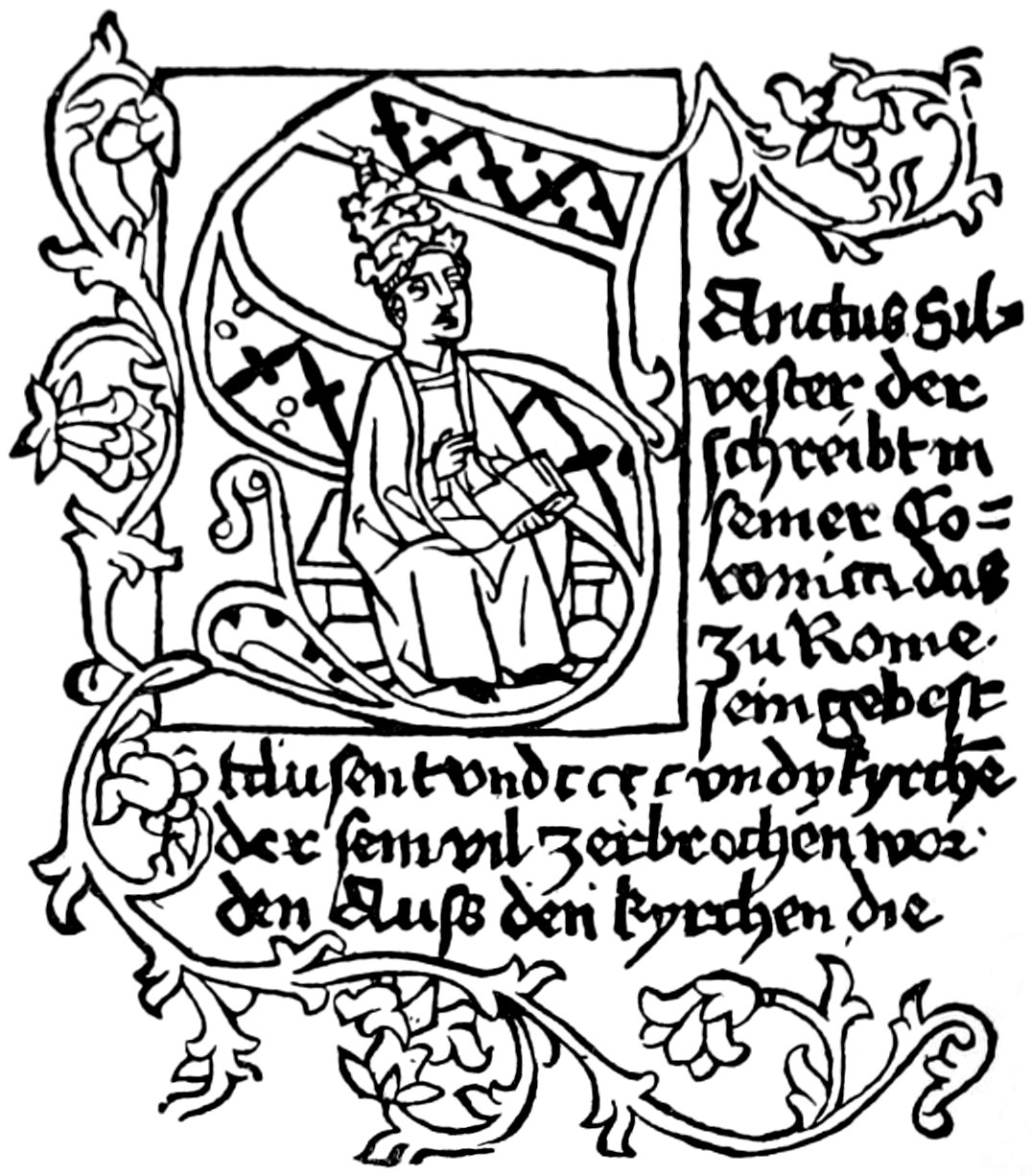
FROM THE ‘MIRABILIA ROMAE’
FROM THE 'MIRABILIA ROMAE'
MAYENCE

FROM THE ÆSOP OF SCHEFFER
From The Aesop of Scheffer

FROM THE BREIDENBACH OF ERHARDT REUWICH
FROM THE BREIDENBACH OF ERHARDT REUWICH
[113]
[113]
AUGSBURG


FROM G. ZAINER’S SIXTH GERMAN BIBLE AND J. FRIBURGENSIS’ ‘SUMMA CONFESSORUM’
FROM G. ZAINER’S SIXTH GERMAN BIBLE AND J. FRIBURGENSIS’ ‘SUMMA CONFESSORUM’
[114]
[114]

FROM G. ZAINER’S ‘MARGARITA DAVITICA’
FROM G. ZAINER’S ‘MARGARITA DAVITICA’
[115]
[115]


INITIALS OF SORG
SORG's Initials

INITIALS OF KELLER
Keller's initials
[116]
[116]


INITIALS OF HOHENWANG AND PFLANTZMANN
INITIALS OF HOHENWANG AND PFLANTZMANN


INITIALS OF SCHÖNSPERGER
INITIALS OF SCHÖNSPERGER
[117]
[117]


INITIALS OF BÄMLER
INITIALS OF BÄMLER
[118]
[118]
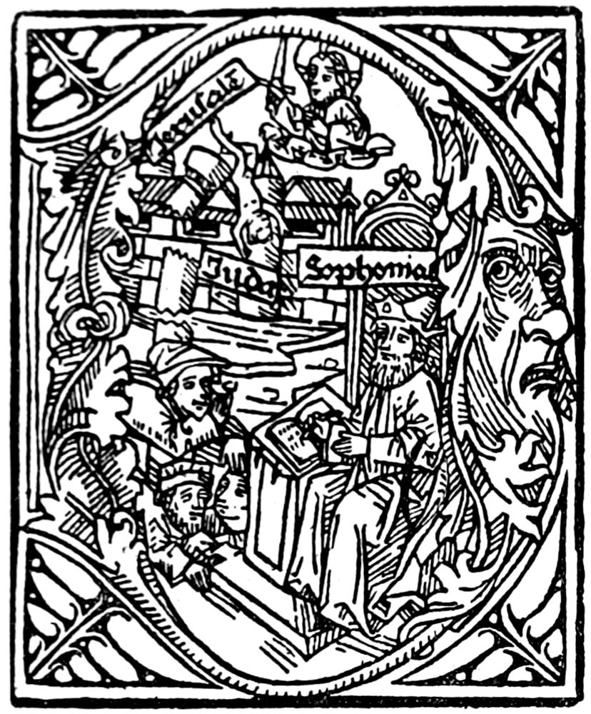


FROM G. ZAINER’S GERMAN BIBLE
FROM G. ZAINER’S GERMAN BIBLE
[119]
[119]


FROM G. ZAINER’S GERMAN BIBLE
FROM G. ZAINER’S GERMAN BIBLE
[120]
[120]


FROM SORG’S ‘SUSO DICTUS AMANDUS’
FROM SORG’S ‘SUSO SAID TO LOVE’
[121]
[121]
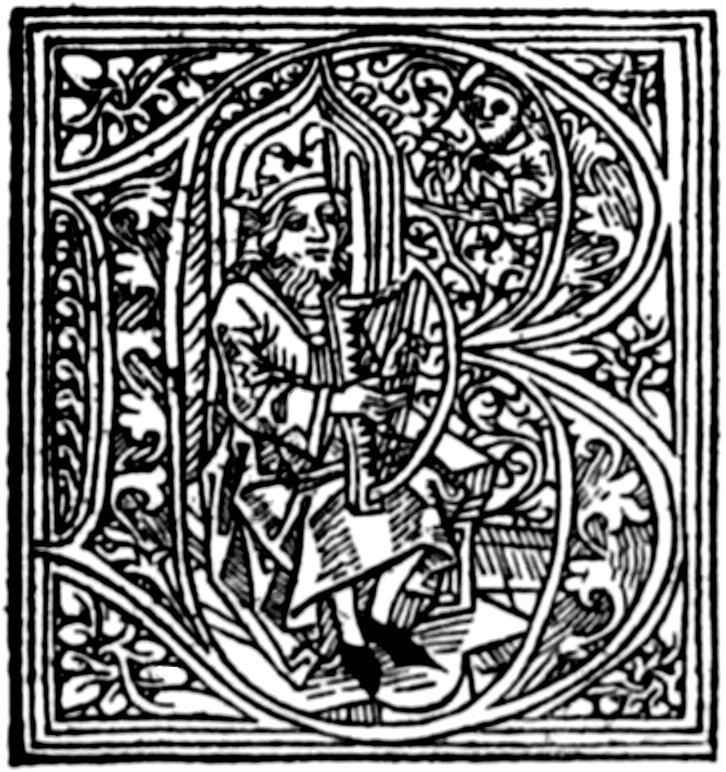
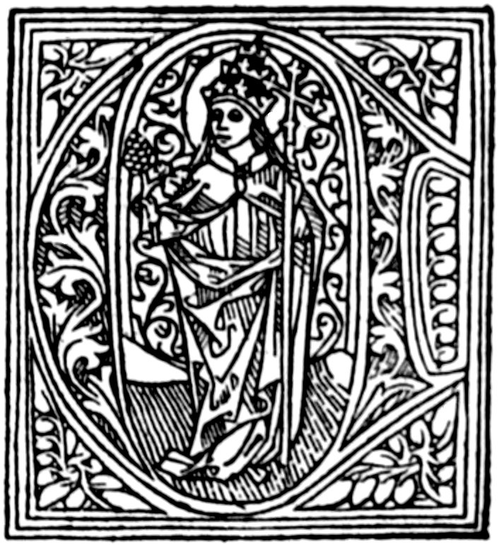
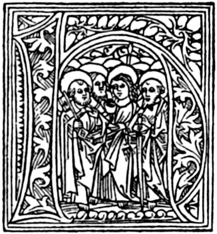

FROM RATDOLT’S BREVIARY, 1491
FROM RATDOLT’S BREVIARY, 1491
[122]
[122]


FROM RATDOLT’S BREVIARY AND PSALTER, 1491-1499
FROM RATDOLT’S BREVIARY AND PSALTER, 1491-1499
[123]
[123]


FROM RATDOLT’S CONSTANCE MISSAL, 1516
FROM RATDOLT’S CONSTANCE MISSAL, 1516
[124]
[124]


INITIALS BY HANS WEIDITZ IN DIFFERENT WORKS PUBLISHED BY STEYNER
INITIALS BY HANS WEIDITZ IN DIFFERENT WORKS PUBLISHED BY STEYNER
[125]
[125]


INITIALS BY HANS WEIDITZ IN DIFFERENT WORKS PUBLISHED BY STEYNER
INITIALS BY HANS WEIDITZ IN DIFFERENT WORKS PUBLISHED BY STEYNER
[126]
[126]
ULM


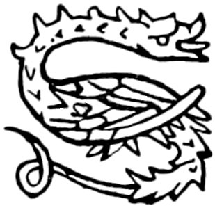
FROM J. ZAINER’S BOCCACCIO
FROM J. ZAINER'S BOCCACCIO


OTHER INITIALS OF G. ZAINER
OTHER INITIALS OF G. ZAINER
[127]
[127]


FROM THE COSMOGRAPHIA OF PTOLEMY—LEONARD HOLL, 1482
FROM THE COSMOGRAPHIA OF PTOLEMY—LEONARD HOLL, 1482

FROM THE ULM BIBLE, 1480
FROM THE ULM BIBLE, 1480
[128]
[128]


INITIALS OF J. REGER, 1496
INITIALS OF J. REGER, 1496
NUREMBERG

INITIALS OF PETER WAGNER, 1489
INITIALS OF PETER WAGNER, 1489

INITIAL OF J. REGIOMONTANUS
J. Regiomontanus Initial
[129]
[129]


FROM THE FOURTH GERMAN BIBLE OF FRISNER AND SENSENSCHMIDT
FROM THE FOURTH GERMAN BIBLE OF FRISNER AND SENSENSCHMIDT
[130]
[130]


FROM THE FOURTH GERMAN BIBLE OF FRISNER AND SENSENSCHMIDT
FROM THE FOURTH GERMAN BIBLE OF FRISNER AND SENSENSCHMIDT
[131]
[131]


FROM THE FOURTH GERMAN BIBLE OF FRISNER AND SENSENSCHMIDT
FROM THE FOURTH GERMAN BIBLE OF FRISNER AND SENSENSCHMIDT
[132]
[132]


FROM THE ‘MISSALE PATAVIENSE’ OF J. GUTNECHT
FROM THE ‘MISSALE PATAVIENSE’ OF J. GUTNECHT
[133]
[133]


FROM THE ‘MISSALE PATAVIENSE’ OF J. GUTNECHT
FROM THE ‘MISSALE PATAVIENSE’ OF J. GUTNECHT
[134]
[134]
BASLE


FROM RICHEL’S LATIN BIBLE, 1475
FROM RICHEL'S LATIN BIBLE, 1475
[135]
[135]


FROM FURTER’S PSALTER, 1501
FROM FURTER'S PSALTER, 1501
[136]
[136]


INITIALS BY URS GRAF
INITIALS BY URS GRAF

FROM THE ‘CHRISTIANLICHE BILGERSCHAFT’ OF ADAM PETRI
FROM THE ‘CHRISTIAN CITIZENSHIP’ OF ADAM PETRI
[137]
[137]


INITIALS OF ‘DANCE OF DEATH’ BY LÜTZELBERGER
INITIALS OF ‘DANCE OF DEATH’ BY LÜTZELBERGER


GREEK ‘DANCE OF DEATH’ INITIALS
GREEK 'DANCE OF DEATH' INIT.

‘DANCE OF DEATH’ INITIAL
'DANCE OF DEATH' INTRO
FROM ALPHABETS BY HANS HOLBEIN
FROM ALPHABETS BY HANS HOLBEIN
[138]
[138]


STRASBURG COPIES OF THE ‘DANCE OF DEATH’ ALPHABET
STRASBURG COPIES OF THE ‘DANCE OF DEATH’ ALPHABET
[139]
[139]


INITIALS OF PEASANTS FROM THE ‘GALEN’ OF BEBELIUS AND CRATANDER
INITIALS OF PEASANTS FROM THE ‘GALEN’ OF BEBELIUS AND CRATANDER


FROM CHILDREN’S ALPHABET IN ‘LACTANTIUS’ AND OTHER WORKS
FROM CHILDREN’S ALPHABET IN ‘LACTANTIUS’ AND OTHER WORKS


FROM LARGER CHILDREN’S ALPHABET
FROM BIGGER KIDS' ALPHABET
FROM ALPHABETS BY HANS HOLBEIN
FROM ALPHABETS BY HANS HOLBEIN
[140]
[140]


INITIALS OF VALENTIN CURIO, FROM ALPHABETS BY HANS HOLBEIN
INITIALS OF VALENTIN CURIO, FROM ALPHABETS BY HANS HOLBEIN
[141]
[141]


INITIALS OF VALENTIN CURIO, FROM ALPHABETS BY HANS HOLBEIN
INITIALS OF VALENTIN CURIO, FROM ALPHABETS BY HANS HOLBEIN
[142]
[142]


FROM THE ‘GALEN’ OF BEBELIUS AND CRATANDER
FROM THE ‘GALEN’ OF BEBELIUS AND CRATANDER


FROM THE GREEK LEXICON OF RENÉ GELLI
FROM THE GREEK LEXICON OF RENÉ GELLI
FROM ALPHABETS BY HANS HOLBEIN
From Alphabets by Hans Holbein
[143]
[143]


OTHER INITIALS BY HOLBEIN
OTHER INITS BY HOLBEIN
[144]
[144]
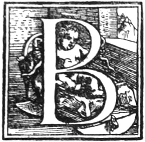


INITIALS BY HOLBEIN
INITIALS BY HOLBEIN


INITIALS FROM ALPHABET BY AMBROSE HOLBEIN
INITIALS FROM ALPHABET BY AMBROSE HOLBEIN


INITIALS BY VAN CALCAR FROM VESALIUS
INITIALS BY VAN CALCAR FROM VESALIUS
[145]
[145]


INITIALS BY VAN CALCAR FROM VESALIUS
INITIALS BY VAN CALCAR FROM VESALIUS
ZÜRICH


INITIALS USED BY FROSCHOUER
INITIALS USED BY FROSCHOUER
[146]
[146]
LÜBECK


FROM THE ‘RUDIMENTA NOVITIORUM’ AND JOSEPHUS OF LUCAS BRANDIS, 1475
FROM THE ‘RUDIMENTA NOVITIORUM’ AND JOSEPHUS OF LUCAS BRANDIS, 1475
[147]
[147]
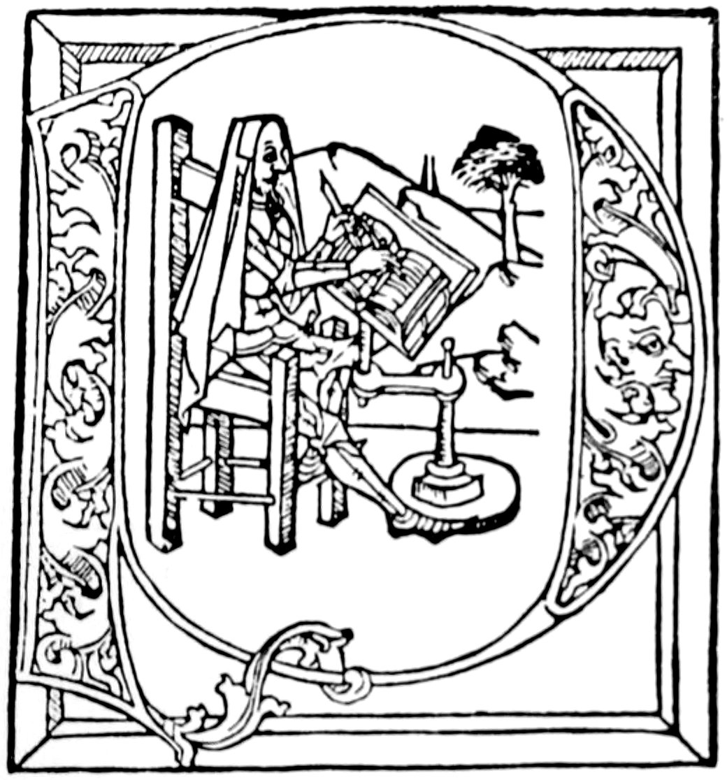

FROM THE ‘RUDIMENTA NOVITIORUM’ AND JOSEPHUS OF LUCAS BRANDIS, 1475
FROM THE ‘RUDIMENTA NOVITIORUM’ AND JOSEPHUS OF LUCAS BRANDIS, 1475

FROM THE ‘LEBEN DES HEIL. HIERONYMUS’ BY BARTHOLOMEW GHOTAN, 1484
FROM THE ‘LEBEN DES HEIL. HIERONYMUS’ BY BARTHOLOMEW GHOTAN, 1484
[148]
[148]


FROM THE ‘MEDITATIONES SANCTÆ BRIGITTÆ’ BY BARTHOLOMEW GHOTAN
FROM THE ‘MEDITATIONES SANCTÆ BRIGITTÆ’ BY BARTHOLOMEW GHOTAN
[149]
[149]


FROM THE ‘MEDITATIONES SANCTÆ BRIGITTÆ’ BY BARTHOLOMEW GHOTAN
FROM THE ‘MEDITATIONES SANCTÆ BRIGITTÆ’ BY BARTHOLOMEW GHOTAN
[150]
[150]
BAMBERG


FROM THE ‘MISSALE OLUMUCENSE’ OF SENSENSCHMIDT, 1489
FROM THE ‘MISSALE OLUMUCENSE’ OF SENSENSCHMIDT, 1489
[151]
[151]


FROM THE ‘MISSALE OLUMUCENSE’ OF SENSENSCHMIDT, 1489
FROM THE ‘MISSALE OLUMUCENSE’ OF SENSENSCHMIDT, 1489


FROM A BAMBERG MISSAL
FROM A BAMBERG MISSAL
[152]
[152]


FROM THE BAMBERG MISSAL OF J. PFEYL, 1506
FROM THE BAMBERG MISSAL OF J. PFEYL, 1506
[153]
[153]


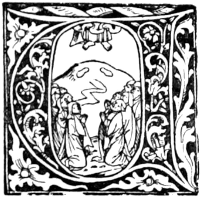

FROM THE BAMBERG MISSAL OF J. PFEYL, 1506
FROM THE BAMBERG MISSAL OF J. PFEYL, 1506
[154]
[154]
STRASBURG

FROM T. DE HASELPACH’S ‘SERMONES’
FROM T. DE HASELPACH’S ‘SERMONS’

FROM ‘BURGUNDISCHE HISTORIE’
FROM 'BURGUNDY HISTORY'

FROM ‘DIALOGUS SALOMONIS ET MARCOLFI’
FROM ‘DIALOGUE OF SOLOMON AND MARCOLF’

FROM ‘BELIAL’ AND OTHER BOOKS
FROM ‘BELIAL’ AND OTHER BOOKS
FROM VARIOUS BOOKS PRINTED BY KNOBLOCHTZER
FROM VARIOUS BOOKS PRINTED BY KNOBLOCHTZER
[155]
[155]


FROM THE ‘DEUTSCHER KALENDER’ AND OTHER BOOKS
FROM THE ‘DEUTSCHER KALENDER’ AND OTHER BOOKS

FROM THE ‘DE SECRETIS MULIERUM’
FROM THE ‘OF WOMEN'S SECRETS’
FROM THE ‘DE RITU ET MORIBUS INDORUM’
FROM THE ‘DE RITU ET MORIBUS INDORUM’
FROM VARIOUS BOOKS PRINTED BY KNOBLOCHTZER
FROM VARIOUS BOOKS PRINTED BY KNOBLOCHTZER
[156]
[156]


ANTHROPOMORPHIC LETTERS USED BY VARIOUS PRINTERS
ANTHROPOMORPHIC LETTERS USED BY VARIOUS PRINTERS


INITIALS FROM THE ‘SCRIPTUM’ OF G. DE OCKAM, AND THE ‘COMMENTARIUS SANCTI JOHANNIS,’ PRINTED BY G. SCHOTT
INITIALS FROM THE ‘SCRIPTUM’ OF G. DE OCKAM, AND THE ‘COMMENTARIUS SANCTI JOHANNIS,’ PRINTED BY G. SCHOTT
[157]
[157]


LETTERS FROM THE ‘PLENARIUM’
LETTERS FROM THE 'PLENARIUM'


OTHER STRASBURG INITIALS
OTHER STRASBURG INITIALS
[158]
[158]


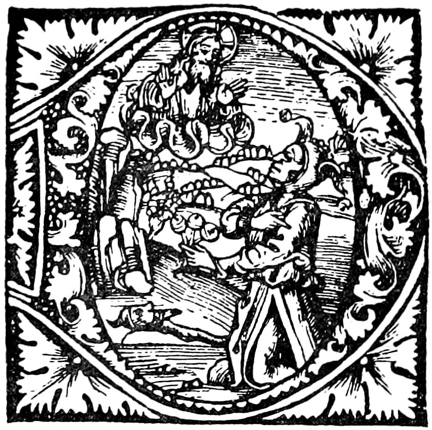


FROM A PSALTER BY J. PRUSZ, 1498
FROM A PSALTER BY J. PRUSZ, 1498
[159]
[159]


FROM KNOBLOUCH’S ‘POGGE,’ 1513
FROM KNOBLOUCH’S ‘POGGE,’ 1513
[160]
[160]


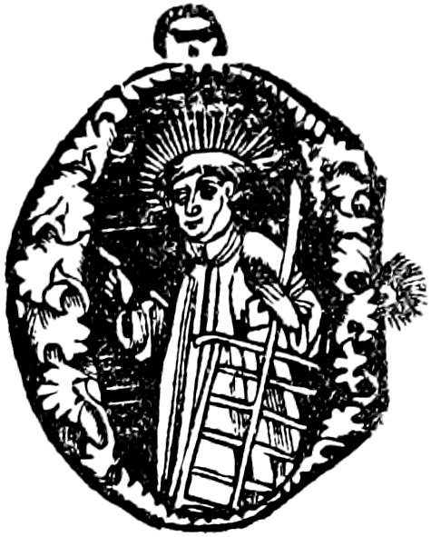


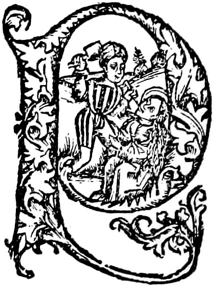
FROM VARIOUS BOOKS PRINTED BY GRÜNINGER
FROM VARIOUS BOOKS PRINTED BY GRÜNINGER
[161]
[161]


FROM VARIOUS BOOKS PRINTED BY GRÜNINGER
FROM VARIOUS BOOKS PRINTED BY GRÜNINGER

FROM ‘SERMONES’ OF GEILER VON KAISERSPERG
FROM ‘SERMONES’ OF GEILER VON KAISERSPERG
[162]
[162]

FROM ‘SERMONES’ OF GEILER VON KAISERSPERG
FROM ‘SERMONES’ OF GEILER VON KAISERSPERG
REUTLINGEN

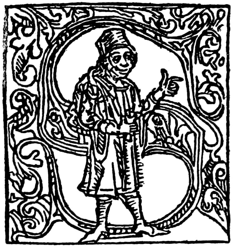
FROM BOOKS PRINTED BY G. GRYFF
FROM BOOKS PRINTED BY G. GRYFF
[163]
[163]
GENEVA

FROM THE ‘DOCTRINAL DE SAPIENCE’ OF 1488
FROM THE ‘DOCTRINAL DE SAPIENCE’ OF 1488
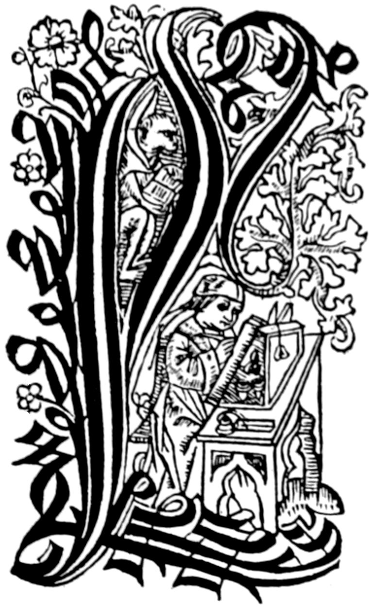
FROM ‘LES FLEURS ET MANIÈRES DES TEMPS PASSÉS’
FROM ‘LES FLEURS ET MANIÈRES DES TEMPS PASSÉS’

FROM THE ‘DOCTRINAL DE SAPIENCE’ OF 1493
FROM THE ‘DOCTRINAL DE SAPIENCE’ OF 1493
[164]
[164]


FROM THE ‘DIALOGUS CREATURUM’
FROM THE 'DIALOGUS CREATURUM'

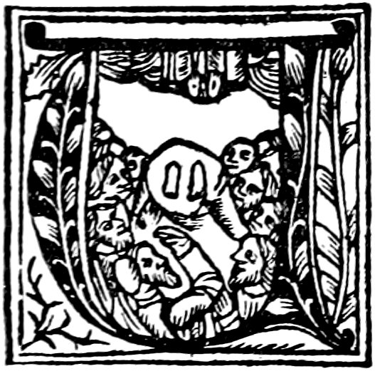


FROM A MISSAL OF BELLOT
From a missal of Bellot
[165]
[165]
COLOGNE

FROM QUENTELL’S MISSAL, 1494
FROM QUENTELL'S MISSAL, 1494
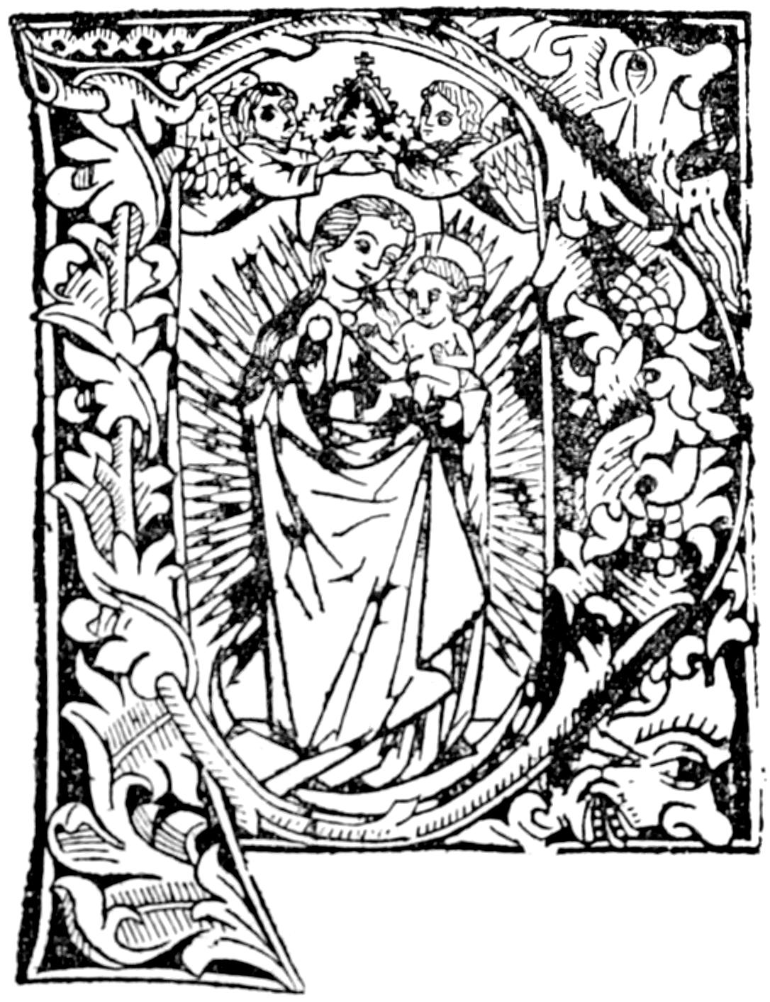
FROM A DONATUS
FROM A DONATUS


FROM ‘SEQUENTIARUM ET HYMNORUM’ EXPOSITIO BY BUNGART DE KETWYCK
FROM ‘SEQUENTIARUM ET HYMNORUM’ EXPOSITIO BY BUNGART DE KETWYCK
[166]
[166]


OTHER INITIALS BY QUENTELL
OTHER INITIALS BY QUENTELL
[167]
[167]


BY MELCHIOR NOVESIANUS
BY MELCHIOR NOVESIANUS

BY J. GYMNICUS
BY J. GYMNICUS
[168]
[168]


FROM ALPHABET OF ALBERT DÜRER IN BOOKS BY CERVICORNUS
FROM ALPHABET OF ALBERT DÜRER IN BOOKS BY CERVICORNUS
[169]
[169]


FROM ALPHABET OF ALBERT DÜRER IN BOOKS BY CERVICORNUS
FROM ALPHABET OF ALBERT DÜRER IN BOOKS BY CERVICORNUS

A LYONS COPY
A Lyons Copy
[170]
[170]


MACABRE INITIALS
CREEPY INITIALS

COPIED FROM THE VENETIAN ‘BREVIARUM ORBIS’ OF LILIUS
COPIED FROM THE VENETIAN ‘BREVIARUM ORBIS’ OF LILIUS
[171]
[171]
VENICE


INITIALS OF RATDOLT, 1476
INITIALS OF RATDOLT, 1476


FROM MISSALS AND BREVIARIES BY GEORGE ARRIVABENE AND LUCANTONIO DI GIUNTA
FROM MISSALS AND BREVIARIES BY GEORGE ARRIVABENE AND LUCANTONIO DI GIUNTA
[172]
[172]


FROM MISSALS AND BREVIARIES BY GEORGE ARRIVABENE AND LUCANTONIO DI GIUNTA
FROM MISSALS AND BREVIARIES BY GEORGE ARRIVABENE AND LUCANTONIO DI GIUNTA
[173]
[173]


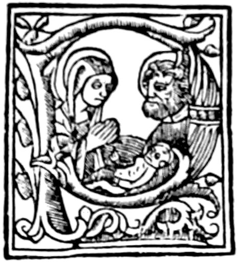

FROM MISSALS AND BREVIARIES BY GEORGE ARRIVABENE AND LUCANTONIO DI GIUNTA
FROM MISSALS AND BREVIARIES BY GEORGE ARRIVABENE AND LUCANTONIO DI GIUNTA
[174]
[174]
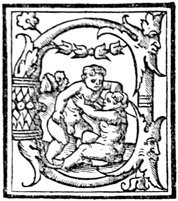


FROM A BOOK PRINTED BY BONETUS LOCATELLUS
FROM A BOOK PRINTED BY BONETUS LOCATELLUS

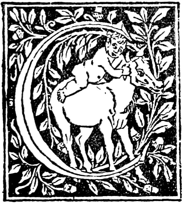
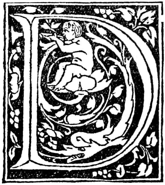


FROM BOOKS BY MATTEO CAPCASA, TACUINUS DE TRIDINO, BONETUS LOCATELLUS, AND OTHERS
FROM BOOKS BY MATTEO CAPCASA, TACUINUS DE TRIDINO, BONETUS LOCATELLUS, AND OTHERS
[175]
[175]


FROM BOOKS BY MATTEO CAPCASA, TACUINUS DE TRIDINO, BONETUS LOCATELLUS, AND OTHERS
FROM BOOKS BY MATTEO CAPCASA, TACUINUS DE TRIDINO, BONETUS LOCATELLUS, AND OTHERS
[176]
[176]


FROM THE ‘MISSALE VALLISUMBROSE’ OF GIUNTA
FROM THE ‘MISSALE VALLISUMBROSE’ OF GIUNTA
[177]
[177]


FROM THE ‘MISSALE VALLISUMBROSE’ OF GIUNTA
FROM THE ‘MISSALE VALLISUMBROSE’ OF GIUNTA
[178]
[178]

FROM THE ‘MISSALE VALLISUMBROSE’ OF GIUNTA
FROM THE ‘MISSALE VALLISUMBROSE’ OF GIUNTA

FROM A VENETIAN IMPRESSION
FROM A VENETIAN IMPRESSION


FROM AN EDITION OF ARISTOTLE BY SESSA
FROM AN EDITION OF ARISTOTLE BY SESSA
[179]
[179]


FROM THE ‘VITA DI SANCTI PADRI’ OF OTINO DA PAVIA DE LA LUNA
FROM THE ‘VITA DI SANCTI PADRI’ OF OTINO DA PAVIA DE LA LUNA
[180]
[180]


FROM THE ‘VITA DI SANCTI PADRI’ OF OTINO DA PAVIA DE LA LUNA
FROM THE ‘VITA DI SANCTI PADRI’ OF OTINO DA PAVIA DE LA LUNA
[181]
[181]


INITIALS BY SESSA
INITIALS BY SESSA
[182]
[182]


FROM THE ‘BREVIARIUM ORBIS’ OF ZACHARIUS LILIUS
FROM THE ‘BREVIARIUM ORBIS’ OF ZACHARIUS LILIUS


FROM A VENETIAN IMPRESSION
From a Venetian Impression


FROM WORKS BY VARIOUS PRINTERS
FROM WORKS BY DIFFERENT PRINTERS
[183]
[183]


INITIALS BY DE GREGORIIS
INITIALED BY DE GREGORIIS
[184]
[184]


INITIALS BY DE GREGORIIS
INITIALS BY DE GREGORIIS

PORTRAIT OF COSMO DE MEDICI
Portrait of Cosimo de' Medici

PIUS ROMAE PONTIFEX
Pope Pius of Rome
[185]
[185]
ROME

FROM THE ‘VITÆ CÆSARUM’ OF SUETONIUS BY SWEYNHEIM AND PANNARTZ, 1471
FROM THE ‘VITÆ CÆSARUM’ OF SUETONIUS BY SWEYNHEIM AND PANNARTZ, 1471
E. SILBER, 1507
E. SILBER, 1507

JACOBUS MAZOCHIUS, 1515
JACOBUS MAZOCHIUS, 1515
SIENNA

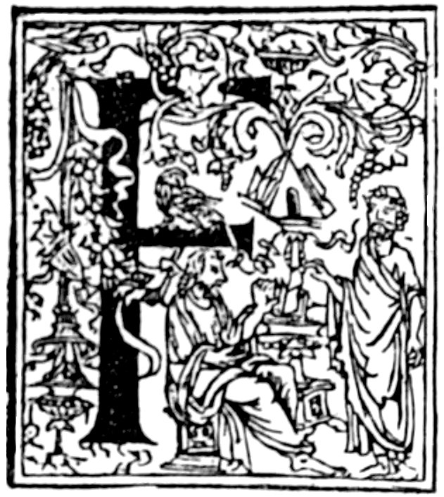


FROM THE ‘OPERA DATHI’ OF NARDI, 1503
FROM THE ‘OPERA DATHI’ OF NARDI, 1503
[186]
[186]


FROM THE ‘OPERA DATHI’ OF NARDI, 1503
FROM THE ‘OPERA DATHI’ OF NARDI, 1503
[187]
[187]
COMO


FROM THE VITRUVIUS OF GOTARDUS DE PONTE
FROM THE VITRUVIUS OF GOTARDUS DE PONTE
[188]
[188]
PAVIA


INITIALS OF J. DE BURGOFRANCO
INITIALS OF J. DE BURGOFRANCO
[189]
[189]
SALUZZO


FROM THE ‘AUREUM OPUS’ OF LE SIGNERRE
FROM THE ‘AUREUM OPUS’ OF LE SIGNERRE
VERONA


FROM A WORK BY CELSUS MAPHEUS
FROM A WORK BY CELSUS MAPHEUS
VICENZA

FROM A CATALOGUS SANCTORUM
FROM A CATALOG OF SAINTS
BRESCIA


FROM THE ‘INVECTIVAE’ OF T. N. CYCHUTHOE
FROM THE ‘INVECTIVAE’ OF T. N. CYCHUTHOE
[190]
[190]
FERRARA


FROM THE ‘DE CLARIS MULIERIBUS’
FROM THE ‘ABOUT FAMOUS WOMEN’
[191]
[191]


FROM THE ‘MISSALE CARTHUSIENSE,’ PRINTED BY THE MONKS AT THEIR CONVENT
FROM THE ‘MISSALE CARTHUSIENSE,’ PRINTED BY THE MONKS AT THEIR CONVENT
[192]
[192]


FROM THE ‘MISSALE CARTHUSIENSE,’ PRINTED BY THE MONKS AT THEIR CONVENT
FROM THE ‘MISSALE CARTHUSIENSE,’ PRINTED BY THE MONKS AT THEIR CONVENT
MILAN


LETTRINES BY SCINZENZELLER
LETTRINES BY SCINZENZELLER
[193]
[193]


FROM THE ‘OPUS AUREE’ OF ZAROTUS, 1513
FROM THE ‘OPUS AUREE’ OF ZAROTUS, 1513

FROM THE ‘SERMONS OF ST. BERNARD,’ LEONARD PACHEL, 1495
FROM THE ‘SERMONS OF ST. BERNARD,’ LEONARD PACHEL, 1495


FROM WORKS PRINTED BY GERARD PONTICUS
FROM WORKS PRINTED BY GERARD PONTICUS
[194]
[194]
LYONS

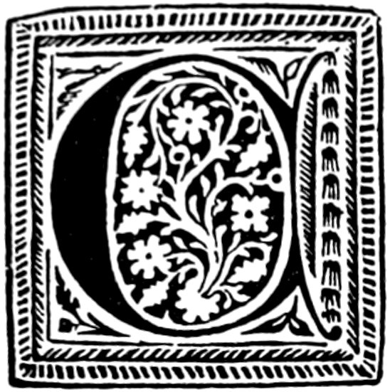


‘LETTRES TOURNEURES FLEURONNÉES’ OF W. LEROY, 1479
‘LETTRES TOURNEURES FLEURONNÉES’ OF W. LEROY, 1479
[195]
[195]

FROM ‘LE PRESTRE JEHAN’
FROM ‘THE PRIEST JEHAN’


FROM ‘LES QUATRE FILS AYMON’ OF W. LEROY
FROM ‘LES QUATRE FILS AYMON’ OF W. LEROY
[196]
[196]


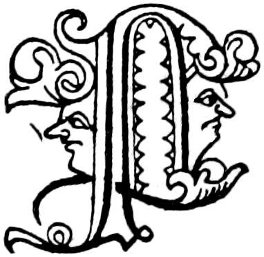


FROM THE ‘STATUTA SYNODALIA’ OF W. LEROY
FROM THE ‘STATUTA SYNODALIA’ OF W. LEROY
[197]
[197]


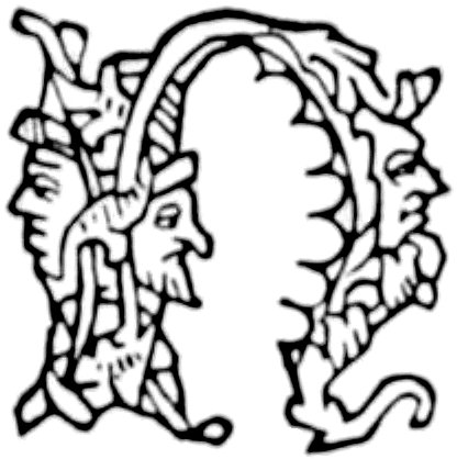


FROM THE BOCCACCIO OF MATHIEU AND JEAN SCHABELER, 1483
FROM THE BOCCACCIO OF MATHIEU AND JEAN SCHABELER, 1483
[198]
[198]

FROM THE BREIDENBACH OF GASPARD ORTUIN
FROM THE BREIDENBACH OF GASPARD ORTUIN

FROM ‘LA MER DES HYSTOIRES’ BY MICHEL TOPIE
FROM ‘LA MER DES HYSTOIRES’ BY MICHEL TOPIE
[199]
[199]

FROM A MELUSINE
From a Melusine


LETTRES RUSTIQUES OF MATHIEU HUSZ
Rustic Letters of Mathieu Husz
[200]
[200]

FROM THE ‘LIVRE DES MARCHANDS’
FROM THE 'BOOK OF MERCHANTS'

FROM THE ‘SOMME RURALE’ OF BOUTELLIER
FROM THE ‘SOMME RURALE’ OF BOUTELLIER

FROM THE ‘CATHON EN FRANÇOYS’
FROM THE 'CATHON IN FRENCH'
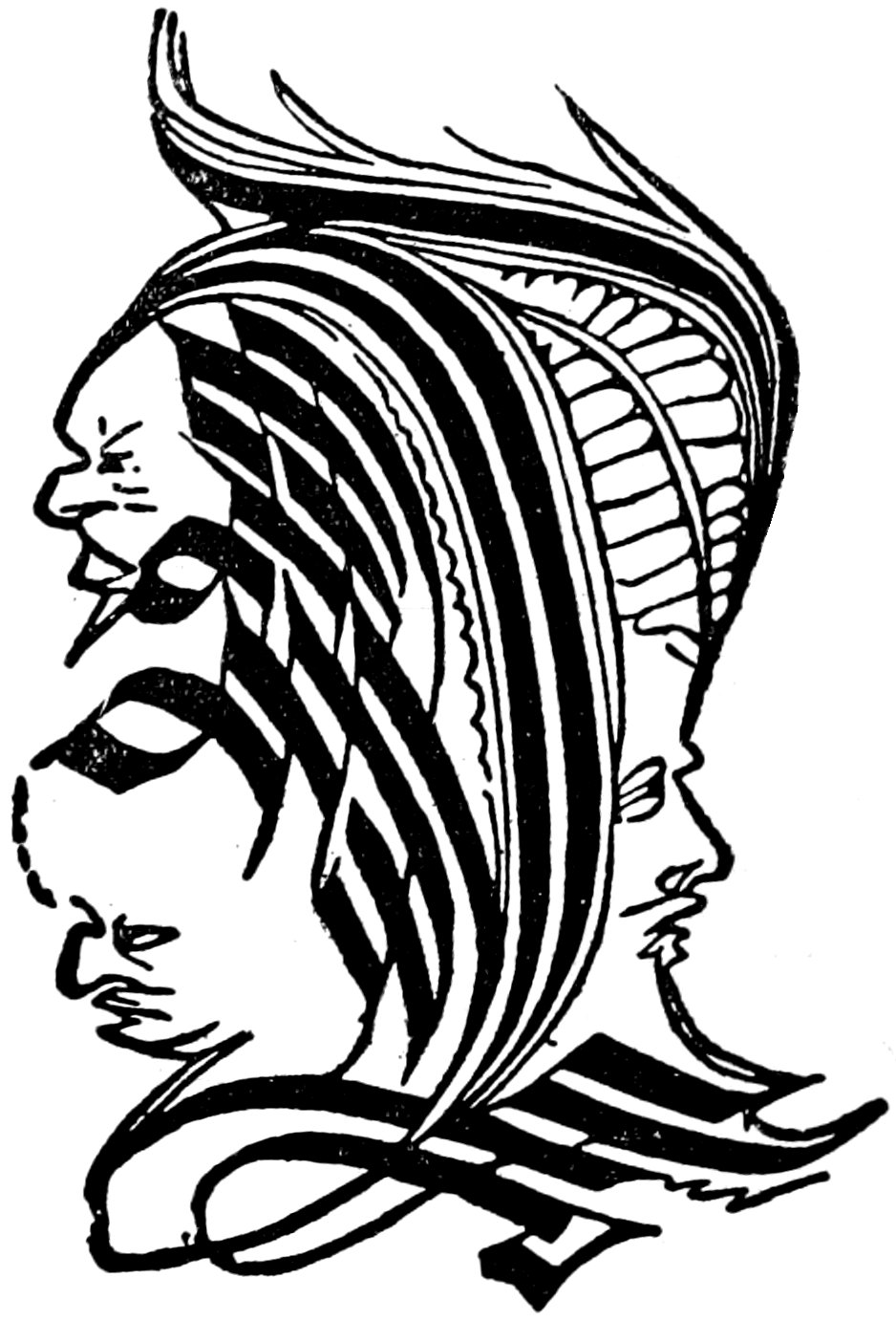
LYONS COPY OF AN INITIAL FROM THE BOECE OF VÉRARD
LYONS COPY OF AN INITIAL FROM THE BOECE OF VÉRARD
[201]
[201]

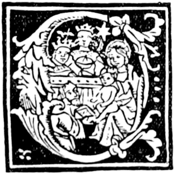


FROM SACCON’S MISSAL
FROM SACCON'S MISSAL
[202]
[202]


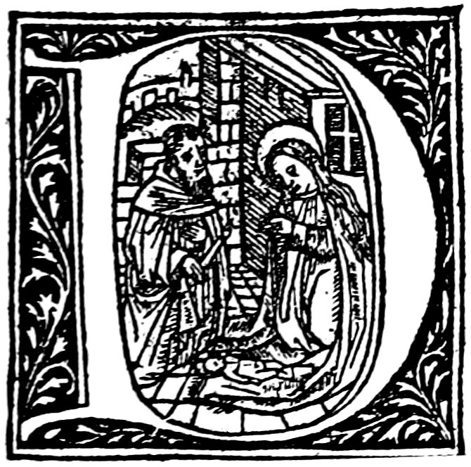

FROM THE MISSAL OF PIERRE HONGRE
FROM THE MISSAL OF PIERRE HONGRE
[203]
[203]


FROM THE MISSAL OF PIERRE HONGRE
FROM THE MISSAL OF PIERRE HONGRE
[204]
[204]


FROM THE MISSAL OF PIERRE HONGRE
FROM THE MISSAL OF PIERRE HONGRE


INITIALS BY J. POULLET, 1505
INITIALS BY J. POULLET, 1505
[205]
[205]
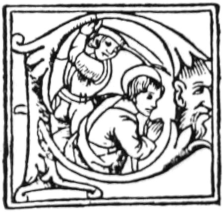
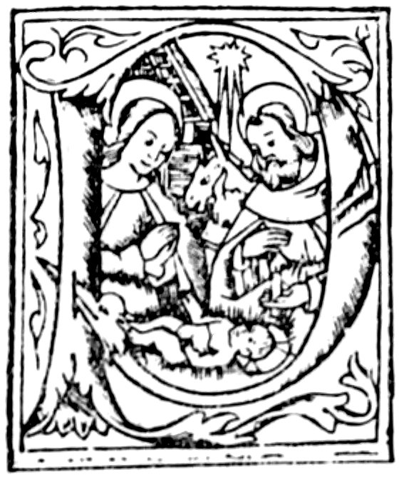

FROM THE MISSAL OF NARBONNE, 1528
FROM THE MISSAL OF NARBONNE, 1528

FROM A LYONS MISSAL
FROM A LYONS MISSAL

FROM A ‘CATALOGUS SANCTORUM’ OF SACCON
FROM A ‘CATALOGUS SANCTORUM’ OF SACCON
[206]
[206]


FROM THE ‘CATHOLICON’ OF J. WOLFF, 1503
FROM THE ‘CATHOLICON’ OF J. WOLFF, 1503
[207]
[207]


FROM THE ‘CATHOLICON’ OF J. WOLFF, 1503
FROM THE ‘CATHOLICON’ OF J. WOLFF, 1503
[208]
[208]


FROM AN UNIDENTIFIED ‘PROPRIETAIRE’
FROM AN UNIDENTIFIED 'OWNER'

FROM ‘AUREUM OPUS’
FROM ‘GOLDEN WORK’
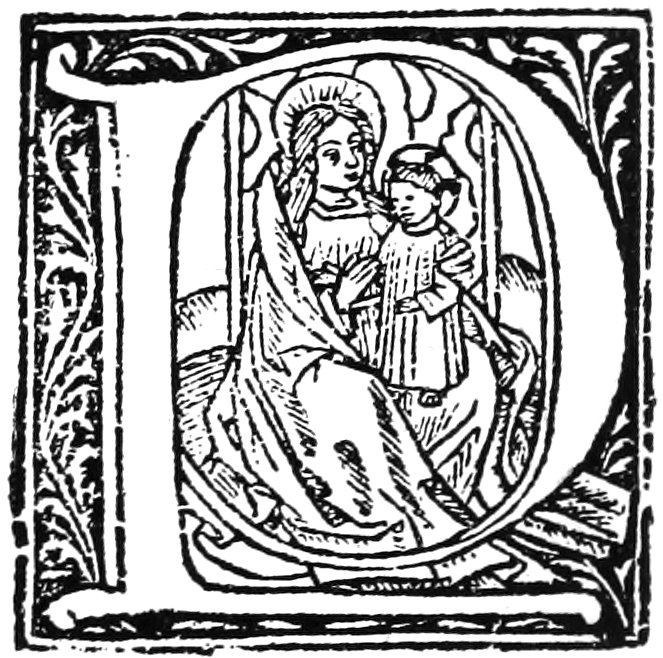
FROM ‘PLUSIEURS GENTILLESSES’ ETC.
FROM 'SEVERAL GENTLEMEN' ETC.
[209]
[209]
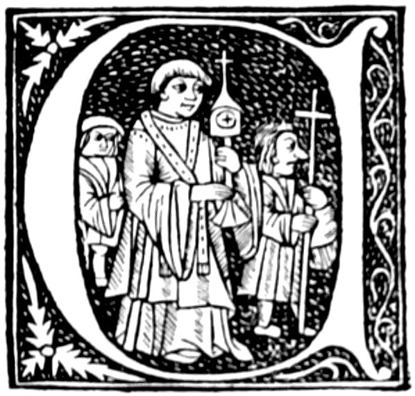


FROM MAGNINI’S ‘REGIMEN SANITATIS,’ BY FRADIN
FROM MAGNINI’S ‘REGIMEN SANITATIS,’ BY FRADIN


INITIALS BY SACCON
INITIALS BY SACCON
[210]
[210]


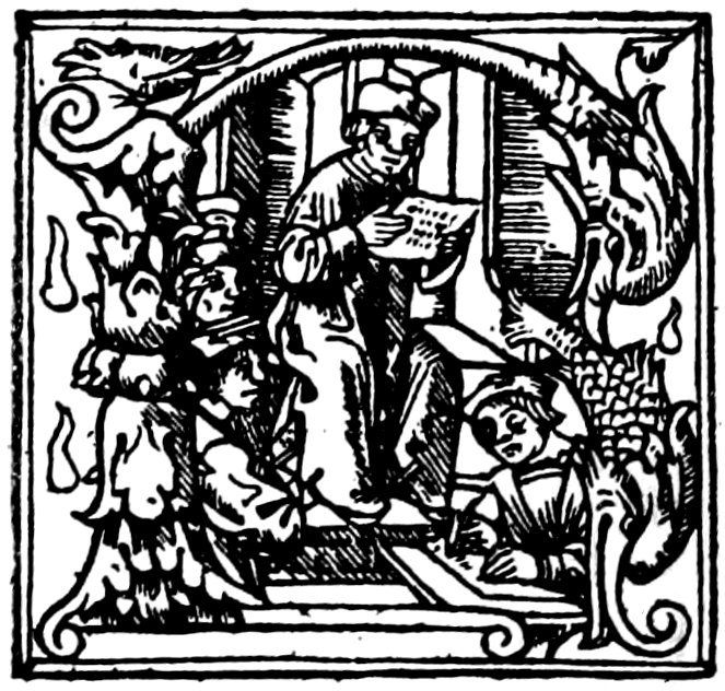
INITIALS BY BLANCHARD AND OTHER PRINTERS
INITIALS BY BLANCHARD AND OTHER PRINTERS
[211]
[211]


CHILDREN’S ALPHABET BY FRADIN
Fradin's Children's Alphabet
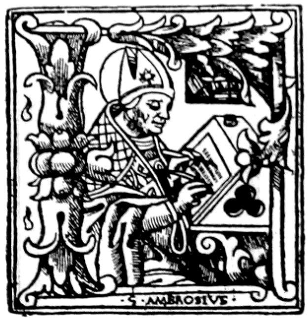
FROM WORKS OF ST. AMBROSE
FROM THE WORKS OF ST. AMBROSE

PORTRAIT OF ERASMUS
PORTRAIT OF ERASMUS

FROM A LYONS BIBLE
FROM A LYONS BIBLE
[212]
[212]


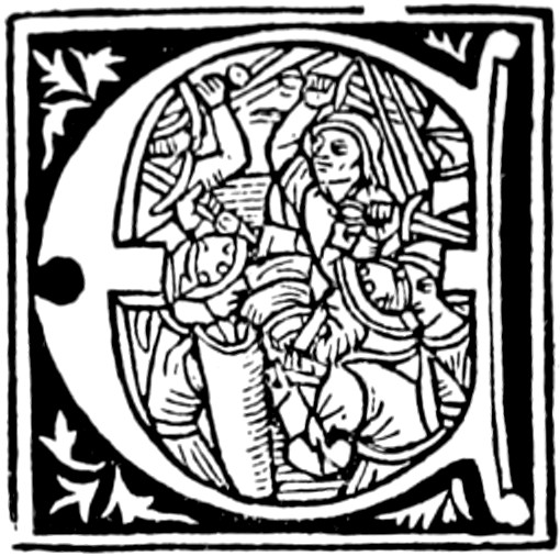


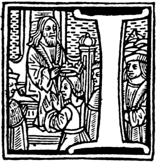

FROM THE ‘BIBLIA CUM SUMMARIIS CONCORDANTIIS,’ ETC., BY JOHN MOYLIN
FROM THE 'BIBLE WITH SUMMARIES AND CONCORDANCES,' ETC., BY JOHN MOYLIN
[213]
[213]


FROM THE ‘BIBLIA CUM SUMMARIIS CONCORDANTIIS,’ ETC., BY JOHN MOYLIN
FROM THE ‘BIBLE WITH SUMMARIES AND CONCORDANCES,’ ETC., BY JOHN MOYLIN
[214]
[214]
FROM THE ‘BIBLIA CUM SUMMARIIS CONCORDANTIIS’
FROM THE ‘BIBLE WITH SUMMARIES AND COORDINATES’


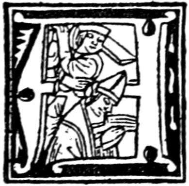


FROM THE ‘CATALOGUS SANCTORUM’ OF SACCON
FROM THE ‘CATALOGUS SANCTORUM’ OF SACCON
[215]
[215]


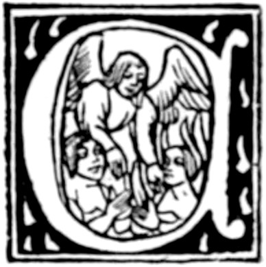
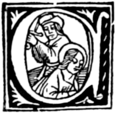
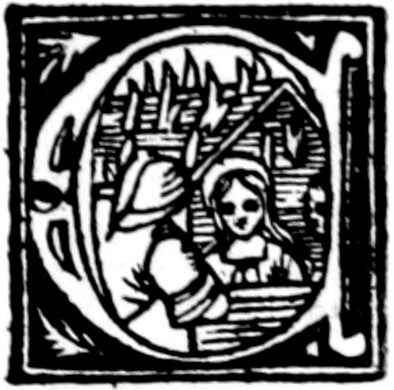


FROM THE ‘CATALOGUS SANCTORUM’ OF SACCON
FROM THE ‘CATALOGUS SANCTORUM’ OF SACCON
[216]
[216]


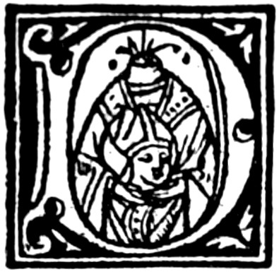
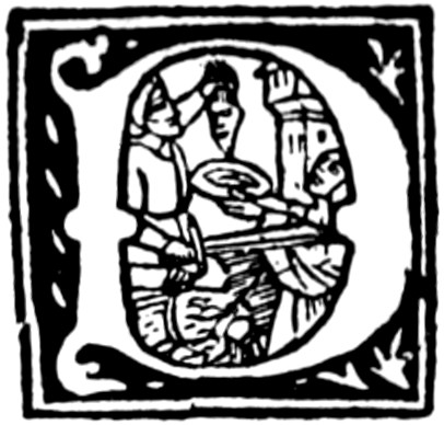


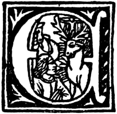


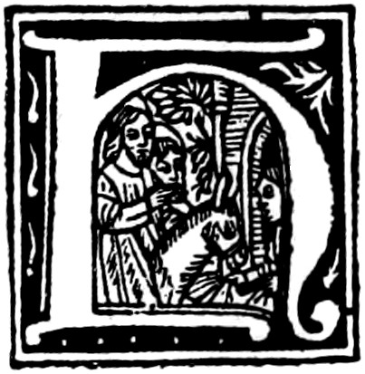
FROM THE ‘CATALOGUS SANCTORUM’ OF SACCON
FROM THE ‘CATALOGUS SANCTORUM’ OF SACCON
[217]
[217]


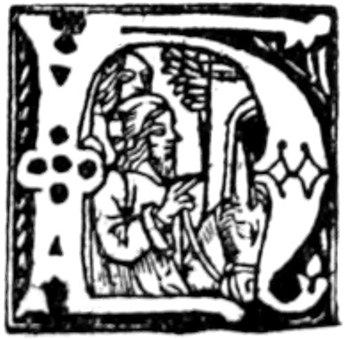

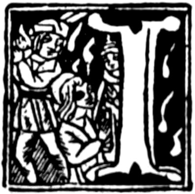


FROM THE ‘CATALOGUS SANCTORUM’ OF SACCON
FROM THE ‘CATALOGUS SANCTORUM’ OF SACCON
[218]
[218]


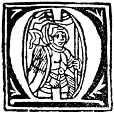

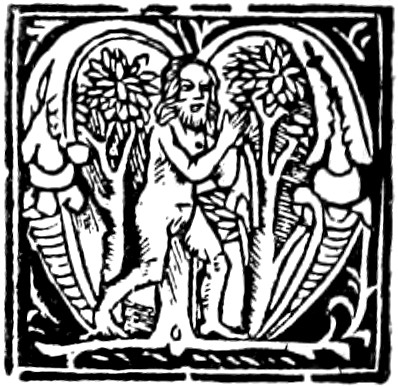
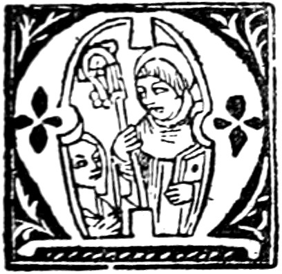

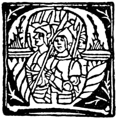


FROM THE ‘CATALOGUS SANCTORUM’ OF SACCON
FROM THE ‘CATALOGUS SANCTORUM’ OF SACCON
[219]
[219]


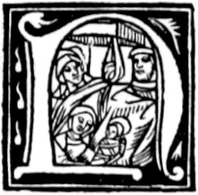


FROM THE ‘CATALOGUS SANCTORUM’ OF SACCON
FROM THE ‘CATALOGUS SANCTORUM’ OF SACCON
[220]
[220]
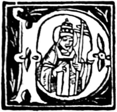


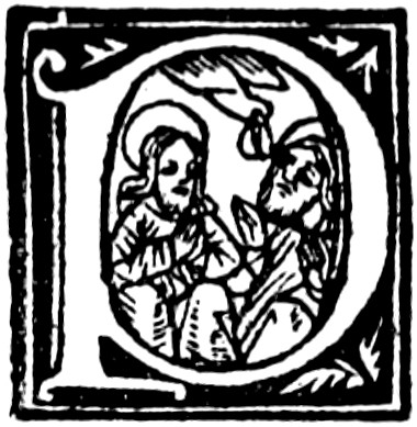


FROM THE ‘CATALOGUS SANCTORUM’ OF SACCON
FROM THE ‘CATALOGUS SANCTORUM’ OF SACCON
[221]
[221]


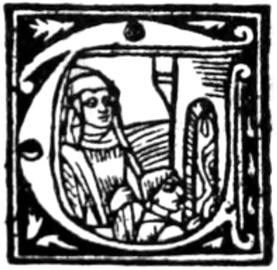


FROM THE ‘CATALOGUS SANCTORUM’ OF SACCON
FROM THE ‘CATALOGUS SANCTORUM’ OF SACCON
[222]
[222]


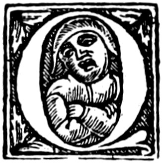


INITIALS OF SACCON
SACCON Initials


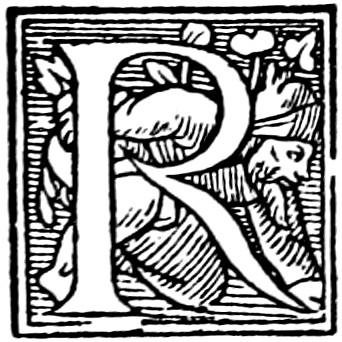


FROM A ‘MORALE REDUCTORIUM PETRI BERTHORII’
FROM A ‘MORALE REDUCTORIUM PETRI BERTHORII’

LETTER USED BY JACQUES MODERNES
LETTER USED BY JACQUES MODERNES
[223]
[223]


ALPHABET OF PHILOSOPHERS
Philosophers' Alphabet
[224]
[224]


FROM AN ALPHABET OF PHILOSOPHERS
FROM A PHILOSOPHER'S ALPHABET


MYTHOLOGICAL INITIALS
MYTHICAL INITIALS
[225]
[225]


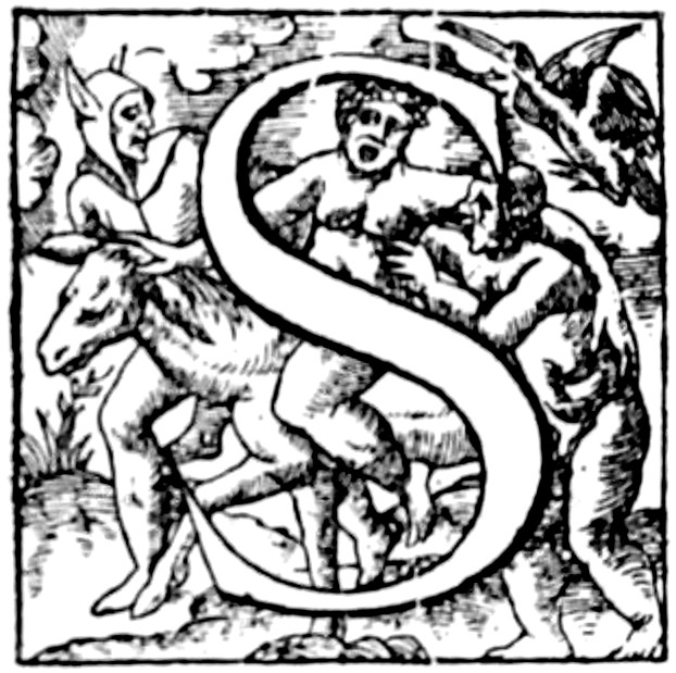
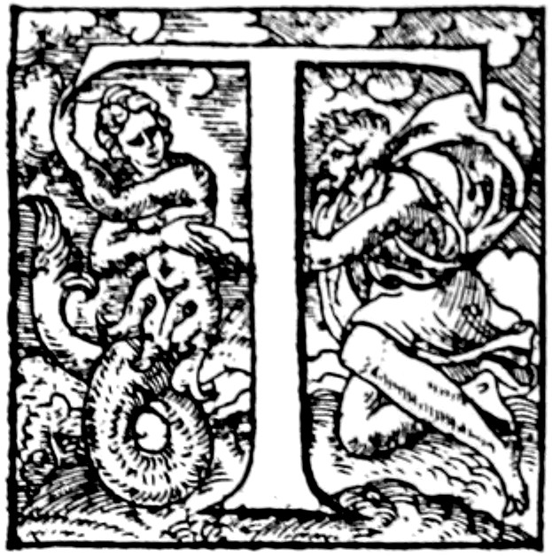
MYTHOLOGICAL LETTERS OF JACOPO FABIO
Mythological Letters of Jacopo Fabio
[226]
[226]
PARIS


FROM THE ‘VIES DES ANCIENS SAINCTZ PÈRES’ OF DUPRÉ
FROM THE 'LIVES OF THE ANCIENT SAINTS' OF DUPRÉ


CALLIGRAPHIC ALPHABET OF VÉRARD
Vérard's Calligraphic Alphabet
[227]
[227]


FROM THE ‘NEF DE SANTÉ’ OF TREPPEREL
FROM THE 'NEF DE SANTÉ' OF TREPPEREL


INITIALS IN BOOKS BY BOCARD
Initials in Books by Bocard
[228]
[228]


INITIALS IN BOOKS PRINTED BY REMBOLT AND GERING
INITIALS IN BOOKS PRINTED BY REMBOLT AND GERING
[229]
[229]


INITIALS IN BOOKS PRINTED BY REMBOLT AND GERING
INITIALS IN BOOKS PRINTED BY REMBOLT AND GERING
[230]
[230]


INITIALS IN BOOKS PRINTED BY REMBOLT AND GERING
INITIALS IN BOOKS PRINTED BY REMBOLT AND GERING

FROM THE HISTORY OF DENMARK BY SAXO GRAMMATICUS
FROM THE HISTORY OF DENMARK BY SAXO GRAMMATICUS
[231]
[231]


INITIALS USED IN THE ‘JARDIN DE SANTÉ’ BY TREPPEREL
INITIALS USED IN THE ‘JARDIN DE SANTÉ’ BY TREPPEREL
[232]
[232]


FROM THE ARISTOTLE OF H. ESTIENNE
FROM THE ARISTOTLE OF H. ESTIENNE


FROM THE ‘MISSALE PARISIENSE’ BY WOLFGANG HOPYL
FROM THE ‘MISSALE PARISIENSE’ BY WOLFGANG HOPYL
[233]
[233]


FROM MISSALS BY WOLFGANG HOPYL
FROM MISSALS BY WOLFGANG HOPYL
[234]
[234]


FROM MISSALS BY WOLFGANG HOPYL
FROM MISSALS BY WOLFGANG HOPYL


INITIALS USED BY PHILIPPE LENOIR, TREPPEREL, AND OTHERS
INITIALS USED BY PHILIPPE LENOIR, TREPPEREL, AND OTHERS
[235]
[235]


FROM AN UNIDENTIFIED MISSAL ATTRIBUTED TO G. TORY
FROM AN UNIDENTIFIED MISSAL ATTRIBUTED TO G. TORY
[236]
[236]

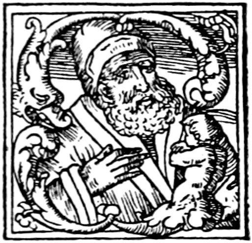


FROM AN UNIDENTIFIED MISSAL ATTRIBUTED TO G. TORY
FROM AN UNIDENTIFIED MISSAL ATTRIBUTED TO G. TORY

FROM A PARIS MISSAL
FROM A PARIS MISSAL
[237]
[237]


GROTESQUE MISSAL INITIALS
Grotesque missal initials
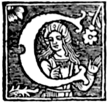
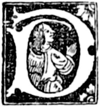

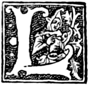


FROM A ‘PROPRIETAIRE’ OF PHILIPPE LENOIR
FROM A 'PROPRIETOR' OF PHILIPPE LENOIR
[238]
[238]


INITIALS USED BY JOSSE BADE
INITIALS USED BY JOSSE BADE

(Original size)
(Original size)

(Enlargement)
(Resize)

INITIALS USED BY CHEVALLON
INITIALS USED BY CHEVALLON
[239]
[239]


INITIALS BY VASCOSAN
INITIALS BY VASCOSAN


INITIALS BY SIMON DE COLINES
INITIALS BY SIMON DE COLINES
[240]
[240]


ROYAL LETTERS DESIGNED BY GEOFFROY TORY
ROYAL LETTERS DESIGNED BY GEOFFROY TORY
[241]
[241]

FROM KERVER’S ALPHABET
FROM KERVER'S ALPHABET
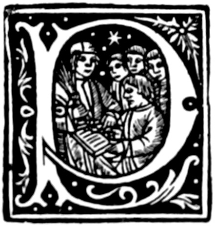
FROM DE LA BARRE’S PRESS
FROM DE LA BARRE’S PRESS


ENGLISH COPIES OF KERVER
ENGLISH COPIES OF KERVER

COPY OF REMBOLT
COPY OF REMBOLT


FROM PHILIP LE NOIR
FROM PHILIP LE NOIR


PEN LETTERS OF PHILIP LE NOIR
PEN LETTERS OF PHILIP LE NOIR
[242]
[242]
TROYES


FROM ‘LA THOISON D’OR’ BY THE LEROUGES
FROM ‘LA THOISON D’OR’ BY THE LEROUGES
[243]
[243]
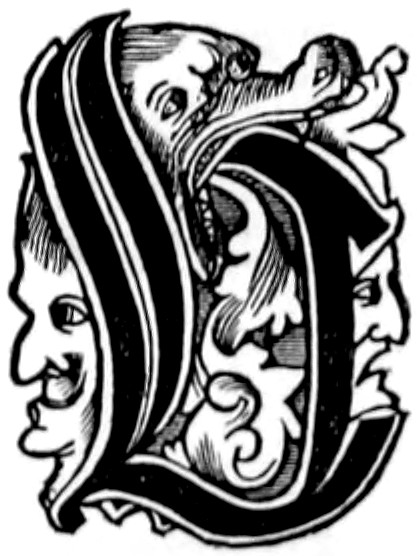


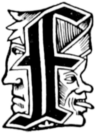


FROM THE ‘GRADUALE TRECENSE’ AND ‘STATUTA SYNODALIA’ BY LECOQ
FROM THE ‘GRADUALE TRECENSE’ AND ‘STATUTA SYNODALIA’ BY LECOQ
[244]
[244]


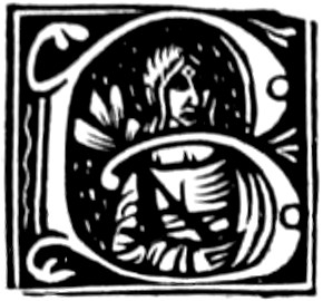


LITTLE LETTERS OF THE ‘VIE DE MONSEIGNEUR ST. BERNARD’ OF LECOQ
LITTLE LETTERS OF THE ‘VIE DE MONSEIGNEUR ST. BERNARD’ OF LECOQ
[245]
[245]
ROUEN


FROM THE ‘PSALTERII EXPOSITIO’ OF PETRUS DE HARENTALS
FROM THE ‘PSALTERII EXPOSITIO’ OF PETRUS DE HARENTALS
[246]
[246]


FROM VARIOUS WORKS BY MARTIN MORIN
FROM VARIOUS WORKS BY MARTIN MORIN

FROM THE ‘MISSALE ATREBATENSE’ OF MARTIN MORIN
FROM THE ‘MISSALE ATREBATENSE’ OF MARTIN MORIN
[247]
[247]


FROM THE ‘MISSALE ATREBATENSE’ OF MARTIN MORIN
FROM THE ‘MISSALE ATREBATENSE’ OF MARTIN MORIN
[248]
[248]


FROM THE ‘COMMINES’ OF J. FORESTIER
FROM THE ‘COMMINES’ OF J. FORESTIER
[249]
[249]


FROM THE ‘PROPRIETAIRE’ OF J. FORESTIER
FROM THE 'OWNER' OF J. FORESTIER
[250]
[250]


FROM THE ‘OPERA GUILELMI MONACHI VALLADII’ BY HOSTINGUE
FROM THE ‘OPERA GUILELMI MONACHI VALLADII’ BY HOSTINGUE


FROM A ‘COUSTUMIER DE NORMANDIE’ OF 1523
FROM A ‘COUSTUMIER DE NORMANDIE’ OF 1523
[251]
[251]
AVIGNON


FROM WORKS PRINTED BY JEAN DE CHAUNY
FROM WORKS PRINTED BY JEAN DE CHAUNY
POITIERS

FROM A POITIERS MISSAL
From a Poitiers Missal

USED IN IMPRESSIONS OF POITIERS
USED IN IMPRESSIONS OF POITIERS

FROM A ‘COUSTUMIER DE POITOU’
FROM A 'COUTURIER DE POITOU'
[252]
[252]
FRANCE

FROM A LIMOGES MISSAL
FROM A LIMOGES MISSAL

FROM TOULOUSE
FROM TOULOUSE
FROM A LIMOGES MISSAL
FROM A LIMOGES PRAYER BOOK

FROM THE ÆSOP OF ALBI
From the Aesop of Albi

FROM ‘LA VIE ET LÉGENDE DE MME. STE. PETROINE’
FROM ‘LA VIE ET LÉGENDE DE MME. STE. PETROINE’


FROM BESANÇON
FROM BESANÇON
[253]
[253]
SPANISH TOWNS


FROM VALENCIA, BY G. CASTILLA
FROM VALENCIA, BY G. CASTILLA
FROM SEVILLE, BY JUAN DE VARILA
FROM SEVILLE, BY JUAN DE VARILA

FROM COIMBRA, BY J. ALVERA
FROM COIMBRA, BY J. ALVERA
[254]
[254]


ORIGIN UNCERTAIN
Origin Unknown
[255]
[255]


FROM THE ‘COMPILACION DE LEYES,’ PRINTED AT ZAMORA
FROM THE ‘COMPILACION DE LEYES,’ PRINTED AT ZAMORA
[256]
[256]

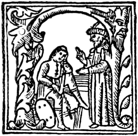

INITIALS USED BY J. CROMBERGER
INITIALS USED BY J. CROMBERGER

FROM A MEDICAL BOOK
FROM A MEDICAL BOOK

FROM A BOOK PRINTED AT BURGOS
FROM A BOOK PRINTED AT BURGOS
[257]
[257]


ORIGIN UNCERTAIN
Unclear origin


DANCE OF DEATH INITIALS FROM THE ‘LIBRO SOTILISSIMO’ PRINTED AT STELLA
DANCE OF DEATH INITIALS FROM THE ‘LIBRO SOTILISSIMO’ PRINTED AT STELLA
[258]
[258]


FROM THE ‘COMENTO DE EUSEBIO’ OF H. GYFFER, SALAMANCA
FROM THE ‘COMENTO DE EUSEBIO’ OF H. GYFFER, SALAMANCA
[259]
[259]


FROM THE ‘PASSIONARIUM’ OF BROCART, COMPLUTUM
FROM THE ‘PASSIONARIUM’ OF BROCART, COMPLUTUM


FROM THE ‘EPILOGO IN MEDICINA’
FROM THE ‘EPILOGUE IN MEDICINE’
[260]
[260]
EARLY DUTCH INITIALS

USED BY JACOB VAN DER MEER OF DELFT
USED BY JACOB VAN DER MEER OF DELFT


USED BY GODFRID DE OS OF GOUDA
USED BY GODFRID DE OS OF GOUDA
[261]
[261]

FROM THE ‘LIFE OF ST. LYDWINNE’ PRINTED AT SCHIEDAM
FROM THE ‘LIFE OF ST. LYDWINNE’ PRINTED AT SCHIEDAM

ENGLISH ADAPTATION OF THE PRECEDING
ENGLISH VERSION OF THE ABOVE


USED BY THIERRY MARTENS
USED BY THIERRY MARTENS

USED BY G. LEEU OF ANTWERP
USED BY G. LEEU OF ANTWERP

FROM AN EARLY LOUVAIN MISSAL
FROM AN EARLY LOUVAIN MASS BOOK
[262]
[262]

FROM THE TITLE-PAGE OF A ‘BELIAL’ OF ANTWERP
FROM THE TITLE PAGE OF A ‘BELIAL’ OF ANTWERP
FROM A LEYDEN TITLE-PAGE
FROM A LEYDEN TITLE PAGE

PORTRAIT OF PHILIP LE BEL, FROM A WORK PUBLISHED BY GODFRID BACK OF ANTWERP
PORTRAIT OF PHILIP LE BEL, FROM A WORK PUBLISHED BY GODFRID BACK OF ANTWERP
[263]
[263]
LATER GERMAN INITIALS


FROM THE MISSAL OF SPIRES BY PETER DRACH
FROM THE MISSAL OF SPIRES BY PETER DRACH
[264]
[264]


FROM THE BENEDICTINE MISSAL OF HAGENAU
FROM THE BENEDICTINE MISSAL OF HAGENAU
[265]
[265]


FROM THE BENEDICTINE MISSAL OF HAGENAU
FROM THE BENEDICTINE MISSAL OF HAGENAU
[266]
[266]


FROM THE BENEDICTINE MISSAL OF HAGENAU
FROM THE BENEDICTINE MISSAL OF HAGENAU
[267]
[267]

FROM THE BENEDICTINE MISSAL OF HAGENAU
FROM THE BENEDICTINE MISSAL OF HAGENAU
[268]
[268]


FROM THE BENEDICTINE MISSAL OF HAGENAU
FROM THE BENEDICTINE MISSAL OF HAGENAU
[269]
[269]


FROM AN UNIDENTIFIED (? MAGDEBURG) MISSAL
FROM AN UNIDENTIFIED (? MAGDEBURG) MISSAL
[270]
[270]

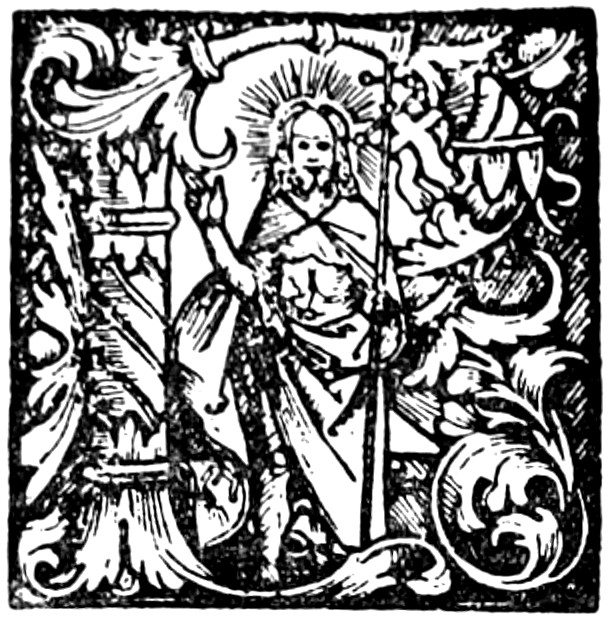
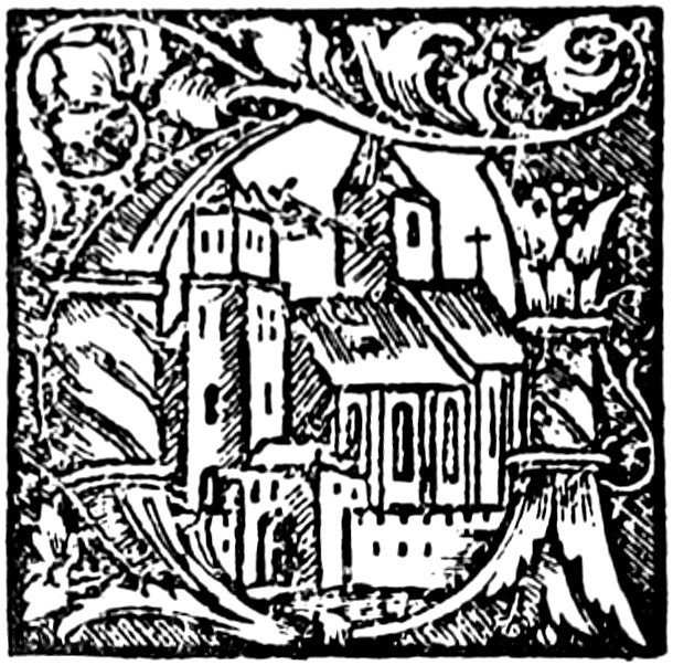
FROM THE ‘MISSALE POSNANIENSE’
FROM THE ‘MISSALE POSNANIENSE’


FROM THE ‘MISSALE EVANGELIARE’ OF LUTHER, BY KRAFFT OF WITTEMBURG
FROM THE ‘MISSALE EVANGELIARE’ OF LUTHER, BY KRAFFT OF WITTEMBURG


INITIALS USED AT DRESDEN
INITIALS USED IN DRESDEN
[271]
[271]

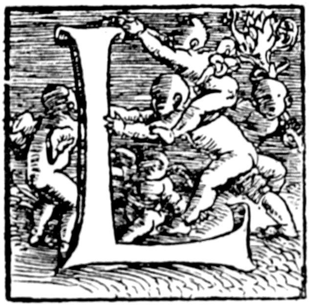

INITIALS BY PILGRIM IN THE ‘ELEGANTIAE’ OF LAURENTIUS VALLA, BY SCHURER, SCHLESTADT
INITIALS BY PILGRIM IN THE ‘ELEGANTIAE’ OF LAURENTIUS VALLA, BY SCHURER, SCHLESTADT


FROM THE ‘MISSALE PATAVIENSE’ OF WINTERBERGER, VIENNA
FROM THE ‘MISSALE PATAVIENSE’ OF WINTERBERGER, VIENNA
[272]
[272]


FROM WORKS PRINTED BY KNOBLOUCH
FROM WORKS PUBLISHED BY KNOBLOUCH

FROM A METZ PSALTER BY CASPAR HOCHFFEDER
FROM A METZ PSALTER BY CASPAR HOCHFFEDER
[273]
[273]


FROM PLINIUS OF HAGENAU, USED AFTERWARDS AT COLOGNE
FROM PLINIUS OF HAGENAU, LATER USED IN COLOGNE

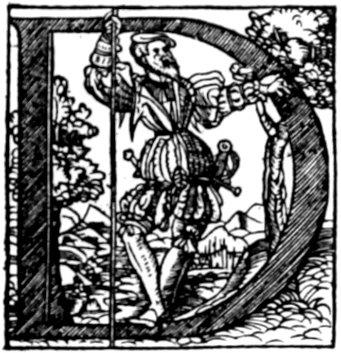
FROM A MAGDEBURG BIBLE
FROM A MAGDEBURG BIBLE

BY SCHEFFER OF MAYENCE
BY SCHEFFER OF MAINZ
[274]
[274]


FROM THE ‘ASTRONOMICON CESAREUM’ OF APIANUS
FROM THE ‘ASTRONOMICON CESAREUM’ OF APIANUS
[275]
[275]


FROM THE ‘ASTRONOMICON CESAREUM’ OF APIANUS
FROM THE ‘ASTRONOMICON CESAREUM’ OF APIANUS
[276]
[276]

FROM AN ECCLESIASTICAL DOCUMENT
FROM A CHURCH DOCUMENT
[277]
[277]
ENGLISH INITIALS

CAXTON’S ‘A’
CAXTON’S 'A'

WYNKYN DE WORDE’S BORROWED ‘H’
Wynkyn de Worde's Borrowed 'H'


FROM PYNSON’S MORTON MISSAL
FROM PYNSON’S MORTON MISSAL
[278]
[278]


INITIALS USED BY JOHN DAY
INITIALS USED BY JOHN DAY
[279]
[279]

INITIAL WITH ARMS OF ARCHBISHOP CRANMER, FROM THE BISHOPS’ BIBLE
INITIAL WITH ARMS OF ARCHBISHOP CRANMER, FROM THE BISHOPS’ BIBLE

INITIAL WITH ARMS OF HENRY VII., FROM GRAFTON’S EDITION OF ‘HALLE’S CHRONICLE’
INITIAL WITH ARMS OF HENRY VII., FROM GRAFTON’S EDITION OF ‘HALLE’S CHRONICLE’

INITIAL WITH ARMS OF THE EARL OF LEICESTER, FROM DAY’S EDITION OF CUNNINGHAM’S ‘COSMOGRAPHICAL GLASS’
INITIAL WITH ARMS OF THE EARL OF LEICESTER, FROM DAY’S EDITION OF CUNNINGHAM’S ‘COSMOGRAPHICAL GLASS’
[280]
[280]

PORTRAIT OF QUEEN ELIZABETH FROM DAY’S EDITION OF FOXE’S ‘BOOK OF MARTYRS’
PORTRAIT OF QUEEN ELIZABETH FROM DAY’S EDITION OF FOXE’S ‘BOOK OF MARTYRS’
[281]
[281]
INDEX
- PAGE
- Æsop, initial from Scheffer’s edition, 112
- —— initial from Albi edition, __A_TAG_PLACEHOLDER_0__, __A_TAG_PLACEHOLDER_1__
- Albi, initial in the manière éraillée, from Æsop printed at, __A_TAG_PLACEHOLDER_0__, __A_TAG_PLACEHOLDER_1__
- Alvarus Pelagius of J. Zainer, border used in, 23
- Alvera, J., initial used by, at Coimbra, 253
- Ambrose, St., portrait initial of, 211
- Antwerp, initial from title-page of book printed at, __A_TAG_PLACEHOLDER_0__, __A_TAG_PLACEHOLDER_1__
- —— initials used in books printed by G. Leeu at, __A_TAG_PLACEHOLDER_0__, __A_TAG_PLACEHOLDER_1__
- Apianus, P., initials from Astronomicon Cesareum printed by, __A_TAG_PLACEHOLDER_0__, __A_TAG_PLACEHOLDER_1__
- Apocalypse, different editions of the block-book, 4
- Arion, initial representing the adventure of, 61
- Aristotle, Opera Nonnulla printed by Keller, 17
- —— initials in editions of, by H. Estienne, 232
- Arrivabene, George, initials from missals printed by, __A_TAG_PLACEHOLDER_0__, __A_TAG_PLACEHOLDER_1__
- Ars Memorandi, historical initial in the, __A_TAG_PLACEHOLDER_0__, __A_TAG_PLACEHOLDER_1__
- Ars Moriendi, the block-book, 4
- Astronomicon Cesareum printed by P. Apianus at Ingoldstadt, __A_TAG_PLACEHOLDER_0__, __A_TAG_PLACEHOLDER_1__
- Augsburg, 5
- —— initials used by printers, __A_TAG_PLACEHOLDER_0__, __A_TAG_PLACEHOLDER_1__-__A_TAG_PLACEHOLDER_2__
- Aureum Opus, initials from edition of, by De Vingle, __A_TAG_PLACEHOLDER_0__, __A_TAG_PLACEHOLDER_1__
- Avignon, initials from volume printed at, __A_TAG_PLACEHOLDER_0__, __A_TAG_PLACEHOLDER_1__
- Aymon, les Quatre Fils de, initials used in Lyons edition of, 195
- Back, Godfrid, initials used by, 262
- Bade, Josse, armorial initials in History of Denmark printed by, __A_TAG_PLACEHOLDER_0__, __A_TAG_PLACEHOLDER_1__
- —— —— other initials of, 238
- Bamberg, initials from missal of Johann Pfeyl of, __A_TAG_PLACEHOLDER_0__, __A_TAG_PLACEHOLDER_1__
- —— initials from Missale Olumucense of, __A_TAG_PLACEHOLDER_0__, __A_TAG_PLACEHOLDER_1__
- Bämler, Johann, initials from works printed by, __A_TAG_PLACEHOLDER_0__, __A_TAG_PLACEHOLDER_1__
- Basle, initials reproduced from books printed at, __A_TAG_PLACEHOLDER_0__-__A_TAG_PLACEHOLDER_1__
- —— psalter of 1501 by Furter, initials from, __A_TAG_PLACEHOLDER_0__, __A_TAG_PLACEHOLDER_1__
- Bebelius, Joannes, initials of Holbein in works published by, 33
- Bebelius and Cratander, initials of Holbein in works by, 36
- Bellot, Jean, initials from volumes printed by, 53
- Benedictine missal printed at Hagenau, initials used in, __A_TAG_PLACEHOLDER_0__, __A_TAG_PLACEHOLDER_1__
- Bernard, le Petit, initials attributed to, 81
- Berthorius, Petrus, initials from Morale Reductorium of, __A_TAG_PLACEHOLDER_0__, __A_TAG_PLACEHOLDER_1__
- Besançon, printers of, use same initials as Furter of Basle, 95
- —— initials of, 252
- Bible, initials from G. Zainer’s editions of, __A_TAG_PLACEHOLDER_0__, __A_TAG_PLACEHOLDER_1__, __A_TAG_PLACEHOLDER_2__, __A_TAG_PLACEHOLDER_3__, __A_TAG_PLACEHOLDER_4__
- —— Latin, of Basle, initials from, __A_TAG_PLACEHOLDER_0__, __A_TAG_PLACEHOLDER_1__
- —— initial from Ulm edition, 1480, 127
- —— initial from a Lyons, 211
- —— German edition, pictorial initials of the fifth, __A_TAG_PLACEHOLDER_0__, __A_TAG_PLACEHOLDER_1__
- —— fourth edition by Frisner and Sensenschmidt, __A_TAG_PLACEHOLDER_0__, __A_TAG_PLACEHOLDER_1__
- —— initials from Nuremberg edition, 129 sq.
- —— the Bishops’, initials in, __A_TAG_PLACEHOLDER_0__, __A_TAG_PLACEHOLDER_1__
- Bibles, Augsburg and Nuremberg, compared, 17
- Biblia cum Summariis et Concordantiis of Jean Moylin, initials of, __A_TAG_PLACEHOLDER_0__, __A_TAG_PLACEHOLDER_1__
- Biblia Pauperum, the block-book, 4
- Birckmann, Franc, Hagenau initials copied by, 105
- [282]Blanchard, remarkable initials used in works by, __A_TAG_PLACEHOLDER_0__, __A_TAG_PLACEHOLDER_1__
- Block-books, initials from, 110
- Bocard, André, initials in books printed by, __A_TAG_PLACEHOLDER_0__, __A_TAG_PLACEHOLDER_1__
- Book-hunting in time of Aulus Gellius, 1
- Book-plate forming part of early Nuremberg impression, 27
- Brandis, Lucas, initials from Rudimenta Novitiorum and Josephus of, __A_TAG_PLACEHOLDER_0__, __A_TAG_PLACEHOLDER_1__
- Breidenbach, Bernard von, initial from Reuwich’s edition of his Peregrinationes, __A_TAG_PLACEHOLDER_0__, __A_TAG_PLACEHOLDER_1__
- —— initials from Ortuin’s Lyons edition, 198
- Brescia, initials from works printed at, __A_TAG_PLACEHOLDER_0__, __A_TAG_PLACEHOLDER_1__
- Bridget, St., Meditationes, initials used in Lübeck edition of, 148 sq.
- Brocart, Arn. de, initials used by, 259
- Bumgart de Ketwyck, initials used by, at Cologne, 165
- Burgofranco, J. P. de, initials in Hyginus de Stellis printed by, __A_TAG_PLACEHOLDER_0__, __A_TAG_PLACEHOLDER_1__
- Burgos, initial used at, 256
- Byzantium, books of, on purple parchment, 2
- Calcar, J. van, initials of, in Anatomy of Vesalius, __A_TAG_PLACEHOLDER_0__, __A_TAG_PLACEHOLDER_1__
- Calligraphic initials from Paris title-pages, 83
- Capcasa, Matteo, initials from works published by, __A_TAG_PLACEHOLDER_0__, __A_TAG_PLACEHOLDER_1__
- Cassiodorus, initial from works of, by Steyner, 21
- Castilla, G., initial used by, at Valencia, 253
- Catalogus Sanctorum of Saccon, __A_TAG_PLACEHOLDER_0__, __A_TAG_PLACEHOLDER_1__
- Catholicon of J. Wolff, selected initials from, __A_TAG_PLACEHOLDER_0__, __A_TAG_PLACEHOLDER_1__
- Caxton, W., initials used by, __A_TAG_PLACEHOLDER_0__, __A_TAG_PLACEHOLDER_1__
- Cervicornus or Hirtzhorn, Euch., initials in works published by, __A_TAG_PLACEHOLDER_0__, __A_TAG_PLACEHOLDER_1__
- Charlemagne invites Irish and Anglo-Saxon monks to his kingdom, 2
- Charles the Bald welcomes foreign artists, 2
- Chauny, Jean de, initials from works printed by, 251
- Chevallon, Claude, initial representing scenes from Ars Moriendi in work published by, __A_TAG_PLACEHOLDER_0__, __A_TAG_PLACEHOLDER_1__
- Children, initials with, used by Venice printers, 61
- —— copied by printers of Basle, Cologne, and Hagenau, 61
- Cicero, initials from German edition of, by Steyner, 21
- Cocksperger, Peter, and the Mayence Psalter initials, 10
- Coimbra, initials used by J. Alvira of, __A_TAG_PLACEHOLDER_0__, __A_TAG_PLACEHOLDER_1__
- Cologne, initial from Donatus of, __A_TAG_PLACEHOLDER_0__, __A_TAG_PLACEHOLDER_1__
- —— other initials used at, 165 sq.
- Como, initials of Vitruvius printed at, __A_TAG_PLACEHOLDER_0__, __A_TAG_PLACEHOLDER_1__
- Compilacion de Leyes, initials from Zamora edition, 255
- Complutum (Alcala de Henares), initial used in liturgical works printed by Brocart at, __A_TAG_PLACEHOLDER_0__, __A_TAG_PLACEHOLDER_1__
- Cosmographia of Ptolemy, initials from, __A_TAG_PLACEHOLDER_0__, __A_TAG_PLACEHOLDER_1__
- —— of Sebastian Munster, account of Psalter initials in the, 9
- Cranmer, Archbishop, initial with his arms, __A_TAG_PLACEHOLDER_0__, __A_TAG_PLACEHOLDER_1__
- Cromberger, J., initials used by, 256
- Cross-hatching, invention of, 20
- Cunningham, William, initials in his Cosmographical Glasse, __A_TAG_PLACEHOLDER_0__, __A_TAG_PLACEHOLDER_1__
- Curio, Valentin, initials used by, at Basle, __A_TAG_PLACEHOLDER_0__, __A_TAG_PLACEHOLDER_1__
- Dance of Death alphabets used at Basle, 137
- —— —— alphabet, Strasburg copies of, __A_TAG_PLACEHOLDER_0__, __A_TAG_PLACEHOLDER_1__
- —— —— alphabet in books published at Stella, __A_TAG_PLACEHOLDER_0__, __A_TAG_PLACEHOLDER_1__
- Dante, praises French miniaturists, 3
- Day, John, initials used by, __A_TAG_PLACEHOLDER_0__, __A_TAG_PLACEHOLDER_1__
- Delft, initial used by Jacob van der Meer at, __A_TAG_PLACEHOLDER_0__, __A_TAG_PLACEHOLDER_1__
- Deutscher Kalender, initials from, 44
- Dinckmut, Conrad, initial and border from Donatus printed by, __A_TAG_PLACEHOLDER_0__, __A_TAG_PLACEHOLDER_1__
- Doctrinal de Sapience, initial from title-page of, __A_TAG_PLACEHOLDER_0__, __A_TAG_PLACEHOLDER_1__
- Donatus, Aelius, Latin primer of, 4
- —— initial from edition of, by Quentell, 12
- —— with Psalter initials attributed to Gutenberg (1456), 9
- —— initial from xylographic impression by Dinckmut, __A_TAG_PLACEHOLDER_0__, __A_TAG_PLACEHOLDER_1__
- [283]Drach, Peter, initials in red from missal of Spires printed by, __A_TAG_PLACEHOLDER_0__, __A_TAG_PLACEHOLDER_1__
- Dresden, initial used at, 270
- Dupré, Jean, ornamental letters in the Vies des Anciens Saincts Pères of, 82
- Dürer, Albert, makes innovation in engraving, 20
- —— —— ornamental letters attributed to, __A_TAG_PLACEHOLDER_0__, __A_TAG_PLACEHOLDER_1__
- Elizabeth, Queen, portrait-initial of, __A_TAG_PLACEHOLDER_0__, __A_TAG_PLACEHOLDER_1__
- English copies of initials by Kerver, 241
- Erasmus, Desiderius, initial with portrait of, __A_TAG_PLACEHOLDER_0__, __A_TAG_PLACEHOLDER_1__
- Esslingen, initials in works printed at, 46
- Estienne, H., initials from work published by, __A_TAG_PLACEHOLDER_0__, __A_TAG_PLACEHOLDER_1__
- Etymologicum Magnum of Callierges, coloured initials in the, 11
- Eusebio di Comento, initials from Salamanca edition of, __A_TAG_PLACEHOLDER_0__, __A_TAG_PLACEHOLDER_1__
- Ex-libris, initial forming, from book printed at Paris, 83
- Fabio, Jacopo, mythological letters in works published by, __A_TAG_PLACEHOLDER_0__, __A_TAG_PLACEHOLDER_1__
- Ferrara, alphabet of initials from work of Joh. Philippus Bergomensis printed at, __A_TAG_PLACEHOLDER_0__, __A_TAG_PLACEHOLDER_1__
- —— initials from Missale Carthusiense of, __A_TAG_PLACEHOLDER_0__, __A_TAG_PLACEHOLDER_1__
- Finé, Oronce, initial with portrait of, 87
- Fool, first engraving of a, in a woodcut border, 23
- —— first example of the, in woodcut initials, 17
- —— in church architecture and early book ornamentation, 23
- Forestier, Jacques, specimens of alphabets used in a Commines printed by, __A_TAG_PLACEHOLDER_0__, __A_TAG_PLACEHOLDER_1__
- Formschneider, opposition of, to the use of woodcut initials, 15
- Fossombrone, initials in work published by Ottaviano dei Petrucci of, 67
- Foxe, John, portrait-initial of Queen Elizabeth, in his Book of Martyrs, __A_TAG_PLACEHOLDER_0__, __A_TAG_PLACEHOLDER_1__
- Fradin, François, children’s alphabet used by, __A_TAG_PLACEHOLDER_0__, __A_TAG_PLACEHOLDER_1__
- —— initials from the Regimen Sanitatis of Magnini printed by, __A_TAG_PLACEHOLDER_0__, __A_TAG_PLACEHOLDER_1__
- Frank, Hans, initial signed by, 81
- Friburgensis, Johann, Summa Confessorum, Augsburg, G. Zainer (1476), initials used in, __A_TAG_PLACEHOLDER_0__, __A_TAG_PLACEHOLDER_1__
- Frisner and Sensenschmidt, initials from fourth German Bible by, __A_TAG_PLACEHOLDER_0__, __A_TAG_PLACEHOLDER_1__
- Froben, Johann, initials of Holbein in works by, 37
- Froschouer, Johann, initials in books printed at Zurich by, __A_TAG_PLACEHOLDER_0__, __A_TAG_PLACEHOLDER_1__
- Fürter, Michael, initials from books printed by, __A_TAG_PLACEHOLDER_0__, __A_TAG_PLACEHOLDER_1__
- Fust, Johann, association of, with Scheffer, 6
- Galen, initials from Basle edition of, __A_TAG_PLACEHOLDER_0__, __A_TAG_PLACEHOLDER_1__
- Gelli, René, initials in Greek lexicon of, 142
- Geneva, large calligraphic initials from books printed at, __A_TAG_PLACEHOLDER_0__, __A_TAG_PLACEHOLDER_1__
- —— other initials used at, 164
- Gering, Ulrich. See Rembolt and Gering.
- Ghotan, Bartholomew, initials used by, at Lübeck, __A_TAG_PLACEHOLDER_0__, __A_TAG_PLACEHOLDER_1__
- Giunta, Lucantonio di, initials from missals and breviaries printed by, __A_TAG_PLACEHOLDER_0__, __A_TAG_PLACEHOLDER_1__, __A_TAG_PLACEHOLDER_2__
- Gouda, initials used by Godfrid de Os at, __A_TAG_PLACEHOLDER_0__, __A_TAG_PLACEHOLDER_1__, __A_TAG_PLACEHOLDER_2__
- Graf, Urs, initials by, 136
- Gregoriis, G. and J. de, initials from Herodotus and other works printed by, __A_TAG_PLACEHOLDER_0__, __A_TAG_PLACEHOLDER_1__
- Grotesque, the, in book ornamentation, 87
- —— profiles, earliest example of, 16
- Grüninger, Johann, initials from works printed by, __A_TAG_PLACEHOLDER_0__-__A_TAG_PLACEHOLDER_1__, __A_TAG_PLACEHOLDER_2__, __A_TAG_PLACEHOLDER_3__
- Gutenberg, Johann, invention of printing by, 6
- Gutenberg Bible sold by Scheffer as a manuscript, 8
- Gutnecht, Jodocus, initials in Missale Pataviense of, __A_TAG_PLACEHOLDER_0__, __A_TAG_PLACEHOLDER_1__, __A_TAG_PLACEHOLDER_2__
- Gyffer, Hans, of Silgenstat, initials from works published at Salamanca by, __A_TAG_PLACEHOLDER_0__, __A_TAG_PLACEHOLDER_1__
- Gymnicus, J., alphabets in works printed by, __A_TAG_PLACEHOLDER_0__, __A_TAG_PLACEHOLDER_1__
- Hagenau, initials of Benedictine missal printed at, __A_TAG_PLACEHOLDER_0__, __A_TAG_PLACEHOLDER_1__
- —— initials from Plinius printed by Thomas Anselm at, __A_TAG_PLACEHOLDER_0__, __A_TAG_PLACEHOLDER_1__
- Halle’s Chronicle, initials in, __A_TAG_PLACEHOLDER_0__, __A_TAG_PLACEHOLDER_1__
- [284]Harentals, Petrus de, initials used in an Expositio Psalterii by, 245
- Heineken, C. H. von, attributes Psalter initials to Meydenbach, 9
- Henry VII., initial with his arms, 279
- Heraldic initials. See Initials, Armorial.
- Hochffeder, Gaspard, initial from Psalter of Metz printed by, __A_TAG_PLACEHOLDER_0__, __A_TAG_PLACEHOLDER_1__
- Hohenwang, Ludwig, initials used by, 116
- Holbein, Ambrose, initials by, 144
- —— Hans, alphabets of, __A_TAG_PLACEHOLDER_0__, __A_TAG_PLACEHOLDER_1__
- —— —— children’s alphabet by, __A_TAG_PLACEHOLDER_0__, __A_TAG_PLACEHOLDER_1__
- —— —— Dance of Death alphabet by, __A_TAG_PLACEHOLDER_0__, __A_TAG_PLACEHOLDER_1__
- —— —— initial of, in books by Valentine Curio, 36
- —— —— mistakes in anatomy, 34
- —— —— peasants’ alphabet by, 35
- —— —— the four Greek initials from the Galen of 1538, 36
- Holl, Leonard, initials in work printed by, __A_TAG_PLACEHOLDER_0__, __A_TAG_PLACEHOLDER_1__
- Holtrop, J. W., early Dutch initials copied from works published by, 101
- Hongre, Pierre, initials from missal of, 202 sqq.
- Hopyl, Wolfgang, initials used by, __A_TAG_PLACEHOLDER_0__, __A_TAG_PLACEHOLDER_1__
- Hostingue, L., and J. Loys, initials from work published by, __A_TAG_PLACEHOLDER_0__, __A_TAG_PLACEHOLDER_1__
- Hupfuff, M., initials in works printed by, 45
- Husz, Mathieu, initials used by, at Lyons, __A_TAG_PLACEHOLDER_0__, __A_TAG_PLACEHOLDER_1__
- Imagines of Varro, described by Pliny, 2
- Ingoldstadt, initials of M. Ostendorfer used at, 107
- Initials, anthropomorphic, of Strasburg printers, 45
- —— armorial, __A_TAG_PLACEHOLDER_0__, __A_TAG_PLACEHOLDER_1__, __A_TAG_PLACEHOLDER_2__, __A_TAG_PLACEHOLDER_3__
- —— coloured, used by Roman copyists, 1
- —— from the Libro Sotilissimo, a typographical curiosity printed at Stella, 99
- —— large calligraphic, on title-pages of books printed at Lyons, __A_TAG_PLACEHOLDER_0__, __A_TAG_PLACEHOLDER_1__
- —— mythological, 224 sq.
- —— in minium or cinnabar of sixth century, 2
- —— of chequer work, 3
- —— resembling Gallo-Frank jewellery, 3
- —— vagaries in use of, 24
- Israel von Mecken, initials by, 27
- Italy, influence of French art in, 3
- Josephus, initials from Lübeck edition of, 146
- Josse Bade. See Bade.
- Kaisersperg, Geyler von, initials in works of, __A_TAG_PLACEHOLDER_0__, __A_TAG_PLACEHOLDER_1__, __A_TAG_PLACEHOLDER_2__
- Keller, Ambrose, initials from works printed by, __A_TAG_PLACEHOLDER_0__-__A_TAG_PLACEHOLDER_1__, __A_TAG_PLACEHOLDER_2__
- Kerver, Thielmann, initials by, 241
- Knoblochtzer, Heinrich, initials from works printed by, __A_TAG_PLACEHOLDER_0__, __A_TAG_PLACEHOLDER_1__
- Knoblouch, Johann, initials in works printed by, __A_TAG_PLACEHOLDER_0__, __A_TAG_PLACEHOLDER_1__, __A_TAG_PLACEHOLDER_2__
- Lecoq, Jean, alphabet from La Vie de Monseigneur St. Bernard by, __A_TAG_PLACEHOLDER_0__, __A_TAG_PLACEHOLDER_1__
- —— letters with grotesque profiles from different works printed by, __A_TAG_PLACEHOLDER_0__, __A_TAG_PLACEHOLDER_1__
- Leeu, Gerard, initials used by, __A_TAG_PLACEHOLDER_0__, __A_TAG_PLACEHOLDER_1__
- Leicester, Earl of, initial with his arms, __A_TAG_PLACEHOLDER_0__, __A_TAG_PLACEHOLDER_1__
- Lenoir, Philippe, initials in works published by, __A_TAG_PLACEHOLDER_0__, __A_TAG_PLACEHOLDER_1__, __A_TAG_PLACEHOLDER_2__, __A_TAG_PLACEHOLDER_3__
- Leo the Isaurian burns the public library, 2
- Lerouges, les, initials from La Thoison d’Or printed by, __A_TAG_PLACEHOLDER_0__, __A_TAG_PLACEHOLDER_1__
- Leroy, Guillaume, initials used by, __A_TAG_PLACEHOLDER_0__, __A_TAG_PLACEHOLDER_1__
- Le Signerre, Guillaume, initials used by, at Saluzzo, 189
- Lettres parlantes in Lyons impression, 81
- —— tourneures fleuronnées used by Leroy in 1479, 73
- Liber Biblie Moralis of J. Zainer, initials in, 23
- Lilius, Zacharias, initials from the Breviarium Orbis of, 182
- Limoges, initials from missal printed at, __A_TAG_PLACEHOLDER_0__, __A_TAG_PLACEHOLDER_1__
- Locatellus, Bonetus, initials used in works printed by, __A_TAG_PLACEHOLDER_0__, __A_TAG_PLACEHOLDER_1__
- Louvain, historiated initial from fifteenth-century missal printed at, __A_TAG_PLACEHOLDER_0__, __A_TAG_PLACEHOLDER_1__
- Lübeck, initials from works published at, __A_TAG_PLACEHOLDER_0__, __A_TAG_PLACEHOLDER_1__
- Lufft of Wittemberg, initials used by, __A_TAG_PLACEHOLDER_0__, __A_TAG_PLACEHOLDER_1__
- Lützelberger, Hans, Dance of Death initials engraved by, 137
- Lyons, initials from books printed at, 194 sqq.
- [285]Lyons missals, initials used in different, 75
- —— copy of Cologne initial, 169
- Macabre initials used at Cologne, 170
- Maiblümchen or lily of the valley design in early books, 5
- Mainz. See Mayence.
- Margarita Davitica, initial of G. Zainer from, __A_TAG_PLACEHOLDER_0__, __A_TAG_PLACEHOLDER_1__
- Marriage licence, pictorial initial from, __A_TAG_PLACEHOLDER_0__, __A_TAG_PLACEHOLDER_1__
- Martens, Thierry, initials used by, __A_TAG_PLACEHOLDER_0__, __A_TAG_PLACEHOLDER_1__
- Mathieu Husz and Jean Schabeler, initials used in Boccaccio of, 74
- Mayence, initial in Erhardt Reuwich’s Breidenbach, __A_TAG_PLACEHOLDER_0__, __A_TAG_PLACEHOLDER_1__
- —— initial in Scheffer’s Æsop printed at, __A_TAG_PLACEHOLDER_0__, __A_TAG_PLACEHOLDER_1__
- —— later Scheffer initial, 273
- Mazochius, Jacobus, portrait of Ariosto in work published by, __A_TAG_PLACEHOLDER_0__, __A_TAG_PLACEHOLDER_1__
- Medici, Cosmo de, initial with portrait of, __A_TAG_PLACEHOLDER_0__, __A_TAG_PLACEHOLDER_1__
- Meditations of St. Bridget, initials from Lübeck edition of, 40
- Meer, Jacob van der, initials used by, at Delft, 260
- Melusine, initials from Lyons edition of, 199
- Milan, initials from works printed at, __A_TAG_PLACEHOLDER_0__, __A_TAG_PLACEHOLDER_1__
- —— initials from works printed by Joannes de Castellione at, 70
- Miniatures in books of Athens and Rome, 2
- —— in mediæval manuscripts, 2
- Mirabilia Romae, historiated initial of the, __A_TAG_PLACEHOLDER_0__, __A_TAG_PLACEHOLDER_1__
- Missale Atrebatense, initials from, __A_TAG_PLACEHOLDER_0__, __A_TAG_PLACEHOLDER_1__
- —— Bambergense, initials from the edition by J. Pfeyl, 152 sq.
- —— Benedictinum, initials from Hagenau edition of, 264 sqq.
- —— Evangeliare of Wittemberg, initials from, __A_TAG_PLACEHOLDER_0__, __A_TAG_PLACEHOLDER_1__
- —— Olumucense, coloured initials of the, __A_TAG_PLACEHOLDER_0__-__A_TAG_PLACEHOLDER_1__, __A_TAG_PLACEHOLDER_2__
- —— Pataviense, pictorial initials from, __A_TAG_PLACEHOLDER_0__, __A_TAG_PLACEHOLDER_1__
- —— Vallisumbrose, large pictorial initials from, __A_TAG_PLACEHOLDER_0__, __A_TAG_PLACEHOLDER_1__
- Missals printed at Lyons, initials from, __A_TAG_PLACEHOLDER_0__, __A_TAG_PLACEHOLDER_1__
- —— printed at Paris, 232 sqq.
- —— printed at Rouen, 247 sq.
- Modernes, Jacques, curious initial in work on Military Art printed by, __A_TAG_PLACEHOLDER_0__, __A_TAG_PLACEHOLDER_1__
- Monks, Irish and Anglo-Saxon, celebrated for miniatures and historiations, 2
- Montfaucon, alphabet of animals of, 3
- Morin, Martin, calligraphic initial from missal printed by, __A_TAG_PLACEHOLDER_0__, __A_TAG_PLACEHOLDER_1__
- —— —— initials from other works published by, __A_TAG_PLACEHOLDER_0__-__A_TAG_PLACEHOLDER_1__, __A_TAG_PLACEHOLDER_2__
- Morton, Archbishop, initial with his rebus, __A_TAG_PLACEHOLDER_0__, __A_TAG_PLACEHOLDER_1__
- Moylin, Jean, initials from his Latin Bible, __A_TAG_PLACEHOLDER_0__, __A_TAG_PLACEHOLDER_1__
- Müller, Johann, or Regiomontanus, works by, 25
- Murr, C. G. von, and the artist of the Psalter initials, 10
- Nardi, Simeon, initials from Datus published by, __A_TAG_PLACEHOLDER_0__, __A_TAG_PLACEHOLDER_1__
- Naudé, Gabriel, accusation against Scheffer, 8
- Normandie, Coustumier de, curious initials from a, __A_TAG_PLACEHOLDER_0__, __A_TAG_PLACEHOLDER_1__
- Novesianus, Melchior, imitations of Alphabet of Death in works printed by, 53
- —— —— other initials used by, 167
- Nuremberg, curious work attributed variously to Stuchs, Zeninger, and Wagner published at, __A_TAG_PLACEHOLDER_0__, __A_TAG_PLACEHOLDER_1__
- —— initials from books printed at, 128 sqq.
- Ornamentation of early books, 1
- Oronce Finé. See Finé.
- Ortuin, Gaspard, initial from Breidenbach’s Peregrinationes, __A_TAG_PLACEHOLDER_0__, __A_TAG_PLACEHOLDER_1__
- Os, Godfrid de, initials used by, 260
- Otino da Pavia de la Luna, initials in the Vita di Sancti Padri of, __A_TAG_PLACEHOLDER_0__, __A_TAG_PLACEHOLDER_1__
- Pachel, Leonard, initials used by, at Milan, 193
- Papillon, J. B. M., testimony of, concerning the artist of the Psalter initials, 10
- Paris, renowned for its manuscripts and copyists, 3
- —— initials used at, 226 sqq.
- Pavia, initials used at, 188
- Peter, St., portrait initial of, 276
- [286]Petrarch, initials from German translation of his De remediis utriusque fortunæ, by Steyner, 21
- Petri, Adam, repetition of same initial in books printed by, 31
- —— —— pilgrim initial used by, 136
- Petroine, La vie et légende de Mme. Ste., initials from, __A_TAG_PLACEHOLDER_0__, __A_TAG_PLACEHOLDER_1__
- Pfister, Alb., impressions of, resembling block-books, 11
- Pflantzmann, J., initials from books printed by, __A_TAG_PLACEHOLDER_0__, __A_TAG_PLACEHOLDER_1__
- Philip le Bel, portrait initial of, 262
- Philosophers, alphabets of, __A_TAG_PLACEHOLDER_0__, __A_TAG_PLACEHOLDER_1__
- Pius II., Pope, portrait initial of, 184
- Playing-cards, method of printing, 4
- Plenarium, initials used in Strasburg edition of, 158
- Pogge, J. F., initials from edition of, printed by Knoblouch, __A_TAG_PLACEHOLDER_0__, __A_TAG_PLACEHOLDER_1__
- Poitiers, initials from books printed at, __A_TAG_PLACEHOLDER_0__, __A_TAG_PLACEHOLDER_1__
- Polychrome initials in early books, 11
- Ponte, Gotardus de, initials from Vitruvius printed by, 187
- Poullet, J., initials used by, 204
- Prestre Jehan, historiated initial from title-page of, __A_TAG_PLACEHOLDER_0__, __A_TAG_PLACEHOLDER_1__
- —— —— initials from Paris edition of, 237
- Propriétaire, initials from Rouen editions of, __A_TAG_PLACEHOLDER_0__, __A_TAG_PLACEHOLDER_1__
- —— letters from Lyons edition of, __A_TAG_PLACEHOLDER_0__, __A_TAG_PLACEHOLDER_1__
- Prusz, Johann, initials used by, at Strasburg, __A_TAG_PLACEHOLDER_0__, __A_TAG_PLACEHOLDER_1__
- Psalter of Mayence initials, Bodman hoaxes Fischer concerning, 8
- —— initials from Furter’s Basle edition of, 135
- —— initials from edition by J. Prusz of Strasburg, __A_TAG_PLACEHOLDER_0__, __A_TAG_PLACEHOLDER_1__
- —— initials said to have been used by Gutenberg, 8
- —— opinions as to the initials of, 7
- Ptolemy, initials from Ulm edition of the Cosmographia, __A_TAG_PLACEHOLDER_0__, __A_TAG_PLACEHOLDER_1__
- Pynson, Richard, initials from his Sarum Missal, __A_TAG_PLACEHOLDER_0__, __A_TAG_PLACEHOLDER_1__
- Quadragesimale of Gritsch, pictorial border of the, 23
- Quentell, Heinrich, initials from volumes printed by, __A_TAG_PLACEHOLDER_0__, __A_TAG_PLACEHOLDER_1__
- Ratdolt, Erhard, initials from Calendarium of J. di Monteregio (Johannes Regiomontanus) by, __A_TAG_PLACEHOLDER_0__, __A_TAG_PLACEHOLDER_1__
- —— —— initials in Brevarium Constantiense of 1516 by, __A_TAG_PLACEHOLDER_0__, __A_TAG_PLACEHOLDER_1__
- —— —— initials in breviary by, __A_TAG_PLACEHOLDER_0__, __A_TAG_PLACEHOLDER_1__
- —— —— initials in psalter of 1499 by, __A_TAG_PLACEHOLDER_0__-__A_TAG_PLACEHOLDER_1__, __A_TAG_PLACEHOLDER_2__
- —— —— Latin couplet on, 19
- Rationale Durandi, ornamented with some of the same initials as Psalter of Mayence, 11
- Reger, Johann, initials in works printed by, __A_TAG_PLACEHOLDER_0__, __A_TAG_PLACEHOLDER_1__
- Rembolt and Gering, initials from volumes printed by, __A_TAG_PLACEHOLDER_0__-__A_TAG_PLACEHOLDER_1__, __A_TAG_PLACEHOLDER_2__
- Reutlingen, initials in works printed at, __A_TAG_PLACEHOLDER_0__, __A_TAG_PLACEHOLDER_1__
- Richard de Bury praises libraries of Paris, 3
- Richel, Bernard, initials from Latin Bible of, 29
- Rome, initials used at, 185
- Rouen, initials used at, __A_TAG_PLACEHOLDER_0__, __A_TAG_PLACEHOLDER_1__
- Royal letters designed by Geoffroy Tory for Robert Estienne, __A_TAG_PLACEHOLDER_0__, __A_TAG_PLACEHOLDER_1__
- Rudimenta Novitiorum, initials from Lübeck edition of, 146 sq.
- Saccon, Jacques, initials in Catalogus Sanctorum of, __A_TAG_PLACEHOLDER_0__, __A_TAG_PLACEHOLDER_1__
- —— —— different initials in works printed by, __A_TAG_PLACEHOLDER_0__, __A_TAG_PLACEHOLDER_1__, __A_TAG_PLACEHOLDER_2__, __A_TAG_PLACEHOLDER_3__, __A_TAG_PLACEHOLDER_4__
- Salamanca, initials used at, 258
- Saluzzo, initials in Aureum Opus of Vivaldus printed by Le Signerre at, __A_TAG_PLACEHOLDER_0__, __A_TAG_PLACEHOLDER_1__
- Sarum missal, initials from Pynson’s edition of, __A_TAG_PLACEHOLDER_0__, __A_TAG_PLACEHOLDER_1__
- Saxo Grammaticus, armorial initials from History of Denmark by, __A_TAG_PLACEHOLDER_0__, __A_TAG_PLACEHOLDER_1__
- Schabeler, Hans, initials used by, at Lyons, 197
- Schäufelein, Hans, initials by, 49
- Scheffer, Peter, association of, with Fust, 6
- —— —— initials used by, __A_TAG_PLACEHOLDER_0__, __A_TAG_PLACEHOLDER_1__, __A_TAG_PLACEHOLDER_2__
- Schiedam, initial used by unknown printer of, __A_TAG_PLACEHOLDER_0__, __A_TAG_PLACEHOLDER_1__
- Schlestadt, initials of Pilgrim, from book printed by Lazarus Schurer at, 106
- [287]Scinzenzeller, Ulr., initials used by, 192
- Schönsperger, Johann, initials from works printed by, __A_TAG_PLACEHOLDER_0__, __A_TAG_PLACEHOLDER_1__
- Schott, initials in works printed by, __A_TAG_PLACEHOLDER_0__, __A_TAG_PLACEHOLDER_1__
- Sessa, different initials met with in impressions by, __A_TAG_PLACEHOLDER_0__, __A_TAG_PLACEHOLDER_1__
- —— initials from Aristotle printed by, __A_TAG_PLACEHOLDER_0__, __A_TAG_PLACEHOLDER_1__
- Seville, initials from books printed by Jacob Cromberger at, 98
- —— initials from book printed by Juan de Varila at, __A_TAG_PLACEHOLDER_0__, __A_TAG_PLACEHOLDER_1__
- Sienna, initials in books published at, __A_TAG_PLACEHOLDER_0__-__A_TAG_PLACEHOLDER_1__, __A_TAG_PLACEHOLDER_2__
- Silber, Eucharius, ornamental letter from book published, __A_TAG_PLACEHOLDER_0__, __A_TAG_PLACEHOLDER_1__
- Sorg, Anton, historiated initials from Das Buch das heisset der Seusse of Suso, __A_TAG_PLACEHOLDER_0__, __A_TAG_PLACEHOLDER_1__
- —— —— initials from works printed by, __A_TAG_PLACEHOLDER_0__-__A_TAG_PLACEHOLDER_1__, __A_TAG_PLACEHOLDER_2__, __A_TAG_PLACEHOLDER_3__
- Spanish initials, 253 sqq.
- Speculum Humanæ Salvationis, a transition from xylography to printing, 4
- Spires, initials used at, 263
- Stamps used for applying initials by early copyists, 4
- Statuta Synodalia, alphabet used in the Troyes edition of, __A_TAG_PLACEHOLDER_0__, __A_TAG_PLACEHOLDER_1__
- Stella, copies of the Alphabet of Death used by Adrian Anverez at, __A_TAG_PLACEHOLDER_0__, __A_TAG_PLACEHOLDER_1__
- Steyner, Heinrich, initials in works published by, __A_TAG_PLACEHOLDER_0__, __A_TAG_PLACEHOLDER_1__
- Strasburg, initials used at, 154 sqq.
- Summa Confessorum, initials of the, __A_TAG_PLACEHOLDER_0__-__A_TAG_PLACEHOLDER_1__, __A_TAG_PLACEHOLDER_2__
- Suso, Henricus, initials from Das Buch das heisset der Seusse, 120
- Sweynheim and Pannartz, initial from the Suetonius of, __A_TAG_PLACEHOLDER_0__, __A_TAG_PLACEHOLDER_1__
- Theoricae Novae, initial from, 25
- Tibullus quoted, 1
- Topie, Michel, initial from Mer des Hystoires of, __A_TAG_PLACEHOLDER_0__, __A_TAG_PLACEHOLDER_1__
- Tory, Geoffroy, initials from missal attributed to, __A_TAG_PLACEHOLDER_0__, __A_TAG_PLACEHOLDER_1__
- —— —— royal letters attributed to, 240
- Toulouse, initial used at, 252
- Trepperel, Jean, grotesque initials in books published by, __A_TAG_PLACEHOLDER_0__, __A_TAG_PLACEHOLDER_1__
- Trepperel, initials from Jardin de Santé of, __A_TAG_PLACEHOLDER_0__, __A_TAG_PLACEHOLDER_1__
- Tridino, Tacuinus de, initials in works published by, __A_TAG_PLACEHOLDER_0__, __A_TAG_PLACEHOLDER_1__
- Troyes, initials used at, 242 sqq.
- Ulm, initial with border from Donatus printed at, __A_TAG_PLACEHOLDER_0__, __A_TAG_PLACEHOLDER_1__
- —— initials from other works printed at, 126 sqq.
- Valerius Maximus of Sorg, initials from, 17
- Varila, Juan de, initial used by, 253
- Vascosan, Michael, initials by, 239
- Venice, initials from works published at, __A_TAG_PLACEHOLDER_0__, __A_TAG_PLACEHOLDER_1__
- Vérard, Antoine, calligraphic initial from the Jardin de Santé of, __A_TAG_PLACEHOLDER_0__, __A_TAG_PLACEHOLDER_1__
- Verona, ornamental letter from book printed at, __A_TAG_PLACEHOLDER_0__, __A_TAG_PLACEHOLDER_1__
- Vesalius, initials of Van Calcar in Anatomy of, __A_TAG_PLACEHOLDER_0__, __A_TAG_PLACEHOLDER_1__
- Vicenza, example of typographic eccentricities in work printed at, __A_TAG_PLACEHOLDER_0__, __A_TAG_PLACEHOLDER_1__
- Vienna, initials from Missale Pataviense printed by J. Winterberger of, __A_TAG_PLACEHOLDER_0__, __A_TAG_PLACEHOLDER_1__
- Virgil, the Vatican copy described by M. Pierre de Nolhac, 2
- Vita di Sancti Padri, initials from the, of Otino da Pavia de la Luna, __A_TAG_PLACEHOLDER_0__, __A_TAG_PLACEHOLDER_1__
- Vitali, Bernardino, alphabet by, used in publications by Sessa, 60
- Vitruvius, initials from Como edition of, 187
- Walther, H., initials from Madgeburg Bible printed by, __A_TAG_PLACEHOLDER_0__, __A_TAG_PLACEHOLDER_1__
- Weiditz, Hans, initials attributed to, by Dr. H. Röttinger, __A_TAG_PLACEHOLDER_0__, __A_TAG_PLACEHOLDER_1__, __A_TAG_PLACEHOLDER_2__
- Winterberger, of Vienna, initials used by, 271
- Wittemberg, apocalyptic initials from the Missale Evangeliare printed at, __A_TAG_PLACEHOLDER_0__, __A_TAG_PLACEHOLDER_1__
- Wohlgemuth, M., his new technical methods, 20
- Worde, Wynkyn de, initial used by, 277
- [288]Worms, Anton von, children’s alphabets designed by, 53
- Zainer, Günther, first used woodcut initials at Augsburg, 15
- —— —— examples of his letters, __A_TAG_PLACEHOLDER_0__, __A_TAG_PLACEHOLDER_1__
- —— Johann, of Ulm, initials in Boccaccio of, __A_TAG_PLACEHOLDER_0__, __A_TAG_PLACEHOLDER_1__
- Zamora, initials from Compilacion de Leyes printed at, __A_TAG_PLACEHOLDER_0__, __A_TAG_PLACEHOLDER_1__
- Zarotus, Antonius, initials used by, at Milan, 193
- Zodiac, initials representing the signs of the, 87
- Zurich, initials in books published by Froschouer of, __A_TAG_PLACEHOLDER_0__, __A_TAG_PLACEHOLDER_1__
FINIS
FINIS

EDINBURGH: T. AND A. CONSTABLE
PRINTERS TO HIS MAJESTY: MCMVIII
EDINBURGH: T. AND A. CONSTABLE
PRINTERS FOR HIS MAJESTY: 1908
Transcriber’s Notes
The spelling, capitalisation and hyphenation of the source document have been retained (including those of proper names and book titles), except as listed under Changes made below.
The spelling, capitalization, and hyphenation of the source document have been kept intact (including proper names and book titles), except for the changes noted below.
Depending on the hard- and software used to read this text, not all elements may display as intended.
Depending on the hardware and software used to access this text, some elements might not show up as expected.
The book appears to contain several contradictions between the descriptions given and the illustrations. These have been retained as printed in the source document without further correction or comment.
The book seems to have several inconsistencies between the descriptions and the illustrations. These have been kept as they were in the original document without any further corrections or comments.
Several of the author’s references to other parts of the text and to (sets of) illustrations are ambiguous. Hyperlinks to such elements are provided only in cases where there is a clear reference to (the first element of) an unambiguous target.
Several of the author’s references to other parts of the text and to (sets of) illustrations are unclear. Hyperlinks to such elements are provided only when there is a clear reference to (the first element of) an unambiguous target.
Page 61, “At Turin ... we find that the L with the satyr,”: as printed in the source document; the sentence appears to be incomplete, or “we find that the L ...” might have to be corrected to “we find the L...”.
Page 61, “At Turin ... we see the L with the satyr,”: as printed in the source document; the sentence seems incomplete, or “we see the L ...” might need to be changed to “we see the L...”.
Page 109 ff.: The illustrations are presented here as printed in the source document, with minimal straightening and de-skewing. On a wide screen or in a wide window, the illustrations are intended to have widths that are approximately proportional to their relative widths in the source document.
Page 109 ff.: The illustrations are shown here as they appear in the original document, with only slight adjustments for alignment. On a widescreen or in a wide window, the illustrations are designed to have widths that closely match their proportions in the original document.
Page 238, “Original size” and “Enlargement”: Based on a quarto book size of around 29 cm, the “Original size” would be around 4.1 × 4.1 cm (1.6″ × 1.6″).
Page 238, “Original size” and “Enlargement”: Based on a quarto book size of about 29 cm, the “Original size” would be approximately 4.1 × 4.1 cm (1.6″ × 1.6″).
Changes made
Changes applied
Some obvious minor typographical and punctuation errors have been corrected silently.
Some clear minor typographical and punctuation mistakes have been quietly corrected.
Footnotes have been moved to under text paragraphs.
Footnotes have been relocated to below the text paragraphs.
Page 39: “LUBECK” changed to “LÜBECK”.
Page 39: “LUBECK” changed to “LÜBECK”.
Page 92: “Psalterum of Harentals” changed to “Psalterium of Harentals”.
Page 92: “Psalterum of Harentals” changed to “Psalterium of Harentals”.
Page 99: “(B Abraham)” changed to “B (Abraham)”.
Page 99: “B (Abraham)” changed to “B (Abraham)”.
Page 137: “LUTZELBERGER” changed to “LÜTZELBERGER”.
Page 137: “LUTZELBERGER” changed to “LÜTZELBERGER”.
Page 142: captions “FROM THE GREEK LEXICON OF RENÉ GELLI” and “FROM THE ‘GALEN’ OF BEBELIUS AND CRATANDER” interchanged.
Page 142: captions “FROM THE GREEK LEXICON OF RENÉ GELLI” and “FROM THE ‘GALEN’ OF BEBELIUS AND CRATANDER” swapped.
Page 252: “BEZANÇON” changed to “BESANÇON”.
Page 252: “BESANÇON” changed to “BESANÇON”.
Page 282: “Zamara” changed to “Zamora”.
Page 282: “Zamara” changed to “Zamora”.
Page 284: “Leo the Isaurian burns the public” changed to “Leo the Isaurian burns the public library”.
Page 284: “Leo the Isaurian burns the public library.”
Index: some page numbers corrected or inserted to conform to the text.
Index: some page numbers fixed or added to match the text.
Download ePUB
If you like this ebook, consider a donation!