This is a modern-English version of Prints and their makers: essays on engravers and etchers old and modern, originally written by unknown author(s).
It has been thoroughly updated, including changes to sentence structure, words, spelling,
and grammar—to ensure clarity for contemporary readers, while preserving the original spirit and nuance. If
you click on a paragraph, you will see the original text that we modified, and you can toggle between the two versions.
Scroll to the bottom of this page and you will find a free ePUB download link for this book.

PRINTS AND THEIR MAKERS

Profile Bust of a Young Woman
Profile Bust of a Young Woman
After Leonardo da Vinci
Post Leonardo da Vinci
“Of the prints attributed to Leonardo, the fascinating Profile Bust of a Young Woman stands out from the rest for the sensitive quality of its outline, but even here I would be more ready to see the hand of an engraver like Zoan Andrea.” Arthur M. Hind.
“Among the prints linked to Leonardo, the intriguing Profile Bust of a Young Woman is notable for its delicate outline, but I would still be more inclined to believe it was created by an engraver like Zoan Andrea.” Arthur M. Hind.
Reproduced from the unique impression in the British Museum
Reproduced from the one-of-a-kind print in the British Museum
PRINTS
AND THEIR MAKERS
Prints
And Their Creators
ESSAYS ON ENGRAVERS AND
ETCHERS OLD AND MODERN
ESSAYS ON ENGRAVERS AND
ETCHERS OLD AND MODERN
EDITED BY
FITZROY CARRINGTON
EDITOR OF “THE PRINT-COLLECTOR’S QUARTERLY”
Edited by
FITZROY CARRINGTON
Editor of “The Print Collector’s Quarterly”
WITH 200 ILLUSTRATIONS
WITH 200 ILLUSTRATIONS

NEW YORK
THE CENTURY CO.
1912
NEW YORK
THE CENTURY CO.
1912
Copyright, 1912, by
The Century Co.
————
Copyright, 1911, 1912, by
Frederick Keppel & Co.
————
Published October, 1912
Copyright, 1912, by
The Century Company
————
Copyright, 1911, 1912, by
Frederick Keppel & Co.
————
Published October, 1912
THE DE VINNE PRESS
THE DE VINNE PRESS
TO
FREDERICK KEPPEL
IN MEMORY OF A FRIENDSHIP OF TWENTY
YEARS THIS BOOK IS DEDICATED BY
THE EDITOR
TO
FREDERICK KEPPEL
IN MEMORY OF A TWENTY-YEAR FRIENDSHIP, THIS BOOK IS DEDICATED BY
THE EDITOR
[Pg vii]
[Pg vii]
CONTENTS
Table of Contents
| PAGE | |
| Dürer's Woodcuts | 1 |
| By CAMPBELL DODGSON, M.A. | |
| Some Early Italian Engravers Before the Time of Marcantonio | 17 |
| By ARTHUR M. HIND | |
| A Prince of Print Collectors: Michel de Marolles, Abbé de Villeloin |
33 |
| By LOUIS R. METCALFE | |
| Jean Morin | 52 |
| By LOUIS R. METCALFE | |
| Robert Nanteuil | 70 |
| By LOUIS R. METCALFE | |
| Rembrandt's Landscape Prints | 94 |
| By LAURENCE BINYON | |
| Giovanni Battista Piranesi | 112 |
| By BENJAMIN BURGES MOORE | |
| Francisco Goya | 153 |
| By CHARLES H. CAFFIN | |
| A Note on Goya | 164 |
| By WILLIAM M. IVINS, JR.[Pg viii] | |
| Fortuny's Etchings | 166 |
| By ROYAL CORTISSOZ | |
| Personal Traits of Sir Seymour Haden, P.R.E. |
173 |
| By FREDERICK KEPPEL | |
| The Watercolors and Drawings of Sir Seymour Haden, P.R.E. |
196 |
| By H. NAZEBY HARRINGTON | |
| Meryon and Baudelaire | 204 |
| By WILLIAM ASPENWALL BRADLEY | |
| Félix Bracquemond: A Bird Etcher | 220 |
| By FRANK WEITENKAMPF | |
| Auguste Lepère | 228 |
| By ELISABETH LUTHER CARY | |
| Herman A. Webster | 239 |
| By MARTIN HARDIE | |
| Anders Zorn—Painter and Etcher | 259 |
| By J. NILSEN LAURVIK | |
[Pg ix]
[Pg ix]
LIST OF ILLUSTRATIONS
ILLUSTRATION LIST
| Profile Bust of a Young Woman | Frontispiece |
| FACING PAGE | |
| Dürer. Portrait of Albert Dürer, aged 56 | 2 |
| The Four Riders of the Apocalypse | 3 |
| The Whore of Babylon, Seated upon the Beast with Seven Heads and Ten Horns |
4 |
| Christ Bearing His Cross | 5 |
| The Resurrection | 6 |
| Samson and the Lion | 7 |
| The Annunciation to Joachim | 8 |
| The Annunciation | 9 |
| The Flight into Egypt | 10 |
| The Assumption and Crowning of the Virgin | 11 |
| St. Jerome in his Cell | 12 |
| The Holy Family | 13 |
| Saint Christopher | 14 |
| The Virgin with the Many Angels | 15 |
| Bartolommeo di Giovanni. Triumph of Bacchus and Ariadne |
18 |
| Botticelli The Assumption of the Virgin | 19 |
| Finiguerra Academy. The Libyan Sibyl | 20 |
| Finiguerra Academy. The Libyan Sibyl | 21 |
| Maso Finiguerra. The Planet Mercury | 22 |
| Finiguerra Academy. A Young Man and Woman Each Holding an Apple |
23 |
| Antonio Pollaiuolo. Battle of Naked Men | 24 |
| Cristofano Robetta. The Adoration of the Magi | 25 |
| Andrea Mantegna. The Risen Christ between St. Andrew and St. Longinus |
26[Pg x] |
| Zoan Andrea (?). Four Women Dancing | 27 |
| Nicoletto from Modena. The Adoration of the Shepherds | 28 |
| Jacopo de' Barbari. Apollo and Diana | 29 |
| Giulio Campagnola. St. John the Baptist | 30 |
| Giulio and Domenico Campagnola. Shepherds in a Landscape |
31 |
| Claude Mellan. Portrait of Michel de Marolles, Abbé de Villeloin |
38 |
| Nanteuil. Portrait of Michel de Marolles, Abbé de Villeloin |
39 |
| Jules, Cardinal Mazarin | 42 |
| Louis XIV | 43 |
| Claude Mellan. Agatha Castiglione | 50 |
| Claude de Marolles | 51 |
| Morin. Louis XIII, King of France | 54 |
| Anne of Austria, Regent of France | 55 |
| Cardinal Richelieu | 58 |
| Pierre Maugis des Granges | 59 |
| Henri de Lorraine, Comte d’Harcourt | 62 |
| Guido, Cardinal Bentivoglio | 63 |
| Nicolas Chrystin | 66 |
| Antoine Vitré | 67 |
| Jean-François-Paul de Gondi | 68 |
| Omer Talon | 69 |
| Nanteuil. Louis XIV | 76 |
| Anne of Austria, Queen of France | 77 |
| Jules, Cardinal Mazarin | 78 |
| Bernard de Foix de la Valette, Duc d’Epernon | 79 |
| Jean Loret | 82 |
| François de la Mothe le Vayer | 83 |
| Nicolas Fouquet | 86 |
| Basile Fouquet | 87 |
| Jean Chapelain | 88 |
| Pompone de Bellièvre | 89 |
| Henri de la Tour d’Auvergne, Vicomte de Turenne, Maréchal de France |
90 |
| Jean-Baptiste Colbert | 91[Pg xi] |
| Rembrandt. The Windmill | 96 |
| View of Amsterdam | 97 |
| The Three Trees | 102 |
| Six’s Bridge | 103 |
| Landscape with a Boat in the Canal | 104 |
| Farm with Trees and a Tower | 105 |
| The Gold-weigher’s Field | 106 |
| Landscape with a Milkman | 107 |
| F. Polanzani. Portrait of Giovanni Battista Piranesi | 112 |
| Piranesi. Arch of Septimius Severus | 113 |
| Arch of Vespasian | 114 |
| Arch of Trajan at Benevento, in the Kingdom of Naples | 115 |
| The Basilica, Pæstum | 116 |
| The Temple of Neptune at Pæstum | 117 |
| The Temple of Concord | 118 |
| Site of the Ancient Roman Forum | 119 |
| View of the “Campo Vaccino” | 120 |
| The Arch of Titus | 121 |
| The Arch of Titus | 122 |
| Façade of St. John Lateran | 123 |
| View of the Ruins of the Golden House of Nero, Commonly Called the Temple of Peace |
124 |
| Interior of the Pantheon, Rome | 125 |
| Piazza Navona, Rome | 126 |
| Interior of the Villa of Mæcenas, at Tivoli | 127 |
| The Temple of Apollo, near Tivoli | 128 |
| The Falls at Tivoli | 129 |
| The Falls at Tivoli | 130 |
| St. Peter’s and the Vatican | 131 |
| The Villa d’Este at Tivoli | 132 |
| Title-page of “The Prisons” | 133 |
| The Prisons. Plate III | 134 |
| The Prisons. Plate IV | 135 |
| The Prisons. Plate V | 136 |
| The Prisons. Plate VI | 137 |
| The Prisons. Plate IX | 138 |
| The Prisons. Plate VII | 139 |
| The Prisons. Plate VIII | 140 |
| The Prisons. Plate XI | 141[Pg xii] |
| The Prisons. Plate XIII | 142 |
| The Prisons. Plate XIV | 143 |
| Francesco Piranesi. Statue of Piranesi | 146 |
| Piranesi. Antique Marble Vase | 147 |
| Section of one of the Sides of the Great Room, or Library, of Earl Mansfield’s Villa at Kenwood. Engraved by I. Zucchi |
148 |
| Ionic Order of the Anteroom, with the rest of the Detail of that Room at Sion House, the Seat of the Duke of Northumberland in the County of Middlesex. Engraved by Piranesi |
149 |
| Title-page to “Il Campo Marzio dell’Antica Roma” | 150 |
| Upper left-hand Portion, bearing a Dedication to Robert Adam, of Piranesi’s etched plan of the Campus Martius |
151 |
| Goya. Portrait of Goya, drawn and etched by himself | 154 |
| The Dead Branch | 155 |
| Back to his Ancestors! | 156 |
| “Birds of a Feather Flock Together” | 157 |
| They have Kidnapped her | 158 |
| “Bon Voyage!” | 159 |
| The Infuriated Stallion | 160 |
| The Bird-Men | 161 |
| Good Advice | 162 |
| God Forgive her—It’s her own Mother! | 163 |
| Love and Death | 164 |
| Hunting for Teeth | 165 |
| Fortuny. Arab watching beside the Dead Body of his Friend |
166 |
| Idyll | 167 |
| The Serenade | 168 |
| A Moroccan Seated | 169 |
| A Horse of Morocco | 170 |
| Interior of the Church of Saint Joseph, Madrid | 171 |
| Portrait of Seymour Haden. At the Age of Sixty-two. By C. W. Sherborn |
174 |
| Haden. Portrait of Seymour Haden etched by himself at the Age of Forty-four |
175 |
| Portrait of Sir Seymour Haden. By A. Legros | 176 |
| Woodcote Manor. By Percy Thomas | 177[Pg xiii] |
| Reproduction of a Page of Manuscript in the Handwriting of Sir Seymour Haden |
178 |
| Facsimile of the Certificate of Seymour Haden’s Candidacy for Membership in the Athenæum Club |
179 |
| Whistler’s House, Old Chelsea | 180 |
| Battersea Reach | 181 |
| Out of Study Window | 182 |
| Thomas Haden of Derby | 183 |
| Seymour Haden Portrait in 1882 (photograph) | 184 |
| Portrait of Sir Seymour Haden. By J. Wells Champney | 185 |
| Mytton Hall | 186 |
| On the Test | 187 |
| A By-road in Tipperary | 188 |
| A Sunset in Ireland | 189 |
| A Lancashire River | 190 |
| Sawley Abbey | 191 |
| The Breaking-up of the Agamemnon | 192 |
| Calais Pier | 193 |
| An Early Riser | 194 |
| Harlech | 195 |
| Salmon Pool on the Spey | 198 |
| Old Oaks, Chatsworth | 199 |
| Course of the Ribble below Preston | 200 |
| Dinkley Ferry | 201 |
| Encombe Woods | 202 |
| An Elderly Couple, Chatsworth Park | 203 |
| Bracquemond. Frontispiece for “Les Fleurs du Mal” of Baudelaire |
206 |
| Portrait of Charles Baudelaire. By Bracquemond | 207 |
| Portrait of Charles Meryon. By Bracquemond | 208 |
| Meryon. Le Pont au Change | 209 |
| Le Petit Pont | 210 |
| Portrait of Charles Meryon. By Flameng | 211 |
| Bracquemond. Ducks at Play | 220 |
| A Flock of Teal Alighting | 221 |
| Pheasants at Dawn: Morning Mists | 222 |
| The Bather (Canards Surpris) | 223 |
| Geese in a Storm | 224[Pg xiv] |
| Sea-gulls | 225 |
| The Old Cock | 226 |
| Swallows in Flight | 227 |
| Lepère. Rheims Cathedral | 228 |
| Belle Matinée. Automne | 229 |
| Vue du Port de la Meule | 230 |
| Peupliers Tétards | 231 |
| Le Moulin des Chapelles | 234 |
| A Gentilly | 234 |
| La Chaumière du Vieux Pecheur | 235 |
| Le Nid | 235 |
| Provins | 236 |
| L’Eglise de Jouy le Moutier | 236 |
| L’Enfant Prodigue | 237 |
| Webster's Dictionary. St. Ouen, Rouen | 240 |
| La Rue Grenier sur l’Eau, Paris | 241 |
| Quai Montebello | 242 |
| Le Pont Neuf, Paris | 243 |
| La Rue Cardinale | 244 |
| La Rue de la Parcheminerie, Paris | 245 |
| St. Saturnin, Toulouse | 246 |
| Ancienne Faculté de Médecine, Paris | 247 |
| Notre Dame des Andelys | 248 |
| Port des Marmousets, St. Ouen, Rouen | 249 |
| Vieilles Maisons, Rue Hautefeuille, Paris | 250 |
| La Route de Louviers | 251 |
| Bendergasse, Frankfort | 252 |
| Cortlandt Street, New York | 253 |
| Lowenplätzchen, Frankfort | 254 |
| Der Langer Franz, Frankfort | 255 |
| The Old Bridge, Frankfort | 256 |
| La Rue St. Jacques, Paris | 257 |
| Anger. Portrait of the Artist and his Wife | 260 |
| The Waltz | 261 |
| Madame Simon | 262 |
| Ernest Renan | 263 |
| August Strindberg | 264 |
| Sunday Morning in Dalecarlia | 265 |
| The Bather, Seated | 266 |
| Edo | 267 |
PREFACE
PREFACE
“GOOD wine needs no bush,” and these essays need no commendatory word from the Editor. The plan of this book is a simple one. Certain lovers of prints have been asked to write on the engravers, etchers, or periods which chiefly interest them and upon which they are best qualified to speak; and, furthermore, to treat their special subjects in their own way. So far as subject matter is concerned, the essays are grouped approximately in chronological order, and the reader may range from Italian engravers before the time of Raphael and woodcuts by Albrecht Dürer to contemporary etchings by Zorn, Lepère, and Herman A. Webster. Throughout the essays one dominant note will be found—a sincere love of Prints and an interest in their Makers.
“Good wine needs no bush,” and these essays don’t need any praise from the Editor. The structure of this book is straightforward. We've asked certain enthusiasts of prints to write about the engravers, etchers, or periods that interest them most and on which they’re most knowledgeable; they will also cover their topics in their own style. In terms of content, the essays are organized roughly in chronological order, allowing the reader to explore Italian engravers from before Raphael, woodcuts by Albrecht Dürer, and contemporary etchings by Zorn, Lepère, and Herman A. Webster. A consistent theme runs through the essays—a genuine love of prints and a passion for their creators.
FitzRoy Carrington.
FitzRoy Carrington.
New York,
NYC
September, 1912.
September 1912.
[Pg 1]
[Pg 1]
DÜRER’S WOODCUTS
By CAMPBELL DODGSON, M.A.
By CAMPBELL DODGSON, M.A.
Keeper of Prints and Drawings in the British Museum
Author of the Catalogue of German and Flemish Woodcuts in the British
Museum and Honorary Secretary of the Dürer Society
Keeper of Prints and Drawings at the British Museum
Author of the Catalogue of German and Flemish Woodcuts at the British
Museum and Honorary Secretary of the Dürer Society
THE first decade of the twentieth century lies not very far behind us, but perhaps it is not too soon to assert that one of its marked features, in the retrospect of a print-lover, is a great revival or extension of interest in every form of engraving among cultivated people who are not specialists. Increased attention has been paid, among other things, to the German woodcuts of the fifteenth and sixteenth centuries, which used to be rather despised by the old-fashioned nineteenth-century collector, with a few enlightened exceptions, as rough and ugly old things which were curious as specimens of antiquity or instructive as illustrations of the life and religion of the generations that produced them, but were not to be taken very seriously as works of art. That estimate is being revised. A generation no longer blinded to the merits of primitive art by the worship of Raphael and the antique is ever tapping fresh sources of delight and enriching itself by the perception of beauty where its fathers saw nought but the grotesque and quaint. It is not surprising, indeed, that German art has made slower progress than Italian on the road to popularity. Even[Pg 2] the primitives, on the south side of the Alps, shared in the winning grace and suavity of the old Mediterranean culture, while their brethren in the North, the French excepted, were indisputably more rugged and barbarous in draughtsmanship and painting, and few of their engravers, except Schongauer, can vie with the Florentines if their achievements are judged by the test of formal beauty. But it is wonderful how, in the North, now and again, art could suddenly blossom and ripen under the creative impulse of an innovator, whose successors, rather than the pioneer himself, lay themselves open to the charge of angularity and uncouthness. The perfection of the very earliest printed books is a commonplace. Less generally known, perhaps, is the great beauty to which the earliest of all the German engravers known to us at all as a personality, though not by name, was capable of attaining. The “Master of the Playing-Cards,” who was at work about 1430-40, produced work of extraordinary charm, not only in some of the figures, animals and flowers of the playing-cards themselves, but especially in the large engraving of the Virgin Mary with the human-headed serpent, or Lilith, beneath her feet, which is one of the most splendid and mature creations of the fifteenth century. Then, again, the early book illustrators of Augsburg and Ulm, in the seventies, when the use of blocks for such a purpose had only recently come in, produced woodcuts that were never surpassed by any successors in their simple and direct vivacity and strength, with the utmost economy of line. But the real beauty of some of the much earlier single woodcuts, illustrating, chiefly, the legends of Our Lady and the Saints, has been [Pg 3]much less generally appreciated. They are very rare, and most of them repose, in a seclusion seldom disturbed, in their boxes in the great European print-rooms or even in monastic libraries. They are only beginning to be reproduced, and they are rarely exhibited. But such an exhibition of the earliest German woodcuts as was held at Berlin in the summer of 1908 was truly a revelation. The soft and rounded features, the flowing lines of the drapery, in the prints of the generation before sharp, broken folds were introduced under the influence of the Netherlands, have something of the charm of Far Eastern art, and the gay coloring with which most of the prints were finished has often a delightfully decorative effect when they are framed and hung at a proper distance from the eye. Such praise is due, of course, only to some of the choicer examples; there are plenty of fifteenth-century woodcuts in which the line is merely clumsy and the coloring merely gaudy, but these are more often products of the last quarter of the century than of its beginning or middle. It would not be true to say that the advance of time brought with it progress and perfection in the woodcutter’s art; on the contrary, the first vital impulse spent itself all too soon, and gave way to thoughtless and unintelligent imitation.
THE first decade of the twentieth century is not too far behind us, but maybe it’s not too early to say that one of its noticeable features, from a print-lover's perspective, is a significant revival or expansion of interest in all forms of engraving among educated people who aren’t specialists. There’s been an increased focus, among other things, on the German woodcuts of the fifteenth and sixteenth centuries, which used to be looked down upon by old-fashioned nineteenth-century collectors, with a few enlightened exceptions, as rough and ugly artifacts that were only interesting as antiques or educational examples of the life and religion of their time, but not to be taken seriously as works of art. That view is being changed. A generation that is no longer blinded to the value of primitive art by the admiration of Raphael and classic works is continuously discovering new sources of enjoyment and enriching itself by recognizing beauty where its predecessors saw only the grotesque and quaint. It’s not surprising that German art has progressed more slowly than Italian art in gaining popularity. Even the primitives in the south of the Alps shared the appealing grace of the old Mediterranean culture, while their northern counterparts, the French aside, were undeniably more rugged and primitive in drawing and painting. Few of their engravers, except for Schongauer, can compete with the Florentines when their work is judged by formal beauty standards. However, it’s amazing how, every now and then, art in the North could suddenly flourish and mature under the creative spark of an innovator, whose successors, rather than the pioneer himself, often get criticized for being angular and unrefined. The excellence of the earliest printed books is well-known. Less commonly recognized is the great beauty that the very first German engraver, known to us only as a personality but not by name, could achieve. The “Master of the Playing-Cards,” who worked around 1430-40, created work with extraordinary charm, not only in some of the figures, animals, and flowers of the playing cards themselves, but especially in the large engraving of the Virgin Mary with the human-headed serpent, or Lilith, beneath her feet, which is one of the most magnificent and mature creations of the fifteenth century. Then, the early book illustrators of Augsburg and Ulm, in the 1570s, when the use of woodblocks for such purposes had only recently become common, produced woodcuts that have never been surpassed by their successors in their simple and direct liveliness and strength, with the utmost economy of line. However, the real beauty of some much earlier single woodcuts, primarily illustrating the legends of Our Lady and the Saints, has been much less widely appreciated. They are very rare, and most are quietly kept in boxes in major European print rooms or even in monastic libraries. They’re just starting to be reproduced, and they’re rarely shown. But an exhibition of the earliest German woodcuts in Berlin during the summer of 1908 was truly a revelation. The soft and rounded features, the flowing lines of the drapery in prints from the generation before sharp and broken folds were introduced by the influence of the Netherlands, have a certain charm reminiscent of Far Eastern art, and the vibrant colors with which most of the prints were finished often create a delightfully decorative effect when they’re framed and displayed at an appropriate distance from the viewer. Of course, such praise is only warranted for some of the finer examples; many fifteenth-century woodcuts have clumsy lines and gaudy colors, but these are more often products of the last quarter of the century than of its beginning or middle. It wouldn’t be accurate to claim that the passage of time brought progress and perfection in the woodcutter’s art; on the contrary, the initial vital drive quickly faded and was replaced by careless and unthinking imitation.
Albrecht Dürer Conterfeyt in seinem alter
Des L V I. Jares.
Albrecht Dürer Portrait at his old age
Of the L V I. years.

Dürer. Portrait of Albert Dürer, aged 56
Dürer. Portrait of Albert Dürer, age 56.
The rare second state (of 3 states) before the monogram of
Dürer and the date 1527
The uncommon second state (of 3 states) before the monogram of
Dürer and the year 1527
Size of the original woodcut, 12¾ × 10 inches
Size of the original woodcut, 12.75 × 10 inches

Dürer. The Four Riders of the Apocalypse
Dürer. The Four Horsemen of the Apocalypse
From “The Apocalypse”
Size of the original woodcut, 15¼ × 11 inches
From “The Apocalypse”
Size of the original woodcut, 15¼ × 11 inches
What was the state of things when Dürer appeared upon the scene? He did so long before the close of the fifteenth century, for his first authenticated woodcut is an illustration to St. Jerome’s Epistles, printed at Basle in 1492. Whether he or an unknown artist is responsible for a large number of other illustrations produced at Basle about 1493-95, is a question about[Pg 4] which no consensus of opinion has been formed, and this is not the place to discuss it. All the woodcuts that the world knows and esteems as Dürer’s were produced at Nuremberg after his return from the first Venetian journey (1495). Let us see, for a moment, how they stand comparison with what had gone before them. The older woodcuts are nearly all anonymous, and if they bear any signature, it is that of a woodcutter (Formschneider or Briefmaler) who was a craftsman allied to the joiner, rather than the painter. Just before Dürer’s time the painter begins to make his appearance on the scene as a designer of woodcuts. There are a few isolated cases in which the almost universal rule of anonymity is broken, and we learn from the preface to a book the name of the artist who designed the illustrations. Breydenbach’s “Travels to the Holy Land” (Mainz, 1486) was illustrated by woodcuts after Erhard Reuwich, or Rewich, a native of Utrecht, who had accompanied the author on his journey, and the immense number of woodcuts in the “Nuremberg Chronicle” by Hartmann Schedel (1493) were the work of the painters Wohlgemuth and Pleydenwurff; to whom the much finer illustrations of the “Schatzbehalter” (1491) may also safely be attributed. It is now almost universally believed that the “Master of the Hausbuch,” one of Dürer’s most gifted predecessors in the art of engraving on copper, was also a prolific illustrator, the principal work assigned to him being the numerous illustrations in the “Spiegel der menschlichen Behaltnis” printed by Peter Drach at Speyer about 1478-80. There are speculations, more or less ill-founded, about the illustrators of a few other woodcut books of the fifteenth century, but I believe [Pg 5]it is true that the first book after those already named in which the artist’s name is settled beyond doubt is Dürer’s “Apocalypse” of 1498.
What was the situation like when Dürer came onto the scene? He appeared well before the end of the fifteenth century, as his first confirmed woodcut is an illustration for St. Jerome’s Epistles, printed in Basle in 1492. There’s debate over whether he or an unknown artist created a large number of other illustrations made in Basle around 1493-95, and this isn’t the place to delve into that question. All the woodcuts recognized and valued as Dürer’s were made in Nuremberg after he returned from his first trip to Venice (1495). Let’s take a moment to compare them to what came before. The earlier woodcuts are mostly anonymous, and if they do have a signature, it belongs to a woodcutter (Formschneider or Briefmaler) who was more of a craftsman linked to carpentry than to painting. Just before Dürer’s time, painters began to emerge as designers of woodcuts. There are a few rare instances where the general rule of anonymity is broken, and we find out the name of the artist who designed the illustrations from a book’s preface. Breydenbach’s “Travels to the Holy Land” (Mainz, 1486) was illustrated with woodcuts by Erhard Reuwich, a native of Utrecht who traveled with the author, and the vast number of woodcuts in the “Nuremberg Chronicle” by Hartmann Schedel (1493) were created by painters Wohlgemuth and Pleydenwurff; it’s likely they also produced the much finer illustrations for the “Schatzbehalter” (1491). It is now widely believed that the “Master of the Hausbuch,” one of Dürer’s most talented predecessors in copper engraving, was also a prolific illustrator, with his main work being the numerous illustrations in the “Spiegel der menschlichen Behaltnis,” printed by Peter Drach in Speyer around 1478-80. There are various speculations—some less credible—about the illustrators of a few other woodcut books from the fifteenth century, but I believe that the first book after those already mentioned where the artist’s name is confirmed beyond doubt is Dürer’s “Apocalypse” of 1498.

Dürer. The Whore of Babylon, Seated upon the Beast with Seven
Heads and Ten Horns
Dürer. The Prostitute of Babylon, Sitting on the Beast with Seven Heads and Ten Horns
From “The Apocalypse”
Size of the original woodcut, 15¼ × 11 inches
From “The Apocalypse”
Size of the original woodcut, 15¼ × 11 inches

Dürer. Christ Bearing His Cross
Dürer. Christ Carrying His Cross
From “The Great Passion”
Size of the original woodcut, 15¼ × 11⅛ inches
From “The Great Passion”
Size of the original woodcut, 15¼ × 11⅛ inches
Dr. Naumann, the editor of a recent facsimile of the cuts in the Speyer book just mentioned, claims for the “Hausbuchmeister” that he was the first painter, or painter-engraver, who attempted to get the most out of the craftsmen employed in cutting blocks from his designs. That is rather a speculative opinion, and the woodcuts in question are not, from the technical point of view, superior to many other contemporary illustrations. But there can be no question that Dürer effected an immense reform in this respect, and carried the technique of wood-engraving to a perfection unparalleled in its previous history. Not by his own handiwork, for there is no reason to suppose that Dürer ever cut his blocks himself. All the evidence points, on the contrary, to his having followed the universal practice of the time, according to which the designer drew the composition in all detail upon the wood block, and employed a professional engraver to cut the block, preserving all the lines intact, and cutting away the spaces between them, so that the result was a facsimile of the drawing as accurate as the craftsman was capable of making it. Dürer set his engravers, we may be sure, a harder task than they had ever had to grapple with before, and he must have succeeded in gradually training a man, or group of men, on whom he could rely to preserve his drawing in all its delicacy and intricate complexity. This was a work of time, and perfection was not reached till after Dürer’s return from his second journey to Venice, when a great increase[Pg 6] of refinement on the technical side becomes noticeable, culminating in that extraordinary performance, the Holy Trinity woodcut of 1511. But even in the large fifteenth-century blocks, the “Apocalypse,” the earlier portion of the “Great Passion” and the contemporary single subjects, much cross-hatching is used and the space is filled with detail to an extent hitherto unknown. Without ever losing sight of the general decorative effect, the telling pattern of black and white, Dürer put in a vast amount of interesting little things, with the conscientiousness and care that characterized everything that he did, and every detail of the leaves of a thistle or fern, or of the elaborate ornament, birds and flowers and foliage and rams’ heads, on the base of a Gothic candle-stick, had to be reproduced so that the crisp clearness of the original pen-drawing lost nothing of its precision. The result was a work so perfectly complete in black and white, as it stood, that nobody ever thought of coloring it, and that in itself was a great innovation and advance. The fifteenth-century “Illuminirer,” or the patron who gave him his orders, seems to have had an instinctive respect for excellent and highly finished work in black and white, which made him leave it alone. Line-engravings of the fifteenth century are very frequently found colored, but they are usually quite second-rate specimens, and prints by the great men, such as the “Master E. S.” and Schongauer, were respected and left alone. But such consideration was not often shown to woodcuts, which were frequently colored, especially when used as illustrations, well into the sixteenth century. It was very rarely, however, that any illuminator laid profane [Pg 7]hands on anything of Dürer’s, woodcut or engraving, and when he did so the result is stupid and disagreeable, for it is always the work of a later generation, out of touch with Dürer’s genius.
Dr. Naumann, the editor of a recent facsimile of the cuts in the Speyer book mentioned earlier, argues that the “Hausbuchmeister” was the first painter or painter-engraver to maximize the skills of the craftsmen who cut blocks based on his designs. This is a somewhat speculative view, and technically, the woodcuts in question aren’t superior to many other contemporary illustrations. However, it’s undeniable that Dürer made a significant reform in this area, elevating the technique of wood-engraving to a level of perfection never seen before. It’s unlikely that Dürer ever cut his blocks himself; all evidence suggests he followed the common practice of the time where the designer would draw the detailed composition on the wood block and hire a professional engraver to cut it, keeping all the lines intact and removing the spaces in between so that the result was a precise facsimile of the drawing, as accurate as the craftsman could achieve. Dürer undoubtedly challenged his engravers with tasks harder than they had faced before and must have gradually trained a reliable group of men to maintain the delicacy and complexity of his drawings. This took time, and true perfection wasn’t achieved until after Dürer returned from his second trip to Venice, when a notable increase in technical refinement became evident, culminating in the extraordinary Holy Trinity woodcut of 1511. Even in the large fifteenth-century blocks, like the “Apocalypse” and the earlier parts of the “Great Passion,” as well as other contemporary subjects, there is considerable cross-hatching, and the details are filled in to an extent never before seen. Without losing sight of the overall decorative effect and the striking black-and-white pattern, Dürer included a vast amount of intriguing small details, with the meticulousness and care that defined all his work. Every detail, from the leaves of a thistle or fern to the intricate designs of birds, flowers, foliage, and rams’ heads on a Gothic candlestick base, had to be reproduced so that the sharp clarity of the original pen drawing maintained its precision. The end result was a work so flawlessly complete in black and white that no one ever thought to color it, which in itself was a significant innovation and advancement. The fifteenth-century “Illuminirer,” or the patron who commissioned the work, seems to have had an instinctive respect for exceptional, highly polished black-and-white art, which led him to leave it untouched. While line engravings from the fifteenth century are often found colored, they are typically second-rate examples, and prints by prominent artists like the “Master E. S.” and Schongauer were respected and left alone. However, such respect was rarely granted to woodcuts, which were frequently colored, especially when used as illustrations, well into the sixteenth century. It was very uncommon for any illuminator to meddle with Dürer’s works, whether woodcut or engraving, and when they did, the outcome was typically unsatisfactory and unpleasant, as it was always produced by a later generation disconnected from Dürer’s genius.

Dürer. The Resurrection
Dürer. The Resurrection
From “The Great Passion”
Size of the original woodcut, 15⅜ × 10⅞ inches
From “The Great Passion”
Size of the original woodcut, 15⅜ × 10⅞ inches

Dürer. Samson and the Lion
Dürer. Samson & the Lion
Size of the original woodcut, 15 × 10⅞ inches
Size of the original woodcut, 15 × 10.875 inches
It may be said that if Dürer and his contemporaries did not cut their own blocks, the woodcuts are not original prints by the masters themselves. It must be conceded that they are not original prints quite in the same sense as engravings and etchings, in which the whole work was carried out upon the plate by the masters’ own hand, but it would be a mistake to describe them as examples of reproductive engraving. Such a thing as a reproductive engraving was, in fact, unknown in the Germany of Dürer’s time. A design originally projected in one medium might be reproduced in another in a case where an engraving by Schongauer, or Meckenen, or Dürer himself, was copied by some inferior woodcutter, as an act of piracy, for a bookseller who was too stingy to pay an artist to draw him a new Virgin or Saint for his purpose. But it would never have occurred to any one to reproduce an engraving or woodcut, a picture or drawing, done for its own sake, as a separate and complete work of art. Reproductions of pictures scarcely exist in German art of the sixteenth century; they are commoner in the Venetian School, among the woodcutters influenced by Titian, and Rubens established the practice once for all by his encouragement of engraving from his pictures, a century after Dürer’s time. But when woodcutting was taken up by the German painters, with Dürer as their leader, for the purpose of circulating their compositions at a cheaper price than they could charge for engravings of their[Pg 8] own, they always had a strictly legitimate object according to the canons of graphic art. Rarely working even from sketches, never from a work already finished in another medium, they drew the subjects intended for printing directly upon the block in a technique adapted for the purpose, avoiding such combinations of lines as the most skilful craftsmen would be unable to cut. Their actual handiwork was preserved upon the surface of the block, much as in the modern original lithograph the artist’s actual work survives upon the surface of the stone; if it was in any way disfigured, as often, no doubt, it was, that must be set down to failure on the cutter’s part. Anything original that the cutter puts in, any swerving that accident or clumsiness permits him to make from the line fixed by the painter’s pen for him to follow, is a blemish, and the best woodcuts of Dürer, Holbein, Baldung, Cranach, Burgkmair and the rest of their generation have no such blemishes. They are strictly autographic: the lines that the artist’s pen has traced remain and are immortalized by the printing-press; the white spaces, also limited by his controlling will and purpose, result from the mere mechanical cutting away of blank wood that any neat-handed workman can perform. So when we speak of the woodcuts of Millais, Rossetti, Whistler, Walker, Pinwell, Sandys and the rest of the “Men of the Sixties,” we know that the blocks were cut by Dalziel or Swain, but every good print is none the less what the designer meant it to be, and what none but himself could have made it.
It can be said that if Dürer and his contemporaries didn’t carve their own blocks, the woodcuts aren’t original prints by the masters themselves. It’s true they aren’t original prints in the same way that engravings and etchings are, where the whole work is done on the plate by the masters’ own hands, but it would be a mistake to label them as examples of reproductive engraving. The concept of reproductive engraving didn’t even exist in Germany during Dürer’s time. A design originally created in one medium could be reproduced in another, for instance, when an engraving by Schongauer, Meckenen, or Dürer was copied by some lesser woodcutter as an act of piracy for a bookseller who was too cheap to hire an artist to create a new Virgin or Saint for him. However, no one would have thought to reproduce an engraving or woodcut, or a picture or drawing created for its own sake, as a separate and complete work of art. Reproductions of pictures were hardly found in German art of the sixteenth century; they were more common in the Venetian School, among woodcutters influenced by Titian, and Rubens finally established this practice by promoting engravings from his pictures, a century after Dürer’s time. But when German painters took up woodcutting, with Dürer leading the way, to share their compositions at a lower price than they could charge for their own engravings, they always had a completely legitimate purpose according to the standards of graphic art. Rarely working from sketches, and never from a finished piece in another medium, they directly drew the subjects meant for printing on the block in a technique suited for that purpose, avoiding line combinations that even the best craftsmen would struggle to cut. Their actual handiwork was retained on the surface of the block, similar to how an artist’s work remains on the surface of the stone in a modern original lithograph; if it was at all distorted, as it likely was sometimes, it must be attributed to the cutter's mistakes. Anything original the cutter adds, any deviations caused by accident or clumsiness from the line set by the painter’s pen, are flaws, and the best woodcuts by Dürer, Holbein, Baldung, Cranach, Burgkmair, and others of their generation have no such flaws. They are strictly autographic: the lines traced by the artist’s pen remain and are preserved by the printing press; the white spaces, also defined by his intentional control, are just the result of mechanically cutting away blank wood, which any skilled worker can do. So when we talk about the woodcuts of Millais, Rossetti, Whistler, Walker, Pinwell, Sandys, and others from the “Men of the Sixties,” we acknowledge that the blocks were cut by Dalziel or Swain, but every good print is still exactly what the designer intended and what only he could have created.

Dürer. The Annunciation to Joachim
Dürer. The Annunciation to Joachim
From “The Life of the Virgin”
Size of the original woodcut, 11⅝ × 8³/₁₆ inches
From “The Life of the Virgin”
Size of the original woodcut, 11⅝ × 8³/₁₆ inches

Dürer. The Annunciation
Dürer. The Annunciation
From “The Life of the Virgin”
Size of the original woodcut, 11⅝ × 8¼ inches
From “The Life of the Virgin”
Size of the original woodcut, 11⅝ × 8¼ inches
Of Dürer’s woodcutters, unluckily, we know nothing till the comparatively late period when he had [Pg 9]been enlisted in the service of the Emperor Maximilian, whose imposing, but somewhat ponderous and pedantic, Triumphal Arch was cut from the designs of Dürer and his school by Hieronymus Andreä. There is much more information about the Augsburg cutters than about those of Nuremberg, and there is no single artist in the latter city whose work is so strongly marked out by its excellence from that of his contemporaries as was Lützelburger’s, who cut Holbein’s “Dance of Death.”
Unfortunately, we know nothing about Dürer’s woodcutters until the later period when he served Emperor Maximilian, whose impressive but somewhat heavy and pedantic Triumphal Arch was created from designs by Dürer and his team, cut by Hieronymus Andreä. There is much more information available about the Augsburg cutters than about those from Nuremberg, and there isn’t a single artist in Nuremberg whose work stands out for its excellence compared to his contemporaries like Lützelburger, who carved Holbein’s “Dance of Death.”
To understand Dürer’s woodcuts aright, it is necessary to get to know them in their chronological sequence. In conservative collections, where they are arranged by order of subject, on the system of Bartsch, the student is continually confused by the juxtaposition of quite incongruous pieces, placed together merely because “Jérôme,” for instance, comes in alphabetical order next after “Jean.” The British Museum collection has been arranged for more than ten years past in chronological order, which, in Dürer’s case, is unusually easy to determine with approximate accuracy, because his methodical turn of mind caused him to be fond of dates, while the undated pieces can be fitted in without much difficulty by the evidence of style. The justification of the system became all the more apparent when the woodcuts were exhibited for a few months in 1909, and fell naturally into consistent and coherent groups upon the screens, while separated, as a matter of practical convenience, from the engravings. Since then two even more interesting experiments have been made, in exhibitions held at Liverpool and Bremen, toward a reconstruction of Dürer’s entire life-work in its[Pg 10] chronological sequence, his pictures, drawings, engravings and woodcuts—represented mainly, of course, by reproductions—being merged in a single series. That is a timely warning against the risks of excessive concentration upon one single side of his many activities, but here we will not digress further from the woodcuts, which are at present our theme.
To fully appreciate Dürer’s woodcuts, it’s important to view them in chronological order. In traditional collections, where they’re organized by subject according to Bartsch’s system, students often get confused by the random mix of unrelated pieces placed together just because “Jérôme” comes alphabetically after “Jean.” The British Museum has arranged its collection chronologically for over ten years now, which is particularly straightforward for Dürer since he had a methodical approach and liked to include dates. The undated works can be positioned accurately based on their style. The value of this system became even clearer when the woodcuts were displayed for a few months in 1909, grouping them into coherent sets on the screens while keeping them separate for practical reasons from the engravings. Since then, two even more fascinating experiments have taken place in exhibitions in Liverpool and Bremen, aiming to reconstruct Dürer’s entire body of work in chronological order, incorporating his pictures, drawings, engravings, and woodcuts—primarily through reproductions—into a single series. This serves as a timely reminder of the dangers of focusing too much on just one aspect of his diverse activities, but for now, we’ll stay on topic with the woodcuts, which are our main focus.

Dürer. The Flight into Egypt
Dürer. The Flight to Egypt
From “The Life of the Virgin”
Size of the original woodcut, 11⅝ × 8¼ inches
From “The Life of the Virgin”
Size of the original woodcut, 11⅝ × 8¼ inches

Dürer. The Assumption and Crowning of the Virgin
Dürer. The Assumption and Crowning of the Virgin
From “The Life of the Virgin”
Size of the original woodcut, 11½ × 8⅛ inches
From “The Life of the Virgin”
Size of the original woodcut, 11½ × 8⅛ inches
The series opens magnificently with the group of large and stately woodcuts, abounding in vitality and dramatic invention, produced by Dürer between 1495 and 1500. These include the fifteen subjects of the “Apocalypse,” the seven early subjects of the “Great Passion” (not completed until 1510-11) and seven detached pieces uniform with the two series already named in dimensions and style, but independent of them in subject. The blocks of the majority of these single pieces are now, by the way, in an American collection, that of Mr. Junius S. Morgan, but they have suffered sadly from the ravages of the worm. There is a certain exaggeration and over-emphasis of gesture in the “Apocalypse” woodcuts, but Dürer never invented anything more sublime than the celebrated Four Riders or the St. Michael defeating the Rebel Angels, which I regard as at least equal to the subject more frequently praised. Superb, too, is the group of Angels restraining the Four Winds. The landscape at the foot of St. John’s Vision of the Four-and-twenty Elders (B. 63) is a complete picture by itself, and there is a rare early copy of this portion alone, which is itself a beautiful print, and doubtless the earliest pure landscape woodcut in existence. Samson and the Lion, the mysteriously named Ercules and the Knight and Man-at-arms, often described as [Pg 11]its companion, and the Martyrdom of St. Catherine are among the finest of the single subjects. After this tremendously impressive group, there is for a time a certain relaxation of energy, or rather Dürer was more bent on other things, especially engraving. To the years 1500-04 belong a number of woodcuts of Holy Families and Saints, much smaller than the “Apocalypse,” and rather roughly cut. Some critics have wished to dismiss one or another of them as pupils’ work, but for this there is really no justification. Then comes another very good period, that of the “Life of the Virgin,” of which set Dürer had finished seventeen subjects before he left for Venice in 1505, while the Death of the Virgin and The Assumption were added in 1510, and the frontispiece in 1511, when the whole work came out as a book, assuredly one of the most desirable picture-books the world has ever seen! It is impossible to weary of the beautiful compositions, the details drawn with such loving care, the tender and homely sentiment, the humor, even, displayed in the accessory figures of The Embrace of Joachim and Anne, the beer-drinking gossips in the Birth of the Virgin, where the atmosphere of St. Anne’s chamber is sweetened by an angelic thurifer, and the merry group of angelic children playing round Joseph, bent on his carpenter’s business, while their elders keep solemn watch round Mary at her distaff and the Holy Child in the cradle. We find landscapes at least as beautiful as those in Dürer’s best engravings in the pastoral background of the Annunciation to Joachim and the mountainous distance of the Visitation. The architectural setting of the Presentation of Christ in the Temple, and the[Pg 12] tall cross held aloft, with the happiest effect on the composition, by the Apostle kneeling on the left in Mary’s death-chamber, are among the memorable features of the set.
The series kicks off impressively with a collection of large, stunning woodcuts, full of energy and dramatic creativity, created by Dürer between 1495 and 1500. These include the fifteen pieces from the “Apocalypse,” the seven early pieces from the “Great Passion” (not finished until 1510-11), and seven standalone works that match the dimensions and style of the two series already mentioned, but are independent in theme. Most of the blocks for these individual pieces are currently in an American collection owned by Mr. Junius S. Morgan, but they have unfortunately suffered quite a bit from damage. There is a bit of exaggeration and over-emphasis in the gestures of the “Apocalypse” woodcuts, but Dürer never created anything more magnificent than the famous Four Riders or St. Michael defeating the Rebel Angels, which I believe are at least as worthy as the more often praised subject. Equally impressive is the group of Angels restraining the Four Winds. The landscape at the base of St. John’s Vision of the Four-and-twenty Elders (B. 63) stands as a complete picture on its own, and there is a rare early copy of just this section, which is a beautiful print and likely the earliest pure landscape woodcut that exists. Samson and the Lion, the intriguingly titled Ercules, and the Knight and Man-at-arms, often referred to as its companion, along with the Martyrdom of St. Catherine, are among the best of the single subjects. After this incredibly impressive collection, there is a temporary dip in energy, or rather Dürer became more focused on other pursuits, especially engraving. From 1500-04, there are several smaller woodcuts of Holy Families and Saints, much smaller than the “Apocalypse,” and rather roughly carved. Some critics have tried to dismiss one or another of these as works of students, but there is no real justification for that. Then comes another great phase, that of the “Life of the Virgin,” for which Dürer had completed seventeen subjects before he left for Venice in 1505, while the Death of the Virgin and The Assumption were added in 1510, and the frontispiece in 1511, when the entire collection was published as a book, undoubtedly one of the most desirable picture books ever created! One can never get tired of the beautiful compositions, the details crafted with such care, the tender and relatable sentiment, and even the humor displayed in the accessory figures of The Embrace of Joachim and Anne, the beer-drinking gossipers in the Birth of the Virgin, where the atmosphere of St. Anne’s room is brightened by an angelic thurifer, and the joyful group of angelic children playing around Joseph, focused on his carpenter tasks, while their elders keep a serious watch around Mary at her distaff and the Holy Child in the cradle. We find landscapes that are at least as lovely as those in Dürer’s best engravings in the pastoral backdrop of the Annunciation to Joachim and the mountainous scenery of the Visitation. The architectural setting of the Presentation of Christ in the Temple, alongside the tall cross held high with the best effect on the composition by the Apostle kneeling to the left in Mary’s death-chamber, are among the memorable highlights of the collection.
Beautiful again, especially in fine proofs, is the next and latest of the long sets, the “Little Passion,” consisting of thirty-six subjects and a title-page, begun in 1509 and finished, like all the other books, in 1511. But it has not the monumental grandeur of the earlier religious sets, and there is an inevitable monotony about the incessant recurrence of the figure of Our Lord, when the history of the Passion is set forth in such detail. The most original and impressive subjects, in my opinion, are Christ Appearing to St. Mary Magdalen and the next following it, The Supper at Emmaus.
Beautiful again, especially in fine prints, is the next and latest of the long series, the “Little Passion,” which includes thirty-six subjects and a title page. It was started in 1509 and completed, like all the other books, in 1511. However, it lacks the monumental grandeur of the earlier religious sets, and there's an inevitable monotony in the constant appearance of Our Lord, given the detailed depiction of the Passion. In my opinion, the most original and striking subjects are Christ Appearing to St. Mary Magdalen and the following one, The Supper at Emmaus.

Dürer. St. Jerome in his Cell
Dürer. St. Jerome in His Cell
Size of the original woodcut, 9¼ × 6¼ inches
Size of the original woodcut: 9¼ × 6¼ inches

Dürer. The Holy Family
Dürer. The Holy Family
St. Anne, attended by St. Joseph and St. Joachim, receiving from
His Mother the Infant Jesus
St. Anne, with St. Joseph and St. Joachim by her side, receiving the Infant Jesus from His Mother.
Size of the original woodcut, 9¼ × 6⅛ inches
Size of the original woodcut: 9¼ × 6⅛ inches
The years 1510 and 1511 were the most prolific of all, and witnessed the publication of other connected pieces, the Beheading of John the Baptist and Salome bringing the Baptist’s Head to Herod, and then the three little woodcuts, Christ on the Cross, Death and the Soldier, and The Schoolmaster, which Dürer brought out on large sheets at the head of his own verses, signed with a large monogram at the end of all. The single sheets of 1511 include, besides the marvelous Trinity already mentioned, the large Adoration of the Magi, the Mass of St. Gregory, a St. Jerome in his Cell, which is the best, after the celebrated engraving of 1514, of Dürer’s repeated versions of that delightful subject; the Cain and Abel, which is one of the great rarities; two rather unattractive Holy Families; and the beautiful square Saint Christopher, of which many fine impressions are extant to bear witness [Pg 13]to its technical virtues. The average level of all the work of the year 1511 is so astonishingly high, that it must be regarded as the culminating period of the woodcuts, just as a slightly later time, the years 1513-14, witnesses the climax of the engravings. In the next few years Dürer’s time was much taken up with carrying out the emperor’s important but rather tiresome commissions for the Triumphal Arch and two Triumphal Cars, the small one which forms part of the Procession, and the much bigger affair, with the twelve horses and allegorical retinue, which did not appear till 1522. All this group offers a rich field of research to the antiquary, but is simply unintelligible without a learned commentary, and appeals much less than the sacred subjects to the average collector and lover of art, who cannot unearth the heaps of pedantic Latin and German literature in which the motives by which Dürer was inspired, if I may use the word, lie buried. Inspiration certainly flagged under the influence of Wilibald Pirkheimer and other learned humanists who encouraged Maximilian in his penchant for allegory, and compelled Dürer, probably somewhat against his will, to use a multitude of symbols, intelligible only to the learned, instead of speaking directly to the populace in the familiar pictorial language derived from old tradition but enriched and ennobled by his own matchless art.
The years 1510 and 1511 were the most productive of all, marked by the publication of related works, the Beheading of John the Baptist and Salome bringing the Baptist’s Head to Herod, along with three small woodcuts, Christ on the Cross, Death and the Soldier, and The Schoolmaster, which Dürer released on large sheets featuring his own verses, signed with a large monogram at the end. The single sheets from 1511 include, in addition to the stunning Trinity already mentioned, the large Adoration of the Magi, the Mass of St. Gregory, and a St. Jerome in his Cell, which is the best, after the famous engraving from 1514, of Dürer’s repeated versions of that charming subject; the Cain and Abel, which is one of the great rarities; two rather unappealing Holy Families; and the beautiful square Saint Christopher, of which many fine impressions exist to demonstrate its technical excellence. The overall quality of all the work from 1511 is so remarkably high that it must be seen as the peak period for woodcuts, just as a slightly later time, the years 1513-14, represents the high point for engravings. In the following years, Dürer was heavily occupied with executing the emperor’s significant but somewhat tedious commissions for the Triumphal Arch and two Triumphal Cars, the smaller one that is part of the Procession and the much larger one, featuring twelve horses and an allegorical entourage, which didn’t appear until 1522. This collection offers a rich area of research for historians, but is essentially incomprehensible without detailed commentary, and appeals far less than the sacred themes to the average collector and art lover, who cannot dig through the piles of scholarly Latin and German literature where the influences that inspired Dürer, if I can use that term, are buried. Inspiration certainly faded under the influence of Wilibald Pirkheimer and other scholarly humanists who encouraged Maximilian in his love for allegory, and pressured Dürer, probably somewhat against his will, to use a multitude of symbols that only the educated would understand, instead of communicating directly with the public in a familiar visual language drawn from old tradition but further developed and enriched by his unique artistic style.
The later woodcuts are comparatively few in number. They include a few that are primarily of scientific interest, such as the celestial and terrestrial globes and the armillary sphere, besides the numerous illustrations to Dürer’s own works on Measurement, Proportion, and Fortification. But among them are[Pg 14] the two splendid portraits made from drawings now in the Albertina, the Emperor Maximilian of 1518 and the Ulrich Varnbüler of 1522. Of the former several varieties exist, from no less than four different blocks, and it is now established that the only original version is the very rare one in which the letters “ae” of the word “Caesar” are distinct, not forming a diphthong, and placed within the large “C.” The other cuts are all copies, produced probably at Augsburg, the fine large one, with an ornamental frame and the imperial arms supported by griffins, being indisputably the work of Hans Weiditz. Only three impressions of the original are known, in the British Museum, the Berlin Kupferstichkabinett, and the Hofbibliothek at Vienna, in addition to which the École des Beaux-Arts at Paris possesses a fragment damaged by fire at the time of the Commune, when it was still in private hands. It is more generally known that the handsome chiaroscuro impressions of the Varnbüler date, like those of the Rhinoceros, from the seventeenth century, the color blocks having been added in Holland. The brown and green varieties belong to different editions, distinguished by the wording of the publisher’s address at the foot, which in the majority of cases has been cut off.
The later woodcuts are relatively few in number. They include some that are primarily of scientific significance, like the celestial and terrestrial globes and the armillary sphere, along with the many illustrations for Dürer’s own works on Measurement, Proportion, and Fortification. Among them are[Pg 14] two stunning portraits made from drawings now in the Albertina, the Emperor Maximilian from 1518 and the Ulrich Varnbüler from 1522. Several versions of the former exist, made from at least four different blocks, and it is now established that the only original version is the rare one where the letters “ae” in the word “Caesar” are clear, not combined into a diphthong, and placed inside the large “C.” The other prints are all copies, likely produced in Augsburg, with the fine large one that has an ornamental frame and the imperial arms supported by griffins being unquestionably the work of Hans Weiditz. Only three impressions of the original are known: one in the British Museum, one in the Berlin Kupferstichkabinett, and one in the Hofbibliothek in Vienna, in addition to which the École des Beaux-Arts in Paris has a fragment that was damaged by fire during the Commune when it was still privately owned. It is more widely known that the attractive chiaroscuro impressions of the Varnbüler, like those of the Rhinoceros, date back to the seventeenth century, with the color blocks having been added in Holland. The brown and green varieties come from different editions, differentiated by the wording of the publisher’s address at the bottom, which in most cases has been cut off.

Dürer. Saint Christopher
Dürer. Saint Christopher
Size of the original woodcut, 8⁵⁄₁₆ × 8¼ inches
Size of the original woodcut, 8 5/16 × 8 ¼ inches

Dürer. The Virgin with the many Angels
Dürer. The Virgin Surrounded by Many Angels
Size of the original woodcut, 11¹³/₁₆ × 8⅜ inches
Size of the original woodcut: 11 13/16 × 8 3/8 inches
The Virgin with the many Angels, of 1518, is one of Dürer’s most accomplished woodcuts, and quite good impressions of it are comparatively common to-day. The latest of his compositions of this class, the Holy Family with Angels, of 1526, is, on the other hand, extremely rare. Some critics doubt its being an authentic work of Dürer, but in spite of certain rather eccentric and unpleasant peculiarities in the drawing, [Pg 15]I consider this scepticism unfounded. Quite at the end of Dürer’s life comes that rather fascinating subject, The Siege of a Fortress, unique among Dürer’s woodcuts in the tiny scale on which its countless details are drawn. Of the many heraldic woodcuts and ex-libris attributed by Bartsch and others to Dürer, very few can be regarded as his genuine work, and most of these are very rare. The best authenticated are his own coat of arms; the arms of Ferdinand I in the book on Fortification; those of Michel Behaim, of which the block is extant with a letter written by Dürer on the back; the arms of Roggendorf, mentioned in the Netherlands Journal, of which only one impression is known, and the arms of Lorenz Staiber, of which the original version is also unique. There can be no doubt that the Ebner book-plate of 1516 is by Dürer; the much earlier Pirkheimer book-plate is intimately connected with the illustrations to the books by Celtes, and cannot be regarded as a certain work of the master himself, while the arms of Johann Tschertte are also doubted.
The Virgin with the many Angels, from 1518, is one of Dürer’s most impressive woodcuts, and good impressions of it are fairly common today. In contrast, his latest work in this genre, the Holy Family with Angels, from 1526, is extremely rare. Some critics question whether it’s an authentic piece by Dürer, but despite certain rather odd and unpleasant quirks in the drawing, I believe this skepticism is unwarranted. Towards the end of Dürer’s life comes the intriguing subject, The Siege of a Fortress, which is unique among Dürer’s woodcuts due to the incredibly small scale of its numerous details. Of the many heraldic woodcuts and ex-libris that Bartsch and others attribute to Dürer, very few can actually be considered genuine, and most of these are quite rare. The best authenticated examples include his own coat of arms; the arms of Ferdinand I in the book on Fortification; those of Michel Behaim, for which the block still exists along with a letter written by Dürer on the back; the arms of Roggendorf, mentioned in the Netherlands Journal, of which only one impression is known; and the arms of Lorenz Staiber, for which the original version is also unique. There is no doubt that the Ebner bookplate from 1516 is by Dürer; the much earlier Pirkheimer bookplate is closely linked to the illustrations for the books by Celtes and cannot be definitively considered a work of the master himself, while the arms of Johann Tschertte are also questioned.
It is a fortunate circumstance for the museums and collectors of to-day that Dürer’s prints have always been esteemed, and his monogram was held in such respect and so generally recognized as the mark of something good that they have been preserved during four centuries, while so much that was interesting was allowed to perish because it was unsigned or its signature was not recognized as the work of any one important. It may be paradoxical to say that Dürers are common; few of them are to be had at any particular moment when one wants to get them; but they are commoner than any other prints of their period,[Pg 16] and a large number of impressions of some subjects must come into the market in the course of every ten years. But the sort of Dürer the collector wants, the really beautiful, fresh, clean impression, with the right watermark and genuine, unbroken border-line, is not, and never has been, common. It is surprising how few, even of the famous museums of Europe, have a really fine collection of the woodcuts, perhaps because so many of them were formed some generations ago in uncritical times, when people were apt to think it enough if the subject was represented, in whatever condition it might be. The first-rate proofs are scarce, and getting scarcer every year; when they are to be had, they should be grasped and treasured.
It's a lucky thing for today's museums and collectors that Dürer’s prints have always been valued. His monogram was so respected and widely recognized as a sign of quality that his works have been preserved for four centuries, while much that was interesting disappeared because it was unsigned or the signature wasn’t recognized as belonging to someone important. It might sound contradictory to say that Dürers are common; few are available at any given time when you're looking to buy them. But they are more common than any other prints from that period, and quite a few impressions of some subjects tend to hit the market every ten years. However, the type of Dürer that collectors seek—the truly beautiful, fresh, clean impression, with the correct watermark and an authentic, unbroken border—has never been common. It’s surprising how few, even among the famous museums in Europe, have a really fine collection of woodcuts, perhaps because many were assembled generations ago during less discerning times, when people thought it was enough if the subject was represented, no matter the condition. First-rate proofs are rare and becoming increasingly rare each year; when they are available, they should be seized and cherished.
[Pg 17]
[Pg 17]
SOME EARLY ITALIAN ENGRAVERS
BEFORE THE TIME OF MARCANTONIO
By ARTHUR M. HIND
By Arthur M. Hind
Of the Department of Prints and Drawings, British Museum
Author of “Catalogue of Early Italian Engravings in the British Museum,”
“Short History of Engraving and Etching,” “Rembrandt’s Etchings:
an Essay and a Catalogue,” etc.
Of the Department of Prints and Drawings, British Museum
Author of “Catalogue of Early Italian Engravings in the British Museum,”
“Short History of Engraving and Etching,” “Rembrandt’s Etchings:
an Essay and a Catalogue,” etc.
FIFTEENTH-CENTURY Italian engraving is not an easy hunting-ground for the collector, but it is one of the most fascinating not less for its own sake than for the difficulty of securing one’s prize.
FIFTEENTH-CENTURY Italian engraving is not an easy area for collectors, but it's one of the most fascinating, not just for its own value but also for the challenge of finding a worthy piece.
From the time of Raphael onward Italian engraving presents an overwhelmingly large proportion of reproductions of pictures, and loses on that account its primary interest. But in the fifteenth and the early sixteenth century, the engravers, though for the most part less accomplished craftsmen, were artists of real independence. We may in some cases exaggerate this independence through not knowing the sources which they used, but the mere lack of that knowledge adds a particular interest to their prints. Treated not only in virtue of their special claim as engravings, but merely as designs, we find something in them which the paintings of the period do not offer us.
Since the time of Raphael, Italian engraving has featured a significantly high number of reproductions of paintings, which diminishes its original appeal. However, in the fifteenth and early sixteenth centuries, engravers, even though often less skilled technically, displayed a genuine sense of independence as artists. We might sometimes overstate this independence because we lack knowledge of their sources, but that very lack of information gives their prints a unique interest. When considered not just for their merits as engravings, but also as designs, they reveal something that the paintings of that era do not offer.
In general, the presence and influence of one of the greater artistic personalities of the time may be recognized, but seldom definitely enough for us to trace the painter’s immediate direction. Mantegna is the most[Pg 18] brilliant exception of a painter of first rank who is known to have handled the graver at this period. But forgetting the great names it is remarkable how in the early Renaissance in Italy even the secondary craftsmen produced work of the same inexpressible charm that pervades the great masterpieces.
In general, you can see the presence and influence of some of the major artistic personalities of the time, but it’s rarely clear enough to pinpoint the painter’s specific direction. Mantegna stands out as a brilliant exception among top-tier painters known to have used the graver during this period. However, if we set aside the big names, it's impressive how even the lesser craftsmen in early Renaissance Italy created works that share the same indescribable charm found in the great masterpieces.[Pg 18]
One of the most beautiful examples I can cite is the Triumph of Bacchus and Ariadne, which is known only in the British Museum impression. It has all the fascination of Botticelli’s style without being quite Botticelli—unless the engraver himself is to account for the coarsening in the drawing of individual forms. Mr. Herbert P. Horne, the great authority on Botticelli and his school, thinks it is by Bartolommeo di Giovanni (Berenson’s “Alunno di Domenico”). But whether immediately after Botticelli or after some minor artist of the school, there is the same delightful flow and rhythmic motion in the design that one thinks of in relation to Botticelli’s Spring.
One of the most beautiful examples I can mention is the Triumph of Bacchus and Ariadne, which is only known from the impression in the British Museum. It has all the charm of Botticelli’s style without being exactly Botticelli—unless the engraver himself is responsible for the roughness in the details of the forms. Mr. Herbert P. Horne, a leading expert on Botticelli and his school, believes it’s by Bartolommeo di Giovanni (Berenson’s “Alunno di Domenico”). But whether it was made right after Botticelli or by a lesser artist from the school, the design has the same lovely flow and rhythmic movement that reminds one of Botticelli’s Spring.

Triumph of Bacchus and Ariadne
Victory of Bacchus and Ariadne
After a design by a close follower of Botticelli, possibly by Bartolommeo di Giovanni
After a design by a close follower of Botticelli, possibly by Bartolommeo di Giovanni
“But whether immediately after Botticelli or after some minor artist of the school, there is the same
delightful flow and rhythmic motion in the design that one thinks of in relation to Botticelli’s Spring....
We could ill afford to lose the charm of the early Florentine Triumph of Bacchus and Ariadne for all the
finished beauty of Marcantonio’s Lucretia, and it is still the youth of artistic development, with its naïve
joy and freshness of outlook, which holds us with the stronger spell.”
Arthur M. Hind.
“But whether it's right after Botticelli or following some lesser-known artist from the same school, there's still the same delightful flow and rhythmic movement in the design that reminds one of Botticelli’s Spring.... We really can’t afford to lose the charm of the early Florentine Triumph of Bacchus and Ariadne, despite the polished beauty of Marcantonio’s Lucretia, and it’s the youthful stage of artistic growth, with its naive joy and fresh perspective, that captures us even more.”
Arthur M. Hind.
Reproduced from the unique impression in the British Museum
Size of the original engraving, 8⅛ × 22 inches
Reproduced from the one-of-a-kind print in the British Museum
Size of the original engraving: 8⅛ × 22 inches

The Assumption of the Virgin
The Virgin's Assumption
Florentine engraving, in the Broad Manner, after a design by Botticelli
Florentine engraving, in the Broad Manner, based on a design by Botticelli
“Most important of all the contemporary engravings after Botticelli is the Assumption of the Virgin.... An original study by Botticelli for the figure of St. Thomas, who is receiving the girdle of the Virgin, is in Turin, and clinches the argument in favor of Botticelli’s authorship. The view of Rome, a record of Botticelli’s visit, is an interesting feature of the landscape.” Arthur M. Hind.
“Most important of all the modern engravings influenced by Botticelli is the Assumption of the Virgin.... An original study by Botticelli for the figure of St. Thomas, who is accepting the Virgin's girdle, is in Turin and supports the claim of Botticelli’s authorship. The view of Rome, documenting Botticelli’s visit, adds an interesting aspect to the landscape.” Arthur M. Hind.
Size of the original engraving, 32⅝ × 22¼ inches
Size of the original engraving, 32⅝ × 22¼ inches
Botticelli was in early life under the immediate inspiration, if not in the very service, of the great goldsmith Pollaiuolo (witness his picture of Fortitude in Florence). One almost expects in consequence that he may at some period have tried his hand at engraving, but there is no proof that he did anything besides supplying the engravers with designs. His chief connection with the engravers was in the series of plates done for Landino’s edition of Dante’s “Divine Comedy” (Florence, 1481). Altogether nineteen plates (and a repetition of one subject) are known, but although spaces are left throughout the whole edition for an illustration to each canto, it is only in rare copies that more than two or three are found. Even [Pg 19]the fine presentation copy to Lorenzo de’ Medici (now in the National Library, Florence) is without a single plate, showing perhaps the small regard that was paid to engraving for book decoration at that period. This lack of appreciation and the difficulties (or double labor) the printers experienced in combining copperplate impressions with type led soon after this and a few other experiments of the period to the use of woodcut as the regular mode of book illustration for well over a century. Apart from the plates to this edition, Botticelli’s devotion to Dante is shown in the beautiful series of pen drawings—in the most subtly expressive outline—preserved at Berlin and in the Vatican. It seems on the whole probable that they are later than the 1481 edition, so that we cannot point to the original drawings for the prints.
Botticelli, in his early life, was directly inspired by, if not actually working for, the renowned goldsmith Pollaiuolo (just look at his painting of Fortitude in Florence). One might expect that he tried engraving at some point, but there’s no evidence he did anything other than provide designs for engravers. His main involvement with engravers was through the series of plates made for Landino’s edition of Dante’s “Divine Comedy” (Florence, 1481). There are a total of nineteen plates (plus a repeat of one subject), but while spaces were left for illustrations in each canto, only a few copies actually include more than two or three plates. Even the excellent presentation copy for Lorenzo de' Medici (now in the National Library in Florence) has no plates, which might indicate how little value was placed on engraving for book decoration at that time. This lack of appreciation, along with the challenges (or extra work) that printers faced in mixing copperplate prints with text, soon led to woodcuts becoming the standard for book illustrations for well over a century. Aside from the plates for this edition, Botticelli's dedication to Dante is evident in a stunning series of pen drawings—finely expressive outlines—kept in Berlin and the Vatican. It seems likely that these drawings were created after the 1481 edition, so we can't directly connect them to the original prints.
Most important of all the contemporary engravings after Botticelli is the Assumption of the Virgin, the largest of all the prints of the period (printed from two plates, and measuring altogether about 82.5 × 56 cm.). An original study by Botticelli for the figure of St. Thomas, who is receiving the girdle of the Virgin, is in Turin, and clinches the argument in favor of Botticelli’s authorship. The view of Rome, a record of Botticelli’s visit, is an interesting feature of the landscape.
Most important among the contemporary engravings after Botticelli is the Assumption of the Virgin, the largest print from that period (printed from two plates, measuring about 82.5 × 56 cm). An original study by Botticelli for the figure of St. Thomas, who is receiving the Virgin's girdle, is in Turin and supports the argument for Botticelli’s authorship. The view of Rome, a record of Botticelli’s visit, is an interesting aspect of the landscape.
This engraving is produced in what has been called the Broad Manner in contradistinction to the Fine Manner, e.g. of the Dante prints. In the Broad Manner the lines are laid chiefly in open parallels, and generally the shading is emphasized with a lighter return stroke laid at a small angle between the parallels. Its aim is essentially the imitation of pen drawing[Pg 20] after the manner of such draughtsmen as Pollaiuolo and Mantegna. The Fine Manner on the other hand shows shading in close cross-hatching (somewhat patchy and cloudy in effect in most of the early Florentine prints), and gives the appearance of imitating a wash drawing.
This engraving is created in what is known as the Broad Style, as opposed to the Good manners, like in the Dante prints. In the Broad Approach, the lines are mostly laid out in open parallels, and the shading is typically emphasized with a lighter return stroke applied at a small angle between the parallels. Its main goal is to mimic pen drawing, following the style of artists like Pollaiuolo and Mantegna. The Good Behavior, on the other hand, features shading through close cross-hatching (which often appears somewhat patchy and cloudy in most early Florentine prints) and gives the impression of resembling a wash drawing.[Pg 20]
The two manners may be well compared in the series of “Prophets and Sibyls,” which exists in two versions, the earlier being in the Fine, and the later in the Broad Manner. The first series shows a craftsman who drew largely from German sources (putting a St. John of the Master E. S. into the habit of the Libyan Sibyl). In the second we have an artist who discarded all the ugly and awkward features which originated in the German originals, and showed throughout a far truer feeling for beauty and a much finer power of draughtsmanship than the earlier engraver. Mr. Herbert Horne suspects, rightly I think, that Botticelli himself directly inspired this transformation of the “Prophets and Sibyls.”
The two styles can be well compared in the series “Prophets and Sibyls,” which exists in two versions; the earlier one is in the Fine Manner, while the later is in the Broad Manner. The first series features an artist who drew heavily from German sources (including a St. John by Master E. S. dressed in the attire of the Libyan Sibyl). In the second series, the artist eliminated all the ugly and awkward aspects that came from the German originals, showcasing a much truer sense of beauty and a significantly better ability to draw than the earlier engraver. Mr. Herbert Horne rightly suspects that Botticelli himself directly influenced this transformation of the “Prophets and Sibyls.”
Through our lack of knowledge of the engravers of this early period in Florence we are driven to a rather constant use of the somewhat unattractive distinctions of the Fine and Broad Manners. We may claim, however, to have advanced a little further in the elucidation of questions of authorship, though the great German authority on this period, Dr. Kristeller of Berlin, would still keep practically all the early Florentine engravings in an unassailable anonymity. This is of course better than classing all the engravings of the period and school, both in the Fine and Broad Manners, under the name of Baccio Baldini, which has long been the custom. A certain “Baccio, orafo” has[Pg 21] been found in documents as buried in 1487, but there is practically nothing to connect his name with the substance of our prints. We would not on that account regard him as a myth, but are reduced at the moment to Vasari’s statement that “Baldini, the successor of Finiguerra in the Florentine school of engraving, having little invention, worked chiefly after designs by Botticelli.” Considering the fact that both Broad and Fine Manners (in all probability the output of two distinct workshops) show prints definitely after Botticelli, we are still in entire darkness as to the position of Baldini.
Due to our limited knowledge of the engravers from this early period in Florence, we often rely on the somewhat unappealing categories of Fine and Broad Manners. However, we can claim to have made some progress in clarifying authorship questions, even though the notable German expert on this period, Dr. Kristeller from Berlin, would still insist on keeping most of the early Florentine engravings anonymous. This approach is certainly preferable to classifying all the engravings from this era and style, whether Fine or Broad, under the name of Baccio Baldini, which has been the norm for a long time. A certain "Baccio, orafo" has been referenced in documents dated to his burial in 1487, but there is virtually nothing linking his name to the prints we have. We wouldn't consider him a myth, but we're left with Vasari’s assertion that “Baldini, the successor of Finiguerra in the Florentine school of engraving, having little invention, worked mostly after designs by Botticelli.” Given that both Broad and Fine Manners (most likely produced by two separate workshops) clearly show prints derived from Botticelli’s work, we remain completely in the dark regarding Baldini's role.

The Libyan Sibyl
The Libyan Oracle
From a series of the “Prophets and Sibyls,” engraved in the Fine
Manner of the Finiguerra School
From a series of the "Prophets and Sibyls," etched in the Fine
Style of the Finiguerra School
Size of the original engraving, 7 × 4¼ inches
Size of the original engraving, 7 × 4.25 inches

The Libyan Sibyl
The Libyan Sibyl
From a series of the “Prophets and Sibyls,” engraved in the
Broad Manner of the Finiguerra School
From a series of the “Prophets and Sibyls,” engraved in the
Broad Style of the Finiguerra School
Size of the original engraving, 7 × 4¼ inches
Size of the original engraving: 7 × 4¼ inches
With regard to an important group of Fine Manner prints, Sir Sidney Colvin has given strong reasons for the attribution to Maso Finiguerra, made famous by Vasari as the inventor of the art of engraving. Considering Vasari’s evident error in regard to the discovery of engraving (for there were engravings in the north of Europe well before the earliest possible example of Finiguerra), modern students have been inclined to regard Finiguerra as much in the light of a myth as Baldini. But there is no lack of evidence as to his life and work, and without repeating the arguments here, which are given in full in Sir Sidney Colvin’s “Florentine Picture-Chronicle” (London, 1898), we would at least state our conviction that a considerable number of the early Florentine engravings, as well as an important group of nielli, must be from his hand. Vasari speaks of him as the most famous niello-worker in Florence, and he also speaks of his drawings of “figures clothed and unclothed, and histories” (the “figures” evidently the series traditionally ascribed to Finiguerra in Florence, but now[Pg 22] for a large part labeled with an extreme of timidity “school of Pollaiuolo”; the “histories,” probably the “Picture-Chronicle” series, acquired from Mr. Ruskin for the British Museum). Then considering Vasari’s fuller statement that Finiguerra was also responsible for larger engravings in the light of a group of Florentine engravings which correspond closely in style with many of the only important group of Florentine nielli (chiefly in the collection of Baron Édouard de Rothschild, Paris) as well as with the Uffizi drawings, we can hardly escape the conviction that Vasari was correct in his main thesis. A curiously entertaining side-light is given by one of these engravings, the Mercury for the series of “Planets.” Here we see the representation of a goldsmith’s shop in the streets of Florence, stocked just as we know from documents Finiguerra’s to have been. And the goldsmith is evidently engaged in engraving, not a niello, but a large copperplate.
Regarding a significant group of Fine Manner prints, Sir Sidney Colvin has provided strong evidence for attributing them to Maso Finiguerra, who was made famous by Vasari as the inventor of engraving. Given Vasari's clear mistake about the discovery of engraving (there were engravings in northern Europe long before Finiguerra's earliest possible example), modern scholars have often viewed Finiguerra as more of a legend, much like Baldini. However, there is plenty of evidence about his life and work, and without restating the arguments found in detail in Sir Sidney Colvin’s “Florentine Picture-Chronicle” (London, 1898), we want to express our belief that many of the early Florentine engravings and a significant group of nielli should be attributed to him. Vasari describes him as the most renowned niello-worker in Florence and also mentions his drawings of “clothed and unclothed figures, and histories” (the “figures” clearly refer to the series traditionally credited to Finiguerra in Florence, but now largely labeled with the overly cautious designation “school of Pollaiuolo”; the “histories” likely refer to the “Picture-Chronicle” series, obtained from Mr. Ruskin for the British Museum). Furthermore, if we consider Vasari’s more detailed statement that Finiguerra was also associated with larger engravings, in light of a group of Florentine engravings that closely match the most notable group of Florentine nielli (primarily in the collection of Baron Édouard de Rothschild in Paris) and the Uffizi drawings, we can hardly doubt that Vasari was correct in his main argument. An interesting detail is provided by one of these engravings, the Mercury from the series of “Planets.” Here we see a depiction of a goldsmith’s shop on the streets of Florence, stocked just as documents confirm Finiguerra’s shop to have been. The goldsmith is clearly engaged in engraving, not a niello, but a large copperplate.
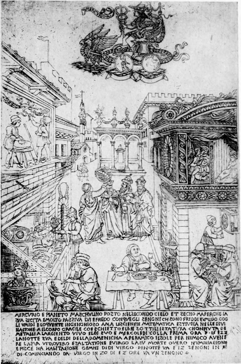
The Planet Mercury
Mercury
Florentine engraving in the Fine Manner, attributed to
Maso Finiguerra, or his school
Florentine engraving in the Fine Manner, attributed to
Maso Finiguerra, or his workshop
“A curiously entertaining side-light is given by one of these engravings, the Mercury for the series of ‘Planets.’ Here we see the representation of a goldsmith’s shop in the streets of Florence, stocked just as we know from documents Finiguerra’s to have been. And the goldsmith is evidently engaged in engraving, not a niello, but a large copperplate.” Arthur M. Hind.
“A strangely entertaining detail comes from one of these engravings, the Mercury from the ‘Planets’ series. Here, we see a depiction of a goldsmith’s shop in the streets of Florence, filled just like we know from Finiguerra’s documents. And the goldsmith is obviously busy engraving, not a niello, but a large copperplate.” Arthur M. Hind.
Size of the original engraving, 12¾ × 8⁹⁄₁₆ inches
Size of the original engraving: 12¾ × 8⅝ inches

A Young Man and Woman Each Holding An Apple
A young man and woman each holding an apple.
A Florentine engraving in the Fine Manner, attributed
to the school of Finiguerra
A Florentine engraving in the Fine Manner, credited to the Finiguerra school
“One of the “Otto Prints” (so called from the eighteenth-century collector who possessed the majority of the series), A Young Man and Woman Each Holding An Apple, is in the Gray Collection, Harvard, and it is a charming example of the amatory subjects of the series, prints such as the Florentine gallant might have pasted on the spice-box to be presented to his inamorata. The badge of Medici (the six “palle” with three lilies in the uppermost) added by a contemporary hand in pen and ink suggests that this one may have been used by the young Lorenzo himself between about 1465 and 1467, which accords well with the probable date of the engravings.” Arthur M. Hind.
“One of the “Otto Prints” (named after the eighteenth-century collector who owned most of the series), A Young Man and Woman Each Holding An Apple, is in the Gray Collection at Harvard. It's a delightful example of the romantic themes in the series, prints that a Florentine dandy might have stuck on a spice box to give to his inamorata. The Medici badge (the six “palle” with three lilies on top) added by a contemporary hand in pen and ink suggests that this print may have been used by young Lorenzo himself between around 1465 and 1467, which aligns well with the likely date of the engravings.” Arthur M. Hind.
(The inscription above reads ò amore te qª (questa) and
piglia qª: “O Love, this to you” and “Take this.”)
(The inscription above reads ò amore te qª (this) and
piglia qª: “O Love, this is for you” and “Take this.”)
Size of the original engraving, 4¼ × 4¼ inches
Size of the original engraving: 4¼ × 4¼ inches
The engravings most certainly by Finiguerra, such as the Judgment Hall of Pilate (Gotha), the March to Calvary and the Crucifixion (British Museum), Various Wild Animals Hunting and Fighting (British Museum), are of course rarities which most collectors can never hope to possess. The same may also be said of somewhat later prints in the same manner of engraving (which may be the work of the heirs of Finiguerra’s atelier, which is known to have been carried on by members of his family until 1498), such as the Fine Manner “Prophets and Sibyls” and the “Otto Prints.” We will in consequence devote less space to these rarities, possessed chiefly by a few European collections, than their artistic interest would justify, [Pg 23]keeping our argument henceforward more to the engravings that the American amateur has the chance of seeing or acquiring at home.
The engravings most likely by Finiguerra, like the Judgment Hall of Pilate (Gotha), the March to Calvary and the Crucifixion (British Museum), and Various Wild Animals Hunting and Fighting (British Museum), are rare items that most collectors will never be able to own. The same goes for slightly later prints in the same style of engraving (which may be from the workshop of Finiguerra's heirs, known to have been operated by his family until 1498), such as the Fine Manner “Prophets and Sibyls” and the “Otto Prints.” Therefore, we will dedicate less space to these rarities, which are mainly held by a handful of European collections, than their artistic significance would typically warrant, [Pg 23]keeping our focus more on the engravings that American collectors are likely to encounter or obtain at home.
One of the “Otto Prints” (so called from the eighteenth-century collector who possessed the majority of the series), A Young Man and Woman Each Holding An Apple, is in the Gray Collection, Harvard, and it is a charming example of the amatory subjects of the series, prints such as the Florentine gallant might have pasted on the spice-box to be presented to his inamorata. The badge of Medici (the six “palle” with three lilies in the uppermost) added by a contemporary hand in pen and ink suggests that this one may have been used by the young Lorenzo himself between about 1465 and 1467, which accords well with the probable date of the engravings.
One of the “Otto Prints” (named after the eighteenth-century collector who owned most of the series), A Young Man and Woman Each Holding An Apple, is in the Gray Collection at Harvard, and it’s a lovely example of the romantic themes found in the series, prints that a fashionable Florentine might have pasted onto the spice box to give to his inamorata. The Medici emblem (the six “palle” with three lilies on top) added by someone later with a pen and ink suggests that this piece might have been used by the young Lorenzo himself between around 1465 and 1467, which aligns well with the estimated date of the engravings.
The only known engraving by the goldsmith and painter Antonio Pollaiuolo, the large Battle of Naked Men, shows a far greater artist than his slightly elder contemporary Finiguerra. They had both studied in the same workshop and probably continued a sort of partnership until Finiguerra’s death. Pollaiuolo’s draughtsmanship evinces a grip and intensity that Finiguerra entirely lacks in his somewhat torpid academic drawings, and it is seen at its best in this magnificently vigorous plate. An excellent impression, surpassed by few in the museums of Europe, is, I believe, in the collection of Mr. Francis Bullard of Boston.
The only known engraving by the goldsmith and painter Antonio Pollaiuolo, the large Battle of Naked Men, showcases a much greater artist than his slightly older contemporary Finiguerra. They both trained in the same workshop and likely maintained a kind of partnership until Finiguerra's death. Pollaiuolo’s drawing skills display a grip and intensity that Finiguerra completely lacks in his somewhat sluggish academic drawings, and this is best exemplified in this impressively dynamic plate. An excellent impression, surpassed by few in the museums of Europe, is, I believe, in the collection of Mr. Francis Bullard of Boston.
Before leaving Florence for north Italy we would allude to that attractive engraver of the transition period, Cristofano Robetta. His art has lost the finest flavor of the primitive Florentine without having succeeded[Pg 24] to the sound technical system of the contemporaries of Dürer, but it has a thoroughly individual though delicate vein of fancy. The Adoration of the Magi, one of his finest plates, is a free translation of a picture by Filippino Lippi in the Uffizi, but the group of singing angels is an addition of his own, and done with a true sense for graceful composition. Fine early impressions of this print are of course difficult to get, but it is perhaps the best known of Robetta’s works, because of the number of modern impressions in the market. The original plate (with the Allegory of the Power of Love engraved on the back) belonged to the Vallardi Collection in the early nineteenth century, and is now in the British Museum, happily safe from the reprinter.
Before leaving Florence for northern Italy, we should mention the captivating engraver of the transition period, Cristofano Robetta. His art has lost the exquisite essence of the early Florentine style without successfully adopting the solid technical systems of Dürer's contemporaries, but it possesses a distinctly individual yet delicate flair for creativity. The Adoration of the Magi, one of his best plates, is a loose interpretation of a painting by Filippino Lippi in the Uffizi, but the group of singing angels is his own addition, created with a true sense of elegant composition. Good early impressions of this print are hard to find, but it’s likely the most recognized of Robetta’s works due to the abundance of modern impressions available. The original plate (with the Allegory of the Power of Love engraved on the back) was part of the Vallardi Collection in the early nineteenth century and is now in the British Museum, thankfully safe from being reprinted. [Pg 24]
Among the greatest rarities of early engraving in north Italy is the well-known series traditionally called the “Tarocchi Cards of Mantegna”—somewhat erroneously, for they are neither by Mantegna, nor Tarocchi, nor playing-cards at all. As in the case of the “Prophets and Sibyls,” there are two complete series of the same subjects by two different engravers. Each series consists of fifty subjects divided into five sections and illustrating: (1) the Sorts and Conditions of Men; (2) Apollo and the Muses; (3) the Arts and Sciences; (4) the Genii and Virtues; (5) the Planets and Spheres. A considerable number of the earliest impressions known are still in contemporary fifteenth-century binding, and it seems as if the series was intended merely as an instructive or entertaining picture-book for the young. There is the most absolute divergence of opinion as to which is the original series, and the student is encouraged to whet his critical acumen [Pg 25]on the problem by the excellent set of reproductions which has recently been issued by the Graphische Gesellschaft and edited by Dr. Kristeller. Unfortunately Dr. Kristeller takes what seems to me an entirely wrong view of the matter. I cannot but feel that the more finely engraved series is at the same time the more ancient, and almost certainly Ferrarese in origin, so characteristic of Cossa is the type of these figures with large heads, rounded forms, and bulging drapery. The second series shows a more graceful sense of composition and spacing (the heads and figures being in better relation to the size of the print), but its very naturalism is to me an indication of its somewhat later origin. The less precise technical quality of this second series is closely related to the Florentine engravings in the Fine Manner, and I am inclined to regard it as the work of a Florentine engraver of about 1475 to 1480, i.e. about a decade later than the original set.
Among the rarest early engravings in northern Italy is the well-known series commonly referred to as the “Tarocchi Cards of Mantegna”—a bit misleading, since they are neither created by Mantegna, nor are they Tarocchi, nor actual playing cards at all. Similar to the “Prophets and Sibyls,” there are two complete series of the same subjects by two different engravers. Each series consists of fifty subjects divided into five sections illustrating: (1) the Types and Conditions of Men; (2) Apollo and the Muses; (3) the Arts and Sciences; (4) the Genii and Virtues; (5) the Planets and Spheres. A significant number of the earliest impressions known are still in contemporary fifteenth-century binding, suggesting that the series was intended purely as an educational or entertaining picture book for the young. There is a complete lack of consensus about which is the original series, and students are encouraged to sharpen their critical skills on the issue using the excellent reproductions recently published by the Graphische Gesellschaft and edited by Dr. Kristeller. Unfortunately, Dr. Kristeller seems to have an entirely misguided perspective on this. I firmly believe that the more finely engraved series is also the older one, and is almost certainly from Ferrara, given how characteristic of Cossa the figures are with their large heads, rounded forms, and flowing drapes. The second series displays a more elegant sense of composition and spacing (the heads and figures are better in proportion to the size of the print), but its overt naturalism suggests a somewhat later origin to me. The less precise technical quality of this second series closely resembles the Florentine engravings in the Fine Manner, and I am inclined to consider it the work of a Florentine engraver from around 1475 to 1480, which is about a decade later than the original set.

Antonio Pollaiuolo. Battle of Naked Men
Antonio Pollaiuolo. Battle of Naked Men
“The only known engraving by the goldsmith and painter Antonio Pollaiuolo, the large Battle of Naked Men, shows a far greater artist than his slightly elder contemporary, Finiguerra. Pollaiuolo’s draughtsmanship evinces a grip and intensity that Finiguerra entirely lacks in his somewhat torpid academic drawings, and it is seen at its best in this magnificently vigorous plate.” Arthur M. Hind.
“The only known engraving by the goldsmith and painter Antonio Pollaiuolo, the large Battle of Naked Men, reveals a far superior artist compared to his slightly older contemporary, Finiguerra. Pollaiuolo’s drawing technique displays a strength and energy that Finiguerra completely lacks in his rather dull academic drawings, and it's most evident in this impressively dynamic piece.” Arthur M. Hind.
Reproduced from the impression in the Print Department, Museum of Fine Arts, Boston
Reproduced from the impression in the Print Department, Museum of Fine Arts, Boston
Size of the original engraving, 15¹¹⁄₁₆ × 23⁷⁄₁₆ inches
Size of the original engraving: 15 11/16 × 23 7/16 inches

Cristofano Robetta. The Adoration of the Magi
Cristofano Robetta. The Adoration of the Magi
“Cristofano Robetta’s art has lost the finest flavor of the primitive Florentine without having succeeded to the sound technical system of the contemporaries of Dürer, but it has a thoroughly individual though delicate vein of fancy. The Adoration of the Magi, one of his finest plates, is a free translation of a picture by Filippino Lippi in the Uffizi, but the group of singing angels is an addition of his own, and done with a true sense for graceful composition.” Arthur M. Hind.
“Cristofano Robetta’s art has lost the best essence of the early Florentine style without achieving the solid technical skills of Dürer’s contemporaries, but it has a very unique, though subtle, creativity. The Adoration of the Magi, one of his greatest works, is a reinterpretation of a painting by Filippino Lippi in the Uffizi, but the group of singing angels is his own addition, executed with a true appreciation for elegant composition.” Arthur M. Hind.
Size of the original engraving, 11⅝ × 11 inches
Size of the original engraving: 11⅝ × 11 inches
Leaving the pseudo-Mantegna for the master himself, we are in the presence of the greatest of the Italian engravers before Marcantonio—if not of all time. Like the Florentines, Mantegna was an ardent lover of antiquity, but his spirit was far more impassive, far more like the antique marble itself. His classical frame of mind was to some extent the offspring of his education in the school of Squarcione and in the academic atmosphere of Padua. His art has a monumental dignity which the Florentines never possessed, but it was without the freshness and inexpressible charm that pervade Tuscan art. An engraving like the Risen Christ between St. Andrew and St. Longinus is an indication of the genius that might[Pg 26] have made one of the noblest sculptors, and one regrets that he never carried to accomplishment the project of a monument to Vergil in Mantua, which Isabella d’Este wished him to undertake.
Leaving the imitation of Mantegna for the master himself, we are faced with the greatest of the Italian engravers before Marcantonio—if not of all time. Like the Florentines, Mantegna was a passionate lover of antiquity, but his demeanor was much more stoic, much more like the ancient marble itself. His classical mindset was partly a result of his education in the school of Squarcione and the academic environment of Padua. His art has a monumental dignity that the Florentines never had, but it lacked the freshness and indescribable charm that defines Tuscan art. An engraving like the Risen Christ between St. Andrew and St. Longinus shows the genius that could have made him one of the greatest sculptors, and one can’t help but regret that he never completed the project for a monument to Vergil in Mantua, which Isabella d’Este wanted him to undertake.
Seven of the engravings attributed to Mantegna (including the Risen Christ) are so much above the rest in subtle expressiveness, as well as in technical quality, that we cannot but agree with Dr. Kristeller’s conclusion that these alone are by Mantegna’s hand, and the rest engraved after his drawings. They are similar to Pollaiuolo’s Battle of Naked Men in style, engraved chiefly in open parallel lines of shading with a much more lightly engraved return stroke between the parallels. It is this light return stroke, exactly in the manner of Mantegna’s pen drawing, which gives the wonderfully soft quality to the early impressions. But it is so delicate that comparatively few printings must have worn it down, and the majority of impressions that come into the market show little but the outline and the stronger lines of shading. Even so these Mantegna prints do not lose the splendidly vigorous character of their design, but it is of course the fine early impressions which are the joy and allure of the true connoisseur. The seven certainly authentic Mantegna engravings are the Virgin and Child, the two Bacchanals, the two Battles of the Sea-Gods, the horizontal Entombment, and the Risen Christ, already mentioned.
Seven of the engravings credited to Mantegna (including the Risen Christ) stand out significantly for their subtle expressiveness and technical quality. We have to agree with Dr. Kristeller’s conclusion that these were definitely made by Mantegna himself, while the others were engraved based on his drawings. Their style resembles Pollaiuolo’s Battle of Naked Men, primarily using open parallel lines for shading, with a much lighter return stroke between the lines. This light return stroke, mirroring Mantegna’s pen drawing style, adds a wonderfully soft quality to the early impressions. However, it’s so delicate that only a few printings likely retained it, and most prints on the market showcase little more than the outlines and the stronger shading lines. Still, these Mantegna prints maintain the impressively vigorous character of their design, although the true delight for connoisseurs comes from the fine early impressions. The seven engravings confirmed to be authentic by Mantegna are the Virgin and Child, the two Bacchanals, the two Battles of the Sea-Gods, the horizontal Entombment, and the Risen Christ, which has already been noted.

Andrea Mantegna. The Risen Christ between
St. Andrew and St. Longinus
Andrea Mantegna. The Risen Christ between St. Andrew and St. Longinus
“Of all the early Italian engravers, Andrea Mantegna is by far the most powerful, though scarcely the most human. Like many of the Florentines, he was an ardent lover of antiquity, but his spirit was far more impassive than theirs, and far more like the antique marble itself. His art has a monumental dignity which the Florentines never possessed, but it lacks the freshness and inexpressible charm that pervade Tuscan art. His was a genius that would have made one of the noblest sculptors: the engraving of the Risen Christ shows what he might have achieved in the field.” Arthur M. Hind.
“Of all the early Italian engravers, Andrea Mantegna stands out as the most powerful, though he’s not necessarily the most relatable. Like many Florentines, he had a strong love for antiquity, but his demeanor was much more detached, resembling the ancient marble itself. His art carries a monumental dignity that the Florentines lacked, but it doesn’t have the freshness and unique charm that define Tuscan art. He had a talent that could have made him one of the greatest sculptors: the engraving of the Risen Christ demonstrates what he could have accomplished in that area.” Arthur M. Hind.
Size of the original engraving, 15⁷⁄₁₆ × 12¹¹⁄₁₆ inches
Size of the original engraving, 15 7/16 × 12 11/16 inches

Zoan Andrea(?). Four Women Dancing
Zoan Andrea(?). Four Women Dancing
This engraving, based on a study by Mantegna for a group in the Louvre picture of Parnassus,
is one of the most beautiful prints of the school of Mantegna. It is most probably by Zoan Andrea.
Size of the original engraving, 8⅞ × 13 inches
This engraving, inspired by a study by Mantegna for a group in the Louvre painting of Parnassus,
is one of the most stunning prints from the Mantegna school. It was most likely created by Zoan Andrea.
Size of the original engraving, 8⅞ × 13 inches
Nearest in quality to these comes the Triumph of Caesar: the Elephants, after some study for the series of cartoons now preserved at Hampton Court. But it lacks Mantegna’s distinction in drawing, and Zoan Andrea, who is probably the author of one of the [Pg 27]anonymous engravings of Four Women Dancing (based on a study for a group in the Louvre picture of Parnassus), one of the most beautiful prints of the school, was certainly capable of this achievement. Even Giovanni Antonio da Brescia, who did work of a very third-rate order after migrating to Rome, produced under Mantegna’s inspiration so excellent a plate as the Holy Family.
Closest in quality to these is the Triumph of Caesar: the Elephants, which was created after studying the series of cartoons now housed at Hampton Court. However, it doesn't have Mantegna’s flair in drawing. Zoan Andrea, who likely created one of the [Pg 27]anonymous engravings of Four Women Dancing (inspired by a study for a group in the Louvre painting of Parnassus), produced one of the most stunning prints of the style and was certainly capable of this achievement. Even Giovanni Antonio da Brescia, who did rather mediocre work after moving to Rome, was inspired by Mantegna to create an excellent print like the Holy Family.
Other prints attributed to Mantegna, such as the Descent into Hell and the Scourging of Christ, possess all Mantegna’s vigor of design, and reflect the master’s work in the manner of the Eremitani frescos, but we can hardly believe that they were engraved by the same hand as the “seven,” even supposing a considerably earlier date for their production.
Other prints attributed to Mantegna, like the Descent into Hell and the Scourging of Christ, have all of Mantegna's bold design and reflect the master's style seen in the Eremitani frescos, but it’s hard to believe that they were made by the same artist as the “seven,” even if we assume they were created much earlier.
Each of Mantegna’s known followers (Zoan Andrea and G. A. da Brescia) entirely changed his manner of engraving after leaving the master; in fact, except in his immediate entourage, Mantegna’s style was continued by few of the Italian engravers. For all its dignified simplicity, it is more the manner of the draughtsman transferred to copper, than of the engraver brought up in the conventional use of the burin. We see Mantegna’s open linear style reflected in the earlier works of Nicoletto da Modena, and the Vicentine, Benedetto Montagna, but each of these engravers tended more and more in their later works to imitate the more professional style of the German engravers, and of Dürer in particular. Dürer was constantly copied by the Italian engravers of the early sixteenth century, and details from his plates (chiefly in the landscape background) were even more consistently plagiarized.
Each of Mantegna’s known followers (Zoan Andrea and G. A. da Brescia) completely changed their engraving style after leaving the master; in fact, aside from his immediate circle, very few Italian engravers continued Mantegna's style. For all its dignified simplicity, it feels more like a draftsman’s technique applied to copper than an engraver's skill based on traditional use of the burin. We see Mantegna’s open linear style reflected in the earlier works of Nicoletto da Modena and Benedetto Montagna from Vicenza, but each of these engravers increasingly mimicked the more professional style of German engravers, especially Dürer, in their later works. Dürer was frequently copied by Italian engravers in the early sixteenth century, and elements from his prints (mainly in the landscape backgrounds) were even more consistently plagiarized.
[Pg 28]
[Pg 28]
In the example of Nicoletto da Modena, the Adoration of the Shepherds, which we reproduce, it is Dürer’s immediate predecessor, Martin Schongauer, from whom the chief elements in the subject are copied. But in this example the background, with its vista of lake with ships and a town, suggested no doubt by one of the subalpine Italian lakes, is thoroughly characteristic of the South, while Schongauer’s Gothic architecture is embellished with classical details. Isolated figures of saints or heathen deities against a piece of classical architecture, set in an open landscape, became the most frequent type of Nicoletto’s later prints, which are practically all of small dimensions.
In the example of Nicoletto da Modena, the Adoration of the Shepherds, which we showcase, it's clear that Dürer’s immediate predecessor, Martin Schongauer, influenced the main elements of the subject. However, in this case, the background—with its view of a lake, ships, and a town—clearly reflects a style characteristic of Southern Europe, likely inspired by one of the subalpine Italian lakes, while Schongauer’s Gothic architecture is enhanced with classical details. Isolated figures of saints or pagan deities against a backdrop of classical architecture, set in an open landscape, became the most common type in Nicoletto’s later prints, which are mostly small in size.
Like Nicoletto da Modena, Benedetto Montagna gradually developed throughout his life a more delicate style of engraving, entirely giving up the large dimensions and broad style of his Sacrifice of Abraham for a series of finished compositions which from their smaller compass would have been well adapted for book illustration. Several of these, such as the Apollo and Pan, illustrate incidents in Ovid’s “Metamorphoses,” but there is no evidence for, and there is even probability against, their having ever been used in books. Several of the subjects are treated very similarly in the woodcuts of the 1497 Venice edition of Ovid in the vernacular. When engravings and woodcuts thus repeat each other, the woodcutter is generally the copyist, but in this case the reverse is almost certainly the case, as the Ovid plates belong to Montagna’s later period, and could hardly have preceded 1500.
Like Nicoletto da Modena, Benedetto Montagna gradually developed a more refined style of engraving throughout his life, completely moving away from the large dimensions and broad style of his Sacrifice of Abraham to create a series of detailed compositions that were better suited for book illustration due to their smaller size. Some of these, like the Apollo and Pan, depict scenes from Ovid’s “Metamorphoses,” but there's no evidence—and it's even likely—that they were ever used in books. Several of the subjects are treated very similarly in the woodcuts of the 1497 Venice edition of Ovid in the vernacular. When engravings and woodcuts mirror each other, the woodcutter is usually the one copying, but in this case, it's almost certainly the opposite, as the Ovid plates are from Montagna’s later period and could hardly have come before 1500.

Nicoletto da Modena. The Adoration of the Shepherds
Nicoletto da Modena. The Shepherds' Adoration
“In the Adoration of the Shepherds it is Dürer’s immediate predecessor. Martin Schongauer, from whom the chief elements in the subject are copied. But in this example the background, with its vista of lake with ships and a town, suggested no doubt by one of the subalpine Italian lakes, is thoroughly characteristic of the South, while Schongauer’s Gothic architecture is embellished with classical details.” Arthur M. Hind.
“In the Adoration of the Shepherds, Dürer's direct predecessor is Martin Schongauer, from whom the main elements of the scene are taken. However, in this example, the background—featuring a view of a lake with ships and a town—was likely inspired by one of the subalpine Italian lakes, which is distinctly characteristic of the South, while Schongauer’s Gothic architecture is enhanced with classical details.” Arthur M. Hind.
Size of the original engraving, 9⅞ × 7¼ inches
Size of the original engraving, 9⅞ × 7¼ inches

Jacopo de’ Barbari. Apollo and Diana
Jacopo de’ Barbari. Apollo and Diana
“Jacopo de’ Barbari is of peculiar interest as a link between the styles of Germany and the South. Whether of Northern extraction or not is uncertain, but the earlier part of his life was passed in Venice. Dürer was apparently much impressed by his art on his first visit to Venice between 1495 and 1497, and ... even seems to have taken an immediate suggestion for a composition from Barbari, i.e. for his Apollo and Diana. Dürer’s version shows a far greater virility and concentration of design, but for all its power it lacks the breezier atmosphere of Barbari’s print.” Arthur M. Hind.
“Jacopo de’ Barbari is particularly interesting as a connection between the artistic styles of Germany and the South. It's unclear whether he was originally from the North, but he spent the earlier part of his life in Venice. Dürer was apparently quite impressed by his art during his first trip to Venice between 1495 and 1497, and he even seems to have drawn immediate inspiration for a composition from Barbari, specifically for his Apollo and Diana. Dürer’s version demonstrates a much stronger sense of power and focus in its design, but despite its strength, it lacks the lighter, more airy feel found in Barbari’s print.” Arthur M. Hind.
Size of the original engraving, 6¼ × 3⅞ inches
Size of the original engraving, 6.25 × 3.875 inches
Apart from Mantegna, Leonardo and Bramante are [Pg 29]the two great names which have been connected with engravings of the period. But I incline to doubt whether either of them engraved the plates which have been attributed to them. The large Interior of a Ruined Church, splendid in design and reminiscent of the architect’s work in the sacristy of S. Satiro, Milan, might equally well have been engraved by a Nicoletto da Modena, with whose earlier style it has much in common. Of the prints attributed to Leonardo, the fascinating Profile Bust of a Young Woman (p. 252), unique impression in the British Museum, stands out from the rest for the sensitive quality of its outline, but even here I would be more ready to see the hand of an engraver like Zoan Andrea, who after leaving Mantua seems to have settled in Milan and done work in a finer manner influenced by the style of the Milanese miniaturists (such as the Master of the Sforza Book of Hours in the British Museum).
Aside from Mantegna, Leonardo and Bramante are [Pg 29]the two major names linked to engravings from that time. However, I’m skeptical that either of them actually engraved the plates attributed to them. The large Interior of a Ruined Church, which is stunning in design and reminiscent of the architect’s work in the sacristy of S. Satiro, Milan, could just as easily have been engraved by Nicoletto da Modena, whose earlier style shares many similarities. Among the prints credited to Leonardo, the captivating Profile Bust of a Young Woman (p. 252), a unique impression in the British Museum, stands out for its delicate outline. Still, I would be more inclined to think it was created by an engraver like Zoan Andrea, who seems to have moved to Milan after leaving Mantua, working in a more refined style influenced by Milanese miniaturists (such as the Master of the Sforza Book of Hours in the British Museum).
In Venice Giovanni Bellini’s style is reflected in the dignified engravings of Girolamo Mocetto, and in the region of Bologna or Modena one meets the anonymous master “I B (with the Bird),” whose few engraved idyls are among the most alluring prints of the lesser masters of north Italy.
In Venice, Giovanni Bellini's style is evident in the dignified engravings of Girolamo Mocetto. In the Bologna or Modena area, you come across the anonymous artist known as “I B (with the Bird),” whose few engraved idyls are some of the most captivating prints from the lesser-known masters of northern Italy.
More individual than Mocetto and far less dependent on any other contemporary painter is Jacopo de’ Barbari, who is of peculiar interest as a link between the styles of Germany and the South. Whether of Northern extraction or not is uncertain, but the earlier part of his life was passed in Venice. Dürer was apparently much impressed by his art on his first visit to Venice between 1495 and 1497, and his particular interest in the study of a Canon of Human Proportions[Pg 30] was aroused by some figure-drawings which Barbari had shown him. Dürer even seems to have taken an immediate suggestion for a composition from Barbari, i.e. for his Apollo and Diana. Dürer’s version shows a far greater virility and concentration of design, but for all its power it lacks the breezier atmosphere of Barbari’s print; it is redolent of the study, while the latter has the charm of an open Italian landscape. There is a distinct femininity about Barbari; perhaps this very feature and the languorous grace of his treatment of line and the sinuous folds of drapery give his prints their special allure.
More individual than Mocetto and much less reliant on any other contemporary painter is Jacopo de’ Barbari, who is particularly interesting as a bridge between the styles of Germany and the South. It's unclear whether he has Northern origins, but he spent the earlier part of his life in Venice. Dürer was clearly impressed by his work during his first visit to Venice between 1495 and 1497, and he became especially interested in the study of a Canon of Human Proportions due to some figure drawings that Barbari had shown him. Dürer even seems to have taken immediate inspiration for a composition from Barbari, specifically for his Apollo and Diana. Dürer’s version displays much greater strength and focus in design, but despite its power, it lacks the lighter atmosphere of Barbari’s print; it feels more like a study, while Barbari’s work has the charm of an open Italian landscape. There’s a distinct femininity to Barbari’s style; perhaps this quality, along with the graceful handling of lines and the flowing drapery, gives his prints their unique attraction.
I would close this article with some reference to two other engravers of great individuality of style—Giulio and Domenico Campagnola, of Padua.
I’d like to wrap up this article with a nod to two other engravers who have a unique style—Giulio and Domenico Campagnola from Padua.
Domenico’s activity as a painter continued until after 1563, but the probable period of his line-engravings (about 1517-18), and his close connection with Giulio Campagnola (though the exact nature of the relationship is unexplained), justify his treatment among the precursors rather than in the wake of Marcantonio.
Domenico’s work as a painter lasted until after 1563, but the likely time frame for his line engravings (around 1517-18) and his strong link with Giulio Campagnola (though the exact nature of their relationship isn’t clear) support placing him among the precursors rather than following Marcantonio.
Giulio Campagnola, like Giorgione, whose style he so well interpreted, was a short-lived genius. He was a young prodigy, famous at the tender age of thirteen as a scholar of Latin, Greek, and Hebrew, besides being accomplished as a musician and in the arts of sculpture, miniature, and engraving. Little wonder that he did not long survive his thirtieth year. Probably his practice as an illuminator as well as his particular aim of rendering the atmosphere of Giorgione’s paintings led him to the method of using dots, or rather short flicks, in his engraving, which is in a [Pg 31]sense an anticipation of the stipple process of the eighteenth century, though of course without the use of etching. Most of his prints are known in the two states—in pure line, and after the dotted work had been added.
Giulio Campagnola, like Giorgione, whose style he interpreted so well, was a brief but brilliant talent. He was a young prodigy, well-known at just thirteen as a scholar of Latin, Greek, and Hebrew, and he also excelled as a musician, as well as in sculpture, miniature work, and engraving. It's no surprise that he didn’t live long past thirty. His experience as an illuminator and his specific goal of capturing the atmosphere of Giorgione’s paintings likely led him to the technique of using dots, or rather short flicks, in his engravings, which can be seen as a precursor to the stipple method of the eighteenth century, although he didn’t use etching. Most of his prints are known in two versions—pure line and after the dotted work was added. [Pg 31]

Giulio Campagnola. St. John the Baptist
Giulio Campagnola. St. John the Baptist
“One of the most splendid of his plates is the St. John the Baptist, with a dignity of design whose origin may probably be traced back to some drawing by Mantegna, though the landscape is of course thoroughly Paduan or Venetian in its character.” Arthur M. Hind.
“One of the most stunning of his pieces is the St. John the Baptist, featuring a dignified design that likely originates from a drawing by Mantegna, although the landscape is definitely in a Paduan or Venetian style.” Arthur M. Hind.
Reproduced from the impression in the Print Department,
Museum of Fine Arts, Boston
Reprinted from the imprint in the Print Department,
Museum of Fine Arts, Boston
Size of the original engraving. 13⅝ × 9⁵⁄₁₆ inches
Size of the original engraving: 13⅝ × 9⁵⁄₁₆ inches
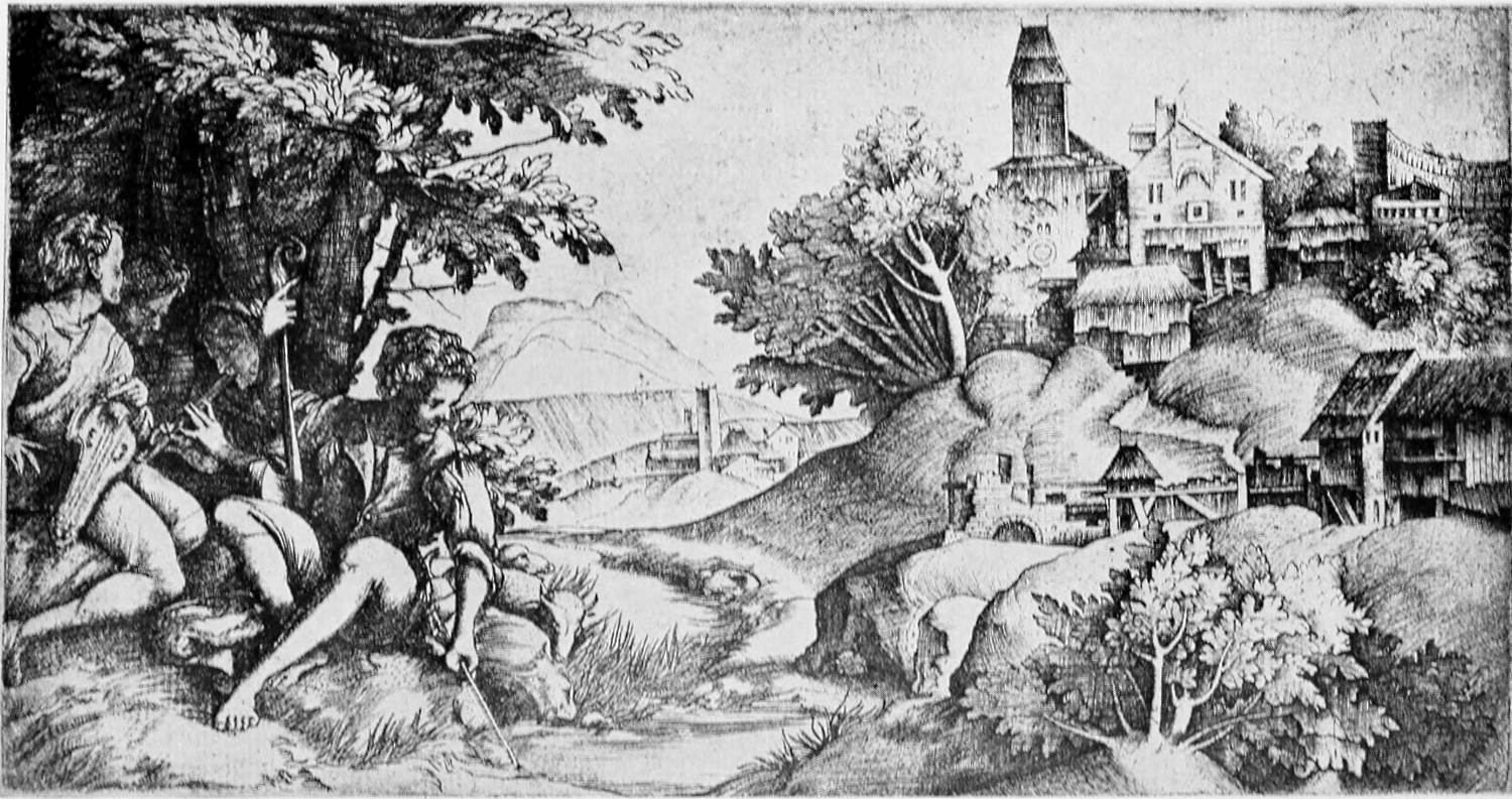
Giulio and Domenico Campagnola. Shepherds in a Landscape
Giulio and Domenico Campagnola. Shepherds in a Landscape
“It is Giorgione again whom we see reflected in the Shepherds in a Landscape, a plate which seems to have been left unfinished by Giulio and completed by Domenico Campagnola. There is a drawing in the Louvre for the right half of the print, and there is every reason to think that this drawing as well as the engraving of that portion of the landscape is by Giulio. But the group of figures and trees on the left is entirely characteristic of the looser technical manner of Domenico.” Arthur M. Hind.
“It’s Giorgione again who we see reflected in the Shepherds in a Landscape, a piece that appears to have been left unfinished by Giulio and later completed by Domenico Campagnola. There’s a drawing in the Louvre for the right half of the print, and there’s every reason to believe that this drawing, along with the engraving of that part of the landscape, is by Giulio. However, the group of figures and trees on the left is entirely characteristic of Domenico’s more relaxed technical style.” Arthur M. Hind.
Size of the original engraving, 5⅜ × 10⅛ inches
Size of the original engraving: 5⅜ × 10⅛ inches
One of the most splendid of his plates is the St. John the Baptist, with a dignity of design whose origin may probably be traced back to some drawing by Mantegna, though the landscape is of course thoroughly Paduan or Venetian in its character. More completely characteristic, and the most purely Giorgionesque of all his prints, is the Christ and the Woman of Samaria, one of the most wonderfully beautiful of all the engravings of this period.
One of his most impressive prints is the St. John the Baptist, featuring a dignified design that likely comes from a drawing by Mantegna, although the landscape is definitely reflective of the Paduan or Venetian style. Even more representative, and the most distinctly Giorgionesque of all his prints, is the Christ and the Woman of Samaria, which is one of the most stunning engravings from this time.
It is Giorgione again whom we see reflected in the Shepherds in a Landscape, a plate which seems to have been left unfinished by Giulio and completed by Domenico Campagnola. There is a drawing in the Louvre for the right half of the print, and there is every reason to think that this drawing as well as the engraving of that portion of the landscape is by Giulio. But the group of figures and trees on the left is entirely characteristic of the looser technical manner of Domenico. The existence of a copy of the right-hand portion of the plate alone points to the existence of an unfinished state of the original, though no such impressions have been found. In any case it distinctly supports the theory that the other part of the original print was a later addition.
It’s Giorgione that we see reflected in the Shepherds in a Landscape, a print that seems to have been left unfinished by Giulio and completed by Domenico Campagnola. There’s a drawing in the Louvre for the right side of the print, and there’s every reason to believe that both this drawing and the engraving of that part of the landscape are by Giulio. However, the group of figures and trees on the left is clearly typical of Domenico’s more relaxed technique. The existence of a copy of just the right side of the plate suggests that there was an unfinished version of the original, even though no such impressions have been found. In any case, this strongly supports the idea that the other part of the original print was added later.
We may have to admit in conclusion that there is nothing in Italian engraving before Marcantonio quite on a level with the achievement of Albrecht Dürer, but the indefinable allure that characterizes[Pg 32] so much of the work of the minor Italian artists of the earlier Renaissance is more than enough compensation for any lack of technical efficiency. With Marcantonio we find this efficiency in its full development, joined to a remarkable individuality in the interpretation of sketches by Raphael and other painters. Yet we could ill afford to lose the charm of the early Florentine Triumph of Bacchus and Ariadne for all the finished beauty of Marcantonio’s Lucretia, and it is still the youth of artistic development, with its naïve joy and freshness of outlook, which holds us with the stronger spell.
We might have to acknowledge that, in conclusion, there is nothing in Italian engraving before Marcantonio that quite matches the achievements of Albrecht Dürer. However, the unique charm that defines much of the work by lesser-known Italian artists from the early Renaissance more than makes up for any lack of technical skill. With Marcantonio, we see this technical proficiency fully developed, combined with a striking individuality in interpreting sketches by Raphael and other painters. Still, we would hate to lose the appeal of the early Florentine Triumph of Bacchus and Ariadne despite the polished beauty of Marcantonio’s Lucretia. It is the youthful stage of artistic development, filled with innocent joy and a fresh perspective, that captivates us even more.
[Pg 33]
[Pg 33]
A PRINCE OF PRINT-COLLECTORS:
MICHEL DE MAROLLES,
ABBÉ DE VILLELOIN
(1600-1681)
By LOUIS R. METCALFE
By Louis R. Metcalfe
THE French make a fine distinction between three varieties of that very special individual to whom we refer in a general way as “a collector.” They have always been authorities on that subject and one of them has said: “On est amateur par goût, connaisseur par éducation, curieux par vanité.” While another adds: “Ou par spéculation.” By “collector” we simply mean a person who has formed the habit of acquiring the things in which he is particularly interested, and these in as many varieties as possible. It implies neither an artistic pursuit nor a deep knowledge of the subject. By curieux, however, is meant, as a rule, an amateur, a man of taste who collects things which pertain to art exclusively; he is in most cases a connaisseur, and always an enthusiast.
THE French make a clear distinction between three types of that unique individual we generally refer to as “a collector.” They have always been experts on this subject, and one of them has said: “On est amateur par goût, connaisseur par éducation, curieux par vanité.” While another adds: “Ou par spéculation.” By “collector,” we simply mean someone who has developed the habit of acquiring items they are particularly interested in, and these can come in many different forms. It suggests neither an artistic pursuit nor extensive knowledge of the topic. By curieux, however, we usually mean an amateur, a person of taste who collects items related solely to art; he is mostly a connaisseur, and always an enthusiast.
Paris, the home of taste, has never been that of the curieux more so than at the present day, when, it seems, every one who can afford a rent of over four thousand francs has a hobby of some sort and is a mad collector. A general history of the weakness for things either beautiful or odd or rare, or merely fashionable,[Pg 34] would be both voluminous and chaotic, if a distinction were not made between that which pertained to art and that which did not. A complete description of the latter, a hopelessly heterogeneous mass, would make an amusing volume, for there is no end to the variety of things in which vanity and folly have caused human beings to become interested to the point of collecting in large numbers.
Paris, the center of style, has become more of a hub for the curious than ever, especially now when it seems like everyone who can pay more than four thousand francs in rent has a hobby and is an obsessed collector. A comprehensive history of the obsession with beautiful, unusual, rare, or simply trendy items would be extensive and chaotic, unless we separate what relates to art from what doesn’t. A complete account of the latter, an utterly mixed bag, would make for an entertaining read, as there's no shortage of the various things that vanity and foolishness have led people to collect in droves.[Pg 34]
George IV collected saddles; the Princess Charlotte and many others, shells. Tulips were so madly sought after in Holland that one root was exchanged for 460 florins, together with a new carriage, a pair of horses, and a set of harness. Shop-bills and posters have been the specialty of many, while thousands of persons have collected postage-stamps and coins. A Mr. Morris had so many snuff-boxes that it was said he never took two pinches of snuff out of the same box. A Mr. Urquhart collected the halters with which criminals had been hanged; and another enthusiast, the masks of their faces. Suett, a comedian, collected wigs, and another specialist owned as many as fifteen hundred skulls, Anglo-Saxon and Roman. If there have been men who have shown a propensity to collect wives, Evelyn tells us in his diary:
George IV collected saddles; Princess Charlotte and many others collected shells. Tulips were so highly desired in Holland that one bulb was traded for 460 florins, along with a new carriage, a pair of horses, and a set of harness. Many people specialized in shop bills and posters, while thousands collected postage stamps and coins. A Mr. Morris had so many snuff boxes that it was said he never took two pinches of snuff from the same box. A Mr. Urquhart collected the halters used to hang criminals, and another enthusiast collected masks of their faces. Suett, a comedian, collected wigs, and another specialist owned as many as fifteen hundred skulls, both Anglo-Saxon and Roman. If there have been men with a tendency to collect wives, Evelyn mentions it in his diary:
“In 1641 there was a lady in Haarlem who had been married to her twenty-fifth husband, and, having been left a widow, was prohibited from marrying in future; yet it could not be proved that she had ever made any of her husbands away, though the suspicion had brought her divers times to trouble.”
“In 1641, there was a woman in Haarlem who had been married to her twenty-fifth husband. After being left a widow, she was banned from marrying again; however, it could never be proven that she had harmed any of her husbands, even though the suspicion had gotten her into trouble several times.”
Although we much regret that such an intensely interesting work as a Comprehensive History of Collecting has never been written, we realize that a[Pg 35] mere description of rare and beautiful objects would be unsatisfactory as long as we did not know their history and the way in which they had been gathered together. It is the soul of the collector which we should like to see laid bare. Was his work a labor of vanity or one of love? Were his possessions mere playthings, speculation, to him, or did they represent treasures of happiness greater than all the gold in Golconda?
Although we really wish that a truly fascinating book like a Comprehensive History of Collecting has never been written, we understand that a[Pg 35] simple list of rare and beautiful objects would fall short as long as we don't know their history and how they were collected. It's the essence of the collector that we want to explore. Was their work motivated by vanity or genuine passion? Were their possessions just toys or investments, or did they symbolize treasures of happiness worth more than all the gold in Golconda?
Without a doubt, it is one thing to collect what is highly prized on all sides, with large means at one’s disposal, and the constant advice of experts, and quite another to search patiently oneself for things which the general public has not yet discovered, and then to acquire them with difficulty.
Without a doubt, it's one thing to gather highly valued items when you have plenty of resources and the ongoing guidance of experts, and quite another to patiently search for things that the general public hasn't discovered yet and then acquire them with effort.
Who shall know with what admirable zeal some collectors have made themselves authorities on the things which they loved? with what untiring energy they have sifted for years masses of trash in the hope of finding the hidden pearl? Who can tell the inner history of the auction-room, the heart-beats of those who were after the jewel which no one else seemed to have noticed, the sacrifices which many with a slender purse have made in order to secure the precious “find,” and lastly the enjoyment which they ever afterward derived from its possession? Many of the great French collections of the last century were made in this spirit: they were begun with a modest outlay and devoted to things which, at that time, no one else wanted. I know of one of the first collectors of Eastern Art in the nineteenth century, who at one time had greatly to reduce his household in order to satisfy his passion for Japanese vases; and of another wealthy[Pg 36] enthusiast who would travel third-class to London to secure an old Roman bronze. The history of such collections becomes that of human beings for whom life is nothing without beauty, and it is too personal to be recorded. The collector will seldom believe that his enthusiasm can be understood by others besides himself: maybe, also, he would be unwilling to reveal the more or less innocent subterfuges to which he had recourse in order to acquire more than one of his treasures.
Who can say just how passionately some collectors have made themselves experts on the things they loved? With what tireless effort they've sorted through piles of junk for years, hoping to find the hidden gem? Who can describe the inner story of the auction room, the heartbeats of those chasing after a jewel that no one else seemed to notice, the sacrifices made by many with limited budgets to secure the precious "find," and, finally, the joy they feel from owning it? Many of the great French collections from the last century were created this way: they started with a modest investment and focused on items that, at that time, no one else wanted. I know of one of the first collectors of Eastern Art in the nineteenth century who once had to downsize his household significantly just to satisfy his passion for Japanese vases, and of another wealthy enthusiast who would travel third-class to London to get an old Roman bronze. The story of such collections becomes that of individuals for whom life means nothing without beauty, and it’s too personal to be documented. Collectors often doubt that their enthusiasm can be understood by anyone but themselves; perhaps they would also be hesitant to reveal the more or less innocent tricks they used to acquire more than one of their treasures.
The American chapter of such a history is the most recent one, and the world is now watching its development with bated breath. The art of the Old World is being imported by the ship-load; fortunes are paid for single paintings, while the paneled wainscots of French châteaux, the ceilings of Italian palaces, the colonnades of their gardens, and the tapestries of the Low Countries, not to mention a hundred varieties of objets d’art, are constantly wending their way to the treasure-houses—still in course of construction—of the New World. All this is taking place to the indignation of Europeans and the æsthetes who consider such a radical change of background a desecration, and do not stop to think that this transplantation is hardly more unnatural than the sight of the Elgin marbles in foggy London, or the winged bulls of Ecbatana in the halls of the Louvre.
The American chapter of this history is the most recent one, and the world is now watching its development in anticipation. The art of the Old World is being imported by the shipload; fortunes are being paid for single paintings, while the paneled walls of French châteaux, the ceilings of Italian palaces, the colonnades of their gardens, and the tapestries of the Low Countries, not to mention a hundred varieties of objets d’art, are constantly making their way to the treasure houses—still under construction—of the New World. All this is happening to the outrage of Europeans and art enthusiasts who view such a drastic change in context as a desecration, failing to consider that this relocation is hardly more unnatural than the sight of the Elgin marbles in foggy London or the winged bulls of Ecbatana in the halls of the Louvre.
So long as we as a nation will learn a much-needed lesson and thereby greatly improve our taste, let all honor and glory be given to those who have been responsible for such valuable acquisitions. Our American collections already contain many “gems of purest ray serene,” and who will dare say that they are not[Pg 37] destined to become in time worthy successors of the famous ones which have preceded them?
As long as we, as a nation, learn a valuable lesson and significantly improve our taste, we should give all the honor and glory to those who have been responsible for such important acquisitions. Our American collections already feature many "gems of purest ray serene," and who would dare say that they aren’t destined to become, over time, worthy successors to the famous ones that came before them?[Pg 37]
From the writings of Pliny and other classic historians, and from several catalogues and rare documents which have come down to us from the Middle Ages and the Renaissance, we have abundant proof that there never was a time when works of art were not treasured. Cicero, Atticus, and Varro collected writings, and the libraries of Aristotle, Theophrastus, and that of Epaphroditus of Chæronea, which contained thirty-two thousand manuscripts, were famous. Hannibal was a lover of bronzes: it was he who owned the little Hercules of Lysippus which the master himself had presented to Alexander the Great and which afterward became the property of Sulla.
From the writings of Pliny and other classic historians, along with several catalogs and rare documents that have survived from the Middle Ages and the Renaissance, we have plenty of evidence that there has never been a time when art wasn’t valued. Cicero, Atticus, and Varro collected writings, and the libraries of Aristotle, Theophrastus, and Epaphroditus of Chæronea, which held thirty-two thousand manuscripts, were well-known. Hannibal loved bronzes; he owned the small Hercules by Lysippus, which the master himself had given to Alexander the Great and which later became Sulla's property.
Both Pompey and Julius Cæsar possessed splendid masterpieces of that Greek art which was so highly prized in Italy. The Venus of the Hermitage comes from Cæsar’s gallery, and the Jupiter of the Louvre from that of Antony; while the Faun with the Child, and the Borghese vase, now treasured in the Louvre, were once among the possessions of Sallust in his palace on the Quirinal. Not only sculpture was collected in those times, for we also hear of the tapestries of Saurus, valued at twenty millions in the currency of the day; the jewelry of Verres, reputed the finest in existence; the priceless crystals of Pollio; and the two thousand vases of precious stone owned by Mithridates, King of Pontus.
Both Pompey and Julius Caesar owned impressive masterpieces of the Greek art that was so highly valued in Italy. The Venus of the Hermitage comes from Caesar’s collection, and the Jupiter of the Louvre comes from Antony’s; while the Faun with the Child and the Borghese vase, now held in the Louvre, were once part of Sallust's possessions in his palace on the Quirinal. It wasn't just sculpture that was collected in those times; we also hear about the tapestries of Saurus, worth twenty million in the currency of the time; the jewelry of Verres, said to be the finest in existence; the priceless crystals of Pollio; and the two thousand vases of precious stone owned by Mithridates, King of Pontus.
Throughout the Middle Ages the trésor of the kings and the most powerful nobles was in reality their collection. That of Dagobert was the result of four Italian conquests. The inventory of the jewels of the[Pg 38] Duc d’Anjou, son of John the Good, contains 796 numbers, while his brother, the Duc de Berry, had a passion for reliquaries, old church ornaments, and rare manuscripts which he caused to be mounted like jewels. The library of Charles V and his trésor were valued at twenty millions of francs, and the collection of curiosities of Ysabeau de Bavière had not its equal. It contained, among other things, an ivory box in which was kept the cane with which Saint Louis used to flagellate himself. The Dukes of Burgundy for centuries were the greatest collectors of richly inlaid armor. And what of the treasures of Jacques Cœur, the great banker of Charles VII? With his fleet of trading-vessels and his many banking-houses he secured the pick of the market. We know that his silverware was piled up to the ceiling in the vaults of his palace at Bourges.
Throughout the Middle Ages, the trésor of kings and the most powerful nobles was essentially their collection. Dagobert's was accumulated from four Italian conquests. The inventory of the jewels of the [Pg 38] Duc d’Anjou, son of John the Good, lists 796 items, while his brother, the Duc de Berry, had a passion for reliquaries, ancient church ornaments, and rare manuscripts that he had mounted like jewels. The library of Charles V and his trésor were valued at twenty million francs, and the collection of curiosities belonging to Ysabeau de Bavière was unmatched. It included, among other items, an ivory box that housed the cane Saint Louis used to flagellate himself. For centuries, the Dukes of Burgundy were the leading collectors of richly inlaid armor. And what about the treasures of Jacques Cœur, the great banker of Charles VII? With his fleet of trading ships and numerous banks, he had access to the best items on the market. It is known that his silverware stacked up to the ceiling in the vaults of his palace in Bourges.
In the Gazette des Beaux-Arts for the year 1869 we read a description of the home of Jacques Duchié, a famous art collector who flourished during the first half of the fifteenth century. In the courtyard were peacocks and a variety of rare birds. In the first room was a collection of paintings and decorated signs; in the second, all kinds of musical instruments—harps, organs, viols, guitars, and psalterions. In the third was a great number of games, cards and chessmen; and in the adjoining chapel, rare missals on elaborately carved stands. In the fourth room the walls were covered with precious stones and sweet-smelling spices, while on those of the next was hung a great variety of furs. From these rooms one proceeded to halls filled with rich furniture, carved tables, and decorated armor.
In the Gazette des Beaux-Arts for the year 1869, we read about the home of Jacques Duchié, a well-known art collector who thrived during the early part of the fifteenth century. The courtyard featured peacocks and a variety of rare birds. The first room housed a collection of paintings and decorative signs; in the second were all kinds of musical instruments—harps, organs, viols, guitars, and psalterions. The third room contained many games, cards, and chess pieces; and in the adjoining chapel, there were rare missals on beautifully carved stands. In the fourth room, the walls were adorned with precious stones and fragrant spices, while the next room showcased a wide variety of furs. From these rooms, guests could move on to halls filled with luxurious furniture, intricately carved tables, and ornate armor.

Portrait of Michael de Marolles, Abbé de Villeloin
Portrait of Michael de Marolles, Abbé de Villeloin
Engraved by Claude Mellan, from his own design from life, in 1648
Engraved by Claude Mellan, based on his own design from life, in 1648.

Illustrissimi Viri L. H. Haberti Monmory libellorum
Supplicum Magistri, EPIGRAMMA in Effigiem
To the Most Illustrious Mr. L. H. Haberti Monmory, of the Supplicum Magistri pamphlets, EPIGRAM on the Portrait
MICHAELIS DE MAROLLES Abbatis de Villeloin.
MICHAELIS DE MAROLLES Abbot of Villeloin.
Nobilitas, Virtus, Pietas, Doctrina MAROLLI
Debuerant Sacrà cingere fronde comam.
Nantüeil ad viuum faciebat 1657
Nobility, Virtue, Piety, Knowledge of MAROLLI
Should have adorned her hair with sacred foliage.
Nantüeil made it realistic 1657
[Pg 39]
[Pg 39]
The Renaissance was the Golden Age of Collectors. What could have withstood the influence of that tremendous movement? The art of Italy and the magnificence of the nobility and the princes of the Church shed, like the Augustan Age, a golden glamour over civilization.
The Renaissance was the Golden Age of Collectors. What could have resisted the impact of that incredible movement? The art of Italy and the grandeur of the nobility and the princes of the Church cast, like the Augustan Age, a golden glow over civilization.
The Médicis set the example, and they were closely followed by the Sforzas, the Farneses, and the Gonzagas. The patronage of the Fine Arts was on such a scale, and the rivalry among the collectors so keen, that in 1515 there were in Rome thirty-nine cardinals who had veritable museums for palaces. It was for Agostino Chigi that Raphael decorated that Farnesina Villa in which such treasures were stored, and for whom, later, he designed those plates on which parrots’ tongues were served to Leo X.
The Médicis set the trend, and the Sforzas, Farneses, and Gonzagas quickly followed suit. The support for the Fine Arts was immense, and the competition among collectors was intense; by 1515, there were thirty-nine cardinals in Rome who had actual museums in their palaces. It was for Agostino Chigi that Raphael decorated the Farnesina Villa, where such treasures were kept, and for whom he later designed the plates that served parrots' tongues to Leo X.
What a rage for beauty there was when Baldassarre Castiglione advised all the sons of noble families to study painting, in order that they might become better judges of architecture, sculpture, vases, medals, intaglios, and cameos. What a madness for antiques, when Cardinal San Giorgio sent back to Michelangelo his “Amorino” because he considered it too modern. Would that we could follow the vicissitudes through which went the great collections of the day—the drawings of Vasari, the books of Aldus and Pico della Mirandola, the armor of Cellini, the portraits of Paolo Giovio and the medals of Giulio Romano!
What a craze for beauty there was when Baldassarre Castiglione advised all the sons of noble families to study painting so they could become better judges of architecture, sculpture, vases, medals, intaglios, and cameos. What madness for antiques, when Cardinal San Giorgio returned Michelangelo’s “Amorino” because he thought it was too modern. If only we could follow the ups and downs of the great collections of the time—the drawings of Vasari, the books of Aldus and Pico della Mirandola, the armor of Cellini, the portraits of Paolo Giovio, and the medals of Giulio Romano!
Certain is it that many of their treasures eventually crossed the Alps. It was after Charles VIII had shown to the élite of his nation “the remnants of antiquity gilded by the sun of Naples and of Rome” that the French Renaissance, already well on its way,[Pg 40] received new inspiration, and that the French collectors renewed their activity. Judging by the fabulous accounts given by the country-folk, the contents of many a turreted castle on the Loire must have been wonderful, indeed. Following the lead of Francis I, who had his library, his pavillon d’armes, and his cabinet de curiosités, and the example of Catherine de Médicis, who had brought from Italy many of her family’s treasures, the leading nobles, like Georges d’Amboise in his Château de Gaillon, collected beautiful things with admirable catholicity. It was not only books in sumptuous bindings which were sought after by Louis XII and the Valois, Diane de Poitiers, Queen Margot, Amyot, and de Thou, but art in every form. In the case of Grolier himself, are we not told by Jacques Strada, in his “Epithome du Thrésor des Curiositez,” that “great was the number of objects of gold, silver, and copper in perfect condition, and remarkable the variety of statues in bronze and marble, which his agents were collecting for him all over the world”?
It’s certain that many of their treasures eventually made their way across the Alps. After Charles VIII showcased “the remnants of antiquity shining under the sun of Naples and Rome” to the elite of his nation, the French Renaissance, which was already well underway, gained new inspiration, and French collectors got back into action. From the incredible stories shared by locals, the collections in many turreted castles along the Loire must have been truly impressive. Following the example of Francis I, who had his library, his pavillon d’armes, and his cabinet de curiosités, and inspired by Catherine de Médicis, who brought numerous family treasures from Italy, prominent nobles like Georges d’Amboise at his Château de Gaillon amassed beautiful items with great enthusiasm. It wasn’t just lavishly bound books that were sought after by Louis XII and the Valois, Diane de Poitiers, Queen Margot, Amyot, and de Thou, but art in every form. In the case of Grolier himself, didn’t Jacques Strada tell us in his “Epithome du Thrésor des Curiositez” that “there was a great number of gold, silver, and copper objects in perfect condition, and a remarkable variety of bronze and marble statues that his agents were collecting for him from all over the world”?[Pg 40]
Most significant is the inventory of the collection of Florimond Robertet, the able treasurer of the royal finances under Charles VIII, Louis XII, and Francis I, which was made in 1532 by Michelle de Longjumeau, his widow. Never was a catalogue such a labor of love as this one. It is a detailed description of the entire contents of a museum on which a great financier spent his entire fortune; it is full of significant touches concerning the customs of the time and the origin and use of the objects described; and it bears witness to the great enjoyment which both husband and wife derived from their treasures throughout[Pg 41] their lifetime. There were many jewels and some pear-shaped pearls of great size, silver andirons, thirty sets of silks and tapestries, bronzes and ivories. Among the paintings and sculpture were a canvas and a statue by Michelangelo. The porcelain was the first brought to France from China, and there was much pottery from Turkish lands and Flanders, French faïence, Italian majolica, church ornaments, precious books, and four hundred pieces of Venetian glass, “gentillisez des plus jolies gayetez que les verriers sauraient inventer.”
Most important is the inventory of the collection of Florimond Robertet, the skilled treasurer of royal finances under Charles VIII, Louis XII, and Francis I, which was created in 1532 by Michelle de Longjumeau, his widow. Never has a catalog been such a labor of love as this one. It provides a detailed description of the entire contents of a museum on which a great financier spent his entire fortune; it is filled with important details about the customs of the time and the origin and use of the objects described, and it shows the great enjoyment that both husband and wife derived from their treasures throughout their lifetime. The collection included many jewels and some large, pear-shaped pearls, silver andirons, thirty sets of silks and tapestries, bronzes, and ivories. Among the paintings and sculptures were a canvas and a statue by Michelangelo. The porcelain was the first brought to France from China, along with a lot of pottery from Turkish lands and Flanders, French faïence, Italian majolica, church ornaments, precious books, and four hundred pieces of Venetian glass, “gentillisez des plus jolies gayetez que les verriers sauraient inventer.”
It was the religious wars of the end of the century which brought French collecting to a stop. Constant strife and persecution discouraged the last artists of the Renaissance, ruined many a noble family, and scattered the contents of their palaces. Not until years afterward, during the seventeenth century, was it taken up again; then it was to reach great brilliancy during the reign of Louis XIV. The leading families of France began to rebuild their collections when Henry IV and his favorite, Gabrielle d’Estrées, indulged their fondness for medals, cameos, and intaglios, and Marie de Médicis had brought from Tuscany those paintings which she considered such an indispensable luxury. In after years Louis XIII collected armor; Anne of Austria, delicate bindings; and Richelieu, finely chased silverware. And when Louis XIV began to reign, Paris was the proud center of the collecting world. From this time on we have full records of the treasures amassed by many people of taste and culture and we are able to follow them into the following century, no matter how often they change hands—this, thanks to specialists like Felibien[Pg 42] and Germain Brice and the thousand references to art in the memoirs of the time. In 1673 there were in Paris eighty-five important art collectors who owned among them seventy-three libraries, and twenty years later this number had increased to one hundred and thirty-four, a remarkable development for such a short space of time.
It was the religious wars at the end of the century that brought French collecting to a halt. Constant conflict and persecution discouraged the last artists of the Renaissance, devastated many noble families, and scattered the contents of their palaces. It wasn't until years later, during the seventeenth century, that it picked up again; then it flourished remarkably during the reign of Louis XIV. The leading families of France began to rebuild their collections when Henry IV and his favorite, Gabrielle d’Estrées, pursued their interest in medals, cameos, and intaglios, and Marie de Médicis brought back those paintings from Tuscany that she deemed essential. In later years, Louis XIII collected armor; Anne of Austria collected delicate bookbindings; and Richelieu focused on finely chased silverware. By the time Louis XIV began his reign, Paris was the proud center of the collecting world. From this period onward, we have comprehensive records of the treasures amassed by many cultured individuals, and we can trace them into the following century, regardless of how often they changed hands—thanks to experts like Felibien[Pg 42] and Germain Brice, as well as the numerous references to art in the memoirs of the time. In 1673, there were eighty-five significant art collectors in Paris who collectively owned seventy-three libraries, and twenty years later, this number had jumped to one hundred and thirty-four, a remarkable growth in such a short period.
The greatest example was set by Cardinal Mazarin and Fabri du Peiresc. The wily Italian who had succeeded Richelieu gave as much time to his collections as to the ship of state, and his fellow-grafter, Nicolas Fouquet, treasurer of the kingdom, was allowed to make himself the most powerful man in France just as long as he was able to supply his Eminence with the millions he was so constantly in need of for the army and his gold-threaded tapestries and busts of Roman emperors. Just before his death. Mazarin had himself carried through a gallery lined with 400 marbles, nearly 500 canvases (among them seven Raphaels), and 50,000 volumes, while he kept weeping and exclaiming: “Faudra-t-il quitter tout cela?” In the south of France, Fabri du Peiresc, great savant and collector, had agents in constant quest of rarities. It is related that “no ship entered a port in France without bringing for his collections some rare example of the fauna and flora of a distant country, some antique marble, a Coptic, Arab, Chinese, Greek, or Hebrew manuscript, or some fragment excavated from Asia or Greece.”
The best example was set by Cardinal Mazarin and Fabri du Peiresc. The cunning Italian who took over from Richelieu dedicated as much time to his collections as he did to running the government, and his colleague, Nicolas Fouquet, the kingdom’s treasurer, was allowed to become the most powerful man in France as long as he could provide Mazarin with the millions he constantly needed for the army, his gold-threaded tapestries, and busts of Roman emperors. Just before he died, Mazarin had himself carried through a gallery lined with 400 marbles, nearly 500 paintings (including seven by Raphael), and 50,000 books, all while he kept crying out, “Will I have to leave all this behind?” In southern France, Fabri du Peiresc, a great scholar and collector, had agents always searching for rare items. It’s said that “no ship entered a port in France without bringing something unique for his collections, whether it was a rare specimen of the fauna and flora from a distant land, an antique marble, a Coptic, Arab, Chinese, Greek, or Hebrew manuscript, or some fragment dug up from Asia or Greece.”

Nanteuil. Jules, Cardinal Mazarin
Nanteuil. Jules, Cardinal Mazarin
Engraved in 1655 when Mazarin was fifty-three years of age
Size of the original engraving, 12⅝ × 9½ inches
Engraved in 1655 when Mazarin was fifty-three years old
Size of the original engraving, 12⅝ × 9½ inches

Nanteuil. Louis XIV
Nanteuil. Louis XIV
Engraved in 1664, from Nanteuil’s own drawing from life
Louis was twenty-six years of age when this
portrait was engraved
Engraved in 1664, from Nanteuil’s own drawing from life
Louis was twenty-six years old when this
portrait was engraved
Size of the original engraving, 15⅜ × 12 inches
Size of the original engraving: 15⅜ × 12 inches
By this time there was a new fine art to be collected seriously—that of Engraving. To the masterpieces of Dürer, Lucas van Leyden, and Marcantonio, now over a century old, had succeeded the spirited etchings [Pg 43]of Callot. It was he who first popularized the art in France and paved the way for the enthusiastic appreciation of Morin, Mellan, and Nanteuil. The school of engravers established by Colbert at the Gobelins made their art rank in importance with Painting and Sculpture, and their work won such popular favor that many engravers became publishers, and did a great business selling their prints and those of their pupils to the leading collectors. The first man of taste to make a serious collection of engravings was Claude Maugis, Abbé de Saint Ambroise, almoner to the Queen, Marie de Médicis. He spent forty years making a collection which at his death was sold to Charles Delorme, that physician-in-ordinary to Henry IV and Louis XIII of whom Callot has made such an interesting little portrait. It was when the first part of the Delorme Collection and that of a Sieur de Kervel had been added to his own possessions by the Abbé de Marolles that there was begun the greatest collection of prints and drawings ever assembled.
By this time, there was a new fine art that people started to take seriously—Engraving. The masterpieces of Dürer, Lucas van Leyden, and Marcantonio, which were now over a century old, were followed by the dynamic etchings of Callot. He was the one who first popularized the art in France and paved the way for the enthusiastic appreciation of Morin, Mellan, and Nanteuil. The school of engravers that Colbert established at the Gobelins elevated their art to the same level as Painting and Sculpture, and their work gained such popularity that many engravers became publishers, making a great business selling their prints and those of their students to top collectors. The first person with taste to seriously collect engravings was Claude Maugis, Abbé de Saint Ambroise, the almoner to Queen Marie de Médicis. He spent forty years building a collection that was sold to Charles Delorme after his death, the physician in ordinary to Henry IV and Louis XIII, whom Callot captured in an interesting little portrait. It was when the first part of the Delorme Collection and that of a Sieur de Kervel were added to his own possessions by the Abbé de Marolles that the greatest collection of prints and drawings ever assembled began.
Michel de Marolles, Abbé de Villeloin, was one of the most picturesque figures of the seventeenth century. He was born in Touraine in 1600, and died in 1681, the son of the gallant Claude de Marolles, maréchal de camp in the army of Louis XIII, who had won a famous duel fought in the presence of two armies in the War of the Ligue. His life was indeed a peaceful one. At the age of twenty-six, after having pursued a complete course of studies, he was presented by Richelieu with the abbey of Villeloin in Touraine, and for the remainder of his days he drew its income, cultivated the most interesting people in France, translated the classics, wrote his memoirs, and collected[Pg 44] prints as no one ever did before him, or after. Truly, an ideal existence!
Michel de Marolles, Abbé de Villeloin, was one of the most striking figures of the seventeenth century. Born in Touraine in 1600, he died in 1681. He was the son of the brave Claude de Marolles, a maréchal de camp in Louis XIII's army, who famously won a duel witnessed by two armies during the War of the Ligue. His life was indeed peaceful. At twenty-six, after completing a full course of studies, he was appointed the abbey of Villeloin in Touraine by Richelieu. For the rest of his life, he enjoyed its income, mingled with the most fascinating people in France, translated classic works, wrote his memoirs, and collected prints like no one before or since. Truly, an ideal existence!
Although he tells us that at the age of nine he decorated the walls of his bedroom with prints given him by a Carthusian monk, we know that for the first half of his life the Abbé de Villeloin did little more than collect friends. This must have given him little trouble, for his rank gained him admission to the entire nobility, and his appreciation of literature and the fine arts enabled him to carry on a friendly intercourse with the best-known artists and connoisseurs. During this intercourse there was a constant exchange of gifts; in fact, to receive presents seemed to have been the Abbé’s object in life. In his “Memoirs” there are one hundred and fifty pages devoted to a complete enumeration of all the persons who have presented him with a gift, or “honored him extraordinarily by their civility,” and the list includes the best-known personages of the day.
Although he says that at nine years old he decorated the walls of his bedroom with prints given to him by a Carthusian monk, we know that for the first half of his life, Abbé de Villeloin did little more than gather friends. This was likely easy for him, as his social standing allowed him to interact with the entire nobility, and his love for literature and the fine arts helped him maintain friendships with well-known artists and connoisseurs. Throughout these interactions, there was a steady exchange of gifts; in fact, receiving presents seemed to be the Abbé’s main goal in life. In his “Memoirs,” there are one hundred and fifty pages dedicated to a full list of all the people who gave him gifts or “extraordinarily honored him with their kindness,” and this list features the most prominent figures of the time.
What did de Marolles give them in return, besides the pleasure of his company and the charm of his appreciation? A mass of bad translations of the classics: that was the great weakness of the Abbé de Villeloin. Chapelain, the poet, complained of it in a curious letter to Heinsius, saying:
What did de Marolles offer them in return, other than the enjoyment of his company and the appeal of his admiration? A bunch of terrible translations of the classics: that was the major flaw of Abbé de Villeloin. Chapelain, the poet, remarked on it in an interesting letter to Heinsius, saying:
“That fellow has vowed to translate all the classic authors, and has almost reached the end of his labors, having spared neither Plautus nor Lucretius nor Horace nor Virgil nor Juvenal nor Martial, nor many others. Your Ovid and Seneca have as yet fought him off, but I do not consider them saved, and all the mercy they can expect is that of the Cyclops to Ulysses—to be devoured last.” That Chapelain was not the[Pg 45] only one who did not appreciate the literary talent of the Abbé, and that he often found difficulty in finding publishers for his translations, is admitted by de Marolles himself when, in his poem on “The City of Paris,” he says:
"That guy has promised to translate all the classic authors and has nearly finished his work, not holding back on Plautus, Lucretius, Horace, Virgil, Juvenal, Martial, and many others. Your Ovid and Seneca have managed to fend him off for now, but I don't think they're safe, and all the mercy they can hope for is like that of the Cyclops to Ulysses—being eaten last." Chapelain wasn’t the only one who didn’t recognize the literary talent of the Abbé, and de Marolles himself acknowledges that he often struggled to find publishers for his translations when he writes in his poem “The City of Paris”:
But it is not as a man of letters that de Marolles interests us: it is as a great lover of the art of Engraving and the greatest collector of prints in history. Not until he had reached the age of forty-four did he begin to collect them systematically. Then he purchased the first part of the Delorme Collection for one thousand louis d’or, the prints owned by Kervel, and those of several other small collectors. His activity was so great that nine years later, in his memoirs, he was able to refer to this collection as follows:
But it's not as a writer that de Marolles captures our interest; it's as a passionate admirer of the art of engraving and the greatest print collector in history. He didn't start collecting systematically until he was forty-four. That's when he bought the first part of the Delorme Collection for one thousand louis d’or, along with the prints owned by Kervel and those from several other small collectors. His efforts were so significant that nine years later, in his memoirs, he was able to describe this collection as follows:
“God has given me grace to devote myself to pictures without superstition, and I have been able to acquire a collection numbering more than 70,000 engravings of all subjects. I began it in 1644, and have continued it with so much zeal, and with such an expense for one not wealthy, that I can claim to possess some of the work of all the known masters, painters as well as engravers, who number more than 400.”
“God has given me the grace to dedicate myself to art without superstition, and I’ve managed to build a collection of over 70,000 engravings on all subjects. I started in 1644 and have kept it up with such passion and at such a cost for someone not wealthy that I can confidently say I own pieces from nearly all the famous masters, both painters and engravers, who number over 400.”
He further adds:
He adds:
“I have found that collecting such things was more suited to my purse than collecting paintings, and more serviceable to the building up of a library. Had we in France a dozen such collectors among the nobility,[Pg 46] there would not be enough prints to satisfy them all, and the works of Dürer, Lucas, and Marcantonio, for which we now pay four and five hundred écus when in perfect condition, would be worth three times that amount.... It seems to me that princes and noblemen who are collecting libraries should not neglect works of this kind, as long as they contain so much information on beautiful subjects; but I know of no one who has undertaken to do this except for medals, flowers, architecture, machines, and mathematics.”
“I’ve found that collecting these kinds of things is better for my budget than collecting paintings and is more useful for building a library. If we had a dozen collectors like this among the nobility in France, there wouldn’t be enough prints to satisfy everyone, and the works of Dürer, Lucas, and Marcantonio, for which we currently pay four or five hundred écus when they’re in perfect condition, would be worth three times that amount.... It seems to me that princes and noblemen who are building libraries shouldn’t overlook works like these, as they contain so much valuable information on beautiful subjects; but I don’t know of anyone who’s taken this on apart from collecting medals, flowers, architecture, machines, and mathematics.”
The collection of the Abbé de Marolles had become so famous by 1666, that Colbert, after having had it examined and appraised by Felibien and Pierre Mignard, advised Louis XIV to purchase it for the royal library. The deed was signed in 1667, and in the following year the Abbé de Villeloin received from the royal treasury the sum of twenty-six thousand livres ($25,000) for what was described in a seal-colored document as “un grand nombre d’estampes des plus grands maîtres de l’antiquité.” Let us see what this meant.
The collection of Abbé de Marolles had become so famous by 1666 that Colbert, after having it examined and appraised by Felibien and Pierre Mignard, recommended that Louis XIV buy it for the royal library. The purchase was finalized in 1667, and in the following year, Abbé de Villeloin received twenty-six thousand livres ($25,000) from the royal treasury for what was described in a seal-colored document as “a large number of prints from the greatest masters of antiquity.” Let’s see what this meant.
De Marolles tells us himself, in his catalogue of 1666, that his collection consisted of 123,400 original drawings and prints, the work of over 6000 artists, and that it was contained in 400 large and 141 small volumes. As to the variety of subjects represented, it had no end: it included, for instance, landscapes, views of cities, architecture, fountains, vases, statues, flowers, gardens, jewelry, lacework, machines, grotesques, animals, costumes, decoration, anatomy, dances, comedies, jousts, heraldry, games, heroic fables, religious subjects, massacres, tortures, and over 10,000 portraits.
De Marolles himself tells us in his 1666 catalog that his collection included 123,400 original drawings and prints, created by over 6,000 artists, and was housed in 400 large and 141 small volumes. The variety of subjects was endless: it featured landscapes, city views, architecture, fountains, vases, statues, flowers, gardens, jewelry, lacework, machines, grotesques, animals, costumes, decoration, anatomy, dances, comedies, jousts, heraldry, games, heroic tales, religious topics, massacres, tortures, and over 10,000 portraits.
[Pg 47]
[Pg 47]
In describing his collection to Colbert, the Abbé made especial note of his greatest treasures as follows:
In describing his collection to Colbert, the Abbé pointed out his greatest treasures as follows:
“Leonardo da Vinci. His work is in 5 pieces.
Leonardo da Vinci. His work consists of 5 pieces.
“Anthony van Dyck. There are 210 plates after his work, of which 14 are etched by his own hand.
Anthony van Dyck. There are 210 prints based on his work, of which 14 are etched by him personally.
“Marcantonio from Bologna, that excellent engraver who has done such beautiful work after Dürer, Mantegna, Raphael, and Michelangelo, is the greatest of all engravers, and the one whose works are the most sought after. I own 570 of them, in two volumes.
Marcantonio from Bologna, that outstanding engraver who has created such beautiful pieces inspired by Dürer, Mantegna, Raphael, and Michelangelo, is the greatest of all engravers and the one whose works are the most in demand. I own 570 of them, in two volumes.
“Andrea and Benedetto Mantegna. The work of the former is in 104 pieces, that of the latter in 74, all rare, making 178 pieces in all, some of which are engraved by Marcantonio.
Andrea and Benedetto Mantegna. Andrea created 104 pieces, while Benedetto made 74, totaling 178 rare pieces, some of which are engraved by Marcantonio.
“Lucas van Leyden, excellent painter and engraver, of whom I have collected in one volume all the works engraved both on copper and on wood, besides 25 drawings in pen and pencil from his own hand, all very singular. I have 180 of these engravings, many in duplicate, all of great beauty, among them the portrait of Eulenspiegel, unique in France, the other having been sold more than twelve years ago for 16 louis d’or. Among the woodcuts, the Kings of Israel are here done in chiaroscuro, and unique in this state.
“Lucas van Leyden, an outstanding painter and engraver, whose works I have compiled in a single volume, including all his engravings on both copper and wood, along with 25 drawings in pen and pencil created by him, all quite distinctive. I possess 180 of these engravings, many of which are duplicates, but all are incredibly beautiful. This collection features the portrait of Eulenspiegel, which is unique in France, as the other was sold over twelve years ago for 16 louis d’or. Among the woodcuts, the Kings of Israel are depicted in chiaroscuro, and this presentation is one of a kind.”
“Albert Dürer. One folio volume, bound in vellum, contains 12 portraits of the artist by various masters; 15 drawings by his own hand, which are singular and priceless; his three plates on brass [sic], his six etched plates, and all his copper engravings in duplicate, with three impressions of Maximilian’s sword-hilt, all having been collected by the Abbé de Saint Ambroise, almoner of Queen Marie de Médicis....
“Albert Dürer. One folio volume, bound in vellum, contains 12 portraits of the artist by different masters; 15 drawings by him that are unique and invaluable; his three brass plates [sic], his six etched plates, and all his copper engravings in duplicate, along with three prints of Maximilian’s sword-hilt, all collected by Abbé de Saint Ambroise, almoner of Queen Marie de Médicis....”
“Rhinbrand [sic]. The work of this Dutch painter[Pg 48] and etcher consists of many prints, of which I have collected 224, among which are portraits and fancy subjects most curious.”
Rhinbrand [sic]. The creations of this Dutch painter[Pg 48] and etcher include numerous prints, 224 of which I have gathered, featuring both portraits and fascinating subjects that are quite intriguing.
He further adds that he possesses 192 original crayon portraits by Lagneau, a successor of the Clouets, and 50 by Dumonstier, and that the prints of the old masters of Italy, Germany, and Flanders are contained in 19 folio volumes.
He also mentions that he has 192 original crayon portraits by Lagneau, a successor of the Clouets, and 50 by Dumonstier, along with prints of old masters from Italy, Germany, and Flanders, all collected in 19 folio volumes.
After this enormous collection had passed into the hands of the King, the Abbé de Marolles was engaged to catalogue and classify it, and also to superintend the binding of its 541 volumes. For this he received on two occasions a payment of 1200 livres. The binding was done in full levant morocco, decorated with the royal arms, Louis’s monogram, and richly tooled borders; for this purpose 500 green and 1200 crimson skins had been specially imported from the East.
After this enormous collection was transferred to the King, Abbé de Marolles was hired to catalog and classify it, as well as oversee the binding of its 541 volumes. For this work, he was paid 1200 livres on two separate occasions. The binding was done in full levant morocco, adorned with the royal arms, Louis’s monogram, and elaborately tooled borders; for this, 500 green and 1200 crimson skins were specially imported from the East.
Our indefatigable collector had hardly parted with the result of the labor of twenty-two years when he began the formation of a second collection. To the second part of the Delorme Collection which he then purchased were added the prints of MM. Odespunck and la Reynie, the collection of M. Petau, who had made a specialty of portraits, and that of the Sieur de la Noue, which contained a great number of original drawings. We know very little about this second collection of the Abbé de Marolles, except that when it was catalogued in 1672 it was contained in 237 folios. What became of it has never been ascertained; in all probability it found its way into the print-cabinets of the many amateurs of the end of the century. It is evident that he wished to dispose of it, probably for the purpose of starting a third collection, for we have[Pg 49] a letter on the subject addressed to M. Brisacier, secrétaire des commandements de la Reine, of whom Masson made that famous engraved plate known as “The Gray-haired Man.” In it de Marolles describes his second collection as being hardly less important than the one he had previously sold to the King, and as containing a great number of masterpieces which were unique.
Our tireless collector had barely let go of the results of twenty-two years of work when he started putting together a second collection. The second part of the Delorme Collection that he bought next included the prints from MM. Odespunck and la Reynie, as well as M. Petau's collection, who specialized in portraits, and that of Sieur de la Noue, which had many original drawings. We know very little about this second collection of Abbé de Marolles, except that when it was cataloged in 1672, it was housed in 237 folios. What happened to it is unknown; likely, it ended up in the print cabinets of many collectors at the end of the century. It’s clear he intended to sell it, probably to start a third collection, as we have a letter on the topic addressed to M. Brisacier, the secrétaire des commandements de la Reine, for whom Masson created the famous engraved plate known as “The Gray-haired Man.” In this letter, de Marolles describes his second collection as being almost as significant as the one he previously sold to the King, containing a number of unique masterpieces.
Not satisfied with such extensive researches in the realm of art, the Abbé de Villeloin decided to record all his information on the subject, and in the spring of 1666 announced the title of a colossal work on which he was engaged as: “Une histoire très ample des peintres, sculpteurs, graveurs, architectes, ingenieurs, maîtres-écrivains, orfèvres, menuisiers, brodeurs, jardiniers et autres artisans industrieux, où il est fait mention de plus de dix mille personnes, aussi bien que d’un très grand nombre d’ouvrages considérables, avec une description exacte et naīve des plus belles estampes ou de celles qui peuvent servir à donner beaucoup de connaissances qui seraient ignorées sans cela.” This work was, unfortunately, never published, and its manuscript has never been found; it would have been a wonderful compendium of French art during the seventeenth century, and would have given us much precious information concerning a number of prominent engravers of whom so little is known to-day.
Not satisfied with such extensive research in the field of art, Abbé de Villeloin decided to document all his findings on the subject, and in the spring of 1666, he announced the title of a massive work he was working on: “A Very Comprehensive History of Painters, Sculptors, Engravers, Architects, Engineers, Master Writers, Goldsmiths, Carpenters, Embroiderers, Gardeners, and Other Skilled Artisans, which mentions over ten thousand individuals, as well as a very large number of significant works, along with an accurate and straightforward description of the most beautiful prints or those that can provide a lot of knowledge that would be unknown otherwise.” Unfortunately, this work was never published, and its manuscript has never been found; it would have been a wonderful compendium of French art during the seventeenth century and would have given us valuable information about a number of prominent engravers of whom so little is known today.
All that remains of it is the summary, written in bad verse and published under the title of “Le livre des peintres et des graveurs.” It is a curious little book, containing little more than the names of thousands of artists who were obscure in their day and who[Pg 50] are now completely forgotten. To many of them, however, and particularly to the most prominent, are affixed such descriptive little touches, that what would otherwise have been a monotonous pattern becomes an original piece of historical ornament.
All that’s left is the summary, written in poor verse and published under the title “The Book of Painters and Engravers.” It’s a curious little book that contains little more than the names of thousands of artists who were unknown in their time and are now completely forgotten. However, to many of them, especially the most notable, are added such descriptive little details that what would normally be a dull listing turns into a unique piece of historical decoration.
As to the “Memoirs” of the Abbé de Marolles, they possess the same defect as many other autobiographies of the time: they were published too soon, and they prove how anxious the author was to witness the sensation he thought he would make. In this case they were published in 1653, fourteen years before the Abbé had sold his first collection, and they tell us little more than that he possessed a very extended circle of acquaintances who thought the world of him on account of his patronage of the fine arts and his literary talent. It is evident that he included himself among his most sincere admirers, and that he regarded the friendship of such a charming woman as Louise-Marie de Gonzague, who later became Queen of Poland, and the incense which all the engravers in France ostentatiously scattered before him, as both natural and deserved. Claude Mellan, Poilly, and Robert Nanteuil were on particularly friendly terms with him, each in turn engraving his portrait from life, the last with such delicacy and finish that that plate ranks among his most successful portraits. Mellan, furthermore, engraved the portraits of his parents, Claude de Marolles and Agatha Castiglione.
As for the “Memoirs” of the Abbé de Marolles, they have the same flaw as many other autobiographies from that era: they were published too early, showing how eager the author was to see the impact he thought he would make. In this case, they came out in 1653, fourteen years before the Abbé sold his first collection, and they reveal little more than that he had a wide circle of acquaintances who admired him for his support of the arts and his literary skills. It’s clear that he counted himself among his biggest fans, considering the friendship of such a lovely woman as Louise-Marie de Gonzague, who later became Queen of Poland, and the admiration that all the engravers in France lavishly showed him as both natural and well-deserved. Claude Mellan, Poilly, and Robert Nanteuil were especially close to him, each engraving his portrait from life; the last one with such finesse and detail that it ranks among his best works. Mellan also engraved portraits of his parents, Claude de Marolles and Agatha Castiglione.

Agatha Castiglione
Agatha Castiglione
Wife of Claude de Marolles and mother of Michel de Marolles,
Abbé de Villeloin
Engraved by Claude Mellan from his own design
Wife of Claude de Marolles and mother of Michel de Marolles,
Abbé de Villeloin
Engraved by Claude Mellan from his own design
Size of the original engraving, 6¼ × 5 inches
Size of the original engraving: 6¼ × 5 inches

Claude de Marolles
Claude de Marolles
Father of Michel de Marolles, Abbé de Villeloin
Engraved by Claude Mellan from his own design
Father of Michel de Marolles, Abbé de Villeloin
Engraved by Claude Mellan from his own design
Size of the original engraving, 9¼ × 7⅜ inches
Size of the original engraving: 9¼ × 7⅜ inches
The tastes and the mania for collecting of the Abbé de Villeloin were so well known that it is not impossible that it was he of whom La Bruyère was thinking when, in his famous “Caractères,” he gives the following description of a collector:
The tastes and obsession for collecting of Abbé de Villeloin were so well known that it's possible he was the one La Bruyère had in mind when he provided the following description of a collector in his famous “Caractères”:
[Pg 51]
[Pg 51]
“‘You wish to see my prints,’ says Democenes, and he forthwith brings them out and sets them before you. You see one which is neither dark nor clear nor completely drawn, and better fit to decorate on a holiday the walls of the Petit Pont or the Rue Neuve than to be treasured in a famous collection. He admits that it is engraved badly and drawn worse, but hastens to inform you that it is the work of an Italian artist who produced very little, and that the plate had hardly any printing; that, moreover, it is the only one of its kind in France; that he paid much for it, and would not exchange it for something far better. ‘I am,’ he adds, ‘in such a serious trouble that it will prevent any further collecting. I have all of Callot but one print, which is not only not one of his best plates, but actually one of his worst; nevertheless, it would complete my Callot. I have been looking for it for twenty years, and, despairing of success, I find life very hard, indeed.’”
“‘You want to see my prints,’ says Democenes, and he immediately brings them out and shows them to you. You notice one that’s neither dark nor clear nor fully detailed, more suitable for decorating the walls of Petit Pont or Rue Neuve on a festive occasion than for being valued in a renowned collection. He acknowledges that it’s poorly engraved and even worse drawn, but quickly mentions that it’s the work of an Italian artist who created very few pieces, and that the plate had hardly any prints made; furthermore, it’s the only one of its kind in France; he paid a lot for it and wouldn’t trade it for something much better. ‘I am,’ he adds, ‘in such serious trouble that it will stop me from collecting further. I have almost all of Callot’s works except for one print, which isn’t even one of his best, but actually one of his worst; still, it would complete my Callot collection. I’ve been searching for it for twenty years, and, losing hope, I find life very difficult, indeed.’”
This is admirably descriptive of a born collector; and what would have been a ridiculous mania in a philistine became a natural attitude on the part of such a connaisseur as the Abbé de Marolles. In our eyes his weaknesses were insignificant, and we forgive him his bad translations, his unpublished history of Art, and the rather monotonous self-sufficiency of his Memoirs, for the encouragement which his honest enthusiasm and indomitable collecting gave to the artists who made the Golden Age of Engraving—for having been the Prince of Print-collectors.
This is a great description of a natural collector; what would have seemed like a silly obsession in a lowbrow person became a natural attitude for someone like the Abbé de Marolles, a true connoisseur. We see his flaws as minor, and we overlook his poor translations, his unpublished history of art, and the somewhat dull self-importance of his memoirs because of the support his genuine passion and relentless collecting provided to the artists who shaped the Golden Age of Engraving—because he was the top print collector.
[Pg 52]
[Pg 52]
JEAN MORIN
1600-1666
1600-1666
By LOUIS R. METCALFE
By Louis R. Metcalfe
THE Exhibitions of French Engraved Portraits of the Seventeenth Century recently made at the New York Public Library and at the Boston Museum of Fine Arts, give one an excellent idea of the vogue of the portrait and the excellence attained by that remarkable school of engravers which flourished under the auspices of Louis XIV. A score of masters are represented, from Michael Lasne to the superb Nanteuil, and their models, the most representative personages of that grand century of French history, whether plotters against Henry IV, friends and foes of Richelieu or flatterers of Louis XIV, stand proudly on parade for the twentieth-century American, in all their glory of immense wigs, armor and lace collars, or in the quieter garb of prelates and counselors to the king. It is a remarkable illustration to the history of a great period. The nobility represented the survival of the fittest, for in the early part of the century four thousand of them had died in those street duels which Richelieu had abolished only with the help of the executioner. As to the clergy, no wonder that so many of those portly prelates could afford to have their portraits painted[Pg 53] and engraved: the wealth of the church had never been greater. Their example was followed by every one of any importance in the public eye; he had his portrait made with no more hesitation than one has nowadays to sit to a photographer of recognized excellence.
THE Exhibitions of French Engraved Portraits of the Seventeenth Century recently held at the New York Public Library and the Boston Museum of Fine Arts provide a great insight into the popularity of portraiture and the high standards achieved by that remarkable school of engravers that thrived under Louis XIV. A number of masters are featured, from Michael Lasne to the outstanding Nanteuil, and their subjects, the most significant figures of that grand century in French history, whether schemers against Henry IV, allies and rivals of Richelieu, or sycophants of Louis XIV, stand proudly on display for the twentieth-century American, all dressed in their magnificent wigs, armor, and lace collars, or in the simpler attire of church leaders and royal counselors. It's a striking representation of a significant period in history. The nobility showcased the survival of the fittest; in the early part of the century, four thousand of them died in the street duels that Richelieu had only ended with the help of the executioner. As for the clergy, it's no surprise that many of those hefty prelates could afford to have their portraits painted and engraved: the church's wealth had never been greater. This trend was followed by everyone of importance in the public eye; they got their portraits done with no more hesitation than one faces today when sitting for a well-regarded photographer.
It was the Golden Age of Portrait-painting, for they were the days of Rubens, Van Dyck, Rembrandt and that host of splendid Dutch artists for whom physiognomy had no secrets. They in turn inspired Philippe de Champaigne and, later, Lebrun and Mignard, Rigaud and Largillière. Many of their glorious canvases have long been public property and remain to-day enshrined in national museums, but many more have for years remained jealously guarded heirlooms in private collections, and have been known only to a few. Many of those which have not been destroyed have become so altered by time and damaged by faulty restoration that they hardly do justice to their creators.
It was the Golden Age of portrait painting, marked by the days of Rubens, Van Dyck, Rembrandt, and a group of amazing Dutch artists who understood human expression like no one else. They inspired Philippe de Champaigne and later artists like Lebrun, Mignard, Rigaud, and Largillière. Many of their stunning works have long been in public collections and are now preserved in national museums, but many more have been closely kept heirlooms in private collections for years, known only to a select few. Many that have survived over time are so altered and damaged from poor restoration that they hardly reflect the talent of their original creators.
Thanks to the engraver, these portraits are just as alive to-day as when they were painted, for in an engraving there is no paint to fade or darken, no values to become altered. A brilliant impression of an early state remains to-day what it was when it emerged from the master’s hand two and a half centuries ago. Such collections as are now exhibited represent more than brilliant examples of an art which is lost; they are historical and artistic documents of great importance, and the French Engravers of the Seventeenth Century deserve infinite praise for having showed all the possibilities of an art which, as Longhi claims in his book La Calcografia, “publishes and immortalizes[Pg 54] the portraits of eminent men for the example of present and future generations, better than any other serving as the vehicle for the most extended and remote propagation of deserved celebrity.”
Thanks to the engraver, these portraits are just as vibrant today as they were when they were painted, because in an engraving, there’s no paint to fade or darken, and no values that can change. A brilliant impression from an early state remains the same today as it was when it first came from the master’s hand two and a half centuries ago. The collections currently on display represent more than just outstanding examples of a lost art; they are historical and artistic documents of great significance. The French engravers of the seventeenth century deserve immense praise for showcasing all the possibilities of an art that, as Longhi states in his book La Calcografia, “publishes and immortalizes[Pg 54] the portraits of eminent men for the example of present and future generations, better than any other serving as the vehicle for the most extensive and remote spread of deserved celebrity.”
Among the many artists who were responsible for the Golden Age of Engraving, Jean Morin occupies a unique position. He was born in 1600 and died in 1666. Morin has the distinction of having not only immediately preceded and influenced the master of them all, Nanteuil, but also of having produced fifty portraits which, in contradistinction to all other reproductive engravers, he etched instead of engraved with the burin. It is difficult, however, to realize what a strikingly original and personal artist he was, without first considering in what stage of development his first efforts had found the art.
Among the many artists who played a key role in the Golden Age of Engraving, Jean Morin holds a special place. He was born in 1600 and passed away in 1666. Morin is notable for not only having influenced the ultimate master, Nanteuil, but also for producing fifty portraits that he etched, as opposed to engraving with a burin like all other reproductive engravers. However, it's challenging to appreciate just how original and personal an artist he was without first looking at the stage of development in which his initial works appeared.
When had engraved portraiture begun in France? We must look for its first steps in the illustrations of the books which were published during the second half of the sixteenth century; they teem with carefully executed small-sized portraits which, as a rule, were framed in decorative cartouches and bore lengthy inscriptions. Very few of them have been drawn from life; the first engravers, not trusting their own powers, were content to copy those exquisitely sensitive and delicate drawings, the crayon portraits which the Clouets made of royalty and the court at the time of Francis I, Henry II, and Catherine de Medicis. They are a wonderful pendant to Holbein’s drawings of the courtiers of Henry VIII. The finest are now hanging in the famous Gallery of Psyche at Chantilly. Nothing can describe the subtlety with which the artist has combined refinement and realism and drawn with[Pg 55] delicate color the features of the famous personages of those tragic times.
When did engraved portraiture start in France? We need to look back at the illustrations found in books published during the latter half of the sixteenth century; they are filled with carefully crafted small-sized portraits that were usually framed in decorative cartouches and featured lengthy inscriptions. Very few of these were drawn from life; the first engravers, lacking confidence in their own abilities, were satisfied to replicate the exquisitely sensitive and delicate crayon portraits created by the Clouets of royalty and the court during the era of Francis I, Henry II, and Catherine de Medicis. These works are a wonderful counterpart to Holbein’s drawings of the courtiers of Henry VIII. The best pieces are now displayed in the famous Gallery of Psyche at Chantilly. Nothing can truly capture the subtlety with which the artist has blended refinement and realism, delicately coloring the features of the renowned figures from those tragic times.

Morin. Louis XIII, King of France
Morin. Louis XIII, King of France
After the painting by Philippe de Champaigne
Size of the original engraving, 11⅜ × 9⅛ inches
After the painting by Philippe de Champaigne
Size of the original engraving, 11⅜ × 9⅛ inches

Morin. Anne of Austria, Regent of France
Morin. Anne of Austria, the regent of France.
Widow of Louis XIII and Mother of Louis XIV
After the painting by Philippe de Champaigne
Widow of Louis XIII and Mother of Louis XIV
After the painting by Philippe de Champaigne
Size of the original engraving, 11½ × 9¼ inches
Size of the original engraving: 11½ × 9¼ inches
Here is Henry IV as a careless youth next to the terrible Catherine when she was an innocent-looking young bride; further on are the baby daughter of Francis I and the indomitable head of the house of Guise. The sad Charles IX is represented here as a mere boy; there, a week before his death, shaking with fever and tortured by remorse for the fearful massacre which he had instigated. The ill-fated Mary Stuart wears becomingly her widow’s mourning, and is surrounded by the chivalry and the beauty of the court. The success of these drawings was so great that every one desired complete sets of them, and the result was that they were copied over and over again, first by other artists, and finally by amateurs who were not very faithful to their models. The work of the Clouets was intelligently continued by several members of the family of Dumonstier, and the vogue of this exquisite form of portraiture lasted until the middle of the following century.
Here is Henry IV as a carefree young man next to the terrifying Catherine, who looks like an innocent young bride; further on are the baby daughter of Francis I and the unstoppable head of the House of Guise. The sad Charles IX is shown here as just a boy; there, a week before his death, trembling with fever and tormented by regret for the horrific massacre he had initiated. The ill-fated Mary Stuart wears her widow's mourning beautifully and is surrounded by the chivalry and beauty of the court. The popularity of these drawings was so immense that everyone wanted complete sets of them, leading to them being copied repeatedly, first by other artists and eventually by amateurs who weren’t very true to the originals. The work of the Clouets was skillfully continued by several members of the Dumonstier family, and the appeal of this exquisite style of portraiture lasted until the middle of the following century.
It was these finished miniatures which the first engravers attempted to reproduce on wood and copper; their drawing was in most cases weak, and consequently the resemblance was seldom faithful; their knowledge of line-work was very meager, and therefore the modeling was most primitive; but in spite of this, their work is interesting for its exquisite finish and its consistent effort to express the character of the individual. Such very personal little portraits as those of Philibert Delorme in his treatise on architecture, Orlando di Lasso in a book of motets, and the great Ambroise Paré in his treatise on the fractures of[Pg 56] the skull, shared the fame of those of Henry IV by Thomas de Leu, and greatly increased the popularity of engraving.
It was these completed miniatures that the first engravers tried to replicate on wood and copper; their drawings were often weak, so the likenesses were rarely accurate. Their understanding of line work was quite limited, resulting in very basic modeling. However, despite this, their work is fascinating for its fine details and consistent effort to capture the character of the individual. Personal little portraits like those of Philibert Delorme in his architecture book, Orlando di Lasso in a collection of motets, and the great Ambroise Paré in his treatise on skull fractures, gained the same recognition as those of Henry IV by Thomas de Leu, significantly boosting the popularity of engraving.
By the beginning of the seventeenth century it had become extremely fashionable to dabble in engraving, and painters, architects, goldsmiths, noblemen and even ladies were busy gouging wood and cutting copper with an enthusiasm which has bequeathed us a mass of small illustrations, tail-pieces, grotesques, mottos, emblems and other embellishments. Then there appeared during the reign of Louis XIII a peculiar genius in Claude Mellan. He adopted such an original technique that he had practically no followers. Considering cross-hatching rank heresy, Mellan spent a great part of his life making facsimiles on copper of more than four score charming pencil-drawings which he had made from life, using distinct lines which he made broader in the shadows. Although he thereby succeeded in producing a set of very remarkable plates, he was prevented by the exaggerated simplicity of his system from securing all the detail, the refinement of expression necessary to a real psychological study, and he was unable to express any color, texture or chiaroscuro whatever.
By the early seventeenth century, it had become very trendy to experiment with engraving. Painters, architects, goldsmiths, noblemen, and even women were enthusiastically carving wood and cutting copper, leaving us with a wealth of small illustrations, tail-pieces, grotesques, mottos, emblems, and other decorations. During the reign of Louis XIII, a unique talent emerged in Claude Mellan. He developed such an original technique that he had virtually no followers. Viewing cross-hatching as a major error, Mellan devoted much of his life to creating copper facsimiles of over eighty charming pencil drawings he made from real life, using distinct lines that he made thicker in the shadows. While he did manage to produce a remarkable set of plates, the overly simple nature of his method prevented him from capturing all the detail and the subtlety of expression needed for true psychological studies, and he couldn’t convey any color, texture, or chiaroscuro at all.
The most original artistic genius at that time was Callot, who had introduced etching in France; he delighted everybody with the facility and esprit with which he handled the needle, and he produced a great number of plates full of crisply drawn little figures which possessed so much animation that nothing like them had previously been seen. His two attempts at portraiture, however, are far from being significant;[Pg 57] it may be said that he was not serious enough for such work.
The most original artistic genius at that time was Callot, who brought etching to France. He amazed everyone with the ease and flair he showed with the needle, producing a large number of plates filled with sharply drawn little figures that had so much life in them that nothing like them had been seen before. However, his two attempts at portraiture are not very noteworthy; it can be said that he wasn't serious enough for that kind of work.[Pg 57]
By that time portrait-engraving had become extinct in Germany, and it was achieving little of importance in Italy and Spain; in the Low Countries, however, it was producing masterpieces. Even if Rembrandt and Van Dyck had given the world nothing more than their etched portraits, their fame would live forever. In the former, the world found an artist who painted as effectively with the needle as with the brush, and an etcher who reveled in such powerful and correct chiaroscuro that his portraits were a perfect revelation. The glowing light with which he illumined his faces and the boldness and freedom of his line-work amazed the engravers of his time, for in comparison they had worked only in outline, and those who attempted to imitate him achieved very little success. In the plates of Rembrandt the engraved portrait reaches the last degree of warmth of expression and life.
By that time, portrait engraving had pretty much died out in Germany, and it was making little impact in Italy and Spain; however, in the Low Countries, it was creating masterpieces. Even if Rembrandt and Van Dyck had given the world nothing more than their etched portraits, their legacy would last forever. In Rembrandt, the world found an artist who created as powerfully with the needle as with the brush, and an etcher who mastered such deep and accurate chiaroscuro that his portraits were a true revelation. The radiant light he brought to his faces and the boldness and freedom of his line work astonished the engravers of his time, as they had only worked in outlines, and those who tried to mimic him achieved very little success. In Rembrandt's prints, the engraved portrait reaches the utmost level of warmth and vitality.
As to Anthony Van Dyck, he had followed the example of Rubens and encouraged the leading engravers of Antwerp to reproduce his portraits on copper. The result was that noble work called his “Iconography,” which contained over a hundred portraits of the leading painters and art patrons of the time, most brilliantly engraved by Soutman, the Bolswerts, Vorstermann and Paul Pontius under the master’s jealous supervision. In directing this work Van Dyck developed such enthusiasm that he himself etched eighteen portraits from life, in which the faces are modeled with small dots; they are charming drawings which exhibit such a wonderful knowledge of[Pg 58] physiognomy, and possess so much life and color in spite of the simplicity of their treatment, that they remain masterpieces for all times.
As for Anthony Van Dyck, he followed in Rubens' footsteps and encouraged the top engravers in Antwerp to create copper reproductions of his portraits. The result was the impressive work known as his “Iconography,” which featured over a hundred portraits of the prominent painters and art patrons of the time, exquisitely engraved by Soutman, the Bolswerts, Vorstermann, and Paul Pontius under the master's watchful eye. In overseeing this project, Van Dyck became so passionate that he personally etched eighteen portraits from life, where the faces are detailed using tiny dots; these are delightful drawings that demonstrate an incredible understanding of physiognomy, and they possess so much life and color despite their straightforward style, ensuring they remain timeless masterpieces.
Through the genius of Rubens and Van Dyck the art of engraving had become transformed; at last life and color had come into it. No such brilliancy in the treatment of flesh and varied texture had been attained by pure line-work before the appearance of Pontius’s portrait of Rubens, and with the exception of the etchings of Rembrandt, nothing so human had previously been seen as Van Dyck’s etching of Pontius himself.
Through the brilliance of Rubens and Van Dyck, engraving was completely transformed; finally, it had gained life and color. No one had achieved such vibrancy in the portrayal of skin and diverse textures using pure line work before Pontius's portrait of Rubens. Aside from Rembrandt's etchings, nothing so lifelike had been seen before Van Dyck’s etching of Pontius himself.
But in spite of the best achievements of the Flemish engravers, there was still an important advance to be made before the copperplate could give such a faithful translation of a painting that besides the drawing and the color, it could reproduce all the refinement of detail, all the texture and chiaroscuro, all the painter-like effect of the canvas. That interval could be bridged only by a born draughtsman who had the soul of a portrait-painter and by an artist who would devote himself exclusively to the solution of that one problem. For that final step of its development, reproductive engraving had to go to France and to the unique Jean Morin.
But despite the impressive accomplishments of the Flemish engravers, there was still a significant leap to take before the copperplate could deliver such a true representation of a painting that, in addition to the drawing and color, it could capture all the intricate details, textures, and contrasts, along with the painterly effect of the canvas. This gap could only be filled by a natural draftsman who had the essence of a portrait artist and by an artist committed solely to solving that one challenge. For that final phase of its development, reproductive engraving had to turn to France and the exceptional Jean Morin.

Morin. Cardinal Richelieu
Morin. Cardinal Richelieu
After the painting by Philippe de Champaigne
Size of the original engraving, 11½ × 9¼ inches
After the painting by Philippe de Champaigne
Size of the original engraving, 11½ × 9¼ inches

Morin. Pierre Maugis des Granges
Morin. Pierre Maugis des Granges
Maître-d’Hôtel of Louis XIII
After the painting by Philippe de Champaigne
Maître-d’Hôtel of Louis XIII
After the painting by Philippe de Champaigne
Size of the original engraving, 11½ × 9⅛ inches
Size of the original engraving: 11.5 × 9.125 inches
It is incredible that so little should be known about an artist of his prominence, particularly as at that time the best artists were constantly “en evidence” and undertaking distant travels for the sake of their education and in order to gain patrons. We must assume that Morin lived a very quiet life and cared little for recognition. Who were his first masters remains a mystery; the references which are made to [Pg 59]him in the records of the time point only to the fact that he was always held in high esteem for the excellence of his work, and that everywhere his serious character commanded respect. Two things are nevertheless certain concerning him. One is that he had begun by becoming a well-schooled painter, for his etched work is of singularly uniform excellence; the other is that he had been influenced exclusively by the Flemish School. It was the etching of Van Dyck which tempted him to give up the brush for the graver, and it was his own peculiarly calm and conscientious temperament which impelled him to carry the original technique of that prince of portraiture to the last degree of finish.
It's amazing that so little is known about such a prominent artist, especially since the best artists at that time were always in the spotlight and traveling far and wide for education and to gain patrons. We can assume that Morin led a very quiet life and didn’t care much for recognition. Who his early mentors were remains a mystery; the records from that time only indicate that he was always highly regarded for the quality of his work, and that his serious character earned him respect everywhere. However, two things are definitely true about him. First, he started out as a well-trained painter, as his etched work is exceptionally consistent in quality; second, he was solely influenced by the Flemish School. It was Van Dyck's etchings that inspired him to trade the brush for the graver, and his own uniquely calm and diligent temperament drove him to take the original technique of that master of portraiture to the utmost level of refinement.
On the other hand, it was from another Flemish artist, Philippe de Champaigne, who had made France his home, that he received inspiration and guidance throughout his life-work. In return for this he devoted himself to the faithful reproduction of as many of that master’s canvases as he could engrave before his death.
On the other hand, it was from another Flemish artist, Philippe de Champaigne, who had made France his home, that he received inspiration and guidance throughout his career. In return for this, he dedicated himself to the accurate reproduction of as many of that master’s paintings as he could engrave before his death.
Morin’s work consists of a few figure-subjects and landscapes and fifty portraits. These are among the finest that were engraved during the seventeenth century, and they have the distinction of illustrating the reign of Louis XIII and his minister Richelieu. As an historical gallery they possess as much importance as the portraits made later by the school of Nanteuil: four of them are after Van Dyck, fourteen are from the works of various painters, including Titian, and all the rest, thirty-two in number, reproduce the dignified canvases of Philippe de Champaigne. It was natural for Morin to turn to the Flemish painter, not[Pg 60] only because the latter had soon after his arrival become the painter of the court and the head of the French School, but because his calm, precise art was admirably suited to the engraver’s work.
Morin’s work includes a few figure-subjects, landscapes, and fifty portraits. These are some of the best engravings from the seventeenth century and notably illustrate the reign of Louis XIII and his minister Richelieu. As a historical collection, they are as significant as the portraits created later by the school of Nanteuil: four of them are after Van Dyck, fourteen are based on works by various painters, including Titian, and the remaining thirty-two replicate the impressive canvases of Philippe de Champaigne. It was natural for Morin to turn to the Flemish painter, not only because he quickly became the court painter and head of the French School after his arrival, but also because his calm, precise style was perfectly suited for engraving work.
The canvases of Philippe de Champaigne have little of the power of Rubens, or the coloring and supreme elegance of Van Dyck, nor do they possess the depth and originality of the portraits of Rembrandt, but they are characterized by an uncommon strength of draughtsmanship and composition, and they unfailingly exhibit such profound seriousness, restraint and dignity as few masters can boast of. As in the case of most of Morin’s portraits, it is hard to gaze upon them without experiencing that peculiar sensation of familiarity with the human being represented, without being convinced that here is the bare truth just as an intelligent and thoroughly sincere nature beheld it, without feeling that some of the model’s soul has passed into the canvas. It could not be otherwise with the work of an artist who had toiled so earnestly to follow an ideal, and who himself had been visited by so much affliction. De Champaigne became at the end of his life a Jansenist and a devoted Port Royalist—that is, a member of a community of austere human beings whose lives were so simple and whose thoughts were so high that they were a perpetual reproach to the selfish clergy of the day and the empty butterflies who crowded the salons of Versailles.
The paintings of Philippe de Champaigne lack the power of Rubens, the vibrant coloring and elegance of Van Dyck, and the depth and originality of Rembrandt’s portraits, but they are marked by an uncommon strength in skill and composition. They consistently show a profound seriousness, restraint, and dignity that few masters can match. Similar to most of Morin’s portraits, it’s hard to look at them without feeling a strange sense of familiarity with the person depicted, without being convinced that this is the plain truth as an insightful and genuinely sincere person saw it, and without sensing that some of the model’s essence has transferred to the canvas. It’s no surprise from an artist who worked so hard to pursue an ideal and who experienced so much suffering. By the end of his life, De Champaigne became a Jansenist and a committed supporter of Port Royal—a part of a community of serious individuals whose lives were simple and whose thoughts were lofty, serving as a constant reminder of the selfish clergy of the time and the shallow socialites flocking to the salons of Versailles.
He has never come into his own, principally because he stood in such close proximity to more brilliant lights, and also because so many of his scattered paintings have become darkened with age. His work as the painter of Richelieu established such a popularity[Pg 61] for the portrait as it had not known before and as it has not known since. To-day, when his name is mentioned, one shrugs his shoulders and says: “Oh, well, but what was he compared to Rubens, Van Dyck and Rembrandt?”, and then suddenly remembers that it was he who painted Richelieu and that the full length portrait which hangs in the Salon Carré of the Louvre and the triple study of the head which is in the National Gallery, London, will always rank with the masterpieces of portrait-painting.
He has never really found his place, mainly because he was always so close to brighter talents, and also because many of his scattered paintings have faded with time. His work as the painter of Richelieu made portraiture more popular than it had ever been before and hasn't reached that level since. Today, when people mention his name, they shrug and say, “Oh, well, what was he compared to Rubens, Van Dyck, and Rembrandt?” Then they suddenly remember that he painted Richelieu and that the full-length portrait hanging in the Salon Carré at the Louvre and the triple study of the head in the National Gallery in London will always be considered masterpieces of portrait painting.[Pg 61]
Such was the artist to whom Jean Morin went for advice and for whom he developed such intense admiration and devotion. The Flemish painter must have readily seen how much the engraver’s temperament had in common with his own, and immediately understood that his faultless drawing and conscientious nature would make of him an admirable interpreter of his canvases. Certain it is that he lost no time in encouraging him to develop his technique, and that he cheerfully gave him his portraits to copy. The friendship which ensued continued until death, and Morin devoted his life to popularizing the portraits of Philippe de Champaigne, later becoming himself affiliated with the noble sect of Port Royalists.
Such was the artist to whom Jean Morin turned for advice and whom he admired and respected deeply. The Flemish painter must have quickly recognized how much the engraver's personality mirrored his own and realized that his impeccable drawing skills and dedicated nature would make him a great interpreter of his paintings. It's clear that he wasted no time encouraging him to improve his technique and willingly gave him his portraits to replicate. The friendship that developed lasted until death, and Morin dedicated his life to promoting the portraits of Philippe de Champaigne, eventually becoming involved with the esteemed group of Port Royalists.
* * * * *
Understood. Please provide the text you'd like me to modernize.
The peculiar significance of Morin’s work, aside from the fact that it has been the principal means of perpetuating the work of a remarkable artist, is that it represents the first effort in the history of Engraved Portraiture to reproduce a painted portrait with all its refinement of drawing and variety of tones. No such trouble had previously been taken fully to represent all the color and chiaroscuro of a picture. In[Pg 62] order to accomplish this the engraver had to develop a painter’s technique, and that was something very different from the precise and methodical line-work of the engravers who had preceded him. The etched work of Callot was mere line-work; Van Dyck supplemented this with some delicate modeling made with small dots; and Morin, developing this system to the last degree of refinement, bent all his energy to the absolutely faithful reproduction of the canvas in every detail of line and gradation of light. His technique is chiefly etching combined with burin work. As a rule, his faces are modeled entirely with etched dots, and he does this with such delicacy and refinement that in many cases they have the quality of a fine mezzotint. Only in a few of his plates does he use line-work to deepen his shadows, and this is done over the stippling. By means of this system he was able to express the greatest variety of tones, from the very light complexion of a blond Englishwoman to the dark skin and blue-black hair of a southern Frenchman. The hair he always etched with great care, with a line admirable alike for its precision and freedom; the frame alone seems to have been done with the burin. It is, however, in the treatment of the costume that Morin shows his independence of technical finish; he makes little pretense at securing realism in his expression of texture. Compared to the work of Nanteuil the surface of his armor and his moiré silk cassocks and rich lace collars often lack realism, while his backgrounds possess little of that soft gradation which enhances the beauty of so many later engravings.
The unique importance of Morin’s work, besides being the main way to keep alive the legacy of an incredible artist, is that it marks the first attempt in the history of Engraved Portraiture to recreate a painted portrait with all its detail in drawing and range of tones. No one had previously gone to such lengths to fully capture all the color and light and shadow of an image. To achieve this, the engraver needed to develop a painter’s technique, which was very different from the precise line work of the engravers who came before him. Callot’s etched work was just simple line work; Van Dyck added some delicate shading with small dots; and Morin took this system to the highest level of refinement, dedicating all his effort to an incredibly faithful reproduction of the painting in every detail of line and light. His technique primarily involves etching combined with burin work. Generally, he modeled faces entirely with etched dots, and he does this with such delicacy and sophistication that in many cases they resemble a fine mezzotint. Only in a few of his plates does he use line work to deepen the shadows, and this is layered over the stippling. With this method, he could express a wide range of tones, from the very light skin of a blonde Englishwoman to the dark complexion and blue-black hair of a southern Frenchman. He always etched hair with great precision, producing lines that are both exact and fluid; it’s only the frame that seems to be done with the burin. However, Morin demonstrates his independence in how he treats costumes; he doesn’t really try to achieve realism in expressing texture. Compared to Nanteuil’s work, the surface of his armor and his moiré silk cassocks and ornate lace collars often lack realism, while his backgrounds show little of that soft gradation that adds beauty to many later engravings.

Morin. Henri de Lorraine, Comte d’Harcourt
Morin. Henri de Lorraine, Count of Harcourt
The Marshal-in-Chief of the Armies of Louis XIII
After the painting by Philippe de Champaigne
The Chief Marshal of the Armies of Louis XIII
After the painting by Philippe de Champaigne
Size of the original engraving, 11¹¹⁄₁₆ × 9⅜ inches
Size of the original engraving: 11 11/16 × 9 3/8 inches

Morin. Guido, Cardinal Bentivoglio
Morin. Guido, Cardinal Bentivoglio
The Papal Nuncio to the Court of Louis XIII
After the painting by Anthony Van Dyck
The Papal Nuncio to the Court of Louis XIII
After the painting by Anthony Van Dyck
Size of the original engraving, 11½ × 9⅛ inches
Size of the original engraving, 11.5 × 9.125 inches
But it is this very freedom which makes his plates so original and gives them such especial charm. Besides, [Pg 63]why should etching partake of the character of slow and precise burin work? Morin’s chief preoccupation is the rendering of the face and the preservation of all the character of the original; it is evident that he spares no pains to make his reproduction an absolutely faithful one. As to the rest of the picture, he does not consider it necessary to do more than recall the picturesque effect of the original’s ensemble, but if he treats it with freedom he is careful to make every line serve a definite purpose; he is never careless. It is to his great sympathy and conscientiousness that Morin owed his success as a reproductive engraver, and the fact that his plates had a great influence on his contemporaries. Before him no such delicate tones and deep velvety blacks had been seen, no engraver had been so consistently correct and expressive in his drawing; so much justice had never been done to a painter.
But it’s this very freedom that makes his plates so unique and gives them a special charm. Additionally, [Pg 63] why should etching have to be like the slow and precise work done with a burin? Morin’s main focus is capturing the face and keeping all the character of the original; it’s clear he goes to great lengths to make his reproductions absolutely faithful. As for the rest of the picture, he doesn’t feel it’s necessary to do more than evoke the picturesque effect of the original as a whole, but when he takes liberties, he ensures every line serves a clear purpose; he’s never careless. Morin owed his success as a reproductive engraver to his deep empathy and attention to detail, and his plates had a significant impact on his peers. Before him, no one had seen such delicate tones and deep, velvety blacks; no engraver had been so consistently accurate and expressive in his drawing; such respect had never been given to a painter.
The art of Morin was so personal that the efforts of his pupils Alix, Plattemontagne and Boulanger to follow his technique remained unsuccessful; he was as inimitable in his brilliant effects of chiaroscuro as Mellan with his fiendishly clever but exaggerated simplicity of line.
The art of Morin was so personal that the attempts of his students Alix, Plattemontagne, and Boulanger to replicate his technique were unsuccessful; he was as uncopyable in his brilliant use of light and shadow as Mellan was with his wickedly clever but exaggerated simplicity of line.
Nevertheless, the lesson of thorough faithfulness he had given was not lost; the seed fell on fertile ground when Robert Nanteuil, at the outset of his career, studied Morin’s work closely enough to imitate his technique in such portraits as those of Pierre Dupuis, the royal librarian, and the poet Gilles Menage. The engraver from Rheims had doubtless profited by the example of his own master Regnesson, whose work had already shown Morin’s influence. Those clever[Pg 64] little portraits as well as a few others done in that style show a marked advance on the previous ones, in which he had followed that of Mellan, and the delicate little dots with which their faces are modeled paved the way for that system of close, short strokes with which he eventually succeeded in imitating to perfection the peculiar texture of skin. Nanteuil was to inherit the best in all who had preceded him and to combine all previous systems into one which would carry the art of Engraved Portraiture to its greatest development; but it was Morin who gave him the most eloquent example and who pointed out to him the last remaining step to technical perfection.
Still, the lesson of complete dedication he had provided was not wasted; the impact was significant when Robert Nanteuil, at the beginning of his career, studied Morin’s work closely enough to replicate his technique in portraits like those of Pierre Dupuis, the royal librarian, and the poet Gilles Menage. The engraver from Rheims undoubtedly benefited from the example of his own teacher Regnesson, whose work had already reflected Morin’s influence. Those skillful little portraits, along with a few others created in that style, demonstrate a clear improvement over the earlier ones, where he had modeled his work after Mellan. The fine little dots used to shape their faces set the stage for the technique of close, short strokes that he ultimately mastered, perfectly capturing the unique texture of skin. Nanteuil was destined to inherit the best from all who came before him and to merge all previous techniques into one that would elevate the art of Engraved Portraiture to its highest level; yet it was Morin who provided him with the most compelling example and guided him toward the final step to technical excellence.
His Work
His Work
On looking through a complete collection of Morin’s portraits one is immediately impressed by the small number of plates which denote crude beginnings. As none of them is dated, it is next to impossible to arrange his works chronologically, all the more so as the engraver perfected his technique and found his manner very early in his career. We find only one portrait which is really unsatisfactory, that of Louis XI, copied possibly from an old miniature, and only two which show any hardness of tone, the portraits of Augustin and Christophe de Thou; they are undoubtedly early works, the head of the dreaded hermit of Plessis-les-Tours being probably Morin’s first effort. Then we have that most Gallic of Frenchmen, Henry IV, a quaint head drawn with much character; Marie de Médicis, after Pourbus; and Henry II, after Clouet. These last two are most excellent plates, the[Pg 65] first showing us that intriguing Italian princess shortly after her arrival from Florence, in all the glory of her wonderful complexion and golden hair; the second recalling the exquisite art of Clouet in the simplicity and delicacy of the treatment of the face and the superb detail of the costume.[1] We are then brought face to face with the great Philip II of Spain, in one of Morin’s most serenely elegant plates after Titian, and the portraits of the two great saints of the time, Saint François de Sales and San Carlo Borromeo. To the four portraits after Van Dyck we must give special attention, for they contain Morin’s masterpieces, the portrait of N. Chrystin, son of the Spanish plenipotentiary at the Peace of Vervins, and that of Cardinal Bentivoglio, the papal nuncio to the court of Louis XIII. Here we have Morin in his grand manner, transferring all the color of the original canvas to his copperplate and interpreting his models with a boldness, a softness, a clearness of purpose and a strength of sympathy wholly admirable. In awarding the palm, we hesitate between the deep tones, the velvety finish in the head of the somber Spaniard and the subtle modeling of the beautifully illumined, sensitive Italian face. Either of these portraits alone would have established Morin’s fame.
Upon reviewing a complete collection of Morin’s portraits, you quickly notice how few of them show early, unrefined attempts. Since none of them are dated, it's nearly impossible to organize his works in chronological order, especially since the engraver improved his technique and developed his style early in his career. There’s only one portrait that is truly unsatisfactory, that of Louis XI, possibly replicated from an old miniature, and only two that exhibit any harshness in tone, the portraits of Augustin and Christophe de Thou; these are definitely early works, with the depiction of the feared hermit of Plessis-les-Tours likely being Morin’s initial attempt. Next, we encounter the quintessential Frenchman, Henry IV, whose quirky head is portrayed with a lot of character; Marie de Médicis, after Pourbus; and Henry II, after Clouet. The last two are outstanding plates, the [Pg 65] first showcasing the fascinating Italian princess just after her arrival from Florence, radiating her gorgeous complexion and golden hair; the second captures Clouet's exquisite artistry in the simplicity and delicacy of the facial treatment and the intricate details in the costume. [1] We then encounter the great Philip II of Spain, depicted in one of Morin’s most elegantly serene plates after Titian, alongside the portraits of two prominent saints of the era, Saint François de Sales and San Carlo Borromeo. We must pay special attention to the four portraits after Van Dyck, as they contain Morin’s masterpieces: the portrait of N. Chrystin, son of the Spanish plenipotentiary at the Peace of Vervins, and that of Cardinal Bentivoglio, the papal nuncio to Louis XIII's court. Here, we see Morin at his best, transferring the rich colors of the original canvas to his copperplate and interpreting his subjects with a remarkable boldness, softness, clarity of purpose, and strength of empathy. When it comes to choosing a favorite, we find ourselves torn between the deep tones and velvety finish in the head of the serious Spaniard and the subtle modeling of the beautifully lit, sensitive Italian face. Either of these portraits alone would have secured Morin’s reputation.
[1] Why such an authority as Robert-Dumesnil should have classed the portrait of Henry IV’s queen among the doubtful plates of Morin is a mystery. It is clearly the work of that master, and although an early plate, it is one of his brilliant ones.
[1] It's a mystery why someone as respected as Robert-Dumesnil would categorize the portrait of Henry IV’s queen among the uncertain works of Morin. It’s clearly the creation of that master, and even though it’s an early piece, it stands out as one of his most impressive works.
The other two plates after Van Dyck represent women, Margaret Lemon, beloved of the painter, and the Countess of Caernarvon, a remarkable study in high lights, and one of Morin’s most delicate plates.
The other two plates by Van Dyck show women, Margaret Lemon, the painter's muse, and the Countess of Caernarvon, an impressive study in highlights, and one of Morin’s most delicate plates.
[Pg 66]
[Pg 66]
The remainder of the gallery consists of his interpretation of Philippe de Champaigne’s portraits, and the array of celebrities there represented is a notable one. What would we know of the features of that eccentric monarch, the melancholic Louis XIII, if we did not possess this striking etching of Morin? The father of “le roi soleil” is here posing, ill at ease, and probably wondering what Richelieu is going to make him do next. An unsatisfactory human being was he whose “principal merit was to have done what few mediocre characters ever do, bow down to the superiority of genius.” His queen, Anne of Austria, is here shown both in the quiet garb of a widow (a delightfully simple portrait) and in the more ceremonious court mourning, while his prime minister, Richelieu, is represented in a plate than which there is none more interesting among Morin’s works. A comparison between this impression of the great cardinal’s character and that recorded in the superb engraving by Nanteuil is a most interesting one. In the latter we see the steersman of the ship of state in all his grandeur of noble purpose and responsibility, and we feel the immense will-power with which, in constant danger of his life, he bore long with his enemies, and then, driven to action, “went far, very far and covered everything with his scarlet robe.” But in Morin’s interpretation of the canvas of de Champaigne we see quite another side of the great statesman. It is the Richelieu whom we perceive through some memoirs of the time (and not the least trustworthy ones), and in the literary history of the early seventeenth century. It is a man wholly lacking in a sense of humor, possessing [Pg 67]plenty of vanity and constantly yearning for recognition as a literary light and a squire of dames.
The rest of the gallery showcases his take on Philippe de Champaigne’s portraits, featuring a remarkable lineup of celebrities. What would we know about the features of that quirky king, the melancholic Louis XIII, if we didn't have this striking etching by Morin? The father of “le roi soleil” is depicted here, looking uncomfortable and likely wondering what Richelieu will make him do next. He was an unsatisfactory individual whose main claim to fame was managing to do what few mediocre people ever achieve: bow down to the superiority of genius. His queen, Anne of Austria, is shown in both the simple attire of a widow (a wonderfully straightforward portrait) and in more formal court mourning. His prime minister, Richelieu, is captured in one of Morin’s most fascinating works. Comparing this portrayal of the great cardinal's character with Nanteuil's stunning engraving is incredibly interesting. In the latter, we see the captain of the ship of state in all his noble grandeur and sense of responsibility, and we sense the tremendous willpower with which he, constantly in danger, endured his enemies. Then, compelled to act, he “went far, very far, and covered everything with his scarlet robe.” But Morin's interpretation of de Champaigne's canvas reveals a different side of the great statesman. This Richelieu can be understood through various memoirs from the time (some of which are not the most reliable) and in the literary history of the early seventeenth century. He appears to be a man completely devoid of humor, filled with vanity, and always seeking recognition as a literary figure and a gentleman with women.

Morin. Nicolas Chrystin
Morin. Nicolas Chrystin
Son of the Plenipotentiary of King Philip IV of Spain to the
Peace of Vervins
After the painting by Anthony Van Dyck
Son of the Ambassador of King Philip IV of Spain to the
Peace of Vervins
After the painting by Anthony Van Dyck
Size of the original engraving, 11½ x 9¼ inches
Size of the original engraving, 11.5 x 9.25 inches

Morin. Antoine Vitré
Morin. Antoine Vitré
Printer to the King and the Clergy
After the painting by Philippe de Champaigne
Printer to the King and the Clergy
After the painting by Philippe de Champaigne
Size of the original engraving, 12¼ x 8⅜ inches
Size of the original engraving: 12¼ x 8⅜ inches
Quite a different portrait is that of his nephew, Vignerod, shown here in three-quarter figure as the Abbé de Richelieu, a most attractive plate, and one of the only two portraits of Morin’s in which the model is shown otherwise than in the usual bust form. The other one is that of Vitré, a famous printer of the time; it is one of the lowest-toned engraved portraits extant, and in its velvety blackness it is a most striking production. A fine impression of it will turn one’s thoughts to Rembrandt and show the full extent of Morin’s originality.
Quite a different picture is that of his nephew, Vignerod, depicted here in a three-quarter pose as the Abbé de Richelieu, a really attractive piece, and one of only two portraits by Morin where the subject is shown in a way other than the usual bust style. The other one is of Vitré, a well-known printer of the time; it is one of the darkest engraved portraits still in existence, and in its deep blackness, it is an incredibly striking work. A good impression of it will remind you of Rembrandt and reveal the full extent of Morin’s originality.
The list contains many famous personages: Mazarin; Michel Le Tellier; Charles de Valois, duc d’Angoulême, son of Charles IX and the beautiful Marie Touchet; the Maréchal d’Harcourt, the “Cadet à la perle” of the more famous portrait by Masson and the valorous head of the armies of Louis XIII; the charming Comtesse de Bossu and her secretly married second husband the Duc de Guise; the Maréchal de Villeroy, preceptor of Louis XIV; Potier de Gesvres, also a warrior; and the Chancellor Marillac, whose brother was executed by Richelieu and who himself became the cardinal’s victim, though in a less tragic way. All these plates are an admirable interpretation of their models, and show an absolute lack of mannerism. With their brilliant contrasts of light and shade and the uncommon amount of texture due to the freedom of the line-work and the rich color of the ink employed, they have a richness of tone and a decorative effect shared by few of the portraits made later in the century. Some of them are engraved in a rather high key and show a[Pg 68] simply modeled head against a light background, as in the case of Brachet de la Milletière, the savant who was first an intolerant Calvinist and then became a militant Roman Catholic. In other portraits like that of Maugis, the maître-d’hôtel of the king, the artist seems to have reveled in the deepest tones of his inky palette, and he renders the olive skin and the raven hair of this strong-featured individual with a most striking intensity.
The list includes many well-known figures: Mazarin; Michel Le Tellier; Charles de Valois, duc d’Angoulême, son of Charles IX and the beautiful Marie Touchet; Maréchal d’Harcourt, the “Cadet à la perle” from the more famous portrait by Masson and the brave leader of Louis XIII's armies; the charming Comtesse de Bossu and her secretly married second husband, the Duc de Guise; the Maréchal de Villeroy, tutor to Louis XIV; Potier de Gesvres, who was also a warrior; and Chancellor Marillac, whose brother was executed by Richelieu and who himself fell victim to the cardinal, though in a less tragic manner. All these plates provide an admirable interpretation of their subjects and demonstrate an absolute lack of mannerism. With their brilliant contrasts of light and shadow and the unusual amount of texture from the freedom of the line work and the rich color of the ink used, they show a richness of tone and a decorative effect that few portraits made later in the century can match. Some of them are engraved in a rather high key, presenting a simply modeled head against a light background, as seen in Brachet de la Milletière, the scholar who was first an intolerant Calvinist and then became a militant Roman Catholic. In other portraits, like that of Maugis, the king's maître-d’hôtel, the artist seems to have delighted in the deepest tones of his ink palette, capturing the olive skin and raven hair of this strong-featured individual with striking intensity.
Splendid likenesses of prominent ecclesiastical dignitaries are to be found among the portraits which complete this interesting gallery, but one there is which we must pause to contemplate, and it is the faithfully reproduced portrait of that extraordinary human being, J. Paul de Gondi, better known as the Cardinal de Retz. In a masterpiece of draughtsmanship, Morin duplicates the art of de Champaigne in expressing all the cleverness and daring, the ambition and the sense of humor, of this born gambler, whose genius for intrigue was at the bottom of the war of the Fronde. One can see him, with his yellow, oily face, unkempt and unshaven, limping through the narrow streets of Paris, distributing largesses among a populace which, the following hour, he would betray to the nobles, and then again champion.
Splendid portraits of notable church leaders can be found among the artworks that fill this fascinating gallery, but one in particular deserves our attention: the strikingly accurate portrait of the remarkable J. Paul de Gondi, more commonly known as the Cardinal de Retz. In a stunning piece of artistry, Morin captures de Champaigne's style, revealing all the cleverness, boldness, ambition, and sense of humor of this natural gambler, whose knack for intrigue ignited the war of the Fronde. You can picture him with his yellow, oily face, unkempt and unshaven, limping through the narrow streets of Paris, handing out money to a crowd that, in just an hour, he would betray to the nobles, only to defend them again later.
As a pendant we have the brilliantly executed head of Omer Talon, avocat-général du Parlement, the greatest pillar of French jurisprudence and a great man in his day; it is a plate which Rembrandt would have deigned to look at more than once.
As a pendant, we have the brilliantly crafted head of Omer Talon, avocat-général du Parlement, the greatest figure of French law and an impressive man in his time; it’s a piece that Rembrandt would have gladly admired more than once.

Morin. Jean-François-Paul de Gondi
Morin. Jean-François-Paul de Gondi
This personage is better known by his later title of Cardinal de Retz
After the painting by Philippe de Champaigne
This figure is better known by his later title, Cardinal de Retz.
After the painting by Philippe de Champaigne
Size of the original engraving, 11½ × 9⅛ inches
Size of the original engraving: 11½ × 9⅛ inches

Morin. Omer Talon
Morin. Omer Talon
Advocate-General of the Parliament of Paris
After the painting by Philippe de Champaigne
Advocate General of the Parliament of Paris
After the painting by Philippe de Champaigne
Size of the original engraving, 12¼ × 9⅛ inches
Size of the original engraving: 12¼ × 9⅛ inches
Finally the famous Port Royal is here represented in the persons of Jansenius, Bishop of Ypres, who raised such a storm in church circles of that time; [Pg 69]Arnauld d’Andilly, the head of the great family of that name and the protector of Port Royal; and Jean Du Verger de Houranne, abbé de Saint-Cyran, its confessor, a man worthy of the first centuries of Christianity. They were famous men in their day, and their names were on everybody’s lips; their story spells the most serious chapter of the history of their age, and still they are all but forgotten in comparison with the great personages of the court, and even their painted portraits are relegated to obscurity.
Finally, the renowned Port Royal is represented here by Jansenius, Bishop of Ypres, who created quite a stir in church circles at that time; [Pg 69]Arnauld d’Andilly, the leader of the prominent family of that name and the supporter of Port Royal; and Jean Du Verger de Houranne, abbé de Saint-Cyran, its confessor, a man deserving of the early centuries of Christianity. They were well-known figures in their time, and everyone talked about them; their story represents the most significant chapter in the history of their era, yet they are nearly forgotten compared to the great figures of the court, and even their painted portraits have been pushed into the shadows.
In these masterly prints of Morin, however, they appear to us just as they looked in their day, with much of their strength and weakness, their aspirations and their secret ambitions. So much animation is there in their faces that it is no hard matter to feel like the old monk in the Spanish monastery who, left alone of all his brothers, said, as he looked on the new pictures by Velasquez, “I sometimes think we are the shadows.”
In these impressive prints by Morin, they look just as they did back then, revealing both their strengths and weaknesses, their dreams and hidden ambitions. There’s so much life in their expressions that it’s easy to relate to the old monk in the Spanish monastery who, the last of his brothers, remarked while gazing at the new paintings by Velasquez, “I sometimes think we are the shadows.”
[Pg 70]
[Pg 70]
ROBERT NANTEUIL
1630-1678
1630-1678
By LOUIS R. METCALFE
By Louis R. Metcalfe
IT is a curious fact that in these days of exhaustive research in everything which concerns the fine arts, Robert Nanteuil, the portrait-engraver of Louis XIV, has remained until so recently both illustrious and unknown. To be sure, his name has been mentioned in all the histories of art, and in the text-books of engraving he is dwelt upon at some length and given a prominent place among the engravers of his time; but he was never found worthy of any especial study, of the least little brochure. His name has been familiar only to the connoisseurs and the print-collectors; to them it has always been synonymous with the greatest excellence attained by the lost art of line-engraving.
IT is an interesting fact that in today’s thorough research into everything related to the fine arts, Robert Nanteuil, the portrait engraver for Louis XIV, has remained both famous and relatively unknown until very recently. Of course, his name appears in all the art histories, and he is discussed at length in engraving textbooks, given a prominent spot among the engravers of his era; however, he has never been considered worthy of any special study, not even a small brochure. His name has been known mainly to connoisseurs and print collectors; for them, it has always represented the highest excellence achieved by the lost art of line engraving.
This silence was broken finally in the artist’s own birthplace. In 1884 Mr. Charles Loriquet, curator of the library of the city of Rheims, who had just completed a collection of Nanteuil’s portraits for the city museum, addressed the Academy at one of its public sittings and eloquently pleaded with the authorities to erect a monument to him whom he considered second only to the great Colbert as the most illustrious son of Rheims. His description of the artist and his work created such enthusiasm that he was later induced[Pg 71] to publish it, together with some interesting documents concerning Nanteuil. The unique little book found its way into many libraries, private as well as public, and has ever since been unfindable.
This silence was finally broken in the artist’s hometown. In 1884, Mr. Charles Loriquet, the curator of the city library in Rheims, who had just finished compiling a collection of Nanteuil’s portraits for the city museum, spoke to the Academy at one of its public meetings and passionately urged the authorities to build a monument for someone he considered second only to the great Colbert as the most notable son of Rheims. His description of the artist and his work generated so much enthusiasm that he was later encouraged[Pg 71] to publish it, along with some interesting documents about Nanteuil. The unique little book made its way into many libraries, both private and public, and has since become impossible to find.
Many new books on engraving have appeared since that day which have devoted as much as two or three pages to this brilliant artist without, however, giving his work more than a superficial criticism. It was not until Mr. T. H. Thomas published his recent work “French Portrait Engravers of the Seventeenth and Eighteenth Centuries” that the artist received proper recognition. Nanteuil is here frankly recognized as one of the most admirable figures in the history of art, and proclaimed not only prince of portrait-engravers but also a great artist among the portrait-makers of all times. The thirty pages which are devoted to him constitute the most brilliant and thorough criticism that has ever been made of a line-engraver,—they are a splendid analysis of the artist’s technique, his development, his influence on his contemporaries, and the exalted position which he occupied among them. Without doubt many readers of that interesting work will wonder why they never had before heard of such an important artist.
Since that day, many new books on engraving have come out, offering two or three pages about this brilliant artist, but they only provide a superficial critique of his work. It wasn't until Mr. T. H. Thomas published his recent book, “French Portrait Engravers of the Seventeenth and Eighteenth Centuries,” that the artist finally received the recognition he deserved. Nanteuil is clearly acknowledged as one of the most admirable figures in art history and celebrated not just as the prince of portrait engravers but also as a great artist among portrait creators of all time. The thirty pages dedicated to him provide the most brilliant and comprehensive critique ever written about a line engraver—it’s a fantastic analysis of the artist’s technique, his growth, his impact on his peers, and the esteemed position he held among them. Without a doubt, many readers of that engaging book will wonder why they had never heard of such an important artist before.
It was only four years ago that I for one made his acquaintance. While I was looking through a large collection of old engraved portraits, one head in particular arrested my attention; it was drawn with such rare precision, modeled with such maestria, it had such expressive eyes and mouth, that it made all the other portraits seem flat and lifeless. My admiration turned into wonderment when I saw by the signature[Pg 72] that the artist had drawn it from life as well as engraved it. I had known the work of only those showy engravers who, in the time of Louis XV, were content to copy the work of the leading painters of the day and improve on it if they could. There was no traduttore traditore about this expressive portrait; here was something of a very different order. The artist was a real portrait-maker, a student of character, a worthy comrade of Holbein, a draughtsman whose ambition it was first to represent the subject as he really looked, then to make as fine an engraved plate as possible.
It was only four years ago that I first met him. While I was browsing through a large collection of old engraved portraits, one head in particular caught my eye; it was drawn with such incredible detail, shaped with such skill, and had such expressive eyes and mouth that it made all the other portraits look flat and lifeless. My admiration turned into amazement when I saw the signature[Pg 72] and realized that the artist had drawn it from life as well as engraved it. I had only known the work of those flashy engravers who, during the time of Louis XV, were satisfied to copy the work of the top painters of the day and improve on it if they could. There was nothing lost in translation with this expressive portrait; this was something entirely different. The artist was a true portrait-maker, a character study, a worthy peer of Holbein, a draftsman whose goal was first to depict the subject as they truly looked, and then to create the best engraved plate possible.
The text-books on engraving which fell into my hands informed me of the rank he had occupied in that famous school of engraving established by Louis XIV and of the great number of prominent people he had drawn from life. That was enough to whet my curiosity to the limit, for my interest in physiognomy had become a passion, and whenever I had found in the galleries of Europe a convincing portrait of a well-known historical personage, my delight had been keen. Holbeins, Van Dycks, Mierevelts and Quentin de Latours had been for years the objects of my enthusiasm; they were living documents, revelations of personalities such as few memoirs provided. When the catalogue of Robert-Dumesnil, the only complete list of Nanteuil’s portraits, had informed me that Nanteuil’s models had been in great part the men who had given so much greatness to the reign of the most splendid of modern potentates, I felt that the collection must constitute an historical document of no mean interest, if the likenesses of those celebrities[Pg 73] were as convincing as that of the obscure Louis Hesselin, Président de la Chambre des Deniers, which I now owned.
The textbooks on engraving that I came across told me about the rank he held in that famous engraving school established by Louis XIV and about the many notable people he had captured from life. That was enough to spark my curiosity, as my interest in understanding people's faces had turned into a passion. Whenever I found a convincing portrait of a well-known historical figure in the galleries of Europe, it brought me great joy. Holbeins, Van Dycks, Mierevelts, and Quentin de Latours had been my favorites for years; their works were living documents, providing insights into personalities that few memoirs could match. When I discovered in Robert-Dumesnil's catalogue—the only complete list of Nanteuil’s portraits—that Nanteuil’s subjects were largely the men who contributed significantly to the reign of the most magnificent of modern rulers, I realized that this collection must serve as a historical document of considerable interest, especially if the likenesses of those celebrities were as compelling as that of the obscure Louis Hesselin, Président de la Chambre des Deniers, which I now owned.
But it was not until I had pored over the contents of six huge volumes containing his complete works, at the Cabinet des Estampes of the Bibliothèque Nationale, that I realized what a unique achievement had been that of the engraver from Rheims. He had made, it seems, a multitude of drawings from life of his contemporaries, in pencil, silverpoint, crayons, and pastels, from the King himself down to the humblest curé of his parish, and had then engraved many of them on copper, securing thereby so many impressions that although almost all of his original drawings have disappeared, his work has been perpetuated for all times. (Whoever has said that a multitude of sheets of paper scattered among the museums of the world constituted a monument more enduring than the pyramids, must have been a collector, for he realized with how much jealousy a treasure can be guarded.) Throughout all this work Nanteuil exhibited such power as a draughtsman that his portraits won international fame for their resemblance, and moreover he engraved with such perfection that his work and the influence he exerted over the great school formed by Louis XIV mark the Golden Age of Line-engraving.
But it wasn't until I went through the contents of six huge volumes containing his complete works at the Cabinet des Estampes of the Bibliothèque Nationale that I understood what a remarkable achievement it was for the engraver from Rheims. He seemed to have created a multitude of life drawings of his contemporaries, using pencil, silverpoint, crayons, and pastels, ranging from the King himself to the humblest curé in his parish. He then engraved many of these on copper, producing so many prints that even though nearly all of his original drawings have vanished, his work has been preserved for all time. (Whoever claimed that a multitude of sheets of paper scattered across the world's museums forms a monument more lasting than the pyramids must have been a collector, because he understood how fiercely a treasure can be protected.) Throughout this work, Nanteuil displayed such skill as a draughtsman that his portraits gained international acclaim for their likeness, and he engraved with such perfection that his work and the influence he had on the great school founded by Louis XIV defined the Golden Age of line engraving.
It is therefore in a dual capacity that Nanteuil must be admired, and this point has not been sufficiently emphasized by his critics. He is an inspiring example of a man who has set out to do only one thing (for he never attempted anything but heads)—but has learned to do it so well that he rises far above his[Pg 74] rivals and has made his name a synonym for supreme excellence. To carry the engraved portrait to its greatest possible perfection had been his ambition, and he succeeded in this, for it is not possible to imagine the burin producing more decided color, greater fullness of tone, and finer finish than can be found in a great many portraits by Nanteuil. It can be said that he used the sharp metal point with the same freedom as a great painter uses a brush; his technique was so elastic and susceptible of modification that he was enabled to test to the fullest extent the possibilities of his medium and to determine its limitations.
Nanteuil should be admired for two main reasons, and his critics haven’t highlighted this enough. He’s an inspiring example of someone who focused on doing just one thing (since he only ever worked on portraits)—but he mastered it to such an extent that he stands far above his competitors, making his name synonymous with excellence. His goal was to achieve the highest level of perfection in engraved portraits, and he accomplished this, as it’s hard to imagine the burin creating more vibrant colors, richer tones, or finer details than can be seen in many of Nanteuil's works. It's fair to say he wielded the sharp metal point with the same freedom that a great painter uses a brush; his technique was so flexible and adaptable that he could fully explore the limits and possibilities of his medium.
When one is lucky enough to have the wonderful collections of the Cabinet des Estampes at his disposal, the next thing to do after having seen the works of Nanteuil is to examine those of his contemporaries. It becomes perfectly clear which artists have influenced him, and to what extent; it will also be evident at a glance that he influenced all the rest. This study, however superficial, will take several days, for the number of peintre-graveurs encouraged by Louis XIV through the indefatigable Colbert was great, and their work was enormous. Edelinck, who until recently has been better known than Nanteuil, was extremely prolific, and Pitau, the Poillys, Masson, Lombart, and Van Schuppen, to say nothing of Mellan and Morin among many others, produced a great many portraits. What a collection! What a complete iconography of le grand siècle! Here is everybody who was at all prominent in the most civilized country of the time. Is it possible not to develop a love of portraiture, a strong interest in engraving and a desire to collect engraved portraits, of all pictures[Pg 75] the most convenient, the most possible to acquire and keep in large numbers?
When you’re lucky enough to have access to the amazing collections of the Cabinet des Estampes, the next step after viewing Nanteuil’s works is to look at those of his contemporaries. You can clearly see which artists influenced him and to what extent; it also quickly becomes apparent that he influenced all the others. This study, however brief, will take several days because the number of peintre-graveurs supported by Louis XIV through the tireless Colbert was substantial, and their output was vast. Edelinck, who until recently was better known than Nanteuil, was incredibly prolific, and Pitau, the Poillys, Masson, Lombart, and Van Schuppen, not to mention Mellan and Morin among many others, produced a large number of portraits. What a collection! What a complete representation of le grand siècle! Here is everyone who was even slightly notable in the most cultured country of the time. Is it possible not to develop a love for portraiture, a strong interest in engraving, and a desire to collect engraved portraits, which are the easiest images to acquire and to keep in large quantities?[Pg 75]
I am reminded of John Evelyn and Samuel Pepys as well as of the abbé Michel de Marolles, who were the first great or systematic collectors of engraved portraits, the Frenchman owning twenty thousand prints and all the portraits extant. Evelyn wrote to Pepys advising him to collect them, for, as he said, “some are so well done to the life that they may stand in competition with the best paintings.” He then adds: “This were a cheaper and so much a more useful curiosity as they seldom are without their names, ages and eulogies of the persons whose portraits they represent. I say you will be exceedingly pleased to contemplate the effigies of those who have made such a noise and bustle in the world, either by their madness and folly, or a more conspicuous figure by their wit and learning. They will greatly refresh you in your study and by your fireside when you are many years returned.” We later see him write in his “Diary” that he had “sat to the great Nanteuil who had been knighted by the king for his art” and had considered himself “unworthy of being included in that gallery of models whom Nanteuil’s art has made famous.” We know by his own “Diary” that Pepys became an enthusiastic collector and that he went over to Paris to buy many prints by the great engraver, at a later date commissioning his wife to secure for him many more which he strongly desired.
I think of John Evelyn and Samuel Pepys, as well as Abbé Michel de Marolles, who were the first major systematic collectors of engraved portraits. The Frenchman owned twenty thousand prints and all the existing portraits. Evelyn wrote to Pepys recommending that he collect them, saying, “some are so well done that they can compete with the best paintings.” He added, “This would be a cheaper and much more useful curiosity since they usually include the names, ages, and praises of the individuals represented. I say you will be very pleased to see the likenesses of those who have made such a stir in the world, either through their madness and folly or by their notable achievements in wit and learning. They will greatly refresh you in your study and by your fireside when you are many years older.” Later in his “Diary,” he wrote that he had “sat for the great Nanteuil, who had been knighted by the king for his art” and felt “unworthy of being included in that gallery of models made famous by Nanteuil’s work.” We know from his own “Diary” that Pepys became an enthusiastic collector and traveled to Paris to buy many prints from the great engraver, later commissioning his wife to get him many more that he really wanted.
Portrait-painting had at that time become a mania, and there was no one of any prominence who did not wish to leave to posterity a record of his physical appearance. Richelieu in a single order had called for[Pg 76] an entire gallery full of portraits of celebrities. The French peintre-graveurs proved how effectively color could be translated into black and white, and by revealing the true relation of engraving to painting shared the fame of their contemporaries in the other arts.
Portrait painting had become a craze back then, and everyone important wanted to leave a lasting image of their appearance for future generations. In one go, Richelieu had requested a whole gallery of portraits of famous people. The French peintre-graveurs showed just how well color could be transformed into black and white, and by demonstrating the true connection between engraving and painting, they gained recognition alongside their peers in other art forms.[Pg 76]
It is not possible for the lover of prints to glance at this interminable gallery and not be amazed at the number of portraits which show much originality in their treatment and infinite skill in their execution, but I defy the admirer of truth in art not to be impressed by the small number of those by other engravers which are distinguished by both simplicity and conviction. The heads of Mellan, which were drawn with as few lines as possible, remain absurdly unique, and the etched portraits of Morin, who was a faithful translator of Philippe de Champaigne, are too personal for comparison. But the mass of the peintre-graveurs give constant proofs of having been influenced by Nanteuil’s method, and in the case of Van Schuppen there is a very close following indeed in the master’s footsteps. He is supposed to have been his favorite pupil.
It’s impossible for anyone who loves prints to look at this endless gallery and not be amazed by the many portraits that display a lot of originality in their style and incredible skill in their execution. However, I challenge anyone who values truth in art not to notice the small number of works by other engravers that stand out for their simplicity and conviction. The heads created by Mellan, drawn with as few lines as possible, remain uniquely striking, and the etched portraits by Morin, who accurately captured the essence of Philippe de Champaigne, are far too personal for comparison. Yet, the majority of the peintre-graveurs consistently show evidence of being influenced by Nanteuil’s technique, and in the case of Van Schuppen, there’s a very close adherence to the master’s style. He is believed to have been Nanteuil’s favorite pupil.
Nevertheless, Edelinck, brilliant colorist as he was and a wonderfully clever artist with his burin, refused to do any original work and too frequently attempted to add vigor and brilliancy to the portraits he copied. In modeling his faces he, in the opinion of Nanteuil himself, broke his lines unnecessarily. The work of Masson lacks quiet and balance, when his faces are not out of drawing, while that of the rest of the school displays that great vitality and style which made it a model for all the artists of the following [Pg 77]century, without, however, combining these qualities with the solidity, consummate science, and restraint which characterize almost all Nanteuil’s portraits.
Nevertheless, Edelinck, as a brilliant colorist and an exceptionally skilled artist with his burin, refused to create any original work and too often tried to infuse more energy and brilliance into the portraits he copied. In shaping his faces, he, according to Nanteuil himself, unnecessarily broke his lines. Masson's work lacks calmness and balance, especially when his faces are not off in proportion, while the rest of the school's work shows a great vitality and style that made it a model for all artists of the following [Pg 77]century, yet it does not blend these qualities with the solidity, mastery, and restraint that almost all of Nanteuil’s portraits exhibit.

Nanteuil. Louis XIV
Nanteuil. Louis XIV
Engraved in 1666 from Nanteuil’s own drawing from life
Louis XIV was twenty-eight years of age when this portrait
was engraved
Engraved in 1666 from Nanteuil’s own drawing from life
Louis XIV was twenty-eight years old when this portrait
was engraved
“In appearance Louis, though admirably proportioned, was slightly below the middle height. His eyes were blue, his nose long and well formed. His hair, which was remarkable for its abundance, was allowed to fall over his shoulders. With his handsome features and his serious—perhaps phlegmatic—expression he seemed admirably fitted to play the part of a monarch.” Arthur Hassall. Louis XIV.
“In terms of looks, Louis was well-proportioned but a bit shorter than average. He had blue eyes, a long and well-shaped nose, and his hair, which was notably thick, fell over his shoulders. With his good looks and serious—maybe even indifferent—expression, he seemed perfectly suited to be a king.” Arthur Hassall. Louis XIV.
Size of the original engraving, 19¾ × 16¾ inches
Size of the original engraving, 19¾ × 16¾ inches

Nanteuil. Anne of Austria, Queen of France
Nanteuil. Anne of Austria, Queen of France
Engraved in 1666 from Nanteuil’s own design from life
Engraved in 1666 from Nanteuil’s own design taken from life
Anne of Austria was the daughter of Philip III of Spain, wife of Louis XIII of France and mother of Louis XIV. She was Regent from 1643 to 1661.
Anne of Austria was the daughter of Philip III of Spain, wife of Louis XIII of France, and mother of Louis XIV. She served as Regent from 1643 to 1661.
Size of the original engraving, 19¾ × 16¾ inches
Size of the original engraving, 19¾ × 16¾ inches
Nothing more admirable has been done in the realm of engraving than these quiet prints in which there is no affectation, no parade of technical brilliance, and it is a question whether anything more sincere has been accomplished in the history of portraiture. The portraits of Nanteuil take their place with perfect dignity alongside of the subtle crayon portraits of the courtiers of Henry VIII at Windsor Castle, and the exquisite drawings of the courtiers of Francis I and Henry II, which alone would make Chantilly worthy of a pilgrimage. Nanteuil’s drawing is perfect and his massing of tones masterly; his expression of texture has both realism and breadth, and his indication of skin by means of a system of very close and delicate short strokes is an admirable solution of a problem which had been the despair of the entire school.
Nothing more impressive has been created in the world of engraving than these subtle prints, which lack any pretentiousness or showy technical skill. It's debatable whether anything more genuine has been achieved in the history of portrait art. Nanteuil's portraits stand with perfect dignity alongside the refined crayon portraits of Henry VIII's courtiers at Windsor Castle, and the beautiful drawings of the courtiers of Francis I and Henry II, which alone would make Chantilly a worthwhile destination. Nanteuil's drawing is flawless, and his handling of tones is exceptional; his depiction of texture is both realistic and expansive, while his technique for rendering skin with a series of very fine, delicate short strokes is an impressive solution to a challenge that had troubled the entire art movement.
The most superficial study of his modeling of that side of the face which is in full light, for instance, will reveal the supreme delicacy, the never-failing tact, with which he carries out this most difficult part of the work. His burin is as light as a feather, there is not a line too many, and he knows the exact value of each and every tone. It is interesting to note that, according to one of his pupils, he had made a careful study of the chiaroscuro of Leonardo, a master for whom he had an especial admiration.
The briefest look at how he models the side of the face that's fully lit, for example, shows the incredible delicacy and consistent skill he brings to this challenging aspect of his work. His burin is as light as a feather, there’s not a single extra line, and he understands the precise value of every tone. It’s noteworthy that, according to one of his students, he had studied the chiaroscuro techniques of Leonardo, a master he particularly admired.
The great simplicity of his composition allowed him to concentrate all the resources of his art on the expression of character in the head. With an understanding[Pg 78] of character which was the most sympathetic of his day, he strove to represent his model with all the outward calm of nature which was possible in an age when form reigned supreme and every one was en parade. To secure this touch of life Nanteuil, at the last sitting, would do everything in his power to bring out in his sitter’s face that look of amused attention which is so characteristic of his portraits, with the result that, as a brilliant critic has recently remarked, “instead of one vivid impression his portrait is the sum of many impressions, a balanced conclusion rather than a single piece of evidence.” It is this which makes his work so interesting as a historical document. Here we see in the truest light the divine monarch, the arrogant noble, the worldly prelate, the serious man-of-letters, and the humble commoner who fill all the French memoirs of the seventeenth century.
The great simplicity of his composition allowed him to focus all of his artistic resources on capturing character in the face. With a deep understanding of character that was the most empathetic of his time, he aimed to portray his model with all the calm of nature possible during a period when form was everything and everyone was dressed to impress. To achieve this lifelike quality, Nanteuil, at the final sitting, would do everything he could to evoke in his sitter that look of amused attention that is so typical of his portraits. As a noted critic recently pointed out, “instead of one vivid impression, his portrait is the sum of many impressions, a balanced conclusion rather than a single piece of evidence.” This is what makes his work so compelling as a historical document. Here, we see in the clearest light the divine monarch, the arrogant noble, the worldly churchman, the serious writer, and the humble commoner who populate all the French memoirs of the seventeenth century.
It is indeed high time that the artist who has been called “the Louis XIV of engraving” came into his own again, or that he at least be accorded some of the immense popularity which he enjoyed during the palmy days of the grand siècle. For two centuries he has lain in an obscurity which it is not easy to understand, in spite of the fact that his style of portraiture went out of fashion long before the great monarch died. It remained extremely unpopular throughout the eighteenth century, for what could those austere bust portraits against a plain dark background, in the simplest of settings, have in common with the decorative compositions of the days of Louis XV, in which velvet and embroideries, ermine and rich lace, inlaid armor, canopies and complicated furniture, [Pg 79]played such an important part? In comparison with these decorative panels they seem cold and uninteresting, but on the other hand they alone represent real portraiture; they reflect the earnestness of Port-Royal.
It’s definitely time for the artist known as “the Louis XIV of engraving” to regain his recognition, or at least receive some of the massive popularity he had during the glory days of the grand siècle. For two hundred years, he has been overshadowed in a way that’s hard to comprehend, even though his style of portraiture fell out of favor long before the great king passed away. It remained really unpopular throughout the eighteenth century because those simple bust portraits against a plain dark background had nothing in common with the ornate compositions of the Louis XV era, where velvet and embroidery, ermine and lavish lace, inlaid armor, canopies, and elaborate furniture played such a crucial role. Compared to these decorative pieces, his work seems cold and unexciting, but on the flip side, they are the only ones that truly represent portraiture; they capture the seriousness of Port-Royal. [Pg 79]

Nanteuil. Jules, Cardinal Mazarin
Nanteuil. Jules, Cardinal Mazarin
Engraved in 1656 from Nanteuil’s own drawing from life
Engraved in 1656 from Nanteuil’s own live drawing
This is one of the most interesting of the many portraits of the great
minister engraved by Nanteuil.
This is one of the most captivating among the various portraits of the great
minister engraved by Nanteuil.
Size of the original engraving, 13½ × 10½ inches
Size of the original engraving: 13½ × 10½ inches

Nanteuil. Bernard de Foix de la Valette, Duc d’Epernon
Nanteuil. Bernard de Foix de la Valette, Duke of Épernon.
Engraved in 1650 from Nanteuil’s own drawing from life
Engraved in 1650 from Nanteuil's own drawing taken from life
“This man was the son of the Duc d’Epernon, who was seated in the
carriage with Henry IV at the time when the king was assassinated.
The Duc was suspected of complicity in the plot, but this never was
proved. Both the elder and the younger Espernon were extremely
haughty and arrogant men. Their possessions in Guienne were of an
almost royal character and they governed them practically independent
of the royal authority. Both were associated with the reactionary
party.”
J. B. Perkins, France under Richelieu and Mazarin.
“This man was the son of the Duke of Épernon, who was in the carriage with Henry IV when the king was assassinated. The Duke was suspected of being involved in the plot, but this was never proven. Both the elder and younger Épernon were extremely proud and arrogant men. Their estates in Guienne were nearly royal in nature, and they managed them almost entirely independent of royal authority. Both were linked to the reactionary party.”
J. B. Perkins, *France under Richelieu and Mazarin*.
Size of the original engraving, 12⅝ × 10 inches
Size of the original engraving: 12⅝ × 10 inches
There cannot have been a time when they were not admired by those who possessed true artistic perception, but there is no indication that any special value was attached to them or that they were collected. Suffice it to say that at the Mariette sale, in 1775, the complete works of Nanteuil, two hundred and eighty proofs of two hundred and sixteen plates in choice impressions, realized only a trifle over one hundred dollars. More than five times that sum has recently been paid for one single print. In 1825, at a famous auction, record prices of twelve dollars and nine dollars were paid respectively for the portraits of Pompone de Bellièvre and Richelieu. Half a century later their value was not much greater, and general interest in them remained dormant until four years ago when the collecting world suddenly realized their artistic worth, and made a raid on the leading markets of Europe.
There hasn’t been a time when they weren’t admired by those with genuine artistic insight, but there’s no sign that they were seen as particularly valuable or collected. It’s enough to point out that at the Mariette sale in 1775, the complete works of Nanteuil—two hundred and eighty proofs of two hundred and sixteen plates with choice impressions—sold for just over one hundred dollars. Recently, more than five times that amount has been paid for a single print. In 1825, at a famous auction, record prices of twelve dollars and nine dollars were paid for the portraits of Pompone de Bellièvre and Richelieu, respectively. Half a century later, their value hadn’t increased much, and interest in them stayed dormant until four years ago when the collecting world suddenly recognized their artistic value and made a push in the major markets of Europe.
It is said that Nanteuil kept a journal; if so, we must greatly deplore the fact that it has not been preserved to us, for we would have been treated to a delightful account of the habits of painters in that time and to many anecdotes connected with their sittings. Who shall ever know the number of Nanteuil’s sitters? His studio was found full of pastel portraits many of which had never been engraved, and his pencil and pen sketches seem to have been innumerable. In spite of his reputation of bon vivant and his popularity[Pg 80] with both the bourgeoisie and the nobility, allusions to Nanteuil in the memoirs of the day are fragmentary and we know little about the man. We are told, however, that he was born in Rheims about 1630 and that he drew so persistently during his school years that his studies were sadly neglected. It was only through the excellence of the frontispiece which he engraved for his thesis that he succeeded in securing his degree. The conscientious engraver Regnesson taught him all he knew, gave him his sister in marriage, and sent him to Paris, not to complete his apprenticeship, for Nanteuil was already more famous than his master, but in order to place him under the influence of the court painters.
It’s said that Nanteuil kept a journal; if that’s true, it’s a shame we don’t have it, because it would have given us a fascinating look at the habits of painters during that time and plenty of stories about their sittings. Who can say how many sitters Nanteuil had? His studio was filled with pastel portraits, many of which were never engraved, and his pencil and pen sketches seem to be countless. Despite his reputation as a socialite and his popularity with both the middle class and the nobility, references to Nanteuil in the memoirs of the time are sparse, and we know little about him. However, we do know that he was born in Rheims around 1630 and that he was so dedicated to drawing during his school years that he neglected his studies. He only managed to earn his degree thanks to the outstanding frontispiece he engraved for his thesis. The dedicated engraver Regnesson taught him everything he knew, married him to his sister, and sent him to Paris—not to finish his apprenticeship, as Nanteuil was already more famous than his mentor, but to place him under the influence of the court painters.
In the great city his wit and conviviality won him many friends and his talent for securing an excellent likeness secured him instant fame. It is said that he received his first order by following some divinity students to a wine-shop where they were wont to take their meals. There, having chosen one of the portraits he had brought from Rheims, he pretended to look for a sitter whose name and address he had forgotten. It is superfluous to add that the picture was not recognized, but it was passed from hand to hand, the price was asked, the artist was modest in his demands, and before the end of the repast his career had begun. He made so many portraits in a week that he was advised by a famous connoisseur to limit his production to four. At night he copied them in pen-and-ink for the sake of familiarizing himself with that burin work which later was to astonish Europe.
In the big city, his humor and sociability earned him a lot of friends, and his ability to create great likenesses quickly brought him fame. It’s said that he got his first commission by following some divinity students to a wine bar where they usually ate. There, he picked one of the portraits he had brought from Rheims and pretended to search for a sitter whose name and address he had forgotten. It goes without saying that the picture was unrecognized, but it was passed around, the price was asked, the artist was modest about his fees, and by the end of the meal, his career had started. He painted so many portraits in a week that a well-known expert advised him to limit his work to four. At night, he copied them in pen-and-ink to familiarize himself with the burin technique that would later impress Europe.
During many months he catered to the growing demand for the portrait, with drawings in the style of[Pg 81] those of the Clouets and the Dumonstiers. One has but to realize in what favor all portrait-makers were in those days in order to understand how this peculiarly gifted artist sprang into such sudden popularity. The dignity of French portrait-painting was being upheld by the noble Philippe de Champaigne, under whose influence the painters of the time produced a great number of portraits which, if not technically brilliant, were presented with that serious dignity which was characteristic of the early seventeenth century and were drawn with admirable sincerity and correctness. To him Nanteuil went for advice and encouragement, and soon after presented the engraved copy of the painter’s latest portrait; it met with so much success that it can be said to have started the tremendous vogue of the engraved portrait and the formation of the great school which Colbert installed at the Gobelins.
For many months, he catered to the growing demand for portraits, with drawings in the style of[Pg 81] the Clouets and the Dumonstiers. One only needs to recognize how favored portrait artists were in those days to understand why this uniquely talented artist gained such rapid popularity. The dignity of French portrait painting was being upheld by the noble Philippe de Champaigne, under whose influence the painters of the time created many portraits that, while not technically brilliant, were presented with the serious dignity characteristic of the early seventeenth century and were rendered with admirable sincerity and accuracy. Nanteuil sought advice and encouragement from him and soon afterward presented an engraved copy of the painter's latest portrait; it was so successful that it can be said to have sparked the immense popularity of the engraved portrait and the establishment of the great school that Colbert set up at the Gobelins.
Meanwhile the artist, already a perfect draughtsman and very proficient with pastels, had carefully studied the technique of all the leading engravers, and as soon as he had evolved a system of his own bent all his efforts on revolutionizing the art. Nanteuil made a picturesque début during that incredible opera-bouffe, the War of the Fronde. He was draughted into military service, but although frequently active with a blunderbuss and wearing a false beard in imitation of the dreaded Swiss mercenaries, he succeeded in making a portrait of all the heroes of the day. For him sat Condé and the Duc d’Epernon, the last representative of feudalism in France; the Ducs de Bouillon, de Mercœur, de Nemours, and de Beaufort, who met in taverns to appoint the generals[Pg 82] of an army which did not exist; the Archbishop of Paris, de Retz, who appeared in Parliament armed like a pirate; that fat poet and peasant Loret, who sold on street corners his “Muse Historique,” a daily satire on the intriguing nobles “who were not afraid of bullets but who were in deadly fear of winter mud,” and lastly the indomitable prime minister, Cardinal Mazarin, whom the populace twice drove from Paris and then so madly welcomed back that many were trampled to death in the riot. Of that wily Italian he engraved as many as fourteen portraits.
Meanwhile, the artist, already an exceptional draftsman and skilled with pastels, had carefully studied the techniques of all the top engravers. Once he developed his own method, he focused all his efforts on transforming the art. Nanteuil made a striking debut during the remarkable opera-bouffe, the War of the Fronde. He was drafted into military service, and although he often acted with a blunderbuss and wore a fake beard to imitate the feared Swiss mercenaries, he managed to create portraits of all the heroes of the time. He portrayed Condé and the Duc d’Epernon, the last representative of feudalism in France; the Ducs de Bouillon, de Mercœur, de Nemours, and de Beaufort, who gathered in taverns to choose the generals of an army that didn’t exist; the Archbishop of Paris, de Retz, who showed up in Parliament armed like a pirate; that chubby poet and peasant Loret, who sold his “Muse Historique” on street corners, a daily satire on the scheming nobles “who were not afraid of bullets but who were terrified of winter mud”; and finally, the unyielding prime minister, Cardinal Mazarin, whom the public drove out of Paris twice, then welcomed back so enthusiastically that many were trampled to death in the chaos. He engraved as many as fourteen portraits of that cunning Italian.
During the few years which followed the civil war he made his most interesting portraits.
During the few years after the civil war, he created his most captivating portraits.
It was then that he assiduously frequented the literary salons of the capital where, a poetaster of some renown, he was ever welcome and made that beautiful pastel portrait of Madame de Sévigné which has been preserved to us, and another of Mlle. de Scudéry, who thanked him as follows:
It was then that he regularly visited the literary salons of the capital, where, as a poet of some fame, he was always welcomed. He created that beautiful pastel portrait of Madame de Sévigné that has been preserved for us, along with another of Mlle. de Scudéry, who thanked him like this:
At this time he engraved the set of small-size portraits which represents the high-water mark of his talent. Can one possibly imagine anything more exquisitely choice than his heads of Maridat the philosopher and Hugues de Lionne the secretary for foreign affairs? With equal excellence he made the portraits of Chapelain, one of the founders of the French Academy, who reported himself to the King as a greater poet than Corneille, Scudéry, who signed the popular novels written by his sister, the witty Marquis de St. Brisson, the poets Loret and Sarrazin, the genial Abbé de Marolles, savant and print-collector, the learned octogenarian Le Vayer, and the ex-preceptor of the King, the archbishop of Paris, Péréfixe de Beaumont.
At this time, he created a series of small portraits that showcase the peak of his talent. Can you imagine anything more exquisitely crafted than his depictions of Maridat, the philosopher, and Hugues de Lionne, the secretary for foreign affairs? With the same level of excellence, he portrayed Chapelain, one of the founders of the French Academy, who claimed to be a greater poet than Corneille, Scudéry, who wrote popular novels with his sister, the witty Marquis de St. Brisson, the poets Loret and Sarrazin, the charming Abbé de Marolles, a scholar and print collector, the learned octogenarian Le Vayer, and the former tutor to the King, the Archbishop of Paris, Péréfixe de Beaumont.

Nanteuil. Jean Loret
Nanteuil. Jean Loret
Engraved in 1668 from Nanteuil’s own drawing from life
Engraved in 1668 from Nanteuil’s own life drawing
Loret is chiefly remembered for his Gazette, written in vers libres, which he began to issue in 1650, and continued until his death in 1666.
Loret is mainly remembered for his Gazette, written in free verse, which he started publishing in 1650 and continued until his death in 1666.
Size of the original engraving, 10⅛ × 7⅛ inches
Size of the original engraving: 10⅛ × 7⅛ inches

Nanteuil. François de la Mothe le Vayer
Nanteuil. François de la Mothe le Vayer
Engraved in 1661 from Nanteuil’s own drawing from life
Engraved in 1661 from Nanteuil’s own life drawing
Few were Le Vayer’s equal either in wit or learning. His writings were exceedingly numerous. Regarded as the Plutarch of his century for his boundless erudition and his mode of reasoning. He died at the age of eighty-six, in 1672, having enjoyed good health to the last days of his life.
Few matched Le Vayer in wit or knowledge. He wrote an incredible amount. He was considered the Plutarch of his century for his vast knowledge and reasoning style. He died at the age of eighty-six in 1672, having maintained good health until the end of his life.
Size of the original engraving, 10¾ × 7½ inches
Size of the original engraving: 10¾ × 7½ inches
These portraits owe their size to the fact that they had been used as frontispieces for the works of those various personages, but the special care, the con amore finish with which they are executed, is due to the fact that the subjects were warm personal friends of the artist. The portrait of John Evelyn was made in the same way, although before the artist’s technique had reached its fullest development.
These portraits are large because they were used as frontispieces for various works, but the special attention and loving detail with which they are created comes from the fact that the subjects were close personal friends of the artist. The portrait of John Evelyn was done in the same manner, even though the artist's technique hadn't yet reached its peak development.
Before the year 1660 Nanteuil made, besides many portraits including those mentioned above and several of Mazarin, four very remarkable ones of a larger size. They are those of Cardinal de Coislin, the young Duc de Bouillon, Marie de Bragelogne, and the abbé Basile Fouquet. The prelate was a Jesuit who became chaplain of Versailles; the youth, as lord chamberlain of France, had the honor of handing the King his nightshirt, an honor which he forfeited forever when on two successive nights he forgot his gloves. The woman was an old love of Richelieu; the delicate modeling of her careworn face is worthy of Holbein’s best manner and is executed with a tact that baffles description. This plate reminds us of the fact that out of two hundred and sixteen portraits Nanteuil made only eight of women; of these only two were made from life,—that of Anne of Austria and the one mentioned above, but they are gems of purest ray serene which make us sigh when[Pg 84] we think of what he could have done with Henrietta of England and Mesdames de Lavallière, de Montespan, and de Maintenon! As to the fourth portrait, it is that of the brother of the great Surintendant des Finances, Nicolas Fouquet; he was at that time the head spy of Mazarin as well as the chancellor of the orders of the King and the most accomplished rascal who ever fished in troubled waters.
Before 1660, Nanteuil created many portraits, including those mentioned earlier and several of Mazarin, as well as four notable larger ones. These are the portraits of Cardinal de Coislin, the young Duc de Bouillon, Marie de Bragelogne, and the abbé Basile Fouquet. The prelate was a Jesuit who became the chaplain of Versailles; the young man, serving as lord chamberlain of France, had the honor of handing the King his nightshirt—a privilege he lost forever after he forgot his gloves two nights in a row. The woman was a former romantic interest of Richelieu; the delicate modeling of her worn face is reminiscent of Holbein's finest works and is rendered with a skill that is hard to describe. This piece highlights that out of the 216 portraits Nanteuil completed, only eight were of women; of these, only two were done from life—those of Anne of Austria and the aforementioned subject—but they are exquisite pieces that leave us yearning for what he could have created of Henrietta of England and Mesdames de Lavallière, de Montespan, and de Maintenon! As for the fourth portrait, it is of the brother of the great Surintendant des Finances, Nicolas Fouquet; at the time, he was Mazarin’s chief spy, chancellor of the king's orders, and the most skilled scoundrel who ever thrived in chaotic times.
These four engraved portraits are masterpieces of characterization, and exhibit in the most eloquent way the master’s powerful draughtsmanship, his utter lack of mannerisms, and the sympathetic way in which he varied his entire technical treatment to suit different subjects. Here is abundant proof that he was primarily a portrait-maker, that, in spite of the fact that he handled the burin with as much ease and sureness as his pencil and chalks, he never strove after effect and never allowed his skill to carry him away and mar the unity of his perfectly balanced composition. He is a psychologist who consistently strove to brand his model’s soul on his countenance. Of no other peintre-graveur can we say as much.
These four engraved portraits are incredible examples of characterization and show in the most powerful way the artist’s impressive drawing skills, his complete lack of pretentiousness, and the thoughtful way he adapted his entire technique to fit different subjects. This is clear evidence that he was primarily a portrait artist, and even though he used the burin with the same ease and confidence as his pencil and chalks, he never aimed for flashy effects and never let his skill overshadow the harmony of his perfectly balanced composition. He is a psychologist who consistently aimed to capture his model’s soul in their expression. No other peintre-graveur can we say this about.
With the year 1660 came the royal marriage, and a twelvemonth later the death of the despotic Mazarin and the emancipation of the young King. Nanteuil’s fame by this time was thoroughly established, he was everywhere recognized as a past-master of his art and was in a position to refuse as many orders as he pleased. The leading men in the church, the parliament, and the bourgeoisie, which always followed the lead of the nobility, did not rest until they had the artist from Rheims engrave their portraits and strike off many hundred impressions, which were[Pg 85] quickly enough distributed among their families and friends. Among them were the Maître d’Hôtel and the physician of the King, Guenault, the quack who looked after the health of the Queen, and Dreux d’Aubray, who became the first victim of his daughter, the famous murderess, the Marquise de Brinvilliers. The two great protectors of Nanteuil at this time were Michel Le Tellier and Nicolas Fouquet. Of the former, who was then war minister and who as chancellor of France died the day after signing the fatal Revocation of the Edict of Nantes, we have ten convincing portraits, as well as five of his son Charles Maurice who became the worldliest of archbishops, and one of his eldest son who became the dreaded war minister Louvois. These sixteen portraits of the Le Tellier family represent some of Nanteuil’s best work. The portrait of Fouquet is a great historical document, a piece of most subtle characterization done in the artist’s best manner, and it is interesting to note that it was made only a very short time before the sensational fall of that then most powerful man in the kingdom. Could we but know what thoughts ran through the head of the Lord of Vaux as he sat for his portrait with a quizzical smile! Nanteuil, by the way, has left us the record of the appearance of practically all the principal figures of that sensational trial which lasted three years and the outcome of which alone assured the complete independence of the King.
With the year 1660 came the royal marriage, and a year later the death of the tyrannical Mazarin and the liberation of the young King. By this time, Nanteuil’s fame was well established; he was recognized everywhere as a master of his craft and was able to turn down as many commissions as he wanted. The leading figures in the church, parliament, and the bourgeoisie, who always followed the nobility’s lead, didn’t rest until they had the artist from Rheims create their portraits and produce many hundreds of prints, quickly distributed among their families and friends. Among them were the King’s Master of the Household and the physician, Guenault, the quack doctor who tended to the Queen's health, and Dreux d’Aubray, who became the first victim of his daughter, the notorious murderess, the Marquise de Brinvilliers. At this time, the two key supporters of Nanteuil were Michel Le Tellier and Nicolas Fouquet. Of the former, who was then the war minister and died the day after signing the fateful Revocation of the Edict of Nantes, we have ten convincing portraits, as well as five of his son Charles Maurice, who became the most worldly archbishop, and one of his eldest son who became the feared war minister Louvois. These sixteen portraits of the Le Tellier family are some of Nanteuil’s best work. The portrait of Fouquet is a significant historical document, showcasing a subtle characterization done in the artist’s finest style, and it's interesting to note that it was created just shortly before the dramatic downfall of that then most powerful man in the kingdom. If only we could know what thoughts raced through the mind of the Lord of Vaux as he posed for his portrait with a playful smile! Nanteuil, by the way, has left us a record of the appearances of nearly all the key figures in that sensational trial, which lasted three years and whose outcome alone guaranteed the complete independence of the King.
Nanteuil had now patrons influential enough to insure him a gracious welcome at court. His greatest ambition had been to paint the young King and he felt able to improve greatly on the efforts of both[Pg 86] Mignard and Lebrun. With this end in view he addressed to the King a petition for a sitting in such eloquent verse that the request was readily granted. The first pastel portrait of the King seems to have made a small sensation at court; “Come and look at your husband in this portrait, madame,” said Anne of Austria to the young Queen; “he fairly speaks.” Still greater, however, was the King’s delight when he saw the engraved copy of the portrait which Nanteuil later presented to him. He rewarded with a gift of 4000 livres the artist whom he had already named court painter and engraver with a lodging at the Gobelins, and at whose bidding he had raised the status of engraving to a fine art.
Nanteuil now had powerful patrons who ensured him a warm welcome at court. His biggest goal had been to paint the young King, and he believed he could significantly outdo the works of both Mignard and Lebrun. With this in mind, he submitted a request for a sitting to the King in such eloquent verse that it was quickly approved. The first pastel portrait of the King seemed to create a bit of a stir at court; "Come and look at your husband in this portrait, madame," said Anne of Austria to the young Queen; "he truly comes to life." Even more impressive was the King’s joy when he saw the engraved copy of the portrait that Nanteuil later gifted him. He rewarded the artist, whom he had already named court painter and engraver with a residence at the Gobelins, with a gift of 4000 livres for raising engraving to the level of fine art.
There are in all eleven of these portraits of Louis XIV and they give us an excellent idea of the haughty appearance, the conceited expression of the demigod during the happiest period of his life. What care we for the old monarch who later was caricatured by the pomp of Rigaud’s painting and the satire of Thackeray? This is the young Alexander who has just seized the reins of government and set up the most brilliant court in history. In the earliest one he is twenty-six years old, madly in love with Mlle. de La Vallière, and building Versailles with feverish haste; at the last sitting he is thirty-eight and hopelessly under the sway of Madame de Montespan. Here he bears our gaze with a contemptuous air, the man who, “if he was not the greatest of kings, was the greatest actor of majesty who ever filled a throne.” These portraits were considered extraordinary in point of resemblance. The great Bernini himself, who had come from Italy to make a bust of the King, [Pg 87]warmly congratulated the engraver on “the best portrait ever made of his Majesty,” and this before the leading personages of the court.
There are a total of eleven portraits of Louis XIV, and they give us a great sense of his proud appearance and arrogant expression during the happiest time of his life. Who cares about the old king who was later mocked in Rigaud’s painting and Thackeray’s satire? This is the young Alexander who has just taken charge of the government and created the most splendid court in history. In the earliest portrait, he is twenty-six years old, deeply in love with Mlle. de La Vallière, and rushing to build Versailles; by the last sitting, he is thirty-eight and completely under the influence of Madame de Montespan. He meets our gaze with a scornful attitude, the man who, “if he was not the greatest of kings, was the greatest performer of majesty that ever sat on a throne.” These portraits were regarded as remarkable for their resemblance. The great Bernini himself, who traveled from Italy to create a bust of the King, [Pg 87] warmly praised the engraver for “the best portrait ever made of his Majesty,” doing so in front of the prominent figures of the court.

Nanteuil. Nicolas Fouquet
Nanteuil. Nicolas Fouquet
Engraved in 1661 from Nanteuil’s own design from life
Engraved in 1661 from Nanteuil’s own design based on real life
“Of the three ministers to whom Louis had openly given his confidence, Lionne, Le Tellier, and Fouquet, the last named was the only one who possessed the qualities necessary for a prime minister.
“Of the three ministers to whom Louis had openly given his trust, Lionne, Le Tellier, and Fouquet, the last one was the only one who had the qualities needed for a prime minister.
“‘It was generally believed,’ says Madame de La Fayette, ‘that the Superintendent would be called upon to take the Government into his hands.’ There is no doubt whatever that Fouquet himself expected eventually to succeed Mazarin.” Arthur Hassall, Louis XIV.
“‘People generally thought,’ says Madame de La Fayette, 'that the Superintendent would eventually take control of the Government.' There's no doubt that Fouquet himself anticipated that he would ultimately succeed Mazarin.” Arthur Hassall, *Louis XIV*.
Size of the original engraving, 13 × 10 inches
Size of the original engraving: 13 × 10 inches

Nanteuil. Basile Fouquet
Nanteuil. Basile Fouquet
Engraved in 1658 from Nanteuil’s own drawing from life
Engraved in 1658 from Nanteuil’s original life drawing
Basile Fouquet, Abbé de Barbeaux and Rigny, Chancelier des Ordres du Roi, was the brother of Nicolas Fouquet, the famous Superintendent of Finance.
Basile Fouquet, Abbé de Barbeaux and Rigny, Chancellor of the King's Orders, was the brother of Nicolas Fouquet, the well-known Superintendent of Finance.
Size of the original engraving, 12¾ × 9¾ inches
Size of the original engraving: 12¾ × 9¾ inches
An unusual feature of these royal portraits is that seven of them are life-size, a feat which had not been previously attempted.
An unusual aspect of these royal portraits is that seven of them are life-size, something that had not been tried before.
It had become the fashion to hang these portraits in rich frames at the top of the high wainscots used in those days, and the very large size adopted by Nanteuil made of them decorative panels which held their own even in a roomful of paintings. Many of the nobles must have owned complete sets. They met with such favor that during the last four years of his life the artist engraved entirely in that size, about twenty-two inches by thirty, and had started a gallery of all the great men of France; he had actually produced as many as thirty-six before he died in 1678. The list includes the portraits of the Queen Mother Anne of Austria, decked out in all her finery a few weeks before she died, that of the young Dauphin, the effeminate brother of the King the Duc d’Orléans, Colbert, Turenne, Louvois, Bossuet, the Duc de Chaulnes, and several other celebrities. They are admirable plates in which he secured broad masses and simple effects by means of the same system he used in his small portraits. In spite of the very large surface and what seems like a million lines there is no confusion, not a flaw in the unity of his composition. They had formed the special admiration of the last Medici Duke of Tuscany when, on a visit to France, he had insisted on meeting Nanteuil. From him he purchased for the Uffizi Gallery in Florence the portrait of the painter himself and those of the King and Turenne. He moreover[Pg 88] obliged him to accept a pupil dans l’intimité, a thing which Nanteuil had never done for he always locked himself up when he engraved his plates. It was that Domenico Tempesti who has left us such an interesting record of the habits of the engraver and the ideas he held on the subject of portraiture. It is from him that we know that the master made all those delightful pastel portraits in three sittings of exactly two hours each. Would that we knew how long it took him to engrave them! we can only form a vague idea of this from the fact that in his most prolific year he made fifteen engraved portraits. Robert-Dumesnil limits to ten the portraits engraved entirely by Nanteuil; the selection he makes is judicious, but the number was certainly far greater. Of course the purely mechanical draughting of the frame and the filling of the background was the work of assistants, and it is more than probable that in many of the less important plates and in the life-size portraits, on account of the great surface to be covered, the costume was engraved by such pupils as Pitau and Van Schuppen, for instance, as their cleverness for such work almost equaled their master’s. But in all the small portraits and those of Turenne and the Ducs de Bouillon, for instance, we recognize everywhere the vigorous yet tactful touch of Nanteuil himself.
It became trendy to display these portraits in ornate frames at the top of the tall wainscoting popular at the time, and the large size favored by Nanteuil turned them into decorative panels that stood out even in a room full of paintings. Many nobles likely owned complete sets. They gained such popularity that during the last four years of his life, the artist engraved almost entirely in that size, about twenty-two inches by thirty, and began a gallery of all the great men of France; he actually produced as many as thirty-six before he died in 1678. The list includes portraits of Queen Mother Anne of Austria, dressed in her finest a few weeks before her death, the young Dauphin, the effeminate brother of the King, the Duc d’Orléans, Colbert, Turenne, Louvois, Bossuet, Duc de Chaulnes, and several other notable figures. They are impressive plates where he captured broad masses and simple effects using the same technique he applied in his smaller portraits. Despite the large surface and what feels like a million lines, there is no confusion or flaw in the unity of his composition. They particularly impressed the last Medici Duke of Tuscany, who insisted on meeting Nanteuil during his visit to France. He bought the portrait of the painter himself and those of the King and Turenne for the Uffizi Gallery in Florence. He also insisted that Nanteuil take on a pupil dans l’intimité, something Nanteuil had never done before, as he always secluded himself while engraving his plates. This pupil was Domenico Tempesti, who left us an interesting account of the engraver's habits and his views on portraiture. It is from him that we learn that the master made all those delightful pastel portraits in three sittings of exactly two hours each. If only we knew how long it took him to engrave them! We can only guess based on the fact that in his most productive year he completed fifteen engraved portraits. Robert-Dumesnil limits the portraits entirely engraved by Nanteuil to ten; his selection is smart, but the actual number was certainly much higher. Of course, the purely mechanical drafting of the frame and background was done by assistants, and it's probable that in many of the less significant plates and in life-size portraits, due to the large surface area, the costume was engraved by pupils like Pitau and Van Schuppen, whose skills in this work were almost equal to their master's. However, in all the smaller portraits and those of Turenne and the Ducs de Bouillon, for instance, we can see clearly the vigorous yet subtle touch of Nanteuil himself.

Nanteuil. Jean Chapelain
Nanteuil. Jean Chapelain
Engraved in 1655 from Nanteuil’s own drawing from life
Engraved in 1655 based on Nanteuil’s own life drawing
Jean Chapelain, born at Paris, December 4, 1595, died February 22, 1674. His mediocre poem “La Pucelle” brought him much more renown than the “Iliad” brought to Homer. It was Chapelain who corrected the first poems of Racine.
Jean Chapelain, born in Paris on December 4, 1595, died on February 22, 1674. His average poem "La Pucelle" gained him much more fame than the "Iliad" did for Homer. It was Chapelain who edited Racine's earliest poems.
Size of the original engraving, 10⅝ × 7½ inches
Size of the original engraving, 10.625 × 7.5 inches

Nanteuil. Pompone de Bellièvre
Nanteuil. Pompone de Bellièvre
Engraved in 1657 (when Nanteuil was twenty-seven years of age) after the painting by Charles Lebrun. By many authorities it has been described as the most beautiful of all engraved portraits.
Engraved in 1657 (when Nanteuil was twenty-seven years old) after the painting by Charles Lebrun. Many experts consider it the most beautiful of all engraved portraits.
Size of the original engraving, 12¾ × 9¾ inches
Size of the original engraving, 12¾ × 9¾ inches
Reproductive work was for Nanteuil an exception. The plates which he engraved from the paintings of other artists number thirty-eight; to each of them he affixed the name of the painter with a fairness which Edelinck, for one, seldom exhibited. It is natural that these plates should show little of that inspiration and originality which were distinctive of a born character [Pg 89]student like the artist from Rheims, but the majority are supremely interesting and the finest are masterpieces. It is evident that in the earliest ones, notably in the head of Chavigny, reputed a son of Richelieu, he was experimenting with technique and that several others which were used as frontispieces were merely potboilers. Even the portrait of Queen Christina of Sweden and the much overrated one of the Dutch lawyer van Steenberghen are nothing more than interesting studies of simple linework and softness of tone. In those of the two little sons of the Duchesse de Longueville, the Comte de Dunois and the Comte de Saint Paul, we see how easy it was for Nanteuil’s technique to express the soft outline and the tender complexion of youth with a charming effect.
Reproductive work was an exception for Nanteuil. He created thirty-eight plates based on paintings by other artists, and he credited each painter with a fairness that Edelinck, for instance, rarely showed. It’s expected that these plates wouldn’t display much of the inspiration and originality typical of a naturally gifted artist like the one from Rheims, but most are extremely interesting and the best are masterpieces. It’s clear that in the earliest works, especially in the portrait of Chavigny, who was said to be a son of Richelieu, he was experimenting with technique, and several others meant as frontispieces were simply commercial pieces. Even the portrait of Queen Christina of Sweden and the highly overrated one of the Dutch lawyer van Steenberghen are just interesting studies in simple linework and soft tones. In the portraits of the two young sons of the Duchesse de Longueville, the Comte de Dunois and the Comte de Saint Paul, we can see how easily Nanteuil’s technique captured the soft contours and delicate complexion of youth with a charming effect. [Pg 89]
After Lebrun he engraved with an admirable chiaroscuro the head of the Chancellor Seguier, and that well-known portrait of Pompone de Bellièvre, statesman and philanthropist, which, if lacking in vigor, represents the highest point reached by the intelligent refinement of linework. But it is only with the sober and precise work of his master Philippe de Champaigne that Nanteuil had a positive affinity. The two artists held identical views about portraiture and the Flemish painter found in the engraver from Rheims an interpreter who fairly breathed in unison with him. It is not possible to imagine anything more admirable than the engraved portraits of de Neufville, bishop of Chartres, Richelieu, and Marshal Turenne. They undoubtedly represent the last word on the subject of line-engraving. The face of the Cardinal is treated with all the subtlety of Velasquez and the head of the greatest captain of his time is modeled[Pg 90] with a strength of coloring which Rembrandt himself would have admired. This plate shows in the clearest way Nanteuil’s ability to represent different textures: the hair, skin, lace, silk, and steel armor are treated with precision which is wholly satisfying and a breadth which commands the highest admiration.
After Lebrun, he skillfully engraved the Chancellor Seguier's head using impressive chiaroscuro, along with that famous portrait of Pompone de Bellièvre, a statesman and philanthropist. While it may lack some energy, it represents the pinnacle of refined linework. However, it’s with the careful and precise techniques of his mentor Philippe de Champaigne that Nanteuil truly connects. Both artists shared the same views on portraiture, and the Flemish painter found an interpreter in the engraver from Rheims who resonated deeply with him. It’s hard to imagine anything more exceptional than the engraved portraits of de Neufville, the bishop of Chartres, Richelieu, and Marshal Turenne. They undoubtedly epitomize the ultimate mastery of line engraving. The Cardinal's face is rendered with all the subtlety of Velasquez, and the head of the greatest commander of his time is modeled with a richness of color that even Rembrandt would have admired. This plate clearly showcases Nanteuil’s talent for representing various textures: hair, skin, lace, silk, and steel armor are depicted with a precision that is completely satisfying and a breadth that commands the utmost admiration.
From the inventory made in his house the day after his death we learn that Nanteuil had for years been dissipating in extravagant living the large sums he had earned with his work. His household goods, his drawings, and the tools of his profession were sold under the hammer, and it is amusing at the present day to realize that a lot consisting of 2966 of his prints, together with many reams of paper and his printing-press, were valued at only seven hundred dollars.
From the inventory taken in his house the day after his death, we learn that Nanteuil had been wasting the large sums he earned through his work on extravagant living for years. His household items, drawings, and professional tools were sold at auction, and it’s amusing today to see that a lot of 2,966 of his prints, along with many reams of paper and his printing press, was valued at just seven hundred dollars.
It is also explained why most of his portraits went through so many different states; it was chiefly on account of the “theses.” A curious fashion it was by which wealthy students in law, philosophy, and the arts formally dedicated their graduating theses to one or another distinguished personage whose engraved portrait they ordered from a peintre-graveur. This, with a lengthy dedication, was then attached to the printed thesis as a frontispiece and sent to the patron and to many of his friends. It is thus that the Chancellor d’Aligre commissioned Nanteuil, who had the monopoly of such work, to engrave and strike off twenty-five hundred proofs of a new and extra-large portrait of the King measuring thirty inches by forty-two for his son’s thesis; for this and the printing of the thesis itself the engraver received the sum of 10,400 livres, or about $9000 of our money. The price [Pg 91]of an ordinary engraved portrait was $2000. Other less wealthy postulants had to be content with ordering a reimpression of a plate which had already been used and which needed only a change of dedication. In this way the portrait of the Dauphin for instance went through fifteen states and one of the King went through eleven; the plates were naturally often retouched by the artist in order to enable them to withstand so much use. Not to these theses alone, however, must the great number of royal portraits which were printed be attributed, for they had become immensely popular throughout the kingdom and whoever could afford it had one hanging in his house. In 1667 Cardinal de Bouillon ordered the portrait of the King for his thesis, and some years later another student selected for his patron the Cardinal himself. In 1675 it was the son of d’Artagnan, dear to all lovers of romance, who was presented by his father with the finest of the King’s portraits for his thesis.
It’s also explained why so many of his portraits went through various versions; mainly because of the “theses.” It was a curious trend where wealthy students in law, philosophy, and the arts formally dedicated their graduating theses to a distinguished individual, ordering an engraved portrait from a peintre-graveur. This portrait, along with a lengthy dedication, was attached to the printed thesis as a frontispiece and sent to the patron and many of his friends. For instance, the Chancellor d’Aligre commissioned Nanteuil, who had a monopoly on such work, to engrave and produce twenty-five hundred copies of a large new portrait of the King measuring thirty inches by forty-two for his son’s thesis; the engraver received 10,400 livres, which is about $9000 today, for this and the printing of the thesis itself. The cost of a standard engraved portrait was $2000. Other less wealthy students had to settle for reprinting a plate that had already been used, only needing a change in the dedication. For example, the portrait of the Dauphin went through fifteen versions, and one of the King went through eleven; naturally, the artist often retouched the plates to handle so much use. However, the sheer number of royal portraits printed can't be attributed solely to these theses, as they had become incredibly popular throughout the kingdom, and anyone who could afford one had it hanging in their home. In 1667, Cardinal de Bouillon ordered the portrait of the King for his thesis, and a few years later another student chose the Cardinal himself as his patron. In 1675, it was the son of d’Artagnan, beloved by all romance fans, who received the finest portrait of the King for his thesis from his father.

Nanteuil. Henri de la Tour d’Auvergne, Vicomte de Turenne,
Maréchal de France
Nanteuil. Henri de la Tour d’Auvergne, Viscount of Turenne,
Marshal of France
Engraved from the painting by Philippe de Champaigne
Engraved from the painting by Philippe de Champaigne
“It is not possible to imagine anything more admirable than the engraved portraits of de Neufville, bishop of Chartres, Richelieu, and Marshal Turenne. They undoubtedly represent the last word on the subject of line-engraving.... The head of the greatest captain of his time is modeled with a strength of coloring which Rembrandt himself would have admired.” Louis R. Metcalfe.
“It’s hard to imagine anything more impressive than the engraved portraits of de Neufville, bishop of Chartres, Richelieu, and Marshal Turenne. They truly represent the pinnacle of line engraving.... The portrait of the greatest general of his time features a vibrancy of color that even Rembrandt would have admired.” Louis R. Metcalfe.
Size of the original engraving, 15⅛ × 11⅜ inches
Size of the original engraving, 15⅛ × 11⅜ inches

Nanteuil. Jean-Baptiste Colbert
Nanteuil. Jean-Baptiste Colbert
Engraved in 1668 from Nanteuil’s own drawing from life
Engraved in 1668 from Nanteuil’s original drawing made from life
To Colbert Louis XIV was indebted for much, if not all, of the success of his enterprises during the twenty-five years succeeding the death of Cardinal Mazarin.
To Colbert, Louis XIV owed a lot, if not everything, for the success of his ventures during the twenty-five years after Cardinal Mazarin's death.
Size of the original engraving, 19¾ × 16¾ inches
Size of the original engraving, 19¾ × 16¾ inches
Of course this custom does not account for all the changes of state. When an archbishop became a cardinal for instance, the engraver made the necessary modification in the costume on the copper and provided his patron with a new set of impressions; similarly for a change in a title. In the case of Fouquet, the second of five states of his portrait was made necessary by a mistake in spelling in the dedication, the others being undoubtedly due to the touching-up of the plate on account of the great number of impressions ordered by a powerful man the circle of whose friends constituted the real court of that time. In the case of Cardinal Mazarin, politics undoubtedly[Pg 92] played a great part in the use which was made of his portraits.
Of course, this practice doesn’t cover all the changes in status. When an archbishop became a cardinal, for example, the engraver made the necessary updates to the costume on the copper and provided his patron with a new set of prints; the same goes for any title changes. In the case of Fouquet, the second of five versions of his portrait was needed due to a spelling mistake in the dedication, while the other versions were likely due to the retouching of the plate because of the large number of prints requested by a powerful man whose circle of friends formed the real court of that time. For Cardinal Mazarin, politics certainly played a significant role in how his portraits were used.
It is not generally known that Nanteuil was himself the author of most of the titles and dedications both in prose and in verse, in Latin as well as in French, which form such an attractive feature of his prints. This was to be expected of the clever versifier who had written such amusing sonnets to the royal family and the leaders of the court in connection with their sittings, and of the cheerful companion who had known so intimately the beaux-esprits whom the hospitality of Fouquet had so often convened at his château of Vaux. To the Queen, who had a complexion of marvelous whiteness, he wrote a poem thanking her for the order for her portrait, which ended with this line: “Mais prenons courage, on a peint le soleil même avec un charbon!”
It’s not widely known that Nanteuil himself wrote most of the titles and dedications, both in prose and in verse, in Latin and in French, that add such charm to his prints. This was to be expected from the talented poet who composed such entertaining sonnets for the royal family and court leaders during their meetings, as well as from the lively friend who was so close with the intellectuals that Fouquet often gathered at his château in Vaux. To the Queen, who had an extraordinary fair complexion, he wrote a poem thanking her for her portrait commission, which ended with this line: “Mais prenons courage, on a peint le soleil même avec un charbon!”
Nanteuil’s original drawings in pencil, crayons, and pastels are fewer by far than those of the Clouets or the pastellists of the eighteenth century which have been preserved to us; probably not more than twenty are now to be found in public collections. To my knowledge the Louvre has two, the Museum of Rheims four, the Chartres Museum one, Florence three, Chantilly four, and Stafford House, London, six. They are supremely interesting for that simplicity and sincerity, that living truth, which make one feel as if he recognized old acquaintances. As for his engravings, there are splendid collections of them in Paris, Dresden, and Chantilly, and there doesn’t exist a private collection of any importance in the world which does not contain some of the noble work of the past-master of engraved portraiture, the painter of the most brilliant [Pg 93]period in modern history, the genial artist who had said to his pupil: “Le temps et la peine ne font pas tant les beaux ouvrages que la bonne humeur et l’intelligence.”
Nanteuil's original drawings in pencil, crayons, and pastels are significantly fewer than those of the Clouets or the pastel artists of the eighteenth century that have been preserved; probably no more than twenty are currently found in public collections. To my knowledge, the Louvre has two, the Museum of Rheims has four, the Chartres Museum has one, Florence has three, Chantilly has four, and Stafford House in London has six. They are incredibly interesting for their simplicity and sincerity, that living truth that makes you feel as if you recognize old friends. As for his engravings, there are exceptional collections of them in Paris, Dresden, and Chantilly, and there isn’t a significant private collection in the world that doesn’t include some of the noble work from the master of engraved portraiture, the artist of the most brilliant period in modern history, the friendly artist who told his pupil: “Le temps et la peine ne font pas tant les beaux ouvrages que la bonne humeur et l’intelligence.”
[Pg 94]
[Pg 94]
REMBRANDT’S LANDSCAPE ETCHINGS
By LAURENCE BINYON
By Laurence Binyon
Assistant-Keeper of Prints and Drawings in the British Museum
Author of “Dutch Etchers,” “Painting in the Far East,” etc.
Assistant Curator of Prints and Drawings at the British Museum
Author of “Dutch Etchers,” “Painting in the Far East,” etc.
THE pioneers of landscape art, those who have opened up new possibilities of design in landscape themes, were, at least until the nineteenth century, certain great masters of figure-painting. Titian, Rubens, Velasquez, Rembrandt, each of these gave a fresh impulse to the painting of landscape, an impulse which even to-day has not lost its inspiration; while the conventions established by Claude, Ruysdael and Salvator Rosa seem by comparison tame and more or less artificial or demoded.
THE pioneers of landscape art, those who opened up new possibilities for designing landscape themes, were, at least until the nineteenth century, some great masters of figure painting. Titian, Rubens, Velasquez, and Rembrandt each gave a new energy to landscape painting, an energy that even today still inspires; while the conventions set by Claude, Ruysdael, and Salvator Rosa seem, by comparison, tame and somewhat artificial or outdated.
Of these masters Rembrandt is the nearest to modern feeling. The famous Mill, in which a landscape motive is treated with a richness and depth of humanity that hitherto had found expression only in figure-subjects, stands in this respect as a monument in European art.
Of these masters, Rembrandt comes closest to modern sensibilities. The famous Mill, where a landscape is portrayed with a richness and depth of human experience that had previously only been captured in figure subjects, stands as a landmark in European art.
Yet landscapes form a very small proportion of Rembrandt’s paintings. Rembrandt as a painter rarely seems to treat landscape for its own sake. He composes for the most part arbitrarily, using broad spaces of level and hill-masses with ruined towers as the material elements of a scene for which some visionary[Pg 95] play of gleam and cloud seems the real motive in his mind, the counterpart of the emotions he sought to communicate and evoke.
Yet landscapes make up a very small part of Rembrandt’s paintings. As a painter, Rembrandt rarely seems to focus on landscapes just for their own sake. He generally composes in a somewhat random way, using wide open areas and hill formations with ruined towers as the physical elements of a scene, for which some imaginative play of light and clouds appears to be the true motive in his mind, reflecting the emotions he aimed to communicate and evoke.[Pg 95]
We are now concerned with Rembrandt as an etcher. Here again the proportion of landscape to figure-subjects is small. There are seven and twenty out of a total of some three hundred etchings.
We are now focusing on Rembrandt as an etcher. Again, the proportion of landscapes to figure subjects is small. There are twenty-seven out of a total of around three hundred etchings.
We note at once that the etched landscapes present a different aspect from the painted landscapes.
We immediately notice that the etched landscapes look different from the painted landscapes.
In his paintings Rembrandt shows none of the characteristics of the national landscape school of Holland, of those artists who relied on the features of their native land,—its wide pastures, its canals, its seaports, its sand-dunes, its farms, its great skies and immense horizons,—and made of the plain portraiture of these familiar scenes their pride and glory. Rather he took hints from his traveled countrymen and the painters who had sought the classic South. Landscape, whether treated simply or as an adjunct to some scene from Scriptural story, was to him a source of romantic appeal. And just as Italian masters, like Botticelli, have sometimes introduced as background foreign scenes from the Rhineland suggested by the work of Northern painters, so Rembrandt, to whom mountains had all the fascination of strangeness and romance, took from actual drawings of Titian’s school which he may have possessed or seen, or from pictures by traveled Dutchmen like Hercules Seghers, the features he desired, fusing them into a world of his own imagination.
In his paintings, Rembrandt doesn't show any of the traits of the Dutch national landscape school, where artists focused on the characteristics of their homeland—its vast pastures, canals, seaports, sand dunes, farms, expansive skies, and wide horizons—and took pride in depicting these familiar scenes. Instead, he drew inspiration from his well-traveled countrymen and painters who explored the classic South. For him, landscape, whether shown simply or as a backdrop to a scene from a Biblical story, was a source of romantic allure. Just as Italian masters like Botticelli sometimes included foreign scenes from the Rhineland as backgrounds influenced by Northern painters, Rembrandt, who found mountains intriguing and romantic, took elements from actual drawings from Titian’s school that he may have owned or seen, or from works by traveled Dutch artists like Hercules Seghers, blending them into a world of his own imagination.
The etchings, on the contrary, are for the most part pure Holland. Yet their inspiration is very different from that of the typical Dutch painter or etcher.[Pg 96] They are not mere portraits of places. Even when apparently simple transcripts from the scene before the artist’s eyes, the composing spirit is at work in them, rearranging and suppressing. And perhaps just because of this absence of the literal topographical spirit, they seem to contain the essential genius and atmosphere of Dutch landscape.
The etchings, on the other hand, are mainly pure Holland. However, their inspiration differs significantly from that of the typical Dutch painter or etcher.[Pg 96] They aren't just straightforward portraits of locations. Even when they seem to be simple representations of the scene in front of the artist, there's an artistic approach at play, rearranging and holding back. And maybe because of this lack of a literal topographical feel, they capture the true essence and vibe of Dutch landscapes.
Practically all Rembrandt’s landscape work belongs to the middle period of his life. Some writers have sought to account for this by supposing that he turned to such subjects in some rural retreat to soothe his overwhelming grief at the loss of his wife. The actual dates hardly support this supposition. Saskia died in the summer of 1642. But the landscapes begin a few years before that date. The first ten years of the master’s life at Amsterdam—the years of his prosperity—were, we know, crowded with portrait commissions; and landscape work would only have been a relaxation. It was hardly more than this at any time, but for some reason it interested him more during the ten or twelve years after 1640 than in his youth or old age.
Practically all of Rembrandt’s landscape work is from the middle part of his life. Some writers have tried to explain this by suggesting that he focused on these subjects in some countryside hideaway to ease his overwhelming grief over his wife's death. However, the actual dates don’t really support this idea. Saskia passed away in the summer of 1642, but the landscapes started a few years before that. The first ten years of the master’s life in Amsterdam—the years when he was thriving—were, as we know, filled with portrait commissions; so landscape work would have been more of a hobby. It was barely more than that at any time, but for some reason, he found it more interesting during the ten or twelve years after 1640 than in his younger or older years.
The earliest date on a landscape etching is 1641; the latest, 1652. The undated plates can be placed with tolerable certainty within a year or so.
The earliest date on a landscape etching is 1641; the latest is 1652. The undated plates can be reasonably dated within a year or so.
In 1634 Rembrandt had etched the large Annunciation to the Shepherds, in which the landscape is of the same visionary kind as appears in the paintings. The general effect is of white on black, the supernatural effulgence in the sky, which so startles the shepherds and their flocks, calling out of the gloom mysterious waving heights of foliage and obscure gleams of distance.
In 1634, Rembrandt created the large Annunciation to the Shepherds, featuring a landscape that has the same dreamlike quality as his paintings. The overall effect is a contrast of white on black, with a supernatural glow in the sky that surprises the shepherds and their flocks, revealing mysterious, swaying trees and faint glimmers in the distance emerging from the darkness.

Rembrandt. The Windmill
Rembrandt. The Windmill
“In the Windmill Rembrandt found a perfect subject. There is no adventitious impressiveness lent by strong effect of light and shadow in this beautiful plate: all is plain and simply rendered.... We feel the stains of weather, the touch of time, on the structure; we feel the air about it and the quiet light that rests on the far horizon as the eye travels over dike and meadow....” Laurence Binyon.
“In the Windmill, Rembrandt discovered an ideal subject. There's no dramatic impact from strong contrasts of light and shadow in this lovely piece: everything is straightforward and simply portrayed.... We sense the effects of the weather and the passage of time on the structure; we feel the air surrounding it and the soft light that lingers on the distant horizon as the eye moves across the dike and meadow....” Laurence Binyon.
Size of the original etching, 5¹¹⁄₁₆ × 8³⁄₁₆ inches
Size of the original etching, 5 11/16 × 8 3/16 inches

Rembrandt. View of Amsterdam
Rembrandt. Amsterdam View
“In the little Amsterdam, as in nearly all these etchings, the sky is left absolutely clear and empty. And how far more truly it suggests to us the brightness of a cloudless day than the most successful of plein-air painting in vivid color, which stops the imagination instead of leaving it free and active! This little plate is filled with air and sun.” Laurence Binyon.
“In the little Amsterdam, just like in almost all these etchings, the sky is completely clear and empty. And how much more accurately it captures the brightness of a cloudless day than the best plein-air painting in vibrant colors, which limits the imagination instead of allowing it to remain free and active! This small piece is filled with air and sunlight.” Laurence Binyon.
Size of the original etching, 4⅜ × 6 inches
Size of the original etching: 4⅜ × 6 inches
[Pg 97]
[Pg 97]
In none of the etchings of pure landscape does Rembrandt adopt this method and conception. None of them has that effect of illuminated gloom which is so peculiarly associated with the master’s name. Their effect is of black on white, and the line is given its full value. One of the earliest, probably, is a small plate (B. 207), sometimes called A Large Tree and a House. I believe some critics have cast a doubt on it, but it is unmistakably Rembrandt’s in conception and “handwriting.” The little piece might well be called Twilight. We seem to be near the shores of a lake; light is fading out of the sky and scarcely permits us to discern any details; the presence of a few figures and a human dwelling is felt rather than seen. All is gray and quiet; nothing stands out saliently. It is the silvery evenness of tone which is the charm of this tiny plate, in no way striking, yet indefinably revealing a master’s hand. Usually Rembrandt would make such quiet etched work, all of one biting, the basis of a rich effect produced by dry-point. He may have intended to have used the dry-point here, but perhaps thought the scale was too small.
In none of the pure landscape etchings does Rembrandt use this method and concept. None of them has that effect of illuminated gloom that’s so uniquely tied to his name. Their impact is of black on white, and the line is given full value. One of the earliest, likely, is a small plate (B. 207), sometimes called A Large Tree and a House. I believe some critics have questioned it, but it's clearly Rembrandt’s in conception and "handwriting." This little piece could easily be named Twilight. It feels like we’re near the edge of a lake; light is fading from the sky and barely lets us see any details; the presence of a few figures and a human dwelling is sensed more than seen. Everything is gray and calm; nothing stands out sharply. It's the silvery evenness of tone that gives this tiny plate its charm, not striking by any means, yet subtly revealing a master’s touch. Typically, Rembrandt would create such quiet etched work, all in one biting, as the basis for a rich effect achieved by dry-point. He may have intended to use dry-point here but perhaps felt the size was too small.
With the Windmill and the Cottage and Hay-barn, both dated 1641, we come to a group of plates which are typical of Rembrandt’s landscape manner in etching. Close to these in date, presumably, are the little Amsterdam and the Cottage and Large Tree. Mr. Hind, in the latest catalogue of the etchings, follows von Seidlitz in assigning the Amsterdam to 1640, though Dr. Six maintains that the absence of a tower not finished till 1638 proves it to be earlier than that year. Rembrandt, however, was quite capable of abolishing towers to suit his composition. The simplest[Pg 98] materials presented by the country-side are used in these etchings. Though Rembrandt never seems to have cared to make pictures of such subjects, he made a great number of drawings of them. A wonderful series of these sketches, once in the possession of his pupil, Govert Flinck, is at Chatsworth; and numbers of course in the great public collections. These summary small drawings, made with a reed-pen and sepia, and sometimes with a wash of sepia added, do not appeal to every one, certainly not to those whose pleasure is in the external aspect of things, the softness of verdure, the glitter of trees; to say nothing of the want of grandeur and impressiveness in the scenes themselves, the absence of anything scenic, such as makes the most obvious appeal, whether in nature or art.
With the Windmill and the Cottage and Hay-barn, both from 1641, we come to a set of prints that represent Rembrandt’s typical style in landscape etching. Close in date are the small works Amsterdam and Cottage and Large Tree. In the latest catalogue of the etchings, Mr. Hind follows von Seidlitz in dating the Amsterdam to 1640, while Dr. Six argues that its lack of a tower, not completed until 1638, indicates it’s earlier than that year. However, Rembrandt was quite capable of removing towers to fit his composition. The simplest materials found in the countryside are used in these etchings. Although Rembrandt didn’t seem interested in creating paintings of these subjects, he made a significant number of drawings of them. A remarkable collection of these sketches, once owned by his student, Govert Flinck, is now at Chatsworth, along with many in major public collections. These brief small drawings, created with a reed pen and sepia and sometimes enhanced with a wash of sepia, may not appeal to everyone, especially not to those who enjoy the visual aspects of nature, like the lushness of greenery and the sparkle of trees; not to mention the lack of grandeur and impressiveness in the scenes themselves or anything dramatic that makes the strongest appeal, whether in nature or art.
But the more one studies drawings, and the more one becomes familiar with the qualities which differentiate the first-rate from the second, the higher one inclines to rank these sketches. For one thing, they are almost miraculous in the certainty with which the reality of things is evoked, and the planes of recession indicated. Slight as is the means employed, rough and summary as is the stroke of the blunt pen, sometimes even with what seems a superficial clumsiness or carelessness, the things seen are there,—trees, buildings, bridges and canals, men and women,—and not only visible but, as it were, tangible. We can walk in imagination into these little landscapes, and not only do we breathe an infinite air but we are sure of every step. And this is the great test of mastery in such drawings. Take, for instance, the landscape drawings of Domenico Campagnola, which are also in reed-pen and sepia. These, with their broken foregrounds,[Pg 99] upland farms among trees of delicate foliage, and distant mountain-ranges, are much more attractive to the eye at first sight than the great Dutchman’s sketches. But when in imagination we move into these pleasant landscapes, we are disconcerted by unrealities; our steps are uncertain, for they are not on solid ground. And in fact a pleasant pattern of pen-strokes remains a pattern and nothing else. But Rembrandt’s rough strokes have somehow molded all the ground with its saliences and depressions and filled the whole with light and air.
But the more you study drawings, and the more you get familiar with the qualities that set the best apart from the good, the more you tend to appreciate these sketches. For one thing, they're almost miraculous in how accurately they capture the reality of things and indicate depth. Despite the simplicity of the methods used, and the rough and quick strokes of the blunt pen—sometimes seeming a bit clumsy or careless—the subjects are there—trees, buildings, bridges, canals, men, and women—and not just visible but almost tangible. We can mentally step into these little landscapes, and not only do we feel an immense air but we're confident about every step. This is the ultimate test of skill in such drawings. Take, for example, the landscape drawings of Domenico Campagnola, which are also done in reed-pen and sepia. These, with their fragmented foregrounds, upland farms amidst delicate trees, and distant mountain ranges, are much more visually appealing at first glance than the great Dutchman's sketches. But when we imagine ourselves in these charming landscapes, we feel uneasy due to their unreal quality; our steps are unsure because they're not on solid ground. In fact, a pleasant arrangement of pen strokes remains just that—an arrangement and nothing more. Yet Rembrandt’s rough strokes somehow shape all the terrain with its highs and lows and fill everything with light and air.
It is the same with the etchings. But there is a difference: the difference of the medium. True artist as he is, Rembrandt conceives all he does in the terms of the material used. His etchings are born as etchings and nothing else; they are not drawings transferred to copper.
It’s the same with the etchings. But there’s a difference: the difference in the medium. True artist that he is, Rembrandt thinks about everything he creates in relation to the material he uses. His etchings are made to be etchings and nothing else; they aren’t drawings that have been transferred to copper.
There is a specific beauty of the etched line which is quite different from the beauty of a line made by the pen or chalk, or the line ploughed by a burin on copper. If it is unsuited to the sweeping rhythms of large movement in design, such as we associate with Rubens, for instance, its want of modulation and even character help a quiet dignity of draughtsmanship; and the etcher has means of enhancing homeliness of detail unrivaled in any other medium. Old buildings, wharves, boats and shipping at a river-side or quay,—such things as these naturally attract the etcher, for they are congenial to his medium. And in the Windmill (B. 233, dated 1641), Rembrandt found a perfect subject.
There’s a unique beauty to the etched line that’s completely different from the beauty of a line drawn with a pen or chalk, or a line carved with a burin on copper. While it may not suit the grand, sweeping rhythms of large designs like those associated with Rubens, its lack of modulation and distinct character contributes to a quiet dignity in drawing. The etcher has unmatched ways to bring out the everyday details that no other medium can match. Old buildings, docks, boats, and shipping along a riverside or quay—these subjects naturally appeal to the etcher because they fit well with his medium. In the Windmill (B. 233, dated 1641), Rembrandt discovered a perfect subject.
There is no adventitious impressiveness lent by strong effect of light and shadow in this beautiful[Pg 100] plate: all is plain and simply rendered. But we have only to compare this etching with the etchings of some of Rembrandt’s immediate predecessors, like Jan and Esaias Van de Velde, to see the difference not only between a great and an average artist, but between a great and a commonplace etcher. The picturesque tracery of a windmill’s sails and timber-work are seen and enjoyed in the Van de Veldes’ plates, but how much more than this is in Rembrandt’s Mill! We feel the stains of weather, the touch of time, on the structure; we feel the air about it and the quiet light that rests on the far horizon as the eye travels over dike and meadow; we are admitted to the subtlety and sensitiveness of a sight transcending our own; and even by some intangible means beyond analysis we partake of something of Rembrandt’s actual mind and feeling, his sense of what the old mill meant, not merely as a picturesque object to be drawn, but as a human element in the landscape, implying the daily work of human hands and the association of man and earth. Here is a classic in its kind which many generations of etchers have found an inspiring model. An accident in the biting apparently is the cause of an aquatint-like broken tone of gray in the sky above the mill; but it comes with congruous effect, and is rather a beauty than a blemish.
There’s no dramatic impact from strong light and shadow in this beautiful[Pg 100] piece: everything is straightforward and simply presented. However, if we compare this etching to works by some of Rembrandt’s immediate predecessors, like Jan and Esaias Van de Velde, we can see the difference not only between a great artist and an average one, but also between a great etcher and a typical one. The intricate details of a windmill’s sails and wooden structure are visible and appreciated in the Van de Veldes' etchings, but Rembrandt’s Mill offers so much more! We can feel the weathered stains and the passage of time on the structure; we sense the surrounding atmosphere and the soft light resting on the distant horizon as our eyes scan the dike and meadow; we are invited to experience a depth of vision that goes beyond our own; and through some indescribable means, we connect with Rembrandt’s actual thoughts and emotions, his understanding of what the old mill represented—not just as a picturesque object to depict, but as a human element in the landscape, embodying the daily toil of human hands and the bond between people and the earth. This is a classic work that generations of etchers have found to be a source of inspiration. An accidental effect in the biting seems to have created a broken tone of gray in the sky above the mill that resembles aquatint; however, it works harmoniously and is more of a beauty than a flaw.
In the little Amsterdam, as in nearly all these etchings, the sky is left absolutely clear and empty. And how far more truly it suggests to us the brightness of a cloudless day than the most successful of plein-air painting in vivid color, which stops the imagination instead of leaving it free and active! This little plate is filled with air and sun.
In the small Amsterdam, like in almost all of these etchings, the sky is completely clear and empty. And it conveys the brightness of a cloudless day far more effectively than the best plein-air paintings in bright colors, which tend to limit our imagination instead of allowing it to be free and active! This small plate is filled with air and sunshine.
[Pg 101]
[Pg 101]
A first state of this etching belongs to my friend Mr. Gustav Mayer in London, but is absolutely unknown to all catalogues previous to that of Mr. Hind. In it there is a hare running over the fields, but it is a thought too big in scale, and Rembrandt doubtless suppressed it as a distracting incident.
A first state of this etching belongs to my friend Mr. Gustav Mayer in London, but it's completely unknown to all catalogs before Mr. Hind's. In it, there’s a hare running through the fields, but it’s a bit too large in scale, and Rembrandt likely removed it as a distracting element.
The Cottage and Hay-barn (B. 225) and the Cottage and Large Tree (B. 226) seem companion plates; and though the latter is not dated, it is natural to assume for it the same date as that inscribed on the former—1641. If the Cottage and Large Tree is the finer of these two oblong plates in design, the Cottage and Hay-barn is the more brilliant as an etching. The cottage and shed which give the plate its name are in the center of the design, and the dark mass, full of tender shadows and reflections, emphasizes by contrast the play of open light on the fields stretching on either side, the river, the house nestling in a wood, beyond, and the distant towers of Amsterdam. Though all is treated in Rembrandt’s broad way, it is surprising how full, how suggestive of intimate detail the landscape is. As we look at it there comes over us the sense of sleepy, bright air and sunshine, the quiet of the fields, in which, though nothing outwardly is happening, we are conscious of the stir of natural life, of growing things, of flowers and grass and insects, and peaceful human occupations going on unobtrusively; of “all the live murmur of a summer’s day.” It is interesting, in view of Rembrandt’s treatment of topography, to note that Dr. Jan Six has shown that the master has here combined two different views in a single composition.
The Cottage and Hay-barn (B. 225) and the Cottage and Large Tree (B. 226) appear to be companion pieces; and although the latter isn't dated, it's reasonable to assume it shares the same date as the former—1641. While the Cottage and Large Tree has a more sophisticated design, the Cottage and Hay-barn stands out more as an etching. The cottage and shed that give the plate its name are centered in the design, and the dark mass filled with gentle shadows and reflections highlights the bright light playing on the fields on either side, the river, the house nestled in a grove beyond, and the distant towers of Amsterdam. Even though everything is depicted in Rembrandt's expansive style, it's remarkable how rich and evocative the landscape is with intimate details. As we look at it, we can feel the drowsy, bright air and sunshine, the calm of the fields where, although nothing seems to be happening, we're aware of the natural life—growing plants, flowers, grass, insects, and the quiet human activities happening subtly; of “all the live murmur of a summer’s day.” It's also interesting, considering Rembrandt's approach to landscapes, to note that Dr. Jan Six has shown that the master combined two different views into a single composition.
In the Cottage with White Palings (B. 232, dated[Pg 102] 1642), effective use is made of the broad white planks of the fence to enforce the pattern of black and white in the design. Here again the subject is placed in the center with views on either side, though the horizon is higher than usual.
In the Cottage with White Palings (B. 232, dated[Pg 102] 1642), the wide white fence boards are used effectively to highlight the black and white pattern in the design. Once again, the subject is positioned in the center with views on both sides, although the horizon is higher than usual.
With the Three Trees (B. 212) of 1643, we come to the most famous of Rembrandt’s etched landscapes. This plate stands in the same sort of relation to the rest as the Mill to the rest of his landscape paintings. It is the grandest and most typical, most expressive of the master’s temperament. Here the composition is less accidental, and more (so to speak) architectural. The group of three trees stands up darkly on a bank of high ground at the right. At the left one looks over the level fields to the horizon and a glimmer of distant sea. A thunderstorm is passing away, with contorted clouds piled in the upper sky and trailing over the plain, and rods of violent rain slant across the corner of the scene. For once Rembrandt builds up a landscape design out of sky and earth; and the something elemental which inspires it gives the etching a pregnancy and significance which are absent from the other landscapes, in themselves, at their best, more intimately charming. There are those who object to the straight, hard lines of the rain; but I do not find them untrue, and they are of great value in the design. Then, what beauties lurk in this etching, wherever one looks into it! The return of the light after rain, than which there is nothing more beautiful in nature, gives a wet sparkle to the fields; and again we notice how the trees in their dark relief give glory to the space of luminous clearness beyond. The wagon on the top of the high bank is moving toward the light, [Pg 103]and a painter sits by the roadside, sketching the passing of the storm. An angler fishes in a pool; lovers, hardly discerned, sit together, away from the world in a thicket’s obscurity. All the plain, so solitary at first sight, is filled with moving life. Of what particular species the three trees are, it might be difficult, as often with Rembrandt, to say with confidence; from their shape and the sturdy growth of their boughs, I suppose them to be oaks. There is no doubt, however, about the willow in the Omval (B. 209). The gnarled, seamed trunk of an old tree, with its rugged wrinkles and smooth bosses, irresistibly invites the etcher’s needle; and Rembrandt, like other etchers since, has evidently found a great enjoyment in this willow-stem, as in that other old willow to which he added, not very felicitously, a St. Jerome reading, spectacles on nose, and a perfunctory lion (B. 232, dated 1648). The Omval shows a different kind of composition; the willow at the edge of a thicket, in whose shadow two lovers are embowered, divides the plate; the right and larger part is all light and open—a river-bank on which a man moves down to the ferry, and the broad sunny stream, and houses, masts, and windmills across the water—a picturesque river-side such as Whistler and Haden loved to etch.
With the Three Trees (B. 212) from 1643, we arrive at the most famous of Rembrandt’s etched landscapes. This piece relates to his other work like the Mill does to his other landscape paintings. It’s the grandest and most typical, most expressive of the master’s temperament. Here, the composition feels less random and more, so to speak, architectural. The group of three trees stands out darkly on a high bank to the right. To the left, you look over the flat fields towards the horizon and a hint of distant sea. A thunderstorm is moving away, with twisted clouds piled in the upper sky and trailing over the plain, while slants of heavy rain cut across the corner of the scene. For once, Rembrandt constructs a landscape from sky and land; and the elemental quality that inspires it gives the etching a depth and significance that are lacking in his other landscapes, which, at their best, are more subtly charming. Some might critique the straight, harsh lines of the rain, but I don’t find them untrue, and they add significant value to the design. And oh, the beauties hidden in this etching, wherever you look! The return of light after the rain, which is perhaps the most beautiful sight in nature, brings a wet sparkle to the fields; and once again, we see how the trees, in their dark outline, enhance the glowing clarity of the space beyond. The wagon at the top of the high bank moves towards the light, and a painter sits by the roadside, sketching the passing storm. An angler is fishing in a pool; lovers, barely noticeable, sit together, away from the world, hidden in a thicket. The plain, which seems so solitary at first glance, is actually filled with life. Identifying the exact type of the three trees is challenging, as often with Rembrandt, but judging by their shape and sturdy branches, I would guess they are oaks. There’s no doubt, however, about the willow in the Omval (B. 209). The gnarled, cracked trunk of an old tree, with its rugged wrinkles and smooth bumps, irresistibly calls for the etcher’s needle; and Rembrandt, like many etchers since, clearly found great pleasure in this willow trunk, just as he did with another old willow where he added, not very successfully, a St. Jerome reading, with spectacles on nose, and a half-hearted lion (B. 232, dated 1648). The Omval presents a different type of composition; the willow at the edge of a thicket, under whose shadow two lovers are nestled, divides the scene; the right and larger part is all light and open—a riverbank where a man approaches the ferry, with the broad sunny stream, and houses, masts, and windmills across the water—a picturesque riverside that Whistler and Haden loved to etch.

Rembrandt. The Three Trees
Rembrandt. The Three Trees
“With the Three Trees of 1643, we come to the most famous of Rembrandt’s etched landscapes. This plate stands in the same sort of relation to the rest as the Mill to the rest of his landscape paintings. It is the grandest and most typical, most expressive of the master’s temperament.” Laurence Binyon.
“With the Three Trees of 1643, we reach the most famous of Rembrandt’s etched landscapes. This plate relates to the others just like the Mill does to his other landscape paintings. It is the most impressive, characteristic, and expressive of the master’s temperament.” Laurence Binyon.
Size of the original etching, 8⁵⁄₁₆ × 11 inches
Size of the original etching, 8.3125 × 11 inches

Rembrandt. Six’s Bridge
Rembrandt. Six's Bridge
“To the same year—1645—belongs the well-known Six’s Bridge, a plate in which the pure bitten line, with no close hatching or shadow-effect, is given full play. Of its kind, this is a perfect etching.” Laurence Binyon.
“To the same year—1645—belongs the well-known Six’s Bridge, a print where the clean, bitten line, without any dense hatching or shadow effects, takes center stage. This is a flawless etching of its type.” Laurence Binyon.
Size of the original etching, 5¹⁄₁₆ × 8¹³⁄₁₆ inches
Size of the original etching, 5 1/16 × 8 13/16 inches
To the same year—1645—belongs the well-known Six’s Bridge (B. 208), a plate in which the pure bitten line, with no close hatching or shadow-effect, is given full play. Of its kind, this is a perfect etching. Every one knows the story of its being done while Six’s servant went to fetch the mustard. But there is nothing hasty or incomplete about it: the masterly economy of lines is perfectly satisfying in its absolute directness[Pg 104] and simplicity. There is great pleasure in contemplating a work like this, so clean, so free from any superfluous element.
To the same year—1645—belongs the well-known Six’s Bridge (B. 208), a plate that showcases the pure bitten line, without any close hatching or shadow effects. This is a perfect etching of its kind. Everyone knows the story about it being created while Six’s servant went to get the mustard. But there’s nothing rushed or incomplete about it: the masterful use of lines is completely satisfying in its absolute directness and simplicity. There’s great pleasure in looking at a work like this, so clean and free from any unnecessary elements. [Pg 104]
But from this time onward Rembrandt seems to grow dissatisfied with pure etching. He grows more and more fond of dry-point, using it very frequently to enrich an etched plate, and in his later years preferring often to dispense with the acid altogether.
But from this point on, Rembrandt seems to become unhappy with pure etching. He grows increasingly fond of dry-point, using it often to enhance an etched plate, and in his later years, he often prefers to skip the acid altogether.
Dry-point is employed in the delightful little plate, the Boat-house (B. 231), to deepen the shadows of the arch over the water; but in ordinary impressions this has worn off and only the groundwork of bitten lines remains. This is the kind of subject which most artists would have drawn in delicate detail; but Rembrandt is always rather remarkably indifferent to the particular beauty and character of vegetation (probably this was one of the reasons why he made so little appeal to Ruskin); and it is surprising that with all the indifference and roughness in the drawing of the plant-forms on the river-bank, the little plate should still have so intimate a character and suggest so much of the beauty of dark, quiet water in which reflections of flower and herbage are asleep.
Dry-point is used in the charming little print, the Boat-house (B. 231), to enhance the shadows of the arch over the water; however, in most impressions, this has faded away, leaving only the basic outline of the etched lines. This is the kind of subject that most artists would have depicted with fine details; but Rembrandt often seems surprisingly unconcerned with the particular beauty and character of plants (which was probably one reason he appealed so little to Ruskin); and it's surprising that despite the overall roughness and indifference in how the plant forms on the riverbank are drawn, the little print still manages to convey such an intimate quality and evoke so much of the beauty of the dark, calm water where reflections of flowers and greenery are at rest.
In one or two of the plates of 1650 and thereabouts, as if tired of level horizons, Rembrandt closes the view with a mountain or range of hills. Such are the Canal and Angler and the Boat in the Canal (B. 235 and 236), which, joined together, form one composition; and one might add the Sportsman with Dogs (B. 211), though Mr. Hind assigns the completion, at any rate, of this etching to a date of a few years later.
In one or two of the plates from around 1650, as if weary of flat landscapes, Rembrandt frames the scene with a mountain or a series of hills. Examples include the Canal and Angler and the Boat in the Canal (B. 235 and 236), which, when combined, create a single composition; one could also include the Sportsman with Dogs (B. 211), although Mr. Hind assigns the completion of this etching to a date a few years later.

Rembrandt. Landscape with a Boat in the Canal
Rembrandt. Landscape with a Boat on the Canal
“In one or two of the plates of 1650 and thereabouts, as if tired of level horizons, Rembrandt closes the view with a mountain or range of hills. Such are the Canal and Angler and the Boat in the Canal.” Laurence Binyon.
“In one or two of the pieces from around 1650, as if bored with flat landscapes, Rembrandt concludes the scene with a mountain or a series of hills. Examples include the Canal and Angler and the Boat in the Canal.” Laurence Binyon.
Size of the original etching, 3¼ × 4¼ inches
Size of the original etching: 3¼ × 4¼ inches

Rembrandt. Farm with Trees and a Tower
[Landscape with a Ruined Tower and Clear Foreground]
Rembrandt. Farm with Trees and a Tower
[Landscape with a Ruined Tower and Clear Foreground]
“... a long, oblong plate, of great beauty for its pattern of light and shade. Part of the sky is shadowed, and the last light, before a shower pours over the trees, illuminates the foliage on one side.” Laurence Binyon.
“... a long, rectangular plate, beautiful for its play of light and shadow. Part of the sky is dark, and the last light, just before a storm rains down on the trees, lights up the leaves on one side.” Laurence Binyon.
Size of the original etching, 4⅞ × 12⅝ inches
Size of the original etching: 4⅞ × 12⅝ inches
The Hay-barn with Flock of Sheep (B. 224) is an instance of a favorite feature in Rembrandt’s landscape—a [Pg 105]road seen in perspective at one side of the design. The Landscape with a Cow Drinking (B. 237) is a beautiful etching in a rather slight manner, with a suggestion of wind in the branches of trees, and light coming with the wind. Even in the Three Trees, though there is storm, there is little impression of movement in the air; and it is characteristic of the landscape etchings as a whole that they are serene and still, and more often suggest a sunny day than gray skies.
The Hay-barn with Flock of Sheep (B. 224) is an example of a common element in Rembrandt’s landscapes—a [Pg 105]road depicted in perspective on one side of the composition. The Landscape with a Cow Drinking (B. 237) is a lovely etching done in a somewhat delicate style, showing a hint of wind in the branches of the trees and light moving with the breeze. Even in the Three Trees, where there is a storm, the sense of air movement is minimal; it’s a defining feature of his landscape etchings in general that they feel calm and still, often evoking a sunny day rather than overcast skies.
Dry-point becomes more emphatic in the Obelisk (B. 227); indeed, in the earliest impressions of this plate the black of the bur is too pronounced, and only after it had been printed from till this effect had merged and blended with the etched lines was the right effect attained. Here the obelisk gives character to the design; and in the Landscape with a Square Tower (B. 218) a building dominates,—an old tower of rather blunted outlines, such as Rembrandt loved to crown dark hills with in the visionary landscapes of his painting.
Dry-point becomes more pronounced in the Obelisk (B. 227); in fact, in the earliest prints of this plate, the black from the bur is too intense, and only after it was printed multiple times did this effect merge and blend with the etched lines, achieving the desired result. Here, the obelisk adds character to the design; meanwhile, in the Landscape with a Square Tower (B. 218), a building stands out—a weathered tower with somewhat softened outlines, similar to the kinds that Rembrandt liked to place atop dark hills in the dreamlike landscapes of his paintings.
Another old tower occurs, less prominently, in the Farm with Trees and a Tower (B. 223), a long, oblong plate, of great beauty for its pattern of light and shade. Part of the sky is shadowed, and the last light, before a shower pours over the trees, illuminates the foliage on one side. In the first two states there is a small cupola on the tower; but Rembrandt, no doubt rightly, judged that the design would be improved by lopping it off. The change certainly subdues the local character of the scene.
Another old tower appears, less prominently, in the Farm with Trees and a Tower (B. 223), a long, rectangular plate, notable for its beautiful pattern of light and shade. Part of the sky is in shadow, and the last light, before a rainstorm hits the trees, highlights the foliage on one side. In the first two versions, there is a small dome on the tower; however, Rembrandt, probably correctly, decided that removing it would enhance the design. The change definitely tones down the local character of the scene.
Another long oblong of perhaps greater beauty is the Gold-weigher’s Field of 1651 (B. 234). This is all[Pg 106] air and sun and space, the etched lines light and open, with dry-point adding a kind of gleam and vibration to the fertile fields. It is a revelation of what a great artist can do, unaided by tone or color, with a scene that to the average eye would be tame enough. There is a sense, too, of the riches of the earth, the farmer’s pride in broad acres and growing crops, which gives a human touch, never absent from Rembrandt’s work.
Another long rectangle, possibly even more beautiful, is the Gold-weigher’s Field from 1651 (B. 234). This piece is filled with air, sunlight, and open space; the etched lines are light and free, with dry-point adding a sort of sparkle and energy to the lush fields. It showcases what a great artist can achieve, without relying on tone or color, with a scene that might seem rather ordinary to the average person. There's also a sense of the earth's abundance, the farmer's pride in vast lands and thriving crops, which adds a human element that's always present in Rembrandt’s work.
In contrast with this is another plate of the previous year—the Three Gabled Cottages (B. 217)—where the dry-point is freely used to give color and softness to the thatched roofs, checkered with the shadow of an old tree. But it is the gratefulness of shadow in the noonday, not its gloom, which is the motive of the etching.
In contrast, there's another plate from the previous year—the Three Gabled Cottages (B. 217)—where the dry-point technique is used freely to add color and softness to the thatched roofs, which are patterned with the shadow of an old tree. However, it's the pleasing quality of the midday shadow, not its darkness, that inspires the etching.
The last group of landscapes are in pure dry-point. It is interesting to compare one of the earlier bitten plates with the Road by the Canal (B. 221), delicious in its freshness and spontaneous effect, or the Clump of Trees with a Vista (B. 222). Of this last there is a first state with a mere indication of part of the design; the trees, with the peep through the thicket, seem to have been an afterthought.
The last set of landscapes are in pure dry-point. It's interesting to compare one of the earlier etched plates with the Road by the Canal (B. 221), which is delightful in its freshness and spontaneous effect, or the Clump of Trees with a Vista (B. 222). In the first state of this last piece, there's just a hint of part of the design; the trees, along with the glimpse through the thicket, seem to have been an afterthought.
The Wood over Palings (B. 364), the principal one of several unfinished studies on one plate, has velvety dry-point in the foliage. It is a plate that seems to have served for inspiration to Andrew Geddes, the Scotch artist who was one of the first to inaugurate the revival of etching in the nineteenth century and to realize once again—what had been so unaccountably forgotten since Rembrandt’s time—the possibilities and beauty of the dry-point method.
The Wood over Palings (B. 364), the main piece among several unfinished works on one plate, features a soft, velvety dry-point technique in the foliage. This plate appears to have inspired Andrew Geddes, the Scottish artist who was one of the pioneers of the etching revival in the nineteenth century and who rediscovered—after it had been strangely overlooked since Rembrandt's era—the potential and beauty of the dry-point method.

Rembrandt. The Gold-weigher’s Field
Rembrandt. The Gold-Weigher's Field
“This is all air and sun and space, the etched lines light and open, with dry-point adding a kind of gleam and vibration to the fertile fields. It is a revelation of what a great artist can do, unaided by tone or color, with a scene that to the average eye would be tame enough. There is a sense, too, of the riches of the earth, the farmer’s pride in broad acres and growing crops, which gives a human touch, never absent from Rembrandt’s work.” Laurence Binyon.
“This scene is all about air, sunlight, and open spaces, with the etched lines feeling light and airy. The dry-point technique adds a kind of shine and energy to the fertile fields. It shows what an incredible artist can accomplish without relying on tone or color, transforming a scene that might seem ordinary to most people. There’s also a feeling of the earth’s abundance, a farmer’s pride in vast land and thriving crops, which adds a human element that is always present in Rembrandt's work.” Laurence Binyon.
Size of the original etching, 4¾ × 12⅝ inches
Size of the original etching: 4¾ × 12⅝ inches

Rembrandt. Landscape with a Milkman
Rembrandt. Landscape with a Milkman
This etching, like The Wood over Palings, has velvety dry-point in the foliage, and may have suggested to Andrew Geddes, the Scotch artist who was one of the first to inaugurate the revival of etching in the nineteenth century and to realize once again—what had been so unaccountably forgotten since Rembrandt’s time—the possibilities and beauty of the dry-point method.
This etching, like The Wood over Palings, features a soft dry-point texture in the leaves and may have inspired Andrew Geddes, the Scottish artist who was among the first to kick off the revival of etching in the 19th century and to rediscover—what had been so inexplicably overlooked since Rembrandt’s era—the potential and beauty of the dry-point technique.
Size of the original etching, 2⁹⁄₁₆ × 6⅞ inches
Size of the original etching, 2 9/16 × 6 7/8 inches
And so the series comes to an end, and landscape [Pg 107]disappears from the master’s work, save as a background to figure-compositions. One of these backgrounds may be noticed for its special interest. About 1653 Rembrandt took up a copperplate already etched by Hercules Seghers—a Tobias and the Angel (after a composition of Elsheimer’s)—and transformed it into a Flight into Egypt. Suppressing the two figures, which were of very large size in proportion to the design, he masked the traces of them by a mass of trees, put in his own figures on a much smaller scale, and by the most vigorous use of the dry-point wrought the whole into harmony. The treatment of shadowy masses of foliage reminds us how little there is of this element of landscape in the etchings we have been considering. There is nothing of that feeling for the majesty and mystery of leafy forest-trees which Claude expressed so beautifully in the Bouvier etching, and still more in his sepia drawings. Critics have also remarked on other limitations of landscape interest in Rembrandt—the absence of seas and water in movement, the comparative absence of wind and weather, in his etchings.
And so the series comes to an end, and landscapes [Pg 107]fade from the master’s work, only appearing as backgrounds to figure compositions. One of these backgrounds stands out for its unique interest. Around 1653, Rembrandt picked up a copperplate that had already been etched by Hercules Seghers—a Tobias and the Angel (based on a composition by Elsheimer)—and transformed it into a Flight into Egypt. By removing the two figures, which were very large compared to the design, he obscured their outlines with a cluster of trees, added his own figures at a much smaller scale, and skillfully used the dry-point technique to bring everything into harmony. The way he handled shadowy masses of foliage highlights how little landscape is present in the etchings we've been looking at. There’s none of the sense of the majesty and mystery of leafy forest trees that Claude captured so beautifully in the Bouvier etching, and even more in his sepia drawings. Critics have also pointed out other limitations in Rembrandt's landscape approach— the lack of seas and moving water, and the relatively absent wind and weather in his etchings.
For all that, when we think of the other Dutch etchers of landscape, we realize how far he towers over those who professed no other subject,—over Molyn. Ruysdael, Everdingen, Waterloo, and Italianizers like Both.
For all that, when we think about the other Dutch landscape etchers, we see how much he stands out compared to those who focused only on that subject—like Molyn, Ruysdael, Everdingen, Waterloo, and the Italian influences like Both.
Hercules Seghers is the one who showed most variety and temperament; and his work evidently had a great interest for Rembrandt. He was a curious experimenter, and though he rarely seems quite master of his intentions, he was the antithesis of those landscape artists, so frequent, who “take out a patent,”[Pg 108] as has been said, for some particular corner or aspect of nature, and never do anything else but repeat their favorite theme with variations.
Hercules Seghers was the most diverse and passionate artist; his work clearly fascinated Rembrandt. He was an adventurous experimenter, and even though he didn’t always seem fully in control of his ideas, he was the opposite of those landscape artists who, as it’s often said, “take out a patent” for a specific part of nature and just keep repeating their favorite theme with variations.[Pg 108]
With Rembrandt landscape was a kind of interlude and holiday from more serious design. We feel it in the sunny temper which pervades the majority of the etchings. But how far superior he is to all the rest in his sensitiveness to beauty! As we have seen, he is not greatly interested in the details of landscape form. We find scribbles and shapelessness in his foliage and plants; but his grasp of essential truths overrides all criticism of this kind, and always and everywhere we feel his intense joy in expressing light. The etchings of his contemporaries seem cold and hueless, without air or sun, beside his.
With Rembrandt, landscapes were like a break and a getaway from more serious subjects. You can sense it in the bright feeling that fills most of the etchings. But how much more he excels over others in his sensitivity to beauty! As we've noticed, he's not particularly focused on the details of the landscape forms. We see scribbles and formlessness in his trees and plants; yet his understanding of essential truths overshadows any criticism of that kind, and everywhere we feel his deep joy in capturing light. The etchings of his contemporaries appear cold and colorless, lacking air or sunlight, when compared to his.
I find it hard to express a preference among the series. The Three Trees stands by itself, but there are others which touch one with a more vivid charm. Turning from one to another, I find each arresting the eye with some particular beauty, though the set of oblong plates, from the Cottage and Hay-barn to the Gold-weigher’s Field, contain, I think, the most delight; they are those in which all Holland seems to lie before us, with its pastures and its many peaceful waters.
I struggle to choose a favorite among the series. The Three Trees is unique, but there are others that connect with a more vibrant charm. As I move from one to another, I find each one catching the eye with its specific beauty, although the collection of oblong plates, from the Cottage and Hay-barn to the Gold-weigher’s Field, I believe, brings the most joy; they showcase all of Holland with its pastures and tranquil waters.
The landscape of Holland, with its level distances and low horizon, has inexhaustible attractions for the painter of skies and atmosphere. To the born designer it is less stimulating. One of the things that most impress in any representative exhibition of Rembrandt’s etchings is the extraordinary variety and freshness of his designing. The proportions of the plate, upright, square, or oblong; the relation of the[Pg 109] figures to the frame; the proportion of light to dark; the use of tone and line;—all these show a constant variety. Those who, when they think of Rembrandt, call up the image of a dark panel with light concentrated on a head or group in the middle of it, find a series of the etchings quite subversive of their preconception.
The landscape of Holland, with its flat distances and low horizon, has endless appeal for artists focusing on skies and atmosphere. For a born designer, it’s less inspiring. One of the most striking things in any exhibition of Rembrandt’s etchings is the incredible variety and freshness of his designs. The sizes of the plates—whether upright, square, or rectangular—the positioning of the figures in relation to the frame, the balance of light and dark, and the use of tone and line—all these show a consistent variety. Those who picture Rembrandt as someone who paints a dark canvas with light focused on a head or group in the center will find the etchings completely challenge that idea.
Now to an inventive designer like Rembrandt the resources of the Dutch landscape offered but little. Where he blends landscape with figure, as in the infinitely pathetic Burial of Christ, or the Woman of Samaria, or the Christ Returning with His Parents from the Temple, though the human types, as always, are taken from the world around the artist, the landscape is drawn from his imagination, or borrowed from others. In the St. Jerome (B. 104) the background is no doubt taken from a Venetian drawing. Such methods were, indeed, inevitable, since one cannot go on weaving designs of human forms and landscape material where the typical form of this last is little more than a straight line, or a series of straight lines, across the field of sight.
Now for a creative designer like Rembrandt, the Dutch landscape offered very little. When he combines landscape with figures, as seen in the incredibly poignant Burial of Christ, Woman of Samaria, or Christ Returning with His Parents from the Temple, while the human figures are always inspired by people around him, the landscapes come from his imagination or are borrowed from others. In the St. Jerome (B. 104), the background is likely taken from a Venetian drawing. Such approaches were unavoidable, as one cannot keep creating designs with human forms and landscapes when the typical shape of the latter is mostly just a straight line or a series of straight lines across the field of view.
One may wonder, perhaps with regret, why Rembrandt did not for once etch a landscape of his inner vision, like those paintings at Cassel and at Brunswick. It may be that he felt that for such tone-effects etching was not the appropriate medium. Had he lived in a later day, he might have used mezzotint, as Turner did in his Liber Studiorum; and certainly that process should in his hands have yielded marvelous results.
One might wonder, maybe with a hint of regret, why Rembrandt never etched a landscape from his imagination, like the paintings in Cassel and Brunswick. It’s possible he believed etching wasn’t the right medium for those tonal effects. If he had lived in a later time, he might have used mezzotint, like Turner did in his Liber Studiorum; and it’s certain that method would have produced amazing results in his hands.
But we may well be content with these landscape[Pg 110] etchings which he has left us. They express the genius of the Dutch country, the “virtue” of it, as Pater would have said, as no other of his countrymen has expressed it. The series of plates in which Legros has expressed the genius of the country of Northern France, with its poplar-bordered streams and sunny pastures, has something of the same native quality. Each of these masters seems to have seized an essence which no one not born of the soil, however enamoured of a land’s beauty, can quite possess and make his own.
But we can be happy with these landscape[Pg 110] etchings he left us. They capture the spirit of the Dutch countryside, its "virtue," as Pater would say, like no other of his fellow countrymen has managed to. The series of plates where Legros captures the essence of Northern France, with its poplar-lined streams and sunny pastures, shares that same native quality. Each of these artists seems to have grasped an essence that no one not born from the land, no matter how much they love its beauty, can truly claim and make their own.
What is it that gives these landscapes their enduring charm, and why do we rank them so high? Many a later etcher has had equal skill with needle and acid; some have had even greater. Whistler is more delicate, perhaps, more exquisite, more unexpected in his gift of spacing. Yet neither Whistler nor any other master of etching has the secret power of Rembrandt. I say “secret,” because we cannot argue about it or explain it. It lay in what Rembrandt was: in the depth and greatness of his humanity. When we have wondered at the sensitive instrument of his eyesight, when we have exalted his magical draughtsmanship, when we have admired his instinctive fidelity to the capacity and limitations of the medium used, when we have recognized the profound integrity of his art, there is still something left over, beyond analysis, and that the rarest thing of all.
What is it that gives these landscapes their lasting appeal, and why do we hold them in such high regard? Many later etchers have matched Rembrandt’s skill with needle and acid; some have even surpassed it. Whistler might be more delicate, perhaps more exquisite, and more unexpected in his sense of spacing. Yet neither Whistler nor any other etching master possesses the unique power of Rembrandt. I call it “unique” because we can't argue about it or explain it. It comes from who Rembrandt was: the depth and greatness of his humanity. After appreciating the sensitivity of his eyesight, admiring his magical drawing ability, recognizing his instinctive adherence to the strengths and limitations of his medium, and acknowledging the profound integrity of his art, there remains something indescribable, and that’s the rarest thing of all.
How it is we cannot say, but there has passed into these little works an intangible presence, of which we cannot choose but be conscious, though it was not consciously expressed,—the spirit of one of the fullest,[Pg 111] deepest natures that ever breathed. Whatever Rembrandt does, however slight, something of that spirit escapes him, some tinge of his experience,—of those thoughts, “too deep for tears,” which things meaner than the meanest flowers could stir in him.
How it happened, we can't say, but an intangible presence has found its way into these small works, something we're aware of even if it wasn't directly expressed—the essence of one of the most profound, deepest souls that ever lived. Whatever Rembrandt creates, no matter how trivial, a trace of that essence escapes him, a hint of his experiences—those thoughts "too deep for tears" that even the simplest things, far less significant than the tiniest flowers, could evoke in him.[Pg 111]
[Pg 112]
[Pg 112]
GIOVANNI BATTISTA PIRANESI
(1720-1778)
(1720-1778)
Part I
Part I
By BENJAMIN BURGES MOORE
By Benjamin Burgess Moore
THE life of Piranesi was eminently that of a man of genius, characterized by all the peculiarities ascribable to genius, perhaps as failures of human nature, but also distinguished by that which imparts to its possessor an imperishable renown. Those peculiarities are worthy of notice, as they bear so much on the character of his work; but his works, wonderful as they are in point of execution, are less to be admired for this than for the interest of the subjects he chose, and that which he imparted to them. In an age of frivolities, he boldly and single-handed dared to strike out for himself a new road to fame; and in dedicating his talents to the recording and illustrating from ancient writers the mouldering records of former times, he met with a success as great as it was deserved, combining, as he did, all that was beautiful in art with all that was interesting in the remains of antiquity.”
THE life of Piranesi was clearly that of a genius, marked by all the traits associated with genius, which may sometimes seem like flaws of human nature, but also set him apart in a way that grants lasting fame. These traits are noteworthy because they greatly influence the character of his work; however, his creations, remarkable as they are in their execution, deserve admiration not just for that but also for the compelling subjects he selected, and the depth he brought to them. In a time filled with triviality, he had the courage to carve out his own path to recognition; by dedicating his skills to documenting and illustrating the decaying remnants of the past as described by ancient writers, he achieved a well-deserved level of success, blending together all that was beautiful in art with all that was fascinating in the artifacts of antiquity.
These words were prefixed to an account of Piranesi’s career published in London during the year 1831 in “The Library of the Fine Arts,” and based upon a sketch of his life written by his son, Francesco, [Pg 113]but never published, although the manuscript at that period had passed into the hands of the publishers, Priestly and Weale, only to be subsequently lost or destroyed.
These words were added to a summary of Piranesi’s career published in London in 1831 in “The Library of the Fine Arts,” based on a biography written by his son, Francesco, [Pg 113]which was never published, even though the manuscript had at that time gone to the publishers, Priestly and Weale, only to be later lost or destroyed.

Portrait of Giovanni Battista Piranesi
Portrait of Giovanni Battista Piranesi
From the engraving by F. Polanzani, dated 1750
From the engraving by F. Polanzani, dated 1750
It is impossible to study this little known portrait without being convinced of its accurate likeness. It certainly conveys an impression of the man’s dæmonic force, which is not given by the more frequently reproduced statue executed by Angelini.
It’s impossible to examine this lesser-known portrait without being convinced of its accurate likeness. It definitely delivers an impression of the man’s powerful spirit, which isn’t captured by the more commonly reproduced statue created by Angelini.
Size of the original etching, 15¼ × 11¼ inches
Size of the original etching, 15.25 × 11.25 inches

Piranesi. Arch of Septimius Severus
Piranesi. Arch of Septimius Severus
A rendering almost as faithful as an architect’s drawing, which Piranesi’s unfailing genius has transformed into an enchanting work of art. This arch stands in the Roman Forum. It was dedicated 203 A.D. in commemoration of victories over the Parthians.
A depiction that is nearly as accurate as an architect’s drawing, which Piranesi's unmatched talent has turned into a captivating piece of art. This arch is located in the Roman Forum. It was dedicated in 203 A.D. to celebrate victories over the Parthians.
Size of the original etching, 18⅜ × 27¾ inches
Size of the original etching: 18⅜ × 27¾ inches
Eighty years, therefore, have passed since this evaluation of the great Italian etcher was written, yet to-day he is no more appreciated at his full worth than he was then. At all times it has been not uncommon for an artist to attain a kind of wide and enduring renown, although estimated at his true value and for his real excellences by only a few; but of such a fate it would be difficult to select a more striking or illustrious example than Giovanni Battista Piranesi. Living and dying in the Eternal City, Rome, to whose august monuments his fame is inseparably linked, he was the author of the prodigious number of over thirteen hundred large plates, combining the arts of etching and engraving, which, aside from their intrinsic merit as works of art, are of incalculable value on account of the inexhaustible supply of classic motives which they offer to all designers, and to which they, more than any other influence, have given currency.
Eighty years have passed since this evaluation of the great Italian etcher was written, yet today he is still not appreciated at his full worth any more than he was back then. Throughout history, it's not uncommon for an artist to gain widespread and lasting fame, although only a few truly recognize their worth and real talents. A remarkable example of this is Giovanni Battista Piranesi. Living and dying in the Eternal City, Rome, to whose grand monuments his fame is forever linked, he created an astonishing collection of over thirteen hundred large plates, blending the arts of etching and engraving. These works, aside from their intrinsic artistic value, are invaluable for the endless supply of classic motifs they provide to designers. More than any other influence, they have established a significant presence in design.
These prints, in early and beautiful proofs, are still to be bought at relatively low figures, while each year sees the sale, by thousands, of impressions from the steeled plates still existing at Rome in the Royal Calcography;—impressions which, although in themselves still sufficiently remarkable to be worth possessing, are yet so debased as to constitute a libel upon the real powers of Piranesi.
These prints, in early and beautiful proofs, are still available for relatively low prices, while each year thousands of impressions from the steel plates still held in Rome at the Royal Calcography are sold. These impressions, although still notable enough to be worth having, are so degraded that they diminish the true talents of Piranesi.
The wide diffusion of these ignoble prints, and the fact that Piranesi’s output was so great as to place his work within the reach of the slenderest purse, are[Pg 114] largely responsible for the failure of the general public to apprehend his real greatness; for rarity calls attention to merit, to which in fact it often gives a value entirely fictitious, while there is always difficulty in realizing that things seen frequently and in quantities may have qualities far outweighing those of work which has aroused interest by its scarcity. This is why the fame of Piranesi is widely spread, although his best and most characteristic work is almost unknown, and his real genius generally unrecognized.
The widespread availability of these low-quality prints, along with the sheer volume of Piranesi's work making it affordable for even the tightest budgets, are[Pg 114] major reasons why the general public fails to appreciate his true greatness. Rarity tends to draw attention to quality, often assigning a completely false value to it, while it’s hard to understand that things we see often and in large numbers can possess qualities that far exceed those of works that catch interest due to their scarcity. This explains why Piranesi is so well known, even though his best and most distinctive work remains almost unknown, and his true genius largely unrecognized.
Born in Venice, October 4th, 1720, and named after Saint John the Baptist, Piranesi was the son of a mason, blind in one eye, and of Laura Lucchesi. His maternal uncle was an architect and engineer,—for in those days the same person frequently combined the two professions,—who had executed various water-works and at least one church. From his uncle the young Giovanni Battista received his earliest instruction in things artistic, for which he appears to have displayed a conspicuously precocious aptitude. Before he was seventeen he had attracted sufficient attention to assure him success in his father’s profession, but Rome had already fired his imagination, and aroused that impetuous determination which marked his entire career. His yearning after Rome report says to have been first aroused by a young Roman girl whom he loved, but, however that may be, he overcame the determined opposition of his parents, and, in 1738, at the age of eighteen, set out for the papal city to study architecture, engraving, and in general the fine arts; for even in those degenerate days there were left some traces of that multiform talent which distinguished the artists of the Renaissance. When he reached the [Pg 115]goal of his longing, the impression produced by the immortal city on so fervid an imagination must have been so deep, so overwhelming, as to annihilate all material considerations, although they could not have been other than harassing, since the allowance received from his father was only six Spanish piastres a month, or some six or seven lire of the Italian money of to-day. By what expedients he managed to live we cannot even conjecture, but it may be supposed that he was boarded, apprentice-wise, by the masters under whom he studied. These teachers were Scalfarotto and Valeriani, a noted master of perspective and a pupil of one Ricci of Belluno, who had acquired from the great French painter and lover of Rome, Claude Lorrain, the habit of painting highly imaginative pictures composed of elements drawn from the ruins of the Roman Campagna. This style was transmitted to Piranesi by Valeriani, without doubt stimulating that passionate appreciation of the melancholy grandeur of ruined Rome already growing in his mind, and afterward to fill his entire life and work.
Born in Venice on October 4th, 1720, and named after Saint John the Baptist, Piranesi was the son of a mason who was blind in one eye and Laura Lucchesi. His maternal uncle was an architect and engineer—back then, those roles were often combined—who had worked on various water projects and at least one church. His uncle provided the young Giovanni Battista with his earliest art education, which he seemed to have a remarkable talent for. Before he turned seventeen, he had gained enough recognition to ensure a successful career in his father’s trade, but Rome had already captured his imagination and ignited a fierce determination that would define his entire career. Reportedly, his desire for Rome was first sparked by a young Roman girl he fell in love with, but regardless of the reason, he overcame his parents' strong opposition and, in 1738, at the age of eighteen, journeyed to the papal city to study architecture, engraving, and the fine arts; even in those declining times, some traces of the diverse talents that characterized Renaissance artists still remained. When he arrived at the city he longed for, the impact of the eternal city on such an enthusiastic imagination must have been profound and overwhelming, silencing all practical concerns, even if they were stressful, considering his father only gave him six Spanish piastres a month, or about six or seven lira today. We can't really guess how he managed to survive, but it’s likely he was taken in and boarded by the masters he studied under. His teachers were Scalfarotto and Valeriani, a renowned perspective master who had trained under Ricci of Belluno, who learned from the great French painter and Rome enthusiast, Claude Lorrain, the art of creating highly imaginative scenes from the ruins of the Roman Campagna. This style was passed on to Piranesi by Valeriani, undoubtedly fueling his passionate appreciation for the melancholic grandeur of ruined Rome, a sentiment that would fill his entire life and work.

Piranesi. Arch of Vespasian
Piranesi. Arch of Vespasian
In this, as in many of Piranesi’s compositions, the figures are frankly posing, but their
presence adds such charm to the scene that none could wish them absent.
In this, as in many of Piranesi’s works, the figures are clearly posing, but their
presence adds so much charm to the scene that no one would want them gone.
Size of the original etching, 19 × 27⅜ inches
Size of the original etching, 19 × 27.375 inches

Piranesi. Arch of Trajan at Benevento, in the Kingdom of Naples
Piranesi. Arch of Trajan in Benevento, part of the Kingdom of Naples
A fine rendering of that air of glory which the most dilapidated fragments of a Roman Arch of Triumph never lose. The Arch of Trajan, one of the finest of ancient arches, was dedicated A.D. 114. It is of white marble, 48 feet high and 30½ wide, with a single arch measuring 27 by 16½ feet. The arch is profusely sculptured with reliefs illustrating Trajan’s life and his Dacian triumphs.
A beautiful depiction of that majestic aura that even the most worn-out parts of a Roman Arch of Triumph never lose. The Arch of Trajan, one of the most impressive ancient arches, was dedicated CE 114. It is made of white marble, standing 48 feet tall and 30½ feet wide, with a single arch measuring 27 by 16½ feet. The arch is richly decorated with reliefs that showcase Trajan’s life and his victories over the Dacians.
Size of the original etching, 18⅜ × 27½ inches
Size of the original etching: 18⅜ × 27½ inches
At the same time, he acquired a thorough knowledge of etching and engraving under the Sicilian, Giuseppe Vasi, whose etchings first aroused the great Goethe’s longing for Italy. At the age of twenty, thinking, probably not without foundation, that this master was concealing from him the secret of the correct use of acid in etching, Piranesi is reported, in his anger, to have made an attempt to murder Vasi. Such an act would not be out of keeping with the character of the fiery Venetian, for, before leaving Venice, he had already been described by a fellow-pupil as “stravagante,” extravagant, or fantastic, a term not restricted[Pg 116] by Italians to a man’s handling of money, but applied rather to character as a whole, in which connection it usually denotes the less fortunate side of that complete and magnificent surrender to an overwhelming passion which aroused so lively an admiration of the Italian nature in the great French writer, Stendhal. When we, tame moderns, judge the “extravagance” of such characters, it is only fair to recollect that, with all their faults and crimes, these same unbridled Italians were capable of heroic virtues, unknown to our pale and timid age. Men like Cellini and Piranesi, who had much in common, are simply incarnate emotional force, a fact which is, at the same time, the cause of their follies and the indispensable condition of their genius.
At the same time, he gained a deep understanding of etching and engraving from the Sicilian, Giuseppe Vasi, whose etchings first sparked the great Goethe’s desire for Italy. At the age of twenty, thinking—likely with some justification—that this master was keeping the secret of how to properly use acid in etching from him, Piranesi is said to have angrily attempted to kill Vasi. Such a reaction wouldn't be surprising considering the passionate nature of the fiery Venetian, as even before leaving Venice, a fellow student had described him as “stravagante,” meaning extravagant or fantastic. This term is not just about how a man handles money but refers to his overall character, often highlighting the less favorable aspects of a complete and intense surrender to overwhelming passion, which greatly fascinated the French writer Stendhal about the Italian nature. When we, tame moderns, assess the “extravagance” of such characters, it’s important to remember that despite their flaws and crimes, these same unrestrained Italians were capable of heroic virtues that are unknown to our restrained and cautious age. Figures like Cellini and Piranesi, who shared much in common, were simply embodiments of emotional intensity, which is both the source of their missteps and a fundamental aspect of their genius.
After this quarrel Piranesi returned to Venice, where he attempted to gain a livelihood by the practice of architecture. There is reason to believe that at this period he studied under Tiepolo; at any rate there exist in his published works a few curious, rather rococo plates entirely different from his usual manner, and very markedly influenced by the style of Tiepolo’s etching. He also studied painting with the Polanzani who is responsible for that portrait of him which forms the frontispiece to the first edition of “Le Antichità Romane,” and gives so vivid an impression of the dæmonic nature of the man. Meeting with little success in Venice, he went to Naples, after returning to Rome, attracted principally by archæological interests. He stayed at Herculaneum, Pompeii, and Pæstum, where at this time, undoubtedly, he made the drawings of the temples afterward etched and published by his son. The drawings for these etchings of [Pg 117]Pæstum, among the best known of the Piranesi plates, are now in the Soane Museum in London.
After this argument, Piranesi returned to Venice, where he tried to make a living as an architect. There’s reason to believe that during this time he studied under Tiepolo; at least in his published works, there are a few interesting, somewhat rococo plates that are completely different from his usual style and clearly influenced by Tiepolo’s etching. He also learned painting from Polanzani, who created the portrait of him that appears in the frontispiece of the first edition of “Le Antichità Romane,” capturing the intense nature of the man. Meeting with little success in Venice, he went to Naples, after returning to Rome, primarily drawn by archaeological interests. He stayed in Herculaneum, Pompeii, and Pæstum, where he surely made the drawings of the temples that his son later etched and published. The drawings for these etchings of [Pg 117]Pæstum, among the most famous of the Piranesi plates, are now in the Soane Museum in London.

Piranesi. The Basilica, Pæstum
Piranesi. The Basilica, Paestum
Size of the original etching, 17¾ × 26⅝ inches
Size of the original etching: 17¾ × 26⅝ inches

Piranesi. The Temple of Neptune at Pæstum
Piranesi. The Temple of Neptune in Paestum
Size of the original etching, 19½ × 26⅜ inches
Size of the original etching: 19½ × 26⅜ inches
Having decided that he had no vocation for painting, which he definitely abandoned at this time, Piranesi returned to Rome, and settled there permanently. His father now wished him to return to Venice, but he was altogether unwilling to do so, and replied, characteristically, that Rome being the seat of all his affections it would be impossible for him to live separated from her monuments. He intimated that in preference to leaving, he would give up his allowance, a suggestion upon which his father acted promptly by stopping all remittances, so that, estranged from his relatives, Piranesi was now entirely dependent upon his own resources for a livelihood.
Having decided he had no talent for painting, which he completely gave up at this point, Piranesi returned to Rome and settled there for good. His father wanted him to come back to Venice, but he was totally unwilling to do so and responded, in his typical way, that since Rome was the center of all his passions, it would be impossible for him to live away from her monuments. He suggested that instead of leaving, he would give up his allowance, which his father quickly acted on by stopping all payments. As a result, estranged from his family, Piranesi was now entirely reliant on his own resources for a living.
His poverty and suffering at this period were undoubtedly great, but his indomitable nature could be crippled by no material hardships. He devoted himself entirely to etching and engraving, and, when twenty-one, published his first composition. At this time he was living in the Corso opposite the Doria-Pamphili Palace, but even if the neighborhood was illustrious, it is not pleasant to think what wretched garret must have hidden the misery of his struggling genius. His first important and dated work, the “Antichità Romane de’ Tempi della Republica, etc.,” was published in 1748, with a dedication to the noted antiquary, Monsignore Bottari, chaplain to Pope Benedict XIV. This work was received with great favor, as the first successful attempt to engrave architecture with taste, and from the day of its appearance Piranesi may be said to have been famous. However, he still experienced the utmost difficulty in finding the[Pg 118] money necessary to subsist and to procure the materials requisite to his work. Yet, despite his terrible poverty, his labor was unceasing and tireless to a degree that we can now scarcely conceive. It must be borne in mind that, in addition to etching and engraving, he was engaged in the extensive study of archæology, which led him to undertake many remarkable researches. He became a noted archæologist of great erudition, as is shown by numerous controversies with famous antiquarians of the day. Some idea of the copiousness of his knowledge can be gained from the fact that his argument covers a hundred folio pages in that controversy in which he upheld the originality of Roman art against those who claimed it to be a mere offshoot of Grecian genius. In the preface to one of his books, he refers to it as the result of “what I have been able to gather from the course of many years of indefatigable and most exact observations, excavations, and researches, things which have never been undertaken in the past.” This statement is quite true, and when we realize that the preparation of a single plate, such as the plan of the Campus Martius, would, in itself, have taken most men many years of work, we can only feel uncomprehending amazement at the capacity for work possessed by this man of genius.
His poverty and suffering during this time were undeniably severe, but his unbreakable spirit couldn’t be crushed by any material hardships. He dedicated himself entirely to etching and engraving, and by the age of twenty-one, he published his first work. At this point, he was living on the Corso, right across from the Doria-Pamphili Palace. Even though the area was prestigious, it’s unpleasant to imagine the dismal attic that must have concealed the struggles of his talented mind. His first significant and dated work, the “Antichità Romane de’ Tempi della Republica, etc.,” was published in 1748, dedicated to the well-known antiquarian Monsignore Bottari, chaplain to Pope Benedict XIV. This work was very well received as the first successful attempt to elegantly engrave architecture, and from the moment it was released, Piranesi can be considered famous. Nevertheless, he still faced extreme difficulty in finding the money needed to live and acquire the materials essential for his work. Yet, despite his abject poverty, his work ethic was relentless and tireless to a degree that is almost unimaginable today. It’s important to remember that, in addition to etching and engraving, he was deeply involved in the extensive study of archaeology, which led him to undertake many remarkable investigations. He became a distinguished archaeologist with great knowledge, as evidenced by numerous debates with prominent antiquarians of the time. An idea of the depth of his knowledge can be grasped from the fact that his arguments stretch over a hundred folio pages in the debate where he defended the originality of Roman art against claims that it was merely a product of Greek genius. In the preface to one of his books, he describes it as the result of “what I have been able to gather from many years of tireless and meticulous observations, excavations, and research—efforts that had never been undertaken before.” This assertion is entirely accurate, and considering that preparing a single plate, such as the plan of the Campus Martius, would have taken most people years of work, we can’t help but feel bewildered by the extraordinary capacity for hard work possessed by this genius.

Piranesi. The Temple of Concord
Piranesi. The Temple of Agreement
From this plate it is possible to gain an idea of the greater beauty possessed by ruined Rome when
still shrouded in vegetation. The Arch of Septimius Severus is seen in the middle distance
From this plate, you can get a sense of the greater beauty that ruined Rome has when it’s still covered in greenery. The Arch of Septimius Severus is visible in the background.
Size of the original etching, 18⅛ × 27⅛ inches
Size of the original etching: 18⅛ × 27⅛ inches

Piranesi. Site of the Ancient Roman Forum
Piranesi. Location of the ancient Roman Forum.
A very interesting historical document which makes it possible to realize an aspect of the Forum
at present difficult to conceive
A very interesting historical document that helps us understand an aspect of the Forum
that is currently hard to imagine.
Size of the original, 14⅞ × 23¼ inches
Size of the original: 14⅞ × 23¼ inches
The very spirit of imperial Rome would seem to have filled Piranesi, making him its own, so that the vanished splendor was to him ever present and added to the strange melancholy of the vine-grown ruins which alone remained from the “grandeur that was Rome.” In every age and in every province most Italians have been animated by a lively sense of their [Pg 119]direct descent from classic Rome,—a feeling that its fame was peculiarly their inheritance in a way true of no other people, so that this glorious descent was their greatest pride and claim to leadership. In the darkest days of oppression and servitude, when Italy sat neglected and disconsolate among her chains, there were never lacking nobler souls who kept alive a sense of what was fitting in the descendants of classic Rome, and took therein a melancholy pride. But no Italian was ever more completely an ancient Roman than Piranesi, who certainly, in despite of his Venetian birth, considered himself a “Roman citizen.” This sentiment played an important part in, perhaps, the most characteristic act of his whole life, namely, his fantastic marriage, of which he himself left an account not unworthy of Cellini.
The very spirit of imperial Rome seems to have filled Piranesi, making him one with it, so that the lost splendor was always present for him and added to the strange sadness of the vine-covered ruins that were all that remained from the "grandeur that was Rome." Throughout history and across different regions, most Italians have been inspired by a strong sense of their direct descent from classic Rome—a feeling that its legacy was uniquely theirs in a way that was true of no other people, making this glorious heritage their greatest pride and claim to leadership. Even in the darkest days of oppression and servitude, when Italy was neglected and heartbroken among her chains, there were always noble souls who kept alive a sense of what was fitting for the descendants of classic Rome, taking a melancholic pride in it. But no Italian was ever more truly an ancient Roman than Piranesi, who certainly considered himself a "Roman citizen," despite his Venetian birth. This sentiment played an important role in perhaps the most characteristic act of his entire life—his fantastical marriage, which he documented in a way that can stand alongside Cellini.
He was drawing in the Forum one Sunday, when his attention was attracted by a boy and girl, who proved to be the children of the gardener to Prince Corsini. The girl’s type of features instantly convinced Piranesi that she was a direct descendant of the ancient Romans, and so aroused his emotions that on the spot he asked if it were possible for her to marry him. Her exact reply is not recorded, although it must have conveyed the fact that she was free, but it can surprise no one to hear that the girl was thoroughly frightened by such sudden and overpowering determination. His hasty resolution was confirmed when Piranesi afterward learned that she had a dower of one hundred and fifty piastres, or some three hundred lire of to-day, a fact certain to arouse a keen realization both of his poverty and of the value of money in those days. Without any delay, he proceeded[Pg 120] to ask the girl’s hand in marriage of her parents, who, like the girl, appear to have been so terrified and overwhelmed by the cyclonic nature of the man as to be incapable of the slightest resistance. Whatever may have been the motives of all the parties concerned, the fact is that Piranesi was married to the descendant of the ancient Romans exactly five days after he first laid eyes on her classic features! Immediately after the wedding, having placed side by side his wife’s dowry and his own finished plates, together with his unfinished designs, he informed his presumably astonished bride that their entire fortune was now before them, but that in three years’ time her portion should be doubled; which proved to be no boast but a promise that he actually fulfilled.
He was sketching in the Forum one Sunday when he noticed a boy and girl, who turned out to be the children of the gardener for Prince Corsini. The girl’s features instantly convinced Piranesi that she was a direct descendant of the ancient Romans, stirring his emotions so much that he immediately asked if she could marry him. Her exact reply isn’t recorded, but it must have indicated that she was available. It's no surprise that the girl was completely startled by such an unexpected and intense proposal. His quick decision was reinforced when Piranesi later learned that she had a dowry of one hundred and fifty piastres, equivalent to about three hundred lire today, which made him acutely aware of his own poverty and the value of money in that era. Without hesitation, he went to ask the girl’s parents for her hand in marriage, who, like their daughter, seemed so frightened and overwhelmed by the whirlwind nature of the man that they couldn’t resist at all. Regardless of the reasons behind everyone's actions, the reality is that Piranesi married the descendant of the ancient Romans just five days after he first saw her classical features! Right after the wedding, he lined up his wife's dowry alongside his completed plates and his unfinished designs, telling his presumably amazed bride that their entire fortune was laid out before them, but that in three years her share would be doubled; which he actually delivered on, proving it wasn’t just an empty boast.
According to report, he told his friends that he was marrying in order to obtain the money required for the completion of his great book on Roman Antiquities. However, even if he did marry for money, he maintained all his life, to the poor woman’s great discomfort, as jealous a watch over his wife as could be expected of the most amorous of husbands; so his affections as well as his vanity may, perhaps, have been called into play by his marriage. At any rate, his ideas as to family life were worthy of the most severe Roman paterfamilias. His son, Francesco, born in 1756, relates that, when absorbed in his studies, he would quite forget the hours for meals, while his five children, neither daring to interrupt him nor eat without him, experienced all the miseries of hunger. His domestic coercion and discipline were doubtless extreme, but the family would seem to have lived not too unhappily.
According to the report, he told his friends that he was getting married to secure the money needed to finish his grand book on Roman Antiquities. However, even if he did marry for money, he kept a jealous eye on his wife throughout their lives, much to the poor woman's discomfort, as any passionate husband might. So, his feelings and his pride may have been stirred by the marriage as well. In any case, his views on family life were reminiscent of the strictest Roman paterfamilias. His son, Francesco, born in 1756, mentions that when he was deep in his studies, he would completely lose track of mealtime, while his five children, not daring to interrupt him or eat without him, suffered from hunger. His household discipline and control were surely strict, but the family didn’t seem to live too unhappily.

Piranesi. View of the “Campo Vaccino”
Piranesi. View of the “Campo Vaccino”
The Site of the Ancient Roman Forum showing the Arch of Septimius Severus, Columns of the Temple of Jupiter Tonans and of the Temple of Concord and, in the distance, the Arch of Titus, the Colosseum, etc., etc.
The Site of the Ancient Roman Forum featuring the Arch of Septimius Severus, Columns of the Temple of Jupiter Tonans and the Temple of Concord, and in the distance, the Arch of Titus, the Colosseum, etc.
Size of the original etching, 16⅛ × 21½ inches
Size of the original etching: 16⅛ × 21½ inches

Piranesi. The Arch of Titus
Piranesi. The Arch of Titus
In this plate can be seen a favorite device of Piranesi’s, which is to enhance the size and stability of massive architecture by placing on some part of the ruin a human figure in active motion. The Arch of Titus was built in commemoration of the taking of Jerusalem. The vault is richly coffered and sculptured, and the interior faces of the piers display reliefs of Titus in triumph, with the plunder of the temple at Jerusalem.
In this plate, you can see one of Piranesi's favorite techniques, which is to emphasize the scale and solidity of large structures by placing a human figure in motion somewhere within the ruins. The Arch of Titus was built to celebrate the capture of Jerusalem. The vault is intricately coffered and decorated, and the inner sides of the piers feature reliefs showing Titus in triumph, alongside the treasures taken from the temple in Jerusalem.
Size of the original etching, 18⅝ × 27¾ inches
Size of the original etching, 18 5/8 × 27 3/4 inches
[Pg 121]
[Pg 121]
Every two years, if not oftener, a monumental book would make its appearance, to say nothing of separate plates, and Piranesi was now a famous man. With the exception of Winckelmann, he did more than any one to spread a knowledge and love of classic art, while his learning and his researches aroused a widespread appreciation of the nobility of Roman ruins, thereby largely contributing to their excavation and protection. His exhaustive acquaintance with antiquity and his impassioned admiration for its beauty, combined with his singular and interesting character, caused him to mingle with all that was most remarkable in the world of arts and letters in Rome, at the same time bringing him into relation with whatever foreigners of distinction might visit the city. He was, however, then and always a poor man, for his first important work, “Le Antichità Romane,” sold in the complete set for the ridiculous pittance of sixteen paoli, or about seventeen lire, while later the Pope was wont to pay him only a thousand lire for eighteen gigantic volumes of etchings. The very fact that his fertility was so enormous, lowered the price it was possible to ask for his plates during his lifetime, just as since his death it has militated against a correct valuation of his talent. Forty years after he came to Rome, he wrote to a correspondent that he had made, on an average, some seven thousand lire of modern money a year, out of which he had had to support his family, pay for the materials required in his business, and gather together that collection of antiquities which was a part of his stock in trade.
Every two years, if not more often, a major book would be released, not to mention individual prints, and Piranesi had become a well-known figure. Except for Winckelmann, he did more than anyone else to promote knowledge and appreciation of classical art. His scholarship and research sparked widespread admiration for the grandeur of Roman ruins, greatly aiding their excavation and preservation. His extensive knowledge of antiquity and his passionate appreciation for its beauty, along with his unique and fascinating personality, enabled him to connect with many remarkable figures in the art and literary world of Rome, and he interacted with distinguished foreigners visiting the city. However, he was always poor; his first major work, "Le Antichità Romane," sold as a complete set for the absurdly low price of sixteen paoli, or about seventeen lire, while later the Pope would only pay him a thousand lire for eighteen massive volumes of etchings. The sheer volume of his work reduced the prices he could command for his prints during his lifetime, just as it has complicated the accurate assessment of his talent since his death. Forty years after arriving in Rome, he wrote to a correspondent that he had made, on average, about seven thousand lire in today’s money each year, from which he had to support his family, cover the costs of materials for his business, and build up his collection of antiquities that formed part of his trade.
The rapidity with which Piranesi worked, and the number of plates, all of unusually large dimensions,[Pg 122] which he executed, are so extraordinary as to leave one bewildered by the thought of such incomprehensible industry. Competent authorities vary in their statements as to the number of plates produced by Piranesi, but accepting as correct the lowest figure, which is thirteen hundred, it will be found that for thirty-nine years he produced, on a rough average, one plate every two weeks. Ordinarily, great productiveness will be found to have damaged the quality of the work accomplished, but this is not true in the case of Piranesi. Although his work is of varying merit, like that of all true artists, and even comprises examples lacking his usual excellence, there is no plate which betrays any signs of hurry or careless workmanship, while in many the meticulous finish is remarkable. Such an output is in itself phenomenal, yet in preparation for these works he found the time to pursue archæological researches and studies, in themselves sufficiently exhaustive to have occupied the life of an ordinary man. Moreover, in his capacity of architect, he executed various important restorations, including those of the Priorato di Malta, where he is buried, and of Santa Maria del Popolo. Most of his restorations were undertaken by command of the Venetian, Pope Clement XIII, who bestowed on him the title of Knight, or Cavaliere, a distinction of which he was proud, as he was of his membership in the “Royal Society of Antiquaries” in London, of which he was made an honorary fellow in 1757.
The speed at which Piranesi worked and the number of plates he created, all of unusually large size,[Pg 122] are so remarkable that it leaves one amazed by such unbelievable hard work. Experts disagree on how many plates Piranesi produced, but if we go with the lowest estimate of thirteen hundred, it turns out that over thirty-nine years, he made, on average, one plate every two weeks. Usually, high productivity can compromise the quality of the work, but that doesn't apply to Piranesi. While his work varies in quality, like all true artists, and includes some pieces that aren’t up to his usual standards, there’s no plate that shows any signs of rushing or poor craftsmanship, and many demonstrate incredibly detailed finishing. This level of output is already astonishing, yet he still found time for archaeological research and studies that could easily fill the life of an ordinary person. Additionally, as an architect, he carried out various significant restorations, including at the Priorato di Malta, where he is buried, and at Santa Maria del Popolo. Most of his restorations were done at the request of the Venetian Pope Clement XIII, who honored him with the title of Knight, or Cavaliere, a distinction he took pride in, as he did in being made an honorary fellow of the "Royal Society of Antiquaries" in London in 1757.

Piranesi. The Arch of Titus
Piranesi. The Arch of Titus
Showing the relief of the Triumph of Titus and the carrying away of the Seven-branched Candle-stick from Jerusalem. A particularly beautiful and not very well-known plate, which clearly shows Piranesi’s fine sense of composition, and his keen appreciation of that singularly picturesque contrast between the ancient ruins and the more modern buildings in which they were then embedded.
Showing the relief of the Triumph of Titus and the removal of the Seven-branched Candlestick from Jerusalem. A particularly beautiful and not very well-known plate, which clearly highlights Piranesi’s excellent sense of composition and his keen appreciation for the uniquely picturesque contrast between the ancient ruins and the more modern buildings they were then surrounded by.
Size of the original etching, 15⅞ × 24¼ inches
Size of the original etching: 15⅞ × 24¼ inches

Piranesi. Façade of St. John Lateran
Piranesi. Front of St. John Lateran.
Piranesi, almost without exception, placed a written description of the scene on every one of his plates, using it as a decorative feature. In this case it proves an integral part of a group which makes an interesting etching out of what otherwise would have been a simple architectural drawing.
Piranesi, nearly always, included a written description of the scene on each of his plates, using it as a decorative element. In this instance, it becomes an essential part of a collection that turns what would have otherwise been a straightforward architectural drawing into an intriguing etching.
Size of the original etching, 18⅞ × 27½ inches
Size of the original etching: 18⅞ × 27½ inches
The question of how much assistance Piranesi received in the execution of his plates is an interesting one. In a few prints, the figures were etched by one Jean Barbault, whose name sometimes appears on the [Pg 123]margins with that of Piranesi. The latter’s son, Francesco, was taught design and architecture by his father, whose manner he reproduced exactly, although none of the numerous etchings which he left behind him show any signs of those qualities which constitute the greatness of his parent’s work. The daughter, Laura, also etched in the manner of her father and has left some views of Roman monuments. These two children, together with one of his pupils, Piroli, undoubtedly aided him, but their moderate skill is a proof that their assistance could not have been carried very far. That his pupils never formed a sort of factory for the production of work passing under their master’s name, as happened with some famous painters, is made certain by the fact that he established no school which caught his manner and produced work reminiscent or imitative of his. His unparalleled output must, therefore, be almost entirely a result of his own unaided labor.
The question of how much help Piranesi got in creating his prints is an interesting one. In a few prints, the figures were etched by one Jean Barbault, whose name sometimes appears alongside Piranesi's in the margins. Piranesi’s son, Francesco, learned design and architecture from his father and closely copied his style, although none of the many etchings he left behind show the qualities that make his father's work great. His daughter, Laura, also etched in her father’s style and created some views of Roman monuments. These two children, along with one of his students, Piroli, certainly helped him, but their limited skills suggest that their contribution wasn't extensive. That his students never formed a sort of factory to produce work under their master's name, as happened with some famous painters, is confirmed by the fact that he didn’t establish a school that captured his style or produced work that echoed his. Therefore, his extraordinary output must be almost entirely the result of his own hard work.
Piranesi died at Rome, surrounded by his family, on the ninth of November, 1778, of a slight disorder rendered serious by neglect. His body was first buried in the church of St. Andrea della Fratte, but was soon afterward removed to that Priory of Santa Maria Aventina which he had himself restored. Here his family erected a statue of him, carved by one Angelini after the design of Piranesi’s pupil, Piroli. Baron Stolberg writes in his “Travels”: “Here is a fine statue of the architect Piranesi, as large as life, placed there by his son. It is the work of a living sculptor, Angelini, and though it certainly cannot be compared with the best antiquities, it still possesses real merit.”
Piranesi died in Rome, surrounded by his family, on November 9, 1778, from a minor illness that became serious due to neglect. His body was initially buried in the church of St. Andrea della Fratte but was later moved to the Priory of Santa Maria Aventina, which he had restored himself. There, his family put up a life-sized statue of him, carved by Angelini based on a design by Piranesi’s student, Piroli. Baron Stolberg writes in his “Travels”: “Here is a fine statue of the architect Piranesi, life-sized, placed there by his son. It is the work of a living sculptor, Angelini, and while it may not compare to the best ancient works, it still has real merit.”
[Pg 124]
[Pg 124]
The singular figure of Giovanni Battista Piranesi, with his power, his fire, and his passionate love of Roman grandeur, not unworthy of some great period of rebirth, appears all the more phenomenal when viewed in relation to his times and his surroundings. The corruption of the pontifical city had been flagrant since the days when it filled with scorn and loathing the wonderful “Regrets” penned by the exiled French poet, Joachim du Bellay, whose homesick heart took less pleasure in the hard marble and audacious fronts of Roman palaces than in the delicate slate of the distant dwelling built by his Angevin ancestors,—but its depravity had at least been replete with virility and splendor. After the Council of Trent, however, the Counter-Reformation spread over the Roman prelacy a wave of external reform, which left the inner rottenness untouched, but veiled it decently with all the stifling and petty vices of hypocrisy, until Roman life gradually grew to be that curious androgynous existence which we see reflected so clearly in Casanova’s memoirs. During the eighteenth century, when Piranesi lived, the whole of Italy had sunk to depths of degradation such as few great races have ever known, not because the people were hopelessly decayed, for their great spirit never died, but lived to flame forth in 1848 and create that marvelous present-day regeneration of Italy, which is perhaps the most astonishing example of the rebirth of a once great but apparently dead nation that the world has yet seen. The debased condition of Italy at that time was caused, rather, by centuries of priestly and foreign oppression, which had stifled the entire country until it had fallen into a state of torpor little [Pg 125]different to death. Any sign of intellectual or political activity, however slight or innocent, had long been ruthlessly repressed by Austria and the petty tyrants who ruled the states of Italy. Since men must find some occupation to fill their lives, or else go mad, in a land where every noble and even normal employment was forbidden, the Italian of the day was forced to confine himself within the limits of an idle inanity, concerned only with petty questions and petty interests. It is difficult for people of to-day to conceive the abject futility to which such oppression and enforced inactivity can reduce an entire nation. In France the comparative freedom enjoyed under the old régime gave to the eighteenth century, in its most frivolous and futile moments, a charming grace utterly denied to enslaved and priest-ridden Italy. To realize the situation, it is only necessary to consider for a moment the institution of the cicisbeo, and to read Parini’s “Il Giorno.” In this world of little loveless lovers, of sonneteers and collector academicians, the figure of Piranesi looms gigantic, like a creature of another world. He had a purity of taste in artistic matters quite unknown to his contemporaries, while his originality, his passion, and his vigor seem indeed those of some antique Roman suddenly come to life to serve as pattern for a people fallen on dire days.
The remarkable figure of Giovanni Battista Piranesi, with his strength, enthusiasm, and intense love for Roman greatness, stands out even more when you consider his era and environment. The corruption of the papal city had been blatant since it looked down upon and despised the beautiful “Regrets” written by the exiled French poet, Joachim du Bellay, whose homesick heart found less joy in the hard marble and bold facades of Roman palaces than in the delicate slate of the distant home built by his Angevin ancestors. However, its depravity at least had a sense of vigor and splendor. After the Council of Trent, the Counter-Reformation cast a wave of external reform over the Roman church, which left the inner decay untouched but covered it modestly with the suffocating and petty vices of hypocrisy, until Roman life gradually evolved into that strange androgynous existence reflected so clearly in Casanova’s memoirs. During the eighteenth century, when Piranesi lived, all of Italy had sunk into depths of degradation like few great civilizations had ever experienced, not because the people were hopelessly decayed—their great spirit never died but erupted in 1848 to create the remarkable modern regeneration of Italy, perhaps the most astonishing example of the revival of a once-great but seemingly dead nation that the world has ever seen. The degraded state of Italy at that time was caused more by centuries of clerical and foreign oppression, which had stifled the whole country until it fell into a state of inertia that was close to death. Any sign of intellectual or political activity, no matter how small or innocent, had long been brutally suppressed by Austria and the petty tyrants ruling the Italian states. Since people need some kind of occupation to keep themselves sane in a land where every noble and even normal pursuit was forbidden, the Italians of the time were forced to remain within a realm of idle trivialities, focused only on minor issues and petty interests. It’s hard for people today to understand the absolute futility that such oppression and enforced inactivity can impose on an entire nation. In France, the relative freedom enjoyed under the old regime gave the eighteenth century, even in its most superficial and trivial moments, a charming grace completely denied to enslaved and priest-ridden Italy. To grasp the situation, it’s enough to think about the cicisbeo institution and read Parini’s “Il Giorno.” In this world of loveless lovers, sonnet writers, and academic collectors, the figure of Piranesi towers like a being from another realm. He possessed an artistic taste that was completely unknown to his contemporaries, while his originality, passion, and energy seem truly that of some ancient Roman suddenly brought to life to inspire a people facing dire times.

Piranesi. View of the Ruins of the Golden House of Nero
Commonly Called the Temple of Peace
Piranesi. View of the Ruins of Nero's Golden House
Also Known as the Temple of Peace
A striking image of the romantic desolation in Roman ruins long since removed
by modern research
A powerful image of the romantic emptiness in Roman ruins that have long been altered
by modern research
Size of the original etching, 19¼ × 28 inches
Size of the original etching, 19.25 × 28 inches

Piranesi. Interior of the Pantheon, Rome
Piranesi. Inside the Pantheon, Rome
A good illustration of Piranesi’s originality in choosing a point of view
so curious as to give a novel air to the best known subjects
A great example of Piranesi's creativity in selecting a perspective
that is so intriguing it gives a fresh twist to well-known subjects
The Pantheon, completed by Agrippa B.C. 27, consecrated to the divine ancestors of the Julian family, and now dedicated as the Church of Santa Maria Rotonda, is 142½ feet in diameter and its height, to the apex of the great hemispherical coffered dome, is the same. The lighting of the interior is solely from an opening, 28 feet in diameter, at the summit of the dome. The dome is practically solid concrete.
The Pantheon, finished by Agrippa in 27 B.C., originally dedicated to the divine ancestors of the Julian family, and now known as the Church of Santa Maria Rotonda, is 142½ feet in diameter, with its height reaching the same measurement at the top of the massive curved coffered dome. The interior lighting comes entirely from a hole, 28 feet in diameter, at the very top of the dome. The dome is almost entirely made of solid concrete.
Size of the original etching, 18⅞ × 22¼ inches
Size of the original etching, 18 ⅞ × 22 ¼ inches
Francesco Piranesi, after the death of his father, sold the collection formed by him to Gustavus III of Sweden in return for an annuity. He continued the publication of etchings, many, although unacknowledged, from drawings by his father, and was assisted in his archæological research by Pope Pius VI. After[Pg 126] various rather dishonorable transactions, as spy to the court of Sweden, he started for Paris by sea in 1798, having with him the plates of his father’s etchings, and accompanied in all probability by his sister Laura. The ship on which he traveled was captured and all it contained taken as a prize by a British man-of-war, England and France being then engaged in hostilities. By some curious chance, the English admiral knew the worth of Piranesi’s work, and persuaded the officers who had made the capture to restore the plates to his son, and in addition obtained, by some still more curious chance, both the admission of the plates into French territory free of duty, and government protection of Francesco’s ownership. At Paris, Francesco Piranesi and his brother, Pietro, tried to found both an academy and a manufactory of terra-cotta. He also republished his father’s etchings and his own, thus creating the first French edition, already inferior in quality to the original Roman impressions. He died in Paris, in 1810, in straitened circumstances. The plates of both the father’s and the son’s work passed into the hands of the publishers Firmin-Didot, who republished them once more. The original plates, which at one time were rented for almost nothing to any one who wished them for a day’s printing, finally found a refuge, as before said, in the Royal Calcography at Rome, where they have been coated with steel and rebitten, so that it is now possible to print as many copies every year as tourists and architects may desire. It can, therefore, be seen that, most unfortunately, the world is flooded with countless impressions which, even if they have value for an architect as documents, or still retain enough [Pg 127]character to give them some merit as pictures, are yet so utterly changed and debased as to do the gravest and most irreparable injustice to the reputation of the genius who created them.
Francesco Piranesi, after his father passed away, sold the collection his father had built to Gustavus III of Sweden in exchange for an annuity. He continued publishing etchings, many of which, although uncredited, were based on drawings by his father, and was supported in his archaeological research by Pope Pius VI. After several rather disreputable dealings, acting as a spy for the Swedish court, he set sail for Paris in 1798 with his father’s etching plates, likely accompanied by his sister Laura. The ship he was on was captured, and everything it carried was seized as a prize by a British warship, as England and France were then at war. By a strange twist of fate, the English admiral recognized the value of Piranesi's work and convinced the officers who had captured the ship to return the plates to his son, and also managed, through another fortunate turn of events, to get the plates into France without any customs duties, along with government protection of Francesco's ownership. In Paris, Francesco Piranesi and his brother, Pietro, attempted to establish both an academy and a terra-cotta manufacturing business. He also republished his father's etchings and his own, creating the first French edition, which was already of lower quality than the original Roman prints. He died in Paris in 1810 in difficult circumstances. The plates of both father and son ended up with the publishers Firmin-Didot, who published them again. The original plates, which at one time were almost freely rented out to anyone who wanted them for a day’s printing, ultimately found a new home, as previously mentioned, in the Royal Calcography in Rome, where they have been coated with steel and redone, allowing for as many prints every year as tourists and architects might want. Thus, it becomes evident that, quite regrettably, the world is overwhelmed with countless imprints that, even if they hold some value for architects as documents or still possess enough character to have some artistic merit, are so utterly altered and diminished that they do a serious and irreparable disservice to the reputation of the genius who created them.
[Pg 128]
[Pg 128]

Piranesi. Piazza Navona, Rome
Piranesi. Navona Square, Rome
This plate shows how Piranesi could render a complicated view without confusion and, at
the same time, give an air of novelty to a well-known place
This plate demonstrates how Piranesi was able to depict a complex scene clearly, while also adding a fresh perspective to a familiar location.
Size of the original etching, 18⅜ × 27⅝ inches
Size of the original etching: 18⅜ × 27⅝ inches

Piranesi. Interior of the Villa of Mæcenas, at Tivoli
Piranesi. Inside the Villa of Mæcenas in Tivoli.
An example of Piranesi’s skill in making a rather ordinary scene appear dramatic, and arousing
a sense of vastness greater than that imparted by the actual building
An example of Piranesi’s talent for transforming a fairly ordinary scene into something dramatic, evoking a sense of vastness greater than what the actual building conveys.
Size of the original etching, 16⅝ × 23⅝ inches
Size of the original etching, 16⅝ × 23⅝ inches
Part II
Part II
“LE CARCERI D’INVENZIONE” (THE PRISONS)
"THE PRISONS"
Any one who bestows even a passing inspection on the etchings of Piranesi will be struck by the intensity of imagination which they display, a quality whose precise nature it will perhaps be useful to analyze, since, despite the fact that we use the word constantly, the thousand differing values which we attach to it render our ideas of its true meaning in general of the vaguest. Reduced to its ultimate essence, imagination would appear to be the faculty of picture-making; that is to say, the power of bringing images before the mental eye with absolute exactitude, and of clothing ideas with a definite form, so that they have a reality quite as great as that which characterizes the objects of the external world. So long as ideas remain in the mind in the form of abstract conceptions, they are food for reason, but have no power to move us. It is only when, by means of the imaginative faculty, the concept has presented itself as a definite image, that it arouses our emotions and becomes a motive of conduct. When, for example, the idea of an injury to some one we love comes into our sphere of consciousness, a concrete picture of that injury presents itself in some form or other to our inner vision, and is the cause of the emotion which we experience. Our sympathy and understanding will be proportionate to the varying distinctness with which our imaginative power offers such images for our contemplation. Imagination therefore connotes [Pg 129]the ability to conceive the emotions and experiences of others, and is thus indissolubly connected with sympathy and all the nobler qualities of human nature.
Anyone who takes even a quick look at the etchings of Piranesi will be struck by the intensity of imagination that they show, a quality whose precise nature it might be helpful to analyze. Even though we use the word all the time, the countless different meanings we attach to it make our understanding of its true meaning quite vague. Reduced to its core, imagination seems to be the ability to create pictures; that is, the power to form images in our mind with absolute clarity, and to give ideas a specific form so that they feel as real as the objects in the outside world. As long as ideas remain in our minds as abstract concepts, they are just food for thought, but don’t have the power to move us. It’s only when the imaginative faculty turns a concept into a clear image that it stirs our emotions and becomes a reason for action. For instance, when the idea of an injury to someone we care about enters our mind, a vivid picture of that injury appears in some way in our inner vision, causing the emotion we feel. Our sympathy and understanding will be directly related to how clearly our imagination presents such images for us to consider. Imagination, therefore, is the ability to grasp the emotions and experiences of others, and is thus deeply connected with sympathy and all the nobler qualities of human nature.

Piranesi. The Temple of Apollo, near Tivoli
Piranesi. The Temple of Apollo, near Tivoli
Size of the original etching, 18¾ × 24⅝ inches
Size of the original etching, 18¾ × 24⅝ inches

Piranesi. The Falls at Tivoli
Piranesi. The Waterfalls at Tivoli
This etching illustrates a little known side of Piranesi’s talent, namely, his ability
to etch pure landscape
This etching shows a lesser-known aspect of Piranesi’s talent: his skill in creating pure landscape etchings.
The Falls of the Teverone (the ancient Anio) at Tivoli are fifteen miles east-northeast of Rome. Tivoli was the favorite place of residence of many Romans—Mæcenas, Augustus, Hadrian—and the ruins of both Hadrian’s Villa and the Villa of Mæcenas are still to be seen.
The Falls of the Teverone (the ancient Anio) at Tivoli are fifteen miles east-northeast of Rome. Tivoli was a favorite residence for many Romans—Mæcenas, Augustus, Hadrian—and the ruins of both Hadrian’s Villa and the Villa of Mæcenas are still visible today.
Size of the original etching, 18⅞ × 28⅛ inches
Size of the original etching: 18⅞ × 28⅛ inches
The fact that our conduct is determined not by concepts, but by mental images which motive emotion, although at first it appear paradoxical, will certainly be recognized by any one who is willing to study, if only for a short time, his own mental experiences. This truth was realized with such force as to be made the base of their entire spiritual discipline by that notable Spaniard, Ignatius Loyola, and his followers, the Jesuit fathers, who have understood the complex and subtle mechanism of the human soul more profoundly and exhaustively than any other body of men which has ever existed. In classic times Horace was cognizant of this peculiarity of man’s mind when he wrote that the emotions are aroused more slowly by objects which are presented to consciousness by hearing than by those made known by sight. Burke, it is true, disputes this dictum of the Latin poet, on the ground that, among the arts, poetry certainly arouses emotions more intense than those derived from painting. Although this is probably true, for reasons which he details and which it would be wearisome to reiterate here, it is certain that poetry moves us exactly in ratio to the power it possesses of creating vivid images for our contemplation, while it is certainly doubtful whether any emotion excited through hearing surpasses in vivacity that experienced on suddenly seeing certain objects or situations.
The fact that our behavior is shaped not by concepts, but by mental images that drive our emotions, may seem paradoxical at first. However, anyone willing to reflect on their own mental experiences, even briefly, will recognize this truth. This insight was embraced so strongly that it became the foundation of their entire spiritual practice by the notable Spaniard, Ignatius Loyola, and his followers, the Jesuit fathers, who have understood the complex and intricate workings of the human soul more deeply and thoroughly than any other group in history. In ancient times, Horace acknowledged this aspect of the human mind when he noted that emotions are triggered more slowly by sounds than by sights. Burke, however, challenges this statement from the Latin poet, arguing that among the arts, poetry definitely evokes stronger emotions than painting. While this may be true, for reasons he explains and that would be tedious to repeat here, it is evident that poetry affects us in proportion to its ability to create vivid images for us to contemplate. It is also questionable whether any emotion triggered by sound can match the intensity of that experienced when we suddenly see certain objects or situations.
All artists at all worthy of the name are, therefore, possessed to a certain degree of imagination. It is[Pg 130] the gift which makes visible to them whatever they embody in words, pictures, sounds, or sculpture. If totally deprived of it, they could create nothing, for no man can express what does not appear to him as having a real existence for at least the moment of creation. In the domain of art, imagination, in its lower forms, is merely the power of recollecting and reproducing things endowed with material existence; but in its highest development, when handling the conceptions and emotions of an original mind, it acquires the power of actual creation, and is inseparably attached to the loftiest acts of which man is capable.
All artists who are truly worthy of the name possess a certain degree of imagination. It’s the gift that allows them to visualize whatever they express in words, images, sounds, or sculptures. If they were completely deprived of it, they couldn’t create anything, because no one can convey what doesn’t seem to them to have a real existence, even if just for the moment of creation. In the world of art, imagination, in its simpler forms, is just the ability to remember and reproduce things that have a physical form; but in its highest form, when dealing with the ideas and emotions of an original mind, it gains the ability to create something new and is inseparably tied to the greatest achievements of which humans are capable.

Piranesi. The Falls at Tivoli
Piranesi: The Falls at Tivoli
Among later works there are few better expressions of that feeling for nature in its wildest aspects, which, practically unknown until the time of Rousseau, is now considered the speciality of modern artists. That Piranesi appreciated this side of nature, and was able to express its poetry and power, could be proved by this plate alone.
Among later works, there are few better examples of the appreciation for nature in its wildest forms, which was largely unrecognized until Rousseau's time and is now seen as a hallmark of modern artists. The fact that Piranesi valued this aspect of nature and could convey its beauty and strength is evident in this plate alone.
Size of the original etching, 18¾ × 28⅛ inches
Size of the original etching: 18¾ × 28⅛ inches

Piranesi. St. Peter’s and the Vatican
Piranesi. St. Peter's and the Vatican
This is perhaps the best example of Piranesi’s exaggerated perspective. It is quite justified, in this case at least, by the success with which it creates an impression of vastness and of grandeur which was certainly aimed at by the architects of St. Peter’s, but which the exterior of the actual building, quite as certainly, fails to arouse.
This is probably the best example of Piranesi’s exaggerated perspective. In this case, it’s definitely justified by how effectively it creates a sense of vastness and grandeur, which the architects of St. Peter's intended to evoke, but which the exterior of the actual building definitely does not inspire.
Size of the original etching, 18 × 27¾ inches
Size of the original etching, 18 × 27.75 inches
Every plate etched by Piranesi betrays to even a careless glance the presence of imagination in some form, while in one series this noble faculty is revealed with an amplitude almost unparalleled. If it be only the presentment of fragments of Roman epitaphs, he finds a way by some play of light or shade, or by some trick of picturesque arrangement, to throw a certain interest about them, relieving the dryness of barren facts; if it be the etching of some sepulchral vault, in itself devoid of any but antiquarian interest, he introduces some human figure or some suggestive implement to give a flash of imagination to the scene. In those very plates where he depicts the actually existing monuments of classic Rome, and in which it was his expressed intention to save these august ruins from further injury and preserve them forever in his engravings, he created what he saw anew, and voiced his own distinctive sentiment of the melancholy grandeur of ruined Rome. To-day the word impressionism has come to have a rather restricted meaning in connection with a recent school of art, but Piranesi’s [Pg 131]work, like that of all really great artists, is in the true sense of the word impressionistic. In passing, it may be remarked that he was one of the rare artists in earlier times who worked directly from nature, a habit distinctive of our modern impressionism. Piranesi is concerned with the expression of his own peculiar impression of what he sees; for the benefit of others and for his own delight he gives form to his own particular vision of whatever he treats. He certainly was desirous of, and successful in, recording the existing forms of the buildings he loved so well; it is also true that his etchings and engravings are in many ways faithful renderings which have immense historical and antiquarian value, since they preserve an aspect of Rome none shall ever see again, but together with the actual facts, and transcending them, he offers the imaginative presentment of his own creative emotion. What he draws is based on nature, and is full of verisimilitude, but it is not realistic in the base way that a photograph would be. It contains while it surpasses reality, and is faithful to the idea of what he sees, using that word in its Platonic sense.
Every plate created by Piranesi shows, even at a quick glance, the presence of imagination in some form, while in one series, this noble faculty is displayed with an almost unmatched breadth. Even when presenting fragments of Roman epitaphs, he finds a way, through clever use of light and shadow or through visually appealing arrangement, to add a certain intrigue, alleviating the dryness of bare facts. When etching a sepulchral vault that holds little interest beyond its antiquity, he includes a human figure or some evocative object to infuse the scene with imagination. In those plates where he depicts the surviving monuments of classic Rome, with the clear intention of protecting these majestic ruins from further damage and preserving them forever through his engravings, he recreated what he saw and expressed his own unique sentiment about the poignant grandeur of ruined Rome. Today, the word impressionism is often associated with a specific modern art movement, but Piranesi’s [Pg 131]work, like that of all truly great artists, is genuinely impressionistic in the true sense of the term. It's worth noting that he was one of the rare artists in earlier times who worked directly from nature, a practice typical of modern impressionism. Piranesi focuses on expressing his own unique impressions of what he observes; for the benefit of others and his own enjoyment, he brings his distinct vision of whatever he depicts to life. He certainly aimed for, and succeeded in, recording the existing forms of the buildings he cherished; it’s also true that his etchings and engravings are, in many ways, faithful representations with immense historical and antiquarian value, as they capture a side of Rome that will never be seen again. However, beyond mere facts, he offers an imaginative vision of his own creative emotion. His drawings are grounded in nature and full of realism, but they are not realistic in the simplistic way that a photograph would be. They embody and surpass reality, staying true to the idea of what he sees, using that term in its Platonic sense.
Taine, in what is probably the most lucid and exhaustive definition of the nature of a work of art ever given, starts from the statement that all great art is based on an exact imitation of nature; then proceeds to demonstrate how this imitation of nature must not extend to every detail, but should, instead, confine itself to the relations and mutual dependencies of the parts; and finally states, as the condition essential to creating a work of art, that the artist shall succeed, by intentional and systematic variation of these relations,[Pg 132] in setting free, in expressing more clearly and completely than in the real object, some essential characteristic or predominating idea. This is wherein art transcends nature, and a work of art is, therefore, constituted by the fact that it expresses the essential idea of some series of subjects, freed from the accidents of individuality, in a form more harmoniously entire than that attained by any object in nature. Now this is precisely what Piranesi did. He is often taken to task for his departure from a literal statement of fact in his renderings of architectural subjects, but, in so departing, he is varying the interrelation of parts so as to disengage the characteristic essence of what he depicts, and thus create a work of art, not a historical document. If he lengthens Bernini’s colonnade in front of St. Peter’s, he is only composing with the same liberty accorded to Turner, when, in one picture of St. Germain, he introduces elements gathered from three separate parts of the river Seine; and by so doing he expresses the idea of limitless grandeur, latent in St. Peter’s, with a fullness it does not possess in the actual building. In his “Antiquities of Rome,” he disengages a sense of devastation and of desolate majesty which is the fundamental characteristic of Roman ruin, and one that could have presented itself with such directness and force only to the mind of an artist of genius. His own vision of the inner truth of what he saw, stripped of everything accidental, is what he gives to posterity, and what lifts his work out of the field of simple archæology into the proud realm of true art.
Taine, in what is likely the clearest and most thorough definition of an artwork ever provided, starts by stating that all great art is rooted in a precise imitation of nature. He then goes on to show that this imitation shouldn’t cover every detail but should focus on the relationships and interdependencies of the parts. Finally, he claims that the key to creating a work of art is for the artist to intentionally and systematically alter these relationships, allowing them to reveal and express more clearly and completely than in the real object some essential characteristic or main idea. This is where art goes beyond nature, meaning that a work of art conveys the core idea of some subjects, stripped of individual quirks, in a more harmonious form than any natural object could achieve. This is exactly what Piranesi accomplished. He is frequently criticized for straying from a literal representation in his architectural depictions, but in doing so, he adjusts the relationships between elements to highlight the essential essence of what he portrays, thus producing a work of art rather than a historical record. When he extends Bernini's colonnade in front of St. Peter’s, he is exercising the same creative freedom as Turner did when he combined elements from three different parts of the Seine River in one painting of St. Germain. In doing so, he captures the idea of boundless grandeur inherent in St. Peter’s with a fullness that isn’t present in the actual structure. In his “Antiquities of Rome,” he reveals a sense of devastation and lonely majesty that is the fundamental quality of Roman ruins, one that could only be perceived with such clarity and intensity by a true artistic genius. His unique vision of the inner truth of what he observed, free from incidental details, is what he bequeaths to future generations, elevating his work from mere archaeology to the distinguished realm of true art.

Piranesi. The Villa d’Este at Tivoli
Piranesi. The Villa d’Este in Tivoli
It is interesting to note that at the time Piranesi etched this fine plate the avenue of Cypress trees, which now adds so much to the picturesqueness of the Villa d’Este, was not even planted.
It’s interesting to note that when Piranesi created this beautiful print, the row of cypress trees that now enhances the charm of the Villa d’Este hadn’t even been planted.
Size of the original etching, 18½ × 27⅝ inches
Size of the original etching: 18½ × 27⅝ inches

Piranesi. Title-page of “The Prisons”
Piranesi. Title page of "The Prisons"
From “Opere Varie di Architettura Prospettive Grotteschi Antichita sul Gusto Degli Antichi Romani Inventate, ed Incise da Gio. Batista Piranesi. Architetto Veneziano.” (Rome, 1750.)
From “Various Works on Architecture, Grotesque Perspectives, Antiquities on the Taste of the Ancient Romans, Designed and Engraved by Gio. Batista Piranesi, Venetian Architect.” (Rome, 1750.)
Size of the original etching, 21¼ × 16¼ inches
Size of the original etching: 21¼ × 16¼ inches
Even in those plates where he etches actual scenes with loving care, Piranesi passes nature, as it were, [Pg 133]through the alembic of his own personality, doing this moreover in a way peculiar to him and to him alone. His originality consists in this,—that his mind, when considering an object, seized instinctively on certain distinguishing features peculiar to that object, qualities which his mind, and only his, was capable of extracting from the rough ore of ordinary perception; and that for the powerful impression which he thus experienced, he was able to find an adequate and distinctive expression. It was his good fortune to behold Rome in a moment of pathetic and singular beauty, irrevocably vanished, as one of the penalties to be paid for the knowledge gained by modern excavation. In those days the Roman ruins did not have that trim air, as of skeletons ranged in a museum, which they have taken on under our tireless cleansing and research. For centuries the barbarians of Rome had observed the precept: “Go ye upon her walls and destroy; but make not a full end,” so that only the uppermost fragments of temple columns protruded through the earth where the cattle browsed straggling shrubbery above the buried Forum, while goats and swine herded among cabins in the filth and century-high dirt which covered the streets that had been trod by the pride of emperors. But that which, more than anything else, helped to create an atmosphere of romantic beauty none shall see again, was the indescribable tangle of vine, shrub, and flower, which in those days draped and hid under a mass of verdure the mighty ruins of baths and halls that still stupefy by their vastness when we see them now, devoid of their ancient marble dressing, stripped clean like polished bones. Shelley tells how even in his day the Baths of[Pg 134] Caracalla were covered with “flowery glades, and thickets of odoriferous blossoming trees, which are extended in ever-winding labyrinths.”
Even in those prints where he carefully depicts real scenes, Piranesi filters nature through his unique perspective, expressing it in a way that's truly his own. His originality lies in how his mind instinctively focuses on specific features that define an object, qualities that only he could draw out from the rough material of everyday perception. For the intense feelings he experienced, he managed to create a fitting and distinctive expression. He was fortunate to witness Rome at a moment of poignant and unmatched beauty, a beauty that has irrevocably faded as a result of the insights gained from modern excavations. Back then, the Roman ruins didn't have the polished appearance of skeletons arranged in a museum, which they have taken on due to our relentless cleaning and research. For centuries, the invaders of Rome followed the principle: “Go up on her walls and destroy; but don’t finish the job,” so only the topmost fragments of temple columns peeked through the earth, where cattle grazed on the sparse vegetation above the buried Forum, while goats and pigs roamed among huts in the grime and dirt piled up for centuries over the streets once walked by emperors. But what truly contributed to the atmosphere of romantic beauty that will never be seen again was the indescribable mix of vines, shrubs, and flowers that, at that time, draped over and concealed the massive ruins of baths and halls that still amaze with their size, now stripped of their ancient marble façade, bare like polished bones. Shelley describes how even in his time, the Baths of [Pg 134] Caracalla were adorned with “flowery glades, and thickets of fragrant blooming trees, which stretched out in winding mazes.”
The sentiment of august grandeur inspired by the indestructible mass of Roman ruins was, therefore, in those days curiously complicated by the contrast between them and the fantastic growth of ever-passing, ever-renewed vegetation which wrapped them as in a mantle. The poignancy of this beauty Piranesi seized with a felicity and expressed with a plenitude given to no one but to him. He was, both by nature and by volition, profoundly classical, yet he enveloped all that he handled, however classic it might be in subject, with a sense of mysterious strangeness so strong as to arouse the sensation called in later times romantic. This contrast is one of the distinctive phases of his originality.
The feeling of impressive grandeur inspired by the enduring mass of Roman ruins was, back then, intriguingly complicated by the contrast between them and the incredible growth of ever-changing, ever-renewing vegetation that wrapped around them like a cloak. The intensity of this beauty was captured by Piranesi with a skill and expressed with a richness that no one else possessed. He was, both by nature and choice, deeply classical, yet he surrounded everything he touched, no matter how classic it was in subject, with a sense of mysterious strangeness so powerful that it evoked what would later be called romantic. This contrast is one of the hallmarks of his originality.
It would be pleasant to think that Edmund Burke was familiar with the creations of Giambattista Piranesi when he wrote so searchingly of “The Sublime and Beautiful”; but, if this be perhaps an idle fancy, it is certainly true that it would not be easy to find concrete examples demonstrating more clearly than the etchings of Piranesi the truth of large parts of his enquiry, and in particular of the following definition of the sublime: “Whatever is fitted in any sort to excite the ideas of pain and danger, that is to say, whatever is in any sort terrible, or is conversant about terrible objects, or operates in a manner analogous to terror, is a source of the sublime; that is, it is productive of the strongest emotion which the mind is capable of feeling. When danger or pain press too nearly, they are incapable of giving any delight, [Pg 135]and are simply terrible, but at certain distances, and with certain modifications, they may be, and they are, delightful, as we every day experience.”
It’s nice to think that Edmund Burke was aware of Giambattista Piranesi's work when he wrote so insightfully about “The Sublime and Beautiful”; but even if that’s just wishful thinking, it’s definitely true that the etchings of Piranesi provide clear examples that illustrate many parts of his exploration, especially the following definition of the sublime: “Anything that is somewhat capable of stirring up feelings of pain and danger, or that is in any way terrifying, or relates to frightening subjects, or works in a way similar to terror, is a source of the sublime; meaning, it produces the strongest emotion the mind can experience. When danger or pain are too close, they fail to bring any pleasure and are simply frightening, but from a safe distance, and with certain adjustments, they can be, and often are, enjoyable, as we experience every day.” [Pg 135]

Piranesi. The Prisons. Plate III
Piranesi. The Prisons. Plate 3
Size of the original etching, 21¼ × 16¼ inches
Size of the original etching, 21.25 × 16.25 inches

Piranesi. The Prisons. Plate IV
Piranesi. The Prisons. Plate 4
Size of the original etching, 21½ × 16¼ inches
Size of the original etching, 21.5 × 16.25 inches
The application of these words to the work of Piranesi will probably surprise those persons acquainted only with his etchings of classic ruins. However, even these plates exemplify this definition in many ways which it would be tedious to enumerate, while to feel its full appositeness it is only necessary to study Piranesi’s least-known and greatest achievement, commonly called “The Prisons,” and known in Italian as “Le Carceri d’Invenzione.” These sixteen fantasies, executed at the age of twenty-two and published at thirty, form a set of prints in which it is no exaggeration to say that imagination is displayed with a power and amplitude that have elsewhere never been surpassed in etching or engraving, and only rarely in other forms of pictorial art. Although scarcely known to the public at large, they have always formed the delight of those who feel the appeal of imaginative fantasy, and notably of Coleridge and of De Quincey, who has recorded his impression in golden words. They are reputed to represent scenes which burned themselves into the artist’s consciousness while delirious with fever, and it is certain that they do possess that terrible, vivid reality, so enormously amplified as to lose the proportions of ordinary existence, which characterizes all oppressive dreams and particularly those induced by narcotics. They represent interiors of vast and fantastic architecture, complete yet unfinished, composed of an inexplicable complexity of enormous arches springing from massive piers built, like the arches they carry, of gigantic blocks[Pg 136] left rough-hewn. By a contrast that could only have been conceived by genius these monstrous spaces are traversed in every direction by frail scaffoldings, together with ladders, bridges, and all manner of works in wood; and are filled, at the same time, with an inexhaustible succession of ropes, pulleys, and engines, finely described by De Quincey as “expressive of enormous power put forth or of resistance overcome.” They are distinguished by one of Piranesi’s greatest qualities, the power to express immensity as, perhaps, no one else has ever done, and are flooded with light which seems intense in its opposition to the brilliant shadows, so that altogether it would be difficult to understand their title of “Prisons,” were it not for the presence of engines of torment, and of mighty chains that twine over and depend from huge beams, or sometimes bind fast the little bodies of human beings. The unusual and inexplicable nature of these “Prisons” gives to the beholder’s imagination a mighty stimulus productive of strange excitement.
The use of these words to describe Piranesi's work might surprise those who are only familiar with his etchings of classic ruins. However, even these prints illustrate this definition in many ways that would be tedious to list. To fully appreciate its relevance, you only need to look at Piranesi’s least-known and greatest work, commonly called “The Prisons,” or in Italian, “Le Carceri d’Invenzione.” These sixteen pieces, created when he was just twenty-two and published by thirty, make up a collection where it's no exaggeration to say that imagination is shown with a power and expansiveness that has rarely been matched in etching or engraving, and even less so in other art forms. Although they aren't widely known, they have always delighted those who appreciate imaginative fantasy, including Coleridge and De Quincey, who has beautifully captured his impression in his writing. They are said to depict scenes that etched themselves into the artist's mind while he was delirious with fever, and they definitely possess that striking, intense reality, so exaggerated that they lose the scale of normal life, which is characteristic of oppressive dreams, especially those influenced by narcotics. They illustrate interiors of vast and fantastical architecture, complete yet unfinished, made up of an inexplicable complexity of enormous arches rising from massive piers constructed of gigantic, roughly-hewn blocks. In a contrast only a genius could conceive, these monstrous spaces are filled in every direction with delicate scaffolding, along with ladders, bridges, and various wooden structures; all the while, they are overflowing with an endless array of ropes, pulleys, and machines, aptly described by De Quincey as “expressive of enormous power put forth or of resistance overcome.” These pieces showcase one of Piranesi's greatest strengths: the ability to convey enormity like perhaps no one else has. They are bathed in light that feels intense against the vibrant shadows, making it challenging to grasp why they are called “Prisons,” were it not for the presence of torment devices and heavy chains that coil over and hang from massive beams, or sometimes bind the small forms of human beings. The unusual and enigmatic nature of these “Prisons” provides a powerful spark for the viewer's imagination, resulting in a strange excitement.

Piranesi. The Prisons. Plate V
Piranesi. The Prisons. Plate 5
Size of the original etching, 21¼ × 16¼ inches
Size of the original etching: 21¼ × 16¼ inches

Piranesi. The Prisons. Plate VI
Piranesi. The Prisons. Plate 6
Size of the original etching, 21¼ × 15¾ inches
Size of the original etching, 21¼ × 15¾ inches
The “English Opium-Eater” in likening his visions to these pictures,—and what higher praise of their imaginative force could there be?—speaks of their “power of endless growth and self-reproduction.” One of their distinguishing peculiarities is this repetition of parts, as of things which grow out of themselves unceasingly, reproducing their parts until the brain reels at the idea of their endlessness. This characteristic, together with that curious opposition between their air of open immensity and their suggestion of prison-horror, gives them that particular appearance of absolute reality in the midst of impossibility, [Pg 137]which is a distinctive feature of dreams. In this way they arouse a sense of infinitude in the mind of the beholder; now, although size is in itself of no importance, it is nevertheless true that, when combined with other qualities of value, “greatness of dimension is a powerful cause of the sublime.” This greatness, both in conception and in material execution, they possess, together with that opposition of light to obscurity which “seems in general to be necessary to make anything very terrible.” Indeed, that these etchings reveal a more imaginative vigor arouse a kind of awe in any one who gives them more than a passing glance, while the horror which they suggest is never physical so as to nauseate or “press too nearly” and cause pain, but imparts, on the contrary, a sense of danger and of terror that causes a delightful excitement, certainly fulfilling the definition of the sublime as given by Burke.
The “English Opium-Eater,” by comparing his visions to these images—what better compliment to their imaginative power could there be?—describes their “ability for endless growth and self-reproduction.” One of their unique features is this repetition of elements, like things that continuously emerge from themselves, recreating their components until the mind struggles with the concept of their infinity. This trait, combined with the strange contrast between their sense of open vastness and their hint of confinement-horror, gives them an unmistakable appearance of complete reality amidst the impossible, which is a key aspect of dreams. This way, they evoke a sense of infinity in the observer’s mind; while size alone doesn’t matter much, it’s also true that when paired with other valuable qualities, “vastness is a strong contributor to the sublime.” They embody this vastness, both in ideas and physical form, alongside the contrast of light and darkness, which “generally seems essential to make anything truly terrifying.” Indeed, these etchings display a more imaginative energy that instills awe in anyone who looks closely at them, while the horror they suggest is never so physical as to be nauseating or overly oppressive, but rather conveys an exhilarating sense of danger and fear that provides a thrilling excitement, certainly embodying Burke’s definition of the sublime. [Pg 137]
Although it does not follow that Piranesi is a greater etcher than Rembrandt, it may still be true that these etchings reveal a more imaginative vigor than is shown in those of the great Dutchman. They do not possess that subtle imagination which envelops everything that Rembrandt ever touched in an air of exquisite mystery, and gives to his least sketch an inexhaustible fund of suggestion, nor can they be compared to his etchings as consummate works of art; yet they do have a titanic, irresistible force of sheer imagination, which neither Rembrandt nor any other etcher, however superior in other ways, possessed to the same extent. Their preëminence in this one point is certainly admissible, and as it has been shown, presumably, that they are imaginative, original, and[Pg 138] sublime, is it too much to say that, at least in the expression of certain intellectual qualities, Piranesi in these plates carried the art of etching to the highest point yet attained, so that no one who does not know these plates can know quite all that etching is capable of expressing?
Although it doesn't mean that Piranesi is a better etcher than Rembrandt, it's still possible that these etchings show a more vivid imagination than those of the great Dutch artist. They lack the subtle creativity that gives everything Rembrandt touched an air of exquisite mystery, making even his simplest sketches rich with suggestions. They also can't be compared to his etchings as finished works of art; however, they do possess a colossal, irresistible force of pure imagination, which neither Rembrandt nor any other etcher, no matter how skilled in other respects, had to the same degree. Their superiority in this one aspect is certainly valid, and as it has been shown, presumably, that they are imaginative, original, and sublime, is it too much to say that, at least in expressing certain intellectual qualities, Piranesi in these plates brought the art of etching to its highest point yet reached? Therefore, anyone who is not familiar with these plates cannot fully appreciate what etching is capable of expressing.
“The Prisons” are also the most notable example of that principle of opposition, or contrast, of which Piranesi made so masterful a use in whatever he did. The application of this law in the handling, and at times in the abuse, of blacks and whites, is, of course, apparent to even the most casual observer in all that came from his hand. In the present series, however, this law may be seen carried to its utmost limit. From every stupendous vault there hangs a long, thin rope, while up gigantic pillars of rough masonry climb frail ladders of wood, and great voids between immense piers are spanned by light bridges, also of wood, bearing the slightest and most open of iron railings. In his plates of Roman ruins, Piranesi introduces the human figure dressed in the lovely costume of the eighteenth century, in order to contrast grace with force, and to oppose the living and the fugitive to the inanimate and the enduring; but here his use of the human figure rises to the truly dramatic. In the midst of these vast and awful halls with their air of stillness and of power, of “resistance overcome,” he places men who seem the smallest and the frailest among creatures. Grouped by twos or threes, whether depicted in violent motion or standing with significant gesture, they are always enigmatic in their attitudes, so that their presence and obvious emotion amid this immense and silent grandeur arouse a sense [Pg 139]of tragic action, a feeling of mysterious wonder and curiosity that gives to all lovers of intellectual excitement a pleasure as keen as unusual. Particularly in one vision of a monstrous wheel of wood revolving in space, no one knows how, above a fragment of rocky architecture, while three human beings engaged in animated converse are obviously unconscious of the gigantic revolutions, the limits of fantasy are reached, and the mind turns instinctively to those images of the spheres rolling eternally in infinite space which are found in Milton and all mystic poets.
“The Prisons” are also the most significant example of the principle of opposition, or contrast, that Piranesi skillfully employed in all his work. The use of this principle, especially in the treatment, and sometimes mistreatment, of blacks and whites, is evident to even the most casual observer in everything he created. However, in this series, this principle is taken to its extreme. From every massive vault hangs a long, thin rope, while frail wooden ladders climb up gigantic pillars of rough stone, and great voids between enormous piers are connected by light wooden bridges with the thinnest and most open iron railings. In his depictions of Roman ruins, Piranesi includes human figures dressed in the beautiful clothing of the eighteenth century to contrast grace with strength, and to juxtapose the living and fleeting against the inanimate and enduring; but here, his use of the human figure becomes truly dramatic. In the midst of these vast and imposing halls, filled with an atmosphere of stillness and power, of “resistance overcome,” he places men who appear to be the smallest and most fragile of creatures. Grouped in pairs or threes, whether captured in dynamic motion or standing with meaningful gestures, they are always enigmatic in their poses, making their presence and visible emotions amid this immense and silent grandeur evoke a sense of tragic action, a feeling of mysterious wonder and curiosity that brings intense and unusual pleasure to all who seek intellectual excitement. Particularly in one vision of a monstrous wooden wheel spinning in space, mysteriously suspended above a fragment of rocky architecture, while three humans engaged in lively conversation seem completely unaware of the giant revolutions, the limits of imagination are reached, and the mind instinctively drifts to the images of spheres rolling endlessly in infinite space found in Milton and other mystic poets. [Pg 139]

Piranesi. The Prisons. Plate IX
Piranesi. The Prisons. Plate 9
Size of the original etching, 21½ × 16 inches
Size of the original etching, 21.5 × 16 inches

Piranesi. The Prisons. Plate VII
Piranesi. The Prisons. Plate 7
Size of the original etching, 21⅝ × 16⅛ inches
Size of the original etching: 21⅝ × 16⅛ inches
These plates are also interesting as a striking and curious proof of Piranesi’s conscious mastery of his art. They are filled with such a fury of imagination, and are etched with such dash and boldness of execution that it seems as though they must be, if not, as was once said, the sane work of a madman, at least burned directly on the plate by the force of a fever-stricken mind. But not so; they are, however fevered their original inspiration may have been, the result of careful elaboration, and are but one more proof of the saying of that other and still greater etcher, Whistler, that a work of art is complete, and only complete, when all traces have disappeared of the means by which it was created. There exists in the British Museum a unique, and until recently unknown, series of first states of “The Prisons.” Now, although these first states have the main outline and, as it were, the germ of the published states, these latter are so elaborated and, on the whole, improved, as to make it at first incredible that they could ever have grown out of, or had any relation to, the earlier states. The idea of vast masses of masonry[Pg 140] is there, thrown on the paper with a simplicity of decorative effect and a directness of touch which have been lessened in the later work; but, on the other hand, all those scaffolds, engines of torment, and groups of men above described, are lacking, so that the power of contrast and the sense of terror, productive of the sublime, are entirely wanting, and are, therefore, shown to be the result of conscious art used by Piranesi in elaboration of an original inspiration.
These plates are also fascinating as a striking and intriguing testament to Piranesi’s skill in his craft. They are filled with such a burst of imagination, and are etched with such flair and bold technique that it feels as if they must be, if not the rational output of a madman as was once said, then at least burned directly onto the plate by the intensity of a fevered mind. But that's not the case; however feverish their original inspiration might have been, they are the result of careful refinement, and serve as further evidence of the saying from that other, even greater etcher, Whistler, that a work of art is complete, and only complete, when all traces of its creation process have disappeared. In the British Museum, there's a unique, and until recently unknown, series of first states of “The Prisons.” Now, while these first states have the main outline and the essence of the published versions, the latter are so detailed and, overall, improved, that it’s initially hard to believe they could have emerged from or have any connection to the earlier states. The concept of vast blocks of masonry is there, presented on the paper with a simplicity of decorative effect and a directness of touch that have been diminished in the later works; however, on the other hand, all those scaffolds, devices of torture, and groups of men previously described are absent, so the power of contrast and the sense of terror, which creates the sublime, are completely missing, demonstrating that these qualities are the result of Piranesi’s conscious artistry in refining an original inspiration.
Piranesi possessed a style so intensely individual that every print he produced is recognizable as his by any person who has ever looked at two or three of his plates with moderate attention, yet this style never degenerated into manner; that is to say, into an imitation not of nature, but of the peculiarities of other men or of one’s own earlier work. It became a manner or process in the hands of his son, Francesco, but with Giovanni Battista it always remained style, which is the expression of an original intellect observing nature before consciously varying the relations of elements drawn by it from nature, to the end of producing a work of art. This style, whose faults lie in excessive contrasts of black and white, in inadequate handling of skies, and, at times, in a certain general hardness of aspect, is marked by great boldness, breadth, and power, both in conception and in actual execution, but it is never marred by crudity or roughness. It is a remarkable fact that the immense force, which first of all impresses one in Piranesi’s work, does not exclude, but is, on the contrary, often combined or contrasted with extreme elegance and fineness of touch. To cite but one instance: in that [Pg 141]wonderful print which forms the title-page of “The Prisons,”—the figure of the chained man, who imparts such a sense of terror to the whole scene, is handled with a grace and delicacy worthy of Moreau or any of those French contemporaries who filled the land with their exquisite creations for the endless delight of later generations. It is this contrast, together with his dramatic introduction and grouping of the human figure, which gives to Piranesi’s style a character that has been aptly qualified as scenic. An etching by Piranesi produces very much the same curious effect that a person experiences on entering a theater after the curtain has risen, so that he receives from the stage a sudden, sharp impression, not of a passing moment of the play, but of one distinct, dramatic picture. His etchings are never theatrical in the sense of something factitious and exaggerated beyond likeness to nature, but are always truly dramatic.
Piranesi had such a unique style that anyone who has looked at two or three of his prints with a bit of attention can immediately recognize them as his. However, this style never turned into a mere manner; that is to say, it didn’t become an imitation of nature, but rather of other artists’ quirks or even his own earlier work. His son, Francesco, developed it into a manner or process, but with Giovanni Battista, it always remained a true style, reflecting an original intellect that observes nature before intentionally changing the relationships of elements drawn from it to create a work of art. This style, which has flaws like excessive contrasts of black and white, poor handling of skies, and sometimes a certain general harshness, is characterized by boldness, breadth, and power in both conception and execution, but it’s never crude or rough. It’s notable that the immense force that strikes one in Piranesi’s work doesn’t exclude, but often works alongside, refined elegance and delicacy. For example, in the stunning print that serves as the title page for “The Prisons,” the figure of the chained man, which adds such a sense of terror to the scene, is portrayed with a grace and delicacy worthy of Moreau or any of those French contemporaries whose exquisite creations have delighted later generations. This contrast, along with his dramatic introduction and arrangement of the human figure, gives Piranesi’s style a distinctive scenic quality. A print by Piranesi has a similar curious impact to that of someone entering a theater after the curtain rises; it delivers a sudden, sharp impression—not of a fleeting moment in the play, but rather one clear, dramatic image. His etchings are never theatrical in a way that feels artificial or exaggerated beyond nature; they are always genuinely dramatic.

Piranesi. The Prisons. Plate VIII
Piranesi. The Prisons. Plate 8
Size of the original etching, 21½ × 15¾ inches
Size of the original etching, 21.5 × 15.75 inches

Piranesi. The Prisons. Plate XI
Piranesi. The Prisons. Plate 11
Size of the original etching, 16 × 21½ inches
Size of the original etching: 16 × 21½ inches
It will have been noticed that plates by Piranesi have been referred to both as etchings and engravings; this is because he used both etching and engraving in the same plate, a proceeding which, if decried by theoretical writers, has none the less been habitually employed by many of the greatest masters of both means of expression. Despite his faults and his Latin exuberance, Piranesi is technically one of the great etchers, in whose hands, particularly in certain plates in “The Prisons,” the etching-needle attained a breadth of vigorous execution that no one has surpassed. In judging an artist, the obvious precept, to consider what he was aiming to do, is unfortunately too often neglected. To expect of Piranesi either the incomparable delicacy of Whistler, or the[Pg 142] unsurpassed crispness of Meryon would be futile, but he does possess certain forceful qualities which are not theirs. When he used the burin, he could handle it with the greatest precision and skill. In such a plate as the one known as The French Academy, the building is engraved with a skill not at all unworthy of the engravers who were at that time doing such wonderful work in France, while the plate, as a whole, gains a delightful quality,—that neither pure etching nor pure engraving could have given,—from the contrast which the sharp and delicately engraved lines make with the figures that are etched with a consummate freedom and dash worthy of Callot, who, one cannot but think, must have influenced Piranesi.
It has been noted that Piranesi's plates have been called both etchings and engravings; this is because he used both techniques on the same plate. While some theoretical writers criticize this approach, many of the greatest masters of both methods have regularly employed it. Despite his flaws and his exuberant Latin style, Piranesi is technically one of the great etchers. In certain plates of “The Prisons,” the etching needle achieved a boldness of execution that no one has surpassed. When judging an artist, the common guideline to assess what they aimed to achieve is unfortunately too often overlooked. It would be pointless to expect Piranesi to have the incomparable delicacy of Whistler or the exceptional sharpness of Meryon, but he does possess certain strong qualities that are distinct from theirs. When he used the burin, he handled it with great precision and skill. In a plate like The French Academy, the building is engraved with a skill that is truly impressive, comparable to the engravers who were producing amazing work in France at that time. The plate as a whole gains a lovely quality—one that neither pure etching nor pure engraving could provide—thanks to the contrast between the sharp, delicately engraved lines and the figures that are etched with a free and lively style reminiscent of Callot, who undoubtedly must have influenced Piranesi.
In his valuable monograph on Piranesi, Mr. Arthur Samuel makes the statement that “architectural etching has culminated with him”; and it is certain that in this field his work surpasses, both in architectural correctness and in artistic merit, any that has been done either before or since his day.
In his important study on Piranesi, Mr. Arthur Samuel claims that “architectural etching has reached its peak with him”; and it’s clear that in this area, his work exceeds, in both architectural accuracy and artistic quality, anything that was created before or after his time.

Piranesi. The Prisons. Plate XIII
Piranesi. The Prisons. Plate 13
Size of the original etching, 16 × 21¾ inches
Size of the original etching: 16 × 21¾ inches

Piranesi. The Prisons. Plate XIV
Piranesi. The Prisons. Plate 14
Size of the original etching, 16⅜ × 21½ inches
Size of the original etching, 16 ⅜ × 21 ½ inches
[Pg 143]
[Pg 143]
Part III
Part III
THE INFLUENCE OF PIRANESI ON DECORATION
IN THE XVIII CENTURY
THE INFLUENCE OF PIRANESI ON DECORATION
IN THE 18TH CENTURY
There is still another side of Piranesi’s originality, public ignorance of which may be said to be complete—namely, his relation to architecture, and the very great debt owed him by that art. That he was an architect who signed himself as such on many plates during his entire life is a fact ignored even by many of those architects who are most indebted to him; but this fact is negligible, together with the work which he actually executed as an architect. The benefits which he conferred were rendered in other ways.
There is another aspect of Piranesi’s originality that most people are completely unaware of—specifically, his connection to architecture and the significant influence he has had on that field. The fact that he referred to himself as an architect on many of his works throughout his life is often overlooked, even by many architects who owe him a lot; however, this detail is minor, along with the actual architectural projects he completed. The contributions he made were expressed in different ways.
His first, and perhaps greatest, service consisted in the collection of materials. The classic motives which he gathered and etched form an inexhaustible store of ornament on which generation after generation of architects has drawn, and will continue to draw. The enormous quantity and variety of classic fragments of the best quality that Piranesi brought together is in itself astounding, but a fact of still greater importance is that it was he who, more than any one else, gave these motives currency. In his day no one, except Winckelmann—now known chiefly by his influence on Goethe, and by his tragic death—did as much as Piranesi to foster appreciation and spread knowledge of classic antiquity; while his plates, both by their greater currency and higher artistic merit, did wider and more enduring good than could ever be accomplished by the work of a critic and connoisseur,[Pg 144] even of Winckelmann’s talent and prestige. His boundless enthusiasm and his real learning aroused more people than we shall ever know, at the same time that his labors, so indefatigable as to be incredible, spread abroad in prodigal profusion the reproductions of the remains of classic buildings, statues, and ornament. The greater part of these relics would have continued, but for him, to be known to only a few collectors and frequenters of museums; and it is certain that more classic motives have come into use, directly or indirectly, from the works of Piranesi than from any other one source, with the possible exception of modern photography.
His first and probably greatest contribution was collecting materials. The classic designs he gathered and carved provide an endless source of inspiration that generations of architects have drawn from, and will continue to do so. The vast amount and variety of high-quality classic fragments that Piranesi compiled is impressive, but what's even more significant is that he was the one who popularized these designs more than anyone else. In his time, no one, except for Winckelmann—who is mainly recognized today for his influence on Goethe and his tragic death—did as much as Piranesi to enhance appreciation and spread knowledge of classic antiquity. His plates, because of their widespread circulation and superior artistic quality, did more for the cause than any work of a critic and expert, even one as talented and esteemed as Winckelmann. His boundless enthusiasm and genuine knowledge inspired more people than we can ever know, while his tireless efforts produced an abundant array of reproductions of the remains of classic buildings, sculptures, and decorations. Most of these relics would have remained known only to a handful of collectors and museum visitors if not for him, and it’s clear that more classic designs have been adopted, either directly or indirectly, from Piranesi’s works than from any other single source, except perhaps modern photography.[Pg 144]
In this connection it is impossible to insist too much on his exquisite taste, which, although it had its lapses, as in his designs for chimney-pieces, was on the whole of the highest. This fact seems quite incredible if the time and place of his life be considered. The intellectual degradation of all Italy at this period has already been alluded to, and, art being always a reflection and expression of contemporary life, it follows that the artistic degradation of Piranesi’s Italian contemporaries was complete. It is difficult to conceive the rococo horrors of eighteenth-century Italy. In France the most contorted productions of the Louis XV style, or the most far-fetched symbolic lucubrations under Louis XVI, never reached such depths of bad taste; for the French, in their most unfortunate moments, can never divest themselves entirely of an innate taste and a sense of measure which give some redeeming grace to their worst follies. The lack of tact, of a sense of limitations, which often characterizes Spanish and Italian art, and at times makes[Pg 145] possible splendid flights never attempted by the French, also permits them, when misguided, to sink to abysmal depths. It would be hard to find much good in the heavy contortions of the rococo work of eighteenth-century Italy, which, starting from Bernini, exaggerated all his faults and kept none of even his perverted genius. Amid this riot of bad taste, Piranesi, with his love of classic simplicity, his sense of the noble, and his feeling for balance and distance, stands out an inexplicable phenomenon.
In this regard, it's impossible to overemphasize his outstanding taste, which, although it had its flaws—like in his designs for chimney pieces—was overall of the highest quality. This fact seems quite unbelievable when considering the time and place in which he lived. The general decline of intellectual standards throughout Italy during this period has already been mentioned, and since art is always a reflection and expression of contemporary life, it follows that the artistic standards of Piranesi’s Italian peers were utterly lacking. It's hard to imagine the rococo nightmares of eighteenth-century Italy. In France, even the most twisted creations of the Louis XV style, or the most bizarre symbolic works under Louis XVI, never reached such low levels of bad taste; for the French, even at their worst, maintain an inherent sense of style and measure that lends some redeeming qualities to their greatest missteps. The often noticeable lack of tact and an absence of limits, which frequently mark Spanish and Italian art, can lead to remarkable heights that the French never attempt, but it also allows them to fall to shocking lows when misguided. It’s challenging to find much value in the heavy distortions of rococo art from eighteenth-century Italy, which, starting with Bernini, exaggerated all his flaws without retaining even a hint of his twisted genius. Amid this chaos of poor taste, Piranesi, with his appreciation for classic simplicity, his sense of nobility, and his feeling for balance and proportion, stands out as a puzzling anomaly.
In certain plates, Piranesi, while using elements taken from antiquity, created a style of ornamental composition which inspired or was copied in work praised for its originality, and passing under the name of other styles. No one dreams of speaking of a Piranesi style, yet there is many a piece of decoration that calls itself Louis XVI, or Adam, or anything else, which comes directly from the work of this much-pilfered Italian. He stands in relation to a great deal of architectural decoration much as do, in science, those profound and creative minds who discover a great principle, but neglect its detailed application, only to have it taken up by lesser inventors of a practical trend, who put it to actual uses, the tangible value of which excites so great an admiration that no thought is taken of the man who discovered the very principle at the base of it all. In such plates as those dedicated to Robert Adam and Pope Clement XIII there can be found, fully developed, the style we call currently Louis XVI, although the greater part of it was produced under Louis XV contemporaneously with the work which goes by that name. The style in question is there, with its exquisite detail copied from[Pg 146] the antique; we can see its inspiration taken from the classic which it wished to reproduce, together with its fortunate inability to do so, and its consequently successful creation of something entirely original but yet filled with classic spirit. That interruption of ornament, that alternation of the decorated and the plain, that sense of balance and of contrast, distinctive of the Louis XVI style—all are here. To think that these qualities came to Piranesi through French influence would be ridiculous, for the style under discussion obviously took for its model classic art, to which it was an attempted return; and as Piranesi was all his life in direct contact with the source of this inspiration, he could scarcely have been formed by a derivation of that which he knew directly.
In certain prints, Piranesi, while using elements from ancient times, created a style of decorative composition that inspired or was imitated in works celebrated for their originality, often attributed to other styles. No one ever thinks of a Piranesi style, yet there are many decorative pieces labeled as Louis XVI, Adam, or other names that come directly from the work of this often-copied Italian. He relates to a lot of architectural decoration in the same way that groundbreaking scientists relate to those who discover significant principles but overlook their detailed application, only to have them taken up by less inventive individuals who turn them into practical uses. These tangible results receive such admiration that no one considers the original discoverer of the principle behind it all. In prints dedicated to Robert Adam and Pope Clement XIII, we can find, fully developed, the style we now call Louis XVI, even though most of it was produced under Louis XV at the same time as the works known by that name. The style in question is present, with its exquisite details borrowed from the antique; we can see its inspiration from the classics it aimed to replicate, along with its fortunate inability to do so, resulting in something entirely original yet rich with classic spirit. That interruption of ornament, that alternation of decorated and plain, that sense of balance and contrast, characteristic of the Louis XVI style—all of this can be found here. To think that these qualities emerged in Piranesi due to French influence would be absurd, as the style being discussed clearly models itself on classical art, aiming to return to it; and since Piranesi spent his entire life in direct contact with the source of this inspiration, it’s unlikely he was shaped by a derivative of what he directly knew.
If this be true, it may be asked why Piranesi’s work did not create in Italy at least sporadic attempts at a style analogous to that of Louis XVI. The reason for this lies in the already mentioned condition of the Italy of that day, for a work of art is absolutely conditioned by, and a result of, the environment in which it occurs. Here and there a work of art may, by some phenomenon, occur in opposition, or without apparent relation, to its surroundings; but in such circumstances it will have no successors, just as an unusually hardy orange-tree may thrive far to the north, but will not bear fruit and propagate itself. A great critic has said: “There is a reigning direction, which is that of the century; those talents who try to grow in an opposite direction find the issue closed; the pressure of public spirit and of surrounding manners compresses or turns them aside by imposing on them a fixed flowering.” The torpor and bad taste engendered [Pg 147]in Italy by political and intellectual oppression precluded the work of Piranesi from bearing any fruit in his own country.
If this is true, one might wonder why Piranesi’s work didn’t inspire even sporadic attempts at a style similar to that of Louis XVI in Italy. The answer lies in the previously mentioned state of Italy at that time because a piece of art is completely influenced by and a product of its environment. Occasionally, a work of art may arise in contrast to or seemingly unrelated to its surroundings; however, in such cases, it won't have any successors, just like an exceptionally hardy orange tree might survive far up north but won’t produce fruit or propagate. A great critic once said: “There is a prevailing trend, which is that of the century; those talents who attempt to grow in an opposite direction find the path closed; the pressure of public sentiment and surrounding customs constrains or diverts them by enforcing a fixed outcome.” The stagnation and poor taste created in Italy by political and intellectual oppression prevented Piranesi’s work from yielding any results in his own country.

Statue of Piranesi, by Angelini, assisted by Piranesi’s son, and erected in the Church of Santa Maria in Aventino (Rome). It faces the great candelabra which Piranesi had designed to illuminate his statue. This plate was engraved by Piranesi’s son, Francesco, in 1790.
Statue of Piranesi, created by Angelini, with help from Piranesi’s son, and set up in the Church of Santa Maria in Aventino (Rome). It looks toward the impressive candelabra that Piranesi designed to light up his statue. This plate was engraved by Piranesi’s son, Francesco, in 1790.
Size of the original engraving, 19⅞ × 12¾ inches
Size of the original engraving: 19⅞ × 12¾ inches
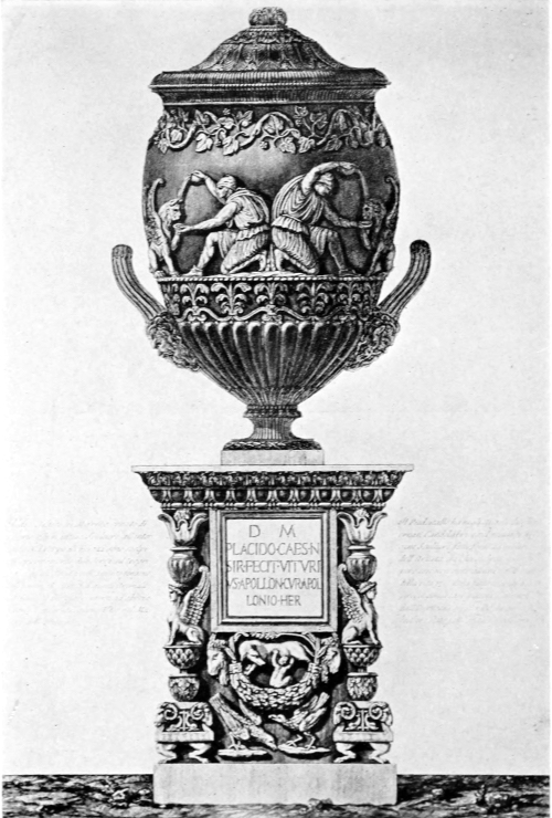
Piranesi. Antique Marble Vase
Piranesi. Vintage Marble Vase
From “Vasi. Candelabri. Cippi. Sarcofagi. Tripodi. Lucerne ed Ornamenti Antichi Disegn. ed inc. dal Cav. Gio. Batta. Piranesi.” (1778) Vol. II, plate No. 73. Piranesi’s dedication of this plate reads: “Al Suo Carissimo Amico Il. Sig. Riccardo Hayward Scuttore Inglese.”
From “Vases. Candelabras. Tombstones. Sarcophagi. Tripods. Lanterns and Ancient Ornaments Designed and Engraved by Cav. Gio. Batta. Piranesi.” (1778) Vol. II, plate No. 73. Piranesi’s dedication of this plate reads: “To His Dearest Friend Mr. Riccardo Hayward English Sculptor.”
Size of the original etching, 24 × 16⅜ inches
Size of the original etching: 24 × 16⅜ inches
To think, on the other hand, that Piranesi exerted an influence on French art of his day is not so fanciful as might at first be supposed. If it be true, as just stated, that it is impossible for the work of an artist to produce any result when his environment is hostile, it is equally true that an artist, or a body of artists, can exert an enormous influence when their surroundings favor and the ground is ready to receive the seed they sow. France was ripe for such seed as Piranesi cast abroad vainly in Italy, and in the former country an incalculable influence in the creation of the Louis XVI style was exerted by those men who accompanied Mme. de Pompadour’s brother, Abel Poisson, Marquis de Marigny, on his travels in Italy. Three years previously this great patron of art had caused her brother to be appointed to the succession of the “Surintendance des Beaux-Arts,” and after three years of apprenticeship, in order to make himself worthy of this important and exalted position, she sent him, in the company of a numerous suite, to Italy in December, 1749, to complete his education by remaining there until September, 1751. In his following were Soufflot, the architect, and Charles Nicholas Cochin fils, the celebrated engraver. On his return from Italy, M. de Marigny directed all the works of art undertaken by the government throughout France, while Soufflot built the church of Ste. Geneviève, now known as the Panthéon, and was one of the most conspicuous and influential men in the world of art in his day. Cochin, aside from being a great engraver, was intellectually[Pg 148] one of the most interesting artists of the day, and, as M. de Marigny’s right-hand man, wielded an influence almost incomprehensible to us of to-day. The latter part of his life, he really ruled in M. de Marigny’s stead, and his absolute dictatorship in all matters of art in France can only be compared to that of Le Brun under Louis XIV.
To think that Piranesi had an impact on French art in his time isn't as far-fetched as it might seem at first. If it's true that an artist's work can't make an impact in a hostile environment, it's also true that an artist or a group of artists can have a huge influence when the circumstances are right and the ground is ready to nurture the ideas they present. France was ready for the ideas that Piranesi was trying to promote in Italy, and in France, the creation of the Louis XVI style was greatly influenced by those who traveled with Mme. de Pompadour’s brother, Abel Poisson, Marquis de Marigny, on his trips to Italy. Three years earlier, this major art patron had gotten her brother appointed to the position of “Surintendance des Beaux-Arts,” and after three years of preparation, to ensure he was deserving of this important role, she sent him, along with a large entourage, to Italy in December 1749 to finish his education there until September 1751. Among those traveling with him were the architect Soufflot and the famous engraver Charles Nicholas Cochin fils. Upon returning from Italy, M. de Marigny oversaw all government art projects across France, while Soufflot designed the church of Ste. Geneviève, now known as the Panthéon, and became one of the most prominent and influential figures in the art world of his time. Cochin, besides being a remarkable engraver, was also one of the most intellectually engaging artists of the time and served as M. de Marigny’s right-hand man, wielding an almost unimaginable influence for us today. In the latter part of his life, he effectively ruled in M. de Marigny’s place, and his total control over all art matters in France can only be compared to that of Le Brun under Louis XIV.
That his Italian travels were the decisive influence of Cochin’s career is clearly shown in his own work, and is expressly stated by Diderot, who says of him that, “judge everywhere else, he was a scholar at Rome.” Soufflot was only seven years older than Piranesi, and Cochin but five. Now, when these distinguished Frenchmen were in Rome, Piranesi was already famous and frequented the most interesting artistic circles. His talents and his remarkably impetuous personality made him one of the curiosities of Rome, so that it is scarcely credible that these visiting foreigners should not have seen much of him. As their express object was the study of antiquity, and as no one in Rome knew more of the ruins or had so lively an enthusiasm for them as Piranesi, it is certainly probable that he influenced them deeply.
That Cochin's travels in Italy had a major impact on his career is clearly evident in his work and is explicitly stated by Diderot, who remarked that “everywhere else, he was a scholar in Rome.” Soufflot was only seven years older than Piranesi, and Cochin was just five years younger. By the time these distinguished Frenchmen arrived in Rome, Piranesi was already well-known and moved in the most vibrant artistic circles. His talents and notably intense personality made him one of the highlights of Rome, so it’s hard to believe that these visitors didn’t have significant interactions with him. Since their primary goal was to study antiquity, and because no one in Rome had a deeper understanding of the ruins or a more passionate enthusiasm for them than Piranesi, it’s very likely that he had a profound influence on them.

Section of one of the Sides of the Great Room, or Library,
of Earl Mansfield’s Villa at Kenwood
A section of one side of the Great Room, or Library, of Earl Mansfield's Villa at Kenwood
Robert Adam, Architect, 1767. Engraved by J. Zucchi in 1774
From “The Works in Architecture of Robert and James Adam.”
(London, 1778)
Robert Adam, Architect, 1767. Engraved by J. Zucchi in 1774
From “The Works in Architecture of Robert and James Adam.”
(London, 1778)

Ionic Order of the Anteroom, with the rest of the Detail of that Room
at Sion House, the Seat of the Duke of Northumberland
in the County of Middlesex
Ionic Style of the Entrance Hall, along with the other Details of that Room
at Sion House, the Home of the Duke of Northumberland
in Middlesex County
Robert Adam, Architect, 1761. Engraved by Piranesi
From “The Works in Architecture of Robert and James Adam.”
(London, 1778)
Robert Adam, Architect, 1761. Engraved by Piranesi
From “The Works in Architecture of Robert and James Adam.”
(London, 1778)
Aside from these men, the list is long of famous Frenchmen who studied in Rome during the height of Piranesi’s artistic production, and must certainly have felt his influence. It includes Augustin Pajou, the sculptor, who went to the Villa Médicis as Prix de Rome in 1748, at eighteen, and who afterward decorated the opera built at Versailles by Ange Gabriel, architect of the faultless buildings which ennoble the Place de la Concorde; Jean Jacques Caffieri, the sculptor, who was in Rome from 1749 to 1753; [Pg 149]Chalgrin, Prix de Rome in 1758, successor to Soufflot as architect of the city of Paris, and architect of St. Philippe du Roule and of the Arc de Triomphe; Jean Antoine Houdon, the sculptor, Prix de Rome in 1761, at twenty, who came to America with Franklin to execute the statue of Washington now in Richmond; and finally Claude François Michel, known as Clodion, who gained the Prix de Rome for sculpture in 1763 and filled whatever he touched with unrivaled grace, raising the art of terra-cotta figurines to a degree of loveliness no one else ever attained. It must be remembered that these architects and sculptors did not confine themselves to architecture pure and simple, as do our prouder and less talented contemporaries. With the spirit which animates all periods of great art, they considered no object too insignificant to be made lovely by their talent. They decorated theaters and houses, designing furniture, clocks, vases, and every article of daily life; filling them all with the consummate, delicate art that remains the despair of all who have followed. If, therefore, as is to be supposed, they underwent Piranesi’s influence while in Rome, it would have made itself felt, through them, in all the decorative arts of France.
Aside from these men, there’s a long list of famous French individuals who studied in Rome during the peak of Piranesi’s artistic output, and they must have definitely felt his influence. This includes Augustin Pajou, the sculptor, who went to the Villa Médicis as Prix de Rome in 1748 at the age of eighteen, and later decorated the opera built at Versailles by Ange Gabriel, the architect behind the flawless buildings that enhance Place de la Concorde; Jean Jacques Caffieri, the sculptor, who was in Rome from 1749 to 1753; [Pg 149]Chalgrin, Prix de Rome in 1758, who succeeded Soufflot as the architect for the city of Paris, and designed St. Philippe du Roule and the Arc de Triomphe; Jean Antoine Houdon, the sculptor, Prix de Rome in 1761 at the age of twenty, who came to America with Franklin to create the statue of Washington now in Richmond; and finally Claude François Michel, known as Clodion, who won the Prix de Rome for sculpture in 1763 and infused everything he touched with unmatched elegance, elevating the art of terra-cotta figurines to a beauty that no one else has ever matched. It should be noted that these architects and sculptors didn’t limit themselves to pure architecture, unlike our more arrogant and less gifted contemporaries. With the spirit that drives all great art periods, they believed no object was too trivial to be made beautiful by their skills. They adorned theaters and homes, designed furniture, clocks, vases, and every other item of daily life, filling them all with exquisite art that remains a challenge for anyone who has followed. Therefore, as can be assumed, if they were influenced by Piranesi while in Rome, it would have manifested, through them, in all the decorative arts of France.
If Piranesi’s influence in France be a subject for hypothesis, in England it can be decisively proved in the case of the so-called Adam style, a vulgar caricature of which is at present so prevalent in New York. Robert Adam, a Scotchman who studied in Rome, was so delightfully original and adventurous as to fit out an expedition to explore the then totally unknown Palace of Diocletian at Spalato in Dalmatia. He was also a friend of Piranesi, who dedicated his views of[Pg 150] the Campus Martius to “Robert Adam, a British cultivator of architecture, as a proof of his affection.” Now Adam, a man of unusually alert mind and delicate taste, was a poor architect, with a most defective sense of proportion in the composition of a building as a whole, who nevertheless possessed unusual and distinctive talent as a decorator. His fine taste led him to cover his work with detail executed and often conceived by remarkable persons, so that much of the credit for originality and delicacy given to him is due, as with so many an architect, to the artists whom he had the cleverness and good fortune to employ and the ability to direct. In the preparation of his monumental book he was assisted by “Eques J. B. Piranesi,” as he there signs himself, who actually engraved three plates with his own hand, while the rendering of every design in the book shows his influence. Knowing this, it is impossible to doubt that Adam’s taste and style were profoundly influenced by, and indebted to, so original and masterly a mind as that of Piranesi.
If Piranesi’s influence in France is a topic for speculation, in England it can be clearly seen in the so-called Adam style, a crude version of which is currently quite popular in New York. Robert Adam, a Scotsman who studied in Rome, was wonderfully original and adventurous, even organizing an expedition to explore the then completely unknown Palace of Diocletian in Split, Dalmatia. He was also a friend of Piranesi, who dedicated his views of[Pg 150] the Campus Martius to “Robert Adam, a British architect, as a token of his affection.” Now Adam, a man with an unusually sharp mind and refined taste, was not a great architect, as he struggled with an inadequate sense of proportion in the overall design of buildings, yet he had a unique and distinct talent as a decorator. His keen taste led him to embellish his work with details often created by exceptional individuals, so much of the credit for originality and refinement attributed to him is owed, like with many architects, to the artists he smartly and fortunate enough to hire, as well as his ability to guide them. In creating his monumental book, he was assisted by “Eques J. B. Piranesi,” as he signed himself, who actually engraved three plates by hand, while the interpretation of every design in the book reflects his influence. Knowing this, it’s hard to deny that Adam’s taste and style were deeply influenced by and indebted to Piranesi’s remarkably original and masterful mind.
A comparison of Adam’s book with certain plates by Piranesi will clearly show the debt, while a careful study of only three of his compositions—namely, the title-page before mentioned as dedicated to Adam and the two plates inscribed with the name of Pope Clement XIII—will in itself make clear that much decorative work called either Louis XVI or Adam takes its forms as well as its inspiration directly from the creations of Giambattista Piranesi. Piranesi’s influence can also be proved in the case of George Dance, architect of old Newgate Prison; of Robert Mylne, architect of old Blackfriars Bridge; of Sir John Soane, architect [Pg 151]of the Bank of England; and of many more. The subject of Piranesi’s influence in England has been so exhaustively treated by Mr. Arthur Samuels in his monograph as to make useless any attempt to rehandle the subject here.
A comparison of Adam’s book with certain plates by Piranesi will clearly show the influence, while a close look at just three of his works—the title page mentioned earlier, dedicated to Adam, and the two plates labeled with the name of Pope Clement XIII—will clearly indicate that much of the decorative work classified as either Louis XVI or Adam derives both its forms and inspiration directly from the creations of Giambattista Piranesi. Piranesi’s impact can also be observed in the works of George Dance, the architect of old Newgate Prison; Robert Mylne, the architect of old Blackfriars Bridge; Sir John Soane, the architect of the Bank of England; and many others. The topic of Piranesi’s influence in England has been so thoroughly addressed by Mr. Arthur Samuels in his monograph that any effort to revisit the subject here would be unnecessary.

Piranesi. Title-page to “Il Campo Marzio dell’ Antica Roma”
(Rome, 1762)
Piranesi. Title page for “The Campus Martius of Ancient Rome”
(Rome, 1762)
The dedication to Robert Adam is upon the column to the left
Size of the original etching, 19⅞ × 13¼ inches
The dedication to Robert Adam is on the column to the left
Size of the original etching, 19⅞ × 13¼ inches

Piranesi. Upper left-hand Portion, bearing a Dedication to Robert Adam, of Piranesi’s
etched plan of the Campus Martius
Piranesi. Upper left corner, showing a dedication to Robert Adam, of Piranesi’s
etched plan of the Campus Martius
Size of the original etching (of which the above is a part only), 53 × 45½ inches
Size of the original etching (of which the above is just a part), 53 × 45½ inches
Still another example of Piranesi’s influence is to be found in the sketches of the present-day German, Otto Rieth, the originality of whose drawings is so vaunted. Very talented and individual they certainly are, but to any one thoroughly familiar with the architectural fantasies of Piranesi, the source of inspiration is so obvious as to make it impossible that Rieth should not have known the work of his great Italian predecessor.
Another example of Piranesi’s influence can be seen in the sketches of today’s German artist, Otto Rieth, whose unique drawings are widely celebrated. They are certainly talented and distinctive, but for anyone deeply familiar with Piranesi’s architectural fantasies, the source of inspiration is so clear that it’s impossible to believe Rieth wasn’t aware of the work of his great Italian predecessor.
The influence which Piranesi exerts on the École des Beaux-Arts, and consequently on the leading contemporary architects of both France and the United States, is enormous, if hard to define. The use of detail which he furnishes is never-ceasing, but more important than this is the constant inspiration sought in a study of those architectural fantasies which he has filled with the qualities of grandeur and immensity so much valued by the French to-day. The buildings of New York are covered with motives either inspired by Piranesi or taken directly from his work—ornament much of which would never have come into vogue but for him; while a recent number of a leading architectural periodical, without acknowledgment, printed a design of his for its cover.
The impact Piranesi has on the École des Beaux-Arts, and thus on the top contemporary architects in both France and the United States, is significant, even if difficult to describe. His use of detail is relentless, but more importantly, he consistently inspires a pursuit of those architectural fantasies that he imbues with grandeur and immensity, qualities highly valued by the French today. The buildings in New York are adorned with designs either influenced by Piranesi or directly taken from his work—ornamentation that would likely never have become popular without him. Moreover, a recent issue of a prominent architectural magazine published one of his designs on its cover without giving him credit.
It is ardently to be hoped that a wider and more just appreciation of Piranesi’s unique work may gradually gain currency. Mere productiveness is, of course, of no intrinsic value; but that any human[Pg 152] being should be capable of so vast a labor as Piranesi must in itself excite in us a lively sense of wonder and admiration. When, moreover, it is found that his work, in addition to putting the art of architecture under an enormous debt, is distinguished by imagination, originality, sublimity, and immense skill of execution,—a certain portion of it at least possessing these qualities to a degree unsurpassed by any artist using the particular medium employed,—it is surely not unreasonable to attribute to their creator the rare quality of original genius.
It is to be hoped that a broader and fairer appreciation of Piranesi’s unique work will gradually catch on. Mere productivity is, of course, not intrinsically valuable; however, the fact that any human being could accomplish such immense labor as Piranesi does inspire a strong sense of wonder and admiration in us. Furthermore, when we realize that his work not only places an enormous burden on the art of architecture but is also characterized by imagination, originality, sublimity, and exceptional skill in execution— with at least some of it containing these qualities to a level unmatched by any other artist using the same medium—it’s certainly not unreasonable to credit the creator with the rare trait of original genius.
Note: I desire to acknowledge my indebtedness to Mr. Arthur Samuel of London, both for material contained in his book and for personal courtesy.
Note: I want to express my gratitude to Mr. Arthur Samuel of London, both for the information in his book and for his personal kindness.
[Pg 153]
[Pg 153]
FRANCISCO GOYA Y LUCIENTES
By CHARLES H. CAFFIN
By Charles H. Caffin
Author of “The Story of Spanish Painting,” “Old Spanish
Masters, Engraved by Timothy Cole,” etc., etc.
Author of “The Story of Spanish Painting,” “Old Spanish
Masters, Engraved by Timothy Cole,” etc., etc.
THE phenomenon of Goya is among the curiosities of the history of art. For in the latter half of the eighteenth century, when, under the feeble Bourbon dynasty, Spain had reached the lowest ebb of her national and artistic life, an artist arose who represented more than any other her racial characteristics and was destined to exert a world-wide influence on the art of the succeeding century.
THE phenomenon of Goya is one of the interesting aspects of art history. In the late eighteenth century, when Spain, under the weak Bourbon dynasty, was at its lowest point both nationally and artistically, an artist emerged who embodied her racial characteristics more than anyone else and was set to have a global impact on the art of the following century.
While the rest of Europe was seething with the spirit of revolution, Goya, the man, was already in revolt, and at the same time had discovered for himself a revolutionary form of art, which anticipated by half a century the consciousness elsewhere of the need of a new method to fit the new point of view. In a word, he drove an entering wedge into the contemporary classicalism that was based upon a dry imitation of Roman marbles and Raphaelesque compositions, restored nature to art, and adapted his vision of nature to the spirit of inquiry, observation, and research that was in process of fermentation. Finally, he adjusted to his vision of life a method of composition, freer and more flexible than the older ones: that was preoccupied less with the representation[Pg 154] of form than with the expression of movement and character; its aim, in fact, being primarily expressional. Thus he anticipated the motive of modern impressionism and determined in advance the methods of rendering it.
While the rest of Europe was buzzing with revolutionary energy, Goya was already in revolt himself and had also discovered a groundbreaking form of art that anticipated by fifty years the growing awareness of the need for a new approach to reflect a fresh perspective. In short, he introduced a new element into the contemporary classical art that relied heavily on a dry imitation of Roman sculptures and Raphael's works, revitalized nature in art, and adapted his understanding of nature to the spirit of inquiry, observation, and research that was brewing at the time. Ultimately, he aligned his vision of life with a method of composition that was freer and more flexible than the older styles, focusing less on the representation of form and more on the expression of movement and character; its main goal was fundamentally about expressing emotion. In this way, he foreshadowed the motives of modern impressionism and laid the groundwork for its rendering techniques.
No less remarkable is the degree in which he was an avatar of the mingled traits of his race. For ethnologically the Spaniard is a Celt, who first was disciplined by Roman civilization, then merged in the flood of a Germanic wave, and later infused with the blood and culture of the Arab and the Moor. A truly wonderful amalgam—the ironic humor of the Celt; the mysticism, vigor, and grotesque imagination of the forest-bred Goth; the subtle inventiveness, sensuousness, and abstraction of the Orient, and the uncouth strain of the Black Man, whom to-day we are discovering to be the flotsam of a far-off submerged civilization in Darkest Africa. All these traits are recognizable in the work of Goya that he did to please himself: namely, in his painted figure-subjects, other than portraits, and in his drawings and etchings.
No less remarkable is how much he represented the mixed traits of his race. Ethnologically, the Spaniard is a Celt, who was first shaped by Roman civilization, then blended with a Germanic wave, and later enriched with the blood and culture of the Arab and the Moor. It's a truly amazing combination—the ironic humor of the Celt; the mysticism, energy, and wild imagination of the forest-dwelling Goth; the clever inventiveness, sensuality, and abstraction of the East; and the raw influence of the Black Man, who today we are recognizing as the remnants of a long-lost civilization in Darkest Africa. All these traits can be seen in the work of Goya that he created for his own enjoyment: specifically, in his painted figures that aren’t portraits, as well as in his drawings and etchings.
* * * * *
Understood. Please provide the text you'd like me to modernize.

Goya. Portrait of Goya, drawn and etched by himself
Goya. Self-portrait of Goya, created and engraved by him.
Size of the original etching, 5⁵⁄₁₆ × 4⅞ inches
Size of the original etching: 5 5/16 × 4 7/8 inches

Goya. The Dead Branch
Goya. The Fallen Branch
From “The Proverbs” (Lefort No. 126)
A reference to the Spanish court, which rests on a dead branch over an abyss
From “The Proverbs” (Lefort No. 126)
A reference to the Spanish court, which hangs on a weak branch over a deep drop.
Size of the original etching, 8⅜ × 12⁹⁄₁₆ inches
Size of the original etching: 8⅜ × 12⅝ inches
In the modern craze for making over biographies of past worthies, so as to bring their lives into conformity with the standards of respectability in the present, there is a tendency to suggest that many of the records of Goya’s career may be apocryphal. This would rob the story of art of a very picturesque personality; one, moreover, which seems to be quite convincingly represented in his art. He was born in 1746, in the little town of Fuendetodos near Zaragoza in the province of Aragón, his father being a small [Pg 155]farmer. Reared among the hills, he breathed independence, throve mightily in bodily vigor, and proved precociously disposed to art. Accordingly, at the age of fourteen he was put under a teacher, Luzan, in Zaragoza. But it was never Goya’s way to take instruction from a spoon, and at this period he distinguished himself less as a student than as a roistering young fellow, apt for gallantry and brawls and ready with his rapier. Having drawn on himself the attention of the authorities of the Inquisition, he found it convenient to proceed to Madrid. Here again his escapades aroused notoriety, so that he abandoned the capital and set forth for Rome, working his way to the sea-board by practising as a bull-fighter. In Rome he mainly nourished his artistic development by observation of the old masterpieces, meanwhile indulging in gallantries, which culminated in a plot to rescue a young lady from a convent. This time he found himself actually in the grip of the Inquisition and was only released from it by the Spanish ambassador, who undertook to ship him back to Spain. Arrived the second time in Madrid he found a friend in the painter Francisco Bayeu, who gave him his daughter, Josefa, in marriage and introduced him to Mengs, the arbiter of art at Court. Josefa bore him twenty children, none of whom survived him, and patiently put up with his infidelities. Mengs had been urged by the king, Charles III, to revive the Tapestry Works of Santa Barbara, and intrusted Goya with a series of designs, which to-day may be seen in the basement galleries of the Prado, while some of them, executed in the weave, adorn the walls of a room in the Escoriál. The vogue at the time was for Boucher’s pretty pastoral[Pg 156] ineptitudes, but Goya took a hint from Teniers and represented the actual pastimes of the Spanish people. He, however, far outstripped the Flemish artist in the variety, naturalness, and vivacity of his subjects, while in the matter of composition he showed himself already a student of the harmonies of nature rather than a perpetuator of studio traditions.
In today’s obsession with updating the biographies of historical figures to align their lives with present-day standards, there’s a trend to suggest that many accounts of Goya’s career might be fabricated. This would take away from the art world a fascinating personality that is convincingly reflected in his work. He was born in 1746 in the small town of Fuendetodos near Zaragoza in the province of Aragón, where his father was a small farmer. Growing up in the hills, he embraced independence, thrived in physical strength, and showed an early talent for art. Consequently, at fourteen, he started studying under a teacher named Luzan in Zaragoza. However, Goya was never one to follow instruction blandly; during this time, he made a name for himself more as a fun-loving young man, skilled in romance and fights, always ready with his sword. After attracting the attention of the Inquisition, he thought it best to move to Madrid. There, his antics gained notoriety once again, prompting him to leave the capital for Rome, making his way to the coast by working as a bullfighter. In Rome, he mainly developed his artistic skills by studying old masterpieces while indulging in romantic escapades, which culminated in a plan to rescue a young woman from a convent. This time, he found himself in the hands of the Inquisition and was only released thanks to the Spanish ambassador, who arranged for his return to Spain. Back in Madrid for a second time, he found a friend in the painter Francisco Bayeu, who married him to his daughter, Josefa, and introduced him to Mengs, the leading art figure at Court. Josefa gave him twenty children, none of whom outlived him, and patiently endured his infidelities. Mengs had been encouraged by King Charles III to revive the Tapestry Works of Santa Barbara and entrusted Goya with a series of designs, which can now be seen in the basement galleries of the Prado, with some woven pieces decorating a room in the Escorial. At the time, the trend was to emulate Boucher’s charming pastoral scenes, but Goya took inspiration from Teniers and depicted the real pastimes of the Spanish people. Nevertheless, he far surpassed the Flemish artist in the variety, naturalness, and vibrancy of his subjects, already showing a preference for the harmonies of nature in composition rather than sticking to studio traditions.
These designs secured his general popularity and paved the way for his entrée into royal favor at the accession of Charles IV in 1788. Goya, turned forty, was already the darling of the populace and now became the cynosure of the Court. He would pit his prowess against the professional strong man in the streets of Madrid and plunged with equal aplomb and assurance into the gallantries of the royal circle, which was a hotbed of intrigue under the lax régime of Queen Maria Luisa, whose amours were notorious. Foremost among her lovers was Manuel Godoy, whom she raised from the rank of a guardsman eventually to be prime minister. He embroiled his country in a war with England, and finally ratted to Napoleon, conniving at the invasion of the French troops and the placing of Joseph Bonaparte on the throne of Spain. Meanwhile, in the interval before this débâcle, Goya, while dipping into intrigue, notably with the beautiful Countess of Alba, and establishing his position as an artist to whom every one who would be anybody must sit for a portrait, maintained an attitude of haughty mental exclusiveness. He was the rebel, the insurgent, the nihilist; lashing with the impartial whip of his satire the rottenness of the Court and the shams and hypocrisies of the Middle Class, the Church, Law, Medicine, and even Painting. [Pg 157]Also, like many devotees of sensual pleasures, he was hot in his denunciation of lust, a terrible exponent of its consequences in satiety and sapped vitality.
These designs earned him widespread popularity and set the stage for his entry into royal favor when Charles IV took the throne in 1788. Goya, who was now forty, was already adored by the public and became the center of attention at Court. He would test his skills against the tough guys in the streets of Madrid and engaged with equal confidence and flair in the romantic intrigues of the royal circle, which was rife with drama under the relaxed rule of Queen Maria Luisa, known for her infamous affairs. One of her prominent lovers was Manuel Godoy, whom she promoted from a guardsman to prime minister. He dragged the country into a war with England and ultimately betrayed it to Napoleon, facilitating the French invasion and the installation of Joseph Bonaparte on the Spanish throne. Meanwhile, before this disaster, Goya mingled in intrigues, particularly with the enchanting Countess of Alba, and established himself as the go-to artist for anyone who wanted their portrait done, all while maintaining an air of aloof intellectual superiority. He was the rebel, the insurgent, the nihilist; he wielded his satire like a whip to expose the corruption of the Court and the pretenses and hypocrisies of the Middle Class, the Church, Law, Medicine, and even Painting. [Pg 157] Similarly, like many lovers of pleasure, he was fiercely critical of lust, vividly illustrating its consequences of excess and drained vitality.

Goya. Back to His Ancestors!
Goya: Back to His Ancestors!
“Poor animal! The genealogists and the kings of heraldry have
muddled his brain, and he is not the only one.”
Manuel Godoy, satirized in this print, had a long and fictitious
genealogy made for himself, according to which he was a
direct descendant of the ancient Gothic kings of Spain.
“Poor animal! The genealogists and the heraldic kings have confused his mind, and he’s not the only one.”
Manuel Godoy, who is made fun of in this print, had a long and made-up family tree created for himself, claiming he was a direct descendant of the ancient Gothic kings of Spain.
From “The Caprices” (Lefort No. 39).
From “The Caprices” (Lefort No. 39).

Goya. “Birds of a Feather Flock Together”
Goya. “People with similar interests or characteristics tend to hang out together.”
“The question is often raised whether men or women are superior.
The vices of either proceed from bad upbringing; where
the men are depraved the women likewise are depraved.”
From “The Caprices” (Lefort No. 5).
“The question is often raised whether men or women are superior. The flaws of either come from a poor upbringing; where men are corrupt, women are also corrupt.”
From “The Caprices” (Lefort No. 5).
This last is the theme of one of his most horribly arresting subjects in oils, an allegory of the Fates, wherein lust and its accompanying exhaustion represent the futility of man’s existence. It is painted in colors of extreme neutrality that almost amount to monochrome. Thus it illustrates a dictum of Goya’s that color no more than line exists in nature; there are only differences of light and shade. It accordingly prepares one for an appreciation of his etchings, in which aquatint plays so intrinsically important a rôle. As a painter he had begun with positive hues—to abandon them, as soon as he reached his maturity, for a sparing use of color and a liberal differentiation of color values. In this he was following Velasquez, whom he admitted to be one of his teachers, the others being Rembrandt and nature. It was Rembrandt, unquestionably, who helped him to a vision of nature that reduced itself to the principle of light and dark; but from nature herself he gained corroboration of the essential truth of such a vision. How true it is the artist of the present day has learned from Goya. Like the latter, he sees color in nature not as positive hues, but as a complex weave of varying intensities of light and shade that play over and transform the hues. It is by the correlation of these varying values that he builds up the structure and secures the planes of his composition, and realizes a unity and harmony of ensemble. And it is in Goya’s etchings that he finds these principles of color in relation to composition represented with most adequate reliance on simplification,[Pg 158] organization, and expression—the three watchwords of contemporary artists who are working in the latest modern spirit.
This last topic is the focus of one of his most strikingly disturbing subjects in oils, an allegory of the Fates, where desire and its resulting fatigue symbolize the futility of human existence. It's painted in extremely neutral colors that almost resemble monochrome. This reflects a principle of Goya’s that neither color nor line exists in nature; only variations of light and shade do. Thus, it sets up an appreciation for his etchings, where aquatint plays a crucial role. As a painter, he started with bright colors but abandoned them upon reaching maturity, opting for minimal use of color and a broad differentiation of color values. In this, he followed Velasquez, who he acknowledged as one of his mentors, along with Rembrandt and nature. It was undoubtedly Rembrandt who influenced his understanding of nature, simplifying it to the principle of light and dark; from nature itself, he found confirmation of this vision's fundamental truth. How true it is that contemporary artists have learned from Goya. Like him, they perceive color in nature not as distinct hues, but as a complex interplay of varying intensities of light and shade that influence and transform the colors. By correlating these different values, they construct the structure and secure the planes of their compositions, achieving a unity and harmony of ensemble. Goya’s etchings exemplify these principles of color in relation to composition, relying heavily on simplification,[Pg 158] organization, and expression—the three guiding words for today’s artists working in the latest modern style.
Expression is the keynote of Goya’s etchings, as it is of his paintings. It is the quality of feeling rather than of seeing that is interpreted. Thus, in the oil painting of the Maja, Nude, it was Goya’s intent not so much to represent the young form as to interpret the expression of its youth through the play of light and shadow on the supple torso and limbs; an expression so exquisitely subtle and tender that it defies the copyist’s attempted imitation and eludes the resources of photographic reproduction. Similarly, in the splendid impressionism of the group-portrait of Charles IV and his family it is not the appearance of the jewels, clustered on the breasts of the royal pair, but the effect of their luster that he designed to render. And so throughout his drawings and etchings the prime purpose is not to represent the thing seen but to suggest its effect upon the feelings.
Expression is the key focus of Goya’s etchings, just like in his paintings. It’s more about the feeling than the sight that comes through. In the oil painting of the Maja, Nude, Goya aimed not just to depict the young body but to convey the essence of its youth by using light and shadow on the graceful torso and limbs; an expression so delicately subtle and tender that it challenges any copyist's attempts to replicate it and escapes the limits of photographic reproduction. Likewise, in the stunning impressionism of the group portrait of Charles IV and his family, it’s not the appearance of the jewels on the royal couple that he intended to portray, but the impact of their shine. Throughout his drawings and etchings, the main goal is not to represent what’s seen but to evoke its effect on the emotions.
* * * * *
Understood! Please provide the text you'd like me to modernize.
Goya’s etched work, as catalogued in 1907 by Julius Hofmann, comprises 268 pieces. These include 22 Various Subjects; 16 Studies after Velasquez; 83 Caprices; 21 Proverbs; 82 Disasters of War and 44 Tauromachies, or Scenes from the Bull-Fight. To this list of engraved work are to be added 20 lithographs.
Goya’s etched work, as listed in 1907 by Julius Hofmann, includes 268 pieces. These consist of 22 Various Subjects; 16 Studies after Velasquez; 83 Caprices; 21 Proverbs; 82 Disasters of War; and 44 Tauromachies, or Scenes from the Bull-Fight. Additionally, there are 20 lithographs to be added to this collection of engraved work.
The best known of these groups is Los Caprichos, etched in 1794-1798 but not published until 1803. These Caprices represent the most spontaneous expression of Goya’s temperament and of his attitude toward the life and the society of his day. At the [Pg 159]same time, the designs, as in the case of all his etchings and lithographs, were executed with due deliberation, worked out previously in drawings in which every effect was carefully calculated and assured. With corresponding fidelity the drawings were copied on the plate.
The best known of these groups is Los Caprichos, created between 1794 and 1798 but not published until 1803. These Caprices showcase the most spontaneous expression of Goya’s personality and his views on the life and society of his time. At the [Pg 159]same time, the designs, like all his etchings and lithographs, were made with careful thought, previously developed in drawings where every effect was meticulously planned and achieved. The drawings were faithfully replicated on the plate.

Goya. They have Kidnapped Her
Goya. They've Kidnapped Her
“The woman who does not know how to guard herself is the
first to be attacked. And it is only when there is no longer time
to protect herself that she is astonished that she was carried off.”
From “The Caprices” (Lefort No. 8).
“The woman who doesn’t know how to protect herself is the first to get attacked. And it’s only when it’s too late to defend herself that she’s shocked that she was taken away.”
From “The Caprices” (Lefort No. 8).

Goya. “Bon Voyage!”
Goya. "Safe travels!"
“Where go they across the shadows, this infernal cohort which makes the air ring with their cries? If only there were daylight— ... Then it would be another thing: because with a gun we could bring them down.... But it is night and nobody can see them.” From “The Caprices” (Lefort No. 64).
“Where are they going through the shadows, this dreadful group that fills the air with their screams? If only it were daytime— ... Then it would be different: because with a gun we could take them down.... But it's night, and no one can see them.” From “The Caprices” (Lefort No. 64).
It is in this set that the creative quality of Goya’s imagination is most demonstrated. He could not only summon visions from the void, but clothe them in convincing shape. Whether he stretched some human type to the limit of caricature or invested it with attributes of bird, beast, or reptile, or used some familiar form of animal, or created a hybrid monster, he had the faculty of giving it an actuality that makes it seem reasonable. As to the meaning of the subjects, the titles which he himself gave them furnish, except in a few instances, an intelligible clue. Prints of this set were brought to England by officers engaged in the Peninsular War and later found their way to Paris and exercised a very conscious influence upon Delacroix. For they not only echoed the turbulence of his own spirit, but helped him to give expression to his own visions of the horrible and fantastic. The best proofs are those of the first edition, many of which were pulled by the artist himself.
It is in this collection that the creative quality of Goya’s imagination is most evident. He could not only summon visions from nowhere but also give them convincing shapes. Whether he exaggerated some human figure to the extreme of caricature, added characteristics of bird, beast, or reptile, used some familiar animal form, or created a hybrid monster, he had the ability to make it seem real. Regarding the meaning of the subjects, the titles he gave them, except in a few cases, provide a clear clue. Prints from this collection were brought to England by officers involved in the Peninsular War and later made their way to Paris, significantly influencing Delacroix. They not only reflected the turbulence of his own spirit but also helped him express his visions of the horrific and the fantastic. The best examples are from the first edition, many of which were printed by the artist himself.
The Proverbs, although engraved between 1800 and 1810, were not published until 1850. While their subjects are often difficult to comprehend, they show generally a marked technical advance over the previous work. This is apparent not only in the character of the drawing, but also in the increased simplification and more highly organized arrangement of the composition. Some of the latter, as for example in the case[Pg 160] of The Infuriated Stallion and The Bird-Men, present designs of extraordinary distinction.
The Proverbs, although created between 1800 and 1810, weren't published until 1850. While their themes can be tough to grasp, they generally show a significant technical improvement over earlier work. This is clear not only in the quality of the drawing, but also in the greater simplicity and better organization of the composition. Some of them, like The Infuriated Stallion and The Bird-Men, feature designs of remarkable distinction.[Pg 160]
The last prints of La Tauromachie are dated 1815. This series falls short of the others in esthetic interest, being more conspicuously illustrative. It was, indeed, designed to represent the various phases through which the baiting of bulls in Spain had passed. Beginning with the early hunting of the bull in the open country, both on horseback and on foot, it proceeds to the methods introduced by the Moors, who are represented in the attire of Turks. Thence it gradually traces the development of a precise science and technique in the management of the sport and incidentally commemorates the prowess of individual bull-fighters, beginning with the Emperor Charles V, and passing to well-known professional toreadors. Contemporary proofs of Goya are very rare; and it was not until 1855 that a complete set was published in Madrid. A later issue, including seven extra prints, was published by Loizelet in Paris.
The last prints of La Tauromachie are dated 1815. This series is less engaging than the others in terms of artistic interest, being more overtly illustrative. It was actually created to show the different stages that bull baiting in Spain went through. Starting with the early hunting of bulls in open fields, both on horseback and on foot, it moves to the techniques introduced by the Moors, who are depicted in Turkish attire. From there, it gradually outlines the evolution of a precise science and technique in managing the sport and also pays tribute to the skills of individual bullfighters, starting with Emperor Charles V and moving on to famous professional toreadors. Contemporary proofs of Goya are quite rare; it wasn't until 1855 that a complete set was published in Madrid. A later edition, including seven additional prints, was published by Loizelet in Paris.

Goya. The Infuriated Stallion
Goya. The Angry Stallion
“The Proverbs” (Lefort No. 133)
Size of the original etching, 8⅜ × 12½ inches
“The Proverbs” (Lefort No. 133)
Size of the original etching, 8⅜ × 12½ inches

Goya. The Bird-Men
Goya. The Bird-Men
From “The Proverbs” (Lefort No. 136)
Size of the original etching, 8⅝ × 12⅞ inches
From “The Proverbs” (Lefort No. 136)
Size of the original etching, 8⅝ × 12⅞ inches
Of the Disasters of War no prints exist prior to those of the set published by the Academy of San Fernando in 1863. Etched during 1810 and the succeeding years of the Peninsular War, the Disasters are regarded as the finest products of Goya’s needle. Yet he was sixty-four years old when he commenced them. Though he had subscribed to the Bonaparte régime and still held the position of Court painter, he lived apart from active affairs in the seclusion of his country home. The prints are inspired by his country’s sufferings, but he did not publish them. To do so would have been to raise a protest against the crime of the French invasion and to stir his countrymen to [Pg 161]increased patriotism. Under the circumstances of his equivocal position Goya may have thought such a course impolitic. Perhaps he felt the national condition to be hopeless. At any rate, he closed himself around in an atmosphere of profound pessimism. “Was it for this they were born?” is the legend beneath one of the prints which shows a heap of mangled corpses. It is the note of the whole series—the criminal horror of war, and its futility. Nowhere else is the element of the macabre in his genius more fully revealed. The designs are in no sense illustrative; they are visions of his own brooding, projected against darkness and emptiness. Yet, just as in the Caprices he gave bone and flesh to the eery fabrics of his imagination, so by the magic of his needle his abstract imaginings of the enormity of war became visualized into concrete actuality.
Of the Disasters of War, there were no prints made before the ones published by the Academy of San Fernando in 1863. Created between 1810 and the following years of the Peninsular War, the Disasters are considered the best works of Goya’s engraving skills. He was sixty-four when he started them. Even though he had supported the Bonaparte regime and was still the Court painter, he distanced himself from active politics, living in the quiet of his country home. The prints draw from his country’s suffering, but he never published them. Doing so would have been a protest against the French invasion and would have sparked a sense of patriotism in his fellow citizens. Given his ambiguous position, Goya may have thought this approach impractical. He might have seen the national situation as hopeless. In any case, he surrounded himself with a deep sense of pessimism. "Was it for this they were born?" is the caption under one print showing a pile of mangled bodies. This encapsulates the entire series—the brutal horror of war and its pointlessness. Nowhere else does the macabre aspect of his genius come through more clearly. The designs aren't meant to illustrate anything; they are manifestations of his own dark reflections, set against a backdrop of despair. Yet, just as in the Caprices, where he gave life to the eerie visions of his mind, through his artistry he transformed his abstract thoughts about the horrors of war into something tangible.
Of Goya’s lithographs it must suffice here to mention the set of four prints, The Bulls of Bordeaux. They were executed in that city in 1825. For after the expulsion of the French by Wellington and the restoration of the Bourbon dynasty in the person of Ferdinand VII, Goya again turned his coat. “For your treason you deserve to be hanged,” remarked the new king, “but you are a great artist and I overlook the past.” He was reappointed Court painter; but, broken in health and spirits, so deaf that he could no longer indulge his musical taste in playing, he obtained the king’s permission to retire to Bordeaux, where he was cared for by a Madame Weiss and her daughter. It was during this time that he visited Paris and was enthusiastically welcomed by Delacroix and the other Romanticists. When he drew The Bulls[Pg 162] of Bordeaux he was in his seventy-ninth year and able to work only with the aid of a powerful magnifying-glass. Yet the prints in their intense and vigorous movement show no slackening of artistic power. He died three years later, in 1828, and was buried in the cemetery of Bordeaux. After lying there for seventy-one years, his body was claimed by his country and interred with honors in Madrid. For by this time the modern world of art had recognized Goya’s greatness and its own indebtedness to his genius.
Of Goya’s lithographs, it’s worth mentioning the set of four prints, The Bulls of Bordeaux. They were created in that city in 1825. After the French were expelled by Wellington and the Bourbon dynasty was restored with Ferdinand VII, Goya changed his allegiances. “For your betrayal, you should be hanged,” said the new king, “but you’re a great artist, so I’ll overlook the past.” He was reappointed as Court painter; however, he was in poor health and spirits, so deaf that he could no longer enjoy playing music. He got the king’s permission to retire to Bordeaux, where he was cared for by Madame Weiss and her daughter. During this time, he visited Paris and was warmly welcomed by Delacroix and the other Romanticists. When he created The Bulls[Pg 162] of Bordeaux, he was seventy-nine years old and could only work with the help of a strong magnifying-glass. Yet the prints, with their intense and vigorous movement, show no decline in artistic power. He died three years later, in 1828, and was buried in the Bordeaux cemetery. After resting there for seventy-one years, his body was reclaimed by his country and reburied with honors in Madrid. By then, the modern art world had come to appreciate Goya’s greatness and recognize its debt to his genius.
* * * * *
Understood. Please provide the text you would like me to modernize.
Goya’s etchings reveal him a great master of design. The versatility of his invention suggests the exuberance of nature, yet calculated art determines each composition. It is architectonic, organic, functional; possessing the quality of a built-up structure, with perfect correlation of its parts and absolute adjustment of means to end. Moreover, it carries the final mark of distinction in that it appears to have grown: it has the vitality, movement, and character of a living organism. It is discovered to be the product of a new mating of nature and geometry, inspired by a wider and more penetrating observation of the former and a more extended and imaginative use of the latter. Hence, at times it strangely anticipates what we are now familiar with in Oriental composition.
Goya’s etchings show that he's a great master of design. His creative versatility reflects the richness of nature, yet every composition is carefully crafted. It’s architectural, organic, and functional; it has the quality of a well-built structure, with perfect harmony among its parts and a complete alignment of purpose and means. Additionally, it carries a unique mark of distinction as it seems to have developed naturally: it possesses the energy, movement, and character of a living organism. It’s evident that it’s the result of a new blend of nature and geometry, inspired by a deeper and more insightful observation of the former and a broader and more imaginative application of the latter. Thus, at times, it intriguingly foreshadows what we now recognize in Oriental composition.
Most remarkable also is the plastic quality, which is realized not only in the ensemble but also in the component parts. Goya’s compositions are no mere patterning of surfaces, but an example of actual space-filling, in the true sense that they occupy the third dimension. The substance of his forms and their [Pg 163]position in space are so concretely realized that they most actively excite the tactile sense. And yet, for all their concreteness, they are permeated with a quality of abstraction. Thus they fascinate alike by their actuality and their suggestion of a vision. They are frequently hideous, but in their capacity of sense-enhancement and in their stimulus to the esthetic intellectuality they are beautiful.
Most remarkable is the plastic quality, which is evident not only in the ensemble but also in the individual parts. Goya’s compositions are not just arrangements of surfaces, but actual examples of space-filling, genuinely occupying the third dimension. The substance of his forms and their position in space are so vividly realized that they intensely stimulate the tactile sense. Yet, despite their concrete nature, they are infused with a sense of abstraction. Thus, they captivate both through their realism and their imaginative suggestion. They can often be grotesque, but in their ability to enhance sensory perception and stimulate intellectual aesthetics, they are beautiful.

Goya. Good Advice
Goya. Solid Advice
“And this advice is worthy of her who gives it. Worse yet is the damsel who follows it to the letter, and misfortune to the first one who accosts her!” From “The Caprices” (Lefort No. 15).
“And this advice is fitting for the one who gives it. Even worse is the girl who follows it exactly, and bad luck to anyone who approaches her!” From “The Caprices” (Lefort No. 15).

Goya. God Forgive Her—It’s Her Own Mother!
Goya. God Forgive Her—It's Her Own Mom!
“The damsel while young left her native land, served her apprenticeship
in Cadiz, and is now returned to Madrid. She has
drawn a prize in the lottery, goes one day to the Prado, and is
accosted by an old and decrepit beggar—she repulses her; the
beggar woman insists. The beauty turns and recognizes her—this
poor old woman is her mother.”
From “The Caprices” (Lefort No. 16).
“The young woman left her hometown, trained in Cadiz, and is now back in Madrid. She won a lottery prize, goes to the Prado one day, and is confronted by an old, frail beggar—she pushes her away; the beggar woman keeps insisting. The beautiful woman turns to look and recognizes her—this poor old woman is her mother.”
From "The Caprices" (Lefort No. 16).
And the beauty of these compositions is materially increased by the sense of color which they suggest. In consequence of Goya’s influence aquatint is coming largely into vogue with modern etchers; but he with this process, and his contemporary, Turner, with mezzotint, were the first to explore fully the resources of tint in combination with line. The English artist, however, used it mainly as a convenient method of representation. In Goya’s hand it became a medium of intellectual and emotional expression, comparable to tone in music. Goya, in fact, by his study of nature, advanced the circle of his art, so that, on the one hand, it embraced more of the universal geometry and, on the other, intersected more freely the circles of the other arts. Thus he anticipated the latest modern thought, in its consciousness of the essential unity of the arts and of the essential unity of art with life.
And the beauty of these pieces is significantly elevated by the sense of color they evoke. Thanks to Goya's influence, aquatint is gaining popularity among modern printmakers; however, he and his contemporary, Turner, were the first to thoroughly explore the potential of tint in combination with line using this process and mezzotint. The English artist mainly used it as a practical method of representation. In Goya’s hands, however, it became a means of intellectual and emotional expression, similar to tone in music. Indeed, Goya expanded the range of his art through his study of nature, so that it, on one hand, included more universal geometry and, on the other, more freely intersected with other art forms. This way, he anticipated the latest modern ideas about the fundamental unity of the arts and the essential connection between art and life.
[Pg 164]
[Pg 164]
A NOTE ON GOYA
By WILLIAM M. IVINS, JR.
By WILLIAM M. IVINS, JR.
NO other artist in black and white has ever exhibited such tremendous vitality as Goya. Look back along the line, and there is no maker of prints who has put into them the same exuberant, full-blooded delight in life. For sheer physical strength Mantegna only may be compared with him. And, strangely, with this often almost delirious overflow of animal spirits there is the most remarkable sensitiveness to the significance of gesture. Who, except Hokusai, has ever expressed, in black and white, weight—the heaviness of tired bodies, the leaden fall of an unconscious woman’s arm, or the buoyancy of excitement—as this Spaniard? Who has ever made motion so moving—made young limbs so supple, elastic, and graceful? His every line is kinetic—he does not relate motion, he exhibits it—and in art as elsewhere deeds are worth more than words.
NO other artist in black and white has ever shown such incredible energy as Goya. If you look back through history, there’s no printmaker who has infused their work with the same joyful, vibrant love for life. For sheer physical strength, only Mantegna can be compared to him. And, oddly enough, alongside this almost ecstatic overflow of vitality, there's an incredible sensitivity to the meaning behind gestures. Who, besides Hokusai, has ever conveyed in black and white the weight—the heaviness of tired bodies, the limp drop of an unconscious woman’s arm, or the lightness of excitement—like this Spaniard? Who has ever made movement so impactful—made young limbs so flexible, bouncy, and elegant? Every line he draws is alive—he doesn’t just depict motion; he showcases it—and in art, just like everywhere else, actions speak louder than words.
For sensitiveness to the beauty of the human body, for curious research in the esthetic inversion, the beauty of the hideous, Goya stands alone. No one, not even Leonardo, has plumbed so deep in the hidden shadowy parts. No one has so pictured fear—theatricalities a plenty—but only here real terror.
For sensitivity to the beauty of the human body, for exploring the aesthetic twist of finding beauty in the ugly, Goya is unmatched. No one, not even Leonardo, has delved as deeply into the hidden, shadowy aspects. No one has captured fear—there are plenty of theatrics—but here we see true terror.
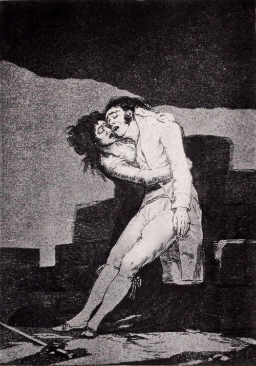
Goya. Love and Death
Goya: Love and Death
“Here is a lover who, like those in Calderon, because he could not refrain from mocking his rival, is dying in the arms of his beloved, and by his temerity has lost all. It is not well to draw the sword too often.” From “The Caprices” (Lefort No. 10).
“Here is a lover who, like those in Calderon, because he couldn’t stop mocking his rival, is dying in the arms of his beloved, and out of his boldness has lost everything. It’s not wise to draw the sword too often.” From “The Caprices” (Lefort No. 10).

Goya. Hunting for Teeth
Goya. Searching for Teeth
“The teeth of those who have been hanged are very efficacious in bringing luck. Without this ingredient nothing worth while can be done. Is it not pitiful that the common folk believe such foolishness?” From “The Caprices” (Lefort No. 12).
“The teeth of those who have been hanged are very effective in bringing good luck. Without this ingredient, nothing valuable can be achieved. Isn’t it sad that ordinary people believe in such nonsense?” From “The Caprices” (Lefort No. 12).
On the purely technical side—the broad massing of sharply contrasted light and shade, the ability to tell [Pg 165]a tale with the simplest means, the instinctive choice of the pictorially dramatic detail—Rembrandt and Goya stand alone.
On the purely technical side—the overall arrangement of sharply contrasted light and shadow, the ability to tell a story with the simplest methods, the instinctive selection of visually dramatic details—Rembrandt and Goya are in a league of their own.
On another side that is purely technical, it should be borne in mind that Goya is the only one who has availed himself of all the possibilities of aquatint—the only one who has used the medium with audacity and resolution and success; the only one who has dared use it to express powerful and fundamental things.
On a purely technical side, it’s important to remember that Goya is the only one who has fully explored all the possibilities of aquatint—he’s the only artist who has approached the medium with boldness and determination and achieved success; the only one who has had the courage to use it to express powerful and essential ideas.
Goya, both in himself and for his influence, is one of the greatest artists that the world has seen these last hundred and fifty years—and his greatest work is his black and white.
Goya, both for his personal talent and his impact, is one of the greatest artists the world has seen in the last one hundred fifty years—and his most significant work is his black and white pieces.
[Pg 166]
[Pg 166]
THE ETCHINGS OF FORTUNY
By ROYAL CORTISSOZ
By ROYAL CORTISSOZ
Literary and Art Editor of the New York Tribune
Literary and Art Editor of the New York Tribune
THE etchings of Fortuny make an inviting theme, inviting in itself and doubly sympathetic because it provokes talk about Fortuny. I have always had a weakness for that endearing personality and I cannot, for the life of me, go with foot-rule and a spirit of cold analysis through the twenty-five or thirty plates—twenty-nine, to be exact—recorded in the useful compendium of Beraldi. You cannot be pedantic about an artist whose work has meant to you an early enthusiasm and a lifelong sense of gaiety and brilliance. The first work of art I ever yearned to possess was a drawing by Fortuny. I did not get it into my hands. The spell faded, but it was revived, and long afterward it involved me in an enchanting task. In Paris, one summer, the late Philip Gilbert Hamerton asked me to write a memoir of Fortuny and for two years I spent a good deal of my leisure going hither and yon, collecting material. The book never got itself written, for reasons which I found both pathetic and comic. Too much of the “material” aforesaid proved too heart-breakingly expensive. Mr. Hamerton and I and his London publisher, [Pg 167]the late Mr. Seeley, ruefully concluded as we counted up the figures, that, humorously speaking, ruin stared us in the face. We turned to other things.
THE etchings of Fortuny create an engaging theme, appealing in itself and even more so because it sparks conversations about Fortuny. I've always had a fondness for that charming figure, and I can’t bring myself to analyze the twenty-five or thirty plates—twenty-nine, to be exact—listed in Beraldi's helpful collection with a clinical approach. You can't be pedantic about an artist whose work has brought you early enthusiasm and a lifelong sense of joy and brilliance. The first piece of art I ever desired to own was a drawing by Fortuny. I never got it, and while the allure faded, it was later revived, leading me into a delightful endeavor. One summer in Paris, the late Philip Gilbert Hamerton asked me to write a memoir about Fortuny, and for two years, I spent a lot of my free time gathering material. The book never got written, for reasons that I found both sad and amusing. Much of the "material" turned out to be heartbreakingly expensive. Mr. Hamerton, his London publisher, the late Mr. Seeley, and I grimly concluded, as we tallied the costs, that, humorously speaking, we were facing financial ruin. We decided to focus on other things.

Fortuny. Arab watching beside the Dead Body of his Friend
Fortuny. An Arab stands beside the body of his friend.
(Beraldi No. 1)
Size of the original etching, 7½ × 15¼ inches
(Beraldi No. 1)
Size of the original etching, 7.5 × 15.25 inches

Fortuny. Idyll
Fortuny. Idyll
(Beraldi No. 4)
Size of the original etching, 7⅝ × 5½ inches
(Beraldi No. 4)
Size of the original etching, 7⅝ × 5½ inches
That, as I have said, was years ago, but every now and then I go back to Fortuny, for old sake’s sake if for no other reason, though he was, of course, a remarkable artist to whom one would be bound, anyway, frequently to return. As a matter of fact, his genius has needed, of late, to be restored to the public consciousness. When the Impressionists came in, Fortuny, or perhaps I should more specifically say, the hypothesis for which he stood, went out. One of the results of my understanding with Mr. Hamerton was a series of visits to the palazzo in Venice which is still the home of Fortuny’s family, and there you found a contrast that was full of meaning. On the piano nobile Fortuny’s art held its own in numerous unfinished pictures, sketches, and the like. But, up-stairs, in his son’s studio, all was changed. When young Marianito sought inspiration as a painter, he did not follow in his father’s footsteps, but went to Munich, and on his walls I saw huge canvases illustrating Wagnerian motives in a huge and splashy manner, strongly suggestive of Franz Stuck and his followers. I confess that at this distance of time I do not recall very accurately just what they were all about; but I can remember as though it were yesterday how extremely different they were from the paintings down-stairs. Of course no one could blame Marianito. An artist must seek salvation in his own way. But it is impossible not to feel a certain indignation over the ignorance of those who have tried to wave Fortuny aside as a painter of bric-a-brac.
That was years ago, but every now and then I return to Fortuny, just for old times' sake, if for no other reason—even though he was a remarkable artist to whom one would naturally want to revisit often. Recently, his genius has needed to be brought back to the public's attention. When the Impressionists emerged, Fortuny—or rather, the ideas he represented—fell out of favor. One of the outcomes of my agreement with Mr. Hamerton was a series of visits to the palazzo in Venice, which is still the home of Fortuny’s family. There, you found a contrast that was very meaningful. On the piano nobile, Fortuny’s art was present in numerous unfinished paintings, sketches, and similar works. But upstairs, in his son’s studio, everything had changed. When young Marianito looked for inspiration as a painter, he didn’t follow in his father’s footsteps; instead, he went to Munich. There, on his walls, I saw massive canvases depicting Wagnerian themes in a bold and flashy style, strongly reminiscent of Franz Stuck and his followers. I admit that I don't remember exactly what all the paintings were about after all this time, but I can still recall how different they were from the works downstairs as if it were yesterday. Of course, no one could blame Marianito. An artist must find their own path. But it’s hard not to feel some outrage at the ignorance of those who have tried to dismiss Fortuny as just a maker of decorative art.
[Pg 168]
[Pg 168]
We saw too much of that sort of thing when the works of Sorolla and Zuloaga were shown at the Hispanic Museum and people went into hysterics over them, talking especially about how the first of these painters was rejuvenating Spanish art. I used to hear such talk in Madrid, some fifteen years ago, amongst the younger men who were even then hailing Sorolla as a pioneer. They were right, and it is right, as I have argued elsewhere, to recognize in this painter’s work an influence of the highest value to the modern Spanish school. But there were great men before Agamemnon, and it is stupid to ignore what was done for Spanish painting by Fortuny long before any one ever heard of Sorolla. I have great respect and plenty of admiration for that accomplished technician, and yet I think that he himself, if pressed in the matter, would cheerfully admit that nothing he ever painted could quite touch the portrait in the Metropolitan Museum, A Spanish Lady, which Fortuny painted in 1865. Outside of France that was not a particularly good year amongst painters, but Fortuny, then twenty-seven years old, was proving himself not unworthy of Velasquez. He was drawing with mastery and he was painting blacks with amazing skill and taste, with amazing sensitiveness to the beauties lying entangled in one of the most difficult of a colorist’s problems. Indeed, I may note in passing that this picture alone would show Fortuny to have enforced lessons in tone which no Spaniard since his time, not even the prodigiously clever Sorolla, has begun to commence to prepare to equal.
We saw way too much of that kind of thing when the works of Sorolla and Zuloaga were displayed at the Hispanic Museum, and people went into a frenzy over them, especially talking about how the first of these painters was revitalizing Spanish art. I used to hear that talk in Madrid, about fifteen years ago, among the younger guys who were already calling Sorolla a pioneer. They were right, and it’s accurate, as I’ve said elsewhere, to recognize in this painter’s work an influence of great significance to the modern Spanish school. But there were great artists before Agamemnon, and it’s foolish to ignore what Fortuny did for Spanish painting long before anyone ever heard of Sorolla. I have great respect and a lot of admiration for that skilled technician, and yet I believe that he, if pushed on the subject, would gladly acknowledge that nothing he ever painted could quite match the portrait in the Metropolitan Museum, A Spanish Lady, which Fortuny painted in 1865. Outside of France, that wasn't a particularly great year for painters, but Fortuny, then just twenty-seven, was proving himself worthy of Velasquez. He was drawing with mastery, and he was painting blacks with incredible skill and taste, showing remarkable sensitivity to the beauty tangled in one of the toughest challenges for a colorist. In fact, I should mention that this painting alone would prove Fortuny to have taught lessons in tone that no Spaniard since his time, not even the incredibly talented Sorolla, has even begun to approach.

Fortuny. The Serenade
Fortuny. The Serenade
(Beraldi No. 10)
Size of the original etching, 15½ × 12¼ inches
(Beraldi No. 10)
Size of the original etching, 15.5 × 12.25 inches

Fortuny. A Moroccan Seated
Fortuny. A Moroccan Sitting
(Beraldi No. 19)
Size of the original etching, 5½ × 4 inches
(Beraldi No. 19)
Size of the original etching, 5.5 × 4 inches
There are many other paintings of his over which it would be pleasant to linger, but, having the etchings [Pg 169]in view, I forbear. At the same time I have driven at nothing irrelevant in speaking of Fortuny’s command over the brush, for that is very closely related to his command over the needle. It is important to remember, in the first place, that he was a born draughtsman. The fact was brought home to me when I made a pilgrimage to Barcelona, to see the big Moroccan battle-piece which he painted for the municipality not long after he had won the Prix de Rome. I saw in the spirited picture the Fortuny we all know, but I saw also, in some earlier pieces, the kind of academic work that he did under the influence of old Soberano, his master at Reus, where he was born in 1838. Yes, it was academic work, but it was the work of a youngster of genius who had a flair for form and drew it with astonishing adroitness. There, to be sure, you have the essence of Fortuny, more even than in the glitter of light and color conventionally associated with his name. The artists and critics who think that the history of painting began with Manet are wont to damn Fortuny with faint praise, talking about his dexterity as though that were a very ordinary and perhaps specious gift. Well, there is a dexterity, there is a sleight of hand, as honest as anything that you will find in Manet, and Fortuny had it. There are moments, no doubt, in which it takes your breath away as though by some deceptive stroke of conjuror’s work. But at bottom there is a sterling sincerity about it, and this, I think, is sharply perceptible in the etchings.
There are many other paintings of his that would be enjoyable to discuss, but since I have the etchings in front of me, I’ll hold off. At the same time, I’m not straying off topic when I talk about Fortuny’s skill with the brush, as it directly connects to his talent with the needle. It’s essential to remember that he was a natural draftsman. This hit home for me when I made a trip to Barcelona to see the massive Moroccan battle painting he created for the city shortly after winning the Prix de Rome. In that vibrant piece, I saw the Fortuny we all know, but I also noticed, in some earlier works, the kind of academic pieces he produced under the influence of Soberano, his teacher in Reus, where he was born in 1838. Yes, it was academic work, but it was done by a talented young genius with a knack for form, and he captured it with remarkable skill. That is the essence of Fortuny, even more than the shine of light and color often associated with him. Artists and critics who believe that painting history began with Manet tend to downplay Fortuny’s talent, referring to his dexterity as if it’s just an ordinary and maybe superficial skill. But there is a genuine dexterity and a sleight of hand in Fortuny’s work, just as honest as you would find in Manet. There are moments when it truly takes your breath away, almost like a trick of a magician. But at its core, there is a solid sincerity in his work, and I believe that's clearly evident in the etchings.
Paradoxically, these do not proclaim Fortuny what the master of etching is wont to be—a lover of line for its own sake, a user of it as a language possessing its[Pg 170] own special character and charm. Rembrandt’s strength and Whistler’s exquisiteness were alike unknown to him. The truth is that Fortuny employed the needle somewhat as he employed the pen, simply for purposes of swift and free expression. There are some bewitching drawings of his, reproduced by the Amand-Durand process in the memoir by Baron Davillier, and there are others in the catalogue of the great sale of his studio effects in 1875, which, for the impression they leave, might almost be regarded as etchings. The impression in either category is very much one of “black-and-white.” Has not Fortuny been the master of a generation of illustrators? Nevertheless his drawings and his etchings are not absolutely interchangeable. In the latter there is too much of the painter for that; his figures are too closely modeled and his backgrounds are too transparent. Some of his plates, such as The Serenade, The Anchorite, the Kabyle Mort, and The Farrier, are wonderfully rich in color such as no pen draughtsman could secure. He knew how to fill his backgrounds with deep warm tone, and he could use the same vivifying touch in his treatment of the figure. It is worth while to go carefully through the little collection of etchings that he left, looking more particularly for those rather thin staccato effects which his imitators affect—one is so delightfully disappointed. I have spoken of his sincerity, his honesty. Amongst all the plates there is only one, La Victoire, which hints a contradiction. There is something factitious about the composition, recalling the Sicilian nudities hawked about by the photographers in Southern Italy. But even this etching has undeniable brilliance [Pg 171]as a piece of technique, and, for the rest, Fortuny is the quite artless connoisseur of picturesqueness, etching his Moorish types and his portraits in the mood of the serious observer of nature aiming at the truth. On two or three occasions he appears to have let his fancy rove. His Amateur de Jardin and his Méditation both belong amongst those graceful studies of costume and pseudo-romantic sentiment with which his paintings have made us so familiar. And once he turned poet in a small way, etching that charming Idylle which may reflect no emotion whatever, but has, at all events, a certain dainty elegance; but do not think that Fortuny was really a poet. It was not in his temperament. He was sensuous, mundane, in the soul of him; the very man to enjoy just the career that fell to his lot.
Paradoxically, these don’t reveal Fortuny as the master of etching that he is known to be—a lover of line for its own sake, using it as a language with its[Pg 170] own unique character and charm. Rembrandt’s strength and Whistler’s delicacy were both unknown to him. The truth is that Fortuny used the needle much like he used the pen, simply for quick and free expression. There are some captivating drawings of his, reproduced by the Amand-Durand process in the memoir by Baron Davillier, along with others in the catalogue of the significant sale of his studio effects in 1875, which, for the impression they leave, could almost be seen as etchings. The impression in either case is very much one of “black-and-white.” Hasn’t Fortuny been a master for a generation of illustrators? Still, his drawings and etchings aren’t completely interchangeable. In the latter, there’s too much of the painter for that; his figures are too meticulously modeled and his backgrounds are too transparent. Some of his plates, like The Serenade, The Anchorite, Kabyle Mort, and The Farrier, are wonderfully rich in color that no pen draughtsman could achieve. He knew how to fill his backgrounds with deep, warm tones, and he could apply the same lively touch in his figure treatment. It’s worthwhile to closely examine the small collection of etchings he left behind, paying particular attention to those somewhat thin staccato effects favored by his imitators—one is often delightfully surprised. I’ve mentioned his sincerity and honesty. Among all the plates, there’s only one, La Victoire, that suggests a contradiction. There’s something artificial about the composition, reminiscent of the Sicilian nudes sold by photographers in Southern Italy. But even this etching has undeniable brilliance as a technique, and, overall, Fortuny is the completely artless connoisseur of picturesque, etching his Moorish types and his portraits with the mindset of a serious observer of nature seeking the truth. On two or three occasions, he seems to have let his imagination wander. His Amateur de Jardin and Méditation both fit among those elegant studies of costume and pseudo-romantic sentiment that his paintings have made us so familiar with. And once he turned poetically in a minor sense, etching that charming Idylle which may reflect no real emotion, but nonetheless possesses a certain delicate elegance; yet don’t think Fortuny was really a poet. It wasn’t in his nature. He was sensual and worldly at heart; the very man to enjoy the path that came to him.

Fortuny. A Horse of Morocco
Fortuny. A Moroccan Horse
(Beraldi No. 20)
Size of the original etching, 4¼ × 6¼ inches
(Beraldi No. 20)
Size of the original etching, 4.25 × 6.25 inches

Fortuny. Interior of the Church of Saint Joseph, Madrid
Fortuny. Interior of the Church of St. Joseph, Madrid.
(Beraldi No. 21)
Size of the original etching, 5⅜ × 9¼ inches
(Beraldi No. 21)
Size of the original etching, 5⅜ × 9¼ inches
New Yorkers will recall the sale here of the collection formed by the late W. H. Stewart in Paris, the “Cher Monsieur Guillermo” of more than one of the artist’s letters printed by Davillier. It was full of Fortunys, which made a dazzling array when they were put up at auction. But it was better to see them scattered about in Mr. Stewart’s home by the Seine, and there they breathed the atmosphere of a clearly defined character. You did not think of Fortuny in Spain, quietly painting at Granada; you did not think of him on the more adventurous soil of Morocco, nor did you dwell on thoughts of his days in Rome and on the beach at Portici. You thought, instead, of the Fortuny who took the collectors of Paris by storm, who moved Théophile Gautier to jeweled eloquence, who was young, successful, and happy, who had a great gift and used it truly with a gaillard grace. He[Pg 172] was not the specious entertainer, bemusing his audience with incredible tricks. All his wizardry, all his diabolical cleverness, was quite natural to him, springing from his heart and in no wise diminishing his weight and seriousness as a student of nature. Beraldi applauds his etchings for their originality. Let us honor them too for their fidelity to life, for their simple strength, as well as for their light, vivacious charm.
New Yorkers will remember the sale here of the collection put together by the late W. H. Stewart in Paris, the “Cher Monsieur Guillermo” mentioned in several of the artist’s letters printed by Davillier. It was filled with Fortunys, which created a stunning display when they were auctioned off. But it was more captivating to see them spread throughout Mr. Stewart’s home by the Seine, where they truly captured a unique character. You didn’t think of Fortuny in Spain, quietly painting in Granada; you didn’t imagine him on the adventurous grounds of Morocco, nor did you ponder his days in Rome or on the beach at Portici. Instead, you thought of the Fortuny who captivated the collectors of Paris, who inspired Théophile Gautier to eloquence, who was young, successful, and happy, who had a great talent and used it with vibrant grace. He[Pg 172] was not the flashy entertainer, dazzling his audience with unbelievable tricks. All his artistry, all his remarkable cleverness, came naturally to him, coming from his heart and not undermining his seriousness as a student of nature. Beraldi praises his etchings for their originality. Let’s also honor them for their realism, for their straightforward strength, as well as for their lively charm.
[Pg 173]
[Pg 173]
PERSONAL CHARACTERISTICS OF
SIR SEYMOUR HADEN, P.R.E.
Part I
Part I
By FREDERICK KEPPEL
By Frederick Keppel
MANY treatises have been published on Seymour Haden the artist, but not one, as yet, on Seymour Haden the man. This is as it should be; because no one can write freely and frankly on the personality of a famous man while that man is still living, and Sir Seymour lived until the year 1910, when he died at the great age of ninety-three.
MANY treatises have been published on Seymour Haden the artist, but not one, as yet, on Seymour Haden the man. This is how it should be; because no one can write openly and honestly about the personality of a famous person while that person is still alive, and Sir Seymour lived until 1910, when he passed away at the impressive age of ninety-three.
I met him often every year for about thirty years, and I first made his acquaintance when he lived in his very handsome house in the aristocratic region known as Mayfair, in the west end of London. His house adjoined the residence of the Lord Chief Justice of England.
I met him regularly every year for about thirty years, and I first got to know him when he lived in his beautiful house in the upscale area known as Mayfair, in the west end of London. His house was next to the home of the Lord Chief Justice of England.
The doctrine held by the ancients that the Goddess of Fortune was stone-blind has much to warrant it. Let us take the case of three contemporary nineteenth-century etchers, all three being men of genius. I mean the two French masters, Charles Meryon and Jean-François Millet, and the Englishman Seymour Haden. The two French etchers lived in dire poverty and often had to go hungry because they had not the[Pg 174] means to pay for a meal; while, to their English contemporary, “the lines were fallen in pleasant places” and he never knew the wants that pinch the poor.
The belief held by the ancients that the Goddess of Fortune was stone-blind has a lot of truth to it. Let's look at three contemporary etchers from the nineteenth century, all of whom were geniuses. I'm talking about the two French masters, Charles Meryon and Jean-François Millet, along with the Englishman Seymour Haden. The two French etchers lived in extreme poverty and often went hungry because they couldn’t afford a meal; meanwhile, their English contemporary had “the lines fallen in pleasant places” and never experienced the struggles faced by the poor.[Pg 174]
Born in 1818, in his father’s fine house in Sloane Street, London West, Francis Seymour Haden had the advantage of coming of a good and well-known family, in easy circumstances, and the further advantage of having received an excellent university education, so that he found himself, from the first, the social equal of many of the best in the land, and he never had to invade and overcome that formidable social barrier which in England so sternly divides the “somebodies” from the “nobodies”; and during his long and active life he certainly did nothing to diminish or discredit the high social standing to which he was born and bred.
Born in 1818 at his father's impressive house on Sloane Street in West London, Francis Seymour Haden was fortunate to come from a well-known family with comfortable means. He also had the benefit of receiving a top-notch university education, which allowed him to start out as the social equal of many of the elite in the country. He never had to challenge or break through the significant social divide that rigidly separates the "somebodies" from the "nobodies" in England. Throughout his long and active life, he certainly did nothing to lessen or undermine the high social status he was born into.
This being so, he remained to the end of his life an ideal Tory aristocrat, a condition which might be compared to that of the Bourbon kings, who “never forgot anything and never learned anything.” In maintaining any opinion which he had formed, or inherited, he was as immovable as the rock of Gibraltar, and it made no difference to him if later evidence showed that his earlier opinions were wrong.
This being the case, he stayed an ideal Tory aristocrat until the end of his life, a situation similar to that of the Bourbon kings, who “never forgot anything and never learned anything.” When it came to holding on to any opinions he had formed or inherited, he was as unyielding as the rock of Gibraltar, and it didn’t matter to him if later evidence proved that his earlier opinions were incorrect.

Portrait of Seymour Haden at the age of Sixty-Two
Portrait of Seymour Haden at Sixty-Two Years Old
From the engraving by C. W. Sherborn
Size of the original engraving, 6 × 3½ inches
From the engraving by C. W. Sherborn
Size of the original engraving, 6 × 3½ inches

Portrait of Seymour Haden at the Age of Forty-four
Portrait of Seymour Haden at Age 44
From his etching from life, done in 1862
Size of the original print, 7¾ × 10⅝ inches
From his life drawing, created in 1862
Size of the original print, 7¾ × 10⅝ inches
I well remember hearing that man of genius, Henry Ward Beecher, say in a sermon: “Talk of the sin of Pride—we haven’t half enough of it!” Be that as it may, Seymour Haden was always a proud man, and this innate pride sometimes rendered him intolerant of the opinions of other good men whose ideas were also entitled to due respect. Indeed, I have never known a man who set a higher value on himself. [Pg 175]Nothing was too good for him—whether it might be his collection of the best prints by older masters, his house and its appointments great and small, or the instruments which he used when he practised surgery,—everything must be of the very best. This determination of his was, within limits, a noble one, although it sometimes made him intolerant of other men who were unable to rise to his high ideals.
I clearly remember hearing the talented Henry Ward Beecher say in a sermon, “Talk about the sin of Pride—we don’t have enough of it!” Regardless, Seymour Haden was always a proud man, and this deep-seated pride sometimes made him intolerant of the opinions of other good people whose ideas deserved respect as well. In fact, I’ve never known anyone who valued themselves more highly. [Pg 175]Nothing was ever good enough for him—whether it was his collection of the best prints by classic masters, his house and its decor, or the instruments he used when performing surgery—everything had to be of the highest quality. While this determination of his was, to an extent, admirable, it occasionally made him intolerant of others who couldn’t meet his lofty standards.
In this ingrained pride and self-esteem of Seymour Haden’s he was far too proud to be vain. I do not think he had any vanity at all. In this respect he differed, “as far as the east is from the west,” from his illustrious brother-in-law, Whistler. The latter’s lifelong habit was to pose and to perform like an actor on the stage—whether his audience consisted of many auditors or of only one; while Haden, though an eminently well-bred gentleman, cared nothing whatever about the impression he might be making on his auditors—so long as his actions were approved by himself. On such occasions all went charmingly until some other person uttered a heterodox opinion on art, or politics, or any other subject; but when that happened Sir Seymour’s indignation would burst forth like a raging volcano.
In this deep-seated pride and self-esteem of Seymour Haden’s, he was way too proud to be vain. I don’t think he had any vanity at all. In this way, he was different, “as far as the east is from the west,” from his famous brother-in-law, Whistler. Whistler’s lifelong habit was to pose and perform like an actor on stage—whether his audience was large or just one person; while Haden, although a thoroughly well-bred gentleman, didn’t care at all about the impression he was making on his audience—as long as he approved of his own actions. Everything would go smoothly until someone expressed an unconventional opinion on art, politics, or any other topic; but when that happened, Sir Seymour’s indignation would erupt like a raging volcano.
On one such occasion, while I was a guest in his country house, I infuriated him—though with no evil intention. It was at the time when the patriot Charles Stewart Parnell was making such a brave struggle in the House of Commons on behalf of Home Rule for Ireland, I expressed my admiration for Parnell, when Sir Seymour got very angry and so made all the company uncomfortable. Thus far I did not blame myself; but a year later I certainly was ashamed of my[Pg 176] own indiscretion. I had quite forgotten about the outbreak of the former year and I again expressed my warm sympathy with the cause of Irish Home Rule. It was just at the beginning of dinner at Sir Seymour’s hospitable table, but no sooner had I mentioned the subject than he flung down knife and fork, marched out of the dining-room, banged the door behind him, and tramped up-stairs to his bedroom. That sweet woman, Lady Haden, said to me very quietly, “We shall see no more of Sir Seymour to-night,” and next morning, before my host appeared at breakfast, his very tactful wife, laying her hand gently on my arm, said to me, “Mr. Keppel, in conversing with my husband, pray avoid the subject of Home Rule in Ireland.” Most readers would think that the little incident ended here; but it didn’t. Presently Sir Seymour came down to breakfast and carried in his hand a large and handsome book which he presented to me. On the fly-leaf I read a long and most kindly dedication written by himself; and so that was the end of the incident. I remember that when I received this amende honorable my first impulse was to recall a characteristic Irish adage which says: “First cut my head, an’ then give me a plasther!”
On one occasion, while I was a guest at his country house, I unintentionally upset him. It was during the time when the patriot Charles Stewart Parnell was bravely fighting for Home Rule for Ireland in the House of Commons, and I expressed my admiration for Parnell. Sir Seymour got very angry, making everyone uncomfortable. At the time, I didn’t blame myself, but a year later I definitely felt ashamed of my own poor judgment. I had completely forgotten about the previous year’s outburst and once again shared my strong support for Irish Home Rule. It was just as dinner was starting at Sir Seymour’s welcoming table, but as soon as I mentioned the topic, he slammed down his knife and fork, stormed out of the dining room, banged the door behind him, and marched upstairs to his bedroom. That lovely woman, Lady Haden, quietly said to me, “We won’t see Sir Seymour again tonight,” and the next morning, before my host appeared for breakfast, his very diplomatic wife gently placed her hand on my arm and advised me, “Mr. Keppel, please steer clear of the subject of Home Rule in Ireland when talking to my husband.” Most people would think that the little incident ended there, but it didn’t. Shortly, Sir Seymour came down to breakfast holding a large, beautiful book, which he presented to me. On the flyleaf, I read a long and very kind dedication written by him; and that was the conclusion of the incident. I remember that when I received this gesture of goodwill, my first impulse was to recall a distinctive Irish saying: “First cut my head, and then give me a plaster!”

Sir Seymour Haden
Sir Seymour Haden
From the drawing by Alphonse Legros, done in 1895
From the drawing by Alphonse Legros, created in 1895

Woodcote Manor (the Home of Sir Seymour Haden)
Woodcote Manor (the home of Sir Seymour Haden)
From the etching by Percy Thomas
Size of the original etching, 6⅝ × 10½ inches
From the etching by Percy Thomas
Size of the original etching, 6⅝ × 10½ inches
Lady Haden was, in a very quiet and refined way, a remarkable woman. She was daughter of an American army officer, Major Whistler, and she bore the Puritan Christian names of Deborah Delano. In more than one of Sir Seymour’s etchings her first name is quieted down to “Dasha.” She was half-sister to the great Whistler, who was the issue of her father’s second marriage, and she clung to her “brother Jimmie” to the end of her life. All the art which was [Pg 177]inherent in the Whistler family manifested itself in Lady Haden’s music. She was a marvelous reader of piano music, and when Sir Seymour got possession of the fine old Elizabethan mansion of Woodcote Manor in Hampshire, Lady Haden, perceiving that there was no musical skill among the young men of the neighboring village of Bramdean, organized a band or orchestra for these rustics. To one she taught the violin, to another the flute, to another the trombone, etc. After about two years of drilling I had the opportunity of hearing her band performing in the school-house at Bramdean, and they played respectably well, while the sweet old lady conducted the music with her baton. Toward the end of her life she became totally blind, and after that I never was more affected in my life than when, at Woodcote Manor, I saw her grope her way to her piano and heard her play, superbly, some great compositions by Beethoven and Chopin.
Lady Haden was, in a very quiet and refined way, an extraordinary woman. She was the daughter of an American army officer, Major Whistler, and she had the Puritan Christian names of Deborah Delano. In more than one of Sir Seymour’s etchings, her first name is shortened to “Dasha.” She was the half-sister of the famous Whistler, who was the child of her father’s second marriage, and she remained close to her “brother Jimmie” for her entire life. The artistic talent that ran in the Whistler family was evident in Lady Haden’s music. She was an amazing piano performer, and when Sir Seymour acquired the beautiful old Elizabethan mansion of Woodcote Manor in Hampshire, Lady Haden noticed that there was no musical talent among the young men in the nearby village of Bramdean, so she organized a band or orchestra for them. She taught one how to play the violin, another the flute, another the trombone, and so on. After about two years of practice, I had the chance to hear her band perform in the schoolhouse at Bramdean, and they played quite well while the sweet old lady conducted the music with her baton. Toward the end of her life, she became completely blind, and I was never more moved than when, at Woodcote Manor, I saw her feel her way to the piano and heard her play, beautifully, some great pieces by Beethoven and Chopin.
At Woodcote Manor Sir Seymour enjoyed his life thoroughly (except when something went wrong and made him angry). The mansion stood in its own park and there was a beautiful old garden inclosed with high stone walls. One summer when his long hedge of sweet pea was in full bloom he took me to see it and told me that he had thought out a new and interesting botanical fact, on which he had written a paper for the learned Royal Society, and that he intended to send it to them in London and to invite some eminent botanists of the Society to come to Woodcote and see the phenomenon for themselves. His theory was that garden flowers always had a tendency to return to the original color of the same[Pg 178] blossoms in the wild plant, especially when the garden plant grew tall, and then he showed me that, in his hedge of sweet pea, the purple blossoms at the top were much more numerous than the flowers of pink or blue or white which were lower down, thus proving that when a garden sweet pea grew tall the blossoms returned to the original purple color of the wild pea.
At Woodcote Manor, Sir Seymour really enjoyed his life (except when something went wrong and made him angry). The mansion was surrounded by its own park, and there was a beautiful old garden enclosed by high stone walls. One summer, when his long hedge of sweet peas was in full bloom, he took me to see it and told me that he had thought of a new and interesting botanical fact, on which he had written a paper for the prestigious Royal Society. He planned to send it to them in London and invite some renowned botanists from the Society to come to Woodcote to see the phenomenon for themselves. His theory was that garden flowers tend to revert to the original color of the same blossoms found in the wild plant, especially when the garden plant grew tall. He then showed me that, in his hedge of sweet peas, the purple blossoms at the top were much more numerous than the pink, blue, or white flowers lower down, thus proving that when a garden sweet pea grew tall, the blossoms returned to the original purple color of the wild pea.
I had always been somewhat of a horticulturist myself and so I said to him: “It is evident that the plants here bearing purple flowers grow taller than the others; but you must remember that any single plant of sweet pea can give you nothing but one and the same color in its blossoms.” Sir Seymour sent for his pig-headed old Hampshire gardener, put the question to him, and although the old man was greatly in awe of his master he gave his decision on my side and against Sir Seymour. “You are a pair of fools,” was the old gentleman’s angry answer, and he started to leave us. But I overtook him and said: “Now, Sir Seymour, it is not fair to me to leave this little scientific question undecided. Pray come back for a few minutes and let me cut two or three of your plants at the roots, disentangle them from the hedge, and show you that although they mingle when growing close together yet you never get more than one colored bloom from one plant.” To this he consented, and of course my demonstration showed that his theory was wrong; but his anger against me lasted till bedtime, and it was only next morning that he said to me: “Keppel, you made me angry yesterday about those sweet peas,—but, all the same, I am glad you saved me from making a damned fool of myself before the Royal Society.”
I had always been a bit of a gardener myself, so I said to him, “It’s clear that the plants with purple flowers here grow taller than the others; but you need to remember that each individual sweet pea plant can only produce flowers of one color.” Sir Seymour called for his stubborn old Hampshire gardener, asked him the question, and even though the old man was quite intimidated by his master, he sided with me against Sir Seymour. “You’re both fools,” the old gentleman snapped, and he started to walk away. But I caught up to him and said, “Now, Sir Seymour, it's not fair to leave this little scientific question unresolved. Please come back for a few minutes and let me cut two or three of your plants at the roots, untangle them from the hedge, and show you that even though they grow close together, you still only get one color of bloom from each plant.” He agreed, and of course my demonstration proved that his theory was incorrect; however, his anger towards me lasted until bedtime, and it wasn’t until the next morning that he said to me, “Keppel, you made me angry yesterday about those sweet peas—but still, I’m glad you saved me from looking like a complete fool in front of the Royal Society.”

Reproduction, in reduced size, of a page of Manuscript in the Handwriting
of Sir Seymour Haden
A smaller version of a page from a manuscript by Sir Seymour Haden

Facsimile, in reduced size, of the Certificate of Seymour Haden’s
Candidacy for Membership in the Athenæum Club
A smaller version of the Certificate for Seymour Haden's
Application for Membership in the Athenæum Club
[Pg 179]
[Pg 179]
Sir Seymour’s anger on this occasion was mild compared with the rage he flew into with his gardener when, after the master had been absent for a day in London, he returned and found that his man had spent a laborious day in scraping off the beautiful green moss which adorned the trunks and larger branches of the old apple-trees in the garden. I was with Sir Seymour when he made the distressing discovery and I heard the furious sound of the vials of wrath which he poured on the stupid old man’s head. After Sir Seymour had gone the poor gardener said to me: “And that’s my thanks for having worked hard to make his old apple-trees look neat and tidy!”
Sir Seymour’s anger this time was mild compared to the rage he directed at his gardener when, after being away in London for a day, he returned to find that the gardener had spent the whole day scraping off the lovely green moss that covered the trunks and larger branches of the old apple trees in the garden. I was with Sir Seymour when he made this upsetting discovery, and I heard the furious outburst of anger that he unleashed on the poor old man. After Sir Seymour left, the gardener said to me, “And that’s my thanks for working hard to make his old apple trees look neat and tidy!”
Besides being a fellow of the Royal College of Surgeons, Sir Seymour Haden was a member of the most exclusive club in London—if not in the world—the Athenæum. It generally took from fifteen to twenty years for any candidate to be elected. Sir Seymour had to wait eighteen years. The usage of this club is to hang on the wall a large sheet of paper setting forth the name and the qualities of the candidate, and any member who approved of this candidate would sign this paper. Whether many of these eminent persons had much idea of the quality of a fine etching is quite another matter, but Sir Seymour’s nomination sheet at the club was crammed with signatures of eminent men advocating his election. Among these signatures are those of Robert Browning, Anthony Trollope, Matthew Arnold, Dr. Tait, Archbishop of Canterbury; Huxley, the great scientist; Lord Chief Justice Coleridge, and Sir E. J. Poynter, now President of the Royal Academy of Arts. Besides the signatures of these famous men[Pg 180] who had “achieved greatness” other signers of this Athenæum document had been “born great,” including several hereditary peers; and—to finish Shakespeare’s sentence—the gentleman chiefly concerned never waited to have “greatness thrust upon him,” for he was always quite willing to meet greatness half-way.
Besides being a fellow of the Royal College of Surgeons, Sir Seymour Haden was a member of the most exclusive club in London—if not in the world—the Athenæum. It typically took fifteen to twenty years for any candidate to be elected. Sir Seymour had to wait eighteen years. The club has a practice of hanging a large sheet of paper on the wall that outlines the name and qualities of the candidate, and any member who supports this candidate would sign the paper. Whether many of these distinguished individuals had a true understanding of what makes a fine etching is a different question, but Sir Seymour’s nomination sheet at the club was filled with signatures from prominent people backing his election. Among these signatures are those of Robert Browning, Anthony Trollope, Matthew Arnold, Dr. Tait, Archbishop of Canterbury; Huxley, the renowned scientist; Lord Chief Justice Coleridge, and Sir E. J. Poynter, who is now the President of the Royal Academy of Arts. In addition to the signatures of these famous men who had “achieved greatness,” other signers of this Athenæum document had been “born great,” including several hereditary peers; and—to complete Shakespeare’s sentence—the gentleman primarily involved never waited for “greatness to be thrust upon him,” as he was always more than willing to meet greatness halfway.
The Athenæum Club is so desperately exclusive that no member can bring in an outsider except to a little sentry-box inside the main portal, which room is only large enough to accommodate two persons. On one occasion when I was visiting Sir Seymour I did one of the few deliberately wicked things that ever I did in my life. As I stood in the little sentry-box I perceived His Grace the Archbishop of York entering with a friend at the front door of the club. The two walked straight to the glass door of the little sentry-box where I was, and the eminent prelate said to his friend, in a loud authoritative voice: “We can sign the documents here in a moment.” Then it was that “Satan entered into me.” I knew that this was my only chance ever to make a British archbishop wait till I was “good and ready,” and so, although I had finished my business with Sir Seymour, I began talking and talking about his friends in Paris and what they were doing, until I kept the very impatient archbishop striding up and down before the little door for more than ten minutes, and twice when I caught his eye he looked at his watch, glared at me, and exclaimed, “Dear me, how tiresome!” (It will be remembered that in genteel English parlance the word “tiresome” means “annoying” or “provoking.”) At last, when I could talk no more, Sir Seymour [Pg 181]rose from his chair, opened the door, and met the raging Dr. Maclagan outside. “Oh, Archbishop,” said he, “I do hope we have not kept you waiting,” and His Grace made answer in a very fretful voice, “Well, in point of fact, Sir Seymour, you have!” I cannot claim that this prank of mine did me any credit, but in my boyhood days in England my family and I had suffered from the pomposity of English prelates.
The Athenæum Club is so incredibly exclusive that no member can bring in an outsider, except to a small sentry-box inside the main entrance, which is only big enough for two people. One time when I was visiting Sir Seymour, I did one of the few intentionally mischievous things I've ever done in my life. As I stood in the little sentry-box, I saw His Grace the Archbishop of York entering with a friend through the front door of the club. They walked straight to the glass door of the little sentry-box where I was, and the prominent archbishop said to his friend in a loud, commanding voice, “We can sign the documents here in a moment.” That’s when “Satan entered into me.” I realized this was my only chance to make a British archbishop wait till I was “good and ready,” so even though I had finished my business with Sir Seymour, I started talking and talking about his friends in Paris and what they were up to, keeping the increasingly impatient archbishop pacing back and forth in front of the little door for more than ten minutes. Each time I caught his eye, he glanced at his watch, glared at me, and exclaimed, “Dear me, how tiresome!” (It’s worth noting that in polite English, the word “tiresome” means “annoying” or “provoking.”) Finally, when I couldn’t talk anymore, Sir Seymour rose from his chair, opened the door, and came face-to-face with the furious Dr. Maclagan outside. “Oh, Archbishop,” he said, “I do hope we haven’t kept you waiting,” to which His Grace responded in a very irritated voice, “Well, in point of fact, Sir Seymour, you have!” I can’t say that this prank of mine did me any favors, but during my childhood in England, my family and I often dealt with the pompousness of English prelates.

Haden. Whistler’s House, Old Chelsea
Haden. Whistler’s House, Old Chelsea
Etched in 1863. On the left is Lindsay Row, in which Whistler’s house is indicated by a small stellated
mark above the chimney. To the right is old Chelsea Church and Battersea Bridge
Etched in 1863. On the left is Lindsay Row, where Whistler’s house is shown by a small star-shaped
mark above the chimney. To the right is the old Chelsea Church and Battersea Bridge.
Size of the original etching, 6⅞ × 13 inches
Size of the original etching, 6⅞ × 13 inches

Haden. Battersea Reach
Haden. Battersea Reach
A view of the Thames at Battersea, etched in 1863, looking out of Whistler’s window
A view of the Thames at Battersea, captured in 1863, looking out from Whistler’s window
Size of the original etching, 5⅞ × 8⅞ inches
Size of the original etching, 5 ⅞ × 8 ⅞ inches
The feud between Seymour Haden and Whistler was known throughout Europe. Whistler loathed Haden and Haden detested Whistler. But Sir Seymour drew a distinction between the man whom he abominated and the artist whom he greatly admired. This admiration led him to make a notable collection of Whistler’s prints. On one occasion Sir Seymour said to me that if he were forced to part with his Rembrandt etchings or with his Whistlers he would find it hard to determine which master’s works he must let go. Later on I repeated this saying to Whistler and that modest gentleman calmly remarked: “Why, Haden should first part with his Rembrandts, of course.”
The feud between Seymour Haden and Whistler was well-known across Europe. Whistler hated Haden, and Haden couldn’t stand Whistler. However, Sir Seymour made a distinction between the man he despised and the artist he truly admired. This admiration motivated him to build an impressive collection of Whistler’s prints. One time, Sir Seymour told me that if he had to choose between giving up his Rembrandt etchings or his Whistlers, he’d struggle to decide which artist's works to part with. Later, I shared this with Whistler, and that humble gentleman coolly replied, “Well, Haden should definitely give up his Rembrandts first.”
Among the historic questions which can never be definitely determined is the one—whether Seymour Haden was the man who kicked Whistler down-stairs or whether it was Whistler who administered this violent treatment to Haden. I have heard the story from both, and each of these eminent men stoutly maintained that he had been the kicker and his adversary the kicked one.
Among the historical questions that can never be fully resolved is whether Seymour Haden was the one who kicked Whistler down the stairs or if it was Whistler who inflicted this violent treatment on Haden. I've heard the tale from both of them, and each of these distinguished men firmly insisted that he was the kicker and his opponent was the one who got kicked.
As president of the Royal Society of Painter-Etchers Sir Seymour did a great work in maintaining[Pg 182] sound doctrine in etching. Nothing was admitted which was “commercial” in character, and etchings which were done after paintings by other hands were rigorously ruled out.
As president of the Royal Society of Painter-Etchers, Sir Seymour did an excellent job of upholding solid principles in etching. Nothing that was “commercial” in nature was accepted, and etchings created after paintings by other artists were strictly excluded.
The membership comprised foreign as well as British artists, and membership was eagerly sought for,—so much so that many famous etchers never were elected, although they tried hard to be.
The membership included both foreign and British artists, and it was highly desired—so much so that many well-known etchers were never elected, even though they made strong efforts to join.
The members often had to complain of the masterful ways of their president; he ruled them with a rod of iron, but still the malcontents were forced to endure it,—well knowing that no other man could give to the Society the prestige and authority that Seymour Haden gave to it.
The members often had to complain about their president's controlling ways; he ruled them with an iron fist, but the unhappy members had to put up with it, knowing full well that no one else could provide the Society with the prestige and authority that Seymour Haden brought to it.
In all other art exhibitions a good thing, done by an outsider, is accepted and welcomed, but the Royal Society of Painter-Etchers exhibits nothing except the work of its own members.
In all other art exhibitions, a good piece by an outsider is accepted and appreciated, but the Royal Society of Painter-Etchers only showcases the work of its own members.
We have seen that Sir Seymour Haden, in spite of his good qualities—and his great qualities—was a man of a domineering and disputatious nature. I know of no figure in dramatic literature whom he resembled so closely as Sheridan’s Sir Anthony Absolute. Both of these Sirs were of a violent and masterful temper, and yet both of them were good men.
We have seen that Sir Seymour Haden, despite his good qualities—and his exceptional qualities—was a man with a controlling and argumentative nature. I can't think of anyone in dramatic literature who resembles him as much as Sheridan’s Sir Anthony Absolute. Both of these Sirs had a fierce and commanding temperament, yet both of them were good men.

Haden. Out of Study Window
Haden. Out of Study Window
Etched from an upper window in Mr. Haden’s house in Sloane Street. In the mid-distance is the suburb
of Brompton
Etched from an upper window in Mr. Haden’s house on Sloane Street. In the distance is the suburb
of Brompton
Size of the original etching, 4¼ × 10¼ inches
Size of the original etching: 4¼ × 10¼ inches

Haden. Thomas Haden of Derby
Haden. Thomas Haden from Derby
“Thomas Haden of Derby, my grandfather, was, under a polished exterior, one of the most determined men I have ever known, and one of the bravest. He would have made a hero of romance if he had had the chance. At the age of eighty-five he defended his home against the whole mob of Derby, keeping them at bay all night.” Seymour Haden.
“Thomas Haden of Derby, my grandfather, was, beneath a refined surface, one of the most determined and courageous men I've ever known. He could have been a romantic hero if given the opportunity. At eighty-five, he defended his home against an entire mob from Derby, holding them off all night.” Seymour Haden.
Size of the original etching, 13⅞ × 9⅜ inches
Size of the original etching, 13⅞ × 9⅜ inches
Besides Seymour Haden’s signal achievements as etcher and as surgeon, and his zeal as an angler, he, like some other good men, had a special hobby which he rode for years, and which he often ventilated in the London Times. His theory was that no corpse should be buried in a solid wooden coffin, but that it should be inclosed in a loose wicker case, where the earth could come in direct contact with the dead body. [Pg 183]He contended that such contact would very quickly turn “earth to earth.” One of his demonstrations was practised on the dead body of a large old sow that died in his farm-yard. (The animal’s name, I remember, was Mary Jane.) Sir Seymour had Mary Jane buried in the garden, in a shallow grave, and he had a covering of not more than three inches of earth laid over her. Then every visitor to Woodcote Manor had to visit the grave and to use his olfactory organs over it. I myself had to do this on two occasions and I must say that I detected no foul odor whatever.
Besides Seymour Haden’s notable achievements as an etcher and surgeon, and his passion for fishing, he, like some other good men, had a unique hobby that he pursued for years and frequently shared in the London Times. His theory was that no corpse should be buried in a solid wooden coffin; instead, it should be placed in a loose wicker container, allowing the earth to come into direct contact with the body. [Pg 183] He argued that such contact would quickly turn “earth to earth.” One of his demonstrations involved the body of a large old sow that had died on his farm. (I remember the animal’s name was Mary Jane.) Sir Seymour had Mary Jane buried in the garden, in a shallow grave, with no more than three inches of soil covering her. Then, every visitor to Woodcote Manor had to stop by the grave and check it out. I had to do this on two occasions, and I have to say that I didn’t detect any unpleasant odor at all.
For more than twenty years I enjoyed a peculiar privilege in connection with Woodcote Manor. The old couple, used to the stir and bustle of London, where they had “troops of friends,” sometimes found themselves somewhat lonely in the solitude of Hampshire, and so it happened that for more than twenty years I was given carte blanche to invite to Woodcote any person I pleased. I was very particular as to the persons whom I thus invited; but the people so invited were charmed with their visit, whether it lasted for three days or for two weeks, and the English know very well how to make a guest comfortable.
For over twenty years, I had a unique privilege connected to Woodcote Manor. The old couple, accustomed to the hustle and bustle of London, where they had “troops of friends,” sometimes felt a bit lonely in the quiet of Hampshire. So, for more than twenty years, I was allowed carte blanche to invite anyone I wanted to Woodcote. I was very selective about who I invited, but those who came were delighted with their visit, whether it lasted three days or two weeks, and the English certainly know how to make a guest feel at home.
In the park at Woodcote Manor there is an etched tablet, nailed to the trunk of an ancient hawthorn-tree. It reads:
In the park at Woodcote Manor, there's a carved plaque nailed to the trunk of an old hawthorn tree. It says:
I wrote this epitaph at Lady Seymour Haden’s request. She gave to my dear old pet crow a resting-place when he died. That crow was more like a friend[Pg 184] than a pet. On Atlantic steamers he would fly about among the sea-gulls, and in London I used to open the windows and he flew where he pleased, but I was always sure that he would come back to me.
I wrote this epitaph at Lady Seymour Haden’s request. She provided a final resting place for my beloved pet crow when he passed away. That crow was more like a friend than just a pet. On Atlantic steamers, he would soar among the sea-gulls, and in London, I would open the windows, letting him fly wherever he wanted, but I always knew he would come back to me.[Pg 184]
* * * * *
Understood! Please provide the text you'd like me to modernize.
The present article is already so long that I must not prolong it further; but in a later number of The Print-Collector’s Quarterly I intend to give an account of Sir Seymour Haden’s visit to the United States.
The current article is already so lengthy that I can't extend it any further; however, in a future issue of The Print Collector's Journal, I plan to share a report on Sir Seymour Haden’s trip to the United States.
Part II
Part 2
SEYMOUR HADEN IN AMERICA
Seymour Haden in America
The former chapter of my article on Sir Seymour Haden referred entirely to my experiences with him in Europe; this second and concluding portion will contain nothing except an account of his sayings and doings during his visit to the United States in the year 1882. The purpose of his American visit was to expound and vindicate the importance of original etching as a fine art. This he did by delivering a series of lectures on the subject, and these lectures, in the main, were very well received.
The previous chapter of my article about Sir Seymour Haden focused entirely on my experiences with him in Europe; this second and final part will only include a description of his remarks and actions during his trip to the United States in 1882. The aim of his visit to America was to explain and defend the significance of original etching as a fine art. He accomplished this by giving a series of lectures on the topic, and overall, these lectures were received very positively.

Portrait of Seymour Haden
Portrait of Seymour Haden
From a photograph from life: taken in New York in 1882
From a photograph taken in New York in 1882

Champney. Portrait of Sir Seymour Haden
Champney. Portrait of Sir Seymour Haden
Sketched (unknown to him) in the Print Room of the British Museum by J. Wells Champney of New York. Sir Seymour afterward wrote on this sketch. “Excellent! S. H. 1899.”
Sketched (unknown to him) in the Print Room of the British Museum by J. Wells Champney of New York. Sir Seymour later wrote on this sketch, "Excellent! S. H. 1899."
Size of the original drawing, 9 × 8 inches
Size of the original drawing: 9 x 8 inches
Being a born and case-hardened controversialist he soon found out that in America no man’s unproved ipse dixit, however eminent he might be, was dutifully accepted as it would have been in one of the older civilizations of Europe, and so it came about that several unprofitable controversies were hotly [Pg 185]waged on both sides. Seymour Haden was by nature pugnacious and “toplofty,” and such an attitude went down badly in America. But, all the same, the man himself was treated with distinguished consideration here, and his lectures did genuine good to the cause of true art. He lectured in all our principal cities from New York to Chicago, and although when he landed here I think he had very few personal acquaintances (except myself), yet when he sailed back to England he took with him the cordial friendship and good will of many Americans of the right sort.
Being a natural and tough-minded debater, he quickly realized that in America, no one’s unproven statement, no matter how respected they might be, was automatically accepted as it would have been in the older civilizations of Europe. This led to several unproductive arguments on both sides. Seymour Haden was naturally combative and arrogant, and that kind of attitude didn't sit well in America. However, he was still treated with great respect here, and his lectures genuinely benefited the cause of true art. He spoke in all our major cities from New York to Chicago, and even though he arrived here with very few personal connections (aside from me), by the time he returned to England, he left with the warm friendship and goodwill of many of the right kind of Americans.
His first lecture was delivered before a distinguished audience in Chickering Hall, Fifth Avenue, New York. He had plenty of voice to make his auditors hear him; but his lecture dragged considerably—for a peculiarly British reason: it is known to some of us that in an Englishman’s public oration he is not genteel or distinguished if he speaks freely and fluently. No, no; he must befog and entangle his words with all sorts of hesitations and amendments. It is the same in the British House of Commons. I do not mean such master orators as Gladstone was, but the public speech of the average British member,—let us call him Sir Huddleston Fuddleston—sounds like this: “The honorable, hum—the honorable and gallant member from—ha—hum—from Hull, has been good enough to—a—um—to say—etc.”
His first lecture was given in front of a distinguished audience at Chickering Hall, Fifth Avenue, New York. He had more than enough voice for his listeners to hear him; however, his lecture dragged on quite a bit—for a uniquely British reason: we know that in an Englishman's public speech, he doesn't come across as genteel or distinguished if he speaks openly and smoothly. No, no; he has to muddle and complicate his words with all kinds of hesitations and corrections. It's the same in the British House of Commons. I'm not talking about great speakers like Gladstone, but the public speech of the average British member—let's call him Sir Huddleston Fuddleston—sounds something like this: “The honorable, um—the honorable and gallant member from—uh—um—from Hull, has been kind enough to—a—um—to say—etc.”
Well, Seymour Haden modeled his oratory on this preposterous but genteel British usage; and yet, in private conversation, I have never known a man who used more elegant and appropriate language than he. On the day following that of the lecture, I received[Pg 186] a visit from my kind and valued friend the Right Reverend Monsignor Doane, who was a genuine lover of fine prints, and he said to me: “Well, I heard your English friend last evening humming and hawing through his lecture.” Soon afterward I had the opportunity of bringing these two distinguished men together, and after that, during his yearly visit to England, the monsignor used to be a welcome and honored guest of Sir Seymour and Lady Haden. The artist’s lectures in Boston were listened to with earnest attention and he was the guest of honor at a reception given at the St. Botolph Club; but even there storms and tempests arose. He quarreled with the one eminent American whom, the rest of us would think, nobody could quarrel with,—namely, Oliver Wendell Holmes. It was all about a “fool” difference of opinion on some question of medical ethics and usages in America as compared with England.
Well, Seymour Haden based his speaking style on this absurd but sophisticated British manner; yet, in private conversation, I’ve never met a man who used more elegant and fitting language than he did. The day after the lecture, I had a visit from my kind and valued friend, the Right Reverend Monsignor Doane, a true lover of fine prints. He said to me, “Well, I heard your English friend last night mumbling through his lecture.” Soon after, I had the chance to bring these two distinguished men together, and afterward, during his annual visit to England, the monsignor became a welcome and respected guest of Sir Seymour and Lady Haden. The artist’s lectures in Boston were listened to with great attention, and he was the guest of honor at a reception held at the St. Botolph Club; but even there, conflicts emerged. He had a falling out with the one prominent American who, as the rest of us would think, no one could argue with—Oliver Wendell Holmes. It was all over a “foolish” disagreement about some issues of medical ethics and practices in America compared to England.

Haden. Mytton Hall
Haden. Mytton Hall
“Mytton Hall is an old Henry the Seventh house which Mr. Haden was in the habit of staying at for the purpose of his salmon fishing in the river Ribble (the Lancashire River) which runs past it.” Seymour Haden.
“Mytton Hall is an old house from the time of Henry the Seventh, where Mr. Haden often stayed to fish for salmon in the Ribble River (the Lancashire River) that flows by it.” Seymour Haden.
Size of the original dry-point, 4¾ × 10⅜ inches
Size of the original dry-point: 4¾ × 10⅜ inches

Haden. On the Test
Haden. On the Exam
“This plate and A Water Meadow were done on the same day, one at noon, the other very late in the evening. The Test (in Hampshire) is a famous trout stream.” Seymour Haden.
“This plate and A Water Meadow were created on the same day, one at noon and the other very late in the evening. The Test (in Hampshire) is a well-known trout stream.” Seymour Haden.
Size of the original dry-point, 6 × 8⅞ inches
Size of the original dry-point, 6 × 8.875 inches
Before the evening of his reception at the St. Botolph Club, Seymour Haden procured a list of the principal personages whom he was to meet there. He brought it to me, and said: “Now, what should I know about these people?” I wrote down for him as many notes as I could, and when he met the Bostonians, I was astonished to see how well he had coached himself about them. On his return to New York, he received a great number of letters. He was staying at the old Hotel Brunswick, Fifth Avenue, and every morning I had to go there and tell him “who was who” among the writers of the letters. One day he was called down to the parlor by a message that a lady wished to see him. He went down and when he came back to his room carrying a card in his hand, he said to me, [Pg 187]“Well, I certainly am in an extraordinary country. That visitor, whom I never knew, is evidently a lady, and she has invited me to come and spend a week with her husband and herself at Yonkers.” Glancing at the card, I read the name of Mrs. James B. Colgate, and said to Seymour Haden, “I should certainly advise you to accept,” and I went on to say that it was easy enough for a stranger from England to see our public show places, big hotels, etc., but not so easy to get an entrée to the home of a really nice American family. Seymour Haden accepted the invitation and spent a week with Mr. and Mrs. Colgate. In those years, I myself lived in Yonkers, and I called on him at the Colgate house the day after his arrival there. The eminent banker showed us into his library, and leaving us alone he closed the door. The English visitor, first looking around to see that there was no other person present, said to me in a sort of whisper: “I am very comfortable here, with but one serious drawback. I have been in the habit, all my life, of taking wine with my dinner; but last evening, what do you suppose they gave me in the place of wine?—milk!” This was about nine o’clock at night, and when I got home I stated the case to my dear old mother. She laughed a little wickedly, and said, “I think I can help your friend in this case.” We happened to have some very good sherry. The old lady got a large flat bottle, filled it with the wine, corked it and put it into an innocent-looking pasteboard box, telling me to take it to him. Before leaving my home, I wrote a brief note to Seymour Haden saying that the package which I had to deliver to him must be opened only in the privacy of his own chamber. The Colgates[Pg 188] were total abstainers of so pronounced a kind that when Mr. Colgate rented any house of his in Yonkers, he made a condition in the lease that no intoxicants of any kind were ever to be received in that house. Further than that, one of his principles was, not only never to drink wine or spirits, but never to touch or carry them. When I got back to Mr. Colgate’s house, it was ten o’clock at night, and all the lights in the big house were extinguished and the doors locked. I rang and rang at the bell, and at last Mr. Colgate himself, wearing trousers and slippers, opened the door. I had to manufacture a small fiction, which recalls Sir Walter Scott’s couplet:
Before the evening of his reception at the St. Botolph Club, Seymour Haden got a list of the key people he was going to meet there. He brought it to me and asked, “What should I know about these folks?” I jotted down as many notes as I could, and when he met the Bostonians, I was amazed at how well he had prepared himself about them. When he returned to New York, he received a ton of letters. He was staying at the old Hotel Brunswick on Fifth Avenue, and every morning I had to go there and explain “who was who” among the letter writers. One day, he was called down to the parlor by a message saying a lady wanted to see him. He went down, and when he returned to his room holding a card, he said to me, “Well, I certainly am in an extraordinary country. That visitor, whom I never knew, is clearly a lady, and she has invited me to come spend a week with her husband and her in Yonkers.” I glanced at the card, read the name Mrs. James B. Colgate, and told Seymour Haden, “I really think you should accept.” I went on to say that it was easy for someone from England to see our attractions, big hotels, etc., but not so easy to get invited into the home of a genuinely nice American family. Seymour Haden took the invitation and spent a week with Mr. and Mrs. Colgate. During that time, I lived in Yonkers myself, and I visited him at the Colgate home the day after he arrived. The prominent banker showed us into his library, and after leaving us alone, he closed the door. The English visitor, making sure no one else was there, whispered to me, “I’m very comfortable here, but there is one serious drawback. I’m used to taking wine with my dinner all my life; but last night, can you believe what they gave me instead of wine?—milk!” This was around nine o’clock at night, and when I got home, I told my dear old mother about it. She chuckled a bit mischievously and said, “I think I can help your friend in this situation.” We happened to have some really good sherry. The old lady got a large flat bottle, filled it with wine, corked it, and put it in a nondescript pasteboard box, telling me to take it to him. Before I left my home, I wrote a short note to Seymour Haden saying that the package I had to deliver must be opened only in the privacy of his own room. The Colgates were such strict total abstainers that when Mr. Colgate rented any of his houses in Yonkers, he made it a condition in the lease that no alcohol of any kind was ever allowed in that house. Additionally, one of his principles was not only to never drink wine or spirits but also to never touch or carry them. When I returned to Mr. Colgate’s house, it was ten o’clock at night, and all the lights in the big house were off and the doors locked. I rang the bell over and over, and finally, Mr. Colgate himself, wearing pants and slippers, opened the door. I had to come up with a little story, which reminds me of Sir Walter Scott’s couplet:
Mr. Colgate said to me rather fretfully that all the household had retired, and that Mr. Seymour Haden must wait until the morning. I said to him in reply, that he would do me a great favor, if when he was passing his guest’s chamber door, he would knock at it and deliver the package, and this Mr. Colgate consented to do. Some days later a reception was given to Seymour Haden at the Lotos Club, Fifth Avenue, and I accompanied him from Yonkers to New York on that occasion. When Mr. Haden found himself safe in the train, he said to me: “I couldn’t have slept a wink except for that excellent sherry that your mother sent me, but I took deucéd good care to carry away the empty bottle in my bag.” I remember that from the train we saw the gorgeous sight of the sun setting behind the Palisades, and mirrored in the Hudson River, and Mr. Haden said to me, with something like reproach in his voice: “Now, why have I never been told of the beauty of all this?” Later on, he said to me, looking about in the crowded train: “Now, isn’t it melancholy to think that nobody among all these people, except myself (and perhaps you), has the slightest sense of the beauty of this magnificent sunset!” I was tempted to say to him that he had no right to assume such callous insensibility on the part of the Americans, but though I thought it, I did not say it. Seymour Haden’s reception at the Lotos Club was a notable function. I remember that the President, the Hon. Whitelaw Reid, made a very graceful speech in honor of his guest, and I recall vividly the marvelous cleverness of a very young man who had been invited to entertain the company. One of this young man’s monologues represented an intimate talk between three Italian opera singers, the soprano, the tenor, and the basso; the three continually interrupting one another. The speaking of the young man was in “fake” Italian, and the three speaking voices were admirably differentiated. I inquired who this young man was, and was told that he was the son of the famous oratorio singer, Madame Rudersdorf of Boston, that his name was Richard Mansfield, and that he was studying for the stage. I then uttered a prophecy that that young man would be a great actor later on; and so he was.
Mr. Colgate told me rather anxiously that the whole household had gone to bed and that Mr. Seymour Haden would have to wait until morning. I replied that he would do me a big favor if he could knock on his guest's door and deliver the package when passing by. Mr. Colgate agreed to do this. A few days later, a reception was held for Seymour Haden at the Lotos Club on Fifth Avenue, and I traveled with him from Yonkers to New York for the occasion. Once Mr. Haden settled into the train, he said to me, “I wouldn't have slept a wink if it wasn't for that great sherry your mother sent me, but I made sure to take the empty bottle with me in my bag.” I remember seeing the stunning sight of the sun setting behind the Palisades, reflected in the Hudson River, and Mr. Haden remarked, somewhat reproachfully, “Why has nobody ever told me about the beauty of this?” Later, as he scanned the crowded train, he said, “Isn’t it sad to think that among all these people, except for me (and maybe you), no one has the slightest sense of the beauty of this amazing sunset?” I was tempted to tell him he was wrong to assume such insensitivity from Americans, but though I thought it, I kept quiet. Seymour Haden’s reception at the Lotos Club was a significant event. I remember the President, the Hon. Whitelaw Reid, giving a very gracious speech in honor of his guest, and I vividly recall the incredible talent of a young man invited to entertain the crowd. One of this young man’s monologues featured a conversation among three Italian opera singers—the soprano, the tenor, and the basso—who continuously interrupted each other. The young man's speaking was in “fake” Italian, and he distinguished the three voices exceptionally well. I asked who this young man was and was told he was the son of the famous oratorio singer, Madame Rudersdorf from Boston, his name was Richard Mansfield, and he was studying for the stage. I then predicted that this young man would become a great actor in the future, and he did.

Haden. A By-road in Tipperary
Haden. A Back Road in Tipperary
This magnificent plate was etched in 1860, in the park of Viscount Hawarden. All
things considered, it is the artist’s finest rendering of tree-forms
This stunning plate was created in 1860, in the park of Viscount Hawarden. All
things considered, it is the artist’s best depiction of tree shapes.
Size of the original etching, 7½ × 11¼ inches
Size of the original etching: 7.5 × 11.25 inches

Haden. A Sunset in Ireland
Haden. A Sunset in Ireland
“This plate, and also A By-road in Tipperary, were done in the park of Viscount Hawarden, in the most beautiful part of Tipperary.” Seymour Haden.
“This plate, along with A By-road in Tipperary, was created in the park of Viscount Hawarden, in the most beautiful part of Tipperary.” Seymour Haden.
Size of the original dry-point, 5½ × 8½ inches
Size of the original dry-point, 5.5 × 8.5 inches
After his return from Boston, the artist spent several weeks in New York, and while he was there, I arranged for him the first public exhibition of his etchings which was ever made in America. The New York press took up the subject with enthusiasm, and every important newspaper printed a long[Pg 190] review of the artist and his work. I collected all of these very laudatory articles, and took them to Mr. Haden at the Hotel Brunswick. Next day he said to me, “Do you know that these reviews of the New York press are distinctly abler and more intelligent than if they had been written in London?” He added, “I wish you would pay my particular compliments to the gentleman who wrote the review in the New York World; that article in particular I found to be admirable.” He was surprised when he saw me begin to laugh, but I explained to him that the “gentleman” in question was a lady, and the article which he so greatly admired was from the pen of Mrs. Schuyler van Rensselaer.
After he came back from Boston, the artist spent a few weeks in New York, and while he was there, I set up the first public exhibition of his etchings ever held in America. The New York press picked up the story with excitement, and every major newspaper published a long review of the artist and his work. I collected all these highly complimentary articles and took them to Mr. Haden at the Hotel Brunswick. The next day he said to me, “Do you know that these reviews from the New York press are clearly smarter and more insightful than if they had been written in London?” He added, “I wish you would pass on my special compliments to the gentleman who wrote the review in the New York World; that article in particular I found to be excellent.” He was surprised when he saw me start to laugh, but I explained to him that the “gentleman” in question was a lady, and the article he admired so much was written by Mrs. Schuyler van Rensselaer.
One very seldom finds that the imaginative and creative artist is also endowed with a logical and judicial cast of mind. It was so with Seymour Haden. He had brought from England a large collection of excellent lantern-slides to illustrate these lectures by means of a stereopticon, and in the lecturer’s zeal to glorify original etching at the expense of prints done by any other method, he had procured one lantern slide of the beautiful little portrait which Rembrandt had etched of himself, the complete print of which is hardly bigger than a postage stamp. It was the Rembrandt à trois moustaches. Alongside of this, Mr. Haden had printed a morsel of the same size, taken from a crude and unimportant part of the foreground of William Sharp’s famous line-engraving of the Holy Family, after the painting by Sir Joshua Reynolds. Thus this special pleader, Haden, displayed an etching in its entirety, and less than one-hundredth part of a line-engraving of very large size. Wherever, during [Pg 191]his lectures, this illustration was exhibited by a stereopticon, there was a universal outcry against the unfairness of it. People all, with one accord, declared that if the artist wanted to confront and contrast etching with line-engraving, fairness would require the lecturer to have chosen two prints of the same size; but there was no “budging” Seymour Haden, when he had formed an opinion.
One rarely finds that an imaginative and creative artist also has a logical and analytical mindset. Seymour Haden was one of those exceptions. He brought over from England a large collection of excellent lantern slides to illustrate his lectures using a stereopticon. In his eagerness to promote original etching while downplaying prints made by any other method, he obtained a lantern slide of the beautiful little self-portrait that Rembrandt had etched, which is barely larger than a postage stamp. This was the Rembrandt à trois moustaches. Next to this, Mr. Haden had printed a tiny piece from a rough and insignificant part of the foreground of William Sharp’s famous line engraving of the Holy Family, based on a painting by Sir Joshua Reynolds. So, this advocate, Haden, showcased a complete etching and a tiny fraction—less than one-hundredth—of a much larger line engraving. Whenever this illustration was shown during his lectures using the stereopticon, there was a widespread uproar about its unfairness. Everyone unanimously argued that if the artist wanted to compare etching with line engraving, it would be reasonable to choose two prints of the same size; however, there was no swaying Seymour Haden once he had made up his mind.

Haden. A Lancashire River.
Haden. A River in Lancashire.
A well-known salmon pool on the Ribble. In Sir Seymour’s opinion this is one of his very finest plates. It was awarded the Medal of Honor at the Paris Exposition of 1889.
A popular salmon spot on the Ribble. In Sir Seymour’s view, this is one of his best works. It earned the Medal of Honor at the Paris Exposition of 1889.
Size of the original etching, 11 × 16 inches
Size of the original etching, 11 × 16 inches

Haden. Sawley Abbey
Haden. Sawley Abbey
Sawley Abbey stands by a salmon river, the Ribble, which here is enlarged into a wide
pool. Seymour Haden often came here for his salmon fishing.
Sawley Abbey sits by the Ribble, a salmon river that widens into a large
pool here. Seymour Haden frequently visited this spot for salmon fishing.
Size of the original etching, 10 × 14⅞ inches
Size of the original etching: 10 × 14⅞ inches
While in New York, he visited the exhibition of paintings at the National Academy of Design, and was escorted through the galleries by the late James D. Smillie, N.A. When his eye fell upon a certain painting, he suddenly stopped as if he were paralyzed. “Who did that picture?” “It is the work of one of our New York artists, Miss So-and-So.” “Why do you allow such dreadful things on your walls?” “Well,” said Mr. Smillie, “we like to exemplify various phases in art.” “Hum,” rejoined Seymour Haden, while glaring at the picture; “she ought to be disemboweled!”
While in New York, he visited the art exhibition at the National Academy of Design and was shown around the galleries by the late James D. Smillie, N.A. When he spotted a particular painting, he suddenly stopped as if frozen. “Who painted that?” “It’s the work of one of our local artists, Miss So-and-So.” “Why do you allow such awful things on your walls?” “Well,” replied Mr. Smillie, “we like to showcase different styles in art.” “Hmm,” said Seymour Haden, glaring at the painting; “she should be disemboweled!”
Of at least one of our well-known American artists, Seymour Haden expressed the strongest admiration. This was the late John Lafarge, N.A., and he also spoke with enthusiasm of the original American etchings of thirty years ago, the work of such men as Stephen Parrish, Charles A. Platt, Peter Moran, and Joseph Pennell. On seeing a very large, intricate plate by Mr. Parrish, Mr. Haden made the remark to me, “That young man does not know what the sense of fatigue in making a picture is.” Even at this period, Seymour Haden was known throughout Europe as being the judge par excellence of a fine print, and he was also recognized as an admirable judge of paintings.
Of at least one of our well-known American artists, Seymour Haden expressed the strongest admiration. This was the late John Lafarge, N.A., and he also spoke enthusiastically about the original American etchings from thirty years ago, created by artists like Stephen Parrish, Charles A. Platt, Peter Moran, and Joseph Pennell. When he saw a very large, intricate plate by Mr. Parrish, Mr. Haden commented to me, “That young man doesn’t understand what the sense of fatigue in making a picture is.” Even at that time, Seymour Haden was recognized across Europe as the leading authority on fine prints, and he was also regarded as an excellent judge of paintings.
[Pg 192]
[Pg 192]
While on this subject of Haden’s learned judgment of pictures, I will record what he remarked to me after he had visited Niagara for the first time. What he said was: “No artist, except Turner, should have ever dared to attempt making a picture of the Falls of Niagara.”
While we're on the topic of Haden’s insightful opinions on art, I want to share what he told me after visiting Niagara for the first time. He said, “No artist, except Turner, should ever have attempted to create a picture of the Falls of Niagara.”
One of Seymour Haden’s exceptionally good days was the Sunday which he spent in visiting that famous art collector and admirable man, James L. Claghorn, of Philadelphia. On that occasion, I myself was included as a sort of “make-weight.” The Englishman, with genuine zeal, went through Mr. Claghorn’s collection of prints, and he wrote with pencil on several of them that they were exceptionally fine.
One of Seymour Haden’s really great days was the Sunday he spent visiting the renowned art collector and impressive man, James L. Claghorn, from Philadelphia. On that day, I was brought along as a kind of “extra.” The Englishman enthusiastically examined Mr. Claghorn’s collection of prints and noted with a pencil on several of them that they were exceptionally fine.
On another side Mr. Haden excelled as a judge, and that was in the matter of first-class food and first-class cooking. At lunch, our host treated us to a delicious dish of terrapin. Seymour Haden found it wonderfully good and declared that not only had he never tasted terrapin before, but he had never heard of the dish. “Oh, yes,” said I to him; “you certainly have heard of terrapin; don’t you remember at church on Sundays, when they sing the ‘Te Deum,’ they sing, ‘Terrapin and Seraphim.’” “Oh, tut, tut,” said he, “I want to hear no irreverence.”
On another note, Mr. Haden stood out as a judge, especially when it came to top-notch food and cooking. At lunch, our host treated us to a delicious plate of terrapin. Seymour Haden found it incredibly good and declared that not only had he never tasted terrapin before, but he had never even heard of the dish. “Oh, yes,” I said to him; “you’ve definitely heard of terrapin; don’t you remember at church on Sundays, when they sing the ‘Te Deum,’ they sing, ‘Terrapin and Seraphim.’” “Oh, come on,” he said, “I don’t want to hear any irreverence.”
Seymour Haden had ranked as a very able physician. An incident occurred while we were at Mr. Claghorn’s house which shows how wise he was in this respect: Mr. Claghorn was a huge and corpulent man of about sixty, but he was full of force and energy. While we were in his library he got up and bustled out on some errand, and Seymour Haden said to me: “Your friend will not live long, and when he [Pg 193]dies he will go off very suddenly.” I was shocked on hearing such an unexpected prophecy, and I asked Mr. Haden how long Mr. Claghorn was likely to live. In answer he said, “Just about two years.” Two years later, within ten days of the time Haden had designated, Mr. Claghorn suddenly fell dead.
Seymour Haden was known as a very skilled doctor. An incident happened while we were at Mr. Claghorn’s house that shows how insightful he was in this regard: Mr. Claghorn was a large and hefty man around sixty years old, but he was full of vigor and energy. While we were in his library, he got up and rushed out on some errand, and Seymour Haden said to me, “Your friend won’t live long, and when he dies, it will be very suddenly.” I was shocked to hear such an unexpected prediction, so I asked Mr. Haden how long Mr. Claghorn was likely to live. He replied, “Just about two years.” Two years later, within ten days of the time Haden had mentioned, Mr. Claghorn suddenly dropped dead.

Haden. The breaking-up of the Agamemnon
Haden. The breakup of the Agamemnon
Perhaps, all things considered, the artist’s masterpiece. Collectors differ as to the relative merits of the various etchings by Seymour Haden, but all are agreed in ranking this as a masterpiece, Moreover, it was the first etching to be treated in this particular manner, and it has become the model for many imitators. This fine plate was etched on the Thames, at Greenwich, in 1870. Sir Seymour devoted the money obtained from the sale of the proofs to the aid of the London Hospital for Incurables.
Perhaps, all things considered, the artist’s masterpiece. Collectors have different opinions about the relative value of the various etchings by Seymour Haden, but they all agree that this one is a masterpiece. Moreover, it was the first etching done in this particular way, and it has become a model for many imitators. This fine plate was etched on the Thames, at Greenwich, in 1870. Sir Seymour dedicated the money he earned from selling the proofs to support the London Hospital for Incurables.
Size of the original etching, 7¾ × 16¼ inches
Size of the original etching: 7¾ × 16¼ inches

Haden. Calais Pier
Haden. Calais Port
Etched by Seymour Haden after the painting by J. M. W. Turner in the National Gallery, London. This superb etching stands alone in the history of the art. The scene could not be more strongly felt nor more vividly presented had the etcher been working from nature instead of from a painting by another hand. When this etching appeared, Seymour Haden received an enthusiastic letter from John Ruskin, in which the latter exhorted him to devote the remainder of his life to etching the paintings of Turner.
Etched by Seymour Haden after the painting by J. M. W. Turner in the National Gallery, London. This remarkable etching is unique in the history of art. The scene could not be more powerfully captured or more vividly presented, even if the etcher had been working directly from nature instead of from another artist's painting. When this etching was released, Seymour Haden received an excited letter from John Ruskin, in which Ruskin urged him to dedicate the rest of his life to etching Turner's paintings.
Size of the original print, 23½ × 33 inches
Size of the original print, 23.5 × 33 inches
Still continuing the subject of Mr. Haden’s critical judgment in dining. I may mention that wherever he went, he would never partake, at a hotel, of a table d’hôte meal. He insisted on selecting particular dishes which he wished for, and he had them specially cooked for him. On his return from Cincinnati, he told me that while there he met my own dear friend, the late Herman Goepper, and he had given him, at a club, the very best, and best-served, dinner that he had ever partaken of.
Still on the topic of Mr. Haden’s critical judgment about dining, I should mention that wherever he went, he would never have a table d’hôte meal at a hotel. He insisted on choosing specific dishes he wanted, and he had them specially prepared for him. Upon returning from Cincinnati, he told me that while he was there, he met my dear friend, the late Herman Goepper, and at a club, Herman treated him to the best, and best-served, dinner he had ever had.
Seymour Haden’s course of lectures at Chicago was a great success, and a very notable reception was tendered to him. During the course of that reception, a very influential Chicago lady marched up and said in a loud voice: “Why don’t you educate your women in England?” “I know what you mean,” said the Englishman, “but we don’t like to have our English women crammed with a lot of abstruse isms and ologies.” Another lady, who thought the English guest had been rather unfairly attacked, said to him, “Now, Mr. Haden, can’t you attack her in return?” “Well, yes,” said he: “in America, you don’t know how to make tea, and your table knives will not cut anything.” Another little dispute arose in Detroit. Haden had arrived late at night, very much fatigued, at the Russell House. At about eight o’clock in the morning he was awakened from a much-needed[Pg 194] sleep by a sound of hammering and grinding in the wall outside his window. He got up, raised the window, and saw two men boring a hole into the front wall of the hotel, for the purpose of inserting an iron bar from which a sign was to be swung. Mr. Haden remonstrated at being disturbed. The two mechanics answered that they were “on that job” and that they were going to do it. Then, as the Detroit Free Press related the incident, the elderly gentleman, dressed in night-clothes and a nightcap, had pushed out both his arms, seized the offending and disturbing crowbar, hauled it into his room and shut down the window. Very soon after, the proprietor of the hotel came, knocked at his guest’s door, and said that the crowbar which had been seized was not his property and that he would get into trouble if it were not given up at once, but Seymour Haden before giving it up stipulated that he was not to be disturbed with any more noise until such time as he was ready to leave his bed.
Seymour Haden’s lecture series in Chicago was a huge hit, and he received an impressive reception. During that reception, a prominent Chicago woman approached him and loudly asked, “Why don’t you educate your women in England?” “I understand what you’re saying,” replied the Englishman, “but we don’t want our English women filled with a bunch of complicated isms and ologies.” Another woman, who felt the English guest was unfairly challenged, said to him, “Now, Mr. Haden, can’t you respond to her?” “Well, sure,” he replied: “in America, you don’t know how to make tea, and your table knives can’t cut anything.” Another little dispute occurred in Detroit. Haden arrived late at night, very tired, at the Russell House. Around eight in the morning, he was jolted awake from a much-needed sleep by loud hammering and grinding outside his window. He got up, opened the window, and saw two men drilling a hole into the front wall of the hotel to insert an iron bar for a sign. Mr. Haden complained about the disturbance. The two workers replied that they were “on that job” and planned to finish it. Then, as the Detroit Free Press reported, the elderly gentleman, dressed in his nightclothes and a nightcap, reached out both arms, grabbed the annoying crowbar, pulled it into his room, and shut the window. Soon after, the hotel owner knocked on his guest’s door and said that the seized crowbar wasn’t his property and that he’d get in trouble if he didn’t return it immediately, but Seymour Haden insisted that before he handed it over, he wouldn’t be disturbed by any more noise until he was ready to get out of bed.
It will be noticed that, while in my former article I called him Sir Seymour Haden, in the present one I call him plain Mister. This was because it was after his return from America to England that Queen Victoria gave him his title, and although in London he had a large medical practice he never was even Doctor Haden. In England a surgeon, however eminent, is never addressed as Doctor.
It will be noticed that, while in my previous article I referred to him as Sir Seymour Haden, in this one I just call him Mister. This is because it was after his return from America to England that Queen Victoria awarded him his title, and even though he had a large medical practice in London, he was never even called Doctor Haden. In England, a surgeon, no matter how distinguished, is never addressed as Doctor.

Haden. An Early Riser
Haden. A Morning Person
Engraved in pure mezzotint in 1897. To this plate and Sir Seymour’s mezzotint Grayling Fishing was awarded the Medal of Honor at the Paris Exposition of 1900.
Engraved in pure mezzotint in 1897. This plate and Sir Seymour’s mezzotint Grayling Fishing received the Medal of Honor at the Paris Exposition of 1900.
Size of the original mezzotint, 8⅞ × 11⅞ inches
Size of the original mezzotint, 8 ⅞ × 11 ⅞ inches

Haden. Harlech
Haden. Harlech
In Harlech the artist has first mezzotinted his composition and has then strengthened and defined the outlines with etched lines. This is the reverse of the method employed by Turner in the “Liber Studiorum.” Turner first etched the main lines of his composition and then finished the plate in mezzotint.
In Harlech, the artist first created a mezzotint of his composition and then added and clarified the outlines with etched lines. This process is the opposite of what Turner did in the “Liber Studiorum.” Turner first etched the main lines of his composition and then completed the plate in mezzotint.
Size of the original engraving, 8⅞ × 12½ inches
Size of the original engraving, 8 ⅞ × 12 ½ inches
This change to a title of nobility reminds me of a couplet in Thackeray’s fine Irish ballad, “Mr. Molony’s Account of the Ball”:
This shift to a noble title reminds me of a couplet in Thackeray’s wonderful Irish ballad, “Mr. Molony’s Account of the Ball”:
During his stay in America he learned to like our people greatly, and it was his intention to make us a second visit and to bring his charming American wife along with him; but this purpose of his was never carried out.
During his time in America, he really grew to like our people, and he planned to come back for a second visit, bringing his lovely American wife with him; however, he never followed through on that plan.
Shortly before leaving our shores, he said to me: “One thing alone would render it impossible for me ever to reside permanently in the United States, and that is the intolerable and brutal insolence of the lower classes.” To this I made answer: “But, Mr. Haden, in America we have no ‘lower classes.’ What you suffered from these people was really your own fault. It is all very well in England for a fine gentleman to bully and denounce the cabman, the railway-porter, and the servants at hotels, but it will not do here, and no American, however eminent, ever does it.”
Shortly before leaving our shores, he said to me: “One thing alone would make it impossible for me to ever live permanently in the United States, and that is the unbearable and harsh rudeness of the lower classes.” To this I responded: “But, Mr. Haden, in America we have no ‘lower classes.’ What you experienced from these people was really your own doing. It’s perfectly fine in England for a wealthy gentleman to bully and criticize the cab driver, the train porter, and the hotel staff, but that doesn’t work here, and no American, no matter how prominent, ever behaves like that.”
When Seymour Haden returned to England he took with him the genuine good will of many Americans, and the lasting friendship of not a few.
When Seymour Haden returned to England, he brought with him the genuine goodwill of many Americans and the lasting friendship of several.
[Pg 196]
[Pg 196]
THE WATER-COLORS AND DRAWINGS OF
SIR SEYMOUR HADEN, P.R.E.
By H. NAZEBY HARRINGTON
By H. Nazeby Harrington
Author of “The Engraved Work of Sir Francis
Seymour Haden, P.R.E.”
Author of “The Engraved Work of Sir Francis
Seymour Haden, P.R.E.”
AS an etcher the work of Sir Seymour Haden is known to all lovers of art the wide world over, and not least in the United States, but his general capacity as an artist in other forms of expression is less well known, partly from lack of opportunity and partly from the very limited amount of material.
AS an etcher, the work of Sir Seymour Haden is known to all art lovers around the world, especially in the United States. However, his broader talents as an artist in other forms are less recognized, partly due to a lack of opportunity and partly because of the very limited amount of available material.
It must never be forgotten that art was not the main business of his life; it was but an occasional and fitful relaxation in a life devoted to another profession and full of other and varied interests. The wonder is, not that his artistic work was so limited, but that it was so great and so successful.
It should never be overlooked that art wasn’t the main focus of his life; it was just an intermittent and sporadic break in a life dedicated to another career and filled with other diverse interests. The surprising thing isn’t that his artistic work was so limited, but that it was so substantial and successful.
When a medical student in Paris, instead of spending his evenings in the usual frivolities of the Quartier Latin, he attended the classes of the Government School of Art, which were held in the same building as the School of Medicine. This was done, not from any positive love for art, but rather with the fixed idea that such study would train his powers of observation and make the hands more alert to obey the impulses of the will, and in this way help him in his surgical work. What he dissected he drew, what he drew he[Pg 197] modeled, and in this way obtained a remarkable knowledge of anatomy and some facility in the technique of graphic art.
When a medical student in Paris, rather than spending his evenings on the typical distractions of the Latin Quarter, he attended classes at the Government School of Art, which was located in the same building as the School of Medicine. He didn't do this out of a genuine passion for art, but rather with the belief that this study would enhance his powers of observation and make his hands quicker to respond to the will, thereby assisting him in his surgical work. Whatever he dissected, he drew; whatever he drew, he modeled; and in this way, he gained an impressive understanding of anatomy and some skill in graphic art techniques.
In this way he got into the habit of using drawing as a sort of shorthand, and so, when in 1844 he traveled in Italy, his diaries were filled with sketches rather than verbal descriptions—sketches that unfortunately have been too generously scattered.
In this way, he developed the habit of using drawing as a kind of shorthand. So, when he traveled in Italy in 1844, his diaries were filled with sketches instead of written descriptions—sketches that, unfortunately, have been too widely spread out.
While in Italy he met, and spent some time in the company of, Duval le Camus, a capable French artist who painted a good deal in water-color, and from him no doubt he picked up some knowledge of that medium. In Naples and its neighborhood they spent many happy days sketching together.
While in Italy, he met and spent some time with Duval le Camus, a skilled French artist who did a lot of watercolors, and he likely learned a thing or two about that medium from him. In Naples and the surrounding area, they had many joyful days sketching together.
During the next fourteen or fifteen years Seymour Haden had not much time for the practice of art. His professional work took up all his time and vigor, but he always took a great interest in art and artists and counted many artists among his friends. He was appointed Surgeon to the Department of Science and Art at South Kensington, and became a collector of etchings by the old masters, not merely for the sake of acquisition but rather for the purpose of study and comparison. He also became the possessor of many pictures and water-color drawings, amongst others of several by Turner; and so, when in 1858 his young brother-in-law J. M. Whistler returned from France with his recently etched plates and his inciting tales of work in the Paris studios, Haden became readily infected and took up etching again, with the result we all know. Thenceforward, whenever a rare afternoon’s holiday could be stolen, or a few moments spared between the casts of the line during the annual[Pg 198] vacation devoted to fishing, or on the rarer occasions of a continental holiday, the copper plate or the sketching block was brought into use. And so we find sketches done on the Thames and the Ribble, the Teivy, the Test and the Spey; in Holland and in Germany, in Spain and Madeira; at Chatsworth, in the old towns of Rye and Winchelsea, and above all in the fascinating Isle of Purbeck—sketches done for his own pleasure or for his friends, with never a thought of placing them before either the critic or the purchaser.
During the next fourteen or fifteen years, Seymour Haden didn’t have much time for practicing art. His professional work consumed all his time and energy, but he always had a strong interest in art and artists, and he counted many artists as friends. He was appointed Surgeon to the Department of Science and Art at South Kensington and became a collector of etchings by the old masters, not just for the sake of collecting but for study and comparison. He also acquired many paintings and water-color drawings, including several by Turner; so when in 1858 his young brother-in-law J. M. Whistler returned from France with his recently etched plates and exciting stories about work in the Paris studios, Haden was quickly inspired and took up etching again, which led to the well-known results. From then on, whenever he could steal a rare afternoon off, or find a few moments between fishing trips during the annual vacation, or on the rare occasions of a holiday abroad, he would pull out a copper plate or a sketching block. This resulted in sketches made along the Thames and the Ribble, the Teivy, the Test, and the Spey; in Holland and Germany, Spain and Madeira; at Chatsworth, in the old towns of Rye and Winchelsea, and especially in the captivating Isle of Purbeck—sketches done for his own enjoyment or for his friends, with no intention of ever showing them to critics or buyers.
The earliest sketch that I have seen is one dated 1841. It is in pen and sepia and represents an early morning execution outside the Old Bailey. At a first glance it might be mistaken for an etching by Cruikshank. It measures only three and one half by two and one fourth inches, but is masterly in its drawing, and marvelous in its suggestiveness of a large crowd.
The earliest sketch I've seen is dated 1841. It’s done in pen and sepia and depicts an early morning execution outside the Old Bailey. At first glance, it might be confused with an etching by Cruikshank. It measures just three and a half by two and a quarter inches, but it’s masterful in its drawing and remarkable in its portrayal of a large crowd.
The drawings done in 1844 in France and Italy vary from mere thumb-nail sketches to comparatively finished drawings. Some of them in their carefulness and decision resemble the early drawings of Turner. Two or three figure sketches, notably portraits of Duval le Camus and the Marquis de Belluno (two of his companions), are very expressive and full of character.
The drawings created in 1844 in France and Italy range from simple thumbnail sketches to more polished drawings. Some of them, with their precision and clarity, are similar to Turner’s early works. A couple of figure sketches, especially the portraits of Duval le Camus and the Marquis de Belluno (two of his friends), are very expressive and full of personality.
While in Rome, through the introduction of the Marquis de Belluno, Haden had many interviews with Pope Gregory XVI, and during two or three of them he took the opportunity of sketching, on one of his shirt cuffs, a somewhat elaborate portrait of His Holiness. The Pope very kindly professed not to [Pg 199]notice what the artist was doing until the portrait was finished. He then quietly remarked that he “now understood why M. Haden had attended at three audiences without a change of linen.” One would give much to see this portrait (which Sir Seymour always said was an excellent one), but it has disappeared, having been lent to a friend and never returned.
While in Rome, thanks to the introduction from the Marquis de Belluno, Haden had several meetings with Pope Gregory XVI. During two or three of these, he took the chance to sketch, on one of his shirt cuffs, a detailed portrait of His Holiness. The Pope kindly pretended not to notice what the artist was doing until the portrait was done. He then mentioned that he “now understood why M. Haden had attended three audiences without changing his shirt.” It would be great to see this portrait (which Sir Seymour always claimed was excellent), but it has vanished, having been lent to a friend and never returned.

Haden. Salmon Pool on the Spey
Haden. Salmon Pool on the Spey
Size of the original charcoal drawing, 14 × 20 inches
Size of the original charcoal drawing, 14 × 20 inches

Haden. Old Oaks, Chatsworth
Haden. Old Oaks, Chatsworth
Size of the original charcoal drawing, 14 × 20 inches
Size of the original charcoal drawing: 14 × 20 inches
The drawings done after 1858 were much broader in style than the early sketches, and vary in method, being in lead pencil, pen and ink, chalk, charcoal, and water-color. Thrown off in a moment of inspiration, as a poet would throw off a lyric, he chose the material which chanced to be at hand. Some are on sheets of writing paper, and many valuable ones are on perishable blotting paper. Here and there among these “slight” sketches are specimens that in their economy of line, their stamp of decision, and their interpretative insight, suggest the work of his great master Rembrandt. What strikes one above all is their vigor and “bigness.” There is no dainty indecision about them; they go straight for the heart of the subject, giving the vigorous impression of a vigorous mind. They do not give all that could be said on the subject, but they give all that he feels is best worth saying. They make an intellectual appeal to the mind and do not tire with unnecessary platitudes.
The drawings created after 1858 were much broader in style than the early sketches and varied in technique, using lead pencil, pen and ink, chalk, charcoal, and watercolors. Completed in a moment of inspiration, much like a poet crafting a lyric, he chose the materials that were readily available. Some are on sheets of writing paper, while many valuable ones are on flimsy blotting paper. Among these “slight” sketches are pieces that, with their simplicity, decisiveness, and interpretative insight, evoke the work of his great master Rembrandt. What stands out the most is their energy and boldness. There’s no delicate hesitation in them; they go directly to the core of the subject, delivering the powerful impression of a strong mind. They don't cover everything there is to say on the topic, but they convey what he believes is worth saying. They present an intellectual challenge to the mind and avoid wearying the reader with unnecessary clichés.
The water-color drawings show a good but scarcely a great colorist. They are in the “grand” manner and the best of them have a fine atmospheric quality, as in the Dinkley Ferry here, which reminds one of[Pg 200] a good De Wint. The Course of the Ribble is probably one of the most finished drawings he ever did, and shows to the highest degree of what he was capable in this medium when time allowed and when loving care was exercised. It is wonderfully mellow, good in color, and true in drawing, but has less of the white heat of inspiration:—I envy the fortunate possessor! The Lancashire River, a drawing of the same subject as the etching with the same title, is perhaps his finest piece of color.
The watercolor drawings are good but not quite great. They have a "grand" style, and the best ones, like the Dinkley Ferry here, have a nice atmospheric quality that reminds me of a good De Wint. The Course of the Ribble is probably one of the most complete drawings he ever did, showcasing the highest level of his ability in this medium when he had the time and put in the effort. It’s wonderfully rich, well-colored, and accurately drawn, but lacks that intense spark of inspiration—I envy the lucky owner! The Lancashire River, which depicts the same scene as the etching of the same name, might be his best work in color.
But it is in his large charcoal drawings of the end of the seventies that he rises to his greatest heights,—in the sketches done around Swanage in the south of Dorsetshire, and at Chatsworth, and two or three drawn from the stores of his memory. What a revelation it was to me when—I scarcely like to count how many years ago—I first passed into that peaceful little “garden room” that looked out upon the old-time bowling green at Woodcote Manor and saw around its walls some four and twenty of these large charcoal drawings! It was as though some new planet swam into my ken! I had never seen so much suggested with such simple means. Two or three hours’ work with a sheet of rough paper, a piece of charcoal, and a mezzotint scraper! Heath and woodland, sea cliff and river glen, radiant light and quivering mist, houses sleeping in the sun and mysterious shadows lurking in the corners of the quaint old kitchen or the romantic ruin, or lying full length before the giant boles of centuries-old oaks; all suggested with equal ease and magic mastery! Many and many an hour did I afterward spend in that little treasure-house, [Pg 201]ever finding fresh beauties revealed to me, and learning through them to see in Nature much that had previously been hidden from me. Haden’s etchings had proved him to be a great master in line, these drawings proved him to be almost equally great in tone. What particularly strikes one is the variety and transparency of his shadows. They are not black patches, but receding planes of varying densities. And what atmospheric quality they have! Driving mist and slanting rain, and sun rays penetrating the moisture-laden air, as though by a magician, are fixed for us on paper.
But it's in his large charcoal drawings from the late seventies that he truly excels—in the sketches made around Swanage in southern Dorset, at Chatsworth, and a few drawn from his memory. What a revelation it was for me when—I can hardly believe how many years ago—I first stepped into that peaceful little “garden room” that looked out onto the old bowling green at Woodcote Manor and saw around the walls about twenty-four of these large charcoal drawings! It felt like discovering a new planet! I had never seen so much suggested with such simple tools. Just two or three hours of work with a sheet of rough paper, a piece of charcoal, and a mezzotint scraper! Heath and woods, sea cliffs and river valleys, radiant light and shimmering mist, houses basking in the sun and mysterious shadows lurking in the corners of the charming old kitchen or the romantic ruins, or stretching in front of the massive trunks of ancient oaks; all portrayed with the same effortless and magical skill! I spent countless hours afterward in that little treasure trove, always finding fresh beauties revealed to me, and learning to see much in Nature that had previously been hidden from my view. Haden’s etchings showed him to be a great master of line, and these drawings demonstrated he was almost equally masterful in tone. What really stands out is the variety and clarity of his shadows. They aren’t just black blobs, but layers of depth with varying densities. And what an atmospheric quality they possess! Driving mist and slanting rain, and sun rays breaking through the moisture-laden air, almost as if by magic, are captured for us on paper.

Haden. Course of the Ribble below Preston
Haden. Path along the Ribble River below Preston
Size of the original water-color, 12½ × 19 inches
Size of the original watercolor, 12½ × 19 inches

Haden. Dinkley Ferry
Haden. Dinkley Ferry
Size of the original water-color, 10¼ × 16½ inches
Size of the original watercolor is 10¼ × 16½ inches.
The origin of many of these drawings has been described by Sir Seymour himself in an article written some years ago in Harper’s Magazine, “On the Revival of Mezzotint as a Painter’s Art.” With the idea that he could use mezzotint as he had done etching, face to face with Nature, he had taken a previously grounded plate to the bank of the River Test and attempted to scrape upon it what he saw before him. The result was the plate numbered 234 in my catalogue (The Test at Longparish No. 3), interesting, but not wholly satisfactory and incomplete in intention. This proved that, unlike etching, mezzotint was too slow a process with which to work from nature at a single sitting, and a return on a later day only proved that the natural effect had changed, or that the artist was in a different phase of mind or not in the humor to complete the original impression. So instead of taking a grounded plate out with him he took a sheet of rough paper which had been rubbed all over with charcoal, this black surface corresponding to the mezzotint ground upon the copper plate, and[Pg 202] on this prepared surface he scraped away the lights. As will be readily understood, this softer material could be much more rapidly manipulated than the harder copper, and so he found that in two or three hours the desired effect could be obtained. His intention was to reproduce in the studio and at his leisure the effects of these studies upon the copper plate. And so, with modifications, in several instances he did—I say with modifications, for it was almost impossible for him to closely copy even his own work. The Salmon Pool on the Spey provided the motif for the mezzotint plate with the same title (H. 250), and more closely of the little Salmon River, which served as a frontispiece to Dr. Hamilton’s book on “Fly Fishing.” The Encombe Woods supplied the subject for the two plates H. 218 and 219, which were intended to be a combination of etching and mezzotint, but the latter part of the project was never carried out. This too was the case with Early Morning (H. 244) and By the Waters of Babylon (H. 245), Ars Longa, Vita Brevis (H. 210) and A Study of Rocks (H. 211), all of which were etched or dry-pointed from charcoal drawings. The only important plates inspired by these drawings that were fully completed, were Evening Fishing, Longparish (H. 239), An Early Riser (H. 240), Grayling Fishing (H. 241), and The Pillar of Salt (H. 246); but they are sufficient to prove what a series of masterpieces we have lost through the dimming of the eye and the numbing of the hand by relentless Age.
The origin of many of these drawings has been described by Sir Seymour himself in an article he wrote a few years ago in Harper’s Magazine, “On the Revival of Mezzotint as a Painter’s Art.” With the idea that he could use mezzotint just like etching, face-to-face with Nature, he took a pre-ground plate to the bank of the River Test and tried to scrape onto it what he saw in front of him. The result was the plate numbered 234 in my catalog (The Test at Longparish No. 3), which was interesting but not entirely satisfactory and incomplete in its intention. This demonstrated that, unlike etching, mezzotint was too slow a process to work from nature all in one sitting, and returning on a later day only showed that the natural effect had changed or that the artist was in a different frame of mind or not in the mood to finish the original impression. So instead of taking a grounded plate out with him, he took a sheet of rough paper that had been covered with charcoal; this black surface mirrored the mezzotint ground on the copper plate, and[Pg 202] on this prepared surface, he scraped away the highlights. As you can easily understand, this softer material was much easier to work with than the harder copper, and he found that in two or three hours he could achieve the desired effect. His goal was to reproduce in the studio, at his leisure, the effects of these studies on the copper plate. And so, with some modifications, he did this in several cases—I say with modifications because it was nearly impossible for him to closely replicate even his own work. The Salmon Pool on the Spey inspired the mezzotint plate with the same title (H. 250), and more directly, the little Salmon River, which served as a frontispiece for Dr. Hamilton’s book on “Fly Fishing.” The Encombe Woods provided the subjects for the two plates H. 218 and 219, which were meant to combine etching and mezzotint, but the latter part of that project was never completed. The same was true for Early Morning (H. 244) and By the Waters of Babylon (H. 245), Ars Longa, Vita Brevis (H. 210) and A Study of Rocks (H. 211), all of which were etched or dry-pointed from charcoal drawings. The only significant plates inspired by these drawings that were fully completed were Evening Fishing, Longparish (H. 239), An Early Riser (H. 240), Grayling Fishing (H. 241), and The Pillar of Salt (H. 246); but they are enough to show what a series of masterpieces we've lost due to the fading of vision and the numbing of the hand by unyielding Age.

Haden. Encombe Woods
Haden. Encombe Woods
Size of the original charcoal drawing, 14 × 20 inches
Size of the original charcoal drawing: 14 × 20 inches

Haden. An Elderly Couple, Chatsworth Park
Haden. An Older Couple, Chatsworth Park
Size of the original charcoal drawing, 13½ × 19½ inches
Size of the original charcoal drawing: 13½ × 19½ inches
However, we must be thankful for what we have, and the regret one has that these drawings should be scattered in different directions, is tempered by the [Pg 203]hope that by one of the marvelous photographic processes of to-day this wonderful series of visions may be reproduced, and so again brought together for all of us who love beautiful things, and who reverence the master who produced them.
However, we must be thankful for what we have, and the regret that these drawings should be scattered in different directions is softened by the [Pg 203]hope that through one of today’s amazing photographic processes, this incredible series of images may be reproduced and brought back together for all of us who appreciate beautiful things and honor the master who created them.
[Pg 204]
[Pg 204]
MERYON AND BAUDELAIRE
By WILLIAM ASPENWALL BRADLEY
By William Aspenwall Bradley
ALL French poets of the middle part of the nineteenth century were interested, theoretically at least, in painting and the graphic arts, which afforded them an ideal and an example of objectivity for their own verbal representations of reality. From Théophile Gautier, godfather of Parnassianism, who reserved for his prose the full resources of his superb Turneresque palate, to Verlaine, creator of decadence, with his limpid and lovely aquarelles, pictorial preoccupations were, on the whole, paramount. Charles Baudelaire almost alone appears, in part, an exception to this rule; but if, in his work, the purely visual element is less pronounced than in that of most of his contemporaries—if the images of sight yield there in number and in clear evocative power to those of sound and of scent, thereby preluding the way for a new poetic dispensation—he nevertheless fits into the late romantic tradition, if only by reason of his keen æsthetic appreciation of the arts of design, and of his association, as a disinterested friend or sympathetic critic, with many of the most illustrious artists of the age. Himself a rebel and an outlaw in the domain of orthodox taste, though with a distinct tinge of the traditional, he was especially drawn to the insurgent leader, like[Pg 205] Delacroix, his championship of whom is as famous as his espousal of the cause of Wagner’s music in Paris, or to the solitary attardé of romanticism who, like Constantin Guys, worked out his own salvation in his own way. It is not that he did not welcome new movements in all their collectivity of talents and temperaments; but these, to find favor with him, must be vouched for by unmistakable evidences of creative vigor and originality in the individual artists, not merely by plausible theories or pretentious dogmas professed scholastically. Intellectual distinctions counted but little with him in matters of art, and a new way of rendering what was actually seen or felt seemed to him of infinitely more importance than any merely academic discussion as to what an artist should or should not look for, deliberately, in order to put it into or leave it out of his pictures.
ALL French poets from the mid-nineteenth century were at least theoretically interested in painting and the visual arts, which provided them with an ideal and an example of objectivity for their own written representations of reality. From Théophile Gautier, the godfather of Parnassianism, who used all his superb Turner-like palette in his prose, to Verlaine, the creator of decadence with his clear and beautiful aquarelles, visual concerns were generally paramount. Charles Baudelaire stands out as somewhat of an exception to this rule; while the purely visual element in his work is less emphasized than in most of his contemporaries—where images of sight are surpassed in number and evocative power by sounds and scents, paving the way for a new poetic perspective—he still fits into the late romantic tradition, mainly due to his keen aesthetic appreciation of the design arts and his connections, as a disinterested friend or sympathetic critic, with many of the most notable artists of the time. A rebel and outsider in the realm of mainstream taste, yet with a distinct touch of tradition, he was especially attracted to insurgent leaders like[Pg 205] Delacroix, whose support for him is as renowned as his promotion of Wagner's music in Paris, or to the solitary attardé of romanticism, like Constantin Guys, who found his own path to salvation in his own way. It’s not that he didn’t welcome new movements with all their variety of talents and temperaments; these had to show clear signs of creative energy and uniqueness in the individual artists for him to appreciate them, rather than relying solely on plausible theories or pretentious dogmas taught academically. Intellectual distinctions mattered little to him in art; a new way of representing what was truly seen or felt held far greater significance than any academic debate about what an artist should or shouldn’t seek out to include or exclude in their works.
Thus it was that while he shrugged his shoulders at the realists who were not really observers, he turned an attentive eye to the work of the group of young painter-etchers who, about 1859, were beginning to attract attention in the salons. Baudelaire thought highly of etching because it afforded an opportunity for “the most clean-cut possible translation of the character of the artist,” and he was attracted to those who were engaged in reviving this almost obsolete medium, because they gave clear proof in their work of that personal force and distinction which he valued above all else, and which he was always on the alert to discover in the productions of the new and the unknown.
So, while he dismissed the realists who weren't true observers, he focused intently on the work of the young painter-etchers who, around 1859, were starting to gain attention in the galleries. Baudelaire held a high opinion of etching because it offered a chance for “the most precise possible expression of the artist’s character,” and he was drawn to those reviving this nearly forgotten medium, as their work clearly demonstrated the personal strength and uniqueness that he valued above everything else and was always looking to find in the creations of the new and unknown.
In his article, Peintres et Aqua-fortistes, included [Pg 206]in the volume of his collected works entitled L’Art Romantique, Baudelaire mentions the following etchers as among those through whose efforts the medium was to recover its ancient vitality: Seymour Haden, Manet, Legros, Bracquemond, Jongkind, Meryon, Millet, Daubigny, Saint-Marcel, Jacquemart, and Whistler. With at least two of these, on the evidence of his published correspondence,[2] he had personal relations: Bracquemond and Meryon. The name of the former occurs frequently in the letters with reference to a device which Baudelaire wished to adopt as a frontispiece to the second edition of Fleurs du Mal. The idea of this device came to him, as he writes to Félix Nadar (May 16, 1859), while turning the leaves of the Histoire des Danses Macabres, by Hyacinthe Langlois. It was to be “an arborescent skeleton, the legs and the ribs forming the trunk, the arms extended in the form of a cross breaking into leaf and shoot, and protecting several rows of poisonous plants arranged in rising tiers of pots, as in a greenhouse.” In casting about for an artist to execute this design, Baudelaire mentions and dismisses Doré, Penguilly—whom he afterward wished he had taken—and Célestin Nanteuil. Finally, perhaps at the instance of his publisher, Poulet-Malassis, he chose Bracquemond,—a most unhappy selection as it turned out, for that artist was either unable or unwilling to grasp the poet’s conception, and the plate which he etched for this purpose was not used. A few proofs were pulled, however, and impressions in both the first and second [Pg 207]states of the plate are now in the Samuel P. Avery collection in the New York Public Library.
In his article, Peintres et Aqua-fortistes, included [Pg 206]in the volume of his collected works titled L’Art Romantique, Baudelaire lists the following etchers as key figures who helped revive the medium's ancient vitality: Seymour Haden, Manet, Legros, Bracquemond, Jongkind, Meryon, Millet, Daubigny, Saint-Marcel, Jacquemart, and Whistler. He had personal connections with at least two of them, based on his published correspondence: Bracquemond and Meryon. The name of the former comes up often in his letters regarding a design that Baudelaire wanted to use as a frontispiece for the second edition of Fleurs du Mal. He got this idea, as he tells Félix Nadar (May 16, 1859), while browsing the Histoire des Danses Macabres by Hyacinthe Langlois. It was meant to be “an arborescent skeleton, the legs and ribs forming the trunk, the arms extended in the shape of a cross breaking into leaves and shoots, and protecting several rows of poisonous plants arranged in rising tiers of pots, like in a greenhouse.” When looking for an artist to bring this design to life, Baudelaire considers and rejects Doré, Penguilly—whom he later wished he had chosen—and Célestin Nanteuil. In the end, possibly at the suggestion of his publisher, Poulet-Malassis, he picked Bracquemond,—a choice that proved to be quite unfortunate, as that artist either couldn't or didn't want to understand the poet’s vision, and the plate he etched for this purpose was not used. A few proofs were pulled, however, and impressions in both the first and second [Pg 207]states of the plate are now in the Samuel P. Avery collection at the New York Public Library.

Bracquemond. Frontispiece for “Les Fleurs du Mal” of Baudelaire
Bracquemond. Cover design for "The Flowers of Evil" by Baudelaire.
The seven plants symbolize the Seven Deadly Sins, and the outstretched arms of the skeleton will support, later, the Fruits of Evil. This romantic and remarkable frontispiece was never used. Baudelaire criticized the drawing of the skeleton severely, as well as the spirit and arrangement of the whole design.
The seven plants represent the Seven Deadly Sins, and the skeleton's outstretched arms will eventually hold the Fruits of Evil. This striking and beautiful frontispiece was never used. Baudelaire harshly criticized the drawing of the skeleton, along with the overall spirit and design of the piece.
Size of the original etching, 6¾ × 4⁵⁄₁₆ inches
Size of the original etching: 6¾ × 4 5/16 inches

Portrait of Charles Baudelaire
Portrait of Charles Baudelaire
From the etching by Félix Bracquemond. Of the same size as the original etching. Evidently an excellent likeness, since it exactly renders that ecclesiastical aspect of the poet which made one of his friends compare him to a cardinal.
From the etching by Félix Bracquemond. Of the same size as the original etching. Clearly an excellent likeness, as it perfectly captures that churchly look of the poet which caused one of his friends to compare him to a cardinal.
Baudelaire’s negotiations with the “terrible Bracquemond,” as he came to call him, were carried on for the most part through Poulet-Malassis, which perhaps affords a partial explanation of the misunderstanding concerning the macabre frontispiece. And, although he speaks in one letter of having met the artist and repeated verbally the instructions which he had already given, with characteristically minute attention to detail, in writing, no such special interest attaches to this meeting, by no means unique, as to that between Baudelaire and Meryon which occurred about the same time, and to which we owe one of the most vivid and fantastic presentments we possess of that mad genius. In his Salon of 1859, Baudelaire had written of Meryon with an enthusiasm which awoke a responsive reverberation in the breast of Victor Hugo.
Baudelaire's dealings with the "terrible Bracquemond," as he referred to him, mostly went through Poulet-Malassis, which might explain part of the confusion regarding the macabre frontispiece. Although he mentions in one letter that he met the artist and repeated the instructions he had already given in writing, with his usual attention to detail, this meeting isn’t particularly noteworthy; it’s not as significant as the one between Baudelaire and Meryon that happened around the same time, which gave us one of the most vivid and imaginative portrayals we have of that mad genius. In his Salon of 1859, Baudelaire wrote about Meryon with an enthusiasm that resonated with Victor Hugo.
“Since you know M. Meryon,” the latter wrote to Baudelaire (April 29, 1860), “tell him that his splendid etchings have dazzled me. Without color, with nothing save shadow and light, chiaroscuro pure and simple and left to itself: that is the problem of etching. M. Meryon solves it magisterially. What he does is superb. His plates live, radiate, and think. He is worthy of the profound and luminous page with which he has inspired you.”
“Since you know M. Meryon,” the latter wrote to Baudelaire (April 29, 1860), “tell him that his amazing etchings have blown me away. Without color, relying only on shadow and light, pure and simple chiaroscuro left on its own: that’s the essence of etching. M. Meryon masters it brilliantly. What he creates is outstanding. His plates come alive, radiate, and convey thought. He deserves the deep and bright page that he has inspired in you.”
This page, which Baudelaire afterward incorporated in his Peintres et Aqua-fortistes, where he speaks further of Meryon as “the true type of the accomplished aqua-fortiste,” and praises the famous[Pg 208] perspective of San Francisco as his masterpiece, does, indeed, betray the subtle penetration of the poet into the very spirit of his fellow-artist: “By the severity, the delicacy, and the certitude of his design, M. Meryon recalls what is best in the old aqua-fortistes. I have rarely seen represented with more poetry the natural solemnity of a great capital. The majesties of accumulated stone, the spires pointing a finger to the skies, the obelisks of industry vomiting their thick clouds of smoke heavenward, the prodigious scaffoldings of monuments under repair, relieved against the solid mass of architecture, their tracery of a filmy and paradoxical beauty, the misty sky, charged with wrath and with rancor, the depths of the perspectives augmented by the thought of the dramas contained therein,—none of the complex elements of which the dolorous and glorious setting of civilization is composed is here forgotten.”
This page, which Baudelaire later included in his Peintres et Aqua-fortistes, where he discusses Meryon as “the true example of the skilled aqua-fortiste,” and praises the famous[Pg 208] perspective of San Francisco as his masterpiece, indeed shows the poet's deep understanding of his fellow artist: “Through the severity, delicacy, and certainty of his design, M. Meryon reminds us of the best in the old aqua-fortistes. I have rarely seen the natural solemnity of a great capital depicted with more poetry. The grandeur of stacked stone, the spires pointing a finger to the skies, the obelisks of industry belching their thick clouds of smoke into the heavens, the massive scaffolding of monuments under repair set against the solid mass of architecture, their intricate yet paradoxical beauty, the stormy sky, filled with anger and resentment, the depth of the perspectives heightened by the thoughts of the dramas contained within them,—none of the complex elements that make up the sorrowful and glorious backdrop of civilization is overlooked here.”
Grateful for such recognition on the part of a distinguished man of letters who was also accepted as one of the leading art critics of the day in Paris, Meryon evidently wrote to Baudelaire, thanking him, and asking permission to call; for in his letter of January 8, 1860, to Poulet-Malassis, the poet writes as follows:
Grateful for such recognition from a respected writer who was also recognized as one of the top art critics in Paris at the time, Meryon clearly wrote to Baudelaire, thanking him and asking if he could come by; because in his letter dated January 8, 1860, to Poulet-Malassis, the poet writes as follows:
“What I write to-night,” he begins, “is worth the trouble of writing: M. Meryon has sent me his card, and we have met. He said to me: You live in a hotel whose name must have attracted you, because of the relation it bears, I presume, to your tastes.—Then I looked at the envelope of his letter. On it was ‘Hôtel de Thèbes,’ and yet his letter reached me.”
“What I’m writing tonight,” he starts, “is worth the effort: M. Meryon sent me his card, and we’ve met. He said to me: You stay in a hotel whose name must have caught your attention because of its connection, I assume, to your preferences.—Then I looked at the envelope of his letter. It was addressed to ‘Hôtel de Thèbes,’ and yet his letter still got to me.”

Portrait of Charles Meryon
Portrait of Charles Meryon
From the etching by Félix Bracquemond, done in 1853
From the engraving by Félix Bracquemond, created in 1853
Size of the original etching, 8⁷/₁₆ × 6⅛ inches
Size of the original etching, 8.4375 × 6.125 inches

Meryon. Le Pont au Change
Meryon. The Bridge at Change
“In one of his great plates, he has substituted for a little balloon a flight of birds of prey, and, when I
remarked to him that it was lacking in verisimilitude to put so many eagles into a Parisian sky, he replied
that what he had done was not devoid of foundation in fact, since ces gens-là [the imperial government]
had often released eagles so as to study the presages, according to the rite,—and that this had been printed
in the newspapers, even in Le Moniteur.”
Charles Baudelaire in a letter to Poulet-Malassis (January 8, 1860).
“In one of his stunning paintings, he replaced a small balloon with a flock of birds of prey. When I pointed out that it didn't seem realistic to have so many eagles in a Paris sky, he responded that what he'd done had some basis in reality, since ces gens-là [the imperial government] had often released eagles to study omens, following the ritual—and that this had been reported in the newspapers, even in Le Moniteur.”
Charles Baudelaire wrote in a letter to Poulet-Malassis on January 8, 1860.
[Pg 209]
[Pg 209]
It is necessary to interrupt the letter at this point to explain what is obscure in the foregoing allusion for one not familiar with Baudelaire’s haunts and homes in Paris. He was living at this time, not in the Hôtel Pimodan where he dwelt so long, and where he held those famous meetings described by Gautier in his introductory essay to Fleurs du Mal, but in modest quarters in the Hotel de Dieppe, 22, rue d’Amsterdam, whose principal advantage was its proximity to the Gare de l’Ouest whence he took the train for Honfleur on his frequent visits to his mother. Thus, through a bizarre confusion between the two words, Dieppe and Thèbes, is explained Meryon’s curious mistake in addressing his letter to Baudelaire.
It’s important to pause the letter here to clarify something that might be unclear for those unfamiliar with Baudelaire's favorite spots and homes in Paris. At this time, he wasn’t living in the Hôtel Pimodan, where he spent so much time and held those famous meetings mentioned by Gautier in his introduction to Fleurs du Mal, but in simple accommodations at the Hotel de Dieppe, 22, rue d’Amsterdam. The main benefit of this place was its closeness to the Gare de l’Ouest, from where he caught the train to Honfleur on his regular visits to see his mother. Therefore, the odd mix-up between the words Dieppe and Thèbes explains Meryon's strange mistake in addressing his letter to Baudelaire.
The poet proceeds with the following report of their conversation: “In one of his great plates,[3] he [Meryon] has substituted for a little balloon a flight of birds of prey, and, when I remarked to him that it was lacking in verisimilitude to put so many eagles into a Parisian sky, he replied that what he had done was not devoid of foundation in fact, since ces gens-là [the imperial government] had often released eagles so as to study the presages, according to the rite,—and that this had been printed in the newspapers, even in Le Moniteur.
The poet shares the following account of their conversation: “In one of his great works, he [Meryon] replaced a small balloon with a flock of birds of prey. When I pointed out that it didn’t really make sense to have so many eagles in a Paris sky, he responded that what he’d done had some basis in reality, since ces gens-là [the imperial government] had often released eagles to study omens according to the ritual—and that this had been reported in the newspapers, even in Le Moniteur.
[3] The Pont-au-Change.
__A_TAG_PLACEHOLDER_0__ The Pont-au-Change.
“I must tell you that he makes no attempt to conceal his respect for all superstitions, but he explains them badly, and he sees cabal everywhere.
“I must tell you that he doesn't try to hide his respect for all superstitions, but he explains them poorly, and he sees conspiracy everywhere.”
“He drew my attention to the fact, in another of his plates, that the shadows cast by one of the masonry constructions of the Pont-Neuf[4] on the lateral[Pg 210] wall of the quay represented exactly the profile of a sphinx; that this had been, on his part, quite involuntary, and that he had only remarked this singularity later, on recalling that this design had been made a short time before the coup d’état. But the Prince is the real person who, by his acts and his visage, bears the closest resemblance to a sphinx.
“He pointed out to me that in another of his works, the shadows created by one of the stone structures of the Pont-Neuf[4] on the side wall of the quay resembled the exact profile of a sphinx; that this was completely unintentional on his part, and he only noticed this uniqueness later, after remembering that this design was made shortly before the coup d’état. But the Prince truly embodies the closest likeness to a sphinx through his actions and his appearance.”
“He asked me if I had read the tales of a certain Edgar Poe. I answered that I knew them better than any one else, and for a good reason. He then asked me in a very emphatic manner, if I believed in the reality of this Edgar Poe. I naturally asked him to whom he attributed all his tales. He replied: ‘To a society of men of letters who are very clever, very powerful, and who are in touch with everything.’ And here is one of his reasons: ‘The Rue Morgue. I have made a design of the Morgue.—An Orang-ou-tang. I have often been compared to a monkey.—This monkey murders two women, a mother and her daughter. I also have morally assassinated two women, a mother and her daughter.—I have always taken the story as an allusion to my misfortunes. You would be doing me a great favor if you could find out for me the date when Edgar Poe, supposing that he was not helped by any one, composed this story, so that I could see if the date coincided with my adventures.’
“He asked me if I had read the stories of a certain Edgar Poe. I replied that I knew them better than anyone else, and for a good reason. He then asked me emphatically if I believed in the reality of this Edgar Poe. I naturally asked him who he thought wrote all those stories. He answered: ‘To a group of clever, powerful literary men who are connected to everything.’ And here’s one of his reasons: ‘The Rue Morgue. I’ve made a sketch of the Morgue.—An orangutan. I’ve often been compared to a monkey.—This monkey murders two women, a mother and her daughter. I’ve also morally assassinated two women, a mother and her daughter.—I’ve always viewed the story as a reference to my misfortunes. You would be doing me a huge favor if you could find out the date when Edgar Poe, assuming he wasn't assisted by anyone, wrote this story so I could see if the date matches my experiences.’
“He spoke to me, with admiration, of Michelet’s book on Jeanne d’Arc, but he is convinced that this book is not by Michelet.
“He spoke to me with admiration about Michelet’s book on Jeanne d’Arc, but he is convinced that this book isn’t by Michelet."
“One of his great preoccupations is cabalistical science, but he interprets it in a strange fashion that would make a cabalist laugh.
"One of his main interests is mystical science, but he interprets it in such a strange way that it would make a mystic laugh."

Meryon. Le Petit Pont
Meryon. The Little Bridge
“He drew my attention to the fact, in another of his plates, that the
shadows cast by one of the masonry constructions of the Pont-Neuf
on the lateral wall of the quay represented exactly the profile of a
sphinx; that this had been, on his part, quite involuntary, and that
he had only remarked this singularity later, on recalling that this
design had been made a short time before the coup d’état.”
Charles Baudelaire in a letter to Poulet-Malassis (January 8, 1860).
“He pointed out to me that in another one of his artworks, the shadows thrown by a stone structure of the Pont-Neuf on the side wall of the quay perfectly formed the profile of a sphinx. He mentioned that this was completely unintentional on his part and that he had only noticed this peculiarity later, recalling that this piece was created shortly before the coup d’état.”
Charles Baudelaire wrote in a letter to Poulet-Malassis on January 8, 1860.
Size of the original etching, 9⅝ × 7¼ inches
Size of the original etching: 9⅝ × 7¼ inches

Portrait of Charles Meryon
Portrait of Charles Meryon
From the drawing by Léopold Flameng, made in May, 1858, in Meryon’s room in the rue des Fossés-Saint-Jacques, the night before Meryon became dangerously mad and was taken by his friends, in a cab, to Charenton for the first time. Later he was discharged, and took up his lodging in the rue Duperré, and in October, 1866, returned to Charenton, where he died in February, 1868.
From the drawing by Léopold Flameng, made in May 1858, in Meryon’s room on rue des Fossés-Saint-Jacques, the night before Meryon became seriously unwell and was taken by his friends in a cab to Charenton for the first time. Later, he was released and moved to a place on rue Duperré, and in October 1866, he returned to Charenton, where he passed away in February 1868.
[Pg 211]
[Pg 211]
“Do not laugh at all this with méchants bougres. For nothing in the world would I wish to injure a man of talent....
“Don’t mock all this with méchants bougres. For nothing in the world would I want to harm a talented person....
“After he left me, I asked myself how it happened that I, who have always had, in my mind and in my nerves, all that was needed to make me mad, had not become so. Seriously, I addressed to heaven the thanksgivings of the Pharisee.”
“After he left me, I wondered how it was possible that I, who have always had, in my mind and in my nerves, everything needed to drive me crazy, hadn’t lost it. Honestly, I sent my thanks to heaven like a Pharisee.”
* * * * *
Understood! Please provide the text you would like me to modernize.
It is not surprising that Baudelaire should have been somewhat disconcerted by this interview which confirmed so strikingly the reports of the mental malady of his visitor to which he had alluded in his Salon of 1859, and that he should soon have sought, after some brief intercourse, to avoid personal and private encounters which might have proved embarrassing. He gave notice in ways the artist could not long mistake, that he did not wish to continue the acquaintance on a footing of intimacy, though, as Crépet, in his Charles Baudelaire[5] points out, he by no means ceased to interest himself in the artist, several sets of whose Eaux-Fortes sur Paris he was instrumental, with one or two other admirers of Meryon, in having purchased by the Ministry. Poor Meryon! With an incomplete realization of his own condition which rendered him incapable of divining the real truth, he felt he had offended Baudelaire in some way, and finally addressed him the following appeal, tragic in its note of noble and unconscious pathos:
It’s not surprising that Baudelaire was a bit thrown off by this interview, which confirmed so clearly the reports about his visitor's mental health that he had mentioned in his Salon of 1859. After a short interaction, he likely sought to avoid personal and private meetings that could become awkward. He made it clear in ways the artist couldn’t misunderstand that he didn’t want to keep their relationship on an intimate level. However, as Crépet points out in his Charles Baudelaire[5], he still remained interested in the artist. He was instrumental, along with a couple of other admirers of Meryon, in getting several sets of Eaux-Fortes sur Paris purchased by the Ministry. Poor Meryon! With only a partial understanding of his own situation, which made it hard for him to grasp the truth, he felt he had upset Baudelaire somehow and eventually reached out with the following plea, tragically filled with noble and unconscious pathos:
[Pg 212]
[Pg 212]
“Dear Sir: I called on you yesterday evening at the Hôtel de Dieppe. I was informed that you had changed your domicile. I wished, above all, to see you, in order to learn from your own lips that you were not angry with me, for I do not think I have ever done anything to you which could serve as a motive for your change of manner toward me. Only, as the last letter which I wrote you has remained unanswered, and as three times I have left my name at your dwelling without my having had the slightest word from you, I am entitled to believe that you have some reason for breaking with me. I did not remind you of your promise to write a newspaper article about my work, because, quite frankly, I was sure that you could make much better employment of your time and of your literary skill. My etchings are known to nearly all whom they could interest and rather too much good has been said of them. As to the interruption of our relations, which have been but of brief duration and of slight importance, I agree to this without a word if such is your desire, and I shall conserve, none the less, the recollection of the eminent services you have rendered me in coming to see me, and in occupying yourself with me at a time when I was utterly destitute.
Dear Sir: I visited you yesterday evening at the Hôtel de Dieppe. I was told that you had moved. I really wanted to see you to hear from you directly that you aren't upset with me because I genuinely don't think I've done anything to upset you. However, since my last letter to you went unanswered and I've left my name at your place three times without hearing anything back, I can't help but think you have a reason for distancing yourself from me. I didn’t remind you about your promise to write a newspaper article about my work because, honestly, I believed you could put your time and writing talent to better use. My etchings are known to almost everyone they should interest, and too many positive things have already been said about them. Regarding the halt in our relationship, which has been brief and not particularly significant, I will accept that without any objection if that's what you want. Still, I will always appreciate the outstanding help you provided me when I was completely down and out.
“I have forwarded to M. Lavielle, whom I had the advantage of meeting once with you, the set of my views, reworked and a trifle modified; he has, perhaps, shown them to you. I have had difficulty in procuring the ten sets of them (the printer being very busy at that time) that I have disposed of with sufficient rapidity. I have no longer any left and I have destroyed the Petit-Pont, which I propose to engrave[Pg 213] anew, after I have made in it some rather important corrections.
“I’ve sent my updated thoughts to M. Lavielle, who I had the chance to meet once with you; he may have shown them to you. I struggled to get ten copies printed because the printer was really busy, so I managed to distribute them quickly. I don’t have any copies left now, and I’ve destroyed the Petit-Pont, which I plan to engrave again after making some significant corrections.”[Pg 213]
“Adieu, dear sir, with all possible good wishes.
“I am your sincere and devoted friend,
“Goodbye, dear sir, with all my best wishes.
“I am your sincere and devoted friend,
“C. Meryon.
“C. Meryon.
“20, rue Duperré.”
“20 Duperré Street.”
The letter to which Meryon refers in the opening paragraph of the foregoing as having remained unanswered by Baudelaire is doubtless that bearing the date of February 23, 1860, which is the only other one given by Crépet in the appendix to his volume. This is it:
The letter that Meryon mentions at the beginning of the previous section as still being unanswered by Baudelaire is definitely the one dated February 23, 1860, which is the only other letter listed by Crépet in the appendix to his book. This is it:
“Dear Sir: I send you a set of my ‘Views of Paris.’[6] As you can see, they are well printed, on Chinese tissue mounted on laid paper, and consequently de bonne tenue. It is on my part a feeble means of recognizing the devotion you have shown on my behalf. However, I dare hope that they will serve sometimes to fix your imagination, curious of the things of the past. I myself, who made them at an epoch, it is true, when my naïve heart was still seized with sudden aspirations toward a happiness which I believed I could attain, look over some of these pieces with a[Pg 214] veritable pleasure. They may, then, be able to produce nearly the same effect upon you who also love to dream.
Dear Sir: I'm sending you a set of my ‘Views of Paris.’[6] As you can see, they’re well printed on Chinese tissue mounted on laid paper, and therefore de bonne tenue. This is a small way for me to acknowledge the support you’ve shown me. However, I hope that they will sometimes spark your imagination, which is curious about the past. I, myself, who created these during a time when my naïve heart was still filled with sudden hopes for happiness that I thought I could reach, look back on some of these pieces with real pleasure. They might just have a similar effect on you, as you also enjoy dreaming.
“I have not yet terminated the notes that I promised to make in order to aid you in your work; at all events, I shall go to see you soon to discuss the matter with you further. As the publisher recoils before the steps which would still have to be taken, he says, for the placing of these prints, there is nothing pressing about the affair. Thus, do not let this disturb you.
“I haven’t finished the notes that I promised to write to help you with your work; in any case, I’ll come to see you soon to talk about it more. The publisher is hesitant about the steps that still need to be taken for getting these prints ready, so there’s no urgency with this matter. So, don’t let this bother you.”
“Adieu, monsieur; I hope that before your departure, I shall be able to profit by the kindly reception that I have received from you.
“Goodbye, sir; I hope that before you leave, I will be able to take advantage of the warm welcome you've given me.”
“I am your very humble and very devoted servant.
“I am your humble and devoted servant.
“I am going to try to place sets with those persons who have been so good, on your recommendation, as to interest themselves in this work.
“I’m going to try to connect with those people who have been so kind, based on your recommendation, as to get involved in this work.
“Meryon.
“Meryon.”
“20, rue Duperré.”
"20, Duperré Street."
[6] Baudelaire had already tried to obtain a set of these prints. In writing to Charles Asselineau (February 20, 1859) he commissions his friend to get from Édouard Houssaye “all the engravings of Meryon (views of Paris), good proofs on Chinese paper. Pour parer notre chambre, as Dorine says.” He was not successful, however, at that time. In quoting Molière, Baudelaire refers to Toinette’s speech in Le Malade Imaginaire (Act II slc· v).
[6] Baudelaire had already tried to get a set of these prints. In a letter to Charles Asselineau (February 20, 1859), he asks his friend to get from Édouard Houssaye “all the engravings of Meryon (views of Paris), good proofs on Chinese paper. To decorate our room, as Dorine says.” He wasn’t successful, though, at that time. By quoting Molière, Baudelaire is referring to Toinette’s line in Le Malade Imaginaire (Act II sc. v).
This letter renders sufficiently clear the kind of service Baudelaire had rendered Meryon over and above the public praise contained in his writings. What, at the first glance, is less certain is the work on which the poet was engaged at this time and for which Meryon, on his own testimony, had promised to assist him with notes. In a foot-note to this letter, M. Jacques Crépet states that it was “doubtless L’eau-forte est à la mode, an anonymous article published by the Revue anecdotique in the latter half of April, 1862.” Personally, I doubt the correctness of this conjecture. One has but to turn to Baudelaire’s letters of the period to see that there was then under discussion another [Pg 215]piece of work for which Meryon would have been much more likely to give assistance in the form of notes, since it directly concerned himself. Indeed, the matter almost amounted to a project of collaboration between Meryon and Baudelaire. The publisher Delâtre had promised to bring out an album of the “Vues de Paris,” and had asked the poet to prepare some text for the plates. The first reference to this tentative undertaking occurs in Baudelaire’s letter of February 16, 1860 (just a week before Meryon’s), to Poulet-Malassis:
This letter makes it clear what kind of support Baudelaire provided to Meryon beyond the public praise in his writings. What’s less certain at first glance is the work the poet was involved in at that time, for which Meryon claimed he had promised to help with notes. In a footnote to this letter, M. Jacques Crépet suggests that it was “probably L’eau-forte est à la mode, an anonymous article published by the Revue anecdotique in the latter half of April, 1862.” Personally, I’m skeptical about this guess. One only has to look at Baudelaire’s letters from that period to see that there was another piece of work being discussed, for which Meryon would have been much more likely to provide notes, as it directly concerned him. In fact, it was almost a collaboration project between Meryon and Baudelaire. The publisher Delâtre had promised to release an album of the “Vues de Paris” and had asked the poet to write some text for the plates. The first mention of this tentative project appears in Baudelaire’s letter from February 16, 1860 (just a week before Meryon’s), to Poulet-Malassis:
“And then Meryon!”—he broaches the matter abruptly, after having expressed his impatience at the attitude of two other artists, Champfleury and Duranty, friends of his, toward Constantin Guys, and at a certain note of pedantry and dogmatism that was stealing into art under the influence and sanction of “realism”—“And then Meryon! Oh, as for him, it is intolerable. Delâtre asks me to write some text for the album. Good! there is an occasion to write some reveries—ten lines, twenty or thirty lines—on beautiful engravings, the philosophical reveries of a Parisian flaneur. But Meryon, whose idea is different, objects. I am to say: on the right you see this; on the left you see that. I must say: here originally there were twelve windows, reduced to six by the artist, and finally I must go to the Hôtel de Ville to find out the exact epoch of the demolitions. M. Meryon talks, his eyes fixed on the ceiling, and without listening to any observation.”
“And then Meryon!”—he brings it up suddenly, after expressing his frustration with the attitudes of two other artists, Champfleury and Duranty, who are friends of his, towards Constantin Guys, and at a certain tone of pretentiousness and rigidity that was creeping into art due to the influence and endorsement of “realism”—“And then Meryon! Oh, as for him, it’s just unbearable. Delâtre wants me to write some text for the album. Fine! there’s a chance to write some reflections—ten lines, twenty or thirty lines—about beautiful engravings, the philosophical musings of a Parisian flaneur. But Meryon, who has a different view, disagrees. I’m supposed to say: on the right you see this; on the left you see that. I have to point out: there were originally twelve windows, reduced to six by the artist, and finally I have to go to the Hôtel de Ville to find out the exact time of the demolitions. M. Meryon talks, his eyes fixed on the ceiling, and doesn’t listen to any feedback.”
Thus it was historical and antiquarian notes that, in all probability, Meryon had promised to jot down to facilitate the composition of a running commentary[Pg 216] on the etchings. Meryon’s reference to the reluctance of the publisher in the very same paragraph in which he speaks of these notes, serves to remove the least doubt as to what is meant. When he tells Baudelaire not to be disturbed, it is clearly as to the time at his disposal for the preparation of his text. Baudelaire, however, seems to have been less concerned about his own share in the work than about the fate of the project as a whole. Evidently he was not satisfied at the prospects of the work with Delâtre, for, on March 9, 1860, he wrote in a postscript to Poulet-Malassis:
Thus, it was historical and antiquarian notes that, most likely, Meryon had promised to write down to help with creating a running commentary[Pg 216] on the etchings. Meryon’s mention of the publisher’s reluctance in the same paragraph where he talks about these notes eliminates any doubt about what he meant. When he tells Baudelaire not to worry, it’s clearly about how much time he has to prepare his text. Baudelaire, however, seems to have been more worried about the overall fate of the project than about his own contribution. Clearly, he wasn’t optimistic about working with Delâtre, because on March 9, 1860, he wrote in a postscript to Poulet-Malassis:
“I turn my letter, to ask you, very seriously, if it would not be advisable for you to be the publisher of Meryon’s album (which will be augmented) and for which I am to write the text. You know that, unfortunately, this text will not be in accordance with my wishes.
“I turn my letter to seriously ask you if it might be a good idea for you to publish Meryon’s album (which will be expanded) and for which I am supposed to write the text. You know that, unfortunately, this text won’t reflect my wishes.”
“I warn you that I have made overtures to the house of Gide....
“I warn you that I have made overtures to the house of Gide....
“This Meryon does not know how to go about things; he knows nothing of life. He does not know how to sell; he does not know how to find a publisher. His work is readily salable.”
“This Meryon doesn’t know how to handle things; he knows nothing about life. He doesn’t know how to sell; he doesn’t know how to find a publisher. His work is easy to sell.”
And again, on March 13, he writes, in response to some proposition from his friend:
And again, on March 13, he writes in response to some suggestion from his friend:
“Relative to Meryon, do you mean by buying the plates to buy the metal plates, or rather the right of selling an indefinite number of proofs from them? I can conceive that you fear the conversations with Meryon. You should carry on the negotiations by letter (20, rue Duperré). I warn you that Meryon’s great fear is lest the publisher should change the[Pg 217] format and the paper.... What you say to me of Meryon does not affect what I write to you concerning him.”
“Regarding Meryon, when you say buying the plates, do you mean purchasing the metal plates or the right to sell an unlimited number of proofs from them? I understand that you're concerned about discussions with Meryon. It's better to handle the negotiations through letters (20, rue Duperré). I should warn you that Meryon’s major concern is that the publisher might change the[Pg 217] format and the paper.... What you tell me about Meryon doesn’t change what I write to you about him.”
The excellent business sense, the note of prudence and painstaking, that comes out in all this correspondence on the part of Baudelaire, and which is scarcely less notable than his unwearied devotion to the interests of his friends, ought to go far toward discountenancing the theory that a poet cannot be a good man of affairs. Still again he writes on the same subject, with recapitulations of what he had said before, to the same correspondent:
The great business acumen, the touch of caution, and the careful attention that come through in all of Baudelaire's correspondence, which are nearly as impressive as his tireless commitment to his friends' interests, should help dispel the idea that a poet can't be a good businessman. Once more, he writes about the same topic, summarizing what he has previously mentioned, to the same correspondent:
“I am very much embarrassed, mon cher, to reply to you relatively to the Meryon affair. I have no rights in the matter whatsoever; M. Meryon has repulsed, with a species of horror, the idea of a text composed of a dozen little poems or sonnets; he has refused the idea of poetic meditations in prose. So as not to wound him, I have promised to write for him, in return for three copies with the good proofs, a text in the style of a guide or manual, unsigned. It is, therefore, with him alone that you will have to treat.... The thing has presented itself to my mind very simply. On one side, an unfortunate madman, who does not know how to conduct his affairs, and who has executed a beautiful work; on the other, you, on whose list I want to see the best books possible. As the journalists say, I have considered for you the double pleasure of a good bit of business and of a good act.” And he compares Meryon’s case with that of Daumier, then without a publisher, to wind whom up, “like a clock,” would also, he tells Poulet-Malassis, be “a great and good bit of business.”
“I’m really embarrassed, my dear, to reply to you about the Meryon situation. I have no rights in this matter at all; M. Meryon has rejected, with a sort of horror, the idea of a text made up of a dozen little poems or sonnets; he has turned down the notion of poetic reflections in prose. To avoid upsetting him, I’ve promised to write for him, in exchange for three copies with good proofs, a text in the style of a guide or manual, without my name. So, you’ll need to deal with him directly.... The situation seems pretty straightforward to me. On one side, there’s an unfortunate madman who doesn’t know how to manage his affairs and has created a beautiful work; on the other, there’s you, and I want to see the best books on your list. As the journalists say, I’ve considered for you the double pleasure of a good business deal and a good deed.” He also compares Meryon’s situation to Daumier’s, who was then without a publisher, saying that getting him sorted out, “like a clock,” would also be “a great and good business deal.”
[Pg 218]
[Pg 218]
This is the last reference in any of the letters to Meryon, or to the album, for which Baudelaire never wrote his text, since no publisher was willing to publish the work. Had Poulet-Malassis not failed in 1861, it might have appeared, and then, in spite of the restrictions imposed upon the restive spirit of the poet, we might have had in Baudelaire’s text some literary equivalent of Meryon’s etchings. How sympathetic this would have been, is shown by the descriptive and interpretative passage from the Salon de 1859 already quoted, which, in a few sentences, completely defines the form of Meryon’s imaginative genius, and reveals the inmost source of its power to stir the emotions.
This is the final mention in any of the letters about Meryon or the album, for which Baudelaire never wrote his text, since no publisher was willing to publish it. If Poulet-Malassis hadn't failed in 1861, it might have been released, and then, despite the limitations placed on the restless spirit of the poet, we could have had something in Baudelaire’s text that captured the literary essence of Meryon’s etchings. How fitting this would have been is evident from the descriptive and interpretive excerpt from the Salon de 1859 already referenced, which, in just a few sentences, fully encapsulates the nature of Meryon’s imaginative genius and unveils the profound source of its ability to evoke emotions.
There was, indeed, much that was common to the genius of Meryon and of Baudelaire. The work of both was profoundly personal, and in both a powerful and somber imagination was tinged with a subtle fantasy supplied by a morbid exaggeration in the senses, which did not, however, preclude an intense and ardent preoccupation with formal perfection.
There was definitely a lot in common between the genius of Meryon and Baudelaire. Both of their works were deeply personal, and both had a strong and dark imagination mixed with a subtle fantasy that came from a morbid exaggeration of the senses. However, this didn’t stop them from being intensely focused on achieving formal perfection.
On the contrary, these two modern détraqués present in their work a solidity of construction and an absolute rectitude in the rendering of their moods and dreams, that is scarcely to be found in the work of even their best-balanced and sanest contemporaries. The art of Baudelaire has been compared to that of Racine, and, in the same way, Meryon’s design has the complete economy and control of Robert Nanteuil or of Callot. Men like these make us doubt and reconsider our stock distinctions of “romantic” and “classic.” The work of Meryon and of Baudelaire answers equally to both descriptions, and assures them a place apart in their generation. Thus,[Pg 219] while their paths crossed but for a moment, and while they never shared with each other their secret thoughts and aspirations, there is, nevertheless, no small interest for the student in these slight and fragmentary records of what, had it not been for a cruel freak of fate, might have proved an enduring and fruitful friendship.
On the contrary, these two modern détraqués show a strong construction in their work and a complete accuracy in expressing their moods and dreams, which is rarely found in even their most stable and sane contemporaries. Baudelaire's art has been compared to Racine's, and similarly, Meryon’s design exhibits the total economy and control of Robert Nanteuil or Callot. Artists like these make us question and rethink our usual distinctions of “romantic” and “classic.” The work of Meryon and Baudelaire fits both labels, securing them a unique place in their generation. Thus,[Pg 219] although their paths crossed only briefly and they never shared their innermost thoughts and aspirations with each other, there is still significant interest for students in these minor and fragmented records of what, if not for a cruel twist of fate, could have blossomed into a lasting and fruitful friendship.
[Pg 220]
[Pg 220]
FÉLIX BRACQUEMOND: AN ETCHER
OF BIRDS
By FRANK WEITENKAMPF
By Frank Weitenkampf
Chief of the Department of Prints, New York Public Library
Chief of the Prints Department, New York Public Library
EVEN the artist of various interests actively expressed,—the versatile artist, if that adjective be used without the suspicion of superficiality which is often its aftertaste—is very apt to become associated in the public mind with some one specialty.
EVEN the artist with various interests actively expresses— the versatile artist, if that term is used without the lingering suspicion of shallowness that often comes with it—is very likely to be associated in the public's mind with one particular specialty.
Félix Bracquemond is known particularly well as an etcher of birds. Yet he has done many things, more than one well enough to have established a reputation. At twenty he painted, and exhibited at the Salon of 1853, a portrait of himself, in a manner that carries you back to Holbein, that even faintly suggests the spirit of Van Eyck in its precise and detailed utterance. The portrait clearly indicates his future activity, for he holds in his hand a bottle of acid, while etching tools lie on a table near him. His etched portraits are numerous, and include such comparatively free productions as the ones of Legros and of Meryon, and the large, minutely finished one of Edmond de Goncourt. The last named is a characteristic and typical example of Bracquemond’s art, which, even when most painstaking, somehow or other never seems labored. Bracquemond appears [Pg 221]as a peculiar and interesting mingling of Teutonic thoroughness and Gallic esprit.
Félix Bracquemond is particularly well-known as a bird etcher. However, he's done a lot more than that, with several accomplishments that have earned him a solid reputation. At the age of twenty, he painted and exhibited a self-portrait at the Salon of 1853, in a style that harks back to Holbein, while also faintly hinting at the precision and detail of Van Eyck. The portrait clearly points to his future work, as he holds a bottle of acid in one hand, with etching tools on a table next to him. He has created many etched portraits, including more free-spirited pieces like those of Legros and Meryon, along with a large, highly detailed one of Edmond de Goncourt. The latter is a typical example of Bracquemond’s style, which, even when meticulously done, somehow never feels overworked. Bracquemond seems to combine Teutonic meticulousness with a French flair. [Pg 221]

Bracquemond. Ducks at Play
Bracquemond. Ducks Having Fun
Size of the original etching, 12¾ × 9⅜ inches
Size of the original etching: 12¾ × 9⅜ inches

Bracquemond. A Flock of Teal Alighting
Bracquemond. A Group of Teal Landing
Size of the original etching, 12 × 9⅝ inches
Size of the original etching: 12 × 9.625 inches
The characteristic elements in his portraits—“robustness, versatility and a resourceful mastery of technique”—are peculiar to all his work. The same artist who carefully and with honest and sympathetic adaptation translated such different products of painter’s personality as Millet’s Man with the Hoe and Meissonier’s La Rixe, as well as canvases and drawings by Holbein (the magisterial portrait of Erasmus), Corot, Gustave Moreau, Gavarni and Delacroix, also, under Japanese influence, etched numerous designs for ceramic ware (he was for a time a sort of artist director at the Haviland factory at Limoges), fishes and birds in swirling, decorative outline. In contrast to these last named are his numerous well-finished pictures of birds and mammals. His hares, moles and mice done with loving emphasis on the texture of their furry pelts. (The vision of happy days, seen by poor bunny suspended by one leg, was reproduced as far afield as Poland, in Tygódnik Illustrowány.) The birds, with the delightful and strong modeling of their bodies felt under the sleek surface of their feathery coverings.
The key features in his portraits—“strength, adaptability, and a skilled command of technique”—are unique to all his work. The same artist who thoughtfully and with genuine and sympathetic adaptation interpreted such diverse expressions of a painter's personality as Millet’s Man with the Hoe and Meissonier’s La Rixe, as well as canvases and drawings by Holbein (the impressive portrait of Erasmus), Corot, Gustave Moreau, Gavarni, and Delacroix, also, influenced by Japanese art, created numerous designs for ceramic ware (he was for a time an artist director at the Haviland factory in Limoges), featuring fishes and birds in swirling, decorative outlines. In contrast to these, he produced many well-crafted images of birds and mammals. His hares, moles, and mice are depicted with a loving focus on the texture of their furry coats. (The image of a happy bunny hanging by one leg was reproduced as far away as Poland, in Tygódnik Illustrowány.) The birds exhibit delightful and strong modeling of their bodies, felt beneath the smooth surface of their feathers.
A master craftsman, he has found delight, like Buhot, Guérard and Mielatz, in technical experiments, and his interest and skill in reproductive methods are illustrated in etchings, dry-points, aquatints, lithographs, photogravures retouched with etching, engravings in color, and plates showing combinations of processes. Burty once wrote: “He contrives by repeated use of the acid on certain parts of the plate to get a black which for depth and intensity [Pg 222]has never been equaled.” And Meryon avowed of him: “I cannot etch. That one, there, he is the true etcher.”
A master craftsman, he has found joy, like Buhot, Guérard, and Mielatz, in technical experiments, and his interest and skill in reproduction methods are shown in etchings, dry-points, aquatints, lithographs, photogravures touched up with etching, color engravings, and plates demonstrating combinations of techniques. Burty once wrote: “He manages to create a black through repeated use of acid on certain areas of the plate that has never been matched for depth and intensity.” And Meryon declared about him: “I can’t etch. That one over there, he’s the true etcher.” [Pg 222]
His active interests, and his all-embracing outlook on the life about him, found expression in such occasional productions as the etchings of figures modeled in snow by French sculptors in Paris during the Commune; the symbolical lithograph of France defending himself against the Prussian eagle, while strangling his own imperial bird; the ceramic compliment to Uncle Sam: The Old World and Young America, or the very large plate done as a memorial tablet for Meryon’s coffin. His hand recorded the placid, rural beauties of Bas Meudon and the quick impression of a steamboat, amusingly described by Beraldi (see No. 185). And a bit of woodland, possibly in the Bois de Boulogne, in winter snows, in combination with a gaunt wolf probably studied at the Jardin d’Acclimatation (the Paris “Zoo”), gave him opportunity for his effective Wolf in the Snow, also known as Winter (Beraldi No. 180), which in its spirit of desolation might be many hundred miles from Paris.
His active interests and wide-ranging perspective on the world around him were reflected in occasional works like the etchings of figures shaped in snow by French sculptors in Paris during the Commune; the symbolic lithograph of France defending itself against the Prussian eagle while strangling its own imperial bird; the ceramic tribute to Uncle Sam: The Old World and Young America; or the large plate created as a memorial tablet for Meryon’s coffin. He captured the serene, rural beauty of Bas Meudon and the lively impression of a steamboat, humorously described by Beraldi (see No. 185). And a glimpse of woodland, perhaps in the Bois de Boulogne, covered in winter snow, combined with a thin wolf likely studied at the Jardin d’Acclimatation (the Paris “Zoo”), inspired his striking Wolf in the Snow, also known as Winter (Beraldi No. 180), which, with its sense of desolation, could be hundreds of miles away from Paris.
And with all this, his etchings only have been spoken of here,—and they are about 800 in number. But the catalogue (issued in an edition of 220 copies) of his work exhibited at the Société Nationale des Beaux-Arts (Salon) in 1907, includes not only etchings, but paintings, water-colors, pastels and designs executed in embroidered silk, ceramics, iron, cloisonné enamel, jade, wood and bookbindings.
And with all this, only his etchings have been mentioned here, and there are about 800 of them. However, the catalog (published in an edition of 220 copies) of his work shown at the Société Nationale des Beaux-Arts (Salon) in 1907 includes not just etchings, but also paintings, watercolors, pastels, and designs made in embroidered silk, ceramics, iron, cloisonné enamel, jade, wood, and bookbindings.

Bracquemond. Pheasants at Dawn: Morning Mists
Bracquemond. Pheasants at Dawn: Morning Mists
Size of the original etching, 9 × 13⅜ inches
Size of the original etching: 9 × 13⅜ inches

Bracquemond. The Bather (Canards Surpris)
Bracquemond. The Bather (Surprised Ducks)
Size of the original etching, 14 × 10½ inches
Size of the original etching: 14 × 10.5 inches
Yet the late Walter S. Carter of Brooklyn, a most catholic print-collector, ventured fearlessly on the [Pg 223]inviting but not always safe sliding pond of analogy, and proclaimed Bracquemond the “Michelangelo of ducks.” Without regard to the manner of the statement, we may accept the classification. For had Bracquemond never etched anything but his bird plates, he would have won his place in the annals of the fascinating art of needle and acid. Perhaps he realized that when he furnished a title-page design for the third volume, devoted to himself, of Beraldi’s “Graveurs du XIXᵉ Siècle,” consisting solely of a duck and a portfolio of prints. Much slighter in execution, but more significantly allegorical, was his frontispiece (Beraldi No. 480) for the catalogue of the second portion of the Burty collection. It represented a stand holding an open portfolio from which prints flying upward are gradually evolved into cranes. Ducks, however, have apparently been his special delight. He has pictured them in action, as in the delightful oblong picture of two ducks swimming (Beraldi No. 185) and in the equally, and amusingly, lifelike one of five ducks swimming hurriedly to a central point of common interest. Or in allegorical attitude, as in the Canard (Beraldi No. 116), the herald of “fake” news. He has observed the teal along the riverside and the Gambols of ducks (Beraldi No. 221), done with a simple and sympathetic delight in the doings of these water-fowl. Hardly ever, perhaps, has he better characterized the useful bird whose call, onomatopoetically imitated, has long served to characterize medical charlatanry, than in the plate known as The Bather or Canards surpris. The three birds, who have come down to their accustomed swimming hole[Pg 224] only to find it already occupied by a comely young woman, are alive and moving. The beholder can fairly see and hear their wonder at the unwarranted intrusion on their rights, and regards their wagging tails with much of the fascination that Septimus and Wiggleswick (in W. J. Locke’s “Septimus”) felt in the same diversion.
Yet the late Walter S. Carter from Brooklyn, a very diverse print collector, boldly ventured into the intriguing yet sometimes risky territory of analogy and declared Bracquemond the “Michelangelo of ducks.” Regardless of how one interprets this statement, we can accept this classification. Because had Bracquemond only created his bird plates, he would still have secured his place in the captivating art of etching. Perhaps he recognized this when he created a title-page design for the third volume, dedicated to himself, of Beraldi’s “Graveurs du XIXᵉ Siècle,” which featured nothing but a duck and a portfolio of prints. Much simpler in execution, but more significantly symbolic, was his frontispiece (Beraldi No. 480) for the catalog of the second part of the Burty collection. It depicted a stand with an open portfolio from which prints are gradually transforming into flying cranes. Ducks, it seems, have been his particular joy. He has illustrated them in action, as seen in the charming rectangular image of two ducks swimming (Beraldi No. 185) and in another equally amusing and lifelike image of five ducks hurriedly swimming towards a shared point of interest. Or in a symbolic pose, like in the Canard (Beraldi No. 116), representing the source of “fake” news. He has observed the teal by the riverside and the Gambols of ducks (Beraldi No. 221), capturing a simple and genuine delight in the behavior of these waterfowl. Hardly ever has he depicted the handy bird, whose sound has long been used to mock medical quackery, better than in the plate known as The Bather or Canards surpris. The three ducks, who have come back to their usual swimming spot only to find it taken over by a lovely young woman, are full of life and motion. One can almost see and hear their surprise at this unexpected intrusion into their territory, and their wagging tails are as captivating as the fascination that Septimus and Wiggleswick (in W. J. Locke’s “Septimus”) experienced in the same amusement.
While the duck apparently appealed most to him, Bracquemond was attracted also by other members of the family of Aves. The goose, cousin to the Anas, he showed collectively in Geese in a Storm (The Storm Cloud. Beraldi No. 219), which may be studied in the Avery collection at the New York Public Library, in a series of touched proofs in which the fortuitous effect of gradually added work in the sky gives somewhat the impression of a storm rising as you look at the consecutive proofs. Ducks in a Marsh also move under a lowering sky, and in It’s Raining Pitchforks (Beraldi No. 212) the flood-gates of heaven are fully opened, so that the water-fowl appear to find themselves doubly in their element.
While the duck clearly caught his attention the most, Bracquemond also found other members of the bird family appealing. He showcased the goose, a relative of the duck, in "Geese in a Storm" ("The Storm Cloud." Beraldi No. 219), which can be viewed in the Avery collection at the New York Public Library. In a series of limited proofs, the effect of gradually added work in the sky creates the impression of a storm brewing as you observe the consecutive proofs. "Ducks in a Marsh" also features birds under a darkening sky, and in "It’s Raining Pitchforks" (Beraldi No. 212), the heavens open up completely, causing the waterfowl to seem even more at home.

Bracquemond. Geese in a Storm
Bracquemond. Geese in a Storm
Size of the original etching, 9½ × 13⅜ inches
Size of the original etching: 9.5 × 13.375 inches

Bracquemond. Sea-gulls
Bracquemond. Seagulls
Size of the original etching, 10¾ × 18 inches
Size of the original etching: 10¾ × 18 inches
Bracquemond sometimes labored through a number of states on a plate. The large portrait of Edmond de Goncourt was patiently carried through a number of progressive proofs. And in the process of thus searching for ultimate satisfactoriness he may give us such pleasant surprises as the fourth state of Morning Mists (Beraldi No. 779), a pheasant piece, with its delightful background addition of trees—an airy, light impression of early morning. He has done several landscapes of a lightness which approaches a Legros-like delicacy, so that it is perplexing to compare them with such a faithfully studied but [Pg 225]somewhat hard plate as that of the duck perplexed at sight of a turtle (L’Inconnu, Beraldi No. 174), and to realize that the same hand did both. Venturing still farther into the field of ornithology, he depicted golden pheasants, partridges, swallows, with sympathy for his subject and an open eye for its artistic possibilities. The human element enters into these pictures very rarely, and then only when absolutely in place. So in At the Jardin d’Acclimatation (Beraldi No. 214), in which two stylishly dressed young ladies are looking at golden pheasants in an inclosure. Once, at least, in Sea-gulls (Beraldi No. 782), he felt and rendered the beautiful effect of a circling, gliding flight of gulls over rolling waves, in a graceful swirl of lines combining into a harmonious pattern.
Bracquemond sometimes worked through several states on a plate. The large portrait of Edmond de Goncourt was carefully developed through a series of progressive proofs. In his quest for ultimate satisfaction, he surprised us with delightful pieces like the fourth state of Morning Mists (Beraldi No. 779), a pheasant work, featuring an enchanting background of trees—an airy, light impression of early morning. He created several landscapes with a lightness that approaches a Legros-like delicacy, making it tricky to compare them with the faithfully detailed yet somewhat harsh plate of the duck puzzled by a turtle (L’Inconnu, Beraldi No. 174), realizing that the same artist created both. Delving further into ornithology, he illustrated golden pheasants, partridges, and swallows, showing an appreciation for his subjects and an eye for their artistic potential. The human element appears in these pictures very rarely, and only when it’s absolutely relevant. For instance, in At the Jardin d’Acclimatation (Beraldi No. 214), two fashionably dressed young women are observing golden pheasants in an enclosure. At least once, in Sea-gulls (Beraldi No. 782), he captured the stunning effect of circling, gliding gulls over rolling waves, in a graceful swirl of lines forming a harmonious pattern.
The peculiar effect of this last named plate, with its mingling of Japanese and other influences, is in striking contrast to his early and most remarkable Haut d’un battant de Porte (Beraldi No. 110, done at the age of nineteen), in which the dead bodies of three birds of prey and a bat are shown nailed to a barn door, held up as a warning example in a not too smoothly flowing quatrain. To his plates of moralizing or emblematic intention, such as the one just referred to, or the Canard (Beraldi No. 116), he delighted in adding such inscriptions, generally in rhyme. His verses in such cases partake a little of the halting metre of those which poor Meryon attached to certain of his plates. Such etched letterpress additions appear also in Margot la Critique (Beraldi No. 113) and in Le Corbeau. The last named delineation of an old bow-legged crow presents a creature so weird, so uncanny, that without adventitious [Pg 226]effects it appears as a symbol of some sinister power, felt though not realized. But a still more famous plate, because most strongly characteristic, is The Old Cock (the original drawing for which is owned by Samuel P. Avery), a masterly portrait of chanticleer, in all the dignity and pomp of his mature vigor and serene self-sufficiency. Here is the poem for this:
The unique impact of this last-mentioned plate, blending Japanese and various other influences, sharply contrasts with his early and most notable Haut d’un battant de Porte (Beraldi No. 110, created at the age of nineteen), where the lifeless bodies of three birds of prey and a bat are displayed nailed to a barn door, serving as a cautionary tale in a somewhat uneven quatrain. For his plates that aim to convey moral or emblematic messages, like the one just mentioned, or the Canard (Beraldi No. 116), he enjoyed adding inscriptions, usually in rhyme. His verses in these instances share a bit of the awkward rhythm seen in those that the unfortunate Meryon associated with some of his plates. Such etched lettering also appears in Margot la Critique (Beraldi No. 113) and in Le Corbeau. The latter’s depiction of an old, bow-legged crow presents a figure so bizarre and uncanny that it stands as a symbol of some menacing force, sensed yet not fully grasped. However, an even more famous plate, known for being highly characteristic, is The Old Cock (the original drawing of which belongs to Samuel P. Avery), a skilled portrayal of the rooster, showcasing all the dignity and grandeur of his mature strength and calm self-reliance. Here is the poem for this:
He japonized this magnificent fowl in a purely decorative spirit, without the psychological element. And on the occasion of the visit of the Russian fleet to Toulon in 1893, he repeated and emphasized the theme to the verge almost of the grotesque, in a representation of the Gallic cock, a Hercules of his kind, with the aggressiveness of conscious strength, trumpeting forth his Vive le Tsar! with triumphant enthusiasm. This emblematic use of ornithological specimens has been already referred to in the case of the Canard. It appears notably also in Margot la Critique. The critic may note that Margot happens to be particularly unctuous in the state before the verses, but will not be otherwise adversely influenced by this etched philippic against his brethren.
He gave this amazing bird a Japanese twist purely for decorative purposes, without any psychological angle. When the Russian fleet visited Toulon in 1893, he took this theme even further, almost to the point of being ridiculous, in a portrayal of the Gallic cock, a Hercules of its kind, boldly displaying its strength and proudly shouting “Vive le Tsar!” with triumphant enthusiasm. This symbolic use of bird specimens was already mentioned with the Canard, and it can also be seen in Margot la Critique. Critics might point out that Margot is particularly syrupy in the sections before the verses, but this won't negatively affect his critique against his peers.

Bracquemond. The Old Cock
Bracquemond. The Old Cock
“But a still more famous plate, because most strongly characteristic,
is The Old Cock, a masterly portrait of chanticleer, in all the dignity
and pomp of his mature vigor and serene self-sufficiency.”
Frank Weitenkampf, Félix Bracquemond: An Etcher of Birds.
“But an even more famous plate, because it's very characteristic, is The Old Cock, a brilliant portrait of the rooster, showcasing all the dignity and pride of his mature strength and calm confidence.”
Frank Weitenkampf, Félix Bracquemond: A Bird Etcher.
Size of the original etching, 11¼ × 9⅞ inches
Size of the original etching: 11¼ × 9⅞ inches

Bracquemond. Swallows in Flight
Bracquemond. Swallows in Flight
Size of the original etching, 12½ × 10½ inches
Size of the original etching: 12½ × 10½ inches
But besides these many realistic studies of bird life there are just about as many of purely decorative interest, showing strong Japanese influence, and mostly executed for ceramic decoration. There are also decorative combinations of Reeds and Teal, Swallows flying in graceful curves and swirls, Lapwing and Teal swimming and flying. Here again we have an entirely different point of view. The loving study of nature, sometimes expressed in an uncompromising hardness in the reproduction of form or detail, or elsewhere in an almost playful lightness of touch in obedience to a passing mood, appears here with quite different results. Seemingly endless changes on the same theme of swirling, undulating curves of flying, running, strutting, swimming bodies of birds and fishes delight the eye with the rhythmic flow of ever recurrent accent on the pure beauty of line.
But in addition to these many realistic studies of bird life, there are just as many pieces that focus purely on decorative aspects, showing a strong Japanese influence and mostly created for ceramic decoration. There are also decorative combinations of Reeds and Teal, Swallows flying in graceful curves and swirls, and Lapwing and Teal swimming and flying. Here, we get a completely different perspective. The tender study of nature, sometimes shown with a strict attention to the reproduction of form or detail, or at other times with a playful lightness reflecting a fleeting mood, appears here with very different results. The seemingly endless variations on the same theme of swirling, undulating curves of flying, running, strutting, and swimming birds and fish captivate the eye with the rhythmic flow of continuously recurring accents on the pure beauty of line.
And at the end, when you have gone through the many portfolios of Bracquemond’s work, there occurs to you his own statement quoted by Clement Janin. It is to the effect that a work of graphic art must bear on its face, undisguised, the characteristics of the technique by which it was produced. A lithograph must be a lithograph; a wood-engraving a wood-engraving and not the imitation of an engraving on copper or of a photograph. A review of the arts of reproduction proves that this is not the truism it may seem. It is a basic principle in all art, and will bear earnest and repeated emphasis. And the notable recognition of this fact by Bracquemond is a prime factor in his success in the art that has meant so much to him.
And at the end, after you've looked through the many portfolios of Bracquemond’s work, you remember his own statement quoted by Clement Janin. It suggests that a piece of graphic art must clearly show the characteristics of the technique used to create it. A lithograph must be a lithograph; a wood engraving must be a wood engraving, not a copy of a copper engraving or a photograph. A review of the arts of reproduction shows that this isn’t as obvious as it seems. It’s a fundamental principle in all art, and it deserves serious and repeated emphasis. The important acknowledgment of this fact by Bracquemond is a key reason for his success in the art that has meant so much to him.
[Pg 228]
[Pg 228]
AUGUSTE LEPÈRE
By ELISABETH LUTHER CARY
By Elisabeth Luther Cary
Art Editor of the New York Times
Art Editor of the New York Times
IT is the fashion of the moment to specialize in art as in other professions, and we no longer expect to find the multiple tendencies and ambitions of a Leonardo or a Dürer, or even of the self-contained Rembrandt, in the modern artist. He is a painter or a sculptor or a wood-engraver or an etcher. He is even more closely classified as a portrait- or a landscape-painter, an animalier or a decorator, a dry-point engraver or a disciple of pure etching. If, as sometimes happens, he escapes from the threads of the Lilliputians and swings his arms in a wider sweep, it is in the mood of deprecation or excuse, as a writer may choose to whittle wood or hammer metal in order to clear his word-fogged brain.
It’s currently trendy to specialize in art just like in other professions, and we no longer expect to see the diverse talents and ambitions of a Leonardo or a Dürer, or even the self-sufficient Rembrandt, in today’s artists. They are typically categorized as painters, sculptors, wood engravers, or etchers. They are even more specifically classified as portrait or landscape painters, animal artists, decorators, dry-point engravers, or pure etching specialists. If they, at times, break free from the constraints of the small-minded and expand their creative expression, it tends to be accompanied by a sense of modesty or justification, similar to how a writer might whittle wood or forge metal to clear the clutter from their mind.
There is, however, a wholesome and growing impression among thoughtful observers that extreme limitation and restriction produce weakness rather than strength, and when we find an artist who has something of the ancient flexibility of mind and hand it is worth our while to acclaim him.
There is, however, a healthy and increasing belief among thoughtful observers that extreme limitations and restrictions create weakness instead of strength, and when we encounter an artist who possesses some of the ancient flexibility of mind and skill, it's worth celebrating him.

Lepère. Rheims Cathedral
Lepère. Reims Cathedral
Size of the original etching, 14⅛ × 10¾ inches
Size of the original etching, 14 1/8 × 10 3/4 inches

Lepère. Belle Matinée. Automne
Lepère. Beautiful Morning. Autumn
Size of the original etching, 7½ × 11¼ inches
Size of the original etching: 7.5 × 11.25 inches
Auguste Lepère has pursued a free course of development, rounding his capacities, and forming himself with balanced and reasonable attention to diversified [Pg 229]interests. He was born in Paris in 1849. His father was the talented sculptor François Lepère, and he got, no doubt, from his father something of the latter’s taste for suggesting passion, even frenzy, in small but monumental figures. While quite young he studied with the English engraver Smeeon, and spent his first professional years in the service of illustration for Le Monde Illustré, L’Illustration, Le Magasin Pittoresque, and La Revue Illustrée in Paris, the Graphic and Black and White in London, and Scribner’s and Harper’s in America.
Auguste Lepère has followed a free path of development, honing his skills and shaping himself with a balanced and thoughtful approach to a variety of interests. He was born in Paris in 1849. His father was the talented sculptor François Lepère, and he certainly inherited some of his father's knack for conveying emotion, even intensity, in small yet impactful figures. While still young, he studied with the English engraver Smeeon and spent his early professional years working on illustrations for Le Monde Illustré, L’Illustration, Le Magasin Pittoresque, and La Revue Illustrée in Paris, as well as Graphic and Black and White in London, and Scribner’s and Harper’s in America.
Tiring of this field, he tried all things. He became in turn a metal-chaser, a decorator of leathers, a ceramist, an etcher, a wood-engraver and a painter. If we consider him chiefly as an etcher, it must be with the full appreciation that any craft mastered by him is made subsidiary to the larger principles upon which all works of art are based, whatever the medium or process. He has consistently declined to fritter away his admirable technique upon technicalities undertaken for their own sake, and his work in etching as in painting is the work of an intellect concerned with the problems of rhythm and harmony, color, tone and form, which assail artists in every field.
Tired of this field, he tried everything. He became a metalworker, a leather decorator, a ceramicist, an etcher, a wood engraver, and a painter. If we mainly think of him as an etcher, it should be with the understanding that any craft he mastered serves a greater purpose based on the fundamental principles that apply to all forms of art, regardless of the medium or method. He has consistently refused to waste his impressive skills on technical details just for the sake of it, and his work in etching, just like in painting, reflects a mind focused on the challenges of rhythm and harmony, color, tone, and form that artists face in every discipline.
As an etcher he received his initiation from Bracquemond, the most robust of temperaments and at the same time the most fastidious of technicians. Lepère has been worthy of his teaching. From the first he has sought to render his impression, recorded by a vision singularly prompt and synthetic, with precise care, patiently assembling all the complex virtues of his method to the task. To his slightest plate he has brought conscience and sincerity, and[Pg 230] also a quality without which all the moral gifts with which human nature may be endowed would have availed him nothing as an artist: the rare capacity, that is, for retaining the freshness of his vision throughout a slow process of translation.
As an etcher, he was taught by Bracquemond, who had a strong personality but was also incredibly particular about technique. Lepère has lived up to that training. From the beginning, he has aimed to capture his impressions, noted with a unique, quick, and concise vision, with careful precision, slowly putting together all the complex aspects of his method for each piece. He has approached even his smallest plates with dedication and honesty, and also a quality that would have rendered all the moral gifts of human nature useless for him as an artist: the rare ability to keep his perspective fresh throughout a long process of translation.[Pg 230]
Before examining a few of his plates to discern their significant qualities, it will be interesting to consider his own words on the aim of the engraver: notes written with reference to the change in methods of reproduction from interpretation by means of the engraver’s art to the use of photography and the resultant processes. Even his notes on engraving for the purpose of reproduction, though less closely allied to the work of his riper years than the notes on engraving from nature as an original art, are excellent reading, since they throw a clear light upon his ideals and definite convictions:
Before looking at some of his plates to identify their key qualities, it's worth considering his own thoughts on the purpose of the engraver: notes that discuss the shift in reproduction methods from the engraver's artistic interpretation to photography and the processes that followed. Even his notes on engraving for reproduction, while not as directly connected to his later work as his notes on original art from nature, are still great to read since they shed light on his ideals and firm beliefs:
“Formerly,” he says, “when an engraver had a work to reproduce, it was absolutely necessary for him to see it. He could then study it, comprehend it, and consequently extract its essential principle, simplify it, adapt it to his mode of expression, engrave it.
“Back in the day,” he says, “when an engraver had a piece to reproduce, it was absolutely necessary for him to see it. He could then study it, understand it, and ultimately extract its core principle, simplify it, adapt it to his style, and engrave it.”
“If he had not the gift of composition, that of design was necessary in order to make his transposition; that of interpretation, in order to gather the idea of the creator of his model. His work was almost the equal of the work of an original engraver who usually interprets a composition or a model given by nature.
“If he didn't have the talent for writing, he needed the skill of design to create his adaptations; he also needed the ability to interpret to understand the idea of the creator of his model. His work was nearly on par with that of an original engraver, who typically interprets a composition or a model provided by nature.”
“His art was that of transposition. He took color or mass and made a song in a different key, keeping only the relative values of the shadows and lights and the contours of the objects.
“His art involved transposition. He took color or form and created a melody in a different key, maintaining only the relative values of the shadows and highlights and the shapes of the objects.

Lepère. Vue du Port de la Meule
Lepère. View of the Port of Meule
Size of the original etching, 8⅝ × 12½ inches
Size of the original etching: 8⅝ × 12½ inches

Lepère. Peupliers Tétards
Lepère. Pollarded Poplars
Size of the original etching, 7⅞ × 9¾ inches
Size of the original etching: 7⅞ × 9¾ inches
[Pg 231]
[Pg 231]
“Photography has come to change all that. It has facilitated the task of the engraver, who, for the most part, has not even seen the works he reproduces. The science of design is almost reduced to knowing how to trace; as for simplifying a photograph, it can only make matters worse. Such as it is, a photograph forms a perfect gamut in which nothing can be changed without losing everything; to extract a line from it is impossible, so indiscernible is the passage from one object to another, a figure in the background, etc., etc.
“Photography has changed everything. It has made things easier for engravers, most of whom have never even seen the works they’re reproducing. The art of design has nearly boiled down to just knowing how to trace; simplifying a photograph only complicates things further. As it stands, a photograph creates a complete spectrum where nothing can be altered without losing it all; pulling out a line from it is impossible since the transition from one object to another, or a background figure, is so subtle.”
“Photography is a reproduction; it becomes a betrayal. What is the copy interpreted by this betrayal? How can one extract the character of anything if the true model is not there?
“Photography is a reproduction; it becomes a betrayal. What does the copy reveal through this betrayal? How can you capture the essence of anything if the true model isn't present?”
“Here, then, is our engraver obliged to copy with his precise art from something quite vague. Photography sees the globs of color, the accidents of a picture, with as much interest as the most beautiful design. What will he put in the place of these accidents? He traces, he copies; and as the photograph is stupid, he copies a stupidity.
“Here, then, our engraver has to replicate with his precise skill something that's quite unclear. Photography captures the blobs of color and the quirks of an image with as much interest as the most beautiful design. What will he use to replace these quirks? He draws, he copies; and since the photograph is mindless, he ends up copying a lack of thought.”
“He does this so thoroughly that he can be dispensed with, the means of printing a photograph having been discovered. What imitates a photograph most completely if not a photogravure? This attains to a degree of impersonality so great that the poor engraver can no longer battle against it.
“He does this so completely that he can be replaced, since the method of printing a photograph has been discovered. What imitates a photograph more perfectly than a photogravure? This achieves such a level of impersonality that the poor engraver can no longer compete with it."
“For the engraver who possesses no faculty of composition to do artistic work it is necessary that he be an interpreter, a simplifier, with a very well-defined idea of the necessities of his craft, and that he know how to draw directly! He must renounce all attempts[Pg 232] to overstep the boundaries of his craft; he must not try to express colors. One may, in an engraving, express cold and heat; that is, indeed, the main thing. But it is impossible to engrave red, yellow, or green. These are researches that encroach upon the domain of the painter and spoil everything.”
“For an engraver who lacks a talent for composition to create artistic work, it’s essential that they act as an interpreter and a simplifier, with a clear understanding of the requirements of their craft, and that they know how to draw directly! They must give up any attempts[Pg 232] to go beyond the limits of their craft; they shouldn’t try to express colors. In an engraving, it’s possible to convey coolness and warmth; that really is the main point. However, it’s impossible to engrave red, yellow, or green. These are explorations that intrude on the painter’s work and ruin everything.”
Of the original engraver more is exacted. As a true artist he must respect both his craft and the quality of his vision. He must synthetize, simplify, express, avoid photographic vision and trivialities of style; he must employ only the means forbidden to photography: those well-affirmed indications of the movements of the point which are the very foundation of the beautiful technique of engraving.
Of the original engraver, more is expected. As a true artist, he must honor both his craft and the quality of his vision. He must synthesize, simplify, express, avoid a photographic approach and trivial stylistic elements; he must use only the techniques that photography cannot capture: those clear indications of the movements of the point, which form the very basis of the beautiful technique of engraving.
And in one phrase is summed up the essential aim of the engraver who treats his art with respect, whether he uses it for purposes of reproduction or for original work: “Not to imitate. To express.”
And in one phrase, the main goal of the engraver who values his craft is summed up, whether he uses it for reproduction or original work: “Not to imitate. To express.”
Lepère has followed his own doctrine to its logical conclusion. Never servile, even in his most faithful portraiture of a nature that enchants him, he works with a plenitude of science, but also with unwearied freshness of inspiration and a sympathetic feeling for the character of his subject, whether it is a curve of the river near Nôtre Dame where horses come down to drink, or a poor man’s hut with climbing vines in bloom, or the wide marshes of the Vendée. With the passage of time his vision has grown larger and calmer, his interpretations magisterial; but in his most classic moments he does not forget to infuse into his composition a strong feeling for this intimate characterization. He is a true creator, living not only above but in his conception. He is at once serene and[Pg 233] moved, in command of his intellectual instrument and impelled by his personal interest.
Lepère has taken his own beliefs to their logical end. Never submissive, even in his most accurate portrayal of a nature that captivates him, he creates with a wealth of knowledge, but also with an endless freshness of inspiration and a deep empathy for the character of his subject, whether it's a bend in the river near Notre Dame where horses come to drink, a poor man's hut with climbing vines in bloom, or the vast marshes of the Vendée. Over time, his perspective has become broader and more tranquil, with his interpretations becoming authoritative; yet in his most classic moments, he still manages to infuse his composition with a strong sense of this intimate characterization. He is a true creator, existing not only above but within his concept. He is both calm and passionate, mastering his intellectual craft while driven by personal interest.
The Journée d’Inventaire is a plate that shows clearly this double action of the artist’s mind. The composition is stately in both line and mass. In the background rises the lofty architecture of the Amiens Cathedral; in the foreground, in deep shadow, is a group of figures diversely occupied. The upraised arms of these figures lead naturally to the pointed arches and ascending spires. In a similar fashion, the strong darks of the foreground mount in diminishing quantity through the heavy shadows in the recesses of the doorways to the luminous blacks that mark the slender openings in the towers. It is a beautiful upward movement that repeats the song of the Gothic spirit.
The Journée d’Inventaire is a painting that clearly demonstrates the dual action of the artist’s mind. The composition is impressive in both shape and form. In the background rises the grand architecture of the Amiens Cathedral; in the foreground, in deep shadow, is a group of figures engaged in various activities. The raised arms of these figures naturally lead the eye to the pointed arches and soaring spires. Similarly, the strong darks in the foreground gradually transition through the heavy shadows in the doorways to the bright blacks that highlight the narrow openings in the towers. It creates a beautiful upward movement that echoes the essence of the Gothic spirit.
These wonderful darks have also another function. Echoed as they are, in the small, sharp shadows of the multitudinous detail, they send the light quivering all through the picture. It pours down from a sky empty of clouds, and causes the web of decorative imagery with which the structure is draped to shimmer like a fabric set with precious stones. Only a true master of the subtleties possible to interwoven dark and light could thus command his atmospheric effect, and evoke from his slight and restricted materials the grandeur of the immense pile of stone raised by the hands of man, and the contrasting evanescence of the passing sunshine caressing every boss and hollow in the richly manipulated surfaces. It is perhaps not too much to say that nothing more remarkable in its kind has been done in the present century. The element of drama is added by the turmoil of little[Pg 234] figures in shadow at the base of the cathedral, seen in minute detail through the translucent darkness and agitated by their human accidents and emotions. The whole spirit of France, its imperishable monuments, its sparkle of sunshine, its reasonable architecture, its vivid life, may be inferred from this remarkable plate.
These amazing darks serve another purpose as well. Reflected in the small, sharp shadows of countless details, they make the light vibrate throughout the picture. It streams down from a cloudless sky and makes the decorative imagery adorning the structure shimmer like fabric set with gemstones. Only a true master of the nuances of interwoven dark and light could achieve such an atmospheric effect and draw from his limited materials the grandeur of the massive stone structure built by human hands, alongside the fleeting sunshine that caresses every ridge and dip in the beautifully crafted surfaces. It may not be an overstatement to say that nothing quite like this has been accomplished in this century. The element of drama is heightened by the bustle of tiny shadowy figures at the base of the cathedral, clearly seen through the translucent darkness and stirred by their human experiences and emotions. The whole essence of France—its timeless monuments, its bright sunshine, its sensible architecture, its vibrant life—can be inferred from this remarkable image.
Very different in sentiment and less close to perfection in the relation of the parts of the design to the whole, is La Chûte de Ballon; yet this also is a beautiful plate. As in the Journée d’Inventaire, the eye is led upward by the gestures of the crowd in the foreground to the point of interest, the balloon hung poised above the trees and houses. There is the same contrast of movement, too, in the agitated figures of the foreground with the calm lines and clear light of the distance. In this plate, however, is greater piquancy of light and shade. The abrupt lines and minor episodes are carried so far into the composition as to dominate the general impression, leaving the open distance to play a secondary instead of primary part. Figures are hurrying in excitement toward the scene of the aërial drama; tree branches are tossing, there are little restless clouds passing rapidly across the sky; the air is brisk, it is a bright day, there is much to see and do, and interest is keen—that is the story one carries away from the handsome, stirring print, and also a subtle poetic suggestion that beyond the town, as one follows the slow length of a white cliff, to where it meets the horizon, is a very great world that turns from night to day, from day to night, interminably, unchecked and unspeeded by the passing storms of human glee and human woe.
Very different in feeling and less close to perfection in how the parts relate to the whole, is La Chûte de Ballon; yet this is also a beautiful piece. Just like in the Journée d’Inventaire, the viewer's eye is drawn upward by the gestures of the crowd in the foreground to the main focus, the balloon floating above the trees and buildings. There’s also the same contrast between the agitated figures in the foreground and the calm lines and clear light of the background. However, this piece features a greater play of light and shadow. The sharp lines and minor details are integrated so deeply into the composition that they overshadow the overall impression, causing the open space to take a back seat instead of being the main focus. People are rushing excitedly towards the scene of the aerial drama; tree branches are swaying, there are small, restless clouds moving quickly across the sky; the air is brisk, it's a bright day, there’s a lot to see and do, and interest is high—that’s the impression one takes away from the striking, lively print, along with a subtle poetic suggestion that beyond the town, as one follows the slow curve of a white cliff to where it meets the horizon, lies a vast world that moves from night to day, from day to night, endlessly, unaffected and unhurried by the fleeting storms of human joy and sorrow.

Lepère. Le Moulin des Chapelles
Lepère. The Mill of Chapels
Size of the original etching, 4¾ × 5¾ inches
Size of the original etching: 4¾ × 5¾ inches

Lepère. A Gentilly
Lepère. A Gentilly
Size of the original etching, 7⅝ × 9¾ inches
Size of the original etching: 7⅝ × 9¾ inches

Lepère. La Chaumière du Vieux Pecheur
Lepère. The Cottage of the Old Fisherman
Size of the original etching, 8½ × 15¼ inches
Size of the original etching: 8½ × 15¼ inches

Lepère. Le Nid
Lepère. The Nest
Size of the original etching, 6¼ × 6⅜ inches
Size of the original etching: 6¼ × 6⅜ inches
La Seine à l’Embouchure du Canal Saint-Martin [Pg 235]is more commonplace in subject, the river and its barges having entered into the artistic life of nearly all French etchers; but how few could pass with such sureness of plan, such precision of execution, from the dark bulk of the vessel in the lower left corner to the snapping black of the tree-top in the upper right corner, along a perfect diagonal, without a suspicion of stiffness or formalism in the fluent arrangement of innumerable details of pattern! This strong sense of appropriate and austere design, supported by such an easy grace of handling, is unusual in any age, and especially in our own, when grace and austerity find it almost impossible to live together in one man’s work.
La Seine à l’Embouchure du Canal Saint-Martin [Pg 235]is a more common subject, with the river and its barges having become a part of the artistic lives of nearly all French printmakers; however, how few can move so confidently in their planning and with such precision in execution, from the dark shape of the boat in the lower left corner to the bold black of the treetop in the upper right corner, along a perfect diagonal, without any hint of stiffness or formality in the smooth arrangement of countless details of patterns! This strong sense of suitable and simple design, combined with such effortless skill, is rare in any era, and especially in our own, where grace and simplicity often struggle to coexist within a single artist's work.
Turning away from these subjects, in which nature presents a wide range to the artist and inspires him to breadth and dignity of treatment, to the quaint and touching subjects drawn from peasant life in the Vendean homes, we find beneath the admirable form of Lepère’s expression thoughts tender and merry and filled with sympathy for common experience. His work becomes picturesque and living, the mood of the observer changes in response, and the pleasure given is that inspired by simple things, although the treatment of the given scene is often far from simple.
Turning away from these topics, where nature offers a broad canvas that encourages the artist to pursue a sense of grandeur and dignity, and the charming and poignant scenes drawn from peasant life in the homes of the Vendee, we discover that beneath the impressive style of Lepère’s art lie thoughts that are both tender and joyful, filled with empathy for everyday life. His work becomes vibrant and full of life, the viewer's mood shifts in response, and the enjoyment it brings is inspired by the beauty of simplicity, even though the depiction of the scene can often be quite complex.
While all these plates are admirably expressive, one in particular, Le Nid, seems to me filled with melody, color and charm as well as with the efficient intelligence always to be found in Lepère’s work. A little solid house with thick walls stands in greenery. Children, natural, happy, unconcerned, are playing in the foreground. Beyond is a curve of low hill and a glimpse of flat plain; and still beyond, a little town[Pg 236] with its spire. It is all very naïve and fresh; the outdoor setting has much beauty; the types of the children are unhackneyed; the gestures and positions unconventional and spontaneous. A mere glance reveals the felicity of the subject-matter, but longer acquaintance is necessary before all the resources of the design are appreciated. Even in this playful note of pleasant summer pastime we get something of the gravity and serious purpose indispensable to great etchers as to great painters. It was this characteristic that led Lepère to pull down all the detail of the middle distance below the noble swinging line of the hillock, in order to keep the severity of that magnificent curve. It was this which led him to follow a repeating curve in the arrangement and environment of the children, apparently so carelessly disposed among their shrubs and flowers. “Let all things play and bloom and make holiday,” he seems to exclaim in this rare plate, “so long as the power of my design is not weakened by them.” The artist whose work says that to us is sure of long life in our memories.
While all these plates are impressively expressive, one in particular, Le Nid, stands out to me as filled with melody, color, and charm, along with the efficient intelligence always present in Lepère’s work. A small solid house with thick walls sits amidst greenery. Children, carefree and happy, are playing in the foreground. In the background, there's a curve of low hills and a glimpse of flat plains; even further back, a little town with its steeple. Everything is very naïve and fresh; the outdoor setting is beautiful; the types of children are unique; their gestures and positions are unconventional and spontaneous. Just a quick glance shows the joy of the subject matter, but a longer look is needed to fully appreciate all the elements of the design. Even in this playful scene of enjoyable summer activities, there’s a sense of seriousness and purpose that great etchers share with great painters. It was this quality that led Lepère to simplify all the detail in the middle distance below the graceful, sweeping line of the hillock to maintain the power of that stunning curve. This also guided him in following a repeating curve in the arrangement and surroundings of the children, seemingly carelessly placed among their shrubs and flowers. “Let everything play and flourish and celebrate,” he seems to proclaim in this rare plate, “as long as my design remains strong.” An artist whose work communicates this will surely have a lasting place in our memories.
There are several of these subjects in which children at play near their homes are the principal feature, and it would be easy to find in each some special note of gaiety and charm and quick Gallic wit. In Les deux Bourrines, for example, the groups of little ugly creatures, who form again a curved line of beauty, are characterized with a frank acceptance of their unclassic physiognomies that would have delighted the heart of Daumier. Le Nid de Pauvres is not less romantic in its Gothic avoidance of the ideal type.
There are several topics where kids playing near their homes are the main focus, and it would be easy to find a special touch of joy, charm, and quick French wit in each one. In Les deux Bourrines, for instance, the groups of little not-so-cute characters who form a curved line of beauty are portrayed with a straightforward acceptance of their unconventional looks that would have warmed Daumier's heart. Le Nid de Pauvres is equally romantic in its Gothic rejection of the perfect ideal.

Lepère. Provins
Lepère. Provins
Size of the original etching, 6 × 11¾ inches
Size of the original etching: 6 × 11¾ inches

Lepère. L’Eglise de Jouy le Moutier
Lepère. The Church of Jouy-le-Moutier
Size of the original etching, 6⅜ × 6⅜ inches
Size of the original etching, 6.375 × 6.375 inches

Lepère. L’Enfant Prodigue
Lepère. The Prodigal Son
Size of the original etching, 9½ × 12⅝ inches
Size of the original etching: 9.5 × 12.625 inches
Classic Lepère can be, however, with a curiously [Pg 237]vital appreciation of what the living classic must have been. He has an etching of a swineherd entering the yard in which the beasts are penned. They move, grunting, toward him. Outside is a cluster of great trees with bushy foliage. The light is clear and warm. The folds of the swineherd’s mantle and his gesture are Greek. His figure might have passed across the Athenian stage, one fancies, at the time of Sophoclean drama. And the landscape has the deep repose immortalized in classic verse—such songs as in his extreme old age Sophocles made to do honor to his native village:
Classic Lepère can be, however, with a strangely vital appreciation of what the living classic must have been. He has an etching of a swineherd entering the yard where the animals are penned. They move, grunting, toward him. Outside, there's a cluster of large trees with thick foliage. The light is clear and warm. The folds of the swineherd’s cloak and his gesture are Greek. His figure could easily have crossed the Athenian stage, one imagines, during the time of Sophoclean drama. And the landscape has the deep calm captured in classic verse—such songs as Sophocles composed in his old age to honor his native village:
Lepère is not often found in this mood, however, and the swineherd plate cannot be considered wholly characteristic of his temper of mind. It seems to have been one of those rare happenings when the mind is lifted above its habitual plane, occasion serves, and the trained hand obediently records a moment of peculiar exaltation. He is perhaps most of all his daily self in the little plate called Le Moulin des Chapelles. Here he shows us the machinery of the mill and the round white column of the structure as others have done, but he also shows us what others seldom do—the use of the mill. A patient horse is standing near, a man is shifting the bags of flour to his back. It is not a mere accident of landscape; it has a social and utilitarian function; it is connected with human life.
Lepère isn't usually in this mood, though, and the swineherd plate can't be seen as fully representative of his usual state of mind. It seems to be one of those rare moments when creativity rises above its normal level, circumstances align, and his skilled hand captures a moment of unique inspiration. He is perhaps most himself in the small plate called Le Moulin des Chapelles. Here, he depicts the mill's machinery and the round white column of the structure like others have done, but he also reveals what few others do—the mill's purpose. A patient horse stands nearby as a man shifts bags of flour to his back. This isn't just a random landscape; it has a social and practical function; it connects to human life.
This is the most characteristic attitude of mind for[Pg 238] an artist so alert to the significance of visible things; and it is immensely to his credit as an artist that he almost never permits this keen and throbbing interest in the world about him to trespass upon his logical use of his great instrument.
This is the most typical mindset for[Pg 238] an artist who is so aware of the meaning of what he sees; and it really speaks to his skills as an artist that he almost never lets this intense curiosity about the world around him interfere with his logical use of his powerful talent.
If organization of line and space, ability to establish in each of his compositions a decorative scheme adequate to support easily all the delightful episodes and figures which he chooses to introduce, is the most important element in Lepère’s artistic equipment, the next in significance is the clarity and precision of his utterance. There is no vapor in his imagination; he is a poet as well as an artist, with a poet’s sensitiveness to definition of form. All that he lacks is the intensity of emotion that sweeps away interest in everything but the personal feeling. We suspect that the world for him will always be “full of a number of things,” and that he will not be able to forget any of them in the exaltation of profound self-absorption. But he has a genius for infusing a rich suggestiveness into all that he observes, and for giving his narrative an epic character.
If the way he organizes line and space and his skill in creating a decorative scheme in each of his works that easily supports all the delightful scenes and characters he chooses to include is the most important aspect of Lepère’s artistic toolkit, then the next most important is the clarity and precision of his expression. There’s no ambiguity in his imagination; he’s a poet as well as an artist, with a poet’s sensitivity to the definition of form. What he lacks is the intensity of emotion that makes him focus solely on personal feelings. We suspect that for him, the world will always be “full of a number of things,” and that he won’t be able to forget any of them in the thrill of deep self-absorption. However, he has a talent for infusing a rich suggestiveness into everything he observes and for giving his stories an epic feel.
[Pg 239]
[Pg 239]
HERMAN A. WEBSTER
By MARTIN HARDIE
By Martin Hardie
“DID you ever see a barber sharpen his razor? That’s what it wants—the decision and the smacks.” That is one of the many quaint remarks that old John Varley used to hurl at the pupils who came to him for lessons in the complete art of painting in water-color. It is a remark very appropriate to the vast quantity of etchings, mechanically correct, but unimpassioned and uninteresting, which are produced to-day. There are wonderfully few etchers whose work strikes a note of imagination and individuality, and appeals by its force and directness, its decisions and its smacks. One of that small company is Mr. Herman A. Webster.
“Have you ever seen a barber sharpen his razor? That’s what it needs—the decisions and the hits.” That’s one of the many charming comments that old John Varley used to throw at the students who came to him for lessons in the complete art of watercolor painting. It’s a remark very fitting for the huge number of etchings produced today that are technically correct but lack passion and interest. There are remarkably few etchers whose work resonates with imagination and individuality, and that connects with its strength and directness, its decisions and its hits. One of that small group is Mr. Herman A. Webster.
An artist’s life is written in his work, and the cold facts of his biography are of little real importance. To some extent, however, they act as a commentary upon his productions, and at the worst they serve to satisfy the not unpardonable curiosity which impels all of us to inquire into the age and life-history of any man whose pictures or prints awaken our instant sympathy. So I put here a few outlines of Mr. Webster’s career, merely the mile-stones that mark the route along which he has proceeded. It has been a career of strenuous activity, for the artist who now prints his finely-wrought plates in his studio in the Rue de Furstenberg [Pg 240]at Paris (the street of which Whistler made a lithograph in 1894) has graduated at a famous university, traveled round the world, spent two years in commercial life, toiled as general reporter to a big daily paper, worked in a coal-mine, and acted as assistant cashier in a bank. And the tale of his years is only just over thirty, for he was born in 1878. Need I add—for an English reader it would be quite superfluous—that Mr. Webster is an American, with New York as his native city?
An artist’s life is revealed in their work, and the basic facts of their biography aren’t that important. However, they do provide some context for their creations, and at the very least, they satisfy our natural curiosity to learn about the age and background of anyone whose art speaks to us. So here are a few highlights of Mr. Webster’s career, just the milestones that outline his journey. It has been a life of intense activity, as the artist who now prints his beautifully crafted plates in his studio on Rue de Furstenberg in Paris (the street Whistler made a lithograph of in 1894) has graduated from a renowned university, traveled around the globe, spent two years in business, worked as a general reporter for a major daily newspaper, labored in a coal mine, and served as an assistant cashier at a bank. And he is still just over thirty years old, having been born in 1878. Do I need to mention—though it would be common knowledge for an English reader—that Mr. Webster is American and was born in New York?
Mr. Webster came into the world with an innate love of art. In his school-days, before he had received any instruction in drawing, he made posters, that were perhaps crude but not ineffective, for the school games; and at Yale he was one of the editors and a valued illustrator of the Yale Record. This love of art was fostered by a visit to the 1900 Exposition at Paris, where the genius loci has a stronger spell for the young artist than anywhere else upon earth. Studios and restaurants of the Quartier Latin are fragrant with great memories, still haunted by the mighty spirits of the past: Louvre and Luxembourg are filled with the living realities that abide. Amid the enchantment of this artistic atmosphere, with all its traditions and associations, Mr. Webster lingered for some months, and then set out on a trans-Siberian tour to the Orient, staying long enough in Japan and China for his natural instinct to be quickened by the marvelous art which has exerted so strong an influence on the Western world. On returning home his desire to adopt art as his life-calling was checked by family opposition. Here in England—for I write as one of Mr. Webster’s English admirers—many a boy [Pg 241]artist has been thwarted by a foolish antipathy in the home circle to art in the abstract, but for a parent in the New World the conviction must be even more sincere that business is the only lucrative profession, while art is at least something precarious, if not a downward road to poverty and starvation. And so, at his father’s wish, Mr. Webster, in the office of the Chicago Record-Herald and elsewhere, served two years of bondage to commerce. Determination, however, won its way at last, and in February, 1904, he set out to Paris with the family consent to “try it for a year.” That year is still continuing.
Mr. Webster was born with a natural passion for art. During his school days, before he had any formal drawing lessons, he created posters for school events that, while perhaps a bit rough around the edges, were still effective. At Yale, he became one of the editors and a respected illustrator for the Yale Record. His love for art was deepened during a visit to the 1900 Exposition in Paris, where the creative energy of the place has a captivating pull for young artists unlike anywhere else on earth. The studios and cafes of the Quartier Latin are filled with incredible memories, still alive with the powerful spirits of the past: the Louvre and Luxembourg hold the vibrant realities that endure. Within this magical artistic environment, rich with traditions and connections, Mr. Webster spent several months before embarking on a trans-Siberian journey to the East, taking enough time in Japan and China for his innate talent to be energized by the stunning art that has profoundly impacted the Western world. Upon returning home, his ambition to pursue art as a career was held back by family disapproval. Here in England—for I write as one of Mr. Webster’s British admirers—many young artists have faced setbacks due to a misguided resistance to abstract art within their families, but for a parent in the New World, the belief must be even stronger that business is the only profitable path, while pursuing art is often seen as risky, if not a path to poverty and hardship. So, following his father’s wishes, Mr. Webster spent two years in the commercial world at the Chicago Record-Herald and other places. However, determination eventually prevailed, and in February 1904, he left for Paris with his family's support to “give it a year.” That year is still ongoing.

Webster. St. Ouen, Rouen
Webster. St. Ouen, Rouen
“His chief delight is in the nooks and corners of old-world thoroughfares and culs-de-sac, where deep shadows lurk in the angles of time-worn buildings, and sunlight ripples over crumbling walls, seamy gables, and irregular tiled roofs.” Martin Hardie.
“His main joy is in the hidden spots and narrow alleys of historic streets and dead ends, where deep shadows hide in the corners of aged buildings, and sunlight dances over decaying walls, rundown gables, and uneven tiled roofs.” Martin Hardie.
Size of the original etching, 5½ × 3⅞ inches
Size of the original etching: 5.5 × 3.875 inches

Webster. La Rue Grenier sur l’Eau, Paris
Webster. Granary Street by the River, Paris
“A fourth plate, perhaps even finer than any of these in its force, directness, and concentrated simplicity, is the Rue Grenier sur l’Eau. There is much of Meryon in its clear, crisp line-work.” Martin Hardie.
“A fourth plate, maybe even better than any of these in its impact, straightforwardness, and focused simplicity, is the Rue Grenier sur l’Eau. There's a lot of Meryon in its sharp, clean lines.” Martin Hardie.
Size of the original etching, 8¾ × 4⅞ inches
Size of the original etching: 8¾ × 4⅞ inches
Seven months during 1904 were spent at the Académie Julien under Jean Paul Laurens, in study from the nude; and that is the only academic instruction which Mr. Webster has received. A few months after his arrival in Paris, chance led him to the Bibliothèque Nationale, where he saw some of Meryon’s etchings, and fell instantly under the spell of the great artist whose sinister needle first revealed the mysterious and somber poetry of Paris and the Seine. From Meryon and from books he forthwith taught himself to etch, receiving no outside instruction, but evolving his own methods till he attained mastery of the “teasing, temper-trying, yet fascinating art”—a mastery the more valuable and complete in that it was based on his own experience. A first attempt was made from his studio window in the Rue de Furstenberg, and some copperplates went with him on his autumn holiday at Grez, that “pretty and very melancholy village” in the Forest of Fontainebleau, where Robert Louis Stevenson met the romance of his life. As the first-fruits of this holiday three little etchings won their way into[Pg 242] the next summer’s Salon—the Rue de l’Abbaye, The Loing at Grez, and The Court, Bourron, the last being the forerunner of several subjects of similar type. At the Salon also was hung a large oil-painting of still life, a study of fabrics and porcelain; but though color will no doubt claim allegiance again, Mr. Webster has been too closely held in thrall by etching to essay further experiments in the painter’s craft.
Seven months in 1904 were spent at the Académie Julien under Jean Paul Laurens, studying from the nude; and that's the only formal art training Mr. Webster has had. Shortly after arriving in Paris, he stumbled upon the Bibliothèque Nationale, where he discovered some of Meryon’s etchings and was instantly captivated by the great artist whose dark artistry first unveiled the mysterious and somber beauty of Paris and the Seine. He taught himself to etch by studying Meryon and reading books, without any outside guidance, developing his own techniques until he mastered the “challenging yet captivating art”—a mastery that is even more valuable and complete because it came from his own experience. His first attempt was made from his studio window on Rue de Furstenberg, and he took some copperplates with him on his autumn getaway to Grez, that “charming and very melancholic village” in the Forest of Fontainebleau, where Robert Louis Stevenson found the romance of his life. As a result of this holiday, three little etchings made their way into the next summer’s Salon—the Rue de l’Abbaye, The Loing at Grez, and The Court, Bourron, with the last one being the precursor to several similar subjects. A large oil painting of still life, a study of fabrics and porcelain, was also displayed at the Salon; but although color will certainly attract his attention again, Mr. Webster has been too deeply enchanted by etching to explore further experiments in painting.
A pilgrimage to Spain in the spring of 1905 was the source of several spontaneous and effective plates, among them St. Martin’s Bridge, Toledo, and Mirada de las Reinas, Alhambra. Up to this point Mr. Webster’s work may be considered, in a large measure, tentative and experimental, but from 1906 onward he has found in Normandy—at Pont de l’Arche and Rouen—at Bruges, and above all in Paris, the inspiration for a series of plates noteworthy for their fine craftsmanship and their expression of individuality. They have won him the recognition of connoisseurs and public without his passing through any period of undeserved obscurity. At the Paris Salon, at the Royal Academy, and in his native land, his etchings have constantly been exhibited and admired. Nor must I forget to add that in 1908 he was elected an Associate of the Royal Society of Painter-Etchers, which, under the presidency of its veteran founder, Sir Francis Seymour Haden, has done so much to foster the revived art of etching.
A trip to Spain in the spring of 1905 inspired several spontaneous and impactful plates, including St. Martin’s Bridge, Toledo and Mirada de las Reinas, Alhambra. Until this point, Mr. Webster’s work could be seen as mostly tentative and experimental, but starting in 1906, he found inspiration in Normandy—at Pont de l’Arche and Rouen—at Bruges, and especially in Paris, leading to a series of plates known for their excellent craftsmanship and unique expression. This has earned him recognition from both experts and the public without going through a phase of unwarranted obscurity. His etchings have been regularly displayed and admired at the Paris Salon, the Royal Academy, and in his home country. I should also mention that in 1908, he was elected an Associate of the Royal Society of Painter-Etchers, which, under the leadership of its long-serving founder, Sir Francis Seymour Haden, has greatly contributed to the revival of etching as an art form.

Webster. Quai Montebello
Webster. Montebello Quay
“Few etchers have ever preached the gospel of light with more truth and earnestness than Webster himself in the Quai Montebello and many other plates.” Martin Hardie.
“Few etchers have ever communicated the message of light with more honesty and passion than Webster himself in the Quai Montebello and many other prints.” Martin Hardie.
Size of the original etching, 7⅞ × 5⅛ inches
Size of the original etching, 7.875 × 5.125 inches

Webster. Le Pont Neuf, Paris
Webster. Pont Neuf, Paris
“A fitting companion to this vision of Notre Dame is Le Pont Neuf, another of the etcher’s largest and most distinguished plates. The stern solidity of the bridge, with its massive masonry, its corbeled turrets, and its deeply shadowed arches, makes pleasing contrast with the irregular sky-line of the sunlit houses that rise beyond.” Martin Hardie.
“A perfect match for this vision of Notre Dame is Le Pont Neuf, one of the etcher’s largest and most notable works. The strong solidity of the bridge, with its huge stonework, its projecting turrets, and its deeply shadowed arches, creates a nice contrast with the uneven skyline of the sunlit houses that rise behind it.” Martin Hardie.
Size of the original etching, 8⅛ × 11¾ inches
Size of the original etching, 8 1/8 × 11 3/4 inches
It is of some of the chief works produced and exhibited during the last three years that I have now to speak, and in doing so may perhaps indicate a few leading characteristics of the etcher’s work. His chief [Pg 243]delight is in the nooks and corners of old-world thoroughfares and culs-de-sac, where deep shadows lurk in the angles of time-worn buildings, and sunlight ripples over crumbling walls, seamy gables, and irregular tiled roofs. Of such is a series of subjects found in old Rouen—the St. Ouen; the Rue du Hallage, where the cathedral spire towers high above old timbered houses; and that charming plate with the title Old Houses, Rouen, a quaint corner of tenements whose high-pitched roofs stand propped against one another for all the world like a castle of cards. The etcher of this and of the St. Ouen was welcomed with warm sympathy by the Gazette des Beaux-Arts, which said that “never before has there been so fervent and skilled an interpreter of the bowed timber and crumbling plaster of the old houses of Rouen, which line the street ending in the cathedral with its pointed spire against the open sky.” And so we pass to two courtyard scenes—belonging, like the Rouen subjects, to the year 1906—the Cour, Normandie, and Les Blanchisseuses. In both we find the artist becoming more adept in using broad and balanced disposition of light and shade to give not merely chiaroscuro but the suggestion of actual color, and more skilled in adding exquisiteness of detail to refined truth of visual impression. Les Blanchisseuses, in particular, with its rich mystery of shadow, with its sunshine falling on white walls and lighting the seamed interstices of plaster and timber, has an indefinable charm that, for myself at any rate, makes it a high-water mark in Mr. Webster’s art. Of similar type is the Old Butter Market, Bruges, where a cobbled street curves beneath a shadowed archway; and then for variety you step from Bruges la Morte,[Pg 244] from the silent cobbles that centuries ago were a busy thoroughfare for ringing feet, to the Bruges of to-day. It is Bruges in a very different aspect, this free and spirited study made on July 27, 1907, on the day of the Fête de l’Arbre d’Or, giving a quick impression of gay holiday crowds, of banners fluttering against the open sky, and of the “belfry old and brown” whose carillon inspired America’s poet, as its tall form and fretted outline have inspired the American etcher of whom I write. This Bruges en Fête, and Paysanne, a clever and direct figure-study of an old peasant at Marlotte, come as an episode of pleasing variety in Mr. Webster’s work, and tend to show that, though he has his preferences, he is not really fettered by any limitation of subject or treatment.
I'm discussing some of the main works created and shown over the last three years, and in doing so, I might highlight a few key features of the etcher's craft. His main joy comes from the hidden nooks and crannies of historical streets and alleyways, where deep shadows hide in the corners of weathered buildings, and sunlight dances over crumbling walls, worn gables, and uneven tiled roofs. Among these are a series of subjects found in old Rouen—the St. Ouen; the Rue du Hallage, where the cathedral's spire rises high above the old timber-framed houses; and that lovely piece titled Old Houses, Rouen, a charming corner of buildings whose steep roofs lean against one another like a house of cards. The etcher of this piece, as well as the St. Ouen, received a warm reception from the Gazette des Beaux-Arts, which stated that “never before has there been such a passionate and skilled interpreter of the bent timber and crumbling plaster of Rouen's old houses, which line the street leading to the cathedral with its pointed spire against the clear sky.” We then move on to two courtyard scenes—like the Rouen works, from the year 1906—the Cour, Normandie, and Les Blanchisseuses. In both, we see the artist becoming more skilled in using broad and well-balanced light and shadow to create not just chiaroscuro but also the impression of actual color, while also enhancing the fine details alongside a refined visual reality. Les Blanchisseuses, in particular, with its rich shadows and sunlight pouring over white walls, illuminating the textured gaps of plaster and wood, has an indescribable charm that, at least for me, makes it a high point in Mr. Webster’s art. Similarly, the Old Butter Market, Bruges, features a cobblestone street winding beneath a shaded archway; then, for a change, you step from Bruges la Morte,[Pg 244] with its silent cobbles that once thronged with footsteps, into modern Bruges. It’s Bruges in a much different light, this lively and spirited study made on July 27, 1907, during the Fête de l’Arbre d’Or, capturing the quick vibe of festive crowds, flags fluttering against the open sky, and the “old and brown belfry” that inspired America’s poet, just as its tall form and detailed silhouette have inspired the American etcher I’m discussing. This Bruges en Fête, along with Paysanne, a skillful and direct portrait of an elderly peasant in Marlotte, provides a refreshing variety in Mr. Webster’s work and suggests that, while he has his favorites, he isn't truly limited by any specific subject or style.
Webster. La Rue Cardinale
Webster. Cardinal Street
“La Rue Cardinale has affinity of general treatment with Rue de la Parcheminerie, and is not the less interesting for an amazing tour de force in the rendering of color and texture in the striped blind over a shop-front.” Martin Hardie.
“La Rue Cardinale shares a similar overall style with Rue de la Parcheminerie, and it’s just as fascinating for its incredible tour de force in portraying color and texture in the striped blind of a shopfront.” Martin Hardie.
Size of the original etching, 10⅞ × 7⅝ inches
Size of the original etching, 10⅞ × 7⅝ inches

Webster. La Rue de la Parcheminerie, Paris
Webster. The Parchment-Making Street, Paris
“Closely akin to Rue Brise Miche in restful balance of composition and in fine shadow effect is the Rue de la Parcheminerie—of special value now, for the old street has disappeared largely since the making of the plate.” Martin Hardie.
“Similar to Rue Brise Miche in its peaceful composition and beautiful shadow effects is the Rue de la Parcheminerie—especially valuable now since much of the old street has mostly vanished since the plate was created.” Martin Hardie.
Size of the original etching, 11⅛ × 7 inches
Size of the original etching, 11 ⅛ × 7 inches
It is but natural that an artist of Mr. Webster’s temperament, a devoted admirer of Meryon, should become absorbed in Paris herself and endeavor to put upon copperplate the “poésie profonde et compliqué d’une vaste capitale.” The Bruges and Rouen plates showed Mr. Webster to be keenly susceptible to the magnetism and charm of medieval tradition, but Paris, steeped in sentiment even more than Rouen or Bruges, was to rouse a still greater warmth and feeling. He began by searching out those picturesque streets in the old quarters that have survived the wholesale demolishment of Baron Haussmann, a name hated by artists as that of Granger by lovers of books. The Rue Brise Miche found its way to the Royal Academy, and was also honored by publication in the Gazette des Beaux-Arts (July, 1907). Closely akin to it in restful balance of composition and in fine shadow effect is the Rue de la Parcheminerie—of special value now, for [Pg 245]the old street has disappeared largely since the making of the plate. La Rue Cardinale has affinity of general treatment, and is not the less interesting for an amazing tour de force in the rendering of color and texture in the striped blind over a shop-front. A fourth plate, perhaps even finer than any of these in its force, directness, and concentrated simplicity, is the Rue Grenier sur l’Eau. There is much of Meryon in its clear, crisp line-work. Some day perhaps these loving studies of the old Paris of Balzac may be gathered in a series illustrating the “Quartier Marais,” and published in an édition de luxe with descriptive text by the etcher. Let us hope that this may come to pass, for the buildings that Mr. Webster depicts are far more than a prosaic record of architectural features. There is a spiritual and human suggestiveness behind the mortar and bricks of his pictures: as a poet of his own nation has it, they are “latent with unseen existences.” He has appreciated the fact that etching—an art hedged in by limitations and depending upon power of suggestion—is the one art that can give at once those delicate lines, those broad shadows, those crumbling bits of texture. The lover of etching can regard his subject with indifference, and take full joy in the soft play of sunlight, the fine choice of line, the effective massing of light and shade.
It’s only natural that an artist like Mr. Webster, who is a devoted admirer of Meryon, would become deeply immersed in Paris and try to capture the “deep and complex poetry of a vast capital” on copperplate. The Bruges and Rouen plates showed that Mr. Webster was highly sensitive to the magnetism and appeal of medieval tradition, but Paris, brimming with sentiment even more than Rouen or Bruges, inspired an even greater passion and emotion. He started by seeking out those picturesque streets in the old neighborhoods that survived the widespread destruction brought on by Baron Haussmann, a name that artists loathe just as book lovers dislike Granger. The Rue Brise Miche made its way to the Royal Academy and was also featured in the Gazette des Beaux-Arts (July 1907). Similar in its calm composition and excellent shadow effects is the Rue de la Parcheminerie—especially valuable now since the old street has largely disappeared since the plate was made. La Rue Cardinale shares a similar overall treatment and is just as interesting for its remarkable tour de force in depicting color and texture in the striped awning over a shop window. A fourth plate, maybe even finer than these in its strength, clarity, and concentrated simplicity, is the Rue Grenier sur l’Eau. It has a lot of Meryon in its clear, sharp line work. Perhaps one day these loving studies of the old Paris of Balzac will be collected into a series illustrating the “Quartier Marais” and published in a édition de luxe with descriptive text by the etcher. Let’s hope this comes to be, because the buildings that Mr. Webster portrays are much more than a straightforward account of architectural features. There’s a spiritual and human resonance behind the mortar and bricks in his pictures: as a poet from his own country puts it, they are “latent with unseen existences.” He understands that etching—an art form limited by its own constraints and reliant on the power of suggestion—is the one medium that can simultaneously deliver delicate lines, broad shadows, and crumbling bits of texture. The etching enthusiast can look at their subject with detachment and still revel in the soft play of sunlight, the exquisite choice of line, and the effective combination of light and shade.
Another plate of this “Quartier Marais” series is a noble representation of Notre Dame seen from an unusual aspect. It is a drawing from near the Hôtel de Ville and shows the splendid mass of the cathedral rising above the irregular houses that face the Quartier Marais and the Quai aux Fleurs. There is freedom and charm in the treatment of the foreground, [Pg 246]where a little tug puffs along the river and the big barges move cumbrously under the lee of the near bank, and in the middle distance where the light plays pleasantly over the old houses; but the roof of the cathedral itself, put in with unpleasing rigidity of line, comes like cold fact in the middle of romance. It is as though Meryon here had imposed his weakness as well as his strength upon Mr. Webster, for in the Morgue, for instance, the one small blemish is the ruled precision of the lines upon a roof. A fitting companion to this vision of Notre Dame is Le Pont Neuf, another of the etcher’s largest and most distinguished plates. The stern solidity of the bridge, with its massive masonry, its corbeled turrets, and its deeply shadowed arches, makes pleasing contrast with the irregular sky-line of the sunlit houses that rise beyond.
Another plate from this “Quartier Marais” series provides a striking view of Notre Dame from a unique angle. It’s a drawing made near the Hôtel de Ville and captures the impressive silhouette of the cathedral towering over the uneven buildings that line the Quartier Marais and the Quai aux Fleurs. The foreground exudes a sense of freedom and charm, where a small tugboat puffs along the river and large barges move heavily along the nearby bank. In the middle distance, the light dances pleasantly over the old houses; however, the cathedral's roof, depicted with an unappealing rigidity, stands out starkly amidst the romance. It seems that Meryon has infused both his weaknesses and strengths into Mr. Webster, as seen in the Morgue, where the only flaw is the overly precise lines on a roof. A fitting counterpart to this depiction of Notre Dame is Le Pont Neuf, another one of the etcher's largest and most notable plates. The bridge's stern solidity, characterized by its heavy masonry, corbeled turrets, and deeply shadowed arches, contrasts beautifully with the irregular skyline of the sunlit houses rising behind it. [Pg 246]
It may be said of all Mr. Webster’s etchings—and perhaps there could be no higher praise—that each possesses the faculty of provoking fresh interest. That is certainly the case with four of his most recent plates. One is an interior of St. Saturnin, Toulouse, majestic and stately, full of suggestive mystery in the religious light that falls with soft touch upon the pillars, throws into relief the dark masses of the choir-stalls, and strives to penetrate the dim recesses of the vaulted roof. St. Saturnin will be among the rariora of the collector, for the plate unfortunately broke when twelve proofs only had been printed.
It can be said about all of Mr. Webster’s etchings—and there’s no higher compliment—that each one sparks new interest. This is definitely true for four of his most recent plates. One features the interior of St. Saturnin, Toulouse, which is majestic and impressive, filled with suggestive mystery from the soft religious light that gently falls on the pillars, highlights the dark shapes of the choir-stalls, and tries to reach the shadowy corners of the vaulted ceiling. St. Saturnin will be a rarity for collectors, as the plate unfortunately broke after only twelve proofs were printed.
The artist’s subtle perception of light and his refined draughtsmanship have been used to singular advantage in the Ancienne Faculté de Médecine, 1608. One is grateful to him for his fine record of this [Pg 247]domed building that was a little gem of Renaissance art, though there is a note of sadness in the substructure of balks and struts set at its base by the ruthless hand of the destroyer.
The artist’s keen eye for light and his skilled drawing have been put to great use in the Ancienne Faculté de Médecine, 1608. We appreciate his detailed depiction of this [Pg 247] domed building, which is a true treasure of Renaissance art, although there’s a hint of sadness in the supports and beams at its base left by the ruthless hand of destruction.

Webster. “St. Saturnin, Toulouse”
Webster. “St. Saturnin, Toulouse”
Size of the original etching, 10⅛ × 4¾ inches
Size of the original etching: 10⅛ × 4¾ inches

Webster. Ancienne Faculté de Médecine, Paris
Webster. Historic Faculty of Medicine, Paris
“The artist’s subtle perception of light and his refined draftsmanship have been used to singular advantage in the Ancienne Faculté de Médecine, 1608. One is grateful to him for his fine record of this domed building that was a little gem of Renaissance art, though there is a note of sadness in the substructure of balks and struts set at its base by the ruthless hand of the destroyer.” Martin Hardie.
“The artist’s keen understanding of light and his skilled drawing have been put to great use in the Ancienne Faculté de Médecine, 1608. We appreciate his wonderful depiction of this domed building, which was a beautiful piece of Renaissance art, although there’s a hint of sadness in the underlying beams and supports at its base, left by the merciless hand of destruction.” Martin Hardie.
Size of the original etching, 11⅞ × 7⅞ inches
Size of the original etching, 11⅞ × 7⅞ inches
Gothic canopies and tracery are drawn with loving care in the Porte des Marmousets, St. Ouen, Rouen, but here again it is the mystery of shadow in the deep porch that supplies the true theme. A church porch has also supplied the subject of one of Mr. Webster’s latest works, Notre Dame des Andelys. The ordinary observer will delight in the print for its beautiful rendering of a noble fragment of architecture. Those who have real knowledge of etching will appreciate it still more for its clever biting and for its subtle delicacy of line so cunningly used for the indication of stone, glass, and woodwork with their different surfaces and textures.
Gothic canopies and tracery are created with great care in the Porte des Marmousets, St. Ouen, Rouen, but once again, it's the mystery of shadow in the deep porch that provides the true focus. A church porch has also inspired one of Mr. Webster’s latest works, Notre Dame des Andelys. The casual observer will enjoy the print for its beautiful depiction of a stunning piece of architecture. Those with a real appreciation for etching will value it even more for its skilled biting and the subtle delicacy of lines expertly used to represent stone, glass, and woodwork with their varying surfaces and textures.
That plate of Notre Dame des Andelys, though not the most instantly engaging, is perhaps the most accomplished which the artist has produced. It is in this accomplishment that from the coldly critical point of view I see an indication—a hint only—of possible danger. Here, and to some extent in the Pont Neuf and the Rue Grenier, the careful, tense, concentrated work shows almost too disciplined a self-control. Close study of these prints gives just a touch of the irritation that comes from watching the monotonous perfection of a first-class game-shot or golfer, bringing a malicious desire for some mistake or piece of recklessness. The true etching always appeals in some degree by its spice of adventure, by some happiness of accident, and so while the Pont Neuf and the Notre Dame des Andelys rouse full admiration and respect[Pg 248] for their splendid artistry, the more haphazard methods of the Rue Brise Miche and Les Blanchisseuses touch a far deeper note of sympathy. They have in them the breezy, natural oratory that is often so much more stirring than the fluent, polished periods of the accomplished speaker. But even where Mr. Webster is most precise in his articulation, most resolute in his adherence to familiar truths, he always combines with this a personal aspect and a power of selection that, disregarding the commonplace and petty, lends poetry to the interpretation. His “careful” work is very far removed from the cold and careful work of the ordinary uninspired craftsman.
That plate of Notre Dame des Andelys, while not the most instantly captivating, is probably the most skillful piece the artist has created. It’s in this skill that I see, from a critical perspective, a hint of possible danger. Here, and to some degree in the Pont Neuf and the Rue Grenier, the meticulous, intense, focused work displays almost too much disciplined self-control. A close examination of these prints evokes a slight irritation similar to watching a flawlessly executed shot in a top-notch game, sparking a wish for some mistake or reckless moment. A true etching should appeal, to some extent, with a hint of adventure, a touch of happy accidents, and while the Pont Neuf and the Notre Dame des Andelys definitely earn admiration and respect for their outstanding artistry, the more spontaneous methods of the Rue Brise Miche and Les Blanchisseuses resonate on a much deeper emotional level. They possess the fresh, natural oratory that is often much more impactful than the smooth, polished speeches of a skilled speaker. But even when Mr. Webster is most precise in his articulation and most committed to familiar truths, he always combines this with a personal touch and a sense of selection that, by ignoring the ordinary and trivial, adds a layer of poetry to the interpretation. His “careful” work is far from the cold and meticulous output of the average uninspired craftsman.
In studying the work of a young etcher—and Mr. Webster is still young as an etcher—it is almost always possible to trace certain influences which, quite legitimately, have acted upon his choice of subject and his technique. In one of his first etchings, The Court, Bourron, the Whistler influence is frankly apparent. Les Blanchisseuses is in no sense an imitative plate, but I should have said it was the work of a man who knew Whistler’s Unsafe Tenement by heart. And there comes in the critic’s danger of leaping to rash conclusions, for Mr. Webster tells me he never saw that print by Whistler till long after his etching was made. For the Meryon influence, which is clearly apparent in much of his work, Mr. Webster makes no apology. Nor need he do so; for if he reminds us, here a little of Whistler, there a little of Meryon, there is always a large measure of himself besides. The true artist lights his torch from that of his predecessors: it is his business to carry on great traditions. “I have done my best simply to learn from him, not to steal” [Pg 249]—that is Mr. Webster’s own expressive way of putting it.
In studying the work of a young etcher—and Mr. Webster is still young as an etcher—it's almost always possible to trace certain influences that have legitimately shaped his choice of subject and technique. In one of his first etchings, The Court, Bourron, the influence of Whistler is clearly obvious. Les Blanchisseuses isn’t an imitative plate, but I would say it was created by someone who knew Whistler's Unsafe Tenement by heart. This brings up the critic’s risk of jumping to hasty conclusions, since Mr. Webster told me he never saw that print by Whistler until long after he made his etching. As for the Meryon influence, which is clearly present in much of his work, Mr. Webster makes no apologies. Nor does he need to; because while he may remind us a bit of Whistler here and a bit of Meryon there, there’s always a strong presence of his own individuality. The true artist draws inspiration from the works of those who came before him: it’s his role to carry on great traditions. “I have done my best simply to learn from him, not to steal” [Pg 249]—that’s Mr. Webster’s own expressive way of putting it.

Webster. Notre Dame des Andelys
Webster. Notre Dame des Andelys
“The ordinary observer will delight in Notre Dame des Andelys for its beautiful rendering of a noble fragment of architecture. Those who have real knowledge of etching will appreciate it still more for its clever biting and for its subtle delicacy of line so cunningly used for the indication of stone, glass, and woodwork with their different surfaces and textures.” Martin Hardie.
“The average viewer will enjoy Notre Dame des Andelys for its beautiful depiction of a remarkable piece of architecture. Those with a true understanding of etching will appreciate it even more for its skillful technique and the subtle delicacy of line cleverly used to represent stone, glass, and wood with their distinct surfaces and textures.” Martin Hardie.
Size of the original etching, 11 × 7⅛ inches
Size of the original etching, 11 × 7.125 inches

Webster. Porte des Marmousets, St. Ouen, Rouen
Webster. Marmousets Gate, St. Ouen, Rouen
“Gothic canopies and tracery are drawn with loving care in the Porte des Marmousets, St. Ouen, Rouen, but here again it is the mystery of shadow in the deep porch that supplies the true theme.” Martin Hardie.
“Gothic canopies and tracery are created with great attention in the Porte des Marmousets, St. Ouen, Rouen, but once again, it's the mystery of shadow in the deep porch that provides the real focus.” Martin Hardie.
Size of the original etching, 10⅛ × 7 inches
Size of the original etching: 10⅛ × 7 inches
Mr. Webster has not learned from Meryon at the cost of his own individuality, and one reason for the freshness that characterizes his work is that he is one of those who like to transfer their first impressions of nature direct to the plate in the open air. With very few exceptions, that is how his etchings have been made. A certain amount of work is necessarily done afterward in the retirement of the studio, but the straightforward method of rendering nature gives a vividness and spontaneity that careful work from intermediate studies in pencil or color can rarely produce. This spontaneity is the very essence of good etching, for with etching, as with water-color, its highest charm is inevitably troubled by mechanical labor; it is essentially a method of which one feels that “if ’twere done, ’twere well done quickly.” The etcher should no more be able to stay the quick gliding of his needle in the middle of a line than the skater to stand still upon the outside edge. And I think that the etcher who works straight from nature is more apt to search out the notes and accents of character and to seize upon those structural lines which are a fundamental necessity to his work.
Mr. Webster hasn’t lost his individuality while learning from Meryon, and one reason his work feels so fresh is that he likes to capture his first impressions of nature directly on the plate outdoors. With very few exceptions, that’s how his etchings are created. Some work is inevitably done later in the quiet of the studio, but the direct approach to depicting nature brings a vividness and spontaneity that careful work from intermediate pencil or color studies rarely achieves. This spontaneity is the heart of good etching, because, like watercolor, its greatest appeal can be disturbed by mechanical effort; it’s fundamentally a technique where you feel that “if it’s going to be done, it should be done quickly.” The etcher shouldn’t be able to pause the swift glide of his needle in the middle of a line any more than a skater can stand still on the edge. I believe that the etcher who works straight from nature is more likely to discover the nuances and character traits and to grasp those structural lines that are essential to his work.
Another chief excellence in Mr. Webster’s work lies in the fact that from the first he has been his own printer. He is no believer in the principle followed by many other etchers of biting their plate and leaving it to some one “with the palm of a duchess” to do the rest. Patient acquisition of craftsmanship is bound to tell, for the paid printer, be he never so skilled, cannot hope to understand an artist’s intentions quite so[Pg 250] well as the artist himself. Mr. Webster, however, has no need of any artifice; there is no trace in his etchings of the meretricious printing which Whistler condemned as “treacly.” Light and shade enter into charming alliance in his prints, but line is always of the confederacy, and it is to purity of line that the shadows which tell so strongly owe their strength. In the very depths of them there is always a luminous gloom, never a trace of the harshness and opacity that come from slurred workmanship and reliance upon printer’s ink.
Another main strength of Mr. Webster’s work is that he has always printed his own pieces. He doesn’t subscribe to the common practice of having someone else, “with the touch of a duchess,” finish the work after he etches the plate. The careful development of craftsmanship really shows, because a paid printer, no matter how skilled, can’t fully grasp an artist’s intentions the way the artist does himself. Mr. Webster, however, doesn’t rely on tricks; his etchings lack the flashy printing that Whistler criticized as “syrupy.” Light and shadow beautifully blend in his prints, but the line is always a part of that balance, and the clarity of the lines gives strength to the shadows that are so impactful. Even in the deepest parts, there’s always a radiant darkness, devoid of the harshness and dullness that result from sloppy work and dependence on printer’s ink.
Perhaps I have said too much already, for Mr. Webster’s work is well able to speak for itself. But there is one noteworthy feature, common to all his plates, that claims attention, and that is his power of rendering sunlight. If he loves dark and dingy thoroughfares with dilapidated roofs and moldering plaster, it is for the sake of those quaint shadows that peep from their recesses and climb the high walls, and still more for the patches of brilliant, quivering sunlight to which the shadows give so full a value. He seems to hear, like Corot, the actual crash of the sun upon the wall—“l’éclat du soleil qui frappe.”
Perhaps I’ve said too much already, as Mr. Webster’s work can speak for itself. However, there is one remarkable aspect common to all his pieces that deserves attention: his ability to capture sunlight. If he is drawn to dark, dingy streets with crumbling roofs and decaying plaster, it’s because of the interesting shadows that peek from their nooks and climb the tall walls, and even more so because of the patches of bright, shimmering sunlight that make those shadows even more valuable. He seems to sense, like Corot, the actual impact of the sun on the wall—“the brilliance of the sun striking.”
Part II
Part II
It is difficult to clothe one’s speech in the detached terms of a catalogue when writing of an artist whose work always kindles fresh enthusiasm. And so I may perhaps be pardoned if, in adding something to a previous essay upon the etchings of Herman A. Webster, I venture to strike a more personal note.
It’s tough to express one’s thoughts in the impersonal way of a catalog when talking about an artist whose work always sparks new excitement. So, I hope it's okay if, in adding to a past essay about the etchings of Herman A. Webster, I take a more personal approach.

Webster. Vieilles Maisons, Rue Hautefeuille, Paris
Webster. Historic Homes, Rue Hautefeuille, Paris
“He loves dark and dingy thoroughfares with dilapidated roofs and moldering plaster, ... for the patches of brilliant, quivering sunlight to which the shadows give so full a value.” Martin Hardie.
“He loves dark, gloomy streets with worn-out roofs and crumbling plaster, ... for the patches of bright, flickering sunlight that the shadows enhance so much.” Martin Hardie.
Size of the original etching, 11¼ × 5⅞ inches
Size of the original etching, 11.25 × 5.875 inches

Webster. La Route de Louviers
Webster. The Road to Louviers
“In landscape, as in his architectural work, Webster sets his theme upon the plate with fine skill of arrangement and with exquisite draughtsmanship.” Martin Hardie.
“In landscape, just like in his architectural work, Webster skillfully presents his theme on the canvas with great attention to arrangement and remarkable drawing ability.” Martin Hardie.
Size of the original etching, 6 × 8¼ inches
Size of the original etching: 6 × 8¼ inches
[Pg 251]
[Pg 251]
There can be few men to whom art is more of a religion than to Webster. On two occasions when I saw him during his hurried visits to London in the spring of 1910, he spoke of his art with all the zeal of a missionary and the fervor of a convert. He seemed to be laboring in a slough of despond, beset with a feeling that his past work was something worthless, to be thrown aside like Christian’s bundle. He appeared to be torn in sunder by divers doctrines, telling me of the constant ebb and flow of argument in the Paris cafés and studios between the parti métier and the parti âme—those who maintained that finished technique, the “cuisine” of the French student, was the final aim, and those who held that the artist’s own emotion, howsoever it might find expression, was the greatest thing of all. Webster felt—and it was a fact, indeed, at which I hinted in writing of his work before—that he was sacrificing something of the âme to the métier; and his own realization of that is already becoming apparent in his outlook and his style. Then, too, his talk was all of the attainment and suggestion of light as the supreme quality in an etching; and here I could reassure him, for few have ever preached the gospel of light with more truth and earnestness than Webster himself in the Quai Montebello and many other plates.
There are probably few people for whom art is more of a religion than it is for Webster. During two of his rushed visits to London in the spring of 1910, he talked about his art with the enthusiasm of a missionary and the passion of a convert. He seemed to be struggling in a deep sense of despair, overwhelmed by the feeling that his past work was worthless, something to be discarded like Christian’s burden. He appeared to be torn apart by different beliefs, sharing with me the ongoing debates in the Paris cafés and studios between the parti métier and the parti âme—those who believed that perfected technique, the “cuisine” of the French student, was the ultimate goal, and those who argued that the artist's own emotion, no matter how it was expressed, was the most important thing. Webster felt—and I hinted at this when I wrote about his work before—that he was sacrificing some of the âme to the métier; and his awareness of this is already becoming clear in his perspective and his style. Additionally, his discussions were entirely focused on achieving and suggesting light as the highest quality in an etching; and here I could assure him, because few have ever advocated for the concept of light with as much sincerity and dedication as Webster did in the Quai Montebello and many other plates.
Still, there matters stood more than a year ago, and the plates that Webster had etched at Marseilles and elsewhere lay rejected and unbitten in his studio. Then he set out to America, where he spent the summer of 1910, and, like Mr. Pennell, fell a victim to the sky-scrapers of New York. “They are the most marvelous things,” he wrote, “on the face of Mother[Pg 252] Earth to-day. It took me two months to begin to see them, but then they began to glow, to take shape, and to grow. Perhaps no work of human hands in all the world offers such a stupendous picture as New York seen from almost anywhere within the down-town district, or from the river or the bay. There are cliffs and cañons where sun and shadow work the weirdest miracles, and soaring above them, between forty and fifty stories from the ground, rise arched roofs and pointed ones, gray and gold and brown, that one must see with one’s own eyes to have the faintest conception of. From across the Hudson in the afternoon when the sun goes down you can watch the shadows creep up the sides of these mountains of brick and stone until you’d swear you were looking out on some gigantic fairyland.”
Still, that’s where things stood more than a year ago, and the plates that Webster had etched in Marseille and elsewhere remained rejected and untouched in his studio. Then he headed to America, where he spent the summer of 1910 and, like Mr. Pennell, became captivated by the skyscrapers of New York. “They are the most amazing things,” he wrote, “on the surface of Mother[Pg 252] Earth today. It took me two months to really start seeing them, but then they began to glow, take shape, and grow. Perhaps no work of human hands in the world offers such a breathtaking view as New York seen from almost anywhere in the downtown area, or from the river or the bay. There are cliffs and canyons where sunlight and shadows create the most bizarre wonders, and rising above them, between forty and fifty stories up, are arched and pointed roofs, in shades of gray, gold, and brown, that you have to see for yourself to truly grasp. From across the Hudson in the afternoon, when the sun sets, you can watch the shadows creep up the sides of these mountains of brick and stone until you swear you’re looking out on some gigantic fairyland.”
His admiration of those sky-scrapers found expression in a series of drawings made on behalf of The Century Magazine, and in, at any rate, one etching—the Cortlandt Street, New York. The subject will appeal most, perhaps, to those who live beneath the familiar shade of these monstrous habitations, with their hundreds of staring eyes; but the ordinary man, though he may find it strangely uninspiring and unromantic, will at any rate admire the firm decision of the drawing and welcome the slender filaments and trembling gray spirals of smoke—so difficult to express in line with a point of steel—that cast a veil over the sordid reality of the scene. Though Webster carried that one plate to a finish, he was still obsessed by all sorts of doubts. Many drawings were torn up, and many plates that he etched were wilfully destroyed. Just as the golfer falls victim to too much [Pg 253]reading of theoretical works, so for Webster his eager indulgence in theory and science put him “off his game.” I say all this to account for what must seem a small output during two years for a man whose sole work is etching. It is all to the artist’s credit; but, none the less, we have suffered, nous autres, for his convictions. Now, however, Richard is himself again. A month or more spent in Frankfort this summer has produced a series of pencil-drawings and etchings which should bring satisfaction and content both to the artist and to all who admire his work.
His admiration for those skyscrapers came through in a series of drawings he created for The Century Magazine, and at least one etching—the Cortlandt Street, New York. The subject will likely resonate most with those who live under the familiar shadows of these massive buildings, with their hundreds of watchful windows; but the average person, while he may find it oddly uninspiring and unromantic, will at least appreciate the strong lines of the drawing and welcome the delicate strands and swirling gray smoke—so hard to capture with a steel point—that obscure the grim reality of the scene. Although Webster completed that one plate, he was still filled with various doubts. He tore up many drawings and intentionally destroyed several plates he etched. Just as a golfer can get thrown off by too much theoretical reading, Webster's eager dive into theory and science put him “off his game.” I mention this to explain what may seem like a limited output over two years for a man focused solely on etching. It reflects well on the artist; however, we, nous autres, have felt the impact of his convictions. Now, though, Richard is back to himself. A month or so spent in Frankfurt this summer has resulted in a series of pencil drawings and etchings that should bring joy and satisfaction to both the artist and all who appreciate his work.

Webster. Bendergasse, Frankfort
Webster. Bendergasse, Frankfurt
“Then there are the Street of the Three Kings, the Bendergasse, and Sixteenth Century Houses, all of them felicitous in charm of theme, in play of light and shade, and in the suggestion of life given by the animated figures.” Martin Hardie.
“Then there are the Street of the Three Kings, the Bendergasse, and Sixteenth Century Houses, all of them wonderfully charming in their themes, in the interplay of light and shadow, and in the sense of life conveyed by the lively figures.” Martin Hardie.
Size of the original etching, 8 × 5¼ inches
Size of the original etching, 8 × 5.25 inches

Webster. Cortlandt Street
Webster. Cortlandt St.
Size of the original etching, 12⅞ × 7½ inches
Size of the original etching: 12⅞ × 7½ inches
Before speaking of the Frankfort series of etchings, a word may be said about Webster’s pencil-drawings. I know of no other artist, save perhaps Mr. Muirhead Bone, who can use the pencil-point with such exquisite fineness and precision in the production of an architectural drawing that, with all its accuracy, still retains the freshness of a sketch. Finding in a portfolio a drawing of Cortlandt Street and several others that repeated the subjects of the Frankfort etchings, I felt curious as to the exact relationship between these drawings and the work on the copperplate. This interest was largely, perhaps, that of a fellow-etcher, keen to see “how the wheels go round,” but Webster’s reply to a question on this subject may interest others as well. “I determine my composition,” he wrote, “in outline first. This outline I transfer to the plate. Then I go out and carefully study in pencil, on the original outline sketch, the subject I want to do, so as to ‘get acquainted’ with it before beginning the more exacting work upon the copperplate. I never use a drawing to work from except sometimes as an extra guide in the biting, where a[Pg 254] careful study can be very useful.” They are beautiful things, these pencil-drawings of New York and Frankfort, but there can be only one of each. The etchings, fortunately, can be shared and enjoyed by many possessors.
Before discussing the Frankfort series of etchings, let’s mention Webster’s pencil drawings. I don't know any other artist, except maybe Mr. Muirhead Bone, who can use a pencil with such exquisite finesse and precision to create architectural drawings that, despite their accuracy, still have the freshness of a sketch. When I found a drawing of Cortlandt Street in a portfolio, along with several others that echoed the themes of the Frankfort etchings, I became curious about the exact connection between these drawings and the work on the copper plate. This curiosity was largely, perhaps, that of a fellow etcher eager to see “how the wheels go round,” but Webster’s response to a question on the subject might interest others as well. “I determine my composition,” he wrote, “in outline first. I transfer this outline to the plate. Then I go out and carefully study in pencil, on the original outline sketch, the subject I want to do, so I can ‘get acquainted’ with it before starting the more detailed work on the copper plate. I never use a drawing to work from, except sometimes as an extra guide in the biting process, where a[Pg 254] careful study can be very useful.” These pencil drawings of New York and Frankfort are beautiful, but there can be only one of each. Fortunately, the etchings can be shared and enjoyed by many.
Frankfort has grown to be a large and very modern town with broad thoroughfares and palatial buildings; but it has its old quarter as well, and among the houses that nestle in narrow streets round the cathedral, Webster has found the same kind of subject that fascinated him before in Bruges and Marseilles and Paris. A brilliant draughtsman, he never seems to hesitate or lose his way among the manifold intricacies of the old-world buildings that he depicts. He aims always at knitting his subjects into fine unity of composition by broad massing of light and shade. “In the last few months,” he writes, “I have grown never to make an etching for etching’s sake, but for the means it gives of studying closely the play of light across my subject.” That is his main theme: the light that travels now with cold curiosity as it did centuries ago, glancing into open windows, throwing into relief a corbel or a crocket, casting a shadow under eave or window ledge, revealing, like a patch in some tattered garment, the cracks and seams in moldering plaster or time-worn timber. In depicting these storehouses of human joys and aspirations, hopes and despairs, he has none of Meryon’s gloom and morbidness. It is true that behind many of the windows in these poor homes of his pictures some Marie Claire may be toiling in sad-eyed poverty; yet for Webster the outside shall be sunny, little white curtains shall veil the gloom, and flowers shall blossom on the window [Pg 255]ledge, though the sad worker may have watered them with her tears. And if sunshine is still potent in these new plates, there is also a fresh and joyous note of life and movement in the streets. The introduction of figures, well placed and full of character, is a new development in Webster’s art. Bustling workers, or happy groups of gossiping women, or the dark mass of a distant crowd, are introduced with consummate skill, and the picturesqueness of the old streets gains new value from the suggestion of this living stream of human traffic. The presence of modern life enhances the gray and wrinkled age of the buildings which have watched so many generations come and go.
Frankfort has become a large, modern town with wide streets and impressive buildings, but it still has its old quarter. Among the houses tucked away in the narrow streets around the cathedral, Webster has found the same subjects that fascinated him in Bruges, Marseilles, and Paris. A talented draftsman, he navigates effortlessly through the complex details of the historic buildings he illustrates. He always strives to create a cohesive composition through bold contrasts of light and shade. “In the last few months,” he writes, “I’ve learned never to make an etching just for the sake of etching, but for the opportunity it provides to closely study how light plays on my subject.” This is his main focus: the light that moves with a curious coolness, just as it did centuries ago, shining through open windows, highlighting a corbel or a crocket, casting shadows beneath an eave or window ledge, and revealing, like a patch on a worn-out garment, the cracks and seams in decaying plaster or aged timber. In capturing these spaces filled with human joys and aspirations, hopes and despairs, he lacks Meryon’s gloom and morbidity. While it’s true that behind many of the windows in these humble homes, some Marie Claire may be struggling in quiet poverty, for Webster, the exterior remains bright, small white curtains shield the darkness, and flowers bloom on the window ledge, even if the saddened worker has watered them with her tears. If sunlight still has its effect on these new plates, there’s also a fresh and cheerful sense of life and movement in the streets. The addition of figures, well-placed and full of personality, marks a new evolution in Webster’s art. Busily working people, cheerful groups of chatting women, or the distant mass of a crowd are introduced with expert skill, and the charm of the old streets gains new significance from this flowing stream of human activity. The presence of modern life highlights the gray and weathered age of the buildings that have witnessed countless generations come and go.

Webster. Lowenplätzchen, Frankfort
Webster. Lowenplätzchen, Frankfurt
Size of the original etching, 8 × 6⁵⁄₁₆ inches
Size of the original etching, 8 × 6.31 inches

Webster. Der Langer Franz, Frankfort
Webster. The Tall Franz, Frankfurt
“Der Langer Franz, a view of the Rathaus tower that took its nickname from a tall burgomaster of the town, is a little gem, brilliant with light and rich in the mystery of shadow.” Martin Hardie.
“Der Langer Franz, a look at the town hall tower that got its nickname from a tall mayor of the town, is a small treasure, shining with light and full of shadowy mystery.” Martin Hardie.
Size of the original etching. 4⅞ × 3⅜ inches
Size of the original etching: 4⅞ × 3⅜ inches
Among the new plates are four that deal with street scenes in the Alt Stadt of Frankfort. Der Langer Franz, a view of the Rathaus tower that took its nickname from a tall burgomaster of the town, is the smallest of all, but a little gem, brilliant with light and rich in the mystery of shadow. Then there are the Street of the Three Kings, the Bendergasse, and Sixteenth-century Houses, all of them felicitous in charm of theme, in play of light and shade, and in the suggestion of life given by the animated figures. There are admirable figures again in An Old Court, one of the plates that the collector of future days will most desire to possess. There is less in it of obvious labor than in the street scenes; the etcher has overcome a natural fear of blank spaces; and his reticence and more summary execution have lent to this plate much of the unconscious and unpremeditated charm that is one of the finest qualities which an etching can possess.
Among the new plates are four that depict street scenes in the Alt Stadt of Frankfort. Der Langer Franz, a view of the Rathaus tower that got its nickname from a tall mayor of the town, is the smallest of them all but a little gem, shining with light and full of the mystery of shadow. Then there are Street of the Three Kings, Bendergasse, and Sixteenth-century Houses, all charming in their themes, in the play of light and shadow, and in the lively atmosphere created by the animated figures. There are impressive figures again in An Old Court, one of the plates that future collectors will most want to own. It has less obvious effort than the street scenes; the etcher has conquered a natural fear of empty spaces; and his restraint and more sketchy execution have given this plate much of the spontaneous and effortless charm that is one of the finest qualities an etching can have.
[Pg 256]
[Pg 256]
Two etchings of old bridges over the Main at Frankfort must rank among the best work that Webster has yet produced. One is a small and spirited plate showing the tower of the cathedral and a row of houses, most delicately drawn, rising with a beautiful sky-line above the solid mass of the shadowed bridge with its heavy buttresses. The other shows the old bridge that spans the Main between Frankfort and Sachsenhausen. Legend tells that in compensation for finishing the building within a certain time the architect made a vow to sacrifice to the devil the first living being that crossed the bridge. Then, when the fatal day arrived, he drove a cock across, and so cheated the devil of his due. Much the same story of outwitting the devil is told about the building of the cathedral at Aix-la-Chapelle. Whether Webster ventured upon any compact I do not know; but this plate, in its building, in its well-constructed composition, in its splendid effect of brilliant sunshine, is one of the most successful tasks he has ever accomplished. The group of figures on the near bank, happily placed like those in Vermeer’s famous View of Delft, adds no little to the charm of the scene. I would set this plate beside Les Blanchisseuses and the Quai Montebello, which Mr. Wedmore has found “modestly perfect,” as representing the very summit of Webster’s art.
Two etchings of old bridges over the Main River in Frankfurt have to be considered among the best work Webster has produced so far. One is a small, lively plate showing the tower of the cathedral and a row of houses, all beautifully drawn, rising with a stunning skyline above the solid mass of the shadowy bridge with its heavy supports. The other depicts the old bridge that spans the Main between Frankfurt and Sachsenhausen. According to legend, to ensure the building was finished on time, the architect vowed to sacrifice the first living thing that crossed the bridge to the devil. When the day came, he drove a rooster across, thus cheating the devil out of his due. A similar tale of outsmarting the devil is told about the construction of the cathedral at Aix-la-Chapelle. Whether Webster made any pact, I can’t say; but this plate, with its solid construction, well-thought-out composition, and incredible effect of bright sunshine, is one of his most successful pieces. The group of figures on the near bank, perfectly positioned like those in Vermeer’s famous View of Delft, adds significantly to the scene's charm. I would place this plate alongside Les Blanchisseuses and the Quai Montebello, which Mr. Wedmore described as "modestly perfect," as representing the pinnacle of Webster’s art.

Webster. The Old Bridge, Frankfort
Webster. The Old Bridge, Frankfort
This old bridge spans the river Main between Frankfort and Sachsenhausen
This old bridge crosses the river Main between Frankfurt and Sachsenhausen.
“I would set this plate beside Les Blanchisseuses and Quai Montebello, which Mr. Wedmore has found ‘modestly perfect,’ as representing the very summit of Webster’s art.” Martin Hardie.
“I would place this plate next to Les Blanchisseuses and Quai Montebello, which Mr. Wedmore has described as ‘modestly perfect,’ as they represent the very peak of Webster’s art.” Martin Hardie.
Size of the original etching, 5½ × 8½ inches
Size of the original etching: 5½ × 8½ inches

Webster. La Rue St. Jacques, Paris
Webster. St. Jacques St, Paris
“... One of the best etchings he has ever made.... It is not merely fine in its pattern of light and shade, but it has a direct force and simplification that are rich with promise for the future.” Martin Hardie.
“… One of the best engravings he has ever created.... It’s not just excellent in its interplay of light and shadow, but it also has a straightforward power and simplicity that holds great promise for the future.” Martin Hardie.
Size of the original etching, 8⅝ × 5⅞ inches
Size of the original etching, 8.625 × 5.875 inches
While he has surrendered for the time being to the charm of Frankfort, Webster has not been unfaithful to the Paris of his early love. Of Paris he might say, like Montaigne, “That city has ever had my heart; and it has fallen out to me, as of excellent things, that the more of other fine cities I have seen since, the more the beauty of this gains on my affections. I love [Pg 257]it tenderly, even with all its warts and blemishes.” All the more for the warts and blemishes of its old buildings Webster loves it, too; and while working on his Frankfort plates he has completed another of La Rue St. Jacques, Paris, which, I think, is one of the best etchings he has ever made. At times, even in his Frankfort plates, one still feels that his superb draughtsmanship and his love of detail—ce superflu, si nécessaire—have led him to a uniformity of finish that is almost too “icily regular.” I do not mean that Webster’s elaboration is the cold, almost meaningless, elaboration of the line-engraver; nor do I forget that the technique of Meryon, one of the greatest masters of etchings, was, in Mr. Wedmore’s happy phrasing, “one of unfaltering firmness and regularity, one of undeterred deliberation.” All the same, one wishes that Meryon had done a few more things like the Rue des Mauvais Garçons, and wishes that Webster also, in a similar way, were now and then less sure of himself, were held sometimes by a trembling hesitancy, or driven sometimes by the passion of the moment to allow room for fortunate accident and rapid suggestion. For that reason I welcome his Rue St. Jacques. It is not merely fine in its pattern of light and shade, but it has a direct force and simplification that are rich with promise for the future.
While he has temporarily surrendered to the charm of Frankfurt, Webster hasn't been unfaithful to the Paris he once loved. Of Paris, he might say, like Montaigne, “That city has always had my heart; and just like with other amazing places I've seen since, the more I discover, the more I appreciate its beauty. I love it dearly, even with all its flaws and imperfections.” In fact, it’s precisely because of the flaws and imperfections of its old buildings that Webster loves it even more; and while working on his Frankfurt plates, he has finished another piece of La Rue St. Jacques, Paris, which I believe is one of the best etchings he has ever created. Even in his Frankfurt plates, you can still sense his incredible skill and attention to detail—ce superflu, si nécessaire—has led to a consistency in finish that sometimes feels almost too “icily regular.” I don’t mean to imply that Webster’s attention to detail is the cold, almost soulless work of a line-engraver; nor do I overlook that Meryon, one of the greatest etching masters, had a technique that, as Mr. Wedmore aptly put it, was “marked by unwavering firmness and regularity, unyielding deliberation.” Still, one wishes Meryon had done a few more pieces like the Rue des Mauvais Garçons, and similarly, one wishes Webster would occasionally allow himself to be less certain, to experience moments of doubt, or to be driven by the passion of the moment to make space for happy accidents and spontaneous ideas. For that reason, I appreciate his Rue St. Jacques. It’s not just impressive in its play of light and shadow, but it also carries a direct energy and simplicity that hold great promise for the future.
Since writing the above, I have seen working-proofs of two new etchings of landscape. And here, too, there is high promise. They show, at least, that Webster is not going to remain a man of one subject; that he is opening his heart to the beauty and romance of simple nature. He has sought his first themes in that pleasant countryside where, between tall poplars, you[Pg 258] get peeps of Château Gaillard, nobly set upon its hill. In landscape, as in his architectural work, Webster sets his theme upon the plate with fine skill of arrangement and with exquisite draughtsmanship. These two plates, Château Gaillard and La Route de Louviers, are exhilarating in their feeling of sunshine, and they please by their absolute simplicity of statement. They are honest, and without artifice. Printed “as clean as a whistle,” without any of the doubtful expedients that give a meretricious attractiveness to so much modern etching, they appeal by their rightness of pattern and precision of line. Those who see high promise as well as present fulfilment in Webster’s art, will not regret that he has left the town and set out where
Since writing the above, I've seen working proofs of two new landscape etchings. And once again, there's a lot of potential here. They show that Webster isn't just sticking to one theme; he's opening himself up to the beauty and romance of the simple outdoors. He’s drawn inspiration from the lovely countryside where, between tall poplars, you can catch glimpses of Château Gaillard, majestically perched on its hill. In both landscape and his architectural work, Webster skillfully arranges his themes on the plate with exquisite drawing ability. These two etchings, Château Gaillard and La Route de Louviers, are refreshing in their sunny feel and delightfully straightforward in their expression. They're genuine and without pretense. Printed “as clean as a whistle,” without the questionable techniques that give a flashy look to so much modern etching, they attract with their precise patterns and crisp lines. Those who see both great potential and present accomplishment in Webster's art will appreciate that he's left the town and ventured where
[Pg 259]
[Pg 259]
ANDERS ZORN—PAINTER-ETCHER
By J. NILSEN LAURVIK
By J. NILSEN LAURVIK
BROADLY speaking there are but two kinds of artists—innovators and imitators. The first may be known by the opposition they arouse in the sacred sanctums of mediocrity and by their final but reluctant acceptance by the self-appointed custodians of the Hall of Fame whose business it is to exclude genius until Time shall have tempered all its buoyant, youthful enthusiasms, which are the very signs and tokens of those starry creatures whom the gods have blessed. Youth and all its amazing prodigality are of the very essence of genius, and it is by virtue of this exuberant overflowing of the spirit that the works of Anders Zorn make their vital appeal.
BROADLY speaking, there are basically two types of artists—innovators and imitators. Innovators can be recognized by the pushback they create in the sacred spaces of mediocrity and by their eventual, albeit hesitant, acceptance by the self-proclaimed guardians of the Hall of Fame, whose job is to keep genius out until time has softened all its vibrant, youthful passions, which are the very hallmarks of those exceptional individuals favored by the gods. Youth and its incredible extravagance are central to genius, and it is through this energetic overflow of creativity that the works of Anders Zorn resonate so powerfully.
He celebrates with fervent, dramatic strokes the pageant of the visible world, and all that his alert eyes can see his nimble fingers depict with an unfailing sense of the pictorial possibilities inherent in the passing procession of contemporary life. There is in his work something of childlike spontaneity,—a healthy, natural enjoyment in the mere practice of his art that is infectious. He has the same impartial love for nature as it is as had Velasquez and Frans Hals, and the same incomparable interdependence of head and hand. His art is, in the best sense of the word, purely objective, dedicated to a specific transcription[Pg 260] of the outward semblance of things. These bright, vivacious plates are not evolved by any painful process of mental cogitation, nor are they the result of imaginative vagaries.
He passionately and dramatically celebrates the spectacle of the visible world, and everything his keen eyes can see is captured by his quick fingers with a reliable sense of the visual possibilities in the ongoing scenes of modern life. There's a certain childlike spontaneity in his work—a healthy, natural enjoyment in simply practicing his art that is contagious. He shares the same impartial love for nature as Velasquez and Frans Hals, and the same unmatched connection between mind and hand. His art is, in the best sense, purely objective, focused on accurately capturing the outward appearance of things. These bright, lively images are not produced through any painful process of deep thought, nor are they the result of whimsical imagination.[Pg 260]
Zorn is concerned but little with abstract form or involved compositions. But he cannot be accused of evading difficulties through any fear of failure, as he has so convincingly demonstrated in his vivid, sun-flecked Interior of a Parisian Omnibus with its sharply characterized passengers, and in his dramatically effective Waltz with its assemblage of swaying figures moving rhythmically through the spacious ball-room, both marvels of discerning observation recorded with an almost clairvoyant magic of line that evoke the kaleidoscopic shimmer and brilliancy of the scenes depicted. The difficulties presented by these complex subjects are surmounted with the same nonchalant ease and certainty that distinguish his long series of individual portraits and figure pieces. That the latter predominate in the hierarchy of his etched work is a matter of choice rather than of chance and may, I think, be taken as an indication of his keen appreciation of the limitations as well as the possibilities of this medium. No one, not even Whistler, has realized more clearly than he that etching at its best is essentially an impressionistic art, to be practised only in the happiest moods, and his finest plates are marvels of swift, stenographic notations that have been scratched upon the copper direct from nature in a white heat of enthusiasm.
Zorn is mostly unconcerned with abstract forms or complicated compositions. However, he can’t be accused of avoiding challenges due to a fear of failure, as he has impressively demonstrated in his bright, sunlit Interior of a Parisian Omnibus with its well-defined passengers, and in his powerfully effective Waltz featuring a group of swaying figures moving rhythmically through the spacious ballroom—both are wonders of keen observation captured with an almost clairvoyant skill that evoke the colorful shimmer and brilliance of the scenes represented. The challenges posed by these intricate subjects are handled with the same casual ease and confidence that characterize his long series of individual portraits and figure pieces. The fact that the latter are more prominent in his etching work is a matter of choice rather than coincidence and can be seen as a sign of his sharp understanding of both the limitations and potential of this medium. No one, not even Whistler, has understood more clearly than he that etching, at its best, is essentially an impressionistic art that should be practiced only in the most inspired moods, and his finest plates are remarkable examples of quick, shorthand notations that have been scratched onto the copper directly from nature in a burst of passion.

Zorn. Portrait of the Artist and his Wife
Zorn. Portrait of the Artist and His Wife
Size of the original etching, 12½ × 8⅜ inches
Size of the original etching, 12.5 × 8.375 inches

Zorn. The Waltz
Zorn. The Waltz
Size of the original etching, 13¼ × 9 inches
Size of the original etching, 13.25 × 9 inches
He calls etching his diversion, which accounts for the uniformly high quality of this side of his art. [Pg 261]Done for the sheer love of it, as other men would ride horseback or play golf, these plates are the product of a joyousness that is the mother of all great art. It is typical of him that he should have taken up the practice of this exacting though elusive art merely as an amusement, as he himself says, “with which to while away odd hours, instead of sitting at home or going about for entertainment.” This is characteristic of his whole life and harks back to the genesis of his artistic career when, as a mere lad, he carved in birch-wood with his clasp-knife images of the flocks he tended in the Dalecarlian forests. Even in those early days this son of humble peasant folk revealed a power of lifelike characterization that did not pass unnoticed by these shrewd, clear-eyed peasantry whose sole criterion in matters of art was whether or not the counterfeit presentment looked like the original. And in these small carved images of cows and sheep they found a striking resemblance to their models that aroused their keenest admiration. His first patron was one of these peasant folk, a shepherd friend of his, who bought from him a carved statuette of an enraged cow for which Zorn received in payment a sou and a little white loaf. To make his sculpture more lifelike he used to imitate antique statuary by tinting his work. His palette was the palm of his hand, in which he mixed a composite of bilberry juice and certain coloring substances obtained from little forest flowers.
He refers to etching as his pastime, which explains the consistently high quality of this aspect of his art. [Pg 261] Created purely for the joy of it, just like others might ride a horse or play golf, these plates come from a happiness that is the foundation of all great art. It's typical of him to pursue this demanding yet elusive art just for fun, as he himself says, “to pass the time during odd hours instead of just sitting at home or looking for entertainment.” This reflects his entire life and goes back to the beginning of his artistic journey when, as a young boy, he carved images of the flocks he tended in the birch woods of Dalecarlia with his pocketknife. Even then, this son of humble peasants showed a talent for lifelike representation that didn’t go unnoticed by the shrewd, perceptive locals whose only standard for art was whether the likeness looked like the real thing. In his small carvings of cows and sheep, they found a striking resemblance to their models that sparked their admiration. His first supporter was one of these local farmers, a shepherd friend, who bought a carved statuette of an angry cow from him, for which Zorn received a sou and a small white loaf. To make his sculptures more lifelike, he would imitate ancient statues by tinting his work. His palette was his hand, where he mixed bilberry juice with certain coloring materials from small forest flowers.
That was the beginning of a sturdy naturalism that no subsequent academic training has been able to nullify. Even in these first tentative attempts at personal[Pg 262] expression he revealed the essential qualities of his genius,—his very powerful color sense and his acute observation of natural phenomena. His work betrays an almost savage delight in the truth of nature, and if to be truthful is to be cruel, then Zorn is often cruel. He employs no gentle gloss, and, whether it be friend or casual sitter, each is treated with unblushing frankness. A full-blooded art, somewhat primitive and exulting in its crude strength, it gives one a pulsating sense of reality. His work has the natural daring of one who is on familiar terms with all the secrets of his art. Conveying an appearance of brilliant, almost reckless improvisation, it is none the less the result of astute and penetrating observation that has in each case recorded the face of actuality as well as its deeper and abiding spirit.
That was the start of a strong naturalism that no later academic training has been able to erase. Even in these early, tentative efforts at personal expression, he showcased the essential qualities of his genius—his powerful sense of color and his keen observation of natural phenomena. His work reveals an almost wild joy in the truth of nature, and if being truthful means being harsh, then Zorn is often harsh. He doesn’t use any softening touch; whether it’s a friend or a casual model, each person is depicted with unembellished honesty. His art is full-bodied, a bit primitive, and revels in its raw strength, providing a vibrant sense of reality. His work reflects the natural boldness of someone who knows the ins and outs of his craft. It gives off an impression of brilliant, almost reckless spontaneity, yet it is still based on sharp and insightful observation that captures both the surface of reality and its deeper, lasting essence.
Strongly opposed to all the conventionalities of the studio, he abhors posing as much as he dislikes monogamy, preferring to study his subjects under natural conditions when they are off their guard and then to transcribe his impressions very largely from memory, after the essential lines have been noted. Thus have come into being some of his most memorable plates, such as the Renan, and the portrait of himself and his wife, each executed in a few hours of concentrated effort. The very swiftness with which these impressions have been recorded has no doubt contributed much toward giving them that convincing finality which, paradoxically enough, are theirs in a preëminent degree no matter how casual may appear the means by which this effect has been achieved. That is the impression left upon one by his illuminating portrait of the pontifical-looking Renan, for example.
Strongly against all the norms of the studio, he hates posing just as much as he dislikes monogamy, preferring to observe his subjects in natural settings when they are relaxed and then to capture his impressions mostly from memory after noting the essential lines. This approach has led to some of his most memorable works, like the Renan and the portrait of himself and his wife, each completed in just a few hours of focused effort. The quickness with which these impressions have been recorded has certainly helped give them a striking sense of authenticity, which, ironically, is even more pronounced despite how casual the methods may seem. This is the impression left by his eye-opening portrait of the pontifical-looking Renan, for instance.

Zorn. Madame Simon
Zorn. Madame Simon
Size of the original etching, 9 × 6¼ inches
Size of the original etching: 9 × 6¼ inches

Zorn. Ernest Renan
Zorn. Ernest Renan
Size of the original etching, 9⅜ × 13½ inches
Size of the original etching: 9⅜ × 13½ inches
[Pg 263]
[Pg 263]
Here is set down for all time in a few unerring lines the soul and body of the man—the casuist and the voluptuary of thought, the Balzacian bulk of him physically and the bigness of him mentally. The massive and apparently grotesque exterior of this speculative dreamer, immersed in his own meditations, conveys something of the same sense of aloofness with which Rodin has invested his statue of Balzac. They both appear to be dreaming of life and its mysteries until the immense torso seems but an Olympian pedestal supporting the domelike head. It is more than a pocket-edition biography, this portrait. Executed in one sitting in Renan’s study in April of 1892, nine years after his initiation into the mysteries of etching, this plate may be said to epitomize the whole art of Zorn,—his vigorous truthfulness, his synthetic treatment of salient points of character, and his love of dramatic contrasts of sharply juxtaposed masses of black and white. Moreover, it furnishes a striking exposition of the purely technical side of his art in which he has created for himself a highly original and personal method. No one has eschewed more rigorously than he the “happy accidents” employed as a convenient cloak by masquerading incompetents, foisting their meaningless scrawls on a bewildered public, to whom etching has become synonymous with a pretty dilettantism that is within the easy reach of every aspiring fledgling of art. These parallel, slanting strokes that seem to cut and divide the form into unrelated sections are really the expression of an accurate and well-defined intention that manifests itself in the extraordinary verisimilitude of the figure and its adroitly suggested accessories. [Pg 264]It is like a fleeting glimpse in a mirror in which the impalpable spirit of reality is reflected, evoking by some mysterious incantation the most fugitive nuances of expression and gesture with the slightest inflection of his modeling.
Here’s a permanent record in a few precise lines of the man’s soul and body—the thinker and the pleasure-seeker of ideas, the substantial physical presence and the significant mental capacity he possesses. The massive and somewhat awkward appearance of this reflective dreamer, lost in his thoughts, gives off a similar sense of detachment that Rodin captured in his statue of Balzac. They both seem to be pondering life and its mysteries, with the enormous torso acting as an Olympic pedestal supporting the grand head. This portrait is more than just a brief biography. Created in one sitting in Renan’s studio in April 1892, nine years after he began mastering etching, this plate encapsulates Zorn’s entire artistry—his bold honesty, his cohesive portrayal of key character traits, and his appreciation for dramatic contrasts of stark black and white. Additionally, it provides a striking view of the technical aspects of his art, where he developed a highly original and personal style. No one has avoided the "happy accidents" more strictly than he, which are often used as a disguise by incompetent artists trying to pass off their meaningless scribbles to an unsuspecting public, where etching has become synonymous with a superficial artistry accessible to every aspiring artist. These parallel, slanting lines that appear to break the form into unrelated sections actually reflect a precise and well-defined intention that shows through in the remarkable lifelike quality of the figure and its skillfully implied elements. [Pg 264] It’s like a brief reflection in a mirror, capturing the elusive spirit of reality, conjuring the most fleeting nuances of expression and gesture with the slightest variation in his modeling.
It is the extreme refinement and subtility in this seeming brutality that give to these plates their unique value and interest. Seldom has a man suggested his predecessors less than does Zorn in these epigrammatic etchings. They are according to no established formula. If he has looked upon Rembrandt, as what practitioner of aqua fortis has not, there is but slight evidence of it in these straightforward vibrant plates. To be sure, he has the same love of bold contrasts of light and shade as had the master of Amsterdam, without the romantic glamour of the dreamy Dutchman. This modern Swede is more direct, more incisive, his line has something of the penetrating and biting analysis of a page from Strindberg, and not infrequently, as in the case of his haunting portrait of the besotted poet Paul Verlaine, there is discernible a sort of ironic humor that throws a revealing light upon his sitter. With what discerning and subtle insight he has portrayed that gentle flavor of intellectual skepticism which is the chief characteristic of Anatole France; while the head of Rodin, laughing in his foaming beard, is highly indicative of the immense creative energy of the author of Le Penseur. In every instance he has successfully summarized the essential and abiding characteristics of his sitter, no less effectually accomplished in the twenty-minute impromptu of Marcelin Berthelot than in the more deliberately studied portrait of Marquand, [Pg 265]or the very succinctly realized version of August Strindberg, the Swedish author. These portraits of contemporary men and women are fascinating records of repeated excursions into the realm of character, which holds for Zorn the strongest appeal, as it has ever for all men of the North, whose supreme happiness is the realization of a clearly defined individualism.
It’s the extreme refinement and subtlety in this apparent brutality that give these plates their unique value and interest. Rarely has an artist acknowledged his predecessors less than Zorn does in these sharp etchings. They don’t follow any standard formula. While he clearly appreciates Rembrandt, as any printmaker must, there's only a slight hint of it in these direct, vibrant plates. He definitely shares a love for bold contrasts of light and shadow like the master from Amsterdam, but he lacks the romantic allure of the dreamy Dutchman. This modern Swede is more straightforward and incisive; his lines carry a penetrating, biting analysis similar to a page from Strindberg, and often, like in his haunting portrait of the intoxicated poet Paul Verlaine, there’s a touch of ironic humor that sheds light on his subject. With keen and subtle insight, he captures the gentle essence of the intellectual skepticism that is the hallmark of Anatole France; meanwhile, the head of Rodin, laughing amid his foaming beard, strongly reflects the immense creative energy of the creator of Le Penseur. In every case, he effectively summarizes the essential and enduring traits of his subjects, achieving this equally well in the twenty-minute sketch of Marcelin Berthelot as in the more intentionally crafted portrait of Marquand, or the succinctly realized version of August Strindberg, the Swedish author. These portraits of contemporary figures are captivating records of Zorn's repeated explorations into the realm of character, which holds the strongest appeal for him, as it always has for all men of the North, whose ultimate happiness lies in the realization of a clearly defined individualism.

Zorn. August Strindberg
Zorn. August Strindberg
Size of the original etching, 11⅜ × 7⅝ inches
Size of the original etching, 11⅜ × 7⅝ inches

Zorn. Sunday Morning in Dalecarlia
Zorn. Sunday Morning in Dalecarlia
Size of the original etching, 10¾ × 7¾ inches
Size of the original etching: 10¾ × 7¾ inches
While Zorn to-day occupies a position of unchallenged supremacy in the difficult and exacting field of portraiture—his portrait etchings would alone make a notable Pantheon of contemporary worthies—it is in his frank, unabashed nudes and in his delineations of Swedish peasant types that we find the most personal expression of his peculiar genius. Nowhere has his faculty of instantaneous perception, his ability to grasp at a glance and in its entirety either an isolated individual or a group of figures, been employed to greater advantage than in these brilliant, dazzling nudes and in these veracious records of his beloved Dalecarlian peasants. With a few swift, sure strokes he gives us the soft contour, the undulating curves of the fresh, firm flesh, of these strong-limbed Junos, as well as the wrinkled, time-worn visages of the aged tillers of the soil.
While Zorn today holds an unmatched position in the challenging and demanding field of portraiture—his portrait etchings alone would create a significant collection of contemporary notable figures—it is in his candid, unapologetic nudes and his depictions of Swedish peasant types that we discover the most personal expression of his unique talent. Nowhere has his ability for instant perception, his knack for capturing an isolated individual or a group of figures at a glance and in their entirety, been showcased to greater effect than in these brilliant, striking nudes and in these truthful portrayals of his beloved Dalecarlian peasants. With a few quick, confident strokes, he reveals the soft outlines, the flowing curves of the fresh, firm flesh of these strong-limbed women, as well as the wrinkled, time-worn faces of the elderly farmers.
His interest in this type is not episodic, it is persistent. They were his first subjects as well as his first patrons, and throughout his career it is to them that he has turned for rest and refreshment from the social banalities of the mundane life in the great capitals of the world where he is in constant demand as a painter of exclusive society. At heart he remains a peasant, retaining a strong love for the scenes of his[Pg 266] boyhood with all their simple associations. Here he is at home, and here he has given untrammeled expression to that paganism which is the dominant trait of his character. He delights in portraying these sturdy, flaxen-haired peasants in all the unconscious abandon of their naïve natures, and the series of plates celebrating the intimate life of these people are the most authentic expressions of his art because the most closely related to the mainsprings of his personality.
His interest in this type isn't just a phase; it's consistent. They were his first subjects as well as his first supporters, and throughout his career, he has relied on them for a break from the social monotony of everyday life in the major cities where he's constantly in demand as a painter for elite society. Deep down, he still feels like a peasant, holding onto a strong affection for the scenes from his childhood with all their simple connections. This is where he feels at home, and here he has freely expressed that paganism which is the key aspect of his character. He enjoys portraying these strong, blond-haired peasants in the natural freedom of their innocent natures, and the series of works celebrating the everyday lives of these people are his most genuine expressions of art because they are most connected to the core of his personality.
His love of the unstudied, unposed naturalness of life has found its culminating expression in these nudes of women and children as seen in the open air in the free solitude of the shores of Dalecarlia. Zorn regards nature with the eagerness of the primitive, and these ruddy women are virile protests against the anemic, hyperæsthetic refinements of the school-room conventions. Stripped of all regard for the accepted ideals of feminine beauty these women of Zorn repel or appeal by the unfeigned candor of every look and gesture. These big, blonde women, whose naked bodies move with unrestrained freedom through the tonic, balsam air are imbued with a superb, healthy animalism such as has never been depicted in the whole history of art. They spring from a strong artistic impulse that has its roots in the subsoil of nature. To see these frankly realistic versions of unsophisticated, throbbing femininity is to feel that the nude has never before been adequately portrayed—all other nudes seem mere means toward some elaborately preconceived end while those of Zorn are gloriously self-sufficing, an end in themselves.
His love for the spontaneous, unposed naturalness of life is most fully expressed in these nudes of women and children captured in the open air on the tranquil shores of Dalecarlia. Zorn approaches nature with the enthusiasm of the primal, and these robust women stand as vibrant challenges to the weak, overly refined standards of academic conventions. Unencumbered by traditional ideals of feminine beauty, these women from Zorn either repel or attract through the genuine honesty in every look and gesture. These tall, blonde women, whose bare bodies move freely in the fresh, invigorating air, embody a remarkable, healthy vitality that has never been represented in the entire history of art. They arise from a powerful creative drive rooted deep in nature. Witnessing these honestly realistic depictions of straightforward, vibrant femininity makes it clear that the nude has never been truly captured before—all other nudes seem like steps towards some complex, preconceived goal, while Zorn’s works are gloriously complete, serving as an end in themselves.
Zorn. The Bather, Seated
Zorn. The Seated Bather
Size of the original etching, 6¼ × 4¾ inches
Size of the original etching: 6¼ × 4¾ inches

Zorn. Edo
Zorn. Edo
“Edo” is the name of the Swedish island where Zorn etched
this beautiful plate
“Edo” is the name of the Swedish island where Zorn created
this beautiful plate.
Size of the original etching, 7 × 4⅝ inches
Size of the original etching: 7 × 4.625 inches
An ardent sensuousness marks all these things, but it is sane and wholesome, with no trace of doubtful submeaning. [Pg 267]That is strikingly exemplified in My Model and my Boat, in which the exuberant, re-creating force of life is presented in all its tantalizing seductiveness of ample, quivering curves. The beauty of vigorous symmetry, of inherent strength, overcome the somewhat obvious coarseness of the type of woman depicted here, and one can have nothing but admiration for the underlying sincerity as well as the consummate mastery revealed in every stroke of these plates. But the purely physical allure of his nudes is by no means always as insistent as in the foregoing. The elusive and half-reticent feminine charm has not escaped him, and there are some nudes out of doors, in the lambent light of dawn and twilight, more delicate, more subtly suggestive, than anything hitherto accomplished in etching.
There’s a passionate sensuality in all of this, but it feels healthy and genuine, with no hint of hidden meanings. [Pg 267]This is clearly shown in My Model and My Boat, where the vibrant, revitalizing energy of life is displayed in all its tempting allure with full, quivering curves. The beauty of strong symmetry and natural strength overshadows the somewhat obvious roughness of the type of woman portrayed here, inspiring nothing but admiration for the deep sincerity and exceptional skill revealed in every detail of these images. However, the purely physical appeal of his nudes isn’t always as overwhelming as in the previous examples. He hasn’t missed the subtle and somewhat reserved feminine charm, and some outdoor nudes, captured in the soft light of dawn and dusk, are more delicate and suggestively nuanced than anything else previously achieved in etching.
The nudes of Rembrandt would look singularly coarse and heavy by comparison with these silvery, exquisitely modeled Brunhildas of Zorn, who disport themselves on the sunlit beach or emerge from the enveloping shadow of some protruding cliff with a childlike unconsciousness and a pagan naïveté that disarms prudish prejudices. In its supple grace and vibrant vitality the delicately modulated back of the bending figure of The Bather—Evening is a pantheistic hymn to the eternal efflorescence of life. She pauses in the silvery twilight, before breaking the surface of the mirror-like lake into a thousand jewels of refracted light, and she is as much a part of the enshrouding stillness as the aged rocks on which she stands. Whistler never did anything more evanescent than the landscape of this plate, which is printed in a key as light and airy as the magically executed[Pg 268] lines, that give the softness of the figure’s contours as well as the hardness of the rocks and the veiled serenity of distant lake and woodland. It is a splendid affirmation of the extremely delicate sensibilities possessed by this most vigorous and brilliant of contemporary etchers, whose art is one of the most powerful and significant manifestations of the re-awakened æsthetic impulse of the twentieth century.
The nudes of Rembrandt would seem notably rough and heavy compared to these silvery, beautifully sculpted Brunhildas by Zorn, who play on the sunlit beach or rise from the shadow of a jutting cliff with a childlike innocence and a pagan simplicity that disarms conservative judgments. In its graceful fluidity and vibrant energy, the gently outlined back of the bending figure in The Bather—Evening is a celebration of the everlasting blossoming of life. She pauses in the silvery twilight before breaking the surface of the mirror-like lake into a thousand sparkling reflections of light, and she is as integrated into the surrounding calm as the aged rocks beneath her feet. Whistler never created anything more fleeting than the landscape in this plate, which is printed in a tone as light and airy as the skillfully executed lines, capturing the softness of the figure’s curves as well as the solidity of the rocks and the muted tranquility of the distant lake and woods. It is a remarkable testament to the incredibly refined sensitivities possessed by this most dynamic and brilliant of contemporary etchers, whose work is one of the most powerful and significant expressions of the renewed aesthetic movement of the twentieth century.
Transcriber’s Notes:
Transcription Notes:
Larger images of most plates can be obtained by clicking on them.
Larger images of most plates can be viewed by clicking on them.
Variations in spelling and hyphenation are retained.
Variations in spelling and hyphenation are kept.
Perceived typographical errors have been changed.
Perceived typos have been fixed.
Download ePUB
If you like this ebook, consider a donation!