This is a modern-English version of The Burlington magazine : for connoisseurs. vol. II—June to August, originally written by unknown author(s).
It has been thoroughly updated, including changes to sentence structure, words, spelling,
and grammar—to ensure clarity for contemporary readers, while preserving the original spirit and nuance. If
you click on a paragraph, you will see the original text that we modified, and you can toggle between the two versions.
Scroll to the bottom of this page and you will find a free ePUB download link for this book.
THE BURLINGTON MAGAZINE
FOR CONNOISSEURS
THE BURLINGTON MAGAZINE
FOR ENTHUSIASTS
VOL. II
VOL. 2
The
Burlington Magazine
for Enthusiasts
Illustrated & Published Monthly
Published Monthly with Illustrations
Volume II—June to August
Volume II—June to August
LONDON
THE SAVILE PUBLISHING COMPANY, LIMITED
14 NEW BURLINGTON STREET, W.
LONDON
THE SAVILE PUBLISHING COMPANY, LIMITED
14 NEW BURLINGTON STREET, W.
PARIS: LIBRAIRIE H. FLOURY, 1 BOULEVARD DES
CAPUCINES
BRUSSELS: SPINEUX & CIE., 62 MONTAGNE DE LA COUR
LEIPZIG: KARL W. HIERSEMANN, 3 KÖNIGSSTRASSE
VIENNA: ARTARIA & CO., I., KOHLMARKT 9
AMSTERDAM: J. G. ROBBERS, N. Z. VOORBURGWAL 64
FLORENCE: B. SEEBER, 20 VIA TORNABUONI
NEW YORK: SAMUEL BUCKLEY & CO., 100 WILLIAM STREET
PARIS: LIBRAIRIE H. FLOURY, 1 BOULEVARD DES CAPUCINES
BRUSSELS: SPINEUX & CIE., 62 MONTAGNE DE LA COUR
LEIPZIG: KARL W. HIERSEMANN, 3 KÖNIGSSTRASSE
VIENNA: ARTARIA & CO., I., KOHLMARKT 9
AMSTERDAM: J. G. ROBBERS, N. Z. VOORBURGWAL 64
FLORENCE: B. SEEBER, 20 VIA TORNABUONI
NEW YORK: SAMUEL BUCKLEY & CO., 100 WILLIAM STREET
1903
1903

[Pg v]
[Pg v]
CONTENTS
|
PAGE
|
|
|
I.—Clifford’s Inn and the Protection of Ancient
Buildings
|
|
|
II.—The Publication of Works of Art belonging to
Dealers
|
|
|
The Finest Hunting Manuscript extant. Written by W. A.
Baillie-Grohman
|
|
|
A newly-discovered ‘Libro di Ricordi’ of Alesso
Baldovinetti. Written by Herbert P. Horne:
|
|
|
Part I.
|
|
|
Part II (conclusion)
|
|
|
Appendix—Documents referred to in Articles
|
|
|
The Early Painters of the Netherlands as Illustrated by
the Bruges Exhibition of 1902. Written by W. H. James Weale:
|
|
|
Article IV
|
|
|
Article V
|
|
|
On Oriental Carpets:
|
|
|
Article III.—The Svastika
|
|
|
Article IV.—The Lotus and the Tree of Life
|
|
|
The Dutch Exhibition at the Guildhall:
|
|
|
Article I.—The Old Masters
|
|
|
Article II.—The Modern Painters
|
|
|
Early Staffordshire Wares Illustrated by Pieces in the
British Museum. Article I. Written by R. L. Hobson
|
|
|
|
|
|
Two alleged ‘Giorgiones’
|
|
|
Two Italian Bas-reliefs in the Louvre
|
|
|
Two Pictures in the Possession of Messrs.
Dowdeswell
|
|
|
A Marble Statue by Germain Pilon
|
|
|
Lace in the Collection of Mrs. Alfred
Morrison at Fonthill
|
|
|
The Sorö Chalice
|
|
|
The Oaken Chest at Ypres
|
|
|
A Burgundian Chest
|
|
|
A New Fount of Greek Type
|
|
|
Portrait of a Lady by Rembrandt
|
|
| [Pg vi]
Pictures in the Collection of Sir Hubert Parry, at
Highnam Court, near Gloucester. Article I.—Italian Pictures of the
Fourteenth Century. Written by Roger Fry
|
|
|
Mussulman Manuscripts and Miniatures as Illustrated in
the Recent Exhibition at Paris. Part I. Written by E. Blochet
|
|
|
The Plate of Winchester College. Written by Percy
Macquoid, R.I.
|
|
|
The Seals of the Brussels Gilds. Written by R.
Petrucci
|
|
|
Note on the Life of Bernard van Orley
|
|
|
The Collection of Pictures of the Earl of Normanton, at
Somerley, Hampshire. Article I.—Pictures by Sir Joshua Reynolds. Written
by Max Roldit
|
|
|
French Furniture of the Seventeenth and Eighteenth
Centuries. Article II.—The Louis XIV Style (cont.)—The Gobelins.
Written by Emile Molinier
|
|
|
The Exhibition of Greek Art at the Burlington Fine Arts
Club. Written by Cecil Smith
|
|
|
The Lowestoft Porcelain Factory, and the Chinese
Porcelain made for the European Market during the Eighteenth Century.
Written by L. Solon
|
|
|
Titian’s Portrait of the Empress Isabella. Written by
Georg Gronau
|
|
|
A newly-discovered Portrait Drawing by Dürer. Written by
Campbell Dodgson
|
|
|
Later Nineteenth-Century Book Illustrations. Article I.
Written by Joseph Pennell
|
|
|
Andrea Vanni. By L. Mason Perkins
|
|
|
The Geographical Distribution of the First Folio
Shakespeare. Written by Frank Rinder
|
|
|
Recent Acquisitions at the Louvre
|
|
|
New Acquisitions at the National Museums
|
|
|
Bibliography
|
|
|
Correspondence
|
|
|
Foreign Correspondence
|
[Pg vii]
[Pg vii]
LIST OF PLATES
|
|
PAGE
|
|
Frontispiece—The Judgement of Cambyses—Gerard David
|
|
|
The Finest Hunting Manuscript Extant:—
|
|
|
Stripping the Boar
|
|
|
Hunting the Fallow Buck
|
|
|
Pages from Gaston Phoebus MS.
|
|
|
Page from Gaston Phoebus MS.
|
|
|
Painted-glass Window in the Cloister of Santa
Croce, Florence—Alesso Baldovinetti
|
|
|
Altar-piece, in the Florentine Academy—Alesso
Baldovinetti
|
|
|
The Blessed Virgin and Child, with Angels,
surrounded by Virgin Saints—Gerard David
|
|
|
The Blessed Virgin and Child, St. Catherine,
and St. Barbara—Cornelia Cnoop
|
|
|
Portraits of Thomas Portunari and his Wife—Attributed
to Hans Memlinc
|
|
|
Section of Oriental Carpet, showing the Svastika
|
|
|
The Cook Asleep—Jan Vermeer of Delft
|
|
|
Portrait of Himself—Jan Steen
|
|
|
Portrait of the Wife of Thomas Wijck—Jan Verspronck
|
|
|
Off Scheveningen—Jan van de Capelle
|
|
|
Le Commencement d’Orage
|
|
|
A Scandinavian Chalice, with details
|
|
|
Madonna and Child—Cariani
|
|
|
The Sempstress Madonna—Cariani
|
|
|
Adoration of the Shepherds—Venetian School
(Two Pictures)
|
|
|
Bas-relief—School of Leonardo da Vinci
|
|
|
Bas-relief—Agostino di Duccio
|
|
|
Adoration of the Magi, and Dormition of the
Blessed Virgin—French fourteenth century
|
|
|
La Charité—Germain Pilon
|
|
|
Specimens of Lace:—
|
|
|
Plate I
|
|
|
Plate II
|
|
|
Plate III
|
|
|
Lady Betty Hamilton—Sir J. Reynolds
|
|
|
Nativity and Adoration—School of Cimabue
|
|
|
Altar-piece—Bernardo Daddi
|
|
|
Coronation of our Lady (Two Subjects: 1, by
Agnolo Gaddi; 2, by Taddeo Gaddi)
|
|
|
Adoration of the Magi—Lorenzo Monaco
|
|
|
The Visitation—Lorenzo Monaco
|
|
|
Madonna and Child, with Angels—Florentine of
the early fifteenth century
|
|
|
Triptych, by the same painter
|
|
|
Mussulman Miniatures:—
|
|
|
Plate I—From the Makamat of Hariri—From
MS. of the Astronomical Treatise of Abd-er-Rahman-el-Sufi
|
|
|
Plate II—From the Book of Kings
|
|
|
Plate III—From the Book of Kings
|
|
|
Plate IV—A Hunting Scene
|
|
|
Plate of Winchester College:—
|
|
|
The Election Cup
|
|
|
Parcel Gilt Rose-water Dish and Ewer
|
|
|
Sweetmeat Dish and Gilt Standing-Salt
|
|
|
Gilt Cup with Cover
|
|
|
Rose-water Dish and Ewer, and small Gilt
Standing Cup and Cover
|
|
|
Two Tankards and Standing Salt
|
|
|
Steeple-cup and Hanap
|
|
|
Ecclesiastical Plate
|
|
|
Paintings on a vaulted roof at S. Trinita,
Florence—Alesso Baldovinetti
|
|
|
A Group of Three—Jan Miense Molenaer
|
|
|
The Archives at Veere—Jan Bosboom
|
|
|
A Jewish Wedding—Joseph Israels
|
|
|
A Fantasy—Matthew Maris
|
|
|
The New Flower—Joseph Israels
|
|
|
Watering Horses—Anton Mauve
|
|
|
The Canal Bridge—Jacob Maris
|
|
|
A Windmill, Moonlight—Jacob Maris
|
|
|
The Butterflies—Matthew Maris
|
|
|
Engravings at S. Kensington:—
|
|
|
Queen Elizabeth—William Rogers
|
|
|
Roman Edifices in Ruins—Thomas Hearne
and William Woollett
|
|
|
The Water Mill—C. Turner
|
|
|
The Hôtel de Ville at Louvain—J. C. Stadler
|
|
|
Miss Murray of Kirkcudbright—Sir J. Reynolds
|
|
|
Charity, Faith, Hope—Sir J. Reynolds
|
|
|
Temperance and Prudence—Sir J. Reynolds
|
|
|
Justice and Fortitude—Sir J. Reynolds
|
|
|
The Little Gardener—Sir J. Reynolds
|
|
|
George, third Duke of Marlborough—Sir J.
Reynolds
|
|
|
Study of a Little Girl—Sir J. Reynolds
|
|
|
The Misses Horneck—Sir J. Reynolds
|
|
|
High Warp Tapestry, Louis XIV—After
Charles Le Brun
|
|
|
Gobelin Tapestry
|
|
| [Pg viii]
A Marquetry Bureau—André Charles Boule
|
|
|
A Bookcase—André Charles Boule
|
|
|
Fragment of the Frieze of the Parthenon
|
|
|
Bust of Aphrodite—Probably by Praxiteles
|
|
|
Head of a Mourning Woman
|
|
|
Head of a Youth
|
|
|
Group of Bronzes
|
|
|
Repoussé Mirror-Cover
|
|
|
Terracottas
|
|
|
Krater, belonging to Harrow School
|
|
|
Kylix, and plate
|
|
|
The Great Executioner
|
|
|
Lowestoft Porcelain Teapot of Soft Paste
|
|
|
Small Plate painted in Underglaze Blue, with a
View of Lowestoft Church
|
|
|
Hard Porcelain Teapot, marked ‘Allen,
Lowestoft’
|
|
|
Portrait of the Empress Isabella—Titian
|
|
|
Copy of the Portrait of the Empress Isabella from
which Titian painted the above Portrait
|
|
|
Portrait of a Lady—Albrecht Dürer
|
|
|
Portrait of a Lady—Albrecht Dürer
|
|
|
Later Nineteenth-Century Book Illustrations:—
|
|
|
Plate I
|
|
|
Plate II
|
|
|
Plate III
|
|
|
Plate IV
|
|
|
Plate V
|
|
|
Polyptych in the Church of S. Stefano, Siena—Andrea
Vanni
|
|
|
Annunciation, in S. Pietro Ovile, Siena—Andrea
Vanni
|
|
|
Virgin and Child, from the Altar-piece in S. Francesco,
Siena—Andrea Vanni
|
|
|
Madonna and Child—Andrea Vanni
|
|
|
Details of the Annunciation in S. Pietro Ovile,
Siena—Andrea Vanni
|
|
|
Annunciation, in the Collection of Count Fabio
Chigi, Siena—Andrea Vanni
|
|
|
Annunciation, in the Uffizi Gallery, Florence—Simone
Martini
|
|
|
St. Luke—Adrian Isenbrant
|
|
|
Triptych: The Blessed Virgin and Child with
Two Angels—Adrian Isenbrant
|
|
|
The Vision of Saint Ildephonsus—Adrian Isenbrant
|
|
|
Portrait of Roger de Jonghe, Austin Friar
|
|
|
Episodes in the Life of St. Bernard—John van
Eecke
|
|
|
Three Italian Albarelli of the fourteenth century
|
|
|
Landscapes—Solomon Ruysdael
|
|
|
Portrait of Dame Danger—Louis Tocqué
|
|
|
Lid of an Arabic Koursi of the fourteenth
century
|
|
|
Tabriz Carpet
|
|
|
The Sorö Chalice
|
|
|
Polychrome Chest belonging to the Office of
Archives at Ypres
|
|
|
A Burgundian Chest of the fifteenth century
belonging to the Hospices Civiles at Aalst
|
|
|
Portrait by Rembrandt van Rijn
|
|
|
On the Seine—Charles François Daubigny
|
|
|
Le Pêcheur—Léon Lhermitte
|

from the picture by Gerard David in the Bruges Museum.
[Pg 3]
[Pg 3]
❧ EDITORIAL ARTICLES ❧
I.-CLIFFORD’S INN AND THE PROTECTION OF ANCIENT BUILDINGS

E must confess that when we published Mr. Philip Norman’s appeal to the Government to save Clifford’s Inn, we had little hope that the appeal would be listened to; it is too much to expect an English Government to take any interest in a question of an artistic nature; in agreeing to ignore such questions the unanimity of political parties is wonderful. Nor does the English public really care about such matters. The appeal received considerable support in the press, but it was a support given by men who, whatever they themselves think, know well enough that an agitation for the preservation of an ancient building would only bore most of their readers. ¶ So Clifford’s Inn has been sold, and sold at a ridiculously low price. It is some satisfaction to know that legal education, which condemned it to destruction, will profit little if at all by its sale, for the income derived from the purchase money can be no larger than could have been derived from the rents of the Inn under proper management. The end, however, is not yet, for the gentleman who now owns Clifford’s Inn is happily not without appreciation of its artistic and historical interest; for the present, at any rate, he will leave matters in statu quo, and all the tenants have been informed that they need not fear early ejection. Moreover we have every reason to believe that, if there were any movement to preserve the Inn, the present owner would be willing to part with his property at a very moderate premium on the sum of £100,000 that he paid for it. ¶ The London County Council—the only public authority in London that cares about such matters—has had its eye on Clifford’s Inn, and a committee of the Council only refrained from recommending its purchase from fear of the ratepayers. We would, however, appeal to the County Council to cast aside fear of the Philistines and reconsider the matter. Expert opinion in such matters holds that Clifford’s Inn could be made, as it stands, to return £3,000 a year; its purchase, therefore, at a little more than £100,000 would involve little or no loss to the ratepayers. The County Council has done and is doing admirable work for the preservation of ancient buildings; it might well add to its laurels by acquiring Clifford’s Inn for the citizens of London. ¶ The case of Clifford’s Inn raises the larger question of the preservation of ancient buildings generally. We in England pretend to be an artistic nation; we talk and write very much about art, and we all collect more or less works of art or imitations thereof; most of us try to paint pictures, and the world will soon be unable to contain the pictures that are painted. But there is one fact that brands us as hypocrites, the fact that Great Britain shares with Russia and Turkey the odious peculiarity of being without legislation of any kind for the protection of ancient buildings and other works of art such as is possessed to some degree by every other country in Europe, and by almost every State of the American Union. We have calmly looked on while amiable clergymen, restoring architects, and legal peers with a mania for bricks and mortar and more money than taste, have hacked, hewn, scraped and pulled to pieces the greatest architectural works of our forefathers; too many modern architects, when they are not engaged in copying the work of their predecessors, are engaged in destroying it. Though the legend of ‘Cromwell’s soldiers’ still on the lips of the intelligent[Pg 4] pew-opener accounts for the havoc wrought in many an ancient church, the historian and the antiquary know that to the sixteenth and not the seventeenth century must that havoc be in the first place attributed, and the observer of recent history knows that the mischief worked by the iconoclast of the sixteenth century has been far exceeded by that worked by the restorer and the Gothic revivalist of the nineteenth. And if this has been done by persons who imagined themselves to be artistic and were actuated by the best possible motives, what has been the destruction wrought by those who made no profession of any motive but that of commercial advantage? Within the memory of the youngest among us, buildings of great artistic and historical interest have been ruthlessly swept away in London and in every other town in the kingdom, and the few that have been left are rapidly disappearing. ¶ There is no way of saving the remnant of our heritage but that of legislation; but we cannot honestly recommend the advocacy of such legislation to a minister or a party in need of an electioneering cry, and we are not sanguine as to the prospects of anything being done. Still, it may be interesting to some to learn what the despised foreigner has done in this respect; we take the information from a Parliamentary paper presented to the House of Commons on July 30, 1897.[1] ¶ We will briefly summarize the facts given in this paper, referring those of our readers who wish for further information to the paper itself. In Austria there has existed for many years a permanent ‘Imperial and Royal Commission for the investigation and preservation of artistic and historical monuments.’ This Commission had, in 1897, direct rights only over monuments belonging to the State (in which churches are included); but it acted in concert with municipalities and learned societies, and promoted the formation of local societies to carry out its objects. No ancient monument coming within its scope can be touched without the sanction of the Commission. Since 1897 its powers have, we believe, been extended. Not only buildings, but objects of art and handicraft of every kind as well as manuscripts and archives, of any date up to the end of the eighteenth century, come within the scope of activity of the Commission, which is a consultative body advising the Minister of Public Worship and Education, who is the executive authority for these purposes. ¶ In Bavaria, alterations to all monuments or buildings of historical or artistic importance (including churches) belonging to the State, municipality, or any endowed institution, have, since 1872, required the sanction of the Sovereign, who is advised by the Royal Commissioners of Public Buildings. The ecclesiastical authorities and even religious communities are prohibited from altering a church or dealing with its furniture without the consent of the Commissioners. ¶ In Denmark there has been a Royal Commission with similar objects since 1807; ancient monuments are scheduled, and since 1873 the Royal Commission has had power to acquire them compulsorily if their owners will not take proper measures for their preservation. ¶ In France the Minister of Public Instruction and Fine Arts, who is advised by a Commission of Historical Monuments, has as drastic powers as the Danish Royal Commission; some 1,700 churches, castles, and other buildings (including buildings in private ownership) have been scheduled and classified, and cannot be destroyed, restored, repaired, or altered except with the approval of the Minister, who has power to expropriate private owners under certain circumstances. ¶ Belgium has statutory provisions of a similar character; there a Royal Commission on Monuments was constituted so long ago as 1835, so that Belgium is second only to Denmark in this matter. The Commission[Pg 5] may schedule any building or ancient monument, and the scheduled building cannot be touched without the consent of the Commission, even if it is in private ownership. In Belgium, as in France and Denmark, grants of public money are given for the purchase and preservation of ancient monuments, and the Belgian municipalities are very zealous in the same direction. In Bruges, we understand, the façades of all the houses belong to the municipality, so that their preservation is secured, and also congruity in the case of new buildings. No object of art may legally be alienated or removed from a Belgian church; this law, however, is unfortunately still evaded to some extent. ¶ In Italy several laws have been passed, beginning with an edict of Cardinal Pacca for the old Papal States in 1820. The Minister of Public Instruction may, by a decree, declare any building a national monument, and the municipalities have large powers; works of art, as is well known, cannot legally be taken out of Italy, but this law is often evaded. ¶ In Greece the powers of the State are perhaps more drastic than anywhere else. Even antique works of art in private collections are considered as national property in a sense and their owner can be punished for injuring them; if the owner of an ancient building attempts to demolish it or refuses to keep it in repair, the State may expropriate him. ¶ Holland, Prussia, Saxony, Spain, Sweden and Norway, Switzerland, and many American States have provisions of a more or less stringent character with the same purpose. But we need not now go further into details; the whole of the facts will be found in the Parliamentary paper, and we have given enough of them to show how far behind every other civilized country England is in this matter. The protection of monuments of the past which Denmark has had for nearly a century and Belgium for nearly seventy years we have not yet thought of. Surely the time has come to wipe out this reproach; until it is wiped out let us have done with the hypocritical claim that we are an artistic people.
E must admit that when we published Mr. Philip Norman’s appeal to the Government to save Clifford’s Inn, we had little hope that it would be taken seriously; it's too much to expect an English Government to care about something artistic. It's impressive how political parties all agree to ignore such issues. The English public doesn’t really care about these matters either. The appeal got significant support in the press, but it was support from people who, despite their private opinions, know that most of their readers would find a push for preserving an old building boring. ¶ So, Clifford’s Inn has been sold, and at a ridiculously low price. It is somewhat reassuring to know that legal education, which led to its demolition, won't gain much from its sale, as the income generated from the purchase price will hardly exceed what could have been earned from the Inn’s rents if managed properly. However, this isn't the end yet, since the new owner of Clifford’s Inn thankfully appreciates its artistic and historical value; for now, he plans to keep things as they are, and all tenants have been told they don’t need to worry about being kicked out anytime soon. Moreover, we have good reason to believe that if there were any movement to preserve the Inn, the current owner would be open to selling it for a reasonable premium above the £100,000 he paid. ¶ The London County Council—the only public authority in London that cares about such issues—has been watching Clifford’s Inn, and a committee of the Council only refrained from recommending its purchase out of concern for the ratepayers. We would, however, urge the County Council to overlook the naysayers and reconsider this matter. Experts believe that Clifford’s Inn could generate around £3,000 a year as it stands; therefore, purchasing it for just over £100,000 would likely result in little or no loss to the ratepayers. The County Council has been doing great work preserving ancient buildings; it could further enhance its reputation by acquiring Clifford’s Inn for the people of London. ¶ The situation with Clifford’s Inn raises a broader issue regarding the preservation of historical buildings in general. We in England like to consider ourselves an artistic nation; we talk and write a lot about art, and we all collect art or copies of it to some extent; most of us attempt to paint, and soon the world may be overflowing with our paintings. But there's one fact that exposes our hypocrisy: Great Britain, along with Russia and Turkey, shamefully has no laws whatsoever to protect ancient buildings and other artwork, unlike almost every other European country and nearly every U.S. state. We have stood by as well-meaning clergymen, renovation architects, and wealthy peers obsessed with bricks and mortar but lacking taste have damaged, stripped, and destroyed the greatest architectural works of our ancestors; many modern architects, when they're not busy replicating the work of those before them, are involved in its destruction. While the myth of 'Cromwell’s soldiers' still circulates among the informed churchgoers, explaining the damage done to many ancient churches, historians and antiquarians recognize that the destruction should primarily be attributed to the sixteenth century, not the seventeenth, and those watching recent history see that the damage caused by the iconoclasts of the sixteenth century has been far surpassed by that of the restorers and Gothic revivalists of the nineteenth. If such destruction has been executed by those who believed they were acting artistically and had the best intentions, what kind of devastation has been brought about by those whose only motive is commercial gain? In the memories of the youngest among us, buildings of significant artistic and historical interest have been ruthlessly demolished in London and every other city in the kingdom, and the few that remain are quickly disappearing. ¶ The only way to save what’s left of our heritage is through legislation. However, we cannot honestly advocate for such laws to a minister or party needing an election campaign slogan, and we’re not optimistic about the chances of anything being done. Still, it might be interesting for some to learn what the so-called “despised foreigners” have accomplished in this regard; we gather this information from a parliamentary document presented to the House of Commons on July 30, 1897.[1] ¶ We will briefly summarize the facts from this document, directing those of our readers who seek more information to the paper itself. In Austria, there has been a permanent ‘Imperial and Royal Commission for the Investigation and Preservation of Artistic and Historical Monuments’ for many years. As of 1897, this Commission had direct authority over state-owned monuments (including churches); it worked alongside municipalities and learned societies and promoted the formation of local groups to achieve its goals. No ancient monument under its jurisdiction can be altered without the Commission's approval. Since 1897, we believe its powers have been expanded. Now, not only buildings but also works of art, crafts of all kinds, manuscripts, and archives dating up to the end of the eighteenth century fall within the Commission's scope, which serves as an advisory body to the Minister of Public Worship and Education, who holds executive authority in these matters. ¶ In Bavaria, since 1872, any changes to monuments or buildings of historical or artistic significance (including churches) owned by the State, municipality, or any endowed organization must be approved by the Sovereign, who is advised by the Royal Commissioners of Public Buildings. Even ecclesiastical authorities and religious communities are forbidden from altering a church or its furnishings without the Commissioners' consent. ¶ In Denmark, there has been a Royal Commission with similar objectives since 1807; ancient monuments are designated, and since 1873, the Royal Commission has had the authority to acquire them forcibly if their owners do not take adequate measures for their preservation. ¶ In France, the Minister of Public Instruction and Fine Arts, advised by a Commission of Historical Monuments, has powers as strict as those of the Danish Royal Commission; around 1,700 churches, castles, and other buildings (including privately-owned structures) have been listed and classified, and cannot be destroyed, restored, repaired, or altered without the Minister’s approval, who has the authority to expropriate private owners under certain circumstances. ¶ Belgium has similar statutory provisions; a Royal Commission on Monuments was established as far back as 1835, making Belgium second only to Denmark in these matters. The Commission can designate any building or ancient monument, and designated buildings cannot be modified without the Commission's permission, even if they are privately owned. Like in France and Denmark, public funds are allocated for the purchase and preservation of ancient monuments, and Belgian municipalities are very proactive in this regard. In Bruges, for example, we understand that the façades of all houses belong to the municipality, ensuring their preservation and harmony with new constructions. No piece of art can be legally removed from a Belgian church; however, this law is unfortunately evaded to some extent. ¶ In Italy, several laws have been enacted since Cardinal Pacca’s edict for the old Papal States in 1820. The Minister of Public Instruction can declare any building a national monument by decree, and municipalities possess significant powers; as is well known, art cannot legally be exported from Italy, but this law is often ignored. ¶ In Greece, state authority over these matters is perhaps more stringent than elsewhere. Even antique artworks in private collections are treated as national property in a sense, and owners can be penalized for damaging them; if an owner of an ancient building tries to demolish it or refuses to maintain it, the State can expropriate the building. ¶ Various countries, including Holland, Prussia, Saxony, Spain, Sweden, Norway, Switzerland, and many American states have similar provisions with varying degrees of strictness for the same purpose. But we won’t delve further into details now; all the facts can be found in the parliamentary document, and we've provided enough to illustrate how far behind every other civilized nation England is in this matter. The protections for historical monuments that Denmark has had for nearly a century and Belgium for almost seventy years are still not on our radar. Surely, it’s time to eliminate this disgrace; until it is removed, let’s stop pretending that we are an artistic nation.
II.—THE PUBLICATION OF WORKS OF ART BELONGING TO DEALERS

N the April number of THE BURLINGTON MAGAZINE we stated that it was our intention not to exclude from the Magazine works of art likely to be of interest to the student and collector because they happened to be in the hands of dealers. The policy of including objects belonging to dealers has been adversely criticized by friends who have the interests of the Magazine at heart; we therefore think it well to refer again to the matter, although the purpose of our decision was, as it seems to us, clearly enough stated in the April number. Suggestions have, it seems, been made in certain quarters that some corrupt or at least commercial arrangement with the dealers concerned is accountable for the publication in the Magazine of objects belonging to them. Such suggestions we may pass over, for they are not and will not be credited by anyone whose opinion need concern us. But we owe it to the friendly critics who are concerned for the welfare of the Magazine, and anxious that it should not be affected even by a breath of suspicion, to state our position quite frankly. ¶ In the first place we may say that we entirely sympathize with their point of view, and we recognize as fully as they do the harm that has been done to artistic enterprises—literary and otherwise—by commercial entanglements, and, in the case of periodicals, by a too intimate relation[Pg 6] between the advertisement and editorial pages. So much has this been the case that we are not surprised at the alarm which is felt by some of our friends lest even a suspicion of a similar tendency should attach to a periodical in the success of which they are, we are glad to know, keenly interested. But we would point out that in such cases as those to which we have referred far more subtle methods are resorted to than that of frankly publishing a work of art that may happen to be for the time in the hands of a dealer; a little reflection will convince anyone that an Editor of a periodical ostensibly devoted to art, if he wishes—to put it quite plainly—to puff the goods of this or that individual, does not set about it in so palpable a way as that of publishing without subterfuge objects which are frankly stated to be in the possession of the individual or individuals whom it is desired to advertise. It is the very purity of our motives that has enabled us to take a course the boldness of which we do not for a moment deny. Nor must it be supposed that the publication of works of art in their possession is necessarily desired by the dealers themselves; on the contrary, as is well known to every one with experience in these matters, the idiosyncrasies of collectors are such that in many cases a dealer who has a fine work of art in his possession does not wish it to be generally known. We have in some cases had considerable difficulty in inducing dealers to allow their property to be reproduced, and we will go so far as to say that, strange as it may seem to the purist in these matters, we believe that some of them are really actuated by a desire to assist the study of art. It would be false modesty on our part to affect to believe that publication of a work of art in THE BURLINGTON MAGAZINE is injurious to the owner, whether dealer or collector; we are willing to admit that such publication may, on the contrary, be advantageous to the owner of the work of art published. But, surely, that is not the question to be considered; the only question, it seems to us, is whether the work of art is likely to be of interest to readers of THE BURLINGTON MAGAZINE and of value to students. This is, at any rate, the only question that we have taken into consideration; and we have felt that if any particular work of art is of interest to our readers, and particularly to those who make a special study of the branch of art concerned, we ought not to hesitate to publish it merely because it happens to be in the hands of a dealer. ¶ Is there not after all just a suspicion of cant in this squeamishness about the publication of pictures or other objects belonging to dealers? Even private collectors have, we believe, been known to sell objects out of their collections, and, so far as our information goes, they do not invariably sell them at a loss; indeed, when one comes to define the boundary between collecting and dealing one finds a considerable difficulty in doing so with exactitude; the border country between the two is very wide in extent and very hazy. We have heard of cases in which private collectors, who would not for the world be considered to be dealers, have written anonymously in a periodical about objects in their own possession and then put them up to auction with a quotation from their own article in the catalogue. Any such practice as that we shall certainly discourage or rather repress; these are difficulties which beset the path of an editor of an art periodical. But if we are to be deterred by such difficulties it will end in our being afraid to publish any work of art in case we haply enhance its value, and thus indirectly do a service to its owner. ¶ Let us restate more fully the case which we have already stated shortly in the April number of this Magazine. At any given time there are in the hands of London dealers not a few pictures which are of profound interest to all students of art, and which may indeed throw light on vexed problems and assist in their solution.[Pg 7] Are we to deprive the readers of THE BURLINGTON MAGAZINE of the opportunities which the publication of such pictures may give them? Doubtless in a normal state of things such pictures would ultimately find their way either into the National Gallery or at least into the possession of some English collector. But as things are they are far more likely to find a home either, let us say, in the Berlin, Amsterdam, or Munich Museum, or in a private collection on the other side of the Atlantic; and it may be very difficult to trace them if the opportunity is lost of publishing them while they are in London. Were the National Gallery still a buyer of pictures, it might not be necessary for a periodical to take such a course as we have taken. But it is notorious that the National Gallery is no longer a buyer of pictures; not merely is the money allotted by the Government absurdly inadequate, but it is also the case that, inadequate as it is, it is not made the best use of. Only last month Mr. Weale pointed out in this Magazine that the Berlin Gallery had recently bought for £1,000 a charming picture by a rare Flemish master, which was sold at Christie’s eight years ago for £3 10s., and this is merely one example of the almost innumerable opportunities that escape those who at present direct the National Gallery. Although we are told that present prices in England are prohibitive so far as public collections are concerned, it is nevertheless the fact that museums such as those of Berlin, Boston, Munich, and Amsterdam find it worth while to buy largely in London, and we do not suppose that they always pay exorbitant prices, although of course a large and wealthy country like Bavaria can afford to spend more on art than a country like England. In former years a London dealer who had a particularly fine picture in his possession would have offered it to the National Gallery; now that is the last thing that he thinks of doing; he knows too well that the authorities of the National Gallery would probably not take the trouble even to look at it, and that some of those who would have a voice in deciding whether it should be purchased have not the necessary qualifications for making such a decision. The evil has been increased by the insane rule now in force, that the trustees of the National Gallery must be unanimous before any picture is purchased—a rule which, as anyone with sense would have foreseen, has led to an absolute deadlock. Within the last few weeks, for instance, the chance of purchasing a superb work of Frans Hals at a very moderate price has been lost to the nation, simply because one of the trustees of the National Gallery refuses to agree to any purchase that does not suit his own preference for art of what may be called the glorified chocolate-box type. ¶ But we need not now enlarge upon this subject, with which we hope to deal at some future time; we have said enough perhaps to support our contention that it is hopeless to expect that fine pictures which have passed into the hands of London dealers will find their way into that collection which has been made by former directors one of the most representative in the world of the best European art. This being so, we feel very strongly that we ought to risk something in order to give the readers of THE BURLINGTON MAGAZINE the opportunity of seeing, at least, reproductions of works of art which they may otherwise never have the opportunity of seeing. At the same time we cannot lightly reject the objections which have been raised by those who, as we know, have only the best interests of THE BURLINGTON MAGAZINE at heart; and, while we do not at present feel disposed to alter our policy in this respect, we are nevertheless open to argument, and if the considerations which we have put forward can be shown to be unsound or inadequate we are prepared to be convinced. We invite from our readers expressions of opinion on the subject.
N the April issue of THim BURLINGTON MMAGAZINE, we mentioned that we intend to include works of art in the Magazine that are of interest to students and collectors, even if they’re held by dealers. This policy of featuring objects owned by dealers has drawn criticism from friends who genuinely care about the Magazine’s interests; hence, we think it’s worth addressing again, even though our reasoning was clearly stated in the April issue. It seems that some suggestions have been made implying that we have some shady or at least commercial agreement with the dealers for the inclusion of their objects in the Magazine. We can ignore such suggestions, as they won’t be believed by anyone whose opinion matters. However, we owe it to our constructive critics, who care about the Magazine’s integrity and want to safeguard it from any hint of suspicion, to lay out our position clearly. First, we completely understand their point of view and fully recognize the harm that commercial entanglements have caused to artistic endeavors—both literary and otherwise. In the context of periodicals, this is often due to an overly close relationship between the advertisement and editorial content. Given this reality, we can’t be surprised by the alarm expressed by some of our friends, fearful that even a hint of similar issues might affect a publication they care about, which makes us glad to know they’re invested in its success. We would point out that, unlike more covert manipulations often employed in these situations, our method is quite straightforward; it’s certainly not typical for an editor of an art-focused publication to promote certain individuals by openly publishing art that’s acknowledged to belong to them. The very purity of our motives allows us to take this bold stance without qualms. Moreover, it shouldn't be assumed that dealers necessarily want their artwork publicized; quite the opposite—anyone with experience in these matters knows that the preferences of collectors can be so particular that a dealer might wish to keep a fine piece of art under wraps. In some instances, we have faced significant challenges persuading dealers to permit reproductions of their art, and bizarre as it might seem to purists, we believe some are genuinely motivated by a desire to advance art studies. It would be false modesty on our part to claim that featuring a work of art in THe BURLINGTON MMAGAZINE is detrimental to its owner, whether they are a dealer or a collector; we would acknowledge that such publication might actually benefit the owner of that artwork. But that isn’t even the primary issue; what matters is whether the artwork will interest our readers and provide value to students. That is the critical question we’ve taken into account, and we believe that if a particular work of art engages our readers—especially those who specialize in that area of art—we shouldn’t hesitate to publish it just because it’s currently in a dealer’s hands. Isn’t there a hint of hypocrisy in this squeamishness about publishing images of objects owned by dealers? Even private collectors, we believe, have been known to sell pieces from their collections, and from what we understand, they don’t always take a loss when doing so. In fact, the line between collecting and dealing is often hard to define precisely; the area between the two is extensive and murky. We’ve heard of circumstances where private collectors, who would never want to be thought of as dealers, have anonymously written about their own collections in periodicals and then auctioned them off with a note referencing their own article in the catalog. We will certainly discourage or eliminate any such practices; these are hurdles that an art periodical editor must face. But if we let these complications hold us back, we might end up afraid to publish any artwork lest we inadvertently increase its value and thus indirectly benefit its owner. Let’s reiterate the case which we previously summarized in the April issue of this Magazine. At any given time, London dealers have numerous paintings that are crucial for all art students and may illuminate complex issues and help in their resolution.[Pg 7] Should we deprive THE BURLINGTON MMAGAZINE readers of the chance to see such important works? Under normal circumstances, these pictures would eventually be acquired by the National Gallery or wind up in the hands of some English collector. But as things stand, they are more likely to go to museums in Berlin, Amsterdam, or Munich, or to private collections across the Atlantic, and it could be tough to track them down if we miss the chance to publish them while they’re still in London. If the National Gallery were still actively purchasing artworks, it wouldn’t be necessary for a publication to take our approach. But it’s well-known that the National Gallery is no longer buying paintings; not only is the government’s funding ridiculously insufficient, but even the limited funds available aren’t being optimized. Just last month, Mr. Weale pointed out in this Magazine that the Berlin Gallery had recently acquired a beautiful work by a rare Flemish master for £1,000, which was sold at Christie’s eight years ago for just £3 10s. This is just one example of countless missed opportunities for the current management of the National Gallery. Although we hear that present prices in England are prohibitive for public collections, it remains true that museums like those in Berlin, Boston, Munich, and Amsterdam find it worthwhile to buy extensively in London, and we don’t believe they consistently pay outrageous prices—although certainly, a wealthy region like Bavaria can afford to invest more in art than a country like England. In the past, a London dealer with an exceptional painting would have approached the National Gallery; now that’s the last thing they consider. They understand too well that the National Gallery’s officials probably wouldn’t bother to examine it, and those who could decide on its acquisition may lack the expertise required to make such a decision. The situation has worsened due to the insane requirement that National Gallery trustees must unanimously agree before any painting can be purchased—a rule that anyone with sense would have anticipated would lead to a total deadlock. Recently, for example, the opportunity to acquire an outstanding work by Frans Hals at a very reasonable price was lost to the country simply because one trustee of the National Gallery refuses to consent to any purchase that doesn’t align with his own preferences for what could be described as glorified chocolate-box art. However, we need not dwell on this topic further, as we hope to examine it in more depth at a later date. We’ve perhaps provided enough information to back our assertion that it’s unrealistic to expect that high-quality paintings held by London dealers will find their way into a collection that has been made by former directors one of the globe’s most representative of exemplary European art. Given this reality, we feel it’s essential to take some risks to provide readers of THE BURLINGTON MMagazine with the opportunity to at least see reproductions of artworks they may otherwise never encounter. At the same time, we cannot dismiss the objections raised by those who, as we understand, only have the best interests of THe BURLINGTON MMAGAZINE in mind; and while we’re currently not inclined to alter our stance on this issue, we remain open to being persuaded, and if our grounds can be proven unsound or insufficient, we’re ready to be convinced. We welcome feedback on this topic from our readers.
[Pg 8]
[Pg 8]
THE FINEST HUNTING MANUSCRIPT EXTANT
❧ WRITTEN BY W. A. BAILLIE-GROHMAN ❧
❧ WRITTEN BY W. A. BAILLIE-GROHMAN ❧
HEN the burly Landsknechte stormed the walls of the deer park and therewith won the hard-fought battle of Pavia, one of the treasures they captured in Francis’s sumptuous gold-laden tents was a vellum Codex of folio size, almost every leaf of which bore beautifully illuminated pictures of hunting scenes. We know from other evidence that this precious volume was one of the favourite books of the luxury-loving French king, and the fact that he took it with him to the Italian wars in preference to a printed copy, infinitely more portable, such as had been turned out in three different editions by the hand-presses of Antoine Verard, Trepperel, and Philippe le Noir, is a further proof that Francis’s love for finely illuminated manuscript was a ruling passion with him. It is this very MS. which forms the subject of these lines, and the facsimile reproductions, which the writer obtained permission to have executed by competent hands, show the rare skill of the fifteenth-century miniaturist of whose identity we unfortunately know but little. ¶The history of this Codex is an extremely interesting one and well worth the research expended upon it by Gaucheraud, Joseph Lavallée, Werth, and others. The eighty-five chapters are written in a wonderfully regular and perfect hand, and the ink is today as black and clean of outline as it was four and a half centuries ago. The author of what is unquestionably the most beautiful hunting manuscript extant was Count Gaston de Foix, the oft-cited patron of Froissart. This great noble and hunter began the book on May Day 1387, and we know that it was completed when a fit of apoplexy, after a bear hunt, cut short his remarkable career four years later, when he was in his sixty-first year. Of the forty, or possibly forty-one, ancient copies of this hunting book that have come down to us, one or two were written it is almost certain during the author’s lifetime, though the original itself, which was dedicated by Gaston to ‘Phelippes de France, duc de Bourgoigne,’ disappeared in a mysterious manner from the Escurial during the eventful year of 1809, and has not turned up since. None of the other contemporary copies have illuminations at all comparable to those in our MS., for the simple reason that it was not until some decades later that art had reached, even in France, the brilliancy that our illuminations show. For although Argote de Molina—who in his ‘Libro de la Monteria,’ published in Seville in 1582, describes the lost original—says ‘el qual se vee illuminado de excelente mano,’ it is safe to say that, could we place the original side by side with the MS. of which we are speaking, its illuminations would be found to be far inferior to those in the MS. owned by Francis I. ¶ Very likely the lost original MS. was written by one or the other of the four secretaries Froissart tells us were constantly employed by Count de Foix. These he did not call John, or Gautier, or William, but nicknamed them ‘Bad-me-serve,’ or ‘Good-for-nothings.’ The illuminations were probably the work of some wandering master-illuminator attracted to the splendid court at Orthéz by the Count’s well-known prodigal liberality. ¶ Gaston de Foix, to interrupt for a brief spell our tale, was the lord of Foix and Béarn; buffer countships at the foot of the Pyrenees—the castle of Pau was one of Foix’s strongholds. He succeeded, as Gaston III, at the age of twelve to his principalities. Two years later he was serving against the English, and shortly afterwards was made ‘Lieutenant de Roi’ in [Pg 11] Languedoc and Gascony, and at the age of eighteen he married Agnes daughter of Philip III King of Navarre. His person was so handsome, his bodily strength so great, his hair of such sunny golden hue, that he acquired the name of Le Roi Phoebus or Gaston Phoebus, by which latter both he and his hunting book have gone down to posterity.
HEN the strong Landsknechte charged the walls of the deer park and secured the fiercely contested battle of Pavia, one of the treasures they seized in Francis’s lavish gold-filled tents was a vellum Codex of folio size, almost every page of which featured beautifully illuminated images of hunting scenes. We know from other sources that this valuable volume was one of the favorite books of the luxury-loving French king, and the fact that he took it with him to the Italian wars instead of a printed copy, which would have been far easier to carry and had been produced in three different editions by the presses of Antoine Verard, Trepperel, and Philippe le Noir, further demonstrates Francis’s passion for finely illuminated manuscripts. It is this very MS. that is the focus of these lines, and the facsimile reproductions, which the writer was granted permission to have created by skilled hands, display the rare artistry of the fifteenth-century miniaturist, whose identity we sadly know very little about. ¶The history of this Codex is incredibly interesting and well worth the effort invested in it by Gaucheraud, Joseph Lavallée, Werth, and others. The eighty-five chapters are written in a wonderfully consistent and perfect hand, and the ink is still as black and crisp as it was four and a half centuries ago. The author of what is undoubtedly the most stunning hunting manuscript still in existence was Count Gaston de Foix, the frequently referenced patron of Froissart. This great noble and hunter began the book on May Day 1387, and we know it was finished when a stroke, following a bear hunt, abruptly ended his remarkable life four years later, at the age of sixty-one. Of the forty, or possibly forty-one, ancient copies of this hunting book that have survived, one or two were likely written during the author’s lifetime, though the original itself, dedicated by Gaston to ‘Phelippes de France, duc de Bourgoigne,’ mysteriously vanished from the Escurial during the significant year of 1809, and has not resurfaced since. None of the other contemporary copies have illuminations that come close to those in our MS., simply because it wasn’t until several decades later that art reached, even in France, the brilliance our illuminations exhibit. For although Argote de Molina—who in his ‘Libro de la Monteria,’ published in Seville in 1582, describes the lost original—says ‘el qual se vee illuminado de excelente mano,’ we can safely say that, if we could place the original next to the MS. we are discussing, its illuminations would be found to be significantly inferior to those in the MS. owned by Francis I. ¶ It’s likely the lost original MS. was written by one of the four secretaries Froissart mentions were constantly employed by Count de Foix. He did not refer to them as John, or Gautier, or William, but humorously called them ‘Bad-me-serve,’ or ‘Good-for-nothings.’ The illuminations were probably created by some traveling master-illuminator drawn to the magnificent court at Orthéz due to the Count’s famous generosity. ¶ Gaston de Foix, to take a brief break from our story, was the lord of Foix and Béarn; countships at the foot of the Pyrenees—the castle of Pau was one of Foix’s strongholds. He became the ruler, as Gaston III, at the age of twelve. Two years later he was fighting against the English, and soon afterwards was appointed ‘Lieutenant de Roi’ in [Pg 11] Languedoc and Gascony, and at eighteen he married Agnes, daughter of Philip III King of Navarre. His appearance was striking, his physical strength impressive, his hair a bright golden color, earning him the nickname Le Roi Phoebus or Gaston Phoebus, by which both he and his hunting book have been remembered.
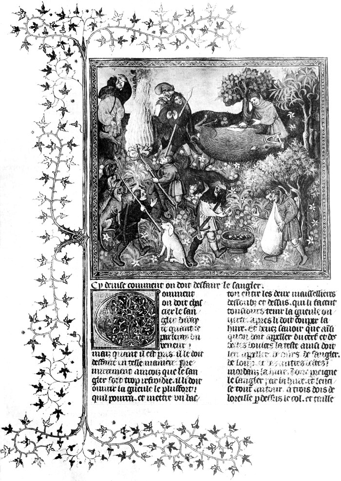
The oldest copy that is extant is preserved in the same treasure-house that contains our MS. and some fourteen other copies of it, namely the Bibliothèque Nationale in Paris. It bears the number 619 (anc. 7,098), while our MS. is numbered f.fr. 616 (anc. 7,097), and if P. Paris MSS. Franc. V 217 is right, it was Gaston’s working copy. The pictures in this MS. are shaded black-and-white drawings, and are not illuminations. That its origin was the south of France is proved, as M. Joseph Lavallée says, by the spelling of certain words: car being spelt guar, baigner as bainher, montagne as montainhe, a manner peculiar in the fourteenth century to the langue d’Oc. The fact that in the MS. 616 these words are spelt in the more modern fashion supports the theory, according to the last-mentioned authority, that it was written at a later date, i.e. in the first half of the fifteenth century, thus confirming the impression already produced by the far superior illuminations in MS. 616. These latter, as we see by a glance at the two full-page reproductions, somewhat reduced in size though they necessarily had to be to find space in this place, evince the unmistakable signs of having been created during a period of transition in the miniaturist’s art. For while the one has the characteristic diapered background, the other has a more realistic horizon, which betokens a later origin than the beginning of the fifteenth century. Of the eighty-seven illuminations in our MS. 616, only four have a natural horizon as background, the rest are diapered in the conventional older manner, in the invention of which the miniaturists of the fourteenth century developed a perfectly wonderful ingenuity, and of which this exquisite Codex is one of the most remarkable examples. ¶ In the opinion of some experts the illuminations in MS. 616 are by the hand of the famous Jean Foucquet, born about 1415, who was made painter and valet-de-chambre to Charles VII. Amongst the choicest works of this artist rank, it is perhaps hardly necessary to mention, the Book of Hours that he executed for Estienne Chevalier, Charles VII’s Treasurer, another Hours which he made for the Duchess Marie of Cleves, and most famous of all the ninety miniatures of the Boccaccio of Estienne Chevalier which is one of the principal treasures of the Royal Library in Munich. Those who are acquainted with Count Bastard’s monumental work will probably discover a distinct resemblance between one of his reproductions, especially in the foliage and scroll work, and the two full-page pictures now before the reader. On the other hand, the opinion of such a painstaking critic as is Levallée deserves attention. According to him—and nobody expended more time and trouble in Gaston Phoebus researches—the illuminations are not by Foucquet’s hand, but possibly by an artist of his school. If they are Foucquet’s, they cannot have been executed before 1440, or at the earliest 1435. ¶ And now to return to the romantic history of our Codex. On one of the front leaves is painted a large coat-of-arms. It is that of the Saint-Vallier family, and two events connected with the then possessors of this precious manuscript throw a telling sidelight upon French social conditions at the period to which the opening scene on Pavia’s bloody field has introduced us. A generation before that event, namely in 1477, Jacques de Brézé, a rich noble of well-known sporting proclivities, returning suddenly home found his wife in a compromising position with a young noble. Swords flashed on slighter provocation than this one in those days, and the angry husband killed both the lover and his wife without further[Pg 12] ado. Unhappily for him, the latter was no less a personage than Charlotte of France, natural daughter of Charles VII, and it cost the stern husband a fine of 100,000 ducats, a huge sum in those days, and a couple of years’ confinement in a castle to save his life. The eldest of the six children who were made motherless by this event subsequently married Diane of Poitiers, who not long afterwards became the all-powerful mistress of Francis I, and later on of Henry II, his son. Now Diane de Poitiers was the daughter of Jean de Poitiers, Sieur of Saint-Vallier, on whom his King (Louis IX) had bestowed the hand of his natural daughter Marie. The Codex whose reproductions we have before us had been given, probably as part of the King’s dower, to Jean de Poitiers’s wife, hence the armorial bearings. If we want to become acquainted with the circumstances that probably were the cause of its presence in King Francis’s tents on the eventful day of Pavia, we have to turn to another tragic event which occurred two years before Pavia. In 1523 Jean de Poitiers involved himself in the Connétable de Bourbon’s conspiracy, and the discovery by the King’s minions, among Jean’s secret papers, of the code treacherously used by the Connétable in his correspondence with Charles V of Germany, sent Jean speedily to the scaffold. He was in the act of kneeling down to receive the deathblow when the pardon obtained by his daughter from her royal lover, the King, saved his life. But all his goods and chattels were confiscated by Francis I, and amongst them was most probably our Codex, and thus it came to form part of the vast booty captured by Emperor Charles’s rough-handed Landsknechte. ¶ These formidable soldiers, who, under their giant leader, Georg von Frundsberg, had performed in the Italian campaigns deeds of great prowess—they were really the first trained infantry—were recruited almost exclusively in Tyrol, and for this reason it is not surprising that the next authentic news we have of our Codex is from that country. Bishop Bernard of Trent purchased it evidently from some returning booty-laden Landsknecht, and, recognising its great value, he presented it about the year 1530 to Archduke Ferdinand, Duke of Tyrol, one of the greatest collectors of his time, whose museum and library at his castle Ambras, near Innsbruck, was the wonder of the day. ¶ It remained in the possession of the Hapsburgs for about 130 years, when victory returned it once more to the country from whence defeat had removed it. During Turenne’s campaign in the Netherlands, General the Marquis of Vigneau became possessed of the volume—how remains unfortunately a mystery—and on his return to Paris presented it, July 22, 1661, to his King, Louis XIV. Bishop Bernard’s and General Vigneau’s dedications to the respective royalties are inscribed on the fly leaves, the former, in the shape of a long-winded Latin ‘humblest offering,’ taking up a good deal of space, though, unlike the Frenchman’s dedication, it fails to indicate the year when the presentation was made. ¶ Louis XIV deposited it in the Royal Library, where it received its librarian’s birthmark, the number 7,097, which it retained down to recent days, when it was rechristened, to be known henceforth, as already stated, as MS. 616. It never should have left those sacred halls, but Louis XIV was no venerator of his own law when it suited him to break it. Regretting his gift to the Library, a few years afterwards he demanded the volume back, and back again he got it, his son, the Count of Toulouse, becoming the next owner of it. From him it passed to Orleans princes until, in the fateful year 1848, it formed part of the private library of Louis Philippe at Neuilly, when that royal residence was plundered and fired by the populace.
The oldest surviving copy is kept in the same treasure house as our manuscript and about fourteen other copies, specifically the Bibliothèque Nationale in Paris. It has the number 619 (anc. 7,098), while our manuscript is numbered f.fr. 616 (anc. 7,097), and if P. Paris MSS. Franc. V 217 is accurate, it was Gaston’s working copy. The illustrations in this manuscript are black-and-white drawings with shading and are not illuminations. According to M. Joseph Lavallée, its origin from the south of France is supported by the spelling of certain words: car is spelled guar, baigner becomes bainher, and montagne is montainhe, which was distinctive to the langue d’Oc in the fourteenth century. The fact that in the manuscript 616 these words are spelled in a more modern way supports the idea, according to the aforementioned expert, that it was written later, specifically in the first half of the fifteenth century, confirming the impression given by the far superior illuminations in manuscript 616. The latter, as can be seen in the two full-page reproductions shown here, slightly reduced in size to fit in this book, clearly shows the unmistakable signs of having been created during a transitional period in miniaturist art. One features the characteristic diapered background, while the other has a more realistic horizon, indicating a later origin than the early fifteenth century. Of the eighty-seven illuminations in our manuscript 616, only four have a natural horizon as a background, while the rest are diapered in the conventional older style, an art that the miniaturists of the fourteenth century developed with remarkable creativity, making this exquisite Codex one of the most notable examples. ¶ Some experts believe that the illuminations in manuscript 616 were created by the famous Jean Foucquet, born around 1415, who became painter and valet-de-chambre to Charles VII. Among Foucquet's best-known works is the Book of Hours he created for Estienne Chevalier, Charles VII’s Treasurer, another Book of Hours he made for the Duchess Marie of Cleves, and his most famous work, the ninety miniatures for the Boccaccio of Estienne Chevalier, which is one of the treasures of the Royal Library in Munich. Those familiar with Count Bastard’s monumental work will likely see a distinct resemblance between one of his reproductions, particularly in the foliage and scrollwork, and the two full-page pictures presented here. On the other hand, the opinion of careful critics like Levallée is worth considering. According to him—and no one spent more time and effort studying Gaston Phoebus—the illuminations were not created by Foucquet but possibly by an artist from his school. If they are indeed Foucquet’s work, they must have been made after 1440 or at the earliest 1435. ¶ Returning to the romantic history of our Codex, one of the front leaves features a large coat of arms. It belongs to the Saint-Vallier family, and two events involving the then-owners of this valuable manuscript shed light on French social conditions at the time introduced by the opening scene on Pavia’s bloody field. A generation before that event, in 1477, Jacques de Brézé, a wealthy noble known for his love of hunting, returned home unexpectedly to find his wife in a compromising situation with a young nobleman. Swords could flash for lesser provocations back then, and the furious husband killed both the lover and his wife without hesitation. Unfortunately for him, the latter was none other than Charlotte of France, the illegitimate daughter of Charles VII, which cost him a hefty fine of 100,000 ducats—an enormous amount at the time—and two years of confinement in a castle to save his life. The eldest of the six children left motherless by this tragic event later married Diane de Poitiers, who soon became the powerful mistress of Francis I, and later his son, Henry II. Diane de Poitiers was the daughter of Jean de Poitiers, Sieur of Saint-Vallier, who had been given the hand of the king's natural daughter, Marie. The Codex before us was likely given as part of the king’s dowry to Jean de Poitiers’s wife, hence the armorial bearings. To uncover the circumstances that likely led to its presence in King Francis’s tents on that momentous day at Pavia, we look to a tragic event that occurred two years prior. In 1523, Jean de Poitiers became entangled in the Connétable de Bourbon’s conspiracy, and when the king's agents discovered the treasonous code among Jean’s secret papers, he was swiftly sentenced to execution. He was kneeling to receive the death blow when a pardon, obtained by his daughter from her royal lover, the king, saved him. However, all his assets were confiscated by Francis I, including what was probably our Codex, which then became part of the vast loot captured by Emperor Charles’s rough-handed Landsknechte. ¶ These formidable soldiers, under their giant leader Georg von Frundsberg, had committed remarkable acts during the Italian campaigns—they were truly the first trained infantry—and since they were almost exclusively recruited from Tyrol, it’s not surprising that the next authentic news about our Codex comes from there. Bishop Bernard of Trent purchased it from a returning Landsknecht laden with loot, and recognizing its great value, presented it around 1530 to Archduke Ferdinand, Duke of Tyrol, one of the greatest collectors of his time, whose museum and library at his castle Ambras, near Innsbruck, was the talk of the town. ¶ It remained with the Hapsburgs for about 130 years until victory returned it to the country from which it had been taken. During Turenne’s campaign in the Netherlands, General Marquis of Vigneau obtained the volume—how remains a mystery—and upon returning to Paris, he presented it to his king, Louis XIV, on July 22, 1661. The dedications from Bishop Bernard and General Vigneau to their respective royal patrons are inscribed on the flyleaves. The former’s lengthy Latin “humblest offering” takes up a lot of space, while, unlike the Frenchman’s dedication, it does not indicate the year of presentation. ¶ Louis XIV placed it in the Royal Library, where it received its librarian’s birthmark, the number 7,097, which it retained until recent days, when it was renamed, now known, as mentioned earlier, as MS. 616. It shouldn’t have left those hallowed halls, but Louis XIV was not above bending the rules when it suited him. A few years later, regretting his gift to the Library, he demanded the volume back, and he got it back, with his son, the Count of Toulouse, becoming its next owner. From him, it passed to the Orleans princes until, in the fateful year 1848, it was part of the private library of Louis Philippe at Neuilly, when that royal residence was looted and burned by the public.

By a wonder it escaped complete destruction on that occasion, and though the covers were badly damaged and blood-bespattered, the inside of the book was left intact. Although a new cover of somewhat gaudy modernity has been supplied to it in[Pg 15] consequence of the fiery ordeal through which it had passed, the student visiting the great Paris library, where this unique Codex is exhibited in what is known as the Reserve, will find its vellum leaves in very much the same perfect condition as they were when Diane de Poitiers and Francis I turned them over with the care that is bestowed upon a work one loves. ¶ Another fine copy of Gaston Phoebus is preserved in the late Duc d’Aumale’s magnificent library at Chantilly, now the property of the French nation. When recently making some researches there the writer came across a pathetic little note in the late Duke’s catalogue respecting our Codex, which, as we have heard, belonged to the House of Orleans for upwards of a century. It occurs where the Duc d’Aumale speaks of the MS. 616, and it runs: ‘Saved from the conflagration of 1848, it was taken to the Bibliothèque Nationale, but our appeals for a return of the volume addressed to the Conservateurs of the Library were rejected, however well founded we considered our claim!’ The miniatures in the Chantilly copy are finely drawn, but evince in some instances a grotesqueness which is absent from those adorning MS. 616. Thus the much suffering reindeer comes in for some exceedingly quaint limning, with antlers of perfectly ludicrous proportions and a coat like an Angora goat’s. ¶ One curious fact obtrudes itself upon our notice as we examine the illumination in almost all the Gaston Phoebus copies that are adorned with illuminations (the majority of the existing forty MSS. are not illuminated, or at best only with very inferior pictures). It is the bright colours of the huntsmen’s dress in the fifteenth century. With the exception of the wild-boar hunters, who are generally garbed in grey costumes, mounted and unmounted hunters engaged in the pursuit of the stag, buck, bear, otter, fox, wild cat, wolf, hare, and badger, wear with curious promiscuousness blue, scarlet, mauve, white, and yellow costume quite as often as they appear in the more orthodox green-coloured dress. It may possibly have been merely an instance of artistic licence on the part of the miniaturists, for according to the text grey and green were the only colours of venery known to the good veneur. ¶ To come to the contents of our MS. we can introduce it by the broad statement that Gaston Phoebus is the first mediaeval hunting-book in prose that does not deal with the subject in the catechism-like form of question and answer. The few previous prose works that have come down to us take the form of questions asked by the keen young apprentice and answered by his instructor, an experienced veneur, explaining to him the A B C of venery. Some bits in Gaston’s Livre de Chasse are borrowed from Roy Modus, written about sixty years earlier, some from Gace de la Buigne (or Vigne), King John’s first chaplain, written less than thirty years earlier, and a few from La Chace dou Serf, a poetic effusion of the second half of the thirteenth century. But taking it as a whole Gaston Phoebus is unquestionably as original as could be any work upon such a popular subject as hunting then was. ¶ To those who know their Froissart, Count Gaston de Foix’s personality will be very familiar; but, considering that the chronicler’s visit occurred in 1388, the year after the commencement of the Livre de Chasse, it is somewhat strange, in view of his long stay and intimate intercourse at the Count’s court, that he does not mention the opus upon which his host was then engaged. ¶ The prologue mirrors in a characteristic manner the spirit of the age, as does also the last miniature in MS. 616, which represents the noble sportsman in an attitude of beatitude kneeling in a chapel. That Gaston was a pious lord we can see by the score or so of Latin prayers said to have been composed by him in the dire hour of mortal distress after the tragic death of his only son by his—the father’s—hand. ‘By the Grace of God’ Count Gaston speaks wisely and well of the good qualities that a hunter should have, and how hunting[Pg 16] causeth a man to eschew the seven deadly sins, concluding his homily with a sentiment that appeals to the sportsman of the twentieth century as much as it did to him of the fourteenth. ‘And also, say I, that there is no man who loves hunting that has not many good qualities in him, for they come from the nobleness and gentleness of his heart of whatsoever estate he be, great lord or little, poor or rich.’ ¶ The prologue once finished, Gaston starts with zest on his task, beginning with the stag, or, to be quite correct, with the ‘nature’ of what was considered in all Continental hunting the most important beast of venery. The next thirteen chapters deal respectively in a similar way with the natural history of the reindeer, the fallow deer, the ‘bouc,’ under which the ibex and the chamois were included, the roe-deer, the hare, the rabbit, the bear, the wild boar, the wolf, the fox, the badger, the wild cat, and the otter. ¶ Following these fourteen chapters, we get ten very interesting ones on the various kinds of sporting hounds, their training, treatment when ill, the construction and management of the kennel, and other details relating to the subject. In Gaston’s time there were five kinds; the first is the Alaunt, which he subdivides into the Alaunt gentle and the Alaunt veautres; the second is the levrier or greyhound; the third the chien courant or running hound; the fourth the bird dog or espainholz, from which the modern spaniel has sprung; and the fifth the mastin or mastiff. Then come two chapters on how to make nets, and how to blow and trumpet, followed by eighteen chapters on how to track the stag and the wild boar, and how to judge of their presence, size, age, etc., by the various signs known to the veneur, who made a very exact science of what we would call woodcraft. The next fifteen chapters relate to the chase proper of the fourteen beasts named at first, with a double chapter on the chase of the wild boar. The concluding twenty-six chapters deal with the various manners of netting, snaring, trapping, and poisoning of wild beasts of prey and other less noxious animals. They are mostly short chapters, and in more than one place the author displays his unwillingness to deal with matter that a good sportsman need have no ken of, except in so far as was necessary to keep down vermin and destroy ‘marauders of the woods’ for the benefit of his legitimate quarry. ¶ Certain historians have called Gaston Phoebus a ‘cruel voluptuary,’ and no doubt some of his repressive measures sound unnecessarily harsh, not to say merciless, in these soft times; but the spirit in which he wrote his famous book is unquestionably that of a really good sportsman who abhors all underhand advantages that curtail the hunted beast’s chances, and who takes his bear or wild boar single-handed, and pursues his stag to a finish, be the forest a trackless maze, and the river to which the hunted deer finally takes a swift flowing stream, into which to plunge is but a minor incident of an exciting sport. ¶ Of the forty or forty-one ancient MS. copies of Gaston Phoebus that are known to exist in Europe to-day, twenty-one are in France, fifteen keeping our MS. 616 company on the shelves of the Bibliothèque Nationale. Five form part of the Vatican Library, and six adorn the principal libraries of Continental capitals. Of the eight copies that are or were in England one is in the British Museum, and two form part of the well-known collection formed in the first half of the last century by the late Sir Thomas Phillipps, Bt., a bibliophile as wealthy as he was discerning. Of these two MSS., No. 11,592 is an incomplete late copy of little value; but the other MS., 10,298, is on the other hand a treasure of great value. Of all the Continental and English copies that the writer has examined this one contains, next to those in MS. 616, the finest miniatures. It is less carefully written, and there are some variations, but nothing of importance so far as is known, [Pg 21] though it has never been carefully collated with the best French copies.
By a miracle, it avoided total destruction at that time, and even though the covers were seriously damaged and stained with blood, the inside of the book remained intact. A new cover, somewhat flashy and modern, has been added as a result of the fiery ordeal it endured. When students visit the great library in Paris, where this unique Codex is displayed in what’s called the Reserve, they will find its vellum pages in almost the same perfect condition as when Diane de Poitiers and Francis I handled them with the care given to a beloved work. ¶ Another fine copy of Gaston Phoebus is preserved in the late Duc d’Aumale’s magnificent library at Chantilly, which is now owned by the French nation. While recently doing some research there, the writer stumbled upon a poignant little note in the late Duke’s catalogue regarding our Codex, which, as we’ve heard, belonged to the House of Orleans for over a century. It appears where the Duc d’Aumale references the MS. 616, stating: ‘Saved from the fire of 1848, it was taken to the Bibliothèque Nationale, but our requests for its return to us addressed to the library’s curators were denied, no matter how justified we thought our claim!’ The miniatures in the Chantilly copy are intricately drawn, but in some cases, they reveal a bizarre quality that is missing from those found in MS. 616. For instance, the long-suffering reindeer is depicted in an exceedingly odd manner, sporting antlers of ridiculously exaggerated size and a coat resembling that of an Angora goat. ¶ One curious observation arises as we examine the illustrations in nearly all the illuminated copies of Gaston Phoebus (most of the forty existing manuscripts are either unillustrated or contain very inferior images). It’s the bright colors of the hunters’ outfits in the fifteenth century. Except for the wild boar hunters, who are typically dressed in gray, both mounted and unmounted hunters pursuing stag, buck, bear, otter, fox, wildcat, wolf, hare, and badger often wear a mix of blue, scarlet, mauve, white, and yellow attire as frequently as they sport the more traditional green garb. This could have simply been an artistic license taken by the miniaturists, as according to the text, gray and green were the only colors of hunting attire known to the good veneur. ¶ Moving on to the contents of our manuscript, we can introduce it with the broad statement that Gaston Phoebus is the first medieval hunting book in prose that doesn’t present the subject in the form of question and answer like a catechism. The few previous prose writings that have survived take the form of questions posed by an eager young apprentice and responses from his knowledgeable instructor, an experienced veneur, explaining the basics of hunting. Some sections in Gaston’s Livre de Chasse are borrowed from Roy Modus, written about sixty years earlier, some from Gace de la Buigne (or Vigne), King John’s first chaplain, composed less than thirty years prior, and a few from La Chace dou Serf, a poetic work from the latter half of the thirteenth century. However, as a whole, Gaston Phoebus is undoubtedly as original as any work on such a popular topic as hunting was at the time. ¶ For those familiar with Froissart, Count Gaston de Foix’s character will be very recognizable; yet, considering that the chronicler visited in 1388, the year after the Livre de Chasse began, it is somewhat odd that despite his long stay and close interaction at the Count’s court, he doesn’t mention the opus on which his host was currently working. ¶ The prologue reflects the spirit of the age in a characteristic way, as does the last miniature in MS. 616, which shows the noble sportsman kneeling in a chapel with an expression of peace. That Gaston was a devout lord is evident from the numerous Latin prayers reportedly composed by him at a time of deep personal distress following the tragic death of his only son, caused by his— the father’s— hand. ‘By the Grace of God’ Count Gaston wisely and eloquently discusses the noble traits a hunter should embody, and how hunting[Pg 16] helps a man avoid the seven deadly sins, concluding his reflection with a sentiment that resonates with the sportsman of the twentieth century as much as it did for him in the fourteenth: ‘And also, I say that there is no man who loves hunting who does not possess many good qualities, because they stem from the nobility and kindness of his heart, whatever his social status may be, whether great lord or humble, poor or rich.’ ¶ Once the prologue is complete, Gaston enthusiastically begins his work, starting with the stag, or more specifically, with the ‘nature’ of what was deemed the most important beast of venery in all continental hunting. The next thirteen chapters similarly address the natural history of the reindeer, fallow deer, ‘bouc,’ which includes ibex and chamois, roe deer, hare, rabbit, bear, wild boar, wolf, fox, badger, wildcat, and otter. ¶ After these fourteen chapters, we find ten very intriguing chapters on the different types of hunting dogs, their training, care in illness, the construction and management of the kennel, and other relevant details. In Gaston’s era, there were five types; the first is the Alaunt, which he divides into the Alaunt gentle and the Alaunt veautres; the second is the levrier or greyhound; the third is the chien courant or running hound; the fourth is the bird dog or espainholz, from which the modern spaniel is derived; and the fifth is the mastin or mastiff. Following that are two chapters on making nets, and on blowing a horn, which is succeeded by eighteen chapters on tracking the stag and wild boar, and how to assess their presence, size, age, etc., by the various signs known to the veneur, who perfected what we would now call woodcraft. The next fifteen chapters focus on the chase of the fourteen beasts mentioned earlier, with a double chapter on hunting the wild boar. The final twenty-six chapters discuss various methods of netting, snaring, trapping, and poisoning wild prey and other less harmful animals. These chapters are mostly brief, and in several instances, the author shows reluctance to delve into matters that a good sportsman doesn’t really need to know, except as necessary for controlling vermin and eliminating ‘marauders of the woods’ to protect his legitimate game. ¶ Some historians have labeled Gaston Phoebus a ‘cruel pleasure-seeker,’ and while some of his strict measures may seem excessively harsh, not to mention merciless, in our gentler times, the spirit in which he wrote his famous book is unquestionably that of a true sportsman who detests all underhanded tactics that diminish the hunted animal's chances, taking on his bear or wild boar alone, and pursuing his stag to the end, regardless of whether the forest is a chaotic maze, and the river into which the fleeing deer ultimately plunges is merely a minor detail of an exhilarating sport. ¶ Of the forty or forty-one ancient manuscript copies of Gaston Phoebus known to exist in Europe today, twenty-one are in France, with fifteen alongside our MS. 616 at the Bibliothèque Nationale. Five are part of the Vatican Library, and six are housed in the major libraries of various continental capitals. Among the eight copies that are or were in England, one is in the British Museum, and two are part of the renowned collection built up in the first half of the last century by the late Sir Thomas Phillipps, Bt., a bibliophile as wealthy as he was discerning. Among these two manuscripts, No. 11,592 is an incomplete late copy of little value; however, the other manuscript, 10,298, is a treasure of significant worth. Of all the Continental and English copies the writer has examined, this one contains, next to those in MS. 616, the finest miniatures. It is less carefully written, and there are some variations, but nothing of great importance is known, [Pg 21] although it has not been thoroughly compared with the best French copies.
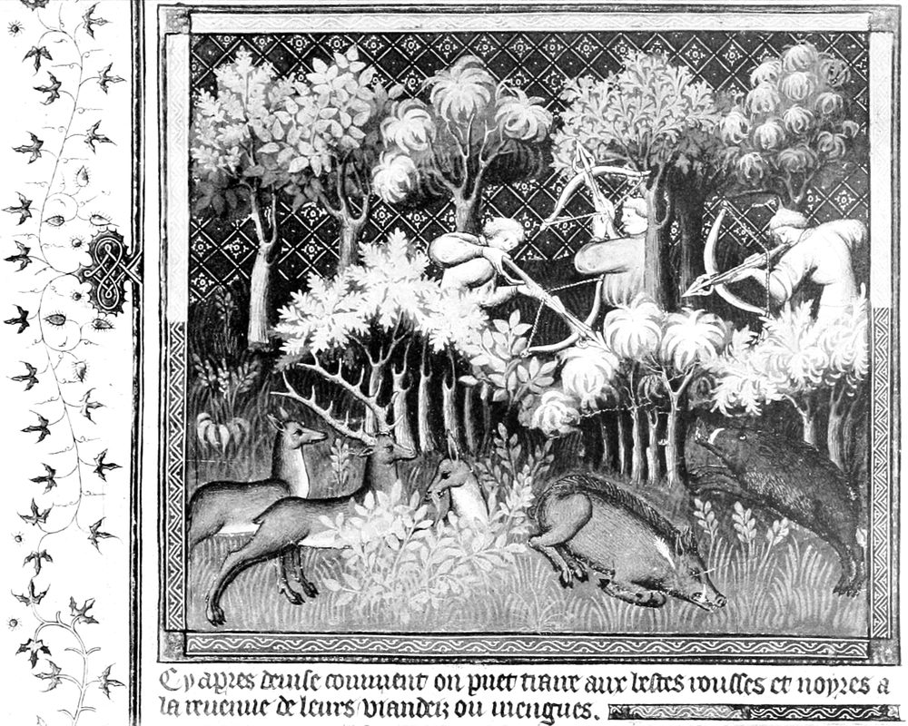


The British Museum copy of Gaston Phoebus, catalogued as Addit. MS. 27,699, is on vellum, quarto, written in the first half of the fifteenth century. The miniatures are by an indifferent hand, and have been left in an unfinished state, the miniaturist having apparently expended most of his time, and nearly all his bright colours and shining gold, upon the diapering of the backgrounds. It was bought at the Yemeniz Sale in Paris, in May 1867, for something less than £400. The Ashburnham Library contained two copies, both early ones, and of these MS. App. 179 is interesting on account of an hitherto unknown treatise on hawking and birds being added at the end of the hunting book, which is incomplete, and the spaces at the head of each chapter for the usual miniatures are left blank. It was bought at the fourth Ashburnham Sale in May 1899 by the writer. ¶ Of the copy which Werth and Lavallée quote as being in the possession of a Cambridge Library, it is regrettable that no information could be obtained by them or by myself. As a rule the lot of the student making researches of this sort in English libraries, always excepting, of course, the British Museum and the Bodleian, is not a happy one. Not only is study in the libraries discouraged, and letters of inquiry are left unanswered, but valuable MSS. seem to get mislaid, lost, or stolen, rather more frequently than should be. The two remaining copies of Gaston Phoebus in this country, one being in a public museum, the other in a well-known ducal library, have shared this fate, and their whereabouts are unknown. The latter copy must have been a very beautiful MS., for it is described in Dibdin’s Decameron, Vol. III, p. 478, and was bought in 1815 for £161, then a large sum, by Loché; and according to Werth (Altfranzösische Jagdlehrbücher, 1889, p. 70) it was, when he wrote, in the Duke of Devonshire’s library, from which, however, it seems to have disappeared, for no trace of it can be found. Curiously enough, this fate is shared by yet another valuable hunting MS., which for the English student has even greater interest, namely, one of the few existing copies (nineteen all told) of the Duke of York’s translation of Gaston Phoebus, which has disappeared from a well-known nobleman’s library. ¶ In conclusion, it is necessary to say a few words respecting the subject matter of the MS. just mentioned, for many erroneous impressions regarding it are abroad. Gaston Phoebus deals with some animals that were not found in England in Plantagenet times, e.g. the reindeer, the ibex and chamois, and the bear. Hence when Edward, second Duke of York, who filled the position of Master of Game at the court of his cousin, Henry IV, made a translation of his famous contemporary’s hunting book, he took only those parts of it which related to game and dogs found in England, and added five original chapters, calling the whole ‘The Master of Game.’ This book is the oldest hunting book in English, but has never been published. The writer’s reproduction of it, illustrated by photogravure copies of the illuminations in the Paris Codex MS. 616, some of which are reproduced in the present article, is now going through the press.[2] It will, it is hoped, fill a gap in English hunting literature, and remove numerous misconceptions concerning this subject.
The British Museum's copy of Gaston Phoebus, catalogued as Addit. MS. 27,699, is on vellum, quarto size, and was written in the first half of the fifteenth century. The miniatures are by a mediocre artist and remain unfinished, as the miniaturist seems to have spent most of his time and most of his vibrant colors and shiny gold on the backgrounds. It was purchased at the Yemeniz Sale in Paris in May 1867 for just under £400. The Ashburnham Library had two early copies, and MS. App. 179 is notable because it includes an unknown treatise on hawking and birds added at the end of the incomplete hunting book, with blank spaces at the start of each chapter for the usual miniatures. The writer bought it at the fourth Ashburnham Sale in May 1899. ¶ Unfortunately, no information could be gathered about the copy that Werth and Lavallée mentioned as being in a Cambridge library, which is disappointing. Generally, students researching this kind of material in English libraries—excluding, of course, the British Museum and the Bodleian—have a tough time. Not only is studying in the libraries often discouraged, but inquiries often go unanswered, and valuable manuscripts seem to go missing, lost, or stolen more often than one would expect. The two other copies of Gaston Phoebus in this country, one in a public museum and the other in a prestigious ducal library, have also met this fate, and their locations are unknown. The latter copy must have been stunning, as it’s referenced in Dibdin’s Decameron, Vol. III, p. 478, and was purchased in 1815 for £161, a significant amount at that time, by Loché; according to Werth (Altfranzösische Jagdlehrbücher, 1889, p. 70), it was in the Duke of Devonshire’s library when he wrote, but it seems to have vanished since then, as no trace of it can be found. Interestingly, this fate is also shared by another important hunting manuscript that’s even more relevant to English students: one of the few existing copies (only nineteen in total) of the Duke of York’s translation of Gaston Phoebus, which has also disappeared from a well-known nobleman’s library. ¶ In conclusion, it's important to clarify some points about the manuscript just mentioned, as there are many misconceptions about it. Gaston Phoebus includes animals that weren’t found in England during the Plantagenet era, like the reindeer, ibex, chamois, and bears. So when Edward, the second Duke of York, who was the Master of Game at the court of his cousin, Henry IV, translated his famous contemporary’s hunting book, he only included the parts relevant to game and dogs found in England and added five original chapters, renaming the whole work 'The Master of Game.' This book is the oldest hunting book in English but has never been published. The writer’s reproduction of it, illustrated with photogravure reproductions of the illuminations from the Paris Codex MS. 616, some of which are featured in this article, is currently being printed.[2] It is hoped that it will fill a gap in English hunting literature and correct many misconceptions about the topic.
[Pg 22]
[Pg 22]
A NEWLY DISCOVERED ‘LIBRO DI RICORDI’ OF ALESSO BALDOVINETTI
❧ WRITTEN BY HERBERT P. HORNE ❧
❧ WRITTEN BY HERBERT P. HORNE ❧
PART I

MONG the books of the Spedale di San Paolo, at Florence, is a volume marked on the cover ‘Testimenti,’ and lettered ‘B.’ It contains a record of all wills between the years 1399 and 1526 under which the hospital in any way benefited; and on fol. 16 recto is the following entry: ‘Alexo di Baldovinecto Baldovinetti has this day, the 23rd of March, 1499, made a donation to our hospital of all his goods, personal and real, after his death, with obligation that the hospital support Mea, his servant, so long as she live: [the deed was] engrossed by Ser Piero di Leonardo da Vinci, notary of Florence, on the day aforesaid.’ ‘Alexo died on the last day of August, 1499; and was buried in his tomb in San Lorenzo; and the hospital remained the heirs of his goods. May God pardon him his sins!’[3] ¶ Milanese, who quotes this ‘ricordo’ textually, though not without some slight errors, in his notes to Vasari, states that the volume in which it occurs is preserved in the Archivio di Stato at Florence; whereas the archives of the hospital are now in the ‘Archivio’ of Santa Maria Nuova, San Paolo having been united to the latter hospital by the Grand Duke Pietro Leopoldo, c. 1783.[4] ¶ At first sight, this ‘ricordo’ would not seem to bear out the story which Vasari tells of Alesso and his dealings with the authorities of San Paolo. It states only that Alesso made a donation to the hospital of all his worldly goods after his death, upon the condition that his faithful servant, Mea, was to be lodged, clad, and fed, during her life; whereas Vasari, on the contrary, states that the painter himself became an inmate of San Paolo. ‘Alesso,’ he says, ‘lived eighty years; and when he began to grow old, desirous of being able to attend to the studies of his profession with a quiet mind, he, as many men often do, entered the Hospital of San Paolo: and in order, perhaps, that he might be received the more willingly, and be better treated (though it might, indeed, have happened by chance), he caused a great chest to be brought into his rooms, in the hospital; acting as if a goodly sum of money were therein: whereupon the master and the other ministrants of the hospital, believing that this was so, bestowed on him the greatest kindness in the world; since they knew that he had made a donation to the hospital, of whatever was found in his possession at his death. But when Alesso died, only drawings, cartoons, and a little book which set forth how to make the tesserae for mosaic, together with the stucco and the method of working them, were found therein.’[5] ¶ The apparent discrepancy between the ‘ricordo’ in the books of San Paolo and Vasari’s account led me to search, and not without success, for the deed by which Alesso’s property passed to the hospital. I found that both the name of the notary and the date of the execution of the instrument were incorrectly given in the ‘ricordo’ cited above. The instrument was engrossed by Ser Piero di Antonio di Ser Piero da Vinci, the father of Leonardo da Vinci, and executed on March 16, 1497–8. By this deed Alesso, ex titulo et causa donationis, ‘irrevocably gave and bequeathed during his life-time, to the Hospital of the Pinzocheri of the third order of St. Francis, otherwise called the Hospital of San Pagholo, and to the poor of Christ living in the said hospital for the time being,’ etc., ‘all his goods, real and personal, present and future, wherever situate or existent,’ etc., reserving to himself[Pg 23] ‘the use and usufruct of the said goods,’ etc., ‘for the term of his natural life.’ The ‘rogiti’ of Ser Piero da Vinci for the year 1498 have not been preserved among the ‘protocols’ of that notary now in the Archivio di Stato at Florence; and so it is no longer possible to say under what conditions, if any, the donation was made: but it is to be presumed upon the evidence of the ‘ricordo’ cited above, that it entailed the obligation on the part of the hospital, to maintain Mea, his servant, during her life. ¶ On October 17, 1498, Alesso executed what was technically known as a ‘renuntiatio,’ which was likewise engrossed by Ser Piero da Vinci. This second instrument, which begins by reciting the former deed of donation in the terms quoted above, sets forth how, on that day, Alesso, ‘by reason of lawful and reasonable causes of motion influencing, as they assert, his mind, and by his mere, free, and proper will,’ etc., ‘renounced the said use and usufruct, expressly reserved to himself in the aforesaid donation, and freely remitted and released the said use and usufruct to the said hospital, and to the poor of Christ dwelling in the said hospital,’ etc. The text of this document, which is preserved in the Archivio di Stato at Florence, is printed at length at the end of this article.[6] It allows us to draw but one conclusion; namely, that when the painter executed the deed of donation on March 16, 1497–8, he had been left without wife or children; and that he anticipated but two contingencies against which he would provide after his death—the health of his soul and the maintenance of his faithful servant, Mea. ¶ Alesso had married late in life. It appears from the ‘Portata al Catasto,’ returned by him in 1470, that he was still unmarried at that time, and that he was possessed of no real property, but rented a house in the ‘popolo’ of San Lorenzo, in Florence, described in his later ‘Denunzie,’ as being in the Via dell’ Ariento, at the Canto de’ Gori.[7] In another ‘Denunzia’ returned in 1480, Alesso thus describes his family:—‘Alesso Baldovinetti, aforesaid, aged 60, painter; Monna Daria, his wife, aged 45; Mea, his maid-servant, aged 13.’ As a matter of fact, Alesso was 63 years of age, having been born on October 14, 1427, Milanesi, by the way, in his notes to Vasari, gives the name of his, Alesso’s wife, as Diana, in error for Daria.[8] According to the same ‘Denunzia,’ the painter was at that time possessed of a parcel of land of twelve staiora, situate in the ‘popolo’ of Santa Maria a Quinto, and another parcel of seven staiora, in the same ‘popolo,’ the latter having been bought in 1479, with a part of his wife’s dowry. It is, therefore, probable that he had not long been married at that time.[9] It appears from a yet later ‘Denunzia’ on which the ‘Decima’ of 1498 was assessed, though the return itself was probably drawn up in 1495, that he possessed, in addition to the two parcels of land in the ‘popolo’ of Santa Maria a Quinto, a third parcel of over eleven staiora, in the adjoining ‘popolo’ of San Martino a Sesto, on the road to Prato. He was still living at that time in the same house at the Canto de’ Gori; and he also enjoyed the rents of two shops, with dwellinghouses above, which had been made over to him for the term of his natural life, by the Consuls of the Arte dei Mercanti, on February 26, 1483–4, in payment of his ‘magistero e esercitio et trafficho,’ in having restored the mosaics of the Baptistery of San Giovanni.[10] ¶ The Spedale di San Paolo, of which the beautiful loggia, with its ornaments by Andrea della Robbia, still remains on the Piazza of Santa Maria Novella, was originally a hospital for the care of the sick; and as such it is mentioned in a document of 1208.[11] From the time that St. Francis himself is said to have lodged at San Paolo, the hospital appears to have been administered by Franciscans,[Pg 24] called in the records ‘Fratres tertii Ordinis de Penitentia S. Pauli.’ During the fourteenth century, the house underwent certain reforms; and in 1398 it was decreed by the Signoria, ‘that the place was to be no longer a hospital, but a house of Frati Pinzocheri of the third order.’[12] Notwithstanding, the members of the community continued to devote themselves to the care of the sick; and a papal brief of 1452 directs that the revenues of the house were to be set apart for the infirm.[13] At an early period in the history of San Paolo, mention occurs of Pinzochere, that is to say, women attached to the community, no doubt for the service of the hospital; but unlike the men of the house, who are invariably called Frati Pinzocheri, they were not dignified by the title of ‘Monache’: from this Stefano Rosselli infers that they originally had no share in its government.[14] Owing, however, to some cause which is not very clear, the Frati Pinzocheri appear to have died out towards the latter part of the fifteenth century, leaving the women in possession of the hospital. From evidence that Rosselli and Richa adduce, it seems that in 1497 San Paolo was controlled and administered entirely by Pinzochere; and in the document of 1499, cited below, it is called ‘lo spedale di pizichora del terzo ordjne dj san franchesco.’[15] From this we must conclude that, when Alesso renounced the use and enjoyment of his property on October 17, 1498, he entered the hospital of San Paolo, not as a member of the community, but as a sick man who sought nothing more on earth than to be tended during the brief span of life that was left to him. He died ten months later, on August 29, 1499, and was buried in his own tomb in San Lorenzo.[16] The hospital of San Paolo probably inherited, along with Alesso’s other property, all his cartoons and drawings, as Vasari asserts: they, certainly, came into the possession of his books and papers, as we know. The little treatise on the art of Mosaic has long been lost; but Milanesi has stated in a well-known passage in his Vasari, that the autograph manuscript of certain ‘Ricordi’ of Alesso Baldovinetti still existed in his time, in the Archivio of Santa Maria Nuova, among the books of the hospital of San Paolo. He adds that these ‘Ricordi were published at Lucca in 1868, by Dr. Giovanni Pierotti, per le nozze Bongi e Ranalli.’[17] Few of those innumerable, little pamphlets with which Italians, learned and unlearned, delight to celebrate the marriages of their patrons, friends, or relatives, are more difficult to find than the little brochure of ten leaves, in a green paper wrapper, to which Milanesi alludes. The title page runs thus: ‘Ricordi di Alesso Baldovinetti, pittore fiorentino del secolo xv. Lucca. Tipografia Landi. 1868.’ Unfortunately only a portion of Baldovinetti’s manuscript is given in this pamphlet. The extracts, which fill less than a half of its twenty pages, are partly given in the text, and partly in an abstract, of the original. The rest of the pamphlet is filled with the introductory preface and notes of Dr. Pierotti. ¶ It is now some years ago since I first made an attempt to find the original manuscript of these ‘Ricordi,’ in the Archivio of Santa Maria Nuova, only to discover that I was not the first student of Florentine painting to search in vain for the volume. Whether it had been borrowed by Pierotti, or merely mislaid, or in what way it had disappeared, no one could tell me. Not long after this attempt, however, I chanced upon what proved to be a clue to its history. While searching among the ‘Carte Milanesi,’ the voluminous manuscript collections which the famous commentator of Vasari left to the Communal Library of Siena, I came across a series of extracts from the ‘Ricordi’ of Baldovinetti, in the handwriting of Milanesi, with the title: ‘Estratto del libro dei Ricordi di Alesso Baldovinetti autografo [Pg 27]essitente nell’ Archivio dello Spedale di Santa Maria Nuova di Firenze.—Libri dello Spedale di San Paolo, 12 Febbo. 1850.’ On comparing these extracts with Pierotti’s pamphlet, I found that the two copies agreed word for word with one another. It was evident that Pierotti had made use of Milanesi’s manuscript (indeed, he owns as much in his concluding note), and that he may never have seen the original manuscript. ¶ Last autumn, having occasion to make some researches in the Archivio of Santa Maria Nuova, with my friend Sir Domenic Colnaghi, for his ‘Dictionary of Florentine Painters,’ I took the opportunity of renewing my search for the missing volume. On the top shelf of one of the presses which contain the books and papers of the hospital of San Paolo, I came across a ‘filza’ labelled ‘Libri Diversi,’ and filled with miscellaneous account-books of the hospital, chiefly of the fifteenth and sixteenth centuries. Among these was a small, upright book of forty-seven leaves, bound in a parchment cover which was inscribed:—
MONG the books of the Spedale di San Paolo in Florence, there's a volume labeled on the cover ‘Testimenti’ and marked ‘B.’ It has a record of all the wills from 1399 to 1526 that benefitted the hospital in any way; and on fol. 16 recto there’s the following entry: ‘Alexo di Baldovinecto Baldovinetti has today, March 23, 1499, made a donation to our hospital of all his goods, both personal and real, after his death, with the condition that the hospital support Mea, his servant, for as long as she lives: [the deed was] documented by Ser Piero di Leonardo da Vinci, notary of Florence, on the date mentioned.’ ‘Alexo died on the last day of August, 1499, and was buried in his tomb in San Lorenzo; the hospital inherited his goods. May God forgive him his sins!’[3] ¶ Milanese, who quotes this record verbatim, though with some slight errors, in his notes to Vasari, states that the volume is preserved in the Archivio di Stato in Florence; whereas the hospital's archives are now in the ‘Archivio’ of Santa Maria Nuova, San Paolo having been merged with the latter hospital by Grand Duke Pietro Leopoldo around 1783.[4] ¶ At first glance, this record doesn’t seem to support the story Vasari tells about Alesso and his interactions with the authorities of San Paolo. It only states that Alesso donated all his worldly goods after his death, on the condition that his faithful servant, Mea, was to be housed, clothed, and fed for her life; while Vasari, on the other hand, claims that the painter himself became a resident of San Paolo. ‘Alesso,’ he states, ‘lived to be eighty; and as he began to age, wanting to focus on his studies with peace of mind, he, like many men often do, entered the Hospital of San Paolo: and perhaps to be welcomed more gladly and treated better (though it may have happened by chance), he had a large chest brought to his room in the hospital, pretending there was a goodly amount of money inside: consequently, the master and the other providers at the hospital, believing it was true, showed him great kindness; knowing he had made a donation to the hospital of whatever was found in his possession at his death. But when Alesso died, only drawings, sketches, and a small book explaining how to create the tesserae for mosaics, along with stucco and the method to work with them, were found inside.’[5] ¶ The apparent disagreement between the record in the books of San Paolo and Vasari’s narrative prompted me to investigate, and not without success, for the deed by which Alesso’s property was transferred to the hospital. I discovered that both the name of the notary and the date of the document's execution were incorrectly stated in the previously mentioned record. The document was drawn up by Ser Piero di Antonio di Ser Piero da Vinci, Leonardo da Vinci's father, and executed on March 16, 1497–8. By this deed, Alesso, ex titulo et causa donationis, ‘irrevocably gave and bequeathed during his lifetime, to the Hospital of the Pinzocheri of the Third Order of St. Francis, also known as the Hospital of San Pagholo, and to the poor of Christ residing in the said hospital at that time,’ etc., ‘all his goods, both real and personal, current and future, wherever they may be located or exist,’ etc., reserving for himself[Pg 23] ‘the use and usufruct of the said goods,’ etc., ‘for the duration of his natural life.’ The ‘rogiti’ of Ser Piero da Vinci for the year 1498 have not been preserved in the ‘protocols’ of that notary currently held in the Archivio di Stato in Florence; so it’s no longer possible to say under what conditions, if any, the donation was made. However, it can be presumed from the evidence in the above-cited record, that it included the obligation for the hospital to care for Mea, his servant, for her lifetime. ¶ On October 17, 1498, Alesso executed what was technically a ‘renuntiatio,’ also drawn up by Ser Piero da Vinci. This second document, which begins by reciting the earlier deed of donation in the terms quoted above, explains how, on that day, Alesso, ‘due to lawful and reasonable causes affecting, as they say, his mind, and by his own free and proper will,’ etc., ‘renounced the said use and usufruct, explicitly reserved to himself in the prior donation, and freely released the said use and usufruct to the said hospital and to the poor of Christ living in the hospital,’ etc. The text of this document, preserved in the Archivio di Stato in Florence, is printed in full at the end of this article.[6] It leads us to just one conclusion: that when the painter executed the donation deed on March 16, 1497–8, he had no wife or children; and that he anticipated only two contingencies he would need to provide for after his death—the well-being of his soul and the care of his faithful servant, Mea. ¶ Alesso married later in life. It appears from the ‘Portata al Catasto’ returned by him in 1470, that he was still unmarried at that time and had no real estate but rented a house in the ‘popolo’ of San Lorenzo in Florence, described later in his ‘Denunzie,’ as being on the Via dell’Ariento, at the Canto de’ Gori.[7] In another ‘Denunzia’ returned in 1480, Alesso describes his family as follows: ‘Alesso Baldovinetti, aforementioned, aged 60, painter; Monna Daria, his wife, aged 45; Mea, his maid, aged 13.’ In fact, Alesso was 63 years old, born on October 14, 1427. Milanesi, in his notes to Vasari, incorrectly states the name of Alesso’s wife as Diana instead of Daria.[8] According to the same ‘Denunzia,’ the painter at that time owned a parcel of land of twelve staiora, located in the ‘popolo’ of Santa Maria a Quinto, and another parcel of seven staiora in the same area, the latter bought in 1479 with part of his wife’s dowry. Hence, it’s probable he hadn’t been married long at that point.[9] A later ‘Denunzia’ that assessed the ‘Decima’ of 1498, though likely compiled in 1495, shows he also owned, in addition to the two parcels in the ‘popolo’ of Santa Maria a Quinto, a third parcel of over eleven staiora in the neighboring ‘popolo’ of San Martino a Sesto, on the road to Prato. He was still living at that time in the same house at the Canto de’ Gori; he also enjoyed the rents from two shops, with apartments above, that had been transferred to him for his lifetime by the Consuls of the Arte dei Mercanti on February 26, 1483–4, in payment for his ‘magistero e esercitio et trafficho,’ related to the restoration of the mosaics of the Baptistery of San Giovanni.[10] ¶ The Spedale di San Paolo, known for its beautiful loggia adorned with ornaments by Andrea della Robbia, still stands on the Piazza of Santa Maria Novella. Initially, it served as a hospital for the sick, as noted in a document from 1208.[11] From the time St. Francis is said to have stayed at San Paolo, the hospital appears to have been run by Franciscans, referred to in records as ‘Fratres tertii Ordinis de Penitentia S. Pauli.’ During the fourteenth century, the establishment underwent reforms, and in 1398 it was decreed by the Signoria that ‘the place would no longer be a hospital but a house of Frati Pinzocheri of the third order.’[12] Nevertheless, the community members continued to care for the sick; a papal brief from 1452 decreed that the revenues of the house should be set aside for the infirm.[13] Early in the history of San Paolo, there are mentions of Pinzochere, meaning women affiliated with the community, likely serving the hospital; however, unlike the men of the house, consistently referred to as Frati Pinzocheri, they were not given the title of ‘Monache’; from this, Stefano Rosselli infers that they originally didn’t have a role in governance.[14] However, due to some unclear reason, the Frati Pinzocheri seem to have disappeared towards the end of the fifteenth century, leaving the women in charge of the hospital. Evidence from Rosselli and Richa suggests that in 1497, San Paolo was entirely managed by Pinzochere; in the 1499 document, it’s referred to as ‘lo spedale di pizichora del terzo ordjne dj san franchesco.’[15] This leads us to conclude that when Alesso renounced his property rights on October 17, 1498, he entered the hospital of San Paolo, not as a member of the community, but as a sick man in need of care during the short time he had left. He died ten months later, on August 29, 1499, and was buried in his own tomb in San Lorenzo.[16] The hospital of San Paolo likely inherited all of Alesso’s other property along with his cartoons and drawings, as Vasari asserts: they definitely obtained his books and papers, as we know. The small treatise on the art of mosaic has been long lost; but Milanesi noted in a well-known passage in his Vasari, that the autograph manuscript of certain ‘Ricordi’ of Alesso Baldovinetti still existed in his time, in the Archivio of Santa Maria Nuova, among the books of the hospital of San Paolo. He adds that these ‘Ricordi were published in Lucca in 1868 by Dr. Giovanni Pierotti, for the wedding of Bongi and Ranalli.’[17] Few of those countless little pamphlets that Italians, learned and unlearned alike, love to use to celebrate the marriages of their patrons, friends, or relatives are more challenging to find than the small brochure of ten pages, in a green paper cover, referred to by Milanesi. The title page reads: ‘Ricordi di Alesso Baldovinetti, pittore fiorentino del secolo xv. Lucca. Tipografia Landi. 1868.’ Unfortunately, only a portion of Baldovinetti’s manuscript is included in this pamphlet. The extracts, filling less than half its twenty pages, are partly presented in the text and partly summarized. The rest of the pamphlet consists of the introductory preface and notes from Dr. Pierotti. ¶ It’s been several years since my initial attempt to locate the original manuscript of these ‘Ricordi’ in the Archivio of Santa Maria Nuova, only to find that I wasn’t the first student of Florentine painting to search in vain for the volume. Whether it had been borrowed by Pierotti, misplaced, or how it disappeared, no one could tell me. Shortly after that attempt, however, I stumbled upon what turned out to be a clue about its history. While exploring the ‘Carte Milanesi,’ the extensive manuscript collections left to the Communal Library of Siena by the famous commentator of Vasari, I found a series of extracts from Baldovinetti’s ‘Ricordi,’ in Milanesi's handwriting, titled: ‘Estratto del libro dei Ricordi di Alesso Baldovinetti autografo [Pg 27] essitente nell’ Archivio dello Spedale di Santa Maria Nuova di Firenze.—Libri dello Spedale di San Paolo, 12 Febbo. 1850.’ Comparing these extracts with Pierotti’s pamphlet, I discovered that the two copies were identical word for word. It was apparent that Pierotti had utilized Milanesi’s manuscript (indeed, he acknowledges this in his concluding note) and may never have seen the original manuscript. ¶ Last autumn, when I needed to conduct some research in the Archivio of Santa Maria Nuova with my friend Sir Domenic Colnaghi, for his ‘Dictionary of Florentine Painters,’ I took the chance to renew my search for the missing volume. On the top shelf of one of the cabinets that hold the books and papers of the hospital of San Paolo, I found a ‘filza’ labeled ‘Libri Diversi,’ filled with miscellaneous account books of the hospital, primarily from the fifteenth and sixteenth centuries. Among these was a small, upright book of forty-seven leaves, bound in a parchment cover which was inscribed:—
RICHORDI[18]
RICHORDI__A_TAG_PLACEHOLDER_0__
·Ḅ̇·
·Ḅ̇·


On the recto of the first leaf was written: ‘1470. In this book I will keep a record of all the expenses that I shall incur in the chapel of the High Altar of Santa Trinita, namely of gold, blue, green, lake, with all other colours and expenses that shall be incurred on behalf of the said chapel; and so we may remain in agreement [I and] Messer Bongiani Gianfigliazi, the commissioner of the work, and the patron of the said chapel, as appears by a writing which I hold, subscribed by his own hand.’ ¶ Fol. 2 tergo, and fol. 3 recto, were filled with entries relating to the purchase of colours and other materials for the work of the chapel, and fol. 3 tergo contained two further entries in the same hand; after which was written, in a different hand: ‘Here follow the records of the hospital of the Pinzochere of the third order of St. Francis, written by Giovanni di Ser Antonio Vianizzi.’ The remainder of the book was filled with entries relating to the hospital of San Paolo, the first of which recorded a payment of twenty-three lire, made by the hospital on October 19, 1499, to Luca d’Alesso Baldovinetti. On comparing the ‘Ricordi’ relating to Santa Trinita, with the ‘Portata al Catasto,’ returned by Alesso in 1471, it was clearly evident that both documents were in the handwriting of the painter. Of the ‘Portata al Catasto,’ returned by Alesso in 1480, two copies exist in the same hand; but they do not appear to have been written by the painter himself, although Milanesi has reproduced a portion of one of them, in his ‘Scrittura di Artisti Italiani,’ Florence, 1876, Vol. 1, No. 74, as a specimen of his handwriting. ¶ What is more, this manuscript, which I may call ‘Libro B,’ throws a light upon the nature of the missing volume, ‘Libro A.’ In the case of ‘Libro B,’ what undoubtedly happened was, that the good Pinzochere, on looking over Alesso’s property after his death, found an account-book of which only the first three leaves had been used. With a proper spirit of economy, they determined to make use of the rest of the book for the accounts of their hospital: but instead of tearing out the leaves containing Alesso’s ‘Ricordi,’ they fortunately allowed them to stand; their procurator adding the note I have cited above. The same thing probably happened in the case of ‘Libro A.’ From the extracts that Milanesi made, it appears that Alesso’s ‘Ricordi’ only filled some sixteen pages of a volume, that cannot well have contained fewer leaves than ‘Libro B.’ With this clue to its discovery, I leave my friends and rivals in Florence to continue the search for a volume, whose loss every genuine student of Italian painting must regret. ¶ The history of the Cappella Maggiore of Santa Trinita affords a curious instance of the tardy process by which many of the Florentine churches and their chapels were brought[Pg 28] to completion. The present church of Santa Trinita was begun c. 1250, but many of the lateral chapels remained unfinished until the fifteenth century, and among them the Cappella Maggiore. On November 1, 1371, the abbot of Santa Trinita, inter missarum solepnia, made an appeal to many of the chief parishioners, who had assembled for mass, to contribute to the expenses necessary for the erection of the Cappella Maggiore.[19] The work appears to have proceeded very slowly, since it is on record that the chapel was but half built in the year 1463. In order to bring it to completion, the abbot, having assembled the parishioners in the church, gave notice that since money was wanting to finish the work, licence to do so would be granted to the family that was able and willing to undertake the expense; and accordingly on February 4 of the same year, the patronage of the chapel was granted by acclamation of the parishioners, to Messer Bongianni Gianfigliazzi and his descendants.[20] ¶ The Gianfigliazzi were an ancient Florentine family, of no little repute in the conduct of affairs and arms during the last two centuries of the republic. Ugolino Verino celebrates them in his Latin poem, ‘De Illustratione Urbis Florentiae’:—
On the front side of the first page was written: ‘1470. In this book, I'll keep track of all the expenses I incur for the chapel of the High Altar of Santa Trinita, including costs for gold, blue, green, lake, and all other colors and expenses related to the chapel; to ensure we are in agreement [Messer] Bongiani Gianfigliazi, the commissioner of the work and the patron of the chapel, as stated in a document I have, signed by his own hand.’ ¶ Fol. 2 back, and fol. 3 front, were filled with entries about the purchase of colors and other materials for the chapel's work, and fol. 3 back contained two more entries in the same handwriting; after which was written, in a different hand: ‘The records of the Pinzochere hospital of the third order of St. Francis follow here, written by Giovanni di Ser Antonio Vianizzi.’ The rest of the book was filled with entries related to the San Paolo hospital, with the first noting a payment of twenty-three lire made by the hospital on October 19, 1499, to Luca d’Alesso Baldovinetti. Comparing the ‘Ricordi’ related to Santa Trinita with the ‘Portata al Catasto,’ submitted by Alesso in 1471, it was clear that both documents were in the painter's handwriting. Of the ‘Portata al Catasto,’ returned by Alesso in 1480, two copies exist in the same hand; however, they don't seem to have been written by the painter himself, though Milanesi included part of one in his ‘Scrittura di Artisti Italiani,’ Florence, 1876, Vol. 1, No. 74, as an example of his handwriting. ¶ Furthermore, this manuscript, which I’ll call ‘Libro B,’ sheds light on the missing volume, ‘Libro A.’ In the case of ‘Libro B,’ what likely happened is that the good Pinzochere, reviewing Alesso’s property after his death, found an account book with only the first three leaves used. With a sensible approach to saving, they decided to use the rest of the book for their hospital accounts: but instead of tearing out the leaves with Alesso’s ‘Ricordi,’ they fortunately left them intact; their procurator adding the note I mentioned above. The same likely occurred with ‘Libro A.’ From Milanesi's notes, it seems that Alesso’s ‘Ricordi’ only filled about sixteen pages of a volume, which likely contained no fewer leaves than ‘Libro B.’ With this clue for its discovery, I leave my friends and rivals in Florence to continue the search for a volume whose loss every true student of Italian painting must regret. ¶ The history of the Cappella Maggiore of Santa Trinita provides a curious example of the slow process by which many Florentine churches and their chapels were completed. The current church of Santa Trinita was begun around 1250, but many of the side chapels remained unfinished until the fifteenth century, including the Cappella Maggiore. On November 1, 1371, the abbot of Santa Trinita, during the mass, appealed to many key parishioners gathered for mass to contribute to the costs required for building the Cappella Maggiore.[19] The work seems to have progressed very slowly, as there’s a record that the chapel was only half-built in 1463. To facilitate its completion, the abbot gathered the parishioners in the church and announced that since funds were lacking to finish the work, he would grant permission to the family willing to undertake the expense; and so, on February 4 of that same year, the chapel's patronage was awarded by unanimous vote of the parishioners to Messer Bongianni Gianfigliazzi and his descendants.[20] ¶ The Gianfigliazzi were an ancient Florentine family of considerable reputation in managing affairs and arms during the last two centuries of the republic. Ugolino Verino celebrates them in his Latin poem, ‘De Illustratione Urbis Florentiae’:—
According to Piero Monaldi, the Gianfigliazzi were descended and took their name from one ‘Ioannes filius Acci,’ who is named in a treaty concluded between the Sienese and Florentines in the year 1201.[22] Besides knights of Malta and Santo Spirito, this family boasted of ten gonfaloniers of the republic, and thirty priors; the first of whom held office in 1345. Gherardo Gianfigliazzi was gonfalonier in 1462; and Messer Bongianni, his brother, in 1467, and again in 1470. The latter, ‘magnificus miles’ as he is styled in documents, was a ‘cavalier spron d’oro,’ and famous in his day as a leader of the Florentine forces. He was several times created ambassador of the Florentine republic, and one of the Dieci di Balia. In 1471 he was one of the six ‘orators’ sent to felicitate Sixtus IV on his election to the papacy; and in 1483 he was appointed ‘commessario’ in the war against the Genoese, which ended in the capture of Sarzana. Alesso was not the only famous artist which this family patronized. Their shield of arms, carved with a lion rampant, by Desiderio da Settignano, is still to be seen on the front of their palace on the Lung’ arno Corsini, at Florence.[23] ¶ Giuseppe Richa states that the deed granting the patronage of the Cappella Maggiore of Santa Trinita to the Gianfigliazzi, was engrossed by Ser Pierozzo Cerbini on February 13, 1463–4, which we may well believe;[24] but he adds that the ‘ius patronale’ was vested in the persons of Messer Bongianni and Messer Gherardo.[25] The latter statement, however, would seem to be incorrect, for Gherardo was already dead at that time, as we learn from the inscription on the sepulchral slab (one of the most beautiful of its kind in Florence), which is still to be seen on the floor of the chapel, but now partly covered by a choir-organ:
According to Piero Monaldi, the Gianfigliazzi family was named after ‘Ioannes filius Acci,’ who is mentioned in a treaty between the Sienese and Florentines from the year 1201.[22] In addition to being knights of Malta and Santo Spirito, this family proudly produced ten gonfaloniers of the republic and thirty priors, starting with the first who held office in 1345. Gherardo Gianfigliazzi served as gonfalonier in 1462, and his brother Messer Bongianni served in 1467 and again in 1470. The latter, referred to as ‘magnificus miles’ in official documents, was a ‘cavalier spron d’oro’ and well-known in his time as a leader of the Florentine forces. He was appointed ambassador of the Florentine republic several times, and was one of the Dieci di Balia. In 1471, he was one of the six ‘orators’ sent to congratulate Sixtus IV on his election as pope; and in 1483, he was appointed ‘commessario’ in the war against the Genoese, which resulted in the capture of Sarzana. Alesso wasn’t the only famous artist supported by this family. Their shield of arms, featuring a carved lion rampant by Desiderio da Settignano, can still be seen on the front of their palace on the Lung’ arno Corsini in Florence.[23] ¶ Giuseppe Richa notes that the document granting the Gianfigliazzi family the patronage of the Cappella Maggiore of Santa Trinita was created by Ser Pierozzo Cerbini on February 13, 1463–4, which seems credible;[24] but he also states that the ‘ius patronale’ belonged to Messer Bongianni and Messer Gherardo.[25] However, this latter statement appears to be incorrect, as Gherardo was already deceased at that time, according to the inscription on the sepulchral slab (one of the most beautiful of its kind in Florence), which is still visible on the chapel floor, although partly covered by a choir-organ:
GHERARDO . IANFILIATIO . DE . SE .
FAMILIA . ET . PATRIA . BE[? NE-
MERITO BONIOANNES] . FRATRI .
PIENTISSIMO . SIBI ..... IDVS . SEP .
AN . SAL . MCCCCLXIII
GHERARDO . IANFILIATIO . DE . SE .
FAMILY . AND . HOMELAND . BE[? NE-
MERITO BONIOANNES] . BROTHER .
MOST PIUS . TO HIM ..... IDVS . SEP .
YEAR . SAL . 1463

Messer Bongianni appears to have proceeded at once with the work of finishing the chapel. His share of the work may yet be made out: the vaulting, with its heavy roll ribs, too large for the corbels on which they rest, was clearly erected by him. The corbels themselves probably date from the thirteenth century. Furthermore, he constructed the large window of two round-headed lights, and an a ‘occhio,’ or circular light, above, which is still to be seen in the [Pg 31]head of the chapel. The structure being completed, he next turned to the decoration, which he began by filling the lights of the window with painted glass. Alesso Baldovinetti enters, in his ‘Ricordi,’ Libro A, that ‘Lionardo di Bartolommeo, surnamed Lastra, and Giovanni di Andrea, glazier, owe me this 14th day of February, 1465[-6], lire 120; which moneys are for the painting of a window placed in the Cappella Maggiore of Santa Trinita; and Bongianni di Bongianni Gianfigliazzi has ordered this window to be executed by the said Lastra and Giovanni, master-glaziers; and I, Alesso, have designed and painted it for them, at the rate of forty soldi the square braccio: the ‘occhio’ above being estimated with the said window, in the said sum, and according to the said measure.‘[26] It appears from the ‘Trattato’ of Cennino Cennini that it was the common practice of the ‘maestri di finestre’ in Florence in the fifteenth century not only to employ painters to design cartoons for their windows, but also to paint the design upon the glass. The ‘maestro di finistre,’ says Cennini, ‘will come to you with the measure of his window, both breadth and length. You will take as many sheets of paper glued together as will be necessary for your window; and you will draw your figure first in charcoal, afterwards you will outline it in ink, having shaded your figure as completely as if you were drawing it on panel. Then the master-glazier takes this design and spreads it out on a desk or board, large and even, and according as he wishes to colour the draperies of the figure, so, piece by piece, he cuts the glasses, and gives you a colour made of copper filings, well ground; and with this colour, piece by piece, you proceed with a little pencil of minever, having a good point, to contrive your shadows, making the joins of the folds and other parts of your figure agree, one piece of glass with another, just as the master-glazier has cut and put them together; and with this colour you are able, without exception, to shade on every sort of glass.’[27] ¶ In 1616, the glass designed and painted by Alesso, ‘being all spoiled, broken, and patched, in such a manner that it yielded no light, except where there was no wire-screen,’ the whole of the lights were reglazed anew, at the joint expense of the monastery and the patrons of the chapel.[28] The beautiful stonework of the window, however, designed in the classic taste of the time, with finely-wrought pilasters at the jambs and mullion, was restored and filled with modern stained-glass during the recent restoration of the church, in 1890–7. ¶ It appears from the ‘Ricordi,’ Libro A, of Alesso Baldovinetti, that the painter gave designs for several windows to the ‘maestri di finestre.’ In 1472, he designed an Annunciation to be executed in glass for the cathedral church of San Martino, at Lucca; and in 1481, he designed a window for the church of Sant’ Agostino, at Arezzo.[29] These windows have perished, but there still remains in Florence a painted window which was undoubtedly executed from a cartoon by Alesso. This window, which, so far as I am aware, has never been ascribed to him, is above the altar of the Pazzi chapel, in the first cloister of Santa Croce. [Plate I.] It consists of two lights, a lower circular-headed light containing a full-length figure of St. Andrew, the patron saint of the chapel, with the arms of the Pazzi below; and an upper round window, or ‘occhio,’ containing a half-length figure of God the Father. This window affords a good example of the use of the pure and brilliant colours which the Florentine ‘maestri di finestre’ employed in the fifteenth century, and which to our northern eyes are apt to appear crude and too little wrought upon. But seen, as such windows were doubtless intended to be seen, with the full power of the Italian sun upon them, their colours become fused, and take that jewel-like quality which is essentially distinctive of the finest[Pg 32] painted-glass. The figure of St. Andrew is draped in a golden leaf-green robe, lined with a smalt blue, and worn over an underrobe of a warm and brilliant purple. The frieze of the niche behind the figure is of a colder purple; the capitals of a madder tint; the cupola of a smalt blue; and the sky in the background of a full ultramarine. The figure of God the Father in the ‘occhio’ above, wears a golden purple vest, and a mantle of smalt blue; and the curtains of a madder purple, lined with green, which are drawn apart, reveal a skyey background of ultramarine behind the figure. During the recent restoration of the Pazzi chapel, this window was repaired, and several missing pieces of the glass made good. These repairs are especially noticeable in the ultramarine glass. ¶ The high altar of Santa Trinita was originally placed immediately below the window, in the head of the Cappella Maggiore. Its beautiful marble frontal, carved with the symbol of the Trinity in relief, was found during the recent restoration of the church, in the Cappella della Pura, in Santa Maria Novella, and has once more been put to its original use. For this altar Alesso, as he records in Libro A, received the commission from Messer Bongianni, on April 11, 1470, to paint an altar-piece, in which was to be a Trinity with two saints, namely, St. Benedict and St. John Gualbert, and angels. He finished it on February 8, 1471, and received eighty-nine gold florins in payment for the work.[30] In 1569, the high altar was brought forward, and placed below the arch of the Cappella Maggiore; and the choir which anciently lay before the high altar, in the body of the church, was reconstructed in the chapel, behind the altar. In 1671, the crucifix of St. John Gualbert was brought from San Miniato, and placed upon the new high altar; and Alesso’s altar-piece was left hanging in its original position, below the window of the choir, where it was to be seen when Don Averardo Niccolini collected his notices of Santa Trinita, towards the middle of the seventeenth century.[31] At a later time the picture was removed into the sacristy; and finally, upon the suppression of the monastery in 1808, it was taken to the Florentine Academy, where it is still preserved, No. 159. [Plate II.] It is painted on a panel measuring 7 ft. 8½ ins. in height, and 9 ft. 1¾ ins. in length. God the Father is seated in the centre of the composition, in the midst of a glory of seraphim, supporting the cross on which the figure or Christ is hanging. The Holy Ghost, in the form of a dove, hovers above the crucifix; and at the foot of the cross, which rests upon the earth, is the skull of Adam. In the lower left-hand corner kneels St. Benedict, in the habit of his order; and on the opposite side of the picture kneels St. John Gualbert. In the upper corners, two angels draw back a curtain embroidered with pearls; while other angels hover around, against the skyey background. Dry, almost unpleasing as a whole, and with little or nothing of that delicate feeling for sensuous beauty which distinguishes Alesso’s early works, this altar-piece is, nevertheless, one of the most remarkable productions extant of Florentine painting in the fifteenth century. In execution, it shows a mastery of technique to which few of Alesso’s contemporaries attained. The draperies, for instance, are wrought with a richness of colour and texture which recalls the work of some great Fleming. In conception too severely understood, in presentation too precisely wrought out, and with too exacting a definition, this altar-piece seems to forestall something of that profoundly intellectual rendering of constructed form, which Michael Angelo afterwards carried to its height in the fresco of the Last Judgement. Certainly, there are few more striking instances of the manner to which the Florentine painters of the fifteenth century developed the technique and science of painting.
Messer Bongianni seems to have immediately started finishing the chapel. His contributions are evident: the vaulting, with its heavy roll ribs that are too large for the corbels they sit on, was clearly constructed by him. The corbels likely date back to the thirteenth century. Additionally, he created the large window, featuring two rounded lights and a circular light above, which can still be seen at the head of the chapel. Once the structure was complete, he began decorating it by filling the window lights with painted glass. Alesso Baldovinetti notes in his ‘Ricordi,’ Libro A, that ‘Lionardo di Bartolommeo, nicknamed Lastra, and Giovanni di Andrea, the glazier, owe me 120 lire on this 14th day of February, 1465[-6], for the painting of a window placed in the Cappella Maggiore of Santa Trinita; and Bongianni di Bongianni Gianfigliazzi has commissioned this window to be made by Lastra and Giovanni, master-glaziers; and I, Alesso, designed and painted it for them, at the rate of forty soldi per square braccio: the ‘occhio’ above is included in the same agreement and measure.’ It appears from Cennino Cennini’s ‘Trattato’ that it was common practice for the ‘maestri di finestre’ in Florence during the fifteenth century to not only hire painters to create designs for their windows, but also to paint the designs directly onto the glass. As Cennini explains, ‘the maestro di finestra will come to you with the measurements of his window, both width and height. You will use as many sheets of paper glued together as necessary for your window; and you will first draw your design in charcoal, then outline it in ink, shading it as completely as if you were drawing on a panel. The master-glazier then takes this design and spreads it out on a large, flat desk or board. Based on how he wants to color the draperies of the figure, he cuts the glass pieces accordingly, providing you with a color made from finely ground copper filings; and with this color, piece by piece, you will use a fine-pointed miniver brush to apply shadows, making the edges of the folds and other aspects of your figure match, each piece of glass joined seamlessly, just as the master-glazier has cut and assembled them; and with this color, you can shade on any type of glass.’ In 1616, the glass designed and painted by Alesso, which had become spoiled, broken, and patched to the extent that it let in minimal light, except where there was no wire-screen, was completely reglazed at the shared expense of the monastery and the chapel's patrons. The beautiful stonework of the window, however, designed in the classic style of the time with intricately crafted pilasters at the jambs and mullion, was restored and filled with modern stained-glass during the church's recent restoration from 1890 to 1897. According to Alesso Baldovinetti’s ‘Ricordi,’ Libro A, the painter provided designs for several windows to the ‘maestri di finestre.’ In 1472, he designed an Annunciation window to be made of glass for the cathedral of San Martino in Lucca; and in 1481, he designed a window for the church of Sant’ Agostino in Arezzo. These windows have since been lost, but there is still a painted window in Florence undoubtedly created from a cartoon by Alesso. This window, which I believe has never been attributed to him, is located above the altar of the Pazzi chapel in the first cloister of Santa Croce. It consists of two lights: a lower circular light containing a full-length figure of St. Andrew, the chapel's patron saint, with the Pazzi arms below, and an upper round window, or ‘occhio,’ featuring a half-length figure of God the Father. This window is a great example of the pure and vibrant colors employed by the Florentine ‘maestri di finestre’ in the fifteenth century, which can seem bold and underdeveloped to our northern eyes. However, when viewed as such windows were meant to be seen, under the bright Italian sun, their colors blend beautifully, acquiring the jewel-like quality characteristic of the finest painted glass. St. Andrew is dressed in a golden leaf-green robe lined with smalt blue, worn over an inner robe of warm, brilliant purple. The frieze of the niche behind him is a cooler purple; the capitals have a madder tint; the cupola is smalt blue; and the sky in the background is a rich ultramarine. God the Father in the ‘occhio’ above wears a golden purple vest and a smalt blue mantle, and the madder purple curtains, lined with green, drawn apart, reveal an ultramarine sky background behind him. The recent restoration of the Pazzi chapel included repairs to this window, with several missing pieces of glass replaced. The repairs are particularly noticeable in the ultramarine glass. The high altar of Santa Trinita was originally positioned directly below the window at the head of the Cappella Maggiore. Its beautiful marble frontal, carved with the symbol of the Trinity in relief, was discovered during the recent restoration of the church in the Cappella della Pura at Santa Maria Novella and has been returned to its original location. For this altar, Alesso, as he recorded in Libro A, received a commission from Messer Bongianni on April 11, 1470, to paint an altar piece featuring a Trinity with two saints, St. Benedict and St. John Gualbert, along with angels. He completed it on February 8, 1471, receiving eighty-nine gold florins for his work. In 1569, the high altar was moved forward and placed under the arch of the Cappella Maggiore, while the original choir that stood in front of the high altar inside the church was reconstructed in the chapel behind the altar. In 1671, the crucifix of St. John Gualbert was brought from San Miniato and placed on the new high altar, while Alesso’s altar piece remained hanging in its original spot below the choir window, where it could be seen when Don Averardo Niccolini collected his notes on Santa Trinita in the mid-seventeenth century. At a later date, the painting was transferred to the sacristy, and ultimately, after the monastery was disbanded in 1808, it was taken to the Florentine Academy, where it is still held, No. 159. It is painted on a panel measuring 7 feet 8½ inches in height and 9 feet 1¾ inches in length. God the Father is depicted at the center of the composition, surrounded by a glory of seraphim, holding the cross from which Christ hangs. The Holy Ghost appears above the crucifix in the form of a dove, and at the foot of the cross, resting on the ground, is Adam’s skull. In the lower left corner kneels St. Benedict, dressed in his religious habit; on the opposite side, kneels St. John Gualbert. In the upper corners, two angels pull back a curtain embroidered with pearls, while others circle around against the sky background. Though the altar piece is somewhat dry and unappealing overall and lacks the delicate sense of beauty that characterizes Alesso’s earlier works, it remains one of the most notable examples of Florentine painting from the fifteenth century. In terms of execution, it demonstrates a technical mastery that few of Alesso's contemporaries achieved. The draperies, for example, are crafted with a richness of color and texture reminiscent of some great Flemish artist. While its conception is too rigid and its presentation too meticulously detailed, with overly precise definitions, this altar piece anticipates the intellectually profound rendering of form that Michelangelo later perfected in his fresco of the Last Judgment. Indeed, there are few examples that so strikingly illustrate how Florentine painters of the fifteenth century advanced the technique and science of painting.
[To be continued.]
[Stay tuned.]
[Pg 34]
[Pg 34]
[Pg 35]
[Pg 35]
THE EARLY PAINTERS OF THE NETHERLANDS AS ILLUSTRATED BY THE BRUGES EXHIBITION OF 1902
❧ WRITTEN BY W. H. JAMES WEALE ❧
❧ WRITTEN BY W. H. JAMES WEALE ❧
ARTICLE IV

HE Exhibition included a number of other works attributed to Memlinc. Three of these are supposed to have been executed in his early years: the Passion of Saint Sebastian (69), belonging to the Brussels Museum; the triptych with the Deposition of Christ in the centre, and Saints James and Christopher (92), formerly at Liphook in the Heath collection, now the property of M. R. von Kaufmann; and the Blessed Virgin and Child with a donor protected by Saint Anthony. The first of these was probably painted by a follower of Dirk Bouts; the second by an imitator of Bouts and Memlinc; the third only has any claim to be considered the work of Memlinc; the date 1472, inscribed in the background, is certainly modern, but probably copied from the frame when this was discarded. The Blessed Virgin and Child (78), lent by Mr. A. Thiem, is a school picture in not very good condition; another (83) belonging to Baron P. Bethune, having long served as the lid of a miller’s flour box, has very little of the original work left. A Madonna enthroned with two angels (82) entirely overpainted, lent by Mrs. Stephenson Clarke, and another belonging to the Museum of Woerlitz (29), are like similar pictures in the Museum at Vienna and in the possession of the Duke of Westminster, works probably painted after Memlinc’s death from his patterns by Louis Boels. The three large panels from the monastery of Najera (84), belonging to the Antwerp Museum, are fine decorative works painted about 1490 by an imitator of Memlinc and Van Eyck. As to the Annunciation lent by Prince Radziwill (85), said by Dr. Waagen to have been painted in 1482, I should, looking at the colour and execution, think it at least twenty years later, and am convinced that Memlinc never had anything whatever to do with it. Mr. Hulin calls it Memlinc’s most perfect composition; Dr. Friedländer, ‘an extremely original composition of remarkable delicacy of sentiment and execution’ (von höchst eigenartiger Komposition und besonderer Feinheit in Empfindung und Durchführung); while a writer in the Athenaeum of September 20 says: ‘In conception it belongs entirely to the master, and the composition is as fine and original as anything to be found in his work,’ and thinks that ‘it was a beautiful and new conceit thus to represent the Virgin as sinking down tremblingly at the angel’s word, but held by the supporting arms of two other attendant angels who look up to her with reassuring smiles.’ Now it is certain that Memlinc, far from being an innovator and an inventor of what the writer properly calls new conceits, was a faithful follower of ecclesiastical tradition, and would never have dreamt of introducing into the representation of this mystery these two sentimental and affected angels. No doubt the Gospel says that Mary was troubled at the words of the angel, but there is nothing to warrant this impertinent addition. The fact is that the beautiful long waving line of the Virgin’s robe with its sudden returning lines has made these critics shut their eyes to these points, which I think are by themselves sufficient evidence that the picture is the work of a sixteenth-century innovator. As to the six panels (176) lent by the Strassburg Museum, it is an outrage to suggest that Memlinc was their author. ¶ After[Pg 36] Memlinc, the greatest master who worked at Bruges was another foreigner, Gerard son of John, son of David, a native of Oudewater in South Holland, who in all probability learnt his art either at Haarlem or under Dirk Bouts at Louvain. He came to Bruges at the end of 1483, and was admitted into the Guild of Saint Luke as free master on January 14, 1484. Although we have no written evidence as to his history previous to that date, yet certain details in his works make it almost certain that he had travelled in Italy after the termination of his apprenticeship. Bruges still possesses the earliest works by him of which the authenticity is established; these with a number of others by his followers not only afforded an excellent opportunity for studying the variations in his manner, but showed the great influence he exercised over his contemporaries and followers. In 1488 Gerard David was commissioned to paint two pictures by the magistrates elected by the three members of Flanders to succeed those who had been deposed after the imprisonment of Maximilian; they were intended by them to commemorate the execution of the judge Peter Lanchals and other members of the late administration who, having been found guilty of corruption and malversation, had been condemned to death and executed. Gerard, however, instead of painting the history of Lanchals, took for his theme an analogous subject originally recorded by Herodotus, which he probably drew from the then much better known works of Valerius Maximus. By so doing he avoided the resentment of the friends of the deposed magistrates, while the subject chosen was equally well adapted to recall to the sitting magistrates that they must be honest and impartial. In the first of the two panels (121), which we reproduce (as the frontispiece of this number), Cambyses, accompanied by his court, is represented entering the hall of justice and ordering the arrest of the unjust judge Sisamnes. In the background Sisamnes is seen at the porch of his house receiving a bag of money from a suitor. The groups of nude children and the garlands of fruit and flowers, the earliest instance of the occurrence of such details in a Netherlandish picture, must have been copied from Venetian or Florentine pictures, and the two Medicean cameos are almost proofs of a visit to Florence; one of these, the Judgement of Marsyas by Apollo, is represented as a breast ornament worn by Lucretia Tornabuoni (?) in the portrait of that lady by Botticelli in the Städel Institute at Frankfort. It is interesting to note that the square seen in the background is an almost exact representation of the Square of St. John at Bruges. The flaying of Sisamnes (122) is an extremely realistic picture vigorously painted with wonderful finish. The composition and pose of the figures in both scenes remind one of Carpaccio, the heads have a great deal of character, and the hands are admirably modelled. For the two pictures, which were not completed until 1498, Gerard received in three instalments the sum of £14 10s. ¶ The National Gallery contains two pictures painted between 1500 and 1510, both formerly in the Cathedral of Saint Donatian at Bruges, the one an altar-piece executed for Richard De Visch Van der Capelle, who held the office of cantor in that church; the other, the dexter wing of a triptych painted for Bernardine Salviati, a canon of the same cathedral. These of course were not at Bruges, but I mention them here because they form a connecting link with the triptych representing the Baptism of Christ (123), of which the centre and the inner face of the shutters were painted before 1502, and the outer in 1508. The next work in order of date, and in my opinion David’s masterpiece, is the picture (124) presented by him in 1509 to the convent of the Carmelite nuns of Sion at Bruges, and now in the Rouen Museum; it represents the Blessed Virgin and Child surrounded by virgin saints and two angels, the [Pg 39] one playing a mandoline, the other a viola, whilst at the extreme ends in the background the painter has represented himself and his young wife. The composition is not quite original; Memlinc had already painted for John Du Celier a small Sacra Conversazione now in the Louvre, and another artist who has not as yet been identified had executed in 1489, for the Guild of Saints Mary Magdalene, Katherine, and Barbara, an altar-piece (114) which doubtless suggested not only the composition of this picture but the mode of characterizing the saints. The author of this earlier work, if one may judge by its colouring, was probably accustomed to design tapestries; most of the figures are exceedingly plain and wanting in expression, whereas in Gerard’s picture the colouring is harmonious and the figures remarkable for beauty of expression, the angels being amongst the most charming conceptions realized by the school.
HE Exhibition featured several other works attributed to Memlinc. Three of these are believed to have been created in his early years: the Passion of Saint Sebastian (69), which is part of the Brussels Museum; a triptych with the Deposition of Christ in the center and Saints James and Christopher (92), previously in the Heath collection at Liphook and now owned by M. R. von Kaufmann; and the Blessed Virgin and Child with a donor shielded by Saint Anthony. The first was likely painted by a disciple of Dirk Bouts; the second by someone imitating both Bouts and Memlinc; and the third has some claim to be regarded as Memlinc's work; the date 1472 inscribed in the background is likely modern, probably copied from the frame when it was removed. The Blessed Virgin and Child (78), loaned by Mr. A. Thiem, is a school piece in fairly poor condition; another (83) owned by Baron P. Bethune, which has long served as the lid of a miller's flour box, has very little of the original work remaining. A Madonna seated with two angels (82) is completely overpainted, lent by Mrs. Stephenson Clarke, and another from the Museum of Woerlitz (29) resembles similar pieces in the Museum at Vienna and in the collection of the Duke of Westminster, likely painted after Memlinc's death from his designs by Louis Boels. The three large panels from the monastery of Najera (84), owned by the Antwerp Museum, are excellent decorative works painted around 1490 by a follower of Memlinc and Van Eyck. As for the Annunciation lent by Prince Radziwill (85), which Dr. Waagen claims was painted in 1482, I would, based on the color and style, estimate it to be at least twenty years later and am convinced Memlinc had no involvement with it. Mr. Hulin refers to it as Memlinc's most perfect composition; Dr. Friedländer calls it "an extremely original composition of remarkable delicacy of sentiment and execution" (von höchst eigenartiger Komposition und besonderer Feinheit in Empfindung und Durchführung); while a writer in the Athenaeum on September 20 states: "In conception, it belongs entirely to the master, and the composition is as fine and original as anything found in his work," thinking it was a beautiful and new conceit to depict the Virgin trembling at the angel's word, supported by the arms of two other attending angels who look at her with reassuring smiles. However, it is clear that Memlinc, far from being an innovator creating what the writer aptly describes as new conceits, was a loyal follower of ecclesiastical tradition and would never have thought to introduce these two sentimental and affected angels into the representation of this mystery. While the Gospel states that Mary was troubled by the angel's words, there is nothing to justify this impertinent addition. The beautiful, flowing line of the Virgin’s robe with its sudden returning lines has made these critics overlook these details, which I believe are sufficient evidence that the painting is the work of a sixteenth-century innovator. As for the six panels (176) lent by the Strassburg Museum, it is absurd to suggest that Memlinc created them. ¶ After[Pg 36] Memlinc, the most significant master who worked in Bruges was another foreigner, Gerard, son of John, son of David, originally from Oudewater in South Holland, who likely learned his craft either in Haarlem or under Dirk Bouts in Louvain. He arrived in Bruges at the end of 1483 and became a free master in the Guild of Saint Luke on January 14, 1484. Although we lack written records about his history before that date, specific details in his works strongly suggest that he traveled to Italy after completing his apprenticeship. Bruges still holds the earliest works by him whose authenticity is confirmed; these, along with several by his followers, not only provided an excellent opportunity to study the variations in his style but also demonstrated the considerable influence he had over his contemporaries and followers. In 1488, Gerard David was commissioned to create two paintings by the elected magistrates of Flanders, intended to commemorate the execution of judge Peter Lanchals and other members of the former administration who were convicted of corruption and subsequently executed. However, instead of depicting Lanchals' story, Gerard chose an analogous theme originally recorded by Herodotus, likely derived from the widely known works of Valerius Maximus at the time. By doing this, he sidestepped potential backlash from the supporters of the deposed magistrates, while the subject still served to remind the current magistrates of the importance of honesty and impartiality. In the first of the two panels (121), which we reproduce (as the frontispiece of this number), Cambyses, accompanied by his court, is depicted entering the hall of justice and ordering the arrest of the corrupt judge Sisamnes. In the background, Sisamnes is shown at the porch of his home receiving a bag of money from a suitor. The groups of nude children and the garlands of fruit and flowers, the earliest instance of such details in a Netherlandish painting, must have been modeled after Venetian or Florentine artworks; the two Medicean cameos almost prove a visit to Florence; one of these, the Judgment of Marsyas by Apollo, appears as a breast ornament worn by Lucretia Tornabuoni (?) in the portrait by Botticelli housed in the Städel Institute in Frankfurt. It's noteworthy that the square depicted in the background closely resembles the Square of St. John in Bruges. The flaying of Sisamnes (122) is an extremely realistic painting, vigorously executed with exceptional detail. The composition and poses of the figures in both scenes are reminiscent of Carpaccio, the heads exhibit strong character, and the hands are exceptionally well modeled. For the two paintings, which were not completed until 1498, Gerard received a total of £14 10s in three installments. ¶ The National Gallery holds two paintings completed between 1500 and 1510, both formerly in the Cathedral of Saint Donatian in Bruges; one is an altar piece made for Richard De Visch Van der Capelle, the cantor of that church; the other is the right wing of a triptych painted for Bernardine Salviati, a canon of the same cathedral. Although these were not in Bruges, I mention them here because they connect to the triptych representing the Baptism of Christ (123), of which the center and the inner face of the shutters were painted before 1502, and the exterior in 1508. The next work in chronological order, and in my view David’s masterpiece, is the painting (124) he presented in 1509 to the convent of the Carmelite nuns of Sion in Bruges, now in the Rouen Museum; it depicts the Blessed Virgin and Child surrounded by virgin saints and two angels, one playing a mandolin and the other a viola, while the artist has included himself and his young wife at the extreme ends in the background. The composition is not entirely original; Memlinc had already created a small Sacra Conversazione for John Du Celier, which is now in the Louvre, and another unidentified artist executed an altar piece (114) in 1489 for the Guild of St. Mary Magdalene, Katherine, and Barbara, which likely inspired not just this painting’s composition but also the characterization of the saints. The creator of this earlier work, judging by its color scheme, likely specialized in tapestry design; most of the figures are quite plain and lacking in expression, whereas Gerard's painting features harmonious colors and figures notable for their beauty of expression, with the angels being among the most delightful concepts realized by the school.

The large triptych (125) lent by M. de Somzée, with life-size figures of Saint Anne with the Blessed Virgin and Child in the centre, and Saints Nicholas and Anthony of Padua on the shutters, painted for some Spanish church, is a late work inferior in execution to those already mentioned. Six other panels with scenes from the lives of the two saints, said to have been the predella of this altar-piece, not exhibited, are on the contrary charming works; they are now in the possession of Lady Wantage. Two shutters of a triptych (138) with full-length figures of four saints, lent by Mr. James Simon, of Berlin, appear to me to be authentic works; the Saints Christopher and Anthony are especially good. ¶ Of the other eleven works attributed to Gerard by their owners or by those who have written on the exhibition, I can only say caveat lector. We know no picture painted by Gerard before 1488 or after 1512, and the variation of style in the works executed between those dates of which the authenticity is established makes it difficult to say with certainty that any picture painted at Bruges between 1512 and 1527 is or is not by him, and it is certainly mere guesswork to attribute to him any pictures of an earlier date than 1488; it is indeed probable that, being a stranger, he would during his first four years at Bruges have confined himself to the execution of small pictures of religious subjects which would meet with a ready sale. The Adoration of the Magi (135) lent by the Brussels Museum, formerly supposed to be by John van Eyck, was first attributed to Gerard by Dr. Scheibler. Dr. Friedländer believes it to be an original work of about 1500, often copied. It was originally in the Premonstratensian abbey of Saint Michael at Antwerp, and I doubt its being a Bruges picture or an original composition. The original painting was certainly executed shortly after 1490 and was copied by the miniaturist who adorned a Dominican Breviary which was in the possession of Francis de Roias in Spain before 1497. ¶ The style of the figures and the colouring of the Annunciation (128) lent by the Museum of Sigmaringen are very much in Gerard’s manner, and it may possibly be by him; the Städel Museum at Frankfort contains a copy of these two panels apparently painted by a Netherlandish artist in the Peninsula or by a Portuguese artist in the Low Countries, the inscription on the border of the angel’s vestments being in Portuguese: Modar de Senor. A triptych representing the Deposition of Christ (126), which though thrice restored, in 1675, 1773, and 1827, is still in fairly good condition, was first included by me in 1863 among the works by Gerard on the authority of a document of the year 1675, preserved in the archives of the Confraternity of the Holy Blood, to which the picture has always belonged. It certainly differs considerably from the pictures painted by him between 1488 and 1510, and shows a strong influence of Quentin Metsys, and I do not think that the opinion of two or three modern critics warrants the rejection of the evidence in its favour. The picture was certainly painted[Pg 40] c. 1520 in Bruges, where several old copies of it were preserved until the middle of the last century. ¶ A Holy Family (343) lent by M. Martin Le Roi is an excellent work painted about the same time, showing even more strongly the influence of Quentin Metsys, and I have little doubt painted by an Antwerp master. Yet this is classed by Dr. Friedländer as an excellent work of David’s later time (Vortreffliches Werk aus der Spätzeit Davids), although there is neither tradition nor documentary evidence in favour of this attribution. The Transfiguration (117) belonging to the church of Our Lady, another work of about the same date, is of interest as representing an event rarely treated by the early masters of the Netherlands. The composition shows an Italian influence; the figures, especially those in the group on the left, that of Gerard; the colouring is light and cool; the picture has suffered very much from neglect. The shutters of this altar-piece, not exhibited, were painted by Peter Pourbus. The lunette (149) lent by Baron de Schickler is a fine piece, but the types of the figures are unlike any in Gerard’s authentic works. ¶ Gerard was not only a painter but also a miniaturist, and as such a member of the Guild of Saint John and the head of a school of miniaturists. Two specimens of his own work—(129) Saint John the Baptist preaching in the wilderness and the Baptism of Christ—and three by his wife, Cornelia Cnoop, were formerly in the Cistercian abbey of Saint Mary in the Dunes; the three last (130), lent by Messrs. P. and D. Colnaghi, are here reproduced; they have been framed as a triptych.
The large triptych (125) loaned by M. de Somzée, featuring life-size figures of Saint Anne with the Blessed Virgin and Child in the center, along with Saints Nicholas and Anthony of Padua on the shutters, was painted for a Spanish church and is a later work that is not as well-executed as the previously discussed pieces. Six other panels depicting scenes from the lives of the two saints, believed to be the predella of this altar-piece, are not on display but are charming works that are currently owned by Lady Wantage. Two shutters from a triptych (138) featuring full-length figures of four saints, lent by Mr. James Simon from Berlin, seem to be authentic works; the figures of Saints Christopher and Anthony are particularly impressive. ¶ Of the other eleven works attributed to Gerard by their owners or by those who have written on the exhibition, I can only advise caveat lector. We know of no paintings by Gerard before 1488 or after 1512, and the variations in style among the works created between these dates—where authenticity is confirmed—make it hard to definitively say whether any painting made in Bruges between 1512 and 1527 is by him. Attributing any works created before 1488 to him is pure guesswork; it’s likely that as a stranger, he spent his first four years in Bruges making small religious paintings that would sell easily. The Adoration of the Magi (135), which was lent by the Brussels Museum and previously thought to be by John van Eyck, was first credited to Gerard by Dr. Scheibler. Dr. Friedländer considers it to be an original work from around 1500 that was often copied. The piece was originally in the Premonstratensian abbey of Saint Michael in Antwerp, and I doubt that it is a Bruges work or an original composition. The original painting was definitely created shortly after 1490 and was copied by the miniaturist who illustrated a Dominican Breviary that belonged to Francis de Roias in Spain before 1497. ¶ The style of the figures and the coloring in the Annunciation (128), lent by the Museum of Sigmaringen, closely resembles Gerard’s style, and it might possibly be his work; the Städel Museum in Frankfurt has a copy of these two panels that seem to have been painted by a Netherlandish artist in the Peninsula or a Portuguese artist in the Low Countries, as indicated by the Portuguese inscription on the border of the angel’s garments: Modar de Senor. There's a triptych representing the Deposition of Christ (126) that, despite being restored three times—in 1675, 1773, and 1827—is still in reasonably good condition. I first included it among Gerard's works in 1863, based on a 1675 document found in the archives of the Confraternity of the Holy Blood, to which the painting has always belonged. It differs significantly from the works he created between 1488 and 1510 and shows a strong influence from Quentin Metsys. I don't believe the views of a couple of modern critics justify dismissing the evidence supporting its authenticity. The painting was definitely created around 1520 in Bruges, where several old copies of it were preserved until the mid-last century. ¶ A Holy Family (343) loaned by M. Martin Le Roi is an excellent work painted around the same time, which also reflects the influence of Quentin Metsys even more distinctly, and I have little doubt it was created by an Antwerp master. Yet, Dr. Friedländer categorizes it as an exceptional work from David’s later period (Vortreffliches Werk aus der Spätzeit Davids), although there is no tradition or documentary evidence backing this attribution. The Transfiguration (117), belonging to the Church of Our Lady, is another work from roughly the same time that is noteworthy as it depicts an event rarely addressed by the early masters of the Netherlands. The composition shows Italian influence; the figures, especially those in the group on the left, resemble Gerard’s style. The coloring is light and cool, and the painting has suffered significantly from neglect. The shutters of this altar-piece, which are not on display, were painted by Peter Pourbus. The lunette (149) lent by Baron de Schickler is a fine piece, but the types of the figures are unlike any found in Gerard’s genuine works. ¶ Gerard was not only a painter but also a miniaturist and was a member of the Guild of Saint John, heading a school of miniaturists. Two examples of his own work—(129) Saint John the Baptist preaching in the wilderness and the Baptism of Christ—and three by his wife, Cornelia Cnoop, were once in the Cistercian abbey of Saint Mary in the Dunes; the three last (130), lent by Messrs. P. and D. Colnaghi, are reproduced here and have been framed as a triptych.
[The previous articles of this series were published in Nos. 1, 2, and 3 of THE BURLINGTON MAGAZINE for March, April, and May, 1903.]
[The earlier articles of this series appeared in Nos. 1, 2, and 3 of THE BURLINGTON MMAGAZINE for March, April, and May 1903.]
EDITORIAL NOTE
WE give reproductions of the portraits of Thomas Portunari and his wife, referred to by Mr. Weale in his third article (THE BURLINGTON MAGAZINE, No. 3, May 1903, p. 336), as they may be of interest to students of Flemish art, since their authorship is a disputed question. These portraits have hitherto been attributed to Memlinc, but, when they were exhibited at Bruges last year, this attribution was doubted by many critics. Mr. Weale, as our readers know, has suggested that the portraits may be early works of Hugh van der Goes. The question is one on which further opinion will be welcome. Amateurs of mediaeval jewellery, by the way, should notice the very beautiful necklace worn by Portunari’s wife, which is a remarkably fine example of fifteenth-century work.
WE present reproductions of the portraits of Thomas Portunari and his wife, mentioned by Mr. Weale in his third article (THE BURLINGTON MMAGAZINE, No. 3, May 1903, p. 336), as they might interest students of Flemish art, since the authorship is a debated topic. These portraits have previously been credited to Memlinc, but when they were shown in Bruges last year, many critics questioned this attribution. Mr. Weale, as our readers know, has proposed that the portraits could be early works of Hugh van der Goes. This is a topic on which further opinions would be appreciated. Additionally, enthusiasts of medieval jewelry should take note of the stunning necklace worn by Portunari’s wife, which is an exceptionally fine example of fifteenth-century craftsmanship.

[Pg 43]
[Pg 43]
ON ORIENTAL CARPETS
❧ ARTICLE III.—THE SVASTIKA ❧

NTIL a comparatively few years ago, the literature of science was almost wholly silent on the subject of the Svastika. Professor Wilson, of the Smithsonian Institute, writing in the early nineties, sets forth that in most of the best-known encyclopedias, both European and American, the word Svastika is not so much as mentioned. It was indeed, he says, this to him incomprehensible omission, and consequent admittedly general ignorance, that prompted him to make an exhaustive study of the subject, and to embody the results of his researches in what is undoubtedly the standard work on Svastika at the present time. Yet even Professor Wilson, while giving to his readers the great mass of evidence he has collated, is chary of expressing any definite opinion as to the origin and significance of this universal symbol. In this reserve he is doubtless prudent, at least in so far that he has avoided entering upon a controversy which must probably be endless. The theories, indeed, that have been presented concerning the origin and the symbolism of the Svastika are as numerous as they are diverse. Every kind of suggestion has been made as to its relation to the most ancient Deities, and as to its typifying of certain qualities. Various writers have regarded it as being the emblem, respectively, of Zeus and of Baal, of the Sun God, of the Sun itself as a God, and of the Sun chariot. Of Agni (the Ignis of the Romans) the fire God, and of Indra the rain God. In the estimation of others, again, it is typical of the sky and of the sky God; and finally of the Deity of all Deities, the great God, the maker and ruler of the universe. Again, it has been held to symbolize light and the God of light, and the forked lightning, as a manifestation of that Deity; and yet again, according to some, from its intimate association with the Lotus, it has been regarded as the emblem of the God of water. That it is the oldest known Aryan symbol is hardly in dispute. There are writers who have announced their conviction that it represents Brahma, Vishnu, and Siva, the creator, the preserver, and the destroyer. Certainly it appears in the footprints of Buddha, engraved upon the living rock of Indian mountains; equally certainly it stood for the Jupiter Tonans and Pluvius of the Latins, and for the Thor of the Scandinavians, though that it represented a variety of the ‘Thor hammer’ is now considered to be disproved. Many have attributed a Phallic meaning to it, or, regarding it as the symbol of the female, have claimed that it represents the generative principles of mankind, while its appearance on the person of certain Goddesses, Artemis, Hera, Demeter, Astarte, and the Chaldean ‘Nana,’ the leaden Goddess from Hissarlik, has caused it to be claimed as a sign of fecundity. But, as Professor Wilson points out, and as every other writer has allowed, whatever else the Svastika may have stood for, and however many meanings it may have had, it was always, if not primarily, ornamental. It may have been used with any or all and other than the above significations, but it was always ornamental as well.
NTIL a few years ago, the scientific literature was mostly quiet about the Svastika. Professor Wilson from the Smithsonian Institution noted in the early 1890s that most of the well-known encyclopedias, both European and American, didn't mention the word Svastika at all. He found this omission puzzling and the resulting general ignorance troubling, which led him to conduct an in-depth study on the topic and present his findings in what is now the definitive work on the Svastika. However, even Professor Wilson, while sharing a wealth of evidence he gathered, is cautious about stating any clear opinions on the origins and meanings of this universal symbol. His caution is wise, as it allows him to avoid entering into a debate that could go on indefinitely. The theories about the origin and symbolism of the Svastika are vast and varied. Many suggestions link it to ancient deities, representing qualities or characteristics. Different writers have associated it with Zeus, Baal, the Sun God, the Sun itself, and its chariot. Others view it as a symbol of Agni, the fire god, and Indra, the rain god. Some believe it represents the sky and the sky god, while others see it as a depiction of the supreme deity, the creator and ruler of the universe. Others claim it symbolizes light and the God of light, associating it with forked lightning as a manifestation of this deity. Some, due to its close connection to the Lotus, regard it as the representation of the water god. It's generally accepted as the oldest known Aryan symbol. Some authors assert it represents Brahma, Vishnu, and Shiva, the creator, preserver, and destroyer. It certainly appears in the footprints of Buddha, carved into the rocks of Indian mountains, and it also represented the Jupiter Tonans and Pluvius of the Latins, as well as Thor of the Scandinavians, though its connection to the 'Thor hammer' is now seen as debunked. Many have ascribed a phallic meaning to it or, interpreting it as a feminine symbol, claimed it represents the generative principles of humanity. Its presence on certain goddesses like Artemis, Hera, Demeter, Astarte, and the Chaldean goddess “Nana,” has led some to identify it as a sign of fertility. However, as Professor Wilson and other writers agree, no matter what other meanings the Svastika may have had, it has always been, if not primarily, decorative. It might have been used in conjunction with any or all of the above meanings, but it has always served an ornamental purpose as well.


But in whatever other connexion it may have been employed, it was invariably, and still is to-day, an auspicious sign. It is still used by the common people of India, of China, and of Japan, as a sign of ‘long life, good wishes, and good fortune.’ Among many North American[Pg 44] Indian tribes it is called ‘the luck,’ and the men wear it embroidered on their garters, and the women on the borders of their skirts; and in ancient times it was wont to be embroidered in quills on the bags in which they carried their medicinal herbs. In Thibet it is a not uncommon mode of tattooing; and in this connexion it is interesting to note that Higgins in his ‘Anacalypsis’ says, concerning the origin of the cross, that the official name for the Governor of Thibet comes from the ancient Thibetan name for cross, the original spelling of which is “Lamh.” Davenport corroborates this view in his “Aphrodisiaco.” There is, according to Balfour, despite Mr. Gandhi’s contradictions of Colonel Cunningham, a sect in Thibet who receive their name from this symbol. They are the ‘Tao-sse’ of the Chinese. The founder of this doctrine is said to have flourished B.C. 604 to 523. They were rationalists who held that peace of mind and contentment were the only objects worthy of attainment in this life. They assumed the name of Tirthakar, or pure-doers. Professor Max Müller, discussing the question why the sign should have had an auspicious meaning, mentions that Mr. Thomas, the distinguished oriental numismatist, has called attention to the fact, that in the long list of the recognized devices of the twenty-four Jain Tirthankara[32] the sun is absent, but that while the eighth Tirthankara has the sign of the half moon, the seventh is marked with a Svastika, i.e. the sun. Here, then, is clear indication that the Svastika with the ends pointing in the right direction was originally a symbol of the sun, perhaps of the vernal sun as opposed to the autumnal sun, the ‘Suavastika,’ and therefore a natural symbol of light, life, health, and wealth. This ‘Suavastika,’ Max Müller believes, was applied to the Svastika sign with the ends bent to the left, but with the exception of Burnouf (‘Des Sciences et Religions’) no one agrees with him. Burnouf supports his theory (which is, that the word Suavastika is a derivation of the Svastika, and ought to signify ‘he, who, or that which bears or carries the Svastika or a species of Svastika’) by the story of Agni (Ignis), the god of Sacred Fire, as told in the ‘Veda’ (the four sacred books of the Hindus). ‘The young Queen, the Mother of Fire, carried the Royal infant mysteriously concealed in her bosom. She was a woman of the people, whose common name was Arani—that is, the instrument of wood (the Svastika) from which fire was produced by rubbing.’ Burnouf says that the origin of the sign is now easy to recognize. It represents the two pieces of wood which compose the Arani, of which the extremities were to be retained by the four nails. At the junction of the two pieces was a fossette or cup-like hole, and there was placed a wooden upright in the form of a lance (the pramantha), the violent rotation of which (by whipping after the fashion of the whipping-top) brought forth fire.
But in any other context it may have been used, it was always, and still is today, a good omen. It's still used by everyday people in India, China, and Japan as a symbol of ‘long life, good wishes, and good fortune.’ Many North American Indian tribes refer to it as ‘the luck,’ and the men wear it embroidered on their garters while women place it on the edges of their skirts; in ancient times, it was often embroidered in quills on the bags they used to carry their medicinal herbs. In Tibet, it is a relatively common form of tattooing; and in this context, it’s interesting to note that Higgins in his ‘Anacalypsis’ mentions the origin of the cross, stating that the official title for the Governor of Tibet derives from the ancient Tibetan word for cross, originally spelled “Lamh.” Davenport supports this idea in his “Aphrodisiaco.” According to Balfour, despite Mr. Gandhi’s disagreements with Colonel Cunningham, there is a group in Tibet who get their name from this symbol. They are the ‘Tao-sse’ of the Chinese. The founder of this belief system is said to have lived from 604 to 523 B.C. They were rationalists who believed that peace of mind and contentment were the only objectives worth pursuing in life. They took on the name Tirthakar, meaning pure-doers. Professor Max Müller, when discussing why the sign is considered auspicious, notes that Mr. Thomas, the prominent expert in Oriental coins, pointed out that in the long list of symbols for the twenty-four Jain Tirthankaras, the sun is missing, but while the eighth Tirthankara is associated with the half-moon, the seventh is marked with a Svastika, i.e., the sun. This indicates that the Svastika, with its ends pointing in the right direction, was originally a symbol of the sun, possibly the spring sun as opposed to the autumn sun, the ‘Suavastika,’ and therefore a natural representation of light, life, health, and wealth. Max Müller believes that this ‘Suavastika’ was applied to the Svastika sign with its ends bent to the left, though apart from Burnouf (‘Des Sciences et Religions’), no one concurs with him. Burnouf supports his theory (that the word Suavastika originates from the Svastika and should mean ‘he, who, or that which bears or carries the Svastika or a type of Svastika’) by referencing the tale of Agni (Ignis), the god of Sacred Fire, as told in the ‘Veda’ (the four sacred texts of the Hindus). ‘The young Queen, Mother of Fire, concealed the Royal infant mysteriously in her bosom. She was a common woman known as Arani—that is, the wooden instrument (the Svastika) from which fire was produced by rubbing.’ Burnouf claims that the origin of the sign is now easy to recognize. It represents the two pieces of wood that make up the Arani, the ends of which were to be secured by four nails. At the junction of the two pieces was a cup-like hole, in which a wooden upright in the shape of a lance (the pramantha) was placed. The violent rotation of this (like whipping a top) created fire.


Zmigrodski agrees with this view; but, as with every other theory connected with Svastika, it has many opponents. ¶ Professor Dumontier holds that Svastika is nothing else than a development of the ancient Chinese characters C. h. e, which carries the idea, according to Count Goblet D’Alviella (in ‘La Migration des Symboles’), of perfection or excellence, and signifies the renewal and perpetuity of life. Max Müller, Waring, and D’Alviella are agreed that neither in Babylonia nor in Assyria are any traces of Svastika to be found. Ludwig Müller, however, finds ample evidence of it on Persian coins of the Arsacides and Sassanides dynasties. ¶ Arsacides was the [Pg 47] name of the Parthian kings whose family name was Arseus. The Arsacidean kings of Armenia, according to Moses of Chorene, began to reign B.C. 130, and ruled until A.D. 45, when the Armenian kingdom was extinguished. The Sassanian kings of Persia ruled from A.D. 226 to 641, when the last monarch, Yez-de-jird the Third, was overthrown by the Mahomedans. This monarchy took its origin when Artaxerxes (the Greek and Roman way of pronouncing Ardeshir) overthrew the Parthian dynasty. This prince, Ardeshir Babekan, son of Sassan, was an officer of King Arsaces Artabanus the Fifth, whom he murdered, assuming the Persian throne as the first of the Sassanian dynasty. ¶ Ohnefalsch Richter holds the view that although no trace of Svastika had been found in Phoenicia, yet that travellers to that country had brought it from the Far East, and had introduced it into Cyprus, and into Carthage and the north of Africa generally. As against the denial of it in Assyria, however, is Wilson’s assertion that the three-rayed design is found on Assyrian coins, as also as a countermark on those of Alexander, B.C. 333 to 323. Professor Sayce, on the other hand, is of opinion that Svastika was a Hittite symbol which passed by communication to the Aryans, or to some of their important branches before their final dispersion took place. The Professor regards it as being fairly established that the symbol was in more or less common use among the peoples of the bronze age anterior to either the Chaldeans, Hittites, or Aryans.
Zmigrodski agrees with this perspective; however, like every other theory related to Svastika, it has many critics. ¶ Professor Dumontier believes that Svastika is simply an evolution of the ancient Chinese characters C. h. e, which, according to Count Goblet D’Alviella (in ‘La Migration des Symboles’), represents the idea of perfection or excellence, symbolizing the renewal and continuity of life. Max Müller, Waring, and D’Alviella all agree that there are no traces of Svastika in Babylonia or Assyria. Ludwig Müller, however, finds plenty of evidence on Persian coins from the Arsacid and Sassanid dynasties. ¶ The Arsacides were the name of the Parthian kings whose family name was Arseus. The Arsacidean kings of Armenia, according to Moses of Chorene, began their reign in BCE 130 and ruled until CE 45, when the Armenian kingdom was dissolved. The Sassanian kings of Persia ruled from CE 226 to 641, when the last monarch, Yez-de-jird the Third, was defeated by the Muslims. This monarchy began when Artaxerxes (the Greek and Roman pronunciation of Ardeshir) overthrew the Parthian dynasty. This prince, Ardeshir Babekan, son of Sassan, was an officer under King Arsaces Artabanus the Fifth, whom he killed to take the Persian throne as the first of the Sassanian dynasty. ¶ Ohnefalsch Richter believes that although no evidence of Svastika has been found in Phoenicia, travelers to that region brought it from the Far East, introducing it into Cyprus, Carthage, and generally northern Africa. Contrarily, Wilson asserts that the three-rayed design appears on Assyrian coins and also as a countermark on those of Alexander, BCE 333 to 323. Professor Sayce, on the other hand, thinks that Svastika was a Hittite symbol that passed through communication to the Aryans or some of their significant branches before their final dispersal occurred. The Professor believes it is well established that the symbol was widely used among the peoples of the Bronze Age before either the Chaldeans, Hittites, or Aryans.


With circle. Basic.


As against all these theories, Major-General Gordon, writing to Dr. Schliemann in 1896 from the Royal Arsenal, Woolwich, of which he was then Controller, points out that the Svastika is obviously Chinese, and that on the breech of a large gun captured in the Taku Fort in ’61, and at the time of writing lying outside his office at Woolwich, the same symbol is displayed. Dr. Lockyer, who was for many years a medical missionary in China, also says that the sign is thoroughly Chinese. Colonel Sykes, another authority on matters Chinese, concludes that according to the Chinese authorities, Fa-hiau, Soung-Young, and Hiuantusang, the ‘doctors of reason,’ Taosee or followers of the mystic cross were diffused in China and India before the advent of Sakya in the sixth century B.C. (according to other authorities in the eleventh century B.C.), continuing to Fa-hiau’s time, and that they were professors of qualified Buddhism, which it is stated was the universal religion of Thibet before Sakya’s advent, and continued until orthodox Buddhism was introduced in the ninth century A.D. As to this Colonel Tod holds the opinion that the first Buddha of the four flourished circa B.C. 2250. This was Budh the parent of the lunar race. ¶ The Greeks undoubtedly connected the symbol with the cult of Apollo, but it seems probable that the sign came to them from Egypt, where the Tau which was a cross was anciently a symbol of the generative power, and afterwards was introduced into the Bacchic mysteries. Such a cross has been found at Pompeii in a house, in juxtaposition with the Phallus and with other symbols embodying the same idea. This mystic Tau, or Standard of the Cross as it has been called, formed just half of the Labarum,[33] or idolatrous war standard of the Pagans. The Labarum bore at once the crescent and the cross, the crescent as the emblem of Astarte the Queen of Heaven, and the cross as[Pg 48] that of Bacchus. ¶ The controversy, if so it can be called, will doubtless rage for all time, but the one essential point remains salient: namely, that the symbol is admittedly universal, and equally admittedly it is the basis and the mainstay in one form or another of all conventional decorative design. It is to be found everywhere in our modern life. In our household appointments, in our mural decorations, in the shapes and adornment of articles of our furniture. Even does it come down to us in the shape of those old irons on houses with which we are all familiar, and which, though a few persons fondly believe them to be so placed for the purpose of remedying cracking walls, are regarded by every right-thinking country person as a protection against lightning and fire. Unconsciously Svastika permeates our whole existence. We cannot even sit down to dinner without finding it set before us in some of our table appointments; and nowhere is the symbol more constantly and more permanently evident than in oriental rugs and carpets. In every specimen of these, of whatsoever provenance, and no matter how much the flowing line of curves may have encroached on the rectilineal design of convention, the Svastika is traceable. It may not be at once discovered in the main body of the pattern, though it is always present, but it is invariably and inevitably to be found in the border, which it may at once be said is as much an historical asset as is the central design itself.
Against all these theories, Major-General Gordon, writing to Dr. Schliemann in 1896 from the Royal Arsenal in Woolwich, where he was the Controller, points out that the Svastika is clearly Chinese. He mentions that on the breech of a large gun captured at Taku Fort in '61, which was lying outside his office at Woolwich at the time, the same symbol is displayed. Dr. Lockyer, who spent many years as a medical missionary in China, also states that the sign is entirely Chinese. Colonel Sykes, another expert on Chinese matters, concludes that according to the Chinese scholars Fa-hiau, Soung-Young, and Hiuantusang, the ‘doctors of reason,’ Taosee or followers of the mystic cross were spread across China and India before the arrival of Sakya in the sixth century B.C. (some sources say in the eleventh century B.C.), continuing up to Fa-hiau's time, and that they taught a qualified form of Buddhism, which was noted to be the universal religion of Tibet before Sakya's arrival, and persisted until orthodox Buddhism was introduced in the ninth century A.D. Colonel Tod believes that the first Buddha of the four lived around 2250 B.C., identified as Budh, the ancestor of the lunar race. The Greeks certainly associated the symbol with the cult of Apollo, but it likely came to them from Egypt, where the Tau, an ancient cross symbol, represented generative power and was later introduced into the Bacchic mysteries. A similar cross has been found at Pompeii in a house, alongside the Phallus and other symbols conveying the same meaning. This mystic Tau, or Standard of the Cross as it has been termed, was half of the Labarum, or pagan war standard. The Labarum displayed both the crescent and the cross, the crescent symbolizing Astarte, the Queen of Heaven, and the cross representing Bacchus. The debate, if it can be termed that, will likely continue indefinitely, but one key point stands out: the symbol is universally acknowledged and serves as the foundation and mainstay, in various forms, of all conventional decorative design. It can be found everywhere in our modern lives: in our household items, wall decorations, and the shapes and embellishments of our furniture. It even appears in those old irons on houses we all recognize, which, although some people believe are for preventing wall cracks, are regarded by most sensible country folks as protections against lightning and fire. Unconsciously, the Svastika permeates our entire existence. We can't even sit down to dinner without seeing it in some of our table settings; and nowhere is the symbol more consistently and permanently visible than in oriental rugs and carpets. In every single one of these, regardless of their origin, and no matter how much the flowing curves may have blended into the straight-line design of tradition, the Svastika can be traced. It may not be immediately apparent in the main part of the pattern, though it is always there, but it is invariably and inevitably found in the border, which is just as much a historical asset as the central design itself.


Double. Single.
Of course throughout the natural working of Time’s processes, the merging of myths and the blending of conceptions, certain bold and salient developments, if projected with sufficient force and persistency, must ever remain paramount. This is the case with the Svastika and with that other symbol, that of the lotus, with which it is almost invariably found in conjunction. There are many indeed who claim that the two symbols are indivisible. Professor Goodyear, no mean authority, is specially insistent on this point. He holds that it is the lotus that is the keynote of decoration. The lotus, he contends, is the Tree of Life, or rather the accepted Tree of Life is really the lotus in one or another of its many aspects. The spiral scroll, he urges, comes from the bent sepals of the lotus much exaggerated, which being squared becomes the Greek fret or meander or key pattern, and this doubled forms the Svastika. ¶ The Lotus and the Tree of Life will form the subject of the next article.
Of course, throughout the natural progression of Time's processes, the merging of myths and blending of ideas, certain bold and prominent developments, when projected with enough force and persistence, will always remain significant. This is true for the Svastika and the other symbol, the lotus, which is almost always found alongside it. Many people indeed claim that the two symbols are inseparable. Professor Goodyear, a recognized authority, particularly emphasizes this point. He argues that the lotus is the key element of decoration. He suggests that the lotus represents the Tree of Life, or rather, the commonly accepted Tree of Life is actually the lotus in one of its many forms. He asserts that the spiral scroll originates from the exaggerated bent sepals of the lotus, which, when squared, becomes the Greek fret or meander or key pattern, and this doubled forms the Svastika. ¶ The Lotus and the Tree of Life will be the subject of the next article.
[Previous articles of this series were published in Nos 1 and 3, for March and May, 1903.]
[Previous articles in this series were published in Nos 1 and 3, for March and May, 1903.]
[Pg 51]
[Pg 51]

THE DUTCH EXHIBITION AT THE GUILDHALL
❧ ARTICLE I.—THE OLD MASTERS ❧
HERE is every probability that the current exhibition of early and modern pictures by Dutch artists will prove to be one of the most popular which has yet been held at the Guildhall; not, indeed, because it is of finer quality than its predecessors, but from the fact that the pictures are well within the grasp of the average man. There is nothing incomprehensible to those least acquainted with Dutch art, and there is something that will appeal to all. It must have occurred to many with regard to pictures of Holland by artists of varying nationality that only the Dutchman really grasps the subtleties of the country. All the rest look upon it with alien eyes, and give us but the external form. They never get behind the veil and infect us with that indefinable exquisiteness and charm so characteristic of Holland with its pastoral flats, pollard willows, canals, picturesque craft and windmills and, most wonderful of all, that delicate atmosphere softening the harshest lines into a melodious ensemble, and overhead the immensity of sky, vast in its expanse and with its delicacies of blues and greys. The finest Dutch landscape painters have always painted in a minor key; whenever they seek to modulate into the major they lose themselves and become commonplace. This applies equally to Rüysdael and to Jacob Maris; doubtless it is an expression of the national temperament of the Dutchman. Generally upon emerging from a contemplation of the old men into a modern artistic environment a feeling of repulsion creeps over one, but this is not the case here. Rüysdael and Rembrandt seem strangely in harmony with Maris and Mauve, and in this fact may be found a plea for the endurance of the latter. A very different impression is given, for instance, when one leaves an eighteenth-century French picture and comes to a modern French landscape. The modern Dutch school have maintained the traditions of their predecessors, and one of them at least—Jacob Maris—is worthy to be put on the same plane as Rüysdael and Hobbema. ¶ In the small gallery upstairs the student of seventeenth-century Dutch art will find much to admire, still more to interest him, and not a few examples which will tax his ingenuity as to attribution. Among these last are some of the six pictures ascribed to Rembrandt. The most important, and perhaps the one which should attract the most attention, is the large landscape Le Commencement d’Orage, which is surpassed by little in the landscape work of Rembrandt for poetical intensity and incisive truth. This picture is by most modern critics denied to Rembrandt; as the question is one which must be fully dealt with, its discussion may conveniently be postponed to the end of this paper. ¶ When we leave this and come to the portraits we find but one, the Portrait of the Painter’s Son Titus, which has any serious pretensions to be considered as coming from his brush. Against this, however, nothing can be urged in point of quality. Of the Dutch master’s last and finest manner—it is dated 1655—it has all the pathetic realism of his unsubdued genius. It is interesting to compare this canvas, which is undoubtedly a portrait of Titus, with that of the same boy in the Wallace collection. As this is dated authentically 1655, the Hertford House picture should be painted within the next year, or at the latest in 1657, whereas it is approximately dated in the catalogue 1658–60. On the score of quality there is little to choose, but perhaps the English picture is[Pg 52] in a better state of preservation. The Head of a Man, a careful work, and with many good qualities to recommend it, is in all probability a work of Solomon de Koninck, who was one of those pupils of Rembrandt who assimilated most of his technicalities. The extreme timidity of many of those points in which the bolder qualities of Rembrandt would be brought into play, such as the handling of the nose, mouth and hair, go far to convince us of the correctness of this attribution. Coming to The Portrait of the Artist, it appears quite incomprehensible that a picture of such inferior artistic qualities should have been seriously considered for so long a period as a work of the master. Coming from the collections of M. de Calonne, the Marquis Gerini and Mr. Agar, engraved by Seuter and Townley, quoted in Smith, it serves to show the hazy idea of even the best connoisseurs in the early days of the last century. Such a work would be difficult to affiliate upon any of the best known of Rembrandt’s pupils. The weakness of the drawing and lack of power and roundness are clearly the work of but a second-rate man of the period. The signature, moreover, presents no claim to serious consideration. In Ruth and Naomi is possibly to be found the work of a very interesting painter of the school of Rembrandt—Karel Fabritius, who is little known yet in this country. It is painted with remarkable strength and solidity, and although not a great achievement, is worthy of comparison with some of those pictures which are ascribed to the greater light upon very slender foundation. The picture, however, is in such bad condition and has suffered so much that no one can tell what it may have been when fresh. ¶ More interesting upon the whole than the representation of Rembrandt and his School is that of Frans Hals. His so-called Admiral de Ruyter (which is not a portrait of that admiral) for decision and fearless handling has not an equal in the gallery. It is not Hals as we see him at Hertford House, careful and conscientious, though successful, but the spontaneous, daring master whom we find at Haarlem and in the Louvre, at Cassel and St. Petersburg. It is the Hals that we not only admire but also love, the wonder of the cultured art-loving public, and—may we add it?—the despair of the modern portrait painter. Such brushwork has only been equalled, we shall not say surpassed, by a few masters, of whom Velasquez stands out prominently. When, however, we turn to Van Goyen and his Wife and Child, we have another instance of more than doubtful attribution. The landscape is probably by Van Goyen, for it has many of his characteristics of tree draughtsmanship and sober colour. The figures, however, betray nothing of Hals beyond his influence, and even the latter is only just allowable. They are well and strongly painted in parts; but Hals would never be guilty of such loose handling as is observable in the child in the foreground or such weak drawing as the foot of Van Goyen betrays. There is but little from which to deduce an attribution with any degree of certainty. The present ascription is part of that system which insists on fathering upon Hals all the portraits in this manner and of this period, in much the same way as in the past all portraits which betrayed any of the technicalities of Rembrandt were attributed to that master.
HERE is a good chance that the current exhibition of early and modern paintings by Dutch artists will turn out to be one of the most popular ever held at the Guildhall; not necessarily because it is of better quality than previous shows, but because the artworks are relatable to the average person. There’s nothing confusing for those who are not well-versed in Dutch art, and there’s something here for everyone. It must have occurred to many that regarding paintings of Holland by artists from different countries, only the Dutch truly understand the nuances of the landscape. Others can only see it from an outsider’s perspective, giving us only the surface appearance. They fail to delve beneath the surface and convey that indescribable beauty and charm that is so typical of Holland—with its flat pastures, pollarded willows, canals, charming boats, and windmills. Most astonishing of all is the delicate atmosphere that softens the sharpest lines into a harmonious whole, under the vast sky filled with various shades of blue and gray. The best Dutch landscape painters have always used a subtle tone; when they try to switch to a brighter palette, their work often loses depth and becomes ordinary. This holds true for both Rüysdael and Jacob Maris, likely reflecting the national character of the Dutch. Typically, after stepping away from the old masters into a modern artistic setting, one might feel a sense of disenchantment, but that’s not the case here. Rüysdael and Rembrandt strangely resonate with Maris and Mauve, which suggests a case for the lasting relevance of the latter. A starkly different feeling emerges, for example, when one shifts from an 18th-century French painting to a modern French landscape. The modern Dutch school has carried on the traditions of their predecessors, and at least one of them—Jacob Maris—can stand alongside Rüysdael and Hobbema. ¶ In the small gallery upstairs, anyone interested in 17th-century Dutch art will find plenty to admire, even more to intrigue them, and quite a few pieces that will challenge their skills of attribution. Among these, a few of the six paintings attributed to Rembrandt stand out. The most significant, and perhaps the one that should draw the most attention, is the large landscape "Le Commencement d’Orage," which remains unmatched in Rembrandt’s landscape works for its poetic intensity and striking truth. Most modern critics attribute this piece to someone other than Rembrandt; as this is an issue that requires thorough exploration, the discussion can be reserved for the end of this paper. ¶ When we transition to the portraits, we find only one, the "Portrait of the Painter’s Son Titus," that has any serious claims to be from his hand. Against this, however, nothing can be said regarding its quality. This work, dated 1655, showcases all the emotional realism of his incredible genius. It’s fascinating to compare this canvas, which undoubtedly portrays Titus, with that of the same boy in the Wallace Collection. Since the latter is reliably dated to 1655, the Hertford House painting should have been made within a year or by 1657 at the latest, although it is approximately dated in the catalogue as 1658–60. In terms of quality, there’s little difference, but the English painting might be in better condition. The "Head of a Man," a meticulous work with many commendable qualities, is likely a production of Solomon de Koninck, one of Rembrandt’s students who absorbed much of his style. The notable hesitance in handling features such as the nose, mouth, and hair lends further support to this attribution. Turning to "The Portrait of the Artist," it seems quite baffling that a piece of such inferior artistic quality could have been taken seriously for so long as a work of the master. Coming from the collections of M. de Calonne, the Marquis Gerini, and Mr. Agar, engraved by Seuter and Townley, cited in Smith, it illustrates the confused understanding held by even the best connoisseurs in the early years of the last century. Such a piece would be difficult to connect to any of Rembrandt’s more renowned pupils. The flaws in drawing and the lack of power and volume point clearly to the work of a second-rate artist of that era. Furthermore, the signature doesn’t warrant any serious consideration. "Ruth and Naomi" possibly showcases the work of a very intriguing painter from Rembrandt’s school—Karel Fabritius, who is still relatively unknown in this country. It is executed with remarkable strength and solidity, and while it may not be a major accomplishment, it is worthy of comparison with some paintings credited to greater artists on flimsy grounds. However, the piece is in such poor condition and has deteriorated so much that nobody can truly ascertain how it might have looked when fresh. ¶ Overall, Frans Hals' representation is more captivating than that of Rembrandt and his School. His so-called "Admiral de Ruyter" (which is not a portrait of that admiral) stands out for its assertiveness and fearless technique, unmatched in the gallery. This isn’t the meticulous and conscientious Hals we see at Hertford House, but rather the spontaneous, daring master found in Haarlem, the Louvre, Cassel, and St. Petersburg. It’s the Hals that we not only admire but also love, a wonder to art-loving audiences and—may we say it?—a challenge to modern portrait painters. Such brushwork has only been matched, not surpassed, by a few masters, among whom Velasquez is prominent. Yet, when we look at "Van Goyen and his Wife and Child," we encounter another example of uncertain attribution. The landscape probably belongs to Van Goyen, as it has many distinct features of his tree drawings and muted colors. However, the figures don’t reflect Hals' influence, and suggesting even that is a stretch. They are well and strongly painted in sections; yet Hals would never have employed the loose technique seen in the child in the foreground or the weak structure of the foot depicted by Van Goyen. There’s little evidence to definitively attribute this work. The current attribution reflects a tendency to credit Hals with all portraits of this style and period, just like in the past when all works showing any elements of Rembrandt’s technique were assigned to him.


Turning from this to a Group of Three we have a splendid example by a master whose history is enshrouded still in much mystery, but who was, if one can judge from his art, a pupil of Hals—we are referring to Jan Miense Molenaer. It was evidently painted in the earlier portion of his career and has much in common with The Spinet-players in the Rycks Museum at Amsterdam. A scene which Hals would have revelled in depicting, full of uproarious good humour, the picture presents attractions quite apart from its superb technical qualities and masterly composition. Curiously enough, upon the same wall we have two examples, [Pg 55] Jovial Companions and The Health of the Troop, by Molenaer’s wife, Judith Leyster, a painter of the school of Haarlem of the period when Hals was at the height of his fame. They are both catalogued as being collaborations by Hals and Judith Leyster, but beyond the potent influence of the former they have nothing to do with him. As pictures they are interesting to the student, but not for any striking qualities which they present. The brushwork is of a character which one expects from a painter who from self-assurance endeavours to emulate a bold and dashing manner without possessing the ability of the prototype, with the inevitable result of a coarse disjointedness irritating to the last degree. The colour scheme of each is unpleasing too, blues and reds being foiled against one another with a rashness which is born of over confidence. Of quite another character is the little Portrait of a Gentleman by Thomas de Keyser. The strong and firm modelling of the face has not a weakness apparent anywhere, whilst, as is usual with this master, he has placed a restraint upon himself which sustains him through the most arduous task without loss of dignity or ease of presentment. This grasp of his material leaves him when he attempts anything on a large scale: he loses concentration and becomes straggling. The picture is, however, overcleaned. ¶ But to revert to the school of Hals again, there are few more instructive pictures in the exhibition than The Portrait of a Dutch Lady by Jan Verspronck, who was in many respects his cleverest pupil. This is a remarkably characteristic example, the authenticity of which is convincingly attested by the presence of the signature with the date 1643. It must have occurred to many students that the scarcity of Verspronck’s pictures is accounted for by their being not infrequently converted into examples of the better-known master. They lend themselves very readily to this from the strong affinities of technique. The great point of difference is to be found in the lack of brilliancy and freedom, qualities eminently characteristic of Hals, both in his early and late period. But the delicate silveriness and luminosity of Hals find an echo in the finest portraits of Verspronck. I remember seeing a portrait of a man some years ago in London which was ascribed with all confidence to Hals, until a close examination revealed the traces of an obliterated signature of Verspronck on the background. Further, I have always held the opinion that the superb Portrait of a Lady at Antwerp is by this master, and a contemplation of the present picture strengthens this view. ¶ One other portrait is well worthy of mention, although it may be observed that it hardly comes within the scope of an exhibition of Dutch Art, but we should have been considerably the losers without it—the Portrait of Ambrogio, Marchese di Spinola, by Cornelis de Vos. It is a superb piece of direct portraiture, full of dignity and precision, and the ruff and breastplate are handled with remarkable accuracy and vigour. ¶ Of the genre paintings the most attention will be attracted by The Cook Asleep, a picture ascribed to that very rare master Jan Vermeer of Delft. There is little of his characteristic technique displayed in the treatment of the accessories—the fruit and the bottle. Still, the girl, particularly in the head and bosom, and the handling of the table-cloth, point to the work of the great Delft master, to say nothing of the signature, which has every appearance of being authentic. Nevertheless, to extol it as a masterpiece—it is set forth as such in the catalogue—by Vermeer, is quite unjustifiable when one remembers the picture in Mrs. Joseph’s possession, the two in the Six Collection at Amsterdam, or those in the Rycks Museum, the Louvre, and at Dresden and Berlin. There are weaknesses, as witness the flat painting of the arms, and the diffusion of light is not grasped with his wonted skill. It lacks just that which delights one most in the master’s work. It is unfortunate that a better picture to represent[Pg 56] Vermeer’s contemporary Gabriel Metzu could not be obtained than A Woman Dressing Fish. I cannot agree with Smith in describing it as ‘this excellent little picture’; indeed I have grave doubts as to its being a genuine picture at all. Neither does a Portrait of a Lady worthily display the magic and refined art of Terborch, for the painting is careful even to timidity. Better by far is the Portrait of a Young Woman, which, in spite of an unequal tussle with the restorer, still presents some of his most charming qualities. Both the head and hands are in his best manner, and the black dress with its semi-transparent frills is full of such delicate painting as characterizes The Portrait of a Gentleman in the National Gallery. ¶ A most interesting panel, A Lady at a Harpsichord, is ascribed to Palamedes. Great confusion has existed with regard to his works in the past, arising from the fact that several painters have an almost identical technique and painted similar subjects. Foremost among these are Willem Cornelisz Duyster, Pieter Codde, Dirk Hals, and that controversial and mysterious master, Hendrik Pot. The fine picture at Hampton Court, described in the Commonwealth Inventory as ‘A Souldier making a Strange Posture to a Dutch Lady, by Bott,’ which has been in turn assigned to Pieter Codde, Poelenburgh, Palamedes, Mytens, and Hendrik Pot, is now permanently and rightly ascribed to the last, an attribution arrived at by careful comparison with other works, and further confirmed by the presence of Pot’s initials on the chimneypiece—all in addition to the suggestive entry in the Commonwealth Inventory. Now the panel in the exhibition is almost identical in treatment, and also with that of the Convivial Party in the National Gallery, and I think that Pot is much more likely to be its creator than Palamedes. ¶ The life work of Jan Steen, so badly illustrated at present in our public galleries, is well summed up by the humorous and most masterly Portrait of Himself. Seated on a chair, he bawls without restraint a ditty, no doubt culled from his own cabaret, accompanying himself with a mandoline, which he plays with evidently greater gusto than expression. Steen was no idealistic dreamer: he believed in earthly enjoyment, and from this fact arose the tales of dissipation of which modern investigation has proved the falsity. Still, he seems to have largely been in sympathy with the views of Omar Khayyam, and making ‘the most of what we yet may spend.’ ¶ The ascription to Adriaen Brouwer of An Interior with Figures is perhaps another misnomer. There is none of his exquisite transparency, the colouring is opaque and lacks the brilliancy of his palette, and the draughtsmanship has not nearly his precision. Again, the figures in the foreground, although having much in common with Brouwer, betray the influence of David Teniers, an influence still more marked in those talking through the window. Consequently there is a strange mixture of Dutch and Flemish art, which points to a master conversant with both. Two men suggest themselves as its author, Hendrik Sorgh and Joost van Craesbeeck, and the weight of evidence is in favour of the latter, largely because of the Flemish sentiment which pervades the whole composition and the presence of mannerisms which are peculiar to Brouwer, which leads one to give the preference to Craesbeeck rather than to Sorgh. Some particularly fine examples of the still-life painters of Holland are shown, Jan van Huysum and Jan van Os especially; whilst one of the three canvases by Willem van Aelst (No. 167) is quite a new revelation of his powers.
Turning from this to a Group of Three, we have a great example by a master whose history is still shrouded in mystery but who, if we can judge by his art, was a pupil of Hals—we're talking about Jan Miense Molenaer. It was clearly painted in the earlier part of his career and shares a lot with The Spinet-players in the Rycks Museum in Amsterdam. A scene that Hals would have loved to depict, full of lively good humor, this picture has attractions beyond its superb technical qualities and masterful composition. Interestingly, on the same wall, we see two works, Jovial Companions and The Health of the Troop, by Molenaer’s wife, Judith Leyster, a painter from the Haarlem school during the time when Hals was at the height of his fame. They are both listed as collaborations between Hals and Judith Leyster, but aside from the strong influence of Hals, they don’t truly relate to him. As paintings, they are interesting to scholars, but they lack any striking qualities. The brushwork is what you'd expect from an artist trying to emulate a bold style without the skill of the original, resulting in a coarse disjointedness that's irritating. The color scheme of each is also unappealing, the blues and reds clashing recklessly due to overconfidence. In stark contrast is the little Portrait of a Gentleman by Thomas de Keyser. The strong and firm modeling of the face shows no signs of weakness, and, as is typical of this master, he maintains a restraint that allows him to tackle even the most challenging subjects without losing dignity or ease of presentation. However, this mastery seems to falter when he attempts larger works; he loses focus and becomes unfocused. The picture is, nevertheless, overcleaned. ¶ But returning to the school of Hals, there are few more instructive works in the exhibition than The Portrait of a Dutch Lady by Jan Verspronck, who was, in many ways, his most talented student. This is a remarkably characteristic example, its authenticity confirmed by the signature dated 1643. Many students must have noticed that the scarcity of Verspronck’s works is often because they get misattributed to the more famous master. They easily lend themselves to this due to their strong technical similarities. The main difference lies in the lack of brilliance and freedom—qualities that are prominently characteristic of Hals, throughout his career. However, the delicate silver luminosity of Hals is reflected in Verspronck's finest portraits. I remember seeing a portrait of a man in London years ago that was confidently attributed to Hals, until a close look revealed the remains of an obliterated signature of Verspronck in the background. Furthermore, I've always believed that the superb Portrait of a Lady in Antwerp is by this master, and looking at the current piece strengthens this belief. ¶ One more portrait is worth mentioning, although it might not fit neatly within a Dutch Art exhibition, but we would certainly miss out without it—the Portrait of Ambrogio, Marchese di Spinola, by Cornelis de Vos. It's an impressive piece of straightforward portraiture, full of dignity and precision, and the ruff and breastplate are rendered with remarkable accuracy and vigor. ¶ Among the genre paintings, The Cook Asleep, attributed to the rare master Jan Vermeer of Delft, will draw the most attention. There isn’t much of his characteristic technique evident in the handling of the accessories—the fruit and the bottle. Still, the girl, especially in her head and chest, and the treatment of the tablecloth, suggest the work of the great Delft master, not to mention the signature, which appears to be authentic. However, to hail it as a masterpiece—as it's listed in the catalogue—by Vermeer is quite unjustifiable when you consider the piece in Mrs. Joseph’s collection, the two in the Six Collection in Amsterdam, or those in the Rycks Museum, the Louvre, and at Dresden and Berlin. There are weaknesses, like the flat painting of the arms, and the dispersion of light doesn’t show the master’s usual skill. It lacks the charm that we love most in his work. It’s unfortunate that a better piece representing Vermeer’s contemporary Gabriel Metzu couldn't be found than A Woman Dressing Fish. I can’t agree with Smith calling it ‘this excellent little picture’; in fact, I have serious doubts about its authenticity. Similarly, a Portrait of a Lady does not showcase the magic and refined skill of Terborch, as its carefulness borders on timidity. Much better is the Portrait of a Young Woman, which, despite some battling with the restorer, still showcases some of his most delightful qualities. Both the head and hands reflect his best style, and the black dress with its semi-transparent frills displays the delicate brushwork that characterizes The Portrait of a Gentleman in the National Gallery. ¶ An intriguing panel, A Lady at a Harpsichord, is attributed to Palamedes. In the past, there's been considerable confusion about his works due to multiple artists sharing a very similar style and subjects. Notable among these are Willem Cornelisz Duyster, Pieter Codde, Dirk Hals, and the controversial and mysterious master, Hendrik Pot. The fine picture at Hampton Court, noted in the Commonwealth Inventory as ‘A Souldier making a Strange Posture to a Dutch Lady, by Bott,’ has also been attributed to Pieter Codde, Poelenburgh, Palamedes, Mytens, and Hendrik Pot, but it's now rightfully assigned to Pot—an attribution arrived at through careful comparison with other works, confirmed further by the presence of Pot’s initials on the chimneypiece—all in addition to the telling entry in the Commonwealth Inventory. The panel in the exhibition is almost identical in style, and so is the one in the Convivial Party in the National Gallery, and I believe Pot is much more likely to be its creator than Palamedes. ¶ The artistic legacy of Jan Steen, currently poorly represented in our public galleries, is well summarized by the humorous and masterful Portrait of Himself. Seated on a chair, he exuberantly sings a song, likely taken from his own cabaret, while accompanying himself on a mandolin, doing so with more enthusiasm than finesse. Steen wasn’t an idealistic dreamer: he believed in enjoying life, which led to tales of debauchery that recent investigations have proven false. Still, he seems to have largely sympathized with the sentiments of Omar Khayyam, making ‘the most of what we yet may spend.’ ¶ The attribution of An Interior with Figures to Adriaen Brouwer may also be a misnomer. There's none of his exquisite transparency; the colors are flat and lack his usual brilliance, and the drawing isn't nearly as precise. Also, the figures in the foreground, while they share traits with Brouwer, show the influence of David Teniers, especially evident in those conversing through the window. As a result, there’s a strange mix of Dutch and Flemish art that suggests a master familiar with both. Two artists come to mind as possible creators, Hendrik Sorgh and Joost van Craesbeeck, with evidence leaning toward the latter, mainly due to the Flemish sentiment that permeates the whole composition and the peculiar mannerisms found in Brouwer's work, prompting one to favor Craesbeeck over Sorgh. There are some particularly fine examples of still-life painters from Holland shown, especially Jan van Huysum and Jan van Os; while one of the three canvases by Willem van Aelst (No. 167) is a refreshing revelation of his talents.

Coming to the landscape men, in some respects a pleasurable surprise awaits us, and in others something akin to disappointment. The latter was furnished by the representation of Jacob van Rüysdael, by whom no less than three examples are shown. Good as they all will be considered, not one shows to the full the intensely poetical side of his genius, a side which, [Pg 59] exemplified by the magnificent View of Haarlem in the Mauritshuis at the Hague or the View over an extensive flat wooded Country in our own National Gallery, places him far ahead of any painter of the Dutch school for the rendering of dreamy poetry of nature. He must yield the palm to Hobbema in tree painting and to Cüyp in landscape full of delicate shimmer and sunny glow, and if Philips de Koninck is his equal in the presentment of immensity of distance, he is left far behind by Rüysdael’s atmospheric achievements. One point may be conceded to Hobbema, namely, that he is more equal: he never painted a bad picture, whereas Rüysdael frequently did so; but when the two are seen at their best, the latter surpasses him by reason of his superiority in catching that essentiality of landscape—stimmung. For want of these qualities A Forest Scene, fine as it is from a technical standpoint, and in a perfect state of preservation, does not show the better side of Rüysdael. The Seapiece is better, but fails by reason of its obviously forced sky. Its redeeming feature is the masculine painting of the sea and its finely-felt distance. Perhaps the best is the so-called View on the Brill, which is impressive whilst remaining unsatisfactory. It is particularly unfortunate that a picture of Rüysdael in his best and most soulful mood could not be found, for then he would more than hold his own against any of the plein air men in the remaining galleries. By Hobbema there are two superb panels, A Woody Landscape with a gentleman on a grey horse, and A Landscape, between which, although painted at different periods of his career, there is little to choose in point of quality. However, the latter suffers from over cleaning, particularly in some of those parts—notably the middle distance—where Hobbema shines most, and this gives it a rawness quite foreign to the picture in its pristine state. Still, they are both profound in their grasp of nature and magnificence of achievement. Cüyp, too, is equally well represented by A Herdsman and a Woman tending Cattle, with its suffusion of golden sunlight over the placid river. A delicately soft and delicious haze, so essential a feature on a summer afternoon in the vicinity of a river, envelops the whole composition from the finely-grouped cattle and figures in the immediate foreground to the distant tower, and the portrayal of the relation of the exquisitely truthful sky to the landscape was vouchsafed to no Dutchman to a greater degree than to Cüyp. This is the only example here of the Dordrecht master, for few will consider seriously the pretensions of the Head of a Cow to be from his hand. It is signed (but it is to be questioned if it is a contemporary signature) Berchem, and it is possible that it is by that master, but there are other men equally likely. ¶ A capital little landscape with cattle represents the art of Adriaen van de Velde at its best. It is well that such a picture has been chosen, for it is in its original condition, unlike all too many which have become dark in parts owing to the employment of unstable pigments. Another noteworthy example is that by Jan van der Heyden; whether or not one is allowed to altogether admire such finish, one cannot but wonder at the minute and painstaking rendering of detail and at the masterly way with which, in spite of his finesse, he preserves the unity of his composition. ¶ When we come to the Aart van der Neer, a Moonlight River Scene, we are confronted with a clever picture, but one which almost presents doubts as to its being really from the hand of the master. In the first place it is painted with a much fuller brush and broader handling than is usual with Van der Neer. The trees, instead of being delicately, even minutely wrought, are treated in broad masses, and the buildings have not his directness; and one’s doubts are strengthened by the figures. Now Van der Neer was never loose—if anything, his failing is in the opposite direction—but here we have men in the foreground who are even clumsy, whilst the whole[Pg 60] work has a lack or transparence which raises grave doubts whether it is a Dutch picture at all. Here and there is just a trace of a copyist, although a man of no mean talent and one who was copying to arrive at the spirit of the Dutchmen. We have at least one man of the English school who, if this hypothesis has foundation, is capable of this, and many little mannerisms are very like him; but some good authorities regard the picture as an early work of Van der Neer, much over-cleaned and repainted. ¶ The two Jan van de Cappelles are of unsurpassable beauty. In the little Seapiece, with its placid water, an awful stillness pervading the whole scene before the approaching storm, the last glimpses of lurid light which catch the distant town before a complete envelopment in inky blackness of the scene is accomplished, and the depth of the picture, are quite wonderful. But it is rather to Off Scheveningen we look for a thoroughly characteristic Van de Cappelle. The wonderful sky and the amount of atmosphere infused into the whole theme raises it quite on a level with the River Scene of the Wynn Ellis bequest in the National Gallery, an equal of which for pure aerial painting we have yet to see in a European Gallery. The present example is one which surpasses Willem van de Velde at his best in all the higher qualities of art. Another curious picture is the Rising in a Dutch Town, ascribed to Gerrit Berkheyde. ¶ We will now return to Le Commencement d’Orage; and in this connexion it may be convenient to quote the passage referring to this picture which occurred in the notice of the Guildhall Exhibition published in The Times, since it expresses a view now widely held. The passage is as follows:—‘Another picture, of great beauty and greater importance, has for more than a century borne Rembrandt’s name—ever since de Marcenay engraved it with that attribution. Yet it is absolutely certain that Lady Wantage’s great picture, The Beginning of the Storm (174), is not by Rembrandt at all, but is the masterpiece of Philip de Koning, who has two or three similar but smaller works in the National Gallery, and whose signed pictures since the days when Dr. Waagen wrote, have become perfectly well known. Such a picture places de Koning in the very first rank of landscape painters, and it is unjust to deprive him of it. It would take us too long to give reasons for the change of name, but there can be no doubt whatever about it. The picture, of course, shows the influence of the mighty teacher throughout, but it is in point of fact a better, truer, less fantastic landscape than he himself ever painted. It makes the Cassel and other landscapes seem what they really are—dreams, not transcripts from nature in any sense of the term.’ ¶ That the opinion thus dogmatically expressed is that of the majority of critics cannot be denied, but I venture still to acquiesce in the attribution to Rembrandt and I will give my grounds for so doing. In the first place the view is just of such a character as de Koninck painted—an extensive landscape seen from a height with river and distant sandhills, the intervening space studded here and there with hamlets. When, however, we come to compare the technique here with that in accepted pictures by de Koninck, such as the landscape No. 836 in the National Gallery, the only similarity which can be traced to him is in the handling of the bank of the river at the right and the bushes above it. But this is much too powerfully realized for de Koninck, it has a force and breadth which the pupil never put forward. This point can be observed by comparison with the National Gallery picture, which has a very similar foreground only much more restrainedly achieved. Again, the qualities to be found in the roofs by the windmill on the left of the picture and the trees over them are such as are found in all Rembrandt’s work, whether he is working in oil or with the etching needle. Further, none of the finest works of Philips [Pg 63] de Koninck have such an impressive and powerful opposition of sunlight and gloom as we have here. He may be wonderfully fascinating in rendering the delicate silveriness of certain phases of atmospherical freshness but he is never soul-stirring, which is a quality I claim for Lady Wantage’s picture. In the sky painting there is much affinity between this and the Peel picture as regards the cloud cumuli, but a reference to the Landscape with Tobias and the Angel (No. 72) in the National Gallery will disclose an identity which demonstrates that the other similarity is only of such a character as would be found in the work of a very clever pupil assimilating his master’s technique.
Coming to the landscape artists, in some ways we find a pleasant surprise, and in others, a sense of disappointment. The disappointment comes from the work of Jacob van Rüysdael, who is represented by three pieces. While all of them are good, none truly captures the intensely poetic nature of his genius, which is perfectly showcased in the stunning View of Haarlem at the Mauritshuis in The Hague or the View over an extensive flat wooded country in our own National Gallery. These works position him well ahead of any Dutch painter for his ability to convey the dreamy poetry of nature. He must concede tree painting to Hobbema and landscapes filled with delicate shimmer and sunlight to Cüyp. If Philips de Koninck is his equal in presenting vast distances, he lags behind Rüysdael in atmospheric achievements. One point can be given to Hobbema: he is more consistent; he never painted a bad piece, while Rüysdael often did. However, at their best, Rüysdael surpasses him thanks to his ability to capture the essence of landscape—stimmung. Due to the lack of these qualities, A Forest Scene—though technically impressive and perfectly preserved—doesn't showcase Rüysdael's best work. The seascape is better but falls short due to its forced sky. Its redeeming quality is the robust depiction of the sea and its sense of distance. Perhaps the best is the so-called View on the Brill, which is striking but remains unsatisfactory. It’s particularly unfortunate that we couldn't find a piece of Rüysdael in his finest and most soulful state, as it would have held its own against any of the plein air artists in the other galleries. Hobbema has two superb panels: A Woody Landscape with a gentleman on a grey horse and A Landscape, which, although painted at different times, are similar in quality. However, the latter suffers from over-cleaning, especially in areas where Hobbema excels—specifically the middle distance—making it feel raw, a quality foreign to the painting in its original state. Still, both demonstrate a profound understanding of nature and remarkable achievement. Cüyp is also well represented by A Herdsman and a Woman Tending Cattle, with golden sunlight bathing the calm river. A delicate, soft haze—a crucial aspect of summer afternoons near a river—envelops the entire scene, from the finely grouped cattle and figures in the foreground to the distant tower. The way Cüyp portrays the relationship between the beautifully rendered sky and the landscape surpasses that of any other Dutch artist. This is the only example here from the Dordrecht master, as few will take the Head of a Cow seriously as his work. Though it’s signed Berchem (but that signature’s authenticity is questionable), it might be from that master, although other candidates seem just as likely. ¶ A wonderful little landscape with cattle showcases Adriaen van de Velde at his best. It’s fortunate that this piece was selected, as it remains in its original condition, unlike many others that have darkened due to unstable pigments. Another noteworthy example is by Jan van der Heyden; regardless of how much one might admire such meticulous detail, one can't help but be amazed at how painstakingly he renders every detail while still maintaining the unity of his composition. ¶ When we come to Aart van der Neer’s Moonlight River Scene, we encounter a clever painting that raises doubts about its authenticity. For one, it’s painted with a much fuller brush and broader strokes compared to Van der Neer’s usual style. The trees, instead of being carefully detailed, are treated in broad masses, and the buildings lack his usual directness, which heightens suspicions about the figures in the foreground. Van der Neer was never loose—if anything, his drawback was the opposite—but the figures here seem almost clumsy, and the overall work feels lacking in transparency, leading to concerns that it may not be a genuine Dutch piece. There’s a hint of a copyist’s influence here, though it’s by a talented individual aiming to capture the spirit of the Dutch school. We might consider an English artist capable of this hypothesis, as some of the mannerisms resemble his style; however, some respected authorities believe this painting could be an early work of Van der Neer, albeit one that has been heavily over-cleaned and repainted. ¶ The two Jan van de Cappelles are stunningly beautiful. In the small seascape, the calm water and incredible stillness permeate the entire scene before the incoming storm, capturing the last glimpses of vibrant light illuminating the distant town just before it is swallowed by inky darkness. The depth in this picture is remarkable. Yet we turn to Off Scheveningen for a truly characteristic example of Van de Cappelle. The gorgeous sky and the atmospheric quality infused throughout elevate it to the same level as the River Scene from the Wynn Ellis bequest at the National Gallery, for which we have yet to encounter an equal in aerial painting in any European gallery. This example surpasses Willem van de Velde at his peak in all higher artistic qualities. Another intriguing piece is the Rising in a Dutch Town, attributed to Gerrit Berkheyde. ¶ Now, let’s revisit Le Commencement d’Orage; in connection to this, it’s fitting to quote a passage from the Guildhall Exhibition review published in The Times, as it reflects a perspective currently held by many. The passage states: ‘Another picture, of great beauty and greater importance, has carried Rembrandt’s name for over a century—ever since de Marcenay engraved it as such. Yet it is absolutely certain that Lady Wantage’s great painting, The Beginning of the Storm (174), is not by Rembrandt at all but is actually the masterpiece of Philip de Koning, who has two or three similar but smaller works in the National Gallery, and whose signed pieces have become well-known since Dr. Waagen’s time. This painting places de Koning among the top landscape painters, and it’s unjust to deny him that recognition. It would take a long time to explain the reasons for this name change, but there’s no doubt about it. Of course, the piece shows the influence of the great master throughout, but it’s actually a better, more truthful, and less fantastical landscape than he ever painted. It makes the Cassel landscapes and others appear as they truly are—dreams, rather than accurate representations of nature.’ ¶ While it can’t be denied that the expressed opinion is held by the majority of critics, I still lean towards attributing this work to Rembrandt, and I’ll provide my reasons. Firstly, the view resembles what de Koninck painted—an expansive landscape seen from above, with a river and distant sand dunes, interspersed with small hamlets. However, when we compare the technique used in this painting to accepted works by de Koninck, like landscape No. 836 at the National Gallery, the only similarity lies in the handling of the riverbank on the right and the bushes above it. But this portrayal is far too robust for de Koninck, displaying a strength and breadth not typical of this pupil. This can be noted by comparing it to the National Gallery painting, which has a surprisingly similar foreground but is achieved in a far more restrained manner. Additionally, the qualities present in the rooftops by the windmill on the left and the surrounding trees are features found throughout all of Rembrandt’s work, whether in oil or through etching. Furthermore, none of de Koninck’s finest pieces showcase such a striking contrast between light and dark as we see here. He may be exceptional at rendering the fragile silver quality of certain atmospheric scenes, but he never evokes profound emotion, a quality I do attribute to Lady Wantage’s painting. In the sky painting, there’s a similarity to the Peel painting regarding the cloud formations, but if we reference the Landscape with Tobias and the Angel (No. 72) at the National Gallery, an identity emerges that shows the other similarities only reflect a talented pupil emulating their master’s technique.

Before leaving this picture it would be useful to draw attention to the parallel rendering of several details—the trees and the sunlight hill in the background. Now in the second period of Rembrandt, which is tentatively placed by students as lying between 1640 and 1649, much attention to landscape is a prominent characteristic. Particularly was this the case with regard to his work with the needle. This culminated in the production of that most impressive of all his landscape etchings, The Three Trees. If that etching is compared with the present picture, many points of similarity will be observed, not only with regard to the extensive view on the left of that etching, but with regard to its realization and general feeling, beside which the art of de Koninck appears but a triviality. The Three Trees is dated 1643, and I am inclined to place this picture at about the same period, or at any rate between 1640 and 1643. With this date the technique is in strict consonance. Philips de Koninck we know was born in 1619, so that at this period he would be twenty-one, a very impressionable age, and I would hazard the suggestion, although the evidence is purely presumptive, that not only was this landscape the forerunner of The Three Trees, but that its production at the period when de Koninck was probably a pupil of Rembrandt, or at any rate had but just emerged from his studio, influenced the former to such an extent that it actually inspired his future landscapes, the similar character of which is so well known. Hence the importance of Le Commencement d’Orage for us. ¶ Yet another plea may be urged for the acceptance of the work as being by Rembrandt. It is an accepted fact, that the etchings of Hercules Seghers had great influence on Rembrandt. The inventory of his effects made in 1656 shows that he had in his possession six landscapes by Seghers in addition to the copper of Tobias and the Angel, which latter he reworked and it appears in Rembrandt’s work as the Flight into Egypt. Seghers, as is well known, was a lover of these vast Dutch plains seen from a height, as witness his flat Dutch landscape seen from a height with water in the foreground, and a flat Dutch landscape with a winding river. Now Seghers was born about 1590 and died somewhere about 1640, and it is fair to presume that at this latter date Rembrandt came into possession of the plate of Tobias and the Angel. This is the very period to which I attribute the production of Le Commencement d’Orage, and it is a noteworthy fact that prior to this date we have nothing akin to this and subsequent landscapes, so that it is fair to presume that the art of Seghers created the landscape art of Rembrandt as exemplified by The Three Trees and subsequent etchings, and through him the art of Philips de Koninck. ¶ Moreover the picture of Tobias and the Angel in the National Gallery is directly executed under the influence of Seghers, and I have already drawn attention to the similarity between the building of the sky in this picture and that of Lady Wantage’s. In view of these considerations it would seem that the champions of Philips de Koninck must show more adequate reasons before robbing Rembrandt of the authorship of this superb landscape.
Before we move on from this image, it’s worth highlighting the similar details—the trees and the sunlight on the hill in the background. During Rembrandt's second period, which scholars generally place between 1640 and 1649, he paid much more attention to landscapes. This was especially true for his work with etching. This phase reached its peak with the creation of his most notable landscape etching, The Three Trees. If you compare that etching with the current image, you’ll notice many similarities, not just in the expansive view on the left side of the etching, but also in its execution and overall mood, making de Koninck’s work seem relatively minor in comparison. The Three Trees is dated 1643, and I believe this painting was created around the same time, or at least between 1640 and 1643. The technique aligns closely with this timeline. We know Philips de Koninck was born in 1619, so he was just 21 at this time—a very impressionable age. I would suggest, although this is speculative, that this landscape not only preceded The Three Trees, but that its creation coincided with a period when de Koninck was likely a student of Rembrandt or had just left his studio. This could have significantly influenced his future landscapes, which are famously similar in style. Thus, Le Commencement d’Orage is important to us. ¶ Additionally, there’s a strong argument for recognizing this work as one by Rembrandt. It’s an established fact that the etchings of Hercules Seghers had a considerable impact on Rembrandt. An inventory of his possessions made in 1656 indicates that he owned six landscapes by Seghers, in addition to the copper plate of Tobias and the Angel, which he reworked and appeared in his work as the Flight into Egypt. Seghers, as we know, loved the vast Dutch plains viewed from above, as shown in his flat Dutch landscape with water in the foreground and a winding river. Seghers was born around 1590 and died around 1640, and it’s fair to assume that Rembrandt acquired the plate of Tobias and the Angel around this time. This is the very period I associate with the creation of Le Commencement d’Orage, and it’s worth noting that before this point, there were no works similar to this and the following landscapes. Thus, it's reasonable to conclude that Seghers’ art influenced Rembrandt’s landscape work, as seen in The Three Trees and later etchings, and through him, the art of Philips de Koninck. ¶ Furthermore, the painting of Tobias and the Angel in the National Gallery is clearly created under Seghers’ influence, and I’ve already noted the similarity in the construction of the sky in this painting and that of Lady Wantage’s. Considering all these factors, it seems that those defending Philips de Koninck need to provide stronger arguments before attributing this magnificent landscape to anyone other than Rembrandt.
[Pg 64]
[Pg 64]
EARLY STAFFORDSHIRE WARES
ILLUSTRATED BY ITEMS IN THE BRITISH MUSEUM
❧ WRITTEN BY R. L. HOBSON ❧
❧ WRITTEN BY R. L. HOBSON ❧
ARTICLE I
N beginning a series of articles on Staffordshire wares, which are intended to sketch the history of those fascinating old pieces now so eagerly sought by the collector of pottery, our first duty is to select a convenient starting point. It is improbable that in a county so rich in materials as Staffordshire the making of pottery has suffered any serious intermission since prehistoric times; but I think we may safely assume that the collector, as distinct from the antiquary, will feel little interest in any of the productions of this district prior to the seventeenth century. If we except Gothic paving tiles, a few of the better costrels or pilgrim’s bottles, and the mysterious ‘poteries gracieuses de la reine Elizabeth’ (which, whatever they are, no one thinks of claiming for Staffordshire), it may be said that for five centuries after the Norman conquest the ceramic art of this country boasted nothing better than coarse pitchers, gotches, gourds, and gorges of clumsy shape and uncouth ornament, which appeal to few but the sternest antiquarians. With the seventeenth century, however, begins a new period of development, very gradual at first, but full of interest. ¶ To anyone who has recently visited the Potteries, and seen the great conglomerate of towns intersected by railways and tramlines, with its forest of chimneys and the constantly burning kilns of numberless factories that supply the markets of the world, it is difficult to picture the same district 300 years ago, wooded, wild and picturesque. The great towns were then represented by a few moorland hamlets, the teeming factories by occasional ‘hovels’ and ‘sun-kilns,’ and the armies of workmen by the solitary potter, who, helped by one or two labourers or by his own household alone, threw, glazed and fired his weekly ovenload of crocks, which his wife took to town on a donkey to exchange for the necessaries of life. It is not a very promising picture from a collector’s point of view; and yet in the first few years of the seventeenth century and in circumstances little less primitive than those we have just described, a number of pieces were made that are now eagerly sought after by persons of taste. I need hardly say that it is not the common crocks made for the market or fair that have achieved this apotheosis. The vessels with which we are at present concerned were, we may be sure, of the kind ‘made for honour,’ tours de force to celebrate special occasions, and to be cherished among the heirlooms of the poor.
N starting a series of articles on Staffordshire pottery, aimed at highlighting the history of those intriguing old pieces that collectors of ceramics eagerly seek, our first step is to choose a suitable starting point. It's unlikely that in a county as rich in resources as Staffordshire, pottery production has faced any significant break since prehistoric times; however, we can reasonably assume that collectors, as opposed to antiquarians, will show little interest in the products of this area prior to the seventeenth century. If we exclude Gothic paving tiles, a few quality costrels or pilgrim’s bottles, and the mysterious ‘poteries gracieuses de la reine Elizabeth’ (which, whatever they are, no one claims are from Staffordshire), it could be said that for five centuries following the Norman conquest, the ceramic art in this country had little to offer beyond rough pitchers, gotches, gourds, and oddly shaped and decorated vessels that attract only the sternest antiquarians. However, the seventeenth century marks the beginning of a new development period, initially slow but full of interest. ¶ For anyone who has recently visited the Potteries and seen the vast collection of towns crisscrossed by railways and tramlines, with its mass of chimneys and the ever-burning kilns of countless factories supplying global markets, it’s hard to imagine the same area 300 years ago, which was wooded, wild, and picturesque. The large towns were then represented by a few moorland hamlets, the bustling factories by occasional ‘hovels’ and ‘sun-kilns,’ and the armies of workers by the solitary potter, who, aided by one or two laborers or his own family, would shape, glaze, and fire his weekly load of pots, which his wife would then take to town on a donkey in exchange for life’s necessities. It’s not a very hopeful image from a collector’s perspective; yet in the early years of the seventeenth century, in circumstances not much better than those we’ve described, several pieces were created that are now highly sought after by discerning individuals. I hardly need to mention that it’s not the ordinary crocks made for the market or fairs that have achieved this status. The items we are currently discussing were surely of the ‘made for honor’ type, tours de force created to celebrate special occasions and treasured among the heirlooms of the humble.
The Pelican in her Piety.


[Pg 66]
[Pg 66]
For the right understanding of our subject, it will be necessary to go into a few technical details gathered from the earliest notice (in Dr. Plot’s ‘Natural History of Staffordshire,’ 1689) of the industry, and from the silent evidence of the pots themselves. At Burslem, which even in Plot’s time was the ‘greatest pottery’ of the district, only four kinds of clay were in use for the body of the wares: bottle clay, hard fireclay which was mixed with red blending clay to make black wares, and a white clay, so called because it produced a yellow ware, which was the nearest approach to white then obtainable. Besides these there were three finer clays reserved for decorative purposes, known as orange slip, white slip, and a red slip which burnt black. Slip, it must be explained, was a creamy fluid made of clay softened by water. The glaze was produced by powdered lead ore dusted on to the ware. For special pieces the ore was first calcined. Used in its simple form, this powder, when fired, covered the ware with a transparent glass of a warm yellow tone, which gave a rich reddish brown surface to a red body, a yellow colour to white slip ornament, and a similar augmentation to clays of other tints. Only two colouring oxides appear to have been used—manganese, from which a colour was obtained varying according to its intensity from purplish brown to black, and commonly used to streak or mottle the glaze, and oxide of copper, which produced a bright green effect. The unsophisticated potter called the lead ore smithum and the manganese magnus. A little Latin went a long way in the district. ¶ Such were the simple materials that the seventeenth-century potter had at his disposal, differing scarcely at all from those used by his mediaeval forerunners. Let us see what use he made of them, when working at his best. Fig. I shows an ornamental dish for a cottage dresser. Fig. II is a type of drinking cup used on special occasions. Other not inelegant drinking vessels of the period are beaker-shaped, or in the form of an elongated dice-box with two handles close together; these are always in black ware. Another shape is seen in Fig. III. The principal feature of most of these quaint tygs, or loving-cups, is their astonishing number of handles, which range from two to as many as twelve. It is supposed that the purpose of this equipment was that the cup might pass from hand to hand, and each guest have a fresh portion of the rim to himself, no doubt an excellent arrangement for the first time round! Not content with half a dozen or so of full-grown handles, the potter frequently inserted between each of them a sort of rudimentary handle consisting of a looped strip of clay. Another variety of the[Pg 67] tyg was called a posset pot, and was usually distinguished by a spout. The posset pot would seem to have been a family possession preserved with great respect, and used only on special occasions, such as Christmas time. It also suffered from a plethora of handles. Of any exact recipe for a posset I must plead ignorance, but I fancy it as a compound of mulled ale with an indefinite something floating on the surface, succulent, and exceedingly popular. There were other and still more fanciful drinking vessels besides these. A fuddling cup is shown in Fig. VIII. When it is realized that the six cups communicate with each other internally, so that to empty one you must empty all, the force of the name will be apparent. Any doubt as to the use of these formidable vessels is dispelled by the inscription on a similar piece, Fill me ful of sidar, drink of me. The puzzle jug is another playful variety. Fig. IX is an elaborate example from which it will be seen that the liquor must be extracted in some unusual way if the drinker wants to get his full measure, and has any respect for his clothes. The rim and handle are tubes, communicating with the body of the jug, through which the contents must be sucked from a spout in front of the rim, in this case the bird’s beak. To complicate matters there are usually one or more concealed holes in the tubes which must be stopped by the fingers, in addition to a false spout or two, such as is seen on the side of the rim. The puzzle jug is a joke of long standing. Specimens have been found which go back to the fourteenth century, and the trick is not quite unknown at the present day. No doubt their existence was prolonged by the far-seeing publican who appreciated the possibilities implied in the following doggerel that appears on one of them:—
For a proper understanding of our topic, we need to delve into a few technical details from the earliest accounts (in Dr. Plot’s ‘Natural History of Staffordshire,’ 1689) of the industry, as well as the silent evidence provided by the pots themselves. Back in Plot’s day, Burslem was already known as the region's 'greatest pottery,' and they only used four types of clay for the body of the wares: bottle clay, hard fireclay mixed with red blending clay to create black wares, and a white clay, which was named so because it produced a yellow ware that was the closest to white available at the time. In addition to these, there were three finer clays used for decorative purposes, known as orange slip, white slip, and a red slip that burned black. It should be noted that slip was a creamy fluid made from clay softened with water. The glaze was made by dusting powdered lead ore onto the wares. For special pieces, the ore was first calcined. When used in its basic form, this powder, once fired, covered the wares with a transparent glass that had a warm yellow tint, giving a rich reddish-brown surface to a red body, a yellow color to white slip decorations, and similar enhancements to other colored clays. Only two coloring oxides seem to have been used—manganese, which produced a color ranging from purplish brown to black depending on its intensity, and which was often used to streak or mottle the glaze; and copper oxide, which resulted in a bright green effect. The straightforward potter referred to lead ore as smithum and manganese as magnus. A little Latin went a long way in the area. ¶ These were the basic materials available to the potter in the seventeenth century, hardly different from those used by his medieval predecessors. Let's see how he utilized them at his best. Fig. I shows an ornamental dish suitable for a cottage dresser. Fig. II is a type of drinking cup used for special occasions. Other stylish drinking vessels from the period are beaker-shaped or resemble an elongated dice box with two handles close together; these are always made of black ware. Another design is seen in Fig. III. The main feature of many of these quirky tygs, or loving cups, is their surprising number of handles, which can range from two to as many as twelve. It's thought that this design was intended so that the cup could be passed around, allowing each guest a fresh section of the rim, an excellent arrangement for the first round! Not satisfied with just half a dozen proper handles, the potter often added a sort of basic handle made of a looped strip of clay between each of them. Another type of the[Pg 67] tyg was known as a posset pot and was typically distinguished by a spout. The posset pot seems to have been a family treasure cherished and used only on special occasions, like Christmas. It also featured an overabundance of handles. I don’t exactly know the recipe for a posset, but I imagine it as a mix of mulled ale with some unspecified floating ingredient, rich and extremely popular. There were other, even more fanciful drinking vessels, including a fuddling cup shown in Fig. VIII. When you realize that the six cups are internally connected, so that emptying one requires emptying them all, the meaning of the name becomes clear. Any question about the purpose of these formidable vessels is answered by the inscription on a similar piece, Fill me ful of sidar, drink of me. The puzzle jug is another playful variety. Fig. IX is a detailed example from which it can be seen that the drinker must extract the liquid in an unusual way if they want their full serving and don’t want to ruin their clothes. The rim and handle are tubes that connect to the body of the jug, through which the contents must be sucked from a spout in front of the rim, in this case, resembling a bird’s beak. To complicate matters, there are usually one or more hidden holes in the tubes that must be blocked with fingers, along with a false spout or two, such as shown on the side of the rim. The puzzle jug is an old trick. Examples have been discovered dating back to the fourteenth century, and the game is not entirely forgotten today. Their continued existence was likely supported by the savvy pub owner who recognized the potential in the following humorous verse that appears on one of them:—


Another pleasant surprise was furnished by the toad mug, in which the drinker as he neared the bottom discovered a well-modelled toad, usually of red clay with white slip eyes. Fig. XI is an example of a rarer class. The owl jug was made with a removable head which could be used as a cup. It is, however, a disputed question whether these jugs are of Staffordshire origin, and it is hinted that they have a suspiciously close parallel in German pottery. Other special forms of a less bibulous kind are shown in Fig. VII, a model of a cradle which tells its own tale; and Fig. X, a horn lantern. Candlesticks, handovens and condiment trays also occur. ¶ We must now return for a moment to technicalities in order to understand the remaining feature of our wares, their ornament. The tyg, jug, cradle or piece of whatever form, was sometimes left to depend for its popularity on its streaky purplish brown or glossy black[Pg 68] glaze alone, neither of them a recommendation to be despised; or it was embellished with a scratched design, a pattern impressed by wooden stamps, or applied pads of clay moulded or stamped with rosettes, formal ornament, and occasionally with the human form. I have seen a tyg with busts of King Charles I disposed round its perimeter, an unusually ambitious design for a potter of the period. The handles were made a still more conspicuous feature by the addition of twists of coloured clay, knobs and bosses. ¶ Another and a larger group were ornamented with the slips we spoke of above. These were applied in various ways. First as simple washes to give a light surface to a dark body or vice versa (see Figs. IX and XII). Or again they were dropped or trailed on from a spouted vessel in quaint tracery, dotted patterns, or outlined designs. As might be expected at this period, the tulip more or less conventionalized was a favourite motive. The process is best understood by taking an example. Fig. VII is of light buff ware: the ornament on the upper part, and the inscription and date, WILLIAM CHATERLY, 1696, were traced in black slip dotted with white; the lower half was immersed in black slip, and the pattern added in white; the whole was then leaded and fired. ¶ A third method consisted in dropping slip of one or more colours on the surface and working it about with a wire brush or leather comb until an effect similar to our graining or paper marbling was obtained. Wares so treated are called combed or marbled wares (see Figs. XI and XIII). This process, seen on the tall bottle-shaped costrels attributed to the sixteenth century, continued in its primitive form to the middle of the eighteenth century, when it developed into the agate ware of Whieldon and Wedgwood and their contemporaries. ¶ Lastly, there was graffiato ware, in which a thick coating of slip was laid over a body of contrasting colour and the pattern scratched through so as to discover the body beneath (see Fig. VIII). This kind of ornament has been in use in all countries and from the earliest times. It is seen at its best on Italian pottery from the quattrocento onwards, and the continuance of its Italian name is a compliment to the masterpieces of that country.
Another pleasant surprise was the toad mug, where the drinker would find a well-crafted toad at the bottom, usually made of red clay with white slip eyes. Fig. XI is an example of a rarer type. The owl jug has a removable head that can be used as a cup. However, there’s a debate about whether these jugs originated in Staffordshire, and some suggest they have a suspiciously close resemblance to German pottery. Other unique forms of a less drinking-related kind can be seen in Fig. VII, a model of a cradle with its own story; and Fig. X, a horn lantern. Candlesticks, handovens, and condiment trays are also included. ¶ We now need to touch on some details to understand the remaining aspect of our wares, their decoration. The tyg, jug, cradle, or any piece could sometimes rely on its streaky purplish-brown or glossy black glaze alone for popularity, both of which were attractive; or it was decorated with a scratched design, a pattern pressed by wooden stamps, or clay pads shaped or stamped with rosettes, formal patterns, and occasionally human figures. I’ve seen a tyg with busts of King Charles I around its outer edge, an unusually ambitious design for a potter of that time. The handles became even more prominent with twists of colored clay, knobs, and bosses. ¶ Another larger group was decorated with the slips mentioned earlier. These were applied in various ways. First, as simple washes to provide a lighter surface on a dark piece or vice versa (see Figs. IX and XII). They were also dropped or trailed on from a spouted vessel in intricate tracery, dotted patterns, or outlined designs. As expected for this period, the tulip, more or less stylized, was a popular motif. This process is best illustrated with an example. Fig. VII is made of light buff ware: the decoration on the upper part and the inscription and date, WILLIAM CHATERLY, 1696, were traced in black slip with white dots; the lower half was soaked in black slip, and the pattern added in white; the entire piece was then leaded and fired. ¶ A third method involved applying slip of one or more colors on the surface and manipulating it with a wire brush or leather comb until achieving an effect similar to graining or paper marbling. Such items are referred to as combed or marbled wares (see Figs. XI and XIII). This technique, seen in the tall bottle-shaped costrels from the sixteenth century, remained in its basic form until the mid-eighteenth century when it evolved into the agate ware produced by Whieldon, Wedgwood, and their contemporaries. ¶ Finally, there was graffiato ware, where a thick layer of slip was applied over a body of a different color, and the pattern was scratched through to reveal the underlying body (see Fig. VIII). This kind of decoration has been used in all countries since ancient times. It is best displayed on Italian pottery from the quattrocento onward, and the retention of its Italian name pays tribute to the masterpieces from that region.

It remains to speak of dates and localities. Those of our wares that have no slip decoration can be traced back to the first years of the seventeenth century, if not to Elizabethan times. They continued to the early part of the eighteenth century, when they either disappeared or were improved out of recognition. Like all primitive wares, they were manufactured all over the country, and though it is certain that a large number of them were made in Staffordshire, it would be difficult to claim any particular piece for that district. Slip decoration, which dates back to mediaeval times, was equally universal. Indeed we know that a well-defined class of slip ware with stamped ornaments and patterns of dots and dashes was made at Wrotham in Kent from 1612–1717. Another group with a distinctive kind of scroll and fern ornament in thin white slip, and inscriptions usually of Puritanical tone, was made in or near London from the middle of the sixteenth century. A third kind is attributed with much probability to Cockpit Hill, Derby. It is characterized by moulded patterns with raised outlines which contained the coloured slips much as the cloisons contain the enamels on cloisonnée work. ¶ But the best slipware of[Pg 69] Staffordshire, as exemplified by Figs. I, XII, and XIV, is unmistakable in style, and yields to none in picturesque effect. Our earliest clue to its history was given by the simple legend scratched on the back of a dish similar to Fig. I, THOMAS TOFT. TINKERS CLOUGH. I MADE IT., 166–. Tinker’s Clough is a lane between Shelton and Wedgwood’s Etruria. On the strength of this modest confession the name Toft ware has been applied by many writers to all slipwares of this class, and even to slipware generally. A number of other names, sometimes with dates, are found on these wares (e.g. Ralph Toft 1676, Charles Toft, Ralph Turnor 1681, Robart (sic) Shaw 1692), many of them no doubt the names of potters, others of those for whom the pots were made. Slipware, though naturally superseded by the finer earthenwares of the eighteenth century, is not yet extinct, and may be seen occasionally at country fairs of the present day. ¶ The question of Staffordshire delft ware is too long to consider here. It is a moot point if any such thing existed before the eighteenth century, and it is certain that delft was never made there to any extent worth considering. But this article would be incomplete if one omitted to give a few of the quaint inscriptions that are a feature of the various kinds of pots we have discussed. They tell their own story and need no comment:—
It’s time to talk about dates and locations. The items we have that lack slip decoration can be traced back to the early 1600s, if not even to the Elizabethan era. They continued to be produced until the early 1700s, when they either disappeared or were changed beyond recognition. Like all early pottery, they were made all over the country, and while a significant number were produced in Staffordshire, it would be hard to say any specific piece belongs to that area. Slip decoration, which goes back to medieval times, was also widespread. In fact, we know that a specific type of slipware with stamped designs and patterns of dots and dashes was made in Wrotham, Kent, from 1612 to 1717. Another category featured a unique type of scroll and fern ornament in thin white slip, often with Puritanical inscriptions, and was produced in or around London from the mid-1500s. A third type is likely linked to Cockpit Hill, Derby, and is characterized by molded patterns with raised outlines that held the colored slips, much like how cloisons hold the enamels in cloisonnée work. ¶ However, the finest slipware from[Pg 69] Staffordshire, as shown in Figs. I, XII, and XIV, is unmistakable in style and stands out for its visual appeal. Our earliest clue to its history comes from a simple inscription scratched on the back of a dish similar to Fig. I, reading THOMAS TOFT. TINKERS CLOUGH. I MADE IT., 166–. Tinker’s Clough is a lane between Shelton and Wedgwood’s Etruria. Based on this modest claim, the term Toft ware has been used by many to refer to all slipwares of this type, and even slipware in general. A number of other names, sometimes with dates, can be found on these items (e.g. Ralph Toft 1676, Charles Toft, Ralph Turnor 1681, Robart (sic) Shaw 1692), many of which are likely the names of potters, while others might be the names of the people for whom the pots were made. Slipware, although naturally replaced by the finer earthenwares of the 18th century, is not extinct and can still occasionally be seen at country fairs today. ¶ The topic of Staffordshire delft ware is too lengthy to discuss here. It’s debated whether any such ware existed before the 18th century, and it’s certain that delft was never produced there in significant quantities. However, this article would be incomplete without mentioning a few of the charming inscriptions that are characteristic of the various types of pots we've talked about. They tell their own story and need no explanation:—
The gift is small, Good will is all.
The gift is small, but the intention behind it is what matters.
Mary Oumfaris your cup. 1678. [Can this spell Humphreys!]
Mary Oumfaris your cup. 1678. [Can this spell Humphreys!]
This for W. F. 1691.
This is for W. F. 1691.
The best is not to good for you. 1697. I.B. R.F.
The best isn't good enough for you. 1697. I.B. R.F.
Anne Draper this cup I made for you and so no more. I.W. 1707.
Anne Draper, I made this cup for you and that's it. I.W. 1707.
Come good wemen drink of the best Ion my lady and all the rest.
Come, good women, drink of the best! I, my lady, and everyone else.
Brisk be to the med you desier as her love yow ma requare.
Brisk be to the medicine you desire as her love may require you.
Robert Pool mad this cup With gud posset fil and
Robert Pool made this cup with good posset fill and
The aposiopesis in the last is pregnant with meaning. ¶ Naturally after all these years good examples of old Staffordshire wares are scarce, and when they appear in the market they can only be bought at proportionately good prices, owing to the eagerness with which they are sought by the collector. And me judice they deserve all the attention they get. There is something genuinely fascinating in their naïve simplicity and their entire lack of all that is artificial or extraneous. We do not, of course, pretend that for instance the use of slip originated in this country, but the particular application of it that is so characteristic of the Staffordshire wares is of purely native development. These early pots are like the potters who made them and their friends who used them, English to the backbone.
The aposiopesis in the last is filled with meaning. ¶ Naturally, after all these years, good examples of old Staffordshire wares are rare, and when they come up for sale, they can only be purchased at correspondingly high prices because collectors are so eager for them. And me judice, they deserve all the attention they receive. There is something genuinely fascinating about their naive simplicity and their complete lack of anything artificial or unnecessary. We don’t, of course, claim that the use of slip originated in this country, but the specific way it’s used in Staffordshire wares is purely a local development. These early pots reflect the potters who made them and their friends who used them—English through and through.

[Pg 70]
[Pg 70]
NEW ACQUISITIONS AT THE NATIONAL MUSEUMS
VVICTORIA AND ALBERT MMUSEUM
A MEDIAEVAL SILVER CHALICE FROM ICELAND
A Medieval Silver Chalice from Iceland
HE national collection of silversmiths’ work at South Kensington has lately been enriched by the acquisition of a silver chalice of exceptional beauty and interest, which has reached this country, by way of Denmark, with the history of having belonged formerly to the church of Grundt, a village in the north of Iceland. ¶ As will be seen from the illustration, the chalice is of the early type in which the round contour prevails, in hemispherical bowl, bulb-shaped knop, and circular foot. The bowl is of fine workmanship, fashioned with the hammer with admirable uniformity, and finished with a high polish on the outside. Round its margin runs the leonine hexameter (with some allowances) + SVMMITVR HINC NVNDA DIVINI SANGVINIS VNDA (no doubt for ‘sumitur hinc munda divini sanguinis unda ’).[34] The lettering of the inscription, of which a rubbing is shown, is interesting, apart from the beauty and freedom of its forms, in helping to fix an approximate date for the object it adorns. ¶ The knop, separated from the bowl by a narrow indented necking with beaded edges, is cast hollow, pierced and chiselled with four compartments of foliage. The leafage in each compartment is of a different design, and in each springs from the turned-up ends of a circumscribing band stamped with a row of annulets (see illustration). The upper spandrels so formed are filled each with a small leaf; the lower are blank. ¶ The trumpet-shaped foot is finished round the margin with a bevel, engraved with a rudimentary fret and turned out at the edge in a narrow rim. At its junction with the knop it is enriched with a border of vertical leaves rising from a kind of nebuly band. The workmanship of the foot is notably inferior to that of the bowl; the hammermarks are plainly visible inside, and outside no careful polishing has smoothed away the concentric markings of the turning tool which was used, after the hammer, on both bowl and foot. It may perhaps be suggested that the inferior finish of the foot is evidence of its not having originally belonged to the bowl; but the suggestion is discredited by the excellent proportion existing between the two, and by the similarity of both to the corresponding parts of other examples about to be noticed. It is more probable that a higher finish was imparted to the bowl in deference to its function as the receptacle of the consecrated wine. ¶ To conclude the description, the enriched portions, that is to say, the band of inscription round the bowl, the knop with the parts adjacent, and the bevel of the foot, and these only, are gilt, by the old mercury process, with a pale gold. The measurements are: height 413⁄16 in. (12˙2 cm.), diameter of bowl 3¾ in. (9˙5 cm.), diameter of foot 39⁄16 in. (9 cm.). With the chalice is a paten of plain silver, a slightly concave disc 51⁄16 in. (12˙9 cm.) in diameter, with a roughly-formed circular depression. As this is of very rough make, and has no appearance of being that which originally accompanied the chalice, it need not be referred to further.
HE national collection of silversmiths’ work at South Kensington has recently expanded with the addition of a stunning silver chalice that has arrived in this country via Denmark, previously belonging to the church of Grundt, a village in northern Iceland. ¶ As shown in the illustration, the chalice has an early design with a round shape, featuring a hemispherical bowl, a bulbous knop, and a circular foot. The bowl is expertly crafted, hammered with impressive consistency, and has a shiny finish on the outside. Along its edge runs the leonine hexameter (with some allowances) + SVMMITVR HINC NVNDA DIVINI SANGVINIS VNDA (likely meaning ‘sumitur hinc munda divini sanguinis unda ’).[34] The lettering of the inscription, illustrated by a rubbing, is noteworthy not just for its elegant and fluid shapes but also for helping to establish an approximate date for the object it embellishes. ¶ The knop, separated from the bowl by a narrow indented neck with beaded edges, is hollow and features four compartments of foliage that are cast, pierced, and chiselled. Each compartment displays different leaf designs, all springing from the turned-up ends of a band stamped with a row of annulets (see illustration). The upper spandrels are filled with a small leaf; the lower ones are blank. ¶ The trumpet-shaped foot has a bevel around the edge, engraved with a simple fret and flaring out at the rim. Where it meets the knop, there’s a decorative border of vertical leaves originating from a nebuly band. The craftsmanship of the foot is notably less refined than that of the bowl; hammer marks are clearly visible inside, and the outside shows no careful polishing to remove the circular marks left by the turning tool used on both the bowl and foot. It might be suggested that the foot's rough finish indicates it wasn’t originally part of the bowl, but this idea is undermined by the great proportion between the two and their similarities to corresponding parts of other examples soon to be discussed. It’s more likely that the bowl received a higher level of finishing to reflect its role as the vessel for the consecrated wine. ¶ In summary, the decorative elements—the inscription band around the bowl, the knop and adjacent areas, and the edge of the foot—are all gilt, using the old mercury method, with a pale gold. The measurements are: height 413⁄16 in. (12˙2 cm.), diameter of the bowl 3¾ in. (9˙5 cm.), diameter of the foot 39⁄16 in. (9 cm.). Along with the chalice comes a plain silver paten, a slightly concave disc measuring 51⁄16 in. (12˙9 cm.) in diameter, which has a roughly formed circular indentation. Since this paten is very crudely made and doesn’t appear to be the original companion piece to the chalice, there’s no need to discuss it further.

The shape of the chalice is sufficient, by comparison with other examples, to determine its date approximately. It may be compared, in respect of its hemispherical bowl, its flattened globular knop, and its trumpet-shaped foot with bevelled margin, with a much larger and more ornate example in the church of [Pg 73] the Holy Apostles at Cologne, shown by the character of its ornament to be of the early part of the thirteenth century.[35] While in the latter example, however, the bowl and knop are separated by a stem equal in length to at least half of the height of the knop, in our chalice they are separated only by the narrow indented band with beaded edges already noticed.[36] ¶ A closer parallel, though again on a larger scale, is furnished by an example dated 1222, formerly in the Heckscher collection, and now in the possession of Sir Samuel Montagu, where all the main features referred to are reproduced, and a much closer similarity in the spacing of bowl and knop is observable.[37] ¶ Still more to the point, however, is a silver chalice found at Sorö, in Denmark, in the year 1827, with an episcopal ring, in the grave of Absalon, bishop of Lund (died 1201).[38] We have here an example from the latter part of the twelfth or the first year of the thirteenth century, reproducing almost exactly the outlines of our chalice already described, and in almost the same dimensions. In the bishop’s chalice the knop is plain, and set off by a band of shallow fluting above and below; but these differences of detail, and even a somewhat wider separation of bowl and knop, cannot veil the striking resemblance of type between the two. ¶ The inscription with its combination of uncial and capital letters furnishes further evidence of date. In general style, as well as in its peculiarities of the use of both varieties of D, the freely curved G, and the A with bent cross-stroke, it shows considerable affinity to the inscription on the ivory cross of Gunhilda (died 1076), grand-niece of Canute, in the Copenhagen Museum.[39] The same peculiarities, as well as the V with a circle on its sinister stroke, are to be observed in the inscriptions on the altar frontal of Lisbjerg, in Denmark, assigned to the twelfth century. The tendency towards curved forms, however, shown in the rounding of the interior of the capital D’s and in the curving-in of the tails of these letters and of the R may be more closely matched, in default of a Scandinavian example, in the inscriptions on the bronze font at Hildesheim, assigned to the second quarter of the thirteenth century.[40] At this date, however, the fully-developed Lombardic character has so far prevailed over the roman capital that it is only by picking out letters here and there, existing as survivals among their curved supplanters, that such pure capital or transitional characters as form the staple of our inscription can be matched. ¶ The foliage on the knop is in two of the groups of that conventional type which, apparently in reality a debasement of the classical acanthus, is employed in the decoration of the twelfth and thirteenth centuries as the leafage of the symbolical vine; and the bud-shaped objects springing among the leaves in one compartment are clearly intended for such bunches of grapes as are similarly rendered in ironwork of the thirteenth century. Foliage of similar character, rising in the same way from the curved ends of the circumscribing band, may be observed on certain of the carved church doors of the twelfth century in Norway,[41] where such groups, employed in rows side by side, distinctly recall an enrichment of classical architecture. It is less easy to speak confidently of another of the bunches of leaves, which suggests the growth either of a trumpet-shaped lichen or possibly of an arum lily.[Pg 74] The single flat leaf with curled edges seems clearly the leaf of a water-plant. Perhaps it is not too fanciful to see in this and the vine foliage already noticed a reference to the two constituents of the sacramental element. ¶ Turning to the question of nationality, it is to be remarked that the inscription and the lines enclosing it, one above and two below, are entirely engraved in that zigzag line, reminding one of the mark of an assayer’s tool, which is an almost constant characteristic, even till recent times, of Scandinavian silversmiths’ work; and the fret round the foot shows the same peculiarity. It has already been said that the chalice comes to us with a tale of a distant but active centre of Scandinavian art. If it be doubted whether such highly developed work could have been produced in Iceland at the date indicated it may be recalled that this remote island, whose inhabitants anticipated by five centuries the discovery of Columbus, was at this time the home of a culture such as could hardly be boasted by continental Scandinavia—a land, indeed, ‘where, long before the “literary eras” of England or Germany, a brilliant period of intellectual life produced and elaborated in its own distinct form of expression a literature superior to any north of the Alps.’[42] ¶ Gathering the conclusions to which all indications point, there seems every reason to regard this beautiful little chalice as an example of Scandinavian work, of a date not later than the early part of the thirteenth century, produced, it may well be, in that farthest outpost of European culture whence already in the dark ages a hand was stretched out from the old world to the new.
The shape of the chalice is enough, when compared to other examples, to give us an approximate date. Its hemispherical bowl, flattened globular knop, and trumpet-shaped foot with a beveled edge can be compared to a much larger and more elaborate chalice located in the church of [Pg 73] the Holy Apostles in Cologne, which, based on its ornamentation, can be dated to the early part of the thirteenth century. In that example, the bowl and knop are separated by a stem that's about half the height of the knop, while in our chalice they are separated only by a narrow indented band with beaded edges that we've already noted. A closer parallel, though again larger, is an example dated 1222, once in the Heckscher collection and now owned by Sir Samuel Montagu, where all the major features are present, and a much closer similarity in the spacing between the bowl and knop can be seen. However, even more relevant is a silver chalice found in Sorö, Denmark, in 1827, with an episcopal ring, in the grave of Absalon, bishop of Lund (who died in 1201). This example, from the late twelfth or early thirteenth century, closely mirrors the outlines of our chalice and is nearly the same size. In the bishop’s chalice, the knop is plain and highlighted by a band of shallow fluting above and below, but these minor differences and a slightly wider gap between the bowl and knop don't obscure the striking resemblance between the two. The inscription, featuring a mix of uncial and capital letters, further supports the date. In general style, as well as in specific features like the use of both forms of D, the freely shaped G, and the A with a bent cross-stroke, it shows a strong resemblance to the inscription on the ivory cross of Gunhilda (who died in 1076), the grand-niece of Canute, housed in the Copenhagen Museum. The same unique features, along with the V with a circle on its left stroke, can also be found in the inscriptions on the altar frontal of Lisbjerg in Denmark, dating to the twelfth century. The tendency toward curved forms, as seen in the rounding of the interior of the capital D's and the curving of the tails of these letters and the R, can be more closely matched, in the absence of a Scandinavian example, in the inscriptions on the bronze font at Hildesheim, which dates to the second quarter of the thirteenth century. At this point, the fully developed Lombardic character had largely taken over the Roman capital, so it’s only by selecting letters here and there, which still survive among their rounded counterparts, that we can find such pure capital or transitional characters that make up the bulk of our inscription. The foliage on the knop consists of two groups of that conventional type, which, in reality, is a simplified version of the classical acanthus, used as decoration in the twelfth and thirteenth centuries, representing the leaves of the symbolic vine; the bulb-like objects emerging among the leaves in one section clearly represent grape clusters, as similarly seen in thirteenth-century ironwork. Similar foliage, rising likewise from the curved ends of the surrounding band, can be seen on some carved church doors from the twelfth century in Norway, where such groups, arranged side by side, distinctly recall embellishments of classical architecture. It's harder to confidently describe another cluster of leaves, which looks like a trumpet-shaped lichen or possibly an arum lily. The single flat leaf with curled edges clearly appears to be from a water plant. Perhaps it's not too far-fetched to interpret this, along with the vine foliage previously mentioned, as a reference to the two components of the sacramental element. Turning to the question of nationality, it's notable that the inscription and the enclosing lines, one above and two below, are all engraved with that zigzag line reminiscent of an assayer's tool, which has been a common characteristic of Scandinavian silversmiths’ work, even into recent times; the fret around the foot shows the same feature. It's already been mentioned that the chalice comes to us with a story of a distant but vibrant center of Scandinavian art. If there's any doubt that such highly developed work could have been created in Iceland at the indicated date, it's worth remembering that this remote island, whose residents anticipated Columbus's discovery by five centuries, was at that time home to a culture that could hardly be rivaled by continental Scandinavia—a land where, long before the "literary eras" of England or Germany, a brilliant period of intellectual life developed a literature in its unique form of expression that surpassed any found north of the Alps. [42] Considering all the evidence we've gathered, there’s every reason to believe that this beautiful little chalice is an example of Scandinavian craftsmanship, dating no later than the early thirteenth century, likely produced in that farthest outpost of European culture from which, even in the dark ages, a connection was made from the old world to the new.
H. P. MITCHELL.
H. P. M. ITCHELL.
THE REid GIFT.—II
One of the most interesting of the Italian manuscripts is a Book of Hours—Officium Beatae Virginis Marine secundum consuetudinem Romanae Curiae—belonging to the early part of the sixteenth century, and evidently made for a member of the famous Bentivoglio family: perhaps Giovanni, born in 1505. The Bentivoglio arms appear on the first page; on folio 41 in two cartouches within the border are the words IOANNES, BEN; and on folio 109, in one cartouche similarly placed, IO·BEN. The writing of this volume is very good; the more important initials are well drawn, and pleasantly placed in architectural compartments decorated above and below with the characteristic ornament of the period. Indeed one would say that the composition and arrangement of the less ornate pages of the book are its best features. There are twenty-two full-page illuminations, each containing an elaborate initial, within a rich border of brightly-coloured arabesque ornament, generally in compartments. The decoration is well drawn and distributed, though the drawing of the figures in the initials, and of the half-human grotesques in the borders, leaves something to be desired. An interesting and useful feature—though one by no means uncommon—is the use of jewellery to give relief to the arabesques. ¶ From the calligraphic point of view only, a tall folio of the four Gospels, with commentary (Italian, twelfth century), is possibly the most important of the gift, and should be especially useful to students. The text is written in a large minuscule character, beautifully spaced and proportioned, occupying the centre of each page. In either margin occur the notes in much smaller writing. Practically the whole decoration consists of initials in blue and red, with here and there a rare display of bold but simple pen-drawn ornament and a few chapter headings of tall, cramped lettering, of which the initial has never been supplied. A ‘Thesaurus’ of St. Cyril of Alexandria is another valuable example of fine Italian writing; in this instance, of the end of the fifteenth century in date. A border and a few fine initials in gold, blue, pale red and green of cunningly contrived interlacements—in[Pg 75] the case of the border further embellished with amorini, birds, etc.—are the only decorations of note. This volume also includes a work by St. John Chrysostom, and formerly belonged to the Minutoli Tegrimi family of Lucca, whose stamp defaces some of the pages. A small Book of Hours is to be referred to the same period and locality as the latter; it has, however, much more elaborate decoration; the superposition of numerous beasts, birds, and insects on the interlacing scroll-work of the borders, is, though interesting, by no means an improvement. These animals are, it must be admitted, rendered with curious care; while the two full-page miniatures adorning the volume, as it stands, are of quite a high order of merit. They represent The Annunciation and David killing Goliath—a particularly spirited drawing, with a beautiful little miniature of the Man of Sorrows in a cartouche on the page facing it; four storied initials within borders also serve to mark the commencements of various offices. The capitals, in gold, on these pages are very finely written. The kalendar is complete, and contains references to several local saints, indicating Umbria as the district for use in which it was made. ¶ A Missal belonging in date to the beginning of the fifteenth century, is a good example of Italian writing adorned with fine pen-drawn scrolls and storied initials treated in a broad, simple style of colouring and foliage. The pen-work, interesting for its restraint and formality, differs greatly in this respect from that of the more northern schools. There are sixteen large storiated initials, of which attention may be drawn to those on folios 283, a Monstrance displayed on an altar; 292, the Celebration of Mass; and a representation of the absolutions at the side of a dead man, clothed and hooded in red and lying on a couch; the prayer is read by a monk in a white habit, attended by another similarly dressed who supports a tall cross which has lighted candles on either arm. The kalendar is very full, and has been corrected in a later handwriting in several places. Immediately following it, in two pages of small script, is the Ordo ad faciendum aquā bn̄dictam. ¶ A small Italian Book of Hours is archaeologically interesting because it is signed in a colophon on folio 266. ‘Frater paulus de mediolano ordīs scī B’tholomei de hermineis sc’psit’ (late fifteenth century). The name of this writer is believed to be unrecorded hitherto; the script is thoroughly Italian in character, but the decoration has decided Netherlandish tendencies. Several northern saints are inserted in the kalendar—by another hand—including St. Brandan. ¶ In conclusion mention may be made of a small Book of Devotions with borders and miniatures of considerable merit and interest, placed within architectural frames. On the first page is a coat of arms, which however has evidently been superimposed on an earlier design. The writing is good and the initials well placed and coloured. At the end on a tablet are the initials S.H., but these have not been identified. The work is French, probably southern, and in date belongs to the first half of the sixteenth century. ¶ The works mentioned in these notes are only a few of the large collection given by Mr. Reid. They are all now exhibited near the entrance to the National Art Library.
One of the most fascinating Italian manuscripts is a Book of Hours—Officium Beatae Virginis Marine secundum consuetudinem Romanae Curiae—from the early sixteenth century, likely created for a member of the renowned Bentivoglio family, possibly Giovanni, who was born in 1505. The Bentivoglio arms appear on the first page; on folio 41, there are two cartouches within the border featuring the words IOANNES, BEN; and on folio 109, in one similarly placed cartouche, IO·BEN. The writing in this volume is impressive; the important initials are well-crafted and nicely positioned in architectural compartments adorned above and below with the distinctive ornamentation of the time. In fact, one might say that the layout and organization of the less decorative pages are its standout features. There are twenty-two full-page illuminations, each showcasing an intricate initial within a richly decorated border of vibrant arabesque patterns, typically in compartments. The decoration is well-drawn and well-distributed, although the depiction of the figures in the initials and the half-human grotesques in the borders leaves something to be desired. An interesting but not uncommon feature is the use of jewelry to accentuate the arabesques. ¶ From a calligraphy standpoint, a tall folio of the four Gospels, with commentary (Italian, twelfth century), is possibly the most significant gift and would be particularly helpful to students. The text is presented in a large, beautifully spaced and proportioned minuscule character, centered on each page. Margins feature notes in much smaller writing. Most of the decoration comprises initials in blue and red, with occasional bold yet simple pen-drawn ornaments and a few chapter headings in tall, cramped lettering, of which the initial is missing. A ‘Thesaurus’ of St. Cyril of Alexandria is another valuable example of fine Italian writing, dating from the end of the fifteenth century. It features borders and several elegant initials in gold, blue, pale red, and green, with cleverly interwoven designs—in the case of the border, further enhanced with amorini, birds, etc.—being the only notable decorations. This volume also contains a work by St. John Chrysostom and previously belonged to the Minutoli Tegrimi family of Lucca, whose stamp marks some of the pages. A small Book of Hours from the same period and region also exists; however, it features much more elaborate decoration; the layering of numerous beasts, birds, and insects on the intertwining scrollwork of the borders, while interesting, is not necessarily an improvement. These animals are notably rendered with curious precision; the two full-page miniatures in the volume are quite high in quality. They depict The Annunciation and David defeating Goliath—a particularly dynamic illustration, accompanied by a lovely little miniature of the Man of Sorrows in a cartouche on the facing page; four storied initials within borders also mark the beginnings of various offices. The gold capitals on these pages are exceptionally well-written. The calendar is complete and contains references to several local saints, indicating Umbria as the area for which it was created. ¶ A Missal from the early fifteenth century serves as a fine example of Italian writing embellished with exquisite pen-drawn scrolls and storied initials in a broad, simple style of coloring and foliage. The penwork, notable for its restraint and formality, markedly contrasts with that of the northern schools. There are sixteen large storied initials; particular attention is drawn to those on folios 283, depicting a Monstrance on an altar; 292, showing the Celebration of Mass; and a depiction of the absolution for a deceased man, dressed and hooded in red, reclining on a couch; the prayer is read by a monk in a white habit, assisted by another similarly attired monk who supports a tall cross with lit candles on each side. The calendar is very detailed and has been corrected in a later handwriting in several areas. Following it, two pages of small writing contain the Ordo ad faciendum aquā bn̄dictam. ¶ A small Italian Book of Hours is archaeologically significant as it bears a colophon on folio 266. ‘Frater paulus de mediolano ordīs scī B’tholomei de hermineis sc’psit’ (late fifteenth century). The name of this writer is believed to be previously unrecorded; the script is entirely Italian in style, but the decoration shows clear Netherlandish influences. Several northern saints are included in the calendar—added by another hand—such as St. Brandan. ¶ In conclusion, a small Book of Devotions deserves mention for its attractive borders and miniatures, set within architectural frames. The first page displays a coat of arms, which has clearly been overlaid on an earlier design. The writing is good and the initials are well-placed and colored. At the end, a tablet shows the initials S.H., though these remain unidentified. The work is French, likely from the southern region, and dates from the first half of the sixteenth century. ¶ The works referenced in these notes are just a portion of the extensive collection donated by Mr. Reid. They are currently displayed near the entrance of the National Art Library.
E. F. S.
EFS
THE PRINT ROOM OF THE BRITISH MMUSEUM
The most interesting among recent additions to the Print Room are woodcuts, both old and new. A chiaroscuro by Andreani, after Alessandro Casolani of Siena, representing the Pietà, or Lamentation for Christ, is remarkable both for its great size—it measures nearly six feet by four—and for its rarity. Other impressions exist at Bassano and Berlin. The figures, St. John supporting the dead Saviour, and a second group of three holy women in attendance on the Virgin, are nearly of the size of life, and the[Pg 76] wood-engraver evidently set himself the task of producing the closest possible facsimile of a large cartoon, outlined in charcoal and washed with neutral tints. He has succeeded very well, and he was fortunate, considering the date, 1592, in obtaining so fine a composition on which to exert his skill. The design has been cut throughout on three sets of blocks, one for the black outline and two for tone. The impression, on many sheets of paper joined together, is in good preservation, but the lowest portion has perhaps been cut away, for there is no trace of the inscription, recorded by Kolloff in his catalogue of Andreani’s works (No. 15), that contains the dedication of the print to Vincenzo Gonzaga, duke of Mantua, with the names of the artists and the date and place of publication. Andreani had worked hitherto at Rome, Florence, and Siena. It was to this dedication, apparently, and to his success in such an important print, that he owed a summons to Mantua, his native city, and a commission from the duke to reproduce in chiaroscuro Mantegna’s Triumph of Caesar. ¶ Another woodcut of smaller but still considerable dimensions (39¾ by 28¼ inches) bears the address ‘Gedruckt zu Nürmberg Bey hans Wolff Glaser,’ cut upon the block in a tablet at the left lower corner. Glaser was a ‘Briefmaler’ or petty publisher, printer, and wood-engraver, who was at work at Nuremberg in the middle, or third quarter, of the sixteenth century. His name is most familiar as the publisher of one of the late editions of the portrait of Dürer at the end of his life. The present work represents the Trinity, with angels in adoration. These angels are copied, for the most part, from Dürer’ fine woodcut of 1511 (B. 122), but they have been sadly spoilt in the process of enlargement. Glaser’s work is coarse throughout, and remarkable only for the rarity which it shares with most early woodcuts of exceptional size. ¶ A fine impression of the portrait of Luther as an Augustinian friar, after Cranach, dated 1520 (P. 194), has been well coloured by a contemporary hand. A tablet at the bottom contains the undescribed Latin inscription, EFFIGIES DOCTORIS MARTINI LVTHERI | AVGVSTINIANI WITTENBERGĒSIS | 1520. The Holy Dove is added at the top on a separate block, which also completes the arch. The portrait, rare in the early, original impressions, hardly deserves to rank with the woodcuts drawn by Cranach himself on the block; it seems, rather, to be a good adaptation of an engraving on copper of the same year (P. 8, Sch. 7), in which Luther stands in front of a niche. Dr. Flechsig finds much fault with the engraving itself, and will not allow it to be more than a copy of the other engraved portrait of Luther (B. 5, Sch. 6), with a plain background. With this woodcut were purchased three interesting and undescribed etchings of knights arrayed for the tournament, by the monogrammist C. S., a German artist of about 1550. ¶ A dainty little book, without text, but with the address, A LION | PAR IAN DE TOVRNES. | M.D. LVI, within a graceful arabesque border, on the first page, contains proofs of sixty blocks by wood-engravers of the Lyons school, printed throughout on the recto of the leaf. ‘Das gebet Salomonis’ (S. Grimm, Augsburg, 1523; 8vo.) has a pretty border to the title, and a woodcut, Moses receiving the Tables of the Law, both by the fascinating illustrator known provisionally as ‘The Master of the Trostspiegel.’ A more important illustrated book is ‘Die Legend des heyligen vatters Francisci,’ printed by Hölzel at Nuremberg in 1512, and profusely illustrated with woodcuts by Wolf Traut. The fine copy recently purchased for the Print Room was formerly in the library of William Morris. ¶ Another volume, still more intimately associated with the author of ‘The Earthly Paradise,’ is the gift of Mr. George Young Wardle, a friend and associate of Morris. It contains a complete set, one of a very small number in existence, of proofs rubbed by hand from unpublished blocks, designed by Burne-Jones, to illustrate the[Pg 77] tale of ‘Cupid and Psyche.’ The illustrations, forty-four in number, were drawn upon the block by Mr. Wardle himself from the rough sketches of Burne-Jones, which are now at Oxford. Morris, in revolt against the methods of professional wood-engravers, had a few blocks cut by amateurs, chosen among his own friends, and then took up the task himself and cut by far the larger number with his own hands. To these illustrations are added some initials and decorative borders, both designed and cut by Morris. The story of the projected edition has been told in ‘A Note on the Kelmscott Press.’ The scheme was abandoned about 1870. The woodcuts, accordingly, belong to the period of English illustrations generally described as ‘the sixties,’ and are separated by a long interval from the later Burne-Jones woodcuts, including the Chaucer series, which were printed in the ‘nineties,’ at the Kelmscott Press. They are as full of romance as anything that Burne-Jones ever drew, and the cutting, inexperienced and occasionally faulty as it is, often preserves the freshness of the original sketch as no mere hack engraver’s work would have done. It must not be forgotten, however, that the defects of the cutting, in the opinion of Morris and Burne-Jones themselves, were so serious as to make the publication of the blocks undesirable. In addition to such rubbed proofs as those lately in Mr. Wardle’s possession, a small number of proofs exist which were pulled at a later date in the printing-press, and do more justice to the blocks.
The most interesting new additions to the Print Room are woodcuts, both old and new. A chiaroscuro by Andreani, after Alessandro Casolani of Siena, depicting the Pietà, or Lamentation for Christ, is notable for its impressive size—it measures nearly six feet by four—and for its rarity. Other prints are located in Bassano and Berlin. The figures, with St. John supporting the dead Savior and a second group of three holy women attending the Virgin, are nearly life-sized, and the wood-engraver clearly aimed to produce the closest possible replica of a large cartoon outlined in charcoal and washed with neutral tints. He succeeded quite well, and considering the date, 1592, he was fortunate to find such a fine composition to showcase his skills. The design has been carved on three sets of blocks: one for the black outline and two for tone. The impression, made on multiple sheets of paper joined together, is in good condition, but the bottom part may have been cut away, as there is no trace of the inscription recorded by Kolloff in his catalogue of Andreani’s works (No. 15), which includes the dedication of the print to Vincenzo Gonzaga, duke of Mantua, along with the names of the artists and the date and place of publication. Andreani had previously worked in Rome, Florence, and Siena. It seems that this dedication, and his success with such an important print, led to an invitation to Mantua, his hometown, and a commission from the duke to produce a chiaroscuro of Mantegna’s Triumph of Caesar. ¶ Another woodcut, smaller but still significant in size (39¾ by 28¼ inches), has the address ‘Gedruckt zu Nürmberg Bey hans Wolff Glaser,’ engraved on the block in a tablet at the bottom left corner. Glaser was a ‘Briefmaler’ or minor publisher, printer, and wood-engraver, who worked in Nuremberg in the mid to late 1500s. He is best known as the publisher of one of the late editions of Dürer’s portrait near the end of his life. This piece depicts the Trinity, with angels in adoration. Most of these angels are copied from Dürer’s fine woodcut of 1511 (B. 122), though they suffered in the enlargement process. Glaser's work is rough in quality and notable primarily for its rarity, which is a common trait for many early large woodcuts. ¶ A fine impression of the portrait of Luther as an Augustinian friar, after Cranach, dated 1520 (P. 194), has been beautifully colored by a contemporary hand. A tablet at the bottom features an undocumented Latin inscription, EFFIGIES DOCTORIS MARTINI LVTHERI | AVGVSTINIANI WITTENBERGĒSIS | 1520. The Holy Dove is added at the top on a separate block, which completes the arch. The portrait, rare in its early original impressions, doesn’t quite compare to the woodcuts drawn by Cranach himself; it appears rather to be a good adaptation of a copper engraving from the same year (P. 8, Sch. 7), where Luther stands in front of a niche. Dr. Flechsig criticizes the engraving itself, asserting that it's merely a copy of another engraved portrait of Luther (B. 5, Sch. 6), with a plain background. Along with this woodcut came three interesting and undocumented etchings of knights preparing for the tournament, by the monogrammist C. S., a German artist from around 1550. ¶ A charming little book, without text but featuring the address, A LION | PAR IAN DE TOVRNES. | M.D. LVI, enclosed within a graceful arabesque border on the first page, includes proofs of sixty blocks by wood-engravers from the Lyons school, printed on the front side of each leaf. ‘Das gebet Salomonis’ (S. Grimm, Augsburg, 1523; 8vo.) has a lovely border on the title page and a woodcut of Moses receiving the Tables of the Law, both by the captivating illustrator temporarily known as ‘The Master of the Trostspiegel.’ A more significant illustrated book is ‘Die Legend des heyligen vatters Francisci,’ printed by Hölzel in Nuremberg in 1512, richly illustrated with woodcuts by Wolf Traut. The fine copy recently acquired for the Print Room previously belonged to the library of William Morris. ¶ Another volume that has a closer connection with the author of ‘The Earthly Paradise’ is a gift from Mr. George Young Wardle, a friend and associate of Morris. It contains a complete set, one of very few in existence, of proofs rubbed by hand from unpublished blocks designed by Burne-Jones to illustrate the[Pg 77] story of ‘Cupid and Psyche.’ There are forty-four illustrations, all drawn on the blocks by Mr. Wardle himself based on rough sketches by Burne-Jones, which are now in Oxford. In a departure from the techniques of professional wood-engravers, Morris had a few blocks cut by amateurs chosen among his friends and then took it upon himself to cut the majority by hand. To these illustrations, he added some initials and decorative borders, also designed and cut by him. The story of the intended edition has been detailed in ‘A Note on the Kelmscott Press.’ The project was abandoned around 1870. Thus, the woodcuts belong to a period of English illustrations generally characterized as ‘the sixties,’ with a long gap separating them from the later Burne-Jones woodcuts, including the Chaucer series, which were printed in the ‘nineties’ at the Kelmscott Press. They are filled with as much romance as anything Burne-Jones ever drew, and, despite their inexperienced and occasionally flawed cutting, often retain the freshness of the original sketch that no mere hack engraver's work could replicate. However, it's important to note that, according to Morris and Burne-Jones, the defects in the cutting were significant enough to render the publication of the blocks undesirable. In addition to the rubbed proofs that were once in Mr. Wardle’s possession, a small number of proofs that were printed later using a press exist and do more justice to the blocks.
C. D.
C. D.
[Pg 78]
[Pg 78]
NOTES ON VARIOUS WORKS OF ART
TWO ALLEGED ‘GIORGIONES’
HE Leuchtenberg Gallery at St. Petersburg has lately yielded up some of those treasures which it has long and jealously guarded. In 1852 Passavant published a catalogue raisonné of the pictures, with illustrations in outline, and to many this large volume has been the sole medium of introduction to the collection. Several of the originals have now found their way to London, among them two which bear the great name of Giorgione—an Adoration of the Shepherds, and a Madonna and Child. Both appear in outline in Passavant’s book, under the name of Barbarelli, the supposed cognomen of Giorgione, to which, however, as modern research has shown, he is not entitled.[43] ¶ The Madonna and Child picture has now passed into the rich collection of Mr. George Salting, of which assuredly it will not be one of the least ornaments; here moreover it will hang in company with another picture from the same hand, each admirably illustrating two different phases of Cariani’s art. For to Cariani, the Bergamesque painter, must be ascribed the authorship of this Madonna and Child, which reveals him in a mood no less characteristic than does the fine Portrait of one of the Albani Family, which Mr. Salting has generously placed on loan at the National Gallery. It would be a fitting complement to see the new Cariani hung near the other, if only to prove how charming an artist he can be at times, and how far superior these examples are to the two which the nation actually possesses at Trafalgar Square. ¶ Like all artists not absolutely in the first rank, Cariani varies considerably in quality of workmanship; indeed, owing to the peculiar local characteristics of Bergamesque art Cariani is exceptionally protean in form, appearing now in Venetian guise, now in Brescian, now in his own native awkwardness. For by nature he was not gifted with great refinement, or with a strong individuality, and when the temporary influence of Lotto, or of Palma Vecchio, or even of Previtali, was withdrawn, he easily lapsed into a slovenliness which repels, or into a tastelessness which betrays his provincial origin. Fortunately this is not the mood we feel in Mr. Salting’s Madonna. There is a homely strain indeed, which makes the subject simply Mother and Child; a conception which we find exactly paralleled in another charming work of his known as La Vergine Cucitrice, or The Sempstress Madonna, in the Corsini Gallery in Rome (see illustration). But the homeliness of conception is in each case relieved by the exquisite setting; the landscape background and especially the decorative foliage being treated with a rare feeling for beautiful effects. Girolamo dai Libri’s lemon trees and the leafy arbours of Lotto and Previtali do not make more charming bowers than do Cariani’s rose hedge and his hanging limes. Add, moreover, a certain fullness of form, a softness of expression, and a harmony of colour, which can be traced to the direct influence of Palma Vecchio in Venice, and you have in Mr. Salting’s picture probably the most attractive Madonna and Child which Cariani ever painted. Can there be better evidence of appreciation on the part of some bygone owner than that he considered it worthy of the great Giorgione himself, and that up to now it has borne this courtesy title?
HE Leuchtenberg Gallery in St. Petersburg has recently revealed some of the treasures it has long kept under close guard. In 1852, Passavant published a catalogue raisonné of the paintings, complete with outline illustrations, which for many has been the primary way to connect with the collection. Several of the original works have now made their way to London, including two pieces attributed to the renowned Giorgione—a Nativity scene and a Madonna and Child. Both are illustrated in outline in Passavant’s book, listed under the name Barbarelli, which was thought to be Giorgione's surname; however, modern research has shown that this attribution is incorrect.[43] ¶ The Madonna and Child painting is now part of the impressive collection of Mr. George Salting, and it will surely be one of its highlights; here, it will also hang alongside another piece by the same artist, showcasing two distinct phases of Cariani’s artistry. This Madonna and Child can be attributed to Cariani, the Bergamesque painter, revealing him in a manner as characteristic as his exquisite Portrait of a member of the Albani Family, which Mr. Salting has generously loaned to the National Gallery. It would be fitting to display the new Cariani near the other, only to demonstrate how charming an artist he can be at times, and how superior these pieces are to the two currently held by the nation in Trafalgar Square. ¶ Like all artists who aren’t strictly at the top of their game, Cariani shows significant variation in the quality of his work; indeed, due to the unique local characteristics of Bergamesque art, he is exceptionally versatile in style, appearing now in a Venetian manner, now in a Brescian one, and at times in his own native awkwardness. Naturally, he was not particularly blessed with great refinement or a strong individual style, and when the temporary influences of Lotto, Palma Vecchio, or even Previtali faded away, he would easily fall into a sloppiness that could be off-putting, or into a tastelessness that betrays his provincial roots. Fortunately, this is not the sentiment we find in Mr. Salting’s Madonna. There is indeed a homely quality that makes the subject simply Mother and Child; a concept that mirrors another of his enchanting works known as La Vergine Cucitrice, or The Sempstress Madonna, found in the Corsini Gallery in Rome (see illustration). However, this homely concept is lifted by the exquisite setting; the landscape background and particularly the decorative foliage are treated with a rare sensitivity to beautiful effects. Girolamo dai Libri’s lemon trees and Lotto and Previtali’s leafy arbours do not create more delightful spots than Cariani’s rose hedges and hanging limes. Additionally, there is a certain fullness of form, a softness of expression, and a harmony of color that can be traced back to the direct influence of Palma Vecchio in Venice, giving us in Mr. Salting’s work probably the most appealing Madonna and Child that Cariani ever painted. Is there any better evidence of appreciation from a previous owner than considering it worthy of the great Giorgione himself, and that it has carried this honorific title up until now?

The second ‘Giorgione’ which comes from the Leuchtenberg Gallery is an Adoration of the Shepherds, now in the possession of Mr. Asher Wertheimer, by whose kind permission it is reproduced here. No [Pg 83] excuse need be offered for its publication in The Burlington Magazine, inasmuch as it bears directly on one of the lesser problems in our National Gallery, where, in the Venetian Room, has hung for some years a similar painting ascribed to Savoldo. That this ascription is erroneous is admitted in the large illustrated edition of the catalogue, published a year or two ago by Sir Edward Poynter, the director, and it seems a pity to keep the old label with Savoldo’s name still attached to the frame. The National Gallery is a place of public resort, and the public believes in the labels it reads; for what does the public know of Savoldo? Those, however, who have studied his work at Venice, Milan, Verona, and elsewhere know that our National Gallery picture is only in a remote degree akin to him in style, and anyone who will take the trouble to make a comparison with the Magdalen in the same room (which is a genuine example), and also with the two pictures by him at Hampton Court, will be able to convince himself that Sir Edward Poynter is right in removing the Brescian master’s name from the catalogue, and more wisely substituting ‘Venetian School.’ Now comes the Leuchtenberg picture, a comparison with which proves that such likenesses exist as to exclude all theory of chance resemblance, yet such differences also exist as to dispel any suspicion that the one may be a copy of the other. In such cases a common original can usually be inferred, a deduction which modern archaeologists habitually make in similar circumstances; and rightly, for a common idea, or conception, underlies the outward divergencies of detail, so that when the highest common factor can be found we can reconstruct in idea what such an original must have been like. Now it is curious that Giorgione’s name is attached to the Leuchtenberg picture, for anyone at all familiar with Venetian painting must see at a glance that the style proclaims a period at least a decade after his death in 1510. It is more than probable that both this picture and that in the National Gallery date from about 1530 or so. Giorgione cannot possibly have produced either the one or the other: but is it altogether beyond possibility that some idea of his may have served as basis for later artists to work up? Strictly speaking, neither picture is Giorgionesque, except by reflection, for the dazzling personality of the young Castelfrancan shed lustre even on the succeeding generation in Venice. In neither does the painting show much trace of that mysterious glamour which the master, above all Venetian painters, knew how to impart. Yet in the romantic rendering of the subject, and in the picturesque treatment of landscape, we may trace an ultimate connexion with the art of Giorgione. In neither is the handling so unmistakably individual as to warrant a positive opinion as to authorship. It is true that several competent judges profess to recognize the hand of Calisto da Lodi in the National Gallery picture,[44] but further research is needed before certainty of judgement is reached; and as to the Leuchtenberg example—well, it matters little whether Beccaruzzi or some other imitator of better things be the author. Two separate painters have taken a common theme, they have treated the group of St. Joseph and the two Shepherds practically alike, and have laid down the outlines of landscape and architecture in the same way. Each has shown his independence in the treatment of the Madonna and Child and in the minor accessories. One of these details in the Leuchtenberg picture shows the sort of man the painter was, for he has calmly appropriated the idea of the boy angel playing at the trough, a motive which Titian first introduced in the world-famous Sacred and Profane Love. He seems also prone to introduce non-significant detail, such as the dog (very wooden, by the way) and the elaborate accessories of the ruined stable, the architecture of which baffles analysis.[Pg 84] The Magi also appear in procession, thus distracting attention from the simple theme of the Adoration of the Shepherds. Yet as a colourist this painter is worthy of praise, though not such a master of chiaroscuro as his fellow-artist of the National Gallery. We may say then that the Leuchtenberg picture adds to the interest attaching to the other, and raises the question whether some Giorgionesque motive is not at the bottom of the composition.
The second 'Giorgione', which comes from the Leuchtenberg Gallery, is an Adoration of the Shepherds, currently owned by Mr. Asher Wertheimer, who has kindly allowed it to be reproduced here. No reason needs to be given for its publication in The Burlington Magazine, as it directly relates to one of the smaller issues in our National Gallery, where a similar painting attributed to Savoldo has been displayed in the Venetian Room for several years. The incorrect attribution is acknowledged in the large illustrated edition of the catalogue published a year or two ago by Sir Edward Poynter, the director, and it seems unfortunate to keep the old label with Savoldo's name still attached to the frame. The National Gallery is a public space, and visitors tend to trust the labels they read; after all, what does the public know about Savoldo? However, those who have studied his work in Venice, Milan, Verona, and beyond understand that our National Gallery painting only loosely resembles him in style. Anyone willing to compare it with the Magdalen in the same room (a genuine piece) and also with the two works by him at Hampton Court will be convinced that Sir Edward Poynter is correct in removing the Brescian master's name from the catalogue and more appropriately substituting 'Venetian School.' Now the Leuchtenberg piece, which shows strong similarities that rule out pure coincidence, also has differences that dispel any notion that one is simply a copy of the other. In such cases, a common original can usually be inferred, a conclusion that modern archaeologists often arrive at in similar situations—and rightly so, as a shared idea or concept underpins the outward variations in detail; thus, when we identify the highest common factor, we can reconstruct in our minds what that original must have looked like. It's curious that Giorgione's name is associated with the Leuchtenberg painting, because anyone familiar with Venetian art can tell at a glance that the style indicates a period at least a decade after his death in 1510. It's likely that both this painting and the one in the National Gallery date from around 1530. Giorgione couldn't have created either of these works; however, is it entirely out of the question that some of his ideas might have inspired later artists? Strictly speaking, neither painting is Giorgionesque, except in a secondary way, because the dazzling presence of the young Castelfrancan artist cast a shadow over even the next generation in Venice. Both paintings lack the unique charm that the master, more than any other Venetian painter, was able to convey. Yet, in the romantic interpretation of the subject and the picturesque portrayal of the landscape, we can trace a distant connection to Giorgione's art. The treatment in both works is not distinctive enough to definitively establish authorship. It is true that several knowledgeable judges claim to identify the work of Calisto da Lodi in the National Gallery piece, but further investigation is required before reaching a definite conclusion. As for the Leuchtenberg painting, it doesn’t really matter whether Beccaruzzi or some other imitator of better styles is the author. Two different painters have chosen a common theme, handling the group of St. Joseph and the two Shepherds in a very similar way, and outlining the landscape and architecture similarly. Each artist shows their individuality in how they depict the Madonna and Child and in the smaller details. One detail in the Leuchtenberg painting reveals something about the painter's character; he has audaciously taken the idea of the boy angel playing at the trough, a motif that Titian first presented in the famous Sacred and Profane Love. He also seems inclined to include trivial details, like the dog (which appears quite stiff, by the way) and the intricate features of the dilapidated stable, whose architecture is perplexing. [Pg 84] The Magi also appear in procession, diverting attention from the simple theme of the Adoration of the Shepherds. Yet as a colorist, this painter deserves commendation, though he is not as skilled in chiaroscuro as his counterpart in the National Gallery. Thus, we can say that the Leuchtenberg painting enriches the interest surrounding the other, and raises the question of whether some Giorgionesque motif underlies the composition.
HERBERT COOK.
HERBERT COOK.
TWO ITALIAN BAS-RELIEFS IN THE LOUVRE
HE two bas-reliefs reproduced were not only known but also celebrated before they came to the Louvre. The first, a bust and profile, represents a juvenile figure, almost feminine, clothed in shining armour, wearing a helmet decorated with a surprising dash and fantasy, round which may be read this unexpected and rather unusual inscription: ‘P. Scipioni.’ It is not known under what circumstances this was acquired by M. Paul Rattier, an amateur of Paris. On his death he bequeathed it to the Louvre with reserve of usufruct on behalf of his brother. The latter has just died, and the museum thus enters into absolute possession of the legacy. In the various exhibitions where this bas-relief has been displayed it has not failed, as may be imagined, to attract the attention and excite the curiosity of students and critics. As it recalls by the expression of the face a great number of Leonardo’s figures and, in the decoration of the armour and the helmet, motives frequent in the work of the master, notably the celebrated warrior in the Malcolm collection, we think firstly and very naturally of Leonardo da Vinci. We know, too, that he was a sculptor as well as a painter; he himself says expressly in his treatise on painting that, having practised the two arts with equal care, he has a good foundation for pronouncing on the difficulties of both. But we know of no authentic sculpture from his hand which could serve as a starting-point or as a means of comparison for the purpose of making a decisive attribution. Is the St. John the Baptist in the South Kensington Museum, which came from the Gigli Campana collection, really from his hand? No one can prove it. And of the busts of children and women which, according to Vasari, he executed in clay (‘Facendo nella sua giovanezza di terra alcune teste di femine che ridono, che vanno formate per l’ arte di gesso, e parimente teste di putti che parevano usciti di mano d’ un maestro’), none have come down to us. ¶ Bode, who was the first to pronounce the name of Leonardo in connexion with the Scipio of the Rattier collection, proposed, afterwards, that of his master Verrochio. The reasons which prompted him are as follows: Vasari has told us that Verrochio had made ‘due teste di metallo; una d’Alessandro Magno in profilo; l’ altro d’ un Dario, a suo capriccio, pur di mezzo rilievo, e ciascuno da per se, variando l’ un dall’ altro ne cimieri, nell armadura od in ogni cosa; le quali amendue furono mandate dal magnifico Lorenzo vecchio de’ Medici al re Mattia Corvino in Ungharia, con molte altre cose....’ Why should not the Scipio belong to the same series? The ornamentation of the helmet, the design of the streamers which decorate it, especially the modelling of the mouth, do they not recall other works of Verrochio, and notably the execution of the mouth of his David? These arguments, no matter on what authority we have them, are not decisive. Courajod, Muntz, Muller-Walde, and the latest historian of Verrochio, M. Mackowsky, incline rather towards maintaining the name of Leonardo da Vinci or of his school. All that can be said with [Pg 89] certainty is, that the sculptor who turned out this brilliant piece of work must have been a very skilful decorative artist, and that he was evidently inspired by the achievements and the spirit of the master. But it would be very rash to assert that the hand of Leonardo himself worked this marble.
HE two bas-reliefs shown here were not just known but also celebrated before they arrived at the Louvre. The first one is a bust and profile of a youthful figure, almost feminine, dressed in shiny armor and wearing a helmet adorned with an impressive and imaginative design. The inscription around it reads: ‘P. Scipioni.’ It's unclear how it was acquired by M. Paul Rattier, a Parisian art enthusiast. After his death, he left it to the Louvre while reserving the right for his brother to use it. His brother has just passed away, granting the museum full ownership of the piece. In various exhibitions where this bas-relief has been showcased, it has certainly drawn the attention and sparked the curiosity of students and critics alike. The expression on the figure’s face brings to mind many of Leonardo’s works, and both the decoration of the armor and the helmet include elements frequently found in the master’s art, especially in the famous warrior from the Malcolm collection. Naturally, we think of Leonardo da Vinci first. We also know he was a sculptor, as he stated in his treatise on painting that he practiced both arts with equal dedication, giving him a solid basis for discussing the challenges of each. However, we lack any verified sculptures by him that could act as a reference point or benchmark for a conclusive attribution. Is the St. John the Baptist in the South Kensington Museum, which came from the Gigli Campana collection, genuinely by him? No one can confirm it. And while Vasari mentions that he created busts of children and women in clay (“Facendo nella sua giovanezza di terra alcune teste di femine che ridono, che vanno formate per l’ arte di gesso, e parimente teste di putti che parevano usciti di mano d’ un maestro”), none have survived. ¶ Bode, who was the first to link the name of Leonardo with the Scipio from the Rattier collection, later suggested it might be the work of his master Verrocchio. The reasoning behind this is as follows: Vasari stated that Verrocchio made “due teste di metallo; una d’Alessandro Magno in profilo; l’ altro d’ un Dario, a suo capriccio, pur di mezzo rilievo, e ciascuno da per se, variando l’ un dall’ altro ne cimieri, nell armadura od in ogni cosa; le quali amendue furono mandate dal magnifico Lorenzo vecchio de’ Medici al re Mattia Corvino in Ungharia, con molte altre cose....” Why couldn’t the Scipio belong to the same group? The helmet's design, the streamers decorating it, especially the way the mouth is modeled, don’t they remind us of Verrocchio’s other works, notably the mouth of his David? These points, regardless of their sources, aren't conclusive. Courajod, Muntz, Muller-Walde, and the most recent historian of Verrocchio, M. Mackowsky, tend to support attributing it to Leonardo da Vinci or his workshop. What we can say for sure is that the sculptor who created this impressive piece must have been a highly skilled decorative artist inspired by the master’s work and spirit. However, it would be very unwise to claim that Leonardo himself carved this marble.


If There does not seem any possibility for doubt or difference of opinion with regard to the attribution of the other bas-relief which, only a few days after the arrival of the Scipio, was acquired by the museum. To him who has seen the interior decoration of the temple of Rimini, the front of San Bernardino at Perugia, and the Madonna of the Opera di Duomo at Florence, the name of Agostino di Duccio invincibly presents itself. This bas-relief was found framed, over an altar, in the wall of a little church in the department of the Oise, a dependent of the commune of Neuilly-sous-Clermont. This rural church was originally the chapel belonging to the chateau of Auvillers, which belongs to the family of Bonnières-de-Wierre. One of the general officers of Bonaparte’s army was a member of this family, and brought this precious bas-relief home with him (the archives of the family might possibly reveal to us the place and the circumstances under which he found it), and he placed it in the chapel belonging to the chateau. It was thence that the Louvre, with the consent of the members of the family of Bonnières and of the commune, acquired it. A former lamented head of the department of Mediaeval and Renaissance Sculpture, Louis Courajod, published, in 1892, in the Gazette des Beaux-Arts, an account of this charming piece of sculpture, and, to put it out of the reach of any attempts that might be made by collectors or merchants, he had it placed on the list of historical monuments. Events have proved that this was not an unnecessary precaution; however, the admission of this bas-relief into the Louvre puts a stop to all competition.
If there’s no doubt or disagreement about who created the other bas-relief, which was acquired by the museum just days after the Scipio arrived. For anyone who has seen the interior decoration of the temple of Rimini, the front of San Bernardino in Perugia, and the Madonna of the Opera di Duomo in Florence, the name Agostino di Duccio instantly comes to mind. This bas-relief was found framed above an altar on the wall of a small church in the Oise department, part of the commune of Neuilly-sous-Clermont. This rural church was originally the chapel for the Auvillers chateau, which belongs to the Bonnières-de-Wierre family. One of the generals in Bonaparte’s army was from this family and brought this valuable bas-relief back with him (the family archives might reveal the location and circumstances of its discovery), placing it in the chapel of the chateau. From there, the Louvre acquired it with the consent of the Bonnières family and the commune. A former respected head of the Department of Medieval and Renaissance Sculpture, Louis Courajod, published an account of this beautiful piece of art in 1892 in the Gazette des Beaux-Arts, and to protect it from any attempts by collectors or merchants, he had it listed as a historical monument. Events have shown that this was a wise precaution; however, the inclusion of this bas-relief in the Louvre eliminates any competition.
ANDRÉ MICHEL.
ANDRÉ MICHEL.
TWO PICTURES IN THE POSSESSION OF MESSRS. DOWDESWELL
HESE two remarkable and curious pictures appear to us likely to interest students of mediaeval painting. They are painted on thin panels measuring 12⅛ ins. by 7⅞ ins. The wood has first been covered with a rather coarse canvas, over which the usual gesso ground has been laid; directly on this, and without the usual preparation of bole, gold leaf was laid over the whole surface. The gold is elaborately tooled in the halos and crowns. The pictures are painted in tempera over the gold ground. The handiwork is of exceptional fineness, the hatchings being extremely minute, and the whole is wrought to an enamelled surface of extreme beauty. I can recall only one other work in which quite the same minuteness and perfection of surface quality are attained, and that is the Richard II diptych at Wilton House, which indeed surpasses the present examples. Unfortunately the tempera has not adhered perfectly to the gold, and in many places only a trace of colour is left; the faces are, however, for the most part intact. ¶ This somewhat lengthy description of the methods employed in these pictures may not be without value in view of the attempt to determine the origin of these curious and unusual works. Many characteristics of the pictures seem to point to a Siennese origin, such, for instance, as the tooling of the halos, which may be almost be matched in the works of Ceccharelli and Vanni; the Madonna’s face seems like a vulgarized version of Simone Martini’s type, while the treatment of the hair by separate, rather thick, continuous, and parallel lines of light is such as we find frequently in Siennese art. The seated figures in the Dormition of the Virgin, again, if not distinctly Siennese are decidedly Italian, and are among[Pg 90] the common properties of Giotto’s heirs. Italian, again, is the appearance of the inlaid woodwork of the bed-stand. The use of a canvas basis for the gesso ground is, too, in Italy, a peculiarly Siennese tradition, though it is there only a late survival of what was probably a universal practice. On the other hand the absence of a bole foundation for the gilding is quite unlike the practice of any Italian painters. Again, the types with their heavily modelled features, their full round staring eyes and protruding noses, seem to suggest a northern origin for these works. No less distinctive is the colour. The chief characteristic of this is the extraordinary brilliance and purity of the local tints, combined with an absence of any feeling for a distinct colour scheme as opposed to the mere putting together of agreeable tints. The main notes are an ultramarine of quite astounding intensity and saturation, a pure deep rose, and a bright green midway between apple and myrtle green. The flesh is florid and full coloured without traces of a terra verte foundation being apparent. These qualities of colour are such as we might expect from a miniaturist, and other things point to the same conclusion; first, the extreme minuteness and the marvellous perfection of the workmanship, then the crowding of the composition, and the elegant but singularly unstructural disposition of the draperies. Finally, one may surmise that no artist who was accustomed to work on a large scale would have made so elementary a blunder in space construction as our unknown master has in the Adoration of the Magi. The Madonna is clearly intended to be seated beneath the thatched roof, yet the foremost support, instead of coming down in front of her knees, is placed behind her. Such a mistake would be possible, however, to an artist who was accustomed to the almost hieroglyphic symbolism of miniature painting. ¶ Taking all these points into consideration I think it most probable that we have here two of the rare and singularly beautiful works of the French school of painting of the fourteenth century. This is made probable most of all by the colouring. This intense ultramarine never occurs in Italian work, but is to be found in the paintings attributed to Jean Malouel in the Louvre. It indeed remained endemic in French art, for we find it in many miniaturists, and something not unlike it turns up again in the work of Ingres. There is, moreover, in the Louvre a small picture, No. 997, representing the Entombment, in which not only does the same blue appear, but united with the same deep rose and vivid myrtle green. It has also the same rare perfection of surface quality, the same even, hard smalto. This picture is no doubt rightly attributed to the French school of the end of the fourteenth century. But neither this nor any other French picture in the Louvre shows so strong an Italian influence as our panels do, and it is partly for their interest as yet another proof of the constant interchange of ideas between Italy and the North about this period that we give them publicity. Of such intercourse there are, of course, already many proofs in the work of painters like Enguerrand de Charenton, of Fouquet, and most remarkable of all in a miniature by Pol de Limbourg, which is a free copy of a fresco by Taddeo Gaddi in Santa Croce at Florence.
HESE two fascinating and unique paintings are likely to interest students of medieval art. They are painted on thin panels measuring 12⅛ inches by 7⅞ inches. The wood has been covered with a somewhat rough canvas, over which the usual gesso ground has been applied; on top of this, without the usual preparation of bole, gold leaf was spread across the entire surface. The gold has been intricately tooled in the halos and crowns. The paintings are executed in tempera over the gold background. The craftsmanship is of exceptional quality, with extremely fine hatchings, resulting in a beautifully enameled finish. I can only recall one other piece where such detail and surface perfection are reached, which is the Richard II diptych at Wilton House, which indeed surpasses these examples. Unfortunately, the tempera has not adhered perfectly to the gold, and in many areas, only a trace of color remains; however, the faces are mostly intact. ¶ This somewhat detailed description of the techniques used in these paintings may prove valuable when trying to determine the origin of these unusual works. Many features of the paintings suggest a Siennese origin, such as the tooling of the halos, which can be closely matched in the works of Ceccharelli and Vanni; the Madonna’s face resembles a simplified version of Simone Martini’s style, while the hair is treated with separate, somewhat thick, continuous, and parallel lines of light, as often seen in Siennese art. The seated figures in the Dormition of the Virgin, although not distinctly Siennese, are definitely Italian and share common traits with Giotto's successors. The inlaid woodwork of the bed stand also bears Italian characteristics. The use of a canvas basis for the gesso ground is particularly a Siennese tradition in Italy, although it is merely a late survival of what was likely a widespread practice. However, the absence of a bole foundation for the gilding is quite different from the methods of any Italian painters. Furthermore, the types with their heavily modeled features, round, staring eyes, and protruding noses seem to suggest a northern origin for these works. The color is equally distinctive. Its main characteristic is the extraordinary brilliance and purity of the local colors, coupled with a lack of any understanding of a distinct color scheme aside from simply combining pleasant tints. The primary colors are an ultramarine of astonishing intensity and saturation, a pure deep rose, and a bright green lying between apple and myrtle green. The flesh tones are rosy and rich without any evidence of a terra verte base. These color qualities suggest the work of a miniaturist, and other aspects reinforce this conclusion; first, the extreme detail and remarkable precision of the craftsmanship, then the crowded composition and the elegant but somewhat unstructured arrangement of the draperies. Lastly, one might conjecture that no artist used to working on a large scale would have made such a basic mistake in spatial construction as our unknown master has in the Adoration of the Magi. The Madonna is clearly depicted as sitting beneath the thatched roof, yet the foremost support, instead of positioning in front of her knees, is placed behind her. Such a blunder might be possible for an artist accustomed to the almost symbolic nature of miniature painting. ¶ Considering all these points, I believe it is highly probable that we are looking at two of the rare and exceptionally beautiful works from the French school of painting in the fourteenth century. This is most strongly suggested by the coloring. This intense ultramarine rarely occurs in Italian art but is found in the paintings attributed to Jean Malouel in the Louvre. It indeed became a staple in French art, appearing in many miniatures, and something similar reappears in the work of Ingres. Additionally, in the Louvre, there is a small painting, No. 997, depicting the Entombment, where not only does the same blue appear, but it is combined with the same deep rose and vibrant myrtle green. It also shares the same rare quality of surface perfection and the same smooth, hard smalto. This painting is undoubtedly correctly attributed to the French school at the end of the fourteenth century. However, neither this nor any other French painting in the Louvre shows as strong an Italian influence as our panels do, and it is partly due to their value as yet another testament to the continuous exchange of ideas between Italy and the North around this period that we highlight them. There are, of course, many existing proofs of such exchanges in the works of painters like Enguerrand de Charenton, Fouquet, and most notably in a miniature by Pol de Limbourg, which is a free adaptation of a fresco by Taddeo Gaddi in Santa Croce in Florence.
R. E. F.
R.E.F.
A MARBLE STATUE BY GERMAIN PILON

ORN towards 1515, either at Paris or Loué, and dying only in 1590, Germain Pilon lived through a momentous century in the history of France. The native art, so prolific during the two preceding centuries, which commands our admiration to-day by its originality and simplicity, was essentially French in feeling and execution, but towards the close of the fifteenth century the [Pg 95] all-powerful influence of the great Italians manifested itself, partly by the general spread of knowledge which noised abroad the fame of achievements in Italy to which the civilized world was then paying homage, and again by the migration of Italian artists to adjacent countries, which, in the majority of cases, received them with acclamation.
ORN around 1515, either in Paris or Loué, and passing away in 1590, Germain Pilon experienced a significant century in French history. The native art, which thrived in the two centuries before, impresses us today with its originality and simplicity. It was distinctly French in both feeling and execution. However, by the late fifteenth century, the dominating influence of the great Italians emerged, partly due to the widespread knowledge that highlighted Italy's achievements, which the civilized world was then admiring, and also through the movement of Italian artists to neighboring countries, which generally welcomed them with enthusiasm.


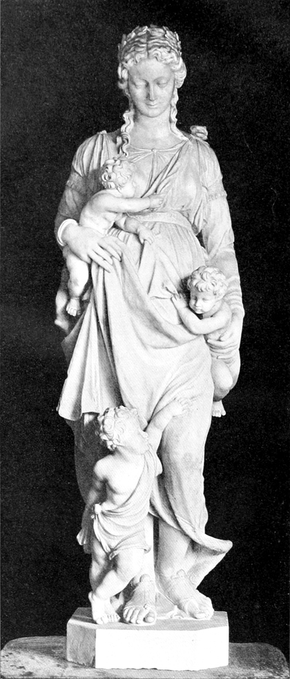
In one way this had a beneficial effect upon the productions of the northern countries, for it incited a spirit of emulation laudable in the extreme, but it was also the cause of a decline in native resourcefulness and originality due to an unduly thorough assimilation of Italian methods and aims. The result of this was a strange co-mingling of Italian and native ideas and technique producing an eclecticism which robbed art somewhat of the virility apparent in the creations of the fourteenth and fifteenth centuries. Still, side by side with this we have a growing tendency to tenderness and sympathetic treatment quite in keeping with the lofty aims of the sixteenth century, which compensates to some extent for the loss of robustness and impetuous energy. ¶ In such a condition did Pilon find art in France, when, leaving his father, also a sculptor, with whom he had hitherto collaborated, he came to Paris about 1550, and here we find him, in conjunction with Pierre Bontemps and Ambrose Perret, at work upon the tomb of François I, which had been designed by Philibert Delorme. After the designs of the latter Pilon was employed from 1560 to 1565 upon the well-known tomb at Saint-Denis of Henri II and Catherine de Médicis, which must be counted amongst his most important achievements. For the King and Queen he executed about this time the fine group of Les Trois Grâces in the Louvre, which represents, perhaps, the culminating point of his genius, and is manifestly superior both in elegance of contour and in technical qualities to Les Trois Parques ascribed to him which has found a permanent resting place in the Hôtel de Cluny. In Les Trois Grâces he presents to us the culmination of the French Renaissance in sculpture; the rhythm and balance of the composition is aided by the superb technique displayed in the modelling of the well-chosen figures, and a further beauty is added by the grace with which they support the urn. ¶ But quite equal to any single figure is the fine example of Pilon’s art which we illustrate this month by permission of Mr. E. Lowengard, its present owner. It represents as an emblematical figure of Charity a tall and dignified woman holding a child to her breast with the right hand, whilst the left, with protecting care, sustains another, which is clinging to her mantle; a third stands at her feet with a look of trustful assurance upon its upturned face. The head of Charity is crowned with laurel. The drapery is entirely characteristic of Pilon at his best; while not unduly severe, it does not err in being too florid, a failing of Pilon on many occasions. Moreover, it fully illustrates the French master’s profound knowledge of anatomy, a study in which he easily outstripped most of his contemporaries. It is open to question whether such an important and characteristic example of Pilon’s work has been seen in London before, and its presence at the moment furnishes an admirable opportunity of studying the style of this master.
In some ways, this had a positive impact on the works from the northern countries, as it sparked a commendable competitive spirit. However, it also led to a decline in local creativity and originality due to an excessively thorough adoption of Italian methods and goals. This resulted in a curious blend of Italian and local ideas and techniques, creating an eclecticism that diminished the strength evident in the arts of the fourteenth and fifteenth centuries. Still, alongside this, there was a growing trend towards tenderness and sympathetic expression that aligned with the elevated aspirations of the sixteenth century, which somewhat made up for the loss of robust energy and passion. ¶ This is the environment in which Pilon found art in France when he left his father, who was also a sculptor and with whom he had previously collaborated, to come to Paris around 1550. Here, he worked alongside Pierre Bontemps and Ambrose Perret on the tomb of François I, designed by Philibert Delorme. Following Delorme’s designs, Pilon worked from 1560 to 1565 on the famous tomb at Saint-Denis of Henri II and Catherine de Médicis, which stands out as one of his major achievements. During this time, he also created the beautiful group of Les Trois Grâces in the Louvre for the King and Queen, which probably represents the peak of his talent and is clearly superior in elegance and technical quality to Les Trois Parques attributed to him that is now housed in the Hôtel de Cluny. In Les Trois Grâces, he showcases the pinnacle of the French Renaissance in sculpture; the rhythm and balance of the composition are enhanced by the superb technique evident in the modeling of the well-selected figures, and their graceful support of the urn adds further beauty. ¶ Equally impressive as any single figure is the fine example of Pilon’s art that we feature this month, with permission from Mr. E. Lowengard, its current owner. It depicts Charity as an emblematic figure, a tall and dignified woman holding a child to her breast with her right hand, while her left hand protectively supports another child clinging to her mantle; a third child stands at her feet, looking up with a trusting expression. Charity’s head is crowned with laurel. The drapery exemplifies Pilon at his finest; while not overly strict, it avoids being too ornate, a common flaw for him. Moreover, it clearly demonstrates the French master’s deep understanding of anatomy, a study in which he easily surpassed most of his contemporaries. It’s questionable whether such a significant and characteristic example of Pilon’s work has been seen in London before, and its availability now offers an excellent chance to study the style of this master.
LACE IN THE COLLECTION OF MRS. ALFRED MORRISON AT FONTHILL
HE lace of Mrs. Alfred Morrison at Fonthill House is of special interest among private collections. Mrs. Morrison has long interested herself in the exertions of M. M. Lefébure, the Honiton revival by the late Mrs. Treadwin of Exeter, and even the crochet work of Ireland, and has in many cases supplied designs, or suggestions for design, to these centres; hence, with her well-known collection of antique lace she has included the best of its modern derivatives[Pg 96] and modern design. Among the specimens illustrated are:—
HE lace collection of Mrs. Alfred Morrison at Fonthill House is particularly noteworthy among private collections. Mrs. Morrison has been actively involved in the efforts of M. M. Lefébure, the Honiton revival led by the late Mrs. Treadwin of Exeter, and even the crochet work from Ireland. She has often contributed designs or suggestions for designs to these areas; thus, alongside her well-known collection of antique lace, she has included the finest examples of its modern adaptations[Pg 96] and contemporary design. Among the specimens illustrated are:—
Plate I: (1) A curious example of a rare type of lace made in Russia, consisting of a scarf with arms worked upon either end. This lace was made in the early part of the nineteenth century (when needle-point was first introduced into Moscow) at a private lace school. The design, which is upon net, and very unlike the characteristic Russian vermiculate patterns with their oriental character and occasional colouring, consists of a chain of jours enclosing coarse, simple, and prominent fillings similar to those of provincial pillow-laces of England and France, and a semé of small sprigs. Although the workmanship is even throughout, the drawing is so naïve as to suggest that the lace-worker was unused to that type of lace. There is a border of similar jours alternating with small leaves and sprays.
Plate I: (1) A fascinating example of a rare type of lace made in Russia, featuring a scarf with arms worked on either end. This lace was created in the early nineteenth century (when needle-point was first introduced to Moscow) at a private lace school. The design, which is on net and quite different from the typical Russian vermiculate patterns with their oriental style and occasional colors, consists of a chain of jours enclosing coarse, simple, and prominent fillings similar to those found in provincial pillow-laces from England and France, along with a semé of small sprigs. While the craftsmanship is consistent throughout, the drawing is so naïve that it suggests the lace-maker was not experienced with that type of lace. There is a border of similar jours alternating with small leaves and sprays.
(2) Gros point de Venise.—In the central strip of this lace very few brides have been introduced, and only so far as is necessary for strength, and those used are plain. The bride work forms no essential part of the design, the parts of the pattern being chiefly held together by being worked in contact with one another. In the joined border, which is of later date, the work, and especially the raised scallops, is of a superior evenness and regularity. Short brides, both plain and picotées, connect the design, which is closer and more florid, and remarkable for the compact, firm character which careful and precise workmanship has given to the piece, as it were scolpito in rilievo.
(2) Gros point de Venise.—In the center of this lace, very few brides have been added, and only to provide necessary strength, and those that are used are simple. The bride work doesn’t play a crucial role in the design; the parts of the pattern are mostly held together by being worked in contact with each other. In the joined border, which is of a later date, the work, especially the raised scallops, is much more even and consistent. Short brides, both plain and picotées, connect the design, which is denser and more ornate, notable for the solid, firm quality that careful and precise craftsmanship has provided to the piece, as if scolpito in rilievo.
(3) Point de Venise.—Two long strips (3½ inches wide) of excellent and open scroll and floral design. The brides which connect the design are decorated with small stars and whirls. Upon some of the raised borders are set small scallops, or picots. Seventeenth century.
(3) Point de Venise.—Two long strips (3½ inches wide) of beautiful and intricate scroll and floral patterns. The brides that connect the designs are adorned with small stars and swirls. Some of the raised borders feature small scallops or picots. Seventeenth century.
(4) Alençon lappet, a design of interlacing ribbons, filled in with light modes, enclosing a small ornament. Eighteenth century. Period, Louis XV.
(4) Alençon lappet, a pattern of intertwined ribbons, filled in with lighter tones, surrounding a small decorative piece. Eighteenth century. Period, Louis XV.
(5) Modern Irish Needle-point lace, à brides picotées, specially made and designed for Mrs. Alfred Morrison [very much reduced]. Nineteenth century.
(5) Modern Irish Needle-point lace, with picot stitches, specially made and designed for Mrs. Alfred Morrison [very much reduced]. Nineteenth century.
Plate II: (1) Brussels veil (three sides of which are ornamented, the fourth being plain), containing floral devices made in pillow, and applied to pillow-made mesh grounds. The softness of the grounds, the workmanship of the flowers, of which the cordonnets have little or no relief, the lightness of the fillings of the modes, place these Brussels points in a category quite distinct from any other lace. The design is of light leafy festoons of roses and forget-me-nots. In the corner is an urn-shaped ornament with lateral festoons. The border has a scalloped edge. Throughout the veil are pillow renderings of various modes, the réseau rosacé, star devices, etc. Eighteenth century.
Plate II: (1) Brussels veil (three sides decorated, the fourth side plain), featuring floral designs made with a pillow technique, applied to mesh backgrounds created with pillow methods. The softness of the backgrounds, the craftsmanship of the flowers, which have little or no raised detail, and the lightness of the filling work set these Brussels points apart from any other type of lace. The design includes delicate leafy garlands of roses and forget-me-nots. In the corner, there's an urn-shaped decoration with side garlands. The border has a scalloped edge. Throughout the veil are pillow representations of various modes, the réseau rosacé, star patterns, etc. Eighteenth century.
(2) Honiton lace, made by the late Mrs. Treadwin of Exeter, from an old design. The pattern is connected by small brides covered with a number of small picots.
(2) Honiton lace, created by the late Mrs. Treadwin of Exeter, based on an old design. The pattern features small brides linked with several tiny picots.
(3) Rose point à brides (Venetian), of close workmanship, in silk (natural-coloured). The free use of ornate picots clustering upon flying loops edging the scallops, as well as upon the brides, is noticeable. The brides are thickly ornamented with stars and whirls. [This sort of lace is sometimes called point de neige, probably on account of its snowy appearance.] The stems of the pattern are of light work, and not strengthened on the edge by an outer cordonnet or button-hole stitched work. Seventeenth century.
(3) Rose point lace (Venetian) is finely crafted in silk (natural-colored). You can easily see the decorative picots clustered on the flying loops that trim the scallops, as well as on the brides. The brides are heavily decorated with stars and swirls. [This type of lace is sometimes called point de neige, probably because of its snowy look.] The stems of the pattern are delicately made and aren't reinforced at the edge with an outer cord or button-hole stitching. Seventeenth century.
A very similar specimen of Venetian needle-point lace in silk is to be seen at the Victoria and Albert Museum [835–’68]. It is also square and of similar size and date, and is also remarkable for the series of scallops and picots upon the raised portions of the design. The design of this specimen ‘consists of a symmetrical distribution of floral forms grouped about an ornamental arrangement in the centre.’ It was probably a ‘pall’ or covering for a chalice or sacramental cup. Though Mrs. Morrison’s specimen is said to be of Jewish work, and used in the synagogue to cover the law, it is more probable that it is a ‘pall,’ like the above-mentioned example.
A very similar piece of Venetian needle-point lace made of silk can be found at the Victoria and Albert Museum [835–’68]. It is also square, of similar size and age, and is notable for the series of scallops and picots on the raised areas of the design. The design of this piece features a balanced arrangement of floral patterns surrounding an ornamental centerpiece. It was likely a 'pall' or cover for a chalice or sacramental cup. While Mrs. Morrison's piece is said to be of Jewish origin and used in the synagogue to cover the Torah, it’s more likely that it is a 'pall,' similar to the previously mentioned example.


[Pg 103]
[Pg 103]
(4) Drawn thread-work [Turkish?].
(4) Drawn thread work [Turkish?].
(5) Point de Venise, period Louis XIII.—A conventional design somewhat resembling Italian Renaissance ironwork. The pattern and some of the short brides which connect it are ornamented with picots, giving lightness and variety to the work.
(5) Point de Venise, Louis XIII period.—A traditional design that somewhat resembles Italian Renaissance ironwork. The pattern and some of the short connections between it are decorated with picots, adding lightness and variety to the piece.
(6) Irish crochet lace, specially made for Mrs. Alfred Morrison, adapted from the above design, which it well reproduces. An experiment in improving the spiritless and confused effect of Irish crochet, where conventional motifs are fitted together without any pre-arranged design. In natural-coloured silk.
(6) Irish crochet lace, specifically created for Mrs. Alfred Morrison, adapted from the design above, which it accurately replicates. An attempt to enhance the dull and chaotic look of Irish crochet, where standard motifs are assembled without any planned design. Made from natural-colored silk.
(7) Imitation point d‘Alençon.—The ground or réseau of this piece is a very wide-meshed knotted net of coarse thread. A stiff and simple flower issuing from a horn or vase is set in the centre of a waved diamond-shaped compartment. The flowers are filled in with small pieces of coarse linen, and are appliqué to the net by stitches which hold the twisted thread outlines—the substitute for the cordonnet of button-hole stitches in the Alençon it imitates—to the little bits of linen.
(7) Imitation point d'Alençon.—The base or réseau of this piece is a wide-meshed knotted net made of coarse thread. A stiff and simple flower emerging from a horn or vase is placed in the center of a wavy diamond-shaped area. The flowers are filled with small pieces of coarse linen and are appliqué to the net with stitches that secure the twisted thread outlines—acting as a substitute for the cordonnet of button-hole stitches found in the Alençon it mimics—onto the small pieces of linen.
Plate III: (1) Embroidered Turkish drawn thread work.—An eight-pointed star within the centre of which is a circle of drawn-work, of which the threads are overcast with fine button-hole stitches.
Plate III: (1) Embroidered Turkish drawn thread work.—An eight-pointed star in the center has a circle of drawn-work, where the threads are finished with delicate buttonhole stitches.
(2) The old conventional cut-work of Italy; Reticella, with punto in aria vandykes attached. Reticella differs from cutwork in that, though it also is worked on a linen foundation, the linen has almost entirely disappeared. The threads left as the framework of the design, dividing it into square compartments, are closely covered with stitches. Into these squares are introduced geometrical forms (star-forms) set in circles and enriched with patterns in solid needlework. This lace is frequently called Greek lace, principally owing to the fact that a great deal was found during the occupation of the Ionian islands by the English. It is, however, undoubtedly Italian in origin. The lace is shown upon the linen on which it is made; most specimens have been cut off for sale from the original linen ground. The punto in aria vandykes developed from the reticella, and are made with the same geometrical designs. The pointed edge was worked on threads laid down in the required shape, and the spaces filled in various designs. Brides picotées were sparingly added to connect the various portions of the pattern.
(2) The traditional cut-work from Italy; Reticella, with punto in aria points attached. Reticella is different from cutwork because, while it is also made on a linen base, most of the linen has been removed. The threads left to form the design's framework create square compartments and are densely covered with stitches. Geometric shapes (like stars) are placed inside these squares, set in circles, and enhanced with solid needlework patterns. This lace is often referred to as Greek lace, mainly because many pieces were discovered during the British occupation of the Ionian islands. However, its roots are definitely Italian. The lace is displayed on the linen it's made on; most examples have been cut from the original linen base for sale. The punto in aria points evolved from reticella and use the same geometric designs. The pointed edges were created using threads arranged in the desired shape, with the spaces filled in with various designs. Brides picotées were added sparingly to connect different parts of the pattern.
(3) Venetian-made Alençon (Burano).—A design of small sprays upon mixed grounds. Along the lower portion of the design runs a twisting ribbon enclosing various à jours and diapered grounds. The scalloped border shows blossom modes set upon a large hexagonal mesh picoté, alternating with a scalloped ribbon, enclosing varieties of diaper-patterned grounds, similar to those to be seen in the modes of Venetian heavy point laces.
(3) Venetian-made Alençon (Burano).—A design featuring small sprays on mixed backgrounds. At the bottom of the design, there's a twisting ribbon that surrounds different à jours and diapered backgrounds. The scalloped border displays blossom modes set against a large hexagonal mesh picoté, alternating with a scalloped ribbon that encircles various diaper-patterned backgrounds, similar to those found in the modes of Venetian heavy point laces.
(4) Venetian-made Alençon, design of palm leaves, with straight-edged border of flowerets and leaves.
(4) Venetian-made Alençon, featuring a design of palm leaves, with a straight-edged border of small flowers and leaves.
(5) Alençon bordering lace, eighteenth century. Period, Louis XVI.—Under Louis XVI it became the fashion to multiply the number of flounces to dresses and to gather them into pleats, or, as it was termed, to badiner them, so that ornamental motifs, more or less broken up or partially concealed by the pleats, lost their significance and flow. The spaces between the motifs, therefore, widened more and more, until the design deteriorated into semés of small devices, detached flowers, pots, larmes, or, as in the present design, a dot set within a rosette. Instead, also, of wreaths, ribands, or festoons undulating from one side of the border to another, we have a stiff rectilinear border of purely conventional design. Naturalistic patterns are not met with in lace of that period.
(5) Alençon bordering lace, eighteenth century. Period, Louis XVI.—During the time of Louis XVI, it became trendy to add more flounces to dresses and to gather them into pleats, which was referred to as badiner, causing decorative motifs to be disrupted or partially hidden by the pleats, losing their meaning and flow. As a result, the gaps between the motifs increasingly widened, leading to designs that degenerated into semés of small motifs, isolated flowers, pots, larmes, or, as seen in the current design, a dot set within a rosette. Instead of flowing wreaths, ribbons, or garlands moving from one side of the border to the other, we have a rigid, straight-edged border with a purely conventional design. Naturalistic patterns were not found in lace from that era.
M. JOURDAIN.
M. Jourdain.
[Pg 104]
[Pg 104]
❧ BIBLIOGRAPHY ❧
FFRENCH ENGRAVERS AND DRAUGHTSMEN OF THE EEighteenth CCENTURY. By Lady Dilke. George Bell and Sons.
The book published by Lady Dilke, at the end of last year, is one of the most complete and definite works on an important section of our artistic history that we French possess. For we are marked by this rare characteristic, that the qualities of our own distinguished men are most often revealed to us by foreigners. While we have in our midst a number of specialist writers to instruct us in minute detail concerning the most trifling acts and deeds of a Fleming or Italian, we lack historians who will take a general view of our national art. It would seem that the Frenchman who shall have written a book on the eighteenth century as full and thorough as Lady Dilke’s is yet to be born. From time to time men of great attainments have produced a monograph, have described the work of a Watteau or a Lancret, but this has always wanted the necessary general commentary, the linking with general history, the grouping of facts, which lend so great an attraction to the works of Lady Dilke. It affords me a two-fold pleasure to say this, first because I profess a deep and very respectful sympathy for the author’s person, and secondly because I have always been greatly touched by the French side of her character. Lady Dilke and I know the faults of our respective countrymen; we speak of them when necessary; but we also know our reciprocal good qualities and speak of these too. Lady Dilke has written in praise of the school of the French Minor Masters of the eighteenth century with a conviction and an ardour of which we are very proud, and I feel charged to express to her in this review our deep-felt gratitude. ¶The difference between England and ourselves is made manifest from the very first. Whereas with us a more or less florid, amusing, or, let us say, sensational narrative is in most cases sufficient to satisfy the French reader, Lady Dilke’s book, although intended to be read by everybody, does not fear to display an integral erudition. This handsome and well-illustrated book, while it gladdens the eyes of a person indifferent to these questions, will interest profoundly the specialist and the scholar. It contains not a line unsupported by at least one reference and often by many. All that the contemporaries of our eighteenth-century artists have left concerning them, all records of inventories and even judicial notes, have been read and employed in their season by their kindly historian. It is easy to read into the impartial, nicely-turned, but apparently impassive text a genuine woman’s admiration for these feminine, evasive and exquisite artists; but the passion is restrained and displays itself only at the last. When the author is occasionally obliged to lament certain rather gross errors, she does so with filial moderation, with that which a child might show towards its grandfather; and we have learnt all, we are able to deplore all, while not one serious word of blame shall have fallen from the historian’s pen. ¶ Lady Dilke divides her work into eleven chapters, each bearing the name of an art-lover or artist. The first of these chapters is devoted to the Comte de Caylus and the great amateurs. For, though the collectors date very far back, the ‘amateur,’ in the French and modern sense of the word, came into being together with the speculations of Law. There is a singular and never-changing agreement between the rabid collector and the stock jobbing financier; it is as though the man who had grown suddenly rich wished to find no less suddenly in his new palace the ancestral elegance of the man of quality. ¶ Lady Dilke has selected the Comte de Caylus because he exercised an enormous influence upon the whole of the eighteenth century. Himself an engraver—though of no great merit—he was the cause that men and women of the world amused themselves with the pastime, that Madame de Pompadour tried her hand at engraving, and that, trying her hand, but with only slight success, she favoured to an extreme degree the artist-engravers of her time. ¶ The second chapter is devoted to those lovers of engravings, the print-collectors Mariette and Basan, who, for the rest, had no great affection for the artists of their time, but who favoured the iconographic movement. ¶ The typical French engraver of the eighteenth century is Charles Nicolas Cochin, who was known as the Chevalier Cochin. Cochin, through his family, his connexions and his works, touches every section of society. He belongs to the Court, to the nobility, to the middle class. His mother was a Horthemels; his sisters were Mesdames Tardieu and Belle. Cochin was trained in the school of different masters; he shows traces of Watteau, Gillot, Chardin and Detroy. But he is above all himself; his mind is composed of a thousand amiable,[Pg 105] witty, and refined things; his art is the very spirit of a nation; and it is not too much to say that in him French art is summed up. ¶ The men whom Lady Dilke studies in Chapter IV of her book, the engravers Drevet and Daullé, are different people. They descend from the great century; they go back by easy degrees to Louis XIV and those famous artists, Audran, Nanteuil and Edelinck. But, though they have style and even majesty, they have neither the charm nor the grace of their contemporaries. This is also, to a certain extent, the case with Wille, who came to France to learn and who borrowed from us only the solemn and majestic side of the great masters. ¶ Lady Dilke studies in succession the Laurent Cars, the Le Bas, and, lastly, Gravelot. Gravelot the author regards almost in the light of a fellow-countryman. The greater part of his career was spent in London. We know that, in so far as this part is concerned, the author is in possession of even still more varied and personal notes. From Gravelot to Eisen, from the “Opera de Flora” to the “Contes de Lafontaine,” is an imperceptible transition. And thus we come to the masters of the end of the century, to Moreau the younger in particular, who presents its definite synthesis, linked as he is to Cochin by the brothers Saint-Aubin, the “exquisite poets of the most charming decadence.” ¶ Finally, Lady Dilke speaks of the engravers in colours, of those men, such as Demarteau, Debucourt, and others, who, without eclipsing their English colleagues, keep step with them. And then we come to the relations of the engravers with the Academy. Here, what severity is shown! On one occasion, the engraver Balechou, who is a member of the Academy, engraves a full-length portrait of the King of Poland, Augustus III. He had promised not to pull a separate proof of it. Having done so in one single case—this proof is still preserved in the Paris Print-room—he was struck off the list of Academicians. ¶ It is impossible, in a short review, to set forth in detail the importance of a book of this kind. We need this book in France, and it is to be hoped that one of our publishers will issue a translation, because it is a revelation to us. The English publisher has undoubtedly produced a practical and easily-handled book, but his reproductions are a little inferior in quality, given the value of the work. It would have been desirable that all the illustrations should have taken the form of heliogravures. Nevertheless, and putting this little criticism on one side, Lady Dilke’s book is, sincerely speaking, the newest and most “encyclopaedic” work that we at present possess on the French draughtsmen and engravers of the eighteenth century.
The book published by Lady Dilke at the end of last year is one of the most comprehensive and definitive works on an important part of our artistic history that we French have. We are marked by this unique trait: the qualities of our own distinguished figures are often revealed to us by outsiders. While we have several specialist writers to inform us in minute detail about the smallest acts and achievements of a Flemish or Italian artist, we lack historians who take a broader view of our national art. It seems the Frenchman who writes a book on the eighteenth century as full and thorough as Lady Dilke's is yet to be born. From time to time, accomplished individuals have produced monographs describing the works of a Watteau or a Lancret, but these have always lacked the necessary overarching commentary, the connections to general history, and the grouping of facts that make Lady Dilke's works so appealing. It gives me great pleasure to say this, first because I have a deep and respectful admiration for the author herself, and secondly because I have always been profoundly touched by the French aspect of her character. Lady Dilke and I acknowledge the flaws of our respective countrymen; we discuss them when necessary; but we also recognize our mutual good qualities and highlight those as well. Lady Dilke has passionately praised the French Minor Masters of the eighteenth century with a conviction and enthusiasm that make us proud, and I feel compelled to express our heartfelt gratitude to her in this review. The difference between England and us is evident from the very start. While a somewhat flashy, entertaining, or let’s say, sensational narrative typically satisfies the French reader, Lady Dilke's book, aimed at a general audience, boldly displays a complete body of knowledge. This beautifully illustrated book will delight those indifferent to these matters while deeply engaging specialists and scholars. Every line in it is backed by at least one reference, often many. All that the contemporaries of our eighteenth-century artists left behind, all records of inventories, and even judicial notes, have been thoroughly reviewed and employed by this kind historian. One can easily sense genuine admiration for these feminine, elusive, and exquisite artists in the impartial, well-crafted, but seemingly detached text; yet this passion is restrained and only revealed toward the end. When the author sometimes feels the need to lament certain rather significant errors, she does so with a kind of respectful moderation, like a child speaking about a grandparent; we learn all, we can regret all, without any serious blame falling from the historian's pen. Lady Dilke organizes her work into eleven chapters, each named after an art lover or artist. The first chapter is dedicated to the Comte de Caylus and the great collectors. Although collectors date back quite far, the ‘amateur’ in the modern French sense emerged alongside the speculations of Law. There is a peculiar and unchanging relationship between the obsessive collector and the stock market financier; it’s as if the suddenly wealthy man wishes to find an ancestral elegance in his new palace, akin to that of a person of quality. Lady Dilke highlights the Comte de Caylus because he had a tremendous influence on the entire eighteenth century. An engraver himself—though not of great merit—he encouraged both men and women of the world to engage in this pastime, leading Madame de Pompadour to try her own hand at engraving and, although with limited success, heavily favoring the artist-engravers of her day. The second chapter focuses on the print collectors Mariette and Basan, who, while having little affection for the artists of their time, supported the iconographic movement. The quintessential French engraver of the eighteenth century is Charles Nicolas Cochin, known as the Chevalier Cochin. Through his family, connections, and works, Cochin touches every part of society. He is connected to the court, nobility, and middle class. His mother was a Horthemels; his sisters were Mesdames Tardieu and Belle. Cochin trained under various masters and showcases influences from Watteau, Gillot, Chardin, and Detroy. Yet, he remains uniquely himself; his mind is filled with countless charming, witty, and refined ideas; his art embodies the very spirit of a nation, and it’s not an exaggeration to say that he encapsulates French art. The men that Lady Dilke examines in Chapter IV of her book, engravers Drevet and Daullé, come from the grand century; they trace their roots gradually back to Louis XIV and the famous artists Audran, Nanteuil, and Edelinck. However, despite their style and majesty, they lack the charm and grace of their contemporaries. This is also somewhat true for Wille, who came to France to learn and adopted only the solemn and majestic aspects of the great masters. Lady Dilke proceeds to study Laurent Cars, Le Bas, and finally, Gravelot. The author regards Gravelot almost as a fellow countryman, having spent most of his career in London. We know that, regarding this part, the author possesses even more varied and personal insights. The transition from Gravelot to Eisen, from the “Opera de Flora” to the “Contes de Lafontaine,” is almost imperceptible. Thus, we arrive at the masters of the end of the century, particularly Moreau the Younger, who exemplifies its final synthesis, linked through the brothers Saint-Aubin, the “exquisite poets of the most charming decadence.” Finally, Lady Dilke discusses the color engravers, including Demarteau, Debucourt, and others, who, without overshadowing their English counterparts, keep pace with them. Then we look at the relationship between engravers and the Academy. Here, one sees a degree of severity! At one point, the engraver Balechou, a member of the Academy, creates a full-length portrait of the King of Poland, Augustus III, having promised not to pull a separate proof of it. After doing so just once—this proof still exists in the Paris Print-room—he was removed from the list of Academicians. In a brief review, it is impossible to detail the significance of a book like this. We need this book in France, and it is hoped that one of our publishers will issue a translation because it reveals so much to us. The English publisher has certainly created a practical and user-friendly book, but the quality of the reproductions falls somewhat short given the worth of the work. Ideally, all illustrations should have been presented in heliogravures. Nevertheless, setting this minor criticism aside, Lady Dilke's book is, quite frankly, the most recent and “encyclopedic” work we currently have on the French draughtsmen and engravers of the eighteenth century.
HENRI BOUCHOT.
HENRI BOUCHOT.
THE NATIONAL PPORTRAIT GGALLERY. Edited by Lionel Cust, M.V.O., F.S.A. Cassell.
It was a happy thought of Messrs. Cassell to issue an illustrated catalogue of the National Portrait Gallery similar to that of the National Gallery. The Portrait Gallery, in spite of great difficulties in the matter of space and funds, has become a place of which the nation may well be proud. It already contains a series of British portraits which if not absolutely complete, is at least representative, sensibly arranged, and catalogued with much more fullness and accuracy than some better endowed collections. One or two possible improvements may suggest themselves to the outsider—the addition, for instance, of photographs (we hear that some arrangement of this kind is actually contemplated) or careful copies of unique portraits of famous men which can never leave their present owners. The colleges of Oxford and Cambridge contain several pictures which would fill gaps in the Gallery, and other works in private hands are equally desirable. Nevertheless, the National Portrait Gallery, like the British Museum, has hitherto been so fortunate in its directors that there is no reason for regarding its future with serious anxiety. ¶ Nor can we be surprised that Mr. Cust, who has had so much to do with the well-being of the Portrait Gallery, has edited its illustrated catalogue on thoroughly sound lines. To precisians a chronological arrangement may seem to have disadvantages. These disadvantages, in our opinion, are minimized by the addition of an index of portraits and an index of artists, while the grouping together of men of the same generation, family, or profession, has the enormous advantage of making the book a thing attractive both to the casual reader and to the student of history, instead of a dry alphabetical list. ¶ We have only one fault to find with the abbreviated biographies which Mr. Cust supplies. They are laudably impartial, but the impartiality is sometimes carried to an extreme which places a second-rate man on the same level as a first-rate one. ¶ As a rule, a very wise discretion has been exercised in reproducing the pictures on a scale proportionate to their actual size and[Pg 106] importance, so that the defects which marred the kindred volumes on the National Gallery have generally been avoided. One or two exceptions may perhaps be noted. We do not, for instance, think that justice is done to Kneller’s vivid portrait of the poet Gay (No. 622) by a cut less than two inches in height and less than one and a half inches in breadth, especially when Mr. Sargent’s portrait of Coventry Patmore is honoured by a full-page engraving. The juxtaposition of the two portraits of Sir William Hamilton also is not a success. The figure by David Allan looks a giant compared with that painted by Reynolds. ¶ The photographing, engraving, and printing of the pictures have on the whole been so admirably done that we have no more fault to find with them than with the letterpress or the arrangement of the book. We notice, indeed, that Kneller is again unfortunate. His portrait of John Smith, the mezzotint engraver (No. 699), is one of his most masterly works, showing a grip of character, an artistic taste, and a technical perfection for which in his Court portraits we seek in vain. In the reproduction the portrait loses all its spirit and all its quality. On the other hand, almost all the slight sketches and pencil drawings in the gallery come out excellently, so that any occasional failure cannot be attributed to want of care or want of science. ¶ Perhaps, considering its price, the publishers might have bound the book more strongly, even if they retained the limp cover which allows the book to open comfortably. The present paper binding is too flimsy for a book that has to be used for reference, and to send a work of reference to the binder often results in deprivation just when one needs the book most. ¶ These, after all, are minor details. As a whole, the catalogue is a thoroughly sound piece of work, and does credit to its editor, publishers, and printers (if not to its binder), and we have no doubt it will take its place by the Dictionary of National Biography on the shelves of all who are interested in the past history of the British race.
It was a great idea by Cassell to publish an illustrated catalog of the National Portrait Gallery, similar to the one for the National Gallery. Despite challenges with space and funding, the Portrait Gallery has become a source of national pride. It already holds a collection of British portraits that, while not completely exhaustive, is certainly representative, well arranged, and cataloged with more detail and accuracy than some better-funded collections. A few potential improvements might come to mind—like adding photographs (we've heard that such an arrangement is being considered) or careful replicas of unique portraits of notable figures that can never leave their current owners. The colleges of Oxford and Cambridge have several paintings that would fill gaps in the Gallery, and other privately-owned works are similarly sought after. Still, like the British Museum, the National Portrait Gallery has been lucky with its directors, so there's no real reason to worry about its future. We also aren’t surprised that Mr. Cust, who has played a significant role in the success of the Portrait Gallery, has put together its illustrated catalog on solid lines. While some might find a chronological arrangement has its downsides, we believe the introduction of an index of portraits and an index of artists minimizes those issues. Grouping individuals from the same generation, family, or profession makes the book appealing both to casual readers and history students, rather than just a dull alphabetical list. We have only one critique of the brief biographies provided by Mr. Cust. They are commendably unbiased, but this impartiality sometimes puts second-rate individuals on the same level as first-rate ones. Generally, there’s been sensible discretion in reproducing the images at a size that reflects their actual importance, avoiding most of the flaws that affected related volumes on the National Gallery. There are perhaps a couple of exceptions. For instance, we don’t think Kneller’s striking portrait of the poet Gay (No. 622) is properly represented by a cut that’s under two inches in height and less than one and a half inches in width, especially when Mr. Sargent’s portrait of Coventry Patmore receives a full-page engraving. The side-by-side presentation of the two portraits of Sir William Hamilton also misses the mark; David Allan’s piece looks enormous compared to Reynolds’s. Overall, the photographing, engraving, and printing of the images have been handled so well that we have no complaints about them, just as we have none regarding the text or layout of the book. We do notice that Kneller seems to come up short again. His portrait of John Smith, the mezzotint engraver (No. 699), is one of his finest works, showcasing a strong sense of character, artistic taste, and technical perfection that’s often lacking in his Court portraits. Unfortunately, in reproduction, the portrait loses all its spirit and quality. On the flip side, almost all the small sketches and pencil drawings in the gallery appear excellently, indicating that any occasional oversight isn’t due to a lack of care or skill. Given its price, the publishers could have bound the book more sturdily, even if they opted for the flexible cover that allows for easy opening. The current paper binding feels too flimsy for a reference book, and sending such a resource to the binder often leads to being without it at the worst possible moment. In the grand scheme of things, these are minor issues. Overall, the catalog is a solid piece of work that reflects well on its editor, publishers, and printers (if not its binder), and we have no doubt it will find a place on the shelves of everyone interested in the historical legacy of the British people, alongside the Dictionary of National Biography.
C. J. H.
C.J.H.
ISABELLA D’ESTE, MARCHDUCHESS OF MANTUA, 1474–1539. A Study of the Renaissance. By Julia Cartwright (Mrs. Ady). John Murray. 1903.
There are three ways of writing history which rejoice all serious readers and students. The first and best is, alas, rare, for it requires constructive imagination based on sound scholarship. It is the history which bestows upon the characters portrayed that quality which makes them live on in the reader’s mind like great myths. Gibbon’s ‘Julian,’ Mommsen’s ‘Hannibal,’ Carlyle’s ‘Voltaire,’ Creighton’s ‘Pius II’—to take a very few instances chosen at random—live on in our imaginations like the heroes of romance, like Don Quixote, or Julien Sorel, or the ‘Egoist.’ ¶ On the other hand, there is the work of the mere archivist, the conscientious finder and transcriber of documents, who leaves the imaginative reconstruction of character entirely to the reader. For this, too, the student cannot be too grateful. And then there is the via media of the gifted compiler, whose efforts are also welcome, provided they are honest and careful, and free from the taint of journalism. ¶ It is this middle path that Mrs. Ady is accustomed to take, and always with peculiar success in her biographies of women. Those who have already enjoyed her ‘Beatrice d’Este’ will be prepared for finding interest and pleasure in reading her account of that noble lady’s even more accomplished and more famous sister, Isabella, marchioness of Mantua, the leader for more than forty years of the most continuously brilliant and intellectual court in Italy. Mrs. Ady does not claim originality of research, but her task of weaving the documentary researches of others into a readable, accurate, and interesting account is extremely well done. It is true that she has no great or genial gifts for the presentment of character, but she knows at least how to describe it with the appropriate background of historical events and of court and family life. She has better taste than to make of it a lurid tale, as some popular writers would have done. Isabella is painted as the faithful and devoted wife and daughter and sister, the careful and affectionate mother—nay, even the doting grandmother—as well as the ‘prima donna del mondo,’ the Muse of poets and humanists, the patroness and friend of great artists, the confidante of popes and emperors, and the victim, too, of family and political tragedies. ¶ For us in this place, her interest lies chiefly in one aspect of her many activities—in her relations with the artists of her day. Her portrait was drawn by Leonardo, and painted by Mantegna, Titian, Francia, Costa, as well as by various artists of less importance, such as Maineri and Buonsignori, and her medal was cast in bronze by the sculptor Cristoforo Romano. She was a passionate collector of beautiful[Pg 107] things, decorating her private apartment with pictures by Mantegna, Costa, and Perugino, and sending her emissaries over nearly the whole of Italy to extort from dilatory or overworked painters the fulfilment of commissions she had given them, getting now a Nativity from Giovanni Bellini, a Magdalen and a St. Jerome from Titian, Allegories from Correggio, portraits from Francia, and even from Raphael himself. She employed Timoteo Viti to make designs for her majolica dinner-service, and most of the northern sculptors of note were at one time or another set to work for her. Lorenzo da Pavia made her priceless viols and lutes of inlaid ivory and ebony, and Caradosso carved her a wonderful inkstand in ebony and silver, while the most famous glass-blowers and jewellers of her time contributed their best efforts to her matchless collection. But even dearer to her than contemporary art was the antique, and she spared no pains or expense, no wiles or selfishness, to get into her possession every available antique statue or fragment that she heard of. The collector’s passion was on her, and even her fine taste and that of her cultivated advisers did not always protect her from the collector’s misfortunes. In the light of recent revelations, it is amusing to hear how she was taken in by the forgeries of a certain Roman dealer who bore the splendid name of Raphael of Urbino, and how this shifty precursor of many an Italian ‘antiquario’ of to-day managed to get out of giving her back her money! ¶ Curiously enough, Isabella, although a fast friend of the Medicean popes and their relatives, seems to have taken no interest at all in the art of Florence, except in Michelangelo, and in Leonardo, who came to her, not from Florence, but from Milan. She sent to Florence, it is true, for a picture, but it was to Perugino she wrote, and not to any of the great Florentine masters. ¶ Mrs. Ady has tried to trace carefully the present whereabouts of Isabella’s portraits and possessions, but we miss in the index any assembling of her scattered remarks on this interesting subject. The Leonardo pastel sketch (reproduced as frontispiece to Vol. I, but wrongly described as red chalk) is well known in the Louvre; one of the Titians (the one copied by Rubens) she identifies in the collection of M. Leopold Goldschmid at Paris, while the other, in Vienna, is reproduced as the frontispiece to the second volume. As to the latter, she says it was painted by Titian after a portrait by Francia, itself not done from the life, but from sketches and descriptions. If this be indeed the one referred to, Titian has managed to give no hint of his obligation to the Bolognese master. The portrait by Maineri, a painter of Parma, the author suggests as being the same as that in Mrs. Alfred Morrison’s collection, exhibited at the Burlington Fine Arts Club in 1894; but she admits, on the other hand, that this portrait may be from the hand of Beltraffio, which indeed it clearly is. Although it has apparently not occurred to Mrs. Ady, is it not possible that the untraced portrait of Isabella painted by Costa, was, like so many of her treasures, bought for Charles I, and that it is the Portrait of a Lady which now hangs in Hampton Court (No. 295)? The face resembles the one he painted as Isabella’s in the Louvre Allegory, but, on the other hand, they are both so thoroughly Costa in every detail that neither can be called real portraits in the modern sense of the word. The objective photographic style of portraiture in vogue to-day was quite foreign to the habits of most Renaissance painters, who were satisfied, once they had found a type that suited them, to stick to it for everything—Madonnas, portraits of ladies, and allegorical figures, indifferently. ¶ Perhaps the most vivid part of Mrs. Ady’s book is her description of Isabella’s experiences in that fatal sack of Rome, which, as Erasmus wrote to her friend Sadoleto, was ‘not the ruin of one city, but of the whole world.’ Barricaded in the Palazzo Colonna with three thousand distressed souls under her care, Isabella, safe in the protection of her son, Ferrante, one of the leaders of the imperial forces, looked down from her windows with anguish upon the scenes of horror and vandalism enacted in the streets below. Her house was the only one in Rome that escaped, except the Cancelleria, which was occupied by Cardinal Colonna. But except for the irreparable destruction of so many of the world’s masterpieces of beauty, this and many another interesting incident in Isabella’s career belong rather to history than to art.
There are three ways of writing history that please all serious readers and students. The first and best is, unfortunately, rare, as it requires a creative imagination grounded in solid scholarship. This kind of history gives the characters portrayed a quality that makes them linger in the reader’s mind like great myths. Gibbon’s ‘Julian,’ Mommsen’s ‘Hannibal,’ Carlyle’s ‘Voltaire,’ Creighton’s ‘Pius II’—just to name a few randomly—live on in our imaginations like the heroes of fiction, like Don Quixote, or Julien Sorel, or the ‘Egoist.’ ¶ On the other hand, there’s the work of the simple archivist, the diligent finder and transcriber of documents, who leaves the imaginative reconstruction of character entirely to the reader. For this, too, students can’t be grateful enough. Then there’s the via media of the skilled compiler, whose work is also appreciated, provided it is honest, careful, and free from the influence of sensational journalism. ¶ This middle ground is what Mrs. Ady usually takes, and she always succeeds uniquely in her biographies of women. Those who have already enjoyed her ‘Beatrice d’Este’ will be ready to find interest and pleasure in reading about that noble lady’s even more accomplished and famous sister, Isabella, marchioness of Mantua, who led the most consistently brilliant and intellectual court in Italy for over forty years. Mrs. Ady doesn’t claim original research, but she does a remarkable job of weaving others' documentary research into a readable, accurate, and engaging account. While she may lack extraordinary talent for presenting character, she knows how to describe it within the appropriate context of historical events and court and family life. She has better taste than to turn it into a sensational story, as some popular writers might have done. Isabella is depicted as a loyal and devoted wife, daughter, sister, a caring and affectionate mother—indeed, even a doting grandmother—as well as the ‘prima donna del mondo,’ the Muse of poets and humanists, the patron and friend of great artists, the confidante of popes and emperors, and also a victim of familial and political tragedies. ¶ For us here, her significance lies mainly in one aspect of her many activities—in her relationships with the artists of her time. Her portrait was sketched by Leonardo, and painted by Mantegna, Titian, Francia, Costa, along with various lesser-known artists like Maineri and Buonsignori, while the sculptor Cristoforo Romano cast her medal in bronze. She was a passionate collector of beautiful[Pg 107] objects, decorating her private apartment with works by Mantegna, Costa, and Perugino, and sending her agents throughout Italy to push lazily or overworked painters to fulfill her commissions, acquiring a Nativity from Giovanni Bellini, a Magdalen and a St. Jerome from Titian, Allegories from Correggio, portraits from Francia, and even from Raphael himself. She hired Timoteo Viti to design her majolica dinnerware, and most notable northern sculptors worked for her at one time or another. Lorenzo da Pavia made her priceless viols and lutes inlaid with ivory and ebony, and Caradosso carved her a stunning inkstand in ebony and silver, while the most famous glass-blowers and jewelers of her time contributed their best work to her exceptional collection. Yet even more dear to her than contemporary art was the antique; she went to great lengths and expense, using wiles and selfishness to acquire every available antique statue or fragment she heard of. The collector’s passion overtook her, and even her refined taste and that of her educated advisors didn’t always shield her from the misfortunes that befall collectors. In light of recent discoveries, it’s amusing to learn how she fell for the forgeries of a certain Roman dealer who bore the grand name of Raphael of Urbino and how this tricky precursor to many of today’s Italian ‘antiquarios’ managed to avoid giving her back her money! ¶ Interestingly, Isabella, despite being a close friend of the Medicean popes and their relatives, seemed to have no interest whatsoever in Florentine art, except for Michelangelo and Leonardo, who came to her not from Florence, but from Milan. She did request a painting from Florence, but she wrote to Perugino and not to any of the great Florentine masters. ¶ Mrs. Ady has made an effort to track down the current locations of Isabella’s portraits and possessions, but the index lacks any compilation of her scattered notes on this intriguing subject. The Leonardo pastel sketch (featured as a frontispiece to Vol. I, but incorrectly described as red chalk) is well-known in the Louvre; one of the Titians (the one copied by Rubens) she identifies in the collection of M. Leopold Goldschmid in Paris, while the other, in Vienna, is shown as the frontispiece to the second volume. Regarding the latter, she claims it was painted by Titian after a portrait by Francia, which itself wasn’t done from life but from sketches and descriptions. If this is indeed the one referred to, Titian has managed to give no indication of his obligation to the Bolognese master. The portrait by Maineri, a painter from Parma, she suggests might be the same as that in Mrs. Alfred Morrison’s collection, exhibited at the Burlington Fine Arts Club in 1894; however, she admits that this portrait could also be attributed to Beltraffio, which it clearly is. Although it seems to have not occurred to Mrs. Ady, could it be possible that the untraced portrait of Isabella painted by Costa was, like so many of her treasures, purchased for Charles I, and that it is the Portrait of a Lady currently hanging in Hampton Court (No. 295)? The face resembles the one he painted as Isabella’s in the Louvre Allegory, but on the other hand, both are so distinctly Costa in every detail that neither can be considered genuine portraits in today’s understanding of the term. The objective photographic style of portraiture popular today was completely foreign to the practices of most Renaissance painters, who were content, once they found a type that suited them, to use it for everything—Madonnas, portraits of ladies, and allegorical figures, without distinction. ¶ Perhaps the most vivid part of Mrs. Ady’s book is her account of Isabella’s experiences during the tragic sack of Rome, which, as Erasmus wrote to her friend Sadoleto, was ‘not the ruin of one city, but of the whole world.’ Barricaded in the Palazzo Colonna with three thousand distressed individuals under her care, Isabella, safe under the protection of her son, Ferrante, one of the leaders of the imperial forces, looked down from her windows with despair at the scenes of horror and vandalism happening in the streets below. Her house was the only one in Rome that remained intact, except for the Cancelleria, which was occupied by Cardinal Colonna. But apart from the irreplaceable loss of so many global masterpieces of beauty, this and many other fascinating incidents in Isabella’s life are more about history than art.
M. L.
M. L.
FRANS HALS. By Gerald S. Davies, M.A. George Bell and Sons.
On comparing the number of monographs that have appeared on other than Dutch artists with that of books in our possession treating of Dutch painters, we see that the latter have been allotted but a scanty measure in literature; indeed, one may go further and say that during the past[Pg 108] twenty years, excepting Rembrandt and a few other great masters, no extensive and comprehensive work has been written on the old Dutch painters. For this neglect a very well-founded reason exists: the native art historians of the Netherlands are still collecting materials, and cannot as yet think of writing exhaustive books concerning their great masters; for they are much too well aware of the vast gaps that are still to be found in their knowledge. This is so in the case, among others, of Frans Hals, and it will remain so for many years to come; we must needs wait until all the records are accessible before being able to arrive at a definite knowledge of Hals’s personality. ¶ Mr. Davies has been deterred by no such considerations; he not only, with a ready pen, describes Hals’s life and works, but, thanks to the spacious manner in which he conceives his subject, finds occasion to indulge in digressions on old Dutch conditions, art and so forth, which might undoubtedly possess an interest for English readers if they were correct, but that, unfortunately, is far from being always the case. ¶ After treating in his first two chapters of the ‘Rise of a National Art’ and ‘Holland and its Art in the Seventeenth Century’ the author collects the few known facts concerning Hals’s life in Chapter III, and endeavours to draw a conclusion touching his personality. We quite admit that legend may have represented Hals as being a more dissolute man than he actually was. Nevertheless, one who ill-treated his wife as he did can really not have had any particularly aristocratic manners. It would be better for us to say that we do not know enough about his life to be able to white-wash it of the few disagreeable facts that have been handed down to us. There can be no doubt, however, that he was a Bohemian, as Mr. Davies rightly characterizes him. ¶ The following chapters are devoted entirely to Hals’s artistic career and works; those preserved at Haarlem of course occupying a great place. The description of these is a lively one, and is evidently based upon a repeated examination. There are a good index, bibliography, useful indications such as the approximate dates of Hals’s life and of his principal paintings, etc. In a word, the writer has industriously brought together all that he has been able to ascertain touching his subject from books and pictures. But there is one matter in which Mr. Davies has not succeeded, and that is the producing of a critical work. It is true that he himself expressly says this as regards the catalogue,[45] but he constantly makes the same mistakes in the text itself. This is an exceedingly dangerous standpoint; for, thanks to it, so soon as one sets to work on a scientific basis, one finds him, for instance, describing two pictures (Illustrations Nos. 1 and 54) as Portraits of the Painter which do not represent Hals at all, while, again, the Portrait of Admiral de Ruyter (Illustration No. 55) is not a picture of that admiral. ¶ In the same way, the catalogue—which, from the very nature of the standpoint of the writer, is incomplete—contains childish mistakes, which are due to a lack of adequate critical knowledge. For to say of the Hille Bobbe with a young man smoking behind her, merely that it is ‘generally recognized as the work of F. Hals the son’ surely denotes an excess of caution, considering that it is established beyond all doubt that this picture was, in fact, painted by the son, and therefore it ought not to have been included in the catalogue. Some of the paintings in English collections which we missed in the catalogue we were fortunate enough to find mentioned in the ‘List of Pictures which have appeared ... in the Winter Exhibitions ... at Burlington House,’ which is inserted after the ‘List of Works.’ But these data are also, we regret to say, uncritical. We also searched the catalogue in vain for the oldest dated portrait by Frans Hals, namely, that of Scriverius, dated 1613, which forms part of the Warneck Collection in Paris, although it is mentioned by the author on pp. 27, 29, 84, and 96 of the text. Again, we find no mention of the delightful Portrait of a Man[46] in the Van Lynden collection, at present lent to the Mauritshuis at the Hague, nor of various other pieces.[47] As regards the drawings, there is no doubt whatever that the drawing in the British Museum is an original Hals. There are more of this sort, and we are sorry not to find them mentioned in Mr. Davies’s book. ¶ We must deliver ourselves of one or two further remarks, not from any love of fault-finding, but to remove mistaken ideas. The picture mentioned on p. 22, which is traditionally, and by Mr. Davies, supposed to represent Hals’s workshop, was painted by Michiel Sweerts, and has nothing to do with Hals’s workshop. Nor is what the author observes touching Hals’s[Pg 109] manner of painting (p. 124) quite correct. Hals slowly perfected his technique, proceeding along a road which is quite easily traced. It is true that he underpainted a considerable number of his pictures, but there are also many, very many indeed, which he finished at once, in the wet paint, without the least underpainting. One of the best examples of the latter is the Portrait of a Man, in Lord Spencer’s collection, which is at present in the Guildhall Exhibition. ¶ Mr. Davies’s book has been very handsomely printed and produced, and is filled with mostly satisfactory illustrations. It is to be regretted that the contents of the book are not more worthy of its format; as a critical guide to the art of Frans Hals it is wholly untrustworthy.
When we compare the number of books about artists from outside of the Netherlands with the number of books we have on Dutch painters, it's clear that the latter have received very little attention in literature. In fact, over the last twenty years, aside from Rembrandt and a few other major figures, there hasn't been any extensive work done on old Dutch painters. There’s a good reason for this oversight: Dutch art historians are still gathering information and aren't ready to write complete books about their great masters, as they're very aware of the significant gaps in their knowledge. This is especially true for Frans Hals, and it will likely remain so for many more years; we’ll have to wait until all records are available to truly understand Hals’s personality. Mr. Davies isn’t held back by such concerns; he readily writes about Hals’s life and works, and because of his broad approach, he strays into discussions about old Dutch conditions, art, and such, which could be interesting for English readers if they were accurate, but sadly, that’s not always the case. In his first two chapters, which cover the ‘Rise of a National Art’ and ‘Holland and its Art in the Seventeenth Century,’ the author compiles the few known details about Hals’s life in Chapter III and tries to draw conclusions about his character. We acknowledge that legends may portray Hals as more dissolute than he really was. Nonetheless, someone who treated his wife poorly as he did cannot really be said to have particularly refined manners. It’s safer to say that we don’t know enough about his life to dismiss the few unpleasant facts we have. However, there’s no doubt that he was a Bohemian, as Mr. Davies aptly describes him. The following chapters focus entirely on Hals’s artistic career and works, particularly those preserved in Haarlem. The descriptions are lively and clearly rooted in thorough examination. There’s a good index, bibliography, and useful notes, such as approximate dates of Hals’s life and his main paintings. In short, the writer has worked hard to gather everything he can about his subject from books and artworks. However, there's one area where Mr. Davies falls short: producing a critical work. He explicitly acknowledges this in the catalogue, but unfortunately, he makes the same errors in the main text. This is a dangerous position because when working from a scholarly standpoint, one quickly discovers mistakes, such as his describing two paintings (Illustrations Nos. 1 and 54) as Portraits of the Painter when neither actually represents Hals, and likewise, the Portrait of Admiral de Ruyter (Illustration No. 55) doesn’t depict that admiral. Similarly, the catalogue—due to the author's perspective—is incomplete and contains naive mistakes stemming from a lack of adequate critical knowledge. For example, to refer to the Hille Bobbe with a young man smoking behind her as merely ‘generally recognized as the work of F. Hals the son’ indicates excessive caution, considering it’s clearly established that this painting was indeed created by the son, and so it shouldn’t have been included in the catalogue. We also noticed that some paintings in English collections that are missing from the catalogue were fortunately mentioned in the ‘List of Pictures which have appeared ... in the Winter Exhibitions ... at Burlington House,’ which is included after the ‘List of Works.’ But unfortunately, this information is also uncritical. We also searched the catalogue in vain for the oldest dated portrait by Frans Hals, that of Scriverius from 1613, which is part of the Warneck Collection in Paris, even though the author does mention it on pages 27, 29, 84, and 96 of the text. Again, there’s no mention of the delightful Portrait of a Man in the Van Lynden collection, currently lent to the Mauritshuis in The Hague, nor of various other pieces. Regarding the drawings, it’s certain that the drawing in the British Museum is an original Hals. There are more like it, and it's unfortunate that we don’t find them mentioned in Mr. Davies’s book. We must express a few more remarks, not out of a desire to nitpick, but to clear up misunderstandings. The painting mentioned on page 22, which is traditionally and by Mr. Davies supposed to represent Hals’s workshop, was actually painted by Michiel Sweerts and has nothing to do with Hals’s workshop. Additionally, what the author notes about Hals’s painting style (p. 124) isn’t entirely accurate. Hals gradually refined his technique along a clearly traceable path. While it’s true that he underpainted many of his works, there are also many—indeed, quite a few—that he completed at once in wet paint without any underpainting. One of the best examples of the latter is the Portrait of a Man, in Lord Spencer’s collection, currently at the Guildhall Exhibition. Mr. Davies’s book is beautifully printed and produced, featuring mostly satisfactory illustrations. It’s a shame that the content doesn’t match the quality of the format; as a critical guide to the art of Frans Hals, it is entirely unreliable.
W. M.
W. M.
PERIODICALS
GAZETTE DES BEAUX ARTS.—The April number opens with an article by M. Salomon Reinach, in which he brings to light a great unknown miniaturist whom he identifies with the painter Simon Marmion, known as the author of the altarpiece of St. Bertin, now in the castle of Wied. Of this magnificent and little-known work the National Gallery possesses two fragments representing a chorus of angels rejoicing at the birth of the saint and two angels carrying his soul up to heaven, a strange and imaginative composition, in which the ridge of a roof cutting into the base of the composition gives an effect of supernatural strangeness. The manuscript in which the miniatures in question occur is in the Imperial Library at St. Petersburg, and has remained till now unnoticed. It is in the main the French compilation entitled the ‘Grandes Chroniques de Saint-Denys,’ but the history is continued with extracts from various historians to the beginning of the reign of Charles V. It contains fifteen full-page miniatures which are of quite extraordinary merit, and which may be by Simon Marmion. The smaller miniatures are by another hand, and are distinctly inferior. The most interesting of the miniatures is the title-page representing Fillastre, Abbot of St. Bertin, offering the Grandes Chroniques to Philippe le Bon of Burgundy, by whose side stands the aged Chancellor Rollin; behind stand three figures, among which M. Reinach recognizes the youthful Charles the Bold and the Grand Bâtard. The heads are admirably rendered, and show that Marmion, if it be indeed he, must be reckoned as one of the great masters of portraiture of a school in which portraiture attained to the utmost perfection. The landscapes are, however, scarcely less remarkable. They do not, of course, rise quite to the height of imaginative realism shown in the Hubert van Eyck miniatures published by M. Durrieu, but they are conceived in a similar vein and executed with absolute mastery. If M. Reinach’s conjecture is correct, and it rests on a number of subsidiary proofs besides the likeness of style to the Wied altarpiece, he has done a great service in bringing to light the work of a great artist whose reputation as a miniaturist was such that his name was coupled with that of Fouquet in the eulogies of contemporary poets. Marmion was born at Amiens about 1420. In 1454 he was at Lille employed by the Duke of Burgundy, but he seems to have worked chiefly at Valenciennes. His style shows the influence of the Van Eycks, and still more of Van der Weyden. But there is, we think, in his manner of composition, and in the freedom of his fancy, something which distinguishes him from the pure Flemish painters, something which is due to his French origin and early training. ¶ The next article by M. Casimir Stryienski is concerned with French art of a very different kind. There exist a number of catalogues of the early exhibitions of the Salon, illustrated throughout with minute sketches by Gabriel de St. Aubin. The author has had the idea of reconstructing by the aid of one of these catalogues the Salon of 1761, and discussing the subsequent history of the various works. Many of these are quite lost, and survive only in St. Aubin’s marvellous sketches. Delicate as St. Aubin’s more serious work is, as a tour de force nothing could equal the dexterity of these minute notes. Between two lines of the catalogue he will insert a whole row of sketches, in which not only the composition but some suggestion of the chiaroscuro of the originals is given. Many of the works of Vien, J. B. M. Pierre, Vanloo, and Hallé make a more pleasing impression when interpreted thus than the originals can have done. ¶ M. André Michel, who carries on the work inaugurated by the genius of Courajod, commences a series of articles on the acquisitions made by his department of the Louvre. The finest of these came from Courajod’s collection, and include a wooden crucifix of the twelfth century, in which we can trace the first germs of the new sentiment for life and dramatic expressiveness working in the old hieratic formula. The exquisite statue of a man of the thirteenth century, also in wood, shows[Pg 110] the new art arrived already at perfect command of the means of expression, but still restrained by a reminiscence of earlier schematic treatment. This and the stone statue of St. Geneviève show French sculpture at a point which it has never surpassed. The fifteenth and sixteenth century sculptures which have been added to the national collection, though of great beauty, have nothing of the supreme sense of design of the earlier work. ¶ M. F. de Mely publishes two sarcophagi with figures in relief discovered at Carthage. In spite of Greek and Egyptian influences the author considers that at least one of the figures, that of the priestess, bears the impress of a special racial type, and he considers that this and the Elche head taken together give us an idea of a distinctively Punic ideal type. M. Pierre Gusman describes, without adding anything very new, the Villa Madama, and M. André Pascal begins an account of the eighteenth century sculptor Pierre Julien.
GAZETTE DES BEAUX ARTS.—The April issue starts with an article by M. Salomon Reinach, where he uncovers a major unknown miniaturist, identifying him as the painter Simon Marmion, recognized for creating the altarpiece of St. Bertin, now housed in the castle of Wied. The National Gallery has two fragments of this magnificent and obscure work, which depict a choir of angels celebrating the saint's birth and two angels lifting his soul to heaven. This unusual composition features a roof ridge cutting into the base, creating an effect of supernatural oddity. The manuscript containing these miniatures is located in the Imperial Library in St. Petersburg and has gone unnoticed until now. It mainly consists of the French compilation titled 'Grandes Chroniques de Saint-Denys,' but the history continues with excerpts from various historians up to the beginning of Charles V's reign. It includes fifteen full-page miniatures of remarkable quality, possibly by Simon Marmion, while the smaller miniatures are by another artist and notably inferior. The most captivating miniature is the title page showing Fillastre, the Abbot of St. Bertin, presenting the Grandes Chroniques to Philippe le Bon of Burgundy, accompanied by the elderly Chancellor Rollin; behind them are three figures, among whom M. Reinach identifies the young Charles the Bold and the Grand Bâtard. The heads are excellently rendered, suggesting that if it is indeed Marmion, he ranks among the great masters of portraiture in a school that achieved the highest perfection in this art. The landscapes are also quite exceptional. They may not reach the imaginative realism found in the Hubert van Eyck miniatures published by M. Durrieu, but they are conceived in a similar style and executed with complete mastery. If M. Reinach’s theory is accurate, supported by several additional pieces of evidence beyond the stylistic resemblance to the Wied altarpiece, he has greatly contributed to revealing the work of a significant artist whose miniaturist reputation was so esteemed that his name was linked with that of Fouquet in the praises of contemporary poets. Marmion was born in Amiens around 1420. In 1454, he was in Lille working for the Duke of Burgundy, but he seems to have primarily worked in Valenciennes. His style shows the influence of the Van Eycks, and even more of Van der Weyden. However, we believe his composition style and creative freedom distinguish him from pure Flemish painters, reflecting his French heritage and early training. ¶ The next article by M. Casimir Stryienski discusses a very different aspect of French art. There are several catalogues from the early Salon exhibitions, beautifully illustrated with detailed sketches by Gabriel de St. Aubin. The author has proposed reconstructing the Salon of 1761 using one of these catalogues and examining the subsequent histories of the various artworks. Many of these pieces are completely lost and exist only through St. Aubin's stunning sketches. While St. Aubin’s more serious work is delicate, nothing can compare to the skill displayed in these intricate notes. Between two lines of the catalogue, he includes entire rows of sketches that capture not only the composition but also hints of chiaroscuro from the originals. Many works by Vien, J. B. M. Pierre, Vanloo, and Hallé impress more when interpreted this way than the originals may have. ¶ M. André Michel, who continues the work started by the visionary Courajod, begins a series of articles discussing the acquisitions made by his department in the Louvre. The finest of these came from Courajod’s collection and includes a twelfth-century wooden crucifix, where we can detect the early signs of a new appreciation for life and dramatic expressiveness emerging from the old hierarchical styles. The exquisite statue of a thirteenth-century man, also in wood, demonstrates that the new art had already reached a perfect command of expression, though still shows a hint of earlier schematic styles. This and the stone statue of St. Geneviève showcase French sculpture at a peak that has never been surpassed. The sculptures from the fifteenth and sixteenth centuries added to the national collection, while incredibly beautiful, lack the supreme design sensibility of the earlier works. ¶ M. F. de Mely publishes two sarcophagi with relief figures discovered in Carthage. Despite Greek and Egyptian influences, the author believes that at least one figure, that of the priestess, reflects a particular racial type, and he argues that this and the Elche head together represent a distinctly Punic ideal type. M. Pierre Gusman describes the Villa Madama without introducing anything particularly new, and M. André Pascal starts an account of the eighteenth-century sculptor Pierre Julien.
In the May number Monsieur Gaston Migeon, who has done much towards the classification of Mahommedan copper work, writes on the Exhibition of Mahommedan Art recently held at the Union Centrale des Arts Décoratifs in the Pavillon de Marson. Several remarkable specimens of copper work are reproduced, perhaps the most interesting being that lent by M. Sarre which is supposed to date from the first years of the Hegira, and to be of Sassanian workmanship. Some fourteenth-century Persian velvets and tissues of singularly fine and naturalistic design are also figured, as well as two splendid Indo-Persian miniatures from the collection of M. Bing. ¶ In his second and concluding article on the acquisition of the department of sculpture in the Louvre, M. André Michel describes a remarkable polychrome wooden statue of the beginning of the sixteenth century belonging to the Franconian school. In this the author finds the influence of Albert Dürer. It is certainly a more deliberate and scientific work of art than the majority of Franconian sculptures of the period. Several works by Houdon, Deseine and Clodion are also described and reproduced. The prints of the Dutuit Collection are described in a brilliant and humorous article by M. Henri Bouchot, in which he concerns himself more with the collector than the collection, which is in fact rather remarkable for the number of prints of ascertained pedigree than for its artistic character. M. Pascal completes in this number his study of Pierre Julien.
In the May issue, Monsieur Gaston Migeon, who has contributed significantly to the classification of Islamic copper work, writes about the Exhibition of Islamic Art recently held at the Union Centrale des Arts Décoratifs in the Pavillon de Marson. Several notable examples of copper work are featured, with perhaps the most interesting being one lent by M. Sarre, believed to date from the early years of the Hegira and to be of Sassanian origin. There are also images of some fourteenth-century Persian velvets and textiles with exceptionally fine and naturalistic designs, along with two stunning Indo-Persian miniatures from M. Bing's collection. ¶ In his second and final article on the acquisition of the sculpture department in the Louvre, M. André Michel describes a remarkable polychrome wooden statue from the early sixteenth century attributed to the Franconian school. The author notes the influence of Albert Dürer in this piece. It is certainly a more intentional and scholarly work of art compared to most Franconian sculptures from that time. Several works by Houdon, Deseine, and Clodion are also discussed and illustrated. The prints from the Dutuit Collection are presented in a witty and engaging article by M. Henri Bouchot, who focuses more on the collector than the collection itself, which is notably recognized for the number of prints with established provenance rather than its artistic value. M. Pascal concludes his study of Pierre Julien in this issue.
JAHRBUCH DER KUNSTHISTORISCHEN SAMMLUNGEN DES ALLERHÖCHSTEN KAISERHAUSES. Band XXIII, Heft 5.—The present fascicule is devoted entirely to researches by Herr Julius von Schlosser on ‘Artistic Tradition in the late Middle Ages.’ Under this title the author brings together several separate researches; the connexion between them lies in their illustration of the contrast between mediaeval art with its direct visual symbolizing of ideas and the Renaissance and modern habits of actual imitation of natural forms. ¶ The first of his researches is concerned with a large illuminated parchment, too large to have formed part of a book and probably meant to be framed and hung on a wall. It depicts in the centre the Nativity, around which, in a large number of medallions enclosed in late Gothic scrollwork, are represented the various analogies by which the immaculate conception was rendered credible. It is an early example of the ‘Defensorium inviolatae virginitatis beatae Mariae,’ in which the miracle is rendered plausible by a record of all the miraculous things in nature. The origin and propagation of this popular form of doctrinal exegesis is discussed. The author of the ‘Defensorium,’ Franciscus of Retz, was a Dominican, and professed theology in the University of Vienna from 1385 to 1411. The earliest illustrated version is the manuscript of Frater Antonius of Tegernsee of 1459, and the work was published as a block-book as early as 1470. The best-known is Eysenhut’s block-book of 1471, of which the British Museum possesses a copy. In the early sixteenth century it was published also in a French translation at Rouen, but it was most popular in Bavaria and Austria. The parchment picture of the Vienna Hofmuseum, which forms the subject of these researches, is, the author considers, by an Austrian artist of the latter half of the fifteenth century. ¶ Of greater artistic merit are the small folding tablets of the Vienna Hofmuseum, in which are depicted a series of men and animals which served as patterns for artists. There are, for instance, the heads of Christ, the Virgin, and St. John, in poses which show that they would serve for a Crucifixion; there is the Veronica, and a number of varied types which experience and tradition showed were likely to be useful to an artist. It is certainly a striking example of the essentially practical methods of artistic production at a time when painting was an actual necessity, and when, therefore, the picture was of more importance than the artist’s personality. This work belongs to about the year 1400. ¶ Another[Pg 111] artist’s pattern-book discussed by Herr von Schlosser, though this has already been published in part, is that used by the miniaturists of a Rhenish monastery, now in the Hofbibliothek at Vienna. This contains, besides initials and borders, the traditional receipts for various animals both real and fabulous. This the author compares with Villars de Honnecourt’s famous sketch-book and the similar pattern-book of Stephen of Urach in Munich. Villars de Honnecourt, however earlier in date, had indeed much more than a merely practical aim in view. He had already begun those researches into the laws of proportion and harmony in natural form which later on absorbed Leonardo da Vinci and Dürer. ¶ Herr von Schlosser aptly concludes this part of his researches by a reproduction of an Attic vase in Berlin, on which is represented the workshop of a vase maker with the pattern receipts for gods and animals hanging on the wall. ¶ Finally, in an appendix, Herr von Schlosser discusses Giusto of Padua’s frescoes of the virtues in the Eremitani at Padua, which have recently been relieved in part of their covering of whitewash. He reproduces the two best preserved figures. Here again the question is of the rôle played by a traditional pattern-book, for there exist similar representations of the virtues in manuscripts at Florence and Vienna, while recently Signor Venturi has acquired for the national collection at Rome another version, which he considers is Giusto of Padua’s own sketch-book and the model for the frescoes. Herr von Schlosser shows, we think conclusively, that this is of later origin by a belated Giottesque of the early fifteenth century, while he brings forward as the original of the whole series a MS. at Chantilly by Bartolommeo de’ Bartoli, executed in all probability between 1353 and 1356 in Bologna.
JAHRBUCH DER KUNHISTORICAL SAMMLUNGEN DES ALLERHÖCHSTEN KAISERHAUSES. Band XXIII, Heft 5.—This issue is entirely focused on the research by Herr Julius von Schlosser about ‘Artistic Tradition in the late Middle Ages.’ Under this title, the author gathers several individual studies; the link between them is their illustration of the difference between medieval art, which directly visualizes ideas, and the Renaissance and modern styles that focus on imitating natural forms. ¶ The first study examines a large illuminated parchment that's too big to have been part of a book and was likely intended to be framed and displayed on a wall. It features the Nativity at the center, surrounded by numerous medallions elaborately framed in late Gothic scrollwork, showing the various analogies that supported the idea of the immaculate conception. This is an early example of the ‘Defensorium inviolatae virginitatis beatae Mariae,’ which makes the miracle seem plausible by listing miraculous occurrences in nature. The discussion covers the origin and spread of this popular form of doctrinal interpretation. The author of the ‘Defensorium,’ Franciscus of Retz, was a Dominican who taught theology at the University of Vienna from 1385 to 1411. The earliest illustrated version is a manuscript by Frater Antonius of Tegernsee from 1459, and the work was published as a block-book as early as 1470. The most recognized version is Eysenhut’s block-book from 1471, of which the British Museum holds a copy. In the early 1500s, a French translation was published in Rouen, but it was most popular in Bavaria and Austria. The parchment in the Vienna Hofmuseum that’s the focus of this research is, according to the author, by an Austrian artist from the latter half of the fifteenth century. ¶ More artistically significant are the small folding tablets at the Vienna Hofmuseum, which depict a variety of men and animals that served as reference models for artists. For example, they include the heads of Christ, the Virgin, and St. John, posed in a way that would work for a Crucifixion scene; there’s also the Veronica and a range of other types that experience and tradition indicated would be useful to an artist. This is certainly a remarkable example of the practical techniques of artistic production at a time when painting was a genuine necessity, making the artwork itself more important than the artist’s identity. This work dates to around the year 1400. ¶ Another[Pg 111] artist’s pattern book discussed by Herr von Schlosser, though partially published already, is that used by the miniaturists of a monastery in the Rhine, now housed in the Hofbibliothek in Vienna. This includes not only initials and borders but also traditional recipes for various real and mythical animals. The author compares this to Villars de Honnecourt’s famous sketchbook and the similar pattern book of Stephen of Urach in Munich. While Villars de Honnecourt's work predates this, he had much broader ambitions than just practical utility. He had already initiated the study of the laws of proportion and harmony in natural forms, which would later captivate Leonardo da Vinci and Dürer. ¶ Herr von Schlosser effectively concludes this part of his research with a reproduction of an Attic vase in Berlin, depicting the workshop of a vase maker with pattern recipes for gods and animals hanging on the wall. ¶ Lastly, in an appendix, Herr von Schlosser examines Giusto of Padua’s frescoes of virtues in the Eremitani at Padua, which have recently been partially uncovered from their whitewash. He reproduces the two best-preserved figures. Once more, the focus is on the role played by a traditional pattern book, as there are similar virtue representations in manuscripts from Florence and Vienna, while Signor Venturi has recently acquired another version for the national collection in Rome, which he believes is Giusto of Padua’s original sketchbook and the model for the frescoes. Herr von Schlosser convincingly argues that this sketchbook is of a later date, attributed to a later Giottesque artist from the early fifteenth century, while he identifies a manuscript at Chantilly by Bartolommeo de' Bartoli as the true original for the entire series, likely executed between 1353 and 1356 in Bologna.
REPERTORIUM FÜR KUNSTWISSENSCHAFT. 1903. Part II.—Constantin Winterberg continues his minute analysis of Albert Dürer’s theory of the proportions of the figure. In this article he deals with the second book, and shows how Dürer freed himself increasingly from the traditional mediaeval canon and sought to establish his theory on inductive lines. ¶ Mr. Campbell Dodgson publishes a transcript of David de Necker’s preface to the Landsknechts, from which it appears that the original drawings were by Hans Burkmair, Christopher Amberger, and Jörg Breu, and were engraved by Jost de Necker, David’s father. This settles a much-disputed point, and shows that Beham, to whom a number of the originals were ascribed, must be excluded altogether. ¶ Count Luigi Manzoni writes on the stained glass in Perugia in the quattrocento, and in particular on the great window in S. Domenico, which he ascribes in part to Fra Bartolommeo di Pietro Accomandati, who appears to have worked in stained glass already in the fourteenth century at a time when most Italian towns were forced to employ foreigners for such work. The greater part of the window was executed, according to the author, in the second half of the fifteenth century, and by the painter Benedetto Bonfigli. ¶ In this number Dr. Friedländer concludes his notices of the Bruges Exhibition. He deals with Albert Cornelis, an artist who was first recognized by Mr. James Weale, and with Jan Provost, with regard to whom he follows M. G. Hulin. He agrees therefore in giving to the artist, Mr. Sutton-Nelthorpe’s Legend of St. Francis. More surprising is his suggestion that the Madonna, lent by Madame André under the name of Van Eyck, which was reproduced in the April number of The Burlington Magazine, is a youthful work of Jan Provost. With regard to Jan van Eeckele, the author maintains a sceptical attitude. He supposes the signature J.V.E. attached to certain works to be forgeries intended for Jan Van Eyck. After discussing the works of the later Flemish and Dutch artists, Dr. Friedländer discourses on the works which are not of purely Flemish origin. Among them the most interesting was the so-called Antonello da Messina, lent by Baron d’Albenas, representing the Pietà. This, following M. Hulin, Dr. Friedländer gives to a French artist, and dates about 1470. The mixture of Italian and Flemish influence in this work is, we think, of quite a different kind from that found in French works of the period.
REPERTORIUM FOR KUNSCIENCE. 1903. Part II.—Constantin Winterberg continues his detailed analysis of Albert Dürer’s theory on the proportions of the figure. In this article, he discusses the second book and demonstrates how Dürer increasingly moved away from the traditional medieval standards and aimed to base his theory on inductive reasoning. ¶ Mr. Campbell Dodgson publishes a transcript of David de Necker’s preface to the Landsknechts, revealing that the original drawings were made by Hans Burkmair, Christopher Amberger, and Jörg Breu, and were engraved by Jost de Necker, David’s father. This clarifies a long-debated issue and indicates that Beham, who was attributed with several of the originals, must be completely excluded. ¶ Count Luigi Manzoni writes about the stained glass in Perugia in the fifteenth century, particularly focusing on the grand window in S. Domenico, which he partially credits to Fra Bartolommeo di Pietro Accomandati, who seems to have worked in stained glass as early as the fourteenth century when many Italian towns had to employ foreigners for such tasks. Most of the window was completed, according to the author, in the latter half of the fifteenth century, by the painter Benedetto Bonfigli. ¶ In this issue, Dr. Friedländer wraps up his commentary on the Bruges Exhibition. He discusses Albert Cornelis, an artist initially recognized by Mr. James Weale, and Jan Provost, following M. G. Hulin’s insights. He concurs in attributing to the artist Mr. Sutton-Nelthorpe’s Legend of St. Francis. More surprisingly, he suggests that the Madonna, lent by Madame André under the name of Van Eyck, which was reproduced in the April issue of Burlington Magazine, is an early work of Jan Provost. Regarding Jan van Eeckele, the author holds a skeptical view. He believes the signature J.V.E. attached to certain works to be forgeries meant to represent Jan Van Eyck. After examining the works of later Flemish and Dutch artists, Dr. Friedländer discusses those that do not originate solely from Flanders. Among these, the most intriguing was the so-called Antonello da Messina, lent by Baron d’Albenas, portraying the Pietà. This piece, following M. Hulin’s analysis, Dr. Friedländer attributes to a French artist and dates to around 1470. The combination of Italian and Flemish influence in this work is, in our opinion, quite distinct from what is found in French works of the time.
RASSEGNA D’ARTE.—To the April number M. George le Brun contributes an enthusiastic, though by no means exaggerated, appreciation of the elder Breughel, ‘the only artist of his time who knew how to withstand the enchantments of the Italian masters,’ though he too travelled in Italy. Signor Enrico Cavilia calls attention to the imposing ruins of the basilica at Squillace which he ascribes to about the year 600. If this is accurate it becomes, after St. Abbondio at Como, the earliest example of a basilica in the form of a Latin cross. This important example of early Christian[Pg 112] architecture has been little noticed hitherto. Signor Rivoira, for example, makes no mention of it. ¶ A small piece of stuff with a woven pattern of figures, rabbits, birds, and ornamental intreccie, which was found at Modena in 1900, forms the subject of an article by Isabella Errera. This has hitherto been supposed to be of Byzantine workmanship, but the author by comparison with other pieces of similar design and workmanship ascribes it to Arab workmen under Byzantine influence.
RASSEGNA D’ARTE.—In the April issue, M. George le Brun offers a passionate, but not exaggerated, review of the elder Breughel, stating he was “the only artist of his time who could resist the allure of the Italian masters,” despite having traveled in Italy himself. Signor Enrico Cavilia highlights the impressive ruins of the basilica at Squillace, which he dates back to around the year 600. If correct, this basilica becomes, after St. Abbondio at Como, the earliest example of a basilica in the shape of a Latin cross. This significant piece of early Christian[Pg 112] architecture has received little attention until now. For instance, Signor Rivoira does not mention it. ¶ An article by Isabella Errera discusses a small fabric featuring a woven pattern of figures, rabbits, birds, and decorative intreccie, discovered in Modena in 1900. It has previously been thought to be made in the Byzantine style, but the author, through comparison with other similar works, attributes it to Arab artisans influenced by Byzantine techniques.
In the May number Signor Paoletti publishes an ancona (insufficiently reproduced) by Jacobello Bonomo. This ancona in its original carved frame is dated 1385, and is important as showing how early the traditional form of the ancona as it appears in the works of the Muranese school was fixed. This indeed differs but slightly from the altarpieces of Antonio da Murano in Sta. Zaccharia at Venice, which are dated nearly half a century later. ¶ Signor Ricci continues to elucidate the little-known Giovanni Francesco da Rimini, an artist of the Romagna influenced by Benedetto Bonfigli, and through him deriving many motives which recall the work of Filippo Lippi. These are specially noticeable in the Baptism belonging to Signor Blumenstihl at Rome. The other picture, which he attributes to this mediocre but agreeable painter, is a Madonna adoring the Infant Saviour which is No. 255 of the Bologna Gallery. ¶ Signor Augusto Bellini Pietri discourses on the frescoes of S. Piero a Grado which were brought to light in 1885 at Cavalcaselle’s instigation. Cavalcaselle himself judged of them as feeble productions of the early Pisan school which might be connected with the name of Giunta Pisano. He failed to see traces of true Byzantine influence. Signor Pietri’s view practically coincides with this, except that he considers them of much greater artistic significance and as indicating the dawn of the new Italian spirit, the beginnings of a dramatic and expressive art as opposed to the hieratic and purely architectonic character of the Byzantine. ¶ Signor Ricci calls attention to an interesting portrait of Luca Pacioli acquired by the Naples Gallery with a Cartellino bearing the inscription JACO. BAR. VIGENNIS. 1495. If vigennis is a corruption of ventenne, and if Jaco. Bar. stands for Jacopo de Barbari, it brings that artist’s birth down to a much later period than has hitherto been assumed. Unfortunately Signor Ricci does not indicate how far the painting in question conforms to the manner of Jacopo de Barbari’s known works. ¶ Signor Ferrari announces the installation of the new museum at Piacenza, and describes its two chief treasures, the Christ at the Column by Antonello da Messina and the tondo (poorly reproduced), which is ascribed, somewhat rashly we think, to Botticelli himself.
In the May issue, Mr. Paoletti features a panel (not very well reproduced) by Jacobello Bonomo. This panel, in its original carved frame, is dated 1385 and is significant as it shows how early the traditional form of the panel, as seen in works from the Muranese school, was established. It barely differs from the altarpieces of Antonio da Murano in Sta. Zaccharia in Venice, which date back nearly 50 years later. ¶ Mr. Ricci continues to shed light on the lesser-known Giovanni Francesco da Rimini, an artist from Romagna influenced by Benedetto Bonfigli, and through him, draws on many themes that remind us of Filippo Lippi's work. These are especially evident in the Baptism piece owned by Mr. Blumenstihl in Rome. The other painting attributed to this mediocre but pleasant painter is a Madonna adoring the Infant Savior, which is No. 255 in the Bologna Gallery. ¶ Mr. Augusto Bellini Pietri talks about the frescoes of S. Piero a Grado that were uncovered in 1885 at Cavalcaselle’s request. Cavalcaselle himself described them as weak works from the early Pisan school that might be linked to Giunta Pisano’s name. He didn’t notice any signs of true Byzantine influence. Mr. Pietri’s perspective closely aligns with this, though he believes they hold much greater artistic importance and mark the beginning of the new Italian spirit, the start of a dramatic and expressive art compared to the hieratic and purely architectural style of the Byzantine. ¶ Mr. Ricci points out an intriguing portrait of Luca Pacioli acquired by the Naples Gallery, featuring a label with the inscription JACO. BAR. VIGENNIS. 1495. If vigennis is a corruption of ventenne, and Jaco. Bar. refers to Jacopo de Barbari, it suggests that this artist was born much later than previously thought. Unfortunately, Mr. Ricci does not specify how well this painting aligns with the style of Jacopo de Barbari’s known works. ¶ Mr. Ferrari announces the opening of the new museum in Piacenza and describes its two main treasures: Christ at the Column by Antonello da Messina and a tondo (poorly reproduced), which is attributed, somewhat boldly we think, to Botticelli himself.
ONZE KUNST contains two articles by Max Rooses; in one he describes the Pacully collection in Paris, which has recently come into the market, and, à propos of the picture of a young woman writing, by the Master of the half-figures, which was exhibited at Bruges, makes a suggestion that possibly the half-figure pictures were executed by Jan Matsys when he was absent from the Netherlands, and may have come into connexion with Clouet’s school in France. The colour scheme and scale of modelling of Jan Matsys’s signed Lucretia is, we should have thought, quite distinct from that of the half-figure pictures. ¶ In the second article the author makes known a Rubens belonging to the Countess Constantin de Bousies. The picture is of a satyr pressing grapes into a cup held by a young satyr; in the foreground a tigress is suckling her young. M. Rooses declares this to be the original of the similar picture at Dresden.
ONZE KUNST contains two articles by Max Rooses; in one, he describes the Pacully collection in Paris, which has recently hit the market. He also suggests, regarding the painting of a young woman writing by the Master of the half-figures that was displayed in Bruges, that the half-figure paintings might have been created by Jan Matsys while he was away from the Netherlands and could be linked to Clouet’s school in France. We believe the color scheme and modeling style of Jan Matsys’s signed Lucretia is quite different from that of the half-figure paintings. ¶ In the second article, the author reveals a Rubens belonging to Countess Constantin de Bousies. The painting depicts a satyr pressing grapes into a cup held by a young satyr, while in the foreground, a tigress is nursing her cubs. M. Rooses states this to be the original of the similar painting in Dresden.
ATENEUM. HELSINGFORS.-No. 1 contains an article on mediaeval art in Finland with illustrations of sculptures of the fourteenth and fifteenth centuries, which shows how closely the types of early French and German Gothic sculptures were followed. The St. Margaret from Vemo has almost the grace and ease of movement and the large disposition of draperies of the best French work of the end of the thirteenth century. The later work indicates more clearly German influence. Osvald Siren publishes two Florentine Madonna reliefs, at present in Sweden. One is a stucco copy of a relief by Desiderio, lately in the possession of Mrs. Pepys Cockerell.
ATENEUM. HELSINGFORS.-No. 1 features an article on medieval art in Finland, showcasing illustrations of sculptures from the fourteenth and fifteenth centuries, which demonstrate how closely early French and German Gothic styles were followed. The St. Margaret from Vemo has nearly the grace and fluidity of movement, along with the generous drapery, characteristic of the finest French works from the late thirteenth century. The later works more clearly display German influence. Osvald Siren shares two Florentine Madonna reliefs that are currently in Sweden. One is a stucco replica of a relief by Desiderio, which was recently owned by Mrs. Pepys Cockerell.
THE REVUE DE L’ART contains some illustrations from the Pacully collection, and the record by M. Paul Vitry of an interesting discovery, an almost contemporary copy of a lost portrait of the Comte de Dunois, the original probably being by Jean Fouquet.
THim REVUE DE L’ART features some illustrations from the Pacully collection and a report by M. Paul Vitry about an intriguing discovery: an almost contemporary copy of a lost portrait of the Comte de Dunois, with the original likely created by Jean Fouquet.
L’ART, for April, contains a number of reproductions of mediaeval works by royal and titled amateurs, an article on the Museum of Tapestry[Pg 113] at the Gobelins factory, one on Horace Vernet as a caricaturist, and one on the exhibition of the Société National des Beaux-Arts, remarkable for its violent and ill-judged attack on Rodin, à propos of the fact that he is not exhibiting this year.
L’ART, for April, features several reproductions of medieval works by royal and titled enthusiasts, an article about the Museum of Tapestry[Pg 113] at the Gobelins factory, another on Horace Vernet as a caricaturist, and one discussing the Société National des Beaux-Arts exhibition, notable for its harsh and misguided criticism of Rodin, due to the fact that he is not exhibiting this year.
THE ARCHITECTURAL REVIEW, May, is mostly devoted to contemporary architecture, but contains the second part of Mr. Lethaby’s article on ‘How Exeter Cathedral was Built,’ with many illuminating remarks on mediaeval methods of work; not the least interesting is the suggestion that when columns of Purbeck marble were ordered from Corfe, the designs of mouldings and sections were left to the Corfe masons.
THE AARCHITECTURAL RREVIEW, May, mainly focuses on modern architecture, but includes the second part of Mr. Lethaby’s article on ‘How Exeter Cathedral was Built,’ filled with many insightful comments on medieval work methods; one of the most fascinating points is the idea that when columns of Purbeck marble were ordered from Corfe, the designs of moldings and sections were left to the Corfe masons.
R. E. F.
R. E. F.
ZEITSCHRIFT FÜR BÜCHERFREUNDE, April, 1903.—The first number of the seventh annual volume of this periodical opens with a detailed account by H. A. L. Degener of the John Rylands Library at Manchester. The building is described and the history of its foundation related. The biography of John Rylands himself is followed by an interesting account of the founders of the Althorp collection, now incorporated, through the munificence of Mrs. Rylands, with the other contents of the palatial building at Manchester. The purchase of the Crawford collection of MSS. by Mrs. Rylands is duly recorded, and a good summary is given of the most important treasures of the library in the way of block-books and incunabula, with special attention to the books from early English presses. The article is illustrated with sketches of the building and facsimiles of rare specimens of printing. An article follows on the contemporary book-decorator, Hugo Hoppener, whose pseudonym is Fidus. His work is unknown in this country, and such specimens as are given do not inspire us with any desire for a closer acquaintance with it. Modern printing in Russia is described by P. Ettinger, and there is a review of two important facsimiles of block-books recently published by Heitz, and edited by Professor W. L. Schreiber, the ‘Twelve Sibyls,’ at St. Gallen, and the edition of the ‘Biblia Pauperum,’ in fifty leaves, at Paris. A specimen of each facsimile accompanies the review.
ZEIT newsletter for BBOOKLOVERS, April, 1903.—The first issue of the seventh annual volume of this magazine begins with a detailed account by H. A. L. Degener about the John Rylands Library in Manchester. The article describes the building and tells the story of its foundation. It includes a biography of John Rylands followed by an interesting overview of the founders of the Althorp collection, which has now been incorporated into the other contents of the grand building at Manchester thanks to the generosity of Mrs. Rylands. The acquisition of the Crawford collection of manuscripts by Mrs. Rylands is noted, along with a solid summary of the library's most important treasures, focusing on block-books and incunabula, particularly early English printed works. The article features illustrations of the building and facsimiles of rare print specimens. Following this is a piece on the contemporary book designer, Hugo Hoppener, who goes by the name Fidus. His work is largely unfamiliar in this country, and the examples provided do not inspire much interest in exploring it further. P. Ettinger describes modern printing in Russia, and there’s a review of two significant facsimiles of block-books recently released by Heitz and edited by Professor W. L. Schreiber: the ‘Twelve Sibyls’ from St. Gallen and the edition of the ‘Biblia Pauperum,’ consisting of fifty leaves, from Paris. Each review includes a specimen of the corresponding facsimile.
C. D.
C. D.
❧ CORRESPONDENCE ❧
PROFESSOR LANGTON DOUGLAS AND DOCUMENTARY EVIDENCE.
SIR,
Sir,
Professor Douglas’s long and elaborate reply to my note is no doubt interesting; but it seems as if he considers the subject of more vital importance than I do; and I fancy most readers of The Burlington Magazine will agree with me so far. It is scarcely necessary to point out the personal turn to which his arguments veer; but I am unregenerate enough to draw attention to the fact that, in spite of much circumlocution, he brings out none that really prove me wrong in my contentions. I do not deny the talents of either Signor Centofanti or Signor Donati (of the works of the former and the friendship of the latter I have reason to speak most highly); but their names alone scarcely carry conviction to the ordinary English reader. I must repeat that I do not consider that Professor Douglas’s assertions with regard to Sodoma will bear close examination. The explanation of this in detail would take too long here; but I hope some day to have an opportunity of going fully into the subject of that artist’s name and family. That Beccafumi was very frequently designated as ‘Mecharino,’ or ‘Mecarino,’ is beyond dispute, and the statements here brought forward are certainly not sufficient to account for the entire omission of this important fact from Professor Douglas’s work. With regard to Matteo’s Massacre of the Innocents, I can only suggest to anyone interested in the subject to go and look at the picture, signature, and original document, and then form his own opinion.
Professor Douglas’s long and detailed response to my note is definitely interesting; however, it seems he views the topic as more important than I do, and I think most readers of The Burlington Magazine would agree with me on that. It’s hardly worth mentioning how personal his arguments get, but I'm not shy enough to point out that, despite his long-windedness, he doesn’t provide any evidence that actually proves me wrong. I don’t deny the abilities of either Signor Centofanti or Signor Donati (I have good reason to speak highly of the works of the former and the friendship of the latter); but just their names alone don’t really convince the average English reader. I must emphasize that I do not think Professor Douglas’s assertions about Sodoma can stand up to close scrutiny. Explaining this in detail would take too long here; however, I hope to have the chance someday to discuss fully the topic of that artist’s name and family. That Beccafumi was very frequently referred to as ‘Mecharino’ or ‘Mecarino’ is undeniable, and the points brought up here are certainly not enough to explain why this significant fact is completely missing from Professor Douglas’s work. Regarding Matteo’s Massacre of the Innocents, I can only suggest that anyone interested in the topic should go see the picture, signature, and original document, and then form their own opinion.
On both these points the reader cannot do better than compare the statements here set forth with those in the ‘History of Siena.’ I need say no more; but, in conclusion, I cannot resist remarking how great was my astonishment to find that until last April Professor Douglas, in spite of all his studies at Siena, was not aware that the Archivio dei Contratti of that city (Archivio Notarile Provinciale)—referred to continually by Milanesi and others, and containing many important documents (including two wills of Francesco Tolomei, in the second of which Matteo’s picture is not mentioned)—is an absolutely different institution from its younger, and admittedly more imposing and interesting, rival—the Archivio di Stato, is under different control, and is even a cause of jealousy. Surely, when preparing to overthrow the consensus of opinion of a number of competent predecessors, it is scarcely safe to trust implicitly to copies, and a search for[Pg 114] this original will would have saved that situation anyhow. Had I not received this information from the writer’s own lips, I could not have believed it possible. For the historian of Siena to admit ignorance of the separate existence and constitution of this important storehouse seems to me to be more damaging to his reputation for accuracy than any points of detail upon which differences of opinion can arise.
On both these points, the reader would be well-served to compare the information presented here with that in the 'History of Siena.' I won't say more, but I have to mention how shocked I was to discover that until last April, despite all his studies in Siena, Professor Douglas didn't know that the Archivio dei Contratti of that city (Archivio Notarile Provinciale)—which Milanesi and others frequently reference and contains many significant documents (including two wills of Francesco Tolomei, where Matteo’s picture is not mentioned in the second)—is an entirely different institution from its younger, and arguably more impressive and interesting, counterpart—the Archivio di Stato. It is under different management and has even caused some jealousy. Surely, when setting out to challenge the widely-held views of several knowledgeable predecessors, it isn't wise to rely completely on copies, and a search for[Pg 114] this original will would have resolved this situation anyway. If I hadn't heard this from the writer himself, I wouldn't have believed it possible. For the historian of Siena to acknowledge ignorance of the separate existence and function of this vital archive strikes me as more damaging to his reputation for accuracy than any specific details where opinions might differ.
ROBERT H. HOBART CUST.
ROBERT H. HOBART CUST.
THE AUTHORSHIP OF A MADONNA BY SOLARIO
SIR,
Sir,
The Madonna by Solario which you reproduce in your number for May is a picture by no means unknown in art literature. It is reproduced on Plate XXXVII of Rosini’s ‘Storia della Pittura Italiana,’ and as No. 29bis, IIS. in Muxell’s ‘Catalogue of the Leuchtenberg Collection,’ and such well-known critics as Waagen, Rumohr, Hettner, and Crowe and Cavalcaselle have spoken of it. The last-named writers unhesitatingly ascribe the picture in question to Andrea Solario of Milan, declaring the signature a coarse forgery. Rosini, who seems to have known all about the picture, says:—‘Could we trust this signature—Antonius da Solario Venetus f—there would be no doubt regarding the home of this artist. But are we bound to have a blind faith in a signature, when we happen to know the history of the picture, and how it passed through the hands of restorers and dealers before it was sold to the collection where it now hangs? Experience has taught me to entertain very serious doubts.’[48]
The Madonna by Solario that you featured in your May issue is definitely a well-known piece in art literature. It's shown on Plate XXXVII of Rosini’s ‘Storia della Pittura Italiana’ and is listed as No. 29bis, IIS. in Muxell’s ‘Catalogue of the Leuchtenberg Collection.’ Notable critics like Waagen, Rumohr, Hettner, and Crowe and Cavalcaselle have commented on it. The last-mentioned authors confidently attribute the artwork to Andrea Solario from Milan, stating the signature is a blatant forgery. Rosini, who seems to have thoroughly understood the painting, says:—‘If we could trust this signature—Antonius da Solario Venetus f—there would be no doubt about this artist's origin. But should we place blind faith in a signature when we know the painting's history and how it changed hands among restorers and dealers before it ended up in the collection where it currently resides? Experience has taught me to have serious doubts.’[48]
I share these doubts, for I cannot hesitate a moment in ascribing this very charming Madonna to Andrea Solario. Mr. Roger Fry in his admirable note on this picture mentions the points of likeness which it has with the Brera Madonna and Saints, dated 1495. There happens to be another work even closer to this one, and in my opinion certainly by Solario, although not attributed to him.[49] It belongs to Dr. J. P. Richter, and represents the Madonna adoring the Holy Child. So Venetian are its colour, tone, and feeling, that more than one good critic has attempted to find its author in Venice; but so singularly like are the ovals, so identical the eyes and mouths of the Virgins in Dr. Richter’s and in Mr. Wertheimer’s pictures, that they could not have been painted by different hands. A Madonna belonging to Signor Crespi of Milan, never, that I am aware, ascribed to another than Solario, although of later date, again betrays identity of hand, in the landscape at least, with Mr. Wertheimer’s painting.
I share these doubts because I can't help but attribute this beautiful Madonna to Andrea Solario. Mr. Roger Fry, in his excellent note on this painting, points out the similarities it has with the Brera Madonna and Saints from 1495. There's another work even more similar to this one, which I believe is definitely by Solario, even if it isn’t credited to him. [49] It belongs to Dr. J. P. Richter and shows the Madonna worshiping the Holy Child. The colors, tones, and feel are so Venetian that several talented critics have tried to identify its creator as someone from Venice. However, the ovals are strikingly similar, and the eyes and mouths of the Virgins in Dr. Richter's and Mr. Wertheimer's paintings are so alike that they couldn’t have been painted by different artists. A Madonna owned by Signor Crespi of Milan, which I believe has always been attributed to Solario despite being from a later date, also shows a similar style in the landscape, at least, as Mr. Wertheimer's painting.
But Mr. Fry, who, if any one, has a right to an opinion, admits the possibility that the signature is genuine; in which case Mr. Wertheimer’s picture would be by a painter famous in Neapolitan art-mythology, who is supposed to have executed the frescoes in the cloister of Sanseverino at Naples. Mr. Fry, with a candour by no means common among recent writers on art, tells us that he is not acquainted with these frescoes. I happen to know them well, and I can assure Mr. Fry that these paintings and Mr. Wertheimer’s Madonna have nothing in common. The latter, like all of Solario’s works, even the most Venetian, displays many characteristics of an art substantially Milanese, while the frescoes contain no element of the kind. The principal author of the series (he freely employed assistants) seems to have been a Sicilian educated under Antonello, Gentile Bellini, and Carpaccio. In his wanderings up and down the peninsula his fancy seems to have been taken by Pintoricchio’s landscape—a taste for which Carpaccio’s romantic scenery had doubtless prepared him. No other influences are visible in his work, neither Lombard, nor Ferrarese, nor Florentine. I am amazed that paintings so obviously Venetian should have remained so long unrecognized for what they are.
But Mr. Fry, who definitely has the right to an opinion, acknowledges that the signature might be genuine; if that's the case, then Mr. Wertheimer’s painting would be by a well-known artist from Neapolitan art history, who is believed to have created the frescoes in the cloister of Sanseverino in Naples. Mr. Fry, with a honesty that’s pretty rare among recent art writers, admits that he isn’t familiar with these frescoes. I happen to know them quite well, and I can assure Mr. Fry that those paintings and Mr. Wertheimer’s Madonna have nothing in common. The Madonna, like all of Solario’s works—even those that are most Venetian—shows many traits of an art that is mainly Milanese, whereas the frescoes have no trace of that style. The primary artist behind the series (who used assistants freely) appears to have been a Sicilian trained by Antonello, Gentile Bellini, and Carpaccio. In his travels across the peninsula, he seems to have been influenced by Pintoricchio’s landscapes—a preference that Carpaccio's romantic scenery likely prepared him for. No other influences are evident in his work, neither from Lombard, Ferrarese, nor Florentine styles. I’m surprised that paintings so clearly Venetian have remained unrecognized for so long.
I would gladly say more of the author of these frescoes (there is not a little to be said), but I must now hasten to answer the question that may be asked: But what if the inscription is ancient? Even then Mr. Wertheimer’s picture does not cease to be Andrea Solario. The inscription may in fact never have been intended for a signature, but for a label. Soon after it was painted this picture may have fallen into the hands of a person who, like so many of us to-day when addressing a letter, confused the Christian name of the painter with one resembling it, and, wishing to make sure that he did not forget it altogether, had it inscribed according to his inaccurate recollection upon the panel, with the addition of the fact that the picture was painted in Venice—for that is all that the word Venetus need mean here. Or if it does mean more, this more would tend to establish the value of connoisseurship. It was on internal evidence alone that I came to the conclusion, published in my ‘Lorenzo Lotto’ some nine years ago, that Solario must have made a long enough sojourn at Venice to have become deeply imbued with the ideas of Alvise Vivarini: and now Mr. Wertheimer’s picture, if the inscription be ancient, would confirm this hypothesis to the extent of proving that Solario remained long enough in Venice to be considered a Venetian, just as Lotto, for instance, owing to a residence of two or three years at Treviso, was called a Trevisan.
I would gladly say more about the author of these frescoes (there's a lot to discuss), but I need to quickly address a question that might come up: What if the inscription is ancient? Even then, Mr. Wertheimer’s painting does not stop being Andrea Solario. The inscription may not have been meant as a signature, but rather as a label. Shortly after it was painted, this artwork might have ended up with someone who, like many of us today when addressing a letter, mixed up the painter's first name with a similar one, and to avoid forgetting it entirely, had it inscribed according to their mistaken memory on the panel, adding that the painting was created in Venice—since that's all that the word Venetus really signifies here. Or if it means something more, that would support the value of connoisseurship. It was based solely on internal evidence that I concluded, published in my ‘Lorenzo Lotto’ about nine years ago, that Solario must have spent enough time in Venice to have absorbed the ideas of Alvise Vivarini: and now Mr. Wertheimer’s painting, if the inscription is ancient, would back up this hypothesis by showing that Solario stayed in Venice long enough to be regarded as a Venetian, just like Lotto was called a Trevisan due to a two or three-year stay in Treviso.
BERNHARD BERENSON.
BERNHARD BERENSON.

[Pg 117]
[Pg 117]
PICTURES IN THE COLLECTION OF SIR HUBERT PARRY, AT HIGHNAM COURT, NEAR GLOUCESTER
❧ WRITTEN BY ROGER FRY ❧
❧ WRITTEN BY ROGER FRY ❧
ARTICLE I.—ITALIAN PICTURES OF THE FOURTEENTH CENTURY

AST summer, by the courtesy of Sir Hubert Parry, I was enabled to visit Highnam Court in company with Mr. Berenson. It was intended that we should collaborate in the work of bringing to the notice of students some of the very remarkable Italian paintings in this collection. Owing to ill health and the pressure of other work Mr. Berenson has not been able to do what he had hoped. Under these circumstances I shall confine myself to a brief account of these pictures in the hope that at some future date Mr. Berenson will again take the subject in hand and draw from these examples those more definite conclusions which his far wider knowledge of Italian art would justify. In justice to him I must add that, except where expressly stated, he is not responsible for the ideas here put forward. ¶ A few words on the collection in general may be appropriate; for, no less than the house, the garden, and all its surroundings, the collection at Highnam bears the impress of a very remarkable personality, that of Thomas Gambier Parry, the father of the present owner. On leaving the university, in 1838, Parry bought the Highnam estate, near Gloucester, which became thenceforward his home. But the duties of a country squire, though undertaken with unusual energy and benevolence, did not absorb his entire activities. His enthusiastic love of Italian art led him to travel frequently, and to devote himself to the hope of acclimatizing in England the art of fresco wall-decoration. Realizing the unsuitability to our climate of the true Italian method of fresco painting, he made many researches in technique, which led to the discovery of the method of spirit fresco, which is best known in England from Sir Frederick Leighton’s two examples in the Victoria and Albert Museum. But Parry was not only an inventor; he himself practised the art with considerable success. The church which he built in his park for the village of Highnam is decorated internally by him; the paintings of St. Andrew’s chapel in Gloucester cathedral, and of the roof of Tewkesbury abbey, are also due to him. But perhaps the best known is his decoration of the wooden roof of the nave in Ely cathedral, which must certainly be counted as one of the few really successful modern attempts to recapture the spirit of mediaeval decorative design. All these works were executed by him without payment, and largely at his own expense. ¶ We are, however, not concerned here with Parry as an artist, but as a connoisseur, and the collection at Highnam shows that in this he was as original, as independent of the fashions of his day, and of as fine a taste as in his other capacities. For, at the time when the Highnam collection was made it was not yet a title to social distinction to have one’s walls decorated with Italian primitives. The works of the trecento are not even now estimated at their real value, and it is in the specimens of trecento and early quattrocento painting that the Highnam collection is most remarkable. ¶ Hence, if we take the works in chronological order, we begin at once with a picture which is in its way unique, the Nativity and Adoration (Plate I). The singularity of this is that we have here[Pg 118] a panel painted in tempera, belonging at the latest to the early years of the fourteenth century, which is not only untouched, but in complete preservation, and which for brilliance and intensity of colour and the perfection of its enamel-like smalto can scarcely be surpassed by works of the succeeding century. It is a small panel in which the figures are drawn with miniature-like precision. The prevailing tone is the pale brown in which the rocky landscape is rendered. It is almost of the colour and surface quality of boxwood or tarnished ivory. Upon this the plants and trees, still treated with the elementary symbolism of Byzantine art, are relieved in vivid black green; while the chief notes in the draperies—which are hatched with gold, according to the Byzantine tradition—are an intense blue green and a very positive transparent pink, with rarer touches of scarlet and celadon green. The effect of this colour scheme is very unusual, and recalls at once the well-known altarpiece of St. Cecilia in the corridor of the Uffizi. Two other altarpieces, by the same master, who is best known from his frescoes in the upper church at Assisi, have been recently discovered by Mr. Herbert Horne in the neighbourhood of Florence, and in these also a similar colour scheme is observable.[50] That the Highnam panel is a contemporary work, and, like those, marks the first germs of a distinctively Italian tradition, is apparent, but the tempting conclusion that it is by the same remarkable painter is not altogether borne out by the forms. For the master of the St. Cecilia altarpiece, though he was Giotto’s contemporary, shows an independent development out of the older tradition. Only in the Assisi frescoes is he influenced, and that in a secondary and superficial way, by Giotto; whereas this panel, which from its composition and the use of gold hatchings on the draperies we may assign to an early period of the movement, bears already decided traces of the style of Giotto. ¶ Whereas in the master of the St. Cecilia altarpiece we note the peculiarity of small heads, elongated figures, fine-drawn features, and spider-like extremities; above all a sense of elegance, almost of affectation, which connects his work more with the decadent classic tradition than with the new ideas of Giovanni Pisano and Giotto; here we have already, more rounded forms, and more solid relief, while the poses are of a kind which allow of re-entering lines, gathering the form together in a self-centred mass. Particularly noteworthy in this respect is the group at the bottom of the composition, where the influence of forms discovered by Giovanni Pisano in bas-relief is clearly apparent. ¶ There are comparatively few extant works of art which exemplify this precise movement in the development of the Italian from the early Christian style, but among them the closest analogy to our picture may be found in the panels at Munich, Nos. 979 and 980, in which a number of scenes are united in a single panel, though not as here in a single composition. We have in them a similar mixture of Byzantine tradition as seen in the gold hatchings on the draperies, similar large and rather heavy masks, similar deep shadows in the eye orbits, while the corners of the mouth are marked by similar round dots. Indeed the angel to Christ’s left in the Last judgement of the Munich panels is almost the exact counterpart of the angel immediately above the Christ in the Highnam Adoration. These Munich panels are considered by Mr. Berenson to be early works by Giotto. Is it possible that we have in the Highnam picture yet another early work by the same hand, and in incomparably better preservation? Besides the general likeness of style to the Munich pictures, there are certain characteristics which would point to such a conclusion; perhaps the most striking is the drawing of the hands. Thus the pose of the Madonna’s hand with the two first fingers outstretched, the others clenched, is[Pg 125] a peculiarity constant in Giotto. Another characteristic trait is the tendency to bring the fingers of the opened hand to a point, as in the right hand of the third king.
AST summer, thanks to Sir Hubert Parry, I had the opportunity to visit Highnam Court with Mr. Berenson. We planned to work together to highlight some of the remarkable Italian paintings in this collection for students. Unfortunately, due to his ill health and other commitments, Mr. Berenson couldn't do what he had hoped. Therefore, I will limit myself to a brief overview of these artworks, hoping that in the future, Mr. Berenson will revisit the topic and draw more definitive conclusions that his broader knowledge of Italian art would support. I should clarify that, unless stated otherwise, the ideas expressed here are not Mr. Berenson's. ¶ A few remarks about the collection in general are fitting; like the house, garden, and surroundings, the collection at Highnam is marked by the impressive personality of Thomas Gambier Parry, the father of the current owner. After graduating from university in 1838, Parry bought the Highnam estate near Gloucester, which became his home. However, while he took on the responsibilities of a country squire with notable energy and kindness, he didn't limit himself to those duties. His passion for Italian art led him to travel often and to focus on bringing the art of fresco wall-decoration to England. Aware that the true Italian method of fresco painting wasn't suitable for our climate, he conducted extensive research into techniques that resulted in the invention of spirit fresco, best known in England from Sir Frederick Leighton’s two pieces in the Victoria and Albert Museum. Parry was not just an inventor; he practiced the art himself with notable success. The church he built in his park for the village of Highnam is decorated by him, as are the paintings in St. Andrew’s chapel at Gloucester Cathedral and on the roof of Tewkesbury Abbey. However, his most famous work is the decoration of the wooden roof of the nave in Ely Cathedral, which stands out as one of the few truly successful modern attempts to recapture the essence of medieval decorative design. He completed all these works without payment and primarily at his own expense. ¶ However, we are not focusing on Parry as an artist, but rather as a connoisseur, and the collection at Highnam demonstrates that he was as original and independent of the trends of his time, with as fine a taste as in his other roles. When the Highnam collection was created, it was not yet prestigious to have Italian primitives decorating one's walls. The works of the trecento are still not valued appropriately, and it is in the pieces from the trecento and early quattrocento that the Highnam collection truly stands out. ¶ Therefore, when we look at the works in chronological order, we start with a painting that is unique in its own right, the Nativity and Adoration (Plate I). What makes this particular piece unique is that it is a tempera panel, dating back to the early years of the fourteenth century, which is not only in pristine condition but also boasts brilliance and intensity of color that rivals works from later centuries. It is a small panel where the figures are rendered with the precision of miniatures. The dominant color is a pale brown representing the rocky landscape, which resembles the color and texture of boxwood or tarnished ivory. Set against this, the plants and trees, still using the basic symbolism of Byzantine art, are depicted in striking black-green; while the main colors in the draperies—hatching with gold in the Byzantine manner—are a vivid blue-green and a bright transparent pink, with occasional accents of scarlet and celadon green. The overall effect of this color scheme is very distinctive and immediately brings to mind the famous altarpiece of St. Cecilia in the Uffizi corridor. Recently, Mr. Herbert Horne discovered two other altarpieces by the same artist, who is known for his frescoes in the upper church at Assisi, and these also exhibit a similar color scheme.[50] The Highnam panel is a contemporary piece, and it indicates the beginning of a distinctly Italian tradition, but the enticing idea that it might belong to the same remarkable painter is not entirely supported by its forms. While the master of the St. Cecilia altarpiece was contemporary with Giotto, he shows an independent evolution from the older tradition. His influence is mostly found in the Assisi frescoes, and even then, it is superficial. In contrast, this panel, identified by its composition and gold hatchings on the draperies, suggests an early phase of the movement and already bears clear traces of Giotto's style. ¶ In the master of the St. Cecilia altarpiece, we notice distinct features such as small heads, elongated figures, finely drawn features, and delicate extremities, along with an elegance that leans more towards the decadent classic tradition than the new ideas of Giovanni Pisano and Giotto; whereas here, we see more rounded forms and stronger relief, with poses that create re-entering lines, gathering the figures into a cohesive whole. Notably, the group at the bottom of the composition reflects Giovanni Pisano's influence with its bas-relief forms. ¶ There are relatively few surviving artworks that illustrate this specific movement in the evolution of Italian art from the early Christian style, but among them, the closest analogues to our painting can be found in the panels housed in Munich, Nos. 979 and 980, where multiple scenes are combined into one panel, although not as a single composition. These panels also display a similar blend of Byzantine tradition, such as the gold hatchings on the draperies, heavy masks, and deep shadows around the eyes, while the corners of the mouths are marked with similar round dots. In fact, the angel to Christ’s left in the Last Judgment of the Munich panels closely resembles the angel positioned above Christ in the Highnam Adoration. Mr. Berenson considers these Munich panels to be early works by Giotto. It raises the question: could the Highnam painting also be an early work by the same artist, preserved in incomparably better condition? Along with the general stylistic similarities to the Munich images, several characteristics suggest this might be the case; perhaps the most striking is the depiction of the hands. The pose of the Madonna’s hand, with the two first fingers extended and the others clenched, is a typical feature found consistently in Giotto’s work. Another characteristic is the tendency to taper the fingers of an open hand to a point, as seen in the right hand of the third king.


On the other hand we must point out that the Munich pictures, in spite of the roughness of their execution, indicate a richer imagination, a greater energy of dramatic presentment, than can be claimed for the Highnam piece. There is nothing in the latter which can compare, for instance, with the inexpressible tenderness with which the Virgin contemplates the Child in the Munich picture. In our picture, the attempt to infuse life into the older formula is evident, but the persons of the drama still remain somewhat coldly self-absorbed and aloof; that flash of mutual interaction and sympathy which both Giovanni Pisano and Giotto realized so intensely is still lacking. ¶ In the present state of our knowledge, which leaves open so many unsuspected possibilities, it is, perhaps, unsafe to go further; but at least this can be said, that we have here no Giottesque work in the ordinary sense of the word, which might be more appropriately termed Gaddesque, but a work executed either by Giotto himself, or more probably by some contemporaneous artist who was elaborating at the same time with him the new idea; or if by a pupil, one who came under his influence at a very early date, before Giotto’s own style was fully matured. Certainly this work has none of the academic qualities of the followers who, like Taddeo Gaddi, accepted the formulæ of Giotto’s later style; it has in it, like Giotto’s own work, the spring and vitality which come with the germination of a new and fruitful conception. And among the works of this fascinating period of Italian painting, we know of none which surpass this in the polished perfection of the technique nor in the marvellous preservation of its surface. ¶ The next important picture (Plate II), keeping to the chronological order, is one of the most magnificent of the many noble altarpieces which have come down to us from the fourteenth century. Even in Florence itself it would be hard to find an altarpiece in which the religious sentiment of the time is expressed in more imposing forms, or in which the decoration is more sumptuous and the execution more refined. It is, moreover, in wonderful preservation, and the pale flat tints of pure heliotrope, dull scarlet and blue, and white flushed with pink, relieved upon a background of elaborately stamped gold, produce an effect of brilliance and variety toned to a perfect harmony which the artists of Florence rarely surpassed. Indeed, in the pallor and brilliance of the colour scheme, as also in the atmospheric tonality and the absence of vigorous relief in the figures, we are reminded of Sienese art. The forms, however, are essentially Florentine. The inscription at the base leaves us in no doubt about the author of this masterpiece; it runs: ANNO DNI MCCCXLVIII BERNARDVS PINXIT ME QUEM FLORENTIE (sic) FINSIT. The original notion that this Bernardo was the same as Nardo the elder brother of Orcagna has been exposed by Milanesi, to whose researches we owe all that is known of Bernardo da Firenze or Bernardo Daddi, whose chef d’œuvre is the Highnam altarpiece. Bernardo Daddi was almost overlooked by Vasari, who makes him, by an anachronism of more than half a century, a pupil of Spinello Aretino; nor did Crowe and Cavalcaselle realize his importance in their ‘History of Painting.’ Milanesi has, however, discovered many facts about Daddi, who, though inferior in the vitality and freshness of his imagination to Giottino, was perhaps a finer artist than any other of the immediate successors of Giotto. Certainly Taddeo Gaddi, who somehow came to be regarded as the capo scuola, has left nothing comparable to this as regards the variety and self-consistency of the types, the nobility of the design and spacing of the figures, or the research for beauty in the execution. Even in the Crucifixion, though it is only a variation of Giotto’s inventions, there survives, in spite of a tendency to a[Pg 126] more sentimental treatment, something of the great master’s dramatic feeling. There is much here, moreover, that seems already to suggest Orcagna, and Daddi may perhaps be regarded as the connecting link between him and Giotto. ¶ What is known of the life of Daddi may be found at length in Milanesi’s commentary to Vasari’s life of Stefano Fiorentino and Ugolino Sanese. Milanesi champions eloquently the cause of this great but curiously neglected artist—that his pleading has not been altogether successful may be due in part to the fact that he endeavours to establish Daddi’s authorship of the frescoes of the Triumph of Death, in the camposanto at Pisa. The improbability of such a view will be apparent to anyone who compares them with the Highnam altarpiece. Daddi, who was born at the close of the thirteenth century, died either in 1348 according to Crowe and Cavalcaselle, or in 1350 according to Milanesi. This picture must therefore be one of his latest, as it is also one of his finest works. It came originally from the church of St. George at Ruballa, whence it passed into the Bromley collection. It is referred to as being in that collection by Crowe and Cavalcaselle, and is mentioned as being in England by Milanesi. ¶ To a considerably later period of the fourteenth century belongs the Coronation of the Virgin (Plate III), which is ascribed in the catalogue to Giotto. It is, however, clearly a fine work by the last great Giottesque master of Florence, Agnolo Gaddi, whose characteristic qualities and defects are here admirably displayed. The weak lines of the boneless fingers with their rounded ends, the long thin noses imperfectly articulated with the mask, and the want of life and character in the figures, betray the facile exponent of a stock formula which made but small demands upon the artist’s observation or his feeling for reality. It was, indeed, due to the cleverness and, if we are to believe Vasari, the commercial astuteness of the Gaddi family that Giotto’s style was crystallized into so lifeless a system of design. But Agnolo, though he inherited too much from his father, was more of an artist. Where, as at Sta. Croce, he depicts a stirring narrative, his line, at other times mechanical and slow, becomes alert and expressive of at least the more obvious dramatic effects, while at all times he shows a refined taste and originality as a decorator in the more limited sense of the word. Judged as an imaginative rendering of a supreme event, this picture is certainly cold and inadequate, but as a piece of elaborate decoration it is charmingly designed and brilliantly executed. The brocade hanging, which reminds one of Orcagna’s school, is painted with the utmost skill; on a ground of brilliant orange red, the symmetrical pattern of birds and flowers is relieved in intensest blue and gold. The draperies and flesh are for the most part in that beautiful pale key which Agnolo affected; the opposition of pale grey, blue, and saffron yellow, with stronger notes of mauve and pink, forms one of those complex and sumptuous harmonies of colour which were unfortunately abandoned by the artists of the succeeding century. The general likeness of this to Taddeo Gaddi’s version of the same subject in the sacristy of Sta. Croce (Plate III) (there attributed to Giotto) is apparent. Agnolo has even repeated, though in a modified form, the peculiar double sleeve which is not unfrequent in Taddeo’s pictures. The influence of Orcagna is, however, to be seen in the more rectilinear folds and the attempt at structural design in the draperies.
On the other hand, we should point out that the Munich paintings, despite their rough execution, show a richer imagination and greater dramatic energy than can be found in the Highnam piece. There’s nothing in the latter that compares, for example, to the indescribable tenderness with which the Virgin gazes at the Child in the Munich artwork. In our piece, the effort to breathe life into the older style is clear, but the characters still feel somewhat detached and aloof; the spark of mutual interaction and sympathy that both Giovanni Pisano and Giotto captured so intensely is absent. ¶ Given our current understanding, which leaves open so many unexplored possibilities, it's perhaps unwise to go further; but at the very least, we can say that we don't have a traditional Giottesque work here that might be better labeled Gaddesque. This piece was either executed by Giotto himself or, more likely, by a contemporary artist who was developing the new ideas alongside him; or if it was by a pupil, it would have been someone influenced by Giotto at a very early stage, before Giotto's own style was fully formed. Certainly, this work lacks the academic qualities of the followers who, like Taddeo Gaddi, embraced the formulae of Giotto's later style; it has, much like Giotto's work, the spring and vitality that come from the beginnings of a new and fruitful concept. Among the pieces from this fascinating period of Italian painting, none surpasses this in the polished perfection of technique or in the marvelous preservation of its surface. ¶ The next important artwork (Plate II), following chronological order, is one of the most magnificent altarpieces that have survived from the fourteenth century. Even in Florence, it would be difficult to find an altarpiece that expresses the religious sentiment of the time in more imposing forms, or one that features more sumptuous decoration and refined execution. Additionally, it is wonderfully preserved, with pale flat shades of pure heliotrope, dull scarlet, blue, and white tinged with pink, set against a background of elaborately stamped gold, creating an effect of brilliance and variety harmonized to a perfect balance that the artists of Florence rarely surpassed. In fact, the paleness and brightness of the color scheme, along with the atmospheric tonality and lack of vigorous relief in the figures, remind us of Sienese art. However, the forms are essentially Florentine. The inscription at the base leaves no doubt about the author of this masterpiece; it reads: In the year of our Lord 1248, Bernard painted me, whom Florence... (sic) FINSIT. The original notion that this Bernardo was the same as Nardo, the elder brother of Orcagna, has been disproven by Milanesi, to whose research we owe all that is known about Bernardo da Firenze or Bernardo Daddi, whose chef d’œuvre is the Highnam altarpiece. Bernardo Daddi was almost overlooked by Vasari, who mistakenly identifies him, due to a chronologic error of more than half a century, as a pupil of Spinello Aretino; nor did Crowe and Cavalcaselle recognize his importance in their ‘History of Painting.’ However, Milanesi has uncovered many facts about Daddi, who, though less vibrant and fresh in imagination than Giottino, was perhaps a finer artist than any of Giotto's immediate successors. Certainly, Taddeo Gaddi, who somehow came to be considered the capo scuola, produced nothing comparable to this in terms of the variety and consistency of the types, the nobility of the design and arrangement of the figures, or the pursuit of beauty in execution. Even in the Crucifixion, which is merely a variation of Giotto’s inventions, there remains, despite a tendency toward a more sentimental approach, some of the great master’s dramatic essence. Moreover, there is much here that seems to suggest Orcagna, and Daddi may be seen as the link between him and Giotto. ¶ Details about Daddi’s life can be found in Milanesi’s commentary on Vasari’s accounts of Stefano Fiorentino and Ugolino Sanese. Milanesi passionately advocates for this great but oddly neglected artist. His case may not have entirely succeeded, partly because he tries to assert Daddi’s authorship of the frescoes in the Triumph of Death at the camposanto in Pisa. The unlikelihood of this claim will be clear to anyone who compares them with the Highnam altarpiece. Daddi, who was born at the end of the thirteenth century, died either in 1348 according to Crowe and Cavalcaselle, or in 1350 according to Milanesi. This painting must therefore be one of his latest and is also one of his finest works. It originally came from the church of St. George at Ruballa, from where it moved into the Bromley collection. Crowe and Cavalcaselle refer to it as being in that collection, and it is noted as being in England by Milanesi. ¶ To a much later period in the fourteenth century belongs the Coronation of the Virgin (Plate III), which is attributed in the catalogue to Giotto. However, it is clearly a fine work by Agnolo Gaddi, the last great Giottesque master of Florence, whose characteristic qualities and flaws are excellently displayed here. The weak lines of the boneless fingers with their rounded ends, the long thin noses poorly defined with the mask, and the lack of life and character in the figures reveal a facile adopter of a standard formula that required little from the artist’s observation or feeling for reality. It was, in fact, due to the cleverness and, as Vasari claims, the commercial acumen of the Gaddi family that Giotto’s style was crystallized into such a lifeless design system. Yet Agnolo, although he inherited too much from his father, was more of an artist. Where he depicted a compelling narrative, as at Sta. Croce, his line, which is often mechanical and slow, becomes lively and expressive of the more obvious dramatic effects. At all times, he shows refined taste and originality as a decorator in a more restricted sense. Judged as an imaginative portrayal of a supreme event, this painting is certainly cold and insufficient, but as a piece of elaborate decoration, it is charmingly designed and brilliantly executed. The brocade hanging, reminiscent of Orcagna’s school, is painted with utmost skill; on a vivid orange-red ground, the symmetrical pattern of birds and flowers is highlighted in the deepest blue and gold. The draperies and flesh tones predominantly feature that beautiful pale palette that Agnolo favored; the interplay of pale gray, blue, and saffron yellow, with stronger accents of mauve and pink, forms one of those complex yet sumptuous color harmonies that unfortunate artists of the following century abandoned. The striking resemblance to Taddeo Gaddi’s version of the same subject in the sacristy of Sta. Croce (Plate III) (there attributed to Giotto) is clear. Agnolo even repeats, though in a modified way, the peculiar double sleeve that is often seen in Taddeo’s works. However, the influence of Orcagna is noticeable in the more angular folds and the attempt at structural design in the draperies.
[Pg 127]
[Pg 127]
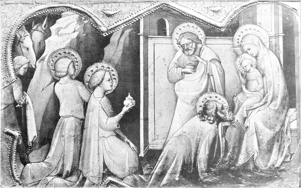


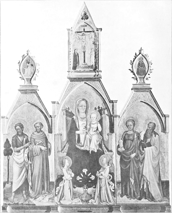
We come next to an artist who was probably at one time Agnolo Gaddi’s pupil. The two little predella pieces representing the Visitation and the Adoration of the Magi (Plate IV) are not only among the most charming pieces of the collection, but they are among the best works of an artist whose sense of beauty was almost of the highest order—Lorenzo Monaco. The melodious rhythm of his long-drawn interlacing lines, the sweetness and lucidity of his design, are here beautifully apparent. His[Pg 131] peculiar treatment of drapery would seem to indicate that the miniature paintings of northern Europe, particularly of French workmanship, were not without their influence on him. But here, though the main ideas of design are essentially gothic, there is much that already foreshadows the art of the fifteenth century. How much of Fra Angelico there already is in the tenderly expressive gesture of the Virgin’s hands as she raises St. Elizabeth from her knees, while the movement of the right leg and the peculiar disposition of the drapery which it causes are favourite motives with the pupil. Angelico, indeed, had but little to add to this exquisite interpretation of the subject. How much, too, of Fra Filippo Lippi’s genre feeling is already hinted at in the figure leaning against the doorpost—how much of his romance in the woodland background! Lorenzo Monaco’s importance as the inspirer of the new ideas of the quattrocento perhaps deserves more recognition. The Adoration is a variation upon the theme of a predella piece by Lorenzo in the Raczynski gallery at Berlin; but the differences between this, which we must assume to be a late work, and the Berlin picture are remarkable. The head of the second king in particular is so different from Lorenzo’s usual type, so near to what Masolino or the young Masaccio might have done, that one wonders whether some pupil, already advancing beyond his master in the new direction, may not have had a hand in it. ¶ If these works by Lorenzo Monaco show the emergence from the gothic formula of a new spirit, our next picture (Plate V) is on the contrary a curious case of retardation. ¶ The general effect of this picture is decidedly Giottesque; the colour scheme is still of the gay and variegated kind that occurs in works of the trecento. The crimson robes with yellow high lights, the indigo blues and apple greens, all belong to the Giottesque tradition; but, none the less, this picture was probably executed at a period when the more original artists had already established the new ideas of fifteenth-century art. The master who executed this was clearly a reactionary who clung to the old, convenient receipts for the fabrication of handsomely decorated altarpieces. His works are not uncommon in and around Florence, and may be easily recognized by the peculiar alert expression of the eyes and the gaiety and piquancy of his faces. One of his pictures in the corridor of the Uffizi is reproduced here (Plate V); another is in Fiesole cathedral. The artist shows some evidence of the influence of Lorenzo Monaco, though this is more apparent in the draperies of the Uffizi picture than in the Highnam Madonna. The latter seems in essentials to be rather a continuation of the purely Florentine Giottesque tradition of the end of the fourteenth century, and is probably a somewhat earlier work. ¶ Whoever our artist may be, his work scarcely rises above the level of tasteful and accomplished craftsmanship, and his chief interest is as an example of one phase of the work of the period of transition to the style of the quattrocento. One is apt to forget that long after Masaccio and Castagno had realized in paint the new plastic ideas of Donatello, the older firms of ecclesiastical furnishers went on contentedly in the earlier manner, which was, in fact, better adapted to the requirements of the altarpiece. Even in the next generation Neri di Bicci only made a sufficient pretence to structural draughtsmanship and modelling to pass muster among his contemporaries.
We now turn to an artist who was likely once a student of Agnolo Gaddi. The two small predella pieces depicting the Visitation and the Adoration of the Magi (Plate IV) are not only among the most delightful works in the collection, but they also rank among the best creations of an artist whose sense of beauty was nearly unmatched—Lorenzo Monaco. The melodic flow of his long, intertwining lines and the sweetness and clarity of his design are clearly evident here. His[Pg 131] unique treatment of drapery suggests that the miniature paintings from northern Europe, particularly those from France, influenced him. However, while the main design ideas are fundamentally gothic, there’s much that hints at the art of the fifteenth century. You can see a lot of Fra Angelico in the tenderly expressive gesture of the Virgin’s hands as she helps St. Elizabeth to her feet, while the positioning of her right leg and the way the drapery moves are favorite themes for the student. In fact, Angelico had little to add to this exquisite interpretation of the scene. There’s also a glimpse of Fra Filippo Lippi’s genre sensibility in the figure leaning against the doorpost—so much of his romantic style is present in the woodland background! Lorenzo Monaco’s importance as a source of the new ideas of the quattrocento may deserve more recognition. The Adoration is a variation of a predella piece by Lorenzo found in the Raczynski gallery in Berlin; however, the differences between this—and we assume it to be a later work—and the Berlin piece are striking. The head of the second king, in particular, is so different from Lorenzo’s typical style, resembling what Masolino or the young Masaccio might have painted, that one wonders if a pupil, who is already progressing beyond his master in a new direction, might have contributed to it. ¶ If Lorenzo Monaco's works indicate a move away from the gothic style towards a new spirit, our next painting (Plate V) represents an interesting case of regression. ¶ The overall effect of this painting is clearly Giottesque; the color palette is still bright and diverse, typical of trecento works. The crimson robes with yellow highlights, indigo blues, and apple greens all belong to the Giottesque tradition, yet this painting was likely created during a time when more innovative artists had already embraced the new concepts of fifteenth-century art. The master behind this work was clearly a traditionalist, sticking to the old, tried-and-true methods for creating beautifully decorated altarpieces. His works are relatively common in and around Florence and can be easily identified by the unique lively expression in the eyes and the cheerful, striking features of his faces. One of his paintings in the corridor of the Uffizi is shown here (Plate V); another is located in the Fiesole cathedral. While the artist shows some signs of Lorenzo Monaco's influence, this is more apparent in the draperies of the Uffizi painting than in the Highnam Madonna. The latter essentially seems to extend the purely Florentine Giottesque tradition from the late fourteenth century and is probably an earlier work. ¶ Regardless of who our artist is, his work barely exceeds the level of skilled and polished craftsmanship, and his main significance lies in being an example of one aspect of the transition period to the style of the quattrocento. It's easy to overlook that long after Masaccio and Castagno had brought the new three-dimensional ideas of Donatello into their paintings, older groups of church decorators continued to work comfortably in the earlier style, which actually suited the needs of altarpieces better. Even in the next generation, Neri di Bicci only feigned sufficient structural drafting and modeling to remain acceptable among his peers.
[Pg 132]
[Pg 132]
MUSSULMAN MANUSCRIPTS AND MINIATURES AS ILLUSTRATED IN THE RECENT EXHIBITION AT PARIS
❧ WRITTEN BY E. BLOCHET ❧
❧ WRITTEN BY E. BLOCHET ❧
PART I
HE exhibition of Mussulman art held during the months of May and June in the Pavillon de Marsan at Paris afforded an opportunity such as is rarely given of studying the art of the Mussulman nations. The objects brought together included some fine examples of their various classes, and most of them, coming as they did from private collections, had not before been seen by the public. ¶ The art of miniature-painting is one of those in which the Mussulmans have excelled, especially the Persians and the Turks, who, since the appearance upon the world’s scene of the hordes of Jenghis Khan, have lived by Iranian culture and civilization. Also it is one of the least known, for we have to go in search of specimens of this art to the manuscripts in which they are scattered without order and, at least at first sight, without logic. Moreover, as will presently be seen, only a very restricted few of these paintings are signed and dated, so that it is only by external considerations that we can succeed in identifying a period and a country of origin. ¶ The Mussulman religion has always been shy of encouraging the art of painting; in fact, the tradition of Islam formally forbids it. This absolute prohibition was borrowed by Mohammed from the Jews, and he also reckoned upon establishing a distinction between his Faithful, of whom he wished to make a nation of iconoclasts, and the Byzantine Christians and Mazdean Persians, who decorated their palaces with carvings and their books with paintings. He who draws a human figure, or even a representation of any kind of animal, says the Sunna, shall give it his soul at the Day of Judgement, and thus perish amid the torments of hell. Fortunately for the history of art, the Mussulmans did not observe this prohibition more strictly than did Solomon that of the Bible, when he introduced figures of animals into the Temple; but it did not fail to weigh heavily upon the artistic development of a whole world, and it forced the latter to confine itself vaguely to geometrical decoration, while systematically renouncing statuary and figured representations, which enabled Greek art to attain its full splendour. ¶ Passing through the galleries of the Pavillon de Marsan, one was struck by the smallness of the space occupied by figured representations among the number of objects there brought together. Here and there, at very rare intervals, one found a few bronzes representing animals; while as for the carpets, the accoutrements, the copper vessels, the glass lamps, it was only exceptionally that they bore anything but inscriptions in large neskhi letters, taken from verses of the Koran or from the traditions attributed to the prophet Mohammed. Nor did any but a certain number of Persian manuscripts contain other than those commonplace decorations which we find throughout the Islam world, from the Hispano-Arab monuments of Seville and Granada to the mosques raised by the descendants of Timur Bey in the countries that form the frontier of Chinese Turkestan. ¶ The impression of a person seeing once, and a little quickly, an exhibition, however limited, of Mussulman paintings, is that all these miniatures are so many isolated artistic fancies, scarcely connected one with the other, and that the painters who have executed them have confined themselves to following the whims of their imagination, without troubling to know what had been done before them, or to inquire into the workmanship of artists contemporary with themselves.
HE exhibition of Muslim art held in May and June at the Pavillon de Marsan in Paris provided a unique chance to explore the art of Muslim nations. The collection featured fine examples from various categories, most of which came from private collections and had never been seen by the public before. ¶ Miniature painting is one of the art forms in which Muslims have excelled, particularly the Persians and the Turks, who have thrived on Iranian culture and civilization since the time of Genghis Khan. However, it is also one of the least understood, as we must search for examples of this art within scattered manuscripts that appear disordered and, at first glance, illogical. Furthermore, as will be shown, only a limited number of these paintings are signed and dated, so identifying a specific period or place of origin relies on external factors. ¶ The Muslim faith has traditionally been cautious about supporting the art of painting; in fact, Islamic tradition formally prohibits it. This strict ban was adopted by Muhammad from the Jews, as he intended to create a distinction between his followers, whom he wanted to turn into a nation of iconoclasts, and the Byzantine Christians and Zoroastrian Persians, who decorated their buildings with carvings and their books with illustrations. According to the Sunna, anyone who draws a human figure or represents any kind of animal will have to give their soul on Judgment Day, eventually facing eternal suffering in hell. Fortunately for the history of art, Muslims didn’t enforce this prohibition as strictly as Solomon did with the Biblical ban when he included animal figures in the Temple; nevertheless, it heavily impacted the artistic evolution of an entire culture, forcing it into a vague realm of geometric decoration while systematically rejecting sculpture and figurative representations that allowed Greek art to achieve its full glory. ¶ Walking through the galleries of the Pavillon de Marsan, one is struck by how few figurative representations there are among the many objects displayed. Here and there, at rare intervals, one might find a few bronze sculptures of animals; as for the carpets, weapons, copper vessels, and glass lamps, they typically featured only large neskhi inscriptions taken from verses of the Koran or traditions attributed to the prophet Muhammad. Additionally, only certain Persian manuscripts contained anything beyond the typical decorations found throughout the Islamic world, from the Hispano-Arab monuments of Seville and Granada to the mosques built by the descendants of Timur Bey in the regions bordering Chinese Turkestan. ¶ The impression of someone quickly viewing an exhibition of Muslim paintings, however limited, is that these miniatures are isolated artistic whims, barely connected to one another, and that the artists responsible for them simply followed their imaginations without bothering to know what had come before them or the works of contemporary artists.


This is an inevitable impression, but a radically false one, as a careful and prolonged examination of the documents easily enables us to see. ¶ On the contrary, the world of Islam produced schools of which each had its own methods and types. By comparing manuscripts of the same date and origin, one perceives that, without exception, they present the same pictures, and that, moreover, those pictures are very nearly identical. They offer hardly the smallest variations in detail, while in workmanship and in the general plan of the composition they are strictly alike. It is thus that, in all the ‘Books of the Kings’ illustrated in Persia during the time of the Sefevæan kings, we find the same scenes treated in identical fashion, with more or less finish, according to the price of the book; in the same way, all the manuscripts of the life of the famous Sufis of Sultan Husein Mirza contain identical paintings, which are hardly differentiated one from the other and which are evidently replicas of a common original, drawn and painted by an artist of talent, the head of a school. ¶ No illuminated Arab manuscript is known of an earlier date than the thirteenth century, and the reason of this is simple. So long as the caliphate of Bagdad was sufficiently powerful, or, at least, preserved sufficient moral authority, to cause the Mussulman law to be respected in its integrity, none dared to violate one of the strictest injunctions of the Sunna. The artists, both in the Persian world and among the Mussulmans of Syria and Egypt, waited for the day of the final decadence of the spiritual power before venturing to transgress the formal prohibition against the reproduction, by any process whatever, of the human figure, or even of animal forms. ¶ Arab books adorned with pictures (of indifferent merit) appeared first in the empire of the Aiyubite sultans descended from Saladin. This innovation raised a storm among the ulemas and men of law, who looked upon it as an abomination; but the Aiyubite sovereigns, although loudly proclaiming themselves the stoutest defenders of the Caliph of Bagdad, were but little interested to know whether a thing was orthodox or not. Had not Saladin built in the very heart of Cairo a college for the Bathenians, whose doctrines, a hundred times anathematized by the Abbasside caliphs, tended to prove that there existed neither Allah nor Mohammed, and that the only possible divinity was the prime mover, the first hypostasis, the absolute One of the Neoplatonists? The Aiyubites troubled themselves so little about the prohibition against reproducing the human figure that they had coins struck in Syria bearing on the obverse the head of the Byzantine Christ and on the reverse the usual inscriptions in the Arab tongue. Saladin even went so far—and this is the acme of heterodoxy—as to plan a marriage between his brother Melik Adel and the sister of Richard Cœur-de-Lion, King of England. The Mussulman artists would have been very wrong not to have taken it at their ease under the reign of such liberal princes; and therefore, beginning with the extreme end of the twelfth century, we behold the first appearance of illuminated Arab manuscripts. ¶ These Arab manuscripts adorned with paintings are of the greatest rarity, and are not generally distinguished for their execution. They are curious documents, worthy of preservation because of their rarity, rather than real works of art, and the painters who illuminated them were never very careful with their work. They betrayed an almost complete lack of imagination and invention, and confined themselves to copying as best they could the illuminated pictures in the manuscripts at their disposal, that is to say the Byzantine manuscripts, in Egypt and Syria: as for the Mussulmans of the Maghreb and the Yemen, it never occurred to their minds that it was possible to adorn a book with pictures. The greater number[Pg 135] of the pictures in Arab manuscripts are copied from Byzantine manuscripts of the eighth to the eleventh century, and the limners, not knowing what they were copying, often surrounded the heads of their figures with the golden haloes of the saints of the Greek Church. ¶ There are only very few Arab manuscripts the pictures of which rise above the conventional commonplace level, although they always display very evident traces of Byzantine influence. The most important of these manuscripts is a copy of the Makāmāt (‘assemblies,’ or séances) of Harīrī, which belongs to M. Charles Schefer. A very curious painting from this manuscript, which was copied in Mesopotamia in the year 1237, is reproduced in the present article. It shows a troop of horsemen in the army of the Abbasside caliph, carrying the black silk standard of the Abbas family and sounding enormous trumpets. This picture, which is far from possessing the merit of the miniatures that adorn the Persian manuscripts, presents to us, in a life-like manner, a scene which must have been frequent in the streets of Bagdad and Damascus; the costumes and the harness of the horses are absolutely correct and correspond in every respect with the descriptions of apparel to be found at random in the Arab historians. One fact which goes to show that Arab art, at least in Syria, assumed a considerable development at that time is that we possess two other manuscripts of these séances of Harīrī less fine than the one in question, but illuminated by artists who evidently belong to the same school. ¶ These painters of the Aiyubite period considered that Byzantine art, itself very limited and restricted almost exclusively to religious painting, did not offer a large enough variety of models, and they looked around them for others. These were so rare that our artists were sometimes content to reproduce Egyptian stelæ, or to draw their inspiration from the statues of Pharaohs or divinities which they encountered at every step on Egyptian soil, copying to the best of their ability the hieroglyphic characters which they found on those monuments and of which they understood not a word. In short, painting never existed on Arab manuscripts save by way of exception and in a sporadic state; and yet the Arab artists suffered from no lack of subjects for illustration. What an inexhaustible mine the ‘Thousand Nights and a Night’ would have supplied, and the heroic romances of ‘Antarah, of Sultan Zahir Bibars, or the ‘History of the Heroes of Islamism’ (Siret el-mujāhidin)! A few Arab manuscripts copied in Persia are adorned with paintings, generally of indifferent merit, but it is very evident that these do not belong to Arab art properly so called, and that they must be included among the productions of Iranian art. ¶ The only ornamentation of the Arab manuscripts consists of the illumination of the titles and the first pages of the text. They are not so fine as those done in Persia, although we find copies of the Koran, written on parchment, richly illuminated with gilded designs. But this ornamentation, reduced to a very small number of colours and with broken lines, is heavy and overladen with gildings: the Persians were more sober and showed that they had less taste for tinsel.
This is an unavoidable impression, but it's completely misleading, as a careful and thorough examination of the documents quickly reveals. ¶ In fact, the world of Islam produced schools, each with its own methods and styles. By comparing manuscripts from the same time and place, you can see that they, without exception, depict the same scenes, and furthermore, those depictions are nearly identical. They show hardly any variations in detail, while in craftsmanship and the overall layout, they are strictly similar. Thus, in all the 'Books of the Kings' illustrated in Persia during the era of the Safavid kings, we find the same scenes presented in the same way, with variations in detail based on the book's price; likewise, all the manuscripts depicting the lives of the famous Sufis of Sultan Husein Mirza contain identical paintings that barely differ from each other and are clearly replicas of a common original created by a talented artist, the leader of a school. ¶ No illuminated Arab manuscript from before the thirteenth century is known, and the reason is straightforward. As long as the caliphate of Baghdad was powerful enough, or at least maintained enough moral authority, to uphold Muslim law in its entirety, no one dared violate one of the strictest prohibitions of the Sunna. Artists in both the Persian realm and among Muslims in Syria and Egypt waited until the final decline of spiritual power before daring to ignore the formal ban on reproducing human figures or even animal forms. ¶ Arab books illustrated with pictures (of mediocre quality) first emerged in the Ayyubid sultanate, descending from Saladin. This innovation stirred outrage among the ulema and legal scholars, who saw it as an abomination; however, the Ayyubid rulers, despite loudly claiming to be strong supporters of the Caliph of Baghdad, were not particularly concerned with whether something was orthodox or not. Hadn't Saladin built a college for the Bathenians in the heart of Cairo, whose doctrines had been denounced countless times by the Abbasid caliphs for claiming that neither Allah nor Mohammed existed, and that the only true divinity was the prime mover, the first hypostasis, the absolute One of the Neoplatonists? The Ayyubids paid little heed to the prohibition against depicting human figures, even minting coins in Syria that showed the head of the Byzantine Christ on one side and the usual Arabic inscriptions on the other. Saladin even planned a marriage between his brother Melik Adel and the sister of Richard the Lionheart, King of England, which was the pinnacle of heresy. Muslim artists would have been very wrong not to take advantage of such liberal reigns. Therefore, beginning in the late twelfth century, we see the first illuminated Arab manuscripts emerging. ¶ These illustrated Arab manuscripts are extremely rare and are not generally celebrated for their craftsmanship. They are interesting documents worth preserving for their rarity rather than for their artistic merit, and the artists who illuminated them were often careless. They displayed an almost complete lack of creativity and innovation, mostly copying the illuminated illustrations in the manuscripts they had available, namely the Byzantine manuscripts in Egypt and Syria. As for the Muslims of the Maghreb and Yemen, it never crossed their minds that making a book visually appealing with illustrations was possible. Most of the images in Arab manuscripts are copied from Byzantine manuscripts from the eighth to the eleventh century, and the artists, unaware of what they were replicating, often surrounded the heads of their figures with the golden halos typical of saints from the Greek Church. ¶ There are very few Arab manuscripts with illustrations that rise above the level of the commonplace, although they always show clear signs of Byzantine influence. The most significant of these manuscripts is a copy of the Makāmāt (‘assemblies,’ or séances) of Harīrī, which belongs to M. Charles Schefer. A particularly interesting painting from this manuscript, which was copied in Mesopotamia in the year 1237, is reproduced in this article. It portrays a troop of horsemen from the army of the Abbasid caliph, carrying the black silk standard of the Abbas family and sounding enormous trumpets. This image, while it doesn't have the artistic merit of the miniatures found in Persian manuscripts, provides a vivid representation of a scene that must have often occurred in the streets of Baghdad and Damascus; the clothing and the horse saddles are entirely accurate, matching the descriptions of attire found in various Arab historical texts. One fact suggesting that Arab art, at least in Syria, underwent significant development at that time is that we have two other manuscripts of Harīrī’s séances that are less refined than the one mentioned but illuminated by artists clearly from the same school. ¶ These painters of the Ayyubid period considered that Byzantine art, which was also very limited and almost exclusively religious, didn’t offer enough variety of models and searched for others. These were so rare that our artists sometimes resorted to reproducing Egyptian stelae or drawing inspiration from statues of Pharaohs or deities they encountered frequently in Egypt, copying the hieroglyphic characters they found on those monuments without understanding their meaning. In short, painting in Arab manuscripts was an exception and occurred sporadically; yet Arab artists had no shortage of subjects to illustrate. What an endless source of inspiration the ‘Thousand and One Nights’ or the heroic tales of ‘Antarah, of Sultan Zahir Bibars, or the ‘History of the Heroes of Islam’ (Siret el-mujāhidin) would have offered! A few Arab manuscripts copied in Persia feature illustrations, generally of mediocre quality, but it's evident that these do not belong to true Arab art and must be classified as part of Iranian artistic production. ¶ The ornamentation of Arab manuscripts consists solely of the decoration of titles and the first pages of the text. While not as fine as those created in Persia, we do find copies of the Koran, written on parchment, richly illuminated with gilded designs. However, this decoration is limited to a small palette of colors and consists of broken lines, appearing heavy and overdone with gilding; the Persians exhibited a more understated style and showed less taste for excessive decoration.
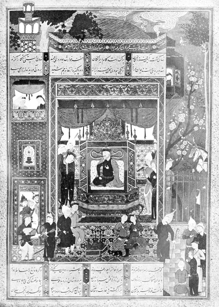
The artistic history of Persia begins with the Achæmenian kings, that is to say in the fifth century before Christ, a very recent date compared with the antiquity of the ancient Assyrian and Chaldean empires. Like all the countries of Hither Asia, the Persia of the Achæmenians was tributary to the Babylonian Empire, and the monuments of Persepolis and Murghab are obviously copied from those of the valley of the Euphrates, while showing signs of a strong Hellenic influence. In fact, the influence of Greece in Persia began long before the conquest by Alexander, and the subjects of the Great Kings had happily lightened the heavy architecture and ponderous sculpture of Babylon by taking their inspiration from [Pg 136] the methods of the artists of Hellas. It is thus that the Apadana of Persepolis, the Apadana of Esther and Xerxes, is a compromise between the oldest works of Assyrian art and the most grandiose specimens of Greek architecture, between the Palace of Sargon, which it suggests by the elevation of its immense walls and its heavy friezes, and the Parthenon, in which we find the colonnade of the Persian edifice, which the architecture of the Euphrates valley always ignored. The casings in many-coloured bricks which adorn the Apadana were borrowed by the Persians from Chaldean, or rather Assyrian art; and the frieze of the Archers has its prototype in the glazed-brick low-reliefs of the Dur-Sarkayan. The workmanship of those polychromatic casings has changed very little in the course of the ages, and the methods employed by the brick-makers who, in the sixteenth century, adorned the splendid mosques of the Sefevæan kings at Ardabil and Veramin with sky-blue and pale-green mosaics were almost identical with those of the artists of the time of Sargon and Nebuchadnezzar. ¶ The Greek influence attained its height in Iran after the conquest by Alexander, under the reign of the Arsacidan princes who assumed the title of Philhellenes on their coinage. The Sāsānians, while endeavouring to bring about a reaction against that influence which had several times threatened to deprive Iran of all its autonomy, were unable, at least at the commencement of their dynasty, to dispense with the aid of the Greek artists, and the inscriptions of the early kings of that dynasty are accompanied by a Greek translation. ¶ The art and methods of construction of the period of the Sāsānian kings were perpetuated long after the Mussulman conquest; and the ogival doorways of the Timurid mosques of Samarcand or of the mosques of the Sefevæan shahs recall, although with a much less imposing aspect, the gigantic ogive, the Ivān, to-day half-ruined, of the Palace of the Sāsānians at Ctesiphon, which, according to the Islam tradition, was rent in two during the night in which Mohammed came into the world. The Mussulman architects who built the powerful citadels which stayed the onrush of the crusaders in Syria also derived their inspiration from the Sāsānian tradition, and it was thus that the gothic style made its way into the art of the east and ended by supplanting the Roman style. ¶ If the influence of Greek art was considerable in Ancient Persia, it was null in Persian art according to Islam; for there was scarcely any point of contact between the Byzantine world in its decline and Persia subjugated by the arms of the caliphs and separated from the west by Syria and the provinces that formed the Seljukian empire of Asia Minor. Nevertheless there exist a few rare specimens of Persian painting of the end of the thirteenth century which recall in a positive fashion the methods of Hellenic art; but there is no doubt that the works which they serve to illustrate are merely translations of Arab originals written in Syria and containing miniatures imitated from Byzantine types. The Persian limners confined themselves to reproducing those paintings at the same time that the Arab works were being translated into the Persian language, and we must beware of seeing in this the trace of any post-Islamic influence of Byzantine art. ¶ The three great schools of painting in Persia succeed one another without interruption and, encroaching one on the other from the beginning of the thirteenth century to the early years of the eighteenth century, correspond with the three great dominations which held sway over Iran during this period of nearly five centuries: the Mongolians, the Timurids and the Sefevæans. Books adorned with paintings, in fact, make their first appearance with the dynasty of the Mongolian sovereigns, whose ancestor, Hulagu, was sent to conquer Persia by the Emperor of China, Manchu. Although the dynasties which had made themselves independent in Persia,[Pg 139] up to the Seljukians, had taken matters easily with the Abbasside caliphate, it is no less true that they were deeply attached to Islamism and that men hesitated under their dominion openly to transgress the prescription of the religious law. The Mongolian sovereigns, at least the first, did not profess Islamism and even greatly preferred Christianity to the Mussulman religion, although not themselves Christians. Some of them, such as Hulagu, had Christian wives, and they often protected the Christians to the detriment of the votaries of Mohammed. We know from the narrative of the missionaries who were sent on embassy to the court of the Grand Khan of Cathay—Jean du Plan de Carpin, Guillaume de Ruysbroeck and others—that the Mongols made very coarse representations of their divinity Itoga and of other spirits of an inferior order. Like all the primitives, they greatly loved to see themselves pictured in paintings, and the manuscripts which date from the time of the Mongolian sovereigns of Persia are filled with portraits of the Khans, different nobles accompanied by their wives and engaged in drinking fermented mare’s milk in cups of Chinese porcelain. The Mongols, when they issued from their steppes bent upon the conquest of the world, were certainly the most ignorant people conceivable, for which reason they were surrounded by Chinese secretaries, interpreters, engineers and bureaucrats, without whom they would have been helpless. All this yellow flood swept down upon Persia and there settled as in a conquered country, introducing numbers of Turkish words into the language and, into art, not the formulas of the Turks and Mongols, because these had none, but those of the Celestial empire. It is certain that the Chinese artists whom the Mongols had brought with them to Persia understood the technicalities of painting infinitely better than did the Iranians, even as the Chinese accountants could easily have given lessons to all the financial clerks of the Sāmānids or Seljukians. And so the Persian painters sat at the feet of the Chinese and eventually came to create an art which was very different from that of the Celestial empire, but which nevertheless displays many characteristics of Chinese painting. In any case, it is certain that the miniatures which adorn the Persian manuscripts from the time of the Mongols have no connexion whatever with what is known to us of the art of the Sāsānidans, or with the descriptions given by Mas‘ūdī of pictures which he had seen at Persepolis in a book and by the unknown author of a chronicle entitled the ‘Sum of Histories.’ ¶ The manuscripts illuminated in Persia and in the regions that depended upon her during the Mongolian period (1258–1335) are very numerous and all present the same characteristics: the artists who illuminated them drew, above all, battle-scenes, sieges of fortresses, bloody contests, or else banquets, for the Mongols were, according to the account of travellers, great quaffers of strong liquors. These pictures, however, are rarely so well executed as those which belong to the school of the Timurids and the Sefevæans: the Mongols were people who were not hard to please; they wished before all things to be served quickly; and with them quantity easily took the place of quality. It may be remarked that the manuscripts executed at that time contain a very considerable number of paintings; but, though these paintings possess a great documentary interest, they have but a feeble interest from the artistic point of view. Some of them are merely wash-drawings in uniform tints rather than paintings in the proper sense of the word.
The artistic history of Persia starts with the Achaemenian kings, which is to say in the fifth century BCE, a relatively recent date compared to the ancient Assyrian and Chaldean empires. Like all the countries in the Near East, Persia during the Achaemenian period was under the influence of the Babylonian Empire. The monuments of Persepolis and Murghab are clearly inspired by those in the Euphrates valley, but they also show a strong Greek influence. In fact, Greek influence in Persia began long before Alexander's conquest, as the subjects of the Great Kings skillfully lightened the heavy architecture and bulky sculpture of Babylon by drawing inspiration from the techniques of Greek artists. This is evident in the Apadana of Persepolis, associated with Esther and Xerxes, which represents a blend of the earliest Assyrian art and grand Greek architecture, echoing the Palace of Sargon in its towering walls and heavy friezes, and the Parthenon, where the colonnade of the Persian structure contrasts with the typical designs of the Euphrates valley. The multi-colored brick facades that adorn the Apadana were borrowed from Chaldean, or rather Assyrian, art, and the frieze of the Archers has its roots in the glazed-brick low-reliefs of Dur-Sarkayan. The craftsmanship of these colorful facades has barely changed over the centuries, and the techniques used by the brick-makers who, in the sixteenth century, decorated the stunning mosques of the Safavid kings at Ardabil and Veramin with sky-blue and pale-green mosaics were almost identical to those of the artists from the time of Sargon and Nebuchadnezzar. ¶ The Greek influence peaked in Iran after Alexander's conquest, during the reign of the Arsacid princes, who called themselves Philhellenes on their coins. The Sasanian dynasty, while trying to counteract the influence that repeatedly threatened Iran's autonomy, still relied on Greek artists at the start of their rule, with inscriptions from the early Sasanian kings accompanied by Greek translations. ¶ The art and construction methods from the Sasanian kings' era continued long after the Muslim conquest; the pointed doorways of the Timurid mosques in Samarkand and the mosques of the Safavid shahs, although less grand, recall the massive arch, the Iwan, mostly in ruins today, from the Sasanian Palace at Ctesiphon, which, according to Islamic tradition, was split in two when Muhammad was born. Muslim architects who built the formidable citadels that resisted the Crusaders in Syria were also inspired by Sasanian style, allowing the Gothic style to enter Eastern art and eventually replace the Roman one. ¶ While Greek art had a significant influence in Ancient Persia, it had no impact on Persian art under Islam; there was hardly any connection between the declining Byzantine world and Persia, which was conquered by the caliphs and separated from the West by Syria and the provinces that made up the Seljuk Empire in Asia Minor. Nonetheless, there are a few rare examples of Persian painting from the late thirteenth century that clearly reflect Hellenic art techniques; however, it’s evident that the works they illustrated were only translations of Arab originals created in Syria and featuring miniatures adapted from Byzantine styles. Persian artists focused on reproducing these paintings as Arab works were translated into Persian, so we should not interpret this as an indication of any post-Islamic Byzantine influence. ¶ The three major schools of painting in Persia succeeded one another uninterruptedly, overlapping from the early thirteenth century to the early eighteenth century, aligning with the three significant powers that ruled over Iran during nearly five centuries: the Mongols, the Timurids, and the Safavids. Illustrated books made their first appearance with the Mongolian dynasty, whose ancestor, Hulagu, was sent to conquer Persia by the Manchu Emperor of China. Although the dynasties that became independent in Persia, up until the Seljuks, were relatively easygoing with the Abbasid caliphate, they were still deeply committed to Islam, and people were wary of openly breaking religious laws under their rule. The early Mongolian sovereigns did not adopt Islam and actually preferred Christianity over Islam, even though they themselves were not Christians. Some, like Hulagu, had Christian wives and often protected Christians at the expense of Muslim followers. Accounts from missionaries who were sent to the court of the Grand Khan of Cathay—like Jean du Plan de Carpin, Guillaume de Ruysbroeck, and others—describe that the Mongols expressed crude representations of their deity Itoga and other lesser spirits. Like many primitives, they enjoyed being depicted in artwork, and manuscripts from the time of the Mongolian rulers in Persia include portraits of the Khans and various nobles with their wives, indulging in drinking fermented mare's milk from Chinese porcelain cups. The Mongols, as they emerged from their steppes in pursuit of global conquest, were among the most ignorant peoples imaginable, which is why they relied on Chinese secretaries, interpreters, engineers, and bureaucrats, without whom they would have struggled. This yellow tide swept into Persia, treating it as a conquered nation, introducing many Turkish words into the language and incorporating not Turkish and Mongolian formulas, for those did not exist, but rather those from the Celestial Empire. It’s apparent that the Chinese artists brought by the Mongols understood painting techniques far better than the Iranians, just as Chinese accountants could have easily instructed all the financial clerks of the Samanids or Seljuks. Consequently, Persian painters learned from the Chinese and eventually developed an art distinctly different from that of the Celestial Empire, while still showcasing many characteristics of Chinese painting. In any case, it's clear that the miniatures gracing Persian manuscripts from the Mongolian period bear no connection to what we know of Sasanian art or the descriptions by Mas'udi of images he encountered at Persepolis in a book or by the unknown author of a chronicle named the ‘Sum of Histories.’ ¶ The illuminated manuscripts produced in Persia and its dependent regions during the Mongolian period (1258–1335) are numerous and share common traits: the artists focused mainly on battle scenes, sieges of fortresses, violent conflicts, or banquets, as Mongols were renowned for their fondness for strong drinks, according to travelers. However, these images are often not as skillfully executed as those from the Timurid and Safavid schools: the Mongols were easy to please, preferring speedy service above all, and with them, quantity often took precedence over quality. It is worth noting that manuscripts from this period contain a large number of illustrations; although these images are of significant historical interest, they lack substantial artistic value. Some are merely wash-drawings in uniform colors rather than true paintings.

The schools of painting of the Mongolian period did not last long in Persia, and it would seem as though, from the moment when the descendants of Hulagu became converted to Islamism, people in Persia began to look with an evil eye upon picture-books and those who painted them. Moreover, the Mongolian dynasty gave way amid so great a chaos and such infinite disorder that [Pg 140] the Persians had too many other things to occupy their minds to allow them to think of illustrating their ‘Books of the Kings’ or the Gulistān of the Sheikh Sa‘dī. We still find in the great European libraries a few manuscripts illuminated for the Djelairids or the Mozafferids; but the political instability of Iran was at that time so great that two copies of the same work are sometimes dedicated to two successive sovereigns. ¶ The accession of Timur Bey put an end to this anarchy, which, for that matter, was to begin again a century later, and the reign of his successor, Shah-Rokh, was a period of peace such as Persia had not known since long. Under the reign of this pacific prince, who waged no war until driven to extremes by his kinsmen, there was executed, at Herat, one of the most splendid specimens of Iranian painting, the manuscript of the ‘Ascension of Mohammed to Heaven.’ Illuminated books belonging to the Timurid school of Persia and Turkestan are not excessively rare, and we must look among them to find the master-pieces of Persian painting. A certain number of these volumes come from the libraries of the Timurids, principally from that of Herat, where Sultan Husain Mirza had collected a magnificent library, which has now completely disappeared. ¶ These Timurid sovereigns, including those who reigned in the east of Persia and in Transoxiana after the death of Tamerlane (Timur Bey) as well as those who went to seek their fortune in Hindustan, were great lovers of works of art and of fine literature. At Samarcand, they raised the splendid mosques, now ruined, which were the ornament of the Righistan—the Tilla-kari, Bibi-khanum and Guri-Mir—whose gutted cupolas, all enamelled with many-coloured bricks, still excite the admiration of archæologists. Timur Bey, whom the pamphlet of Ibn-Arabshah did not a little to represent as a vulgar toper, delighted in reading the Ghazels of Hāfiz and the ‘Romance of Alexander’ of Nizāmī. Some of his writings are master-pieces of Turco-Oriental literature, and the unauthenticity of his Memoirs has never been absolutely proved. His grandson, Ulugh Beg, was the Alfonso X of the east, and the astronomical tables which he drew up with the aid of the most celebrated cosmographers form one of the most important works of Oriental mathematics. Sultan Husain ibn Baïkara lived in his capital of Herat surrounded by the most famous writers of his time—‘Alī Shīr his Vizir, the illustrious Sūfī Jāmī, Khwānd-Amīr the historian—and his collection of biographies of Mussulman saints is one of the master-pieces of elegant prose produced by Persian literature. ¶ The Emperor Babar, who, when the Timurid empire was definitely ruined in Persia, went away to conquer Hindustan, has left a sober and severe history of his long campaigns which recalls Caesar’s ‘Commentaries.’ In the midst of their intrigues and of the crimes which they did not hesitate to commit to obtain possession of the throne, his descendants, the Grand Moguls of Delhi, never lost their passion for works of art. The Emperor Shah-Jahan, who, in order to assume the crown, had revolted against his father and killed off all his brothers, found time, on the very day of his accession, to inscribe his ex-libris on a magnificent copy of one of the six poems of Jāmī; it is true that this volume was a family record, and that it had been copied for his ancestor, the sovereign of Herat, Sultan Husain Mirza. The Timurids of Hindustan retained this passion for fine books until the worst days of their history. Copies bearing the seal of Mohammed Shah or of Ferrukh Siyyar are not at all rare, and Shah Alem II enriched the library of the Grand Moguls even at the time when he was being torn between the English, the Mahrattas and the French, and when his empire was on the point of passing under a foreign dominion. ¶ The influence of Chinese art is even more marked in the paintings of the Timurid school of Khorassan than in those of the Mongols of Persia,[Pg 143] and it is open to us to ask ourselves whether they were executed by Persians trained in the school of the Chinese, or by Chinese striving to produce something in the Persian taste. If a doubt be permissible in the case of the manuscript of the ‘Ascension of Mohammed,’ none such can be entertained concerning a manuscript which was copied at Samarcand for Sultan Mirza Ulugh Beg and which contains the Arab text of an astronomical treatise famous in the East, that of ‘Abd ur-Rahmān el-Sūfī. One of the pictures adorning this magnificent manuscript is reproduced in the present article, and it is easy to see, even in the absence of colour, that the drawing shows an evident Chinese influence. The lightness of the outlines and of the painting, reduced to a few tints of Chinese ink in the shadows and a few threads of colour, reminds one in an extraordinary manner of the methods of the Japanese artists. This same characteristic occurs also, although in a less pronounced degree, in the miniatures on the manuscript of the ‘Ascension of Mohammed’; but the heads of the chimera on which the Prophet is mounted and of the angels recall the chubby faces on certain paintings or certain ivories of the Far East. ¶ We know from an undoubted source that the Timurids of Turkestan and Eastern Persia were pleased to make calls upon the artists of the Celestial empire, and that one of those sultans had set up at the gates of Samarcand a Trianon in Chinese porcelain which had been brought in sections, with every piece numbered, to the Athens of Turkestan. It is therefore no matter for surprise that we should find in the paintings of many manuscripts which formed the libraries of Herat and Samarcand traces of so deep and so protracted an influence. These miniatures are always infinitely better executed than are those of the Mongolian school, and we feel that they appeal to men of a different and more refined form of culture than the cavalry leaders who organized the bold raids across the Asiatic continent. They represent fewer scenes of carnage and, above all, fewer horsemen barbed and iron-clad to their eyes than fill the paintings of the Mongolian manuscripts. The sultans of Turkestan made war upon one another in order to steal the others’ crowns, but they did not do so as brutes greedy of slaughter and scenes of bloodshed: often warfare was their only means of living and of defending themselves against the incessant attacks of their rapacious kinsmen. ¶ The transition from the school of Turkestan at the time of the princes of the House of Timur to the third great school of painting in Persia, that of the Sefevæans, was not so clearly defined as that which separates the Mongolian from the Timurid school. There was, towards the end of the fifteenth century, a certain period during which the Persian artists endeavoured to produce something new, while retaining, in a great measure, the method of the miniature-painters of Turkestan. To this transition period belongs the manuscript of the ‘Book of the Kings,’ the property of M. de Rothschild, of which two reproductions will be found in these pages, and also the miniature representing a hunting-scene which is taken from a splendid manuscript, dated 1527, from the divan of Mīr ‘Alī Shīr Navā’ī, Vizir to the Timurid Sultan Husain Mirza. ¶ Obviously the master-pieces of Mussulman painting are to be sought among the miniatures executed at Herat and Samarcand in the fifteenth century; but this does not prevent the miniatures painted in Western Persia under the reign of the Sefevis (fifteenth to seventeenth century) from being splendid works of art. The number of illuminated manuscripts dating from this period is relatively large. This does not imply that there were many more painted in Persia under Shah Abbas than during the time of the Timurids, but simply that, being more modern, there were fewer of them lost.
The schools of painting from the Mongolian period didn't last long in Persia. It seems that once the descendants of Hulagu converted to Islam, people in Persia started to view illustrated books and their creators with suspicion. Furthermore, the Mongolian dynasty fell into such chaos and disorder that the Persians had too many other concerns to focus on illustrating their 'Books of the Kings' or the Gulistān by Sheikh Sa‘dī. We still find a few illuminated manuscripts from the Djelairids or the Mozafferids in major European libraries, but the political instability in Iran was so critical at that time that sometimes two copies of the same work would be dedicated to two consecutive rulers. The rise of Timur Bey ended this anarchy, which resumed a century later, and the reign of his successor, Shah-Rokh, was a time of peace that Persia hadn't experienced in a long time. Under this peaceful prince, who only went to war when absolutely necessary due to his relatives, a masterpiece of Iranian painting was completed in Herat: the manuscript of the 'Ascension of Mohammed to Heaven.' Illuminated books from the Timurid school of Persia and Turkestan are not excessively rare, and it’s among them that we find the masterpieces of Persian painting. Some of these volumes came from the Timurids' libraries, particularly from Herat, where Sultan Husain Mirza had amassed a magnificent collection, now completely lost. The Timurid rulers, including those in eastern Persia and Transoxiana after Tamerlane’s death, along with those who sought fortune in Hindustan, were great enthusiasts of art and fine literature. In Samarcand, they built magnificent mosques, now in ruins, that adorned the Righistan—Tilla-kari, Bibi-khanum, and Guri-Mir—whose shattered domes, decorated with colorful bricks, still fascinate archaeologists. Timur Bey, who was portrayed by Ibn-Arabshah as a common drunkard, loved reading the Ghazels of Hāfiz and the 'Romance of Alexander' by Nizāmī. Some of his writings are masterpieces of Turco-Oriental literature, and the authenticity of his Memoirs has never been definitively disproved. His grandson, Ulugh Beg, was the Alfonso X of the east, and the astronomical tables he created with the help of renowned cosmographers represent one of the most significant contributions to Oriental mathematics. Sultan Husain ibn Baïkara lived in his Herat capital surrounded by the most prominent writers of his time—‘Alī Shīr, his Vizir, the renowned Sufi Jāmī, and historian Khwānd-Amīr—and his collection of Muslim saint biographies stands as one of the finest examples of elegant prose in Persian literature. The Emperor Babar, who ventured to conquer Hindustan as the Timurid empire collapsed in Persia, left behind a stark and serious history of his lengthy campaigns, reminiscent of Caesar’s ‘Commentaries.’ Despite their intrigues and crimes for the throne, his descendants, the Grand Moguls of Delhi, never lost their passion for art. The Emperor Shah-Jahan, who revolted against his father and murdered his brothers to claim the crown, still found the time, on his very first day as ruler, to inscribe his ex-libris on a splendid copy of one of Jāmī’s six poems, even though this volume was a family heirloom originally copied for Sultan Husain Mirza of Herat. The Hindustani Timurids maintained their love for beautiful books even during the darkest days of their reign; copies with the seals of Mohammed Shah or Ferrukh Siyyar are not uncommon, and Shah Alem II enriched the Grand Moguls' library even while his realm was under threat from the British, the Mahrattas, and the French. The influence of Chinese art is even more evident in the paintings of the Timurid school in Khorassan than in those of the Mongols in Persia, and we might wonder whether these works were created by Persians trained in the Chinese tradition or by Chinese artists attempting to meet Persian tastes. While there may be doubts about the manuscript of the 'Ascension of Mohammed,' there can be none about a manuscript copied in Samarcand for Sultan Mirza Ulugh Beg, which contains the Arabic text of a famous astronomical treatise by ‘Abd ur-Rahmān el-Sūfī. One of the illustrations from this magnificent manuscript is included in this article, and it’s easy to see, even without color, that the drawing shows clear Chinese influence. The lightness of the outlines and painting, reduced to simple tints of Chinese ink for shadows and a few colors, remarkably resembles the techniques of Japanese artists. This same quality appears, although to a lesser extent, in the miniatures of the 'Ascension of Mohammed,' yet the faces of the creature supporting the Prophet and of the angels resemble the soft features seen in certain Eastern paintings or ivories. There is solid evidence that the Timurids of Turkestan and Eastern Persia welcomed artists from the Celestial Empire, and one of those sultans had a Trianon built at the gates of Samarcand, made of Chinese porcelain brought in sections, all numbered, to the Athens of Turkestan. Thus, it’s no surprise to find traces of a deep and enduring influence in the paintings of many manuscripts that formed the libraries of Herat and Samarcand. These miniatures are consistently executed with far greater skill than those from the Mongolian school, suggesting they were created by individuals with a more refined culture than the cavalry leaders who led daring raids across Asia. They depict fewer scenes of bloodshed, particularly fewer armored horsemen than fill the paintings of Mongolian manuscripts. The sultans of Turkestan fought each other to seize crowns, but they did not do so as brutal murderers seeking slaughter; often, warfare was their only means of survival and defense against their relentless, greedy relatives. The shift from the Turkestan school during the Timur princes to the third major painting school in Persia, the Safavids, wasn’t as distinctly marked as the transition from the Mongolian to the Timurid school. Toward the end of the fifteenth century, there was a period during which Persian artists sought to innovate while largely retaining the techniques of the Turkestani miniature painters. This transition period includes the manuscript of the 'Book of the Kings,' owned by M. de Rothschild, of which two reproductions are featured in these pages, along with a miniature depicting a hunting scene taken from an exquisite manuscript dated 1527 from the divan of Mīr ‘Alī Shīr Navā’ī, the Vizir to Timurid Sultan Husain Mirza. Clearly, the masterpieces of Muslim painting can be found among the miniatures produced at Herat and Samarcand in the fifteenth century; however, this doesn’t diminish the value of miniatures created in Western Persia under the Safavids (fifteenth to seventeenth century), which are also magnificent works of art. The number of illuminated manuscripts from this period is relatively large. This doesn’t mean that there were significantly more created in Persia under Shah Abbas than during the Timurid era, but simply that, being more recent, fewer have been lost.
(To Be continued.)
(To Be Continued.)
[Pg 144]
[Pg 144]

[Pg 145]
[Pg 145]

THE PLATE OF WINCHESTER COLLEGE
❧ WRITTEN BY PERCY MACQUOID, R.I. ❧
❧ WRITTEN BY PERCY MACQUOID, R.I. ❧
HERE is an undefinable feeling of romance and sentiment that forcibly strikes even the most callous who visit Winchester College. Founded by William of Wykeham in 1393 for the purpose of providing free education for the sons of those who could not otherwise have afforded it, as well as a means of supplying the country with an enlightened priesthood, it remains to-day the oldest and one of the greatest of England’s public schools. The royal licence to found the college, granted by Richard II, empowers Wykeham to ‘acquire the site and build a hall or college to the honour and glory of God and our Lady, and to settle in it a warden and seventy scholars who should study grammar within its halls and to grant them a charter.’ This first building took six years to complete, and the sum of £1.014 8s. 3d. was spent upon its construction, a sum that would represent about £20,000 according to the present value of money. ¶ As Winchester was at one time the capital of England, many kings made it their chief seat of residence, and many important parliaments were held there, and it was no doubt from this traditional importance that reigning sovereigns, and the highest dignitaries of Church and State, continually paid visits to the college. It would be otherwise difficult to account for the very large amount of ecclesiastical plate and precious vestments, in addition to the great quantity of secular plate, that was at different times in the possession of the college. The number of rose-water basins with ewers and spoons enumerated in one inventory alone proves that the entertainments must have been of a highly important nature. ¶ The earliest record of a royal gift in plate is of 1449, when Henry VI gave a tabernacle of gold, Margaret of Anjou about the same time presenting a pair of silver-gilt basins, weighing 114 oz., with the enamelled arms of England on one and those of France on the other. Before this date King Henry had paid many visits to the college, being desirous of gaining information on the subject of its working rules and statutes, in order to apply the same to the two similar institutions he was about to found. Another visit was on the occasion of his marriage, when it is stated in one of the records that the wine and beer for the entertainment of the royal suite cost two shillings and fourpence, a sum that does not appear excessive for court refreshments. Doubtless it was in return for the information and hospitality received that he produced the tabernacle and basins. The only recorded visit of Henry’s successor, Edward IV, was in 1469, when he was sufficiently impressed by the school to lend a live lion for the edification of the boys, but he does not appear to have made any presentation of plate; nor is there record of any particular interest taken in the college by either Richard III or Henry VII. During the next reign—which might with justice be called the reign of terror so far as gothic plate was concerned—Thomas Cromwell, representing the king as vicegerent and vicar-general, paid a formal visit to the college. Perhaps the authorities, scenting the coming storm, thought that the presentation to him of a standing salt from the college plate chest might prove a politic precaution; for in the records this entry occurs: ‘Sol. pro reparacione unius salsarii dat. Mro Cromwell secretario Dn̄i Regis pro favore suo habendo in causis Collegii vs. xd.’ A few weeks later, when the king was at Wolvesey Castle, two oxen, ten sheep, and twelve capons were sent to him and graciously accepted. Whether on[Pg 149] account of the gift of the salt to Cromwell, or of the offering of sheep and chickens, Henry VIII spared the college plate; his indulgence in this respect is proved when it is seen, from the following inventory taken in 1525 of the secular college plate, how great the temptation must have been:—
HERE is an indescribable sense of romance and sentiment that hits even the most indifferent visitors at Winchester College. Founded by William of Wykeham in 1393 to provide free education for boys who couldn’t afford it, and to ensure the country had an educated priesthood, it remains today the oldest and one of the finest public schools in England. The royal license to establish the college, granted by Richard II, allows Wykeham to "acquire the site and build a hall or college to the honor and glory of God and our Lady, and to appoint a warden and seventy scholars who would study grammar within its halls and to grant them a charter." This first building took six years to finish, and a total of £1,014 8s. 3d. was spent on its construction, which would be equivalent to about £20,000 in today's money. ¶ Since Winchester was once the capital of England, many kings made it their main residence, and numerous important parliaments were held there. It's likely because of this historical significance that reigning monarchs, along with high-ranking officials from the Church and State, frequently visited the college. It would otherwise be hard to explain the substantial amount of ecclesiastical plate and precious garments, along with a significant quantity of secular plate, that the college possessed at various times. The number of rose-water basins with ewers and spoons listed in one inventory alone suggests that the events hosted there were quite significant. ¶ The earliest record of a royal gift in plate dates back to 1449 when Henry VI donated a gold tabernacle, while Margaret of Anjou also contributed around the same time with a pair of silver-gilt basins weighing 114 oz., adorned with the enamelled arms of England on one and those of France on the other. Before this, King Henry had made several visits to the college to learn about its rules and statutes, intending to apply the same principles to two similar institutions he was planning to establish. Another visit occurred during his marriage, noted in the records as costing two shillings and fourpence for wine and beer to entertain the royal suite, which doesn’t seem like much for court refreshments. It was likely in gratitude for the hospitality and information he received that he offered the tabernacle and basins. The only documented visit from Henry's successor, Edward IV, was in 1469, where he was so impressed by the school that he lent a live lion for the boys’ education, though he didn’t make any gifts of plate; there’s also no record of Richard III or Henry VII showing particular interest in the college. During the next reign—which could rightly be called the reign of terror for gothic plate—Thomas Cromwell, acting on behalf of the king, formally visited the college. Perhaps sensing trouble ahead, the authorities thought it wise to present him with a standing salt from the college plate collection; the records contain this entry: "Sol. pro reparacione unius salsarii dat. Mro Cromwell secretario Dn̄i Regis pro favore suo habendo in causis Collegii vs. xd." A few weeks later, when the king was at Wolvesey Castle, two oxen, ten sheep, and twelve capons were sent to him and graciously accepted. Whether due to the gift of the salt to Cromwell or the offering of sheep and chickens, Henry VIII spared the college plate; his leniency is evident in an inventory from 1525 of the secular college plate, highlighting how great the temptation must have been:—
|
OZ.
|
|
|
Six silver goblets, one silver-gilt cover, the gift of Dr.
Young
|
82½
|
|
Three silver-gilt cups, with one silver-gilt cover, the
gift of Mr. Ashborne
|
84½
|
|
A silver standing cup with gilt lid, the gift of Roger
Mapull
|
29½
|
|
Do., the gift of Dr. Lavender
|
26½
|
|
Do., the gift of Dr. Mayhew
|
21½
|
|
Do., the gift of Clyff, Fromond’s chaplain
|
18¼
|
|
Two silver-gilt cups and covers, called the Rose pieces
|
36¼
|
|
A great silver cup with gilt cover, the gift of Andrew
Hulse
|
66½
|
|
Two silver standing cups, with gilt covers, the gift of
Mr. Ashborne
|
46½
|
|
A silver standing cup with cover, three hounds at its foot
|
21½
|
|
A silver standing cup with cover and an eagle on it
|
26½
|
|
A silver-gilt cup called ‘le spice dyssh,’ enamelled
|
12½
|
|
Three silver cups with one cover, the gift of Warden
Cleve
|
118½
|
|
A silver cup and cover
|
16½
|
|
Three silver cups and one cover, marked ‘T’ and ‘A’
on the bottom
|
23½
|
|
A silver basin with the founder’s arms
|
52½
|
|
A silver ewer with a hare on its top
|
16½
|
|
A silver basin and ewer with the founder’s arms, the
gift of Warden Cleve
|
115½
|
|
A silver basin and ewer with the founder’s arms, the
gift of Warden Cleve
|
113½
|
|
A silver basin, the gift of Hugh Sugar
|
43½
|
|
A silver basin and ewer
|
53½
|
|
Two silver pots
|
44½
|
|
Two silver salts and one silver cover
|
36½
|
|
Four silver salts and one silver cover
|
64½
|
|
Three silver-gilt spoons
|
5¼
|
|
Twelve silver spoons with ‘pinnacles’
|
14½
|
|
Twelve silver spoons, six marked ‘Margarett,’ six marked
‘Batt’
|
16½
|
|
Twelve silver spoons with a mayden’s hedde
|
15½
|
|
Eleven silver spoons marked with a lion
|
11½
|
|
Fourteen silver spoons with a diamond
|
8½
|
|
Twenty-four silver spoons, eighteen with an acorn and
six with pinnacles
|
25½
|
|
Twelve silver spoons with a diamond
|
2½
|
|
Three silver spoons with round
|
18¼
|
|
Twelve silver spoons with a diamond
|
9½
|
|
Fifteen silver spoons
|
13½
|
|
A nutt with a blue knoppe and cover.
|
|
|
A nutt and cover with three stags at its foot.
|
|
|
A nutt and cover with silver knoppe.
|
|
|
A nutt with a cover and a round knoppe.
|
|
|
A nutt and cover marked ‘B.’
|
|
|
Six nutts and five covers.
|
¶ There is also an inventory of what was given to the college chapel by Wykeham and other benefactors, consisting of silver plate and gilt 3,892 oz., gold plate and articles in gold 91⅞ oz., which Henry VIII must have found even more difficult to resist. Out of the amount of gothic plate mentioned in these two inventories but one piece remains; this is the so-called ‘Election Cup’ illustrated on Plate I. ¶ The death of Henry VIII in 1547 relieved the college from the threatened danger of dissolution, but not from the sequestration of its plate; the blow fell in the sixth and seventh year of Edward VI, when the plate was seized, together with all the plate and other ornaments belonging to the ‘cathedrall churche and other parishes and chapells within the said cytie of Winchester.’ The different ‘parcells’ are minutely described in the indenture that forms a receipt, and beautiful ‘parcells’ they must have been. ¶ The college was honoured by a visit from Queen Mary on the occasion of her marriage with Philip, which took place in Winchester cathedral in 1554, and it received small gifts of alms from the royal couple; but neither Mary nor Elizabeth attempted to make good the confiscation of plate that had taken place during their brother’s reign. However, in 1565 the college began once more to accumulate plate, and amongst other things bought a ‘pousshe-pot for wine.’ Some few of these purchases and presentations are still in existence, and are given in the illustrations, [Pg 150] but the greater part disappeared in various ways during the seventeenth century. As an instalment towards replacing this, Dr. Nicolas, a warden, presented in 1861 a large silver-gilt bowl and two silver-gilt salvers, and that others were prompted to follow his example is proved by the fine specimens of Charles II silver still in possession of the college. At the beginning of the next century Dr. Burton became head-master, and consolidated the branch of the school known as commoners. As many of these pupils were of noble birth, a special and well-appointed table was kept for their use, and much of the older plate was in 1740 condemned to the melting-pot in order to provide the necessary silver forks, spoons, etc., for the use of these fashionable young gentlemen. It was Dr. Burton’s practice to accept gifts of portraits and plate from his pupils in place of what was termed ‘leaving money’; on his death he bequeathed the portraits to the college, but not the presentation plate, some of which still exists as the property of his descendants, and was exhibited at the Fine Arts Society last winter.
¶ There's also a list of what was given to the college chapel by Wykeham and other donors, including 3,892 oz. of silver plate and gilt, as well as 91⅞ oz. of gold plate and gold items, which Henry VIII must have found hard to resist. Out of the gothic plate mentioned in these two records, only one piece remains; this is the so-called ‘Election Cup’ illustrated on Plate I. ¶ The death of Henry VIII in 1547 spared the college from the fear of dissolution, but not from the confiscation of its plate; the hit came in the sixth and seventh years of Edward VI when the plate was seized, along with all the plate and other decorations belonging to the ‘cathedrall churche and other parishes and chapells within the said cytie of Winchester.’ The various ‘parcells’ are detailed in the indenture that serves as a receipt, and they must have been beautiful ‘parcells.’ ¶ The college was honored with a visit from Queen Mary during her marriage to Philip, which happened in Winchester Cathedral in 1554, and it received small gifts of alms from the royal couple; however, neither Mary nor Elizabeth tried to replace the plate that had been taken during their brother’s reign. But in 1565, the college started gathering plate again, and among other items, it bought a ‘pousshe-pot for wine.’ A few of these purchases and gifts still exist and are shown in the illustrations, [Pg 150] but most vanished in various ways during the seventeenth century. As part of the effort to replace this, Dr. Nicolas, a warden, gave a large silver-gilt bowl and two silver-gilt salvers in 1861, and the fact that others were inspired to follow his lead is evident from the fine pieces of Charles II silver still owned by the college. At the beginning of the next century, Dr. Burton became headmaster and consolidated the part of the school known as commoners. Many of these students were of noble birth, so a special and well-equipped table was kept for them, and a lot of the older plate was melted down in 1740 to make the needed silver forks, spoons, etc., for these fashionable young men. Dr. Burton typically accepted gifts of portraits and plate from his students instead of what was called ‘leaving money’; upon his death, he bequeathed the portraits to the college, but not the presentation plate, some of which still belongs to his descendants and was exhibited at the Fine Arts Society last winter.

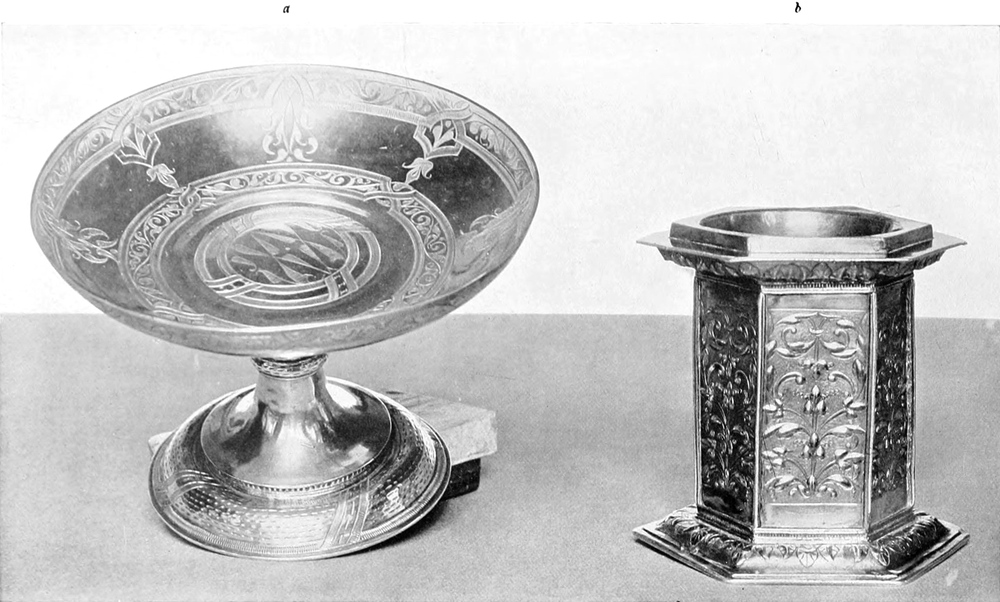

From the slight records from which it is possible to gain information, and for which I am much indebted to Mr. T. F. Kirby (the bursar) and Mr. M. J. Rendall, it is very evident that at one time Winchester College was unusually rich in plate, and it is most interesting to have brought to light the few beautiful specimens that still remain, for not only were silver lovers unaware of its existence, but the college authorities had little notion of the rarity and value of their pieces. They are all in an extraordinarily fine state of preservation, and have not suffered in any way from repairing or regilding. It is a source of comfort that, belonging to such an institution as Winchester College, they are beyond the reach of the American millionaire, and will receive all proper care from the authorities. As the plate is so little known, I have thought it best to describe each important piece in catalogue form.
From the limited records available, which I owe much to Mr. T. F. Kirby (the bursar) and Mr. M. J. Rendall, it's clear that Winchester College was once notably rich in silver plate. It's fascinating to have uncovered the few beautiful pieces that still exist, as not only were silver enthusiasts unaware of them, but the college officials also had little idea of the rarity and value of their items. They are all in remarkably good condition and haven’t been affected by any repairs or regilding. It's reassuring that, being part of an institution like Winchester College, they are out of reach of American millionaires and will receive proper care from the authorities. Since the plate is so little known, I thought it best to describe each significant piece in a catalogue format.
Plate I.—Silver-gilt cup with cover, called ‘The Election Cup’; height, 17½ ins.; diameter, 6½ ins.; weight, 69 oz. 9 dwt. The bowl, which resembles in shape the Anathema and Leigh cups, is moveable, and attaches to the stem by a double socket and flange; it is embossed with decorated and graduated escallops on a matted ground. The stem is of channelled and truncated form, finishing in palm-like points where it meets the bowl and foot, which is similar in decoration to the rest of the cup. The base is edged by an open scrolled moulding formed of leaves surmounted by a ladder moulding, finishing in a very bold and unusually tall cresting. The cover to this remarkable cup is of cupola shape, rising to a slender shaft fashioned like the stem and necked by a cinque-foil; this supports a Tudor crown, the cap showing a surface once filled in with enamel; the finials and bands belonging to the crown are missing. The cover is embossed in the same manner as the bowl, and bordered with the same moulding and tall cresting as the base, pierced in both cases to hold precious stones, which are now replaced by coloured glass. The cup is in remarkable preservation, and has its original gilding. It has no hall-marks, but is, without doubt, English, circa 1520; the boldness of the cresting and workmanship, together with the shape of the bowl, exactly coincides with the few contemporary English pieces in existence. It was presented by Warden More in 1523, and is the sole remaining piece from the wonderful store of gothic plate once possessed by the college.
Plate I.—Silver-gilt cup with a cover, known as ‘The Election Cup’; height, 17½ inches; diameter, 6½ inches; weight, 69 oz. 9 dwt. The bowl, which looks like the Anathema and Leigh cups, is movable and connects to the stem via a double socket and flange; it features embossed decorative and graduated scallops on a textured background. The stem is channelled and truncated, tapering into palm-like points where it meets the bowl and foot, which has similar decoration to the rest of the cup. The base is edged with an open scrolled molding made of leaves topped by a ladder molding, culminating in a striking and unusually tall cresting. The cover of this stunning cup has a dome shape, rising to a slim shaft shaped like the stem and necked by a cinquefoil; this holds a Tudor crown, with the cap displaying a surface that was once filled with enamel; the finials and bands on the crown are missing. The cover is embossed in the same style as the bowl and is bordered with the same molding and tall cresting as the base, both designed to hold precious stones, which are now replaced by colored glass. The cup is in excellent condition, with its original gilding intact. It bears no hallmarks, but is undoubtedly English, dating back to around 1520; the boldness of the cresting and craftsmanship, along with the shape of the bowl, matches the few existing contemporary English pieces. It was presented by Warden More in 1523 and is the only remaining item from the impressive collection of gothic plate once owned by the college.
Plate II.—A rose-water dish, parcel gilt, 16 ins. in diameter; weight, 48 oz. II dwt.; hall-mark, London 1562; maker’s mark, a unicorn’s head in a shield. The border of the dish, which is gilt, and 2 ins. in width, is engraved with panels of strapwork and arabesques, enclosing the words, in Lombardic lettering, RADOLPHUS [Pg 155]HENSLOWE Ao DNI 1563 CUI DEUS RETRIBUAT IN ILL DIE HANC PELVIM CUM SUO GUTTURNIO DE NOVO FECIT. The centre is composed of one boss raised on another enclosing a print bearing the Wykeham arms enamelled in their tinctures; argent two chevronels sable, between three roses gules, barbed and seeded proper within a garb. Round the lower base runs the legend, also in Lombardic lettering, MANERS MAKET MAN QUOTHE WYLLYAM WYKEHAM. The face of this boss is decorated with baskets of fruit and trophies of arms in repoussé, gilt on a matted ground; the bason of the dish is of plain silver. ¶ The companion ewer, with cover (height, 8½ ins.; weight, 47 oz. 11 dwt., and with marks the same as dish), is of unusually beautiful proportions. The cover, of depressed form, is surmounted by a rosace finial containing the Wykeham arms in enamel; the rest of the cover is embossed with baskets of fruit and trophies of arms. The body of the ewer is cylindrical, and this, as well as the narrow spout, is decorated at the top and centre with gilt bands of scrolled arabesques, enclosing engraved medallions of heads in the foreign taste. The stem is fluted, and the foot covered with a repoussé of a lion’s mask and human heads in cartouches between bunches of fruit, and is edged with reeded and ovolo mouldings. The billet is formed of two masks in profile enclosing a bunch of leaves, and the graceful bow handle is engraved down the back with panels of arabesques. This beautiful dish and ewer much resemble those belonging to Lord Newton, of Lyme, exhibited in 1902 at the Burlington Fine Arts Club, and possess all the characteristics of the finest Elizabethan work. Both dish and ewer are in perfect preservation, and have the original parcel gilding.
Plate II.—A rose-water dish, partially gilded, 16 inches in diameter; weight, 48 oz. II dwt.; hall-mark, London 1562; maker’s mark, a unicorn’s head in a shield. The border of the dish, which is gilded and 2 inches wide, is engraved with panels of strapwork and arabesques, enclosing the words, in Lombardic lettering, RADOLPHUS [Pg 155]HENSLOWE Ao DNI 1563 CUI DEUS RETRIBUAT IN ILL DIE HANC PELVIM CUM SUO GUTTURNIO DE NOVO FECIT. The center features one boss raised on another, enclosing a print bearing the Wykeham arms enamelled in their colors; argent two chevronels sable, between three roses gules, barbed and seeded proper within a garb. Around the lower base runs the legend, also in Lombardic lettering, MANERS MAKET MAN QUOTHE WYLLYAM WYKEHAM. The face of this boss is decorated with baskets of fruit and trophies of arms in repoussé, gilded on a matted ground; the bason of the dish is made of plain silver. ¶ The matching ewer, with cover (height, 8½ inches; weight, 47 oz. 11 dwt., and with marks the same as the dish), has unusually beautiful proportions. The cover, which is depressed in shape, is topped by a rosette finial containing the Wykeham arms in enamel; the rest of the cover is embossed with baskets of fruit and trophies of arms. The body of the ewer is cylindrical, and this, as well as the narrow spout, is decorated at the top and center with gilded bands of scrolled arabesques, enclosing engraved medallions of heads in a foreign style. The stem is fluted, and the foot is covered with a repoussé design of a lion’s mask and human heads in cartouches between bunches of fruit, edged with reeded and ovolo moldings. The billet is formed of two masks in profile enclosing a bunch of leaves, and the elegant bow handle is engraved down the back with panels of arabesques. This stunning dish and ewer closely resemble those owned by Lord Newton, of Lyme, displayed in 1902 at the Burlington Fine Arts Club, and they exhibit all the characteristics of the finest Elizabethan craftsmanship. Both the dish and ewer are in perfect condition and retain their original parcel gilding.
Plate IIIa.—Sweetmeat dish of tazza shape; diameter, 7 ins.; height, 5 ins.; weight, 15 oz. 9 dwt.; hall-mark, London 1594. The bowl is engraved on the inside, with two bands of strapwork enclosing panels of arabesque design; the centre is of similar decoration surrounded by a double strap. The stem is plain save for an embossed ring indented with dotted lines, the same decoration being repeated on the foot between a double strap, and connected to the stem by a ladder moulding. The piece is singularly simple in its ornamentation, and it should be observed how much of its beauty is dependent on the perfection of the plain line engraving. These dishes were used for sweetmeats and handed to the guests; the tazza form was taken from the Italian and French dishes that were so much in vogue in those countries during the sixteenth century.
Plate IIIa.—Sweet dish in the shape of a tazza; diameter, 7 inches; height, 5 inches; weight, 15 ounces 9 dwt.; hall-mark, London 1594. The inside of the bowl is engraved with two bands of strapwork that enclose panels featuring arabesque designs; the center has similar decoration and is surrounded by a double strap. The stem is plain except for an embossed ring with dotted lines, and this design is repeated on the foot between a double strap, connected to the stem by a ladder molding. The piece is notably simple in its decoration, and one should note how much of its beauty relies on the precision of the plain line engraving. These dishes were used for sweet treats and given to the guests; the tazza shape was inspired by the Italian and French dishes that were very popular in those countries during the sixteenth century.
Plate IIIb.—Small standing salt, gilt; height, 4½ ins.; weight, 15 oz. 9 dwt.; hallmark, London 1596. It is in the form of a hexagonal plinth; the panels forming the sides are filled with an upright design of foliated arabesques in low relief on a matted ground, divided at the angles by a plain ribbed moulding, connected at the top and base by a fine ladder moulding between two fillets; the top and base coincide in design, and are composed of a slight ogee embossed with a lea moulding of Persian origin. The simple repetition of design throughout this little standing salt constitutes its charm, each space being most admirably filled. The cover to this salt is, unfortunately, missing; it would probably have been of cupola shape, bearing a vase finial surmounted by a little figure.
Plate IIIb.—Small standing salt, gilded; height, 4½ inches; weight, 15 ounces 9 dwts.; hallmark, London 1596. It has a hexagonal base; the sides feature an upright design of stylized leaf patterns in low relief on a textured background, separated at the corners by a plain ribbed molding, and connected at the top and bottom by a delicate ladder molding between two fillets; the top and bottom share the same design, consisting of a slight ogee embossed with a leaf motif of Persian influence. The simple repetition of the design throughout this small standing salt gives it its charm, with each area beautifully filled. Unfortunately, the cover for this salt is missing; it likely would have been cupola-shaped, topped with a vase finial and a small figure.
Plate IIIc.—Cup with cover, gilt; height, 11¼ ins.; diameter of bowl, 9½ ins.; both hall-marked London 1682; maker’s mark, ‘R. L.’ in a shield over a fleur-de-luce; weight, 118 oz. 15 dwt. The cup, which stands on a base ¾ in. in height, is of porringer shape, decorated with a surbase of upright and repoussé acanthus, alternating with plain leaves in lower relief; above this in fine line engraving are the Poulett arms within a mantling of acanthus, and the inscription, ‘Ex dono prænobilis Caroli Dm̄i Marchionis Winton,’ etc. The scroll handles are cast solid, and terminate in animals’ heads.
Plate IIIc.—Cup with lid, gold-plated; height, 11¼ inches; diameter of the bowl, 9½ inches; both stamped with the London hallmark from 1682; maker’s mark, ‘R. L.’ in a shield over a fleur-de-lis; weight, 118 oz. 15 dwt. The cup, which has a base ¾ inch high, is shaped like a porringer, decorated with a frieze of upright and raised acanthus leaves, alternating with plain leaves in lower relief; above this, finely engraved are the Poulett arms within a decorative acanthus mantling, along with the inscription, ‘Ex dono prænobilis Caroli Dm̄i Marchionis Winton,’ etc. The scroll handles are solidly cast and end in animal heads.
[Pg 156]
[Pg 156]


The cover is of flattened form and plain except for a central enrichment of acanthus in a spiral design, and finishes in an open-worked knop of the same leaves. The condition of this unusually large porringer cup is surprising. It has the original gilding, and the sharp yet round modelling of the ornament shows to what perfection this form of decoration was carried. The rapid deterioration of this acanthus design in William III’s reign goes far towards explaining the reason for its lasting such a short period. The acanthus scrolled handles are a little small for the otherwise perfect proportions of this very remarkable cup.
The cover is flat and simple, except for a central decoration of acanthus in a spiral pattern, finishing with an open-worked knob of the same leaves. The condition of this unusually large porringer cup is surprising. It still has its original gilding, and the sharp yet rounded modeling of the ornament shows how perfectly this style of decoration was executed. The quick decline of this acanthus design during William III's reign helps explain why it was so short-lived. The acanthus scrolled handles are slightly small for the otherwise perfect proportions of this very remarkable cup.
Plate IVa.—Rose-water dish; diameter, 17¼ ins.; weight, 63 oz.; no hall mark; maker’s mark, monogram C. R. in a shield; date, circa 1613. The dish is quite plain, with an engraved line on the edge. The arms per pale of Winchester College and the donor are engraved on the centre boss, round which runs the inscription, ‘Ex dono Georgii Rives Sacræ Theologiæ Doct. huius Collegii socii deinde Novi Coll. custodis in usum quotidianum Vicecustodis istius Coll. prope Winton Anno Domini 1613.’ The companion ewer of same date, with same maker’s mark; height, 7⅛ ins.; diameter, 4½ ins.; weight, 23 oz. 10 dwt. This is also perfectly plain, with wide bow handle and long curved spout; the foot is of trumpet shape spreading to a plain stepped base. Both dish and ewer are good examples of the plain plate that was slowly coming into fashion in this country during the early part of the seventeenth century.
Plate IVa.—Rose-water dish; diameter, 17¼ inches; weight, 63 ounces; no hall mark; maker’s mark, monogram C. R. in a shield; date, around 1613. The dish is quite simple, featuring an engraved line on the edge. The arms of Winchester College and the donor are engraved on the center, with the inscription running around it: ‘Ex dono Georgii Rives Sacræ Theologiæ Doct. huius Collegii socii deinde Novi Coll. custodis in usum quotidianum Vicecustodis istius Coll. prope Winton Anno Domini 1613.’ The matching ewer from the same time, with the same maker’s mark; height, 7⅛ inches; diameter, 4½ inches; weight, 23 ounces 10 dwt. This piece is also completely plain, with a wide bow handle and a long curved spout; the foot has a trumpet shape that spreads to a simple stepped base. Both the dish and the ewer are good examples of the plain plate style that was gradually becoming popular in this country during the early part of the seventeenth century.
Plate IVb.—Small standing cup and cover, gilt; height, 14. ins.; hall-mark, London 1632; maker’s mark, P. C. over a rose in a shield. The bowl of the cup is matted with a broad plain border at the lip, round which runs the inscription, ‘Ex dono Hugonis Barker legū Doctoris olim huius Collegii Scholaris ac Consanguinei fundatoris eiusdem Collegii ac eo nomine in numerū Scholariū eiusdem admissi.’ Below this in a circle are engraved the arms of the donor. The stem is of baluster shape usual to the cups of this period, and plain save for a matting on the knop, and where it joins the foot there is a repoussé ornament of small leaves; the base is composed of simple mouldings. The cover is of cupola shape with a wide brim; the surface is decorated with a matted ground, and the whole is surmounted by a plain finial of vase-shaped form. This plain plate with a granulated or matted surface was much made in the north of Germany, Denmark, and Sweden, and was probably introduced into this country through the influence of Anne of Denmark, the queen of James I.
Plate IVb.—Small standing cup and cover, gilded; height, 14 inches; hall-mark, London 1632; maker’s mark, P. C. over a rose in a shield. The bowl of the cup is matted with a wide flat border at the rim, around which runs the inscription, ‘From the gift of Hugh Barker, Doctor of Laws, once a Scholar of this College and cousin of its founder, and admitted into the number of Scholars for that reason.’ Below this, in a circle, are engraved the arms of the donor. The stem is of baluster shape typical of cups from this period and is plain except for matting on the knop, and where it connects to the foot, there is a repoussé ornament of tiny leaves; the base consists of simple mouldings. The cover is dome-shaped with a wide brim; the surface is decorated with a matted texture, and the entire piece is topped with a simple vase-shaped finial. This plain plate with a granulated or matted surface was commonly made in northern Germany, Denmark, and Sweden, and was likely introduced to this country due to the influence of Anne of Denmark, the queen of James I.
Plate Va.—Tankard and cover; height, 7 ins.; weight, 34 oz. 11 dwt.; marks, London 1614; maker’s mark, O. S., with pellets in a shield. This early Jacobean tankard is plain throughout and of globular or tankard form. Round the neck runs a band on which is engraved ‘Facile contemnit omnia qui semper cogitat se esse moriturum.’ As an additional emphasis of this sad but true remark, the billet of the cover is formed of a human skull holding a scroll between its teeth, and on the body of the tankard is engraved the arms of the donor with the inscription, ‘Ex dono Johanis Bolney quondā de sanguine fundatoris Jstius Collegii St. Marie Winton Aō dm̄ni 1614.’ The handle is depressed in the bow and finishes in a square whistle end. Tankards or flagons of this shape are extremely rare, and owe the origin of their form to the stoneware jug of Tudor days.
Plate Va.—Tankard and cover; height, 7 inches; weight, 34 oz. 11 dwt.; marks, London 1614; maker’s mark, O. S., with pellets in a shield. This early Jacobean tankard is simple throughout and has a rounded or tankard shape. Around the neck is a band with the engraving, ‘Facile contemnit omnia qui semper cogitat se esse moriturum.’ To further emphasize this somber but true statement, the top of the cover is shaped like a human skull holding a scroll in its teeth, and on the body of the tankard, the arms of the donor are engraved along with the inscription, ‘Ex dono Johanis Bolney quondā de sanguine fundatoris Jstius Collegii St. Marie Winton Aō dm̄ni 1614.’ The handle is curved and ends in a square whistle shape. Tankards or flagons of this design are very rare and trace their origin to the stoneware jug of Tudor times.
Plate Vb.—Standing salt; height, 6½ ins.; diameter, 9 ins. at top, q¼ ins. at base; weight, 47 oz. 5 dwt.; marks, London 1664; maker’s mark undecipherable. The salt is plain, cylindrical, and of X form; the three short curved arms that spring from the slightly convex top were intended to hold a napkin to protect the salt, or, as is to be seen in pictures of the time, for the support of a small dish for olives or caviare. On the fine[Pg 161] trumpet sweep of the base are engraved the arms of Wykeham and of the donor within feather mantling, and the inscription, ‘Legatum Mr̄i Michaelis Bold M. Art Collegij Btae Mariae Winton.’ The edge is finished in a simple half-round and step moulding.
Plate Vb.—Standing salt; height, 6½ inches; diameter, 9 inches at the top, 4 inches at the base; weight, 47 ounces 5 pennyweights; marks, London 1664; maker’s mark is undecipherable. The salt is simple, cylindrical, and has an X shape; the three short curved arms that extend from the slightly curved top were meant to hold a napkin to protect the salt, or, as seen in contemporary images, to support a small dish for olives or caviar. On the elegant[Pg 161] trumpet-style base, the arms of Wykeham and those of the donor are engraved within feathered mantling, along with the inscription, ‘Legatum Mr̄i Michaelis Bold M. Art Collegij Btae Mariae Winton.’ The edge is finished with a simple half-round and step molding.
Plate Vc.—Tankard with lid, parcel gilt; height, 6 ins.; weight, 25 oz. 9 dwt.; marks, London 1649. The tankard is cylindrical and straight-sided, hooped and staved in imitation of a barrel; the lid is quite flat, and engraved with the arms of the see within a garter; the billet is of half skull type, and the curious short handle is of rectangular and irregular form. The barrel decoration at this date (the first year of the Commonwealth) is unusual to find, although the fashion was much adopted towards the end of the same century. The parcel gilding is original.
Plate Vc.—Tankard with a lid, parcel gilt; height, 6 inches; weight, 25 ounces 9 dwts.; marks, London 1649. The tankard is cylindrical and straight-sided, designed to look like a barrel; the lid is flat and engraved with the arms of the see within a garter; the handle is unique, rectangular and uneven in shape. The barrel design from this period (the first year of the Commonwealth) is rare to find, although it became popular later in the century. The parcel gilding is original.
Plate VIa.—Steeple cup and cover, gilt; total height, 19 ins.; height of cup, 12 ins.; weight, 38 oz. 5 dwt.; marks, London 1615; maker’s mark, T. F. in monogram in a shield. The cover is surmounted by a perforated spire of graceful proportions, supported on three brackets of female form. The cover and cup are decorated with scrolled acanthus and fruit in low relief and fine line engraving; the stem is of the composite character usual to these cups, and bears the last traces of Renaissance influence. The cup, although in excellent preservation, has been regilt. There are many steeple cups of this type in existence, but few are so happy in their proportions as this specimen.
Plate VIa.—Steeple cup and cover, gilded; total height, 19 inches; height of cup, 12 inches; weight, 38 ounces 5 dwts.; marks, London 1615; maker’s mark, T. F. in a monogram inside a shield. The cover features a delicate, perforated spire supported by three female-form brackets. Both the cover and cup are adorned with scrolling acanthus and fruit in low relief and fine line engraving; the stem has the typical composite design found in these cups and still shows faint signs of Renaissance influence. The cup is in excellent condition, though it has been regilded. There are many steeple cups like this one, but few are as beautifully proportioned as this example.
Plate VIb.—Tall standing cup or hanap with cover. Total height, 24 ins.; cup without cover, 17¼ ins.; diameter, 8⅛ ins.; weight, 124 oz. 17 dwt.; marks, London 1680; maker’s mark, T. C. with a fish and a fleur de luce in a shield. The bowl of this very tall standing cup is plain in shape, ornamented with a surbase of upright acanthus, above which runs an embossed laurelled band; above and below this band are the following inscriptions in Greek and Latin:—
Plate VIb.—A tall standing cup or hanap with a lid. Total height, 24 inches; cup without the lid, 17¼ inches; diameter, 8⅛ inches; weight, 124 ounces 17 dwt.; marks, London 1680; maker’s mark, T. C. with a fish and a fleur de luce in a shield. The bowl of this very tall standing cup has a simple shape, decorated with a raised section of upright acanthus, above which there is an embossed laurel band; before and after this band are the following inscriptions in Greek and Latin:—
κρᾶσις ἀγαθοῦ δαίμονος
Sivè
Poculum Charitatis
In Usum
Collegij Btae Mariae Winton
propè Winton
κρᾶσις ἀγαθοῦ δαίμονος
Sivè
Poculum Charitatis
In Usum
Collegij Btae Mariae Winton
propè Winton
The stem is of ordinary baluster shape, engraved and chased with laurelling and acanthus. The base and cover resemble each other in their decoration, and the latter ends in a mushroom-shaped finial, from which spring two arms supporting a heart. This form of standing cup was universal from 1640 to 1690, and, though deficient in artistic construction, possesses interest as being the last recognized design of loving cup mounted on to a tall stem.
The stem has a typical baluster shape, decorated with engravings and chasing of laurel and acanthus. The base and cover share similar designs, with the cover topped by a mushroom-shaped finial, from which two arms extend to support a heart. This type of standing cup was widely used from 1640 to 1690, and while it may lack artistic sophistication, it is noteworthy as the last acknowledged design of a loving cup mounted on a tall stem.
Plate VII.—Ecclesiastical plate belonging to the college chapel. Two chalices with covers, gilt; marks, London 1611; maker’s mark, R. P. in a shield over a fleur de luce. These are perfectly plain and of the type that was usual during the first years of the seventeenth century. The two tall flagons are of tankard shape, gilt; marks, London 1627; maker’s mark, R. S. over a heart. These tankards are of a shape that was common to both ecclesiastical and secular use, the entasis of the drum, on which are engraved the arms of the donor per pale with those of the college, gives great elegance to its tall and plain columnar form, and the mouldings to the petticoat base are unusually sharp and well proportioned. The large alms dish is gilt; width, 17¼ ins.; marks, London 1681; maker’s mark illegible. The dish is plain, but edged with a reeded moulding; on the border is engraved an inscription set in feather mantling between the arms of Wykeham and those of the donor. There are many other pieces of ecclesiastical and secular plate belonging to the college for which there is not space here. These consist of chalices, patens, salvers, porringers and tankards, which, although of great merit, are not of corresponding interest to the pieces represented in the illustrations.
Plate VII.—Church silver owned by the college chapel. There are two gilded chalices with covers; hallmarks from London 1611; maker’s mark is R. P. inside a shield over a fleur de luce. These are simple and typical of the early seventeenth century. The two tall tankard-shaped flagons are also gilded; hallmarks from London 1627; maker’s mark is R. S. over a heart. These tankards were commonly used for both religious and everyday purposes. The curved body of the vessel, engraved with the arms of the donor alongside those of the college, adds a touch of elegance to its tall, simple columnar shape, and the sharp, well-proportioned mouldings of the base are quite striking. The large alms dish is gilded; diameter is 17¼ inches; hallmarks from London 1681; maker’s mark is unreadable. The dish is plain but features a reeded edge; the border is engraved with an inscription framed by decorative mantling between the arms of Wykeham and those of the donor. There are many other pieces of ecclesiastical and secular silver belonging to the college, but there isn't enough space to cover them all here. These include chalices, patens, salvers, porringers, and tankards, which, while valuable, are not as noteworthy as the pieces shown in the illustrations.
[Pg 162]
[Pg 162]


[Pg 167]
[Pg 167]
A NEWLY DISCOVERED ‘LIBRO DI RICORDI’ OF ALESSO BALDOVINETTI
❧ WRITTEN BY HERBERT P. HORNE ❧
❧ WRITTEN BY HERBERT P. HORNE ❧
PART II
Y a strange coincidence those paintings in the ‘Cappella Maggiore’ of Santa Trinita to which the entries in Alesso’s ‘Ricordi, Libro B,’ refer, have alone been preserved of all the frescoes once in the chapel, with the exception of some fragments of the lunettes on the lateral walls. The last but one of these entries records the purchase of cinnabar for the wings of the seraphim on the soffit of the arch opening into the ‘Crociera.’[51] The first entry in ‘Libro B’ is dated March 9, 1470–1; but according to an abstract of an entry in ‘Libro A,’ Alesso ‘received the commission to paint the “Cappella Maggiore” of Santa Trinita from Bongianni Gianfigliazzi, for 200 gold ducats, on July 1, 1471, and undertook to finish the work within the period of five to seven years.’[52] The latter date, no doubt, was that of the execution of the ‘writing,’ subscribed by the hand of Misser Bongianni, which Alesso held, and to which he refers in the ‘ricordo’ on the first page of ‘Libro B.’ In the interval between these two dates the painter began the cartoons for the figures of the prophets and the other ornaments of the vault. On April 28, 1471, he bought ‘16 quires of coarse paper (carta da straccia) in royal folio, at 5 soldi the quire, for making the “spolverizzi” of the prophets and the other “spolverizzi” that occur in the said vault.’ The ‘spolverizzi’ properly were the outlines pounced upon the plaster, by means of the pricked cartoon; but here, by a figure of speech, Alesso clearly intends the cartoons themselves. The more usual method of transferring a cartoon was to trace the outlines, by means of a metal style, on to the fresh plaster, as Vasari recommends.[53] Pricked cartoons seem to have been more commonly employed in the case of embroideries and ‘drappi.’[54] ¶ Having in the meantime purchased certain colours for the work, Alesso, at length, on August 29, 1471, paid various sums for moving the boxes containing his colours, etc., into chapel, and for the purchase of brushes and pipkins in preparation for the actual painting of the vault. There are two entries of that date: the first records that he bought ‘from Bernardino di Ventura, the pencil-maker, 58 pencils of minever, between coarse and fine, one with another, great and small,’ costing, lire 1 soldi 12; the second, that he spent, ‘between new pipkins and small pots, and hogs’-hair and pack thread for making pencils of hogs’-hair, and for the carriage of chests and trestles for the work of painting the said chapel, lire 3 soldi 5.’ Alesso, however, does not appear to have proceeded very far with the actual painting of the vault until the following spring; for on April 12, 1472, he records that he bought ‘five pounds of azzurro della Magnia (namely, biadetto) for making the bed under the fine blue, and this I bought from Lorenzo di Piero, the painter, in Borgo Sant’Apostoli, at the price of 5 soldi the ounce.’[55] This ‘biadetto’ was probably identical with the ‘sbiadato’ mentioned by[Pg 168] Cennini, in a passage in which he says, that ‘a blue like sbiadato, and very similar to azzurro della Magnia,’ may be made with indigo and white, ‘biacca’ or ‘bianco sangiovanni.’[56] Alesso would seem to have painted a fresco the blue backgrounds behind the figures of the prophets on the vault with this ‘biadetto,’ using it as a ‘bed’ for the fine azzurro della Magnia, which he afterward applied a secco.[57] It cost one-fifth, or even less, of the genuine azzurro della Magnia, and, no doubt, resembled it in colour. The genuine azzurro della Magnia seems to have been not easily obtainable in Florence; and Alesso is generally careful to record how he came by his purchases. On March 7, 1470–1, according to the first entry in ‘Libro B,’ he bought ‘2 pounds 9 ounces of azzurro di Magnia from Cardinale del Bulletta, at the price of 26 soldi the ounce’; and on the 12th of the same month, 4 pounds 2½ ounces, at 33 soldi the ounce. On April 31, 1471, he bought 1 pound 7 ounces, ‘from a German, in a bladder,’ at 31 soldi the ounce. ‘On 25 day of September, 1472,’ records Alesso, ‘I bought 2 pounds of azzurro di Magnia from Giovanni d’Andrea, glazier, at the price of 25 soldi the ounce; he said it belonged to a gossip of his, a courier, who brought it from Venice: the said Giovanni wanted 4 soldi to go drinking with.’ This Giovanni d’Andrea was the glazier who, in partnership with Il Lastra, had executed the window of the ‘Cappella Maggiore’ of Santa Trinita, from Alesso’s design. Finally, on January 13, 1472–3, Alesso bought 2 pounds 10 ounces, ‘from a Pole,’ at 20 soldi the ounce; ‘a clear, beautiful, finely-ground blue,’ he adds with satisfaction. At that time the painter was about to begin the lunettes on the lateral walls of the chapel. ¶ Cennini calls azzurro della Magnia ‘a natural colour that is found in and around silver lodes.’ ‘Much,’ he adds, ‘is obtained in Germany [La Magnia, whence its name], and also in the country about Siena.’[58] Milanesi, in the notes to his edition of Cennini, says that this blue was an oxide of cobalt; but Mrs. Herringham, with more probability, identifies the colour with blue carbonate of copper, commonly called blue verditer: in the same way, she identifies ‘verde azzurro,’ which Cennini says was made artificially from ‘azzurro della Magnia,’ with green verditer, which is also a carbonate of copper.[59] Alesso records in ‘Libro B,’ that, on March 20, 1470–1, he bought 6 pounds of ‘verde azzurro,’ at 14 soldi the ounce. ¶ It is worthy of remark that in a work of the importance of these frescoes, executed for so wealthy a patron as Messer Bongianni Gianfigliazzi, Alesso should not have used ultramarine, but a blue which cost but a twentieth part of that ‘noble, beautiful, and most perfect beyond all colours.’[60] According to the entries cited above, Alesso bought his azzurro della Magnia at prices varying from 20 soldi to 33 soldi the ounce.
Y in an odd turn of events, the paintings in the ‘Cappella Maggiore’ of Santa Trinita, which the entries in Alesso’s ‘Ricordi, Libro B’ mention, are the only ones that have survived of all the frescoes that used to be in the chapel, apart from a few fragments of the lunettes on the side walls. The second-to-last entry notes the purchase of cinnabar for the wings of the seraphim on the ceiling of the arch leading into the ‘Crociera.’[51] The first entry in ‘Libro B’ is dated March 9, 1470–1; however, according to an abstract from ‘Libro A,’ Alesso ‘received the commission to paint the “Cappella Maggiore” of Santa Trinita from Bongianni Gianfigliazzi, for 200 gold ducats, on July 1, 1471, and agreed to complete the work within a period of five to seven years.’[52] This later date was likely when the ‘writing’ was executed, signed by Misser Bongianni, which Alesso held and referenced in the 'ricordo' on the first page of ‘Libro B.’ In the time between these two dates, the painter began the designs for the figures of the prophets and other decorations of the vault. On April 28, 1471, he purchased ‘16 quires of coarse paper (carta da straccia) in royal folio, for 5 soldi each, to make the “spolverizzi” of the prophets and other “spolverizzi” that appear in the vault.’ The ‘spolverizzi’ originally referred to the outlines applied to the plaster using the pricked cartoon; but here, Alesso clearly means the cartoons themselves. The more common method of transferring a cartoon involved tracing the outlines onto fresh plaster using a metal stylus, as recommended by Vasari.[53] Pricked cartoons seemed to be more often used for embroideries and ‘drappi.’[54] ¶ In the meantime, after buying certain colors for the work, Alesso finally, on August 29, 1471, made various payments for moving the boxes with his colors, etc., into the chapel, and for the purchase of brushes and pots in preparation for the actual painting of the vault. There are two entries from that date: the first states that he purchased ‘from Bernardino di Ventura, the pencil-maker, 58 pencils of minever, both coarse and fine, large and small,’ costing 1 lire 12 soldi; the second shows that he spent ‘on new pots and small vessels, hogs’-hair, and packing thread for making hogs’-hair pencils, and for transporting chests and trestles for the painting work, 3 lire 5 soldi.’ However, it seems that Alesso did not progress very far with the actual painting of the vault until the following spring; on April 12, 1472, he noted that he bought ‘five pounds of azzurro della Magnia (specifically, biadetto) for making the base under the fine blue, from Lorenzo di Piero, the painter, in Borgo Sant'Apostoli, for 5 soldi per ounce.’[55] This ‘biadetto’ was likely identical to the ‘sbiadato’ mentioned by[Pg 168] Cennini, in a section where he states that ‘a blue like sbiadato, and very similar to azzurro della Magnia,’ can be made with indigo and white, ‘biacca’ or ‘bianco sangiovanni.’[56] Alesso seems to have painted a fresco the blue backgrounds behind the figures of the prophets on the vault with this ‘biadetto,’ using it as a ‘base’ for the fine azzurro della Magnia, which he later applied a secco.[57] It cost one-fifth, or even less, than the genuine azzurro della Magnia and probably looked similar in color. The genuine azzurro della Magnia doesn’t seem to have been easily available in Florence; Alesso is generally careful to note how he made his purchases. On March 7, 1470–1, according to the first entry in ‘Libro B,’ he bought ‘2 pounds 9 ounces of azzurro di Magnia from Cardinale del Bulletta, for 26 soldi per ounce’; and on the 12th of that month, 4 pounds 2½ ounces, at 33 soldi per ounce. On April 31, 1471, he bought 1 pound 7 ounces, ‘from a German, in a bladder,’ for 31 soldi per ounce. ‘On September 25, 1472,’ Alesso notes, ‘I bought 2 pounds of azzurro di Magnia from Giovanni d’Andrea, a glazier, for 25 soldi per ounce; he said it belonged to a friend of his, a courier who brought it from Venice: Giovanni wanted 4 soldi to go drinking.’ This Giovanni d’Andrea was the glazier who had worked with Il Lastra to create the window for the ‘Cappella Maggiore’ of Santa Trinita, based on Alesso’s design. Finally, on January 13, 1472–3, Alesso purchased 2 pounds 10 ounces, ‘from a Pole,’ for 20 soldi per ounce; he added with satisfaction that it was ‘a clear, beautiful, finely ground blue.’ At that time, the painter was about to start on the lunettes on the side walls of the chapel. ¶ Cennini refers to azzurro della Magnia as ‘a natural color found in and around silver lodes.’ ‘Much,’ he adds, ‘is obtained in Germany [La Magnia, from which it gets its name], and also in the region around Siena.’[58] Milanesi, in the notes to his edition of Cennini, explains that this blue was an oxide of cobalt; but Mrs. Herringham more plausibly identifies the color as blue carbonate of copper, commonly known as blue verditer: similarly, she identifies ‘verde azzurro,’ which Cennini states was artificially produced from ‘azzurro della Magnia,’ with green verditer, which is also a carbonate of copper.[59] Alesso records in ‘Libro B’ that, on March 20, 1470–1, he bought 6 pounds of ‘verde azzurro,’ at 14 soldi per ounce. ¶ It’s notable that in a work of this significance, created for such a wealthy patron as Messer Bongianni Gianfigliazzi, Alesso did not use ultramarine but a blue that cost just a twentieth of that ‘noble, beautiful, and most perfect beyond all colors.’[60] According to the entries mentioned, Alesso purchased his azzurro della Magnia at prices ranging from 20 soldi to 33 soldi per ounce.
Few other colours are specified by name in these ‘Ricordi.’ On May 24, 1471, Alesso purchased 4 pounds 5 ounces of yellow, namely, ‘arzicha,’ at 13 soldi the ounce. Cennini calls ‘arzica’ a colour chemically produced and little used, but more at Florence than elsewhere. He adds that it perishes on exposure to the air, and is not good for walls, but mixed with a little azzurro della Magnia and giallorino it makes a beautiful green.[61] Mrs. Herringham suggests that ‘arzica’ may be massicot, called azarcon in Spain.[62] ¶ On September 1, 1471, Alesso bought 5 ounces of fine lake at 14 soldi the ounce.[Pg 169] The colour was probably used for the purple robe of the David. Lastly, on September 14, 1472, he bought ‘8 ounces of fine cinnabar to make the cherubim of the arch before the said chapel,’ at 2 soldi 8 danari the ounce. This was the vermilion for the wings of the seraphim, which still remain on the soffit on the arch. ¶ By June 1472 the painting of the vault had so far advanced that Alesso began to buy the gold for the ornaments. On June 13 he bought from Domenico, the gold-beater, 1,700 pieces of fine gold ‘laid upon tin-foil,’ for lire 61; on June 15, from Giovanni, the gold-beater, called Il Rosso, 500 pieces, also on foil, for lire 18; on June 23, 4,000 pieces of fine gold, at 3 lire 4 soldi the hundred, from a Genoese; and on June 28, 86 sheets of yellow foil, on which to lay the gold, for lire 8. Lastly, on July 9, 1472, he bought ‘8 pounds of liquid varnish, to apply them upon the vault, namely, the ornaments of fine gold.’ In all this Alesso appears to have followed the method set forth by Cennini, in cap. 99 of his ‘Trattato.’[63] ¶ But one other entry in these ‘Ricordi’ calls for any remark: on July 24, 1471, Alesso ‘bought four pounds of linseed oil at the price of 4 soldi the pound.’ What purpose was this oil intended to serve? Was it for some oil ‘tempera’? Vasari, speaking of these paintings of Santa Trinita, says that ‘Alesso laid them in a fresco, and afterwards finished them a secco, tempering the colours with yolk of egg, mixed with liquid varnish made over the fire’; he adds that Alesso ‘thought that this tempera would protect the paintings against damp; but it was of so strong a nature that where it has been applied freely the work has in many places flaked away, and so, whereas he thought to have found a rare and most beautiful secret, he remained deceived by his opinion.’[64] Without attempting to discuss the nature of the ‘tempera’ which is here described, I may recall the fact that Domenico Veneziano, who was undoubtedly Alesso’s master, is celebrated by Vasari on account of ‘the new method which he employed of colouring in oil’; and the books of the hospital of Santa Maria Nuova record payments for very considerable quantities of linseed oil which that master used for the lost paintings in the ‘Cappella Maggiore’ of Sant’ Egidio.[65] Domenico, no doubt, possessed the secret of some improvement upon the old method of painting in oil on walls, which Cennino Cennini, who describes it at length in the ‘Libro dell’ Arte,’ cap. lxxxix.–cap. xciv., says ‘was much in use among the Germans.’ ¶ Alesso, as I have said, originally undertook, on July 1, 1471, to paint the ‘Cappella Maggiore’ of Santa Trinita for 200 gold florins, and to finish the work within a period of five to seven years. It was not, however, until January 19, 1496–97, after an interval of more than twenty-five years, that the total amount to be paid him for finished work was estimated by Cosimo Rosselli, Benozzo Gozzoli, Pietro Perugino and Filippino Lippi at 1,000 gold florins.[66] In other words, Alesso had spent upon the work five times the minimum period originally stipulated for its completion, and he was awarded five times the original sum for which he had undertaken to complete the chapel. Two causes appear to have contributed to this delay. The one was that Alesso’s method of laying-in his paintings a fresco, and finishing them a secco, admitted of endless elaboration, and a consequent expenditure of time, which pure fresco painting did not admit of. The other was, that shortly after receiving the commission for the chapel Alesso appears to have turned his attention to reviving the art of mosaic, which had almost died out in Florence. We first hear of Alesso working in mosaic in 1481, in which year he restored the figures on the façade of San Miniato a Monte.[67] In 1483 he was appointed by the consuls of[Pg 170] the Arte de’ Mercanti to restore the mosaics in the tribune of the baptistery of San Giovanni, ‘there being no one, in all the dominion and jurisdiction of Florence, but he, who then understood that art’: in consideration of which the consuls resolved to convey to him, ‘for the term of his natural life, such real property as would yield 30 florins yearly, upon the condition that he bound himself, so long as he lived, to repair and restore the mosaics of San Giovanni.’[68] In accordance with this resolution two houses in the Piazza di San Giovanni, belonging to the Arte de’ Mercanti, were assigned to Alesso on February 26, 1483–4,[69] and by two instruments of the same date, engrossed by the notary, Ser Giovanni di Jacopo de’ Migliorelli, Alesso re-leased the two houses to the persons who were already in possession of them at the date of the assignment. These instruments are printed, for the first time, in the appendix to this article.[70] ¶ The decoration of the ‘Cappella Maggiore’ of Santa Trinita, and the restoration of the mosaics in the baptistery of San Giovanni and San Miniato a Monte, appear to have almost entirely engrossed the last thirty years of Alesso’s life. During that time we hear of no work of importance undertaken by him, with the exception of the lost altar-piece of Sant’ Ambrogio, which he began in 1470. Messer Bongianni Gianfigliazzi died on November 7, 1484, and was buried in his chapel at Santa Trinita, long before Alesso had brought its frescoes to a conclusion.[71] The work, however, was continued at the instance of his son, Jacopo Gianfigliazzi; and Stefano Rosselli records in his ‘Sepoltuario Fiorentino,’ that at the time he was writing, c. 1657, the basement of Alesso’s altar-piece in the ‘Cappella Maggiore’ of Santa Trinita bore the inscription: ‘Jacobus Gianfigliazzius Bongiannis Equitis Filius, sua erga Deum Pietate.’[72] ¶ Of the paintings that once decorated the walls of this chapel we possess but some partial and imperfect accounts. Vasari, to whom we chiefly owe the meagre notices which are extant, says that they consisted of ‘stories from the Old Testament.’ Alesso, he says, ‘drew many portraits from the life; and in the story of the aforesaid chapel [of Santa Trinita], in which he represented the Queen of Sheba going to hear the wisdom of Solomon, he drew Lorenzo de’ Medici, the Magnificent, who was father of Pope Leo X, and Lorenzo dalla Volpaia, a most excellent master of dials, and a great astrologer.’ ‘In another story which is opposite to this, Alesso drew Luigi Guicciardini the elder, Luca Pitti, Diotisalvi Neroni, Giuliano de’ Medici, father of Pope Clement VII; and next to the stone pilaster [of the arch opening into the church] Gherardo Gianfigliazzi the elder, and Messer Bongianni, knight, wearing a blue habit and a collar round his neck, together with Jacopo and Giovanni of the same family. Near to these last are Filippo Strozzi and Messer Paolo dal Pozzo Toscanelli, astrologer.’[73] What the subject of this latter story may have been, we do not now know. According to Giovanni Cinelli, in his edition of the ‘Bellezze di Firenze,’ published in 1677, the other story of the Queen of Sheba was on the left wall of the chapel, ‘dal Corno del Vangelo.’ Cinelli, after quoting this passage from Vasari, adds that ‘in the angle of the choir, on the left side, there is painted a Cain in the act of striking his brother Abel, a figure which is very admirable in its attitude, and which expresses in its countenance the malice and hatred which Cain bore in his heart towards his brother: and it is greatly esteemed by the connoisseurs; so much so, that when the cardinal of the serene house of Este came to Florence and visited this church, he desired to see and consider with attention so fine a painting.’[74]
Few other colors are specifically named in these ‘Ricordi.’ On May 24, 1471, Alesso bought 4 pounds 5 ounces of yellow, called ‘arzicha,’ for 13 soldi per ounce. Cennini describes ‘arzica’ as a chemically produced color that's rarely used, mainly found in Florence. He notes that it fades when exposed to air and isn’t suitable for walls but when mixed with a bit of azzurro della Magnia and giallorino, it creates a lovely green. Mrs. Herringham suggests that ‘arzica’ could be massicot, known as azarcon in Spain. ¶ On September 1, 1471, Alesso bought 5 ounces of fine lake for 14 soldi an ounce. This color was likely used for the purple robe of David. Finally, on September 14, 1472, he bought 8 ounces of fine cinnabar to create the cherubim on the arch in front of the chapel, for 2 soldi 8 danari per ounce. This was the vermilion used for the seraphim’s wings, which still remain on the soffit of the arch. ¶ By June 1472, the painting of the vault had progressed enough that Alesso started buying gold for the decorations. On June 13, he purchased 1,700 pieces of fine gold ‘laid on tin-foil’ from Domenico, a gold-beater, for lire 61; on June 15, he bought 500 pieces on foil from Giovanni, called Il Rosso, for lire 18; on June 23, he obtained 4,000 pieces of fine gold at 3 lire 4 soldi per hundred from a Genoese; and on June 28, he got 86 sheets of yellow foil to lay the gold on for lire 8. Lastly, on July 9, 1472, he bought 8 pounds of liquid varnish to apply on the vault, specifically for the fine gold decorations. In all this, Alesso seems to have followed the method explained by Cennini in cap. 99 of his ‘Trattato.’ ¶ However, one other entry in these ‘Ricordi’ deserves mention: on July 24, 1471, Alesso ‘bought four pounds of linseed oil at the price of 4 soldi per pound.’ What was this oil supposed to be used for? Was it for some oil ‘tempera’? Vasari, discussing these paintings of Santa Trinita, states that ‘Alesso laid them in a fresco, and then finished them a secco, mixing the colors with egg yolk and liquid varnish made over fire’; he adds that Alesso ‘thought this tempera would protect the paintings from damp, but it was so strong that where it was applied generously, it caused the work to flake off in many places. So, while he thought he had discovered a rare and beautiful secret, he was misled by his opinion.’ Without delving into the nature of the described ‘tempera,’ it's worth noting that Domenico Veneziano, who was undoubtedly Alesso’s master, is praised by Vasari for ‘the new method he employed for coloring in oil’; and the records from the hospital of Santa Maria Nuova indicate significant payments for linseed oil used by that master for the lost paintings in the ‘Cappella Maggiore’ of Sant’ Egidio. Domenico likely had the secret of improving the traditional method of painting in oil on walls, which Cennino Cennini details in the ‘Libro dell’ Arte,’ cap. lxxxix.–cap. xciv., saying it ‘was widely used among the Germans.’ ¶ Alesso, as previously mentioned, initially agreed on July 1, 1471, to paint the ‘Cappella Maggiore’ of Santa Trinita for 200 gold florins, committing to complete the work in five to seven years. However, it wasn’t until January 19, 1496–97, over twenty-five years later, that Cosimo Rosselli, Benozzo Gozzoli, Pietro Perugino, and Filippino Lippi assessed the total payment for his completed work at 1,000 gold florins. In other words, Alesso spent five times the minimum period originally planned for the completion of the work, and he received five times the initial payment he had agreed to for the chapel. Two main reasons seem to have contributed to this delay: one was that Alesso’s method of initially laying in his paintings a fresco and then finishing them a secco allowed for endless refinement and thus consumed more time than pure fresco painting would have. The other reason is that shortly after he was commissioned for the chapel, Alesso shifted his focus to reviving the almost extinct art of mosaic in Florence. The first record of Alesso working with mosaic is from 1481, the year he restored the figures on the façade of San Miniato a Monte. In 1483, he was commissioned by the consuls of the Arte de’ Mercanti to restore the mosaics in the tribune of the baptistery of San Giovanni, ‘there being no one, in all of Florence, who understood that art more than he did'; as a result, the consuls decided to give him ‘property that would yield 30 florins per year for his natural life, on the condition that he commit to repair and restore the mosaics of San Giovanni.’ Following this decision, two houses in the Piazza di San Giovanni, which belonged to the Arte de’ Mercanti, were assigned to Alesso on February 26, 1483–4, and through two legal documents dated the same day, recorded by notary Ser Giovanni di Jacopo de’ Migliorelli, Alesso leased the two houses back to the current occupants at the time of the assignment. These documents are published here for the first time in the appendix to this article. ¶ The decoration of the ‘Cappella Maggiore’ of Santa Trinita, along with the restoration of the mosaics in the baptistery of San Giovanni and San Miniato a Monte, seems to have occupied almost the entire last thirty years of Alesso’s life. During this time, we hear of no major works undertaken by him, aside from the lost altar-piece of Sant’ Ambrogio, which he began in 1470. Messer Bongianni Gianfigliazzi passed away on November 7, 1484, and was buried in his chapel at Santa Trinita, long before Alesso finished the frescoes. However, the work was continued at the request of his son, Jacopo Gianfigliazzi; and Stefano Rosselli records in his ‘Sepoltuario Fiorentino’ that by his time, around 1657, the base of Alesso’s altar-piece in the ‘Cappella Maggiore’ of Santa Trinita had the inscription: ‘Jacobus Gianfigliazzius Bongiannis Equitis Filius, sua erga Deum Pietate.’ ¶ As for the paintings that once adorned the walls of this chapel, we only have some partial and incomplete accounts. Vasari, from whom we mainly get the limited information that exists, says they featured ‘stories from the Old Testament.’ He states that Alesso ‘drew many portraits from life; and in the story of the chapel [of Santa Trinita], where he represented the Queen of Sheba coming to hear Solomon's wisdom, he depicted Lorenzo de’ Medici, the Magnificent, the father of Pope Leo X, and Lorenzo dalla Volpaia, an excellent master of dials and a great astrologer.’ ‘In another story opposite this one, Alesso portrayed Luigi Guicciardini the elder, Luca Pitti, Diotisalvi Neroni, Giuliano de’ Medici, the father of Pope Clement VII; and next to the stone pilaster [of the arch leading into the church] Gherardo Gianfigliazzi the elder, and Messer Bongianni, a knight, in a blue habit with a collar around his neck, alongside Jacopo and Giovanni from the same family. Close to these last two are Filippo Strozzi and Messer Paolo dal Pozzo Toscanelli, the astrologer.’ What the subject of this latter story may have been is no longer known. According to Giovanni Cinelli, in his 1677 edition of the ‘Bellezze di Firenze,’ the story of the Queen of Sheba was on the left wall of the chapel ‘from the Corner of the Gospel.’ Cinelli, after referencing this passage from Vasari, adds that ‘in the corner of the choir, on the left side, there is painted a Cain in the act of striking his brother Abel, a figure which is very admirable in its posture, expressing in its face the malice and hatred Cain harbored towards his brother: and it is highly regarded by connoisseurs; so much so that when the cardinal from the serene house of Este visited Florence and this church, he wished to see and carefully consider such a wonderful painting.’

[Pg 173]
[Pg 173]
Already, when Vasari wrote in 1568, the frescoes in the ‘Cappella Maggiore’ of Santa Trinita ‘had begun to flake away in many places.’[75] The last writer to allude to their indifferent condition is Giuseppe Richa, who speaks of them as ‘not a little consumed and spoiled by time.’[76] That was in 1755; five years later, in 1760, Alesso’s ‘stories’ were ruthlessly destroyed or covered with whitewash, and the walls of the chapel decorated with ‘stucchi’ in the taste of the time.[77] During the recent restoration of the church, in 1890–7, the paintings of the four patriarchs on the vault of the chapel, the seraphim on the soffit of the vault, and the fragments of the lunettes on the lateral walls of the chapel, were found under the whitewash, and restored by Signor Dario Chini. [Plate III.] ¶ The vault itself is divided into four triangular compartments by the intersecting ribs of the vault, which spring from the four corbels at the angles of the chapel. In the compartment above the window of the chapel is a seated figure of Noah, in an ample cloak of dark green, worn over an under-dress of a reddish colour. He holds some object which is now undecipherable in his right hand; and beside him, on the left, is placed the ark. ¶ In the compartment above the left wall of the chapel is a seated figure of Abraham clad in a yellow robe lined with green, over an under-dress of vermilion. In his right hand he holds the sacrificial knife, and at his feet kneels his son Isaac, bound and clad in white. In the compartment above the right wall is a seated figure of Moses, holding the two tables of the Law in his hands. The robe, which falls over the knees of the figure, is vermilion in colour, and the underdress appears to have been a dark leaf-green. In the compartment above the arch is a seated figure of David playing upon a psaltery with three sound-holes. He is attired in a purple mantle lined with green, which almost entirely envelops his figure. The purple of this robe is now much perished. All these four figures are relieved against blue backgrounds, broken by rays of gold which appear to proceed from the figures; and all the four compartments are surrounded by borders of fruit and flowers upon a vermilion ground. The ribs of the vault are painted with green foliage intertwined with a running ribbon, and the keystone of the vault is blazoned with the arms of the Gianfigliazzi: or, a lion rampant azure. On the soffit of the arch opening into the chapel is painted, on a blue ground, the series of seraphim with vermilion wings, to which allusion has already been made. ¶ In the lunette on the left wall, immediately below the figure of Abraham, in the vault, are the remains of a ‘story’ of the ‘sacrifice of Isaac.’ In the upper part of the picture, on some rising and rocky ground, Abraham is seen turned towards the right, and kneeling before an altar. This figure is in large part almost obliterated, and the figure of the angel who appears to him in the sky, and that of Isaac upon the altar, can now scarcely be made out. On the right of the painting, however, there may still be seen a tree boldly designed against the sky, recalling certain passages in Alesso’s painting of the Nativity in the atrium of the Annunziata at Florence. The lower part of this lunette has entirely perished. ¶ In the lunette on the opposite wall, below the figure of the patriarch, in the vault, is a ‘story’ of ‘Moses receiving the tables of the Law on Mount Sinai.’ The upper portion of this painting alone remains in a ruined condition. On the top of the mount Moses kneels, turned to the left. The figure is much damaged; and that of God the Father, who appears to him out of the heavens, has almost entirely disappeared. The bare mountain-top is broken by patches of herbage, and around it may still be seen some cypresses, with other foliage. ¶ Below each of these lunettes, on the lateral walls of the chapel, appear to have been two other stories; but the subject of only one of them[Pg 174] has been recorded (as I have said) by Vasari, namely, the visit of the Queen of Sheba to King Solomon, which appears to have been on the left wall of the chapel. The story of Cain killing his brother Abel, recorded by Cinelli, was probably on the altar-wall beside the window, in the left-hand corner. ¶ In the figures on the vault, Alesso attains to a nobility of design, and a largeness of manner, which he does not again reach in any extant work of his. That extreme research for form, which so largely spoils our enjoyment of the altar-piece which he painted for this chapel, does not detract, at all in the same degree, from the severe beauty of these figures; for they possess a charm both of conception and design which is little distinctive of Alesso’s later manner, though akin to a certain grace and sweetness in some of his earliest works. The attitudes of these ‘prophets old’ are very grandly imagined, especially that of the David, who looks up as he touches his psaltery with a gesture that expresses a spiritual ecstasy, with an admirable fineness and reticence. Indeed, these figures are represented with a truth of character, and a refinement of feeling, for which we vainly look in similar works by his more famous, and more obviously gifted, pupil, Domenico Ghirlandaio; such as the vaults of the ‘Cappella Maggiore’ of Santa Maria Novella, and of the Sassetti chapel in Santa Trinita. To judge from these figures of the four patriarchs, the destruction of the ‘stories’ which were below them cannot sufficiently be deplored; the reputation of few Florentine masters depended so largely on a single work as Alesso’s did upon this chapel of the Gianfigliazzi. ¶ One other fragment of the ‘stories’ which once decorated the walls of this chapel has come down to us. Giuseppe Richa, in his ‘Notizie Istoriche delle Chiese Fiorentine,’ after mentioning the various portraits to be found in these paintings, adds: ‘all these figures are named by the writers of the life of Alesso; but they do not allude to [the portrait of] a young man in the angle of the choir, on the epistle side, who is represented in a red habit, with a green cap on his head, and a white handkerchief in his hands; and this is Alesso Baldovinetti, who portrayed himself as he was, when a young man; and he, also, drew there the portrait of Guido Baldovinetti, who was the man most gifted and renowned at that time in his illustrious family.’[78] ¶ Domenico Maria Manni, in the notes to his edition of ‘Baldinucci,’ published a few years after Richa’s work had appeared, cites a certain ‘Memoriale’ of Francesco di Giovanni di Guido Baldovinetti, written in the year 1513. According to this ‘Memoriale’ (from which, no doubt, Richa derived his notice of the portrait in question) Alesso portrayed on the walls of the ‘Cappella Maggiore’ of Santa Trinita, among many other noble citizens, ‘Guido Baldovinetti, and, last of all, himself, wearing a cioppone of faded rose, and a handkerchief in his hand.’[79] Among the pictures which Morelli bequeathed to the Accademia Carrara, at Bergamo, is a fragment of a fresco, No. 23, containing the head of a man. It has been cut to a round measuring 0.23 centm. in diameter. According to an inscription on the back of the painting it is a portrait of Alesso Baldovinetti, painted by himself and taken from an angle of the choir of Santa Trinita in Florence.[80] There can be little doubt that this is the head to which Francesco Baldovinetti referred in his ‘Memoriale,’ and that it was cut from the walls of Santa Trinita when Alesso’s paintings were destroyed in 1760; but whether it is a portrait of the painter is a question which I must not here attempt to discuss.
Already, when Vasari wrote in 1568, the frescoes in the ‘Cappella Maggiore’ of Santa Trinita ‘had begun to flake away in many places.’[75] The last writer to mention their poor condition is Giuseppe Richa, who describes them as ‘not a little consumed and spoiled by time.’[76] That was in 1755; five years later, in 1760, Alesso’s ‘stories’ were ruthlessly destroyed or covered with whitewash, and the walls of the chapel were decorated with ‘stucchi’ in the fashion of the time.[77] During the recent restoration of the church, from 1890 to 1897, the paintings of the four patriarchs on the chapel's vault, the seraphim on the soffit of the vault, and the fragments of the lunettes on the side walls of the chapel, were found under the whitewash and restored by Signor Dario Chini. [Plate III.] ¶ The vault itself is divided into four triangular sections by the intersecting ribs of the vault, which spring from the four corbels at the corners of the chapel. In the section above the chapel window is a seated figure of Noah, dressed in a large dark green cloak over a reddish tunic. He holds an object that is now undecipherable in his right hand; next to him, on his left, is the ark. ¶ In the section above the left wall of the chapel is a seated figure of Abraham in a yellow robe lined with green, over a vermilion underdress. He holds a sacrificial knife in his right hand, and at his feet kneels his son Isaac, bound and dressed in white. In the section above the right wall is a seated figure of Moses, holding the two tablets of the Law. His robe, which falls over his knees, is vermilion, and the underdress appears to be a dark leaf-green. In the section above the arch is a seated figure of David playing a psaltery with three sound holes. He is wearing a purple mantle lined with green, which almost completely envelops him. The purple of this robe is now much faded. All four figures are set against blue backgrounds, broken by rays of gold that seem to emanate from the figures; and all four sections are surrounded by borders of fruit and flowers on a vermilion ground. The ribs of the vault are painted with green foliage intertwined with a flowing ribbon, and the keystone of the vault displays the arms of the Gianfigliazzi: or, a lion rampant azure. On the soffit of the arch opening into the chapel is painted, on a blue background, the series of seraphim with vermilion wings, as previously mentioned. ¶ In the lunette on the left wall, directly below the figure of Abraham in the vault, are the remains of the ‘story’ of the ‘sacrifice of Isaac.’ In the upper part of the painting, on some rocky ground, Abraham is depicted turned to the right, kneeling before an altar. This figure is largely obliterated, and the angel appearing to him in the sky, along with Isaac on the altar, can now hardly be discerned. On the right side of the painting, however, there remains a boldly designed tree against the sky, recalling specific scenes in Alesso’s painting of the Nativity in the atrium of the Annunziata in Florence. The lower part of this lunette has completely perished. ¶ In the lunette on the opposite wall, below the figure of the patriarch in the vault, is a ‘story’ depicting ‘Moses receiving the tablets of the Law on Mount Sinai.’ Only the upper portion of this painting remains, in a ruined condition. At the top of the mountain, Moses kneels, turned to the left. The figure is heavily damaged; and that of God the Father, who appears to him from the heavens, has almost entirely vanished. The bare mountaintop is scattered with patches of grass, and some cypress trees and other foliage can still be seen around it. ¶ Below each of these lunettes, on the side walls of the chapel, there seem to have been two other stories; but the subject of only one of them[Pg 174] has been recorded (as I mentioned) by Vasari, specifically, the visit of the Queen of Sheba to King Solomon, which seems to have been on the left wall of the chapel. The story of Cain killing his brother Abel, noted by Cinelli, was probably on the altar wall beside the window, in the left corner. ¶ In the figures on the vault, Alesso achieves a nobility of design and a breadth of style that he does not reach again in any extant work of his. The extreme focus on form, which heavily detracts from our enjoyment of the altarpiece he painted for this chapel, does not diminish to the same extent the striking beauty of these figures; for they possess a charm in both conception and design that is less characteristic of Alesso's later manner, though it is similar to a certain grace and sweetness found in some of his earliest works. The postures of these ‘ancient prophets’ are very grand, especially that of David, who looks up while touching his psaltery with a gesture that expresses spiritual ecstasy, with admirable delicacy and restraint. Indeed, these figures are portrayed with a truth of character and a refinement of feeling that we search for in vain in similar works by his more famous and seemingly more talented pupil, Domenico Ghirlandaio; such as the vaults of the ‘Cappella Maggiore’ of Santa Maria Novella and of the Sassetti chapel in Santa Trinita. Based on the figures of the four patriarchs, the destruction of the ‘stories’ that were below them is deeply regrettable; the reputation of few Florentine masters depended so heavily on a single work as Alesso’s did on this chapel of the Gianfigliazzi. ¶ One other fragment of the ‘stories’ that once decorated the walls of this chapel has survived. Giuseppe Richa, in his ‘Notizie Istoriche delle Chiese Fiorentine,’ after mentioning the various portraits found in these paintings, adds: ‘all these figures are named by the writers of the life of Alesso; but they do not mention [the portrait of] a young man in the corner of the choir, on the epistle side, who is depicted in a red robe, with a green cap on his head, and a white handkerchief in his hands; and this is Alesso Baldovinetti, who portrayed himself as he was when he was young; and he also painted a portrait of Guido Baldovinetti, who was the most gifted and renowned member of his illustrious family at that time.’[78] ¶ Domenico Maria Manni, in the notes to his edition of ‘Baldinucci,’ published a few years after Richa’s work appeared, cites a certain ‘Memoriale’ of Francesco di Giovanni di Guido Baldovinetti, written in 1513. According to this ‘Memoriale’ (from which, no doubt, Richa derived his reference to the portrait in question), Alesso portrayed in the ‘Cappella Maggiore’ of Santa Trinita, along with many other esteemed citizens, ‘Guido Baldovinetti, and lastly, himself, wearing a cioppone of faded rose, and a handkerchief in his hand.’[79] Among the pictures that Morelli left to the Accademia Carrara in Bergamo is a fragment of a fresco, No. 23, containing the head of a man. It has been cut to a round measuring 0.23 cm in diameter. According to an inscription on the back of the painting, it is a portrait of Alesso Baldovinetti, painted by himself and taken from a corner of the choir of Santa Trinita in Florence.[80] There can be little doubt that this is the head that Francesco Baldovinetti referred to in his ‘Memoriale,’ and that it was cut from the walls of Santa Trinita when Alesso’s paintings were destroyed in 1760; but whether it is a portrait of the painter is a question I must not attempt to discuss here.

[Pg 176]
[Pg 176]
THE DUTCH EXHIBITION AT THE GUILDHALL
❧ ARTICLE II.—THE MODERN PAINTERS ❧
HE collection of works of modern Dutch painters at the Guildhall is much more representative than that of the old masters, and is likely to be a revelation to those visitors who know only the few, and in many cases inadequate, examples of modern Dutch works which have been seen from time to time in London. In only one previous instance, that of the Glasgow exhibition, has such a representative collection of modern Dutch painters been brought together in this country. ¶ The chief interest of the collection is to be found in the works of the three brothers Maris and of Israels, for these painters are the leaders of the school, and the rest, though not without individualities of their own in technique and treatment, are followers. ¶ Joseph Israels is represented at the Guildhall chiefly by works of his later period, which are far better known in England than are the pictures in his earlier manner, which can be studied best at Amsterdam; these latter are distinguished by precision and detail rather than by the subtler and more sympathetic treatment of his mature work. ¶ The largest canvas of Israels shown is The Shipwrecked Fisherman (11), which, though impressive and well balanced, has a certain stagey effect. There are several tricks of technique, such as the parallel clouds and sky, which, however, add not a little strength to the general effect. Far superior to this picture is The Cottage Madonna (14), a vigorous painting of a woman with a child in a characteristically Dutch cottage interior. This fine work can hardly be considered a typical example of Israels, not indeed because it falls short of his other achievements, but rather for the opposite reason. It is a wonderful piece of sympathetic painting, full of feeling and pathos, and without those eccentricities which are apparent in such of his pictures as A Jewish Wedding (95), interesting as being the last picture which he has painted, and therefore reproduced here for this reason, but lacking in the opinion of the present writer the surpassing merits which many claim for it. It has become so much the mode to praise equally all the work of a particular painter or a particular school, that the sense of proportion and the power of discrimination have almost become extinct and criticism has been undermined. No painter of the modern Dutch school is more unequal than Israels, except perhaps Mauve; and one feels that if he has almost risen to the level of a great master in The Cottage Madonna, and perhaps in A Ray of Sunshine (7) and The New Flower (82), there is a particular group of works at the Guildhall which are sustained in estimation by the repute of greater achievements. ¶ The case of Jacob Maris is quite otherwise. The whole of his work is upon essentially legitimate lines, and inspires a feeling that he never produced a picture from a less than worthy motive. His pictures are full of the softness and delicacy of the Dutch atmosphere, and most people would consider it incredible that none of them were painted out-of-doors. Yet the present writer has been assured by one of Maris’s intimate friends that this was the case; when a particular view or picture struck him he was accustomed to stand with his hands in his pockets, and the picture was painted entirely from memory in his studio. Yet his works miss no essential truth. This stage was not reached without much experimentalizing and profound study. Jacob Maris began with a scrupulous striving after finish, which would do credit to any of the little masters of Holland of the seventeenth century. Take[Pg 177] for example The Weary Watchers (90), painted in 1869, in which the child is painted with the finish of a Metzu, and the cat approaching the cradle with the minuteness of a Mieris. It is a long jump from this picture to A Windmill, Moonlight (125), the last work which he finished; but under the surface of the latter, in spite of the apparent dash, we perceive not one whit less regard for essential truth. ¶ There are three or four canvases at the Guildhall which display Maris in his very finest mood. Many will, perhaps, consider that the finest of all, at least as regards brush work, is Gathering Seaweed (44). The sky with its immense grey white clouds, through breaks in which glimpses of blue beyond are discernible, is the chief factor in the picture. This is in every respect one of Maris’s finest works, and he has never exceeded the delicious silveriness of sea and sky and the sense of moisture in the breeze which he here gives us; his rendering of the wet flat sand on which stand the horse and cart of the seaweed gatherers has been equalled only by Bonington. ¶ Of somewhat similar character is the beautiful little Storm Cloud (80), into which he has infused much the same feeling; but another phase of Maris is shown in the wonderful Bridge (92), which deservedly occupies a place of honour on the walls of the Guildhall gallery. Across a typical Dutch canal is thrown a wooden bridge, under which, away along the placid canal, can be seen a distant quay abutted with houses; little red-tiled houses fill the extreme left and right of the picture. It is a simple motive which in strict accordance with the principles of the painters of Holland demonstrates the innate beauty of the commonplace. Quite equal to this, both for intensity of feeling and realization, is the River and Windmill (101) on the side wall; the sense of stillness and calm which pervades this work is typical of the tranquillity of a mind whose sole delight was in nature and its portrayal. The artist is equally successful in a very different way in the bold and powerful Dutch Town (43), which seems to be a freely adapted view of Amsterdam. This is one of his latest works, and was painted in 1898. There is a delicate shimmer on the water with its lazy craft, and the ill-defined buildings are developed in an atmosphere shrouded by haze and darkened by smoke. These two works should be compared with The Ferry Boat (81), painted in 1870, which owes something to Van Goyen and Soloman Ruysdael; to his appreciation of the qualities of his predecessors, and his study of their art, Maris’s own achievements must in great measure be attributed. It is always unsafe to prophesy, but it is almost safe to say that Jacob Maris’s reputation will last. ¶ The representation at the Guildhall of Willem Maris is much less worthy, and a better series of his works could surely have been obtained; but in one small panel, Springtime (37), we have the best qualities of his art, and it may be doubted whether in the representation of the delicate and poetical charm of spring Willem Maris is surpassed even by Daubigny, except in a very few pictures. The trees awaken from their winter slumber and put forth in velvety green the leaves which hardly more than tinge the brownness of trunk and branch. The stream swollen with the recent rain affords refreshing drink to the cattle which have just emerged from the copse on the right. The meadow, with its carpet of tender green bordered by a row of pollard willows, recedes until it meets the sky line. Light clouds float over the blue sky and betoken weather fair but fickle. ¶ When one turns from these two kindred spirits to their brother Matthew Maris one is struck by the contrast. For Matthew lifts us at once from things earthly into a spiritual atmosphere; everything that he touches he envelops in mysticism and poetry. Yet perhaps his work is more difficult of appreciation; he appeals to a more exclusive circle. Yet what magic contour of line, what exquisite rhythm, what consummate balance of composition, we find in it. The Outskirts of a Town (39), for instance, enveloped in a bewitching gloom, commends itself to the artist and student, though not to the lover of pyrotechnics. That fine canvas entitled Montmartre (40) is another example of the same idealistic treatment. Among examples of his work which particularly puzzle the public are such efforts as A Study (58) and A Lady and Goats (59), the latter an idyl inadequately described by its prosy title. But perhaps the essence of his art is to be found in The Butterflies (62) and L’Enfant Couchée (70), which for typical presentment and delicacy of colour are among his finest achievements.
HE collection of works by modern Dutch painters at the Guildhall is much more comprehensive than that of the old masters, and is likely to surprise visitors who are only familiar with the few, often inadequate, examples of modern Dutch art that have appeared in London. Previously, only the Glasgow exhibition has shown such a representative collection of modern Dutch painters in this country. ¶ The main interest of the collection lies in the works of the three brothers Maris and Israels, as these artists lead the school, while the others, despite having their own unique techniques and styles, are largely followers. ¶ Joseph Israels is mainly represented at the Guildhall by pieces from his later period, which are much better known in England than the pictures from his earlier years, best seen in Amsterdam; the earlier works are more detailed and precise, lacking the subtler, more emotional treatment of his later work. ¶ The largest canvas of Israels on display is The Shipwrecked Fisherman (11), which is impressive and well-composed but has a somewhat staged quality. There are several techniques used, like the parallel clouds and sky, which add considerable strength to the overall impact. Far superior to this painting is The Cottage Madonna (14), an energetic depiction of a woman with a child in a typical Dutch cottage setting. This remarkable piece cannot be considered a standard example of Israels, not because it falls short of his other works, but quite the opposite. It is a beautiful expression of painting, full of emotion and depth, and lacks the eccentricities seen in some of his other works, such as A Jewish Wedding (95). The latter is interesting as it is the last painting he completed, which is why it has been included here, but in the opinion of this writer, it doesn't possess the outstanding qualities that many claim for it. It has become so common to praise the work of an artist or a school uniformly that the ability to maintain perspective and the power of discernment have almost disappeared, undermining criticism. No painter in the modern Dutch school is more inconsistent than Israels, perhaps aside from Mauve; and one feels that while he reaches the heights of greatness in The Cottage Madonna, and possibly in A Ray of Sunshine (7) and The New Flower (82), there is a group of works at the Guildhall that are sustained by the reputation of greater achievements. ¶ In contrast, Jacob Maris's entire body of work is fundamentally sound and gives the impression that he never created a painting from anything less than a worthy motive. His paintings convey the softness and delicacy of the Dutch atmosphere, and most would find it hard to believe that none were painted outdoors. However, this writer has been informed by one of Maris’s close friends that this was indeed the case; when a particular scene or idea inspired him, he would stand with his hands in his pockets and paint the picture entirely from memory in his studio. Yet his works capture essential truths. He achieved this after much experimentation and deep study. Jacob Maris began with a meticulous pursuit of finish that would impress any of the lesser masters of Holland from the seventeenth century. Take, for instance, The Weary Watchers (90), painted in 1869, where the child is depicted with the finesse of a Metzu, and the cat approaching the cradle is rendered with the precision of a Mieris. The leap from this painting to A Windmill, Moonlight (125), his last completed work, is substantial; however, beneath the surface of the latter, despite its apparent spontaneity, there is still a significant regard for essential truth. ¶ There are three or four canvases at the Guildhall that showcase Maris at his absolute best. Many might argue that the finest of all, at least in terms of brushwork, is Gathering Seaweed (44). The sky, filled with enormous gray-white clouds, through which glimpses of blue peek, is the centerpiece of the painting. This is undoubtedly one of Maris’s best works, and he has never surpassed the delightful silver tones of sea and sky, nor the feeling of moisture in the breeze that he conveys here; his depiction of the wet flat sand where the horse and cart of the seaweed gatherers stand has only been matched by Bonington. ¶ Also similar in character is the beautiful little Storm Cloud (80), which embodies a similar essence; but another side of Maris is revealed in the magnificent Bridge (92), which rightfully holds a place of honor on the walls of the Guildhall gallery. A wooden bridge spans a typical Dutch canal, beneath which a distant quay lined with houses can be seen; little red-tiled houses fill the extreme left and right of the painting. It’s a simple subject that perfectly demonstrates the intrinsic beauty of the ordinary, consistent with the principles of Dutch painters. Equally strong in emotional resonance and realization is the River and Windmill (101) on the side wall; the sense of stillness and calm that fills this piece reflects a mind devoted solely to nature and its depiction. The artist also excels in a very different way in the bold and powerful Dutch Town (43), appearing to be a freely interpreted view of Amsterdam. This is one of his later works, created in 1898. There’s a delicate shimmer on the water filled with slow-moving boats, and the indistinct buildings are rendered in an atmosphere hazed over with smoke. These two pieces should be compared with The Ferry Boat (81), painted in 1870, which shows some influence from Van Goyen and Soloman Ruysdael; Maris’s own achievements can largely be attributed to his appreciation of his predecessors' qualities and his study of their art. It’s always risky to predict the future, but it seems safe to say that Jacob Maris’s reputation will endure. ¶ The representation of Willem Maris at the Guildhall is notably lacking, and surely a better selection of his works could have been gathered; however, in one small piece, Springtime (37), we find the best qualities of his art, and it may be questioned whether anyone surpasses Willem Maris in conveying the delicate and poetic charm of spring, even Daubigny, except in a very few works. The trees awaken from their winter slumber, putting forth soft green leaves that barely tint the brown of the trunk and branches. The stream, swollen from recent rain, provides refreshing water for the cattle just emerging from the thicket on the right. The meadow, with its tender green carpet bordered by a row of pollard willows, recedes until it meets the horizon. Light clouds drift across the blue sky, indicating fair but changeable weather. ¶ When you move from these two kindred spirits to their brother Matthew Maris, the contrast is striking. Matthew immediately lifts us from earthly matters into a spiritual realm; everything he touches is wrapped in mysticism and poetry. Yet perhaps his work is harder to appreciate; it appeals to a more exclusive audience. But what enchanting lines, what exquisite rhythm, what perfect balance of composition we find in his pieces. The Outskirts of a Town (39), for example, is enveloped in a captivating gloom, appealing to artists and students, though perhaps not to those who prefer flashy displays. That striking canvas Montmartre (40) is another example of the same idealistic style. Among the works that particularly confuse the public are A Study (58) and A Lady and Goats (59), the latter a scene inadequately described by its mundane title. However, perhaps the essence of his art is embodied in The Butterflies (62) and L’Enfant Couchée (70), which, for their typical representation and delicate color, rank among his finest achievements.
[Pg 178]
[Pg 178]


[Pg 179]
[Pg 179]


We are back once more upon the earth when we come to Anton Mauve, of whose works there are no less than twenty-one examples in the Guildhall exhibition. With the exception of Joseph Israels, he is the most unequal painter of modern Holland; there are occasions when he comes near to equalling Jacob Maris at least in atmospherical effect, and yet at other times he sinks into a mere technical repetition of his better self. Of his best phase we could not have better illustrations than The Hay Cart (2) and Driving in the Dunes (4). In both there is the same feeling for truth, the same adaptation of technique to the necessities of the occasion. Watering Horses (97) is another fine work, resplendent with harmonies of green and grey, and showing the same feeling for natural phenomena. ¶ After such work as that of the brothers Maris, and Mauve, and occasionally Israels, one is inevitably disappointed with Mesdag. Mesdag misses the mark not because of any deficiencies in technique, but because his works lack that essential quality of landscape painting—atmosphere. The consequence is that we never lose sight of the paint; it is paint everywhere. This is all the more to be regretted since he is a good draughtsman, and his scheme of colour is often satisfactory and truthful; moreover he has a profound knowledge of composition. Yet with all these qualities he generally fails. We do not want a sunset sky full of prismatic glow, nor a sea shimmering with opalescent tints, if we cannot feel that it is a real sky and a real sea, and that something other than paint fills up the intervening space. Mesdag’s deficiency is emphasized in the two pictures shown in the present exhibition, A Stormy Sunset (28) and A Threatening Sky (54), which give us nothing but the mere physical features of the scene, and leave us with an undefinable yearning for something for which we look in vain. ¶ The other men whose work is represented for the most part owe what is best in their art to the greater lights of their school. Of such is the work of Théophile de Bock, of which Evening (17) is an example of a plagiarism on the school of 1830, intermingled with a Dutch sentiment which renders it difficult to say with certainty whether it should be classified as French or Dutch in sentiment. That Bock has originality when it is brought into play is amply demonstrated in An Avenue in Holland (94). The sunlit road with its strongly painted trees conveys an admirable idea of summer heat and foliage, in which the artist boldly achieves his aim without any aid but his own sheer force. Such a work shows powers which are never brought into full play when he attempts to see with other eyes. Apart from landscape there is but little of interest in the exhibition. An exception, however, must be made in favour of the fine canvas by Christopher Bisschop, Prayer Disturbed (29), which is a strong and powerful piece of painting, and also intensely sympathetic in realization. Two other canvases are worthy of mention, that by Albert Neuhuys, Near the Cradle (96), a fine representation of a cottage interior painted with incisive truth and directness, and Bosboom’s Archives at Veere (128), an excellent example of the interiors to which he devoted himself; it has the spaciousness and grace characteristic of the work of a painter than whom no modern artist has shown a keener appreciation of the artistic possibilities of ancient buildings.
We are back on earth when we come to Anton Mauve, whose works number twenty-one in the Guildhall exhibition. Except for Joseph Israels, he is the most inconsistent painter of modern Holland; sometimes he nearly matches Jacob Maris in atmospheric effect, but at other times he falls into a mere routine of his better self. The best examples of his best work are The Hay Cart (2) and Driving in the Dunes (4). Both pieces share the same commitment to truth and an adaptation of technique to the needs of the moment. Watering Horses (97) is another beautiful piece, glowing with greens and greys, showcasing a similar appreciation for natural phenomena. ¶ After viewing the works of the brothers Maris, Mauve, and occasionally Israels, one is often left disappointed with Mesdag. Mesdag doesn’t miss the mark due to any technical shortcomings, but because his works lack the essential quality of landscape painting—atmosphere. As a result, we can't help but notice the paint; it’s paint everywhere. This is particularly unfortunate as he is a skilled draughtsman with a color scheme that is often effective and truthful; additionally, he has a deep understanding of composition. Yet, despite these strengths, he consistently falls short. We don’t want a sunset sky bursting with prismatic colors, or a sea shimmering with opalescent hues, if we can’t feel that it’s a real sky and a real sea, and that something more than paint fills the space between. Mesdag’s shortcomings are highlighted in the two paintings in this exhibition, A Stormy Sunset (28) and A Threatening Sky (54), which give us nothing but the physical features of the scene and leave us with an indescribable longing for something we can't quite find. ¶ Most of the other artists represented owe their best work to the greater masters of their school. One example is Théophile de Bock, whose Evening (17) is a clear imitation of the school of 1830, mixed with a Dutch sentiment that makes it hard to classify as purely French or Dutch. Bock's originality shines through in An Avenue in Holland (94). The sunlit road with its boldly painted trees conveys a wonderful sense of summer heat and foliage, where the artist successfully achieves his goal using only his own strength. Such works show abilities that are often not fully realized when he looks through other lenses. Besides landscapes, there’s not much else of interest in the exhibition. However, an exception must be made for the striking canvas by Christopher Bisschop, Prayer Disturbed (29), which is a strong and powerful piece of painting, intensely sympathetic in its portrayal. Two other canvases deserve mention: one by Albert Neuhuys, Near the Cradle (96), which is an excellent representation of a cottage interior painted with sharp truth and directness, and Bosboom’s Archives at Veere (128), a superb example of the interiors he dedicated himself to; it has the spaciousness and grace typical of a painter who has shown a remarkable appreciation for the artistic potential of ancient buildings.
[Pg 189]
[Pg 189]
THE SEALS OF THE BRUSSELS GILDS[81]
❧ WRITTEN BY R. PETRUCCI ❧
❧ WRITTEN BY R. PETRUCCI ❧

ONSIEUR G. DES MAREZ, professor at the university and keeper of the records of the city of Brussels, has drawn attention lately to three seals which appeared to him to be worthy of special study. These consist, first, of the matrix of the seal of the Gild of Barbers in the fifteenth century, which forms part of the sigillographical collection of the Musées Royaux du Cinquantenaire; secondly, of the silver matrix of the seal of the Gild of Butchers in the sixteenth century, preserved in the archives of the city of Brussels; thirdly and lastly, of the matrix of the seal of the Gild of Bakers, in the private collection of M. Charles Lefébure: this last belongs, like the first, to the fifteenth century. Now the Brussels gilds were never called upon to seal deeds, a fact of which M. Des Marez was the better aware as he had just obtained a gold medal from the Royal Academy of Belgium for an important study, which is at this moment in the press, on the organization of labour in Brussels during the fifteenth century. Were the three existing matrices therefore false? And, if they did in reality date from the period to which everything contributed to ascribe them, how was their presence to be explained? Those were the questions which M. Des Marez set himself to adjudge and upon which he has succeeded in throwing a brilliant light. ¶ Thanks to M. Des Marez’ kindness, I have been able to take cognizance of his work and of the seals upon which it bears. M. Des Marez’ study will not be published until the end of August or September next, when it will appear in the annals of the Archaeological Society. My readers will therefore be the first to find here set forth the solution of an important historical and archaeological question. ¶ The juridical incompetence of the Brussels trading corporations is indisputable. In the second half of the thirteenth century, the artisans began to lay down the outlines of a corporate movement. This led to a privilege obtained from Duke John by the patricians invested with power, by which the craftsmen were subjected to their authority. The gilds were dependent upon the town council for all that concerned the making of their rules and regulations; at most, they enjoyed the right of presenting drafts for the approval and sanction of the aldermen; they were not able to sell, pledge or mortgage; and, although their wardens were invested with certain police functions, their jurisdiction was nevertheless extremely limited. Difficult cases were submitted to the judgement of the aldermen, and in no case could the wardens of their own initiative proceed to a forced execution upon the persons or goods of delinquents. ¶ The gild was unable to issue any act directly, and therefore the use of a seal, the attributive mark of jurisdiction, is inexplicable. Even the Drapers’ Gild was without it, although this gild constituted a powerful administrative and jurisdictive machinery by the side of the aldermen, of whom, at the time of its splendour, it was even independent. It issued acts, which the trading corporations were not able to do, and made regulations, far and near, for all those having to do with the woollen manufactures or cloth-making. The absence of a collective seal is to be explained, in this case, by the use made by the deacons of their personal seals, a use proved by documents in which it is explicitly mentioned. It was not until 1698 that the Drapers’ Gild ordered a collective seal to be made. The matrix of this seal is lost, but there remains an impression of it affixed to one side of the very sheet containing the text of the resolution relating to it, which document is preserved in the archives of the kingdom,[Pg 190] where I have been able to consult it. ¶ The engraving of this seal is very poor. In a circular field is St. Michael, clad in a Roman breast-plate, his legs cased in buskins. His forehead is surmounted by a cross, and his wings are unfolded. He brandishes a sword in his right hand. Lucifer lies felled at his feet. St. Michael is seizing one of the demon’s horns with his hand. Lucifer raises his right hand with a defending gesture; his left arm is brought back against his body. He wears short wings, one of which covers a part of the saint’s arm. His lower limbs end in claws; a long tail is twined between his legs. The impression is made on a paper pulp which was previously moistened. Above this was laid a cut-out leaf of thin paper, on which the matrix of the seal was pressed with force. The paper shows stains of mould; the reliefs are weak and difficult to distinguish; to reproduce them by photography is almost impossible. These circumstances, added to the fact that this piece has absolutely no artistic value, account for the absence of a reproduction in these pages. Between the two circular fillets that run around the above figures is this inscription: SIGIL · DECANOR · ET OCTOJUDICUM · GILDÆ · BRUXELLENSIS. (Sigillum decanorum et octojudicium gildæ bruxellensis.) The text of the resolution says that the seal shall be inscribed with the words: Sigillum collegii decanorum, etc. The engraver could not find room for the word collegii, and was obliged to omit it. This is why a note added to the text of the resolution of December 4, ordering the execution of the seal, declares that a true impression of the seal is affixed on the other side and corrects the text by suppressing the word collegii. I may also mention that, whereas the seal shows the spelling GILDÆ, the text preserves the old mediaeval spelling GILDE. ¶ We find, therefore, that one alone of the corporations, the Drapers’ Gild, which was the most powerful, did unquestionably possess a seal, but at a late date, at the end of the seventeenth century. This innovation is due, on the one hand, to modifications introduced into the expedition of the acts, involving the abolition of the single or double parchment label separate from the sheet itself and bearing the seal; on the other, to the fact that the deacons abandoned the use of their personal seals, which served as a signature in the middle ages, for the customary employment of a manuscript signature. The personal seals of the deacons having been abandoned, it became necessary to have recourse to a collective seal. ¶ It is certain, therefore, that the juridical conditions under which the trading corporations were constituted give rise to very grave doubts as to the authenticity of the seals of the gilds. If we add the fact that the records contain no sealed document proceeding from any of the Brussels gilds, we shall feel greatly tempted to lend to these doubts the force of certainty. However, an examination of the three matrices of seals which are here for the first time reproduced scarcely permits us to believe in their falseness. Let me briefly analyse each of these three pieces.
ONSIEUR G. DES MAREZ, a professor at the university and the city clerk of Brussels, has recently highlighted three seals that he believes deserve special attention. The first is the matrix of the seal of the Barber's Guild from the fifteenth century, which is part of the sigillographical collection at the Royal Museums of the Cinquantenaire; the second is the silver matrix of the seal of the Butcher's Guild from the sixteenth century, kept in the archives of Brussels; and thirdly, the matrix of the seal of the Baker's Guild, found in the private collection of M. Charles Lefébure, which also dates back to the fifteenth century. It’s important to note that the Brussels guilds were never required to seal documents, something M. Des Marez was keenly aware of, having just received a gold medal from the Royal Academy of Belgium for a significant study—currently in press—on the organization of labor in Brussels during the fifteenth century. Were these three existing matrices therefore fake? And if they genuinely date back to the time they are attributed to, how can their existence be explained? These are the questions M. Des Marez sought to answer, and he has managed to shed considerable light on them. ¶ Thanks to M. Des Marez’s generosity, I have had the opportunity to review his work and the seals it discusses. M. Des Marez’s study will not be published until late August or September, when it will appear in the annals of the Archaeological Society. Therefore, my readers will be the first to see the resolution of an important historical and archaeological issue presented here. ¶ The legal incompetence of the Brussels trading corporations is undeniable. In the latter half of the thirteenth century, artisans began to establish the framework of a corporate movement, which led to a privilege granted by Duke John to the empowered patricians, subjecting the craftsmen to their authority. The guilds were reliant on the town council for matters related to their rules and regulations; at most, they could propose drafts for the aldermen's approval; they were unable to sell, pledge, or mortgage their property; and while their wardens had some police powers, their jurisdiction remained very limited. Complex cases were sent to the aldermen for judgment, and the wardens could not initiate forced actions against individuals or property of offenders on their own. ¶ The guild could not issue any act directly, making the use of a seal—a symbol of jurisdiction—unexplainable. Even the Drapers’ Guild did not have one, despite being a powerful administrative body alongside the aldermen, to whom, at its height, it was even independent. It issued acts, something the trading corporations could not do, and established regulations for everyone involved in woolen manufacturing or cloth-making. The absence of a collective seal in this context can be explained by the usage of personal seals by the deacons, a practice supported by documents explicitly referencing it. It wasn't until 1698 that the Drapers’ Guild ordered a collective seal. The matrix of this seal is lost, but there remains an impression on one side of the document containing the resolution about it, which is preserved in the kingdom’s archives,[Pg 190] where I have been able to consult it. ¶ The engraving of this seal is quite poor. Within a circular design is St. Michael, dressed in Roman armor, with his legs covered in high boots. He has a cross above his forehead and his wings spread out. He wields a sword in his right hand, with Lucifer lying defeated at his feet. St. Michael is grabbing one of the demon’s horns with his hand. Lucifer raises his right hand defensively; his left arm is pressed against his body. He has short wings, one covering part of the saint’s arm. His legs end in claws, and a long tail curls between his feet. The impression is made on a piece of paper pulp that had been moistened beforehand. A thin sheet of cut-out paper was placed above it, and the seal matrix was forcefully pressed down on it. The paper shows signs of mold; the details are faint and hard to discern; reproducing them through photography is nearly impossible. These factors, combined with the fact that this piece holds no artistic value, explain why there is no reproduction included in these pages. The inscription around the figures reads: SIGIL · DECANOR · ET OCTOJUDICUM · GILDÆ · BRUXELLENSIS. (Sigillum decanorum et octojudicium gildæ bruxellensis.) The resolution states that the seal should read: Sigillum collegii decanorum, etc. The engraver could not fit the word collegii and had to leave it out. That’s why a note added to the resolution from December 4, which ordered the seal’s creation, states that a true impression of the seal is attached on the other side and corrects the omission by removing the word collegii. I should also mention that while the seal shows the spelling GILDÆ, the text keeps the old medieval spelling GILDE. ¶ Thus, we find that only one of the corporations, the Drapers’ Guild—which was the most powerful—actually possessed a seal, but only later, toward the end of the seventeenth century. This change was due, on one hand, to modifications in how documents were issued, eliminating the single or double parchment labels separate from the document itself that bore the seal; on the other hand, it was because the deacons stopped using their personal seals that served as signatures in the Middle Ages, in favor of the standard practice of handwritten signatures. Once the deacons’ personal seals were no longer used, there was a need to adopt a collective seal. ¶ It is clear, therefore, that the legal conditions under which the trading corporations were established raise serious doubts about the authenticity of the guild seals. If we also consider the fact that there are no sealed documents recorded from any of the Brussels guilds, it’s tempting to treat these doubts as certainty. However, a close examination of the three seal matrices presented here for the first time makes it hard to believe they are fake. Let me briefly analyze each of these three pieces.

The matrix of the seal of the Barbers’ Gild is in the sigillographical collection of the Musées Royaux du Cinquantenaire. Two figures are standing on a circular ground; they represent St. Cosmas and St. Damian, the patrons of barber-surgeons. They are dressed in the costume of the fifteenth century. The right figure, clad in a tunic that comes down to mid-leg, carries in its left hand a mortar exactly similar to the mortars that were still in use in Flanders in the last century. In its right hand, it holds an instrument that might be either a pestle or a lancet; it is a long, thin instrument, spreading slightly at one end. Its right arm is bent, and from the wrist hangs a sort of case shaped like a purse,[Pg 191] with an open clasp. This figure symbolizes the barber. By its side is a shield bearing a pair of open scissors, with an instrument in pale that appears identical with that which the figure holds in its right hand. The figure on the left is clad in a long robe adorned with a wide collar, which seems to point to a profession superior to that of the mere barber: this is a surgeon. In his right hand, he holds a round phial with a long, bell-mouthed neck. His left hand is folded over his breast; the extended fore-finger points to the phial. From his wrist hangs a bag or purse-shaped case, with open clasp. By his side is the escutcheon of the city of Brussels, which, in the fifteenth century, was a plain red shield. The two figures are standing on a grassy mound. In the upper half of the circumference of the seal we see a device that reads: S. barbitonsorū in brūx. This seal is the only one of the three that bears a Latin device, a fact quite in keeping with the learned profession of the surgeons and barbers.
The seal of the Barbers’ Guild is part of the collection at the Royal Museums of the Cinquantenaire. It features two figures standing on a circular base, representing St. Cosmas and St. Damian, the patron saints of barber-surgeons. They are dressed in 15th-century clothing. The figure on the right, wearing a knee-length tunic, holds a mortar in its left hand, which looks similar to those still used in Flanders last century. In its right hand, it has a tool that could be either a pestle or a lancet; it’s a long, thin instrument that widens slightly at one end. Its right arm is bent, and there's a purse-like case hanging from its wrist with an open clasp. This figure represents the barber. Next to it, a shield displays a pair of open scissors along with a tool that looks similar to the one in its right hand. The figure on the left is dressed in a long robe with a wide collar, suggesting a profession higher than that of a mere barber: this is a surgeon. He holds a round vial with a long, bell-shaped neck in his right hand. His left hand rests over his chest, with his extended index finger pointing at the vial. A purse-like case also hangs from his wrist, open at the clasp. Beside him is the coat of arms of the city of Brussels, which, in the 15th century, was a plain red shield. The two figures stand on a grassy mound. In the upper half of the seal's circumference, there's an inscription that reads: S. barbitonsorū in brūx. This seal is the only one of the three featuring a Latin inscription, which aligns with the learned nature of the surgeons and barbers.

The matrix of the seal of the Bakers’ Gild is now in the private collection of M. Charles Lefébure. On the ground of the seal we see St. Aubert, Bishop of Cambrai, the patron of the Brussels bakers, clad in his pontifical vestments, with the mitre on his head. With his right hand he is giving the benediction; in his left he holds a peel, the shovel used for thrusting bread into the oven. The figure rises at half-length from behind a wide shield on which are represented, saltierwise, a peel, with two round loaves laid upon the blade, and a bar for raking the cinders. The circular inscription is in Flemish, it reads: S. d’s ambachts · der · beckers · in brussel · (‘Seal of the Gild of the Bakers in Brussels’). The seal displays all the characteristics of the fifteenth century.
The matrix of the Bakers’ Guild seal is currently in the private collection of M. Charles Lefébure. On the seal, we see St. Aubert, Bishop of Cambrai, the patron saint of Brussels bakers, dressed in his ceremonial robes, wearing a mitre. With his right hand, he’s giving a blessing; in his left hand, he holds a peel, which is the shovel used to put bread into the oven. The figure is shown from the waist up, emerging from behind a wide shield that features a peel with two round loaves resting on the blade, along with a rake for moving cinders. The circular inscription is in Flemish, which reads: S. d’s ambachts · der · beckers · in brussel · (‘Seal of the Guild of the Bakers in Brussels’). The seal showcases all the hallmarks of the fifteenth century.

The matrix of the seal of the Butchers’ Gild is in silver. It is kept in the archives of the city of Brussels. Its date must be carried back to the early sixteenth century; it is very beautifully engraved. St. Michael fells the dragon, represented as a shaggy monster with a bull’s head, which seizes the saint’s left leg in one of its claws; in the other, it clutches the escutcheon, which it bites in the lower corner. The saint is clad in armour. In his right hand, he brandishes his sword; with his left, he holds the escutcheon, which he uses as a buckler. On the shield figure the heads of three animals: an ox, a calf and a sheep. The exergue bears the device in Flemish: S. TSVLEESHOUWERS · A͡BACHT · IN BRUESSEL · (‘Seal of the Butchers’ Gild in Brussels’). ¶ M. Des Marez connects the making of these seals with the great impulse towards emancipation that stirred the trading corporations in the fifteenth century. In the second half of that century, the protests of the magistrates are constantly multiplying, and the trades seem to be progressing towards complete independence. On the accession of Mary of Burgundy, a violent popular agitation wrested from the young princess the privilege of June 4, 1477, which hallowed the triumph of democracy. But this victory lasted only a little while; and, in 1480, Maximilian of Austria restored the old constitution of 1421. The execution of the seals must, therefore, be ascribed to this emancipatory movement and, doubtless, to that short period of three years during which the gilds, as sovereign masters, were called upon to seal their acts. It is to be presumed that, if any acts were sealed, these were very[Pg 192] rare and were probably destroyed; and it is also very possible that, after the matrices had been engraved, the reaction set in almost immediately and that they were never used. ¶ This concerns the seals of the Barbers’ and Bakers’ Gilds. That of the butchers must be attributed to the beginning of the sixteenth century. The gild had, since 1450, claimed a privileged situation consecrating the hereditary principle: none could be a butcher who was not sprung from butchers. This privilege, granted by Philip the Good, kindled a quarrel between the butchers and the town which sometimes led to bloodshed and which lasted for seventy years. In or about 1516, Charles V put an end to this state of things by perpetuating the privilege. The date of the execution of the seal corresponds with this victory for the gild. But the butchers were stopped in their too independent courses and were made to continue to recognize the authority of the town council in all that concerned the making of their rules and regulations and the management of their interests. ¶ I have shown how constitutional history and sigillography have together enabled M. Des Marez to solve a question debated to this day by proving the genuineness of the seals of the Brussels gilds. The question involved a two-fold problem, historical and archaeological. The interest attaching to it will be understood when I add that seals of gilds are exceedingly rare in Belgium. Hardly any are known to exist except for Bruges, Saint-Trond, Hasselt, Maastricht, Liége and Ardenbourg. Almost all the tradesmen were subject to the authority of the town magistrates. The seals of the Brussels gilds survive as eloquent witnesses of a temporary triumph in their struggle for independence.
The seal of the Butchers’ Guild is made of silver and is kept in the archives of the city of Brussels. It dates back to the early sixteenth century and is very beautifully engraved. St. Michael is depicted defeating a dragon, which is shown as a shaggy creature with a bull’s head that has seized the saint’s left leg in one of its claws while the other claw grips the shield, biting it in the lower corner. The saint is dressed in armor. In his right hand, he holds a sword while with his left, he uses the shield as a buckler. The shield features the heads of three animals: an ox, a calf, and a sheep. The exergue has the inscription in Flemish: S. TSVLEESHOUWERS · A͡BACHT · IN BRUSSELS · (‘Seal of the Butchers’ Guild in Brussels’). ¶ M. Des Marez relates the creation of these seals to the strong push for emancipation that inspired trading corporations in the fifteenth century. In the second half of that century, protests from the magistrates grew increasingly frequent, and various trades seemed to be moving toward full independence. When Mary of Burgundy came to power, a fierce popular uprising forced the young princess to grant the privilege on June 4, 1477, which marked a victory for democracy. However, this victory was short-lived; by 1480, Maximilian of Austria reinstated the old constitution from 1421. The creation of the seals should therefore be linked to this movement for emancipation, likely during that brief three-year period when the guilds acted as sovereigns and were required to seal their documents. It’s presumed that if any documents were sealed, they were very rare and probably destroyed; it’s also likely that after the matrices were engraved, the reaction against them began almost immediately, resulting in them never being used. ¶ This also applies to the seals of the Barbers’ and Bakers’ Guilds. The butchers’ seal can be traced to the early sixteenth century. Since 1450, the guild had asserted a privileged position, establishing the hereditary principle: only those descended from butchers could be butchers. This privilege, granted by Philip the Good, sparked a long-standing conflict between the butchers and the town, at times leading to violence, lasting for seventy years. Around 1516, Charles V ended this situation by confirming the privilege. The issuance of the seal coincides with this victory for the guild. However, the butchers were restricted in their independence and required to continue recognizing the authority of the town council regarding their rules, regulations, and interests. ¶ I have demonstrated how constitutional history and sigillography have allowed M. Des Marez to resolve a question still debated today by proving the authenticity of the seals of the Brussels guilds. This issue is twofold, involving both historical and archaeological elements. The interest in it is significant given that guild seals are extremely rare in Belgium. Almost all known examples are from Bruges, Saint-Trond, Hasselt, Maastricht, Liège, and Ardenbourg. Most tradesmen were subject to the town magistrates’ authority. The seals from the Brussels guilds remain powerful reminders of a brief triumph in their quest for independence.
[Pg 193]
[Pg 193]
NEW ACQUISITIONS AT THE NATIONAL MUSEUMS
BBRITISH EENGRAVING AT THE VVICTORIA AND ALBERT MMUSEUM
HE Exhibition of British engraving which has been arranged at the Victoria and Albert Museum is of considerable interest and importance. Moreover, it is timely; for the trend of fashion in engravings has of late been in a direction so limited, that the need was very apparent of a corrective to a popular point of view by no means entirely warranted by the facts. The cult of the colour-print and mezzotint has been pursued beyond all reasonable bounds. In the hands of able merchants and indiscriminating patrons it has reached a mere absurdity—expressed in market values. The whole matter has got out of scale; and the most serious criticism that could be launched against the present exhibition—that it tried to cover a field too wide—is fully met by the absolute desirability of reminding the British public that there were line engravings of some importance; that aquatint had been used with results of no little value; that etching was not a lost art, and that mezzotints of subjects other than those devoted to portraits of pretty women were by no means ignoble. ¶ The art of line engraving was but tardily settled in this country, for some doubtful reason, not until well-nigh a century after it had reached a pitch of high perfection on the continent. Its tangible beginnings are represented at South Kensington by the superb title-page of the ‘Anatomy’ of Thomas Gemini (1545). But the work of William Rogers is the first of importance by a native-born artist. By him, we have the superb portrait of Queen Elizabeth, lent by his Majesty the King from the collection at Windsor; and three plates from Segar’s ‘Honor Military and Ciuill,’ Sir Thomas Docwra, Godfreydus Adelmar, and Alphonsus Rex Castiliensis. These very fairly represent the strongly individual talent of Rogers, who used a most expressive line with care and economy; and in his employment of the dot for the modelling of faces, foreshadowed the invention of stipple by more than a hundred years. ¶ The method of Thomas Coxon is not represented in the exhibition; but that of Elstracke, a Flemish contemporary has full justice done to it by the fine Prince Charles, as well as other prints from the King’s collection. His Majesty has also contributed most of the best examples of the severe and dry manner of the De Passe family, who had an influence so great on British line engraving; but whose technique, however able, seems to lack something, and to have destroyed the decorative qualities which were already apparent in the earlier group. An interesting comparison may be made between the Queen Elizabeth of Crispin de Passe and that of Rogers mentioned before. Of the engravers of the later part of the seventeenth century, mention need only be made of the fact that Faithorne the elder, David Loggan, Sherwin, and White, all receive ample justice in the exhibition; and this means that under their names will be found some of the finest prints exhibited in any branch of engraving. The line engraving of the eighteenth century developed for the best in subjects other than portraiture. Thus we have the strong work of that turbulent spirit, Sir Robert Strange, devoted mainly to the translation of paintings by the great masters; and that of William Woollett and his school to landscape, especially after Claude. Woollett is well represented by four plates attributed entirely to him, and by two in which Ellis and Vivares avowedly collaborated. But of the first it must be said that a note in Dance’s ‘Portraits’ expressly states that Thomas Hearne, the water-colour artist, who was apprenticed to Woollett, ‘etched’[Pg 194] the Roman Edifices in Ruins. The working proof exhibited at Kensington (No. 146) is, if this is true, in great part the work of Hearne. We have little space on this occasion for more than the merest summary of the contents of the gallery; an adequate notice of which would indeed require at least a whole number of this magazine. It is only possible therefore, in passing from the subject of line engraving, to draw special attention to Mr. Rawlinson’s splendid loan of specimens of the fine school fostered especially by J. M. W. Turner; to the numerous proofs of the delicate work produced by the book illustrators of about the same period; and to the interesting and unique examples of working and finished proofs of the Landseer school—portions of a collection which came to the National Art Library by the generosity of Mr. Sheepshanks—in its way, probably unrivalled.
Him Exhibition of British engraving at the Victoria and Albert Museum is very interesting and significant. Additionally, it is well-timed; recently, the fashion in engravings has narrowed so much that it became clear there was a need to correct a popular perspective that isn’t fully supported by the facts. The obsession with color prints and mezzotints has gone too far. In the hands of talented dealers and indiscriminate collectors, it has become quite absurd—reflected in their market prices. The situation has gotten out of balance; the biggest criticism that could be directed at the current exhibition—that it tries to cover too broad of a range—is outweighed by the urgent need to remind the British public that there are significant line engravings; that aquatint was used with noteworthy results; that etching is still a relevant art, and that mezzotints on subjects beyond pretty women are certainly not without merit. ¶ The art of line engraving took a long time to establish in this country, for unclear reasons, nearly a century after it reached high perfection on the continent. Its early beginnings are shown at South Kensington by the exquisite title page of the ‘Anatomy’ by Thomas Gemini (1545). However, the first significant work by a British artist is by William Rogers. He produced the stunning portrait of Queen Elizabeth, graciously lent by His Majesty the King from the collection at Windsor, along with three plates from Segar’s ‘Honor Military and Ciuill’: Sir Thomas Docwra, Godfreydus Adelmar, and Alphonsus Rex Castiliensis. These effectively showcase the unique talent of Rogers, who used an expressive line with precision and restraint; his use of dots to model faces anticipated the invention of stipple by more than a century. ¶ The works of Thomas Coxon are not included in the exhibition; however, those of Elstracke, a Flemish contemporary, are well represented by the impressive Prince Charles, along with other prints from the King’s collection. His Majesty has also provided most of the best examples of the strict and dry style of the De Passe family, who had a major influence on British line engraving; yet their technique, while skilled, seems to lack something that detracted from the decorative qualities already present in the earlier group. A compelling comparison can be made between the portrait of Queen Elizabeth by Crispin de Passe and that of Rogers mentioned earlier. Among the engravers from the late seventeenth century, it is important to note that Faithorne the elder, David Loggan, Sherwin, and White are all well represented in the exhibition; this means their names will be associated with some of the finest prints showcased in any engraving category. The line engraving of the eighteenth century excelled mainly in subjects beyond portraits. We see the powerful work of the dynamic Sir Robert Strange, primarily focused on rendering paintings by the great masters, and that of William Woollett and his followers in landscapes, particularly after Claude. Woollett is well represented by four plates attributed solely to him and by two where Ellis and Vivares worked together. However, it should be noted that a remark in Dance’s ‘Portraits’ clearly states that Thomas Hearne, the watercolor artist who apprenticed under Woollett, ‘etched’[Pg 194] the Roman Edifices in Ruins. If this is true, the working proof exhibited at Kensington (No. 146) is largely due to Hearne’s efforts. We have limited space here for more than a brief overview of the gallery’s contents; a comprehensive notice would indeed require an entire issue of this magazine. Therefore, as we move on from the subject of line engraving, it’s worth highlighting Mr. Rawlinson’s amazing loan of samples from the fine school particularly nurtured by J. M. W. Turner; the numerous proofs of delicate work from book illustrators around the same era; and the fascinating and unique examples of working and finished proofs from the Landseer school—parts of a collection that came to the National Art Library thanks to the generosity of Mr. Sheepshanks—likely unmatched in its kind.
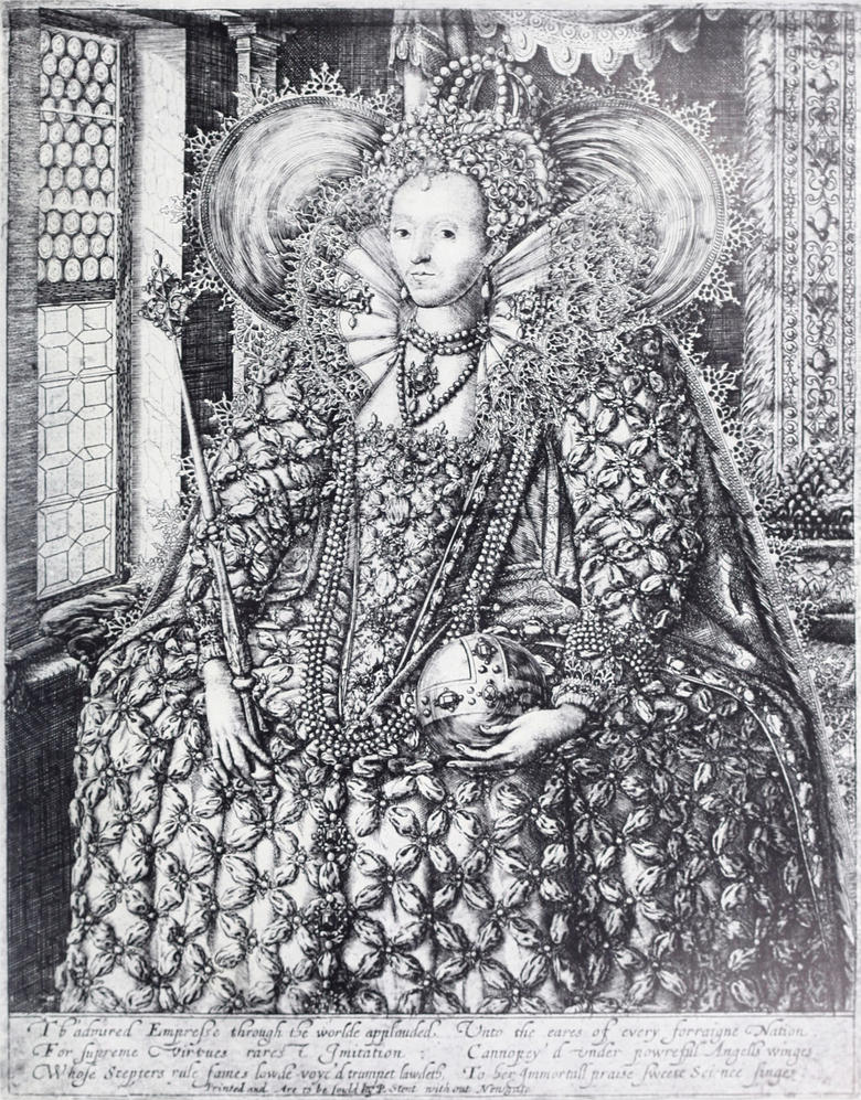
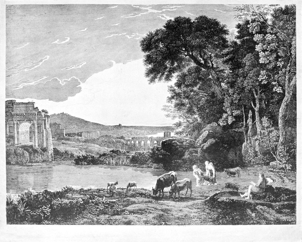
There is little to say, in this place, on the subject of the mezzotints. His Majesty has lent a magnificent impression of The Great Executioner, by Prince Rupert, after Spagnoletto; a print which strikes one as perhaps in its vigour and splendid painter-like qualities the finest in the gallery. The rest of the mezzotints are generally well known, though to the credit of the exhibition it must be said that the preponderance of the fashionable, if insipid class, is not overwhelming. The Wards are hardly as good as they might be; especially in view of the large amount of space given to Charles Turner. But The Water Mill by the latter, after Sir A. W. Callcott, makes one very charitable towards him. It is certainly one of the finest examples of the value of mezzotint as a method of rendering landscape. Mr. Rawlinson, again, lends some valuable examples of the ‘Liber Studiorum’ which are carefully and instructively catalogued. Among the modern work, that of Mr. Frank Short holds, of course, the first place, for he is one of the very few living mezzotinters who can be said to take rank with the best of the old men in technique. The pretty art of stipple receives due attention; and so do the colour-prints, of which the best are, it is good to find, the property of the museum. The art of etching is well shown from Hollar, the group of imitators of Rembrandt in the eighteenth century, the Norwich school, and Wilkie and Geddes in the nineteenth, down to the etching clubs and our own times. Most of this work is well known, for etching has been better served in the matter of literature than any of its sister arts: and it is the only one which has real life at the present day. A most important complement to the exhibited prints is furnished by a series of technical cases, containing complete sets of all tools and materials used in each of the various methods of engraving and etching; as well as examples of all the intermediate stages of working them. These were arranged by Mr. Frank Short and Miss C. M. Pott, and their descriptive notes in the catalogue make it a really useful little manual of technique for the amateur. It only remains to add that the illustration of Rogers’s Queen Elizabeth is reproduced by the gracious permission of his Majesty the King, who has also allowed a photogravure to be made of The Great Executioner, by Prince Rupert, which will appear as a supplement to the next number of THE BURLINGTON MAGAZINE. The other illustrations are from the collection of prints in the Victoria and Albert Museum.
There isn’t much to say here about the mezzotints. His Majesty has lent a stunning impression of The Great Executioner, by Prince Rupert, after Spagnoletto—a print that is arguably the finest in the gallery because of its vigor and painterly qualities. The other mezzotints are generally well-known, although it’s worth noting that the predominance of the trendy, yet dull, ones is not overwhelming. The Wards aren’t as good as they could be, especially considering the significant space given to Charles Turner. However, The Water Mill by him, after Sir A. W. Callcott, makes one feel more forgiving towards him. It’s certainly one of the best examples of how mezzotint can effectively render landscapes. Mr. Rawlinson also contributes valuable examples from the ‘Liber Studiorum,’ which are meticulously and helpfully cataloged. Among the modern works, Mr. Frank Short, of course, takes the top spot, as he is one of the few living mezzotinters who can be compared with the best of the old masters in terms of technique. The appealing art of stipple receives appropriate attention, along with the color prints, of which it’s good to see that the best are part of the museum's collection. The art of etching is well represented, showcasing Hollar, a group of Rembrandt imitators from the eighteenth century, the Norwich school, and Wilkie and Geddes in the nineteenth, all the way to the etching clubs and today. Most of this work is familiar since etching has been better documented than its sister arts, making it the only one still thriving today. An essential addition to the exhibited prints is a series of technical cases containing complete sets of all the tools and materials used in each engraving and etching method, as well as examples of all the intermediate stages of production. These were organized by Mr. Frank Short and Miss C. M. Pott, and their descriptive notes in the catalog create a genuinely useful little manual of technique for the amateur. It only remains to mention that the illustration of Rogers’s Queen Elizabeth is reproduced with His Majesty the King’s kind permission, who has also allowed a photogravure of The Great Executioner by Prince Rupert to be made, which will be included as a supplement to the next issue of THE BBurlington MMAGAZINE. The other illustrations come from the collection of prints at the Victoria and Albert Museum.
EDWARD F. STRANGE.
EDWARD F. STRANGE.
BRITISH
MMUSEUM
DDEPARTMENT OF BRITISH AND
MMEDIEVAL AANTIQUE ITEMS
Among the additions to the department of British and mediaeval antiquities during the past half year are several objects of exceptional interest. In the ceramic section, a large two-handled vase of Florentine maiolica of the fifteenth century, with heraldic lions upon the sides, forms a worthy[Pg 199] pendant to the magnificent vase of the same fabric acquired last year; while the series of oriental wares has been enriched by a writing-stand, or stand for flowers, of the twelfth or thirteenth century, ornamented with animals of archaic style in relief, and attributed to a factory in the neighbourhood of Aleppo. The acquisitions to the collection of glass exhibited in the same room include an enamelled German drinking-glass of the late sixteenth century, a very good example of its kind. ¶ In the mediaeval room the most notable additions will be found in the series of ivory carvings. Here the place of honour belongs to the beautiful head of a tau cross in morse ivory, dating from the eleventh century, recently discovered in the vicarage garden of Alcester, Warwickshire, which will be fully described next month in these pages. Secondly, there is a small but important group of ivories formerly in the possession of the Rev. Walter Sneyd, of Keele Hall, and exhibited in the art treasures exhibition at Manchester in 1857, and at South Kensington in 1862. Although few of the pieces composing this group are of high artistic merit, they are valuable as illustrations of the development of ivory carving during the early middle ages, a period which needed fuller representation in the museum collections. The most remarkable is an oval pyx of the form favoured between the fourth and seventh centuries, especially in Egypt and Syria. Its interest lies in the fact that it appears to be a Carlovingian imitation of a Syrian original dating from perhaps two centuries earlier. It differs essentially in style from the other examples which have been preserved, and the heavy, large-headed figures, with their long, retorted fingers, find their nearest parallels in the miniatures of Carlovingian MSS. Then there is a Byzantine panel, apparently by the same hand as a plaque acquired by the museum at the Ashburnham sale in 1901. This plaque was let into the cover of a thirteenth-century MS. of the romance of ‘Parceval le Galois,’ but originally belonged to a casket ornamented with scenes from the history of Joseph, two large panels from which have been for many years in the Berlin museum. It is satisfactory now to record the acquisition from the Sneyd collection of yet another example marked by the same individuality of style, and perhaps once forming a part of the same composition. Another small piece of Byzantine work not without charm is a panel from the lid of a casket of the ninth century, with figures probably from one of the classical scenes so popular during the iconoclastic period. Finally there are two long panels with seated apostles, Rhenish work of the twelfth century, and a smaller panel with the Flagellation, of similar attribution and date. An interesting accession in the sphere of prehistoric industrial art is a remarkably large bronze spear-head, inlaid at the base of the blade with gold studs, a fine example of the skill and taste of the metal-workers of Britain towards the close of the bronze age.
Among the additions to the department of British and medieval antiquities over the past six months are several objects of exceptional interest. In the ceramics section, a large two-handled vase made of Florentine maiolica from the fifteenth century, featuring heraldic lions on the sides, serves as a fitting counterpart to the magnificent vase of the same type acquired last year. The collection of oriental wares has also expanded with a writing-stand, or flower stand, from the twelfth or thirteenth century, decorated with archaic-style animals in relief, thought to be made in a factory near Aleppo. The glass collection displayed in the same room includes an enamelled German drinking glass from the late sixteenth century, which is a very good example of its kind. In the medieval room, the most notable additions can be found in the series of ivory carvings. The standout piece is a beautiful head of a tau cross made from morse ivory, dating back to the eleventh century, which was recently found in the vicarage garden of Alcester, Warwickshire, and will be fully described next month in these pages. Additionally, there’s a small but significant group of ivories that were once owned by Rev. Walter Sneyd of Keele Hall, exhibited in the art treasures exhibition at Manchester in 1857 and at South Kensington in 1862. Although few pieces in this group are of high artistic quality, they are valuable as examples of the evolution of ivory carving during the early Middle Ages, a period that requires more representation in museum collections. The most remarkable piece is an oval pyx, a form that was popular between the fourth and seventh centuries, especially in Egypt and Syria. Its significance lies in the fact that it seems to be a Carolingian imitation of a Syrian original from perhaps two centuries earlier. It differs greatly in style from other preserved examples, and the heavy, large-headed figures with their long, contorted fingers closely resemble those found in the miniatures of Carolingian manuscripts. There is also a Byzantine panel, seemingly created by the same hand as a plaque acquired by the museum at the Ashburnham sale in 1901. This plaque was embedded in the cover of a thirteenth-century manuscript of the romance ‘Parceval le Galois,’ but originally belonged to a casket decorated with scenes from the history of Joseph, two large panels of which have been in the Berlin museum for many years. It is satisfying to note that the Sneyd collection has yielded yet another example showcasing the same distinctive style, and perhaps originally part of the same composition. Another charming piece of Byzantine work is a panel from the lid of a ninth-century casket, featuring figures likely from one of the classical scenes that were popular during the iconoclastic period. Finally, there are two long panels depicting seated apostles, of Rhenish origin from the twelfth century, and a smaller panel depicting the Flagellation, attributed to the same style and date. An interesting addition in the realm of prehistoric industrial art is a remarkably large bronze spearhead, inlaid with gold studs at the base of the blade, showcasing the skill and artistry of Britain's metalworkers towards the end of the Bronze Age.
O. M. D.
OMG


THE PRINT ROOM OF THE BBRITISH MMUSEUM
The Department has acquired by purchase an extremely interesting and important addition to the collection of Chinese paintings. This is a long roll, containing scenes of court life and amusements in the first century A.D. Pan Chao, a female historian of that era, is among the figures represented. It is painted in colours on brown silk; green, purple, and a tawny yellow have been used, but have more or less sunk, so that the general impression is that of a painting in vermilion and black, the two pigments which have stood best. The actual workmanship, especially the modulation of the brush-line, is of extraordinary beauty and power, and can only be that of a great master. There seems no reason to doubt that we have in this roll an authentic work by Ku K‘ai-chih (‘Ko-gai-shi’ in Japanese[Pg 200] pronunciation), a very famous artist of the fourth and fifth centuries A.D., to whom it has always been attributed, though the signature and inscriptions are probably of later date. Annexed to the roll is a eulogy of the painter in the handwriting of Ch‘ien Lung, the emperor who received Lord Macartney’s embassy in 1793; and following this is an admirable and delicate ink-landscape by an eighteenth-century painter. The importance of a picture by Ku K‘ai-chih will be realized when we consider that of the art of the T‘ang dynasty (600 to 900 A.D.) hardly a vestige remains, while relics of the later Sung period are extremely rare. Nothing so ancient exists in Japan, the country where for a thousand years the early paintings of China have been collected with ardour and preserved with veneration. ¶ A full account of this and some other important examples of Chinese painting will shortly be given in this magazine.
The Department has purchased a fascinating and significant addition to the collection of Chinese paintings. This is a long scroll that depicts scenes of court life and entertainment from the first century A.D. Pan Chao, a female historian from that time, is among the figures illustrated. The painting is done in colors on brown silk; green, purple, and a tawny yellow were used, but they have faded to some extent, giving the overall impression of a work primarily in vermilion and black—the two colors that have held up the best. The craftsmanship, especially the variation in the brushstrokes, is extraordinarily beautiful and powerful, indicating it must be by a great master. There’s no reason to doubt that this scroll is an authentic piece by Ku K‘ai-chih (referred to as ‘Ko-gai-shi’ in Japanese pronunciation), a highly regarded artist from the fourth and fifth centuries A.D., to whom it has always been credited, although the signature and inscriptions were likely added later. Attached to the scroll is a tribute to the painter in the handwriting of Ch‘ien Lung, the emperor who hosted Lord Macartney’s embassy in 1793; following this is a beautiful and delicate ink landscape by an eighteenth-century artist. The significance of a painting by Ku K‘ai-chih becomes clear when we consider that little remains of the art from the Tang dynasty (600 to 900 A.D.), while items from the later Sung period are extremely rare. No such ancient works exist in Japan, where early Chinese paintings have been eagerly collected and carefully preserved for a thousand years. ¶ A complete account of this and other significant examples of Chinese painting will soon be featured in this magazine.
L. B.
L. B.
NOTE ON THE LIFE OF BERNARD VAN ORLEY
Bernard van Orley is generally said to have been the second son—third child—of Valentine van Orley by his first wife, Margaret van Pynbroeck, whom he married May 13, 1490. He is further stated to have left Brussels in 1509 for Rome, and to have studied in the school of Raphael, becoming a great favourite with his master. ¶ It seems impossible to reconcile these statements with certain facts which are established beyond doubt by authentic documents. In 1514 Bernard was settled as a master-painter at Brussels, and had already gained a certain reputation, for the confraternity of the Holy Cross at Furnes in 1515 sent a delegate to Brussels to ask him to furnish a design for the altar-piece of their chapel. Bernard must therefore have at that time attained the age of 30,[82] which would put back the date of his birth to 1484–5. And unless there is some error in the date—May 4, 1504—of the procuration published by A. Wauters (‘Bernard van Orley,’ Bruxelles, 1881, p. 70), his birth must have taken place before May 1479, as no minor could give a procuration or power of attorney to another to dispose of property. Children at that time only attained their majority at the age of 25. ¶ If born in 1479 Bernard may well have become a free master or gone to Rome in 1509. I suspect that he was not the son of Valentine and Margaret van Pynbroeck, but of some other Valentine, perhaps the uncle. I know of no document giving the name of his mother.
Bernard van Orley is generally considered to have been the second son—third child—of Valentine van Orley and his first wife, Margaret van Pynbroeck, whom he married on May 13, 1490. It's also mentioned that he left Brussels in 1509 for Rome and studied in Raphael's workshop, becoming a favorite of his master. ¶ However, it seems impossible to reconcile these claims with certain facts that are clearly established by authentic documents. By 1514, Bernard was established as a master painter in Brussels and had already gained some reputation, as the confraternity of the Holy Cross in Furnes sent a delegate to Brussels in 1515 to ask him to create a design for the altar piece of their chapel. Therefore, Bernard must have been around 30 at that time, which would push his birth date back to 1484-85. Unless there’s an error with the date—May 4, 1504—of the document published by A. Wauters (‘Bernard van Orley,’ Bruxelles, 1881, p. 70), he must have been born before May 1479 since no minor could give a power of attorney to allow someone else to manage their property. Back then, children only reached adulthood at 25. ¶ If born in 1479, Bernard could have indeed become a free master or gone to Rome in 1509. I suspect that he might not be the son of Valentine and Margaret van Pynbroeck but rather of another Valentine, possibly an uncle. I don’t have any documents naming his mother.
W. H. JAMES WEALE.
W. H. JAMES WEALE.
[Pg 205]
[Pg 205]
THE COLLECTION OF PICTURES OF THE EARL OF NORMANTON, AT SOMERLEY, HAMPSHIRE
❧ WRITTEN BY MAX ROLDIT ❧
❧ WRITTEN BY MAX ROLDIT ❧
ARTICLE I.—PICTURES BY SIR JOSHUA REYNOLDS
N almost every corner of these islands there is to be found hidden away amongst the trees or proudly standing on the summit of a hill one of those imposing ancestral homesteads which the British aristocracy have erected at various times ever since the Norman conquest. From the feudal castle of gothic architecture to the modern mansion replete with every comfort and household invention of the nineteenth century every style is represented. These buildings are geographical landmarks in the country, and nearly all are also landmarks in the artistic topography of Great Britain. Succeeding generations of owners have accumulated treasures which, severely guarded by family settlements, can only be dislodged under special conditions. In not a few instances the ancient furniture thus preserved, the objects of art and especially the pictures, the latter usually grouped round a nucleus of family portraits of successive periods, would rival many a public collection for the perfection of the examples, their artistic and monetary worth, and even their actual number. The more therefore is it to be regretted that they are so rarely accessible to the artist, the student, the public at large. A small percentage is, it is true, to be seen at the admirable loan exhibitions organized yearly at Burlington House and the Guildhall, and also from time to time in galleries governed by private enterprise; but these artistic feasts are all too rare, and even were the owners of fine works of art always willing to lend their property, which is not invariably the case, it would be impossible for all the objects worthy of being shown to pass in this way before the gaze of a single generation. Many are the masterpieces in this country which have not moved from their resting place for scores of years and which are, except to a privileged few, as completely unknown and invisible as the immensely distant stars which astronomers contemplate through their most powerful lens. ¶ The collection of pictures at Somerley, the Earl of Normanton’s beautiful seat near Ringwood in Hampshire, is one of those of whose very existence only a small minority is aware. The mansion, of late Georgian style, stands on the banks of the Avon in the midst of a park and estate extending over 9,000 acres, and is visited by only a small number of persons annually besides Lord Normanton’s immediate entourage. ¶ With a very few exceptions, the entire collection was formed between the years 1820 and 1868 by Welbore Ellis, second Earl of Normanton, and grandfather of the present peer. Born in 1778, he succeeded to the title in 1809, married Diana, eldest daughter of the eleventh Earl of Pembroke, in 1816, and died in his ninetieth year in 1868, leaving as a record of his taste and artistic knowledge the wonderful gallery of paintings which is the subject of this study. ¶ The collection is composed chiefly of pictures of the eighteenth-century English school, including works by Reynolds, Gainsborough, Hogarth, Hoppner, Romney, Lawrence, Morland, Bonington, Nasmyth and Crome; it contains also pictures by some Flemish and Dutch masters of the seventeenth century, Rubens, Van Dyck and Teniers, Paul Potter, Van de Capelle, Aart van der Neer, Wouwerman and Willem van de Velde; Guardi and Canaletto represent the Italian; Murillo represents the Spanish school; whilst Greuze is the only French artist who has found a place at Somerley. The most striking feature of the collection[Pg 206] is to be found in the predominance of works by Sir Joshua Reynolds, evidently the favourite painter of the second Lord Normanton, who acquired no fewer than twenty-six examples from his brush. ¶ For the sake of clearness and convenience, a description of the Normanton collection may be divided into three sections, namely:—
N almost every part of these islands, you can find tucked away among the trees or proudly perched on a hilltop one of those impressive ancestral homes built by the British aristocracy at various times since the Norman conquest. From the feudal castles with gothic architecture to the modern mansions equipped with all the comforts and innovations of the nineteenth century, every style is represented. These buildings serve as geographical landmarks across the country and are also significant in the artistic landscape of Great Britain. Generations of owners have gathered treasures that, closely protected by family settlements, can only be taken under specific conditions. In many cases, the ancient furniture, art pieces, and especially the paintings—typically centered around a collection of family portraits from different periods—could rival many public collections in terms of quality, artistic and monetary value, and even quantity. Therefore, it is unfortunate that they are rarely accessible to artists, students, and the general public. A small percentage is, indeed, displayed at the excellent loan exhibitions organized yearly at Burlington House and the Guildhall, and occasionally in galleries run by private enterprises; but these artistic showcases are all too rare. Even if the owners of fine artworks were always willing to lend their pieces—which isn’t always the case—it would be impossible for all worthy objects to be presented to the view of a single generation. There are many masterpieces in this country that haven’t been moved from their places for decades and are, except to a privileged few, as completely unknown and unseen as the distant stars that astronomers observe through their most powerful telescopes. ¶ The collection of paintings at Somerley, the Earl of Normanton’s beautiful estate near Ringwood in Hampshire, is one of those of which only a small minority is aware. The mansion, in late Georgian style, sits on the banks of the Avon in a park and estate that covers over 9,000 acres, and is visited by only a small number of people each year, aside from Lord Normanton’s immediate circle. ¶ With very few exceptions, the entire collection was created between 1820 and 1868 by Welbore Ellis, the second Earl of Normanton, and grandfather of the current peer. Born in 1778, he inherited the title in 1809, married Diana, the eldest daughter of the eleventh Earl of Pembroke, in 1816, and passed away at the age of ninety in 1868, leaving behind a legacy of taste and artistic knowledge in the form of the remarkable gallery of paintings that is the focus of this study. ¶ The collection mainly consists of works from the eighteenth-century English school, including pieces by Reynolds, Gainsborough, Hogarth, Hoppner, Romney, Lawrence, Morland, Bonington, Nasmyth, and Crome; it also features paintings by several seventeenth-century Flemish and Dutch masters—Rubens, Van Dyck, Teniers, Paul Potter, Van de Capelle, Aart van der Neer, Wouwerman, and Willem van de Velde; Guardi and Canaletto represent the Italian artists; Murillo stands for the Spanish school; while Greuze is the only French artist represented at Somerley. The most notable aspect of the collection[Pg 206] is the dominance of works by Sir Joshua Reynolds, clearly the favored painter of the second Lord Normanton, who acquired no fewer than twenty-six pieces by him. ¶ For clarity and convenience, a description of the Normanton collection can be divided into three sections, namely:—
- The works by Sir Joshua Reynolds.
- The works by British painters other than Sir Joshua Reynolds.
- The works by painters of the foreign schools.

IN THE COLLECTION OF THE EARL OF NORMANTON.
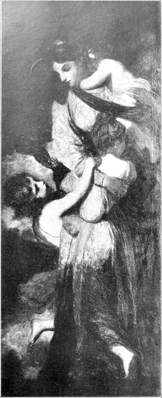


¶ The group of paintings by Sir Joshua Reynolds is unparalleled in any other collection public or private all the world over; both by the number and the excellence of the examples, it is absolutely unique, and it would be well-nigh impossible at the present day for even a multi-millionaire to bring together a rival gathering of this one painter’s productions. ¶ All through his career as a collector, Lord Normanton continued to acquire examples of Sir Joshua’s work, but his most important single purchase was made as early as 1821 at the sale of the pictures of the Marchioness of Thomond, held at Christie’s on May 18 and 19 of that year. The Marchioness of Thomond was no other than Mary Palmer, daughter of Sir Joshua’s elder sister, and sister to pretty ‘Offy’ Palmer, afterwards Mrs. Gwatkin, whom her uncle so often used as a model for his fancy pictures, notably for the Strawberry Girl. When Sir Joshua died in 1792, he left the bulk of his property to his niece, Mary Palmer; she inherited nearly £100,000 besides a number of pictures and other works of art; the same year she married the fifth Earl of Inchiquin, subsequently created Marquess of Thomond. After her death in 1821, her pictures were sold at Christie’s, and that occasion may be said to mark the foundation of the Normanton collection. Lady Thomond’s sale included, besides many works by old masters, a large number of pictures and sketches by her illustrious uncle; and here Lord Normanton secured for less than £3,000 the wonderful series of seven decorative panels which have ever remained the chief ornament of his collection, and for which in recent years fabulous sums have been offered and refused. They represent the three theological virtues, Faith, Hope, and Charity, and the four cardinal virtues, Temperance, Prudence, Justice, and Fortitude. They are the original designs executed by Sir Joshua Reynolds for the window at New College, Oxford, and afterwards copied on glass by Jarvis. Ever since his school days at Westminster, Lord Normanton had known and admired these pictures at Lady Thomond’s. On the day of the sale, in answer to a suggestion of the auctioneer that the entire set should be sold together, the company present, which included the Dukes of Devonshire and Northumberland, Lords Egremont, Grosvenor, Bridgewater, Fitzwilliam, Dudley and Ward, and Harewood, Sir Charles Long on behalf of the king, and many other well-known picture buyers, decided that the Virtues should be offered separately. The Charity was put up first, and its purchase at 1,100 guineas by Lord Normanton, then a young man, created no small sensation. Lord Dudley and Ward eagerly competed for the Fortitude, for which his mother had sat to Sir Joshua, but that as well as the other six succumbed to Lord Normanton’s bidding. Seven years later an offer of twice the purchase price was made for them on behalf of the king, and again some few years afterwards the National Gallery tried in vain to tempt Lord Normanton with three times the original sum. ¶ As to the designs themselves, it had been the painter’s original intention to make them drawings or cartoons; but he soon found it would be easier for him to paint them in oils, so long had he been used to the brush and the palette. ‘Jarvis, the painter on glass,’ he said, ‘will have a better original to copy, and I suppose persons hereafter may be found to purchase my paintings.’ In this he was, however, disappointed, since the Virtues were still in[Pg 211] his possession at his death. ¶In a letter written about 1778, Sir Joshua details the general plan for the Oxford window. ‘Supposing this scheme to take place, my idea is to paint, in the great space in the centre, Christ in the Manger, on the principle that Correggio has done it, in the famous picture called the Notte; making all the light proceed from Christ. These tricks of the art, as they may be called, seem to be more properly adapted to glass-painting than any other kind. This middle space will be filled with the Virgin, Christ, Joseph and angels; the two smaller spaces on each side I shall fill with the shepherds coming to worship; and the seven divisions below with the figures of Faith, Hope, Charity and the four cardinal virtues; which will make a proper rustic base or foundation for the support of the Christian Religion....’ ¶ The large central picture of the Nativity, measuring ten feet by eighteen, was sold by the artist to the Duke of Rutland for the then unprecedented price of 1,200 guineas. It was unfortunately destroyed in the fire at Belvoir in 1816. A powerful sketch of this subject on a small scale is, however, to be found at Somerley. ¶ The seven Virtues, which now hang side by side in the magnificent gallery built by the second Earl of Normanton, each measure 6 ft. 11 in. in height by 2 ft. 9 in. in width, except the central panel, Faith, which is taller and narrower than the others, namely, 8 ft. by 2 ft. 5 in. Charity is represented by a group of a woman clasping three children in her protecting arms, whilst all the rest contain but a single allegorical figure, with the special attributes consecrated by tradition. The most noteworthy feature of the entire series, and that which first strikes the onlooker, is its thoroughly and unmistakably English character. No straining after classicism, no copying or imitation of the Italians are to be found in this the most successful work of decoration ever painted by a British artist. In the Nativity, Reynolds was accused of a too servile imitation of Correggio, but certainly no such reproach can apply to the seven Virtues. In the conception or the execution, in the drawing or the colour, in the types of his models or the arrangement of the draperies, nowhere is a trace discernible of any foreign element. Reynolds represented the Virtues under the features of the lovely and refined English ladies whom he was accustomed to paint; the draperies in which they are clothed are dresses of the eighteenth century, simplified no doubt, and chastened, but sometimes scarcely altered, as in the case of Temperance and Prudence. He thus avoided the cold conventionality usually so apparent in allegorical paintings, whilst losing nothing in dignity or impressiveness; if one misses the spiritual elevation of the Italians, there is a corresponding gain in humanity, and that indefinable quality, charm.
¶ The collection of paintings by Sir Joshua Reynolds is unmatched in any public or private collection around the world; its sheer number and quality make it truly one of a kind, and it would be nearly impossible today for even a multi-millionaire to assemble a comparable assortment of works from this one artist. ¶ Throughout his collecting career, Lord Normanton continued to acquire examples of Sir Joshua’s work, but his most significant single purchase was made as early as 1821 at the auction of the Marchioness of Thomond's paintings, held at Christie’s on May 18 and 19 of that year. The Marchioness of Thomond was none other than Mary Palmer, Sir Joshua’s older sister's daughter, and sister to the pretty ‘Offy’ Palmer, later Mrs. Gwatkin, whom her uncle often used as a model for his charming paintings, notably for the Strawberry Girl. When Sir Joshua died in 1792, he left most of his estate to his niece, Mary Palmer; she inherited nearly £100,000 along with numerous paintings and other works of art; that same year she married the fifth Earl of Inchiquin, who was later made the Marquess of Thomond. After her death in 1821, her paintings were auctioned at Christie’s, and this occasion can be seen as the beginning of the Normanton collection. Lady Thomond’s sale included, in addition to many works by old masters, a large number of paintings and sketches by her famous uncle; at this auction, Lord Normanton acquired for less than £3,000 the remarkable series of seven decorative panels which continue to be the main highlight of his collection, for which in recent years astonishing sums have been offered and turned down. They represent the three theological virtues, Faith, Hope, and Charity, and the four cardinal virtues, Temperance, Prudence, Justice, and Fortitude. These are the original designs created by Sir Joshua Reynolds for the window at New College, Oxford, which were later replicated in glass by Jarvis. Since his school days at Westminster, Lord Normanton had known and admired these paintings at Lady Thomond’s. On the day of the auction, in response to a suggestion from the auctioneer that the entire set should be sold together, the attendees, which included the Dukes of Devonshire and Northumberland, Lords Egremont, Grosvenor, Bridgewater, Fitzwilliam, Dudley and Ward, and Harewood, Sir Charles Long on behalf of the king, and many other well-known art buyers, decided that the Virtues should be auctioned separately. The Charity panel was offered first, and its purchase for 1,100 guineas by the then young Lord Normanton created quite a stir. Lord Dudley and Ward eagerly vied for the Fortitude panel, for which his mother had posed for Sir Joshua, but that and the other six ultimately fell to Lord Normanton's bids. Seven years later, an offer of twice the purchase price was made for them on behalf of the king, and again a few years later the National Gallery tried unsuccessfully to entice Lord Normanton with three times the original amount. ¶ As for the designs themselves, the painter initially intended them to be drawings or cartoons; however, he quickly realized it would be easier for him to paint them in oils, given his long experience with the brush and palette. ‘Jarvis, the glass painter,’ he noted, ‘will have a better original to copy, and I suppose people in the future may be found to buy my paintings.’ Unfortunately, he was disappointed, as the Virtues remained in his possession at the time of his death. ¶ In a letter written around 1778, Sir Joshua outlined the general concept for the Oxford window. ‘Assuming this scheme goes ahead, my idea is to paint, in the large space in the center, Christ in the Manger, following Correggio’s approach in his well-known painting called the Notte; making all the light come from Christ. These artistic tricks seem to be more suited for glass-painting than any other form. This central space will be filled with the Virgin, Christ, Joseph, and angels; the two smaller spaces on each side I’ll have filled with the shepherds coming to worship; and the seven sections below with figures of Faith, Hope, Charity, and the four cardinal virtues; which will provide a fitting rustic base or foundation for supporting the Christian Religion....’ ¶ The large central image of the Nativity, measuring ten feet by eighteen, was sold by the artist to the Duke of Rutland for the then-remarkable price of 1,200 guineas. Unfortunately, it was destroyed in a fire at Belvoir in 1816. However, a powerful small-scale sketch of this subject remains at Somerley. ¶ The seven Virtues, which now hang together in the stunning gallery built by the second Earl of Normanton, each measure 6 ft. 11 in. tall by 2 ft. 9 in. wide, except for the central panel, Faith, which is taller and narrower, measuring 8 ft. by 2 ft. 5 in. Charity is depicted by a woman embracing three children in her protective arms, while the others depict a single allegorical figure with traditional attributes. The most striking feature of the entire series, which is immediately apparent to viewers, is its distinctly English character. There is no attempt at classicism, nor any imitation of the Italians in this, the most successful decorative work ever painted by a British artist. In the Nativity, Reynolds faced criticism for being too slavish in his imitation of Correggio, but certainly such criticism cannot be leveled against the seven Virtues. In terms of conception and execution, drawing and color, the models' types or the arrangement of draperies, there is no trace of any foreign influence. Reynolds portrayed the Virtues as the beautiful and refined English women he was used to painting; the costumes they wear are dresses from the eighteenth century, simplified and refined, yet in some instances almost unchanged, as seen with Temperance and Prudence. He thus avoided the cold conventionality often evident in allegorical paintings, without sacrificing dignity or impact; while one may miss the spiritual grandeur of the Italians, there is a corresponding gain in warmth and that elusive quality, charm.
[Pg 212]
[Pg 212]


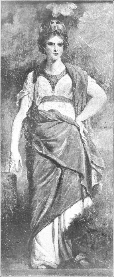

Faith is represented by the figure of a girl with a face of exquisite innocence and sweetness, expressive also of deep suffering and infinite resignation. Her plain white pilgrim’s robe is partly covered by a loose brown drapery falling around her in simple heavy folds; with her left hand she holds a tall wooden cross, the upper part of which is strongly outlined against the divine illumination which brightens the clouds above her; her right hand is uplifted towards heaven in an attitude of invocation. Hope is the least successful panel of the series. Clad in dull green draperies with a brown scarf flowing from her shoulders, she stands in a somewhat awkward position, her hands uplifted and her face averted towards the light which pours upon her through the clouds. Charity can, on the contrary, rank with the finest of Sir Joshua’s pictures; his model in this instance was Mrs. Sheridan, the lovely wife of the author of ‘School for Scandal,’ who had also sat to him for the figure of the Virgin in the Nativity. On her breast nestles a half-naked infant whom she lovingly supports with her left hand, whilst with the other she clasps in a close embrace two more children, a young girl and a curly-headed boy, who have run to her for protection; with an expression of rare tenderness and pity she gazes down upon her little charges. This picture is painted with exceptional power; the contrasts of light and shade are rendered with a perfection almost reminiscent of Rembrandt, whilst the composition is both strong and graceful. The two beautiful young women in whom Reynolds has impersonated Temperance and Prudence are clothed in white dresses of eighteenth-century design, bordered in the case of the second with a narrow gold braid. Mrs. Elizabeth Palmer, wife of the artist’s nephew, the Dean of Cashel, was the model for Prudence; she gazes thoughtfully into a mirror which she holds in her right hand; in the left she has an arrow round which an adder is entwined. Temperance is pouring water from a golden jug into a golden cup. In the two last panels, the figures stand full face to the spectator; the features of Justice are shaded by the balance which she raises to the level of her head; her loose robe, held by a girdle at the waist, is rose-coloured, and her right hand rests on the hilt of a naked sword. Fortitude (Lady Dudley and Ward) is the traditional figure of Britannia, a plumed helmet upon her noble head, a small golden breast-plate decorating her white robe, around which a dark red mantle is draped; the head of the watchful lion crouching at her feet is shown in the right-hand corner. ¶ Several other works by Sir Joshua were acquired by Lord Normanton besides the seven Virtues at Lady Thomond’s sale, including the expressive half-length portrait of himself, painted in 1769, in his robes of president of the Royal Academy, his right hand resting on a book. The delightful portrait of Elizabeth, daughter of Sir Joshua’s friend Topham Beauclerk and his beautiful wife Lady Diana, represented as Spenser’s Una with the lion crouching at her side, came from the same source and cost only thirty-seven guineas. Elizabeth Beauclerk married in 1787 the Earl of Pembroke and was the mother of Diana, Lady Normanton, wife of the collector. Sir Joshua painted her about the year 1778 and showed her in a perfectly simple white frock, childishly sitting on her heels upon the ground. Her hair falls loosely over her shoulders and her expression is one of thoughtful innocence. The foliage and landscape behind her are treated with great breadth and power; the more delicate parts of the picture, such as the face and hands, are on the contrary very smoothly painted; the marked difference in texture is explained by the fact that at this period Sir Joshua used a mixture of wax and Venice turpentine as a vehicle for the heads, and wax alone for other portions of his pictures where he wished to produce thicker impastos. The picture described in Lady Thomond’s catalogue as A Girl seated on her heels embracing a favourite Kitten, for which Lord Normanton gave 295 guineas, is one of several of the same delightful subject done by Sir Joshua and usually known as Felina. It was painted in 1787, and although Offy Palmer was by that time a grown-up young woman, it is her features when a child which her uncle has once more used. Witty and graceful, this picture bears witness to Sir Joshua’s supremacy as a limner of children. No one more than he succeeded in reproducing their quaint and charmingly awkward attitudes, and it would be difficult to find even in his works anything more delicious than this little dark-eyed damsel fondling her unhappy pet almost to the point of suffocation. The face is painted with great delicacy and a clearness of complexion unusual in Sir Joshua’s pictures; the background of foliage is unfortunately severely cracked, owing to an excessive use of treacherous bitumen. Miss Falconer (afterwards the Hon. Mrs. Stanhope) as Contemplation was also included in the Marchioness of Thomond’s collection, but was not bought at her sale by Lord Normanton. It was knocked down on that occasion for 100 guineas to a dealer, from whom it passed into the possession of Mr. John Allnutt, of Clapham Common, and it was only many years later that it was transferred[Pg 217] into the Somerley collection of which it now forms part. The beautiful lady whom the painter has here represented, in a moonlit landscape, seated on a bank in a pensive attitude, was a well-known figure in the society of her day, where her high spirits and light-hearted gaiety made her a general favourite; the appearance of this portrait, so contrary to her character, excited no little comment at the time. In charm of expression and unaffected grace of pose this portrait is a truly delightful production. An interesting fact concerning it is that it is one of the few portraits by Reynolds painted on a panel; the artist, who, as is well known, was for ever making new experiments in the mediums he employed, selected on this occasion an old Japanese panel, and the reverse of the picture is to this day decorated with a still-life in bold relief, brilliant in colouring and of no mean artistic merit. ¶ In three life-size full-length portraits of young girls which hang in Lord Normanton’s gallery, it is instructive to compare the artist’s method of treatment of a similar subject at different periods of his career. These pictures are those of Lady Betty Hamilton, painted in 1758, of Miss Murray of Kirkcudbright, 1765, and that, some twenty years later in date, known for lack of a better title as The Little Gardener. In the first there is a richness of colour and a wealth of detail not to be found in either of the two others; the influence of Reynolds’s master, Hudson, is still clearly discernible, and the warmth and brilliance of the colouring must be traced to the immediate effects of the artist’s recent travels in Italy, where the gorgeous tones of the Venetians had filled him with a boundless admiration. In the two earlier portraits there is a simple artlessness of pose in striking contrast with the affected and self-conscious attitude of The Little Gardener, whilst the latter is far broader and more spontaneous in technique. ¶ The portrait of Lady Betty Hamilton, afterwards Countess of Derby, is unsurpassed by any work of Sir Joshua at this early period, and it may also be counted among the best of his child portraits. In a low-cut dress of plum-coloured embroidered silk, her wide skirt reaching to the ground, she sits on a bank in a garden; she has a white muslin pinafore bordered with lace, and her hands rest on her lap holding a bunch of vari-coloured flowers. The flesh-tints are somewhat faded, but the dreamy blue eyes and rosebud mouth expressive of happy childhood’s ignorance of evil and suffering, are a delight to look upon. She was a daughter of the Duke of Hamilton, and became the first wife of the twelfth Earl of Derby, who, after divorcing her, married Miss Farren the celebrated actress. In 1777 Reynolds painted another portrait of her as Countess of Derby, a whole-length which was engraved by William Dickinson; this picture has, however, disappeared, probably destroyed by her husband after his divorce. ¶ Little Miss Murray of Kirkcudbright in a plain white dress with a black silk scarf thrown over her head and shoulders and funny blue shoes, stands in a landscape, her hands loosely crossed in front of her. By her side sits a curious woolly white dog with black spots on its face, which has no appearance of life, and shows how inferior in this respect Sir Joshua was to Gainsborough, who stands with Velasquez among the greatest dog painters of the world. The landscape in this picture is of quite unusual excellence, and with the fine breezy sky forms an effective and pleasing background to the figure of the blue-eyed little Scotch girl. ¶ Who was the sitter for the portrait called The Little Gardener, it seems at the present time impossible to discover; it shows a pretty young girl sitting dreamily on a bank at the edge of a wood; she wears a white dress with a crimson sash, and with her right hand she loosely holds a straw bonnet decorated with pink ribbons.
Faith is depicted as a girl with a face of exquisite innocence and sweetness, showing deep suffering and endless resignation. She wears a simple white pilgrim’s robe, partly covered by a loose brown drapery that falls around her in thick folds. In her left hand, she holds a tall wooden cross, the upper part sharply outlined against the divine light brightening the clouds above her; her right hand is raised towards heaven in a gesture of prayer. Hope is the least successful panel in the series. Dressed in dull green drapery with a brown scarf draping from her shoulders, she stands in a somewhat awkward pose, her hands raised and her face turned away from the light pouring down on her through the clouds. In contrast, Charity ranks among the best of Sir Joshua’s works; his model for this piece was Mrs. Sheridan, the lovely wife of the author of ‘School for Scandal,’ who also posed for the Virgin in the Nativity. A half-naked baby rests on her chest, lovingly supported by her left hand, while she tightly embraces two other children—a young girl and a curly-haired boy—who run to her for comfort. With a gaze full of rare tenderness and compassion, she looks down at her little ones. This painting is exceptionally powerful; the contrasts of light and shadow are rendered with a nearly Rembrandt-like perfection, and the composition is both strong and elegant. The two beautiful young women representing Temperance and Prudence are dressed in white gowns from the eighteenth century, with the second adorned with a narrow gold trim. Mrs. Elizabeth Palmer, the artist’s nephew’s wife and the Dean of Cashel, was the model for Prudence; she gazes thoughtfully into a mirror held in her right hand, while her left hand grips an arrow entwined with a snake. Temperance is pouring water from a golden jug into a golden cup. In the last two panels, the figures face the viewer; Justice’s features are shaded by the balance she lifts to the level of her head; her loose rose-colored robe is cinched at the waist, and her right hand rests on the hilt of a naked sword. Fortitude, represented by Lady Dudley and Ward, embodies Britannia, wearing a plumed helmet, a small gold breastplate over her white robe, which is draped with a dark red mantle. The head of a watchful lion crouches at her feet, shown in the right-hand corner. ¶ Lord Normanton acquired several other works by Sir Joshua in addition to the seven Virtues at Lady Thomond’s sale, including an expressive half-length portrait of himself, painted in 1769, in his Royal Academy president's robes, with his right hand resting on a book. He also bought the charming portrait of Elizabeth, daughter of Sir Joshua’s friend Topham Beauclerk and his beautiful wife Lady Diana, depicted as Spenser’s Una with the lion by her side, which came from the same source and cost only thirty-seven guineas. Elizabeth Beauclerk married the Earl of Pembroke in 1787 and was the mother of Diana, Lady Normanton, the collector's wife. Sir Joshua painted her around 1778, showing her in a simple white dress, childishly sitting on her heels on the ground. Her hair falls loosely over her shoulders, and her expression reflects thoughtful innocence. The foliage and landscape behind her display great breadth and power, while the more delicate elements, like her face and hands, are painted very smoothly; this textures difference is explained by Sir Joshua’s use of a wax and Venice turpentine mixture for the heads and wax alone for other parts where he aimed for thicker paint application. The painting listed in Lady Thomond’s catalog as A Girl Seated on Her Heels Embracing a Favourite Kitten, which Lord Normanton purchased for 295 guineas, is one of several delightful pieces by Sir Joshua usually referred to as Felina. Painted in 1787, although Offy Palmer was a grown woman by then, it is her childhood features that her uncle has captured once more. Witty and graceful, this painting attests to Sir Joshua’s mastery in depicting children. No one succeeded better than he in capturing their quirky and charming quirks, and it’s hard to find even in his work something more delightful than this little dark-eyed girl cuddling her unfortunate pet almost to the point of suffocating it. The face is painted with great delicacy and an unusually clear complexion for Sir Joshua's work; the background of foliage has unfortunately cracked due to an overuse of unreliable bitumen. Miss Falconer (later the Hon. Mrs. Stanhope) as Contemplation was also part of the Marchioness of Thomond’s collection but was not bought at her sale by Lord Normanton. It was sold for 100 guineas to a dealer, from whom it ended up in the possession of Mr. John Allnutt of Clapham Common, and it was only many years later that it was transferred[Pg 217] into the Somerley collection, where it currently resides. The beautiful lady depicted in this portrait, seated pensively on a bank in a moonlit landscape, was well-known in society for her spirited and cheerful personality, making her a favorite among her peers; the appearance of this portrait, which contrasts with her character, drew considerable commentary at the time. In charm of expression and graceful pose, this portrait is truly delightful. An interesting fact is that it is one of the few portraits by Reynolds painted on a panel; the artist, known for constantly experimenting with different mediums, chose an old Japanese panel for this piece, which features a still-life in bold relief, brilliantly colored and of notable artistic value on the back. ¶ In three life-size full-length portraits of young girls hanging in Lord Normanton’s gallery, it’s interesting to compare the artist’s treatment of similar subjects at different stages of his career. These portraits are of Lady Betty Hamilton, painted in 1758, Miss Murray of Kirkcudbright from 1765, and another, about twenty years later, known as The Little Gardener. The first shows a richness of color and detail not found in the other two; the influence of Reynolds’s mentor, Hudson, is still evident, and the warmth and vibrancy of the colors can be attributed to the immediate impacts of the artist’s recent travels in Italy, where the stunning tones of the Venetians had inspired him deeply. The two earlier portraits display a simple authenticity of pose that contrasts sharply with the affected and self-conscious stance of The Little Gardener, which is broader and more spontaneous in technique. ¶ The portrait of Lady Betty Hamilton, later Countess of Derby, is unmatched by any of Sir Joshua's work from this early period and can be considered one of his best child portraits. Dressed in a low-cut, plum-colored embroidered silk gown with a wide skirt reaching the ground, she sits on a bank in a garden, wearing a white muslin pinafore bordered with lace, her hands resting in her lap holding a bunch of colorful flowers. Though the flesh tones have faded a bit, her dreamy blue eyes and rosebud mouth, which express the blissful ignorance of childhood regarding evil and suffering, are delightful to behold. She was the daughter of the Duke of Hamilton and became the first wife of the twelfth Earl of Derby, who, after divorcing her, married the famous actress Miss Farren. In 1777, Reynolds painted another portrait of her as Countess of Derby, a full-length work engraved by William Dickinson; however, this picture has likely been lost, possibly destroyed by her husband following their divorce. ¶ Little Miss Murray of Kirkcudbright, in a plain white dress with a black silk scarf draped over her head and shoulders and funny blue shoes, stands in a landscape with her hands loosely crossed in front of her. A curious woolly white dog with black spots on its face sits next to her, appearing lifeless, which highlights Sir Joshua’s inferiority in this aspect compared to Gainsborough, who ranks alongside Velasquez as one of the greatest dog painters ever. The landscape in this portrait is exceptionally well done, and the lovely breezy sky creates a pleasing backdrop for the blue-eyed little Scottish girl. ¶ The identity of the sitter for the portrait known as The Little Gardener remains currently unknown; it features a pretty young girl dreamily sitting on a bank at the edge of a wood, wearing a white dress with a crimson sash, loosely holding a straw bonnet adorned with pink ribbons in her right hand.
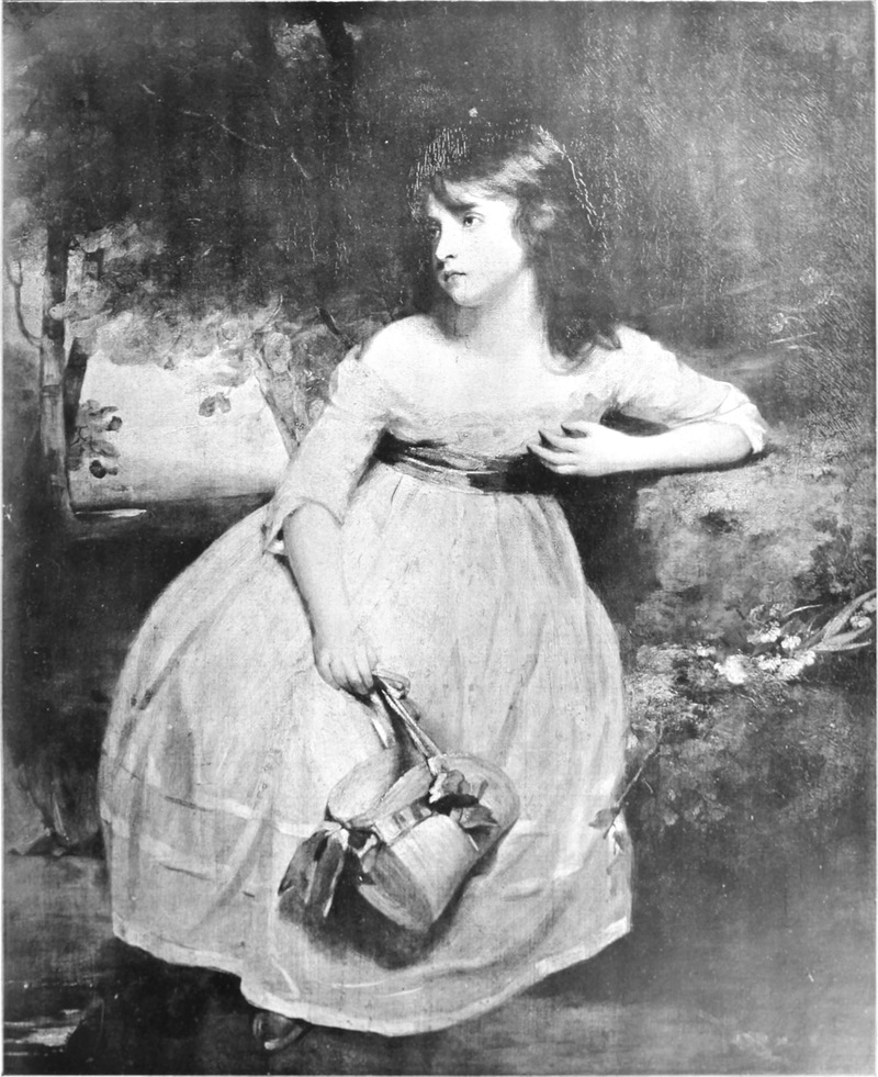

There is at Somerley only one male portrait of great importance by Sir Joshua Reynolds. This represents George, third Duke of Marlborough, and is a magnificent[Pg 218] three-quarter length portrait. The duke wears a rich coat of brown embroidered silk and a mantle of crimson velvet bordered with white fur thrown over his right shoulder; his left arm rests upon a column, and the upper portion of the body is outlined against a beautiful sky background. The pose is evidently inspired by Van Dyck, and the portrait lacks none of the dignity and elegance of the older master. An almost exactly similar painting is in the possession of the Earl of Pembroke, in which however the duke’s dark dress is replaced by one of white embroidered satin. ¶ Some dozen portraits of the usual half-length format (about 30 in. by 25 in.) are contained in the Normanton collection, and not a few of them are of superlative quality. Among the most pleasing is that of the Misses Horneck, as original as it is graceful in composition; many failures have resulted from the attempt thus to group two life-size heads in so small a space, but Sir Joshua has here admirably succeeded in avoiding stiffness and crowding while preserving perfect pictorial unity. Painted in a light key about the year 1775, this picture is in a wonderful state of preservation, having retained all its freshness of tone and delicacy of modelling. An unfinished sketch of the same subject, slightly larger in size, belongs to Sir Henry Bunbury, a descendant of the elder sister’s husband, the caricaturist, Henry William Bunbury. Mrs. Bunbury (Catharine Horneck), who is seen on the right of the group, was Goldsmith’s ‘Little Comedy,’ whilst her sister Mary, afterwards Mrs. Gwyn, is celebrated by him as ‘The Jessamy Bride.’ The excellent though slightly faded portrait of Miss Anne Liddell was bought by the second Lord Normanton at Christie’s in May, 1867, at the sale of Mr. H. A. J. Munro, of Novar, for 225 guineas. Miss Liddell, who is represented in a black low-cut dress and black cloak trimmed with white fur, holding some flowers in her right hand, was a daughter of Lord Ravensworth; she became Duchess of Grafton, and after divorcing in 1769 married the Earl of Upper Ossory. The pair of heads of the Earl and Countess of Pembroke, painted within the last years of the artist’s life, cost Lord Normanton only 30 guineas in 1827. Lord and Lady Pembroke were the parents of Diana, Lady Normanton, and the countess is the same lady whom Sir Joshua represented some years previously as Una with the lion; she wears her peeress’s robes of crimson and ermine over a white low-necked dress, and the earl is in uniform of red and gold. It is interesting to find side by side with these examples of the end of the painter’s career the picture of A Boy Reading, which is inscribed ‘1747, Ja Reynolds pinxit Nov.’ and which is one of the earliest known works of the artist, when he was only twenty-three years of age. It is said to be a portrait of himself, but this is by no means certain, although the boy’s features bear a certain resemblance to those of Sir Joshua. With hair falling over his shoulders, and arms leaning on a table, he reads from a large book which he holds open with both hands; four more books lie on the table beside him. It is related that on seeing this picture after an interval of many years Sir Joshua remarked that he had made but little progress since he painted it. Although this observation must not be taken too literally, there is no doubt that even at this early period he exhibited uncommon mastery of his art. To an early period also, probably between 1755 and 1760, the portrait of Lady Charlotte Johnstone, daughter of the first Earl of Halifax, and that of Mrs. Russell, daughter of Mr. Flountia Vassall, are shown to belong by the marked attention paid to detail, by a certain tightness of drawing, and also by the faded flesh-tints due to Reynolds’s excessive use at this time of brilliant but unstable carmine. Both are painted in profile, wearing rich dresses of similar pattern, with pearls in their ears and round their throat. Probably a little later in date is the very decorative and somewhat French-looking portrait of Miss Meux[Pg 223] (engraved as Miss Muse); she wears a Louis XV costume, the bodice all tucks and frills, and a flat gipsy straw hat trimmed with pink ribbons; she has two rows of pearls round her throat, and the muslin gimp which covers her breast is spotted with little pink rosettes. This is no doubt the picture which Lord Normanton bought for 135 gns. at the Novar sale in 1867, and which was then said to be a portrait of Fanny Reynolds (Sir Joshua’s sister). Another beautiful half-length picture is that of the actress Mrs. Quarrington, as St. Agnes, in a brown dress over which hangs a dark green mantle. She holds a lamb in her arms and a palm branch in her left hand; the pathetic face, surrounded by her loose locks of hair, is upturned in an attitude of prayer. Nor must mention be omitted of a pretty and powerful octagonal study of a little girl’s head with pearls in her hair, the shoulders covered with a light white drapery. ¶ The oval portrait of Mrs. Inchbald is catalogued in more than one volume of recent date as a work by Sir Joshua; it is, however, hard and unconvincing, and the flesh and black dress are too weakly painted not to leave a doubt in one’s mind whether it is not rather the production of one of Reynolds’s pupils, most probably Northcote. It is difficult also to admit the portrait of Admiral Barrington to be entirely from the master’s hand; there is a similar portrait by him in Greenwich Hospital, and it is known that six replicas were made at the time in Sir Joshua’s studio; this is one of them, and, although painted under his supervision, it is probable that his own brush took but little part in the work. Possibly a replica of the famous picture in the Chamberlayne collection, but also more probably the work of a contemporary copyist, is the Lady Hamilton as a Bacchante, a subject rendered familiar by numerous engravings, notably Bartolozzi’s beautiful colour-print. No doubt whatever is possible in the case of The Little Archer, the figure of a boy lying full length in a landscape; here the methods of Sir Joshua are palpably imitated, but the poor drawing and the ugly obtrusiveness of the boy’s white stockings preclude any possibility of the master having in any way contributed to its painting. ¶ A number of acknowledged copies of pictures by Sir Joshua Reynolds are also to be found at Somerley, and some are not devoid of merit. Among the best may be mentioned Mrs. Siddons as the Tragic Muse, painted by the Duchess of Buckingham, from the original now at Grosvenor House, of which a genuine replica hangs at Dulwich; also Mrs. Gwyn in Persian costume, a good contemporary reproduction of the picture which belongs to Mr. W. W. Astor. ¶ It would be difficult to exaggerate the importance of this group of pictures by Sir Joshua Reynolds; the genius of the Royal Academy’s first president is displayed at Somerley in its every phase, and each period of his career is represented by one or more works of the highest artistic value; there, he can be studied as it is impossible to study him elsewhere, at the same time that a comparison can be made with masterpieces of other great English painters which hang in Lord Normanton’s magnificent gallery.
There is only one significant male portrait by Sir Joshua Reynolds at Somerley, depicting George, the third Duke of Marlborough. It's a stunning three-quarter length portrait. The duke is dressed in a lavish brown embroidered silk coat and a crimson velvet mantle edged with white fur draped over his right shoulder. His left arm rests on a column, and the upper part of his body is set against a beautiful sky backdrop. The pose clearly draws inspiration from Van Dyck, and the portrait maintains the dignity and elegance characteristic of the older master. A nearly identical painting belongs to the Earl of Pembroke, though in this version, the duke wears a white embroidered satin suit instead. The Normanton collection includes around a dozen portraits in the usual half-length style (approximately 30 by 25 inches), many of which are of exceptional quality. One of the most charming is the portrait of the Misses Horneck, which is both original and graceful in its composition. Grouping two life-sized heads in a small space sometimes leads to awkward results, but Sir Joshua successfully avoids stiffness and crowding while achieving perfect pictorial unity. Painted in light tones around 1775, this piece remains wonderfully preserved, retaining its freshness in color and delicacy in the modeling. An unfinished sketch of the same subject, slightly larger, belongs to Sir Henry Bunbury, a descendant of the elder sister’s husband, the caricaturist Henry William Bunbury. Mrs. Bunbury (Catharine Horneck), seen on the right of the group, was known as Goldsmith’s ‘Little Comedy,’ while her sister Mary, later Mrs. Gwyn, became famous in his work as ‘The Jessamy Bride.’ The slightly faded but excellent portrait of Miss Anne Liddell was purchased by the second Lord Normanton at Christie’s in May 1867, at the sale of Mr. H. A. J. Munro of Novar, for 225 guineas. Miss Liddell, depicted in a black low-cut dress and black cloak trimmed with white fur while holding flowers in her right hand, was a daughter of Lord Ravensworth; she later became Duchess of Grafton and, after divorcing in 1769, married the Earl of Upper Ossory. The pair of portraits of the Earl and Countess of Pembroke, painted in the last years of the artist's life, cost Lord Normanton only 30 guineas in 1827. Lord and Lady Pembroke were the parents of Diana, Lady Normanton, and the countess is the same lady who was earlier depicted by Sir Joshua as Una with the lion; she wears her peeress's robes of crimson and ermine over a white low-necked dress, while the earl appears in a red and gold uniform. It’s intriguing to find, alongside these later works, the painting titled A Boy Reading, dated ‘1747, Ja Reynolds pinxit Nov.’ This is one of the earliest known works of the artist, painted when he was only twenty-three. It is believed to be a self-portrait, though this is not certain, even though the boy does resemble Sir Joshua. With his hair falling over his shoulders and arms resting on a table, he's reading from a large book held open with both hands, with four more books lying on the table next to him. It’s said that when Sir Joshua saw this painting after many years, he remarked that he hadn't made much progress since then. Though this comment shouldn’t be taken too literally, it's clear that even at this early stage, he demonstrated significant mastery of his art. The portraits of Lady Charlotte Johnstone, daughter of the first Earl of Halifax, and Mrs. Russell, daughter of Mr. Flountia Vassall, also belong to this early period, probably between 1755 and 1760, indicated by the attention to detail, the tightness of the drawing, and the faded flesh tones resulting from Reynolds's excessive use of brilliant yet unstable carmine at that time. Both are painted in profile, wearing similarly patterned rich dresses, with pearls adorning their ears and necks. A bit later, the decorative and somewhat French-inspired portrait of Miss Meux (engraved as Miss Muse) features her in a Louis XV-style outfit, complete with a bodice adorned with tucks and frills and a flat gypsy straw hat trimmed with pink ribbons. She has two pearl strands around her neck, and the muslin trim that covers her chest features tiny pink rosettes. This is likely the portrait that Lord Normanton acquired for 135 guineas at the Novar sale in 1867, which was rumored then to be a portrait of Fanny Reynolds (Sir Joshua’s sister). Another striking half-length painting is of the actress Mrs. Quarrington as St. Agnes, shown in a brown dress with a dark green mantle. She cradles a lamb and holds a palm branch in her left hand; her poignant face, framed by loose hair, is turned up in prayer. There’s also a lovely and powerful octagonal study of a little girl's head adorned with pearls in her hair, her shoulders draped in light white fabric. The oval portrait of Mrs. Inchbald is listed in several recent volumes as a work by Sir Joshua; however, it appears hard and unconvincing, with weakly painted flesh and black dress that make it doubtful if it’s genuinely his work rather than that of one of his pupils, most likely Northcote. It's also hard to fully attribute the portrait of Admiral Barrington to him; there's a similar portrait by him in Greenwich Hospital, and it is known that six replicas were made in Sir Joshua’s studio at the time. This is likely one of them, painted under his supervision, but it’s probable that his own brush was minimally involved. A potential replica of the famous picture in the Chamberlayne collection, but more likely the work of a contemporary copyist, is the depiction of Lady Hamilton as a Bacchante, a subject familiar from numerous engravings, especially Bartolozzi’s exquisite color print. There is no doubt about the case of The Little Archer, the image of a boy lying full length in a landscape; the techniques of Sir Joshua are clearly imitated here, but the poor drawing and the glaring white stockings on the boy prevent any possibility of it being painted by the master himself. A number of acknowledged copies of Sir Joshua Reynolds's works can also be found at Somerley, and some have their merits. Among the best are Mrs. Siddons as the Tragic Muse, painted by the Duchess of Buckingham from the original at Grosvenor House, with a genuine replica hanging at Dulwich; also, Mrs. Gwyn in Persian costume, a good contemporary reproduction of the painting that belongs to Mr. W. W. Astor. The significance of this group of pictures by Sir Joshua Reynolds cannot be overstated; the genius of the first president of the Royal Academy is showcased at Somerley in all its phases, with each period of his career represented by one or more works of the highest artistic value. Here, he can be studied in a way that is impossible anywhere else, while comparisons can be made with masterpieces of other great English painters displayed in Lord Normanton’s magnificent gallery.
[Pg 224]
[Pg 224]


FRENCH FURNITURE OF THE SEVENTEENTH AND EIGHTEENTH CENTURIES[83]
❧ WRITTEN BY ÉMILE MOLINIER ❧
❧ WRITTEN BY ÉMILE MOLINIER ❧
ARTICLE II.—THE LOUIS XIV STYLE—(continued)
THE GOBELINS
The Gobelins
T would certainly be unfair to consider Louis XIV and espeacially Colbert, from the point of view of the part played of the royal manufactory of crown furniture at the Gobelins, as being merely unconscious instruments. There is no doubt that a formal act of will on their part entered into this creation. But, once having done this justice, especially to Colbert, we are bound to remark, if we would wish to take a sane view of events, that an institution of this kind was, at the moment when it was established in France, the result of a series of previous efforts, all turned in the same direction; was the result also of a general movement of centralization which was to be one of the sources of weakness, of the system of government adopted in France. ¶ The founding of the academy of painting and sculpture had completed the organization of art in the great sense; the founding of the manufactory of the Gobelins was destined to bring about the centralization of the minor arts and to strike a blow at the old edifice of the rules of the corporations. We must make no mistake: from the artistic point of view, the monarchy largely began the salutary work of emancipation which the French Revolution was to complete, and we may well be surprised that right-minded persons should discover a source of weakness and decadence in the modifications introduced into the life of the workshops. To be logical we should have to blame the monarchy itself, which, nearly 150 years before the Revolution, began, by a devious course it is true, to take away all force from restrictive laws, from rules and regulations which already seemed out of date at the end of the middle ages. It will be seen that, though the complete abolition of the rules of the corporations did, in certain cases, become a cause of confusion, we should do wrong to look upon it as the sole cause of the degeneration in artistic feeling in the minor arts at the commencement of the nineteenth century. The suppression of the corporations under the Revolution was as inevitable an event as was under Louis XIV the establishment of official artistic workshops. The whole lay in the manner of setting to work to decree those two measures. ¶ To second his views, Colbert was fortunate enough to have at hand an exceptional man, one who was at the same time an organizer and an artist, two qualities rarely united in one and the same brain; and he also had the good sense to select him in spite of appearances. He did more, for after selecting him he left him the most complete liberty. And yet Charles Le Brun might have passed as suspect in the minds of both the king and Colbert. ¶ Born in Paris on February 24, 1619, Charles Le Brun was the son of Nicholas Le Brun, a sculptor. His first masters were Perrier, a Burgundian painter, and Simon Vouet; and it was doubtless through Vouet’s intermediary that he became acquainted with the Chancellor Séguier, in whom he was later to find a firm friend and a constant protector. Some works executed for the Cardinal de Richelieu[Pg 229] earned for him the title of painter to the king in 1638. In 1642, he accompanied Nicolas Poussin to Rome and was admitted as a master-painter into the corporation. He returned to Paris in 1646, received the title of valet de chambre to the king, and married Suzanne Butay, a painter’s daughter. ¶ A law-suit between the wardens of the Gild of Painters and the king’s painters, the so-called ‘patent painters,’ suddenly made Le Brun conspicuous, and, after the favourable decision pronounced by the parliament, with the support of Séguier he contributed not a little towards the definite foundation of the academy of painting (1648). But, while fighting strenuously for the principles of his art, Le Brun neglected no opportunity of practising it, and executed for a number of Paris mansions a series of large decorative compositions, for which he had acquired the taste in Italy. The houses of Bertrand de la Bazinière, treasurer of the Épargne; of Marshal d’Aumont; of the Chevalier de Jars; of Inselin, treasurer of the Chambre aux Deniers; of Lambert de Thorigny, president of the Chambre des Comptes, were decorated by him in turns. In the last of these mansions he painted the Galerie d’Hercule, which still exists, and the sight of which eventually determined the Superintendent Fouquet to send for Le Brun to Vaux (1657). Here, in the sumptuous residence of Vaux, of which Fouquet was to have the enjoyment for so short a while, Le Brun displayed his full powers. He not only painted or designed such compositions as the Apothéose d’Hercule, the Triomphe de la Fidélité, L’Aurore, Le Sommeil, the Palais du Soleil, but he also directed the sculptors, ornament workers and silversmiths, the tapestry workers and embroiderers, and managed the manufactory of high-warp tapestry established by Fouquet at Maincy. He supplied so large a number of models and cartoons for tapestry, that many of his compositions could be executed only much later at the manufactory of the Gobelins; the Chasses de Méléagre, Mars et Venus, Jupiter allaité par la chèvre Amalthée, five pieces representing the history of Constantine, the Muses, all bear witness to the prodigious fertility of an artist who, like the great Italians of the Renaissance, was lavish in production while developing his admirable administrative qualities. ¶ If these gigantic works at the Château de Vaux had not succeeded in earning for him the esteem of Mazarin and of the queen-mother, Anne of Austria, and also in drawing the attention of the king (for Le Brun was the organizer of the great fêtes given by the Superintendent in 1659), it might have happened that our artist would have incurred the same disgrace as his patron. Very fortunately this was not so; for once talent was able to silence envy, and Le Brun was admirably served by circumstances. In 1660, the king ordered a large picture of him, Alexandre pénétrant dans la tente de Darius, and the city of Paris instructed him to erect a triumphal arch on the Place Dauphine for the entry into Paris of Louis XIV and his queen, Maria Theresa. In 1661 he entered into relations with Colbert; in 1662 he received the much-coveted title of ‘first painter to the king.’ We see, therefore, that his connexion with Fouquet—and it does not seem that Le Brun was ever placed in the painful situation of having to deny the man who had enabled him to make his mark—so far from harming him, had, on the contrary, done him good service. Perhaps the king, at the same time that Colbert began to suspect his exceptional powers as an organizer and administrator, recognized in Le Brun one of those men who were to be so useful to his thirst for stately glory and royal pomp.
T would certainly be unfair to view Louis XIV and especially Colbert solely as unconscious instruments regarding the royal manufactory of crown furniture at the Gobelins. There's no doubt that they made a conscious decision to create this institution. However, once we acknowledge the credit due, especially to Colbert, we must note that this type of institution, at the time it was established in France, resulted from a series of prior efforts all aimed in the same direction; it was also a product of a broader movement toward centralization, which ultimately contributed to the governmental weaknesses in France. ¶ The founding of the academy of painting and sculpture completed the organization of art in a broad sense; the establishment of the Gobelins manufactory aimed to centralize the minor arts and undermine the old structure of guild rules. We must not be mistaken: from an artistic standpoint, the monarchy initiated the beneficial work of liberation that the French Revolution would later finish, and it is surprising that sensible individuals would see a source of weakness and decline in the changes made in workshop life. To be consistent, we would have to blame the monarchy itself, which, nearly 150 years before the Revolution, began, albeit in a roundabout way, to weaken restrictive laws and regulations that had already seemed outdated by the end of the Middle Ages. It will be noted that while the total removal of guild rules did, in some cases, lead to confusion, it would be wrong to consider it the sole reason for the decline in artistic sensibility within the minor arts at the start of the nineteenth century. The dismantling of the guilds during the Revolution was as inevitable as the establishment of official artistic workshops under Louis XIV. The key lies in how these two measures were implemented. ¶ To support his vision, Colbert was fortunate to have an exceptional individual on hand—someone who was simultaneously an organizer and an artist, two qualities rarely found together in one person; he also wisely chose him despite appearances. Furthermore, after selecting him, he granted him complete freedom. Yet, Charles Le Brun could have appeared suspect in the eyes of both the king and Colbert. ¶ Born in Paris on February 24, 1619, Charles Le Brun was the son of Nicholas Le Brun, a sculptor. His first teachers were Perrier, a painter from Burgundy, and Simon Vouet; it was likely through Vouet that he became acquainted with Chancellor Séguier, who later became a firm friend and consistent supporter. Some works done for Cardinal de Richelieu[Pg 229] earned him the title of painter to the king in 1638. In 1642, he accompanied Nicolas Poussin to Rome and was admitted as a master painter into the guild. He returned to Paris in 1646, received the title of valet de chambre to the king, and married Suzanne Butay, the daughter of a painter. ¶ A lawsuit between the guild leaders of painters and the king’s painters, known as the ‘patent painters,’ suddenly brought Le Brun into the spotlight, and after the favorable verdict by parliament, with Séguier's support, he played a significant role in the formal establishment of the academy of painting (1648). However, while he vigorously defended the principles of his art, Le Brun seized every opportunity to practice it, creating a series of large decorative compositions for various Parisian estates, a taste he had developed in Italy. The homes of Bertrand de la Bazinière, treasurer of the Épargne; Marshal d’Aumont; Chevalier de Jars; Inselin, treasurer of the Chambre aux Deniers; and Lambert de Thorigny, president of the Chambre des Comptes, were each decorated by him in turn. In the last of these homes, he painted the Galerie d’Hercule, which still exists today, and seeing it eventually led the Superintendent Fouquet to invite Le Brun to Vaux (1657). Here, in the opulent residence of Vaux, where Fouquet would enjoy too briefly, Le Brun showcased his full abilities. He not only painted or designed compositions like the Apothéose d’Hercule, the Triomphe de la Fidélité, L’Aurore, Le Sommeil, and the Palais du Soleil, but he also directed the sculptors, ornament makers, silversmiths, tapestry workers, and embroiderers, overseeing the high-warp tapestry manufactory established by Fouquet at Maincy. He provided so many models and cartoons for tapestry that many of his compositions could only be executed at the Gobelins manufactory much later; the Chasses de Méléagre, Mars et Venus, Jupiter allaité par la chèvre Amalthée, and five pieces depicting the story of Constantine and the Muses all testify to the incredible productivity of an artist who, like the great Italians of the Renaissance, was prolific while also developing his remarkable administrative skills. ¶ If these monumental works at the Château de Vaux had not succeeded in winning the esteem of Mazarin and Queen Anne of Austria, and also in attracting the king's attention (Le Brun organized the grand fêtes given by the Superintendent in 1659), it could have led to Le Brun facing the same disgrace as his patron. Thankfully, this was not the case; talent managed to outshine envy, and Le Brun was beautifully supported by circumstances. In 1660, the king commissioned a large painting from him, Alexandre pénétrant dans la tente de Darius, and the city of Paris requested him to create a triumphal arch on the Place Dauphine for the arrival of Louis XIV and his queen, Maria Theresa. In 1661, he engaged in relations with Colbert; in 1662, he received the highly sought-after title of ‘first painter to the king.’ Thus, we see that his connection with Fouquet—and it doesn’t seem that Le Brun ever had to deny the man who helped him gain recognition—benefited him rather than harmed him. Perhaps the king, while Colbert started to suspect his exceptional abilities in organization and management, recognized in Le Brun one of those individuals who would be incredibly useful to his aspirations for grand glory and royal splendor.


One last circumstance enabled Le Brun to make himself absolutely indispensable to the king’s glory. On February 6, 1661, the first floor of the small gallery of the Louvre was almost totally destroyed by fire. Our artist was commissioned to renew its decoration; he made of this a monument to the glory of Apollo,[Pg 230] the god of the sun, a delicate attention which enabled him to indulge in more or less delicate allusions with his brush to the king himself. All the works—which, for that matter, were never finished under Louis XIV: the works at the other royal residences, and particularly at Versailles, thrust the Galerie d’Apollon into the background—were directed solely by Le Brun: he got together a little army of sculptors and decorators, among whom we recall the names of Gaspard and Balthazar de Marsy, François Girardon, Thomas Regnauldin, Monnoyer, the brothers Lemoyne and Ballin, whose fortunes were thenceforth closely linked with those of the first painter to the king. ¶ The letters patent of Louis XIV instituting the ‘royal manufactory of crown furniture’ are dated November 1667, but they sanction a state of things that existed as far back as 1663. I shall analyse briefly this deed of foundation, most of whose dispositions it is very important for us to know, showing as they do how the machinery of administration was capable of being simplified in the seventeenth century. Let me here remind my readers that the name of ‘Gobelins,’ which to-day serves to designate the tapestries issuing from the famous manufactory, dates back to the fifteenth century. At that time a dyer called Jean Gobelin, a native of Rheims, settled on the banks of the little river Bièvre. His trade prospered so well that his name was given to his house and workshop, near to which came to live Marc de Comano and François de la Planche, the Flemish upholsterers installed in Paris by Henry IV. In 1662 Colbert joined the old house of the Gobelins to the workshops of the descendants of Comano and La Planche; and on these premises was installed the new manufactory which was destined to perpetuate the memory of the name of the humble dyer of the fifteenth century.
One last factor made Le Brun totally essential to the king’s glory. On February 6, 1661, the first floor of the small gallery in the Louvre was nearly completely destroyed by fire. The artist was tasked with renewing its decoration; he turned this into a tribute to the glory of Apollo, the sun god, which allowed him to make subtle references to the king himself through his artwork. All the projects—which, by the way, were never completed under Louis XIV: the work at the other royal residences, especially at Versailles, overshadowed the Galerie d’Apollon—were solely directed by Le Brun: he assembled a small team of sculptors and decorators, including Gaspard and Balthazar de Marsy, François Girardon, Thomas Regnauldin, Monnoyer, the Lemoyne brothers, and Ballin, whose fortunes became closely tied to the king's chief painter. ¶ The letters patent from Louis XIV establishing the ‘royal manufactory of crown furniture’ are dated November 1667, but they confirm a situation that had been in place since 1663. I will briefly analyze this founding document, as its provisions are important for us to understand, illustrating how the administration could be streamlined in the seventeenth century. I want to remind my readers that the name ‘Gobelins,’ which today refers to the tapestries produced by the famous manufactory, dates back to the fifteenth century. At that time, a dyer named Jean Gobelin, originally from Rheims, settled along the banks of the little river Bièvre. His business thrived so much that his name was given to his house and workshop, near which Marc de Comano and François de la Planche, the Flemish upholsterers brought to Paris by Henry IV, also took up residence. In 1662, Colbert merged the old house of the Gobelins with the workshops of Comano and La Planche's descendants; and it was in these premises that the new manufactory was established, meant to honor the legacy of the humble dyer from the fifteenth century.
(To be continued.)
(To be continued.)
[Pg 235]
[Pg 235]
THE EXHIBITION OF GREEK ART AT THE BURLINGTON FINE ARTS CLUB
❧ WRITTEN BY CECIL SMITH ❧
❧ WRITTEN BY CECIL SMITH ❧

VERY man of taste will congratulate himself that England is the seat and the refuge of the arts; and that so many genuine remains of ancient sculpture are present in our cabinets.’ So wrote James Dallaway at the beginning of last century, and, although some may think that the arts have now somewhat altered their habits, there is no doubt that this country still remains pre-eminent in the wealth of its private collections of Greek antiquities. If proof were needed, this admirable little collection would afford it. When the scheme was first mooted of a Greek exhibition at the Burlington Club, a moderate scepticism was not altogether unnatural. The former attempt in 1888 had not been exactly an enthusiastic success, and somehow the club itself appeared to be a somewhat stern soil for so tender a plant. A society of dilettanti, with grave and reverend opinions upon every conceivable form of bigotry and virtue, might be expected either to adopt an attitude of cold aloofness or to overlay its offspring with excessive and even (may one whisper it?) injudicious appreciation. But we never know where a blessing may light, and, if one may judge from the assiduous attention the exhibition has received, not only from the sternest critics of the club, but from the smart ladies of at least two capitals, a new era has dawned for Greek art; if it only lasts long enough, intrepid explorers will be found invading Bloomsbury, and the British Museum will cease to offer cool solitudes for the peaceful reflection of the philosopher and student. ¶ For the general public who have little time or inclination for long museum galleries, this sort of exhibition has much to recommend it; the intelligent public likes to have its culture prescribed for it in tabloid[Pg 236] form—a small dose, unmistakably potent, which can be easily digested between meals. To this form of requirement the Burlington Club is admirably adapted: a single room, with just enough space for arranging a few good things. Mrs. Strong and her committee are so much to be congratulated that it seems ungracious to grumble; but personally I should have preferred to turn out about half of the less fine objects. It was difficult, no doubt; the susceptibilities of lenders are not lightly to be trifled with; but Greek art, more than most things, needs plenty of breathing space, and the exhibition would have gained by a judicious depletion. ¶ I think it was M. Piot who used to carry always in his waistcoat pocket a few of the choicest Greek coins (those being the most portable forms of the best art), as he said, ‘to correct his eye’; that was undoubtedly a true instinct. When all is said and done, Greek art will always serve as an admirable corrective—within its limits of course, for painting is obviously excluded—and that is at least some comfort in these impressionist days, when new creeds lie about like leaves in Vallombrosa. ¶ I overheard one day a visitor to this exhibition angrily resenting the suggestion that Greek art at its best could be compared for a moment with the master works of the middle ages. It is a large question, which there is no space here to argue, only I do not think it is so easily dismissed as the hasty critic supposed. I should even be prepared to stand by some of the objects here exhibited. After all, it is in many cases the same plant growing up under differing conditions of time and circumstance. Some day perhaps the club may be persuaded to try the experiment of showing side by side some of the finest parallel achievements of antiquity and the three centuries of mediaeval Europe.
VERY man with taste will be proud that England is the home and sanctuary of the arts, and that so many authentic pieces of ancient sculpture are in our collections. So wrote James Dallaway at the beginning of the last century, and while some may feel that the arts have changed their ways a bit, it’s clear that this country still stands out with its vast private collections of Greek antiquities. If proof is needed, this excellent little collection offers it. When the idea of a Greek exhibition at the Burlington Club was first proposed, a bit of skepticism seemed reasonable. The previous attempt in 1888 wasn’t exactly a rousing success, and the club itself felt like a stiff environment for such a delicate venture. A society of enthusiasts, with serious opinions on every form of prejudice and virtue, might either remain coldly detached or smother its creation with excessive and perhaps (if I may say so?) misguided praise. But you never know where a blessing might come from, and judging by the enthusiastic attention the exhibition has received—not only from the most critical members of the club but also from fashionable ladies in at least two capitals—a new era could be beginning for Greek art; if it lasts long enough, daring explorers might soon invade Bloomsbury, and the British Museum will stop being a quiet refuge for philosophers and students. ¶ For the general public, who often lack the time or inclination to wander through lengthy museum halls, this kind of exhibition has a lot to offer; the discerning public appreciates having its culture served up in compact form—something small but undeniably powerful, easy to digest between meals. The Burlington Club is perfectly suited to this need: a single room, just spacious enough to display a few great works. Mrs. Strong and her committee deserve congratulations to the point that it seems rude to complain; however, personally, I would have preferred to remove about half of the less impressive pieces. It was undoubtedly a tough decision; the feelings of lenders shouldn’t be taken lightly; but Greek art, more than most, requires ample breathing space, and the exhibition would have benefited from a careful reduction. ¶ I think it was M. Piot who always kept a few of the choicest Greek coins in his waistcoat pocket (since they are the most portable examples of great art), to “correct his eye,” as he put it; this was indeed a true instinct. In the end, Greek art will always provide a wonderful correction—within its limits of course, since painting is obviously excluded—and that is some solace in these impressionist times, when new movements scatter like leaves in Vallombrosa. ¶ I once overheard a visitor to this exhibition angrily rejecting the idea that the best Greek art could be compared, even for a moment, to the masterpieces of the middle ages. It’s a big question that can’t be fully addressed here, but I don’t think it can be so easily dismissed as the quick critic suggested. I would even be ready to defend some of the pieces on display here. After all, in many cases, it’s the same plant thriving under different conditions of time and circumstance. Perhaps someday the club will be persuaded to experiment with displaying some of the finest achievements of antiquity alongside those from the three centuries of medieval Europe.


And I am not sure that[Pg 237] the plan might not be adopted with advantage in museums, of having a small room, like the tribuna at Florence for instance, with a florilegium of the best things of all dates; it would be both physically and mentally a boon to many a weary wayfarer. ¶ The most obvious point of comparison with the classical is the work of the classicists of north-east Italy, who, already at the end of the trecento, were beginning a formal but intelligent study of the antique. It would be instructive to see works of Donatello and John of Bologna side by side with their Greek counterparts; a Syracusan decadrachm of Kimon or Euainetos beside a medal of Pisanello or Sperandio. ¶ One bronze in the Burlington Club especially seems to challenge this comparison—the big mounted warrior (No. 53), which at first sight suggests a kind of glorified gothic aquamanile. A reviewer in the Athenaeum points out the ‘research for elegance which already characterizes this figure,’ and which he considers to mark the essential difference between the Greeks and their successors. ‘Whereas the Greek,’ he says, ‘feels most keenly the planes, to the northern and Italian artists it is the ridges that count.’ This seems to me to be a plausible generalization from imperfectly perceived facts. The world-old contrast of the ideal and the real naturally went on in Greek art as it has gone on in every other art; but less among the Greeks, because for most of their history they steadily withstood realism; they believed and acted upon Shakespeare’s ‘Nature is made better by no mean, but nature makes that mean.’ At a late period realism became too strong for them, and the Pergamene school was the beginning of the end. Surely the broad contrasting of planes is not the characteristic of a race, but of a stage of development. Obviously the sculptor in marble or wood is bound to set out by blocking out his figure in broad planes: relative development shows itself in the amount of skill which the artist exhibits in graduating and refining these planes into each other. Early Greek art shows this particularly, because it derived largely from Egyptian traditions, and was long in breaking loose from set canons. But it is none the less true of all sculpture in which an historical development can be traced. The history of Italian sculpture down to Michael Angelo is so much under classical influence that its evolution may almost be said to be an index of its information regarding Greek art. Michael Angelo unfortunately corresponds to the Pergamene stage. Already, before his day, the great Italian medallists had shown in their medal work what is probably, outside of classical times, the nearest approach to the best Greek relief, and they worked largely on Greek lines. It is not by coincidence alone that the helmeted knight on the well-known medal of Ludovico Gonzaga naturally suggests an analogy to the bronze now exhibited. In both cases the simple effect is attained by a judicious elimination, by contrasted planes, and by a skilful co-ordination into an harmonious whole. ¶ This bronze is said to have been found at Grumentum, in Lucania, a city which, as its name and its geographical position show, was never a Greek colony, though latterly a town of some importance. Probably it found its way there in the course of Corinthian traffic: the long-bodied horse, the unusual subject of a helmeted horseman, the treatment of mane and tail, are all characteristic rather of the Corinthian art of the sixth century B.C.; and we know how active the Corinthian colonists were at that period in south Italy. ¶ The same characteristic treatment is seen in the splendid bronze head from Chatsworth (No. 8). It is an Apollo rather over life size, belonging to that interesting transitional stage which immediately precedes the Parthenon. In this case, however, the archaism is partly conscious; the artist realizes the maxim peu de moyens, beaucoup d’effet, and uses it to advantage. The type chosen is that of a strong virile athlete, with hair still long, but just budding into manhood,[Pg 243] the Βούπαις (‘bully boy’), as Furtwängler points out, of an epigram on a contemporary statue of him by Onatas. What a contrast this to the soft and dreamy Sauroktonos of the succeeding century: with its almost architectural symmetry, its vigorous subordination of all search for detail to general effect, and its mathematical balance of large lines and large planes, it seems to stand as a visible protest against weakness and effeminacy. As Emerson puts it, this one head might be the indemnification for populations of pygmies or weaklings. The step from this to the Parthenon is short in point of years, but is artistically an interval which is strongly defined, for within its limit Greek sculpture has entered into its birthright. This stage is nobly represented in the exhibition by the fragment from a slab of the north frieze of the Parthenon, reproduced in Plate I. Broken away probably at the time of the Venetian bombardment, it seems to have been acquired in Athens by Stuart, who sent it to Smyrna; a few years ago it was dug up beside a rockery in a garden in Essex; what its movements were between Smyrna and Essex is matter for conjecture. A former owner of the Essex property was a Mr. Astle, who was a trustee of the British Museum, and may be supposed to have had an interest in antiquities: habent sua fata, these flotsam relics of antiquity: this is not the only marble in the exhibition which has been excavated on English soil. The head (No. 24), which early in the seventeenth century belonged to the famous Arundel collection, was recently dug up by a navvy in London close to the Temple, on the site that was once part of the Arundel house garden. ¶ The surface of the Parthenon fragment has suffered, of course, but not so grievously as might be expected. It gives the head of one of the mounted knights of the north frieze, and the horse’s head of the figure immediately following him. The youth is from northern Greece, probably from one of the Thracian colonies of Athens, as his Thracian headdress of foxskin (the alopeke) shows. That his horse is in movement even the fragment makes clear by the light tresses of hair blown backward beneath his cap, of which the heavy tail is itself curved outward by the motion; but his eyes are intently set on his forward path, and the firm and straight yet supple poise of neck and torso bespeak his ‘magic horsemanship.’ The figure behind him (preserved in the British Museum), a squadron commander or marshal, turns partly round in his seat, checking his horse, apparently to give an order to his section; with the suddenness of the action the horse’s mouth is wrenched open and his head thrown back, the plaited forelock swings upward, and every muscle is tense; the motive is a subtle variation on the theme represented by the splendid horse’s head of Selene or Night in the eastern pediment, but with this principal difference, that while this horse is answering to its rider’s curb, the Selene horse is probably starting back of its own accord, in alarm at taking the downward plunge. Now that this beautiful fragment has found its way to London, is it too much to hope that it may make one more journey—and that its last—to Bloomsbury, and rejoin the slab to which it fits?
And I'm not sure that[Pg 237] the plan wouldn't be beneficial in museums, having a small room, like the tribuna in Florence, for example, with a collection of the best items from all periods; it would be both a physical and mental boost for many tired visitors. ¶ The most obvious comparison with classical art is the work of the classicists from northeast Italy, who, by the end of the 14th century, were starting to engage in a formal but thoughtful study of the ancient. It would be enlightening to see works by Donatello and Giovanni Bologna displayed next to their Greek counterparts; a Syracusan decadrachm by Kimon or Euainetos alongside a medal by Pisanello or Sperandio. ¶ One bronze at the Burlington Club, in particular, seems to invite this comparison—the large mounted warrior (No. 53), which at first glance resembles a kind of glorified Gothic aquamanile. A reviewer in the Athenaeum notes the ‘search for elegance that characterizes this figure,’ which he believes marks a key difference between the Greeks and their successors. ‘While the Greek,’ he says, ‘focuses on the planes, for Northern and Italian artists, it’s the ridges that matter.’ This seems to me a valid generalization based on partially understood facts. The age-old contrast between the ideal and the real continued in Greek art as it has in every other art form; but it was less pronounced among the Greeks because, for most of their history, they consistently resisted realism; they believed and acted on Shakespeare’s idea that ‘Nature is made better by no means, but nature makes that mean.’ In later times, realism became too overpowering for them, and the Pergamene school marked the beginning of the decline. Surely, the broad contrast of planes isn't a trait of a particular race, but rather a phase of artistic development. Clearly, a sculptor working in marble or wood has to begin by shaping his figure in broad planes: variations in skill are evident in how the artist refines and blends these planes together. Early Greek art exemplifies this particularly well because it largely stemmed from Egyptian traditions and took a long time to break away from established norms. But this holds true for all sculpture with a traceable historical evolution. The history of Italian sculpture up to Michelangelo is so deeply rooted in classical influence that its development can almost be seen as a reflection of its understanding of Greek art. Unfortunately, Michelangelo aligns with the Pergamene stage. Even before his time, the great Italian medallists had demonstrated in their medal work what is likely, outside of classical periods, the closest approximation to the finest Greek relief, and they largely followed Greek methods. It’s no coincidence that the helmeted knight on the famous medal of Ludovico Gonzaga naturally evokes a comparison to the bronze currently on display. In both cases, the simple effect is achieved through careful elimination, contrasting planes, and skillful coordination into a harmonious whole. ¶ This bronze is said to have been found at Grumentum, in Lucania, a city which, by name and geographic location, was never a Greek colony, though it became a town of some importance later on. It probably made its way there through Corinthian trade: the long-bodied horse, the unusual subject of a helmeted horseman, and the way the mane and tail are treated are all typical of Corinthian art from the sixth century BCE; and we know how active the Corinthian colonists were in southern Italy at that time. ¶ The same stylistic treatment is evident in the magnificent bronze head from Chatsworth (No. 8). It’s an Apollo figure slightly larger than life, representing that fascinating transitional stage just before the Parthenon. In this case, however, the archaism is somewhat deliberate; the artist is aware of the principle peu de moyens, beaucoup d’effet, and uses it effectively. The type depicted is that of a strong, virile athlete, with hair still long but just starting to mature, [Pg 243] the Βούπαις (‘bully boy’), as Furtwängler points out, from an epigram on a contemporary statue of him by Onatas. What a contrast to the soft and dreamy Sauroktonos from the following century: with its nearly architectural symmetry, its vigorous focus on overall effect rather than detail, and its mathematical harmony of large lines and broad planes, it stands as a clear statement against weakness and effeminacy. As Emerson puts it, this single head could compensate for entire populations of pygmies or weaklings. The leap from this piece to the Parthenon is short in terms of years, but artistically it represents a distinct interval, as within this boundary Greek sculpture has claimed its rightful place. This stage is magnificently represented in the exhibition by the fragment from a slab of the north frieze of the Parthenon, depicted in Plate I. Likely broken during the Venetian bombardment, it appears to have been acquired in Athens by Stuart, who sent it to Smyrna; a few years ago, it was unearthed beside a rockery in a garden in Essex; what its journey was between Smyrna and Essex remains a subject of speculation. A previous owner of the Essex estate was Mr. Astle, a trustee of the British Museum, who presumably had an interest in antiquities: habent sua fata, these remnants of antiquity: this isn't the only marble in the exhibition that has been dug up on English soil. The head (No. 24), which belonged to the famous Arundel collection early in the seventeenth century, was recently discovered by a laborer in London near the Temple, on what was once part of the Arundel house garden. ¶ The surface of the Parthenon fragment has certainly been affected, but not as severely as one might expect. It depicts the head of one of the mounted knights from the north frieze, along with the horse's head of the figure directly following him. The youth is from northern Greece, likely from one of the Thracian colonies of Athens, as indicated by his Thracian headdress made of foxskin (the alopeke). Even this fragment makes it clear that his horse is in motion, evidenced by the light strands of hair blown back under his cap, and the heavy tail that curls outward from the movement; yet his gaze is intensely focused forward, and the firm, straight, yet flexible position of his neck and torso reveals his ‘magic horsemanship.’ The figure behind him (preserved in the British Museum), a squadron leader or marshal, is turned slightly in his seat, holding back his horse, seemingly to give an order to his section; in the suddenness of the movement, the horse’s mouth is pulled open, and its head is thrown back, with the braided forelock swinging upwards, every muscle tensed; the action is a subtle variation on the theme represented by the magnificent horse's head of Selene or Night in the eastern pediment, but with this key difference: while this horse responds to its rider's command, the horse of Selene is likely rearing back of its own accord, startled by the impending downward plunge. Now that this stunning fragment has reached London, is it too much to hope that it might make one more journey—and that its final destination—back to Bloomsbury, to reunite with the slab to which it belongs?


From Pheidias it is natural to turn to that other sculptor who shared with him the glory of the latter part of the fifth century. Polykleitos, the leader of the Argive school, did for the physical ideal what Pheidias had done for the religious. His earliest recorded work, the statue of a boy-boxer crowning himself with a wreath, set up at Olympia about 440 B.C., has been identified in four different replicas, of which one is the head belonging to Sir Edgar Vincent (No. 45), shown on Plate III. The statue-base itself was found at Olympia in 1877, still bearing its dedicatory inscription, and with marks showing that the figure was of bronze. From a marble copy to a bronze original, and that of an artist whose bronze technique [Pg 244] was by many considered pre-eminent in antiquity, is a far cry, but even in this head we may see some faint reflection of the genius of Polykleitos. The curved surfaces definitely meet and intersect instead of merging almost insensibly into one another, as happens in marble work. In this respect an admirable contrast is offered by the famous head of Aphrodite, belonging to Lord Leconfield, on Plate II. This head, which is in the catalogue (No. 22) boldly described as ‘an original by Praxiteles,’ in acceptation of a suggestion originally due to Payne Knight, and later adopted by Furtwängler, is undoubtedly the most beautiful Aphrodite head in this artist’s style which has come down to us. A comparison of it with that of the Olympian Hermes and with the copies of the Knidian Aphrodite makes this identification at least highly probable. The hair is apparently roughly finished and almost sketchy, but offers an admirable contrast to the highly polished surface of the flesh, and even without the colour which certainly once covered it is magically successful in its rendering of texture. The high triangular forehead-space, which gives distinction to the type and value to the setting of the eyes, is almost identical with the forehead of the Knidian Aphrodite, and also that of the Knidian Demeter, a statue certainly under strong Praxitelean influence: the slight projection over the brows, the so-called ‘bar of Michael Angelo,’ which is so marked a feature in the Hermes, is introduced here with extraordinary delicacy of effect. It is no wonder that Lucian singled out for praise in the Aphrodite of Praxiteles ‘the beautiful line of her forehead and brow, and her melting eye, full of joy and of pleasure.’ The eyes indeed are especially characteristic; their narrow opening in proportion to the length (yeux bridés), the slight projection of the lower lid, which gives an indescribable softness to the shadow beneath it, the almost imperceptible transition at the outer corner both of eye and mouth, are all traits which belong to Praxiteles alone. The oval contour is skilfully redeemed from formality by the dimple in the chin, just as the columnar neck is softened by the soft fold midway. For beneath all the refinement, which might easily become voluptuous, there is withal a physical dignity of form which bespeaks the goddess, ‘che muove il sole e l’ altre stelle.’ The artist ‘keeps the two vases, one of aether and one of pigment, at his side, and invariably uses both.’ ¶ In the presence of this masterpiece it is difficult to share the admiration which the catalogue bestows on the Head of a Girl from Chios (No. 44). The intention of the sculptor was obviously to reproduce a Praxitelean type; but whatever this head may once have been, the entire surface has been so rubbed down that it now looks like a model in partly melted loaf sugar. Under these circumstances any close study of the details is fruitless, but the characteristic features, especially the mouth, are so weakly conceived that it probably looks as pretty now, half hidden under a ‘baldacchino,’ as ever it did; its prettiness indeed seems to be its highest claim to notice.[84] ¶ The head belonging to Mr. Claude Ponsonby on Plate III has lately been claimed as Lysippean by M. Salomon Reinach. Unfortunately we know very little of the characteristic treatment of the features by Lysippos; we know that he was essentially a worker in bronze, that he introduced a more natural treatment of the hair and an animation of facial expression, and that this last qualification naturally led him into portraiture. The general outline of the eye cavities, and the form and modelling of the forehead, closely resemble those of the Alexander portrait in the British Museum; and the rendering of the hair has a certain naturalism which is also found in the Alexander: moreover there is a tragic intensity in[Pg 249] the almost haggard eyes and parted lips which, together with the loosened tresses and the drapery covering the back of the head, certainly mark the head as the portrait of a mourning woman. Further than this perhaps we cannot go; but it is worth noting that Tatian mentions the portrait of a woman (the Praxilla) by Lysippos, which we may presume to have been something like this. Michaelis suggests that it may have belonged to ‘the statue of a mourning woman which may have served as the decoration of some sepulchral monument.’ This is probably not far from the truth; at any rate the head seems to stand midway between the conventionalized portraits of the Athenian stelae and the more realistic portraiture of the Hellenistic age, well represented in the exhibition by the busts of Menander (No. 26) and the presumed Hipponax (No. 27). ¶ The genre side of Hellenistic art is well represented in the exhibition by the large bronze statuette of Eros, a dexterous figure of a winged laughing boy rushing forward through space with outspread wings and right foot just touching the ground; Mrs. Strong justly points to the motive as an ultimate evolution from that of the Nike of Samothrace, wherein the weight of the body seems partly supported by the foot and partly by the spread wings, which serve as a counterpoise to the structure. It is quite in consonance with Hellenistic sentiment that the love-god should be shown as the victor in the sacred torch race, the Lampadephoria —Eros the unconquerable, the ἀνίκατος μάχαν, invades the palaestra and beats the athlete at his own game. ¶ When I first saw this charming figure (it was in a room at the Charing Cross Hotel, on his first arrival here) the then owner told me the circumstances of his discovery. Not far south of Vesuvius the river Sirmio finds its way to the sea; at a spot on the Pompeii side which probably in antiquity marked a ferry or ford, this statuette with other things was excavated. The presumption is that the hapless owner, fleeing from the eruption with his treasure under his arm, was overtaken here, possibly while waiting for the ferry-boat. It is a tragic little history, all the more touching somehow on account of the subject which the figure represents. ¶ In its collection of smaller bronzes the exhibition is particularly rich. A small selection is here given in Plate IV. The archaic period is represented by the little crouching or, more probably, dancing Seilenos (No. 34), the wild animalistic sprite of the woods, half bearded man and half horse, as Ionic art depicted him; by the amphora handle (No. 92) in the form of a youth bent backwards below two panthers which rested on the lip of the vase; and by the charming little Aphrodite (No. 20) whose formal drapery and pose, combined with a refinement of delicate modelling, are together characteristic of the springtime of Greek art. With her may be contrasted the tiny nude Aphrodite (No. 11) to which an ancient admirer has presented a necklace, bracelet, and anklet in gold, probably, as Mrs. Strong suggest, an adaptation of a famous statue by Praxiteles. ¶ On Plate V is a fine example of the repoussé mirror-covers which seem to have belonged exclusively to the fourth and third centuries B.C. The nearly full-grown Eros with long wings is characteristic rather of the earlier stage; otherwise the subject, in which he assists a lady or his mother at her toilet, is a favourite one for this class of representation. An unusual form of mirror support is Mr. Wallis’s plaque (No. 62), which has the design cut out à jour, as beautiful in its pale blue patina as it is in the dexterous adaptation of the composition to the space which it has to fill. The owner suggests that the reclining winged boy is Hypnos rather than Eros; if so, it is an unusual rendering of the god of sleep.
From Pheidias, it makes sense to move on to another sculptor who shared his fame in the latter part of the fifth century. Polykleitos, the leader of the Argive school, did for the physical ideal what Pheidias accomplished for the religious ideal. His earliest known work, a statue of a boy-boxer placing a wreath on his own head, was set up at Olympia around 440 B.C. This has been identified in four different replicas, one of which is the head owned by Sir Edgar Vincent (No. 45), shown on Plate III. The base of the statue was found in Olympia in 1877, still showing its dedicatory inscription and evidence that the figure was made of bronze. The transition from a marble copy to a bronze original, particularly from an artist whose bronze technique was regarded by many as the best of antiquity, is a significant change, but we can still sense some of Polykleitos's genius in this head. The curved surfaces clearly meet and intersect instead of blending almost invisibly, as is common in marble work. In this respect, it offers a striking contrast to the famous head of Aphrodite owned by Lord Leconfield, shown on Plate II. This head, described in the catalog (No. 22) as ‘an original by Praxiteles,’ based on a suggestion by Payne Knight later taken up by Furtwängler, is certainly the most beautiful example of an Aphrodite head in this artist's style that we have. Comparing it to the Olympian Hermes and copies of the Knidian Aphrodite makes this identification highly likely. The hair appears roughly finished and somewhat sketchy, yet provides an excellent contrast to the highly polished surface of the flesh. Even without the color that probably once covered it, it is remarkably successful in its depiction of texture. The high triangular forehead, which gives distinction to the type and importance to the setting of the eyes, closely resembles the forehead of both the Knidian Aphrodite and the Knidian Demeter, a statue certainly influenced strongly by Praxiteles. The slight projection over the brows, known as the ‘bar of Michael Angelo,’ is a prominent feature in the Hermes and is introduced here with extraordinary delicacy. It’s no surprise that Lucian praised the Aphrodite of Praxiteles for ‘the beautiful line of her forehead and brow, and her melting eye, full of joy and pleasure.’ The eyes, in particular, stand out; their narrow opening relative to the length (yeux bridés), the slight projection of the lower lid that creates an indescribable softness in the shadow beneath it, and the almost imperceptible transition at the outer corners of both the eye and mouth are all characteristics unique to Praxiteles. The oval shape is skillfully softened by the dimple in the chin, just as the column-like neck is made gentler by a soft fold halfway up. Beneath all this refinement, which could easily appear overly sensual, there remains a physical dignity of form that speaks to the goddess, ‘che muove il sole e l’ altre stelle.’ The artist ‘keeps two vases, one of aether and one of pigment, by his side and always uses both.’ ¶ In the presence of this masterpiece, it's tough to feel the admiration that the catalog shows for the Head of a Girl from Chios (No. 44). The sculptor clearly aimed to replicate a Praxitelean type; however, whatever this head may have been at one time, its entire surface is so worn down that it now resembles a model made from partially melted sugar. Given these conditions, any detailed study is fruitless, but the defining features, especially the mouth, are so weakly rendered that it probably looks just as pretty now, half hidden under a ‘baldacchino,’ as it ever did; its beauty seems to be its main claim to attention. [84] ¶ The head owned by Mr. Claude Ponsonby on Plate III has recently been suggested as being by Lysippos by M. Salomon Reinach. Unfortunately, we know very little about how Lysippos typically treated features; we do know he was primarily a worker in bronze, that he introduced a more natural style of hair treatment and animated facial expressions, and this led him naturally towards portraiture. The general shape of the eye sockets and the form and modeling of the forehead closely resemble those of the Alexander portrait in the British Museum; the rendering of the hair shows a certain naturalism found in the Alexander as well. Additionally, the almost haggard eyes and parted lips reveal a tragic intensity, together with the flowing hair and drapery over the back of the head, that certainly mark this head as a portrait of a mourning woman. Beyond this, we can't say much more; however, it's interesting to note that Tatian mentions a portrait of a woman (the Praxilla) by Lysippos, which we can assume looked somewhat like this. Michaelis suggests it could have belonged to ‘the statue of a mourning woman which may have decorated some sepulchral monument.’ This is likely close to the truth; at any rate, the head appears to stand between the conventionalized portraits of the Athenian stelae and the more realistic portrait style of the Hellenistic era, which the exhibition represents well with the busts of Menander (No. 26) and the presumed Hipponax (No. 27). ¶ The genre side of Hellenistic art is well showcased in the exhibition by the large bronze statuette of Eros, a skilled depiction of a winged laughing boy rushing forward through space with outspread wings and his right foot just touching the ground; Mrs. Strong aptly notes this motive as a final evolution of that of the Nike of Samothrace, where the weight of the body seems partly supported by the foot and partly by the spread wings, balancing the structure. It's quite fitting with Hellenistic sentiment that the love-god is depicted as victorious in the sacred torch race, the Lampadephoria—Eros the unconquerable, the ἀνίκατος μάχαν, invades the palaestra and bests the athlete at his own game. ¶ When I first encountered this delightful figure (it was in a room at the Charing Cross Hotel upon his initial arrival here), the then-owner shared the story of its discovery. Not far south of Vesuvius, the river Sirmio flows into the sea; at a spot on the Pompeii side, likely a ferry crossing in antiquity, this statuette was excavated along with other items. One can assume the unfortunate owner was fleeing the eruption with their treasure in hand and was caught here, perhaps while waiting for the ferry. It’s a tragic little story, made even more poignant by the theme represented by the figure. ¶ The exhibition's collection of smaller bronzes is particularly rich. A small selection is displayed in Plate IV. The archaic period is represented by the little crouching or, more likely, dancing Seilenos (No. 34), the wild sprite of the woods, half bearded man and half horse, as Ionic art depicted him; by the amphora handle (No. 92) in the shape of a youth bent backward below two panthers which rested on the lip of the vase; and by the charming little Aphrodite (No. 20), whose formal drapery and pose, together with a refinement of delicate modeling, are characteristic of the early days of Greek art. This can be contrasted with the tiny nude Aphrodite (No. 11) to which an ancient admirer presented a gold necklace, bracelet, and anklet, which Mrs. Strong suggests might be an adaptation of a famous statue by Praxiteles. ¶ Plate V features a fine example of repoussé mirror covers, which seem to have belonged exclusively to the fourth and third centuries BCE The nearly fully-grown Eros with long wings is more characteristic of the earlier period; otherwise, the subject, where he assists a lady or his mother at her toilet, is a favored theme in this type of representation. An unusual form of mirror support is Mr. Wallis’s plaque (No. 62), which has its design cut out à jour and is as beautiful in its pale blue patina as it is in the clever adaptation of its composition to the space it occupies. The owner proposes that the reclining winged boy is Hypnos rather than Eros; if that's the case, it’s an uncommon depiction of the god of sleep.


The Alexandrine period is represented on Plate IV by Mr. Salting’s fine mask of a sea deity (No. 113) with inlaid eyes and marine emblems skilfully worked in, suggestive of the grotesque masks of Pompeian and[Pg 250] cinquecento Italian art; and by Mr. Wyndham Cook’s puzzling seated statuette of an emaciated man (No. 50). This figure has usually been described as a pathological study, a votive offering to Asklepios from a sick person. The careful workmanship, however, and the fact that it is inscribed with the name of the personage represented seem to militate against this view; moreover the figure does not seem to represent actual suffering so much as austerity. The excessive emaciation, the pose, and the fixed abstracted expression appear to me to indicate rather ecstasy, the ἔκστασις of the mystic, the Pythagorean anchorite who, like the Brahmin, has learnt by mortification of the flesh to project his soul into the unseen. We know the interest that Alexander took in the Indian yogins, and that he had intended to bring one of them, Kalanos, back with him to Greece. It is not improbable that other Greeks may have taken up the idea: and it is significant that this bronze was found at Alexander’s own city of Pella and bears a Macedonian name. If this be so, it adds an extraordinary and unique interest to the little bronze. ¶ The group of terracotta statuettes on Plate VI are chosen as characteristic types of different forms of this charming art. The little doll (No. 24) made, perhaps, in imitation of a Persephone figure, but intended to have movable limbs, and the Caryatid figure (No. 26) belong to the fifth century; the latter is remarkable for its strongly Pheidian character of type and drapery, and is certainly of Attic work nearly contemporary with the Parthenon. The young Dionysos (No. 7) and the two girls (Nos. 3 and 10) are good instances of the peculiarly modern sentiment which pervaded the art as well as the literature of the Hellenistic age. These figures are the bric-à-brac of antiquity; the far-away ancestors of Dresden, and Saxe, and Watteau, with some of their coquetry and none of their artificiality. ¶ Before leaving the terracottas it is necessary to mention the large head of Zeus (No. 46) which has been added since the exhibition opened; Professor Furtwängler and Mrs. Strong consider this head to be ‘a Greek work of the great period of Pheidias.’ It is particularly unpleasant to me to find myself differing entirely from their view; after close and repeated examination I am bound to say that it seems to me to belong to a well-known class of terracottas which are now generally agreed to be of modern origin. ¶ Of the collection of vases there is only space here to include three typical specimens (Plate VII); these are the kylix signed by the artist Tleson (No. 16), with a charming drawing of two goats rearing up and butting one another above a floral ornament; a good example of the skill with which the Greek artist pressed into his service as pure decoration a common scene of daily life; the plate (No. 79), signed by Epiktetos, with its humorous ride-a-cock-horse subject, the precursor of the Parthenon horseman riding on his own fighting-cock; and the krater from Harrow School (No. 44), with its masterly composition of the hero Kaineus overwhelmed by the Centaurs. In its strong firm line, and spirited composition, which is yet kept in subordination to the decorative effect of the vase as a whole, this work stands out instinct with the combination of strength and self-control which are the leading characteristics of the best works of Hellenic art. ¶ I have already occupied so much space that the very important series of engraved gems and coins must remain almost unnoticed, and this is a pity because outside the great museums we are not likely ever to see such a series again assembled. The beautiful drawings of Greece by Cockerell, the wandering artist-scholar, one of the great builders of English artistic repute in the Levant, these too must be left with a bare mention. But this fact in itself speaks for the high standard attained by the exhibition, on which Mrs. Strong and the club are much to be congratulated.
The Alexandrine period is depicted on Plate IV by Mr. Salting’s impressive mask of a sea deity (No. 113) featuring inlaid eyes and skillfully crafted marine symbols, reminiscent of the grotesque masks from Pompeian and cinquecento Italian art; and by Mr. Wyndham Cook’s intriguing seated statuette of a thin man (No. 50). This figure is typically described as a medical study, a votive offering to Asklepios from a sick individual. However, the meticulous craftsmanship and the fact that it is inscribed with the name of the person represented suggest otherwise; moreover, the figure doesn’t seem to illustrate actual suffering but rather austerity. The extreme thinness, the pose, and the fixed, abstract expression appear to indicate ecstasy, akin to the ἔκστασις of the mystic, the Pythagorean hermit who, like the Brahmin, has learned through self-denial to elevate his spirit into the unseen. We know Alexander was interested in Indian yogins, and that he intended to bring one of them, Kalanos, back to Greece. It's not unlikely that other Greeks may have embraced this idea: it's significant that this bronze was found in Alexander’s own city of Pella and bears a Macedonian name. If this is the case, it adds an extraordinary and unique interest to the small bronze. ¶ The group of terracotta statuettes on Plate VI represents characteristic types of different forms of this delightful art. The small doll (No. 24), possibly modeled after a Persephone figure, but designed to have movable limbs, and the Caryatid figure (No. 26) belong to the fifth century; the latter is notable for its distinct Pheidian character in type and drapery and is certainly Attic work nearly contemporary with the Parthenon. The young Dionysos (No. 7) and the two girls (Nos. 3 and 10) exemplify the distinctly modern sentiment that permeated the art and literature of the Hellenistic age. These figures represent the bric-à-brac of antiquity; the distant ancestors of Dresden, Saxe, and Watteau, exhibiting some of their charm without the artificiality. ¶ Before concluding with the terracottas, it’s essential to mention the large head of Zeus (No. 46), which has been added since the exhibition opened; Professor Furtwängler and Mrs. Strong believe this head to be ‘a Greek work from the great period of Pheidias.’ I find it particularly uncomfortable to entirely disagree with their perspective; after careful and repeated examination, I must say that it seems to me to belong to a well-known class of terracottas broadly recognized as of modern origin. ¶ Regarding the collection of vases, there’s only space to include three typical examples (Plate VII); these include the kylix signed by the artist Tleson (No. 16), featuring a lovely illustration of two goats rearing up and butting each other above a floral design; a good representation of how the Greek artist effectively utilized a common scene from daily life as pure decoration; the plate (No. 79), signed by Epiktetos, depicting a humorous ride-a-cock-horse scene, a precursor to the Parthenon horseman riding his own fighting-cock; and the krater from Harrow School (No. 44), showcasing a masterful composition of the hero Kaineus being overwhelmed by the Centaurs. With its strong, firm lines and dynamic composition that still maintains a balance with the decorative effect of the vase, this work embodies the combination of strength and self-discipline that are the defining traits of the finest examples of Hellenic art. ¶ I have already used so much space that the very important series of engraved gems and coins must go almost unnoticed, which is unfortunate because outside the significant museums, we are unlikely to see such a series assembled again. The beautiful drawings of Greece by Cockerell, the wandering artist-scholar who was a major contributor to English artistic reputation in the Levant, also deserve a mere mention. But this fact alone highlights the high standard achieved by the exhibition, for which Mrs. Strong and the club deserve much commendation.
[Pg 255]
[Pg 255]
❧ BIBLIOGRAPHY ❧
PINTORICCHIO: HIS LIFE, WORK, AND TIn My Experience. By Corrado Ricci. Translated by Florence Simmons. William Heinemann, 1902.
The publication by Mr. Heinemann of a large, costly, and elaborately illustrated book upon Pintoricchio is evidence that this long-neglected Umbrian painter is growing in popularity. Effaced for more than two and a half centuries by the dazzling radiance of his younger contemporary’s fame, Pintoricchio’s individuality, first appreciated by Rumohr, began clearly to stand out again only when Morelli demonstrated that he was the author of two frescoes in the Sixtine chapel. Even then he borrowed his lustre from working where Michelangelo left his masterpieces, and from having, as Morelli pointed out, influenced Raphael. It remained for the anarchical taste of recent years to exalt him into an important ‘Master’ on his own account. ¶ The occasion was offered by the reopening in 1897 of the Borgia apartments, which he decorated; for although the popes may have lost their power to immortalize themselves by feats of statesmanship, the ambition to signalize their pontificates by the patronage of art appears not wholly to have died out. Leo XIII in restoring and opening to the public the magnificent suite of rooms where, in the service of Alexander VI, Pintoricchio toiled to make a monument to his patron, was no less the maker of an artistic reputation than his Renaissance predecessors—with the significant difference, however, that he conferred a posthumous fame, a succès d’archéologie, instead of the renown that came from the commission to rebuild and decorate that city of cities which has now passed from under the papal sway. ¶ But, unless the lay world had been independently attuned to Pintoricchio’s art, papal patronage would not have carried his renown far. But modern art is just at a point where Pintoricchio is really more sympathetic than the masters of the great style, for in the break-up of artistic tradition and the decline of classical taste the decorator of to-day is thrown back upon parading the mere materials of his art, upon bright colour and relief, upon sumptuousness, and the startling and attractive. He has, in fact, dedicated himself to ornamentation—for we must not debase the word decoration! And of ornamentation, of the sumptuous, the attractive, the gay and the ingenious, Pintoricchio was a master. The gorgeousness of the Borgia apartments delude even critics who ought to distinguish more subtly, into praising them as art. It is so difficult to be stern with the attractive! ¶ And so Pintoricchio, becoming popular, needed a handsome book to reveal him further to his English admirers; and for them, being English, a volume of mere illustrations, like the French tome of M. Boyer d’Agen, did not suffice. There must be the flavour of pedantry, of Morellianism, of research into origins, without omitting the necessary historical setting. And so the publisher commissioned the valiant Dr. Ricci, head of the great gallery of the Brera, to prepare such a work, knowing well that he could not entrust it to more skilful and conscientious hands. But, contrary to the Biblical story, instead of blessing Israel the emissary of Balak was unable to keep his tongue from curses! Dr. Ricci’s taste was too cultivated, his experience of great art too profound, to permit him to raise the chosen painter to the altar prepared for him, and the publisher was thus constrained to write a short ‘Note’ explaining that, in spite of what the author says, Pintoricchio really is a great artist, standing only just below ‘the three or four supreme masters’—close, that is to say, to Raphael, Michelangelo, Leonardo, and Giorgione! Turning, however, to Dr. Ricci’s estimate, we find it absolutely sane and just:—‘Pintoricchio ... was more attracted by the external splendours of art than by its sentiment ... is wholly destitute of passion ... and shows but little research in the matter of expression.’ And instead of joining in the unreserved praise accorded to him in the publisher’s ‘Note’ as a ‘master of decoration,’ he, on the contrary, criticizes his artist’s gaudiness and his lack of composition, and utters a protest, particularly welcome at the present moment, against the use of raised ornament in decorative painting. Indeed, while Morelli’s account of Pintoricchio leaves the reader with a general sense that he was to be preferred to his master Perugino, Dr. Ricci nowhere loses his sense of proportion, nowhere unduly exalts the subject of his work, and the resulting impression of his long book is to place Pintoricchio in a just relation to the artists of his time: attractive, sweet, agreeable, ‘exuberant and instinctively elegant,’ but almost never entering into rivalry with any master who possessed, in however small a degree, any of the specifically artistic qualities. His treatment, indeed, of Pintoricchio’s greatest work, the frescoes of the cathedral library of Siena, scarcely does justice to the real artistic merits of the decorative scheme. As these works so far surpass the frescoes of the Borgia apartments, the impression[Pg 256] they give of ‘gaiety and well-being,’ which Dr. Ricci barely touches on, might well have been amplified. But one is grateful to him for pronouncing himself so clearly against the current notion that the young Raphael assisted Pintoricchio in these frescoes, instead of mystifying us with the usual non-committal generalities on this subject; and also for ranging himself so openly with Morelli and against Signor Venturi in refusing the absurd ascription of Gentile Bellini’s drawings to Pintoricchio. He calls attention to a phrase in Gentile’s will which speaks of drawings of his in Rome, thus amply accounting for the introduction of figures similar to those in Gentile’s sketches into the Roman frescoes of the Umbrian painter so notoriously given to pilfering. ¶ Singularly full and complete is Dr. Ricci’s list of Pintoricchio’s works; indeed, the fault lies just in this! While we thank him for sparing no pains to look up every possible work of his painter, we must reproach him with being too liberal in questions of authenticity. It is particularly among what Dr. Ricci considers the early works that we find him too generous. It is in my opinion quite impossible that Pintoricchio should have executed the Presentation at Torre d’ Andrea, which shows so many of the characteristics of that (deservedly) little known painter, Antonio da Viterbo[85], while the copy at Siena of the central figures in the great ancona of 1498 at Perugia cannot of course be, as he supposes, an early work, and seems to me too crude and flaccid to be by him at any period of his career. The early Madonna in the Bufalini collection at Città di Castello I cannot clearly remember, but the ruined Madonna with the infant John in the duomo of that town could certainly never have been touched by Pintoricchio’s own hand, and Lord Crawford’s Madonna and Angels at Wigan is too cold and hard for him, and indeed seems to be the work of some Romagnol imitator of Pintoricchio, whose youthful hand was trained under the benumbing influence of Palmezzano. ¶ I regret that I cannot quite follow our author in his chronology of Pintoricchio’s works, for the clear arrangement of which at the end of his book he nevertheless earns our gratitude. The assumption that the Ara Coeli frescoes were painted after those in the Sixtine chapel seems to me to confuse Dr. Ricci’s view of the chronology from the start. To my eyes they are clearly earlier works, although I know that Morelli here for once agreed with Crowe and Cavalcaselle, and dated them as late as 1496. But the whole question is by no means clear, and I confess to being unable to discover in Dr. Ricci’s book the exact criteria he uses to determine the date of a particular work. The Sienese tondo which he calls early seems to me definitely to belong to the period after 1500, and the two Madonnas at Spello do not convince me that they are early, or even that they are of the same date. Dr. Ricci professes himself not quite convinced of the adequacy of internal evidence; nevertheless, like all unbelievers, he constantly takes refuge in it, but not consistently, and it is this uncertainty of method which, perhaps more than anything else, prevents our following his conclusions with intelligent sympathy. And this one regrets the more, because with the broad lines of his book, and, above all, with his estimate of Pintoricchio, one has such hearty sympathy. ¶ A word of protest must be added about the strange translation and about certain carelessness apparent in the book-making. ‘Coetanean’ is an odd word to meet on the first page, and surely Dr. Ricci never spoke of the ‘coast of Subasio’! ‘S. Bernardine,’ or, worse still, ‘San Bernardine,’ is not a happy way of anglicizing the name of the Sienese saint, nor is ‘Cybo’ an improvement upon the usual form. ‘Enea’ recurs in an irritating manner, where every cultivated English person expects Aeneas; for, since Bishop Creighton’s sympathetic account, ‘Aeneas Silvius,’ whether as humanist or pope, has become a familiar name. Just here, by the way, I may express my surprise that among Dr. Ricci’s historical references for Pope Alexander VI (p. 87) he did not place Creighton’s account, the best in English, or perhaps in any language. ¶ The subject of the first coloured plate is misnamed ‘S. Bernardino,’ although in the text correctly described as St. Louis of Toulouse. And this leads me to protest against cheap colour reproductions of this kind. The feeblest, young-lady water-colour sketch after Pintoricchio could not resemble him less than these coarse, smeared, falsely-tinted reproductions. They are worse than useless; they are hideously misleading. The other illustrations of the book, however, are copious and accurate, and we cannot be too grateful for the reproduction of so many of the pictures in private collections, photographs of which it is often almost impossible for the student to procure. M. L.
The release of a large, expensive, and beautifully illustrated book on Pintoricchio by Mr. Heinemann shows that this long-overlooked Umbrian painter is becoming more popular. For over two and a half centuries, Pintoricchio's unique style was overshadowed by the brilliance of his younger contemporary, but his individuality, first recognized by Rumohr, started to emerge again only when Morelli proved he painted two frescoes in the Sistine Chapel. Even then, he still benefited from being associated with Michelangelo's masterpieces and, as Morelli pointed out, having influenced Raphael. It took the chaotic tastes of recent years to elevate him to an important ‘Master’ on his own merit. The occasion for this recognition came with the reopening in 1897 of the Borgia apartments, which he decorated; while popes may have lost their ability to immortalize themselves through political prowess, their desire to make their pontificates memorable through the support of art seems to persist. In restoring and opening to the public the splendid series of rooms where Pintoricchio labored under Alexander VI to create a monument for his patron, Leo XIII was as much a creator of artistic renown as his Renaissance predecessors—though with the key difference that he granted posthumous fame, a succès d’archéologie, rather than the glory that came from the commission to rebuild and beautify the city that has now lost its papal dominance. However, if the general public hadn't independently tuned into Pintoricchio’s art, papal support wouldn't have expanded his fame significantly. Today’s art scene finds Pintoricchio more relatable than the masters of the great style, as the breakdown of artistic traditions and decline of classical taste have led contemporary decorators to focus on mere materials, vibrant colors, texture, lavishness, and the striking and appealing. He has, in fact, devoted himself to ornamentation—let’s not cheapen the term decoration! And Pintoricchio was a master of ornamentation, of the lavish, the appealing, the bright, and the clever. The richness of the Borgia apartments even deceives critics, who typically should discern more finely, into praising them as art. It’s tough to be critical of the alluring! As Pintoricchio's popularity grew, he needed an attractive book to showcase him to his English fans; for them, a simple book of illustrations, like the French tome by M. Boyer d’Agen, wouldn’t suffice. There had to be an air of scholarship, a Morellian touch, and a thorough historical context. So the publisher tasked the capable Dr. Ricci, head of the prestigious Brera gallery, to create such a work, well aware that he couldn't find anyone more skilled and dedicated. However, in contrast to the Biblical tale, instead of blessing Israel, the messenger of Balak found it hard to hold back his curses! Dr. Ricci’s taste, being too refined, and his deep understanding of great art, wouldn’t allow him to elevate the chosen painter to the pedestal prepared for him, leading the publisher to write a brief ‘Note’ clarifying that, despite the author's claims, Pintoricchio truly is a great artist, just a step below ‘the three or four supreme masters’—that is, close to Raphael, Michelangelo, Leonardo, and Giorgione! When we examine Dr. Ricci’s assessment, we find it sound and fair: ‘Pintoricchio ... was more drawn to the external glories of art than to its emotion ... is completely devoid of passion ... and displays little effort in terms of expression.’ Rather than joining in the unreserved praise given to him in the publisher’s ‘Note’ as a ‘master of decoration,’ he instead criticizes his artist’s garishness and compositional shortcomings, voicing a protest, particularly relevant today, against the use of raised ornamentation in decorative painting. Indeed, while Morelli’s discussion of Pintoricchio suggests he is preferred over his master Perugino, Dr. Ricci maintains perspective, never excessively glorifying his subject, resulting in a portrayal that places Pintoricchio appropriately in relation to the artists of his time: attractive, sweet, pleasant, ‘exuberant and instinctively elegant,’ but rarely rivaling any master who possesses, even slightly, specific artistic qualities. His evaluation of Pintoricchio’s finest work, the frescoes in the cathedral library of Siena, hardly does justice to the actual artistic value of the decorative scheme. Since these works significantly exceed the frescoes of the Borgia apartments, the impression of ‘joy and well-being,’ which Dr. Ricci barely mentions, could have been elaborated. Still, we are grateful to him for clearly opposing the current belief that the young Raphael assisted Pintoricchio in these frescoes, instead of confusing us with vague statements on the matter; he also aligns himself firmly with Morelli and against Signor Venturi in rejecting the ridiculous attribution of Gentile Bellini’s drawings to Pintoricchio. He highlights a phrase from Gentile’s will which mentions his drawings in Rome, adequately explaining the presence of figures akin to those in Gentile’s sketches in the Roman frescoes of the Umbrian painter, who was known for borrowing. Dr. Ricci's list of Pintoricchio’s works is remarkably thorough; indeed, that’s where the issue lies! While we appreciate his effort to track down every possible work of the painter, we must critique him for being too lenient regarding authenticity. This overgenerosity is especially noticeable among what Dr. Ricci considers early works. In my view, it’s impossible that Pintoricchio created the Presentation at Torre d’ Andrea, which shows numerous characteristics of the (undeservedly) lesser-known painter, Antonio da Viterbo, while the copy in Siena of the central figures from the monumental altarpiece of 1498 in Perugia cannot be; as he suggests, an early work, seeming too crude and weak to be by him at any point in his career. I can’t recall the early Madonna in the Bufalini collection at Città di Castello with clarity, but the damaged Madonna with the infant John in the duomo of that town could never have been touched by Pintoricchio himself, and Lord Crawford’s Madonna and Angels at Wigan feels too cold and harsh for him, and appears to be the handiwork of some Romagnol imitator of Pintoricchio, whose formative years were influenced by the stultifying effects of Palmezzano. I regret that I can’t completely agree with our author's timeline of Pintoricchio’s works, for which clear arrangement he nonetheless deserves our thanks at the end of his book. The idea that the Ara Coeli frescoes were painted after those in the Sistine Chapel seems to me to muddle Dr. Ricci’s understanding of the chronology from the outset. In my view, they are clearly earlier works, although Morelli agreed with Crowe and Cavalcaselle, dating them as late as 1496. However, the entire question remains uncertain, and I admit to struggling to find in Dr. Ricci’s book the precise criteria he uses for dating a specific work. The Sienese tondo he calls early seems to undeniably belong to the period post-1500, and the two Madonnas at Spello don’t convince me that they are early, or even from the same time frame. Dr. Ricci admits he isn’t fully satisfied with internal evidence; still, like all skeptics, he often relies on it, though inconsistently, and this lack of a clear method is what, more than anything, hinders us from following his conclusions with true understanding. One regrets this even more because we find such hearty agreement with the broader themes of his book and particularly with his evaluation of Pintoricchio. A note of protest must also be made regarding the strange translation and certain carelessness evident in the book production. ‘Coetanean’ is an odd word to encounter on the first page, and surely Dr. Ricci never referred to the ‘coast of Subasio’! ‘S. Bernardine,’ or worse, ‘San Bernardine,’ is not an ideal way to anglicize the name of the Sienese saint, nor is ‘Cybo’ an improvement over the usual form. ‘Enea’ appears irritatingly often, where any educated English speaker expects Aeneas; since Bishop Creighton’s sympathetic narrative, ‘Aeneas Silvius,’ whether as humanist or pope, has become a commonly recognized name. By the way, I’m surprised that among Dr. Ricci’s historical references for Pope Alexander VI (p. 87), he didn’t include Creighton’s account, which is the best in English or perhaps in any language. The subject of the first colored plate is incorrectly labeled as ‘S. Bernardino,’ although in the text it is rightly identified as St. Louis of Toulouse. This leads me to express my opposition to poor quality color reproductions of this nature. Even the most amateurish watercolor imitation after Pintoricchio couldn’t look less like him than these crude, blurry, inaccurately colored reproductions. They are worse than useless; they are wildly misleading. On the other hand, the other illustrations in the book are numerous and precise, and we cannot be grateful enough for the reproduction of so many pictures in private collections, photographs of which often are nearly impossible for students to obtain. M. L.
[Pg 257]
[Pg 257]
AANCIENT COFFERS AND CUPBOARDS. By Fred Roe. Methuen & Co.
Mr. Fred Roe’s book of ancient coffers and cupboards must surely be the first of many such monographs. To-day the process block has made it possible to illustrate with ease the most elaborate details of the work of the ancient craftsmen, and within the covers of a book we may bear home our museum to be pored over at leisure. And here we have the chosen pieces of many museums, many churches, and many collectors’ hoards, in a form which makes them as useful to the new craftsmen as to the antiquary. It is true that Mr. Roe has not given us process work alone. Although such illustrations as those of the famous chest of the twelve knights at the Cluny and the St. George chest at South Kensington leave nothing to be desired, Mr. Roe does not allow it to be forgotten that he can use a pencil with effect. His drawings, although they have nothing of the tight and T-squared manner familiar in architects’ drawings of old pieces, yet give a pleasant impression of truth and trustworthiness, and err not on the side of that dangerous cleverness which so often persuaded that great man M. Viollet le Duc to translate ornament and detail from every scratch and stain of his model. With a volume of the Mobilier Français at hand Mr. Roe may be at issue with the Frenchman on a definite point. Here we have the great armoire of Noyon as presented spick and span in the coloured drawing of M. Viollet le Duc, and here we have it also from the pencil of Mr. Roe. To our mind Mr. Roe seems the more trustworthy interpreter, but one or other is at fault. On the first of the eight doors of the armoire Mr. Roe gives us a figure of the Virgin in a sweeping robe, holding the Child in her arms. M. Viollet le Duc, with abundant detail, gives us the same door with a bare-legged St. John Baptist in his camel’s hair, supporting in his arms a lamb. ¶ It is no disparagement to Mr. Roe’s written commentary to say that the early history of the chest is told clearly enough by his well-arranged series of drawings and photographs. We owe him thanks that he has avoided the temptation which would persuade the writer upon any side of English archaeology to gallop through his subject from Stonehenge to the great exhibition within the covers of a single book. Here we have the history of the mediaeval chest, from the thirteenth-century examples with which we must perforce begin, to the end of the Gothic work in the fifteen hundreds. There Mr. Roe stays, and for the story of the Elizabeth and seventeenth-century chests, which are still in such plenty amongst us, we may wait in good content for Mr. Roe’s future work. ¶ To those who are familiar with inventories, and wills, and such-like documents of the intimate life of our ancestors, the picture of the ancient English home rises up furnished with a bed, a brass pot, and a chest; for these good things came ever foremost amongst the few household goods of folk of the middling sort. It would be difficult to say where the collector might lay his hand nowadays upon the woodwork of a mediaeval bed; the brass pots have for the most part served their day and gone back to the foundry furnace; but the oaken chest remains here and there in the countryside for a most curious and venerable relic. ¶ We can hardly doubt that the familiar chest was from the beginning cunningly decorated; but accurate knowledge begins with the thirteenth century, with vast fronts of one or more broad beams set longways between two broad uprights. For ornament we have suggestions of arch-work simply indicated with chiselled lines and roundels of tracery. The ends are solidly framed with massive timbers. Of painted chests a notable example remains at Newport in Essex, and this Mr. Roe shows us in its colours. The inside of the lid when upreared shows like a painted reredos with a rood, the Virgin and St. John, and St. Peter and St. Paul, each within a painted archway of reds and greens. Twelve shields appear upon the chest, but on these remains no trace of the painted bearings which would have told us the story of the piece. Below the twelve shields, fessewise across the front of the chest runs a most singular ornament, a broad band of open tracery cast in pewter. ¶ The thirteenth century closes with the richly ornamented chest-fronts which endure for the rest of the medieval period. The long chest in Saltwood church is assigned by Mr. Roe to the century-end. The front is covered with tracery work with deep mullions, the broad uprights at the ends being filled with winged dragons in square panels. To this century-end belongs also that most famous and glorious chest which is the pride of the Musée Cluny, along whose mullioned front stand twelve knights with shields and ailettes of their arms; and here again we feel that, although the lighting of Mr. Roe’s photograph was unfortunate, our modern illustrations must take the place of Viollet le Duc’s too highly wrought drawings. ¶ Throughout the fourteenth century we find in[Pg 258] England the traditional window tracery along the chest front, and the dragons or beasts in squared compartments of the broad uprights. From Hultoft, in Lincolnshire, we have in a late fourteenth-century chest an early example of a panelled and buttressed piece, in which pierced and cut-out tracery has been applied to a flush front. A lid painted inside with shields of arms belongs to a chest formerly in the Chancery court of Durham, and, apart from its beauty, claims our interest by the fact that the first shield is that of the Aungerviles, of whom came Richard of Bury, bishop of Durham, and author of the ‘Philobiblon,’ one of those few mediaeval books which yet find readers. Concerning this shield, we may remark that Mr. Roe’s ‘Gules, a cinquefoil or (or argent) ermine pierced (of the field?)’ is not a very lucid piece of blazonry. Between the shields a dragon meets with a centaur-like figure in yellow hood and red kilt ‘running a tilt,’ as Mr. Roe somewhat loosely phrases it, but really playing with the sword and buckler. Forty-five years ago this chest was still in the Chancery court; if we ask why it is now in the hands of an ‘eminent antiquary,’ we should have for answer a familiar story of the ignorance and wanton folly of our half-civilized English official classes. A sad side of Mr. Roe’s narrative is the recurrent exclamation at the fact that a church chest, perfect in the days of Parker, Cotman, or Shaw, is now staved in, or clumsily restored. This in such cases where the chest has been suffered to remain. The Wittersham chest does not seem to have stayed at Wittersham long after its beauties had been published to the world in a ‘Dictionary of Architecture,’ and the fact that the nameless connoisseur who removed it took with him the ancient parish stocks as well leaves Wittersham without the means of dealing with the offence of those who should have been its custodians. Parker engraves a famous chest at Guestling, of which but one panel remained when the present rector came to Guestling, and even this poor relic has gone the way of the rest. It would be well if the thief were the one enemy of such treasures—in that case the nation might come to its own some day; but the church stove, even in our own time, has crackled with fuel for the loss of which our descendants will curse their pig-hearted ancestry. ¶ Of the most interesting type, which Mr. Roe, who shuns the English word chest, is pleased to call a ‘tilting coffer,’ we are afforded a valuable set of pictures. It is good to see that perhaps the finest panel of St. George and his dragon and Dame Cleodolinde is in our own national collection at South Kensington. The barbarously fine chest at Ypres will stand to all who know it for a familiar example. Mr. Roe, being possessed with the idea that these figured chests are English in design and working, is persuaded that the Ypres chest may have been abandoned by the English army which sieged Ypres in 1383; but we may confess that we find no notably English feeling in this chest or its fellows. ¶ To follow the story of the gothic chest to its running to seed in the sixteenth century were to encroach upon the office of Mr. Roe’s excellent monograph. Mr. Roe’s work is clear and to the point. We feel that he has not only drawn and photographed, but handled and rummaged the chests of which he tells us. He is cunning in hinges and locks, and forgeries of respectable standing and the mis-datings of long tradition do not entangle him. It may perhaps be said of his terminology that he attaches too definite and settled a meaning to the words which he chooses to apply to various forms of the objects of his study. The definition of a coffer as ‘a box of great strength for the keeping and transport of weighty articles, having its front formed by a single panel,’ as distinct from a hutch, ‘a household coffer of a rough description,’ strikes us as too assured and exact. A more serious blemish arises from Mr. Roe’s apparent belief that from the character of the work upon a chest one may easily guess whether its first home were in church or hall. The familiar window tracery of many chest-fronts spells for him plainly church or monastery. By the same token Mr. Roe would have us set down for a churchman every fourteenth-century man who wore ‘Poules windowes’ cut in his shoe leather, and the knights and dragons of many miserere-seats would show him that the first place of their setting-up was in the castle hall. Another odd fancy of Mr. Roe’s persuades him that the ‘civil wars,’ apparently those of the king and commonwealth, account for the loss of many pieces of English gothic furniture. Such a fancy does not argue an intimate knowledge of the history of the seventeenth-century struggles, than which no wars have been waged with less sacking and burning; and Mr. Roe, as his last words show, knows full well that the fellest enemies of our mediaeval relics flourished in the nineteenth century in the close and the rectory, sat at high tables of old foundations, and even came to good credit[Pg 259] as scholars and antiquaries. There are honoured names amongst us to-day whose bearers have done deeds of destruction to which Merciful Strickalthrow or Corporal Humgudgeon would not have set their hands.
Mr. Fred Roe’s book on ancient coffers and cupboards is surely the first of many such works. Today, the process block has made it easy to illustrate even the most intricate details of the work of ancient craftsmen, allowing us to take home a piece of the museum to study at our leisure. Inside this book, we have selected pieces from many museums, churches, and collectors’ collections, presented in a way that is useful both to new craftsmen and to historians. It’s true that Mr. Roe hasn't provided only process work. While the illustrations of the famous chest featuring the twelve knights at the Cluny and the St. George chest at South Kensington are exceptional, Mr. Roe also reminds us that he can draw effectively. His illustrations, although lacking the stiff, precise style typical of old architects’ drawings, still give an impression of accuracy and reliability, avoiding the overly cleverness that often led the great M. Viollet le Duc to misinterpret the details of his models. When using a volume of the Mobilier Français, Mr. Roe might have a disagreement with the Frenchman on a specific detail. Here we have the grand armoire of Noyon as presented neatly in M. Viollet le Duc’s colored drawing, as well as Mr. Roe’s interpretation. In our opinion, Mr. Roe seems to be the more trustworthy interpreter, but one of them must be mistaken. On the first of the eight doors of the armoire, Mr. Roe depicts the Virgin in a flowing robe, holding the Child in her arms. M. Viollet le Duc, with many details, shows us the same door featuring a bare-legged St. John Baptist in his camel’s hair, holding a lamb in his arms. ¶ It’s no slight to Mr. Roe’s commentary to say that the early history of the chest is clearly told through his well-organized series of drawings and photographs. We owe him thanks for steering clear of the temptation that often leads writers on any aspect of English archaeology to rush through their subject, covering everything from Stonehenge to the major exhibition in a single book. Here, we have the history of the medieval chest, beginning with the thirteenth-century examples, right up to the end of Gothic work in the 1500s. Mr. Roe stops there, and for the story of the Elizabethan and seventeenth-century chests, which are still common, we look forward in content to Mr. Roe’s future work. ¶ For those familiar with inventories, wills, and similar documents that reflect the everyday lives of our ancestors, the picture of the ancient English home comes to life furnished with a bed, a brass pot, and a chest; these valuable items were always among the few household goods of the middle class. It would be hard to find any medieval bed frame today; most brass pots have been melted down and repurposed; however, the oak chest still survives here and there in the countryside as a fascinating and venerable relic. ¶ We can hardly doubt that the common chest was originally skillfully decorated; however, reliable knowledge begins in the thirteenth century, with large fronts made of one or more broad beams placed horizontally between two wide uprights. For decoration, we have suggestions of arch work indicated simply with carved lines and roundels of tracery. The ends are solidly framed with sturdy timbers. A notable example of painted chests is still in Newport, Essex, which Mr. Roe presents in vivid colors. The inside of the lid, when opened, resembles a painted reredos with figures of the Virgin, St. John, St. Peter, and St. Paul, each set within painted archways of reds and greens. Twelve shields appear on the chest, but no trace remains of the painted emblems that would tell us its story. Below the twelve shields, there runs a striking ornament—a broad band of open tracery made of pewter. ¶ The thirteenth century concludes with richly decorated chest fronts that persist throughout the medieval period. Mr. Roe attributes the long chest in Saltwood church to this century's end. The front is adorned with intricate tracery and deep mullions, with broad uprights at the ends filled with winged dragons in square panels. Also belonging to this century's end is the well-known and magnificent chest that is the pride of the Musée Cluny, along whose mullioned front stand twelve knights with shields and ailettes representing their arms; again we feel that, despite the unfortunate lighting in Mr. Roe’s photograph, our modern illustrations should replace the overly elaborate drawings by Viollet le Duc. ¶ Throughout the fourteenth century in England, we see the traditional window tracery along chest fronts, accompanied by dragons or beasts in square compartments of the broad uprights. From Hultoft, in Lincolnshire, we have a late fourteenth-century chest that offers an early example of a panelled and buttressed piece, where pierced and cut-out tracery has been applied to a flat front. A lid painted on the inside with shields of arms belonged to a chest that was previously in the Chancery court of Durham and, apart from its beauty, captures our interest because the first shield is that of the Aungerviles, from whom Richard of Bury, bishop of Durham and author of the ‘Philobiblon,’ descends. This is one of those few medieval books still being read. About this shield, we might note that Mr. Roe’s description, ‘Gules, a cinquefoil or (or argent) ermine pierced (of the field?)’ isn’t very clear. Between the shields, a dragon encounters a centaur-like figure in a yellow hood and red kilt ‘running a tilt,’ as Mr. Roe somewhat loosely puts it, but is actually playing with a sword and shield. Forty-five years ago, this chest was still in the Chancery court; if we ask why it is now in the hands of an ‘eminent antiquary,’ we would get the familiar story of ignorance and reckless folly from our half-civilized English officials. A sad aspect of Mr. Roe’s narrative is the repeated lament over the fact that a church chest, once pristine during the days of Parker, Cotman, or Shaw, is now damaged or clumsily restored. This happens in cases where the chest has managed to stay intact. The Wittersham chest seems to have left Wittersham soon after its beauty was showcased in a ‘Dictionary of Architecture,’ and the nameless connoisseur who took it also absconded with the ancient parish stocks, leaving Wittersham without the means to address the wrongs of those who should have protected it. Parker engraved a well-known chest at Guestling, of which only one panel remained when the current rector arrived, and even that meager remnant has vanished like the rest. It would be good if theft were the sole enemy of such treasures—in that case, someday the nation might reclaim its lost heritage; but the church stove, even in our time, has crackled with fuel for the loss of which our descendants will curse their stingy ancestors. ¶ Of the most intriguing type, which Mr. Roe, who avoids the English term chest, prefers to call a ‘tilting coffer,’ we are provided with a valuable set of images. It’s wonderful to see that perhaps the finest panel of St. George and his dragon and Dame Cleodolinde is in our own national collection at South Kensington. The exceptionally fine chest at Ypres will be recognized by all who are familiar with it. Mr. Roe, convinced that these decorative chests are English in design and craftsmanship, suggests that the Ypres chest may have been left behind by the English army that besieged Ypres in 1383; however, we must admit that we don’t find any distinctly English qualities in this chest or its counterparts. ¶ To trace the story of the Gothic chest into its decline in the sixteenth century would be to encroach upon the territory of Mr. Roe’s excellent monograph. Mr. Roe’s work is clear and concise. We sense that he hasn’t only drawn and photographed but also handled and examined the chests he discusses. He is skilled with hinges and locks, and he isn’t misled by respected forgeries or the long-standing misdating of many pieces. It might be said, however, that he assigns too strict a meaning to the terms he uses for different forms of the objects he studies. Defining a coffer as ‘a strong box for keeping and transporting heavy items, with its front made by a single panel,’ as distinct from a hutch, ‘a rough household coffer,’ strikes us as overly assured and exact. A more significant issue comes from Mr. Roe’s apparent belief that the style of a chest's construction can often reveal whether it originated in a church or a hall. The familiar window tracery seen on many chest fronts clearly indicates to him a church or monastery. By the same token, Mr. Roe might expect us to classify every fourteenth-century individual who wore ‘Poules windowes’ cut into his shoe leather as a churchman, and the knights and dragons seen on many miserere-seats would suggest to him that their initial setting was in the castle hall. Another peculiar notion from Mr. Roe leads him to believe that the ‘civil wars,’ presumably those between the king and the commonwealth, account for the loss of many pieces of English gothic furniture. Such a belief does not reflect an intimate knowledge of the history of the seventeenth-century struggles, during which there was shockingly little pillaging or burning; Mr. Roe, as his final remarks show, knows full well that the most intense enemies of our medieval relics thrived in the nineteenth century within the close and the rectory, honored at high tables of old establishments, even gaining good reputation as scholars and antiquaries. There are respected names among us today who have committed acts of destruction that Merciful Strickalthrow or Corporal Humgudgeon would not have dared to undertake.
O. B.
O. B.
A GGUIDE TO SIENA: HHISTORY AND ART. By William Heywood and Lucy Olcott. Enrico Torrini, Siena, 1903.
Certainly it never rains but it pours. Siena, so long without any adequate guide to her intensely interesting history and art, has suddenly broken out into quite a literature to herself. Scarcely has the controversy over the respective merits, or the reverse, of Professor Langton Douglas’s ‘History’ and Mr. Gardner’s ‘Story’ ceased to rouse our interest before a third guide appears in the field, which to our mind is infinitely the best of the three. Less pretentious and less costly, it contains in its smaller compass a mass of information in a readable form that is within the comprehension of the dullest, and yet worthy of the careful perusal of the most critical. Both Mr. Heywood and Miss Olcott live in and love Siena, so that their several parts are not only written con amore, but on carefully studied data. The history is written with a swing that carries one along, and yet leaves one at the end with a clear idea of what Siena was at her best. Mr. Heywood’s charm of style—as might be expected from his former work—is very great. It is easier, more lucid, and, without being any the less expressive or forcible, is wholly free from the few blemishes that might be objected to in his previous essays. No one understands better than he the complications and kaleidoscopic changes that occurred with so much abruptness in the government of the republic. Therefore we have the more occasion to be grateful to him for having set the main facts of her story before us, unhampered by superfluous digressions and comments. Once only he pauses to give eloquent expression to his admiration for that much-misunderstood and much-abused body, the Nove, whose rule (1292–1355) was the longest and most prosperous of all the various combinations that held sway in Siena. They are usually represented as ruthless tyrants, and generally detested and hateful; whereas there can be no question that their firm, autocratic rule, if severe and sometimes cruel, held in check alike arrogant noble and turbulent demagogue, and that under their guidance Siena reached the highest point of her prosperity, internal and external. At home flourished the arts of peace as they never did again, and abroad her fame was European, her merchants were respected, and her produce in demand throughout the civilized world. With the fall of the Nove fell Siena. Their hold over the reins of government lasted sixty-three years;—no other body again held them so long until she finally sank into the position of a subject city. Mr. Heywood’s notices as to the saints and writers of Siena are all too brief, and we would like to hear more from him about them, but space clearly forbids: and, as he points out, readers may turn to his other works for much that is perforce left unrelated here. We can only regret one note (on p. 68), which we feel must have been inadvertent on his part, and certain expressions in the bibliographical notice, to which we refer presently. ¶ Miss Olcott’s section, being, we believe, her first literary work, deserves an unusually high meed of praise. One may not always agree with her attributions, and her judgement on painters that she does not like is severe and not always quite just;—for example, her attitude towards Sodoma and Beccafumi, respectively, will not be endorsed by all her readers;—still, she has so evidently studied her subject with thoroughness and care, working under the best direction, and weighing her facts with so much patience and real insight, that one can scarcely praise this first essay of hers too highly. Her attitude towards the native Sienese artists of the fourteenth and fifteenth centuries is so truly devotional that, even if it blinds her to the beauties and merits of later workers, it disarms severe criticism. She points out very truly—and in this respect she follows the same line as Mr. Heywood in his history—that the art of Siena never rose again after the middle of the fourteenth century (i.e., contemporarily with the fall of the Nove) to the point that it then attained. The various foreign influences that eventually came into the state wrought fine achievements, but native talent was never again what it had been in the days of Duccio, Simone Martini, and their immediate successors. It is, however, true that in the following century very great artists did arise, in whose praise the authoress is specially eloquent. That she has great reason, the lovely works of such men as Matteo di Giovanni, Neroccio di Landi, Lorenzo di Pietro (Vecchietta), and Giovanni di Stefano (Sassetta) amply testify to those who have eyes to see. To Neroccio and Vecchietta, moreover, she draws further notice, since, like so many artists of their day, they were both sculptors and[Pg 260] painters, and obtained more than ordinary success in either of the greater arts. Thus panel, bronze, and marble, when touched by them, produce effects of exquisite charm in gracious line and lovely expression that are unsurpassed and unsurpassable. We feel no doubt that to walk through the city in Miss Olcott’s company will be a pleasure, which student and traveller cannot fail to appreciate. That small mistakes as to fact have occasionally crept in was of course unavoidable; but for practical purposes they are unimportant. She has managed to avoid the dullness of a mere record of facts, though her notes are full of practically useful side-information; while, on the other hand, she has not fallen into that temptation to dogmatize, so difficult to escape from when dealing with a specialized school of painting like that of Siena. ¶ Student and traveller alike have much reason to be grateful for the work; mainly on account of its directness and simplicity; though also for the valuable footnotes supplied by both authors. The bibliographical lists are of great interest, but we cannot refrain from remarking that the notice as to books to be avoided is, to say the least of it, in doubtful taste. We understand the irritation caused by such books as those specified to writers who have studied the subject carefully, and we recognize fully the incalculable mischief done by the inaccuracies of the modern catchpenny magazine contributor; but we cannot but think so long and virulent an attack, however justly deserved, quite unsuitable within the pages of a guide book. We suggest that in a future edition these pages might be omitted, as being the only serious blemish to a book on which authors and publisher may be very heartily congratulated.
Certainly, it never rains but it pours. Siena, which has long lacked a suitable guide to its fascinating history and art, has suddenly burst forth with quite a bit of literature dedicated to itself. Just as the debate over the strengths and weaknesses of Professor Langton Douglas’s ‘History’ and Mr. Gardner’s ‘Story’ was starting to fade, a third guide appears that we believe is the best of the three. Less pretentious and more affordable, it packs a lot of information into a smaller space in a readable format that anyone can understand, yet is still worthy of careful reading by the most discerning. Both Mr. Heywood and Miss Olcott live in and love Siena, so their contributions are both written con amore and based on well-researched information. The history flows smoothly, carrying readers along while providing a clear understanding of what Siena was at its peak. Mr. Heywood’s writing style is very engaging, as one might expect from his previous work. It is easier to read, clearer, and, while remaining equally expressive and impactful, is free from the minor flaws found in his earlier essays. No one understands better than he the complexities and rapid changes that abruptly occurred in the republic's government. Therefore, we have even more reason to be thankful to him for presenting the main facts of Siena's story without unnecessary digressions and comments. Only once does he pause to express his admiration for the often-misunderstood and criticized ruling body, the Nove, whose rule (1292–1355) was the longest and most successful of all the governing groups in Siena. They are typically portrayed as ruthless tyrants, widely disliked and hated; however, it is clear that their strict, autocratic rule, though sometimes severe and cruel, kept both arrogant nobles and rebellious demagogues in check, and under their leadership, Siena reached its peak of prosperity, both internally and externally. At home, the arts of peace flourished like never before, and abroad, Siena enjoyed a European reputation, with its merchants being respected and its goods in demand throughout the civilized world. With the fall of the Nove, Siena itself fell. Their control of the government lasted sixty-three years; no other group held it for so long before the city finally became a subject city. Mr. Heywood’s remarks on Siena’s saints and writers are all too brief, and we wish he had elaborated on them more, but space clearly limits him: and, as he notes, readers can refer to his other works for additional related material that had to be excluded here. We can only regret one note (on p. 68), which we believe must have been an oversight on his part, along with certain phrases in the bibliographical notice, which we will mention later. ¶ Miss Olcott’s section, being her first literary effort, deserves exceptionally high praise. One might not always agree with her attributions, and her judgments on painters she dislikes are harsh and not always fair— for example, her views on Sodoma and Beccafumi won’t be accepted by every reader— yet she has clearly studied her subject thoroughly and carefully, working under excellent guidance and weighing her facts with considerable patience and insight, making it difficult to praise this initial essay of hers too highly. Her devotion to Siena’s native artists from the fourteenth and fifteenth centuries is so genuine that, even if it causes her to overlook the beauty and merits of later artists, it softens harsh criticism. She rightly points out— and in this, she aligns with Mr. Heywood in his history—that Siena's art never reached the heights it did in the mid-fourteenth century (i.e., around the time of the fall of the Nove). Various foreign influences that later entered the region led to impressive achievements, but local talent never returned to the level it had attained during the times of Duccio, Simone Martini, and their immediate successors. However, it is true that during the following century, very talented artists emerged, for whom the author speaks particularly eloquently. That she has good reason to do so is evident from the beautiful works of artists like Matteo di Giovanni, Neroccio di Landi, Lorenzo di Pietro (Vecchietta), and Giovanni di Stefano (Sassetta). She also draws special attention to Neroccio and Vecchietta, as, like many artists of their era, they were both sculptors and painters, achieving extraordinary success in either field. Their panels, bronzes, and marbles produce exquisite effects in graceful lines and lovely expressions that are unmatched. We are certain that exploring the city with Miss Olcott will be a pleasure both students and travelers will appreciate. Some minor factual errors have inevitably slipped in; however, they are insignificant for practical purposes. She has successfully avoided the dullness of simply listing facts, although her notes are full of practically useful supplemental information; on the other hand, she has not fallen into the temptation to dogmatize, which is hard to avoid when dealing with a specialized painting school like Siena's. ¶ Both students and travelers have many reasons to be grateful for this work, primarily due to its clarity and simplicity, as well as the valuable footnotes provided by both authors. The bibliographical lists are of great interest, but we can’t help but note that the section on books to avoid is, at best, in questionable taste. We understand the frustration caused by books like those mentioned, especially for writers who have thoroughly studied the topic, and we fully acknowledge the significant damage done by inaccuracies from modern sensationalist magazine contributors; however, we think such a lengthy and harsh attack, however justified, is unsuitable in a guidebook. We suggest that in a future edition, these pages be omitted, as they represent the only serious flaw in a book that the authors and publisher can rightly be congratulated for.
R. H. H. C.
R.H.H.C.
YACOUB ARTIN PASHA: CCONTRIBUTION TO L’ÉTUDE DU BLASON IN ORIENT. Londres (B. Quaritch), 1902.
The prospectus issued by the publisher of this work contained the extraordinary statement that ‘E. T. Rogers Bey, in his contributions to the subject, established beyond doubt that coats of arms and armorial bearings were introduced into Europe by the crusaders in imitation of the practice of the eastern princes whom they had encountered in the field of battle.’ It would surprise no one acquainted with the vexed question of heraldic ‘origins’ to know that he did nothing of the kind. What he did advance was that ‘... les avis sont partagés sur la question de savoir si les Croisés ont pulsé en Orient les notions de cet art [blazon] ou s’il est exclusivement d’origine européenne. Les arguments en faveur de son origine orientale me paraissent les mieux fondés, car ils sont soutenus par des données historiques. Un esprit militaire et même chevaleresque existait parmi les Musulmans de l’Arabie, de la Syrie et de l’Égypte, longtemps avant la formation de nos ordres de templiers et de chevaliers; et il est fort probable que cet esprit guerrier s’est communiqué par l’entremise des Venitiens et des Génois et repandu peu à peu en Europe même avant la première croisade.’ We do not hesitate to say that beyond this string of theory there is nothing in the forty-nine pages of Rogers Bey’s ‘Le Blason chez les Princes Musulmans de l’Égypte et de la Syrie’ (Bulletin de l’Institut Égyptien, 1880) offering proof of the derivation of European armory from the east. All this we quote in extenso because Artin Pasha’s work is, he states, to be regarded as the sequel to Rogers Bey’s memoir, and because, where he touches the origin of western heraldry, his remarks are likewise mere unfounded assertion. Neither does his knowledge of European arms appear to be of the most accurate order; he states that Louis IX of France was the first to adopt the fleur de lys, when in fact the seal of that monarch’s father, Louis VIII, bears a shield semé de lys, bearings which may be traced back to the mantle and shoes worn by Philip Augustus at his ‘sacre’ in 1179, similarly sown with fleurs de lys. Needless to say, the correctness of no theory concerning the origin of European blazon is demonstrable, and it is to be regretted that the author did not steer clear of it altogether. As an account of Moslem blazon and of the emblems found upon Arabic glass, pottery, sculpture, coins, metal-work and arms, Artin Pasha’s work, in spite of such blemishes, will be of great value to archaeologists and collectors. The author has been at pains to obtain as complete a series as possible of the strange insignia frequently figuring upon these works of art. His plan is to discuss the bearings such as the fleur de lys, lion, fish, eagle, cup, dice, horns, the so-called hieroglyphic signs, the sword and sabre, crescent, cross, dagger, separately, each with its history, and a catalogue of extant examples. Of these over three hundred are reproduced, many in colour, from Egypt and the continental and London museums. Unfortunately many are unidentified, and it seems to us that it would have increased the value of the book if approximate[Pg 261] dates had been assigned to the objects decorated with such insignia as remain for the present in this category. The constitution of mameluke society, to which the majority of mediaeval armigerous Egyptians belonged, is the great obstacle to a systematic identification or study of their heraldry, if heraldry it can be called. The cases in which insignia are known to have been inherited are so few, says the author, that one cannot affirm that hereditary blazon generally existed in Egypt, though in the case of the emirs he concludes for the existence of transmission from father to son; admittance to the mameluke body was closed, apparently, to their legal offspring, and in the majority of cases their insignia denoted official or court rank and changed with it. ¶ Artin Pasha gives also a great deal of information concerning the emblems used by other oriental nations, though his arguments seem occasionally to bring within the net heraldic purely conventionalized animal or vegetable forms, attributing to much merely symbolical or ornamental material a character unwarranted by the strict significance of the term blazon.
The prospectus published by the publisher of this work included the remarkable statement that "E. T. Rogers Bey, in his contributions to the subject, proved beyond doubt that coats of arms and armorial bearings were brought to Europe by the crusaders as an imitation of the practices of eastern princes they encountered on the battlefield." Anyone familiar with the complicated issue of heraldic "origins" would not be surprised to learn that he did not achieve that at all. What he actually suggested was that "… opinions are divided on whether the Crusaders brought the concepts of this art [blazon] from the East or if it is exclusively of European origin. The arguments supporting its eastern origin seem more convincing to me, as they are backed by historical data. A military and even chivalrous spirit existed among the Muslims of Arabia, Syria, and Egypt long before the formation of our orders of Templars and knights; and it is quite likely that this warrior spirit was transmitted through the Venetians and Genoese and gradually spread throughout Europe even before the First Crusade." We can confidently say that aside from this chain of theory, there is nothing in the forty-nine pages of Rogers Bey’s “Le Blason chez les Princes Musulmans de l’Égypte et de la Syrie” (Bulletin de l’Institut Égyptien, 1880) that provides proof of the connection between European armory and the East. We quote all of this in extenso because Artin Pasha’s work is claimed to be a sequel to Rogers Bey’s memoir, and where he addresses the origin of Western heraldry, his comments are also based on unfounded assertions. His knowledge of European arms also does not appear to be very accurate; he claims that Louis IX of France was the first to use the fleur de lys, when in fact the seal of that monarch's father, Louis VIII, features a shield semé de lys, designs that can be traced back to the mantle and shoes worn by Philip Augustus at his coronation in 1179, which were similarly decorated with fleurs de lys. It goes without saying that no theory regarding the origin of European blazon can be definitively proven, and it is unfortunate that the author did not avoid this topic entirely. As a discussion of Muslim blazon and the symbols found on Arabic glass, pottery, sculpture, coins, metalwork, and arms, Artin Pasha’s work, despite these flaws, will be of great value to archaeologists and collectors. The author has worked hard to collect as complete a series as possible of the unusual insignia frequently found on these works of art. His plan is to address symbols like the fleur de lys, lion, fish, eagle, cup, dice, horns, the so-called hieroglyphic signs, sword and sabre, crescent, cross, dagger, each separately with its history, and a catalog of existing examples. Over three hundred of these are reproduced, many in color, from Egypt and museums in continental Europe and London. Unfortunately, many remain unidentified, and we believe that it would have enhanced the book's value if approximate [Pg 261] dates had been assigned to the objects adorned with such insignia that currently fall into this category. The structure of Mameluke society, to which the majority of medieval armigerous Egyptians belonged, presents a significant challenge to a systematic identification or study of their heraldry, assuming it can even be called heraldry. The cases where insignia are known to have been inherited are so few that the author states one cannot assert that hereditary blazon generally existed in Egypt. However, in the case of the emirs, he concludes that there was a transmission of insignia from father to son; access to the Mameluke body was apparently restricted to their legal offspring, and in most cases, their insignia represented official or court rank and changed accordingly. Artin Pasha also provides a lot of information regarding the emblems used by other Eastern nations, although his arguments sometimes appear to capture heraldic purely conventionalized animal or plant forms, attributing to much merely symbolic or decorative material a significance unwarranted by the strict definition of the term blazon.
A. V. DE P.
A. V. DE P.
JULES HELBIG. LA PEINTURE IN THE LAND OF LLIÈGE AND ON THE BANKS OF THE MEUSE. xiv and 510 pp., 30 phototypes, and numerous cuts. Liége, 1903. 12 by 8½ inches. 15s.
This, the second and much enlarged edition of a volume published thirty years ago and long out of print, contains the fruits of the author’s researches, not only at Liége and in the Mosan towns, but also in many museums and private collections. ¶ In the first fifty pages he has brought together all the documentary evidence as to the introduction and progress of art in the principality, illustrating the same by reproductions of the paintings on the mutilated shrine of Saint Odilia at Kerniel, of miniatures from manuscripts in the British Museum, the Royal Library at Brussels, etc., and of the exquisite storied embroideries on the antependium from the church of Saint Martin at Liége, now in the Industrial Art Museum at Brussels. In the next three chapters the author treats of the Benedictine artists of Liége, of the Mosan contemporaries of the Van Eycks, and of the paintings executed in the fifteenth century, of which so little has escaped destruction. As to the painters who flourished in the sixteenth century there is fuller information, though there yet remains much to be done before the history of Joachim Patenir and Henry Bles can be cleared up and their works classified. Of Lambert Lombard and his pupils and followers the author gives us a full account, and from their time onwards to the end of the eighteenth century this volume contains a thoroughly complete history of the painters who flourished in the district and of the paintings they executed. We congratulate the author on the termination of this work, which, with the volume on sculpture and the plastic arts published by him in 1890, constitutes a very satisfactory and well-illustrated history of art in the principality of Liége.
This, the second and much expanded edition of a book published thirty years ago and long out of print, contains the results of the author’s research, not just in Liège and the Mosan towns, but also in many museums and private collections. ¶ In the first fifty pages, he has gathered all the documentary evidence regarding the introduction and development of art in the principality, illustrating it with reproductions of the paintings on the damaged shrine of Saint Odilia at Kerniel, miniatures from manuscripts in the British Museum, the Royal Library in Brussels, and of the beautiful storied embroideries on the antependium from the church of Saint Martin in Liège, now found in the Industrial Art Museum in Brussels. In the next three chapters, the author discusses the Benedictine artists of Liège, the Mosan contemporaries of the Van Eycks, and the paintings created in the fifteenth century, of which very little has survived. There is more information about the painters who thrived in the sixteenth century, although there is still much to do to fully clarify the history of Joachim Patenir and Henry Bles and classify their works. The author provides a comprehensive account of Lambert Lombard and his students and followers, and from that time through the end of the eighteenth century, this volume offers a complete history of the painters active in the area and the artworks they created. We commend the author on completing this work, which, along with the volume on sculpture and the plastic arts published by him in 1890, forms a very satisfying and well-illustrated history of art in the principality of Liège.
W. H. J. W.
W.H.J.W.
PERIODICALS
JAHRBUCH DER KÖNIGLICH PREUSSISCHEN KUNSTSAMMLUNGEN, 1903, 2. HEFT.—The article of most general interest in the current number is that by Drs. Ludwig and Bode on the picture of the Resurrection recently acquired by the Berlin gallery from Count Roncalli of Bergamo. The assumption that this is by Giovanni Bellini himself rests on the following evidence: The church of St. Michael, on the cemetery island of Venice, was so ruined in 1469 that the abbot of the Camaldulensian house to which it belonged began to rebuild it. In the year 1475 the patrician Marco Zorzi, of the Bertucci family, obtained permission to build and furnish a family chapel in the church. The chapel was dedicated to the Virgin, but in his mother’s will, dated 1479, it is already referred to as the chapel of the Resurrection. Then follows the testimony of later writers. Sansovino, 1581, describing the church, says, ‘La risurrezzione a olio fu del medisimo Gian Bellino.’ Ridolfi, 1648, describes the picture fully, and attributes it to Bellini. Boschini, 1664, calls it a Cima, an attribution which clung to the picture in St. Michael’s till 1810, when it disappeared. It will be noted that there is hitherto no proof that the Roncalli picture stood once in the chapel in question. That a composition of this kind by Bellini existed was already to be guessed from various motives copied in other pictures. The question remains whether this is the identical picture, and not, as has been hitherto thought, a late version by Basaiti, Previtali or Bartolommeo Veneto. On the other hand it is noted that Ridolfi’s account of the picture is so minute that one may assume that the Roncalli picture is either the actual one that[Pg 262] stood in Zorzi’s chapel or an exact copy. The problem therefore resolves itself into the question of whether the existing picture is a copy or not. Drs. Ludwig and Bode are agreed that it is an original, and in spite of some curious points which do not precisely agree with any other existing Bellini we think they are right. The picture with which it has most affinity is the Transfiguration at Naples, to which for various reasons we may assign a date just a year or two previous to 1478, the date of this work. If this is correct the likeness to Basaiti, Cima and Bartolommeo Veneto is to be explained by the fact that this work exercised a profound influence on the rising generation of Venetian painters. It is to be noted also that we have here already the peculiar honeycombed rock formation which the Vicentine painters, Montagna in particular, afterwards employed. Whatever be the final verdict as to the authorship of the work, the authorities of the Berlin gallery are to be congratulated upon having secured one of the most imaginative compositions in the whole range of Venetian art.—R. E. F.
JAHRBUCH OF KÖNIGLICH PREUSSISCHEN KUNSTSAMMLUNGEN, 1903, 2. HEFT (Emotional Freedom Techniques).—The most interesting article in this edition is by Drs. Ludwig and Bode, discussing the Resurrection painting recently acquired by the Berlin gallery from Count Roncalli of Bergamo. The belief that this was created by Giovanni Bellini is supported by the following evidence: The St. Michael church on the cemetery island of Venice was so damaged in 1469 that the abbot of the Camaldulensian house it belonged to started rebuilding it. In 1475, the patrician Marco Zorzi from the Bertucci family got permission to construct and furnish a family chapel in the church. The chapel was dedicated to the Virgin, but in his mother’s will from 1479, it was already referred to as the chapel of the Resurrection. Then there’s the testimony of later writers. Sansovino, in 1581, described the church, saying, ‘La risurrezzione a olio fu del medisimo Gian Bellino.’ Ridolfi, in 1648, described the painting in detail and credited it to Bellini. Boschini, in 1664, referred to it as a work by Cima, a label that stuck to the painting in St. Michael’s until 1810, when it disappeared. It should be noted that there’s no current proof that the Roncalli painting was ever in the chapel in question. The existence of a composition like this by Bellini could already be inferred from various motifs found in other works. The question remains whether this is the same painting, or, as previously believed, a later version by Basaiti, Previtali, or Bartolommeo Veneto. However, Ridolfi’s account is so detailed that one can assume the Roncalli painting is either the original that stood in Zorzi’s chapel or an exact replica. Thus, the issue boils down to whether the existing painting is an original or a copy. Drs. Ludwig and Bode agree that it is an original, and despite some unusual features that don’t perfectly align with any other existing Bellini, we believe they are correct. The painting it most closely resembles is the Transfiguration at Naples, which we can tentatively date a year or two before 1478, the date of this work. If this is accurate, the similarities with Basaiti, Cima, and Bartolommeo Veneto can be explained by the fact that this work had a significant influence on the emerging generation of Venetian painters. It’s also worth noting that this painting already features the unique honeycombed rock formation that later Vicentine painters, particularly Montagna, would use. Regardless of the final conclusion regarding the work’s authorship, the Berlin gallery authorities deserve congratulations for securing one of the most imaginative compositions in the whole of Venetian art.—R. E. F.
Dr. Bode writes on the work of Hercules Segers, whose pictures, long forgotten or ascribed to other masters, Rembrandt, Van Goyen, or Vermeer of Haarlem, have recently been rediscovered, mainly through the insight of Dr. Bode himself. The Berlin gallery has possessed since 1874 the only signed picture hitherto known; another signed work is now in the possession of Dr. Hofstede de Groot. These two, a second landscape lately acquired by the Berlin gallery, and a picture exhibited in London in 1901 under the name of Vermeer, but now the property of Herr Simon, are reproduced. Other pictures discussed in the text are a landscape ascribed to Rembrandt in the Uffizi and another, also under Rembrandt’s name, in the National Gallery of Scotland. A great part of the article is devoted to the etchings, the true starting-point of all our knowledge of Segers. About sixty of these are known, of which the Amsterdam cabinet has fifty, while very few other collections possess any considerable number. Several admirable facsimiles in colour accompany the article, and the interesting announcement is made that a publication of the entire work of Segers is contemplated, under the editorship of Prof. Jaro Springer. Almost all the etchings are landscapes, generally printed in colour on a prepared ground, and often finished by the artist with the brush. Dr. Bode discusses the question whether the wild mountain scenery depicted in most of them was invented by the artist or true to nature, and decides for the latter alternative. A great curiosity is the etching in colours of the Lamentation for Christ, copied by Segers from a wood-cut by Hans Baldung. An excellent reproduction is given of the impression recently acquired by the Berlin cabinet. Dr. Bode does not mention the fact that an impression was already known in the collection of King Frederick Augustus II at Dresden, where it passed for a drawing by Baldung till its true character was discerned some years ago by Prof. Lehrs.
Dr. Bode writes about the work of Hercules Segers, whose artworks were long forgotten or mistakenly credited to other masters like Rembrandt, Van Goyen, or Vermeer of Haarlem, but have recently been rediscovered, mainly thanks to Dr. Bode’s insight. The Berlin gallery has had the only signed artwork known since 1874; another signed piece is currently with Dr. Hofstede de Groot. These two, along with a second landscape recently acquired by the Berlin gallery and a painting that was shown in London in 1901 under Vermeer’s name but is now owned by Herr Simon, are reproduced. Other works mentioned include a landscape attributed to Rembrandt at the Uffizi and another also labeled as Rembrandt in the National Gallery of Scotland. A significant portion of the article focuses on the etchings, which are the true foundation of our knowledge about Segers. About sixty of these are known, with the Amsterdam cabinet holding fifty, while very few other collections have a notable number. Several excellent color facsimiles accompany the article, and there’s an exciting announcement that a complete publication of Segers’ works is planned, edited by Prof. Jaro Springer. Almost all of the etchings are landscapes, typically printed in color on a prepared ground and often finished by the artist using a brush. Dr. Bode explores whether the wild mountain scenery depicted in most of them was invented by the artist or true to nature, ultimately opting for the latter. A particularly interesting piece is the color etching of the Lamentation for Christ, which Segers copied from a woodcut by Hans Baldung. An excellent reproduction of the impression recently acquired by the Berlin cabinet is provided. Dr. Bode does not mention that an impression was already known in the collection of King Frederick Augustus II in Dresden, where it was thought to be a drawing by Baldung until its true nature was recognized several years ago by Prof. Lehrs.
C. D.
C. D.
L’ARTE. Parts I–IV. 1903.—The publication of L’Arte, suspended owing to a strike at Rome, has been resumed, and we have received the first four parts for the current year. Signor Venturi appears to have finally discovered the authorship of the small bronze doors which close the reliquary containing St. Peter’s keys in S. Pietro in Vincoli. These, which have been variously praised as Pollajuolo’s and disparaged as Filarete’s, are really not Florentine at all, but by the Milanese Caradosso, working doubtless under Florentine influence. There are two replicas of the two bas reliefs on the doors in question. Both, though alike in the general composition, are curiously modified in some essential particulars which render the subjects unintelligible. One of these replicas is in the Louvre, where it is attributed to the Florentine school; the other, in the Victoria and Albert Museum, is more rashly ascribed to Lorenzo Ghiberti, to whose style it does not conform at all. ¶ M. Marcel Reymond solves satisfactorily a puzzling question connected with the tomb of Onofrio Strozzi in the church of Sta. Trinità in Florence. This has been ascribed on documentary evidence to Piero di Niccolò, who was supposed to have executed it in 1418. In 1423 Piero di Niccolò executed at Venice the essentially gothic monument of Doge Mocenigo, while Donatello himself only arrived at a conception like that of the Strozzi tomb in his monument of Giovanni de’ Medici in 1429. On stylistic grounds there can be no doubt that the Strozzi tomb is nearly a decade later than the Medici tomb, and yet the documentary evidence has been hitherto allowed as authoritative. On closer examination, however, this appears to be quite inconclusive; it is a warning of the necessity for re-examining documents in the light of the evidence afforded by style. The Strozzi tomb may be safely considered to be no earlier[Pg 263] than the close of the fourth decade of the century. It is either, M. Reymond thinks, by Donatello himself, or by some sculptor who carried out a design by him. ¶ The remains of Pisan domination in Sardinia are the subject of researches by Signor Dionigi Scano, who has had the good fortune to discover at Oristano a signed statue by Nino Pisano, together with a number of bas reliefs in which he traces Pisan influence. The very crude architectural settings of most of these, however, betray a strain of northern influence. Far finer than these are the thirteenth-century lion-head door handles in bronze which he reproduces. ¶ Dr. Seidlitz returns to the question of Zenale and Buttinone à propos of Signor Malaguzzi Valeri’s interesting book on Lombard painters. He points out the impossibility of supposing, as Signor Valeri does, that the Castelbarco altarpiece in the Brera belongs to the fifties. The supposed 5 of the date must be a mutilated 8. In the main, however, he appears to have come independently to similar conclusions about the respective shares of Buttinone and Zenale in the great Treviglio altarpiece. He calls attention to the important picture by Zenale (the Circumcision) in the Louvre overlooked by the Italian writer, but by far the most interesting suggestion that he makes is that the strangely imaginative composition of the Adoration in the Ambrosian Library which Morelli described as an early Bramantino is by Buttinone himself. It must be admitted that in no other work does that artist display a freedom and originality of invention comparable to this, but the likenesses to his peculiarly uncouth style are certainly striking. We should like to call attention to the fact that most of these ideas were suggested some years ago by Mr. Herbert Cook in his catalogue to the Lombard exhibition at the Burlington Fine Arts Club. Both Dr. Seidlitz and Signor Valeri are acquainted with this work, but neither has had the courtesy to make full acknowledgement of Mr. Cook’s priority. ¶ Signor Francesco La Grassa-Patti writes on the works of the Della Robbia in Sicily. The full-length Madonna at Trapani he attributes to Andrea, though the coarse vigorous forms suggest Giovanni while still working in his father’s style as more likely. The work is described as Giovanni’s by Miss Cruttwell. The second is a tondo at Messina (Sta. Maria della Scala) which Miss Cruttwell describes as a school piece. This also is attributed by Signor Grassa-Patti to Andrea, while the one work for which Andrea’s authorship might be claimed, the Madonna del Cuscino at Palermo, is called a school piece. A fourth work is the Adoration in the church of S. Niccolò lo Gurgo at Palermo. This M. Reymond considers to be one of many replicas of the motive. The author makes no mention of Miss Cruttwell’s exhaustive researches, although, with the exception of the last, all these works have been fully and critically treated by her. ¶ Signor Gino Fogolari describes some wooden sculptures of the twelfth century at Carsoli and Alatri. Those at the latter place comprise a magnificent Madonna and Child, one of the finest specimens of the type which was usual in Italian sculpture of this period, and twelve has reliefs of the doors which originally closed the Madonna’s shrine. These are of interest as still possessing some of the original colouring and for their similarity in technique to the ivory work of the period. ¶ Dr. Romualdi describes an admirable plan which has been formed for making a complete catalogue raisonné of all publications on the history of Italian art. The scheme is to treat the subject by means of regional committees, whose work will be united and revised by central committees at Florence and Rome. The importance of such a catalogue in a subject of which the literature has become so unwieldy cannot be overrated: the scheme deserves every encouragement. ¶ Signor Venturi replies at length to Dr. Julius von Schlosser’s views concerning the sketch-book attributed to Giusto of Padua in the National Gallery of Engravings at Rome, maintaining the correctness of his original attribution. ¶ Among the ‘miscellanea’ there are descriptions of a fourteenth-century pastoral staff in the cathedral at Treviso, which Signor Biscaro attributes to a Venetian goldsmith. He seems scarcely to explain the peculiarly French character of most of the forms. ¶ Signor Venturi gives a description with a collotype reproduction of the newly-discovered Jacopo di Barbari at Naples. It is evidently a striking picture in which the influence of Antonello da Messina strongly predominates. The two men represented in it are Luca Pacioli, the celebrated mathematician, and the artist himself, whose apparent age agrees with that indicated by the inscription, namely, twenty years. This, since the picture bears the date 1495, throws a new light on Barbari’s position in Venetian art. Signor Venturi also reproduces a drawing in the Piancastelli collection at Rome, which appears to be the original work by Timoteo Viti of which the head in the Taylorian at Oxford, hitherto thought[Pg 264] to be an original, is a replica. If the reproductions are to be trusted, there can be no doubt about the superiority of the Roman drawing. Signor Toesca attributes the coarse picture of the Coronation of the Virgin in the Naples gallery (there ascribed to Matteo di Giovanni) to Christoforo Scacco. He also reproduces an Antoniazzo Romano in the depôt of the Uffizi. Signor Venturi maintains in a vehement but unconvincing argument his former opinion that the Resurrection which the Berlin gallery acquired recently from Count Roncalli at Bergamo is not by Giovanni Bellini, but by Bartolommeo Veneto. ¶ Signor P. D’Achiardi publishes a picture which is in the house of the cathedral chaplains at Pisa which has hitherto been supposed to be merely a school piece of Benozzi Gozzoli’s atelier, but which a recent restoration has shown to be worthy of the master. It is dated 1470, and is therefore one of the earliest of his Pisan works. Signor Manceri adduces a document which shows that Pietro di Bontate, who was supposed to have assisted Laurana in his works at Palermo, was not an artist but a stonemason.
L’ArTÉ. Parts I–IV. 1903.—The publication of L’Arte, which was temporarily halted due to a strike in Rome, has resumed, and we have received the first four parts for this year. Signor Venturi seems to have finally figured out who created the small bronze doors that close the reliquary holding St. Peter’s keys in S. Pietro in Vincoli. While these have been praised as Pollaiuolo’s and criticized as Filarete’s, they are actually not Florentine at all but made by the Milanese artist Caradosso, undoubtedly influenced by Florentine styles. There are two replicas of the bas-reliefs on these doors. Although they have similar overall compositions, they've been strangely altered in key details, making the subjects unclear. One replica is in the Louvre, attributed to the Florentine school; the other, in the Victoria and Albert Museum, is incorrectly attributed to Lorenzo Ghiberti, as it doesn’t match his style at all. ¶ M. Marcel Reymond neatly resolves a tricky question about the tomb of Onofrio Strozzi in the church of Sta. Trinità in Florence. This tomb has been documented as belonging to Piero di Niccolò, who was thought to have created it in 1418. In 1423, Piero di Niccolò made the distinctly Gothic monument of Doge Mocenigo in Venice, while Donatello himself only reached a design similar to the Strozzi tomb in his monument of Giovanni de’ Medici in 1429. Based on stylistic evidence, the Strozzi tomb clearly dates nearly a decade later than the Medici tomb, yet the documentary evidence has been mistakenly accepted as definitive. Upon closer examination, though, this evidence proves to be inconclusive; it serves as a reminder of the need to reassess documents in light of stylistic findings. The Strozzi tomb could be safely viewed as no earlier than the end of the 1430s. M. Reymond believes it was either created by Donatello himself or by another sculptor working from his design. ¶ The remnants of Pisan rule in Sardinia are being studied by Signor Dionigi Scano, who has been fortunate to discover a signed statue by Nino Pisano in Oristano, along with several bas-reliefs showcasing Pisan influence. However, the very rough architectural settings of most of these reveal a northern influence. More impressive are the thirteenth-century bronze lion-head door handles that he reproduces. ¶ Dr. Seidlitz revisits the topic of Zenale and Buttinone in relation to Signor Malaguzzi Valeri’s engaging book about Lombard painters. He points out the impossibility, as Signor Valeri suggests, of dating the Castelbarco altarpiece in the Brera to the 1550s; the supposed 5 in the date must actually be a damaged 8. However, he seems to have independently reached similar conclusions about the roles of Buttinone and Zenale in the significant Treviglio altarpiece. He highlights an important painting by Zenale (the Circumcision) in the Louvre that the Italian writer overlooked, but the most intriguing suggestion he makes is that the uniquely imaginative composition of the Adoration in the Ambrosian Library, which Morelli described as an early Bramantino, might actually be by Buttinone. It must be acknowledged that this artist does not showcase comparable freedom and originality in any other work; nonetheless, the resemblance to his distinctly awkward style is certainly striking. We want to point out that many of these ideas were put forward a few years ago by Mr. Herbert Cook in his catalog for the Lombard exhibition at the Burlington Fine Arts Club. Both Dr. Seidlitz and Signor Valeri are familiar with this work, but neither has had the courtesy to fully acknowledge Mr. Cook’s earlier contributions. ¶ Signor Francesco La Grassa-Patti writes about the works of the Della Robbia family in Sicily. He attributes the full-length Madonna in Trapani to Andrea, though the coarse, vigorous forms suggest Giovanni, while still in his father’s style, is more likely. Miss Cruttwell describes the work as Giovanni’s. The second piece is a tondo in Messina (Sta. Maria della Scala), which Miss Cruttwell classifies as a school piece. Signor Grassa-Patti also attributes this to Andrea, while the one work that could be claimed to be Andrea’s, the Madonna del Cuscino in Palermo, is considered a school piece. A fourth work is the Adoration in the church of S. Niccolò lo Gurgo in Palermo, which M. Reymond thinks is one of many replicas of the motif. The author does not mention Miss Cruttwell’s thorough research, even though all these works, except for the last, have been comprehensively and critically examined by her. ¶ Signor Gino Fogolari describes some wooden sculptures from the twelfth century at Carsoli and Alatri. Those at Alatri include a magnificent Madonna and Child, one of the finest examples of the kind typical of Italian sculpture from this period, as well as twelve bas-reliefs from the doors that originally closed the Madonna’s shrine. These are interesting because they still retain some of their original coloring and resemble the ivory work of the period in technique. ¶ Dr. Romualdi outlines an admirable plan to create a complete catalogue raisonné of all publications related to the history of Italian art. The idea is to approach the subject through regional committees, whose efforts will be consolidated and reviewed by central committees based in Florence and Rome. The significance of such a catalog in a field where the literature has become so extensive cannot be overstated; the initiative deserves the utmost support. ¶ Signor Venturi responds in detail to Dr. Julius von Schlosser’s opinions regarding the sketchbook attributed to Giusto of Padua in the National Gallery of Engravings in Rome, defending the accuracy of his original attribution. ¶ Among the ‘miscellanea’ there are accounts of a fourteenth-century pastoral staff in the cathedral at Treviso, which Signor Biscaro attributes to a Venetian goldsmith. He seems unable to adequately explain the distinctly French character of most of the designs. ¶ Signor Venturi provides a description and a collotype reproduction of a newly discovered work by Jacopo di Barbari in Naples. It’s clearly a striking piece showing the strong influence of Antonello da Messina. The two men depicted are Luca Pacioli, the famous mathematician, and the artist himself, whose apparent age matches that indicated by the inscription, namely, twenty years. Since the artwork is dated 1495, this sheds new light on Barbari’s role in Venetian art. Signor Venturi also reproduces a drawing from the Piancastelli collection in Rome, which seems to be the original work by Timoteo Viti, from which the head in the Taylorian at Oxford, previously assumed to be an original, is a replica. If the reproductions can be trusted, there is no doubt concerning the superiority of the Roman drawing. Signor Toesca credits the rough painting of the Coronation of the Virgin in the Naples gallery (attributed there to Matteo di Giovanni) to Christoforo Scacco. He also reproduces an Antoniazzo Romano from the Uffizi depot. Signor Venturi fervently, though unconvincingly, reiterates his earlier stance that the recently acquired Resurrection in the Berlin gallery from Count Roncalli at Bergamo is not by Giovanni Bellini but by Bartolommeo Veneto. ¶ Signor P. D’Achiardi publishes a painting located in the house of the cathedral chaplains in Pisa, which had previously been assumed to be merely a school piece from Benozzi Gozzoli’s workshop, but a recent restoration has revealed it to be worthy of the master. Dated 1470, it is therefore one of his earliest works in Pisa. Signor Manceri presents documents showing that Pietro di Bontate, who was believed to have assisted Laurana in his projects in Palermo, was not an artist but a stonemason.
GAZETTE DES BEAUX ARTS, June.—M. Henri Cochin begins, in ‘Some reflections on the Salons,’ a delightful article which is none the worse for containing very little about the pictures and a good deal of general speculation about the aims which modern art has proposed to itself. He regrets that the present moment is one in which the public has to some extent lost confidence in its own omniscience, and that the artists are without any clearly formulated ideals to arouse their devotion or hatred. ¶ Owing to the activity of M. Paul Meurice, Paris is going to have yet another museum, that of Victor Hugo. In what was once the poet’s house in the Place Royale, there have been collected and arranged all kinds of records and mementos of the poet-politician’s career. Not the least important of these are the pen-and-ink drawings in which he often made the first record of scenes, elaborated afterwards in prose or verse. It is to these slight but by no means insignificant performances that M. Emile Berteaux devotes a serious study. There was, in fact, a time when Victor Hugo nearly turned artist; he got so far as to master the processes of etching and to produce one successful plate. But he realized the danger of this parergon interfering with his real work and never repeated the experiment. Nevertheless, to the end of his life he noted ideas or striking effects in pen-drawings of astonishing force and brilliance, on which he smudged a melodramatic chiaroscuro with a finger dipped in ink or coffee. The results cannot be treated as great works of art, but none the less every one of them proclaims the man of genius; nor are they unimportant for the understanding of Victor Hugo’s development, since the sombre mood of his later poems was already foreshadowed in these hasty improvisations. ¶ M. Moreau-Nélaton describes the genesis of one of Corot’s late works, the view of Sin-le-noble, now forming part of the Thomy-Thiéry bequest to the Louvre. M. Denis Roche begins an account of Dmitri Grigorévitch Lévitski, a little-known Russian portraitist of the eighteenth century, whose works have decided merit. A certain influence of contemporary Venetian art is apparent in his composition, but for the most part he was formed under the influence of French artists like Tocqué, whom the Empress Elizabeth invited to Russia in the middle of the century. The portrait of Diderot by Lévitski, which is reproduced here, shows that his feeling for character was keener than the average run of West European painters of his time. It is comparable to a Chardin rather than any of the more mannered masters of the day.
GAZETTE DES BEAUX ARTS, June.—M. Henri Cochin starts off "Some Reflections on the Salons," a delightful article that's all the more engaging for having little to say about the paintings and focusing instead on broad thoughts regarding the goals that modern art has set for itself. He expresses disappointment that people have somewhat lost their confidence in their own knowledge and that artists lack clearly defined ideals to inspire their passion or animosity. ¶ Thanks to the efforts of M. Paul Meurice, Paris will have another museum dedicated to Victor Hugo. In what was once the poet's home in Place Royale, various artifacts and mementos from the poet-politician's life have been gathered and organized. Among the most significant are the pen-and-ink drawings in which he often first captured scenes that he later expanded upon in prose or poetry. M. Emile Berteaux takes a serious look at these seemingly minor but meaningful works. There was a time when Victor Hugo nearly became an artist; he managed to master etching techniques and produced one successful plate. However, he recognized the risk of this side project taking time away from his true work and never tried it again. Still, throughout his life, he jotted down ideas or striking visuals in pen drawings that are shockingly powerful and vibrant, smudging dramatic contrasts with his finger dipped in ink or coffee. Though these results can't be considered great art, each one showcases the genius of the man; they are also significant for understanding Victor Hugo's evolution, as the dark mood of his later poems was already hinted at in these quick sketches. ¶ M. Moreau-Nélaton details the origins of one of Corot's late works, a view of Sin-le-noble, which is now part of the Thomy-Thiéry donation to the Louvre. M. Denis Roche begins a profile of Dmitri Grigorévitch Lévitski, a lesser-known Russian portrait painter from the eighteenth century, whose work has notable merit. There’s a certain influence of contemporary Venetian art in his compositions, but he was mostly shaped by French artists like Tocqué, whom Empress Elizabeth invited to Russia mid-century. Lévitski's portrait of Diderot, featured here, shows that his understanding of character surpasses that of many West European painters of his time, resembling a Chardin more than any of the more stylized masters of the era.
RASSEGNA D’ARTE, June.—Signor Carlo Gamba describes two works of art in the royal villa of Castello; one, a Florentine picture (a Nativity) of about 1460, in which the influence of Baldovinetti is most apparent; the other a polychrome stucco attributed to Agostino di Duccio. The composition is undoubtedly his, but the type of face is longer and more accented than is usual with that master. ¶ Signor Antonio Gobbo points out the great differences between the ancient methods of mosaic work and those which obtain in the modern factories at Venice and elsewhere. He insists rightly on the necessity of doing the mosaic in situ, instead of reversed on a cartoon, on the desirability of a restricted colour-scheme and of a less mechanically even fabrication of the tesserae. It is interesting to have explained thus the extreme discomfort one experiences in front of most modern mosaics. ¶ Signor Annoni describes some remains of fifteenth-century work in the northern suburb of Milan, the most interesting being a fresco which he attributes to Borgognone at Garignano. ¶ Signor Antonio della Rovere endeavours to prove by Morellian methods that a feeble and late sixteenth-century Venetian picture, representing St. Jerome, is by[Pg 265] none other than Giorgione. As he relies for his proof on the attribution to Giorgione of the Three Ages in the Pitti, and a well-known Torbido in the Venice academy, his extraordinary result is not entirely the fault of the method he employs. ¶ The Antonello da Messina of Christ at the Column in the museum at Piacenza is reproduced in this number. It is evidently a work of the highest importance for our knowledge of this great and still scarcely understood master. In conception and execution alike it surpasses all the numerous works by Solario and others that it inspired.
RASSEGNA D’ARTE, June.—Mr. Carlo Gamba describes two artworks in the royal villa of Castello; one is a Florentine painting (a Nativity) from around 1460, clearly influenced by Baldovinetti; the other is a polychrome stucco attributed to Agostino di Duccio. The composition is undoubtedly his, but the facial type is longer and more pronounced than usual for that master. ¶ Mr. Antonio Gobbo highlights the significant differences between ancient mosaic techniques and those used in modern factories in Venice and elsewhere. He rightly emphasizes the necessity of doing mosaics in situ, rather than reversing them on a cartoon, and the importance of a limited color scheme and a less mechanically consistent production of the tesserae. It’s interesting to understand why one often feels such discomfort in front of most modern mosaics. ¶ Mr. Annoni describes some remnants of fifteenth-century work in the northern suburb of Milan, the most noteworthy being a fresco he attributes to Borgognone at Garignano. ¶ Mr. Antonio della Rovere attempts to prove using Morellian methods that a weak, late sixteenth-century Venetian painting depicting St. Jerome is actually by[Pg 265] Giorgione. His proof relies on attributing the Three Ages in the Pitti to Giorgione, along with a well-known Torbido in the Venice academy, so his extraordinary conclusion is not entirely due to the method he uses. ¶ The Antonello da Messina piece of Christ at the Column in the museum at Piacenza is featured in this edition. It is clearly a work of utmost importance for understanding this great and still largely enigmatic master. In both conception and execution, it surpasses all the numerous works by Solario and others that it inspired.
THE ARCHITECTURAL REVIEW, June, contains an account of Orvieto cathedral by Mr. Langton Douglas. He effectively disparages Commendatore Fumi’s theory that the original design for the church which follows the plan of a Roman basilica was by Arnolfo di Cambio, and attributes it to ‘some mediocre master of the conservative Roman school.’ With regard to the façade and the importance of Lorenzo Maitano’s work at Orvieto he is in accordance with Burckhardt and Bode. He has done a real service to students in reproducing the two beautiful designs of the façade by the great Sienese master. In discussing the sculptures of the façade he shows excellent reasons for assuming, as was already done by Burckhardt and Bode, that Maitano was the master sculptor. We are rather surprised to find him however admitting M. Marcel Reymond’s contention that Andrea da Pontedera also had a hand in the work, though at a much earlier date than that writer supposed. The work, we think, is throughout thinner, slighter, and of a more facile elegance than the known works of Andrea Pisano. Mr. Langton Douglas tends to exaggerate the indifference of previous writers to Sienese sculpture: the list of works which he gives, with the remark that they have ‘entirely escaped the notice of M. Reymond and other writers upon Tuscan sculpture,’ is more completely given in Bode’s ‘Italienische Plastik’. ¶ For the rest the Architectural Review is devoted to contemporary works, among which we may call attention to Mr. Gilbert Scott’s remarkable designs for the Liverpool Cathedral competition. We may hope that even now it is not too late for the committee to revise their verdict and give us the chance of seeing the execution of a really vital and original gothic design.
THE AARCHITECTURAL REVIEW, June, includes an article about the Orvieto cathedral by Mr. Langton Douglas. He effectively dismisses Commendatore Fumi’s theory that the original design for the church, which follows the layout of a Roman basilica, was created by Arnolfo di Cambio, and instead attributes it to “some mediocre master of the conservative Roman school.” Regarding the façade and the significance of Lorenzo Maitano’s work at Orvieto, he aligns with Burckhardt and Bode. He has done a great service for students by reproducing the two beautiful designs of the façade by the renowned Sienese master. When discussing the sculptures of the façade, he provides solid reasons for believing, as Burckhardt and Bode already suggested, that Maitano was the master sculptor. However, we are somewhat surprised to find him acknowledging M. Marcel Reymond’s claim that Andrea da Pontedera also contributed to the work, although at a much earlier date than Reymond thought. In our opinion, the work appears overall thinner, more delicate, and exhibits a more effortless elegance compared to the known works of Andrea Pisano. Mr. Langton Douglas seems to exaggerate the previous writers' indifference to Sienese sculpture; the list of works he provides, with the note that they have “entirely escaped the notice of M. Reymond and other writers on Tuscan sculpture,” is more thoroughly detailed in Bode’s ‘Italienische Plastik’. ¶ Otherwise, the Architectural Review focuses on contemporary works, including Mr. Gilbert Scott’s impressive designs for the Liverpool Cathedral competition. We hope that it is not too late for the committee to reconsider their decision and allow us to see the execution of a truly vital and original Gothic design.
The May number of the Emporium (Bergamo) which did not reach us in time for our last issue contains an interesting account by Signor Frizzoni of the Tadini gallery at Lovere. The gallery which, with the immense modern palace that contains it, was left to the remote little town of Lovere by Count Tadini, has, it must be admitted, a very small proportion of notable works, but since Signor Frizzoni has rearranged it, its value for the lover of art is considerably enhanced. It is no longer necessary to wander through innumerable seventeenth-century copies in order to pick out the few works that demand serious attention. And these few are indeed of such excellence that no one need regret the time spent in coasting up the winding shores of the Lake of Iseo in order to visit it. By far the most remarkable of these is the incomparable Jacopo Bellini of the Madonna and Child, perhaps the finest existing work of this rare master. Besides this there is Bordone’s greatest masterpiece, a Madonna and Child enthroned with SS. Christopher and George below—a work of almost Giorgionesque splendour, though it is needless to say more florid in taste and more agitated in line. The curtain suspended behind by flying putti reminds one for a moment of Lotto’s S. Bernardino altarpiece. Another fine picture is the portrait of a knight by Parmigiano, while in a picture which the catalogue describes as ‘un bellissimo quadro di Pietro Perugino,’ it is possible to recognize the forms of an early Veronese master, probably Domenico Morone himself. We can only hope that the trustees of the Tadini bequest will carry out Signor Frizzoni’s suggestion and have this picture, which has suffered from clumsy repainting, restored so far as possible to its original condition. An early Venetian picture, falsely signed Cornelio Fiore, and attributed, quite rightly we think, to Lorenzo Veneziano by the author, and a crudely-painted Pietà, signed by Girolamo da Treviso, are other original works.
The May issue of the Marketplace (Bergamo), which didn’t reach us in time for our last edition, features an interesting article by Signor Frizzoni about the Tadini gallery in Lovere. Although the gallery itself, along with the large modern building that houses it, was left to the small town of Lovere by Count Tadini, it must be said that it has a very small number of notable artworks. However, since Signor Frizzoni has reorganized it, its value for art lovers has significantly increased. Visitors no longer have to sift through countless seventeenth-century copies to find the few pieces that are truly noteworthy. And these few pieces are so exceptional that no one should regret the time spent winding along the shores of Lake Iseo to see them. The standout piece is undoubtedly the exquisite Jacopo Bellini painting of the Madonna and Child, probably the finest work from this rare master. Also noteworthy is Bordone’s greatest masterpiece, a Madonna and Child seated with Saints Christopher and George below—a work of almost Giorgionesque grandeur, although it’s worth noting that it is more ornate in style and more dynamic in composition. The curtain hanging behind, supported by flying putti, momentarily recalls Lotto’s St. Bernardino altarpiece. Another impressive piece is a portrait of a knight by Parmigiano, and in a painting described in the catalog as ‘un bellissimo quadro di Pietro Perugino,’ one can discern the style of an early Veronese master, likely Domenico Morone himself. We can only hope that the trustees of the Tadini collection will heed Signor Frizzoni’s recommendation and have this painting, which has suffered from clumsy restoration, returned as much as possible to its original state. An early Venetian painting, incorrectly attributed to Cornelio Fiore but rightly identified by the author as Lorenzo Veneziano, along with a roughly painted Pietà signed by Girolamo da Treviso, are other original works present.
R. E. F.
R.E.F.
BOOKS RECEIVED
AUBREY BEARDSLEY. By A. E. Gallatin. Godfrey A. S. Wieners, New York; Elkin Mathews, London. 20s. net.
AUBREY BEARDSLEY. By A. E. Gallatin. Godfrey A. S. Wieners, New York; Elkin Mathews, London. 20s. net.
THE ARTS IN EARLY ENGLAND. By G. Baldwin Brown. Murray. Two Volumes. 16s. each net.
THE ARTS Inside EARLY ENGLAND. By G. Baldwin Brown. Murray. Two Volumes. 16s. each net.
CHINESE PORCELAIN (VOL. II.). By W. G. Gulland. Chapman and Hall. 10s. 6d.
CHINESE PORCELAIN (VOL. II.). By W. G. Gulland. Chapman and Hall. £10.30.
THE HISTORY OF JOHNNY QUAE GENUS. By Thomas Rowlandson. (Reprint.) Methuen. 3s. 6d
THE HHISTORY OF JJOHNNY QUAE GENUS. By Thomas Rowlandson. (Reprint.) Methuen. 3s. 6d
[Pg 266]
[Pg 266]
THE TOUR OF DR. SYNTAX. By Thomas Rowlandson. (Reprint.) Methuen. 3s. 6d.
THE TOUT OF DR. SYNTAX. By Thomas Rowlandson. (Reprint.) Methuen. 3s. 6d.
ILLUSTRATIONS OF THE BOOK OF JOB. By William Blake. (Reprint.) Methuen. 3s. 6d.
IILLUSTRATIONS OF THE BLOOK OF JOB. By William Blake. (Reprint.) Methuen. 3s. 6d.
MEMOIRS OF THE LIFE OF JOHN MYTTON. By Nimrod. (Reprint.) Methuen. 3s. 6d.
MMEMOIRS OF THE LLIFE OF JOHN MYTTON. By Nimrod. (Reprint.) Methuen. £3.60.
STRADANUS TE FLORENCE. By J. A. Orbaan. Nijgh and Van Ditman, Rotterdam, 3s. 6d.
STRADANUS YOU FLORENCE. By J. A. Orbaan. Nijgh and Van Ditman, Rotterdam, 3s. 6d.
L’ÉTUDE DU BLASON EN ORIENT. By Jacoub Artin Pacha. Quaritch. £3 3s.
L’ÉTUDE DU BLason in ORIENT. By Jacoub Artin Pacha. Quaritch. £3 3s.
THE VISION OF DANTE (Cary’s translation). Newnes. 3s. 6d.
THE VVISION OF DANTE (Cary’s translation). Newnes. 3s. 6d.
TINTORETTO. By J. B. S. Holborn. Bell & Son. 5s. (Great Masters Series).
TINTORETTO. By J. B. S. Holborn. Bell & Son. £5. (Great Masters Series).
HISTORY OF THE PEWTERERS’ COMPANY. Two Vols. By C. Welch. Blades, East, and Blades.
HHISTORY OF THE PEWTERERS’ CCOMPANY. Two Vols. By C. Welch. Blades, East, and Blades.
THE NORFOLK BROADS. By W. A. Dutt. Methuen. 21s.
THE NORFOLK BSTREETS. By W. A. Dutt. Methuen. 21s.
CATALOGUE OF ENGRAVED PORTRAITS. Myers and Rogers.
Catalogue of Engraved Portraits. Myers and Rogers.
IL DUOMO DI SAN GIOVANNI. By Mospignotti. Alinari (Florence.) 5 lire.
IL DMAN OF SAN GIOVANNI. By Mospignotti. Alinari (Florence.) 5 lire.
FRA FILIPPO LIPPI. By J. B. Supino. Alinari. 10 lire.
FRA FILIPPO LIPPI. By J. B. Supino. Alinari. 10 lire.
LA PITTURA VENEZIANA. By P. Molmenti. Alinari. 10 lire.
LA PITTURA VENEZIANA. By P. Molmenti. Alinari. 10 lire.
THE WORLD’S CHILDREN. By Mortimer Menpes. A. and C. Black. 20s.
THE WORLD’S CKids. By Mortimer Menpes. A. and C. Black. 20s.
L’EPOPÉE FLAMANDE. By Eugène Baie. J. Lebègue et Cie (Brussels). 3.50 f.
L’EPOPEE FLAMANDE. By Eugène Baie. J. Lebègue et Cie (Brussels). 3.50 f.
THE WORKS OF RUSKIN, VOL. III. (Library Edition.) G. Allen. 21s.
THE WORKS OF RUSKIN, VOL. III. (Library Edition.) G. Allen. 21s.
DANTE’S DIVINE COMEDY. By Leigh Hunt. Newnes. 2s. 6d.
DANTE’S DIVINE COMEDY. By Leigh Hunt. Newnes. 2s. 6d.
THE SHAKESPEARE COUNTRY ILLUSTRATED. Newnes. 3s.
The Shakespeare Country Illustrated. Newnes. 3s.
PEINTRES DE JADIS ET D’AUJOURD’HUI. Perrin et Cie (Paris). 6 francs.
PEINTRES DE JADIS ET D’ATODAY’HUI. Perrin et Cie (Paris). 6 francs.
REPERTORIUM FÜR KUNSTWISSENSCHAFT. Berlin.
REPERTORIUM FÜR KUNSTWISSENSCHAFT. Berlin.
ACADEMY NOTES. Wells Gardner & Co. 1s.
Aacademy NOTES. Wells Gardner & Co. 1s.
ROYAL ACADEMY PICTURES. Cassel. 7s. 6d.
Royal Academy Pictures. Cassel. 7.5.
ÜBER OTTO OSEINER. By Johannes Guthman. Hiersemann (Leipzig).
ÜBER OTTO OSeiner. By Johannes Guthman. Hiersemann (Leipzig).
CATALOGUE OF JAPANESE WOOD CARVINGS, ETC., IN THE BOSTON MUSEUM OF FINE ARTS.
Catalogue of Japanese Wood Carvings, etc., in the Boston Museum of Fine Arts.
MAGAZINES.
Gazette des Beaux Arts. Durendal (Brussels). Onze Kunst (Amsterdam and Antwerp). L’Art (Paris). La Presse Universelle (Antwerp). L’Arte (Rome). Rassegna d’Arte. The Architectural Review
Gazette des Beaux Arts. Durendal (Brussels). Onze Kunst (Amsterdam and Antwerp). L’Art (Paris). La Presse Universelle (Antwerp). L’Arte (Rome). Rassegna d’Arte. The Architectural Review
A NEW MEZZOTINT
We have received from Messrs. P. and D. Colnaghi & Co. an impression of a mezzotint by Mr. H. Scott Bridgwater after Raeburn’s portrait of Mrs. Home Drummond of Blair Drummond, which they have just published. Raeburn loses nothing in Mr. Bridgwater’s translation, indeed the mezzotint has greater merit as a work of art than the original picture; we have seen no modern engraving in mezzotint which we can regard as its equal. Mr. Bridgwater has produced a work worthy to rank with the best mezzotint engraving of the eighteenth century—with the work even of such a master of the art as J. R. Smith; and this portrait of Mrs. Drummond is very much superior to some of the eighteenth-century mezzotints for which absurd prices are being paid by people who regard everything that comes from the eighteenth century with indiscriminating admiration. We do not believe that anyone of taste and judgement, who was not blinded by the eighteenth-century glamour, could seriously maintain that any mezzotint of Valentine Green’s is to be compared as a work of art with Mr. Bridgwater’s latest work. We have little enough to boast of in modern artistic production; let us at least recognize good work when we meet with it; the best work of modern artists has been done in black and white, and most of the modern works of art that are really worth collecting are drawings or etchings; to these we can now add some mezzotints, among which Mr. Bridgwater’s Mrs. Drummond is perhaps the most notable. The issue is restricted to 350 impressions, all artist’s proofs.
We have received from P. and D. Colnaghi & Co. a print of a mezzotint by H. Scott Bridgwater based on Raeburn’s portrait of Mrs. Home Drummond of Blair Drummond, which they have just released. Raeburn doesn't lose anything in Bridgwater’s interpretation; in fact, the mezzotint is a more significant work of art than the original painting. We haven't seen any modern mezzotint engravings that we would consider its equal. Bridgwater has created a piece that deserves to be compared with the best mezzotint engravings of the eighteenth century, including the works of masters like J. R. Smith. Moreover, this portrait of Mrs. Drummond far exceeds some of the overpriced eighteenth-century mezzotints that people buy blindly, simply because they hail from that era. We don’t think anyone with taste and discernment, who isn’t dazzled by the allure of the eighteenth century, could seriously argue that any mezzotint by Valentine Green compares as art to Bridgwater’s latest piece. We don’t have much to be proud of in modern art; let’s at least acknowledge quality work when we see it. The finest modern art has been created in black and white, and most truly collectible modern works are drawings or etchings. Now we can add some mezzotints to that list, with Bridgwater’s Mrs. Drummond being perhaps the most remarkable. The edition is limited to 350 impressions, all artist’s proofs.
❧ CORRESPONDENCE ❧
MR. JULIUS WERNHER’S TITIAN
SIR,
Sir,
One of your subscribers in Venice has drawn my attention to an article in your magazine (April number, p. 185), written by Mr. Herbert Cook, and illustrating a magnificent portrait by Titian, in the possession of Mr. Julius Wernher. Your subscriber tells me that similarly insufficiently described Italian portraits are not uncommon in English private collections, though, of course, not through the fault of the collectors, as it is impossible to obtain sufficient information from printed books only. We here in Venice are naturally better off, and the public and private archives and the manuscripts in the libraries offer much material to one who is experienced to handle it, and yield in most cases sufficient information. So your subscriber has asked me to show in the case of this Giacomo Doria what we can achieve here. ¶ To the student of palaeography it is not a matter of opinion, but of certainty, that the inscription reads: Giacomo Doria quondam Agostini, that means Giacomo Doria, son of the late Agostino. The dress is not the habit of an Augustinian friar. In the famous concert by Giorgione, in the Palazzo Pitti, the ecclesiastic playing the clavi-cembalo is an Augustinian;[Pg 267] he is clean shaven, has the large tonsure, and wears a mozetta. It is impossible to decide by looking at the reproduction alone whether Giacomo wears Venetian or Genoese dress, everything being entirely black. According to Crollalanza’s ‘Dizionario storico-blasonico,’ there were two families of the name of Doria—one in Genoa, and one in the Veneto. Mr. Cook has not been able to decide to which branch Giacomo belonged. ¶ Now Signor Comm. Carlo dei Conti Bullo, at Venice, has a private archive containing many important documents concerning the history of the town of Chioggia. These documents show that the war between Venice and Genoa, called the war of Chioggia, led to the settlement of several important Genoese families in Chioggia. Amongst these are mentioned the Bonivento, the Cibo, the Gandolfo and the Doria. ¶ The Chioggia branch of the Doria family still exists; its present head is Signor Giovanni Battista Doria, a draughtsman in the Genio Civile in Venice. This gentleman has in his possession a genealogical tree, compiled and signed by two canons of the cathedral of Chioggia, which proves his descent from Victor, son of Giovanni, born in the year 1480, and founder of the Chioggia branch. But in this tree no Giacomo di Agostino occurs. Now Signor Doria has another tree, although not a signed one, which shows how Victor di Giovanni is attached to the main trunk of the family in Genoa. In this tree the looked-for Giacomo di Agostino occurs; he is therefore a Genoese and not a Venetian. ¶ We give here the interesting part of this tree:
One of your subscribers in Venice pointed me to an article in your magazine (April issue, p. 185), written by Mr. Herbert Cook, featuring a stunning portrait by Titian owned by Mr. Julius Wernher. Your subscriber mentioned that similarly inadequately described Italian portraits are quite common in English private collections, though it's not the collectors' fault, as it's nearly impossible to get enough information from printed books alone. Here in Venice, we have an advantage; the public and private archives and the manuscripts in the libraries offer a wealth of material for those skilled enough to handle it, often providing sufficient information. Therefore, your subscriber has asked me to demonstrate what we can achieve here regarding Giacomo Doria. ¶ For someone studying paleography, it is a fact, not an opinion, that the inscription reads: Giacomo Doria quondam Agostini, which means Giacomo Doria, son of the late Agostino. The clothing is not that of an Augustinian friar. In the famous concert by Giorgione in the Palazzo Pitti, the clergyman playing the harpsichord is an Augustinian; [Pg 267] he is clean-shaven, has a large tonsure, and wears a mozetta. It's impossible to tell just from the reproduction whether Giacomo is in Venetian or Genoese attire, as everything appears to be completely black. According to Crollalanza’s ‘Dizionario storico-blasonico,’ there were two families with the name Doria—one in Genoa and one in the Veneto. Mr. Cook hasn't been able to determine which branch Giacomo belonged to. ¶ Now, Signor Comm. Carlo dei Conti Bullo in Venice has a private archive full of significant documents related to the history of the town of Chioggia. These documents indicate that the war between Venice and Genoa, known as the Chioggia war, led to the settlement of several key Genoese families in Chioggia. Among these are the Bonivento, the Cibo, the Gandolfo, and the Doria. ¶ The Chioggia branch of the Doria family still exists; its current head is Signor Giovanni Battista Doria, a draftsman with the Genio Civile in Venice. He has a genealogical tree, compiled and signed by two canons of the Chioggia cathedral, that proves his descent from Victor, son of Giovanni, born in 1480, who founded the Chioggia branch. However, this tree does not mention Giacomo di Agostino. Signor Doria has another tree, although it isn't signed, showing how Victor di Giovanni connects to the main branch of the family in Genoa. In this tree, the sought-after Giacomo di Agostino does appear; thus, he is a Genoese and not a Venetian. ¶ We present here the interesting part of this tree:

We see from this tree that Giacomo was a man of eminence, a brother of a doge, and the father of two doges of the republic of Genoa. His personality is of particular interest to the Germans, as his nearest relations play an important part in Schiller’s great tragedy, ‘The Conspiracy of Fiesco.’ His cousins Vettor and Nicolò settled in Chioggia, and, probably on the occasion of a visit to his relatives, Titian painted his portrait. Signor Doria is not certain as to the signification of the dates occurring in this tree, probably they mean the year of birth. Mr. Cook puts the portrait about the year 1523, but I am afraid it will have to be put to a considerably later date. ¶ This is all we can do in Venice; for further information about Giacomo one would have to search the documents in the archives of Genoa. ¶ Curiously enough, Mr. Cook has not a word to say about the arms which one can faintly recognize in the upper left-hand corner of the reproduction. I give below the arms of the Genoese Dorias, and those of the Dorias of Chioggia. ¶ From what I am able to make out, the arms represented on the picture are the Genoese arms. I shall be happy to search for arms occurring on Italian portraits in English collections, and collect information about the persons represented, if printed books fail to give the necessary help.
We can see from this tree that Giacomo was a notable figure, a brother of a doge, and the father of two doges of the Republic of Genoa. His personality is particularly interesting to the Germans because his close relatives play a significant role in Schiller’s major tragedy, ‘The Conspiracy of Fiesco.’ His cousins Vettor and Nicolò moved to Chioggia, and likely during a visit to his relatives, Titian painted his portrait. Signor Doria is unsure about the meanings of the dates on this tree; they probably indicate the year of birth. Mr. Cook dates the portrait around the year 1523, but I believe it should be assigned to a significantly later time. ¶ This is all we can determine in Venice; for more information about Giacomo, one would need to look through the documents in the archives of Genoa. ¶ Interestingly, Mr. Cook doesn’t mention the coat of arms that can be barely seen in the upper left-hand corner of the reproduction. Below, I provide the coat of arms of the Genoese Dorias and those of the Dorias of Chioggia. ¶ From what I can gather, the arms displayed in the picture appear to be the Genoese arms. I would be happy to look for coats of arms on Italian portraits in English collections and gather information about the individuals depicted if printed materials do not provide the necessary assistance.
Yours truly,
GIOVANNI DE
PELLEGRINI.
Sincerely,
GIOVANNI DE
PELLEGRINI.
Studio Araldico, Campo San Maurizio,
Venice.
Studio Araldico, Campo San Maurizio,
Venice.

[Pg 271]
[Pg 271]
THE LOWESTOFT PORCELAIN FACTORY, AND THE CHINESE PORCELAIN MADE FOR THE EUROPEAN MARKET DURING THE EIGHTEENTH CENTURY[86]
❧ WRITTEN BY L. SOLON ❧
❧ WRITTEN BY L. SOLON ❧
R. W. CHAFFERS is responsible for the spread of a theory regarding the Lowestoft factory and its productions, which, after it had been provisionally endorsed by the majority of collectors, turned out to be one of the worst mystifications recorded in ceramic history. It must be conceded, in mitigation of the offence, that seldom had such a crop of apparently admissible evidence turned up to substantiate an ill-grounded belief. ¶ On a visit that the author of ‘Marks and Monograms,’ in quest of information, paid to the town of Lowestoft, he came across numerous pieces of porcelain of very distinctive character, bearing the crest or initials of the old families in which they had long been preserved, and all of which were said by their possessors to have been made in the local factory that existed at one time. He concluded, naturally enough, that he was on the way to the discovery of a most important and so far unsuspected centre of production—a too-hasty conclusion that a prejudiced course of investigation, unfortunately, came to strengthen. ¶ The ware that he soon felt himself warranted to call ‘Lowestoft porcelain’ bore, it is true, decorations of European design, but was no other than the inferior oriental china that the East India companies threw wholesale upon the market during the eighteenth century. In building up his lame theory Chaffers had neglected to take into consideration a few points of primary importance. ¶ All the ancient inhabitants of the town who could remember anything of the extinct factory agreed in saying that it was a small place, with only one biscuit oven and one enamelling kiln, and that at the best of times the number of persons it employed did not exceed seventy. Now, if the inquirer had not willingly lost sight of the fact that the very same kind of porcelain as that of which he was endeavouring to localize the origin was commonly found in every country which had had commercial intercourse with the east, not only in Europe, but also in America—where Boston and Salem were the centres of a large importation trade—and that many ancient families inhabiting the sea-port towns of those countries boast the possession of tea or dinner services of similar china, emblazoned with the arms or inscribed with the initials of an ancestor who had obtained them from the East Indies; if he had not conveniently forgotten that odd specimens of the ware are found in every collection and curiosity shop at home and abroad, then he might have suspected that such a colossal supply could only have come from a manufacturing centre of amazing magnitude, and not from a small factory at work for a few years on the coast of England. He also failed to observe that the paste of the china was manifestly of oriental character, and that there is no record of hard porcelain having ever been made at Lowestoft. ¶ On the other hand, a coarse kind of soft china, usually painted in underglaze blue, has been traced as the undeniable product of the Lowestoft factory, and a sufficient number of examples of that class can now be produced to dispel any doubt as to the precise description of the ware that was made there, and to put an end to all controversy. ¶ To the facility that the[Pg 272] situation of Lowestoft offered for trading with Holland by way of Yarmouth must be attributed the existence of a petty company of merchants who joined to the importation of Delft-faïence the manufacture, on a small scale, of a pottery of the same description. White and blue faïence pieces, inscribed with local names and dated as early as 1755, seem to indicate that the pottery-works were in operation about that time. The making of soft china was added shortly afterwards. A heap of discarded plaster moulds was unearthed from the site of the old works in 1902; it included moulds for embossed sauce-boats and plain globular teapots; upon one of these latter, the date 1762 was incised in the plaster. The globular tea-pot made in that mould is reproduced on the accompanying plate. In the same year a queer, nine-sided ink-pot was manufactured; it bears a pseudo-Chinese ornamentation in underglaze blue, with the monogram ‘R.B. 1762.’ Robert Browne, for whom the piece was painted and inscribed, was the head of the firm till 1771. This unimpeachable testimony of the true style of the Lowestoft fabrication is now in the possession of Mr. Arthur Crisps, in whose collection are preserved six other ink-pots of the same shape, together with many other genuine pieces, decorated in the same manner, and bearing dates ranging from 1762 to 1782. Among these may be mentioned a tea service which has the name ‘Elizath Buckle,’ and the date 1768, painted in blue. It was executed by Robert Allen, a nephew of the worthy dame, who was still serving his apprenticeship, but in after times became the manager of the works. Also a number of small articles bearing the words ‘A trifle from Lowestoft’ or ‘A trifle from Yarmouth.’ None of these specimens have anything in common with the so-called Lowestoft china. ¶ A family tradition discloses the way in which porcelain making was introduced at Lowestoft. It is reported that Robert Browne, anxious to master a process unknown to him and from which he expected great results, repaired to London disguised as a workman, and in that capacity took employment in one of the china factories, either Bow or Chelsea. The discipline of former years had somewhat relaxed in these establishments, and he had no difficulty in worming out from one of the foremen, in exchange for adequate remuneration, the secret of the mixture, with instructions about practical manipulations. The object he had in view appears to have been most easily attained; scarcely three weeks had elapsed when he returned to his own works, provided with sufficient information to start china-making at once, without calling any outsider to his assistance. It is needless to observe that what he learned in this manner did not put him in the position of producing hard porcelain, and that he could not have made any on this basis. ¶ As it stands now the history of the Lowestoft works is a short one to tell. A better knowledge of the exact nature of the owners’ business might have been obtained from an examination of the papers and account books of the old firm; they may or may not be still in existence; at any rate, their contents have never been investigated. We know very little besides the fact that fritt porcelain was made for the first time in 1762, and that the factory was closed in 1803. This article will, however, have fulfilled its purpose if it establishes, once for all, not so much what was the true Lowestoft ware, but what it was not. One may well wonder how it came to pass that the name of the obscure Lowestoft factory could ever have been mentioned in connection with a particular ware which, in every country where the unmistakable specimens of it are met with in large quantities, is recognized as being of oriental provenance. As no conjecture has so far been advanced in answer to that query I will venture to present a not improbable solution of the problem.
R. W. CHAFFERS is responsible for promoting a theory about the Lowestoft factory and its products, which, after being temporarily accepted by most collectors, turned out to be one of the biggest deceptions in ceramic history. It's important to note, in defense of the issue, that seldom had such a plethora of seemingly credible evidence emerged to support a flawed belief. ¶ During a visit to Lowestoft by the author of ‘Marks and Monograms,’ seeking information, he discovered numerous pieces of porcelain with very distinctive characteristics, featuring the crest or initials of the old families that had preserved them, all of which their owners claimed were made in the local factory that once existed. He reasonably concluded that he was on the path to discovering a significant and previously unsuspected production center—an overly hasty conclusion that a biased investigation, unfortunately, reinforced. ¶ The items he soon felt justified in calling ‘Lowestoft porcelain’ did have European-style decorations, but were actually just the inferior Oriental china that the East India companies flooded the market with during the eighteenth century. In forming his flawed theory, Chaffers overlooked several important points. ¶ All the long-time residents of the town who could remember anything about the now-defunct factory agreed it was a small place, with only one biscuit oven and one enameling kiln, and that at its busiest, it employed no more than seventy people. Now, if the researcher had not conveniently ignored the fact that the very same kind of porcelain he was trying to pinpoint the origin of was commonly found in every country that had trade with the East—not just in Europe, but also in America, where Boston and Salem were major import centers—and that many old families living in the seaport towns of those countries claim to have tea or dinner sets of similar china, adorned with the arms or initials of an ancestor who acquired them from the East Indies; if he had not conveniently forgotten that odd samples of the ware are found in every collection and curiosity shop both at home and abroad, then he might have suspected that such a massive supply could only have originated from a manufacturing center of extraordinary size, and not from a small factory operating for a few years on the coast of England. He also failed to notice that the paste of the china clearly had an Oriental character, and there is no record of hard porcelain ever being made at Lowestoft. ¶ On the flip side, a rough kind of soft china, typically painted in underglaze blue, has been definitively traced as the product of the Lowestoft factory, and there are now enough examples of that type to eliminate any doubt about the exact nature of the ware that was made there, ending all controversy. ¶ The advantageous location of Lowestoft for trading with Holland via Yarmouth led to the establishment of a small group of merchants who coupled the import of Delft faience with the small-scale manufacturing of pottery of the same kind. White and blue faience pieces, inscribed with local names and dating back to 1755, suggest that the pottery works were operational around that time. The production of soft china began shortly afterwards. In 1902, a pile of discarded plaster molds was excavated from the site of the old factory; it included molds for embossed sauce boats and plain round teapots; one of the latter had the date 1762 engraved in the plaster. The round teapot made from that mold is shown in the accompanying plate. That same year, an unusual nine-sided ink pot was created, featuring a faux-Chinese design in underglaze blue, with the monogram ‘R.B. 1762.’ Robert Browne, for whom the piece was painted and inscribed, led the firm until 1771. This irrefutable evidence of the true style of Lowestoft production is now owned by Mr. Arthur Crisps, who has six other ink pots of the same design in his collection, along with many other authentic pieces, decorated similarly, with dates ranging from 1762 to 1782. Among these is a tea set featuring the name ‘Elizath Buckle,’ and dated 1768, painted in blue. It was created by Robert Allen, who was still an apprentice at the time but later became the manager of the works. There are also several small items marked with the phrases ‘A trifle from Lowestoft’ or ‘A trifle from Yarmouth.’ None of these items share any connection with the so-called Lowestoft china. ¶ A family story reveals how porcelain production was introduced at Lowestoft. It is said that Robert Browne, eager to master a process he didn’t know and expecting great outcomes, traveled to London disguised as a laborer and took a job at one of the china factories, either Bow or Chelsea. The discipline at these factories had somewhat lessened, and he easily managed to get information from one of the foremen in exchange for adequate pay, discovering the secret of the mixture along with practical instructions. His goal seems to have been easily achieved; within three weeks, he returned to his own factory armed with enough knowledge to start making china immediately, without needing outside help. It's unnecessary to say that what he learned this way did not enable him to produce hard porcelain, and he couldn't have made any on that basis. ¶ As it stands, the history of the Lowestoft factory is brief. A better understanding of the exact nature of the owners’ business might have been gained if the papers and account books of the old firm had been examined; they may or may not still exist, and their contents have never been looked into. We know very little apart from the fact that frit porcelain was first made in 1762, and that the factory closed in 1803. However, this article will have achieved its goal if it clarifies, once and for all, not just what the genuine Lowestoft ware was, but what it was not. One might wonder how it came to be that the name of the obscure Lowestoft factory was ever linked with a type of ware that, in every country where unmistakable examples are found in abundance, is recognized as being of Oriental origin. Since no conjecture has yet been proposed to answer that question, I will attempt to suggest a plausible solution to the problem.
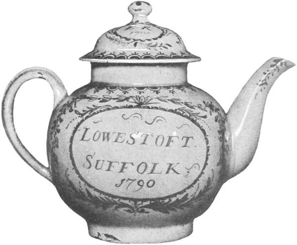


That they never manufactured such a porcelain at Lowestoft has no longer [Pg 277] to be demonstrated; it remains to be proved that they sold it, and that the misconception as to its origin arose from no other cause. We must remember, in the first instance, that the proprietors of the works were also ship-owners, conducting a small trade with Holland. They exported English clays and raw materials for the use of the Delft potters, and brought back, in return, articles of Dutch faïence, often painted with names and inscriptions, for which they accepted commissions from private customers. We know, next, that Rotterdam was the centre of the mighty commerce carried on between Holland and China. It may, then, be fairly assumed that while engaged in the trade of common Delft ware, they conceived the idea of entering into communication with the wholesale importers of Chinese porcelain from whom they could purchase large supplies, and establishing in England a highly-remunerative branch of business by underselling the East India company. ¶ It was customary with the Dutch firms to send over to their foreign settlements shapes and designs obtained from European sources, to be reproduced by native hands. Models from Dresden, Sèvres, and even from Leeds or the Staffordshire potteries, were constantly copied in oriental porcelain. The Lowestoft people did what all other merchants had done before them, and through the same channel forwarded to China the designs of coats-of-arms, English mottoes, and initials that were to be painted on the porcelain they had undertaken to supply. In the Henry Willett collection is an armorial plate decorated in the usual Indo-European style, and inscribed, at the back, with its certificate of origin: CANTON IN CHINA 24th Jan. 1791. Commissions of that kind were received from the leading families of the neighbourhood and duly executed; hence the number of local patronymics that Chaffers noticed on the porcelain in the possession of many inhabitants of the town, who honestly believed that it had been made by the very men from whom it had been purchased. ¶ In 1770 the business had taken sufficient extension to induce the partners to open a warehouse in Queen Street, Cheapside. Their agent, Clark Dunford, inserted in the London papers an announcement in which he advertised ‘a large selection of Lowestoft china.’ We possess no information as to what may have been the exact description of the goods advertised under that name, but we may safely surmise that it was something superior to ‘A trifle from Lowestoft’ or any of the articles we know to have been the staple production of the works. It seems that a more attractive exhibition might have been formed in the show-room by a stock of Chinese porcelain imported by the Lowestoft company. ¶ I feel convinced that conclusive proofs of this elucidation of the Lowestoft puzzle will one day come to light; in the meantime, it cannot be denied that it is strongly supported by the following facts: It is recorded, on good authority, that the ruin of the company was caused by the wreck of one of their vessels carrying a cargo of porcelain, and the burning, by the French army, of the warehouse they had established at Rotterdam. The idea that the enormous amount of ware required to load a vessel and to fill a large warehouse in Rotterdam, not to speak of the one in London, could have been supplied by a one-oven factory, is too ludicrous to be entertained for one moment, and it may be dismissed without further comment. ¶ It has been suggested that the Lowestoft painters may have decorated ware imported from China in the white. By reason of the ubiquity of the porcelain decorated in the accredited style, and the small number of hands employed at the factory, such a suggestion is equally untenable. A hard porcelain teapot, unmistakably painted by a Chinese hand, which is marked ‘Allen, Lowestoft,’ is reproduced on the opposite page. Robert Allen was manager of the works up to the last. When they closed he[Pg 278] set up a small china shop in the town, decorating himself part of the articles he sold. His supply was drawn from various sources, including oriental. Far from being deceived by such misleading testimonies, we may only infer from this tea-pot that the dealer was wont to affix his name to all that passed through his hands, even upon such pieces as had been decorated abroad. This curious specimen is now in the Victoria and Albert museum. ¶ The so-called Lowestoft style is characterized by sprays and garlands of flowers, in which two peculiar pink and purple colours play a conspicuous part, and by scalloped borders of the scale or trellis patterns. Similar designs appear on the early china and earthenware of Staffordshire. The last partisans of the Chaffers theory—for all the offshoots of the mystification have not yet been fully eradicated—believe that such pieces afford irrefutable examples of the Lowestoft original production. This is an error that must be discarded with the others. To imitate Chinese decoration has always been the golden rule of the English potter; just as he had reproduced the fine Nankin porcelain, he also copied the quasi-European ware manufactured for exportation by the East India company, and this all the more readily that it could be easily and cheaply produced. The well-known scale borders and the sprays of pink and purple roses occur frequently on the early china of Minton, Spode and other makers. These designs were obviously taken from the Chinese importations, and did not originate in the Potteries any more than they originated at Lowestoft. ¶ From the few authenticated specimens that have come under the collector’s notice we gather that the paste of the genuine Lowestoft porcelain is coarse, semi-opaque, and of a dingy white; the glaze is speckled with bubbles and minute black spots, which denote a rather imperfect manufacture. It is poorly decorated, and under these conditions we understand that it was not preciously preserved in the households; at all events, it has now become very rare. No mark was ever used at the factory, and the specific character of the ware is not sufficiently pronounced to allow us to use such undoubted examples as we possess as a means of identifying those which may have escaped destruction.
That they never manufactured such porcelain at Lowestoft no longer needs to be proven; it still needs to be shown that they sold it, and that the misunderstanding about its origin happened for no other reason. We must remember that the owners of the works were also shipowners, operating a small trade with Holland. They shipped English clays and raw materials for the Delft potters' use and brought back Dutch faïence, often painted with names and inscriptions, for which they took commissions from private customers. We know that Rotterdam was the hub of the extensive trade between Holland and China. Therefore, it’s reasonable to assume that while engaged in the trade of common Delft ware, they had the idea to communicate with wholesale importers of Chinese porcelain from whom they could buy large quantities, thus establishing a profitable business in England by underselling the East India Company. Dutch firms typically sent shapes and designs to their overseas settlements that they had obtained from European sources so they could be reproduced by local craftsmen. Models from Dresden, Sèvres, and even from Leeds or the Staffordshire potteries were frequently copied in oriental porcelain. The Lowestoft merchants did what others had done before them and, through the same channels, sent designs for coats-of-arms, English mottos, and initials to be painted on the porcelain they agreed to supply. In the Henry Willett collection is an armorial plate decorated in the typical Indo-European style, inscribed on the back with its origin: CANTON IN CHINA 24th Jan. 1791. Such commissions came from the leading families in the area and were faithfully executed; hence, many local surnames seen on the porcelain owned by residents who genuinely believed it was made by the very men they purchased it from. By 1770, the business had grown enough for the partners to open a warehouse on Queen Street, Cheapside. Their agent, Clark Dunford, placed an ad in London's newspapers promoting ‘a large selection of Lowestoft china.’ We have no details on what exactly was advertised under that label, but we can assume it was something better than ‘A trifle from Lowestoft’ or any items we know were the factory's main production. It seems a more appealing display could have been created in the showroom with stock of Chinese porcelain imported by the Lowestoft company. I am convinced that clear evidence to solve the Lowestoft mystery will eventually emerge; in the meantime, it can’t be denied that it is strongly supported by the following facts: It is well-documented that the company’s downfall was caused by the wreck of one of their ships carrying a load of porcelain, and the destruction of their warehouse in Rotterdam by the French army. The notion that the massive quantity of wares needed to load a ship and fill a large warehouse in Rotterdam, not to mention the one in London, could have come from a single-oven factory is too ridiculous to consider for even a moment, and can be dismissed outright. There has been a suggestion that the Lowestoft painters may have decorated white ware imported from China. However, due to the prevalence of the traditionally decorated porcelain and the small number of workers employed at the factory, that suggestion is equally untenable. A hard porcelain teapot, unmistakably painted by a Chinese artisan, marked ‘Allen, Lowestoft,’ is shown on the opposite page. Robert Allen was the manager until the end. When they closed, he opened a small china shop in town, decorating some of the items he sold himself. His inventory came from various sources, including oriental ware. Rather than being misled by such confusing indications, we can only deduce from this teapot that the dealer was in the habit of putting his name on everything that passed through his hands, even pieces that had been decorated elsewhere. This unusual piece is now housed in the Victoria and Albert Museum. The so-called Lowestoft style is characterized by sprays and garlands of flowers, prominently featuring two specific pink and purple colors, along with scalloped borders of scale or trellis patterns. Similar designs are found on early china and earthenware from Staffordshire. The last supporters of the Chaffers theory—since not all offshoots of this misconception have been completely eliminated—believe that such pieces are irrefutable evidence of original Lowestoft production. This is a mistake that must be discarded along with the others. Imitating Chinese decoration has always been the golden rule of the English potter; just as they reproduced fine Nankin porcelain, they also copied the quasi-European ware made for export by the East India Company, especially as it could be produced easily and cheaply. The well-known scale borders and sprays of pink and purple roses appear frequently on the early china from Minton, Spode, and other makers. These designs were clearly taken from Chinese imports and did not originate in the Potteries any more than they did at Lowestoft. From the few authenticated specimens that collectors have encountered, we gather that the paste of genuine Lowestoft porcelain is coarse, semi-opaque, and a dull white; the glaze is speckled with bubbles and tiny black spots, indicating fairly poor manufacturing. It has minimal decoration, and we understand that it was not well-preserved in households; at any rate, it has now become quite rare. No mark was ever used at the factory, and the distinctive nature of the ware is not pronounced enough that we can use the certain examples we have to identify those that may have survived destruction.

TITIAN’S PORTRAIT OF THE EMPRESS ISABELLA
❧ WRITTEN BY GEORG GRONAU[87] ❧
❧ WRITTEN BY GEORG GRONAU__A_TAG_PLACEHOLDER_0__ ❧
BOUT the middle of the year 1543, somewhere between June 20 and 25, a meeting of Paul III and Charles V was arranged at Busseto between Parma and Cremona with a view to the settlement of the political differences outstanding at that date. In the train of the pope came Titian, who on every occasion when the emperor set foot on Italian soil took the opportunity of paying his addresses to the monarch. On this occasion, too, the emperor had a commission for him; Titian was instructed to paint a portrait of the dead empress. From Aretino’s letters—which, apart from their personal fascination which no reader of them is able to resist, are second to none as a source of information on the life of the great painter—a few further details of the incident are to be gleaned, for some days later Aretino, in the company of Duke Guidobaldo of Urbino and of the Venetian ambassadors, met the emperor near Peschiera in the course of his journey to Germany. It was one of the red letter days in Messer Pietro’s life, and, fulfilled with vain-glory, he was never tired of talking of the marked consideration wherewith, if his chronicle is to be trusted, the emperor received him. On this occasion, when portraiture became the topic of conversation, Charles referred to the portrait of his wife that he had given to Titian at Busseto, and told Aretino to tell his godfather that it was a very good likeness, though the work of a painter of small merit.[88] From Aretino’s letters we glean further particulars. In October 1544 he addresses a letter to the emperor wherein he extols the completed picture in such high-flown phrases as to baffle translation.[89] ‘In defiance of Death, he has called her back to life by the inspiration of his colours, so that God possesses her for the first, Charles for the second time.’ Although his words sound as if he were speaking of a finished picture, Titian, it would appear, did not dispatch the picture to the emperor until about a year later. In October 1545 he informed the monarch that he had handed the two portraits at which he had been working with all the diligence of which he was capable, over to Mendoza to be forwarded.[90] A few months later he was writing again from Rome, whither he had gone at the bidding of the Farnesi, to say that he had delivered his own portrait of the empress, ‘together with the other which had been given to me to copy,’ to Don Diego.[91] And he adds: ‘If I hear that it finds favour I shall feel the greatest satisfaction; but in the contrary event, I should prefer to improve it in such a manner as to content your majesty if our Lord God vouchsafes me to be able to come to bring a picture of Venus by me,’ etc. ¶ A little more than two years later Titian arrived at Augsburg at the summons of the emperor, who on this occasion wished once again to see himself portrayed by his favourite painter, this time as the conqueror of the Protestant princes, uplifted and on horseback. It involved a long sojourn. Towards the end of it, on September 1, 1548, Titian wrote to Granvella to explain his prospects to him, and in this letter enumerates the pictures he had done for the emperor, among them ‘The empress alone and the one of the emperor and empress.’ Here a little difficulty arises. Has Titian then painted a single portrait of the empress on two occasions, one between 1543 and 1545, the other in 1548? Or, on the other hand, is the work referred to in this[Pg 281] letter one and the same with the earlier portrait, and did Titian, as a matter of fact, work it up again? It is impossible to speak with any degree of certainty, but as the Spanish inventories always speak of one portrait only we may assume that the latter hypothesis is the more likely to be correct. ¶ While the double portrait has been lost, the picture of the empress has found a place in that incomparable collection of Titian’s works which the Prado gallery in Madrid comprises. It is one of Titian’s most important works; perhaps, indeed, it takes the first place among his portraits of women. Never is his taste more exquisite than here. Its courtly splendour strikes one as a matter of course. In the midst of glorious colour—red and white—the pale, somewhat colourless face stands out framed by its fair reddish hair; the hand clasps a breviary. A window to the right opens on a landscape scene, one of those glimpses of Nature such as Titian had the secret of conjuring up with his brush with such incomparable art. No one looking at the picture would ever be able to suspect how it was painted; that its painter had never seen his model with his own eyes. It was no uncommon thing, by the way, for Titian to paint the portraits of people whom he did not even know by sight. He was proud of his skill of being able to recognize the characteristic traits of a man or woman even from another artist’s work.[92] ¶We can, however, only realize the work of genius for which this portrait of Isabella stands when we compare it with the picture with which the emperor had furnished him, that portrait by ‘a painter of small merit.’ The picture itself has, it is true, been wholly lost, but a copy of it has recently come to light in Florence, and is reproduced in these pages for the first time. That we are not mistaken in assuming it to be a replica of the original from which Titian worked will be proved by the complete coincidence of all the principal characteristics of the picture in Madrid with the one before us. In the Florentine picture the empress is wearing a black robe with white puffed sleeves, a great deal of jewelry, and is holding a spray of foliage in her hand. The picture is, for the most part, sombre in tone, and the face stands out most effectively in its pallor. It has that diaphanous whiteness noticeable in anæmic people. The dull reddish hair frames it heavily. The background is a grey green; in a niche, over which a dull red curtain is draped, the symbol of the exalted rank of the sitter, the imperial crown, is represented. To judge from its style this picture dates back to a Flemish master, though, with the somewhat scanty inherent evidence available, it is impossible to suggest the name of any particular artist. ¶ The picture originates from Bologna, where it was in the possession of the Pepoli family. That in itself is interesting, for we know that Isabella’s sister, Beatrice, duchess of Savoy, had taken up her quarters in the Pepoli palace during the rejoicings in 1530 in celebration of Charles V’s coronation, and that it was the scene of a brilliant ball which the emperor honoured with his presence. It would be well within the bounds of possibility, therefore, that the portrait of the empress, who had been prevented (she had been confined a short time previously) from coming to Bologna, had passed into possession of the Pepoli as a present at first hand, either from the emperor or from the duchess. A replica, with a few trivial distinctions, of the picture is entered in the inventory of the house of Farnese (about 1680). In this the left hand is resting on the back of the chair.[93]
BOUT Around the middle of 1543, between June 20 and 25, a meeting was set between Paul III and Charles V at Busseto, located between Parma and Cremona, to resolve the political disputes at the time. Accompanying the Pope was Titian, who took every chance to approach the emperor whenever he was in Italy. On this occasion, the emperor had a request for him; Titian was to paint a portrait of the late empress. From Aretino’s letters—which, besides their personal charm that no reader can resist, are an invaluable source of information about the life of the great painter—we learn a few more details about the event. A few days later, Aretino met the emperor near Peschiera during his journey to Germany, accompanied by Duke Guidobaldo of Urbino and the Venetian ambassadors. It was a significant day for Messer Pietro, and filled with pride, he constantly talked about the high regard with which, according to his account, the emperor received him. On this occasion, when the subject of portraiture came up, Charles mentioned the portrait of his wife that he had given to Titian at Busseto and told Aretino to inform his godfather that it was a very good likeness, although it was created by a painter of modest talent. From Aretino’s letters, we gather further details. In October 1544, he wrote a letter to the emperor where he praised the finished portrait in such elaborate terms that it is hard to translate. ‘Defying Death, he has brought her back to life through his colors, so that God possesses her for the first time, and Charles for the second.’ Although his words suggest he was referring to a complete painting, it seems Titian didn’t send the portrait to the emperor until about a year later. By October 1545, he informed the emperor that he had handed over the two portraits he had been working on with all his diligence to Mendoza for delivery. A few months later, he wrote again from Rome, where he had traveled at the request of the Farnesi, stating that he had delivered his own portrait of the empress, ‘along with the other one I was commissioned to copy,’ to Don Diego. And he added: ‘If I hear that it is well-received, I will be greatly satisfied; but if not, I would prefer to improve it so that it pleases your majesty if our Lord God allows me to come and present a picture of Venus by me,’ etc. ¶ A little over two years later, Titian arrived in Augsburg at the request of the emperor, who wanted to be portrayed once again by his favorite painter, this time as the conqueror of the Protestant princes, elevated and on horseback. This involved a lengthy stay. Towards the end, on September 1, 1548, Titian wrote to Granvella to explain his situation and listed the paintings he had completed for the emperor, including ‘The empress alone and the one of the emperor and empress.’ Here we encounter some uncertainty. Did Titian paint a sole portrait of the empress twice, once between 1543 and 1545, and again in 1548? Or, is the piece mentioned in this letter the same as the earlier portrait, and did Titian actually rework it? We cannot speak with certainty, but since the Spanish inventories always refer to only one portrait, we might assume that the latter theory is the more likely. ¶ While the double portrait has been lost, the portrait of the empress can be found in the remarkable collection of Titian’s works at the Prado gallery in Madrid. It’s one of Titian’s most significant pieces; in fact, it likely ranks among his top portraits of women. His taste is never more refined than in this work. Its regal grandeur feels entirely natural. Amidst the vibrant colors—red and white—the pale, somewhat colorless face stands out framed by its light reddish hair; the hand holds a breviary. A window to the right reveals a landscape scene, one of those glimpses of nature that Titian magically conjured with his brush. Anyone looking at the painting would never guess that the artist had never seen his model in person. It was not unusual for Titian to paint portraits of people he had never even seen. He took pride in his ability to recognize the distinctive traits of a man or woman even from another artist’s work. ¶ We can truly appreciate the genius behind this portrait of Isabella only when we compare it to the painting the emperor provided him with, that portrait by ‘a painter of modest talent.’ The original painting has, unfortunately, been entirely lost, but a copy has recently surfaced in Florence, which is reproduced on these pages for the first time. That we are correct in believing this to be a replica of the original Titian worked from is demonstrated by the complete likeness of all the main features of the painting in Madrid with the one before us. In the Florentine painting, the empress is depicted wearing a black gown with white puffed sleeves, a lot of jewelry, and holding a sprig of foliage in her hand. The painting predominantly has a dark tone, with her face standing out effectively against its pallor. It has a translucent whiteness typical of anemic individuals. The dull reddish hair frames it heavily. The background is a grayish-green; in a niche, draped with a dull red curtain—the symbol of the sitter’s exalted rank—rests the imperial crown. Based on its style, this painting likely comes from a Flemish master, though without sufficient evidence, it’s impossible to name a specific artist. ¶ The painting originated in Bologna, where it was owned by the Pepoli family. This is interesting because we know that Isabella’s sister, Beatrice, Duchess of Savoy, stayed in the Pepoli palace during the celebrations in 1530 for Charles V’s coronation, and that it was the venue for a splendid ball attended by the emperor. It’s quite possible, therefore, that the portrait of the empress, who had been unable to attend (she had recently given birth), was passed to the Pepoli as a first-hand gift from either the emperor or the duchess. A replica, with some minor differences, is listed in the inventory of the Farnese household (around 1680). In this version, the left hand rests on the back of the chair. [93]

The Florentine picture has undoubtedly a conspicuous iconographic importance as the most authentic portrait of the woman who shared the throne of Charles V. At the same time, its value from the standpoint of the history of art is immeasurably greater, inasmuch as it affords us a most interesting insight into Titian’s [Pg 282] methods. This picture should be compared with the painting in Madrid, their points of variance carefully considered with the question why the master omitted this or added that. It is as though in this picture we were watching him at work with our very eyes. Especially noteworthy is the fact that the imperial crown is not repeated. An artist whose work lacks character needs a symbol as an outward and visible sign-post. One, on the contrary, who knows how to express dignity in the bearing of his sitter, can dispense with these commonplaces. Titian was, of course, compelled to adopt the outline of the features, the colouring of the complexion and of the hair. He even adopted the pose in its main outlines. On the other hand he changed the colour of the dress and the pose of the hands; the pose of the Florentine picture is conventional and meaningless. By adding the book of hours he gains a signal detail of characterization, for the empress was very devout. If in the Flemish picture there is a certain note of contrast brought out by the sombre dress and the costly jewels, in Titian’s picture these ornaments blend with the costly draperies, glowing in the richest colours which robe the empress here. More important still is the fact that the antithesis is toned down thereby, and something of life comes into the pale face by reason of the warm red robe, while in the other it has a cold and lifeless tone, intensified by the dead black garment. And here the little glimpse of landscape which Titian introduces in the right-hand half of the picture gains a special significance of its own. It deflects the eye a little, well-nigh without arousing one’s consciousness that it is so doing; it adds a nuance of restfulness and colour that has as subtle and pleasing an effect as that of a Gobelin, although the landscape is convincingly realistic, instinct with that realism that comprises in its quintessence all the elements of colour and of form, and yet is the abstraction of the characteristics of a definite locality. This, comparatively speaking, small patch (considered as a patch of colour within the picture as a whole) prevents the figure from standing out in too hard relief from the dim-lit background and adds that very essential element of atmosphere to give life to the picture. ¶ It is worth noting that not until a, comparatively speaking, later period did Titian make use of a landscape background. All his earlier portraits show a neutral tone for the background. One finds it for the first time, in so far as the number of Titian’s paintings known to us at present justifies an expression of opinion, in the portrait of the duchess of Urbino of 1537. Thenceforward Titian made very frequent use of this subtle and life-giving device of his art. The portrait of Count Porcia in the Brera gallery in Milan, the little Strozzi in Berlin, the picture of Charles V in Munich are examples of it. Here the element which henceforward is inseparable from courtly portraiture is created. Rubens and Vandyke, above all, follow in the footsteps of the Venetian, whose influence might be traced down to modern times. ¶ Put the Flemish portrait by the side of Titian’s; it is, we see, the self-same picture in its main outlines, and yet with what fundamental distinctions. On the one hand the work of a ‘trifling brush’ (the emperor’s own words, according to Aretino) and on the other the conscious feat of a prince of painters. ¶ Nothing within the scope of artistic consideration can afford so much incitement and pleasure as to force one’s way into the work of the really great. For what they did is not merely a delight to the beholder; it remains an enduring exemplar for the worker. From this sole instance it becomes manifest how a thing insignificant in itself may suffice to force the fruits of genius. Thus an Italian novel gives birth to one of Shakespeare’s dramas, thus the puppet play of Doctor Faust to Goethe’s sublimest work.
The Florentine painting clearly holds significant iconographic importance as the most genuine portrait of the woman who shared the throne with Charles V. Its value for art history is even greater, as it gives us a fascinating look into Titian’s techniques. This painting should be compared with the one in Madrid, carefully noting the differences and considering why the master chose to omit or add certain details. It feels like we’re watching him work right in front of us. It's particularly noteworthy that the imperial crown doesn’t appear again. An artist lacking character often relies on symbols as visible markers. In contrast, one who can convey dignity through the sitter's demeanor can skip these clichés. Titian was naturally required to adopt the outline of the features, the complexion's color, and the hair. He even maintained the general pose. However, he altered the dress color and the hand positioning; the pose in the Florentine painting is conventional and lacks meaning. By including the book of hours, he adds a key detail that reflects the empress's deep devotion. While the Flemish painting features a contrast between the dark dress and elaborate jewels, in Titian’s artwork, these decorations blend with the rich, vibrant drapery that adorns the empress. More importantly, this softens the contrast, bringing some life into the pale face through the warm red robe, while the other has a cold, lifeless tone, accentuated by the stark black garment. The small glimpse of landscape that Titian includes in the right half of the painting becomes particularly significant. It subtly diverts the viewer’s gaze almost without them realizing it; it adds a touch of calm and color that is as nuanced and pleasing as a Gobelin tapestry, even though the landscape is convincingly realistic, capturing all the elements of color and form while abstracting the specific traits of a particular location. This relatively small area (considered just a patch of color in the overall picture) prevents the figure from appearing too rigid against the shadowy background and adds an essential atmospheric element that enlivens the painting. It’s worth noting that it wasn't until a later period that Titian used a landscape background. His earlier portraits featured a neutral tone for the background. The landscape first appears in the portrait of the Duchess of Urbino from 1537. From then on, Titian frequently employed this subtle, life-giving technique in his art. The portrait of Count Porcia in the Brera Gallery in Milan, the small Strozzi in Berlin, and the painting of Charles V in Munich are examples of this. Here, an element becomes inseparable from royal portraiture. Rubens and Vandyke, among others, followed in the footsteps of the Venetian artist, whose influence can be traced to modern times. If we place the Flemish portrait alongside Titian’s, we see it is fundamentally the same in its main outlines, yet with significant differences. On one side is the work of a 'trifling brush' (the emperor’s own words, according to Aretino), and on the other, the deliberate effort of a master painter. Nothing within the realm of artistic exploration can provide as much inspiration and satisfaction as immersing oneself in the work of the truly great. What they created does not just delight the viewer; it serves as a lasting example for the artist. This single instance highlights how something seemingly insignificant can spark the rewards of genius. Just as an Italian novel inspired one of Shakespeare’s dramas, or as a puppet play of Doctor Faust led to Goethe’s greatest work.
[Pg 285]
[Pg 285]
A NEWLY DISCOVERED PORTRAIT DRAWING BY DÜRER
❧ WRITTEN BY CAMPBELL DODGSON ❧
❧ WRITTEN BY CAMPBELL DODGSON ❧
HE British museum, thanks to a timely hint from a friend, has recently acquired a portrait drawing of considerable interest and unknown to students of the present generation. It represents a middle-aged woman, plain-featured and of a short, thick-set figure, seated, with clasped hands, drawn in three-quarter face and looking to the left. The sitter is plainly dressed, without a trace of ornament on the materials of her clothing; she wears a ring on the first finger of her left hand, and the artist has sketched very slightly a double or triple chain with pendants hanging from her neck and reaching across her bodice nearly to the waist. ¶ The portrait, which measures 16½ by 12⅜ ins. (42 by 31·5 centimetres), is lightly drawn in black chalk on a green prepared ground. The watermark of the paper is the large high crown surmounted by a cross (Hausmann, No. 4). A border line, which can be traced round three sides of the drawing, near the edge, is clearly a modern addition, being drawn with lead pencil. The portrait itself has entirely escaped retouching, and the whole sheet is in good preservation, except in a few places where the surface has been rubbed or stained; a severe crease across the lower right-hand corner of the paper has caused the prepared surface to crack. ¶ In the left-hand lower corner is the collector’s mark of Sir Thomas Lawrence, Fagan, 507 (1), stamped blind, and in the corresponding corner to the right is the initial C, also stamped blind, which belonged, according to Fagan (No. 72), to Captain William Coningham. The Lawrence stamp, in this form, was affixed to the drawings by Samuel Woodburn after he had purchased them in 1835. Coningham, too, had dealings with Woodburn; it may be conjectured that he purchased the present drawing from that dealer, and that it was included in the collection of drawings by old masters which Coningham sold to Messrs. Colnaghi in 1846. That would account for the absence of any mention of this drawing in the catalogue of the Woodburn sale in June 1860, when the bulk of the Lawrence drawings were finally dispersed. The drawing had been for a long period in private hands prior to its purchase by the trustees of the British museum in July of the present year, and had not appeared in the sale-room. ¶ After so much has been said about externals, it is time to look more closely at the drawing itself, which can only be reproduced, at present, on a greatly reduced scale, though it is hoped that an opportunity may present itself later on of issuing a full-sized reproduction in facsimile.
HE British Museum, thanks to a timely tip from a friend, has recently acquired a portrait drawing that is quite interesting and unknown to today's students. It features a middle-aged woman, with plain features and a short, stocky build, sitting with her hands clasped, drawn in a three-quarter view while looking to the left. The sitter is dressed simply, without any embellishments on her clothing; she has a ring on the first finger of her left hand, and the artist has lightly sketched a double or triple chain with pendants hanging from her neck, reaching across her bodice nearly to her waist. ¶ The portrait measures 16½ by 12⅜ inches (42 by 31.5 centimeters) and is lightly drawn in black chalk on a green prepared background. The watermark of the paper features a large high crown topped with a cross (Hausmann, No. 4). A border line, visible around three sides of the drawing near the edge, is obviously a modern addition, drawn in pencil. The portrait itself has not been retouched, and the entire sheet is in good condition, except for a few spots where the surface has been rubbed or stained; a deep crease across the lower right corner of the paper has caused the prepared surface to crack. ¶ In the lower left corner is the collector’s mark of Sir Thomas Lawrence, Fagan, 507 (1), stamped blind, and in the corresponding corner on the right is the initial C, also stamped blind, which, according to Fagan (No. 72), belonged to Captain William Coningham. The Lawrence stamp in this form was applied to the drawings by Samuel Woodburn after he purchased them in 1835. Coningham also dealt with Woodburn; it can be assumed that he bought this drawing from that dealer, and it was part of the collection of drawings by old masters that Coningham sold to Messrs. Colnaghi in 1846. This could explain why this drawing isn’t mentioned in the catalogue of the Woodburn sale in June 1860, when the majority of the Lawrence drawings were finally sold off. The drawing had been in private hands for quite some time before its purchase by the trustees of the British Museum in July of this year, and it hadn’t appeared in any sales. ¶ After discussing the details, it’s time to take a closer look at the drawing itself, which can only be reproduced now on a significantly reduced scale, although it is hoped that there will be a chance later to issue a full-sized reproduction in facsimile.

I have said nothing, so far, about the authorship of the drawing. The name of Holbein had been mentioned, but from the moment in which I first set eyes on it I had scarcely a doubt that the draughtsman was Dürer. No other artist of that date, so far as I remember, drew portraits in chalk on a green ground. No suspicion of forgery or fraud could be seriously entertained, and any momentary hesitation suggested by the formation of the eyes, the weak drawing of the left hand (an undeniable blemish), or the lack of energy in the shading of the costume, was soon dispelled by comparison with other drawings by Dürer on a similar scale and also on green paper, the authenticity of which has never been questioned. The impression suggested by the technique of the drawing itself was confirmed by an examination of the inscription and date, which are written in indian ink, and are indisputably genuine. Every letter is characteristic of Dürer’s handwriting; the inscription may be compared [Pg 286] especially with the long note of the same date on a drawing in the Vienna Hofmuseum (Lippmann, 423), in which Dürer has recorded a curious dream that he had in the early summer of 1525. The figures of the date agree closely with those on the Vienna drawing, and still more strikingly with those on a drawing in Mr. Heseltine’s collection (Lippmann, 172), the portrait of a young lady in a hat, with a dog on her lap, not signed, but dated 1525, also in indian ink. Mr. Heseltine’s portrait is that of a much more attractive person; it is also more carefully finished than the drawing which has recently come to light: but the two have much in common, even to the weak drawing of the left hand and the curious break in the outline of the upper eyelid of the left eye. The pose of the two figures is the same; the treatment of the clothes, both in outline and in shading, is curiously similar. The new portrait may also be compared with two large drawings on green paper already in the British museum: the portrait of Dürer’s wife, seriously damaged, of 1522 (Lippmann, 291), and the much more finished and masterly likeness of Henry Parker, Lord Morley (Lippmann, 87), drawn on the occasion of his visit to Nuremberg in 1523[94] as a special envoy sent to confer the order of the Garter on the Archduke Ferdinand. The ground of the latter drawing is of a bluer tint, but the green of Mr. Heseltine’s drawing and of the portrait of Agnes Dürer is almost identical with that of the new drawing in the British museum. ¶ The next question which arose when the authorship of the drawing was established to my own, and, I may add, to Mr. Colvin’s satisfaction, was the interpretation of the line of Dürer’s handwriting, ‘1525 Casmirs schwestr fraw margret.’ No Casimir was known to me among the circle of Dürer’s friends or patrons, but I was not long in finding a solution which seems to meet all the requirements of the case. The name Casimir at once suggested the royal house of Poland; a reference to the first work on Polish history that lay at hand provided me with the name of a connexion of that family whose residence was not far away from Nuremberg. This was Casimir, margrave of Culmbach (1481–1527), eldest son of the Margrave Frederick of Brandenburg-Ansbach and Bayreuth (1460–1536) by his marriage with Sophia, daughter of Casimir III of Poland. Frederick, being of feeble intellect, was deposed in 1515 by his sons and confined in the castle of Plassenburg; Casimir thereupon ruled over the greater part of the Franconian possessions of the house of Hohenzollern. He was a soldier with mediaeval ideas, and a steadfast Catholic, in opposition to his brother George of Bayreuth, who favoured the reformers; he died on September 21, 1527, at Ofen, while holding a high command under Ferdinand in the Hungarian war, and was buried, like most of his family, in the abbey church at Heilsbronn. The name of his eldest sister was Margaret; she was born in January 1483, and died, unmarried, in 1532. I suggest, then, that this prince and princess, both living in 1525, are the Casimir and Margaret of Dürer’s note. The portrait may well be that of a woman of forty-two, though we might guess her to be older. There is nothing unusual in the title ‘Frau Margret’ being applied to a lady of princely rank; we may compare the titles ‘the Lady Mary,’ ‘the Lady Elizabeth,’ by which the princesses of our own royal house of Tudor were known at the same period. I can discover no other portrait of Margaret of Brandenburg-Ansbach, except as one of a group of the daughters of the Margravine Sophia on a wing of an altarpiece at Heilsbronn[95]; here, however, the kneeling princesses are all painted to one pattern, and at so early an age that no comparison of the features is possible. Dürer’s note is thus the only ground for believing that the newly acquired portrait is that of a Hohenzollern princess.[Pg 289] ¶ I was not previously aware that Dürer had enjoyed the patronage of any member of that illustrious family, but I ascertained in the course of the present investigation that there is reason to think that he had had direct relations with the Margrave Casimir himself. Dr. Julius Meyer[96] describes a lost votive picture by Dürer, which represented the body of our Saviour being anointed for burial, with Susanna, wife of Casimir, kneeling in adoration, and Casimir himself standing at her right hand. The picture is only known by a full description in a MS. inventory written in 1768 by its then owner, Hofrath Christian Friedrich von Knebel (1728–1805), at Ansbach. It was signed and dated 1518 in gold. It was painted, therefore, in the year of Casimir’s marriage with Susanna (1502–1543), daughter of Duke Albert III of Bavaria by his marriage with Kunigunda of Austria, sister of the Emperor Maximilian I. Susanna is described by Knebel as ‘Dürer’s great protectress’; it is reasonable to suppose, at any rate, that the close relations in which he stood at this time with the emperor, her uncle, may have led to his appointment to paint the portrait of the niece. ¶ I cannot resist the conjecture—it is hardly more—that the portrait in Mr. Heseltine’s collection was done at the same time, and represents another member of the Margrave Casimir’s family, in all probability his wife, Susanna of Bavaria. The lady cannot be another of his sisters, the youngest of whom, Barbara, was at this time thirty, while the only other survivors, Sophia and Anna, were forty and thirty-eight respectively, and already married.[97] Susanna, on the other hand, was twenty-three, and the portrait may well stand for a lady of that age. She appears to have been fond of dogs, for a large dog lay before her in Knebel’s picture. Medals of the years 1522, 1525 and 1527 respectively, containing portraits of this princess, are reproduced in ‘Schaumünzen des Hauses Hohenzollern,’ Berlin, 1901 (Nos. 522–524). No. 524, in which she is represented in a wide hat, in three-quarter face to the right, agrees best with Dürer’s drawing, but the features are far less pleasing, and Dürer was not wont to flatter his sitters. In 1528, a year after Casimir’s death, his widow married Otto Heinrich, of Neuburg, count (afterwards elector) palatine. Two medals of the year 1529, by Peter Flötner and Hans Daucher, representing Susanna in profile, are preserved in the Munich and Vienna cabinets respectively.[98] Both are superior as works of art to the earlier portraits reproduced among the Hohenzollern medals, and they tend, I think, to confirm, if not to prove, my hypothesis. ¶ Mr. Heseltine’s drawing formerly had an inscription which doubtless gave the name of the person represented. Unfortunately some vandal has cut the paper down, and his scissors have only left the extreme ends of two letters, which may be seen above the date, 1525, written, exactly as on the British museum drawing, with indian ink. Dr. Lippmann, in his note on No. 172, suggests that the lady was an Englishwoman and the drawing a counterpart to the portrait of Morley. This entirely gratuitous assumption compels him to suppose that the date was added by a later hand, and that the drawing was really made a few years earlier than 1525. The authentic inscription and date on the portrait of ‘Fraw Margret’ dispose, I think, of that suggestion. ¶ The new portrait, though not one of the finest class of Dürer drawings, is a welcome addition to the London collection, which is already unusually rich in large portrait-heads of the master’s later years.
I haven't mentioned anything yet about who drew this sketch. Holbein’s name came up, but from the moment I first saw it, I had no doubt that the artist was Dürer. As far as I know, no other artist from that time created portraits in chalk on a green background. There could be no serious doubt about forgery or fraud, and any initial uncertainty caused by the shape of the eyes, the poorly drawn left hand (an obvious flaw), or the lack of vitality in the shading of the clothing was quickly cleared up when compared to other drawings by Dürer of a similar size on green paper, the authenticity of which has never been questioned. The impression given by the drawing's technique was confirmed by looking at the inscription and date, which are written in Indian ink and are undeniably genuine. Every letter reflects Dürer’s handwriting; the inscription particularly resembles the long note from the same date on a drawing at the Vienna Hofmuseum (Lippmann, 423), where Dürer recorded a curious dream he had in early summer 1525. The date’s figures closely match those on the Vienna drawing, and even more strikingly with those on a drawing in Mr. Heseltine’s collection (Lippmann, 172), which is a portrait of a young lady in a hat, with a dog on her lap, not signed but dated 1525, also in Indian ink. Mr. Heseltine’s portrait depicts a more attractive person; it is also more meticulously finished than the drawing that has recently surfaced: but they share much in common, including the weak drawing of the left hand and the odd break in the outline of the upper eyelid of the left eye. The poses of both figures are the same; the treatment of the clothing, in both outline and shading, is notably similar. The new portrait can also be compared to two large drawings on green paper already in the British Museum: Dürer’s wife’s portrait, which is seriously damaged, from 1522 (Lippmann, 291), and the much more polished and masterful likeness of Henry Parker, Lord Morley (Lippmann, 87), created during his visit to Nuremberg in 1523 as a special envoy sent to confer the order of the Garter on Archduke Ferdinand. While the background of the latter drawing is a bluer hue, the green of Mr. Heseltine’s drawing and Agnes Dürer’s portrait is almost identical to that of the new drawing in the British Museum. ¶ The next question that came up after confirming the drawing’s authorship, to my own, and I might add, to Mr. Colvin’s satisfaction, was the interpretation of Dürer’s handwritten line, ‘1525 Casmirs schwestr fraw margret.’ I didn't know of any Casimir among Dürer’s friends or patrons, but I quickly found a solution that seems to fit all the details. The name Casimir immediately made me think of the royal family of Poland; a reference to the first book on Polish history that I found provided the name of a relation of that family whose residence was close to Nuremberg. This was Casimir, margrave of Culmbach (1481–1527), the eldest son of Margrave Frederick of Brandenburg-Ansbach and Bayreuth (1460–1536) through his marriage to Sophia, daughter of Casimir III of Poland. Frederick, who was of weak intellect, was deposed by his sons in 1515 and confined in the Plassenburg castle; Casimir then ruled most of the Franconian properties of the Hohenzollern family. He was a soldier with medieval ideas, and a devout Catholic, opposing his brother George of Bayreuth, who supported the reformers. He died on September 21, 1527, at Ofen while holding a high command in the Hungarian war under Ferdinand, and was buried, like most of his family, in the abbey church at Heilsbronn. His eldest sister was named Margaret; she was born in January 1483 and died unmarried in 1532. Therefore, I propose that this prince and princess, both alive in 1525, are the Casimir and Margaret mentioned in Dürer’s note. The portrait might well be that of a woman in her forties, though we could guess her to be older. It's not unusual for the title ‘Frau Margret’ to be used for a woman of noble rank; we can compare it to the titles ‘the Lady Mary’ and ‘the Lady Elizabeth’ which were used for princesses of our own Tudor royal family at that time. I can't find any other portrait of Margaret of Brandenburg-Ansbach, except for one as part of a group of the daughters of Margravine Sophia on a wing of an altarpiece at Heilsbronn; here, though, the kneeling princesses are all painted similarly, and at such an early age that comparing their features isn't possible. Thus, Dürer’s note is the only basis for believing that the newly acquired portrait is of a Hohenzollern princess.[Pg 289] ¶ I wasn’t aware that Dürer had received patronage from any members of that distinguished family before, but during this investigation, I found reason to think that he did have direct connections with Margrave Casimir himself. Dr. Julius Meyer[96] describes a lost votive painting by Dürer, which depicted the body of our Savior being anointed for burial, with Susanna, Casimir’s wife, kneeling in adoration, and Casimir himself standing at her right. The painting is only known from a detailed description in a manuscript inventory written in 1768 by its then owner, Hofrath Christian Friedrich von Knebel (1728–1805), at Ansbach. It was signed and dated 1518 in gold. So, it was painted in the year of Casimir’s marriage to Susanna (1502–1543), daughter of Duke Albert III of Bavaria by his marriage to Kunigunda of Austria, sister of Emperor Maximilian I. Knebel describes Susanna as ‘Dürer’s great protectress’; it’s reasonable to think that his close ties at that time with the emperor, her uncle, may have led to his being commissioned to paint the portrait of the niece. ¶ I can't help but speculate—it’s hardly more than that—that the portrait in Mr. Heseltine’s collection was done at the same time, and depicts another family member of Margrave Casimir, probably his wife, Susanna of Bavaria. The lady cannot be one of his sisters, the youngest of whom, Barbara, was thirty at this time, while the only other surviving sisters, Sophia and Anna, were forty and thirty-eight respectively and already married.[97] Susanna, on the other hand, was twenty-three, and the portrait might well represent a woman of that age. She seems to have had a fondness for dogs, as there’s a large dog lying in front of her in Knebel’s painting. Medals from the years 1522, 1525, and 1527 featuring portraits of this princess are included in "Schaumünzen des Hauses Hohenzollern," Berlin, 1901 (Nos. 522–524). No. 524, which shows her in a wide hat, facing three-quarters to the right, matches Dürer’s drawing best, but the features are much less pleasing, and Dürer didn’t typically flatter his sitters. In 1528, a year after Casimir’s death, his widow remarried Otto Heinrich, of Neuburg, who became the count (later elector) palatine. Two medals from 1529, by Peter Flötner and Hans Daucher, showing Susanna in profile, are kept in the Munich and Vienna cabinets, respectively.[98] Both are superior as works of art compared to the earlier portraits of the Hohenzollern medals, and I think they tend to confirm, if not prove, my theory. ¶ Mr. Heseltine’s drawing used to have an inscription that likely identified the person depicted. Unfortunately, some vandal has cut the paper down, leaving only the very ends of two letters, which can be seen above the date, 1525, written just like in the British Museum drawing, in Indian ink. Dr. Lippmann, in his note on No. 172, suggests that the lady was an Englishwoman and that the drawing was a counterpart to Morley’s portrait. This completely unfounded assumption forces him to assume that the date was added later, and that the drawing was actually made a few years earlier than 1525. The genuine inscription and date on the portrait of ‘Fraw Margret’ dismiss, I believe, that suggestion. ¶ The new portrait, although not one of Dürer’s most outstanding pieces, is a welcome addition to the London collection, which is already unusually rich in large portrait heads from the master’s later years.
[Pg 290]
[Pg 290]
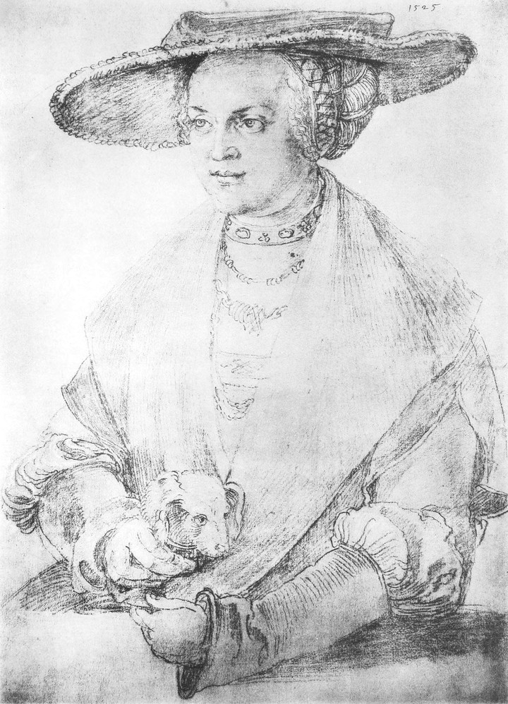
[Pg 291]
[Pg 291]
LATER NINETEENTH-CENTURY BOOK ILLUSTRATIONS
❧ WRITTEN BY JOSEPH PENNELL ❧
❧ WRITTEN BY JOSEPH PENNELL ❧
ARTICLE I
HROUGHOUT the history of art, or rather the history of collecting, there has always been, in conjunction with the desire to collect, a hesitancy in collecting just those things which are ever with us and about which we know the most. Though tremendously characteristic of our age, this hesitancy is by no means confined to it. The Japanese print was ever despised in Japan, and still is, except from its pecuniary point of view, by that grossly over-rated, so-called clever people, who only learned to appreciate their own prints when taught to by the despised western barbarian; the etching of Rembrandt, until the dealer discovered its value, could mostly be obtained for a song; the mezzotint, when it was published, filled the place of the photograph, brought only a guinea, or so, though the near-as-possible counterfeit now is announced to be sold as a rarity in limited editions at the price of the original; the etching of Meryon, valued to-day as much for the paper it is printed on as for what is printed on the paper, was sold by the artist for a few francs, in several cases quite its full value—all these things and endless more are the sport of the collector. ¶ And yet it has always seemed to me extraordinary that the collector, who prizes works of the graphic arts mainly for their rarity, has never collected those which really are rare. It is inconceivable, it is astonishing and unbelievable, that the art of the nineteenth century, the art of illustration, has been so neglected that the original drawings, though they have been always with us, have never yet been properly prized, appreciated, catalogued and collected. I know that old drawings are collected, but the collector’s interest in them to a great extent dates only from yesterday, and even now their price does not equal that of prints from them, of which there may be dozens, or, in fact, nobody knows how many examples in existence. But I also know that, within the last hundred years, drawings, illustrations, have been made in England and America that will rank with any, ever made anywhere, in any age, and that these works of art are absolutely ignored. And they are ignored simply because they have not been collected, because in this country the British museum cannot purchase the work of living British artists, and often it is during the lifetime of the artist only that they can be secured, because in France there is no place to exhibit drawings save in a corner of the Luxembourg; the rest the French government possesses are buried in the Cabinet des estampes. Theoretically, the rule of the British museum may be a good one; it may be thought a safeguard against as terrible a hodge-podge as that presented on the walls of the art gallery at South Kensington. To some of us, however, a remedy suggests itself—change or modify the rule, and, under intelligent direction, there is no reason why collections as fine as those in Dresden and Berlin should not be easily obtained even in England. ¶ The consequence of this neglect, both deliberate and enforced on the part of the British government, has been that here dealers and collectors, connoisseurs and amateurs, have avoided original drawings almost altogether. Artists alone have cared for them, have collected them, and still own almost all that are best worth having.[99] But now[Pg 293] that the best examples have been collected, or have become impossible to collect, I see signs vaguely of an appreciation. I do not for a moment think this is due to any artistic awakening or any sudden recognition of a genuine form of art—the art, as I have always described it, and as it will be known in the future, of the nineteenth century. The real cause is to be found rather in the desire for some new thing. Personally, I care very little what is bringing the change about; I am merely delighted to know that it is coming,[100] for I have been preaching the beauty of this work for many years, though, I admit, in a wilderness of paint, prints, pots and postage stamps. When it does come, the possessors of these drawings will find that they own, not only things of beauty, but wonderful examples of an individual form of expression which owes its existence altogether to the last century. I do not mean to suggest that illustration is a modern form of art; it is as old as the world. I do not mean to say that, in their way, the works of the artists of the Renaissance are not glorious; I do not mean to say that the works of the eighteenth century are not superb, after their fashion; what I do mean is, that not until the nineteenth century in England, with Blake and with Bewick, did illustration become a separate, independent and individual branch of the fine arts. The reasons are simple—the appearance of artists who loved and respected their profession, and the improvement and development of technical and mechanical processes. ¶ Blake wished to show his art in his own publications. There was nothing new in this; Dürer had done it centuries before. But Blake confined himself virtually to illustration; with Dürer, it was only one of his many means of expression. Bewick may or may not have learned to adapt the technique of steel engraving to wood from Papillon; that is a detail for the historian. What he did do, and what Papillon did not, was to impose the new method successfully on the world. Not only did Bewick produce his series of nature books, the forerunners of the present fad for that sort of thing, but he invented a school and a scientific manner of work which conquered the world. ¶ I have traced already the development of English book-illustration, showing how it spread from England to France and to Germany, and how, as it progressed through these countries, artists appeared to work for it—great artists in illustration but in nothing else, Meissonier and Menzel. I have elsewhere shown how, though these artists were ready to draw upon the wood block, they had to send to England for engravers to engrave their designs; I have shown how the pupils and the methods of Bewick were spread all over Europe: but while this was happening the art was languishing in England. Lithography and cheapness had commenced to stifle it. Education and the personal benefactor, the curses of this country, were sitting on it. The equivalent in that day to the county council, I doubt not, had it by the throat. It is true that William Harvey, Linnell, and a few others carried on, as best they could, the traditions of Bewick. But through the mid-century, Turner and his steel engravers struggled with the lithographers, Harding, Prout and Lewis, only that all alike might be undermined by Knight’s penny something or other, and that horror, as it then was, The Illustrated London News, always catering for the people, and the people damn any form of art.
HROUGHOUT the history of art, or more accurately the history of collecting, there's always been a mix of desire and hesitation when it comes to collecting things that are familiar and well-known. Although incredibly typical of our time, this hesitation isn't exclusive to it. The Japanese print was historically looked down upon in Japan, and it still is, except for its financial value, by those who are often over-rated and consider themselves clever, only learning to appreciate their own prints when the "despised" Westerners showed them how; Rembrandt's etchings could usually be picked up for a song until their value was recognized by dealers; the mezzotint, when first published, served as a substitute for photography and only cost about a guinea, even though the almost-exact replicas are now marketed as rare limited editions at the price of the originals; Meryon's etchings, which today are valued as much for the paper they're printed on as for the image itself, were sold by the artist for just a few francs, sometimes even at their full worth—all these instances and countless others are what collectors deal with. ¶ Yet, it has always seemed odd to me that collectors, who value graphic works primarily for their rarity, have never pursued those that truly are rare. It's unimaginable, astonishing, and unbelievable that the art of the nineteenth century, the art of illustration, has been so overlooked that the original drawings, though always present, have never been properly valued, appreciated, cataloged, or collected. I know that old drawings are collected, but the collector's interest in them has only really developed recently, and even now their prices don't compare to those of prints made from them, of which there may be dozens, but no one really knows how many exist. However, in the last hundred years, illustrations made in England and America match the best from anywhere, at any time, and yet these artworks remain completely ignored. They are overlooked simply because they haven't been collected, as in this country the British Museum can't buy works from living British artists, and often these works can only be acquired during the artist's lifetime since in France, there's almost nowhere to exhibit drawings except in a corner of the Luxembourg; the rest owned by the French government remain hidden away in the Cabinet des estampes. Theoretically, the British Museum's policy is solid; it might be seen as a safeguard against the chaotic display present at the art gallery in South Kensington. However, some of us have a solution—modify or change the policy, and with smart guidance, there’s no reason why collections as impressive as those in Dresden and Berlin couldn't be achieved even in England. ¶ The result of this neglect, both intentional and forced by the British government, is that here dealers and collectors, connoisseurs and amateurs have largely steered clear of original drawings. Only artists have cared for them, collected them, and still own almost all the most valuable pieces. [99] But now[Pg 293] that the best examples have been collected, or are now impossible to collect, I see faint signs of newfound appreciation. I don’t believe this is because of an artistic awakening or any sudden acknowledgment of a legitimate form of art—the art of the nineteenth century, as I have always referred to it, and as it will be recognized in the future. The true reason is rooted in a desire for something new. Personally, I don't mind what’s causing the change; I’m just happy to see that it's on its way,[100] as I’ve been advocating for the beauty of this work for many years, though, I admit, in a sea of paint, prints, pottery, and postage stamps. When the appreciation does finally arrive, those who own these drawings will discover they possess not only beautiful items but also incredible examples of a unique form of expression that owes its existence entirely to the last century. I’m not suggesting that illustration is a contemporary form of art; it's been around since the beginning of time. I'm not claiming that the works from the Renaissance aren’t magnificent; and I'm not saying that the works from the eighteenth century aren’t splendid in their own way; what I am asserting is that it wasn’t until the nineteenth century in England, with Blake and Bewick, that illustration became a distinct, independent, and personal branch of fine arts. The reasons are clear—the emergence of artists who cherished and valued their craft, coupled with advancements in technical and mechanical processes. ¶ Blake wanted to showcase his art in his own publications. This wasn’t a new idea; Dürer had done it centuries prior. But Blake primarily focused on illustration; for Dürer, it was just one of many modes of expression. Bewick may or may not have learned to adapt the steel engraving technique to wood from Papillon; that's a detail for historians. What he achieved, and what Papillon did not, was to effectively introduce the new method to the world. Bewick not only created his series of nature books, which were the precursors to the current trend, but he also established a school and a scientific approach to work that gained global recognition. ¶ I've already outlined the development of English book illustration, showing how it spread from England to France and Germany, and as it traversed these nations, artists emerged to contribute—great artists in illustration but not much else, like Meissonier and Menzel. I've detailed how, although these artists were eager to engrave their designs on wood blocks, they had to source engravers from England; I've shown how Bewick's students and methods were disseminated across Europe: yet, during this time, the art itself was stagnating in England. Lithography and affordability were starting to suffocate it. Education and private benefactors, the scourges of this country, were stifling it. The equivalent of today’s county council surely had it under tight control. It’s true that William Harvey, Linnell, and a few others did what they could to carry on Bewick’s legacy. Yet throughout the mid-century, Turner and his steel engravers contended with lithographers, Harding, Prout, and Lewis, all facing the threat of Knight’s penny publications, and that horror of the time, The Illustrated London News, which always catered to the masses, and the masses had little regard for any form of art.
[Pg 294]
[Pg 294]


A. MENZEL, DEL. E. KNUTCHMAR, SC.


But, with the appearance in Germany, in 1840, of Menzel’s ‘Geschichte Friedrichs des Grossen,’ and its appropriation in 1845, by the ingenious Mr. Bohn—I wonder what he paid for the blocks—a new era dawned in England. And just one word about this book. It contains [Pg 299] 500 illustrations by Adolf Menzel, and, says the advertisement, ‘in the execution of the cuts both French and British artists (engravers) have been engaged.’ But it so happened that they were all discarded by the artist for German engravers whom he himself trained. The 500 illustrations were drawn by Adolf Menzel on the wood, and his trials and tribulations are well known to all who have studied the history of illustration. Five hundred drawings in one book, all done on little wood blocks. Why, even this is enough to ruin anybody in our day, when it is an honour to be devoid of technical ability and physical capacity for work. But then we live in a time when incompetence, laziness and anæmic imbecility are, in this country indispensible credentials to fame. ¶ This book of Menzel’s, which has never been surpassed as an example of reproductive wood engraving, was seen by the Dalziels and shown to, at any rate, Keene, Rossetti, Sir John Gilbert and, most likely, Millais. If some of the lesser but more precious illustrators then at work refused to look at it—well, the loss was their own, and it is probably one of the reasons why so little afterwards was ever heard of them. ¶ Some ten years later, in France, where ever since the thirties the romanticists had been illustrating, notably Curmer’s edition of ‘Paul et Virginie’ (1838), while Jean Gigoux in his ‘Gil Blas’ (1836) had made an everlasting reputation, there appeared Meissonier’s edition of the ‘Contes Rémois’ (1858), by which, and not by his sensational dealings in paint with millionaires, his name will be remembered. And then England woke up again. The first English book which shows any evidence of a revival in art, an attempt to escape from the be-Knighted, be-illustrated traditions, was William Allinham’s ‘Music Master,’ which contains nine illustrations: seven by Arthur Hughes, one by Rossetti—The Maids of Elfen Mere, which appears really to have made a sensation—and one by Millais. It was published in 1855. The English edition of Menzel’s ‘Fredrick’ came out in 1845. ¶ It should not be forgotten that there had been a strong saving remnant all along from the time of Bewick. Northcote’s ‘Fables’ appeared in 1828, ‘embellished’ by 280 drawings, ascribed by Northcote, but really by Harvey, ‘most excellently drawn on the wood and prepared for the engraver by Mr. William Harvey, and improved by his skill’—even Northcote himself admitted this in one edition. The ‘Voyage of Columbus,’ undated and unsigned, illustrated by Stothard, was possibly still earlier. Then there was the ‘Solace of Song’ (1837); there was Lane’s memorable edition of the ‘Arabian Nights,’ illustrated also by Harvey (1839); and there were certain other volumes; but one is not now making a bibliography. However, it was with the ‘Music Master’ (1855) that the great change came. ¶ In 1857 Moxon issued his edition of Tennyson, the only book which is well known. It is extraordionary how little good work there is in it, but this little is of the utmost importance, for it includes the monumental Rossettis and Holman Hunts, and a few beautiful Millais. Even more extraordinary is the proof given not long ago of the public’s indifference to great illustration, for when, recently, just these few fine illustrations, together with the poems to which they refer, were reprinted, accompanied not only by the artists’ original studies for them, but by a most interesting essay by Mr. Holman Hunt, one of the illustrators, this new edition fell perfectly flat. This is not very creditable to the intelligence of the British collector, but it is a fact.[101] ¶ By 1859, the movement, with the starting of Once a Week, got into full swing, and we are in the golden age of illustration, the most striking, the most original phase of British art. From this time onward, for ten years, the publishers of this country issued a series of books and magazines that have never been approached, and when the present tendencies in art are considered, it is fairly safe to add will never again be approached in England. Then, artists sought to put the best of themselves into illustration on the wood block. Then, engravers endeavoured to engrave these illustrations as well as they possibly could, and though all of us have been forced regretfully to admit that the methods were abominable, the drawing being cut all to pieces before it could be printed, and the artist having no redress, the published results were often astonishingly good. Then the printer took a pride in doing his work as well as he knew how. And though it might be, and often was, bad, it was the best of which he was capable, and it was frequently much better than what is done to-day. Then, the publisher regarded himself as a shopkeeper, whose business was merely to put his name on the books and to sell them, and he was content to do this and nothing more. Sometimes he succeeded, sometimes he failed. Now, not only does he sit at the receipt of custom, but he dominates the whole. He tells you what the public wants according to his ideas, and the length of his purse, and his travellers’ opinions. And as in nine cases out of ten, despite these authorities, he is supremely ignorant of the work which he farms out, and as cheapness and vulgarity are his only gods, and as paper has come down and process has come in, it is not surprising that English book-illustration should be just where it is to-day. There are, of course, exceptions to this rule among the publishers. They are few, indeed. But they know their position, and it would be discouraging to the rest to name them. ¶ But, the collector may ask, what in all this defence of book-illustration is there for me? As I have pointed out, the illustrations, at any rate up to 1865, were all drawn on the wood block, and were all cut to pieces in the engraving. There remain, therefore, only a very few and rare originals that for some reason or other were not engraved. There also remain in many cases studies for these illustrations. For example, the British museum has been lately showing an illustration, so-called, by Sir J. E. Millais, for his ‘Parables,’ published first in Good Words, and then in a separate volume by the Dalziels (1864). This is not the illustration really, but a study for it. It may safely be assumed that no original drawings for book-illustration prior to 1865 exist, unless they are simply drawings made on the wood for a book and never engraved, when they are not book-illustrations at all—that is, illustrations which have been used in a book—or unless they are drawings of some sort made for the steel-engraver or the lithographer, which were copied or translated by the engraver. For example, Turner’s illustrations to Rogers’ ‘Poems’ exist as most commonplace water-colours in the cellars of the National gallery. Turner and Goodall between them made a great work of art out of the ‘Datur Hora Quieti,’ but there is no original of this at all save the trifling water-colour suggestion. Some of the artists, however, were in the habit of making studies in pen-and-ink, or wash, or pencil, on paper, of the exact size of the future engraving, and containing all the details of the design, which was afterwards redrawn on the wood block. Mr. Sandys did this in very many cases, and in some he even made large versions of the drawings, especially for the ‘Amor Mundi,’ which is owned by Lord Battersea. In his case, too, one or two of his drawings, I know, never were engraved. One which I owned, and which is now in the Adelaide museum, Australia, The Spirit of the Storm, was unfinished, and a second, done for Good Words or Once a Week, for years kicked round in a drawer in the office of Swain, the engraver, until I found it, when it was engraved and published in The Hobby Horse; the reason for this long neglect being that it had been considered too strong by the prurient-minded publisher of that time.
But, with the release in Germany in 1840 of Menzel’s ‘Geschichte Friedrichs des Grossen,’ and its acquisition in 1845 by the clever Mr. Bohn—wonder what he paid for the blocks—a new era began in England. Just a quick note about this book: it has [Pg 299] 500 illustrations by Adolf Menzel, and according to the advertisement, ‘both French and British artists (engravers) were involved in creating the cuts.’ However, all of them were replaced by German engravers whom he trained himself. The 500 illustrations were drawn by Menzel on wood, and his struggles and challenges are well known to anyone who has looked into the history of illustration. Five hundred drawings in one book, all done on tiny wood blocks. That alone could ruin anyone nowadays, when it's considered an achievement to lack technical skill and physical ability. Yet, we live in a time when incompetence, laziness, and mediocrity are often necessary credentials for fame. ¶ This book by Menzel, unmatched as an example of reproductive wood engraving, was viewed by the Dalziels and shared with Keene, Rossetti, Sir John Gilbert, and probably Millais. If some of the lesser but more treasured illustrators of that time chose to ignore it—well, that was their loss, and it’s likely one reason why so little was heard of them afterward. ¶ About ten years later in France, where the romanticists had been illustrating since the thirties—especially Curmer’s edition of ‘Paul et Virginie’ (1838), and Jean Gigoux’s ‘Gil Blas’ (1836) which earned lasting acclaim—Meissonier’s edition of the ‘Contes Rémois’ (1858) appeared, and it’s not his flashy dealings with wealthy patrons that will keep his name alive. England woke up again. The first English book marking a revival in art, an attempt to break free from the outdated, over-illustrated traditions, was William Allingham’s ‘Music Master,’ which featured nine illustrations: seven by Arthur Hughes, one by Rossetti—The Maids of Elfen Mere, which genuinely caused a sensation—and one by Millais. It was published in 1855. The English edition of Menzel’s ‘Frederick’ came out in 1845. ¶ It's important to remember that since Bewick's time, there has always been a strong remaining tradition. Northcote’s ‘Fables’ appeared in 1828, ‘embellished’ with 280 drawings attributed to Northcote, but actually by Harvey, ‘most excellently drawn on wood and prepared for the engraver by Mr. William Harvey, and improved by his skill’—even Northcote himself acknowledged this in one edition. The ‘Voyage of Columbus,’ undated and unsigned, illustrated by Stothard, may have come even earlier. Then there was the ‘Solace of Song’ (1837); Lane’s memorable edition of the ‘Arabian Nights,’ also illustrated by Harvey (1839); and several other volumes; but this isn't the time for a bibliography. Still, it was with the ‘Music Master’ (1855) that the significant change took place. ¶ In 1857, Moxon published his edition of Tennyson, the only well-known book of that time. It’s surprising how little good work is in it, but what little there is holds great importance, as it includes the monumental pieces by the Rossettis and Holman Hunt, alongside a few beautiful Millais illustrations. Even more astonishing is the recent proof of the public’s indifference to great illustration: when just these few fine illustrations, along with the accompanying poems, were reprinted, complete with the artists’ original studies and an intriguing essay by Mr. Holman Hunt, it flopped completely. This does not reflect well on the British collector's intellect, but it is what it is.[101] ¶ By 1859, the movement kicked into high gear with the launch of Once a Week, and we entered the golden age of illustration, the most striking and original phase of British art. From this point onward, for a decade, the publishers in this country released a series of books and magazines that have never been matched, and considering the current trends in art, it’s pretty safe to say will never be matched again in England. Artists aimed to put their best efforts into wood block illustration. Engravers tried to carve these illustrations as well as they could, and even though we all have reluctantly admitted that the methods were terrible—often mutilating the drawing before printing without any recourse for the artist—the published results were frequently surprisingly good. The printer took pride in doing his best work. And though it might have been, and often was, poor, it was the best he could offer, often surpassing what’s done today. The publisher saw himself simply as a retailer, whose job was to affix his name on the books and sell them, and he was content to do just that. Sometimes he succeeded, sometimes he didn’t. Now, he not only waits for customers but controls everything. He dictates what the public wants based on his views, the depth of his wallet, and opinions from his representatives. And in nine out of ten cases, despite these authorities, he is woefully unaware of the work he assigns, and as cheapness and tackiness are his guiding principles, combined with cheaper paper and new processes, it’s not surprising that English book illustration is where it is today. Of course, there are few exceptions among publishers. These are indeed rare. But they are aware of their position, and it would be discouraging for others to name them. ¶ But the collector might ask, what is there in all this defense of book illustration for me? As I pointed out, the illustrations, at least up to 1865, were all drawn on wood blocks and were cut apart in the engraving. Therefore, there are only a very few rare originals that, for one reason or another, were not engraved. Many cases also have studies for these illustrations. For instance, the British Museum recently showcased an illustration, so-called, by Sir J. E. Millais, for his ‘Parables,’ first published in Good Words, then in a separate volume by the Dalziels (1864). This isn’t really the illustration, but rather a study for it. It’s safe to say that no original book illustration drawings exist prior to 1865, unless they are simply sketches made on wood for a book and never engraved, in which case they aren’t true book illustrations—or they are drawings made for steel engravers or lithographers that were copied or translated by the engraver. For example, Turner’s illustrations for Rogers’ ‘Poems’ exist as quite ordinary watercolors in the cellars of the National Gallery. Turner and Goodall created a great work of art from the ‘Datur Hora Quieti,’ but the only original is a minor watercolor sketch. Some artists, however, would often create studies in pen-and-ink, wash, or pencil, exactly to the size of the future engraving, capturing all the design details, which would then be redrawn on the wood block. Mr. Sandys did this in many cases, and for some, he even created larger versions of the drawings, especially for ‘Amor Mundi,’ owned by Lord Battersea. In his case, I know one or two of his drawings were never engraved. One that I owned, now in the Adelaide Museum, Australia, titled The Spirit of the Storm, was unfinished, and another, done for Good Words or Once a Week, was left sitting in a drawer at Swain’s engraving office for years until I found it, when it was finally engraved and appeared in The Hobby Horse; the reason for this long neglect was that it had been deemed too risqué by the prudish publisher of the time.
[Pg 300]
[Pg 300]


After about 1865, or rather before, for the books were published in that year, some of the drawings for the illustrated editions of Dalziel’s ‘Arabian Nights, 1865,’ and ‘Goldsmith, 1865,’ were regarded by the engravers as so remarkable that they had photographs made from these drawings on the wood, and then, by the newly-discovered art of photographing on to wood, the photographs were transferred on to other wood blocks, and the originals on the wood preserved. Several are to be seen in the art gallery at South Kensington. The British museum possesses a few, and so do the Adelaide and Melbourne museums in Australia. Mr. Harold Hartley, Mr. Fairfax Murray, Mrs. C. E. Davis, Boyd Houghton’s sister, and, I believe, Mr. Heseltine, are among other owners of these rare drawings, either on wood or paper. But the number is really very small. ¶ There is also a series of drawings for Dalziel’s ‘Bible Gallery,’ commissioned by the Dalziels as early as 1863, as far as I can gather from Messrs. Dalziel’s own records, which are not too satisfactory. Most of the drawings in this series, however, were made on paper, though some by Mr. Watts and Sir Edward Poynter were on the wood, and uncut, and may be seen at South Kensington. Messrs. Dalziel, finding what a marvellous collection of illustrations they had obtained, wisely did nothing but commission artists to make more, and the work was not brought out until 1880, when the drawings were all photographed on to the wood before engraving, and thus preserved. Where most of them are to-day I do not know. As separate illustrations and great works of art, I was the first to call attention to them as far back as 1889. Those by Lord Leighton are now regarded as his masterpieces, and there are very fine examples of Ford Madox Brown, and Watts, and Sir Edward Poynter, who has never done better work. From all but the artistic standpoint the book was a failure. ¶ These, then, with rare unengraved examples which are bound to turn up, constitute all the original drawings for book-illustration reproduced by wood engraving which will ever be found, and they are mostly owned by museums. I must point out, however, that forgeries, both in the way of shameless copies of the originals, or prints worked over with pen-and-ink, and wash, and even colour—the artists themselves did this sometimes; Pinwell certainly did—and palpable imitations, have all, within a short time, been submitted to me. But, I should imagine, of all these finished drawings done upon the wood for reproduction before 1865, there are not a hundred, probably not fifty, that will ever come into the sale room. Of course, a great find may some day be made in a publisher’s office, or an artist’s portfolio. But I doubt it.
After around 1865, or actually even earlier since the books were released that year, some of the illustrations for the illustrated editions of Dalziel’s ‘Arabian Nights, 1865,’ and ‘Goldsmith, 1865,’ were considered so impressive by the engravers that they had photographs taken of these drawings on wood. Then, using the newly-invented technique of transferring photographs onto wood, they moved the images to other wood blocks while keeping the originals intact. Several of these can be seen in the art gallery at South Kensington. The British Museum has a few, along with museums in Adelaide and Melbourne, Australia. Mr. Harold Hartley, Mr. Fairfax Murray, Mrs. C. E. Davis (Boyd Houghton’s sister), and I believe Mr. Heseltine are among the few who own these rare drawings, whether on wood or paper. However, the total number is very small. ¶ There’s also a collection of drawings for Dalziel’s ‘Bible Gallery,’ commissioned by the Dalziels as early as 1863, based on what I can gather from the Dalziel’s records, which aren't very clear. Most of the drawings in this collection were created on paper, though some by Mr. Watts and Sir Edward Poynter were made on wood and left uncut, which can be viewed at South Kensington. The Dalziels, realizing they had a fantastic selection of illustrations, wisely chose to commission artists to create more, and the work wasn’t released until 1880, when all the drawings were photographed onto wood before being engraved, thus preserving them. I don’t know where most of them are today. I was the first to highlight these as individual illustrations and significant works of art back in 1889. The pieces by Lord Leighton are now seen as his masterpieces, with remarkable examples from Ford Madox Brown, Watts, and Sir Edward Poynter, who has never done better work. From any viewpoint other than artistic, the book was a failure. ¶ So, these, along with rare unengraved examples that are sure to surface, make up all the original drawings for book illustrations reproduced by wood engraving that will ever be discovered, and most of them are housed in museums. However, I should note that forgeries—whether they are blatant copies of the originals or prints that have been altered with pen-and-ink, wash, or even color—the artists themselves sometimes did this; Pinwell certainly did—along with obvious imitations, have all been presented to me in a short period. But I would guess that of all these finished drawings created on wood for reproduction before 1865, there are probably fewer than a hundred, likely less than fifty, that will ever be sold at auction. Of course, a significant find could happen one day in a publisher's office or an artist's portfolio. But I doubt it.
NOTE ON THE ILLUSTRATIONS.—These are mostly included merely to show the sort of drawings the artists made for the engraver and lithographer, who either translated them on to the plate or stone or had an intermediary to do this for them. The first, by Stothard, is in sepia, and a design, I know not for what book, but evidently a headpiece or initial which would have been cleaned up by the engraver. The second, by Bartolozzi, a cul de lampe in washes of indian ink, is very pretty, and the engraver probably would follow it exactly, though he would lose some of the freedom. The others on the same page, by Westall and Courbould, are very typical, and represent the British style of illustration for novels and stories at the beginning of the last century, and very perfectly they represent it, and that is the best I can say for them. The Westall, in wash and pen (indian ink), is slightly touched with colour on the woman’s dress, and may have been engraved on metal and printed in two or more tints. The other is in simple black-and-white. The landscapes are very characteristic; the upper, of the stolid, solid, British water-colourist, who was determined at all costs to be British, and usually forgot he was an artist. And the other, by Barrett,[Pg 305] is typical of the later work when Turner had made himself felt with the ‘Liber,’ or did Turner steal from Barrett? Any way, Barrett is seen at his best in this very charming sepia drawing, evidently for an illustration, while the ‘Liber’ drawings at the National gallery show Turner as an illustrator at his worst and his best. The methods of the two artists are absolutely identical; washes, little work with pen, and much scraping and scratching with the knife. As for the engravings, one is from Northcote’s ‘Fables,’ 1828, and shows the perfection of the minute work of Harvey and Jackson. Yet there is the feeling, somehow, of a big landscape in the print, and the engraving is extraordinary, putting to shame much of the modern so-called bold, but really blundering and ignorant, work on wood. The printing also is excellent in Northcote’s volumes. They were printed by J. Johnson, and the excellent blacks the printer of to-day would, even with all his improved appliances, have difficulty in equalling. The printing is much better than that in the French book, ‘Gil Blas,’ by Everat (Paulin, 1836), in which the ink is dull and grey, but in every other way the Gigoux shows the wide difference in aims there was between the leading English and French artists of that day: Harvey, all refinement; Gigoux, all force, directness and go. Both these engravers seem to have rendered the originals well. What the artists thought is another story. The Gigoux also proves that Daniel Vierge worked out rather than invented his style. The next two illustrations are from Curmer’s ‘Paul et Virginie,’ 1838, which is usually regarded, as Curmer wished it, a ‘monument typographic’ to the glory of the artists who illustrated it, is admitted to be the most important French illustrated book of the period, and to it all the better remembered Frenchmen of the time contributed something. Among the artists are Isabey, Paul Huet, Jacque, Johannot, Français, Meissonier, Steinhell; the engravers were Poiret, Lavoignat, Best, Brévière, Frenchmen; Bentworth, the German; but Orin Smith, Branston, Mary Ann Williams and her brothers, English, did the greater part of the work: a magnificent, artistic union, more practical in many ways than visits of kings and the patter of papers. The book was printed, and extraordinarily well printed, by Everat. ¶ The appearance of Turner as an illustrator changed things much. The ‘Solace of Song,’ published by Seeley, 1837, illustrated by Harvey, and engraved by W. T. Green and others, is simply metal engraving on wood, and is astonishing as an example of what can be done. The final outcome is seen in the print from ‘Sacred Allegories,’ by the Rev. W. Adams (Rimingtons, 1856), one chapter of which, ‘The Distant Hills,’ is illustrated by Samuel Palmer and also engraved by Green. This is, of its sort, probably the most perfect example of English book illustration. ¶ But in Germany the greatest progress had been made under Menzel, and his ‘Frederick,’ from which the print, The Round Table, is taken, is simply magnificent. It was engraved by Krutchmar, 1840, and from it sprang modern illustration, as I have said, in England. The first evidence is to be found in Rossetti’s Maids of Elfen Mere in Allingham’s ‘Music Master,’ 1855. In 1858 came the ‘Contes Rémois,’ Levy, illustrated by Meissonier, the perfection of French work, and the beginning and end of his reputation, as well as the most amazing proof of the genius of Lavoignat as a wood-engraver. After this the art of illustration began to flourish in England, and in a year or two the most superb work was being done.
NNOTE ON THE IILLUSTRATIONS.—These are mainly included just to show the kind of drawings the artists created for the engraver and lithographer, who either copied them onto the plate or stone themselves or had someone else do it. The first one, by Stothard, is in sepia and appears to be a design for some book I'm not sure about, but it looks like it was meant to be a headpiece or initial that would have been refined by the engraver. The second illustration, by Bartolozzi, is a cul de lampe in Indian ink washes, and it’s quite attractive; the engraver would likely replicate it closely, though he would lose some of its spontaneity. The others on the same page, by Westall and Courbould, are very typical and represent the British style of illustration for novels and stories at the beginning of the last century, and they capture that style exceptionally well, which is the highest praise I can offer. The Westall piece, done in wash and pen (Indian ink), has a hint of color on the woman's dress and may have been engraved on metal and printed in several tints. The other illustration is in simple black-and-white. The landscapes are very characteristic; the upper one shows the steadfast, solid British watercolor artist who was determined to be British at all costs, often forgetting he was supposed to be an artist. The other one, by Barrett,[Pg 305] is typical of later works when Turner had made his presence felt with the 'Liber,' or did Turner actually take inspiration from Barrett? Either way, Barrett shines in this charming sepia drawing, clearly intended for illustration, while the 'Liber' drawings at the National Gallery showcase Turner’s illustrating skills at both their worst and best. The techniques of the two artists are virtually identical: washes, minimal pen work, and a lot of scraping and scratching with a knife. Regarding the engravings, one comes from Northcote’s ‘Fables,’ 1828, showcasing the precision of Harvey and Jackson’s fine details. However, there’s still a sense of a grand landscape in the print, and the engraving is remarkable, outshining much of today's so-called bold yet truly clumsy and uninformed woodwork. The printing in Northcote's volumes is also excellent. They were printed by J. Johnson, and the deep blacks that the printer achieved would be challenging for today's printers, even with all their advanced equipment, to match. The printing far surpasses that in the French book ‘Gil Blas’ by Everat (Paulin, 1836), where the ink appears dull and gray, but in every other aspect, Gigoux demonstrates the significant differences in goals between leading English and French artists of that time: Harvey embodied refinement; Gigoux represented force, directness, and dynamism. Both engravers seem to have rendered the originals effectively. What the artists themselves thought is a different matter. The Gigoux also shows that Daniel Vierge developed rather than invented his style. The next two illustrations are from Curmer’s ‘Paul et Virginie,’ 1838, which is generally considered, as Curmer intended, a ‘typographic monument’ to honor the artists who illustrated it. It is recognized as the most significant French illustrated book of the period, to which all the better-known French artists of the time contributed something. Among the artists are Isabey, Paul Huet, Jacque, Johannot, Français, Meissonier, Steinhell; the engravers included Frenchmen Poiret, Lavoignat, Best, Brévière; Bentworth from Germany; but Orin Smith, Branston, Mary Ann Williams, and her brothers, all English, handled most of the work: a magnificent artistic collaboration, more effective in many ways than royal visits and official declarations. The book was printed—and exceedingly well printed—by Everat. ¶ The emergence of Turner as an illustrator significantly changed the landscape. The ‘Solace of Song,’ published by Seeley in 1837, illustrated by Harvey and engraved by W. T. Green and others, is simply metal engraving on wood, showcasing what can be remarkably accomplished. The culmination of this can be seen in the print from ‘Sacred Allegories’ by the Rev. W. Adams (Rimingtons, 1856), one chapter of which, ‘The Distant Hills,’ is illustrated by Samuel Palmer and also engraved by Green. This is probably the most remarkable example of English book illustration of its kind. ¶ However, in Germany, significant progress had been achieved under Menzel, and his ‘Frederick,’ from which the print, The Round Table, is taken, is just magnificent. It was engraved by Krutchmar in 1840, and from it emerged modern illustration, as I mentioned, in England. The first evidence of this can be found in Rossetti’s Maids of Elfen Mere in Allingham’s ‘Music Master,’ 1855. In 1858, the ‘Contes Rémois’ by Levy, illustrated by Meissonier, represented the pinnacle of French work, marking both the start and the peak of his reputation, alongside the most astonishing evidence of Lavoignat's genius as a wood engraver. After this, the art of illustration began to thrive in England, and within a year or two, the most outstanding work was being produced.
[Pg 306]
[Pg 306]


[Pg 310]
[Pg 310]
ANDREA VANNI
❧ WRITTEN BY F. MASON PERKINS ❧
❧ WRITTEN BY F. MASON PERKINS ❧
LTHOUGH the name of Andrea Vanni is by no means unfamiliar to the student of Sienese painting, it is doubtful whether its mention ever calls up to any but a few the image of a definite artistic personality. What fame Andrea now has rests more upon tradition than upon acquaintance with his art. He was born in 1333, or thereabouts. An active participant in the popular uprising of 1368, which resulted in the expulsion of the nobles and the foundation of the new government of the reformatori, he played, during the twenty years that followed, a busy and not unimportant part in the affairs of the Sienese republic, leaving behind him a lengthy and honourable record of the various offices which he held. In later years a friend and warm admirer of his great townswoman Caterina Benincasa, he was the recipient of much good counsel from that gentle saint, in the shape of certain letters which have perhaps done more than all his political achievements to keep alive the memory of his name. ¶ But it is not with Andrea the diplomat, or Andrea the devotee, that we are here concerned. Those who would know him better in these characters need only examine the pages of Milanesi, of Banchi and Borghesi, and of St. Catherine’s letters. Andrea has left behind him documents of a very different nature, and of a far deeper interest, than any of mere lettered parchment, and documents by no means so rare as has generally been supposed. With all his diplomatic and official celebrity, he was primarily an artist—perhaps not a great one in the superlative usage of the word, but sufficiently interesting to warrant an attempt to revive his memory as a painter by giving back to him a number of works which, in his native town and elsewhere, pass to-day under other, and sometimes greater, names. ¶ The works upon which Vanni’s reputation as a painter has hitherto rested are only three in number, and are all in his native town:—a well-known portrait of St. Catherine, in the church of S. Domenico; a very little known polyptych, in the church of S. Stefano; and a fragmentary Crucifixion, once in the church of the Alborino, now in the Istituto delle Belle Arti. Of these three works, whose common authorship is evident, the altarpiece in S. Stefano and the Crucifixion in the Belle Arti are given to Andrea on sufficiently reliable documentary grounds; the likeness of St. Catherine, on the strength of a tradition of several centuries. Despite its historical interest, and its great decorative design, this portrait-fresco, in its present state, can help us to but a slight idea of its author’s general style, and for this purpose the unimportant and somewhat coarsely-painted fragment in the Belle Arti can help us but little more. But the great polyptych of S. Stefano is happily a very different and vastly more important work, and of a nature to give us a satisfactory conception of Andrea’s manner at the time in which it was executed. A glance at this huge painting, or the accompanying reproduction, reveals at once that Vanni belonged to that same group of late trecento painters of which Bartolo di Fredi is the best known representative. Like the work of that master, it shows the influence both of Simone Martini and of the Lorenzetti. But it displays the qualities of a strongly-marked individuality as well. ¶ Let us examine it in detail, commencing with the central and most important panel of the Virgin and the Child. That which, apart from the colour, strikes us immediately and most forcibly, is the peculiar silhouette-like character of the design. The[Pg 309] great figure of the Madonna is thrown out like a dark, clear-cut pattern against the golden background of her throne. Except for the face and hands, there is little, if any, attempt at modelling or chiaroscuro. The whole effect is flat to a degree, reminding us somewhat of the coloured prints of Japan, with their sharply-defined outlines and broad fields of colour. In this feeling for flat design, Andrea gives witness to his being a follower—if an extreme one—of Simone’s methods. But he has little or none of Simone’s subtle contours and undulating flow of line. The drapery of Andrea’s Virgin is severely simple—there is a remarkable economy of line and fold, reminding us in this rather of Ambrogio Lorenzetti than of Simone. Her stiff, upright pose, again, has none of the tender grace of Simone’s Madonnas and saints, and is more akin to that of Ambrogio’s statelier figures. In facial type Andrea’s Virgin is, however, distinctly his own. The large rounded cranium, the narrow eyes and small half-covered iris, the delicately drawn mouth, the firm but not obtrusive chin, go to make up a set of features not easily forgotten. The Christ-Child, again, reveals decidedly the influence of Simone’s models, and finds its prototype in the Child of Simone’s great fresco of the Majestas in the Palazzo della Signoria, as well as in other works by him, by his close follower Lippo Memmi, and by their school. ¶ Turning now to the other figures, we note in the Baptist a striking similarity, even in the smallest details, to Simone’s figures of that saint at Pisa and at Altenburg, of which it is evidently a free copy. The St. Bartholomew shows like influences in a less degree. The figures of SS. James and Stephen are more Vanni’s own—the head of the latter being a free repetition of the Virgin’s. The Annunciation is severely vigorous and individual, the dark figure of the Virgin again showing, very clearly, Andrea’s love of the silhouette. The side figures of saints, and the evangelists in the pinnacles, reveal a slightly stronger sense of modelling and characterization, and remind us of Bartolo di Fredi and Luca di Tommé. The colour throughout is bright and clear, laid out in broad and simple masses, with a parsimonious use of shading and a lavish use of gold. ¶ If Tizio’s notices of this altarpiece be correct—and there is no reason to doubt that they are so, especially as the style of the work itself supports rather than contradicts them—it was painted in or about 1400. It is, therefore, the production of a man already verging on his seventieth year, and must represent the later, if not the last, development of Vanni’s style. As we have already noted, it has a family likeness to the work of Bartolo di Fredi and others of his school. Still, despite all superficial or general resemblances, these two painters are widely different in style and spirit. In pure grace and charm, Bartolo leaves Vanni far behind him. Andrea’s work again, at least as we here see it, has none of the softly-graded colour, the delicate modelling, the freer line, the careful technical finish of detail—none of the bibelot quality in fact—of Bartolo’s at its best. But, for all that, it convinces us that his was the deeper, grander soul. For mere prettiness or elaborate technical refinement he displays little sympathy or care. Directness and simplicity of expression, staid dignity and great seriousness of purpose—these seem the salient characteristics of his nature, as we read it in his art; nor do they disagree with the conception which the written records convey to us of the man.
LTITUDE the name of Andrea Vanni is pretty familiar to those studying Sienese painting, but it's doubtful that it brings to mind a clear image of a distinct artistic personality for many. Andrea's current fame relies more on tradition than on direct familiarity with his art. He was born around 1333. As an active participant in the popular uprising of 1368, which led to the expulsion of the nobles and the establishment of the new government of the reformatori, he played a busy and notably significant role in the affairs of the Sienese republic over the following twenty years, leaving behind an extensive and respectable record of the various positions he held. In later years, he became a friend and avid admirer of his great townswoman Caterina Benincasa, receiving much valuable advice from that gentle saint through letters that may have done more than all his political accomplishments to keep his memory alive. ¶ However, we are not focused on Andrea the diplomat, or Andrea the devotee. Those interested in knowing him better in these roles can check the pages of Milanesi, Banchi, Borghesi, and St. Catherine’s letters. Andrea has left behind documents of a very different nature, and of much greater interest, than mere written records, and documents that are not as rare as usually thought. Despite his diplomatic and official fame, he was primarily an artist—perhaps not a great one in the most superlative sense, but interesting enough to warrant an effort to revive his memory as a painter by attributing to him several works that, in his hometown and elsewhere, are currently attributed to other, and sometimes more prominent, names. ¶ The works that have previously established Vanni’s reputation as a painter are only three, all in his hometown: a well-known portrait of St. Catherine in the church of S. Domenico; a little-known polyptych in the church of S. Stefano; and a fragmentary Crucifixion, once in the church of the Alborino, now in the Istituto delle Belle Arti. Among these three works, whose common authorship is clear, the altarpiece in S. Stefano and the Crucifixion in the Belle Arti are attributed to Andrea based on reliable documentary evidence; the likeness of St. Catherine is supported by a tradition that dates back several centuries. Despite its historical significance and great decorative design, this portrait fresco, in its current state, only offers a limited impression of its creator’s overall style, and for this purpose, the somewhat unremarkable and coarsely painted fragment in the Belle Arti provides little additional insight. However, the grand polyptych of S. Stefano is significantly different and vastly more important, as it allows for a satisfactory understanding of Andrea’s style at the time it was created. A glance at this large painting, or the accompanying reproduction, immediately reveals that Vanni belonged to the same group of late trecento painters with Bartolo di Fredi being the best-known representative. Like the work of that master, it reflects the influences of both Simone Martini and the Lorenzetti. Yet, it also showcases qualities of a distinctive individuality. ¶ Let’s take a closer look, starting with the central and most significant panel of the Virgin and Child. The most striking aspect, aside from the color, is the unique silhouette-like nature of the design. The[Pg 309] large figure of the Madonna stands out vividly as a dark, sharply defined shape against the golden backdrop of her throne. Other than the face and hands, there is little to no attempt at modeling or chiaroscuro. The overall effect is quite flat, reminiscent of Japanese colored prints, characterized by their sharp outlines and broad fields of color. In this appreciation for flat design, Andrea demonstrates that he is a follower—if a radical one—of Simone’s approach. However, he lacks the subtle contours and flowing lines typical of Simone. The drapery of Andrea’s Virgin is starkly simple—exhibiting an economy of line and fold that is more reminiscent of Ambrogio Lorenzetti than of Simone. Her rigid, upright stance lacks the gentle grace of Simone’s Madonnas and saints, paralleling the statelier figures of Ambrogio. In terms of facial features, Andrea’s Virgin is undeniably unique, with a large rounded head, narrow eyes and small half-covered irises, a delicately outlined mouth, and a firm but not prominent chin, creating a memorable appearance. The Christ Child also distinctly shows the influence of Simone’s models, drawing parallels with the Child in Simone’s grand fresco of the Majestas in the Palazzo della Signoria, as well as other works by him, his close follower Lippo Memmi, and their school. ¶ Looking at the other figures, we note a striking resemblance in the Baptist even in the most minor details to Simone’s representations of that saint at Pisa and Altenburg, clearly a free interpretation. St. Bartholomew shows similar influences, though to a lesser extent. The figures of SS. James and Stephen exhibit more of Vanni’s own style, with the latter’s head being a free repetition of the Virgin’s. The Annunciation is marked by a strong and individual style, with the Virgin’s dark figure demonstrating Andrea’s preference for silhouette once again. The side figures of saints, along with the evangelists in the pinnacles, show a slightly stronger sense of modeling and characterization, reminding us of Bartolo di Fredi and Luca di Tommé. The colors throughout are bright and clear, applied in broad and simple areas, with sparse use of shading and an abundant application of gold. ¶ If Tizio’s references to this altarpiece are accurate—and there’s no reason to doubt them, especially as the style of the work supports rather than contradicts them—it was painted around 1400. Thus, it represents the creation of a man already approaching seventy, reflecting the later, if not the final, development of Vanni’s style. As noted, it bears a familial resemblance to the works of Bartolo di Fredi and others from his school. Yet, despite these outward and general similarities, the two painters are quite different in style and spirit. In terms of sheer grace and charm, Bartolo leaves Vanni far behind. Andrea’s work here, at least as we see it, lacks the softly graded colors, delicate modeling, freer lines, and meticulous attention to detail—none of the bibelot quality that Bartolo achieves at his best. However, it convinces us that Andrea possessed a deeper, grander soul. He shows little concern for mere prettiness or elaborate technical finesse. Directness and simplicity of expression, dignified steadiness, and profound seriousness of intent seem to be the key traits of his nature, as discerned through his art; and these traits align with the notions conveyed by written records about the man.


Taking this altarpiece, then, as a fairly characteristic example of Vanni’s mature style, I shall bring before the reader’s notice a series of works, at present under other names, one and all of which share with it, in a greater or a less degree, all the peculiarities which I have already pointed out, as well as others to which I have not yet drawn attention. Not the least among these works, in size and in importance, is a picture of the Enthroned Virgin and Child, popularly known as the Madonna[Pg 315] degli Infermi, in the church of S. Francesco at Siena. Those who have once seen this strangely impressive painting will not be likely to forget it. The colossal Virgin is seated upright on her throne, majestic and solemnly hieratic, the grave-visaged Child supported on her arm. There is something enigmatic, mysterious, superhuman, in the commanding grandeur of the figures, which the photographic reproduction[102] can but partially convey. They remind us of some of the works of early Byzantine art, in their strange impassiveness and impersonality, far rather than of those of late fourteenth-century Siena. The panel has been cut down, and evidently once formed but part of an even more imposing whole. The flesh parts have darkened as if by smoke, and now have the colour of mahogany; the glazings and the surface coatings have entirely disappeared. The picture is traditionally attributed to Pietro Lorenzetti, but there can be no question as to its real author. Let us compare it with the central panel of the S. Stefano polyptych. Even in its present damaged state, the analogies which it offers to that painting are so apparent that it is more than surprising some passing critic, or even some local art-historian, has not long ago given it back to its true painter, striking and important picture as it is. The similarities between the two Madonnas seem hardly to require comment. The same clearly-outlined figure, the same sedate pose, the same dark mantle with its golden border and broad and simple folds, the same head, eyes, nose, and mouth, the same hands—to dwell longer on these points would be merely to waste words. Here we have, beyond a doubt, another work of Andrea Vanni, belonging to the same period as, and sharing all the characteristics of, the S. Stefano polyptych—only in a severer and grander vein. As if in support of our conclusions, Tizio tells us that at about the same time Andrea painted his great picture for S. Stefano he executed still another similar work for the friars minor of S. Francesco. Doubtless this present panel once formed part of the work to which he refers, nor would it be stretching a point too far to say that its present half-ruined condition is probably due to damage suffered during the disastrous conflagration which, in 1655, wrecked the great building wherein it stood and destroyed so many of its treasures. ¶ But this, to my mind, is not the only work by Vanni still to be seen in this same restored church of S. Francesco. In the last chapel of the north transept is an imposing fresco of the Virgin seated with the Child in an elaborate architectural throne. It is generally attributed to Ambrogio Lorenzetti, and has been published with his name. As it now stands, this fresco has been almost entirely renewed, but enough of its original spirit still remains to afford the practised eye some slight idea of its primitive state. The incised outlines are still virtually unchanged, and the forms of the figure and the broad folds of the drapery have preserved, to a great extent, their original character. As is usually the case, the faces have undergone the greatest transformation, yet even here the original features have not been entirely lost. Quite enough remains, in fact, to convince me that in this case also we are in the presence of what was once an important work of Andrea Vanni. The entire figure of the Virgin, the peculiarly marked outline, the dignified position, the oval head, the narrow eyes, and the straight nose, the characteristic and tell-tale folds of the voluminous mantle, their peculiar arrangement about the feet, the long wrist and hand, still pierce through the modern covering of repaint, clearly revealing the touch of Vanni’s brush. ¶ In far better condition, and far easier of identification, is the half-length panel of the Virgin and Child—evidently once part of a larger work, but now cut down to fit an oval frame—in the chapel of the SS. Chiodi in Siena.[Pg 316] This picture, usually given to Barna, was surmised, but only surmised, by Crowe and Cavalcaselle, to be a possible work of Vanni. The reasons for their hesitation are rather difficult to find, and they were certainly correct in their conjecture, for the work is as evidently by Vanni as is the great Madonna of S. Francesco. But here we have our painter in a very different, far gentler, almost playful, strain. As usual, the Virgin is seated sedately upright on her throne, clad in the conventional dark mantle, fastened, as in the fresco of S. Francesco, by a splendid golden clasp. The head and face are the same in shape and features as in the other panels; the expression less serious and solemn. The Child is pleasing in type and action. With one hand to His mouth, He presses with the other His Mother’s bared breast as He looks half shyly towards the spectator. Here again there is none of the hieratic solemnity of the S. Francesco panel. The colour—apart from the repainted mantle—is warmer, and the modelling of the flesh parts softer, than in the picture of S. Stefano, but the forms and details are the same. ¶ Somewhat similar in spirit to this last-named work are two other panels, one in the church of S. Spirito, the other in S. Giovanni in Pantaneto, better known as S. Giovannino della Staffa. The first of these is a full-length figure of the Virgin holding in her arms the Christ-Child, who plays with a bird. At the foot of the throne kneels a diminutive figure of the donor, cap in hand. The Virgin sits in the upright position common to all the pictures we have so far examined; she has the same bend of the head, the same stereotyped set of features. The architecture and perspective of the throne are the same as in the picture of the SS. Chiodi and the fresco in S. Francesco. The Child is not unpleasing in action and expression. The figure of the Virgin has suffered considerably from repaint, the mantle being in great part quite new. The original colour is bright and gay, but the execution is less careful than in most of Vanni’s works, and would lead us to place this panel in the last years of his activity, when his brush had lost some of the freshness of its touch, were it not for the energetically, and at the same time carefully, executed little figure of the kneeling donor, damaged and darkened but still intact—a remarkable piece of early portraiture, finely characterized. Judging from the shape of this panel, it also once formed part of a triptych or polyptych. The Madonna of S. Giovanni has suffered far more from restoration, the figure of the Christ-Child being here almost entirely repainted. The still pleasing Virgin displays Vanni’s usual type, and differs but slightly from the Madonna in S. Spirito, although originally it may have been a more carefully executed figure. Still another picture, a charming little Annunciation, in the possession of Count Fabio Chigi at Siena, also clearly shows Andrea’s hand: it is very careful in execution and graceful in movement—far more free in this respect than the similar but severer treatment of the subject in the polyptych at S. Stefano. The types are Vanni’s usual ones, the colour is quiet and subdued.[103] ¶ But finer in quality and in a better state of preservation than any of these works, is a little picture of the Virgin and Child belonging to Mr. Bernhard Berenson, at Florence. That it is by Vanni needs no urging on my part—a moment’s comparison of the accompanying reproduction with any of the paintings which we have already examined is sufficient to prove this very obvious fact. It would be hard to imagine a more characteristic and at the same time a more charming example of his work. Yet in some ways it differs considerably from the paintings we have so far studied, especially in its more painstaking and finished execution, and in its light golden tone of colour, so very unlike that of such works as the Madonnas of S. Spirito and the SS. Chiodi. Although not without the dignity which [Pg 317] Vanni never fails to give her, the Virgin in Mr. Berenson’s picture is less sedately grave than in the panels at S. Francesco and S. Stefano—the Child less grown-up and solemn. Both, again, are in Vanni’s softer, more gentle mood. Belonging to Mr. Berenson also, we have another panel by Andrea, painted in a very different style and spirit. It represents the Deposition from the Cross, and must have been part of a predella to an altarpiece. Derived from Ambrogio Lorenzetti’s treatment of this sublime theme, it yet is more restrained, more intellectual, and more clearly arranged.
Taking this altarpiece as a typical example of Vanni’s mature style, I will present a series of works currently attributed to other artists, all of which share, to varying degrees, the characteristics I've already pointed out, along with some that I have not yet mentioned. Notable among these works, both in size and significance, is a painting of the Enthroned Virgin and Child, commonly known as the Madonna[Pg 315] degli Infermi, located in the church of S. Francesco at Siena. Those who have seen this striking painting are unlikely to forget it. The massive Virgin is seated upright on her throne, majestic and solemn, with the serious-looking Child resting on her arm. There is something enigmatic, mysterious, and superhuman in the commanding presence of the figures, which a photograph[102] can only partially capture. They remind us of some early Byzantine art with their strange impassivity and lack of personality, rather than the late fourteenth-century style of Siena. The panel has been trimmed down and clearly was once part of a more impressive whole. The flesh tones have darkened as if affected by smoke, now taking on a mahogany hue; the glazings and surface coatings have completely disappeared. The painting is traditionally attributed to Pietro Lorenzetti, but there is no doubt about its true creator. If we compare it with the main panel of the S. Stefano polyptych, the similarities are so evident, even in its damaged condition, that it’s surprising no passing critic or local art historian has already recognized it as the work of its actual painter, especially given its striking and significant nature. The similarities between the two Madonnas hardly need elaboration. The same clearly defined figure, the same calm pose, the same dark mantle with its golden border and broad, simple folds, the same head, eyes, nose, mouth, and hands—spending more time on these details would simply be repetitive. Undoubtedly, this is another work by Andrea Vanni, from the same period as the S. Stefano polyptych, sharing all its characteristics but presenting a more severe and grand appearance. Supporting this conclusion, Tizio mentions that around the same time Andrea created his major piece for S. Stefano, he also completed another similar work for the friars minor at S. Francesco. It’s likely that this panel was once a part of the work Tizio discusses, and it’s reasonable to suggest that its current half-ruined state is probably due to damage from the disastrous fire that in 1655 destroyed the significant building housing it and many of its treasures. ¶ However, I believe this is not the only work by Vanni still visible in the restored church of S. Francesco. In the last chapel of the north transept is an impressive fresco of the Virgin seated with the Child in an elaborate architectural throne. It is generally attributed to Ambrogio Lorenzetti and published under his name. As it stands now, this fresco has been almost entirely restored, but enough of its original spirit remains to give the trained eye some idea of its initial state. The incised outlines are still largely unchanged, and the forms of the figure and the broad folds of the drapery have retained much of their original quality. As is typical, the faces have undergone the most significant transformation; however, the original features have not been entirely lost. There is enough left to convince me that we are also looking at what was once an important work by Andrea Vanni. The entire figure of the Virgin, the uniquely shaped outline, the dignified position, the oval head, the narrow eyes, the straight nose, and the distinctive folds of the voluminous mantle, along with their specific arrangement around the feet, and the long wrist and hand, still shine through the modern repainting, clearly revealing Vanni’s touch. ¶ In far better condition and easier to identify is the half-length panel of the Virgin and Child—obviously once part of a larger work but now trimmed to fit an oval frame—in the chapel of the SS. Chiodi in Siena.[Pg 316] This painting, usually attributed to Barna, was speculated upon, but only speculated, by Crowe and Cavalcaselle to possibly be a work of Vanni. The reasons for their uncertainty are hard to pinpoint, and they were certainly correct in their suspicion, as the work is as clearly by Vanni as the great Madonna of S. Francesco. Yet here we find our painter in a very different, much gentler, almost playful mood. As usual, the Virgin sits upright on her throne, dressed in the traditional dark mantle, fastened with a beautiful golden clasp, just like in the fresco at S. Francesco. The shape and features of her head and face match those of the other panels, but her expression is less serious and solemn. The Child is charming in both appearance and action. With one hand to His mouth, He uses the other to touch His Mother's exposed breast while half-shyly looking toward the viewer. Again, there is none of the solemnity typical of the S. Francesco panel. The colors—aside from the repainted mantle—are warmer, and the modeling of the flesh is softer compared to the S. Stefano painting, but the forms and details remain consistent. ¶ Similar in feel to this last work are two other panels, one in the church of S. Spirito and the other in S. Giovanni in Pantaneto, better known as S. Giovannino della Staffa. The first shows a full-length figure of the Virgin holding the Christ-Child, who is playing with a bird. At the base of the throne kneels a small figure of the donor, cap in hand. The Virgin maintains the upright position common to all the artworks we’ve examined so far, with the same head tilt and the same stereotypical features. The architecture and perspective of the throne are identical to those seen in the SS. Chiodi panel and the fresco in S. Francesco. The Child is pleasant in both action and expression. The Virgin's figure has endured significant repainting, with much of the mantle being entirely new. The original color is bright and cheerful, but the execution is less meticulous than in most of Vanni’s works, suggesting that this panel may have been created in the latter years of his activity when his brush lost some of its former freshness, if not for the energetic and carefully executed figure of the kneeling donor—damaged and darkened but still intact—a remarkable example of early portraiture, finely characterized. Given the shape of this panel, it was likely once part of a triptych or polyptych. The Madonna of S. Giovanni has been more heavily restored, with the figure of the Christ-Child almost entirely repainted. The still charming Virgin shows Vanni’s typical style and only slightly differs from the Madonna in S. Spirito, although it may have originally been more intricately executed. Another piece, a delightful little Annunciation, owned by Count Fabio Chigi in Siena, also clearly displays Andrea’s handiwork: it is very carefully executed and graceful in movement—much freer in this regard than the similar but more austere treatment of the subject in the polyptych at S. Stefano. The types are typical of Vanni, and the colors are soft and subdued.[103] ¶ But finer in quality and in better preservation than any of these works is a small painting of the Virgin and Child belonging to Mr. Bernhard Berenson in Florence. That it is by Vanni is undeniable—a moment’s comparison with any of the paintings we've already discussed clearly proves this fact. It would be hard to find a more characteristic and simultaneously charming example of his work. Yet, in some respects, it differs significantly from the paintings we've examined, particularly in its more painstaking and refined execution and its light golden tone, which is quite different from works like the Madonnas of S. Spirito and the SS. Chiodi. Although maintaining the dignity that Vanni always provides, the Virgin in Mr. Berenson’s painting appears less gravely somber than in the panels at S. Francesco and S. Stefano, with the Child looking less mature and serious. Both figures again embody Vanni’s softer, more gentle style. Additionally, Mr. Berenson has another panel by Andrea, painted in a distinctly different style and spirit. It depicts the Deposition from the Cross and must have been part of a predella for an altarpiece. Taking inspiration from Ambrogio Lorenzetti’s interpretation of this profound theme, it remains more restrained, more intellectual, and more clearly organized.
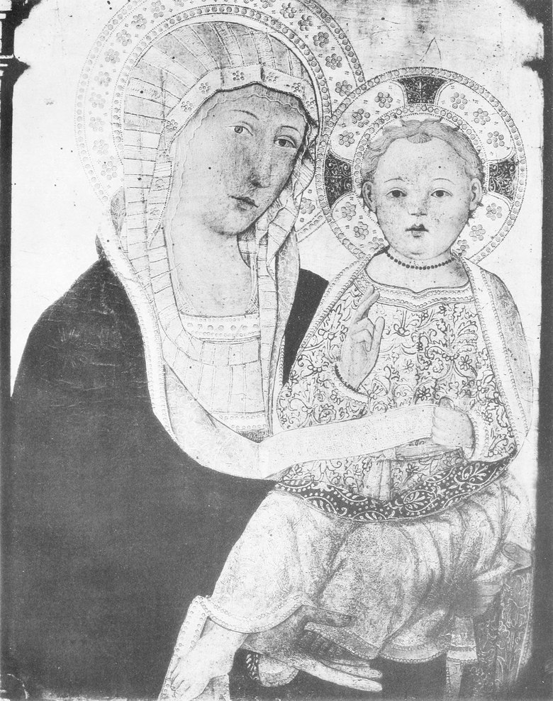


The famous portrait of St. Catherine which I have already mentioned, and which is too well known to require description, and the Crucifixion in the Belle Arti—a fragment of a larger work painted in 1396—would bring this particular list of Vanni’s works to a temporary close,[104] were it not for still another painting, perhaps even more interesting than any of these, which to my mind must also be classed with them. In the church of S. Pietro Ovile, at Siena, we find a beautiful free copy of Simone Martini’s famous Annunciation, now in the Uffizi gallery. This picture has aroused the admiration of numberless tourists and the curiosity of more than one writer on Siena’s art. Apart from its traditional attribution to Simone and Lippo Memmi themselves, it has undergone a series of widely different baptisms at a variety of hands; from a trecento it has become a quattrocento painting, and so back again. It has long been my conviction, as it has been that of no less an authority on Sienese painting than Mr. Berenson before me, that this picture is a work of Andrea Vanni. I am quite well aware of the surprise which this sudden attribution will cause to many, as I am also of the difficulties in proving my point with the limited and unsatisfactory aid which photographs afford. In an article supported only by photographic reproductions, that most important of all arguments, quality, and, as in this case, the hardly less convincing one of colour, must in great part be laid aside. Nevertheless, there remains, in this particular instance, so much that can be demonstrated by photographic evidence in support of Vanni’s claims, that I shall make the attempt. ¶ Of the history of the Annunciation now in S. Pietro, nothing appears to be known. As it now exists it stands no longer above an altar, but is let into the wall of the church. In shape and size it was evidently once quite similar to Simone’s original, but it has since been cut down and shortened at the sides and bottom. The three panels which now surmount it have nothing to do with the picture itself, and are the work of two different painters of the quattrocento—the Crucifixion is probably by Giovanni di Paolo; the two figures of St. Peter and St. Paul by Matteo di Giovanni, as we see him in the remains of the altarpiece at Borgo S. Sepolcro, which once contained, as its central panel, Piero dei Francesci’s Baptism of Christ, now in London. They were probably placed in their present position at a relatively recent date. As to its condition, the picture has evidently not always enjoyed the care that is now given it, for it is considerably damaged and darkened. The hand of the restorer has not been absent, alas! and there are, unfortunately, visible traces of his brush in the heads and hands, and in the Virgin’s draperies. ¶ That we have here a copy, and in some ways a fairly close one, of Simone’s famous picture, is obvious; that it was painted directly from Simone’s original, which was at that time in the cathedral of Siena, is no less certain; that it was painted by an artist who was throughout seeking to overcome the peculiarities of his own somewhat strongly marked style, and that he was but[Pg 321] partially successful in so doing, is also apparent. ¶ Let us examine the work more closely, and in its separate parts, commencing with the figure of the Virgin. It shows but little of the ease of movement and grace of line to be found in Simone’s original. The high-waisted figure; the stiff, upright, almost rigid, position; the line of the shoulders and the knees; the peculiar poise of the head; the straight-falling folds of the drapery and the line of the mantle as it catches the arm in its downward flow: all are points which find their counterpart in the works of Vanni, and in those of no other painter. Here, also, we have the same simple, strongly-marked outlines, the same dark field of colour relieved, pattern-like and comparatively flat, against the lighter background. Although the blue of the Virgin’s mantle has darkened considerably, it is still apparent that her figure was always fairly innocent of modelling—far more so in fact than that of Simone’s Virgin. For Simone, with all his love of outlined pattern, does not stop at this—his contour, however clear and distinct, is far more flowing, far more subtle—his mass is far less flat and unrelieved. Although the painter of the S. Pietro copy has tried more or less faithfully to copy the arrangement of Simone’s drapery, he has done it, perhaps despite himself, in his own way. The folds in the copy have an entirely different character from that which they possess in the original; they are precisely what we might imagine Vanni doing in an attempt to be particularly graceful. But if all these points in the drapery and figure remind us so unmistakably of Vanni’s style, we discover in the Virgin’s head even closer affinities with that master’s other works. The same well-rounded cranium and oval face; the same narrow eyes, with the small half-covered iris and high-arched brows; the same long straight nose (still clearly recognizable as Vanni’s, despite scaling and later retouching); the identical mouth; the same inclination of the head and its peculiar setting on the neck; the same chin; the same long, slender hands: all are to be found in one or other of the works we have already mentioned, and especially in Mr. Berenson’s Madonna. Here we have, also, Vanni’s love of gold brocade in the Virgin’s under garment and in the hangings of the throne. The figure of the angel is no less characteristic. The drapery is here incontestably Vannesque in its peculiar, not over-graceful, folds. Here, again, is the clear outline, the slight modelling, and the sparing use of chiaroscuro, the same treatment of the draperies, the long hands and thin arms, as in all Vanni’s other works. The outline of the face, chin, and neck has been damaged and gone over, and the peculiar, straggling, dark-brown curls are a later addition, and contrast strongly with the lighter golden hair behind them. Apart from these slight changes, the head, although a would-be copy of Simone‘s, shares Vanni’s characteristic features. The cherubs about the Holy Spirit already point to the end of the trecento. The roman lettering of the inscriptions we find used likewise on the scroll held by the Christ-Child in Mr. Berenson’s picture. ¶ So much for material resemblances, of which the reader may gather some idea by means of the accompanying illustrations. And now a word as to the colour of the work. Its striking resemblance, in this respect, to the Madonna of Mr. Berenson’s collection, will not fail to carry conviction where there may before have existed only persuasion. In the general quality of technique, and more especially in the remarkable golden tone of colour and the peculiar treatment of the flesh, the two works are strangely alike, and cannot help but do away with any final doubts as to their community of authorship.
The well-known portrait of St. Catherine that I've already mentioned, which is too famous to need description, and the Crucifixion at the Belle Arti—a fragment of a larger piece painted in 1396—would temporarily conclude this list of Vanni’s works, [104] if it weren't for another painting, perhaps even more intriguing than these, that I believe should also be included. In the church of S. Pietro Ovile in Siena, there's a beautiful free copy of Simone Martini’s renowned Annunciation, now housed in the Uffizi gallery. This piece has captured the admiration of countless tourists and sparked the curiosity of several writers about Siena’s art. Beyond its traditional attribution to Simone and Lippo Memmi, it has gone through various reclassifications over time; from a trecento piece, it transformed into a quattrocento work, and then back again. I've long held the belief, as has the esteemed expert on Sienese painting, Mr. Berenson, that this painting is a work of Andrea Vanni. I understand that this sudden attribution may surprise many, and I'm aware of the challenges in proving my argument with the limited and often unsatisfactory assistance of photographs. In an article relying solely on photographic reproductions, the most crucial argument—quality—and, in this case, the equally compelling aspect of color, must largely be set aside. Nevertheless, in this instance, there's enough photographic evidence to support Vanni’s claim, so I will make the attempt. ¶ As for the history of the Annunciation now in S. Pietro, nothing about it seems to be known. Currently, it no longer sits above an altar but is integrated into the church wall. In shape and size, it was evidently once quite similar to Simone’s original, but it has since been trimmed and shortened at the sides and bottom. The three panels now above it are unrelated to the painting itself and were created by two different quattrocento artists—the Crucifixion is probably by Giovanni di Paolo; the two figures of St. Peter and St. Paul are by Matteo di Giovanni, as we see him in the remains of the altarpiece at Borgo S. Sepolcro, which once featured Piero della Francesca’s Baptism of Christ in the central panel, now in London. These panels were likely added to their current location relatively recently. Regarding its condition, the painting hasn't always received the care it does now, as it is significantly damaged and darkened. Unfortunately, the restorer's hand has been evident, and unfortunately, there are visible traces of their brushwork in the heads and hands, as well as in the Virgin’s draperies. ¶ That we have a copy here, and in some ways a fairly close one, of Simone’s famous piece is obvious; that it was painted directly from Simone’s original, which at that time was in the Siena cathedral, is equally certain; that it was created by an artist who was trying to overcome the distinctiveness of his own strong style, and that he was only[Pg 321] partially successful in doing so is also apparent. ¶ Let’s take a closer look at the work, examining it in its individual parts, starting with the figure of the Virgin. It shows little of the ease of movement and graceful lines found in Simone’s original. The high-waisted figure, the rigid, upright position, the lines of the shoulders and knees, the unique angle of the head, the straight-folding drapery, and the way the mantle drapes over the arm are all details that mirror Vanni’s works and no other painter's. Here, too, we see the same bold outlines, the same dark field of color against the lighter background, albeit the blue of the Virgin’s mantle has darkened significantly, it is still evident that her figure was always rather lacking in modeling—far more so than Simone’s Virgin. Simone’s contour, despite being clear and distinct, is much more flowing and subtle, presenting a mass that is less flat and unrelieved. Although the painter of the S. Pietro copy has attempted to replicate Simone’s drapery arrangement fairly faithfully, he has done so, perhaps against his own intentions, in his own style. The folds in the copy possess a different character from those in the original; they reflect what we might expect from Vanni’s attempt to create a graceful depiction. However, if all these elements in the drapery and figure clearly evoke Vanni’s style, we find even closer resemblances with the Virgin’s head to that master's other works. The same rounded cranium and oval face; the same narrow eyes with a small, partly-covered iris and high-arched brows; the same long straight nose (still recognizable as Vanni's despite later retouching); the identical mouth; the same head tilt and unique positioning on the neck; the same chin; the same long, slender hands: all are found in his other works, particularly in Mr. Berenson’s Madonna. Here we also see Vanni’s fondness for gold brocade in the Virgin’s undergarment and the throne hangings. The angel’s figure is no less typical, with drapery that unmistakably reflects Vanni’s peculiar, albeit not overly graceful folds. Once again, we see the clear outline, slight modeling, and minimal use of chiaroscuro, along with the same treatment of the drapery, long hands, and slender arms characteristic of all Vanni’s work. The outline of the face, chin, and neck has suffered damage and been repainted, and the distinctively straggly dark brown curls added later contrast sharply with the lighter golden hair beneath. Aside from these minor alterations, the head, while a copy of Simone's, carries Vanni’s distinctive features. The cherubs surrounding the Holy Spirit hint at the end of the trecento. The Roman lettering of the inscriptions is similarly seen on the scroll held by the Christ-Child in Mr. Berenson’s painting. ¶ So much for material similarities, of which the reader might get some insight through the accompanying illustrations. Now, regarding the color of the work, its striking similarity to the Madonna in Mr. Berenson’s collection will surely convince anyone who may have previously only been persuaded. In technique and particularly in the remarkable golden tone of color and the unique treatment of the flesh, the two pieces are strangely alike, effectively putting to rest any lingering doubts about their shared authorship.


In the preceding pages I have tried to prove—the reader can best judge with what success—Vanni’s claims to the authorship of a certain group of pictures, so closely related in style, quality, and spirit, as clearly to belong to the same period of his activity[Pg 322] as that which produced the polyptych of S. Stefano. As we know, this period was one of a comparatively old age. Yet it would seem as if Andrea had turned, during the later years of his life, with a renewed activity, to the practice of his art, after the busy public career of his prime. Judging from the scarcity of documents of an official nature connected with his name after 1384, it would seem that, somewhere about that year, he retired from active participation in political affairs and devoted himself wholly to his painting. That he was inactive as an artist, however, during all his earlier years, is not to be believed. We have, in fact, a line of documents to prove that this was not the case. Still, these written records help us very little in the tracing of his earlier artistic development. Evidently in origin a pupil of the school of Lippo Memmi, I should place in the period of his ascendance a somewhat hard and gaudy, but not uninteresting, triptych, representing St. Michael between St. Anthony the abbot and the Baptist, No. 67 of the Siena gallery. This work, which is in a remarkable state of preservation, is attributed to Lippo Memmi himself, and clearly shows the characteristics of his school. There is much in the figures which bears a close similarity to Andrea’s later types. Another panel—a Virgin and Child in the priest’s house, next to S. Pietro Ovile—having close affinity to Simone and Lippo Memmi in technical treatment, in colour, and even in style, seems to presage in a far more definite manner the works of Vanni which we now know, and already shares many of his peculiar characteristics in detail. But, apart from these two paintings, I can call to mind no works of these early years which I can with any confidence give to him. The first notice of Andrea as a painter is one of 1353, in which year he was associated with Bartolo di Fredi, whether as partner or assistant is not quite clear. The last records of his activity are dated 1400. Milanesi, upon some unnamed authority, gives the probable date of his death as 1414. ¶ It would prolong this article unduly if the questions of Vanni’s influence upon Sienese art, and of his possible pupils and apparent successors, were entered into with the fullness which the subject demands. We must limit ourselves here to a brief mention of the closest of the followers of Vanni in those later years in which chiefly we have been studying him, a painter less known even than himself, Paolo di Giovanni Fei. An apparently early work by him, the Madonna del Rosario of S. Domenico, suggests that he was actually the pupil of Vanni. By him, also, are three pictures in the Siena gallery, one in the chapel of S. Bernardino just outside the Porta Camollia, another in the Saraceni collection, and yet another in the Minutolo chapel of Naples cathedral.
In the earlier pages, I've tried to demonstrate—though the reader can judge for themselves how well I've succeeded—Vanni's claims to be the author of a specific group of paintings that are so closely connected in style, quality, and spirit that they clearly belong to the same period of his work as the polyptych of S. Stefano. This period, as we know, was relatively late in his life. However, it seems that Andrea, in the later years of his life, re-engaged with his art with renewed energy after a busy public career earlier on. Given the lack of official documents related to him after 1384, it appears that around that year, he stepped back from political activities and dedicated himself entirely to painting. Yet, it's hard to believe he was inactive as an artist during his earlier years. In fact, we have a series of documents to prove that this wasn’t the case. Still, these records don’t help us much in tracing his early artistic development. Clearly starting as a student of the Lippo Memmi school, I would place a somewhat bold and colorful, but still interesting, triptych depicting St. Michael between St. Anthony the Abbot and the Baptist, No. 67 of the Siena gallery, in the period of his rise. This work, which is exceptionally well-preserved, is attributed to Lippo Memmi himself and clearly reflects the characteristics of his school. Many of the figures in it closely resemble Andrea’s later styles. Another panel—a Virgin and Child in the priest’s house next to S. Pietro Ovile—shows a strong connection to Simone and Lippo Memmi in technique, color, and even style, and seems to foreshadow Vanni’s works that we recognize today, already featuring many of his distinctive details. However, aside from these two pieces, I can't think of any other works from these early years that I can confidently attribute to him. The first mention of Andrea as a painter is from 1353, when he was associated with Bartolo di Fredi, though it’s not entirely clear if he was a partner or an assistant. His last recorded activity is dated 1400. Milanesi, citing an unspecified source, suggests his death likely occurred in 1414. ¶ It would extend this article unnecessarily if we explored the issues of Vanni’s impact on Sienese art, as well as his possible students and apparent successors, in the detail the topic deserves. We must limit ourselves here to a brief mention of Vanni's closest followers during the later years we’ve primarily been studying him, a painter who is less known even than Vanni himself, Paolo di Giovanni Fei. An apparently early work from him, the Madonna del Rosario of S. Domenico, suggests that he was actually Vanni’s student. He is also responsible for three paintings in the Siena gallery, one in the chapel of S. Bernardino just outside the Porta Camollia, another in the Saraceni collection, and one more in the Minutolo chapel of Naples cathedral.
[Pg 325]
[Pg 325]
EARLY PAINTERS OF THE NETHERLANDS AS ILLUSTRATED BY THE BRUGES EXHIBITION OF 1902
❧ WRITTEN BY W. H. JAMES WEALE ❧
❧ WRITTEN BY W. H. JAMES WEALE ❧
ARTICLE V
ERARD DAVID worked in Bruges from the commencement of 1484 until his death, August 13, 1523, yet he does not appear to have taken a single apprentice during all that period, at least the register of the gild of St. Luke contains no entry of any such. It is, however, certain that he had several assistants; one of these, Adrian Isenbrant, I was able to rescue from oblivion in 1865. He came to Bruges in 1510, was admitted as free master into the gild on November 29, and continued working there for more than forty years, until his death in July 1551. He acquired a reputation for skill in painting the nude and the human countenance, and executed many pictures for Spain, which as a rule he sent by Antwerp to Bilbao. Although no document has as yet been discovered connecting his name with any particular picture, yet there is hardly any doubt that he is the author of a number of works certainly painted in Bruges between 1510 and 1551, the figures in which are remarkable for their careful execution and sweetness of expression, characteristics attributed to the works of Isenbrant by old writers. Several of these works are still in Spain, others have been brought from the Peninsula within the last fifty years. Of these I purpose to treat later on; at present I shall confine my remarks to the works included in the exhibition. The most important of these is a large diptych given to the church of Our Lady at Bruges by Barbara Le Maire, widow of George Van de Velde, a wealthy cloth merchant, who had held many offices in the communal council. The dexter panel (178) represents the Blessed Virgin seated with clasped hands, overwhelmed with grief, in a niche of Renascence architecture. Around her, set in architectural framework, are seven little pictures representing the seven dolours; in some of these are motives borrowed from the engravings of Martin Schongauer and Albert Dürer. The sinister panel (179), which disappeared from the church about 1832, came into the possession of the duke of Arenberg, who in 1874 sold it to the Brussels museum. On the face are pictured George Van de Velde in the costume of a brother of the confraternity of the holy Blood, and his wife, protected by their baptismal patrons, and accompanied by their nine sons and eight daughters, all kneeling in prayer. The subject on the dexter panel is repeated on the reverse of this in grisaille but with differences, so that whether the diptych was shut or open, on festivals or ferias, the figure of the sorrowful Mother, to whom the widow Van de Velde was very devoted—multum affectata—was always exposed to the veneration of the faithful. George Van de Velde died on April 28, 1528; his second son, John, who in the picture wears a surplice, was ordained priest and said his first mass in the church of Our Lady in 1530—31, about which date his mother presented the picture. ¶ The Blessed Virgin and Child seated in a landscape with SS. Katherine, Barbara, Dorothy, Margaret and Agnes (145), lent by Count Arco-Valley, is a charming early composition, of which there is a weak repetition in the academy of St. Luke at Rome. The prototype of this picture is doubtless the dexter panel of the diptych painted by Memlinc for John Du Celier, now in the Louvre at Paris, whilst variations are in the gallery at Munich, at Geneva, and at Buckingham Palace. A triptych lent by M. Lotman, of Berne (177), represents the Blessed Virgin and Child and two angels playing a mandoline and a harp; and on the exterior, St. Jerome praying before a crucifix. The carpet here is from the same model as that under the Virgin’s feet in 145.
ERARD DAVID worked in Bruges from early 1484 until his death on August 13, 1523. However, he does not seem to have taken on a single apprentice during that time, as the St. Luke guild register shows no entries. It is certain, though, that he had several assistants; one of them, Adrian Isenbrant, I was able to bring to light in 1865. He arrived in Bruges in 1510, was accepted as a free master into the guild on November 29, and worked there for over forty years until he passed away in July 1551. He gained a reputation for his skill in painting the nude and human faces and created many works for Spain, which he typically sent from Antwerp to Bilbao. Although no documents have yet been found linking his name to any specific paintings, it’s widely believed that he is the creator of several works definitely painted in Bruges between 1510 and 1551, notable for their meticulous execution and sweet expressions, traits old writers attributed to Isenbrant's works. Several of these pieces remain in Spain, while others have been brought back from the Peninsula in the last fifty years. I plan to discuss them later; for now, I will focus on the works in the exhibition. The most significant of these is a large diptych given to the Church of Our Lady in Bruges by Barbara Le Maire, the widow of George Van de Velde, a wealthy cloth merchant who held many roles in the communal council. The right panel (178) depicts the Blessed Virgin seated with clasped hands, deeply sorrowful, in a niche of Renaissance architecture. Surrounding her, set within an architectural framework, are seven small pictures illustrating the seven sorrows; some of these borrow motifs from the engravings of Martin Schongauer and Albrecht Dürer. The left panel (179), which disappeared from the church around 1832, ended up in the possession of the Duke of Arenberg, who sold it to the Brussels museum in 1874. Its front features George Van de Velde dressed as a member of the confraternity of the Holy Blood, alongside his wife, sheltered by their baptismal patrons, accompanied by their nine sons and eight daughters, all kneeling in prayer. The subject on the right panel is echoed on the reverse but in grisaille, with variations so that whether the diptych was closed or open, during festivals or ordinary days, the figure of the sorrowful Mother—whom the widow Van de Velde was very devoted to—multum affectata—was always presented for the reverence of the faithful. George Van de Velde died on April 28, 1528; his second son, John, who is shown in the painting wearing a surplice, was ordained as a priest and celebrated his first mass in the Church of Our Lady in 1530–31, around the time his mother presented the picture. ¶ The Blessed Virgin and Child seated in a landscape with Saints Catherine, Barbara, Dorothy, Margaret, and Agnes (145), loaned by Count Arco-Valley, is a lovely early composition, of which a weak repetition exists in the Academy of St. Luke in Rome. The original of this piece is likely the right panel of the diptych painted by Memlinc for John Du Celier, which is now in the Louvre in Paris, while variations can be found in galleries in Munich, Geneva, and Buckingham Palace. A triptych loaned by M. Lotman of Berne (177) shows the Blessed Virgin and Child with two angels playing a mandolin and a harp; and on the exterior, St. Jerome praying before a crucifix. The carpet here is from the same model as that under the Virgin's feet in 145.
[Pg 326]
[Pg 326]


A panel (183) belonging to the earl of Northbrook represents the Blessed Virgin and Child enthroned, in a garden, beneath a canopy, to which is attached a cloth of honour; the donor and his wife and family kneel at the sides; the background is formed by a stone wall, on which two peacocks and a pea-hen are sunning themselves. The head of our Lady has been restored. ¶ Two shutters of a triptych (180), lent by Mr. R. von Kaufmann, represent a donor and his wife with their children protected by St. John the Evangelist and St. Barbara(?). The donors on these shutters are, though a few years older, strikingly like those in 183. But in the earlier picture the man, aged thirty-four, is represented with one son and one daughter, both dead when the picture was painted, while behind his wife, aged thirty-three, kneel a boy of nine and a girl of five. The man in 180 is represented with one son dead, and his wife with three daughters, one of whom was dead. ¶ The vision of St. Ildephonsus, bishop of Toledo (151), belonging to Lord Northbrook, is in every respect a very remarkable work; the composition unusually good, the colouring rich and harmonious. The saint, kneeling on the foot-pace of an altar on the north side of a large church of picturesque architecture, looks up with outstretched arms at the Blessed Virgin, who, attended by three lovely angels, is about to vest him with a chasuble. Behind him kneel three monks, two looking up at the heavenly apparition, the third absorbed in prayer. In the background a procession of chanting monks, followed by a pious crowd of lay folk, winds its way round the choir. The figures of all are most carefully executed, and are remarkable for the delicacy of their modelling and sweetness of expression.[105] ¶ Another brightly coloured picture (152), also belonging to Lord Northbrook, represents the Blessed Virgin seated on a stone throne adorned with rams’ heads, holding the divine Child, who has his left arm round her neck and is caressing her chin. The Virgin’s face has little character, but the Child’s expression is very pleasing. ¶ St. Mary Magdalene in the desert, kneeling before a large crucifix held by an angel (182), from the De Somzée collection, is a remarkable work, with a landscape background with peculiar rocks. A panel with a half-length figure of St. Luke holding a portrait of the Blessed Virgin and Child (187), lent by Messrs. P. and D. Colnaghi, is a fine work, the evangelist being probably the master’s own portrait. A triptych belonging to the cathedral of Bruges (184) represents in the centre the Presentation in the Temple with the kneeling figure of an Augustinian nun of the Le Gros family, probably the granddaughter of Philip Wielant and Joan van Halewyn, whose portraits on the shutters, as remarked by M. G. Hulin, are evidently not painted from life. The triptych, which probably came from one of the Augustinian convents suppressed at the end of the eighteenth century, was, with many others now preserved in the cathedral, presented to it by M. van Huerne. ¶ A panel (185) lent by M. Sedelmeyer, with full-length figures of St. Andrew, St. Michael, and St. Francis in the foreground, with a representation of Calvary in the upper portion, is a late work, the Calvary closely resembling that in the diptych of our Lady of seven dolours. The exhibition included several other works either copies or painted under the influence of Isenbrant. ¶ Two other masters who flourished in Bruges about this time, and who were restored to history by me, one in 1860 and the other in 1863, were each represented by one authentic work. John Prevost, a native of Mons in Hainault, was born c. 1462. It is not known where he learned his art or to whom he was apprenticed. He visited Antwerp in 1493 and was admitted as free-master into the gild[Pg 331] of St. Luke, but shortly after removed to Bruges, where he bought the right of citizenship and settled definitely. He also purchased the freedom of the town of Valenciennes in 1498, in which year, if not previously, he married Joan de Quaroube, a well-to-do elderly lady, who, after twenty-five years of wedded life, had in 1489 been left a widow by the celebrated painter and miniaturist Simon Marmion. She died in 1506. Prevost, who married again three times, died in January 1529. The only picture proved by documentary evidence to be by him is the Last Judgement (167), painted in 1525 for the town hall, lent by the museum where it is now kept. An earlier representation of the same subject, said to have been painted by him for the Dominicans of Bruges (169), was lent by Viscount de Ruffo Bonneval. A third, lent by Mr. E. F. Weber (168), attributed to him by M. Hulin,[106] appears to me to be the work of an imitator. It is not only inferior in drawing and execution, but the treatment of the subject—the risen are bringing account books which the angels are verifying—is childish. M. Hulin enumerates eleven other pictures as being certainly, and three more as possibly, by Prevost. Four of these were in the exhibition (109, 157, 189, and 342); a fifth, the Blessed Virgin and Child in an aureole surrounded by angels, with the prophets and sibyls, at St. Petersburg, which he believes to be the picture painted in 1524 for the altar of St. Daniel in the church of St. Donatian at Bruges. The other six are SS. Antony of Padua and Bonaventure, in the Brussels gallery; an Adoration of the Magi, at Berlin; the Blessed Virgin and Child, in the National gallery (No. 713, attributed to Mostaert); another with SS. Benedict and Bernard, at Windsor castle; another with a carthusian, exhibited as by Isenbrant at the Burlington club in 1892; and a Virgin and Child, at Carlsruhe, where it is attributed to Gossart. The three which he thinks may be attributed to him are the heads of Christ and the Blessed Virgin (193 and 194), and the charming picture of St. Francis renouncing the world (150), belonging to Mr. Sutton Nelthorpe. Few indeed are those who write on the early masters who can resist the temptation of attributing to them a goodly list of works. Much may be learnt when, as in the present case, serious arguments are started which can be discussed, and no harm can result so long as the attributions are not accepted as certainties by museum authorities. ¶ The other master, Albert Cornelis, who died in 1532, is still only known by one remarkable picture (170), the Coronation of the B. Virgin. ¶ A painting of the Mater dolorosa (105), formerly in the church of the Austin friars, lent by the cathedral, is said to be a copy of a miraculous picture in the church of Ara caeli at Rome, of which other copies were formerly at Abbenbroek and Romerswale in Zealand, and a third, if not one of these two, is now in the gallery at Munich. The copy exhibited was traditionally attributed to John van Eyck, and the cipher in the corner, supposed to be his, was adduced as a proof. This cipher, retouched by the restorer who re-gilt the background, is certainly that used as a signature by John van Eecke or van Eeckele, a painter who settled in Bruges and was admitted as free-master into the gild of St. Luke in September 1534, and worked there until his death in November 1561. A panel lent by the museum of Tournay (106), representing the vision of St. Bernard with other episodes in the life of that saint in the landscape background, is an original work of the master signed with his cipher. ¶ A panel (250) lent by the Black Sisters represents St. Nicolas of Tolentino, and on the exterior an Austin friar, Roger De Jonghe (born 1482, died 1579), kneeling at a prayer desk on which is an open book.
A panel (183) from the Earl of Northbrook shows the Blessed Virgin and Child seated on a throne in a garden, under a canopy with a cloth of honor. The donor, his wife, and their family kneel on either side. The background features a stone wall where two peacocks and a pea-hen bask in the sun. The head of Our Lady has been restored. ¶ Two shutters of a triptych (180), lent by Mr. R. von Kaufmann, depict a donor and his wife with their children, protected by St. John the Evangelist and St. Barbara(?). The donors on these shutters, though a few years older, remarkably resemble the ones in 183. In the earlier painting, the man, aged thirty-four, is shown with one son and one daughter, both deceased at the time it was painted, while behind his thirty-three-year-old wife kneel a nine-year-old boy and a five-year-old girl. In 180, the man is depicted with one deceased son, and his wife has three daughters, one of whom had also passed away. ¶ The vision of St. Ildephonsus, Bishop of Toledo (151), owned by Lord Northbrook, is an exceptional work; the composition is notably good, and the coloring is rich and harmonious. The saint kneels at the foot of an altar on the north side of a beautifully designed church, looking up with outstretched arms at the Blessed Virgin, who is accompanied by three lovely angels and is about to dress him in a chasuble. Behind him, three monks kneel, two gazing at the divine appearance, while the third is deep in prayer. In the background, a procession of chanting monks, followed by a devout crowd, winds around the choir. All figures are meticulously crafted, noted for their delicate modeling and sweet expressions. [105] ¶ Another vividly colored piece (152), also belonging to Lord Northbrook, shows the Blessed Virgin seated on a stone throne adorned with ram heads, holding the divine Child, who wraps his left arm around her neck and gently touches her chin. The Virgin’s face lacks character, but the Child’s expression is very charming. ¶ St. Mary Magdalene in the desert, kneeling before a large crucifix held by an angel (182), from the De Somzée collection, is a remarkable work, featuring a landscape background with unusual rocks. A panel with a half-length figure of St. Luke holding a portrait of the Blessed Virgin and Child (187), lent by Messrs. P. and D. Colnaghi, is a fine piece, with the evangelist likely being the master’s own likeness. A triptych belonging to the cathedral of Bruges (184) features in the center the Presentation in the Temple with the kneeling figure of an Augustinian nun from the Le Gros family, likely the granddaughter of Philip Wielant and Joan van Halewyn, whose portraits on the shutters, as noted by M. G. Hulin, are clearly not painted from life. This triptych probably came from one of the Augustinian convents that were closed at the end of the eighteenth century and was presented to the cathedral by M. van Huerne. ¶ A panel (185) lent by M. Sedelmeyer, featuring full-length figures of St. Andrew, St. Michael, and St. Francis in the foreground, along with a depiction of Calvary in the upper section, is a later work, the Calvary closely resembling that in the diptych of our Lady of Seven Dolors. The exhibition included several other works that were either copies or done under the influence of Isenbrant. ¶ Two other artists who thrived in Bruges around this time, whose works I reintroduced to history—one in 1860 and the other in 1863—were each represented by an authentic piece. John Prevost, a native of Mons in Hainault, was born c. 1462. It’s unclear where he learned his craft or who apprenticed him. He visited Antwerp in 1493 and was accepted as a free master into the guild of St. Luke, but soon after moved to Bruges, where he purchased citizenship and settled permanently. He also acquired the freedom of Valenciennes in 1498, the same year he married Joan de Quaroube, a wealthy older woman who, after twenty-five years of marriage, had been widowed by the famous painter and miniaturist Simon Marmion in 1489. She died in 1506. Prevost, who married three more times, died in January 1529. The only painting documented to be by him is the Last Judgment (167), painted in 1525 for the town hall, lent by the museum that currently houses it. An earlier depiction of the same subject, claimed to be by him for the Dominicans of Bruges (169), was lent by Viscount de Ruffo Bonneval. A third painting, lent by Mr. E. F. Weber (168), attributed to him by M. Hulin, [106] seems to be the work of an imitator. It’s not just inferior in drawing and execution, but the way the subject is treated—the resurrected are bringing account books which the angels are checking—is simplistic. M. Hulin lists eleven other paintings likely by Prevost, with three more possibly by him. Four of these were in the exhibition (109, 157, 189, and 342); a fifth, depicting the Blessed Virgin and Child in an aureole surrounded by angels, along with the prophets and sibyls, is in St. Petersburg. He believes this to be the piece painted in 1524 for the altar of St. Daniel in the church of St. Donatian in Bruges. The other six include SS. Antony of Padua and Bonaventure, in the Brussels gallery; an Adoration of the Magi in Berlin; the Blessed Virgin and Child in the National gallery (No. 713, attributed to Mostaert); another featuring SS. Benedict and Bernard at Windsor Castle; another with a Carthusian, shown as by Isenbrant at the Burlington Club in 1892; and a Virgin and Child at Carlsruhe, attributed to Gossart. The three he thinks may be attributed to him are the heads of Christ and the Blessed Virgin (193 and 194), and the lovely painting of St. Francis renouncing the world (150), owned by Mr. Sutton Nelthorpe. Few writers on early masters can resist the temptation to connect them with a notable list of works. Much insight can be gained when serious arguments arise that can be discussed, and as long as attributions aren’t accepted as certainties by museum authorities, no harm is done. ¶ The other artist, Albert Cornelis, who died in 1532, is still only recognized for one remarkable painting (170), the Coronation of the B. Virgin. ¶ A painting of the Mater dolorosa (105), previously in the church of the Austin friars and lent by the cathedral, is said to be a copy of a miraculous image in the church of Ara caeli in Rome, with other copies formerly in Abbenbroek and Romerswale in Zealand, and a third, if not one of those two, now in the gallery at Munich. The exhibited copy was traditionally attributed to John van Eyck, with the cipher in the corner, believed to be his, put forward as proof. This cipher, touched up by the restorer who gilded the background, certainly corresponds to the signature used by John van Eecke or van Eeckele, an artist who settled in Bruges and was accepted as a free master into the guild of St. Luke in September 1534, working there until his death in November 1561. A panel lent by the museum of Tournay (106), depicting the vision of St. Bernard along with other events from his life in the landscape background, is an original work by the master signed with his cipher. ¶ A panel (250) lent by the Black Sisters shows St. Nicolas of Tolentino, while on the exterior, an Austin friar, Roger De Jonghe (born 1482, died 1579), kneels at a prayer desk with an open book.
[Pg 332]
[Pg 332]
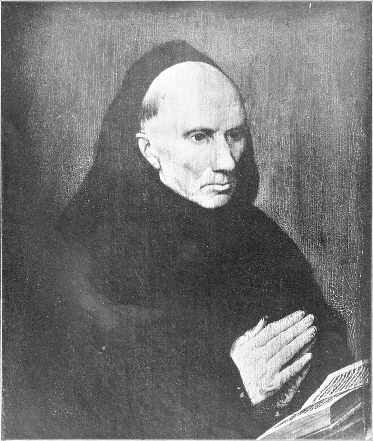

[Pg 333]
[Pg 333]
THE GEOGRAPHICAL DISTRIBUTION OF THE FIRST FOLIO SHAKESPEARE
❧ WRITTEN BY FRANK RINDER ❧
❧ WRITTEN BY FRANK RINDER ❧
N November 8, 1623, Edward Blount and Isaac Jaggard obtained the licence of the Stationers’ company for the publication, in the first folio edition of Shakespeare’s comedies and tragedies, of sixteen plays, not before printed. Some 265 years later the late Mr. Bernard Quaritch, in cataloguing a good copy of the completed work, directed attention to the fact that, based on the then value of the quartos, the twenty Shakespearian plays actually printed for the first time in the folio of 1623—for as many were included—would, as first editions, have a money-worth of from £3,500 to £4,000. All question of the quartos apart, however, a fine copy of the book, originally procurable for £1, might now realize from £2,000 to £3,000; indeed, the mean between these two sums is said to have been privately offered for a particularly well-known example. No printed book, apart from about a dozen monuments of typography from fifteenth-century presses, has fetched so much at auction as the £1,720 realized at Christie’s in 1901 for the Dormer-Hunter first folio, now in the possession of Mr. Charles Scribner of New York, albeit a few weeks previously £1,475 was the amount paid on behalf of a transatlantic collector for the scarcer Bunyan’s ‘Pilgrim’s Progress,’ in first edition, said to have been issued at 1s. 6d. ¶ That there was ample warrant for the publication of a new facsimile is acknowledged on all hands; and the folio recently produced by the Clarendon press has failed in few respects only to satisfy the most exigent of connoisseurs. The hypercritical observe that the plate-mark measures no more than 1211⁄16 in. by 7½ in., as against 13⅛, in. by 8⅛ in., the actual size of the pages of the duke of Devonshire’s copy at Chatsworth, on which the facsimile is based. On the whole, however, the volume has been cordially welcomed, and that welcome is merited. ¶ Interest and value are enhanced, of course, by the scholarly introduction and the census of known extant copies from the pen of Mr. Sidney Lee. Under his guidance we are enabled to take a bird’s-eye view of all relevant facts pertaining to the volume ‘which constitutes the greatest contribution yet made to English literature.’ Oversights and inaccuracies must of necessity have crept into the census, for Mr. Lee has been compelled to rely to a considerable extent, of course, on information supplied to him by owners and others. But who would have been prepared to undertake a like task, who would have been able to carry it to a more successful issue? ¶ Mr. Lee conjectures that the edition of the first folio consisted of 600 copies, of which not far short of one-third, in varying states, probably still exist. In 1616 and 1647 respectively there appeared the collected works of Ben Jonson and of Beaumont and Fletcher, each issued, he thinks, in about the same number of copies and at the same price of £1. At the sale of Sir Kenelm Digby’s library in April 1680 the Beaumont and Fletcher volume fetched 13s. 6d.; the Ben Jonson, with the folio of 1640 added, 17s. 6d. As most collectors are aware, the earliest record of the sale by auction of a first folio Shakespeare is of that in the library of Sir William and the Hon. Henry Coventry, dispersed in the Haymarket by W. Cooper on May 19, 1687; but, unfortunately, there is no mention of the sum realized. Mr. Lee states that the first priced record[Pg 335] belongs to 1756, when the Martin Folkes example, now in the Rylands library, was sold to George Steevens for 3 guineas. On the other hand, it has been affirmed that in an anonymous collection of books dispersed in 1687–8 a first folio fetched no more than 14s. ¶ It is felt that in one direction Mr. Sidney Lee might with advantage have taken a further step. He has gathered together the material necessary for making, not only a geographical analysis of the copies traced, but an analysis which shall show, too, the approximate condition of those to be found here or there. Of the 600 copies conjectured to have been printed in 1623, Mr. Lee mentions the present owners of 144, leaving the possessors of 14., whose particulars do not agree with those of any others, untraced. The total of 160, including the two copies named in the postscript, is made up by mention of an example stated to have been lost in the S.S. Arctic, 1854, and of that said to have been destroyed in the Chicago fire of 1871. In order to understand the table that follows, it is necessary in the first place to transcribe details of the four main classifications into which Mr. Lee divides the copies he has traced:—
N On November 8, 1623, Edward Blount and Isaac Jaggard got the license from the Stationers’ Company to publish the first folio edition of Shakespeare’s comedies and tragedies, which included sixteen plays that had not been printed before. About 265 years later, the late Mr. Bernard Quaritch, while cataloging a good copy of the completed work, pointed out that, based on the then value of the quartos, the twenty Shakespearean plays that were published for the first time in the folio of 1623 would, as first editions, be worth between £3,500 and £4,000. Setting aside questions about the quartos, however, a fine copy of the book, which originally could be purchased for £1, could now be worth between £2,000 and £3,000; in fact, it's said that a particularly well-known copy was privately offered around the average of these two amounts. No printed book, aside from about a dozen notable examples from fifteenth-century printing presses, has sold for as much at auction as the £1,720 achieved at Christie’s in 1901 for the Dormer-Hunter first folio, now owned by Mr. Charles Scribner of New York, even though just weeks earlier £1,475 was paid on behalf of a collector in America for the rarer first edition of Bunyan’s ‘Pilgrim’s Progress,’ which is said to have been priced at 1s. 6d. ¶ It is widely accepted that there was a strong justification for publishing a new facsimile; the folio recently produced by the Clarendon Press has only failed to satisfy the most demanding connoisseurs in a few small respects. The most critical observers note that the plate mark measures only 1211⁄16 in. by 7½ in., compared to 13⅛ in. by 8⅛ in., which is the actual size of the pages of the Duke of Devonshire’s copy at Chatsworth that the facsimile is based on. Overall, however, the volume has been warmly welcomed, and that reception is well-deserved. ¶ The interest and value are further enhanced by the scholarly introduction and the inventory of known extant copies by Mr. Sidney Lee. With his guidance, we can take a bird’s-eye view of all relevant facts related to the volume ‘which constitutes the greatest contribution yet made to English literature.’ There may inevitably be oversights and inaccuracies in the inventory since Mr. Lee had to rely significantly on information provided by owners and others. But who else would have been willing to undertake such a task or been able to carry it out more successfully? ¶ Mr. Lee estimates that the edition of the first folio consisted of 600 copies, of which almost one-third in various conditions likely still exist. The collected works of Ben Jonson and of Beaumont and Fletcher were published in 1616 and 1647, respectively, each thought to have been issued in about the same number of copies and at the same price of £1. At the sale of Sir Kenelm Digby’s library in April 1680, the Beaumont and Fletcher volume sold for 13s. 6d.; the Ben Jonson, along with the 1640 folio, sold for 17s. 6d. Most collectors know that the earliest record of the auction sale of a first folio Shakespeare is from the library of Sir William and the Hon. Henry Coventry, which was sold off in the Haymarket by W. Cooper on May 19, 1687; unfortunately, there is no record of the amount it fetched. Mr. Lee states that the first priced record[Pg 335] belongs to 1756, when the Martin Folkes copy, now in the Rylands library, was sold to George Steevens for 3 guineas. On the other hand, it has been claimed that in an anonymous collection of books sold off in 1687–8, a first folio sold for no more than 14s. ¶ It seems that Mr. Sidney Lee could have taken a further step in one area. He has compiled the necessary material to create not only a geographical analysis of the traced copies but also an analysis showing the approximate condition of those found here and there. Out of the estimated 600 copies printed in 1623, Mr. Lee mentions the current owners of 144, leaving 14 whose details do not match those of any others untraced. The total of 160, including the two copies named in the postscript, accounts for an example said to have been lost in the S.S. Arctic in 1854 and one claimed to have been destroyed in the Chicago fire of 1871. To understand the following table, it is first necessary to detail the four main classifications into which Mr. Lee divides the copies he has traced:—
|
CLASS I.—(PERFECT COPIES).
|
|||
|
Division.
|
|||
|
A.
|
I.–XIV.
|
Good, un-restored condition
|
14
|
|
B.
|
XV.–XLI.
|
Good condition, but with occasional leaves
either supplied from another copy of the first folio or repaired, i.e.,
mended, mounted, or inlaid
|
27
|
|
C.
|
XLII., XLIII.
|
Good condition, with leaves occasionally
supplied from later folios
|
2
|
|
43
|
|||
|
CLASS II.—(IMPERFECT).
|
|||
|
Division.
|
|||
|
A.
|
XLIV.–LIV.
|
Good condition, but with a few pages missing, and
occasionally other slight defects
|
11
|
|
B.
|
LV.–CV. and
LXXVII. |
Fair condition, but with fly-leaf and occasionally
other leaves missing, or supplied either from later folios or
in facsimile
|
52
|
|
C.
|
CVI.–CXXII.
|
Moderate condition, with most of preliminary and
other missing leaves in facsimile or from later folios
|
17
|
|
80
|
|||
|
CLASS III.—(STILL MORE IMPERFECT).
|
|||
|
Division.
|
|||
|
A.
|
CXXIII.–CXL.
and CXXXIV. |
Defective, numerous leaves in various sections
missing, or made up in facsimile or from later folios
|
19
|
|
B.
|
CXLI.–CXLVI.
|
Fragmentary
|
6
|
|
25
|
|||
|
CLASS IV.
|
|||
|
Division.
|
|||
|
A.
|
CXLVII.–CLVI.
|
Copies otherwise unclassed owing to lack of full
description
|
10
|
|
Copies alleged to have been destroyed
|
2
|
||
|
12
|
|||
|
Total
|
160
|
||
The accompanying table is an attempt to show at a glance the geographical distribution of the copies named by Mr. Lee. His estimate of condition has been scrupulously followed, even with regard to the first folio in the royal library at Berlin. In the Vossische Zeitung of February 10, and in The Times of the following day, there appeared a statement to the effect that a careless or malicious reader had mutilated this Berlin copy, which was bought of Joseph Lilly in 1858 and presented by the then prince-regent, afterwards Emperor William I., to the royal library, and that the whole of the ‘Comedy of Errors’ had been cut out. I communicated with the director of the library on this subject, and he courteously informs me that the statement, happily, is based on a misapprehension. The folio of 1623 is in the same condition as when presented forty-five years ago; on the other hand, the facsimile of 1806 has been robbed of eight leaves, including those on which the ‘Comedy of Errors’ is printed. As to distribution, I have assumed that the five copies sold in the United States during the past few years have there remained; of the three examples which occurred at Sotheby’s in 1902 I chance to know that one has gone to America, another is still in London; while since January copies LXXVIIIa, LXXX, and LXXXVI have been sold at auction and are entered under ‘London, private owners.’ It is worthy of remark that the three first folios in British colonies are presentations from public-spirited men: those at Capetown and Auckland are the gift of Sir George Grey; that at Sydney of Sir Richard Tangye.
The table below shows the geographical distribution of the copies mentioned by Mr. Lee. His assessment of the condition has been carefully followed, even regarding the first folio in the royal library in Berlin. On February 10, the Vossische Zeitung, followed by The Times the next day, reported that a careless or malicious reader had damaged this Berlin copy, which was bought from Joseph Lilly in 1858 and gifted by the then prince-regent, later Emperor William I., to the royal library, claiming that the entire 'Comedy of Errors' had been cut out. I contacted the library director about this, and he kindly informed me that the statement is fortunately based on a misunderstanding. The 1623 folio is in the same condition as when it was presented forty-five years ago; however, the 1806 facsimile is missing eight pages, including those that contain the 'Comedy of Errors.' Regarding distribution, I've assumed that the five copies sold in the United States in recent years remain there; of the three examples that appeared at Sotheby’s in 1902, I know that one went to America, while another is still in London. Since January, copies LXXVIIIa, LXXX, and LXXXVI have been sold at auction and are listed under 'London, private owners.' It's noteworthy that the three first folios in British colonies were gifts from generous individuals: the ones in Cape Town and Auckland were given by Sir George Grey, and the one in Sydney was given by Sir Richard Tangye.
[Pg 336]
[Pg 336]
|
CLASS I.
|
CLASS II.
|
CLASS III.
|
CLASS IV.
|
TOTAL.
|
|||||||||||||||||||
|
DDIVISION
|
DDIVISION
|
DIVISION
|
|||||||||||||||||||||
|
A
|
B
|
C
|
A
|
B
|
C
|
A
|
B
|
||||||||||||||||
|
Public
Insti- tutions. |
Private
Owners. |
Public
Insti- tutions. |
Private
Owners. |
Public
Insti- tutions. |
Private
Owners. |
Public
Insti- tutions. |
Private
Owners. |
Public
Insti- tutions. |
Private
Owners. |
Public
Insti- tutions. |
Private
Owners. |
Public
Insti- tutions. |
Private
Owners. |
Public
Insti- tutions. |
Private
Owners. |
Public
Insti- tutions. |
Private
Owners. |
Public
Insti- tutions. |
Private
Owners. |
Distribution of Copies.
|
|||
|
ENGLAND:—
|
|
|
|
|
|
|
|
|
|
|
|
|
|
|
|
|
|
|
|
|
|
|
|
|
London
|
2
|
2
|
2
|
4
|
—
|
—
|
2
|
1
|
3
|
8
|
1
|
1
|
—
|
4
|
2
|
—
|
—
|
1
|
12
|
21
|
LLONDON
|
33
|
|
|
UUniversities:—
|
|
|
|
|
|
|
|
|
|
|
|
|
|
|
|
|
|
|
|
|
|
|
|
|
Oxford
|
—
|
—
|
—
|
—
|
1
|
—
|
1
|
—
|
2
|
—
|
—
|
—
|
—
|
—
|
—
|
—
|
—
|
—
|
4
|
—
|

|
UUNIVERSITIES
|
7
|
|
Cambridge
|
2
|
—
|
—
|
—
|
—
|
—
|
—
|
—
|
1
|
—
|
—
|
—
|
—
|
—
|
—
|
—
|
—
|
—
|
3
|
—
|
|||
|
NNORTHERN CCOUNTIES:—
|
|
|
|
|
|
|
|
|
|
|
|
|
|
|
|
|
|
|
|
|
|
|
|
|
Northumberland
|
—
|
—
|
—
|
—
|
—
|
—
|
1
|
—
|
—
|
—
|
—
|
—
|
—
|
—
|
—
|
—
|
—
|
—
|
—
|
1
|
|
NNORTHERN
CCOUNTIES |
12
|
|
Durham
|
—
|
—
|
—
|
—
|
—
|
—
|
1
|
—
|
—
|
—
|
—
|
—
|
—
|
—
|
—
|
—
|
—
|
—
|
1
|
—
|
|||
|
Lancashire
|
—
|
1
|
—
|
2
|
—
|
—
|
2
|
—
|
1
|
—
|
—
|
1
|
—
|
—
|
—
|
—
|
—
|
—
|
3
|
4
|
|||
|
Yorkshire
|
—
|
—
|
—
|
—
|
—
|
—
|
—
|
—
|
—
|
2
|
—
|
—
|
—
|
1
|
—
|
—
|
—
|
—
|
—
|
3
|
|||
|
MIDLAND CCOUNTIES:—
|
|
|
|
|
|
|
|
|
|
|
|
|
|
|
|
|
|
|
|
|
|
|
|
|
Lincolnshire
|
—
|
—
|
—
|
—
|
—
|
—
|
—
|
—
|
—
|
1
|
—
|
—
|
—
|
—
|
—
|
—
|
—
|
—
|
—
|
1
|
|
MIDLAND
CCOUNTIES |
34
|
|
Nottinghamshire
|
—
|
—
|
—
|
—
|
—
|
—
|
—
|
—
|
—
|
2
|
—
|
—
|
—
|
—
|
—
|
—
|
—
|
—
|
—
|
2
|
|||
|
Derbyshire
|
—
|
—
|
—
|
1
|
—
|
—
|
—
|
—
|
—
|
1
|
—
|
—
|
—
|
—
|
—
|
—
|
—
|
—
|
—
|
2
|
|||
|
Cheshire
|
—
|
—
|
—
|
—
|
—
|
—
|
—
|
—
|
—
|
—
|
—
|
1
|
—
|
—
|
—
|
—
|
—
|
—
|
—
|
1
|
|||
|
Shropshire
|
—
|
—
|
—
|
—
|
—
|
—
|
—
|
—
|
—
|
—
|
—
|
—
|
—
|
1
|
—
|
—
|
—
|
—
|
—
|
1
|
|||
|
Staffordshire
|
—
|
—
|
—
|
—
|
—
|
—
|
—
|
—
|
—
|
—
|
—
|
—
|
—
|
—
|
—
|
—
|
—
|
1
|
—
|
1
|
|||
|
Leicestershire
|
—
|
—
|
—
|
1
|
—
|
—
|
—
|
—
|
—
|
—
|
—
|
—
|
—
|
—
|
—
|
—
|
—
|
—
|
—
|
1
|
|||
|
Norfolk
|
—
|
—
|
—
|
—
|
—
|
—
|
—
|
—
|
—
|
1
|
—
|
1
|
—
|
—
|
—
|
—
|
—
|
—
|
—
|
2
|
|||
|
Cambridgeshire
|
—
|
—
|
—
|
—
|
—
|
—
|
—
|
—
|
—
|
1
|
—
|
1
|
—
|
—
|
—
|
—
|
—
|
—
|
—
|
2
|
|||
|
Northamptonshire
|
—
|
1
|
—
|
—
|
—
|
—
|
—
|
—
|
—
|
2
|
—
|
1
|
—
|
—
|
—
|
—
|
—
|
—
|
—
|
4
|
|||
|
Warwickshire
|
—
|
—
|
1
|
—
|
—
|
—
|
—
|
1
|
1
|
1
|
1
|
—
|
—
|
—
|
1
|
—
|
—
|
—
|
4
|
2
|
|||
|
Worcestershire
|
—
|
—
|
—
|
—
|
—
|
—
|
—
|
—
|
—
|
2
|
—
|
—
|
—
|
—
|
—
|
—
|
—
|
—
|
—
|
2
|
|||
|
Gloucestershire
|
—
|
—
|
—
|
1
|
—
|
—
|
—
|
—
|
—
|
1
|
—
|
1
|
—
|
1
|
—
|
—
|
—
|
—
|
—
|
4
|
|||
|
Buckinghamshire
|
—
|
—
|
—
|
—
|
—
|
—
|
—
|
—
|
1
|
1
|
—
|
—
|
—
|
—
|
—
|
1
|
—
|
—
|
1
|
2
|
|||
|
Berkshire
|
—
|
—
|
—
|
—
|
—
|
—
|
—
|
—
|
—
|
1
|
—
|
—
|
—
|
1
|
—
|
—
|
—
|
—
|
—
|
2
|
|||
|
SSOUTHERN
CCOUNTIES:—
|
|
|
|
|
|
|
|
|
|
|
|
|
|
|
|
|
|
|
|
|
|
|
|
|
Sussex
|
—
|
—
|
—
|
1
|
—
|
—
|
—
|
—
|
—
|
—
|
—
|
1
|
—
|
1
|
—
|
—
|
—
|
—
|
—
|
3
|
|
SSOUTHERN
CCOUNTIES |
9
|
|
Hampshire
|
—
|
1
|
—
|
—
|
—
|
—
|
—
|
—
|
—
|
—
|
—
|
—
|
—
|
—
|
—
|
—
|
—
|
—
|
—
|
1
|
|||
|
Wiltshire
|
—
|
—
|
—
|
—
|
—
|
—
|
—
|
1
|
—
|
1
|
—
|
—
|
—
|
—
|
—
|
—
|
—
|
—
|
—
|
2
|
|||
|
Devonshire
|
—
|
—
|
—
|
—
|
—
|
—
|
—
|
—
|
—
|
—
|
—
|
—
|
1
|
1
|
—
|
—
|
—
|
—
|
1
|
1
|
|||
|
Cornwall
|
—
|
—
|
—
|
—
|
—
|
—
|
—
|
—
|
—
|
—
|
—
|
—
|
—
|
1
|
—
|
—
|
—
|
—
|
—
|
1
|
|||
|
|
|
|
|
|
|
|
|
|
|
|
|
|
|
|
|
|
|
|
|
|
ENGLAND
|
95
|
|
|
WALES (Crickhowell,
Newport) |
—
|
—
|
—
|
—
|
—
|
—
|
—
|
—
|
—
|
1
|
—
|
—
|
—
|
1
|
—
|
—
|
—
|
—
|
—
|
2
|
|
WALES
|
2
|
|
SCOTLAND (Glasgow,
Abernethy) |
—
|
1
|
—
|
—
|
—
|
—
|
—
|
—
|
1
|
—
|
—
|
—
|
—
|
1
|
—
|
—
|
—
|
—
|
1
|
2
|
|
SCOTLAND
|
3
|
|
IRELAND (Dublin)
|
—
|
—
|
—
|
—
|
—
|
—
|
—
|
—
|
1
|
—
|
—
|
—
|
—
|
—
|
—
|
—
|
—
|
—
|
1
|
—
|
|
IIRELAND
|
1
|
|
|
|
|
|
|
|
|
|
|
|
|
|
|
|
|
|
|
|
|
|
|
BRITISH ISLES
|
101
|
|
|
CONTINENT:—
|
|
|
|
|
|
|
|
|
|
|
|
|
|
|
|
|
|
|
|
|
|
|
|
|
Germany (Berlin)
|
—
|
—
|
—
|
—
|
—
|
—
|
—
|
—
|
1
|
—
|
—
|
—
|
—
|
—
|
—
|
—
|
—
|
—
|
1
|
—
|
|
CONTINENT
|
2
|
|
Italy (Padua)
|
—
|
—
|
—
|
—
|
—
|
—
|
—
|
—
|
1
|
—
|
—
|
—
|
—
|
—
|
—
|
1
|
—
|
—
|
1
|
—
|
|||
|
|
|
|
|
|
|
|
|
|
|
|
|
|
|
|
|
|
|
|
|
|
EUROPE
|
103
|
|
|
BRITISH COLONIES:—
|
|
|
|
|
|
|
|
|
|
|
|
|
|
|
|
|
|
|
|
|
|
|
|
|
Sydney
|
—
|
—
|
—
|
—
|
—
|
—
|
—
|
—
|
1
|
—
|
—
|
—
|
—
|
—
|
—
|
—
|
—
|
—
|
1
|
—
|
|
BRITISH
COLONIES |
3
|
|
Auckland
|
—
|
—
|
—
|
—
|
—
|
—
|
—
|
—
|
—
|
—
|
—
|
—
|
—
|
—
|
—
|
—
|
1
|
—
|
1
|
—
|
|||
|
Capetown
|
—
|
—
|
—
|
—
|
—
|
—
|
—
|
—
|
—
|
—
|
—
|
—
|
—
|
—
|
—
|
—
|
1
|
—
|
1
|
—
|
|||
|
UNITED STATES:—
|
2
|
2
|
4
|
10
|
1
|
—
|
—
|
1
|
—
|
11
|
2
|
5
|
—
|
4
|
1
|
1
|
—
|
2
|
10
|
36
|
|
UNITED STATES
|
46
|
|
Untraced
|
—
|
—
|
—
|
—
|
—
|
—
|
—
|
1
|
—
|
—
|
—
|
—
|
—
|
1
|
—
|
—
|
—
|
4
|
—
|
6
|
|
Untraced
|
6
|
|
|
6
|
8
|
7
|
20
|
2
|
—
|
6
|
5
|
14
|
38
|
4
|
13
|
1
|
18
|
4
|
2
|
2
|
8
|
46
|
112
|
|
|
158
|
|
CLASS I.
|
||||||
|
DDivision
|
||||||
|
A
|
B
|
C
|
||||
|
Public
Insti- tutions. |
Private
Owners. |
Public
Insti- tutions. |
Private
Owners. |
Public
Insti- tutions. |
Private
Owners. |
|
|
ENGLAND:—
|
|
|
|
|
|
|
|
London
|
2
|
2
|
2
|
4
|
—
|
—
|
|
UUNIVERSITIES:—
|
|
|
|
|
|
|
|
Oxford
|
—
|
—
|
—
|
—
|
1
|
—
|
|
Cambridge
|
2
|
—
|
—
|
—
|
—
|
—
|
|
NNORTHERN CCOUNTIES:—
|
|
|
|
|
|
|
|
Northumberland
|
—
|
—
|
—
|
—
|
—
|
—
|
|
Durham
|
—
|
—
|
—
|
—
|
—
|
—
|
|
Lancashire
|
—
|
1
|
—
|
2
|
—
|
—
|
|
Yorkshire
|
—
|
—
|
—
|
—
|
—
|
—
|
|
MIDLAND CCOUNTIES:—
|
|
|
|
|
|
|
|
Lincolnshire
|
—
|
—
|
—
|
—
|
—
|
—
|
|
Nottinghamshire
|
—
|
—
|
—
|
—
|
—
|
—
|
|
Derbyshire
|
—
|
—
|
—
|
1
|
—
|
—
|
|
Cheshire
|
—
|
—
|
—
|
—
|
—
|
—
|
|
Shropshire
|
—
|
—
|
—
|
—
|
—
|
—
|
|
Staffordshire
|
—
|
—
|
—
|
—
|
—
|
—
|
|
Leicestershire
|
—
|
—
|
—
|
1
|
—
|
—
|
|
Norfolk
|
—
|
—
|
—
|
—
|
—
|
—
|
|
Cambridgeshire
|
—
|
—
|
—
|
—
|
—
|
—
|
|
Northamptonshire
|
—
|
1
|
—
|
—
|
—
|
—
|
|
Warwickshire
|
—
|
—
|
1
|
—
|
—
|
—
|
|
Worcestershire
|
—
|
—
|
—
|
—
|
—
|
—
|
|
Gloucestershire
|
—
|
—
|
—
|
1
|
—
|
—
|
|
Buckinghamshire
|
—
|
—
|
—
|
—
|
—
|
—
|
|
Berkshire
|
—
|
—
|
—
|
—
|
—
|
—
|
|
SSOUTHERN
CCOUNTIES:—
|
|
|
|
|
|
|
|
Sussex
|
—
|
—
|
—
|
1
|
—
|
—
|
|
Hampshire
|
—
|
1
|
—
|
—
|
—
|
—
|
|
Wiltshire
|
—
|
—
|
—
|
—
|
—
|
—
|
|
Devonshire
|
—
|
—
|
—
|
—
|
—
|
—
|
|
Cornwall
|
—
|
—
|
—
|
—
|
—
|
—
|
|
|
|
|
|
|
|
|
|
WALES (Crickhowell,
Newport) |
—
|
—
|
—
|
—
|
—
|
—
|
|
SCOTLAND (Glasgow,
Abernethy) |
—
|
1
|
—
|
—
|
—
|
—
|
|
IRELAND (Dublin)
|
—
|
—
|
—
|
—
|
—
|
—
|
|
|
|
|
|
|
|
|
|
CONTINENT:—
|
|
|
|
|
|
|
|
Germany (Berlin)
|
—
|
—
|
—
|
—
|
—
|
—
|
|
Italy (Padua)
|
—
|
—
|
—
|
—
|
—
|
—
|
|
|
|
|
|
|
|
|
|
BRITISH COLONIES:—
|
|
|
|
|
|
|
|
Sydney
|
—
|
—
|
—
|
—
|
—
|
—
|
|
Auckland
|
—
|
—
|
—
|
—
|
—
|
—
|
|
Capetown
|
—
|
—
|
—
|
—
|
—
|
—
|
|
|
|
|
|
|
|
|
|
UNITED STATES:—
|
2
|
2
|
4
|
10
|
1
|
—
|
|
|
|
|
|
|
|
|
|
Untraced
|
—
|
—
|
—
|
—
|
—
|
—
|
|
|
6
|
8
|
7
|
20
|
2
|
—
|
|
CLASS II.
|
||||||
|
DVISION
|
||||||
|
A
|
B
|
C
|
||||
|
Public
Insti- tutions. |
Private
Owners. |
Public
Insti- tutions. |
Private
Owners. |
Public
Insti- tutions. |
Private
Owners. |
|
|
ENGLAND:—
|
|
|
|
|
|
|
|
London
|
2
|
1
|
3
|
8
|
1
|
1
|
|
UUniversities:—
|
|
|
|
|
|
|
|
Oxford
|
1
|
—
|
2
|
—
|
—
|
—
|
|
Cambridge
|
—
|
—
|
1
|
—
|
—
|
—
|
|
NNORTHERN CCOUNTIES:—
|
|
|
|
|
|
|
|
Northumberland
|
1
|
—
|
—
|
—
|
—
|
—
|
|
Durham
|
1
|
—
|
—
|
—
|
—
|
—
|
|
Lancashire
|
2
|
—
|
1
|
—
|
—
|
1
|
|
Yorkshire
|
—
|
—
|
—
|
2
|
—
|
—
|
|
MIDLAND CCOUNTIES:—
|
|
|
|
|
|
|
|
Lincolnshire
|
—
|
—
|
—
|
1
|
—
|
—
|
|
Nottinghamshire
|
—
|
—
|
—
|
2
|
—
|
—
|
|
Derbyshire
|
—
|
—
|
—
|
1
|
—
|
—
|
|
Cheshire
|
—
|
—
|
—
|
—
|
—
|
1
|
|
Shropshire
|
—
|
—
|
—
|
—
|
—
|
—
|
|
Staffordshire
|
—
|
—
|
—
|
—
|
—
|
—
|
|
Leicestershire
|
—
|
—
|
—
|
—
|
—
|
—
|
|
Norfolk
|
—
|
—
|
—
|
1
|
—
|
1
|
|
Cambridgeshire
|
—
|
—
|
—
|
1
|
—
|
1
|
|
Northamptonshire
|
—
|
—
|
—
|
2
|
—
|
1
|
|
Warwickshire
|
—
|
1
|
1
|
1
|
1
|
—
|
|
Worcestershire
|
—
|
—
|
—
|
2
|
—
|
—
|
|
Gloucestershire
|
—
|
—
|
—
|
1
|
—
|
1
|
|
Buckinghamshire
|
—
|
—
|
1
|
1
|
—
|
—
|
|
Berkshire
|
—
|
—
|
—
|
1
|
—
|
—
|
|
SSOUTHERN
CCOUNTIES:—
|
|
|
|
|
|
|
|
Sussex
|
—
|
—
|
—
|
—
|
—
|
1
|
|
Hampshire
|
—
|
—
|
—
|
—
|
—
|
—
|
|
Wiltshire
|
—
|
1
|
—
|
1
|
—
|
—
|
|
Devonshire
|
—
|
—
|
—
|
—
|
—
|
—
|
|
Cornwall
|
—
|
—
|
—
|
—
|
—
|
—
|
|
|
|
|
|
|
|
|
|
WALES (Crickhowell,
Newport) |
—
|
—
|
—
|
1
|
—
|
—
|
|
SCOTLAND (Glasgow,
Abernethy) |
—
|
—
|
1
|
—
|
—
|
—
|
|
IRELAND (Dublin)
|
—
|
—
|
1
|
—
|
—
|
—
|
|
|
|
|
|
|
|
|
|
CONTINENT:—
|
|
|
|
|
|
|
|
Germany (Berlin)
|
—
|
—
|
1
|
—
|
—
|
—
|
|
Italy (Padua)
|
—
|
—
|
1
|
—
|
—
|
—
|
|
|
|
|
|
|
|
|
|
BRITISH COLONIES:—
|
|
|
|
|
|
|
|
Sydney
|
—
|
—
|
1
|
—
|
—
|
—
|
|
Auckland
|
—
|
—
|
—
|
—
|
—
|
—
|
|
Capetown
|
—
|
—
|
—
|
—
|
—
|
—
|
|
|
|
|
|
|
|
|
|
UNITED STATES:—
|
—
|
1
|
—
|
11
|
2
|
5
|
|
Untraced
|
—
|
1
|
—
|
—
|
—
|
—
|
|
|
6
|
5
|
14
|
38
|
4
|
13
|
|
CLASS III.
|
CLASS IV.
|
|||||
|
DVISION
|
||||||
|
A
|
B
|
|||||
|
Public
Insti- tutions. |
Private
Owners. |
Public
Insti- tutions. |
Private
Owners. |
Public
Insti- tutions. |
Private
Owners. |
|
|
ENGLAND:—
|
|
|
|
|
|
|
|
London
|
—
|
4
|
2
|
—
|
—
|
1
|
|
UUniversities:—
|
|
|
|
|
|
|
|
Oxford
|
—
|
—
|
—
|
—
|
—
|
—
|
|
Cambridge
|
—
|
—
|
—
|
—
|
—
|
—
|
|
NNORTH CCOUNTIES:—
|
|
|
|
|
|
|
|
Northumberland
|
—
|
—
|
—
|
—
|
—
|
—
|
|
Durham
|
—
|
—
|
—
|
—
|
—
|
—
|
|
Lancashire
|
—
|
—
|
—
|
—
|
—
|
—
|
|
Yorkshire
|
—
|
1
|
—
|
—
|
—
|
—
|
|
MIDLAND CCOUNTIES:—
|
|
|
|
|
|
|
|
Lincolnshire
|
—
|
—
|
—
|
—
|
—
|
—
|
|
Nottinghamshire
|
—
|
—
|
—
|
—
|
—
|
—
|
|
Derbyshire
|
—
|
—
|
—
|
—
|
—
|
—
|
|
Cheshire
|
—
|
—
|
—
|
—
|
—
|
—
|
|
Shropshire
|
—
|
1
|
—
|
—
|
—
|
—
|
|
Staffordshire
|
—
|
—
|
—
|
—
|
—
|
1
|
|
Leicestershire
|
—
|
—
|
—
|
—
|
—
|
—
|
|
Norfolk
|
—
|
—
|
—
|
—
|
—
|
—
|
|
Cambridgeshire
|
—
|
—
|
—
|
—
|
—
|
—
|
|
Northamptonshire
|
—
|
—
|
—
|
—
|
—
|
—
|
|
Warwickshire
|
—
|
—
|
1
|
—
|
—
|
—
|
|
Worcestershire
|
—
|
—
|
—
|
—
|
—
|
—
|
|
Gloucestershire
|
—
|
1
|
—
|
—
|
—
|
—
|
|
Buckinghamshire
|
—
|
—
|
—
|
1
|
—
|
—
|
|
Berkshire
|
—
|
1
|
—
|
—
|
—
|
—
|
|
SSOUTHERN
CCOUNTIES:—
|
|
|
|
|
|
|
|
Sussex
|
—
|
1
|
—
|
—
|
—
|
—
|
|
Hampshire
|
—
|
—
|
—
|
—
|
—
|
—
|
|
Wiltshire
|
—
|
—
|
—
|
—
|
—
|
—
|
|
Devonshire
|
1
|
1
|
—
|
—
|
—
|
—
|
|
Cornwall
|
—
|
1
|
—
|
—
|
—
|
—
|
|
|
|
|
|
|
|
|
|
WALES (Crickhowell,
Newport) |
—
|
1
|
—
|
—
|
—
|
—
|
|
SCOTLAND (Glasgow,
Abernethy) |
—
|
1
|
—
|
—
|
—
|
—
|
|
IRELAND (Dublin)
|
—
|
—
|
—
|
—
|
—
|
—
|
|
|
|
|
|
|
|
|
|
CONTINENT:—
|
|
|
|
|
|
|
|
Germany (Berlin)
|
—
|
—
|
—
|
—
|
—
|
—
|
|
Italy (Padua)
|
—
|
—
|
—
|
—
|
—
|
—
|
|
|
|
|
|
|
|
|
|
BRITISH COLONIES:—
|
|
|
|
|
|
|
|
Sydney
|
—
|
—
|
—
|
—
|
—
|
—
|
|
Auckland
|
—
|
—
|
—
|
—
|
1
|
—
|
|
Capetown
|
—
|
—
|
—
|
—
|
1
|
—
|
|
|
|
|
|
|
|
|
|
UNITED STATES:—
|
—
|
4
|
1
|
1
|
—
|
2
|
|
Untraced
|
—
|
1
|
—
|
—
|
—
|
4
|
|
|
1
|
18
|
4
|
2
|
2
|
8
|
|
TOTAL.
|
|||||
|
Public
Insti- tutions. |
Private
Owners. |
Distribution of Copies.
|
|||
|
ENGLAND:—
|
|
|
|
|
|
|
London
|
12
|
21
|
LLONDON
|
33
|
|
|
UUniversities:—
|
|
|
|
|
|
|
Oxford
|
4
|
—
|
|
UUniversities
|
7
|
|
Cambridge
|
3
|
—
|
|||
|
NNORTHERN CCOUNTIES:—
|
|
|
|
|
|
|
Northumberland
|
—
|
1
|
|
NNORTHERN
CCOUNTIES |
12
|
|
Durham
|
1
|
—
|
|||
|
Lancashire
|
3
|
4
|
|||
|
Yorkshire
|
—
|
3
|
|||
|
MIDLAND CCOUNTIES:—
|
|
|
|
|
|
|
Lincolnshire
|
—
|
1
|
|
MIDLAND
CCOUNTIES |
34
|
|
Nottinghamshire
|
—
|
2
|
|||
|
Derbyshire
|
—
|
2
|
|||
|
Cheshire
|
—
|
1
|
|||
|
Shropshire
|
—
|
1
|
|||
|
Staffordshire
|
—
|
1
|
|||
|
Leicestershire
|
—
|
1
|
|||
|
Norfolk
|
—
|
2
|
|||
|
Cambridgeshire
|
—
|
2
|
|||
|
Northamptonshire
|
—
|
4
|
|||
|
Warwickshire
|
4
|
2
|
|||
|
Worcestershire
|
—
|
2
|
|||
|
Gloucestershire
|
—
|
4
|
|||
|
Buckinghamshire
|
1
|
2
|
|||
|
Berkshire
|
—
|
2
|
|||
|
SSOUTHERN
CCOUNTIES:—
|
|
|
|
|
|
|
Sussex
|
—
|
3
|
|
SSOUTHERN
CCOUNTIES |
9
|
|
Hampshire
|
—
|
1
|
|||
|
Wiltshire
|
—
|
2
|
|||
|
Devonshire
|
1
|
1
|
|||
|
Cornwall
|
—
|
1
|
|||
|
|
|
|
ENGLAND
|
95
|
|
|
WALES (Crickhowell,
Newport) |
—
|
2
|
|
WALES
|
2
|
|
SCOTLAND (Glasgow,
Abernethy) |
1
|
2
|
|
SCOTLAND
|
3
|
|
IRELAND (Dublin)
|
1
|
—
|
|
IIRELAND
|
1
|
|
|
|
|
BRITISH ISLES
|
101
|
|
|
CONTINENT:—
|
|
|
|
|
|
|
Germany (Berlin)
|
1
|
—
|
|
CONTINENT
|
2
|
|
Italy (Padua)
|
1
|
—
|
|||
|
|
|
|
EUROPE
|
103
|
|
|
BRITISH COLONIES:—
|
|
|
|
|
|
|
Sydney
|
1
|
—
|
|
BRITISH
COLONIES |
3
|
|
Auckland
|
1
|
—
|
|||
|
Capetown
|
1
|
—
|
|||
|
UNITED STATES:—
|
10
|
36
|
|
UNITED STATES
|
46
|
|
Untraced
|
—
|
6
|
|
Untraced
|
6
|
|
|
46
|
112
|
|
|
158
|
❧ RECENT ACQUISITIONS AT THE LOUVRE ❧
THREE IITALIAN ALBARELLI
OR some time past Italian fifteenth-century maiolica has been much sought after, and very justly; it would appear, however, that, so far, it is more admired than understood. Without doubt several works have been devoted to this subject. But if we attempt to divide it up into several groups, the various classifications seem neither very clear nor very definitive. ¶ The three druggists’ jars which have just been acquired by the Louvre will help in a certain degree to fix the date and to determine the centre of activity of one of the factories which we are trying to reconstitute at the present moment—a factory which Mr. Fraschetti has made his special study (in L’ Arte, 1898), as also Mr. Stettiner has done.[107] Articles from this factory are characterized by a decoration of long, large leaves, curving back at the end, half white and half painted, the veining only being indicated on the back side; these leaves are intermingled with a peculiar style of decoration, in which the eyes of peacocks’ feathers are presented together with large, round, blue and yellow flowers, standing out from a background of slender blue scroll-pattern. The principal pieces of this ware have been found at Rome. They are notably the druggists’ jars of the hospital of St. John Lateran, those of the apothecary Bruti, near the bridge of S. Angelo, the paving tiles in one of the chapels of the church of S. Maria del Popolo, and those in the church of S. Maria della Verità at Viterbo.[108] From this fact it has been concluded that this factory, which sprang more or less directly from Faenza, and which produced a great deal, must have been situated in Rome; and it has been proposed[Pg 337] to call it, at least provisionally, the Roman factory. ¶ The three albarelli in the Louvre belong, as the accompanying figures will show, to this class, for they are all decorated on one side with the large peculiar leaves. The most important of these jars, from an artistic point of view, bears on the front side the bust of a beardless man, which will at once recall similar figures on the Viterbo pavement. Before the face waves a streamer,[109] upon which the maker (who was evidently very illiterate) has traced an inscription, which does not seem to convey any meaning whatever:—AR ·IERIN ·RI · N · E · I · R · E. The two other jars are, truth to tell, but very mediocre specimens, but they are of great interest to the archaeologist, for they are decorated with armorial shields which furnish us with some very useful information. On one of these shields are quartered the arms of Aragon and Jerusalem; on the other are the same arms parti per pale with those of Milan. These armorial bearings[110] (very distinct though slightly simplified by the maker, as is generally the case) tell us for whom these jars were manufactured; they belonged, in fact, to Alfonzo II of Aragon, king of Naples and Sicily, who reigned one year (from 1494 to 1495) and died in the latter year at the age of forty-seven. He married in 1465 Hippolyta Maria Sforza (daughter of Francesco Sforza I, duke of Milan, and Bianca-Maria Visconti), who died at Naples in 1484.[111] These albarelli, which bear the coats-of-arms of the king and queen, must have been made between 1465 and 1484, or at the latest before 1495.
or some time now, Italian maiolica from the fifteenth century has been highly sought after, and rightly so; however, it seems that it is admired more than understood. There have undoubtedly been several works dedicated to this subject. Yet, when we try to categorize it into different groups, the classifications appear neither very clear nor definitive. ¶ The three apothecary jars recently acquired by the Louvre will help somewhat to establish the date and identify the main activity center of one of the factories we are currently trying to reconstruct— a factory that Mr. Fraschetti has studied in detail (in L’ Arte, 1898), as well as Mr. Stettiner. [107] Articles from this factory are marked by a decoration featuring long, large leaves that curl back at the end, half white and half painted, with the veining only indicated on the back; these leaves are mixed with a unique style of decoration that includes peacock feather eyes alongside large, round blue and yellow flowers, set against a background of slender blue scroll patterns. The main pieces of this ware have been discovered in Rome. Notably, these include the apothecary jars from the hospital of St. John Lateran, those from the apothecary Bruti near the S. Angelo bridge, the paving tiles from one of the chapels in the church of S. Maria del Popolo, and those in the church of S. Maria della Verità in Viterbo. [108] This leads us to conclude that this factory, which developed more or less directly from Faenza and produced a lot, must have been located in Rome; it has been suggested[Pg 337] to provisionally label it the Roman factory. ¶ The three albarelli in the Louvre belong to this category, as the accompanying figures will show, since they are all decorated on one side with the large distinctive leaves. The most significant of these jars, from an artistic standpoint, features on the front the bust of a beardless man, which immediately brings to mind similar figures found on the Viterbo pavement. A streamer waves before the face, [109] on which the maker (who was evidently not very literate) has inscribed a message that seems to make no sense: —AR ·IERIN ·RI · N · E · I · R · E. The other two jars, while not remarkable specimens, are very interesting to archaeologists because they are adorned with armorial shields that provide us with useful information. One of these shields displays the quartered arms of Aragon and Jerusalem; the other features these same arms arranged per pale with those of Milan. These armorial bearings [110] (very distinct though somewhat simplified by the maker, as is usually the case) tell us for whom these jars were made; they belonged to Alfonso II of Aragon, king of Naples and Sicily, who reigned for one year (from 1494 to 1495) and passed away that year at the age of forty-seven. He married Hippolyta Maria Sforza in 1465 (the daughter of Francesco Sforza I, duke of Milan, and Bianca-Maria Visconti), who died in Naples in 1484. [111] These albarelli, which display the coats-of-arms of the king and queen, must have been produced between 1465 and 1484, or at the latest before 1495.

Therefore they were made for a Neapolitan prince, and, furthermore, they come from Palermo.[112] This would agree very well with the hypothesis of[Pg 338] Messrs. Fraschetti and Stettiner, according to whom all the pieces in this style would be of Roman origin. It would seem natural indeed that Neapolitan sovereigns should address themselves to a factory in Rome which was much nearer than those in Faenza or Florence. But, on the other hand, it must not be forgotten that, even before the end of the fifteenth century, fanciers sent their orders to very distant factories, and also that the centres of ceramic industry were much more numerous in those days than is generally supposed.
Therefore, they were made for a Neapolitan prince, and, on top of that, they come from Palermo.[112] This aligns quite well with the theory of[Pg 338] Messrs. Fraschetti and Stettiner, who argue that all the pieces in this style are of Roman origin. It seems logical that Neapolitan rulers would reach out to a factory in Rome, which was much closer than those in Faenza or Florence. However, it should also be noted that even before the end of the fifteenth century, collectors were placing orders with factories that were very far away, and that there were many more centers of ceramic production at that time than is commonly believed.
J. J. MARQUET DE VASSELOT.
J. J. MARQUET DE VASSELOT.
PPICTURES
The latest acquisitions consist, in the first place, of two large landscapes by Salomon van Ruysdael. The photographs reproduced avoid the necessity of a detailed description. One of them is from a collection at Montpellier, the other from an Austrian collection. They both present large views of nature, very peaceful and very simple, banks of wide and sluggish rivers such as the first generation of the Dutch seventeenth-century landscape men loved to depict. The museum at Rotterdam possesses a picture by this same van Ruysdael; and we know that his contemporary, Jan van Goyen, who was his rival rather than his master, also took a special delight in painting the environs of that city on the banks of the Maas, with its great sheet of water spread calmly and majestically under the sky laden with grey or copper-coloured clouds. Do we find ourselves here in the same environs of Dordrecht? Probably; although it is impossible to assert this absolutely. ¶ One thing is certain, which is that the workmanship of these two pictures very closely approaches that of the other paintings attributed by modern critics to the uncle of the great Jacob van Ruysdael, as it does that of many other landscapes of that period. Although they do not descend to the almost monochrome appearance of certain van Goyens, brown and yellowish tones predominate, and a certain and rather monotonous uniformity stands revealed, notably in the clump of trees that forms the centre of one of the two compositions. But the moist and cloudy skies are filled with light: one, in the landscape with the two towers, has gaps through which appears a pale blue, with rosy streaks in the direction of the horizon; the other is a little greyer and sadder. A whole crowd of figures, all standing out clearly against the background, fills the bank and the river itself, on which barges are carrying herds and shepherds from one side of the river to the other. A group of horsemen of quality, in the landscape with the church, reminds us very closely of those which we see in the Halt at the Rijksmuseum in Amsterdam. This last picture is dated 1660. But it is much more complicated in composition and more compact in execution than are our two landscapes at the Louvre. The latter seem to belong to a less advanced period of the artist’s career, and are doubtless nearer the Pesth landscape (1631), the first that is known to us after the artist’s registry on the roll of the gild of St. Luke at Haarlem. In any case, these are two very fine museum-pieces, and most worthily represent the earlier of the two Ruysdaels at the Louvre, where as yet he was hardly represented at all, beside those unquestionable master-pieces of his nephew, the Dykes, the Thicket, and the landscape known as the Coup de soleil. ¶ As for the French picture which is also newly hung, this is the portrait of a woman, signed ‘L. Tocqué, 1793.’ It was exhibited at the Salon of the same year, and represents a certain Dame Danger, a perfectly unknown lady. It was, therefore, no iconographic interest that drew the attention of the keepers of the Louvre to this portrait, but rather the intrinsic charm of this very intimate and searching picture of a woman of the fashionable middle-class of the eighteenth century and the merit of its very simple and harmonious execution.[Pg 343] Jean Louis Tocqué was already abundantly represented at the Louvre, but chiefly by those official portraits of artist-academicians, of princes and princesses, which made his fortune, which sent him as far abroad as Sweden, Russia and Denmark, but which perhaps charm us less to-day than do those simple and discreet figures which make the society of the eighteenth century itself live once more before our eyes. This picture has been hung not far from the supposed portrait of Madame de Graffigny and from that of a man unknown, by the same artist, and these three figures of unknown persons, to whom we cannot help ascribing a wealth of wit and intelligence, form a charming trio together. ¶ The new-comer is engaged in parfilage or ‘unravelling.’ This occupation was greatly in fashion at the time; it formed an easy work which kept the fingers busy without interfering with conversation. The gold threads were separated from the silks of some piece of lace-work or embroidery and rolled on a special shuttle (we have preserved some that are marvels of delicate carving). Neither the eyes nor the mind needed to be kept fixed on this light labour, as we see in the present case, where the lady, who is no longer in her first youth under her powdered hair, but who still wears a seductively young appearance, looks up at her visitor or interlocutor with a calm and gentle gaze. She wears a grey fur cloak over a vieux-rose skirt; and the whole forms with the blues of the sofa on which she is seated a rare and delicate harmony which is one of the principal qualities of this picture.
The latest acquisitions include two large landscapes by Salomon van Ruysdael. The photographs included eliminate the need for a detailed description. One is from a collection in Montpellier, and the other is from an Austrian collection. Both depict expansive, tranquil views of nature, featuring wide, slow rivers similar to those favored by the first generation of Dutch landscape artists in the seventeenth century. The museum in Rotterdam has a painting by the same van Ruysdael; additionally, we know his contemporary and rival, Jan van Goyen, also enjoyed painting the areas around the city on the banks of the Maas, showcasing its great body of water peacefully stretched out under heavy grey or copper-colored clouds. Are we looking at the same surroundings of Dordrecht? Possibly; although it’s impossible to say for sure. What is certain is that the craftsmanship of these two paintings is very close to that of other works attributed by modern critics to the uncle of the famous Jacob van Ruysdael, as well as many other landscapes from that era. While they don't take on the almost monochromatic look of some of van Goyen’s works, brown and yellowish tones dominate, revealing a somewhat monotonous uniformity, especially in the cluster of trees that is the focal point of one composition. However, the damp and cloudy skies are filled with light: one landscape with two towers has openings showing pale blue skies with rosy streaks toward the horizon; the other is a bit greyer and gloomier. A crowd of figures stands out clearly against the background, filling the bank and the river itself, where barges transport livestock and shepherds from one side to the other. A group of well-dressed horsemen in the landscape with the church closely resembles those seen in The Halt at the Rijksmuseum in Amsterdam. This latter painting is dated 1660. However, it is much more complex in composition and more compact in execution compared to our two landscapes at the Louvre. The latter appear to belong to an earlier phase of the artist’s career, likely closer to the Pesth landscape (1631), the first known to us after the artist was registered in the St. Luke’s guild in Haarlem. In any case, these are two exceptional museum pieces that represent the earlier of the two Ruysdaels at the Louvre, where he was scarcely represented at all, next to the undeniable masterpieces of his nephew, like The Dykes, The Thicket, and the landscape known as The Coup de soleil. As for the French painting that has also been recently hung, it's a portrait of a woman, signed ‘L. Tocqué, 1793.’ It was exhibited at the Salon that same year and portrays a certain Dame Danger, an entirely unknown lady. Thus, it wasn't the iconographic interest that caught the Louvre's curators’ attention but rather the intrinsic charm of this intimate and insightful depiction of a woman from the fashionable middle class of the eighteenth century and the merit of its simple and harmonious execution. Jean Louis Tocqué is already well represented at the Louvre, primarily through his official portraits of artist-academicians, princes, and princesses, which earned him fame and took him as far as Sweden, Russia, and Denmark, but these may charm us less today than those simple and discreet figures, which allow us to relive the society of the eighteenth century. This portrait has been displayed near the assumed portrait of Madame de Graffigny and that of an unknown man by the same artist, and these three unknown figures, to whom we can't help but attribute a wealth of wit and intelligence, form a delightful trio together. The newcomer is engaged in parfilage or 'unraveling.' This pastime was very popular at the time; it was a simple task that kept fingers busy without getting in the way of conversation. The gold threads were separated from the silks in some lace or embroidery and rolled on a special shuttle (some of which remain as marvels of intricate carving). Neither the eyes nor the mind needed to stay focused on this light work, as illustrated here, where the lady, no longer young under her powdered hair but still carrying a youthful allure, looks up at her visitor or conversation partner with a calm and gentle expression. She wears a grey fur cloak over a vieux-rose skirt; together with the blues of the sofa she’s sitting on, it creates a rare and delicate harmony, which is one of the painting's key qualities.[Pg 343]
PAUL VITRY.
PAUL VITRY.

THE COVER OF A KOURS
In 1902, the Louvre acquired from a French collector residing in Cairo a piece of Arabic copper incrusted with gold and silver, the beauty and rarity of which deserve every attention. This piece is the lid or cover of a koursi, used sometimes as a stool on which the candlesticks are placed in a mosque, sometimes as a box to contain the Koran. To prove the rarity of this object I need only mention that no more than two such stools and one box of metal incrusted with gold and silver are known. These two famous objects bear the names of the Sultans Kalaoun and Mohammed el Nasser, and are preserved at the museum of Arabic art in Cairo. ¶ The koursi cover acquired by the Louvre is hexagonal in shape, but must originally have been circular, and formed a plate engraved and incrusted with silver about the middle of the thirteenth century. This hypothesis is confirmed by an examination of the reverse side, which allows of an engraved decoration that would not have been necessary in a real koursi top fixed to the body of the article itself. The centre, consisting of a rose with various designs, and the surrounding frieze, containing an interrupted inscription, give a name—Al Ganâb—and the following indication: ‘Belonging to Malik al Nasir.’ This title was common to several sultans in Egypt in the thirteenth and fourteenth centuries, and does not convey an exact indication of the period. ¶ The inscription is interrupted by six medallions. Their shape and the pointed arabesques in which they terminate seem characteristic of the thirteenth century. ¶ Later, in the fourteenth century, the plate must have been turned and cut out into a hexagon intended to serve as a koursi cover. The engraved decoration then added to it is executed with the greatest vigour and clearness, and is rich in incrustations in gold and silver. In the centre is a long inscription with radiating letters giving the customary titles of the contemporary sultan, the sacred names of God, the great, the sole, the glorious. This fine radiating inscription is peculiar, through its character and the decorative importance of the letters, to the art of the Egyptian engravers on copper of the fourteenth century.
In 1902, the Louvre acquired a beautiful and rare piece of Arabic copper inlaid with gold and silver from a French collector living in Cairo. This piece is the lid or cover of a koursi, which was sometimes used as a stool for placing candlesticks in a mosque and sometimes as a box to hold the Koran. To highlight its rarity, it’s worth noting that only two such stools and one metal box inlaid with gold and silver are known to exist. These two notable items are associated with Sultans Kalaoun and Mohammed el Nasser and are housed in the Museum of Arabic Art in Cairo. ¶ The koursi cover acquired by the Louvre is hexagonal in shape, but it was likely originally circular, designed as a plate engraved and inlaid with silver around the mid-thirteenth century. This idea is supported by an examination of the back, which shows engraved decoration that wouldn't have been necessary on a real koursi top attached to the body of the object. The center features a rose with various designs, and the surrounding frieze includes an interrupted inscription that mentions the name—Al Ganâb—along with the note: ‘Belonging to Malik al Nasir.’ This title was shared by several sultans in Egypt during the thirteenth and fourteenth centuries and doesn’t provide a specific date. ¶ The inscription is interrupted by six medallions. Their shape and the pointed arabesques at the ends appear typical of the thirteenth century. ¶ Later, in the fourteenth century, the plate was turned and cut into a hexagon to serve as a koursi cover. The engraved decoration added afterward is executed with great vigor and clarity, rich in gold and silver inlays. In the center is a long inscription with radiating letters that provides the customary titles of the reigning sultan, alongside the sacred names of God: the great, the sole, the glorious. This striking radiating inscription, notable for its style and the decorative importance of the letters, is characteristic of the art of Egyptian copper engravers in the fourteenth century.
GASTON MIGEON.
Gaston Migeon.
[Pg 344]
[Pg 344]

[Pg 348]
[Pg 348]
ON ORIENTAL CARPETS
ARTICLE IV.
❧ THE LOTUS AND THE TREE OF LIFE ❧
HAT the art of weaving textile fabrics was known and practised among the earliest civilized nations of the world appears to be beyond dispute. Primarily no doubt the need for some form of clothing (slight probably in a hot country) and for floor coverings which should afford a protection against scorpions and other venomous creatures and for sleeping mats called forth the production of cloths woven from reeds and grasses and from the fibres of large-leaved plants. Soon, however, the possibility of using the wool of goats and sheep and camels must have impressed itself on the minds of primitive weavers, and from this to the production of textiles proper was but a short and easy step in natural development. It is probable that a considerable time may have elapsed between the first production of woven fabrics and the time when the artistic need became felt for enhancing their appearance by the employment of colouring matters. The mind of the primitive manufacturer became no doubt gradually attuned to this necessity by the slow development of a natural desire to brighten the gloomy aspect of his darkened homes. (In this regard it will be borne in mind that an essential feature of all oriental interiors has ever been the exclusion, so far as may be, of the scorching glare of the sun’s rays.) The primitive houses of the earliest settled peoples were doubtless built of mud, as are those of their descendants to-day, and it would be difficult to imagine anything less attractive than the interior of an Upper Egypt, or Nubian or Mesopotamian house (which is to-day the exact counterpart of those we find on the paintings and bas-reliefs which have come down to us from the oldest times), with mud walls, mud floor, mud roof, all of a uniform dingy brown, and without furniture of any kind to relieve the eye. It is probable that the early weaver was in the habit of dyeing his woven products in some uniform colour for a considerable time before it occurred to him that richer effects might be produced by colouring his yarns in different tints previous to their employment on the loom. Having got so far it did not take very long before his manual dexterity had so far attained the level of his artistic aspirations as to impel him to seek models for the complicated designs he sought to introduce into his work. For these models, as for their colouring, he naturally turned to those forms which were constantly before his eyes in everyday life.
Hat the craft of weaving textile fabrics was recognized and practiced by some of the earliest civilizations in the world is pretty much undeniable. Initially, it was obviously driven by the need for clothing (minimal, perhaps, in warm climates) and for floor coverings to guard against scorpions and other harmful creatures, as well as for sleeping mats, leading to the creation of cloths made from reeds, grasses, and the fibers of large-leaved plants. Before long, though, the idea of using wool from goats, sheep, and camels must have struck the minds of early weavers, and transitioning to creating proper textiles was a straightforward and natural development. It likely took a significant amount of time between the first woven fabrics and when there was a felt need to enhance their appearance with colors. The primitive manufacturer probably gradually became aware of this need through a growing desire to brighten the dreary look of their dimly lit homes. (It’s worth noting that an essential aspect of all Oriental interiors has historically been to minimize, as much as possible, the harsh glare of the sun.) The early homes of the first settled peoples were likely made of mud, just like those of their descendants today, and it’s hard to imagine anything less appealing than the interior of an Upper Egypt, Nubian, or Mesopotamian house (which today mirrors what we see in ancient paintings and bas-reliefs), with mud walls, mud floors, and mud roofs, all in a dull brown and lacking any furniture to provide visual relief. It’s likely that early weavers would dye their woven products in some solid color for quite a while before realizing that richer looks could be achieved by coloring their yarns in different shades before using them on the loom. Once they reached that point, it didn’t take long before their manual skills matched their artistic ambitions, prompting them to look for models for the intricate designs they wanted to incorporate into their work. For these models, just like their colors, they naturally turned to the forms present in their everyday lives.

And among these most prominent no doubt was the lotus, which in one form or the other is invariably found to hold a prominent place in the centre or border of an oriental carpet. Probably the artistic weaver copied the numerous forms of the lotus long before he attached any symbolism to the plant itself, and merely because the flowing lines and sweeping curves of the plant appealed to his eye. Other tree and plant forms there were no doubt that commended themselves to him, and these, too, he sought to introduce into his designs; but the predominance of the lotus over all other forms early asserted itself and has maintained its position ever since. At what period the profound and mystic symbolism of the lotus became generally recognized among the peoples to whom it was a familiar object must ever remain a matter of controversy and of speculation.[Pg 349] Professor Goodyear, who has written an elaborate treatise on ‘The Grammar of the Lotus,’ regards this form of classic and ancient ornamentation as a development of sun worship. His theory briefly deals with the development of the sun symbols from the lotus by a series of complicated and ingenious evolutions. The lotus, according to him, was a fetish of immemorial antiquity, which has been worshipped in many countries from Japan to Gibraltar. He claims that it is the symbol of life, immortality, renaissance, resurrection and fecundity. He describes the three forms of lotus: the blue and the white, which differ but little save in colour, and the rose lotus, which is really not a lotus at all botanically speaking, and is not a native of Egypt but of India.
And among these, the lotus was definitely one of the most significant, usually appearing prominently in the center or border of an oriental carpet. The skilled weaver probably replicated the various forms of the lotus long before adding any symbolism to the plant itself, likely attracted by its flowing lines and sweeping curves. There were certainly other tree and plant forms that appealed to him, and he tried to incorporate those into his designs as well. However, the lotus's dominance over all other shapes quickly established itself and has remained strong ever since. The exact time when the deep and mystical symbolism of the lotus became widely acknowledged among the cultures familiar with it will always be a topic of debate and speculation. Professor Goodyear, who has written a detailed study called 'The Grammar of the Lotus,' sees this form of classic and ancient decoration as stemming from sun worship. His theory briefly discusses how sun symbols evolved from the lotus through a series of complex and clever transformations. According to him, the lotus has been a venerated object of ancient times, worshipped in many regions from Japan to Gibraltar. He argues that it symbolizes life, immortality, rebirth, resurrection, and fertility. He describes three forms of lotus: the blue and white lotuses, which are quite similar except for their color, and the rose lotus, which is technically not a lotus and is native to India, not Egypt. [Pg 349]
This lotus (the rose) is still cultivated in China as a food plant, and it is believed that it was brought to Egypt from India by Alexander the Great for that purpose; but that it was regarded by the Egyptians as a national symbol there is, in the opinion of Professor Goodyear, no sufficient evidence to show. ¶That the lotus was early regarded as a religious symbol in India and China is generally held. It is, of course, the sacred flower of the Buddhists. ‘When Buddha was born,’ says Moor in his ‘Hindu Pantheon,’ ‘a lotus bloomed where he first touched the ground; he stepped seven steps northward, and a lotus marked each foot-fall.’ The Buddhist prayer often quoted begins: ‘O God, the jewel of the lotus,’ or ‘O holy jewel in the lotus, be it so.’ In the Hindu theogony the lotus floating on the water is an emblem of the world, and the whole plant of the earth and its two principles of fecundation. Edwin Arnold, in ‘The Light of Asia,’ says: ‘Aum Mani pâdme hûm,’ of which the literal translation is, ‘All hail to the jewel in the flower of the lotus.’ He continues: ‘The sunrise comes,’ ‘The dew-drop slips,’ ‘Into the shining sea.’ ¶ Brahmans consider the sun to be the emblem or image of their great deities, jointly or individually, i.e. Brahma the supreme one, who alone exists really and absolutely. The legend goes that Brahma, according to a generally received system founded on a doctrine of the Vaishnavas, sprang on a lotus from the navel of Vishnu, who is the personification of the sun, to bid all worlds exist. ¶ Professor Goodyear maintains that the symbolism of the lotus, which is referred most frequently by modern writers to its phallic and generative or to its funereal and mortuary bearings, is based upon well-proved but not generally recognized solar significance. The easiest way to demonstrate this is by an appeal to the acknowledged fact that the Egyptian idea of the resurrection and of a future life was connected with the worship of the creative and reproductive forces of nature, which were conceived and worshipped as solar in character and origin. It is the supposed passage of the sun at night through a lower world during its return to the dawn of a following day which makes Osiris (the sun at night) the god of the lower world and of the dead, for which reason he is represented as a mummy. As the god of resurrection, the special and emphatic character of Osiris, he represents the creative power of the sun god; and thus the lotus, as the attribute of Osiris, is at once a symbol of the sun of resurrection, and of creative force and power.
This lotus (the rose) is still grown in China as food, and it’s believed that Alexander the Great brought it to Egypt from India for that reason; however, according to Professor Goodyear, there isn't enough evidence to support the idea that it was considered a national symbol by the Egyptians. That the lotus was seen as a religious symbol in India and China early on is widely accepted. It is, of course, the sacred flower of Buddhism. "When Buddha was born," says Moor in his "Hindu Pantheon," "a lotus bloomed where he first touched the ground; he stepped seven steps northward, and a lotus marked each footprint." The Buddhist prayer often quoted starts: "O God, the jewel of the lotus," or "O holy jewel in the lotus, let it be so." In Hindu creation stories, the lotus floating on water symbolizes the world and the whole plant of the earth and its two principles of fertilization. Edwin Arnold, in "The Light of Asia," mentions: "Aum Mani pâdme hûm," which literally translates to, "All hail to the jewel in the flower of the lotus." He goes on: "The sunrise comes," "The dew-drop slips," "Into the shining sea." Brahmans view the sun as the symbol or image of their great deities, either collectively or individually, meaning Brahma, the ultimate being, who truly and absolutely exists. The legend states that Brahma, according to a widely accepted belief based on a doctrine of the Vaishnavas, was born on a lotus from Vishnu's navel, who embodies the sun, to create all worlds. Professor Goodyear argues that the symbolism of the lotus, often linked by modern writers to phallic and generative or to funerary and mortuary contexts, is actually rooted in well-documented but not widely acknowledged solar significance. This can be easily demonstrated by pointing out that the Egyptian concept of resurrection and afterlife was tied to the worship of the creative and reproductive forces in nature, which were considered solar in nature and origin. It's thought that the sun traverses a lower world at night on its way to the dawn of a new day, which is why Osiris (the sun at night) is seen as the god of the underworld and the dead, represented as a mummy. As the god of resurrection, Osiris uniquely symbolizes the creative power of the sun god; thus, the lotus, as an attribute of Osiris, signifies both the sun of resurrection and creative force and power.

FROM THE COLLECTION OF MESSRS. GILLOW
Professor Goodyear further contends that the lotus, which he holds, as has been said, to be the keynote of decoration, is identical with the tree of life, or rather that the accepted tree of life is really a variant of the lotus in one form or the other of its many aspects. He objects to the theory that the date palm, the palmetta, or the papyrus is invariably the tree of life, as is held by several writers.¶ The weakness of the theory regarding the soma tree or [Pg 350] hom (date-palm) as the tree of life is not only the weakness of the palm theory, which is that no transitional forms between the palmetta and palm can be shown in Assyrian art and that they are not known to have grown there, because it is not to be denied that the sacred tree of Assyria[113] was the palm, but it is a pure hypothesis to suppose that all were soma trees.
Professor Goodyear argues that the lotus, which he believes is the central theme of decoration, is actually the same as the tree of life, or rather that the commonly accepted tree of life is just a variation of the lotus in its many forms. He disagrees with the idea that the date palm, the palmetta, or the papyrus is always the tree of life, as several authors claim.¶ The flaw in the theory regarding the soma tree or the hom (date palm) as the tree of life is not just a weakness in the palm theory, which cannot demonstrate any transitional forms between the palmetta and palm in Assyrian art, and that these plants are not known to have grown there. It is undeniable that the sacred tree of Assyria[113] was the palm, but it's purely speculative to assume that all were soma trees.

The Assyrian tree of life, he holds, was really an artificial form of the lotus, which plant was as well known in Assyria as in India. Sir George Birdwood, who gives a lengthy list of trees held sacred in one part or another of the east, is more or less emphatic as to the hom or soma, which he says is the date-palm, being the tree of life. He allows, however, that on Yarkand rugs the tree of life is represented by a pomegranate tree. As against this, Sayce, in one of the Hibbert lectures, as quoted by Goodyear, says that, ‘the cedar tree is identified with the tree of life,’ and ‘the palm is possibly later.’ The palm, he adds, is undoubtedly a symbol on Assyrian and Chaldean cylinders, as illustrated in Layard’s ‘Culte du Methra,’ but Goodyear does not[Pg 353] think that Layard’s text would give much support to the theory of ornamental palm symbolism in Assyria. Count Goblet d’Alviella, in his work on ‘La Migration des Symboles,’ bears out Goodyear and Sayce, and, to some extent, even Birdwood, as to the locality where the tree of life had its origin; but albeit he describes what he holds to be its early representation, he does not attempt to establish a theory as to what was the tree originally typified. The sacred tree, he says, is one of the earliest historic symbols (note he does not call it the tree of life) and had its origin in Mesopotamia; it passed thence to India, where it was used by Buddhists and Brahmans, and thence again to the Phoenicians, and from Asia Minor to Greece. From Persia it was introduced to the Byzantines, and found its way in early Christian times into Christian symbolism in Sicily, Italy, and even in the west of France. ¶ The earliest type, he claims, was a tree of complex and ornate pattern, having on either side of it a monster who faced each the other. These had the forms of winged bulls or of griffins.
The Assyrian tree of life, he suggests, was actually a stylized version of the lotus, which was familiar in both Assyria and India. Sir George Birdwood, who provides a detailed list of trees considered sacred in various parts of the East, strongly asserts that the hom or soma, identified as the date-palm, represents the tree of life. However, he notes that on Yarkand rugs, the tree of life is depicted as a pomegranate tree. In contrast, Sayce, during one of the Hibbert lectures, as cited by Goodyear, claims that "the cedar tree is identified with the tree of life," while "the palm is possibly later." He also mentions that the palm is undoubtedly a symbol on Assyrian and Chaldean cylinders, as shown in Layard’s ‘Culte du Methra,’ but Goodyear does not think that Layard's text provides strong support for the idea of ornamental palm symbolism in Assyria. Count Goblet d’Alviella, in his work ‘La Migration des Symboles,’ supports Goodyear and Sayce, and to some extent even Birdwood, regarding the origin of the tree of life. While he describes what he believes to be its early depiction, he does not attempt to establish a theory about what the tree originally symbolized. He states that the sacred tree is one of the earliest historic symbols (noting he doesn’t refer to it as the tree of life) and originated in Mesopotamia; it then moved to India, where it was utilized by Buddhists and Brahmans, and subsequently to the Phoenicians, eventually reaching Greece from Asia Minor. It was introduced to the Byzantines from Persia, and later found its way into early Christian symbolism in Sicily, Italy, and even the west of France. ¶ He claims the earliest type was a tree with a complex and ornate design, flanked by monsters facing each other, which took the forms of winged bulls or griffins.
Another type, which was that of the semi-human or human priests and kings, followed the same route into China and India and eastern Asia, and being found in the ancient Mexican and Maga codices, is held by Goblet d’Alviella as a part of the evidence which he cites in support of his theory of a pre-Columbian communication between the old world and the new. ¶ As opposed to Sir George Birdwood’s theory that the soma or hom is a date-palm, it may be pointed out that other authorities who are not less entitled to speak on the subject declare the soma of the Vedas[114] and the hom of the[Pg 354] Zendavesta[115] to be the Sarcostemma viminale, a leafless asclepiad with white flowers in terminal umbels which appear during the rains in the Dekhan. The flower obtains its name apparently from the fact that it is gathered by moonlight (presumably the full moon), the sanskrit word for the moon being soma. Its conveyance home in carts drawn by rams is accompanied by ceremonials. A fermented liquor is obtained from the flower by mixing its juice, which has been strained through a sieve of goats’ hair, with a preparation of barley and clarified butter or ghee. This beer or wine is used at religious festivals; it may be said that according to Hindu superstition the gods of their system can do nothing without having been previously stimulated with soma. In the second hymn of the Rigveda occurs this passage: ‘Approach, O Wayu; be visible; this Soma juice has been prepared for thee; approach, drink, hear our invocation.’ Many indeed are the allusions made in religious ceremonials to the invigorating power and even intoxicating qualities of the soma, as to which Windischmann suggests that the plant was identical with the gogard tree, which has the quality of ‘enlightening the eyes’ and which he compares with Ampelus, the vine of Bacchus. This same beverage is used at their meals by the Muhammedan Rishis in Kashmir, who abstain from animal food and from marriage. It may be said that Soma, as well as being the name of a tree, to which it may afterwards well have been given, is in the Hindo mythology the name of the son of Rishi Atri by his wife Anasuga (he is also said to be the son of Dharma and Prabhakara). He married the twenty-seven daughters of Daksha (which are the twenty-seven lunar asterisms). He also carried off Tara the wife of Brihaspati, who bore him a son and named him Buddha. This Buddha is regarded as being the parent of the lunar race. Thus are we inevitably brought back to Buddha and Buddhistic emblems and to the long-vanished origins from which those emblems were derived. The lotus, none have disputed, is the oldest known attribute of Buddhist symbolism, but is it not equally certain that the lotus existed in remote ages long antecedent to the dawn of Buddhism? Here then is matter which makes for the support of Professor Goodyear’s ingenious theory. He takes the sepals of the lotus in their natural form, he shows how they have been twisted and exaggerated into spirals and volutes, which, being squared on their passage through the Ionic style of architecture, formed at length what is known as the meander, Greek fret or key pattern, which being doubled produces the svastika. The svastika therefore, which every authority has acknowledged to be the most ancient expression of symbolism, as it is also the earliest form of ornamentation known to the world, should in accordance with this be regarded as identical with the lotus symbol in one of its many phases.
Another type, which included semi-human or human priests and kings, took a similar path into China, India, and eastern Asia. This concept, found in ancient Mexican and Maga codices, is presented by Goblet d’Alviella as evidence supporting his theory of pre-Columbian contact between the Old World and the New. ¶ In contrast to Sir George Birdwood’s theory that soma or hom is a date-palm, it should be noted that other authorities, equally qualified to weigh in on the matter, assert that the soma of the Vedas[114] and the hom of the [Pg 354] Zendavesta[115] refer to the Sarcostemma viminale, a leafless asclepiad with white flowers that bloom in clusters during the rainy season in the Dekhan. The flower likely got its name because it is gathered by moonlight (presumably during a full moon), as the Sanskrit word for moon is soma. Its transportation home in carts pulled by rams involves various rituals. A fermented drink is made from the flower by mixing its juice, which has been strained through a goats' hair sieve, with a mixture of barley and clarified butter or ghee. This beer or wine is consumed at religious celebrations; according to Hindu beliefs, their gods can do nothing without first being energized by soma. In the second hymn of the Rigveda, there's a passage: ‘Approach, O Wayu; be visible; this Soma juice has been prepared for you; come, drink, hear our invocation.’ There are many references in religious rituals to both the energizing power and the potential intoxicating effects of soma. Windischmann suggests that the plant may have been the same as the gogard tree, known for its ability to ‘enlighten the eyes,’ which he compares to Ampelus, the vine of Bacchus. This same beverage is also consumed by the Muhammedan Rishis in Kashmir, who avoid animal products and marriage. Soma, aside from being the name of a tree, which it might have been named after later, is in Hindu mythology the son of Rishi Atri and his wife Anasuga (he is also said to be the offspring of Dharma and Prabhakara). He married the twenty-seven daughters of Daksha (which correspond to the twenty-seven lunar mansions). He also abducted Tara, the wife of Brihaspati, who gave birth to a son named Buddha. This Buddha is seen as the ancestor of the lunar lineage. Thus, we are inevitably led back to Buddha and Buddhist symbols and to the long-lost origins from which those symbols came. The lotus, universally recognized, is the oldest known symbol in Buddhist iconography, but it is equally certain that the lotus existed in ancient times, long before Buddhism arose. This presents support for Professor Goodyear’s clever theory. He takes the lotus's natural form and illustrates how its sepals have been twisted and exaggerated into spirals and volutes. As they were integrated into the Ionic architectural style, this eventually formed what is known as the meander, Greek fret, or key pattern, which when doubled produces the svastika. Therefore, the svastika, acknowledged by all authorities as the most ancient symbol and the earliest form of ornamentation known to the world, should be viewed as identical to the lotus symbol in one of its many iterations.
[The previous articles of this series appeared in THE BURLINGTON MAGAZINE for March, May, and June.]
[The earlier articles in this series were published in THE BURLINGTON MMAGAZINE for March, May, and June.]

NOTES ON VARIOUS WORKS OF ART
THE SORÖ CHALICE
N the notice of a mediaeval chalice from Iceland in the June number of this Magazine (p. 70), mention was made, by way of comparison, of the silver chalice found in 1827 at Sorö, Denmark, in the grave of Absalon, bishop of Lund, who died in the year 1201. A view of this exceptionally interesting specimen of early Scandinavian work, still preserved in the church of Sorö, is shown in the accompanying illustration.[116] The character of the chalice, as revealed by the photograph, confirms the close relationship existing between it and the example which was the subject of the notice alluded to. The bowl nearly hemispherical in shape, the flattened globular knop, and the trumpet-shaped foot with bevelled margin finishing in a narrow turned-out edge, are the salient features of each alike. A point of distinction not quite so apparent in the engraving which was referred to[117] is the somewhat greater width in proportion to height of the Sorö chalice, giving a rather more spreading shape of bowl and foot. The bowl, too, is seen to have less of the tendency towards a straightening of the contour at its upper part, which, in the example from Iceland, seems to give a hint of the coming change of shape, an indication which suggests the lapse of a certain interval between their dates. The necking between the knop and bowl, on the other hand, is now shown to be of very similar proportions in both. This necking (called by Theophilus the ‘ring’) and the band below the knop are enriched with shallow fluting, somewhat hidden by the shadow in the photograph; the foot appears to have suffered injury from crushing. ¶ Certain features, such as the fully-expanded knop with enrichment above and below, and the fairly substantial character of the work apparent in the thickness at the edge of the foot, support the belief that the subject of the present illustration is an actual mass-chalice.[118] Whether made for service at the altar or merely for mortuary use the chalice is equally valuable as an example of the shape arrived at in Scandinavia in or before the year 1201.
N the notice of a medieval chalice from Iceland in the June issue of this Magazine (p. 70), there was a comparison made to the silver chalice discovered in 1827 at Sorø, Denmark, in the grave of Absalon, bishop of Lund, who passed away in 1201. An image of this incredibly interesting piece of early Scandinavian craftsmanship, still housed in the church of Sorø, is included in the illustration. [116] The design of the chalice, as shown in the photograph, confirms the strong connection between it and the chalice that was mentioned earlier. The bowl is nearly hemispherical, the flattened globular knop, and the trumpet-shaped foot with a bevelled edge that turns out narrow are the key features of both. One noticeable difference, not as clear in the engraving referred to [117], is that the Sorø chalice is somewhat wider in relation to its height, resulting in a more spread-out shape of the bowl and foot. Additionally, the bowl exhibits less of a tendency to straighten out at its upper part, which in the Icelandic example hints at a shift in shape, suggesting a time gap between their creation. The necking between the knop and the bowl, however, appears to have very similar proportions in both chalices. This necking (referred to as the ‘ring’ by Theophilus) and the band below the knop are decorated with shallow fluting, somewhat obscured by shadows in the photograph; the foot seems to have sustained damage from pressure. ¶ Certain features, like the fully-expanded knop with decorative elements above and below, and the sturdy nature of the craftsmanship visible in the thickness at the edge of the foot, support the idea that the chalice in this illustration is a true mass-chalice. [118] Whether it was made for use at the altar or just for burial purposes, the chalice is equally significant as an example of the design present in Scandinavia in or before 1201.
H. P. MITCHELL.
H. P. M. Itchell.
THE OAKEN CHEST OF YPRES
This chest of massive oak belongs to the office of archives at Ypres. It is perhaps the most curious and characteristic example of a kind familiar to antiquaries. In the middle panel, cut deep into the oak, St. George charges stoutly at the dragon, whose throat is stricken through with the lance. St. George’s head has a basnet, whose point ends in a socket with a feather stuck in it. This basnet has the camail and roundels over the ears. Over his hawberk the saint wears a short coat with long sleeves, wide and slittered at the edges. The saddle, with its great rolled guards for the legs, is noteworthy. The dragon is no writhing worm under the horse-hoofs, but a fearsome thing like to a mad bull-calf, a thing begotten of bull and serpent. Behind the monster stands Dame Cleodolinde, daintily lifting her skirt and no whit uneasy for the hurtling of horse[Pg 357] and dragon. Behind her are the town walls, with towers and halls above them. Out of frilled clouds over St. George’s head a divine arm is thrust, in a loose sleeve, with two fingers blessing the lance-thrust. In the broad uprights at the chest-end a gentleman and a lady in full round sleeves stand between pillars. Above them are battlements, and above the battlements mullioned windows. ¶ The broad lock of this chest remains, a lock of most interesting form. The whole chest was once painted in colours, traces of which remain here and there. When the fashion of the dresses and arms have been reckoned over, and something allowed for craft tradition, the chest would seem to be of the early years of the fifteenth century, although it came to the famous exhibition of 1902 at Bruges most absurdly labelled and catalogued as of the thirteenth.
This chest made of solid oak is part of the archives office in Ypres. It might be the most intriguing and unique example known to collectors. In the middle panel, carved deeply into the oak, St. George boldly charges at the dragon, whose throat is pierced by his lance. St. George wears a basinet helmet with a plume sticking out of it. This helmet includes a chain mail curtain and round ear guards. Over his chain mail, the saint dons a short coat with long sleeves, which is wide and split at the edges. The saddle, featuring large rolled leg guards, stands out. The dragon isn’t just a wriggling creature under the horse’s hooves but looks more like a crazed bull-calf, a creature born of both bull and serpent. Behind the monster is Lady Cleodolinde, gracefully lifting her skirt and showing no fear of the charging horse and dragon. Behind her rise the town walls, complete with towers and buildings above them. Above St. George’s head, a divine arm emerges from swirling clouds, with a loose sleeve and two fingers blessing the lance strike. In the broad uprights at the chest's end, a gentleman and lady in full round sleeves stand between columns. Above them are battlements, and above those, mullioned windows. The large lock on this chest remains, and it is of a very interesting design. The entire chest was once painted in vibrant colors, with traces still visible here and there. When the styles of the clothing and weapons are considered, along with some acknowledgment of craftsmanship traditions, the chest appears to be from the early years of the fifteenth century, although it was absurdly labeled and cataloged as thirteenth-century during the famous 1902 exhibition in Bruges.
A BURGUNDIAN CHEST
This great chest, which was shown at Bruges in 1902, is a noble example of the Burgundian school of wood-carving, its ornament offering sharp contrast with the English manner. ¶ The four panels of the front and three of the uprights are filled with rich carving of traceries and arabesques, but the chisel has stayed at the framework, and the chest, for all the richness of its ornament, loses nothing of its massive and sturdy appearance. The end panels are plain, and the plain cover is slightly arched in remembrance of the waggon tops of the earlier coffers. The first panel has a little shield of St. Peter’s keys, with the pope’s triple crown very large above it. The second has the emperor’s shield of the eagle with two necks surmounted by an open crown. Another crowned shield bears the famous badge of Burgundy, the steel, or strike-a-light, with its flint and sparks. The fourth panel has neither crown nor shield, but the tracery shapes itself into three fleurs-de-lys, which, although they be not upon a shield, may stand for the king of France. Thus the four panels show pope, emperor, duke and king. On the broad upright in the middle is a crown above a tiny shield charged with a single fleur-de-lys. It will be seen that the armorial decoration is poorly-conceived stuff to be set upon these rich panels. Especially is this feebleness manifest in the starveling fowl of the emperor’s shield. ¶ The chest is of the latter half of the fifteenth century. It is the property of the ‘hospices civils’ of Aalst.
This impressive chest, displayed in Bruges in 1902, is a striking example of the Burgundian wood-carving style, with its decoration providing a sharp contrast to the English style. ¶ The four front panels and three side panels are filled with intricate carvings of traceries and arabesques, but the chisel has left the frame untouched, so that even with all its ornate detail, the chest retains a strong and sturdy appearance. The end panels are plain, and the flat top is slightly arched, reminiscent of the wagon tops on earlier coffers. The first panel features a small shield with St. Peter's keys, topped by a large pope's triple crown. The second panel displays the emperor's shield featuring a two-headed eagle, topped with an open crown. Another crowned shield showcases the famous Burgundy badge, a steel strike-a-light with flint and sparks. The fourth panel lacks a crown or shield, but the tracery forms three fleurs-de-lys, which, while not on a shield, can represent the king of France. Thus, the four panels represent the pope, emperor, duke, and king. In the broad upright section in the middle, there's a crown above a small shield featuring a single fleur-de-lys. It’s clear that the heraldic decoration seems poorly imagined against the rich panels, particularly evident in the weak depiction of the emperor's shield. ¶ The chest dates from the latter half of the 15th century and belongs to the 'hospices civils' of Aalst.
O. B.
O. B.
A NEW FOUNT OF GREEK TYPE
The Greek type of which a specimen is shown on page 359 is based on the celebrated Alcalà fount of 1514. This was cut by order of Cardinal Ximenes for use in the New Testament of the great Complutensian polyglot Bible, and is usually supposed, though there is no direct evidence, to owe its form to an ancient manuscript which was sent to Spain by Leo X from the Vatican library to serve as the basis for the text of the New Testament in that work. The printer, Arnaldo Guillen de Brocar, asserts in his preface that the type was designed to do special honour to the original language of the Gospels. The present type is adapted from this Alcalà fount with little alteration, as far as the lower case is concerned, the chief change beyond an increase in size being as follows. The New Testament of 1514 was printed with no accents except the acute, and the body of the type was adjusted to this condition. But when Guillen came to print other books (the ‘Chrysoloras’ of the same year, the undated ‘Hero and Leander,’[Pg 358] and one or two others), he found it necessary to provide a complete set of accents, and as the body of the type was not high enough to give room for the tallest of these, he was compelled, in order to avoid recasting the whole fount, to hang these over the line above by means of what are called kerns. The result of this is that while the page produces a very fine solid effect, the lines are too close to each other for comfort in reading. This has been avoided in the new type by taking the tallest combination as the standard of height, and thus increasing the whites between the lines, with a corresponding increase of readableness. But the Alcalà type had only one capital letter, a Π, and it has been necessary to design the whole of the capitals for the new type, as no good models were available. The capitals have in fact always been the weakest point in Greek types. The points and other minor features are also new. ¶ The punches have been cut for Mr. Robert Proctor by Mr. E. P. Prince, who cut the punches for the Kelmscott, Doves, and other special founts, from drawings prepared by Messrs. Walker and Cockerell, and the type has been cast on a double-pica body by Messrs. Miller and Richard, of Edinburgh, the vowels and accents being made separately, and contrived by means of overhangs to combine into a single sort. It is proposed to use this, which will be called the Otter type, for the production of books representative of Greek literature of all periods, ancient, mediaeval, and modern. They will be printed by a hand-press on special hand-made paper in red and black, and no effort will be spared to give, in most cases for the first time since the invention of printing, a form worthy of them to the masterpieces of the greatest classical literature of the world. The first volume, which will probably appear in the autumn of this year, is to be the ‘Oresteia’ of Aeschylus, a quarto of some 250 pages.
The Greek type shown on page 359 is based on the famous Alcalà font from 1514. This was created on the orders of Cardinal Ximenes for the New Testament of the renowned Complutensian polyglot Bible, and while there’s no direct evidence, it’s generally believed to derive its design from an ancient manuscript sent to Spain by Leo X from the Vatican library, intended as the foundation for the New Testament text in that work. The printer, Arnaldo Guillen de Brocar, claims in his preface that the type was specifically designed to honor the original language of the Gospels. The current type adapts the Alcalà font with minimal changes to the lowercase letters; the main difference, aside from a size increase, is that the New Testament of 1514 was printed with only acute accents, and the font was tailored accordingly. However, when Guillen printed other works (the ‘Chrysoloras’ from the same year, the undated ‘Hero and Leander,’[Pg 358] and a few others), he found it essential to include a complete set of accents. Since the body of the type wasn’t tall enough to accommodate the largest accents, he had to extend them above the line using what are known as kerns. Consequently, while the page creates a visually appealing solid effect, the lines are too close for comfortable reading. This issue has been addressed in the new type by using the tallest combination as the height standard, thus increasing the spacing between lines and improving readability. However, the Alcalà type had only one capital letter, a Π, necessitating the design of an entirely new set of capital letters, as there were no good models available. Capitals have consistently been the weakest aspect of Greek types. The points and other minor features are also new. ¶ The punches for this type have been created for Mr. Robert Proctor by Mr. E. P. Prince, who also crafted punches for the Kelmscott, Doves, and other special fonts, from drawings made by Messrs. Walker and Cockerell. The type has been cast on a double-pica body by Messrs. Miller and Richard in Edinburgh, with vowels and accents made separately and designed to work together using overhangs. This new type, named Otter, will be used for publishing books that represent Greek literature from all periods—ancient, medieval, and modern. They will be printed using a hand press on special handmade paper in red and black, and every effort will be made to present, often for the first time since the invention of printing, a form worthy of the masterpieces of the world’s greatest classical literature. The first volume, likely to be released in the autumn of this year, will be Aeschylus's ‘Oresteia,’ a quarto of about 250 pages.
Τηλέμαχ᾽, οὔ σ᾽ ὁ ξεῖνος ἐνὶ μεγάροισιν ἐλέγχει ἥμενος, οὐδέ τι τοῦ σκοποῦ ἤμβροτον οὐδέ τι τόξον δὴν ἔκαμον τανύων· ἔτι μοι μένος ἔμπεδόν ἐστιν, οὐχ ὥς με μνηστῆρες ἀτιμάζοντες ὄνονται. νῦν δ᾽ ὥρη καὶ δόρπον Ἀχαιοῖσιν τετυκέσθαι ἐν φάει, αὐτὰρ ἔπειτα καὶ ἄλλως ἑψιάασθαι μολπῇ καὶ φόρμιγγι· τὰ γάρ τ᾽ ἀναθήματα δαιτός. ἦ καὶ ἐπ᾽ ὀφρύσι νεῦσεν· ὁ δ᾽ ἀμφέθετο ξίφος ὀξὺ Τηλέμαχος, φίλος υἱὸς Ὀδυσσῆος θείοιο, ἀμφὶ δὲ χεῖρα φίλην βάλεν ἔγχεϊ, ἄγχι δ᾽ ἄρ᾽ αὐτοῦ πὰρ θρόνον ἑστήκει κεκορυθμένος αἴθοπι χαλκῷ. ΟΔΥΣΣΕΙΑΣ ΒΙΒΛΟΣ ΕΙΚΟΣΤΟΣ ΔΕΥΤΕΡΟΣ ❆ αὐτὰρ ὁ γυμνώθη ῥακέων πολύμητις Ὀδυσσεύς ἆλτο δ᾽ ἐπὶ μέγαν οὐδὸν ἔχων βιὸν ἠδὲ φαρέτρην ἰῶν ἐμπλείην, ταχέας δ᾽ ἐκχεύατ᾽ ὀιστοὺς αὐτοῦ πρόσθε ποδῶν, μετὰ δὲ μνηστῆρσιν ἔειπεν. οὗτος μὲν δὴ ἄεθλος ἀάατος ἐκτετέλεσται· νῦν αὖτε σκοπὸν ἄλλον, ὃν οὔ πώ τις βάλεν ἀνήρ εἴσομαι, αἴ κε τύχωμι, πόρῃ δέ μοι εὖχος Ἀπόλλων. ἦ καὶ ἐπ᾽ Ἀντινόῳ ἰθύνετο πικρὸν ὀϊστόν. ἦ τοι ὁ καλὸν ἄλεισον ἀναιρήσεσθαι ἔμελλεν χρύσεον ἄμφωτον, καὶ δὴ μετὰ χερσὶν ἐνώμα ὄφρα πίοι οἴνοιο· φόνος δέ οἱ οὐκ ἐνὶ θυμῷ μέμβλετο. τίς κ᾽ οἴοιτο μετ᾽ ἀνδράσι δαιτυμόνεσσιν μοῦνον ἐνὶ πλεόνεσσι, καὶ εἰ μάλα καρτερὸς εἴη, οἷ τεύξειν θάνατόν τε κακὸν καὶ κῆρα μέλαιναν· τὸν δ᾽ Ὀδυσεὺς κατὰ λαιμὸν ἐπισχόμενος βάλεν ἰῷ ἀντικρὺ δ᾽ ἁπαλοῖο δι᾽ αὐχένος ἤλυθ᾽ ἀκωκή, ἐκλίνθη δ᾽ ἑτέρωσε, δέπας δέ οἱ ἔκπεσε χειρὸς βλημένου, αὐτίκα δ᾽ αὐλὸς ἀνὰ ῥῖνας παχὺς ἦλθεν αἵματος ἀνδρομέοιο, θοῶς δ᾽ ἀπὸ εἷο τράπεζαν ὦσε ποδὶ πλήξας, ἀπὸ δ᾽ εἴδατα χεῦεν ἔραζε.
Τηλέμαχε, ο ξένος δεν σε κατηγορεί εδώ μέσα, ούτε έχει χάσει το σκοπό του ή έχει ρίξει βέλος για πολύ· ακόμα έχω δύναμη μέσα μου, όχι όπως οι μνηστήρες που με απαξιώνουν. Τώρα είναι ώρα για τον φαγητό στους Αχαιούς στο φως, και μετά να τραγουδήσουμε με μουσική και λύρα· γιατί αυτά είναι τα αφιερώματα της γιορτής. Έκανε νόημα με το φρύδι· και ο Τηλέμαχος, ο γιος του θεϊκού Οδυσσέα, έβαλε το αγαπημένο του χέρι γύρω από το δόρατο, και κοντά του στεκόταν ο καλοφτιαγμένος χαλκός. ΟΔΥΣΣΕΙΑΣ ΒΙΒΛΟΣ ΕΙΚΟΣΤΟΣ ΔΕΥΤΕΡΟΣ ❆ τότε ο πολυμήχανος Οδυσσέας βγήκε από την ρακένδυτη κατάσταση και πήδηξε στο μεγάλο κατώφλι, έχοντας γεμάτο το βέλος του, και έριξε γρήγορα βέλη μπροστά από τα πόδια του, και μετά μίλησε με τους μνηστήρες. Αυτή είναι η μεγάλη προσπάθεια που έχει τελειώσει· τώρα όμως έχω άλλο στόχο, τον οποίο δεν έχει ρίξει κανείς μέχρι τώρα, αν τύχω να τον πετύχω, και ο Απόλλωνας θα μου δώσει καλή τύχη. Ήταν επίσης ακριβής στο να ρίξει το πικρό βέλος στον Αντίνοο. Έτσι ετοιμαζόταν να αφαιρέσει το όμορφο χρυσό που συνοδευόταν από τα χέρια του για να επωφεληθεί από το κρασί· όμως ο φόνος δεν ήταν στο μυαλό του. Ποιος μπορεί να νομίζει ότι θα είναι μόνος του με τους άλλους άνδρες σε ένα γλέντι, και αν είναι πολύ δυνατός, ποιος θα του φέρει κακό θάνατο και μαύρη μοίρα; Ο Οδυσσέας τον χτύπησε στο λαιμό με βέλος, και το βέλος πέρασε απαλά από τον αυχένα, κλίνοντας προς την άλλη πλευρά, και το κύπελλο έπεσε από το χέρι του, και αμέσως το αίμα του κυλούσε μέσα από τις ρινίδες του, και γρήγορα χτύπησε την τράπεζα με το πόδι του, και από εκεί έρεε τα νερά.
[Pg 359]
[Pg 359]
PORTRAIT OF A LADY BY REMBRANDT
HE important and interesting portrait by Rembrandt which is here reproduced has justly been given a place of honour among the works of that master now being shown in the exhibition of portraits by old masters at the Hague; indeed, in the opinion of many good critics it is one of the greatest attractions at the Kunstkring. Since permission was given to us by Messrs. Dowdeswell to reproduce the picture, it has passed out of their hands into those of Mr. Hage, a Dutch collector, by whom it has been lent to the Hague exhibition; it was formerly in the collection of Sir Matthew Wilson. The panel, which is 30 by 23¼ inches, was painted in the same year as The Anatomy Lesson, when Rembrandt was only twenty-six years old, and belongs, therefore, to his earliest period; that this is the case is proved by the signature on the right of the picture, ‘R. H. L. van Rijn 1632.’ The identity of the lady who is the subject of the portrait has not yet been established, and beyond the fact stated on the picture itself that she was thirty-nine at the time it was painted we know nothing about her. It is unnecessary to expatiate on the merits of the picture, which speaks for itself even in the reproduction.
HE important and compelling portrait by Rembrandt that's reproduced here has rightfully earned a prestigious spot among the works of that master currently displayed in the exhibition of portraits by old masters at The Hague; indeed, many respected critics consider it one of the main highlights at the Kunstkring. Since we received permission from Messrs. Dowdeswell to reproduce the artwork, it has moved from their collection to Mr. Hage, a Dutch collector, who has lent it to the Hague exhibition; it was previously part of Sir Matthew Wilson's collection. The panel measures 30 by 23¼ inches and was painted in the same year as The Anatomy Lesson, when Rembrandt was just twenty-six years old, making it a piece from his early period; this is confirmed by the signature on the right side of the painting, ‘R. H. L. van Rijn 1632.’ The identity of the woman in the portrait remains unknown, and aside from the indication on the painting that she was thirty-nine when it was created, we have no further information about her. It's unnecessary to elaborate on the quality of the painting, as it conveys its own excellence even in this reproduction.
The oil painting by Daubigny and the pastel by Lhermitte, of which we publish reproductions by kind permission of Mr. John Balli, are good examples of the work of the two French artists. They are among the pictures which have recently been exhibited at Mr. McLean’s gallery for the benefit of that excellent institution, the artists’ benevolent fund.
The oil painting by Daubigny and the pastel by Lhermitte, which we share here with the kind permission of Mr. John Balli, are great examples of the work of these two French artists. They are among the artworks recently displayed at Mr. McLean’s gallery to support the fantastic artists’ benevolent fund.
[Pg 360]
[Pg 360]


❧ BIBLIOGRAPHY ❧
THE AAMBASSADORS UNRIDDLED. By W. F. Dickes. London: Cassells.
MR. DICKES has been ill-advised to repeat and amplify, as he has done in this volume, a theory concerning Holbein’s picture of The Ambassadors of which all competent students recognized the futility when it was first broached in The Magazine of Art a dozen years ago. Since then the subject and history of the picture have been completely elucidated by Miss Mary Hervey in a book published in 1895. Her work is a model of patient, sagacious and fortunate industry. No links of any consequence are wanting in the chain of evidence, internal and external, by which she has made it certain that the portraits in the picture are those of two leading French diplomatists of the time, the one a man of the sword and the other of the robe, viz.: Jean de Dinteville, bailly of Troyes, and his friend, George de Selve, bishop of Lavaur; that the picture was painted by Holbein in London when the two friends were here together in the spring of 1533; and that it is the identical work described in three perfectly authentic documents of the mid-seventeenth century as having been preserved down to that date at Polisy, the seat of the Dinteville family in Champagne. The traditional name of the picture in the eighteenth century, The Ambassadors, is thus completely justified. Of one ambassador, M. de Selve, tradition had also quite rightly preserved the name; while of the other, Jean de Dinteville, the name had been lost; and the name D’Avaux, which belonged to a diplomatic family of a later generation, had been substituted mistakenly. It is the pleasure of Mr. Dickes to ignore these proofs, and to assert a rival theory for which there is not a shadow either of antecedent likelihood or of genuine evidence, while it is flatly at variance with tradition. His work, the result of no small industry and application of a blundering kind, is a pathetic example of the fate which awaits an untrained inquirer who has become possessed by an idée fixe and insists on burrowing with obstinate blindness in a hopelessly wrong direction. Kindness would suggest that such a performance should be ignored; but as its illusory air of candour and research has actually misled some unwary critics, let it be dealt with here as briefly and gently as the case admits. ¶ The theory of Mr. Dickes is that the picture represents the two German brothers, Otto Henry and Philip, counts palatine of the Rhine, who had their residence at Neuburg and were known as dukes of Neuburg, and that it was painted in celebration of a treaty of Nuremberg concluded between the Catholic and Protestant princes of Germany in 1532. The road by which the author has arrived at this conclusion is somewhat as follows: A conspicuous feature in the picture is a lute with a broken string. In Alciati’s famous book of Emblems, of which the first extant edition was published at Augsburg in 1531 (though some of the emblems had previously been in circulation, most probably in manuscript), a lute is the symbol of a treaty. Or rather it is the symbol of a particular group of treaties, Foedera Italorum; in all probability the league of Cognac, which in 1626 united the princes of Italy with France and England against the emperor. A set of Latin verses accompanies the emblem, and declares, among other things, that if a single string should be ill-stretched or broken, all power of pleasing will depart out of the instrument and its excellent music will become jangled. Obviously, therefore, if the lute with the broken string in Holbein’s picture has anything to do with Alciati and his emblems at all, it must signify a treaty broken and not a treaty made and confirmed. Mr. Dickes shuts his eyes to this root fact of the case, and builds all his argument on the patently false supposition that it is the emblem of a treaty signed and valid. Having further, on no reasonable grounds whatever, satisfied himself that the picture represents two brothers of whom one is Catholic and the other Protestant, he hunts up his history of the Reformation, and learns about the treaty of Nuremberg and the concern in it of the two brothers, Counts Otto Henry and Philip. From that moment it becomes a fixed dogma with him that these are the persons represented, and all facts and evidences have to be pulled about like putty in order to prove it. Thus the inscriptions on the picture, which are perfectly genuine, declare that Holbein painted it in 1533, and that at that date the age of the lay personage in short cloak, sword and dagger was twenty-nine, and of the clerical or legal personage in square cap and velvet gown, twenty-five. These indications absolutely fit alike the date of Dinteville’s mission, that of Selve’s visit, and those of Dinteville’s birth and Selve’s birth. But they are hopelessly out for[Pg 367] Counts Otto Henry and Philip. So it costs Mr. Dickes nothing to declare the inscription with the artist’s name and the date a forgery; when in fact it has been proved unquestionably genuine by the test of the same caretul processes which cleared away the dirt and accretions of time from other details in the work. Agreeing that the picture was painted in 1533 (for which there is no evidence at all except this same impeached inscription), Mr. Dickes then assumes the arbitrary date 1532 (that of the signature of his Nuremberg treaty) from which to calculate the ages of the sitters. Even so he cannot get them right, Otto Henry having been born in 1502 and Philip in 1503. The former thus still remains one year and the latter five years too old; so that in the case of Philip the figure 25 has to be declared, again without a shadow of foundation, to have been altered. ¶ Once more, the lay ambassador in the ordinary court dress of the time, short cloak, sword and dagger and tasselled belt, wears the badge of the French order of St. Michael, thus confirming the tradition and the probability that he was a Frenchman. This would be fatal to Mr. Dickes’s theory, so it has to be made out that the badge is not that of the famous order at all. For this Mr. Dickes has no better proof than that it is not identical with the same order as figured about a century later in Favyn’s ‘Théâtre d’Honneur et de Chevalerie.’ But there was no mechanical uniformity in the badge of the order as worn by its members, and still less in its representation by artists supplying their portraits. All students of French sixteenth-century portraiture, whether painted or engraved, can easily recall a dozen or a score of variations in the badge; while no such student could have a moment’s doubt that Holbein’s sitter, whatever else he was or was not, is declared by this badge to be a knight of the order. This is again one of the cardinal facts by which an inquirer must be guided, and to contradict it as Mr. Dickes does is merely idle. ¶ Again, Miss Hervey discovered in a Paris curiosity shop in 1895, and presented to the National gallery, a docketed seventeenth-century document on parchment fully describing the picture and its contents. Mr. Dickes at the time attacked the authenticity of this document in detail, on grounds which to any trained paleographer are ridiculous. In his book he does not reprint his arguments, but in an innocently impertinent dedication to the trustees of the National gallery coolly puts it aside as ‘supposititious.’ In point of fact it has no flaw whatever except that it is destructive of his theory. But worse: Miss Hervey, whose methods are as sound and scrupulous as those of Mr. Dickes are the reverse, also found in the library of the French Institute two other documents of the seventeenth century minutely confirming the contents of the first: these are papers of the Godefroy family relating to a correspondence between themselves and Nicholas Camusat, the well-known antiquary of Troyes, who had made it his business to collect historical and archaeological traditions concerning his native town and its distinguished families, including that of Dinteville. These documents are too irrefutable to be contested: Mr. Dickes therefore placidly ignores them. In like manner, in trying to show, what his theory requires, that the picture was painted not in London but in Germany, he ignores Miss Hervey’s proof that the pavement is copied strictly from one still extant in Westminster abbey. As a point on his side, he quotes as having been painted by Holbein at Basle in 1533 a picture of a Wheel of Fortune ‘in the collection of the duke of Westminster.’ The picture he means belongs in fact to the duke of Devonshire, and was painted by Hans Schäufelein; whose monogram and mark of a shovel have been tampered with but are still clearly discernible, and whose style is quite unlike that of Holbein. One more instance may suffice for the illustration of this gentleman’s incredible method of dealing with the evidences which substantiate the real meaning and contents of the picture. Among the instruments on the table symbolical of the arts to which these two cultivated and liberal young diplomatists were devoted, is a small hand globe, which has been identified as copied, with the addition of a certain number of place-names, from that published by Schöner at Nuremberg in 1523. On this globe the name of Nuremberg appears conspicuously, as of course is natural, since that was its place of publication. Mr. Dickes at once reads this as an evidence for his theory that the picture is meant to celebrate the peace of Nuremberg. Among the place-names added by the painter to those which were inserted by the cartographer are three of German provinces, four of Spanish provinces, five of French provinces, and three of French towns, Paris, Lyons and Bayonne, besides one which is that of Dinteville’s own village and fief in Champagne, Polisy (the s a little broken by a crack in the panel). These additions are exactly[Pg 368] what might have been expected to be dictated by a French diplomatist engaged in the combinations of his country at the time with Spain and Italy, while the insertion of Polisy is of course a final link in the proof that the lay ambassador is no other than Dinteville. This insertion is promptly and without a shadow of reason declared by Mr. Dickes an eighteenth-century forgery. ¶ Now for an instance of the kind of evidence with which this critic tries to support his own theory. Dinteville in the picture wears a girdle with a rich tassel hanging at the front. So do a number of great gentlemen in portraits of this time; as for instance the well-known Earl of Surrey at Hampton Court, and the sitter in the famous portrait of Morett in the gallery at Dresden. But Mr. Dickes thinks it a great point for his argument that a tassel (though one, as he does not mention, of other colours) was among the quarterings in the arms of his counts palatine. So he not only ignores its habitual use in the fashions of the day; he maintains that the Dresden picture, in which the sitter also wears the tassel, is another and later portrait of the same Count Otto Henry, and that it was painted not by Holbein but long after Holbein’s death by Christoph Amberger. The suggestion is merely preposterous: the Dresden picture is not only by Holbein, but one of the very finest and the most central of his works, of far finer artistic quality, indeed, than our National gallery picture; and the features have no resemblance to those of Dinteville (Mr. Dickes’s Otto Henry) in the London picture except in the mere fashion of the hair and beard. Moreover, the identity of the sitter in the Dresden picture as another French ambassador to England, Charles de Soliers, sieur de Morette, has lately been put out of the possibility of doubt by the discovery of a fine contemporary medallion portrait of the same sitter, in boxwood, with his name and titles in full and on the back his device of a seaport, a horse, and a dolphin. ¶ But why pursue the ungrateful subject farther? Mr. Dickes’s book bristles on every page with similar absurdities of statement and of inference. Fortunately, for any qualified and careful reader, he sometimes provides an antidote against his own theories by himself furnishing the obvious means of their refutation. Nothing, for instance, could be more grotesque than the collection of different and totally unlike portraits which he has picked out of various galleries in Europe, and would persuade us to accept as all representing the valiant Count Philip, the defender of Vienna. The mere possibility of his taking all these, together with the French cleric in The Ambassadors, for one and the same person, would seem to argue him form-blind in the same degree as the whole tenour of his book unfortunately argues him fact-blind and evidence-proof.
MR. DICKES has been poorly advised to restate and expand, as he has in this book, a theory about Holbein’s painting of The Ambassadors that all knowledgeable scholars dismissed as pointless when it was first introduced in The Magazine of Art twelve years ago. Since then, the subject and history of the painting have been thoroughly explained by Miss Mary Hervey in a book published in 1895. Her work is an excellent example of diligent, insightful, and effective research. There are no significant gaps in the internal and external evidence she presents, which confirms that the subjects in the painting are two prominent French diplomats of the time: one a military man and the other a cleric, namely Jean de Dinteville, bailly of Troyes, and his friend George de Selve, bishop of Lavaur. The painting was created by Holbein in London while the two friends were together in the spring of 1533, and it is the very piece described in three perfectly authentic mid-seventeenth-century documents as being preserved until that time at Polisy, the home of the Dinteville family in Champagne. Therefore, the traditional name given to the painting in the eighteenth century, The Ambassadors, is completely justified. The name of one ambassador, M. de Selve, has also been accurately preserved in tradition, while the name of the other, Jean de Dinteville, was lost and mistakenly replaced with D’Avaux, belonging to a diplomatic family from a later generation. Mr. Dickes chooses to overlook these facts and promotes an opposing theory that lacks any foundation or true evidence, and is directly contrary to established tradition. His work, a product of considerable effort but flawed reasoning, is a sad example of what happens to an untrained researcher who becomes fixated on a false idea and stubbornly insists on digging in an entirely wrong direction. Kindness would suggest ignoring such an effort, but because its seemingly honest appearance has misled some unsuspecting critics, it must be addressed here briefly and gently. Mr. Dickes’s theory is that the painting depicts two German brothers, Otto Henry and Philip, counts palatine of the Rhine, who resided at Neuburg and were known as dukes of Neuburg, and that the work was created to celebrate the Nuremberg treaty ratified between the Catholic and Protestant princes of Germany in 1532. His reasoning follows this line: A notable feature in the painting is a lute with a broken string. In Alciati’s famous book of Emblems, which had its first known edition published in Augsburg in 1531 (though some of the emblems were likely circulating earlier in manuscript form), a lute symbolizes a treaty. More specifically, it symbolizes a particular group of treaties, Foedera Italorum; likely referring to the league of Cognac, which in 1626 united the princes of Italy with France and England against the emperor. Accompanying the emblem is a set of Latin verses that state among other things that if a single string is ill-stretched or broken, all joy will depart from the instrument and its beautiful music will become discordant. Clearly, if the broken-string lute in Holbein’s painting relates to Alciati and his emblems in any way, it must signify a broken treaty and not a treaty concluded and upheld. Mr. Dickes ignores this primary fact and builds his entire argument on the obviously false assumption that it represents a treaty that was signed and valid. With no rational justification, he convinces himself that the painting features two brothers, one Catholic and the other Protestant, and he scours his history of the Reformation, learning about the Nuremberg treaty and the involvement of these two brothers, Counts Otto Henry and Philip. From that point on, he clings to the belief that these are the subjects depicted, manipulating facts and evidence to support this interpretation. The inscriptions on the painting, which are entirely genuine, indicate that Holbein painted it in 1533, and at that time, the lay figure in the short cloak, sword, and dagger was twenty-nine years old, and the clerical or legal figure in the square cap and velvet gown was twenty-five. These details perfectly align with the timelines of Dinteville’s mission, Selve’s visit, and their respective birth years. However, they are completely inconsistent with Counts Otto Henry and Philip. Mr. Dickes finds it easy to dismiss the inscription with the artist’s name and the date as a forgery, even though it has been undeniably proven genuine through the same careful processes that cleared away layers of time from other aspects of the work. Accepting that the painting was done in 1533 (of which there is no evidence except for this same contested inscription), Mr. Dickes arbitrarily assumes the date 1532 (the year of his Nuremberg treaty signature) to calculate the sitters’ ages. Even then, he fails to get it right; Otto Henry was born in 1502 and Philip in 1503. Thus, Otto Henry remains one year too old, and Philip five years too old, requiring Mr. Dickes once again to declare the figure 25 to have been altered, with no credible basis for such a claim. Additionally, the lay ambassador, in typical court dress of the time—short cloak, sword, dagger, and tasselled belt—bears the badge of the French order of St. Michael, confirming the tradition and likelihood that he was French. This would undermine Mr. Dickes’s theory, so he must argue that the badge doesn’t belong to this well-known order at all. For this assertion, Mr. Dickes offers no better evidence than that it doesn't match the uniform of the order as depicted about a century later in Favyn’s ‘Théâtre d’Honneur et de Chevalerie.’ However, there was no strict standardization in the badge of the order as worn by its members, much less in artistic representations. Any student of French portraiture from the sixteenth century, whether painted or engraved, can easily recall numerous variations on the badge, and no scholar could doubt that Holbein’s subject, whatever else he was or wasn't, is clearly identified by this badge as a knight of the order. This is yet another fundamental fact that an investigator must acknowledge, and contradicting it, as Mr. Dickes does, is simply pointless. Furthermore, Miss Hervey discovered a seventeenth-century document on parchment in a Paris curiosities shop in 1895 that fully describes the painting and its contents, which she presented to the National Gallery. At that time, Mr. Dickes questioned the authenticity of this document in detail, using arguments that any trained paleographer would find laughable. He does not include those arguments in his book but rather dismisses them as ‘supposititious’ in a disrespectful dedication to the trustees of the National Gallery. In reality, the document has no flaws except that it undermines his theory. Worse still, Miss Hervey, whose methods are as reliable and meticulous as Mr. Dickes’s are not, discovered two additional seventeenth-century documents in the library of the French Institute that confirm the contents of the first one. These papers belong to the Godefroy family and discuss their correspondence with Nicholas Camusat, the well-known antiquarian from Troyes, who sought to gather historical and archaeological information about his hometown and its prominent families, including the Dinteville family. These documents are too irrefutable to be disputed, hence Mr. Dickes conveniently ignores them. Similarly, in his attempt to demonstrate that the painting was created not in London but in Germany, he overlooks Miss Hervey’s proof that the pavement is directly copied from one that still exists in Westminster Abbey. As a point in his favor, he incorrectly states that Holbein painted a Wheel of Fortune in Basel in 1533, which actually belongs to the Duke of Devonshire, not the Duke of Westminster, and was created by Hans Schäufelein. Mr. Dickes has tampered with and misinterpreted the monogram and shovels, which are still visible, and the style differs greatly from Holbein's. One more instance will illustrate this gentleman’s astonishing method of handling evidence that supports the true meaning and content of the painting. Among the items on the table symbolizing the arts that these two educated and cultured young diplomats were passionate about is a small globe, which has been identified as a copy, with several place names added, from one published by Schöner in Nuremberg in 1523. On this globe, the name Nuremberg appears prominently, which is logical since that was its publication place. Mr. Dickes interprets this as evidence for his theory that the painting was meant to celebrate the peace of Nuremberg. Among the place names added by the artist, there are three from German provinces, four from Spanish provinces, five from French provinces, and three towns in France: Paris, Lyons, and Bayonne, plus one from Dinteville’s own village and fief in Champagne, Polisy (the "s" slightly broken by a crack in the panel). These additions are precisely what one would expect from a French diplomat involved in his country's dealings with Spain and Italy, while including Polisy serves as further proof that the lay ambassador is none other than Dinteville. Mr. Dickes promptly declares this addition, without justification, as an eighteenth-century forgery. Now let’s look at an example of the type of evidence Mr. Dickes uses to support his own theory. Dinteville in the painting wears a belt with a rich tassel at the front, similar to many noblemen in portraits of the time; for example, the well-known Earl of Surrey at Hampton Court, and the sitter in the famous portrait of Morett in the Dresden gallery. Mr. Dickes presents a tassel (though of different colors, which he neglects to mention) as a significant point for his argument, claiming it was among the quarterings in the arms of his counts palatine. Not only does he ignore its common usage in fashion at the time, but he also asserts that the Dresden picture, in which the sitter also wears a tassel, is yet another, later portrait of Count Otto Henry, claiming it was painted not by Holbein but long after his death by Christoph Amberger. This suggestion is utterly absurd: the Dresden painting is undoubtedly by Holbein and is one of his finest, more significant works, with superior artistic quality compared to our National Gallery painting; the features bear no resemblance to those of Dinteville (Mr. Dickes’s Otto Henry) in the London painting, except in general hair and beard style. Furthermore, the identity of the sitter in the Dresden painting as yet another French ambassador to England, Charles de Soliers, sieur de Morette, has recently been established beyond doubt due to the discovery of a beautiful contemporary medallion portrait of the same man, made of boxwood, displaying his name and titles in full, along with his emblem of a seaport, a horse, and a dolphin on the reverse. But why continue with this unproductive topic? Mr. Dickes’s book is filled with similar absurdities on every page. Fortunately, for any qualified and careful reader, he sometimes provides ammunition against his own theories by inadvertently presenting clear means of their refutation. For instance, nothing could be more ridiculous than the assortment of different and entirely dissimilar portraits he has gathered from various galleries in Europe, claiming they all depict the brave Count Philip, the defender of Vienna. The mere possibility of him grouping these images, alongside the French cleric in The Ambassadors, as one and the same person, suggests that he is as blind to form as his entire approach demonstrates he is blind to fact and immune to evidence.
S. C.
S.C.
UN DES PEINTRES PEU CONNUS DE’ÉCOLE FLAMANDE DE TRANSITION. Jean Gossart de Maubeuge, sa vie et son œuvre, d’après les dernières recherches et des documents inédits. Par Maurice Gossart. 147 pp., 2 engravings, and 12 phototypes. Lille, 1903.
Being at Veere some years ago, and finding that I had a few hours at my disposal before the members of the gild of St. Thomas and St. Luke could arrive, I bethought me of the local archives, which I fancied would probably contain documents throwing light on the history and works of Gossart. I found the archives in confusion, and was not so fortunate as to discover anything. I had hoped on taking up the present volume to find that the author had been more fortunate, but, alas, it contains no mention of these archives, which probably still await the visit of someone with leisure and patience to devote to their examination. It is a pity that M. Gossart has not been able to undertake this; still we must be thankful for what he has done. Any attempt to clear up the history of an artist of note, especially of one to whom many works are attributed, is deserving of praise and encouragement. The settling of the date of Gossart’s visit to Italy with Philip of Burgundy and of his death are two important additions to our knowledge. ¶ John Gossart, son of Simon, a bookbinder, was born at Maubeuge about 1472. It is not known when or to whom he was apprenticed, or where he worked prior to 1503, in which year he was admitted as free master into the gild of St. Luke at Antwerp. In 1508 he went to Rome with his patron, Philip of Burgundy, admiral of Flanders, who was sent by the Archduchess Margaret on an embassy to Pope Julius II. Starting from Mechlin on October 26, 1508, they visited Verona and Florence on their way to the Eternal City, where, after the return of Philip, Gossart remained copying antique works of art for him until July 1509, when he set out for the Netherlands, arriving at Middleburg in November. ¶ He remained in the service of Philip until the death of that prince in 1524, and then entered that of Adolphus of Burgundy, marquis of Veere, with whom he remained until his death in 1533. So far good, and had the[Pg 369] author stopped here we should have had no fault to find with him, but he has endeavoured to draw up a list of Gossart’s paintings, a task for which he is evidently little fitted. Not only has he omitted several important works, such as the early picture in the Prado gallery, but he has included others which bear no resemblance to those painted by Gossart, or which never pretended to be other than copies, being honestly signed by the copyist ‘Malbodius inventor’; he has enumerated pictures as being now in private collections which were dispersed more than fifty years ago, and has described the same picture twice over (pp. 66 and 68) under different titles, having apparently copied out or translated any notices he has come across, and this with very little care, as his pages not only swarm with errors of spelling but also of fact, such as the monstrous absurdity that Gossart (p. 63) painted the portrait of ‘Van den Rust, Carmélite, qui recueillit Memlinc à la bataille de Nancy.’
A few years ago, while I was in Veere and had a few hours to spare before the members of the Gild of St. Thomas and St. Luke arrived, I thought about checking the local archives, which I imagined might contain documents shedding light on Gossart's history and works. Unfortunately, when I found the archives, they were disorganized, and I didn’t have any luck discovering anything. I had hoped that upon reading this volume, I would see that the author had been more successful, but sadly, there’s no mention of these archives, which likely still await someone with the time and patience to explore them. It’s unfortunate that M. Gossart hasn’t been able to take this on; however, we should appreciate the work he has done. Any effort to clarify the history of a notable artist, especially one to whom many works are attributed, deserves recognition and support. Establishing the date of Gossart’s visit to Italy with Philip of Burgundy and the date of his death adds significant information to our understanding. ¶ John Gossart, son of Simon, a bookbinder, was born in Maubeuge around 1472. We don’t know when or to whom he was apprenticed or where he worked before 1503, the year he became a free master in the Gild of St. Luke in Antwerp. In 1508, he went to Rome with his patron, Philip of Burgundy, the admiral of Flanders, who was sent on an embassy to Pope Julius II by the Archduchess Margaret. They left Mechlin on October 26, 1508, visiting Verona and Florence on their way to the Eternal City. After Philip returned, Gossart stayed there to copy antique works of art for him until July 1509, when he headed back to the Netherlands, arriving in Middleburg in November. ¶ He worked for Philip until the prince’s death in 1524, and then he entered the service of Adolphus of Burgundy, marquis of Veere, with whom he remained until his own death in 1533. So far, so good, and had the[Pg 369] author stopped here, we would have no complaints, but he has tried to compile a list of Gossart’s paintings, a job for which he is clearly not well-suited. Not only has he left out several significant works, like the early painting in the Prado gallery, but he has also included others that bear no resemblance to Gossart’s style or that were clearly meant to be copies, honestly signed by the copyist ‘Malbodius inventor’; he has listed pictures supposedly in private collections that were dispersed over fifty years ago and has described the same painting twice (pp. 66 and 68) under different titles, seemingly having copied or translated any notices he came across with minimal attention, as his pages are filled with spelling mistakes and factual errors, such as the ridiculous claim that Gossart (p. 63) painted the portrait of ‘Van den Rust, Carmélite, qui recueillit Memlinc à la bataille de Nancy.’
W. H. J. W.
W. H. J. W.
OLD ENGLISH MAsters Engraved by Timothy Cole. Macmillan.
This hook contains some of Mr. Timothy Cole’s most accomplished work. The preface certainly does not exaggerate his merits when it says that no other engraver of the day could transpose into the medium of wood engraving so much of the spirit and even of the actual quality of the original pictures. Whether, as is also claimed, his engravings are of more value as records and reminiscences of the paintings than good photogravures we doubt. For any purposes of study photographic processes with all their drawbacks are essential. But there is much to be said for interpretative engraving when it reaches so high a point of excellence as Mr. Cole’s. For when we look at a photograph or a photogravure, however good, we enjoy, not the thing before our eyes, but the vision of the original, which, even if we have never seen it, we imaginatively construct. Our enjoyment is at one remove from our actual sensations, but when we look at one of Mr. Cole’s finer pieces we get an immediate pleasure from the discriminating and appreciative tact of the translator, from the rare mastery of a difficult medium which he shows, and this pleasure is superadded to a very vivid sense of the beauty of the original. Moreover, in certain instances, his power of suggesting luminous and transparent depth of colour or of hinting at subtle gradations of tone goes almost beyond the reach of photographic reproduction. It is not a little surprising that in a medium so precise as wood engraving Mr. Cole’s most distinctive excellence lies not in his rendering of design of definite form so much as in his power of giving atmospheric suffusion and infinitely subtle gradations of tone and of suggesting colour. There are, indeed, not a few cases where the form is too much lost, where the searched-out design of the original disappears in a vague penumbra; many cases, too, where the contour is unduly wavering and shapeless: on the other hand, where the chiaroscuro is most subtle, where the gradations would seem to defy any analysis into lines and dots, Mr. Cole surpasses himself. The face of Gainsborough’s Mrs. Graham is quite marvellous in this respect, while for atmospheric quality it would be impossible to surpass the Wilsons. With Reynolds he is less successful. Romney’s Parson’s Daughter is another excellent engraving; and here again it is the evasive liquid brush stroke which he understands so perfectly. Raeburn’s Lord Newton, in which similar qualities predominate, is again admirably rendered. We doubt whether this method of reproducing works of art will be continued in the future, nor do we particularly desire it. The finest qualities of wood engraving as an independent art are really contradictory to such methods as are necessary for the faithful transcription of oil painting, but the American school of wood engraving will nevertheless be remembered for the perfect attainment of its best aims in Mr. Cole’s work.
This hook showcases some of Mr. Timothy Cole’s best work. The preface definitely doesn’t overstate his talents when it mentions that no other engraver of the time could capture so much of the spirit and even the actual quality of the original images in wood engraving. We question the claim that his engravings are more valuable as records and memories of the paintings than good photogravures. For studying purposes, photographic processes, despite their limitations, are essential. However, there’s a lot to appreciate in interpretative engraving when it achieves such a high level of quality as Mr. Cole’s. When we look at a photo or a photogravure, regardless of how good it is, we enjoy not just what’s in front of us, but the concept of the original, which we construct in our imagination, even if we’ve never seen it. Our enjoyment is one step removed from our immediate sensations, but when we view one of Mr. Cole’s finer pieces, we get direct pleasure from the skill and sensitivity of the artist, as well as from his exceptional mastery of a challenging medium, which enhances the vivid beauty of the original. Furthermore, in some cases, his ability to suggest a luminous, transparent depth of color or to imply subtle tonal gradations seems almost beyond what photographic reproduction can achieve. It’s a bit surprising that in a medium as precise as wood engraving, Mr. Cole’s most distinctive skill lies not in rendering well-defined forms but in creating atmospheric effects and incredibly subtle tonal gradations while suggesting color. Indeed, there are instances where the form is overly obscured, leading to the intricate design of the original fading into a vague blur; there are also many cases where the outlines are excessively fluid and shapeless. On the other hand, where the interplay of light and shadow is most delicate, where tonal gradations defy simple lines and dots, Mr. Cole truly excels. The depiction of Gainsborough’s Mrs. Graham is absolutely stunning in this regard, while for capturing atmosphere, the Wilsons are hard to beat. He is less successful with Reynolds. Romney’s Parson’s Daughter is another outstanding engraving, where again it’s the elusive liquid brushstroke that he masters so well. Raeburn’s Lord Newton, showcasing similar qualities, is beautifully rendered. We’re not sure whether this method of reproducing art will continue in the future, nor do we particularly want it to. The greatest qualities of wood engraving as an independent art form are truly at odds with the methods needed for an accurate transcription of oil paintings, but the American school of wood engraving will still be remembered for perfectly achieving its best goals in Mr. Cole’s work.
R. E. F.
R.E.F.
PERIODICALS.
GAZETTE DES BEAUX ARTS, July.—La Sculpture beige et les influences françaises. By M. Raymond Kœchlin.—The author endeavours to show that the realistic tendencies hitherto supposed to be indigenous in Flemish art from its commencement did not in reality declare themselves till the end of the fourteenth and beginning of the fifteenth centuries. In the twelfth century German influence predominated at all events in Mosan art, but was succeeded in the thirteenth and fourteenth centuries by the decisive influence of French figure sculpture. Belgian art was at this period informed by the same idealistic and generalizing tendencies as the French school from which it derived. M. Kœchlin makes his point good by a number of interesting examples, but in his anxiety to proclaim French influence he minimizes the distinctions between the two schools,[Pg 370] the shorter proportions, the blunter and more angular modelling of the Belgian sculptors. If the effigy of Blanche of Castile which came from Tournai to St. Denys is really—as M. Pit supposes—a work of the thirteenth century, it shows that already the Flemings were beginning that angular and cutting treatment of the folds of drapery which is associated with the realistic art of the late fourteenth and fifteenth centuries, and which the French did not accept till a much later date. Quelques réflexions sur les Salons. (Second, concluding article.) By M. Henry Cochin.—This is as brilliantly and fascinatingly written as the first article, and is, like it, pleasantly discursive. M. Cochin discusses with stimulating suggestiveness the theory that every work of art is a symbol, a sign in a universal language, a token corresponding with spiritual and mental values. He proceeds to elaborate the very tenable thesis that all portraiture is caricature, and justly praises in this connection M. Weber’s satiric comedies. His remarks on the ‘modern style,’ as the French call it, or ‘l’art nouveau’ as we, with a laudable desire to assign to the disease a foreign origin, term it, deserve to be quoted: ‘Le temps est venu, je pense, de prononcer le De profundis et les dernières prières sur le soi-disant modern style, être abortif et adultérin, qui porte un nom Anglais, mail est né vraiment en Allemagne, qui n’est pas moderne puisqu’il paraît déjà suranné et court la province—qui de plus n’est pas un style, comme it serait aisée de le démontrer.’ Un Manuscrit de Philippe le Bon. (Second Article.) By M. S. Reinach.—The author continues his description of these remarkable miniatures and gives still further proof, drawn from the types and gestures of the horses, for supposing that its author is none other than Simon Marmion, of whose picture at Wied he gives three illustrations. It is certain that the likenesses to the early Dutch school, particularly to Dirk Bouts, are common both to Simon Marmion and the miniaturist. While he is discussing Simon Marmion, we hope M. Reinach will take account of the picture of St. Michael attributed to the Flemish school at Hertford House (No. 528), which bears, we think, the impress of his style. The idea had already occurred independently to Mr. Claude Phillips. We hope that M. Reinach will be able to secure rather better reproductions of the succeeding miniatures in his forthcoming article. Le Salon de 1761. (Second article.) By M. Casimir Stryienski.—By the aid of the minute and brilliant sketches with which Gabriel de Saint-Aubin annotated his catalogues, the author continues to trace the history of the pictures which figured in this salon. The most interesting of those here discussed is Chardin’s Benedicite, a second replica of one of those in the Louvre. In this version the artist extended his canvas laterally to take in another figure which he succeeded in relating admirably with the original group. The purpose of this change was to make his picture a companion piece to a Teniers. The central composition was frequently repeated by contemporary copyists and imitators. Tradition française et musées d’art antique. By M. Georges Toudouze. —An eloquent appeal for the vulgarization of art, in the proper sense of the word, by making the arrangement of specimens more intelligible and interesting to the unlearned and by adding to fragmentary figures explanatory models of the whole figure or composition.
GAZETTE DES BEAUX ARTS, July.—Beige Sculpture and French Influences. By M. Raymond Kœchlin.—The author aims to demonstrate that the realistic tendencies once thought to be inherent in Flemish art from its beginnings didn't actually emerge until the late fourteenth and early fifteenth centuries. In the twelfth century, German influence was dominant in Mosan art, but it was followed in the thirteenth and fourteenth centuries by the significant impact of French figure sculpture. Belgian art during this time shared the same idealistic and generalizing trends as the French school from which it was derived. M. Kœchlin supports his argument with several interesting examples, but in his eagerness to highlight French influence, he downplays the differences between the two schools,[Pg 370] such as the shorter proportions and the blunter, more angular modeling of the Belgian sculptors. If the effigy of Blanche of Castile, which came from Tournai to St. Denys, is indeed—as M. Pit suggests—a work from the thirteenth century, it indicates that the Flemings were already starting to adopt that angular and sharply defined style of drapery folds associated with the realistic art of the late fourteenth and fifteenth centuries, which the French didn't embrace until much later. Some Reflections on the Salons. (Second, concluding article.) By M. Henry Cochin.—This piece is as brilliantly and engagingly written as the first article, and like it, has a pleasantly discursive style. M. Cochin stimulatingly discusses the theory that every work of art is a symbol, a sign in a universal language, corresponding with spiritual and mental values. He goes on to develop the quite plausible thesis that all portraiture is caricature and rightly praises M. Weber’s satirical comedies in this context. His comments on the ‘modern style,’ as the French refer to it, or ‘l’art nouveau’ as we label it with a nod to its foreign roots, are worth quoting: ‘The time has come, I think, to utter the De profundis and the final prayers for the so-called modern style, which is abortive and adulterous, has an English name, but was truly born in Germany, which is not modern since it already appears dated and provincial—not to mention that it is not a style, as could be easily demonstrated.’ A Manuscript by Philip the Good. (Second Article.) By M. S. Reinach.—The author continues detailing these remarkable miniatures and provides further evidence, based on the types and poses of the horses, suggesting that its creator is none other than Simon Marmion, of whom he includes three illustrations of a painting at Wied. It’s evident that the resemblances to the early Dutch school, especially to Dirk Bouts, are present in both Simon Marmion and the miniaturist. While discussing Simon Marmion, we hope M. Reinach will consider the painting of St. Michael attributed to the Flemish school at Hertford House (No. 528), which we believe reflects his style. The idea had already come to Mr. Claude Phillips independently. We hope that M. Reinach will be able to obtain better reproductions of the subsequent miniatures in his upcoming article. The Salon of 1761. (Second article.) By M. Casimir Stryienski.—With the help of the detailed and brilliant sketches that Gabriel de Saint-Aubin annotated in his catalogues, the author continues to trace the history of the artworks featured in this salon. The most interesting among those discussed is Chardin’s Benedicite, a second version of one found in the Louvre. In this version, the artist extended the canvas laterally to include another figure that he successfully related to the original group. The purpose of this adjustment was to create a companion piece to a Teniers. The central composition was frequently replicated by contemporary copyists and imitators. French Tradition and Antique Art Museums. By M. Georges Toudouze. —An eloquent call for the popularization of art, in the proper sense, by making the arrangement of exhibits clearer and more engaging for the uninformed and by adding explanatory models of complete figures or compositions to fragmented ones.
RASSEGNA D’ARTE.—Le feste artistiche da Milano.—An account of the inauguration of the gallery of art in the castle at Milan, and of the new rooms at the Brera. The history of what the public spirit and intelligence of the Milanese has accomplished, both in the castle and the Brera, may well make us envy the energy of the decadent Latin races. To take the Brera: in the last four years, under the able direction of Signor Ricci, the Brera has been entirely remodelled; the sixteen galleries have been increased to thirty-five, in which the pictures are displayed according to their affinities of time and place; the frescoes by Luini from the chapel of S. Giuseppe in the della Pace have been placed on a vault expressly adapted to them; while among the new acquisitions, mentioning only the more important ones, we find eight frescoes by Bramante, four panels by Gentile du Fabriano, one by Benozzo Gozzoli, several pieces by Lazzaro Bastiani, Butinone, Beltraffio, Solario, Cosimo Tura, and a magnificent Cima. In addition to this, that most desirable adjunct to all places intended for the study of art, a large and representative collection of photographs, has been installed. We fear that in spite of our greater wealth the last four years’ acquisitions by the National gallery would show poorly compared with the work accomplished in this provincial town in Italy. Butinone and Zenale: a reply by Malaguzzi Valeri to the criticisms of Herr Seidlitz, of which we gave an abstract last month. In this he maintains the validity of the date 145— for the altarpiece in the Brera, and brings in as evidence for its possibility Foppa’s Crucifixion at Bergamo of 1456, which he describes as showing a[Pg 371] similar squarcionesque influence. We should have said that the influence was rather that of Jacopo Bellini, and that the squarcionesque element found its way later into Lombard art and lingered on even when Leonardo was in the city. Della Robbia at Marseilles: two school pieces, one of which is catalogued by Miss Cruttwell, are figured and described by Signor Rossi. La Rocella di Squillace: Dr. Groeschel replies to the article by Signor Caviglia in the April number, in which this was referred to the sixth century. The author says that the naves were covered with ogival vaults, and that the church cannot antedate the end of the eleventh century. Miscellaneous Articles: Don Guido Cagnola, who is well known for his efforts in the preservation of works of art, writes to protest against the disfigurement and obliteration of pictures and frescoes by ecclesiastical authorities. An article signed Piceller describes vividly the battle of San Egidio and the capture of Malatesta; the description is fitted to the picture by Ucello in the National gallery. This is evidence of how little attention is paid abroad to the work of English historians of art, for Mr. Horne, in the Monthly Review for October 1901, once and for all disposed of the theory that Ucello’s picture represents this battle. With admirable patience and minute research, he proved point by point that it represents the rout of San Romano in which Niccolo da Tolentino defeated the Sienese under Bernardino della Carda in 1432. His article leaves the matter no longer open to such vague guesses. Among various items of news we learn that a school piece of the Della Robbia which stood in the oratory of the Annunziata at Legri has been stolen, or rather broken to pieces and the greater part taken away.
RASSIGN D’ARTE.—The artistic festivals from Milan.—This is a report on the opening of the art gallery in the castle at Milan and the new rooms at the Brera. The achievements of the civic spirit and intelligence of the people of Milan, both in the castle and at the Brera, might inspire envy towards the energy of the declining Latin races. Taking the Brera as an example: in the last four years, under the capable leadership of Signor Ricci, the Brera has been completely remodeled; the number of galleries has expanded from sixteen to thirty-five, where the artworks are displayed according to their historical and geographical connections; the frescoes by Luini from the chapel of S. Giuseppe della Pace have been installed on a specially designed vault; among the significant new acquisitions, we notice eight frescoes by Bramante, four panels by Gentile du Fabriano, one by Benozzo Gozzoli, several pieces by Lazzaro Bastiani, Butinone, Beltraffio, Solario, Cosimo Tura, and an impressive work by Cima. Additionally, a large and representative collection of photographs, which is highly desirable for places focused on the study of art, has been set up. We fear that despite our greater wealth, the last four years’ acquisitions by the National Gallery would compare poorly with the work achieved in this provincial town in Italy. Butinone and Zenale: a response by Malaguzzi Valeri to the critiques of Herr Seidlitz, which we summarized last month. In this, he defends the date 145— for the altarpiece in the Brera, citing Foppa’s Crucifixion in Bergamo from 1456 as evidence for its plausibility, describing it as showcasing a[Pg 371] similar squarcionesque influence. We would argue that the influence is more indicative of Jacopo Bellini and that the squarcionesque element later integrated into Lombard art and persisted even when Leonardo was in the city. Della Robbia in Marseilles: two school pieces, one cataloged by Miss Cruttwell, are illustrated and described by Signor Rossi. La Rocella di Squillace: Dr. Groeschel responds to Signor Caviglia's article in the April issue, which dated this to the sixth century. The author states that the naves were covered with pointed vaults, indicating that the church cannot predate the late eleventh century. Miscellaneous Articles: Don Guido Cagnola, recognized for his efforts in the preservation of artworks, writes to protest against the damage and erasure of pictures and frescoes by ecclesiastical authorities. An article by Piceller vividly depicts the battle of San Egidio and the capture of Malatesta; this description aligns with the painting by Ucello in the National Gallery. This serves as evidence of how little attention is given abroad to the work of English art historians, as Mr. Horne definitively refuted the theory that Ucello’s painting depicts this battle in the Monthly Review for October 1901. With remarkable patience and detailed research, he demonstrated step by step that it actually represents the defeat at San Romano, where Niccolo da Tolentino defeated the Sienese led by Bernardino della Carda in 1432. His article has left the topic no longer open to such vague speculations. Among various news items, we learn that a school piece by Della Robbia that was in the oratory of the Annunziata at Legri has been stolen, or rather destroyed, with most of it taken away.
LA REVUE DE L’ART ANCIEN ET MODERNE.—The July number is devoted almost exclusively to modern art. An article on the discoveries at Antinoe by Mons. Gayet describes some very remarkable Byzantine textiles, on which are symbols of a mixed Greco-Roman and Egyptian character, such as the Venus-Isis. The form, however, appears to be decadent Alexandrine Greek.
LA REVUE DE L’ART ANCIEN ET MODERNE.—The July issue focuses almost entirely on modern art. An article by Mons. Gayet discusses the discoveries at Antinoe, highlighting some very impressive Byzantine textiles featuring symbols that combine Greco-Roman and Egyptian elements, such as Venus-Isis. However, the style seems to be a declining form of Alexandrine Greek.
ARCHITECTURAL REVIEW.—Contains an article by Mr. A. C. Champneys on Iona, with many excellent reproductions. The author’s careful analysis of the building and the historical evidence seems only to show the hopeless uncertainty of any theories which would connect the existing buildings with the sites of St. Columba’s original monastic foundations. Nor is the architectural history of the cathedral itself much clearer. The curious habit of the later builders of imitating older forms makes the determination of dates exceedingly difficult. The appeal made by The Burlington Magazine for the preservation of Clifford’s Inn is taken up in an editorial article, and Mr. Lethaby protests, we fear in vain, against the proposed destruction of the beautiful eighteenth-century bridge over the Exe, at Exeter.
AARCHITECTURAL REVIEW.—Includes an article by Mr. A. C. Champneys about Iona, featuring many great reproductions. The author’s thorough analysis of the building and the historical evidence seems to highlight the frustrating uncertainty of any theories connecting the current structures to the sites of St. Columba’s original monastic foundations. The architectural history of the cathedral itself isn’t much clearer either. The peculiar tendency of later builders to mimic older styles makes it extremely challenging to determine dates. An editorial piece picks up on Burlington Magazine's call for the preservation of Clifford’s Inn, and Mr. Lethaby protests, though we fear it will be in vain, against the planned destruction of the stunning eighteenth-century bridge over the Exe in Exeter.
REPERTORIUM FÜR KUNSTWISSENSCHAFT.—Die Gotteshäuser von Meran, der Alten Hauptstadt des Landes Tirol. By Franz Jacop Schmitt. An analysis of the architectural features of the churches of Meran and the neighbourhood, with the result, which the author describes as hocherfreulich, of finding that German gothic forms crossed the border line between the ecclesiastical provinces of Mayence and Aquileja, and arc found in parts of Tyrol where Italian was the spoken language. The result is interesting; the patriotic fervour with which the author hails it is to be deprecated in writing the history of art. ¶ Due Strambotti inediti per Antonio Vinciguerra e un ignoto ritratto di Vettor Carpaccio. By Arduino Colasanti. The author publishes two octaves by an unknown poetaster of the end of the quattrocento. In one written about 1502 he describes a portrait of Antonio Vinciguerra, called il Cronico, by Carpaccio. The portrait, like others by the same hand of which we have records, has disappeared. ¶ Ueber die Proportionsgesetze, etc. By Constantin Winterburg. A third instalment of this minute analysis of the types of proportion established by Dürer, and of the changes in his point of view between the first and second book. ¶ Die Allegorie des Leben und Todes in der Gemäldegalerie des Germanischen Museums. By Ludwig Lorenz. An account of the picture in two parts of the above subject, No. 135 in the Nuremberg museum. The author finds in this remarkable work, which was originally ascribed to the mysterious Gerard van der Meire, the characteristics of the Meister des Hausbuches, an artist of the middle Rhenish school, known hitherto only by his engravings. ¶ Zur Geschichte der Plastik Schlesiens von 1550–1720. By Berthold Haendcke. The author praises highly the renaissance sculpture of Silesia, and finds in the best work the influence of Italian, and, to some extent, Flemish models, but rejects with some fervour the idea of foreign workmanship.
RWardrobe for KUNSCIENCE.—The Churches of Meran, the Old Capital of South Tyrol. By Franz Jacop Schmitt. This is an analysis of the architectural features of the churches in Meran and the surrounding area, with the positive outcome that the author describes as hocherfreulich, revealing that German Gothic styles crossed the border between the ecclesiastical regions of Mainz and Aquileia and can be found in parts of Tyrol where Italian was the spoken language. This finding is intriguing; the patriotic enthusiasm with which the author celebrates it is something that should be avoided in the writing of art history. ¶ Two Unpublished Strambotti for Antonio Vinciguerra and an Unknown Portrait of Vettor Carpaccio. By Arduino Colasanti. The author presents two octaves by an unknown poet from the late 15th century. In one written around 1502, he describes a portrait of Antonio Vinciguerra, known as il Cronico, by Carpaccio. The portrait, like others by the same artist that we know of, has vanished. ¶ About the Laws of Proportion, etc. By Constantin Winterburg. This is the third installment of a detailed examination of the types of proportion established by Dürer, highlighting the changes in his perspective between the first and second books. ¶ The Allegory of Life and Death in the Gallery of the Germanic Museum. By Ludwig Lorenz. This is a discussion of the artwork in two parts on the above subject, No. 135 in the Nuremberg museum. The author identifies in this remarkable piece, originally attributed to the enigmatic Gerard van der Meire, the traits of the Meister des Hausbuches, an artist from the Middle Rhenish school, known until now only by his engravings. ¶ On the History of Sculpture in Silesia from 1550 to 1720. By Berthold Haendcke. The author highly praises the Renaissance sculpture of Silesia, noting that the best works reflect the influence of Italian and, to some extent, Flemish models, but he strongly rejects the notion of foreign craftsmanship.
R. E. F.
R.E.F.
[Pg 372]
[Pg 372]
FOREIGN CORRESPONDENCE
NOTES FROM FRANCE[119]
EEXHIBITION OF FRENCH PPRIMITIVES
The splendid exhibition at Bruges, of which Mr. W. H. James Weale is writing for the readers of THE BURLINGTON MAGAZINE with that eminent proficiency for which he is so widely known, has had an unexpected effect and has become the decisive cause of the realization of a plan dear to numbers of French art-lovers. I refer to an exhibition of French primitives. ¶ The origin of the talent of the van Eycks has long preoccupied the minds of art-historians. M. P. Durrieu said lately, in the Gazette des Beaux-Arts: ‘The prodigious talent of the van Eycks seems to be revealed suddenly, like a sort of brilliant meteor, which bursts forth and dazzles men’s eyes. It presents a peculiarly attractive problem.’ ¶ The Bruges exhibition has given a fresh impulse to the study of the question. On the other hand, it has brought home to us the injustice of the profound neglect into which we had allowed our old French masters to fall, while the renown of the primitives of Flanders and Italy was increasing year by year. Lastly, certain works attributed to the Flemish artists, some of which even figured in this way in the Bruges exhibition, had called for a more careful examination, which led eventually to French attributions. The question was really pertinent. ¶ I have spoken of ‘profound neglect.’ The expression is not strictly accurate. M. Paul Vitry, of the Louvre, published lately a remarkable pamphlet in which he resuscitated a whole collection of French works on our old fifteenth-century painters. He quoted the studies of Vallet de Viriville, of the Marquis de Laborde, of Messrs. de Grandmaison, Bouchot, Leprieur, Durrieu, Salmon, Benoît, Salomon Reinach, etc. It is nevertheless true that an undeserved ostracism and an unjustifiable ignorance still weigh down upon the French primitives. ¶ Every art-lover will applaud the happy initiative of M. Henri Bouchot, the distinguished keeper of prints at the national library, who has undertaken to restore to our painters of the middle ages and the Renaissance the glorious place which they have the right to occupy in the history of art. Without seeking in the least to detract from the value of the Flemish primitives, it is nevertheless well to recall the close connexion that exists between their work and that of our limners of the thirteenth and fourteenth centuries, whose reputation at that time was worldwide. Is it not likely that the latter were the masters and leaders of the former? The artistic centre of the world in the fourteenth century was the court of the Valois. We owe the prodigious output of works of art that forms the pride of the fourteenth and fifteenth centuries to those Maecenases who are known as Philip VI, John II, Charles V, to the dukes of Berry, Anjou and Burgundy. ¶ M. Bouchot has thought that it would be interesting to show de visu how great was the influence upon the destinies of art of all those master-pieces conceived and executed for princes so French in their taste and language. Would it not be interesting to prove that the van Eycks were the heirs of the Limbourg-Malouels, who worked in France for the duke of Berry, and that such Flemings as Broderlam were inspired by Jacquemart de Hesdin and André Beauneveu, themselves the successors of our old Parisian miniature painter, Pucelle? ¶ Thanks to M. Henri Bouchot, who knows this period of our national art better than any of his contemporaries, the exhibition of French primitives has issued from the conception stage and entered into the domain of active life. It will be held in 1904. The French government has given its best support. The exhibition is organized under the honorary presidency of the minister of public instruction and the honorary vice-presidency of the director of fine arts and the director of higher education, and it will have for its acting president M. Aynard, member of the Institute, and for its vice-presidents M. Georges Berger, president of the Union centrale des Arts décoratifs, and M. Robert de Lasteyrie, member of the Institute, professor at the École des Chartes. The members of the managing committee are M. Léopold Delisle of the Institute, administrator of the national library; M. Kaempfen, director of the national museums; M. Pascal, of the Institute, in- spector-general of civil buildings. The members of the council of organization are, for painting, M. Georges Lafenestre, of the Institute; for miniatures, M. Henri Omont, of the Institute; for tapestries, M. Maurice Fenaille; for enamels, M. E. Saglio, of the Institute. The general secretary is M. Henri Bouchot, keeper of the print-room and a member of the consultative committee of THE BURLINGTON MAGAZINE, assisted by M. P. A. Lemoisne. The treasurer is M. T. Mortreuil, treasurer-general of the national library, assisted by M. P. Lacombe. ¶ There will doubtless be three exhibitions: one at the Louvre, which will include the primitives of that museum and those of Cluny; the second at the national library, consisting of the rich collection of miniatures in the print-room. The third exhibition, the place of which is not yet definitely fixed, will comprise the works lent by the provincial museums and by private collectors. These will be very numerous and very fine, to judge by the many kind offers which M. Henri Bouchot has already received. I can only repeat the words of M. Paul Vitry and hope with him that all those who set store by the glory of French art and of art pure and simple will make a point of supporting ‘the Bouchot plan’ and giving it, at the exhibition of French primitives, ‘the benefit of their knowledge and of their good will.’
The impressive exhibition in Bruges, which Mr. W. H. James Weale is writing about for the readers of THE BURLINGTON MMAGAZINE with the expertise he's renowned for, has had an unexpected impact and has become the key reason behind a plan that's close to the hearts of many French art lovers. I'm talking about an exhibition of French primitives. ¶ The origins of the van Eycks' talent have long fascinated art historians. Recently, M. P. Durrieu mentioned in the Gazette des Beaux-Arts: ‘The extraordinary talent of the van Eycks seems to emerge suddenly, like a dazzling meteor that lights up the sky. It presents a uniquely captivating challenge.’ ¶ The Bruges exhibition has spurred new interest in this topic. At the same time, it has highlighted the unfair neglect of our old French masters while the fame of the Flemish and Italian primitives has been on the rise year after year. Moreover, some works attributed to the Flemish artists, some of which were even listed this way in the Bruges exhibition, warranted a closer look, which eventually led to French attributions. The question really mattered. ¶ I mentioned ‘profound neglect.’ That term isn’t entirely accurate. M. Paul Vitry, from the Louvre, recently published an impressive pamphlet that revived a whole collection of French works on our old 15th-century painters. He referenced studies by Vallet de Viriville, the Marquis de Laborde, and Messrs. de Grandmaison, Bouchot, Leprieur, Durrieu, Salmon, Benoît, Salomon Reinach, among others. It's still true, however, that an undeserved exclusion and an unjustifiable ignorance continue to overshadow the French primitives. ¶ Every art lover will celebrate the fortunate initiative of M. Henri Bouchot, the esteemed curator of prints at the national library, who has taken on the task of restoring our medieval and Renaissance painters to the esteemed position they deserve in art history. Without trying to undermine the value of the Flemish primitives, it's essential to acknowledge the strong connection between their work and that of our 13th and 14th-century painters, who were globally recognized at the time. Isn’t it likely that the latter were the teachers and leaders of the former? The world’s artistic hub in the 14th century was the court of the Valois. We owe the remarkable amount of artwork from the 14th and 15th centuries to those patrons known as Philip VI, John II, and Charles V, as well as to the dukes of Berry, Anjou, and Burgundy. ¶ M. Bouchot thought it would be interesting to visually demonstrate how significantly those masterpieces, designed and executed for princes with distinct French tastes and language, influenced the trajectory of art. Wouldn’t it be fascinating to establish that the van Eycks inherited from the Limbourg-Malouels, who worked in France for the duke of Berry, and that Flemish artists like Broderlam were influenced by Jacquemart de Hesdin and André Beauneveu, who were themselves successors of our old Parisian miniature painter, Pucelle? ¶ Thanks to M. Henri Bouchot, who understands this period of our national art better than any of his contemporaries, the exhibition of French primitives has moved from the planning stages to becoming a reality. It will take place in 1904. The French government is providing robust support. The exhibition is organized under the honorary presidency of the minister of public instruction, with the honorary vice-presidency held by the director of fine arts and the director of higher education. Acting president is M. Aynard, a member of the Institute, and the vice-presidents include M. Georges Berger, president of the Union centrale des Arts décoratifs, and M. Robert de Lasteyrie, a member of the Institute and professor at the École des Chartes. The managing committee includes M. Léopold Delisle of the Institute, administrator of the national library; M. Kaempfen, director of the national museums; and M. Pascal, of the Institute, inspector-general of civil buildings. The organization council for painting includes M. Georges Lafenestre of the Institute; for miniatures, M. Henri Omont of the Institute; for tapestries, M. Maurice Fenaille; and for enamels, M. E. Saglio of the Institute. The general secretary is M. Henri Bouchot, keeper of the print-room and a member of the consultative committee of THE BURLINGTON MMAGAZINE, assisted by M. P. A. Lemoisne. The treasurer is M. T. Mortreuil, treasurer-general of the national library, assisted by M. P. Lacombe. ¶ There will likely be three exhibitions: one at the Louvre, including the primitives from that museum and those of Cluny; the second at the national library, featuring the rich collection of miniatures in the print-room. The third exhibition, with the venue not yet set, will comprise works lent by provincial museums and private collectors. These will be plentiful and exceptional, judging by the many generous offers M. Henri Bouchot has already received. I can only echo M. Paul Vitry's hope that everyone who values the glory of French art and art in general will make a point of supporting ‘the Bouchot plan’ and lending it ‘the benefit of their knowledge and goodwill’ at the exhibition of French primitives.
G. DE RORTHAYS.
G. DE RORTHAYS.
[Pg 373]
[Pg 373]
ROUEN.
To those who know the grand portal of the cathedral of Rouen, resplendent with sculptural wealth, a master-piece of the sixteenth century in all its magnificence, the work of its complete restoration, which is now being pursued, will appear enormous. Thanks to the support of the state, of the city of Rouen and of the diocesan administration, this work will be entirely finished within a few years. ¶ It is already, in fact, well forward. During the last three well-filled years, they have restored, on either side of the central portion, a whole row of little gables and fourteenth-century niches, in which old statues, kept in reserve in the Tour de Beurre and the Cour d’Albane, have been replaced. They have also completely reconstructed and re-erected two large stone pyramids, 16 m. in height, which had not been rebuilt since the terrible hurricane which in 1632, in a few hours, overthrew most of the steeples and spires of the Rouen churches. ¶ These works were followed by the complete restoration of the large central gable, against which the extremity of the roofing of the nave rests, and by the entire repair of the great open gallery, dating to the end of the fifteenth century. At the same time one of the great buttresses flanking the main front was removed. They were erected in our own time, when, after the fire of 1822, the new metal spire was constructed by the architect Alavoine. This buttress, the carving of which had never been executed, and which had remained corroded, has been replaced by a large fourteenth-century buttress. There remains another, which will also be entirely replaced. ¶ These different works completing the restoration of the upper portions of the portal have allowed an important part of the tall scaffolding that concealed it to be removed. There still remains to be restored the whole of the lower portion of the portal, notably the great gable, very much fretted and sunk, which at present supports the clock; the great arch of the rose-window and the rose itself; and, lastly, the covings, embellished with innumerable small statues, sheltered under canopies, that form the chief portal itself. It is to be hoped that they will be able to put back all those delicious little figures of which a large number were broken down by the Protestants: they will probably succeed in doing so, for the credit placed at the disposal of the restoring architect, M. Sauvageot, is about to be increased by a sum of 600,000 fr., bequeathed to the archbishop for the express object of being employed exclusively on this work of restitution in the cathedral, by M. Gosselin, an architect who had long collaborated in the work of the cathedral church. ¶ Several works have been carried out in the archbishop’s palace itself. For instance, they have been engaged on the restoration of a gallery, on the east side overlooking the garden, which was built during the Renaissance by one of the Cardinals d’Amboise, at the same time as a pretty fountain in marble, the memory of which has been preserved by Jacques Le Lieur, who drew it for his ‘Livre des fontaines.’ This gallery, supported by columns, is to be restored to its original form. ¶ During the excavations necessitated by the construction of an important building in the rue Grand Pont the eminent archaeologist M. Léon de Vesly, corresponding member of the ministry of public instruction, brought to light, at a depth of 5 m., numerous fragments of red earthen Samos bowls, handsomely decorated. ¶ I will mention the following among the objects discovered: the bottom of a basin, in red earth, ·120 m. in diameter, with the inscription, SCOTNS: Scotnus (See ‘Corpus inscriptionum latinarum,’ Vol. XII, p. 758. Scotnus, Vase found at Nîmes and in the Saint-Germain museum). ¶ Another bottom of a dish, ·151 m., with the inscription ONESMCANNI : Onesimus Caï Annus. This is a mark of Arezzo read by M. Seymour de Ricci (See the ‘Corpus inscript.,’ Vol. XIII, part 3, p. 95). ¶ The bottom of a lecythus, ·40 m., with, on a rectangular seal, the mark CACASIM. ¶ Fragments of a large amphora. On the rim, near the sinus, from right to left, SEX VALECT: Sextus Valenus fecit, with a cartouche with a rectangular border and circles.¶ Other discoveries included an antefix of a somewhat rare character, seeing that the Saint-Germain museum does not contain a similar one. It is decorated with the figure of a child, full-face, with puffed cheeks, and forms the stem of a palm-leaf. This is evidently the copy of a type of antefix that came from Italy or Greece. Among the remains found in the excavation were also found many bones of cattle, of the Sus scrofa, or wild-sow, and vestiges of stakes, of which an array had already been discovered previously, which might suggest the existence of a lacustrine settlement in the neighbourhood of the Seine. ¶ In the course of the excavations executed on the site of the Haute Vieille Tour, where stood the original palace of the dukes of Normandy, there were found, beside important vestiges of military fortifications, a little bottle, in black earth, of Roman origin; various bones, including numerous horns of the cervus elephas; and two fifteenth-century tokens. One of these is ·026 m. in diameter, and bears on the obverse a caravel, on the reverse a lozenged shield charged with four fleurs-de-lys. It is said to resemble the English noble. The other measures ·032 m. This is a French token, imitated from the coinage of Dauphiné, a dolphin quartered with fleurs-de-lys. A silver half-crown of Louis XV, dated 1741, was also found, as was a token of German make of the eighteenth century, bearing on the obverse a quartered shield and on the reverse the legend CVIQUE SVVM, and the date 1701.
To those familiar with the grand entrance of the Rouen cathedral, with its stunning sculptures, a true masterpiece from the sixteenth century, the ongoing restoration effort will seem massive. Thanks to the backing of the state, the city of Rouen, and the diocesan administration, this work will be completely finished in a few years. ¶ In fact, it is already well underway. Over the past three productive years, they have restored a full row of small gables and fourteenth-century niches on either side of the central section, in which old statues, stored away in the Tour de Beurre and the Cour d’Albane, have been replaced. They have also entirely rebuilt and re-erected two large stone pyramids, standing 16 meters tall, which hadn’t been reconstructed since the devastating hurricane that struck in 1632, causing most of Rouen's church steeples and spires to collapse in a few hours. ¶ This work was followed by the complete restoration of the large central gable, which supports the end of the roofing of the nave, as well as the full repair of the grand open gallery dating back to the end of the fifteenth century. At the same time, one of the major buttresses flanking the main entrance was removed. This buttress was erected in modern times when, after the fire of 1822, architect Alavoine built a new metal spire. The buttress, which had never been properly carved and had remained worn down, was replaced with a large fourteenth-century buttress. Another one still needs to be completely replaced. ¶ These various projects completing the restoration of the upper parts of the portal have allowed a significant section of the tall scaffolding that obscured it to be taken down. There remains the entire lower portion of the portal to be restored, especially the large gable, which is heavily worn and sunken, currently supporting the clock; the large arch of the rose window and the rose itself; and finally, the decorative covings filled with countless small statues sheltered under canopies that form the main portal itself. It is hoped that they can restore all those charming little figures, many of which were destroyed by the Protestants: they will likely succeed, as the budget available to the restoring architect, M. Sauvageot, is about to be increased by an additional 600,000 francs, bequeathed to the archbishop for the specific purpose of being used solely for this restoration work in the cathedral by M. Gosselin, an architect who has long worked on the cathedral church. ¶ Several projects have also been undertaken in the archbishop’s palace itself. For example, they have been working on restoring a gallery on the east side overlooking the garden, built during the Renaissance by one of the Cardinals d’Amboise, alongside a lovely marble fountain, remembered in drawings by Jacques Le Lieur for his ‘Livre des fontaines.’ This gallery, supported by columns, is set to be returned to its original appearance. ¶ During the excavations required for the construction of a significant building on rue Grand Pont, renowned archaeologist M. Léon de Vesly, a member of the ministry of public instruction, uncovered, at a depth of 5 meters, numerous fragments of beautifully decorated red earthen Samos bowls. ¶ Among the discovered items, I will mention the following: the bottom of a basin, in red earth, 120 meters in diameter, bearing the inscription, SCOTNS: Scotnus (See ‘Corpus inscriptionum latinarum,’ Vol. XII, p. 758. Scotnus, Vase found at Nîmes and in the Saint-Germain museum). ¶ Another bottom of a dish, 151 meters, inscribed ONESMCANNI: Onesimus Caï Annus. This is a mark from Arezzo read by M. Seymour de Ricci (See the ‘Corpus inscript.,’ Vol. XIII, part 3, p. 95). ¶ The bottom of a lecythus, 40 meters, with a rectangular seal marking CACASIM. ¶ Fragments of a large amphora. On the rim, near the sinus, from right to left, SEX VALECT: Sextus Valenus fecit, featuring a cartouche with a rectangular border and circles. ¶ Other finds included an antefix of a rather rare type, as the Saint-Germain museum does not have a similar one. It features a full-face child with puffed cheeks and forms the stem of a palm leaf. This is likely a copy of a style of antefix from Italy or Greece. Among the remnants discovered during the excavation were also many bones of cattle, of the Sus scrofa, or wild boar, and remains of stakes, previously discovered, which might suggest the existence of a lakeside settlement near the Seine. ¶ During the excavations conducted at the site of the Haute Vieille Tour, where the original palace of the dukes of Normandy once stood, alongside significant remnants of military fortifications, a small bottle made of black earth of Roman origin was found; various bones, including numerous horns of the cervus elephas; and two tokens from the fifteenth century. One of these measures 26 mm in diameter, featuring a caravel on the obverse and a lozenged shield with four fleurs-de-lys on the reverse. It is said to resemble an English noble. The other measures 32 mm. This is a French token, imitating the coinage of Dauphiné, with a dolphin quartered with fleurs-de-lys. A silver half-crown of Louis XV, dated 1741, was also discovered, along with a token of German origin from the eighteenth century, featuring a quartered shield on the obverse and the legend CVIQUE SVSUM, with the date 1701 on the reverse.
GEORGES DUBOSC.
GEORGES DUBOSC.
[Pg 374]
[Pg 374]
FROM BELGIUM[120]
GHENT
The staircase which at present gives access to the crypt in the cathedral of St. Bavo at Ghent is to disappear in consequence of the installation of the Heilig Graf in the place at which it starts. In view of the artistic and archaeological importance of this vast crypt, it will now be approached, as, for that matter, the greater number of crypts were approached, by two staircases. With this object, the two primitive staircases will simply be reinstated in their original positions. The restoration of these primitive entrances is desirable from another point of view: it will allow of the immediate rebuilding of the lower portions of the columns, which were rashly cut away, in the eighteenth century, for the installation of large marble slabs. All the columns in the choir have undergone the same dangerous mutilation; their bases have been slashed into, to a great depth, right and left. So long ago as 1900, the royal commission on monuments declared that it was necessary to take thought of this position of affairs, which was capable, at a given moment, of compromising the very existence of the building. ¶ In the crypt, two large funeral monuments have been discovered. They are in marble, and belong to the Renaissance period; they were originally in one of the chapels in the circumference of the choir, whence they were removed to make room for some works of restoration. These funeral monuments will be placed against the walls of the south-east entrance of the church. ¶ Lastly, the commission has requested the governor of the province to instruct the committee of correspondents to draw up an inventory of the objects of art housed in the cathedral crypt and to state, as far as possible, the origin of these works, several of which appear to present a real artistic importance.
The staircase that currently leads to the crypt in St. Bavo's Cathedral in Ghent will be removed due to the installation of the Heilig Graf at its starting point. Given the artistic and archaeological significance of this large crypt, it will now be accessed, like most crypts, by two staircases. To achieve this, the two original staircases will simply be restored to their original locations. The restoration of these original entrances is important for another reason: it will enable the immediate rebuilding of the lower parts of the columns, which were carelessly cut away in the eighteenth century for the installation of large marble slabs. All the columns in the choir have suffered the same damaging mutilation; their bases have been deeply cut on both sides. As far back as 1900, the royal commission on monuments stated that this situation needed to be addressed, as it could ultimately threaten the existence of the building. ¶ In the crypt, two large marble funeral monuments from the Renaissance period have been discovered. They were originally located in one of the chapels around the choir but were moved to make way for some restoration work. These funeral monuments will be placed against the walls of the southeast entrance of the church. ¶ Finally, the commission has asked the governor of the province to direct the committee of correspondents to create an inventory of the art objects housed in the cathedral crypt and to provide information about the origins of these works, as several appear to have real artistic significance.
NIEUPORT
The work of restoration of the fine church of Nieuport is being actively carried out. In consequence of certain demolitions effected since an earlier inspection, it has been ascertained that the cross-vaulting of the transept was originally in wood, as were all the other vaults of the building. A portion of the wooden ribs is still in position, as is also the case with the remains of the shingle roofing. All doubt being now resolved, this vault will be reinstated in wood. In the wall of the south transept, a primitive window has been laid bare. It was built up at the time of a general alteration of the edifice and replaced by a larger bay. The window will be restored to its first state. The removal of the covering of the south transept has shown that the ridge of that portion of the monument is higher by about 50 cm. than that of the adjacent roofings. As no alteration has taken place in this part, the actual height of the roofing and of the south gable will be maintained. Pains have been taken to restore the primitive buttresses of the south nave, beside the choir, of which the old sites have been found.
The restoration work on the beautiful church of Nieuport is currently underway. Due to some demolitions since the last inspection, it has been determined that the cross-vaulting of the transept was originally made of wood, just like all the other vaults in the building. Some of the wooden ribs are still in place, along with the remnants of the shingle roofing. With all doubts cleared, this vault will be restored using wood. In the wall of the south transept, an original window has been uncovered. It was filled in during a major renovation of the building and replaced with a larger opening. The window will be restored to its original design. Removing the covering of the south transept has revealed that the peak of this section of the church is about 50 cm higher than the adjoining roofs. Since no changes have occurred in this area, the current height of the roofing and the south gable will be preserved. Care has been taken to restore the original buttresses of the south nave, next to the choir, where the old locations have been found.
R. PETRUCCI.
R. P. ETRUCCI.
FROM BERLIN[121]
Within the last few months the picture gallery of Berlin has had the opportunity of making some very fortunate purchases which supplement the collection of pictures of the northern schools in a way that is particularly desirable. The acquisition of the large picture by Hugo van der Goes was an event for the Berlin gallery, one of those purchases which may suffice to reconcile an acquisitive curator with the chances of a restless profession for another year or two. ¶ Of the pictures of older German masters the gallery had the opportunity of buying two striking works. The Rest on the Flight of the year 1504, always acknowledged as Lucas Cranach’s best picture, passed from the hands of Frau Fiedler of Munich, the widow of its last owner, into the possession of the Berlin gallery. The picture, enamel-like in painting and in excellent preservation, was formerly in the Schiarra gallery in Rome. Further, they succeeded in acquiring one of the few authentic panels of Martin Schongauer, a painting of moderate dimensions, very near akin to the Münich, and still more to the Vienna Madonna pictures. Of particular charm is the sunny bright landscape in the background. ¶ The gallery hitherto lacked a great religious painting by Rubens; this default is now very happily atoned by the acquisition of the Conversion of Paul. The picture, that dates from about the time of the great religious pictures of Antwerp, reveals stress of emotion and very penetrating harsh illumination. Of the recently acquired Italian pictures only one deserves comment here; but this is a master work—the Resurrection of Christ, by Giovanni Bellini, of the earlier period of the master.
In the past few months, the Berlin art gallery has had the chance to make some excellent purchases that enhance its collection of northern school paintings in a highly desirable way. The acquisition of the large painting by Hugo van der Goes was a significant event for the gallery, one of those buys that can keep an ambitious curator satisfied with the unpredictable nature of their job for another year or two. ¶ Among the artworks by older German masters, the gallery managed to acquire two remarkable pieces. The Rest on the Flight from 1504, widely recognized as Lucas Cranach’s best work, was sold by Frau Fiedler of Munich, the widow of its last owner, to the Berlin gallery. The painting, with its enamel-like quality and excellent condition, was previously in the Schiarra gallery in Rome. Additionally, they successfully acquired one of the few authentic panels by Martin Schongauer, a modestly sized painting that closely resembles works in Munich and even more so the Madonna paintings in Vienna. The sunny, bright landscape in the background adds particular charm. ¶ Until now, the gallery lacked a major religious painting by Rubens; this gap has now been happily filled with the acquisition of the Conversion of Paul. This artwork, dating from the same period as the great religious paintings of Antwerp, shows intense emotion and striking lighting. Among the recently acquired Italian paintings, only one deserves special mention here, but it is a masterpiece—the Resurrection of Christ by Giovanni Bellini, from the earlier period of the artist.
I. S.
I.S.
FROM VIENNA[121]
To-day Vienna has its modern gallery. The old possessions of the municipal art gallery and of the academy of the graphic arts furnished the foundations for this new institution, and the works acquired of late years in behalf of the state and of the province of Lower Austria supplement this nucleus in such a way as to give us to-day a fairly comprehensive review of the evolution of art in Austria since the year 1848. Some 200 well-chosen paintings adorn the old and venerable apartments of the Lower Belvedere—in the palace,[Pg 375] that is to say, which Prince Eugene of Savoy commissioned Lucas von Hildebrand (1668–1745) to build for him. ¶ Some few masters, such as Rudolf von Alt, Hans Makart, Ferdinand Georg Waldmüller, who have carried their names and the fame of their art far beyond the boundaries of their native land, are represented by a considerable number of their works. Other ornaments of the Vienna school, such as Moriz Schwind, Joseph Danhauser, Joseph Führich, E. Jacob Schindler, are unfortunately by no means represented in proportion to the claims of their art or fame. Whether in these cases mistakes in selection—for the storehouse still contains great treasures—or actual dearth of the works of the one or the other was the cause we are not in a position to decide. In any case the authorities of the new museum of the town of Vienna, whither on its completion the modern gallery is to migrate, have their work cut out here to make good all the mistakes that have been committed in their time, and to restore the monuments of eminent men which have slipped somewhat into the background of the temple of fame to their proper places. The right wing of the palace is devoted to foreign artists. Germany is represented by Klinger, Böcklin, Stuck, Uhde, Achenbach; Italy by Segantini; France by Monet, Rolt and Dagnan-Bouveret; England and the Netherlands by Alma Tadema; and Spain by Zuloaga.
Today, Vienna has its modern gallery. The old collections of the municipal art gallery and the academy of graphic arts provided the foundation for this new institution, and the works acquired in recent years on behalf of the state and Lower Austria complement this core, giving us a fairly comprehensive overview of the evolution of art in Austria since 1848. About 200 well-chosen paintings decorate the old, historic rooms of the Lower Belvedere—in the palace, that is, which Prince Eugene of Savoy commissioned Lucas von Hildebrand (1668–1745) to build for him. A few masters, such as Rudolf von Alt, Hans Makart, and Ferdinand Georg Waldmüller, who have taken their names and the fame of their art well beyond their homeland, are represented by a significant number of their works. Other notable figures from the Vienna school, like Moriz Schwind, Joseph Danhauser, Joseph Führich, and E. Jacob Schindler, unfortunately are not represented in proportion to their artistic contributions or fame. We cannot determine whether this is due to selection mistakes—since the storage still holds great treasures—or a real shortage of works by some of these artists. In any case, the authorities of the new museum in Vienna, where the modern gallery is set to move upon its completion, have a lot of work to correct past oversights and to restore the recognition of prominent artists who have somewhat faded into the background of the temple of fame. The right wing of the palace is dedicated to foreign artists. Germany is represented by Klinger, Böcklin, Stuck, Uhde, and Achenbach; Italy by Segantini; France by Monet, Rolt, and Dagnan-Bouveret; England and the Netherlands by Alma Tadema; and Spain by Zuloaga.
J. M.
J. M.
LETTER TO THE EDITOR
To the Editor of THE BURLINGTON MAGAZINE.
To the Editor of THE BURLINGTON MAGAZINE.
DEAR SIR,
Dear Sir,
In your July number, Mr. Cecil Smith states that the head of a girl, from Chios, recently exhibited in the Burlington Fine Arts club, is rubbed down ruinously over the entire surface. A microscopic examination of the piece in various lights will convince him, or anyone open to conviction, that his statement is plainly contrary to fact. Seldom is seen a marble with greater freshness of surface. ¶ That the original modelling is evanescent—or, as he may care to call it, ‘rubbed down’—is obvious, even to me; but the whole effect, good or bad, depends on that evanescence, which is found repeatedly in works which aim at Praxitelean effects. ¶ Mr. Smith having given you his estimate of the head as a work of art, allow me to quote the judgement of another man, Auguste Rodin, almost equally eminent. When questioned by an interviewer concerning his impressions of London during his recent visit, he is reported to have answered: ‘This time I have been most fortunate, for I have seen at the Burlington Fine Arts club an antique head of great beauty. It is life itself. It embodies all that is beautiful, life itself, beauty itself. It is admirable! Those parted lips! I am not a man of letters, hence I am unable to describe this truly great work of art. I feel, but I cannot find the words to express what I feel. It is a Venus. I cannot tell you how interesting that Venus is to me. It is a flower, a perfect gem. Perfect to such a degree that it is “aussi déroutante que la nature elle-même!” It defies description.’ ¶ The interviewer thought M. Rodin was speaking of the Petworth Aphrodite, but a few inquiries will enable Mr. Smith to find out the truth of the matter, if it is worth his while. ¶ Thus it appears that about a model in partly-melted loaf-sugar there may be as diverse opinions as concerning the tone of a cracked bell.
In your July issue, Mr. Cecil Smith mentions that the head of a girl from Chios, recently shown at the Burlington Fine Arts Club, has been excessively rubbed down across its entire surface. A close examination of the piece in different lights will show him, or anyone open to persuasion, that his statement is clearly incorrect. It's rare to see a marble with such a fresh surface. ¶ That the original modeling is faint—or, as he might want to call it, ‘rubbed down’—is evident, even to me; but the overall effect, whether good or bad, relies on that faintness, which frequently appears in works aiming for Praxitelean effects. ¶ Since Mr. Smith has given you his opinion of the head as a work of art, let me share the judgment of another equally notable figure, Auguste Rodin. When asked by an interviewer about his impressions of London during his recent visit, he reportedly replied, ‘This time I've been very lucky, as I've seen at the Burlington Fine Arts Club an antique head of great beauty. It is life itself. It embodies all that is beautiful, life itself, beauty itself. It is remarkable! Those parted lips! I’m not a writer, so I can't describe this truly great work of art. I feel it, but I can't find the words to express what I feel. It is a Venus. I can’t tell you how fascinating that Venus is to me. It is like a flower, a perfect gem. So perfect that it is “aussi déroutante que la nature elle-même!” It defies description.’ ¶ The interviewer thought Mr. Rodin was referring to the Petworth Aphrodite, but a few inquiries will help Mr. Smith uncover the truth, if he cares to. ¶ Thus, it seems that there can be as many opinions about a model made of partially melted sugar as there are about the tone of a cracked bell.
I am, Sir,
Your obedient servant,
JOHN
MARSHALL.
I am, Sir,
Your obedient servant,
JOHN MARSHALL.
July 28, 1903.
July 28, 1903.
[Pg 376]
[Pg 376]
APPENDIX
DDOCUMENTS RREFERRED TO IN MR. HERBERT HORNE’S AARTICLES ON A NEWLY DISCOVERED ‘LIBRO DI RICORDI’ OF ALESSO BALDOVINETTI, PP. 22 AND 167
DOC. I.
Firenze: Archivio di Santa Maria Nuova; Libri di San Paolo. ‘Testimentj’ dal 1399, al 1526. Segnato B. Inscribed on the original fly-leaf, after the index which has been added to the volume:—‘Questo libro edello spedale de efratj pinzocherj del terzo ordine di sancto francescho echiamasj quaderno dj testamentj.’
Firenze: Archivio di Santa Maria Nuova; Libri di San Paolo. ‘Testaments’ from 1399 to 1526. Marked B. Inscribed on the original fly-leaf, after the index that has been added to the volume:—‘This book belongs to the hospital of the Efrat friars of the third order of Saint Francis and is called the notebook of testaments.’
fol. 16 recto.
fol. 16 front.
Alexo di baldouinecto baldouinettj a facto ogi questo dj 23 dimarço 1499 donatione allospedale nostro djtuttj esua beni mobili & immobilj dopo lasua uita con incharico che lospedale habia alimentare lamea sua serua imentre che uiuera rogato Ser piero djleonardo dauinci notaio fiorentino sotto dj decto djsopra.
Alexo di baldouinecto baldouinettj made a donation today, on this 23rd day of December 1499, to our hospital of all his movable and immovable goods after his life, with the condition that the hospital should provide for his servants while they live, as requested by Ser Piero di Leonardo da Vinci, notary from Florence, under the aforementioned decree.
✠ Mori Alexo adjultimo dagosto 1499 & soterossi in sancto lorenço nella sua sepultura & lospedale rimase hereda desua benj che iddjo gliabia perdonato esua pecatj.
✠ Mori Alexo adjultimo dagosto 1499 & soterossi in sanancto lorenço nella sua sepultura & lospedale rimase hereda desua benj che iddjo gliabia perdonato esua pecatj.
[Printed by Milanesi in his notes to Vasari, ed. Sansoni, Vol. II, p. 597; and again more correctly by Dr. Pierotti in his preface to the ‘Ricordi di Alesso Baldovinetti,’ Lucca, 1868, p. 6. The document is here given textually from the original.]
[Printed by Milanesi in his notes to Vasari, ed. Sansoni, Vol. II, p. 597; and again more correctly by Dr. Pierotti in his preface to the ‘Ricordi di Alesso Baldovinetti,’ Lucca, 1868, p. 6. The document is here given textually from the original.]
DOC. II.
Firenze: R. Archivio di Stato. Rogiti di Ser Piero di Antonio di Ser Piero da Vinci. Protocollo dal 28 Marzo 1495, al 23 Marzo 1498–9. Segnato P 356.
Firenze: R. Archivio di Stato. Deeds of Ser Piero di Antonio di Ser Piero da Vinci. Protocol from March 28, 1495, to March 23, 1498–9. Marked P 356.
fol. 553 recto.
fol. 553 recto.
1498
1498
Item postea dictis anno indictione et die xvij mensis ottobris predictis actum florentie inpopolo sanctj stephanj abbatie florentine presentibus testibus etc. ser antonio niccholaj deemporio et ser lionardo bartholomej tuccj notariis publicis florentinis.
Item after the statements in the year of indictment and on the 17th day of October, actions took place in Florence at the holy Abbey of St. Stephen, in the presence of witnesses, including Ser Antonio Niccolai Deemporio and Ser Leonardo Bartholomej Tucci, public notaries of Florence.
Renuntiatio. Cum sit quod Alexus filius olim baldouinj alexij debaldouinetis ciuis florentinus et de popolo sanctj laurentij de florentia ex titulo et causa donationis interuiuos et inreuocabiliter / dederit et donauerit hospitalj pinzocherorum tertij ordinis sanctj franciscj / alias vocato lospedale disampagholo / et pauperibus xp̃i jndicto hospitalj pro tempore existentibus licet absentibus et venerabilj viro domino antonio ser niccholaj guidj priorj hospitalario et gubernatorj dictj hospitalis ibidem presentj et pro dicto hospitalj recipientj / omnia sua bona mobilia et immobilia presentia et futura / et ubicumque posita et existentia et sub quibuscumque eorum vocabulis et confinibus et omnia et quecumque eius jura nomina et actiones et tam presentia quam futura / et eidem donatorj quomodolibet pertinentia et expectantia et seu compatitura etc. / reseruato sibj donatorj omnium suprascriptorum bonorum et jurium ut supra donatorum vsis et vsufructis toto tempore eius vite naturalis / ut de ipsa donatio ne constat manu mej notarij jnfrascriptj sub die xvj mensis martij annj proximj preteritj Mcccclxxxxvij seu alio veriorj tempore / Vnde hodie hac presente suprascripta die dictus alexus / ex aliquibus iustis et rationabilibus causis motus / animum suum ut asserint mouentibus et ex eius mera libera et spontanea voluntate / et non per aliquem juris uel factj errorem etc. et omnj modo etc. / dicto vsuj et vsufructuj sibj in suprascripta donatione reseruato expresse renuntiauit etc. et dictum vsum et vsufructum libere remisit et relapsauit dicto hospitalj et pauperibus xp̃i degentibus jn dicto hospitalj / licet absentibus et mihj notario jnfrascripto vt publice persone recipientj et acceptantj pro dicto hospitalj et hospitalario et pauperibus xp̃i etc. que omnia et singula etc. promisit etc. attendere et obseruare etc. et contra non facere etc. sub pena duplj eius quod pro tempore poteretur et lixesset in que pena etc. obligans etc. renuntia[n]s etc. cuj pro guarantigia etc. rogantes etc.
Giving up. Since Alex, son of the late Baldouin Alexij of the citizenry of Florence and from the population of Saint Laurence in Florence, has irrevocably donated and given to the hospital of the Pinzocheri of the Third Order of Saint Francis, also known as the Hospital of Disampagholo, for the poor of Christ, be they present at the hospital or absent, and to the venerable man, Lord Antonio Ser Niccolaj Guidi, prior and governor of the said hospital, who is here present and for the above-mentioned hospital will receive all his movable and immovable goods, present and future, wherever located and existing, and under any of their names and confines, and any rights, claims, and actions, both present and future, pertaining to him in any way, and any expectations or hopes he has, etc., reserving to the donor all of the aforementioned goods and rights as above for the use and usufruct during his entire natural life, so that this donation is certified by me, the notary undersigned, on the sixteenth day of March in the year near the end of 1447 or another later date. Therefore, today, on this present day, the said Alex, moved by certain just and reasonable causes, free will, and spontaneous intention, and not under any legal constraint or error, and in every way, expressly renounced the above-said usufruct of the donation, and freely remitted and released the said hospital and the poor of Christ residing in the said hospital, be they absent, and me, the below-signed notary, to publicly act as the receiving persons on behalf of the said hospital, hospital governor, and the poor of Christ, etc., promising to observe and uphold all and each of these, and not to do against it under the penalty of double what could be claimed at any time, and legally obligated, renouncing any claims, guarantees, etc., requesting etc.
DOC. III.
Firenze: R. Archivio di Stato. Arch. del Arte di Medici e Speziali. No. 247. Libro dei Morti, Segnato D, dal 10 Gennaio 1489–90, al 31 Luglio 1505.
Firenze: R. Archivio di Stato. Arch. del Arte di Medici e Speziali. No. 247. Libro dei Morti, Segnato D, dal 10 Gennaio 1489–90, al 31 Luglio 1505.
fol. 133 tergo.
fol. 133 verso.
Agosto 1499
August 1499
Alesso baldouinettj Adj 29 Ro in so loro.
Alesso baldouinettj Adj 29 Ro in so loro.
DOC. IV.
Firenze: R. Archivio di Stato. Quartiere, Santa Maria Novella; Gonfalone, Vipera; Portate 1470, No. verde 196.
Firenze: R. Archivio di Stato. Quartiere, Santa Maria Novella; Gonfalone, Vipera; Portate 1470, No. verde 196.
fol. 9 recto.
fol. 9 recto.
quartiere S maria novella Ge vipera
quartier S maria novella G vipera
Alesso di baldouinetto dalesso baldouinettj delpopolo disannto Apostolo djfirenze
Alesso di Baldouinetto, also known as Baldouinett, from the people of Saint Apostle of Florence.
Sustannza
Sustannza
Nonna nulla djsutannza
Nonna non fa scenate
Incharichj
Incharichj
|
* .... al 69 Ge Lo
do in conto [di] chosimo dipiero
lenzi perdetto pigone
|
Tenncho una chaxa apigione dachosimo dj ....
fuori della porta afaennz[a] nelpopolo djsalorenzo e pacho djetta
chaxa djpicione fiorinj 5 lanno
|
† lennzzi istouigliaio
|
|
fiorinj 114 —
|
||
|
Alesso sopra detto deta dannj —— 40
|
||
|
Soma laprima facca
|
fiorinj —
|
|
|
Chonposto perdeliberazione degluficalj
in soldj iiij Roghato ser nicholo ferrini notaro
|
fiorinj — soldj iiij
|
DOC. V.
Firenze: R. Archivio di Stato. Quartiere, Santa Maria Novella; Gonfalone, Vipera; Portate 1480, No verde 1008, fol. 41 recto.
Firenze: R. Archivio di Stato. Quartiere, Santa Maria Novella; Gonfalone, Vipera; Portate 1480, No verde 1008, fol. 41 recto.
|
Quartiere di Sa Ma
novella ge della Vipera.
|
||
|
Alesso dibaldouinetto dalesso baldouinettj
dipintore del popolo di San appostolo difirenze ebbe
dicatasto 1470
|
soldj 4
|
|
|
Ebbe disesto
|
lire j picciolj
|
|
|
Sustantia
|
||
|
Vn pezzo diterra Lauoratia distaiora 12 acorda o
circha posta nel popolo diSancta maria
aquinto comune disesto luogho detto via mozza Confinj apo
ebenj diSancta maria maggiore difirenze asecondo
Giovannj di giorgio aldobrandinj atertio ebenj delle
monache dela munistero di San giovannj vangiolista vuolgharemente
detto fauenza a ¼ Pagholo dinannj dacholannata
|
Al 95 jndetto nome & Ge ano
21 per Rendita difiorinj 2 16 6
fiorinj 40 soldj 7 . 2
|
|
|
Vno pezzo diterra Lauoratia distaiora 7 o circha
acorda posta in detto popolo diSancta
maria aquinto jndetto Comune disesto Luogho detto amorucj
Confinj apo leredj di Sanctj di simone ambrogi asecondo
et tertio Leredj didomenicho dimichele pescionj a ¼ Le Rede
di bancho Righattiere Lequalj dettj dua pezzj diterra sono per
parte difondo dotale dima daria donna didetto Alesso
Carte per mano diser piero daVincj Sotto gliannj
1479 & vna Ladetta terra aficto Lucha della Vacchio danne
per detto ficto Lanno istaia
|
Al 95 jndetto nome & Ge ano
21 per valuta difiorinj 27 — —
|
|
|
Grano istaia 22
|
fiorinj 27
soldj —
|
|
|
67 7 2
|
||
|
Bocche
|
||
|
Alesso baldouinettj detto
|
dannj 60 dipintore
|
|
|
Ma daria sua donna
|
dannj 45
|
|
|
Mea sua fanticella
|
dannj 13
|
|
|
[Pg 377]
Incharichj
|
||
|
Vna chasa posta nel popolo
diSancto Lorenzo difirenze nella via dello ariento al chanto
deghorj confinj dapo via asecondo et
tertio Leonardo dimeo disalj a ¼ Messer domenicho
marteglj Laquale one apigione dachosimo Lenzj bocteghaio fuorj della
porta afaenza pagho Lanno fiorinj viij di suggiello chome apparisce
scripta dimano didetto chosimo
|
||
|
fol. 41 tergo.
|
||
|
Somma lesustanze
|
fiorinj 67 7 2
|
|
|
Abattj per 5 perco
|
fiorinj 3 7 4
|
|
|
✠ Auanzaglj fiorinj 64 a 7
perco fanno it Ra fiorinj
iiijo soldj 9 danarj 6 aoro
Abattj perpigione di chasa lire 46 lanno
|
||
|
✠ Manchaglj per teste soldj diecj di
fiorinj larghj
|
soldj 10
|
|
|
Tochaglj
|
fiorinj —
|
lire 2 0 0
|
[Another copy of this Denunzia, written in the same hand, occurs in the Campione del Monte; Quartiere, Santa Maria Novella; Gonfalone, Vipera; 1480; No. 54, fol. 59.
[Another copy of this Denunzia, written in the same hand, occurs in the Campione del Monte; Quartiere, Santa Maria Novella; Gonfalone, Vipera; 1480; No. 54, fol. 59.]
A portion of this second copy is facsimiled in G. Milanesi’s ‘Scrittura di Artisti Italiani’ (Sec. XIV-XVII), Florence, 1876, Vol. I, No. 74. In the text which accompanies this plate, it is erroneously stated that the facsimile was taken from the foregoing copy.
A part of this second copy is reproduced in G. Milanesi’s ‘Scrittura di Artisti Italiani’ (Sec. XIV-XVII), Florence, 1876, Vol. I, No. 74. In the text that goes with this plate, it incorrectly states that the facsimile was taken from the previous copy.
In the copy printed above, the official marginalia on the left margin of the document are no longer legible. In the second copy, in the Campione del Monte, they run thus. Against the first parcel of land, under the heading ‘Sustantia’:—‘Dal 69 nichio c. 668 dachonto dj Rede di charlo Ridolfi per Rendita dj fiorinj 2.16.6 dasoma dj fiorinj 44 soldj 5 diRendita [sic].’ Against the second parcel of land, under the same heading:—‘Dal 69 Go Lo co c. 930 da chonto disantj disimone anbruogj per valuta dj fiorinj 27.’ It appears from the docket of this second copy, on fol. 72 tergo, ‘Recho alesso al 28 diGo,’ that the return in question was lodged with the officials by Alesso himself on June 28, 1480.
In the copy printed above, the official notes on the left margin of the document are no longer readable. In the second copy, in the Campione del Monte, they say this. For the first parcel of land, under the heading ‘Sustantia’:—‘Dal 69 nichio c. 668 dachonto dj Rede di charlo Ridolfi per Rendita dj fiorinj 2.16.6 dasoma dj fiorinj 44 soldj 5 diRendita [sic].’ For the second parcel of land, under the same heading:—‘Dal 69 Go Lo co co c. 930 da chonto disantj disimone anbruogj per valuta dj fiorinj 27.’ It seems from the docket of this second copy, on fol. 72 tergo, ‘Recho alesso al 28 diGo,’ that the return in question was submitted to the officials by Alesso himself on June 28, 1480.
J. Gaye, in his ‘Carteggio d’Artisti,’ Firenze, 1839, Vol. I, p. 224, cites this ‘Denunzia’; and erroneously alludes to Mea, as the daughter of Alesso.]
J. Gaye, in his ‘Carteggio d’Artisti,’ Florence, 1839, Vol. I, p. 224, cites this ‘Denunzia’; and mistakenly refers to Mea as the daughter of Alesso.
DOC. VI.
Firenze: R. Archivio di Stato. Quartiere, Santa Maria Novella; Gonfalone, Unicorno; Portate 1498, No verde 66, No 21, fol. 59 recto.
Firenze: R. Archivio di Stato. Neighborhood, Santa Maria Novella; Banner, Unicorn; Carried 1498, No green 66, No 21, fol. 59 recto.
|
Quartiere dj sancta ma
na Go vipera
|
||
|
Alesso dibaldouinetto dalesso baldouinettj disse
lagrauezza sua in dicto alesso Inchamerata dellanno
1481 indetto Alesso Schala habito nelpopolo
disanlorenzo djfirenze
|
||
|
Sustanze
|
||
|
danseglj per laueduta degliuficalj per
piu pezzi ditera per Rendita, difiorinj
quattro soldj nove danarj iij disugo.
|
Vmpezzo diterra lauoratia posta nelpopolo
disancta ma aquinto djstaiora 12 daprimo
chonfina ebeni disancta ma magiore dj firenze
a ijo Giouanni digiorgio aldobrandinj a iijo
Lemonache di faenza a iiijo Pagolo dinanni
dacholonnato
|
|
|
Vmpezzo diterra lauoratia distaiora 7 posta
nelpopolo disancta ma aqo
confini the dapo lerede dj santi disimone ambrogi
ijo & terzo le rede didomenicho dimatteo dimichele
pescionj a iiijo lerede dibancho rigattiere edetti pezzi
diterra lauora lucha dj domenicho di biagio dalauacchio etielle afitto
dame edammi lanno difitto staj xxij digrano edetti dua
pezzi diterra sono per parte difondo dotale di ma
daria mia donna Rogato ser piero dauinci notaro
alpalagio delpodestad ifirenze sotto lanno
. . . . .*
|
||
|
Grano staj xxij
|
fiorinj 4 9 3
|
|
|
danseglj per laueduta chome di sopra per
piu pezzi ditera per Rendita difiorinj
otto soldj djcotto danarj iij disug
|
Vmpezzo diterra vigniata distaiora xj epanora
tre chomperai danoferi dipierozzo dinofri chalzaiuolo posta
nelpopolo disancto martino asesto logho detto
acqua ritrosa Confini dapo via ijo rede dizanobi
pasquinj iijo batista uernacci iiijo saluestro
digiouanni schiattesi lauora ladetta uiga lucha didomenicho
dalauacchio epagolo dogni chose cioe folla amia mano la detta uignia
euignia vecchia rende[Pg 378]
lanno da 16 a 18 barili diuino chosto lostaioro lire xxiij
dipicciolj Comperala perterra danofri dipierozzo sopradecto
Rogato ser piero danto da uinci notaro
alpalagio delpodista difirenze Vino
|
al 32 in benedetto di pa gholo grassj ge
chiaue No. 63 per fiorinj 8 18 3
|
|
Barilj 18
|
fiorinj 8 18 3
|
|
|
Incharichi
|
||
|
Vna chasa chonsua uochaboli cchonfini posta
alchanto dighori popolo disancto lorenzo
difircnze laqual chasa sie dichosimo dipiero lenzi bottegaio allaporta
afaenza Confini che dapo via ijo terzo rede
dilionardo djmeo disali iiijo Jaco maringho
tiratoiaio Edella detta chasa nepago lanno djpigione lire 46 dj
picciolj a decto chosimo Edeldetto chosimo pagha
pesoborghe nelquartiero disanta
ma na popolo di san Lo
dentro dafaenza.
|
||
|
fol. 59 tergo.
|
||
|
dasegli per laueduta degluificallj
Rendita dj fiorinj uentidua disugo
|
Adi 26 dj febraio 1483 michonsigniorono echonsolj
dellarte demerchatantj lapigione di dua botteghe Rogato
ser giouannj migliorellj loro notaro poste
insulle piazza disangiouannj Laprima bottega sie cholla
chasa djsopra nella quale chasa abita ma piera
donna che fu dj rinierj chaualchantj Epaga lanno
djpigione lire 45 lanno di picciolj Enella bottega
djsotto adecta chasa habita filippo djrinierj banditore
epagliaiuolo prestatore dichauaglj epaga lanno djpigione
lire 65 djpicciolj Confini dapo via
ijo gherardo djgherardo chasinj iijo larte
demerchatantj iiijo pagolo dipina doro speziale
|
fiorinj 22 — —
|
|
daseglj per laueduta chome disopra per
Rendita, difiorinj otto soldj sediccj
disugo
|
Vna bottegha laquale e nelnumero delle due botteghe
sopradette laquale habita filippo dj saluestro sellaio Epaga
lanno djpigione lire 44 dipicciolj confini
dapo via ijo laporta dellopera
disangiouannj iijo larte demerchatantj
iiijo larte detta lequal botteghe epigione manno
chonsigniato per mio mestero & pagamento del
musaicho dj sangiouannj che jo o racchoncio &
rifatto erischiarato Eanchora o affare ilfregio dj fuora Eanchora
quando accadessi djracchonciare decto
musaicho sono ubrigato aogni loro richiesta Queste botteghe e
ilpagamento delmio magistero eessercitio et trafficho
lapigione diqueste botteghe sie ilmio ghuadagnio delmio
trafficho chede stuccho euetrj esmaltj eferrj chonchio lauoro
|
fiorinj 8 16 —
|
|
fol. 60 recto.
|
||
|
Sonma lentrata dela prima faccja di
questa schritta fiorinj tredicj
soldj sette danarj vjo disugo
chefanno fiorinj larghj digrossj fiorinj
undjccj soldj dua danarj xj Tochaglj didecima
fiorinj uno soldj dua danarj iiijo
larghj
|
||
|
Sonmma lasechonda faccja diquesta
schritta fiorinj trenta soldj sedjccj disugo
chefanno fiorinj larghj digrossj fiorinj
uenticinque soldj xiij danarj iiij Tochaglj
didecima fiorinj dua soldj undjccj danarj iiij
larghj chefanno intuto didecima colle partite disopra
into fiorinj tre soldj tredjccj danarj
viijo larghj
|
fiorinj 3 13 8
|
|
|
Adj 28 djgennaio 1504 abattesi soldj 2
danarj 9 larghj per tantj itj inconto
djgiouannj ambruogi unicorno c. 430
|
fiorinj 3 10 11 larghj
|
|
|
Adj detto abattesi soldj 14 danarj 10
larghj posti aconto diser pagolo damerigo trianj c. 208
|
fiorinj 2 16 jo larghj
|
|
|
Addj 17 didicenbre 1556 fiorinj
4 . 9 posti a sa Colonba monacha Ge
detto perstta no 303
|
fiorinj 4 9 —
|
|
[* Lacuna in original.
[__A_TAG_PLACEHOLDER_0__ Lacuna in original.
It appears from the dockets on a great number of the ‘Portate’ of 1498, that they were actually returned between March and May, 1495.]
It looks like the records on many of the ‘Portate’ from 1498 show that they were actually submitted between March and May of 1495.
DOC. VII.
Libro di Ricordi d’Alesso Baldovinetti, segnato A.
Libro di Ricordi d’Alesso Baldovinetti, segnato A.
fol. 1 recto.
fol. 1 front.
‘Al nome di Dio, e della sua Madre vergine Maria, e di tutta la corte del paradiso, che mi dieno gratie di fare qui in questo libro el buono principio e la buona fine. Ammen.’
‘In the name of God, and of His virgin Mother Mary, and of all the court of heaven, may they grant me the grace to make here in this book a good beginning and a good ending. Amen.’
[Pg 379]
[Pg 379]
‘In questo libro scriverrò tutti mie ricordi, e debitori e creditori; el quale libro è d’Alesso di Baldovinetto d’Alesso Baldovinetti, cominciato a dì 10 di Diciembre 1449; segnato A.’
‘In this book, I will write all my memories, both debts and credits; this book belongs to Alesso of Baldovinetto d’Alesso Baldovinetti, started on the 10th of December 1449; marked A.’
fol. 4 tergo.
fol. 4 back.
‘1465. Lionardo di Bartolommeo, detto Lastra, e con Giovanni di Andrea vetraio deono dare a dì 14 di Febbraio lire cento venti, e qua’ denari sono per dipintura d’una finestra posta nella cappella maggiore di S. Trinita, la quale finestra ha fatta fare Bongianni di Bongianni Gianfigliazzi a detto Lastra, e con Giovanni maestri di finestre di vetro: ed io Alesso l’ho disegnata e dipinta loro per soldi quaranta al braccio quadro; intendendosi l’occhio di sopra in detta somma e misura con detta finestra. L. 120.’
‘1465. Lionardo di Bartolommeo, known as Lastra, and Giovanni di Andrea, the glassmaker, need to pay 120 lire on February 14th. This amount is for painting a window located in the main chapel of S. Trinita, which window was commissioned by Bongianni di Bongianni Gianfigliazzi from Lastra and Giovanni, master glassmakers. I, Alesso, have designed and painted it for 40 soldi per section; this total also includes the upper part of the window. L. 120.’
fol. 7 recto.
fol. 7 front side.
1470, 11 Aprile. Toglie a dipingere la tavola della cappella maggiore di S. Trinita da Bongiovanni di Bongiovanni Gianfigliazzi, nella quale ha a essere una Trinità con due santi da lato, con angioli, S. Benedetto e S. Giovanni Gualberto. La dette finita il dì 8 Febbraio 1471; e n’ebbe dal Gianfigliazzi in pagamento fiorini 89 larghi d’oro.
1470, April 11. He began painting the panel for the main chapel of S. Trinita for Bongiovanni di Bongiovanni Gianfigliazzi, which was to feature a Trinity with two saints on the sides, along with angels, St. Benedict, and St. John Gualbert. He finished it on February 8, 1471, and received 89 gold florins from Gianfigliazzi as payment.
fol. 7 recto.
fol. 7 right side.
1471, 1 Luglio. Toglie a dipingere la cappella maggiore di S. Trinita da Bongiovanni Gianfigliazzi per ducati 200 d’oro larghi, da finirsi in tempo di cinque anni a 7.
1471, July 1. He commissions Bongiovanni Gianfigliazzi to paint the main chapel of S. Trinita for 200 gold ducats, to be completed in five years.
[Printed by G. Pierotti, in the ‘Ricordi di Alesso Baldovinetti, Pittore Fiorentino del secolo xv, Lucca, Tipografia Landi, 1868,’ pp. 9, 12, and 14.]
[Printed by G. Pierotti, in the ‘Ricordi di Alesso Baldovinetti, Pittore Fiorentino del secolo xv, Lucca, Tipografia Landi, 1868,’ pp. 9, 12, and 14.]
DOC. VIII.
Firenze: Archivio di Santa Maria Nuova; Libri di San Paolo. Filza labelled ‘Libri Diversi,’ containing a number of miscellaneous account books relating to the hospital. A small upright book of 47 leaves of paper, bound in a parchment cover, inscribed:
Firenze: Archivio di Santa Maria Nuova; Libri di San Paolo. A file labeled ‘Libri Diversi,’ containing several miscellaneous account books related to the hospital. A small upright book with 47 leaves of paper, bound in a parchment cover, inscribed:
RICHORDI
·Ḅ̇·
RICHORDI
fol. 1 recto.
fol. 1 recto.
1470
1470
In questo quaderno faro richordo ditutte lespese faro nellachappella maggiore dj Santa trinita cioe / oro / azurro uerde lacha congnj altrj cholorj espese cheachadranno indetta chappella echosi siano rimasi dachordo [? io e] meserbongiannj gianfigliazi aloghatore epadrone didetta chappella chome appare per una scritta soscritta dj sua mano laquale io tengho.
In this notebook, I will record all the expenses I incur at the main chapel of Santa Trinità, specifically for gold, blue, green, and any other colors needed for the decorations that will go in that chapel. This will serve as a record for myself and for the new overseer of that chapel, as noted in a written account signed by him, which I have.
fol. 2 recto.
fol. 2 recto.
1470
1470
|
chonperaj addj 9 di marzo anno detto libre 2
eoncie 9 dazurro dimangnia da chardinale delbulletta per pregio
dj soldj 26 loncia fu azurro sottile
|
lire 42 soldj 18
|
|
E addj 12 dimarzo anno detto chonperaj libre
4 eoncie due emmezo dazzurro dimangnia per pregio dj soldj
. 33 .
|
lire 83 soldj 6
|
|
E addj uentj dimarzo chonperaj libre
. 6 . dj uerdazzuro per pregio dj soldj 14 loncia
|
lire 50 soldj 8
|
|
E addj . 25 . dimarzo chonperaj
libre . 26 . dj pju cholorj chostorno tuttj insieme lire
. 28 . cioe lire ventotto
|
lire 28 soldj — danarj —
|
|
E adj 28 daprile anno detto chonperaj
sedicj quadernj djfoglj realj dastraccio per soldj
. 5 . elquaderno per fare glispoluerezj de
profetj e altrj spoluerezi achaggiono in detta volta
|
lire 4 soldj — danarj —
|
|
E adj . 31 . daprile anno detto
chonperaj libra vna eoncie 7 dazurro djmangna dauno tedescho in
una vescicha per pregio dj soldj 31 loncia
|
lire 29 soldj 9 danarj —
|
|
fol. 2 tergo.
|
|
|
1471
|
|
|
E addj 24 dimaggio anno detto chonperaj
libre 4 eoncie 5 dj digiallo [sic] cioe arzicha per
detta chappella per pregio dj dj [sic] soldj . 13 .
loncia
|
lire 34 soldj 9
|
|
E addj . 24 . diluglio chonperaj
libre quatro dolio djseme dilio per pregio dj soldj 4
lalibra
|
lire — soldj 16
|
|
[Pg 380]
E addj . 29 . daghosto chonperaj
dabernardjno djuentura chefa epenneglj penneglj . 58 .
divaio tra grossj esottilj luno perlaltro grandj eppicholj
|
lire j soldj 12
|
|
E adj 29 daghosto spesi tra uaseglj nuouj epentolinj
esetole espagho per farpenneglj dj setole epportatura dj
chassette echapre perasercitio dj detta chappella
|
lire 3 soldj 5
|
|
E addj primo dj settenbre anno detto
chonperaj oncie cinque dj lacha fine per pregio dj soldj
14 loncia intutto
|
lire 3 soldj 1o
|
|
E addj 25 disettenbre detto anno detto
chonperaj libre due dazzurro djmangnia dagionannj dandrea
uetraio per pregio di soldj. 25. loncia disse era dunsuo
chonpare chorriere Lauea rechato da uinegia voile detto giouannj
soldj 4 perandare abbere
|
lire 30 soldj 4
|
|
fol. 3 recto.
|
|
|
1472
|
|
|
E addj 12 daprile anno detto
chonperaj libre / cinque / dazurro dj mangnia
cioe biadetto per fare elletto sotto lazurra fine el quale
chonperaj da lorenzo dipiero djpintore inborghosantappostolo
per pregio dj soldj 5 loncia
|
lire 15 soldj —
|
|
E addj 13 digiungnio anno detto chonperaj
dadomenicho battjloro pezi mille setteciento doro fine indue uolte
laprima fu cinqueciento lasechonda melle dugiento messo insollo
stangnio per pregio di lire sesantuna
|
lire 61 soldj —
|
|
E addj 15 digiungnio chonperaj dagiouannj
battiloro detto rosso pezzi cinqueciento doro fine messo insullo
stangnio per pregio di lire djciotto
|
lire 18 soldj —
|
|
E addj 23 dj giungnio anno detto chonperaj
pezzj / quatro / mila doro fine per pregio dj
lire tre e soldj quatro el cientinaio dauno gienouese cioe oro
battuto aggienoua
|
lire 128 soldj —
|
|
E addj 28 di giungnio anno detto chonperaj
fogli ottantasej di stangnio giallo per metteruj suso loro
intutto chosto
|
lire 8 soldj —
|
|
E addj 9 di lulglio chonperaj libre otto
diuernicie liquida per appichare loro insulla uolta cioe
gliornamentj doro fine
|
lire 3 soldj 4
|
|
fol. 3 tergo.
|
|
|
1472
|
|
|
E addj 14 di settenbre anno detto
chonperaj oncie otto dj cinabro fine per fare echerubinj
dellarcho dinanzi didetta chappella per pregio dj soldj 2 e
danarj otto loncia
|
lire 1 soldj 1 danarj 4
|
|
E addj 13 dj giennaio anno detto chonperaj
libre 2 eoncie diecj dazzurro dimangnia dauno polacco per
pregio dj soldj uentj loncia azurro chiaro bello sottile
|
lire 34 soldj —
|
|
[In a later hand:]
|
|
|
Seghuitasj per fare Richordj per
lospedale di pizichora del terzo ordjne dj san franchesco
iscritto per giouanj diser antonio vianizzj.
|
|
[The remainder of the book is filled with accounts relating to the hospital of S. Paolo.
[The rest of the book contains stories connected to the S. Paolo hospital.]
Since I discovered this ‘Libro di Ricordi’ last autumn, in the ‘archivio’ of S. Maria Nuova, its contents, so far as they relate to Alesso, have been printed, no doubt, inadvertently, though not without some errors, in the third number of the Miscellanea d’ Arte, Firenze, Marzo, 1903, p. 50, by Signor Piero Bagnesi-Bellincini, the keeper of the ‘archivio,’ to whom I happened to mention my find.]
Since I found this ‘Book of Memories’ last fall in the ‘archive’ of S. Maria Nuova, its contents related to Alesso have been printed, probably by accident, though not without some errors, in the third issue of the Miscellanea d’ Arte, Florence, March 1903, p. 50, by Mr. Piero Bagnesi-Bellincini, the keeper of the ‘archive,’ to whom I happened to mention my discovery.
DOC. IX.
Firenze: R. Archivio di Stato. Conventi soppressi, No. grosso 89, Santa Trinita, No. 135.
Firenze: R. Archivio di Stato. Suppressed convents, No. grosso 89, Santa Trinita, No. 135.
Libro cartaceo scritto circa la metà del secolo xvii, da D. Averardo Niccolini, Abate di Santa Trinita; contenente notizie della Chiesa e Monasterio di Ripoli, e della Chiesa e Convento di Santa Trinita.
A printed book from the mid-17th century by D. Averardo Niccolini, Abbot of Santa Trinita; containing details about the Church and Monastery of Ripoli, as well as the Church and Convent of Santa Trinita.
[Without pagination.]
[Without pagination.]
Annotazioni e ricordi per la Chiesa di S. Trinita.
Annotazioni e ricordi per la Chiesa di S. Trinita.
Cappa Maggiore della SSma Trinita de Gianfigliazzi
Capp a Maggiore della SS ma Trinita de Gianfigliazzi
|
1371.
|
Nella fabrica et edifizio della Cappa
Maggiore si legge in una carta pecora*
che l’anno 1371. l’Ab. di quel tempo....†
al popo di S. Trinita che fabricasse la Cappella Maggiore di
da Chiesa e questo intermine di tre mesi, e passati
qti....† dato principio atal fabrica la concederebbe a
chi la uolesi fabricare.
|
|
[Pg 381]
1463.
|
Si cominciò da fabrica ma molto adagio,
poiche l’anno 1463 si legge che era mezza fabricata, si come erano
anco molte altre Cappelle, e tutto auueniva per mancamento di
danaro; la doue per darli fine l’Abb. congregò in Chiesa tutt’ il
popolo, ouero la maggior parte, per dare questa Cappa
perche essendo mancati i danari per tirarla innanzi, la famiglia
che l’aueua lipotesse dar l’ultima mano, cosi it di 4 di Febbraio dello
stesso anno a uiva uoce del popo fù concessa a meser
Bongianni di Bongianni Gianfigliazzi, e aquelli che fossero dell sua
linea.
|
|
Alesso Baldouninetti Pittore.
|
Questa famiglia aueua già la Cappa di S.
Donato‡
posta in detta Chiesa la pa à canto alla ....†
uerso it coro, a questa aueuano gl’ Oblighi come di sotto si
dirà; Onde ottenuta che ebbe Bongianni tal Cappa la finì, e
la fece dipignere da Alesso Baldouinetti, di cui mano è ....†,
come anco ....†
doue è effigiata la SSma Trinita, e l’Altare ....†
situata sotto la finestra inuetriata del Coro, e in questra
Cappa fatto la sepolta cui portorno l’ossa dei
loro antenati.
|
* Firenze, Archivio di Stato, Diplomatico, Santa Trinita, 1371, 1o novembre: cited by Arnaldo Cocchi, ‘Le Chiese di Firenze,’ Firenze, 1903, Vol. I, p. 180.
* Florence, State Archive, Diplomatic, Santa Trinita, 1371, November 1: cited by Arnaldo Cocchi, ‘The Churches of Florence,’ Florence, 1903, Vol. I, p. 180.
† Lacuna in original.
__A_TAG_PLACEHOLDER_0__ Gap in original.
‡ An error for San Benedetto. This chapel, the patronage of which now belongs to the Marchesi Lotteringhi della Stufa, is the first chapel of the right aisle, on entering the church.
‡ An error for San Benedetto. This chapel, now owned by the Marchesi Lotteringhi della Stufa, is the first chapel on the right side when you enter the church.
Inuetriate della Chiesa
Inuit of the Church
....
Please provide the text you would like me to modernize.
Ricordo ancora come l’inuetriata della Cappella maggiore della Chiesa di Sa Trinita di Firenze essendo tutta guasta, rotta e rattoppata, in maniera che non rendeua lume alcuno, se non doue non era rete: it medesimo Rmo Padre D. Damiano Generale [della Congregazione di Vallombrosa] molte uolte uedendo il bisogno, ne haueua trattato e pregato il Sigr Orazio, et il Sigr Luca Gianfigliazzi, che la uolessino rifare tutta di nuovo, et accio si pregassino à uolere fare da spesa promesse, che la Fabbrica di Sa Trinita di Firenze hauerebbe in parte concorso per la somma di scudi 30 ò 35. Alla fine al tempo del P.D. [Florio]* Sili Abe di Sa Trinita, e soprastante alla da fabbrica l’anno 1616, si deliberorno metterui mano, e per dare loro aiuto ci obligò à fare l’inuetriata dell’ occhio di sopra con quelle due ali, rassettarli ferramenti, che vibisognauano, e fare li Ponti che u’andauono, e così al nome del Sigre Iddio si dette fine alla da Inuetriata del mese di Giugno 1616.
Ricordo ancora come l'illuminazione della Cappella maggiore della Chiesa di Santa Trinità di Firenze fosse completamente danneggiata, rotta e riparata in modo che non emettesse alcuna luce, tranne dove non era rotta. Il Reverendo Padre D. Damiano, Generale della Congregazione di Vallombrosa, molte volte, vedendo il bisogno, aveva parlato e pregato il Signor Orazio e il Signor Luca Gianfigliazzi affinché volessero rifarla completamente da capo, e perché si impegnassero a coprire le spese promesse, che la Fabbrica di Santa Trinità di Firenze avrebbe contribuito per un totale di 30 o 35 scudi. Alla fine, durante il periodo del Padre Florio Sili, Abate di Santa Trinità e supervisore della fabbrica, nell’anno 1616, si decise di iniziare i lavori, e per dar loro aiuto fummo costretti a rifare l’illuminazione dell’occhio di sopra con quelle due ali, sistemare le attrezzature necessarie e costruire i ponti che portavano avanti il lavoro. Così, nel nome del Signore Dio, si completò l'illuminazione nel mese di Giugno 1616.
 .
àc. 167.
.
àc. 167.
[* Lacuna in original.]
[__A_TAG_PLACEHOLDER_0__ Gap in original.]
DOC. X.
Firenze: R. Archivio di Stato. Sezione della Deputazione della Nobilità e Cittadinanza. Miscellanea. La copia è di mano di G. B. Dei.
Firenze: R. Archivio di Stato. Sezione della Deputazione della Nobilità e Cittadinanza. Miscellanea. The copy is in the handwriting of G. B. Dei.
Nel nome di Dio—A dì 19 di Gennajo 1496 (st. c., 1497).
Nel nome di Dio—Il 19 gennaio 1496 (st. c., 1497).
Noi Benozo di Lese dipintore, e Piero di Cristofano da Chastel della Pieve dipintore, e Filippo di fra Filippo dipintore, e Choximo di Lorenzo Rosselli dipintore, eletti da Alesso di Baldovinetto Baldovinetti dipintore a vedere e giudichare e por pregio, per vighore d’una scritta, la quale detto Alesso à con M. Bongianni de’ Gianfigliazzi e sua eredi, a una chappella fatta di pittura in Santa Trinita di Firenze, cioè la Cappella Maggiore di detta chiesa. La quale veduta, tutt’ insieme d’accordo, isaminato tutte le spese di calcina, azzurro, oro e tutti altri colori, ponti e ogni altra cosa, con sua faticha, giudichiamo che di tutto el sopradetto Alesso debbi avere fiorini mille larghi d’oro in oro, cioè fior. 1000l. d’o. in o. E per chiarezza di detto giudicio e della verità, Io Choxinto di Lorenzo sopradetto ò fatto questa scritta di mia propria mano questo sopradetto dì, e tanto giudicho; e qui da piè si soscriveranno da piè di loro propria mano essere contenti a quanto di sopra è scritto, e tanto tanto [sic] giudichare.
Noi Benozo di Lese, painter, and Piero di Cristofano da Chastel della Pieve, painter, and Filippo di fra Filippo, painter, and Choximo di Lorenzo Rosselli, painter, chosen by Alesso di Baldovinetto Baldovinetti, painter, to review, judge, and assign a value for the sake of a written statement, which said Alesso has with M. Bongianni de’ Gianfigliazzi and his heirs, for a chapel made of painting in Santa Trinita of Florence, specifically the Main Chapel of that church. After reviewing everything together, we examined all the expenses for lime, blue, gold, and all other colors, bridges, and everything else, along with our efforts. We judge that all of the above Alesso should receive a thousand gold florins, that is, florins 1000l. of gold in gold. And for the clarity of this judgment and the truth, I Choxinto di Lorenzo have made this statement by my own hand on this day, and I judge as such; and here below, they will each sign their names in agreement with what is written above, and as such [sic] I judge.
Io Benozzo di Lese dipintore sono stato a giudichare la sopradetta chappella; e a quanto di sopra si contiene sono stato contento, e per fede di questa verita ò fatto questi versi di mia propria mano, anno e mese e dì detto di sopra.
Io Benozzo di Lese sono stato il pittore incaricato di giudicare la chiesa sopra menzionata; e quanto detto sopra mi ha soddisfatto, e per attestare questa verità ho scritto questi versi di mia mano, anno, mese e giorno sopra indicati.
Io Piero Perugino penctore sono istacto a giudichare la sopradicta chappella; et a quanto de sopra se conctiene, e sono istacto conctecto, e per fede de questa virictà one facta questa de mia propia mano queste dine sopradicto.
Io Piero Perugino painter am here to judge the aforementioned chapel; and as stated above, I am consequently connected, and by the faith of this truth, I have made these works with my own hand as mentioned above.
[Pg 382]
[Pg 382]
Io Filippo di Filippo dipintore sopradetto fui presente cogl’ infrascritti maestri a giudichare la detta chappella, e chosì confermo e giudicho, e per fede della verità offatto questi versi di mia propia mano, ogi questo dì sopradetto.
Io Filippo di Filippo, the painter mentioned above, was present with the undersigned masters to judge the aforementioned chapel, and I confirm and declare this, and by the truth I have made these verses in my own hand, today on this date above.
Printed in ‘Alcuni Documenti Artistici non mai stampati. [1454–1565.]’ Firenze, Le Monnier, 1855,[per cura di Zanobi Bicchierai, per le nozze Farinola—Vaj.]
Printed in ‘Some Artistic Documents Never Printed. [1454–1565.]’ Florence, Le Monnier, 1855, [edited by Zanobi Bicchierai, for the wedding Farinola—Vaj.]
DOC. XI.
Firenze: R. Archivio di Stato. Rogiti di Ser Giovanni di Jacopo di Piero dei Migliorelli. Protocollo dal 1481, al 1484–5. Segto M. 565.
Firenze: R. Archivio di Stato. Deeds of Ser Giovanni di Jacopo di Piero dei Migliorelli. Protocol from 1481 to 1484–5. Segto M. 565.
fol. 186 recto.
fol. 186 front.
In dei nomine amen. Anno dominj nostrj yħu xp̃j abeius salutifera incarnatione millesimo quadringentesimo ottuagesimo tertio Jndictione secunda & die vigesima sexta mensis februarij Actum florentie in populo sancte marie delfiore presentibus francesco andree ncrij de vetteris et Stefano compagnj sellario populj sancte marie delfiore testibus &c.
In the name of God, amen. Year of our Lord 1883, on the 26th day of February. Recorded in Florence in the parish of Saint Mary of Del Fiore, in the presence of Francesco Andrea Ncrij de Vetteris and Stefano Compagnij, the saddler of the parish of Saint Mary of Del Fiore, witnesses, etc.
Allessus olim baldouinettj de baldouinettis locauit ad pensionem Allesandro andree delfede sellario populj sanctj laurentij deflorentia ibidem presentj et conducentj per se & suis heredibus Vnam apothecam ad vsum sellarij et in qua per plures annos fecit dictam artem sellarij ut magister dictus allesander cum domo super dictam apotecam positam florentie in dicto populo sancte marie delfiore cuj apo via aij bona opere sancti Johannis batiste deflorentia aiijo gherardj casinj aiiijo dectj gherardj casinj infra predictos confines &c. protempore et termine quinque annorum Jnitiatorum die quarta mensis Januarij proxime preteritj 1483 et vt sequitur finiendorum &c. promittens non facere aliquem contractum inprejudicium presentis locationis &c. Ex aduerso dictus allexander promixit dicto allesso dictam apothecam & domum tenere prodicto allesso et proalio non confiteri &c. et dictis bonis vtj aro bonj virj & pensionarij &c. et in fine dictj temporis dicto allesso libere dicta bona vacua & expedita relapsare &c. Et soluere qualibet anno dictorum quinque annorum libras centum uigintj otto solidos 3 danarios 8 florenorum parvorum soluendo desexmensibus insexmenses prout tangit pro rata &c. Cum pacto expresso &c. quod si durante dicto tempore dictus allessus decesserit depresentj seculo quod tunc & eo casu secuta morte dictj allessj immediate sit finita presens locatio &c. Que omnia dicte partes promixerunt obseruare &c. subpena florenorum centum aurj largorum &c. que &c. qua &c. nihillominus &c. proquibus obligaverunt &c. Renumptiantes &c. quibus pro guarantigia &c. Rogantes &c.
Allessus once rented a shop from Alessandro Andree Delfede, located in the public area of San Laurentius. Present there and conducting business by himself and his heirs, he rented a shop for the use of saddlery, where for many years he practiced this craft, with the master being the aforementioned Alexander, along with the house above the mentioned shop, situated in the public area of Santa Maria Delfiore, close to the good works of Saint John the Baptist, relating to the property of Gerard Casini, within the previously mentioned boundaries, etc. for the period of five years, starting from the fourth day of January in the year 1483, and as it follows for the ending thereof, etc. promising not to engage in any actions contrary to the rights of the present lease, etc. In turn, Alexander promised to allow Allessus to hold the mentioned shop and house, and further not to contest etc., and to ensure that the goods will be freely available and ready to be returned, etc. And to pay annually for the aforementioned five years, one hundred twenty-eight solidi 3 danari 8 florens parvorum, to be paid in six-month installments according to what is agreed, etc. With the stipulation that if during this period, Allessus should die, the lease should then be terminated immediately, etc. All these matters were promised by both parties to observe under the penalty of one hundred florins of gold, etc. which, etc., notwithstanding, etc. regarding which they have obliged themselves, etc. Renouncing, etc. for which guarantees, etc. Requesting, etc.
Item postea dictis anno Jndictione die et loco presentibus Johanne xp̃oferj vocato chattagnini barbitonsore populi sancti laurentij de florentia et Michaele domenici filippi sellario populi sancti felicis in piaza deflorentia testibus.
Item after the statements on the day and place present to Johan xp̃oferj, vocalists from Chattagnini, barbitonists of the Holy Laurence of Florentia, and Michael, son of Domenico from the Holy Felix in Piazza, among the witnesses.
Suprascriptus allessus de baldovinettus locauit ad pensionem filippo siluestrj sellario ibidem presentj et conducentj cum licentia & consensu dictj dictj [sic] siluestrj ibidem presentis & eodem filippo licentiam et consensum dantes et prestantes &c. et pro se & suis heredibus Vnam apothecam ad vsum sellarij positam florentie in populo sancte marie delfiore cuj apo via aijo iijo & iiijo bona opere sancte [sic] Johannis batiste deflorentia infra predictos confines pro tempore et termine quinque annorum proxime futurorum Jnitiatorum die quarta mensis Januarij proxime preteritj & ut sequitur finiendorum &c. promittens &c. Ex aduerso dictus filippus cum dicta licentia & consensu promixit dicto allesso tenere pro dicto allesso dictam apothecam et pro alio non confiterj &c. & ipsa apotheca vtj aro bonj viri &c. et infine dictj temporis ipsam relapsare &c. Et dare & soluere qualibet anno dictorum quinque annorum libras quadragenta quatuor florenorum parvorum soluendo desexmensibus insexmenses prout tangit pro rata &c. Cum pacto quod sidictus allessus durante dicto tempore decesserit depresentj seculo quod tunc & eo casu immediate secuta morte dictj allessj presens locatio sit finita &c. Que omnia suprascritta dicte partes promixerunt obseruare &c. subpena florenorum centum aurj largorum &c. que &c. qua &c. Nihillominus &c. pro quibus obligaverunt &c. Renumptiantes &c. quibus proguarantigia &c. Rogantes &c.
Suprascriptus Allessus has rented out to Philip Silvestri the seller present there, under the terms and with the consent of said Silvestri, granting and providing the license to him and his heirs. One shop for the use of the seller located in Florence in the parish of Santa Maria del Fiore, with its address at via Aij. Three hundred and forty good works of Saint John the Baptist are within the aforementioned area for a term of five years from the fourth day of January of upcoming years. The agreement will end as follows, promising that Philip, with said license and consent, will hold the said shop for said Allessus, and for other reasons not stated, and that the shop will serve as the property of a good man, etc. Finally, for the duration of this time, it will be subject to relapsing, etc. And to give and pay whatever sums are deemed necessary for the five upcoming years, forty florins in small parts, to settle in six installments for which it will be the case as agreed upon, etc. With the arrangement that if said Allessus passes away during this period, at that time and in case of the immediate death of said Allessus, the current lease will be terminated, etc. All the above-mentioned parties agreed to observe this under a penalty of one hundred florins in gold, etc. Nevertheless, and for which they have committed, etc. Renouncing, etc. with which they shall extend, etc. Requesting, etc.
DOC. XII.
Firenze: R. Archivio di Stato; Arch. della Grascia, No. 5, Libro Primo Nero de’ Mortj, dal 1,9 Dicembre 1457, al 11 Ottobre 1506.
Firenze: R. Archivio di Stato; Arch. della Grascia, No. 5, Libro Primo Nero dei Morti, from December 1, 1457, to October 11, 1506.
fol. 1 tergo.
fol. 1 verso.
Mcccco lxxxiiijo.
Mccc〇 lxxxiiij〇.
Messer Bongiannj djbongiannj Gianfilgliazzj Riposto insanta Trinita era dediecj djbalia adj 7 dinovembre.
Messer Bongiannj djbongiannj Gianfilgliazzj Riposto insanta Trinita was dedicated on November 7.
[Pg 383]
[Pg 383]
DOC. XIII.
Firenze: Biblioteca Nazionale; Codice Magliabechiano, XXVI, 22, 23, 24. (II, IV, 534, 535, 536.)
Firenze: Biblioteca Nazionale; Codice Magliabechiano, XXVI, 22, 23, 24. (II, IV, 534, 535, 536.)
‘Sepoltuario Fiorentino ouuero Descrizione delle Chiese, Cappelle e Sepolture, Loro Armi et ‘Inscrizioni, della Città di Fire e suoi Contorni, fatta da Stefano Rosselli, L’ Anno 1657.’’
‘Sepoltuario Fiorentino or Description of the Churches, Chapels and Tombs, Their Crests and Inscriptions, of the City of Florence and its Surroundings, made by Stefano Rosselli, The Year 1657.’’
Vol. II, fol. 860 recto.
Vol. II, p. 860 recto.
La Cappella Maggiore di questa Chiesa, insieme con it Coro, ed altare di essa, è della nobil Famiglia de’ Gianfigliazzi, e fù conceduta dagli Operai, dal Popolo, e dall’ Abbate, a messer Bongianni di Bongianni Gianfigliazzi, a 14 di Febbraio 1463; come per rogo di Ser Pierozzo Cerbini notaio Fiorentino appare; si uede l’Arme loro in piu luoghi. [Leone azzuro, campo d’oro.]
La Cappella Maggiore di questa Chiesa, insieme al Coro e all'altare, è della nobile Famiglia dei Gianfigliazzi ed è stata concessa dagli Operai, dal Popolo e dall'Abbate a messer Bongianni di Bongianni Gianfigliazzi, il 14 febbraio 1463; come si evince dal rogito di Ser Pierozzo Cerbini, notaio fiorentino. Si vede il loro stemma in diversi luoghi. [Leone azzurro, campo d'oro.]
Questa Cappella è dipinta à fresco di mano d’Alesso Baldouinetti, e uì sono ritratti al naturale molte Persone Illustri de’ suoi Tempi ... La Tauola di questa Cappella anticamente era di mano di Giouanni Cimabue Famoso Pittore ne’ suoi Tempi, e ne fù leuata per dar luogo à quella d’ Alesso Baldouinetti, the ancora si uede affissa al muro del Coro sotto le finestre uetriate à dirittura dell’ Altar’ grande. Nell’ imbasamento della qual Tauola dicono essere Scritte queste parole:
Questa Cappella è decorata a fresco da Alesso Baldouinetti, e qui sono ritratti in modo naturale molte persone illustri del suo tempo... La tavola di questa Cappella, un tempo, era opera di Giovanni Cimabue, un famoso pittore del suo tempo, e fu rimossa per fare spazio a quella di Alesso Baldouinetti, che può ancora essere vista appesa al muro del coro sotto le finestre colorate in direzione dell'altare grande. Nella base di questa tavola si dice ci siano scritte queste parole:
DOC. XIV.
Firenze: R. Archivio di Stato; Rogiti di Ser Piero di Antonio di Ser Piero da Vinci, Protocollo di Testamenti, dal 1454, al 1503. Segnato P. 357.
Firenze: R. Archivio di Stato; Deeds of Ser Piero di Antonio di Ser Piero da Vinci, Will Protocol, from 1454 to 1503. Labeled P. 357.
Inserto 3o, No. 172, fol. 360 recto.
Inserto 3o, No. 172, fol. 360 recto.
First Will of ‘Jacobus filius olim Magnificj militis dominj buongiovannj bongiannis de gianfiglazis.’ Dated July 24, 1497.
First Will of ‘Jacobus, son of the late Magnificent knight Lord Buongiovanni of Gianfiglazis.’ Dated July 24, 1497.
A will of 6¼ pages, directing among other things ‘sepulturam uero suj corporis quando de hac presente vita migrarj contigerit elegit et deputauit jn ecclesio sanctis trinitatis deflorentia insepulcro patris sitam Jncappella maiorj dicte ecclesie.’
A will of 6¼ pages, directing among other things, ‘the burial of his body when he passes from this present life, has chosen and assigned to the church of the Holy Trinity in the cemetery of his father, to be located in the main chapel of the said church.’
¶ The notices of Alesso collected shortly after his death by a member of his family, Francesco Baldovinetti, though cited by Domenico Maria Manni, in the footnotes to his edition of Baldinucci,[126] and more recently, by the various commentators of Vasari, have never been printed at length. I cannot more fitly bring these notices of Alesso to a conclusion than by giving them textually for the first time from the original manuscript.
¶ The notices about Alesso, gathered shortly after his death by a family member, Francesco Baldovinetti, have been mentioned by Domenico Maria Manni in the footnotes of his edition of Baldinucci, [126] and more recently by various commentators on Vasari, but they have never been published in full. I can't conclude these notices about Alesso better than by presenting them in their entirety for the first time from the original manuscript.
DOC. XV.
Firenze: Biblioteca Nazionale; Codice Baldovinetti, No 244, ‘Memoriale’ di Francesco Baldovinetti.
Firenze: Biblioteca Nazionale; Codice Baldovinetti, No 244, ‘Memoriale’ di Francesco Baldovinetti.
|
fol. 1 recto.
|
|
|
[1]*
|
[Begins] Qvesto elmemoriale per me fatto
echonposto francjescho digouannj djghujdo difranco
dimesser niccholo dalesso [di] borghino delbiecho dimesser
baldovinetto diborghongnone baldovinettj gia degiudj
djciesj degliabati efigiouannj [&c.].
|
|
fol. 2 recto.
|
|
|
[Introductory note, in which the writer states
that he has compiled the contents of the volume ‘insu molte
ischriptture antiche in chasa nostra e fuorj diquella,’ adding,
‘edochomincjato djtto ljbro addj ventj cinque dj febrajo 1513,
in firenze in inchasa mia in borgho santto appostolo ...
e finillo quasi tutto inmesj qvattro, cioe dechasi della chasa
nostra’: i.e., the notices in the earlier part of the book,
relating to the family of the Baldovinetti. The latter portion contains
a chronicle of events in Florence, continued in a later hand, to the
end of the sixteenth century.]
|
|
|
[Pg 384]
fol. 37 recto.
|
|
|
Pittore.
|
Alesso dj baldovinetto dalesso diborghino delbiecho
dimesser Baldovinetto dj Borghongnone Baldovinettj morj
nel 1496 velcircha deta dannj 80 ellascjo sua reds lospedale dj san
pagholo djfirenze edjredo lachasa sua debaldovinettj esotterrato sotto
levolte disanlorenzo elluj fe djtto avello benche daque djchasa era
tenuto bastardo nientte djmancho assuo tenpo fu debuonj djpintorj
djtalia. [†
In margin: La sepoltura è posta a mano destra à canto
quella di Cosimo Pater Patriae e di Piero medici
suo figlio, et è Chiusino di Pietra l’Arme del Leone à basso rilieuo
nel marmo bianco assai ben fatto e ni si legge la seguente
Inscrizione ̷S Baldouinettj Alesij de Baldouinettis, et suor: Descend:
1480.]
|
|
[2]
|
|
|
[3]
|
Ristjaro tutto it musaicho delcjelo djsangouannj
lanno 1490 incircha chennebe granpremjo dachonsolj demerchatantj
eprovisione mentre chevisse
|
|
[4]
|
djpinse amesser bongiannj
gianfigliazzi lachappella magiore dj santa
trinita che ghrande edjfitjo ove eritrasse moltj nobilj cjpttadjnj
eritrassevj ghuido baldovinettj esse medesimo a drieto atuttj
chonuncjoppone rose secche indosso evno fazoletto inmano
ebbene gran premio [* Adi
15 Settenbre 1760. Lunedi Queste Pitture furono leuate
affatto, per esser quasi consumate dal tempo. In margin:
Il Ritratto d’Alesso Pittore lo feci copiare sopra una Tela grande al
naturale e si tiene in casa nostra.]
|
|
[5]
|
djpinse laltare maggiore disanta maria nuova
elacappella dove esiritrasse chonuno saeppolo overo vno dardo
inmano evna gornnea indosso
|
|
[6]
|
djpinse echjostrj djsanbenedetto fuorj djfirenze
[* era
Monast. de Frati Camald; che fù rouinato l’ anno 1529.]
|
|
djpinse quella nunzjata enella chortte deservj
cioe nativita che drieto alaltare della nunzjata acchorda euna vergine
Maria insulchantto decharnnesecchj [Interpolated]
|
|
|
djpinse vna tavoletta daltare alentrate in
santa maria novella amanritta de tre magj chedjchono essj bella chosa.
[* In
margin: La detta Tavoletta fu colorita da Sandro Botticello che
uisse nel tempo dj Alesso e fu miglior maestro dj luj.] edipinse una
uergine Maria insulchantto decharnneseccho. [Interpolated a
second time by error.]
|
|
|
[7]
|
djpinse latavola delaltare disanpiero
inchalicharza nostro. [* Questa
non uè piu, ne si sa comj fosse leuata.]
|
|
djpinse nechjostrj djsanta chrocje vnchristo
chebatuto alla cholonna.
|
|
|
djpinse mestato djtto ciertte natjvita
choncjpttadjnj qvando siscjende leschale delpalagio della singnoria
che sono dua tavole sopro alla chateratta e ja piu su.
|
|
|
djpinse indjmoltj altrj luoghj ealsuo tenpo
non cjera ilmeglio maestro edjmusaicho non cjera
aluj chelluj chello sapessj fare efecje assaj djscjepolj equello
delghrillandaja peruno cheffu siperfetto maestro fusuo discjepolo.
|
|
|
[† Alesso
Fece il mosaico che si uede nel mezzo della Facciata di fuori con
diuerse Figure della Chiesa di S. Miniato almonte, si come li mosaicj
de Corettj sopra le Porte laterali nella Chiesa di S. Giouanni del
Battesimo [† Alesso
He created the mosaic that you see in the middle of the exterior façade with
various figures of the Church of St. Miniato al Monte, just like the mosaics
by Coretti above the side doors of the Church of St. John the Baptist |
|
|
¶ [Since writing the first part of this article,
my friend Dr. A. Warburg, whose name is known to all students of
Florentine art, has kindly communicated to me a copy of a series of
additional notices to, and annotations upon, the foregoing passages
from the ‘Memoriale’ of Francesco Baldovinetti. The copy in question
is in a modern Italian hand, written apparently some thirty years ago;
and it is bound up with a copy of Dr. Pierrotti’s ‘Ricordi di Alesso
Baldovinetti,’ which came from the library of the late Eugene Müntz.
There is no indication in this copy of the source whence these
additional notices were derived, but it is clear from internal
evidence that they were collected by a member of the Baldovinetti
family, c. 1750; and I suspect that they were copied from the
voluminous genealogical collections of Giovanni Baldovinetti, which,
with other manuscripts once belonging to[Pg 385]
that family, are now preserved in the national library at Florence.
After citing, with some omissions, the foregoing passages from the
‘Memoriale’ of Francesco Baldovinetti, the writer of these additional
notices proceeds as follows:—]
|
|
|
Da Libri di partiti, provisioni, e deliberazioni
de Consoli dell’ Arte de Mercatanti si ricavano le seguenti notizie.
|
|
|
[8]
|
1481. Alesso di Baldovinetto piglia a racconciare
it mosaico guasto nella Facciata della Chiesa di S. Miniato al monte
sopra la porta per fiorini 23 a tutte sue spese.
|
|
[9]
|
1481. Il Mosaico della Cappella di S. Gio. Batista
si rasseti, e si spenda fiorini 100.
|
|
Alesso Baldovinetti lo rassetta in detto anno per
fiorini 80.
|
|
|
Domenico cel Grillandaio rivede et approva la
suddetta rassettatura.
|
|
|
Il mosaico fatto sopra la porta di S. Gio. che è
incontro a S. Maria del Fiore si paga ad Alesso di Baldovinetto
Baldovinetti fiorini 39.
|
|
|
[10]
|
Alesso Baldovinetti piglia a rifare it mosaico
guasto della Tribuna grande di S. Gio. Batista, essendo solo in tutto
l’Imperio, e Giurisdizione Fiorentina che allora sapesse tale arte, fu
eletto per questo da Consoli de Mercanti, e fù deliberato da essi di
darli a godere durante sua vita tanti beni che rendino fiorini
30 l’ anno, con che egli sia tenuto fino che vive rassettare,
rischiarare, e fare quanto bisogna, e mantenere it detto mosaico.
|
|
[11]
|
S’avverta, che non trovandosi dal nostro scrittore
fatta menzione del Ritratto di Alesso Baldovinetti pittore, suo
Congiunto e Contemporaneo, che dal Vasari, dal Borghini, dal
Baldinucci, e dagli altri scrittori delle di Lui opere si vuole essere
stato dipinto da Domenico del Grillandaio, et a canto a se stesso nel
Coro di S. Maria Novella; ne facendosi altresì menzione da questi
scrittori de i due ritratti d’Alesso annoverati nel nostro memoriale,
e dipinti da se stesso nelle Cappelle maggiori di S. Trinita, e di S.
Maria Nuova, si dà luogo ad un’ altra opinione, forse la piu sicura,
cioè che quel ritratto destinato da citati Autori per quello di Alesso
Baldovinetti sia di Tomaso, di Currado, di Goro, padre di Domenico del
Grillandaio, e da esso ritratto a canto a se stesso, et in mezzo ad
altro suo Fratello, che fu pure pittore, che l’ aiutò, e compi le
di lui opere rimaste imperfette doppo la morte di esso Domenico; et in
prova di ciò si adduce una copia delle Figure dipinte nel coro suddetto
di S. Maria Novella fatta in Acquerello sopra la Carta d’ordine di
Vincenzio di Piero Tornaquinci uno de Compadroni d’esso Coro e
Cappella magre con la dichiarazione di ciascuna figura
fattavi nell’ anno 1561 da Benedetto di Luca Landucci Speziale
Uomo d’ età grave d’ 89 anni, che asserì aver conosciuti vivi
tutti coloro ritratti al naturale nelle predette Istorie; e
parlando di quella Figura, che li accennati Autori dicono rappresentare
Alesso Baldovinetti pittore, segnta in detta Copia di
No 2 vi si legge il ...* nome
de padre di Domenico del Grillandaio.
|
|
Descendenza d’ Alesso Baldovinetto
Pittore.
|
|
|
— Messer Baldovinetto, di Bogognone, di Ugo,
di Giuda, fù Console del Comune di Firenze l’ anno 1209, e da esso
fù preso it Casato de’ Baldovinetti.
|
|
|
— Bieco.
|
|
|
— Borghino fù de’ Priori dell’ Arti nell’ 1298.
1304. Maria di Cecco d’Alesso Mannelli sua moglie.
|
|
|
— Francesco fù Gonf. di Giustizia l’ anno
l’ an 1330, de’ Priori 1323. 27. 31. 34. 38. 41. 47 Lisa di
...*,
[e] Nanna, di Guglielmo, di Bardo Altoviti, furono sue moglie.
|
|
|
— Alesso, ebbe ...*
Capponi. Simona di Niccolò da Soli, Filippa di Vannuccio Arrighi furono
sue mogli—Questi Arrighi d’Empoli.
|
|
|
— Baldovinetto prese nel 1426 Agnola, d’ Antonio,
di Gio. da Gagliano degli Ubaldini.
|
|
|
[12]
|
— Alesso nato 1425 fù celebre Pittore et Artefice di
mosaico.
|
|
[12]
|
— Giovacchino suo fratello mori a Sermoneta nel
Regno di Napoli.
|
|
[Pg 386]
[13]
|
1465. 15 Xbre. Alesso di Baldovinetto di Alesso
(ch’ è il nostro pittore) rifiutò eredità del detto Baldovinetto
suo padre morto ab intestato Ser Bartolommeo di Ser Guido
Guidi notaro Florentino rogò.
|
|
Annotazioni in margine.
|
|
|
[1]*
|
L’ Originale con altri libri mosi
del medo Autore si conserva appresso di noi suoi discendenti
l’ anno 1750 nelle nostre antiche Case di Borgo SS. Apostoli in
Firenze nelle quali scrisse li detti Libri.
|
|
[2]
|
Alesso nacque anno 1425, ✠ [morto] l’ anno 1499.
in età di anni 74.
|
|
Alesso Pittore ✠ [morto] 29 Agosto 1499 fù sepolto
in S. Lorenzo. Lib. de’ morti nell’ Ufizio dell’ Arte de
med. e speziali.
|
|
|
La Sepoltura d’ Alesso Pittore torna
apunto vicino la Cappella de’ Lotteringhi della Stufa che è la prima in
Cornu Epistole dell’ Altar magre v’ è it Chiusino ovato
di pietra, et un quadretto di marmo bianco alto e largo circa ¾ di
braccio con la suddetta arme a basso rilievo assai ben fatta e la
segte Inscrizione:
|
|
|
S. BALDOVINETTI ALESII DE BALDOVINETTI[S] ET
SVORVM MCCCCLXXX.
|
|
|
A di 16 Settembre 1739. La lecca di questa
sepolt. fu chiusa da noi.
|
|
|
[3]
|
Questa ristiaraze fu fatta l’ anno
1483. come si vede da segti partiti.
|
|
[4]
|
II suddetto Ritratto d’ Alesso nella Cappella
de’ Gianfigliazzi fù da me scrittore fatto copiare in un Quadro a Olio
l’ anno 1730, e messo nelle nostre antiche Case de’
Baldovinetti poste in Borgo SS. Apostoli, insieme con gli altri Ritratti
degli Uomini illustri della nostra Famiglia.
|
|
[5]
|
Questa Pittura non si vede più per essere stata
rifatta di nuovo la Chiesa.
|
|
[6]
|
Questo Monastero di Monaci Camald. che era posto
circa un miglio fuori della Porta a Pinti di Firenze fù gettato a terra
l’ anno 1529 con altri simili per l’ imminente Assedio di
Firenze fatto dall’ Armi di Clemente 7o Pont. de’ Medici,
e di Carlo V Imperat.
|
|
[7]
|
Questa Chiesa che torna di là da Pratolino è
d’ antico Jus Padronato della Famiglia de’ Baldovinetti, e
la suda Tavola più non si vede.
|
|
[8]
|
Delib. dal 1477 al 81 ac. 192. Specchio dal 1429 al
93. Ricordi dal 1481 al 95. Delib. dal 1482 al 89 al 95.
|
|
Queste Provisioni etc. sono registrate nel Codice
BCE 1455 in Archio Strozzi, e
di li ricopiate in una filza di spogli attenti alla Chiesa di S. Gio.
Batta appresso il Dot. Francesco Gori
Cappellano di essa c. 199. 219. 221. et oggi Proposto.
|
|
|
L’ anno 1739. Fù rifatto di nuovo it pavimento del
Cimitero sotto la Chiesa di S. Lorenzo, et il di 16 Settbe
di detto anno lo scrittore fece riturare con i mattoni la Bocca di detta
sepoltura, come che atteneva ad un Ramo spento di nostra Famiglia,
et a noi non abbisogna, ma lo feci perchè non fusse venduta ad altri, vi
è però rimasta l’ antica arme nostra con l’ inscrizione
incisa in marmo, che qui dietro si legge.
|
|
|
[10]
|
1483. Delib. dall’ 1482 al 84.
|
|
[11]
|
La detta copia originale fatta sopra la Carta in
acquerello, si trova appresso di me scrittore comprata per
[? soldi] 36 sopra d’ un muricciolo l’ anno 1735, et un altra
simile si trova appresso Gio. Antonio, e fratelli del
Senator Caio Gaetano Tornaquinci nello loro moderne case in Borgo degli
Albizzi, et ambidue le dette Copie sono tirate sopra due Tavole,
vedendosi in piedi d’ esse copie un’ alberino d’ alcuni rami
de’ Tornaquinci con le notizie appartenenti a medesimi, scrittesi di
mano del predetto Vincenzio, che ne dovette fare più copie con
distribuirle a quei Capi di sua Famiglia, che allora vegliava divisa in
più Consorterie, e Rami.
|
| [Pg 387] |
Nel sepolt: antico m.s. in Cartapec: del anno 1463
nel Capitolo di S. Lorenzo c. 4. t, si legge la seguente memoria.
|
|
Alesso di Baldovinetto, d’ Alesso Baldovinetti,
et sua Descendenti la 23 sepultura, come segue l’ ordine nel primo
filare della Croce con Arme d’ un Lione rampante d’ oro in
Campo rosso con fregio d’ oro intorno allo scudo segnata al
Bastardello della muraglia c. 548, Nro 90.
|
|
|
[12]
|
Ambidue morti senza figli.
|
|
[13]
|
Da un Libro di Ricordanze nello Spedale de
Convalescenti in S. Paolo.
|
¶ [It is significant that two of the three errors which we are now able to detect in the foregoing passages from the ‘Memoriale’ of Francesco Baldovinetti, should consist in the attribution to Alesso of the paintings by Domenico Veneziano, once in the tabernacle at the Canto de’ Carnesecchi, and the fresco of ‘Christ at the Column’ by Andrea da Castagno,” formerly in the cloister of S. Croce: for Alesso was undoubtedly the pupil of Domenico, as his early works prove; and the assistant of Andrea, as he himself states in his ‘Ricordi.’ Of the paintings which Alesso is here stated to have executed in the cloister of the monastery of S. Benedetto al Mugnone, beyond the Porta a Pinti, near to where is now the Barriera della Querce, at Florence, no other notices have come down to us. Here, again, it is significant that Vasari records that at S. Benedetto were works by the hand of Andrea da Castagno, both ‘in a cloister, and in the church’[131]; but it must be remembered that the monastery had long been destroyed at the time Vasari wrote; and that he himself had never seen the cloister in question.]
¶ [It's important to note that two of the three mistakes we've identified in the previous passages from Francesco Baldovinetti's ‘Memoriale’ involve attributing paintings by Domenico Veneziano to Alesso—specifically, the ones that were once in the tabernacle at Canto de’ Carnesecchi—and the fresco of ‘Christ at the Column’ by Andrea da Castagno, which was previously in the cloister of S. Croce. Alesso was clearly a student of Domenico, as shown by his early works, and he was Andrea's assistant, as he mentions in his ‘Ricordi.’ There are no other records regarding the paintings Alesso is said to have created in the cloister of the monastery of S. Benedetto al Mugnone, located beyond Porta a Pinti, near what is now Barriera della Querce in Florence. Additionally, it’s noteworthy that Vasari mentions that there were works by Andrea da Castagno at S. Benedetto, both ‘in a cloister and in the church’[131]; however, we need to keep in mind that the monastery had been destroyed long before Vasari wrote this, and he himself had never seen the cloister in question.]
¶ [The patronage of the church of S. Piero in Calicarza was already, at the beginning of the fourteenth century, in the possession of the Baldovinetti, who also owned the ‘torre,’ or fortified villa, called La Rocca Perduta, which stood near the church. It is probable that the Baldovinetti had possessed this property from very early times. It lies but a few miles from Fiesole, on the hills above the further side of the valley of the Mugnone, beyond the Medicean villa of Pratolino. According to Ugolino Verino’s Latin poem, ‘De Illustratione Urbis Florentiae,’[132] the Baldovinetti had their origin in Fiesole, during Roman times:
¶ [By the start of the fourteenth century, the Baldovinetti already owned the patronage of the church of S. Piero in Calicarza, along with the ‘torre,’ or fortified villa, known as La Rocca Perduta, which was near the church. It’s likely that the Baldovinetti had owned this property for a long time. It’s located just a few miles from Fiesole, on the hills above the other side of the Mugnone valley, beyond the Medicean villa of Pratolino. According to Ugolino Verino’s Latin poem, ‘De Illustratione Urbis Florentiae,’[132] the Baldovinetti traced their roots back to Fiesole during Roman times:
Of the church of S. Piero in Calicarza, I find the following notices in another manuscript which came from their house in Borgo Sant’ Apostoli.]
Of the church of S. Piero in Calicarza, I find the following notes in another manuscript that came from their place in Borgo Sant’ Apostoli.
Firenze: Biblioteca Nazionale; Codici Baldovinetti, No 37, ‘Memoriale di Messer Niccolò d’ Alesso di Borghino Baldovinetti, dal 1354 at 1391.’
Firenze: Biblioteca Nazionale; Codici Baldovinetti, No 37, ‘Memorial of Mr. Niccolò d’ Alesso di Borghino Baldovinetti, from 1354 to 1391.’
|
fol. 31 tergo. [The pagination does not run in order.]
|
|
|
[To left, a rough drawing, in pen and ink, of a
castellated house and tower, inscribed ‘torre dacalicarza detta larocha
perdvta.’ To right, a similar drawing of a church and campanile,
inscribed ‘Sc̃o Piero,’ and below the date, ‘Mccclxxxiiijo.’]
|
|
|
[Below this drawing is written, in the hand of
Giovanni di Niccolò Baldovinetti, as appears from a signed note in the
same volume:] L’ anno 1755. Fù gettata a terra la Chiesa, già da qualche
tempo interdetta dal Curato di S. Iacopo in Pratolino a cuj è unita
senza che da noj Patroni si sia data alcuna permissione.
|
|
|
La Rocca da lungo tempo fù disfatta, et in oggi
resta solo in piedj la Torre che da noj non si possiede.
|
|
|
[Below on a slip of paper attached to the same folio
is written:] 1734. Ricordo fatto da me Gio. di Poggio di Niccolò di
messer Gio. d’ Iacopo Baldovinetti, come essendorni passato
quest’ anno sud. di maggio à uedere nostra antica Chiesa di S.
Piero à Calicarza trouai esser questa posta in cima d’ un
piccolo Colle, e non esserui più Campanile, et in distanza di pochi
passi esserui in piedi la torre fortissima, goduta di presente
(non sò perche) dal G. D. de Medici con li suoj Beni di Pratolino,
ma non già il recinto delle muraglie attorno d’ essa torre, che qui
delineate si uedono, le quali si osseruano rasate, uedendosi però
li fondamenti al pari del terreno.
|
|
|
[Pg 388]
memoriale di franco Baldouinetti.
|
L’ Altar magre di dta Chiesa,
che in oggi è l’ unico d’ essa hà una tauola dipinta in tela
assai moderna, ne potei sapere, che cosa sia stata di quella ui dipinse
Alesso Baldouinetti nostro Pittore antico, se pure non la dipinse
à fresco sul muro, che per l’ antichità, sia andata male, e
perli resarcimenti della Chiesa sia stata
guasta.
|
|
In oltre trouai che la mensa dell’ medo
Altare è fatta di Sassi murati à seccho, ne u’ apparisce alcuno
Contraregno, che ui siano murate le 2 reliquie di S. Bartolomeo, e di S.
Alesso, che nel memoriale di franco Baldouinetti a
c....[133]
si fà menzione, si come in questo medo Libro di messer
Niccolò Baldovinetti, che le’ donò alla predta Chiesa.
|
|
|
1734. Lasciai di queste Reliquie ricordo al
Rettore della meda Chiesa, acciò ne fecesse magre
diligenza, se pure si potessero ritrouare che molto lo desidererej à
Gloria di Dio, et onore de 2 santi, alle quali Reliquie sifarebbe
fare una decorosa Custodia per esporle al culto publico.
|
|
|
L’ anno 1752. la nostra Chiesa di S. Piero a
Caligarza per esser ridotto in cattiuo stato, fù demolita fino a
fondamenti dal Rettore di S. Jacopo in Pratolino, à cuj è unità, tutto
segui senza saputa dj noj Compadroni.
|
|
¶ [One passage in the ‘Memoriale’ of Francesco Baldovinetti has been passed over in silence by all the writers who have cited that document, from Domenico Maria Manni onwards. It is that in which it is stated that Alesso made the tomb for himself at S. Lorenzo, in which he was buried, ‘because those of his own house held him to be a bastard.’ This would explain why Alesso, as the writer of the additional notices records, renounced on December 15, 1465, his right of inheritance to the estate of his father who had died intestate, and why he afterwards disinherited his family, and left his property to the hospital of S. Paolo. The ‘rogiti’ for the year 1465, of the notary, Ser Bartolommeo di Ser Guido Guidi, who engrossed the instrument by which Alesso renounced his right of inheritance in that year, have not been preserved among the notarial archives, in the Archivio di Stato, of Florence.]
¶ [One passage in the ‘Memoriale’ of Francesco Baldovinetti has been ignored by all the writers who have referenced that document, starting from Domenico Maria Manni. It mentions that Alesso created the tomb for himself at S. Lorenzo, where he was buried, ‘because those in his own family considered him a bastard.’ This could explain why Alesso, as noted by the writer of the additional comments, gave up his inheritance rights to his father’s estate, who died without a will, on December 15, 1465. It also clarifies why he later disinherited his family and left his property to the hospital of S. Paolo. The notary records for 1465, by Ser Bartolommeo di Ser Guido Guidi, which included the document where Alesso renounced his inheritance that year, have not been kept in the notarial archives at the Archivio di Stato in Florence.]
[Pg 389]
[Pg 389]
❧ GENERAL INDEX TO VOLUME II ❧
- AALST, Hospices civiles of, Burgundian Chest owned by, 358
- Abbasside caliphs, effect on art of their orthodoxy, 135, 140
- Abd ur-Rahmān el Sūfi, famous astronomical treatise of, fine MS. containing, Chinese influence shown in illuminations of, 144
- Absalon, bishop of Lund, Silver Chalice found in his grave at Sorö, Denmark, 357
- Academy of St. Luke, Rome, replica of painting by Isenbrant in, 326
- Academy of Painting, France, 229
- Le Brun’s share in the foundation of, 230
- Acanthus design on plate, 161, 162
- Accademia Carrara, Bergamo, part of a fresco in, said to be the portrait of A. Baldovinetti, 174
- Achæmenian Kings of Persia, commencement of art history of Persia in their period, 136
- Adelaide Museum, drawings on wood for illustrations to Dalziel’s ‘Arabian Nights,’ owned by, 305
- others, 293 note
- Agate ware, evolution of, from Staffordshire marbled ware, 68
- Agni, the Fire God, and the Svastika, 43
- story of, as told in the ‘Veda,’ 44
- Aiyubite sultans, effect on Arab art of their lax orthodoxy, 135
- Albarelli, Three Italian, recently acquired by the Louvre, use, decoration, armorial bearings on, owner of, provenance, 338
- Alcalà fount of type, made in 1514., its uses, origin, and modern type based on, 358
- Alexander the Great, coins of, Wilson’s discovery of the Svastika on, 47
- conquest of Persia by, not the first introduction of Greek art influence, 136
- interest of, in Indian yogins, 255
- supposed introduction by, of the Rose Lotus into Egypt, 350
- Alfonzo II. of Aragon, King of Naples and Sicily, his reign, wives, etc., albarelli once owned by, now in the Louvre, 338
- ‘Al Ganâb,’ name inscribed on the Koursi Cover in the Louvre, 344
- Allen, Robert, manager of the Lowestoft Porcelain factory, hard porcelain teapot, Chinese, marked with his name, 277
- maker of the ‘Buckle’ tea service of genuine Lowestoft ware, 1768., (Crisps), 272
- Allnutt, J., second private owner of painting by Sir J. Reynolds, Portrait of Miss Falconer as Contemplation, 257
- Altarpieces:—
- by Alesso Baldovinetti, Trinity with two Saints, for S. Trinità, Florence (illustrated), 32.
- conventional methods of decoration for, early xv. cent., 131
- by G. David, painted for R. De Visch Van der Capelle, now in the National Gallery, 36
- by unknown artist, Flemish school, painted for the Gild of SS. Mary Magdalene, Katherine and Barbara, compared with one by G. David, 39
- Ambras Castle, Archduke Ferdinand’s famous Museum and Library at, 12
- America, U.S., Oriental china, crested and initialed in, 18. cent , 271
- Ampelus, the vine of Bacchus, compared with Soma, and the gogard plant, 354
- Amsterdam, earlier work of Josef Israels to be seen at, 176;
- paintings by Jan Vermeer in Six collection at, 55
- Anasuga, wife of Rishi Atri, 354
- Ancient Buildings, Protection of, Clifford’s Inn and the, 3
- Andrea Vanni, F. Mason Perkins, 309
- Angelico, Fra, influence of, on Lorenzo Monaco, 131
- Anna, sister of Casimir, Margrave of Culmbach, 290
- Anne of Austria, Queen of France, patron of Le Brun, 230
- Anne of Denmark, Queen of England, 161
- Ansbach, see von Knebel of
- Antwerp, visit of J. Prevost to, 1493., 331
- Apadana, the, of Persepolis, composite character of its art, 137
- Apollo, statue of, by Onatas, Furtwängler cited on, 244
- Arabia, Arabic, Arabian Art and Artists of:—
- Koursi Cover, copper, gold and silver encrusted, acquired by the Louvre, G. Migeon, 344
- MSS., copies of the Koran, inferiority of the ornamentation of, 136
- date of the first illuminated, character of the decoration, Byzantine and other influence evident in, 135–6
- limit of the ornamentation in, 136
- the most important, Mākamāt of Harīrī, (C. Schefer), and other copies, 136
- [Pg 390] Aragon, (see Alfonzo II. of), arms of, with those of Jerusalem and of Milan, on Italian Albarelli, (Louvre), 338
- Arani and the Svastika, Vedic story concerning, 44
- Archives of the city of Brussels, matrix of the Seal of the Gild of Butchers in, 190, 192
- of the Confraternity of the Holy Blood cited on the authenticity of a painting attributed to G. David, owned by that body, shown at Bruges, 1902., 39, 40
- Archivio di Stato, Florence, documents relating to Baldovinetti, now and formerly in, 22, 23
- of S. Maria Nuova, the Baldovinetti ‘ricordo’ once in, 22, 27
- Arctic, ss., first folio Shakespeare said to have been lost in, 1854., 336
- Ardabil and Veramin, mosques of the Sefevæan kings at, mosaics on, 139
- Ardeshir Babekan, (see Artaxerxes), history of, 47
- Aretino, Pietro, cited on the Portrait of the Empress Isabella by Titian, 281
- Spinello, 125
- Arezzo, painted glass window designed by A. Baldovinetti for the church of S. Agostino at, non-extant, 31
- Armenia, the Arsacidan Kings of, date of their reign, 47
- Armorial Bearings of the city of Brussels, 15. cent., 192
- on Italian Albarelli now on the Louvre, 338
- of the Saint-Vallier family as shown in MS. 616 of Gaston Phoebus, 11
- Arnold, Sir Edwin, cited on the Lotus, 350
- Arsaces Artabanus the Fifth, of Armenia, fate of, 47
- Arsacidan, Parthian Kings of Armenia, history of, 44, 47
- successors of Alexander the Great, Greek influence on Persian art during rule of, 139
- Art, see Greek Art, etc., Notes on Works of
- Notes on Various Works of, 78
- Works of, belonging to Dealers, The Publication of, 5
- Artaxerxes, (synonymous with Ardeshir), overthrow of Parthian dynasty by, 47
- Arte de’ Mercanti, Florence, employers of Baldovinetti to restore mosaics in S. Giovanni, their mode of payment, 23, 170
- Artemis, meaning of Svastika sign on, 43
- Aryans, Svastika probably communicated from Hittites to, 47
- Aryan symbol, Svastika the oldest known, 43
- Ashburnham Library, two copies of Gaston Phoebus formerly in,
- one (MS. App. 179 ), interesting owing to addition of a hitherto unknown Treatise on hawking and birds, bought by W. A. Baillie-Grohman at the fourth Ashburnham Sale, 1899., 21
- Assisi, upper church of, Frescoes in, by unknown artist, school of Cimabue, 118
- Assyria, sacred tree of, 353 and note
- the Svastika in, 44, 47
- Astarte, meaning of the Svastika sign on, 43, 47
- Auckland, N.Z., first folio Shakespeare at, and its donor, 336
- Augsburg, Titian’s stay at, to paint the Emperor Charles V., 281
- Austria, see Anne of, Maximilian, Vienna
- regulations for the protection of ancient buildings in, 4
- Auvilliers, France, Bas-relief from church of, Virgin, Child, Saint, and Angels, now in the Louvre, probably by A. di Duccio, 89
- Azzurro della Magnia, a blue, used by A. Baldovinetti, various writers cited on, 167–8
- BAAL, the Svastika supposed emblem of, 43
- Babar, Emperor, invader of India, his history of his own campaigns, 143
- Babylon, influence of Greek art on its sculpture, etc., 136–7
- Babylonia, the Svastika in, 44, 47
- Bacchus represented on the Labarum by the Cross, 47–8
- Backgrounds; of illuminations of MS. 616 of Gaston Phoebus chiefly diapered in conventional way, 11
- of paintings by Cariani, 78
- by G. David, the Square of St. John at Bruges shown in Judgement of Cambyses, 36
- in portraits by Titian, landscapes, 282,
- sign of comparatively late date, 285
- Bakers, Barbers, Butchers and Drapers, see Gilds of
- Baldovinetti, Alesso, (Luca d’ Alesso), A Newly-Discovered ‘Libro di Ricordi’ of, H. P. Horne, 22
- Appendix giving Documents referred to, 377
- [Pg 391] commission from Bongianni Gianfigliazzi to paint the Cappella Maggiore of S. Trinità, 167
- colours used by, 27, 167–9
- his famous pupil, Ghirlandajo, 174
- his methods of fresco-painting, 169
- Altarpiece for S. Trinità, Florence, Trinity with two Saints, now in the Florentine Academy, 32
- Painted glass Windows designed by, existing and otherwise, 31
- work of, in Mosaic, 24
- date of his death, 22, 24
- paintings by, frescoes on walls of Cappella Maggiore, of S. Trinità, Florence, subjects of, and portraits in, Vasari cited on, 170
- his own portrait in his frescoes, Richa cited on, 174
- early decay of these frescoes, ruthless destruction and recent restoration of, 173
- description of, 173–4
- portrait of Francesco di Giovanni di Guido in, 174
- Balfour, views of, regarding origin of name of Tirthakar sect in Thibet, 44
- Ballin, employed by Le Brun, 235
- Banchi and Borghesi, authorities on Vanni as diplomat, etc., 309
- Barbara, sister of Casimir, Margrave of Culmbach, 290
- Barbarelli, once the supposed cognomen of Giorgione, 78
- Barker, Dr. Hugh, Standing Cup and Cover presented by, to Winchester College, 161
- Barna, painting attributed to, (ascribed by Perkins to Vanni), Panel, Virgin and Child, half-length, (Chapel of SS. Chiodi, Siena), 315–6
- Barrett, G., drawing by, for illustration, apparent influence of Turner shown by, 305–6
- Bartolozzi, F., engraver of Portrait of Lady Hamilton as a Bacchante, (Normanton), ascribed to Sir J. Reynolds, 224
- wash-drawing in indian ink by, for an illustration, 305
- Bas-reliefs:—
- by (probably) Duccio, Agostino di, Virgin and Child with Saint and Angels, from a rural French church, (Louvre), 89
- Greek, slab from frieze of Parthenon, Head of a Knight and of a Horse, shown at the Burlington Fine Arts Club Exhibition, 244
- Two Italian, in the Louvre, A. Michel, 84
- A Warrior, by Leonardo da Vinci (Malcolm collection), its analogies, 84
- Bastard, Count, resemblance between foliage and scroll reproductions in his work and Foucquet’s illuminations in MS. 616 of Gaston Phoebus, 11
- Bathenians, the, heterodox Mussulmans, their tenets as affecting art, 135
- Battersea and Overstrand, Lord, drawing by Sandys owned by, large version of Amor Mundi, 300
- Bavaria (see Prince Rupert, and Susanna of), Duke Albert III. of, his wife and daughter, 290
- regulations for protection of ancient buildings in, 4
- Bayreuth, George of, reforming tendencies of, 289
- Beauclerk, Elizabeth, afterwards Countess of Pembroke, mother of the second Countess of Normanton, Portrait of, by Sir J. Reynolds, as Una with the Lion, (Normanton), 217,
- later portrait, head only, 223
- Topham, his wife and daughter, portraits of the latter by Sir J. Reynolds, 217, 223
- Beaumont and Fletcher, collected works of, published 1647 , size of edition and cost per copy then and in 1680., Lee cited on, 335
- Belgium, (see Ypres Chest)
- Notes from:—Ghent and Nieuport, architectural works in progress at, R. Petrucci, 375
- rarity of seals of Gilds in, reasons for this, 193
- regulations for the protection of ancient monuments in, 4, 5
- Benincasa, Caterina, see S. Catherine of Siena
- Berchem, painting signed by, but attributed to Cüyp, (q. v.), Guildhall 1903., Head of a Cow, 59
- Berenson, B., The Authorship of a Madonna by Solario, letter, 114
- paintings by Andrea Vanni owned by, Deposition from the Cross, 321
- Virgin and Child, 316
- paintings by Vanni pointed out by, 321 note
- paintings at Munich, panels, Last Judgement, etc., attributed by, to Giotto, 118
- Bergamo, see Accademia Carrara
- Berkheyde, Gerrit, painting attributed to, Guildhall, 1903., Rising in a Dutch Town, 60
- Berlin, (see Raczynski gallery), fine collection of drawings in, 293
- first folio Shakespeare at, provenance of, and alleged mutilation of, 336
- paintings by Jan Vermeer in gallery at, 35
- Portrait of Strozzi by Titian in gallery at, (small), 285
- Notes from, Pictures acquired by the gallery, 375
- Bewick, T., one of the initiators of illustration as an art in England, 294
- Biadetto, or sbiadata, see Azzurro della Magnia
- Bibliography and Reviews:—
- ‘The Ambassadors Unriddled,’ Dickes, 367
- ‘Ancient Coffers and Cupboards,’ Roe, 258
- Books and Magazines Received, 266–7
- ‘Contribution a l’Étude du Blason en Orient,’ Artin Pasha, 261
- ‘Frans Hals,’ Davies, 107
- ‘French Engravers and Draughtsmen of the 18th Century,’ Lady Dilke, reviewed by H. Bouchot, 104
- ‘Guide to Siena: History and Art,’ W. Heywood and Lucy Olcott, 260
- ‘Isabella d’Este, Marchioness of Mantua,’ Julia Cartwright, (Mrs. Ady), 106
- ‘The National Portrait Gallery,’ Cust, 105
- ‘La Peinture an Pays de Liége et sur les bords de la Meuse,’ Helbig, 262
- ‘Pintoricchio: His Life, Work, and Time,’ Ricci, (trs. Florence Simmons), 256
- ‘Un des Peintres peu connus de l’Ecole Flamande de Transition, Jean Gossart, sa vie et son œuvre,’ Maurice Gossart, 369
- Periodicals:—
- Architectural Review, 113, 266, 372
- Ateneum, (Helsingfors), 112
- Emporium, (Bergamo), 266
- Gazette des Beaux-Arts, 109, 265, 370
- Jahrbuch der Königlich Preussischen Kunstsammlungen, 1903., 2. Heft, 262
- Jahrbuch der Kunsthistorischen Sammlungen des Allerhöchsten Kaiserhausen, 110
- L’Art, 112
- L’ Arte, Parts I–IV, 263
- Onze Kunst, 112
- Rassegna d’Arte, 111, 265, 370
- Repertorium fur Kunstwissenschaft, 111, 372
- Revue de l’Art Ancien et Moderne, 112, 372
- Zeitschrift für Bücherfreunde, 113
- Bibliothèque Nationale, Paris, several copies of Gaston Phoebus and MS. 616 in, 11, 16
- Bici, Neri di, his mediocre acquirements, 131
- Bièvre river, site of the Gobelins on, 235
- Bilbao, paintings by Isenbrant exported to, 326
- Biographies of Mussulman saints by Sultan Husain ibn Bäikara, a masterpiece of Persian literature, 143
- Birdwood, Sir G., cited on the Tree conventionalized as the Tree of Life, 353
- Birmingham Museum, drawings owned by, how chosen, 293 note
- Bisschop, Christopher, painting by, shown at Guildhall, 1903., Prayer Disturbed, 189
- Black Sisters, Bruges, paintings owned by, artist unknown, panel, S. Nicolas of Tolentino, and Roger de Jonghe, Austin friar, (Bruges, 1902.), 332
- Blake, W., one of the initiators of illustration as an art in England, 294
- Blochet, E., Mussulman Manuscripts and Miniatures as illustrated in the recent Exhibition at Paris, I., 132
- Blount, E. and J. Jaggard, publishers of the 1623. edition of the first folio Shakespeare, 335
- Blue (see Azzurro) ultramarine, intensity of, in painting by Jean Malouel, not found in Italian work, 90
- ‘Boccaccio,’ illuminated by Foucquet for E. Chevalier, 11
- Boels, L., paintings by, ascribed to Memlinc, various owners, 35
- Bold, Michael, Standing Salt bequeathed by, to Winchester College, 161–2
- Bolney, John, Tankard and cover of rare shape presented by, to Winchester College, 161
- Bologna, associations of, with the Empress Isabella, 282
- Bonington, R. P., as a painter of wet sand, 178
- Bontemps, Pierre, French sculptor, work of, on the Tomb of François I., 95
- Book Illustrations, Later Nineteenth Century, J. Pennell, I., 293
- Books of Hours, illuminated by Foucquet for E. Chevalier, and for the Duchess of Cleves, 11
- ‘Books of the Kings,’ Persian MSS., Sefevæan dynasty, repetitive decorations of, 135
- of the subsequent transition period (de Rothschild), 144
- [Pg 392] Borgo di S. Sepolcro, Altarpiece at, artists of, and fate of central panel, 321
- Bosboom, Jan, painting by, shown at Guildhall, 1903., Archives at Veere, 189
- Boston and Salem, U.S.A., crested and initialed porcelain imported to, from the East in the 18. cent., 271
- Botticelli, S., Medicean cameo in painting by, at Frankfort, (Portrait of Lucretia Tornabuoni), also occurring in painting by G. David, 36
- Bouchot, H., French Engravers and Draughtsmen of the Eighteenth Century, (Lady Dilke), review, 104
- Bourbon, Connétable de, conspiracy of, with Charles V. of Germany, 12
- Bouts, Dirk, 35,
- Gerard David possibly a pupil of, at Louvain, 36
- Bow or Chelsea china factories, source of Browne’s skill in porcelain-making at Lowestoft, 272
- Brabant, John, Duke of, privileges accorded to, by the patricians of Brussels, 190
- Brahma, the Svastika supposed emblem of, 43
- Brahmin views and use of the Lotus, 350, 353
- Brandenburg-Ansbach and Bayreuth, Frederick, Margrave of, his daughter Margaret the Lady of the portrait by Dürer, recently acquired by the British Museum, 289
- Brera Gallery, Milan, Portrait of Count Porcia by Titian in, 285
- Brézé, Jacques de, and his wife, indirect connexion of, with Gaston Phoebus, 11
- Brick-casings, many-coloured, at Apadana, prototypes of, 139,
- the same at Samarcand, 143
- Brihaspati, his wife Tara and her son, 354
- British Engraving, Exhibition of, at the V. and A. Museum, 194
- British Museum:—
- British and Mediaeval Antiquities Department, new acquisitions, 199
- drawings on wood for illustrations to Dalziel’s ‘Arabian Nights,’ etc., owned by, 305
- Early Staffordshire Pottery Ware in, 64 et seq.
- Print Room, new acquisitions, 200;
- Portrait Drawing of a Lady, by Dürer, 286
- woodcuts, 75
- rule of, against purchasing work of living artists, some effects of, 293
- Bromley Collection, Altarpiece in five parts by B. Daddi, formerly in, (Parry), 126
- Bronze age, the Svastika in use among peoples of, 47
- Bronzes, Greek (shown at the Burlington Fine Arts Club Exhibition):—
- Amphora Handle, Aphrodite, (2), various owners, archaic character of, 250
- Head of Apollo, (Devonshire), 243
- Mask of Sea-deity, (Salting), 250
- Mounted Warrior, the ‘Athenæum’ cited on, its probable provenance, 243
- Plaque or pierced mirror-support, with Reclining winged boy, (Wallis), 250
- Repoussé mirror-cover, Eros at a lady’s toilet, 250
- Statuettes, Eros, history of, 250
- seated and emaciated man, (Wyndham Cook)
- source of, 255
- Seilenos, 250
- Brouwer, Adriaen, painting ascribed to, Guildhall, 1903., Interior with Figures, possible painter of, 56
- Brown, Ford Madox, drawing by for illustrations to Dalziel’s ‘Bible Gallery,’ 305
- Browne, Robert, head of the Lowestoft porcelain factory till 1771., nine-sided ink-pot bearing his monogram, (Crisps), 272
- how he gained his knowledge of the trade, ib.
- Bruges (see Early Painters of the Netherlands), association of John Prevost, painter, with, 332
- Cathedral of St. Donatian at, paintings by G. David formerly in, now in the National Gallery, 36
- Exhibition of 1902., The Early Painters of the Netherlands as illustrated by, W. H. J. Weale, 35, 326
- façades of houses in, owned by the Municipality, 5
- Gild of St. John at, a gild of miniaturists, connexion of Gerard David with, 40
- great foreign artists of, 35–6
- Museum, paintings by Gerard David, Judgement of Cambyses, two pictures, (one illustrated), 36
- by J. Prevost, Last Judgement, (Bruges, 1902.), 332
- and other Belgian towns in which seals of gilds exist, 193
- Brushwork of Frans Hals, unsurpassed excellence of, 52
- Brussels, association with, of Bernard van Orley, painter, 205
- city of, armorial bearings of, XV. cent., 192
- Gilds of, sketch of their history, lack of juridical powers, question of authenticity of their seals, lack of documents sealed by, probable reasons for existence of seal matrices, 190 et seq.
- Museum, paintings in, shown at Bruges, 1902., one attributed to Memlinc, Passion of St. Sebastian, 35
- one now attributed to G. David, formerly ascribed to J. van Eyck, 39
- one by A. Isenbrant, Diptych, Our Lady of Sorrows, 326
- Buckingham, Duchess of, painting by, copy of Portrait of Mrs. Siddons as the Tragic Muse, by Sir J. Reynolds, (Westminster), in the Normanton collection, 224
- ‘Buckle’ tea service of genuine Lowestoft porcelain, made by R. Allen, 1768., (Crisps), 272
- Buddha, birth of, the Lotus as associated with, 350
- the Svastika in footprints of, on Indian mountains, 43
- Buddhist sacred flower, the Lotus, 350, 353
- Buigne (or Vigne), Gace de la, parts of Gaston Phoebus borrowed from, 15
- Building(s), see Ancient Buildings
- Bulletta, Cardinale del, colours bought from, by Baldovinetti, 168
- Bunbury, Henry William, caricaturist, Portrait of his Wife when Miss Horneck, by Sir J. Reynolds, (Normanton), and sketch, (Bunbury), 223
- Bunyan’s ‘Pilgrim’s Progress,’ high price paid for scarce edition of, in 1901., 335
- Buonarroti, Michael Angelo, see Michael Angelo
- Burgoigne, Phelippes de France, Duc de, original Gaston Phoebus dedicated to, 8
- Burgundian Chest, shown at Bruges, 1902., (Hospices civiles, Aalst), 358
- Burgundy, Mary of, and the trades of Brussels, 192
- Burlington Fine Arts Club:—
- The Exhibition of Greek Art at the, C. Smith, 236
- Bas-reliefs, Fragment of the Frieze of the Parthenon, (T. D. Botterell), 236
- Bronzes, Amphora Handle, (Wyndham Cook), Mask of Sea-deity, (G. Salting), Plaque, (H. Wallis), 245
- Bronzes, statuettes, Aphrodite, Nude, (C. Loeser), Aphrodite with Torch, (J. E. Taylor), 250
- Sick Man, (Wyndham Cook), 245
- Seilenos Crouching, (J. E. Taylor), 250
- Ceramics, Krater, (Harrow School), Kylix signed Tleson, and Plate signed Epiktetos, (Marquess of Northampton), 253
- Metal work, Mirror-cover, Repoussé, (J. E. Taylor), 247
- Sculpture, Bust of Aphrodite, probably by Praxiteles (Lord Leconfield), 239
- Head of a Mourning Woman, (C. Ponsonby), Head of a Youth (Sir E. Vincent), 241
- Terra-cottas, Caryatid Figure, (J. E. Taylor), Doll, (Mrs. Mitchell), Woman Leaning on Pedestal, (J. E. Taylor), Woman with Fan, (J. Knowles), The Young Dionysos, (J. E. Taylor), 251
- Plate of Dr. Burton, headmaster of Winchester College, circ. 1740., shown at, 1902., 155
- other plate exhibited, 156
- Burnouf on the derivation of the Suavastika, 44
- Burslem pottery processes, XVII. cent., Plot cited on, 66
- Burton, Dr., headmaster, plate accrued and re-cast by, Winchester College, 155
- Butay, Suzanne, wife of C. Le Brun, 230
- Byzantine art, traces of, in Nativity and Adoration, (Parry), 118
- Christians, art of, 132,
- influence of, on Mussulman art, 135, 139
- CAGNOLO, Don Guido, cited on a fresco by Vanni at Orvieto, 321 note
- Cairo, College of the Bathenians at, built by Saladin, 135
- Cairo Museum, famous Koursis at, 343
- Canto de’ Gori, Florence, Baldovinetti’s hired house at, 23
- Cape Town, first folio Shakespeare at, and its donor, 336
- Cariani, paintings by, formerly attributed to Barbarelli (or Giorgione), ex Leuchtenberg collection: Adoration of the Shepherds, and Madonna and Child, 78 et seq.
- La Vergine Cucitrice, (Corsini Gallery, Rome), illustrated, 78
- Carpaccio, resemblance to, of some of Gerard David’s work, 36
- Carpets, see Oriental Carpets
- Carthage, the Svastika introduced into, by travellers to Phoenicia, 47
- Cartoons for frescoes, methods of transferring to the plaster, 167
- [Pg 393] Cashel, Dr. Palmer, Dean of, nephew of Sir J. Reynolds, his wife the model for Reynolds’s painting of Prudence, 217
- Casimir III., King of Poland, 289
- Castagno, influence of Donatello on, 131
- Cathay, Grand Khan of, reports of missionaries to, on Mongol sacred drawings, 140
- Catherine de’ Medici, Queen of France, her tomb and its sculptor, 95
- Ceccharelli, features of work by, 89
- Cedar, the, as the Tree of Life, 353
- Cennini, Cennino, cited on XV. cent. methods of the ‘maestri di finestre’ in Florence, 31
- cited on various artists’ colours, 168–9
- Ceramics:—
- and glass recently acquired by the British Museum, 199–200
- Early Staffordshire Ware, illustrated by Pieces in the British Museum, R. L. Hobson, 64
- Greek, Burlington Fine Arts Club: Vases, and Plate, Krater (Harrow School), Kylix by Tleson, plate by Epiktetos, 255
- Lowestoft Porcelain Factory, The, and the Chinese Porcelain made for the European Market in the Seventeenth Century, L. Solon, 271
- Samian bowls found during excavations at Rouen, 374
- Three Italian Albarelli, recently acquired by the Louvre, J. J. Marquet de Vasselot, 338
- Cerbini, Ser Pierozzo, engrosser of the patronage deed of the Cappella Maggiore di S. Trinità, Florence, 28
- Chaffers, W., author of ‘Marks and Monograms,’ his erroneous theory regarding Lowestoft porcelain, 271, 277, 278
- Chaldeans, the Svastika in use among the, 47
- Chalices, Mediaeval Silver from Iceland in the Victoria and Albert Museum, H. P. Mitchell, 70
- The Sorö Chalice, (from Denmark), H. P. Mitchell, 357
- Chamberlayne Collection, painting by Sir J. Reynolds in, Lady Hamilton as a Bacchante, copy, Normanton collection, 224
- Chantilly, library of the Duc d’Aumale at, copy. of Gaston Phoebus in, 15
- Charles II., silver plate of his reign owned by Winchester College, 155
- Charles V., Emperor of Germany, and the butchers of Brussels, 193
- coronation festivities of, at Bologna, possible connection of Titian’s portrait of the Empress Isabella with, 282
- landsknechte of, at the battle of Pavia, 8, 12
- portraits of, by Titian referred to, 281
- one at Munich with landscape background, 285
- Portrait of the Empress Isabella, by Titian, commisioned by, 281
- Charles VII. of France and his daughter Charlotte, 11, 12
- Chests:—
- Burgundian, shown at Bruges, 1902., (Hospices civiles, Aalst), 368
- Oaken, of Ypres, 357
- Chevalier, Estienne, Treasurer of Charles VII. of France, ‘Book of Hours’ and ‘Boccaccio’ illuminated for, by J. Foucquet, 11
- Chicago, first folio Shakespeare said to have been destroyed at, in the fire of 1871., 336
- Ch’ien Lung, Emperor of China, handwriting of, on roll acquired by the Print Room, British Museum, 205
- Chigi, Count Fabio, Siena, painting by Andrea Vanni, owned by, Annunciation, 316
- China, (see Manchu, Emperor of), the rose-lotus used for food in, 350
- use of the Svastika in, 43
- Chinese characters C. h. e., renewal and perpetuity of life signified by, 44
- influence on Persian art, 140, 143–4
- paintings recently acquired by the Print Room, British Museum, 200
- Porcelain made for the European Market during the Eighteenth Century, The Lowestoft Porcelain Factory and, L. Solon, 271
- Chini, Dario, restorer of Baldovinetti’s frescoes, 173
- Christian symbolism, the Tree of Life in, 353
- Christie’s, notable persons present at, during the Thomond sale, 1821., 211
- ‘Chrysoloras,’ printed by Guillen, result of use of accents in, 358–60
- ‘Cicerone,’ the, cited on a painting by A. Vanni at Siena, 316 note
- Cinelli, Giovanni, cited on the subjects of Baldovinetti’s frescoes and their excellence, 170
- Clarendon Press, facsimile of the first folio Shakespeare, and its original, 335
- Cleves, Duchess Marie of, ‘Book of Hours’ made for, by J. Foucquet, 11
- Clifford’s Inn, and the Protection of Ancient Buildings, editorial, 3
- Cluny, Hôtel de, Paris, Group of Les Trois Parques in, by G. Pilon, 95
- Cnoop, Cornelia, wife of Gerard David, paintings by, Triptych (of miniatures), (Colnaghi), 40
- Cockerell, drawings by, of Greece, shown at Burlington Fine Arts Club Exhibition, 255
- Cockpit Hill, Derby, slipware of, 68
- Codde, Pieter, and other painters, greatly resembling Palamedes in style and subject, 56,
- work by Pot, at Hampton Court, formerly attributed to, ib.
- Coins of the Aiyubite (heterodox) Sultans, mixed devices on, 135
- of the Arsacidae, Greek influence manifest in, 139
- Colbert, minister of Louis XIV. of France, and the Gobelins manufactory, 229–35
- his choice of Le Brun as organiser, 229, 230
- Collection, The, of Pictures of the Earl of Normanton, at Somerley, Hampshire, M. Roldit; I. Pictures by Sir Joshua Reynolds, 206
- Collection, The, of Pictures of Sir Hubert Parry, at Highnam Court, near Gloucester, R. Fry; I. Italian Pictures of the Fourteenth Century, 117
- Colnaghi, Sir D., author of ‘Dictionary of Florentine painters,’ 27
- Colour, intensity of, in XV. cent. Florentine painted windows, 31
- in two pictures, probably French, XIV. cent., (Dowdeswell), 90
- Colouring matter used in Burslem pottery-making, XVII. cent., 66
- Colours employed by Alesso di Baldovinetti, 167–9
- Comparative Exhibition of Greek and Mediaeval art, suggested by C. Smith, 236, 243
- Complutensian Polyglot Bible, type cut for, (the Alcalà fount), 358
- Confraternity of the Holy Cross, Furnes, Altarpiece commissioned by, from Bernard van Orley, 205
- Coningham, Capt. W., his collection of drawings by old masters sold to Colnaghi, 1846., possible inclusion in, of the Dürer portrait, recently acquired by British Museum, 286
- Cook, H., Two Alleged ‘Giorgiones,’ 78
- Copper Koursi Cover, Arabic, gold- and silver-encrusted, acquired by the Louvre, G. Migeon, 344
- Corinthian Art, VI. cent. B.C., characteristics of, 243
- Cornelis, Albert, painting by, the only known work of, Coronation of the Virgin, (Bruges, 1902.), 332
- Correspondence, (see also Foreign do.), 113, 267, 376
- Corsini Gallery, Rome, painting by Cariani in La Vergine Cucitrice, 78
- Courajod, Louis. (the late), security assured by, to the Bas-relief probably by Duccio, (Louvre), 89
- and others, views of, on the artist of the P. Scipioni Bas-relief, 84
- Courbould, black-and-white drawing by, for an illustration, 305
- Coventry, Sir W., and the Hon. Henry, first sale by auction of a first folio Shakespeare, at sale of the library of, 1687., price unknown, 335
- Coxon, Thomas, engraver, no work by, shown at V. and A. Museum Exhibition, 194
- Crisps, A., specimens of genuine Lowestoft-made ‘Lowestoft china’ owned by, 272
- Cromwell, Thomas, visit of, to Winchester College, 149
- Cross, the, origin and symbolism of, 47
- Crowe and Cavalcaselle, cited on Bernardo Daddi, 125, 126
- on Titian’s paintings, 281, 282 notes
- on a painting by A. Vanni, usually attributed to Barna, 316
- Ctesiphon, Ivān of, the Palace of, gigantic oval of, tradition concerning, 139
- Culmbach, Casimir, Margrave of, his family, and the Portrait of a Lady, by Dürer, recently acquired by the British Museum, 289
- lost portrait of his wife by the same, 290
- conjectured identity of Portrait of a (Young) Lady, (Heseltine), with this lady, ib.
- Cunningham, views of, regarding origin of name of Tirthakar sect in Thibet, 44
- Cups, see Silver Plate
- Curmer’s edition of ‘Paul et Virginie,’ and its illustrators, 299, 306
- Cust, R. H. H., Professor Langton Douglas and Documentary Evidence, letter, 113
- [Pg 394] Cüyp, A., characteristics of his work, 59
- painting attributed to, Guildhall, 1903., signed Berchem, Head of a Cow, 59
- painting by, Guildhall, 1903., Herdsman and Woman tending Cattle, 59
- Cyprus, the Svastika introduced into, by travellers to Phoenicia, 47
- DADDI, Bernardo, birth and death dates of, 126
- painting by, Altarpiece in five parts (Parry), 125
- provenance of, 126
- Daksha, the twenty-seven daughters of, their symbolism, 354
- Dallaway, James, cited on England as ‘the seat and refuge of the arts,’ 236
- d’Alviella, Count Goblet, see Goblet d’Alviella
- Dalziel’s ‘Arabian Nights’ and ‘Goldsmith,’ 1865., preservation and present ownership of original drawings on the wood for, 305
- ‘Bible Gallery,’ drawings on wood for, by Watts, Poynter, etc. (V. and A. M.), 305
- d’Andrea, Giovanni, glazier of Florence, 168
- Daria, wife of Baldovinetti, 23
- Date-palm, hom, or Soma-tree, sometimes supposed to be the Tree of Life, 350, 353
- Daubigny, C.-F., as a painter of the Spring, 177
- painting by, On the Seine (Balli), 360
- Daucher, Hans, Medal by, with portrait of Susanna of Bavaria (Vienna Gallery), 290
- d’Aumont, Marshal, house of, decorated by Le Brun, 230
- Davenport in ‘Aphrodisiaco’ supporting Higgins’ view on origin of official name for Governor of Thibet, 44
- David, Gerard, painter of Bruges, notes on his history and works, 36
- paintings by, Adoration of the Magi, formerly attributed to J. van Eyck, owned by Brussels Museum, shown at Bruges, 1902., 39;
- Altarpiece in the National Gallery, and (part of a) Triptych, 36;
- Triptych, Baptism of Christ, shown at Bruges, 1902., 36;
- B.V.M. with Child, Virgin Saints, and Angels, Rouen Museum, shown at Bruges, 1902., (illustrated), 36, 39;
- Judgement of Cambyses, two pictures, in Bruges Museum (one illustrated), 36;
- miniatures, and by his wife C. Cnoop, where preserved (some illustrated), 40;
- parts of a Triptych, (J. Simon of Berlin), shown at Bruges, 1902., 39
- panels, part of an Altarpiece, (Lady Wantage), 39
- Triptych, St. Anne, the B. V. M . and Child with Saints, (M. de Somzée), shown at Bruges, 1902., 39
- Transfiguration, (Church of Our Lady, Bruges), shown at Bruges, 1902., 40
- paintings possibly attributable to, variously owned, some shown at Bruges, 1902., 39–40
- period of his painting in Bruges, 326
- dates, limiting known period of production of, 39
- Davis, Mrs. C. E., drawings on wood owned by, 305
- Dealers, The Publication of Works of Art belonging to, editorial, 5
- de Bock, Théophile, characteristics of his work, 189
- painting by, shown at Guildhall, 1903., An Avenue in Holland, 189
- de Brézé, Jacques, see Brézé, Jacques de
- de Brocar, Arnaldo Guillen, printer of the Complutensian Bible and other books, 358
- de Calonne, M., former owner of a painting attributed (erroneously) to Rembrandt, Portrait of the Artist (Guildhall, 1903.), 52
- de Carpin, Jean du Plan, missionary to the Grand Khan, cited on Mongol sacred pictures, 140
- de Charenton, Enguerrand, painter, influence of Italian ideas on, 90
- de Comano, Marc, and François de la Planche, Flemish upholsterers, brought to Paris by Henri IV., 235
- de Foix, see Foix
- de Iode, plate by, of the picture from which Titian painted his Portrait of the Empress Isabella, 282 note
- de Keyser, Thomas, painting by, Portrait of a Gentleman (Guildhall, 1903.), and characteristics of his art, 55
- de Koninck, Philips, characteristics of his painting, 59
- painting, now ascribed to, (Guildhall, 1903.), his masterpiece, attributed to Rembrandt, Commencement d’Orage, (Lady Wantage), 60 et seq.
- de Koninck, S., painting probably by, Head of a Man, usually attributed to Rembrandt, (Guildhall, 1903.), 52
- de la Bazinière, Bertrand, house of, decorated by Le Brun, 230
- de la Planche, F., see de Comano and
- Delft, see Van der Neer
- Delft-faïence, trade of Holland in English clays for, 277
- and in the manufactured article, with Lowestoft, 272
- Delhi, the Grand Moguls of, their love for art, 143
- de Limbourg, Pol, miniature by, a copy of a fresco by T. Gaddi at Florence, 90
- della Robbia, Andrea, ornaments of the loggia of the Spedale di S. Paolo, Florence, by, 23
- de Marsy, Gaspard and Balthazar, employed under Le Brun, 235
- de’ Medici, Giuliano, in Baldovinetti’s frescoes, 170
- Lorenzo, the Magnificent, in Baldovinetti’s frescoes, 170
- Demeter, meaning of the Svastika sign on, 43
- de’ Migliorelli, Giovanni di Jacopo, notary of Florence, 170
- Denmark (see Anne of), regulations for the protection of ancient buildings in, 4, 5
- Sorö Chalice (found in grave of Bishop Absalon), H. P. Mitchell, 357
- ‘Denunzie’ of Baldovinetti, details of his affairs given by, 23
- De Passe, Crispin, engraver, portrait of Queen Elizabeth by, V. and A. Museum Exhibition (H.M. the King), 194
- family, prints by, V. and A. Museum Exhibition (H.M. the King), 194
- de Pellegrini, G., Mr. Julius Wernher’s Titian (Portrait of Giacomo Doria), (letter), 267
- De Poitiers, see Poitiers, Diane, Jean, and Marie de
- de Quaroube, Joan, widow of Simon Marmion, first wife of John Prevost, painter, 332
- Derby, Countess of, see Hamilton, Lady Betty
- twelfth Earl of, his two wives, 218
- de Richelieu, Cardinal, works done for, by Le Brun, his resultant appointment, 229–30
- de Roias, Francis, Dominican Breviary owned by,—its artist, 39
- de Rorthays, Vicomte G., Notes from France, Exhibition of French Primitives, to be held 1904., 373
- de Rothschild, Baron Edouard, Persian MS. late XV. cent. owned by, 144
- de Ruffo Bonneval, Viscount, painting by J. Prevost owned by, Last Judgement (Bruges, 1902.), 332
- de Ruysbroeck, Guillaume, missionary to the Grand Khan, cited on Mongol sacred pictures, 140
- Des Marez, G., keeper of the records of Brussels, and the Gilds’ Seals discovered by him, 190 et seq.
- de Somzée Collection, painting by Gerard David in, Triptych, St. Anne, the B.V.M. and Child with Saints, (Bruges, 1902.), 39
- painting by Isenbrant ex, S. Mary Magdalene in the Desert (Bruges, 1902.), 331
- de Thorigny, Lambert, decorations in house of, by Le Brun, results to the painter, 230
- de Vasselot, J. J. Marquet, Three Italian Albarelli, recently acquired by the Louvre, 338
- Devonshire, Duke of, disappearance of copy of Gaston Phoebus from his library, 21
- owner of a first folio Shakespeare, original of the Clarendon Press facsimile, 335
- de Vos, Cornelis, painting by, Guildhall, 1903., Portrait of Ambrogio Marchese di Spinola, 55
- Dharma and Prabhakara, parents of Rishi Atri according to some legends, 354
- Dibdin’s Decameron, description of lost copy of Gaston Phoebus in, 21
- Dickinson, W., engraver of lost Portrait of the Countess of Derby by Sir J. Reynolds, 218
- Digby, Sir Kenelm, prices realized for the works of Ben Jonson and Beaumont and Fletcher at the sale of his library, 1680., 335
- Dodgson, Campbell, A Newly Discovered Portrait-drawing by Dürer, 286
- Dogs, excellence of Gainsborough and Velasquez as painters of, 218
- Domenico, gold-beater of Florence, 169
- Donatello and his followers, 131
- Dordrecht, associations of, with Cüyp, 59
- Dormer-Hunter first folio Shakespeare, price paid for, 1901., (C. Scribner, New York), 335
- Douglas, Professor Langton, and Documentary Evidence, letter, R. H. H. Cust, 113
- Drawings:—
- by Cockerell, Greek Landscapes, shown at the Burlington Fine Arts Club Exhibition, 255
- by Dürer, A., on green paper, Portraits, of a Lady, of his Wife, of Lord Morley (B.M.), of a Young Lady (Heseltine), 287
- [Pg 395] one in the Vienna Hof Museum, deductions from as to authenticity of Portrait recently acquired by the British Museum, 289
- Drawing, A Newly Discovered Portrait—, by Dürer, C. Dodson, 286
- for illustrations. see Later Nineteenth-century Illustrations and under artists’ names
- Dresden Gallery, tine collection of drawings at, 293
- paintings by Jan Vermeer in, 55
- Druggists’ jars, or Albarelli and similar ware, principal pieces of, and their source, 338
- Dubosc, Georges, Notes from Rouen, 374
- Duccio, Agostino di, sculptor, Bas-relief (probably) by Virgin and Child with Saint and Angels, (Louvre), 89
- other works of, ib.
- Du Celier, John, Diptych painted for, by Memlinc, (Louvre), prototype of one by Isenbrant, 326
- picture painted for, by Memlinc, Sacra Conversazione, now in the Louvre, 39
- Dudley and Ward, Lady, portrait of, by Sir J. Reynolds, as Fortitude, clad as Britannia (Normanton), 211, 217
- Dulwich College gallery, painting by Sir J. Reynolds in, replica of Portrait of Mrs. Siddons as the Tragic Muse, 224
- Dumontier, views of, on the Svastika as development of Chinese characters C. h. e., 44
- Dunford, Clark, London agent of the Lowestoft Porcelain Factory, 1770., 277
- Dürer, Agnes, wife of Albrecht, Portrait of, by her husband (B.M.), 289
- Dürer, Albrecht. A Newly Discovered Portrait-Drawing by, C. Dodgson, 286
- drawings by, on green paper, Portrait of a Lady, Portrait of his Wife, and Portrait of Lord Morley (B.M.), 286–9
- Portrait of a Young Lady (Heseltine), 287
- provenance and authenticity of the first drawing, 286–9
- one, with notes on a dream (Vienna Hof Museum), deductions from, as to authenticity of Portrait recently acquired by the British Museum, 289
- painting by, lost votive picture, with portraits of the Margrave of Culmbach and his wife, 290
- Dur-Sarkayan, glazed-brick Bas-reliefs of, 139
- Dutch Exhibition, The, at the Guildhall; I. The Old Masters, 51
- II. The Modern Painters, 177
- painters, modern, representative collection of, at Glasgow Exhibition, 177
- painters to whom the picture by Hendrik Pot, at Hampton Court, has been successively attributed, 56
- Duyster, Willem Cornelisz, and other painters greatly resembling Palamedes in method and subject, 56
- EARLY French Printers of Gaston Phoebus, 8
- Early Painters, The, of the Netherlands, as illustrated by the Bruges Exhibition of 1902., W. H. J. Weale, 35, 326
- Early Staffordshire Ware, illustrated by pieces in the British Museum, R. L. Hobson, 64
- Editorial Articles:—
- Clifford’s Inn and the Protection of Ancient Buildings, 3
- The Publication of Works of Art belonging to Dealers, 5
- Edward IV., visit of and loan of live lion by, to Winchester College, 149
- Edward VI., sequestration of Winchester College plate in the reign of, 150
- Egypt, (see Cairo), and the Lotus, 350
- Egyptian influence on Arab Illuminations, 136
- and Nubian houses, dreariness of, 349
- Elstracke, Renold, Flemish engraver, prints by, shown at V. and A. Museum Exhibition; Prince Charles, etc. (H.M. the King), 194
- Ely cathedral, paintings on roof of nave of, by T. G. Parry, 117
- Empress Isabella, the, Titian’s Portrait of, G. Gronau, 281
- England (see British), pre-eminence of, in private collections of Greek antiquities, 236
- English engravers employed on Curmer’s ‘Paul et Virginie,’ 306
- potters, copyists of Chinese decoration, 278
- Engraving, see British Engraving
- Engraving(s), shown at the V. and A. Museum Exhibition, by de Passe, Crispin, Portrait of Queen Elizabeth (H.M. the King), 194
- others by members of the same family, ib.
- by Elstracke, R., Prince Charles, etc. (H.M. the King), 194
- by Gemini, Thomas, 194
- Landseer, school of, (Sheepshanks collection), 199
- by Rogers, William, the first important British engraver, Portraits, Alphonso, King of Castile, Godfrey Aldelmar, Queen Elizabeth, (H.M. the King), and Sir T. Docwra, 194
- by Woollett, W., and his school of Engravers, plate by and by his pupil, Roman Edifices in Ruins, after Claude, and other plates, 194–9
- Epiktetos, plate signed by, shown at the Burlington Fine Arts Club Exhibition, 255
- Escurial, Spain, loss of the original of Gaston Phoebus from, 1809., 8
- Esther, Queen, the Apadana of, and its art, 139
- Etching(s):—
- by Rembrandt, The Three Trees, compared with the painting, Le Commencement d’Orage, 63
- at the V. and A. Museum Exhibition of British Engraving, 199
- Europe, (see Northern Europe), the Tree of Life in the Symbolism of, 353
- Everat, printer of Curmer’s edition of ‘Paul et Virginie,’ etc., 306
- Exhibition(s), see British Engraving, Bruges, Glasgow, Guildhall, Hague, Mussulman Art, etc.
- of French Primitives, to be held 1904., G. de Rorthays, 373
- The, of Greek Art, at the Burlington Fine Arts Club, C. Smith, 236
- FABRITIUS, Karel, possibly the painter of Ruth and Naomi, attributed to Rembrandt, Guildhall, 1903., 52
- Faenza, Ceramic ware of, 338, 343
- Fa-hiau, (a doctor of reason), cited on the Tao-sse of China, 47
- Faithorne and other Engravers, latter XVII. cent., fine work by, shown at the V. and A. Museum Exhibition, 194
- Falconer, Miss, (Hon. Mrs. Stanhope), Portrait of, by Sir J. Reynolds, as Contemplation, (Normanton), 217
- Family names of painters, importance of writing them correctly, 332 note
- Farnese family, patrons of Titian, 281
- once owners of the painting from which he painted his Portrait of the Empress Isabella, 282
- Farren, Miss, actress, afterwards Countess of Derby, 218
- Fei, Paolo di Giovanni, a pupil of Andrea Vanni, painting by, Madonna del Rosario, (S. Domenico), other paintings and their locations, 325
- Ferdinand, Archduke, Duke of Tyrol, Codex MS. 616 of Gaston Phoebus presented to, by Bishop Bernard of Trent, 12
- Lord Morley’s visit to, with the order of the Garter, 1523., and Dürer’s portrait of the latter, 289
- Ferrukh Siyyar, books owned by, 143
- Fiesole Cathedral, painting by unknown artist, Florentine school, early XV. cent., in, 131
- Finest Hunting MS. Extant, the, W. A. Baillie-Grohman, 8
- First Folio Shakespeare, the, The Geographical Distribution of, F. Rinder, 335
- Flanders, see Early Flemish Painters, and Elstracke
- Flemish School, artist unknown, painting by, shown at Bruges, 1902., Panel, S. Nicolas of Tolentino, and Roger do Jonghe, Austin Friar, (Black Sisters, Bruges), 332
- Flemish upholsterers brought to Paris by Henri IV., 235
- Florence, see Baldovinetti, Opera di Duomo, S. Croce, S. Trinità, Spedale di S. Paolo, etc.
- Ceramic wares of, 343
- Florentine Academy, painting by A. Baldovinetti in, Altarpiece, (formerly in S. Trinita), Trinity with two Saints, 32
- Florentine painters, works of, in the Parry collection, 117 et seq.
- Flötner, P., Medal by, with portrait of Susanna of Bavaria, (Munich), 290
- Foix, Agnes de, daughter of Philip III. of Navarre, wife of Gaston de Foix, 11
- Gaston de, (Gaston III. of Béarn and Foix, surnamed Phoebus), patron of Froissart, author of the ‘Livre de Chasse’ known as Gaston Phoebus, 8
- characteristics of, as shown by his book, 16
- made Lieutenant de Roi in Languedoc and Saxony, 8
- marriage of, with Agnes daughter of Philip III of Navarre, 11
- his nicknames for his secretaries, 8
- his remorse for the murder of his son, 15
- Fonthill, Mrs. Alfred Morrison’s collection of Lace at, 95
- Foreign Correspondence, 373
- Notes from Belgium, Ghent and Nieuport, architectural works in progress at, R. Petrucci, 375
- from Berlin, Pictures acquired by the Gallery, 375
- from France, Exhibition of French Primitives, (to be held 1904.), G. de Rorthays, 373
- repairs to the cathedral etc., and Samian bowls, coins, etc., found during excavations at Rouen, G. Dubose, 374
- from Vienna, Pictures in the new Modern Gallery, 375
- [Pg 396] Foucquet, Jean, valet-painter to Charles VII. of France, 11
- Boccaccio and Book of Hours executed by, for E. Chevalier, and Book of Hours for the Duchess of Cleves, ib.
- illuminations in MS. 616 of Gaston Phoebus attributed to and other illuminated MSS. executed by, ib.
- influence of Italian ideas on, 90
- Fouquet, Superintendent to Louis XIV., patron of Le Brun, 230
- his fêtes of 1659., organized by Le Brun, ib.
- France, (see Louvre, St. Denis, Paris, etc.)
- Drawings in, storage and exhibition of, 293
- French and English illustrators of the early XIX. cent., different aims of, 306
- German and English engravers employed on Curmer’s ‘Paul et Virginie,’ 306
- illustrators working in, 1836. et seq., 299
- Notes from:—
- Exhibition of French Primitives (to be held 1904)., G. de Rorthays, 373
- Rouen, repairs to the Cathedral, etc., and Samian bowls, coins, etc., found during other excavations at, G. Dubosc, 374
- regulations for the protection of ancient buildings in, 4, 5
- tendency to centralization in, temp. Louis XIV., 229
- Francesci, Piero dei, painting by, central panel of Altarpiece, Borgo S. Sepolcro, Baptism of Christ, (London), 321
- Francis I. of France and Diane de Poitiers, 12
- Tomb of, designed by P. Delorme, executed by Bontemps, Perret, and Pilon, 95
- Franciscan administration of the Spedale di S. Paolo, Florence, 23–4
- Frankfort, Städel Institute at, painting by Botticelli in, details identical with those in a painting by G. David, in Bruges Museum, 36
- Fraschetti, and Stettiner, studies of, on Albarelli, see Albarelli
- Fredi, Bartolo di, a pupil or partner of Vanni, 321
- influence shown in paintings by, 309
- French Art of the XIV. cent., Italian influence discernible in, 90
- Furniture of the Seventeenth and Eighteenth Centuries; E. Molinier; II. The Louis XIV. style: The Gobelins, 229
- paintings probably XIV. cent., artists unknown, Adoration of the Magi and Dormition of the B.V.M. (Dowdeswell), 89
- Primitive painters, Exhibition of, to be held 1904., G. de Rorthays, 373
- Revolution, suppression of the trade corporations under, 229
- Frescoes by A. Baldovinetti in the Cappella Maggiore, S. Trinità, Florence, subjects of, and portraits amongst, Vasari cited on, 170
- early decay, ruthless destruction and recent restoration of, 173
- methods of transferring cartoons for, to plaster, 167
- at Pisa, attributed by Milanesi to Daddi, Triumph of Death, 126
- Fresco-painting(s) by Sir F. Leighton, (V. and A. M.), 117
- Parry’s researches into and practice of the art of, 117
- Friedländer, Dr., cited on the Annunciation attributed to Memlinc, (Prince Radziwill), Bruges, 1902., 35
- views of, on the Adoration of the Magi attributed to G. David, shown at Bruges, 1902., 39
- and on a Holy Family so attributed, 40
- Fry, R., Pictures in the Collection of Sir Hubert Parry, at Highnam Court, near Gloucester; I. Italian Pictures of the Fourteenth Century, 117
- Furniture, French, of the Seventeenth and Eighteenth centuries, E. Molinier; II. The Louis XIV. Style: The Gobelins, 229
- Furtwängler, Professor, cited on Apollo as the Βούπαις, 244
- cited on the sculptor of the Leconfield Head of Aphrodite, 249
- and Mrs. Strong, views of, on the modeller of the Head of Zeus, shown at the Burlington Fine Arts Club Exhibition, 249
- GADDI, Agnolo, painting by, Coronation of the Virgin, (Parry), 126
- Taddeo, follower of Giotto, 125
- painting by, Coronation of the Virgin, (S. Croce), 126
- fresco by, in S. Croce, Florence, copied in miniature by Pol de Limbourg, 90
- Gainsborough, T., excellence of, as a painter of dogs, 218
- Galerie d’Apollon, Louvre, work of Le Brun, 230, 235
- d’Hercule, painted by Le Brun in the de Thorigny mansion, his consequent call to Vaux, 230
- Gambart sale, drawings by Millais for illustrations to Dream of Fair Women purchased at, by V. and A. Museum, 294 note
- Gandhi’s views on the origin of the name of the Tirthakar sect of Thibet, 44
- Gaston Phoebus, see Foix, Gaston de
- Gaston Phoebus, familiar title of the Livre de Chasse, written by Gaston III. of Béarn and Foix, 11
- Codex MS. 616 of, now with others in Bibliothèque Nationale, Paris, 15
- contents summarized, 16
- difference between it and other mediaeval hunting-books, 15
- illuminations in, 15;
- locale and losses of existing copies of, 16, 21
- portions of, borrowed from other writers, 15
- prologue of, a reflection of the spirit of the age, 15–16
- Gaucheraud, researches of, on Codex MS. 616 of Gaston Phoebus, 8
- Gemini, Thomas, title-page to ‘Anatomy’ of, early instance of British engraving, (V. and A M.), 194
- Genoese war with Florence, B. Gianfigliazzi the ‘Commessario’ of Florence in, 28
- Geographical Distribution, The, of the First Folio Shakespeare, F. Rinder, 335
- its publishers, a facsimile of, and its original, Lee’s notes on, first authentic sale of a copy by auction, 335
- first priced records, classification of copies extant, 336
- table showing present ownership of said copies, 337
- Germany (see Bavaria, Berlin, Charles V., Dresden, Dürer, Munich, etc.), (La Magnia), source of ‘Azzurro della Magnia,’ 168
- ’Ghazels,’ the, of Hāfiz. 143
- Ghent, Crypt staircase, etc., at S. Bavo’s, 375
- Ghirlandajo, Domenico, pupil of Baldovinetti, works of, in Florence, 174
- Gianfigliazzi, Bongiani, patron of the Capella Maggiore of S. Trinità, Florence, his agreement with Baldovinetti, 27, 167
- his family history, high official rank, and connexion with the Chapel, 28 et seq.
- death of, 170
- portrait of, with Jacopo and Giovanni in Baldovinetti’s frescoes, 170
- Gherardo, high rank attained by, 28
- sepulchral slab of, ib.
- Jacopo, son of Bongiani, and continuer of his work, 170
- Gigoux, Jean, as an engraver, 306
- illustration by, to ‘Gil Blas,’ 299
- Gild of Bakers, Brussels, matrix of seal of, (Lefébure), 190
- described, 192
- privileges owned by, 193
- Gild of Barbers, Brussels, matrix of seal of, (Museées Royaux du Cinquantenaire), 190
- described, 191–2
- Gild of Butchers, Brussels, matrix of seal of, (City archives), 190
- described, 192
- their privileges, etc, 193
- Gild of Drapers, Brussels, its lack of judicial powers, 190
- its seal, 190
- described, reason for existence of the seal, 191
- Gild of Painters, dispute of, with the king’s painters, France, result of, to Le Brun, 230
- Gild of St. John, (miniaturists), Gerard David a member of, 40
- Gild of St. Luke, 326, 332
- some members of, 36, 343
- ‘Giorgione,’ Two Alleged Paintings by, H. Cook, 78
- once called Barbarelli, two paintings attributed to, but by Cariani, Adoration of the Shepherds, ex Leuchtenberg Gallery, 78
- Madonna and Child, (Salting), ib.
- Giotto, characteristic of his styles, 125
- influence of, on painter of Nativity and Adoration, (Parry), 118
- paintings attributed to, by Berenson, Panels, Last Judgement, etc., (Munich Gallery), 118
- Giovanni d’Andrea, glazier, Florence, work of, in the Cappella Maggiore, 31, 168
- Giovanni di Jacopo de’ Migliorelli, notary of Florence, 170
- Giovanni di Paolo, see Paolo, G. di
- Giovanni, Il Rosso, gold-beater of Florence, 169
- Giovanni, Matteo di, paintings by, part of Altarpiece, (Borgo S. Sepolcro), 321
- probably by, Panels, SS. Peter and Paul, (S. Pietro Ovile, Siena), 321
- Girardon, François, employed by Le Brun, 235
- Girolamo dai Libri, see Libri
- Glasgow Exhibition, representative collection of modern Dutch painters at, 177
- Glass, see Ceramics and Glass
- Glaze, as used at Burslem, XVII. cent., 66
- Gobelin, Jean, dyer, from Rheims, his house annexed by Colbert, whence the name of ‘Gobelins,’ 235
- Gobelins Manufactory, The, E. Molinier, 229
- foundation of, preliminary to the suppression of corporations under the Revolution, 229
- letters patent of Louis XIV. instituting, 235
- origin of the name, ib.
- Goblet d’Alviella, Count, cited on absence of Svastika in Babylonia and Assyria, 44
- on meaning of Chinese characters C. h. e., ib.
- on the Tree of Life, its origin and diffusion, 353
- Goldsmith (Oliver), his names for the Misses Horneck, 223
- Gonzaga, Ludovico, Mecal of, with helmeted knight, Greek character of, 243
- [Pg 397] ‘Good Words,’ some illustrators of, 300
- Goodall, see Turner and Goodall
- Goodyear, Professor, cited on the Lotus as a keynote of decoration rather than the Svastika, 48
- on the same as associated with Sun-worship, etc., 350 et seq.
- and with the Svastika, 354
- Gordon, Major-General, cited on a Svastika on breech of gun captured in Taku Fort in 1861., and on its thoroughly Chinese character, 47
- Gossart, J., painting attributed to, Virgin and Child ascribed by Hulin to Prevost, (Carlsruhe), 332
- Gothic style, intrusion of, into Eastern art, 139
- Graffiato ware, Staffordshire, 68
- Grafton, Duchess of, see Liddell, Miss Anne
- Grand Moguls of Delhi, their love for art, 143
- Granvella, Titian’s letter to, on his portraits of Charles V. and his wife, (see note), 281
- Great Britain, lack of legislation in, for protection of ancient buildings, 3
- Greece, drawings of, by Cockerell, shown at the Burlington Fine Arts Club Exhibition, 255
- regulations in, for the protection of ancient buildings, 5
- Greek Art, evolution of, from idealism to realism, 243
- value and limitations of, 236
- Exhibition of, The, at the Burlington Fine Arts Club; C. Smith, 236
- fret, the, and the Svastika, 48
- influence on Persia and Persian art, early prevalence of, 136–9
- Type, A New Fount of, (Proctor’s Otter), 358
- Green, W. T., remarkable engravings by, illustrations to ‘Solace of Song,’ etc., 306
- Grey, Sir George, donor of a first folio Shakespeare to Auckland, New Zealand, and Cape Town, 336
- Grohman, W. A. Baillie-, The Finest Hunting Manuscript Extant, 8
- Gronau, Georg, Titian’s Portrait of the Empress Isabella, 281
- Grumentum, probable source of the Greek bronze, A Mounted Warrior, shown at the Burlington Fine Arts Club Exhibition, 243
- Guicciardini, Luigi, the elder, portrait of, in Baldovinetti’s frescoes, 170
- Guildhall, the, The Dutch Exhibition (of paintings) at, 1903.
- I. The Old Masters, 51
- II. The Modern Painters, 177
- Guillen, see de Brocar
- ‘Gulistan,’ Persian MS., non-illuminated, 143
- Gwatkin, Mrs., see Palmer, ‘Offy’
- Gwyn, Mrs., (Mary Horneck), Goldsmith’s ‘Jessamy Bride,’ portrait of, see Horneck, the Misses
- Portrait of, by Sir J. Reynolds, in Persian dress, original owned by W. W. Astor, copy in Normanton collection, 224
- HAARLEM, 36
- Hāfiz, delight of Timur Bey in his writings, 143
- Halifax, first Earl of, portrait of his daughter, Lady Charlotte Johnstone, by Sir J. Reynolds (Normanton), 223
- Hals, Dirk, and other painters greatly resembling Palamedes in style and subject, 56
- Hals, F., paintings attributed to, conjointly with Judith Lyster, see Lyster, Guildhall, 1903., probably by Molenaer, Group of Three, 52
- part probably by Van Goyen, Van Goyen and his wife, 52
- painting by, same exhibition, so-called Admiral de Ruyter, high excellence of, 52
- Hamilton, Lady Betty, afterwards Countess of Derby, Portrait of, as a child, by Sir J. Reynolds, (Normanton), her history, 218
- later Portrait of by Reynolds, lost, ib.
- Hanap, see Silver Plate
- Handles a feature of Staffordshire ware, 66, 68
- Hapsburg family, Codex MS. 616 of Gaston Phoebus possessed by, for 130 years, 12
- Harrow School, Greek Krater owned by, decoration, Kaineus overcome by Centaurs, shown at the Burlington Fine Arts Club Exhibition, 255
- Harvey, William, as an illustrator and wood-engraver, 294, 306
- illustrations by, to Lane’s ‘Arabian Nights,’ 299
- to ‘Northcote’s Fables,’ 299
- to the ‘Solace of Song,’ features of, 306
- and Jackson, designers and engravers, illustration by, 306
- Hearne, Thomas, water-colour artist, pupil of W. Woollett, engraver, engraving said to be by him, 194–9
- Heath Collection, Liphook, painting attributed to Memlinc once in, Triptych, Deposition with Saints, shown at Bruges, 1902., 35
- Heilsbronn, burial-place of the Margraves of Culmbach, Altarpiece at, with group of the daughters of the Margravine Sophia of Brandenburg-Ansbach, 289
- Henri II. of France and Catherine de’ Medici, Tomb of, at St. Denis, executed by G. Pilon, 95
- and Diane de Poitiers, 12
- Henri IV. of France, Flemish upholsterers brought to Paris by, 235
- Henry IV. (of England), 21
- Henry VI., gift of plate by, to Winchester College, 149
- visits of to the school, ib.
- Henry VIII., gift of Winchester College to, 149
- Henslowe, Radolphus, Parcel-gilt Rose-water dish presented by, to Winchester College, 155
- Hera, meaning of Svastika sign on, 43
- Herat, celebrated Persian writers of, 143
- fine library of Sultan Husain Mirza at, ib.
- Persian illuminated MS. executed at, ‘Ascension of Mohammed to Heaven,’ beauty of, 143
- question of Chinese influence on, 144
- ‘Hero and Leander’ printed by Guillen, effect of use of accents in, 358–60
- Herringham, Mrs., cited on various artists’ colours, 168
- Higgins, cited on the origin of official name for Governor of Thibet, 44
- Highnam Church, frescoes in, by T. G. Parry, 117
- Court, Sir H. Parry’s collection of pictures at, R. Fry, 117
- Hindu gods, the Svastika supposed emblem of, 43
- use of the Lotus as an emblem, 350
- Hipponax, bust of, shown at the Burlington Fine Arts Club Exhibition, 250
- Hissarlik, the leaden goddess from, meaning of Svastika sign on, 43
- Hittite origin of the Svastika suggested by Sayce, 47
- Hiuantusang, (a Doctor of Reason), cited on the Tao-sse of China, 47
- Hobbema, characteristics of his work, its singular evenness of quality, 59
- paintings by, Guildhall, 1903., Landscape and Woody Landscape, 39
- ‘Hobby Horse, The,’ a drawing by Sandys produced in, 300
- Hobson, R. L., Early Staffordshire Ware, illustrated by pieces in the British Museum, 64
- Holland and China, Rotterdam the centre of the XVIII. cent. commerce between, 277
- trade of, with Lowestoft in Delft-faïence, 272
- and in English clays for its manufacture, 277
- Hom, see Date-palm and Soma tree
- Honiton lace, revival of, by the late Mrs. Treadwin, 95
- Horne, H. P., A Newly-discovered ‘Libro di Ricordi’ of Alesso Baldovinetti, 22
- Appendix giving documents referred to, 377
- frescoes by unknown artist, school of Cimabue, discovered by, near Florence, 118
- Horneck, the Misses, afterwards Mrs. Bunbury and Mrs. Gwyn, Portraits of, by Sir J. Reynolds, (Normanton), 223
- sketch of, (Bunbury), ib.
- sobriquets given to them by Goldsmith, ib.
- House-Irons, Svastika on, 48
- Hulagu, the Mongolian, sent to conquer Persia by Manchu, Emperor of China, 139
- his Christian wife, 140
- Hulin, G., cited on the Annunciation attributed to Memlinc, (Prince Radziwill), shown at Bruges, 1902., 35
- cited on the portraits of Philip Wielant and Joan van Halewyn on a Triptych by Isenbrant, 331
- paintings attributed to J. Prevost by, and their locations, 332 and note
- Hungary, King Matthias Corvinus of, works executed for, by Verrochio, 84
- Hunt, W. Holman, illustrations by, to Moxon’s edition of Tennyson, 299
- Hunting Manuscript, The Finest Extant, W. A. Baillie-Grohman, 8
- Husain ibn Bäikara, Sultan, ruler of Persia, famous writings of and famous writers of his day, 143
- Husain Mirza, Sultan, Timurid ruler of Persia, fine library collected by, at Herat, 143, 144
- ‘Life of the Sufis of,’ repetitive decorations in MSS. of, 135
- IBN ARABSHAH, misrepresentation of Timur Bey by, 143
- Iceland, Mediaeval Silver Chalice from, in the Victoria and Albert Museum, H. P. Mitchell, 70
- Illuminated MSS., The Reid Gift of, Victoria and Albert Museum, II., 74
- [Pg 398] Inchbald, Mrs., Portrait of, ascribed to Sir J. Reynolds, (Normanton), 224
- India, (see Buddha and other divinities, Hindu, etc.), home of the rose lotus, 350
- symbolism of the Svastika in, 43
- Indra, the rain god, the Svastika supposed to be an emblem of, 43
- Innsbruck, Castle Ambras near, 12
- Inselin, house of, decorated by Le Brun, 230
- Isabella, Empress, Titian’s Portrait of, G. Gronau, 281
- Isabey, G., and other French artists, illustrations by, in Curmer’s ‘Paul et Virginie,’ 306
- Isenbrant, Adrian, assistant to Gerard David, notes on his work at Bruges, and its characteristics, etc., 326
- paintings by, shown at Bruges, 1902., Diptych, Our Lady of the Seven Dolours, (part in church of Our Lady at Bruges, part in Brussels Museum), 326
- B. V. M. in landscape with female saints, (Count Arco-Valley), 326
- its prototype, replica and variants, ib.
- B. V. M. and Child on throne with rams’ heads, (Northbrook), 331
- Panels, B.V. M. and Child enthroned in garden with donor, peacocks, etc., (Northbrook), ib.
- St. Luke with portrait of B. V. M. and Child, (Colnaghi), ib.
- SS. Andrew, Michael and Francis, with Crucifixion in upper part. (Sedelmeyer), ib.
- St. Mary Magdalene in the Desert, (De Somzée), ib.
- Triptychs, B. V. M. and Child with angels with musical instruments (Lotman), 326
- Presentation in the Temple, with portraits, probable source of, (Bruges Cathedral), 331
- part of, Donor and family protected by St. John and a female saint, (von Kaufmann), ib.
- Vision of S. Ildephonsus, (Northbrook), ib.
- paintings attributed to, B. V. M. and Child with a Carthusian, ascribed by Hulin to Prevost, 332
- B. V. M. and Child, (Carlsruhe), ascribed to Gossart, ib.
- Israels, Josef, a leader of modern Dutch painting, characteristics and inequality of his work, 177
- paintings by, shown at Guildhall, 1903., The Cottage Madonna, special excellence of, 177
- A Jewish Wedding, last picture painted by, ib.
- The New Flower, A Ray of Sunshine, The Shipwrecked Fisherman, ib.
- Italian Albarelli, Three, (Louvre), 338
- art, evolution of, from the early Christian style, works of art illustrating, 118
- influence of, evident in paintings by Gerard David, 36
- Bas-reliefs, Two, in the Louvre, A. Michel, 84
- Painters, see Baldovinetti, Cariani, Giorgione, Titian, Vanni
- Pictures of the Fourteenth Century, at Highnam Court, in the Collection of Sir Hubert Parry, R. Fry, 117
- Italy and the North, (specially France), XIV. cent., interchange of artistic ideas between, instances of, 90
- regulations in, for the preservation of ancient buildings, 5
- Itoga, chief divinity of the Mongols, 140
- Ivory carvings recently acquired by the British Museum, 200
- JACKSON, see Harvey, W., and Jackson
- Jains, see Tirthankara
- Jāmī, illustrious Sūfi poet of Herat, 143
- Japan, symbolism of the Svastika in, 43
- Jarvis, glass-painter, executor of the Reynolds designs for New College window, 211
- Jenghis Khan, 132
- Jerusalem, arms of, with others, on Italian Albarelli, (Louvre), 338
- Johnson, J., printer of ‘Northcote’s Fables,’ excellent work of, 306
- Johnstone, Lady Charlotte, daughter of first Earl of Halifax, Portrait of, (Normanton), by Sir J. Reynolds, 223
- Jonson, Ben, collected works of, published 1616. and 1640., size of edition and cost per copy then and in 1680., Lee on, 335
- Joseph, Mrs., painting by Jan Vermeer, owned by, 55
- Jourdain, M., Lace in the Collection of Mrs. Alfred Morrison at Fonthill, 95
- Jupiter Pluvius and Jupiter Tonans, Svastika supposed to be an emblem of, 43
- KALAOUN, Sultan, Koursi inscribed with his name, (Cairo Museum), 344
- Kaufmann, R. von, owner of painting attributed to Memlinc, Triptych, Deposition with Saints, (Bruges, 1902.), 35
- Khorassan, Chinese influence on the Timurid art of, 143
- Khwand-Amir, historian, of Herat, 143
- Knight, Payne, cited on the sculptor of the Leconfield Head of Aphrodite, 249
- Knutchmar, German engraver of Menzel’s illustrations, 306
- ‘Koran,’ Arab illuminated MSS. of, inferiority of, 136
- Koursi cover, Arabic, copper, gold and silver encrusted, acquired by the Louvre, G. Migeon, 344
- names inscribed on, ib.
- Ku K’ai-chih, Chinese artist of the T’ang dynasty, roll believed to be his work acquired by the Print Room, British Museum, 200–5
- Kunigunda of Austria, sister of the Emperor Maximilian, her husband and daughter, 290
- LABARUM standard and the Tau Cross, 47, see note
- Lace in the Collection of Mrs. Alfred Morrison at Fonthill, M. Jourdain, 95
- ‘La Chace dou Serf,’ poetical work of XIII. cent., parts of Gaston Phoebus borrowed from, 15
- Lanchals, Peter, picture by Gerard David commemorating the execution of, 36
- Landscape backgrounds in Titian‚s portraits, 282
- a sign of comparatively late date, instances of, 285
- Landseer school of engraving, (Sheepshanks collection), shown at the V. and A. Museum Exhibition, 199
- Landsknechte of Charles V. of Germany, 8
- the first trained infantry, 52
- Langue d’Oc, spelling peculiar to, XIV. cent., found in MS. 616 of Gaston Phoebus, 11
- Lastra, Il, (Bartolommeo di Giovanni), glazier, work of, from designs by Baldovinetti, in the Cappella Maggiore of S. Trinità, Florence, 31
- other work there, 168
- Later Nineteenth-Century Book Illustrations, J. Pennell, I., 293
- artists and collections of drawings, 293, and see note
- collectors, hesitancy of, and its causes, 293
- fate of early originals till 1865., 300
- intervention of photography to save, 305
- methods of workers, 300, 305
- Notes on the illustrations, 305
- publisher and illustrator, past and present relations between, 300
- Latin gods represented by the Svastika, 43
- Lavallée, Joseph, researches of, on Codex MS. 616 of Gaston Phoebus, 8, 11, 21
- Lawrence, Sir T., mark of, on the Dürer Portrait-Drawing newly acquired by the British Museum, 286
- Layard cited on the Palm as an Assyrian symbol, 353
- Le Brun, Charles, ‘first painter to the King’ (Louis XIV.), sketch of his life and association with the Gobelins, 229–35
- designs for Tapestry by, Chasses de Méléagre, History of Constantinople, Jupiter allaité par le chèvre Amalthée, Mars et Venus, Les Muses, 230
- painting by, Alexandre pénétrant dans le tente de Darius, ordered by Louis XIV., 230
- paintings by or designed by, executed at Vaux, L’Apothéose d’Hercule, L’Aurore, Le Palais du Soleil, Le Sommeil, Le Triomphe de la Fidélité, 230
- sculptors and decorators employed by, 235
- Nicholas, sculptor, father of Charles Le Brun, 229
- Leconfield, Lord, Head of Aphrodite ascribed to Praxiteles, owned by, shown at the Burlington Fine Arts Club Exhibition, 249
- Lee, Sidney, introduction by, etc., to Clarendon Press facsimile first folio Shakespeare, 335 et seq.
- Lefébure, C., matrix of the seal of the Gild of Bakers of Brussels, owned by, 190, 192
- M., exertions of, in reviving lace-making, 95
- Le Gros family, Augustinian nun of, portrait of, on triptych by Isenbrant, 331
- Leighton, Lord, drawings by, for Dalziel’s ‘Bible Gallery,’ 305
- fresco paintings by, (V. and A. M.), 117
- Le Maire, Barbara, wife of George Van de Velde, donor of painting by Isenbrant to church of Our Lady, Bruges, 326
- Lemoyne, employed by Le Brun, 235
- Le Noir, Philippe, Gaston Phoebus hand-printed by, 8
- Leonardo da Vinci, his father the notary of Florence who engrossed the ‘ricordo’ referring to Baldovinetti, 22
- is the Bust in Bas-relief inscribed ‘P. Scipioni’ his work? 84 et seq.
- Le Roi, Martin, painting by unknown Flemish artist attributed to G. David, owned by, Holy Family, 40
- Leuchtenberg Gallery, St. Petersburg, painting by Cariani, attributed to Giorgione, from, Adoration of the Shepherds, illustrated, 78
- Lévy, MM., et ses Fils, Paris, 315 note
- Lhermitte, Leon, painting by, Pastel, Le Pêcheur, (Balli), 360
- [Pg 399] ‘Liber Studiorum.’ mezzotints of, (Rawlinson), shown at the V. and A. Museum Exhibition, 199
- Libri, Girolamo dai, backgrounds of his paintings, 78
- ‘Libro de la Monteria,’ by Argote de Molina, containing description of lost original of Gaston Phoebus, 8
- Liddell, Miss Anne, afterwards Duchess of Grafton and Countess of Upper Ossory, Portrait of, by Sir J. Reynolds, (Normanton), 223
- Light, god of, and of Lightning, Svastika supposed to be the emblem of, 43
- Lilly, Joseph, vendor of the Berlin first folio Shakespeare, 336
- Line engraving, late development of, in Great Britain, 194
- Linnell, John, as a wood-engraver and illustrator, 294
- Lippi, Filippo, influence of, on Lorenzo Monaco, 131
- Lippmann, Dr., suggestion of, as to the identity of the person in the newly acquired Portrait-Drawing by Dürer, (B. M.), 290
- Lockyer, Dr., cited on the Svastika as a Chinese symbol, 47
- London, see Clifford’s Inn and Guildhall
- County Council, and its work in preserving ancient buildings, 3
- and district. slipware of, XVII. cent. et seq., 68
- Lorenzo the Magnificent (de’ Medici), in Baldovinetti’s frescoes, 170
- Lorenzotti, the brothers, influence of, shown in paintings by Fredi and Vanni, 309, 310
- Ambrogio, 310
- painting attributed to (ascribed by Perkins to Vanni), Fresco, Seated Virgin, and Child, (S. Francesco, Siena), 315
- Pietro, painting attributed to, (ascribed by Perkins to Vanni), Madonna degli Infermi, (S. Francesco, Siena), 310–15
- Lotto, Lorenzo, influence of, on Cariani, 78
- Lotus, the accepted Tree of Life, Goodyear on, 48
- connexion of the Svastika with, 43
- evolution of, from ornament to symbol, 349
- as a development of sun-worship, etc., Goodyear cited on the three forms of, and identity with the Tree of Life, 350
- evolution of the Svastika from, according to Goodyear, 354
- and Tree of Life, The, in Oriental Carpets, 349
- Louis XIV. Style, The, in French Furniture, see Molinier
- Louvain, visit of Dirk Bouts, painter, to, 36
- Louvre, the:—
- commission of Le Brun to restore the gallery destroyed by fire in 1661., 230
- afterwards called the Galerie d’Apollon, 235
- paintings by Jean Malouel in, intense ultramarine in and in some other pictures there, 90
- by Memlinc in, Sacra Conversazione, done for John Du Celier, 39
- by Jacob Ruysdael in, 343
- by Jan Vermeer in, 55
- Recent Acquisitions by:—Italian Albarelli, Three, J. J. Marquet de Vasselot, 338
- Koursi Cover, Arabic, G. Migeon, 344
- Pictures, Landscapes (2) by S. Ruysdael, Portrait of Dame Danger, by L. Tocqué, P. Vitry, 343
- sculpture in, group, Les Trois Grâces, by G. Pilon, 95
- Two Italian Bas-reliefs in, artists unknown, Bust in Profile wearing helmet and armour inscribed ‘P. Scipioni,’ 84
- Virgin and Child with Saints and Angels, from a country church, (probably) by A. di Duccio, 89
- Two Italian Bas-reliefs in, artists unknown, A. Michel, 84
- Lowestoft Porcelain Factory, The, and the Chinese Porcelain made for the European market during the XVIII. cent., L. Solon, 271
- Allen, Robert, manager of, maker of the ‘Buckle’ teaservice, (Crisps), 272
- hard porcelain teapot, Chinese, marked with his name, 277
- Browne, Robert, head of factory, how he gained his knowledge of the trade, 272
- crested or initialed porcelain found at Lowestoft, Chaffers’ erroneous theory re, its true provenance, 271, 277, 278
- Crisps, A., genuine ‘Lowestoft’ Porcelain owned by, 272
- dates of some of the pieces extant, 272
- distinctive features of genuine Lowestoft ware, 271, 272
- absence of any mark, 278
- distinctive features of so-called Lowestoft ware, 278
- hard porcelain never made at, but imported and sold from, 271, 272–7
- history of the works, 272–8
- London warehouse of, its manager and methods, 277
- ruin of, how caused, ib.
- specimens of, ‘Buckle’ tea-service, by R. Allen, inkpots (one marked ‘Allen’), teapot, etc., (Crisps), 272
- teapot in hard porcelain, Chinese in decoration, marked ‘Allen, Lowestoft,’ (V. and A. M.), 277
- Lucca, painted glass window in the Cathedral at, designed by A. Baldovinetti, Annunciation, non-extant, 31
- Lund, Bishop Absalon of, see Sorö
- Lung’ arno Corsini, Florence, palace of the Gianfigliazzi on, 28
- Lysippus, Head of Mourning Woman, (Ponsonby), attributed to by Reinach, shown at Burlington Fine Arts Club Exhibition, 249
- Michaelis cited on, 250
- Lyster, Judith, wife of J. M. Molenaer, paintings by, attributed to her and F. Hals, Guildhall, 1903., The Jovial Companions, and The Health of the Troop, 55
- MACARTNEY, Lord, embassy of, to China, 205
- Mackowsky, historian of Verrochio, views of, on the artist of the P. Scipioni Bas-relief, 84
- Macquoid, P., The Plate of Winchester College, 149
- Maghreb and Yemen, no illuminated MSS. from, 135
- Maincy, manufactory of high-warp tapestry at, established by Fouquet, 230
- Malcolm Collection, Bas-relief in, Warrior, by Leonardo da Vinci, analogies of, 84
- Malik al Nasir, name on Koursi cover, (Louvre), 344
- Malouel, Jean, painter, intense ultramarine employed by, 90
- Manchu, Emperor of China, Hulagu the Mongol sent by, to conquer Persia, 139
- Manni, Domenico Maria, cited on Baldovinetti’s portraits of himself and Guido Baldovinetti in his frescoes, 174
- Manuscripts, see Mussulman MSS.
- illuminated, (see Reid Gift), The Finest Hunting MS. Extant, W. A. Baillie-Grohman, 8
- Marble Statue, A, by Germain Pilon, Charité, 90
- Marbled Staffordshire Slipware, 68
- Margaret of Anjou, Queen, gift of plate made by, to Winchester College, 149
- daughter of Frederick, Margrave of Brandenburg-Anspach, probably the subject of the newly-acquired Portrait-Drawing by Dürer, (B. M.), 289
- Maria Theresa, wife of Louis XIV., 230
- Maris, the brothers, J., M., and W., leaders of modern Dutch painting, 177–8
- Jacob, characteristics of his work, 51, 177–8
- his methods and their evolution, 177–8
- paintings by, shown at Guildhall, 1903., The Bridge, 178
- A Dutch Town, ib.
- The Ferry Boat, influences traceable in, ib.
- Gathering Seaweed, notable brushwork of, ib.
- River and Windmill, The Storm Cloud; The Weary Watchers, in his early highly finished style; A Windmill, Moonlight, his last work, ib.
- Matthew, characteristics of his work, 178, 189
- paintings by, shown at Guildhall, 1903., The Butterflies, 189
- L’Enfant Couchée, ib.
- Lady and Goats, ib.
- Montmartre, ib.
- Outskirts of a Town, 178
- A Study, 189
- Willem, characteristics of his work, 178
- painting by, shown at Guildhall, 1903., Springtime, 178
- ‘Marks and Monograms,’ by W. Chaffers, erroneous theories in, as to Lowestoft China, 271, 277, 278
- Marlborough, George, third Duke of, Portrait of, by Sir J. Reynolds, (Normanton), 218
- and replica, (Pembroke), 223
- Marmion, Simon, miniaturist of Valenciennes, 332
- Marquet de Vasselot, J. J., see de Vasselot
- Marshall, John, State of a Sculptured Head of a Girl, from Chios, shown at Burlington Fine Arts Exhibition, Smith’s views traversed by those of Rodin, letter, 376
- Martin Folkes copy, first folio Shakespeare, price paid for, by Steevens, 1756., (Rylands Library), 336
- Martini, Simone, influence of, shown in paintings by Fredi and Vanni, 309, 310
- paintings by, Annunciation, (Uffizi), free copy by Vanni, (S. Pietro Ovile), 321
- fresco of the Majestas (Palazzo della Signoria), 310
- St. John Baptist, (2), (Pisa and Altenburg), 310
- type of Madonna painted by, 89
- Mary I., Queen of England, visit and gifts of, to Winchester College, on her marriage, 150
- Masaccio, influence of Donatello on, 131
- the young, type of head painted by, 131
- Masolino, type of head painted by, 131
- ‘Master of Game, The,’ by Edward, Duke of York, oldest English hunting-book, its indebtedness to Gaston Phoebus, 21
- Mas’ūdī, cited on ‘The Sum of Histories,’ Persian MS., 140
- Matteo di Giovanni, see Giovanni, Matteo di
- Matthias Corvinus, King of Hungary, works executed for, by Verrochio, 84
- Mauritshuis, Hague, painting by J. Ruysdael in, View of Haarlem, its excellence, 59
- [Pg 400] Mauve, Anton, characteristics and inequality of his work, 177, 189
- paintings by, shown at Guildhall, 1903., Driving in the Dunes, 189
- The Hay Cart, ib.
- Watering Horses, ib.
- Maximilian I., Emperor of Austria, 36
- his sister and niece and patronage of Dürer, 290
- and the trades of Brussels, 192
- Mazarin, Cardinal, patron of Le Brun, 230
- Mazdean Persians, art of, 132
- Mea, servant of Baldovinetti, his provision for, 22, 23
- Medals by Flötner and Daucher, with portraits of Susanna of Bavaria, 290
- Medici, Lorenzo de’ (vecchio), works of Verrochio executed for, 84
- Medicean cameos, in painting by G. David, deductions from, 36
- Meissonier, J. L. E., as an illustrator, 294, 299
- illustrations by, to the ‘Contes Rémois,’ 299, 306
- Melbourne Museum, drawings on wood for illustrations to Dalziel’s Arabian Nights, etc., owned by, 305
- Melik Adel, brother of Saladin, marriage projected between him and Cœur de Lion’s sister, 135
- Memlinc, Hans, paintings attributed to, shown at Bruges, 1903., various owners, 35
- paintings by, Diptych (Louvre), prototype of one by Isenbrant, 326
- Sacra Conversazione, done for John Du Celier, now in the Louvre, 39
- Memmi, Lippo, a follower of Simone Martini, 310
- painting attributed to, copy of Simone Martini’s Annunciation, (S. Pietro Ovile, Siena), ascribed by Perkins and Berenson to Vanni, 321
- Triptych, St. Michael between St. Anthony the abbot and the Baptist, (Siena Gallery), ascribed by Perkins to Vanni, 325
- Vanni a pupil of the school of, 325
- ‘Memoirs’ of Timur Bey, his undisputed authorship of, 143
- Menander, busts of, shown at the Burlington Fine Arts Club Exhibition, 250
- Mendoza, Don Diego, and Titian’s Portrait of the Empress Isabella, 281
- Menzel, A., as an illustrator, 294
- his work the source of modern illustration in England, 306
- illustrations by, to ‘Geschichte Friedrichs des Grossen,’ 294
- excellence of, 299, 306
- Mesdag, characteristics of his work, its defects, 189
- paintings by, shown at Guildhall, 1903., A Stormy Sunset, 189
- A Threatening Sky, ib.
- Mesopotamia and the Tree of Life, 353
- Metals and Metal Work, see Copper and Silver
- Metsys, Quentin, influence of, on paintings attributed to G. David, 39, 40
- Metzu, Gabriel, painting by, or attributed to, Guildhall, 1903., Woman Dressing Fish, 56
- Meux, Miss, Portrait of, by Sir J. Reynolds, 223
- earlier erroneous identification of, (Normanton) 224
- Mexican and Maga codices, the Tree of Life in, 353
- Meyer, Dr. Julius, cited on a lost votive picture by Dürer, with portraits of the Margrave of Culmbach and his wife, 290
- Mezzotint(s):—A New, Portrait of Mrs. Home Drummond, after Raeburn, executed by H. Scott Bridgwater for P. and D. Colnaghi, 267
- shown at V. and A. Museum Exhibition, Prince Rupert’s Great Executioner, after Spagnoletto, (H.M. the King), and others, 199
- C. Turner’s Watermill, after Callcott, fine qualities of, 199
- Michael Angelo (di Buonarroti), the ‘bar’ of, 249
- his intellectual rendering of constructed form, as in The Last Judgement, foreshadowed by Baldovinetti’s Altarpiece, 32
- position of, in Italian sculpture, 243
- Michaelis, cited on the Head of a Mourning Woman, (Ponsonby), shown at the Burlington Fine Arts Club Exhibition, 250
- Michel, A., Two Italian Bas-reliefs in the Louvre, 84
- Migeon, Gaston, Koursi Cover, Arabic, copper, encrusted with gold and silver, recently acquired by the Louvre, 344
- Milan, arms of, with others, on the Italian Albarelli now in the Louvre, 338
- Duke of, see Sforza, Francesco I.
- Milanesi, commentator of Vasari, his bequest to the Communal Library, Siena, and extracts from the ‘Ricordi’ of Baldovinetti amongst, 24, 27
- error of, as to locale of the Baldovinetti ‘ricordo,’ 22
- and as to name of Baldovinetti’s wife, 23
- source of all information on Bernardo Daddi, 125–6
- cited on Vanni as diplomat, and on his death, 309, 325
- Millais, Sir J. E., illustrations by, to Moxon’s edition of Tennyson, 299
- study by, for illustrations to ‘The Parables,’ (B.M.), 300
- Miniatures, see Mussulman Miniatures
- Miniaturists, see Gerard David, and Marmion
- Mir Alī Shir Navā’ī, Vizir of the Timurid Sultan Husain ibn Bäikara, a famous writer, 143
- splendid MS. dated 1527. from divān of, 144
- Mr Julius Wernher’s Titian, (letter), G. de Pellegrini, 267
- Mitchell, H. P., The Sorö Chalice, (from Bishop Absalon’s grave, Denmark), 357
- Modern Dutch Painters, The; works of, Dutch Exhibition, Guildhall, 177
- Mohammed, effect on art of his prohibition of the art of painting, 132
- Persian tradition connected with his birth, 139
- Mohammed el Nasser, Koursi inscribed with his name, (Cairo Museum), 344
- Mohammed Shah, books owned by, 143
- Mohammedan Art, distribution of and commonplace character of, 132
- various schools of, 135
- foreign influences on, 139 et seq.
- Molenaer, Jan Miense, painting probably by, attributed to Frans Hals, Guildhall, 1903., Group of Three, 52
- painting by, The Spinet-players, (Rycks Museum, Amsterdam), compared with above, ib.
- Molina, Argote de, his ‘Libro de la Monteria’ containing description of lost original of Gaston Phoebus, 8
- Molinier, E., French Furniture of the XVII. and XVIII. Centuries; II. The Louis XIV. Style: The Gobelins, 229
- Monaco, Lorenzo, features of his work and influence traceable in, 126, 131
- paintings by, Predella pieces, Adoration of the Magi and Visitation, (Parry), 126
- Adoration, (Raczynski Gallery, Berlin) compared with the foregoing, 131
- Monaldi, Piero, cited on the Gianfigliazzi family of Florence, 28
- Mongolian dynasty in Persia, 139
- attitude of, towards Christianity, 140
- Persian Art during this period, ib.
- Mons, Hainault, birthplace of John Prevost, painter, 331, 332 note
- Moon, the connexion of, with Soma, 354
- Moor, Major, cited on the Lotus, 350
- More, Warden, ‘Election Cup’ presented by, to Winchester College, 155
- Morelli, painting bequeathed by, to the Accademia Carrara, Bergamo, part of a fresco said to be the portrait of A. Baldovinetti, 174
- Morley, Lord, (Henry Parker), Portrait drawing of, by Dürer, (B.M.), 289, 290
- Morrison, Mrs. Alfred, Lace in her Collection at Fonthill, M. Jourdain, 95
- Mosaic(s) on the mosques of the Sefevæan kings of Persia, 139
- Treatise on, by A. Baldovinetti, lost, 22, 24
- his work in, 169–70
- Moses of Chorene cited on the Arsacidean Kings of Armenia, 47
- Mostaert, painting attributed to, B. V. M. and Child, ascribed by Hulin to Prevost (N.G.), 332
- Moxon’s edition of Tennyson, and its illustrators, 299
- Müller, Ludwig, his discovery of Svastikas on Persian coins of the Arsacide and Sassanide dynasties, 44
- Müller, Professor Max, cited on alleged absence of Svastika in Babylonia and Assyria, 44
- on the Suavastika, 44
- Muller-Walde, and others, views of, on the artist of the P. Scipioni bas-relief, 84
- Munich Gallery, Portrait of Charles V. by Titian in, 285
- Royal Library ‘Boccaccio’ illuminated by J. Fouquet for Chevalier, now in, 11
- Munro, H. A. J., of Novar, first owner of the Portrait of Miss Anne Liddell, by Sir J. Reynolds, (Normanton), 223
- and of the Portrait of Miss Meux, wrongly called Portrait of Fanny Reynolds, (Normanton), 224
- Murghab, monuments of, influence shown by, 136
- Murray, Fairfax, drawings on wood owned by, 305
- Miss, of Kirkcudbright, Portrait of, when a child, by Sir J. Reynolds, (Normanton), 218
- Musées Royaux du Cinquantenaire. Brussels, Matrix of seal of Gild of Barbers, Brussels, in, 190, 191
- Museums, see British Museum, Louvre, V. and A., and others, under their names
- Mussulman Art, Exhibition of, in Paris, May to June, 1903., 132
- Manuscripts and Miniatures as illustrated in the recent Exhibition at Paris, E. Blochet, I., 132
- painting, XV. cent., locale of its masterpieces, 143
- [Pg 401] Mytens, painting by H. Pot, at Hampton Court, Souldier making a Strange Posture to a Dutch Lady, formerly attributed to, 56
- NANA of Chaldea, meaning of Svastika sign on, 43
- Naples and Sicily. Alfonzo II. of Aragon, King of, 338
- Nardo, elder brother of Orcagna, not identical with Bernardo Daddi, 125
- National Gallery, attitude of, towards picture-buying, 7
- paintings in, by Cariani, Madonna and Child, ex Leuchtenberg collection, lent to, by G. Salting, 78
- by G. David, from the Cathedral at Bruges, Altarpiece, and (part of) a Triptych, 36
- by P. de Koninck, compared with Commencement d’Orage, 60
- by J. Ruysdael, View over an extensive flat wooded Country, an excellent example, 59
- National Museums, see New Acquisitions at, and under names of museums
- Nature gods, Svastika supposed to be the emblem of, 43
- Navarre, Philip III. of, father of Agnes, wife of Gaston Phoebus de Foix, 11
- Nelthorpe, Sutton, painting attributed to J. Prevost, owned by, S. Francis renouncing the world, 332
- Neroni, Diotisalvi, portrait of, in Baldovinetti’s frescoes, 170
- Netherlands, the, The Early Painters of, as illustrated by the Bruges Exhibition of 1902., W. H. J. Weale, 35, 326
- Netherlands, Turenne’s Campaign in, 12
- Neuburg, Otto Heinrich Count Palatine of, second husband of Susanna of Bavaria, Margravine of Culmbach, medal portraits of, 290
- Neuhuys, Albert, painting by, shown at Guildhall, 1903., Near the Cradle, 189
- New Acquisitions at the National Museums:—
- British Museum, Department of Mediaeval Antiquities, 199
- Print Room, 75
- rare Chinese roll, 199
- Victoria and Albert Museum, Mediaeval Silver Chalice from Iceland, H. P. Mitchell, 70
- The Reid Gift, (MSS.), 74
- New College, Oxford, window at, original designs for, by Sir J. Reynolds, subjects of, and models for, 211 et seq.
- his intentions stated by himself, 212
- English character of painting, ib.
- Newton, Lord, of Lyme, Rose-water dish and ewer owned by, compared with those of Winchester College, 136
- Niccolini, Don Averardo, collector of notices of S. Trinità, Florence, XVII. cent., 32
- Nicolas, Dr., Warden, gift of plate by, to Winchester College, 155
- Nieuport, Belgium, restoration of the church of, 375
- Nineteenth-Century Book Illustrations, Later, J. Pennell, I., 293
- Nizāmī, delight of Timur Beg in his writings, 143
- Normanton, Diana, second Countess of, 206
- Portrait of Her Mother, by Sir J. Reynolds, 217
- the present Earl of, The Collection of Pictures of, at Somerley, Hampshire, M. Roldit I. Pictures by Sir Joshua Reynolds, 206
- Welbore Ellis, second Earl of, Normanton picture gallery formed by, chief works in, 206
- predominance of Sir J. Reynolds’ paintings in, 206, 211, 224
- prices paid by this Earl, passim, the pictures described, 212 et seq.
- North Africa, Svastika introduced into, by travellers to Phoenicia, 47
- North American Indians, use of and name for the Svastika, 43–4
- Northbrook, Earl of, paintings by A. Isenbrant owned by, shown at Bruges, 1902., panel, B. V. M. and Child, enthroned in garden, donor, peacocks, etc., 335
- B. V. M. and Child, on stone throne with rams’ heads, ib.
- Vision of S. Ildephonsus, ib.
- Northern Europe, plain plate with granulated or matted surface made in, 161
- Nuremberg, visit of Lord Morley to, 1523., its object, and the portrait made by Dürer, 289
- OAWAKEN Chest, The, of Ypres, 357
- Old Dutch Masters, at the Guildhall Exhibition, 1903., 51
- Onatas, statue of Apollo by, and epigram on, 244
- ‘Once a Week,’ and its illustrators, 299
- On Oriental Carpets:—
- III. The Svastika, 43
- IV. The Lotus and the Tree of Life in, 349
- Opera di Duomo, Florence, Madonna of, by A. di Duccio, 89
- Orcagna, (Italian painter), 125, 126
- ‘Oresteia’ of Aeschylus, the first book to be printed from ‘Otter type,’ 360
- Oriental Carpets:—
- III. The Svastika, 43
- IV. The Lotus and the Tree of Life, 349
- Oriental China in Europe and America, XVIII. cent., Chaffers’ erroneous theory regarding, 271, 277, 278
- Orthéz, splendour of Gaston de Foix’s court at, 8
- Osiris, the Lotus as an attribute of, 350
- ‘Otter’ Type, Proctor’s, 358
- Oudenarde, birthplace of Gerard David, painter, of Bruges, 36
- PAin't it? glass windows, designed by A. Baldovinetti, 31
- methods of executing, Florence, XV. cent., 31
- Painters, Dutch, Exhibition of the works of, Guildhall, 1903., 51, 177
- Early, of the Netherlands, as illustrated by the Bruges Exhibition of 1902., W. H. J. Weale, 35, 326
- having marked similarity in style and subject to Palamedes, 56
- Painting(s) in Oils, Frescoes, etc., see also Pictures:—
- by Baldovinetti, A., Altarpiece for S. Trinità, Florence, Trinity with two Saints, now in the Florentine Academy, 32
- Frescoes, in the Cappella Maggiore, S. Trinità, Florence, the only ones preserved, 167
- found in 1890–7., and described, 173–4
- attributed to Barna, panel, Virgin and Child, half-length, (Chapel of SS. Chiodi, Siena), ascribed by Perkins to Vanni, 315–6
- attributed to Berkheyde, Gerrit, Guildhall, 1903., Rising in a Dutch Town, 60
- by Bisschop, Christopher, shown at Guildhall, 1903., Prayer Disturbed, 189
- by Bosboom, Jan, shown at Guildhall, 1903., Archives at Veere, 189
- by Botticelli, S. Portrait of Lucretia Tornabuoni, (Städel Institute, Frankfort), Medicean medallion in, also painted by G. David, 36
- attributed to Brouwer, Adriaen, Guildhall, 1903., Interior with Figures, possible painters of, 56
- by Cariani, ascribed to Giorgione, ex Leuchtenberg collection, Adoration of the Shepherds, (Wertheimer), and Madonna and Child, (Salting), 78
- La Vergine Cucitrice, (Corsini Gallery, Rome), 78
- by Cornelis, Albert, the only known work of, Coronation of the B. Virgin, (Bruges, 1902.), 332
- attributed to Cüyp, Adrian, Guildhall, 1903., signed Berchem, Head of a Cow, 59
- by Daddi, Bernardo, Altarpiece in five parts, (Parry), 125
- attributed to David, G., Triptych, Deposition of Christ, views of Mr. Weale on its authenticity, 39, 40
- Holy Family, (M. Le Roi), shown at Bruges, 1902., 40
- Annunciation, shown at Bruges, 1902., 39, 40
- paintings by him: dates limiting period of production of, 39
- Adoration of the Magi, formerly attributed to J. van Eyck, (Brussels Museum), shown at Bruges, 1902., 39
- Altarpiece, and (part of a) Triptych, (N. G.), 36
- Triptych, Baptism of Christ, shown at Bruges, 1902., 36
- B. V. M. with Child, Virgin Saints, and Angels, (Rouen Museum), 36, 39
- Judgement of Cambyses, two pictures in Bruges Museum, (one illustrated), 36;
- panels, part of an Altarpiece, (Lady Wantage), 39
- parts of a Triptych, (J. Simon, of Berlin), shown at Bruges, 1902., 39
- Triptych, St. Anne and the B. V. M. and Child, SS Nicholas and Anthony of Padua, (de Somzee), shown at Bruges, 1902., 39
- Transfiguration, (Church of Our Lady, Bruges), shown at Bruges, 1902., 40
- by de Bock, Théophile, shown at Guildhall, 1903., An Avenue in Holland, 189
- by de Keyser, T., Guildhall, 1903., Portrait of a Gentleman, 55
- by or ascribed to de Koninck, P., (his masterpiece), attributed to Rembrandt, Commencement d’Orage, (Wantage), Guildhall, 1903., 60 et seq.
- probably by de Koninck, S., Head of a Man, usually ascribed to Rembrandt, Guildhall, 1903., 52
- by de Limbourg, P.. a (miniature) copy of a Florentine fresco by T. Gaddi, 90
- by de Vos, Cornelis, Guildhall, 1903., Portrait of Ambrogio, Marchese di Spinola, 55
- Flemish School, artist unknown, Altarpiece by, for the Gild of SS. Mary Magdalene, Katherine, and Barbara, compared with one by Gerard David, 39
- by unknown artist, shown at Bruges, 1902., panel, S. Nicolas of Tolentino, and Roger de Jonghe, Austin friar, (Black Sisters, Bruges), 332
- by unknown artist, Portrait of the Empress Isabella from which Titian painted his Portrait, 281, 282, 285
- [Pg 402]Florentine School, early XV. cent., artist unknown, Madonna and Child with Angels, (Parry), and Triptych, Madonna and Child with Angels and Saints, (Uffizi), 131
- Francesco, Piero dei, central panel, Altarpiece, Borgo S. Sepolcro, Baptism of Christ, (in London), 321
- probably French, XIV. cent., artists unknown, Adoration of the Magi, and Dormition of the B. V. M., (Dowdeswell), 89
- by Gaddi, Agnolo, Coronation of the Virgin, (Parry), 126
- by Gaddi, Taddeo, Coronation of the Virgin, (S. Croce), 126
- Fresco copied as a miniature by Pol de Limbourg, 90
- probably by Giovanni di Paola, panel, Crucifixion, (S. Pietro Ovile, Siena), 321
- probably by Giovanni, Matteo di, panels, SS. Peter and Paul, (S. Pietro Ovile, Siena), 321
- attributed to Gossart, Jean, ascribed by Hulin to Prevost, Virgin and Child, (Carlsruhe), 332
- by Hals, Frans, Guildhall, 1903., so-called Admiral de Ruyter, excellence of, 52
- paintings attributed to, probably by Jan Miense Molenaer, Group of Three, 52
- part probably by Van Goyen, Van Goyen and his Wife, 52
- conjointly with Judith Lyster, see Lyster
- by Hobbema, Guildhall, 1903., Landscape, and Woody Landscape, 59
- by Isenbrant, Adrian, shown at Bruges, 1902., Diptych, Our Lady of the Seven Dolours, (part in church of Our Lady at Bruges, part in Brussels Museum), 326
- B. V. M. and Child, in landscape with female Saints, (Count Arco-Valley), 326
- its prototype, replica, and variants, ib.
- B. V. M. and Child on throne with rams’ heads, (Northbrook), 331
- panel, B. V. M. and Child enthroned in a garden, donor, peacocks, etc., (Northbrook), ib.
- S. Luke with portrait of B. V. 111 and Child, (Colnaghi), ib.
- SS. Andrew, Michael, and Francis, with Crucifixion in upper part, (Sedelmeyer), 331
- St. Mary Magdalene in the desert, (De Somzée), 331
- Triptych, B. V. M., Child, and angels with harp and mandoline, (Lotman), 326
- Presentation in the Temple, with portraits, probable source of, (Bruges Cathedral), 331
- Triptych, part of, Donor and family protected by St. John and a female Saint, (von Kaufmann), 331
- Vision of S. Ildephonsus, (Northbrook), 330
- attributed to, ascribed by Hulin to Prevost, B. V. M. and Child with a Carthusian, 332
- by Israels, Josef, Guildhall, 1903., The Cottage Madonna, 177
- A Jewish Wedding, ib.
- The New Flower, ib.
- A Ray of Sunshine, ib.
- The Shipwrecked Fisherman, ib.
- by Le Brun, C., Alexandre pénétrant dans le tente de Darius, ordered by Louis XIV., 230
- paintings or designs by, at Vaux, L’Apothéose d’Hercule, L’Aurore, Le Palais du Soleil, Le Sommeil, Le Triomphe de la Fidélité, 230
- attributed to Lorenzotto, Ambrogio, fresco, Seated Virgin and Child, (S. Francesco, Siena), ascribed by Perkins to Vanni, 315
- attributed to Lorenzotto, Pietro, Madonna degli Infermi, (S. Francesco, Siena), ascribed by Perkins to Vanni, 310–15
- by Lyster, Judith, wife of J. M. Molenaer, (attributed to her and Hals), Guildhall, 1903., The Jovial Companions, and The Health of the Troop, 55
- by Maris, Jacob, Guildhall, 1903., The Bridge, 178
- A Dutch Town, ib.
- The Ferry Boat, ib.
- Gathering Seaweed, ib.
- River and Windmill, ib.
- The Storm Cloud ib.
- The Weary Watchers, ib.
- A Windmill, Moonlight, (his last work), ib.
- Matthew, Guildhall, 1903., The Butterflies, 189
- L’Enfant Couchée, ib; Lady and Goats, ib.
- Montmartre, ib.
- Outskirts of a Town, 178
- A Study, 189
- Willem, Guildhall, 1903., Springtime, 178
- by Martini, Simone, Annunciation, (Uffizi), 321
- copy of the same, variously attributed, ib.
- fresco of the Majestas, (Signoria), 310
- St. John Baptist, (2), (Pisa and Altenburg), 310
- by Mauve, Anton, shown at Guildhall, 1903., Driving in the Dunes, 189
- The Hay Cart, ib.
- Watering Horses, ib.
- by Memlinc, Hans, Sacra Conversazione, done for John Du Celier, now in the Louvre, 39
- attributed to him, Bruges, 1903., (various owners), amongst others, Passion of St. Sebastian, (Brussels Museum), Triptych, Deposition of Christ. SS. James and Christopher, (von Kaufmann), Blessed Virgin and Child, donor, and St. Anthony, (Thiem), Annunciation (Prince Radziwill); views of Waagen, Huten, and Friedländer controverted, 35
- attributed to Memmi, Lippo, copy of Simone Martini’s Annunciation, (S. Pietro Ovile, Siena), ascribed by Perkins and Berenson to Vanni, 321
- Triptych, St. Michael between St. Anthony the abbot and the Baptist, (Siena Gallery), ascribed by Perkins to Vanni, 325
- by Mesdag, shown at Guildhall, 1903., A Stormy Sunset, 189
- A Threatening Sky, ib.
- attributed to Metzu, G., Guildhall, 1903., Woman Dressing Fish, 56
- by Molenaer, Jan Miense, The Spinet-players, (Rycks Museum, Amsterdam), compared with the Group of Three, attributed to Hals, Guildhall, 1903., 52
- by Monaco, Lorenzo, Predella pieces, Adoration of the Magi, and Visitation, (Parry), 126
- Adoration, (Raczynski Gallery, Berlin), compared with the foregoing, 131
- attributed to Mostaert, B. V. M. and Child, ascribed by Hulin to Prevost, (N. G.), 332
- by Neuhuys, Albert, shown at Guildhall, 1903., Near the Cradle, 189
- attributed to Palamedes, Guildhall, 1903., Lady at Harpsichord, probably by Pot, 56
- by Pourbus, P., shutters of Altarpiece by Gerard David, 40
- by Prevost, J., shown at Bruges, 1902., Last Judgement, only authentic work of, (Bruges Museum), earlier version, (Viscount de Ruffo Bonneval), and another, (Weber), 332
- paintings attributed to, by Hulin, and their locations, 332 and note
- by Rembrandt, Portrait of a Lady, (Hage), 359
- paintings by or attributed to, Guildhall, 1903., Commencement d’Orage, (Lady Wantage), 51
- now ascribed to P. de Koninck (pros and cons), 60 et seq.
- Portrait of the Artist, previous owners of, unauthentic, 52
- Portrait of the Painter’s Son Titus, compared with a similar picture in the Wallace collection, 51
- Ruth and Naomi, possibly by K. Fabritius, 52
- by Reynolds, Sir J., Nativity, original design for centre of New College window, Oxford, and its fate, 212
- in the Normanton collection, Boy Reading, (said to be his own portrait), 223
- Faith, Hope, Charity, Temperance, Prudence, Justice, and Fortitude, original designs for New College window, 211
- Felina, 217
- The Little Gardener, a child’s portrait, 218
- Portraits: Elizabeth Beauclerk, (afterwards Countess of Pembroke), as Una and the Lion, 257
- George, third Duke of Marlborough, 218, 223
- Himself as President of the Royal Academy, 217
- Lady Betty Hamilton 218
- Lady Charlotte Johnstone, 223
- Study of a Little Girl, octagonal in shape, 224
- of Miss Anne Liddell, 223
- (on panel), Miss Falconer as Contemplation, 217
- Miss Meux, 224
- Miss Murray of Kirkcudbright, as a child, 218
- The two Misses Horneck, 223
- Mrs. Quarrington, (actress), as St. Agnes, 224
- Mrs. Russell, 223
- in the same collection, The Little Archer, 224
- paintings ascribed to, in the same collection: Portraits; Admiral Barrington, 224
- Lady Hamilton as a Bacchante, ib.
- Mrs. Inchbald, ib.
- copies of, in the same collection, Portraits, Mrs. Gwyn in Persian dress, 224
- Mrs. Siddons as the Tragic Muse, painted by the Duchess of Buckingham, 224
- by Ruysdael, Jacob, Guildhall, 1903., Forest Scene, Sea-piece, and View on the Brill, 59
- View of Haarlem, (Mauritshuis, Hague), 59
- View over an extensive flat wooded country, (N. G.), 59
- by Solario, Madonna, 114
- by Steen, Jan, Guildhall, 1903., Portrait of Himself, (Northbrook), 56
- by Terborch, Guildhall, 1903., Portrait of a Lady, and Portrait of a Young Woman, 56
- by Titian, Portraits: Empress Isabella, 281
- Giacomo Doria, 267
- by Tocqué, J. L., at the Louvre, chiefly official portraits, 344
- [Pg 403] Portrait of Dame Danger, recently acquired, 343–4
- by Unknown Artists, Richard II., Diptych, (Wilton), perfection of, 89
- School of Cimabue: Nativity and Adoration, (Parry), 117–8
- Altarpiece of St. Cecilia, (Uffizi), other Altarpieces by, recently found near Florence by Horne, 118
- frescoes by same hand, (Upper Church, Assisi), 118
- by van Aelst, Willem, Guildhall, 1903., Still-life Subject, 56
- by van de Capelle, Jan, Guildhall, 1903., both masterpieces, Off Scheveningen, and Sea-piece, 60
- River Scene, (N. G.), 60
- by van de Velde, Adriaen, Guildhall, 1903., Landscape with Cattle, small and excellent, 59
- by van der Heyden, Jan, Guildhall, 1903., Landscape, small, very highly finished, 59
- attributed to van der Neer, Aart, Moonlight River Scene, 59
- by van Eecke or van Eeckele, John, shown at Bruges, 1902., Mater Dolorosa, (Bruges Cathedral), formerly ascribed to John van Eyck, locale of copies of the same, 332
- Vision of S. Bernard, (Tournay Museum), 332
- by van Huysum, Guildhall, 1903., Still-life Subjects, 56
- by Vanni, Andrea; Annunciation, (Count Fabio Chigi, Siena), 316
- Annunciation after Simone Martini, (S. Pietro Ovile, Siena), various attributions of, 321
- Crucifixion, (fragmentary), formerly in the church of the Alborino, (Istituto delle Belle Arte, Siena), 309, 321
- Deposition from the Cross, (Berenson), 321
- Frescoes, one in bad condition, (S. Giovenale, Orvieto), 321 note
- Seated Virgin and Child (S. Francesco, Siena), usually attributed to Ambrogio Lorenzotti, 315
- Madonna (church on Monte Nero, near Leghorn), 321 note
- Madonna degli Infermi, (S. Francesco, Siena), attributed to Pietro Lorenzotti, 310–15
- panels, Madonna and Child, (S. Giovannino della Staffa, Siena), 316
- Virgin and Child, full length, (S. Spirito, Siena), 316
- Virgin and Child, half-length, (Chapel of SS. Chiodi, Siena), usually attributed to Barna, 315–6
- Virgin and Child, (priest’s house next S. Pietro Ovile, Siena), 325
- Polyptych, Altarpiece, (S. Stefano, Siena), 309
- Portrait of St. Catherine of Siena, (S. Domenico, Siena), 309, 321
- Triptych, St. Michael between St. Anthony the Abbot and the Baptist, (Siena Gallery), attributed to Memmi, 325
- Virgin and Child, (Berenson), 316
- by van Os, Jan, Guildhall, 1903., Still-life Subjects, 56
- by van Ruysdael, Saloman, recently acquired by the Louvre, Landscapes, (2), 343
- by Veneziano, Domenico, frescoes, now lost, once in Cappella Maggiore of S. Egidio, 168
- by Vermeer, Jan, Guildhall, 1903., The Cook Asleep, 55
- by and probably by Verspronck, Jan, Guildhall, 1903., Portrait of a Dutch Lady, (Mrs. Stephenson Clarke), 55
- Portrait of a Lady, (at Antwerp), 55
- Paintings in Water-colour, see Drawings
- Palamedes, painting ascribed to, Guildhall, 1903., Lady at a Harpsichord, probably by Pot, 56
- painting formerly ascribed to, at Hampton Court, Souldier making a Strange Posture to a Dutch Lady, now attributed to H. Pot, 56
- Palma Vecchio, influence of, on Cariani, 78
- Palmer, Mary, see Thomond, Marchioness of
- Mrs. Elizabeth, model of Sir J. Reynolds for painting of Prudence, (Normanton), 217
- ‘Offy,’ (Mrs. Gwatkin), niece and frequent model of Sir J. Reynolds, 211
- as Felina, 217
- Samuel, illustration by, to Adams’s ‘Distant Hills,’ perfection of, 306
- Palmetta, the, as the Tree of Life, 350, 353
- Paolo, Giovanni di, painting probably by; panel, Crucifixion, (S. Pietro Ovile, Siena), 321
- Papillon, Bewick’s possible indebtedness to, 294
- Papyrus, the, as the Tree of Life, 350
- Parfilage, fashionable work in the XVIII. cent., 344
- Paris, see Bibliothèque Nationale, Louvre, and Cluny
- decorative paintings by Le Brun in mansions of, 230, 235
- recent Exhibition (of Mussulman Art) at, Mussulman Manuscripts and Miniatures, E. Blochet, I., 132
- Parker, Henry, see Morley, Lord
- Parry, Sir Hubert, Pictures in the collection of, at Highnam Court, near Gloucester, R. Fry; I. Italian Pictures of the Fourteenth Century, 117
- Altarpiece, in five parts, by Bernardo Daddi, 125
- Madonna and Child with Angels, Florentine School of the early XV. cent., 129
- Coronation of the Virgin, by Agnolo Gaddi, 126
- Predella pieces, Adoration of the Magi and Visitation, by Lorenzo Monaco, 126
- Nativity and Adoration, by unknown artist, School of Cimabue, 117–8
- Thomas Gambier, of Highnam, father of Sir Hubert Parry, his researches into fresco-painting and paintings in fresco by, his collection of pictures at Highnam, 117 et seq.
- Parthenon, the, Persepolitan building recalling, 139
- slab from north frieze of, bas-relief, Head of a Knight and of a horse, various owners and homes of, shown at the Burlington Fine Arts Club Exhibition, 244
- Passavant, his use of ‘Barbarelli’ as cognomen of Giorgione, 78
- Pau, castle of, a stronghold of Gaston de Foix, 8
- Paul III., Pope, patron of Titian, meeting of, with Charles V. at Busseto, 1543., 281
- Pavia, battle of, ‘Gaston Phoebus’ MS. 616 part of the loot after, 8, 11, 12
- Pavillon de Marsan, Paris, Exhibition of Mussulman Art at, 1903., 132
- Pazzi Chapel, S. Croce, Florence, painted window in, designed by A. Baldovinetti, 31
- Pella, birthplace of Alexander the Great, bronze statuette of emaciated man, possibly a Yogi, found at, 255
- Pembroke, Countess of, see Beauclerk, Elizabeth
- Earl of, Portrait of George, third Duke of Marlborough, owned by, replica of that by Sir J. Reynolds in the Normanton collection, 222
- Earl and Countess of, Heads of, by Sir J. Reynolds, (Normanton), 223
- earlier portrait of the Countess by him as Una, 217
- Pennell, Joseph, Later Nineteenth-Century Book Illustrations, I., 293
- Pepoli family of Bologna, original owners of the painting from which Titian painted his Portrait of the Empress Isabella, 282
- Pergamene stage, the, of Greek art, 243
- Perkins, F. Mason, Andrea Vanni, 309
- Persepolis, illustrated book seen at, by Mas’ūdī, ‘Sum of Histories,’ 140
- monuments of, influences shown by, 136
- Persia, beginning of the art-history of, early and continuous Greek influence in, 136–7
- Sassanian kings of, 47
- Sassanid art in, 140
- the three great schools of painting in, 139
- the Mongolian, 140
- the Timurid, 143
- the Sefevæan, 140, 144
- Persian coins of the Arsacide and Sassanide dynasties, the Svastika on, 44
- Persian skill in miniature painting, 132
- monotonous character of the work, 135
- Greek influences on, 139
- Perrett, Ambrose, French sculptor, work of, on the Tomb of François I., 95
- Perrier, first master of Charles Le Brun, 229
- Perugia, front of S. Bernardino at, by A. di Duccio, 89
- Peschiera, meeting of Aretino with Charles V. at, 281
- Petrucci, R., Notes from Ghent and Nieuport, 375
- Seals of the Brussels Gilds, 190
- Phallus associated with the Svastika in Egypt, 43, 47
- Pheidias, fragments of his work shown at the Burlington Fine Arts Club Exhibition, 244
- Phelippes de France, Duc de Bourgoigne, original of Gaston Phoebus dedicated to, 8
- Philip the Good, privilege granted by, to the butchers of Brussels, 193
- Philip II. of Spain, marriage of, to Queen Mary of England, at Winchester, 150
- Philip III. of Navarre, father of Agnes wife of Gaston Phoebus de Foix, 11
- Phoebus, Gaston, or Le Roi Phoebus, sobriquet of Gaston de Foix, and familiar title of his book, 11
- Phoenicia, no trace of Svastika found in, 47
- Piazza di San Giovanni, Florence, houses in, assigned to Baldovinetti in payment for his mosaic work, 170
- Pictures, see Collection of the Earl of Normanton, Dutch, etc.
- exhibitions of, see Bruges, and Guildhall in the Collection of Sir Hubert Parry, at Highnam Court, near Gloucester, R. Fry; I. Italian Pictures of the Fourteenth Century, 117
- recently acquired by the Louvre, Landscapes, (2.), by S. Ruysdael, Portrait of Dame Danger, by L. Tocqué, P. Vitry, 343
- Piero, Lorenzo di, painter and colour seller, 167, and note
- Pierrotti, Dr., preface of, and notes by, to the ‘Ricordi di Alesso Baldovinetti,’ 24
- sources of his information, 27
- Pilon, Germain, French Sculptor XVI. cent., marble statue by, _La Charité_, (Lowengard), 90
- other works by, groups, Les Trois Grâces, (Louvre), Les Trois Parques, (Hôtel de Cluny), 95
- Tomb of François I., (with other sculptors), Tomb of Henri II. and Catherine de Médicis, 95
- Pinwell, G., forgeries of his own drawings by, 305
- Pinzocheri, the Frati, of the Spedale di S. Pedro, Florence, 22, 24
- records of, 27
- women attached to the Hospital, 24
- Piot, M., his use of Greek coins ‘to correct the eye,’ 236
- Pisa, frescoes, the, in campo-santo at, attributed by Milanesi to Daddi, Triumph of Death, 126
- Pisano, Giovanni, influence of, on the painter of the Nativity and Adoration, (Parry), 118
- leading features of his work, 125
- Pitti, Lucca, portrait of, in Baldovinetti’s frescoes, 170
- Place Dauphine, Paris, triumphal arch to welcome Louis XIV. and his queen, erected on, by Le Brun, 230
- Plassenburg Castle, prison of Frederick Margrave of Brandenburg-Anspach, 289
- Plate, (see Silver Plate) The, of Winchester College; P. Macquoid, 149
- Plot’s ‘Natural History of Staffordshire’ cited on Burslem pottery and processes, XVII. cent., 66
- Poelenburg, painting by H. Pot at Hampton Court, Souldier making a Strange Posture to a Dutch Lady, formerly ascribed to, 50
- Poitiers, Diane de, daughter of the Sieur de Saint-Vallier and of Marie of France, her probable connexion with Codex MS. 616 of Gaston Phoebus, 12
- Jean de, Sieur de Saint-Vallier, probable owner of Codex MS. 616 of Gaston Phoebus till 1523., 12
- his pardon obtained by his daughter from Francis I., 12
- Poland, see Casimir III., King of
- Polykleitos, sculptor, leader, of Argive School, earliest recorded work of, and variants thereof, statue; Boy-boxer crowning himself, Head (Vincent), shown at the Burlington Fine Arts Club Exhibition, 244
- Pomegranate, as the Tree of Life, on Yarkand rugs, 353
- Ponsonby, Claude, Head of a Mourning Woman, owned by, shown at the Burlington Fine Arts Club Exhibition, 249
- Porcelain, see Ceramics
- Porcia, Count, Portrait of, by Titian, with landscape background, (Brera Gallery, Milan), 285
- Portata al Catasto, Florence, 1470., details given in, as to Baldovinetti, 23
- evidence of, as to his handwriting, 27
- Portrait(s), (see also Paintings and Pictures), of the Empress Isabella, Titian’s, G. Gronau, 281
- Portrait of a Lady, by Rembrandt, on view at the Hague, (Hage), 359
- by Titian, of Giacomo Doria, (J. Wernher), letter on, from G. de Pellegrini, 267
- Portrait-Drawing, A Newly-Discovered, by Dürer, C. Dodgson, 286
- Pot, Hendrik, and other painters greatly resembling Palamedes in style and subject, 56
- painting by, at Hampton Court, Souldier making a Strange Posture to a Dutch Lady, various attributions of, 56
- Pott, Miss C. M., joint-author, see Short
- Pottery Ware, Early Staffordshire, illustrated by pieces in the British Museum, 64
- Pourbus, Peter, shutters of Altarpiece, by G. David, painted by, 40
- Poussin, Nicolas, companion of C. Le Brun in his journey to Rome, 230
- Poynter, Sir E., drawings by, on wood for illustrations to Dalziel’s ‘Bible Gallery,’ V. and A. Museum, 305
- Praxiteles, Head of Aphrodite ascribed to, (Leconfield), shown at the Burlington Fine Arts Club Exhibition, 249
- other statues by, compared with the foregoing, ib.
- Previtali, influence of, on Cariani, 78
- Prevost, John, notes on his history, 331–2
- paintings by and attributed to, shown at Bruges, 1902., Last Judgement, the only authentic work by him, (Bruges Museum), 332
- also an earlier version, (Viscount de Ruffo-Bonneval), and another, (Weber), ib.
- paintings attributed to, by Hulin, and their location, 332 and note
- Print Room, British Museum, new acquisitions, 75, 200
- Printers, early French, of Gaston Phoebus, 8
- Proctor’s new fount of Greek Type, (the ‘Otter’ type), 358
- Protection of Ancient Buildings, Clifford’s Inn and the, editorial, 3
- Puzzle cups, jugs, etc , see Early Staffordshire Ware
- QUARITCH, the late Bernard, cited on the value of early editions of Shakespeare, 335
- Quarrington, Mrs., actress, Portrait of, by Sir J. Reynolds, (Normanton), 224
- Queen Street, Cheapside, workhouse of the Lowestoft Porcelain Factory in 1770., 277
- RACZYNSKI Gallery, Berlin, painting by Lorenzo Monaco in, Adoration, compared with that in the Parry collection, 131
- Raphael, Bernard van Orley said to have been a pupil of, 205
- Rattier, P., of Paris, Bas-relief bequeathed by, to the Louvre, Bust in Profile, wearing armour, artist unknown, suggestive of Leonardo. 84
- Ravensworth, Lord, father of Miss Anne Liddell, painted by Sir J. Reynolds, 223
- Rawlinson, Mr., British engravings and mezzotints owned by, shown at the V. and A. Museum Exhibition, 199
- Recent Acquisitions at the Louvre, Koursi cover, Arabic, G. Migeon, 344
- Pictures, Landscapes, (2), by S. Ruysdael, Portrait of Dame Danger, by L. Tocqué, Paul Vitry, 343
- Three Italian Albarelli, J. J. Marquet de Vasselot, 338
- Regnauldin, Thomas, employed by Le Brun, 235
- Reid Gift, The, to the V. and A. Museum, II., 74
- Reinach, S., cited on the sculpture of the Head of a Mourning Woman, (Ponsonby), 249
- Rembrandt, (van Rijn), etching by, The Three Trees, compared with Le Commencement d’Orage, 63
- paintings by and attributed to, Guildhall, 1903., Commencement d’Orage, (Lady Wantage), 51
- now attributed to P. de Koninck, 60 et seq.
- Head of a Man, probably by Solomon de Koninck, 52
- Painter’s Son Titus, 55
- Portrait of the Artist, unauthentic, its previous owners, 52
- Ruth and Naomi, possibly by K. Fabritius, 52
- shown at the Hague, 1903., Portrait of a Lady, (Hage), 360
- Landscape with Tobias and the Angel, (N.G.), 63
- Wallace collection, His Son Titus, compared with similar portrait, Guildhall, 1903., 51
- Rendall, M. J., 155
- ‘Restoration’ too often synonymous with destruction, 3
- Resurrection and creation, the Lotus as emblem of, 350
- Reynolds, Fanny, sister of Sir Joshua, Portrait of Miss Meux by him, formerly supposed to represent, (Normanton), 224
- Reynolds, Sir Joshua, Pictures by, in the Collection of the Earl of Normanton, M. Roldit, 206
- methods of, in portrait painting, 217
- Nativity, original design for central space, New College window, and its fate, 212
- paintings by, in the Normanton collection, their sources, prices, and other comments upon them, 211 et seq.
- Boy Reading, said to be a portrait of himself, his own satisfaction with the picture, 223
- Faith, Hope, and Charity, Temperance, Prudence, Justice, and Fortitude, the original designs for New College window, Oxford, executed on glass by Jarvis, 211
- Girl embracing Kitten, known as Felina, 217
- Portraits: child, The Little Gardener, 218
- Elizabeth Beauclerk, afterwards Countess of Pembroke, as Una with the Lion, 217
- George, third Duke of Marlborough, 218, 223
- replica of (Pembroke), ib.
- Himself as President of the Royal Academy, 217
- Lady Betty Hamilton, afterwards Countess of Derby, 218
- Lady Charlotte Johnstone, daughter of first Earl of Halifax, 223
- Study of A Little Girl, octagonal, 224
- Miss Anne Liddell, 223
- (on panel), Miss Falconer, afterwards Hon. Mrs. Stanhope, as Contemplation, earlier owners of, 217
- Miss Meux, 223
- earlier erroneous identification of, 224
- Miss Murray of Kirkcudbright as a child, 258
- the Misses Horneck, 223
- Mrs. Quarrington, actress, as St. Agnes, 224
- Mrs. Russell, daughter of F. Vassall, 223
- paintings ascribed to, same collection, The Little Archer, 224
- Portraits: Admiral Barrington. 224
- Lady Hamilton as a Bacchante, engraved by Bartolozzi, 224
- (probably by his pupils) at Normanton, Mrs. Inchbald, 224
- copies of paintings by, in Normanton collection, Portrait of Mrs. Gwyn in Persian dress, original owned by W. W. Astor, 224
- Portrait of Mrs. Siddons as the Tragic Muse, from that at Grosvenor House, painted by the Duchess of Buckingham, 224
- Rheims, birthplace of Jean Gobelin, 235
- [Pg 405] Richa, Giuseppe, cited on Baldovinetti’s portrait of himself in his frescoes. 174
- cited on the condition of Baldovinetti’s frescoes, 1755., 173
- cited on the Gianfigliazzi family, of Florence, 28
- Richard I. (Cœur de Lion), marriage projected between his sister and Saladin’s brother, Melik Adel, 135
- Richard II., licence granted by, for the founding of Winchester College, 149
- Richter on the absence of the Svastika in Phoenicia, and its westward transmission, 47
- Rimini, interior decoration of the temple of, by A. di Duccio, 89
- Rinder, Frank, The Geographical Distribution of the First Folio Shakespeare, 335
- Rishi Atri and his son, Soma, 354
- Rishis of Kashmir, use of Soma by, 354
- Rives, Dr. George, Rose-water dish presented by, to Winchester College, 161
- Rogers’ ‘Poems,’ Turner’s illustrations to, (N. G.), 300
- Rogers, William, first British engraver of importance, plates by, shown at V. and A. Museum Exhibition; Portraits: Alphonso, King of Castile, Godfrey Adelmar, Queen Elizabeth (H.M. the King), and Sir T. Docwra, 194
- Roldit, M., The Collection of Pictures of the Earl of Normanton, at Somerley, Hampshire; I. Pictures by Sir Joshua Reynolds, 206
- ‘Romance of Alexander,’ by Nizāmī, 143
- Rome, see Academy of St. Luke, Corsini Gallery, and Vatican Library
- alleged visit to, of Bernard van Orley, 205
- chief source of Albarelli or druggists’ jars and similar wares, 338–43
- visit of C. Le Brun to, 230
- Rose Lotus, the, Indian origin of, Chinese use of, etc. 350
- Rose-water Dishes, see Silver Plate
- Rosselli, Cosimo, and other painters, estimate by, of the cost Baldovinetti’s paintings in the Cappella Maggiore of S. Trinità, Florence, 169
- Stefano, cited on the Altarpiece by A. Baldovinetti, and its inscription, 170
- and Richa, cited on the Pinzochere of S. Paolo, Florence, 24
- Rossetti, D. G., illustration by, to Allingham’s ‘Music Master,’ The Maids of Elfen Mere, 299
- influence of Menzel on, 306
- other illustrations by, to Moxon’s edition of Tennyson, 299
- Rotterdam, centre of the trade between Holland and China, 277
- Rouen Museum, painting by G. David in, B. V. M. with Child, Virgin Saints, and Angels, 36, 39
- Archaeological discoveries during excavations at, 374
- Roy Modus, parts of Gaston Phoebus borrowed from, 15
- Rubens, Peter Paul, influence of Titian on, 285
- Rupert, Prince, (of Bavaria), Mezzotint by, The Great Executioner, after Spagnoletto, (H.M. the King), shown at the V. and A. Museum Exhibition, 199
- Russell, Mrs. (née Vassall), Portrait of, by Sir J. Reynolds, (Normanton), 223
- Russia, lack of legislative protection for ancient buildings in, 3
- Rutland, Duke of, painting by Sir J. Reynolds once owned by, Nativity, original design for centre of New College window, Oxford, burnt in 1816., 212
- Ruysdael, Jacob, characteristics of his best work, 56, 59
- paintings by, Guildhall, 1903., Forest Scene, Sea-piece, and View on the Brill, 59
- View of Haarlem, (Mauritshuis, Hague), 59
- View over an extensive flat wooded Country, (N. G.), 59
- Solomon, paintings by, landscapes, (2), (Louvre), 343
- traces of his influence in painting by Jacob Maris, 178
- Rylands Library, first folio Shakespeare in, price paid for, by Steevens, 1756., 336
- Saccostemma viminale, said by some to be the Soma of the Vedas, etc., 353–4
- S. Andrew’s Chapel, Gloucester Cathedral, paintings in, by T. G. Parry, 117
- S. Aubert, Bishop of Cambrai, patron of Brussels Bakers, 192
- S. Catherine of Siena, a friend of Andrea Vanni, 309
- her portrait by him, 309, 321
- S. Cosmas and S. Damian, patrons of Barber Surgeons, 191
- S. Croce, Florence, painted window in the Pazzi chapel of, designed by A. Baldovinetti, 31
- painting in, Fresco by T. Gaddi, copied as a miniature by Pol de Limbourg, 90
- S. Denis, Abbey of, Tomb of Henri II. and Catherine de’ Medici at, executed by G. Pilon, 95
- S. Francesco, church of, Siena, fire at, 1655., 315
- painting by Vanni, Madonna degli Infermi, in, usually ascribed to P. Lorenzotti, ib.
- other work by Vanni in, usually ascribed to other hands, ib.
- S. Francis. traditional residence of, at the Spedale di S. Paolo, Florence, 23
- S. George, church of, at Ruballa, first home of the Altarpiece in five parts by B. Daddi, (Parry), 126
- S. George, the Dragon and Cleodolinde, on the Ypres chest, 357
- S. Giovanni, Florence, baptistery of, Baldovinetti employed to restore, 23
- his emoluments, 170
- S. Lorenzo, Florence, tomb of Baldovinetti in, 22, 24
- district of, Florence, hired dwelling of Baldovinetti in, 23
- S. Luke. (see Academy of), Gild of, 326, 332
- S. Maria a Quinto, Florence, land in, owned by Baldovinetti, 23
- S. Maria Novella, marble frontal of the High Altar of S. Trinità found in, 32
- Piazza of, remains of the Spedale di S. Paolo on, 23
- work of D. Ghirlandajo in, 174
- S. Maria Nuova, Florence, Archivio di, ‘Ricordi’ of Baldovinetti once in, 24
- S. Martino a Sesto, Florence, land in, owned by Baldovinetti, 23
- S. Michael (Archangel), patron of the Brussels gild of Butchers, 191
- and of Drapers, 190
- S. Miniato a Monte, Florence, mosaic façade of, restored by Baldovinetti, 169
- S. John Gualbert’s Crucfix removed from, to S. Trinità, 32
- S. Trinità, Florence, Altarpiece for, painted by A. Baldovinetti, Trinity, with two Saints, now in the Florentine Academy, 32
- decoration of, by Baldovinetti, notes of accounts kept by him, 27
- work of D. Ghirlandajo in, 174
- Saint-Vallier family, arms of, as shown in MS. 616 of Gaston Phoebus, 11, 12
- Saladin, heterodoxy of, evidences of, 135
- Salting, G., present owner of painting attributed to Giorgione now ascribed to Cariani, ex Leuchtenberg collection, Madonna and Child, 78
- Salviati, Bernardine, Canon of Bruges Cathedral, Triptych painted for, by G. David, (N. G.), 36
- Samarcand, edifice of Chinese porcelain set up at, by a Timurid Sultan, 144
- MS. from, containing astronomical treatise of ‘Abd ur-Rahmān el Sufi, strong Chino-Japanese style of, ib.
- Timurid mosques of, ogival doorways of, 139, 143
- Samian bowls found during excavations at Rouen, 374
- Sandys, drawings by, for illustrations, never engraved, Spirit of the Storm, and another, vicissitudes of, 300
- his method of preparing illustrations, and large version of his drawing, Amor Mundi, (Battersea), 300
- Sargon, Palace of, Persepolitan building recalling, 139
- Sarzana, capture of, by Florence, 28
- Sassanides, Kings of Persia, history of, 44, 47
- influence of, on Mussulman architects, art and methods of their period, 139, 140
- Savoy, Beatrice, Duchess of, sister of the Empress Isabella, at Bologna, possibilities of the visit as to the portrait of the latter, 282
- Sayce, Professor A. H., cited on the cedar and the palm as the Tree of Life, 353
- cited on Hittite origin of the Svastika, 47
- Scandinavia, Art and Artists of, (see Denmark and Iceland), Svastika said to represent Thor of, 43
- Schefer, C., Arab illuminated MS. owned by, the ‘Makāmāt of Harīrī,’ 136
- Scheibler, Dr., attribution by, to G. David of the Adoration of the Magi previously ascribed to J. van Eyck, 39
- Schliemann, Dr., letter to, from Major-General Gordon on Svastika as Chinese symbol, 47
- Sculpture, see Bas-reliefs
- Bust of St. John Baptist ex Gigli Campana collection (S. K.), is it the work of Leonardo da Vinci? 84
- Greek, Burlington Fine Arts Club Exhibition:—
- Busts: Hipponax and Menander, 250
- Heads: Aphrodite, ascribed to Praxiteles, (Leconfield), 249
- Girl from Chios, 249 and note
- letter on, by J. Marshall, 376
- Mourning Woman, (Ponsonby), ascribed to Lysippos, 249
- of Statue by Polykleitos, (Vincent), 244
- of a Youth, (Vincent), 241
- [Pg 406] by Pilon, G., Groups: Les Trois Grâces. (Louvre), 95
- Les Trois Parques, (Hôtel de Cluny), ib.
- Statue, Marble, La Charité, (Lowengard), 95
- Tomb of François I. (with other sculptors), and Tomb of Henri II. and Catherine de’ Medici, 95
- by Verrochio, David, Statue, resemblance of its mouth to that of the P. Scipioni Bas-relief, 84
- Seals of the Brussels Gilds, R. Petrucci, 190
- Sefevæan Kings of Persia, MSS. of their period, 135, 144
- mosaics adorning Mosques of, 139
- Segher, Hercules, etcher, influence of, on Rembrandt, 63
- Séguier, Chancellor, patron of Charles Le Brun, 229, 230
- Settignano, Desiderio da, carver of the Gianfigliazzi arms, on their Florentine palace, 28
- Seuter and Townley, engravers, 52
- Seventeenth and Eighteenth Century British Engravers, and their work, V. and A. Museum Exhibition, 194
- Sforza, Francesco, first Duke of Milan, his daughter and her husband, 338
- Shah Abbas, Persian art during period of, large survival of MSS. of, 144
- Shah-Alem II., and his library, 143
- Shah-Jehan, Emperor of Hindustan, and his love for literature, 143
- Shah-Rokh, son of Timur Bey, art in Persia during his reign, 143
- Shakespeare, the First Folio, The Geographical Distribution of, F. Rinder, 335
- Sheepshanks Collection of proofs of the Landseer school of engraving, (N. Art Library), shown at the V. and A. Museum Exhibition, 199
- Sheridan, Mrs., model of Sir J. Reynolds for painting of Charity and the Virgin in the Nativity, (Normanton), 212
- Short, Frank, fine work of, in mezzotint, shown at the V. and A. Museum Exhibition, 199
- and Miss C. M. Pott, catalogue and exhibition of Engraving and Etching processes, arranged by, V. and A. Museum Exhibition, 199
- Siddons, Mrs., portrait of, as Tragic Muse, by Sir J. Reynolds, (Westminster), copy, by the Duchess of Buckingham, (Normanton), replica by Reynolds, (Dulwich), 224
- Siena, Communal Library of, extracts from the ‘Ricordi’ of Baldovinetti found in, 24
- paintings by A. Vanni still extant in, see Vanni, passim
- Silver:—
- Chalice, Mediaeval, from Iceland, in the V. and A. Museum, H. P. Mitchell, 70
- from Sorö, Denmark, H. P. Mitchell, 357
- The Plate of Winchester College, P. Macquoid, 149
- Cup with cover, gilt, presented by a Marquis of Winchester, 156
- Ecclesiastical; Two Chalices and an Alms Dish, etc., 162
- ‘Election Cup’ presented by Warden More, 150, 155
- Hanap, or Tall Standing Cup, 162
- Rose-water Dish and Ewer, parcel-gilt, presented by Radolphus Henslowe 155
- parallels owned by Lord Newton of Lyme, 156
- Rose-water Dish, presented by Dr. George Rives, 161
- Standing Cup and cover, presented by Hugh Barker, 16,
- Standing Salt, bequeathed by Michael Bold, 161–2
- Standing Salt, gilt, 156
- Steeple Cup and cover, gilt, 162
- Sweetmeat Dish of tazza form, 156
- Tankard and cover, presented by John Bolney, rare shape of, 161
- Tankard with lid, parcel-gilt, Commonwealth period, 162
- Simon, J., of Berlin, paintings by Gerard David owned by, parts of a Triptych, 39
- Simone, see Martini, Simone
- Sisamnes, the unjust judge, in painting by Gerard David, Judgement of Cambyses, 36
- Siva, Svastika the supposed emblem of, 43
- Six Collection, Amsterdam, paintings by Jan Vermeer in, 55
- Sixtus IV., Pope, Bongianni Gianfigliazzi one of the Florentine orators sent to, on his election, 28
- Sky and Sky God, Svastika the supposed emblem of, 43
- Slip ornament, Staffordshire pottery, 68, 69
- ‘Slip’ in pottery making, a definition of, 66
- Smith, Portrait of the Artist, ascribed (erroneously) to Rembrandt, 52
- Smith, C., The Exhibition of Greek Art at the Burlington Fine Arts Club, 236
- ‘Solace of Song,’ remarkable illustrations to, by Harvey, engraved by W. T. Green and others, 299, 306
- Solario, The Authorship of a Madonna by, letter, B. Berenson, 114
- Solon, L., The Lowestoft Porcelain Factory, and the Chinese Porcelain made for the European Market in the Eighteenth Century, 271
- Soma, son of Rishi Atri, legend of, and connexion of with a Buddha, 354
- Soma tree (date palm or hom,) as the Tree of Life, 350, 353
- other theories concerning identity of, 353
- juice of, how prepared, its uses, and allusions to it in the Rigveda, 354
- Somerley, Hampshire, The Collection of Pictures of the Earl of Normanton at, M. Roldit; I. Pictures by Sir Joshua Reynolds, 206
- Soorgh, Hendrik, possibly the painter of the picture attributed to Adriaen Brouwer, Guildhall, 1903., Interior with Figures, 56
- Sophia, daughter of Casimir III. King of Poland, her daughter’s portrait by Dürer, 289
- sister of Casimir, Margrave of Culmbach, 290
- Sorö Chalice, The, (from Denmark), H. P. Mitchell, 357
- Soung-Young, (a Doctor of reason), cited on the Tao-sse of China, 47
- Spain, paintings by Adrian Isenbrant sent to, 326
- Spedale di S. Paolo, Florence, ‘ricordo’ in, relating to Baldovinetti, 22
- locale, ornaments, and original use of, 23
- the Pinzochere of, 24
- Spedale di S. Maria Nuova, that of S. Paolo united with, 22
- Spiral Scroll, The, and the Svastika, 48
- Städel Institute, Frankfort, painting by Botticelli in, resemblance of details in, to those in painting by G. David, (Bruges Museum), 36
- Staffordshire Pottery Ware, Early, illustrated by pieces in the British Museum, R. L. Hobson, 64
- Stanhope, Hon. Mrs., see Falconer, Miss
- State, the, of a sculptured Head of a Girl from Chios, recently shown at the Burlington Fine Arts Club, Rodin cited on, letter, J. Marshall, 376
- Statue, Marble, by Pilon, La Charité, 90
- Steen, Jan, painting by, Guildhall, 1903., Portrait of Himself, (Northbrook), 56
- Steevens, George, price paid by, for first folio Shakespeare, Martin Folkes copy, 1756., (Rylands Library), 336
- Stothard, T., illustrations by, to the ‘Voyage of Columbus,’ 299
- sepia drawing by. for an illustration, 305
- Strange, E. F., British Engraving (Exhibition of), at the V. and A. Museum, 194
- Sir Robert, engraver, work by, in V. and A. Museum Exhibition, 194
- Strassburg Museum, paintings attributed to Memlinc owned by, shown at Bruges, 1903., ascription controverted, 35
- Strong, Mrs., Exhibition of Greek Art organized by, 236–55
- comment on the exhibits by, ib.
- Strozzi, Filippo, portrait of, in Baldovinetti’s frescoes, 170
- portrait by Titian with landscape background, (Berlin Gallery), 285
- Suavastika supposed symbol of the Autumnal Sun, 44
- Sufis of Sultan Husein Mirza, MSS. of the Life of, repetitive decorations of, 135
- Sultan Husein Mirza, the Sufis of, MSS. of the Life of, repetitive decorations of, 135
- Sultan Mirza Ulugh Beg, see Ulugh Beg
- Sun, Autumnal, the Suavastika supposed emblem of, 44
- Sun God, Sun and Sun Chariot, the Svastika supposed emblem of, 43
- Sun-worship, association of the Lotus with, Goodyear cited on, 350
- Sung period of Chinese art, rarity of relics of, 205
- Sunnà of Mohammed, laws of, as to art, 132, 135
- Susanna of Bavaria, wife of Casimir, Margrave of Culmbach, patroness of Dürer, in a lost picture by him, 290
- possibly the Lady of Portrait by him owned by Mr. Heseltine, ib.
- other (medal) portraits of and of her second husband, ib.
- Svastika, The, 43
- absence of, from Phoenicia, 47
- absence of, alleged, in Babylonia and Assyria, 47
- as an auspicious sign, and always ornamental, 43
- on breach of gun taken at Taku Fort, 47
- in the Bronze Age, 47
- as the emblem of Agni, 43
- fecundity, 43
- the female, 43
- Hindu gods, 43
- Jupiter Tonans and Jupiter Pluvius, 43
- Thor of the Scandinavians, 43
- [Pg 407] evolution of, from the Lotus, according to Goodyear, 354
- in footprints of Buddha on Indian mountains, 43
- Hittite origin or, Sayce on, 47
- introduction of, into Cyprus, Carthage and North Africa, Richter’s views as to, 47
- in relation to the Lotus, 43, 48
- in relation to the Nature gods. 43
- oldest known Aryan symbol. 43
- origin and symbolism of, theories concerning, 43
- on Persian coins of Arsacide and Sassanide dynasties, 44
- Phallic meaning attributed to, 43
- probably a development of the Chinese characters C. h. e, 44
- in Thibet. 44
- traceable in household appointments, house-irons, etc., 48
- universality of, the basis of all decorative design, 43
- use and name of, among North American Indians, 43–4
- Wilson on, 43
- his discovery of, on Assyrian coins and those of Alexander the Great, 47
- Sydney, N.S.W., first folio Shakespeare at, and its donor, 336
- Sykes, Colonel, on Tao-sse of China, 47
- TAKU Fort, the Svastika, obviously Chinese, found on breech of gun taken at, 47
- Tamerlane, see Timur Bey
- T’ang dynasty of Chinese rulers, rarity of art relics of, 205
- Tangye, Sir R., donor of first folio Shakespeare to Sydney, N.S.W., 336
- Tankards, etc., see Silver Plate
- Tao-sse sect of China, (see also Tirthakar), 47
- Tapestry, designs for, by C. Le Brun, Chasses de Méléagre, History of Constantinople, Jupiter allaité par le chèvre Amalthée, Mars et Venus, Les Muses, 230
- high warp, manufactory of, established by Fouquet at Maincy, 230
- Tara, wife of Brihaspati, mother of a Buddha, by Soma, 354
- Tattooing, the Swastika used in, in Thibet, 44
- Tau Cross, ivory, found at Alcester, (B.M.,) 200
- Teapot, hard porcelain, Chinese in decoration, marked ‘Allen, Lowestoft,’ (V. and A. M.), 277
- Temperament in native Dutch art, 51
- Terborch, G., paintings by, Guildhall, 1903., Portrait of a Lady and Portrait of a Young Woman, 56
- Terra-cottas, see Ceramics
- Tewkesbury Abbey, frescoes on roof of, by T G. Parry, 117
- Textile Arts, see Lace, Oriental Carpets, Tapestry, Weaving, etc.
- Thibet, connection of the Svastika with, 44
- Tirthakar sect in, derivation of name, 44
- Thiem, A., owner of painting attributed to Memlinc, B. V. M. and Child, (Bruges, 1902.), 35
- Thomas, Mr., on the Svastika and the Jain Tirthankara, 44
- Thomond, Marchioness of, niece of Sir J. Reynolds, sale of her pictures, 1821., the foundation of the Normanton collection, 211
- Thor of Scandinavia, the Svastika supposed emblem of, 43
- Thunder-gods, the Svastika probably emblem of, 43
- Times, The, view of, as to correct attribution of Le Commencement d’Orage, Guildhall, 1903., (Lady Wantage), 60
- Timur Bey, (Tamerlane), 132
- as art patron and author, 143
- and his successors, art in Persia during reigns of, 143
- Timurid art in Persia, 143
- of Khorassan, Chinese influence on, 143
- Mosques of Samarcand, ogival doorways of, and art associations of, 139
- Tirthakar sect of Thibet synonymous with Tao-sse of China, 44
- Tirthankara, the Jain, the Svastika one of their devices, Max Müller and Thomas on, 44, see note
- Titian, (Tiziano Vecellio), Portrait of the Empress Isabella by, G. Gronau, 281
- his commission from Charles V. at Busseto, Aretino cited on, 281
- his inferior model, 281–5
- his success, ib.
- visit of, to, Augsburg, confusion caused by his references to his work there, 281
- his adoption of landscape backgrounds, 285
- his influence on subsequent portrait painters, ib.
- portrait by, of Giacomo Doria, owned by J. Wernher, letter on, from G. de Pellegrini, 267
- Tizio, cited on the Altarpiece by Vanni in S Stefano, Siena, 310
- and on his work for the friars minor of S. Francesco, 315
- Tleson, Kylix signed by, shown at the Burlington Fine Arts Club Exhibition, 255
- Tocqué, Jean-Louis, paintings by at the Louvre, chiefly official portraits, 344
- Portrait of Dame Danger, recently acquired, 343–4
- Tod, Colonel, on the date of introduction of Buddhism into Thibet, 47
- Toft ware, a name for slipware, its origin, 69
- Tomb of Francis I. of France, designed by Delorme, work of Pilon and other sculptors on, 95
- Henri II. of France and Catherine de’ Medici, executed by G. Pilon, 95
- Tommé, Lucca di, painter, 310
- Tone in Dutch painters ancient and modern, 51
- Toscanelli, Paolo da Pozzo, astrologer, portrait of, in Baldovinetti’s frescoes, 169
- Tournay Museum, painting by John van Eecke owned by, Vision of S. Bernard, (Bruges, 1902.), 332
- Treadwin, Mrs., the late, Honiton lace revival by, 95
- Tree of Life identified with the Lotus by Goodyear, 350
- types and distribution of, 353
- and Lotus, in Oriental Carpets, 349
- Trees and Plants identified with the Tree of Life, 350, 353
- Trepperel, Gaston Phoebus hand-printed by, 8
- Turenne, Marshal, campaign of, in the Netherlands, 12
- Turkestan, Timurid MSS. in, better executed than similar MSS. in Persia, 144
- Turkey, lack of legislative protection for ancient buildings in, 3
- Turkish skill in miniature painting, 132
- Turner, Charles, Mezzotint by, shown at the V. and A. Museum Exhibition, The Water Mill, after Callcott, 199
- Turner, J. M. W., as an illustrator, 306
- illustrations by, to Rogers’ ‘Poems,’ (N. G.), 300
- struggles of, with his steel-engravings, 294
- and Barrett, resemblances of their work as illustrators, 306
- and Goodall, illustrations by, to ‘Datur Hora Quieti,’ 300
- Tuscany, Pietro Leopoldo, Grand Duke of, union of the Spedale of S. Maria Nuova and S. Paolo effected by, 22
- Two Alleged Giorgiones, H. Cook, 78
- Italian Bas-reliefs in the Louvre, A. Michel, 84
- Pictures in the possession of Messrs. Dowdeswell, Adoration of the Magi and Dormition of the B. V. M., probably French XIV. cent., 89
- Type, Greek, A New Fount of, (Proctor’s ‘Otter’), 358
- Types of the Tree of Life, 353
- Typography, see Greek Type
- Tyrol, Archduke Ferdinand, Duke of, Codex MS. 616 of Gaston Phoebus presented to, by Bishop Bernard of Trent, 12
- Landsknechte of Charles V. of Germany recruited from, 12
- UFFIZI GGallery, painting by unknown artist, Florentine School, early XV. cent. in, Triptych, Madonna and Child, with Angels and Saints, 131
- painting by unknown artist, School of Cimabue, in Altarpiece of St. Cecilia, 118
- Ulugh Beg, grandson of Timur Bey, astronomical tables drawn up by, 143
- astronomical MS. copied for, at Samarcand, strongly marked Chinese influence in, 144
- United States of America, general provision of legislative protection for ancient buildings in, 3
- Upper Ossory, Earl of, his second wife, Miss Anne Liddell, painted by Sir J. Reynolds, (Normanton), 223
- Urbino, Duchess of, Portrait of, by Titian, believed to be the first in which he employed landscape background, 285
- Guidobaldo, Duke of, meeting of, with Charles V. at Peschiera, 281
- VAN AELST, Willem, painting by, Guildhall, 1903., Still-life Subject, 56
- van Craesbeeck, Joost, possibly the painter of the picture attributed to Adriaen Brouwer, Guildhall, 1903., Interior with Figures, 56
- Van de Capelle, Jan, beauties and characteristics of his work, 60
- paintings by, Guildhall, 1903., Off Scheveningen and Sea Piece, both masterpieces, 60
- painting by, River Scene, (N.G.), beauties of, 60
- Van der Heyden, Jan, painting by, Guildhall, 1903., Landscape, (very highly finished), 59
- Van der Neer, Aart, painting attributed to, Guildhall, 1903., Moonlight River Scene, doubtful authenticity of, 59
- [Pg 408] Van de Velde, Adriaen, painting by, Guildhall, 1903., Landscape with Cattle, small and excellent, 59
- George and his son John, portraits of, on Diptych, by Isenbrant, 326
- Willem, paintings of, surpassed by some of van de Capelle’s shown at Guildhall, 1903., 60
- van Dyck, Sir A., (or Vandyke), influence of, traceable in painting by Sir J. Reynolds, 223
- influence of Titian on, 285
- van Eecke or van Eeckele, John, paintings by, shown at Bruges, 1902., formerly ascribed to John van Eyck, Mater Dolorosa, (Bruges Cathedral), locale of copies of the same, 332
- Vision of S. Bernard, (Tournay Museum), 332
- van Eyck, John, paintings formerly attributed to, one now ascribed to Gerard David, Adoration of the Magi, (Brussels Museum), Bruges, 1902., 39
- another, now ascribed to van Eecke or van Eeckele, Bruges, 1902., Mater Dolorosa, (Bruges Cathedral), locale of copies of the same, 332
- van Goyen, Jan, favourite subjects in paintings of, 343
- part of painting attributed to Frans Hals, possibly by, Van Goyen and his Wife, Guildhall, 1903., 52
- traces of his influence in paintings by Jacob Maris, 178
- van Halewyn, Joan, and her husband, portraits of, on triptych, by Isenbrant, 331
- van Huerne, M., paintings by Isenbrant and others, presented by, to Bruges Cathedral, 331
- van Huysum, Jan, paintings by, Guildhall, 1903., Still-life Subjects, 56
- Vanni, Andrea, F. Mason Perkins, 309
- of Siena, painter, diplomat, and devotee, friend of S. Catherine of Siena, date of his birth, share in revolution of 1368, etc., 309
- characteristics of his style, 89, 309, 322
- date of his death, 325
- paintings by; Annunciation, (Count F. Chigi, Siena), 316;
- Annunciation, after Simone Martini, (S. Pietro Ovile, Siena), various attributions of, 321
- Crucifixion, (fragmentary), formerly in the church of the Alborino, (Istituto delle Belle Arte, Siena), 309, 321
- Deposition from the Cross, (Berenson), 321
- Frescoes, in bad condition, (S. Giovenale, Orvieto), 321, note
- Seated Virgin and Child, (S. Francesco, Siena), usually attributed to A. Lorenzotti, 315
- Madonna, (church on Monte Nero, near Leghorn), 321, note
- Madonna degli Infermi, (S. Francesco, Siena), attributed to Pietro Lorenzotti, 310–15
- Panels, Madonna and Child, (S. Giovanni della Staffa, Siena), 316
- Virgin and Child, full-length, (S. Spirito, Siena), 316
- Virgin and Child, half-length, (Chapel of SS. Chiodi, Siena), usually attributed to Barna, 315–6
- Virgin and Child, (priest’s house, next S. Pietro Ovile), 325
- Polyptych, Altarpiece, (S. Stefano, Siena), 309
- Portrait of St. Catherine of Siena, (S. Domenico, Siena), 309, 321
- Triptych, St. Michael between St. Anthony the Abbot and the Baptist, (Siena Gallery), usually ascribed to Lippo Memmi, 325
- Virgin and Child, (Berenson), 316
- presumptions as to his later and earlier artistic life, 325
- one of his pupils referred to, ib.
- van Orley, Bernard, Notes on the Life of, W. H. J. Weale, 205
- Valentine, reputed father of Bernard, 205
- van Os, Jan, paintings by, Guildhall, 1903., Still-life Subjects, 56
- van Pynbroek, Margaret, alleged mother of Bernard van Orley, 205
- van Rijn, Rembrandt, see Rembrandt
- van Ruysdael, see Ruysdael
- Vasari cited on Baldovinetti, 22, 24
- his methods of fresco painting, 169
- his frescoes in the Cappella Maggiore of S. Trinita, Florence, and their subjects, 170
- on their early decay, 173
- cited on the metal heads made by Verrochio, 84
- cited on the preparation of frescoes, 167
- ‘Life of Stefano Fiorentino and Ugolino Sanese,’ by, 126
- and others, error of, as to Bernardo Daddi, 125
- Vassall, F., portrait of his daughter, Mrs. Russell, by Sir J. Reynolds, (Normanton), 223
- Vaux, Château de, works of C. Le Brun at, 230
- Vecellio, Tiziano, see Titian
- Vedas, the, story of Agni the fire God, and the origin of the Svastika in, 44
- note concerning these books, 353
- Velasquez, as a painter of dogs, 218
- one of the few painters whose brushwork equals that of Frans Hals, 52
- Veneziano, Domenico, use of oil by, in his frescoes, 169
- Ventura, Bernardino di, pencil-maker, of Florence, 167
- Veramin, see Ardabil and Veramin
- Verard, Antoine, Gaston Phoebus hand-printed by, 8
- Verino, Ugolino, reference to the Gianfigliazzi family in a poem by, 28
- Vermeer, Jan, of Delft, a rare master, painting by, Guildhall, 1903., The Cook Asleep, 55
- other and finer works by elsewhere, ib.
- Verrochio, possibly the artist of the P. Scipioni Bas-relief, views of Bode and others cited, 84
- statue by, David, resemblance between its mouth and that of the above, 84
- Versailles, works at, directed by C. Le Brun, 235
- Verspronck, J., paintings by, Guildhall, 1903., Portrait of a Dutch Lady, (Mrs. Stephenson Clarke), resemblance of his technique to that of Hals, 55
- painting probably by, Portrait of a Lady, (at Antwerp), ib.
- Via dell’ Ariento, Florence, Baldovinetti’s hired house in, 23
- Vianizzi, Giovanni di Ser Antonio, writer of the records of the Pinzochere of S. Paolo, Florence, 27
- Victoria and Albert Museum:—
- drawings on the wood for illustration to Dalziel’s ‘Arabian Nights,’ etc., in, 305
- Exhibition of British Engraving at, E. F. Strange, 194
- frescoes in, by Sir F. Leighton, 117
- New Acquisitions at:—
- Mediaeval Silver Chalice from Iceland, H. P. Mitchell, 70
- The Reid Gift, (MSS.), 74
- Vienna Museum, paintings by Boels in, ascribed to Memlinc, 35
- Modern Gallery, Pictures in the new, 375
- Vierge, Daniel, and his style, 306
- Vigne, Gace de la, see Buigne
- Vincent, Sir E., Head of a statue by Polykleitos owned by, shown at the Burlington Fine Arts Club Exhibition, 244
- Vinci, Leonardo da, see Leonardo da Vinci
- Ser Piero di Leonardo da, notary of Florence, engrosser of the ‘ricordo’ concerning Baldovinetti, 22, 23
- Visconti, Bianca-Maria, second wife of Alfonzo II. of Aragon, 338
- Vishnu, the Svastika probably an emblem of, 43
- Vitry, Paul, Pictures recently acquired by the Louvre, Landscapes, (2), by S. Ruysdael; Portrait of Dame Danger, by L. Tocqué, 343
- Volpaia, Lorenzo dalla, astrologer, portrait of, in Baldovinetti’s frescoes, 170
- von Kaufmann, R , painting by A. Isenbrant owned by, A Donor and his Family, with Protecting Saints, (Bruges, 1902.), 331
- von Knebel, Hofrath Christian Friedrich, of Ansbach, lost votive picture by Dürer once owned by, with portraits of the Margrave of Culmbach and his Wife, 290
- Vouet, Simon, early master of Charles Le Brun, 229
- WAAGEN, DR., 60
- cited as to the Annunciation attributed to Memlinc, (Prince Radziwill), (Bruges, 1902.), 35
- Walde, Muller-, see Muller-Walde
- Wantage, Lady, painting formerly attributed to Rembrandt, owned by, Le Commencement d’Orage, Guildhall, 1903., 60
- panels by Gerard David owned by, 39
- Waring cited on alleged absence of the Svastika in Babylonia and Assyria, 44
- Water-gods, Greek, and Hindu, Svastika the supposed emblem of, 43
- Water-colour Paintings, see Drawings
- Watts, G. W., drawings on wood by, for illustrations to Dalziel’s ‘Bible Gallery,’ (V. and A. M.), 305
- Wauters, A., cited on Bernard van Orley, 205
- Weale, W. H. J., The Early Painters of the Netherlands as illustrated by the Bruges Exhibition of 1902., 35, 326
- Note on the Life of Bernard van Orley, 205
- Weaving, evolution of the art of, 349
- Weber, E., painting by J. Prevost owned by, Last Judgement, (Bruges, 1902.), 332
- Werth, researches of, on Codex MS. 616 of Gaston Phoebus, 8, 12
- Wertheimer, A., painting attributed to Giorgione, but to be ascribed to Cariani, acquired by, ex Leuchtenberg collection, Adoration of the Shepherds, 78
- Westall, W., wash-and-pen drawing by, for illustration, 305
- Westminister, Duke of, owner of painting by Sir J. Reynolds, Mrs. Siddons as the Tragic Muse, 224
- paintings attributed to Memlinc owned by, probably by L. Boels, 35
- Wielant, Philip, and his wife, portrait of, on Triptych by Isenbrant, 331
- [Pg 409] Willett, Henry, armorial plate in Indo-European style, marked ‘Canton, 1791.,’ owned by, 277
- William I., German Emperor, Berlin copy of first folio Shakespeare bought by, 1858., 336
- William III., deterioration of the acanthus design on plate in the reign of, 161
- William of Wykeham, founder of Winchester College, his arms and outlay. 149
- Wilson, Professor, cited on the Svastika as primarily an ornament, 43
- on the Svastika on Assyrian coins and those of Alexander the Great, 47
- Sir Matthew, former owner of painting by Rembrandt, Portrait eta Lady, (Hage), 360
- Winchester Cathedral, marriage of Queen Mary to Philip of Spain in, 150
- City, importance of, as one time capital of England, 149
- College, The Plate of; P. Macquoid. 149
- its founder, 149
- visitors to, and their gifts of plate, 149–50;
- inventory of plate of, temp. Henry VIII., 150
- sequestration of the plate, temp. Edward VI., ib.
- subsequent gifts of new plate to, 155
- description of principal existing pieces, 155 et seq.
- Marquis of. circ. 1682., Silver-gilt cup with cover presented by, to Winchester College, 156
- Windows, see Glass, Painted Windows, etc.
- Woertz Museum, painting attributed to Memlinc owned by, (Bruges, 1903.), condition of, 35
- Wolvesey Castle, visit to, of Henry VIII., 149
- Woodburn, Samuel, marks affixed by, to Lawrence drawings, 286
- Wood-carving, Burgundian Chest, (Bruges, 1902.), (Hospices civiles, Aalst), 358
- Oaken Chest of Ypres, 357
- Woodcuts, newly acquired by the Print Room of the British Museum, 75
- Woollett, William, and his school of engravers, work by, shown at the V. and A. Museum Exhibition, 194
- plate by, and by his pupils, Roman Edifices in Ruins, after Claude, 194–9
- Works of Art belonging to Dealers, The Publication of, editorial, 5
- Wrotham, Kent, slipware of, XVII. and XVIII. cent., 68
- Wykeham, see William of Wykeham
- XERXES, the Apadana of, and its art, 139
- Ximenes, Cardinal, type cut by order of, the Alcalà fount, 358
- YARKAND Rugs, the pomegranate as the Tree of Life on, 353
- Yez-de-jird the Third, last of the Sassanian kings overthrown by the Mahomedans, 47
- Ypres, The Oaken Chest of, 357
- ZENDAVESTA, note concerning, 354
- Zeus, the Svastika supposed to be an emblem of, 43
- Zmigrodski on the derivation of the Suavastika, 44
[Pg 410]
[Pg 410]
❧ INDEX OF ARTISTS AND WORKS OF ART ❧
- ALBARELLI, Italian, see Ceramics
- Altarpiece, by A. Baldovinetti, painted for the Cappella Maggiore, S. Trinità, now in the Florentine Academy, Trinity, with Saints, 29
- Aquatint, coloured, by Stadler, The Hôtel de Ville, Louvain, after S. Prout; (V. and A. M.), 203
- Armorial Bearings, (Shields), of the Doria family, (in text), 268
- BAGG, engraving by, after E. Isabey, Ship During Storm, illustration to Curmer’s ‘Paul et Virginie,’ 307 (3)
- Baldovinetti, Alesso, painted glass window, designed by, in S. Croce, Florence, with figures of God the Father and St. Andrew, 25
- paintings by, Altarpiece, Trinity, with Saints, formerly in S. Trinità, now in the Florentine Academy, 29
- Patriarchs, Abraham, Noah, Moses and David on the Vault of the Cappella Maggiore of S. Trinità, Florence, 171
- Barret, G., drawing by, for an illustration, Landscape, 301 (3)
- Bartolozzi, F., drawing by, for an illustration, Cupid with a Tragic Mask, 298 (3)
- Bas-reliefs:—
- by Agostino di Duccio, Virgin and Child, with Saints and Cherubs, in the Louvre, 88
- Greek, Burlington Fine Arts Exhibition, Fragment of the Frieze of the Parthenon, (T. D. Botterell), 236
- School of Leonardo da Vinci, Bust and profile in helmet and armour, inscribed ‘P. Scipioni,’ in the Louvre, 88
- Book-illustrations of the Later Nineteenth Century, five plates, 295, 298, 301, 304, 307
- Bosboom, Jan, painting by, The Archives at Veere, (J. C. J. Drucker), Dutch Exhibition, Guildhall, 179
- Boule, André Charles, Furniture by, Marquetry Bureau, and Bookcase, 234
- Bronzes:—
- Greek, Burlington Fine Arts Exhibition, Amphora Handle, (Wyndham Cook), Mask of Sea Deity, (Salting), Mirror-cover, (Taylor), 247
- Plaque, (Wallis), 245
- Statuettes, Aphrodite, Nude, (Loeser), Aphrodite with Torch, Seilenos Crouching, (Taylor), Sick Man, (Wyndham Cook), 245
- Bruges Museum, painting by Gerard David in, The Judgement of Cambyses, 2
- Brussels, Seals of the Gilds of Bakers, Barbers, and Butchers of, (in text), 190, 191
- Burgundian Wooden Chest, XV. cent., richly carved, (Hospices civiles, Aalst), 361
- Burlington Fine Arts Club, Exhibition held by, see Greek Art
- Busi, Giovanni, see Cariani
- CARIANI, (Giovanni Busi), paintings by, Madonna and Child, (G. Salting), 79
- The Sempstress Madonna, (Corsini Gallery, Rome), 81
- Carpets, see Textiles
- Ceramics (see Terra-cottas):—
- Early Staffordshire Ware, (slip-ware, etc.), Dish, Tygs, Cups, Cradle, Jug, Lantern, etc., illustrated in text, XV. figs., 64–9
- Greek, Burlington Fine Arts Exhibition, Krater, (Harrow School), 253
- Kylix signed Tleson, and Plate signed Epiktetos, (Marquess of Northampton), 253
- Lowestoft China, Teapot, (Harding), and Small Plate, (Franks), 273
- Teapot, hard porcelain, made and decorated in China, but marked ‘Allen, Lowestoft’; (V. and A. M.), 276
- Three Italian Albarelli, XIV. cent., (Louvre), 339
- Chalices:—
- Early Scandinavian, (XIII. cent.), Silver, from Iceland, with details of inscription and decoration, V. and A. Museum, 71
- The Sorö, Silver, from Denmark, 356
- Winchester College, 165
- Chests:—
- Burgundian, XV. cent., richly carved, (Hospices civiles, Aalst), 361
- Polychrome Wooden Chest (The Ypres Chest), 361
- Cimabue, School of, paintings by, artist unknown, Nativity, and Adoration, (Parry), 118
- Cnoop, Cornelia, wife of Gerard David, painting by, Triptych, B. V. M. and Child, SS. Catherine and Barbara, (P. and D. Colnaghi), 37
- Corsini Gallery, Rome, painting by Cariani, The Sempstress Madonna, in, 81
- Courbould, drawing by, for an illustration, Duel Scene, 298 (4)
- DADDI, Bernardo, painting by, Altarpiece in Five Parts, (Parry), 121
- Dalziels, engraving by, after D. G. Rossetti, The Maids of Elfen Mere, illustration to Allingham’s ‘Music Master,’ 304 (1)
- Daubigny, Charles-François, painting by, On the Seine, (Balli), 365
- David, Gerard, (see Cnoop, Cornelia, his wife, and her painting), paintings by, B. V. M. and Child, with Angels, Virgin Saints, the painter and his wife, (Rouen Museum), 34
- The Judgement of Cambyses, (Bruges Museum), 2
- De Koninck, Philips, painting variously attributed to, and to Rembrandt, shown at Guildhall, 1903., Le Commencement d’Orage, (Lady Wantage), 61
- Denmark, The Sorö Chalice from, 356
- Doria family, armorial bearings of the, (in text), 268
- Drawings:—
- by artist unknown, for an illustration, River Scene, 301 (2)
- by Barret, G., for an illustration, Landscape, 305 (3)
- by Bartolozzi, G., for an illustration, Cupid with is Tragic Mask, 298 (3)
- by Corbould, for an illustration, Duel Scene, 298 (4)
- by Dürer, A., Portrait of a Lady, (B. M.), 287
- Portrait of a Lady with a Lap-dog, (Heseltine), 291
- by Gigoux, J., Man’s Head, illustration to ‘Gil Blas,’ 295 (1)
- by Harvey, Butterfly and Ant, illustration to ‘Northcote’s Fables,’ 298 (2)
- by Isabey, E., Ship during Storm, illustration to Curmer’s ‘Paul et Virginie,’ 307 (3)
- by Meissonier, J. L. E., Shoeing a Horse, illustration to ‘Les Contes Rémois,’ 307 (1)
- by Menzel, A., The Round Table, illustration to ‘Geschichte Friedrichs des Grossen,’ 295 (2)
- by Palmer, S., illustration to ‘Sacred Allegories,’ 304 (2)
- by Rossetti, D. G., for an illustration to Allingham’s ‘Music Master,’ The Maids of Elfen Mere, 304 (1)
- by Stothard, T., for an illustration, Cupid’s Shooting-lesson, 301 (1)
- by Westall, W., for an illustration, Barefooted Woman under Tree, Man and Dog to left, 293 (1)
- Duccio, Agostino di, Bas-relief by, Virgin and Child with Saints and Cherubs, (Louvre), 88
- Dürer, Albrecht, drawings by, Portrait of a Lady, (B. M.), 287
- Portrait of a Lady with a Lap-dog, (Heseltine), 291
- Dutch Exhibition at the Guildhall, 1903., Painters whose work was shown at, see Bosboom, De Koninck, Israels, Maris, J., and M., Mauve, Molenaer, Rembrandt, Steen, Van de Capelle, Vermeer, Verspronck
- EARLY Painters of the Netherlands whose work was shown at Bruges, 1902., see Cnoop, David, Isenbrant, Memlinc, van Eecke
- Engravings, see also Mezzotints:—
- artist unknown, after J. Gigoux, Man’s Head, illustration to ‘Gil Blas,’ 295 (1)
- by Bagg, after E. Isabey, Ship during Storm, illustration to Curmer’s ‘Paul et Virginie,’ 307 (3)
- by Green, W. T., after S. Palmer, illustration to ‘Sacred Allegories,’ 304 (2)
- by Jackson, after Harvey, Butterfly and Ant, illustration to ‘Northcote’s Fables,’ 298 (2)
- by Knutchmar, E., after A. Menzel, The Round Table, illustration to ‘Geschichte Friedrichs des Grossen,’ 295 (2)
- by Lagornal, after Meissonier, Shoeing a Horse, illustration to ‘Les Contes Rémois,’ 307 (1)
- by Williams, Mary Ann, Jacque, illustration to Curmer’s ‘Paul et Virginie,’ 307 (2)
- Line, British, Portrait of Queen Elizabeth, by W. Rogers, (H.M. the King), 195
- Roman Edifice in Ruins, after Claude, by T. Hearne and W. Woollett, working proof, (V. and A. M.), 197
- [Pg 411] FLEMISH School, paintings of. by unknown artists, Portrait of the Empress Isabella, from which Titian painted his portrait, 283
- Portrait of Roger de Jonghe, Austin Friar, (Sœurs Noires, Bruges), 333
- Florentine Academy; Altarpiece by A. Baldovinetti in, Trinity with Saints, 29
- School, paintings by artist unknown; Madonna and Child with Angels, (Parry), 129
- Triptych by same hand, (Uffizi), ib.
- France, Art and Artists of:—
- Statue, Marble, by G. Pilon, XVI. cent., La Charité, (E. Lowengard), (two aspects of), 94
- French painters illustrated, see Daubigny, Isabey, Lhermitte, Meissonier, Tocqué
- paintings, (probable), artists unknown, XIV. cent., Adoration of the Magi, and Dormition of the B. V. M., (Messrs. Dowdeswell). 91
- French Book-illustrations of the Later Nineteenth Century, 295 (1), 300 (1 and 3)
- Furniture, Marquetry Bureau, and Bookcase by A. C. Boule, 234
- Tapestry, Gobelin, Psyche’s Bath, and section of border of the same, (Louvre), 231
- High Warp, Louis XIV. visiting the Gobelins, after C. Le Brun, 228
- Furniture, French, by A. C. Boule, Marquetry Bureau, and Bookcase, 234
- GADDI, Agnolo, painting by, Coronation of Our Lady, (Parry), 123
- Taddeo, painting by, Part of an Altarpiece in S. Croce, Florence, 123
- ‘Gaston Phoebus’ MS., Facsimiles from, 9, 13, 17, 19
- Gigoux, J., drawing by, Man’s Head, illustration to ‘Gil Blas,’ 295 (1)
- Gilds in Brussels, Seals of those of the Bakers, Barbers, and Butchers, 191, 192
- Glass, see Painted Glass
- Greek Art, see under Bas-reliefs, Bronzes, Ceramics, Metal Work, Sculpture, Terra-cottas
- Green, W. T., engraving by, after S. Palmer, illustration to ‘Sacred Allegories,’ 304 (2)
- HARVEY, drawing by, Butterfly and Ant, illustration to ‘Northcote’s Fables.’ 298 (2)
- Hearne, T., and W. Woollett, line engraving by, Roman Edifice in Ruins, working proof, (V. and A. M.), 197
- ICELAND, Scandinavian Silver Chalice, early XIII. cent., from, with details of inscription and decoration (V. and A. M.), 71
- Illuminated MS., ‘Gaston Phoebus,’ Facsimiles from, 9. 13, 17, 19
- Illustrations (see also Book-illustrations) in the Text:—
- Early Staffordshire Pottery-ware, (slipware, etc.). Dish, Tygs, Cups, Cradle, Jug, Lantern, etc., XV. figs., 64–9
- Heraldic Shields of the Doria Family, 268
- Lotus flower, natural forms of, 349, 350, 353
- Seals of the Gild of Bakers, Barbers, and Butchers, Brussels, 191, 192
- Svastika, various forms of, 43, 44, 47, 48
- Isabey, E., drawing by, Ship during storm, illustration to Curmer’s ‘Paul et Virginie.’ 307 (3)
- Isenbrant, Adrian, paintings by, shown at Bruges, 1902., St. Luke, (Colnaghi), 327
- Virgin and Child, with two Angels, (Lotman), ib.
- Vision of St. Ildephonsus, (Northbrook), 330
- Israels, Josef, paintings by, A Jewish Wedding, (J. C. F. Drucker), 179
- The New Flower, (J. S. Forbes), Dutch Exhibition, Guildhall, 1903., 181
- Italian Painters, see Baldovinetti, Cariani, Florentine School, Leonardo da Vinci, Titian, Vanni, Venetian School, etc.
- Italy, Maiolica of, Three Albarelli, XIV. cent. (Louvre), 339
- JACKSON, engraving by, after Harvey, Butterfly and Ant, illustration to ‘Northcote’s Fables,’ 298 (2)
- KNUTCHMAR, E., engraving by, after A. Menzel, The Round Table, illustration to ‘Geschichte Friedrichs des Grossen,’ 295. (2)
- Koursi, Arabic, Lid of, XIV. cent., copper encrusted with gold and silver (Louvre), 347
- LACE, Brussels, Honiton, Rose-point, Drawn-thread-work, Venetian, Irish crochet, Imitation Alençon, 99
- Russian, Venetian, Alençon, Modern Irish Needle-point, 97
- Turkish Drawn-thread-work, Reticella, Venetian-made Alençon, Alençon bordering, (Mrs. Alfred Morrison), 101
- Lagornal, engraving by, after Meissonier, Shoeing a Horse, illustration to ‘Les Contes Rémois,’ 307 (1)
- Le Brun, C., Tapestry after, (High Warp), Louis XIV. visiting the Gobelins, 228
- Lhermitte, Leon, painting by, Le Pêcheur, (Balli), 365
- Leonardo da Vinci, school of, Bas-relief, by artist unknown, Bust and profile in helmet and armour, inscribed ‘P. Scipioni’ (Louvre), 88
- Leuchtenberg Collection, St. Petersburg, painting of the Venetian School from, Adoration of the Shepherds, artist unknown, 85
- Lotus plant, the, natural forms of, in text, 349, 350, 353
- Louvre, The, Bas-reliefs in, by Agostino di Duccio, Virgin and Child with Saint and Cherubs, 88
- by unknown artist, school of Leonardo da Vinci, Bust and profile in helmet and armour, inscribed ‘P. Scipioni,’ 88
- Lowestoft China, see Ceramics
- MAIOLICA, see Albarelli under Ceramics
- Manuscripts, see Illuminated MS.
- Maris, Jacob, paintings by, The Canal Bridge, (Agnew), 183
- A Windmill, Moonlight, (J. C. J. Drucker), Dutch Exhibition, Guildhall, 185
- Maris, Matthew, paintings by, The Butterflies, (W. Burrell), 187
- A Fantasy, (Mme. E. J. van Wisselingh), Dutch Exhibition, Guildhall, 181
- Martini, Simone, paintings by, Annunciation, (Uffizi), 323
- Mauve, Anton, painting by, Watering Horses, (J. C. J. Drucker), Dutch Exhibition, Guildhall, 183
- Meissonier, drawing by, Shoeing a Horse, illustration to ‘Les Contes Rémois,’ 307 (1)
- Memlinc, Hans, paintings attributed to, Portraits of Thomas Portunari and his Wife, (probably by Van der Goes), (L. Goldschmidt), 41
- Menzel, A., drawing by, for illustration to ‘Geschichte Friedrichs des Grossen,’ The Round Table, 295 (2)
- Metal Work, see Copper and Silver:—
- Arabic, Lid of a Koursi, copper encrusted with gold and silver, XIV. cent., (Louvre), 347
- Greek, Burlington Fine Arts Exhibition, Mirror-cover, Repoussé (J. E. Taylor), 247
- Mezzotints, by Prince Rupert, after Spagnoletto, The Great Executioner, (H.M. King Edward), 270
- by C. Turner, The Water Mill, after Sir A. W. Callcott, (V. and A. M.), 201
- Miniatures:—
- from the Arab MS., Makamat of Hariri; (C. Schefer), 133
- from MS. of the Astronomical Treatise of Abd-er-Rahman El-Sufi, (Nat. Lib. of France), 133
- from a Persian MS., of 1527., Hunting Scene, (Nat. Lib. of France), 145
- (two) from a Persian MS., of 1566., ‘The Book of Kings,’ (Baron E. de Rothschild), 137, 141
- Molenaer, Jan Miense, painting by, A Group of Three, (E. Speyer), Dutch Exhibition, Guildhall, 176
- Monaco, Lorenzo, paintings by, Adoration of the Magi, 127
- The Visitation, (Parry), ib.
- Museums and Galleries, see Bruges Museum, Corsini Gallery, Rome, Florentine Academy, Leuchtenberg Collection National Gallery, Nat. Lib. of France, Rouen Museum, V. and A. Museum, etc.
- Mussulman Miniatures, Arabic and Persian (various owners), 133, 137, 141, 145
- NATIONAL Gallery, painting, Venetian School, artist unknown, in, Adoration of the Shepherds, 85
- New College, Oxford, paintings by Sir J. Reynolds as designs for the Window at, Cardinal Virtues, Temperance and Prudence, 213
- Fortitude and Justice, 216
- Theological Virtues, Faith, Hope, and Charity, 210
- Normanton Collection, paintings by Sir J. Reynolds in, The Cardinal Virtues, Temperance and Prudence, 213
- Fortitude and Justice, all designs for the window at New College, Oxford, 216
- The Three Theological Virtues for the same, 210
- The Little Gardener, 219
- Portraits: George, third Duke of Marlborough, 222
- Lady Betty Hamilton, 116
- Miss Murray of Kirkcudbright, 207
- The Misses Horneck, 225
- Study of a Little Girl, ib.
- OOXFORD, see New College
- PAINTED Glass Window, with figures of God the Father and St. Andrew, from cartoons of A. Baldovinetti, S. Croce, Florence, 25
- [Pg 412] Paintings:—
- attributed to Memlinc, Hans, Portraits of Thomas Portunari and his Wife, (probably by Van der Goes), (Goldschmidt), 41
- attributed to Rembrandt and to De Koninck, Le Commencement d’Orage. (Lady Wantage), shown at Guildhall, 1903., 61
- by Baldovinetti, A., Altarpiece, Trinity, formerly in S. Trinità, now in the Florentine Academy, 29
- on the Vault of the Cappella Maggiore of S. Trinità, Florence, Abraham, Noah, Moses, and David, 173
- by Bosboom, Jan, The Archives at Veere, (J. C. J. Drucker), Dutch Exhibition, Guildhall, 179
- by Cariani (Giovanni Busi), Madonna and Child, (Salting), 79
- The Sempstress Madonna, (Corsini Gallery, Rome), 81
- by Cnoop, Cornelia, wife of Gerard David, Triptych, B. V. M. and Child, SS. Catherine and Barbara, (Colnaghi), 37
- by Daddi, Bernardo, Altarpiece in Five Parts, (Parry), 121
- by Daubigny. C.-F., On the Seine, (Balli), 365
- by David, Gerard, B. V. M. and Child, with Angels, Virgin Saints, the painter and his wife, (Rouen Museum), 34
- The Judgement of Cambyses, (Bruges Museum), 2
- Flemish school, artists unknown, Portrait of the Empress Isabella from which Titian painted the portrait now in the Prado Museum, Madrid, (in private collection, Florence), 283
- shown at Bruges, 1902., Portrait of Roger de Jonghe, Austin Friar, (Sœurs Noires, Bruges), 333
- Florentine School, artist unknown, Madonna and Child with Angels, (Parry), 129
- Triptych by the same artist (Uffizi), ib.
- probably French, XIV. cent., artists unknown, Adoration of the Magi, and Dormition of the B. V. M., (Dowdeswell), 91
- by Gaddi, Agnolo, Coronation of Our Lady, (Parry), 123
- by Gaddi, Taddeo, Part of an Altarpiece in S. Croce, Florence, 123
- by Isenbrant, Adrian, shown at Bruges, 1902., St. Luke, (Colnaghi), 327
- Virgin and Child with two Angels, (Lotman), ib.
- Vision of St. Ildephonsus, (Northbrook). 330
- by Israels, Josef, shown at the Dutch Exhibition, Guildhall, A Jewish Wedding, (J. C. J. Drucker) 179
- The New Flower, (J. S. Forbes), 181
- by Lhermitte, Leon, Le Pêcheur, (Balli), 365
- by Maris, Jacob, shown at Dutch Exhibition, Guildhall, The Canal Bridge, (Agnew), 183
- A Windmill, Moonlight, (Drucker), 185
- by Maris, Matthew, shown at Dutch Exhibition, Guildhall, The Butterflies, (W. Burrell), 187
- A Fantasy, (Mme. E. J. van Wisselingh), 181
- by Martini, Simone, Annunciation, (Uffizi), 323
- by Mauve, Anton, Watering Horses, (J. C. J. Drucker), Dutch Exhibition, Guildhall, 183
- by Molenaer, Jan Miense, A Group of Three, (E. Speyer), Dutch Exhibition, Guildhall, 176
- by Monaco, Lorenzo, Adoration of the Magi, 127
- The Visitation (Parry), 127
- by Rembrandt, Portrait of a Lady, (Hage), 363
- School of Cimabue, artist unknown, Nativity and Adoration, (Parry), 118
- by Reynolds, Sir Joshua, (Normanton), The Cardinal Virtues, Temperance and Prudence, Fortitude and Justice, The Three Theological Virtues, Faith, Hope, and Charity, all for the Window at New College, Oxford, 210, 213, 216
- The Little Gardener, 219
- Portraits: George, third Duke of Marlborough, 222
- Lady Betty Hamilton, 116
- Miss Murray of Kirkcudbright, 207
- The Misses Horneck, 225
- Study of a Little Girl, ib.
- by Ruysdael, Solomon, Landscapes, (2), (Louvre), 342
- by Steen, Jan, Portrait of Himself, (Northbrook), shown at Guildhall, 1903., 53
- by Titian, (Tiziano Vecellio), Portrait of the Empress Isabella, (Prado Museum, Madrid), 280
- by Tocqué, Louis, Portrait of Dame Danger, (Louvre), 345
- by Van de Capelle, J., Off Scheveningen, (Crews), shown at Guildhall, 1903., 57
- by Van Eecke, John, shown at Bruges, 1902., Episodes in the Life of St. Bernard, (Tournai Museum), 333
- by Vanni, Andrea, Altarpiece, Polyptych, Madonna and Saints, S. Stefano, Siena, 311
- Annunciation, (Chigi collection, Siena), 323
- Annunciation, in S. Pietro Ovile, Siena, 314
- details of the foregoing, 320
- Madonna and Child, (Berenson), 317
- Virgin and Child, from the Altarpiece in S. Francesco, Siena, 314
- Venetian School, artists unknown, Adoration of the Shepherds, one in the National Gallery, one from the Leuchtenberg collection, 85
- by Vermeer, Jan, of Delft, The Cook Asleep, (Kann), shown at Guildhall, 1903., 50
- by Verspronck, Jan, Portrait of the Wife of Thomas Wijck, (Mrs. Stephenson Clarke), shown at Guildhall, 1903., 53
- Palmer, Samuel, drawing by, illustration to ‘Sacred Allegories,’ 304 (2)
- Parry Collection, paintings in, by Bernardo Daddi, Altarpiece in Five Parts, 121
- Florentine School, artist unknown, Madonna and Child with Angels, 129
- Triptych by the same artist (Uffizi), ib.
- by Agnolo Gaddi, Coronation of Our Lady, 123
- by Lorenzo Monaco, Adoration of the Magi, 127
- The Visitation, 127
- School of Cimabue, artist unknown, Nativity and Adoration, 118
- Pilon, Germain, French Sculptor, (XVI. cent ), Marble Statue by La Charité, (Löwengard), (two aspects of), 94
- Plate belonging to Winchester College:—
- Ecclesiastical, 165
- Election Cup, 148
- Gilt Cup with Cover, 154
- Parcel Gilt Rose-water Dish and Ewer with top of Cover of Ewer, 151
- Rose-water Dish and Ewer, and Small Gilt Standing Cup and Cover, 157
- Steeple Cup and Hanap, 163
- Sweetmeat Dish and Gilt Standing Salt, 154
- Two Tankards and Standing Salt, 160
- Polychrome Wooden Chest, (The Ypres Chest), 361
- Pottery, see Ceramics
- Prince Rupert, see Rupert, Prince
- REMBRANDT, (Van Rijn), painting by, Portrait of a Lady, (Hage), 363
- variously ascribed to, and to De Koninck, shown at Guildhall, 1903., Le Commencement d’Orage, (Lady Wantage), 61
- Reynolds, Sir J., paintings by, Normanton collection: The Cardinal Virtues, Temperance and Prudence, 213
- Fortitude and Justice, all designs for the Window at New College, Oxford, 216
- The Three Theological Virtues, Faith, Hope, and Charity, for the same, 210
- The Little Gardener, 219
- Portraits: George, third Duke of Marlborough, 222
- Lady Betty Hamilton, 116
- Miss Murray of Kirkcudbright, 207
- The Misses Horneck, 225
- Study of a Little Girl, ib.
- Rogers, W., engraver, line engraving by, Portrait of Queen Elizabeth, (H.M. the King), V. and A. Museum Exhibition, 195
- Rose-water Dish and Ewer, Parcel Gilt, with top of cover of Ewer, (Winchester College), 155
- and Small Gilt Standing Cup and Cover, (Winchester College), 157
- Rossetti, D. G., drawing by, The Maids of Elfen Mere, to illustrate Allingham’s ‘Music Master,’ 304 (1)
- Rouen Museum, painting by Gerard David in, B. V. M. and Child, with Angels, Virgin Saints, the painter and his wife, 34
- Rupert, Prince, Mezzotint by, The Great Executioner, after Spagnoletto, (H.M. King Edward), 270
- Russia, see Russian Lace under Lace, and Leuchtenberg Collection
- Ruysdael, Solomon, paintings by, Landscapes, (2), (Louvre), 342
- SSCANDINAVIA, Art of, see Denmark and Iceland
- Sculpture, see Bas-reliefs, Bronzes, Statues and Terra-cottas:—
- Greek, Burlington Fine Art Exhibition, Bust of Aphrodite, probably by Praxiteles, (Leconfield), 239
- Head of a Mourning Woman, (Ponsonby), 241
- Head of a Youth, (Vincent), 241
- Seals of the Gilds of Bakers, Barbers and Butchers, Brussels, (in text), 191, 192
- Silver and Silver Plate, see Plate
- Chalices, Scandinavian, early XIII. cent., from Iceland, with details of inscription and decoration, (V. and A. M.), 71
- The Sorö, from Denmark, 356
- Sorö, Chalice, The, from Denmark, 356
- Stadler, J. C., Coloured Aquatint by, The Hôtel de Ville, Louvain, after Prout; V. and A. Museum Exhibition, 203
- Standing Salt (Winchester College), 154, 160
- Statue, Marble, by G. Pilon, XVI. cent., La Charité, (Lowengard), (two aspects), 94
- Steen, Jan, painting by, Portrait of Himself, (Northbrook), shown at Guildhall, 1903., 53
- Stothard, T., drawing by, for an illustration, Cupid’s Shooting Lesson, 301 (1)
- [Pg 413] Svastika, The, occurring in an Oriental Carpet owned by H. Hartley, 45
- Various forms of, to illustrations in text, 43, 44, 47, 48
- Sweetmeat Dish (Winchester College), 154
- TANKARDS, silver, (Winchester College), 160
- Tapestry:—
- Gobelin, Psyche’s Bath, and section of border of the same, (Louvre), 231
- High Warp, Louis XIV. visiting the Royal Furniture Manufactory at the Gobelins, after C. Le Brun, 228
- Terra-cottas, Greek, Burlington Fine Art Exhibition, Doll, (Mrs. Mitchell), 251
- Female Caryatid Figure, Woman Leaning on Pedestal, The Young Dionysos, (Taylor), 251
- Woman with Fan, (Knowles), 251
- Textiles, (see Lace, and Tapestry), Carpets, Tabriz, centre medallion illustrating the Tree of Life and Lotus Flower, (Gillow), 350
- Titian, (Tiziano Vecellio), painting by, Portrait of the Empress Isabella, (Prado Museum, Madrid), 280
- Tocqué, Louis, painting by, Portrait of Dame Danger, (Louvre), 345
- Turner, C., Mezzotint by, after Calcott, The Water Mill, (V. and A. M.), 201
- Type, Mr. Robert Proctor’s new Greek ‘Otter’ type, facsimile, 359
- VAN DE CAPELLE, Jan, painting by, Off Scheveningen, (Crews), shown at Guildhall, 1903., 57
- Van Eecke, John, painting by, shewn at Bruges, 1902., Episodes in the Life of St. Bernard, (Tournai Museum), 333
- Vanni, Andrea, paintings by, Altarpiece, Polyptych, Madonna and Saints, S. Stefano, Siena, 311
- Annunciation, (Chigi collection, Siena), 323
- Annunciation, in S. Pietro Ovile, Siena, 314
- details of the foregoing, 320;
- Madonna and Child, (Berenson), 317
- Virgin and Child, from the Altarpiece in S. Francesco, Siena, 314
- Venetian School, paintings of, artists unknown, Adoration of the Shepherds, one in the National Gallery, one from the Leuchtenberg collection, 85
- Vermeer, Jan, of Delft, painting by, The Cook Asleep, (Kann), shown at Guildhall, 1903., 50
- Verspronck, Jan, painting by, Portrait of the Wife of Thomas Wijck, (Mrs. Stephenson Clarke), shown at Guildhall, 1903., 53
- Victoria and Albert Museum:—
- Exhibition of British Engraving at:—
- coloured Aquatint in, by Stadler, after Prout, The Hôtel de Ville, Louvain, 203
- engravings (line) in, by T. Hearne and W. Woollett, Roman Edifice in Ruins, working proof, 197
- by W. Rogers, Portrait of Queen Elizabeth, (H. M. the King), 195
- mezzotint in, by C. Turner after Callcott, The Water Mill, 201
- Scandinavian Silver Chalice, early XIII. cent., from Iceland, in, (with details of inscription and decoration), 71
- Westall, W., drawing by, for an illustration, Barefooted Woman under Tree, Man and Dog to left, 298 (1)
- Williams, Mary Ann, engraving by, Jacque, illustration to Curmer’s ‘Paul et Virginie,’ 307 (2)
- Winchester College, Plate of, 148, 151, 154, 157, 160, 163, 165
- Wood-carvings:—
- Burgundian Chest, XV. cent. (Hospices civiles, Aalst), 361
- Polychrome Chest, (The Ypres Chest), 361
- Woollett, W., engraver, see Hearne, T.
FOOTNOTES:
REFERENCES:
[1] ‘Reports from Her Majesty’s representatives abroad as to the statutory provisions existing in foreign countries for the preservation of historical buildings.’— Miscellaneous, No. 2 (1897).
[1] ‘Updates from Her Majesty’s envoys overseas regarding the laws in other countries for protecting historical buildings.’— Miscellaneous, No. 2 (1897).
[2] Messrs. Ballantyne, Hanson and Co.
__A_TAG_PLACEHOLDER_0__ Ballantyne, Hanson & Co.
[3] Appendix, Doc. I.
__A_TAG_PLACEHOLDER_0__ Appendix, Doc. I.
[6] Appendix, Doc. II.
__A_TAG_PLACEHOLDER_0__ Appendix, Doc. 2.
[7] Appendix, Doc. IV.
__A_TAG_PLACEHOLDER_0__ Appendix, Document IV.
[9] Appendix, Doc. V.
__A_TAG_PLACEHOLDER_0__ Appendix, Document V.
[10] Appendix, Doc. VI.
__A_TAG_PLACEHOLDER_0__ Appendix, Document VI.
[12] l. c., p. 124.
__A_TAG_PLACEHOLDER_0__ l. c., p. 124.
[13] l. c., p. 125.
__A_TAG_PLACEHOLDER_0__ l. c., p. 125.
[15] Appendix, Doc. VIII.
__A_TAG_PLACEHOLDER_0__ Appendix, Doc. 8.
[16] Appendix, Doc. III.
__A_TAG_PLACEHOLDER_0__ Appendix, Doc. 3.
[18] Appendix, Doc. VIII.
__A_TAG_PLACEHOLDER_0__ Appendix, Document VIII.
[20] Appendix, Doc. IX.
__A_TAG_PLACEHOLDER_0__ Appendix, Document IX.
[25] G. Richa, Chiese Fior. Vol. III, p.
__A_TAG_PLACEHOLDER_0__ G. Richa, Chiese Fior. Vol. 3, p.
[26] Appendix, Doc. VII
__A_TAG_PLACEHOLDER_0__ Appendix, Document VII
[28] Appendix, Doc. IX.
__A_TAG_PLACEHOLDER_0__ Appendix, Doc. IX.
[30] Appendix, Doc. VII.
__A_TAG_PLACEHOLDER_0__ Appendix, Document VII.
[31] Appendix, Doc. IX.
__A_TAG_PLACEHOLDER_0__ Appendix, Document IX.
[32] ‘Tirthankara.’ from Tirt’ ha (Sanskrit—any Hindu shrine or holy place to which Hindus make pilgrimages). ‘Tirthankara’ is the generic title of the twenty-four deceased saints held sacred by the Jains. They are deified mortals.
[32] 'Tirthankara.' from Tirt' ha (Sanskrit—any Hindu shrine or holy place that Hindus visit on pilgrimages). 'Tirthankara' is the general title for the twenty-four revered saints honored by the Jains. They are regarded as divine beings who were once human.
[33] ‘Labarum’ was the name given before the time of Constantine, and apparently as far back as that of Hadrian, in the Roman army to the standard of the cavalry. Gradually this became the standard of the whole army, and in its later developments the banner became surmounted by the Eagle of Victory, but always with the cross beneath. Constantine replaced the eagle by the sacred monogram (the Greek letter P traversed by X); he further embroidered the Christian emblems on the purple of the banner in gold and jewels, and beneath these he placed medallions representing in portraiture himself and his children.
[33] The term ‘Labarum’ was used before Constantine’s time, and even back to Hadrian’s era, to refer to the cavalry standard in the Roman army. Over time, this became the standard for the entire army, and in its later versions, the banner was topped with the Eagle of Victory, always with the cross underneath. Constantine replaced the eagle with the sacred monogram (the Greek letter P crossed by X); he also decorated the purple of the banner with gold and jewels featuring Christian symbols, and placed medallions depicting himself and his children below them.
[34] Compare the inscription on a paten from Haraldsborg, Denmark, in the Copenhagen Museum:—HINC PANEM VITE MVNDATI SVMITE QVIQ[ue]. (J. J. A. Worsaae, ‘Nordiske Oldsager i det Kongelige Museum i Kjöbenhavn,’ 1859, p. 144.)
[34] Compare the inscription on a paten from Haraldsborg, Denmark, in the Copenhagen Museum:—HINC PANEM VITE MVNDATI SVMITE QVIQ[ue]. (J. J. A. Worsaae, ‘Nordiske Oldsager i det Kongelige Museum i Kjöbenhavn,’ 1859, p. 144.)
[36] It is distinctive of chalices of the twelfth century and earlier that the bowl either is separated from the knop by only a narrow interval or springs directly from it. Compare the examples of the eighth to twelfth century figured in Otte’s Handbuch, and the French examples of the Church of St. Gauzelin and of St. Rémy. (Exposition rétrospective, Paris, 1900. Catalogue illustré, pp. 65, 73.) It may be remarked that only one of these examples exhibits the slightly turned-out lip which characterizes English chalices of early date. (See Hope and Fallow, ‘English Medieval Chalices and Patens,’ Archaeological Journal, xliii, 142.)
[36] Chalices from the twelfth century and earlier are unique in that the bowl is either only slightly separated from the knop or connects directly to it. Look at the examples from the eighth to twelfth century shown in Otte’s Handbuch, along with the French chalices from the Church of St. Gauzelin and St. Rémy. (Exposition rétrospective, Paris, 1900. Illustrated Catalogue, pp. 65, 73.) It's worth noting that only one of these examples has the slightly flared lip that is typical of early English chalices. (See Hope and Fallow, ‘English Medieval Chalices and Patens,’ Archaeological Journal, xliii, 142.)
[48] Rosini ‘Storia,’ III, p. 28. In 1828 it was owned by an Abate L. Celotti of Venice. Messrs. Crowe and Cavalcaselle suspect that it may be the panel described in 1742 in the catalogue of the collection of the Prince du Carignan as ‘Vierge et un petit S. Jean par André Solario, dans le gout de Léonard de Vincy’ (sold for 240 livres). See also Mündler, ‘Essai d’une Analyse Critique,’ etc., Paris, Firmin Didot, 1850.
[48] Rosini ‘Storia,’ III, p. 28. In 1828, it was owned by Abate L. Celotti from Venice. Messrs. Crowe and Cavalcaselle think it might be the panel mentioned in 1742 in the catalog of the collection of Prince du Carignan as ‘Virgin and a little St. John by André Solario, in the style of Leonardo da Vinci’ (sold for 240 livres). See also Mündler, ‘Essai d’une Analyse Critique,’ etc., Paris, Firmin Didot, 1850.
[51] Appendix, Doc. VIII,
__A_TAG_PLACEHOLDER_0__ Appendix, Document VIII,
[52] Appendix, Doc. VII.
__A_TAG_PLACEHOLDER_0__ Appendix, Document VII.
[55] The painter from whom Baldovinetti purchased this ‘biadetto’ was ‘Lorenzo dipiero randeglj dipintore in borgho so apostolo’; so named in an entry of the year 1472 in the ‘Libro Rosso’ of the Compagnia di San Luca, fol. 90 tergo. This Lorenzo was, no doubt, the ‘Lorenzo dipiero dip[a]pa, dipintore,’ of the popolo of ‘Santa Maria di Verzaia drento alle mura,’ who in 1498 returned his ‘Portata della Decima,’ in Gonfalone Drago, Quartiere di Santo Spirito. He was then living in a house which he had bought in 1483, situated in the Via San Gallo; and he still rented ‘vna botegha aduso didipintore, posta in firenze in borgho santo appostolo enelpopolo di santo stefano a ponte.’—Firenze: Archivio di Stato; l. c. Campione 2do, No verde 28, fol. 909.
[55] The painter from whom Baldovinetti bought this ‘biadetto’ was ‘Lorenzo dipiero randeglj dipintore in borgho so apostolo’; this was noted in a 1472 entry in the ‘Libro Rosso’ of the Compagnia di San Luca, fol. 90 tergo. This Lorenzo was likely the ‘Lorenzo dipiero dip[a]pa, dipintore,’ from the community of ‘Santa Maria di Verzaia inside the walls,’ who in 1498 submitted his ‘Portata della Decima,’ in Gonfalone Drago, Quartiere di Santo Spirito. At that time, he lived in a house he had purchased in 1483, located on Via San Gallo; and he was still renting ‘a shop used for painting, located in Florence in borgho santo apostolo in the community of santo stefano a ponte.’—Firenze: Archivio di Stato; l. c. Campione 2do, No verde 28, fol. 909.
[60] In an early manuscript cited by Mrs. Herringham, in her edition of Cennini, ‘azzurro della Magnia’ is said to have cost from 1 to 3 ducats the pound, whereas ultramarine cost 5 ducats the ounce. Cennini, English ed., 1899, p. 257.
[60] In an early manuscript referenced by Mrs. Herringham in her edition of Cennini, ‘azzurro della Magnia’ is noted to have cost between 1 and 3 ducats per pound, while ultramarine was priced at 5 ducats per ounce. Cennini, English ed., 1899, p. 257.
[63] ‘Cennini,’ ed. 1859, p. 66.
__A_TAG_PLACEHOLDER_0__ 'Cennini,' ed. 1859, p. 66.
[64] Vasari, ed. 1568, Vol. I, p. 380. The passage in the original runs thus: ‘Le quali Alesso abozzò à fresco, e poi fini a secco, temperando i colori con rosso d’ uouo mescolato con vernice liquida fatta à fuoco.’
[64] Vasari, ed. 1568, Vol. I, p. 380. The passage in the original runs thus: ‘Le quali Alesso began with fresco, and then finished with secco, mixing the colors with egg yolk blended with a liquid varnish made by fire.’
[66] Appendix, Doc. IX.
__A_TAG_PLACEHOLDER_0__ Appendix, Doc. IX.
[69] Appendix, Doc. VI.
__A_TAG_PLACEHOLDER_0__ Appendix, Document VI.
[70] Appendix, Doc. XI.
__A_TAG_PLACEHOLDER_0__ Appendix, Document XI.
[71] Appendix, Doc. XII.
__A_TAG_PLACEHOLDER_0__ Appendix, Doc. 12.
[74] l. c., p. 189.
__A_TAG_PLACEHOLDER_0__ l. c., p. 189.
[84] While, in accordance with the principles adopted from the first in this magazine, we give Mr. Cecil Smith perfect liberty to express his opinion on this piece—the opinion of one of the most accomplished experts—it is right to say that the opposite view of the matter will be stated in an early number of this magazine by another expert writer, Mr. John Marshall.—Ed.
[84] While, following the principles set forth at the start of this magazine, we allow Mr. Cecil Smith the freedom to share his views on this piece—the perspective of one of the most skilled experts—it’s important to mention that another expert, Mr. John Marshall, will present an opposing viewpoint in an upcoming issue of this magazine.—Ed.
[85] It would appear that neither Dr. Ricci, who ascribes this altar-piece to Pintoricchio, nor Dr. Steinmann, who gives it, correctly as we think, to Antonio da Viterbo, has noticed a Crucifixion and Saints clearly by the same painter and in the same phase, in the chapel of St. Anthony in the lower church of Assisi.
[85] It seems that neither Dr. Ricci, who attributes this altar-piece to Pintoricchio, nor Dr. Steinmann, who correctly attributes it, in our opinion, to Antonio da Viterbo, has noticed a Crucifixion and Saints clearly by the same painter and from the same period, in the chapel of St. Anthony in the lower church of Assisi.
[86] A chapter extracted from Mr. Solon’s forthcoming book. ‘A Brief History of Old English Porcelain,’ by kind permission of Messrs. Bemrose & Sons, Limited, London and Derby.
[86] A chapter taken from Mr. Solon’s upcoming book. ‘A Brief History of Old English Porcelain,’ with the kind permission of Messrs. Bemrose & Sons, Limited, London and Derby.
[89] l. c., p. 76 verso.
__A_TAG_PLACEHOLDER_0__ l. c., p. 76 verso.
[93] Cf. Campori, ‘Raccolta di Cataloghi,’ p. 275. A plate of de Iode, mentioned by Crowe and Cavalcaselle, has also, it appears, been done from this picture.
[93] Cf. Campori, ‘Raccolta di Cataloghi,’ p. 275. A plate of de Iode, noted by Crowe and Cavalcaselle, seems to have been created from this painting as well.
[100] Only the other day I had the pleasure of seeing South Kensington purchase, for twenty-six guineas, two drawings by Millais, studies for or after his Dream of Fair Women in Moxon’s Tennyson. But with the exception of the bidding by South Kensington and myself, there was no competition for the drawings, though every dealer in London was struggling at the sale—the Gambart—for cheap and rubbishy, though popular, French and Spanish water-colours that brought far higher prices owing to some fad of the moment.
[100] Just the other day, I was thrilled to see South Kensington buy two drawings by Millais for twenty-six guineas. They were studies for or inspired by his Dream of Fair Women in Moxon’s Tennyson. Aside from the bids from South Kensington and me, there was no competition for the drawings, even though every dealer in London was fighting at the sale—the Gambart—for cheap and low-quality, though trendy, French and Spanish watercolors that fetched much higher prices due to some current craze.
[101] See the previous note as to South Kensington. The edition was issued by Messrs. Freemantle.
[101] Check out the previous note regarding South Kensington. The edition was published by Freemantle.
[102] I have to thank MM. Lévy et ses Fils, of Paris, for their courteous permission to reproduce the photograph of this picture, specially taken by them for a forthcoming publication on Sienese painting.
[102] I want to thank MM. Lévy et ses Fils in Paris for their kind permission to use the photograph of this painting, which they specially took for an upcoming publication on Sienese art.
[104] I must here add two other works, also quite evidently by Vanni, to which my attention has been drawn by Mr. Berenson, to whom I owe much for having first called my attention, some years ago, to the possibilities of Andrea as an artist. The first of these is the sacred picture of the Madonna in the great pilgrimage church on Monte Nero, near Leghorn. The second, a damaged, almost ruined fresco in the church of S. Giovenale at Orvieto, has been published with a notice by Don Guido Cagnola, in the Rassegna d’ Arte for February-March, 1903.
[104] I should also mention two other works that are clearly by Vanni, which Mr. Berenson brought to my attention. I'm very grateful to him for first highlighting the potential of Andrea as an artist to me a few years ago. The first is the sacred image of the Madonna in the large pilgrimage church on Monte Nero, near Leghorn. The second is a damaged, nearly ruined fresco in the church of S. Giovenale at Orvieto, which has been published with a note by Don Guido Cagnola in the Rassegna d' Arte for February-March, 1903.
[105] The composition of this picture is remarkably fine, so fine indeed that I doubt its being Isenbrant’s, and yet the picture does not look like a copy.
[105] The composition of this painting is really impressive, so impressive that I'm not sure it's by Isenbrant, yet it doesn't appear to be a copy.
[106] Quelques Peintres Brugeois de la première moitié du XVIe siècle—I. Jan Prevost. Gand, 1902, 38 pp. and 4 phototypes. This master was a Walloon, born at Mons. It is not only more correct to write his family name as he himself and his forbears wrote it, but it is important to do so as the forms De la Pasture, Gossart, Prevost etc., remind the reader that the Walloons had a considerable share in the development of the Netherlandish school, far greater than the Flemings.
[106] Some Bruges Painters from the First Half of the 16th Century—I. Jan Prevost. Ghent, 1902, 38 pp. and 4 phototypes. This master was a Walloon, born in Mons. It's not only more accurate to write his family name as he and his ancestors did, but it's also important, as the names De la Pasture, Gossart, Prevost, etc., remind the reader that the Walloons played a significant role in the development of the Netherlandish school, much more so than the Flemings.
[110] They are found again, slightly more elaborated, upon an albarello of the same series in the British museum. Another one belongs to an amateur in Berlin.
[110] They can be seen again, with a bit more detail, on an albarello of the same series in the British Museum. Another one is owned by a collector in Berlin.
[113] Pliny, Herodotus, and Strabo include as within the bounds of Assyria those countries over which its sway had at times ascendency; the whole of Babylonia, all Mesopotamia, a portion of Mount Zagroo, modern Kurdistan, all Syria as far as Cilicia, Judea, and Phoenicia, and during the seventh century B.C., Lydia, Cyprus, and Egypt on the west, and part of Media on the east, with Babylonia and part of Arabia on the south.
[113] Pliny, Herodotus, and Strabo consider the lands that Assyria once controlled to include all of Babylonia, all of Mesopotamia, part of Mount Zagroo, modern Kurdistan, all of Syria extending to Cilicia, Judea, and Phoenicia, and during the 7th century B.C., Lydia, Cyprus, and Egypt to the west, along with part of Media to the east, and Babylonia and part of Arabia to the south.
[114] Of the Vedas, the four religious books of the Hindus, three were composed about 1700 B.C. and the fourth much later. None of them were collected and written until between 1000 and 800 B.C.
[114] The Vedas, the four sacred texts of the Hindus, were mostly written around 1700 B.C., with the fourth one being completed much later. They weren’t compiled and recorded until between 1000 and 800 B.C.
[115] Zendavesta:—‘Zend’ is old Persian or Achæmenian, meaning commentary or explanation, and was the ‘Zend’ which accompanied the ‘Avesta,’ = the law or the word. The original text of the Avesta was not written by a Persian, as it was not couched in a language used in Persia, nor indeed were any existing Persian customs or practices sanctioned by its tenets. It was written in Media and in the language of Media by the priests of Ragha and Atropatine. It has been practically decided that the greater part of it was written before the third century B.C, while no part of it was written after the fourth century A.D.
[115] Zendavesta:—‘Zend’ comes from old Persian or Achæmenian, meaning commentary or explanation, and refers to the ‘Zend’ that accompanied the ‘Avesta,’ which means the law or the word. The original text of the Avesta wasn’t written by a Persian, as it was not in a language used in Persia, nor were any existing Persian customs or practices supported by its principles. It was written in Media and in the Media language by the priests of Ragha and Atropatine. It has been generally agreed that most of it was written before the third century BCE, and none of it was written after the fourth century CE
[118] It is, however, described by Nyrop (op. cit. p. 7) as ‘hammered out thin.’ Compare the description of the characteristics of mortuary or coffin chalices given by Hope and Fallow, ‘English Medieval Chalices and Patens,’ in Archaeological Journal, xliii, p. 140.
[118] However, Nyrop describes it as ‘hammered out thin’ (op. cit. p. 7). For comparison, see the characteristics of mortuary or coffin chalices detailed by Hope and Fallow in ‘English Medieval Chalices and Patens’ published in the Archaeological Journal, xliii, p. 140.
[128] These interpolations are in the hand of Giovanni di Niccolò di Messer Giovanni Baldovinetti, as appears from his signature, to one of the notes in this volume, on a slip inserted between fol. 10, and fol. 11.
[128] These additions are written by Giovanni di Niccolò di Messer Giovanni Baldovinetti, as indicated by his signature on one of the notes in this volume, on a slip inserted between fol. 10 and fol. 11.
[129] Lacuna in original.
__A_TAG_PLACEHOLDER_0__ Gap in original.
[133] Lacuna in original.
__A_TAG_PLACEHOLDER_0__ Gap in the original.
Download ePUB
If you like this ebook, consider a donation!