This is a modern-English version of A theory of pure design : harmony, balance, rhythm, originally written by Ross, Denman Waldo.
It has been thoroughly updated, including changes to sentence structure, words, spelling,
and grammar—to ensure clarity for contemporary readers, while preserving the original spirit and nuance. If
you click on a paragraph, you will see the original text that we modified, and you can toggle between the two versions.
Scroll to the bottom of this page and you will find a free ePUB download link for this book.
A THEORY OF
PURE DESIGN
Harmony, balance, rhythm
WITH ILLUSTRATIONS AND DIAGRAMS
WITH IMAGES AND DIAGRAMS
By Denman W. Ross, Ph. D.
By Denman W. Ross, Ph.D.
LECTURER ON THE THEORY OF DESIGN IN HARVARD
UNIVERSITY, FELLOW OF THE AMERICAN ACADEMY
OF ARTS AND SCIENCES
LECTURER ON THE THEORY OF DESIGN AT HARVARD
UNIVERSITY, MEMBER OF THE AMERICAN ACADEMY
OF ARTS AND SCIENCES
BOSTON AND NEW YORK
HOUGHTON, MIFFLIN AND COMPANY
MDCCCCVII
BOSTON AND NEW YORK
HOUGHTON, MIFFLIN AND COMPANY
1907
COPYRIGHT 1907 BY DENMAN W. ROSS
COPYRIGHT 1907 BY DENMAN W. ROSS
ALL RIGHTS RESERVED
Published April, 1907
ALL RIGHTS RESERVED
Published April 1907
PREFACE
My purpose in this book is to elucidate, so far as I can, the principles which underlie the practice of drawing and painting as a Fine Art. Art is generally regarded as the expression of feelings and emotions which have no explanation except perhaps in such a word as inspiration, which is expletive rather than explanatory. Art is regarded as the one activity of man which has no scientific basis, and the appreciation of Art is said to be a matter of taste in which no two persons can be expected to agree. It is my purpose in this book to show how, in the practice of Art, as in all other practices, we use certain terms and follow certain principles. Being defined and explained, these terms and principles may be known and understood by everybody. They are, so to speak, the form of the language.
My goal in this book is to clarify, as much as I can, the principles that underlie the practice of drawing and painting as Fine Art. Art is usually seen as a way to express feelings and emotions that can’t really be explained, perhaps only through a term like inspiration, which is more about sentiment than clarity. Art is considered the one human activity without a scientific foundation, and it’s said that people's appreciation of Art is just a matter of taste, meaning no two people will necessarily agree. In this book, I aim to demonstrate that in the practice of Art, like in all other fields, we use specific terms and adhere to certain principles. Once defined and explained, these terms and principles can be understood by everyone. They are, in a sense, the form of the language.
While an understanding of the terms and principles of Art will not, in itself, enable any one to produce important works, such works are not produced without it. It must be understood, however, that the understanding of terms and principles is not, necessarily, an understanding in words. It may lie in technical processes and in visual images and may never rise, or shall I say fall, to any formulation in words, either spoken or written. The terms and principles of Art have, as a rule, been understood by the artist in the form of technical processes and visual images, not in words. It is in words that they will become generally understood. It is in words that I propose to explain them in this book. I want to bring to definition what, until now, has not been clearly defined or exactly measured. In a sense this book is a contribution to Science rather than to Art. It is a contribution to Science made by a painter, who has used his Art in order to understand his Art, not to produce Works of Art. In a passage of Plato (Philebus, ¶ 55) Socrates says: “If arithmetic, mensuration, and weighing be taken out of any art, that which remains will not be much.“ “Not much, certainly,” was the reply. The only thing which remains in Art, beyond measurable quantities and qualities, is the personality, the peculiar ability or genius of the artist himself. That, I believe, admits of no explanation. The element of personality is what we mean when we speak of the element of inspiration in a Work of Art. Underlying this element of personality are the terms and principles of the art. In them the artist has found the possibility of expression; in them his inspiration is conveyed to his fellowmen. I propose to explain, not the artist, but the mode of expression which the artist uses. My purpose, in scientific language, is to define, classify, and explain the phenomena of Design. In trying to do that, I have often been at a loss for terms and have been obliged, in certain instances, to use terms with new meanings, meanings which differ, more or less, from those of common usage and from those of writers in other branches of learning. In all such cases I have taken pains to define my terms and to make my meanings perfectly clear. I do not expect any one to read this book who is not willing to allow to my terms the meanings I have given them. Those who are unwilling to accept my definitions will certainly not follow me to my conclusions.
While knowing the terms and principles of Art won't automatically enable someone to create significant works, those works can't be produced without that understanding. It's important to recognize that grasping these terms and principles isn't just about knowing the words. It can reside in technical processes and visual images and might never be fully articulated, either spoken or written. Typically, artists understand these terms and principles through technical methods and visual representations rather than through language. It's through words that these concepts will be widely understood. In this book, I aim to explain them in words. I want to clarify what hasn't been clearly defined or accurately measured until now. In a way, this book is more a contribution to Science than to Art. It's a Scientific contribution from a painter, who has utilized his Art to understand his Art, rather than to produce Works of Art. In a passage from Plato (Philebus, ¶ 55), Socrates says: “If you take away arithmetic, measurement, and weighing from any art, what’s left won’t be much.” “Not much, certainly,” was the reply. What remains in Art, beyond measurable quantities and qualities, is the artist’s personality, their unique ability or genius. That, I believe, can’t be explained. The personality element is what we refer to when we talk about inspiration in a Work of Art. Underneath this element of personality are the terms and principles of the art. In them, the artist finds the means to express themselves; through them, their inspiration reaches others. My goal is to explain not the artist but the expression that the artist employs. In scientific terms, I aim to define, categorize, and clarify the phenomena of Design. In this endeavor, I've often struggled to find the right terms and, in some cases, had to use words with new meanings that differ somewhat from their common usage and from those of writers in other fields. In all such instances, I've made an effort to define my terms and clarify my meanings. I don’t expect anyone to read this book if they’re not willing to accept the meanings I've assigned to my terms. Those who are unwilling to accept my definitions certainly won't follow my conclusions.
I am giving this book to the Public with great reluctance. Though I have had it in mind for many years and have put no end of thought and work into it, it seems to me inadequate and unsatisfactory. It will hardly be published before I shall discover in it errors both of omission and commission. The book presents a new definition of principles, a new association of ideas. It is inconceivable that this, my first published statement, should be either consistent or complete. It will be a long time, I am sure, before it can be brought to a satisfactory shape. It is simply the best statement that I can make at this time. One reason, perhaps my best reason, for publishing this Theory, before it is completely worked out, is to bring other students into the investigation. I need their coöperation, their suggestions, and their criticisms. Without assistance from others the book would not be as good as it is. I am indebted to a number of persons for helpful suggestions. I am particularly indebted to three men, who have been associated with me in my teaching: William Luther Mowll, Henry Hunt Clark, and Edgar Oscar Parker. Each of them has had a share in the work. I am indebted to Professor Mowll for very important contributions to the doctrine of Rhythm, as it is presented in this book, and he has kindly helped me in the revision of the work for the press. My friend Dean Briggs has kindly read my proof sheets, and I am indebted to him for many suggestions.
I’m sharing this book with the public, even though I’m pretty hesitant. I’ve thought about it for years and put in a lot of effort, but it still feels inadequate and unsatisfactory to me. Before it even gets published, I know I’ll find mistakes in it, both things missing and things that shouldn’t be there. The book offers a new definition of principles and a fresh way of connecting ideas. It’s hard to believe that this, my first published work, could be either thorough or complete. I’m sure it will take a long time to get it into a better form. This is simply the best I can do right now. One of my main reasons for publishing this Theory before it’s fully developed is to invite other students into the exploration. I really need their collaboration, suggestions, and feedback. Without input from others, this book wouldn’t be as good as it is. I owe thanks to several people for their helpful ideas. I’m especially grateful to three men who have worked with me in my teaching: William Luther Mowll, Henry Hunt Clark, and Edgar Oscar Parker. Each of them contributed to this project. I’m particularly thankful to Professor Mowll for his significant contributions to the concept of Rhythm as presented in this book, and for his generous help revising the work for publication. My friend Dean Briggs has also kindly read my proof sheets, and I’m grateful to him for many suggestions.
Harvard University,
February 16, 1907.
Harvard University,
February 16, 1907.
CONTENTS
| Introduction | 1 |
| Positions in Harmony, Balance, and Rhythm | 9 |
| Lines in Harmony, Balance, and Rhythm | 37 |
| Outlines in Harmony, Balance, and Rhythm | 96 |
| Tones and Tone-Relations | 131 |
| Sequences of Values and Colors | 143 |
| Tone-Harmony | 158 |
| Tone-Balance | 172 |
| Tone-Rhythm | 182 |
| Composition, General Rules | 186 |
| The Study of Order in Nature and in Works of Art | 190 |
| Conclusion | 192 |
| Paragraph Index | 195 |
THE MEANING OF DESIGN
1. By Design I mean Order in human feeling and thought and in the many and varied activities by which that feeling or that thought is expressed. By Order I mean, particularly, three things,—Harmony, Balance, and Rhythm. These are the principal modes in which Order is revealed in Nature and, through Design, in Works of Art.
1. By Design, I mean the organization of human emotions and thoughts, as well as the diverse activities through which those emotions and thoughts are expressed. By Order, I specifically refer to three things—Harmony, Balance, and Rhythm. These are the main ways in which Order is shown in Nature and, through Design, in Works of Art.
THE ORDER OF HARMONY
2. Whenever two or more impressions or ideas have something in common that is appreciable, they are in harmony, in the measure of what they have in common. The harmony increases as the common element increases; or the common elements. It diminishes in the measure of every difference or contrast. By the Order of Harmony I mean some recurrence or repetition, some correspondence or likeness. The likeness may be in sounds or in sights, in muscular or other sense-impressions. It may lie in sensations, in perceptions, in ideas, in systems of thought.
2. Whenever two or more impressions or ideas share something noticeable, they are in harmony based on what they have in common. The harmony grows as the shared elements increase; or the common elements. It decreases with every difference or contrast. By the Order of Harmony, I mean a form of recurrence or repetition, some kind of correspondence or similarity. The similarity can be in sounds or visuals, in physical sensations or other sense impressions. It can exist in feelings, perceptions, ideas, or ways of thinking.
THE ORDER OF BALANCE
3. By the Order of Balance I mean some equal opposition and consequent equilibrium, as it occurs at some moment of Time or at some point of Space; an equilibrium which induces, for the moment and in its place, a suspension of all change or movement, and causes a pause or a rest. The equilibrium may be one of physical forces (forces of weight or resistance) or forces of will. It may be an equilibrium of sense-impressions or attractions, of interests, of alternative propositions or ideas. It may be the equilibrium of a perfect antithesis. Certain moments of Time, certain points of Space, are [Pg 2] distinguished from others by instances of equilibrium or balance. The balance being lost, in any case, we have at once some movement. If this movement is regular, and marked in its regularity, we get, instead of Balance, Rhythm.
3. By "Order of Balance," I mean a state of equal opposition and resulting equilibrium that occurs at a specific moment in time or a particular point in space. This equilibrium temporarily halts all change or movement and creates a pause or rest. It could be an equilibrium of physical forces (like weight or resistance) or forces of will. It might involve a balance of sense impressions or attractions, interests, or different ideas and propositions. It can also represent the balance of a perfect contradiction. Certain moments in time and points in space stand out from others due to instances of this equilibrium or balance. Once this balance is disrupted, movement immediately occurs. If this movement is consistent and characterized by regularity, we experience Rhythm instead of Balance.
THE ORDER OF RHYTHM
4. By the Order of Rhythm I mean changes of sensation; changes in muscular impressions as we feel them, in sounds as we hear them, in sights as we see them; changes in objects, people, or things as we know them and think of them, changes which induce the feeling or idea of movement, either in the duration of Time or in the extension of Space; provided that the changes take place at regular and marked intervals of time or in regular and marked measures of space. By regular intervals and measures I mean equal or lawfully varying intervals and measures. I do not mean, by Rhythm, changes simply, inducing the sense or idea of movement: I mean, by Rhythm, a regularity of changes in a regularity of measures, with the effect of movement upon our minds.
4. By the Order of Rhythm, I mean changes in sensation; changes in how we feel muscular impressions, how we hear sounds, and how we see sights; changes in objects, people, or things as we understand and think about them, changes that create the feeling or idea of movement, either over time or across space; as long as those changes happen at regular and noticeable intervals of time or in regular and noticeable measures of space. By regular intervals and measures, I mean equal or lawfully varying intervals and measures. I’m not talking about changes that merely suggest movement; I’m referring to a regularity in changes that follow a regularity in measures, producing an effect of movement in our minds.
Rhythms in Time differ from Rhythms in Space, inasmuch as the movement in Time is in one direction, inevitably. It lies in the duration and passing of time, from which nothing escapes. The movement in space, on the contrary, may be in any one of many possible directions. A movement in different directions, particularly in contrary directions, amounts to a negation of movement. In any space-rhythm, therefore, the direction in which the rhythm leads us, the direction in which we follow it, must be unmistakable.
Rhythms in Time are different from Rhythms in Space because movement in Time only goes in one direction, and that's inevitable. It’s all about the length and passing of time, and nothing can escape that. Movement in space, on the other hand, can go in any number of directions. When movement goes in different directions, especially opposite ones, it essentially cancels out the movement. So, in any space-rhythm, the direction that the rhythm takes us and the direction we move in must be clear.
5. Of these three principles of Order, the first and foremost, the most far-reaching and comprehensive, is the principle of Harmony. We have Harmony in all balances, and we have it also in all rhythms. It is, therefore, undesirable to think of the three principles as coördinate. It will be better to think of the principle of Harmony first, and then [Pg 3] of two other principles, those of Balance and of Rhythm, as lying within the range of Harmony but not coextensive with it. We might express the idea in a logical diagram.
5. Out of these three principles of Order, the first and most important one is the principle of Harmony. We find Harmony in all balances and in all rhythms as well. Therefore, it's not a good idea to think of the three principles as equal. It makes more sense to prioritize the principle of Harmony and then view the other two principles, Balance and Rhythm, as aspects of Harmony that don’t completely overlap with it. We could illustrate this idea in a logical diagram.

Fig. 1
Fig. 1
Within the field of Harmony we have two distinct modes of Order—Balance and Rhythm; but we have Harmony beyond the range of Balance and beyond the range of Rhythm.
Within the field of Harmony, we have two distinct types of Order—Balance and Rhythm; however, we also have Harmony that goes beyond both Balance and Rhythm.
In cases where rhythms, corresponding in character and in direction of movement, are set side by side, one on the right, the other on the left, of a vertical axis, so that they balance, one against the other, and the vertical axis of the balance is the line of the movement, we have the union of all three principles. This idea, also, may be expressed in a logical diagram.
In situations where rhythms, similar in character and direction of movement, are placed next to each other—one on the right and the other on the left—of a vertical axis, creating a balance between them, and the vertical axis of this balance represents the line of movement, we see the combination of all three principles. This concept can also be illustrated in a logical diagram.

Fig. 2
Fig. 2
BEAUTY A SUPREME INSTANCE
OF ORDER
6. I refrain from any reference to Beauty as a principle of Design. It is not a principle, but an experience. It is an experience which defies analysis and has no explanation. We distinguish it from all other experiences. It gives us pleasure, perhaps the highest pleasure that we have. At the same time it is idle to talk about it, or to write about it. The less said about it the better. “It is beautiful,” you say. Then somebody asks, “Why is it beautiful?” There is no answer to that question. You say it is beautiful because it gives you pleasure: but other things give you pleasure which are not beautiful. Pleasure is, therefore, no criterion of Beauty. What is the pleasure which Beauty gives? It is the pleasure which you have in the sense of Beauty. That is all you can say. You cannot explain either the experience or the kind of pleasure which it gives you.
6. I avoid referring to Beauty as a principle of Design. It isn’t a principle, but rather an experience. It’s an experience that resists analysis and defies explanation. We differentiate it from all other experiences. It brings us joy, possibly the greatest joy we possess. At the same time, it's pointless to discuss or write about it. The less you say about it, the better. “It’s beautiful,” you might say. Then someone asks, “Why is it beautiful?” There’s no answer to that question. You say it’s beautiful because it gives you pleasure, but other things provide pleasure that aren’t beautiful. Pleasure, therefore, is not a measure of Beauty. What kind of pleasure does Beauty provide? It’s the pleasure you experience in the sense of Beauty. That’s all you can say. You can’t explain either the experience or the type of pleasure it gives you.
While I am quite unable to give any definition or explanation of Beauty, I know where to look for it, where I am sure to find it. The Beautiful is revealed, always, so far as I know, in the forms of Order, in the modes of Harmony, of Balance, or of Rhythm. While there are many instances of Harmony, Balance, and Rhythm which are not particularly beautiful, there is, I believe, nothing really beautiful which is not orderly in one or the other, in two, or in all three of these modes. In seeking the Beautiful, therefore, we look for it in instances of Order, in instances of Harmony, Balance, and Rhythm. We shall find it in what may be called supreme instances. This is perhaps our nearest approach to a definition of Beauty: that it is a supreme instance of Order, intuitively felt, instinctively appreciated.
While I can't really define or explain Beauty, I know where to find it. Beauty is always revealed, as far as I can tell, in forms of Order, in modes of Harmony, Balance, or Rhythm. Although there are many examples of Harmony, Balance, and Rhythm that aren't particularly beautiful, I believe there's nothing truly beautiful that isn't orderly in one or more, or in all three of these ways. So, when we search for Beauty, we look for it in examples of Order, Harmony, Balance, and Rhythm. We'll find it in what can be called supreme examples. This might be our closest approach to defining Beauty: it's a supreme example of Order that we feel intuitively and appreciate instinctively.
THE ARTS AS DIFFERENT MODES
OF EXPRESSION
7. The Arts are different forms or modes of expression: modes of feeling, modes of thought, modes of action. There are many Arts in [Pg 5] which different terms of expression, different materials, different methods are used. The principal Arts are (1) Gymnastics, including Dancing, (2) Music, (3) Speech, spoken and written, (4) Construction with all kinds of materials, (5) Sculpture, including Modeling and Carving, (6) Drawing and Painting. These are the principal Arts, but there are many others, more or less connected with them. Design comes into all of these Arts, bringing Order, in some cases Beauty.
7. The Arts are different forms or ways of expressing ourselves: ways of feeling, ways of thinking, ways of acting. There are many Arts in [Pg 5] that use different expressions, materials, and methods. The main Arts are (1) Gymnastics, which includes Dancing, (2) Music, (3) Speech, both spoken and written, (4) Building with various materials, (5) Sculpture, which includes Modeling and Carving, and (6) Drawing and Painting. These are the main Arts, but there are many others that are more or less connected to them. Design is a part of all these Arts, adding Order and, in some cases, Beauty.
THE ART OF DRAWING
AND PAINTING
8. The Art which I have studied and practiced, the Art in which I am giving instruction, is that of Drawing and Painting.
8. The art that I have studied and practiced, the art that I am teaching, is drawing and painting.
By the Art of Drawing and Painting I mean expression in pigment-tones (values, colors, intensities of color) spread in different measures or quantities and in different shapes: shapes being differences of character given to a line by its straightness or curvature, to a spot or area by its outline or contour. By Drawing and Painting I mean, therefore, expression by lines and spots of paint.
By the Art of Drawing and Painting, I mean expressing myself using colors and tones—values, hues, and intensities—applied in varying amounts and forms. Shapes refer to the unique qualities given to a line based on its straightness or curve, and to a spot or area based on its outline or contour. So, when I talk about Drawing and Painting, I’m referring to expressing ideas through lines and paint spots.
TWO MODES OF DRAWING
AND PAINTING
9. There are two modes of Drawing and Painting, the mode of Pure Design and the mode of Representation.
9. There are two ways of Drawing and Painting: the way of Pure Design and the way of Representation.
PURE DESIGN
10. By Pure Design I mean simply Order, that is to say, Harmony, Balance, and Rhythm, in lines and spots of paint, in tones, measures, and shapes. Pure Design appeals to the eye just as absolute Music appeals to the ear. The purpose in Pure Design is to achieve Order in lines and spots of paint, if possible, the perfection of Order, a supreme instance of it, the Beautiful: this with no other, no further, no higher motive; just for the satisfaction, the pleasure, the delight of it. In the practice of Pure Design we aim at Order and hope for [Pg 6] Beauty. Even the motive of giving pleasure to others lies beyond the proper purpose of Pure Design, though it constantly happens that in pleasing ourselves we give others pleasure.
10. By Pure Design, I simply mean Order, which includes Harmony, Balance, and Rhythm, in lines and spots of paint, in tones, measures, and shapes. Pure Design appeals to the eye just like absolute Music appeals to the ear. The goal of Pure Design is to achieve Order in lines and spots of paint, ideally striving for the perfection of Order, the ultimate example of it, the Beautiful; this is pursued with no other motive, no additional aim, and no higher purpose—just for the satisfaction, the pleasure, the joy of it. In practicing Pure Design, we seek Order and hope for [Pg 6] Beauty. Even the intention of bringing pleasure to others is beyond the true purpose of Pure Design, although it often happens that in pleasing ourselves, we also please others.
APPLICATIONS OF DESIGN
11. The application of Design in the various Arts and Crafts is well understood and appreciated. We have many instances and examples in the Art of the Past. The possibility of Pure Design, pure Art, followed for the sake of Order and Beauty, with no purpose of service or of utility, is not at all understood or appreciated. I think of Pure Design as I think of Music. Music is the arrangement and composition of sounds for the sake of Order and Beauty, to give pleasure to the ear of the composer. Pure Design is the arrangement and composition of lines and spots of paint for the sake of Order and Beauty, to give pleasure to the eye of the designer. I am prepared to admit, however, that as Music, once created, being appropriate to the occasion when it is performed and to the mood of the listeners, may give pleasure to many persons, so Pure Design, once achieved, being appropriate to the time and the place of exhibition and to the mood of the beholders, may give pleasure to others besides the designer. In that sense, I am willing to allow that Pure Design may be Applied Art,—Art applied in the service of Humanity, its purpose being to bring pleasure into human experience. The underlying motive of it, however, is found not in the service of humanity, but in the ideal of the artist. He aims at Order and hopes for Beauty, as the highest reward of his effort. John Sebastian Bach said of Music: “It is for the glory of God and a pleasant recreation.” That is what I mean. The designer, like the musician, seeks first of all to achieve Order and Beauty for the sake of Order and Beauty. That is his religion,—the worship of the Ideal. When the Ideal is realized, the object which has been produced may serve a useful purpose in giving pleasure, and perhaps inspiration, to others. [Pg 7]
11. The use of Design in various Arts and Crafts is well recognized and appreciated. We have many examples from the Art of the Past. The concept of Pure Design, pure Art, pursued solely for Order and Beauty, with no intention of service or utility, is not really understood or valued. I think of Pure Design like how I think of Music. Music is the arrangement and composition of sounds for the sake of Order and Beauty, to delight the ear of the creator. Pure Design is the arrangement and composition of lines and spots of paint for the sake of Order and Beauty, to please the eye of the designer. I’m willing to acknowledge that, just like Music, once created, can be suited to the occasion and the mood of the listeners and bring joy to many people, Pure Design, once achieved, can fit the time and place of its display and the mood of the viewers and provide pleasure to others besides the designer. In that regard, I’m open to the idea that Pure Design could be considered Applied Art—Art that serves Humanity, with the goal of enriching human experience. However, its fundamental motivation lies not in serving humanity but in the artist's ideals. The artist strives for Order and aspires to Beauty as the ultimate reward for their efforts. John Sebastian Bach once said of Music: “It is for the glory of God and a pleasant recreation.” That captures what I mean. The designer, like the musician, seeks primarily to achieve Order and Beauty for their own sake. That is their belief—the worship of the Ideal. When the Ideal is realized, the created object may serve a practical purpose by bringing pleasure, and perhaps inspiration, to others. [Pg 7]
The principles of Pure Design which are defined and illustrated in this book are the principles which should be followed in all applications of Design in the Arts and Crafts. In such applications, however, the ideals of design are often obscured by the consideration of materials and technical processes on the one hand, and of service or utility on the other. It will be worth while, therefore, for those who wish to bring Design into their work, whatever that is, to study Design in the abstract, Pure Design, so that they may know, before they undertake to use it, what Design is. It is the purpose of this book to explain what it is.
The principles of Pure Design laid out in this book should be followed in all areas of Design in the Arts and Crafts. However, when applying these principles, the ideals of design are often clouded by the choice of materials and technical processes on
REPRESENTATION
12. Order, which in Pure Design is an end, becomes in Representation a means to an end; the end being the Truth of Representation. In Representation we are no longer dealing, as in Pure Design, with meaningless terms, or, if the terms have meanings, with no regard for them. In Representation we are putting lines and spots of paint together for the sake of their meanings. Design in Representation means Order in the composition or arrangement of meanings. What we aim at is the Truth of Representation in a form of expression which will be simple, clear, reasonable, and consistent, as well as true. The attention must be directed to what is important, away from what is unimportant. Objects, people, and things represented must be brought out and emphasized or suppressed and subordinated, according to the Idea or Truth which the artist wishes to express. The irrelevant must be eliminated. The inconsistent and the incongruous must be avoided. That is what I mean by Design in Representation, the knowledge of Nature and Life presented in a systematic, logical, and orderly way.
12. In Pure Design, order serves as an ultimate goal, while in Representation, it becomes a tool for achieving a goal, which is the Truth of Representation. Unlike Pure Design, where we deal with terms that may not have meaning or where meaning is disregarded, in Representation, we combine lines and spots of paint to convey their meanings. Design in Representation refers to the organization or arrangement of meanings. Our objective is to express the Truth of Representation in a straightforward, clear, logical, and coherent manner that is also accurate. We need to focus on what matters and ignore the trivial. The objects, people, and elements depicted must be highlighted or downplayed based on the Idea or Truth the artist wants to convey. Anything irrelevant should be removed. We must avoid inconsistencies and incongruities. That is what I mean by Design in Representation: a systematic, logical, and orderly presentation of knowledge about Nature and Life.
REPRESENTATION IN FORMS
OF DESIGN
13. It sometimes happens that we have the Truth of Representation in a form of Pure Design or Pure Design combined with Representation. In [Pg 8] Poetry we have the meaning of the words in the measures of the verse. So in Representation it is sometimes possible to achieve the Truth in forms of Harmony, Balance, and Rhythm. In such cases the appeal is simultaneously to the love of Knowledge and to the sense of Order and of Beauty, so that we have an æsthetic pleasure in the statement of the Truth.
13. Sometimes, we find the Truth in Representation expressed through Pure Design or a mix of Pure Design and Representation. In [Pg 8] poetry, the meaning of the words connects with the rhythm of the verse. Similarly, in Representation, we can sometimes capture the Truth through Harmony, Balance, and Rhythm. In these cases, there’s an appeal not only to our love of Knowledge but also to our appreciation for Order and Beauty, resulting in an aesthetic pleasure in expressing the Truth.
In this book I shall explain what I mean by Drawing and Painting in Pure Design. Later, I hope to write another book on Design in Representation.
In this book, I will explain what I mean by Drawing and Painting in Pure Design. Later, I hope to write another book on Design in Representation.
DRAWING AND PAINTING
IN PURE DESIGN
**Drawing and Painting in Pure Design**
DEFINITION OF POSITIONS
14. Take a pencil and a piece of paper. With the pencil, on the paper, mark a dot or point.
14. Grab a pencil and a sheet of paper. Use the pencil to make a dot or point on the paper.

Fig. 3
Fig. 3
By this dot (A) three ideas are expressed: an idea of Tone, the tone of lead in the pencil; an idea of Measure, the extent of the space covered by the dot; and an idea of Shape, the character given to the dot by its outline or contour. The dot is so small that its tone, its measure, and its shape will not be seriously considered. There is another idea, however, which is expressed by the dot or point,—an idea of Position. That is its proper meaning or signification. There is presumably a reason for giving the dot one position rather than another.
By this dot (A), three ideas are conveyed: the idea of Tone, which refers to the lead's tone in the pencil; the idea of Measure, representing the area covered by the dot; and the idea of Shape, defined by the dot's outline or contour. The dot is so small that its tone, measure, and shape aren't likely to be taken seriously. However, there's another concept expressed by the dot or point—an idea of Position. That is its true meaning or significance. There is likely a reason for placing the dot in one position instead of another.
POSITIONS DETERMINED BY
DIRECTIONS AND DISTANCES
15. Put another dot (B) on your paper, not far from dot “A.”
15. Put another dot (B) on your paper, not far from dot “A.”

Fig. 4
Fig. 4
[Pg 10] We have now a relation of two positions,—the relation of position “A” to position “B.” The relation is one of Directions and of Distances. Proceeding from “A” in a certain direction to a certain distance we reach “B.” Proceeding from “B” in a certain direction and to a certain distance we reach “A.” Every position means two things; a direction and a distance taken from some point which may be described as the premise-point.
[Pg 10] We now have a relationship between two positions—the relationship of position “A” to position “B.” This relationship involves Directions and Distances. Starting from “A” and moving in a specific direction for a certain distance, we arrive at “B.” If we start from “B” and move in a specific direction for a certain distance, we return to “A.” Every position represents two aspects: a direction and a distance from a reference point we can call the premise-point.
DIRECTIONS
16. Directions may be referred either to the Horizontal or to the Vertical. Referring them to the horizontal, we say of a certain direction, that it is up-to-the-left, or up-to-the-right, or down-to-the-left, or down-to-the-right, a certain number of degrees. It may be thirty (30°), it may be forty-five (45°), it may be sixty (60°),—any number of degrees up to ninety (90°), in which case we say simply that the direction is up or down. Directions on the horizontal may be described by the terms, to the right or to the left.
16. Directions can be referenced either horizontally or vertically. When referring to horizontal directions, we describe a specific direction as up to the left, up to the right, down to the left, or down to the right, with a certain number of degrees. This could be thirty (30°), forty-five (45°), sixty (60°)—any degree up to ninety (90°), in which case we simply say the direction is up or down. Horizontal directions can also be described as to the right or to the left.

Fig. 5
Fig. 5
DISTANCES
17. The definition of Distances in any direction is well understood. In defining position “B,” in Fig. 4, we say that it is, in a direction from “A,” the premise-point, down-to-the-right forty-five degrees (45°), that it is at a distance from “A” of one inch. Distances are always taken from premise-points.
17. The definition of distances in any direction is clear. When defining position “B,” in Fig. 4, we say that it is located down and to the right at a forty-five-degree angle (45°) from “A,” the starting point, and that it is one inch away from “A.” Distances are always measured from starting points.
POSITIONS DETERMINED
BY TRIANGULATIONS
18. If we mark a third dot, “C,” on our paper and wish to define its position, we may give the direction and the distance from “A,” or from “B,” or, if we prefer, we may follow the principle of Triangulation and give two directions, one from “A” and the other from “B.” No distances need be given in that case. The position of “C” will be found at the intersection of the two directions.
18. If we place a third dot, "C," on our paper and want to define its location, we can specify the direction and distance from "A," or from "B," or, if we like, we can use the principle of Triangulation and provide two directions, one from "A" and the other from "B." In that case, we don't need to give any distances. The position of "C" will be where the two directions intersect.

Fig. 6
Fig. 6
The principle of Triangulation is illustrated in the above diagram.
The principle of Triangulation is shown in the diagram above.
INTERVALS
19. We shall have occasion to speak not only of Distances, but of Intervals. They may be defined as intermediate spaces. The spaces between the points “A” and “B,” “A” and “C,” “B” and “C,” in Fig. 6, are Intervals. [Pg 12]
19. We will discuss not only Distances but also Intervals. These can be described as the spaces in between. The spaces between the points "A" and "B," "A" and "C," "B" and "C," in Fig. 6, are Intervals. [Pg 12]
SCALE IN RELATIONS
OF POSITIONS
20. Given any relation of positions, the scale may be changed by changing the intervals, provided we make no change of directions. That is well understood.
20. In any relationship of positions, the scale can be adjusted by changing the intervals, as long as we don't change the directions. That's clear.
Before proceeding to the considerations which follow, I must ask the reader to refer to the definitions of Harmony, Balance, and Rhythm which I have given in the Introduction.
Before moving on to the considerations that follow, I need to ask the reader to check the definitions of Harmony, Balance, and Rhythm that I provided in the Introduction.
THE ORDER OF HARMONY
IN POSITIONS: DIRECTIONS, DISTANCES, INTERVALS
IN POSITIONS: DIRECTIONS, DISTANCES, INTERVALS
21. All Positions lying in the same direction and at the same distance from a given point, taken as a premise-point, are one. There is no such thing, therefore, as a Harmony of Positions. Positions in Harmony are identical positions. Two or more positions may, however, lie in the same direction from or at the same distance from a given point taken as a premise-point. In that case, the two or more positions, having a direction or a distance in common, are, to that extent, in harmony.
21. All positions that are aligned in the same direction and at the same distance from a specific point, which we can call the premise-point, are considered one. Therefore, there’s no such thing as a Harmony of Positions. Positions that are in Harmony are the same. However, two or more positions can be in the same direction or at the same distance from a given point used as a premise-point. In that case, since they share a direction or a distance, they are, to that extent, in harmony.
22. What do we mean by Harmony of Directions?
22. What do we mean by Harmony of Directions?

Fig. 7
Fig. 7
This is an example of Direction-Harmony. All the points or positions lie in one and the same direction from the premise-point “A.” The distances from “A” vary. There is no Harmony of Intervals.
This is an example of Direction-Harmony. All the points or positions lie in the same direction from the starting point “A.” The distances from “A” vary. There is no Harmony of Intervals.

Fig. 8
Fig. 8
In this case the angles of divergence are equal. There is a Harmony, not only in the repetition of a certain angle, but in the correspondence of the intervals.
In this situation, the angles of divergence are the same. There's a harmony, not just in repeating a specific angle, but also in how the intervals correspond.

Fig. 9
Fig. 9
This is an example of Harmony produced by the repetition of a certain alternation of directions.
This is an example of Harmony created by repeating a specific alternation of directions.

Fig. 10
Fig. 10

Fig. 11
Fig. 11
This is an example of Distance-Harmony. All the points are equally distant from the premise-point “A.” The directions vary.
This is an example of Distance-Harmony. All the points are equally far from the premise point “A.” The directions differ.
We may have Distance-Harmony, also, in the repetition of a certain relation of distances.
We can also have Distance-Harmony in the repeating pattern of specific distances.

Fig. 12
Fig. 12
This is an illustration of what I have just described. The Harmony is of a certain relation of distances repeated.
This shows what I just described. The Harmony is about a specific relationship of distances that repeats.
24. Intervals, that is to say intermediate spaces, are in Harmony when they have the same measure.
24. Intervals, or intermediate spaces, are in Harmony when they have the same measurement.

Fig. 13
Fig. 13
In this case we have, not only a Harmony of Direction, as in Fig. 7, but also a Harmony of Intervals. [Pg 15]
In this situation, we have not just a Harmony of Direction, like in Fig. 7, but also a Harmony of Intervals. [Pg 15]

Fig. 14
Fig. 14
In this case the points are in a group and we have, as in Fig. 11, a Harmony of Distances from the premise-point “A.” We have also a Harmony of Intervals, the distances between adjacent points being equal. We have a Harmony of Intervals, not only when the intervals are equal, but when a certain relation of intervals is repeated.
In this situation, the points are grouped together and we have, like in Fig. 11, a Harmony of Distances from the starting point “A.” We also have a Harmony of Intervals, where the distances between neighboring points are the same. We have a Harmony of Intervals not just when the intervals are equal, but also when a specific pattern of intervals is repeated.

Fig. 15
Fig. 15
The repetition of the ratio one to three in these intervals is distinctly appreciable. In the repetition we have Harmony, though we have no Harmony in the terms of the ratio itself, that is to say, no Harmony that is appreciable in the sense of vision. The fact that one and three are both multiples of one means that one and three have something in common, but inasmuch as the common divisor, one, cannot be visually appreciated, as such (I feel sure that it cannot), it has no interest or value in Pure Design.
The repetition of the one-to-three ratio in these intervals is clearly noticeable. In this repetition, we find Harmony, even though the ratio itself doesn't have any visually appreciable Harmony. The fact that one and three are both multiples of one means they share something in common, but since the common factor, one, can't be visually recognized in that way (I’m confident it can’t), it holds no interest or value in Pure Design.

Fig. 16
Fig. 16

Fig. 17
Fig. 17
In this case, also, we have Interval-Harmony, but as the intervals in the vertical and horizontal directions are shorter than the intervals in the diagonal directions, the Harmony is that of a relation of intervals repeated.
In this case, we also have Interval-Harmony, but since the intervals in the vertical and horizontal directions are shorter than the intervals in the diagonal directions, the Harmony reflects a relationship of repeated intervals.
25. In moving from point to point in any series of points, it will be found easier to follow the series when the intervals are short than when they are long. In Fig. 17 it is easier to follow the vertical or horizontal series than it is to follow a diagonal series, because in the vertical and horizontal directions the intervals are shorter.
25. When moving from point to point in a series, you’ll find it easier to follow the series when the intervals are short rather than long. In Fig. 17, it's easier to follow a vertical or horizontal series than a diagonal one, because in the vertical and horizontal directions, the intervals are shorter.

Fig. 18
Fig. 18

Fig. 19
Fig. 19
In this case the series which lies on the diagonal up-left-down-right is the more easily followed. It is possible in this way, by means of shorter intervals, to keep the eye on certain lines. The applications of this principle are very interesting.
In this case, the series that runs diagonally from the upper left to the lower right is easier to follow. This method allows the eye to focus on specific lines using shorter intervals. The uses of this principle are quite fascinating.
26. In each position, as indicated by a point in these arrangements, may be placed a composition of dots, lines, outlines, or areas. The dots indicate positions in which any of the possibilities of design may be developed. They are points from which all things may emerge and become visible.
26. In each position, marked by a point in these arrangements, you can place a mix of dots, lines, outlines, or areas. The dots represent places where any design options can be explored. They are starting points from which everything can arise and become visible.
THE ORDER OF BALANCE
IN POSITIONS: DIRECTIONS, DISTANCES, AND INTERVALS
IN POSITIONS: DIRECTIONS, DISTANCES, AND INTERVALS
27. Directions balance when they are opposite.
27. Directions are balanced when they are in opposite directions.

Fig. 20
Fig. 20
The opposite directions, right and left, balance on the point from which they are taken.
The opposite directions, right and left, balance at the point from which they are measured.

Fig. 21
**Fig. 21**
The equal distances AB and AC, taken in the directions AB and AC respectively, balance on the point “A” from which the directions are taken.
The equal distances AB and AC, measured along the paths AB and AC respectively, balance at point “A” from which the directions are taken.
29. Two directions balance when, taken from any point, they diverge at equal angles from any axis, vertical, horizontal, or diagonal.
29. Two directions are balanced when, starting from any point, they spread out at equal angles from any axis, whether it's vertical, horizontal, or diagonal.

Fig. 22
Fig. 22
The directions AB and AC balance on the vertical axis AD from which they diverge equally, that is to say, at equal angles.
The directions AB and AC balance on the vertical axis AD from which they split equally, meaning they separate at the same angles.

Fig. 23
Fig. 23
The equal distances AB and AC balance in the directions AB and AC which diverge equally from the axis AD, making the equal angles CAD and DAB. Both directions and distances balance on the vertical axis AD.
The equal distances AB and AC balance in the directions AB and AC, which diverge equally from the axis AD, creating the equal angles CAD and DAB. Both directions and distances balance on the vertical axis AD.
31. The positions B and C in Fig. 23, depending on balancing directions and distances, balance on the same axis. We should feel this balance of the positions A and B on the vertical axis even without any indication of the axis. We have so definite an image of the vertical axis that when it is not drawn we imagine it.
31. The positions B and C in Fig. 23, based on the balancing directions and distances, balance on the same axis. We should feel this balance between positions A and B on the vertical axis even without any indication of the axis. We have such a clear image of the vertical axis that when it’s not drawn, we can imagine it.

Fig. 24
Fig. 24
In this case the two positions C and B cannot be said to balance, because there is no suggestion, no indication, and no visual image of any axis. It is only the vertical axis which will be imagined when not drawn.
In this case, the positions C and B can't be considered balanced because there's no suggestion, indication, or visual representation of any axis. Only the vertical axis will be imagined when it's not actually drawn.
32. Perfect verticality in relations of position suggests stability and [Pg 20] balance. The relation of positions C-B in Fig. 24 is one of instability.
32. Perfect vertical alignment in positions indicates stability and balance. The relationship between positions C-B in Fig. 24 is one of instability. [Pg 20]

Fig. 25
Fig. 25
These two positions are felt to balance because they lie in a perfectly vertical relation, which is a relation of stability. Horizontality in relations, of position is also a relation of stability. See Fig. 28, p. 21.
These two positions are seen as balanced because they are perfectly vertical, which represents stability. Horizontal positions in relationships also provide stability. See Fig. 28, p. 21.
33. All these considerations lead us to the definition of Symmetry. By Symmetry I mean opposite directions or inclinations, opposite and equal distances, opposite positions, and in those positions equal, corresponding, and opposed attractions on a vertical axis. Briefly, Symmetry is right and left balance on a vertical axis. This axis will be imagined when not drawn. In Symmetry we have a balance which is perfectly obvious and instinctively felt by everybody. All other forms of Balance are comparatively obscure. Some of them may be described as occult.
33. All these points bring us to the definition of Symmetry. By Symmetry, I mean opposite directions or angles, equal distances that are opposite, opposite positions, and in those positions, equal, corresponding, and opposing attractions on a vertical axis. In short, Symmetry is the balance of left and right along a vertical axis. This axis can be imagined even when it's not drawn. In Symmetry, we have a balance that is clearly noticeable and instinctively recognized by everyone. All other forms of Balance are relatively unclear. Some of them might even be considered mysterious.

Fig. 26
Fig. 26

Fig. 27
Fig. 27
In this case we have a balance of positions (directions and distances) and attractions in those positions, not only on the vertical axis but on a center. That means Symmetry regarding the vertical axis, Balance regarding the center. If we turn the figure, slightly, from the vertical axis, we shall still have Balance upon a center and axial Balance; but Symmetry, which depends upon the vertical axis, will be lost.
In this situation, we have a balance of positions (directions and distances) and attractions in those positions, not just along the vertical axis but also at a center. This indicates symmetry concerning the vertical axis and balance in relation to the center. If we slightly rotate the figure from the vertical axis, we will still maintain balance at a center and axial balance; however, symmetry, which relies on the vertical axis, will be lost.
34. The central vertical axis of the whole composition should predominate in symmetrical balances.
34. The main vertical line of the entire composition should stand out in symmetrical balances.
Fig. 28
Fig. 28
In this case we do not feel the balance of attractions clearly or satisfactorily, because the vertical axis of the whole arrangement does not predominate sufficiently over the six axes of adjacent attractions. It is necessary, in order that symmetrical balance shall be instinctively felt, that the central vertical axis predominate. [Pg 22]
In this situation, we don't perceive the balance of attractions clearly or effectively because the vertical axis of the entire setup doesn't stand out enough against the six axes of surrounding attractions. For a symmetrical balance to be instinctively recognized, the central vertical axis needs to be more prominent. [Pg 22]

Fig. 29
Fig. 29
The central vertical axis is clearly indicated in this case.
The main vertical line is clearly marked in this case.

Fig. 30
Fig. 30
Here, also, the central vertical axis is clearly indicated.
Here, the central vertical axis is clearly indicated as well.
35. All relations of position (directions, distances, intervals), as indicated by dots or points, whether orderly or not, being inverted on the vertical axis, give us an obvious symmetrical balance.
35. All positional relationships (directions, distances, intervals), shown by dots or points, whether organized or not, when flipped on the vertical axis, give us a clear symmetrical balance.

Fig. 31
Fig. 31
This is a relation of positions to be inverted.
This is a description of positions to be reversed.

Fig. 32
Fig. 32
Here the same relation is repeated, with its inversion to the right on a vertical axis. The result is an obvious symmetrical balance. If this inversion were made on any other than the vertical axis, the result would be Balance but not Symmetry. The balance would still be axial, but the axis, not being vertical, the balance would not be symmetrical.
Here, the same relationship is repeated, flipped to the right along a vertical axis. The result is a clear symmetrical balance. If this flip were done along any axis other than the vertical one, the result would be balance but not symmetry. The balance would still be axial, but since the axis isn't vertical, the balance wouldn't be symmetrical.
36. In the case of any unsymmetrical arrangement of dots, the dots become equal attractions in the field of vision, provided they are near enough together to be seen together. To be satisfactorily seen as a single composition or group they ought to lie, all of them, within a visual angle of thirty degrees. We may, within these limits, disregard [Pg 23] the fact that visual attractions lose their force as they are removed from the center of the field of vision. As equal attractions in the field of vision, the dots in any unsymmetrical arrangement may be brought into a balance by weighing the several attractions and indicating what I might call the center of equilibrium. This is best done by means of a symmetrical inclosure or frame. In ascertaining just where the center is, in any case, we depend upon visual sensitiveness or visual feeling, guided by an understanding of the principle of balance: that equal attractions, tensions or pulls, balance at equal distances from a given center, that unequal attractions balance at distances inversely proportional to them. Given certain attractions, to find the center, we weigh the attractions together in the field of vision and observe the position of the center. In simple cases we may be able to prove or disprove our visual feeling by calculations and reasoning. In cases, however, where the attractions vary in their tones, measures, and shapes, and where there are qualities as well as quantities to be considered, calculations and reasoning become difficult if not impossible, and we have to depend upon visual sensitiveness. All balances of positions, as indicated by dots corresponding in tone, measure, and shape, are balances of equal attractions, and the calculation to find the center is a very simple one.
36. In the case of any uneven arrangement of dots, the dots become equal attractions in our field of vision, as long as they are close enough together to be seen as a group. To be perceived as a cohesive composition or group, they should all fall within a visual angle of thirty degrees. Within these limits, we can ignore the fact that visual attractions lose their impact as they move away from the center of our visual field. As equal attractions in the field of vision, the dots in any uneven arrangement can be balanced by evaluating the different attractions and identifying what I would call the center of balance. This is best achieved using a symmetrical enclosure or frame. To find the center in any situation, we rely on visual sensitivity or visual instinct, guided by an understanding of the principle of balance: that equal attractions, tensions, or pulls balance at equal distances from a given center, while unequal attractions balance at distances that are inversely proportional to their strength. Given certain attractions, to find the center, we assess the attractions together in the field of vision and note the position of the center. In straightforward cases, we can confirm or refute our visual instinct through calculations and reasoning. However, in cases where the attractions differ in tone, size, and shape, and where both qualities and quantities must be considered, calculations and reasoning become tricky, if not impossible, and we must rely on visual sensitivity. All balances of positions, as indicated by dots that match in tone, size, and shape, are balances of equal attractions, and the calculation to find the center is quite simple.

Fig. 33
Fig. 33
[Pg 24] Here, for example, the several attractions, corresponding and equal, lie well within the field of vision. The method followed to balance them is that which I have just described. The center of equilibrium was found and then indicated by a symmetrical framing. Move the frame up or down, right or left, and the center of the frame and the center of the attractions within it will no longer coincide, and the balance will be lost. We might say of this arrangement that it is a Harmony of Positions due to the coincidence of two centers, the center of the attractions and the center of the framing.
[Pg 24] Here, for example, the various attractions, which are similar and equal, are clearly visible. The method used to balance them is what I just described. The center of balance was identified and then marked by a symmetrical frame. If you move the frame up, down, left, or right, the center of the frame and the center of the attractions within it will no longer match, and the balance will be lost. We could describe this setup as a Harmony of Positions because of the alignment of two centers: the center of the attractions and the center of the frame.
37. It will be observed that the force of the symmetrical inclosure should be sufficient to overpower any suggestion of movement which may lie in the attractions inclosed by it.
37. You will notice that the strength of the symmetrical enclosure should be strong enough to overcome any hint of movement that might come from the attractions contained within it.

Fig. 34
Fig. 34
In this case the dots and the inclosure are about equally attractive.
In this case, the dots and the enclosure are equally appealing.

Fig. 35
Fig. 35
There is another form of Balance, the Balance of Inclinations, but I will defer its consideration until I can illustrate the idea by lines.
There’s another type of balance, the balance of inclinations, but I’ll hold off on discussing it until I can explain the idea with lines.
THE ORDER OF RHYTHM
IN POSITIONS: DIRECTIONS, DISTANCES, INTERVALS
IN POSITIONS: DIRECTIONS, DISTANCES, INTERVALS
38. In any unsymmetrical relation of positions (directions, distances, intervals), in which the balance-center is not clearly and sufficiently indicated, there is a suggestion of movement. The eye, not being held by any balance, readily follows this suggestion.
38. In any uneven relationship of positions (directions, distances, intervals), where the balance point isn't clearly and adequately marked, there’s an implication of movement. The eye, not being anchored by any balance, easily follows this implication.

Fig. 36
Fig. 36
In this case we feel that the group of dots is unbalanced in character and unstable in its position or attitude. It is easy, inevitable indeed, to imagine the group falling away to the right. This is due, no doubt, to the visual habit of imagining a base-line when it is not drawn. Our judgments are constantly made with reference to the imagined standards of verticality and horizontality. We seem to be provided with a plumb-line and a level without being conscious of the fact. [Pg 26]
In this case, we think the group of dots seems unbalanced and unstable in its position or attitude. It's easy, and almost natural, to picture the group tipping over to the right. This is likely because we have a tendency to imagine a base line even when it’s not there. Our judgments are often influenced by our internal standards of vertical and horizontal alignment. It feels like we have an invisible plumb line and level that we use without even realizing it. [Pg 26]

Fig. 37
Fig. 37
In this case there is a suggestion of falling down to the left due to the feeling of instability. A symmetrical framing holding the eye at the center of equilibrium would prevent the feeling of movement, provided the framing were sufficiently strong in its attractions. In the examples I have given (Fig. 36 and Fig. 37) we have movement, but no Rhythm.
In this case, there’s an impression of tilting to the left because of a sense of instability. If there were a symmetrical frame keeping the focus at the center of balance, it would eliminate the feeling of movement, as long as the frame was strong enough to attract attention. In the examples I’ve provided (Fig. 36 and Fig. 37), we see movement, but no Rhythm.
39. There is another type of movement which we must consider,—the type of movement which is caused by a gradual crowding together of attractions.
39. There’s another kind of movement we need to think about—the kind of movement that happens when attractions gradually crowd together.

Fig. 38
Fig. 38
There is nothing in this series of dots but the harmony of corresponding attractions and intervals repeated in a harmony of direction. If, instead of the repetition of equal intervals, we had a regular progression of intervals, either arithmetical or geometrical, we should feel a movement in the direction of diminishing intervals.
There’s nothing in this series of dots except for the balance of matching attractions and spaces repeated in a balanced direction. If, instead of repeating equal spaces, we had a consistent progression of spaces, whether arithmetic or geometric, we would sense movement toward smaller intervals.

Fig. 39
Fig. 39
In the above example the changes of interval are those of an arithmetical progression.
In the example above, the changes in intervals are an arithmetic progression.

Fig. 40
Fig. 40
[Pg 27] In Fig. 40 the changes of interval are those of a geometrical progression. The movement to the left through these sequences is, no doubt, somewhat checked or prevented by the habit of reading to the right.
[Pg 27] In Fig. 40 the changes in intervals follow a geometric progression. Moving left through these sequences is likely hindered by the tendency to read from left to right.

Fig. 41
Fig. 41
The angle FAB is the angle of vision within which the sequence is observed. At the end F of the sequence there is a greater number of attractions in a given angle of vision than at the end B, so the eye is drawn towards the left. The pull on the eye is greater at the end F because of the greater number and the crowding together of attractions. In the examples just given (Figs. 39, 40), we have not only movements in certain directions, but movements in regular and marked measures. The movements are, therefore, rhythmical, according to the definition I have given of Rhythm.
The angle FAB is the field of vision in which the sequence is observed. At point F in the sequence, there are more attractions within a specific field of view than at point B, so the eye is pulled toward the left. The pull on the eye is stronger at point F because of the larger number and closer grouping of attractions. In the examples provided (Figs. 39, 40), we observe not only movements in specific directions but also movements in regular and defined measures. Therefore, the movements are rhythmic, according to the definition I’ve given for Rhythm.
40. It is evident that any relation of positions, balanced or unbalanced, may be substituted for the single dots or points in the figures just given. Such substitutions have the following possibilities.
40. It's clear that any relationship of positions, whether balanced or unbalanced, can replace the single dots or points in the figures provided. These substitutions offer the following possibilities.

Fig. 42
Fig. 42
There is no movement in this series of repetitions. There is consequently no Rhythm. Disregarding the habit of reading to the right, which induces the eye to move in that direction, it is as easy to move toward the left as toward the right. It requires more than repetitions at equal intervals to produce the feeling of Rhythm. There must be movement, and the movement must have a definite direction.
There’s no movement in this set of repetitions. As a result, there’s no Rhythm. Ignoring the tendency to read from left to right, which makes the eye move in that direction, it’s just as easy to move to the left as it is to the right. Simply repeating at equal intervals isn’t enough to create a sense of Rhythm. There has to be movement, and that movement needs to have a clear direction.
42. Second. The substitution at each point of a symmetrical group at equal intervals, as before, but with a progressive change of scale, will give us Rhythm. The movement will be due to the gradual crowding together of attractions at one end of the series.
42. Second. Replacing each point of a symmetrical group at equal intervals, like before, but with a gradual change in scale will create Rhythm. The movement will come from the gradual gathering of attractions at one end of the series.

Fig. 43
Fig. 43
In this case we have the repetition of a symmetrical relation of positions at equal intervals with a gradation of scale in the repetitions. The result is a Rhythm, in which the movement is from left to right, owing to the greater crowding together of attractions at the right end of the series. The feeling of Rhythm is no doubt somewhat enhanced by our habit of reading to the right, which facilitates the movement of the eye in that direction.
In this situation, we see a repeating symmetrical relationship of positions spaced evenly apart, with a scale progression in the repetitions. This creates a Rhythm, where the movement goes from left to right because of the denser clustering of attractions at the right end of the series. The sense of Rhythm is definitely heightened by our tendency to read from left to right, which makes it easier for our eyes to move in that direction.

Fig. 44
Fig. 44
Taking the relation of positions given in Fig. 36 and repeating it at equal intervals, it will be observed that the falling-to-the-right movement, which is the result of instability, is conveyed to the whole series of repetitions. To make it perfectly clear that the movement of this Rhythm is due to the suggestion of movement in the relation of positions which is repeated, I will ask the reader to compare it with the repetition of a symmetrical group in Fig. 42. There is no movement in that case, therefore no Rhythm.
Taking the relationship of positions mentioned in Fig. 36 and repeating it at equal intervals, you'll notice that the movement falling to the right, which comes from instability, is passed on to the entire series of repetitions. To make it clear that this movement of Rhythm comes from the suggestion of movement in the relationship of positions being repeated, I’ll ask the reader to compare it with the repetition of a symmetrical group in Fig. 42. In that case, there is no movement, and therefore no Rhythm.
44. Fourth. The movement in Fig. 44 may be increased by a diminution of scale and consequent crowding together of the dots, provided the movement of the groups and the crowding together have the same direction.
44. Fourth. The movement in Fig. 44 may be enhanced by reducing the scale and bringing the dots closer together, as long as the movement of the groups and the closer positioning are in the same direction.

Fig. 45
Fig. 45
In this case, as I have said, the movement of Fig. 44 is enforced by the presence of another element of movement, that of a gradation of scale and consequent crowding together in the groups. The two movements have the same direction. The movement of the crowding is not so strong as that which is caused by the instability of the group itself. [Pg 30]
In this case, as I mentioned, the movement of Fig. 44 is driven by the presence of another movement element, specifically a gradation of scale that leads to the groups being pushed together. Both movements are heading in the same direction. The crowding movement isn't as intense as the one caused by the group's own instability. [Pg 30]
45. Fifth. A symmetrical relation of positions, being repeated in a series with gradually diminishing intervals between the repeats, will give us a feeling of rhythmic movement. It will be due to a gradual increase in the number of attractions as the eye passes from one angle of vision to another. See Fig. 41. The Rhythm will, no doubt, be somewhat retarded by the sense of successive axes of symmetry.
45. Fifth. A balanced arrangement of positions, repeated in a sequence with gradually shorter gaps between the repeats, will create a sense of rhythmic movement. This is because there will be a gradual increase in the number of attractions as the eye moves from one viewpoint to another. See Fig. 41. The rhythm will likely be slightly slowed down by the perception of successive axes of symmetry.

Fig. 46
Fig. 46
In this case a symmetrical group is repeated in a progression of measures. The movement is toward the greater number of attractions at the right end of the series. This increase in the number of attractions is due simply to diminishing intervals in that direction. The eye moves through a series of angles toward the angle which contains the greatest number of attractions. The reader can hardly fail to feel the successive axes of symmetry as a retarding element in this Rhythm.
In this situation, a balanced group is repeated in a sequence of measures. The focus is on the increasing number of attractions at the right end of the series. This rise in the number of attractions comes from shorter intervals in that direction. The eye travels through a series of angles toward the angle that holds the most attractions. The reader can hardly miss the successive axes of symmetry as a slowing factor in this rhythm.
46. Sixth. Symmetrical relations of position may be repeated in progressions of scale and of intervals. In that case we get two movements, one caused by a gradual increase in the number of attractions in successive angles of vision, the other being due to a gradual crowding together and convergence of attractions in the same series of angles.
46. Sixth. Symmetrical relationships in position can be repeated in scales and intervals. In this scenario, we experience two movements: one from a gradual increase in the number of attractions in successive fields of view, and the other from a gradual clustering and convergence of attractions in the same series of angles.

Fig. 47
Fig. 47
[Pg 31] Comparing this Rhythm with the Rhythm of Fig. 43, the reader will appreciate the force of a diminution of scale in connection with a diminution of intervals.
[Pg 31] By comparing this Rhythm with the Rhythm of Fig. 43, the reader will see the impact of a decrease in scale alongside a decrease in intervals.
47. Seventh. Unstable groups may be repeated in progressions of intervals, in which case the movement in the group is conveyed to the whole series, in which there will be, also, the movement of a gradual increase of attractions from one angle of vision to another. In all such cases contrary motion should be avoided if the object is Rhythm. The several movements should have a harmony of direction.
47. Seventh. Unstable groups can appear again in sequences of intervals, which means that the movement within the group affects the entire series. In these instances, there will also be a gradual increase in attractions from one viewpoint to another. In all such cases, you should avoid contrary motion if the goal is to achieve Rhythm. The various movements should have a consistent direction.

Fig. 48
Fig. 48
In this case the movement in the group is felt throughout the series, and the force of the movement is enhanced by the force of a gradual increase of attractions from one visual angle to another, in the same direction, to the right. By reversing the direction of increasing attractions and so getting the two movements into contrary motion, the feeling of rhythm would be much diminished. Such contrary motions are unsatisfactory unless Balance can be achieved. In that case all sense of movement and of rhythm disappears.
In this situation, the movement within the group is felt across the series, and this movement is intensified by a gradual increase in attractions from one visual angle to another, all in the same direction, to the right. If you reverse the direction of the increasing attractions, creating opposing movements, the sense of rhythm would be significantly reduced. These opposing motions are unsatisfying unless Balance can be established. In that case, the entire sense of movement and rhythm fades away.
48. Eighth. Unstable groups may be repeated, not only in a gradation of intervals, but in a gradation of scale, in which case we have a combination of three causes of movement: lack of stability in the group repeated, a gradual increase in the number of attractions in the sequence of visual angles, and a crowding or convergence of the attractions. Rhythms of this type will not be satisfactory unless the three movements have the same direction. [Pg 32]
48. Eighth. Unstable groups can be repeated, not just with varying intervals, but also with changes in scale. In this case, we see a combination of three things causing movement: lack of stability in the repeated group, a gradual increase in the number of attractions based on visual angles, and a clustering or convergence of the attractions. Rhythms like this won't be effective unless all three movements are going in the same direction. [Pg 32]

Fig. 49
Fig. 49
Here we have the repetition of an unstable group of attractions in a progression of scale and also of intervals. The arrangement gives us three elements of movement, all in the same direction.
Here we see the repetition of an unpredictable set of attractions in a series of sizes and also of spaces. The layout provides us with three elements of movement, all heading the same way.
49. Two or even more of such rhythms as I have described may be combined in one compound rhythm, in which the eye will follow two or more distinct movements at the same time. It is important in all compound rhythms that there should be no opposition or conflict of movements, unless of course the object is to achieve a balance of contrary movements. Corresponding rhythms in contrary motion balance one another. If one of the movements is to the right, the other to the left, the balance will be symmetrical.
49. Two or more of the rhythms I've described can be combined into one compound rhythm, where the eye follows two or more distinct movements simultaneously. It's crucial in all compound rhythms that there’s no opposition or conflict between movements, unless the goal is to achieve a balance of opposing movements. Corresponding rhythms in opposite directions balance each other out. If one movement goes to the right, the other goes to the left, creating a symmetrical balance.
ATTITUDES
RELATIONS OF POSITION IN DIFFERENT ATTITUDES
RELATIONS OF POSITION IN DIFFERENT ATTITUDES
50. Given any relation of positions (directions, distances, intervals), it may be turned upon a center and so made to take an indefinite number and variety of attitudes. It may be inverted and the inversion may be turned upon a center, producing another series of attitudes. Except in cases of axial balance, the attitudes of the second series will be different from those of the first.
50. Given any relationship of positions (directions, distances, intervals), it can be rotated around a center, allowing it to assume an unlimited number of angles and orientations. It can be flipped, and this flip can be rotated around a center as well, resulting in another set of positions. Unless there's a balance along a central axis, the positions in the second set will differ from those in the first.

Fig. 50
Fig. 50

Fig. 51
Fig. 51
In this case the same group has been inverted, and a second series of attitudes is shown, differing from the first series.
In this case, the same group has been flipped, and a new set of attitudes is presented, differing from the first set.

Fig. 52
Fig. 52
In this case, however, which is a case of axial balance, the inversion of the group and the turning of the inversion on a center gives no additional attitudes.
In this situation, though, which is a case of axial balance, reversing the group and rotating the inversion around a center doesn’t provide any new attitudes.

Fig. 53
Fig. 53
These principal attitudes are: First, I, the original attitude, whatever it is; second, II, the single inversion of that attitude, to the right on a vertical axis; third, III, the double inversion of the original attitude, first to the right then down; and, fourth, IV, the single inversion of the original position, down across the horizontal axis.
These main attitudes are: First, I, the original attitude, whatever that may be; second, II, the single inversion of that attitude, to the right on a vertical axis; third, III, the double inversion of the original attitude, first to the right and then down; and fourth, IV, the single inversion of the original position, down across the horizontal axis.
THE ORDER OF HARMONY
IN ATTITUDES
52. The repetition of any relation of positions without change of attitude gives us Harmony of Attitudes.
52. Repeating any arrangement of positions without changing the attitude gives us Harmony of Attitudes.

Fig. 54
Fig. 54
In this case we have not only a Harmony in the repetition of a certain relation of positions and of intervals, but a Harmony of Attitudes. We have, in the relation of positions repeated, a certain shape. In the repetition of the shape we have Shape-Harmony. In the repetition of the shape in a certain attitude we have a Harmony of Attitudes. [Pg 35]
In this case, we have not only a harmony in the repetition of specific position and interval relationships, but also a harmony of attitudes. In the repeated position relationships, there is a certain shape. In the repetition of that shape, we find shape harmony. When the shape is repeated in a certain attitude, we achieve a harmony of attitudes. [Pg 35]

Fig. 55
Fig. 55
In this case we have lost the Harmony of Attitudes which we had in Fig. 54, but not the Harmony of a certain shape repeated.
In this case, we've lost the Harmony of Attitudes that we had in Fig. 54, but not the Harmony of a certain shape being repeated.
53. The possibilities of Harmony in the repetition of any relation of positions in the same attitude has been discussed. A Harmony of Attitudes will occur, also, in the repetition of any relation of attitudes.
53. The potential for Harmony in repeating any relationship of positions in the same posture has been discussed. A Harmony of Attitudes will also happen in the repetition of any relationship of attitudes.

Fig. 56
Fig. 56
Here we have Harmony in the repetition of a relation of two attitudes of a certain group of positions. The combination of the two attitudes gives us another group of positions and the Harmony lies in the repetition of this group.
Here we have Harmony in the repetition of a relationship between two attitudes of a specific set of positions. The combination of the two attitudes creates another set of positions, and the Harmony is found in the repetition of this set.
THE ORDER OF BALANCE
IN ATTITUDES
54. It is to be observed that single inversions in any direction, for example the relation of attitudes I and II, II and III, III and IV, IV and I, in Fig. 53, shows an opposition and Balance of Attitudes upon the axis of inversion. The relation of positions I and II and III and IV, the relation of the two groups on the left to the two groups on the right, illustrates the idea of Symmetry of Attitudes, the axis of balance being vertical. By Symmetry I mean, in all cases, right and left [Pg 36] balance on a vertical axis. All double inversions, the relation of positions I and III, and II and IV, in Fig. 53, are Attitude-Balances, not on axes, but on centers. The balance of these double inversions is not symmetrical in the sense in which I use the word symmetry, nor is it axial. It is central.
54. It's important to notice that single inversions in any direction, like the relationships between attitudes I and II, II and III, III and IV, IV and I, in Fig. 53, demonstrate an opposition and balance of attitudes along the axis of inversion. The relationship between positions I and II and III and IV, as well as the connection between the two groups on the left and the two groups on the right, highlights the concept of symmetry of attitudes, with the balance axis being vertical. By symmetry, I mean, in all cases, a right and left balance on a vertical axis. All double inversions, the relationships of positions I and III, and II and IV, in Fig. 53, are attitude-balances, not on axes but on centers. The balance of these double inversions isn't symmetrical in the way I define symmetry, nor is it axial. It is central.
THE ORDER OF RHYTHM
IN ATTITUDES
55. When movement is suggested by any series of attitudes and the movement is regulated by equal or regularly progressive intervals, we have a Rhythm of Attitudes.
55. When movement is indicated by a series of positions and the movement is controlled by equal or regularly progressing intervals, we have a Rhythm of Positions.

Fig. 57
Fig. 57
In this case the changes of attitude suggest a falling movement to the right and down. In the regular progression of this movement through marked intervals we have the effect of Rhythm, in spite of the fact that the relation of positions repeated has axial balance. The intervals in this case correspond, producing Interval-Harmony. The force of this Rhythm might be increased if the relation of positions repeated suggested a movement in the same direction. We should have Rhythm, of course, in the repetition of any such unstable attitude-rhythms at equal or lawfully varying intervals.
In this situation, the changes in attitude indicate a downward and rightward movement. As this movement progresses through defined intervals, it creates an effect of Rhythm, even though the repeated positions maintain an axial balance. The intervals here correspond, resulting in Interval-Harmony. The impact of this Rhythm could be amplified if the repeated positions implied movement in the same direction. Naturally, we would have Rhythm in the repetition of any unstable attitude-rhythms at uniform or legally varying intervals.
DEFINITION OF LINES
56. Taking any dot and drawing it out in any direction, or in a series or sequence of directions, it becomes a line. The line may be drawn in any tone, in any value, color or color-intensity. In order that the line may be seen, the tone of it must differ from the ground-tone upon which it is drawn. The line being distinctly visible, the question of tone need not be raised at this point of our discussion. We will study the line, first, as a line, not as an effect of light.
56. If you take a dot and extend it in any direction, or in a series of directions, it turns into a line. The line can be created in any tone, value, color, or intensity. For the line to be visible, its tone has to be different from the background it’s drawn on. Once the line is clearly visible, we don’t need to discuss tone right now. We will examine the line first as a line, not as a result of light.
The line may be drawn long or short, broad or narrow. As the line increases in breadth, however, it becomes an area. We will disregard for the present all consideration of width-measures in the line and confine our attention to the possible changes of direction in it, and to possible changes in its length.
The line can be drawn long or short, wide or narrow. However, as the line gets wider, it becomes an area. For now, we’ll ignore any thoughts about the width of the line and focus on the potential changes in its direction and possible changes in its length.
We can draw the line in one direction from beginning to end, in which case it will be straight. If, in drawing the line, we change its direction, we can do this abruptly, in which case the line becomes angular, or we can do it gradually, in which case it becomes curved. Lines may be straight, angular, or curved. They may have two of these characteristics or all three of them. The shapes of lines are of infinite variety.
We can create a line that goes straight from start to finish. If we change its direction while drawing it, we can do it suddenly, which makes the line sharp-angled, or we can change it slowly, resulting in a curve. Lines can be straight, angular, or curved. They can have two of these traits or all three. The ways lines can form are countless.
CHANGES OF DIRECTION
IN LINES
Angles
57. Regarding the line which is drawn as a way or path upon which we move and proceed, we must decide, if we change our direction, whether we will turn to the right or to the left, and whether we will turn abruptly or gradually. If we change our direction abruptly we must [Pg 38] decide how much of a change of direction we will make. Is it to be a turn of 30° or 60° or 90° or 135°? How much of a turn shall it be?
57. When it comes to the path we're following, we need to decide if we change direction whether we'll turn right or left, and whether that turn will be sharp or smooth. If we decide to change direction sharply, we also need to determine how much we're turning. Are we making a turn of 30°, 60°, 90°, or 135°? How much will we turn?

Fig. 58
Fig. 58
The above illustrations are easy to understand and require no explanation. An abrupt change of 180° means, of course, returning upon the line just drawn.
The illustrations above are straightforward and need no explanation. A sudden 180° change means, obviously, going back along the line just drawn.
Curves
58. In turning, not abruptly but gradually, changing the direction at every point, that is to say in making a curve, the question is, how much of a turn to make in a given distance, through how many degrees of the circle to turn in one inch (1″), in half an inch (½″), in two inches (2″). In estimating the relation of arcs, as distances, to angles of curvature, the angles of the arcs, the reader will find it convenient to refer to what I may call an Arc-Meter. The principle of this meter is shown in the following diagram:— [Pg 39]
58. When turning, not suddenly but gradually, changing direction at every point, meaning making a curve, the question is how much of a turn to make over a certain distance, how many degrees of the circle to turn in one inch (1″), in half an inch (½″), in two inches (2″). To estimate the relationship between arcs, as distances, and angles of curvature, the angles of the arcs, it will be helpful for the reader to refer to what I’ll call an Arc-Meter. The principle of this meter is illustrated in the following diagram:— [Pg 39]

Fig. 59
Fig. 59
If we wish to turn 30° in ½″, we take the angle of 30° and look within it for an arc of ½″. The arc of the right length and the right angle being found, it can be drawn free-hand or mechanically, by tracing or by the dividers. Using this meter, we are able to draw any curve or combination of curves, approximately; and we are able to describe and define a line, in its curvatures, so accurately that it can be produced according to the definition. Owing, however, to the difficulty of measuring the length of circular arcs accurately, we may find it simpler to define the circular arc by the length of its radius and the angle through which the radius passes when the arc is drawn.
If we want to create a 30° angle using a ½″ arc, we take the 30° angle and look for a ½″ arc within it. Once we find the right arc length and angle, we can draw it by hand or using a tool, either by tracing or with dividers. With this setup, we can sketch any curve or combination of curves fairly accurately; we can define and describe a line with its curves so precisely that it can be reproduced according to that definition. However, because measuring the length of circular arcs accurately can be tricky, we might find it easier to define the circular arc by its radius length and the angle that the radius sweeps through when the arc is drawn.

Fig. 60
Fig. 60
Here, for example, is a certain circular arc. It is perhaps best defined [Pg 40] and described as the arc of a half inch radius and an angle of ninety degrees, or in writing, more briefly, rad. ½″ 90°. Regarding every curved line either as a circular arc or made up of a series of circular arcs, the curve may be defined and described by naming the arc or arcs of which it is composed, in the order in which they are to be drawn, and the attitude of the curve may be determined by starting from a certain tangent drawn in a certain direction. The direction of the tangent being given, the first arc takes the direction of the tangent, turning to the right of it or to the left.
Here’s an example of a circular arc. It’s best described as an arc with a half-inch radius and a ninety-degree angle, or simply rad. ½″ 90°. Any curved line can be viewed as a circular arc or made up of multiple circular arcs, which can be defined by naming the arc or arcs that make it up, in the order they should be drawn. The curve's orientation can be determined by starting from a specific tangent drawn in a particular direction. Once the direction of the tangent is established, the first arc follows that direction, bending either to the right or to the left.

Fig. 61
Fig. 61
Here is a curve which is composed of four circular arcs to be drawn in the following order:—
Here is a curve made up of four circular arcs that should be drawn in this order:—
Tangent up-right 45°, arc right radius 1″ 60°, arc left radius ⅓″ 90°, arc right radius ¾″ 180°.
Tangent up-right 45°, arc right radius 1″ 60°, arc left radius ⅓″ 90°, arc right radius ¾″ 180°.
Two arcs will often come together at an angle. The definition of the angle must be given in that case. It is, of course, the angle made by tangents of the arcs. Describing the first arc and the direction (right or left so many degrees) which the tangent of the second arc takes from the tangent of the first arc; then describing the second arc and stating whether it turns from its tangent to the right or to the left, we shall be able to describe, not only our curves, but any angles which may occur in them. [Pg 41]
Two arcs often meet at an angle. In that case, we need to define the angle. Essentially, it’s the angle formed by the tangents of the arcs. By describing the first arc and the direction (right or left, so many degrees) that the tangent of the second arc takes from the tangent of the first arc; and then describing the second arc and indicating whether it turns from its tangent to the right or the left, we can define not only our curves but also any angles that might appear in them. [Pg 41]

Fig. 62
Fig. 62
Here is a curve which, so far as the arcs are concerned, of which it is composed, resembles the curve of Fig. 61; but in this case the third arc makes an angle with the second. That angle has to be defined. Drawing the tangents, it appears to be a right angle. The definition of the line given in Fig. 62 will read as follows:—
Here is a curve that, in terms of the arcs it’s made up of, looks like the curve of Fig. 61; however, in this case, the third arc forms an angle with the second. We need to define that angle. By drawing the tangents, it seems to be a right angle. The definition of the line provided in Fig. 62 will read as follows:—
Tangent down right 45°, arc left radius 1″ 60°, arc right radius ⅓″ 90°, tangent left 90°, arc left ¾″ 180°.
Tangent down 45° to the right, arc left with a radius of 1″ for 60°, arc right with a radius of ⅓″ for 90°, tangent left 90°, arc left with a radius of ¾″ for 180°.
59. In this way, regarding all curves as circular arcs or composed of circular arcs, we shall be able to define any line we see, or any line which we wish to produce, so far as changes of direction are concerned. For the purposes of this discussion, I shall consider all curves as composed of circular arcs.
59. By thinking of all curves as circular arcs or made up of circular arcs, we can define any line we see or any line we want to create, at least when it comes to changes in direction. For this discussion, I'm going to treat all curves as being made up of circular arcs.
There are many curves, of course, which are not circular in character, nor composed, strictly speaking, of circular arcs. The Spirals are in no part circular. Elliptical curves are in no part circular. All curves may, nevertheless, be approximately drawn as compositions of circular arcs. The approximation to curves which are not circular may be easily carried beyond any power of discrimination which we have in the sense of vision. The method of curve-definition, which I have described, [Pg 42] though it may not be strictly mathematical, will be found satisfactory for all purposes of Pure Design. It is very important that we should be able to analyze our lines upon a single general principle; to discover whether they are illustrations of Order. We must know whether any given line, being orderly, is orderly in the sense of Harmony, Balance, or Rhythm. It is equally important, if we wish to produce an orderly as distinguished from a disorderly line, that we should have some general principle to follow in doing it, that we should be able to produce forms of Harmony or Balance or Rhythm in a line, if we wish to do so.
There are many curves that aren’t circular in nature, nor are they made up solely of circular arcs. Spirals are not circular at all. Elliptical curves also aren’t circular in any way. However, all curves can be roughly approximated as combinations of circular arcs. The level of approximation for curves that aren’t circular can easily exceed any visual discrimination we have. The method of defining curves that I’ve described, [Pg 42] although it may not be strictly mathematical, will work well for all purposes of Pure Design. It’s crucial that we analyze our lines based on a single general principle to find out if they illustrate Order. We need to know if a given line, being orderly, reflects Harmony, Balance, or Rhythm. It’s also important, if we want to create an orderly line as opposed to a chaotic one, to have a general principle to guide us, so we can produce forms of Harmony, Balance, or Rhythm in a line when we choose to do so.
DIFFERENCES OF SCALE
IN LINES
60. Having drawn a line of a certain shape, either straight or angular or curved, or partly angular, partly curved, we may change the measure of the line, in its length, without changing its shape. That is to say, we may draw the line longer or shorter, keeping all changes of direction, such as they are, in the same positions, relatively. In that way the same shape may be drawn larger or smaller. That is what we mean when we speak of a change of scale or of measure which is not a change of shape.
60. Once we've created a line with a specific shape—whether it's straight, angular, curved, or a mix of angles and curves—we can adjust the length of the line without altering its shape. In other words, we can extend or shorten the line while maintaining the same directional changes in their relative positions. This means we can draw the same shape but on a larger or smaller scale. That's what we mean when we talk about a change in scale or measurement that doesn't affect the shape.
DIFFERENCES OF ATTRACTION
IN LINES
61. A line attracts attention in the measure of the tone-contrast which it makes with the ground-tone upon which it is drawn. It attracts attention, also, according to its length, which is an extension of the tone-contrast. It attracts more attention the longer it is, provided it lies, all of it, well within the field of vision. It attracts attention also in the measure of its concentration.
61. A line grabs attention based on the contrast in tone it creates with the background tone it’s drawn on. It also captures attention depending on its length, which adds to the tone contrast. The longer it is, the more attention it draws, as long as it stays fully within the field of vision. Additionally, it attracts attention based on its concentration.

Fig. 63
Fig. 63
Line “a” would attract less attention than it does if the tone-contrast, [Pg 43] black on a ground of white paper, were diminished, if the line were gray, not black. In line “b” there is twice the extension of tone-contrast there is in “a.” For that reason “b” is more attractive. If, however, “a” were black and “b” were gray, “a” might be more attractive than “b,” because of the greater tone-contrast.
Line “a” would grab less attention than it does if the tone-contrast, [Pg 43] black on a white paper background, were toned down, if the line were gray instead of black. In line “b,” the tone-contrast is twice as strong as in “a.” Because of this, “b” is more appealing. However, if “a” were black and “b” were gray, “a” could be more attractive than “b,” due to the stronger tone-contrast.

Fig. 64
Fig. 64
In this illustration the curved line is more attractive than the straight line because it is more concentrated, therefore more definite. The extent of tone-contrast is the same, the lines being of the same length.
In this illustration, the curved line looks better than the straight line because it feels more focused and therefore more distinct. The level of tone contrast is the same, as both lines are of equal length.
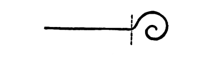
Fig. 65
Fig. 65
In this line there is no doubt as to the greater attraction of the twisted end, on account of the greater concentration it exhibits. The extent of tone-contrast is the same at both ends. The force of attraction in the twisted end of the line would be diminished if the twisted end were made gray instead of black. The pull of concentration at one end might, conceivably, be perfectly neutralized by the pull of a greater tone-contrast at the other.
In this line, there’s no question that the twisted end is more appealing due to its stronger focus. The level of tone contrast is the same at both ends. The attraction of the twisted end would be lessened if it were gray instead of black. The concentration at one end could, in theory, be completely offset by the stronger tone contrast at the other.

Fig. 66
Fig. 66
This might not be the case, however, if the greater extension of tone-contrast in one case were neutralized by an increase of tone-contrast in the other.
This might not be the situation, though, if the larger range of tone contrast in one case were balanced out by a rise in tone contrast in the other.
THE ORDER OF HARMONY
IN LINES
62. Harmony of Direction means no change of direction.
62. Harmony of Direction means no change in direction.

Fig. 67
Fig. 67
In this case we have a Harmony of Direction in the line, because it does not change its direction.
In this case, we have a consistent direction in the line because it doesn’t change its path.
63. Harmony of Angles. We may have Harmony in the repetition of a certain relation of directions, as in an angle.
63. Harmony of Angles. We can achieve harmony by repeating a specific relationship of directions, like in an angle.

Fig. 68
Fig. 68
The angle up 45° and down 45° is here repeated seven times.
The angle up 45° and down 45° is repeated seven times here.

Fig. 69
Fig. 69
In this case we have a great many angles in the line, but they are all right angles, so we have a Harmony of Angles.
In this case, we have plenty of angles in the line, but they're all right angles, so we have a Harmony of Angles.

Fig. 70
Fig. 70
64. Equality of lengths or measures between the angles of a line means a Harmony of Measures.
64. When the angles of a line have equal lengths or measures, it creates a Harmony of Measures.

Fig. 71
Fig. 71
In this case, for example, we have no Harmony of Angles, but a Harmony of Measures in the legs of the angles, as they are called.
In this case, for example, we don't have a Harmony of Angles, but a Harmony of Measures in the legs of the angles, as they are called.
65. We have a Harmony of Curvature in a line when it is composed wholly of arcs of the same radius and the same angle.
65. We have a Harmony of Curvature in a line when it’s made entirely of arcs with the same radius and angle.

Fig. 72
Fig. 72
This is a case of Harmony of Curvature. There is no change of direction here, in the sequence of corresponding arcs.
This is a situation of Harmony of Curvature. There’s no change in direction here, in the order of corresponding arcs.

Fig. 73
Fig. 73
Here, again, we have a Harmony of Curvature. In this case, however, there is a regular alternation of directions in the [Pg 46] sequence of corresponding arcs. In this regular alternation, which is the repetition of a certain relation of directions, there is a Harmony of Directions.
Here, once more, we have a Harmony of Curvature. In this instance, though, there's a consistent alternation of directions in the [Pg 46] sequence of corresponding arcs. In this consistent alternation, which is the repetition of a specific relationship of directions, there is a Harmony of Directions.

Fig. 74
Fig. 74
In this case the changes of direction are abrupt (angular) as well as gradual. There is no regular alternation, but the harmony of corresponding arcs repeated will be appreciated, nevertheless.
In this case, the changes in direction are both sharp and gradual. There's no consistent pattern, but the harmony of the repeating corresponding arcs can still be appreciated.
66. Arcs produced by the same radius are in harmony to that extent, having the radius in common.
66. Arcs with the same radius are harmonious to that degree, sharing a common radius.

Fig. 75
Fig. 75
This is an example of a harmony of arcs produced by radii of the same length. The arcs vary in length.
This is an example of a harmony of arcs created by radii of the same length. The arcs differ in length.

Fig. 76
Fig. 76
This is an example.
This is an example.
Arcs having the same length but varying in both radius and angle may be felt to be in Measure-Harmony. It is doubtful, however, whether lines of the same length but of very different curvatures will be felt to correspond. If the correspondence of lengths is not felt, visually, it has no interest or value from the point of view of Pure Design.
Arcs that are the same length but differ in both radius and angle might be perceived as being in Measure-Harmony. However, it's uncertain whether straight lines of the same length but with significantly different curvatures will be seen as corresponding. If the lengths don't visually match up, it holds no interest or value in terms of Pure Design.
68. Any line may be continued in a repetition or repetitions of its shape, whatever the shape is, producing what I call a Linear Progression. In the repetitions we have Shape-Harmony.
68. Any line can be extended in a repeat or multiple repeats of its shape, no matter what that shape is, creating what I refer to as a Linear Progression. In the repetitions, we have Shape Harmony.

Fig. 77
Fig. 77
This is an example of Linear Progression. The character of the progression is determined by the shape-motive which is repeated in it.
This is an example of Linear Progression. The nature of the progression is defined by the shape-motive that is repeated within it.
69. The repetition of a certain shape-motive in a line is not, necessarily, a repetition in the same measure or scale. A repetition of the same shape in the same measure means Measure and Shape-Harmony in the progression. A repetition of the same shape in different measures means Shape-Harmony without Measure-Harmony. [Pg 48]
69. Repeating a specific shape or motif in a line doesn’t always mean repeating it in the same measure or size. Repeating the same shape in the same measure indicates a balance between Measure and Shape-Harmony in the progression. Repeating the same shape in different measures indicates Shape-Harmony without Measure-Harmony. [Pg 48]

Fig. 78
Fig. 78
Here we have the repetition of a certain shape in a line, in a progression of measures. That gives us Shape-Harmony and a Harmony of Proportions, without Measure-Harmony.
Here we have the repeated pattern of a specific shape in a line, following a series of measurements. This creates Shape-Harmony and a Harmony of Proportions, but lacks Measure-Harmony.
70. In the repetition of a certain shape-motive in the line, the line may change its direction abruptly or gradually, continuously or alternately, producing a Linear Progression with changes of direction.
70. In repeating a certain shape or motif in the line, the line can change its direction suddenly or gradually, continuously or intermittently, creating a Linear Progression with directional changes.

Fig. 79
Fig. 79
[Pg 49] In Fig. 79 there is a certain change of direction as we pass from one repetition to the next. In the repetition of the same change of direction, of the same angle of divergence, we have Harmony. If the angles of divergence varied we should have no such Harmony, though we might have Harmony in the repetition of a certain relation of divergences. Any repetition of a certain change or changes of direction in a linear progression gives a Harmony of Directions in the progression.
[Pg 49] In Fig. 79, there’s a shift in direction as we move from one repetition to the next. When we repeat the same change in direction with the same angle of divergence, we create Harmony. If the angles of divergence were different, we wouldn’t have that Harmony, although we could have Harmony in repeating a particular relationship of divergences. Any repetition of a specific change or changes in direction within a linear progression creates a Harmony of Directions in that progression.

Fig. 80
Fig. 80
In this case there is a regular alternation of directions in the repeats. The repeats are drawn first to the right, then up, and the relation of these two directions is then repeated.
In this case, there’s a consistent back-and-forth in the directions during the repeats. The repeats start by moving to the right, then go up, and this relationship between the two directions gets repeated.
71. By inverting the motive of any progression, in single or in double inversion, and repeating the motive together with its inversion, we are able to vary the character of the progression indefinitely.
71. By flipping the motive of any progression, whether in single or double inversion, and repeating the motive along with its inversion, we can change the nature of the progression endlessly.

Fig. 81
Fig. 81
In this case we have a single inversion of the motive and a repetition [Pg 50] of the motive with its inversion. Compare this progression with the one in Fig. 77, where the same motive is repeated without inversion.
In this case, we have one inversion of the theme and a repeat of the theme with its inversion. Compare this progression with the one in Fig. 77, where the same theme is repeated without inversion. [Pg 50]

Fig. 82
Fig. 82
Here we have the same motive with a double inversion, the motive with its double inversion being repeated. The inversion gives us Shape-Harmony without Harmony of Attitudes. We have Harmony, however, in a repetition of the relation of two attitudes. These double inversions are more interesting from the point of view of Balance than of Harmony.
Here we have the same motive with a double inversion, the motive with its double inversion being repeated. The inversion gives us Shape-Harmony without Harmony of Attitudes. We do have Harmony, though, in a repetition of the relationship between two attitudes. These double inversions are more interesting in terms of Balance than Harmony.
THE ORDER OF BALANCE
IN LINES
72. We have Balance in a line when one half of it is the single or double inversion of the other half; that is, when there is an equal opposition and consequent equilibrium of attractions in the line. When the axis of the inversion is vertical the balance is symmetrical.
72. We have balance in a line when one half is the single or double inversion of the other half; that is, when there’s an equal opposition and resulting equilibrium of attractions in the line. When the axis of the inversion is vertical, the balance is symmetrical.
Fig. 83
Fig. 83
There is Balance in this line because half of it is the single inversion of the other half. The balance is symmetrical because the axis is vertical. The balance, although symmetrical, is not likely to be appreciated, however, because the eye is sure to move along a line upon which there is no better reason for not moving than is found in slight terminal contrasts. The eye is not held at the center when there is nothing to hold the eye on the center. Mark the center in any way and the eye will go to it at once. A mark or accent may be put at the [Pg 51] center, or accents, corresponding and equal, may be put at equal distances from the center in opposite directions. The eye will then be held at the center by the force of equal and opposite attractions.
There is balance in this line because one half is simply the inverted version of the other half. The balance is symmetrical because the axis is vertical. However, even though the balance is symmetrical, it's likely to go unnoticed because the eye tends to follow a line where there’s no strong reason to stop, except for minor differences at the endpoints. The eye won’t focus on the center if there’s nothing to hold its attention there. If you mark the center in any way, the eye will immediately go to it. You can put a mark or accent at the [Pg 51] center, or place equal accents at the same distance from the center in opposite directions. This way, the eye will be drawn to the center due to the equal and opposite pulls.

Fig. 84
Fig. 84
In this case the eye is held at the balance-center of the line by a change of character at that point.
In this case, the eye is drawn to the center of the line because of a shift in character at that spot.

Fig. 85
Fig. 85
In this case the changes of character are at equal distances, in opposite directions, from the center. The center is marked by a break. The axis being vertical, the balance is a symmetrical one.
In this case, the changes in character occur at equal distances, moving in opposite directions from the center. The center is indicated by a break. With a vertical axis, the balance is symmetrical.
73. The appreciation of Balance in a line depends very much upon the attitude in which it is drawn.
73. The appreciation of balance in a line really depends on the position in which it is drawn.

Fig. 86
Fig. 86
In this case the balance in the line itself is just as good as it is in Fig. 85; but the axis of the balance being diagonal, the balance is less distinctly felt. The balance is unsatisfactory because the attitude of the line is one which suggests a falling down to the left. It is the instability of the line which is felt, more than the balance in it. [Pg 52]
In this case, the balance in the line itself is just as good as it is in Fig. 85; however, since the axis of the balance is diagonal, the balance is less noticeable. The balance feels off because the position of the line suggests it’s leaning to the left. It's more the instability of the line that stands out than the balance itself. [Pg 52]

Fig. 87
Fig. 87
In this case of double inversion, also, we have balance. The balance is more distinctly felt than it was in Fig. 86. The attitude is one of stability. This balance is neither axial nor symmetrical, but central.
In this double inversion case, we also have balance. The balance is more noticeable than it was in Fig. 86. The attitude is stable. This balance is not axial or symmetrical, but central.
74. A line balances, in a sense, when its inclinations are balanced.
74. A line is balanced when its angles are even.

Fig. 88
Fig. 88
This line may be said to be in balance, as it has no inclinations, either to the right or to the left, to suggest instability. The verticals and the horizontals, being stable, look after themselves perfectly well.
This line can be considered balanced because it doesn’t lean to the right or left, indicating stability. The vertical and horizontal lines are stable and manage themselves perfectly.

Fig. 89
Fig. 89
This line has two unbalanced inclinations to the left. It is, therefore, less satisfactory than the line in Fig. 88, from the point of view of Balance. [Pg 53]
This line has two unbalanced slants to the left. Therefore, it is not as satisfactory as the line in Fig. 88, in terms of balance. [Pg 53]

Fig. 90
Fig. 90
The two inclinations in this line counteract one another. One inclination toward the left is balanced by a corresponding inclination toward the right.
The two inclinations in this line balance each other out. One inclination to the left is matched by a corresponding inclination to the right.

Fig. 92
Fig. 92
In this case, also, there is no inclination toward the left which is not balanced by a corresponding inclination toward the right.
In this case, there's no lean to the left that isn't balanced by a similar lean to the right.

Fig. 92
Fig. 92
In this line, which is composed wholly of inclinations to the right or [Pg 54] left, every inclination is balanced, and the line is, therefore, orderly in the sense of Balance; more so, certainly, than it would be if the inclinations were not counteracted. This is the problem of balancing the directions or inclinations of a line.
75. A line having no balance or symmetry in itself may become balanced. The line may be regarded as if it were a series of dots close together. The line is then a relation of positions indicated by dots. It is a composition of attractions corresponding and equal. It is only necessary, then, to find what I have called the center of equilibrium, the balance-center of the attractions, and to indicate that center by a symmetrical inclosure. The line will then become balanced.
75. A line that appears unbalanced or asymmetrical can actually achieve balance. We can think of the line as a series of closely spaced dots. The line is essentially a relationship of positions represented by these dots. It’s a composition of equal attractions working together. Therefore, all we need to do is identify what I refer to as the center of equilibrium, the balance point of these attractions, and mark that point with a symmetrical enclosure. The line will then become balanced.

Fig. 93
Fig. 93
Here is a line. To find the center of its attractions it may be considered as if it were a line of dots, like this:—
Here is a line. To find the center of its attractions, we can think of it as a line of dots, like this:—

Fig. 94
Fig. 94
The principle according to which we find the balance-center is stated on page 23. The balance-center being found, it must be [Pg 55] indicated unmistakably. This may be done by means of any symmetrical inclosure which will draw the eye to the center and hold it there.
The principle for finding the balance center is outlined on page 23. Once the balance center is located, it should be clearly marked. This can be accomplished with any symmetrical enclosure that will attract the eye to the center and keep it focused there. [Pg 55]

Fig. 95
Fig. 95
In this case the balance-center is indicated by a rectangular inclosure. This rectangle is not, however, in harmony of character with the line inclosed by it, which is curved.
In this case, the balance center is marked by a rectangular enclosure. However, this rectangle does not match the character of the line it contains, which is curved.

Fig. 96
Fig. 96
In this case the balance-center is indicated by a circle, which, being a curve, is in harmony of character with the inclosed line, which is also a curve. I shall call this Occult Balance to distinguish it from the unmistakable Balance of Symmetry and other comparatively obvious forms of Balance, including the balance of double inversions. As I have [Pg 56] said, on page 24, the symmetrical framing must be sufficiently attractive to hold the eye steadily at the center, otherwise it does not serve its purpose.
In this case, the balance center is shown by a circle, which, being a curve, matches the character of the enclosed line, which is also a curve. I’ll call this Occult Balance to set it apart from the clear Balance of Symmetry and other more obvious forms of Balance, including the balance of double inversions. As I have [Pg 56] mentioned, on page 24, the symmetrical framing must be appealing enough to keep the eye focused on the center; otherwise, it doesn’t fulfill its purpose.
THE ORDER OF RHYTHM
IN LINES
76. The eye, not being held on a vertical axis or on a balance-center, readily follows any suggestion of movement.
76. The eye, not being positioned along a vertical axis or a balance point, easily tracks any hint of movement.

Fig. 97
Fig. 97
In this case there is no intimation of any vertical axis or balance-center. The figure is consequently unstable. There is a sense of movement to the right. This is due, not only to the inclinations to the right, but to the convergences in that direction.
In this case, there’s no sign of any vertical axis or balance point. As a result, the figure is unstable. It feels like it’s moving to the right. This is because of the tilting to the right, as well as the lines that converge in that direction.

Fig. 98
Fig. 98
In this case the movement is unmistakably to the left. In such cases we have movement, but no Rhythm.
In this situation, the movement is clearly to the left. In these cases, we have movement, but no rhythm.
77. Rhythm requires, not only movement, but the order of regular and marked intervals.
77. Rhythm needs not just movement but also a pattern of consistent and noticeable intervals.

Fig. 99
Fig. 99
[Pg 57] In Fig. 99 we have a line, a linear progression, which gives us the feeling of movement, unmistakably. The movement, which in the motive itself is not rhythmical, becomes rhythmical in its repetition at regular, and in this case equal, intervals. The intervals are marked by the repetitions.
[Pg 57] In Fig. 99 we have a line, a straight progression, which clearly gives us a sense of movement. The movement, which isn't rhythmic by itself, becomes rhythmic through its repetition at regular and, in this case, equal intervals. The repetitions mark the intervals.
78. It is a question of some interest to decide how many repetitions are required in a Rhythm. In answer to this question I should say three as a rule. A single repetition shows us only one interval, and we do not know whether the succeeding intervals are to be equal or progressive, arithmetically progressive or geometrically progressive. The rhythm is not defined until this question is decided, as it will be by two more repetitions. The measures of the rhythm might take the form of a repeated relation of measures; a repetition, for example, of the measures two, seven, four. In that case the relation of the three measures would have to be repeated at least three times before the character of the rhythm could be appreciated.
78. It's interesting to figure out how many repetitions are needed in a rhythm. Generally, I would say three repetitions are necessary. A single repetition only shows us one interval, and we can't tell if the following intervals are going to be equal or whether they progress in an arithmetic or geometric way. The rhythm isn't defined until this is clarified, which will happen with two more repetitions. The rhythm's measures could be a repeated relationship of measures, like repeating the measures two, seven, four. In this case, the relationship of the three measures would need to be repeated at least three times before the rhythm's character could be fully understood.
79. Any contrariety of movement in the motive is extended, of course, to its repetitions.
79. Any opposite movement in the motive is naturally extended to its repetitions.

Fig. 100
Fig. 100
In this case, for example, there are convergences and, consequently, movements both up and down. This contrariety of movements is felt through the whole series of repetitions. Other things being equal, I believe the eye moves up more readily than down, so that convergences downward have less effect upon us than corresponding convergences upward. [Pg 58]
In this case, for example, there are convergences and, as a result, movements both up and down. This opposing movement is felt throughout the entire series of repetitions. Other things being equal, I think the eye tends to move up more easily than down, so downward convergences impact us less than upward ones do. [Pg 58]

Fig. 101
Fig. 101
In this case, by omitting the long vertical line I have diminished the amount of convergence downward. In that way I have given predominance to the upward movement. Instead of altogether omitting the long vertical line, I might have changed its tone from black to gray. That would cause an approximate instead of complete disappearance. It should be remembered that in all these cases the habit of reading comes in to facilitate the movements to the right. It is easier for the eye to move to the right than in any other direction, other things being equal. The movement back to the beginning of another line, which is of course inevitable in reading, produces comparatively little impression upon us, no more than the turning of the page. The habit of reading to the right happens to be our habit. The habit is not universal.
In this case, by leaving out the long vertical line, I’ve reduced the downward convergence. This way, I’ve emphasized the upward movement. Instead of completely removing the long vertical line, I could have changed its color from black to gray. That would result in it fading away instead of vanishing entirely. It's important to remember that in all these situations, our reading habits help us move to the right. It’s easier for the eye to move right than in any other direction, assuming everything else is equal. The movement back to the start of the next line, which is inevitable when reading, leaves a minimal impression on us, similar to just turning the page. Our tendency to read to the right is just that—our tendency. This habit isn’t universal.
80. Reading repetitions and alternations to the right, always, I, for a long time, regarded such repetitions and alternations as rhythmical, until Professor Mowll raised the question whether it is necessary to read all alternations to the right when there is nothing in the alternations themselves to suggest a movement in one direction rather than another. Why not read them to the left as well as to the right? We at once decided that the movement in a Rhythm must be determined by the character of the Rhythm itself, not by any habit of reading, or any other habit, on our part. It was in that way that we came to regard repetitions and alternations as illustrations of Harmony rather than of [Pg 59] Rhythm. Rhythm comes into the Harmony of a Repeated Relation when the relation is one which causes the eye to move in one direction rather than another, and when the movement is carried on from repetition to repetition, from measure to measure.
80. After a long time of consistently reading repetitions and alternations to the right, I initially thought these repetitions and alternations had a rhythm to them. However, Professor Mowll questioned whether it was really necessary to read all alternations to the right when there’s nothing in them to indicate a movement one way or the other. Why not read them to the left as well? We quickly agreed that the movement in a Rhythm should be defined by the nature of the Rhythm itself, not by our reading habits or any other habits we might have. This led us to view repetitions and alternations more as examples of Harmony rather than Rhythm. Rhythm becomes part of the Harmony of a Repeated Relation when the relation prompts the eye to move in one direction over the other and when this movement continues from repetition to repetition, from measure to measure. [Pg 59]
81. The repetition of a motive at equal intervals, when there is no movement in the motive, gives us no feeling of Rhythm.
81. Repeating a theme at regular intervals without any change in the theme doesn’t create a sense of rhythm.

Fig. 102
Fig. 102
In this case, for example, we have a repetition in the line of a certain symmetrical shape. As there is no movement in the shape repeated, there is no Rhythm in the repetition. There is nothing to draw the eye in one direction rather than another. The attractions at one end of the line correspond with the attractions at the other.
In this case, for instance, we see a repetition in the line of a specific symmetrical shape. Since there’s no movement in the repeated shape, there’s no rhythm in the repetition. There’s nothing to guide the eye in one direction over another. The points of interest at one end of the line match up with the points of interest at the other.
82. The feeling of Rhythm may be induced by a regular diminution of measure or scale in the repetitions of the motive and in the intervals in which the repetitions take place.
82. The sense of Rhythm can be created by consistently decreasing the measure or scale in the repeated motif and in the spaces where these repetitions happen.

Fig. 103
Fig. 103
In this case the shape repeated is still symmetrical, but it is repeated with a gradual diminution of scale and of intervals, by which we are given a feeling of rhythmic movement. The change of scale and of intervals, to induce a sense of rhythmic motion, must be regular. To be regular the change must be in the terms of one or the other of the regular progressions; the arithmetical progression, which proceeds by a [Pg 60] certain addition, or the geometrical, which proceeds by a certain multiplication. The question may arise in this case (Fig. 103) whether the movement of the Rhythm is to the right or to the left. I feel, myself, that the movement is to the right. In diminishing the scale of the motive and of the intervals we have, hardly at all, diminished the extent of the tone-contrast in a given angle of vision. See Fig. 41, p. 27, showing the increase of attractions from one visual angle to another. At the same time we come at the right end of the progression to two or more repetitions in the space of one. We have, therefore, established the attraction of a crowding together at the right end of the series. See the passage (p. 43) on the attractiveness of a line. The force of the crowding together of attractions is, I feel, sufficient to cause a movement to the right. It must be remembered, however, that the greater facility of reading to the right is added here to the pull of a greater crowding together of attractions in the same direction, so the movement of the Rhythm in that direction may not be very strong after all. If the direction of any Rhythm is doubtful, the Rhythm itself is doubtful.
In this case, the shape being repeated is still symmetrical, but it is repeated with a gradual decrease in scale and intervals, which gives us a sense of rhythmic movement. The change in scale and intervals, to create a feeling of rhythmic motion, needs to be consistent. For it to be consistent, the changes must follow one of the standard progressions: either arithmetic, which increases by a specific addition, or geometric, which increases by a specific multiplication. A question may arise here regarding whether the movement of the rhythm is to the right or to the left. Personally, I feel that the movement is to the right. By decreasing the scale of the motive and the intervals, we have barely reduced the extent of the tone contrast within a given field of vision, showing the increase of attractions from one visual angle to another. At the same time, we end up at the right end of the progression with two or more repetitions in the space of one. Therefore, we have established the attraction of clustering at the right end of the series. See the passage on the attractiveness of a line. The force of the clustering of attractions is, I believe, strong enough to cause movement to the right. However, it should be noted that the greater ease of reading to the right is coupled with the pull of a greater clustering of attractions in that direction, so the movement of the rhythm in that direction may not be very strong after all. If the direction of any rhythm is uncertain, then the rhythm itself is uncertain.
83. The feeling of Rhythm may be induced, as I have said, by a gradual increase of the number of attractions from measure to measure, an increase of the extent of tone-contrast.
83. The sense of Rhythm can be created, as I mentioned, by gradually increasing the number of attractions from measure to measure, along with an increase in the level of tone contrast.

Fig. 104
Fig. 104
Increasing the extent of tone-contrast and the number of attractions in the measures of the Rhythm in Fig. 103, we are able to force the eye to follow the series in the direction contrary to the habit of reading, that is to say from right to left.
Increasing the level of tone contrast and the number of attractions in the measures of the Rhythm in Fig. 103, we can make the eye follow the series in the opposite direction to the normal reading habit, which is from right to left.
A decrease in the forces of attraction in connection with a decrease of [Pg 61] scale is familiar to us all in the phenomena of perspective. The gradual disappearance of objects in aerial perspective does away with the attraction of a greater crowding together of objects in the distance.
A reduction in the forces of attraction related to a decrease in scale is something we all recognize in perspective. The gradual fading of objects in aerial perspective eliminates the attraction of objects being more densely grouped together in the distance.

Fig. 105
Fig. 105
In this case the diminution of scale has been given up and there is no longer any crowding together. There is no chance of this rhythm being read from left to right except by an effort of the will. The increase of attractions toward the left is much more than sufficient to counteract the habit of reading.
In this situation, the reduction of scale has been abandoned, and there’s no longer any overcrowding. There’s no way to read this rhythm from left to right without a conscious effort. The pull toward the left is far stronger than the habit of reading.
84. The force of a gradual coming together of attractions, inducing movement in the direction of such coming together, is noticeable in spiral shapes.
84. The pull of a gradual coming together of attractions, causing movement towards that coming together, is evident in spiral shapes.

Fig. 106
Fig. 106
In this case we have a series of straight lines with a constant and equal change of direction to the right, combined with a regular diminution of measures in the length of the lines, this in the terms of an arithmetical progression. The movement is in the direction of concentration and it is distinctly marked in its measures. The movement is therefore rhythmical. [Pg 62]
In this case, we have a series of straight lines that consistently change direction to the right, along with a steady decrease in the length of the lines, following an arithmetic progression. The movement is focused towards a center and is clearly defined in its measurements. Therefore, the movement is rhythmic. [Pg 62]

Fig. 107
Fig. 107
In this case we have a series of straight lines with a constant change of direction to the right; but in this case the changes of measure in the lines are in the terms of a geometrical progression. The direction is the same, the pull of concentration perhaps stronger.
In this case, we have a series of straight lines that consistently change direction to the right; however, the changes in the lengths of the lines follow a geometric progression. The direction remains the same, and the effect of concentration might be even stronger.

Fig. 108
Fig. 108
In this Rhythm there is an arithmetical gradation of measures in the changes of direction, both in the length of the legs and in the measure [Pg 63] of the angles. The pull of concentration is, in this case, very much increased. It is evident that the legs may vary arithmetically and the angles geometrically; or the angles arithmetically and the legs geometrically.
In this rhythm, there's a numerical progression of measures in the changes of direction, both in the length of the legs and in the measurement of the angles. The level of concentration needed is significantly heightened. It's clear that the legs can change in a numerical way while the angles change geometrically; or the angles can change numerically while the legs change geometrically. [Pg 63]
85. If, in the place of the straight lines, which form the legs, in any of the examples given, are substituted lines which in themselves induce movement, the feeling of Rhythm may be still further increased, provided the directions of movement are consistent.
85. If, instead of the straight lines that create the legs, you use lines that naturally create movement in any of the examples given, the sense of Rhythm can be amplified even more, as long as the directions of movement are consistent.

Fig. 109
Fig. 109
In this case the movement is in the direction of increasing concentration and in the direction of the convergences.
In this case, the movement is towards greater concentration and towards the convergences.
If the movement of the convergences be contrary to the movement of concentration, there will be in the figure a contrary motion which may diminish or even entirely prevent the feeling of Rhythm. If the movement in one direction or the other predominates, we may still get the feeling of Rhythm, in spite of the drawback of the other and contrary movement. [Pg 64]
If the flow of the convergences goes against the flow of concentration, there will be a conflicting motion in the figure that could lessen or completely block the sense of Rhythm. If one movement is stronger than the other, we can still experience the feeling of Rhythm, even with the limitation of the opposing movement. [Pg 64]

Fig. 110
Fig. 110
In this case the linear convergences substituted for the straight lines are contrary to the direction of increasing concentration. The movement is doubtful.
In this case, the linear convergences replacing the straight lines go against the direction of increasing concentration. The movement is uncertain.
86. Corresponding rhythms, set in contrary motion, give us the feeling of Balance rather than of Rhythm. The balance in such cases is a balance of movements.
86. Corresponding rhythms moving in opposite directions create a sense of Balance instead of Rhythm. In these cases, the balance refers to a balance of movements.

Fig. 111
Fig. 111
This is an example of corresponding and opposed rhythms producing the feeling, not of Rhythm, but of Balance.
This is an example of matching and contrasting rhythms creating the feeling, not of Rhythm, but of Balance.
ATTITUDES
LINES IN DIFFERENT ATTITUDES
LINES IN DIFFERENT ATTITUDES
87. Any line or linear progression may be turned upon a center, [Pg 65] and so made to take an indefinite number and variety of attitudes. It may be inverted upon an axis, and the inversion may be turned upon a center producing another series of attitudes which, except in the case of axial symmetry in the line, will be different from those of the first series.

Fig. 112
Fig. 112
In this case the line changes its attitude.
In this case, the line changes its direction.

Fig. 113
Fig. 113
In this case I have inverted the line, and turning the inversion upon a center I get a different set of attitudes.
In this case, I've flipped the line, and by rotating the flip around a center, I get a different set of perspectives.

Fig. 114
Fig. 114
In this case, which is a case of axial symmetry in the line, the inversion gives us no additional attitudes.
In this situation, which is a case of axial symmetry along the line, the inversion doesn't provide us with any new perspectives.
THE ORDER OF HARMONY IN
THE ATTITUDES OF LINES

Fig. 115
Fig. 115
This is an illustration of Harmony of Attitudes. It is also an illustration of Interval-Harmony.
This shows the Harmony of Attitudes. It also illustrates Interval-Harmony.
89. We have a Harmony of Attitudes, also, in the repetition of any relation of two or more attitudes, the relation of attitudes being repeated without change of attitude.
89. We also have a Harmony of Attitudes, where the repetition of any relationship between two or more attitudes occurs, maintaining the same attitude throughout.

Fig. 116
Fig. 116
We have here a Harmony of Attitudes due to the repetition of a certain relation of attitudes, without change of attitude.
We have a Harmony of Attitudes because of the repeated relationship between attitudes, without changing the attitude.
THE ORDER OF BALANCE IN
THE ATTITUDES OF LINES

Fig. 117
Fig. 117
The relation of attitudes I, II, of III, IV, and of I, II, III, IV, is that of Symmetrical Balance on a vertical axis. The relation of attitudes I, IV, and of II, III, is a relation of Balance but not of Symmetrical Balance. This is true, also, of the relation of I, III and of II, IV. Double inversions are never symmetrical, but they are illustrations of Balance. The balance of double inversions is central, not axial. These statements are all repetitions of statements previously made about positions.
The relationship of attitudes I, II, III, IV is characterized by Symmetrical Balance on a vertical axis. The relationship of attitudes I, IV and II, III shows Balance, but not Symmetrical Balance. This is also true for the relationship of I, III and II, IV. Double inversions are never symmetrical, but they exemplify Balance. The balance of double inversions is central, not axial. These statements are all restatements of points previously made about positions.
THE ORDER OF RHYTHM IN
THE ATTITUDES OF LINES
91. It often happens that a line repeated in different attitudes gives us the sense of movement. It does this when the grouping of the repetitions suggests instability. The movement is rhythmical when it exhibits a regularity of changes in the attitudes and in the intervals of the changes.
91. It often happens that a line repeated in different positions gives us a sense of movement. It does this when the way the repetitions are arranged suggests instability. The movement is rhythmic when it shows a consistent pattern of changes in the positions and in the timing of those changes.

Fig. 118
Fig. 118

Fig. 119
Fig. 119
In this case the changes of attitude and the intervals of the changes being regular, the movement becomes rhythmical. The direction of the rhythm is clearly down-to-the-right.
In this case, the shifts in attitude and the timing of those shifts are consistent, so the movement becomes rhythmic. The direction of the rhythm clearly goes down and to the right.
92. In the repetition of any line we have a Harmony, due to the repetition. If the line is repeated in the same attitude, we have a Harmony of Attitudes. If it is repeated in the same intervals, we have a Harmony of Intervals. We have Harmony, also, in the repetition of any relation of attitudes or of intervals.
92. When we repeat any line, we create Harmony because of that repetition. If the line is repeated in the same position, we have a Harmony of Positions. If it’s repeated at the same distances, we achieve a Harmony of Distances. We also find Harmony in the repetition of any relationship between positions or distances.
We have not yet considered the arrangement or composition of two or more lines of different measures and of different shapes.
We haven't yet looked at how to arrange or combine two or more lines that have different lengths and shapes.
THE COMPOSITION OF LINES
93. By the Composition of Lines I mean putting two or more lines together, in juxtaposition, in contact or interlacing. Our object in the composition of lines, so far as Pure Design is concerned, is to achieve Order, if possible Beauty, in the several modes of Harmony, Balance, and Rhythm. [Pg 69]
93. By the Composition of Lines, I mean combining two or more lines together, side by side, touching each other, or interweaving them. Our goal in composing lines, especially regarding Pure Design, is to create Order, and if possible, Beauty, through various forms of Harmony, Balance, and Rhythm. [Pg 69]
HARMONY IN THE COMPOSITION
OF LINES
94. We have Harmony in line-compositions when the lines which are put together correspond in all respects or in some respects, when they correspond in attitudes, and when there is a correspondence of distances or intervals.
94. We achieve Harmony in line compositions when the lines that are combined match in every way or in some ways, when they align in positions, and when there is a matching of distances or spaces.

Fig. 120
Fig. 120
In this case the lines of the composition correspond in tone, measure, and shape, but not in attitude; and there is no correspondence in distances or intervals.
In this case, the lines of the composition match in tone, measure, and shape, but not in attitude; and there is no match in distances or intervals.

Fig. 121
Fig. 121
In this case the attitudes correspond, as they did not in Fig. 120. There is still no correspondence of intervals.
In this case, the attitudes match, unlike in Fig. 120. There is still no alignment of intervals.

Fig. 122
Fig. 122
Here we have the correspondence of intervals which we did not have [Pg 70] either in Fig. 120 or in Fig. 121. There is not only a Harmony of Attitudes and of Intervals, in this case, but the Harmony of a repetition in one direction, Direction-Harmony. In all these cases we have the repetition of a certain angle, a right angle, and of a certain measure-relation between the legs of the angle, giving Measure and Shape-Harmony.
Here, we have the relationship of intervals that we didn’t find in Fig. 120 or Fig. 121. There’s not just a Harmony of Attitudes and Intervals here, but also a Harmony from repetition in one direction, known as Direction-Harmony. In all these instances, we see the repetition of a specific angle, a right angle, and a particular relationship in measurement between the legs of the angle, resulting in Measure and Shape-Harmony.
95. The repetition in any composition of a certain relation of measures, or of a certain proportion of measures, gives Measure-Harmony to the composition. The repetition of the relation one to three in the legs of the angle, in the illustrations just given, gives to the compositions the Harmony of a Recurring Ratio. By a proportion I mean an equality between ratios, when they are numerically different. The relation of one to three is a ratio. The relation of one to three and three to nine is a proportion. We may have in any composition the Harmony of a Repeated Ratio, as in Figs. 120, 121, 122, or we may have a Harmony of Proportions, as in the composition which follows.
95. Repeating a certain relationship of measures or a specific proportion of measures in any piece gives it Measure-Harmony. The repetition of the one-to-three ratio in the legs of the angle in the earlier examples provides the compositions with the Harmony of a Recurring Ratio. By proportion, I mean an equality between ratios, even when they are numerically different. The one-to-three relationship is a ratio. The relationships of one to three and three to nine represent a proportion. In any composition, we can achieve the Harmony of a Repeated Ratio, as seen in Figs. 120, 121, 122, or we might have a Harmony of Proportions, as in the following composition.

Fig. 123
Fig. 123
96. To be in Harmony lines are not necessarily similar in all respects. As I have just shown, lines may be in Shape-Harmony, without being in any Measure-Harmony. Lines are approximately in harmony when they correspond in certain particulars, though they differ in others. The more points of resemblance between them, the greater the harmony. When they correspond in all respects we have, of course, a perfect harmony. [Pg 71]
96. To achieve harmony, lines don’t have to be identical in every way. As I just demonstrated, lines can be in shape harmony without being in measure harmony. Lines are considered harmoniously related when they match in specific aspects, even if they differ in others. The more similarities there are, the greater the harmony. When they match in every detail, we achieve perfect harmony. [Pg 71]

Fig. 124
Fig. 124
This is a case of Shape-Harmony without Measure-Harmony and without Harmony of Attitudes.
This is a situation of Shape-Harmony lacking Measure-Harmony and without Harmony of Attitudes.

Fig. 125
Fig. 125
In this case we have a Harmony of Shapes and of Attitudes, without Measure-Harmony or Harmony of Intervals. This is a good illustration of a Harmony of Proportions.
In this case, we have a harmony of shapes and attitudes, without measure-harmony or harmony of intervals. This is a good example of a harmony of proportions.
Straight lines are in Harmony of Straightness because they are all straight, however much they differ in tone or measure. They are in Harmony of Measure when they have the same measure of length. The measures of width, also, may agree or disagree. In every agreement we have Harmony.
Straight lines are in Harmony of Straightness because they are all straight, no matter how different they are in tone or length. They are in Harmony of Measure when they have the same length. The widths may also match or differ. In any agreement, we find Harmony.
Angular lines are in Harmony when they have one or more angles in common. The recurrence of a certain angle in different parts of a composition brings Harmony into the composition. Designers are very apt to use different angles when there is no good reason for doing so, when the repetition of one would be more orderly. [Pg 72]

Fig. 126
Fig. 126
The four lines in this composition have right angles in common. To that extent the lines are in Harmony. There is also a Harmony in the correspondence of tones and of width-measures in the lines. Considerable Harmony of Attitudes occurs in the form of parallelisms.
The four lines in this composition share right angles. In that sense, the lines are harmonious. There’s also harmony in the matching tones and widths of the lines. A significant harmony of attitudes is present in the form of parallels.

Fig. 127
Fig. 127
These two lines have simply one angle in common, a right angle, and the angle has the same attitude in both cases. They differ in other respects.
These two lines have just one angle in common, a right angle, and that angle is positioned the same way in both cases. They differ in other aspects.

Fig. 128
Fig. 128
In these three lines the only element making for Harmony, except the same tone and the same width, is found in the presence in each line of a certain small arc of a circle. Straightness occurs in two of the lines but not in the third. There is a Harmony, therefore, between two of the lines from which the third is excluded. There is, also, a Harmony of Attitude in these two lines, in certain parallelisms. [Pg 73]
In these three lines, the only factor contributing to Harmony, besides the same tone and width, is the presence of a small curved arc in each line. Two lines are straight, while the third is not. This creates a Harmony between the two straight lines, leaving the third one out. Additionally, there’s a Harmony of Attitude in the two lines due to certain parallels. [Pg 73]
BALANCE IN THE COMPOSITION
OF LINES
97. Lines balance when in opposite attitudes. We get Balance in all inversions, whether single or double.
97. Lines balance when in opposite positions. We achieve Balance in all inversions, whether they are single or double.
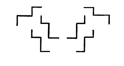
Fig. 129
Fig. 129
Here similar lines are drawn in opposite attitudes and we get Measure and Shape-Balance. In the above case the axis of balance is vertical. The balance is, therefore, symmetrical. Symmetrical Balance is obtained by the single inversion of any line or lines on a vertical axis. Double inversion gives a Balance of Measures and Shapes on a center. We have no Symmetry in double inversions. All this has been explained.
Here, similar lines are drawn in opposing attitudes, and we get Measure and Shape-Balance. In the earlier example, the balance axis is vertical. Therefore, the balance is symmetrical. Symmetrical Balance is achieved by simply flipping any line or lines on a vertical axis. Double flipping results in a Balance of Measures and Shapes around a center. There is no Symmetry in double flips. All of this has been explained.

Fig. 130
Fig. 130
98. Shapes in order to balance satisfactorily must be drawn in the same measure, as in Fig. 131 which follows.
98. To achieve a good balance, shapes need to be drawn to the same scale, as shown in Fig. 131 that follows.

Fig. 131
Fig. 131

Fig. 132
Fig. 132
Here, in Fig. 132, we have Shape-Harmony without Measure-Harmony. It might be argued that we have in this case an illustration of Shape-Balance without Measure-Balance. Theoretically that is so, but Shape-Balance without Measure-Balance is never satisfactory. If we want the lines in Fig. 132 to balance we must find the balance-center between them, and then indicate that center by a symmetrical inclosure. We shall then have a Measure-Balance (occult) without Shape-Balance.
Here, in Fig. 132, we have Shape-Harmony without Measure-Harmony. It could be said that this is an example of Shape-Balance without Measure-Balance. Theoretically, that is correct, but Shape-Balance without Measure-Balance is never satisfying. If we want the lines in Fig. 132 to balance, we need to identify the balance-center between them and then highlight that center with a symmetrical enclosure. At that point, we will have a Measure-Balance (occult) without Shape-Balance.

Fig. 133
Fig. 133
Here we have Measure-Harmony and a Measure-Balance without Shape-Harmony or Shape-Balance. The two lines have different shapes but the same measures, lengths and widths corresponding. The balance-center is found for each line. See pp. 54, 55. Between the two centers is found the center, upon which the two lines will balance. This center is then suggested by a symmetrical inclosure. The balancing measures in such cases may, of course, be turned upon their centers, and the axis connecting their centers may be turned in any direction or attitude, with no loss of equilibrium, so far as the measures are concerned.
Here we have Measure-Harmony and Measure-Balance without Shape-Harmony or Shape-Balance. The two lines have different shapes but the same measures—lengths and widths that match. The balance center is identified for each line. See pp. 54, 55. Between the two centers, there is a central point where the two lines will balance. This center is then suggested by a symmetrical enclosure. In these cases, the balancing measures can be rotated around their centers, and the axis connecting their centers can be adjusted in any direction or position, without losing equilibrium, as far as the measures are concerned.

Fig. 134
Fig. 134
The Balance of Measures here is just as good as it is in Fig. 133. [Pg 76] The attitudes are changed but not the relation of the three balance-centers. The change of shape in the inclosure makes no difference.
The Balance of Measures here is just as good as it is in Fig. 133. [Pg 76] The attitudes have shifted, but the relationship between the three balance-centers remains the same. The change in shape of the enclosure doesn’t matter.
100. Measure-Balance without Shape-Harmony or Shape-Balance is satisfactory only when the balance-center is unmistakably indicated or suggested, as in the examples which I have given.
100. Measure-Balance without Shape-Harmony or Shape-Balance is only acceptable when the balance-center is clearly shown or implied, as in the examples I've provided.
101. There is another form of Balance which is to be inferred from what I have said, on page 18, of the Balance of Directions, but it needs to be particularly considered and more fully illustrated. I mean a Balance in which directions or inclinations to the right are counteracted by corresponding or equivalent directions or inclinations to the left. The idea in its simplest and most obvious form is illustrated in Fig. 22, on page 18. In that case the lines of inclination correspond. They do not necessarily correspond except in the extent of contrast, which may be distributed in various ways.
101. There’s another kind of Balance we can gather from what I've mentioned, on page 18, about the Balance of Directions, but it needs more careful consideration and further explanation. I'm referring to a Balance where movements or inclinations to the right are offset by equal movements or inclinations to the left. The basic idea is shown in Fig. 22, on page 18. In this situation, the lines of inclination match up. They don't always match up except in terms of contrast, which can be arranged in different ways.

Fig. 135
Fig. 135
The balance of inclinations in this case is just as good as the balance in Fig. 22. There is no symmetry as in Fig. 22. Three lines balance against one. The three lines, however, show the same extent of contrast as the one. So far as the inclinations are concerned they will balance in any arrangement which lies well within the field of vision. The eye must be able to appreciate the fact that a disposition to fall to the [Pg 77] right is counteracted by a corresponding or equivalent disposition to fall to the left.
The balance of inclinations in this case is just as effective as the balance in Fig. 22. There’s no symmetry like in Fig. 22. Three lines balance against one. However, the three lines show the same level of contrast as the one line. In terms of inclinations, they will balance in any setup that’s well within the field of vision. The eye needs to perceive that a tendency to fall to the right is offset by a corresponding or equal tendency to fall to the left.

Fig. 136
Fig. 136
This arrangement of the inclining lines is just as good as the arrangement in Fig. 135. The inclinations may be distributed in any way, provided they counteract one another properly.
This setup of the slanting lines is just as effective as the setup in Fig. 135. The slopes can be arranged in any way, as long as they properly counterbalance each other.

Fig. 137
Fig. 137
In this case I have again changed the composition, and having suggested the balance-center of the lines, as attractions, by a symmetrical inclosure, I have added Measure-Balance (occult) to Inclination-Balance. The Order in Fig. 137 is greater than the Order in Figs. 135 and 136. In Fig. 137 two forms of Balance are illustrated, in the other cases only one. The value of any composition lies in the number of orderly connections which it shows. [Pg 78]
In this case, I’ve made changes to the composition again, and after establishing the focal point of the lines as attractions through a symmetrical enclosure, I’ve added Measure-Balance (hidden) to Inclination-Balance. The Order in Fig. 137 is greater than the Order in Figs. 135 and 136. In Fig. 137, two forms of Balance are shown, while in the other cases, only one is depicted. The value of any composition lies in the number of orderly connections it presents. [Pg 78]

Fig. 138
Fig. 138
In this case I have taken a long angular line and added a sufficient number and extent of opposite inclinations to make a balance of inclinations. The horizontal part of the long line is stable, so it needs no counteraction, but the other parts incline in various degrees, to the left or to the right. Each inclining part requires, therefore, either a corresponding line in a balancing direction, or two or more lines of equivalent extension in that direction. In one case I have set three lines to balance one, but they equal the one in length, that is to say, in the extent of contrast. We have in Fig. 138 an illustration of occult Measure-Balance and the Balance of Inclinations. I have illustrated the idea of Inclination-Balance by very simple examples. I have not considered the inclinations of curves, nor have I gone, at all, into the more difficult problem of balancing averages of inclination, when the average of two or more different inclinations of different extents of contrast has to be counteracted. In Tone-Relations the inclinations are of tone-contrasts, and a short inclination with a strong contrast may balance a long inclination with a slight one, or several inclinations of slight contrasts may serve to balance one of a strong contrast. The force of any inclining line may [Pg 79] be increased by increasing the tone-contrast with the ground-tone. In tone-relations the problem becomes complicated and difficult. The whole subject of Inclination-Balance is one of great interest and worthy of a separate treatise.
In this case, I’ve taken a long angular line and added enough opposing angles to create a balance of inclinations. The horizontal part of the long line is stable, so it doesn’t need any counteraction, but the other sections lean in various degrees, either to the left or to the right. Each leaning part, therefore, requires either a corresponding line in the opposite direction or two or more lines of equivalent length in that direction. In one instance, I’ve set three lines to balance one, but they are equal in length, meaning they match the one in terms of contrast. We have in Fig. 138 an illustration of hidden Measure-Balance and the Balance of Inclinations. I’ve demonstrated the concept of Inclination-Balance through very simple examples. I haven’t considered the inclinations of curves, nor have I delved into the more complex issue of balancing averages of inclination when the average of two or more differing inclinations with various contrasts needs to be counteracted. In Tone-Relations, inclinations are based on tone contrasts, and a short incline with a strong contrast can balance a long incline with a slight one, or several inclines with slight contrasts may balance one with a strong contrast. The strength of any inclining line can be amplified by increasing the tone contrast with the ground tone. In tone relations, the problem becomes complicated and challenging. The entire topic of Inclination-Balance is very interesting and deserves its own detailed discussion.
RHYTHM IN THE COMPOSITION
OF LINES
102. We will first consider the Measure-Rhythms which result from a gradual increase of scale, an increase in the extent of the contrasts. The intervals must, in such Rhythms, be regular and marked. They may be equal; they may alternate, or they may be regularly progressive.
102. We'll start by looking at the Measure-Rhythms that come from a gradual increase in scale, enhancing the level of contrasts. In these Rhythms, the intervals need to be consistent and distinct. They can be equal, they can alternate, or they can progress steadily.

Fig. 139
Fig. 139
In this case I feel that the direction of the Rhythm is up-to-the-right owing to the gradual increase of length and consequently of the extent of contrast in the lines, in that direction.
In this case, I think the direction of the Rhythm is up and to the right because of the gradual increase in length and, as a result, the extent of contrast in the lines in that direction.

Fig. 140
Fig. 140

Fig. 141
Fig. 141
In this case a greater extension of contrasts pulls one way and a greater crowding of contrasts the other. I think that crowding has the best of it. The movement, though much retarded, is, I feel, down-to-the-left rather than up-to-the-right, in spite of the fact that the greater facility of reading to the right is added to the force of extended contrasts.
In this situation, one set of contrasts pulls in one direction while a denser group of contrasts pulls in the opposite direction. I believe that the denser group has the advantage. Although the movement is significantly slowed down, I feel it’s leaning down and to the left instead of up and to the right, even though the easier reading from left to right adds to the impact of the extended contrasts.
103. Substituting unstable for stable attitudes in the examples just given, we are able to add the movement suggested by instability of attitude to the movement caused by a gradual extension of contrasts.
103. By substituting unstable attitudes for stable ones in the examples given, we can incorporate the movement suggested by the instability of attitude along with the movement caused by a gradual widening of contrasts.

Fig. 142
Fig. 142
The movement up-to-the-right in Fig. 139 is here connected with an inclination of all the lines down-to-the-right.
The movement up-and-to-the-right in Fig. 139 is now linked to a downward inclination of all the lines to the right.

Fig. 143
Fig. 143
Here the falling of the lines down-to-the-left counteracts the movement [Pg 81] in the opposite direction which is caused by the extension of contrasting edges in that direction. A crowding together of the lines, due to the diminution of intervals toward the left, adds force to the movement in that direction.
Here, the lines falling to the left counteract the movement going in the opposite direction, which is caused by the stretching of contrasting edges that way. When the lines crowd together because the spaces between them decrease toward the left, it strengthens the movement in that direction. [Pg 81]

Fig. 144
Fig. 144
In this case a movement up is caused by convergences, a movement down by crowding. The convergences are all up, the crowding down. I think that the convergences have it. I think the movement is, on the whole, up. The intervals of the crowding down diminish arithmetically.
In this situation, an upward movement is driven by convergences, and a downward movement by crowding. All the convergences are upward, while the crowding is downward. I believe the convergences are more significant. Overall, I think the movement is upward. The intervals of the downward crowding decrease arithmetically.
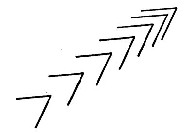
Fig. 145
Fig. 145
The convergences and the crowding of attractions are, here, both up-to-the-right. The Rhythm is much stronger than it was in Fig. 144. The intervals are those of an arithmetical progression. [Pg 82]
The connections and the overwhelming attractions are, here, both up-and-to-the-right. The Rhythm is much stronger than it was in Fig. 144. The intervals follow an arithmetic progression. [Pg 82]

Fig. 146
Fig. 146
The movement here is up-to-the-right, because of convergences in that direction and an extension of contrasts in that direction.
The movement here is upward and to the right, due to convergences in that direction and an extension of contrasts in that direction.

Fig. 147
Fig. 147
In this case the two movements part company. One leads the eye up-to-the-left, the other leads it up-to-the-right. The movement as a whole is approximately up. As the direction of the intervals is horizontal, not vertical, this is a case of movement without Rhythm. The movement will become rhythmic only in a vertical repetition. That is to say, the direction or directions of the movement in any Rhythm and the direction or directions of its repetitions must coincide. In Fig. 139, the movement is up-to-the-right, and the intervals may be taken in the same direction, but in Fig. 147 the movement is up. The intervals cannot be taken in that direction. It is, therefore, impossible to get any feeling of Rhythm from the composition. We shall get the feeling of Rhythm only when we repeat the movement in the direction of the movement, which is up. [Pg 83]
In this case, the two movements diverge. One directs the eye up and to the left, while the other guides it up and to the right. Overall, the movement goes upward. Since the intervals are horizontal rather than vertical, this is a situation of movement without Rhythm. The movement will only become rhythmic through vertical repetition. In other words, the direction of the movement in any Rhythm and the direction of its repetitions must match. In Fig. 139, the movement goes up and to the right, and the intervals can follow the same direction, but in Fig. 147, the movement is simply up. The intervals cannot be taken in that direction. Thus, it's impossible to feel any sense of Rhythm from the composition. We will only sense Rhythm when we repeat the movement in its direction, which is up. [Pg 83]

Fig. 148
Fig. 148
Here we have a vertical repetition of the composition given in Fig. 147. The result is an upward movement in regular and marked intervals, answering to our understanding of Rhythm.
Here we have a vertical repetition of the composition given in Fig. 147. The result is an upward movement at regular and distinct intervals, reflecting our understanding of Rhythm.

Fig. 149
Fig. 149

Fig. 150
Fig. 150
The movement of Fig. 149 is here partly destroyed by an inversion and opposition of attitudes and directions. The movement is, on the whole, up, but it can hardly be described as rhythmical, because it has no repetition upwards, as it has in the next illustration, Fig. 151. Before proceeding, however, to the consideration of Fig. 151, I want to call the attention of the reader to the fact that we have in Fig. 150 a type of Balance to which I have not particularly referred. It is a case of unsymmetrical balance on a vertical axis. The balancing shapes and movements correspond. They incline in opposite directions. They diverge equally from the vertical axis. The inclinations balance. At the same time the composition does not answer to our understanding of Symmetry. It is not a case of right and left balance on the vertical axis. The shapes and movements are not right and left and opposite. One of the shapes is set higher than the other. The balance is on the vertical. It is obvious, but it is not symmetrical. It is a form of Balance which has many and very interesting possibilities. [Pg 85]
The movement of Fig. 149 is partly disrupted by an inversion and conflicting attitudes and directions. Overall, the movement goes up, but it can't truly be called rhythmic because it lacks upward repetition, unlike in the next illustration, Fig. 151. Before moving on to Fig. 151, I want to point out to the reader that in Fig. 150 we have a type of balance that I haven't specifically mentioned. This is an example of unsymmetrical balance on a vertical axis. The shapes and movements that balance each other lean in opposite directions. They move away equally from the vertical axis. The inclinations balance each other out. However, the composition doesn't match our understanding of symmetry. It's not about right and left balance on the vertical axis. The shapes and movements aren't positioned oppositely. One shape is higher than the other. The balance is vertical. It's clear, but it's not symmetrical. This is a form of balance that offers many interesting possibilities. [Pg 85]

Fig. 151
Fig. 151
The feeling of upward movement in Fig. 151 is, no doubt, partly due to the suggestion of upward growth in certain forms of vegetation. The suggestion is inevitable. So far as the movement is caused by this association of ideas it is a matter, not of sensation, but of perception. The consideration of such associations of ideas does not belong, properly, to Pure Design, where we are dealing with sense-impressions, exclusively.
The feeling of upward movement in Fig. 151 is certainly partly due to the idea of upward growth in certain types of plants. This suggestion is unavoidable. When this sensation is influenced by these associations, it’s more about perception than just sensation. Considering these associations doesn’t really fit within Pure Design, where we focus solely on sense impressions.
104. Rhythm is not inconsistent with Balance. It is only necessary to get movements which have the same or nearly the same direction and which are rhythmical in character to balance on the same axis and we have a reconciliation of the two principles.
104. Rhythm is compatible with Balance. You just need to create movements that have the same or similar direction and are rhythmic in nature to balance on the same axis, achieving harmony between the two principles.

Fig. 152
Fig. 152

Fig. 153
Fig. 153
In this case we have the combination of a Rhythm of somewhat contrary, but on the whole upward, movements with Symmetry.
In this situation, we have a combination of a rhythm that's somewhat contradictory but, overall, shows upward movement along with symmetry.
If the diverging movements of Fig. 153 should be made still more diverging, so that they become approximately contrary and opposite, the feeling of a general upward movement will disappear. The three movements to the right will balance the three movements to the left, and we shall have an illustration of Symmetrical Balance, with no Rhythm in the composition as a whole. It is doubtful whether the balance of contrary and opposite movements is satisfactory. Our eyes are drawn in opposite directions, away from the axis of balance, instead of being drawn toward it. Our appreciation of the balance must, therefore, be diminished. Contrary and opposite movements neutralize one another, so we have neither rest nor movement in the balance of contrary motions. [Pg 88]
If the diverging movements of Fig. 153 are made even more divergent, so that they become about contrary and opposite, the feeling of a general upward movement will vanish. The three movements to the right will balance out the three movements to the left, resulting in an example of Symmetrical Balance, with no Rhythm in the composition overall. It's questionable whether the balance of contrary and opposite movements is effective. Our eyes are pulled in opposite directions, away from the axis of balance, rather than drawn toward it. Therefore, our sense of balance is lessened. Contrary and opposite movements cancel each other out, leaving us with neither rest nor motion in the balance of opposing movements. [Pg 88]
By bringing the divergences of movement together, gradually, we shall be able to increase, considerably, the upward movement shown in Fig. 153. At the same time, the suggestion of an upward growth of vegetation becomes stronger. The increase of movement will be partly explained by this association of ideas.
By bringing the differences in movement together, gradually, we will be able to significantly boost the upward movement shown in Fig. 153. At the same time, the idea of upward growth in vegetation becomes clearer. The increase in movement will be partly explained by this connection of ideas.

Fig. 154
Fig. 154
Here all the movements are pulled together into one direction. The Rhythm is easier and more rapid. The Balance is just as good. The movement in this case is no doubt facilitated by the suggestion of upward growth. It is impossible to estimate the force which is added by such suggestions and associations. [Pg 89]

Fig. 155
Fig. 155
Here the movements come together in another way.
Here, the movements converge in a different way.
The number and variety of these illustrations might, of course, be indefinitely increased. Those which I have given will, I think, serve to define the principal modes of line-composition, when the lines are such as we choose to draw.
The number and variety of these illustrations could definitely be increased. The ones I've provided will, I believe, help clarify the main ways of line composition, when the lines are those we decide to draw.
THE COMPOSITION OF
VARIOUS LINES
105. In most of the examples I have given I have used repetitions of the same line or similar lines. When the lines which are put together are not in harmony, when they are drawn, as they may be, without any [Pg 90] regard to the exigencies of orderly composition, the problem becomes one of doing the best we can with our terms. We try for the greatest possible number of orderly connections, connections making for Harmony, Balance, and Rhythm. We arrange the lines, so far as possible, in the same directions, giving them similar attitudes, getting, in details, as much Harmony of Direction and of Attitudes as possible, and establishing as much Harmony of Intervals as possible between the lines. By spacing and placing we try to get differences of character as far as possible into regular alternations or gradations in which there will be a suggestion either of Harmony or of Rhythm. A suggestion of Symmetry is sometimes possible. Occult Balance is possible in all cases, as it depends, not upon the terms balanced, but upon the indication of a center of attractions by a symmetrical framing of them.
105. In most of the examples I've provided, I've used repetitions of the same line or similar lines. When the lines that are put together don’t match up, when they’re drawn without any consideration for the requirements of organized composition, the challenge becomes making the most of what we have. We aim for as many orderly connections as possible, connections that create Harmony, Balance, and Rhythm. We arrange the lines, as much as we can, in the same directions, giving them similar postures, achieving, in details, as much Harmony of Direction and Attitudes as we can, and establishing as much Harmony of Intervals as we can between the lines. Through spacing and placement, we attempt to create variations in character that lead to regular alternations or gradations that suggest either Harmony or Rhythm. Sometimes a suggestion of Symmetry is achievable. Hidden Balance is possible in all cases, as it relies, not on the terms being balanced, but on suggesting a center of attraction through a symmetrical arrangement of them.
Let us take seven lines, with a variety of shape-character, with as little Shape-Harmony as possible, and let us try to put these lines together in an orderly way.
Let’s take seven lines, with different shapes and styles, keeping Shape-Harmony to a minimum, and let’s try to arrange these lines in an organized manner.
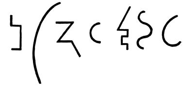
Fig. 156
Fig. 156
With these lines, which show little or no harmony of character, which agree only in tone and in width-measure, lines which would not be selected certainly as suitable material for orderly compositions, I will make three compositions, getting as much Order into each one as I can, just to illustrate what I mean. I shall not be able to achieve a great deal of Order, but enough, probably, to satisfy the reader that the effort has been worth while. [Pg 91]
With these lines, which lack harmony in character and only match in tone and width, lines that definitely wouldn’t be picked as good material for organized compositions, I’m going to create three compositions, putting as much order into each one as I can to illustrate my point. I won't be able to achieve a lot of order, but hopefully enough to show the reader that the effort has been worthwhile. [Pg 91]

Fig. 157
Fig. 157
In this case I have achieved the suggestion of a Symmetrical Balance on a vertical axis with some Harmony of Directions and of Attitudes and some Interval-Harmony.
In this case, I have achieved the idea of Symmetrical Balance along a vertical axis, along with some Harmony of Directions and Attitudes, and a bit of Interval-Harmony.

Fig. 158
Fig. 158
In this case, also, I have achieved a suggestion of Order, if not Order itself. Consider the comparative disorder in Fig. 156, where no arrangement has been attempted. [Pg 92]
In this situation, I've also managed to create a hint of order, if not actual order. Think about the relative chaos in Fig. 156, where no attempt has been made at organization. [Pg 92]

Fig. 159
Fig. 159
Here is another arrangement of the same terms. Fortunately, in all of these cases, the lines agree in tone and in width-measure. That means considerable order to begin with.
Here is another arrangement of the same terms. Fortunately, in all of these cases, the lines are consistent in tone and width. That means there's a good amount of order to start with.
This problem of taking any terms and making the best possible arrangement of them is a most interesting problem, and the ability to solve it has a practical value. We have the problem to solve in every-day life; when we have to arrange, as well as we can, in the best possible order, all the useful and indispensable articles we have in our houses. To achieve a consistency and unity of effect with a great number and variety of objects is never easy. It is often very difficult. It is particularly difficult when we have no two objects alike, no correspondence, no likeness, to make Harmony. With the possibility of repetitions and inversions the problem becomes comparatively easy. With repetitions and inversions we have the possibility, not only of Harmony, but of Balance and Rhythm. With inversions we have the possibility, not only of Balance, but of Symmetrical Balance, and when we have that we are not at all likely to think whether the terms of which the symmetry is composed are in harmony or not. We feel the Order of Symmetry and we are satisfied. [Pg 93]
This issue of taking any items and arranging them in the best possible way is really interesting, and knowing how to do it has practical value. We face this challenge in our everyday lives when we have to organize all the useful and essential things we have in our homes. Achieving a consistent and cohesive look with a wide variety of objects is never easy. In fact, it can be quite challenging, especially when there are no two objects that are the same—no similarities or likenesses to create Harmony. When we allow for repetitions and variations, the problem becomes much simpler. With repetitions and variations, we can create not just Harmony, but also Balance and Rhythm. With variations, we have the opportunity for not just Balance, but also Symmetrical Balance, and when we achieve that, we’re less likely to question whether the elements that make up the symmetry are harmonious. We simply feel the Order of Symmetry and we are satisfied. [Pg 93]

Fig. 160
Fig. 160
In this design I repeat an inversion of the arrangement in Fig. 158. The result is a symmetry, and no one is likely to ask whether the [Pg 94] elements of which it is composed are harmonious or not. By inversions, single and double, it is possible to achieve the Order of Balance, in all cases.
In this design, I mirror the arrangement in Fig. 158. The outcome is a symmetry, and no one will likely question whether the [Pg 94] elements that make it up are harmonious or not. Through single and double inversions, it’s possible to achieve the Order of Balance in all instances.

Fig. 161
Fig. 161
For this design I have made another arrangement of my seven lines. The arrangement suggests movement. In repeating the arrangement at regular and equal intervals, without change of attitude, I produce the effect of Rhythm. Without resorting to inversion, it is difficult to make even [Pg 95] an approximation to Symmetry with such terms (see Fig. 157), but there is little or no difficulty in making a consistent or fairly consistent movement out of them, which, being repeated at regular intervals, without change of attitude, or with a gradual change of attitude, will produce the effect of Rhythm.
For this design, I've rearranged my seven lines. This arrangement suggests movement. By repeating the arrangement at regular and equal intervals, without changing the attitude, I create a sense of rhythm. Without inverting, it’s tough to even get close to symmetry with such terms (see Fig. 157), but it’s fairly easy to create a consistent movement from them which, when repeated at regular intervals—without changing the attitude, or with a gradual change of attitude—will produce a rhythmic effect. [Pg 95]
Up to this point I have spoken of the composition of lines in juxtaposition, that is to say, the lines have been placed near together so as to be seen together. I have not spoken of the possibilities of Contact and Interlacing. The lines in any composition may touch one another or cross one another. The result will be a composition of connected lines. In certain cases the lines will become the outlines of areas. I will defer the illustration of contacts and interlacings until I come to consider the composition of outlines.
Up to now, I've talked about arranging lines side by side, meaning that the lines are positioned close enough to be viewed together. I haven't yet discussed the potential of Touching and Interlacing. The lines in any design can touch or cross each other. The outcome will be a design made up of connected lines. In some instances, the lines will form the outlines of shapes. I'll wait to illustrate touching and interlacing until I address the composition of outlines.
DEFINITION OF OUTLINES
106. Outlines are lines which, returning to themselves, make inclosures and describe areas of different measures and shapes. What has been said of lines may be said, also, of outlines. It will be worth while, however, to give a separate consideration to outlines, as a particularly interesting and important class of lines.
106. Outlines are lines that loop back on themselves, creating enclosures and defining areas of various sizes and shapes. Everything that has been said about lines can also apply to outlines. However, it’s worth giving separate attention to outlines, as they are a particularly interesting and important type of line.
As in the case of dots and lines, I shall disregard the fact that the outlines may be drawn in different tones, making different contrasts of value, color, or color-intensity with the ground-tone upon which they are drawn. I shall, also, disregard possible differences of width in the lines which make the outlines. I shall confine my attention, here, to the measures and shapes of the outlines and to the possibilities of Harmony, Balance, and Rhythm in those measures and shapes.
As with dots and lines, I will ignore the fact that the outlines can be drawn in different shades, creating various contrasts in value, color, or color intensity with the background they’re drawn on. I will also overlook any differences in the thickness of the lines that create the outlines. Instead, I will focus on the dimensions and shapes of the outlines and the possibilities for Harmony, Balance, and Rhythm in those dimensions and shapes.
HARMONY, BALANCE, AND RHYTHM
IN OUTLINES
107. What is Harmony or Balance or Rhythm in a line is Harmony, Balance, or Rhythm in an Outline.
107. What represents Harmony, Balance, or Rhythm in a line also represents Harmony, Balance, or Rhythm in an Outline.

Fig. 162
Fig. 162
In this outline we have Measure-Harmony in the angles, Measure-Harmony of lengths in the legs of the angles, Measure and Shape-Balance on a center and Symmetry on the vertical axis. The same statement will be true of all polygons which are both equiangular and equilateral, when they are balanced on a vertical axis. [Pg 97]
In this outline, we cover Measure-Harmony in the angles, Measure-Harmony of lengths in the legs of the angles, Measure and Shape-Balance at a center, and Symmetry along the vertical axis. The same will be true for all polygons that are both equiangular and equilateral when they are balanced on a vertical axis. [Pg 97]
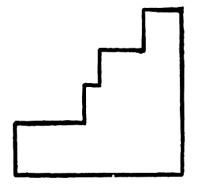
Fig. 163
Fig. 163
In this case we have Measure-Harmony of angles but no Measure-Harmony of lengths in the legs of the angles. We have lost Measure and Shape-Balance on a center which we had in the previous example.
In this situation, we have Measure-Harmony of angles, but there's no Measure-Harmony of lengths in the sides of the angles. We've lost Measure and Shape-Balance around a center that we had in the previous example.

Fig. 164
Fig. 164
In this case the angles are not all in a Harmony of Measure; but we have Measure-Harmony of lengths in the legs of the angles, and we have Measure and Shape-Balance on a center. There is a certain Harmony in the repetition of a relation of two angles.
In this case, the angles aren't all in harmony with each other; however, we have a balanced measure of lengths in the legs of the angles, and we have a balance of measure and shape around a center. There is some harmony in the repetition of the relationship between the two angles.

Fig. 165
Fig. 165
In this case we have Measure-Harmony in the angles, which are equal, and a Harmony due to the repetition of a certain measure-relation in the legs of the angles. As in Fig. 162, we have here a Measure and Shape-Balance on a center and Symmetry on the vertical axis. This polygon is not equilateral, but its sides are symmetrically disposed. Many interesting and beautiful figures may be drawn in these terms. [Pg 98]
In this case, we have Measure-Harmony in the angles, which are equal, and a Harmony resulting from the repetition of a certain measure-relation in the legs of the angles. Similar to Fig. 162, we have a Measure and Shape-Balance around a center and Symmetry along the vertical axis. This polygon isn't equilateral, but its sides are arranged symmetrically. Many interesting and beautiful figures can be created using these concepts. [Pg 98]

Fig. 166
Fig. 166
We have in the circle the most harmonious of all outlines. The Harmony of the circle is due to the fact that all sections of it have the same radius and equal sections of it have, also, the same angle-measure. The circle is, of course, a perfect illustration of Measure and Shape-Balance on a center. The balance is also symmetrical. We have a Harmony of Directions in the repetition of the same change of direction at every point of the outline, and we have a Harmony of Distances in the fact that all points of the outline are equally distant from the balance-center, which is unmistakably felt.
We have in the circle the most harmonious of all shapes. The harmony of the circle comes from the fact that all its sections have the same radius, and equal sections also have the same angle. The circle is, of course, a perfect example of measurement and shape balance around a center. The balance is also symmetrical. There’s harmony in the directions due to the consistent change of direction at every point along the outline, and there's harmony in the distances since all points on the outline are equally far from the central balance point, which is clearly felt.

Fig. 167
Fig. 167
The Ellipse is another example of Measure and Shape-Balance on a center. In this attitude it is also an illustration of Symmetry.
The ellipse is another example of measuring and shaping balance around a center. In this context, it also illustrates symmetry.

Fig. 168
Fig. 168

Fig. 169
Fig. 169
In this case we have an outline produced by the single inversion of a line in which there is the repetition of a certain motive in a gradation of measures. That gives Shape-Harmony without Measure-Harmony. This is a case of Symmetrical Balance. It is also a case of rhythmic movement upward. The movement is mainly due to convergences.
In this case, we have an outline created by a single inversion of a line where a certain motif is repeated in a gradation of measures. That creates Shape-Harmony without Measure-Harmony. This is an example of Symmetrical Balance. It also represents a rhythmic upward movement. The movement mainly comes from convergences.

Fig. 170
Fig. 170
In this case, also, the shapes repeated on the right side and on the left side of the outline show movements which become in repetitions almost rhythmical. The movement is up in spite of the fact that each part of the movement is, in its ending, down. We have in these examples symmetrical balance on a vertical axis combined with rhythm on the same axis. It may be desirable to find the balance-center of an outline when only the axis is indicated by the character of the outline. The principle which we follow is the one already described. In Fig. 169 we have a symmetrical balance on a vertical axis, but there is nothing to indicate the balance-center. It lies on the axis somewhere, but there [Pg 100] is nothing to show us where it is. Regarding the outline as a line of attractions, the eye is presumably held at their balance-center, wherever it is. Exactly where it is is a matter of visual feeling. The balance-center being ascertained, it may be indicated by a symmetrical outline or inclosure, the center of which cannot be doubtful.
In this case, the shapes that repeat on both the right and left sides of the outline exhibit movements that, when repeated, become nearly rhythmic. The movement is upward, even though each part of the movement ends downward. In these examples, we see a symmetrical balance on a vertical axis combined with rhythm along that same axis. It can be helpful to identify the balance point of an outline when only the axis is shown by the outline's character. The principle we follow is the one already explained. In Fig. 169, there is symmetrical balance on a vertical axis, but there's nothing to indicate where the balance point is. It exists somewhere on the axis, but there’s no indication of its exact location. Viewing the outline as a line of attractions, the eye is likely drawn to their balance point, wherever it may be. The exact location is a matter of visual perception. Once the balance point is determined, it can be represented by a symmetrical outline or enclosure, the center of which should be clear.

Fig. 171
Fig. 171
The balance-center, as determined by visual feeling, is here clearly indicated. In this case besides the balance on a center we have also the Symmetry which we had in Fig. 169.
The balance point, identified by visual perception, is clearly marked here. In this instance, in addition to the balance at a center, we also have the symmetry that we found in Fig. 169.

Fig. 172
Fig. 172
The sense of Balance is, in this case, much diminished by the change of attitude in the balanced outline. We have our balance upon a center, [Pg 101] all the same; but the balance on the vertical axis being lost, we have no longer any Symmetry. It will be observed that balance on a center is not inconsistent with movement. If this figure were repeated at equal intervals without change of attitude, or with a gradual change, we should have the Rhythm of a repeated movement.
The sense of balance here is greatly reduced by the change in posture within the balanced outline. We still maintain our balance on a center, [Pg 101] but since we've lost balance on the vertical axis, there’s no longer any symmetry. It's important to note that having balance on a center doesn’t mean we can’t have movement. If this shape were repeated at equal intervals without changing its posture, or with a gradual shift, we would create the rhythm of a repeated movement.
In some outlines only certain parts of the outlines are orderly, while other parts are disorderly.
In some outlines, only certain sections are organized, while other sections are chaotic.

Fig. 173
Fig. 173
In the above outline we have two sections corresponding in measure and shape-character and in attitude. We have, therefore, certain elements of the outline in harmony. We feel movement but not rhythm in the relation of the two curves. There is no balance of any kind.
In the outline above, we have two sections that correspond in size and shape—and in attitude as well. Because of this, there are certain elements of the outline that are in harmony. We can sense movement, but not rhythm, in the relationship of the two curves. There’s no kind of balance present.
We ought to be able to recognize elements of order as they occur in any outline, even when the outline, as a whole, is disorderly.
We should be able to identify elements of order even when the overall outline is chaotic.

Fig. 174
Fig. 174
In order to balance the somewhat irregular outline given in Fig. 173, we follow the procedure already described. The effect, however, is unsatisfactory. The composition lacks stability. [Pg 102]
To balance the somewhat uneven structure provided in Fig. 173, we follow the previously outlined procedure. However, the result is not satisfactory. The composition feels unstable. [Pg 102]

Fig. 175
Fig. 175
The attitude of the figure is here made to conform, as far as possible, to the shape and attitude of the symmetrical framing: this for the sake of Shape and Attitude-Harmony. The change of attitude gives greater stability.
The figure's posture is adjusted to align with the shape and stance of the symmetrical frame as much as possible, emphasizing Shape and Attitude-Harmony. This change in posture provides more stability.
INTERIOR DIMENSIONS OF
AN OUTLINE
108. A distinction must be drawn between the measures of the outline, as an outline, and the measures of the space or area lying within the outline: what may be called the interior dimensions of the outline.
108. A distinction must be made between the measurements of the outline, as an outline, and the measurements of the space or area within the outline: what can be referred to as the interior dimensions of the outline.

Fig. 176
Fig. 176
In this case we must distinguish between the measures of the outline and the dimensions of the space inclosed within it. When we consider the measures—not of the outline, but of the space or area inside of the outline—we may look in these measures, also, for Harmony, for Balance, or for Rhythm, and for combinations of these principles.
In this case, we need to differentiate between the measurements of the outline and the dimensions of the area inside it. When we focus on the measurements—not of the outline, but of the space or area within the outline—we can also find Harmony, Balance, or Rhythm in these measurements, along with combinations of these principles.
HARMONY IN THE INTERIOR DIMENSIONS
OF AN OUTLINE

Fig. 177
Fig. 177
In this case we have an outline which shows a Harmony in the correspondence of two dimensions.
In this case, we have an outline that demonstrates a balance in the relationship between two dimensions.

Fig. 178
Fig. 178
In this case we have Harmony in the correspondence of all vertical dimensions, Harmony in the correspondence of all horizontal dimensions, but no relation of Harmony between the two. It might be argued, from the fact that the interval in one direction is twice that in the other, that the dimensions have something in common, namely, a common divisor. It is very doubtful, however, whether this fact is appreciable in the sense of vision. The recurrence of any relation of two dimensions would, no doubt, be appreciated. We should have, in that case, Shape-Harmony.
In this situation, we have Harmony in the alignment of all vertical dimensions, Harmony in the alignment of all horizontal dimensions, but no relationship of Harmony between the two. One could argue that since the interval in one direction is twice that in the other, the dimensions share something in common—specifically, a common divisor. However, it’s quite questionable whether this fact can be perceived visually. The repetition of any relationship between two dimensions would certainly be noticeable. In that case, we would have Shape-Harmony.

Fig. 179
Fig. 179
In this grouping, we have a Measure-Harmony of diameters. [Pg 104]

Fig. 180
Fig. 180
In this case we have a Harmony due to the repetition of a certain ratio of vertical intervals: 1:3, 1:3, 1:3.
In this case, we have Harmony because of the repeated ratio of vertical intervals: 1:3, 1:3, 1:3.
110. Any gradual diminution of the interval between opposite sides in an outline gives us a convergence in which the eye moves more or less rapidly toward an actual or possible contact. The more rapid the convergence the more rapid the movement.
110. Any gradual reduction of the distance between opposing sides in a shape creates a convergence that causes the eye to move more or less quickly toward an actual or potential contact point. The faster the convergence, the quicker the movement.

Fig. 181
Fig. 181
In this case we have not only symmetrical balance on a vertical axis but movement, in the upward and rapid convergence of the sides BA and CA toward the angle A. The question may be raised whether the movement, in this case, is up from the side BC to the angle A or down from the angle A toward the side BC. I think that the reader will agree that the movement is from the side BC into the angle A. In this direction the eye is more definitely guided. The opposite movement from A toward BC is a movement in diverging directions which the eye cannot follow to [Pg 105] any distance. As the distance from BC toward A decreases, the convergence of the sides BA and CA is more and more helpful to the eye and produces the feeling of movement. The eye finds itself in a smaller and smaller space, with a more and more definite impulse toward A. It is a question whether the movement from BC toward A is rhythmical or not. The movement is not connected with any marked regularity of measures. I am inclined to think, however, that the gradual and even change of measures produces the feeling of equal changes in equal measures. If so, the movement is rhythmical.
In this case, we not only have symmetrical balance along a vertical axis but also movement, seen in the upward and rapid convergence of the sides BA and CA toward the angle A. We might wonder whether the movement goes up from the side BC to the angle A or down from the angle A to the side BC. I believe most readers will agree that the movement is from the side BC into the angle A. This direction more effectively guides the eye. The opposite movement from A toward BC diverges in different directions, making it hard for the eye to follow it for any distance. As the space from BC to A gets smaller, the convergence of the sides BA and CA becomes increasingly helpful to the eye and creates a sense of movement. The eye is confined to a smaller area, with a stronger impulse toward A. There's a question of whether the movement from BC to A is rhythmic or not. The movement doesn’t show any distinct regularity in terms of measures. However, I tend to think that the gradual and consistent change in measures gives a sense of equal changes over equal distances. If that's the case, then the movement is rhythmic.
When the movement of the eye in any convergence is a movement in regular and marked measures, as in the example which follows, the movement is rhythmical, without doubt.
When the movement of the eye during any convergence happens in consistent and clear measures, like in the example that follows, the movement is definitely rhythmic.
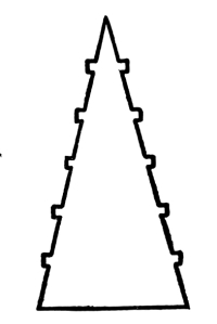
Fig. 182
Fig. 182
The upward movement in this outline, being regulated by measures which are marked and equal, the movement is certainly rhythmical, according to our understanding and definition of Rhythm. Comparing Fig. 181 with Fig. 182, the question arises, whether the movement in Fig. 182 is felt to be any more rhythmical than the movement in Fig. 181. The measures of the movement in Fig 181 are not marked, but I cannot persuade myself that they are not felt in the evenness of the gradation. The movement in Fig. 181 is easier than it is in Fig. 182, when the marking of the measures interferes with the movement. [Pg 106]
The upward movement in this outline, controlled by distinct and equal measures, is definitely rhythmic, based on our understanding and definition of Rhythm. When comparing Fig. 181 with Fig. 182, a question comes up: is the movement in Fig. 182 perceived as more rhythmic than the movement in Fig. 181? The measures of the movement in Fig 181 are not distinct, but I can’t convince myself that they aren't felt in the smoothness of the gradation. The movement in Fig. 181 is easier than it is in Fig. 182, where the marking of the measures disrupts the movement. [Pg 106]

Fig. 183
Fig. 183
In this case we have another illustration like Fig. 182, only the measures of the rhythm are differently marked. The force of the convergence is greatest in Fig. 181. It is somewhat diminished by the measure-marks in Fig. 182. It is still further diminished, in Fig. 183, by the angles that break the measures.
In this case, we have another example like Fig. 182, but the rhythm is indicated differently. The strength of the convergence is strongest in Fig. 181. It is slightly reduced by the measure markings in Fig. 182. Additionally, in Fig. 183, it is further weakened by the angles that disrupt the measures.

Fig. 184
Fig. 184
In this case the movement is more rapid again, the measures being measures of an arithmetical progression. There is a crowding together of attractions in the direction of the convergence, and the movement is easier than it is in Fig. 183, in spite of the fact that the lines of convergence are more broken in Fig. 184. There is an arithmetical diminution of horizontal as well as of vertical lines in Fig. 184. [Pg 107]
In this case, the movement is quicker again, as the measures follow an arithmetic progression. There’s a gathering of attractions towards the convergence, and the movement is smoother than it is in Fig. 183, even though the lines of convergence are more fragmented in Fig. 184. There's a consistent decrease in both horizontal and vertical lines in Fig. 184. [Pg 107]

Fig. 185
Fig. 185
In this case the measures of the rhythm are in the terms of a geometrical progression. The crowding together of attractions is still more rapid in this case and the distance to be traversed by the eye is shorter. The convergence, however, is less compelling, the lines of the convergence being so much broken—unnecessarily.
In this case, the measures of the rhythm are described in terms of a geometric progression. The clustering of attractions happens even faster here, and the distance for the eye to travel is shorter. However, the convergence is less convincing, as the lines of convergence are overly fragmented.
The movement will be very much retarded, if not prevented, by having the movement of the crowding and the movement of the convergence opposed.
The movement will be greatly slowed down, if not stopped, by having the crowd's movement and the movement of convergence working against each other.

Fig. 186
Fig. 186
There is no doubt that in this example, which is to be compared with that of Fig. 184, the upward movement is almost prevented. There are [Pg 108] here two opposed movements: that of the convergence upward and that of a crowding together of attractions downward. The convergence is stronger, I think, though it must be remembered that it is probably easier for the eye to move up than down, other things being equal.
There’s no doubt that in this example, which should be compared with that of Fig. 184, the upward movement is nearly blocked. There are two conflicting movements here: one that pulls upward and another that pushes downward due to the crowding of attractions. I believe the upward movement is stronger, though it’s important to note that it’s likely easier for the eye to move up than down, all else being equal. [Pg 108]
111. The movements in all of these cases may be enhanced by substituting for the straight lines shapes which are in themselves shapes of movement.
111. The movements in all of these cases can be improved by replacing the straight lines with shapes that already represent movement.

Fig. 187
Fig. 187
Here, for example, the movement of Fig. 184 is facilitated and increased by a change of shape in the lines, lines with movement being substituted for lines which have no movement, beyond the movement of the convergence.
Here, for example, the movement of Fig. 184 is made easier and more pronounced by a change in the shape of the lines, with dynamic lines replacing static ones, apart from the movement caused by their convergence.

Fig. 188
Fig. 188
[Pg 109] In Fig. 188 all the shapes have a downward movement which contradicts the upward movement of convergence. The movement down almost prevents the movement up.
[Pg 109] In Fig. 188 all the shapes are moving down, which goes against the upward movement of convergence. The downward movement nearly stops the upward movement.
112. The movement of any convergence may be straight, angular, or curved.
112. The movement of any convergence can be straight, angled, or curved.

Fig. 189
Fig. 189
In this case the movement of the convergence is angular. It should be observed that the movement is distributed in the measures of an arithmetical progression, so that we have, not only movement, but rhythm.
In this case, the movement of the convergence is angular. It's important to note that the movement is distributed in the measures of an arithmetic progression, which means we have not only movement but also rhythm.

Fig. 190
Fig. 190
In this case the movement of convergence is in a curve. The stages of the movement, not being marked, the movement is not rhythmical, unless we feel that equal changes are taking place in equal measures. I am inclined to think that we do feel that. The question, however, is one which I would rather ask than answer, definitely. [Pg 110]
In this case, the movement of convergence takes on a curve. The stages of the movement aren’t marked, so it isn’t rhythmic unless we sense that equal changes are happening over equal distances. I tend to think that we do sense that. However, this is a question I would prefer to ask rather than definitively answer. [Pg 110]

Fig. 191
Fig. 191
In this case the movement is, unquestionably, rhythmical, because the measures are clearly marked. The measures are in an arithmetical progression. They diminish gradually in the direction of the convergence, causing a gradual crowding together of attractions in that direction.
In this case, the movement is definitely rhythmic because the measures are clearly defined. The measures follow a numerical progression. They gradually decrease toward the point of convergence, leading to a gradual clustering of attractions in that direction.
Substituting, in the measures, shapes which have movement, the movement of the rhythm may be considerably increased, as is shown in the example which follows.
Substituting shapes that have movement in the measures can significantly enhance the rhythm's movement, as demonstrated in the following example.

Fig. 192
Fig. 192
This is a case in which the movement is, no doubt, facilitated by an association of ideas, the suggestion of a growth.
This is a case where the movement is clearly helped by a connection of ideas, suggesting a growth.
113. The more obvious the suggestion of growth, the more inevitable is the movement in the direction of it, whatever that direction is. It must be understood, however, that the movement in such cases is due to an association of ideas, not to the pull of attractions in the sense of vision. The pull of an association of ideas may or may not be in the direction of the pull of attractions. [Pg 111]
113. The clearer the suggestion of growth, the more likely there is to be a movement toward it, no matter what that direction is. However, it’s important to understand that this movement happens because of an association of ideas, not because of the attraction one might feel in a visual sense. The pull from an association of ideas might align with the attraction or it might not. [Pg 111]

Fig. 193
Fig. 193
In Fig. 193 we have an illustration of a rhythmic movement upward. The upward movement is due quite as much to an association of ideas, the thought of a growth of vegetation, as it is to mere visual attractions. It happens that the figure is also an illustration of Symmetrical Balance. As we have Harmony in the similarity of the opposite sides, the figure is an illustration of combined Harmony, Balance, and Rhythm.
In Fig. 193 we see an example of a rhythmic upward movement. This upward motion is influenced as much by the idea of plant growth as it is by visual appeal. Additionally, the figure illustrates Symmetrical Balance. With Harmony stemming from the similarity of the opposite sides, the figure demonstrates a blend of Harmony, Balance, and Rhythm.
There is another point which is illustrated in Fig. 193. It is this: that we may have rhythmic movement in an outline, or, indeed, in any composition of lines, which shows a gradual and regular change from one shape to another; which shows a gradual and regular evolution or development of shape-character; provided the changes are distributed in regular and marked measures and the direction of the changes, the evolution, the development, is unmistakable; as it is in Fig. 193. The changes of shape in the above outline are changes which are gradual and regular and suggest an upward movement unmistakably. The movement, [Pg 112] however, involves a comparison of shape with shape, so it is as much a matter of perception as of sensation. Evolutions and developments in Space, in the field of vision, are as interesting as evolutions and developments in the duration of Time. When the changes in such movements are regular, when they take place in regular and marked measures, when we must take them in a certain order, the movements are rhythmical, whether in Time or in Space.
There’s another point illustrated in Fig. 193. It’s this: we can have rhythmic movement in an outline, or really in any arrangement of lines, that shows a gradual and consistent shift from one shape to another; that demonstrates a steady evolution or development of shape characteristics; as long as the changes are distributed in regular and noticeable measures and the direction of the changes, the evolution, the development, is clear; just like in Fig. 193. The changes of shape in the outline above are gradual and consistent, clearly suggesting an upward movement. However, the movement involves comparing one shape to another, so it’s as much about perception as it is about sensation. Evolutions and developments in space, in our field of vision, are just as fascinating as those in the passage of time. When the changes in these movements are consistent, happening in regular and noticeable measures, and we have to follow them in a certain order, those movements are rhythmic, whether in time or in space.
THE ATTITUDES OF OUTLINES
114. Any outline, no matter what dimensions or shape it has, may be turned upon a center and in that way made to take a great number and variety of attitudes. Not only may it be turned upon a center but inverted upon an axis. Being inverted, the inversion may be turned upon a center and made to take another series of attitudes, and this second series of attitudes will be different from the first series, except in cases of axial symmetry in the outline or area. It must be clearly understood that a change of attitude in any outline or area is not a change of shape.
114. Any outline, regardless of its size or shape, can be rotated around a center, allowing it to adopt many different positions. It can also be flipped over an axis. When flipped, the outline can be spun around a center again, resulting in a new set of positions that will differ from the first set, unless the outline or area has axial symmetry. It's important to recognize that changing the position of any outline or area does not change its shape.
115. What has been said of Harmony, Balance, and Rhythm in the attitudes of a line applies equally well to outlines and to the spaces defined by them.
115. What has been said about Harmony, Balance, and Rhythm in the attitudes of a line also applies to outlines and to the spaces they define.
THE ARRANGEMENT AND COMPOSITION
OF OUTLINES
116. By the composition of outlines I mean putting two or more outlines in juxtaposition, in contact or interlacing. In all cases of interlacing, of course, the shape-character of the interlacing outlines is lost. The outlines become the outlines of other areas and of a larger number of them. Our object in putting outlines together is, in Pure Design, to illustrate the orders of Harmony, Balance, and Rhythm, to achieve Order, as much as we can, if possible Beauty.
116. By "composition of outlines," I mean placing two or more outlines next to each other, in contact, or interweaving them. In any case of interweaving, of course, the distinctive shape of the interweaving outlines is lost. The outlines turn into the outlines of different areas and a greater number of them. Our goal in combining outlines is, in Pure Design, to demonstrate the principles of Harmony, Balance, and Rhythm, to create Order, and, if possible, achieve Beauty.

Fig. 194
Fig. 194
In this case we have Shape-Harmony in the outlines and also a Harmony of Attitudes.
In this case, we have Shape-Harmony in the outlines and also a Harmony of Attitudes.

Fig. 195
Fig. 195
Here we have another illustration of the Harmony of Shapes and of Attitudes, with a Harmony of Intervals, which we did not have in Fig. 194.
Here we have another example of the Harmony of Shapes and Attitudes, along with a Harmony of Intervals, which we didn't have in Fig. 194.

Fig. 196
Fig. 196
In this case we have a Harmony of Attitudes and of Intervals (the Harmony of a repeated Relation of Intervals) in what may be called an All-Over Repetition. [Pg 114]
In this case, we have a Harmony of Attitudes and Intervals (the Harmony of a repeated Relationship of Intervals) in what could be called an Overall Repetition. [Pg 114]

Fig. 197
Fig. 197
In this case we have a Harmony of Attitudes in the repetition of a relation of two opposite attitudes; this with Shape-Harmony and Interval-Harmony.
In this case, we have a harmony of attitudes in the repetition of a relationship between two opposing attitudes; this involves shape harmony and interval harmony.

Fig. 198
Fig. 198
In this case we have a Symmetry of Attitudes, with Shape-Harmony and Interval-Harmony. Turning the composition off the vertical axis we should have Balance but no Symmetry. The balance-center will be felt in all possible attitudes of this composition.
In this case, we have a symmetry of attitudes, with shape harmony and interval harmony. If we rotate the composition away from the vertical axis, we would achieve balance but lose the symmetry. The balance point will be noticeable in all possible positions of this composition.

Fig. 199
Fig. 199
In this case I have repeated a certain outline, which gives me the Harmony of a repetition,—this in connection with a progression in scale, so that the Harmony is Shape-Harmony, not Measure-Harmony. We [Pg 115] have in the attitude of this repetition a Symmetrical Balance. The movement is rhythmical and the direction of the rhythm is up.
In this situation, I’ve repeated a specific outline, which gives me the harmony of repetition—connected to a progression in scale, making the harmony Shape-Harmony instead of Measure-Harmony. We [Pg 115] have in this repetition a symmetrical balance. The movement is rhythmic, and the rhythm's direction is upward.
The movement in Fig. 199 might be indefinitely increased by the introduction into it of a gradation of attractions, increasing in number. That means that the extent of contrasting edges is increased from measure to measure.
The movement in Fig. 199 could be increased indefinitely by adding a range of attractions that grow in number. This means that the extent of contrasting edges increases from one measure to the next.

Fig. 200
Fig. 200
The addition of details, increasing in number from measure to measure upward, increases the movement of the rhythm in that direction.
The addition of details, increasing in number from measure to measure upward, boosts the movement of the rhythm in that direction.
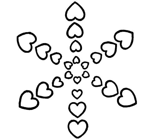
Fig. 201
Fig. 201
[Pg 116] Taking the arrangement of Fig. 199 and repeating it six times at diverging angles of sixty degrees, we get what may be called a radial balance upon the basis of a hexagon.
[Pg 116] By taking the layout of Fig. 199 and repeating it six times at angles of sixty degrees apart, we achieve what can be described as a radial balance based on a hexagon.
Outlines may be drawn one inside of the other or several inside of one.
Outlines can be created one inside another or several within one.

Fig. 202
Fig. 202
This is a case of outlines-within-outlines and of Shape-Harmony without Measure-Harmony. There is, also, a Harmony of Attitudes, but no Harmony of Intervals.
This is a situation of outlines within outlines and of Shape-Harmony without Measure-Harmony. There is also a Harmony of Attitudes, but no Harmony of Intervals.
Interesting results may be produced by drawing a series of outlines similar in shape, the second inside of the first, the third inside of the second, and so on.
Interesting results can come from creating a series of outlines that are similar in shape, with each one placed inside the previous one.
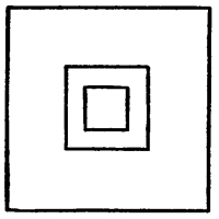
Fig. 203
Fig. 203
In this case, for example, we have the outlines drawn one inside of the other. The outlines have all the same shape, but different measures. It is a case of Shape-Harmony and Harmony of Attitudes, without Measure-Harmony, and without any Harmony of Intervals. This is a very interesting and important form of Design which has many applications. [Pg 117]
In this case, for example, we have shapes drawn one inside the other. The shapes all look the same but are different sizes. It’s a situation of Shape Harmony and Harmony of Attitudes, without Measure Harmony, and without any Harmony of Intervals. This is a very interesting and important form of design that has many applications. [Pg 117]

Fig. 204
Fig. 204
In this case, also, we have Shape-Harmony without Measure-Harmony. We have a Harmony of Attitudes and also of Intervals, the spaces between the outlines corresponding.
In this situation too, we have Shape-Harmony without Measure-Harmony. We have a Harmony of Attitudes as well as of Intervals, where the spaces between the outlines match.

Fig. 205
Fig. 205
Here we have the Harmony of an alternation of Attitudes repeated, with Shape-Harmony, without Measure-Harmony.
Here we have the balance of alternating attitudes repeated, with shape harmony, but without measure harmony.
In all forms of design in which we have the concentric repetition of a certain outline we have, in connection with the feeling of a central balance, the feeling of a movement or movements toward the center. These movements are due to convergences. Movements carrying the eye away from the center, in opposite directions, interfere with the feeling of balance. The feeling is enhanced, however, when the movements converge and come together.
In all types of design where there’s repeated layering of a specific shape, we experience a sense of central balance along with a sensation of movement or movements directed toward the center. These movements arise from convergences. Movements that draw the eye away from the center in opposite directions disrupt the feeling of balance. However, this feeling is strengthened when the movements converge and unite.

Fig. 206
Fig. 206
The repetition of outlines-within-outlines may be concentric or eccentric. The repetition is concentric in Fig. 204. It is eccentric in the example which follows.
The repetition of outlines-within-outlines can be either concentric or eccentric. The repetition is concentric in Fig. 204. It is eccentric in the example that follows.

Fig. 207
Fig. 207
In all eccentric repetitions like this we have a lack of balance and the suggestion of movement. The direction of the movement is determined by the direction of convergences and of the crowding together of attractions. The movement in Fig. 207 is up-to-the-left, unmistakably. Repeating the composition of Fig. 207, at regular intervals and without change of attitude, the movement up-to-the-left would be extended to the repetitions and the movement would be rhythmical. The movement is rhythmical in the composition itself, as shown in Fig. 207, because the movement in the composition is regular in character, regular in its measures, and unmistakable in direction. [Pg 119]
In all unusual repetitions like this, we lack balance and give the impression of movement. The direction of the movement is guided by where things converge and how attractions crowd together. The movement in Fig. 207 clearly goes up and to the left. If we repeat the composition of Fig. 207 at consistent intervals and keep the same attitude, the movement up and to the left would carry over to the repetitions, creating a rhythmic movement. The movement is already rhythmic in the composition itself, as shown in Fig. 207, because the movement in the composition is consistent in nature, regular in its measures, and clear in its direction. [Pg 119]

Fig. 208
Fig. 208
This is another example of eccentric repetition in outlines-within-outlines. As in Fig. 207, we have movement, and the movement is rhythmical.
This is another example of quirky repetition in outlines-within-outlines. As in Fig. 207, we have movement, and the movement is rhythmic.
In the examples I have given there have been no contacts and no interlacings. Contacts and interlacings are possible.
In the examples I've provided, there have been no contacts or interlacings. Contacts and interlacings are possible.

Fig. 209
Fig. 209
Here, for an example, is an instance of contact, with Harmony of Attitudes and a Symmetrical Balance on a vertical axis.
Here, for example, is a case of contact, featuring Harmony of Attitudes and Symmetrical Balance along a vertical axis.

Fig. 210
Fig. 210

Fig. 211
Fig. 211
Here we have a similar composition with interlacings.
Here we have a similar design with overlapping elements.
When the outlines have different shapes as well as different measures, particularly when the outlines are irregular and the shapes to be put together are, in themselves, disorderly, the problem of composition becomes more difficult. The best plan is to arrange the outlines in a group, making as many orderly connections as possible. Taking any composition of outlines and repeating it in the different ways which I have described, it is generally possible to achieve orderly if not beautiful results.
When the shapes have different forms and sizes, especially when the outlines are irregular and the shapes to be combined are, themselves, chaotic, the challenge of composition becomes tougher. The best approach is to group the outlines, creating as many organized connections as possible. By taking any composition of outlines and rearranging it in the various ways I've mentioned, it's usually possible to achieve results that are orderly, if not beautiful.

Fig. 212
Fig. 212
Here are five outlines, very different in shape-character. Let us see what can be done with them. A lot of experiments have to be tried, to find out what connections, what arrangements, what effects are possible. The possibilities cannot be predicted. Using tracing-paper, a great many experiments can be tried in a short time, though it may take a long time to reach the best possible results. [Pg 121]
Here are five outlines, each with a unique shape and character. Let's see what we can create with them. We need to experiment a lot to discover the connections, arrangements, and effects we can achieve. The possibilities are unpredictable. With tracing paper, we can try many experiments quickly, although it might take time to find the best outcomes. [Pg 121]

Fig. 213
Fig. 213
In this example I have tried to make a good composition with my five outlines. The problem is difficult. The outlines to be combined have so little Harmony. The only Harmony we can achieve will be the Harmony of the same arrangement of shapes repeated, which amounts to Shape-Harmony. Inversions will give us the satisfaction of Balance. Inversions on a vertical axis will give us the satisfaction of Symmetry. In the design above given I have achieved simply the Harmony of a relation of shapes repeated, with Rhythm. The Rhythm is due to the repetition of a decidedly unbalanced group of elements with a predominance of convergences in one direction. The movement is on the whole up, in spite of certain downward convergences. The upward convergences predominate. There are more inclinations to the right than to the left, but the composition which is repeated is unstable in its attitude and suggests a falling away to the left. The resultant of these slight divergences of movement is a general upward movement. [Pg 122]
In this example, I’ve tried to create a good composition using my five outlines. The challenge is tough. The outlines to combine have very little harmony. The only harmony we can achieve will be from the same arrangement of shapes repeated, which amounts to shape harmony. Inversions will provide us the satisfaction of balance. Inversions along a vertical axis will give us the satisfaction of symmetry. In the design shown above, I’ve simply achieved harmony through a relation of repeated shapes, with rhythm. The rhythm comes from the repetition of a distinctly unbalanced group of elements, predominantly converging in one direction. Overall, the movement is upward, despite some downward convergences. The upward convergences dominate. There are more inclinations to the right than to the left, but the repeated composition is unstable and suggests a fall to the left. The result of these slight divergences in movement is a general upward movement. [Pg 122]

Fig. 214
Fig. 214
In this case I have less difficulty than in Fig. 213, having left out one of my five outlines, the one most difficult to use with the others. There is a great gain of Harmony. There is a Harmony of Intervals and a Harmony in the repetition of the same grouping of outlines. In the outlines themselves we have a Harmony of curved character, and the curves fit one another very well, owing to a correspondence of measure and shape-character in certain parts. In such cases we are able to get considerable Harmony of Attitudes into the composition. There is a Harmony of Attitudes in the repeats, as well as in certain details. Comparing Fig. 214 with Fig. 213, I am sure the reader will agree that we have in Fig. 214 the larger measure of Harmony.
In this instance, I find it easier than in Fig. 213, having omitted one of my five outlines—the one that was most challenging to integrate with the others. This leads to a significant increase in Harmony. There’s a Harmony of Intervals and a Harmony in the repetition of the same outline group. Within the outlines themselves, we see a Harmony of curved shapes, and these curves complement each other very well due to a matching in measure and shape in certain areas. In such examples, we can achieve a considerable Harmony of Attitudes in the composition. There’s a Harmony of Attitudes in the repeats, as well as in various details. When comparing Fig. 214 with Fig. 213, I’m confident that the reader will acknowledge that Fig. 214 has a greater degree of Harmony.

Fig. 215
Fig. 215
[Pg 123] In Fig. 215 I have used inversions and repetitions of the rather disorderly outline which gave me so much difficulty when I tried to combine it with the other outlines. Whatever merit the composition has is due solely to the art of composition, to the presence of Attitude-Harmony, Interval-Harmony, and to the inversions and repetitions; inversions giving Balance, repetitions giving Harmony.
[Pg 123] In Fig. 215 I have used inversions and repetitions of the somewhat chaotic outline that gave me a lot of trouble when I tried to combine it with the other outlines. Any value the composition has comes entirely from the craft of composition, the presence of Attitude-Harmony, Interval-Harmony, and the inversions and repetitions; inversions create Balance, while repetitions create Harmony.
While it is important to recognize the limitation of the terms in this problem, it is important to yield to any definite impulse which you may feel, though it carries you beyond your terms. The value of a rule is often found in breaking it for a good and sufficient reason; and there is no better reason than that which allows you, in Design, to follow any impulse you may have, provided that it is consistent with the principles of Order.
While it’s important to acknowledge the limitations of the terms in this problem, it’s also crucial to trust any strong impulse you might feel, even if it takes you beyond those terms. The worth of a rule is often revealed in breaking it for a good reason; and there’s no better reason than the one that lets you, in Design, pursue any impulse you have, as long as it aligns with the principles of Order.

Fig. 216
Fig. 216
In this case an effort has been made to modify the terms already used so as to produce a more rapid and consistent movement. Advantage has been taken of the fact that the eye is drawn into all convergences, so [Pg 124] all pointing down has been, so far as possible, avoided. The movement is distinctly rhythmical.
In this case, an effort has been made to change the terms already used to create a quicker and more consistent movement. The fact that the eye is naturally attracted to all convergences has been taken into account, so all downward pointing has, as much as possible, been avoided. The movement is clearly rhythmic.
In the previous examples I have avoided contacts and interlacing. It was not necessary to avoid them.
In the earlier examples, I stayed away from contacts and overlapping. There was no need to avoid them.

Fig. 217
Fig. 217
117. What is done, in every case, depends upon the designer who does it. He follows the suggestions of his imagination, not, however, with perfect license. The imagination acts within definite limitations, limitations of terms and of principles, limitations of certain modes in which terms and principles are united. In spite of these limitations, however, if we give the same terms, the same principles, and the same modes to different people, they will produce very different results. Individuality expresses itself in spite of the limitation of terms and modes, and the work of one man will be very different from the work of another, inevitably. We may have Order, Harmony, Balance, or Rhythm in all cases, Beauty only in one case, perhaps in no case. It must be remembered how, in the practice of Pure Design, we aim at Order and hope [Pg 125] for Beauty. Beauty is found only in supreme instances of Order, intuitively felt, instinctively appreciated. The end of the practice of Pure Design is found in the love of the Beautiful, rather than in the production of beautiful things. Beautiful things are produced, not by the practice of Pure Design, but out of the love of the Beautiful which may be developed by the practice.
117. What happens in every case depends on the designer who is creating it. They follow their imagination's ideas but not without some restrictions. Imagination operates within specific limits, including the constraints of terminology and principles, as well as the particular ways those terms and principles come together. Nevertheless, if we provide the same terms, principles, and methods to different people, they will generate very different outcomes. Individuality shows through, regardless of the limitations of terms and methods, and one person's work will always differ from another's. We may achieve Order, Harmony, Balance, or Rhythm in all instances, but Beauty might only be achieved in one, or maybe in none. It's important to remember that in the practice of Pure Design, we aim for Order and aspire to find Beauty. Beauty is discovered only in the finest examples of Order, which are felt intuitively and appreciated instinctively. The goal of practicing Pure Design is rooted in the love of Beauty, rather than simply creating beautiful items. Beautiful items are produced not by the practice of Pure Design, but from the love of Beauty that can be cultivated through that practice.
AREAS
118. I have already considered the measures of areas, in discussing the interior dimensions of outlines, and in discussing the outlines themselves I have considered the shapes of areas. It remains for me to discuss the tones in which the areas may be drawn and the tone-contrasts by which they may be distinguished and defined—in their positions, measures, and shapes.
118. I’ve already talked about measuring areas when discussing the inner dimensions of shapes, and I’ve looked at the shapes of these areas too. Now, I need to discuss how the areas can be shaded and the color contrasts that can be used to distinguish and define them based on their positions, measurements, and shapes.
LINEAR AREAS
119. Before proceeding, however, to the subject of tones and tone-relations, I must speak of a peculiar type of area which is produced by increasing or diminishing the width of a line. I have postponed the discussion of measures of width in lines until now.
119. Before moving on to the topic of tones and tone relationships, I have to mention a unique type of area that comes from either widening or narrowing a line. I’ve held off on discussing the measurements of line width until now.
A line may change its width in certain parts or passages. It may become wider or narrower as the case may be. The wider it is the more it is like an area. If it is sufficiently wide, the line ceases to be a line, and becomes an area. The line may change its width abruptly or gradually. The effect of the line is by these changes indefinitely varied. The line of Design is not the line of Geometry.
A line can change its width in some sections. It can get wider or narrower depending on the situation. The wider it gets, the more it resembles an area. If it's wide enough, the line stops being a line and turns into an area. The width of the line can change suddenly or gradually. These changes create a variety of effects. The line in Design isn't the same as the line in Geometry.

Fig. 218
Fig. 218
Let us take this line as the motive of a linear progression. We can give it a different character, perhaps a more interesting character, by widening all the vertical passages, as follows:—
Let’s use this line as the basis for a straightforward development. We can change its vibe, maybe make it more engaging, by expanding all the vertical sections like this:—

Fig. 219
Fig. 219
This is what we get for a motive by widening all the vertical passages.
This is what we get for a motive by expanding all the vertical passages.

Fig. 220
Fig. 220
This is what we get for a motive by widening all the horizontal passages.
This is what we get for a reason by expanding all the horizontal passages.

Fig. 221
Fig. 221
Compare this Progression, in which I have used the motive of Fig. 219, [Pg 127] with that of Fig. 77, p. 47. The accents, which in Fig. 221 occur in every repetition of the motive, might occur only in certain repetitions, at certain intervals.
Compare this progression, where I've used the theme of Fig. 219, [Pg 127] with that of Fig. 77, p. 47. The accents, which in Fig. 221 appear in every repetition of the theme, might appear only in some repetitions, at specific intervals.

Fig. 222
Fig. 222
It is not necessary that the changes in the width of the line be abrupt, as in the examples just given. The width of the line may increase or diminish gradually, in which case we may have, not only accents in the line, but movements due to gradations of dimension, to convergences, or to an increase or gradual crowding together of attractions in a series of visual angles.
It’s not essential for the changes in line width to be sudden, as seen in the examples given earlier. The width of the line can widen or narrow gradually, allowing for not just accents in the line, but also movements arising from gradual changes in size, converging forms, or an increasing crowding of attractions within a series of visual angles.

Fig. 223
Fig. 223
In this case we have a gradual increase followed by a diminution of the width of the line in certain parts, and these changes occur at equal intervals. A certain amount of rhythmic movement is given to the progression by such accents, provided the direction of movement is unmistakable, which it is not in this case. It is not at all clear whether the movement is down-to-the-right or up-to-the-left. It seems to me about as easy to move in one direction as in the other. [Pg 128]
In this situation, we see a gradual increase followed by a decrease in the width of the line in certain areas, and these changes happen at regular intervals. Some rhythmic movement is added to the progression by these accents, as long as the direction of movement is clear, which isn’t the case here. It's not at all clear whether the movement is down to the right or up to the left. It seems equally easy to move in either direction. [Pg 128]

Fig. 224
Fig. 224
In this case there is less doubt about the movement. It seems to be down-to-the-right. The eye is pulled through an increase of width-measures toward a greater extension and crowding together of contrasting edges.
In this case, there's less uncertainty about the movement. It appears to be down and to the right. The eye is drawn through a widening perspective towards a greater spread and clustering of contrasting edges.

Fig. 225
Fig. 225
Substituting outlines for areas in the previous illustration, we are surprised, perhaps, to find that the movement is reversed. We go up-to-the-left in this case, not down-to-the-right. The pull of a greater extension of tone-contrast in a given area was, in Fig. 224, sufficient to overcome the pull of a less evident convergence in the other direction. [Pg 129]
Substituting outlines for the areas in the previous illustration, we might be surprised to see that the movement is reversed. In this case, we move up and to the left instead of down and to the right. The influence of a stronger tone-contrast in a specific area was, in Fig. 224, enough to counteract the influence of a less obvious convergence in the opposite direction. [Pg 129]
By increasing or diminishing the width of lines, doing it gradually or abruptly, we are able to control the movement of the eye to an indefinite extent. This is one of the important resources of the designer’s art. Its use is not limited to forms of Linear Progression, but may be extended to all forms of Design in which lines are used.
By adjusting the width of lines, either gradually or suddenly, we can guide the eye's movement to an unlimited degree. This is one of the key tools in a designer's toolkit. Its application isn't confined to Linear Progression but can be applied to all types of design that involve lines.

Fig. 226
Fig. 226
In this case, for example, the eye follows the direction of convergences, but we can easily force it to turn and move in the opposite direction, by widening the lines in that direction, thus increasing the extent of contrasting edge until it more than outbalances the convergences; as in the following illustration:—
In this case, for example, the eye follows the direction of convergences, but we can easily make it turn and move in the opposite direction by widening the lines in that direction, thereby increasing the amount of contrasting edge until it outweighs the convergences; as shown in the following illustration:—

Fig. 227
Fig. 227
THE ARRANGEMENT AND COMPOSITION
OF AREAS
121. What has been said about the composition of Lines and Outlines applies equally well to the composition of Areas, so far as they are distinguished and defined by outlines. We will now proceed to consider areas as distinguished and defined, not by outlines, but by tone-contrasts. The composition of lines and outlines is one thing, the [Pg 130] composition of tones in different positions, measures, and shapes is another. In putting lines and outlines together we draw. The point of view is that of drawing. In putting tones in different positions, measures, and shapes we paint. The point of view is that of the painting.
121. What has been said about the arrangement of Lines and Outlines applies just as well to the arrangement of Areas, as long as they are distinguished and defined by outlines. We will now move on to consider areas as distinguished and defined, not by outlines, but by tone contrasts. The arrangement of lines and outlines is one thing; the arrangement of tones in different positions, sizes, and shapes is another. When we combine lines and outlines, we are drawing. The perspective is that of drawing. When we place tones in different positions, sizes, and shapes, we are painting. The perspective is that of painting.
122. Up to this point I have avoided the consideration of Tones and Tone-Relations. I have spoken of possible changes of tone in dots and in lines; changes of value, of color, of color-intensity; but it is not in dots nor in lines that these changes call for particular attention. Our interest has been in the positions, measures, shapes, and attitudes of dots and lines, and in the possibilities of arrangement and composition. When it comes to the consideration of areas and area-systems, however, the subject of tone-relations becomes one of the greatest interest, because areas are defined and distinguished, not only by their outlines, but quite as much by differences of tone; that is to say, by tone-contrasts.
122. Up to now, I have steered clear of discussing Tones and Tone-Relations. I've touched on possible changes in tone with dots and lines; changes in value, color, and color intensity; but it’s not in dots or lines that these changes deserve special attention. Our focus has been on the positions, measurements, shapes, and orientations of dots and lines, along with the potential for arrangement and composition. However, when we shift our focus to areas and area systems, tone relations become particularly important, because areas are defined and distinguished not just by their outlines, but also by tone differences—in other words, by tone contrasts.
THE PROCESS OF PAINTING AS
DISTINGUISHED FROM DRAWING
123. The first thing to consider is the tone of the surface upon which you are going to paint. You then take a tone differing from the ground-tone, in value, in color, or in color-intensity, you put it in a certain position, and you spread it over a certain extent of space. In so doing you give to the space a certain shape. This is the process of Painting, as distinguished from the process of Drawing. In Drawing we think of lines and outlines first. In Painting we think of Tones first, of positions, measures, and shapes afterwards.
123. The first thing to think about is the tone of the surface you are going to paint on. Then, you take a tone that’s different from the base tone, whether in value, color, or color intensity, place it in a specific position, and spread it over a certain area. By doing this, you give that space a certain shape. This is the process of Painting, which is different from the process of Drawing. In Drawing, we focus on lines and outlines first. In Painting, we focus on Tones first, followed by positions, measurements, and shapes.
DEFINITION OF THE WORD TONE
124. In producing tones we use, necessarily, certain pigment-materials and mixtures of these materials. The effect of light produced by any particular material or mixture we call its tone. Though I have been using the word Tone I have not yet defined its meaning. I will now do that. [Pg 132]
124. When we create tones, we necessarily use specific pigment materials and combinations of these materials. The impact of light created by any particular material or mixture is what we refer to as its tone. Although I have been using the term Tone, I haven't defined its meaning yet. I will do that now. [Pg 132]
TONE-ANALYSIS,—VALUE, COLOR,
INTENSITY, NEUTRALITY
125. In every tone we have to distinguish two elements, the quantity of light in it—what we call its value—and the quality of the light in it—its color; and the color, whatever it is,—Red, Orange, Yellow, Green, Blue, or Violet,—may be intense or neutral. By intensity I mean the quality of a color in its highest or in a very high degree. By the intensity of Red I mean Red when it is as red as possible. The mixture of Vermilion and Rose Madder, for example, gives us a Red of great intensity. That is about the strongest Red which we are able to produce with the pigment-materials which we use. Intensity must not be confounded with value nor value with intensity. By value I mean more or less light. By intensity I mean a great purity and brilliancy of color. Intensity stands in opposition to neutrality, in which no color can be distinguished. The more color we have in any tone the more intensity we have. The less the intensity the less color, and the absence of color means neutrality or grayness. Neutrality or grayness, though it is the negation of color, the zero of color, so to speak, must be classed as a color because upon analysis it proves to be a result of color combination or mixture. When I speak, as I shall from time to time, of the neutral as a color, it will be understood that I am speaking of a combination or mixture of colors in which no particular color can be distinguished. I speak of the neutral as a color just as I speak of zero as a number. We use zero as a number though it is no number, and counts for nothing.
125. In every tone, we need to recognize two elements: the amount of light in it—what we call its value—and the quality of the light—its color. The color, whether it’s Red, Orange, Yellow, Green, Blue, or Violet, can be intense or neutral. By intensity, I mean the quality of a color at its highest or very high level. When I say the intensity of Red, I refer to Red at its absolute peak. For instance, mixing Vermilion and Rose Madder results in a Red of great intensity. That's among the strongest Reds we can create with the pigments we have. Intensity shouldn't be confused with value, nor should value be mistaken for intensity. By value, I mean more or less light. By intensity, I mean a high purity and brilliance of color. Intensity contrasts with neutrality, where no particular color stands out. The more color present in a tone, the higher the intensity. The lower the intensity, the less color there is, and the absence of color results in neutrality or grayness. Neutrality or grayness, despite being the absence of color, or the "zero" of color, must still be categorized as a color because, upon analysis, it turns out to be a result of combining or mixing colors. When I refer to neutral as a color, it will be understood that I’m talking about a combination of colors where no specific color is identifiable. I think of neutral as a color much like I think of zero as a number. We use zero as a number even though it is technically not one and counts for nothing.
STUDY OF TONES AND
TONE-RELATIONS
126. The study of tones and tone-relations means the study of pigment-materials and their effects, to find out what quantities of light we can produce, what qualities of color, what intensities of color, what neutralizations. That is the problem of tones and tone-relations. We cannot know much about tones and tone-relations until we have had experience in the use of pigment-materials. We must [Pg 133] be able to distinguish tones, however slight the differences of value or of color or of color-intensity, and we must be able to produce tones according to our discriminations: this with exact precision. In order to think in tone-relations we must have definite ideas of tone and of tone-relations, in the form of visual images. In order to express our ideas we must be able to paint. We must have practice in painting and a great deal of it. I propose to describe this practice in tones and tone-relations: what it ought to be, what forms it should take.
126. Studying tones and their relationships involves examining pigment materials and their effects to determine how much light we can create, the qualities of color we can achieve, the intensities of color, and how we can neutralize them. This is the challenge of tones and tone relationships. We can't fully understand them until we have hands-on experience with pigment materials. We need to recognize tones, no matter how subtle the differences in value, color, or color intensity, and we must be able to produce tones based on our observations, with exact precision. To think in terms of tone relationships, we need clear ideas about tone and its relationships, represented as visual images. To express these ideas, we must be skilled at painting. We need a lot of practice in painting. I intend to explain this practice in tones and tone relationships: what it should involve and what forms it should take.
PIGMENT-MATERIALS
127. Of pigments I use these: Blue Black, Madder Lake (Deep), Rose Madder, Indian Red, Venetian Red, Vermilion, Burnt Sienna, Cadmium Orange, Yellow Ochre, Pale Cadmium, Aureolin, Cremnitz White, “Emeraude” Green (Green Oxide of Chromium, transparent), Cobalt Blue, French Ultramarine Blue. These are the pigments which I suggest for oil-painting. In water-color painting I should substitute Charcoal Gray for Blue Black. “Emeraude Green” is often called Viridian in the form in which it is used in water-color. For Cremnitz White I should substitute, in water-color painting, Chinese White. These are the pigment-materials which I use myself and recommend to others. There are, of course, many other pigments which may be used, but these will, I think, be found sufficient for all purposes. Provided with these pigments, with a palette upon which to put them, with brushes and other materials necessary for painting, we are prepared to take up the study of tones and tone-relations.
127. The pigments I use are: Blue Black, Madder Lake (Deep), Rose Madder, Indian Red, Venetian Red, Vermilion, Burnt Sienna, Cadmium Orange, Yellow Ochre, Pale Cadmium, Aureolin, Cremnitz White, “Emeraude” Green (Green Oxide of Chromium, transparent), Cobalt Blue, and French Ultramarine Blue. These are the pigments I suggest for oil painting. In watercolor painting, I would replace Blue Black with Charcoal Gray. “Emeraude Green” is often referred to as Viridian in the form used for watercolor. I would replace Cremnitz White with Chinese White in watercolor painting. These are the pigments I personally use and recommend to others. Of course, there are many other pigments that can be used, but I believe these will be sufficient for all needs. Equipped with these pigments, a palette to hold them, brushes, and other essential painting materials, we are ready to begin the study of tones and tone relationships.
THE SCALE OF VALUES
128. It is evident that we have in black paint the least quantity of light which we can produce. Black is the lowest of all values. It is equally evident that in white paint we have the greatest possible quantity of light. White is the highest of all values. Mixing Black and White in different proportions we can produce an indefinite number of [Pg 134] intermediates. We do not want, however, to be indefinite in our terms; on the contrary we want to be as definite as possible. Let us, therefore, establish, between Black and White, a Middle Value (M); between Black and Middle Value an intermediate Dark (D); between Middle Value and White an intermediate Light (Lt), and between these five values the intermediates, Low Dark (LD), High Dark (HD), Low Light (LLt), and High Light (HLt). Further intermediates (eight) may be established, but to these we need not give any particular names. If we have occasion to refer to any one of them we can say that it lies between certain quantities or values of light for which we have names. We can speak, for example, of the intermediate between Middle and High Dark, and it may be described in writing by the formula M-HD. With this terminology we shall be able to describe the principal quantities or values of light both in speech and in writing.
128. It's clear that black paint reflects the least amount of light we can create. Black represents the lowest value. Conversely, white paint gives us the most light possible. White is the highest value. By mixing black and white in various amounts, we can create countless intermediate shades. However, we don’t want to be vague in our descriptions; instead, we aim to be as precise as possible. So, let’s define a Middle Value (M) between black and white; an intermediate Dark (D) between black and Middle Value; an intermediate Light (Lt) between Middle Value and white; and in addition to these five values, the intermediates, Low Dark (LD), High Dark (HD), Low Light (LLt), and High Light (HLt). More intermediates can be created (eight in total), but we won’t assign specific names to them. If we need to refer to any, we can say it lies between certain known quantities or values of light. For instance, we can refer to the intermediate between Middle and High Dark and describe it as M-HD in writing. With this terminology, we’ll be able to express the main quantities or values of light in both speech and writing.
In order to study the principal quantities or values of light and the possibilities of contrast which they afford it is wise to avoid all differences of color and color-intensity. To do that we produce our Scale of Values in terms of perfect neutrality, in which no color can be distinguished. When we use the names of different values it is understood that they are values of Neutrality. The term M, for example, stands for Neutral Middle, D for Neutral Dark, Lt for Neutral Light.
To study the main qualities or values of light and the contrast they offer, it's best to eliminate any differences in color and color intensity. To achieve this, we create our Scale of Values based on perfect neutrality, where no color can be identified. When we refer to different values, it's understood that they represent values of Neutrality. For instance, the term M stands for Neutral Middle, D for Neutral Dark, and Lt for Neutral Light.
CONTRASTS OF THE
SCALE OF VALUES
129. Having produced a scale of nine neutral values, including White and Black, the question arises as to the number of contrasts which it affords, and it is easy to see that the number is thirty-six.
129. After creating a scale of nine neutral values, which includes White and Black, the question comes up about how many contrasts it offers, and it's clear that the number is thirty-six.

Diagram 1
Diagram 1
DEFINITION OF VALUE-RELATIONS
130. The best method of describing and distinguishing these value-contrasts will be to use the value-names in a form of fractions. For example, Lt/D would mean a contrast of Dark on Light, D/Lt would mean a contrast of Light on Dark, Wt/Blk would mean a contrast of Black on White. That is to say, White is subdivided or crossed by Black. When we wish to describe several contrasts in combination, we set the value of the ground-tone above the line, always, the value of the tone or tones put upon it below, thus:—
130. The best way to describe and differentiate these value contrasts is to use the value names in a fraction format. For example, Lt/D would mean a contrast of Dark on Light, D/Lt would represent a contrast of Light on Dark, and Wt/Blk would indicate a contrast of Black on White. In other words, White is divided by Black. When we want to describe multiple contrasts together, we place the value of the ground tone above the line, and the value of the tone or tones applied to it below, like this:—
| Lt | ||
| Wt | Blk | |
| Lt | ||
| Wt | Blk | |
| M | ||
This formula means spots of White and Black on a ground-tone of Light, with a spot of Middle on the White, the Middle being altogether separated from the Light by the White.
This formula refers to patches of White and Black on a background of Light, with a patch of Middle on the White, the Middle being completely separated from the Light by the White.
There is no definite thinking except in definite terms, and without some such terminology as I have devised and described, it will be impossible to enter upon an experimental practice in value-relations with the hope of definite results. With definite terms, however, we can take up the practice in value-relations with a good chance of learning, in the course of time, all that there is to be learned.
There is no clear thinking without clear terms, and without some kind of terminology like the one I have developed and explained, it will be impossible to start experimenting with value relationships hoping for clear results. However, with clear terms, we can engage in the practice of value relationships with a good chance of eventually learning everything there is to know.
SCALES OF COLORS IN
DIFFERENT VALUES
131. We must now proceed to the consideration of the qualities of light beyond the Scale of Neutral Values, in the region of colors and color-intensities,—a region of tones which we have not yet explored.
131. We need to move on to discussing the qualities of light beyond the Scale of Neutral Values, in the area of colors and color intensities—an area of tones that we haven't explored yet.
It is evident that no color can exist either in the value of Black or in the value of White, but in every other value we have the possibility of all colors. That is to say, we may have Red (R) or Orange (O) or Yellow (Y) or Green (G) or Blue (B) or Violet (V) or any of the colors lying intermediate between them,—Red Orange (RO), Orange Yellow (OY), Yellow Green (YG), Green Blue (GB), Blue Violet (BV), or Violet Red (VR): all these, in any value of the Scale of Values, except in the value of Black and in the value of White. The possibilities of value and color, in tones, are exhibited in the following diagram:— [Pg 137]
It’s clear that no color can exist in the values of Black or White, but in every other value, we have the potential for all colors. In other words, we can have Red (R), Orange (O), Yellow (Y), Green (G), Blue (B), or Violet (V), as well as any colors in between—Red Orange (RO), Orange Yellow (OY), Yellow Green (YG), Green Blue (GB), Blue Violet (BV), or Violet Red (VR). All of these can appear in any value on the Scale of Values, except for Black and White. The range of value and color in tones is shown in the following diagram:— [Pg 137]
DIAGRAM OF VALUES AND COLORS
VALUES AND COLORS CHART
| Wt | Wt | ||||||||||||
| HLt | R | RO | O | OY | Y | YG | G | GB | B | BV | V | VR | HLt |
| Lt | R | RO | O | OY | Y | YG | G | GB | B | BV | V | VR | Lt |
| LLt | R | RO | O | OY | Y | YG | G | GB | B | BV | V | VR | LLt |
| M | R | RO | O | OY | Y | YG | G | GB | B | BV | V | VR | M |
| HD | R | RO | O | OY | Y | YG | G | GB | B | BV | V | VR | HD |
| D | R | RO | O | OY | Y | YG | G | GB | B | BV | V | VR | D |
| LD | R | RO | O | OY | Y | YG | G | GB | B | BV | V | VR | LD |
| Blk | Blk | ||||||||||||
Diagram 2
Diagram 2
DEFINITION OF THE
COLOR-TERMS
132. It is important that the words which we use for the different colors should be well understood, that in using them we use them with the same meanings. By Red I mean the only positive color which shows no element either of Yellow or of Blue. It is the color which we often describe by the word crimson, and we produce it by the mixture of Rose Madder and Vermilion. By Yellow I mean the only positive color which shows no element either of Red or Blue. It is the color of the primrose which may be produced by the pigment Aureolin. By Blue I mean the only positive color which shows no element either of Yellow or of Red. Blue is seen in a clear sky after rain and in the pigment Cobalt. By Orange I mean a positive color showing equal elements of Red and of Yellow. By Green I mean a positive color showing equal elements of Yellow and of Blue. By Violet I mean a positive color showing equal elements of Blue and Red. The character of the intermediates is clearly indicated by their several names. In each one we see the adjacents in equal [Pg 138] measures. This definition of the colors is only approximate. It does not pretend to be scientific, but it may help to bring us to a common understanding. To carry these definitions farther, I should have to produce examples. This I can do in my class-room, producing each color according to my idea, exactly. I might reach the same result approximately by color-printing, but the result would not, probably, be permanent. The samples produced by hand, for use in the class-room, can be reproduced from time to time when they no longer answer to the ideas which they are intended to express. In this treatise I shall use a terminology instead of colored illustrations which would not be satisfactory, or, if satisfactory, not so permanently.
132. It’s important that we clearly understand the words we use for different colors, so when we use them, we mean the same thing. When I say Red, I mean the only positive color that doesn’t contain any Yellow or Blue. It’s the color we often refer to as crimson, and we create it by mixing Rose Madder and Vermilion. When I say Yellow, I mean the only positive color that doesn’t contain any Red or Blue. It’s the color of the primrose, which can be made with the pigment Aureolin. When I say Blue, I mean the only positive color that doesn’t contain any Yellow or Red. You see Blue in a clear sky after rain and in the pigment Cobalt. When I say Orange, I mean a positive color that has equal amounts of Red and Yellow. When I say Green, I mean a positive color that has equal amounts of Yellow and Blue. When I say Violet, I mean a positive color with equal amounts of Blue and Red. The nature of the intermediate colors is clearly shown by their names. In each case, we see the neighboring colors in equal measures. This definition of colors is only rough. It’s not meant to be scientific, but it might help us reach a common understanding. To expand on these definitions, I would need to provide examples. I can do this in my classroom by showing each color according to my interpretation. I could achieve a similar result through color printing, but the result likely wouldn’t be lasting. The samples created by hand for classroom use can be made again whenever they stop representing the ideas they’re supposed to convey. In this discussion, I will use terminology instead of colored illustrations, which wouldn’t be satisfying or, if they were, not as permanent. [Pg 138]
COLOR-INTENSITIES IN
DIFFERENT VALUES
133. If we proceed to carry out the idea of Diagram 2, producing all the twelve colors in all of the seven values intermediate between the extremes of Black and White, making the colors, in every case, as strong, as intense, as is possible with the pigment-materials we have chosen to use, we shall discover that the twelve colors reach their greatest intensities in different values; that is to say, in different quantities of light. Red reaches its greatest intensity in the value High Dark, Orange in Low Light, Yellow in High Light, Green in Low Light, Blue in High Dark, Violet in Low Dark, approximately; and the intermediate colors reach their greatest intensities in the intermediate values, approximately. In order to indicate this fact in our diagram, we will mark the positions of greatest intensity by putting the color signs in larger type. [Pg 139]
133. If we move forward with the idea of Diagram 2, creating all twelve colors across the seven values that sit between the extremes of Black and White, and making each color as strong and intense as possible with the pigment materials we've chosen, we'll find that the twelve colors achieve their highest intensities at different values; that is, with varying amounts of light. Red hits its peak intensity in the High Dark value, Orange in Low Light, Yellow in High Light, Green in Low Light, Blue in High Dark, and Violet in Low Dark, approximately; while the intermediate colors reach their greatest intensities in their respective intermediate values, approximately. To illustrate this in our diagram, we will indicate the points of greatest intensity by using larger type for the color signs. [Pg 139]
DIAGRAM OF VALUES, COLORS,
AND COLOR-INTENSITIES
VALUES, COLORS, AND INTENSITIES DIAGRAM
| Wt | Wt | ||||||||||||
| HLt | R | RO | O | OY | Y | YG | G | GB | B | BV | V | VR | HL |
| Lt | R | RO | O | OY | Y | YG | G | GB | B | BV | V | VR | Lt |
| LLt | R | RO | O | OY | Y | YG | G | GB | B | BV | V | VR | LLt |
| M | R | RO | O | OY | Y | YG | G | GB | B | BV | V | VR | M |
| HD | R | RO | O | OY | Y | YG | G | GB | B | BV | V | VR | HD |
| D | R | RO | O | OY | Y | YG | G | GB | B | BV | V | VR | D |
| LD | R | RO | O | OY | Y | YG | G | GB | B | BV | V | VR | LD |
| Blk | Blk | ||||||||||||
Diagram 3
Diagram 3
TONES OF THE SPECTRUM
AND OF PIGMENTS
134. It is probable that we have in the Spectrum an indication of the natural value-relations of the different colors when in their highest intensities. Owing to the limitations of pigment-material, however, it is impossible to reproduce the intensities of the Spectrum satisfactorily. An approximation is all that we can achieve in painting.
134. It’s likely that the Spectrum shows the natural value relationships of different colors at their highest intensities. However, due to the limitations of pigment materials, it’s impossible to perfectly reproduce the intensities of the Spectrum. We can only achieve an approximation in painting.
THE SPECTRUM SEQUENCE AND
THE CIRCUIT OF THE COLORS
135. Having produced the scale of twelve colors in the values of their greatest intensities, and as intense as possible, we get an approximation to the Spectrum with this difference, that the color Violet-Red (Purple) which we get in pigments and mixtures of pigments does not occur in the Spectrum and, so far as we know, does not belong in the Spectrum. We have in the Spectrum a sequence which begins with Red and ends with Violet. It is a sequence, not a circuit. In [Pg 140] pigment-mixtures, however, we have a circuit, clearly enough, and Violet-Red is a connecting link between Violet and Red.
135. After creating a scale of twelve colors at their highest intensities, we come close to representing the Spectrum. The main difference is that the color Violet-Red (Purple) found in pigments and pigment mixtures isn't present in the Spectrum and, as far as we know, doesn't belong there. The Spectrum has a sequence that starts with Red and ends with Violet. It’s a linear progression, not a loop. In [Pg 140] pigment mixtures, however, we have a loop, and Violet-Red serves as a bridge between Violet and Red.
THE COMPLEMENTARIES
136. Considering the circuit of the colors which we are able to produce with our pigment-materials, the question arises, What contrasts of color are the strongest? what interval in the Scale of Colors gives us the strongest possible color-contrast? Producing the twelve colors in the values of their greatest intensities, and as intense as possible, and setting the tones in a circuit and in their natural and inevitable order, you will observe that the greatest color-contrast is the contrast between colors at the interval of the seventh: for example, the contrasts of Red and Green, or Orange and Blue, or Yellow and Violet. The colors at the interval of the sixth are less strong in contrast. The contrast diminishes gradually as we pass from the interval of the seventh to the interval of the second. The contrast of colors at the interval of the seventh, the greatest possible contrast, is called the contrast of the complementaries. In estimating intervals we count the colors between which the intervals occur.
136. When considering the range of colors we can create with our pigments, it raises the question: What color contrasts are the most striking? Which interval in the Color Scale gives us the strongest possible contrast? By producing the twelve colors at their highest intensities and arranging them in a circuit in their natural order, you'll notice that the most powerful contrasts occur at the interval of the seventh. For instance, the contrasts of Red and Green, Orange and Blue, or Yellow and Violet. The contrasts at the interval of the sixth are less pronounced. The contrast gradually weakens as we move from the interval of the seventh to the interval of the second. The contrast of colors at the seventh interval, which is the strongest possible contrast, is known as the contrast of complementaries. When measuring intervals, we count the colors between which the intervals exist.
A GENERAL CLASSIFICATION
OF TONES
137. Taking each color in the value of its greatest intensity (as shown in the Spectrum), and as intense as possible, the color may be neutralized in the direction of Black (neutral darkness) or White (neutral light) or in the direction of any value of neutrality intermediate between Black and White, including the value of the color in its greatest intensity. If we think of five degrees of neutralization, including the extremes of Intensity and Neutrality, we shall get as definite a terminology for color-intensities and color-neutralizations as we have for colors and for values. The choice of five degrees is arbitrary. It is a question how far the classification shall go, what it shall include. We are dealing with infinity, and our limitations are necessarily arbitrary. [Pg 141]
137. Taking each color at its highest intensity (as shown in the Spectrum), and as intense as possible, the color can be neutralized towards Black (neutral darkness) or White (neutral light), or to any neutral value that sits between Black and White, including the color's peak intensity. If we consider five levels of neutralization, ranging from the extremes of Intensity to Neutrality, we can establish a clear terminology for color intensities and color neutralizations, similar to what we have for colors and values. Choosing five levels is arbitrary. The extent of the classification is a matter of debate, as is what it should cover. We are working with infinity, and our boundaries are necessarily arbitrary. [Pg 141]
In Diagram 3 we have a general classification of tones as to value, color, color-intensity, and color-neutralization. Of values we have nine. Of colors we have twelve. Of degrees of intensity and of neutralization we have five.
In Diagram 3 we have a broad classification of tones based on value, color, color intensity, and color neutralization. We have nine values. We have twelve colors. We have five levels of intensity and neutralization.
COLOR-INTENSITIES AND
COLOR-NEUTRALIZATIONS
138. It is important to distinguish between degrees of intensity and degrees of neutralization. The degrees of color-intensity and of color-neutralization, in any value, are described by fractions. The formula D-R¾ means, value Dark, color Red, intensity three quarters. The formula D-R, ¾N means, value Dark, color Red, three quarters neutralized. The formula M-O½ means, value Middle, color Orange, intensity one half. The formula M-O, ½N means, value Middle, color Orange, half neutralized. M-O, ½N is a tone somewhat less intense in color than M-O½, as may be seen on the diagram. The degree of neutralization has reference, in all cases, to the maximum intensity for the given value. What that is, theoretically, may be seen by referring to the triangle of the color, in which the possibilities of intensity, in different values, are clearly indicated.
138. It's important to distinguish between levels of intensity and levels of neutralization. The levels of color intensity and color neutralization, for any value, are represented by fractions. The formula D-R¾ means, value Dark, color Red, intensity three quarters. The formula D-R, ¾N means, value Dark, color Red, three quarters neutralized. The formula M-O½ means, value Middle, color Orange, intensity one half. The formula M-O, ½N means, value Middle, color Orange, half neutralized. M-O, ½N is a tone that is slightly less intense in color than M-O½, as shown in the diagram. The level of neutralization always refers to the maximum intensity for the given value. What that is, theoretically, can be seen by looking at the color triangle, which clearly shows the possibilities of intensity in different values.
THE DEFINITION OF
PARTICULAR TONES
139. To define any tone, in this classification, we must name its value, its color, and the degree of color-intensity or neutralization.
139. To define any tone in this classification, we need to specify its value, its color, and the level of color intensity or neutralization.
THE CLASSIFICATION OF TONES
NECESSARILY THEORETICAL
140. The general classification of tones in which is shown all the possibilities of value, color, color-intensity, and color-neutralization, in reflecting pigments, is necessarily theoretical, or rather ideal, because the degrees of intensity obtainable in any value depend upon the pigment-materials we have to use, or choose to use. No very great intensity of Yellow, even in the value of High Light, can be obtained if we choose to use a mixture of [Pg 142] Yellow Ochre with Ultramarine Blue and White to produce it. It is only when we use the most brilliant pigments—the Madders, Vermilion, the Cadmiums, Aureolin, and Cobalt Blue—that we can approximate toward the highest intensities, as indicated in our diagram and exhibited in the Spectrum.
140. The overall classification of tones shows all the possibilities for value, color, color intensity, and color neutralization in reflecting pigments. This classification is necessarily theoretical or ideal because the intensity levels we can achieve for any given value depend on the pigment materials we have available or choose to use. We can't get a very high intensity of Yellow, even at the High Light value, if we decide to mix Yellow Ochre with Ultramarine Blue and White. We can only get closer to the highest intensities when we use the brightest pigments—like Madders, Vermilion, Cadmiums, Aureolin, and Cobalt Blue—as illustrated in our diagram and shown in the Spectrum.
THE DEFINITION OF PARTICULAR
TONE-RELATIONS
141. The number of tone-contrasts—contrasts of value, of color, and of color-intensity or neutralization—is, evidently, beyond calculation.
141. The number of tone contrasts—contrasts in value, color, and color intensity or neutralization—is clearly limitless.
The method of describing any particular contrast or contrasts is easy to understand. We have only to define the tones and to indicate how they cross one another.
The way to describe any specific contrast or contrasts is simple to grasp. We just need to define the tones and show how they intersect with each other.
| RO, ½N |
| VR |
This formula means that a spot of Violet-Red (Dark, full intensity) is put on a ground-tone of Middle Red-Orange, half neutralized.
This formula means that a spot of Violet-Red (Dark, full intensity) is placed on a ground tone of Middle Red-Orange, which is half neutralized.
| RO½ | ||
| VR | Wt | |
| YG | ||
This formula means that spots of Low Dark Violet-Red (full intensity) and White are put on a ground-tone of Middle Red-Orange, half intensity, and that on the spot of Low Dark Violet-Red (full intensity), as a ground-tone, is put a spot of Light Yellow-Green (full intensity). It is not necessary to name the value when the color occurs in the value of its greatest intensity, and it is not necessary to describe the intensity, in any value, when the greatest intensity possible to that value is meant. In the first case the value is understood, in the second case the intensity—the greatest for the value—is understood.
This formula means that areas of Low Dark Violet-Red (full intensity) and White are placed on a base of Middle Red-Orange at half intensity. On the spot of Low Dark Violet-Red (full intensity), a spot of Light Yellow-Green (full intensity) is applied as a base. There’s no need to specify the value when the color is at its fullest intensity, and it’s also unnecessary to describe the intensity at any value when the maximum intensity for that value is indicated. In the first instance, the value is implied; in the second, the intensity—the highest for that value—is understood.
142. When, in view of all possible tones, as indicated in the general classification of tones, according to value, color, and color-intensity, or color-neutralization (Diagram of the Triangles), we try to think what tones we shall use, what contrasts of tone we shall produce, we are sure to be very much “at sea,” because of the great number and variety of possibilities. Even when we disregard differences of intensity and consider simply the possibilities of value and of color, as shown in the general classification of tones according to value and color (Diagram of Values and Colors, p. 137), we have still too many possibilities to consider, and our choice of tones is determined by accident or habit rather than by clear vision or deliberate preference. We shall find it worth while to limit our range in each experiment to some particular sequence of values and colors, or to some particular combination of sequences. Instead of trying to think in the range of all values, all colors, we ought to limit our thinking, in each case, to the range of a few values and a few colors,—a few definite tones with which we can become perfectly familiar and of which we can have definite visual images. It is only when we can imagine tones vividly that we can think satisfactorily in tone-relations. We shall achieve this power of thinking in tones and tone-relations best through self-imposed limitations.
142. When we consider all possible tones, as outlined in the general classification of tones based on value, color, and color intensity, or color neutralization (Diagram of the Triangles), and try to decide which tones to use and what contrasts to create, we can easily feel overwhelmed by the sheer number and variety of options. Even when we overlook differences in intensity and focus only on the possibilities of value and color, as shown in the general classification of tones according to value and color (Diagram of Values and Colors, p. 137), we still face too many options to handle effectively, leading our tone choices to be based on chance or routine instead of clear insight or intentional choice. It will be beneficial to narrow our focus in each experiment to a specific sequence of values and colors, or to a specific combination of sequences. Rather than trying to think about all values and all colors, we should restrict our thinking to just a few values and a few colors— a few specific tones that we can become very familiar with and have clear visual images of. Only when we can vividly imagine tones can we think effectively about tone relationships. We will develop this ability to think in terms of tones and their relationships best through self-imposed limits.
143. We ought to begin our study of Tones and Tone-Relations with the Scale of Neutral Values (see p. 135). We ought to work with the nine tones of this scale or sequence until we know them well, until we can visualize them clearly, and until we can produce them accurately; until we can readily produce any single tone of the scale and any of the thirty-six possible contrasts which the scale affords. [Pg 144]
143. We should start our study of Tones and Tone-Relations with the Scale of Neutral Values (see p. 135). We need to practice with the nine tones of this scale or sequence until we really understand them, can picture them clearly, and can produce them accurately; until we can easily generate any single tone of the scale and any of the thirty-six possible contrasts that the scale offers. [Pg 144]
Besides the Scale of Neutral Values there are three types of Value and Color Sequence which we may use.
Besides the Scale of Neutral Values, there are three types of Value and Color Sequence that we can use.
144. First. We have the sequences which may be described as those of the Vertical; sequences which may be indicated by vertical lines drawn across the Diagram of Values and Colors. In each of these sequences, twelve in number, we have one color in all the values of the Scale of Values, except Black and White. These sequences of the Vertical, as I shall call them, are of very little use in Pure Design. They give us value-contrasts and contrasts of color-intensity (intensities of one color), but no color-contrasts, no differences of color. The tones in these sequences are monotonous in color.
144. First. We have the sequences that can be described as those of the Vertical; sequences that can be represented by vertical lines drawn across the Diagram of Values and Colors. In each of these sequences, there are twelve in total, featuring one color in all the values of the Scale of Values, except for Black and White. These sequences of the Vertical, as I will refer to them, are not very useful in Pure Design. They provide us with value contrasts and contrasts of color intensity (intensities of one color), but no color contrasts, no differences in color. The tones in these sequences are monotonous in color.
145. Second. We have the sequences which may be described as those of the Horizontal; sequences which may be indicated by horizontal lines drawn across the Diagram of Values and Colors. In these sequences we have differences of color and color-intensity, but all in one value. These sequences give us color-contrasts (different colors in different degrees of intensity), but no value-contrasts. The tones in these sequences are monotonous in value. The sequences of one horizontal are of very little use.
145. Second. We have the sequences that can be described as Horizontal; sequences that can be represented by horizontal lines drawn across the Diagram of Values and Colors. In these sequences, we have variations in color and color intensity, but all within one value. These sequences provide us with color contrasts (different colors at different intensity levels), but no value contrasts. The tones in these sequences are monotonous in value. The sequences of one horizontal are of very little use.
146. Third. We have the sequences which may be described as those of the Diagonal; sequences which may be indicated by lines drawn diagonally across the Diagram of Values and Colors. In drawing these sequences the reader must not forget that the Scale of Colors is a circuit, so when he reaches the end of the diagram he returns and continues from the other end. The diagram might, for convenience in drawing these sequences, be extended to several repetitions of the Scale of Colors. In the sequences of the Diagonal we have contrasts both of value and of color. The color in these sequences changes from value to value through the Scale of Values. Each sequence gives us [Pg 145] certain colors in certain values, and in no case have we two colors in the same value. To these sequences of the Diagonal we must give our particular attention. They are the sequences which we shall use constantly, in Representation as well as in the practice of Pure Design.
146. Third. We have the sequences that can be described as those of the Diagonal; sequences that can be shown with lines drawn diagonally across the Diagram of Values and Colors. When creating these sequences, the reader should remember that the Scale of Colors is a loop, so when they reach the end of the diagram, they go back and continue from the other end. For convenience in drawing these sequences, the diagram can be extended to include several repeats of the Scale of Colors. In the sequences of the Diagonal, we see contrasts in both value and color. The color in these sequences shifts from value to value through the Scale of Values. Each sequence presents certain colors at specific values, and we never have two colors at the same value. We need to pay special attention to these Diagonal sequences. They are the sequences we will frequently use, both in Representation and in the practice of Pure Design.
147. The sequences of the Diagonal fall into two divisions. First, there are the sequences which we draw through the Diagram of Values and Colors from Black up-to-the-right to White. I shall call these the Sequences of the Right Mode (Sign ⍁). Second, there are the sequences which we draw from Black up-to-the-left to White. I shall call these the Sequences of the Left Mode (Sign ⍂).
147. The sequences of the Diagonal are divided into two categories. First, there are the sequences that go from Black up and to the right toward White. I will refer to these as the Sequences of the Right Mode (Sign ⍁). Second, there are the sequences that go from Black up and to the left toward White. I will call these the Sequences of the Left Mode (Sign ⍂).
Taking the lowest color in the sequence as the keynote, we have for the Right Mode, in the Scale of Twelve Colors, twelve distinct sequences of which this which follows is an example.
Taking the lowest color in the sequence as the main reference, we have for the Right Mode, in the Scale of Twelve Colors, twelve distinct sequences, of which the following is an example.
| Seq. LD-BV, ⍁ 2ds | ||
| Wt |
||
| HLt | - | OY |
| Lt | - | O |
| LLt | - | RO |
| M | - | R |
| HD | - | VR |
| D | - | V |
| LD | - | BV |
| Blk | ||
In this sequence the colors are taken at the interval of the second. That is what is meant by the abbreviation 2ds.
In this sequence, the colors are captured every second. That's what the abbreviation 2ds stands for.
| Seq. LD-OY, ⍂ 2ds | ||
| Wt |
||
| HLt | - | BV |
| Lt | - | V |
| LLt | - | VR |
| M | - | R |
| HD | - | RO |
| D | - | O |
| LD | - | OY |
| Blk | ||
In this sequence, as in the one previously given, the colors are taken at the interval of the second.
In this sequence, just like in the one mentioned before, the colors are taken at the interval of a second.
148. The colors in these diagonal sequences may be taken not only at intervals of the second, but at intervals of the third, the fourth, the fifth, the sixth, and the seventh. Taking the colors at these different intervals we have, for each interval, twenty-four distinct sequences; twelve for the Right Mode, twelve for the Left Mode; in all one hundred and forty-four different sequences.
148. The colors in these diagonal sequences can be taken not just at intervals of the second, but at intervals of the third, fourth, fifth, sixth, and seventh. Selecting the colors at these different intervals gives us, for each interval, twenty-four unique sequences: twelve for the Right Mode and twelve for the Left Mode; in total, one hundred and forty-four different sequences.
149. Among the sequences of the Diagonal those in which the colors are taken at the interval of the fifth are particularly interesting. The colors taken at the interval of the fifth fall into four triads,—the first, R-Y-B, the second, RO-YG-BV, the third, O-G-V, the fourth, OY-GB-VR. Taking the colors in any of these triads in the two modes, the Right and the Left, we get six sequences of different colors in different values for each triad. Of these Triad-Sequences I will give one as an example.
149. Among the sequences of the Diagonal, the ones where colors are picked at the interval of the fifth are particularly interesting. The colors chosen at this interval fall into four triads: the first is R-Y-B, the second is RO-YG-BV, the third is O-G-V, and the fourth is OY-GB-VR. When we take the colors in any of these triads using the two modes, Right and Left, we get six sequences of different colors in various values for each triad. I will provide one of these Triad-Sequences as an example.
| Seq. LD-R, ⍂ 5ths | ||
| Wt |
||
| HLt | - | R |
| Lt | - | Y |
| LLt | - | B |
| M | - | R |
| HD | - | Y |
| D | - | B |
| LD | - | R |
| Blk | ||
[Pg 147] The Triad-Scales, whether in the Right Mode or in the Left Mode, are of great interest both in Pure Design and in Representation. In Representation, however, the number of tones between the limits of Black and White would, as a rule, be increased, as in the extended diagram given farther on.
[Pg 147] The Triad-Scales, whether in the Right Mode or in the Left Mode, are very interesting in both Pure Design and Representation. However, in Representation, the number of tones between the extremes of Black and White would typically be increased, as shown in the extended diagram provided later on.
150. Instead of taking the colors at a certain interval in one mode or the other, it is possible to take the colors in a certain relation of intervals repeated; this in either mode. The relation of a third to a fifth, for instance, being repeated, in one mode or the other, gives us some very interesting sequences. The one which follows is an example.
150. Instead of picking colors at specific intervals in one way or another, you can take colors at certain intervals that are repeated; this works in either way. For example, repeating the relationship of a third to a fifth in one way or another creates some really interesting sequences. The following one is an example.
| LD-V, ⍁ 5th-3d | |||
| Wt |
|||
| HLt | - | Y | |
| 3d | |||
| Lt | - | O | |
| 5th | |||
| LLt | - | V | |
| 3d | |||
| M | - | B | |
| 5th | |||
| HD | - | Y | |
| 3d | |||
| D | - | O | |
| 5th | |||
| LD | - | V | |
| Blk | |||
The relation of a seventh followed by two fifths, when repeated, in either mode, gives a large number of sequences of very great interest, particularly for Representation.
The relationship of a seventh followed by two fifths, when repeated in either mode, creates many sequences that are very interesting, especially for Representation.
151. Any two of the sequences which I have described as those of the Vertical, or more than two, may be combined and used together. In that case we have two or more colors to a value. The monotony which is inevitable in any single vertical sequence is avoided in the combination of two or more such sequences. [Pg 148]
151. Any two of the sequences I've mentioned as part of the Vertical, or even more than two, can be combined and used together. In that case, we have two or more colors for one value. The monotony that comes with any single vertical sequence is avoided when combining two or more of these sequences. [Pg 148]
| Seq. R and Seq. Y | ||
| Wt |
||
| R | HLt | Y |
| R | Lt | Y |
| R | LLt | Y |
| R | M | Y |
| R | HD | Y |
| R | D | Y |
| R | LD | Y |
| Blk | ||
This is an example of the combination of two vertical sequences—the sequence of Red and the sequence of Yellow. I have not found the sequences of this type very interesting. In using them in Representation I have found it desirable to have the intensities increase gradually toward white, or, what amounts to the same thing, to have each color neutralized as it loses light. That happens, constantly, in Nature.
This is an example of combining two vertical sequences—the sequence of Red and the sequence of Yellow. I haven't found these types of sequences very interesting. When using them in Representation, I think it's best for the intensities to gradually increase toward white, or, essentially, for each color to become more neutral as it loses light. That happens all the time in Nature.
152. Any two of the sequences which I have described as of the Horizontal, or even more than two, may be combined and used together.
152. Any two of the sequences that I've described as Horizontal, or even more than two, can be combined and used together.
| Seq. Lt and D, 3ds | ||||||
| Lt | R | O | Y | G | B | V |
| D | R | O | Y | G | B | V |
This scale gives us a variety of color-contrasts with one value-contrast. The colors are taken at the interval of the third. They might be taken at any interval up to that of the seventh, in which case we should have a contrast of complementary colors in two values, each color occurring in each value. The monotony of value which is inevitable in any single horizontal sequence is in the combination of two or more such sequences avoided. I have used the Red-Yellow-Blue triad in three and in five values with satisfaction. Each value represents a plane of light in which certain differences of color are observed. [Pg 149]
This scale gives us a range of color contrasts with one value contrast. The colors are taken at intervals of a third. They could be selected at any interval up to a seventh, which would bring about a contrast of complementary colors in two values, with each color appearing in each value. The monotony of value, which is unavoidable in any single horizontal sequence, is avoided by combining two or more of these sequences. I've used the Red-Yellow-Blue triad in both three and five values with satisfaction. Each value represents a light plane where specific color differences can be seen. [Pg 149]
153. Any two of the sequences which I have described as of the Diagonal may be combined, in two ways. First, two sequences of the same mode may be combined. Second, two sequences of different modes, one of the Right Mode and one of the Left Mode, may be combined.
153. Any two of the sequences I've described as belonging to the Diagonal can be combined in two ways. First, you can combine two sequences of the same mode. Second, you can combine two sequences of different modes—one from the Right Mode and one from the Left Mode.
| LD-GB ⍂ 3ds with LD-RO ⍂ 3ds |
||
| Wt |
||
| GB | HLt | RO |
| BV | Lt | OY |
| VR | LLt | YG |
| RO | M | GB |
| OY | HD | BV |
| YG | D | VR |
| GB | LD | RO |
| Blk | ||
In this case we have a combination of two diagonal sequences of the Left Mode in which the colors are taken at the interval of the third. Changing the mode of these two sequences we get them inverted, thus:—
In this case, we have a combination of two diagonal sequences of the Left Mode where the colors are taken at an interval of the third. By changing the mode of these two sequences, we get them inverted, like this:—
| LD-GB ⍂ LD-RO ⍂ 3ds | ||
| Wt |
||
| GB | HLt | RO |
| YG | Lt | VR |
| OY | LLt | BV |
| RO | M | GB |
| VR | HD | YG |
| BV | D | OY |
| GB | LD | RO |
| Blk | ||
| LD-V ⍁ 2ds with LD-V ⍂ 2ds |
||
| Wt |
||
| Y | ||
| OY | YG | |
| O | G | |
| RO | GB | |
| R | B | |
| VR | BV | |
| V | ||
| Blk | ||
In this case we have a combination of two diagonal sequences. One of the sequences is in the Right, the other is in the Left Mode. The colors are in the values of their greatest intensities.
In this case, we have two diagonal sequences mixed together. One sequence is in Right Mode, while the other is in Left Mode. The colors represent their highest intensities.
| Seq. LD-GB ⍁ 3ds with LD-GB ⍂ 3ds |
||
| Wt |
||
| GB | ||
| YG | BV | |
| OY | VR | |
| RO | ||
| VR | OY | |
| BV | YG | |
| GB | ||
| Blk | ||
In this case the combined sequences cross one another in the tone of M-RO. The combined sequences have three tones in common. It may happen that the sequences combined will have no tones in common. This is shown in the sequence which follows:—
In this case, the combined sequences intersect in the tone of M-RO. The combined sequences share three tones. It's possible that the combined sequences have no tones in common. This is demonstrated in the sequence that follows:—
| LD-O ⍂ 5ths with LD-B ⍁ 5ths |
||
| Wt |
||
| O | HLt | B |
| G | Lt | Y |
| V | LLt | R |
| O | M | B |
| G | HD | Y |
| V | D | R |
| O | LD | B |
| Blk | ||
| Wt | ||
| R | HLt | |
| Lt | Y | |
| R | LLt | |
| M | Y | |
| R | HD | |
| D | Y | |
| R | LD | |
| Blk | ||
It has seemed to me that the sequences in which we have one color to a value give better results than those in which we have two or more colors to a value.
It seems to me that the sequences where we assign one color to a value produce better results than those where we assign two or more colors to a value.
155. Instead of having each color in two values in the combination of two horizontal sequences, we may have the colors, taken at equal intervals, occurring alternately first in one value and then in the other.
155. Instead of having each color represented in two values within the combination of two horizontal sequences, we can have the colors occur alternately, first in one value and then in the other, taken at equal intervals.
| Lt | R | . | Y | . | B | . |
| D | . | O | . | G | . | V |
156. These alternating sequences may proceed, not only vertically and horizontally, but diagonally across the diagram. In that case the alternations will be between different value-intervals in a series of equal color-intervals or between different color-intervals in a series of equal value-intervals.
156. These alternating sequences can occur not just vertically and horizontally, but also diagonally across the diagram. In that scenario, the alternations will happen between different value intervals in a series of equal color intervals or between different color intervals in a series of equal value intervals.
| Wt | ||||||||||
| HLt | VR | |||||||||
| Lt | BV | |||||||||
| LLt | GB | V | ||||||||
| M | YG | B | ||||||||
| HD | OY | G | ||||||||
| D | Y | |||||||||
| LD | O | |||||||||
| Blk | ||||||||||
In this case the alternation is between different value-intervals [Pg 152] through the Scale of Colors. The movement being, as a whole, up-to-the-right, is in the Right Mode. I have not used any of the sequences, of this type, in which the value-intervals alternate, first in one mode then in the other, with a constant color-interval, but I have used, frequently, the alternation of two different color-intervals in a series of equal value-intervals. The sequences produced in this way are among the most interesting of all the many I have used. I will give several examples.
In this case, the alternation is between different value ranges [Pg 152] on the Scale of Colors. The overall movement goes up and to the right, which is in the Right Mode. I haven't used any of the types of sequences where the value ranges alternate, first in one mode and then in another, with a constant color range, but I have often used the alternation of two different color ranges within a series of equal value ranges. The sequences created this way are some of the most interesting of all the many I've used. I'll provide several examples.
| Wt | ||
| HLt | Y | |
| 7th | ||
| Lt | V | |
| 5th | ||
| LLt | O | |
| 7th | ||
| M | B | |
| 5th | ||
| HD | R | |
| 7th | ||
| D | G | |
| 5th | ||
| LD | V | |
| Block | ||
In this case the alternation is from the keynote, Low Dark Violet, up first in the Left Mode a fifth, then up in the Right Mode a seventh, then in the Left Mode a fifth, and so on up to White. This particular alternation might be described as the relation of a fifth and a seventh repeated, in the Left Mode.
In this case, the alternation starts with the keynote, Low Dark Violet, moving up first in the Left Mode by a fifth, then up in the Right Mode by a seventh, then back down in the Left Mode by a fifth, and so on up to White. This specific alternation can be described as the repetition of a fifth and a seventh in the Left Mode.
| Wt | ||
| HLt | Y | |
| 7th | ||
| Lt | V | |
| 5th | ||
| LLt | G | |
| 7th | ||
| M | R | |
| 5th | ||
| HD | B | |
| 7th | ||
| D | O | |
| 5th | ||
| LD | V | |
| Blk | ||
[Pg 153] In the sequence just given the alternation is, from the keynote Low Dark Violet, first in the Right Mode a fifth, then in the Left Mode a seventh: this through the Scale of Values up to White. The order of the previous sequence is inverted. This particular alternation might be described as the relation of a fifth and seventh repeated in the Right Mode.
[Pg 153] In the sequence just mentioned, the pattern starts with the key Low Dark Violet, first in the Right Mode with a fifth, then in the Left Mode with a seventh: this continues through the Scale of Values up to White. The order of the earlier sequence is reversed. This specific alternation could be described as the relationship of a fifth and seventh repeated in the Right Mode.
The alternation of intervals of the fifth with intervals of the third gives some interesting sequences, in which the alternation of intervals is, necessarily, an alternation of modes.
The switching between fifths and thirds creates some intriguing patterns, where the changes in intervals also mean a switch in musical modes.
| Wt | ||
| HLt | Y | |
| 3d | ||
| Lt | G | |
| 5th | ||
| LLt | O | |
| 3d | ||
| M | Y | |
| 5th | ||
| HD | R | |
| 3d | ||
| D | O | |
| 5th | ||
| LD | V | |
| Block | ||
157. I have by no means exhausted the possibilities of value and color combination, but I have indicated a sufficient number to serve the purposes of experimental practice in tone-relations, for a long time to come. The sequences which I have found most interesting, in my own experiments, have been the diagonal sequences of the two modes, using intervals of the fifth, and the diagonal sequences in which with equal value-intervals there is an alternation of certain color-intervals,—the seventh and the fifth, and the seventh and two fifths. It may very well be that these particular sequences interest me because I have used them more than others and consequently think in them more easily.
157. I definitely haven't explored all the possibilities for value and color combinations, but I've highlighted enough to support experimental practice in tone relationships for quite some time. The sequences that I've found most intriguing in my own experiments have been the diagonal sequences of the two modes, using fifth intervals, as well as the diagonal sequences where there’s an alternation of certain color intervals—specifically the seventh and the fifth, and the seventh and two fifths—with equal value intervals. It's possible that I'm drawn to these specific sequences because I've worked with them more than others and therefore find it easier to think in those terms.
158. For the purposes of Pure Design the Scale of Nine Values, [Pg 154] including Black and White, will be found sufficient; but when it comes to the combination of Design with Representation, and particularly to Representation in Full Relief, it will be necessary to introduce intermediates into the Scale of Values. With this purpose in view I give one more diagram in which intermediates of value have been introduced. For convenience in drawing out the different sequences upon this diagram I have repeated the Scale of Colors showing the connection of Violet-Red with Red. This diagram (5) is simply an extension of the Diagram of Values and Colors given on p. 137.
158. For Pure Design purposes, the Scale of Nine Values, [Pg 154] which includes Black and White, is sufficient; however, when combining Design with Representation, especially in Full Relief, we need to add intermediates to the Scale of Values. To illustrate this, I’m providing another diagram that includes these value intermediates. For easier reference in drawing different sequences on this diagram, I've repeated the Scale of Colors to show how Violet-Red connects to Red. This diagram (5) is simply an extension of the Values and Colors Diagram presented on p. 137.
159. We may use the various sequences I have described without mixing the tones, using the tones one at a time as they may be required; but if we choose we may mix adjacents or thirds or even threes. In that way the tone-possibilities of each sequence may be very much extended. It may be well to show what the extension amounts to by giving one of the sequences with an indication of the result of mixtures within the limits described.
159. We can use the different sequences I’ve mentioned without blending the tones, using each tone individually as needed; however, we can choose to mix adjacent tones, thirds, or even groups of three. This way, the tonal possibilities of each sequence can be greatly expanded. It would be helpful to illustrate the extent of this expansion by providing one of the sequences along with an indication of the results of the mixtures within the specified limits.
| Seq. LD-R ⍂ 5ths | |
| Wt | |
| HLt | R |
| Lt | Y |
| LLt | B |
| M | R |
| HD | Y |
| D | B |
| LD | R |
| Blk | |
This is the sequence in which we decide to mix adjacents, thirds, and threes.
This is the order in which we choose to combine adjacents, thirds, and threes.
A DIAGRAM OF VALUES AND COLORS
A DIAGRAM OF VALUES AND COLORS
| Wt | Wt | ||||||||||||||||||||||||
| R | RO | O | OY | Y | YG | G | GB | B | BV | V | VR | R | RO | O | OY | Y | YG | G | GB | B | BV | V | VR | ||
| HLt | R | RO | O | OY | Y | YG | G | GB | B | BV | V | VR | R | RO | O | OY | Y | YG | G | GB | B | BV | V | VR | HLt |
| R | RO | O | OY | Y | YG | G | GB | B | BV | V | VR | R | RO | O | OY | Y | YG | G | GB | B | BV | V | VR | ||
| Lt | R | RO | O | OY | Y | YG | G | GB | B | BV | V | VR | R | RO | O | OY | Y | YG | G | GB | B | BV | V | VR | Lt |
| R | RO | O | OY | Y | YG | G | GB | B | BV | V | VR | R | RO | O | OY | Y | YG | G | GB | B | BV | V | VR | ||
| LLt | R | RO | O | OY | Y | YG | G | GB | B | BV | V | VR | R | RO | O | OY | Y | YG | G | GB | B | BV | V | VR | LLt |
| R | RO | O | OY | Y | YG | G | GB | B | BV | V | VR | R | RO | O | OY | Y | YG | G | GB | B | BV | V | VR | ||
| M | R | RO | O | OY | Y | YG | G | GB | B | BV | V | VR | R | RO | O | OY | Y | YG | G | GB | B | BV | V | VR | M |
| R | RO | O | OY | Y | YG | G | GB | B | BV | V | VR | R | RO | O | OY | Y | YG | G | GB | B | BV | V | VR | ||
| HD | R | RO | O | OY | Y | YG | G | GB | B | BV | V | VR | R | RO | O | OY | Y | YG | G | GB | B | BV | V | VR | HD |
| R | RO | O | OY | Y | YG | G | GB | B | BV | V | VR | R | RO | O | OY | Y | YG | G | GB | B | BV | V | VR | ||
| D | R | RO | O | OY | Y | YG | G | GB | B | BV | V | VR | R | RO | O | OY | Y | YG | G | GB | B | BV | V | VR | D |
| R | RO | O | OY | Y | YG | G | GB | B | BV | V | VR | R | RO | O | OY | Y | YG | G | GB | B | BV | V | VR | ||
| LD | R | RO | O | OY | Y | YG | G | GB | B | BV | V | VR | R | RO | O | OY | Y | YG | G | GB | B | BV | V | VR | LD |
| R | RO | O | OY | Y | YG | G | GB | B | BV | V | VR | R | RO | O | OY | Y | YG | G | GB | B | BV | V | VR | ||
| Blk | Blk | ||||||||||||||||||||||||
Diagram 5
Diagram 5
| 2ds | 3ds | 3s | ||
| Wt | ||||
| HLt | R | |||
| O | ||||
| Lt | Y | V | N | |
| G | ||||
| LLt | B | O | N | |
| V | ||||
| M | R | G | N | |
| O | ||||
| HD | Y | V | N | |
| G | ||||
| D | B | O | N | |
| V | ||||
| LD | R | |||
| Blk | ||||
This diagram shows the results of mixing seconds, thirds, and threes. It is evident that in mixing the tones of any sequence in this way we go beyond the strict limitations of the sequence, particularly in mixing thirds and threes. The results obtained are fairly definite, however, and the tones obtainable are still within the range of definite thinking. If we should go farther, to the mixture of tones beyond the interval of the third, we should get into the region of indefinite possibilities.
This diagram illustrates the outcomes of combining seconds, thirds, and threes. It's clear that by mixing the sounds of any sequence in this manner, we exceed the strict boundaries of that sequence, especially when mixing thirds and threes. The results we get are quite clear, and the tones we can achieve still fall within the realm of defined thinking. If we go further, mixing tones beyond the interval of the third, we would enter the area of indefinite possibilities.
160. It must be clearly understood that our object in using these sequences and more or less restricted mixtures is to limit our thinking so that it may gain in definiteness what it loses in extent. When we limit our thinking in any case to a few tones,—certain colors in certain values,—we come to know those tones so well that we can imagine any one of them vividly, without seeing it. It is only when we have in mind definite tone-images that we begin to think in tone-relations and rise to the possibilities of imaginative composition in tones.
160. It should be clear that our goal in using these sequences and somewhat restricted combinations is to narrow our thinking so that it gains clarity at the expense of breadth. When we focus our thinking on just a few tones—specific colors in specific values—we become so familiar with those tones that we can vividly imagine any of them without actually seeing it. It's only when we have clear tone-images in mind that we start to think in terms of tone relationships and elevate to the possibilities of imaginative composition in tones.
In using the sequences which I have described the tones must be carefully mixed and prepared upon the palette and set there in the [Pg 156] order of the sequence, whatever it is. That gives the painter certain colors in certain values. That is to say, he has a certain number of tones to consider and to use. He takes one of the tones into his brush and gives it a position, a measure, and a shape. That done, he takes another tone and gives to that a position, measure, and shape. Proceeding in this way he creates a certain relationship of tones, positions, measures, and shapes, the terms of which relationship are perfectly definite. He repeats what he finds satisfactory. He avoids what he finds unsatisfactory. Experimenting in this way, in such definite terms, he ought to make a sure and steady progress toward the discovery of what is orderly and beautiful. The use of any particular sequence of values and colors is like the use, by the musician, of a well-tuned instrument. It is at once a definition of terms and a source of suggestion and of inspiration.
In using the sequences I've described, the tones must be carefully mixed and prepared on the palette and arranged in the order of the sequence, whatever that may be. This gives the painter specific colors in certain values. In other words, he has a set number of tones to think about and use. He picks one of the tones with his brush and assigns it a position, a measure, and a shape. Once that's done, he takes another tone and gives it its own position, measure, and shape. By doing this, he creates a specific relationship of tones, positions, measures, and shapes, where the terms of this relationship are clearly defined. He repeats what he finds works well and avoids what doesn’t work. By experimenting in these clear terms, he should make steady progress toward discovering what is orderly and beautiful. Using any specific sequence of values and colors is like a musician playing a well-tuned instrument. It serves as both a definition of terms and a source of suggestion and inspiration.
There is nothing occult or sacred about these sequences and combinations of sequences. In using them we are in no way safeguarded against error. Using these sequences, we can produce bad effects of light and of color as well as good ones. Whether the results of using these sequences are good or bad depends upon the user—what his thinking amounts to. It will be a grave mistake to regard any of these sequences as recipes for righteousness, when they are simply modes of thought. They are nothing more than the sections or divisions of a general classification of tones. In using any particular sequence we observe that the same value and color-relations recur repeatedly. That is always desirable from the point of view of Design. It means Harmony.
There’s nothing mysterious or sacred about these sequences and combinations of sequences. Using them doesn’t protect us from making mistakes. With these sequences, we can create both poor and excellent effects of light and color. Whether the outcomes are good or bad depends on the user and their thought process. It would be a serious error to treat any of these sequences as guaranteed paths to goodness, as they are merely ways of thinking. They are just parts of a broader classification of tones. When we use a specific sequence, we notice that the same value and color relationships keep coming up. This is always a positive aspect from a Design perspective. It signifies Harmony.
161. The beauty of any scheme of values and colors depends, not only upon the pigment-materials used, upon the sequence of values and colors chosen and upon the particular tones produced, but quite as much upon the relative positions and juxtapositions given to the tones, the quantities or measures in which they are used, and, lastly, the way in which the paint is handled. To find out what tones to use as [Pg 157] ground-tones, what tones to put upon these ground-tones, and in what quantities or measures, is a matter of experimental practice and of visual and imaginative discrimination.
161. The beauty of any scheme of values and colors depends not only on the pigments used, the order of values and colors selected, and the specific tones created, but also on how the tones are positioned and contrasted, the amounts in which they are applied, and finally, how the paint is manipulated. Determining which tones to use as [Pg 157] base tones, which tones to layer on top of these base tones, and in what amounts is a matter of hands-on practice and visual and imaginative judgment.
Having defined the word tone and its elements, value, color, and color-intensity, and having established a general classification of tones to show the possibilities of tone, I must go on to describe what will be orderly in tone-relations. Order and Beauty in tone-relations will be found in Tone-Harmonies, Tone-Balances, and Tone-Rhythms.
Having defined the term tone and its components—value, color, and color intensity—and established a general classification of tones to illustrate their possibilities, I will now describe what constitutes order in tone relationships. Order and beauty in tone relationships can be found in tone harmonies, tone balances, and tone rhythms.
162. By Tone-Harmony I mean a relation of likeness in tones. Tones are in Harmony when they resemble one another in all or in certain respects. To be in Harmony two or more tones must have at least something in common, either value or color. If they have the same color they may be in the same degree of intensity, giving a Harmony of Intensities. Tone-Harmony resolves itself into Value-Harmony, Color-Harmony, and the Harmony of Intensities. The Harmony of Intensities lies between tones of the same color, when they are equally neutralized or neutralized in approximately the same degree. When different colors are neutralized we have the Harmony of a common neutrality or grayness of color.
162. By Tone-Harmony, I mean a similarity between tones. Tones are in Harmony when they resemble each other in all or certain ways. To be in Harmony, two or more tones must share at least something in common, either in value or color. If they have the same color, they can be at the same level of intensity, creating a Harmony of Intensities. Tone-Harmony consists of Value-Harmony, Color-Harmony, and the Harmony of Intensities. The Harmony of Intensities occurs between tones of the same color when they are equally neutralized or neutralized to a similar degree. When different colors are neutralized, we have the Harmony of a shared neutrality or grayness in color.
163. Tones may be harmonized on the palette before they are used, that is to say, before any positions, measures, and shapes are given to them on paper or canvas, or they may be harmonized after positions, measures, and shapes have been given to them. To harmonize tones on the palette, as to value, we must bring them approximately to the same value, with as little change of color as possible. To harmonize tones on the palette as to color we must bring them approximately to the same color, with as little change of value as possible. If two or more tones have the same color they may be intensified or neutralized until they are brought approximately to the same degree of intensity. The tones of Red showing a Harmony of Intensities would lie on a vertical line drawn through the triangle of Red in the Diagram of the Triangles.
163. Tones can be matched on the palette before they're applied, which means before any positions, measurements, or shapes are defined on paper or canvas, or they can be matched after those elements have been established. To match tones on the palette regarding value, we need to adjust them to be roughly the same value with minimal color change. To match tones on the palette in terms of color, we should adjust them to be approximately the same color with minimal value change. If two or more tones have the same color, they can be intensified or muted until they reach a similar level of intensity. The tones of Red showing a Harmony of Intensities would sit on a vertical line drawn through the triangle of Red in the Diagram of the Triangles.
As the tone-effect which we produce depends very largely upon the positions, measures, and shapes which we give to our tones, we may not be satisfied with an effect which has been produced with previously [Pg 159] prepared and harmonized tones. We may wish to change the effect, to achieve a still greater Harmony. Given a certain arrangement or composition of tones, certain tones in certain positions, measures, and shapes, and given the problem to harmonize those tones, what do we do?
Since the tone effects we create heavily rely on the positions, rhythms, and shapes of our tones, we might not be content with an effect produced using already prepared and harmonized tones. We may want to change the effect to reach an even greater harmony. With a specific arrangement or composition of tones, certain tones in specific positions, rhythms, and shapes, and the task of harmonizing those tones, what should we do? [Pg 159]
164. Suppose it is Value-Harmony which we want; what is our procedure?
164. If we want Value-Harmony, what do we do?
| Wt |
||
| HLt | - | B |
| Lt | - | V |
| LLt | - | Y |
| M | - | RO |
| HD | - | G |
| D | - | O |
| LD | - | VR |
| Blk | ||
Here, let us say, are the tones of a design, certain colors in certain values. What shall we do with these tones to bring them into Value-Harmony?
Here, let's say, are the tones of a design, specific colors in specific values. What should we do with these tones to achieve Value-Harmony?

Diagram 6
Diagram 6

Diagram 7
Diagram 7
Following the indications of this diagram, we pull the colors together toward Light in one case (B), toward Middle in another (A), toward Dark in a third (C). As we do this we increase the Value-Harmony. In reproducing the tones in a diminished range of values, raising the colors in value or lowering them, we are not obliged to change the colors except in cases where they become, possibly, confounded with Black or with White. It will often happen, however, that the intensity of a color has to be diminished when the value is changed. For example, if Red Orange, in the illustration given, is in its greatest intensity, the color may remain unchanged in System “A,” but its intensity will be, necessarily, diminished in System “B,” or System “C.” See Diagram of the Triangles.
Following the guidelines of this diagram, we bring the colors together toward Light in one case (B), toward Middle in another (A), and toward Dark in a third (C). By doing this, we enhance the Value-Harmony. When reproducing the tones within a limited range of values, whether we raise or lower the colors' values, we don't have to change the colors unless they risk becoming confused with Black or White. However, it often turns out that the intensity of a color needs to be reduced when the value changes. For instance, if Red Orange, as shown in the illustration, is at its highest intensity, the color may stay the same in System “A,” but its intensity will necessarily decrease in System “B” or System “C.” See Diagram of the Triangles.
For the sake of Value-Harmony we diminish the range of values, making as little changes of color as possible, and only those changes of color-intensity which are inevitable. A complete and perfect Value-Harmony is, as a rule, undesirable because it means that all the colors are reduced to one value which gives a monotony of value. Approximate Harmony of Values is generally sufficient. The range of values is narrowed, the contrasts are diminished, and an even tonality is secured. That is all we require, in most cases, an approximation to one value. [Pg 161]
To achieve Value-Harmony, we limit the variety of values, making as few color changes as possible, and only those changes in color intensity that are necessary. A completely perfect Value-Harmony is usually not desired because it reduces all colors to one single value, resulting in a monotonous palette. Generally, an Approximate Harmony of Values is adequate. The value range is narrowed, contrasts are lessened, and a consistent tonality is maintained. In most cases, we only need to get close to one value. [Pg 161]
165. Suppose it is Color-Harmony which we want to achieve: what procedure shall we follow?
165. Let’s say we want to achieve Color Harmony: what steps should we take?
- Wt
- B
- V
- Y
- R
- G
- O
- Blk
Here are certain tones, certain colors in certain values. What shall we do with these tones to get Color-Harmony? We must diminish the range of color-contrasts by giving predominance to one color, either to one of the colors to be harmonized or to some other. That may be done by mixing one color into all our tones.
Here are specific tones, specific colors in certain values. What should we do with these tones to achieve Color Harmony? We need to reduce the range of color contrasts by emphasizing one color, either one of the colors we want to harmonize or another one. This can be accomplished by mixing one color into all of our tones.
| Wt | Wt | |
| B | V | |
| V | VR | |
| Y | Giving predominance to Red, we get: | O |
| R | R | |
| G | N | |
| O | RO | |
| Blk | Blk | |
| Diagram 8 | ||

Diagram 9
Diagram 9
Suppose, instead of giving predominance to Red, as in the example above, we give predominance to Blue, taking the same range of colors.
Suppose we focus on Blue instead of Red, like in the example above, while using the same range of colors.
| Wt | Wt | |
| B | B | |
| V | BV | |
| Y | Giving predominance to Blue we get: | G |
| R | V | |
| G | GB | |
| O | N | |
| Blk | Blk | |
| Diagram 10 | ||

Diagram 11
Diagram 11
In the diagrams which I have given the predominance is in the measure of one half. That is to say, the mixtures are half and half, theoretically speaking. The theoretical result is a range of intermediate colors. The predominance is not necessarily in the measure of one half. It may be in any measure. The presence of Red or Blue in all the tones may be hardly noticeable or it may amount to a general redness or blueness in which other colors are distinguished with more or less difficulty.
In the diagrams I've provided, the balance is at a half-and-half ratio. This means that the mixtures are equal, at least in theory. The expected outcome is a spectrum of intermediate colors. However, this balance doesn’t have to be strictly half; it can be in any proportion. The presence of Red or Blue in all the tones might be barely noticeable, or it could create an overall redness or blueness where other colors are recognized with varying degrees of difficulty.
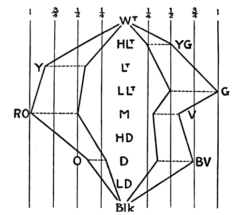
Diagram 12
Diagram 12
The procedure is shown in this diagram. We see here what is meant by a Harmony of Neutralization, without changes of value. The neutralization is in the measure of one half in each case. Red Orange and Green are the only colors which exist in their maximum intensities. Their intensities are diminished to the half-point, without change of value,—from RO to RO½ in one case, and from G to G½ in the other. The other colors are reduced in their intensities proportionally. The value in each case remains unchanged.
The procedure is illustrated in this diagram. Here, we see what is meant by a Harmony of Neutralization, without any changes in value. The neutralization is measured at half in each instance. Red Orange and Green are the only colors that exist at their maximum intensities. Their intensities are reduced to the halfway point, without altering the value—from RO to RO½ in one case, and from G to G½ in the other. The other colors are proportionally reduced in their intensities. The value remains unchanged in each case.
167. Having considered the methods of getting Value-Harmony and Color-Harmony separately, I must now describe the method of getting the combination of Value-Harmony with the Harmony of Neutralization. To do this we must set the colors in positions regarding the Scale of Neutral Values, which will indicate their several values, and in each case the [Pg 165] degree of intensity. We must then decide whether to neutralize the several tones toward Black or White, or toward some neutral value between these extremes.
167. After looking at how to achieve Value-Harmony and Color-Harmony on their own, I now need to explain how to combine Value-Harmony with Neutralization Harmony. To do this, we need to arrange the colors according to the Scale of Neutral Values, which will show their individual values and the degree of intensity in each case. We then need to decide whether to neutralize the different tones toward Black or White, or towards some neutral value that lies between these two extremes. [Pg 165]

Diagram 13
Diagram 13

Diagram 14
Diagram 14

Diagram 15
Diagram 15
This illustrates the method of a neutralization toward the Middle Neutral, between Black and White, a neutralization in the measures of one quarter, one half, and three quarters.
This shows the method of a neutralization toward the Middle Neutral, between Black and White, a neutralization in the measures of one quarter, one half, and three quarters.
In bringing tones into harmony, by one or another or all of these various methods, we must remember that when we have diminished the contrast of value and of color beyond a certain point the result is monotony, a monotony which may be undesirable. It is easy to get into a state of mind in which we dislike all contrasts. In this state of mind we find no æsthetic satisfaction except in monotony. Such a state of mind should be avoided. Monotony is the Nirvana of æstheticism.
In harmonizing tones using any of these different methods, we need to keep in mind that if we reduce the contrast of value and color too much, the outcome can be monotony, which isn’t always a good thing. It’s easy to fall into a mindset where we dislike all contrasts. In that mindset, the only aesthetic satisfaction we find comes from monotony. We should steer clear of such a mindset. Monotony is the ultimate goal of aestheticism.
For example: I may repeat the contrast Orange-Blue any number of times in a certain composition. There is no Harmony of Value or of Color in the contrast, but in repeating the contrast I have the Harmony of a Repetition, just as I have a Harmony in the repetition of a certain line or outline in which there is no order of any kind. The Harmony lies solely in the repetition or recurrence. In this way I may repeat, at equal intervals all over a certain space, the various contrasts indicated by the following diagram:—
For example: I can repeat the contrast between orange and blue as many times as I want in a particular composition. There's no harmony in terms of value or color in that contrast, but by repeating it, I create a sense of harmony through repetition, just like I have harmony in the repeated use of a specific line or shape, even if there's no order involved. The harmony comes entirely from the repetition or recurrence. In this way, I can evenly space out various contrasts throughout a certain area, as shown in the following diagram:—

Diagram 16
Diagram 16

Diagram 17
Diagram 17
The Harmony here indicated will lie in the repetition of certain contrasts in which there is no Harmony.
The Harmony discussed here will be found in the repetition of specific contrasts that lack Harmony.
The Harmony of a repeated contrast, or contrasts, is a very important form of Tone-Harmony. It means that a certain effect of light due to the juxtaposition or association of certain tones recurs repeatedly, let us say at equal or approximately equal intervals, all over a certain space. The result is sure to be harmonious, no matter how strong the tone-contrasts are in the group or series, provided that the repetitions are well within the range of vision so that they may be compared, and the recurrence of the same effect of light appreciated. We must not be too near to the arrangement, for in that case the contrasts of the repeated group will be more noticeable than the even tonality of the all-over repetition. Every even, all-over effect of [Pg 170] light, no matter what the contrasts are which produce it, gives us the feeling of Harmony.
The harmony of repeated contrasts is an important element of tone harmony. It refers to the effect of light created by placing certain tones next to each other, which happens repeatedly, say at regular or roughly regular intervals, throughout a certain area. The outcome will always be harmonious, regardless of how strong the contrasts are in the group or series, as long as the repetitions stay within a comfortable viewing distance so they can be compared and the same light effect can be appreciated. We shouldn’t be too close to the setup because then the contrasts within the repeated group will stand out more than the overall rhythm of the repetition. Every smooth, overall effect of [Pg 170] light, regardless of the contrasts that create it, gives us a sense of harmony.
169. In such compositions as the one indicated in Diagram 17 predominance may be given to one tone by having it recur in larger spots in each group or in a greater number of spots, two or more in each group. In this way, in a composition of many colors in different values, predominance may be given to Middle Blue or Light Orange or Dark Blue-Violet, or any other particular tone. Predominance may be given to neutral gray of a certain value, by having it recur in larger spots or in numerous small spots.
169. In compositions like the one mentioned in Diagram 17, one color can stand out by appearing in larger areas within each group or more frequently across multiple spots, with two or more instances in each group. This way, in a piece filled with various colors and their different shades, you can make Middle Blue, Light Orange, Dark Blue-Violet, or any other specific color more prominent. You can also emphasize a neutral gray of a certain shade by using it in larger areas or repeating it in many small spots.
170. Neutral gray may be made to predominate in another way; by so composing the tones, in the group to be repeated, that they neutralize one another at a certain distance,—the point of view of the observer.
170. Neutral gray can be made to stand out in another way; by arranging the tones in the group to be repeated so that they cancel each other out from a certain distance—the observer's viewpoint.
| Y | G | Y | G | Y | G |
| R | V | R | V | R | V |
| Y | G | Y | G | Y | G |
| R | V | R | V | R | V |
Diagram 18
Diagram 18
In this case Yellow and Violet will neutralize one another and Red will neutralize Green. The effect of the repetition of these complementary oppositions ought to be, at a certain distance, a very lively neutral.
In this case, Yellow and Violet will cancel each other out, and Red will cancel out Green. The result of repeating these complementary oppositions should create a vibrant neutral color when viewed from a distance.
| B | R | Y | B | R | |||||
| Y | B | R | Y | ||||||
| B | R | Y | B | R | |||||
| Y | B | R | Y | ||||||
| B | R | Y | B | R | |||||
| Y | B | R | Y | ||||||
| B | R | Y | B | R | |||||
Diagram 19
Diagram 19
In this case we have a repetition of the triad Red-Yellow-Blue, which, at a certain distance, ought to produce the effect of a middle neutral. The principle of these arrangements is one of the most important in tone-composition.
In this case, we see the repetition of the triad Red-Yellow-Blue, which, from a certain distance, should create the effect of a neutral middle. The principle behind these arrangements is one of the most important aspects of tone composition.
171. There is another consideration which ought to keep us from any morbid interest in harmonious monotonies, which ought to reconcile us to contrasts, even strong contrasts, and to a great variety in tones. Harmony is only one principle of composition in Design; we have two others which are equally important,—the principle of Balance and the principle of Rhythm. The principles of Balance and Rhythm are consistent with the greatest possible contrasts of tone. The tone-contrasts in forms of Balance and Rhythm may be strong, even harsh, and the appreciation and enjoyment of the Balance or of the Rhythm in no degree diminished.
171. There's another thing we should consider that should stop us from having a morbid fascination with harmonious repetitions. Instead, it should help us appreciate contrasts, even strong ones, and a wide variety of tones. Harmony is just one principle of composition in Design; we also have two other equally important principles: Balance and Rhythm. The principles of Balance and Rhythm can work with the greatest possible contrasts of tone. The tonal contrasts in forms of Balance and Rhythm can be strong, even jarring, without diminishing our appreciation or enjoyment of the Balance or the Rhythm at all.
We will now proceed to the consideration of Tone-Balance and Tone-Rhythm.
We will now move on to discussing Tone-Balance and Tone-Rhythm.
172. Tones, simply as tones, disregarding the positions, measures, and shapes which may be given to them, balance, when the contrasts which they make with the ground-tone upon which they are placed are equal. We have an indication of such a balance of tones, simply as tones, in the following formula:—
172. Tones, just as tones, without considering their positions, measures, and shapes, are balanced when the contrasts they create with the background tone they’re placed on are equal. We have a clue to this balance of tones, just as tones, in the following formula:—
| LD - V |
| HLt - Y HLt - Y |
Two spots of High Light Yellow occur on a ground-tone of Low Dark Violet. The two spots of Yellow make equal contrasts with the ground-tone, and for that reason balance as tones, no matter what positions, measures, and shapes are given to them. The value-contrast is that of the interval of the seventh in the Scale of Values; the color-contrast is that of the interval of the seventh in the Scale of Colors. We must assume that the intensities are so adjusted as not to disturb the balance.
Two patches of Bright Yellow are set against a base color of Deep Violet. The two patches of Yellow create equal contrasts with the base color, which allows for a balance in tones, regardless of their positions, sizes, or shapes. The value contrast matches the interval of a seventh in the Value Scale; the color contrast corresponds to the interval of a seventh in the Color Scale. We should assume that the intensities are calibrated to maintain the balance.
| M - V |
| Lt - O D - O |
In this case the values making the contrasts differ. The contrasts are, nevertheless, equal because the value-intervals are equivalent intervals. The value difference between Light and Middle is equivalent to the value difference between Dark and Middle. Though the contrasting elements differ, the contrasts are equal. In this case the contrasting colors are the same and the color-contrasts correspond. We must assume that the intensities are so adjusted as not to disturb the balance. [Pg 173]
In this situation, the values that create the contrasts are different. However, the contrasts are still equal because the value intervals are equivalent. The value difference between Light and Middle is the same as the value difference between Dark and Middle. Although the contrasting elements vary, the contrasts remain equal. In this case, the contrasting colors are identical, and the color contrasts align. We need to assume that the intensities are adjusted in such a way that they don't disrupt the balance. [Pg 173]
| LD - V |
| LLt - O LLt - G |
In this case the contrasting colors differ, but the contrasts are equal because the color-interval between Orange and Violet is the same as the color-interval between Green and Violet. In this case the value-contrasts correspond. We must assume here, as before, that there is no difference of color-intensity to disturb the balance.
In this case, the contrasting colors are different, but the contrasts are equal because the distance in color between Orange and Violet is the same as the distance in color between Green and Violet. In this case, the value contrasts match. We need to assume here, as before, that there is no difference in color intensity to disrupt the balance.
| D - R |
| HD - O LD - V |
In this case the two tones which balance on the ground-tone differ both in value and in color. They balance, nevertheless, because both the value and the color-contrasts are of the interval of the third. Again we must assume that there is no disparity of intensities to disturb the balance.
In this case, the two tones that balance on the ground tone are different in both value and color. They balance, however, because the value and color contrasts are of the interval of a third. We must also assume that there is no difference in intensities to upset the balance.
173. The reader will find the Diagram of Values and Colors (No. 5) very useful in making calculations for tone-balances, so far as value-contrasts and color-contrasts are concerned, leaving out considerations of color-intensity.
173. The reader will find the Diagram of Values and Colors (No. 5) very useful for calculating tone balances, focusing on value contrasts and color contrasts, while ignoring considerations of color intensity.
Taking any tone indicated on the Diagram as a ground-tone, any tones at equal distances in balancing directions will balance on that ground-tone. [Pg 174]
Taking any tone shown on the Diagram as a base tone, any tones at equal distances in opposite directions will balance on that base tone. [a id="Page_174">[Pg 174]

Diagram 20
Diagram 20
The various types of tone-balance are shown in the above diagram. The tones which balance, one against the other, on the ground-tone of Blue-Violet, are the tones marked by the same number.
The different types of tone balance are illustrated in the diagram above. The tones that balance each other on the base tone of Blue-Violet are the tones marked with the same number.
The value and color-balances being achieved, the intensities may be adjusted, increased or diminished, until the balance is perfect.
The value and color balances being achieved can have the intensities adjusted, increased, or decreased until the balance is just right.
174. As you increase the color-intensity in any tone it attracts more attention, and unless you increase the intensity in the opposite tones there will be a disparity which will disturb your balance. When the intensity in any tone is too great, you can increase the color-contrast or the value-contrast of the opposite tones until the balance is achieved.
174. As you boost the color intensity in any tone, it draws more attention, and if you don’t ramp up the intensity in the opposite tones, it will create an imbalance that disrupts your overall harmony. When the intensity in any tone is too high, you can enhance the color contrast or the value contrast in the opposite tones until you achieve balance.
175. Up to this point I have been speaking of Tone-Balance in the abstract, of Tone-Balance as such. I have spoken of Tone-Balance as [Pg 175] something apart from Position, Measure, and Shape-Balance, as if tones could balance without having any positions, measures, or shapes assigned to them. The fact is that a tone does not exist until you give it a position, a measure, and a shape. It follows that Tone-Balance is, in all cases, more or less complicated by considerations of position, measure, and shape.
175. So far, I’ve been discussing Tone-Balance in general terms, as an idea on its own. I've talked about Tone-Balance as if it stands separate from Position, Measure, and Shape-Balance, suggesting that tones could balance without any assigned positions, measures, or shapes. The truth is that a tone doesn’t exist until you assign it a position, a measure, and a shape. Therefore, Tone-Balance is always somewhat influenced by factors like position, measure, and shape.
176. The principle of balance being that equal attractions balance at equal distances and unequal attractions at distances inversely proportional to them, it follows, that if the attraction of a tone is increased by quantity, the attraction of quantity may be balanced against the attraction of contrast. The calculation of such balances may be made on the Diagram of Values and Colors.
176. The principle of balance is that equal attractions balance each other at equal distances, and unequal attractions balance at distances that are inversely proportional to them. This means that if the attraction of a tone increases with quantity, the attraction of quantity can be balanced against the attraction of contrast. The calculation of such balances can be done on the Diagram of Values and Colors.
Diagram 21
Diagram 21
In this case, for example, we have the indication of a possible balance of two parts of Light Red and one part of Dark Green on a ground-tone of Middle Violet, the difference of contrast in one case making up for a difference of quantity and of contrasting edge in the other.
In this scenario, for instance, we suggest a possible mix of two parts Light Red and one part Dark Green on a base tone of Middle Violet, where the difference in contrast in one instance compensates for a difference in quantity and the contrasting edge in the other.
177. So far as Tone-Balance depends upon positions, measures, and shapes, the problem is the problem of Position, Measure, and Shape-Balance, which we have already considered.
177. As far as Tone-Balance relies on positions, measures, and shapes, the issue is the issue of Position, Measure, and Shape-Balance, which we have already addressed.

Diagram 22
Diagram 22
In this case we have an instance of single inversion, which gives us a Symmetrical Balance, of tones, as well as of measures and shapes.
In this case, we have an example of single inversion, which gives us a symmetrical balance of tones, as well as measures and shapes.

Diagram 23
Diagram 23
In this case we have an instance of double inversion of tones, as well as of measures and shapes.
In this case, we have an example of double inversion of tones, as well as measures and shapes.
178. The tones and tone-contrasts on one side of a center or axis are not necessarily the same as those on the other side. We may have a Tone-Balance in which very different tones and tone-contrasts are opposed to one another. This brings us to the consideration of Occult Balance in Tones, Measures, and Shapes.
178. The tones and tone contrasts on one side of a center or axis aren't always the same as those on the other side. We can have a Tone-Balance where very different tones and tone contrasts are set against each other. This leads us to consider Occult Balance in Tones, Measures, and Shapes.
A balance of any tones and of any tone-contrasts, in any measures and in [Pg 177] any shapes, is obtained when the center of tone-attractions is unmistakably indicated, either by the symmetrical character of the balance or by a symmetrical inclosure which will indicate the center. Given any combination of tones, measures, and shapes, and the problem to find the balance-center, how shall we solve the problem? It cannot very well be done by reasoning. It must be done by visual feeling. The principle of Balance being clearly understood, finding the center of any tone-contrasts is a matter of experimental practice in which those persons succeed best who are most sensitive to differences of tone, and who make the greatest effort to feel the centers and to indicate them accurately. Experience and practice are necessary in all cases.
A balance of any tones and tone contrasts, in any measures and shapes, is achieved when the center of tone attractions is clearly defined, either through the symmetrical nature of the balance or by a symmetrical enclosure that indicates the center. Given any combination of tones, measures, and shapes, how do we find the balance center? It can't really be solved through reasoning alone. It must be approached through visual intuition. Once the principle of balance is clearly understood, finding the center of any tone contrasts becomes a matter of hands-on practice, where those who are most attuned to differences in tone and who put in the effort to accurately identify and indicate the centers tend to succeed best. Experience and practice are essential in all cases.

Fig. 228
Fig. 228
Here, within this circle, are the attractions to be balanced. The problem is to find the balance-center, and to indicate that center by a symmetrical inclosure which will bring the tones, measures, and shapes into a Balance. The center is here indicated by the circle. Whether it is correctly indicated is a matter of judgment in which there may be a [Pg 178] difference of opinion. There is a center somewhere upon which the attractions are balancing. The question is, where is it? The illustration which I have given is in the terms of the Scale of Neutral Values. Differences of color and color-intensity would complicate the problem, but would not in any way affect the principle involved. I know of no more interesting problem or exercise than this: to achieve Tone-Balance where there is no Tone-Symmetry.
Here, within this circle, are the attractions that need to be balanced. The challenge is to find the balance point and to indicate that point with a symmetrical enclosure that will align the tones, measures, and shapes into a balance. The center is represented by the circle. Whether it is accurately represented is a matter of judgment that might lead to differing opinions. There is a center somewhere where the attractions are balancing. The question is, where is it? The illustration I provided uses the Scale of Neutral Values. Differences in color and color intensity would complicate the issue but would not change the underlying principle. I don't know of any more fascinating problem or exercise than this: achieving Tone-Balance where there is no Tone-Symmetry.
179. It will sometimes happen, that a gradation of tones or measures will draw the eye in a certain direction, toward the greater contrast, while a larger mass or measure of tone, on the other side, will be holding it back. In such a case we may have a mass balancing a motion.
179. Sometimes, a range of tones or patterns can catch the eye in one direction, towards a bigger contrast, while a larger area or pattern of tone on the opposite side can hold it back. In this situation, we may have a mass counteracting a motion.

Fig. 229
Fig. 229
In this case the eye is drawn along, by a gradation of values, to the right, toward the edge of greater contrast, away from a large dark mass of tone in which there is no movement. The tendency of the dark mass is to hold the eye at its center. The problem is to find the balance-center between the motion and the mass. I have done this, and the balance-center is indicated by the symmetrical outline of the diagram.
In this case, the eye is guided along a series of shades to the right, toward an area of higher contrast, away from a large dark mass that has no movement. The dark mass tends to keep the eye focused in its center. The challenge is to find the balance-point between motion and mass. I have achieved this, and the balance-point is represented by the symmetrical outline of the diagram.
180. Some shapes hold the eye with peculiar force, and in such cases the [Pg 179] attractions of tone or measure or shape on the other side have to be increased if we are to have a balance. Symmetrical shapes have a tendency to hold the eye at centers and on axes. Given certain attractions on the other side, we must be sure that they are sufficient to balance the force of the symmetry in addition to the force of its tone-contrasts, whatever they are.
180. Some shapes really grab our attention, and in those cases, the [Pg 179] appeals of color, rhythm, or form on the opposite side need to be enhanced to create a balance. Symmetrical shapes tend to draw the eye to their centers and along their axes. With certain attractions on the opposite side, we have to ensure that they are strong enough to offset the impact of the symmetry along with the influence of its color contrasts, whatever they may be.
Fig. 230
Fig. 230
In this case we have an approximate balance in which the force of a symmetry, with contrasting edges, on one side, is balanced by contrasts and certain movements on the other. If I should turn down the upper spot on the right, we would feel a loss of balance due to the turning of two movements, which combine to make one movement to the right, into two movements down to the right. If I should increase the force of the symmetry, by filling in the center with black, it would be necessary either to move the symmetry nearer to the center or to move the opposite attractions away from it. An unstable attitude in the symmetry would have to be counteracted, in some way, on the other side.
In this situation, we have a rough balance where the force of symmetry, with contrasting edges on one side, is balanced by contrasts and certain movements on the other. If I were to lower the upper spot on the right, we would feel a loss of balance because the two movements, which combine into one movement to the right, would turn into two movements down to the right. If I were to increase the force of the symmetry by filling in the center with black, I would need to either move the symmetry closer to the center or push the opposite attractions further away from it. An unstable position in the symmetry would need to be offset in some way on the other side.

Fig. 231
Fig. 231
In this case the shape on the right requires a pretty strong dark spot to balance its contrasts and its intricacy.
In this case, the shape on the right needs a significant dark area to balance its contrasts and complexity.
The problem is further complicated when there are, also, inclinations, to the right or to the left, to be balanced.
The problem gets even more complicated when there are also tendencies, to the right or to the left, to find balance.

Fig. 232
Fig. 232
These occult forms of Balance are not yet well understood, and I feel considerable hesitation in speaking of them. We have certainly a great deal to learn about them. They are far better understood by the Chinese and by the Japanese than by us.
These mysterious forms of Balance aren't fully understood yet, and I feel quite hesitant to talk about them. We definitely have a lot to learn about them. The Chinese and Japanese understand them much better than we do.
181. When any line or spot has a meaning, when there is any symbolism or representation in it, it may gain an indefinite force of attraction. This, however, is a force of attraction for the mind rather than for the eye. It affects different persons in different measures. The consideration of such attractions, suggestions, meanings, or significations does not belong to Pure Design but to Symbolism or to Representation.
181. When any line or spot has a meaning, when there's any symbolism or representation in it, it can gain an unlimited appeal. However, this appeal is more for the mind than for the eye. It affects different people in different ways. The exploration of such attractions, suggestions, meanings, or significations falls under Symbolism or Representation, not Pure Design.
182. The idea of Tone-Rhythm is expressed in every regular and perfect gradation of Tones; of values, of colors or of color-intensities, provided the eye is drawn through the gradation in one direction or in a series or sequence of directions. This happens when there is a greater tone-contrast at one end of the gradation than at the other. When the terminal contrasts are equal there is no reason why the eye should move through the gradation in any particular direction. According to our definition of Rhythm, the gradation should be marked in its stages or measures, and the stages or measures should be regular. That is certainly true, but in all regular and perfect gradations I feel that corresponding changes are taking place in corresponding measures, and I get the same feeling from such a gradation that I get from it when it is marked off in equal sections. Though the measures in regular and perfect gradations are not marked, they are, it seems to me, felt. They seem sufficiently marked by the regularity and perfection of the gradation, any irregularity or imperfection being appreciable as a break in the measure. I am inclined, therefore, to say of any regular and perfect gradation that it is rhythmical provided the direction of movement is unmistakable. The direction, as I have said, depends upon the relation of terminal contrasts. The eye is drawn toward the greater contrast, whatever that is and wherever it is. A few examples will make this clear.
182. The concept of Tone-Rhythm is seen in every consistent and perfect gradation of tones, values, colors, or color intensities, as long as the eye is guided through the gradation in one direction or in a series of directions. This occurs when there’s a stronger tone contrast at one end of the gradation compared to the other. When the contrasts at both ends are equal, there’s no specific reason for the eye to move through the gradation in any particular way. Based on our definition of Rhythm, the gradation should be defined in its stages or measures, and those stages or measures should be consistent. That’s definitely true, but in all consistent and perfect gradations, I believe that changes happen in corresponding measures, and I get the same feeling from a gradation as I do when it is divided into equal sections. Even though the measures in consistent and perfect gradations aren’t labeled, they still seem to be sensed. They appear marked enough by the consistency and perfection of the gradation, with any irregularity or imperfection noticeable as a disruption in the measure. Therefore, I’m inclined to say that any consistent and perfect gradation is rhythmical, as long as the direction of movement is clear. As I’ve mentioned, the direction depends on the relationship of the terminal contrasts. The eye is drawn to the greater contrast, no matter what it is or where it is located. A few examples will clarify this.
| M |
| Blk LD D HD M LLt Lt HLt Wt |
| Wt |
| Blk LD D HD M LLt Lt HLt Wt |
In this case we have a gradation of values beginning with White on White, no contrast at all, and reaching ultimately the contrast of Black and White. The eye is drawn through the tones of this gradation in the direction of this contrast, that is to say, from right to left. It is a clear case of Rhythm. If, instead of white, we had black, as a ground-tone, the movement of the rhythm would be in the opposite direction,—from left to right.
In this case, we have a range of values starting with White on White, which has no contrast, and ultimately reaching the contrast of Black and White. The eye is drawn through the shades of this range towards this contrast, meaning from right to left. This clearly shows Rhythm. If we had Black instead of White as the base tone, the movement of the rhythm would go in the opposite direction—from left to right.
| Wt HLt Lt LLt M HD D LD Blk |
| Blk LD D HD M LLt Lt HLt Wt |
In this case, as in the first, we have equally great contrasts at the ends and no contrast at the middle. The result is Balance, not Rhythm.
In this situation, just like the first one, we have significant contrasts at both ends and no contrast in the middle. The outcome is Balance, not Rhythm.
| V |
| Y YG G GB B BV |
In this case, disregarding possible differences of value and color-intensities, there will be a color-rhythm proceeding from right to left. The contrast to which the eye will be drawn is the color-contrast of Yellow and Violet.
In this situation, ignoring any potential differences in value and color intensities, a color rhythm will flow from right to left. The contrast that will catch the eye is the color contrast between Yellow and Violet.
| LD-V |
| D-Y HD-YG M-G LLt-GB Lt-B HLt-BV |
In this case, disregarding possible differences of intensity, there will be a rhythm of color moving from right to left and a rhythm of values moving from left to right. Assuming that we are equally attracted by corresponding value and color-contrasts, these two rhythms, when produced, will neutralize one another and we shall have [Pg 184] an illustration of Tone-Balance rather than Tone-Rhythm. If corresponding color and value-contrasts are not equally attractive we shall have an unequal tug-of-war between the two rhythms.
In this situation, ignoring any differences in intensity, there will be a color rhythm moving from right to left and a value rhythm moving from left to right. If we find both corresponding color and value contrasts equally appealing, these two rhythms will cancel each other out, resulting in an illustration of Tone-Balance instead of Tone-Rhythm. If the corresponding color and value contrasts are not equally attractive, we will experience an uneven tug-of-war between the two rhythms. [Pg 184]
| LD-V |
| HLt-Y Lt-YG LLt-G M-GB HD-B D-BV |
In this case we have two rhythms, one of values and one of colors, in a Harmony of Direction. The direction of movement will be from right to left.
In this case, we have two rhythms: one of values and one of colors, in a Harmony of Direction. The movement will go from right to left.
| HLt-Y⅛ |
| HLt-Y HLt-Y⅞ HLt-Y⁶/₈ HLt-Y⅝ HLt-Y⁴/⁸ HLt-Y⅜ |
In this case we have no change of color and no change of value, but a rhythm of the intensities of one color, in one value. The movement will be from right to left. The ground-tone might be Neutral High Light, the zero-intensity of Yellow. That would not change the direction of the movement.
In this case, there's no change in color and no change in value, but a rhythm of intensities of one color, at one value. The movement will go from right to left. The base tone could be Neutral High Light, the zero-intensity of Yellow. That wouldn't change the direction of the movement.
| LD-Y⅛ |
| HLt-Y Lt-Y⅞ LLt-Y⁶/₈ M-Y⅝ HD-Y⁴/⁸ D-Y⅜ |
In this case I have indicated a combined movement of values and color-intensities. The direction of the movement will be from right to left.
In this case, I've noted a combined movement of values and color intensities. The movement will go from right to left.
The tone-rhythms which I have described are based upon the repetition at regular intervals of a certain change of value, of color or of color-intensity. We have Harmony, of course, in the repetition of equal changes, though the changes are not the same changes. The change of value from Middle to Low Light is equal to the change from Low Light to Light, though these changes are not the same changes. The Harmony is, therefore, the Harmony of equivalent contrasts which are not the same contrasts.
The tone rhythms I’ve described are based on the repeated intervals of certain changes in value, color, or color intensity. We have Harmony, of course, in the repetition of equal changes, even though the changes aren’t the same. The change in value from Middle to Low Light is equal to the change from Low Light to Light, even though these changes aren’t the same. Therefore, the Harmony is the Harmony of equivalent contrasts that are not the same.
183. We have more or less movement in every composition of tones which [Pg 185] is unbalanced, in which the eye is not held between equivalent attractions, either upon a vertical axis or upon a center. In all such cases, of tones unbalanced, the movement is in the direction of the greatest contrast. Unless the movement is regular and marked in its measures, as I think it is in all regular and perfect gradations, the movement is not rhythmical. We get Rhythm, however, in the repetition of the movement, whatever it is, in equal or lawfully varying measures, provided the direction of the movement remains the same or changes regularly or gradually. If the line of the movement is up-to-the-right forty-five degrees we have rhythm in the repetition of the movement at equal or lawfully varying intervals, without changes of direction; but we should have Rhythm, also, if the direction of the movement, in its repetitions, were changed, regularly or gradually; if, for example, the direction were changed first from up-right forty-five degrees to up-right forty degrees, then to up-right thirty-five degrees, then to up-right thirty degrees, this at equal or at lawfully varying intervals. In this way the movement of the composition repeated may be carried on and gradually developed in the movement of the series. A reference to Fig. 161, p. 94, and to Fig. 119, p. 68, will help the reader to understand these statements.
183. We see some kind of movement in every arrangement of tones that is unbalanced, where the eye doesn't settle between equal attractions, either on a vertical axis or at a center. In all these cases of unbalanced tones, the movement tends to go towards the greatest contrast. If the movement isn't consistent and noticeable in its measures, as I believe it is in all regular and perfect gradations, then the movement isn't rhythmical. However, we find Rhythm in the repetition of that movement, no matter what it is, in equal or appropriately varied measures, as long as the direction of the movement stays the same or changes regularly or gradually. If the movement direction is up-to-the-right at forty-five degrees, we have rhythm in the repetition of that movement at equal or lawfully varying intervals, without changing direction. But we would still have Rhythm if the movement's direction changed, either regularly or gradually; for instance, if the direction shifted first from up-right forty-five degrees to up-right forty degrees, then to up-right thirty-five degrees, and then to up-right thirty degrees, all at equal or lawfully varying intervals. This way, the repeated movement of the composition can continue and gradually develop within the series. A reference to Fig. 161, p. 94, and to Fig. 119, p. 68, will help the reader to understand these statements.
184. When any unbalanced composition of tones is singly inverted upon a vertical axis and the movement of the composition follows the axis, either up or down, and this movement, up or down, is repeated, up or down, we get forms of Tone-Rhythm which are also forms of Symmetrical Balance. In the inversions and repetitions of the tone-composition we have Tone-Harmony. As the tones in the repeated composition have certain positions, measures, and shapes, the Harmony, the Balance, and the Rhythm are of Positions, Measures, and Shapes as well as of Tones; so we get the combination of all the terms of Design in all the three modes of Design.
184. When any uneven arrangement of sounds is flipped on a vertical axis and the movement of the arrangement goes along the axis, either up or down, and this movement is repeated, we create forms of Tone-Rhythm that also demonstrate Symmetrical Balance. In the inversions and repetitions of the sound arrangement, we find Tone-Harmony. Since the sounds in the repeated arrangement have specific positions, measures, and shapes, the Harmony, Balance, and Rhythm involve Positions, Measures, and Shapes as well as Tones; thus, we achieve the combination of all elements of Design across all three modes of Design.
THREE GENERAL RULES
THREE BASIC RULES
185. It is quite impossible for me, in this discussion of terms and principles, to indicate, in any measure, the possibilities of composition, in lines and spots of paint, in tones, measures, and shapes. This is in no sense a Book of Designs. All I have undertaken to do is to give a few very simple examples and to indicate the kind of reasoning to be followed, recommending the same kind of reasoning in all cases. There are three general rules, however, which I must state.
185. It’s impossible for me, in this discussion of terms and principles, to outline the potential for composition using lines, spots of paint, tones, measures, and shapes. This is not a Book of Designs. All I aim to do is provide a few very simple examples and suggest the type of reasoning to follow, encouraging the same approach in all situations. However, there are three general rules that I must mention.
First. Given a certain outline and certain tones, measures, and shapes to be put into it, it is the Problem of Pure Design to do the best we can, getting as many connections making unity as possible. The process is one of experimenting, observing, comparing, judging, arranging and rearranging, taking no end of time and pains to achieve Order, the utmost possible Order, if possible the Beautiful.
First. Given a specific outline and certain tones, measures, and shapes to incorporate, the Problem of Pure Design is to do our best by creating as many connections to achieve unity as possible. This process involves experimenting, observing, comparing, judging, arranging, and rearranging, all while dedicating a great deal of time and effort to attain Order, the highest possible Order, and ideally, the Beautiful.
Second. When only an outline is given and we can put into it lines and spots of paint,—tones, measures, and shapes,—ad libitum, we must be sure that in the addition and multiplication of features we do not get less Order than we had in the simple outline with which we started, when it had nothing in it. As we proceed to add features we must be sure that we are not diminishing the order of the composition as a whole. If the composition as a whole is orderly, we do not want to make it less so by cutting it up and introducing additional attractions which may be disorderly and confusing. It may be harder to achieve Order with a greater number and variety of terms. We may deserve credit for overcoming this difficulty, but it is a difficulty which confronts us only when the terms are given and we have to make the best of them. When no terms are given, only a perfectly orderly outline, we should [Pg 187] hesitate before we put anything into it. If we add anything we must be sure that it does not diminish, in the slightest degree, the order we had before, when we had nothing but the outline. The order of the whole must never be diminished.
Second. When we start with just an outline and we can add lines and paint—colors, measurements, and shapes—ad libitum, we have to ensure that as we add features, we don't end up with less order than we had in the simple outline that started out empty. As we incorporate more elements, it’s crucial that we maintain the overall order of the composition. If the whole piece is orderly, we shouldn’t compromise that by breaking it apart and adding new elements that might be chaotic and confusing. Achieving order can be more challenging with a larger number and variety of components. We might deserve recognition for tackling this challenge, but it only arises when we have to work with given elements and make the best out of them. When there are no elements available, just a perfectly orderly outline, we should [Pg 187] think carefully before we add anything. If we choose to add something, we must ensure that it doesn’t reduce, even slightly, the order we had when we only had the outline. The overall order must never be compromised.
Third. When we have an outline with certain tones, measures, and shapes in it, the question is: whether we can increase the order by adding other tones, other measures, or other shapes.
Third. When we have a framework with specific tones, rhythms, and forms in it, the question is: can we enhance the structure by adding different tones, different rhythms, or different forms?

a
a

b
b
Fig. 233
Fig. 233
Arrangement “a” is less orderly than arrangement “b,” so I have acted wisely in adding the other outlines.
Arrangement “a” is messier than arrangement “b,” so I made a smart move by including the other outlines.
a
a

b
b
Fig. 234
Fig. 234
In this case, however, I have added features without achieving any increase of Order in the composition. The order is less than it was before. The additions have no interest from the point of view of Pure [Pg 188] Design. I may add features for the sake of variety or novelty, to give a change of feeling, a new sensation, but such motives are not the motives of Pure Design. In Pure Design our motive is, always, to achieve Order, in the hope that in so doing we may achieve a supreme instance of it which will be beautiful.
In this case, though, I've added features without improving the overall order of the composition. The order is actually worse than before. The additions aren't interesting from the perspective of Pure Design. I might include features to add variety or novelty, to create a different feeling or a new sensation, but those reasons aren't the reasons for Pure Design. In Pure Design, our goal is always to achieve order, hoping that by doing so, we can create an ultimate version of it that will be beautiful.

a
a

b
b

c
c
Fig. 235
Fig. 235
Consider these illustrations. Arrangement “b” is more orderly than arrangement “a,” so I am justified in making the additions. The additions have brought occult balance into the composition with Direction and Interval-Harmony. Arrangement “c” is less orderly than “b,” less orderly than “a.” It has, therefore, no value for us. There is no merit in the multiplication of features which it exhibits. The surface is “enriched” at the expense of Direction-Harmony, Interval-Harmony, and Shape-Harmony. There may be an approximation to an occult balance in arrangement “c,” but you cannot feel it unmistakably as you do in “b.” Its value is, therefore, less.
Consider these examples. Arrangement “b” is more organized than arrangement “a,” so I can justify making the additions. These additions have introduced a hidden balance into the composition with Direction and Interval-Harmony. Arrangement “c” is less organized than “b” and even less than “a.” Therefore, it holds no value for us. There's no benefit in the excessive features it displays. The surface may seem “enriched” at the cost of Direction-Harmony, Interval-Harmony, and Shape-Harmony. While there might be a sense of a hidden balance in arrangement “c,” you can’t feel it as clearly as you do in “b.” Its value is, therefore, less.
186. I object to the word “decoration,” as commonly used by designers, because it implies that additions are likely to be improvements, that to multiply features, to enrich surfaces, is worth while or desirable. The fact is, that additions are, as a rule, to be avoided. There is no merit in the mere multiplication of features. It is a mistake. The rule of Pure Design, and it is the rule for all Design, is simplification rather than complication. As designers we ought to avoid additions, if possible. [Pg 189]
186. I dislike the term “decoration” as it’s typically used by designers because it suggests that adding things is likely an improvement, that adding features or embellishing surfaces is worthwhile or desirable. The truth is, generally speaking, we should avoid adding extras. There's no value in just adding more features. It’s a mistake. The principle of Pure Design, and indeed the principle for all design, is simplification instead of complication. As designers, we should steer clear of additions whenever we can. [Pg 189]
We ought to make them only when in so doing we are able to increase the order of the whole. We make additions, indeed, to achieve the greater simplicity of Order, and for no other reason. Our object in all cases is to achieve Order, if possible a supreme instance of Order which will be beautiful. We aim at Order and hope for Beauty.
We should only make changes when we can improve the overall order. We make additions to attain greater simplicity of order, and for no other reason. Our goal is always to achieve order, ideally a perfect example of order that will be beautiful. We seek order and aspire for beauty.
187. In connection with the practice of Pure Design, as I have described it,—the composition and arrangement of lines and spots of paint; of tones, measures, and shapes: this in the modes of Harmony, Balance, and Rhythm, for the sake of Order and in the hope of Beauty,—the student should take up the study of Order in its three modes, as revealed in Nature and achieved in Works of Art.
187. In relation to the practice of Pure Design, as I have described it—the composition and arrangement of lines and spots of paint; tones, measures, and shapes: all in the styles of Harmony, Balance, and Rhythm, aimed at achieving Order and aspiring for Beauty—the student should focus on studying Order in its three forms, as seen in Nature and realized in Works of Art.
188. The method of study should be a combination of analysis with synthetic reproduction. Taking any instance of Order, whether in Nature or in some work of Art, the first thing to do is to consider its terms,—its positions, its lines, its areas, its measure and space-relations, its tones and tone-relations,—bringing every element to separate and exact definition. The next thing to do is to note every occurrence of Harmony, of Balance, of Rhythm,—every connection making for consistency, unity, Order. In that way we shall get an exact knowledge of the case. We shall know all the facts, so far as the terms and the principles of Design are concerned. That is what I mean by analysis. By a synthetic reproduction I mean a reproduction of the effect or design, whatever it is, following the images which we have in mind as the result of our analysis. The reproduction should be made without reference to the effect or design which has been analyzed. There should be no direct imitation, no copying. We must not depend so much upon the memory as upon the imagination. Having reproduced the effect or design in this way, following the suggestions of the imagination, the reproduction should be brought into comparison with the effect or design reproduced and the differences noted. Differences [Pg 191] should be carefully observed and the previous analysis should be reviewed and reconsidered. When this is done another attempt at reproduction should be made. This process should be repeated until the effect or design is thoroughly understood and imaginatively grasped. The evidence of understanding and comprehension will be seen in the reproduction which is made, which ought to have an essential but not a literal correspondence with the original. Analysis should precede; synthesis should follow.
188. The study method should blend analysis with creative reproduction. Take any example of Order, whether in Nature or a piece of Art. The first step is to examine its components—its positions, lines, areas, measurements, spatial relationships, tones, and tonal relationships—defining each element clearly and separately. Next, observe every instance of Harmony, Balance, Rhythm—each connection that contributes to consistency, unity, and Order. This way, we’ll gain a thorough understanding of the subject. We’ll know all the facts concerning the principles and terms of Design. That’s what I mean by analysis. By synthetic reproduction, I mean recreating the effect or design based on the mental images we’ve formed from our analysis. The reproduction should be made without relying on the analyzed effect or design, avoiding direct imitation or copying. We shouldn’t rely too much on memory but rather on imagination. After reproducing the effect or design in this manner, guided by imagination, we should compare it to the original effect or design and note the differences. Differences [Pg 191] should be carefully observed, and the previous analysis should be revisited and reconsidered. Once that’s done, another attempt at reproduction should be made. This process should continue until the effect or design is fully understood and imaginatively grasped. Evidence of understanding will be reflected in the reproduction, which should have a meaningful but not a literal connection to the original. Analysis should come first; synthesis should follow.
I hope, in another book or books, to be published later, to give some examples of Order in natural objects or effects, also examples of Order in Works of Art, with a careful analysis of each one, showing how the points, lines, and areas, the measure and the space-relations, the tones and tone-relations come together in the forms of Harmony, Balance, and Rhythm, in the modes of Order, in instances of Beauty. In the mean time, as the methods of analytic study and of synthetic practice are clearly indicated in the preceding pages, the student who has taken pains to understand what he has read will find himself well prepared for the work. He can take up the study of Order in Nature and of Design in Works of Art without further assistance.
I hope to publish another book or books later that will provide examples of Order in natural objects or phenomena, as well as examples of Order in Works of Art. Each example will include a detailed analysis showing how points, lines, areas, measurements, space relations, tones, and tone relations come together to create Harmony, Balance, and Rhythm within the framework of Order and instances of Beauty. In the meantime, since the methods for analytical study and practical application are clearly outlined in the previous pages, any student who has made the effort to grasp the material will find themselves well-prepared for the work ahead. They can begin studying Order in Nature and Design in Works of Art independently.
189. It does not follow, even when our minds, in consequence of the study and the practice which I have described, are richly stored with the terms and the motives of Design, that we shall produce anything important or remarkable. Important work comes only from important people. What we accomplish, at best, is merely the measure and expression of our own personalities. Nevertheless, though we may not be able to produce anything important, it is something to appreciate and enjoy what is achieved by others. If our studies and our work bring us to the point of visual discrimination, to æsthetic appreciation and enjoyment, and no farther, we are distinguished among men. The rarest thing in the world is creative genius, the faculty which creates great works. Next to that comes the faculty of appreciation. That, too, is rare. We must not believe that appreciation is easy. It is true that the recognition of Order is instinctive and spontaneous, but untrained people recognize it only in a few simple and obvious forms. Order in its higher forms—the order of a great number and variety of terms and of different principles in combination—lies altogether beyond the appreciation of untrained people. It is only as we are trained, exercised, and practiced in the use of terms and in following principles that we rise to the appreciation of great achievements. The sense of order, which we all have, in a measure, needs to be exercised and developed. The spontaneity of undeveloped faculty does not count for much. It carries us only a little way. Let no one believe that without study and practice in Design he can recognize and appreciate what is best in Design.
189. Just because our minds are filled with the concepts and motivations of Design from the study and practice I've mentioned, it doesn't mean we'll create anything truly significant or remarkable. Important work comes only from important people. At best, what we create reflects our own personalities. Still, even if we can't produce anything groundbreaking, it's valuable to appreciate and enjoy what others have accomplished. If our studies and practice lead us to develop visual discrimination and aesthetic appreciation, then we've distinguished ourselves among others. Creative genius, the ability to create great works, is extremely rare. The ability to appreciate is also rare. We shouldn't assume that appreciating art is easy. While recognizing Order can be instinctive and spontaneous, untrained individuals often see it only in simple and obvious forms. Higher forms of order—composed of a large variety of terms and principles in combination—are beyond the grasp of those who are untrained. Only through training and practice can we develop an appreciation for great achievements. The sense of order that we all possess to some extent needs to be exercised and refined. The spontaneous ability of someone who hasn't developed their skills doesn't amount to much. It only takes us a little way. No one should think that they can recognize and appreciate the best in Design without studying and practicing it.
Appreciation and enjoyment are the rewards of hard thinking with hard [Pg 193] work. In order to appreciate the masterpiece we must have some knowledge of the terms which the artist has used and the principles which he has followed. We know the terms only when we have ourselves used them, and the principles when we have tried to follow them. The reason why the appreciation of excellence in speech and in writing is so widespread is due to the fact that we all speak and write, constantly, and try, so many of us, to speak and write well. The reason why there is so little appreciation of excellence in other forms of art is due to the fact that the terms are not in general use and the principles are not understood, as they should be, in the light of personal experience and effort. It is for this reason that I am anxious to see the teaching and practice of Design introduced into the schools, public and private, everywhere, and into our colleges as well as our schools. I have no idea that many able designers will be produced, but what I expect, as a result of this teaching, is a more general understanding of Design, more interest in it, and more appreciation and enjoyment of its achievements. Among the many who will appreciate and enjoy will be found the few who will create and produce.
Appreciation and enjoyment are the rewards of deep thinking and hard work. To appreciate a masterpiece, we need to have some knowledge of the terms the artist used and the principles they followed. We understand the terms only when we have used them ourselves, and we grasp the principles when we have tried to apply them. The reason we widely appreciate excellence in speech and writing is that we all communicate and strive, in many cases, to do it well. The lack of appreciation for excellence in other art forms often comes from the fact that the terms aren’t commonly used, and the principles aren’t understood as they should be, based on personal experience and effort. This is why I’m eager to see the teaching and practice of Design implemented in schools, both public and private, as well as in our colleges. I don’t expect many skilled designers to emerge, but I do hope this education will lead to a broader understanding of Design, more interest in it, and greater appreciation and enjoyment of its achievements. Among those who appreciate and enjoy, there will be a few who will create and produce.
The purpose of what is called art-teaching should be the production, not of objects, but of faculties,—the faculties which being exercised will produce objects of Art, naturally, inevitably. Instead of trying to teach people to produce Art, which is absurd and impossible, we must give them a training which will induce visual sensitiveness with æsthetic discrimination, an interest in the tones, measures, and shapes of things, the perception and appreciation of Order, the sense of Beauty. In these faculties we have the causes of Art. Inducing the causes, Art will follow as a matter of course. In exercising and developing the faculties which I have named, which naturally and inevitably produce Art, we are doing all that can be done by teaching. There is no better training for the visual and æsthetic faculties than is found in the practice of Pure Design, inducing, as it does, discrimination in tones, measures, and shapes, and the appreciation of [Pg 194] what is orderly and beautiful. The result of the practice will be a wide spread of visual and æsthetic faculty which will have, as its natural and inevitable result, the appreciation and the production of Works of Art.
The goal of what's called art teaching should be to develop skills, not just create objects. By exercising these skills, people will naturally and inevitably produce artwork. Instead of trying to teach people to make Art, which is unrealistic, we should focus on training that enhances visual sensitivity and aesthetic judgment, fostering an interest in the tones, measures, and shapes of things, along with a sense of order and beauty. These skills are the foundation of Art. When we nurture these skills, Art will follow as a natural outcome. By exercising and developing the skills I mentioned, which naturally lead to Art, we are doing everything possible through teaching. There is no better training for visual and aesthetic skills than practicing Pure Design, which helps develop discrimination in tones, measures, and shapes, as well as an appreciation for what is orderly and beautiful. The practice will result in a broad enhancement of visual and aesthetic skills that will naturally and inevitably lead to the appreciation and creation of Works of Art.
Our object, then, in the study and practice of Pure Design is, not so much the production of Works of Art, as it is to induce in ourselves the art-loving and art-producing faculties. With these faculties we shall be able to discover Order and Beauty everywhere, and life will be happier and better worth living, whether we produce Works of Art, ourselves, or not. We shall have an impulse which will lead us to produce Works of Art if we can. At the same time we shall have the judgment which will tell us whether what we have done is or is not beautiful. [Pg 195]
Our goal in studying and practicing Pure Design isn't just to create Works of Art, but to cultivate our ability to appreciate and produce art. With these skills, we'll be able to find Order and Beauty everywhere, making life happier and more meaningful, regardless of whether we create Works of Art ourselves. We’ll have the motivation to create art if we can, along with the discernment to evaluate whether what we’ve made is beautiful or not. [Pg 195]
- 1, p. 1. The Meaning of Design.
- 2, p. 1. The Order of Harmony.
- 3, p. 1. The Order of Balance.
- 4, p. 2. The Order of Rhythm.
- 5, p. 2. Relations of Harmony, Balance, and Rhythm.
- 6, p. 4. Beauty a supreme instance of Order.
- 7, p. 4. The Arts as different modes of Expression.
- 8, p. 5. Drawing and Painting.
- 9, p. 5. Two modes of Drawing and Painting.
- 10, p. 5. Pure Design.
- 11, p. 6. Applied Design.
- 12, p. 7. Representation.
- 13, p. 7. Representation in Forms of Design.
- 14, p. 9. The Definition of Positions.
- 15, p. 9. The Relation of Directions and Distances.
- 16, p. 10. Directions defined.
- 17, p. 11. Distances defined.
- 18, p. 11. Positions determined by Triangulations.
- 19, p. 11. Intervals.
- 20, p. 12. Scale in Relations of Position.
- 21, p. 12. Harmony of Positions.
- 22, p. 12. Harmony of Directions.
- 23, p. 13. Harmony of Distances.
- 24, p. 14. Harmony of Intervals.
- 25, p. 16. Intervals in any series of Positions.
- 26, p. 17. Positions and their possibilities.
- 27, p. 17. Balance of opposite Directions.
- 28, p. 17. Balance of Distances in opposite Directions.
- 29, p. 18. Balance of Directions not opposite.
- 30, p. 18. Balance of Distances in Directions not opposite.
- 31, p. 19. Positions in Balance.
- 32, p. 19. Stable equilibrium of vertical and horizontal directions.
- 33, p. 20. Symmetry defined.
- 34, p. 21. The central axis should predominate in symmetrical Balances.
- 35, p. 22. Balance in Relations of Position, when inverted.
- 36, p. 22. Finding the center of equilibrium in unbalanced
- relations of position. Indication of centers by
- symmetrical inclosures.
- 37, p. 24. Tendency of symmetrical inclosures, when sufficiently
- attractive, to prevent movement.
- 38, p. 25. How unstable equilibrium suggests movement.
- 39, p. 26. Rhythmic movement in a gradual increase in the number of
- attractions through a series of visual angles.
- 40, p. 27. The possibilities of rhythmic movement in relations of position.
- 41, p. 27. Balanced attractions at equal intervals give no
- movement, consequently no Rhythm.
- 42, p. 28. The gradual increase of attractions in a series of
- visual angles, as produced by gradual changes of scale,
- causes rhythmic movement.
- 43, p. 28. How unbalanced groups of positions being repeated at
- equal intervals produce rhythmic movement.
- 44, p. 29. Rhythmic movements produced by the repetition of
- unbalanced relations of position and by a gradual
- diminution of scale.
- 45, p. 30. Rhythmic movements produced by the repetition of a
- balanced relation of positions with a gradual diminution
- of intervals, causing a gradual increase of attractions
- through a series of visual angles.
- 46, p. 30. Rhythmic movements produced by the repetition of a
- balanced relation of positions with diminution of
- intervals and of scale.
- 47, p. 31. Rhythmic movements produced by the repetition of an
- unbalanced relation of positions with a crowding due
- to gradual diminution of intervals.
- 48, p. 31. Rhythmic movements produced by the repetition of an
- unbalanced relation of positions with a diminution of
- measure in the intervals and of scale in the groups.
- The combination of two or more rhythms.
- 49, p. 32. The combination of two or more rhythms.
- 50, p. 32. Relations of position in different attitudes.
- 51, p. 33. Principal Attitudes.
- 52, p. 34. Harmony in Attitudes.
- 53, p. 35. Harmony in the repetition of any relation of attitudes.
- 54, p. 35. Balance in Attitudes.
- 55, p. 36. Rhythm in Attitudes.
- 56, p. 37. The Line.
- 57, p. 37. Changes of Direction in a line. Angles.
- 58, p. 38. Gradual changes of Direction in a line. Curves.
- 59, p. 41. Curves regarded as compositions of circular arcs.
- 60, p. 42. Differences of scale in lines.
- 61, p. 42. Differences of attractive force in lines.
- 62, p. 44. Harmony of Direction in lines.
- 63, p. 44. Harmony of Angles in lines.
- 64, p. 45. Harmony in Legs of Angles.
- 65, p. 45. Harmony in Curvatures.
- 66, p. 46. Harmony in Arcs when they have the same radius.
- 67, p. 46. Harmony in Arcs when they have the same angle.
- 68, p. 47. Linear Progressions.
- 69, p. 47. Variations of scale in Linear Progressions.
- 70, p. 48. Changes of Direction in Linear Progressions.
- 71, p. 49. Inversions in Linear Progressions.
- 72, p. 50. Balance in a Line.
- 73, p. 51. Appreciation of Balance in a line depends very much on
- its attitude.
- 74, p. 52. Balance of Inclinations in a line.
- 75, p. 54. Finding the center of equilibrium of a line and
- indicating that center by a symmetrical inclosure.
- 76, p. 56. Rhythm in a Line.
- 77, p. 56. Rhythm requires more than movement. The movement must
- be in regular and marked measures.
- 78, p. 57. The number of repetitions required in a Rhythm.
- 79, p. 57. Contrary movements in Rhythms.
- 80, p. 58. Regular alternations in space not necessarily
- rhythmical. That depends upon the character of the motive.
- 81, p. 59. Repetition and alternation without Rhythm.
- 82, p. 59. Rhythm due to gradation of scale.
- 83, p. 60. Rhythm due to the gradual increase in the number of
- attractions from measure to measure.
- 84, p. 61. Rhythm in Spiral Concentrations.
- 85, p. 63. Direct and Contrary Motion in Spiral lines.
- 86, p. 64. The Balance of corresponding but opposed Rhythms.
- 87, p. 64. Lines in different Attitudes.
- 88, p. 65. Harmony in Attitudes of lines.
- 89, p. 66. Harmony in the repetition of any relation of attitudes.
- 90, p. 66. Balance in Attitudes of Lines.
- 91, p. 67. Rhythm in Attitudes of Lines.
- 92, p. 68. Recapitulation.
- 93, p. 68. The Composition of Lines.
- 94, p. 69. Harmony in the Composition of Lines.
- 95, p. 70. Measure-Harmony of ratios and of proportions.
- 96, p. 70. Elements making for Harmony in dissimilar lines.
- 97, p. 73. Balance in the Composition of Lines.
- 98, p. 74. Shape-Harmony without Measure-Harmony.
- 99, p. 74. Measure-Balance without Shape-Balance.
- 100, p. 76. The centers of equilibrium in mere measure-balances
- should be indicated by symmetrical inclosures.
- 101, p. 76. Balance of Inclinations.
- 102, p. 79. Measure-Rhythm in the Composition of Lines.
- 103, p. 80. The combination of various types of rhythmic movement.
- 104, p. 86. Rhythm not necessarily inconsistent with Balance.
- 105, p. 89. The Composition of various lines.
- 106, p. 96. Outlines.
- 107, p. 96. Harmony, Balance, and Rhythm in Outlines.
- 108, p. 102. Interior Dimensions of an Outline.
- 109, p. 102. Harmony of Interior Dimensions.
- 110, p. 104. Convergence as a cause of movement.
- 111, p. 108. Rhythm of Convergence. Contrary Motion in Convergences.
- 112, p. 109. Changes of Direction in Convergences.
- 113, p. 110. Ideas of association in rhythmic movements. Rhythm in
- changes of shape.
- 114, p. 112. Outlines in different Attitudes.
- 115, p. 112. Harmony, Balance, and Rhythm in the Attitudes of Outlines.
- 116, p. 112. The Composition of Outlines.
- 117, p. 124. The purpose of designing to induce the sense of Beauty
- which is the cause of all that is fine in Design.
- 118, p. 125. Areas.
- 119, p. 125. Linear Areas.
- 120, p. 125. Changes of width-measure in Linear Progressions.
- 121, p. 129. Areas defined by outlines, and also by tone-contrasts.
- 122, p. 131. The Composition of Areas as defined by tone-contrasts.
- 123, p. 131. Difference between drawing and painting, if there is any.
- 124, p. 131. Definition of the word Tone.
- 125, p. 132. Tone-Analysis.
- 126, p. 132. The study of Tones and Tone-Relations.
- 127, p. 133. Pigment-Materials.
- 128, p. 133. The Scale of Neutral Values.
- 129, p. 134. Contrasts of the Scale of Values.
- 130, p. 135. Definition of Value-Relations.
- 131, p. 136. Scales of Colors in Different Values.
- 132, p. 137. Definition of the terms used to describe different Colors.
- 133, p. 138. Color-Intensities found in different values.
- 134, p. 139. Value-Relation of different Colors shown in the Spectrum.
- 135, p. 139. The Spectrum a sequence not a circuit; a circuit in
- pigments only.
- 136, p. 140. The Complementaries.
- 137, p. 140. A General Classification of Tones as to Value, Color,
- Color-Intensity, and Color-Neutralization.
- 138, p. 141. The distinction between Color-Intensities and
- Color-Neutralizations.
- 139, p. 141. Definition of particular tones.
- 140, p. 141. Theoretical character of our classification of tones.
- 141, p. 142. Definition of particular tone-relations.
- 142, p. 143. Sequences of Values and Colors.
- 143, p. 143. The Sequence of Neutral Values.
- 144, p. 144. Vertical Sequences.
- 145, p. 144. Horizontal Sequences.
- 146, p. 144. Diagonal Sequences.
- 147, p. 145. Diagonal Sequences of the Right and Left Modes.
- 148, p. 146. Different Intervals in Diagonal Sequences.
- 149, p. 146. Peculiar value of the Diagonal Sequence of Colors at the
- interval of the Fifth. The four Triads.
- 150, p. 147. Sequences in which a certain relation of intervals is repeated.
- 151, p. 147. The combination of two or more Vertical Sequences.
- 152, p. 148. The combination of two or more Horizontal Sequences.
- 153, p. 149. The Combination of Diagonal Sequences of the same and
- different modes.
- 154, p. 151. Alternations in Vertical Sequences.
- 155, p. 151. Alternations in Horizontal Sequences.
- 156, p. 151. Alternations of different value-intervals in
- color-sequences of equal intervals.
- 157, p. 153. Alternations of different color-intervals in
- value-sequences of equal intervals. Particular
- Sequences recommended.
- 158, p. 153. Possibility of extending the classification of values
- and colors to a scale of seventeen values, including
- Black and White.
- 159, p. 154. The method of using the Sequences described. Possible
- extension of the sequence by mixtures.
- 160, p. 165. The value of the sequences found in the more definite thinking
- which they make possible, and in the Harmony of repetitions.
- 161, p. 156. Considerations of position, measure, and shape in tone-relations.
- 162, p. 158. Tone-Harmony.
- 163, p. 158. Tones harmonized on the palette or by changes in the design.
- 164, p. 159. Value-Harmony.
- 165, p. 161. Color-Harmony.
- 166, p. 163. Harmony of proportional neutralizations.
- 167, p. 164. Value-Harmony and the Harmony of Proportional
- Neutralizations combined.
- 168, p. 167. Harmony in the repetition of a certain relation of tones
- not in itself harmonious.
- 169, p. 170. Harmony of a predominant tone in the repetition of a
- certain relation of tones.
- 170, p. 170. The Harmony of a grayness induced by the opposition of
- tones which neutralize one another in the sense of vision.
- 171, p. 171. Strong contrasts, inconsistent with Harmony, may be
- perfectly consistent with both Balance and Rhythm.
- 172, p. 172. Tone-Balance in the abstract.
- 173, p. 173. Use of the Diagram of Values and Colors for the
- calculation of tone-balances.
- 174, p. 174. Element of Color-Intensity in tone-balances.
- 175, p. 174. Tone-Balances always connected with Measure and
- Shape-Balances.
- 176, p. 175. Tone and Measure-Balance.
- 177, p. 175. Tone-Relations in Single and in Double Inversions.
- 178, p. 176. Occult Tone, Measure and Shape-Balances.
- 179, p. 178. Further considerations on the same subject.
- 180, p. 178. Further considerations on the same subject.
- 181, p. 181. The effect of Representations in Tone-Balances.
- 182, p. 182. Tone-Rhythm.
- 183, p. 184. Attitudes in Tone-Rhythms.
- 184, p. 185. Inversions in Tone-Rhythms.
- 185, p. 186. Composition of tones, measures, and shapes.
- Three general rules.
- 186, p. 188. Design and “Decoration.”
- 187, p. 190. The study of Order in Nature and in Works of Art.
- 188, p. 190. Method of study by Analysis with Synthetic Performance.
- 189, p. 192. Conclusion. The practice of Pure Design.
- Its purpose and end.
The Riverside Press
The Riverside Press
CAMBRIDGE · MASSACHUSETTS
U · S · A
CAMBRIDGE · MASSACHUSETTS
U · S · A
Transcriber’s Notes:
Transcriber's Notes:
The illustrations have been moved so that they do not break up paragraphs and so that they are next to the text they illustrate.
The illustrations have been relocated so they don't interrupt paragraphs and are placed next to the text they depict.
Typographical and punctuation errors have been silently corrected.
Typographical and punctuation errors have been quietly fixed.
Download ePUB
If you like this ebook, consider a donation!